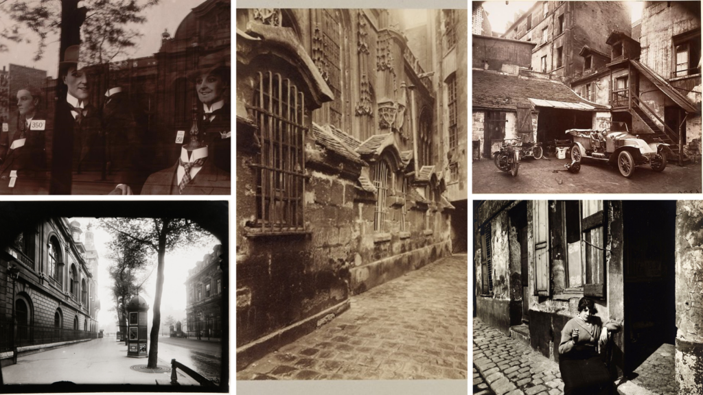
Eugène Atget was a French Photographer that was widely known for his photographs of the Capital city of France (His hometown) Paris. He started his work in the late 1880s and his work supported art students and architect. Furthermore Eugene started his photography using a large format camera with a wide lense so he could fully capture the essence of the Capital city in detail.
MoodBoard Of His Work
Why did I choose him for my artist reference?
I chose Eugène as his style reminds me of the way pictures were around the time my grandad was growing up. I am aiming to re create this style making my images as close to the original images as possible. Even though his photography is more closely linked to everyday life and the precise architecture of the streets of Paris I believe I can still incorporate parts of his work into my own. I can also branch off his work with the layout of my own images as I can compare my present pictures with those taken in the past and look for any similarities and differences
Below is also a hyperlink that takes you to the MoMA sight where more pieces of his work are visible alongside more background knowledge of him.
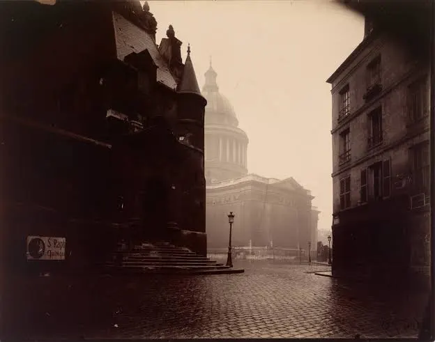
The shutter speed used seems to be quite high and quick because of the dark shadow effect that is visible around the outsides of the images. The ISO seems to be relatively low as the image is taken during high levels of light. This contrast of different lighting creates an eerie feeling to the images. This is further emphasised by the lack of people in the image as the street seems to be very desolate
Visual: This seems to be the end of a street leading up to a bank or a building of interest such as a cathedral. The reflection of the light off the
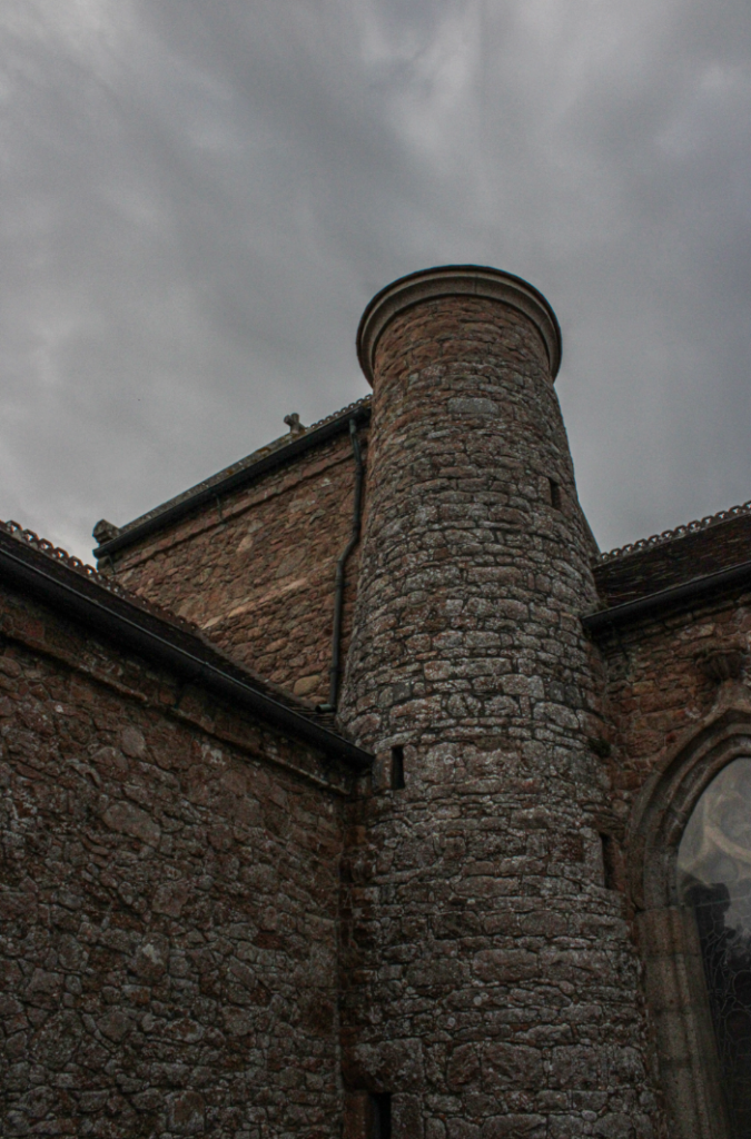
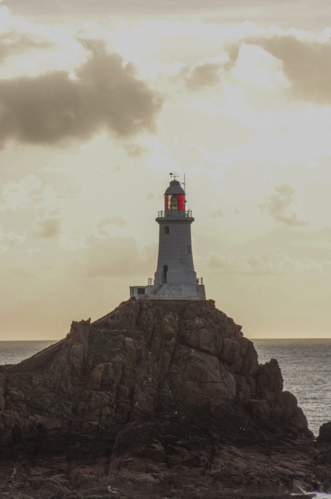
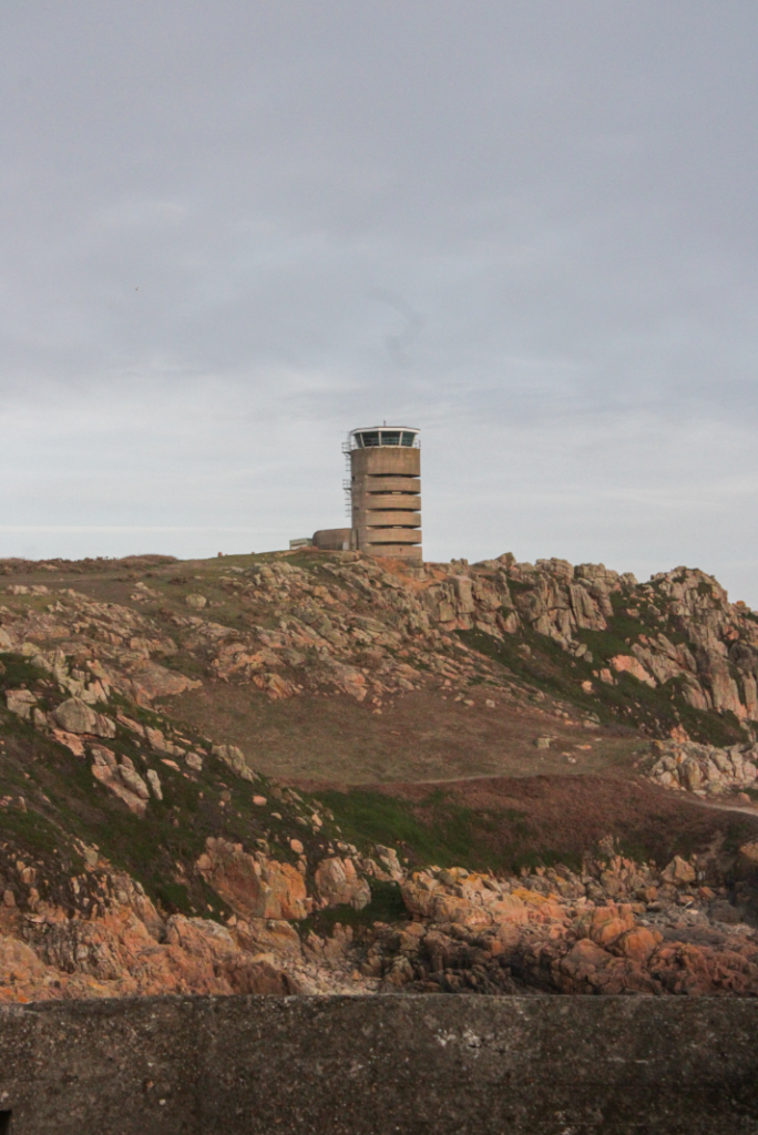
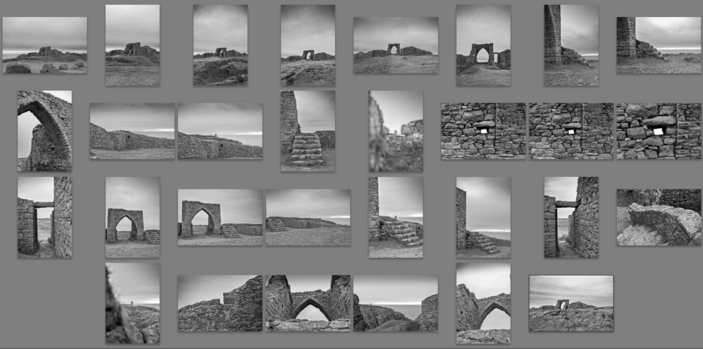
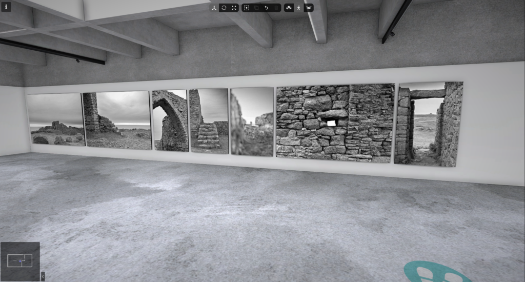
For my first photoshoot, I went to multiple locations on the east side of the island that I think relate to the project I want to develop, although it is not certain that all photos will be used , I still think there are some photos that would be beneficial and relate to the photos I want to take.
Photo sheet
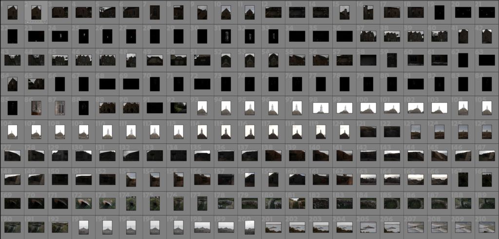
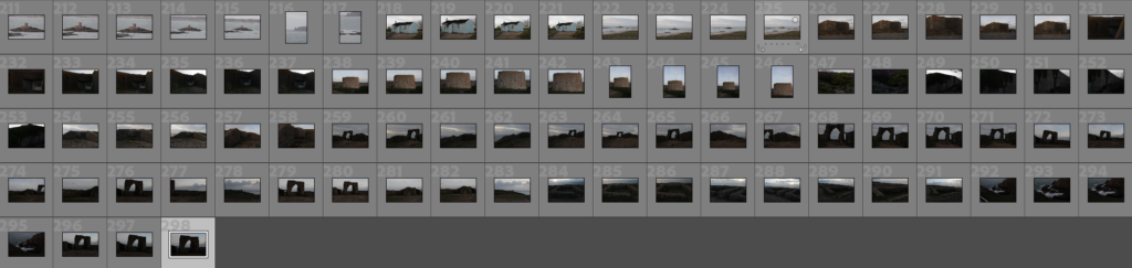
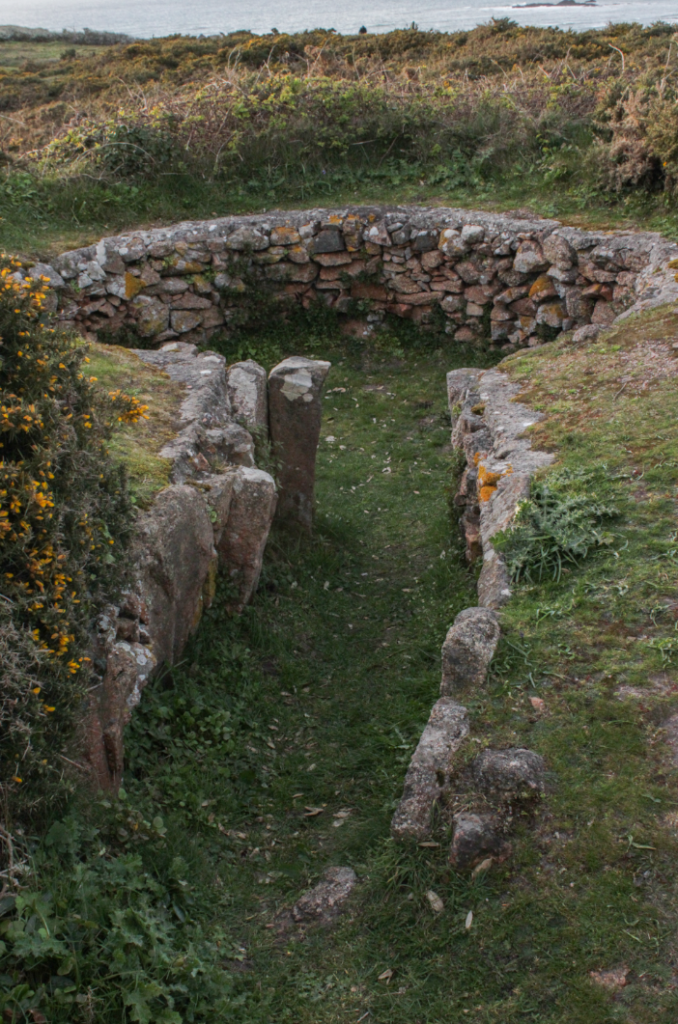
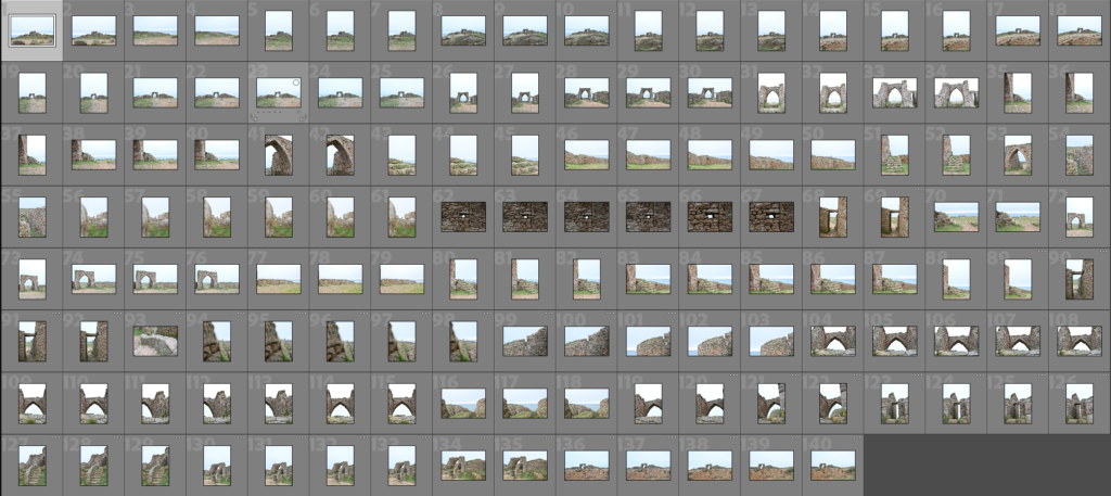
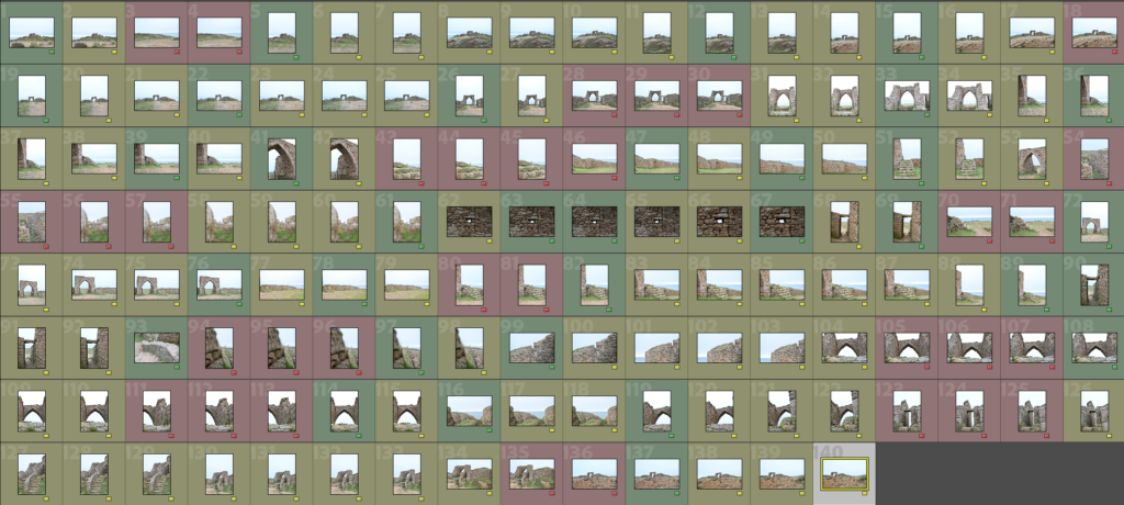
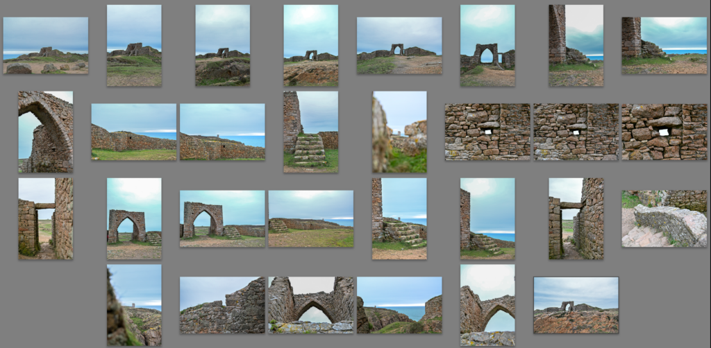
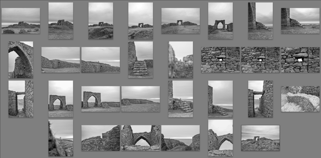
Here is the photos in total, with there being around 300 photos. These are taken over multiple places, in which ended up going to St Brelades, La Corbière, St Ouens and L’Étacq in order to take different photos of different structures that are very old to relatively new in date standards, from La Sergente Tomb to the bunkers around the island, showing widely considered the oldest man-made structure on the island. Built approximately 6,500 years ago to remnants of the occupation that occurred 80 years ago, in which still is a very long time ago but compared to other structures here in does not seem very old. However I think it would be interesting to take photos of newish structures, kind of showing the evolution how structure have been developed in Jersey.
The photos in green signify the photos I selected for the editing process in which I have indeed done, these edited photos are evident in the next section of this blog.
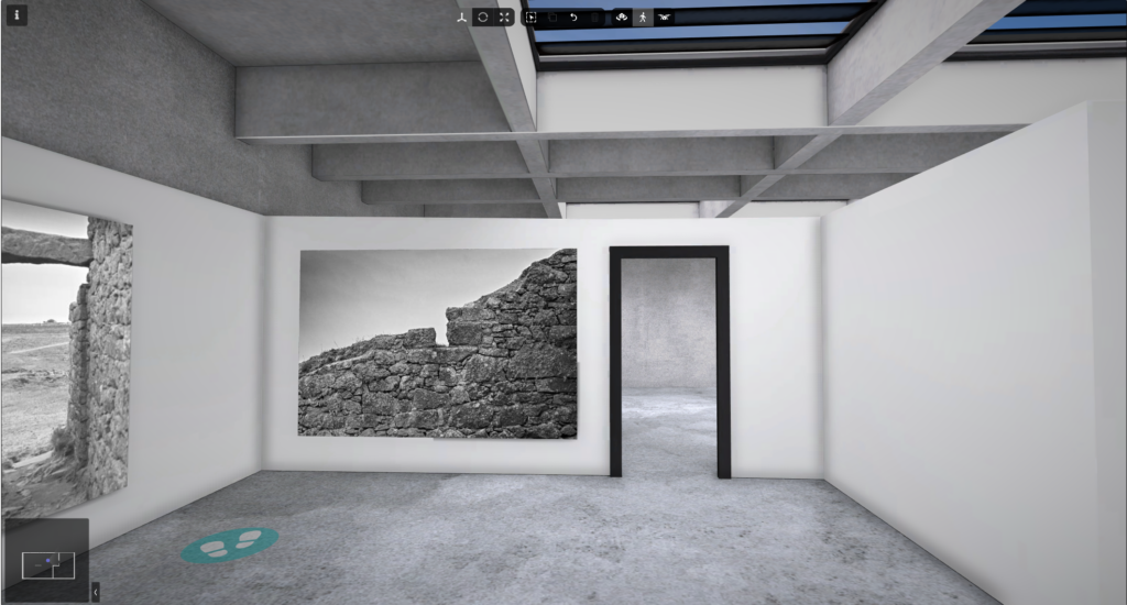
Best photos
These are the photos I think are the best of what I have selected and edited, with multiple of them being ready to print to present type of work I will be doing for this project. These are my best photos as I think the structure and the editing/capture of the image is very well composed in my opinion. Though I do think there can be some improvement in terms of destinations to capture but this will come to life with more photoshoots.
Emile Guiton was a Jersey photographer whose work focused primarily on landscape, heritage, and local history. He is most recognised for his black-and-white and early colour images of Jersey’s landscapes, Neolithic sites, and historic buildings. What separates him from traditional landscape photographers is that his work is not decorative or romanticised. Instead, it feels grounded, serious, and reflective of both place and history.
Through my research using the Jersey Heritage Archive, Société Jersiaise collections, and historical publications, I found that Guiton’s photography often explores how landscapes and built environments have been shaped over centuries. His images suggest that heritage is not static or untouched. It is layered with history, human activity, and cultural memory.
Guiton also believed in physically engaging with his subjects. He would explore sites and surroundings extensively before photographing them, ensuring an informed and deliberate perspective. This is important for my own project because I am not simply photographing heritage sites for visual effect. I am investigating origin through specific Jersey locations, which have detailed archaeological documentation, archival material, and heritage management records. This allows my project to be historically structured and contextually grounded.
INTRODUCTION
I chose Emile Guiton because his photographic approach aligns strongly with my intentions for the theme Origin. When I think about origin, I think of history, ancestry, and human interaction with landscape over time. My project is very literal: I am photographing Jersey’s Neolithic heritage sites, including dolmens, burial chambers such as La Hougue Bie, fossils, bones, and museum artefacts.
What fascinates me is that early humans were able to construct and position massive stones thousands of years ago. It feels mysterious. It also feels strange that today I can stand beside these ancient structures freely and document them with a digital camera. That contrast between ancient permanence and modern accessibility forms part of my conceptual thinking.
Guiton’s black-and-white and early colour imagery supports my decision to shoot in monochrome. Removing colour allows focus on form, structure, symmetry, and texture. Neolithic materials such as stone carry visible evidence of erosion and weathering. Black and white enhances this, making time physically visible within the frame.
I want my images to feel calm yet slightly eerie. Calm because the sites are silent and still. Eerie because they represent burial, ritual, and ways of life that no longer exist. Guiton achieves a similar balance through careful composition, attention to detail, and respect for the subject.
Emile Guiton’s work is widely recognised as important in Jersey’s photographic heritage. His early adoption of colour photography and extensive documentation of local landscapes and archaeological sites highlight the historical and cultural significance of Jersey’s environment.
PHOTO DECONSTRUCTION 1
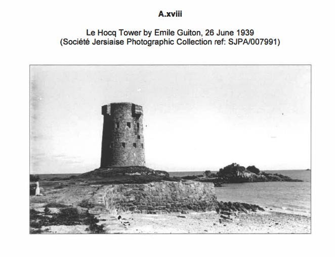
Le Hocq Tower, Jersey (26 June 1939) Photograph by Emile Guiton, Société Jersiaise Photographic Archive (Source)
TECHNICAL
Guiton uses natural daylight, likely diffused by overcast skies, which produces soft but controlled lighting. The tonal range is broad but balanced, with highlights in the sky retaining detail and the tower’s stone surfaces not underexposed. This preserves texture.
A small aperture creates a deep depth of field, keeping everything from the foreground grass to the distant horizon in focus. This maintains the tower’s relationship with its surrounding landscape rather than isolating it. The ISO appears low, ensuring minimal grain and maximum clarity, allowing the tower’s stone surfaces and weathering to be visible.
For my own work, I will use a small aperture and low ISO to maintain depth of field and maximise texture detail in Jersey’s Neolithic monuments. Texture communicates age and the passage of time, which is essential for exploring origin.
VISUAL
The dominant visual elements are tone, texture, form, and space. The tower functions as a strong vertical form within the frame. Its weathered stone creates tactile texture that contrasts against the smooth tonal gradation of the sky.
Compositionally, the tower is positioned slightly off-centre, giving room for its environment to contextualise the structure. The horizon is low, allowing the sky to provide negative space that emphasises isolation and permanence.
No human presence appears, removing distraction and guiding the viewer’s eye directly to the monument. In my project, I aim to use space and scale similarly, creating images that feel deliberate, structured, and historically grounded.
CONTEXTUAL
Le Hocq Tower is a historic coastal fortification on Jersey’s south-east coast. By 1939, it had centuries of human history embedded in its structure. Guiton’s photograph captures the tower as part of its landscape, avoiding romanticisation and presenting it as a living historical object.
For Jersey, this is relevant because many Neolithic and heritage sites exist within modern environments. By acknowledging surroundings, my work can show that origin survives within the present rather than existing as a disconnected past.
CONCEPTUAL
Conceptually, the photograph communicates endurance and continuity. The tower represents not only a specific historical moment but also the accumulation of human activity over time. Black-and-white treatment removes colour as a distraction, allowing structure, material, and the passage of time to dominate the image.
This aligns directly with my interpretation of Origin. Ancient structures and monuments are physical traces of belief, identity, and ancestry. Through careful composition, texture emphasis, and tonal control, I want my images of Jersey’s Neolithic sites to function as visual evidence rather than romanticised landscapes.
PHOTO DECONSTRUCTION 2
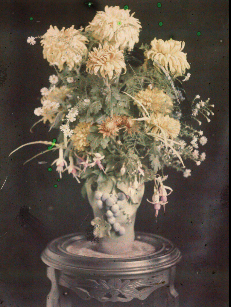
1904, Flowers, Lumière Autochrome, Jersey (ca. 1907–1911) Photograph by Emile Guiton, Société Jersiaise Photographic Archive (Source)
TECHNICAL
Guiton was experimenting with the Autochrome Lumière process, the first commercially practicable colour photographic technique, which used dyed microscopic potato starch grains on glass plates. Exposures had to be long and deliberate due to low light sensitivity, prioritising form and structure over movement.
Colours are muted, showing pastel greens, soft earth tones, and gentle floral hues. This creates a timeless, historic quality rather than vibrant spectacle.
For my project, understanding Guiton’s technical choices informs my decision to use monochrome, prioritising texture and structure over colour.
VISUAL
The dominant visual elements are tone, texture, and spatial calm. Foreground elements are sharply related to background forms, providing depth and structural clarity. Muted colour and soft light produce a quiet, reflective mood.
Composition is measured, with the flower sitting harmoniously within its environment, avoiding distraction or embellishment. This restraint allows the historic and material qualities of the scene to dominate.
CONTEXTUAL
This autochrome represents one of the first colour photographs taken in Jersey, documenting gardens, towns, and landscapes. Guiton’s work shows that photography can record place historically and technically while still exploring the potential of new media.
For my project, this shows that technical experimentation can serve conceptual aims, as long as it foregrounds historical significance.
CONCEPTUAL
The photograph communicates quiet presence and historical situatedness. Subtle colour acts as evidence rather than decoration, aligning with my approach of using black-and-white to foreground structure, material, and temporal endurance.
Through texture, composition, and spatial calm, Guiton’s autochrome demonstrates how photography can document place while also prompting reflection on time and continuity. These are qualities I aim to replicate in photographing Jersey’s Neolithic sites.
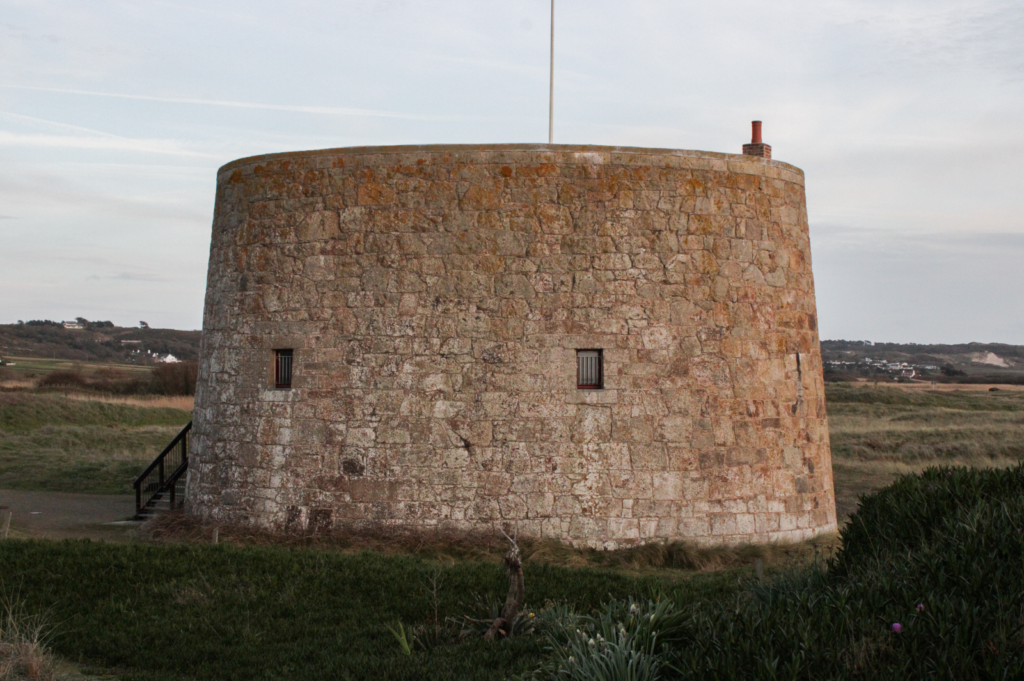
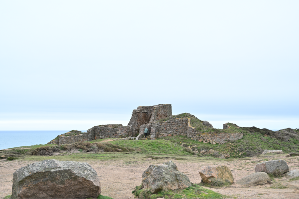
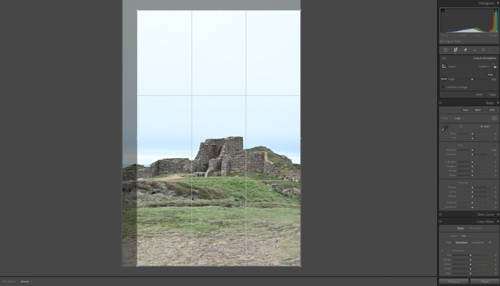
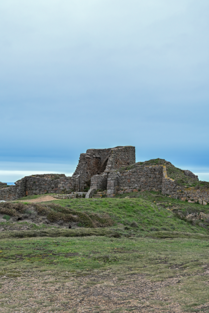
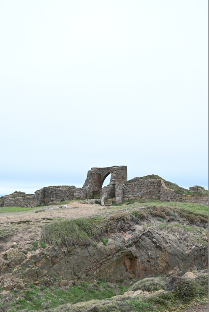
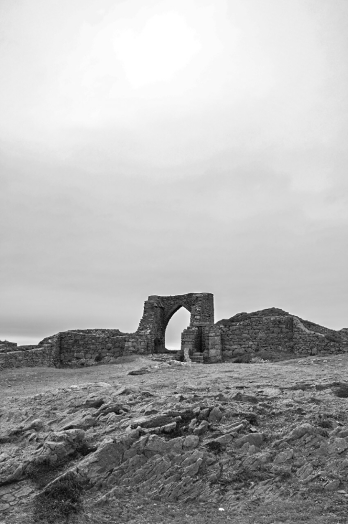
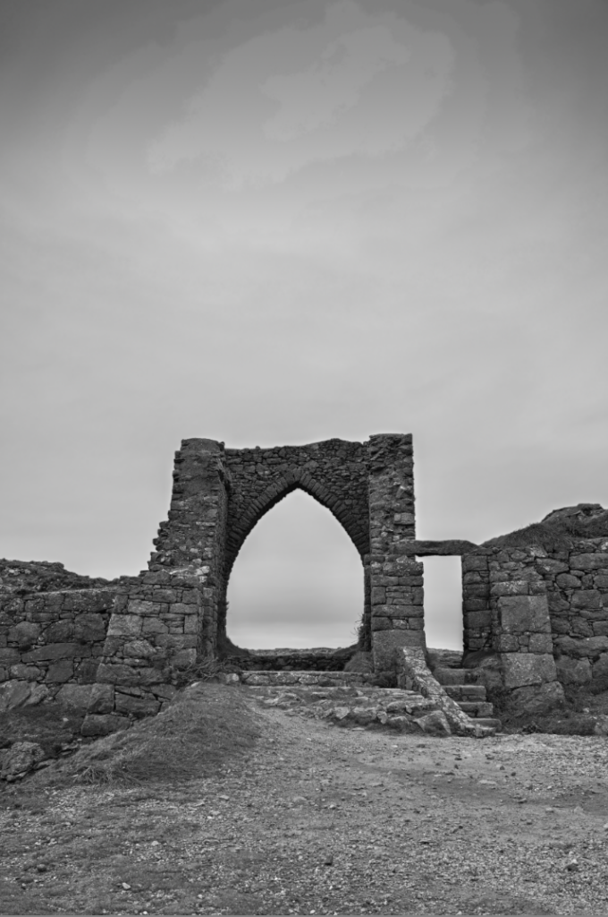
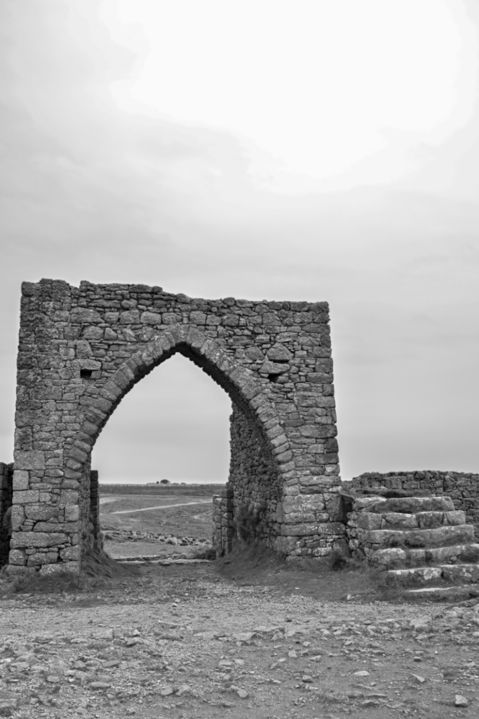
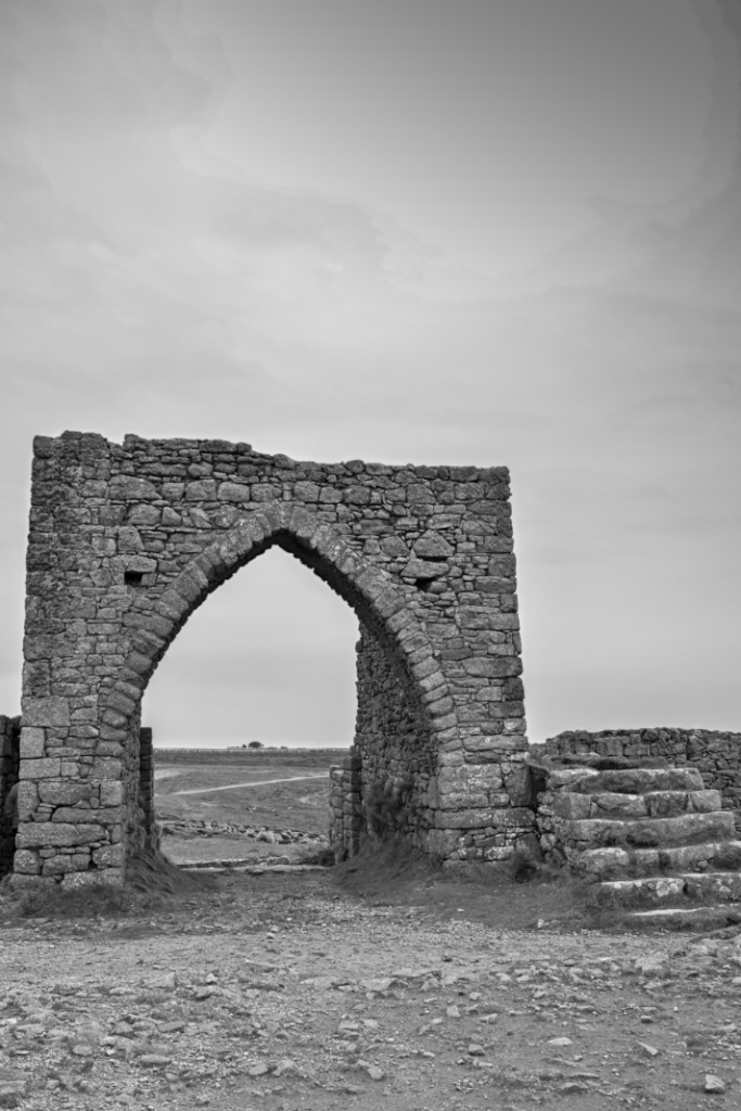
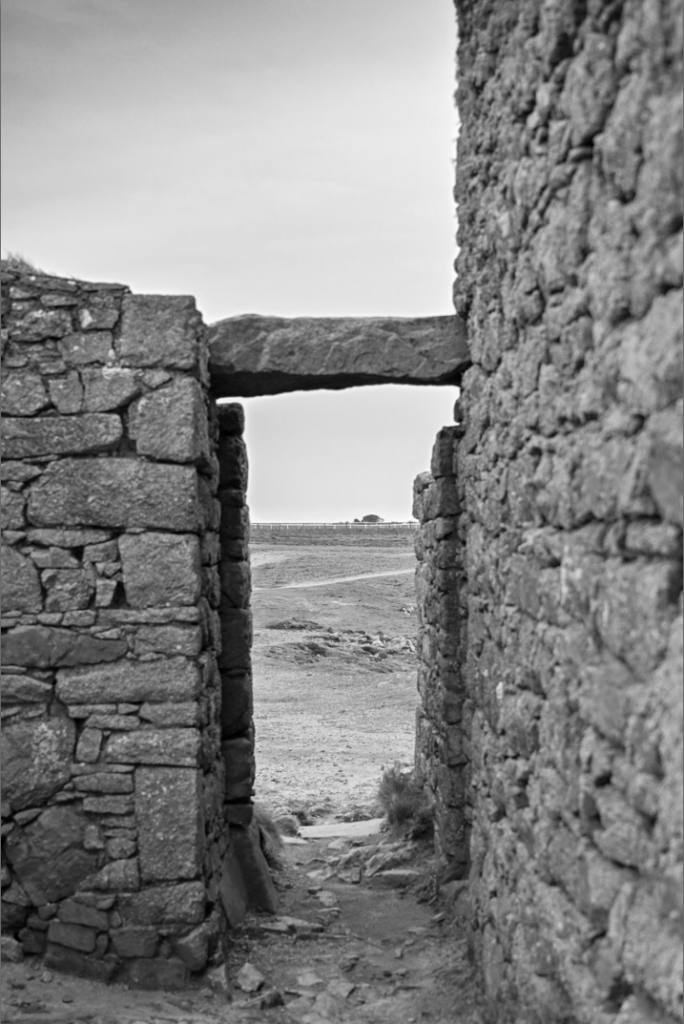
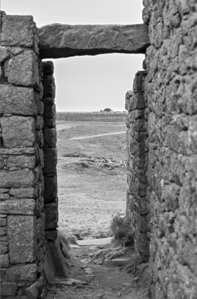
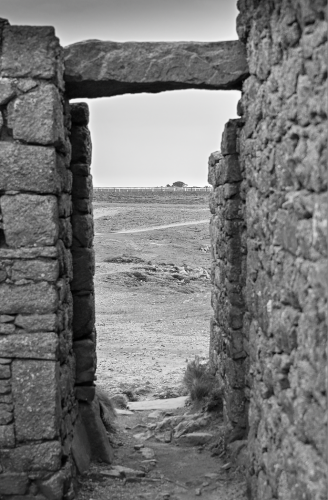
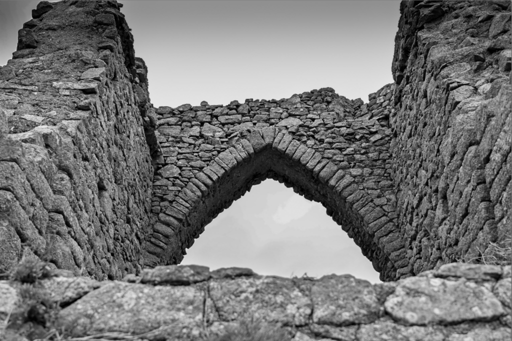
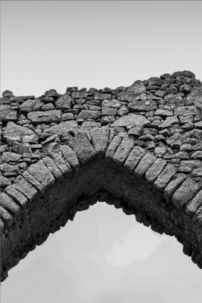
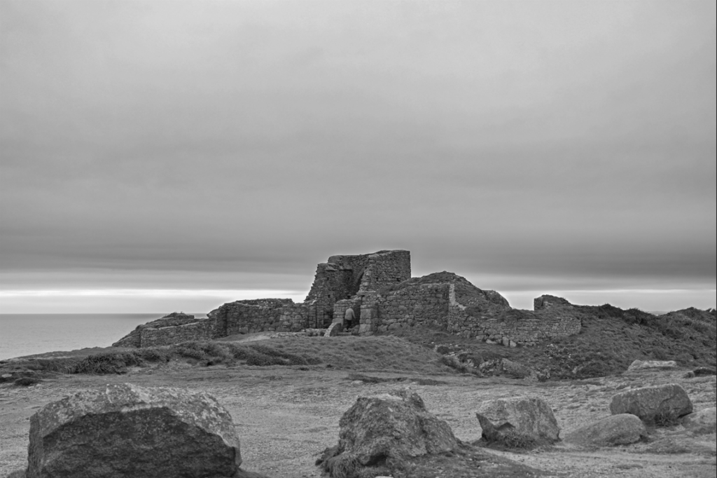
For my first photoshoot, I plan to shoot at Gronez SSI, taking advantage of its rugged coastal setting and interesting, historic arch way to create a dramatic series of images. I want to shoot underneath cloudy skies, ideally in the late afternoon, so the soft light and textured clouds enhance the moody tone of the shoot. The concept will focus on themes of isolation and resilience, and it will strongly relate to the theme origin I will capture a mix of wide shots showing the scale of the landscape and the archway, mid-shots that mix both the finer details and the landscape and then close-ups that highlight textures like the rocks or the steps. Overall, the goal is to create a cinematic, slightly mysterious visual story that highlights Jerseys history and SSIs.
Contact sheet
Selection process
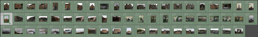
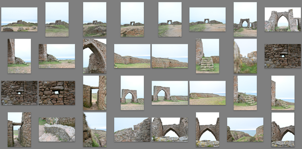
My best RAW images
Basic editing
#1
HereI started by adding some basic edits.
I then added the ‘Storm clouds’ pre set to added the dramatic effect to the sky.
#2
#3
I then repeated a similar editing style for the rest of my chosen photos.
My best edited photos
Black and white
Further editing and masking
#1
#2
#3
#4
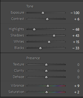
By adding linear gradients to these photo and lowering the exposure, it stops the sky from being completely blown out and it prevents the negative space from taking over the image.
Cropping experiments
#1
I added the linear gradient to the cropped photo to prevent the sky from being all bleached out.
#2
#3
Pairing experiments
#1
I think these two work well as a pair because they are very similar, they where just take from different angles.
#2
These two images work well as a comparison due to them both being of fine details at the SSI.
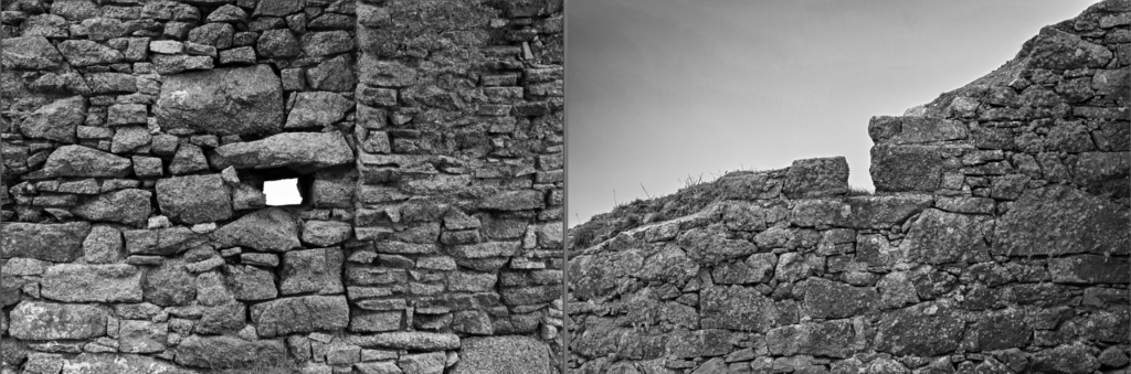
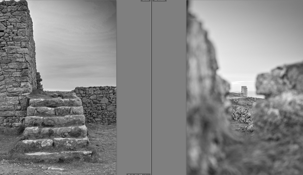
#3
These two images compare really well because the steps show what is this side of the wall and act as leading lines over the wall to the tower on the other side of the wall in the right photo.
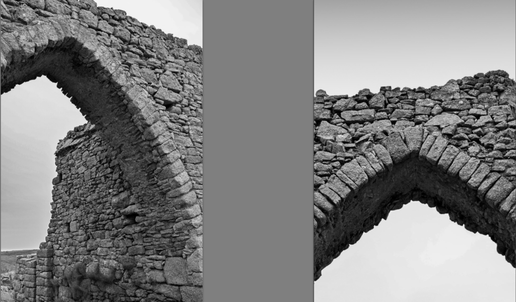
Comparison to Emile Guiton
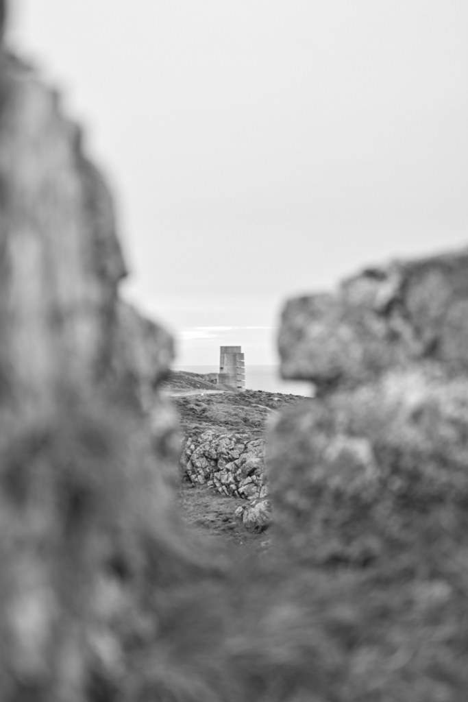
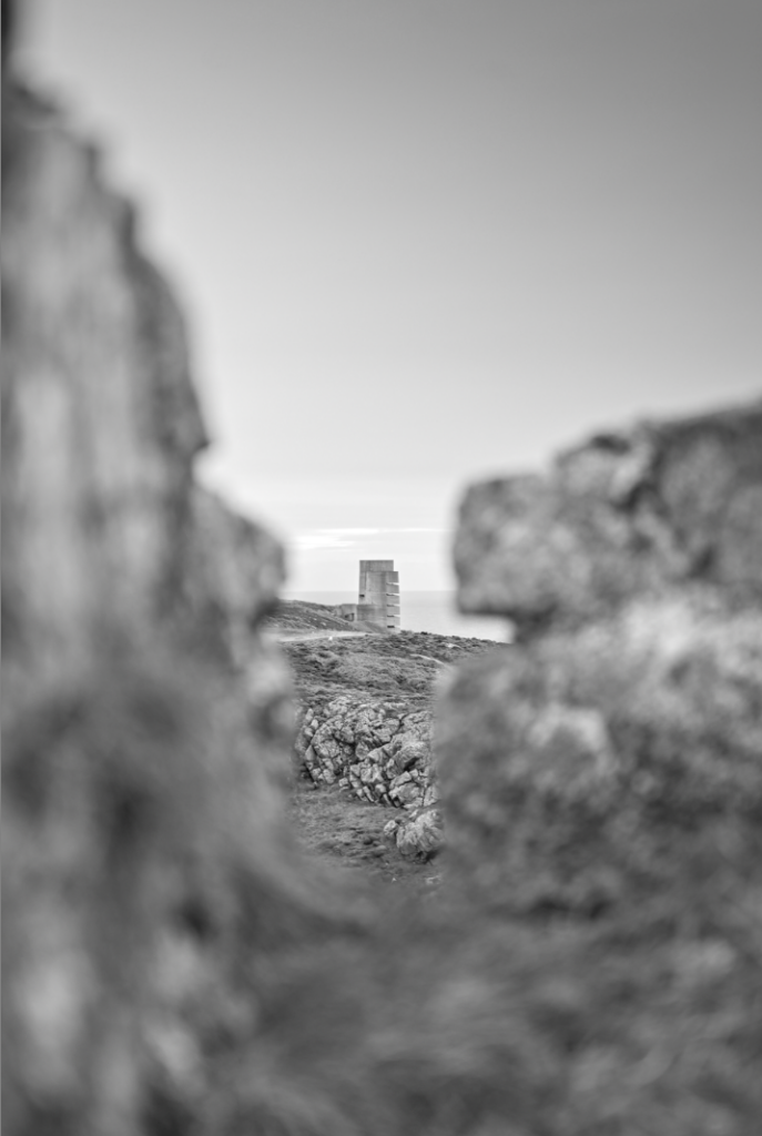
Theses two images are both of rocky features along the coast line, taken in black and white, neither images contain people and they both just focus on the environment. The rule of thirds are also very similar in these images, with the bottom three being the foreground, the middle three being the subject and the top three being the sky and background. Both mine and Emile Guiton’s image use soft, natural lighting on a cloudy day. However, these images definitely have their difference, In the left image, the subject is a man-made arch way that is further away with more negative space than the right image. Moreover, my image as a flatter, moodier sky, whereas, the right image as visible clouds and clear sky, creating a happier, more upbeat tone.
Evaluation
Overall, I’m really happy with how my photos turned out because I think they met the goal I had in mind and followed the original photoshoot plan closely. The pictures show a solid grasp of composition, lighting, and where to place the subjects, which helped make the results visually appealing and cohesive. I especially believe that the focus on detail and the careful choice of angles and framing added to the overall impact of the shots. Moreover, the consistency throughout the series strengthens the theme I wanted to express, making the final result feel well-planned and intentional. Even though there might be a few small areas to improve, I feel that the photographs clearly achieve the goals I set and effectively convey the message I wanted to share with the audience.
Abstract photography challenges the traditional idea that photographs must depict clearly identifiable subjects. Instead, it treats the image itself, and the process of creating it as the main focus. To achieve this, abstract photographs often highlight the internal structure of the image, reveal elements that are normally unseen, or emphasize pure visual qualities such as form, light, and pattern.
The production of abstract images has frequently been used as a form of visual investigation, helping artists and photographers better understand how images work and what they can communicate. Early examples can be traced back to the 1830s, when William Henry Fox Talbot produced contact prints of plants. Later, in the late nineteenth century, Étienne-Jules Marey created chronophotographs that explored movement through sequences of images.
However, Alvin Langdon Coburn is widely regarded as the father of abstract photography. In his 1916 essay ‘The Future of Pictorial Photography‘, he introduced the term and proposed exhibiting photographs that focus on the forms and structures within the image itself rather than on references to objects in the outside world. He called his own abstract experiments “Vortographs,” which were inspired by the artistic movement known as Vorticism in painting.
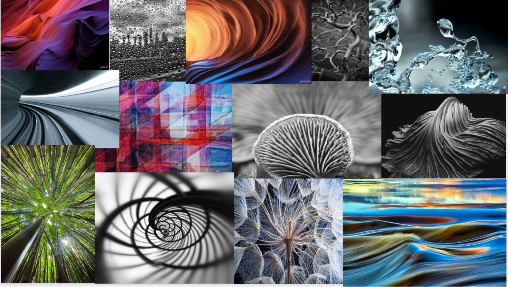
Moodboard
facts about abstract photography
Key Facts About Abstract Photography:
Purpose: The goal is to create a feeling or impression through visual elements rather than documenting a scene.
Origins: Early examples appeared in the 1840s; Anna Atkins used cyanotypes for botanical studies, while John William Draper used spectroscopes to create abstract scientific images.
Core Elements: Key composition elements include patterns, repetition, texture, high-contrast light, and unconventional, close-up perspectives.
Techniques: Common methods involve intentional camera movement (ICM), long exposure, macro photography, and light painting.
Famous Practitioners: Aaron Siskind is known for using photography to focus on lines and textures similar to abstract expressionist paintings.
Subject Matter: Anything can be a subject, particularly natural patterns, architectural details, or intentional reflections.
Types: It includes cameraless photography (like photograms) and heavily edited digital images.
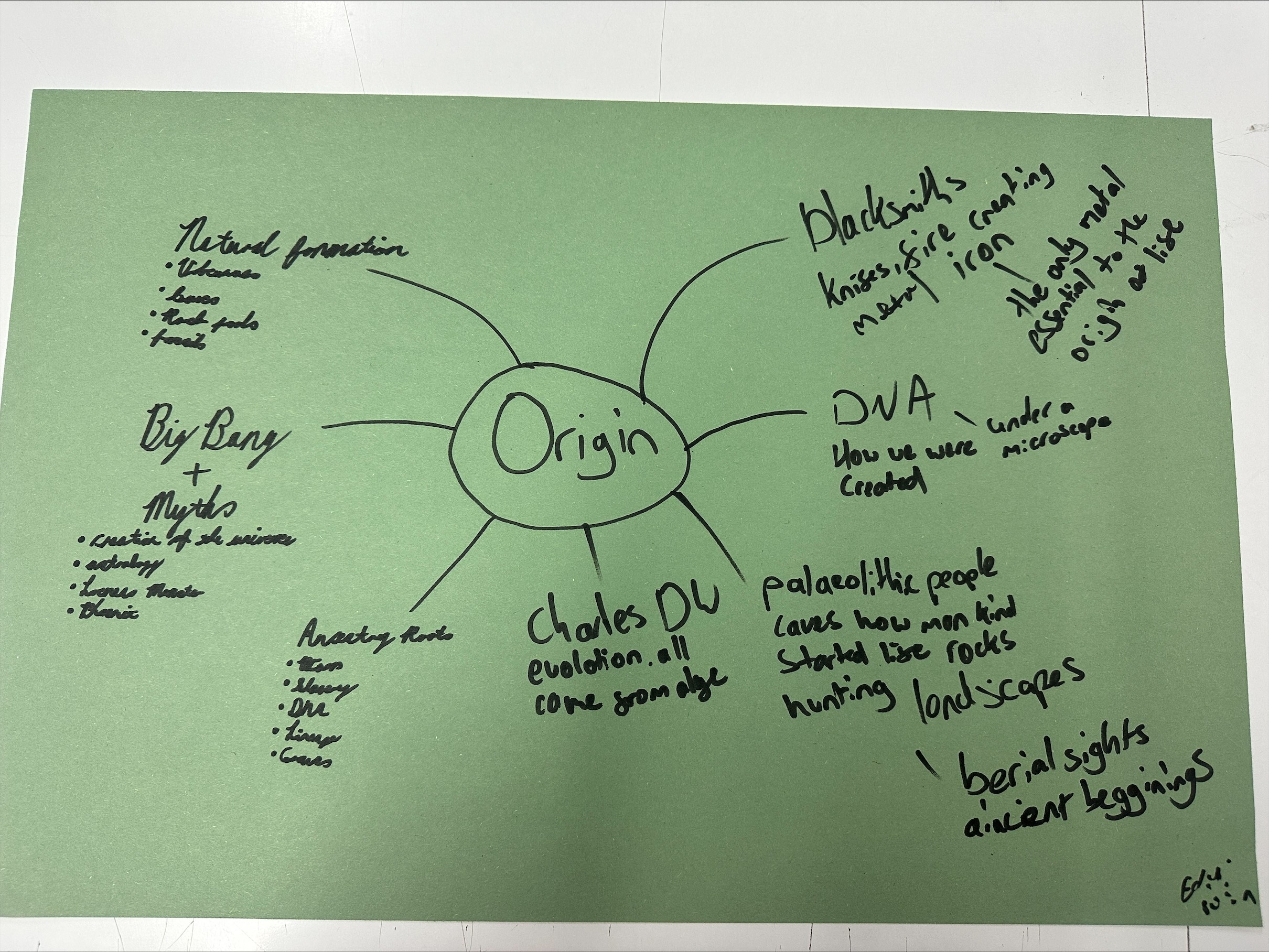
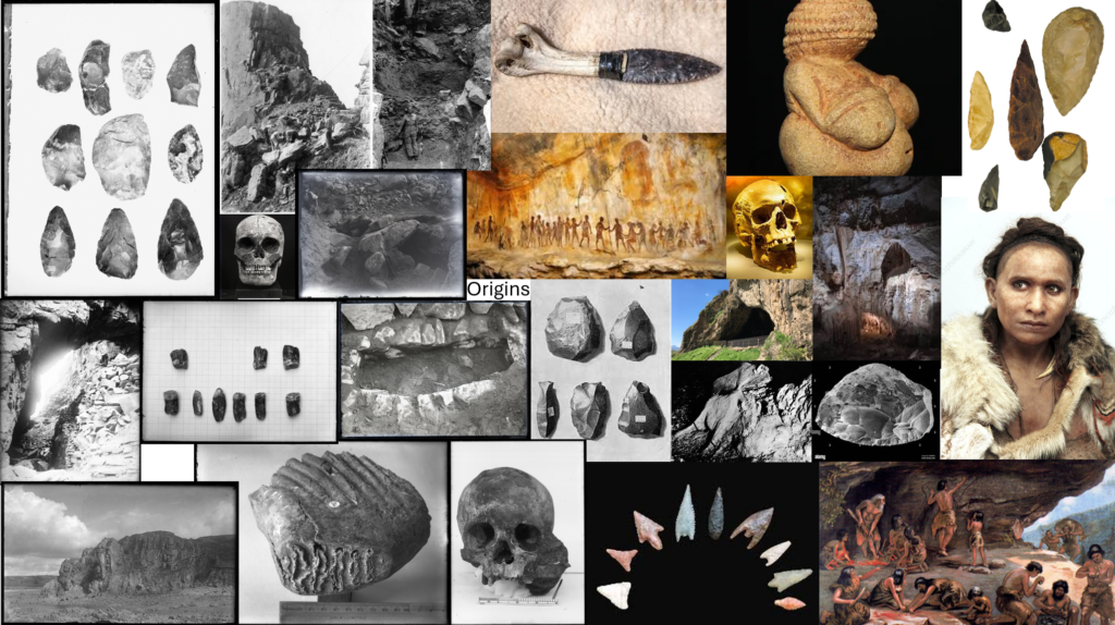
As our first task we came up with a bunch of words linking to origin. My favourite word/idea was Palaeolithic people and there tools and how they were the first origins of humanity.
Mood Board
Taking this further I created a mood board about Palaeolithic people with general ideas and tools on the right and specific jersey found tools and sites on the left.
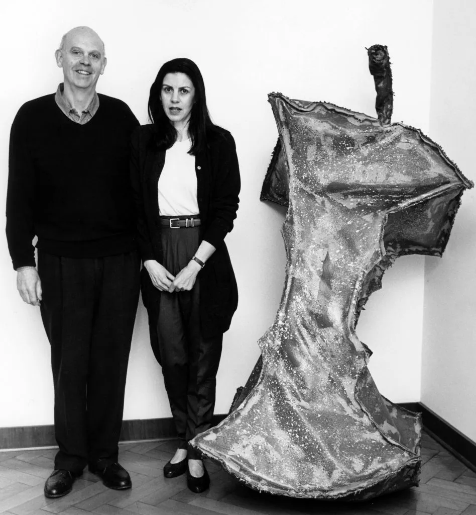
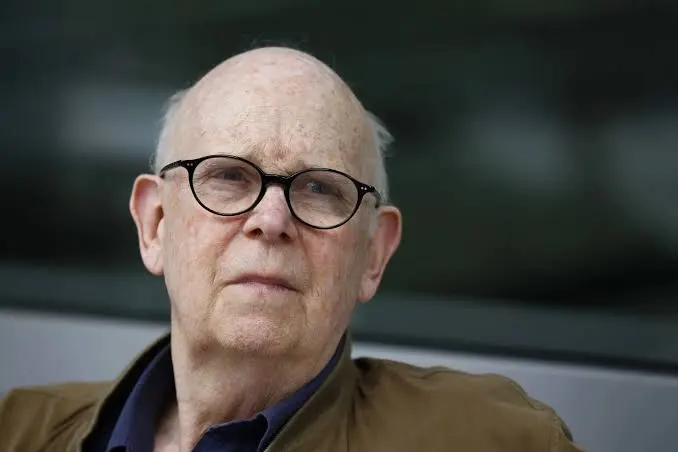
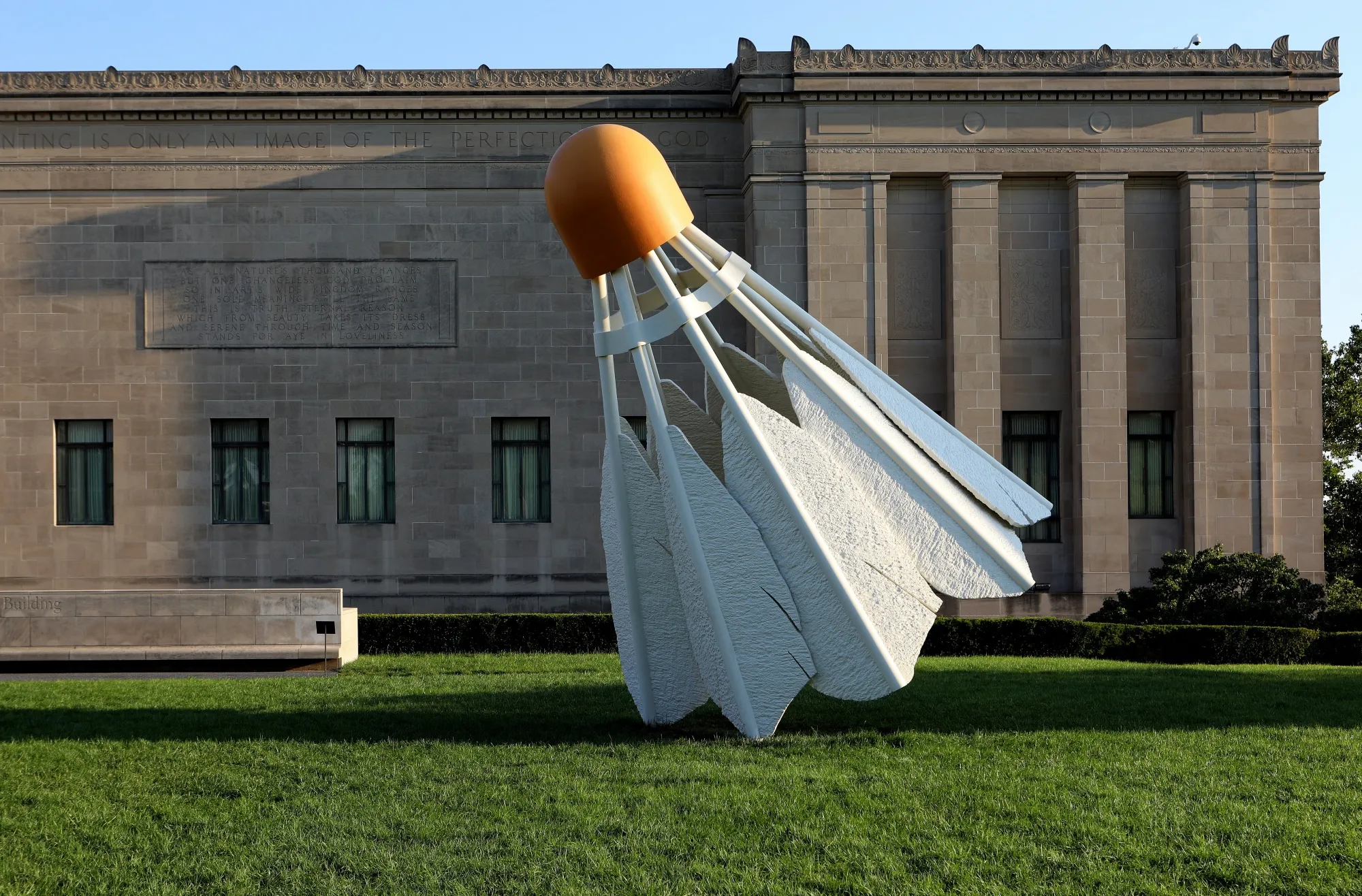
Claes Oldenburg was a Swedish-born American sculptor best known for his public art installations, typically featuring large replicas of everyday objects. Another theme in his work is soft sculpture versions of everyday objects. Born: January 28, 1929, Stockholm, Sweden. Died: July 18, 2022 (age 93 years), New York, New York, United States.
Claes Oldenburg was a central figure in the development of American Pop Art during the 1960s, transforming the language of sculpture by elevating ordinary consumer objects to the status of monumental art. Born in Stockholm and raised in the United States, Oldenburg emerged in New York at a time when Abstract Expressionism dominated the art world. In contrast to its emotional intensity and gestural abstraction, Oldenburg turned toward the everyday environment of shops, advertisements, and mass-produced goods. Like fellow Pop artists such as Andy Warhol, he blurred the boundary between high art and popular culture, questioning traditional hierarchies of subject matter.
One of Oldenburg’s most significant contributions was his development of “soft sculpture.” Instead of carving in marble or casting in bronze, he created enlarged versions of everyday objects using fabric, vinyl, and stuffing. Works such as Floor Burger (1962) transform a common fast-food item into a sagging, oversized form. The use of soft materials undermines the solidity and permanence traditionally associated with sculpture, suggesting that consumer goods despite appearing substantial are ultimately unstable and temporary. This subversion of material expectations reflects Pop Art’s broader critique of consumerism and post-war abundance in America.
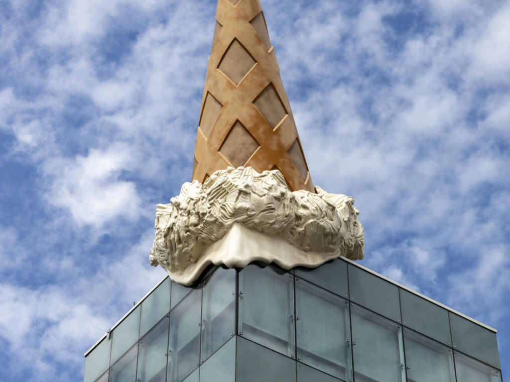
Scale is perhaps Oldenburg’s most powerful artistic device. By enlarging mundane objects to monumental proportions, he forces viewers to reconsider their relationship with the familiar. In public works such as Clothespin and Spoonbridge and Cherry, everyday household items become towering civic landmarks. This dramatic shift in scale creates humour, but it also generates a subtle commentary on the dominance of consumer culture within modern life. Objects designed for private, domestic use are relocated into public spaces, suggesting that consumption has become central to collective identity.
Oldenburg’s later large-scale sculptures, often produced in collaboration with Coosje van Bruggen, demonstrate a sophisticated understanding of site-specific art. These works interact with their architectural surroundings, disrupting urban landscapes while simultaneously becoming integrated into them. Unlike traditional monuments that commemorate political leaders or historical events, Oldenburg’s sculptures celebrate the banal and the everyday. This shift reflects broader late-20th-century artistic movements that sought to democratise art and make it accessible beyond elite gallery spaces.
In conclusion, Claes Oldenburg redefined sculpture by challenging conventions of material, scale, and subject matter. Through humour and transformation, he expanded the possibilities of public art and reshaped perceptions of everyday objects. His work remains significant within art history because it captures the spirit of post-war consumer society while continuing to provoke debate about the relationship between art and popular culture.
My own interpretation of Origin is in regard to my own beginning. To me the word origin signifies the start of many different subjects
During my project I would like to further my knowledge and photography skills by obtaining a set of images that reflects exactly what it is I am studying. This is going to be through looking back at my family heritage specifically looking at the ancestors in my grandfathers family. This connotes to the project word Origin, as it is focusing on my own origin and how my family together as one has formed today. During this idea I would like to lay out and draw family trees and take pictures of the networks. Essentially then hoping to find out more information about my ancestors and then visiting old sites that hold sentimental value to my family. Another idea i would like to put into action with my findings is posing as my ancestors around buildings to resemble what life would of been like at the time of them being alive. This matters to me as my grandad himself has dementia and is therefore unable to communicate with me about anything to do with his past. I know from prior conversations many years ago however, that we was in Jersey during the time of the occupation and i would really like to get a sense of how that impacted not only his life but my family as a whole. I intend to begin my study this weekend of the 7th of march hopefully looking to visit graveyards and old sites for a photoshoot that summarises my ancestors lives
I would then like to further this idea yet again by posing as my family members in images and re creating them. For my final set of images I will display them in a photobook side by side and write a caption below with certain key points from the photographs for example when they were taken and where also including who’s in the pictures
If you are planning on exploring visual storytelling and producing another publication or picture-story, i.e photobook, zine, photo-essay as final outcomes in the exam, then make sure you have completed and published the following blog posts:
RESEARCH & ANALYSIS
CONCEPT & NARRATIVE
DESIGN & LAYOUT
FINAL LAYOUT & EVALUATION
BLOG POST: RESEARCH & ANALYSIS
1. Research a photobook and describe the story it is communicating with reference to: subject-matter (what is it about?) genre (landscape, portraiture, still-life etc) approach to image-making (documentary, tableaux, conceptual etc.)
2. Who is the photographer? Why did he/she make it? (intentions/ reasons) Who is it for? (audience) How was it received? (any press, reviews, awards, legacy etc.)
3. Deconstruct the narrative, concept and design of the book and apply theory above when considering:
Book in hand: how does it feel? Smell, sniff the paper.
Paper and ink: use of different paper/ textures/ colour or B&W or both.
Format, size and orientation: portraiture/ landscape/ square/ A5, A4, A3 / number of pages.
Title: literal or poetic / relevant or intriguing.
Narrative: what is the story/ subject-matter. How is it told?
Structure and architecture: how design/ repeating motifs/ or specific features develops a concept or construct a narrative.
Design and layout: image size on pages/ single page, double-spread/ images/ grid, fold- outs/ inserts.
Editing and sequencing: selection of images/ juxtaposition of photographs/ editing process.
Images and text: are they linked? Introduction/ essay/ statement by artists or others. Use of captions (if any.)
UNDERSTANDING PHOTOBOOKS: NARRATIVE, EDITING, SEQUENCING, DESIGN, FORM, FUNCTION
Earlier in the academic year we looked at narrative in photography. Click on the blog post below to refresh your knowledge and understanding and revisit some of the theories around visual storytelling.
Narrative is essentially the way a story is told. For example you can tell different narratives of the same story. It is a very subjective process and there is no right or wrong. Whether or not your photographic story is any good is another matter.
Narrative is constructed when you begin to create relationships between images (and/or text) and present more than two images together. Your selection of images (editing) and the order of how these images appear on the pages (sequencing) contributes significantly to the construction of the narrative. So too, does the structure and design of the photo-zine or photobook.
However, it is essential that you identity what your story is first before considering how you wish to tell it. Planning and research are also essential to understanding your subject and there are steps you can take in order to make it successful. Once you have considered the points made between the differences in narrative and story complete the following:
CASE-STUDIES:
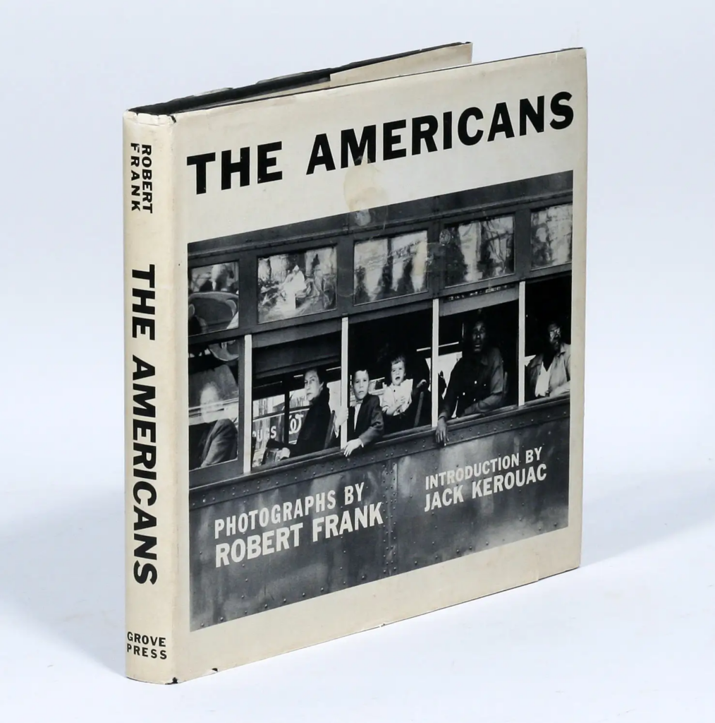
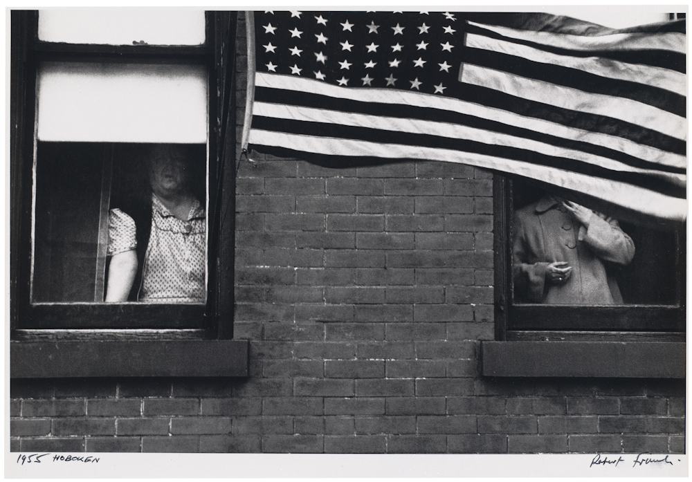
PHOTOBOOKS: In October of 1958, French publisher Robert Delpire released Les Américains in Paris. The following year Grove Press published The Americans in New York with an introduction by American writer, Jack Kerouac (the book was released in January 1960).
Like Frank’s earlier books, the sequence of 83 pictures in The Americans is non-narrative and nonlinear; instead it uses thematic, formal, conceptual and linguistic devices to link the photographs. The Americans displays a deliberate structure, an emphatic narrator, and what Frank called a ‘distinct and intense order’ that amplified and tempered the individual pictures.
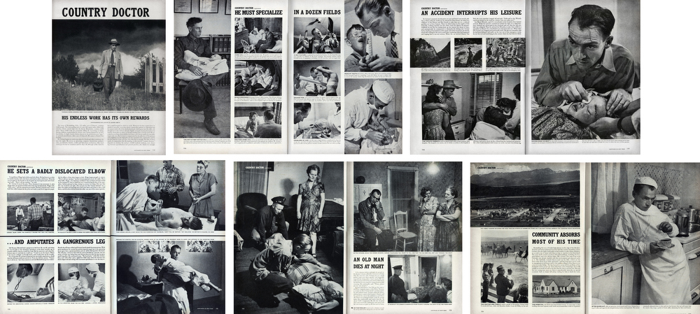
PHOTO-ESSAY: The life of a country doctor in Colorado’s Rocky Mountains
“A photo is a small voice, at best, but sometimes – just sometimes – one photograph or a group of them can lure our senses into awareness. Much depends upon the viewer; in some, photographs can summon enough emotion to be a catalyst to thought”W. Eugne Smith
W. Eugene Smith compared his mode of working to that of a playwright; the powerful narrative structures of his photo essays set a new benchmark for the genre. His series, The Country Doctor, shot on assignment for Life Magazine in 1948, documents the everyday life of Dr Ernest Guy Ceriani, a GP tasked with providing 24-hour medical care to over 2,000 people in the small town of Kremmling, in the Rocky Mountains. The story was important at the time for drawing attention to the national shortage of country doctors and the impact of this on remote communities. Today the photoessay is widely regarded as representing a definitive moment in the history of photojournalism.
TRADITIONAL PICTURE STORY
Here is a Powerpoint with more information about how to construct a Traditional Picture Story that includes individual images such as:
Person at Work
Relationship Shot
Establishing Shot
Detail shot
Environmental Portrait
Formal Portrait
Observed Portrait
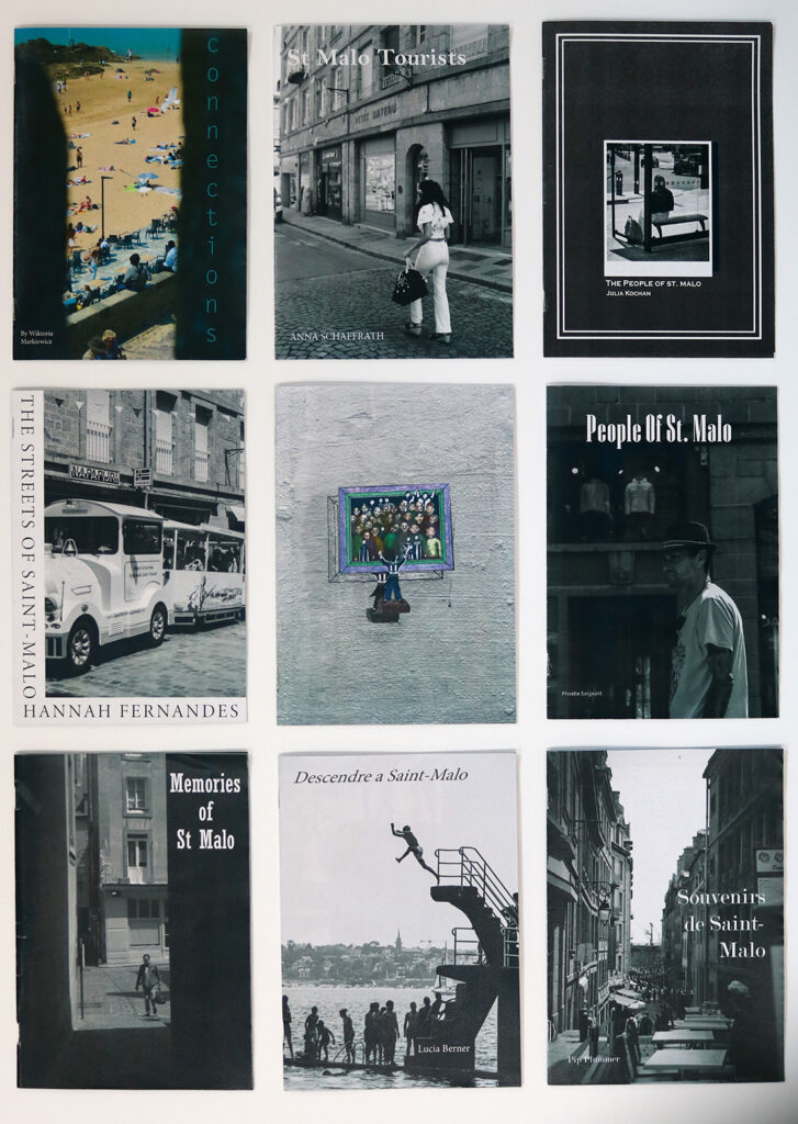
ZINES
Explore more alternative zine designs, structures and bindings here
A selection of zines from trip to St Malo in 2023
Zine: Accordion
Zine: Beak
Zine: Fold-out
Zine: Spring
BLOG POST: CONCEPT & NARRATIVE
1. Write a book specification and describe in detail what your book will be about in terms of narrative, concept and design with reference to the same elements of bookmaking as above.
Narrative:What is your story? Describe in:
3 words
A sentence
A paragraph
Design: Consider the following
How you want your book to look and feel
Paper and ink
Format, size and orientation
Binding and cover
Title
Structure and architecture
Design and layout
Editing and sequencing
Images and text
2. Produce a mood-board of design ideas for inspiration. Look atBLURB online book making website, photo books from photographers or see previous books produced by Hautlieu students on the table in class.
Produce screen prints of layout ideas as you progress and add to the blog for further annotation, commenting on page layout > narrative > sequencing > juxtaposition of pictures > design elements > title > use of text / image captions
Front page of the archive material zine
Contrast:
Front page of landscape vs front page of archive, title text will also be added to the landscape zine but I am first experimenting with the cover itself
Compliment:
I ultimately decided to go with this style of replicating the vintage effects in my own images, but I will remove my name from the second one and highlight that it is archive material and will add image captions to show the original photographer of each image as well as what the picture is showing.
Zine 1 (A3 zine)
Current front cover for each zine, I quite like the complimentary style but as I experiment I may switch back to contrast or potentially do a mix of both throughout.
Main zine (reduced quality for smaller file size, only for presentation purposes here)
BLOG POST: FINAL LAYOUT & EVALUATION
Your final blog post should be an online link to you BLURB book with an evaluation – see below for instructions
EVALUATION: Upon completion of photobook make sure you evaluate and reflect on your learning and final outcomes. Comment on the following:
What references did you make to artists references? comment on technical, visual, contextual, conceptual?
How successful was your final outcomes (book, film, prints etc)?
Did you realise your intentions?
UPLOAD BOOK TO BLURB
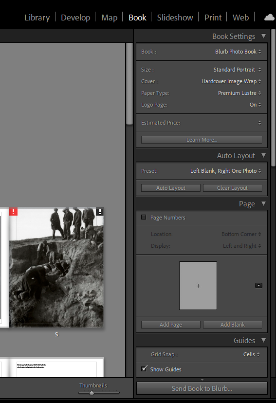
BLURB – Upload layout via internet
Inside Lightroom upload book design to BLURB by clicking on button: Send Book to Blurb. Then log onto your account on the Blurb website, go dashboard where you book is stored and go through check out process and order the book.
Consider spending a few extra pounds on choosing better paper, such as Premium Lustre in check-out, change colour on end paper or choose different cloth/ linen if needed.
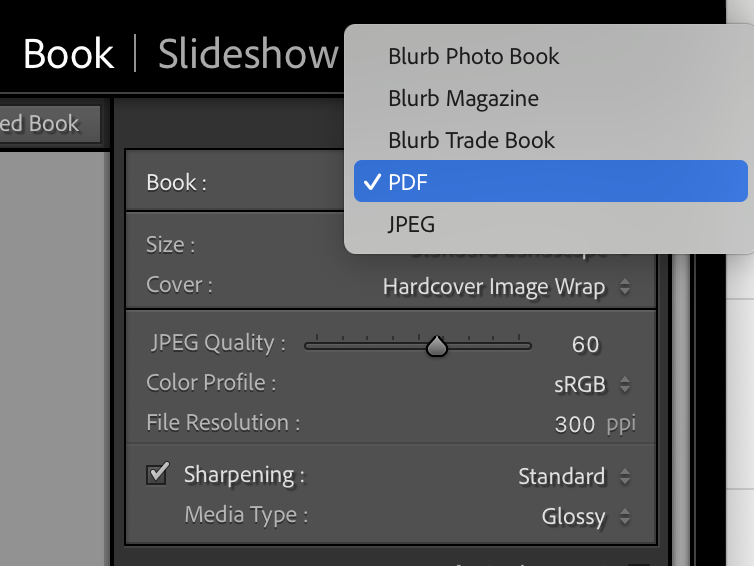
BLURB – Upload pdf (if no internet) Once your final design has been signed off by the teacher follow these steps to upload book as a PDF to Blurb.
1. In Lightroom top right corner click drop-down menu in Blurb Photo Book and choose PDF. Make sure you increase JPEG Quality to 100 %.
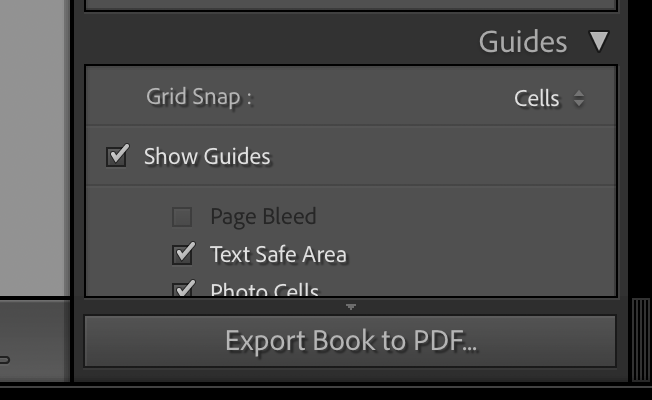
2. In bottom right corner click button: EXPORT BOOK to PDF
3. Save PDF as filename: PHOTOBOOK in folder in your student folder on M:drive.
4. Move PDF file: PHOTOBOOK toOne Drive in Office 365.
5. At home download above file from One Drive and save on your personal computer.
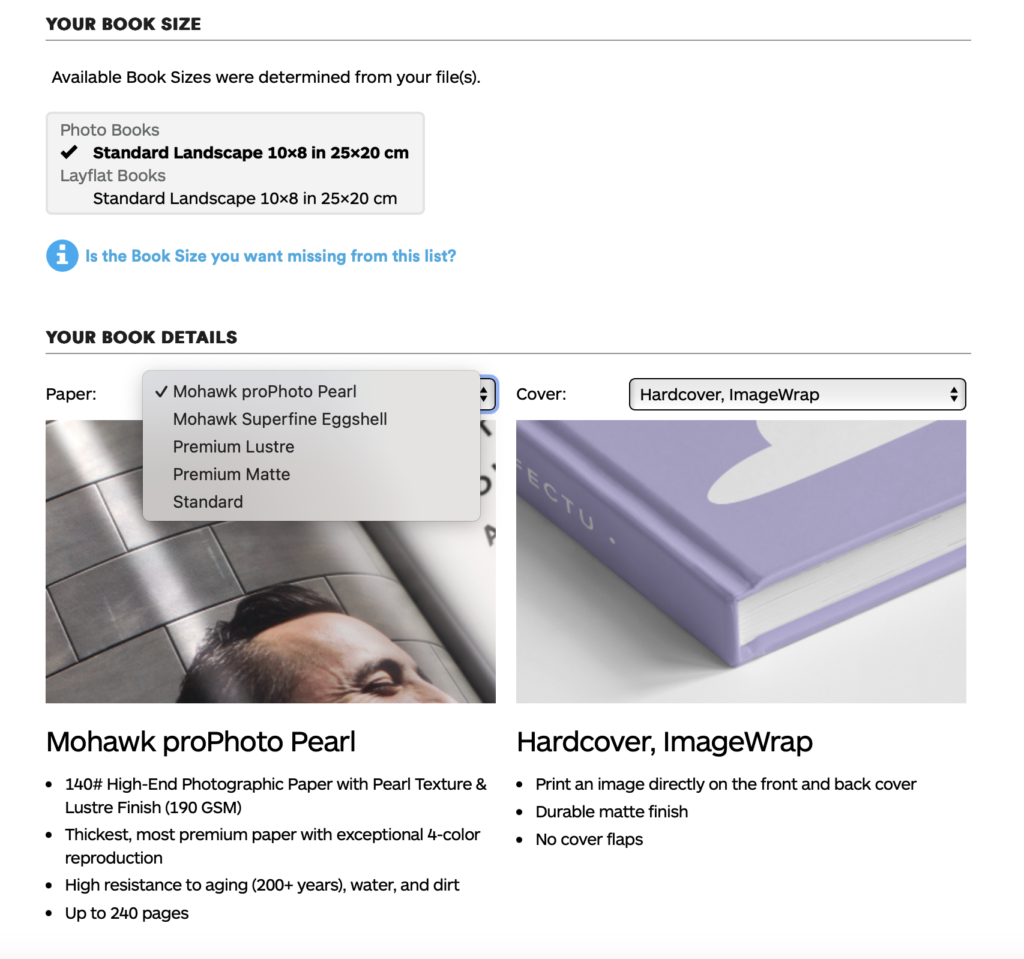
6. Log into your BLURB account (www.blurb.co.uk)
7. In top menu bar click on Design Tools and choose PDF to Book in drop down menu.
8. Click on button: Upload PDF
9. Upload your PDF files. Cover PDF: Click to choose a file or drag and drop one here Pages PDF: Click to choose a file or drag and drop one here
10. Once uploaded, choose paper, either Premium Lustre or Premium Matte and choose cover, either Hardcover, Image wrap or Soft cover.
11. Select either Logo on white page or Logo on black page. IT cost you more if you choose no logo.
12. Type Title of your book and Author’s name (your name)
13. Click button: Upload to Blurb and go to check-out and order your photobook (you need either debit or credit card)
HYPERLINK TO BLURB PHOTOBOOK
LINK TO ONLINE BLURB BOOK
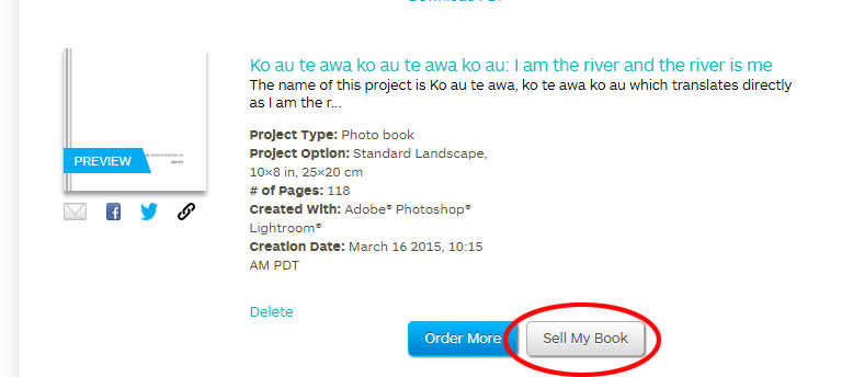
Log into your blurb account and click on Sell my book
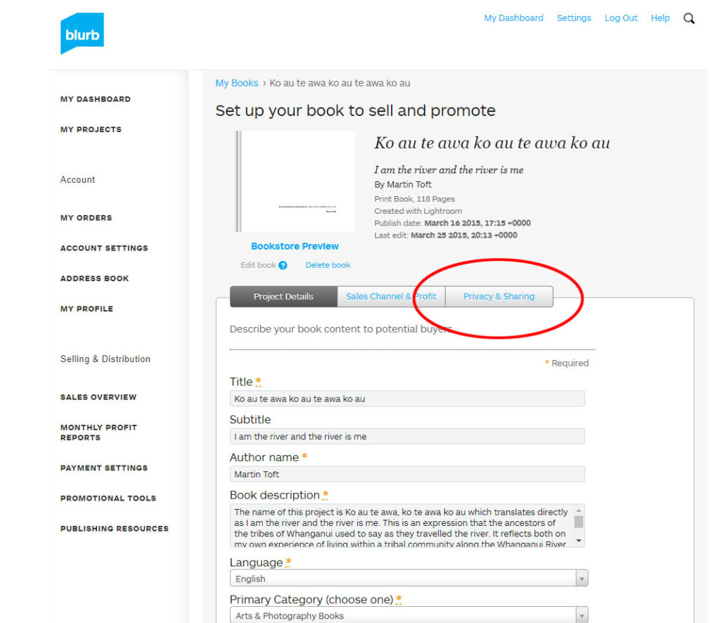
Click on Privacy & Sharing
Copy link circled in red above.
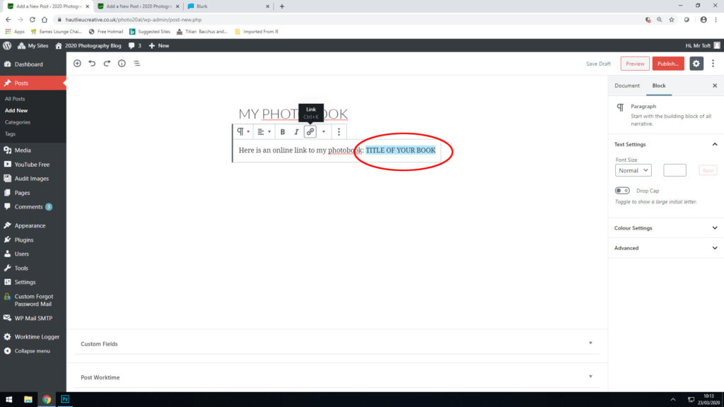
In your Photobook blog post with your final layout and design, at the very top, type title of your Photobook and copy in link from Blurb using Link button above.


:focal(1854x1307:1855x1308)/https://tf-cmsv2-smithsonianmag-media.s3.amazonaws.com/filer_public/9c/35/9c3513e4-e872-4889-9d5f-bdd468b36f62/gettyimages-1409545563.jpg)