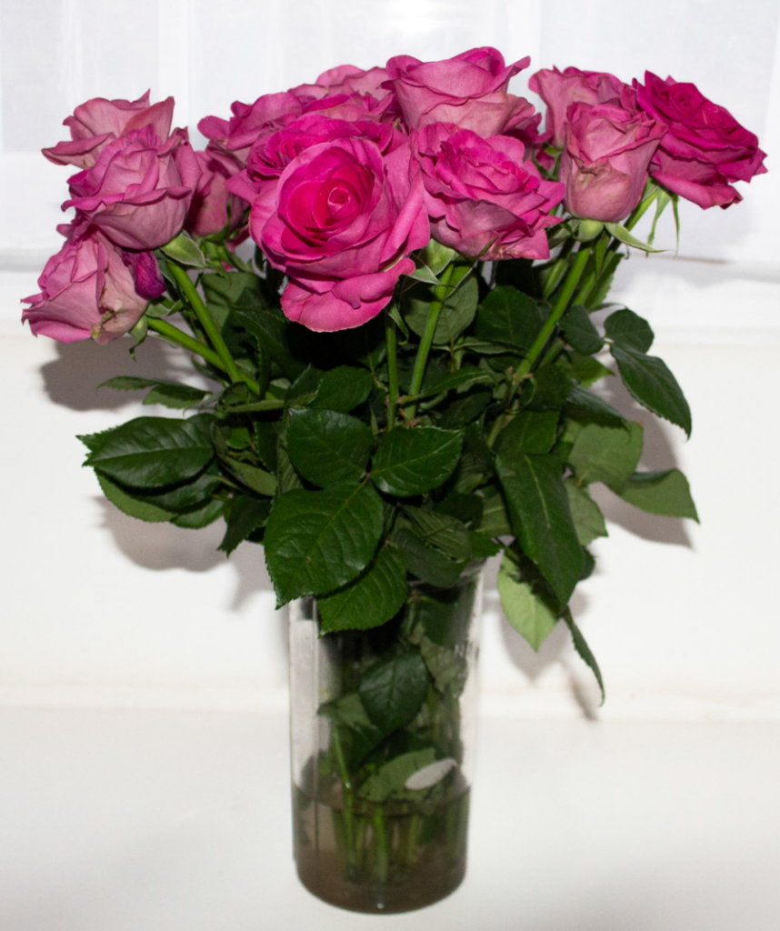
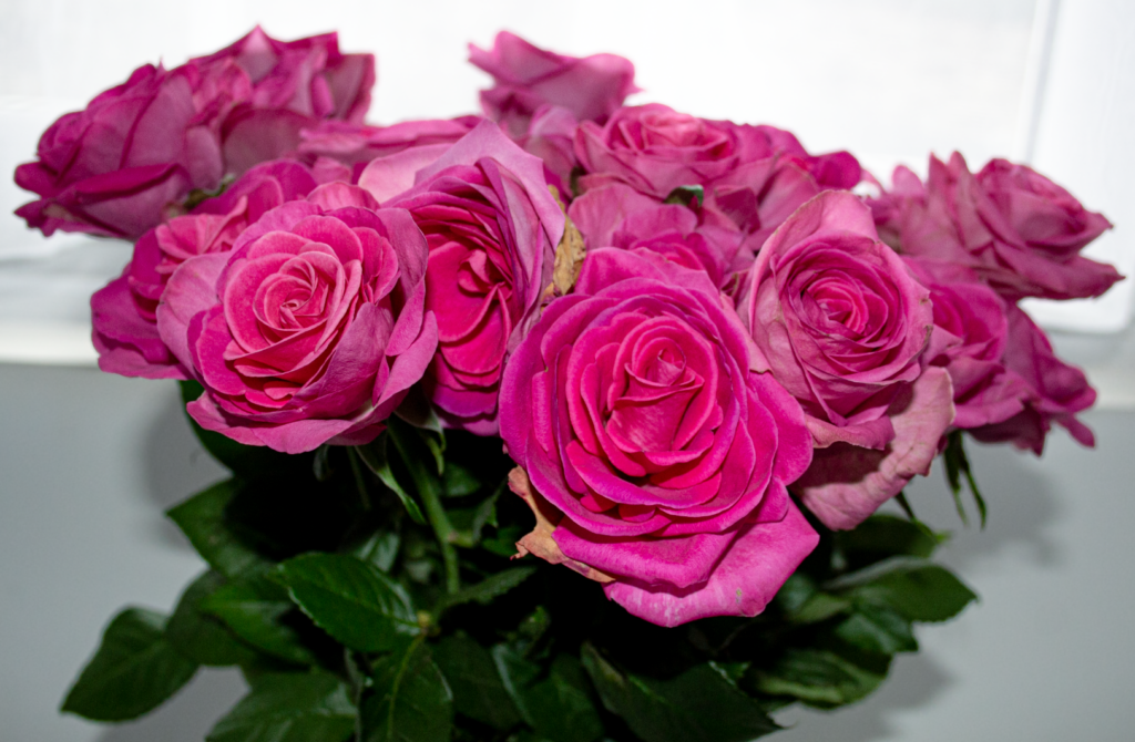
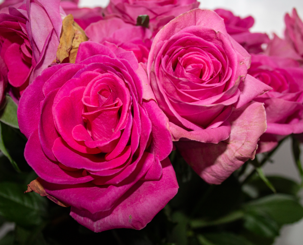
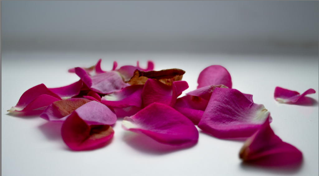
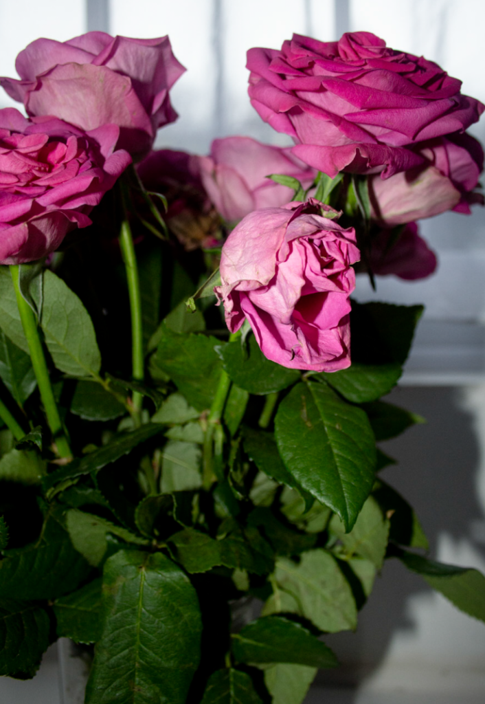
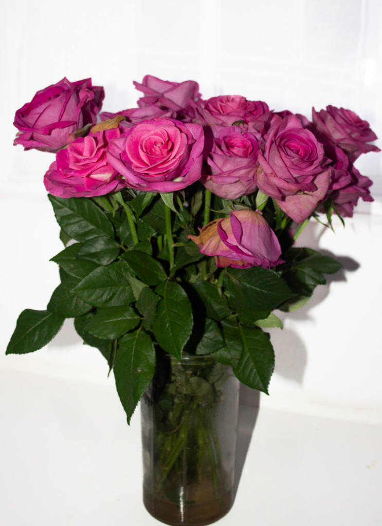
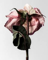
This shoot explores the theme of “Origin” through the natural life cycle of flowers, focusing on beauty, fragility, and the process of decay. I chose roses because they symbolize both growth and impermanence. I aimed to capture subtle changes in their form, by doing so I planned to visually represent mortality and the passage of time.
Location/Setting:
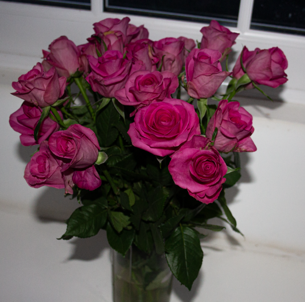
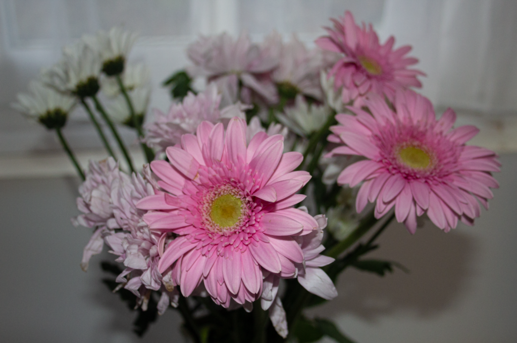
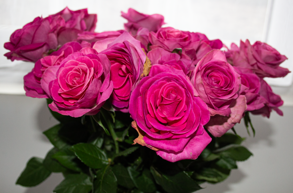
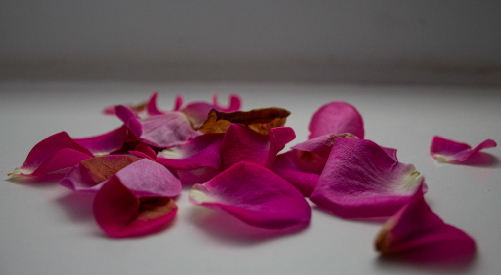
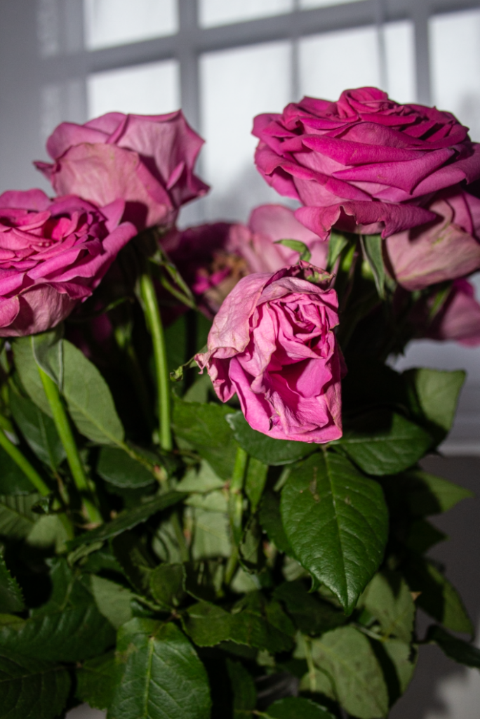
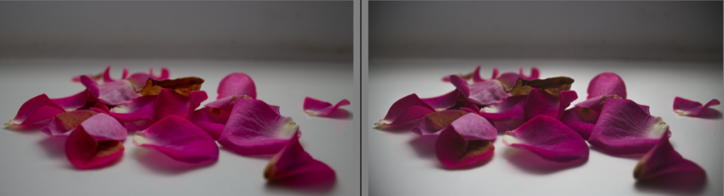
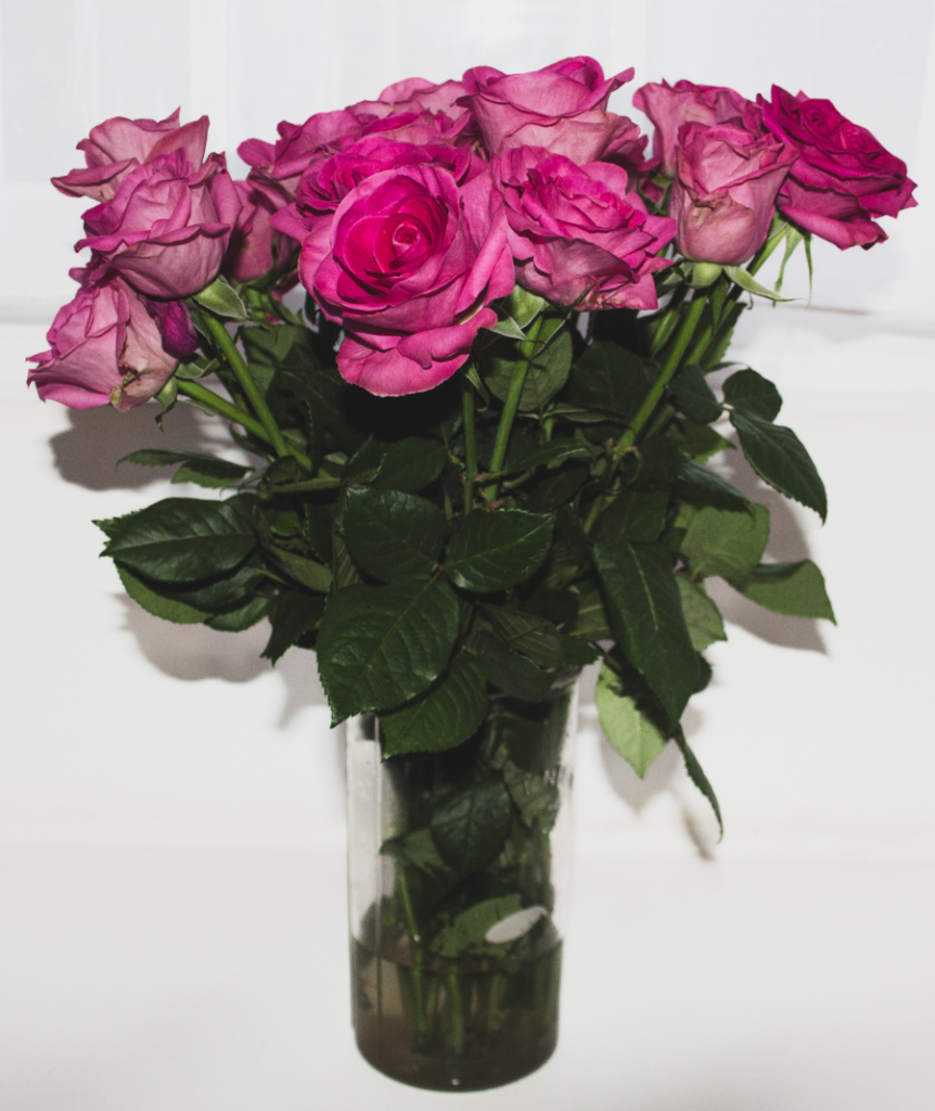
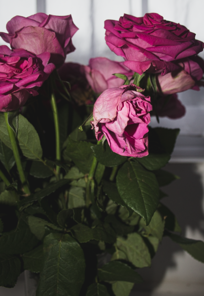
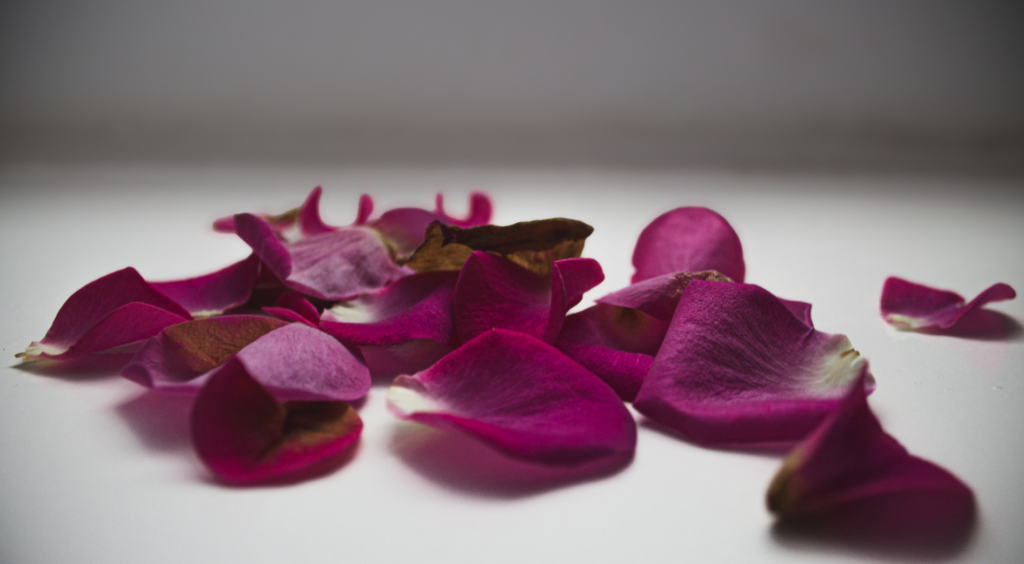
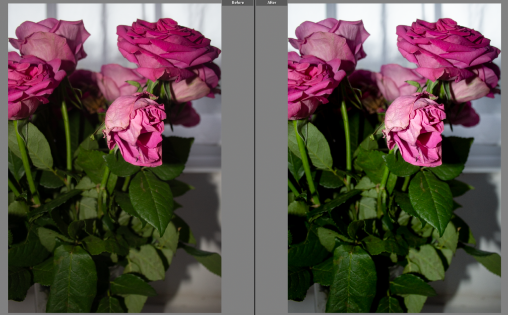
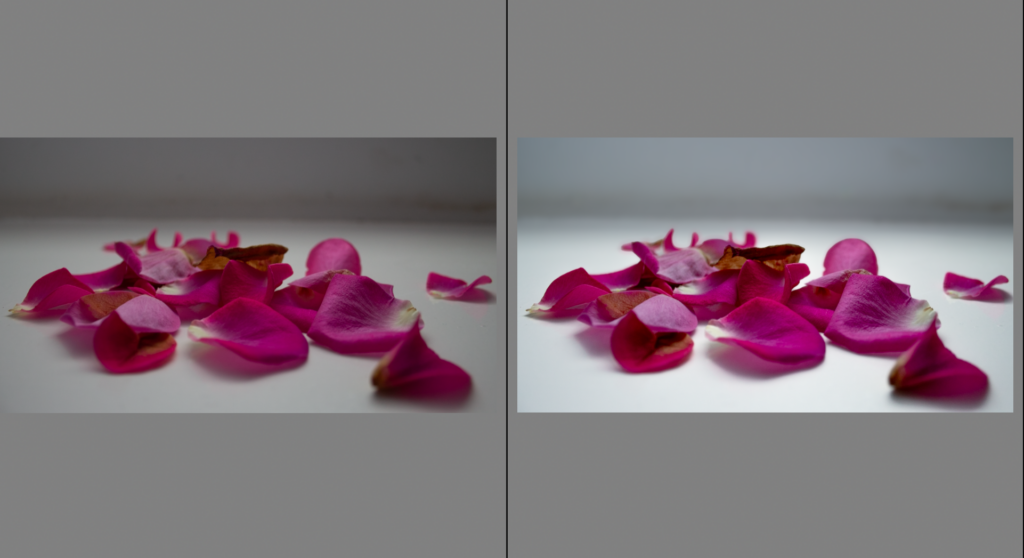
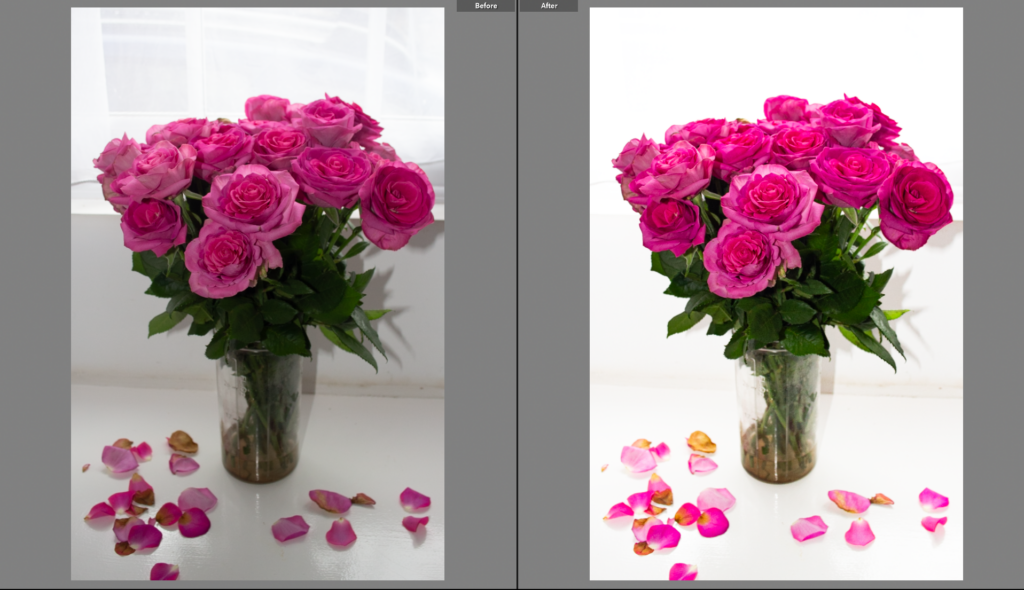
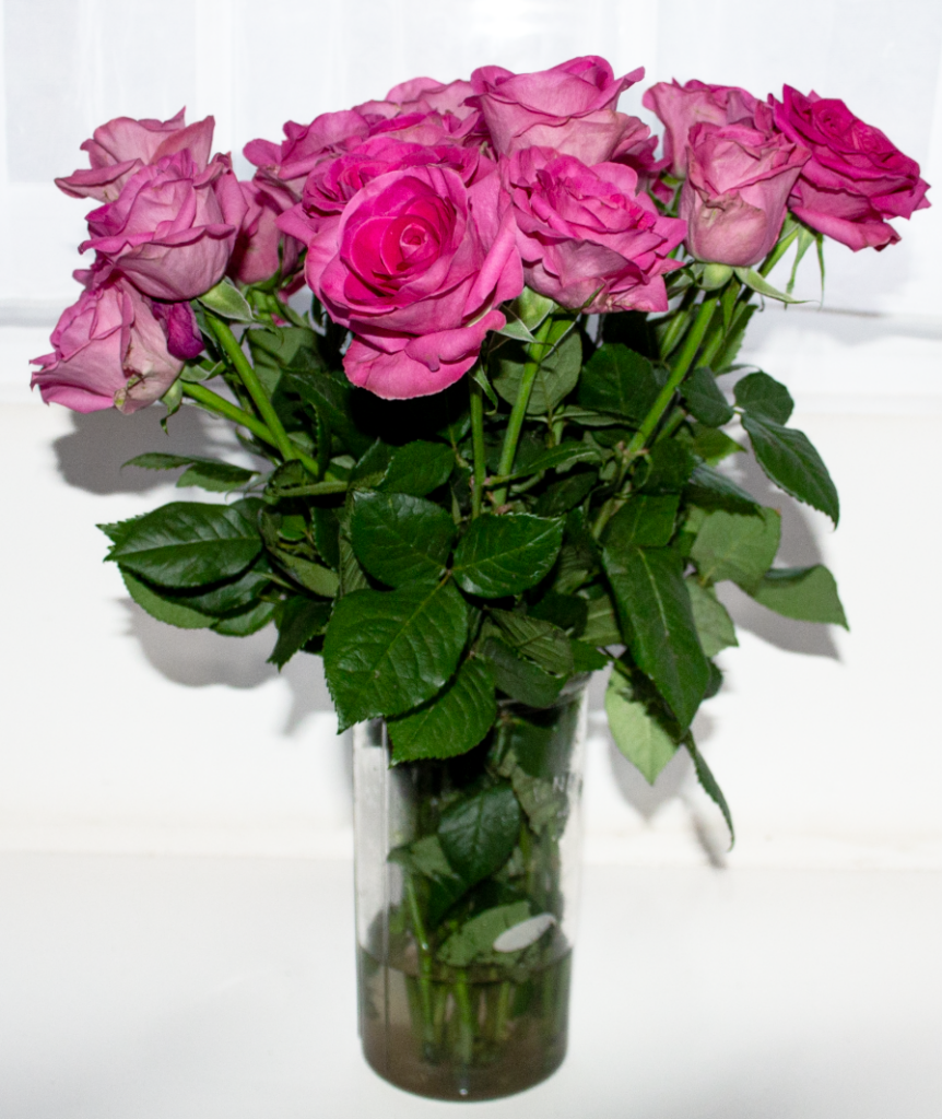
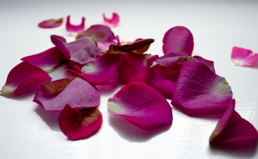
All of these images were taken in a domestic location (inside my home) against a white background to isolate the flowers and emphasize their shape, texture, and colour. I also captured some images of petals scattered on my windowsill to contrast the full bloom with the early stages of decay. I used natural window light to highlight delicate details, shadows, and show tonal variation.
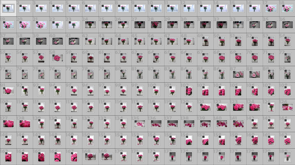
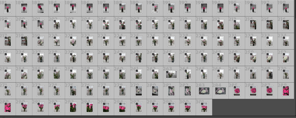
Contact Sheet
Techniques and Processes
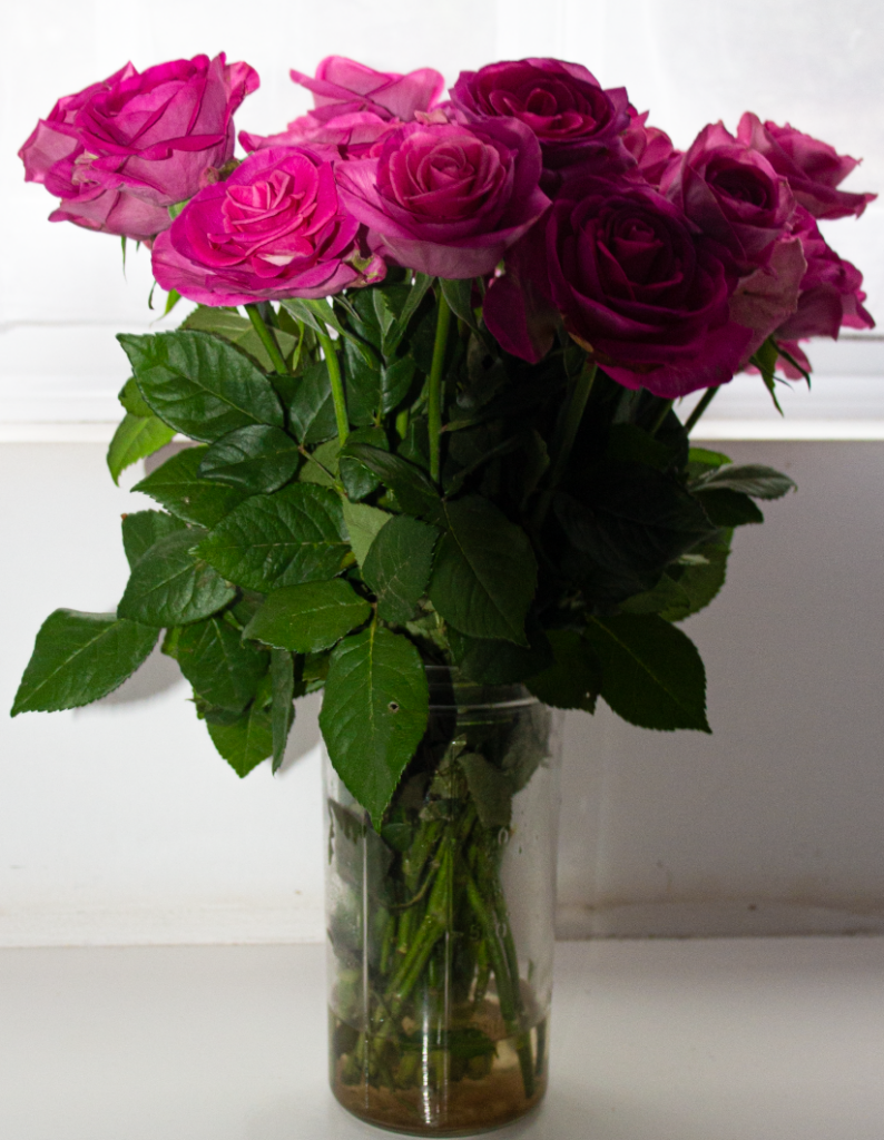
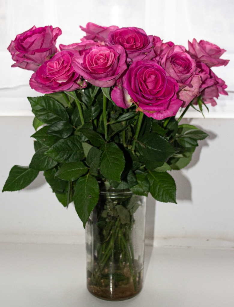
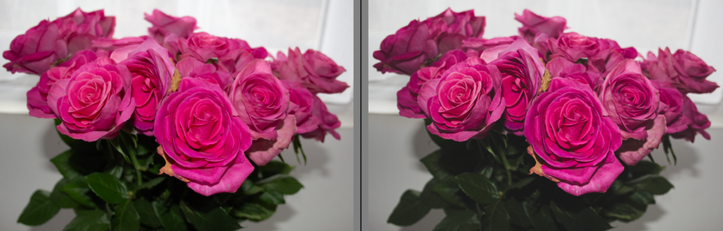
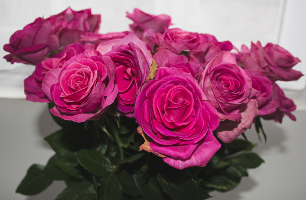
I photographed the roses from multiple angles including close-ups to show textures and subtle imperfections, and wider shots to provide context and composition.
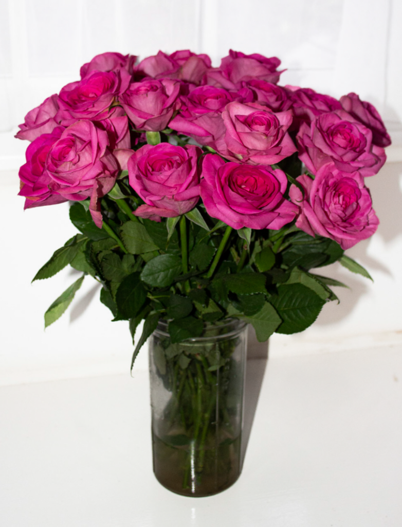
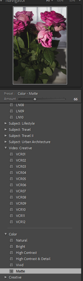
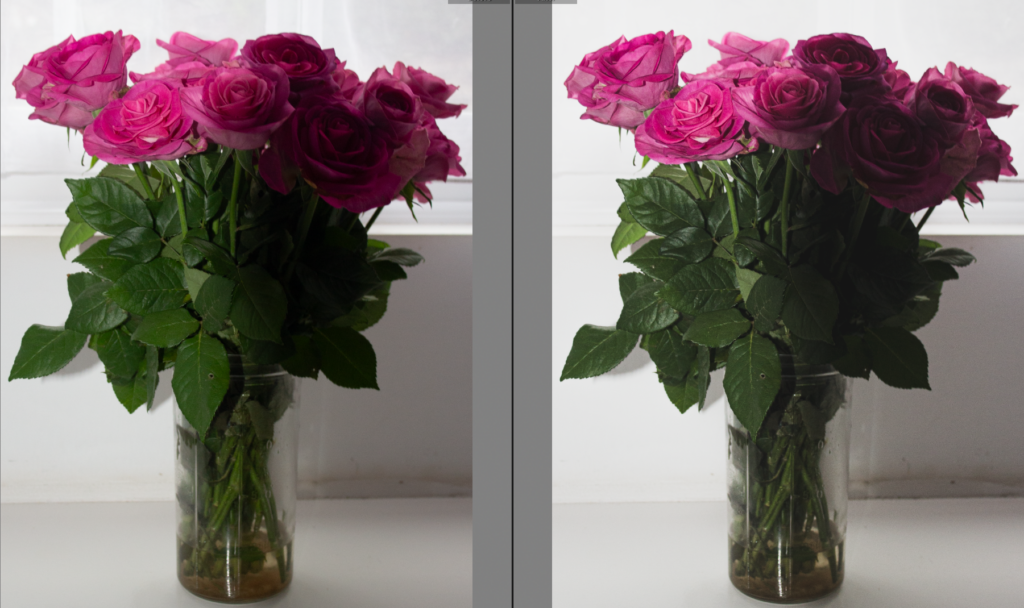
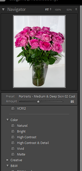
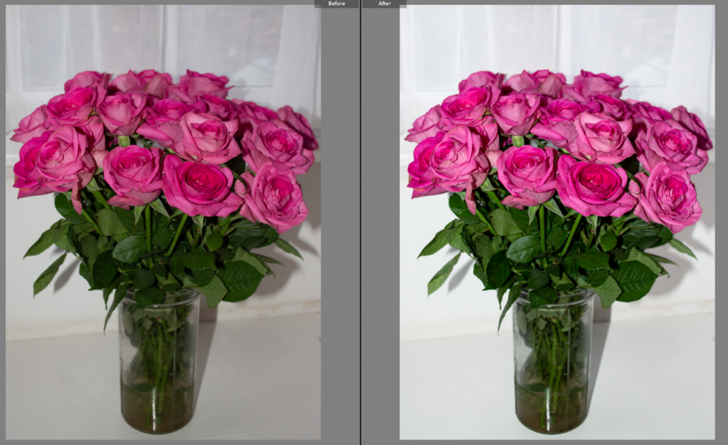
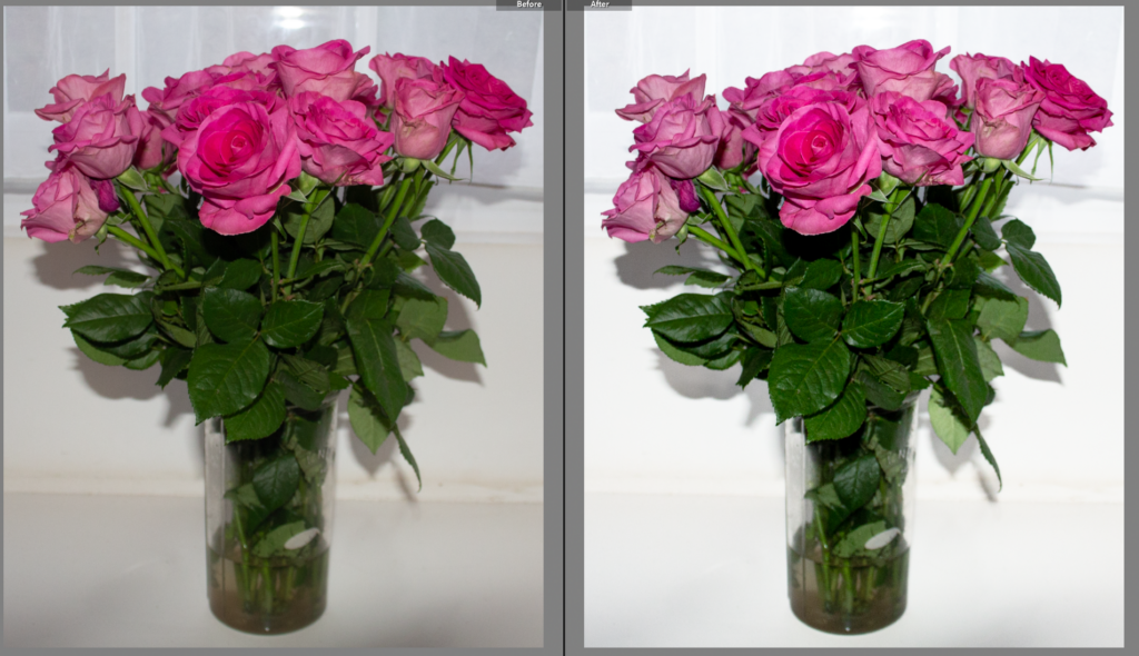
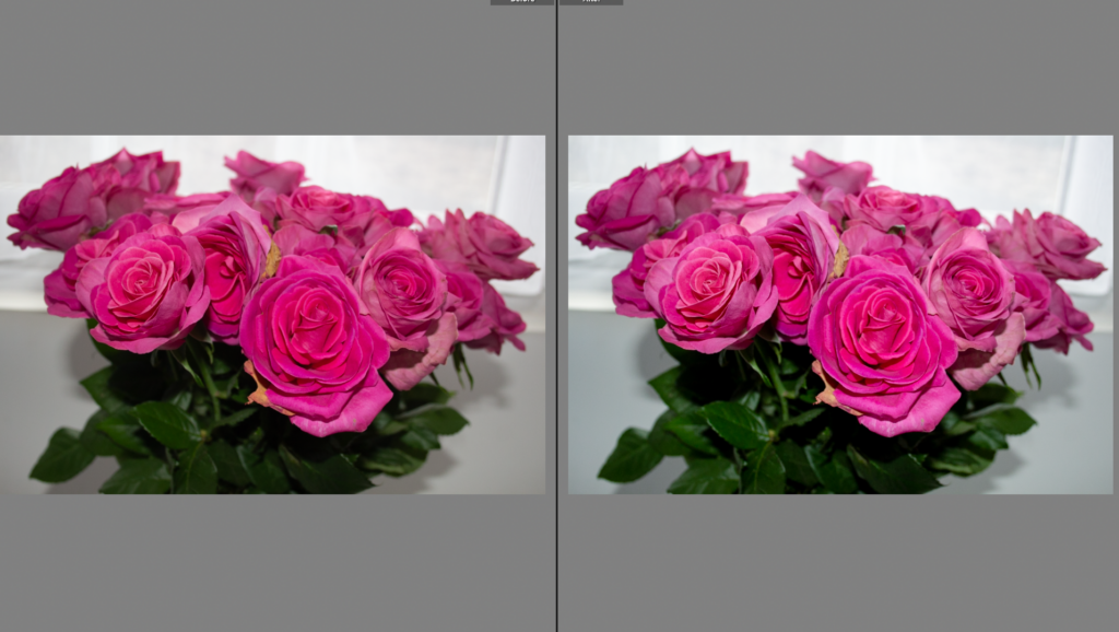
I experimented with several Lightroom presets, including “Matte” and “ Medium Deep Skin 02 Cool”, and chose the second one because it enhanced the subtle tones of the petals while creating a soft, cohesive aesthetic across the series.
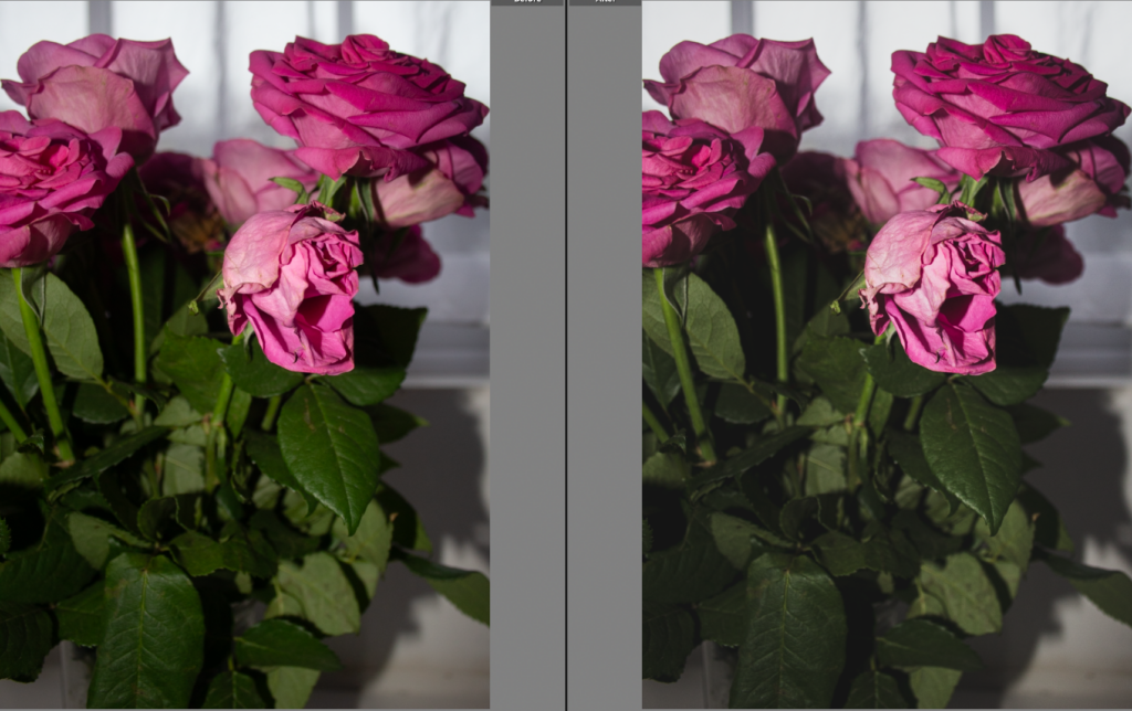
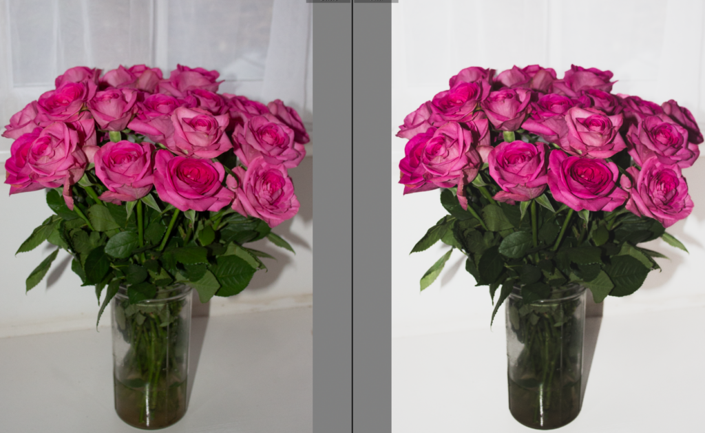
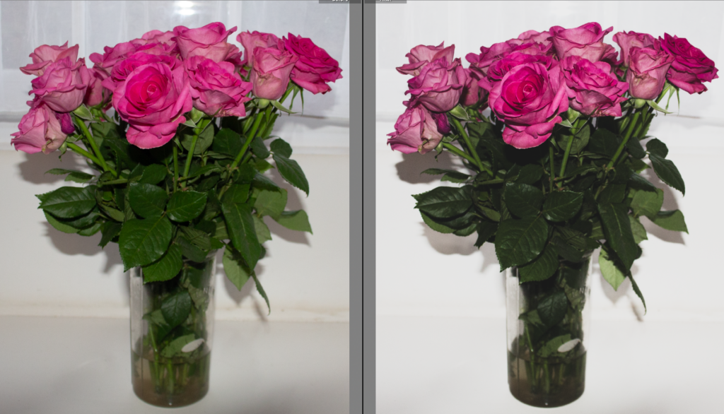
To make the flowers stand out, I selected the background on Lightroom and increased the exposure, brightening it whilst keeping the flowers and details intact.
Editing Selected Images
On Lightroom I selected my best images to edit, I aimed to capture the flowers from different angles, close up, further away and in different lights to highlight the subtle changes.
For this image I experimented with lightroom presets, I chose to use the ‘matte’ preset and adjusted it accordingly. I decided to add this preset to my other selected images to maintain consistency.
Before and After
Preset Images
Second Preset
Whilst experimenting with the presets on Lightroom I preferred this one compared to the previous one so I continued to apply it to all of my selected images to see if it works with them all.
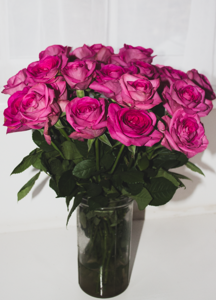
Final Images
Evaluation
This photoshoot successfully captured the fleeting beauty and fragility of the roses by showing both bloom and the beginning of decay. By using a clean white background and increased exposure it allowed the flowers to stand out and emphasize their delicate details. The “Deep Skin 02 Cool” preset I added, created a soft aesthetic and unified the images. I also experimented with different angles and compositions which strengthened the visual narrative by capturing both individual petals and the overall form. Overall, the images communicate themes of beauty, mortality and the passage of time whilst demonstrating conceptual clarity and technical control.
Next Steps:
For my next shoot, I plan to develop the theme of decay by photographing the same bunch of roses at a more dramatic stage of deterioration. I will continue to use different angles to highlight texture but against a dark background instead of a light one. I aim to experiment with lighting by adjusting natural and artificial light sources. This will allow me to build a stronger conceptual progression throughout my project.
FINAL IMAGES UPLOAD : TUE 21st APRIL All files must be added to M : Drive No new images will be accepted after this date
Examination dates: 15 hrs controlled test over 3 days Group 13B & Group 13E: Day 1: TUESDAY 28 April Day 2: THURSDAY 30 April Day 3: FRIDAY 1 May (please check your email from C. Farrow re : dates + clashes)
RULES: No use of mobile phones. No talking to each other or ask teachers for help.
You will have access to the blog to produce blog posts, BUT no access to the internet.
The blog will only be available for you to access during exam times each day between 09:00 – 15:20. In other words, you will not be able to make any changes/ improve work outside of exam times.
It essential therefore, that you have done must of the preparatory work – research/ artist case studies/ photo-shoots/ evidence of creativity, development and experimentation of images – before the exam period begins on DAY 1.
Work to be done 1. PRINTS: Final selection of images in print folder above (ready by end of Day 1: TUE 28 APRIL 2. PRESENTATION: Complete mounting all final prints 3. VIRTUAL GALLERY: Present final images using templates here: M:\Radio\Departments\Photography\Students\EXAM\Yr 13 EXAM 2026\Gallery Mock-ups 3. PHOTOBOOK: Complete design and evaluate Create online link to BLURB book browser – see below. 4. BLOG: Review and complete all supporting blogposts 5. FOLDER: Label all final outcomes and put in Exam folder 6. SIGN: Student authentication form
DEADLINE: LAST DAY OF YOUR EXAM FINAL PRINTS > PHOTOBOOK > BLOG POSTS
IN PREPARATION FOR YOUR EXAM MAKE SURE THE FOLLOWING IS READY BY THE END OF THIS WEEK (FRI 24 APRIL):
Complete and upload new images from photoshoots (DEADLINE TUE 21st APRIL) to M:drive and begin to edit in Lightroom – make sure to produce blog posts showing selection process and experimentation of images.
A draft layout of your photobook using BLURB templates in Lightroom – exam time is used to fine tune design with teacher’s approval
Review Checklist on blog for overview of work that must be completed – improve, complete and publish missing blogposts.
Structure your 3 day Exam as follows:
DAY 1: PRINTS: Complete editing photoshoots, select and prepare final prints. Make sure you have produced blogposts for each photoshoot with a clear progression of selection and editing.
BLOG: Produce blog post showing presentation ideas and create mock-up in Photoshop. Consider appropriate sizes and ways of presenting images as singles, diptych, triptych, multiple grids/ collages/ combinations in window mounts or foamboard etc.
You must save final images (see guidelines below) in print folder here by end of the day: M:\Radio\Departments\Photography\Students\Image Transfer\YR 13 PHOTOGRAPHY EXAM 2026
DAY 2: Photobook: Experiment with photobook design using BLURB in Lightroom – show variation of layouts and creativity.
Blog:Evidence of photobook process 1. Research and deconstruct photobook used as inspiration. Comment on different design element such as: feel of the book, paper, binding, format, size, cover, title, design, narrative (if appropriate), editing, sequencing, image and text.
2. Write a book specification and describe in detail what your book will be about in terms of narrative, concept and design with reference to the same elements of bookmaking as above.
3. Produce a blog post showing your layout and design process in Lightroom using a combination of print screens + annotation.
4. Final layout of every spread and write an evaluation.
5. Upload book design in Lightroom to Blurb and order your book via Blurb account. Once uploaded produce an hyperlink to book browser – see below for more details.
6. Once you have received book in the post bring into school.
Those who are not making a photobook can begin to mount up final prints and follow instruction below for Day 3.
DAY 3 PRESENTATION: Begin to mount your final prints as per your mock-up plans. Each final outcome must be labelled and velcro attached too. Make sure all your final images are presented in a folder with your name.
BLOG: Produce a virtual gallery and write a final evaluation of the exam module and your final outcome. Consider the following:
– How successful was your final outcomes? – Did you realise your intentions? – What references did you make to artists references – comment on technical, visual, contextual, conceptual? – Is there anything you would do differently/ change etc?
FINAL CHECK: Finish and publish any missing blog posts as per Checklist/ Go4School Tracking sheet and comments from teachers.
No students is allowed to leave until an authentication form is signed and teacher has signed off too.
PHOTOBOOK Make sure you have a made a blog post that charts your design decisions, including prints screens of layout with annotation and write an ongoing evaluation. Final book design must be checked and signed off by teacher.
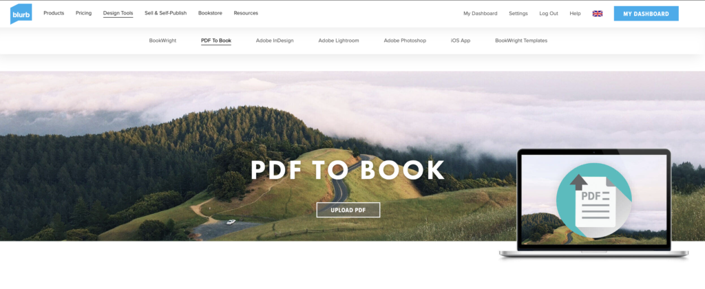
BLURB – ORDER BOOK Inside Lightroom upload book design to BLURB, log onto your account on their website, pay and order the book.
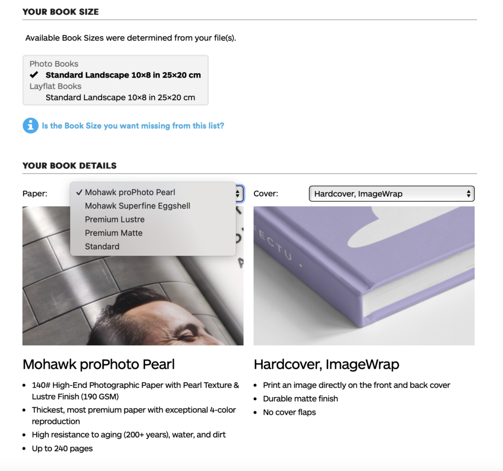
Consider spending a few extra pounds on choosing better paper, such as Premium Lustre or Premium Matte in check-out, change colour on end paper or choose different cloth/ linen if needed.
LINK TO ONLINE BLURB BOOK
Your final blog post should be an online link to you BLURB book with an evaluation. If you have already written an evaluation as part of another blog post on your book design then add the online link to that blog post and change the date to make sure it sits at the top.
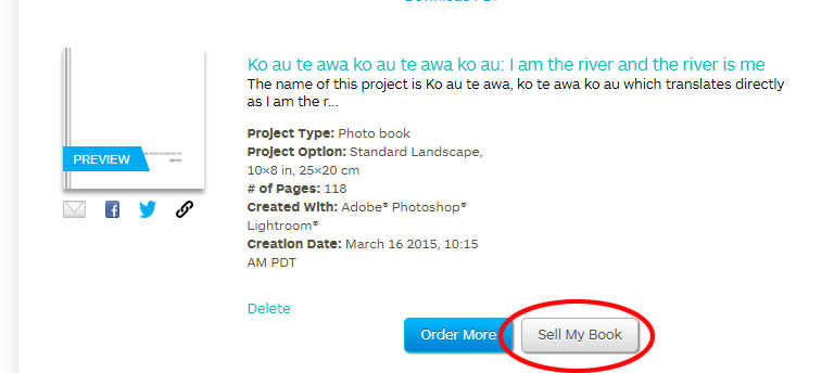
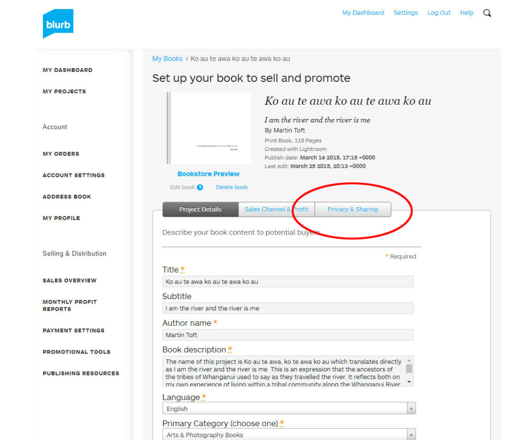
Log into your blurb account and click on Sell my book
Click on Privacy & Sharing
Copy link circled in red above.
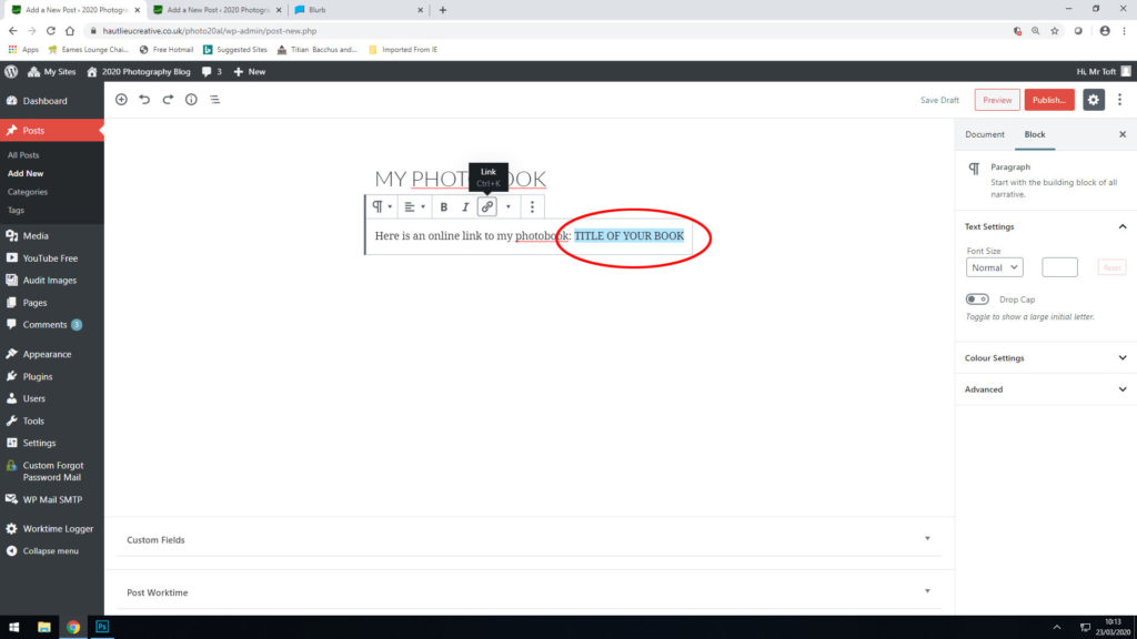
Make a new blog post: MY PHOTOBOOK and copy in link from Blurb into the title of your book using Link button above.
FINAL PRINTS Select your final prints (5-10) from various photoshoots or photobook and make a blog post showing ideas about how to present them.
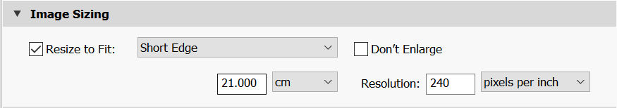
In photoshop produce a mock display (create new document size A1: 594 x 841mm) using different image sizes, for example: A3 x 2, A4 x 2, A5 x 3
PREPARE AND SAVE IMAGES FOR PRINTING:
Add your images to the print folder here…M:\Radio\Departments\Photography\Students\Image Transfer\YR 13 PHOTOGRAPHY EXAM 2026
Complete any unfinished work from last term if you have time, For example check your coursework portfolio and mount up any prints from previous projects.
File Handling and printing...
Remember when EXPORTING from Lightroom you must adjust the file size to 1000 pixels on the Short edge for “blog-friendly” images (JPEGS)
BUT…for editing and printing when EXPORTING from Lightroom you must adjust the file size to Short edge for “high resolution” images (JPEGS) like this…
A5 Short Edge = 14.8 cm
A4 Short Edge = 21.0 cm
A3 Short Edge =29.7 cm
This will ensure you have the correct ASPECT RATIO
Ensure you label and save your file in you M :Drive and then copy across to the PRINT FOLDER in IMAGE TRANSFER:
For a combination of images, or square format images you use the ADOBE PHOTOSHOP > NEW DOCUMENT + PRINT PRESETS on to help arrange images on the correct size page (A3, A4, A5)
You can do this using Photoshop, Set up the page sizes as templates and import images into each template, then you can see for themselves how well they fit… but remember to add an extra 6mm for bleed (3mm on each side of the page) to the original templates. i.e. A4 = 297mm x 210 but the template size for this would be 303mm x 216mm.
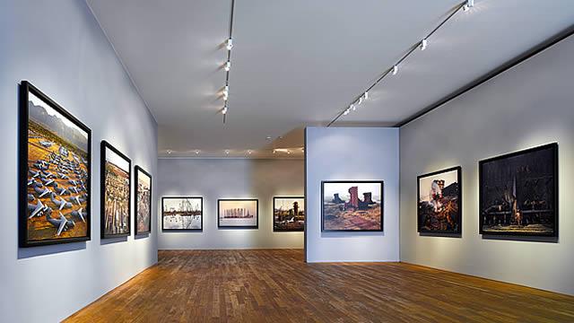
Making a Virtual Gallery in Photoshop
Download an empty gallery file…then insert your images and palce them on the walls. Adjust the perspective, size and shape using CTRL T (free transform) You can also add things like a drop shadow to make the image look more realistic…
Here is a selection of Gallery mock-ups that you can use to superimpose your own final images onto walls using Free transform tool in Photoshop.
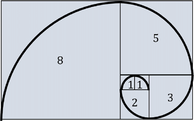
A photography project based on the Fibonacci Golden Spiral is a fantastic way to explore the intersection of nature, geometry, and art. The Golden Spiral is a logarithmic spiral that grows outward in proportion to the Golden Ratio, often seen in everything from shells to galaxies. Here are a few ideas you can explore:
Subject Focus: Capture natural forms where the Fibonacci sequence or Golden Spiral appears. Examples include:
Flowers and Seeds: Sunflowers, daisies, and pinecones are classic examples of the Fibonacci sequence in nature.
Shells and Spirals: Nautilus shells or snail shells with clear spiral structures.
Leaves and Plants: Photograph the spirals in the arrangement of leaves or the branching of trees.
Technique: Use the Golden Spiral as a compositional guide to frame your shots, placing the subject at the spiral’s center or along its curves.
2. Architectural Fibonacci
Subject Focus: Explore architecture and design. Many architectural structures are based on the Golden Ratio, whether in the layout, windows, or decorative elements.
Modern Buildings: Look for spirals in buildings or staircases, such as in the Guggenheim Museum in New York.
Classical Architecture: Use the Golden Spiral to focus on elements of classical structures that follow the Golden Ratio.
Technique: Focus on curves or spirals in architectural forms and align them with the Fibonacci spiral.
3. Human Body and Proportions
Subject Focus: The human body also follows the Fibonacci sequence in its proportions.
Portraiture: Consider photographing people in ways that use the body’s proportions (like focusing on the face, hands, or feet) and overlay the spiral to emphasize those ratios.
Gestures and Poses: Capture poses where limbs, the torso, and head align with the Golden Spiral.
Technique: Apply the Fibonacci spiral to position the person in the frame, emphasizing the symmetry of their body or movement.
4. Still Life with Fibonacci
Subject Focus: Arrange objects that have a natural spiral shape or other objects that can form a spiral pattern. For instance:
Spiral-shaped Objects: Seashells, spiral pasta, nautilus shells, or objects arranged in spiral patterns.
Fruit and Vegetables: You could use objects like apples (with their natural spiral core) or artichokes (which display a spiral pattern when viewed from above).
Technique: Use the spiral as a guide to compose the image, making sure it leads the viewer’s eye in a natural curve across the photo.
5. Macro Photography of Spirals
Subject Focus: Explore the tiny details of spiral forms in natural or man-made objects.
Insects: Close-ups of shells, spider webs, or snail shells.
Flowers: A closer look at the Fibonacci pattern of petals and seeds.
Technique: Use macro photography to get in close to the natural patterns of spirals and use the Golden Spiral to frame your shots.
6. Abstract Fibonacci
Subject Focus: Experiment with abstract forms and compositions that embody the Fibonacci spiral but don’t directly depict natural objects. For example:
Light Trails: Experiment with long exposure photography and light trails to create a spiral effect that mimics the Fibonacci spiral.
Geometric Art: Create geometric or minimalist abstract compositions that follow the Golden Ratio and Fibonacci sequence in their proportions.
Technique: Use light painting, long exposure, or digital editing to create spirals and geometric patterns.
7. Time-Lapse Fibonacci
Subject Focus: Use time-lapse photography to capture the growth or change in objects that follow the Fibonacci pattern.
Plants: Document the growth of plants like sunflowers, which exhibit Fibonacci spirals as they grow.
Sky or Clouds: Experiment with cloud patterns, the movement of the stars, or the sky, and try to capture spirals through time-lapse.
Technique: Overlay the Fibonacci spiral during post-processing to highlight the natural growth or movement aligned with the spiral’s proportions.
8. Fibonacci in Motion
Subject Focus: Capture movement that follows the pattern of a spiral or explores the natural progression of the Golden Spiral.
Water and Waves: Look for waves that curve and spiral, or create a photo of a splash where droplets follow a spiral pattern.
Dance or Movement: Photograph dancers or people in motion, capturing their flow in spirals or curved paths.
Technique: Long exposure to create the illusion of movement following the Fibonacci path.
9. Urban Fibonacci
Subject Focus: Find Fibonacci-like patterns in urban or everyday settings.
Spirals in Traffic: Capture patterns formed by roads or vehicles creating spirals, such as in roundabouts or intersections.
Staircases: Circular or spiral staircases in buildings are classic urban representations of the Fibonacci spiral.
Technique: Position your camera at angles that create spirals, or use the spiral to direct the composition.
10. Post-Processing and the Golden Spiral
Subject Focus: Capture everyday scenes, then manipulate them in post-processing to align with the Fibonacci spiral.
Digital Art: Create an image where elements naturally fit the Golden Spiral after editing. For example, placing objects along the spiral’s lines.
Creative Editing: You can use software like Photoshop to overlay the Fibonacci spiral on existing photos, highlighting how the scene can be restructured or interpreted through this geometry.
Technique: Use digital editing tools to layer the spiral grid and adjust the composition accordingly.
Tips for Success:
Golden Ratio Grid: Most modern cameras have an option to overlay a grid on the viewfinder or screen. This can help you position subjects to align with the Fibonacci spiral as you shoot.
Natural Light: Use natural light for some of your nature-based shots. The soft lighting can help highlight the details of spirals, especially in plant or shell photography.
Use of Color: Pay attention to how colors can influence the flow of your Fibonacci spiral, whether it’s complementary colors, gradients, or light-to-dark transitions.
To create a more personalized artistic take on the Fibonacci spiral, you can blend traditional mathematical principles with your own creative choices. Here are some ways to make the Fibonacci spiral uniquely yours:
1. Customize the Color Scheme
Use a specific palette: Choose colors that speak to you, like pastel shades, bold primaries, or earthy tones. You could even use gradients or color transitions.
Mood-driven color choices: Use warm tones for a vibrant, energetic feel or cool tones for a calming effect. You could even create different color gradients for each segment or quadrant of the spiral.
3. Introduce Organic Elements
Nature-inspired additions: Add elements like leaves, flowers, shells, or other organic shapes that align with the Fibonacci sequence in nature. For example, you could have a spiral of leaves growing along the curve or flower petals in each segment.
Watercolor/Ink Effect: If you are painting or digitally creating the spiral, you could incorporate watercolor textures or ink blot effects for an organic, flowing feel.
6. Play with Scale and Perspective
Make the spiral grow out from a single focal point, and manipulate perspective to make the spiral appear 3D or to add depth. You could have some parts of the spiral seem closer to you, while others fade away.
Alternatively, play with scale by varying the size of each section in the spiral. Some sections might expand dramatically, while others shrink to create a sense of movement.
7. Add Motion or Animation (for Digital Art)
If you’re working digitally, you can make the Fibonacci spiral dynamic by adding subtle animations. The spiral could gradually unfold over time, or elements within it could shift, bloom, or rotate as it grows.
Create a sense of movement by adding flowing lines that move outward or inward, creating a hypnotic effect.
8. Incorporate Light & Shadow
Use light and shadow effects to give the spiral a 3D look or create a more dramatic, atmospheric piece. Highlight certain sections with soft glows or shadow the outer portions for depth.
You could have light radiating from the center of the spiral, gradually fading as the spiral expands outward.
By mixing these ideas, you’ll be able to create a Fibonacci spiral that’s not only mathematically fascinating but also visually and emotionally expressive. You can take the strictness of the Fibonacci sequence and make it your own through creativity.
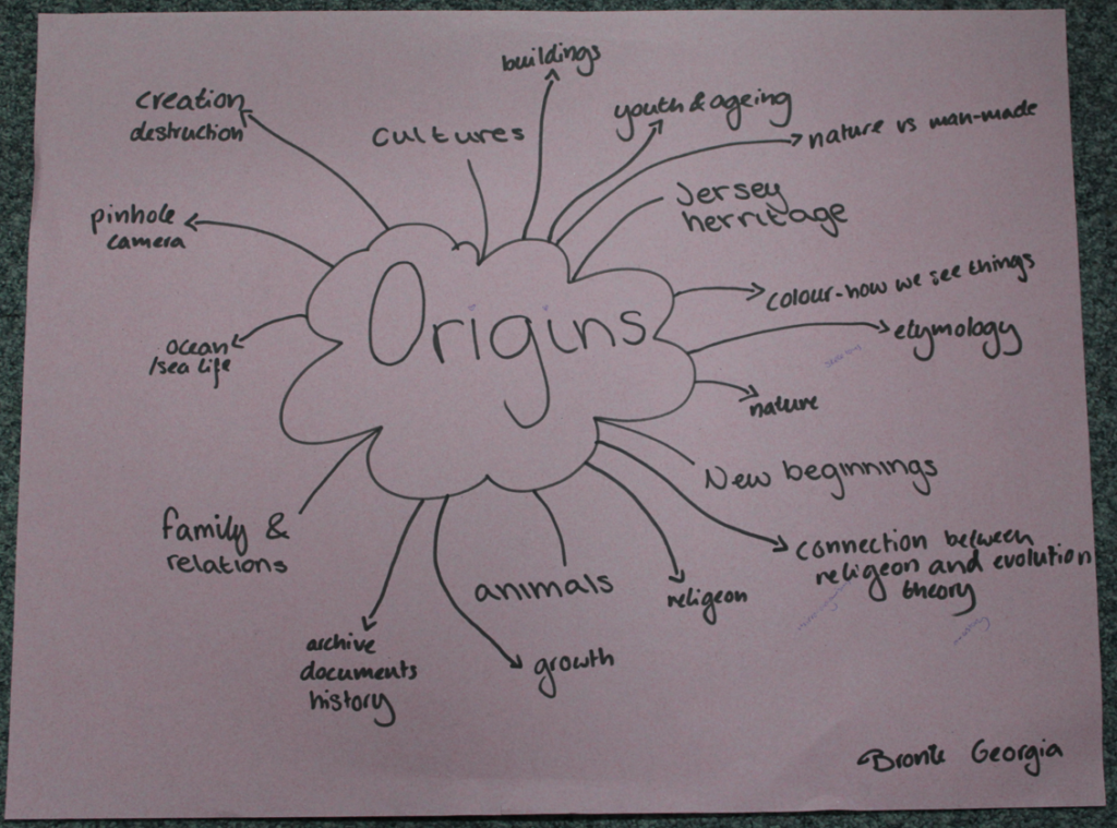
Other Origin Ideas
(AI was used in creating this list)
1. Roots and Beginnings
Concept: Explore the origins of family heritage or ancestry. Capture portraits of people in their family homes, heirlooms, or places that are significant to their lineage. You could also photograph the “roots” of a culture, like traditional clothing, food, or rituals.
Execution: Combine modern portraits with objects or spaces that represent the past, such as old photos, artifacts, or symbols.
2. Birth of a Landscape
Concept: Document natural landscapes that have an origin story, like volcanic regions, river deltas, or glacial formations. Look for ways to visually tell the story of how a landscape evolved.
Execution: Photograph at different times of day or seasons to capture the changing face of the land, or use long exposures to symbolize the passage of time.
3. Human Origins
Concept: Create a visual representation of human evolution. This could be done through a series of portraits of people from different cultures or walks of life, juxtaposed with symbolic objects representing their origins (e.g., maps, tools, fossils).
Execution: Show the diversity of human experience while hinting at the common origins we share.
4. The Origin of Objects
Concept: Explore the history and origins of everyday objects or items that have personal or historical significance. This could include things like old tools, books, or machinery.
Execution: Create close-up shots of these objects in their natural setting, paired with historical context or stories about how they came to be.
5. Life Cycles
Concept: Focus on the cycle of life—birth, growth, decay, and rebirth. You could photograph the growth stages of a plant, animal, or even a building being constructed or deconstructed.
Execution: Tell a story in a series of images, capturing different “origins” of life or objects as they evolve over time.
7. Cultural Origins
Concept: Dive into the traditional practices, rituals, or stories that give birth to cultural identities. You could photograph celebrations, ceremonies, or local artisans at work, showing the origins of cultural practices.
Execution: Portraiture combined with environmental storytelling, using the surrounding elements to express cultural significance.
8. Urban Origins
Concept: Document the origins of a city or neighborhood. This could include the historical foundation of a place, early architecture, and the evolving culture over time.
Execution: Shoot both the modern-day city and archival images (if possible) to highlight the contrast between the past and present.
9. Fossils of the Future
Concept: Imagine the origins of the future by photographing remnants or objects that might be considered “fossils” or artifacts of today. You could photograph common items like cell phones, shoes, or even food packaging and present them in a way that feels archaeological.
Execution: Present objects in stark, minimalistic ways, possibly using dark or moody lighting to give them a timeless, ancient quality.
Moodboard
Artist Research
Photograph old buildings and structures around jersey
look at jerseys history – WW2, jersey heritage sites (hogue bie), old stories, museums, castles, St Catherine’s woods, costal paths, standing stones (textures, patterns, sand dunes)
possible add ons – portraiture, colours, texture, nature, dream like long exposure of people walking to reimagine the time passed and lives lived
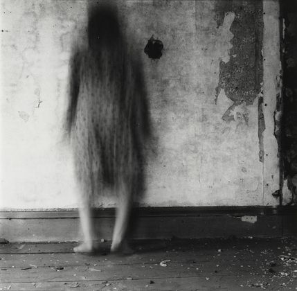
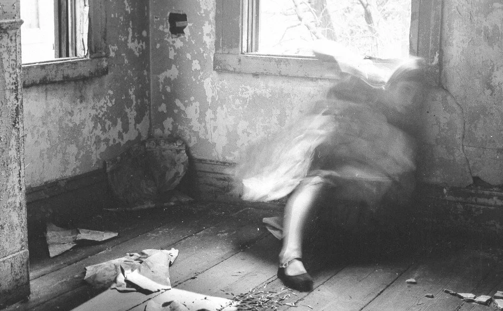
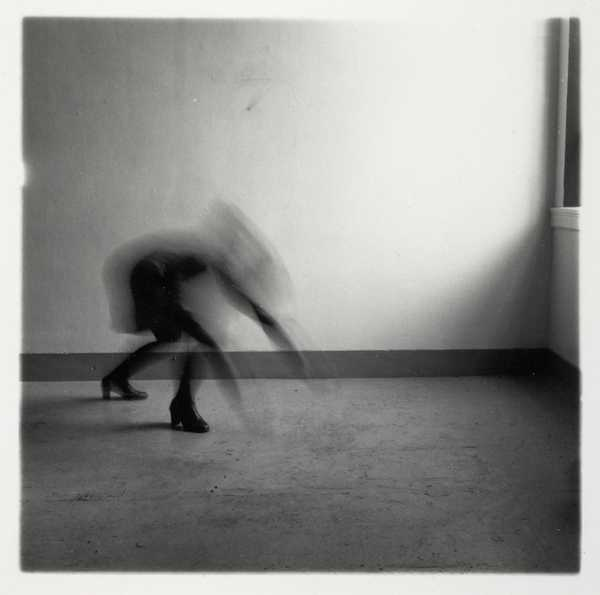
Francesca Woodman
Woodman was an American artist born April 3, 1958 in Denver, Colorado. She grew up surrounded by art her protestant father, George who was a painter and her protestant mother a sculptor. Her brother Charles Woodman grew up to be an electronic artist. Her family encouraged her to begin taking photos at age 13. In 1975 Woodman began studying at Rhode Island School of Design which offered her a honors program in Rome in 1977 before she graduated in 1978. In 1979 she moved to New York to begin her career in photography sending her work to multiple fashion photographers but after many rejections and the end of her long-term relationship she became depressed and attempted suicide in 1980. She was sent to live with her parents in Manhattan during her recovery. Woodman attended therapy and her mental health seemed to improve causing her family and friends to lower their guard leading to her to commit suicide in January 1981 at age 22.
Later she became well known for her black and white images, of which many were self portraits where she captures movement through utilising shutter speed to make the images appear ghostly by obscuring the face and parts of the body. Her use of black and white or sepia filters gives the images a timely feel as though they were taken long before they were. I chose this artist as I felt her use of movement fitted the theme of Origins as she captured passing time.
This could be implemented into my work as I’m hoping to explore Origins through the history of Jersey society by going to Jersey landmarks and Jersey Heritage sites to where I will focus my camera on the structure using a long exposure to capture people and movement around it representing the passing of time whilst the structure remains still and unchanged demonstrating how it has stood the test of time through history and shaped the changing cultures of Jersey being apart of every Jersey families ancestry.
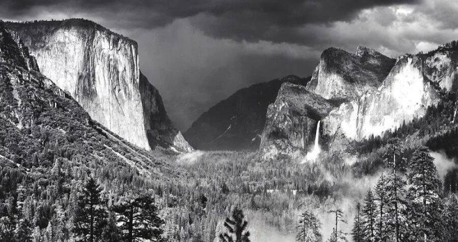
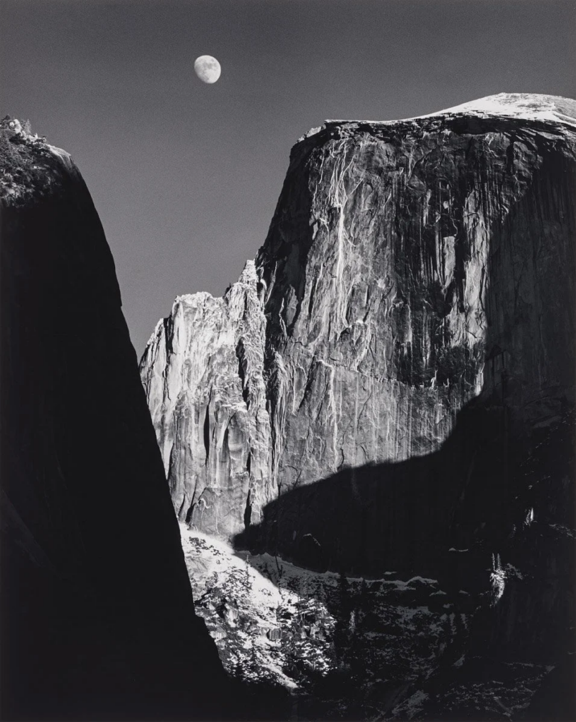
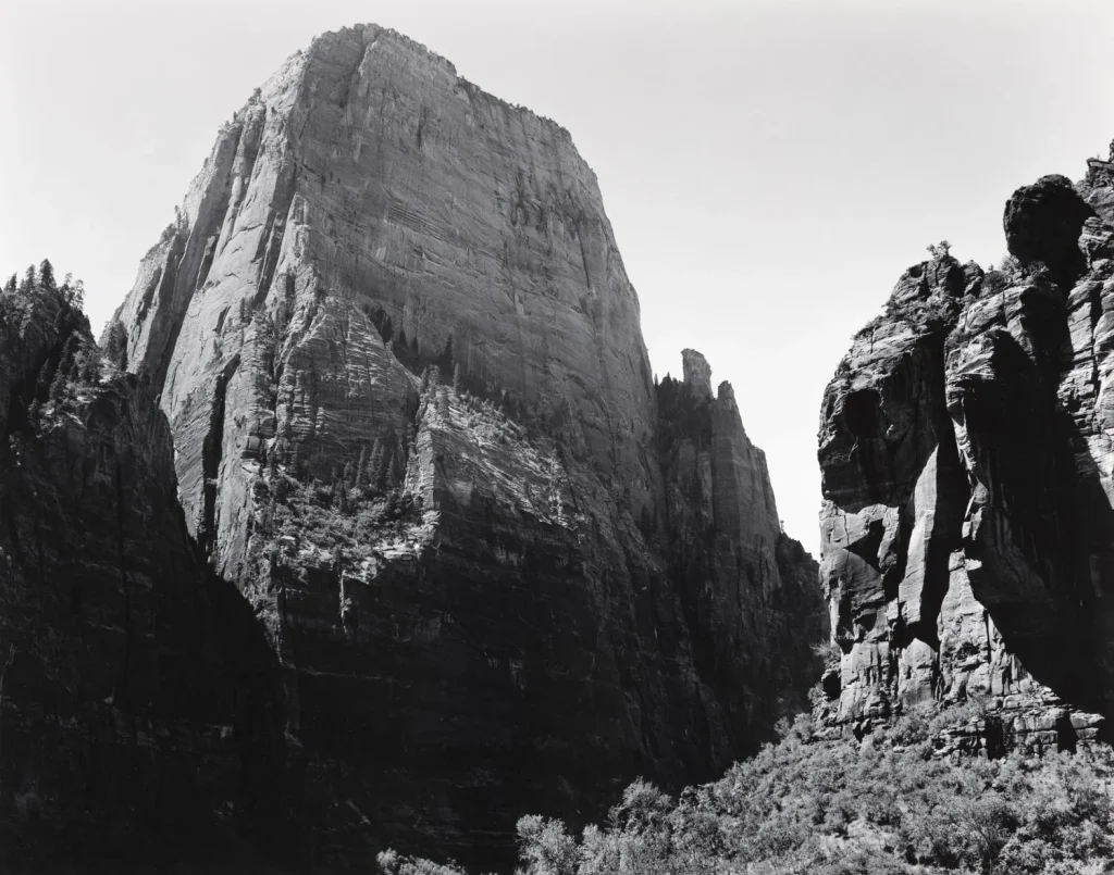
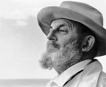
Ansel Adams born in 1902 was an American landscape photographer. Adams was a rebellious child and was pulled from school at age 12, he found focus in nature and music, in which he trained professionally in from 1914 until discovering his passion for photography later. A family trip in 1916 to Yosemite National Park with a Kodak Brownie camera, sparked his interest in national parks, which developed into his career in photography.
Ansel Adams took photos all through the 1920s where he was a part of the Sierra Club, An organisation whose mission is “to explore, enjoy, and protect the wild places of the earth; To practice and promote the responsible use of the earth’s ecosystems and resources; To educate and enlist humanity to protect and restore the quality of the natural and human environment; and to use all lawful means to carry out these objectives.” he later worked as the the custodian of the Sierra Club’s lodge in Yosemite.
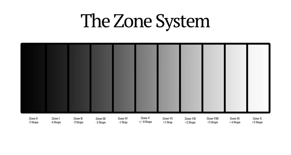
Adams believed in “true photography” where he would use the highest resolution available and full tonal range, differentiating from soft-focus pictorialism and assisted in founding the group f/64 in 1932 in California. The group also believed in Ansel’s’ mindset surrounding photography and took images of the American landscape including mountains and lakes. Ansel Adams also partnered with Fred Archer created “The Zone System” a way of representing the different tonal gradient in a black and white picture. The Zone System is still used today within photography.
The popularity of Adams work has only increased since his death in 1984.
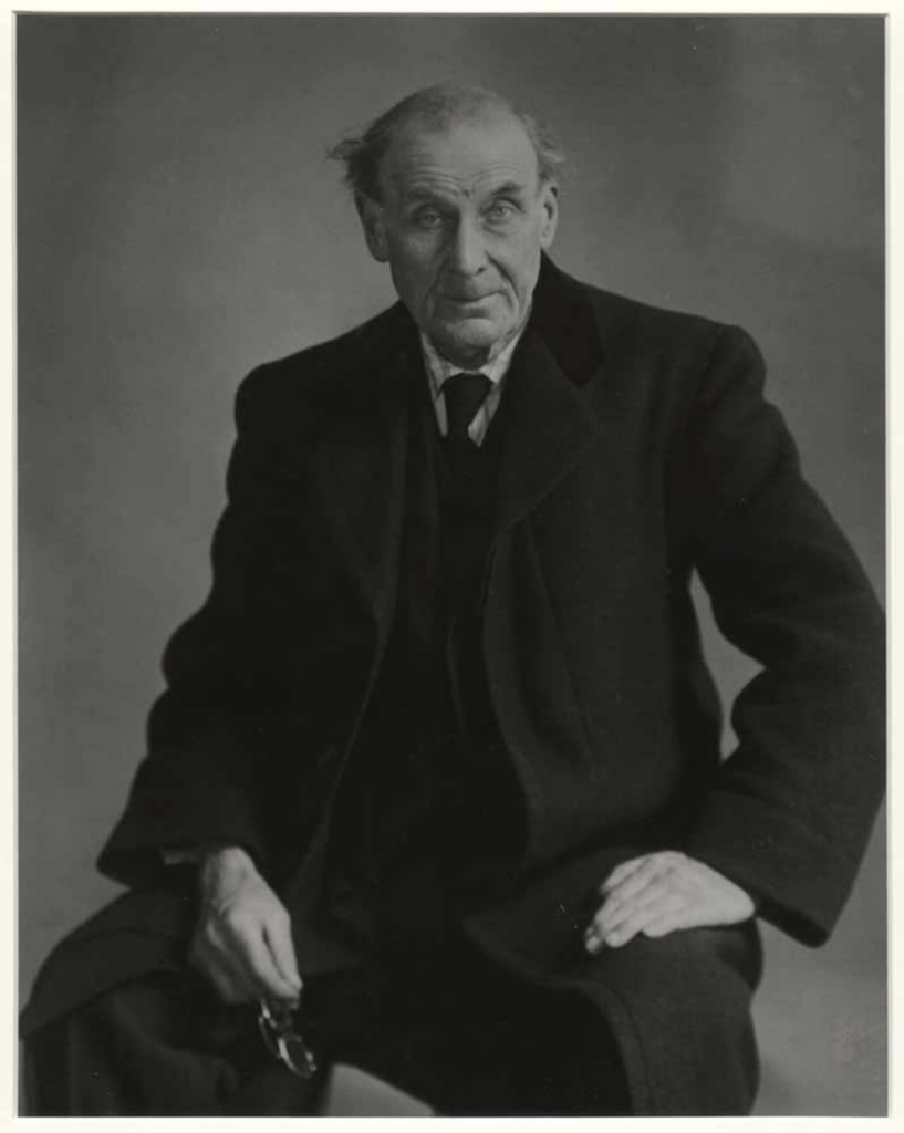
Ansel AdamsMy Image
Statement Of Intent
The project ORIGINS, will be exploring the concept of beginnings and time passing, focusing on the relationship between past and present. I will explore this concept through the study of Jersey’s history and what society on the island has looked like throughout time. I am exploring the history of Jersey in particular, because of the amount of history Jersey holds, such as all of it’s preserved sights such as Hougue bie, dating back to 4000BCE or the occupation of Jersey by the Germans during WW2 and the unrecognised impact Jersey and it’s people have made on the rest of the world through industries, crops, farming and skills developed and learnt by the jersey people. I have also found an interest in exploring history and origins of Jersey, due to the fact that I was born in Jersey myself, with both parents being born in other countries making me the first Jersey-born generation of my family, therefore my family does not have have any roots in Jersey. I will be using a documentary and staged style of photography to approach this project, focusing on lighting and colour to succeed in reimagining places of the past and the lives of the people who lived at the time, inspired by artists such as Ansel Adams who created his career in the effort of protecting and preserving America’s national parks, which also fall into the category of historical sites. Francesca Woodman and her ability to capture movement inspired my idea for the project to implement movement, representing the people and societies which have come and gone, contrasted with the stillness of historical buildings or sites having stood the test of time, carrying memories of the past to the present. I wish for my viewers to be able to step into the shoes of those who lived before us and feel a connection to the culture of Jersey which in modern day, due to technology connecting us with so many cultures and people all the time, is being lost. I also want to communicate to to my viewers just how fleeting our lives are compared with the land we live on, and obviously express where we originate from.
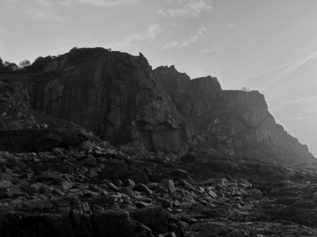
The earliest signs of human activity within Jersey dates back to 250000 years ago, before Jersey was even an island, at La Cotte De St Brelade, a significant European ice age archaeological site. Evidence was discovered of Neanderthal hunters and mammoths in 1881 and since the area has been excavated discovering evidence of it as a home base throughout the ice ages as teeth and bone fragments were found. Though the site is mostly closed off as excavations are still occurring I chose this site as an example of jersey societies earliest origins. Due to the location being so vast I felt the scenery resembled the national parks Ansel Adams took images of and attempted to use his style of photography within my own work such as wide landscapes and editing them into Black and white.
The second location was Hougue Bie the protected site has a historic tomb dating back to before the pyramids were built with remains of at least 8 people found there, along with grave goods such as pottery. The chapel above it on the hill dates to around the 12th century and was named the “Notre Dame de la Clarte” however has been modified throughout history such as in 1509 with the “Jerusalem Wall” being built then being engulfed by the “Princes Tower” in 1792 which became a popular viewing point until a communication system was built until the tower was demolished in 1923 leaving the chapel behind. During WW2 an underground bunker and bomb shelter was built on the site and now in modern times the site has been turned into a museum. I chose this location as it’s been significant throughout Jersey’s history not only during a select time period but as a changing structure throughout changes in society only to remain still standing thousands of years later.
Another location I chose born around 6000 years ago which similarly to the Hougue bie Tomb aligns with the sun on the autumn and spring equinox to allow the light to shine though, is the Dolmen de Faldouët. The site was originally also under a mound in the same way as La Hougue Bie, and the stones used to build the giant structure were transported uphill from 2 1/2 km away. Within the tomb human bones were found along with grave goods such as pottery.
The third location was Hamptonne farm. The farms history dates back to the 1400’s with the records discovered from 1445. In 1633 it was bought by Laurens Hamptonne who later declared Charles || king. Along with regular farming of crops such as Jersey Royals and traditional farm animals, the farm is also equipped for specifically apple farming and the creation of cider which was and remains a large part of Jersey’s economy . In 1988 it was bought by the national trust and turned into a museum documenting country life.
Another location was Pleamont Beach, one of the only places visible on the island where oysters grow after over farming led to the collapse of other natural oyster beds. The rock where they grow in modern times is submerged at high tide with Jersey having the second most drastic tide globally. The oyster trade began being profitable in Jersey around 1810 when fisherman began trading outside of Jersey. By 1850 Gorey had 1000 fishermen working and 300 vessels dedicated to the trade. In the 1970’s The Jersey Oyster Company began their effort to revive colonies in Jersey waters and continue to farm them today.
Though there wasn’t a specific location in mind for this shoot, a large part of Jersey’s culture has to do with Jersey Dairy industry and therefore Jersey cows. Though cows have been on the island for over 1000 years with no specification when the first appearance was it’s likely they originated from Brittany or France. The dairy industry dates back to the 1700’s which in 1763 a law prohibited farmers from importing cheaper French cattle to ensure the Jersey cow breed was protected. A law was also introduced banning the importation of any other animal milk from a company other than Jersey Dairy. In modern day there are around 6000 Jersey cows left in Jersey.
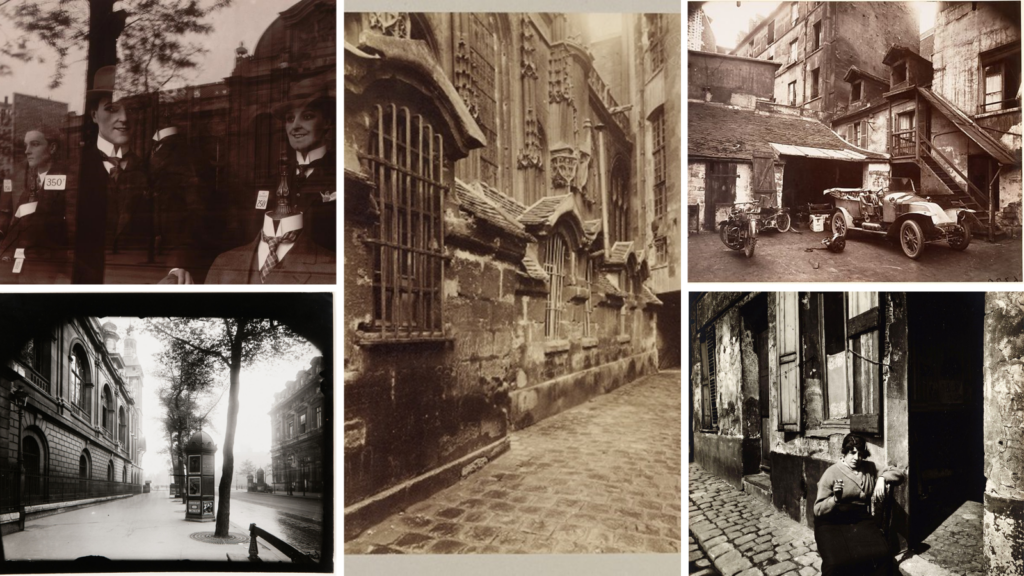
Eugène Atget was a French Photographer that was widely known for his photographs of the Capital city of France (His hometown) Paris. He started his work in the late 1880s and his work supported art students and architect. Furthermore Eugene started his photography using a large format camera with a wide lense so he could fully capture the essence of the Capital city in detail.
MoodBoard Of His Work
Why did I choose him for my artist reference?
I chose Eugène as his style reminds me of the way pictures were around the time my grandad was growing up. I am aiming to re create this style making my images as close to the original images as possible. Even though his photography is more closely linked to everyday life and the precise architecture of the streets of Paris I believe I can still incorporate parts of his work into my own. I can also branch off his work with the layout of my own images as I can compare my present pictures with those taken in the past and look for any similarities and differences
Below is also a hyperlink that takes you to the MoMA sight where more pieces of his work are visible alongside more background knowledge of him.
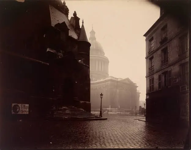
The shutter speed used seems to be quite high and quick because of the dark shadow effect that is visible around the outsides of the images. The ISO seems to be relatively low as the image is taken during high levels of light. This contrast of different lighting creates an eerie feeling to the images. This is further emphasised by the lack of people in the image as the street seems to be very desolate
Visual: This seems to be the end of a street leading up to a bank or a building of interest such as a cathedral. The reflection of the light off the stone floor creates a reflection and further increases the tone of the image giving it more of a haze look and feel. the texture seems to be quite sharp even though the camera must of been quite outdated. There also seems to be a clear pattern of the paved floor and how that type of detail and structure is then reflected towards the building of interest as that also has very high levels of detail into the architecture.
Contextual: In the late 1800s Photography was still just starting out. So pictures taken by Eugene were all incredibly powerful towards the movement of photography as they kept opening new ideas, angles and possibilities that people were yet to explore.
Conceptual: The notion behind this piece of work is that of a prestigious representation of the government. Eugene has taken into account how different factors change the way that the Cathedral is represented.
My own interpretation of Origin is in regard to my own beginning. To me the word origin signifies the start of many different subjects
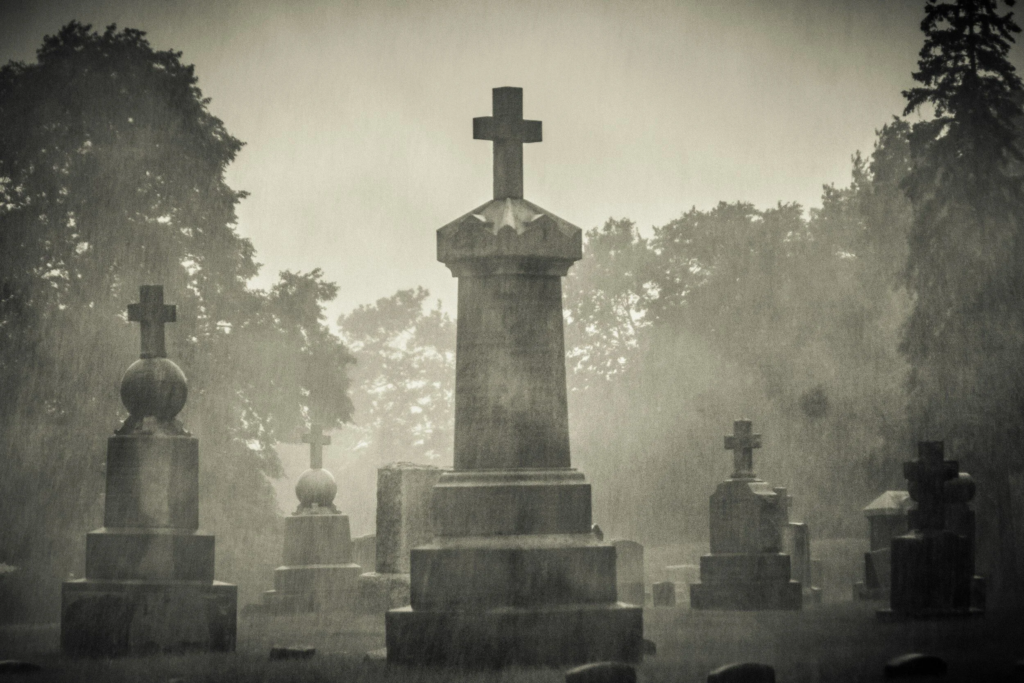
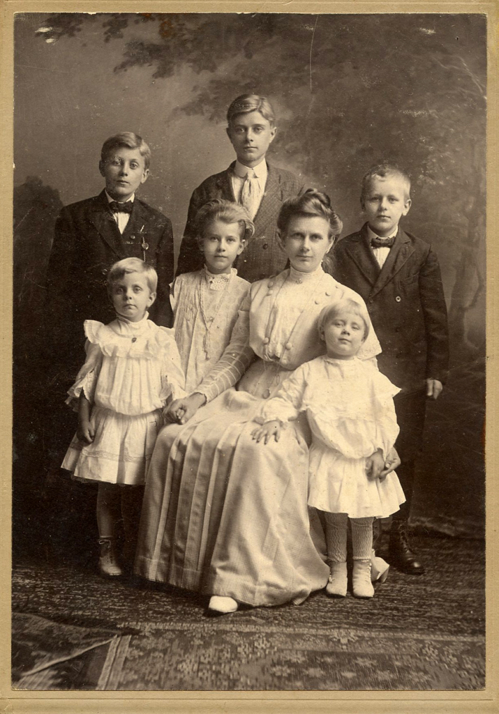
During my project I would like to further my knowledge and photography skills by obtaining a set of images that reflects exactly what it is I am studying. This is going to be through looking back at my family heritage specifically looking at the ancestors in my grandfathers family. This connotes to the project word Origin, as it is focusing on my own origin and how my family together as one has formed today. During this idea I would like to lay out and draw family trees and take pictures of the networks. Essentially then hoping to find out more information about my ancestors and then visiting old sites that hold sentimental value to my family. Another idea i would like to put into action with my findings is posing as my ancestors around buildings to resemble what life would of been like at the time of them being alive. This matters to me as my grandad himself has dementia and is therefore unable to communicate with me about anything to do with his past. I know from prior conversations many years ago however, that we was in Jersey during the time of the occupation and i would really like to get a sense of how that impacted not only his life but my family as a whole. I intend to begin my study this weekend of the 7th of march hopefully looking to visit graveyards and old sites for a photoshoot that summarises my ancestors lives
I would then like to further this idea yet again by posing as my family members in images and re creating them. For my final set of images I will display them in a photobook side by side and write a caption below with certain key points from the photographs for example when they were taken and where also including who’s in the pictures.
If you are planning on exploring visual storytelling and producing another publication or picture-story, i.e photobook, zine, photo-essay as final outcomes in the exam, then make sure you have completed and published the following blog posts:
RESEARCH & ANALYSIS
CONCEPT & NARRATIVE
DESIGN & LAYOUT
FINAL LAYOUT & EVALUATION
BLOG POST: RESEARCH & ANALYSIS
1. Research a photobook and describe the story it is communicating with reference to: subject-matter (what is it about?) genre (landscape, portraiture, still-life etc) approach to image-making (documentary, tableaux, conceptual etc.)
2. Who is the photographer? Why did he/she make it? (intentions/ reasons) Who is it for? (audience) How was it received? (any press, reviews, awards, legacy etc.)
3. Deconstruct the narrative, concept and design of the book and apply theory above when considering:
Book in hand: how does it feel? Smell, sniff the paper.
Paper and ink: use of different paper/ textures/ colour or B&W or both.
Format, size and orientation: portraiture/ landscape/ square/ A5, A4, A3 / number of pages.
Title: literal or poetic / relevant or intriguing.
Narrative: what is the story/ subject-matter. How is it told?
Structure and architecture: how design/ repeating motifs/ or specific features develops a concept or construct a narrative.
Design and layout: image size on pages/ single page, double-spread/ images/ grid, fold- outs/ inserts.
Editing and sequencing: selection of images/ juxtaposition of photographs/ editing process.
Images and text: are they linked? Introduction/ essay/ statement by artists or others. Use of captions (if any.)
UNDERSTANDING PHOTOBOOKS: NARRATIVE, EDITING, SEQUENCING, DESIGN, FORM, FUNCTION
Earlier in the academic year we looked at narrative in photography. Click on the blog post below to refresh your knowledge and understanding and revisit some of the theories around visual storytelling.
Narrative is essentially the way a story is told. For example you can tell different narratives of the same story. It is a very subjective process and there is no right or wrong. Whether or not your photographic story is any good is another matter.
Narrative is constructed when you begin to create relationships between images (and/or text) and present more than two images together. Your selection of images (editing) and the order of how these images appear on the pages (sequencing) contributes significantly to the construction of the narrative. So too, does the structure and design of the photo-zine or photobook.
However, it is essential that you identity what your story is first before considering how you wish to tell it. Planning and research are also essential to understanding your subject and there are steps you can take in order to make it successful. Once you have considered the points made between the differences in narrative and story complete the following:
CASE-STUDIES:
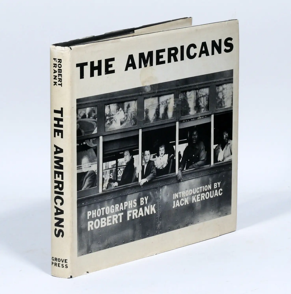
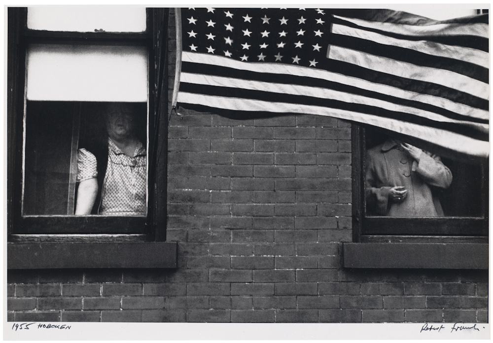
PHOTOBOOKS: In October of 1958, French publisher Robert Delpire released Les Américains in Paris. The following year Grove Press published The Americans in New York with an introduction by American writer, Jack Kerouac (the book was released in January 1960).
Like Frank’s earlier books, the sequence of 83 pictures in The Americans is non-narrative and nonlinear; instead it uses thematic, formal, conceptual and linguistic devices to link the photographs. The Americans displays a deliberate structure, an emphatic narrator, and what Frank called a ‘distinct and intense order’ that amplified and tempered the individual pictures.
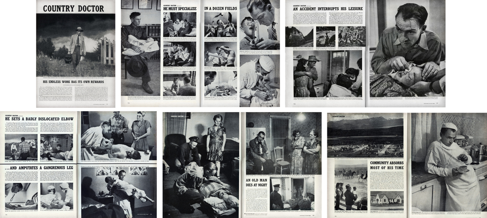
PHOTO-ESSAY: The life of a country doctor in Colorado’s Rocky Mountains
“A photo is a small voice, at best, but sometimes – just sometimes – one photograph or a group of them can lure our senses into awareness. Much depends upon the viewer; in some, photographs can summon enough emotion to be a catalyst to thought”W. Eugne Smith
W. Eugene Smith compared his mode of working to that of a playwright; the powerful narrative structures of his photo essays set a new benchmark for the genre. His series, The Country Doctor, shot on assignment for Life Magazine in 1948, documents the everyday life of Dr Ernest Guy Ceriani, a GP tasked with providing 24-hour medical care to over 2,000 people in the small town of Kremmling, in the Rocky Mountains. The story was important at the time for drawing attention to the national shortage of country doctors and the impact of this on remote communities. Today the photoessay is widely regarded as representing a definitive moment in the history of photojournalism.
TRADITIONAL PICTURE STORY
Here is a Powerpoint with more information about how to construct a Traditional Picture Story that includes individual images such as:
Person at Work
Relationship Shot
Establishing Shot
Detail shot
Environmental Portrait
Formal Portrait
Observed Portrait
ZINES
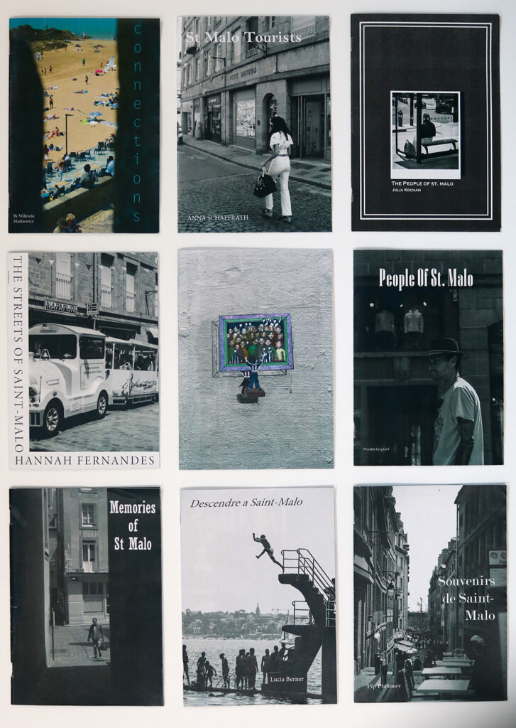
Explore more alternative zine designs, structures and bindings here
A selection of zines from trip to St Malo in 2023
Zine: Accordion
Zine: Beak
Zine: Fold-out
Zine: Spring
BLOG POST: CONCEPT & NARRATIVE
1. Write a book specification and describe in detail what your book will be about in terms of narrative, concept and design with reference to the same elements of bookmaking as above.
Narrative:What is your story? Describe in:
3 words
A sentence
A paragraph
Design: Consider the following
How you want your book to look and feel
Paper and ink
Format, size and orientation
Binding and cover
Title
Structure and architecture
Design and layout
Editing and sequencing
Images and text
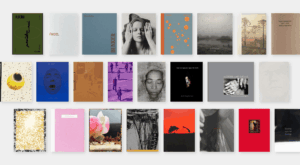
2. Produce a mood-board of design ideas for inspiration. Look atBLURB online book making website, photo books from photographers or see previous books produced by Hautlieu students on the table in class.
Produce screen prints of layout ideas as you progress and add to the blog for further annotation, commenting on page layout > narrative > sequencing > juxtaposition of pictures > design elements > title > use of text / image captions
Front page of the archive material zine
Contrast:
Front page of landscape vs front page of archive, title text will also be added to the landscape zine but I am first experimenting with the cover itself
Compliment:
I ultimately decided to go with this style of replicating the vintage effects in my own images, but I will remove my name from the second one and highlight that it is archive material and will add image captions to show the original photographer of each image as well as what the picture is showing.
Zine 1 (A3 zine)
Current front cover for each zine, I quite like the complimentary style but as I experiment I may switch back to contrast or potentially do a mix of both throughout.
Main zine (reduced quality for smaller file size, only for presentation purposes here)
BLOG POST: FINAL LAYOUT & EVALUATION
Your final blog post should be an online link to you BLURB book with an evaluation – see below for instructions
EVALUATION: Upon completion of photobook make sure you evaluate and reflect on your learning and final outcomes. Comment on the following:
What references did you make to artists references? comment on technical, visual, contextual, conceptual?
How successful was your final outcomes (book, film, prints etc)?
Did you realise your intentions?
UPLOAD BOOK TO BLURB
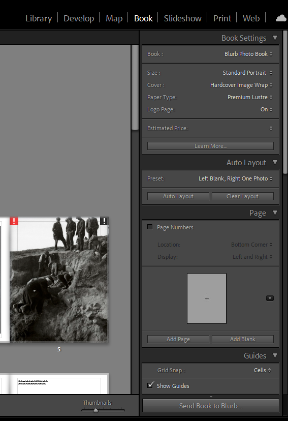
BLURB – Upload layout via internet
Inside Lightroom upload book design to BLURB by clicking on button: Send Book to Blurb. Then log onto your account on the Blurb website, go dashboard where you book is stored and go through check out process and order the book.
Consider spending a few extra pounds on choosing better paper, such as Premium Lustre in check-out, change colour on end paper or choose different cloth/ linen if needed.
BLURB – Upload pdf (if no internet) Once your final design has been signed off by the teacher follow these steps to upload book as a PDF to Blurb.
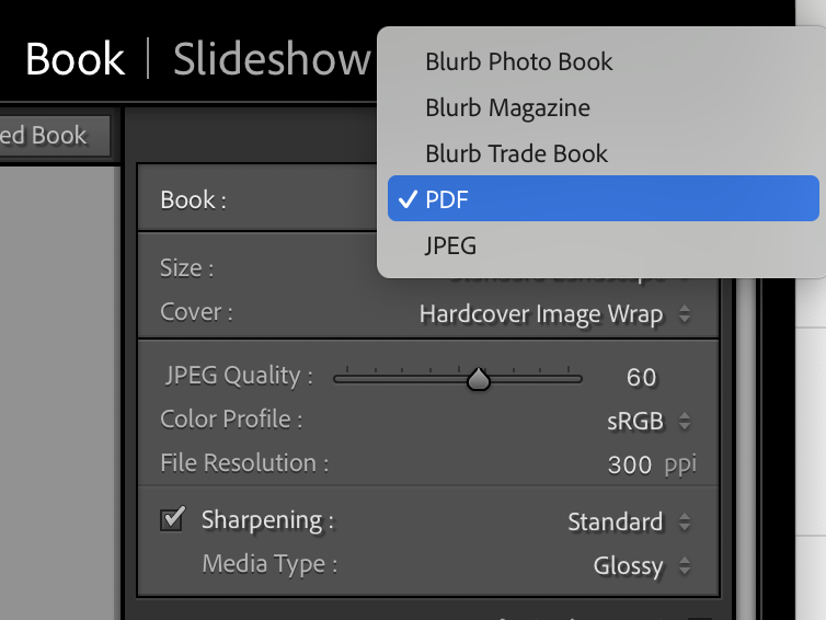
1. In Lightroom top right corner click drop-down menu in Blurb Photo Book and choose PDF. Make sure you increase JPEG Quality to 100 %.
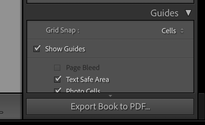
2. In bottom right corner click button: EXPORT BOOK to PDF
3. Save PDF as filename: PHOTOBOOK in folder in your student folder on M:drive.
4. Move PDF file: PHOTOBOOK toOne Drive in Office 365.
5. At home download above file from One Drive and save on your personal computer.
6. Log into your BLURB account (www.blurb.co.uk)
7. In top menu bar click on Design Tools and choose PDF to Book in drop down menu.
8. Click on button: Upload PDF
9. Upload your PDF files. Cover PDF: Click to choose a file or drag and drop one here Pages PDF: Click to choose a file or drag and drop one here
10. Once uploaded, choose paper, either Premium Lustre or Premium Matte and choose cover, either Hardcover, Image wrap or Soft cover.
11. Select either Logo on white page or Logo on black page. IT cost you more if you choose no logo.
12. Type Title of your book and Author’s name (your name)
13. Click button: Upload to Blurb and go to check-out and order your photobook (you need either debit or credit card)
HYPERLINK TO BLURB PHOTOBOOK
LINK TO ONLINE BLURB BOOK
Log into your blurb account and click on Sell my book
Click on Privacy & Sharing
Copy link circled in red above.
In your Photobook blog post with your final layout and design, at the very top, type title of your Photobook and copy in link from Blurb using Link button above.
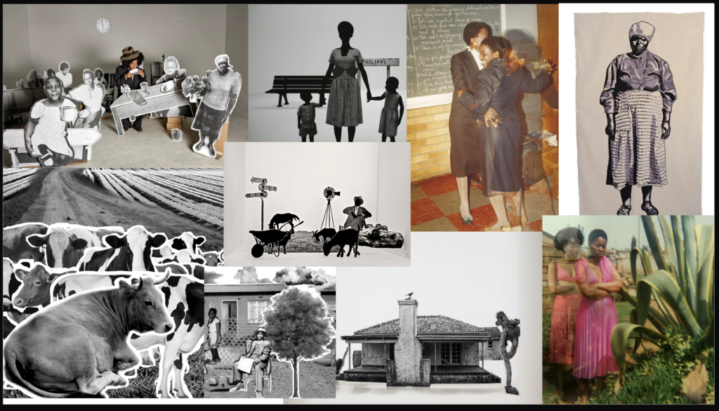
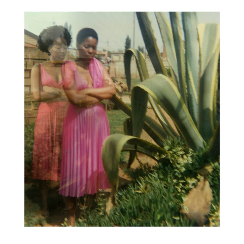
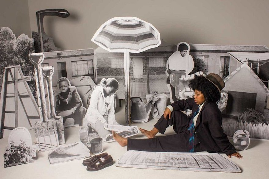
Lebohang Kganye – is 36 from Johannesburg, South Africa and is interested in self portraiture. Her work is focused mainly on personal history and also collective history of her culture. Looking further back into her family archive. She does this by making creative structures and going to certain locations where her family once was and using certain camera techniques such as double exposure. She treats her work as more of living memories of those close to her. She is further able to attempt to receive a clearer perspective of what life was like for her ancestors. By combining her photography skills with her creative art skills that she learnt after receiving her Master in Fine arts. This allowed her to unite these two talents and make pieces of work that connect to form a strong relationship
Why Am I Studying Her?
Her images connote to a past generation. This is an idea I would like to follow and link my interpretation of the word origin. I believe that her images hold a deeper meaning and show the connection that she has with her past and how she understands the importance of certain movements that have led her to be able to freely live her life.
Below is a hyperlink that goes to her website which can further show the work that goes into her images and the design and format of them.
Lighting: She uses artificial lighting that is positioned behind the camera so shadows around her are visible. There is a good contrast between the designs that she has made and the shadows because of the colours being black and white.
Looks to also be using a higher aperture with either an automatic ISO or an ISO like 200 as they are shooting in the light. The temperature seems to be quite warm as the light has more of a warm tone
Visual: There are visible cardboard cut outs which were made from the original pictures of her late family. She seems to of placed herself in these images to almost put herself back in touch with her late ancestors. The images are in colour but contain an imagery of black and white. Also the photo gives off more of a cold town with a white light being placed on the roof. This is visible through the shadows created around each cut out
Contextual: The people that have been cut out are the people of her past family. Lebohang is really interested on the life of her past and how people at that time lived. Her work aims to celebrate those who can usually be forgotten through imagery that captures their hard work through the years.
Conceptual: This contemporary piece of work connotes to a deeper meaning than just an image. It aims to produce images that are more of a reflection on a certain time period almost to freeze it in place is that it will never be forgotten and how things in life should not be taken for granted
For my final project responding to the theme Origins I intend to explore life cycles, mortality and the inevitability of decay by photographing flowers, documenting their deterioration in a domestic setting. I find it fascinating that the beginning of life coincides with the commencement of decline and this is something I aim to explore throughout this project.
Tulip- Celine Marchbank
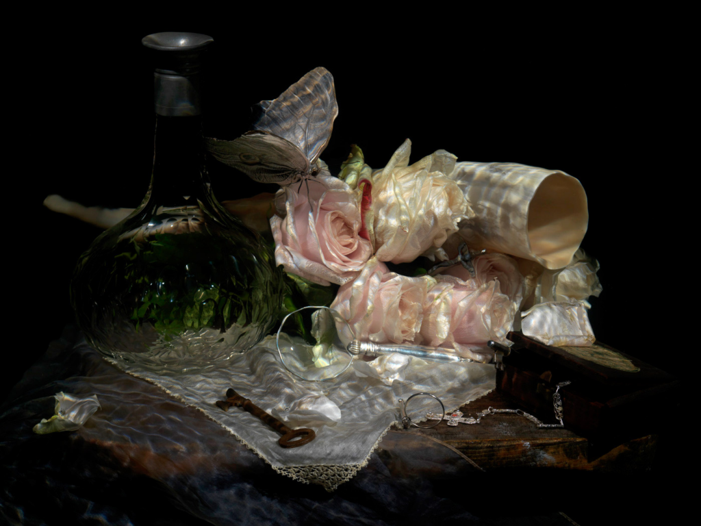
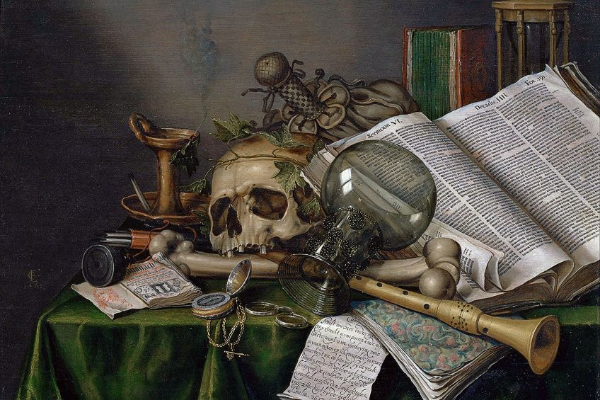
This idea was inspired by Celine Marchbank, particularly her Tulip series, where she uses flowers to reflect personal loss and the quiet progression of morality. I am also influenced by Alexamder James Hamilton’s modern approach to Vanitas, where he uses flowers and other symbolic objects to reference tradition and emphasize the impermanence of life. In addition, Robert Mapplethorpe’s work has informed my visual approach, particularly his use of dark minimalist backgrounds and dramatic lighting to isolate the subject and create a sense of intensity. Their approaches have informed my decision to use a domestic location, varied angles and controlled lighting, alongside subtle Vanitas elements such as glass, petals and water to create conceptual depth.
Underwater Still Life “The Resurrection of Love.” From the Series “Vanitas.” Artist — Alexander James Hamilton
For my final outcome, I plan to produce a physical installation of around 20-30 prints, displayed so that the first image connects to the last to symbolise cyclical life processes. I am going to arrange my images to transition from their peak/bloom through their decline and fragmentation before looping back to the beginning. The variety of angles, scale and abstraction aim to capture and highlight the process of decay in a creative way, enabling the viewer to consider the certainty of death in relation to origin.
Through this project, I intend to create a conceptually thoughtful, technically defined production of work that exposes the fragility of the life cycle, connecting domestic intimate environment with vanitas symbolism and the theme Origins.
This shoot is going to focus on observing and documenting the natural deterioration of flowers in a domestic setting. By photographing the same bunches of flowers repeatedly from different angles and under different lighting conditions, I aim to capture subtle physical changes like drooping petals, discolorations, and decay.
Location:
I am going to use a domestic setting in my home to create a personal and intimate atmosphere, inspired by Celine Marchbanks.
Subject:
Roses and other flowers that are already present in my home.
Experimentation:
Photographing from multiple angles (overhead, eye level, close-up)
Experimenting with natural and artificial lighting
Changing depth of field to isolate details
Capturing texture and subtle changes in form
Outcome:
This photoshoot begins documenting the process of decay, introducing the theme of mortality and establishing a consistent setting for the project.
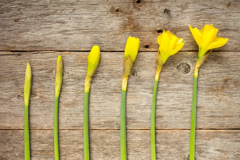
Photoshoot Plan 2- Bloom and Vitality
Concept:
This photoshoot will explore the origin and peak stage of the life cycle, focusing on daffodils as they open and reach full bloom which creates a visual contrast with the deterioration shown in my first photoshoot.
Location:
Same domestic setting to maintain visual consistency.
Lighting:
• Dark background to isolate the flowers
• Directional lighting to create contrast and emphasize shape
Subject:
Daffodils photographed at different stages as they open.
This photo shoot will represent the peak of life, providing a visual contrast to the decline explored in my previous images.
Photoshoot Plan 3- Vanitas and Symbolism
Concept:
This photoshoot will explore mortality and impermanence through vanitas symbolism. By incorporating objects associated with vanitas imagery, it aim to move beyond simple observation of decay and develop conceptual depth.
Location:
In the same domestic environment to maintain continuity.
Subject:
Flowers at various stages of decay along with symbolic objects.
Vanitas Objects:
• Glass containers
• Water
• Fallen petals
• Reflective surfaces/mirrors
• Dramatic lighting
Experimentation:
• Close-up images of texture and deterioration
• Exploring abstraction through detail
• Arranging objects to create symbolic compositions