EXAM GUIDANCE

FINAL IMAGES UPLOAD : TUE 21st APRIL
All files must be added to M : Drive
No new images will be accepted after this date

Examination dates: 15 hrs controlled test over 3 days
Group 13B & Group 13E:
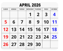
Day 1: TUESDAY 28 April
Day 2: THURSDAY 30 April
Day 3: FRIDAY 1 May

(please check your email from C. Farrow re : dates + clashes)

RULES: No use of mobile phones. No talking to each other or ask teachers for help.

You will have access to the blog to produce blog posts, BUT no access to the internet.

The blog will only be available for you to access during exam times each day between 09:00 – 15:20. In other words, you will not be able to make any changes/ improve work outside of exam times.

It essential therefore, that you have done must of the preparatory work – research/ artist case studies/ photo-shoots/ evidence of creativity, development and experimentation of images – before the exam period begins on DAY 1.
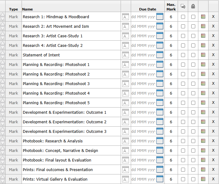
Work to be done
1. PRINTS: Final selection of images in print folder above (ready by end of Day 1: TUE 28 APRIL
2. PRESENTATION: Complete mounting all final prints
3. VIRTUAL GALLERY: Present final images using templates here: M:\Radio\Departments\Photography\Students\EXAM\Yr 13 EXAM 2026\Gallery Mock-ups
3. PHOTOBOOK: Complete design and evaluate
Create online link to BLURB book browser – see below.
4. BLOG: Review and complete all supporting blogposts
5. FOLDER: Label all final outcomes and put in Exam folder
6. SIGN: Student authentication form

DEADLINE: LAST DAY OF YOUR EXAM
FINAL PRINTS > PHOTOBOOK > BLOG POSTS

IN PREPARATION FOR YOUR EXAM MAKE SURE THE FOLLOWING IS READY BY THE END OF THIS WEEK (FRI 24 APRIL):

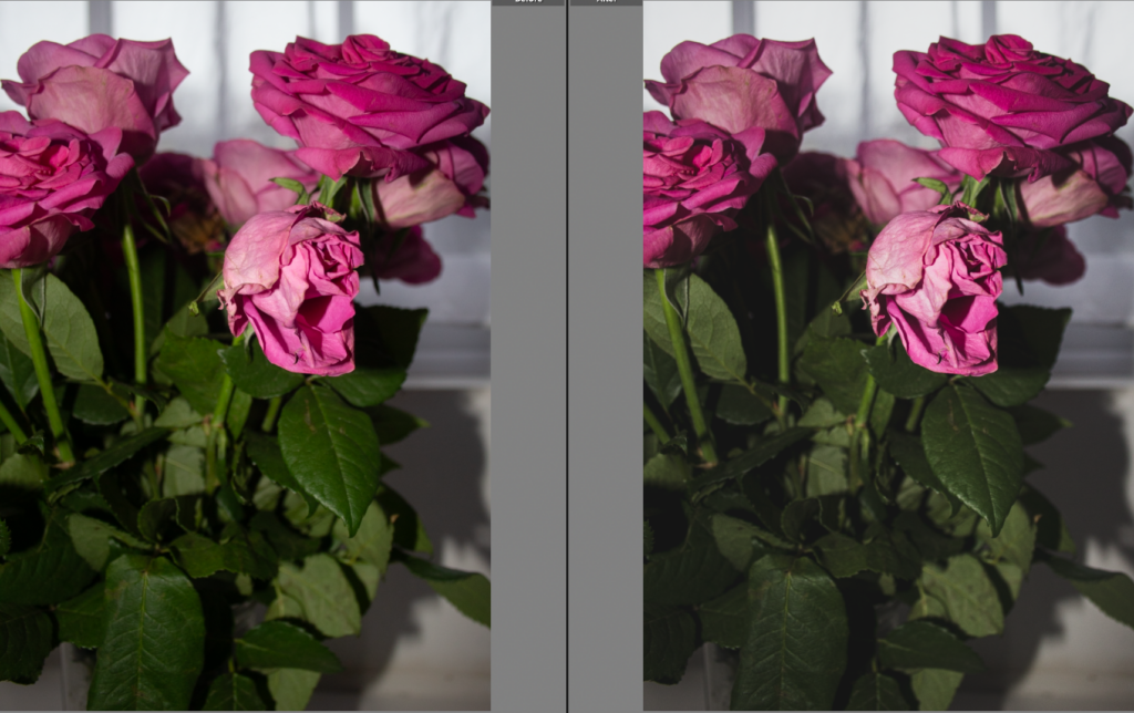
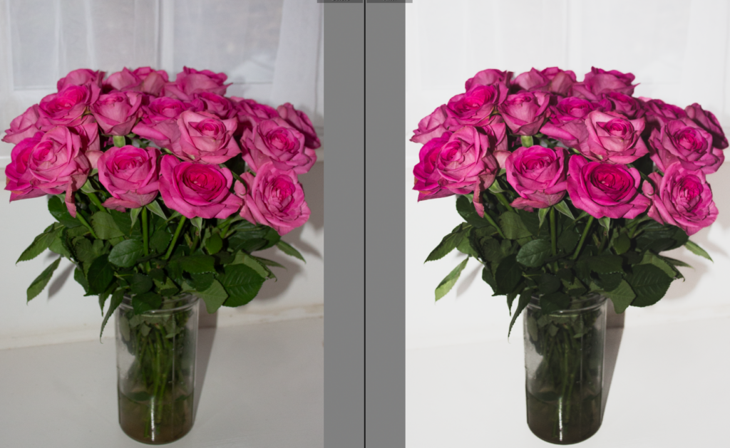
  1. Complete and upload new images from photoshoots (DEADLINE TUE 21st APRIL) to M:drive and begin to edit in Lightroom – make sure to produce blog posts showing selection process and experimentation of images.
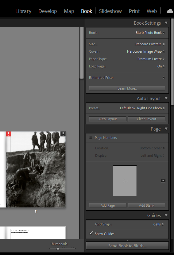
  2. A draft layout of your photobook using BLURB templates in Lightroom – exam time is used to fine tune design with teacher’s approval
  3. Review Checklist on blog for overview of work that must be completed – improve, complete and publish missing blogposts.

Structure your 3 day Exam as follows:

DAY 1:
PRINTS: Complete editing photoshoots, select and prepare final prints. Make sure you have produced blogposts for each photoshoot with a clear progression of selection and editing.

BLOG: Produce blog post showing presentation ideas and create mock-up in Photoshop. Consider appropriate sizes and ways of presenting images as singles, diptych, triptych, multiple grids/ collages/ combinations in window mounts or foamboard etc.

You must save final images (see guidelines below) in print folder here by end of the day:
M:\Radio\Departments\Photography\Students\Image Transfer\YR 13 PHOTOGRAPHY EXAM 2026

DAY 2:
Photobook: Experiment with photobook design using BLURB in Lightroom – show variation of layouts and creativity.

Blog: Evidence of photobook process
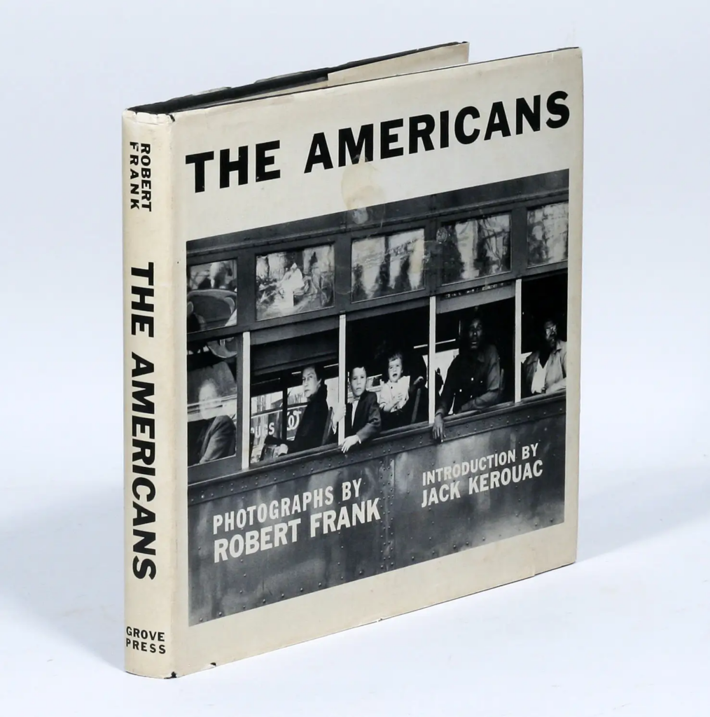
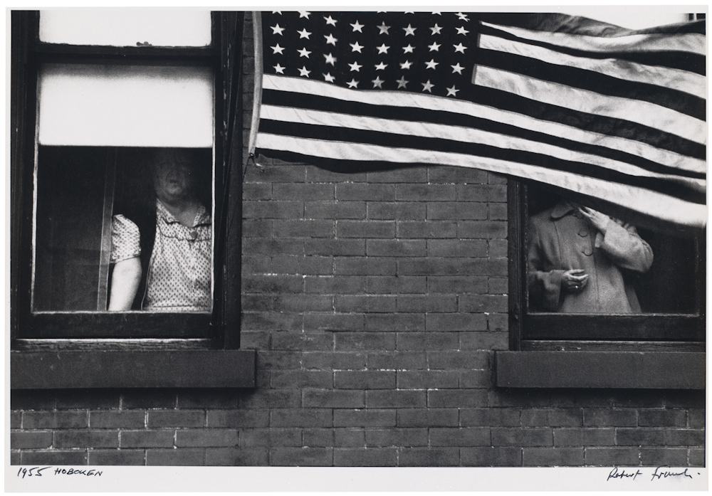
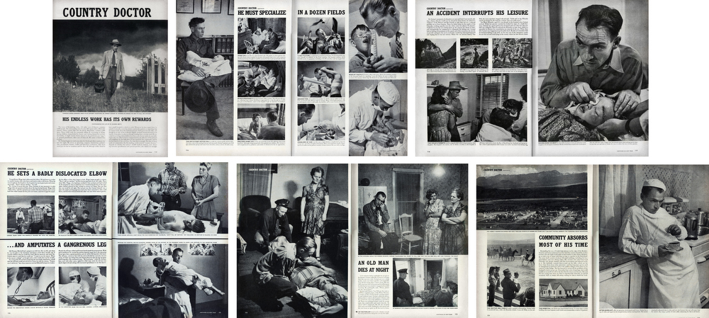
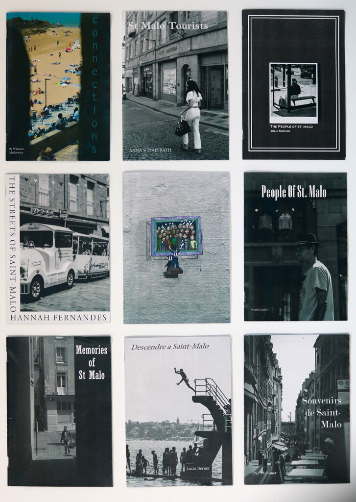
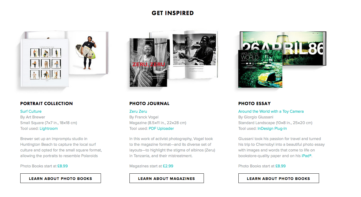
1. Research and deconstruct photobook used as inspiration. Comment on different design element such as: feel of the book, paper, binding, format, size, cover, title, design, narrative (if appropriate), editing, sequencing, image and text.

2. Write a book specification and describe in detail what your book will be about in terms of narrative, concept and design with reference to the same elements of bookmaking as above.

3. Produce a blog post showing your layout and design process in Lightroom using a combination of print screens + annotation.

4. Final layout of every spread and write an evaluation.

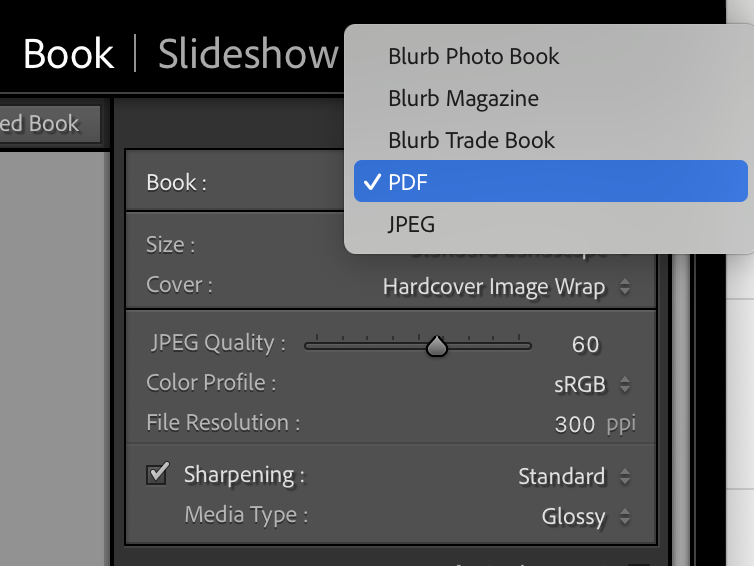
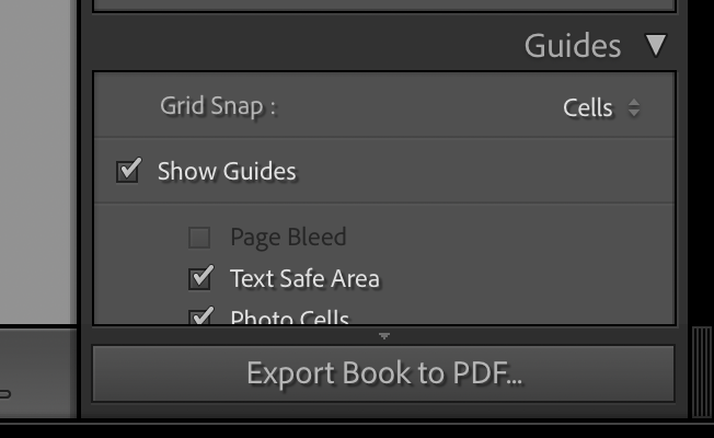
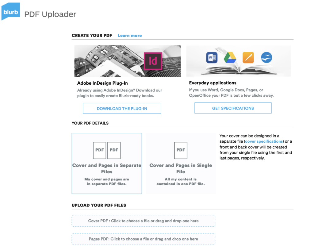
5. Upload book design in Lightroom to Blurb and order your book via Blurb account. Once uploaded produce an hyperlink to book browser – see below for more details.

6. Once you have received book in the post bring into school.

Those who are not making a photobook can begin to mount up final prints and follow instruction below for Day 3.

DAY 3
PRESENTATION: Begin to mount your final prints as per your mock-up plans. Each final outcome must be labelled and velcro attached too. Make sure all your final images are presented in a folder with your name.

BLOG: Produce a virtual gallery and write a final evaluation of the exam module and your final outcome. Consider the following:

Gallery mock-ups: M:\Radio\Departments\Photography\Students\EXAM\Yr 13 EXAM 2026\Gallery Mock-ups

– How successful was your final outcomes?
– Did you realise your intentions?
– What references did you make to artists references – comment on technical, visual, contextual, conceptual?
– Is there anything you would do differently/ change etc?

FINAL CHECK: Finish and publish any missing blog posts as per Checklist/ Go4School Tracking sheet and comments from teachers.

No students is allowed to leave until an authentication form is signed and teacher has signed off too.

PHOTOBOOK
Make sure you have a made a blog post that charts your design decisions, including prints screens of layout with annotation and write an ongoing evaluation. Final book design must be checked and signed off by teacher.
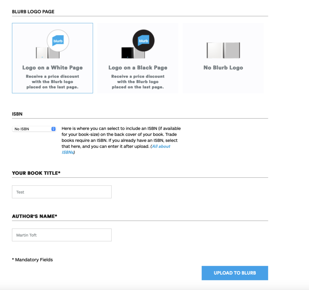
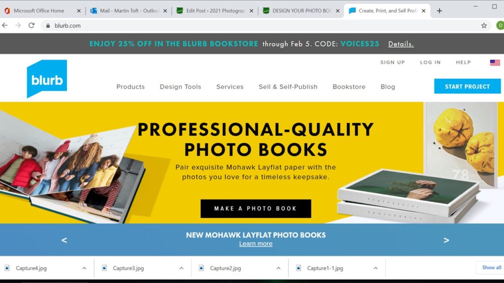
BLURB – ORDER BOOK
Inside Lightroom upload book design to BLURB, log onto your account on their website, pay and order the book.

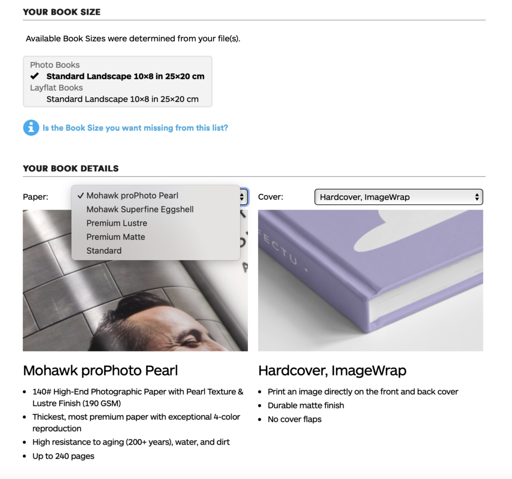
Consider spending a few extra pounds on choosing better paper, such as Premium Lustre or Premium Matte in check-out, change colour on end paper or choose different cloth/ linen if needed.

LINK TO ONLINE BLURB BOOK

Your final blog post should be an online link to you BLURB book with an evaluation. If you have already written an evaluation as part of another blog post on your book design then add the online link to that blog post and change the date to make sure it sits at the top.

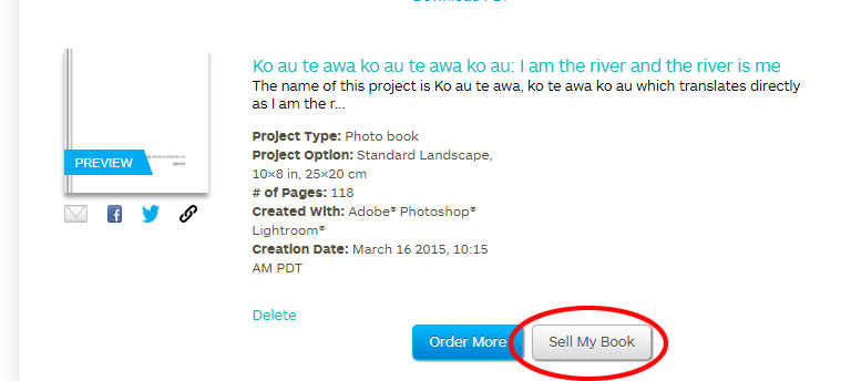
Log into your blurb account and click on Sell my book

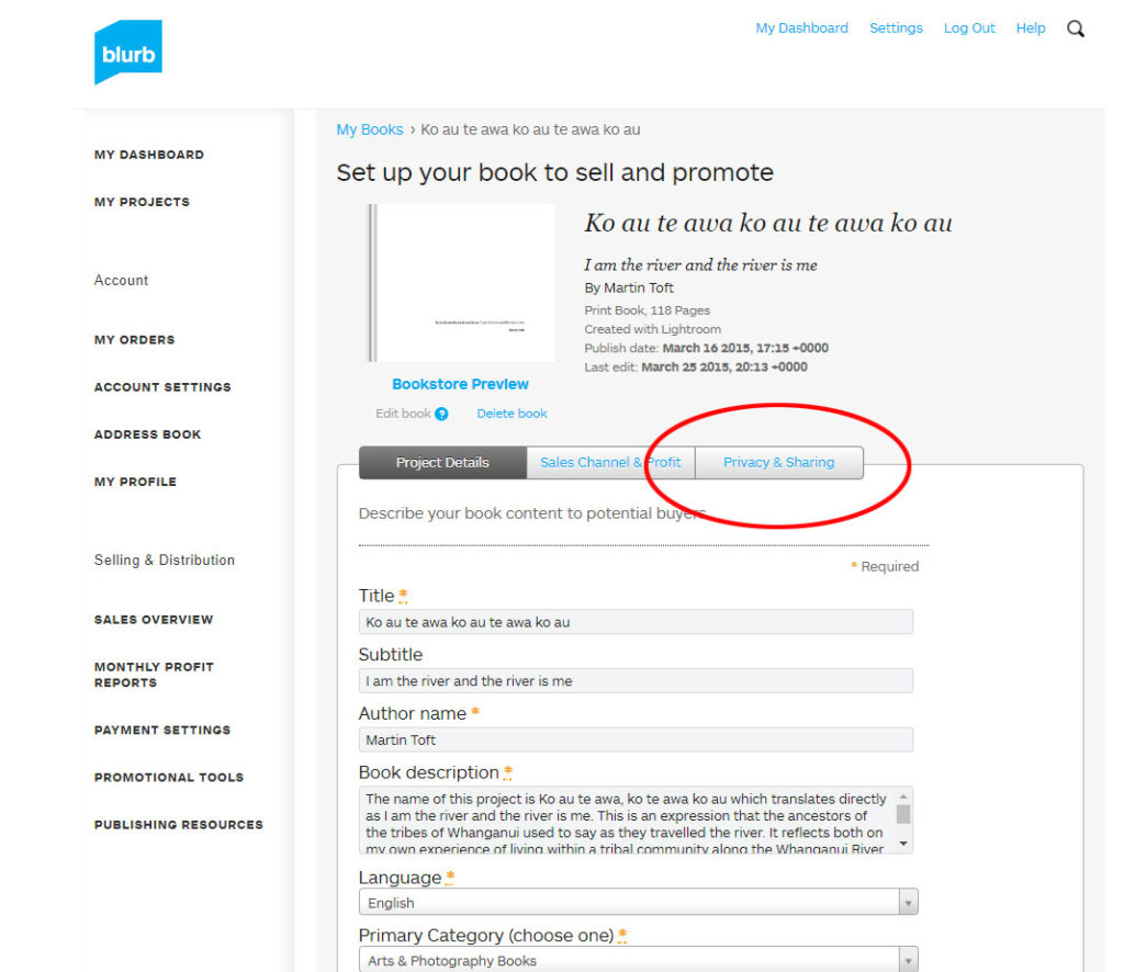
Click on Privacy & Sharing

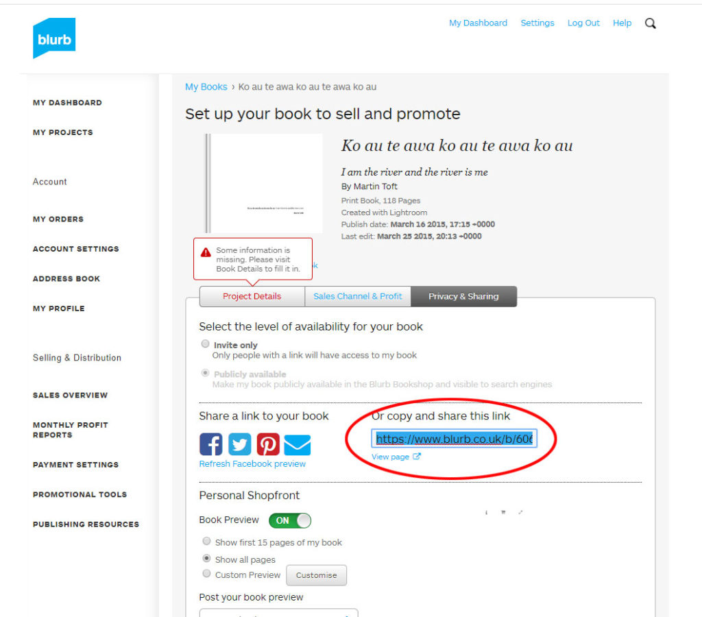
Copy link circled in red above.

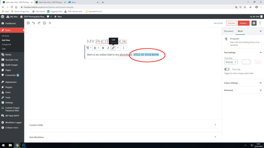
Make a new blog post: MY PHOTOBOOK and copy in link from Blurb into the title of your book using Link button above.

FINAL PRINTS
Select your final prints (5-10) from various photoshoots or photobook and make a blog post showing ideas about how to present them.

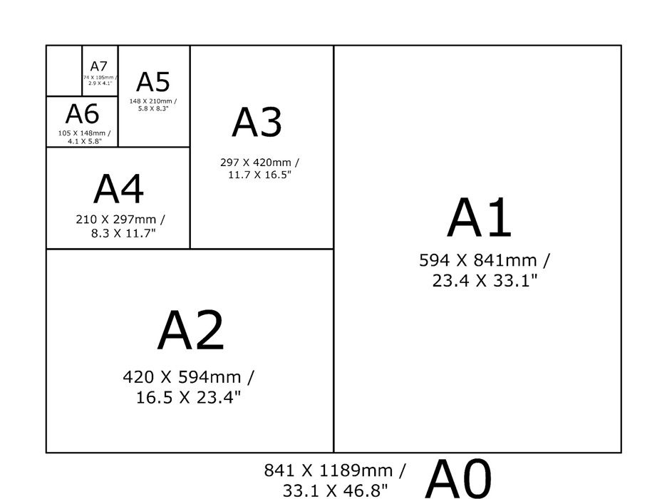
In photoshop produce a mock display (create new document size A1: 594 x 841mm) using different image sizes, for example: A3 x 2, A4 x 2, A5 x 3

PREPARE AND SAVE IMAGES FOR PRINTING:

  • Add your images to the print folder here…M:\Radio\Departments\Photography\Students\Image Transfer\YR 13 PHOTOGRAPHY EXAM 2026
  • Complete any unfinished work from last term if you have time, For example check your coursework portfolio and mount up any prints from previous projects.

File Handling and printing...

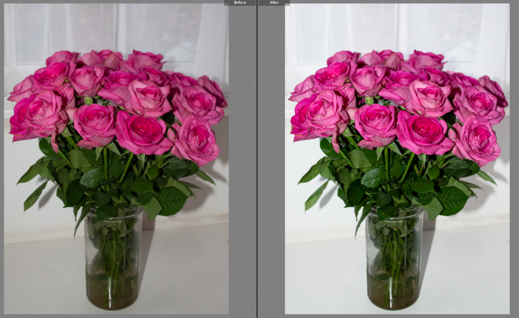
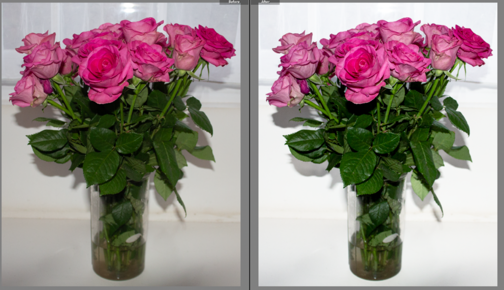
  • Remember when EXPORTING from Lightroom you must adjust the file size to 1000 pixels on the Short edge for “blog-friendly” images (JPEGS)
  • BUT…for editing and printing when EXPORTING from Lightroom you must adjust the file size to Short edge for “high resolution” images (JPEGS) like this…
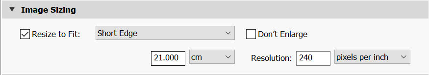
  • A5 Short Edge = 14.8 cm
  • A4 Short Edge = 21.0 cm
  • A3 Short Edge =29.7 cm

This will ensure you have the correct ASPECT RATIO

Ensure you label and save your file in you M :Drive and then copy across to the PRINT FOLDER in IMAGE TRANSFER:

M:\Radio\Departments\Photography\Students\Image Transfer\PRINTS EXAM 2024

For a combination of images, or square format images you use the ADOBE PHOTOSHOP NEW DOCUMENT + PRINT PRESETS on to help arrange images on the correct size page (A3, A4, A5)

You can do this using Photoshop, Set up the page sizes as templates and import images into each template, then you can see for themselves how well they fit… but remember to add an extra 6mm for bleed (3mm on each side of the page) to the original templates. i.e. A4 = 297mm x 210 but the template size for this would be 303mm x 216mm.

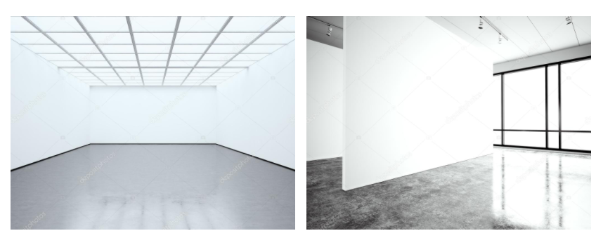
Making a Virtual Gallery in Photoshop

Download an empty gallery file…then insert your images and palce them on the walls. Adjust the perspective, size and shape using CTRL T (free transform) You can also add things like a drop shadow to make the image look more realistic…

The Photographers' Gallery - Gallery - visitlondon.com

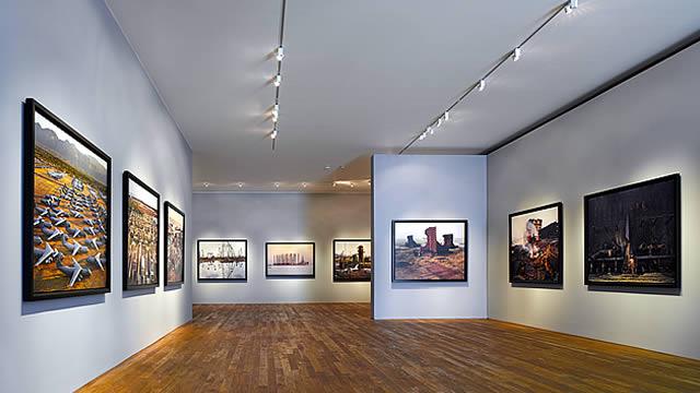
Here is a selection of Gallery mock-ups that you can use to superimpose your own final images onto walls using Free transform tool in Photoshop.

M:\Radio\Departments\Photography\Students\EXAM\Yr 13 EXAM 2026\Gallery Mock-ups

Always ensure you have enough evidence of…

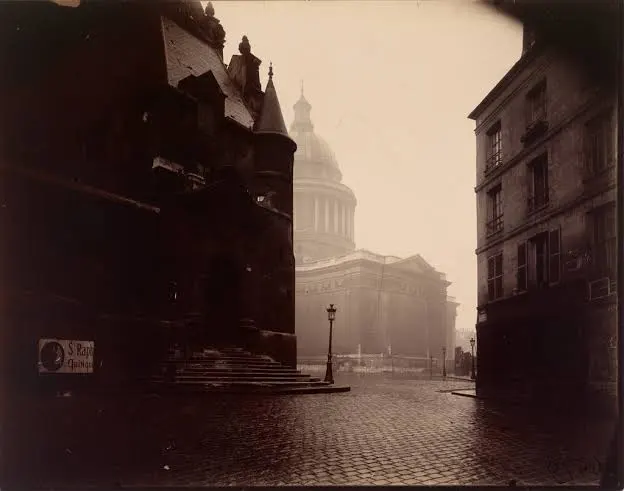
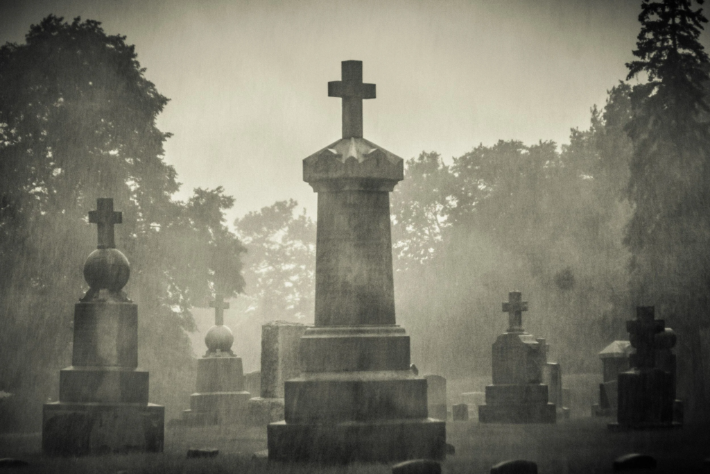
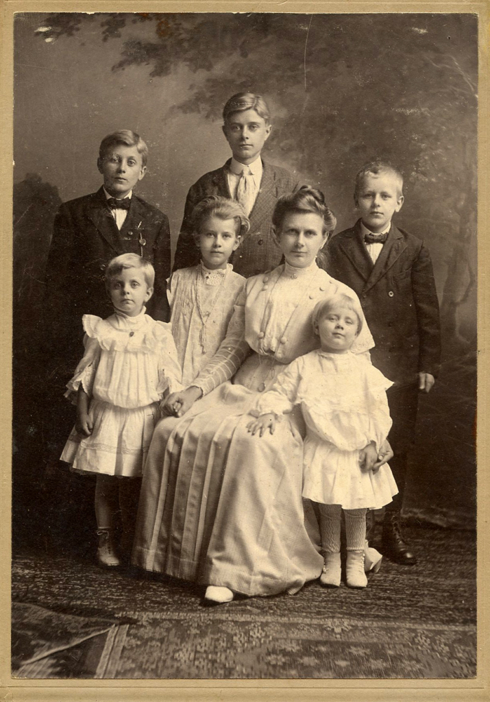
  1. moodboards (use influential images)
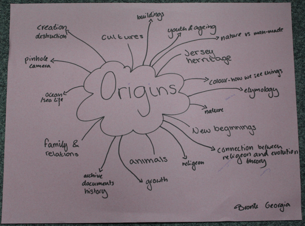
  2. mindmap of ideas and links
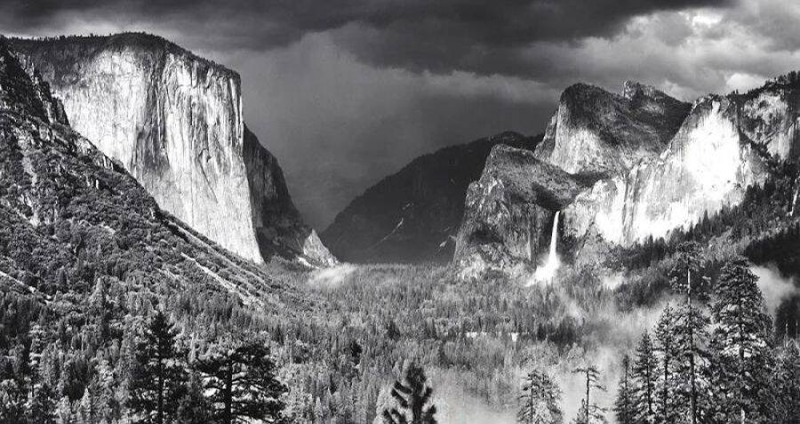
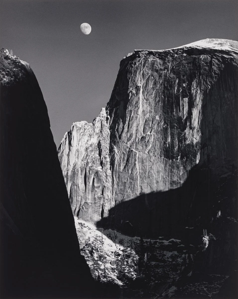
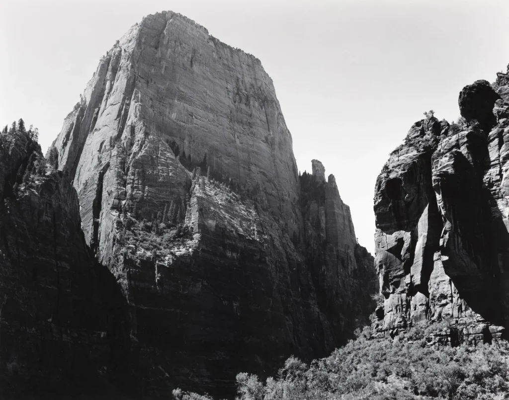
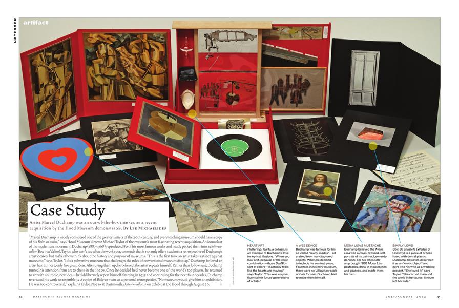
  3. case studies (artist references-show your knowledge and understanding)
  4. photo-shoot action plans / specifications (what, why, how, who, when , where)
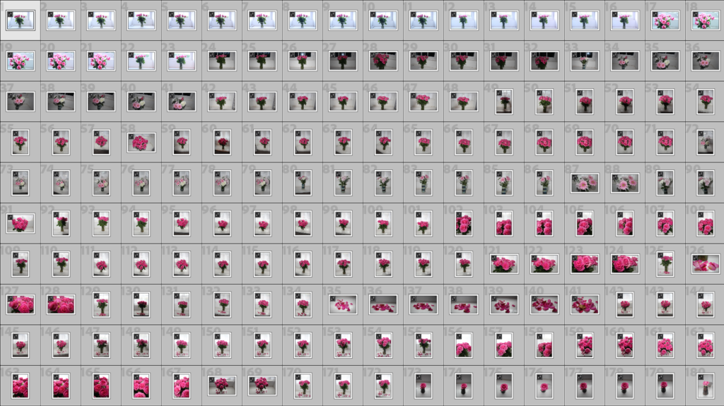
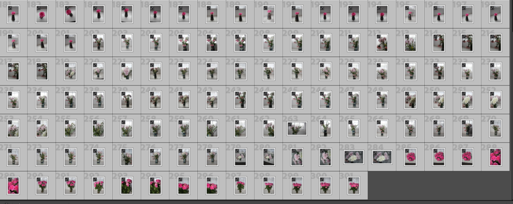
  5. photo-shoots + contact sheets (annotated)
  6. appropriate image selection and editing techniques
  7. presentation of final ideas and personal responses
  8. analysis and evaluation of process
  9. compare and contrast to a key photographer
  10. critique / review / reflection of your outcomes

Vital : Photo Deadline

Photo Deadline

Year 13 Exam 2026

Tuesday April 21st (the day after you return from Easter Break)

No new images will be accepted after this date

All files must be added to M : Drive

Photoshoot 3

Objects

Contact Sheet

Selection Process

Green = Definitely using

Yellow = Maybe using

Red = Not using

Best Raw Images from photoshoot 3

Basic Editing

1.

2.

3.

4.

5.

These are all traditional drinks in Madeira. The first one is traditional Madeira wine going back 500 years. The second set of images is how to make a very popular traditional shot in Portugal/ Madeira called ‘Poncha’. I added all of the ingredients and materials you need to make it to give it more of a meaning. Then we have the traditional Madeira rum which is used in the Poncha and other kinds of popular drinks.

Photoshoot 2

St Brelade and St Aubin

Contact Sheet

Selection Process

Green = Definitely using

Yellow = Maybe using

Red = Not using

Best Raw Images from photoshoot 2

Basic Editing

1.

2.

3.

4.

5.

6.

7.

8.

9.

10.

11.

12.

13.

14.

Final photos edited

Photoshoot 1

Waterfront + Kiosk

Contact Sheet

Selection Process

Green = Definitely using

Yellow = Maybe using

Red = Not using

(Ignore grey)

Best Raw Images from photoshoot 1

Basic Editing

This is a before and after view of this image before and after editing.

This is the settings I used to create the image

2.

3.

4.

5.

6.

7.

8.

9.

10.

Final photos edited

With all these images, I chose carefully where I would be taking my photoshoots. All of these places have special meanings in my childhood and where I spent most of my time growing up in Jersey.

Statement Of Intent – Origins

For this project, I am looking to explore ‘Origins’ within my own identity and personal background. My Portuguese background and Jersey upbringing are the most important things to me. I see origins as a constant influence, not just as a physical starting point, they continue to shape us over time. My work will examine the past and present relationship by overlaying pictures of Madeira and Portugal, where my parents were born, with photos taken in Jersey to reveal my cultural heritage and where I am now.

This project means a lot to me because it allows me to reflect on my sense of identity and belonging. Having grown up across cultures, I’m interested in exploring my identity through photographs and expressing this journey. By utilising family photograph albums and culture objects from my home, I will explore how memory, heritage and upbringing contribute to identity. My artefacts are a part of evidence of ones origin which helps narrate a story of where they come from.

My project will develop through experimentation with layering, photomontage and image manipulation using archival material and my own photography. In my visual style, I will focus on composition, contrast and opacity. I will mainly work in black and white. My project will draw influence from the works of Wendy Red Star, who juxtaposes historical and contemporary imagery to explore cultural heritage and identity, and Chantal Lesley, a photographer who investigates personal identity through her work.

I want to initially work in my home, photographing family objects and old photographs, before layering and altering digitally. My final outcome may be a zine or a photobook where I present a collection of visuals that represent where I’m from, and how it relates to who I am.

Artist Case Study 2 – Wendy Red Star

Background/ Research

Wendy Red Star was born in 1981 in Billings, Montana. She is of Apsáalooke (Crow) and Irish descent and was raised in Pryor, Montana, on the Crow Reservation, “a rural community that’s also a sovereign nation and cultural powerhouse.” At age 18, she left the reservation to attend Montana State University – Bozeman. She attended university between 2000 and 2004, and studied art and Native American Studies.

Moodboard

How it relates to ‘Origins’

Red Star’s work links strongly to the theme of origins because she explores her ancestry, cultural background and family history through photography. She often connects historical images with contemporary ones to show how the past influences the present. This relates to my project because I am layering photographs from Madeira/ Portugal, where my parents were born and grew up, with images from Jersey where I grew up, showing the connection between my family origins and where I am now.

Why did I choose Wendy Red Star?

I chose Red Star as one of my artist case studies because her work explores heritage, ancestry and cultural identity. She uses photography to investigate where she comes from and how cultural background shapes identity. This interested me because my project also explores personal heritage and upbringing.

Methods and Techniques used

Red Star often uses staged photography, carefully arranging people, clothing and objects within the image to communicate ideas about culture and identity. She also works with archival photographs. Sometimes she adds text, drawings or annotations to highlight important cultural details. Another technique that Red Star uses is combining historical imagery with contemporary photography. This allows her to connect the past with the present and explore how cultural history influences identity today.

Style and Approach

Red Star’s style is conceptual and culturally focused. Her photographs are often carefully constructed to communicate ideas about heritage, identity and representation rather than simply documenting reality. She frequently uses symbolism, traditional clothing and historical references to tell stories about Native American culture and to challenge stereotypes about indigenous identity.

Meaning and Philosophy (Conceptual)

The meaning behind Red Star’s work is to explore cultural heritage and reclaim historical narratives. Her photography investigates how indigenous people have been represented in history and aims to present these stories from her own cultural perspective. Through this approach, her work reflects on how history, culture and ancestry shape personal identity.

Quote

“I’m constantly mining my own history and culture to better understand my identity.” – Wendy Red Star

Photo Analysis

Technical:

This picture uses staged photography and digital post-production techniques. The background is probably an ensemble of print and edit which appears as a most likely studio-based, making both the subject and surroundings visible. The entire image is in focus. There is a sharp depth of field, so everything is visible: the flowers in the foreground and the mountains in the background. The artwork features a careful arrangement with the central placement of the subject while there are other symbols and animals.

Visual:

The picture is full of colour. The details are clearer and bright, to the point of appearing false and vivid. The photograph feels constructed as though it has been staged deliberately. This is due to the sharp contrast in its foreground and surroundings. The traditional clothing of the subject stands out strongly from the environment culturally explicit. This painting contains the subject which is made up of animals, flowers and scenery. Even though there are a variety of subjects, the central placement gives it away. It looks like someone placed them all there, rather than being there naturally.

Conceptual:

The work of Wendy Red Star often examines the identity, heritage and representation of Native America, the portrayal of indigenous. The photo shows that she is critical of stereotypes and takes ownership of cultures. The conception of a staged, almost theatrical setting is a reflection of how Native Americans were often staged in art and photos. By replicating and exaggerating this style, Red Star critiques representations while at the same time celebrating her culture.

Contextual:

Conceptually, the image is conceptualising constructed identity and cultural representation. The artificial setting indicates that our concept of identity has often been forged. By placing herself in this staged environment, Red Star highlights the discrepancy between real identity and stereotypical imagery. Wearing traditional clothing and using symbolic elements gives a connection to heritage and origins. The unrealistic composition suggests that there is a particular way of presenting origins. Essentially, the implication in the image that identity is a result of our own lineage and the history of representation fits well with themes of origin.

Artist Case Study 1 – Chantal Lesley

Research

Born in 1988, Chantal Lesley received a BFA from Texas State University in 2021. Chantal Lesley uses self-portraits, staged images, and manipulated family photographs to look at the many layers of family and cultural history. “Is there one that dominates above the rest,” she asks, “or can they all live within someone harmoniously?”

In the project’s title photograph “In the Midst of My Nostalgia,” for example, Lesley casts herself as the figure in Andrew Wyeth’s famous painting “Christina’s World,” which depicts his polio-stricken neighbour on a Maine landscape – struggling with dignity despite her condition. Where Wyeth’s intention was to “do justice to her extraordinary conquest for life,” Lesley inserts her own struggle for hope. In place of Wyeth’s dreamy field and romantic Maine barn, she casts herself looking at a border wall.

This is just one of many images that create a piecemeal narrative to reflect this in-between state. Each image ultimately ponders the evaporation of ethnic roots can create an isolating and confused sense of self.

Moodboard

How it relates to ‘Origins’

Chantal Lesley’s work relates to the them of ‘origins’ because most of her photos consist of people from diverse cultural backgrounds, exploring how culture, race and community influence identity. Culture and heritage are key parts of where a person comes from.

Why I chose Chantal Lesley

I chose Chantal Leslie as an artist case study because her photography explores identity, heritage and cultural background, which strongly relates to the theme of “origins.” Her work focuses on portraiture and representation, often highlighting how a person’s culture, upbringing and community influence who they are. This interested me because my project also looks at origins through objects in my home and family photographs that reflect my Portuguese heritage and upbringing.

Her background

Chantal Lesley is a conceptual photographer who grew up on the U.S. / Mexico border as the daughter of German and Peruvian immigrants. Her multicultural upbringing influenced her interest in identity, heritage and belonging. Much of her work explores family history and cultural background through symbolism and archival imagery, which connects strongly to themes of origins and personal identity.

Methods and Techniques used

Lesley uses a range of photographic methods to explore identity, heritage and personal history. One of her main techniques is portraiture, where she places the subject clearly within the frame so that their identity and expression becomes the focus of the image. She often uses simple or minimal backgrounds, allowing attention to remain on the person or symbolic elements within the photograph. Lesley also works with natural lighting, which helps create a more authentic and intimate atmosphere in her images. In some of her work she incorporates objects, clothing or details that represent cultural background, using these elements as visual symbols of heritage and upbringing. She also uses black and white photography to emphasise tone, contrast and texture, creating a timeless quality that reflects themes of memory and personal origins.

Style + Approach

Chantal Lesley’s photographic style is conceptual and autobiographical, meaning that her work is based on her own life experiences and personal identity. She often creates staged images, self-portraits and manipulated family photographs to explore themes of cultural heritage, memory and belonging. Her approach focuses on constructing visual narratives that represent her upbringing and multicultural background. Lesley explains that her work is motivated by a need to understand her identity across different cultures, stating that her work is “driven by a demand to be seen and understood while uncovering the layers of my identity as part of four different cultures.”

Meaning + Philosophy (conceptual)

The conceptual meaning of Lesley’s photography is to explore how identity is shaped by heritage, memory and personal history. Her work investigates the feelings of belonging to multiple cultures and uses family archives, symbolism and stages imagery to understand where she comes from. Through this approach, her photographs question how upbringing and cultural backgrounds influence a person’s sense of self and connection to their origins.

Quote

“I use photography as a way to understand my own identity and the cultural influences that have shaped my life.” – Chantal Lesley

Photo Analysis

Technical:

The image uses studio lighting where a strong use of red-toned lighting is used and gives a very dramatic feel. To achieve subject sharpness, a fast shutter speed was likely employed by the photographer. It seems that an intentionally shallow depth of field was used to disconnect the pattern from the subject. The staging of the composition is carefully thought out, with the subject framed at the centre holding a mirror. The lighting focused on the subject’s face and reflection ensuring that both were visible.

Visual:

The image’s strength is, in large part, due to its visuals and their strong red colour palette on the subject’s clothing and lighting. The subject stands at the focal point of the image as a result of the red hues provided. The mirror reveals a second face that emerges out of the frame. The subject’s neutral expression is serious in character which induces a sense of reflection. The image feels very symmetrical and framed and is in harmony but gives a little unease.

Contextual:

Chantal Lesley often deals with identity, culture and history. Her multicultural background informs this exploration. This image is consistent with contemporary photography that emphasises self-representation and identity. In conceptual photography, communications on how identity is constructed, staged portraiture and mirrors to unravel viewpoints. Connections to the themes of belonging and cultural duality, which remain so important today, can be drawn from her work.

Conceptual:

Conceptually, the figure embodies the notion that we al have multiple identities that form our individual selves. When we see ourselves in the mirror we see a different version of our subject. That is a version that we perceive differently. Different spheres of identity, for instance, heritage or individual narrative could also be represented. The colour of red lighting may be used at strategic points in the photo to symbolise emotion, intensity or even conflict. The image implies that identity is layered, complex and is influenced by various experiences and origins.

Photoshoot 4

For this photoshoot I will go to Norimont point, this SSI is near Portlet and is home to lots of wild life and WW2 remains. I will go at mid day as this will create the best contrast when turned into black and white. I plan to take around 100-200 photos.

Contact sheet

Selection process

Best RAW images

Basic editing

#1

#2

#3

#4

I then repeated a similar editing style for the rest of my photos.

Best edited images

Black and white

Further editing

#1

I repeated this for the rest of the images.

#2

Here I used the dust removal tool to takeaway some dust spots, I did this across a few other images as well.

#3

For these two images I used AI to remove this buoy.

I repeated similar techniques for the rest of my images.

Cropping experiments

#1

#2

#3

Pairing experiments

#1

I chose to pair these two images because they both contain old, German fortifications, the repetition creates a good pair.

#2

I put these two images together because they are very similar, the composition is my similar but the angle of the photo is slightly different, the repetition will pair well together.

#3

These two images work well because the sea is in the middle and the hills come in from the outside of both images.

Evaluation

Overall I am pleased with the outcome of my photos and I believe that they will complement my other 3 photoshoots really well, I defiantly met the needs of what I needed to do originally.

Art steps

EXAM STUDY: Kevin Smith’s “Clerks”

Slacker cinema is a small genre of independent film that came out of the late 80s and early 90s. The name comes from Richard Linklater’s film Slacker (1990) and the idea is basically that nothing happens. There’s no real plot, no dramatic storyline, just people existing and talking and getting through normal boring life. Its a genre that rejects the idea that a film has to be polished or have a massive budget or a big story to say something meaningful. Kevin Smith’s Clerks is probably the most well known slacker film.

Kevin Smith’s “Clerks” is a black and white film predominantly set in and around an American convenience store. That’s it. The whole point of the film is that nothing really happens at all. This genre of film is called a “slacker” film, and is quite a ‘cult’ genre. Nothing major happens and its mostly just conversations, waiting around and dealing with small pointless problems that come with the every day, with these passive moments in life – being at work. It might feel a bit slow, a bit static and kind of repetitive but under the surface of the film is a slow, often self-referential dry humour. It gets better as the film goes on, you get to know the characters and their inside jokes.

The way Smith made this film is what really interests me though. He made the whole thing for about $27,000. He shot it on 16mm black and white film and he filmed it at night in the actual convenience store where he worked during the day, using his real friends who were not actors. He was 23. He paid for it by selling his comic book collection and maxing out credit cards which is kind of insane. The black and white wasn’t even a creative decision it was literally just cheaper, but it ended up being the thing that makes the film feel the way it does. It looks rough and unpolished and cheap but thats why it works. It doesn’t feel like something made for an audience, it feels like you’re just watching someone’s real life and thats kind of exactly what it is.

That whole approach connects to what I’m doing a lot. Smith didn’t ask anyone for permission to make his film, he didn’t wait for a studio or funding, he just did it with whatever he had. Thats the exact same thing driving the rave scene I’m documenting. We don’t have venues or budgets or official permission we just have abandoned bunkers and a sound system and people who want to make something happen. Both Clerks and my project come from the same place – you don’t need anyone to give you the go ahead to do something that matters to you. The fact that the police shut our party down almost straight away kind of proves this point even more because its literally what happens when you try to create something without asking.

Smith was also an insider which is something that keeps coming up in my references. He was filming his own life, his own workplace, his own mates. He wasn’t some filmmaker coming in from outside to make a film about convenience stores, he was behind the counter every day living it. Tillmans was inside the club scene. Goldin was inside the relationships she photographed. I’m inside the rave scene I’m documenting. Its the same idea across all of them – when the person with the camera is actually part of the thing they’re filming, it feels different. People don’t perform for the camera in the same way, the camera just becomes part of the moment and the footage feels more natural because of it.

While this film does follow a narrative and has character development on a small scale, the overall concept is still relevant to my idea of documenting the passive side of life to an extreme level. Standing around, doing nothing and time dragging on. This links to my conceptualised idea that most of life is just standing around and waiting. Dante the main character literally spends the entire film stuck behind a counter not really doing anything, just letting life happen to him. Thats the passive existence I want to contrast against the rave. In my opinion it makes my concept stronger because it’s not just showing chaos, it’s showing what entails all around it, all the inbetween moments and the boring, the drag. Life actually is like that most of the time and this makes it more realistic.

The pacing does something similar too. Long drawn out conversations that go nowhere, then suddenly something kicks off and the energy changes completely. My video works the same way – surfing is calm, getting ready is just normal boring stuff, the drive is quiet, the setup is slow, and then the party starts and it all shifts. That contrast only works because the slow bits are there. Without them the chaos doesn’t hit as hard.

Theres also the visual quality which I think is really relevant. The rough 16mm black and white footage makes Clerks feel like a memory of someones real life rather than something thats been made and produced for entertainment. That connects directly to my Mini DV footage. The grain, the low resolution, the weird unpredictable lighting – it does the same thing. It makes everything feel more honest and less constructed. I talked about this in my Tillmans case study with Gestalt theory – when an image is rough and low quality the viewer fills in the missing detail with their own imagination and emotion which actually creates more engagement than something perfectly clean. Both Smith’s 16mm and my Mini DV work in that same way, shifting the focus from what things look like to how they feel.

One last thing that connects is that Smith captured something that would have just been forgotten. The boring everyday reality of working in a shop in the early 90s, the conversations people had, the small culture around it – without that film it just disappears and no one remembers it. Thats exactly why I’m documenting the rave scene. It exists right now because a handful of people are pushing it forward and if they stop it just goes away. Its temporary, its not officially recorded anywhere, and without a camera it only lives in peoples memories and stories.

(written after party filming)

Photoshoot 3

For this photoshoot I plan to go to the Le Landes SSI behind the corbier lighthouse, I will go at mid day because this will create the best tonal range when turned into black and white. I will aim for 100-200 images from this photoshoot.

Contact sheet

Selection process

Best RAW photos

Basic edits

#1

#2

#3

#4

#5

#6

I then repeated a similar editing style for the rest of my chosen photos.

Best edited photos

Black and white

Further editing and refining

#1

I dropped the exposure slightly, added the ‘Storm clouds’ present and added a linear gradient

#2

I straightened the image slightly and then added a linear gradient to frame the cliff better.

#3

#4

Here I just added the ‘Storm cloud’ present to darken the sky and frame the cliffs.

Cropping experiments

#1

#2

#3

Pairing experiments

#1

I like the comparison of these two photos because the sea is framed in between the two cliff faces.

#2

These two images work really well together in my opinion because the image on the right leads into the image on the left and off into the sea.

#3

These two images are very similar, this is why they compare very well, the left is a more zoomed in version of the landscape on the right.

Comparison to Emile Guiton

Éditions Emile (ED.EM) | 2020年2月14日 - 2月26日 - Overview | CCA Galleries  International

Both mine and Guiton’s image show rocky, costal cliffs that feel natural and rugged, both are shot in a black and white style, emphasising contrast, texture and lighting instead of colour. In both images the cliff formations dominate the image space as the main subject. Both of these images have similar tonal range and separation between light and dark areas.

Evaluation

To conclude, I am pleased with the outcome of my photoshoot. I believe that my photos perfectly meet what I was attempting to do. These new images will fit well into my final publication.

Art steps

Photoshoot 2

Photoshoot plan

For this photoshoot, I plan to shoot in the style of Marli Miller at the sand dunes, I will do this during mid day for harsh shadows that will look good when turned into black and white. I will also experiment with different amounts of negative space in different photos.

Contact sheet

Selection process

Best RAW photos

Basic editing

#1

#2

#3

I repeated a similar editing style for the rest of my chosen photos.

Best edited photos

Black and white

Further editing and masking

First, I added ‘Storm clouds’ to prevent the sky from looking flat.

#1

Here I used AI to remove these signs

#2

Here I used a linear gradient mask to deepen the sky to prevent it from looking too flat

Here I used AI to remove this sign

#3

I used AI again to remove these spots

Here I used a linear gradient mask to deepen the sky

Cropping

#1

#2

#3

Pairing experiments

#1

These two pair together really well because one is pointing in land at the island and the left one is pointing out to sea, showing two completely opposite angles.

#2

I really like these two next to each other, this is because the left one looks out at the sea view and the other one looks to the right down the coast, taken from a very similar spot

#3

These two work really well together because they are both portraits and the left one uses the road as a leading line through the image and the right image uses the steps.

Comparison to Marli Miller

Contributor spotlight: Geology Pics – Marli Miller – Kaleidoscope

The image on the left shows was taken by me and the image on the right was taken my Marli Miller. Both of these photos show dry, sandy and rocky landscapes with little vegetation. In both of these images, rock formations on the side of a hill is the main focus. Both of these photos are taken from a fair distance and taken in landscape. These photos also both have many differences. First, my photo is in black and white where as her photo is colour. The right photo contains trees that appear dead; a barren landscape within the desert and the left photo shows the sand dunes that have small plants and greenery. Furthermore, my photo shows man made rock formation (the bunker) and her photo shows a natural rock formation.

Evaluation

To conclude, I am very pleased with how much images turned out, they have turned out just like I planned them to, the dramatic, dark sky and the moody black and white theme is exactly what I was going for. Furthermore the sand dunes will make a perfect fit to my book of the Jersey Sites of Special Interest.

Art steps