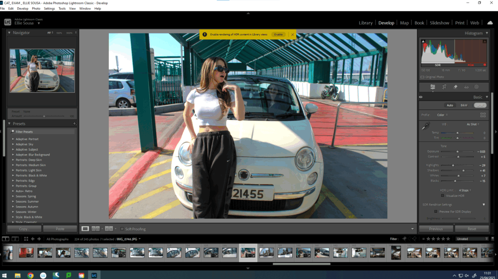
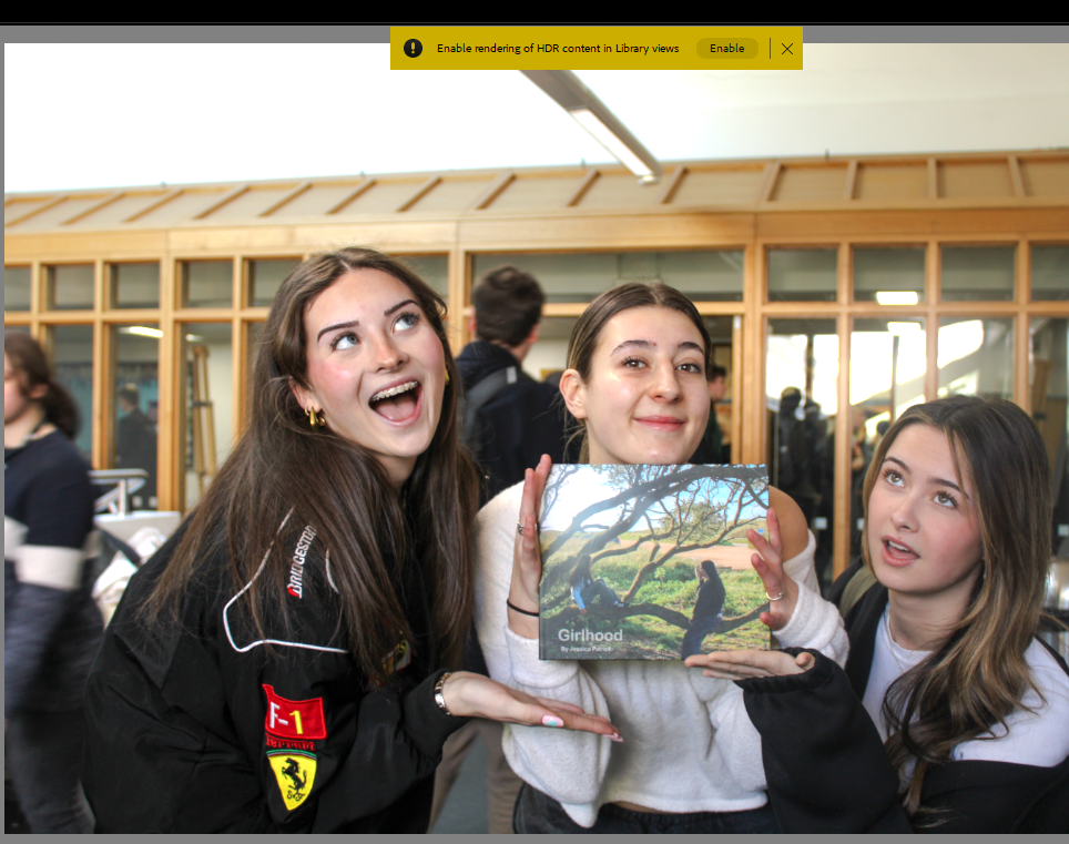
For this project I have decided to make a photobook as well as mounting my final images. This book consists of some of the same and some different images from across my project. The reason I have made a photobook is to be able to present some more images from my photoshoots, and to show some photographs I have already printed but in a different layout or with different editing styles.
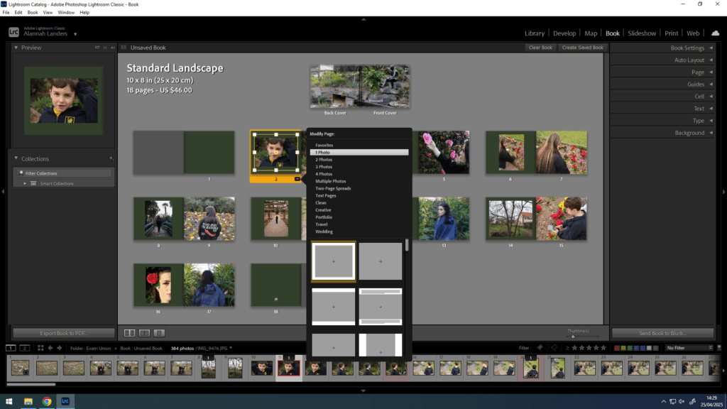
To start, I created the book in Lightroom and went through my images deciding which ones to keep or discard. Once I had chosen my first draft of photographs, I moved them around into different places next to different images. Eventually, when I had chosen my final images along with their placements, I experimented with different ways that the image could be placed on a page, for example if I wanted the photograph to cover a whole page or have a border around it.
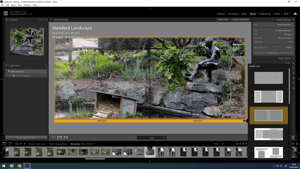
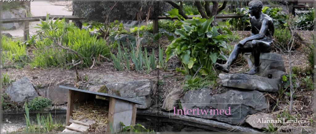
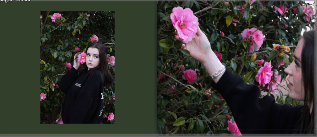
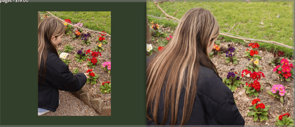
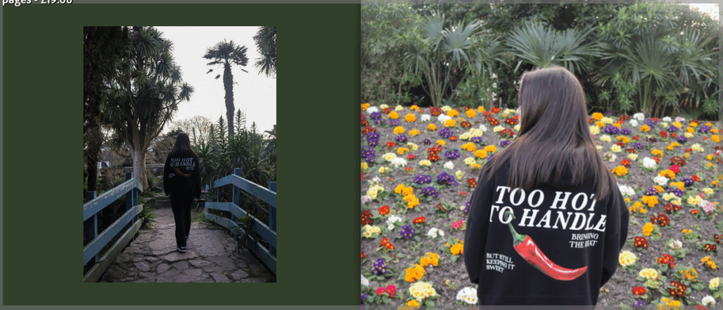
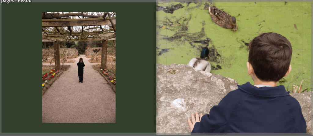
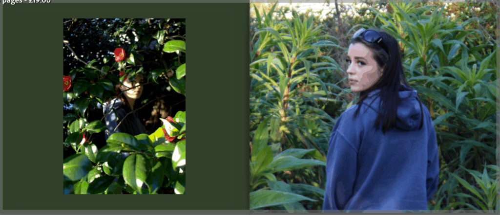
Once the order and positionings were complete, I then went on to create the front and back cover. After trying different images, some being a double page spread, or two individual images for each side, I decided to choose the image below across both the front and back cover to keep it consistent. I also went on to change the background colour of the pages as I found that the white pages didn’t work as well as I had hoped. So, after trying a number of different colours and shades, I chose a darker green colour as it ties in with the green nature in the photographs, letting the brighter colours stand out.
Finally, I chose a title and placement for the title to finish up the whole book. The title is ‘intertwined’ to represent the images all aiming to portray the unity between nature and humankind and how they are and could be more intertwined with one another.
My final photobook:
Evaluation
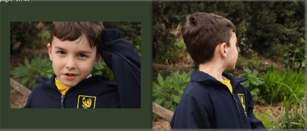
I really like how this photobook turned out, I think the layout of the images being in a consistent pattern presents the photographs in an organised but eye-catching way. Making this photobook, I was able to present images that I haven’t already printed and mounted on foam board or black card, allowing more of my photographs to be shown. I will print this photobook with a soft cover, using premium lustre paper as I feel that the images will look best with the glossed sheets.
I feel that this photobook has successfully followed my narrative of this project which was the photograph and capture the union between nature and humankind. I think that the flow of images follows this nicely as well as the dark green colour of the pages being a naturalistic colour to consistently portray this narrative.
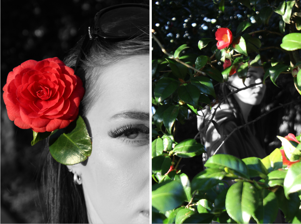
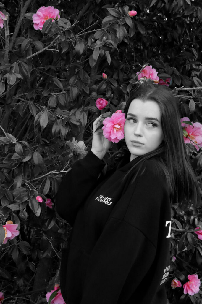
For this piece, I am going to mount both images on a foam board, placing them next to each other as a diptych. I am pairing these two images as they have both been manipulated in the same way, making the colourful nature stand out against the rest of the image in black and white. This creates a link between the two and presenting them next to each other makes both images stronger and more enticing.
I have decided to present this image as a single image as the photograph itself is a strong image which I will mount on a single piece of foam board. After editing it in the same way as I have with other images, I found that they didn’t fit well together aesthetically and so, presenting this image alone is better. This way, the viewer’s attention can solely be on this one image, allowing it’s individual differences to stand out.
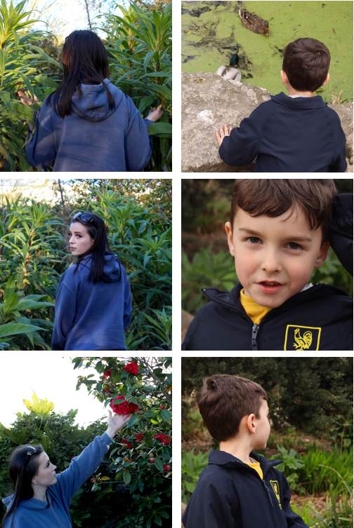
For this piece, I have decided to present a group of six images together in a sequence. This is because all of the images share similarities with each other, showing an obvious link. I found that after experimenting with the positioning of the images, they looked strongest when presented in columns of three images alongside each other. I will also mount these images together on foam, however, I am going to double mount them allowing the images to pop out slightly, creating a border around each image.
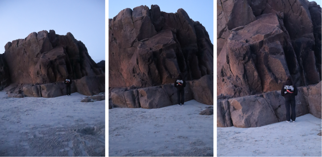
Finally, with these images, I have presented three similar images in a row which I will mount of foam board, keeping them next to each other. I have grouped these photographs together as they are all of the same scene but each image is a closer shot of the model in front of the rock.
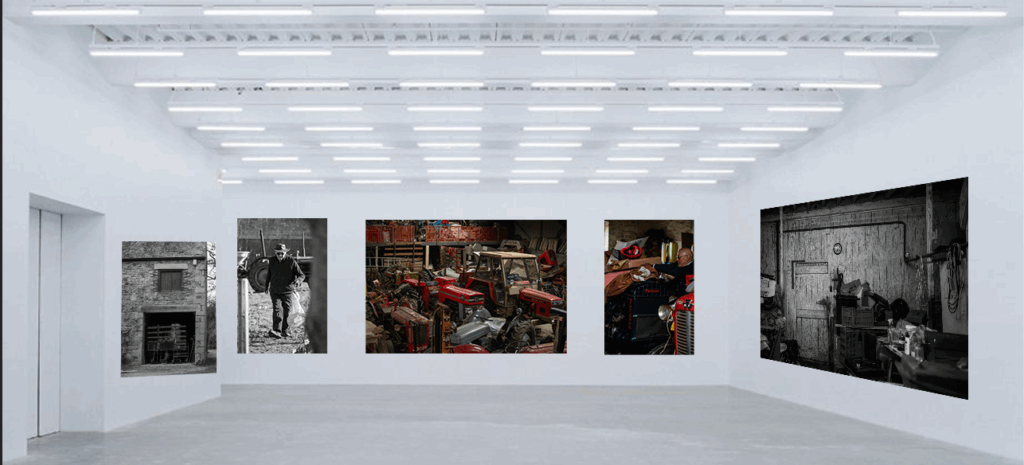
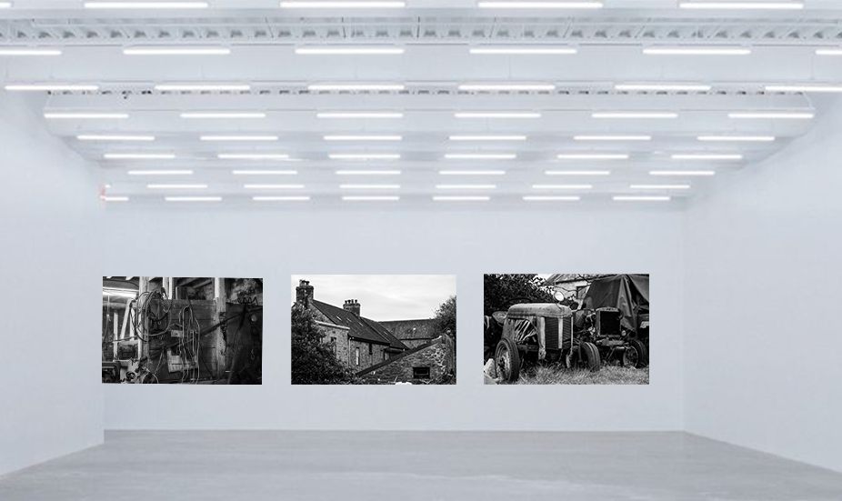
Having selected the best prints I then used photoshop to create a virtual gallery with the photos, pairing certain photos together. For example on the first one there is a photo of the haybarn on the left wall by itself, the next wall has three photos two portraits and tractors, giving a summary that this is a farm. It also hints at who the subject of the project is, showing him working surrounded by photos of his farm. The second gallery was a tryptic presentation of black and white photos, a look into one workshop on the farm/old dairy, a wider shot of the farm itself and then a photo of tractors that have been left in a field for a while due to the busy lifestyle a farm demands.
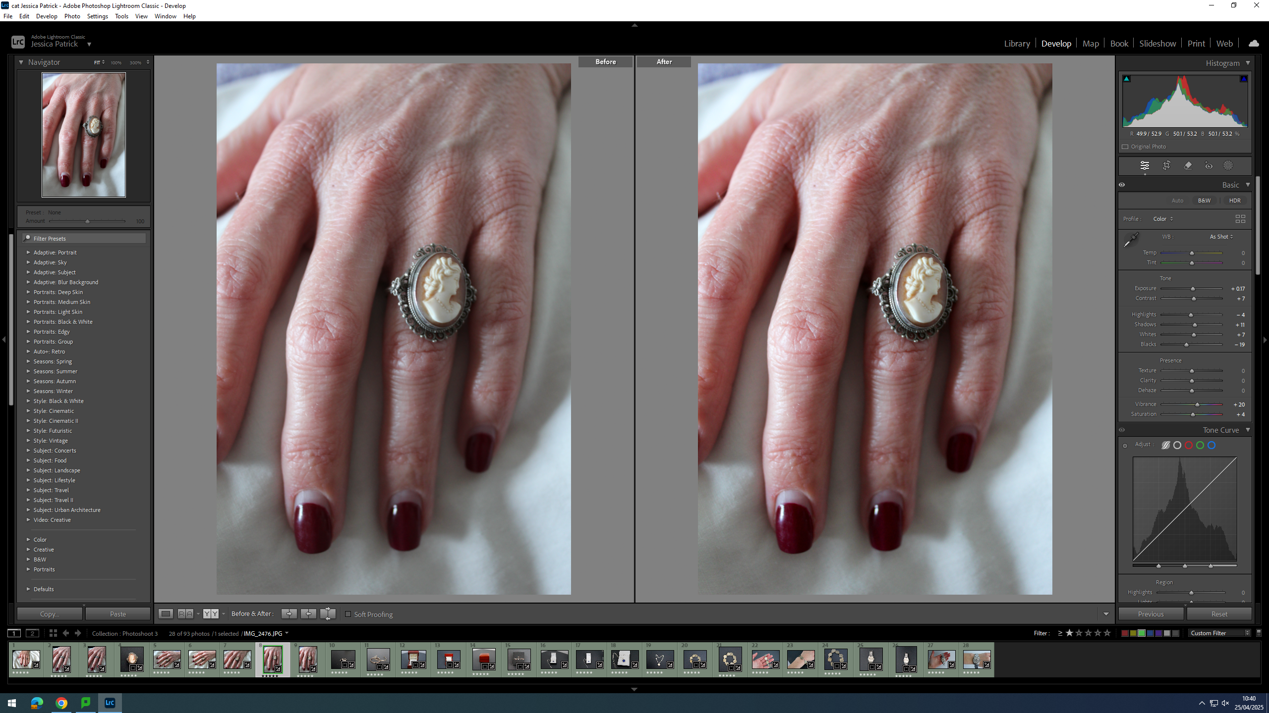
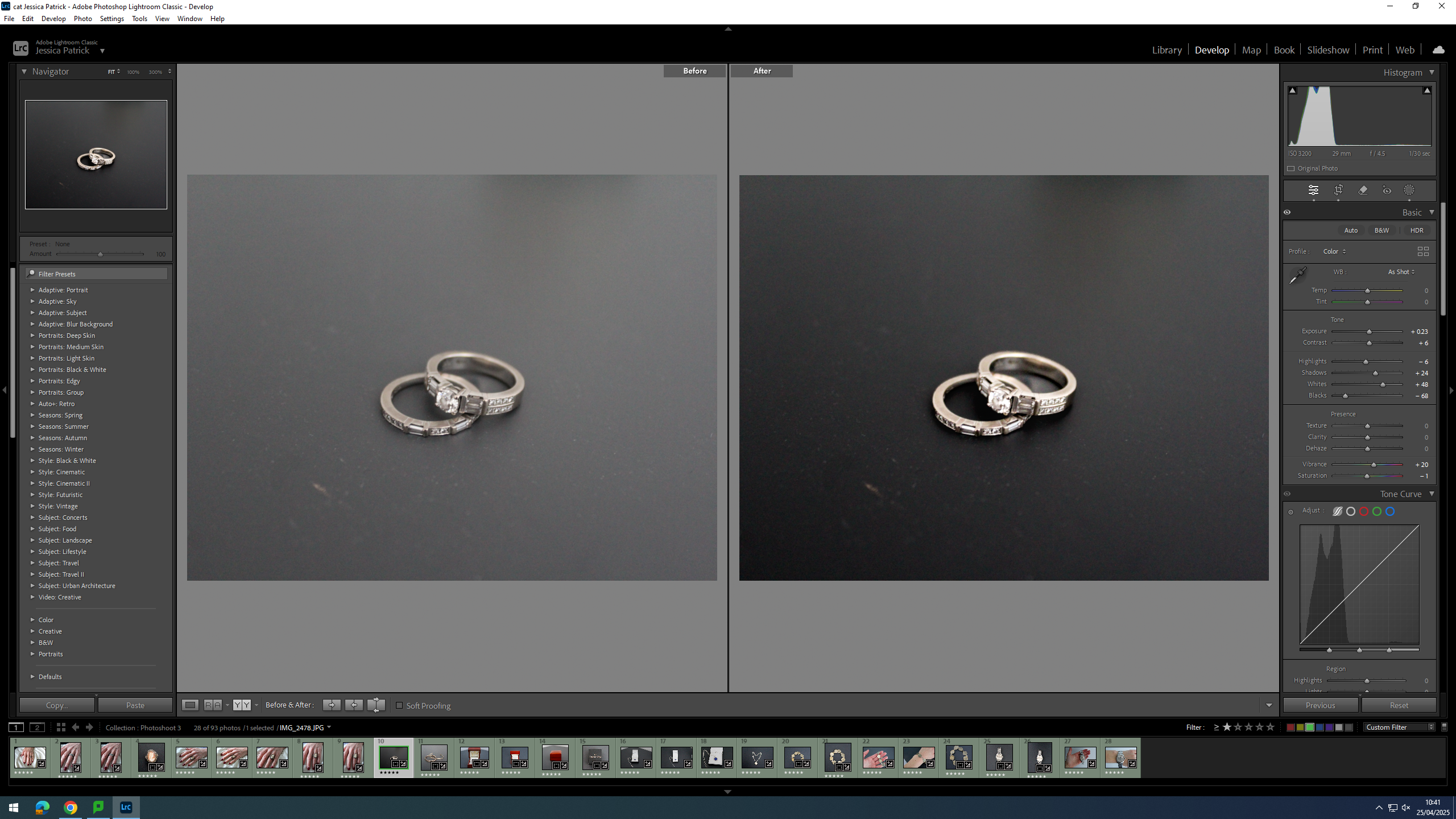
For this photoshoot I have taken images of family heirlooms, which have been passed down on both my mum’s and dad’s side of the family. I have also taken pictures of my mum and dad’s wedding rings to signify their union.
Contact Sheet
Edits
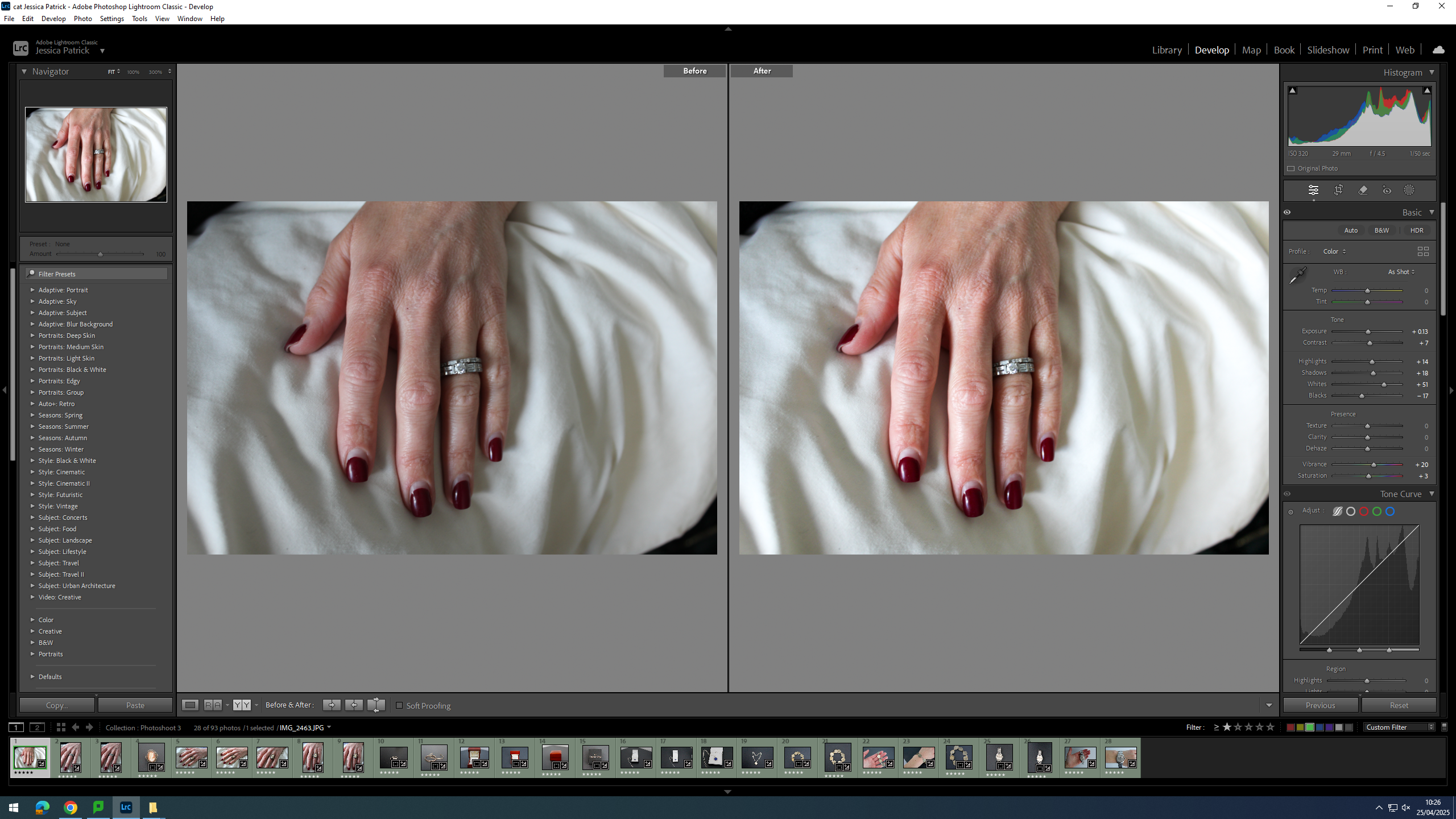
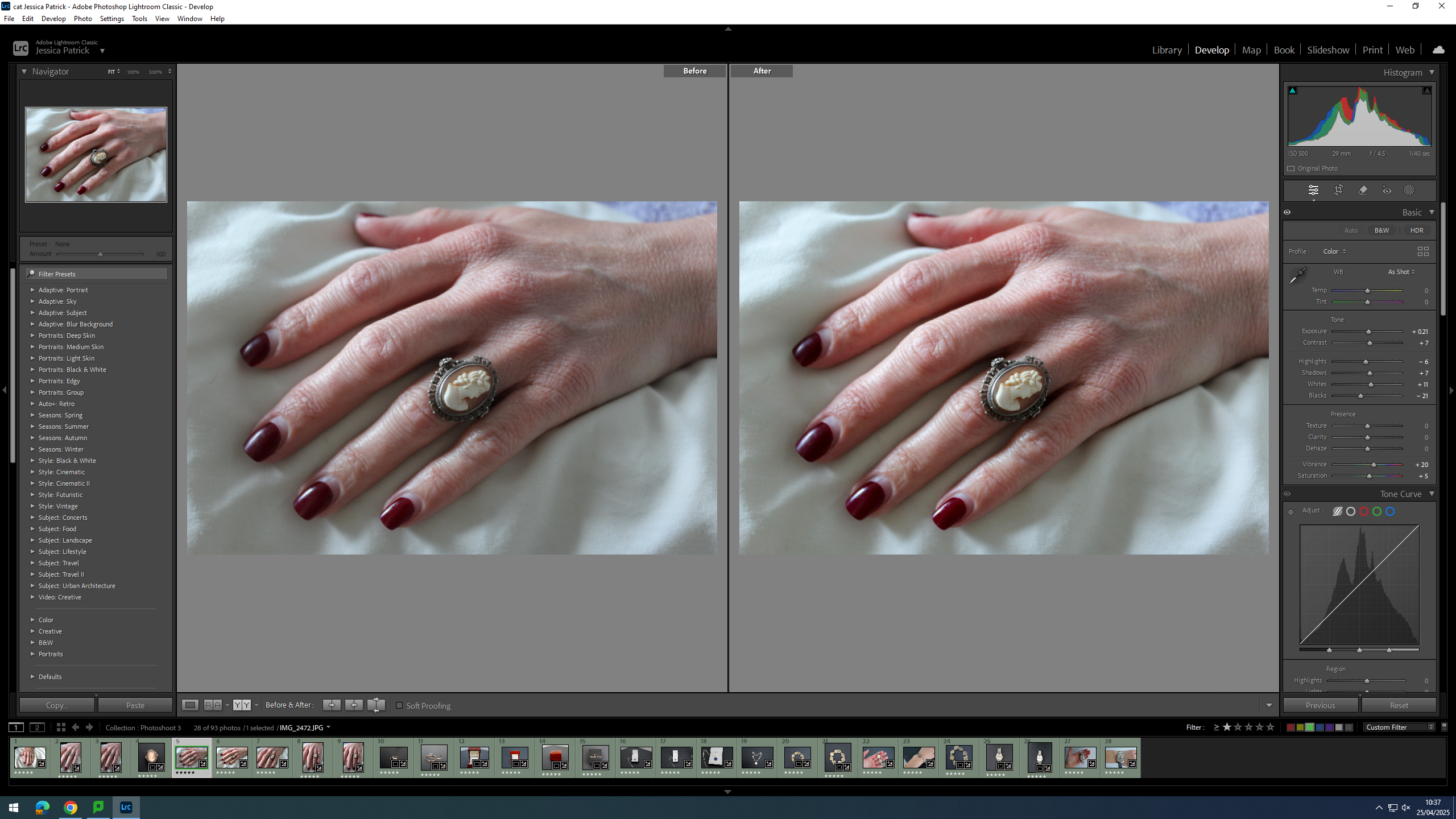
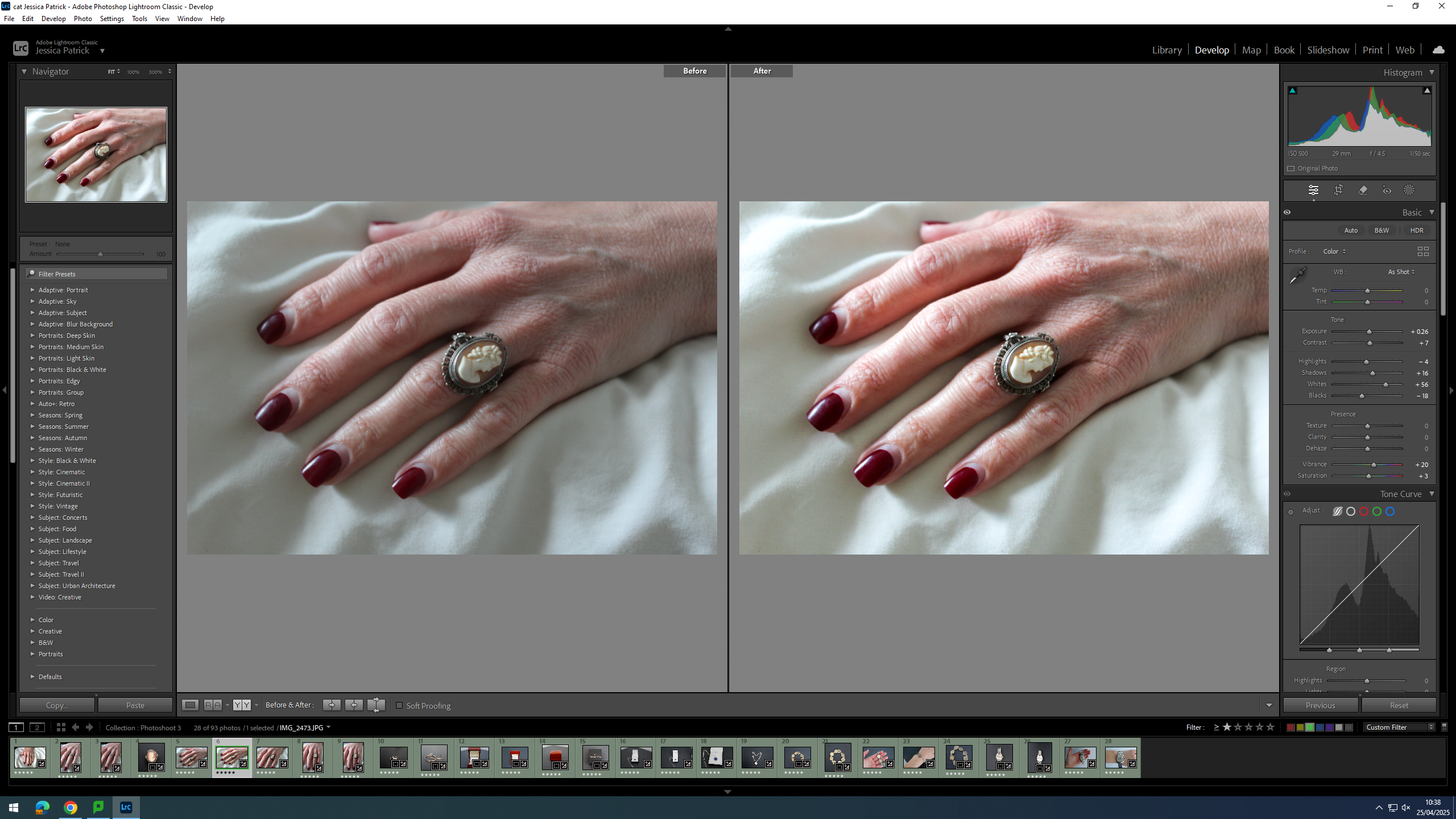
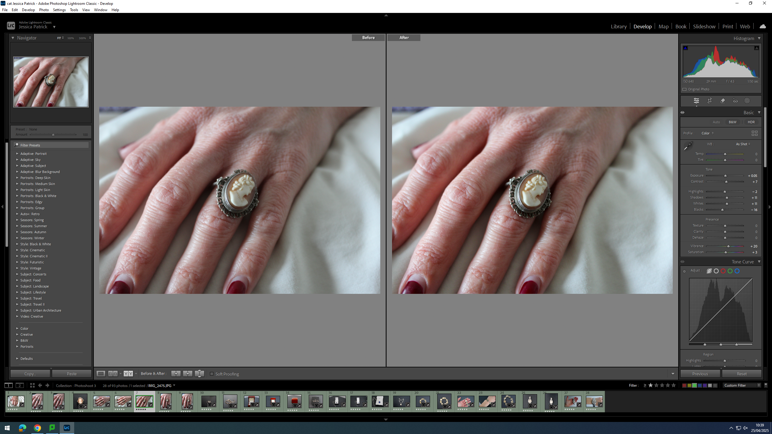
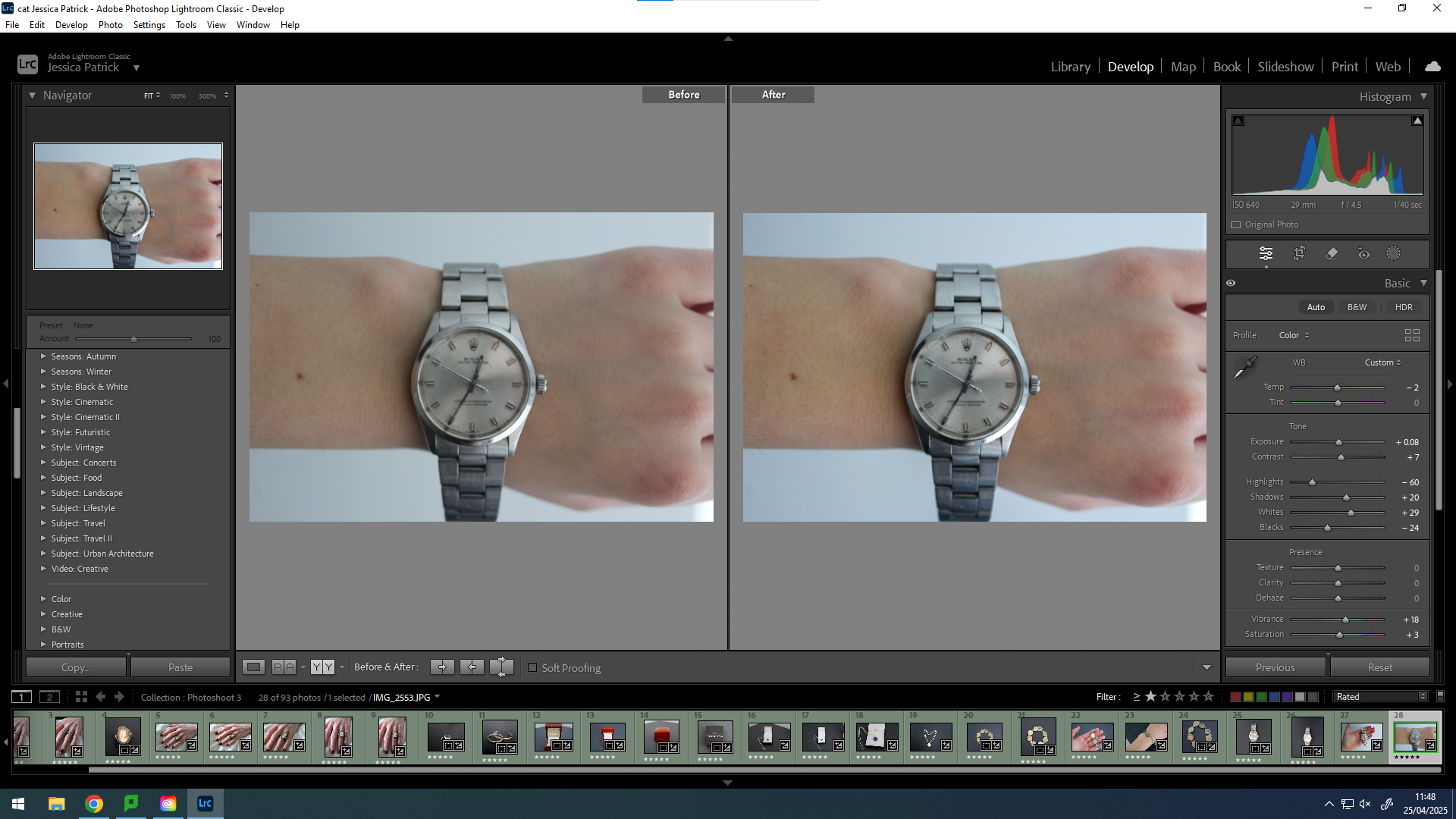
I have edited this photo by increasing the exposure, contrast, shadows, highlights, shadows, vibrancy and saturation, while decreasing the blacks. I did this, so that the image would be slightly more exposed and more vibrant, so that it looks less dull.
I edited this image by increasing the exposure, contrast, highlights, shadows, whites and vibrancy, while also decreasing the blacks and saturation. I did this, so that the image would be more vibrant and have more colour, so that it looks less dull and grey.
I edited this image by increasing the exposure, contrast, shadows, whites, vibrancy and saturation, while decreasing the blacks. I did this, so that the image would be slightly more exposed and have more colour, so that it looked less dull.
First, I cropped this image to crop out all the negative space in the image, so that the subject would take up majority of the frame and not get drowned out my the background.
I edited this image by increasing the exposure, contrast, shadows, vibrancy and saturation, while decreasing the highlights and blacks. I did this, so that the subject of the image would be more vibrant.
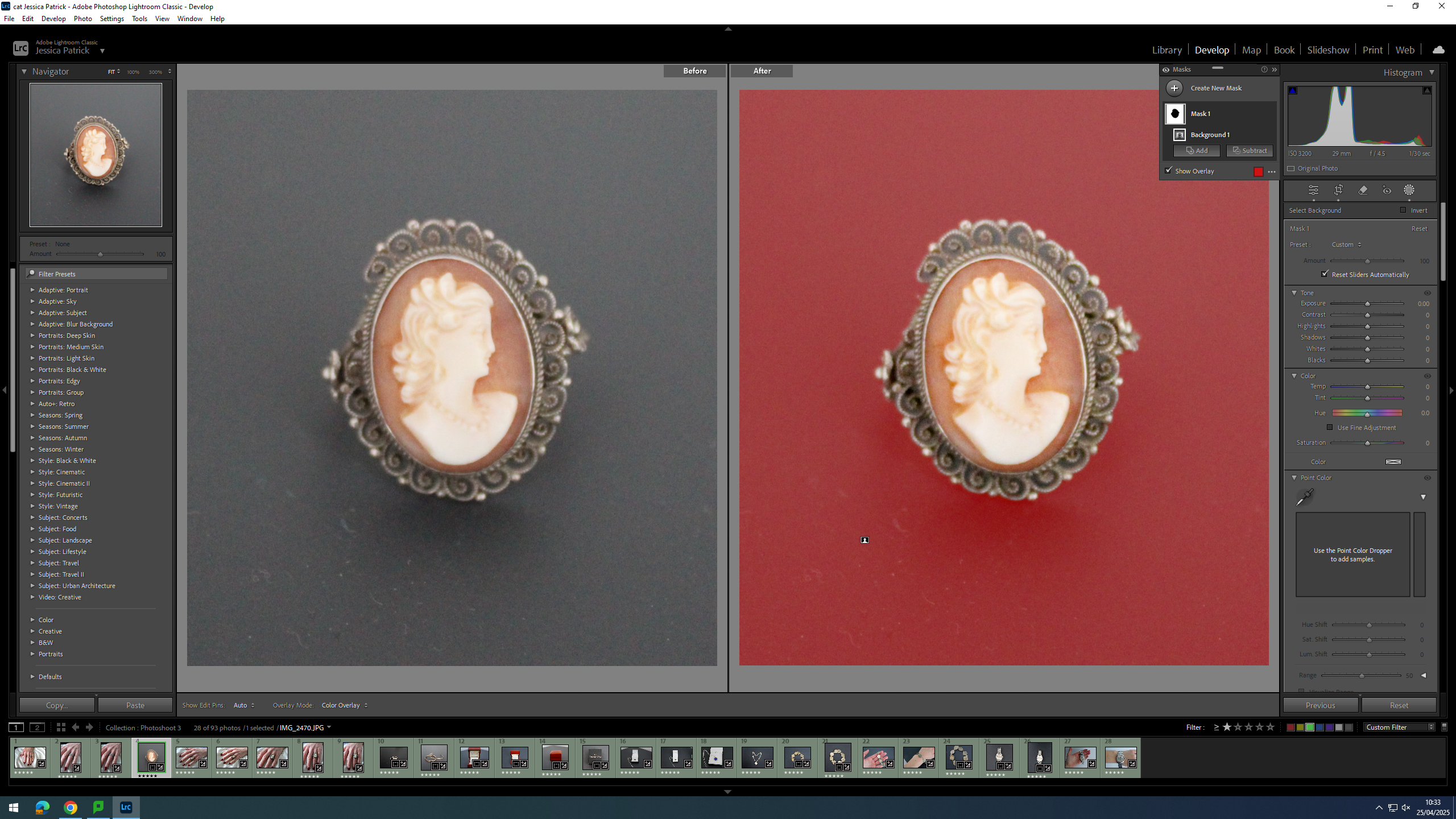
Then, I selected the background of this image and decreased the blacks, so that the background was more black, which created more contrast between the background and the subject.
I edited this image by increasing the exposure, contrast, shadows, whites, vibrancy and saturation, while decreasing the highlights and blacks. I did this, so that the image would be more vibrant and less dull.
I edited this image by increasing the exposure, contrast, shadows, whites, vibrancy and saturation, while decreasing the highlights and blacks. I did this, so that the image would be more vibrant and less dull.
I edited this image by increasing the exposure, contrast, shadows, whites, vibrancy and saturation, while decreasing the highlights and blacks. I did this, so that the image would be more vibrant and less dull.
I edited this image by increasing the exposure, contrast, shadows, whites, vibrancy and saturation, while decreasing the highlights and blacks. I did this, so that the image would be more vibrant and less dull.
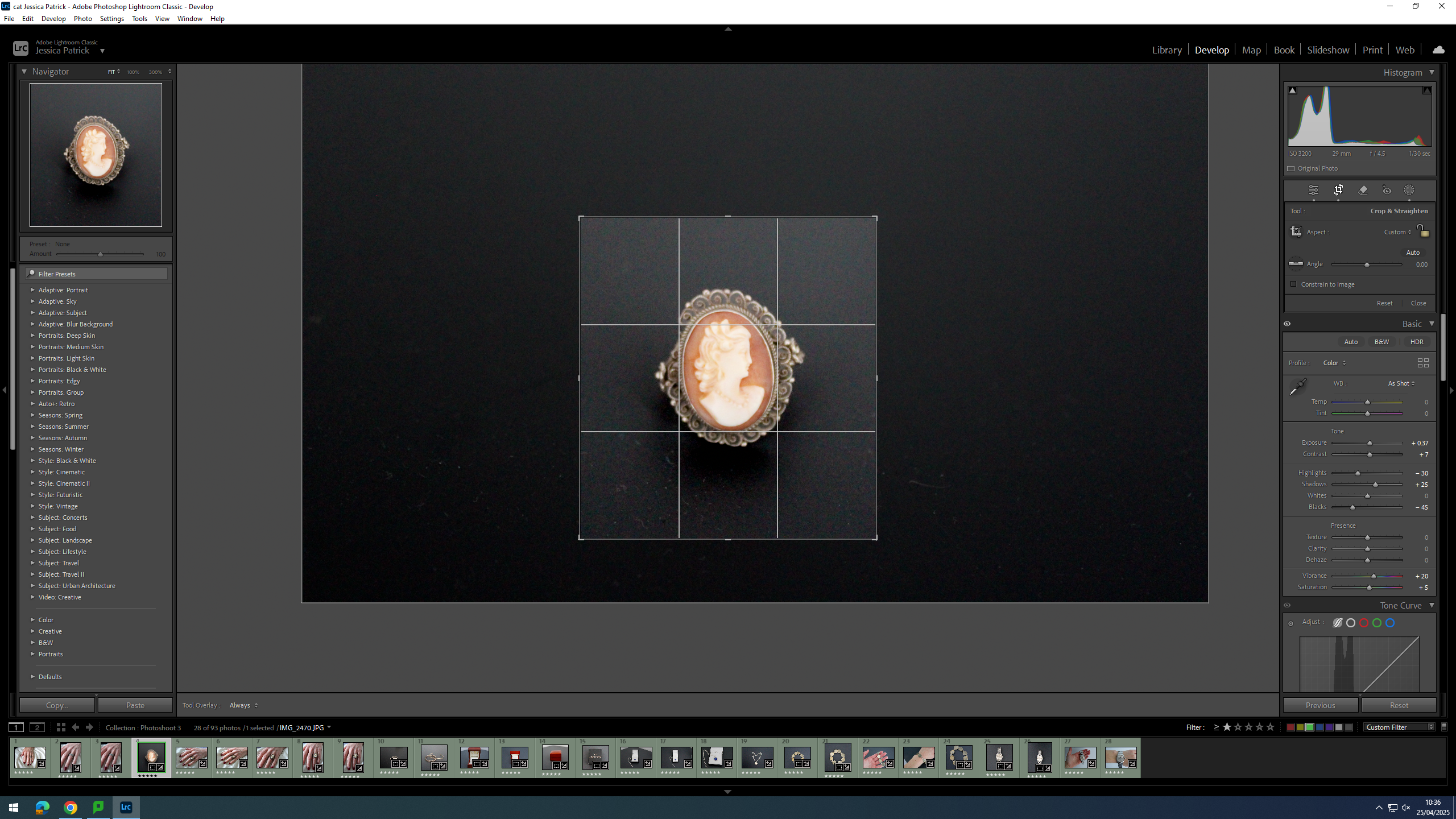
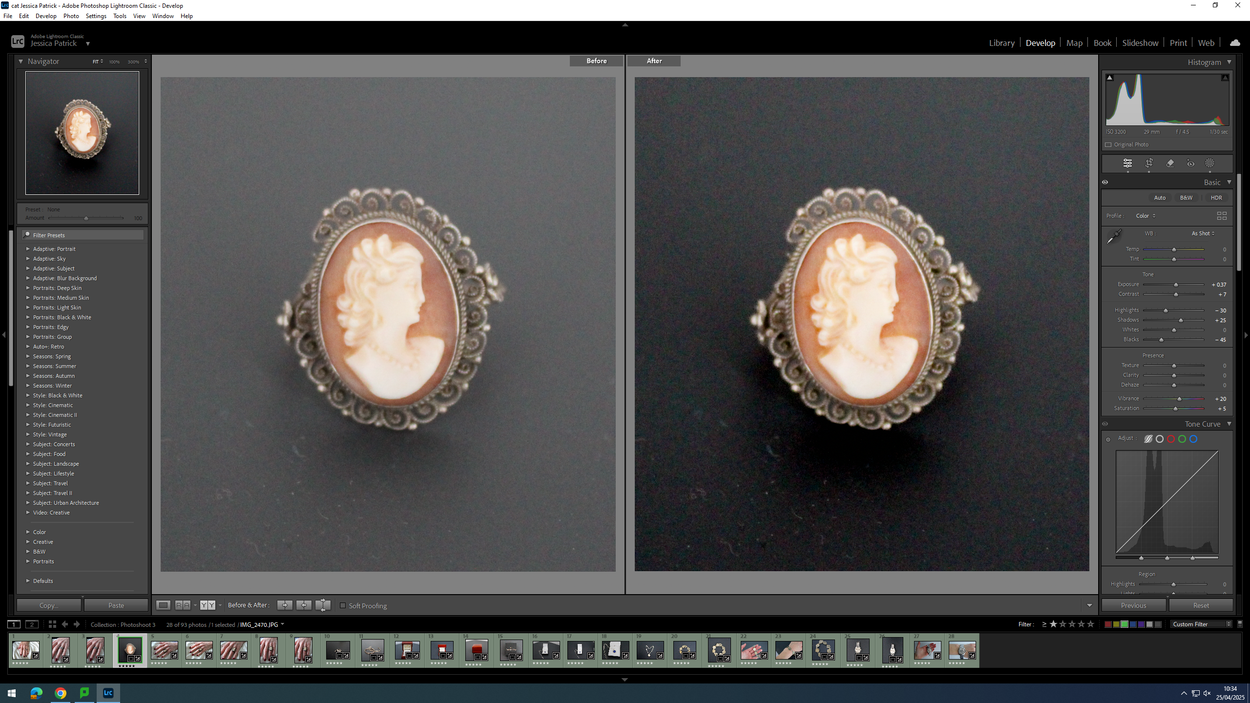
Firstly, I cropped this image, so that the main viewpoint of the image would be in the centre of the frame, following the rule of thirds, which can be seen by the grid.
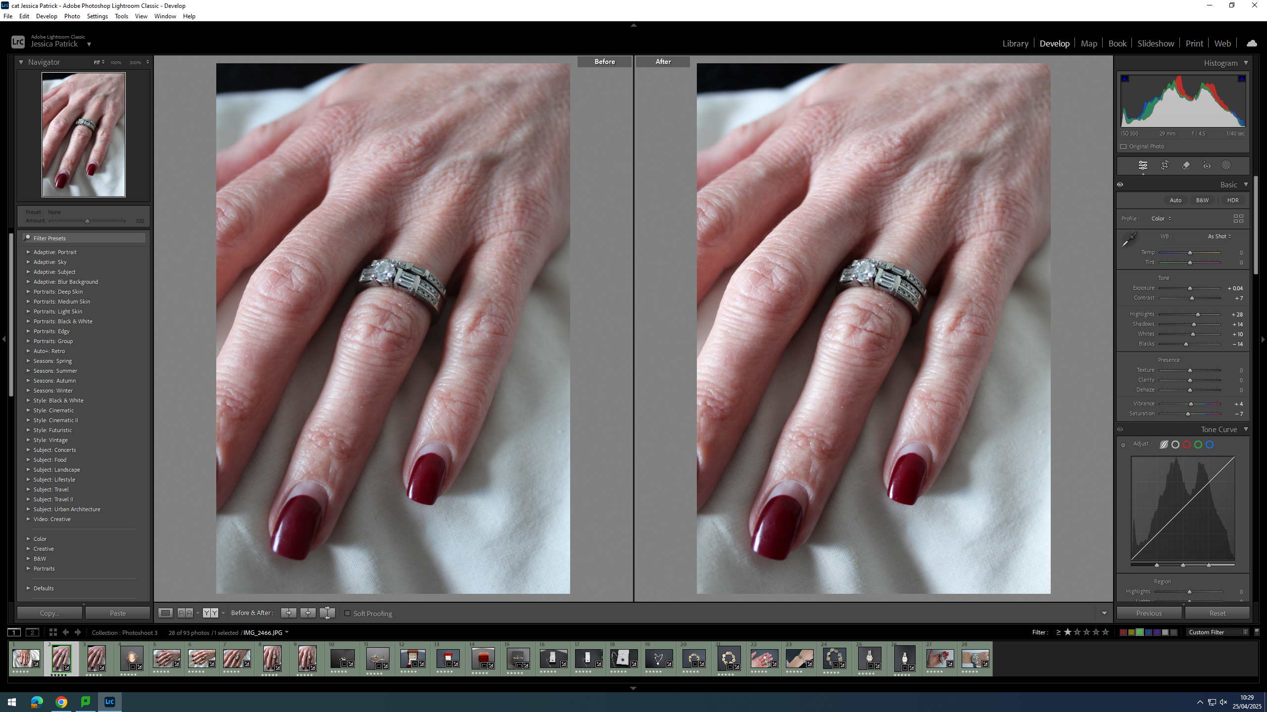
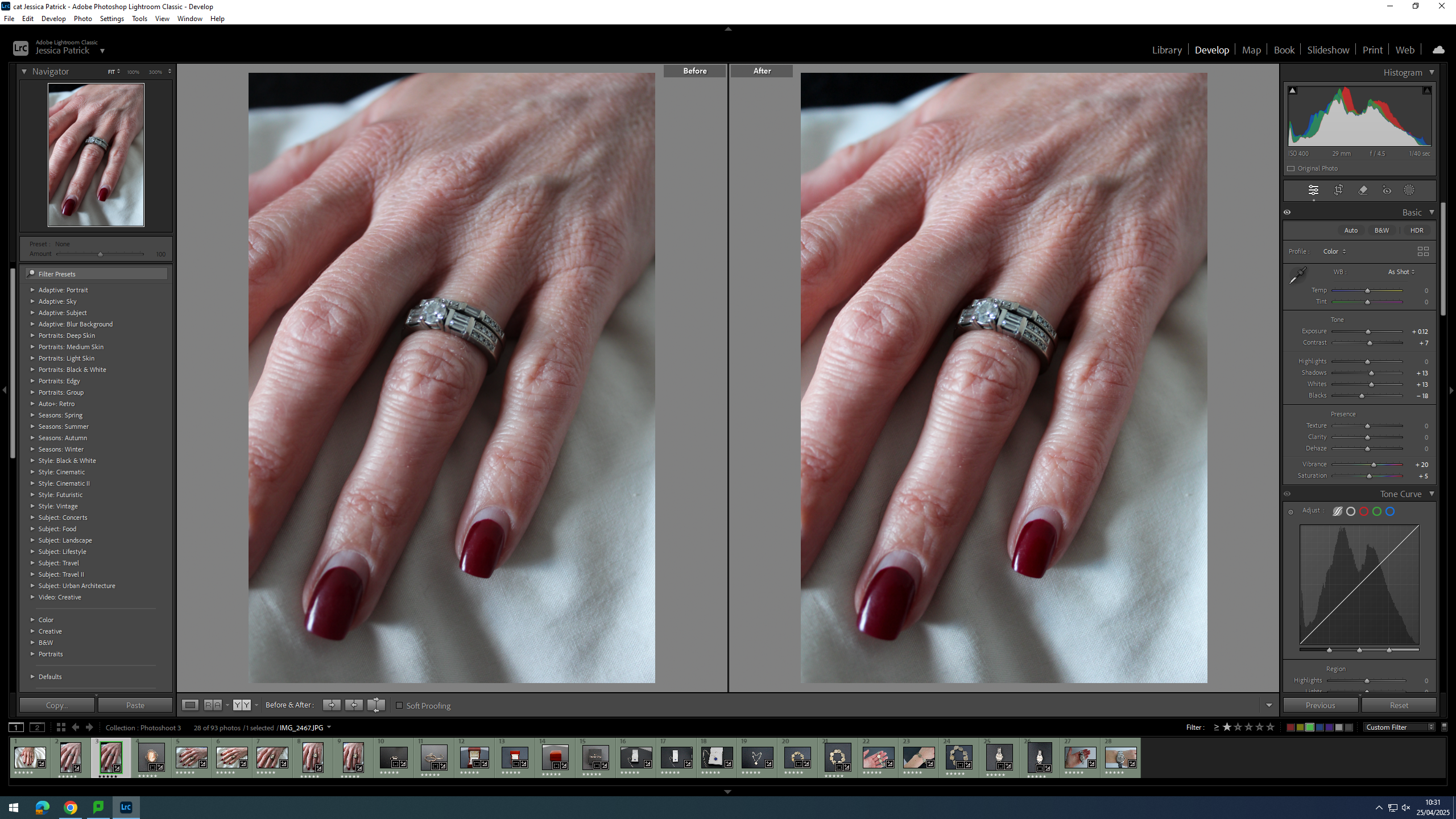
Then, I edited this image by increasing the exposure, contrast, shadows, whites and vibrancy, while decreasing the highlights, blacks and saturation. I did this, so that the rings looked less dull and had more highlights to them.
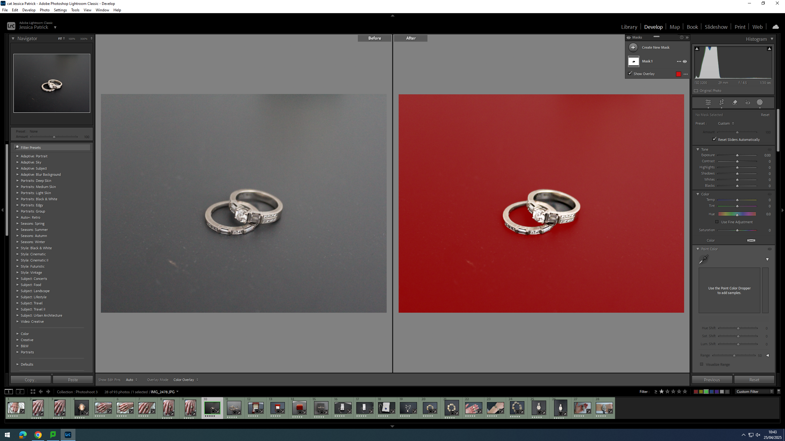
Then, I selected the background of the image and decreased the whites, shadows, exposure and highlights, while increasing the blacks and contrast. I did this, so that the background would be more black, and the try and hide some of the dust on the surface.
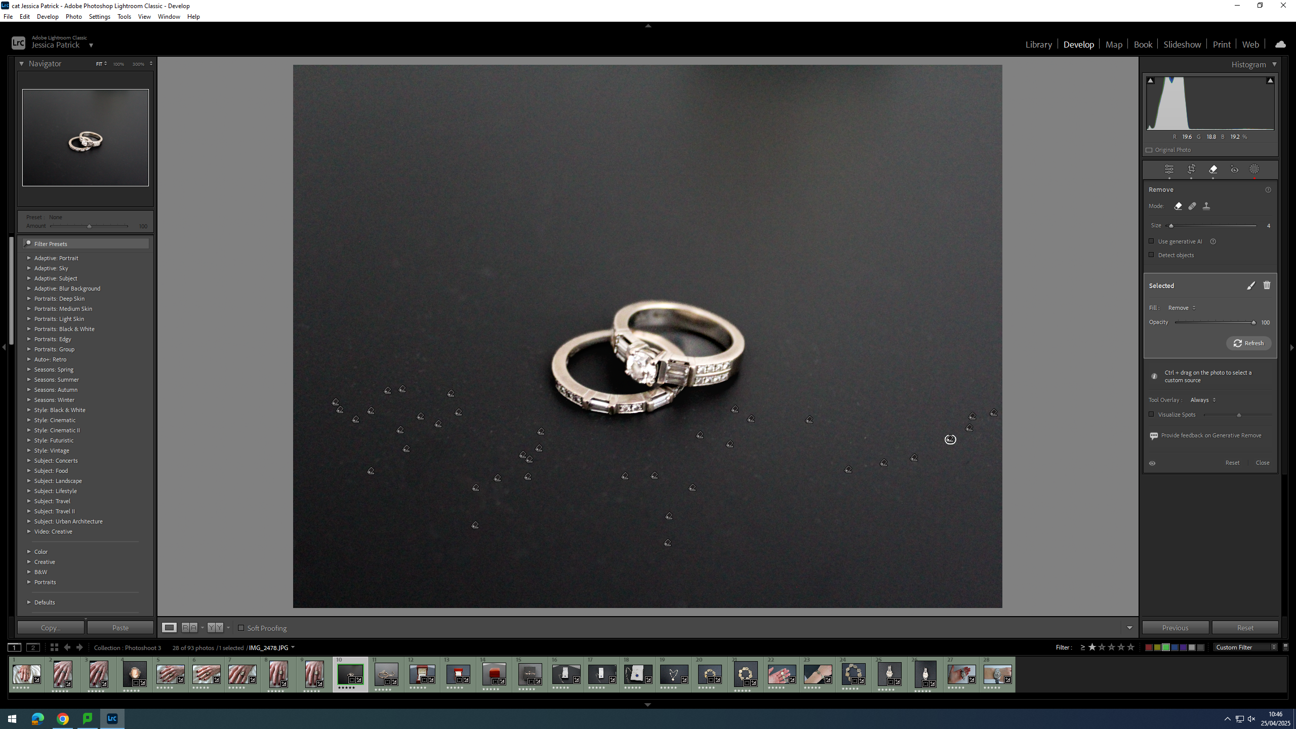
Finally, I used the correction tool to try and remove the dust.
Firstly, I cropped the image, so that the main viewpoint of the image was in the centre of the frame, and so the background of the image didn’t have the white wall and the triangle shape in the background.
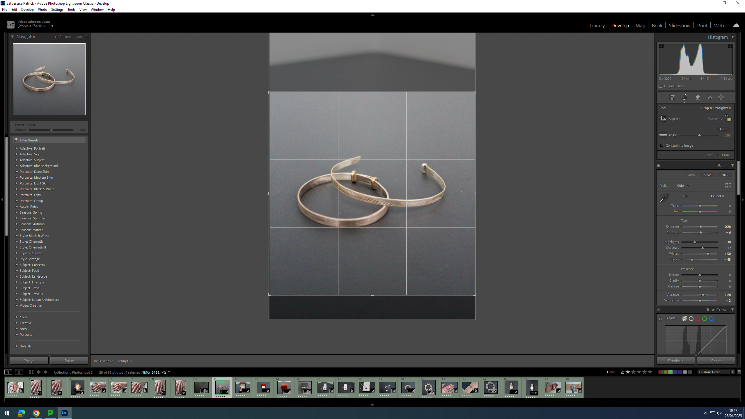
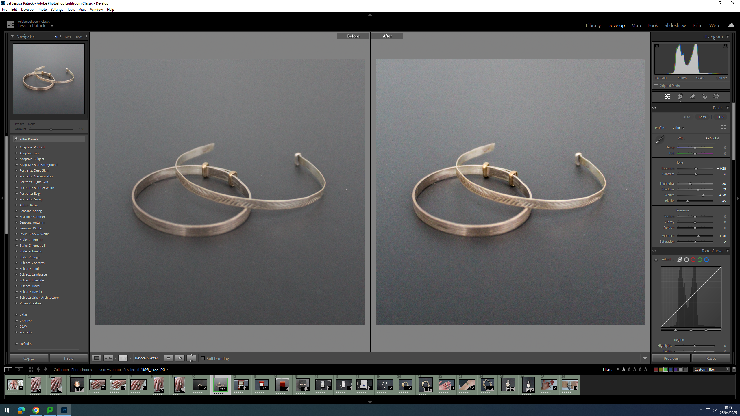
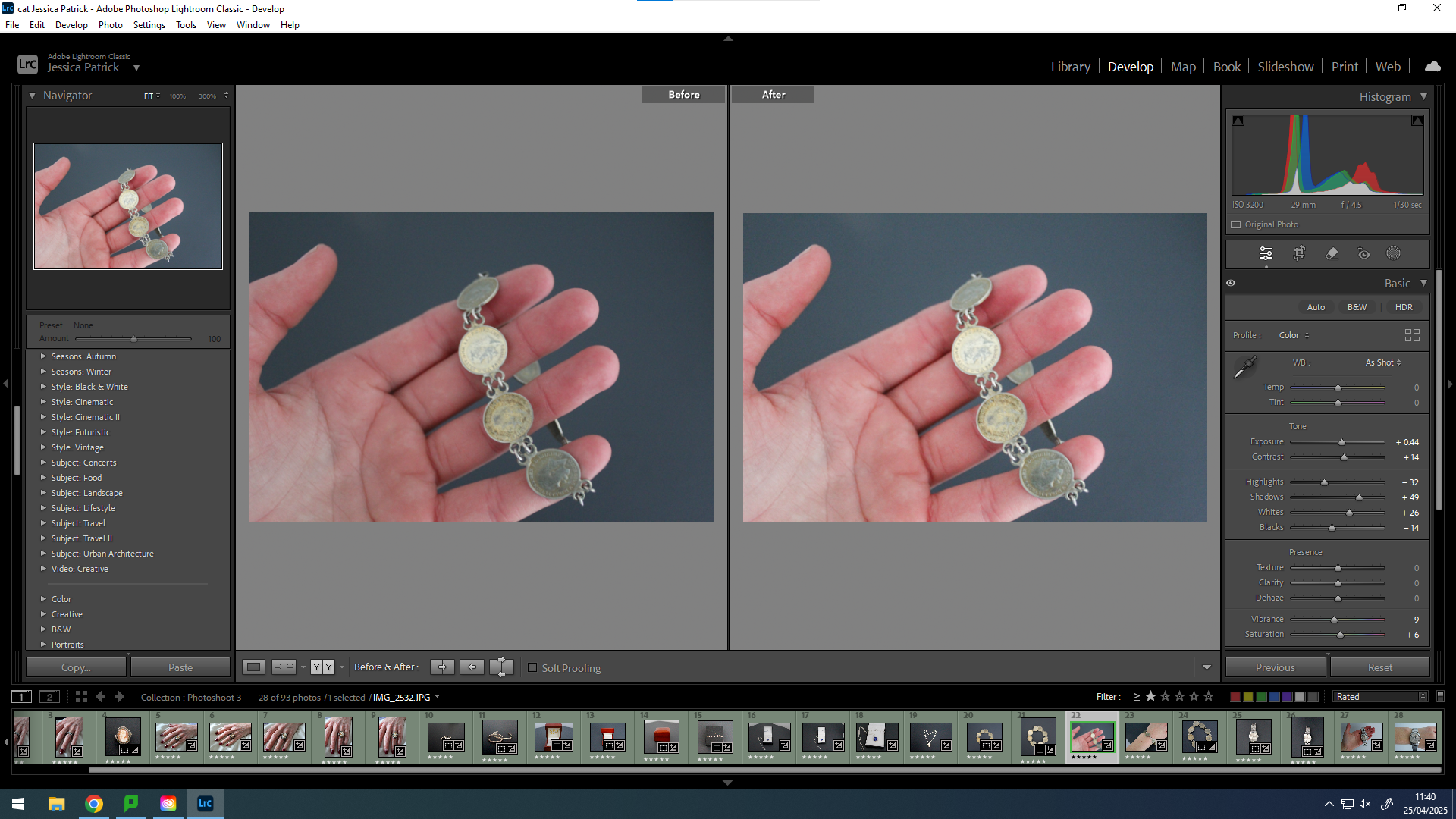
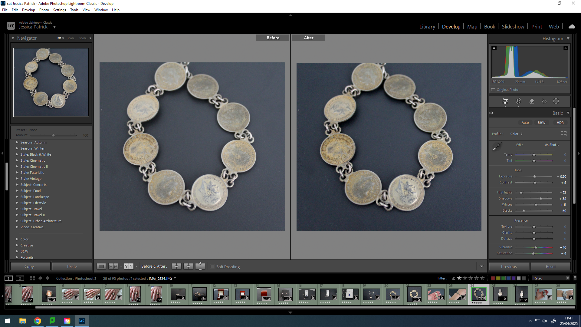
Then, I edited the image by increasing the exposure, contrast, shadows, whites, vibrancy and saturation, while decreasing the highlights and blacks. I did this, so that the bracelet’s were brighter and looked more rustic.
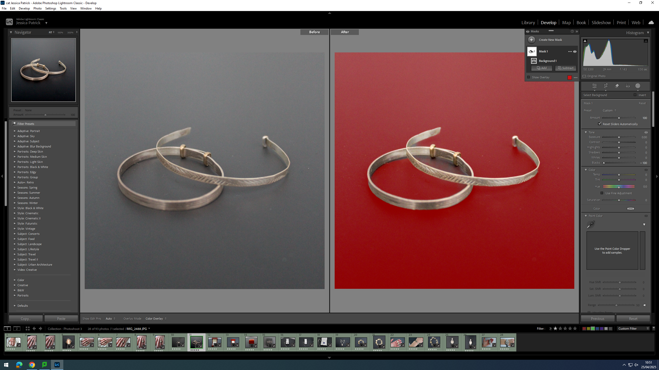
Finally, I selected the background of the image and decreased the blacks, so that the background was more black, which creates more contrast between the bracelets and the background.
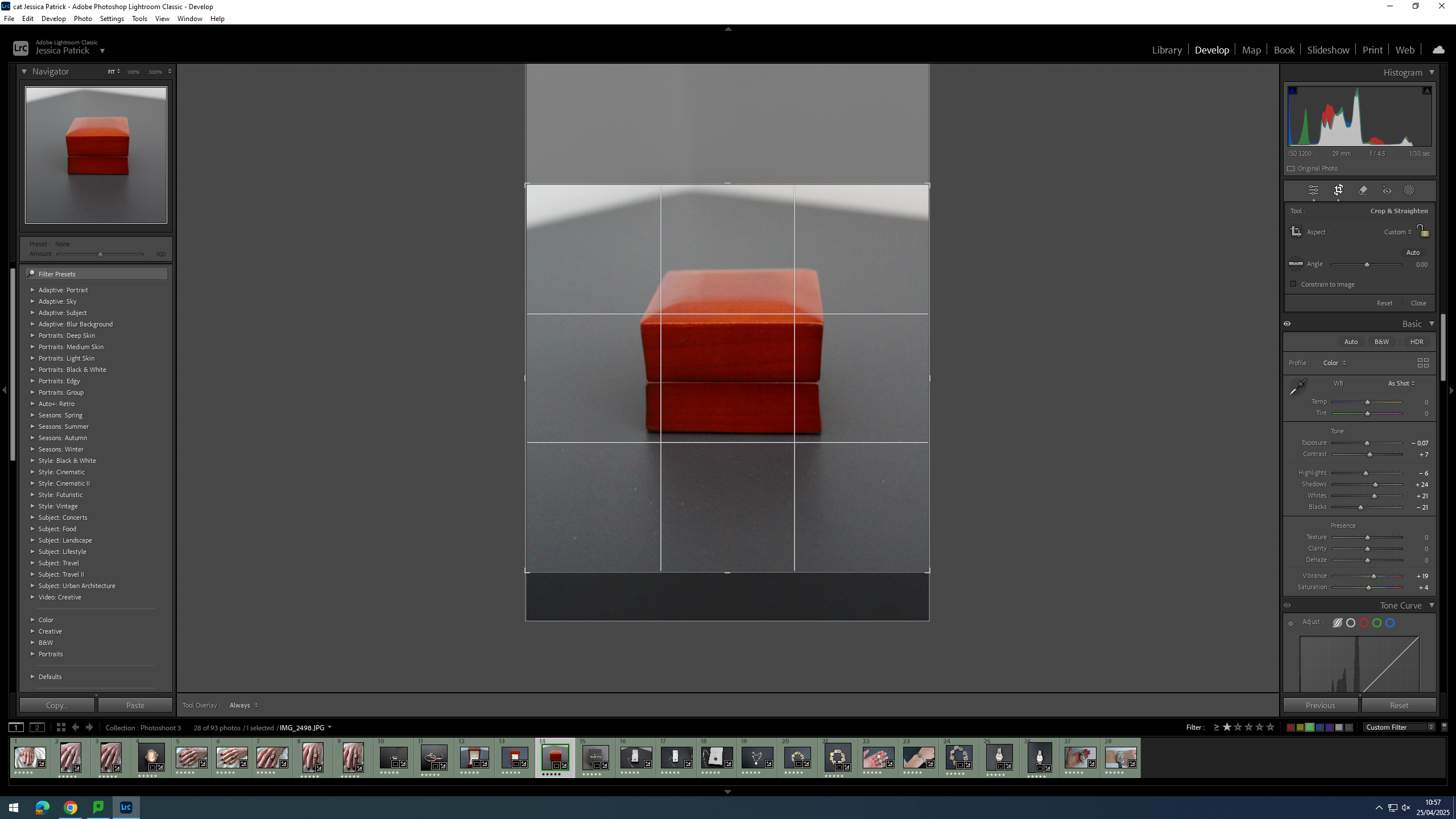
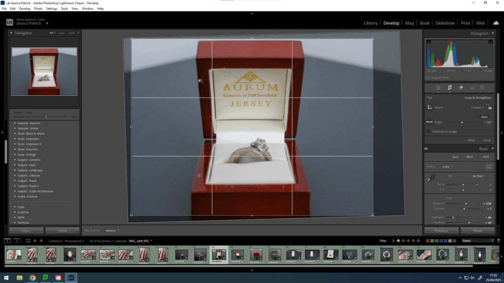
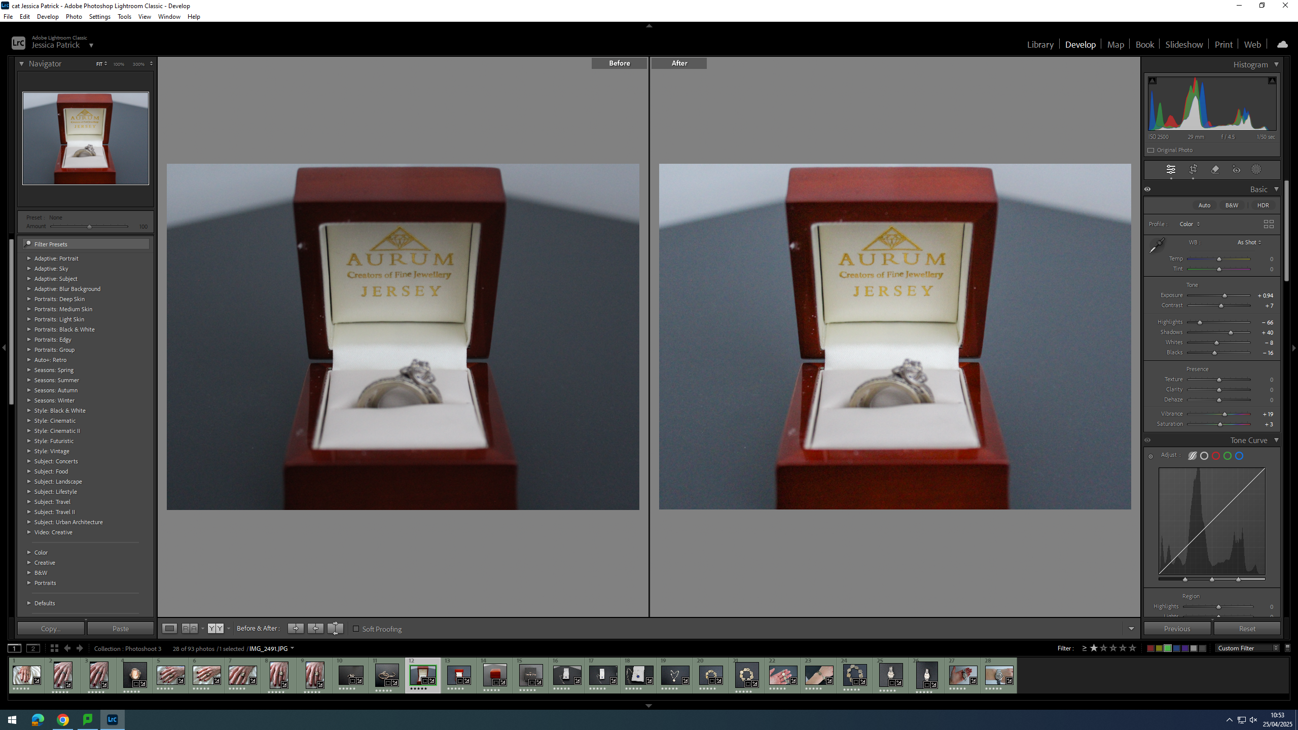
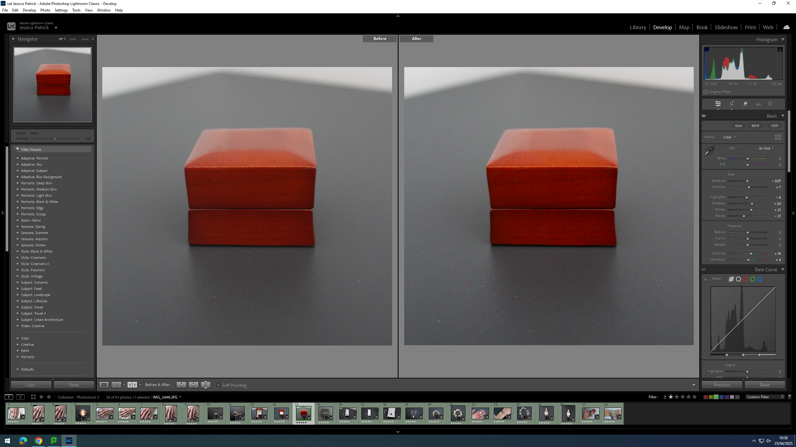
Firstly, I cropped the image slightly, because I manipulated the angle of the image, so that the wedding ring box was straight on, instead of slanted to one side.
Then, I edited this image by increasing the exposure, contrast, shadows, vibrancy and saturation, while decreasing the highlights, whites and blacks. I did this, so that the image was slightly more exposed and more vibrant.
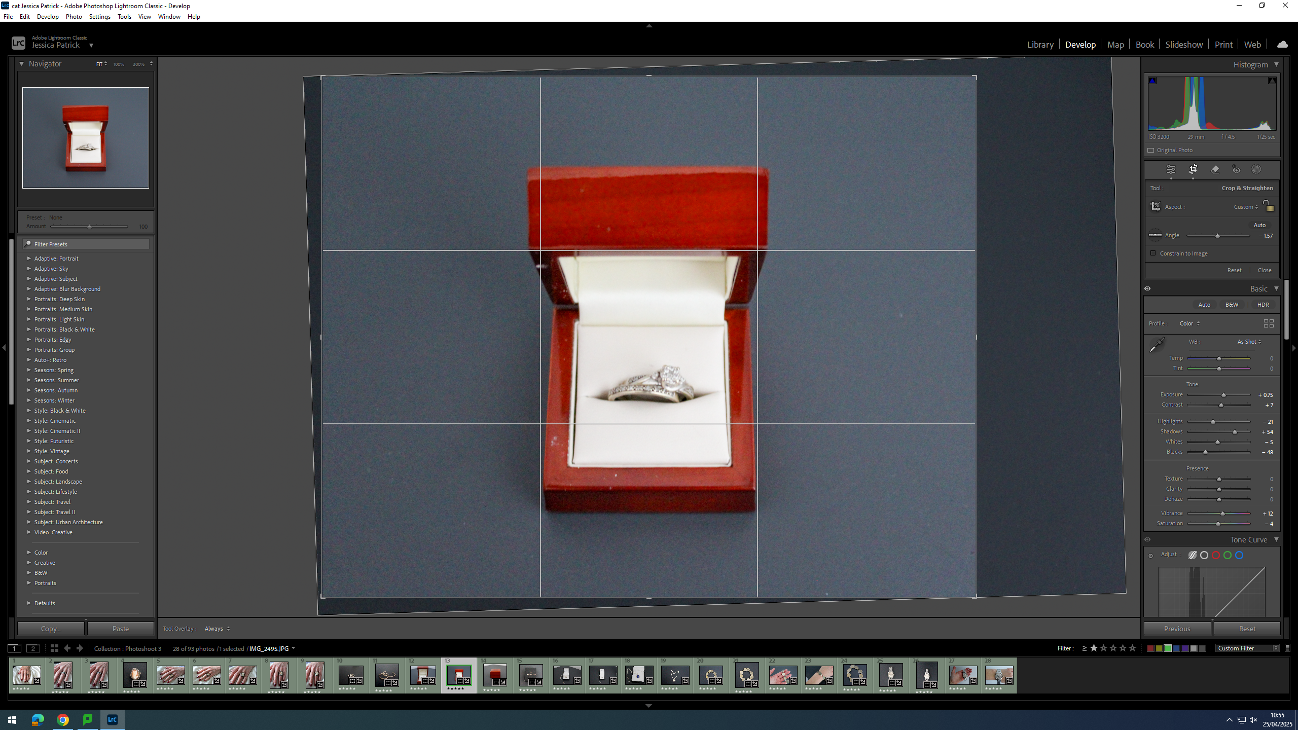
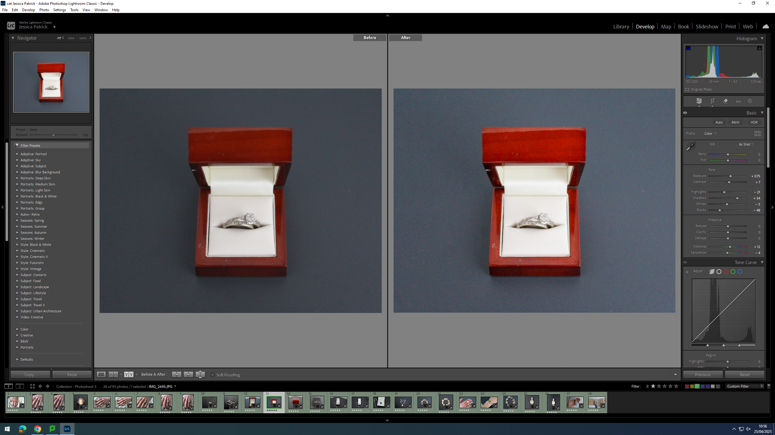
Firstly, I cropped this image by manipulating the angle of the image, so that the wedding ring box was centre in the frame and positioned straight, instead of slanted.
Then, I edited this image by increasing the exposure, contrast, shadows and vibrancy, while decreasing the whites, highlights, blacks and saturation. I did this, so that the image would be slightly more exposed and vibrant.
First, I cropped this image, so that the wedding ring box would be in the centre of the frame.
Then, I edited this image by increasing the contrast, shadows, whites, vibrancy and saturation, while decreasing the exposure and highlights. I did this, so that the image was slightly more vibrant.
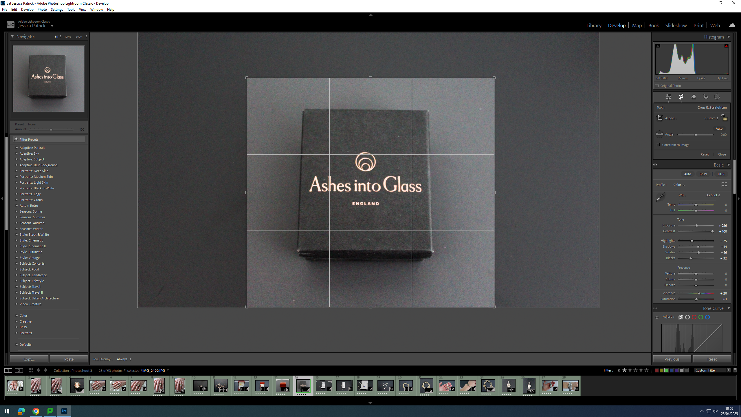
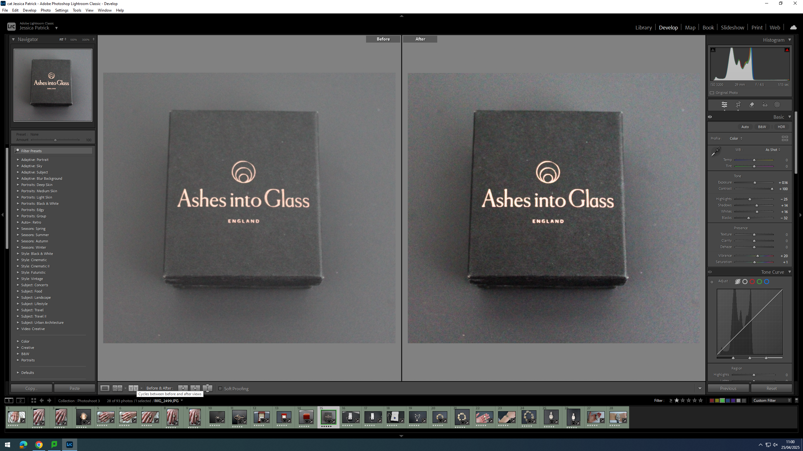
Firstly, I cropped this image, so that the jewellery box would be in the centre of the frame.
Then, I edited this image by increasing the exposure, contrast, shadows, whites, vibrancy and saturation, while decreasing the highlights and blacks. I did this, so the jewellery box would stand out more from the background, as they are very similar colours.
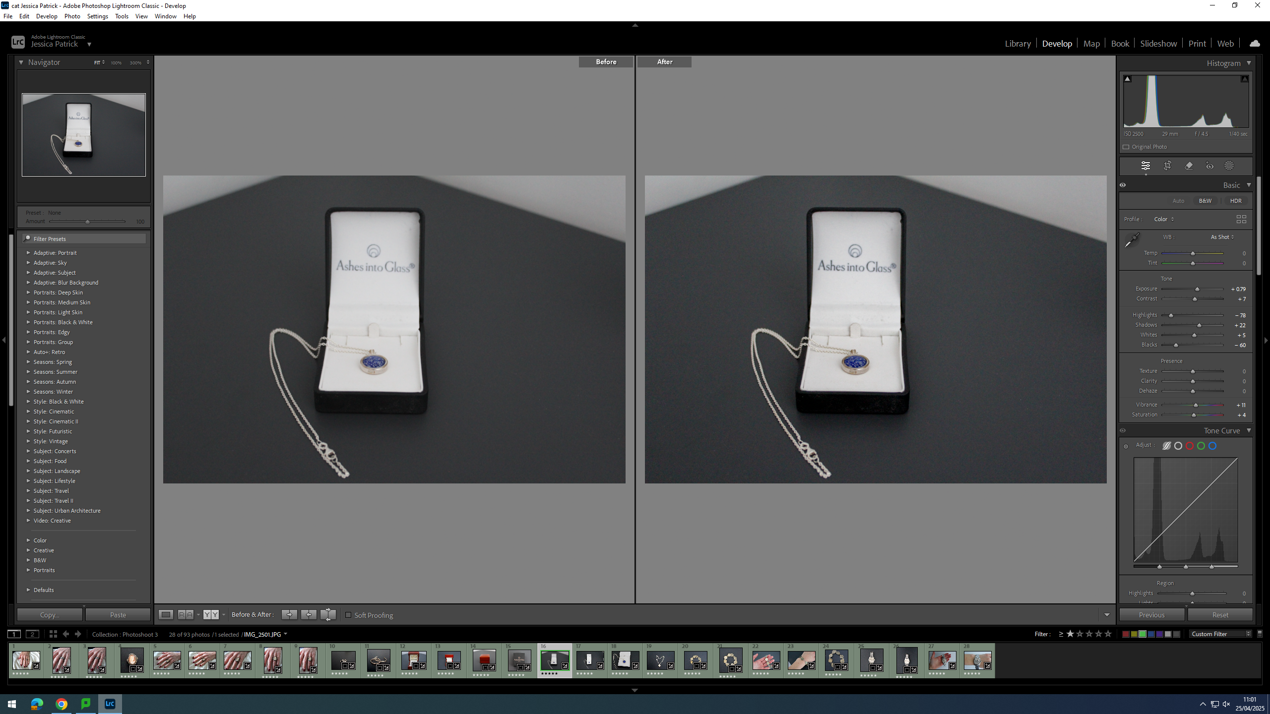
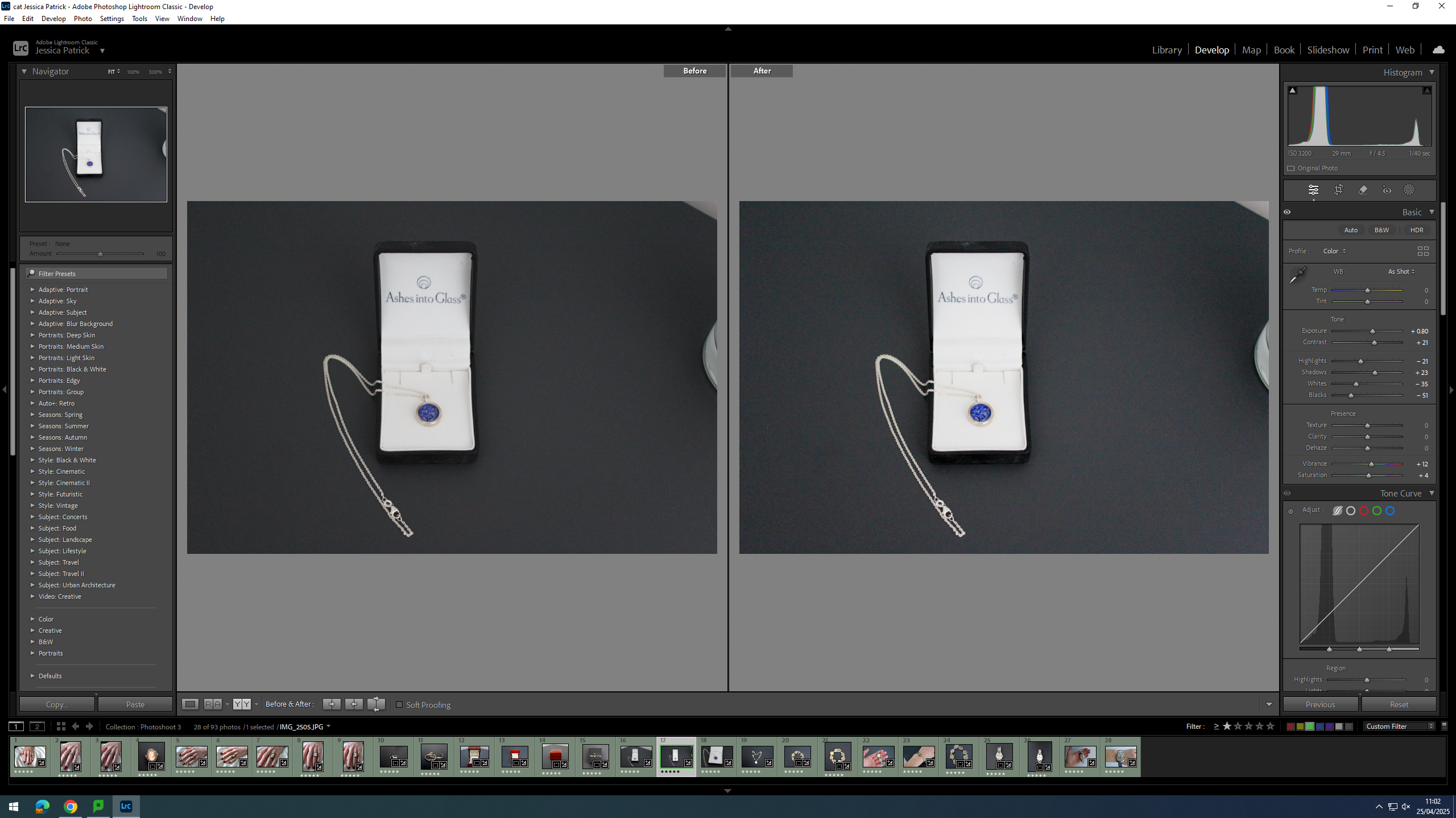
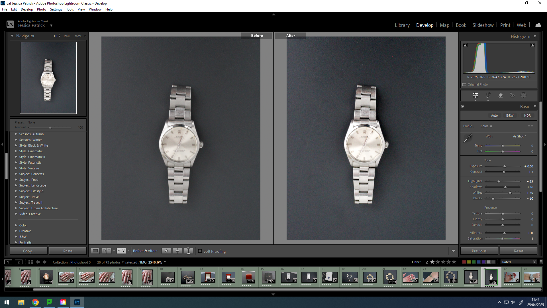
I edited this image by increasing the exposure, contrast, whites, shadows, vibrancy and saturation, while decreasing the highlights and blacks. I did this, so that t more contrast and the necklace was more vibrant and stood out more.
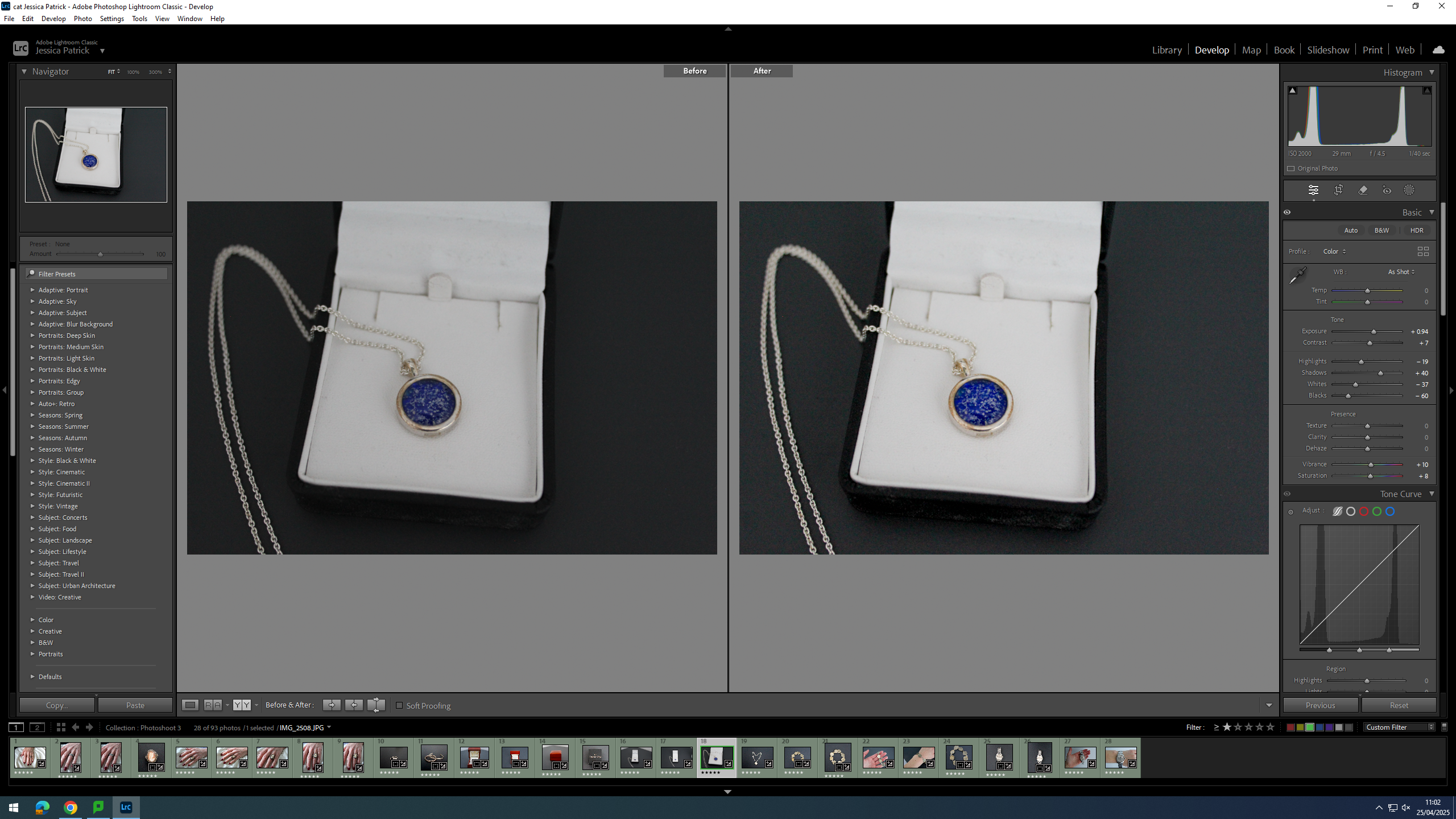
I edited both these images by increasing the exposure, contrast, shadows, whites, vibrancy and saturation, while decreasing the highlights, whites and blacks. I did this, so that there were more dark tones to create more contrast and so the necklace was more vibrant.
I edited this image by increasing the exposure, contrast, shadows, whites and vibrancy, while decreasing the highlights, blacks and saturation. I did this, so that the background was more black, so it would create contrast between the background and the necklace. I also wanted the necklace to look brighter/ shinier.
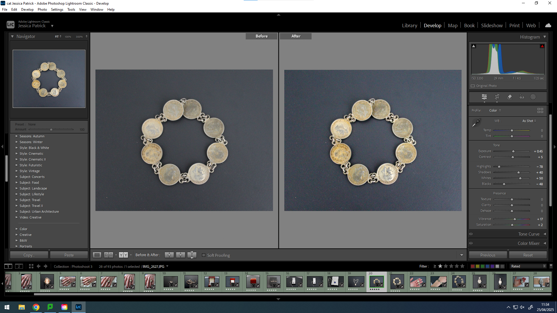
I edited this image by increasing the exposure, contrast, shadows, whites, vibrancy and saturation, while decreasing the highlights and blacks. I did this, so that the background was more black to create contrast between it and the bracelet and so the bracelet was more vibrant with a more rustic look.
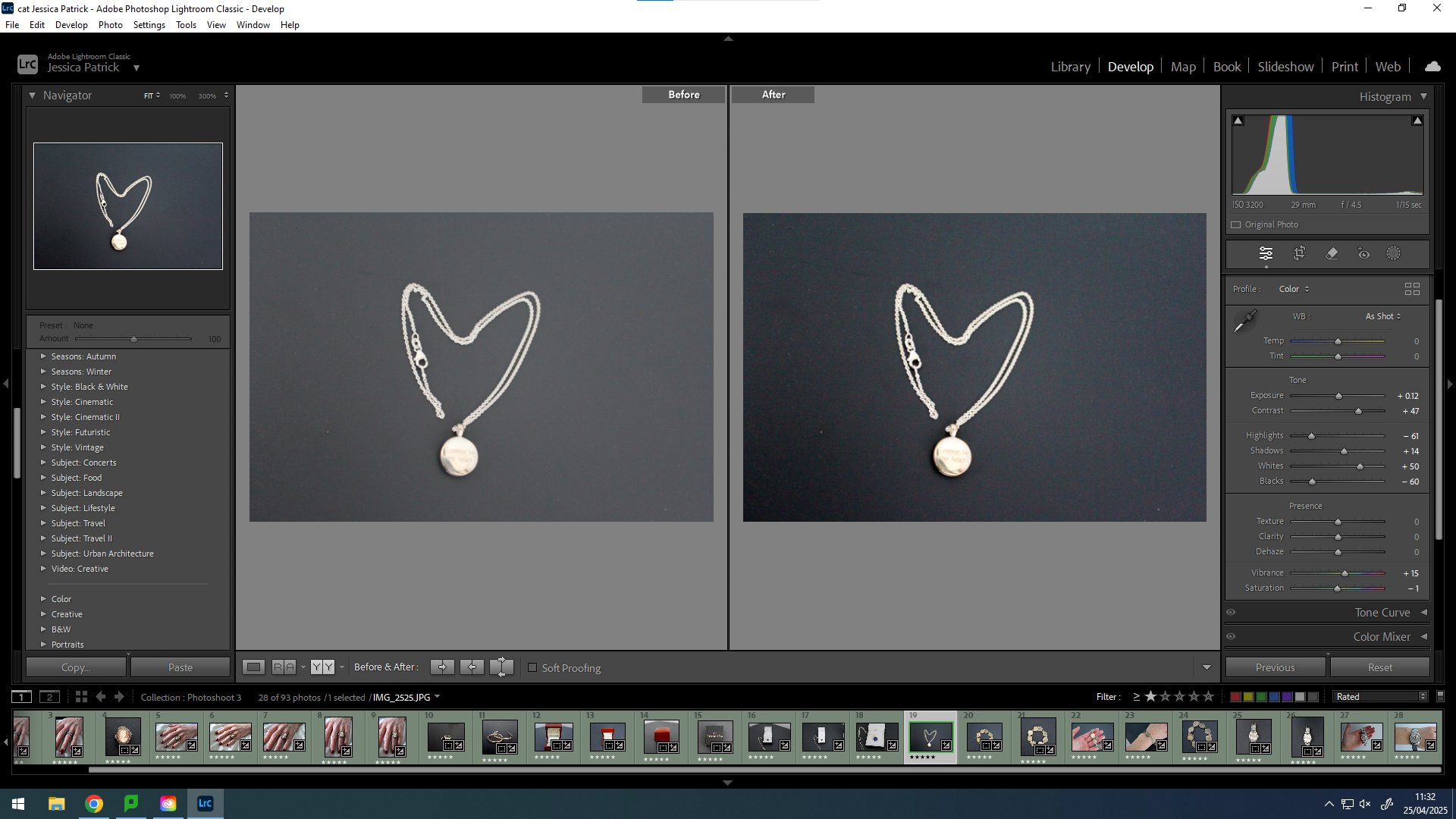
I edited this image by increasing the exposure, contrast, shadows, whites and vibrancy, while decreasing the highlights and blacks. I did this, so that the image would be more vibrant.
I edited this image by increasing the exposure, contrast, shadows, whites and vibrancy, while decreasing the highlights, blacks and saturation. I did this, so that the background would be more black, which would create more contrast between the background and the bracelet. Also to make the bracelet more vibrant and detailed.
I edited this by increasing the exposure, contrast, shadows, whites and vibrancy, while decreasing the highlights, blacks and saturation. I did this, so that the image would be slightly more exposed and have more contrast.
I edited this image by increasing the contrast, shadows, whites vibrancy and saturation, while decreasing the exposure, highlights and blacks. I did this, so that the image would be more vibrant.
I edited this image by increasing the exposure, contrast, shadows, whites, vibrancy and saturation, while decreasing the highlights and blacks. I did this, so that the image would be slightly more exposed and vibrant.
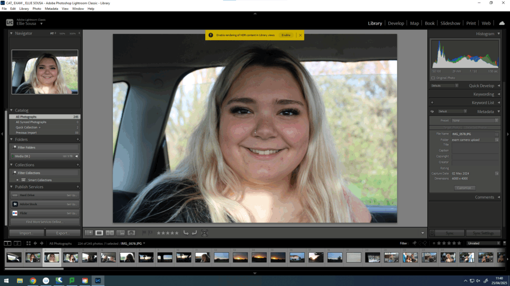
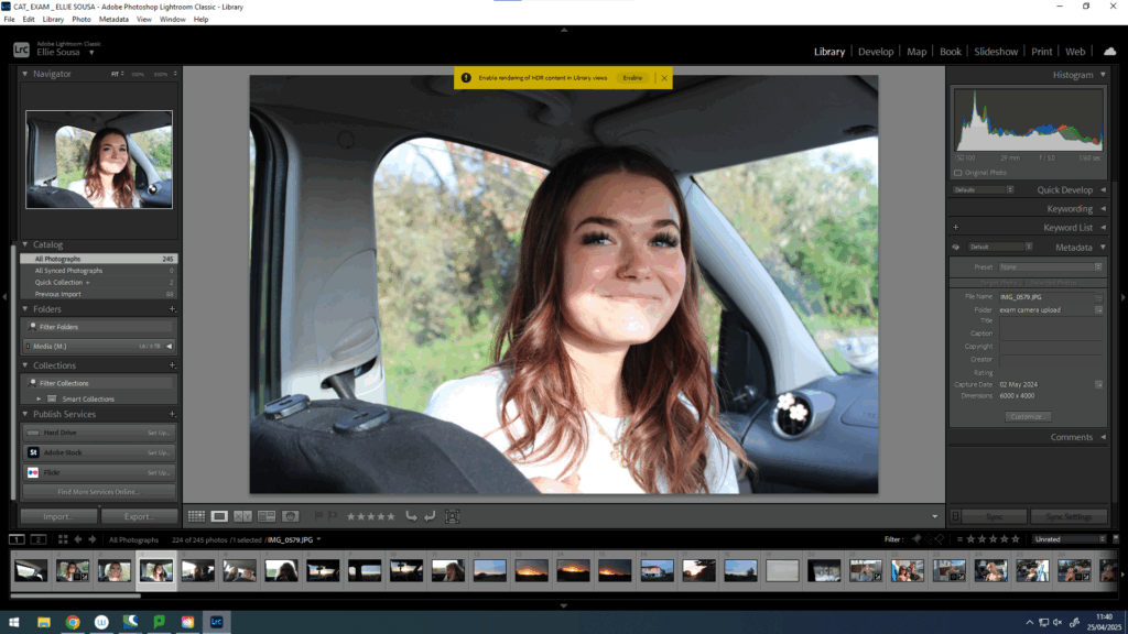
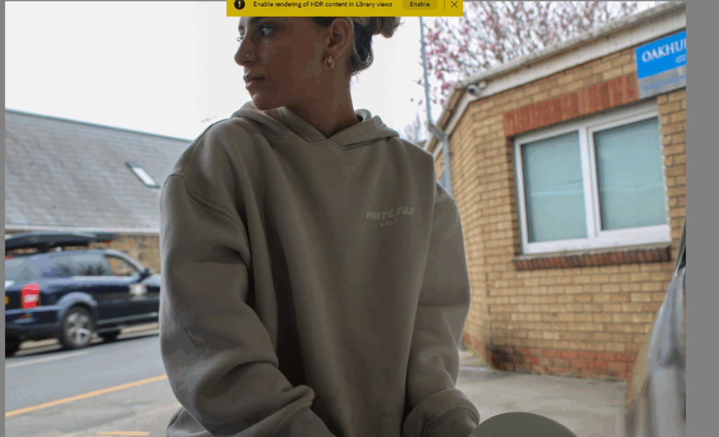
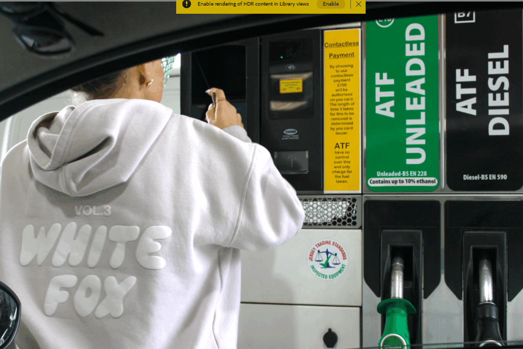
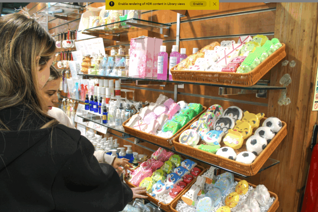
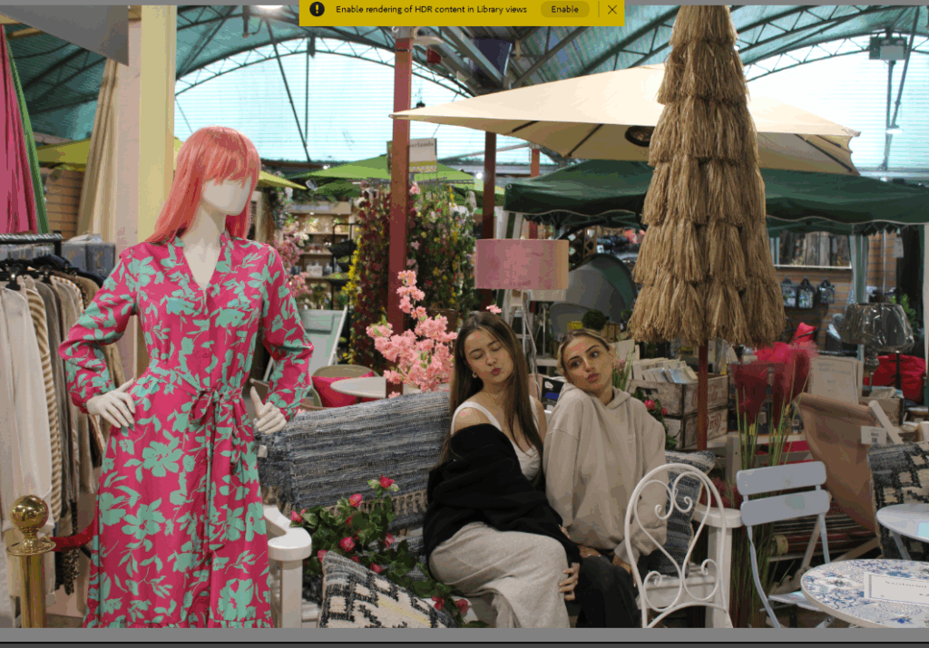
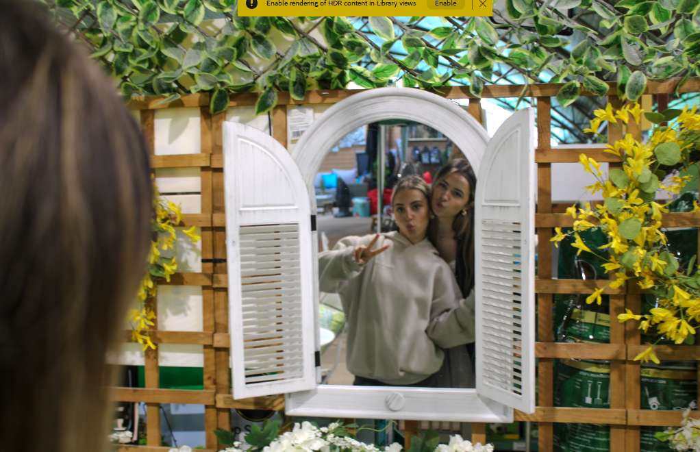
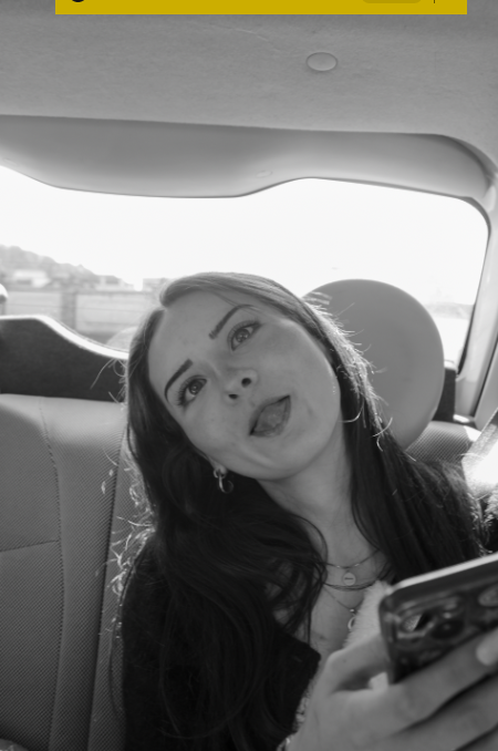
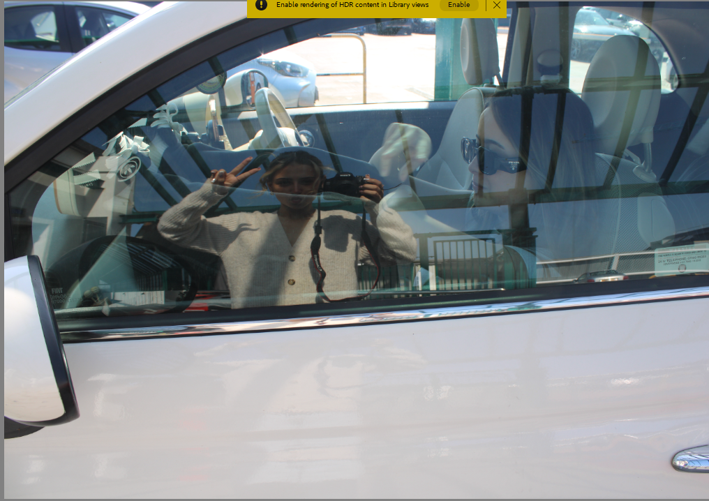
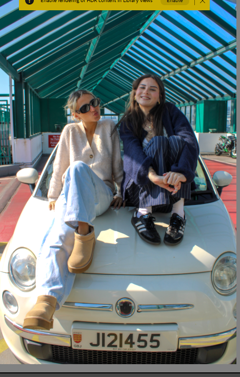
For this shoot I went to a garden centre and a garage to fill up my car with petrol, my friends car and a cliff. I managed to get a range of different images with a bunch of different people.
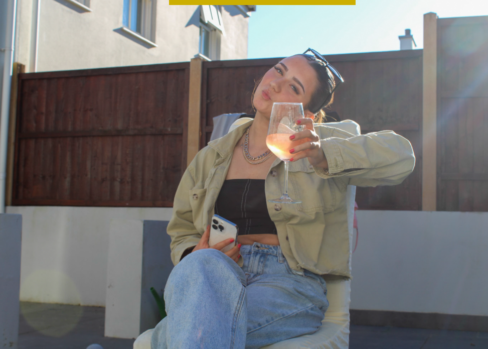
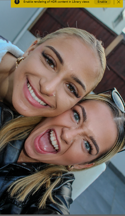
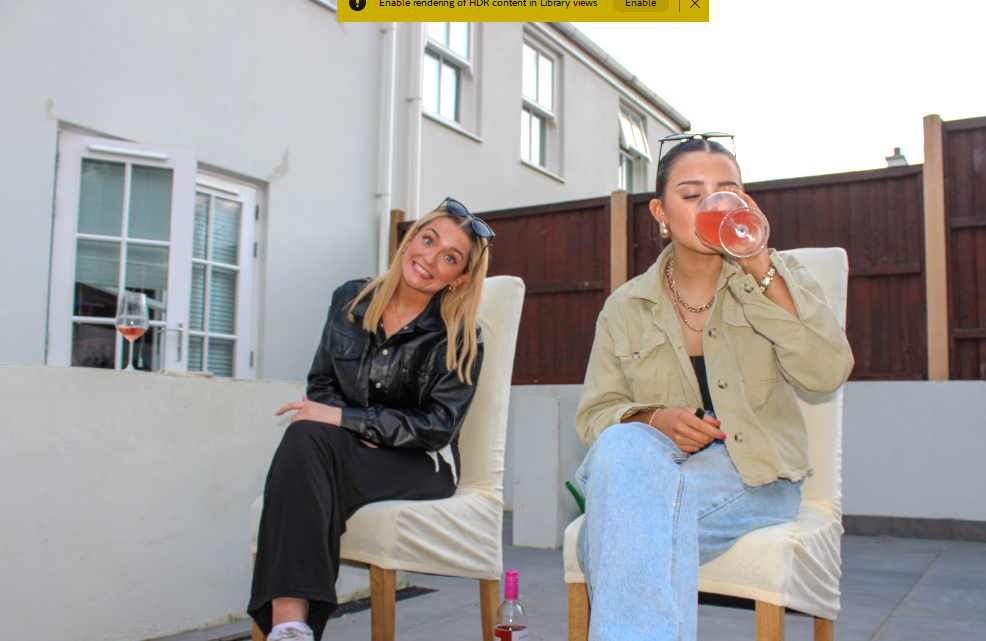
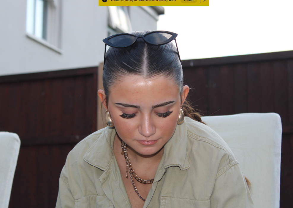
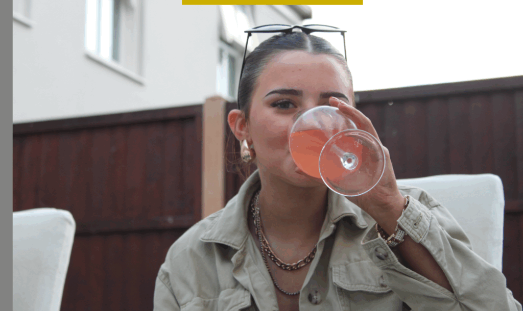
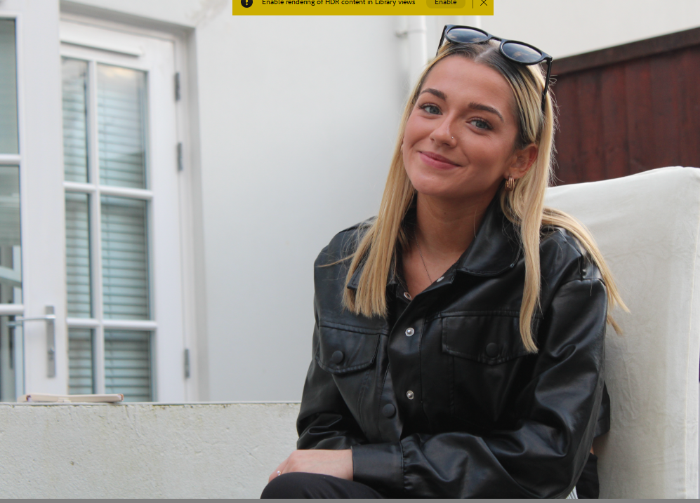
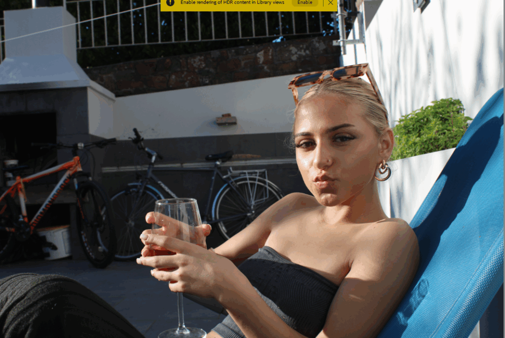
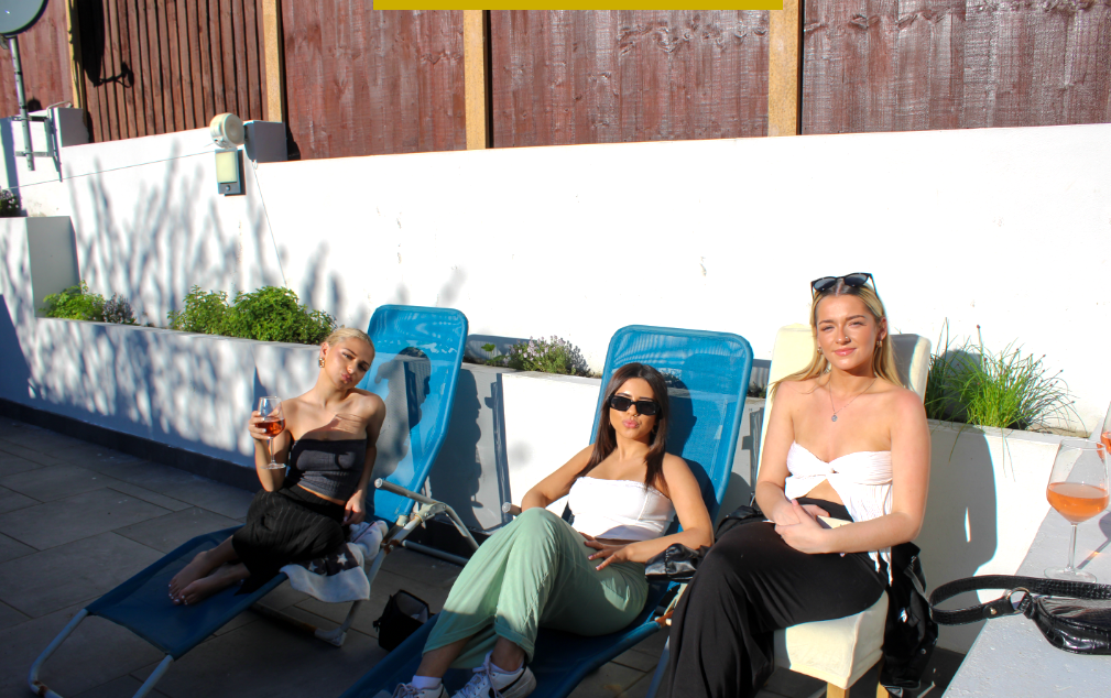
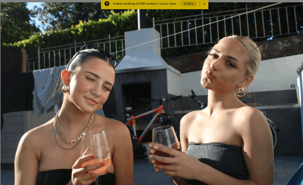
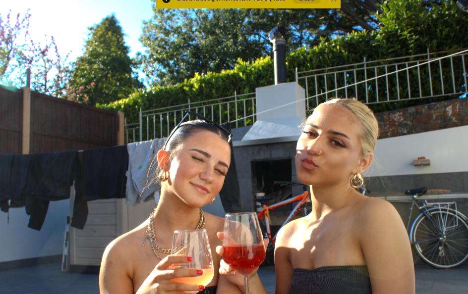
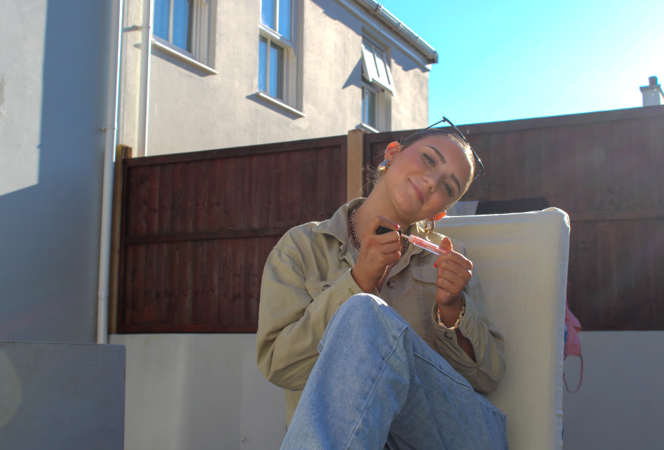
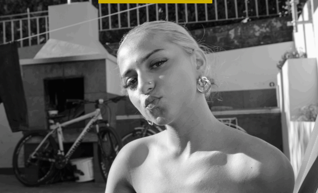
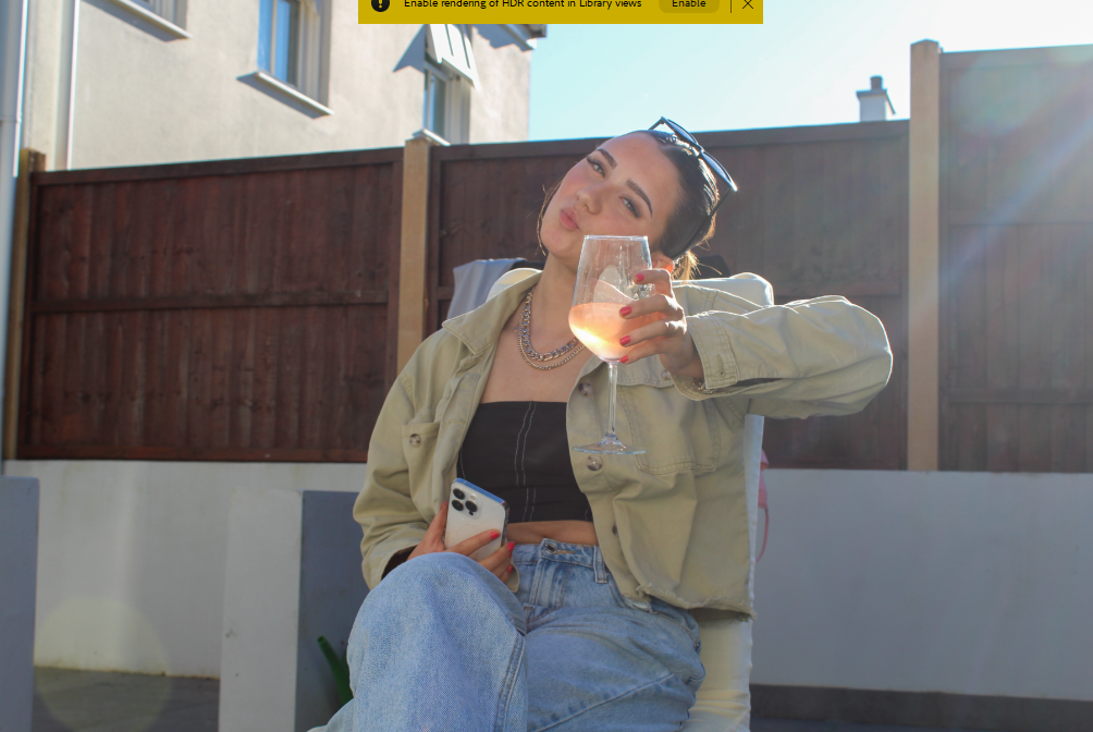
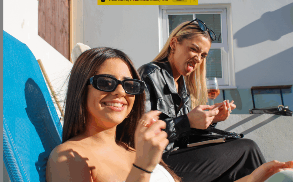
This shoot was done in my garden, on a hot spring day with my best friends and we were drinking some wine and taking some aesthetic photographs. Here are some of them..
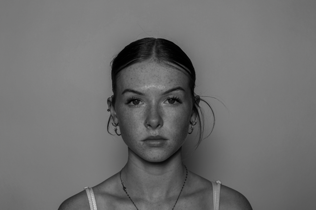
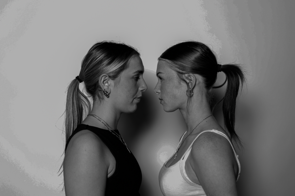
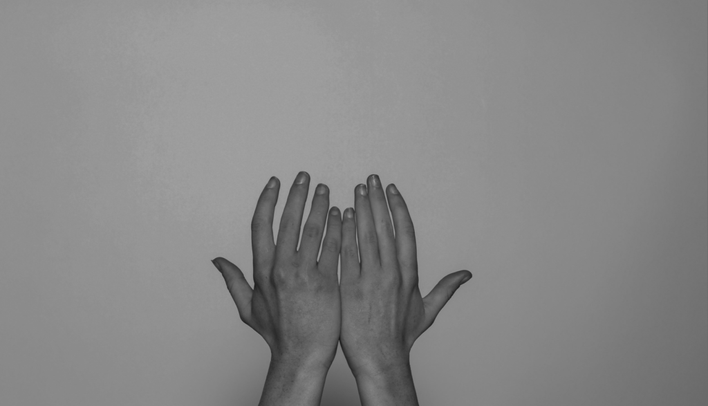
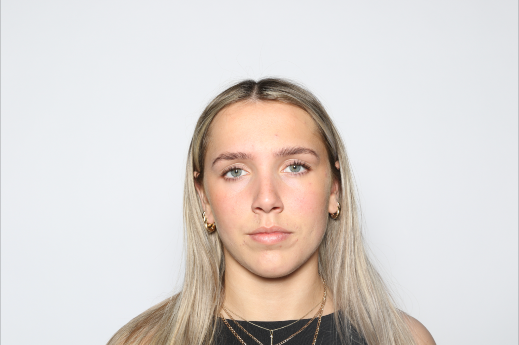
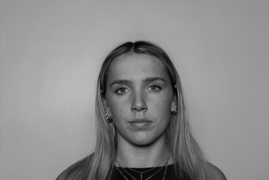
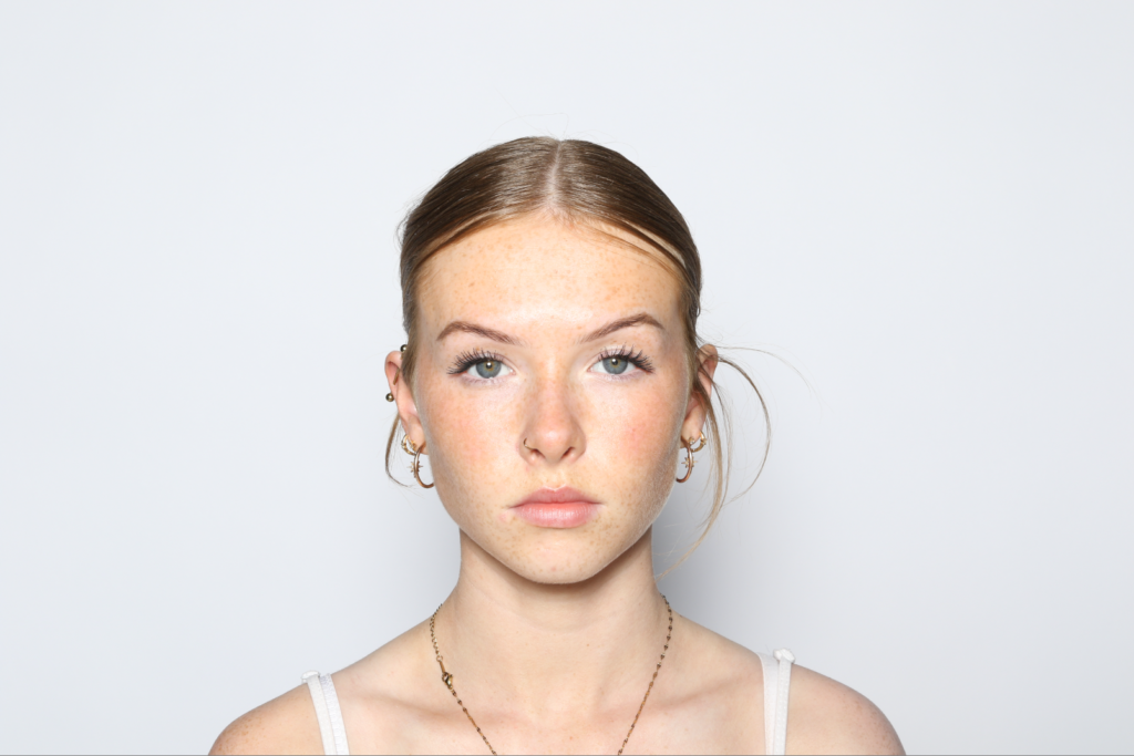
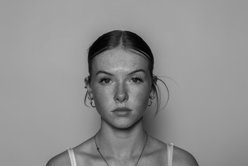
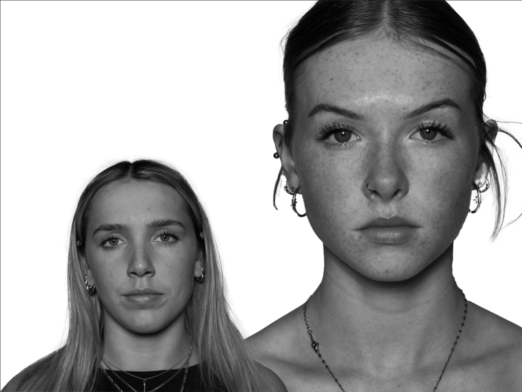
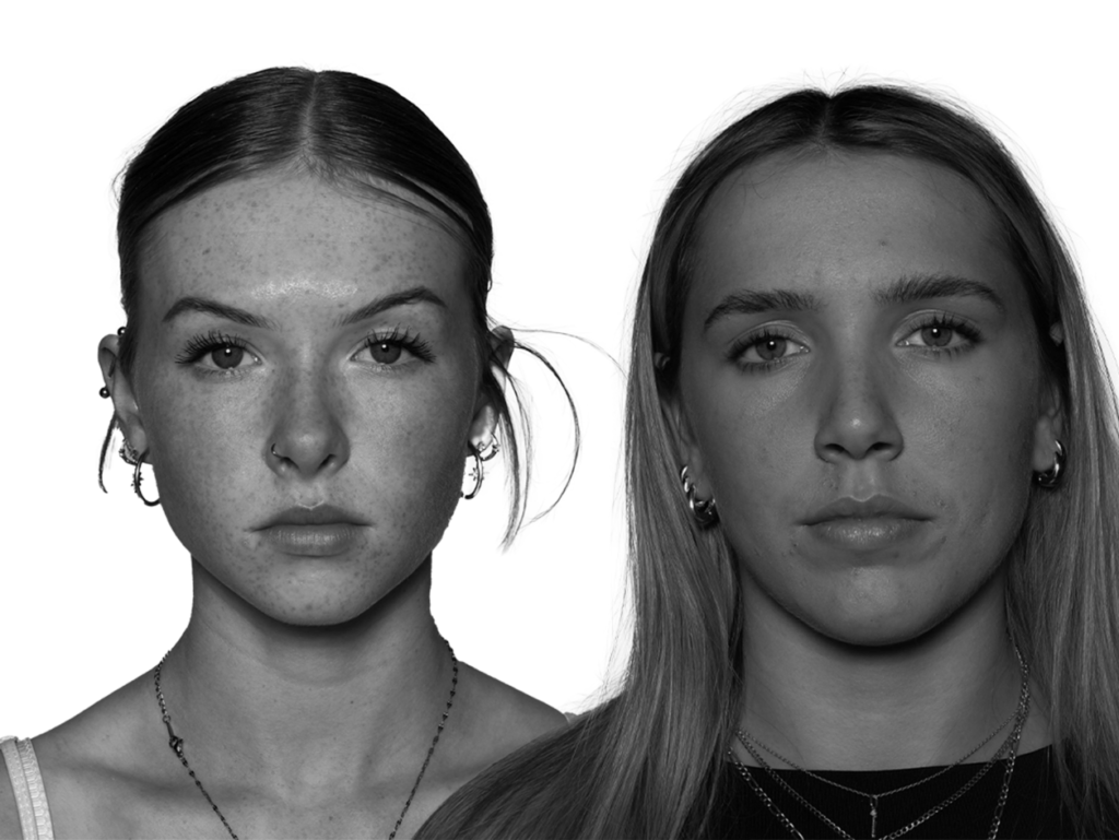
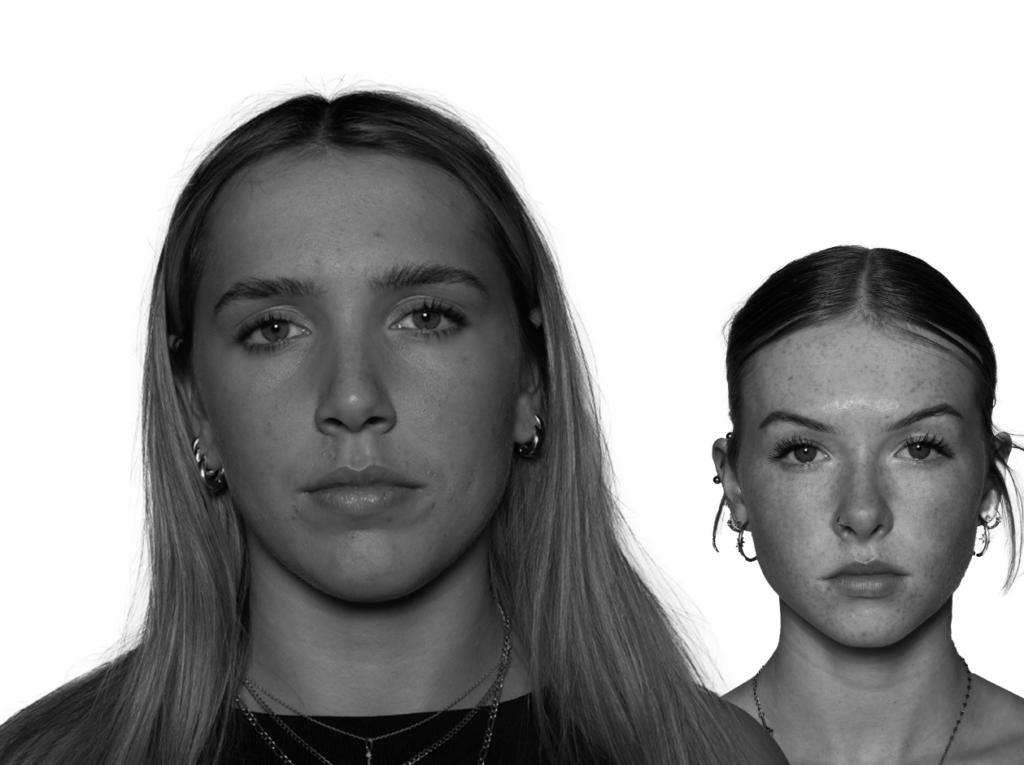
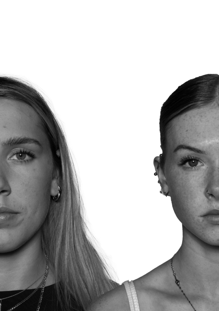
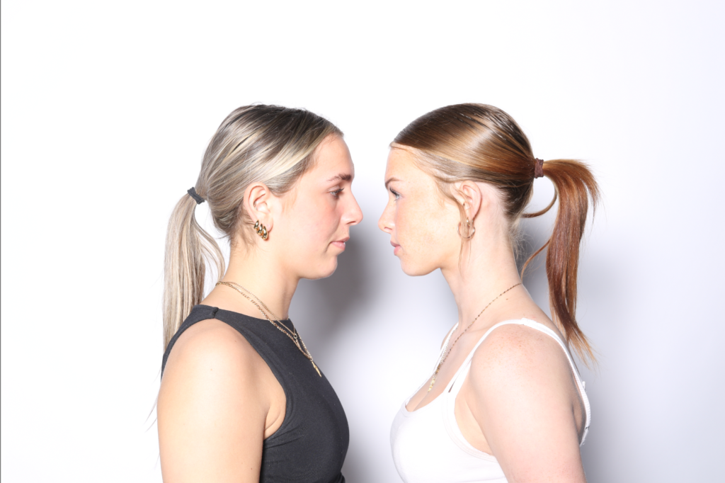
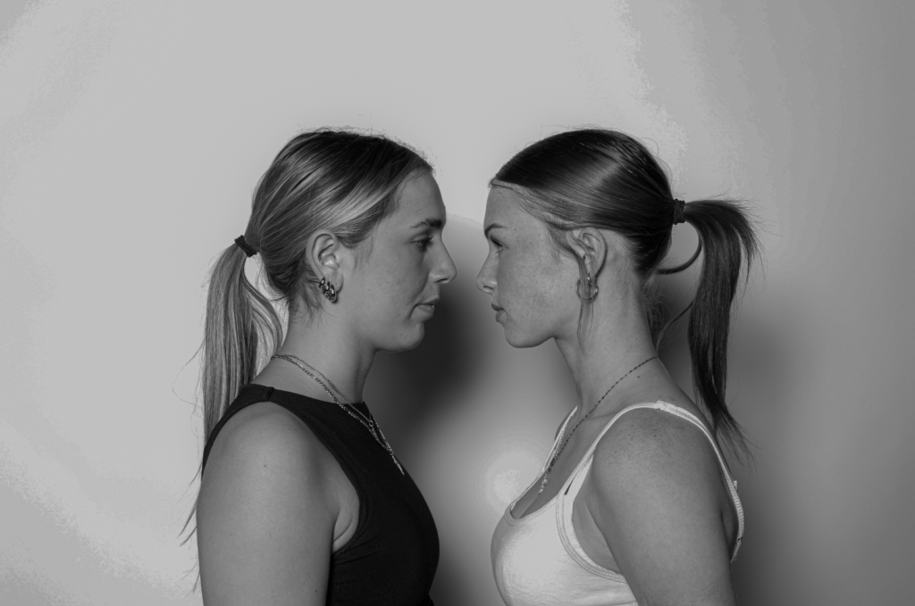
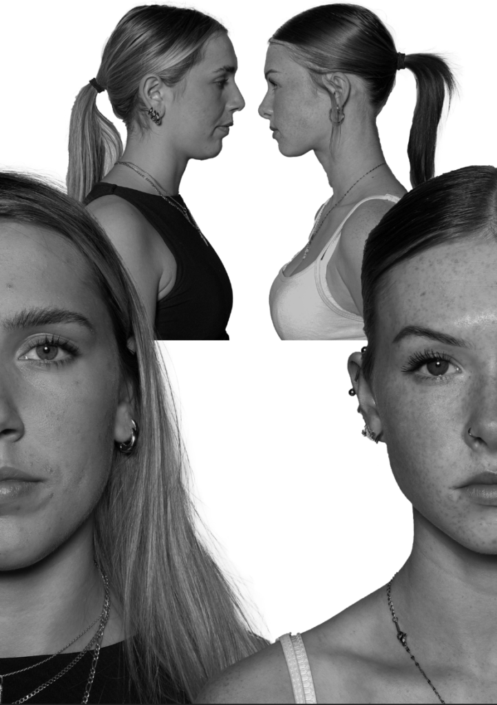
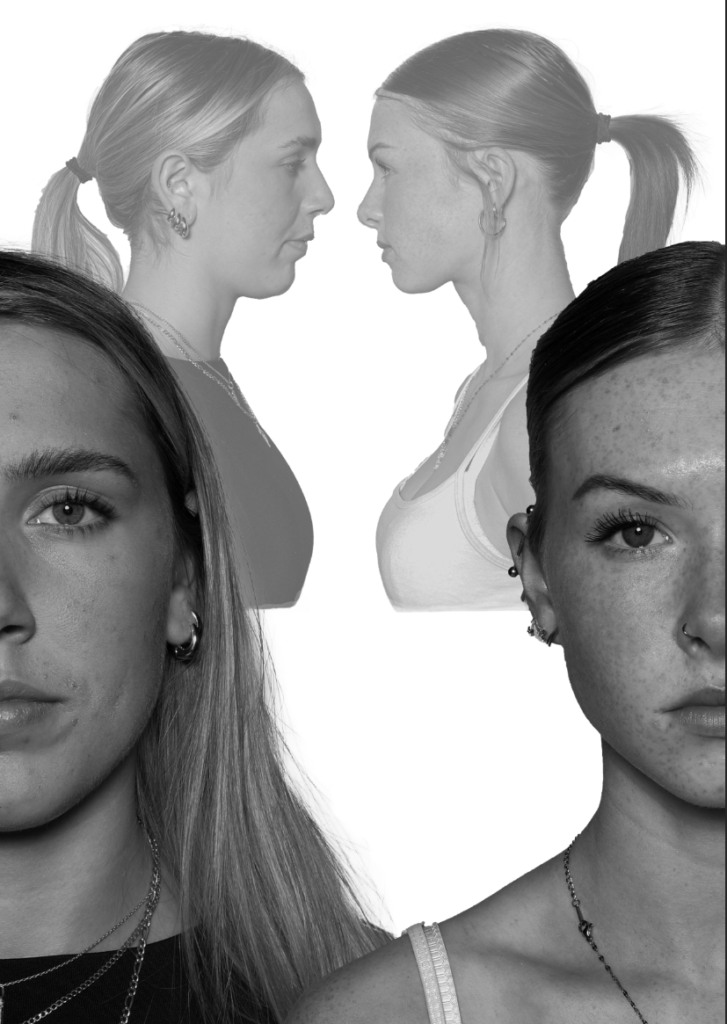
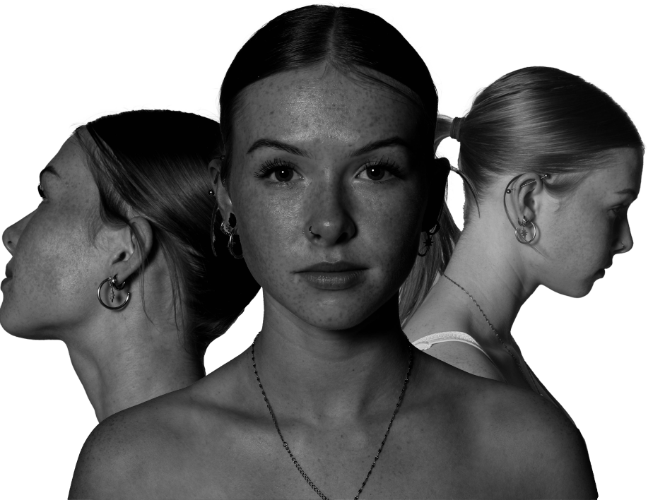
For this photoshoot, I am going to edit the subject’s faces together to create a sense of unity through the females and their similar or unique facial features.
Photoshop edit processes:
Edit 1:
I used Adobe Photoshop to edit all of my photos.
The photos I will use for my first edit:
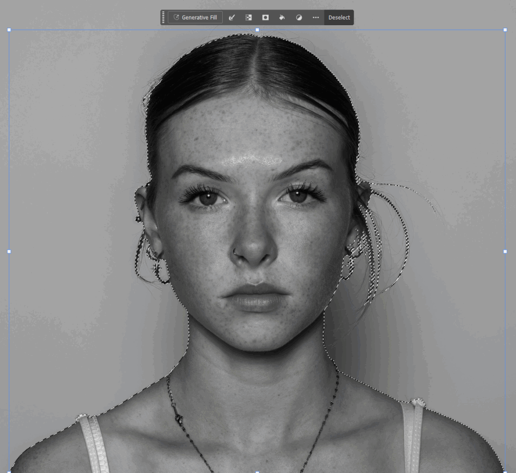
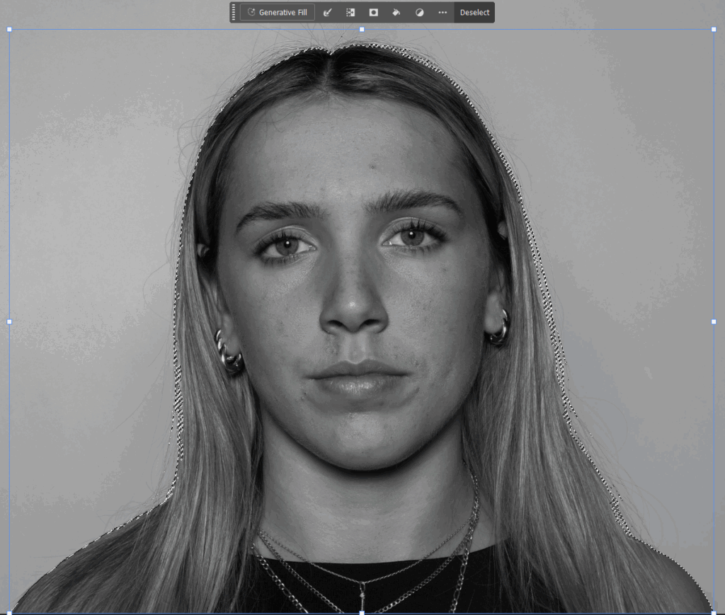
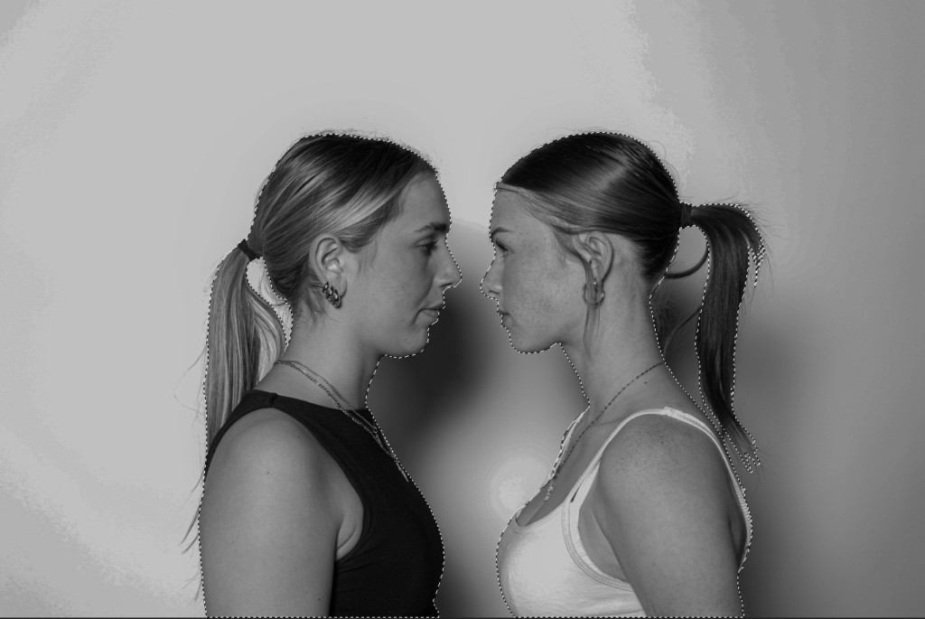
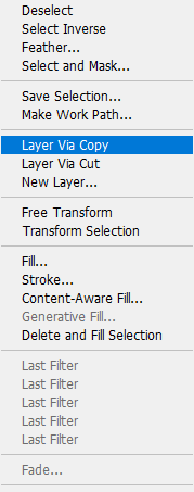
First of all, I selected the subject on both individual images and right clicked to choose ‘layer via copy’.
Then, I transferred the copied layers over onto a new, blank document in Photoshop and experimented with a few different layouts.
But I preferred this one the most:
Onto the final image I will use for this edit:
I repeated the steps from before for this image also. I selected the subject and right clicked ‘layer via copy’.
Then, I transferred this image onto the same document as the other two portrait photos and made it smaller to fit behind the subject’s heads.
I liked this layout so I decided to experiment with different opacity’s and filters for the background image.
I also noticed the harsh line from where the image stopped, so I used the eraser tool to smooth and lighten the blunt edge.
Final outcome:
Edit 2:
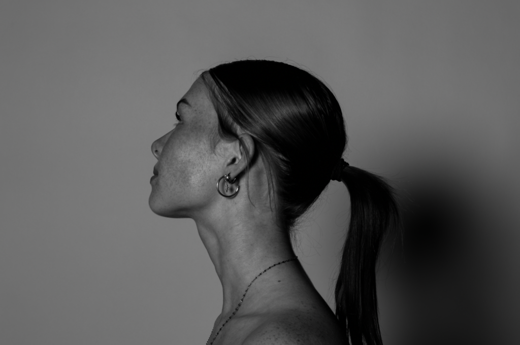
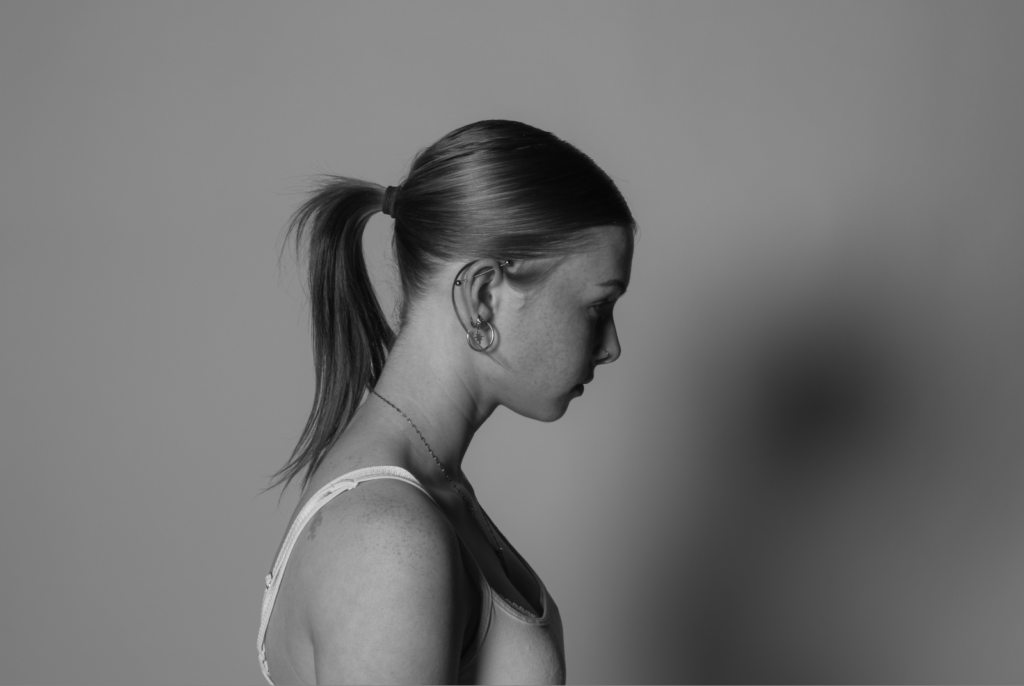
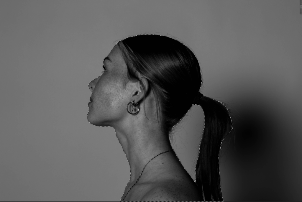
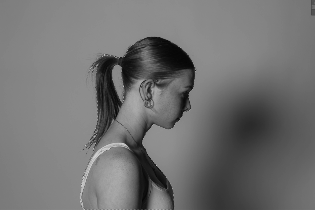
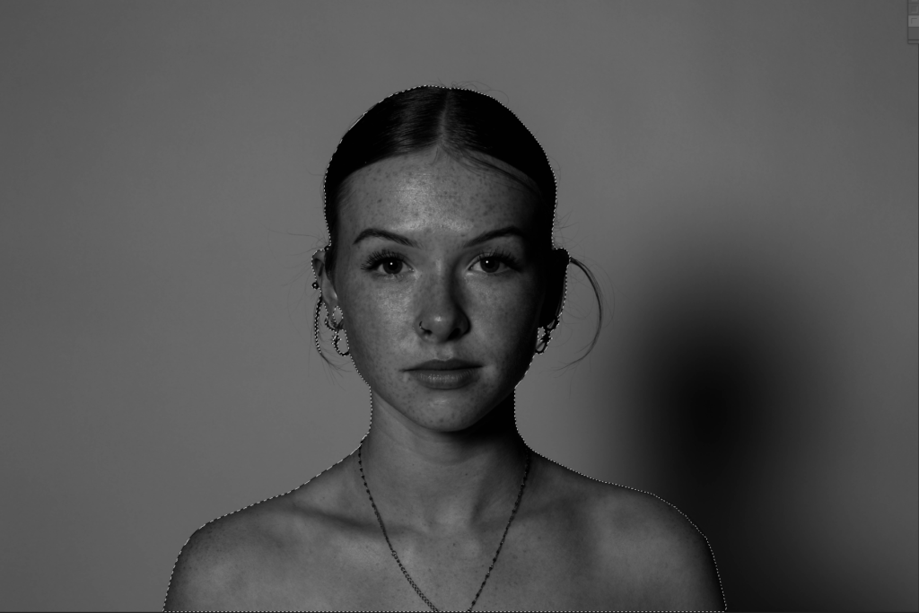
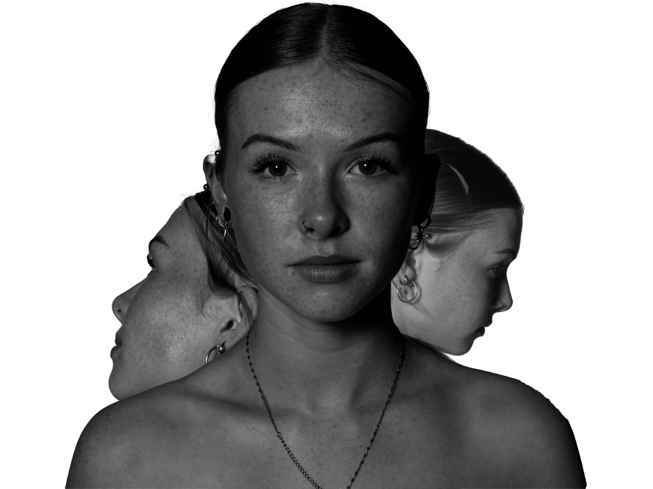
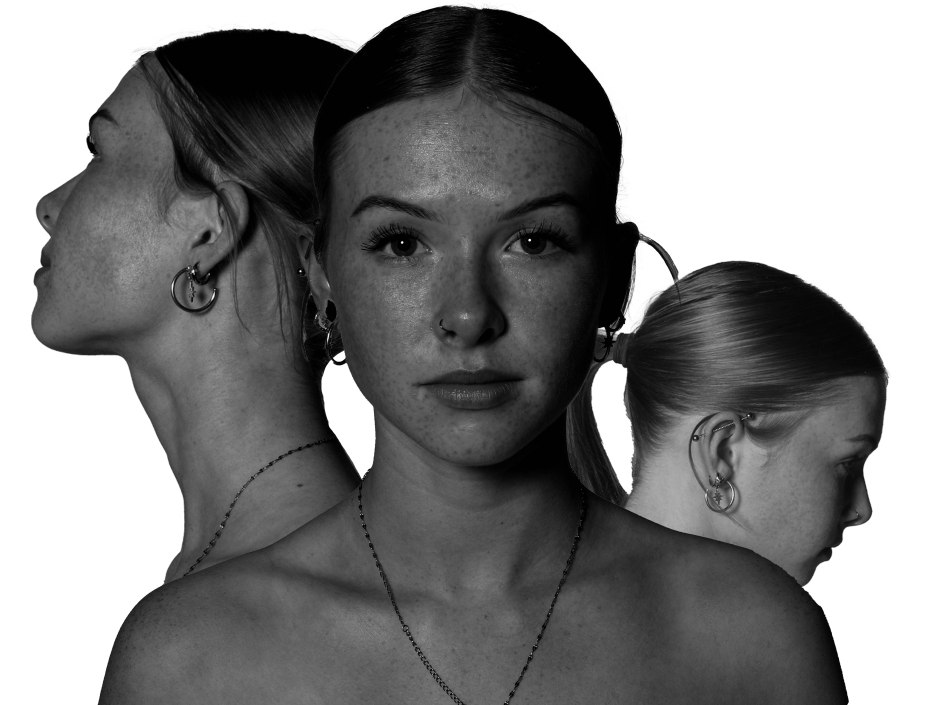
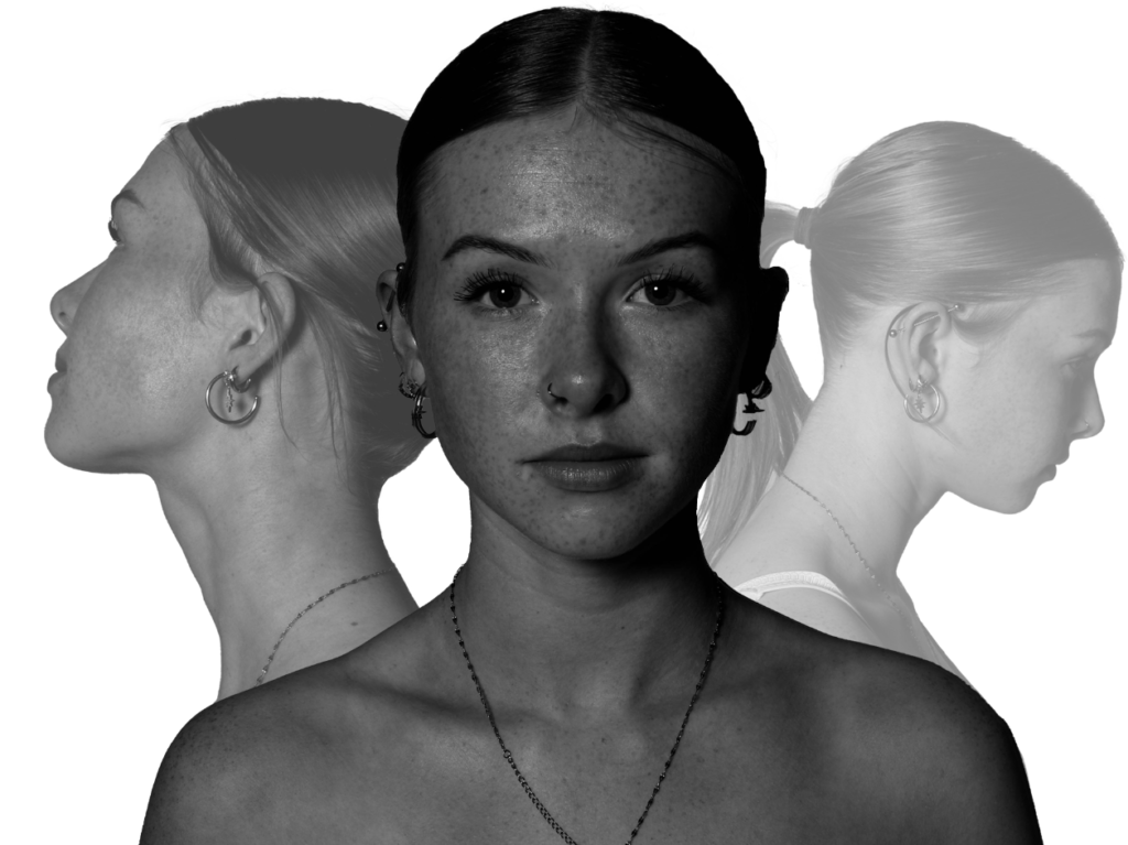
For this edit, I used the same subject but three different angles of her head where she is looking in opposite directions, so that I can merge the images together.
The photos I will be using:
I selected the subject for all 3 images and transferred them onto a blank new document.
I then experimented with the layout of the images and once I finalised the layout, I decreased the opacity of the background images.
Final outcome:
Edit 3:
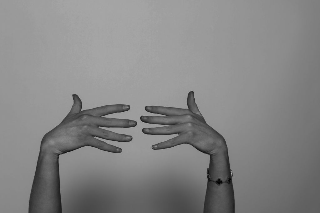
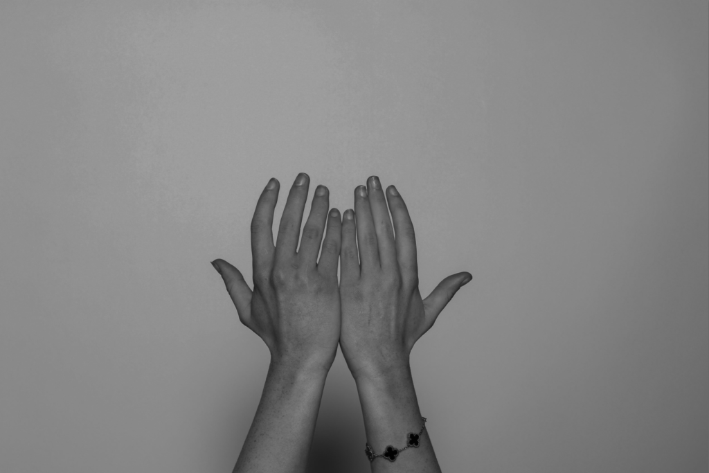
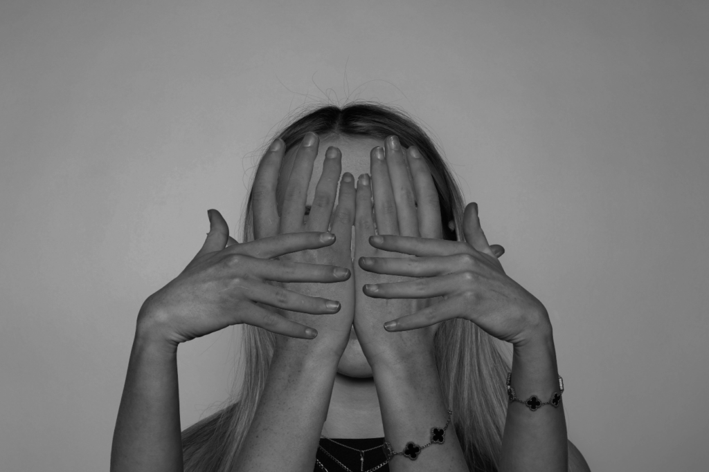
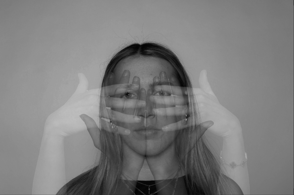
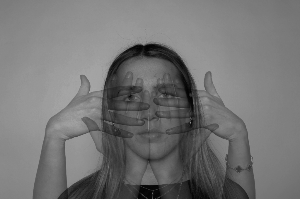
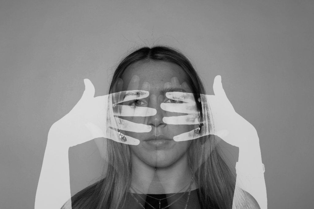
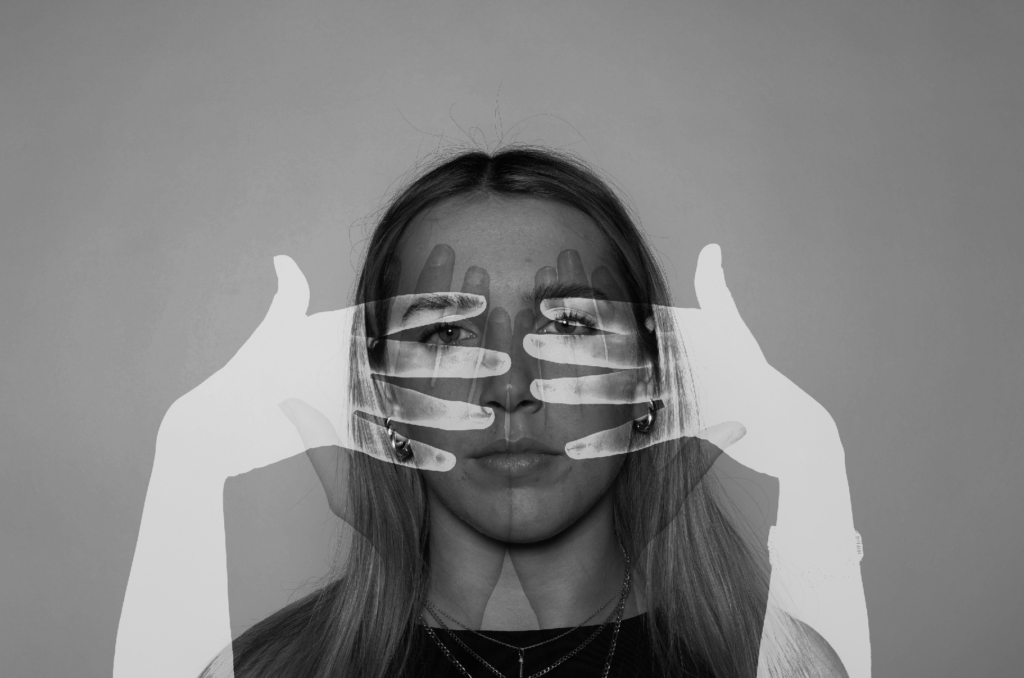
For this edit, I wanted to incorporate hands to merge with faces. Therefore, in the studio I took a few photos of different hand shapes which I thought would be useful to edit onto the subject’s face.
The photos I will be using:
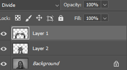
Firstly, I kept the image of the subject’s face (the background image) the same, as I did not need to transfer the photo onto a new document.
I then selected the hands using the quick selection tool. Finally, I transferred them onto the image of the subject’s face where I continued to experiment with the layout and opacity.
Final outcomes:
To create the different affects on the hands, I used the filters I can access through Photoshop, as well as changing the opacity.
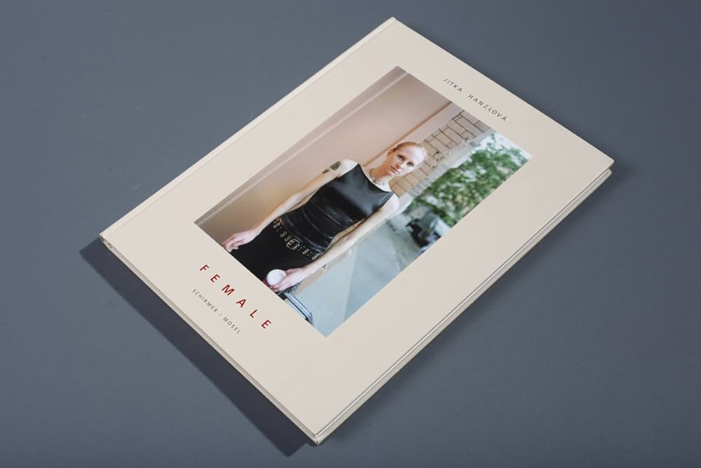
I choose the book “F E M A L E” by Jitka Hanzlova. This book has 115 pages with different women with different culture, background and everyone is unique in their own way including the background. It tells a story that everyone has there own little bubble and are just other people in peoples lives. Photography captures’ peoples lives and moments forever. I like this photobook because it tells a story from so many different perspectives and lives. There are younger kids, older women and overall a range of ages which shows the growing up and how people growing up in different generations can affect you as a person. Most people are pulling a straight or sad/mad face which you could say shows the rage and anger some women have to go through because of misogamy an what some men are like. Some women may be scared to leave the house and I think this book represents a lot of women in todays society. I have made some images similar revolving around girlhood and misogyny to try and raise awareness and show people that life can be tough and isn’t perfect. I think that Hanzlova tried to make elements of this in her photobook too.
The book “F E M A L E” by Jitka Hanzlova. Hanzlová grew up in Rokytník, a village in eastern Bohemia. She was initially interested in painting and drawing before discovering photography as an artistic medium in 1983. Inspired by the works of Diane Arbus[2] and the anonymous portraits of Walker Evans, she undertook her first trip to America in 1986. In 1987 she began studying visual communication at the University of Essen with a focus on photography, which she completed in 1994. In 1989, Stern published her first group of works under the title “Man Calls It School” about a school for asylum seekers.[3] After the fall of the Wall and the end of the communist regime, she travelled back to her Czech homeland for the first time. I think that she made the female book to raise awareness for women and show people how different we all are, we al need to stick together and be kind to each other. This book is for everyone to view and can change peoples perspectives on life. This book drew me in because it shows people how everyone’s life is so different and we all live in each others life like characters. It sends a message that says you should be kind and look out for everyone because you never know what people are going through at the end of the day, we are all beautiful and perfect in our own special ways.
The book female, its thick and heavy. It smells like an old book and there is a range of different colours. The book has 121 A4 pages that are white with the image in the middle on the right page, they feel smooth and soft with a hard cover on the front and back with a printed image on the front, a white female wearing all black with a coffee in her hand looing blankly at the camera which gives some insight on what the book may be about. The title is red and spaced out with normal font and her name is above the picture which is relevant when it comes to all the images in the book. I think that it tells a story of history, its not just images of loads of different women. its about culture and background. The realisation we all grew up differently and this plays a huge part in our life as women. We are all unique. It has this repeating idea of strength and culutre and this is why I think its about awareness and strength. She’s repeated pretty much everything in the mood and it has the same layout for the whole book which again repents the idea of repation.
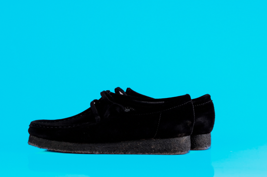
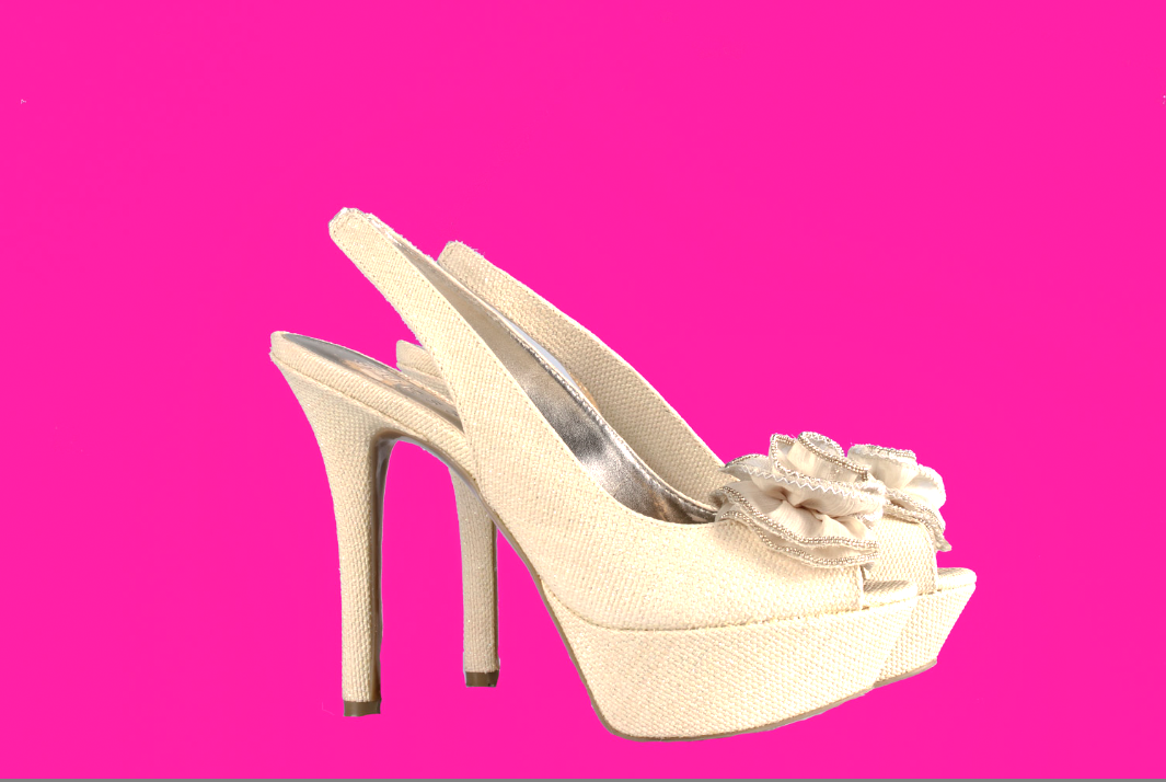
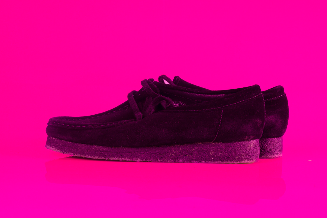
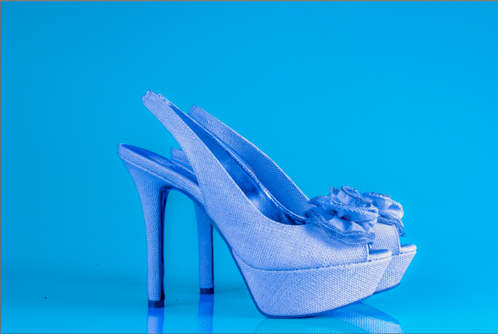
for the set of images I’m about to present I wanted to show oppose the views of people not being able to wear certain footwear or certain objects because of their gender or other personal reasons, as the hole point of my project is to oppose common society beliefs and you’ll be able to see that in some of the images I produced.
these images that I produced was what I was looking for as I took inspiration from a photoshoot that I had seen on the internet that was based around sexuality and the acceptance of people who are “different” because of there preferences and beliefs, this lead to me editing some more images as i liked the way the images came out but i thought i could have added something to make them look more appealing and more enjoyable to look at.
after experimenting:
the change i made in the images was instead of just editing the background of the image and making it a certain colour i decided to edit the images as a whole. I also started to edit the colours of the footwear to help get my point across for my of what I want to portray while creating this book, I also think the images look more lively than the other images I created as well.