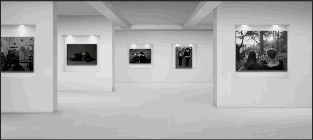
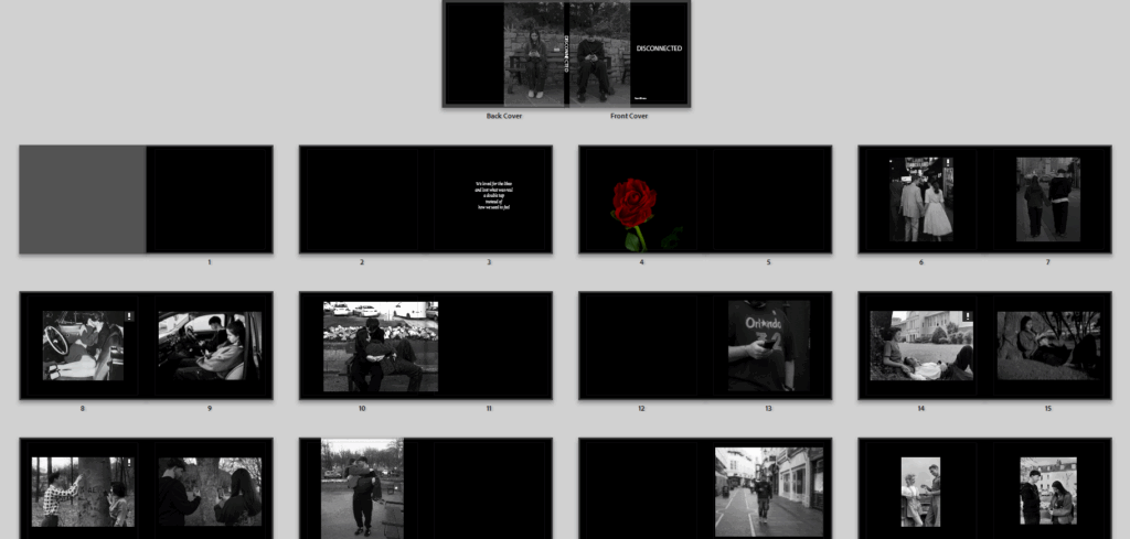
This is my first virtual gallery, it has a few of my photos mainly the ones that show neglected and incorrect love, surrounded by social media.
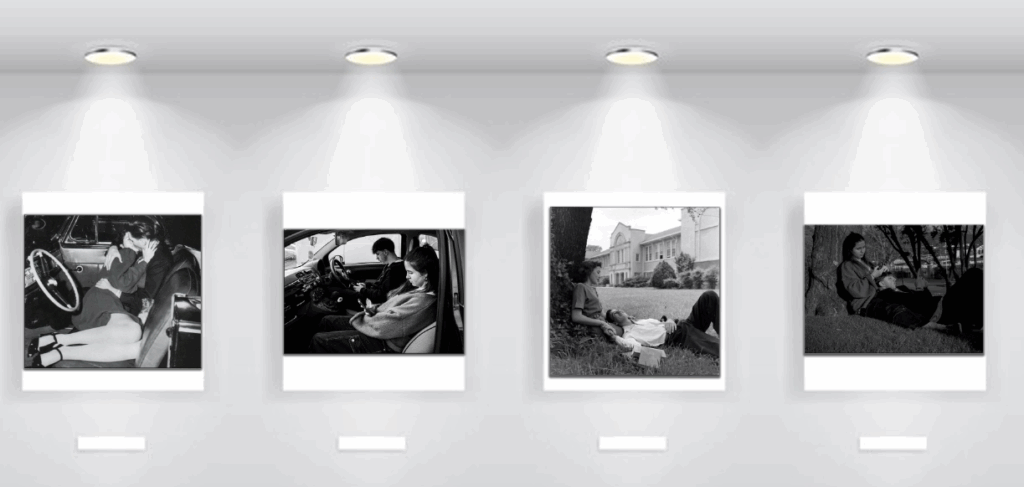
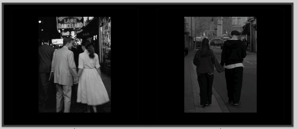
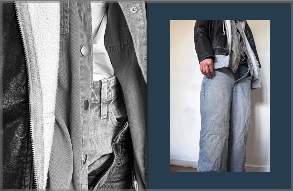
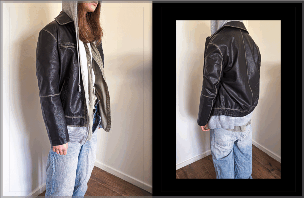
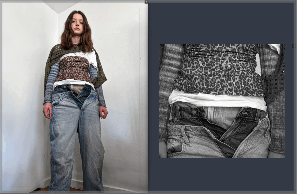
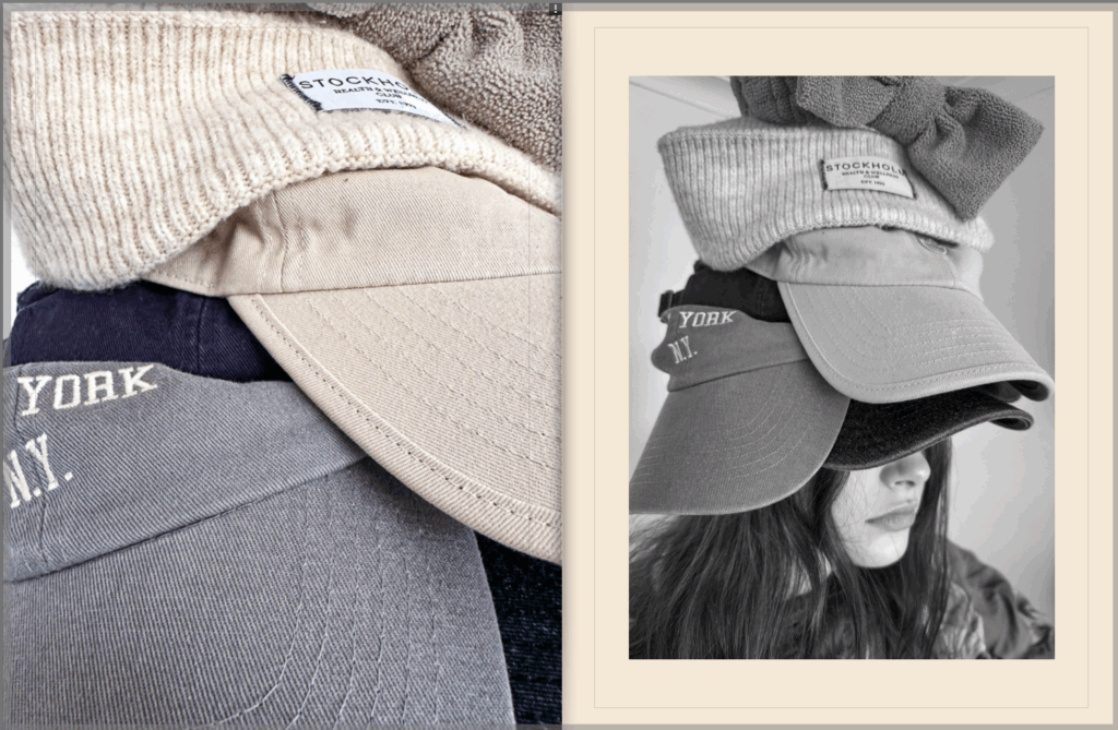
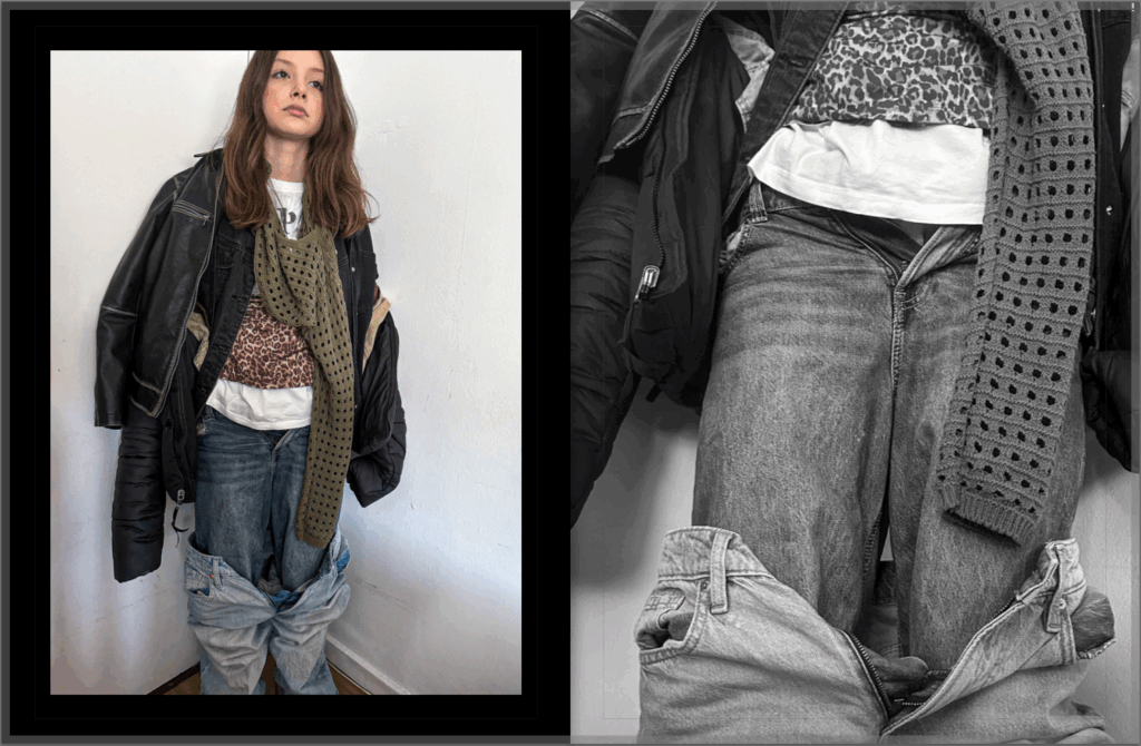
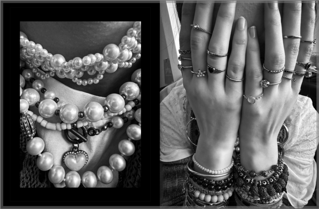
In this second pat of my virtual gallery there are two comparison photos, that I did include in my final book, and prints.
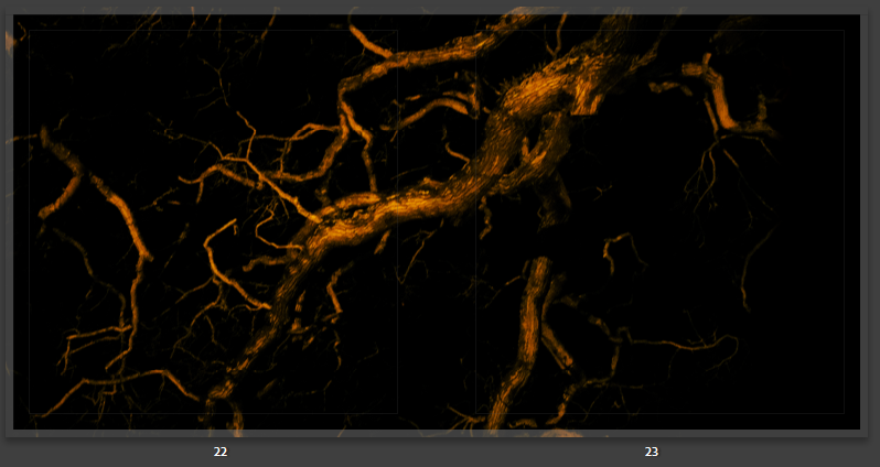
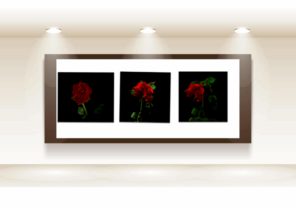
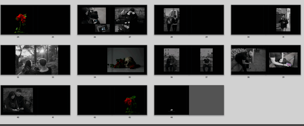
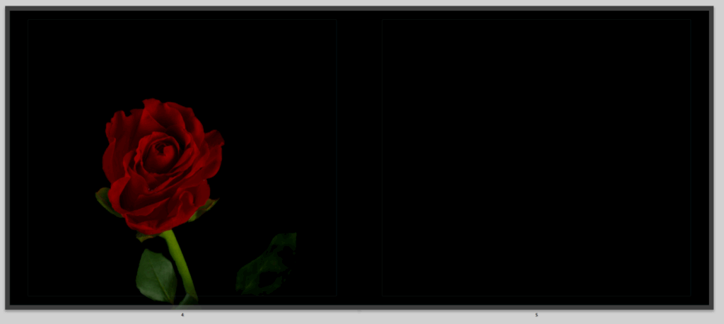
Then I have these three roses showing the slow death between as each image goes by.
Evaluation.
This is my final and over all evaluation to my work and how it went throughout everything, during I have given evaluations of my parts, mainly my final photobook outcome, where I went into detail about my photos and the story it tells. over all I found my work went quite well, I enjoyed doing photoshoots, and artists studies, if I was going to do it all again I would probably take more photoshoots, and start earlier with them, I always find that I start flowing with ideas near the end and not all my images are perfect, some lighting I don’t love and even when editing it didn’t fix it, so if I went back I would be able to take more and have even more images so that I was prepared when things did go wrong, quite like how some of the images I wanted to use weren’t actually great or would have fit better if I had taken more images. Ideas always come to me near the end when I don’t have time I swear. I really enjoyed this topic, and personally a some main photos I would take more of are the comparisons as they were my favourite looks wise and in general to take, I just feel like my book could have done with some more throughout it. My artists studies also went well but could probably do with some more detail on the artist, what I did like about this as yes I used them as inspiration but I didn’t have to focus my topic on doing it exactly like the artist, I could really go down my own root, which felt a lot more freeing and let my own imagination come out, and show how I thought things where really going in my reality and feel a lot more like a real artists. Obviously my mood boards and mind maps aren’t the most exciting things and they show my first original fresh ideas, which I do enjoy that now I look back and see how I really trailed off an became something very new, and if I remade them now they would look completely different, but I enjoy you can see my whole journey and really see how my brain cooks and conjures ideas bouncing off one another. I then had my first day of the exam where the main task was to have images I wanted in the print folder, partly this was a little stressful because I’m not actually sure I had even finished editing my images yet and had no idea what I wanted in the print folder, by the end I had uploaded loads because I have learnt from past experiences that I never find I have enough, I also created an idea for them to all go together and make a massive presentation explaining the story in a different way to my book, and to continue keeping all my presentations yet stories different, as the way I present them is different in my photobook, prints and virtual gallery. I didn’t love how the prints came out because they actually came out very dark, and mounting up images is actually one of my least favourite parts, as much of a perfectionist I am I cant seem to have them perfect in my eyes, I love how they look and if anything its better then how I virtually made them there is juts the little tweaks and cracks that I see that bother me, like the image being to dark or a little jiggered slice here and there, but I really do like them. Then finally I finish off with the virtual galleries which again is not my favourite part compared to actually going out and taken photos and making a book, this is because I don’t think they best represent my work, not compared to what a real gallery would do, some images are hard to see and I don’t always have the best idea on how I want them to go and worry someone might not understand the order I picked. Through and through that is my project finished and I’m genuinely pleased with the outcome because I presented how I wanted to I got to really flow into my creative devices and I think that I have created something I can be really proud of.
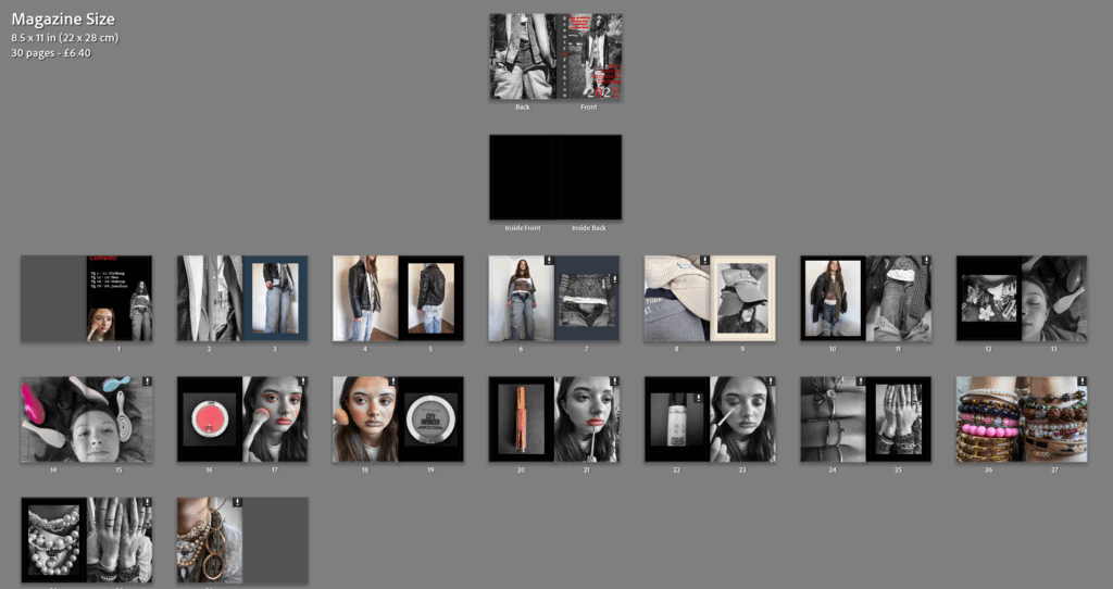
I think my magazine has gone well as I was able to create 30 pages using photos I took in response to Philippe Gerlach. I like the makeup pages especially as they really feel like a magazine in the way that they are showing a product and then showing the product being used on a model. I also like how i did the front cover with red lettering against a black and white image as it is eye catching. If i was to do it again I would take a larger variety of images specifically in the clothing section as I find them to be slightly similar to each other. I would also maybe take more images for the other parts as the clothing part takes up the majority of the magazine.
Virtual Gallery:
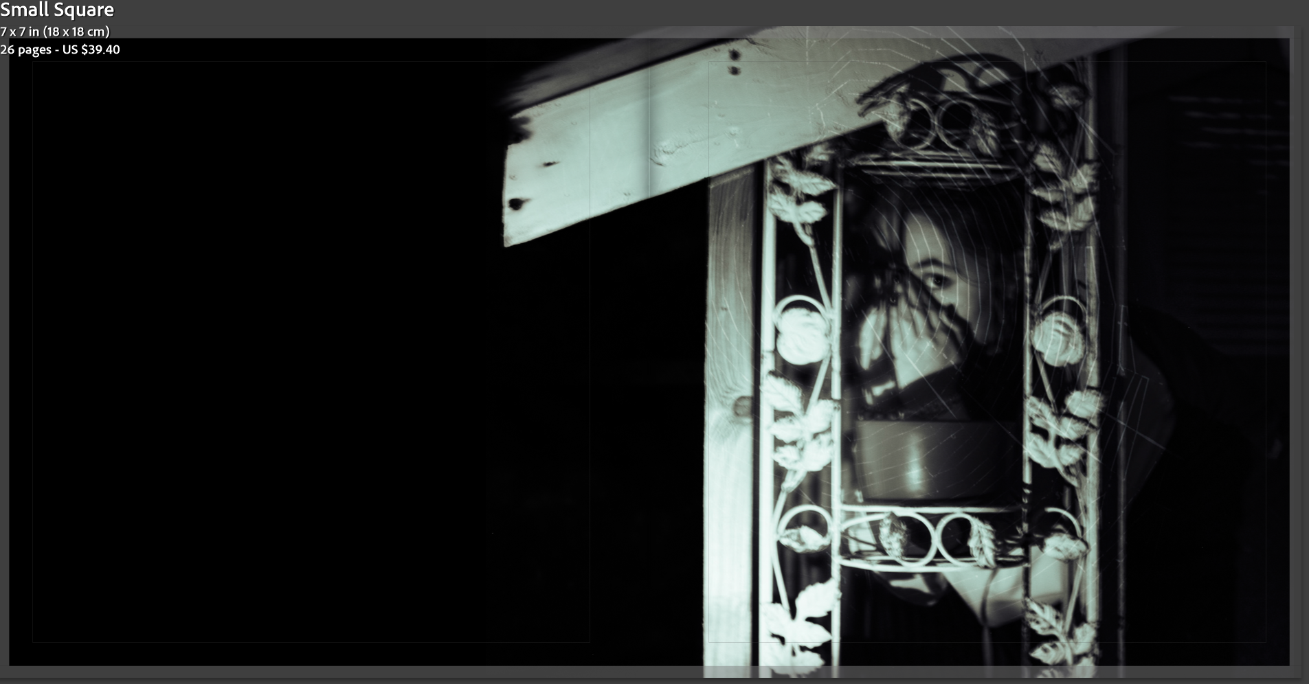
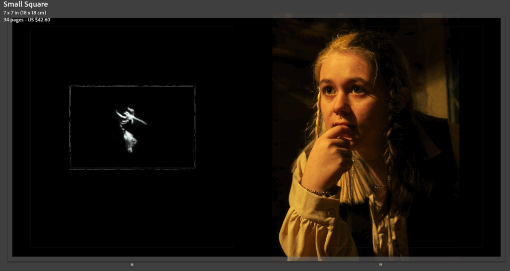
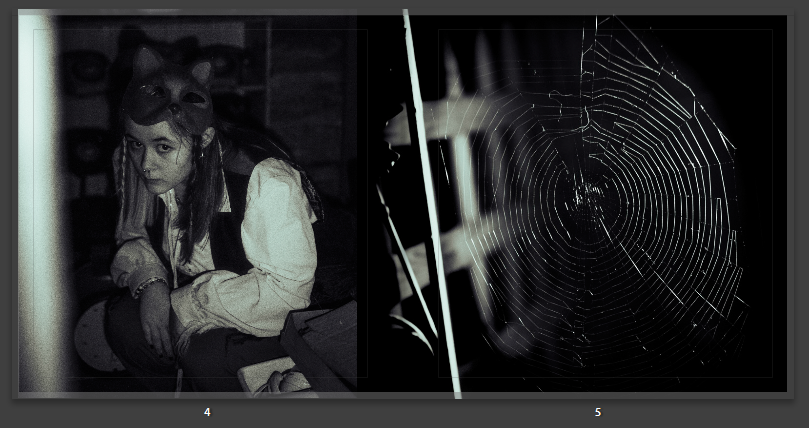
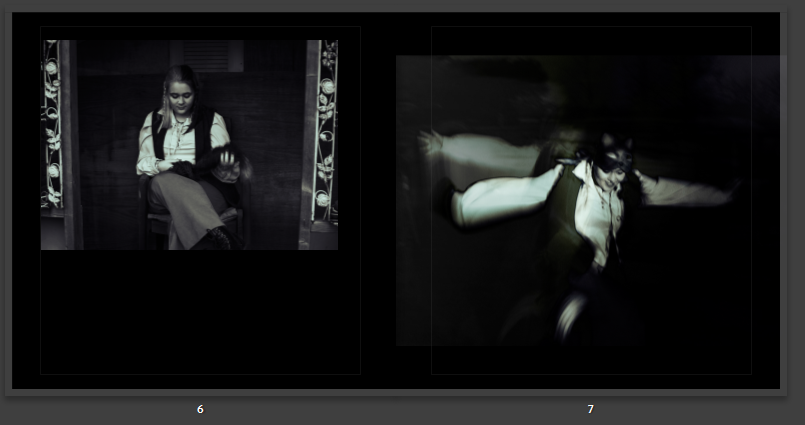
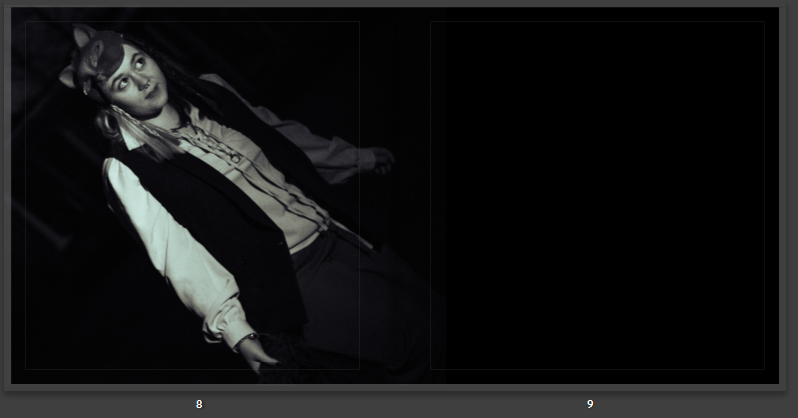
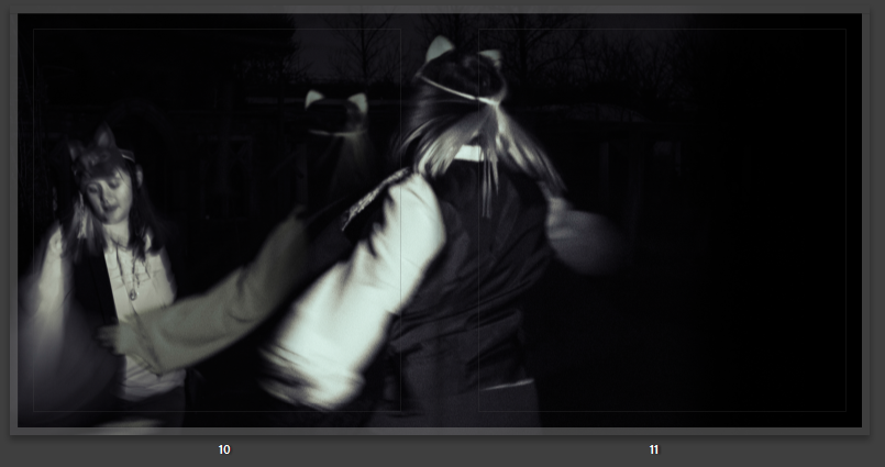
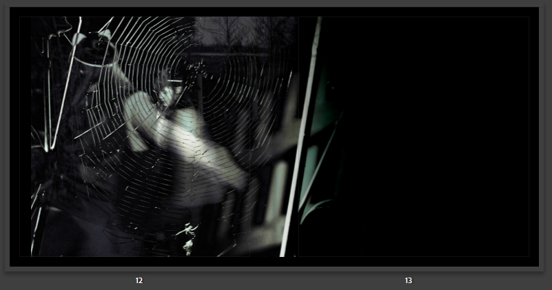
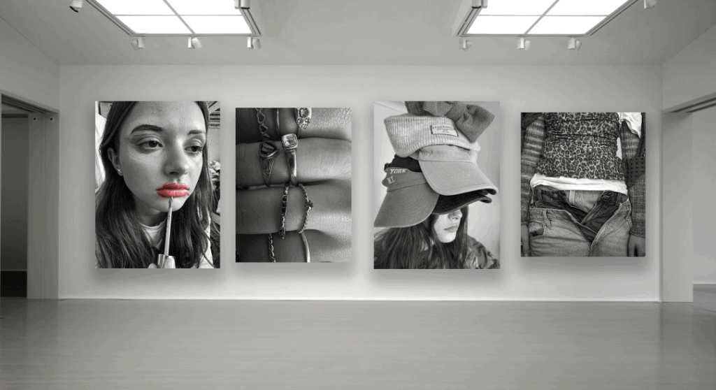
I also chose to present my images in a virtual gallery. I like the gallery as it is primarily black and white with only one pop of colour. I also added a drop shadow which adds depth to the piece and makes it look more realistic.
Collages:
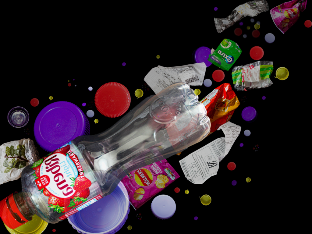
My first collage is okay but I think I could’ve added more pieces to it to make it look more similar to the photographers work, especially in the background.
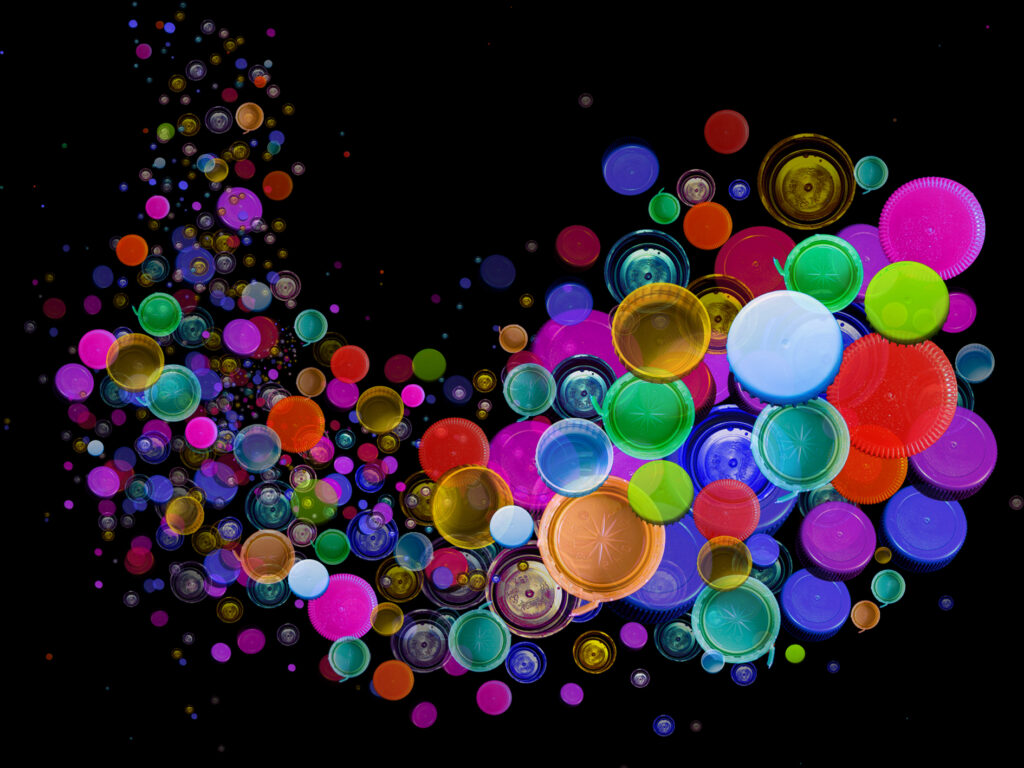
My second Mandy Barker collage is my favourite piece I produced as it looks very similar to the photographers work. I also think I was able to create a good depth and it almost looks 3D. If I was to redo it I would maybe add some smaller ones in the very far background as I think that would add to the depth of the piece. I also like all the colours which I was able to create using different tints and temperatures in lightroom.
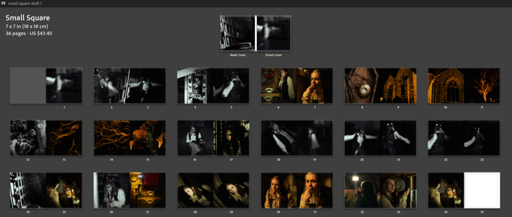
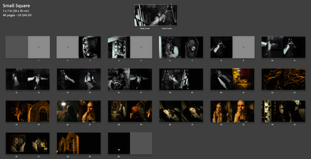
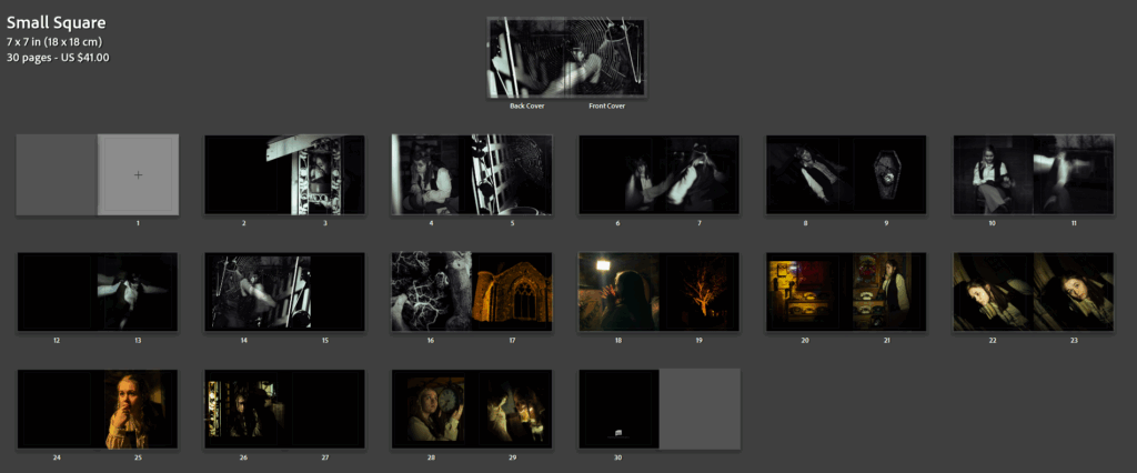
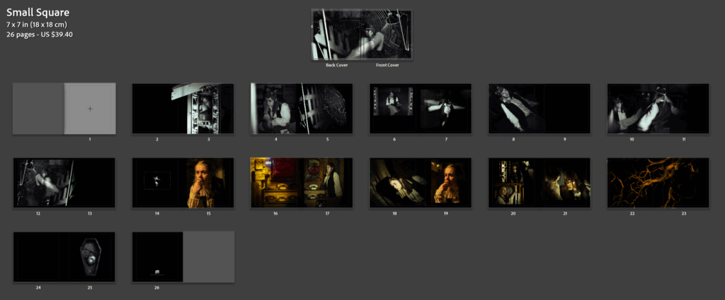
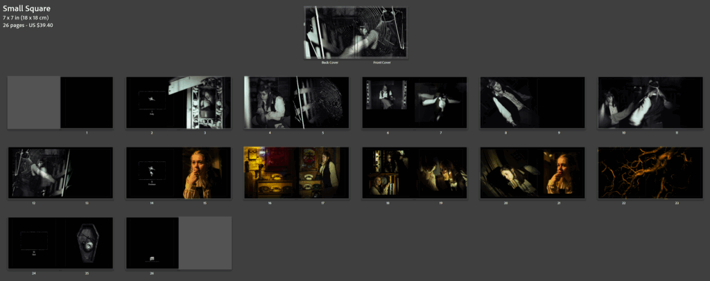
This is the final layout of my photobook, I do really like how it turned out. My photobook is a symbolic piece of work all about how social media ruined and killed romance, I show this throughout the book of comparisons photos I took, photos of street photography, and staged photos of my friends posting and focuses all on social media and not their partner. After about five photoshoots and over 700 photos, I came out with a 44 page book, I would like to say I’m very proud of and clearly shows what I intending to demonstrate through photography and photography skills. Of course there has been some hiccups through the way, especially when making my photobook, and starting to criticise how it looked, but that’s all now going to be part of my evaluation.
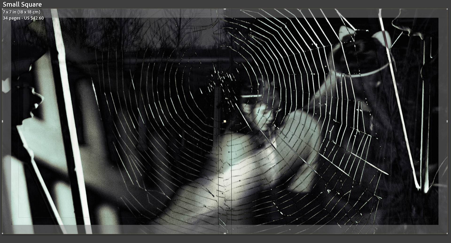
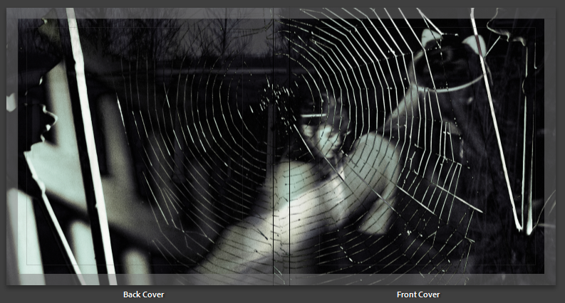
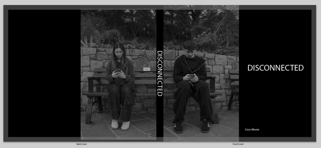
Lets start with my front and back cover. I really wasn’t sure on how I was going to do this, and didn’t think any of my images would work on the front and back cover, I firstly wanted to go for one image of the couple holding hands, or taking a photo of the view so they are on their phones but between the couple they are split up by the gap from the spine. Then I thought to have a completely black cover which just looked very plain and boring and I am very opposite to that, I tried making it the background, or playing around with images, and well if anyone has used adobe Lightroom to make a book they know that sometimes it just does not go well, I had glitches all over the place ands I was stressing out. Then I stumbled across these two images I took in one of my photoshoots, which I did not end up using in the actual book, and I thought hey these two together would really work, I wont need to mess around making them a background or attempting to make the photo perfectly cross over the spine. it took a little bit of editing to make the photos perfectly match the black and white editing, the contrast and exposure, once I completed that they still weren’t a specific match and needed to be slightly cropped so they fit together like puzzle pieces. when the title wasn’t on the spine is looked a bit odd having a black line split the images up, but I knew it would work well once it was actually printed and split up between a real spine instead of looking online which isn’t always the best. I came up with the title by just thinking about my project, I struggled a bit and it was actually one of the last things I decided, I was planning on having a much longer title, but something about the one word ‘disconnected’ hit a lot better. the one word was more powerful and explained the book in one word, as we are disconnected from each other from social media, and disconnected is almost a technology term.
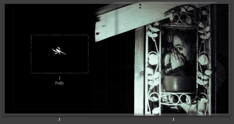
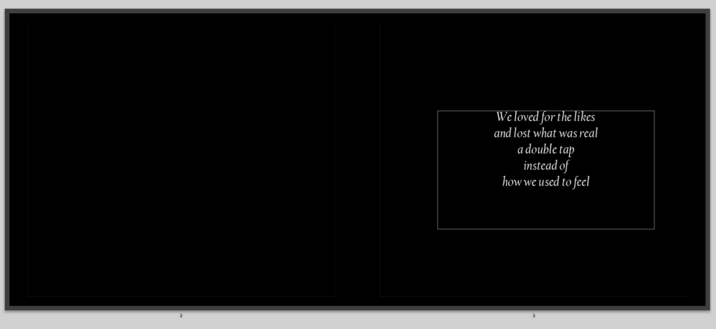
then its the start of my book, with the first pages, I don’t have much to say as this isn’t my photos, but it does have a little poem I made to some up my photobook in a way, saying what is happening now that social media is involved it love. I do like it but not sure its the best poem I have written.
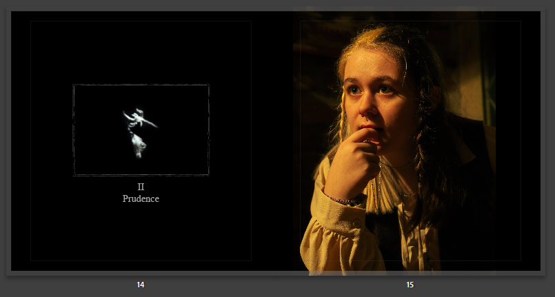
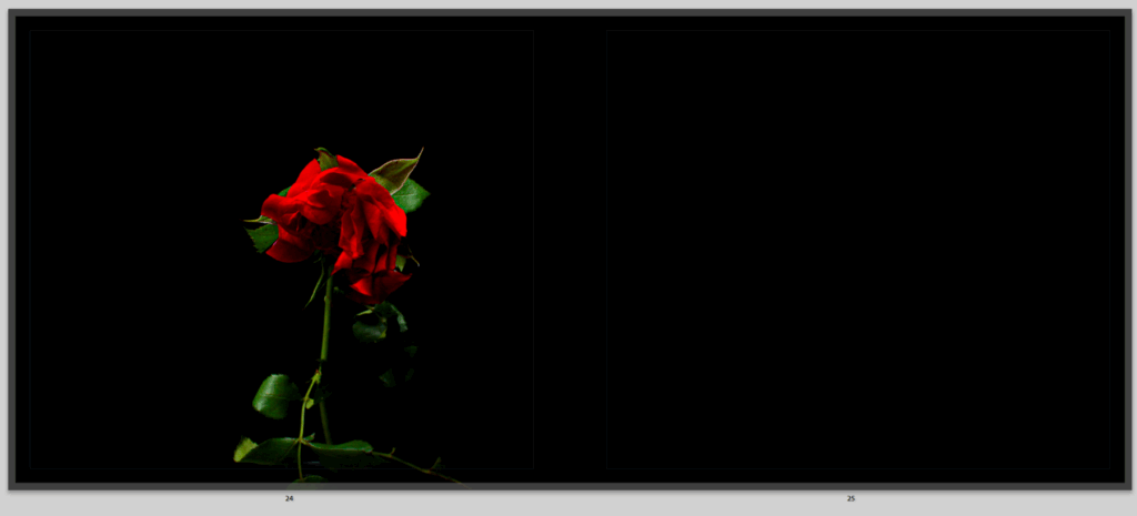
I decided to have this rose as my first image, this was to create a story starter, roses symbolise love, this rose it well, alive, beautiful and full of colour, symbolising the same for love, I wanted to start my story with a strong image of love, to show that once it was strong and powerful, it could still be, but as you continue through my book you will see how that is not so much. I really like this image, because its really bright and stands out with the background, and it looks lonely which I just thought was more powerful having one singular rose stand out to begin my story.
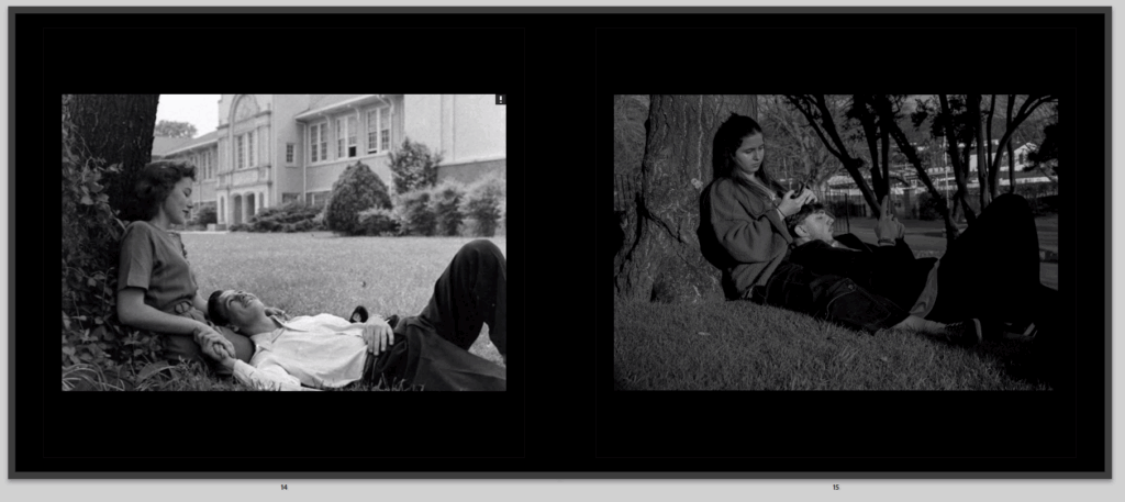
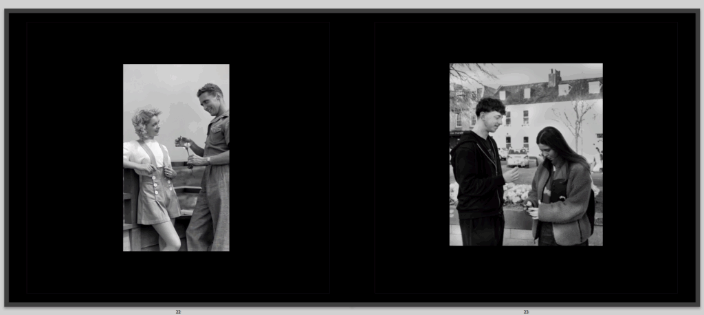
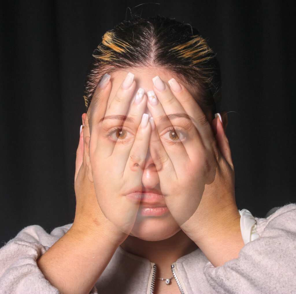
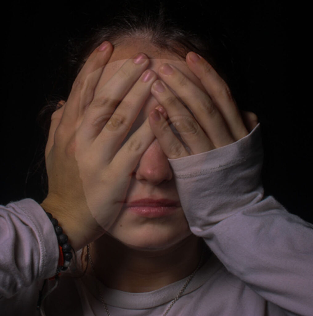
After you turn the page you continue you on to these images, they are a comparison photo, and I really liked my comparison images, as this one very much shows an old image, from the 60’s/70’s of a couple in love ignoring the world around them and focuses on each other, the background is blurred and they are looking lovingly into each others eyes, while holding hands and laughing not involved in their phones or anything else, I wanted to clearly show how love used to be and how we all thought it would be or wanted it to be. As you can see it goes onto my image, right next to it which is a replicate of the other image, also in black and white which I liked as it gives a better affect, but instead of looking lovingly to each other they are walking on their phones not involved in the world around them because they are too focused on their phones, no longer in each others presence, all to know they are a couple is to see they are holding hands, but almost with distance between them. Both the images are places the same on each page perfectly opposite to show a very clear comparison to those who see it.
Then I moved on to this second comparison, again giving the same vibe as before which is what all my comparison images do, I think these ones go particularly well together because apart from the difference in sky they match quite well with their colourings with the same deep contrast of lightness from the skin and darkness from the car and clothes, I also liked that both the men are wearing black and the women wearing grey, to make it even more symmetrical.
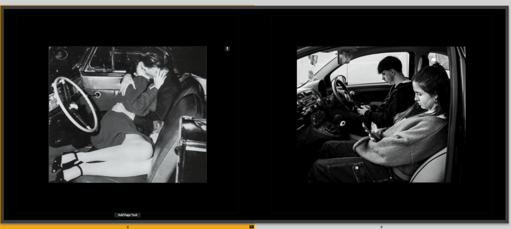
I then decided to break up the comparisons to not have to all at once because then I think the book looked a bit clunky and odd so added in a sequence to make the book flow better and show more of my images, and also have stories within stories, leading to the same outcome, like as you can see here this image comes in on mainly the left side of the pages, where a couple look very in love and are cuddling to and kissing to show their romance, they are the start of the book to show the strength and love of romance that is still around or that has been and is slowly dying depending on how the viewer takes it in.
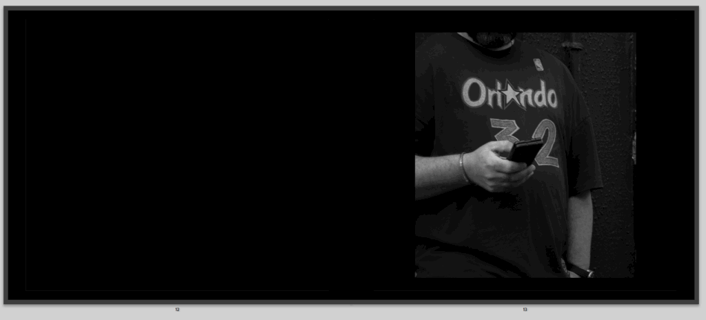
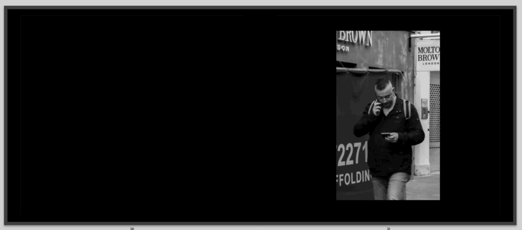
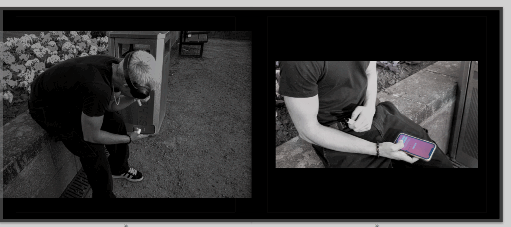
Then on the right side and next pages, I have a photo of a man on his phone, this isn’t my favourite photo but it is here to also continue to tell the story of how social media is slowly sneaking its way into our lives, destroying our romance.
We then go back to comparisons, to continue that sequence of two comparisons then a romantic photo and then a phone photo, I really liked this comparison once again having the images the exact same opposite, only slight differences between them
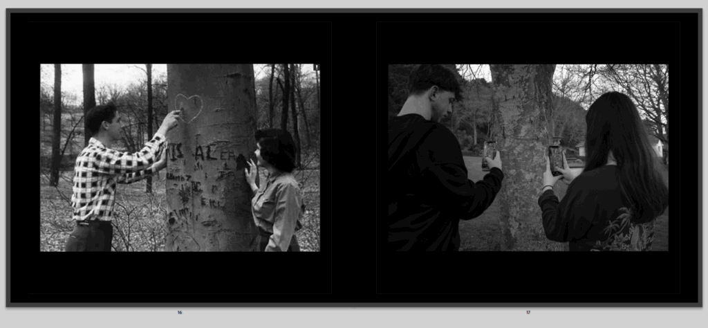
Then we move onto another comparison where in this one it shows a couple carving their heart together, knowing that only those two will know what it means and other people will just see it and wonder who this couple was, when in my photo its the same but they are taking a photo of their heart to post on social media to let the whole world see their cute private moment which now because of social media i snot so private, the main thing I don’t like about my image is because its not clear enough to see the heart, it does not stand out enough, like it does in the other photo, but you can see it an because of the first image I think it makes it more clear what is going on.
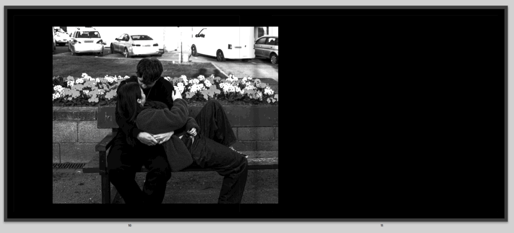
We then move on to another romantic picture of this couple showing that love is alive, and well, but not for long.
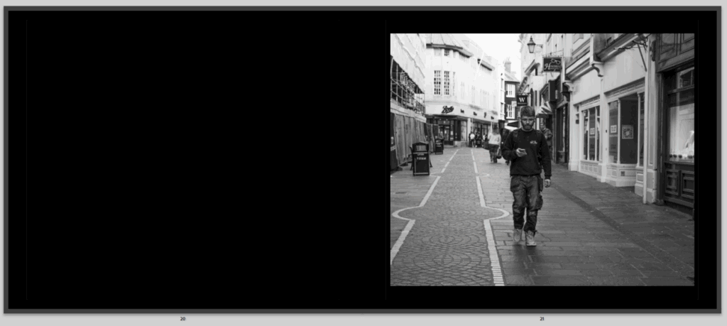
Then on the right side is more street photography of once again another person walking on their phone oblivious to the world around them, continuing to show the poisonous affect of social media that is creeping upon us that we don’t even realise, and that I hope to show throughout my book as a I realised it even more when taking the street photography, the one factor I don’t love of this image is that its quite bright, and I did have it a lot darker before, but once I printed some of my images for the print folder and in my last book I made a lot came out a lot darker then how they looked on the screen, so to be safe I brightened most of my images.
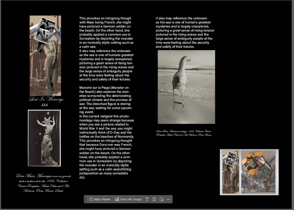
Then I have my final comparison which I actually my least favourite comparison and I wasn’t sure on but I mainly like all my comparison photos, but I don’t love the first photo, but there isn’t anything I can really change about it and I wasn’t planning on using it, I did have it saved for just in case and inspiration then accidentally I made a perfect comparison image. I would liked if I had another one of giving a slower and instead of her just on her phone ignoring him she is taking a photo to post on social media but I liked this one as well and its almost coincidental on how it came to be. I also don’t love my image because of how bright it is and it isn’t particularly clear that there is s a flower there, but I made it brighter for the book when it is printed and after lots of editing I couldn’t really find a way I wanted it to go apart from this.
After that I have this image which shows the same rose, but now it is slowly starting to die just like romance which I think is really good and I actually really like this page and genuinely this idea in my book, and if I had more photos or pages I would have added this more.
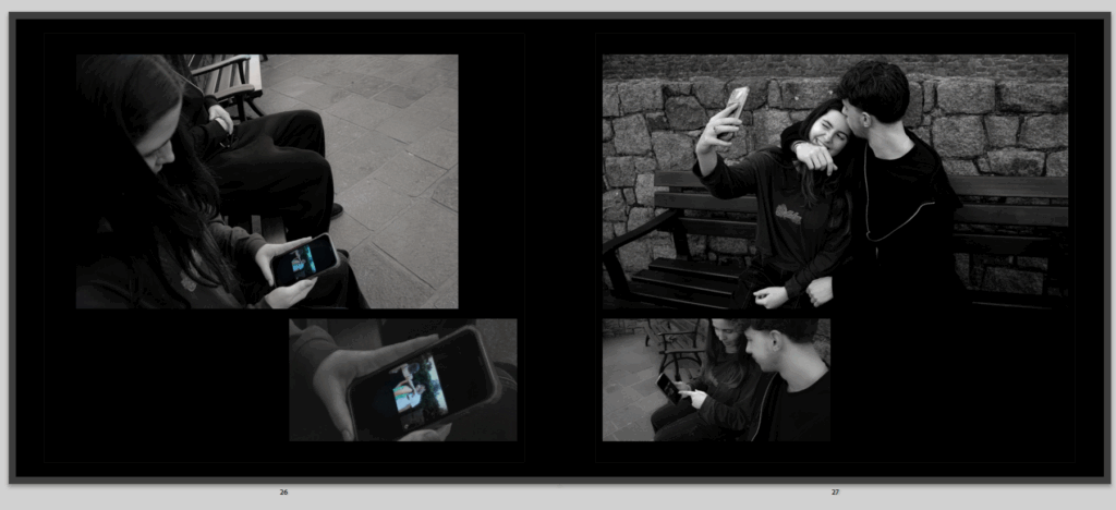
Then these pages, which again tell their own story and have their own symmetry, to me it is quite clear, and shows the girl seeing a couple on social media and getting jealous or comparing her relationship to that, it shows that one couple isn’t very private either, so she decided to take the exact same image with her boyfriend, to also make other people feel the same way she did or show that her relationship is cute just like how other people show theirs. but no one sees the other side of it.
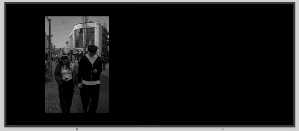
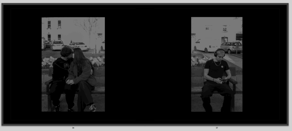
Then we go back to the loving couple and sequence we had throughout the book but only now the couple is not so loving and look more involved in their phones, and that’s showing how social media has come into their relationship and suddenly its not just about them two being together its about everything else.
And right after those pages is this one, that shows a man walking texting on one phone and calling on the other which I think fit well because as you see people on their phones and the couple slowly more involved on their phones and the rose slowly dying from social media, this man is on two phones showing how social media is completely surrounding us.
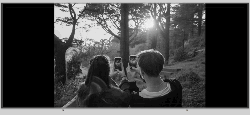
Then this image, which I just really like as an image in general the couple are together, looking at a beautiful view but instead of look at this view and saving this cute moment they are taking photos ready to post on social media and continue to be involved by their phones, I also really like how I decided to present it in the image, because it is full bleed but the image is split in half by the fold of the book to continue to show how they are disconnected and split apart from social media.
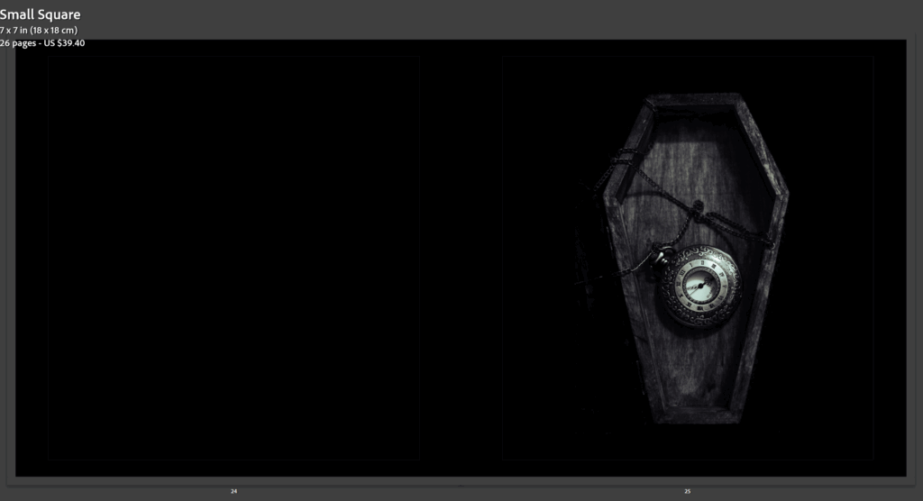
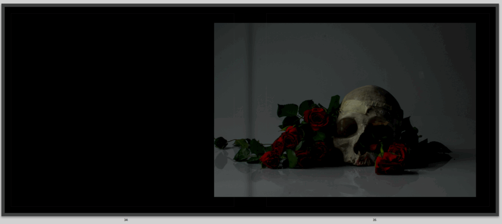
Then this image, which the image I genuinely really like as it shows death and love together symbolising love is dead or just showing opposites together which I think gives a powerful metaphor to anyone who sees it, I don’t love it here in the book think it is randomly placed and really debating on whether it stays in or not but I like the image a little too much and think it shows so much using symbolism which is a massive part of my book.
After is these images, which where taken together, of one guy sitting alone and single looking for love, sat on his phone slightly resenting the relationship he sees around him, wondering how he can find that him self, and also slightly represent that depending on all the social media is how that couple might end up. I do like how the images are opposites of each other on the page they are perfectly symmetrical and show a very clear opposite images.
then these images, of the same alone an. who sat on his phone not going out to look for love in reality but resorting to a dating app, so using more social media thinking that it isn’t fake and dishonest, when reality you see the real person, but he might be stuck talking to someone through a screen and never knowing what the reality of this person is. I had the first image like that so you can see he’s look on his phone to then have the second image more zoomed in an standing out so you can see what he’s on on his phone.
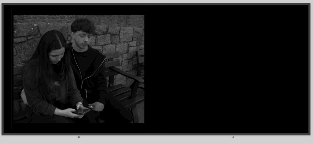
Then this image, which I really like because its that same couple, now with the girl on her phone not only not paying attention and giving affection to her boyfriend but he is also paying attention what’s on her phone because it has made him jealous and paranoid wondering what she is looking at, who she is texting.
Then this final image of the same rose, now completely dead just like love and romance now on the right side of the book, to be closing off the story.
All in all I really like this book, because it shows everything I wanted to and gives a story and sequence throughout, there is things that could be better but like all work that is, but apart from the little tweaks there is nothing really I want to change massively as I am pleased about how it ended up.
I like the way that both my virtual galleries have turned out as they both have drop shadows making them look realistic. I prefer the Mandy Barker one as I like the colours in it as the gallery itself is black and white.
My overall conclusion of this project is that I’m really pleased with my work. I think that my ideas and planning really helped me set myself up for succession and it really helped me understand what union meant to me and how I was going to explore it. I believe that my images are of high quality and that my editing skills which I used to enhance my images are good. My work is clear and inspiring.
I have many strengths throughout my project. One of them being applying my research to my work. My research into romanticism and my 2 case studies evidently combine with each other and I strongly suggest that my work shows all the hard work I did in terms of researching and especially applying that knowledge to my work.
Another strength within my project is the level of experimentation I had. I wanted to make sure that I had enough options and that I had enough content. The creativity I showed in my experiments really showed how engaged I was in this project and how I actively was trying to create different concepts and ideas. The number of photoshoots I did also really helped me have a variety of options when it came to experimenting and editing with images.
Lastly, I believe that my photobook is my biggest strength. In my photobook I was able to show my research, inspirations and ideas which is what makes my photobook so influential. My photobook is outside of the box, and it has many different concepts within it which is something I’m proud of because all my experimenting and editing I did finally paid back.
There are of course many improvements in my project and these improvements and suggestions are something that I will take into consideration if I construct another project like this. One of the improvements is that my photobook should’ve been longer and much more creative, in terms of colour and shapes. My final outcomes could’ve also been presented in a much more creative way, like adding textures or natural resources, like leaves to present the images, especially in the virtual gallery.
If we put this aside, I am really proud of what I have accomplished in this project. I have learnt things, created things and showed skills in this project. This project has taught me to always think outside of the box and to find the deeper form of something.
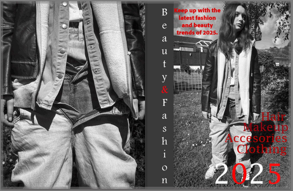
My magazine is going to be based on the idea of overconsumption. I will be doing this in multiple sections including makeup, clothing, hair, and jewellery. I wont include any writing inside of the magazine apart from the concept page. The front cover will include bits of red against black and white images, this will catch the viewers eye.
For my magazine I dont want to include any text as I want the focus to just be on the images I have created.
Front + back cover:
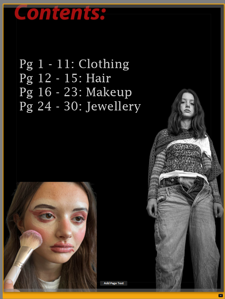
For my magazine I wanted to include a contents page as every magazine has one. In this page I included some images which can be found within the magazine, I did this using photoshop and the object selection fool.
For some pages I changed the colour so that it would look good with the other page, for example I made this one match the beige hat on the left.
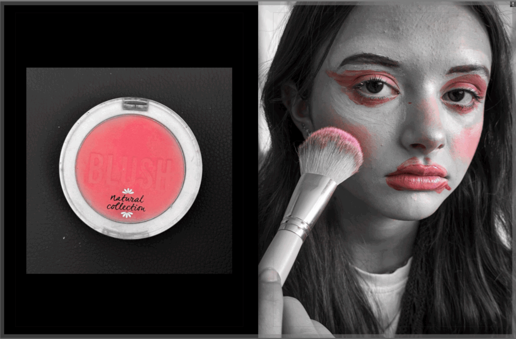
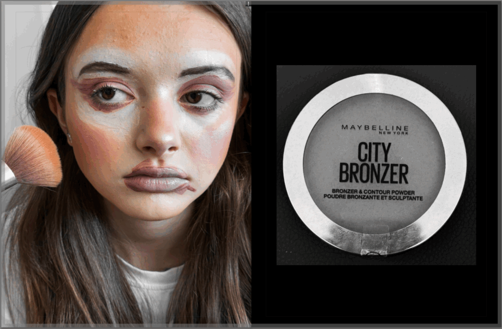
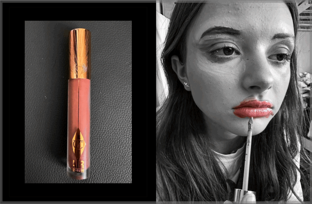
For the makeup pages I wanted to make the products which are being used stand out, for example for blush I removed all colours apart from pink, and for the bronzer I removed all the colours apart from the browns.
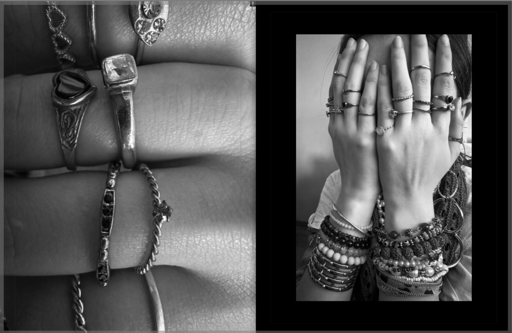
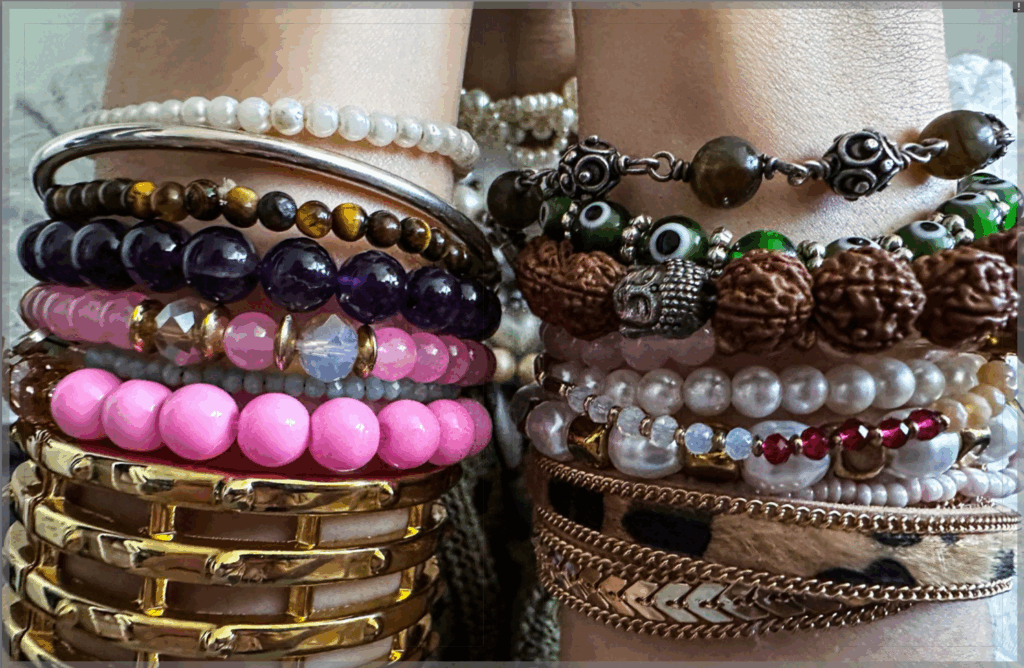
I decided to make this a double page spread as I think it will look good having a stack of bracelets on each page.
Evaluation:
Overall I am pleased with the way that my magazine has turned out. I like how I have added pops of colour to some of the backgrounds on the pages. I like how I have grouped the images into sections within the magazine. If I was to remake the magazine I would take photos of different models as I think it would make it more interesting rather than having the same model consistently throughout the magazine.
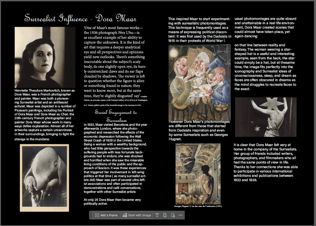
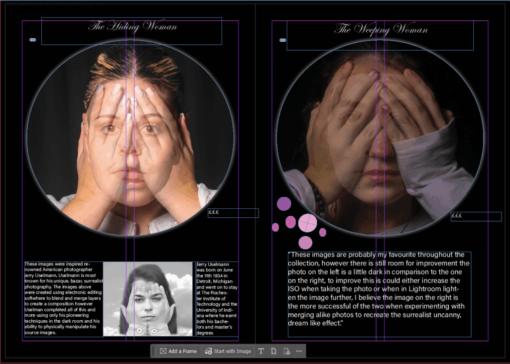
after constructing my virtual gallery thought it would be apt to create a Gallery Pamphlet in indessign, in order to do this looked at other photographers gallery pamphlets to get ideas about the structure and formatting my pamphlet should follow.
I discovered I was very drawn to portraits in a circle/oval frame, My original thought was too present these images :
in a similar way, however when I presented them with a white background it took away from heir intensity
so I decided my pamphlet would be entirely black based in order to preserve the images intensity.
I noticed most successful pamphlets include things such as
title
price
information about the art work
information about the artist inspiration
so I have included these points of notice throughout and within my pamphlet.
most notable pamphlets include quotes either from the author/artist or artists that have inspired or supported the exhibition I any way, so I will be including quotes to personalise myself to the imagined viewers.
And finally I need to consider an eye-catching front cover for my pamphlet, preferably one that includes a human face.
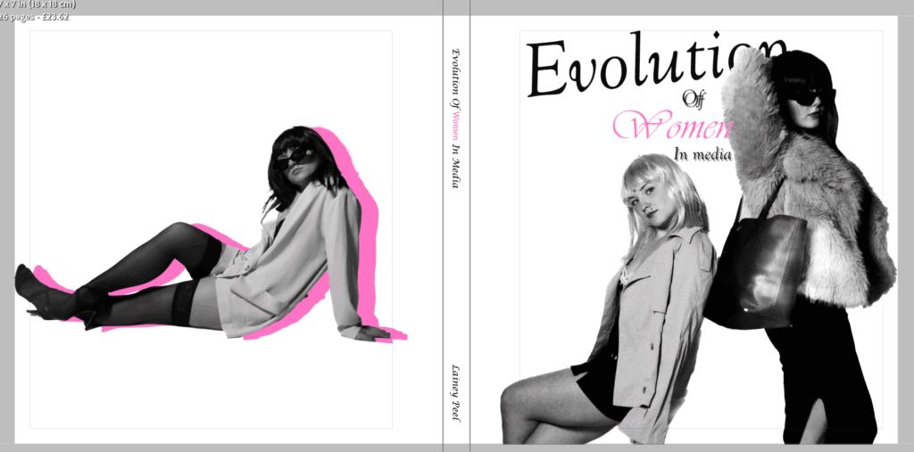
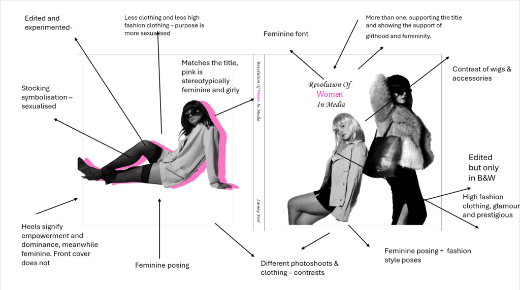
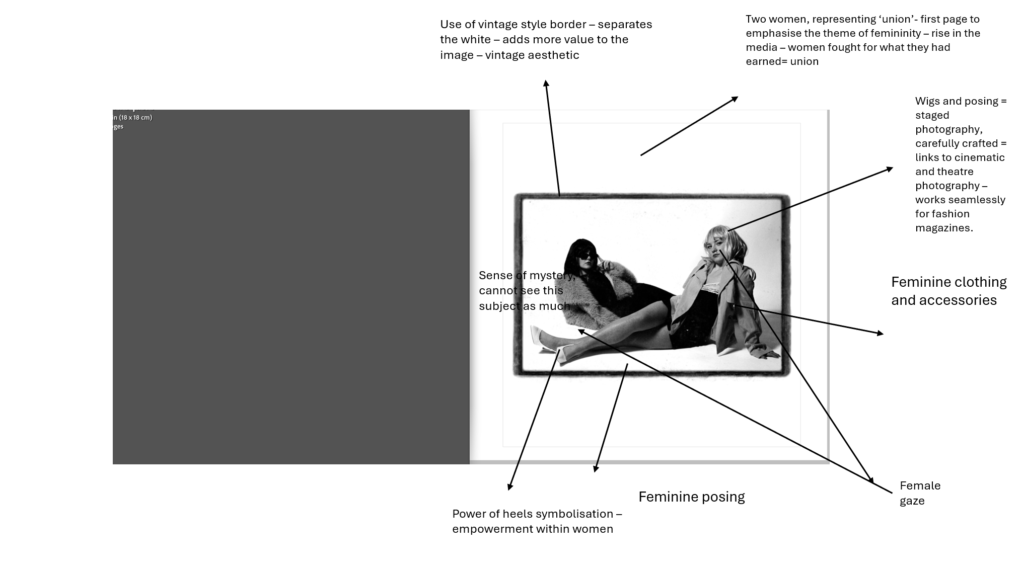
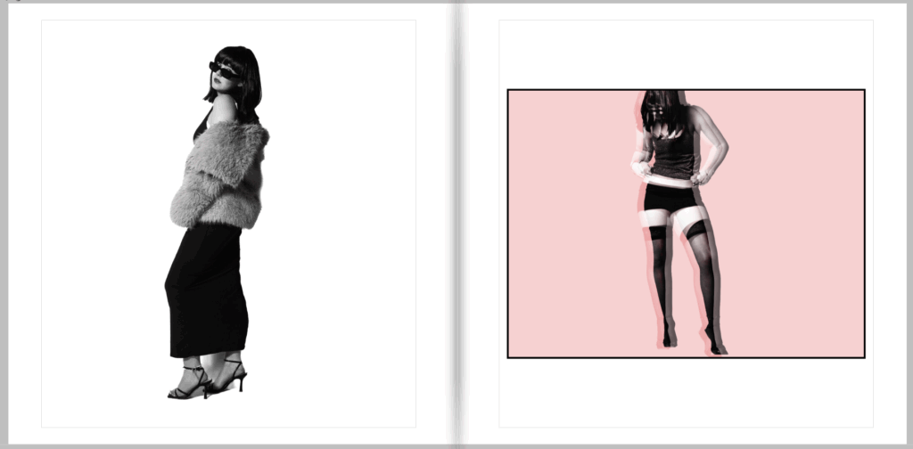
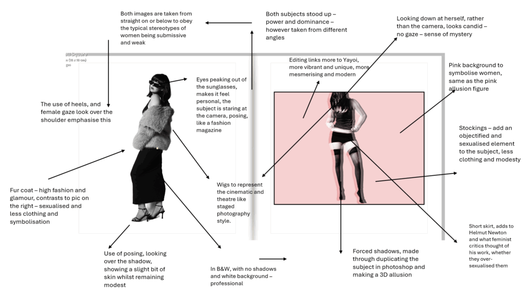
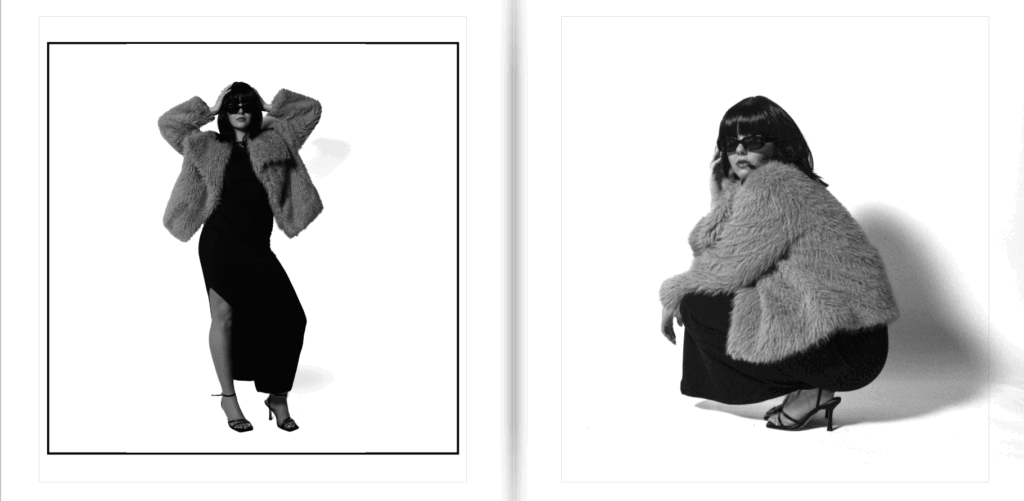
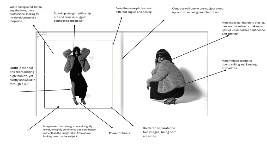
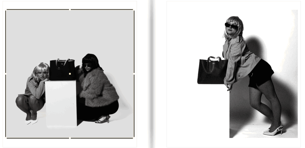
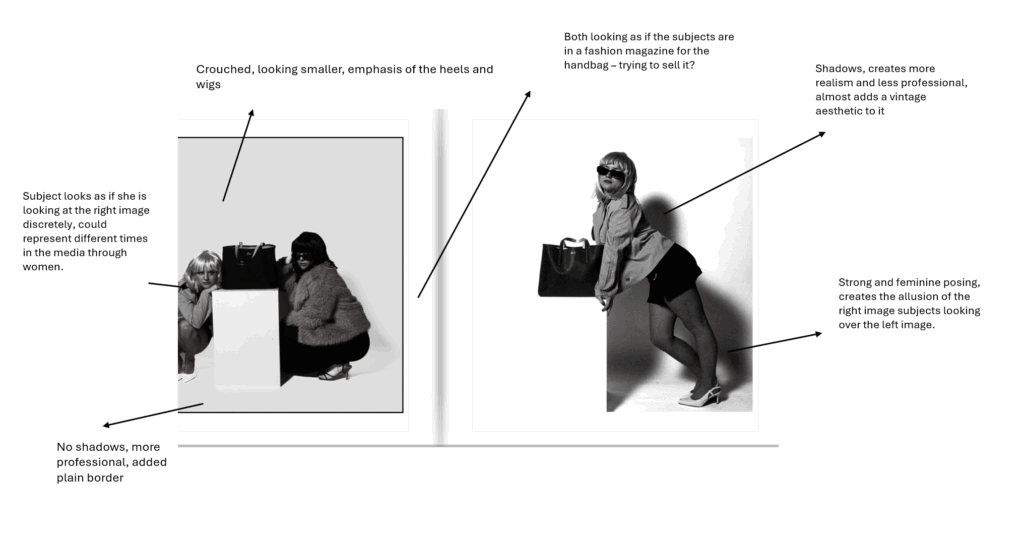
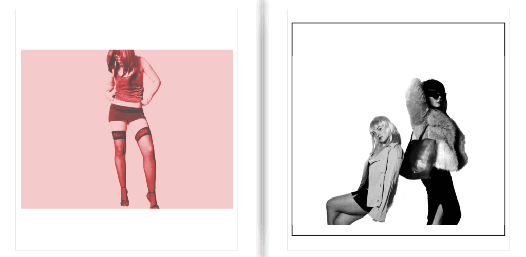
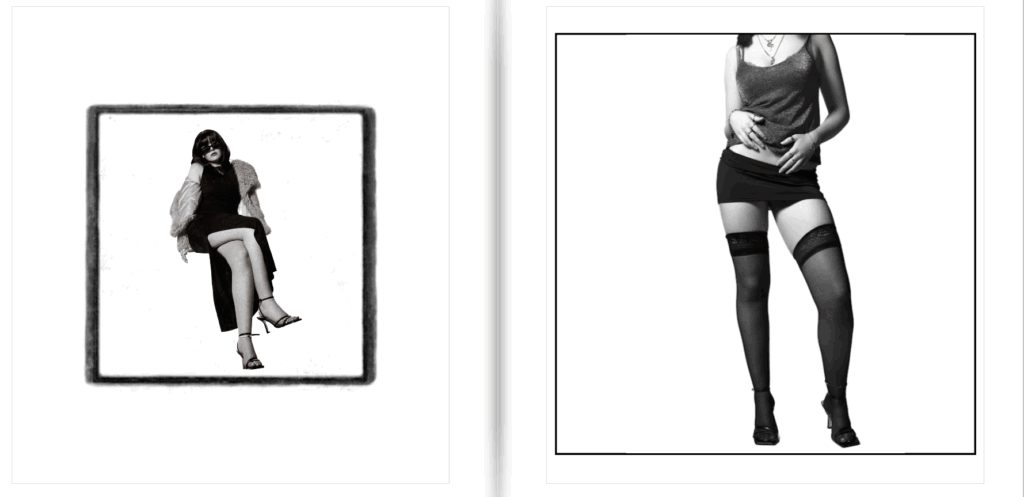
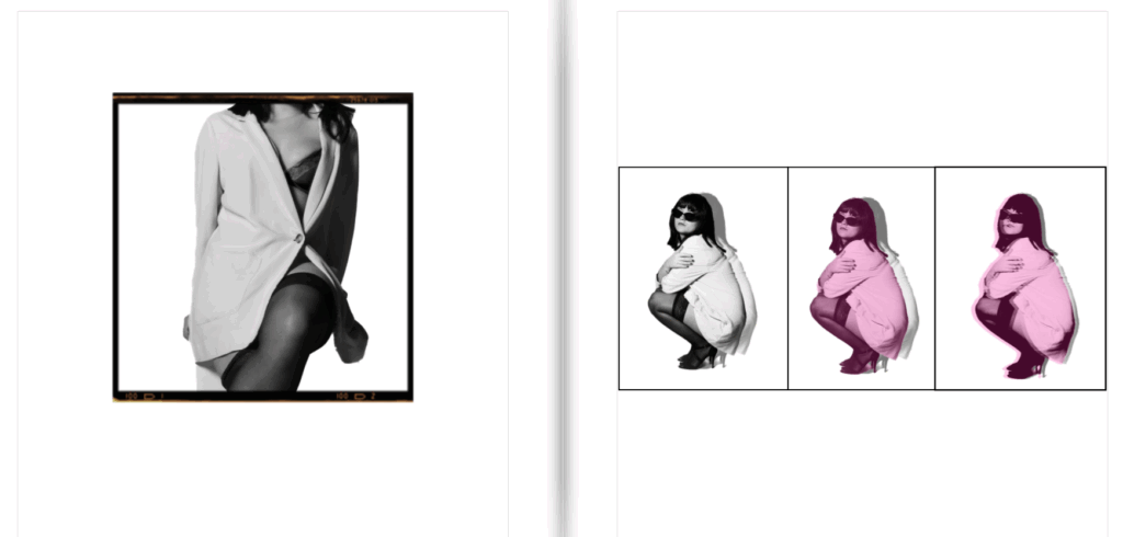
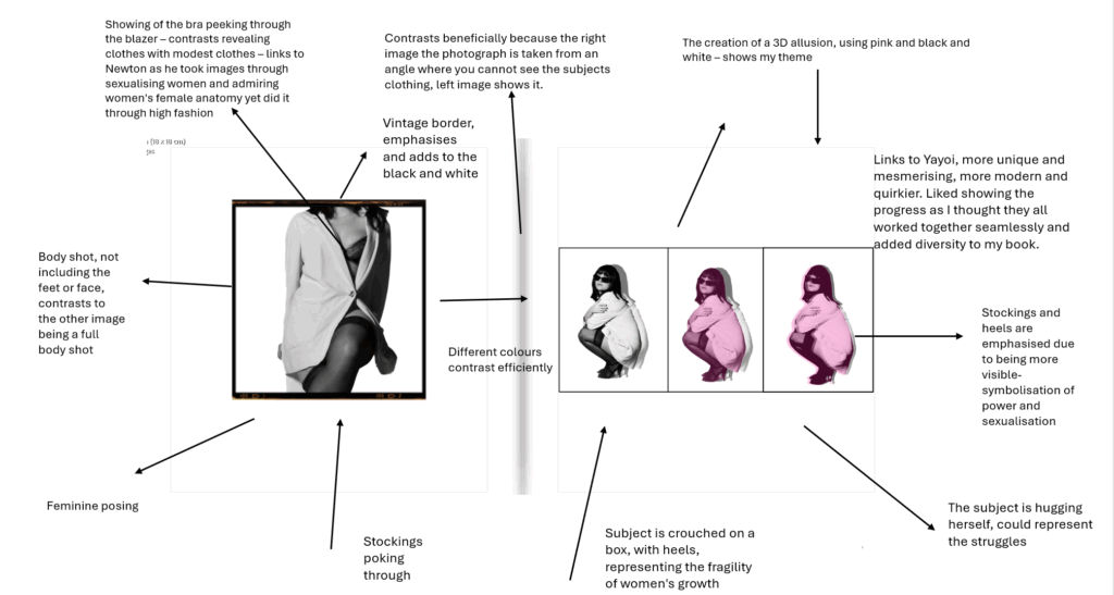
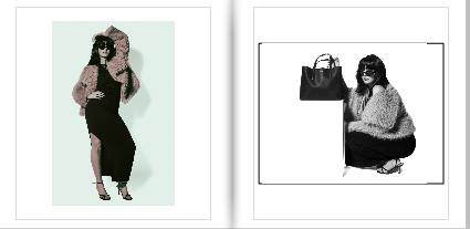
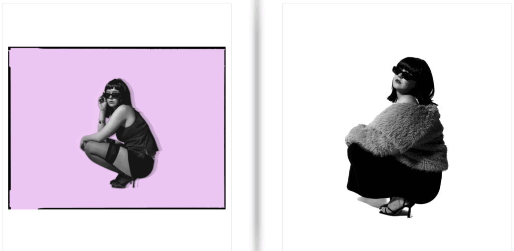
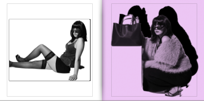
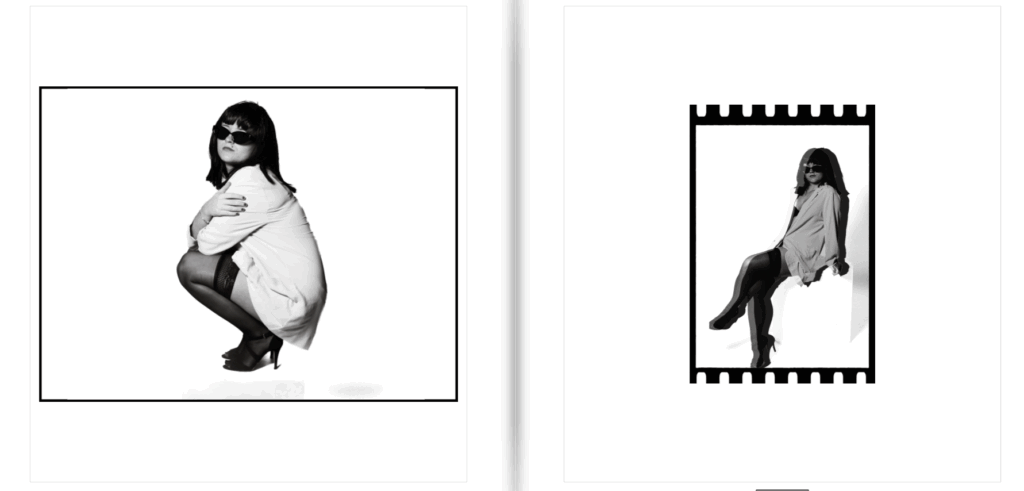
My plan in this magazine styled photobook, is to show off a very feminine aesthetic, straight away illustrating the theme I am focusing on and portraying. To do this, I aim to use stereotypical colours of femininity such as purples and pinks. I want this to be shown straight away on the front and back cover, to emphasise this and let readers aware of my project, before going into the book. My photoshoots are very high fashion, posing and props surrounded, therefore already creating the theme of a fashion photoshoot for a magazine. I really want all my images placed together thoughtfully and carefully to create the most contrast. Almost like this or that. For my front cover, I wanted it to be the both subjects, so it symbols and expresses women as a whole, and fits the term ‘women’ due to being plural. This also signifies how women as a team went through the waves and movements of feminism and eventually increased in the main stream media. Aside from already achieving my powerful and dominant aesthetic of women, I wanted my photobook to add something. Therefore, I will add diversity of boarders to make some images look vintage but also to break apart the white images and make them stand out, rather than blend in. I want to separate all the experimented images so they are spread across the book evenly, and attempt to put 2 pages together to contrast significantly. Although, my aim of my subjects are suppose to look atypical, the clothing etc are very feminine. Therefore, although the pinks and purples contrast with my purpose and aim, they keep the girly aesthetic. The narrative is to signify the revolution of women in the main stream media, and how it was not normalised for women to be in the media before the 1990’s. This is what made Helmut Newton different to other photographers during this time. My narrative is to express modern women in the fashion media and how it changed to the present.
Design and Layout
Photobook style:
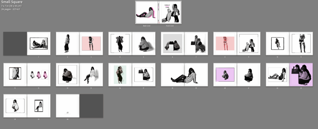
I chose this style, as my last project I used standard portrait and wanted to differ. I also chose this because I wanted my book to be petite and mini as I believe it fitted my concluded theme the most. I want my book to be small and have either a soft or hard cover, however I think soft will fit the magazine style more beneficially.
Front and back cover:
Updated version:
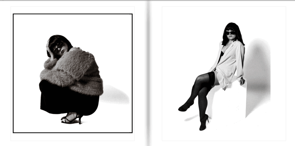
I chose these images as I wanted my title of ‘ women’ to be in pink, therefore I wanted to add something that made this link seamlessly. Due to my photobook obtaining purposely edited colours and black and white, I wanted my back and front cover to show this so the viewers know it is not just in black and white. I made my front cover two women, rather than one to fit the title and show the support of girlhood and femininity. To show that this book is not dull, I added one of my edited and experimented images to the back from a different photoshoot, therefore obtaining different type of women’s styles and what they portray. As shown above, the back cover is more of an over sexualised and objectified aesthetic through the stockings and meanwhile obtaining a modest element to it through the short and flowy blazer with a bra peeking out. I also chose the back cover image because it shows the heels, a very significant symbol in femininity which had to be shown through the first glance. This is because my front cover does not show this, but still shows very feminine and graceful posing. The pink matched perfectly to my title and I think it gave off the correct aesthetic for first glances, which is what I wished to achieve.
Changed title –
Updated after experimented –
Pages to 26:
Double page spread:
My evaluation:
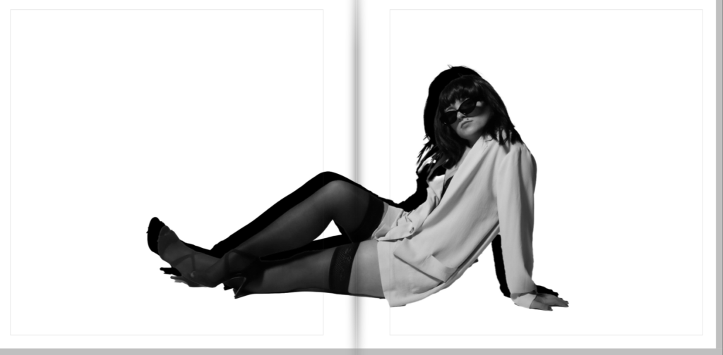
Overall, I enjoy the diversified images, the use of black and white and colours, and different boarders and sizes. The use of black and white and edited colours, I personally believe contrasts yet ties everything in really well. This is because none of my images are in normal colour, yet a few of them obtain colour whilst maintaining the theme of black and white. I like this because it makes my book not boring and dull to look at and definitely catches the eye. The use of different boarders emphasise this but also adds a different aesthetic to each image, throughout whether I want the image to look modern or vintage. Some of the borders I did on photoshop, and some I added for the book. The different sizes emphasised the contrast I was aiming to achieve, but overall I believe the mixing of the edited/experimented images with the black and white images worked seamlessly and created the most contrast. Lastly, I think the use of pink in the title of ‘women’ immediately tells the theme of my magazine, which is what I aimed to do. The use of font is very feminine in my opinion and added to this factor. Some images obtained shadows, and some did not which I think worked beneficially as it made my book more diversified and unique. Lastly, I believe that my photobook gives off a magazine type style which is exactly what I wanted to achieve, which I think I did successfully, with a unique and different perspective, linking to my artist reference Kusama Yayoi. Whereas the images its self and how it was created through props, fashion and posing links to Helmut Newton through the cinematic and theatre – carefully crafted style.