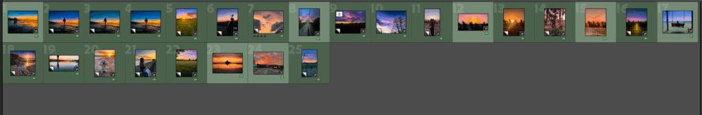
I feel these were my best images from the photoshoots overall as they had the best definition and told the best story in a clear way. They are all different with a variety of different moods and locations which was my intention when selecting these images as I wanted each page of my photo-book to hold a different story.
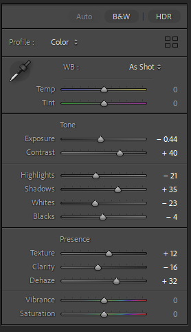
EDIT 1 -
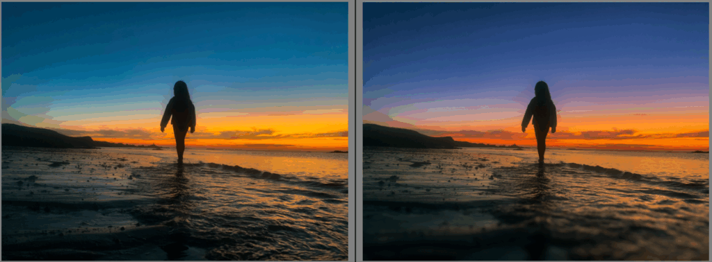
Before & after
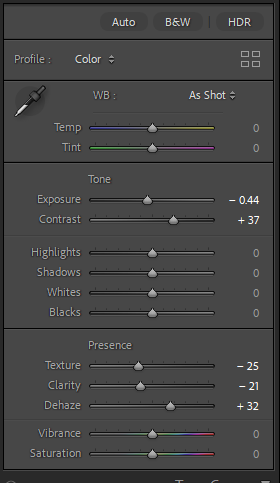
Editing presets -
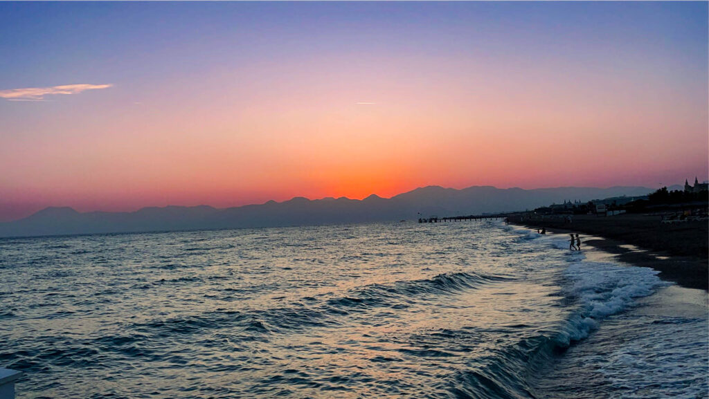
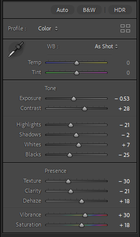
EDIT 2 –
Editing presets –
EDIT 3 –
Editing presets –
EDIT 4 –
Editing presets –
EDIT 5 –
Editing presets –
EDIT 6 –
Editing presets –
EDIT 7 –
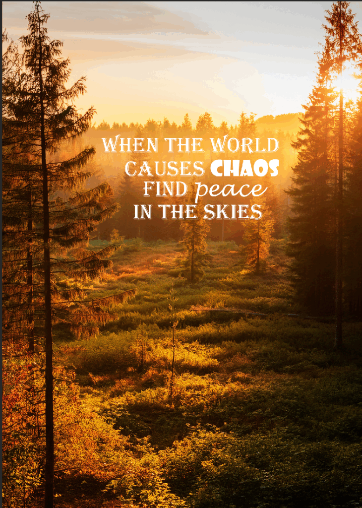
for this edit I used one of my background images and decided to write a nice quote. The quote highlights how the image makes me feel at peace even when I’m stressed, going for a walk in a location like this calms me down instantly so I used words to create that effect for the viewers too.
EDIT 8 –
Evaluation –
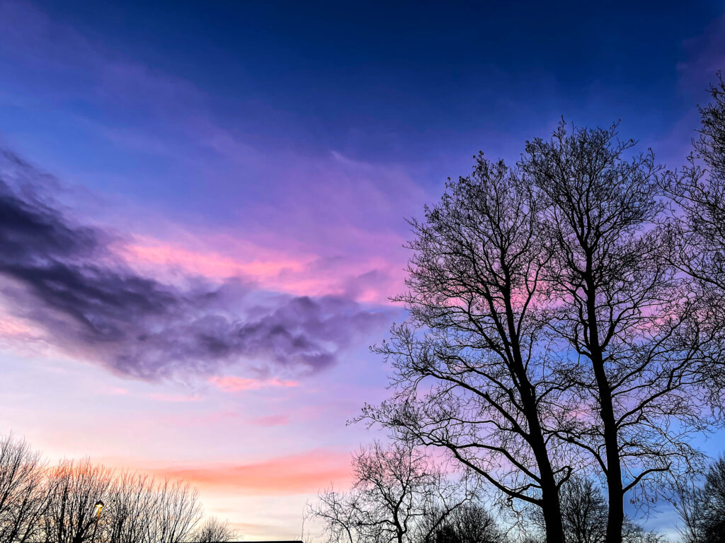
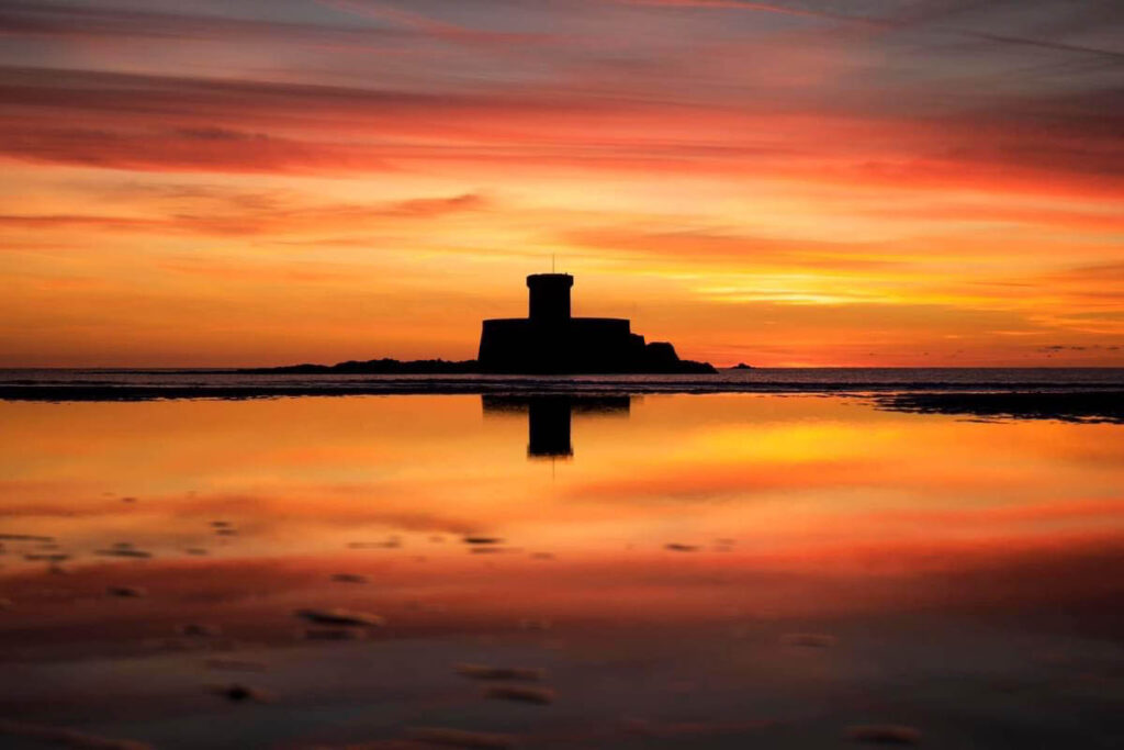
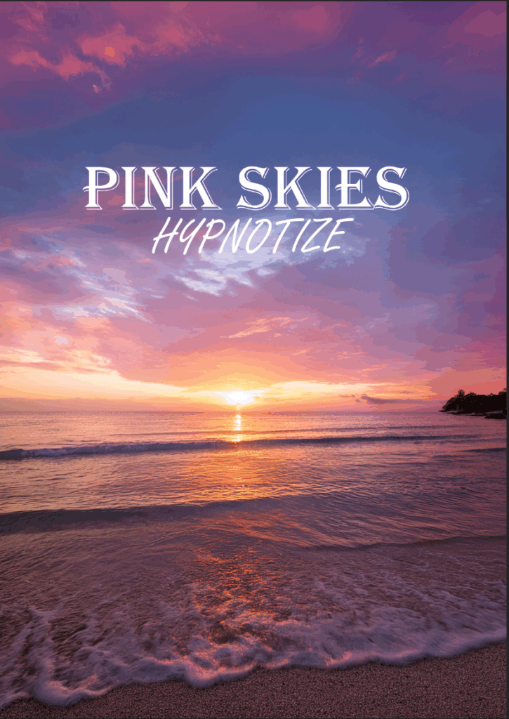
When I saw this in real life I felt almost taken back by the surroundings, the brightness of the sky and the pink and purple hues made me feel so overwhelmed with awe it was almost hypnotising hence why I used the phrase “Pink Skies Hypnotize” again representing how I felt when I was there.
EDIT 9 –
EDIT 10 –
Evaluation –
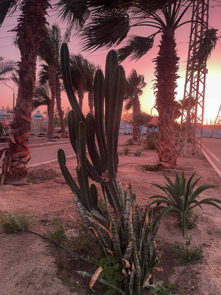
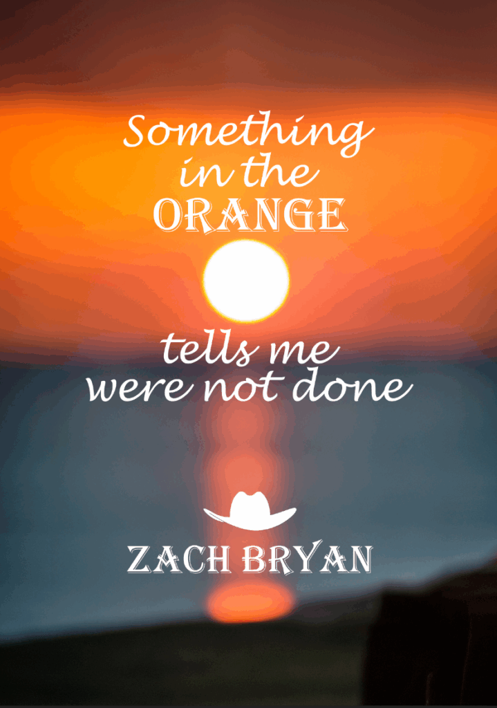
For this image I decided to use a heavy blur on the background and have the lyrics to one of my favourite songs over the top of it as not only does this song remind me of the moments when I am stood under the sunsets but the lyrics almost tell a story, as if sunsets are able to speak to people just through the sole beauty of them and how they draw people in its as if they can speak to peoples minds.
EXTRA PARTS –
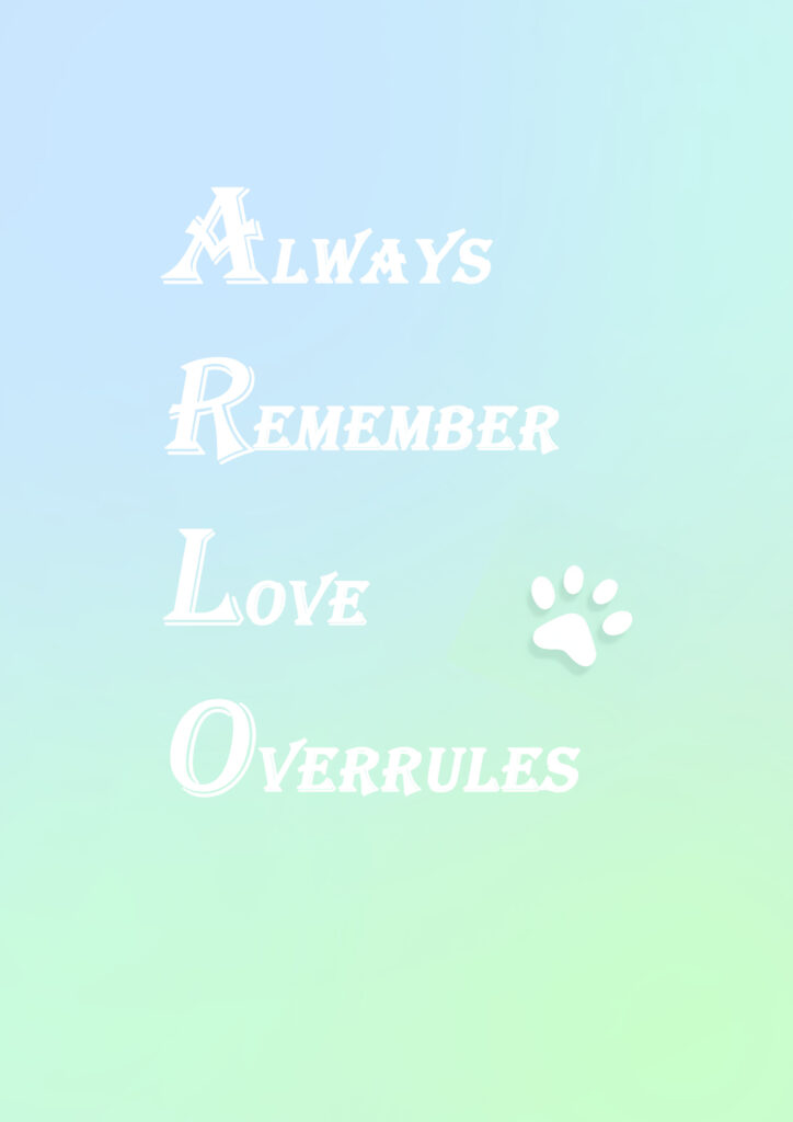
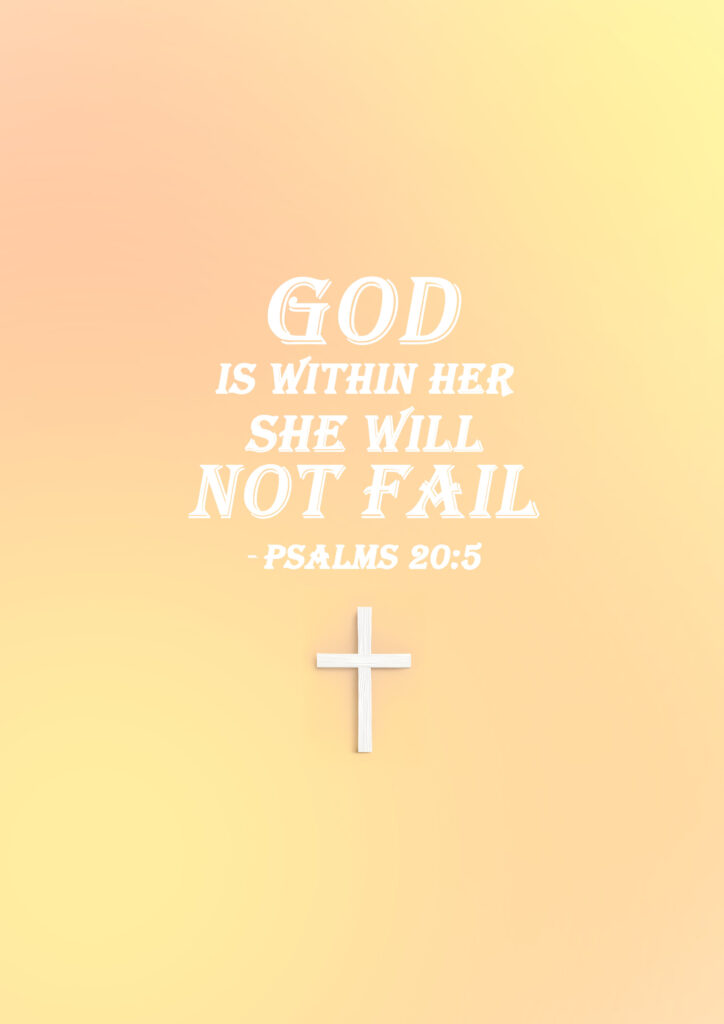
These extra parts I decided to add as I found they gave a really interesting feature to my photobook, each one placed alongside one of my images giving a little bit of background information as to what the images represent without it being laid out as a big story I used as minimal words as possible to represent the images using phrases, quotes, bible scripture and even just lone words.
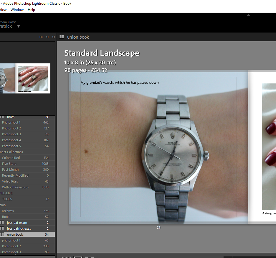
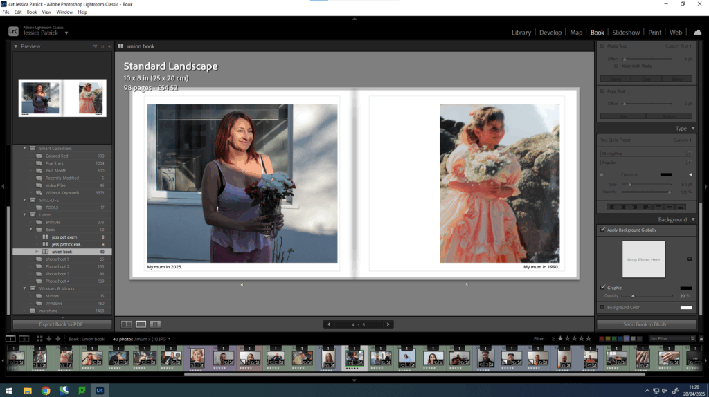
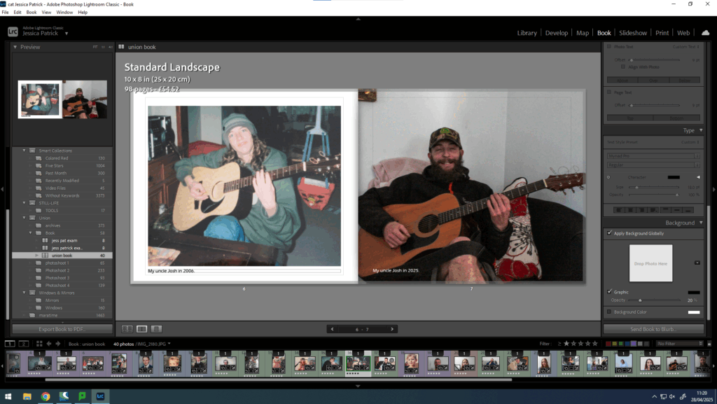
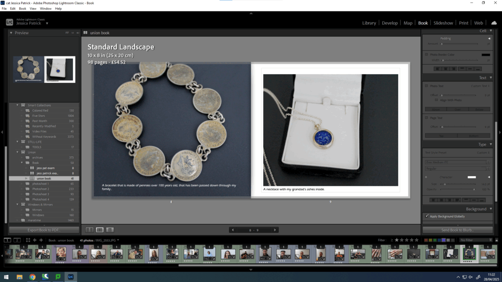
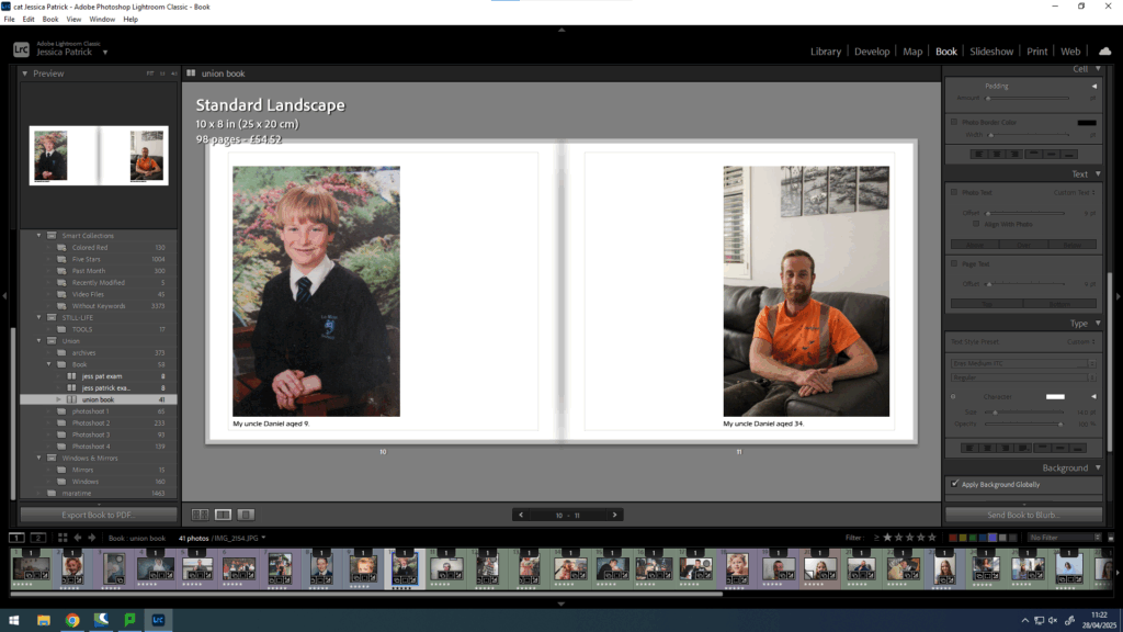
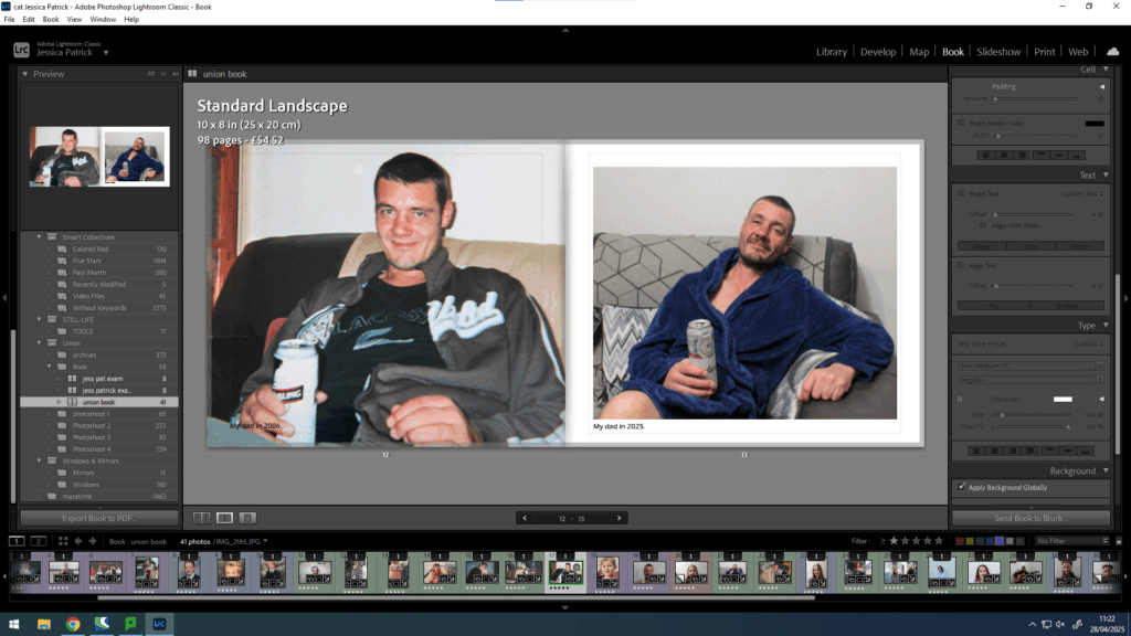
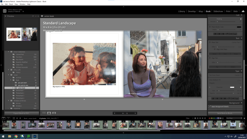
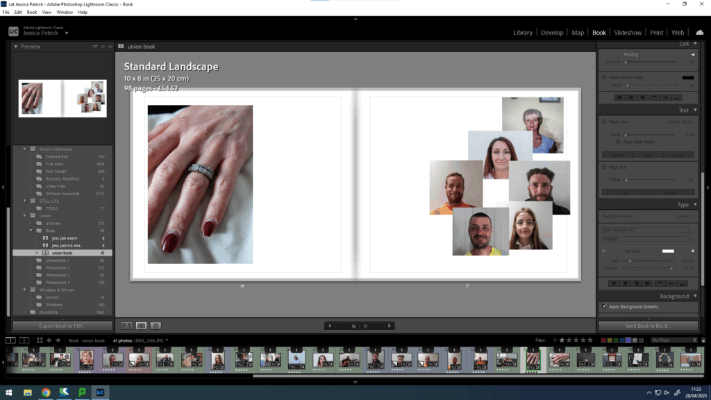
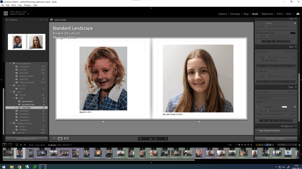
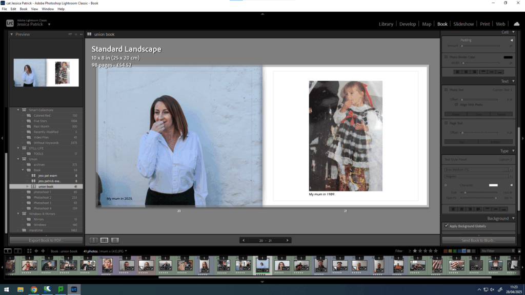
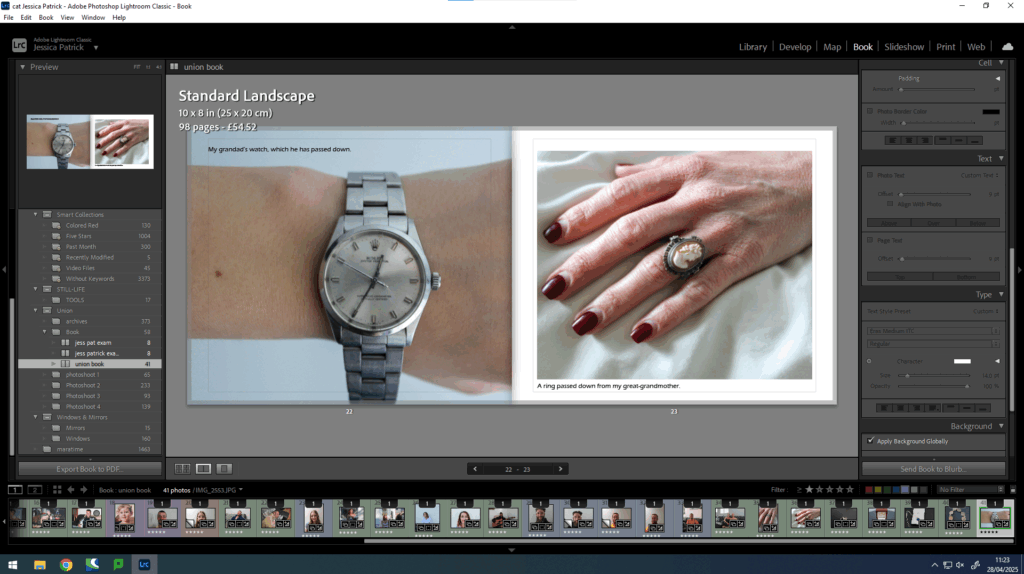
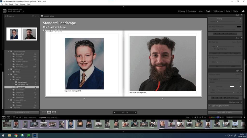
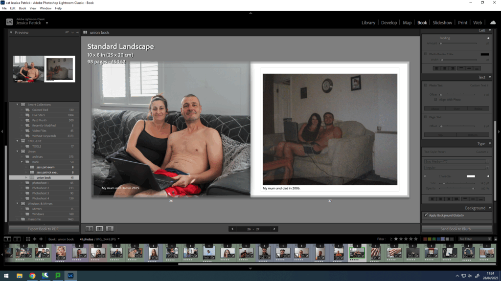
The concept of my photobook is to explore the theme of union through exploring the union my mum and dad have to each other, because of their marriage, and how that has brought two once separate families together and increased the family, by having my sister and myself.
Narrative
Explain the narrative in:
3 words: My family union.
A sentence: The marriage union between my mum and dad that has created a family.
A paragraph: The narrative of my photobook is to present how the individuals in my family have grown and changed over time, but the union still stays as strong as ever. It is also to present the marriage union between my mum and dad that unified two once separate families into one family.
Design
For the design of my photobook, I have taken inspiration of Larry Sultan’s photobook of pictures from home, as I really enjoyed deconstructing his book and I thought it was very visually pleasing.
I chose to do a mounting presentation for my work because, its very hard to catch and keep someone’s attention through a book. On the wall, mounted, its in your face, you cant avoid, and from there, its the message you share that holds the importance.
Mounting grouping –
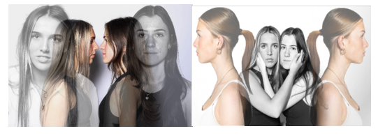
My first mounting group will consist of my 2 surrealism edits:
I will mount them simply, using mount spray to stick them initially, on a piece of black cardboard, so they will look almost bordered. Then using double sided tape to stick them onto a piece of white foam board. Having both photos side by side with about a 2 inch gap between laying next to each other on the same piece of foam.
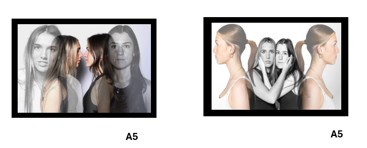
I wanted these two photos together due to their similarity. Both being harsh edits and similar forms, I knew that they would compliment each other very well. I printed them off individually as A5 prints because I knew in my project, they wouldn’t have very much significance.
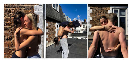
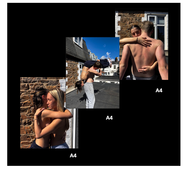
My second mounting group will consist of my final 3 images:
I mounted these photos slightly differently, using mount spray to attach the print to a piece of foam board the same size. This was done for all 3 prints individually. I then used double sided tape again to tape them to a large piece of black cardboard. I allowed my prints to overlap slightly to give my presentation some depth and texture since it is the most simple way of presenting my work.
I wanted to group these 3 images together and not all individually because they reflect what I would call the three unspoken rules of relationships, friendly or intimate. Vulnerability, trust and intimacy. It reminded me of the saying, ‘Hear no evil, See no evil, Speak no evil’, and I thought that could be very impactful.
Examples –
Group 1 –
Group 2 –
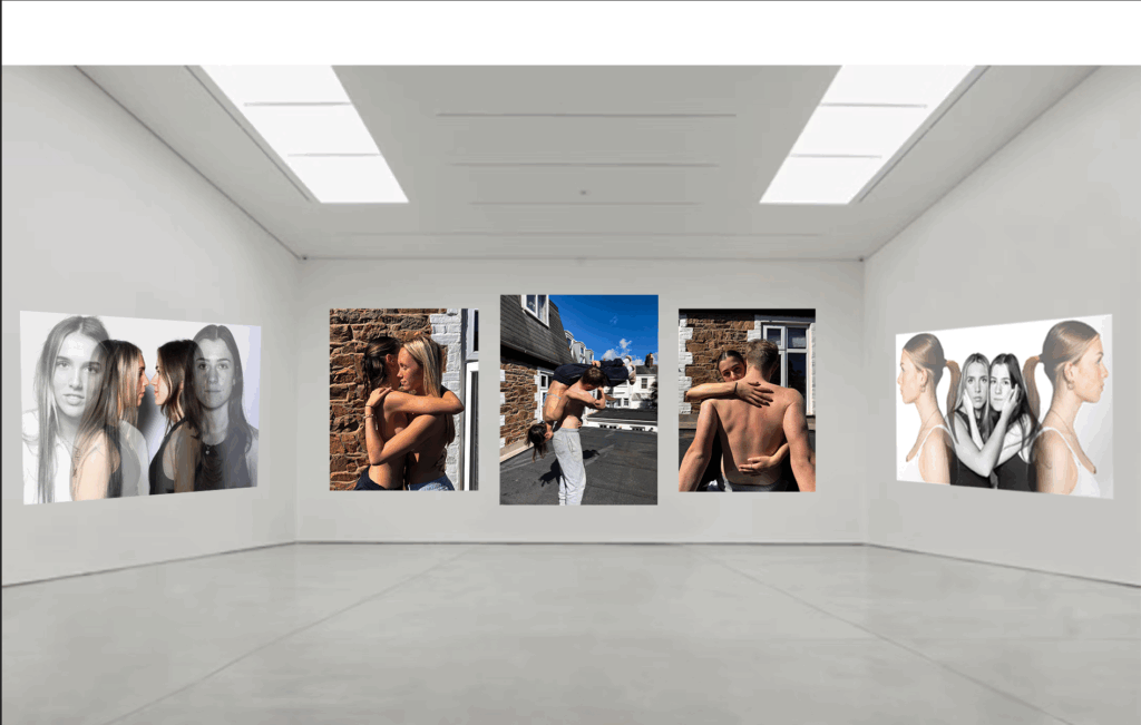
Virtual gallery andEvaluation –
Overall, the mounting process went very well, I gave range and difference between both groups, including texture and having different levels on group 2. The bordering on group 1, complimented the photo and gave the end result dimension and depth.
I could have improved this process by changing the sizing for both groups and varied this to show more dimension between the photos instead of having all images the same size in both groups.
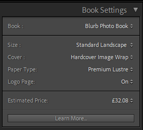
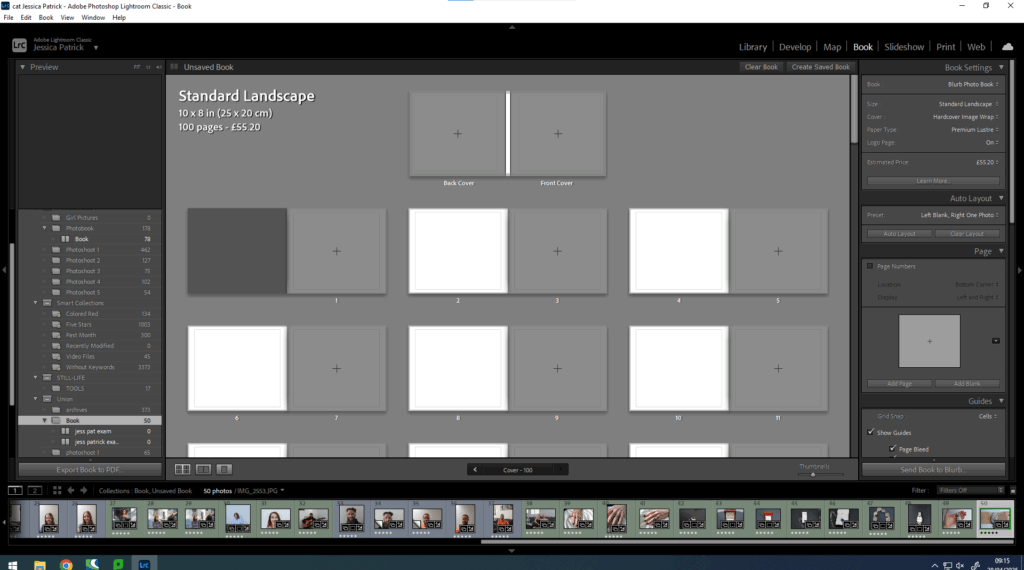
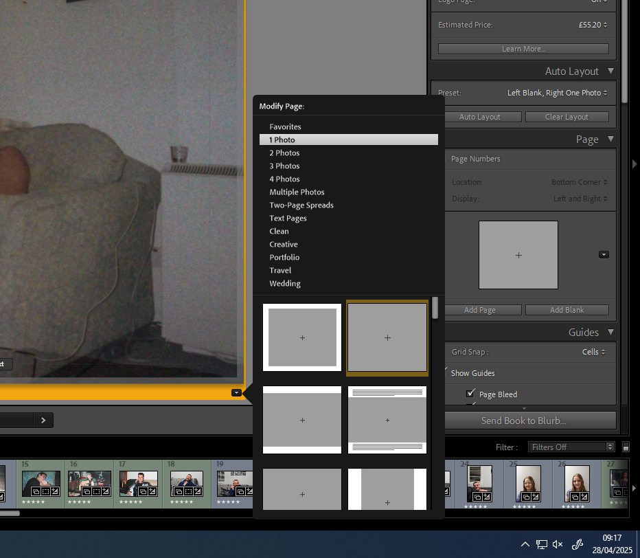
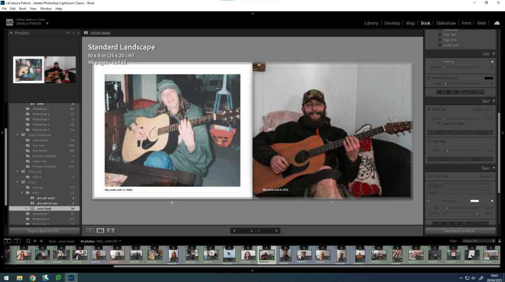
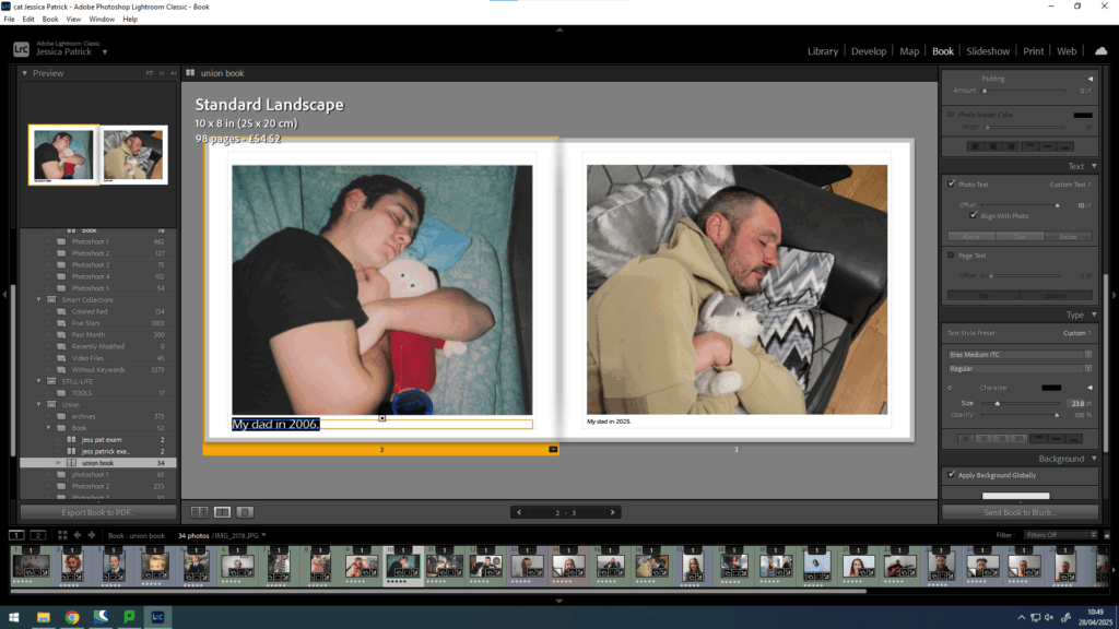
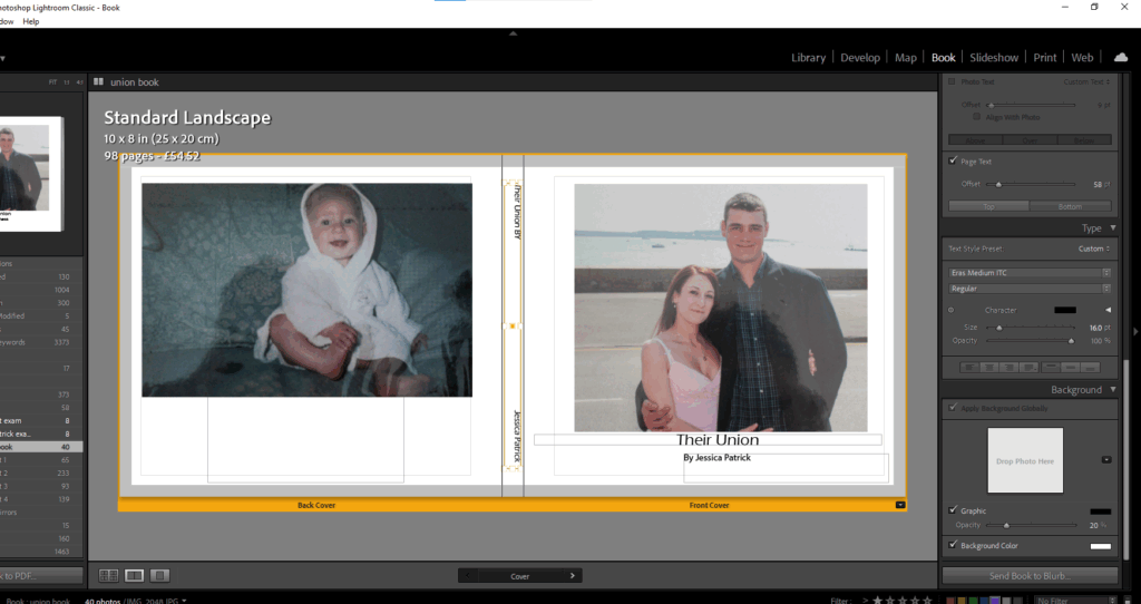
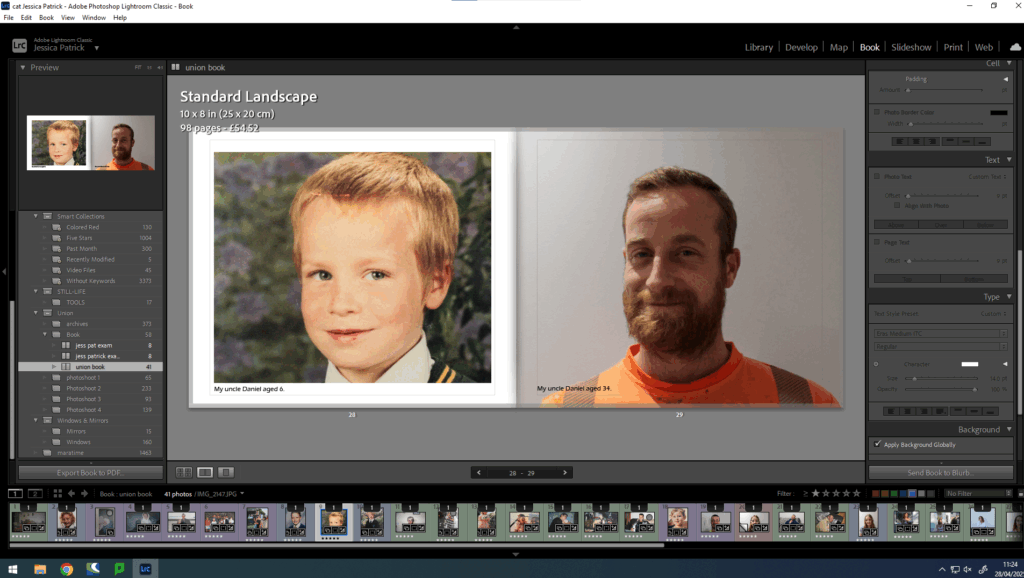
Firstly, I select my final images that I am wanting to use in my photobook in Lightroom and click book.
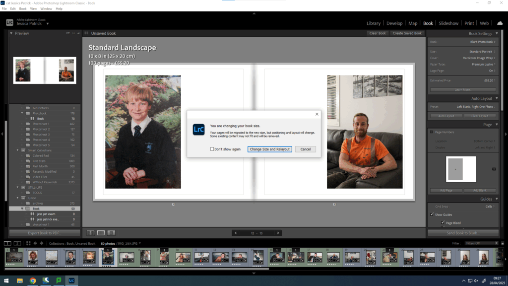
Then, I select whether I want my book landscape or portrait. I decided on the standard landscape.
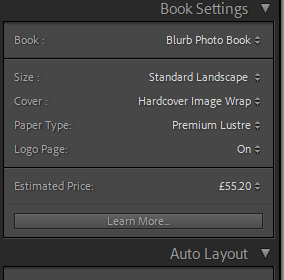
I would then also choose which type of front cover I want and what kind of paper I wanted to be used in my photobook. I chose a hard cover image wrap and premium lustre paper, because I wanted glossy pages, rather than matte.
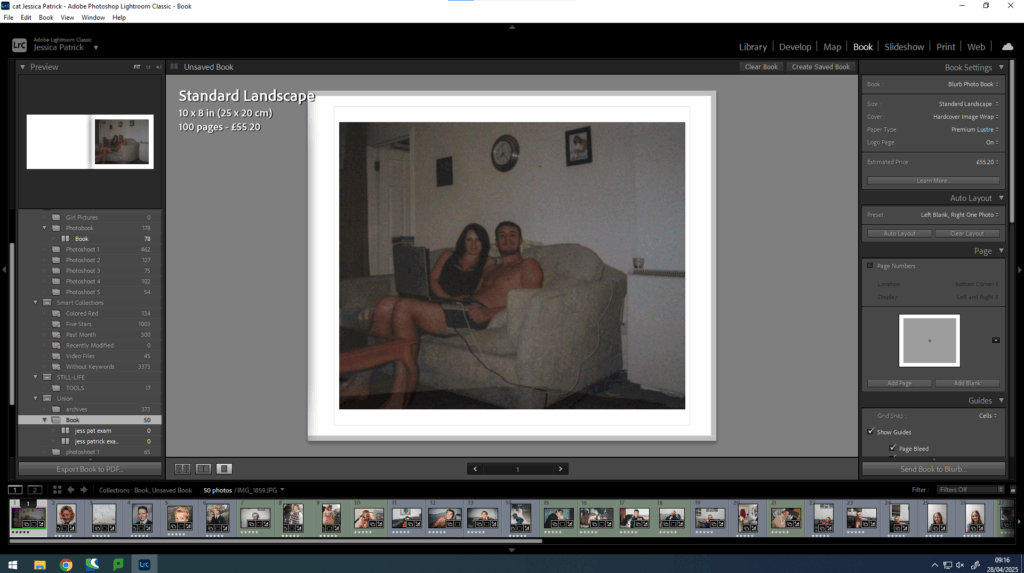
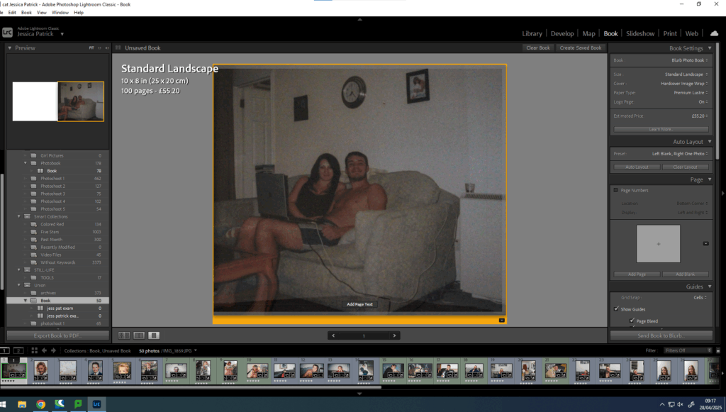
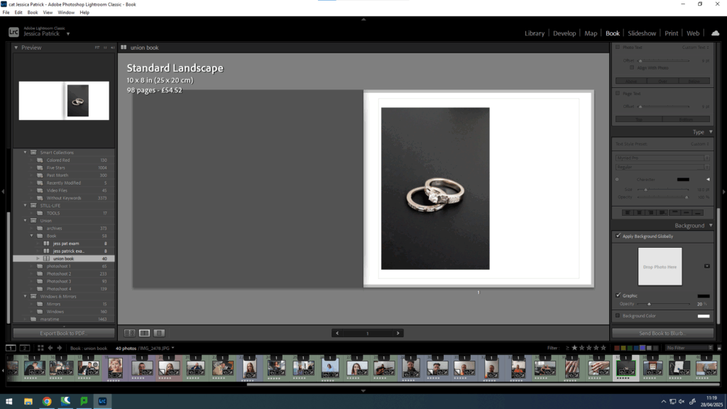
Then, I can drag the image to the page I want it to be on and I can change the layout of the image.
Then, I did this with all my photographs and experimented with the layout and design.
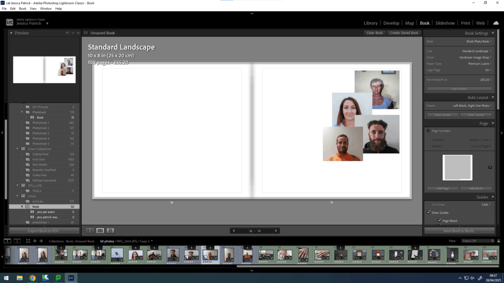
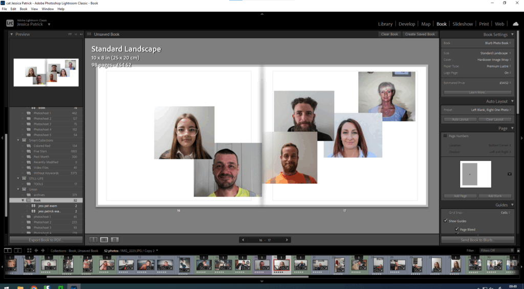
Then, I experimented with including a collage in my book, because when I researched Larry Sultan’s book, I thought it looked very aesthetically pleasing.
I also experimented with making it a double page spread collage as I hadn’t done that before.
Then, I started to experiment with text.
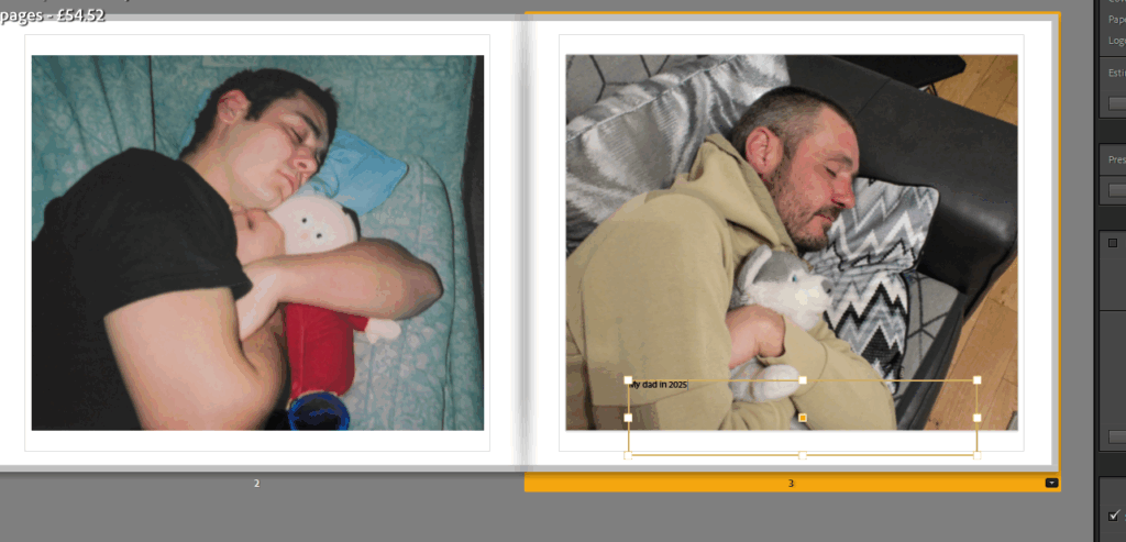
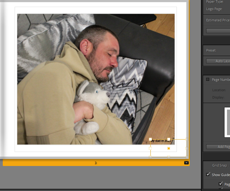
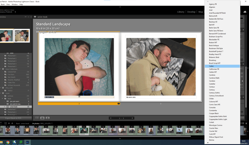
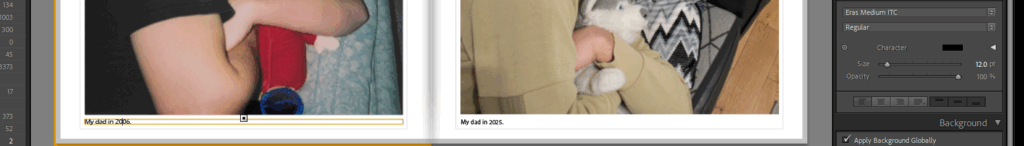
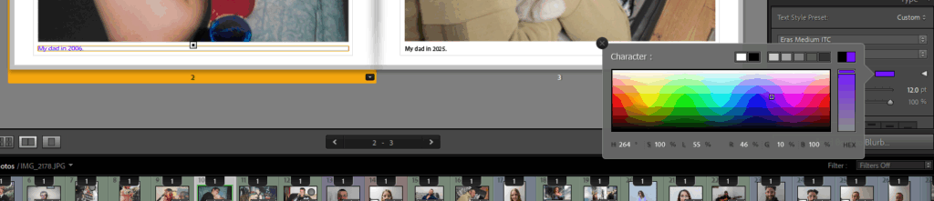
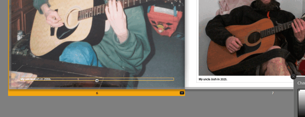
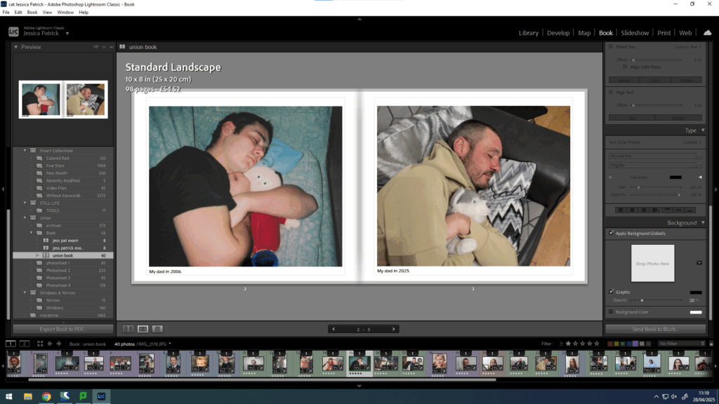
First, I wanted to caption the year of my photographs, so that the archives could be distinguished from my photographs.
Then, I experimented with the placing, until I selected align with photograph, because I thought that looked the best.
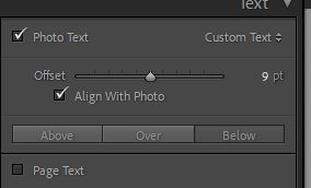
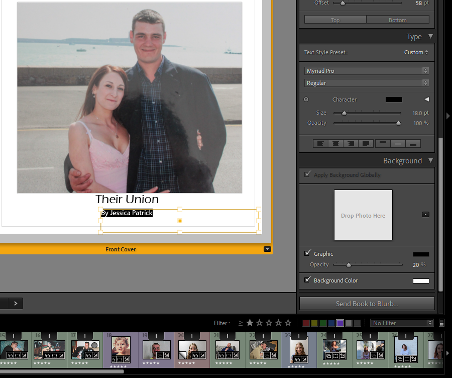
Once I had added all the text I thought neccesary I experimented with the colour, font and size of the text.
First, I looked through all the fonts to see which one I liked the most. I decided on Eras Medium ITC.
Then, I experimented with the colours.
In the end I decided on black, as I thought it looked best, but I did have to go through my book and change the writing to white in some images, as the black writing couldn’t be seen as clear on the darker images.
However, I still found this quite hard to see in some of the images, so I had to alter my layout slightly more.
I also had to change the layout of the writing from the bottom to the top of the page for some images in order for them to be more visible.
Finally, I experimented with the size of the text.
It was originally on 12pt, but I decided it looked better on 14pt.
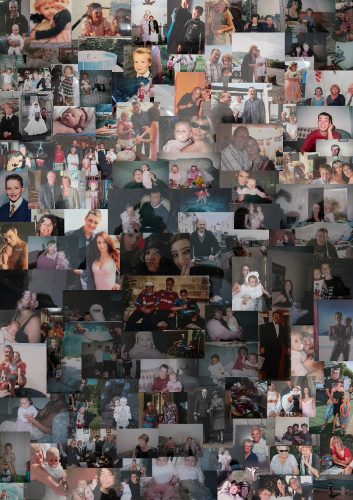
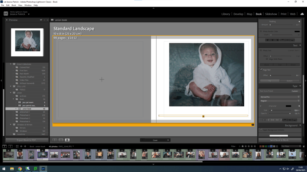
Next, I started to work on my front and back cover pages. At first, I experimented with creating a collage of my family archive images on photoshop.
This was the collage that I had created. However, it wasn’t the best quality and it was made in portrait, but I decided on having my photobook landscape.
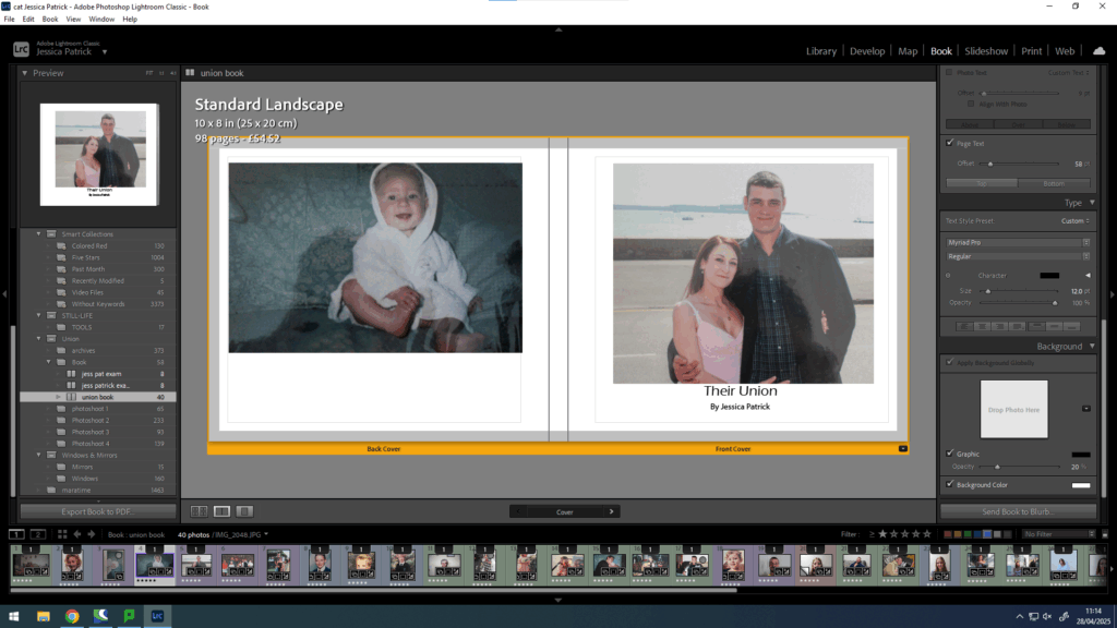
Instead, for my front cover I decided on just using one archive image, instead of lots.
Then, I experimented with different titles. I selected the same font as all my other writing, but the size of the title was 20pt and the size of my name was 18pt.
Then, I experimented with putting text on the spine of the book.
Then, I cantered it.
Finally, I wanted to do one more experimentation with the opacity of the writing, so I played around with that, but ultimately decided on it being 100% opacity.
Final layout
Evaluation
Overall, I think this photobook went well, because I was able to creating an aesthetically pleasing layout of images, using my best final images. I also used quite a bit of experimentation throughout the making of this photobook. I was also able to include some text as well as just images, which I quite like, because I didn’t use any text in my previous photobook.
I also feel this photobook displays many different members of my family and shows how we were unified years ago and still are today. I also feel like the process of making these images has brought us all a little closer together, which I think can be seen in this photobook.
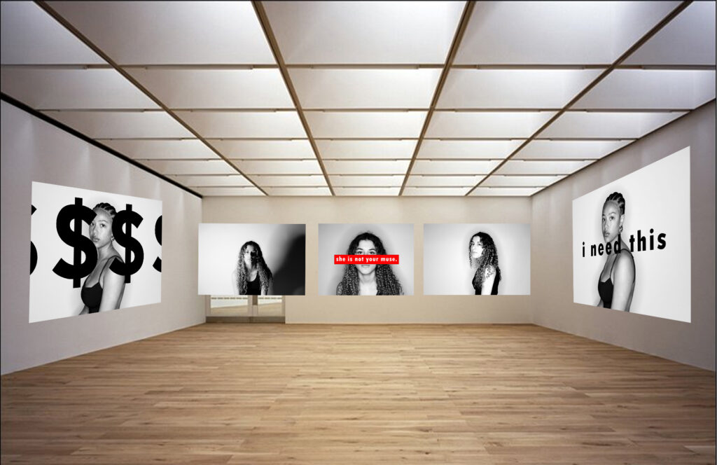
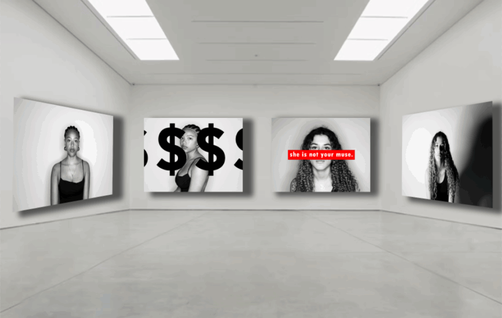
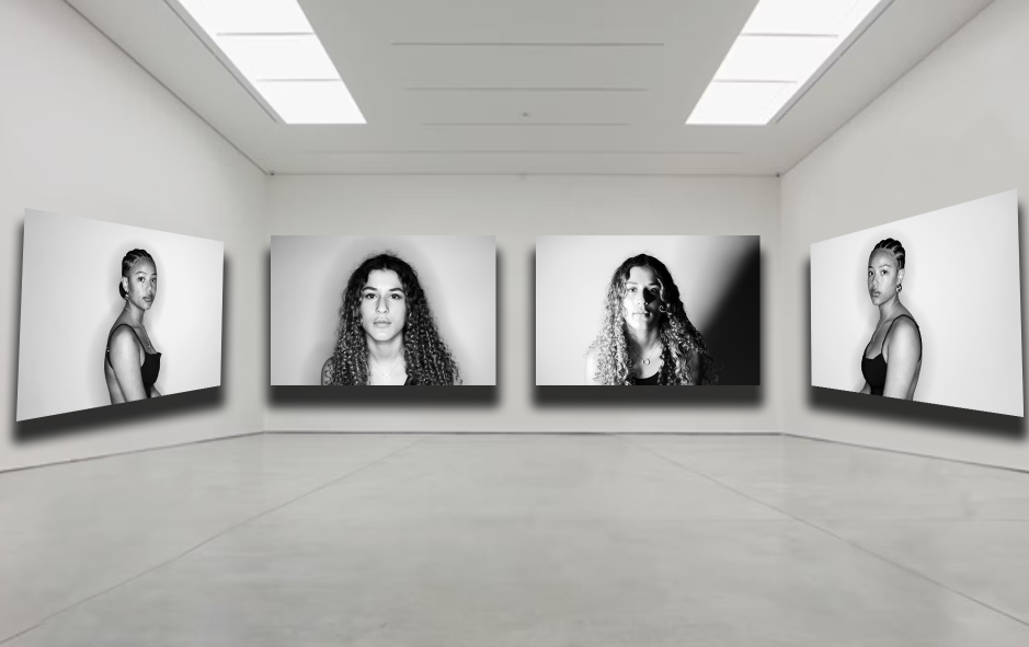
I have made three different galleries for my final images which I have used to display both feminism and consumerism within all three.
For my first gallery I have used two of my consumerism images and three feminism images. The consumerism images are opposite each other and the feminism images are all laid out across the back wall. I have used a mixture of both to represent both sides of my work in one.
For this gallery I have used my favourite pictures I have created. They are all very simple images but all have their own strong messages. The two images on the outside are pictures which are both straight on from the camera, one with no shadows, the other with a strong shadow. The middle two images are my favourite images that are also straight on, but with text over the top.
These images are my favourite ones without text they are very simple, yet they strike you at the same time when in the gallery together. The two outer ones have been taken with the model sitting to the left then to the right, it is symmetrical. Then the middle two face shots with the woman staring into the camera, using lighting techniques to create different shadows and views of this woman. This gallery is made to look like these images are used to support the feminist idea of strong women, staring straight into the camera
Final Evaluation of my final pieces & prints
What went well:
My final outcome was successful and I think it fits the theme of ‘Union’ well. For my project the things I think were most effective things were the actual portrait images, and the lighting I used to do these. I think that the lighting techniques I used played a key part in my final outcome, with the different shadows and images with no shadows at all as it added dimension to my pictures. Another thing I believe went well was the simplicity of my images and how they are presented on my final prints with the simple, yet effective editing with strong statements and slogans, with minimal distractions from them.
What could be better:
The things I believe I could improve on was my mounting techniques, I could have done a window mount for my final project where it is more complicated and challenging to do, yet it could have potentially been more effective. Another thing I could have done better is maybe stray away from my artist inspiration and been more creative with my own editing techniques for my first photoshoot as they were similar to Barbara Krugers work.
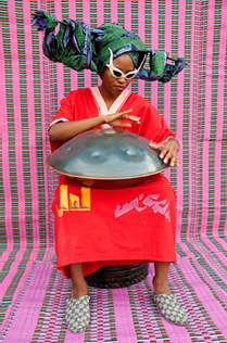
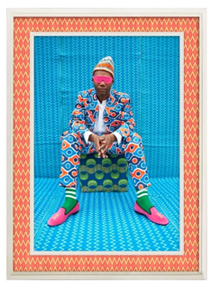
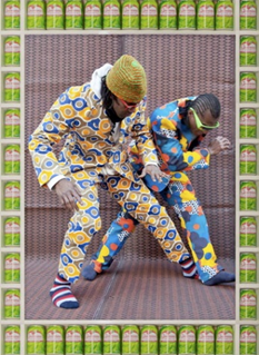
My project will express the theme of union through Cultural Unity and Fashion + Identity. My target is to create compositions showing how fashion can blend with culture, becoming another way to express identity. My inspiration behind this project is the work of two photographers, both Hassan Hajjaj and Omar Victor Diop, my work will aim to replicate and adapt on their work / style of photography.
I will achieve my intended theme by using both portraiture and conceptual photography. My images will consist of bold patterns, high contrast colours and different textures that show off culture and balance. Some of the photographs will be professionally lit with studio lighting for striking compositions and some will be taken outside of the studio, out with natural light for tableau photography within an urban setting.
As well as focusing on integrating cultural aspects and fashion, I will also focus on modern fashion as its own subject, showing how present day styles can also shape identity. Fashion nowadays is mainly inspired by trends, technology and cultural traditions. By also capturing photographs of modern fashion, I will be able to contrast these styles with cultural, colourful influences, finding and spotlighting the differences in self expression and aesthetics. I can do this by using the double exposure technique or using the same model looking into their reflection wearing a different (cultural or modern) outfit.
The final product of this entire project will be a photobook which displays different identities, styles of fashion and cultural fashion, overall exploring how they form identity in unique ways.
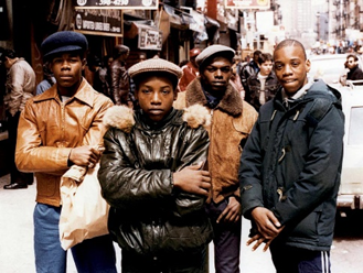
Jamel Shabazz, Shabazz is an American photographer who was born in the 1960s in New York, specifically Brooklyn. Shabazz is known for many reasons however, he is well known because of his photographs when he captures the street life of America, the fashion and the everyday life of African American groups and communities. Jamel Shabazz gained a passion for photography when he was fifteen years old, what got him into photography was the images which he would see during the civil right movement and his dad was also a huge inspiration because his dad loves photography and takes photos too. In the beginning, when he was fifteen years old, he would grab his camera and he would go around his neighbourhood and his town capturing what he sees, producing photos which showed the natural, original energy and vibe which the streets of New York had. In New York, hip hop culture was growing and this culture was extremely popular, especially during the 1980s, fashion was also unique and extremely hyped in New York and this meant that Shabazz was able to capture all of this at the age of fifteen.
His photos in the current day and now that he is grown up and has a better knowledge on photography, his work is mainly based on and explores the themes of culture, identity, unity, urban life and pride. His photographs are energetic, original and they are bold / vibrant and the photos feel like they portray the New York City life so accurately back then.
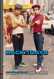
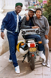
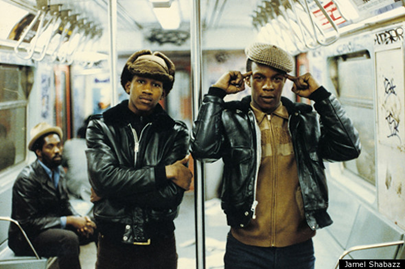
His most popular piece of work is his photobook, titled Back in the Days which was published in 2001, this photobook consists of images with graffiti, streetwear, boomboxes and the overall style of New York and its youth in the 1970s, 1980s. Shabazz`s photography technique had great intentions, he just wanted to capture people from his city in a positive way, displaying photographs of unity in the black community with pride and strength.
Back in the time when Shabazz was taking these photos (1970s-1980s), the main camera used throughout the whole world was a film camera. His photographs were captured on a film camera and a film camera meant that the images would come out to have a warm, grainy and a retro feel / theme to them. If you have a look at all of Jamel Shabazz’s images, they are all candid photos which he gets people to pose for, most of these photographs include bold fashion, things like bucket hats, big chains, sneakers, denim etc. Other features which you will see throughout his entire photography collection is urban settings (subways, basketball courts, New York streets and abandoned, graffiti on buildings), colours and patterns, groups of people posing and natural lighting. His portraits are quite clearly staged and the models are clearly posing for the camera, however the poses and the overall photo does not seem forced, the people who were posing were proudly showing off their outfits and they wanted to be included which is what makes the photograph seem relaxed. Another aspect about his photographs which I really like is the authenticity of the images, his images are authentic and original, he builds a relationship with the models quickly and lets them express themselves however they want to, leaving the pose, the clothing and etc all up to them.
How this Links To My Project
Jamal Shabazz links strongly to my project, more specifically the streetwear aspect of my union project. I plan to do something similar to Jamal Shabazz, just like he would go out and capture peoples style I will do the same, capturing models in streetwear style of the modern day and show how fashion can be a symbol of individuality.
My final images and layout conclude of 12 images. These 12 images I have laid out on four different pieces of black window mounts in groups of three and kept the white border of each image. I decided to layout my images like this because I wanted my work to be simple and have a sense of symmetry so you can focus on the text and image instead of a layout where its complicated and grabs your eye rather than the work itself. I used a black window mount instead of white foam board because It contrasts nicely with the black and white image and also the white background of each photo. I kept the white border of the images to split the black wall mount from the picture.
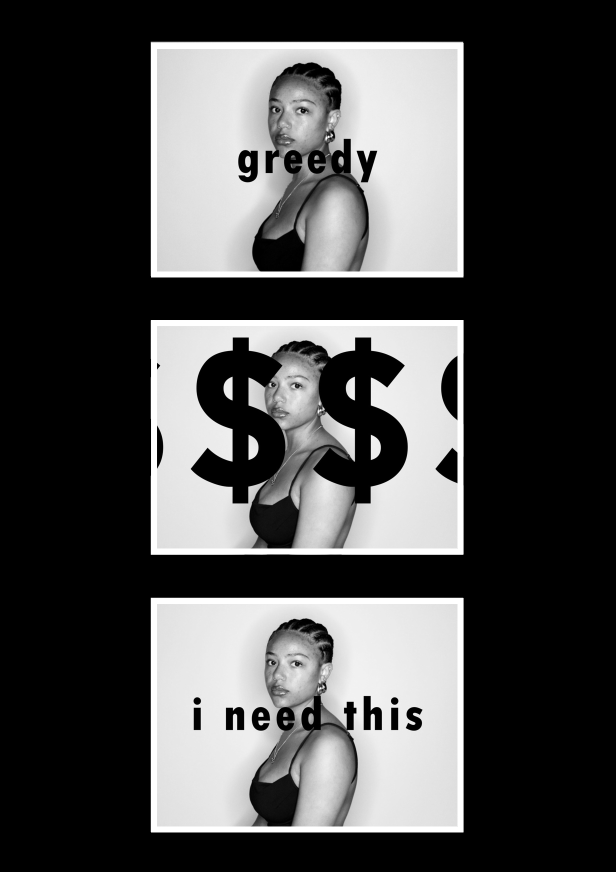
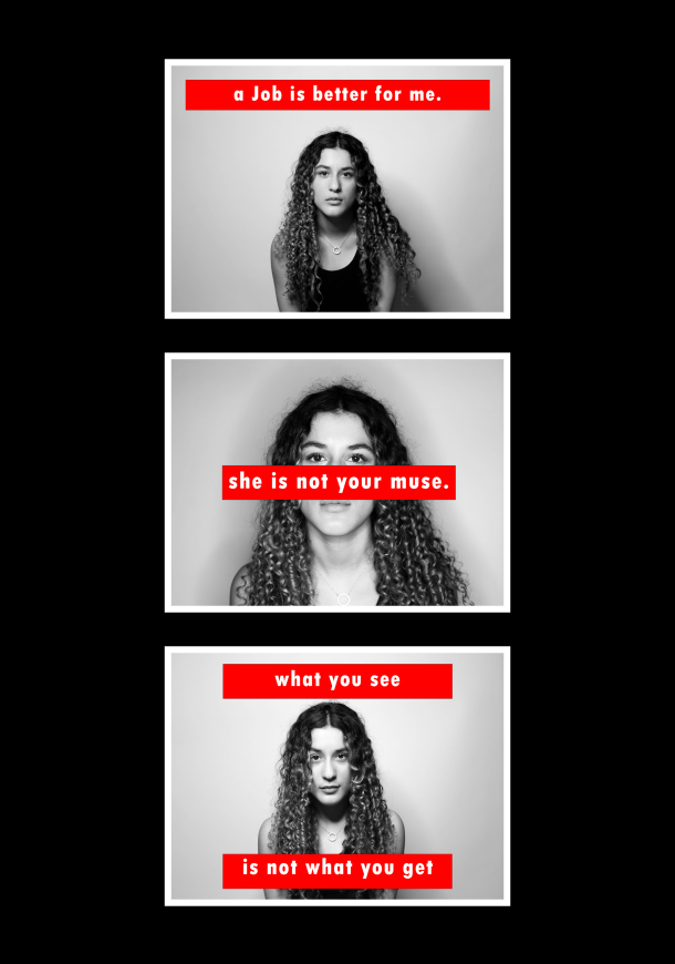
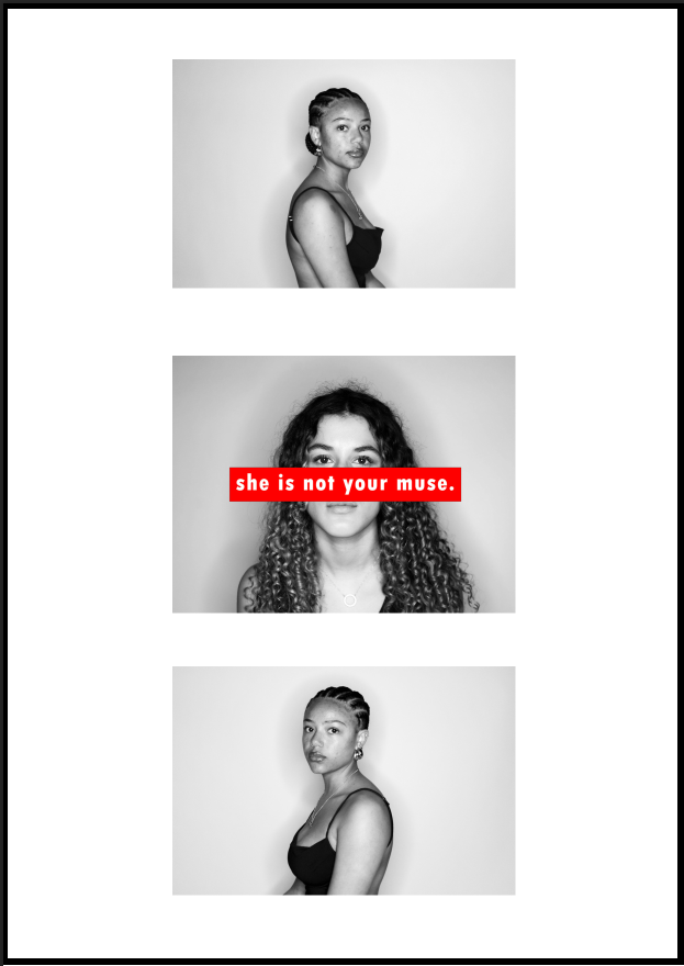
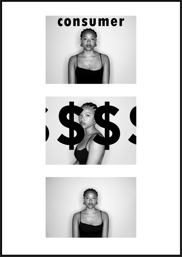
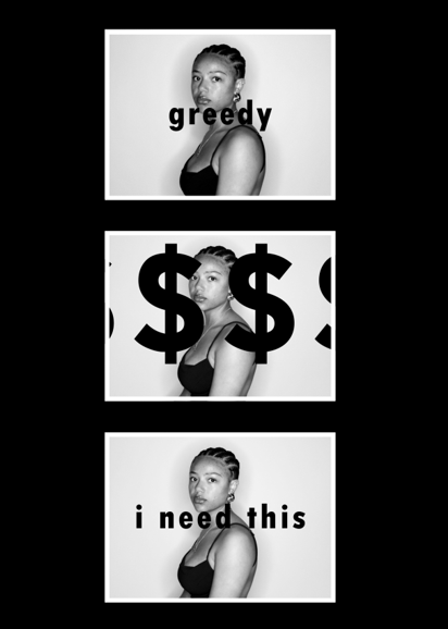
I decided to group these images together as all the images are the same, but with different text on. I also grouped them together because the top and bottom image have writing in the middle of them, this created symmetry within the work and I wanted my work to look simple, clean and bold which the symmetry helps it to achieve this look. The middle image separates the two symmetrical ones with the large, bold dollar signs spreading across the image. All three of these images have phrases, words and symbols defining consumerism, with each having their own meaning of it.
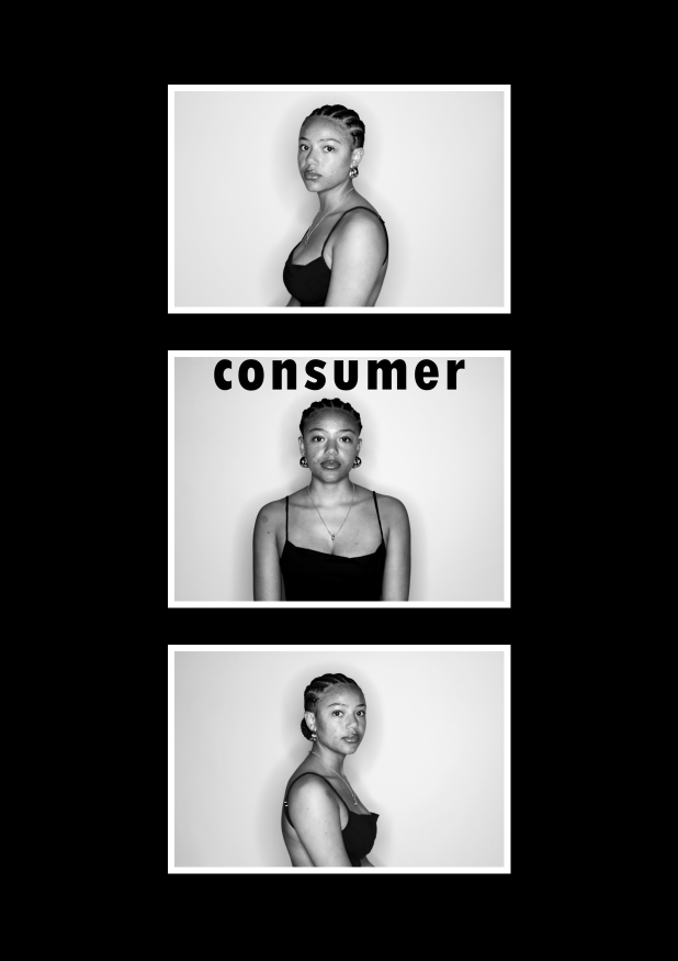
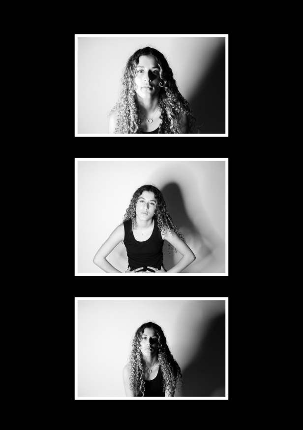
For this group of images I have used symmetry again to make this layout. the top and bottom images I have taken of the model sat facing the left, then the right, with the middle image straight on with the word ‘consumer’ above her. This gives the effect of a mugshot where there are three different angles of her face, like its a crime and wrong for being a consumer/over-consuming.
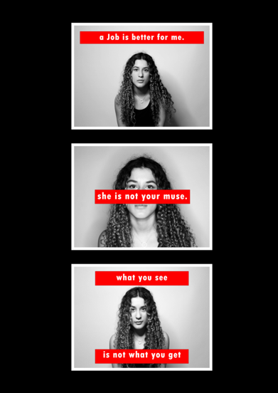
I chose to group these three images together because they all have the same red bordered writing on them. Each of these images are face shots with the camera directly in front of the model, which is a reason why I put them all together, creating an idea that the words written across the images are being said to the person looking at it because of her eye contact with the camera. The top image is a strong statement which expresses that a job is better for her than a man would ever be. the middle image is stating that a woman is not for men to have or talk about, she is her own person. And the last image is showing that the woman may look one way but when you meet her its not how you thought she would be.
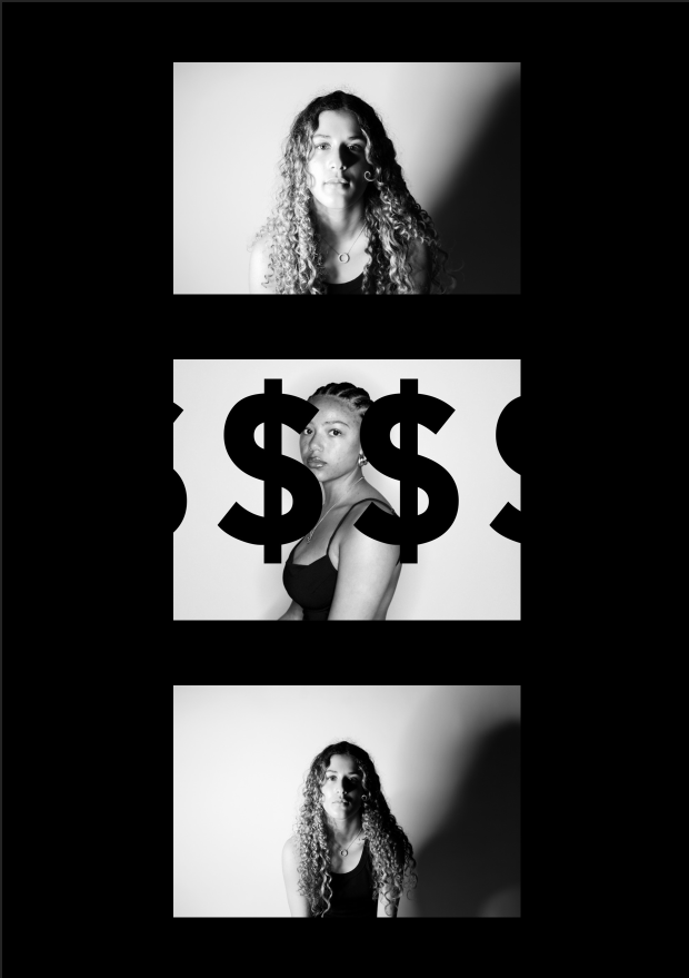
For these three images I have used different lighting techniques to create different kinds of shadows. The first image I have used chiaroscuro lighting technique, then I held the light above the camera and took one straight on creating a shadow behind her, then the last one used Rembrandt to shadow half her face. For the top image I have taken it quite close to her face with strong shadows where you can see the shadow of her nose on her face and the strong shadow behind her. The middle image is meant to show her being tired and looking impatiently into the camera. For the bottom image I have put the light directly to the left of her to shadow half of her. I have done this to create a contrast of being able to see her face clearly in the white then the other half to be in the shadows. I liked this effect because it links back to other meanings behind my different images and text I put over them like ‘what you see is not what you get’ by being able to see her, but not fully.
Final outcome and evaluation
For my final pieces I have created four different wall mounts and each represents consumerism and feminism, which is my final outcome for the theme of ‘Union’. Overall, I think that my best pieces were my images with text on as I think that was one of the most creative aspect of the project. I liked my use of lighting techniques and being able to create different shadows in the background, and on the faces of the models I used.
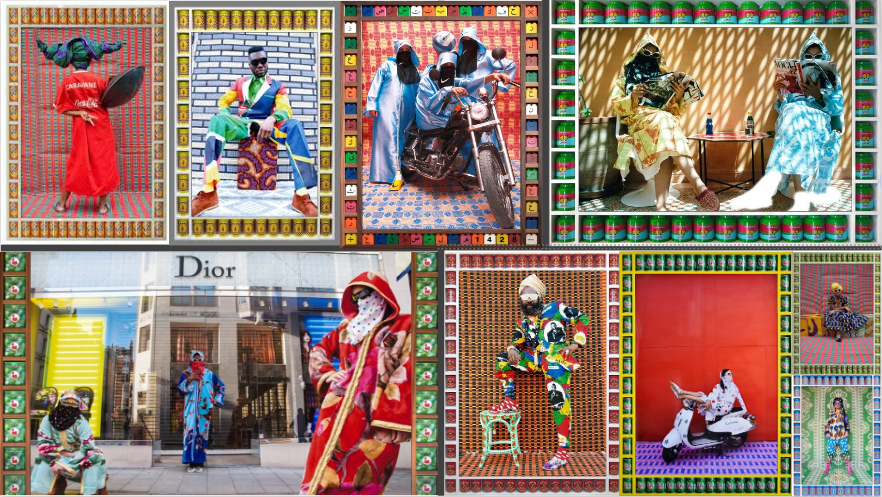
Hassan Hajjaj is a modern Moroccan artist and photographer, who is mainly known for his strong, abstract and outside of the box portraits. Hassan Hajjaj was born in Larache, Morocco in 1961 and when he was a teenager he moved to London. Hassan Hajjaj having experienced both living in Morocco and England (London), really formed his style of photography and art which he produces and explores. His photography work mixes lots of cultures together, specifically the African culture with the Pop culture, joining two completely different ideas together and making powerful imagery which is vastly noticeable. Hajjaj is mainly inspired by reggae, hip hop, fashion, West African lifestyle and UK culture, showing various cultures in his work.
Hassan Hajjaj`s photography style is mainly based around portrait photography however, Hajjaj is not you regular portrait photographer, he takes abstract portraits rather than simple ones. Hajjaj uses his own experiences and life and converts it into his subjects / models, the models he uses in his photos are usually wearing traditional clothing (usually Moroccan) mixed with designer / branded clothing for example, Adidas, Louis Vuitton, Coca Cola, Nike etc. As well as dressing up his models in this sort of clothing, he would also capture everyday things or regular objects like branded food and tinned cans of food, giving that pop art feeling and effect to his photographs. Everyday objects are placed around the actual photograph, creating a frame / border for the main photograph. Hajjaj states “I’m also drawn to work with cola cans and brands because I’m a Sixties child when brands were heavily pushing their names out; Coca-Cola was a big name in Morocco, and it was a ‘rich men’s drink’ that we would drink when guests were coming to our house.” This was said in an interview undertaken with 1-54 art fair. This quote shows that he would not just randomly pick the brands which he used and that there is a deeper meaning behind the choices of brands, as he is connecting to his youth and reaching out to his memories.
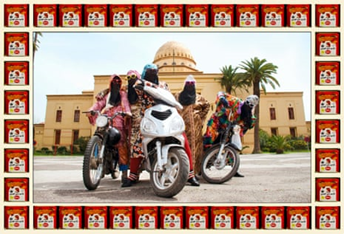
Kesh Angels, Hassan Hajjaj (2010 – 2012)
His photographs are normally bold and lively making them stand out to the viewer, the photos being vibrant and standing out separates the photo from the stereotypical ideas of the western, Moroccan and / or Muslim identity. Instead of fitting in with the stereotypical ideas, Hajjaj makes sure that his images show off the models as strong, fashionable and interesting personalities, he manages to do this by using magazine style setups for his shoots however the magazine styled setup has its own change made to it which reflects the traditional culture with the culture nowadays around the whole world.
His Work
Kesh Angels was one of the most popular series of shoots which he had done, the main idea behind this gallery / series of photographs was to have Moroccan women on top of a moped or motorbike confidently. The clothing used is a blend of both traditional Moroccan clothing as well as streetwear / modern brands, the use of both these clothing forms challenges the stereotypes about women, specifically Moroccan women as they are displayed powerfully with stye and embracing their own culture and background.
Another famous series of work which is made by Hassan Hajjaj is My Rockstars, My Rockstars is all about musicians, artists and performers globally. Similarly to Kesh Angels, Hajjaj uses bright and vibrant backgrounds as well as different textures or patterns included in the background, in the foreground is a model wearing a combination of both conventional fashion as well as modern, streetwear fashion. The portraits taken in this series are different to the previous series mentioned, these portraits are filled with good energy, vibrant colours and they perfectly show the connection between music, culture and fashion. Hassan Hajjaj not only shows the connection between music, culture and fashion but also shows how global trends or influences can blend and come together in a positive way, creating abstract interesting pieces of art.
My Rockstars, Hassan Hajjaj (2012-2013)
How Hassan Hajjaj Links To My Project
Hajjaj’s work links efficiently to my project, Union. His photographs link specifically by cultural fusion and fashion identity, he captures how clothing can unite and come together to create new and unique ideas for example he does this by putting traditional, modern, global and pop culture ideas together into one frame. In my project I will use Hassan Hajjaj as an inspiration, intending on taking photographs of models with cultural outfits with features of modern-day designer or brands.
Image Analysis
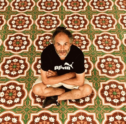
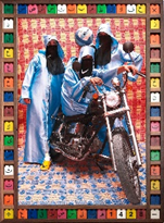
In my opinion, this is the most powerful and the best photograph after having researched Hassan Hajjaj. I will now analyse this image in high detail:
Technical-
This photo uses natural daylight as it is taken outside in the streets of Marrakech, the lighting is not intense which you can tell from the very faint shadows on the floor, if the lighting was harsher the shadows of the bikes and the people would be darker, standing out more. I like that the photo is taken outside rather than inside a studio with artificial lighting, I think that this makes Hajjaj’s image more powerful and even more genuine. The depth of field in this image is sharp, everything in the foreground, which is the women, and the bikes are all clearly in focus and can be seen with no blur or grain, the same goes for the background, little to no blur is seen in the background of the image and the overall composition is sharp, clear and in focus. Since there is no grain and the image is fully in focus, I can make an educated assumption that low iso (in the 100-400 range) was used and the shutter speed would have been fast rather than slow however not too fast, somewhere in between slow and fast.
Visual –
This photo is centrally framed with the models all posing in an organized order, this photo as well as the rest of his images in this series have a border / frame of a branded product, in this instance the product is a tin of food (most likely a Moroccan product.) The purpose of this border is to keep everything kept in place and the border holds the image together perfectly as well as filling up possible empty space. Another visual feature which is seen in this photograph is the use of leading lines, the leading lines come from the bikes, the street and the building the three leading lines elements make the viewers eye go straight to the main subject which is the models framed centrally.
Contextual –
Hassan Hajjaj`s work is quite heavily inspired by pop art and fashion photography; he also does have some features of street photography within his work. Hajjaj also challenges the stereotypes of Muslim women in this photograph, he has them dressed in stylish, bold outfits to argue against the stereotypical traditional way.
Conceptual –
In my opinion, I think that this image is all about embracing your own culture and traditions as well as challenging stereotypes. I think that he is trying to tell a story through these sets of images and especially this image by mixing the traditional with the modern brands, motorbikes and the pop culture, showing how it can all come together / unite and that culture is no longer a separate thing from identity. Showing that identity can be multiple things and not stuck in old fashioned ideas.
I experimented with different layouts for each of my prints where I tried using white and black backgrounds, I had a combination of images with and without text, then images that only had text and ones without any text. I mixed up the photoshoots and created layouts that had both consumerism images from photoshoot 2 and feminism images from photoshoot 1.
Final print layout
My final outcome ended up with having the consumerism and feminism images being split into four wall mounts each with three images on them. I used black as my background colour as it stood out more than the white and looked better with a white border around each image, which also helped create a modern, clean vibe.