Artist research 1 –

Logan white –

Logan white was born and raised in the South of America, which instilled in her a belief of spirit in the form of body place and time. Raised very southern she was surrounded by folklore and classical music, and her work resonates deeply with her heritage.

Her work has a strong sense of emotional intensity of the romantic period. As a young white southern girl, brought up around the bible and its teachings, some expression of her photographs are seen to be nostalgic and subversive.

Logan graduated from Rhode island School of Design with a degree in photography and studied on the European Honours program in Rome, Italy. Her work has been in various publications such as :

  • New York Times
  • Vogue
  • Purple
  • Dazed
  • L’Official Art Paris

Examples of her work –

In this particular photoshoot, the themes of nostalgia and femininity is very strong. I want to stray from the idea of nostalgia for this project but will definitely want to explore the theme of femininity.

The impact of femininity on the world and women in general especially in this day and age is very important, and is something that should be placed on a pedestal, taught to younger generations and explored through school and social scenarios.

Mini photoshoot 2 – liminal spaces

I took these photos at around 9pm after I finished basketball. Its inside fort regent (Jersey), and a week prior I noticed how much nostalgia I got from looking at the play park, as well as a bit of a scared feeling as It looks very run down and forgotten. I got the idea to take photos of it from past research in liminal spaces, as this area reminding me heavily of photos trying to capture this space. I only had 5 minutes to capture some images of here before fort regent was closed for the day, so I didn’t capture too many images.

liminal spaces are empty or abandoned places that appear eerie, forlorn, and often surreal. Liminal spaces are commonly places of transition, pertaining to the concept of liminality. This is basically the space between present and past, with old memories distorting this space. Photography of this rarely contains people, and focus on trying to capture an uncanny valley of architecture and physical places. Liminal space imagery often depicts this sense of “in-between”, capturing transitional places (such as stairwells, roads, corridors, or hotels) unsettlingly devoid of people.

I also increased the grain

The photos that I see online that give me the most ‘nostalgic’ and eerie feeling often look like there weren’t planned and had spontaneously taken the photos. So to make these images look unplanned I edited some of them with motion blur and added some grain, as well as making some images have a tilt.

Agnieszka Lepka – ‘Human vs Nature’

Agnieszka Lepka is a Polish photographer whose work explores the intricate relationship between humans and nature. Through analogue photography, she draws visual parallels between human anatomy and natural elements. Lepka’s most recognised series, ‘Human vs Nature’, presents typological diptychs that juxtapose human anatomy with elements of the natural world. She pairs images of things such as eye veins with lightening, fingerprints with tree rings etc., highlighting the striking similarities between human biology and the environment. Her work suggests that rather than being separate from nature, we are intrinsically linked, sharing patterns, structures and rhythms. Through her work, Lepka challenges viewers to reconsider their relationship with nature as an extension of ourselves. Her photography acts as a bridge between art, science, and philosophy, offering a poetic yet profound reminder that the body and the earth share the same language.

During this project, Lepka primarily uses analogue cameras which require a more thoughtful and deliberate approach to composition. Whereas digital photography allows you to take multiple shots and review them instantly, film photography forces her to slow down and carefully consider framing, and focus on the essential details. This method aligns with the project’s theme of observation and connection between humans and nature. Her use of close-up photography captured details that may usually have been overlooked, reinforcing the idea that human bodies and nature share a profound, often invisible connection. It also emphasises the intricate patterns found in both the human body. It allows her to highlight textures like fingerprints, veins and skin imperfections, drawing direct visual comparisons to natural forms like tree rings, river paths, and topographic maps. She often usually works with soft natural lighting to keep an organic look and feel to her images. This lighting helps to unify human and natural elements, making them appear as part of the same visual and conceptual world. Lepka’s images often consist of deliberately plain, neutral backgrounds that are more simple. This is to keep the viewer’s attention on the diptych comparisons. By removing distractions, she allows the viewer to focus solely on the links between human anatomy and natural forms.

The project strips down the elements to their essence, removing unnecessary visual clutter to emphasize the connections between humanity and nature. The diptych format and framing gives the series a feel similar to scientific comparisons in biology or geology. Through the use of the natural light and analogue textures, Lepka creates an aesthetic that feels raw, organic, and deeply connected to nature. Her work also creates an emotional depth, encouraging viewers to reflect on their place within nature rather than apart from it.

Photoshoot 1 – France

I took these photos a few days after the exam paper way released. I started this photoshoot in a little village in Normandy, France. It was about 5pm when I started my walk and I planned on capturing the village before the night and during the night, using different photographic methods during each time period, for example, I experimented with long exposure once I got back into the village at night.

My purpose of this photoshoot was to capture interesting images of quite an uninteresting place. As well as unionising different things together, like light and dark, and natural and un-natural object.

Here is an example where I put together 2 images of the same house, with my edits below. The left image was taken at night, with a long exposure to make a blurry image, as it its like a memory of the image on the left. The image on the left was taken at night. I decided to create even more of of a contrast between these two images by having one in b&w and one in colour.

Here I put together the ‘colour’ of the image. I noticed while picking the best photos that the sunset is very similar to the colour of the truck so I placed them together. I think this does look a bit naf so I’ll try to find better examples as I continue looking though photos. I think this photo would look better with just the truck.

To edit the colour photo on the right of the truck I simply decreased the saturation for all colours except orange, Increased its luminance and increased the exposure a bit.

Here is another example of taking images during the evening and the night, but this time using mirrors.

I quite like this image as it really reminds me of a blurred dream. This image makes the viewer think this bench has some meaning, and is fading away slowly. My edit is above.

Above I montaged together images of electricity polls and trees.

Above are some other photos I like and might further edit with in photoshop. One editing process I’m thinking of is multi exposure, as well as placing subjects or objects in parts of the image that doesn’t make sense. This will allow me to link these images to the surrealist movement.

Roy Lichtenstein- Research

Roy Lichtenstein was an American artist known for his paintings and prints which referenced commercial art and popular culture icons like Mickey Mouse. Composed using Ben-Day dots (the method used by newspapers and comic strips to denote gradients and texture).

Lichtenstein’s work mimicked the mechanical technique with his own hand on a much larger scale. He was a leading figure in establishing the Pop Art movement, along with Claes Oldenburg, Andy Warhol, and Jasper Johns. “I take a cliché and try to organize its forms to make it monumental.

Lichtenstein’s first one-man show, held in New York City in 1962, was a great commercial success, and his innovative work found an international audience. In 1966 he became the first American to exhibit at London’s Tate Gallery.

By the early 1960s, he had begun showing with Leo Castelli gallery in New York, and made major breakthroughs with works such as Drowning Girl (1963), a satirical take on melodramatic pulp fiction of the era. Themes of irony and cliché prevailed throughout the remainder of Lichtenstein’s career, as evinced in his Haystacks (1969), a take on the canonical series by Claude Monet. The artist died of pneumonia on September 29, 1997 in New York, NY. Today, his works are held in the collections of the Art Institute of Chicago, The Museum of Modern Art in New York, the National Gallery of Art in Washington, D.C., and the Tate Modern in London.

Lichtenstein continued in this vein for much of his career, and his artworks are readily identifiable by their comic-strip characteristics. Nevertheless he extended these techniques into clever and thought-provoking meditations on art and popular culture. After the 1960s, Lichtenstein’s works began to include still life’s and landscapes, and they were a dramatic departure from his earlier style in their use of brushstrokes as well as in their subject matter.

Photoshoot 3 plan

For this next photoshoot, I will be focusing on the strength and rarity of their friendship. I will do this by photographing them in large crowds to convey the idea of there being billions of people in the world, yet they somehow met one another and chose to be friends everyday for 14 years and counting. In order to convey this message, I was planning to go out into town and taking pictures of crowds of people. However, as Jersey is quite a small island and there often aren’t many crowds around, I have decided to instead photograph the crowds of people typically seen in central London as I will be going there during the half term. I think this environment will allow me to further emphasise the vast amount of people in the world and subsequently the strength of their friendship as there are constantly thousands of people roaming the streets and huddled up in certain areas in London. This will allow me to be able to photograph a variety of more crowds and places than I would be able to if I only did it in Jersey, making the photoshoot less repetitive and more interesting to look at. However, as I will be taking these images in England instead of in Jersey, it means that I wont be able to photograph my friends in these crowds as they wont be there. To fix this, I will also be taking images of my friends walking together and playing around in Jersey which I can then cut out and stick them into the images of crowds in London.

Once I have completed this process of adding cut outs of my friends into images of crowds, I will then be covering only them in blocks of colour. This is inspired by the artist Hayley Warnham who adds bold, bright colours into her grandfathers old photographs of her family to create new and interesting pieces of art. I think this idea of adding bright colours will help exaggerate the speciality of their bond as the bold colours represent the positive, joyful emotions they experience when in one another’s presence. Additionally, the colours will also draw the viewers attention to them instead of the rest of the crowd, symbolising how they picked to be friends with one another despite being around hundreds of other potential friends in primary school. In order to add this colour to my friends in the image, I will use photoshop where I will click on the object selection tool to create an outline on only them then right click and press fill then choose a vibrant colour to fill up the outlined space that reflects the positive emotions their friendship provides one another.

Photoshoot 2

Contact Sheet:

For my second photoshoot of my final exam project, I wanted to mainly focus on elements that resemble Yayoi Kusama, through the use of a wig that has a similar style to Kusama’s. With the use of my wig being black but still similar enough to Kusama, I am also able to draw in aspects of Newton’s work as he often included dark and dramatic tones throughout his images. This shoot differs from the first one as I took my own criticism on board when photographing, such as more appropriate clothing and props. Also, I got one of my friends who was not going to be in front of the camera to be the camera man. This way, me and my other subject could be in the frame together rather than individually which I think looks a lot better. This was an advantage for me because me and my other subject could resemble unity by being together in the images, clearly displaying a bond between us while also including elements of fashion.

The location of this shoot was in the photography studio, where we had brought sleek and elegant dresses, sunglasses, wigs, heels and fur coats to highlight femininity, and also play into the act of the male gaze. I think the use of having a plain backdrop is a lot more successful than the backgrounds in the first shoot, as it resembles fashion photography a lot closer than being outdoors. I like this outcome significantly more because for my final outcomes I want to display them in a fashion magazine, and most successful fashion magazines such as Vogue Magazine choose this approach.

Throughout the shoot we were posed in empowering and provocative ways, drawing attention to our clothing by posing in different positions that allow us to appear confident and dominant, which is important for me as I am aiming to challenge traditional expectations of women. The range of positions we were framed in shows variety within the shoot, and we kept the angle of the camera very low so we appear more powerful which opposes from my first photoshoot entirely.

Experimentation:

Edit 1:

Edit 2:

Edit 3:

Edit 4:

Edit 5:

Edit 6:

Edit 7:

Edit 8:

Edit 9:

Edit 10:

Edit 11:

Edit 12:

Edit 13:

Edit 14:

Edit 15:

Edit 16:

Edit 17:

Union of Dreams/Nightmares & Reality Photoshoot

  • Liminal
  • Shoot on Location
  • Found Footage Style
  • Surrealist
  • Cats, Entities
  • Somewhat Empty Space

These are potentially all the images I have selected to edit further on photoshop.

In order to make the images above, these are the steps I took:

  • Create a new layer after importing your desired image
  • Select the Rectangular Marquee Tool
  • Draw a rectangle/some sort of shape
  • Select the Paint Bucket tool and select Fill Colour
  • Change the colour to Black
  • Deselect the shape and start moving to desired location
  • Duplicate the shape layer or repeat steps on a new layer
  • Move the duplicated shape under the original and start lowering it’s opacity to create a shadow-like affect
  • To replicate the tunnel and stair image above you have to create a shape and place it in an area that you wish to black out or give an affect of a hole
  • You then manipulate the shape by selecting Edit, Transform, Distort or Perspective and start shaping the shape to fit it’s environment, you should also use the Eraser Tool to be more precise

Steps I took to make the VHS style camera images:

  • Drag image into Photoshop
  • Duplicate the image/layer
  • Select the copied layer and select the edit button
  • Go to Edit and Fill and put in the settings 50% Gray and press OK
  • Then go to Filter and select Noise then Add Noise
  • Put in the settings 40%, Gaussian and Monochromatic
  • After creating the VHS glitch effect, I changed the Opacity and Blend Mode
  • Settings for text on the images, I attempted to mimic the VHS camera style text

To achieve the image below, I had created multiple duplicates of the original image, I then lowered the opacity of each duplicate layer to different setting.

For the first duplicate layer I had lowered the opacity down to around 50% and then shifted the image towards the right to get a glitch like affect.

For the next layer I set the opacity much higher I then erased horizontal lines all the way down the image to create more of a glitched affect.

For the last layer I erased the whole image apart from the cat, I then changed the opacity of the layer and shifted the cat into a spot that I liked in order to make the cat look like the leading source to the glitching.

  • Below are all the layers of the image above

In order to make the image above, I had taken these steps:

  • Import image into photoshop and duplicate it/the layer
  • Use the Eraser Tool to erase the entire background apart from the door
  • Change the opacity and shift the image, this will create a glitch affect
  • Continue to duplicate this new layer but this time make the opacity lower and shrink the new image to start creating a never-ending looking door
  • Keep repeating this step until you are satisfied

I then created a second version with a VHS affect as I wanted to see what the image would look like in that style.

To make the images below, I used the Brush Tool and slowly drew the hand prints, body and arms with my computer mouse, this was a challenge for me as I’m used using a specialised pen for drawing digitally, however I like how the drawings turned out, I think the messy, unperfect style of them adds more to the uncanny and eerie atmosphere of the images.

For the hand print image I changed the opacity of my drawing layers individually to make the entity look as if it is behind the glass. I made sure to have individual layers for each drawing so that when I went to erase or edit something it wouldn’t affect the actual image or other drawings.

To create the image (and similar ones) below, I had used a combination of techniques that I had explained earlier. In this image in particular, I took great inspiration from Trevor Henderson and his creatures, I decided to draw my own entity as I felt the original image was lacking something.

I started drawing a random shape and then used the Smudge Tool to pull out and distort the edge and overall shape of the body. I then drew lines on the creature to represent teeth, I then used the Smudge Tool to do the same as I did with the body. Lastly I drew the spiralling mouth or eyeball by using various sizes of my Brush Tool and stacking them onto each other, each time using a smaller brush.

For the final touches I had duplicated the body of the entity and changed the opacity, I then distorted it to make a shadow. I had also decided to include the VHS style to make the image look more film like, I then added some text similar to ones you’d find on “Found Footage” work and on old cameras.

Photoshoot 3: Planning and recording

For this photoshoot I am going to use the same subject in my images as photoshoot (my friend and her little brother)

Settings:

I am planning to do the opposite as photoshoot one and have this shoot in an indoor setting. I want to try and conduct the photoshoot in the subjects own home so that the images will be more personal to them. I am planning on making this shoot consist of more portrait images instead of in the moment shoots like photoshoot 1.

The timing of day doesn’t matter for this photoshoot as the lighting will come from the lights in the house. I am planning to get images of the two in places where they go a lot (eg living room & bedrooms). Though I am focussing on indoor settings their garden or outside space of their house still contributes to be person to them as it is still their property and where they go.

When it comes to the editing part of these shoot, I am planning to do the joiners again however I am wanting to do it different so that I don’t do cut outs on photoshop. as the subjects will be sat still in a pose, then instead of editing the sections of the images I will take individual photos of each section of the frame and then put each image on one page and fit them together to create the abstract effect of a joiner. This would mean this shoot should have more images than the other as each shot will consist of 10 images to create one. I think doing this indoors is good as it means I can control background movements which I wouldn’t have been able to do outside (eg cars passing by)

Contact sheet:

Unedited photos:

Photoshoot Three – Editing

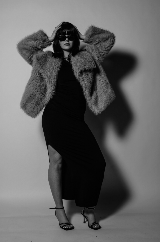
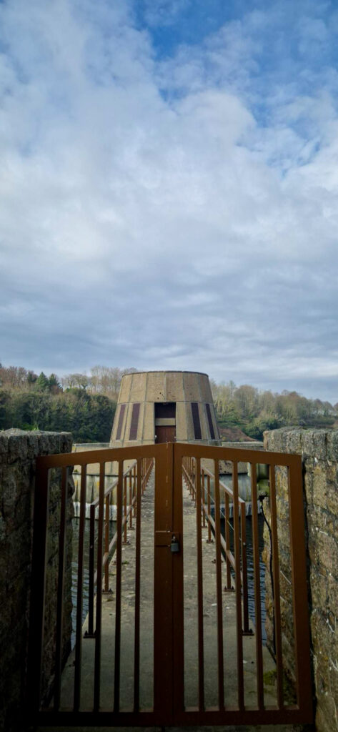
What?- Having covered the details of the equipment and how to keep it running as well as an insight into Raoul as a person and him working. The next step is to cover the Jersey specific side of farming, the old granite farm house style and the traditional jersey equipment like, an apple crusher. I also want to take some of the landscapes to add further context about the farming and the land that is surrounding the farm.

How?- I will use my canon mark 5iv with my 70-200mm lens, this gives me range on my zoom length, allowing for a bigger or smaller depth of focus. I will use a range of angles, for the landscapes, low angles often complement the photos adding in the missing foreground, where as an eyelevel shot on buildings will stop distortion.

Why?- Adding details about the farm and surrounding land adds deeper basis to the book, further describing Raoul and his lifestyle. How the land and manmade work together, creating a happy medium, the union.
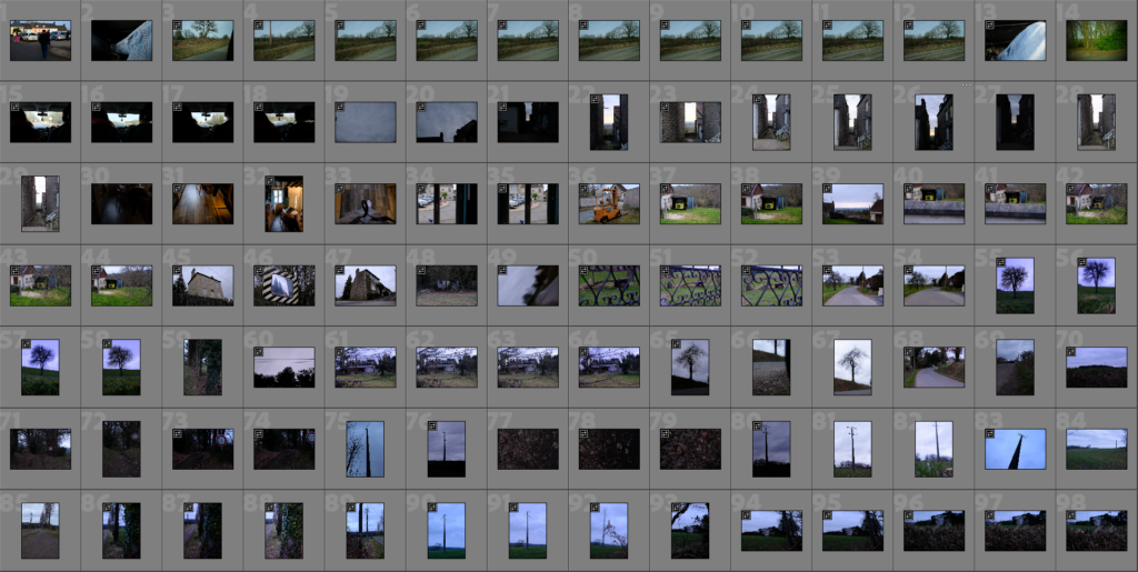
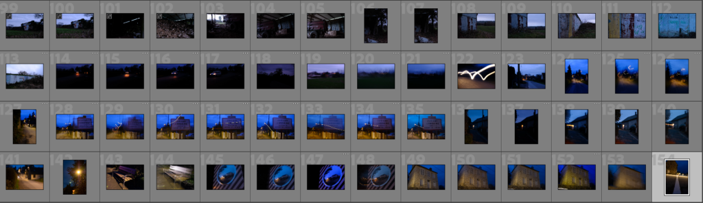
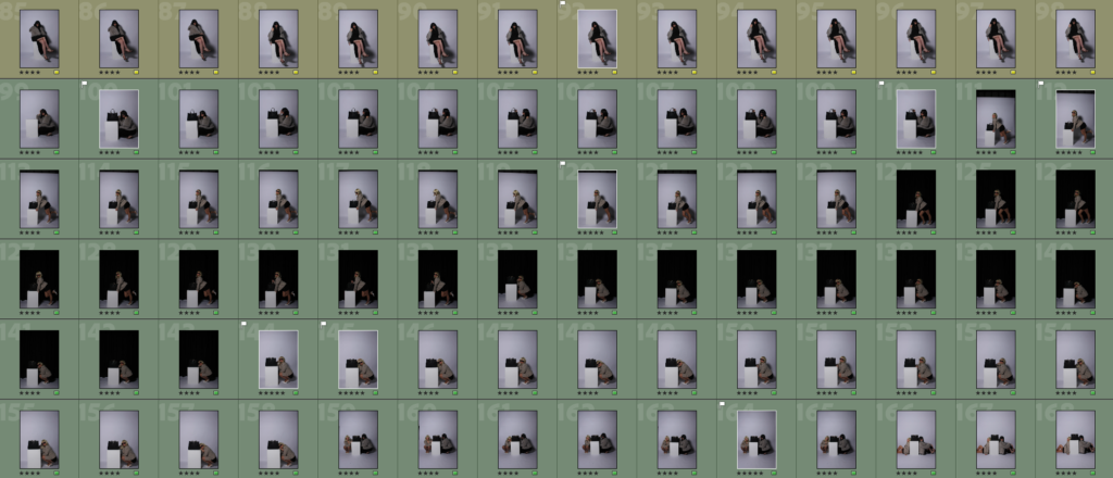
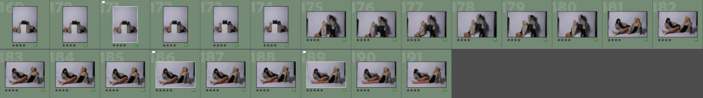
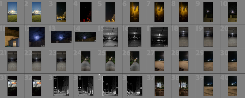
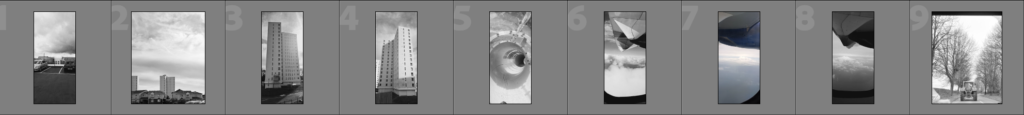
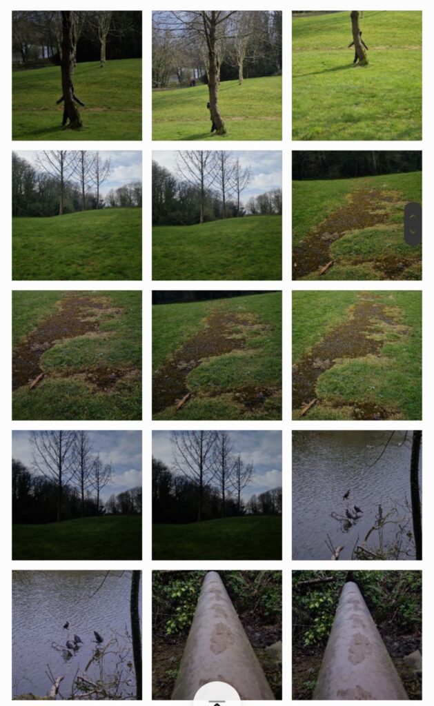
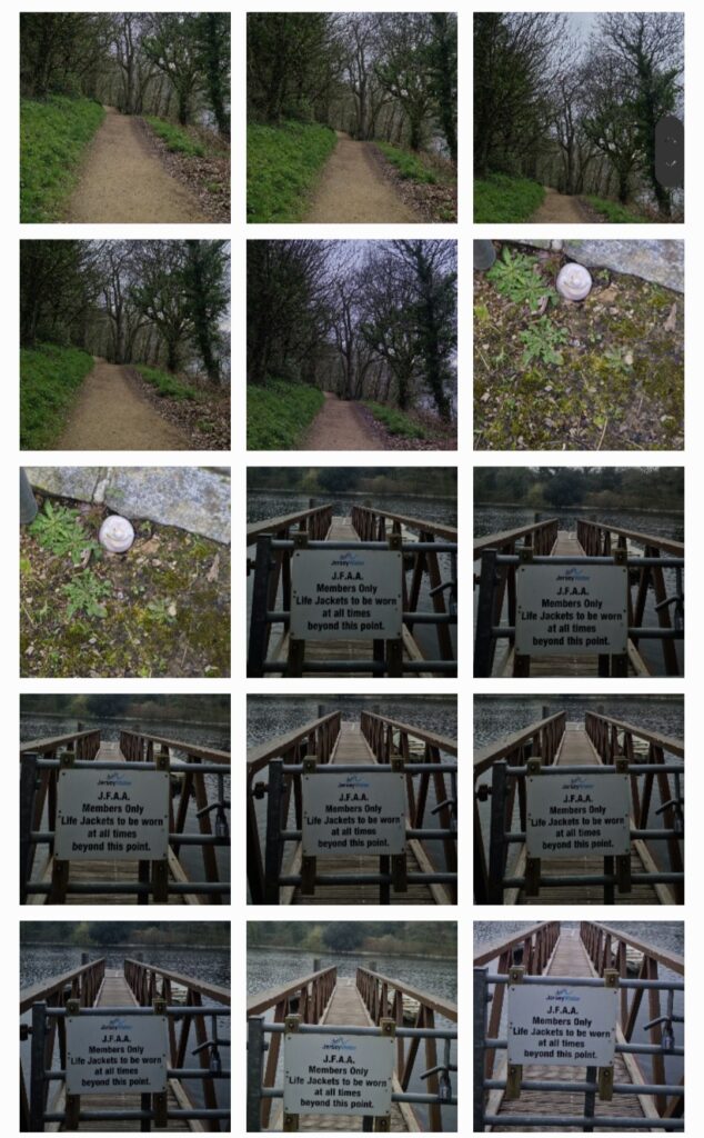
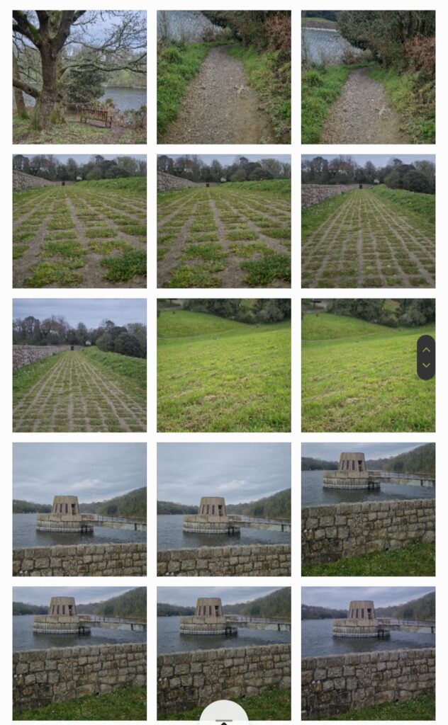
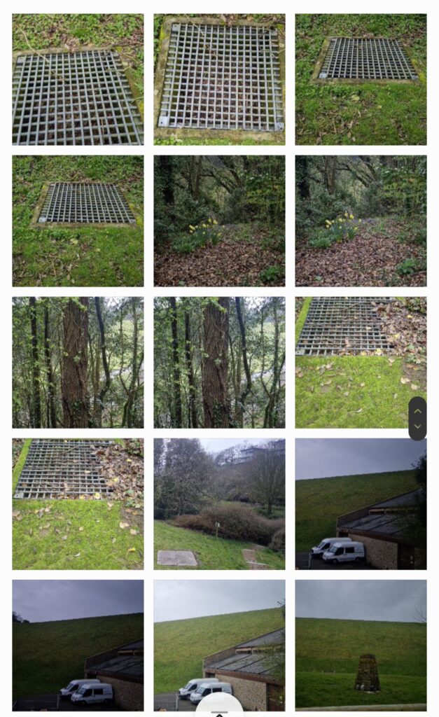
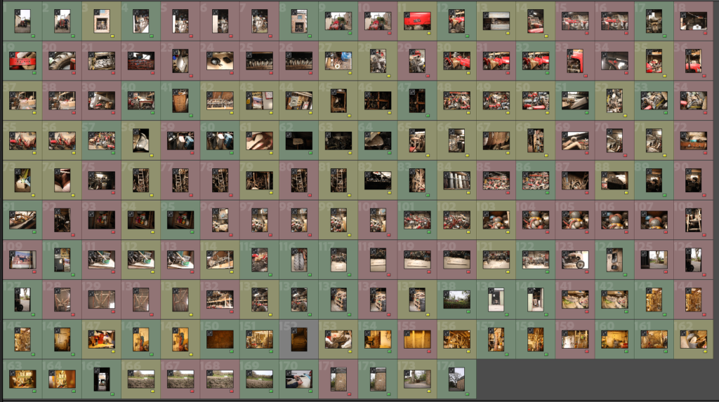
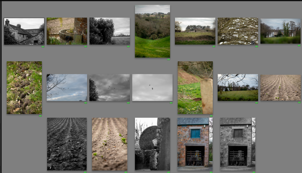
Contact sheet

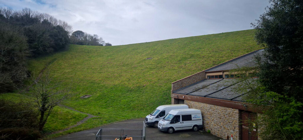
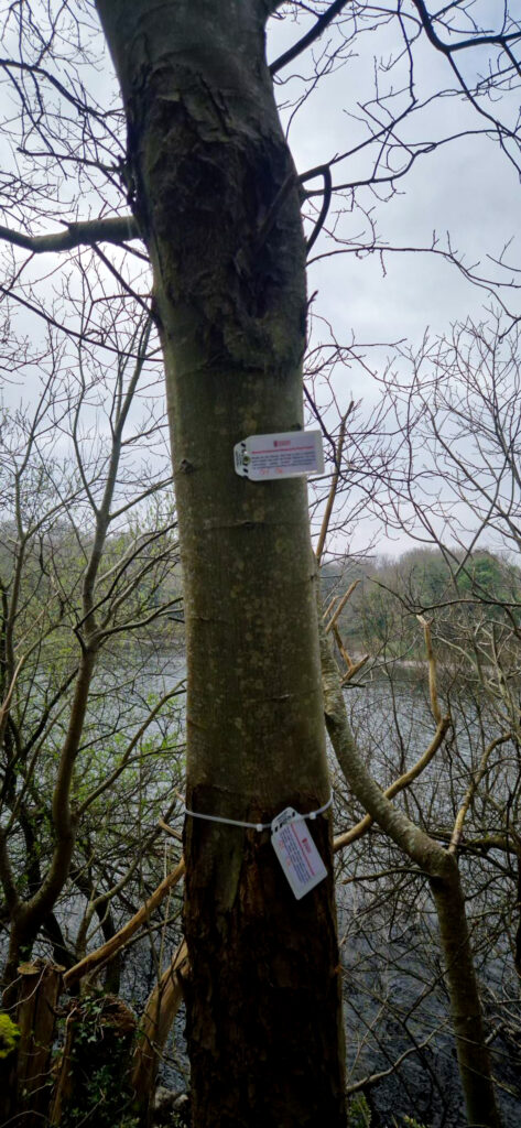
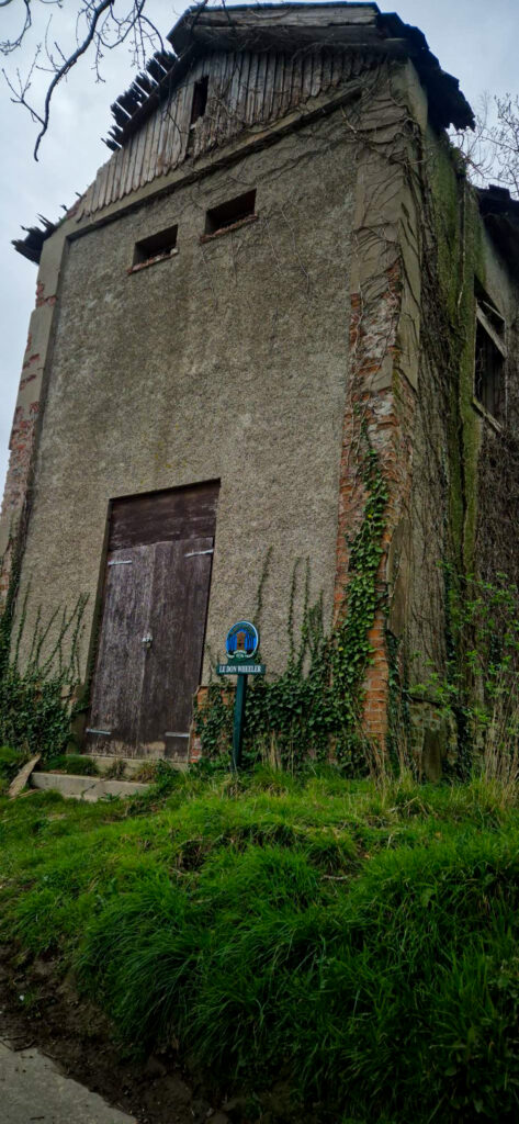
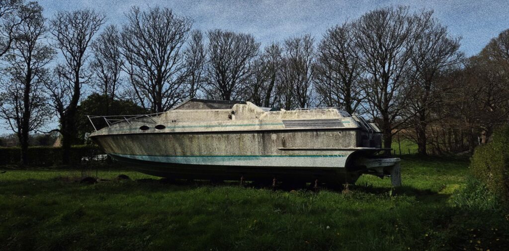
This photoshoot I focused on landscapes and buildings, I noticed I lacked context shots, photos of the farm buildings itself. I need these photos for the project to further add to the point of farming to some idea has been around forever and will stay in some form forever.
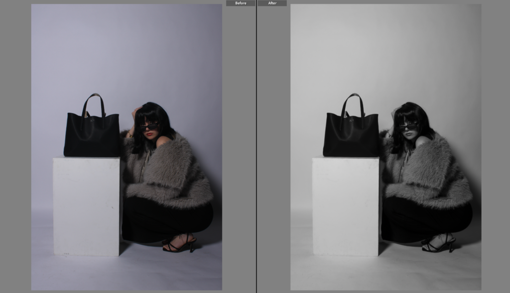
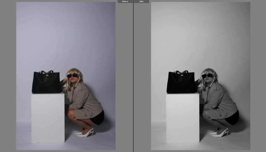
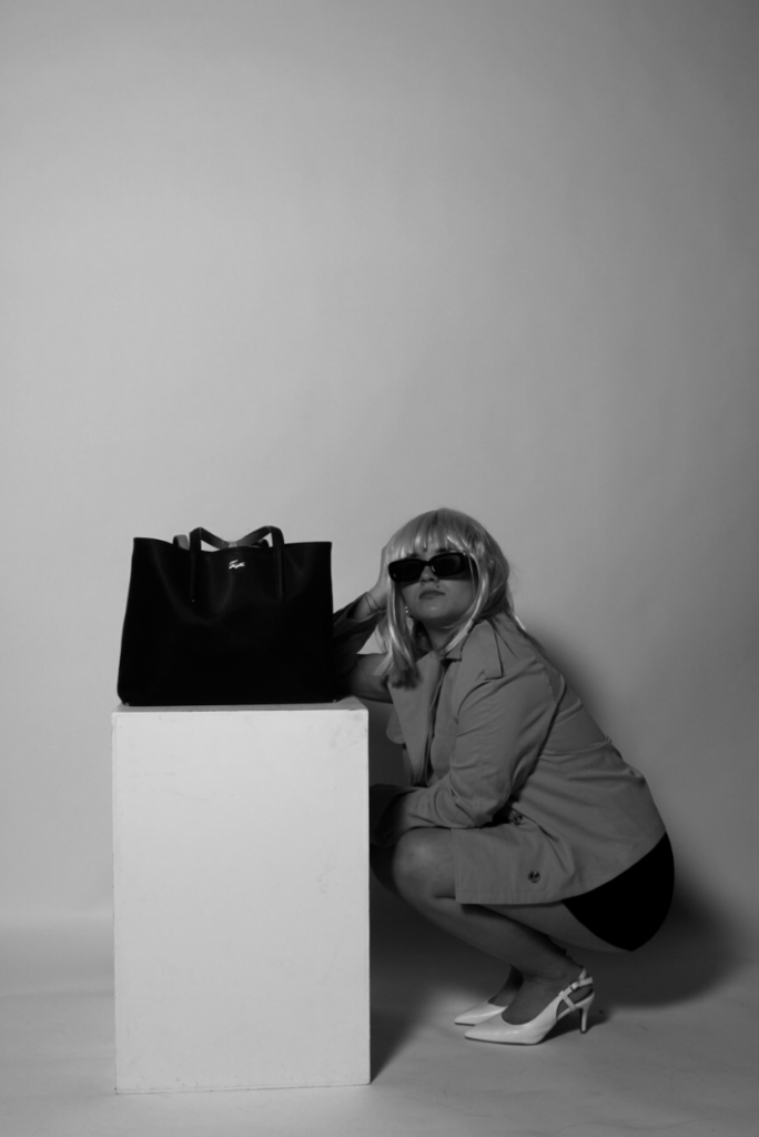
Edit One

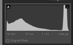
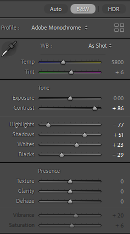
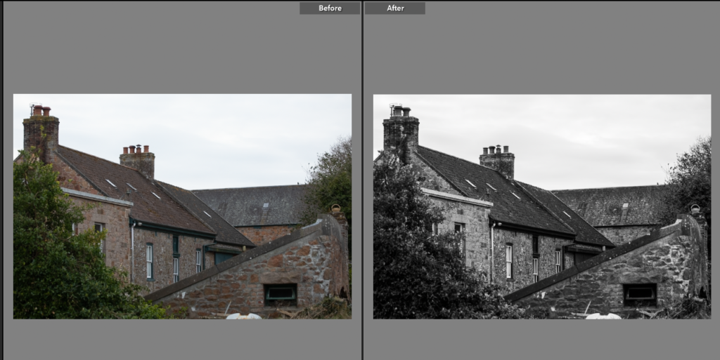
This photo has different angles intersecting with each new building. The colour image is strong but the black and white, high contrast, highlights the granite brick work, and the intersecting lines of each farm building. I think it is a nice summary shot showing the size of the farm and traditional Jersey granite buildings.

Edit Two

A photo of traditional equipment was important that I got, this is an apple crush. I photographed it through a hedge adding softness to the shot working with the continues curve of the crush. I left this photo in colour as then it shows the colour of the granite, the rows of potatoes behind and the granite of the building in the corner.
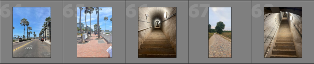
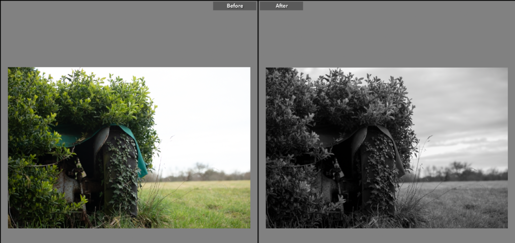
Edit Three

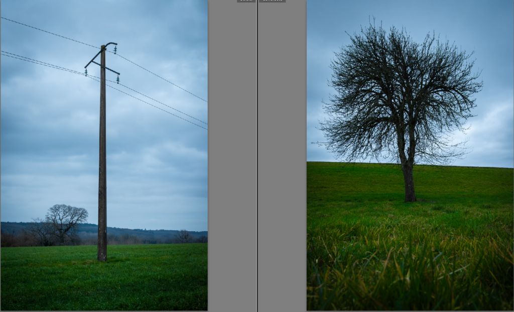
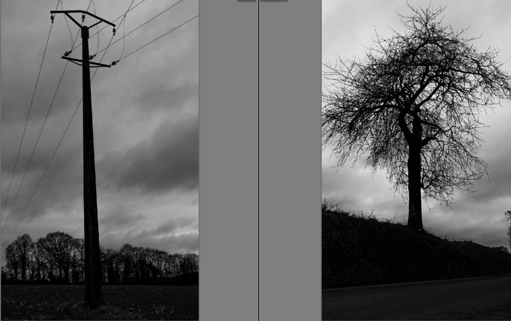
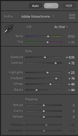
I saw this scene and loved it, I took multiple images of this scene to get what I could see I wanted in the photo. The old tractor having the hedge growing over it and then the empty expanse of the field. I changed the photo to black and white to create a stronger image, using the high range of tones I have used in other black and white photos I have increased in the depth of the sky, outlining the clouds, and the grass tuft next the wheel is now visible.
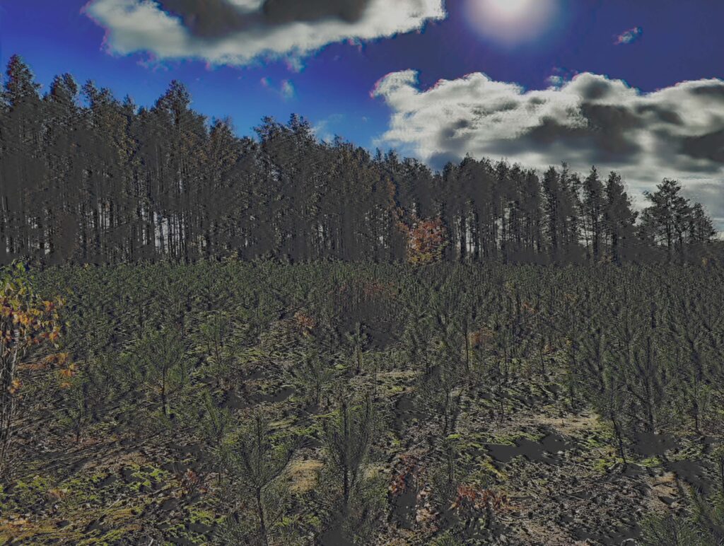
Edit Four

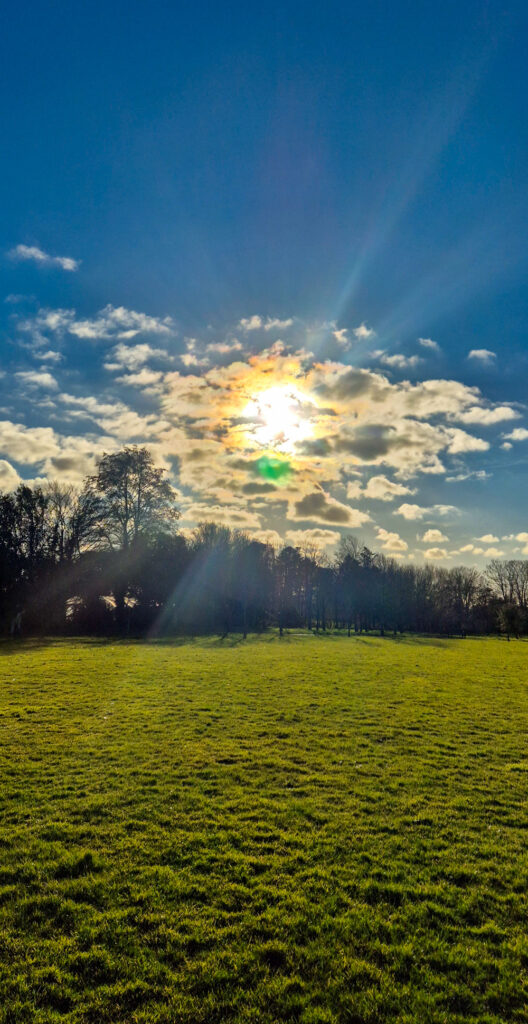
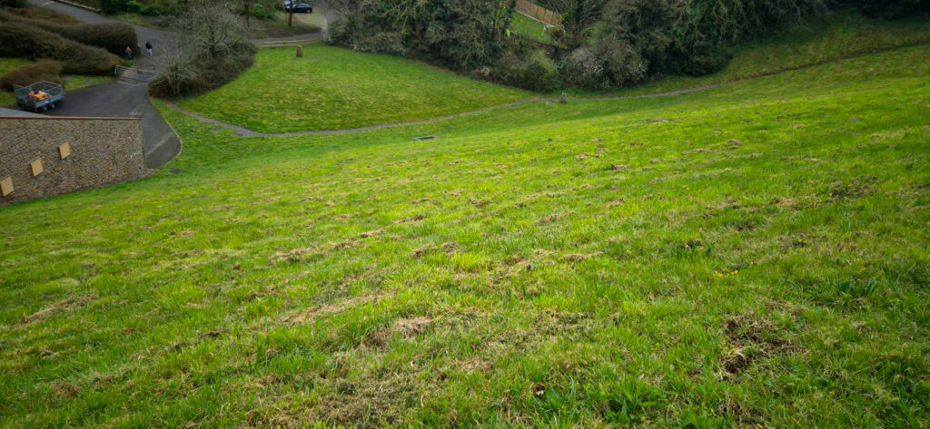
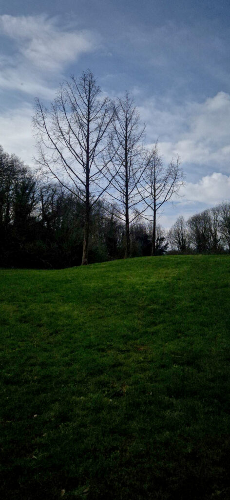
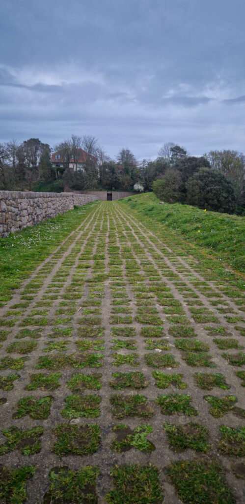
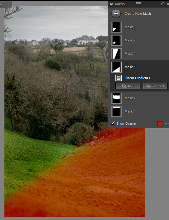
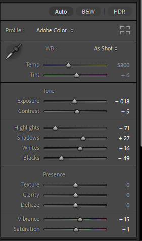
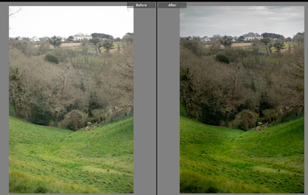
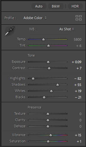
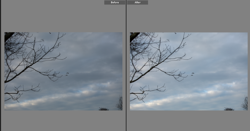
Having noticed I was missing landscape photos, I took some. The editing I used required not only using the sliders but using masks, by using masks and brushes I could create depth and drama in the photos. I found with the season being early Spring the trees were still bare which did mean the photos looked slightly off, by enhancing the grass and stream it has drawn the attention away from the jumble of tree tops.
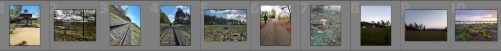
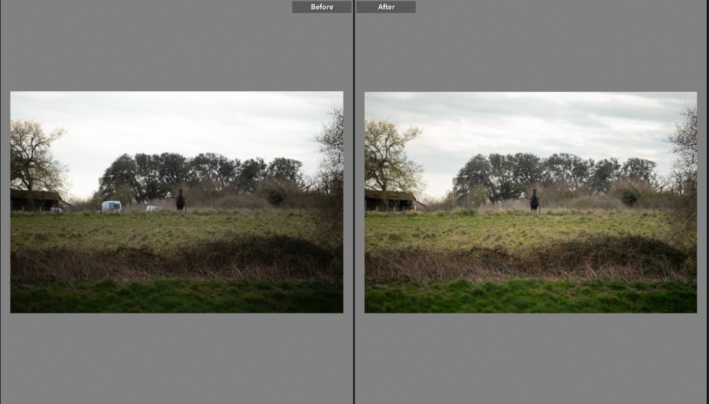
Edit Five

I saw this scene and thought it would be a great photo as the horse was interested in what I was doing so looking at me, and there was a field in between. I like the link from the horse to the land to the apple crush. It will also break up landscape photos showing the life within the landscapes. To edit this image I increased the exposure, making the horse more visible and then removed the cars as it made the shot look busy and not as distant. The overall look of the photo hints at the connection between nature and the land, horses would have been used to farm the land many years ago as well so it has a circular feel to the photo.

Edit Six

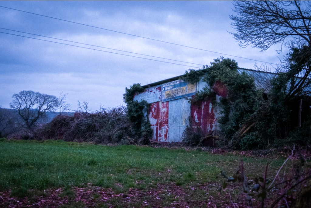
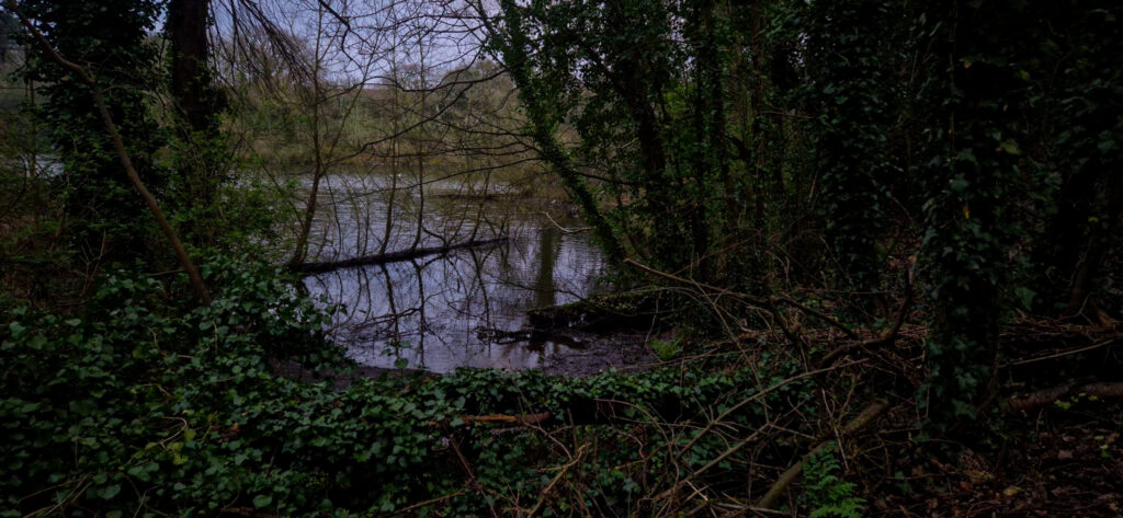
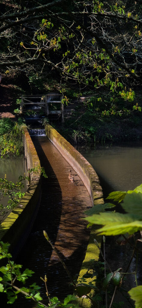
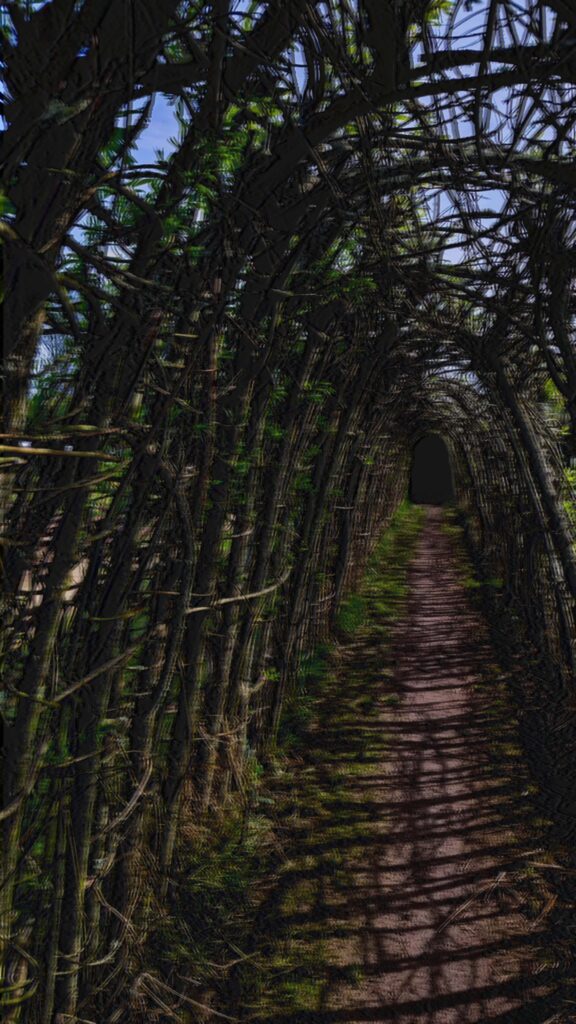
By itself this is not a strong image, however it will add to the book over all as it hints at the land before the farm, while the farm is the subject of the photo. The natural world attempts to cover it. It needed basic adjustments like masking the sky and exposure increase. It draws the connection between farmers and the land, how they try to work in union.

Edit Seven

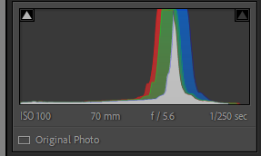
This photo, is a bit different to the rest. However, I like the freedom of the birds flying and the branches add to the composition of the photos.

Edit Eight

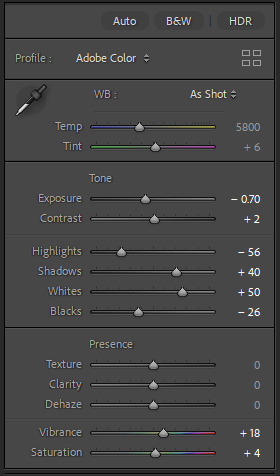
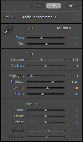
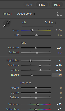
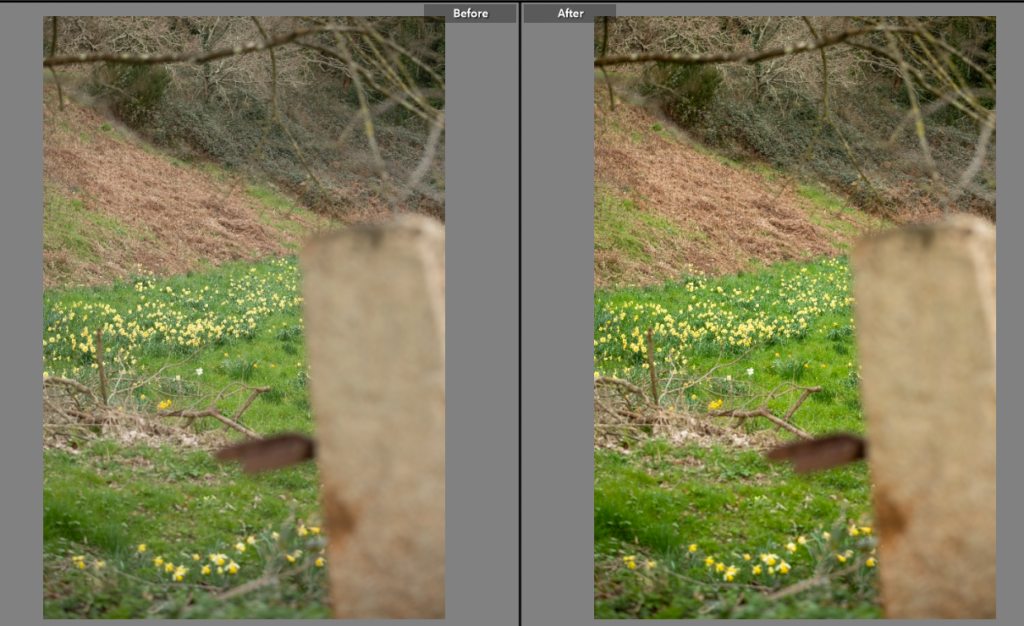
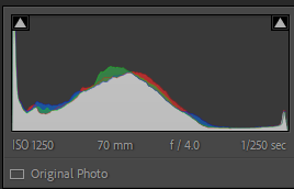
The composition of this shot was important, linking the age and the granite of the farm properties to the land using the granite gate post, out of focus in the foreground. The yellow daffodils will link well to on of the previous photoshoots, securing the circular feeling essential in a book about farming and keeping the old ways alive. It didn’t need much editing, just simple adjustments to correct the colouring.

Edit Nine

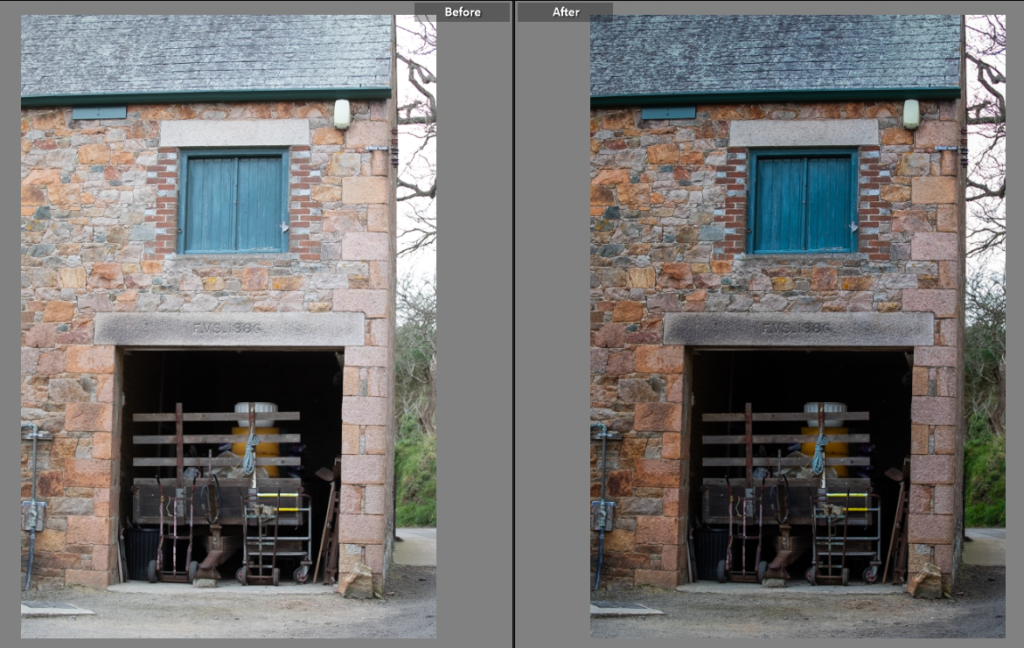
This shot was adjusted to highlight colourings of the green hay barn doors and the hay trailer. It also brought out the pink in the granite. I used the edge of the building to create a line between the nature in the background and the manmade in the foreground.
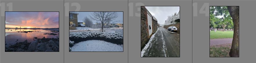
Final Photos

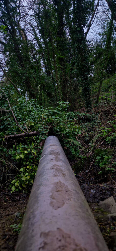
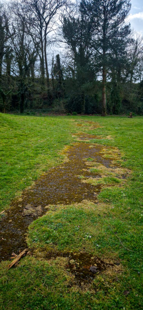
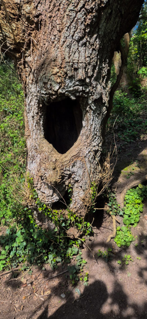
These photos aren’t striking on their own but once paired with the rest of the project will play an integral role in the telling of the narrative. There are a mixture of black and white, detailed, wider angles. I picked details like the tractor tracks in the grass and the perfectly straight lines of potatoes planted as it gives an idea of how farmers alter nature. I also took photos of nature swamping the manmade. By including sections of history and older parts of the farm I have continued to tell the narrative of the older farming techniques as well as the unique elements of this farm itself.