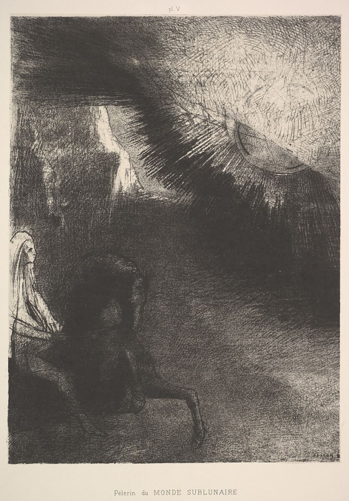
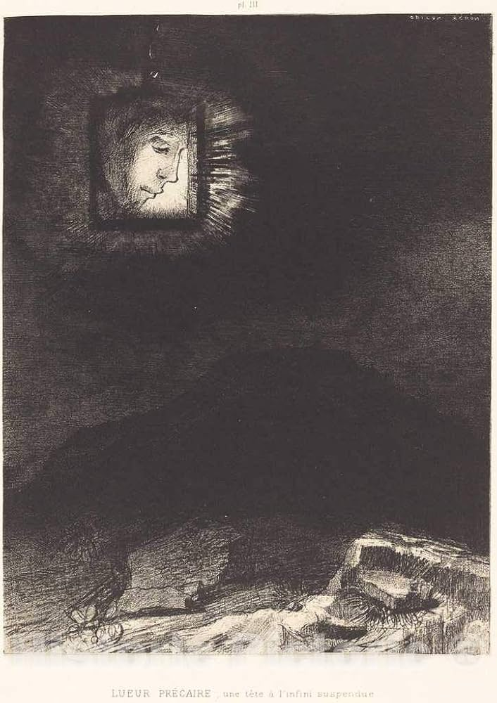
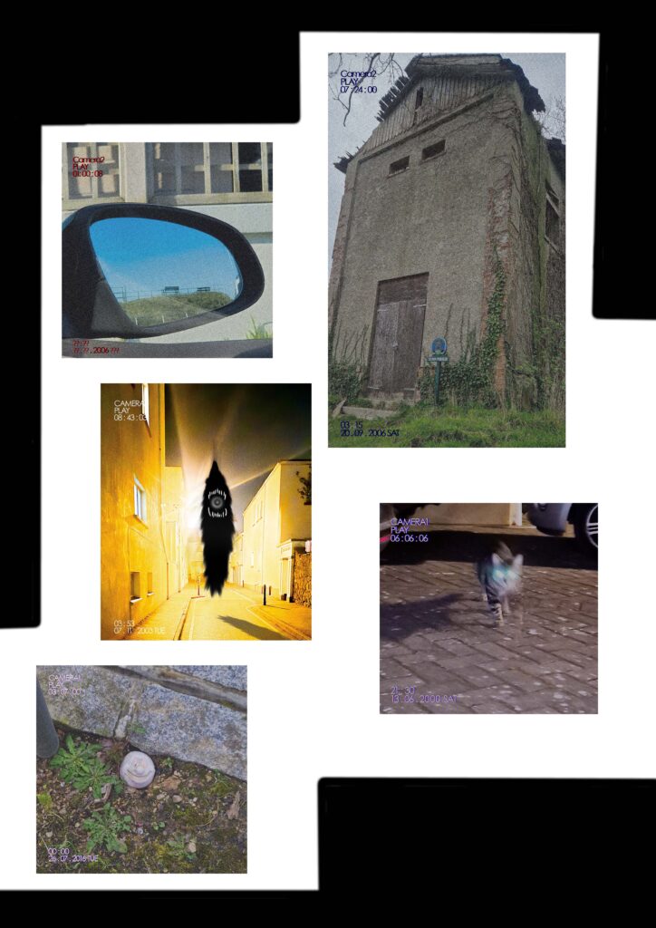
Characterised by its emphasis on emotion and individualism as well as glorifying nature and the past, Romanticism is an art and literature movement, which took value in human emotions, instincts and intuitions. Romanticism began in Europe near the end of the 18th century in approximately 1770, during a time of war with the French Revolution, which fuelled it. The movement was primarily a reaction towards the scientific rationalisation of nature, and a revolt against the restrained emotional nature and the overwhelming changes in society introduced by industrialisation. For most of the Western world, its peak was approximately 1800 to 1850. A main characteristic of romanticism is the deepened appreciation towards nature. There are a range of romantic landscapes which portray and praise nature for its ferociousness and lack of mercy, or it being beautiful and serene.
Dark Romanticism
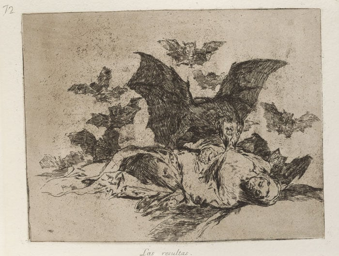
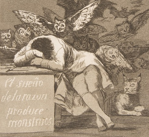
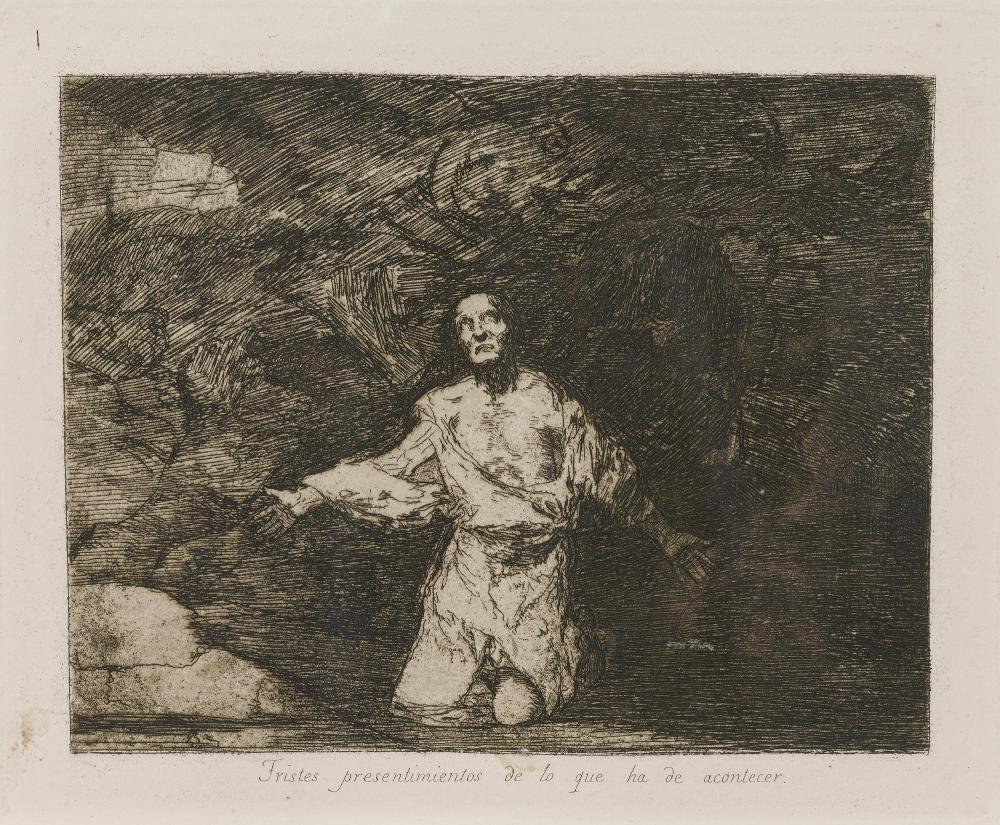
Shadowing the euphoric feelings surrounding Romanticism is the sub-genre of Dark Romanticism, which explores horror, the sublimity of decay, and the supernatural. Dark Romanticism focuses on the sublimity of decay inherit brutality of nature and evil of an individual.
Sublime
Sublime is described by Edmund Burke as an artistic effect that is “the strongest passion”, and in all cases terror and fear is the ruling principle. The sublime is associated with evoking the feeling of the strongest emotion that the mind is capable of experiencing, usually surrounding nature, which inspires great awe and terror knowing you are smaller and insignificant in comparison and at the mercy of nature.
rebellion, freedom, symbol, intuition, emotion, the individual, truth
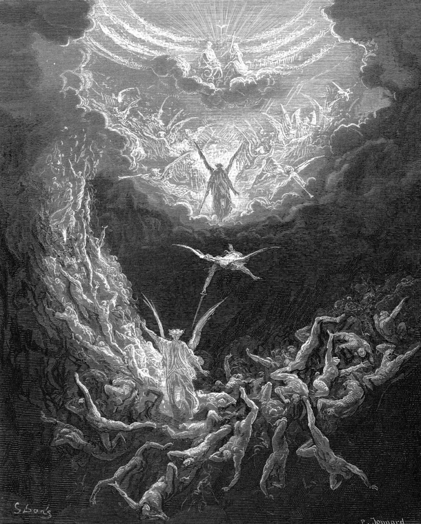
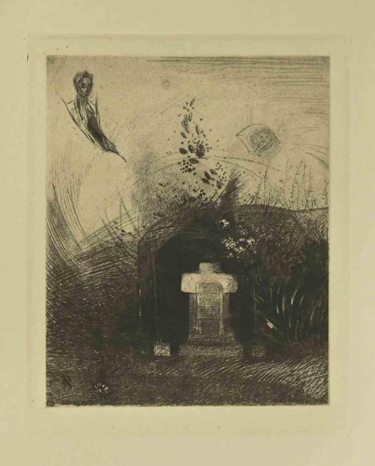
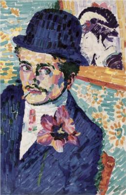
Francisco Goya
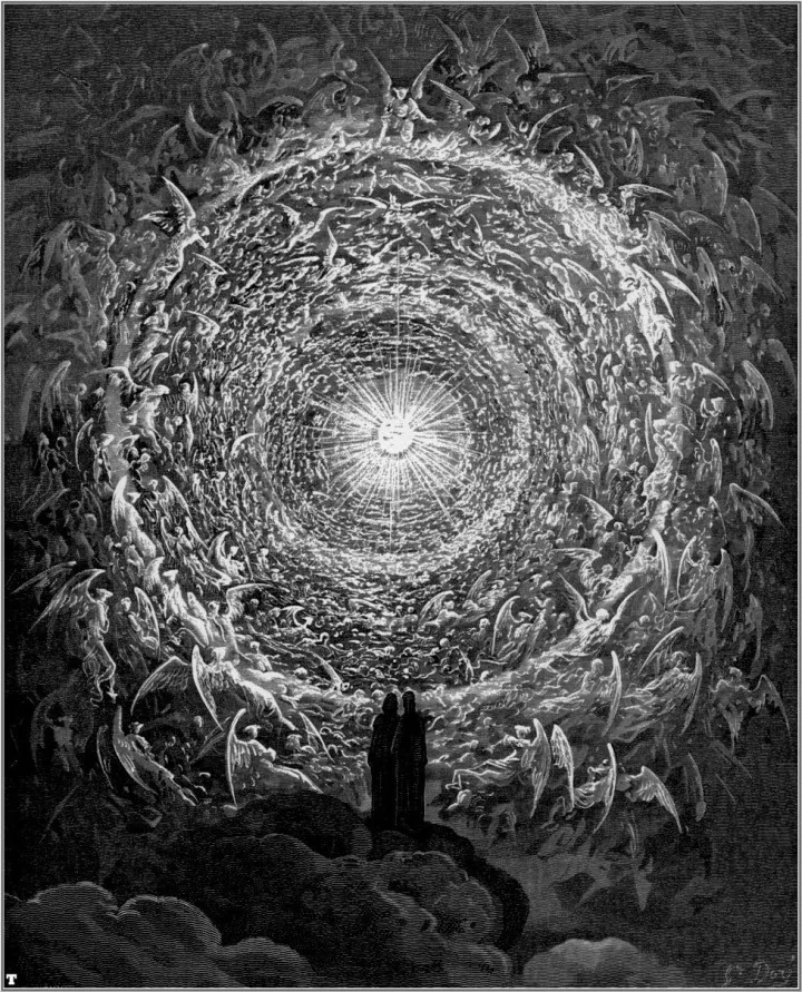
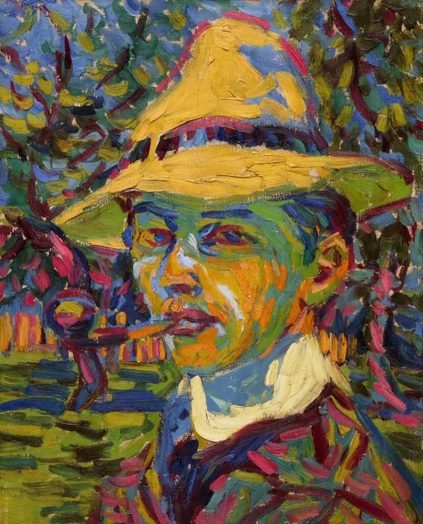
Gustave Doré
Symbolism
Characterised by its emphasis on the disturbing, the mysterious, and the unspeakable, Symbolism is an art movement, originating in the late 19th century, which rejected the realistic depiction of the natural world in favour of imaginary worlds and entities. The work of symbolist artists and writers was fuelled by psychological content, particularly erotic and mystical, which could include figures from literature, Greek mythology, the bible, etc.
disturbance, emotion, the uncanny, anarchy, spiritualism, esoteric, perversity
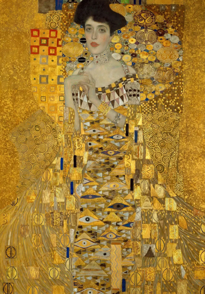
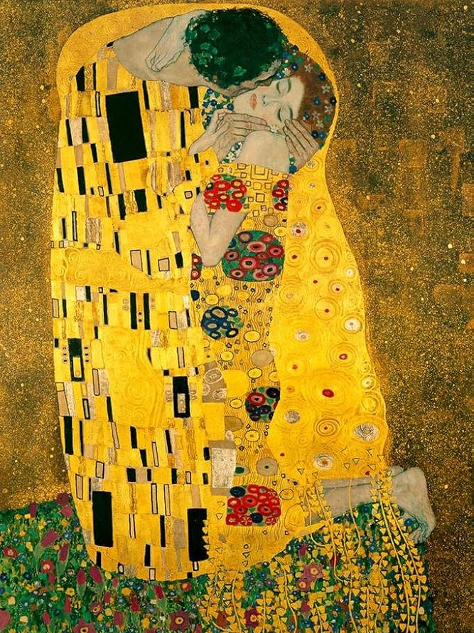
Gustav Klimt
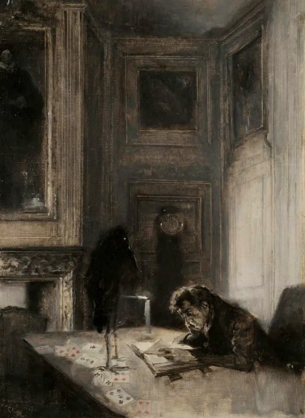
Serafino Macchiati
Surrealism
Aiming to revolutionise the human experience, Surrealism is an art and cultural movement which balances a rational vision of life with one that explores the power of the unconscious, finding beauty within the unexpected, the uncanny, the disregarded, and the unconventional.
the unconscious, irrational, dreams, automatism, juxtaposition, destruction, eroticism
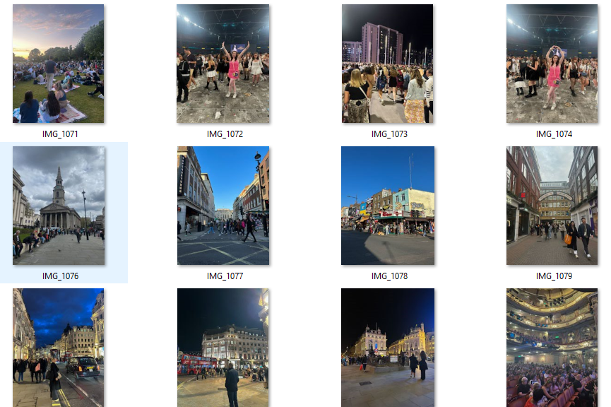
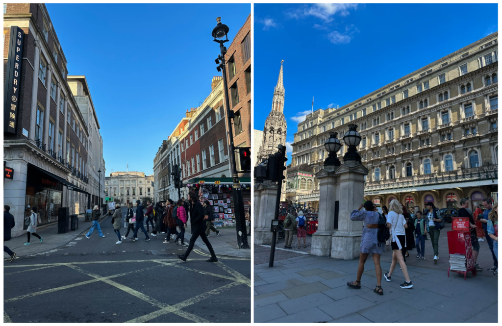
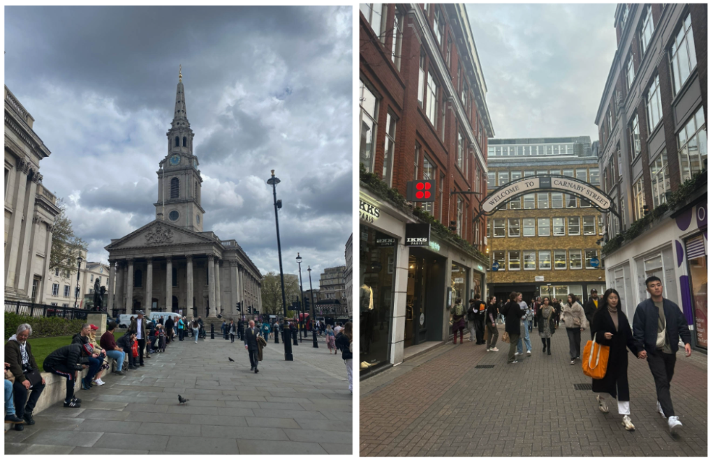
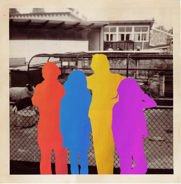
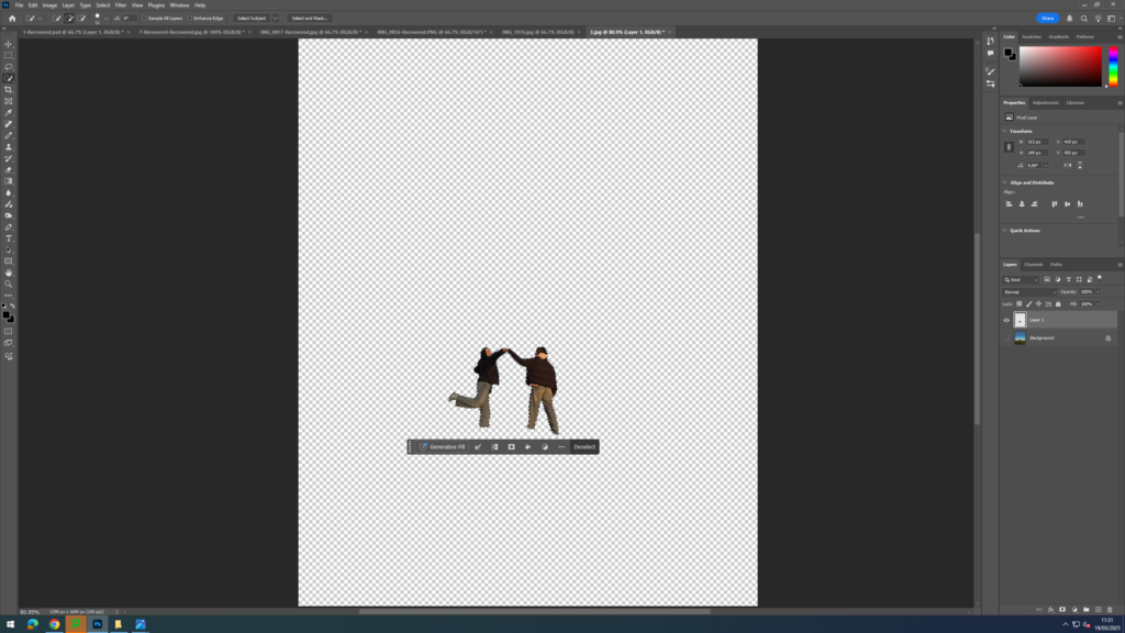
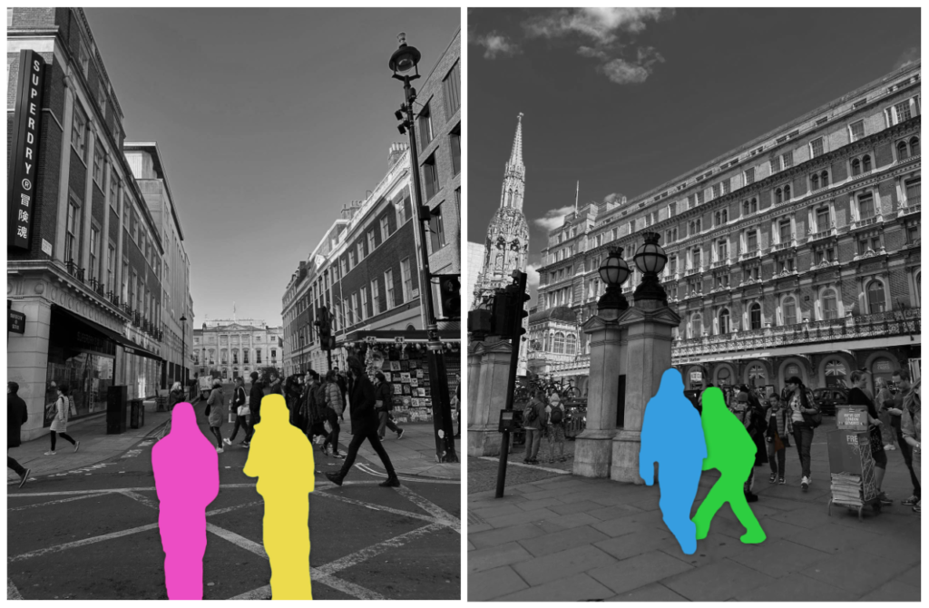
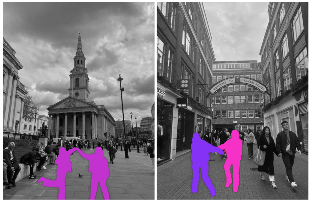
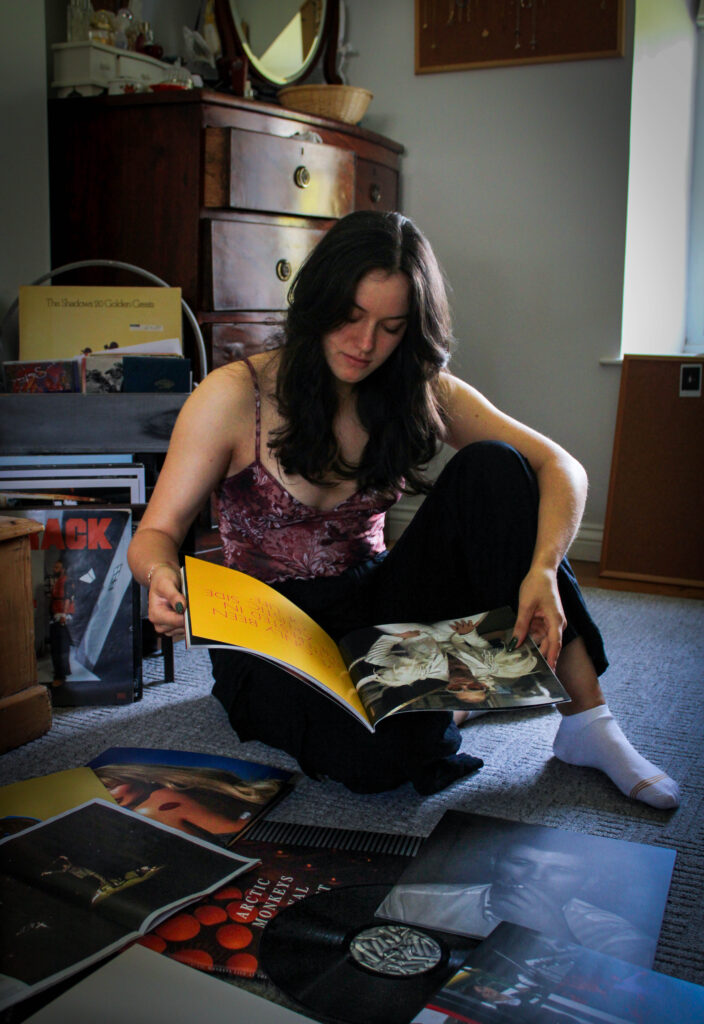
For this photoshoot, I first began by taking pictures of crowded places in Jersey and England. I decided to do this as I wanted to highlight the strength of their friendship by showing how they managed to become friends despite there being billions of other people in the world who they could’ve been friends with. I then decided to further this photoshoot and make my message more clear by taking inspiration from the artist Hayley Warnham. I felt this artist’s work linked well to my images as she adds bold colours to photographs taken by her father which is symbolic of the happy, positive emotions she felt whilst looking at these vintage images of her family.
Overall, I like how these images came out as they are not blurry and have crisp edges which is what I was trying to achieve. Additionally, I think I was able to capture quite large crowds in all my images which enables me to highlight this sense of the low probability of them becoming friends yet them overcoming this.
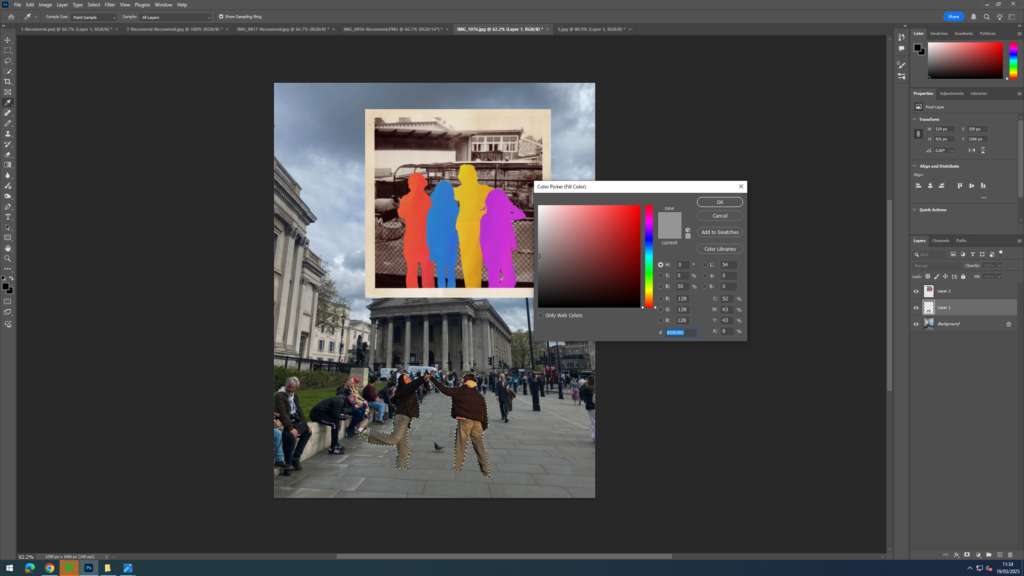
This is the image by Hayley Warnham which inspired my idea
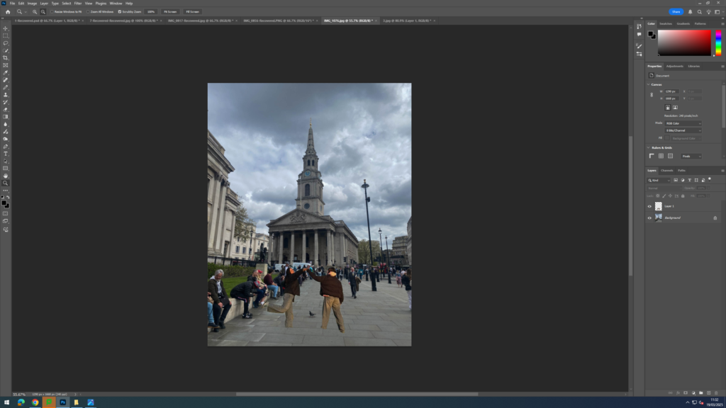
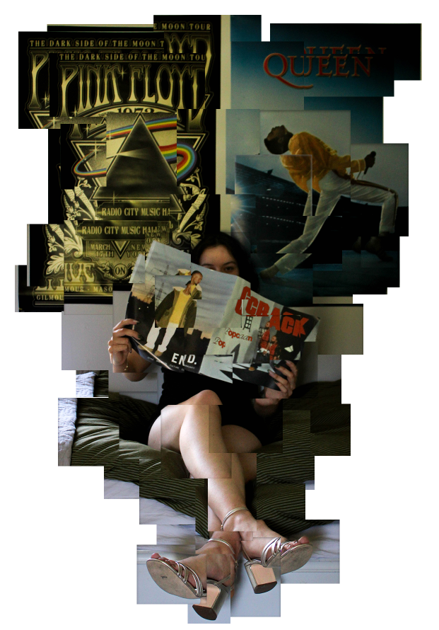
I then took these images of crowds and began to recreate the work of Hayley Warnham. I began by opening up one of my crowd images on photoshop and then another image I had taken separately of my two friends together. I then used the quick selection tool to outline my friends only then pressed layer via copy. Next, I dragged this layer onto the crowd image and adjusted the size to make them proportional to the rest of the people seen in the image. Afterwards, I went onto google and copied one of her images into Photoshop. I used this as a reference for the colours I was going to use in my image to make my work replicate hers more closely by using the pipette tool to select the exact same colour she used. I added colour to my cut out by using the quick selection tool again on them but this time pressing fill to which it then allowed me to select a colour to fill the area outlined. Finally, I wanted to emphasise the bold colours of my friends more and so I decided to make the background image black and white.
Final images:
Overall, I think my photoshoot inspired by Hayley Warnham was successful in exploring the of the theme of friendship. By contrasting the vibrant cut outs of my friends together with the black and white backgrounds, I managed to create a visual narrative about the transformative power of friendship and the way my friends bring each other colour and joy to their lives. The colours symbolise how my friends elevate one another’s lives and without each other, their lives would be mundane and boring (as conveyed through the use of a black and white background). By photographing crowds, which can often symbolise anonymity or a lack of individuality and making it into a backdrop for my two friends highlights their strong bond and the special impact they have on each other as they cause each other to not just fade into the background of life. I like the juxtaposition of vibrant, colourful figures against the greyscale background as it helps make the cut outs stand out and ensure they’re the focal point of the image. The bright colours create a sense of energy, joy and life whereas the neutral tones in the background helps put more emphasis on the cut outs, symbolising the importance of friendship as a source of emotional colour.
In conclusion, I think my photoshoot has been successful in creating an engaging narrative about how my friends infuse joy into each other’s lives. I also think I managed to replicate the work of Hayley Warnham quite closely as I used the exact same colours seen in her cut outs using the pipette tool and I created a clear contrast between the background and my friends by making the background black and white (similar to how her backgrounds are often a sepia, muted tone).
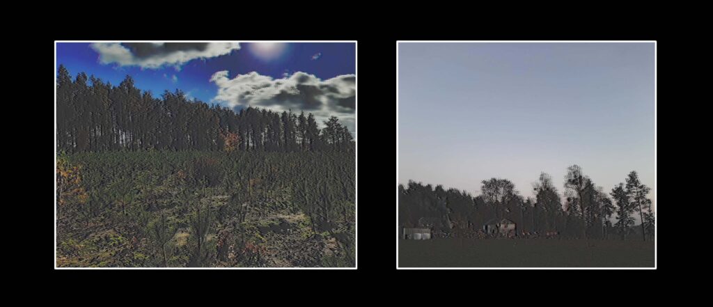
Peter Lik is an award-winning Australian landscape photographer known for his breath taking images of nature, particularly his stunning captures of sunsets, oceans, and vast landscapes. Born in 1959, Lik developed a passion for photography at a young age and later became famous for his ability to capture light, colour, and texture in an almost surreal way. His signature style blends dramatic compositions with rich, vibrant tones, making his work instantly recognizable. Lik has gained worldwide recognition, with some of his prints selling for record-breaking prices, solidifying his status as one of the most successful fine art photographers. His deep appreciation for nature is evident in every image, inspiring viewers to see the world’s beauty through his lens.
Peter Lik – Australian Photographer
What styles does he use? -
Artistic Style & Themes
Peter Lik’s style is honestly insane. His photos don’t just capture landscapes they make them feel larger than life, almost like stepping into a dream. They give off a very surreal feeling even just from being a viewer of his work. He plays with light in a way that makes every scene feel so alive, whether it’s the glow of a sunset over the ocean or mist creeping through a canyon. One of the things that really stands out to me is how rich and vibrant his colours are. His sunsets aren’t just soft pastels, they explode with deep oranges, fiery reds, and intense purples, creating this super dramatic effect that makes his work instantly recognizable.
Another thing I love about his style is how he balances everything so perfectly. His compositions are always on point, he knows exactly where to place the horizon, how to use leading lines, and when to shoot to get the best possible lighting. A lot of his shots feature reflections, either in water or glossy surfaces, which makes the whole scene feel even more surreal. It’s like he finds a way to amplify nature’s natural beauty instead of just documenting it. His work has this mix of peacefulness and intensity at the same time, which is what makes it so unique.
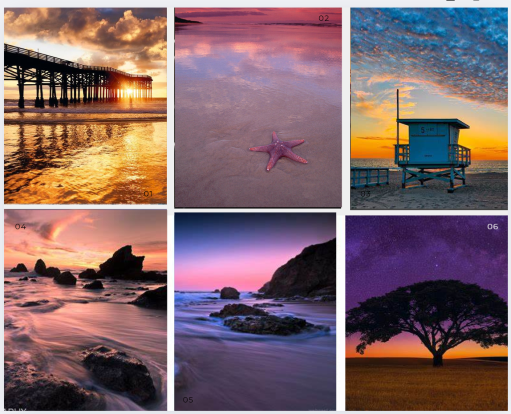
Mood board of his work -
What techniques does he use? -
Techniques & Approach
Peter Lik is all about capturing the most epic landscapes, and he definitely knows how to make nature look its absolute best. One of the biggest things he focuses on is natural light, he times his shots perfectly to get the most dramatic lighting possible, whether that’s during golden hour, right at sunset, or even in the middle of the day. His ability to work with light is next level, and it’s a huge part of why his images feel so bold and cinematic.
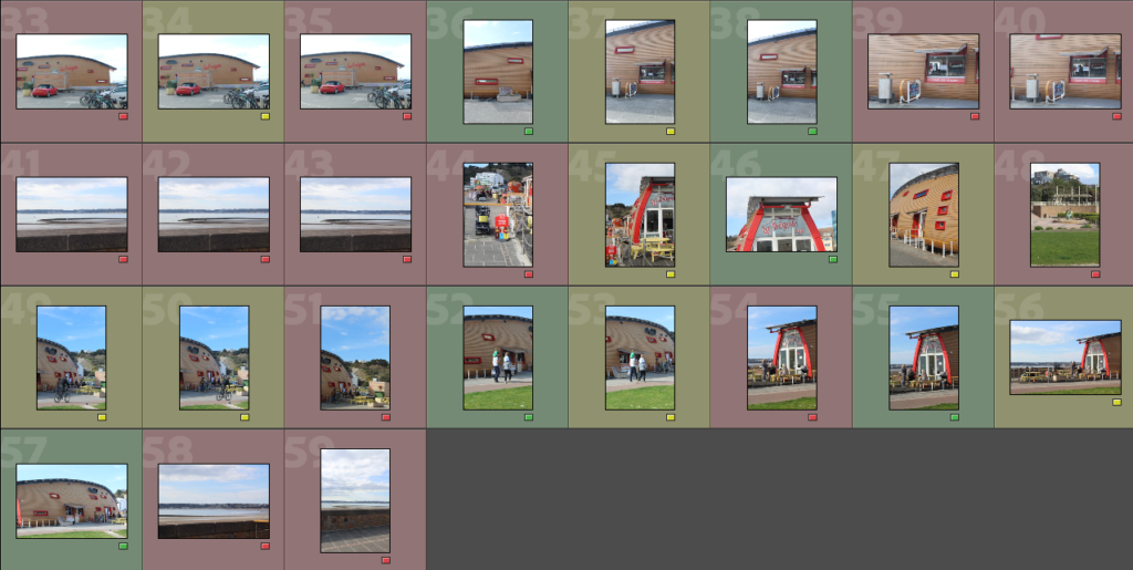
When it comes to his photography gear, he shoots with high end medium format cameras, which help capture crazy amounts of detail and depth. He’s also big on using long exposures, especially for shots of moving water or clouds, giving them that soft, almost otherworldly effect. Another thing he does a lot is panoramic photography, stitching multiple images together to create these massive, ultra-detailed prints. And of course, post-processing plays a role too. His edits enhance the natural vibrancy of the scene without making it look too artificial. It’s clear that he doesn’t just take pictures; he builds an image with a perfect balance of composition, light, and colour to create something that feels almost too perfect to be real.
Peter Lik photo analysis -
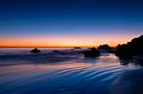
This photo is a beautiful example of sunset landscape photography, utilizing a balanced composition and soft, flowing textures to create a peaceful and surreal atmosphere. The horizon line is placed near the upper third of the frame, following the rule of thirds to maintain a well-structured and visually pleasing balance. The rock formations scattered throughout the scene add depth and serve as natural focal points, guiding the eye toward the horizon where the warm glow of the sunset meets the deep blue sky. The water’s movement creates leading lines in the foreground, naturally pulling the viewer into the scene.
The lighting and colour balance in this image are striking. The sky transitions smoothly from a deep, rich blue at the top to a warm, golden-orange near the horizon, creating a stunning contrast between cool and warm tones. The wet sand reflects these colours, amplifying their vibrancy and adding to the dreamlike quality of the scene. The dark silhouettes of the rocks stand out sharply against the colourful background, adding a sense of depth and making the sky appear even more luminous.
From a technical standpoint, this image likely uses a long exposure technique, which gives the water its smooth, misty appearance. A low ISO (100-200) ensures the image remains sharp and free from noise, while a small aperture (around f/8 to f/16) keeps the entire scene in focus, from the foreground to the distant horizon. The slow shutter speed allows the movement of the waves to be captured as a soft blur, emphasizing the sense of peace.
Overall the mood of the image is calm and relaxing, creating a deep sense of peace. The contrast between the static, solid rocks and the almost ethereal water creates a dynamic yet harmonious balance. The way the colours blend seamlessly into one another makes the scene feel almost too perfect to be real, reinforcing the idea that nature, in the right moment and light, can appear truly magical.
Who influenced Peter Lik? -
Peter Lik’s work is definitely influenced by his deep love for nature and the way light transforms a landscape. You can tell he’s drawn to those dramatic, fleeting moments like the exact second the sun dips below the horizon or when mist rolls through a canyon. His photos feel like he’s capturing something rare and almost untouchable, which makes them so powerful. He’s also clearly inspired by travel and adventure, always seeking out the most breath taking locations. Whether it’s deserts, oceans, or mountains, he finds a way to make them look even more surreal and awe-inspiring. His ability to bring out such intense emotion in his work has definitely influenced a lot of photographers, and it’s easy to see why. His images don’t just show a place, they make you feel like you’re standing right there, taking it all in.
Personal Opinion -
What I love most about Peter Lik’s work is how he makes nature look so unbelievably vibrant and alive. His photos aren’t just pictures of landscapes; they feel like moments frozen in time, but somehow still full of energy. The way he plays with light, especially during sunsets, makes everything feel so rich and intense, like nature turned up to its highest setting. I also really admire how he captures depth and movement, especially in his long exposure shots where the water looks smooth and misty. It makes everything feel so peaceful but also a little surreal.
His style definitely inspires me because it proves how much of a difference lighting, angles, and timing can make in photography. It’s not just about taking a picture, it’s about waiting for the perfect moment and knowing how to bring out the best in a scene. I’d love to experiment with capturing more dramatic lighting and bold colours in my own photography, especially during sunset. His work reminds me that nature already has all the beauty we need, it’s just about learning how to see and capture it in the right way.
Penelope Umbrico is an American artist known for her unique approach to digital photography and how she engages with the internet and technology. Her work often explores the relationship between image culture, technology, and the ways in which we experience and share moments in the digital age.
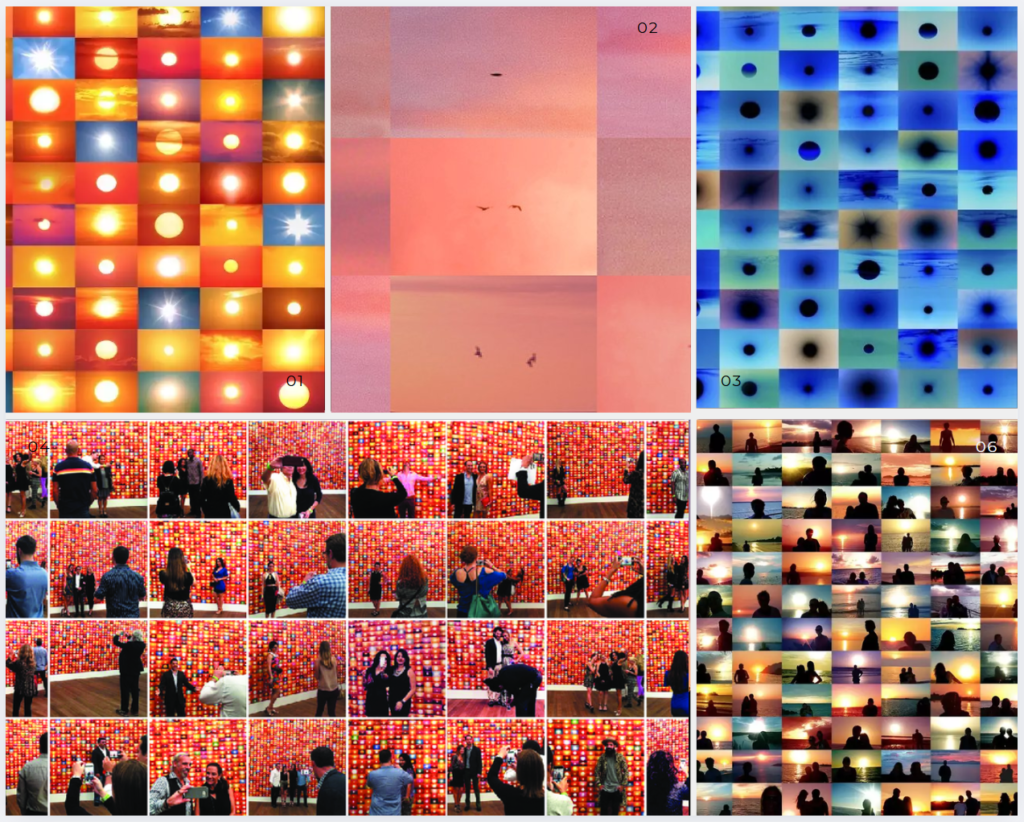
Umbrico’s art is centered around the idea of found images she often collects and repurposes photographs that are already circulating on the internet, particularly those found on platforms like Flickr and Instagram. One of her most well-known projects is Sunsets, where she collects thousands of sunset images uploaded by other users, then reconfigures them into new works of art. The project highlights the idea of mass-produced, ubiquitous images in the digital era and explores how personal moments (like a sunset) can become part of a larger, often impersonal, digital archive.
Her work often touches on themes like image overload, the democratization of photography, and how technology affects our perception of the world. Penelope Umbrico’s work invites viewers to reflect on the way we interact with images, technology, and nature in an age where everything is constantly shared and archived online.
She’s exhibited internationally and is known for her thought-provoking pieces that challenge traditional notions of authorship, originality, and what it means to create in the digital age.
Penelope Umbrico
What’s the Project About?
So, Penelope Umbrico isn’t just out there taking photos of sunsets herself. Instead, she goes through social media sites like Flickr and Instagram, collecting thousands of sunset photos from random people all over the world. It’s like she’s curating a collection of these everyday, personal moments, and then she rearranges them into something totally new. It’s not just about the individual sunsets anymore, but about this big collection of photos that anyone could have taken, and yet when they’re put together, they tell a whole different story.
What makes it interesting is that the sunset itself isn’t just a personal experience anymore. It’s part of a huge, shared digital archive. Everyone has their own version of a sunset, but when you see them all together, they lose some of that personal feel. Umbrico’s project makes you think about how we post these moments online and what happens to them once they’re out in the digital world.
Why I think It’s So Cool
What I love about Umbrico’s Sunsets project is that it’s not just about showing pretty pictures. She’s not really criticizing the photos themselves, but she’s making us think about them differently. When you see so many sunset photos all together, it makes you realize how oversaturated the internet is with this kind of content. Each photo might seem like it captures something unique and beautiful, but once they’re all mixed together, they almost lose some of their magic. And that’s kind of the point like how do we make sense of all these shared experiences online?
Umbrico’s also playing with the idea of what it means to share something digitally. Normally, when you upload a photo, it’s kind of a way to say, “Hey, I was here, and this moment was meaningful to me.” But when you’re looking at these sunset photos on a platform with millions of other people doing the same thing, it changes the experience. Umbrico’s project kind of makes you think about that, and how our obsession with sharing images has an effect on what they mean to us.
The Art of Technology
Another cool thing about Sunsets is how Umbrico mixes art with technology. She doesn’t just throw up these photos as-is. She uses digital tools to manipulate them and make something new, almost like she’s highlighting the way technology affects how we interact with art. The result is this huge, colorful collage of sunsets that almost looks like a digital painting. The sunsets still look beautiful, but they feel a little more fragmented and disjointed when you see them all together.
And I think that’s a metaphor for the digital world in general. We use technology to capture and share moments, but the more we do it, the more we lose that personal connection. These sunset photos, while stunning on their own, kind of lose their magic in a sea of other photos. It’s almost like you have to ask, “Do we even see the sunset anymore when we look at it through a screen?”
Why Does It Matter?
Honestly, in today’s world, we’re flooded with images daily especially on social media. Sunset photos are everywhere, and everyone’s sharing them. But Sunsets is important because it makes you stop and think: What does it mean when we share everything? What happens when we turn the most personal moments into something public? And how does that change how we experience the world around us?
Umbrico’s project doesn’t give us a straight answer. It just makes you reflect on the way we consume and share images today. And I think that’s what makes it so powerful. It’s a reminder that even something as simple as a sunset can have a much deeper meaning when you look at it in the context of the digital age.
My Final Thoughts
Overall, Penelope Umbrico’s Sunsets project isn’t just about sunsets, or even just about photography. It’s about how we live in a digital world where our personal moments get shared and reshaped in ways we don’t always realize. Umbrico’s art makes you think about how technology shapes the way we see things and how we connect with each other through images. So next time you snap a sunset pic, maybe think about where it’s going and how it fits into that huge digital landscape. It might just make you appreciate the moment a little more.
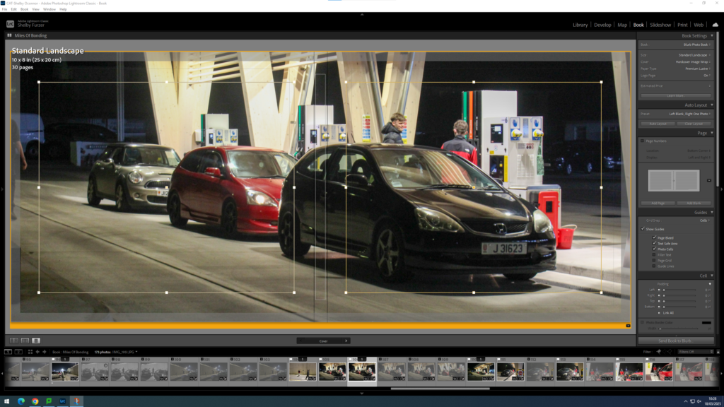
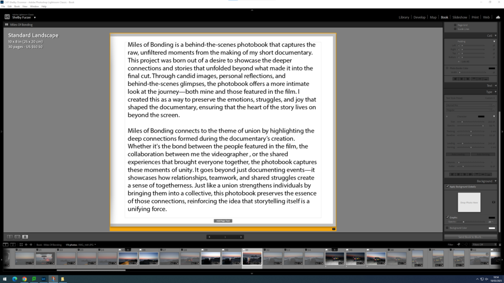
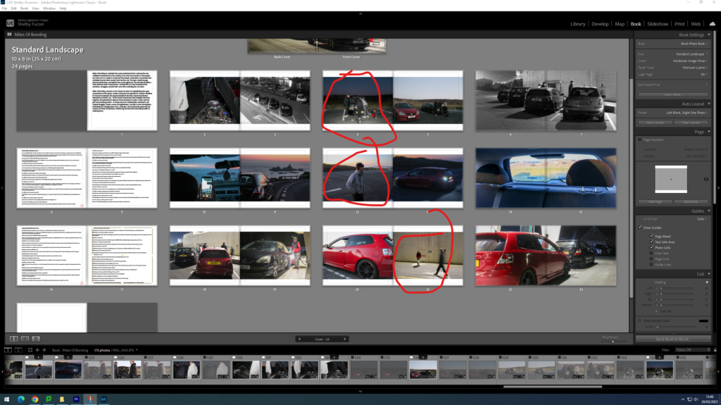
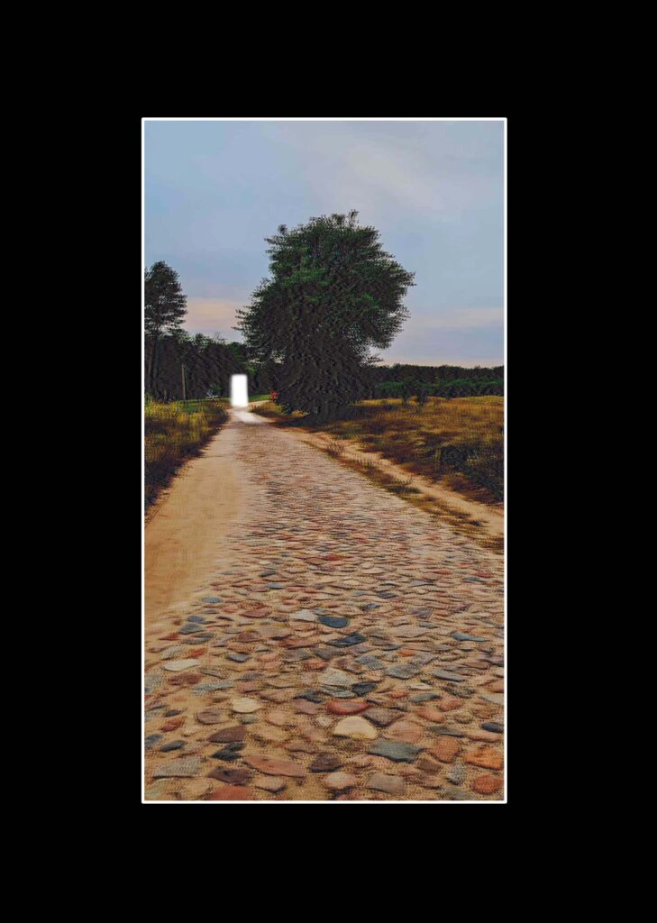
I want to make a short photobook, to link it to my film.
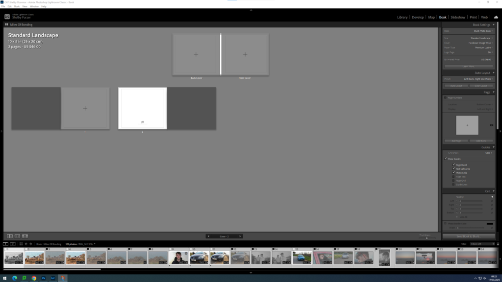
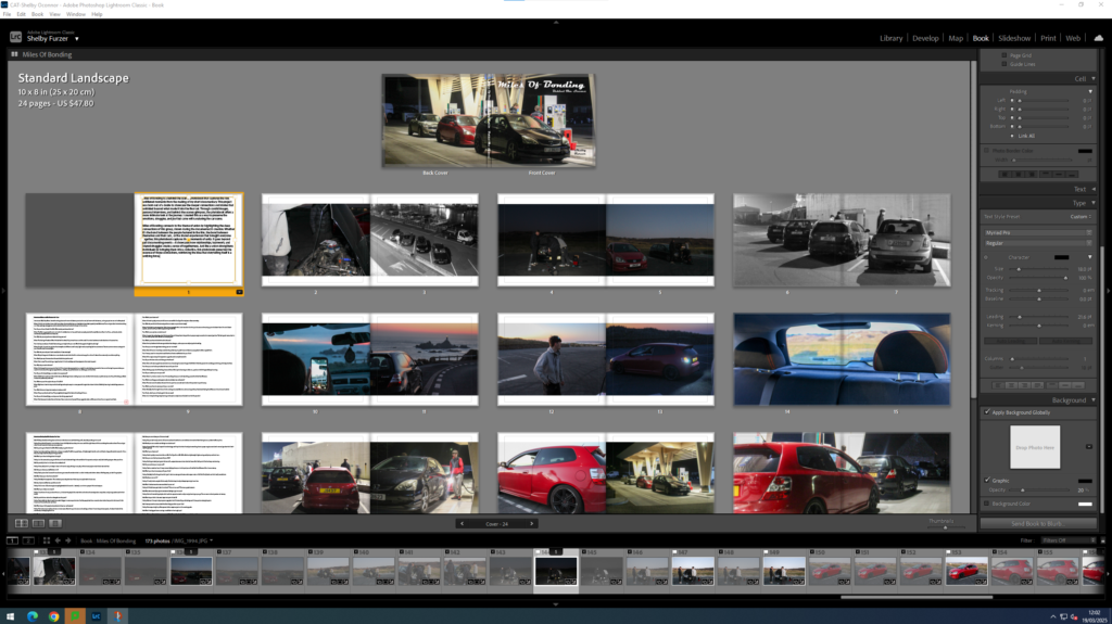
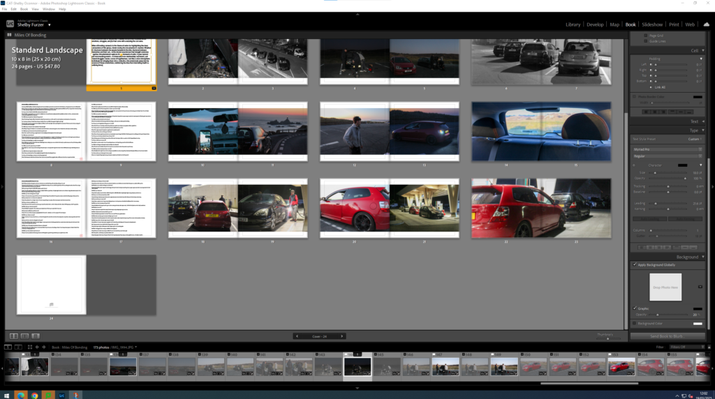
First I started by creating my book within lightroom. I did this by going into my union folder. Select all using ctrl A. Go back into top collections, create collection inside of union, seperate folder. Click book, create. Drag in new images and create save book. Blurb book- choose size- square- orientation and format. Hard cover wrap images. Premium paper. Name and title page? Maybe a short paragraph. Images are at the bottom can drop and drag them in, use zoom button and favorite different templates. Use right click too add pages.
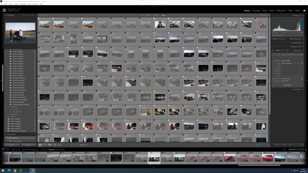
I made things easier for myself by flagging my images, allocating which ones I liked and which ones I didn’t.
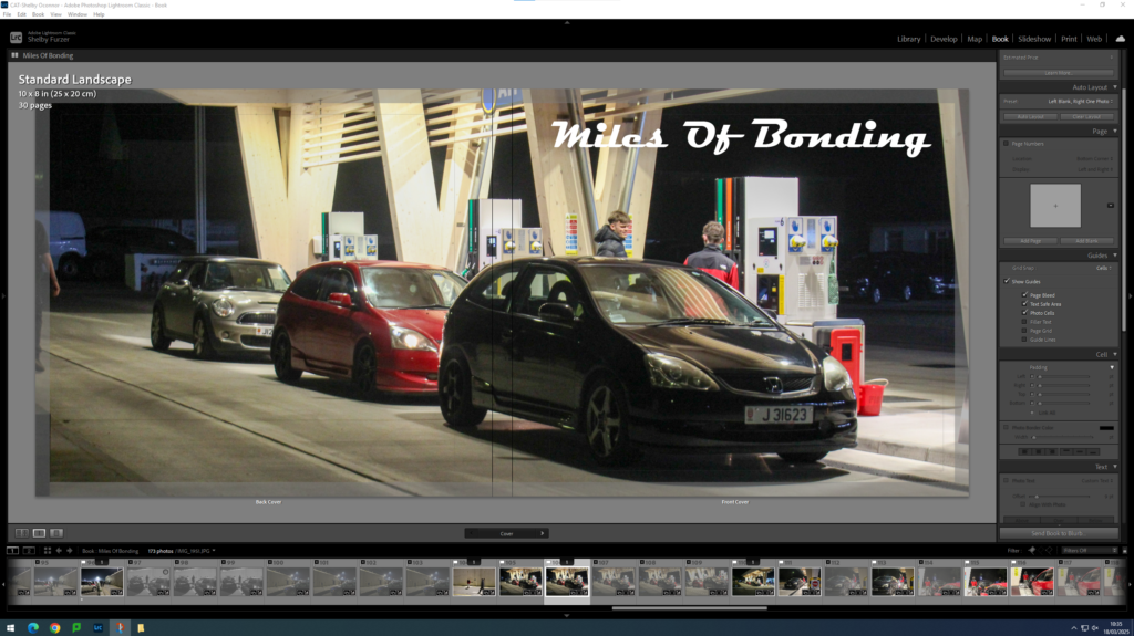
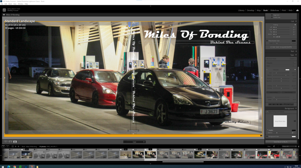
I then chose a main image for my front cover, I wanted it to be a wrapped image to create a more informal feel. And I know that I will still be taking more photos too add to my actual book.
I have made my title the same font as my intro to my short documentary in order to link the two together.
I then added all of my text onto the cover page, creating a final cover.
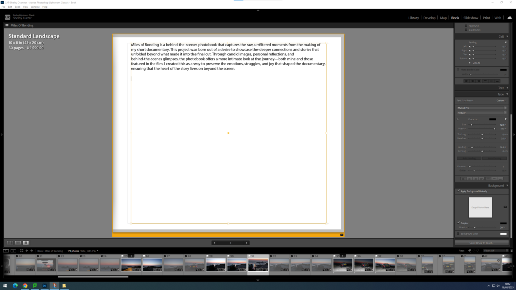
I then decided that my first page would be a text page, so I started mocking up different text pages.
I then came to the conclusion of this.
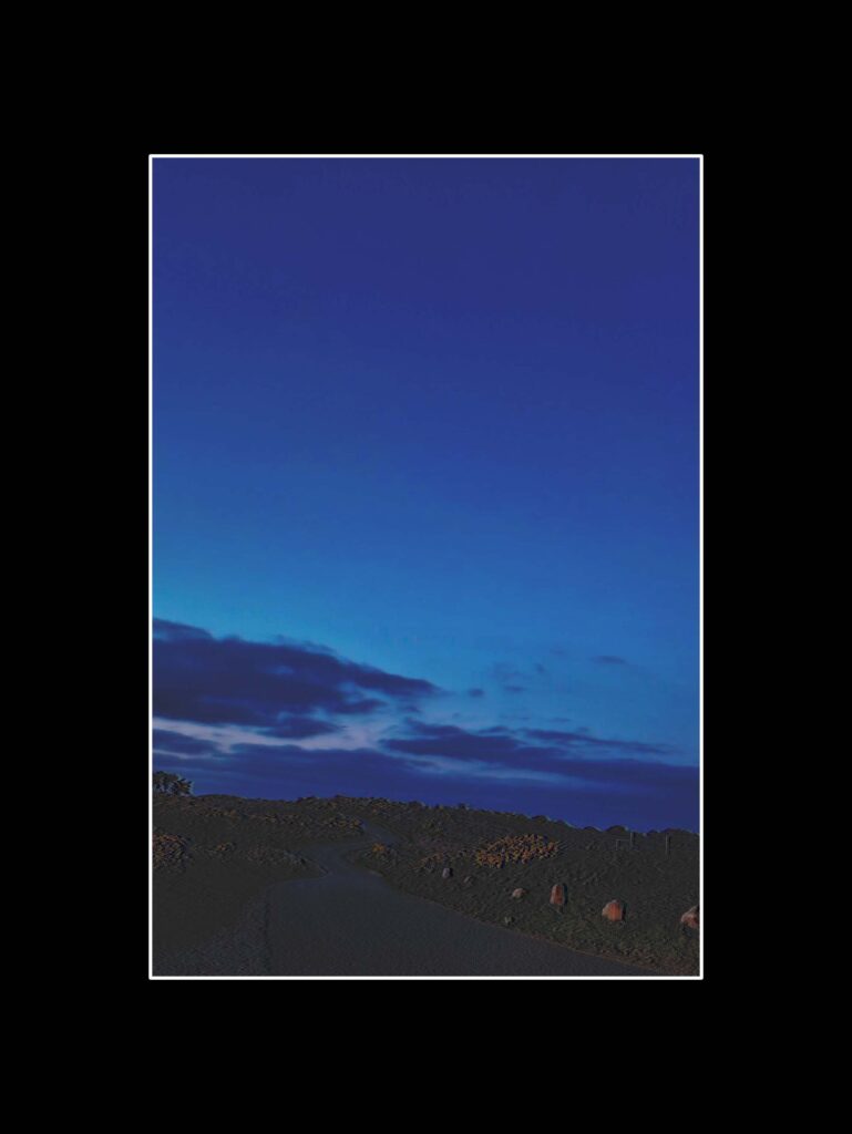
I wanted to start my photobook off with a darker tone, so that my photobook matches my documentary.
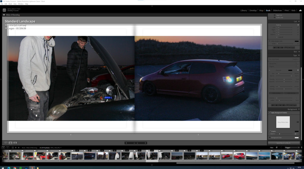
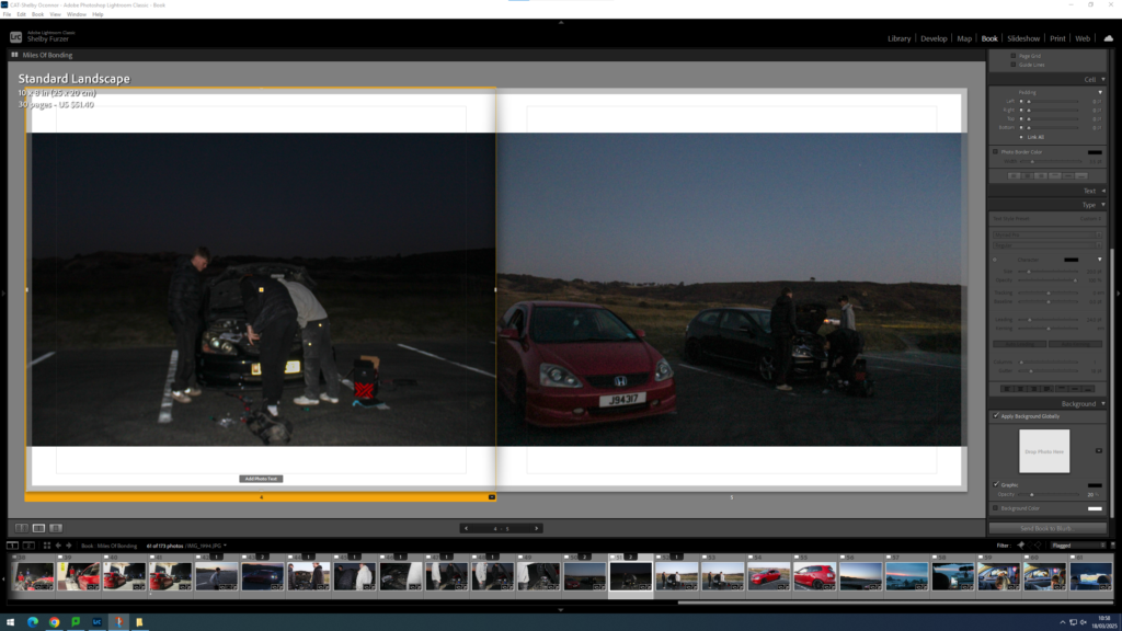
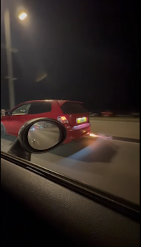
I wanted my images to contain a sequence, a set of four images and then a double page spread to break up the times of the day.
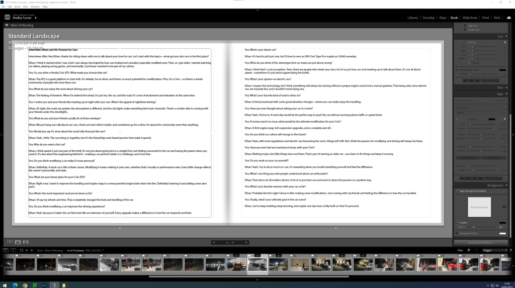
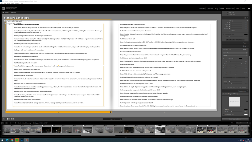
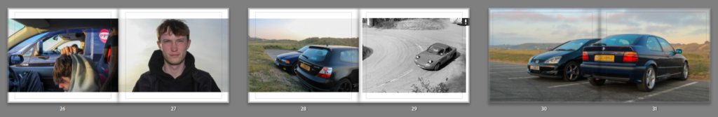
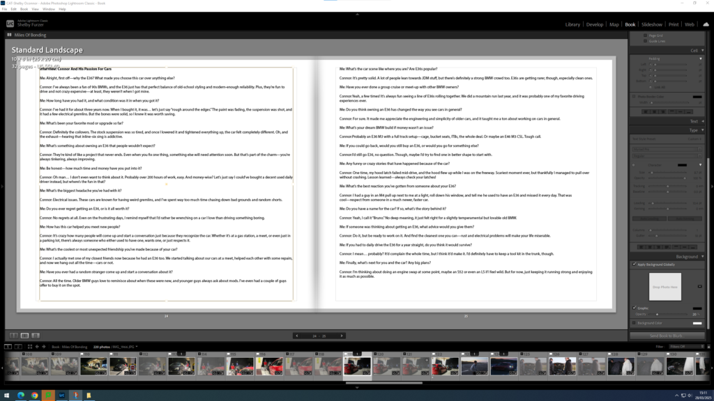
I interviewed one of the drivers within the image, I did this to break up my book, and add more context.
I then shifted my gaze, keeping the same sequencing, but adding a more sunset feel to it.
I then create a secondary interview, with the other person that I will interview for my short documentary.
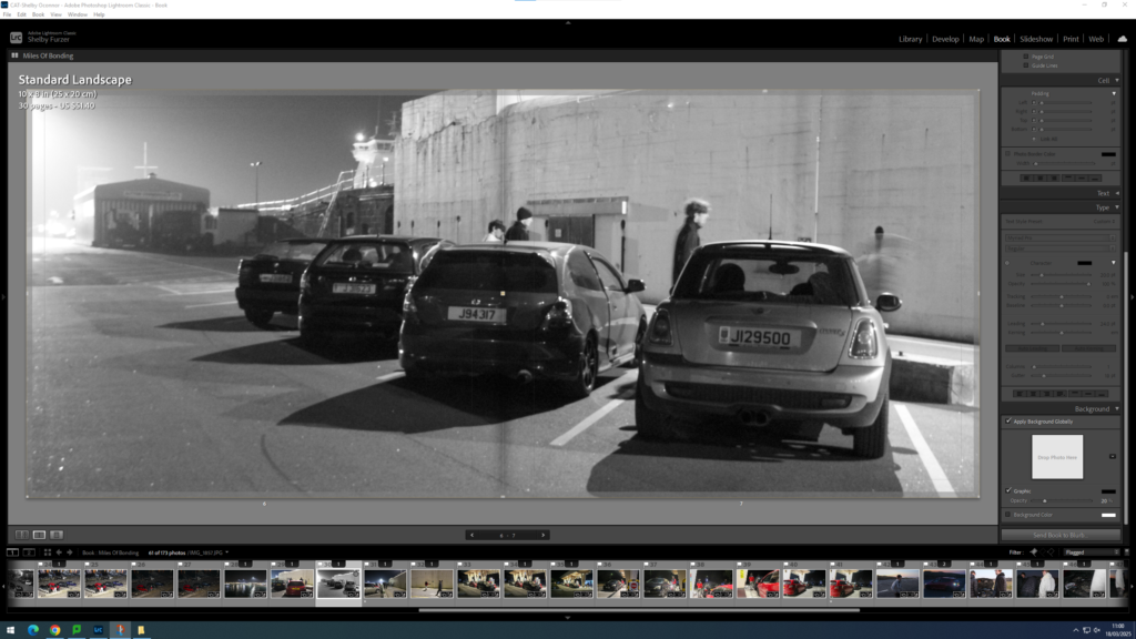
I then finalised my book with the images that are more well lit.
I have added an environmental approach to my photobook, by adding breaker images where they are actually engaging in something.
I then went into my premier short documentary and took screenshots of things that I think would fit within my book.
I did this to create a genuine behind the scenes feel.
I then played around to see how these images would look within my book.
I didn’t really like how these images came out, they looked really pixelated, I think that it was a good experiment to see how these would’ve looked but I don’t think that the execution was good.
I then added another 6 pages from my latest photoshoot, and so that I would have enough room to add in another small interview.
After looking at my book layout in full I decided to play around with the composition moving some images around a bit more.
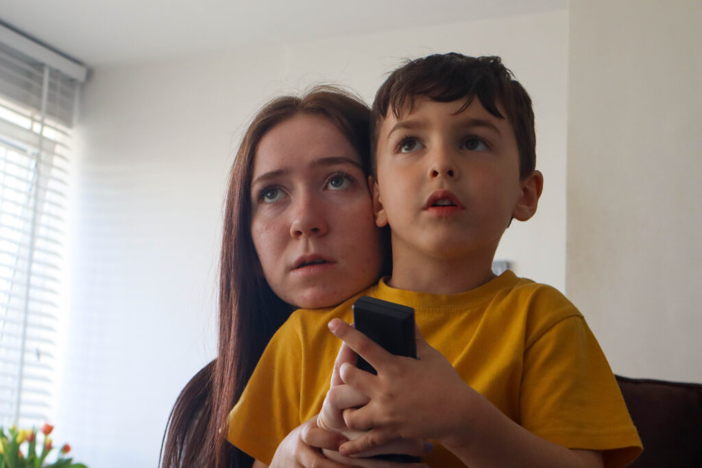
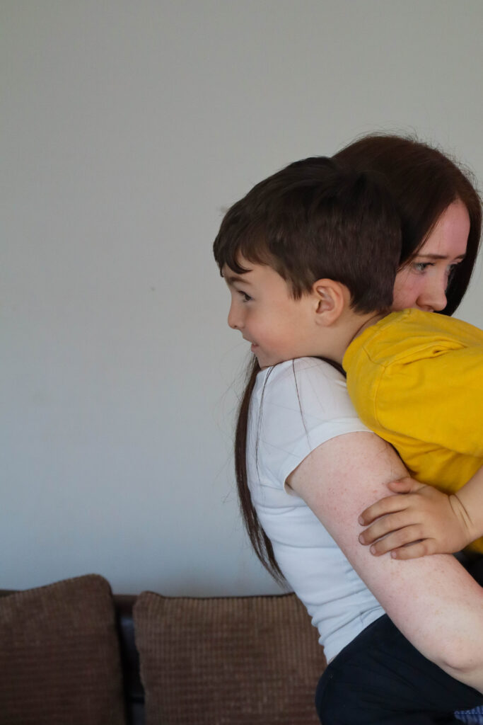
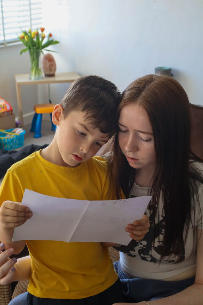
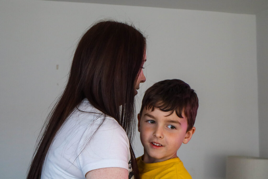
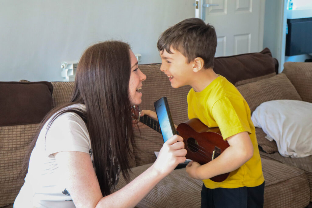
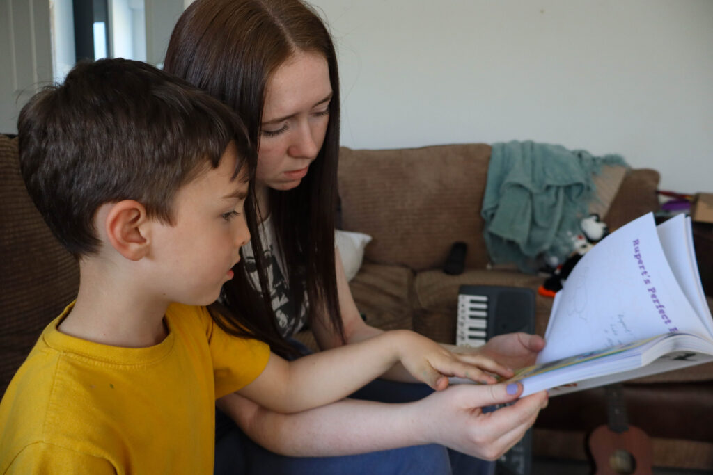
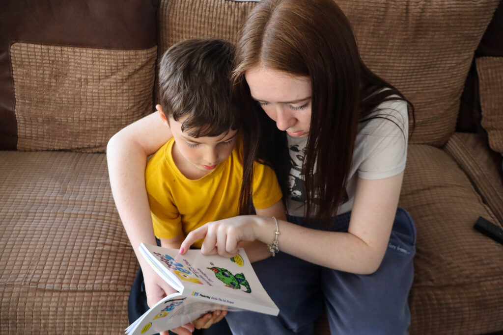
This photoshoot was the shoot I wanted to focus on my friend and her little brother and how their relationship is a union. The difference from the first photoshoot is that this shoot is set indoors in their house.
Favourite edited images:
Joiners:
I created the joiners in the same following steps:
To create these I first edited my images on Lightroom where I adjusted the exposure levels and contrast. I decided on keeping some images in their original colour and some in black and white.
I then filtered the colour marked images and exported them to my documents where id be able to use the edited images to create the joiners.
The first image I used was of the two walking together while holding hands. To do the edit I used the rectangular marquee tool to draw out the boxes that I wanted. after highlighting the first cut out, I right clicked on the box and pressed ‘Layer via copy’ where I then got another layer on the right side under my background. I duplicated the background and moved the layers that I was cutting out to the top. I did this many times while also hiding the background multiple times to see what squares I had missed and if it looked okay. I think went back on each layer and double clicked them. this then gave me editing options for that particular section so I went down to drop shadow and edited the opacity, size, angle and width. doing this meant the boxes were more visible and looked more like they stood out.
The last thing I did was add a colour as the background. I did this by simply copying an image from the internet and pasting it onto the edit which created a new layer which was then able to move end every other layer in the edit which brought it only to the background.
Photoshoot Evalution:
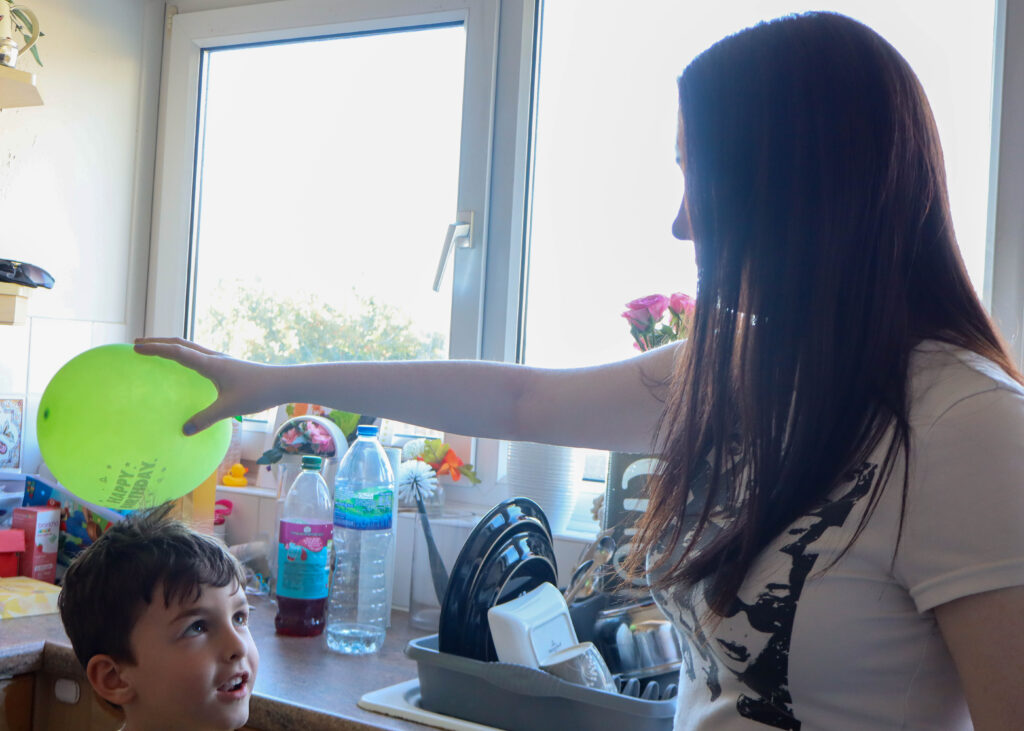
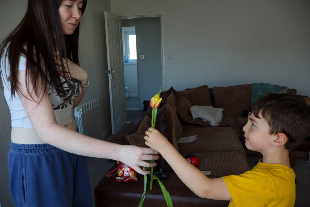
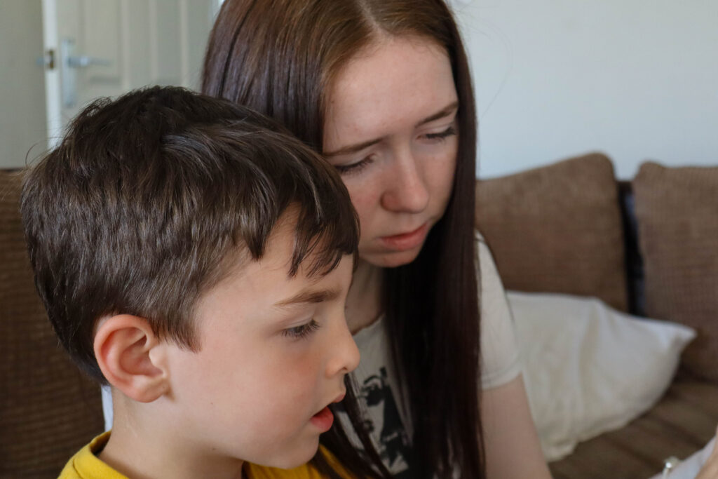
In my opinion, the photoshoot for the theme “Union” went quite well overall. The settings I planned to use in my photoshoot plan was the one I ended up using and this was the subjects own home. I think choosing their home as a photoshoot setting was a good choice as the two are familiar to their surroundings and feel more comfortable participating in a shoot when they know their environment well. As well as this, I believe taking the images in the house makes the shoot a lot more personal to the siblings as its where they have spent part/all of their lives living with each other. I was able to get more shots that were staged rather than candid like photoshoot one as I found it easy to freeze the scene just by telling the two to sit still. this would’ve been more difficult to do in an outdoor setting as I wouldn’t be able to control other factors like moving cars, other people in the shot, or the affect of the weather (eg wind). I like how in this shoot I’ve managed to take images of many different activities the two are engaging in as it was all there to use and set up. this inside things like games, instruments, music playing on the tv and balloons. Being in their home meant they were able to show more deeper connections between each other like laughing while playing instruments or simply having a hug. As well as the first photoshoot, this shoot was again able to show the older siblings care for the younger sibling by helping him with the reading or helping him play the game on the floor.
One thing I didn’t manage to do was create the joiners with the camera. I did my joiners on photoshop again as I was unable to create them the other way.
The black border in the images below is what I would cut off. The same goes for the third image with the white boarder.
Photoshop Gallery
Conclusion
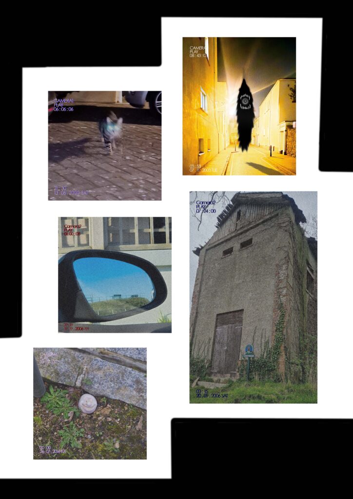
Overall I am satisfied with how this project turned out, I believe I was able to interpret the idea of dreams and reality uniting into some sort of screenshot or freezeframe of a moment.
What I would have done differently is I would have included a lot more human subjects and lean towards Francesca Woodman and Anthi Kollia’s work in order to create a narrative of a character experiencing these scenes (my images) instead of the viewer being left to interpretation. I would have also mounted my images differently to try and form a narrative.
The best part I like about a few of my images is the ‘found footage’/ liminal style that I had created on Photoshop. It creates a more eerie and old camera-like affect. I also like how it brought out more colours and caused a glitch affect.
I have selected my best photographs and arranged them into a gallery.
Evaluation
Overall I think my final outcomes were successful as they represent union through the way they connect together and relate to one another. I have demonstrated this through a series of different edits, firstly using Lightroom to slightly adjust and edit to then exporting onto photoshop, where I then experimented with layering different and the same photographs on top of one another, to using the joiners technique.
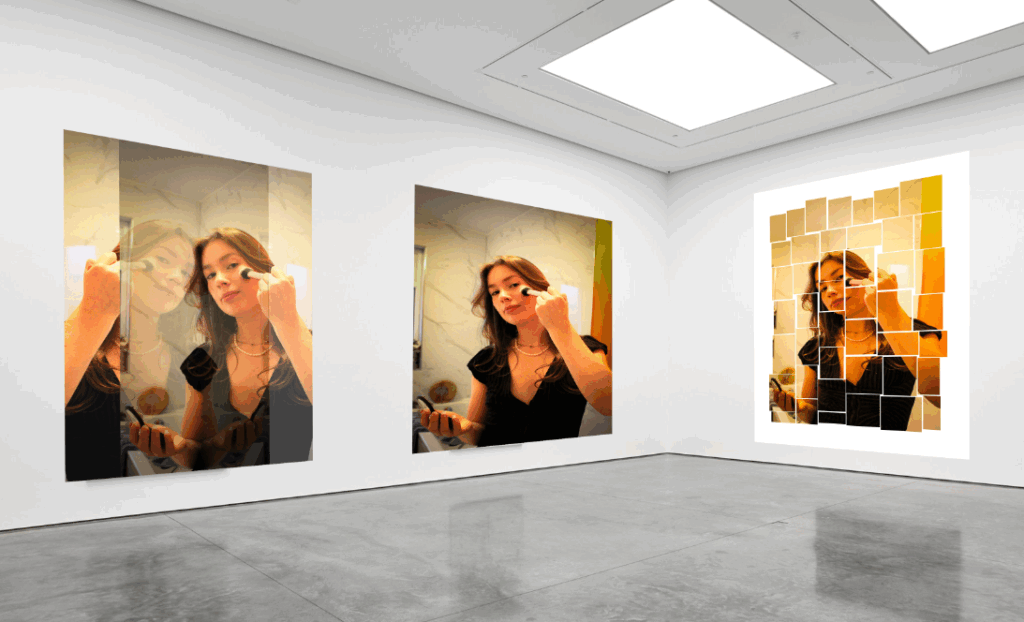
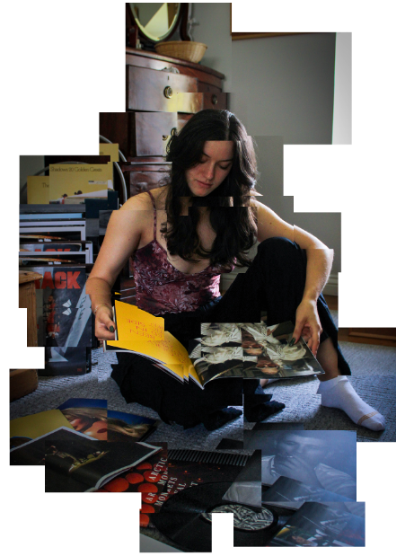
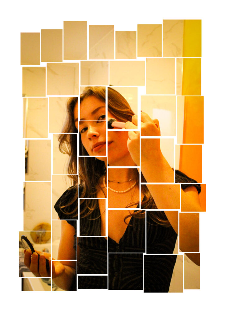
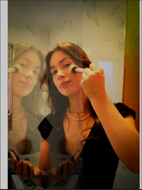
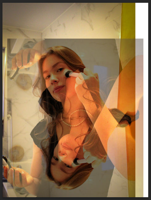
I was firstly greatly inspired by Ernest Ludwig Kirchner, a cubist artist who used very distinct brushstrokes of colour which formulate the overall painting, creating this dramatic, expressive image. Kirchner’s intentions of his work to was to reveal the inner truth, and inner souls of humans even if it was shocking or the fewer. This really influenced me as his loose, figurative, sold blocks of colour, that were painted in a formational, distinct way, overall created this really expressive, intense, dramatic painting that revealed a lot about the subject. Within my own work I incorporated this theme, showing you insights of peoples lives through what they do everyday, or what their passion is. In particular, I captured moments as a girl applies her makeup, and getting ready to a different girl and her passion with music. I decided to take environmental portraits of this, which captured the subject in the moment, whilst still staging some aspects of the portrait, like how the subject as positioned and is set up, I also took the photo with the light coming in from behind me. This expressed union as we are presented with the subject and their ‘natural environment’ such as their bedroom, which describes this story and shows us how they are connected together, as it is something that is personal to them.
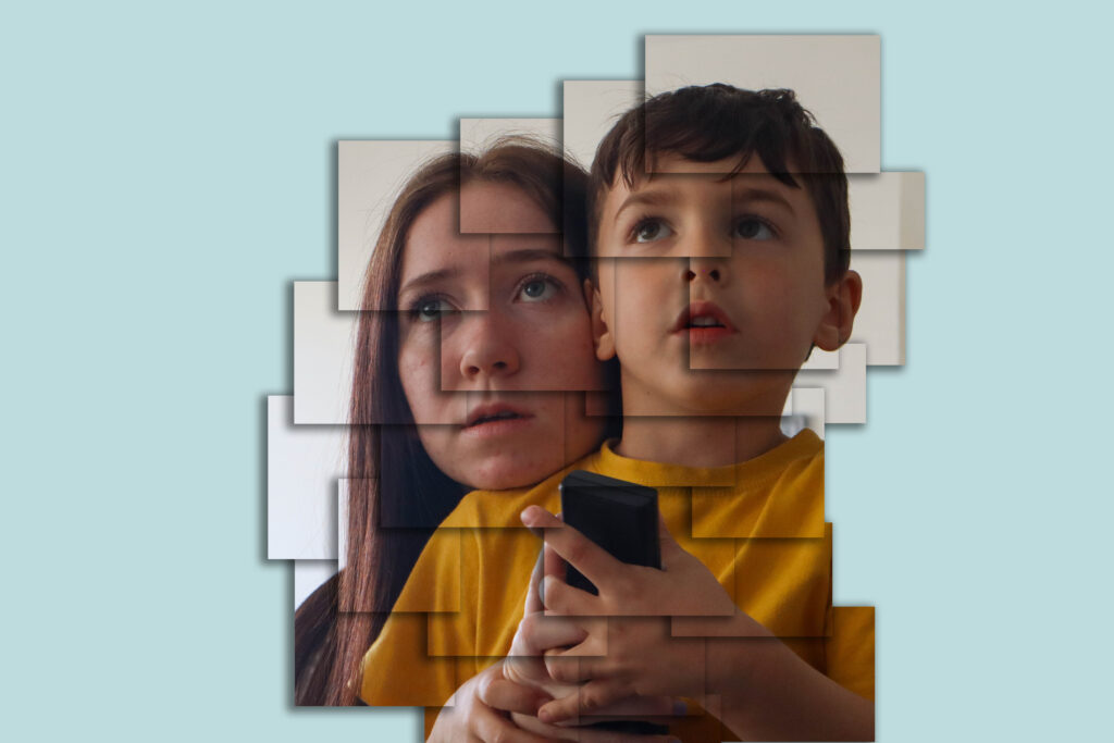
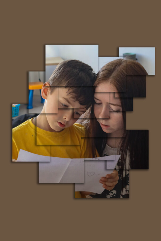
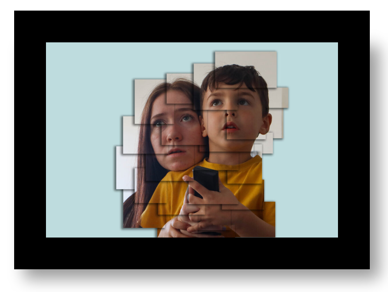
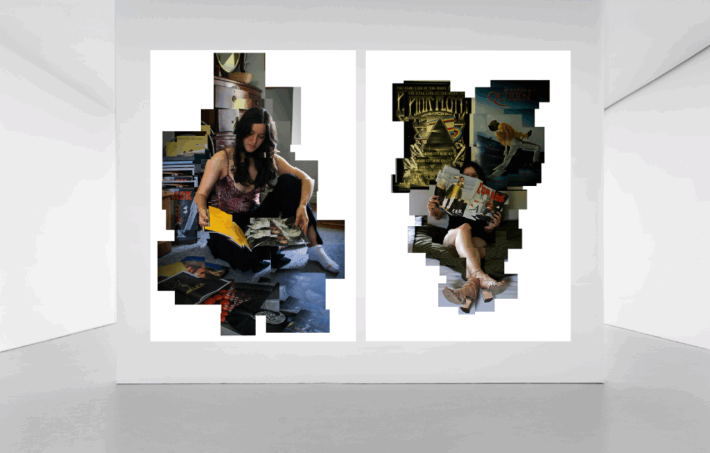
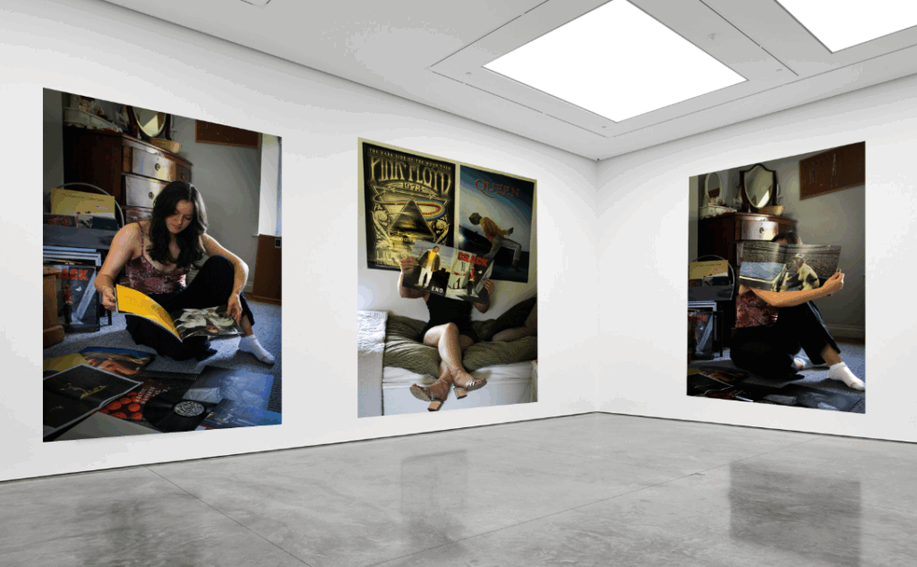
I was was further inspired by David Hockney and his photo joiners editing technique. This further intensified and dramaticed the photo as the photo became almost unrecognisable at first through the uneven, imperfect pieces that are re-joined or united together again which is completely different to the original image. This distorts not only the image itself but your response to it as the subject is not obvious, you have to look for it. This visual technique hides but also reveals narratives forming a new kind of reality, as you have to look in-depth to where you see the actual subject. Within my response, I wanted to emphasise the disjointed effect particularly where their were hidden or unnoticeable details, by repeating part of the layer, then layering this on top which created this sequence of a repeated pattern/ detail. In particular, I did this where the graphical parts were – like on the magazine as this created interesting depth, and expressed the intricate details.
From looking at the joiners technique I wanted to experiment with a new way that I could express the disjointed, fragmented effect, but then show how this was reconnected back together, in a way that unites. I decided to create a mosaic, grid pattern:
I thought this was effective as the broken up pattern creates a similar effect to Kirchner’s loose painting style of expressive brushstrokes.
I then began experimenting with new ways in particular layering photographs. This created an interesting illusion of the subject as their was duplicated versions of the same subject. I found this an interesting way of expression union, as it showed how someone was united together in a particular way. This also created a type of figurative movement, as it is not clear what you see , because your focus is mis-lead by the shadows of the of the second layer (particularly for the third portrait).
Throughout this project I wanted to find new ways I could create depth and show how two subjects are connected together, through various editing techniques from using environmental portraits.
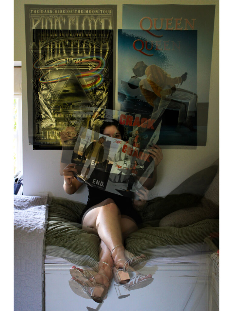
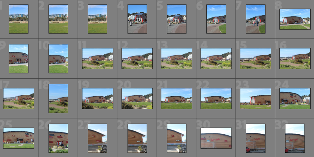
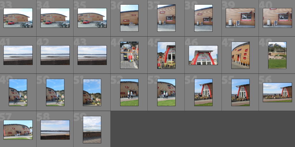
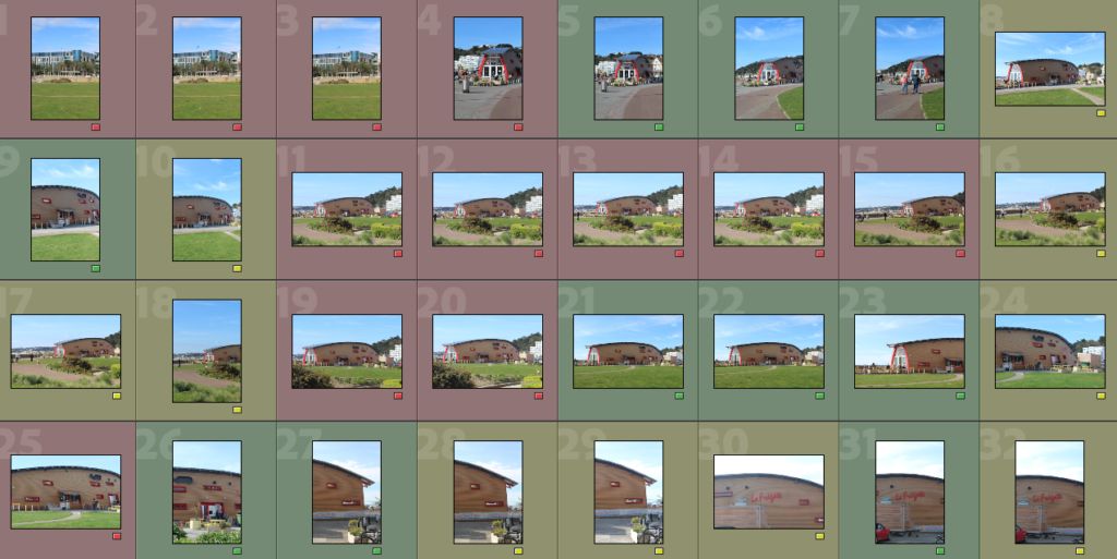
For this joiner, I would like to photograph La Fregate. I think this would be a good subject for a photo joiner as it is a well known place on the island. I also think that this will be a good location as lots of families go there so I can incorporate photos of families and of people spending time together in my joiner. Ultimately, this joiner will link to the theme of Union as La Fregate is a place where people come together to spend time with family and friends.
Camera Settings
For this photoshoot, I set my camera to shutter priority, an ISO of 100 and a shutter speed of 1/80. After now looking at these images, I think that I probably could have adjusted these settings as some shots are over-exposed and some are out of focus. This won’t matter too much however for my joiner as I would like to make some of the images blurred and some more exposed than others.
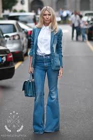
I’m going to go to the Dolmans for my first photoshoot and I’m going to wear the 70’s style outfit which is going to be bright and colourful, so that it stands out against the grey stones and the dull background. I’m going to do many different shots including full body shots, half body, face and just shoulders and face to get a variety of images. I need to focus on positioning and how I want the model to look i.e. where there looking, what angle they are positioned at, whether there doing any specific pose?. I want to try and go when the weather is sunny, so it adds to the fun, innocent vibe of the photos.
Photoshoot 2
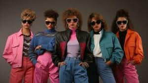
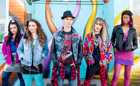
My next photoshoot is going to be at the White House down at St Ouens where I’m going to do my 80’s style shoot which is going to be very colourful and dramatic. I’m going to go when the whether is a little bit more cloudy and there is no sun so that it enhances the images to make them look more dramatic and bold. The model will be stood up for this photoshoot and will be positioned so that they are facing the camera from the front.
Photoshoot 3
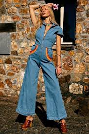
For my final photoshoot I’m going to go to Le Rocco tower and I’m going to go when its low tide so that I can go in and do the photoshoot inside the tower. I’m going to do modern clothing for this photoshoot and because I’m doing it inside the tower, my outfit will contrast against the bricks and will give an interesting texture difference with the type of clothes I’m going to wear. The model will pose for this photoshoot by lying on the wall of the tower and by looking out to sea, I will also have the model facing the camera but looking of to the side. I’m going to do this when the weather is sunny so it contrasts against the dark colour of the tower.