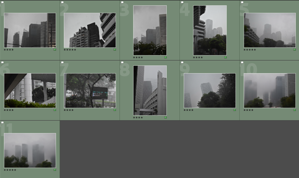
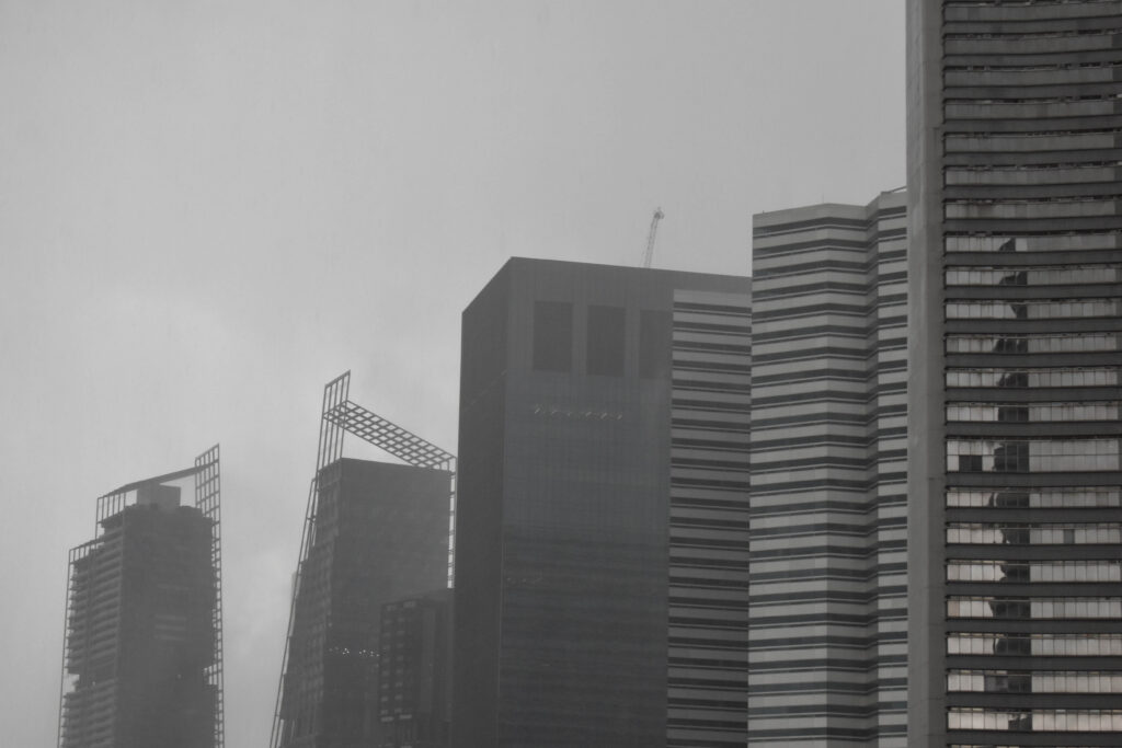
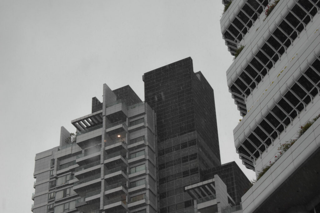
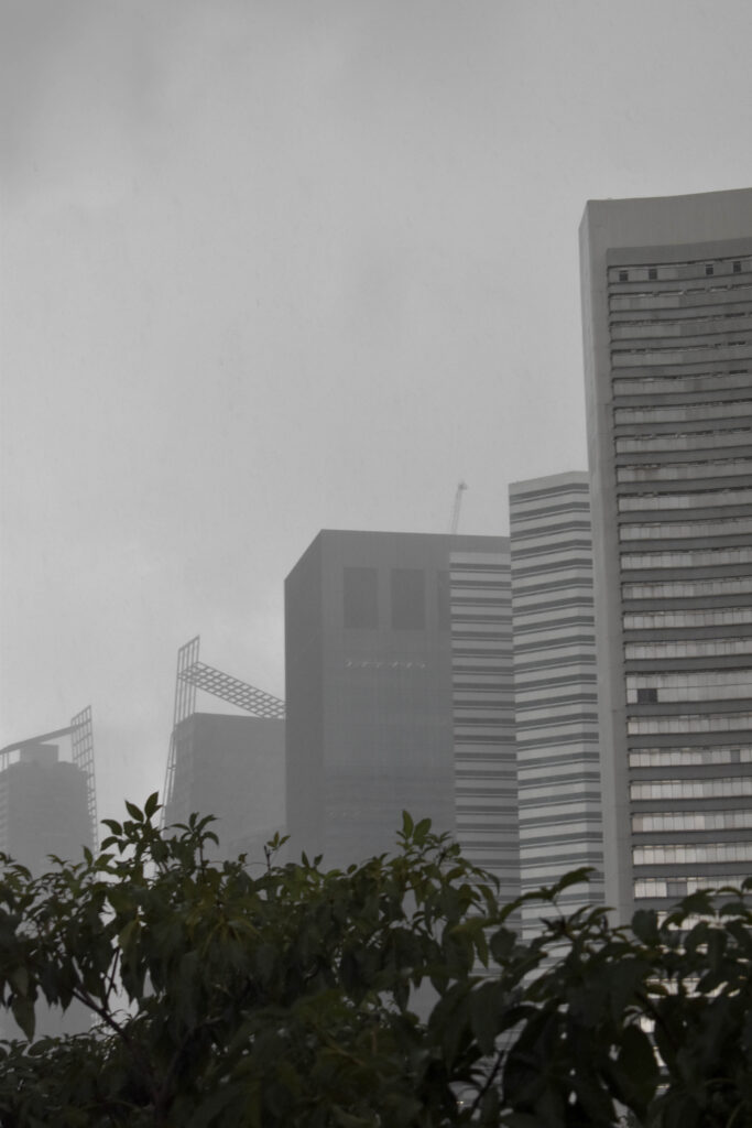
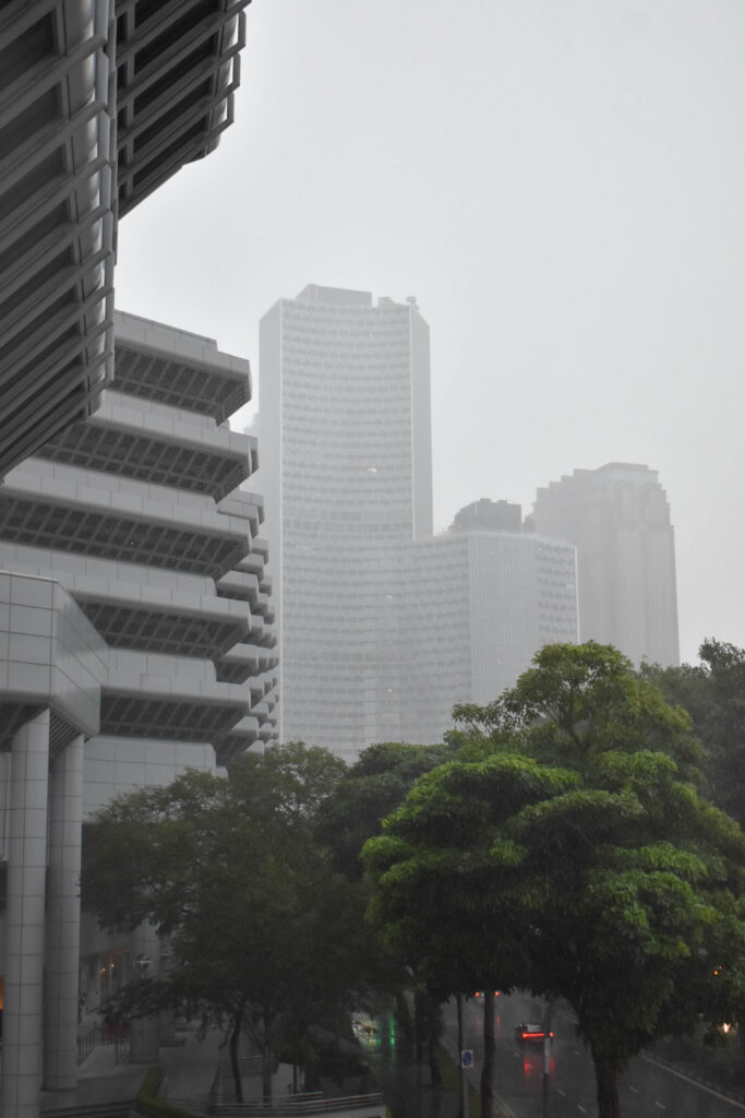
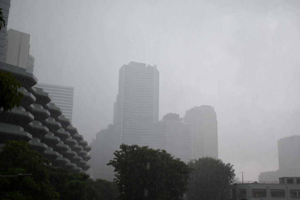
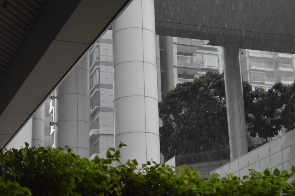
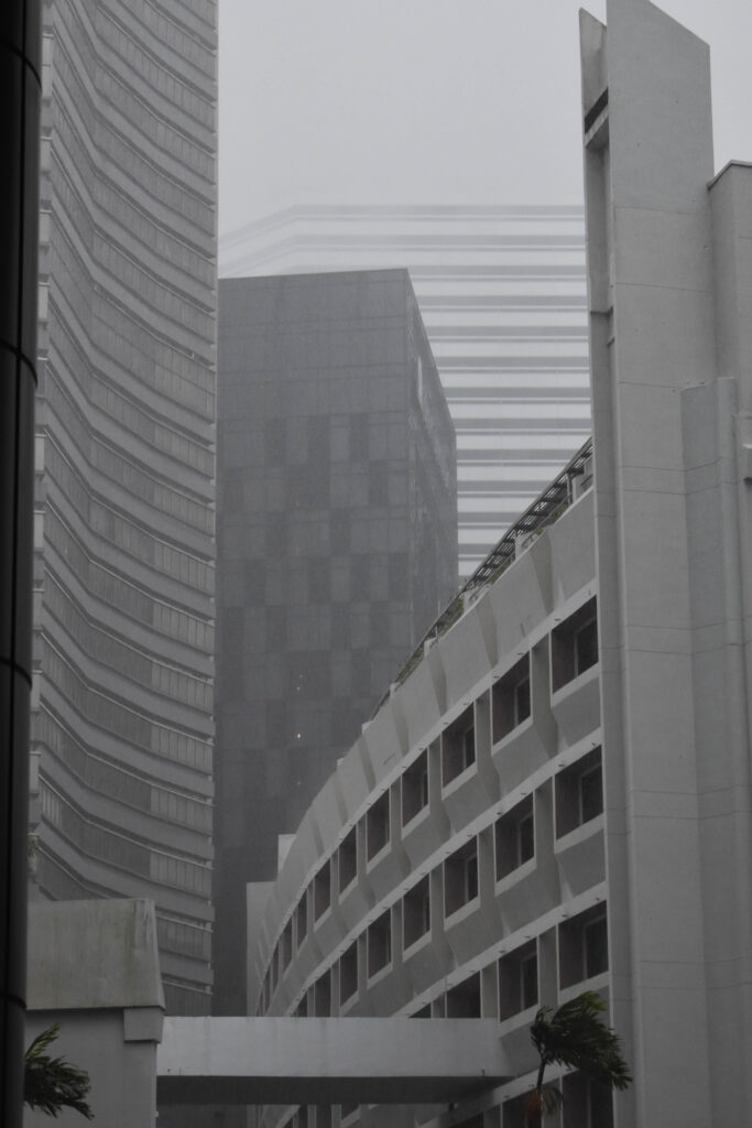
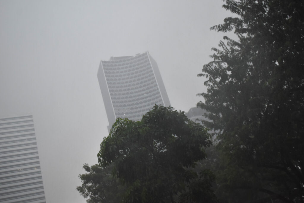
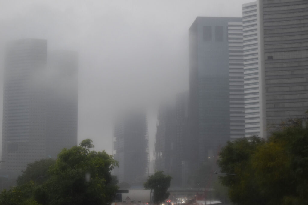
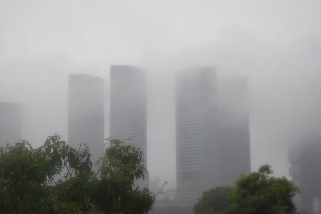
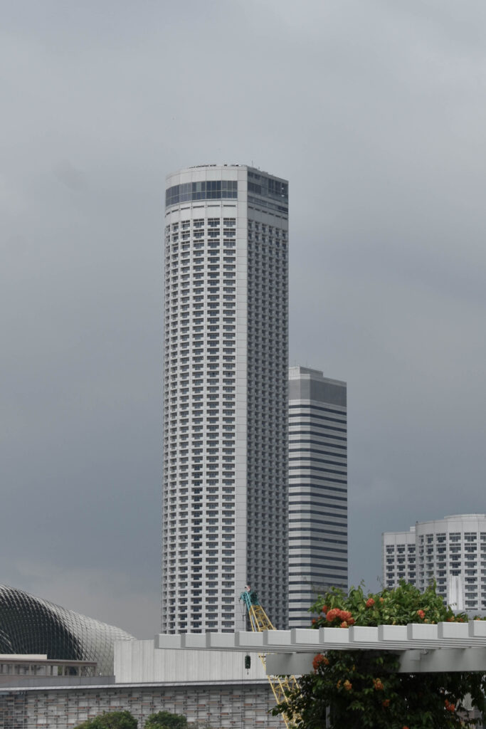
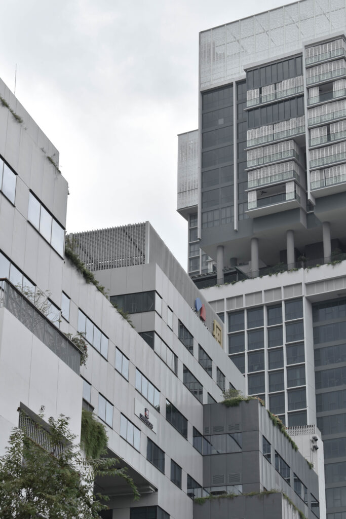
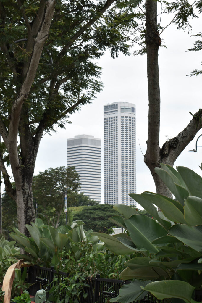
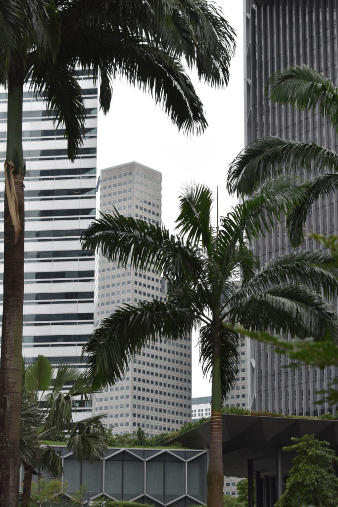
I went out during a tropical storm to photograph buildings in the rain and cloud. While these images weren’t taken in black and white they appear monochrome with lots of mid-tones while still having a small pop of colour from the trees. I narrowed these images down to 11:
Final 11:
I like how the buildings fade in the background to show their ominous presence and how gloomy the images appear with the grey and dull weather.
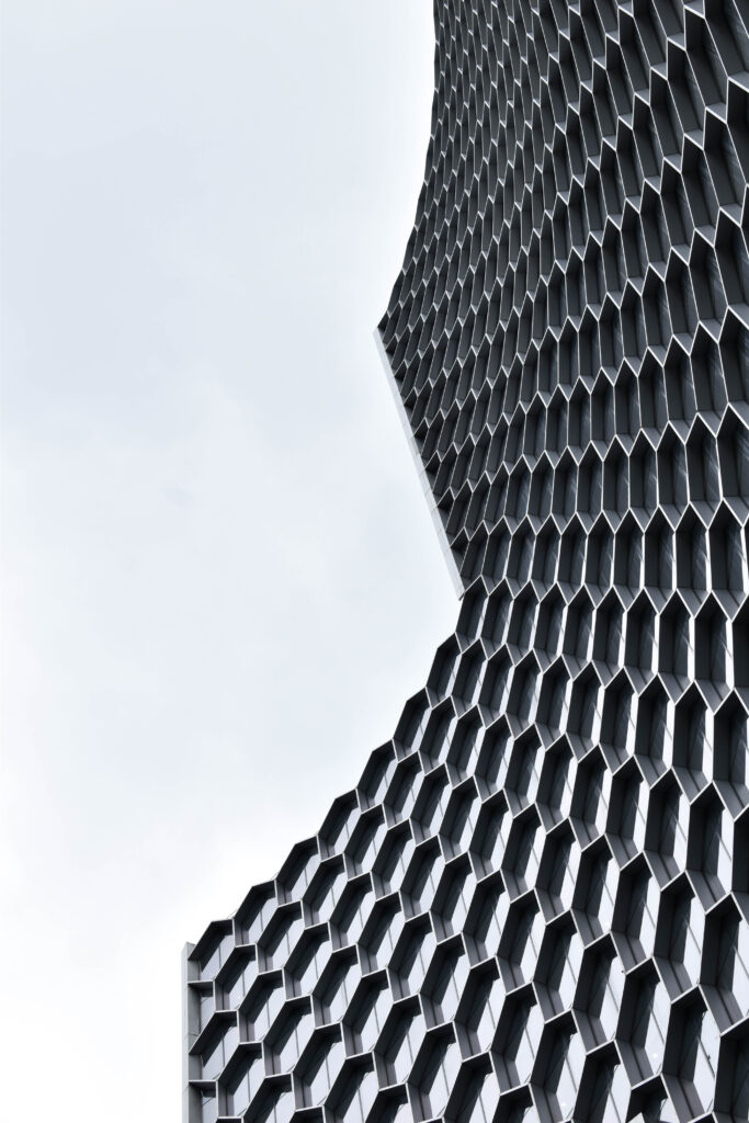
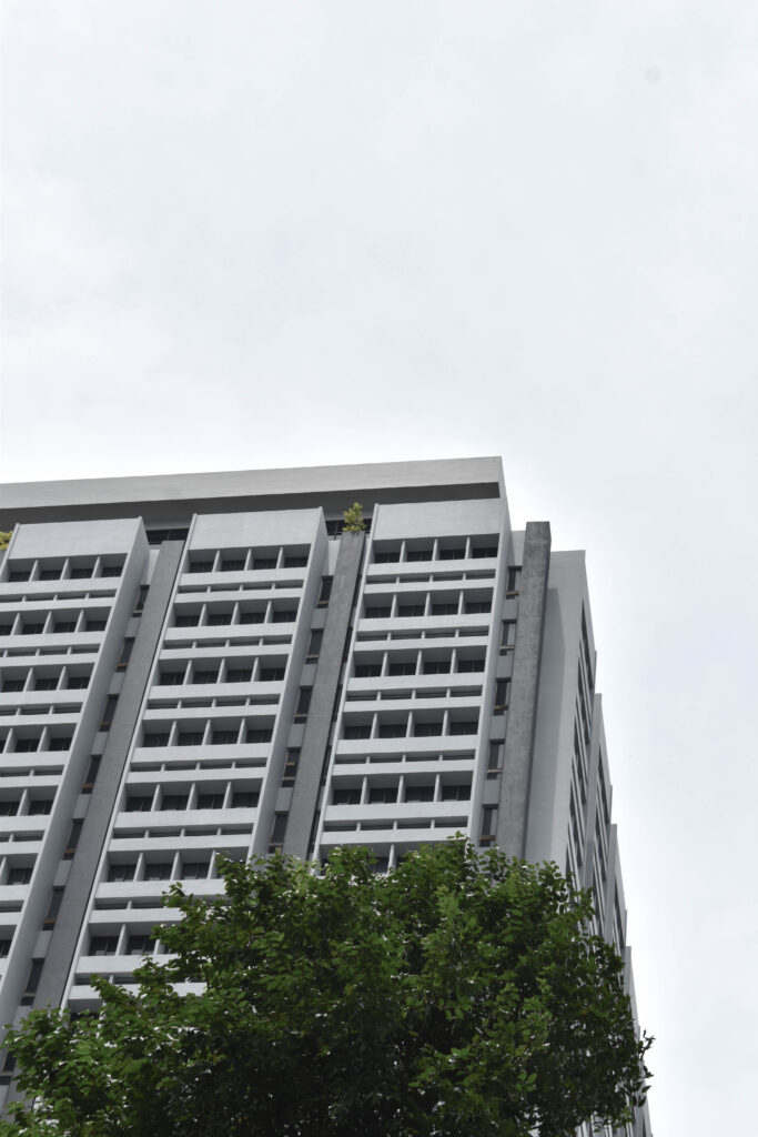
Photoshoot 2
For this photoshoot I decided to try taking different, qirkier angles like that of Kenneth Fredericks work. I made sure not to be caught in bad weather for this photoshoot and narrowed down these images into a final 8:
Here if my first photoshoot I completed when I received the key word “union”. immediately I though of a union of people and emotions and people. I linked in things that mean a lot to me, but then i realised that these photos didn’t really link in well with the Art movements of surrealism and Dadaism, therefore I decided to keep this as an experiment and not my final work. I was able to get some inspiration for my final project based on how I can introduce my own ideas into the key word “union”.
This virtual gallery doesn’t represent any of my final prints but i felt that it went well with the project theme of union as it helps to show a sense of a community, people that have things in common, for example these photos are related t my family members. These photo’s a family union, things that are important to my family, as I have some old photos of relatives and a photo of a dinning room that is an important factor related to mine and my families up brining. This virtual gallery would have turned out better if I had added a backdrop/ shadow, so that it didn’t look like the photos were just placed down onto a wall. Though I do like how this final virtual gallery turned put as I have the two older photos on the sides and in the middle is a recent photo I had taken of the dinning room, it almost compares how things can change within time and it could also possibly show how society has changed over time, how the internet has improved along with camera quality and how our society is different to back then.
Photoshoot Plan:
For this photoshoot I will be going round and taking different photos of random people I come across on the street, these photos will be candid photos and I will be taking them discretely, each photo I will take will have a different purpose and a different story to tell, most photos have a story behind them and I want to try and create a story behind my photos to show how important everyone around us is and how they impact our life. I would also like to go round and capture photos of peoples windows and try and understand how that window is showing a personality, each persons widow will be decorated differently and that will help to understand what is happening in their life and how they are handling it. I would also like to find some old photos of my family members as it helps to identify how time has changed and how they have changed within time. I really like how things can change over time and you don’t ever realise it. I’m planning on capturing photos that are meaningful to me and show a representation of me and my family, possibly something that happened in the past that i am not aware of that has changed something in my family, possibly an significant even and how it has shaped my family yo be the way they are, my family love capturing memories and have many photo albums stored. I want to take photos to show how our society has shaped and changed everyone, we have the use of social media and internet whereas back then there wasn’t such a thing, we also went through a pandemic and that was quite traumatising to some people, people all around us are feeling things that we wont ever know, the idea that everyone has the same amount of importance.
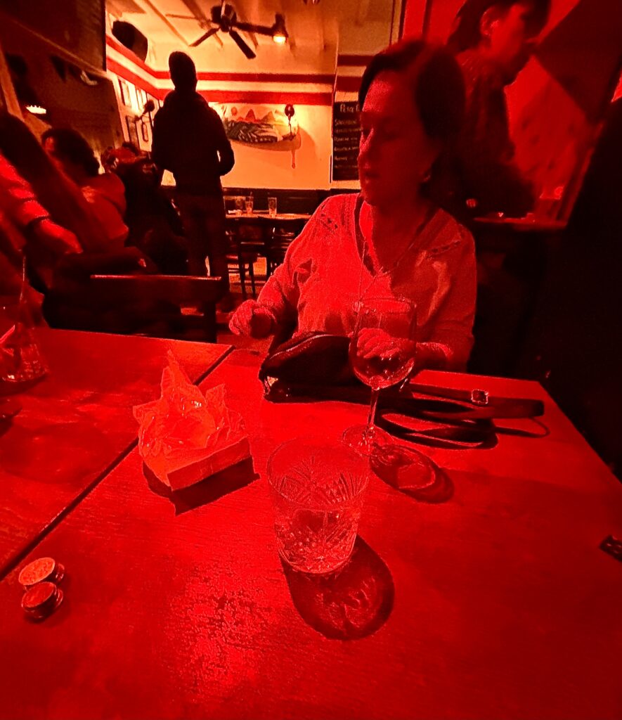
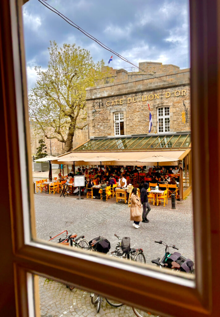
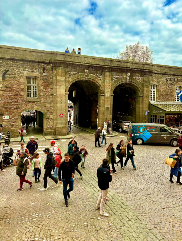
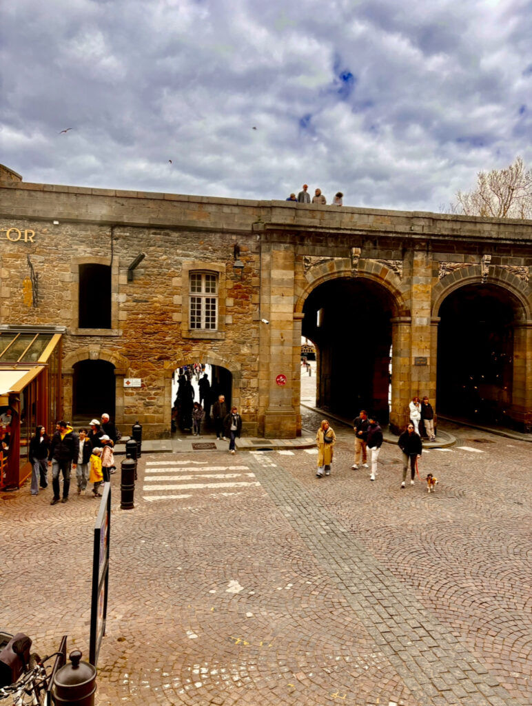
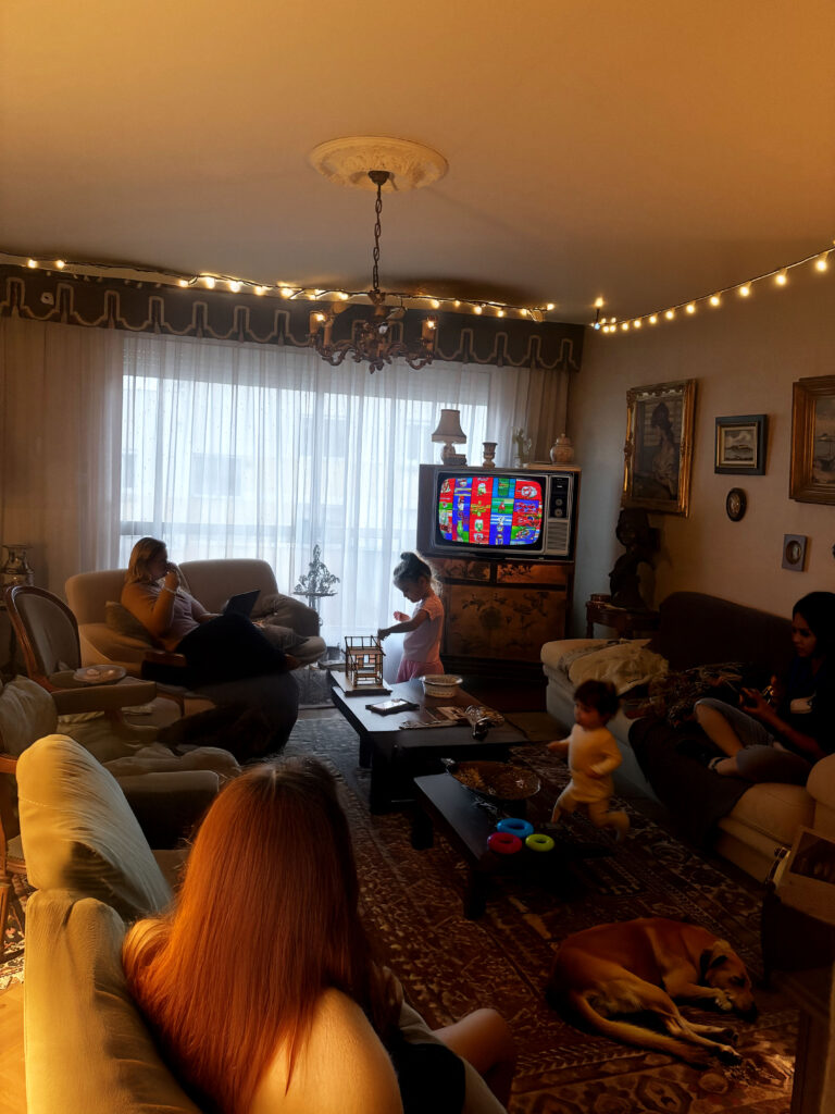
Here is a selection of random photos I had taken while I went away or when I went out into town, I want to show that every photograph has a purpose and a meaning behind it. All theses photos were taken during different time periods, hence the reason they don’t all look the same. Theses photos are going to help explain a story about everything that is happing around you, how each person has a different life to you and feels different things to you. A few of these photos are meaningful to me as they are people from my family or objects related to my family, some of the photos are pictures of my friends and others are of complete strangers I came across in the streets.
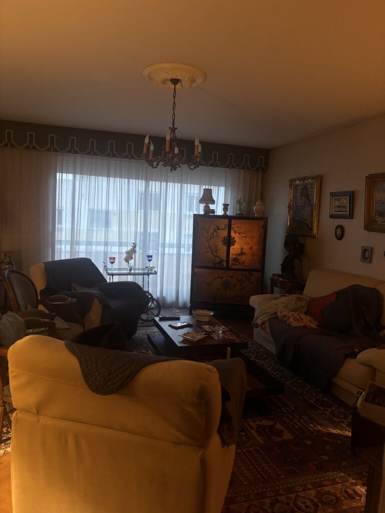
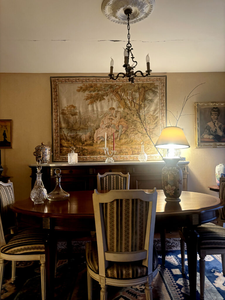
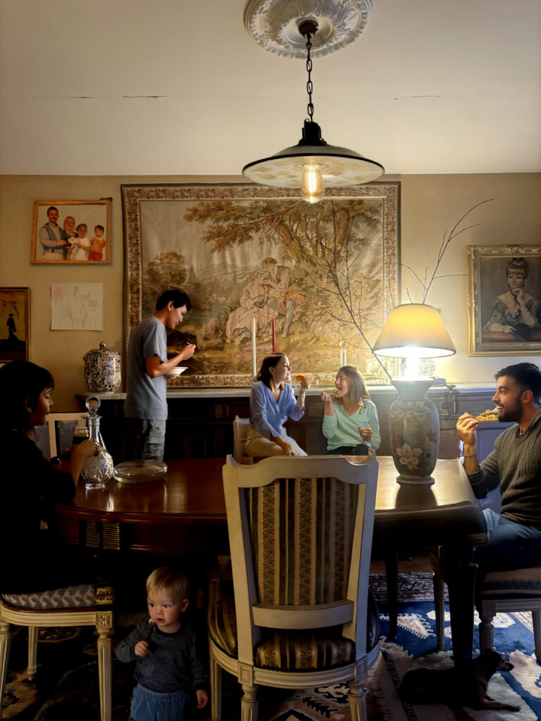
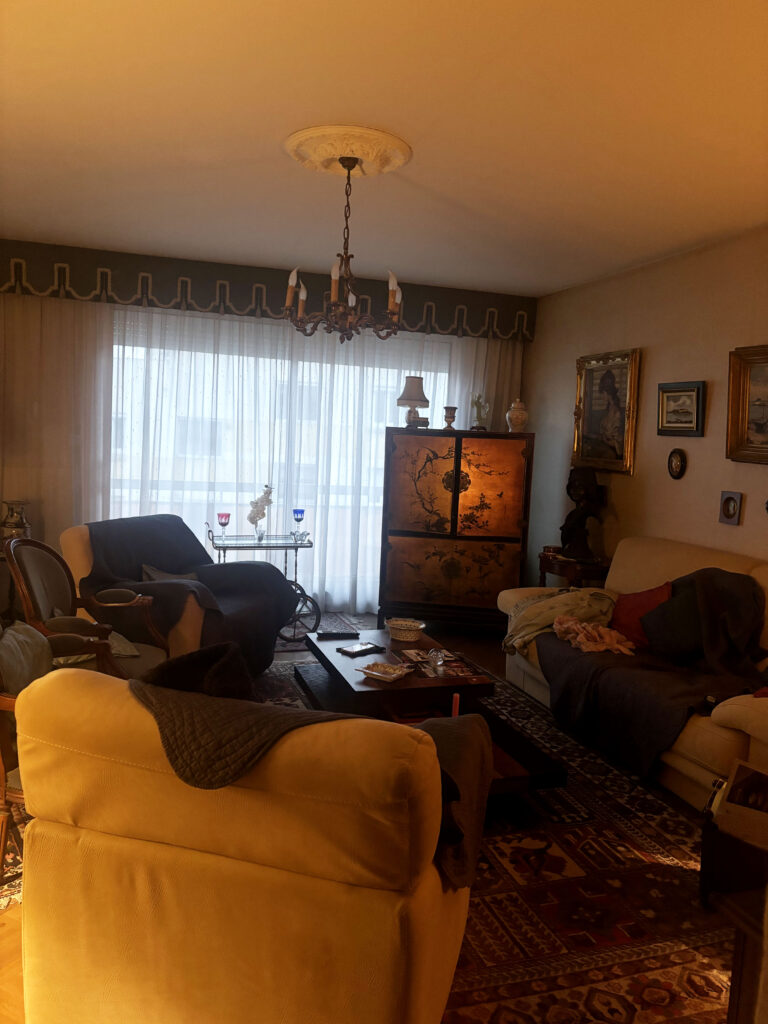
For these two photos I used AI to add people and help make the photo look full and lively, when I originally took theses photos, there weren’t any people present as they were in different rooms, but this was a house that my family members grow up in and now these are only two people left in it, which can make the house look quite lonely, the idea that time changes everything and anything and that now the people living in this house could feel quite lonely and lost without there children being home, if you were to look at this house from the outside, you wouldn’t get this rush of emotions, you would simply feel that its a nice house and its quite big, but you don’t ever consider the history of the house ad the people that grew up in it, the people who has their whole childhood in that house and now it’s left alone without anyone to fill it up and use it. In the first photo, it’s a picture of the dinning room, where my family members would go and eat everyday and talk about how they days are, now it doesn’t get used much as the people still living in the house feel too captivated by loneliness to sit on the table alone. I asked AI to add people sitting down and eating but somehow the photo still feels empty, there is a sense of something missing but you still cant work it out. It’s the idea that this room means a lot to a person, while others may believe it’s just a simple room filled with decorations, everyone has a different life and has experienced different memories. The second photo is a photo of the living room, this room is used a lot more than the dinning room but when I went to take a photo of it, it was empty. yet again I asked AI to add people and some children playing around to make the photo feel alive and colourful, I had even added some lights at the top, to add more spirit to the room. Some of the props in the room have changed around, for example the tv was locked into the a box and the tv was turned off, so i asked AI to make a tv to make it look as if he people in the room where watching the tv. I really like how in the corner of the room their is a small girl playing with a doll house which looks really realistic, this little girl looks similar to a photo I found of two children sat in a field of cows posing for the camera, that photo is also a photo of my family members, therefore the photo helps to add meanings to it’s real purpose of showing how each individual holds onto a certain memory.
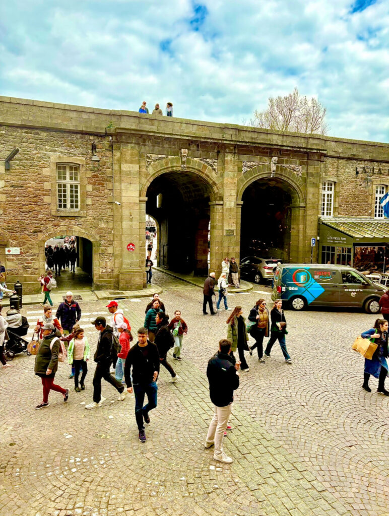
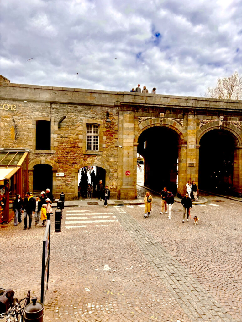
These two photos were taken exactly 1 minute apart, which helps to picture how fast things can change, some people have stayed the same in this photo but others have moved around and even disappeared from the photo, this is showing that anything can happen within a couple of minutes. Every single person in this photo has their own life to live and are doing different thing, for example, the 3-4 people at the top looking down at the town on the rest of the people, these people haven’t moved within the minute whereas most of the people at the bottom have changed position. For example, the grey van at the bottom has changed place and is no longer in sight. This could represent the meaning that nothing is promised and a specific life event can change everything.
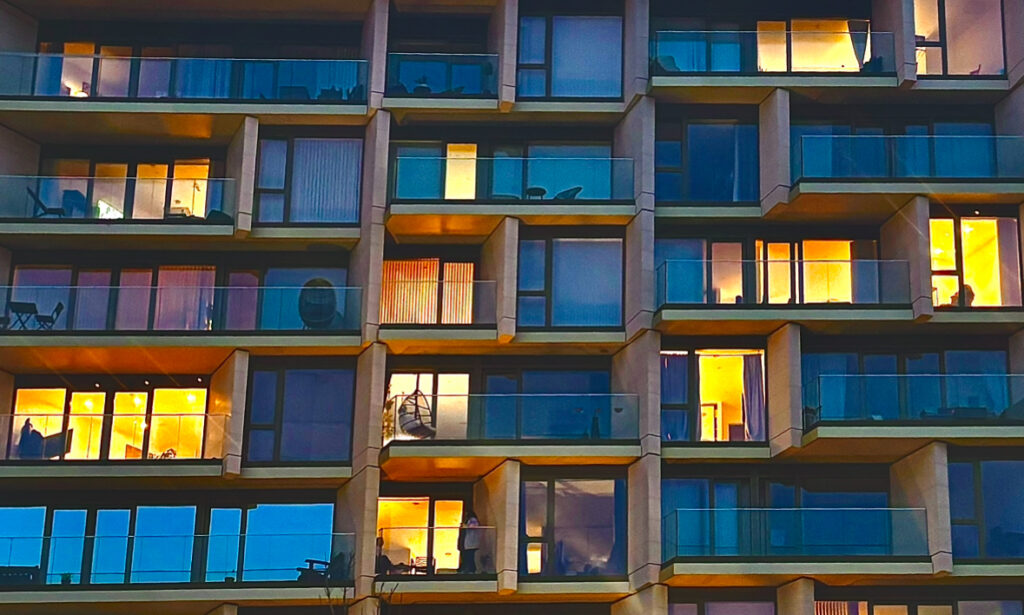
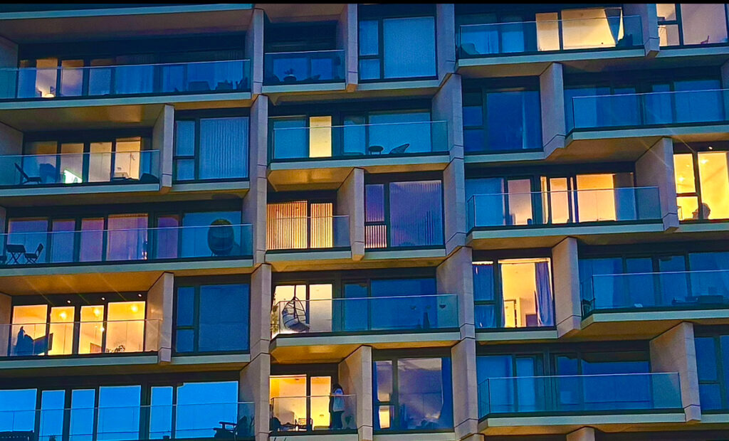
Here ae some of the photos from Photoshoot 3, these are the photos of peoples windows and how everyone has different decorations in front of their window, for example, certain windows have lights turned on and therefore makes it easier to look inside, some other windows have curtains blocking us from looking inside and some windows are completely pitch black with no lights, which could suggest that no one is home. I do like how these turned out as they are quite similar to my inspiration photo, but I did have to crop the photos as there were trees in front of the apartments and there were street lamps also in the way, I preferred taking these pictures during night time as in the day you don’t really get to see much action in the apartments as people are mostly at work or outside, whereas at night people have their lights on dew to the darkness outside. Also if you were to look at the middle window in the middle, the window changes as in the top photo the window blinds are closed and you aren’t able to see anything whereas on the bottom photo there is a persons figure showing, indicating that they are closing the blinds. The shows that things can change very quickly.
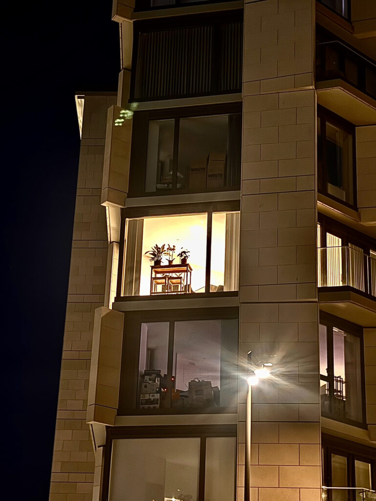
Here is a different building of someone’s window, these windows all look different, as the middle window has a light turned on, with a small table and a plant in front of it. The top window has some boxes in front of the window, implying that someone is either moving in or moving out, there don’t seem to be any sign of lights being turned on, which could mean that no on is home whereas the bottom window also has boxes in front of the window and shows a little bit of light in the corned of the apartment. Each apartment holds a different personality and is customised differently, just like people are. We each have different style and interests depending on the way we were brought up or how good we are at something. Each factor changes things completely. For example if you were brought up without a certain thing then it could most likely not be involved when your older.
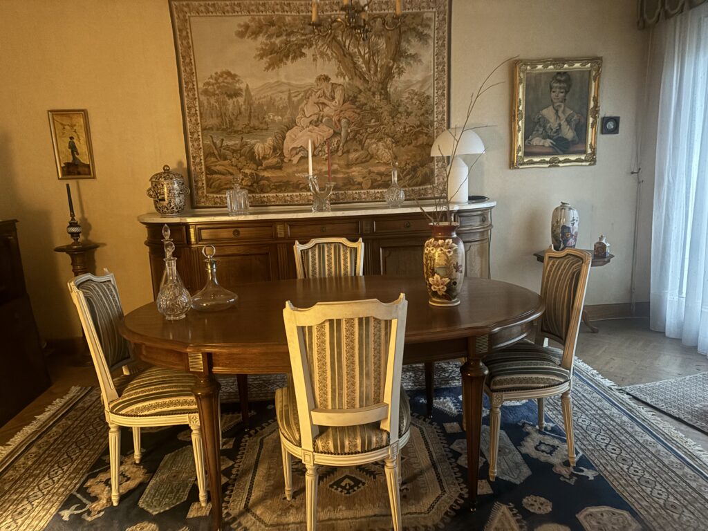
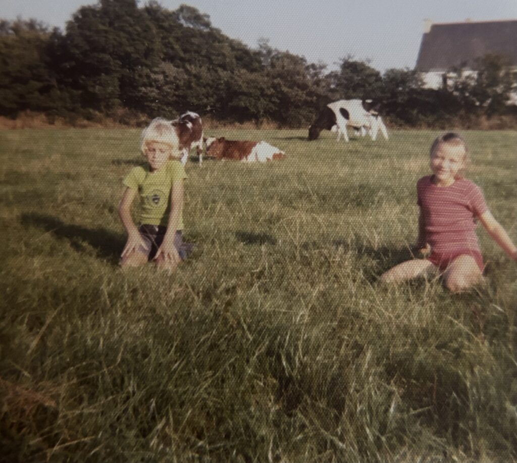
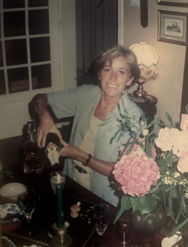
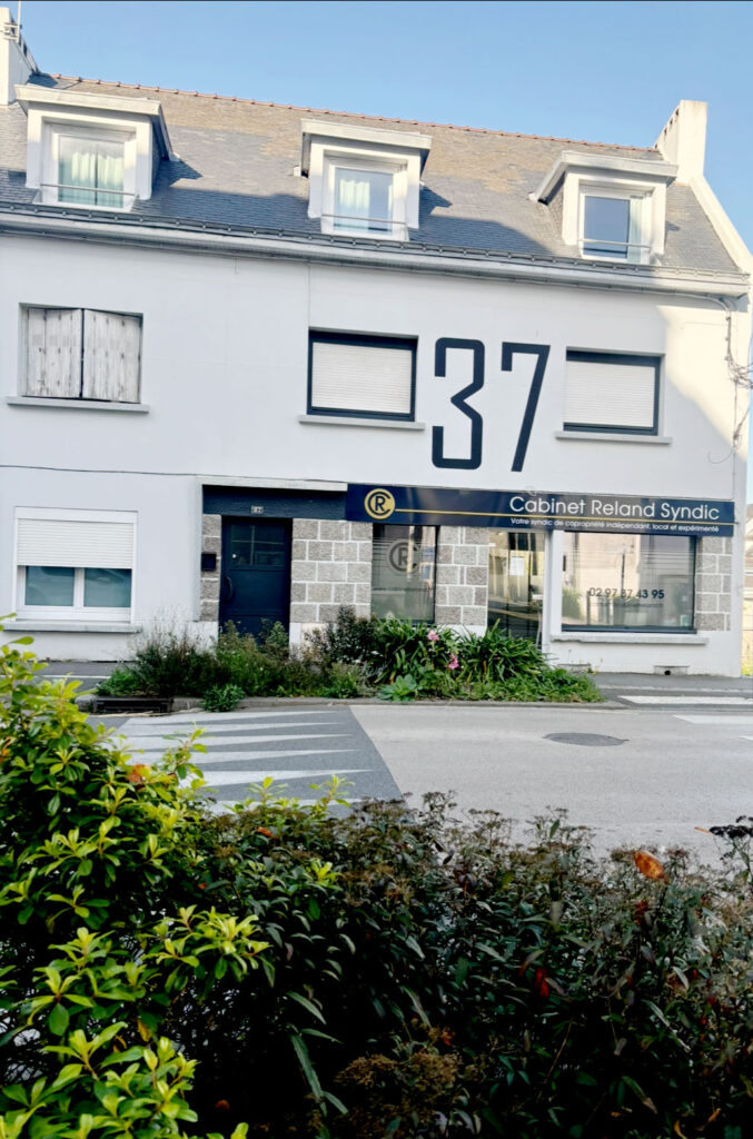
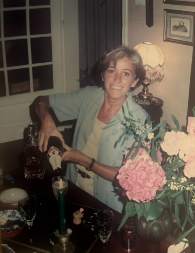
These photos are older photos of my family members, the bottom photo shows two children sat in a cow field owned by their dad, this photo is really meaningful as it keeps a memory of their childhood and how close their bond was, now they aren’t close and don’t really speak to each other, their bond was broken through time. This photo also represents how they will never be this young again and its a way of looking back and remembering how happy they were. This photo was obviously taken in France, where they grey up, the cow farm was their second home as they did spend a lot of time playing and running around the field, this photo captured a moment they will never capture again. Then there is a photo of a lady pouring a drink, this photo is very nostalgic to me as I didn’t get to know her young, I’ve known her as a slightly older lad and I never got to experience her fun side, she is a family member that lives very far away from me. Therefore it’s hard for me to capture memories of her. lastly the photo of the building id meaningful to me as its a business building owned by one of my family members, with our shared last name printed on it. This is a building I have never come across and when I did I though it would be a good photo to have and hold as a memory. That area of France is filled with good memories though I didn’t really get to experience them as I grew up in Jersey, but these photographs help to prove how memories can stay alive.
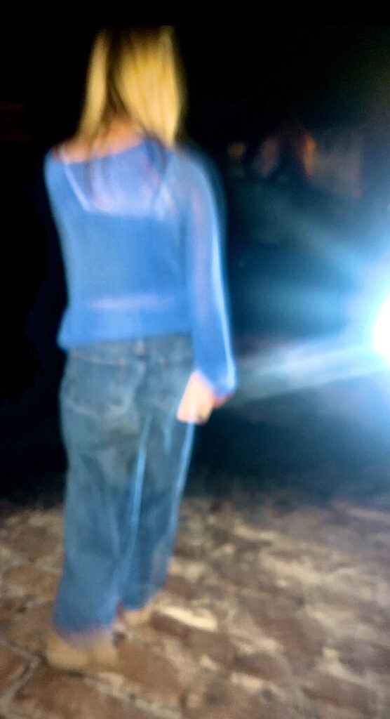
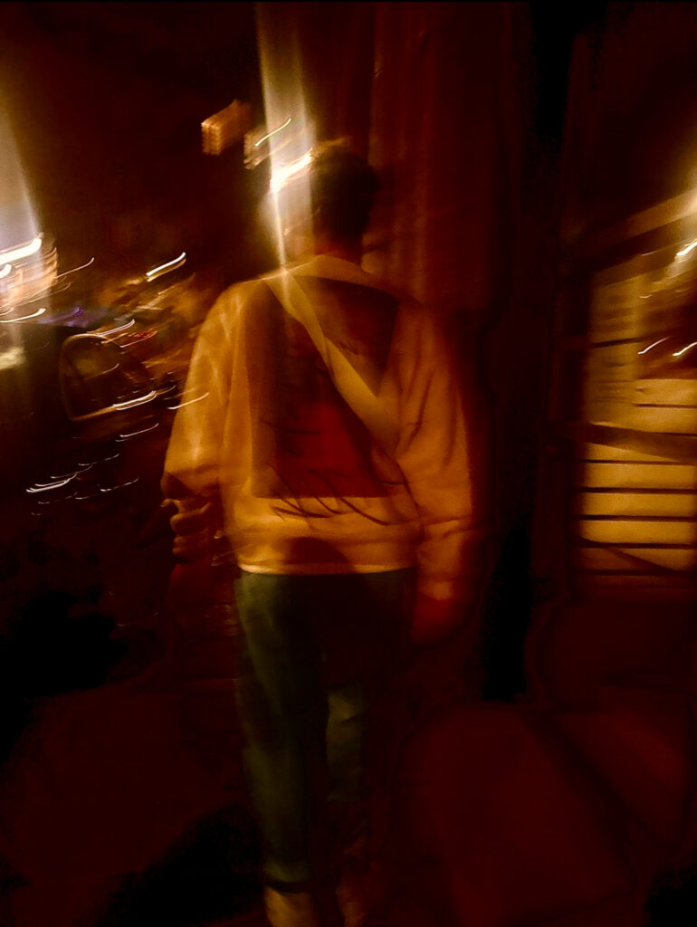
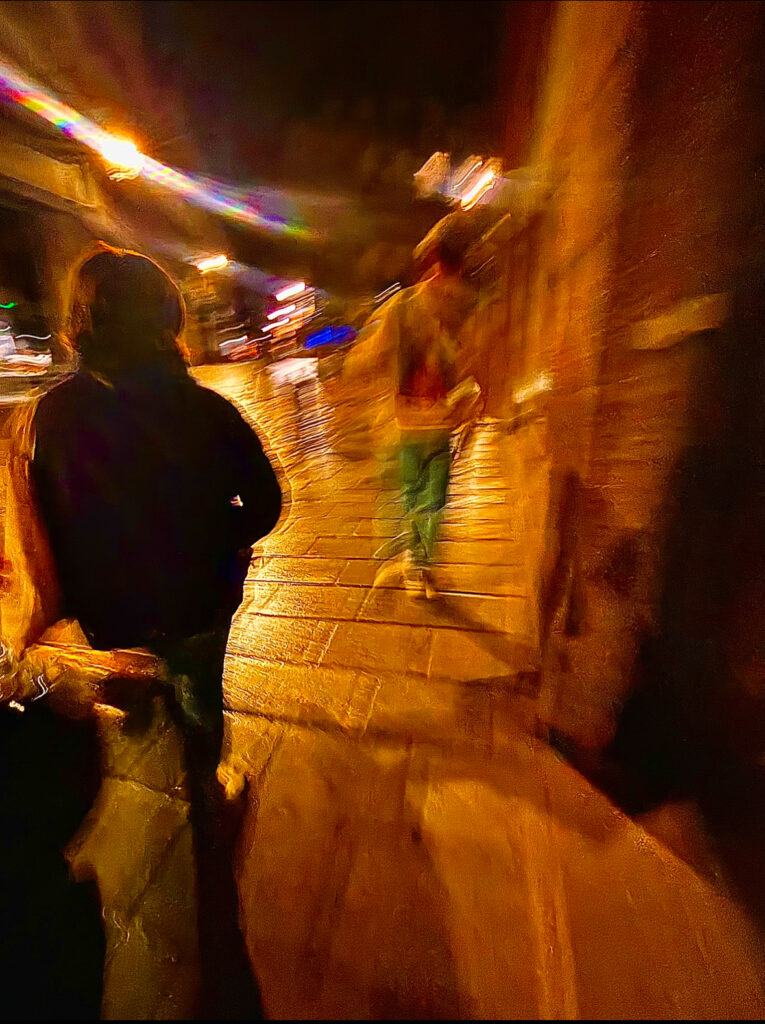
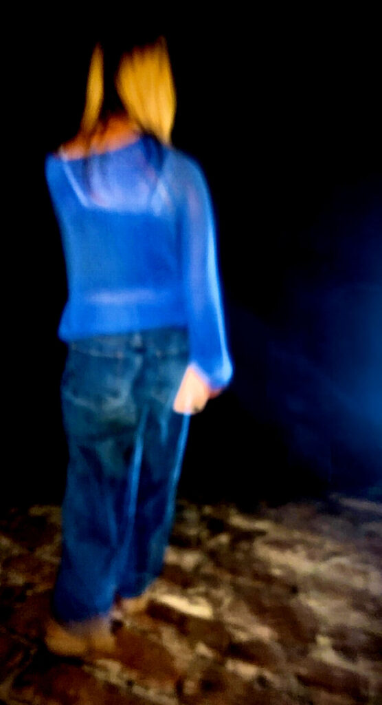
Lastly, here is a photos of a mysterious figures walking in the dark, it’s seems to be that the figure is walking toward the edge of something, the photo slightly blurry due to the gradient effect added which helped to define each and every detail. I had to do some editing and used AI for the corner of the photo as there was a bright light shining through, I wanted to get rid of the light and simply darken the photo to help make it look more mysterious. It also helped to avoid any distractions from the figure as she is the main focus of the photo. I also believe that the strong colour of blue helps to add emotion to the photo, it almost makes the photo look sad and unsettling. Whereas if the girl was to wear an orange jumper, the whole mood of the photo would be different.
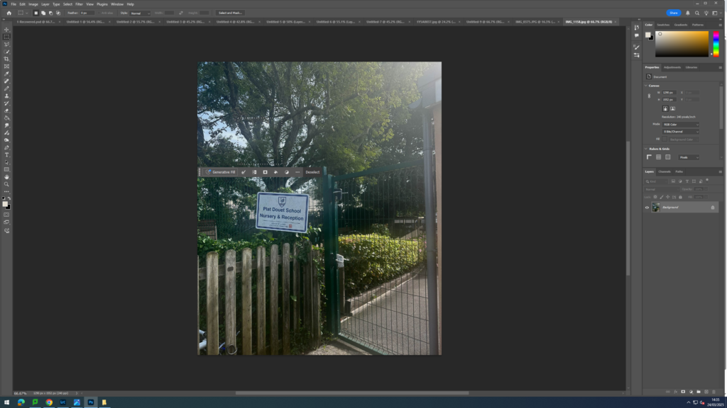
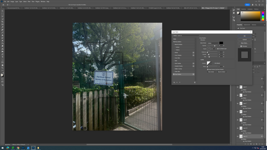
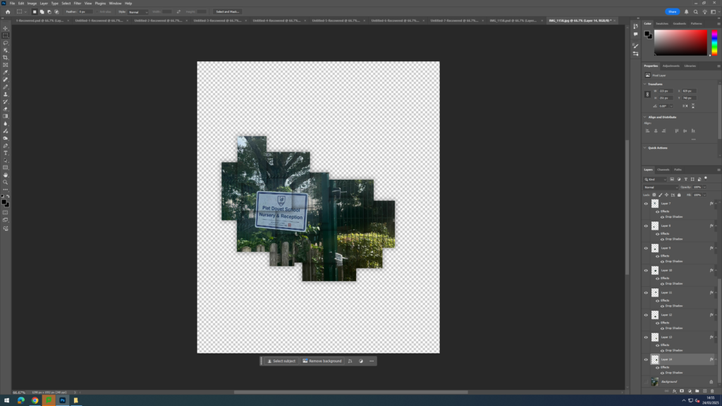
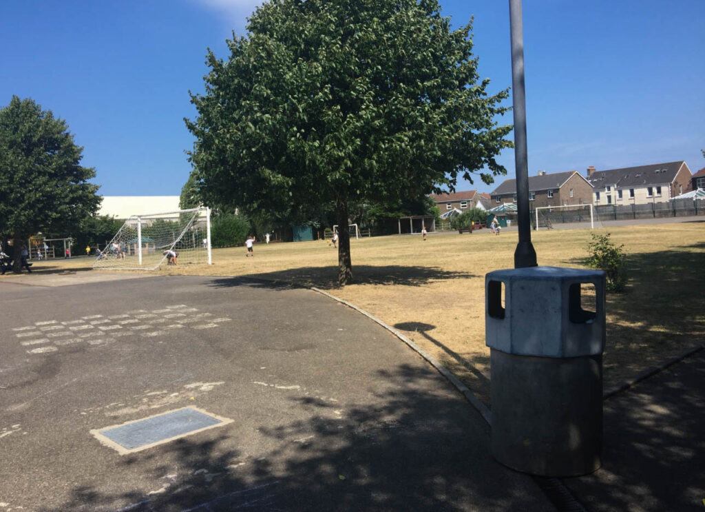
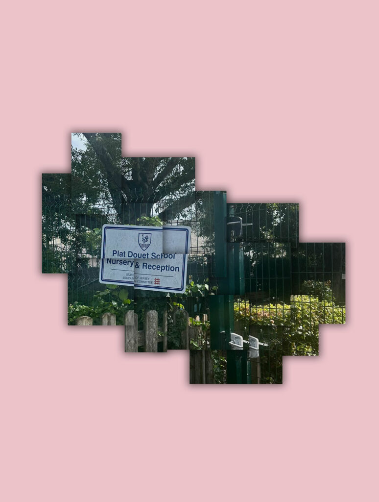
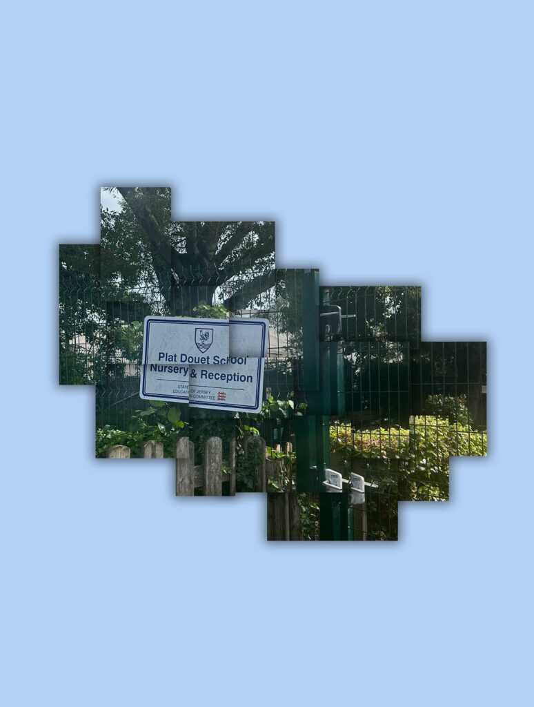
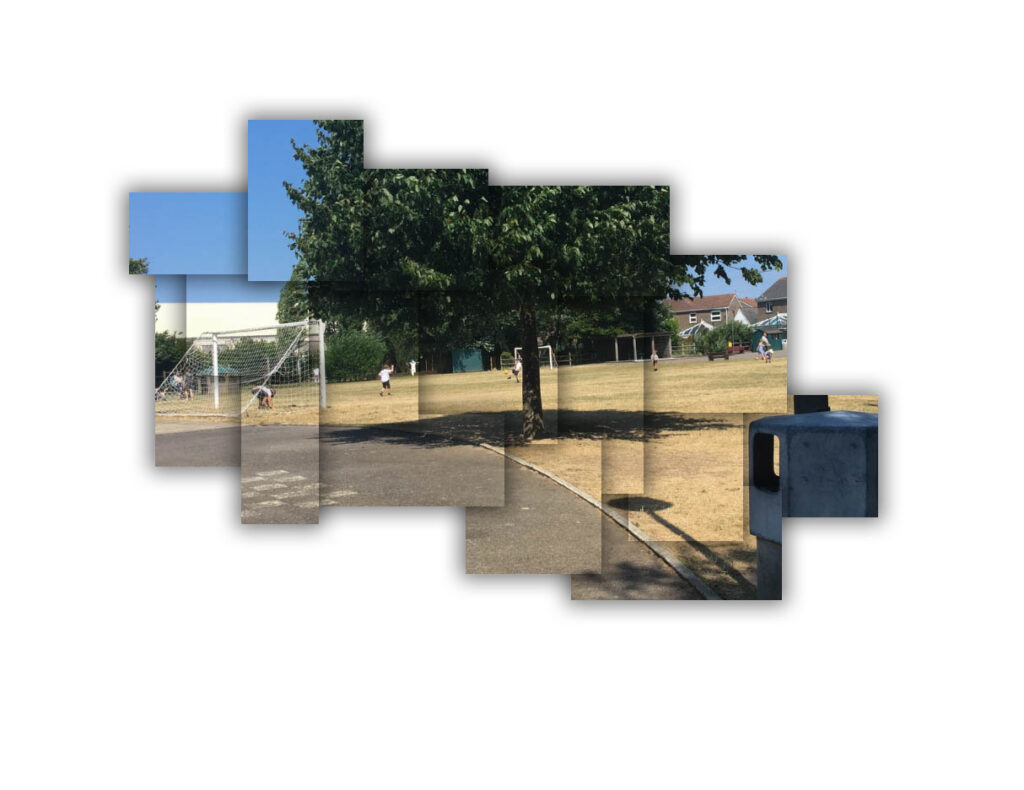
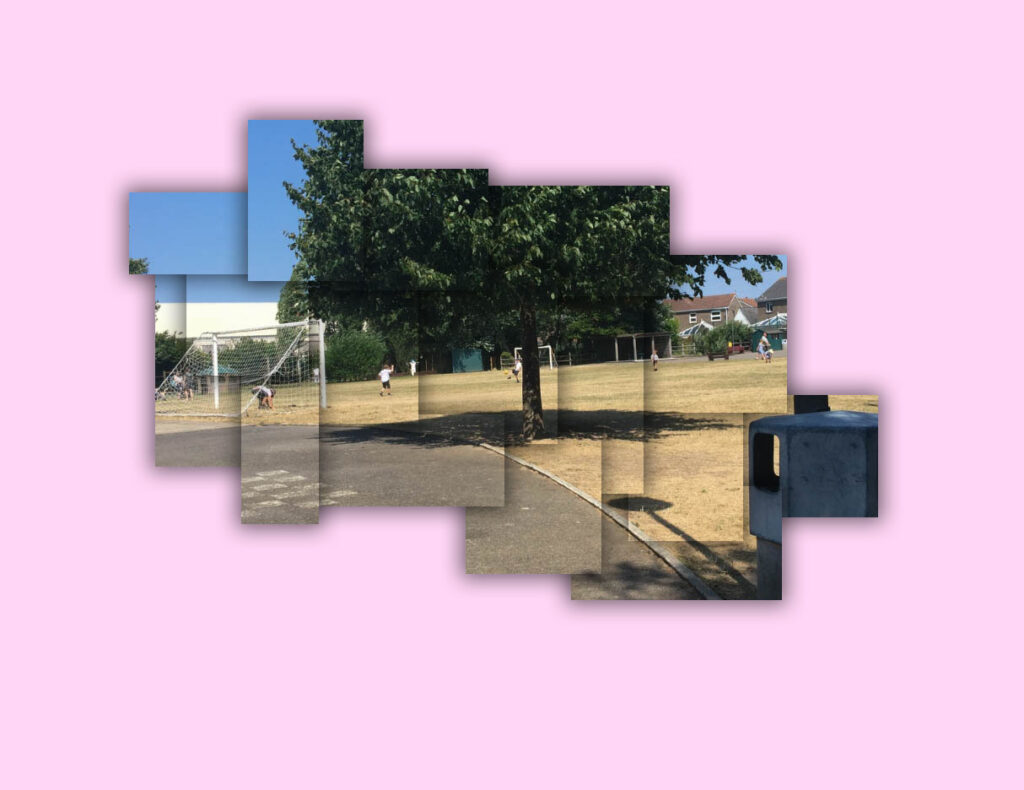
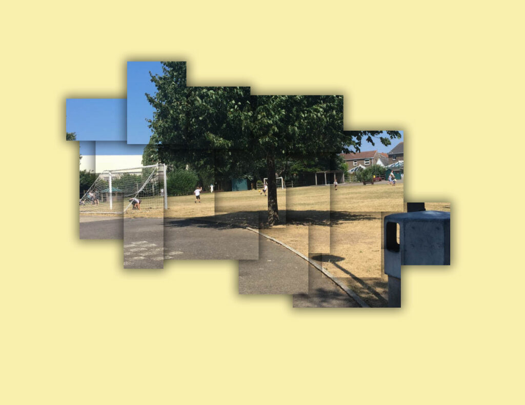
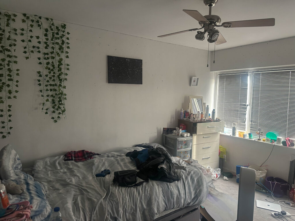
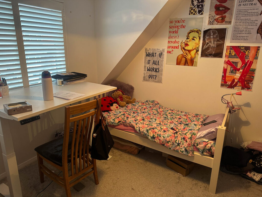
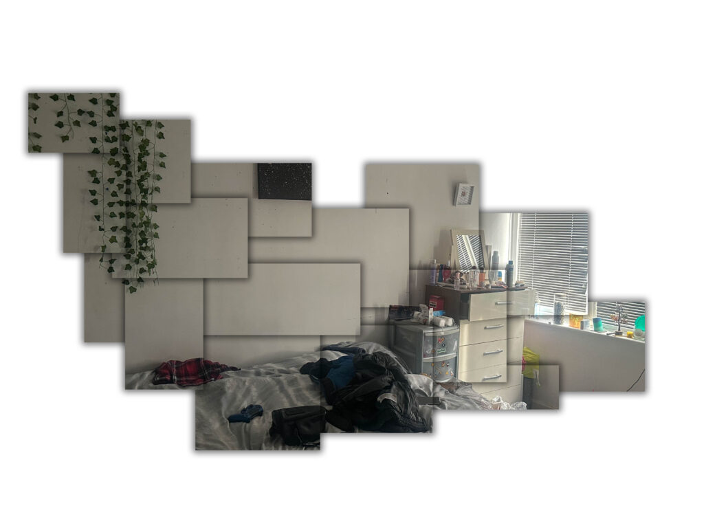
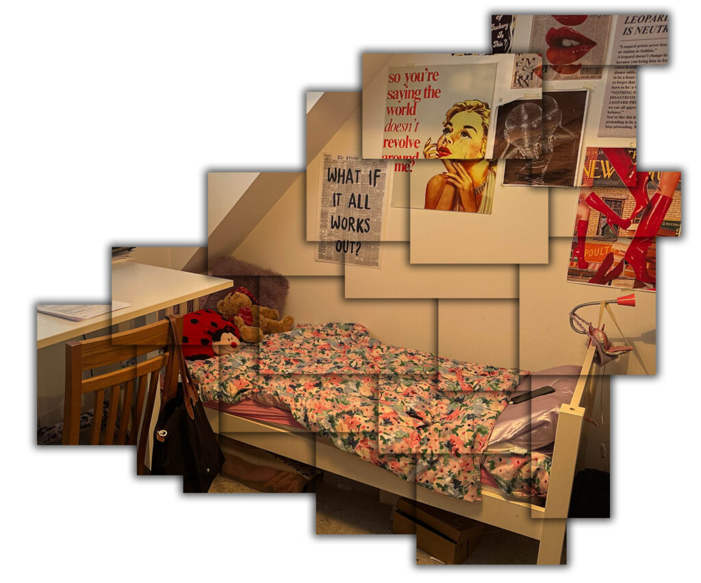
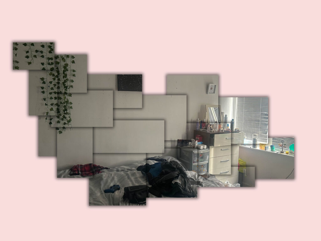
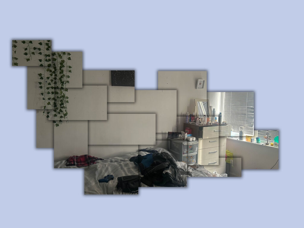
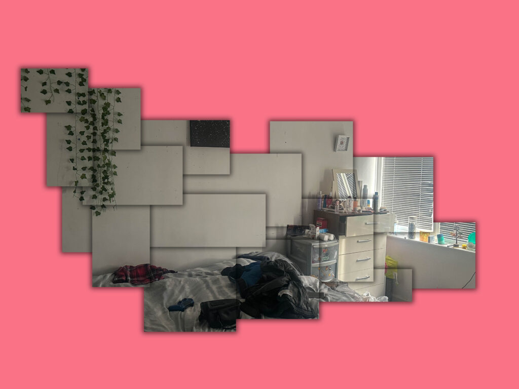
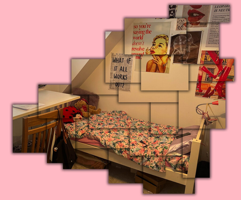
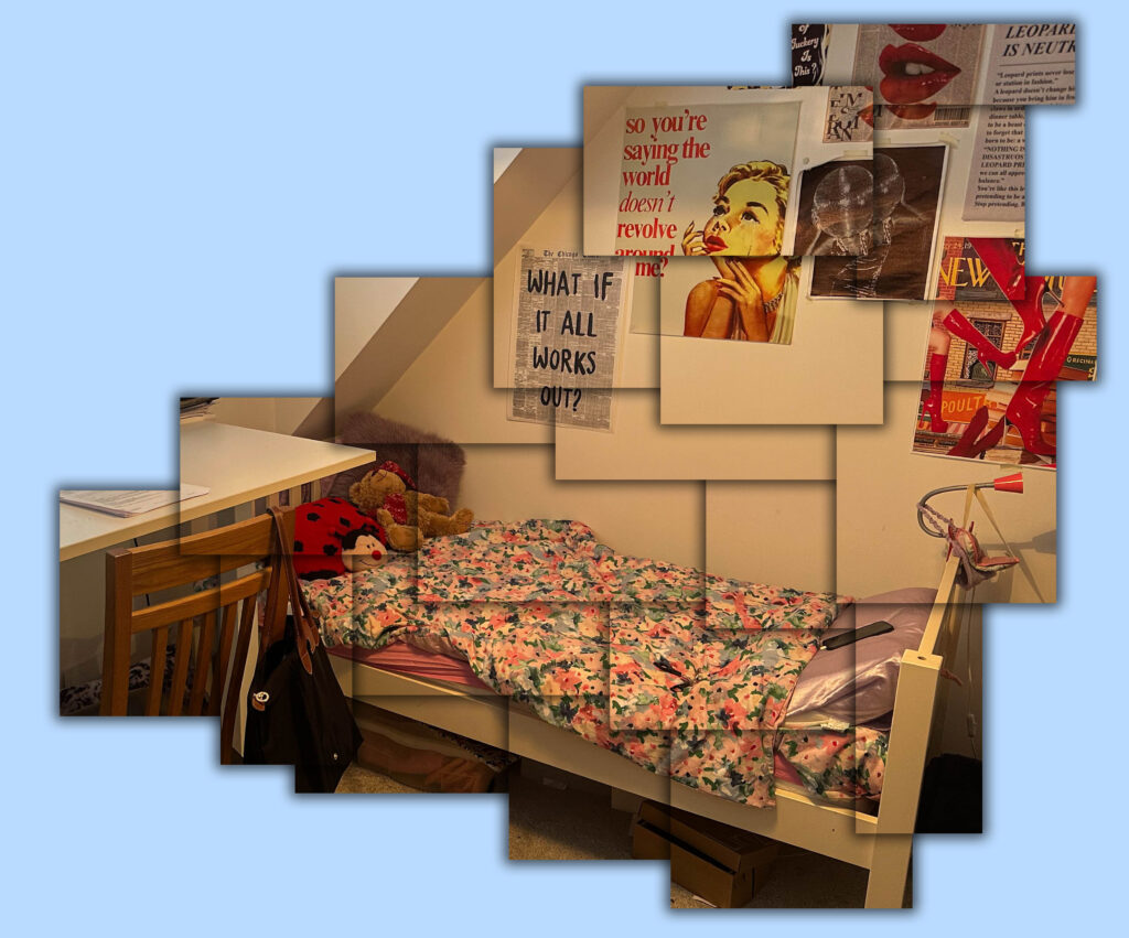
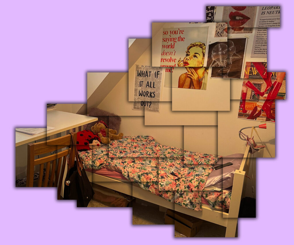
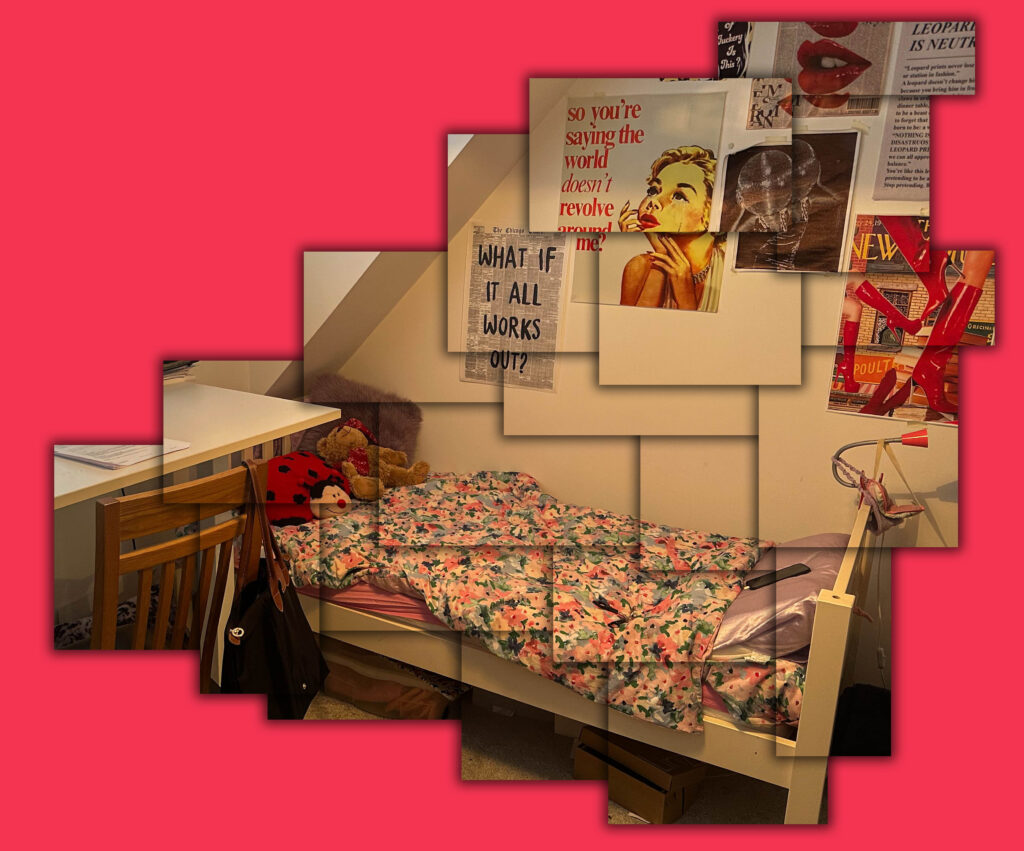
For this photoshoot, I was inspired by David Hockney and his ‘joiners’ series. I began by taking photographs of the primary school Plat Douet as this is where they both went to and is what ultimately led them to meeting and becoming friends. I also decided to take photographs of both of their rooms as I believe their contrasting rooms give an insight into who they are as people and their different interests. I then imported these images into Lightroom and adjusted the exposure, contrast, whites, blacks and shadows accordingly. Next, I opened up my adjusted images in photoshop and selected the rectangular marquee tool and began creating boxes on my image. To create these boxes, I right clicked on them and pressed layer via copy then I added a drop shadow to the box by right clicking on the layer and pressing blending options and selecting drop shadow. I then repeated this step multiple times (making sure to go on the background layer each time I wanted to create a new box) until I had a shape that resembled the work of David Hockney. Finally, I added a new layer behind all of my boxes and got rid of the original image and filled in the new layer with various different colours.
Final Images:
Plat Douet:
Their bedrooms:
Overall, I believe this photoshoot where I photographed my friends’ rooms and their primary school to explore their different personalities through room layouts, was an insightful and creative attempt in portraying their personal identities. The concept of using their environment (their room) as a way to delve into who they are and their interests as individuals was creative and effective in my opinion. The contrast between their childhood space (Plat Douet) and their adult environments (their rooms) was an effective way of showcasing their personality changes and growth over time. I believe their rooms act as a portrait themselves as by looking at the various objects, colours and layouts in their room, you can begin to understand who they are.
I think I managed to successfully recreate the work of David Hockney’s ‘Joiners’ series quite closely. As in his work, he used lots of polaroid pictures he had taken of a specific thing from multiple perspectives and then joined them to make a composite image. Similarly to his work, I created this fragmented effect on photoshop by adding boxes to my image then moving them slightly to give that not perfectly lined up look. However, if I were to improve this idea, I would make the image more fragmented and emphasise the concept of time passing within the same image by photographing their room at different times in the day as this is what he typically did. This would make my work align more closely with David Hockney’s and allow me to explore their room from more than one perspective.
For this final photoshoot, I am going to be taking photographs of Plat Douet school as this is the primary school in which my friends both first met one another and was what ultimately brought upon their friendship. I will also be taking photographs of their individual bedrooms as I believe this gives you a good insight into a person’s personality through looking at the different objects in their room which reflect their interests and likes. By doing this, I hope to display their opposing personalities as their rooms are significantly different from one another. This should create a greater appreciation for their friendship as they have still maintained their friendship despite having very opposite interests in life. I will try and capture their whole bedroom in one image in order to really capture their essence by using a landscape orientation and standing in a corner.
After I have photographed these various different places, I will then edit these photographs on photoshop to create a ‘joiner’ image which is inspired by David Hockney. This process will involve me opening up one of the images on photoshop then pressing on the rectangular marquee tool which will allow me to create boxes on my image. Once I have created a box, I will then right click and press layer via copy. I will repeat this step multiple times until I feel I have enough boxes. Then, to create the more disordered effect as seen in David Hockney’s work, I will move the boxes slightly so they don’t align exactly. Finally, I will finish this idea by adding a drop shadow to all of my boxes to add more depth to my work.
To gain an idea of how I wished to construct and design my magazine, I looked towards influences from subjects I wished to cover to give me ideas on how I can piece together my images.
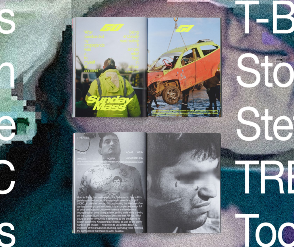
Carhartt WIP Magazine –
Carhartt is well-known in the fashion industry for its ‘multi-purpose street’ look and for being currently popular in appearance in the mainstream. Initially starting as a work-wear brand, it soon developed its place in fashion with the off-spring brand known as WIP – ‘Work in progress’ (A reference to its original function for builders). WIP has grown amongst the youth and pop culture scene that emerged in the 1990s, with its magazine covering an array of all things such as fashion, music, art, film, politics and ideas or messages from the people of today. Within its 200 pages are vibrant and colourful displays of different people, different hobbies and different personalities, all unified under it as a hub of creativity.
To me, WIP magazine is a largely alternative, yet manageable concept of displaying various forms of expressive, contemporary art. By giving a platform to an array of various artists, lifestyles, hobbies, cultures, and many more, I find this would be a strong influence on how to display the theme of ‘Union’ for my project. Making a collection of bold images, influenced from how they are presented in the magazine, and also created from my artist studies and movements, is how I wish to show my influence from it. With all these subjects unified into a single magazine, it creates an aesthetical representation of the modern youth culture that surrounds it.
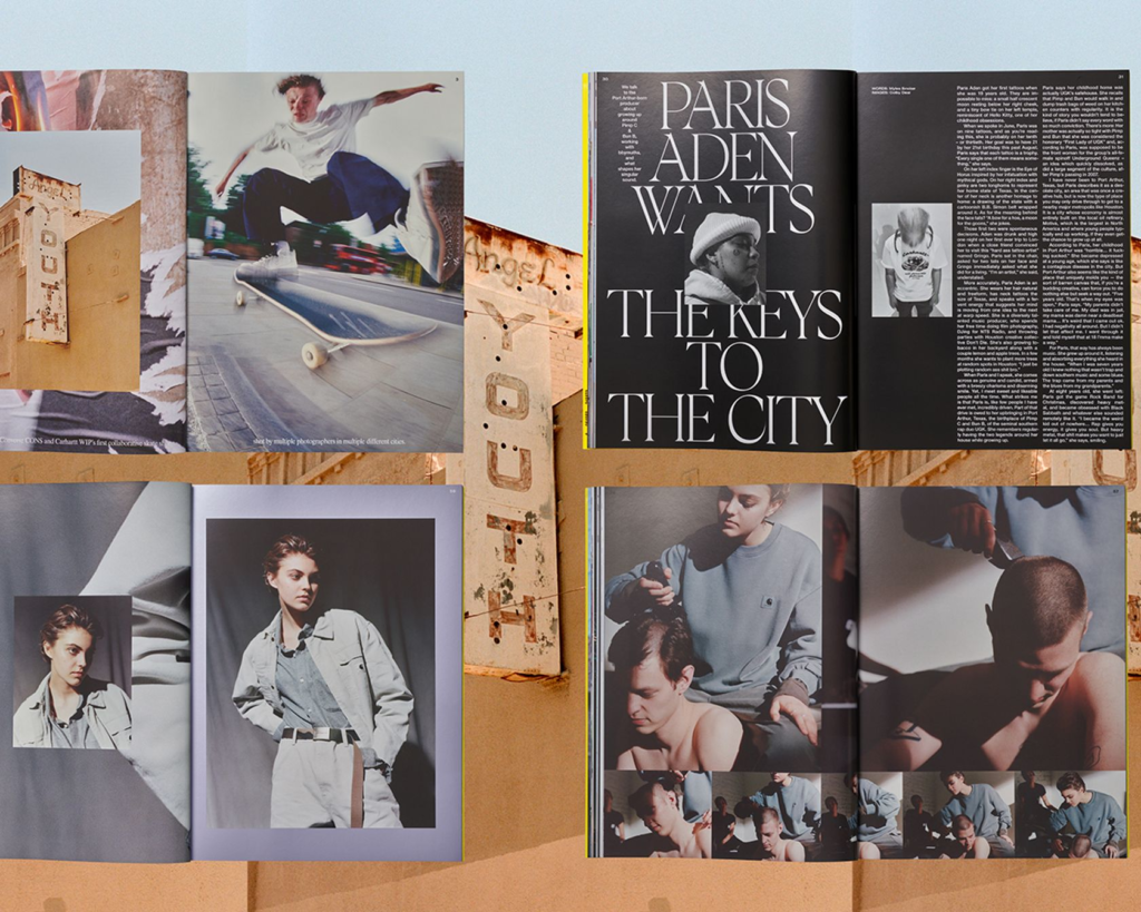
Free Skateboard Magazine –
Free Skateboard magazine is a Pan-European skateboard magazine created by Will Harmon, Sam Ashley and Arthur Derrien that explores the vast world-wide love for skateboarding. Composed of interviews and advertisements, skaters share their travels across the world and the communities they encounter and they memories they make. Adverts from brands linked to the skate community such as Vans, HUF, Palace, ADWYSD and many others are presented in creative ways, matching in similar aesthetics to the nostalgic era of the 1990’s. With imaginative camera angles, colour grading and graphic design each page becomes its own gallery of photographs tied into peoples stories. Within similar magazines to Skate, the feature of a gallery section is included, dedicated to art, photography and music.
Free skateboard magazine is another influence on how I wish to produce my magazine as with the design aspects of how images are arranged, as well as the use of a wide array of varying aesthetics is what I wish to include within my work. An element I wish to include is the feature of a photo gallery section to display some images within a magazine setting. The use of brands as well, I find can unify young people to associate to them and represent their identity through. The global aspect of the magazine, shows ‘union’ for its wide demographic of skate enjoyers across the world, furthermore, with the representations of communities across different geography’s I find this is an interesting aspect to take influence from.
www.npg.org.uk. (n.d.). Angus McBean Portraits – National Portrait Gallery. [online] Available at: https://www.npg.org.uk/business/publications/angus-mcbean-portraits.php
Angus McBean (1904-90) was one of the most extraordinary British photographers of the twentieth century. In a career that spanned the start of the Second World War through the birth of the ‘Swinging Sixties’ to the 1980s, he became the most prominent theatre photographer of his generation and, along with Cecil Beaton, the last of the British avant-garde studio photographers.
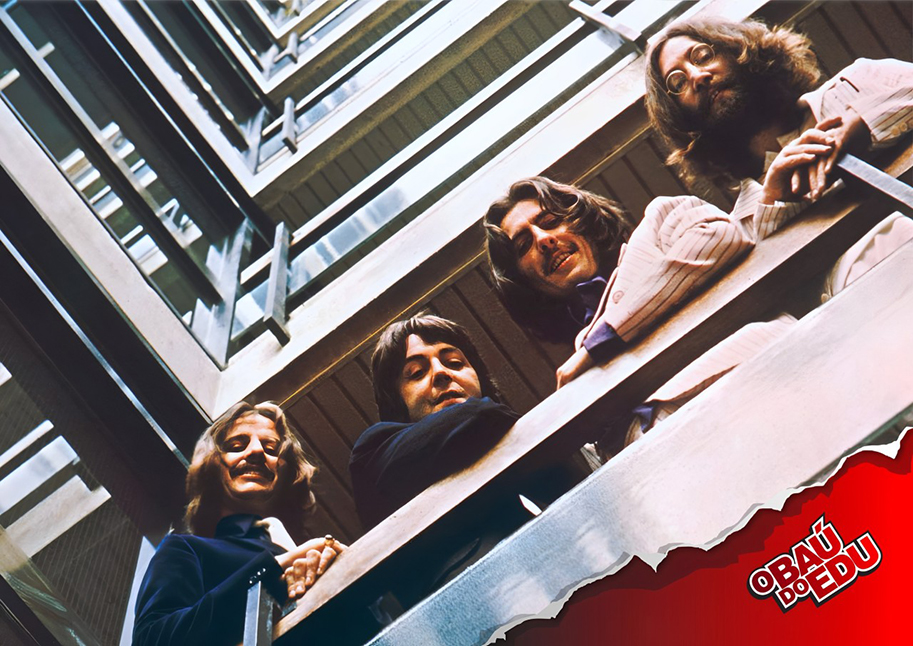
During the 1930s and 1940s, McBean developed Surrealist techniques, including the depiction of the actress Dorothy Dickson as a water lily. Yet his style kept pace with the times and by the 1950s and 1960s he was taking photographs of celebrities from Cliff Richard to Shirley Bassey. Arguably his most famous image is of the Beatles, leaning over the balcony at their recording studios, which was used on the album cover Please Please Me. His celebrated series of self-portraits, which he sent out as Christmas cards, capture his witty and eccentric personality, while his numerous photographic commissions in the 1980s – including his work with the pop singer David Sylvian – demonstrate his inventiveness and creativity.
Barnebys.com. (2015). Surreal Glamour: The Photography of Angus McBean | Barnebys Magazine. [online] Available at: https://www.barnebys.com/blog/surreal-glamour-the-photography-of-angus-mcbean
Born in Wales in 1904, McBean loved cinema from a young age. It inspired him to buy his first camera at the age of 15, and he would practice on his family and friends. He moved to London in 1924, working for seven years for Liberty’s before beginning his career as a theatrical model and mask-maker, whilst still experimenting with photography on the side. An exhibition of his models and early photographs shown at the Private’s Den, a basement tea shop on Maddox Street in London, caught the eye of the society photographer Hugh Cecil , who offered him work.
Cecil’s connections led to introductions to the London theatrical world, and McBean was commissioned to design scenery and props for john Gielgud’s production of Richard of Bordeaux in 1933. However, his big break came when he was asked to make masks for Ivor Novello in an adaptation of Max Beerbohm’s The Happy Hypocrite. At Novello’s insistence, McBean took close-up portraits of the cast which appeared in all the leading reviews and launched his career as one of the leading theatre photographers of his age.
After a difficult war, McBean re-established his studio in London and created a new series of ‘Surrealist Portraiture’, incorporating clever theatrical tricks to create effects, but nevertheless, they were still straight photographs. Another assimilation with modern art of the period was his use of montage and collages, Ivor Novello appearing in 1947, crowded and leaning on his own writings, and Cecil Beaton swamped in his books, photographs and drawings whilst somewhat sinisterly holding a pair of long-bladed scissors, a reminder of Beaton’s cutting remarks.
en.wikipedia.org. (n.d.). Angus McBean. [online] Available at: https://en.wikipedia.org/wiki/Angus_McBean
In 1925, after his father’s early death from tuberculosis, contracted in the trenches during the First World War, McBean moved with his mother and younger sister Rowena to a three bedroomed cottage at 21 Lowfield Road, West Acton. For the next seven years he worked for Liberty’s department store in the antiques department learning restoration, while his personal life was spent in photography, mask-making and watching plays in the West End theatre. In 1932 he left Liberty’s and grew his distinctive beard to symbolise the fact that he would never be a wage-slave again.
McBean resultantly became one of the most significant portrait photographers of the 20th century, and was known as a photographer of celebrities. In the spring of 1942 his career was temporarily ruined when he was arrested in Bath for criminal acts of homosexuality. He was sentenced to four years in prison and was released in the autumn of 1944. After the Second World War, McBean was able to successfully resume his career.
In 1945, McBean set up a new studio in a bomb-damaged building in Endell Street, Covent Garde. He sold his Soho camera for £35, and bought a new half-plate Kodak View monorail camera to which he attached his trusted Zeiss lenses. McBean was commissioned first by the Stratford Memorial Theatre to photograph a production of Anthony and Cleopatra, and all his former clients quickly returned. Through the late 1940s and 50s he was the official photographer at Stratford, the Royal Opera House, Sadler’s wells, Glyndebourne, the Old Vic and at all the productions of H.M. Tennent, servicing the theatrical, musical and ballet star system.
Photo Analysis:
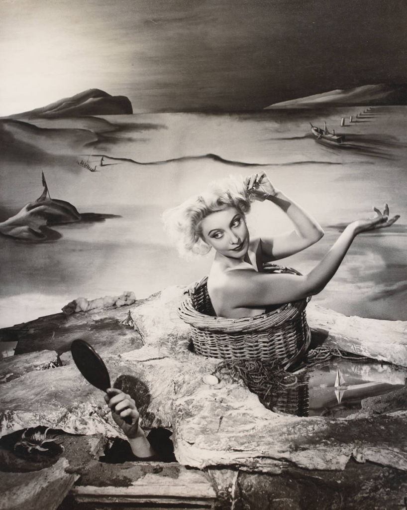
This montage is quite original, it’s clear that this was setup in a studio and nothing was really edited in. For example the lady is sat in a basket and isn’t added in by a computer, just like the hand holding a mirror supporting the women to see herself better. The background also seems to be painted on which makes the overall image look really original and different to other photos. I really like how this photo has a high contrast and is in black and white to avoid any type of colour to pop through and distract the audience. It is clear that the lady in the basket is looking at herself in the mirror held by a different hand, though this overall photo looks very unusual and it isn’t something that you would see everyday. I really like how this photo is original and doesn’t really have a lot of technology used to make this photo, I also really like the small detailing like the little boat in the water next to the lady. It almost gives the effect that the lady really is in water in a lake and is stuck in a basket quite unfazed and just looking at herself in the mirror. This image was produced by Angus McBean a surrealist artists, his work shows a good understanding of surrealism and how unusual it looks, the idea that surrealism is like a dream and produces something extraordinary. This photograph has loads of details added to help make this photo more unusual and different from what we see in the everyday world. For me i quite like how the background of the photo is painted and almost gives off a really peaceful and quiet vibe as the painting is very smooth and relaxing to look at whereas further down where the lady is presented the rocks tend to look very rough and beaten up, it adds a contrast to the photograph, a mixture of peace and war is added to make the audience feel like they are floating above reality and wondering what is present or not. There are really dark shades used in the image round the corner of objects to try and uplift them and make them more noticeable. this photograph is really well detailed and I really like how they haven’t added too much detail or too many random things as it would distract the audience and make the photo look too distracting and painful to look at. The artist has kept to a theme and added certain props that would fit in well with the photo. Such as the rope tied around the basket and in the painting there are small boats and fences along with mountains, there is almost a sense that the sun is setting as there is a beam of light coming form the low left side of the photograph. and the rest of the background seems to be quite dark and less uplifting. I really like that effect as if there wasn’t a background I would suggest that this photograph was produced in the day time as the rest of the photo looks quite light and vibrant but that’s the look surrealism gives, it throws the audience around to make them believe things that aren’t real. Overall this photograph is really well presented and shows the audience that surrealism is a mixture of the truth along with a few lies. That it’s a mixture of the subconscious mind and the reality we face everyday, our brains create a sense of reality with other factors effecting it.
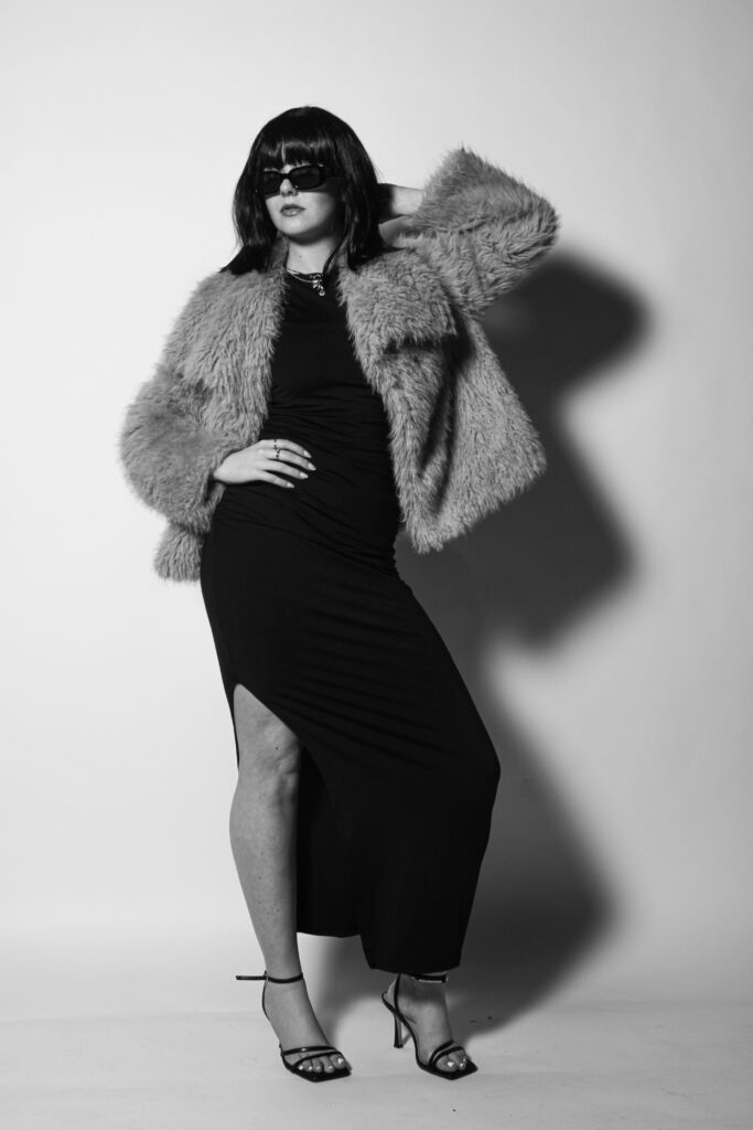
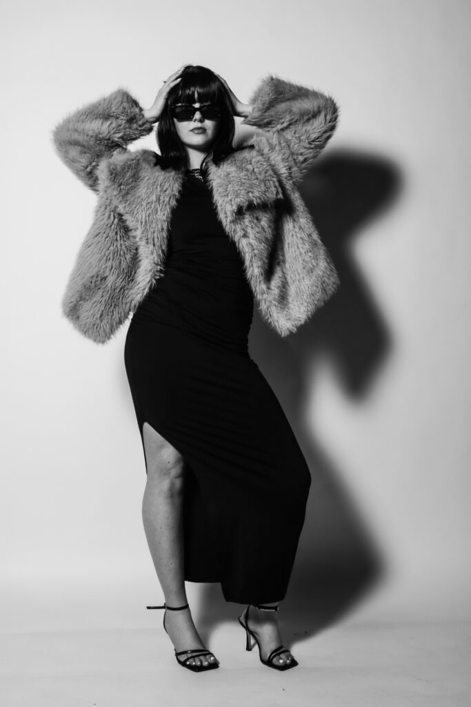
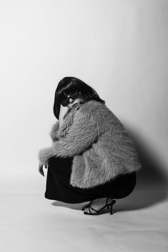
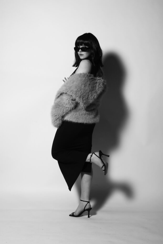
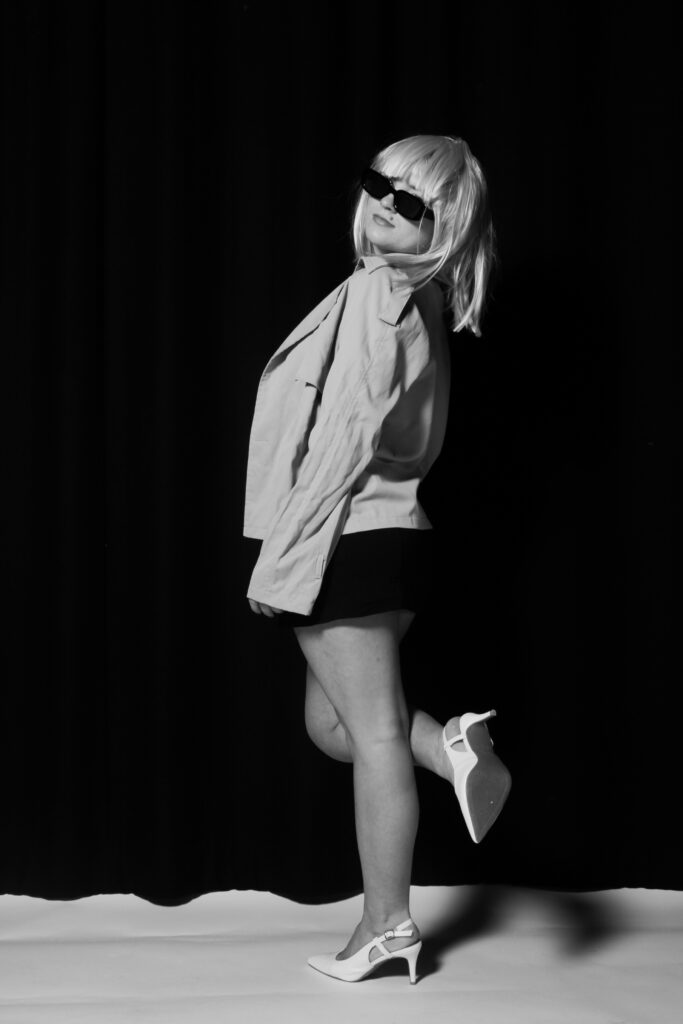
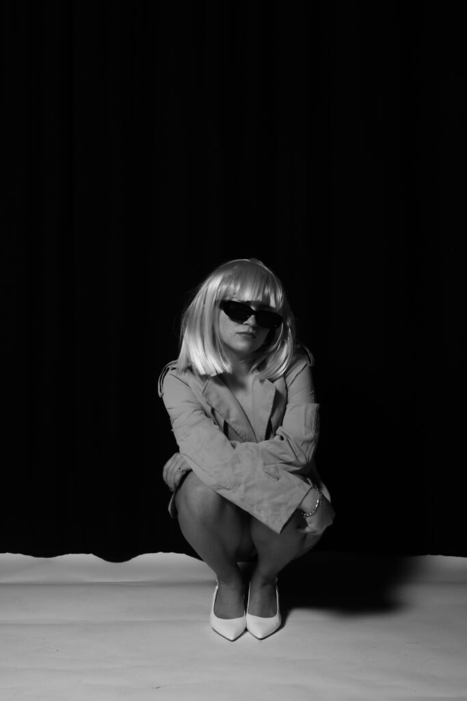
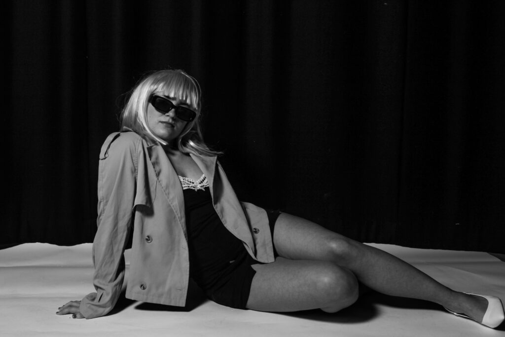
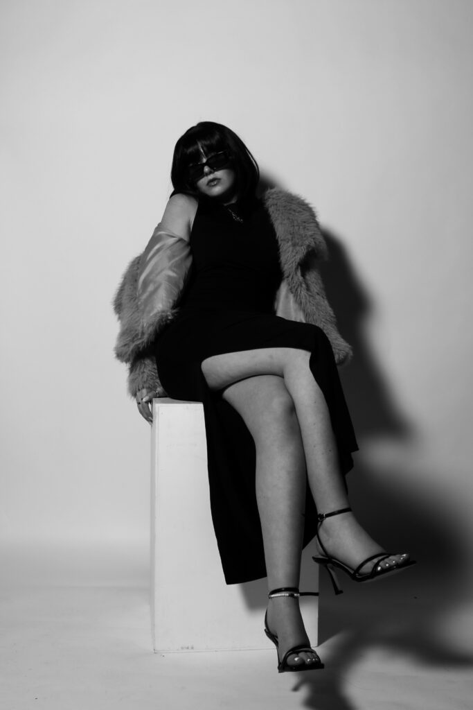
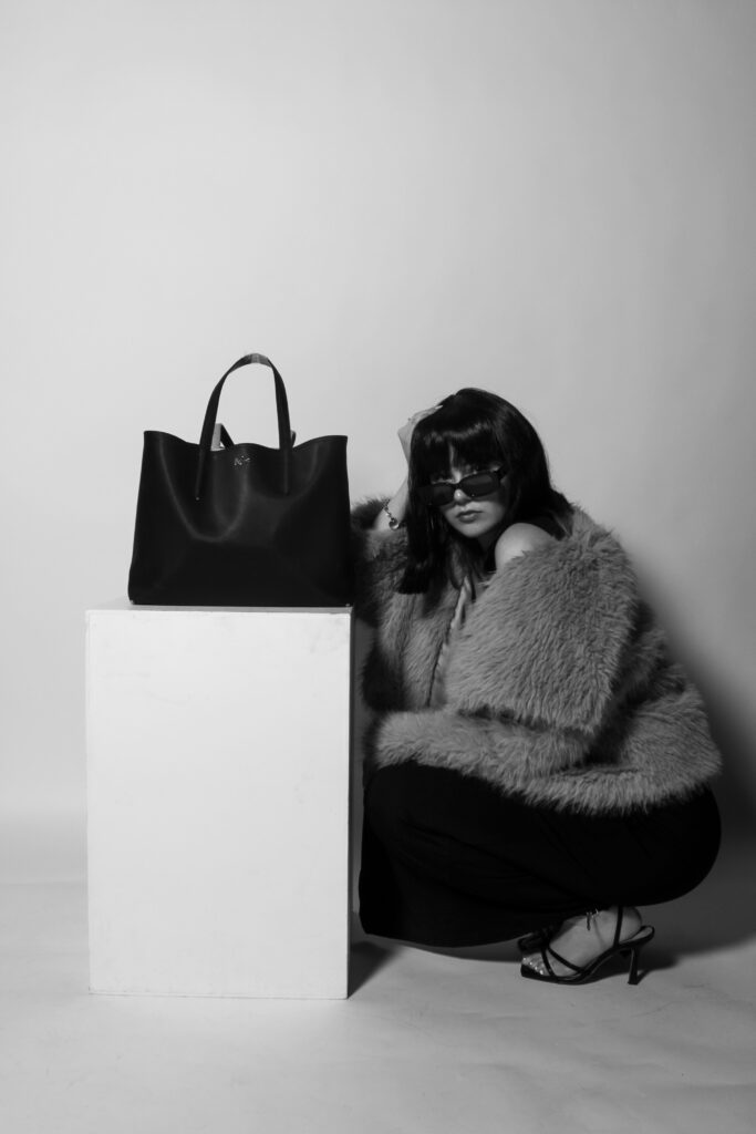
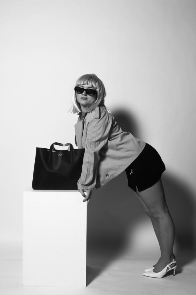
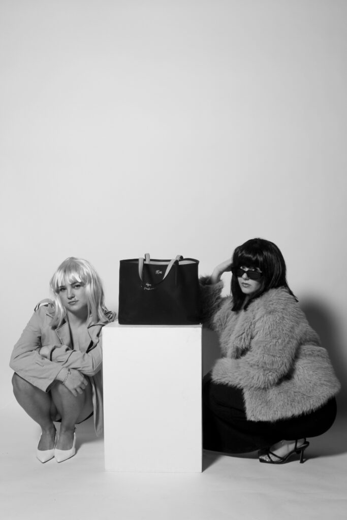
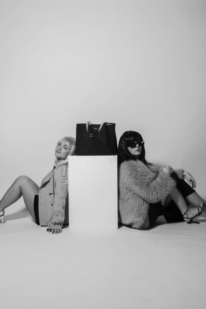
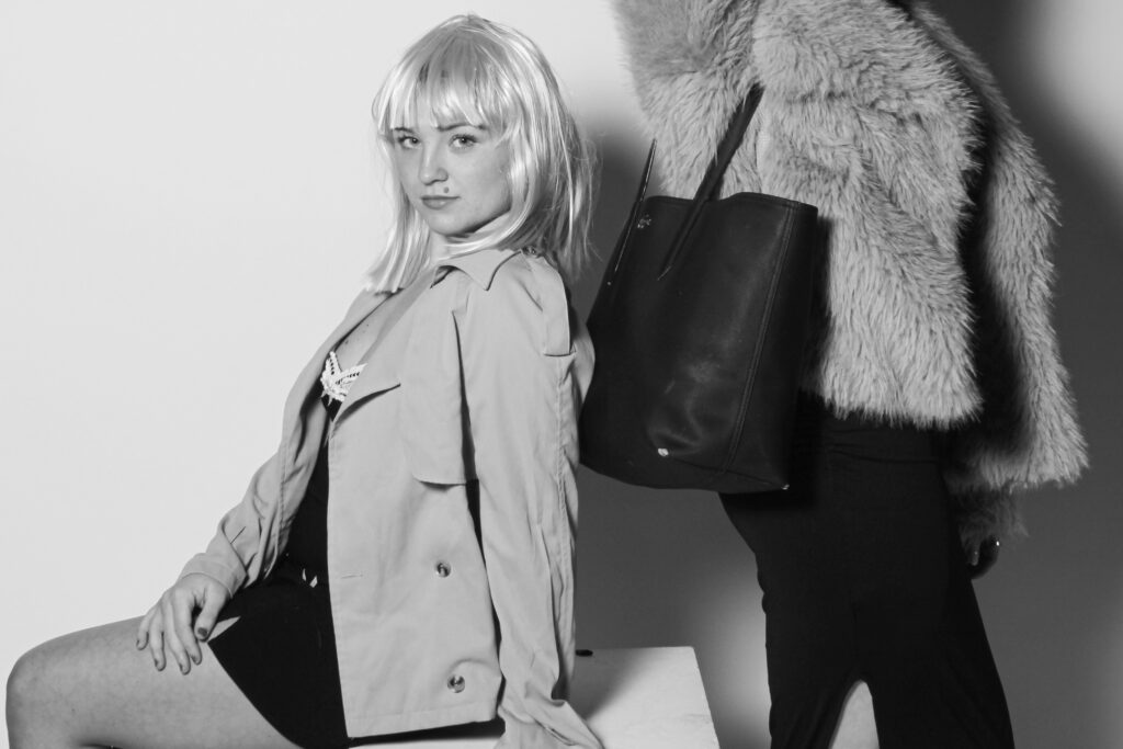
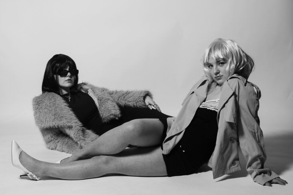
In conclusion, I believe this photoshoot was significantly more successful than the first one I executed. This is mainly due to the costumes and props used as they have more of a direct link to my artist inspirations and the overall aim I am trying to achieve through my project, while giving it a realistic approach as well as linking to historical contexts of the 1960s. The use of the wigs creates a raw sense to my shoot, where the viewer can immediately tell the time period I am reflecting on, they also help disguise my personal identity and allow me to touch on roles of other people in the 60s, which almost makes it appear representative to those women who were trying to overcome traditional expectations.
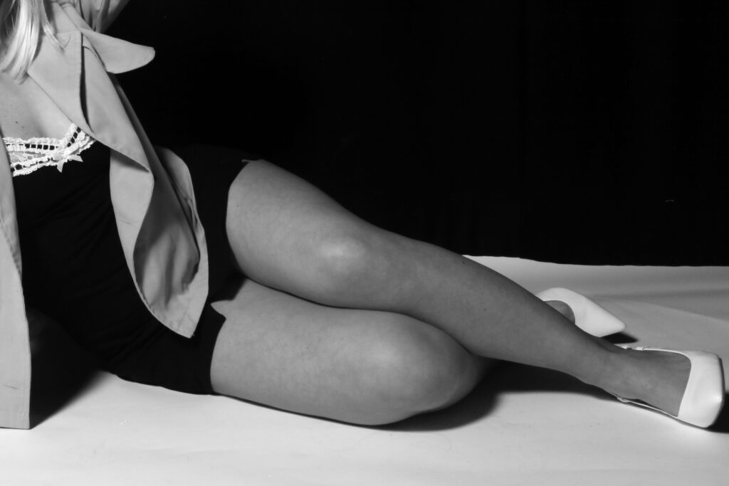
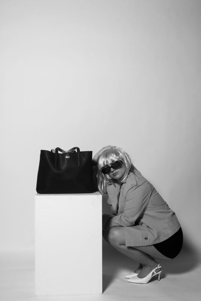
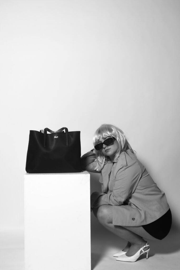
This shoot was captured in the photography studio, with effective lighting positioned right in front of the camera, which gives a more staged approach due to the brightness of the flash. The backdrops are plain, either white or black, which is a very important factor as it allows each image to look more fitting to a magazine. This is the aim I was going for as the viewer can really focus on the content within each image, and it will prevent their eyes from wandering throughout it. I think the idea of just having one main subject in the foreground against a plain background is the most effective way of carrying out a shoot, while also making it look more professional and well thought through.
Similar to my first photoshoot, I also included the large black handbag as an important prop, allowing it to even be the main subject in some of the images. This is because I feel that my shoot mostly has links to Helmut Newton, as the subjects are dressed accordingly to his shoots, as well as the black and white filters which also follow similar themes. By including the handbag, I am able to also resemble Yayoi Kusama’s work as this is one of her main focuses, working with fashion brands. I firmly believe the use of the box in most of the images is very effective too, as it allows for a bigger variety of poses surrounding it, and by placing either the models or the props on it, it is easy to immediately interpret what I want the viewer to focus on, and which elements I am trying to emphasise within each image.
What went well:
Setting and background – makes my images look more professional and more fitting to be in a magazine, rather than being outdoors in public.
Wigs, costumes and props – by disguising myself and playing the role of other people, I feel it tells more of a story and will allow the viewer to connect with my work on a deeper level by seeing close resemblances.
Has clear and visible links to both of my artist studies, while also having my own unique approaches, showing my understanding of each artist but being able to tell stories through my own work.
Improvements that can be made:
Stick to white backdrops – by using only white backdrops, it gives more of an organised approach as the differences between each image will be interpreted quicker and they will look more effective if they all had the same background. The black takes away a sense of liveliness within the images, making them appear darker and not allowing the clothes to stand out.
I wish to highlight the theme of ‘union’ with this piece, through an interplay of symbols and images in Social Realism. While the 2 ‘Isms’ are evidently different, commonality between them may be in the fact that each documents some experience: experience that may be defined through metaphorical expression, in the case of symbolism, or some point in sociopolitical history, in the case of social realism.
In my project, I will discuss “Union” as a theme through Romance, social media, and love. Photography, for me, is an expression of love and creativity; hence, I want to depict the love and relationship objects or the negative impact of social media on love in pictures. This will be juxtaposed with my chosen studies in the art movements which are symbolism and social realism and will serve as an inspiration for my image-making: a symbolic photography in which objects are used to express feeling. With the matter of romance and social media killing it being expressible through many channels-such as skulls, knots… therefore-conjoining people to relate their relationship to symbolic objects.
I am going to create an interesting illumination of the meaning of ‘Union’ through examinations of love, relationships, and social media. Inspired by the aim of looking at the relationships I see around me all the time compared to the relationships that people want to have, another source of inspiration for this project is what I might use to insinuate the relationships people ignore now in consideration of their own culture. Old images of couples from the ’60s and before provide me with an excellent example of the kind of aesthetic I would be pursuing in my work; combining artistic elements of both ‘ism-isms is giving a voice to young artists to articulate their own experiences in connection with other subjects such as social media and youth culture. Presenting that work in a book seems to be a good avenue to give organized representation to the story of how love is perceived through the years. Thus, I find that this will provide a very good ground for me to present my concept of the theme ‘Union.’
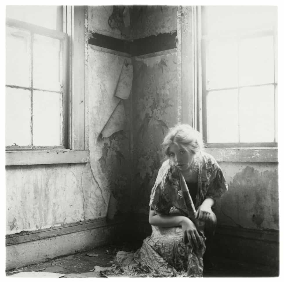
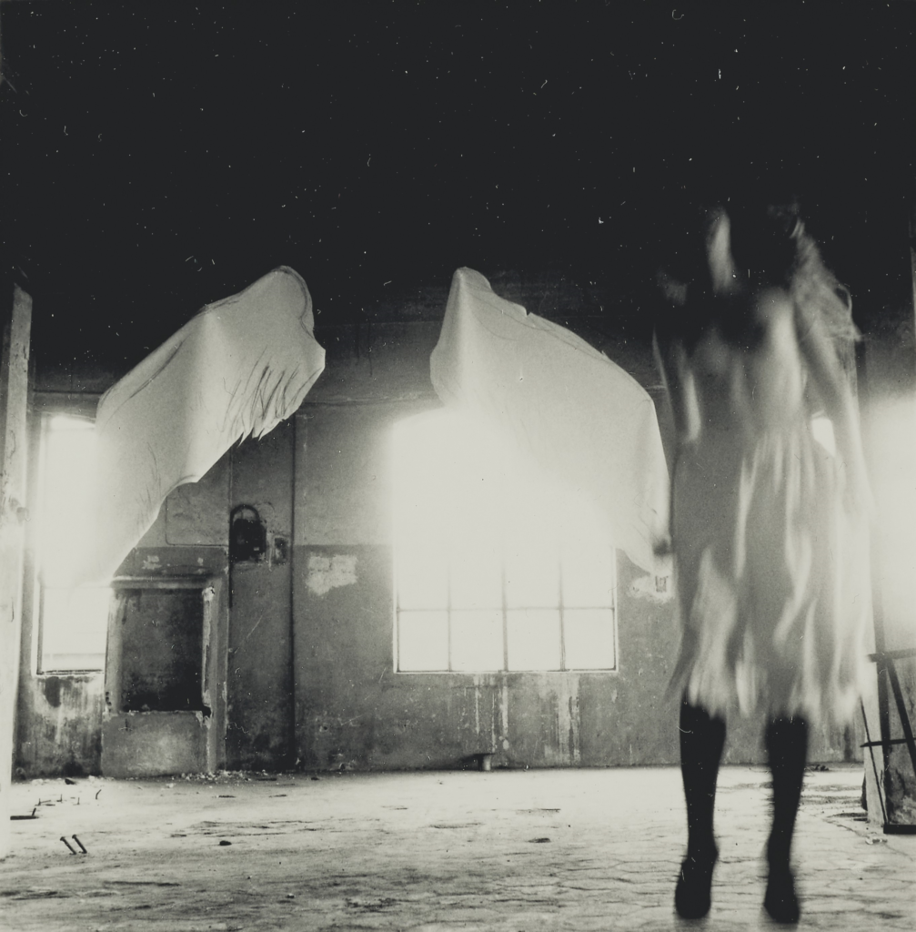
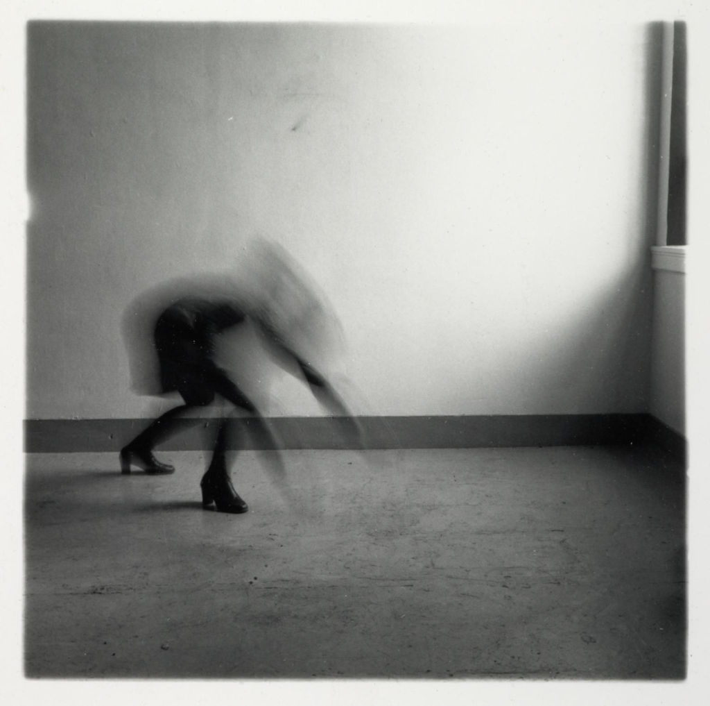
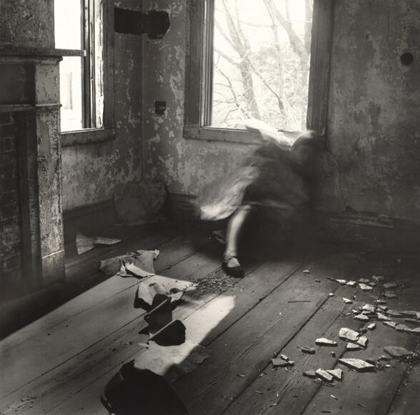
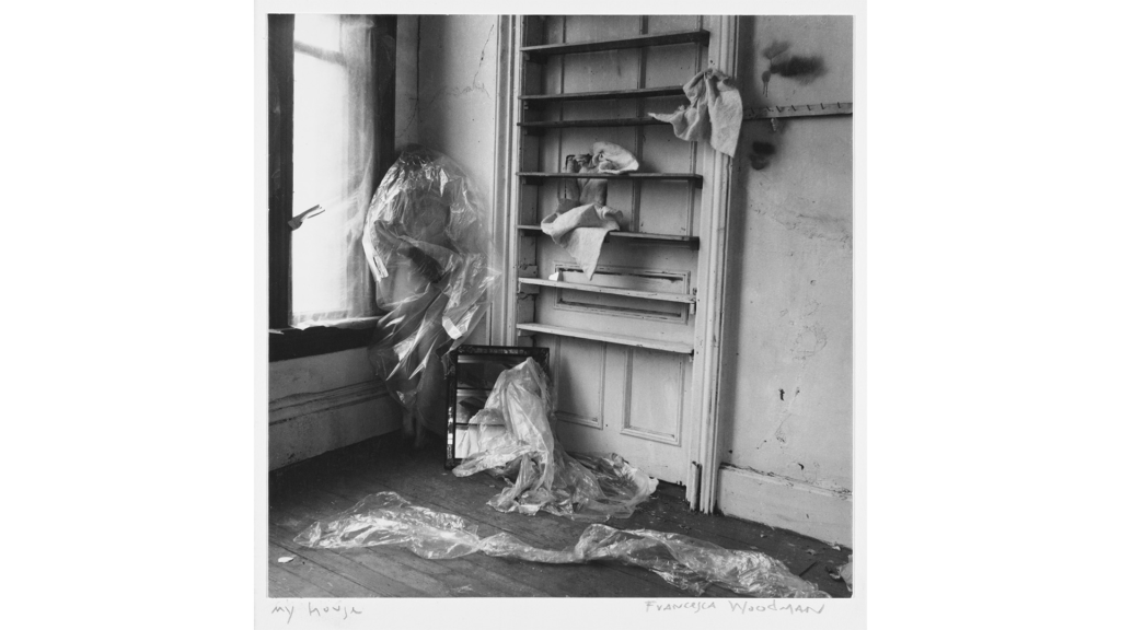
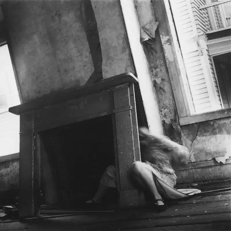
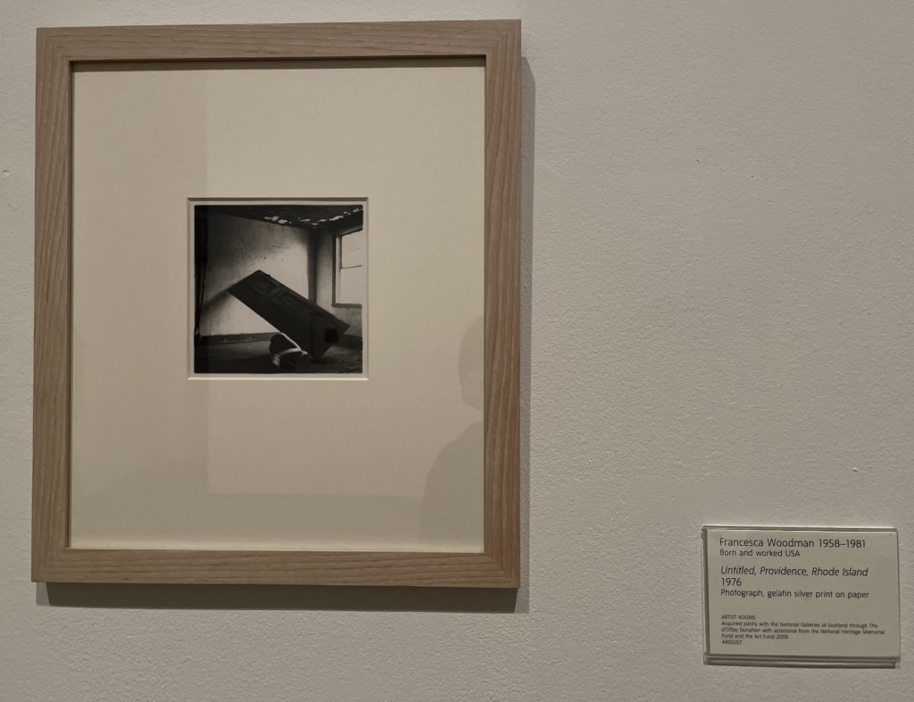
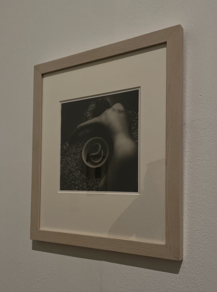
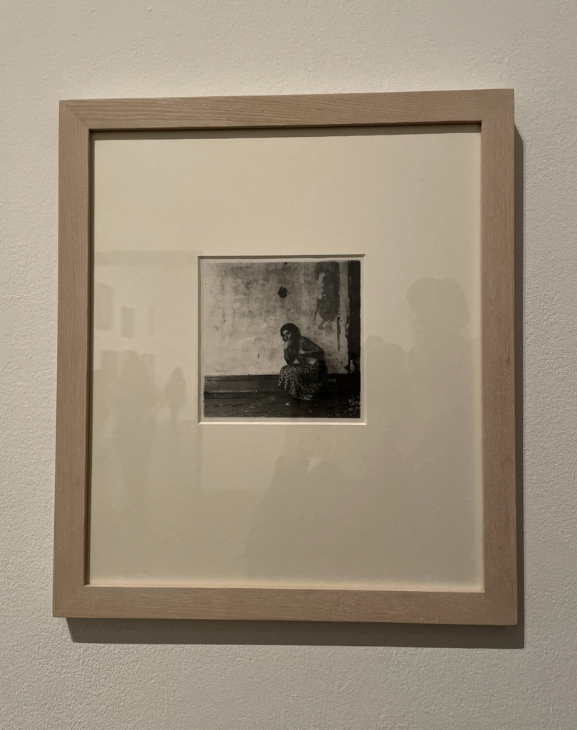
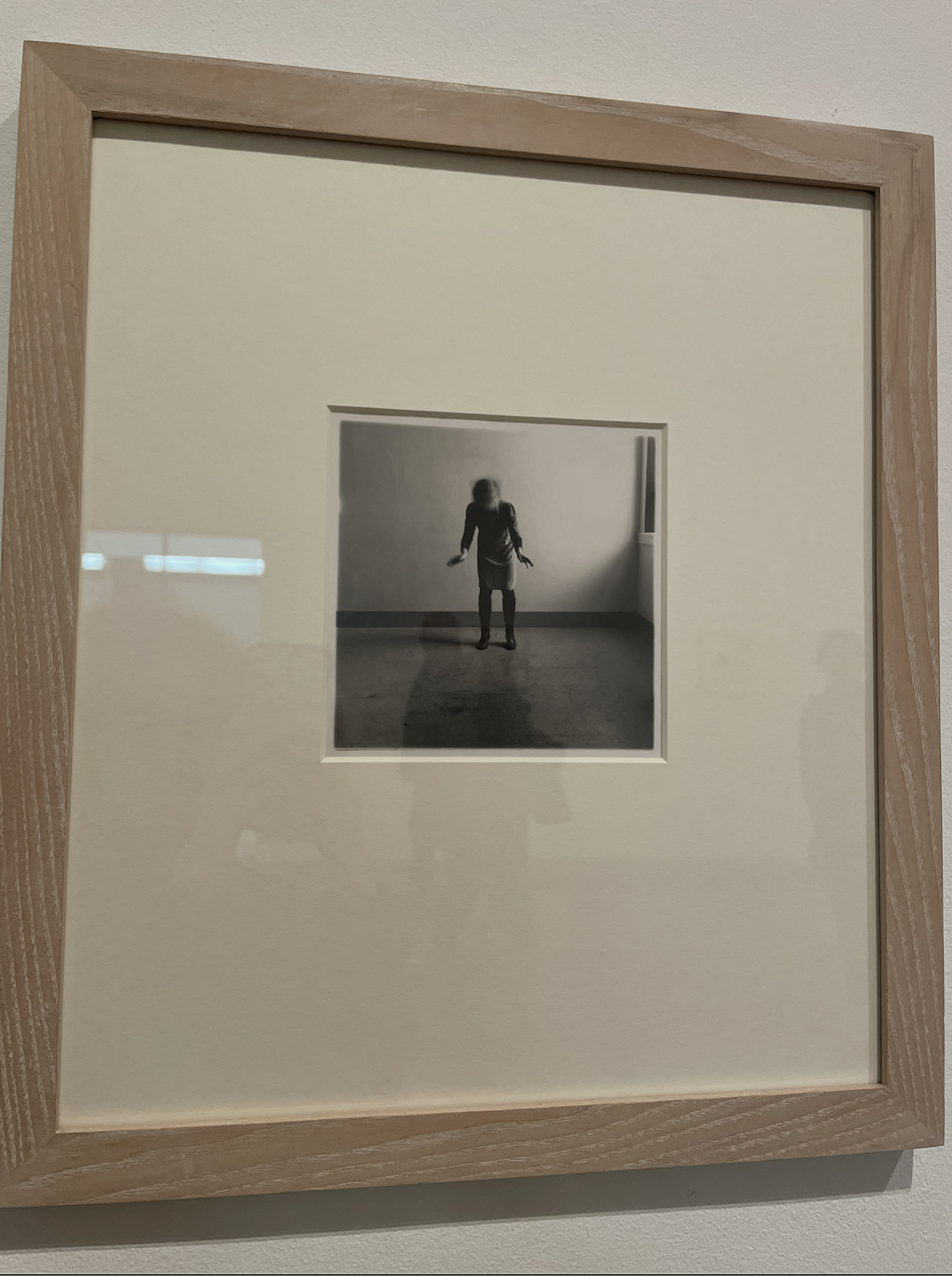
Francesca Woodman was an American photographer who was surrounded by art from a young age – her father was a painter and her mother was a ceramicist. When she was 13, Woodman was given the camera which she used to create her first works. The archive of her work features over 800 black and white photographic prints, a large portion of these being self-portraits, each photograph carefully considered and choreographed in empty studio spaces and abandoned buildings. She sometimes would utilise pieces of furniture as props, along with using wallpaper and shadows to conceal herself. Woodman has stated, ‘I show you what you do not see – the body’s inner force. You cannot see me from where I look at myself.’
Francesca Woodman studied at Rhode Island School of design, where she developed her photographic style, often working in empty rooms, she stated, ‘I’m interested in the relationships that people have with space’. Woodman experimented with longer exposures, the dichotomy of her movements ranging from subtle to more drastic blurring of her figure. These were created by simple gestures such as shaking her head, creating mysterious and blurred proportions that contrast with the sharpness of surrounding details.
While studying in Rome, Woodman lived near a bookshop which specialised in surrealism, inspiring her to research artists associated with the movement. She embraced some of the characteristics of surrealism, such as dream-like compositions and chance.
Woodman’s use of Gothic tropes as a commentary on the photograph as a place of subjective confinement can be seen throughout her work. A critical version of Woodman’s work is Abigail Solomon-Godeau’s association of the House series (1976), ‘In these photographs the woman’s body is practically devoured by the house … Swallowed by the fireplace, layered over by the wallpaper, effaced, occulted, Woodman presents herself as the living sacrifice to the domus.’
A look at Francesca Woodman’s exhibited work:
I had a look at Francesca Woodman’s prints at the Tate Modern, and I was specifically interested in the way she uses her surroundings as props to conceal herself and the movement in her photography, which I feel invites the viewer to question the way we see ourselves and are perceived by others.
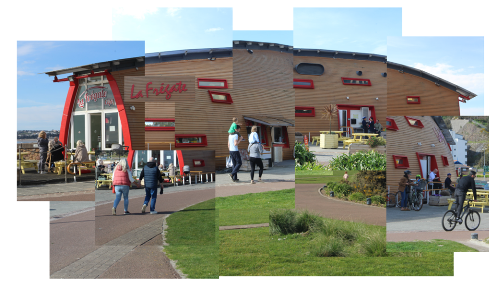
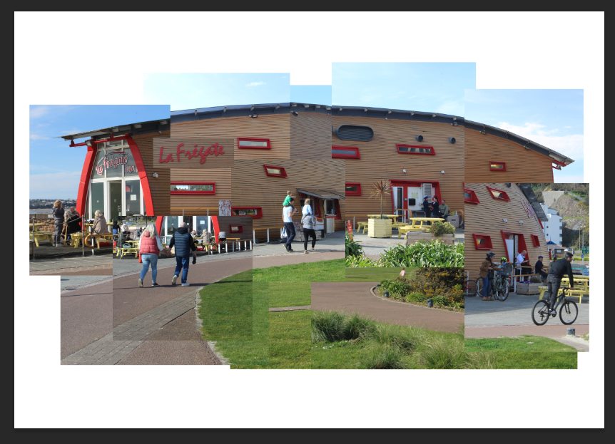
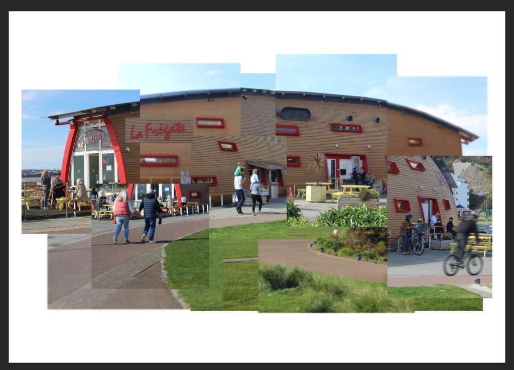
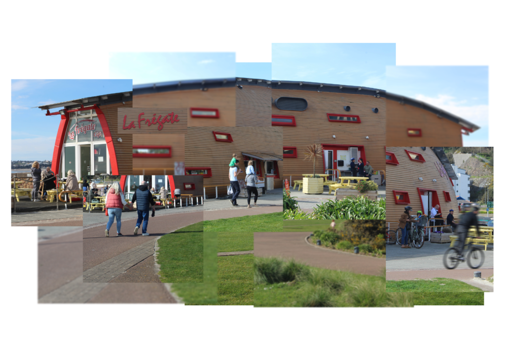
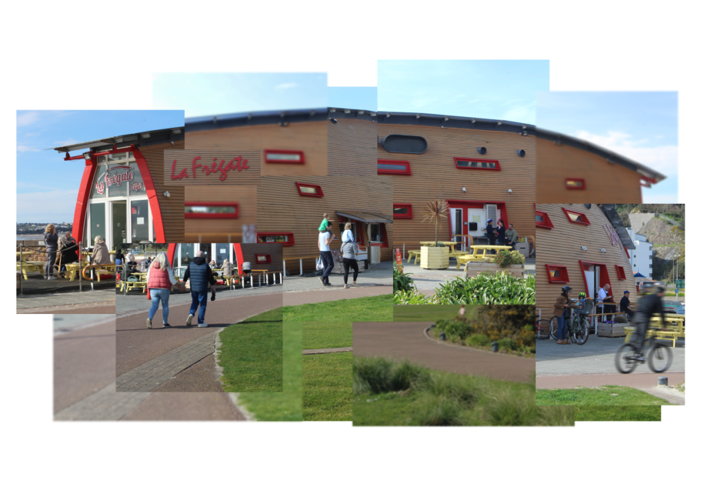
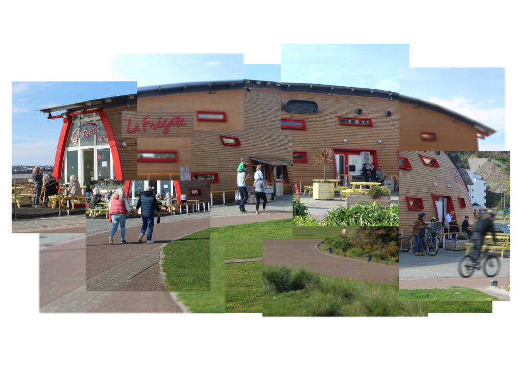
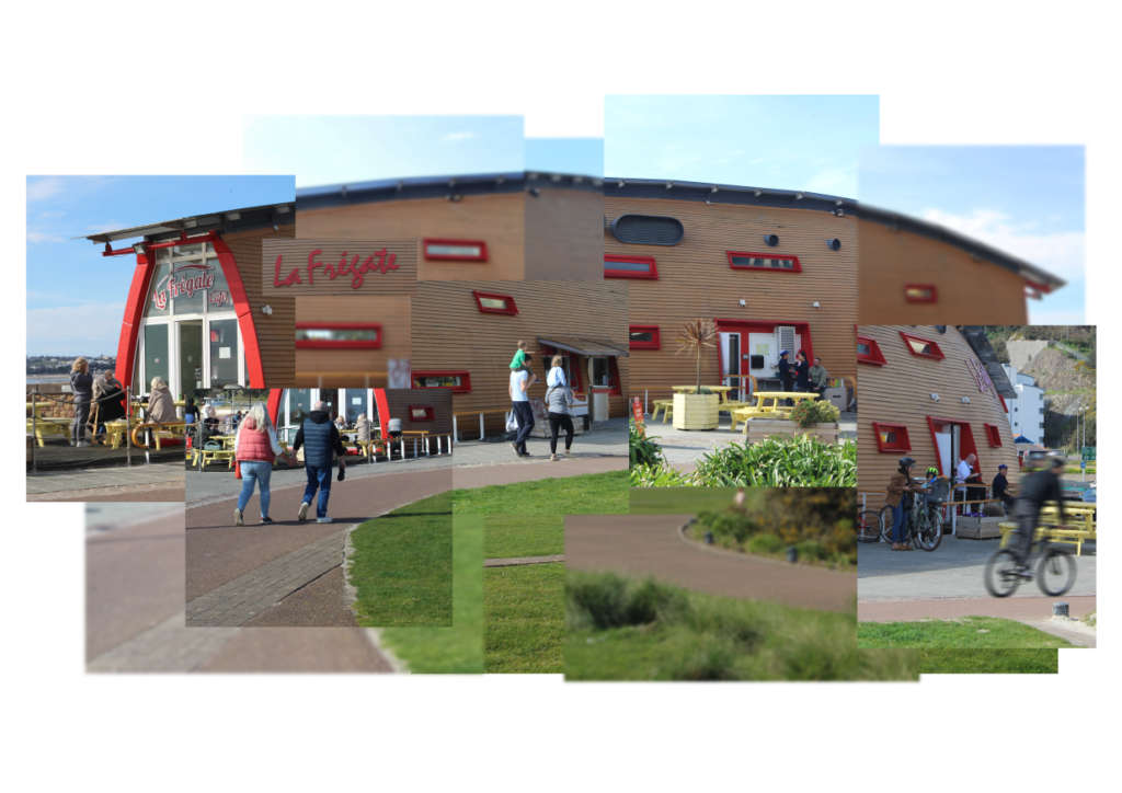
I started off by creating a new document on Photoshop, an A3 landscape sheet. I had also opened all the images in Photoshop which I set as green in Lightroom.
I then made a quick mock up of how I would like my joiner to look before any photos have been edited. I made this using Adobe PowerPoint.
For each of the images I used for this mock up, I colour coded them as blue in Lightroom Classic so that it will make my process easier.
I then cropped each of the images in Lightroom to be the same as how they were on the PowerPoint slide.
I then opened these images in Photoshop and organised them like how I did on PowerPoint.
After making sure I liked how the images were laid out, I began to individually edit each of the images. I also added a gaussian blur to some of the images and a motion blur to the guy on the bicycle.
I then began to alter this even more until I was happy with it.