I would like to base my project around stereotypes and I believe I would be able to achieve this as I think I will be able to fit it into the context of union.
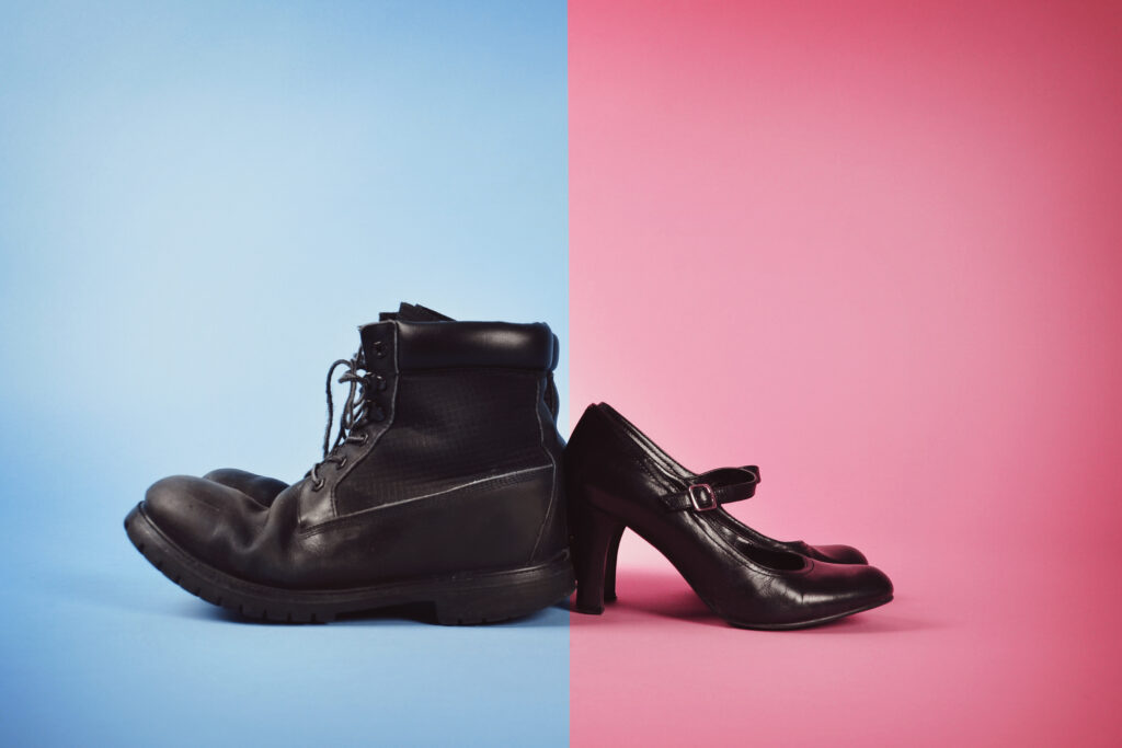
For my first photoshoot I would like to dive into the idea of gender, I would also do this by looking at gender inclusion, sexuality, and how people interact with each other based on what they think and believe in the context of sexuality etc. for reference the images bellow are what i would like to recreate/ take inspiration from:
however for this image i would like to swap the boots and heels as id like to touch upon the idea of sexuality as previously stated before. i would also like to take pictures of people and how they present themselves and show how “different” they really are, for example i would also like to take images of people of the same gender wearing the complete “wrong things” just like in the image bellow.
i would also like to get an image that symbolises sexuality this could be done by taking an image of something that might represent people that are gay (this could be a rainbow flag etc).
Photoshoot 2
for my second photoshoot i would like to look at race by looking at diversity, inclusion, acceptance and tolerance. by taking images of people who feel like they have experienced something simply because of their skin colour or where they come from. I also want to take pictures of someone that would portray a stereotype of someone’s race and create an image of what there really like i.e what they where eat, what clothes they wear, and just in general there lifestyle.
photoshoot 3:
in my third photoshoot i would like to look into size, this will most likely consist of the clothes people wear and why. For example why people may prefer to use tighter clothes or baggy clothes. i also want to look into physical appearance and link it to there life style, so what people eat, what they do in their day to day life. i believe i can link it to stereotypes as when you look at what someone wears or the way they look will always give you a first thought of what “sort of person” someone is
for example when looking at this image you might wonder why this person is using baggy clothes is it because they don’t like the way they look? or could it be as simple as they just like to wear baggy clothes which is what I want people to think when they see my images . to recreate the image I will taker images of people wearing certain clothes that they might not normally wear and also do the opposite. so I’m planning on taking images of a in shape person in big baggy clothes and in tight clothes to then compare it to someone who might be a little out of shape doing the same thing and putting them side by in my photobook.
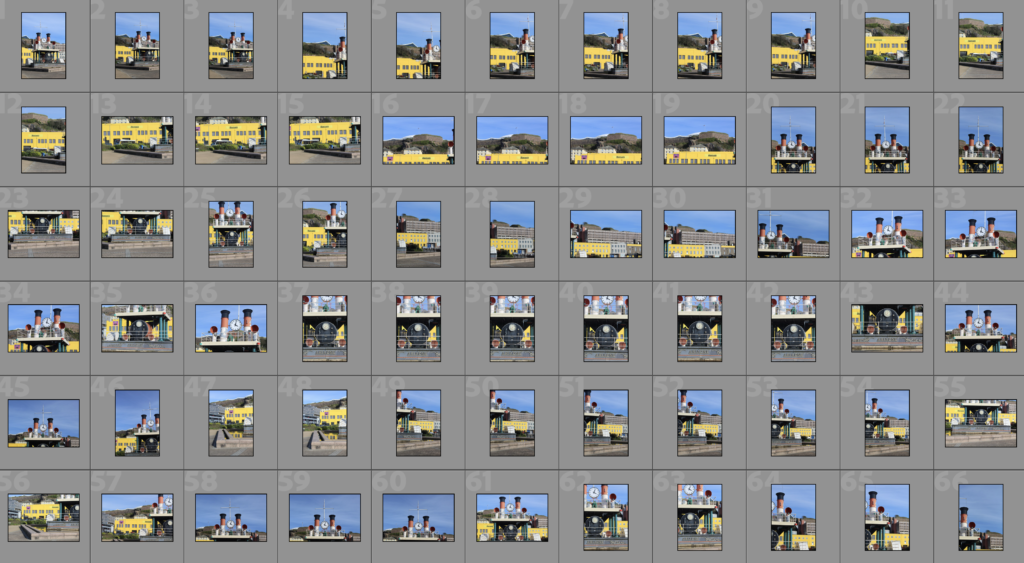
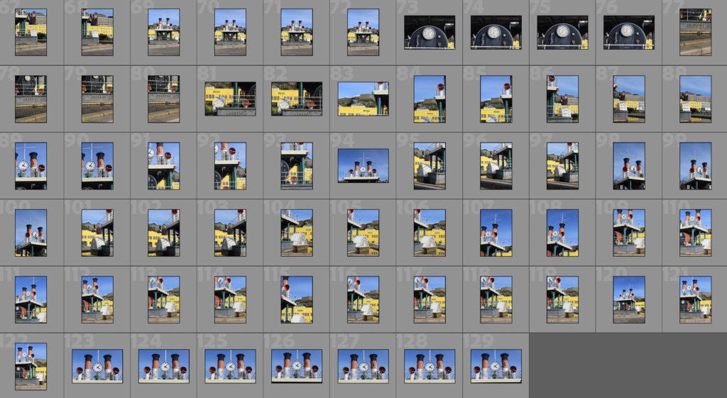
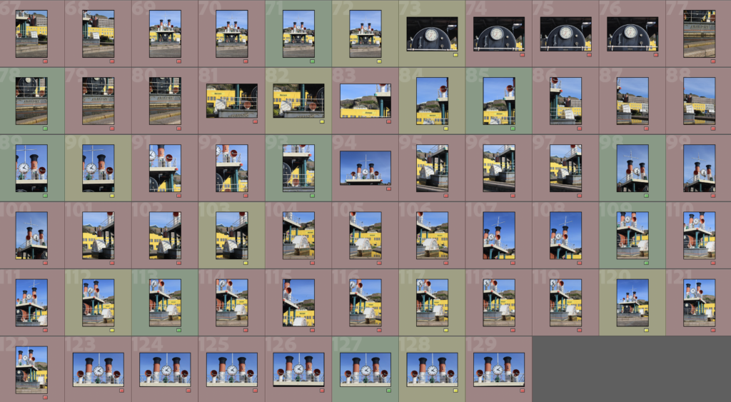
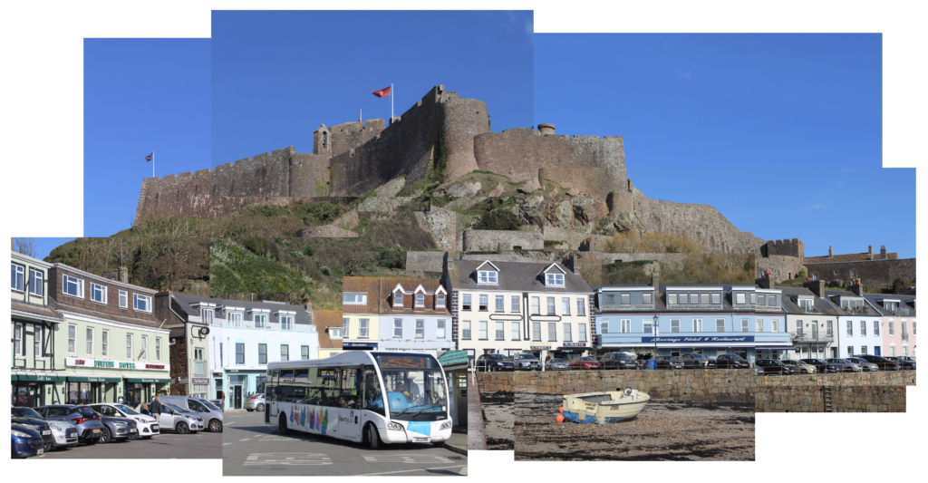
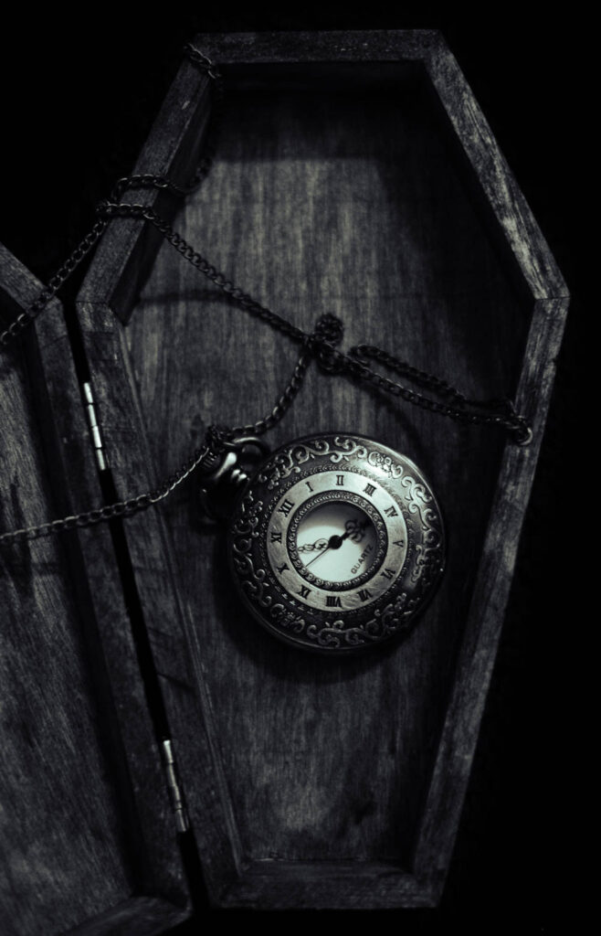
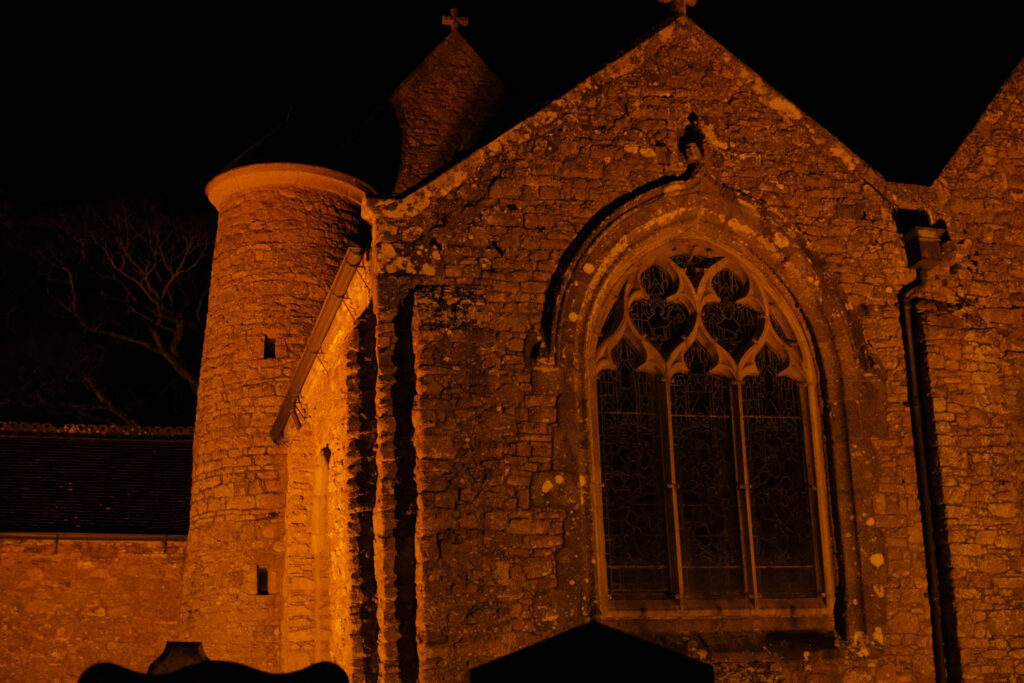
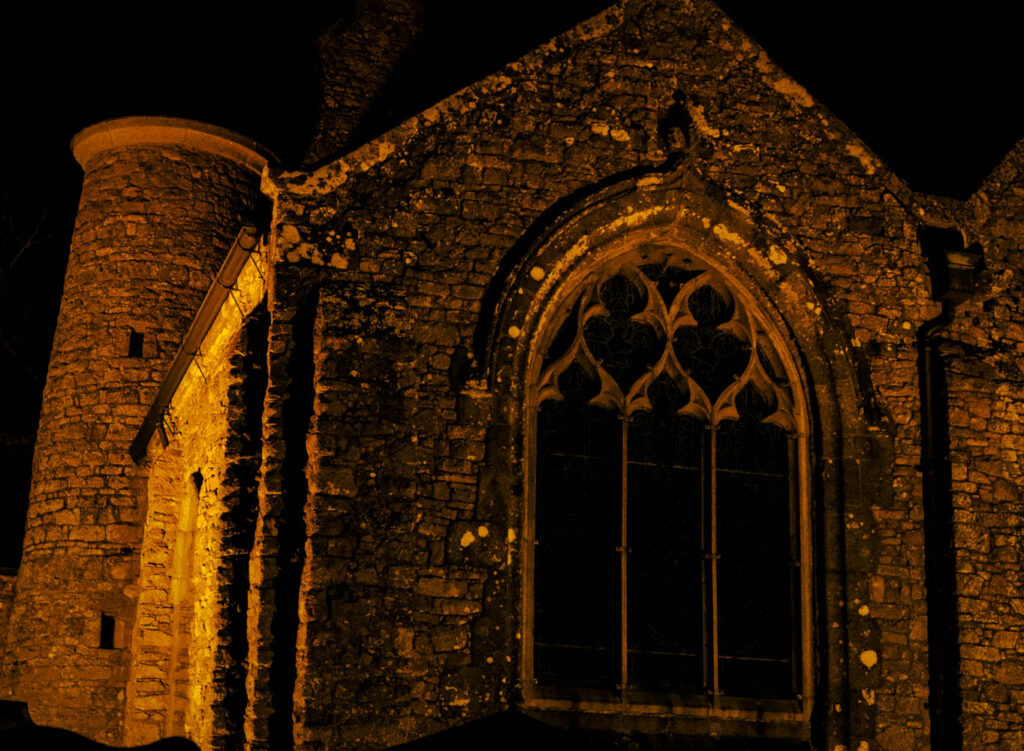
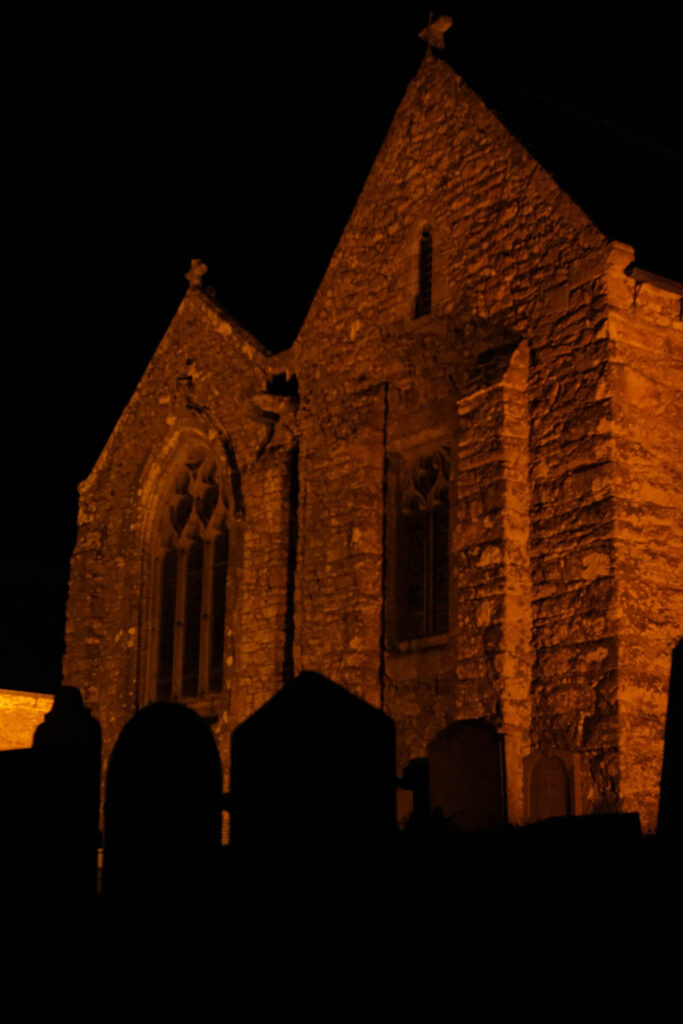
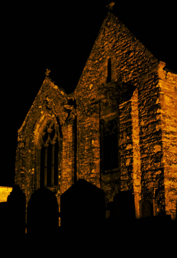
For this photoshoot, I wanted to get many images of the Steam Clock in St Helier to create a joiner. I thought that this would be a good subject for a joiner as it is a landmark at the marina which reflects Jersey’s long association with the sea. This relates to ‘Union’ as Jersey’s economy was built from its maritime history. This maritime history also created unity amongst islanders and with the countries they traded with.
Camera Settings
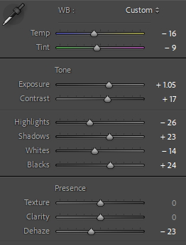
For this photoshoot, I used an ISO of 100 and a shutter speed of 1/640 so that my images wouldn’t be over-exposed.
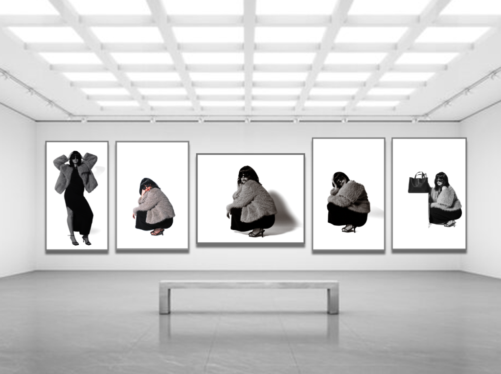
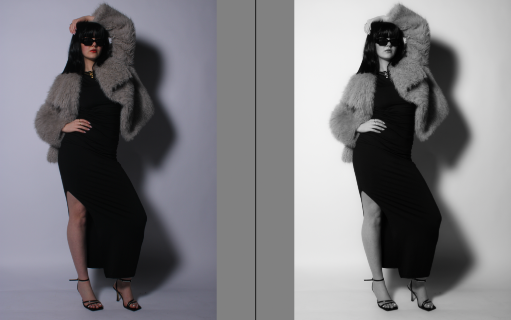
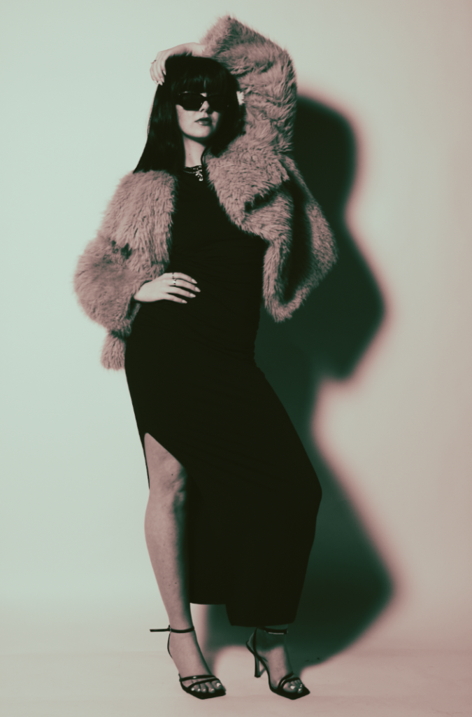
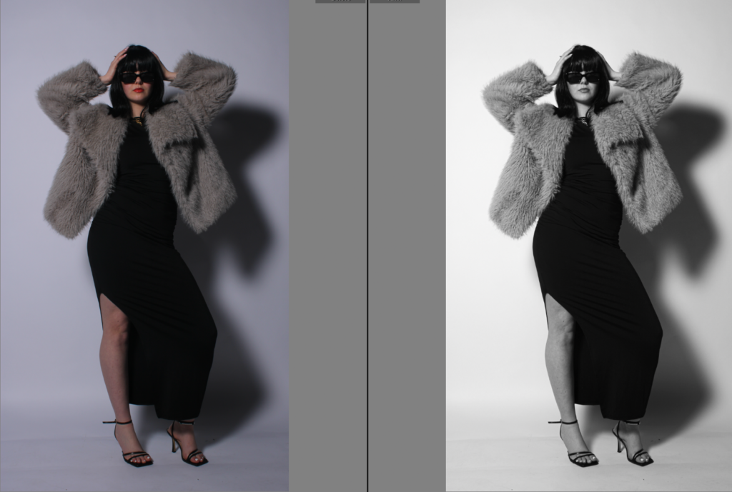
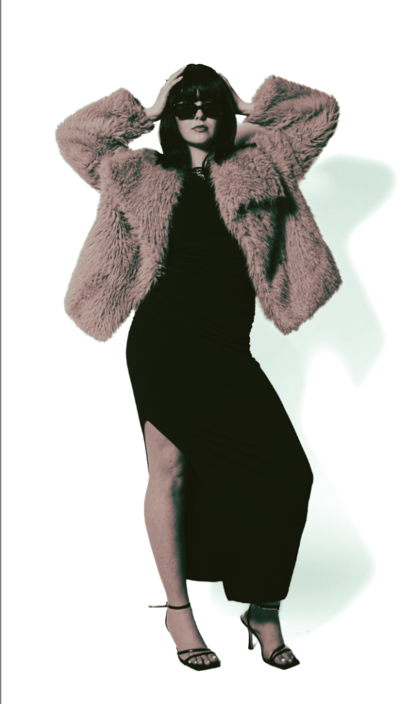
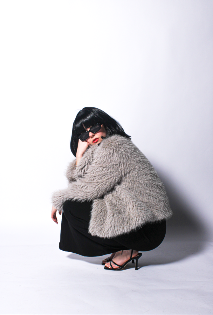
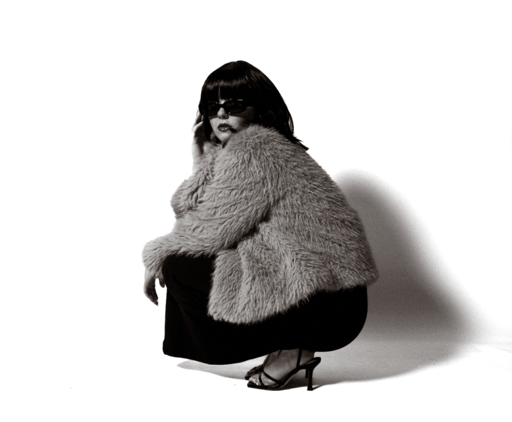
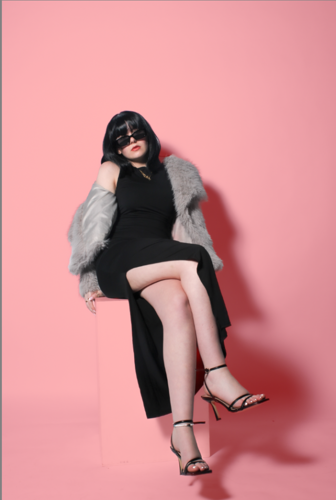
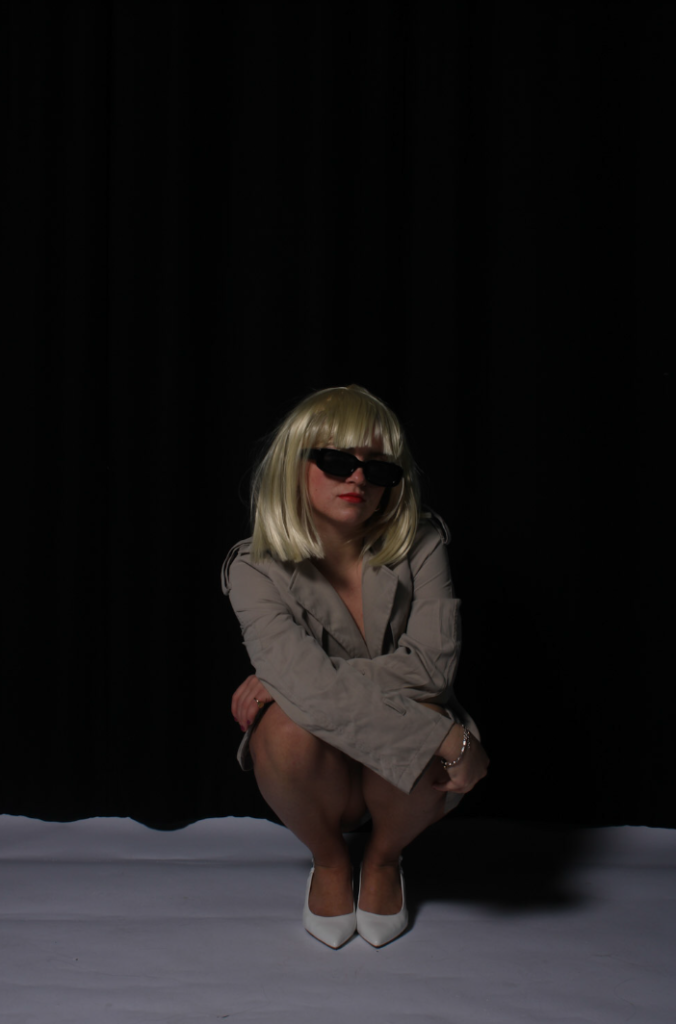
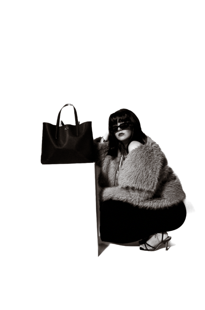
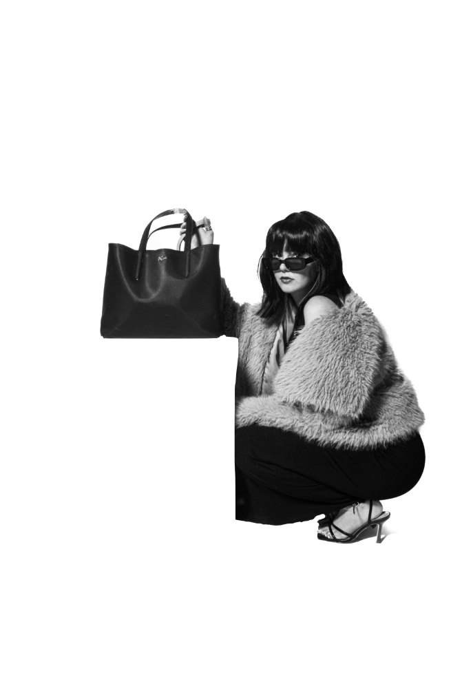
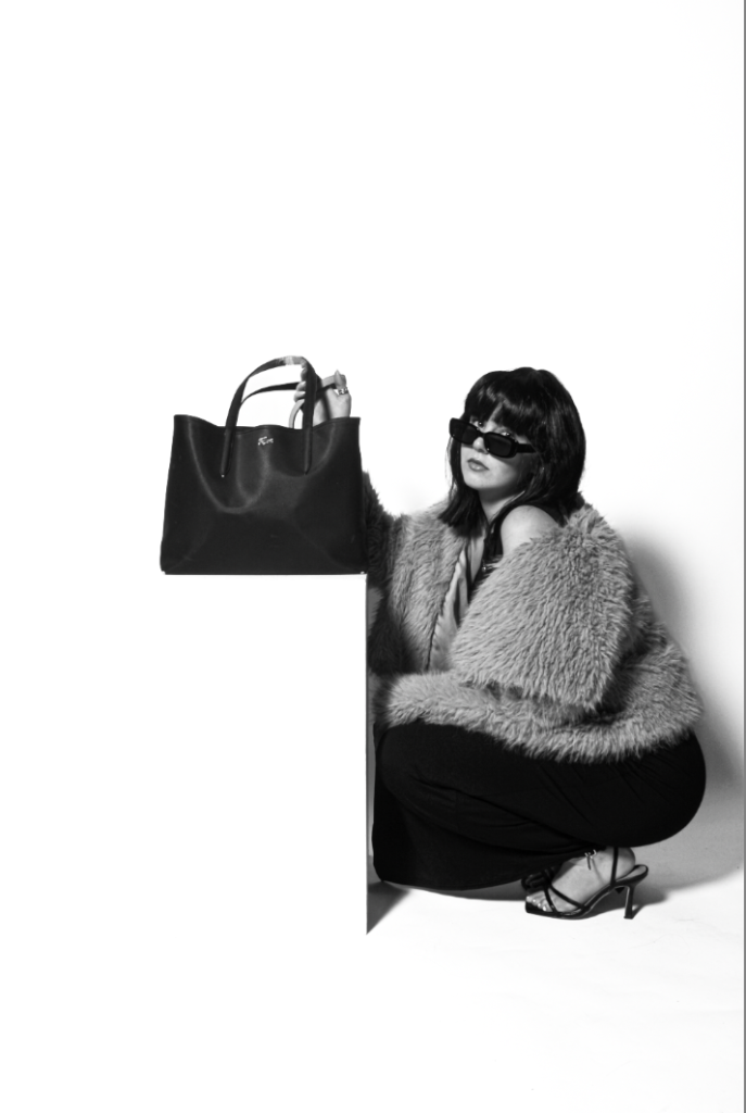
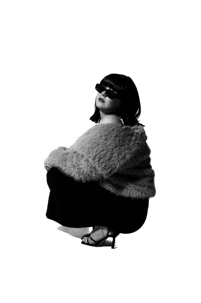
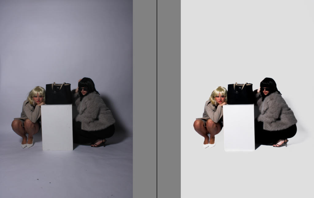
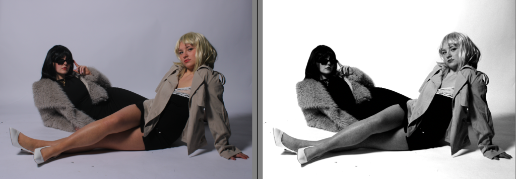
Here above, are all my preferred experiments and development. I’ve chosen these images to be in my virtual gallery as I like them the most. They add an element of an unique aesthetic linking significantly to Yayoi as she was known for her distinct, vibrant and abstract work. However, the posing, clothing and lighting links to Helmut as the posing portrays an element of dominance and the angle from below rather from straight on or above, differs from the typical stereotype of women being weak and submissive. The clothing is seen as glamour and luxurious which Helmut did by maintaining a theme of high- fashion and media. Newton photographed women differing from the typical stereotypes during a time when it was not normalised for women to be in the main stream media. I wished to accomplish this by making the photos look as if they are for a fashion magazine through white backdrops and little shadows. Therefore, my project is based around the revolution of women within media and how they grew, whilst linking to Yayoi’s unique elements, such as my developing.
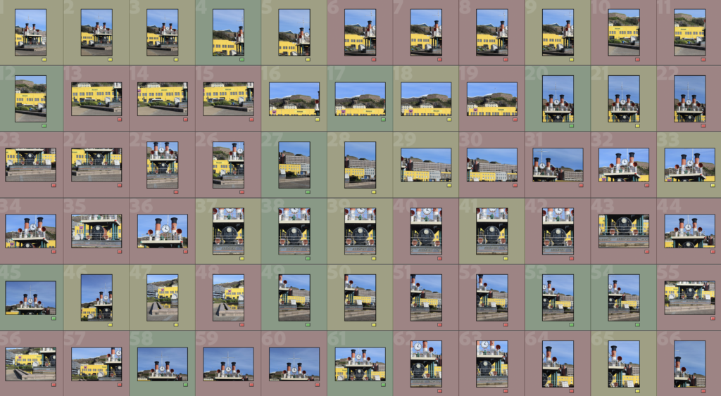
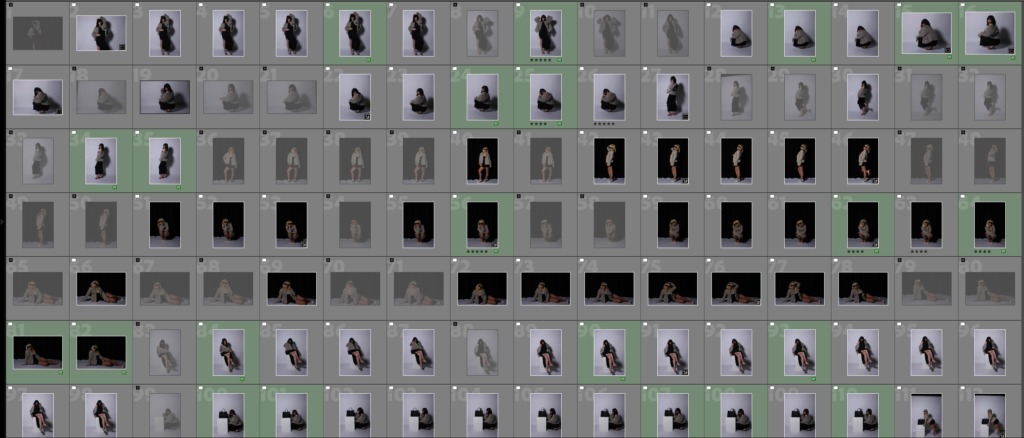
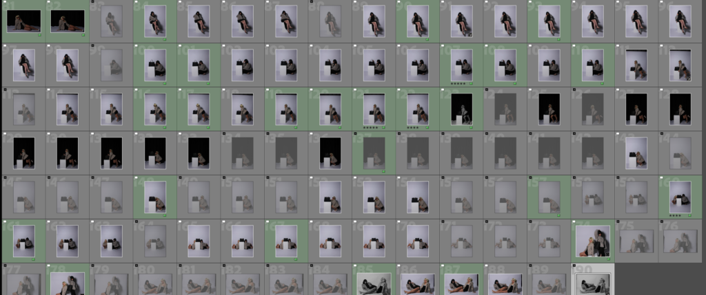
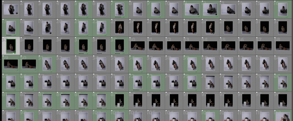
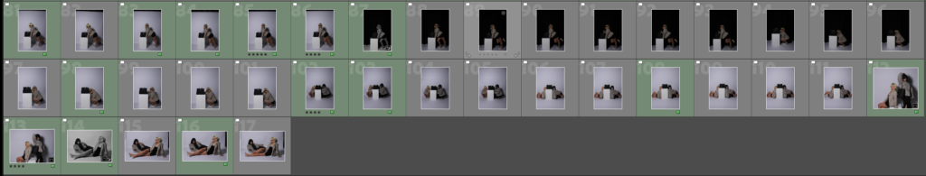
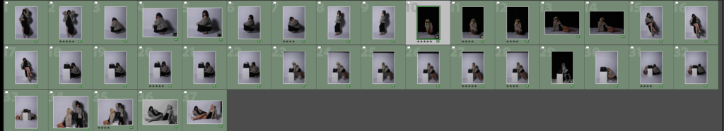
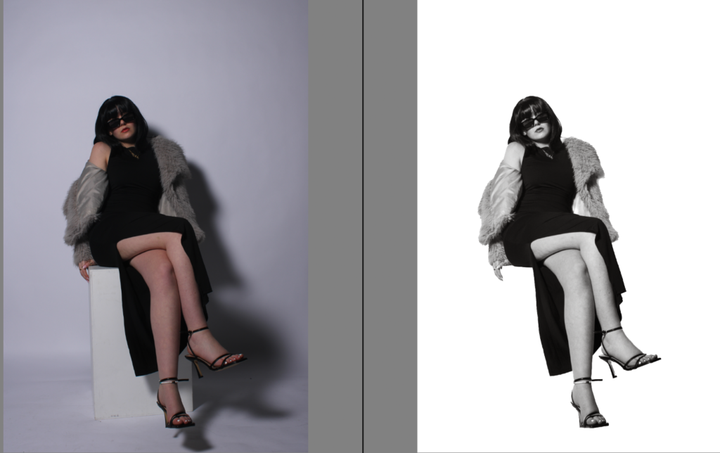
Firstly, I began by either rejecting or flagging them. This is very efficient as it keeps all my images organised by which ones I preferred.
This is because I can filter them by showing flagged only. Ultimately disregarding my rejected images to be time efficient for my next step. My next step is to put the images I wish to edit and wish to develop further into green. The green images demonstrate which images I am going to edit for my finalised exam project.
Leading to, selected images that I definitely like and believe are worth editing. This is beneficial as it decreases my amount of images into a small selection, that is efficient for my project and fit my end goal. Making it much more time-efficient and easier for my next steps.
Editing & Experimenting
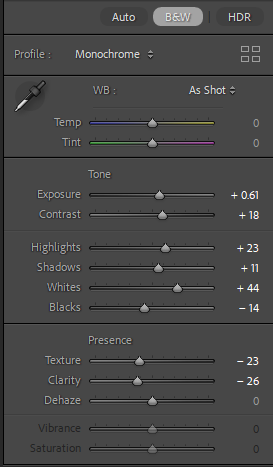
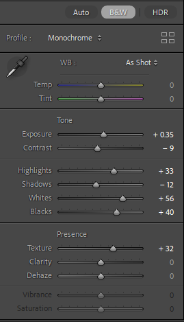
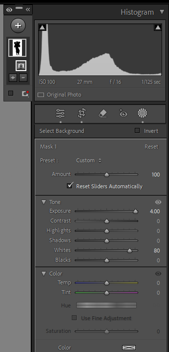
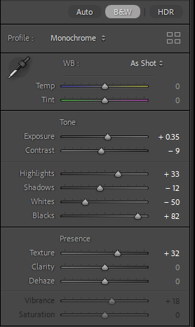
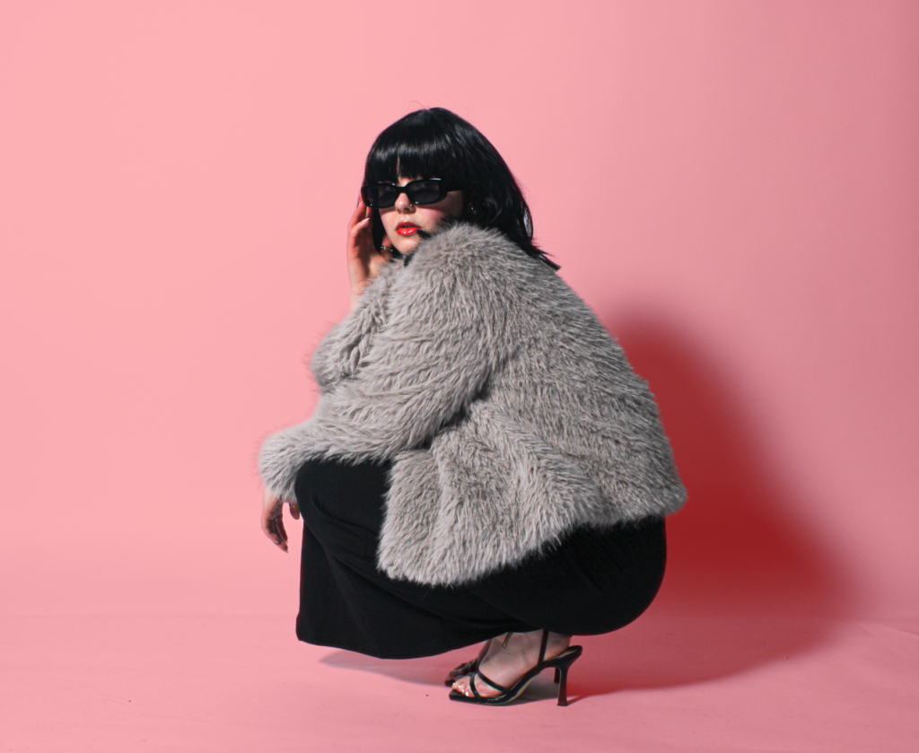
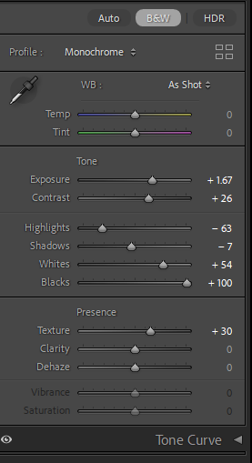
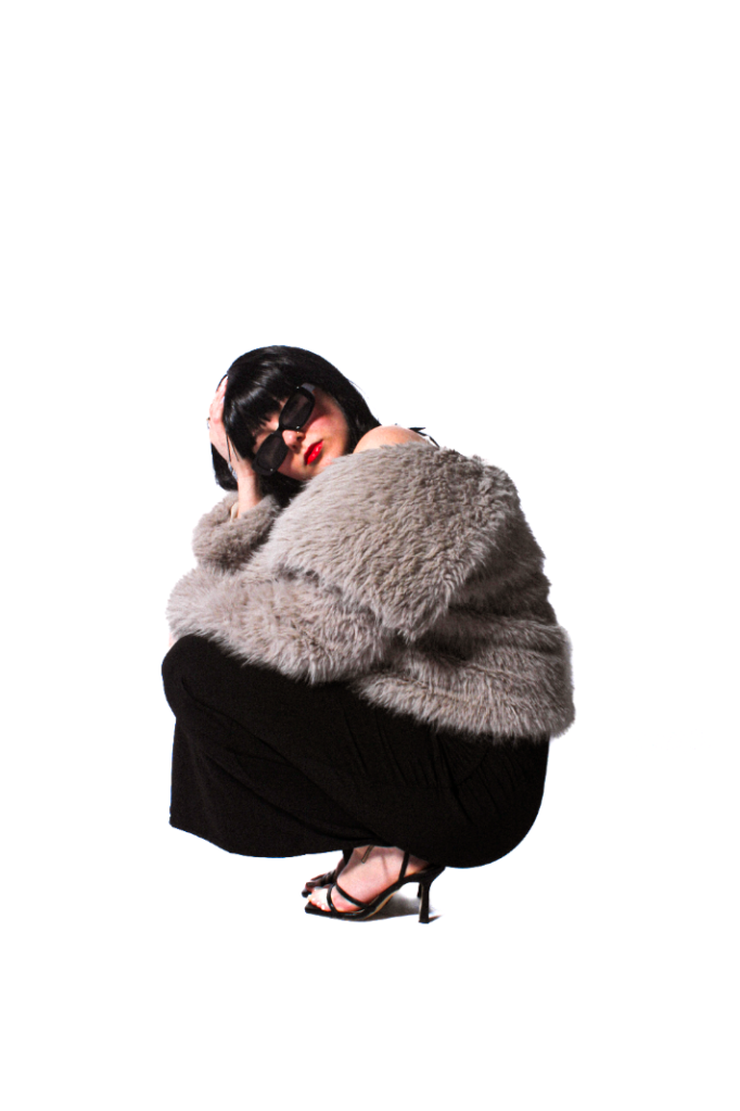
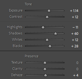
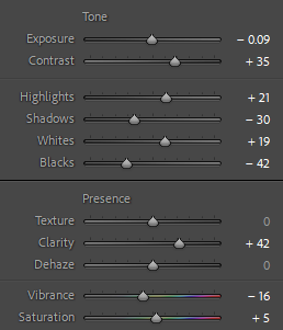
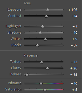
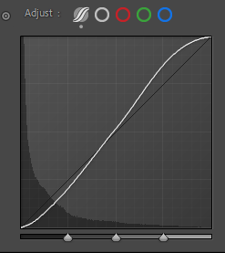
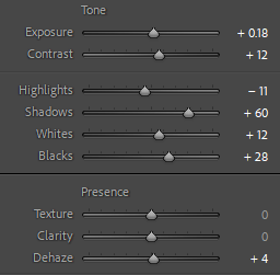
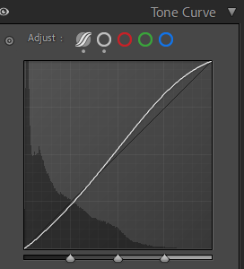
I began by increasing exposure to lighten up the background significantly. But the correct amount, not too much so the medium does not become too bright or unfocused. My next move, was to increase the contrast to make certain elements stand out against the exposure. This is to make these two balanced. This created more depth in the shadows, making it more eye catching and even professional, which is our aim. By increasing the highlights, the backdrop became a lot whiter and brighter which is needed to look more professional, and also to make the subject stand out and contrast against it. To increase the depth of the shadows even more, I slightly increased the shadows, but again not too much as I wanted it too look natural yet eye catching. The increase in whites, emphasised the background, therefore emphasising the shadows. Almost, I decreased my blacks so the subjects clothing, wig and shadows were not too deep so it looked somewhat real. Lastly, I decreased the texture to make the medium’s legs look more fake and surreal as Newton did portray a certain beauty standard, ultimately being unrealistic. Finally, I decreased the clarity to make the glamour fur coat to look more detailed and real, almost to look like a model is advertising it.
Experimentation –
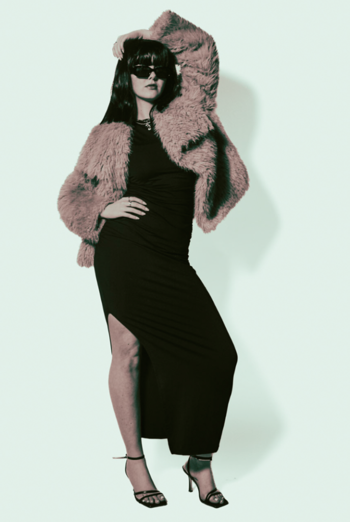
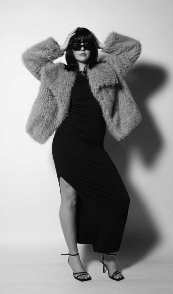
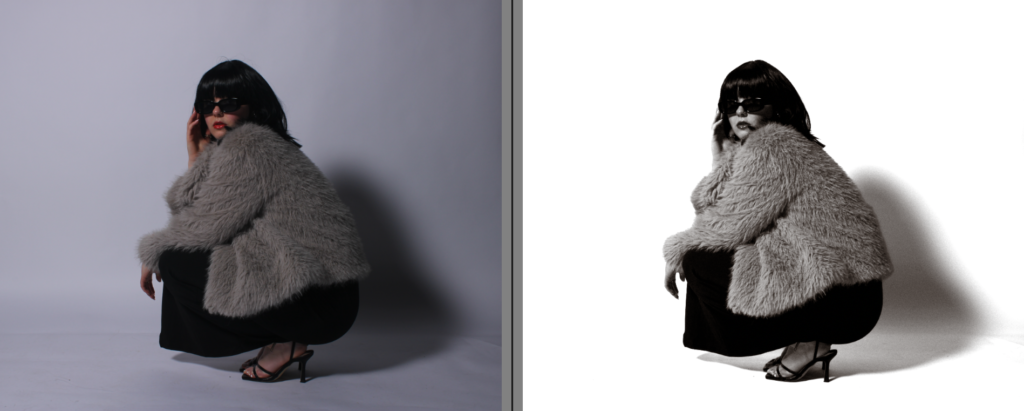
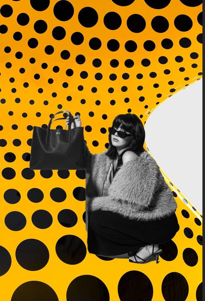
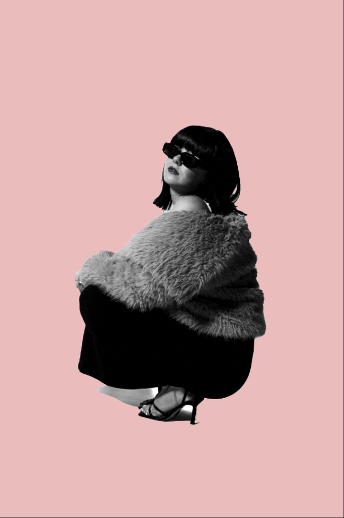
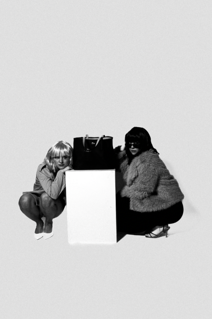
I personally quite like this, as it is quite unique and different. I think the filter makes it less dull and more quirky. I really like how the shadow has an outline of pink, making it very eye catching to look at. Just like how Kusuma’s work is very unique making it different. Although, I like both as they portray and express very different aspects and elements. The filter is style cinematic CN10 which my theme is suppose to look very theatre like, staged and carefully crafted and cinematic, hence the wigs and very unrealistic props.
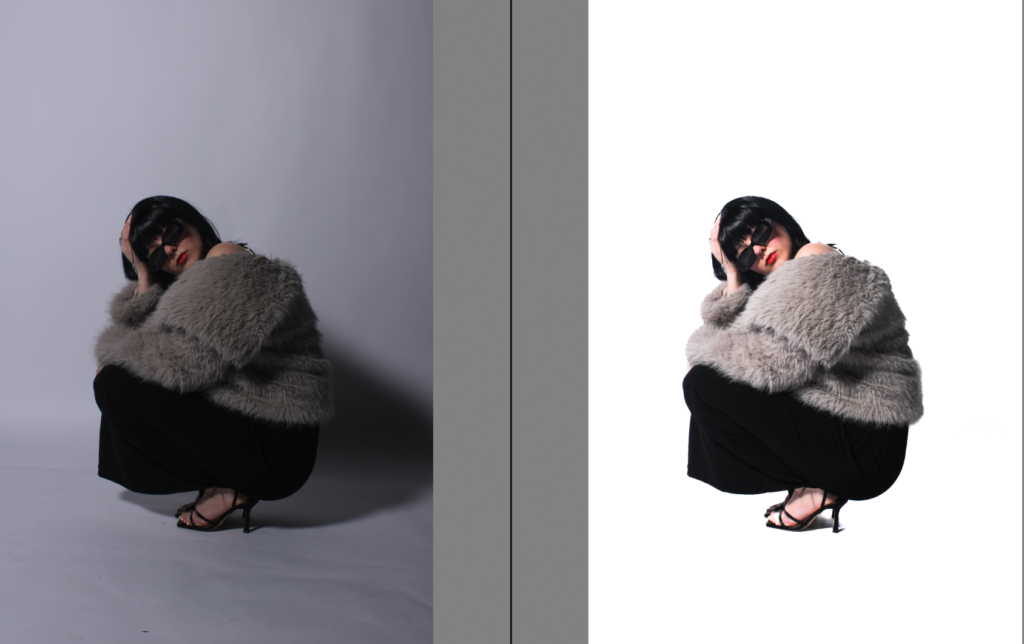
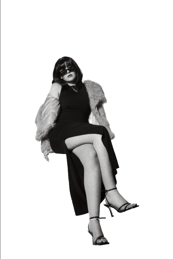
Getting rid of the shadows-
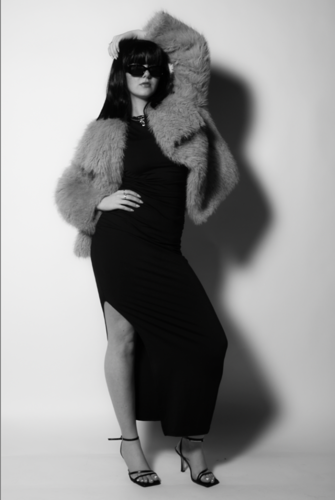
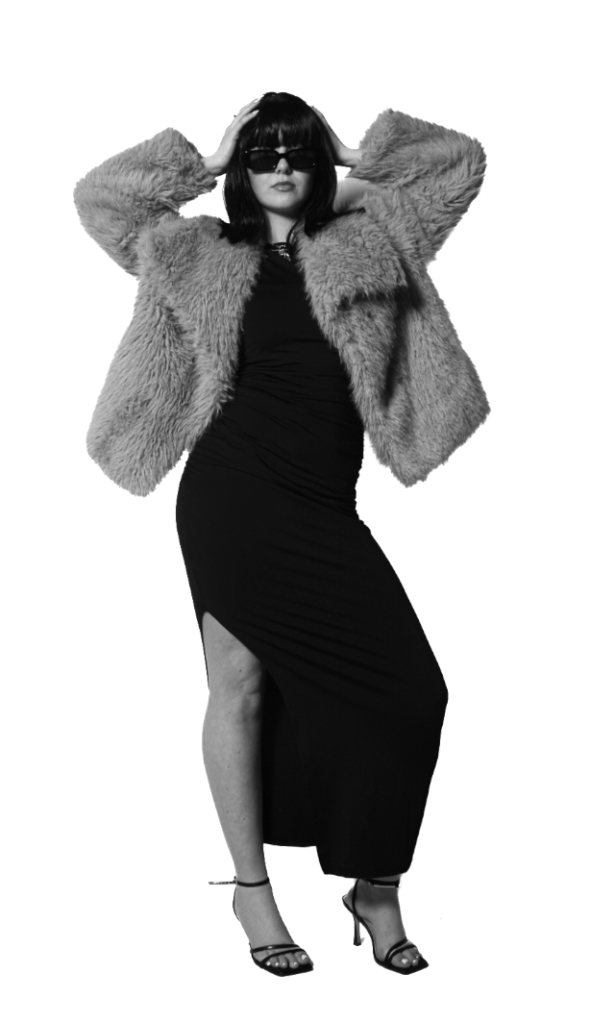
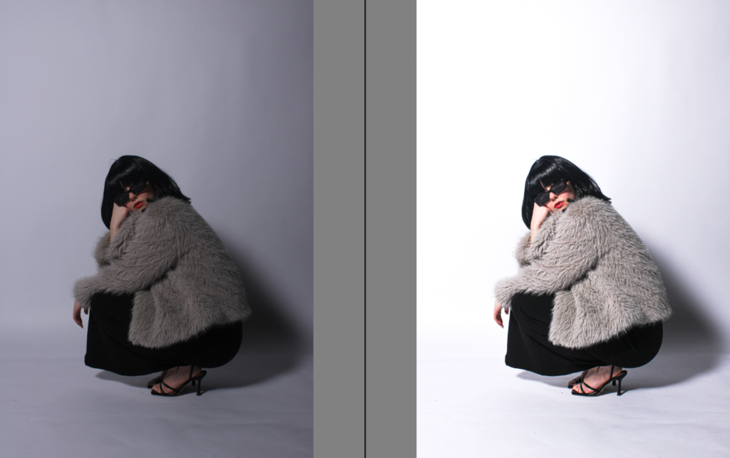
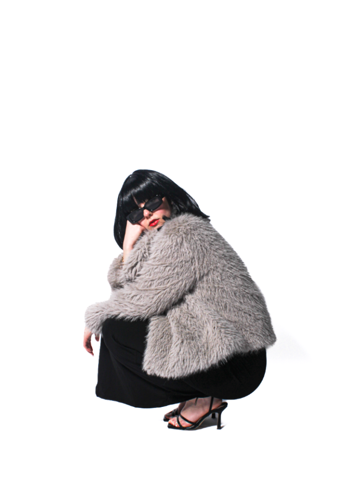
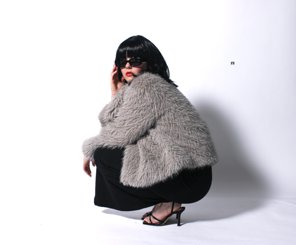
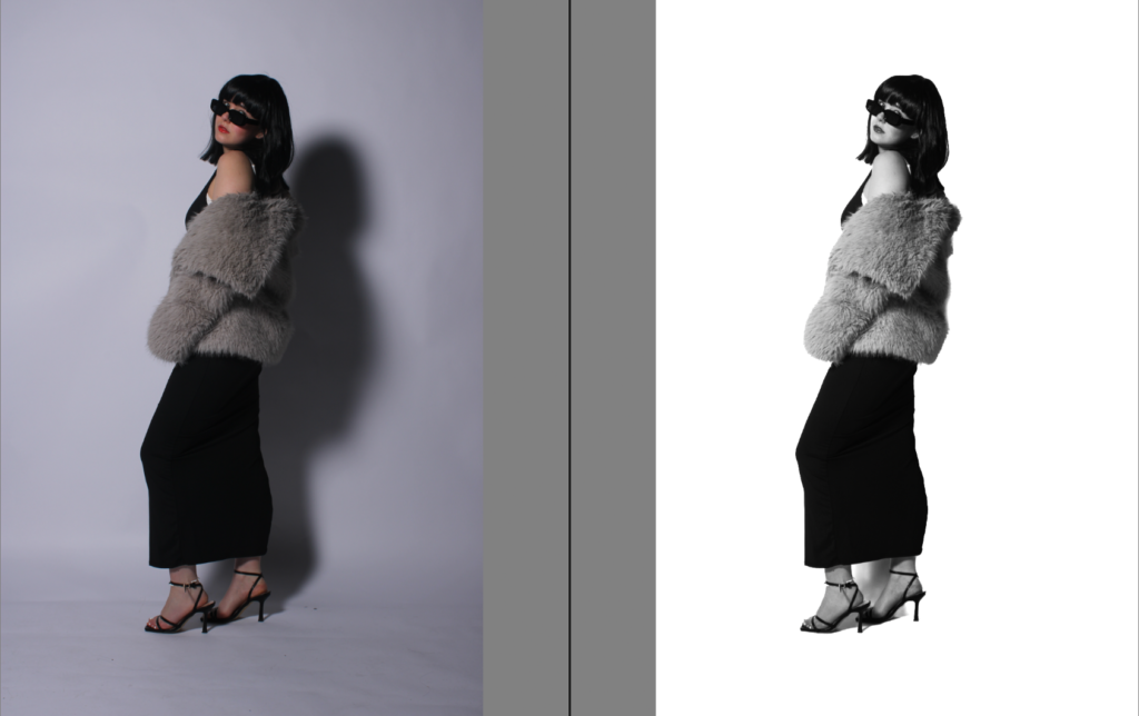
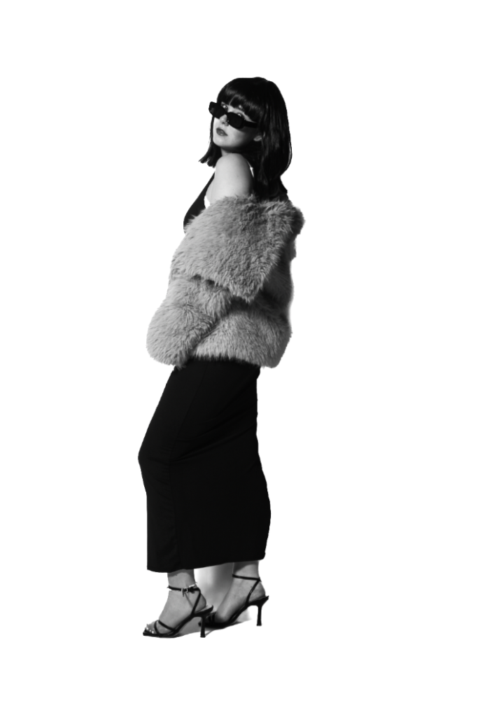
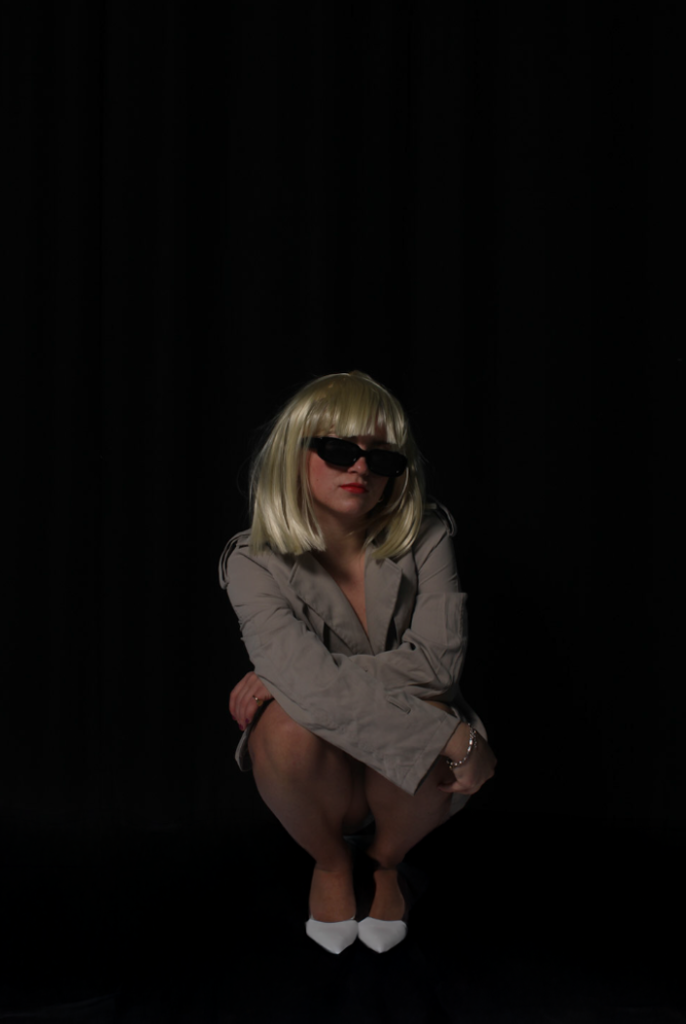
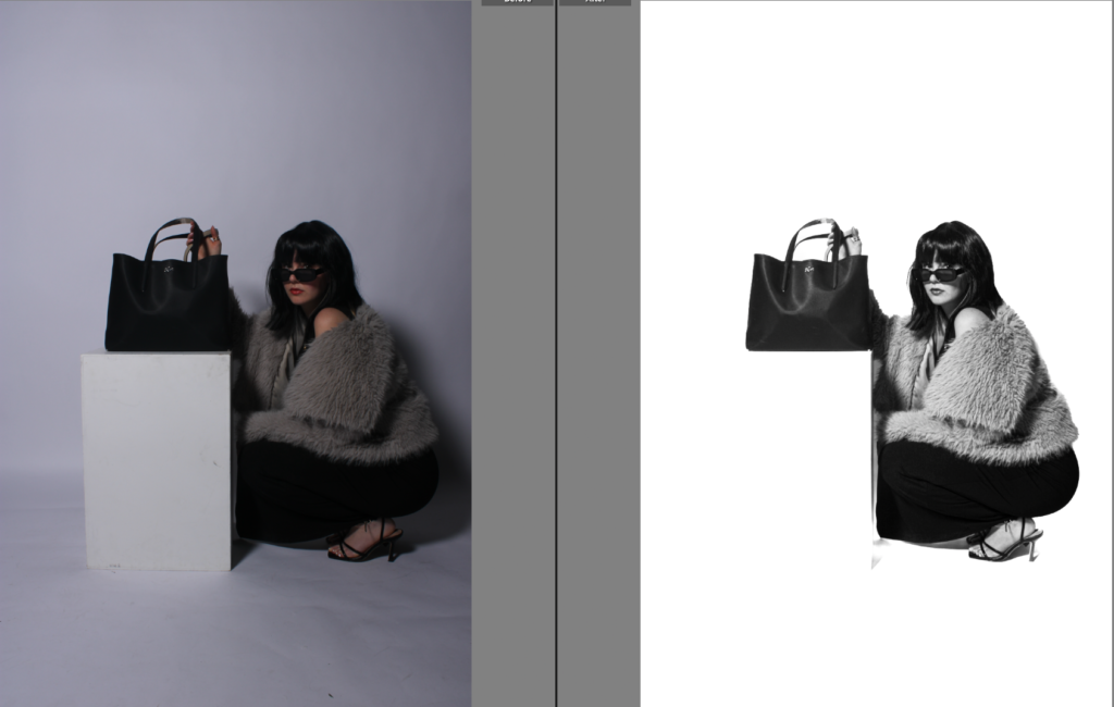
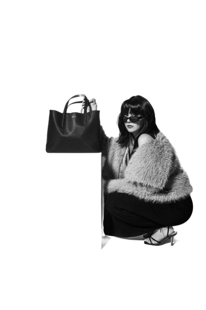
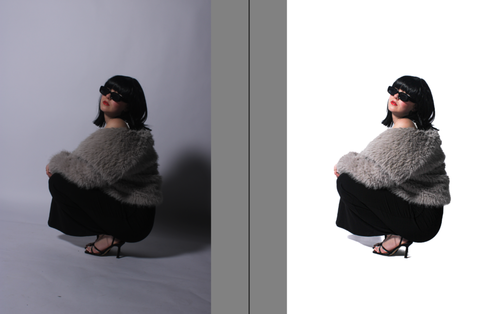
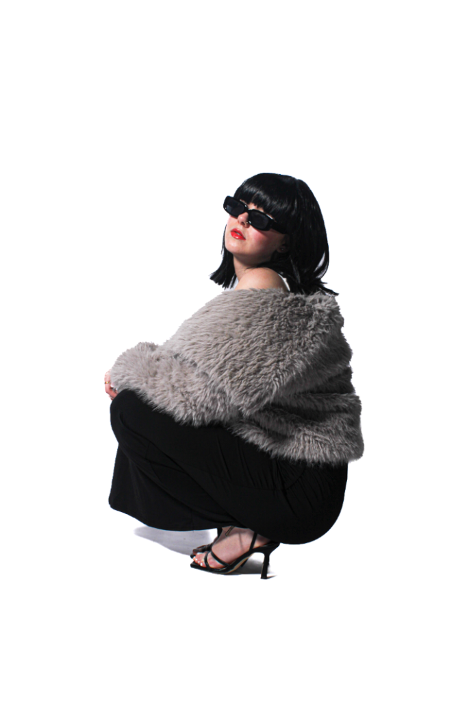
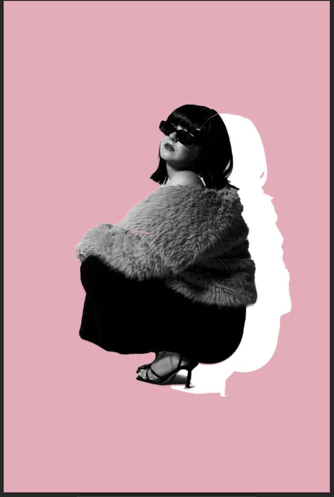
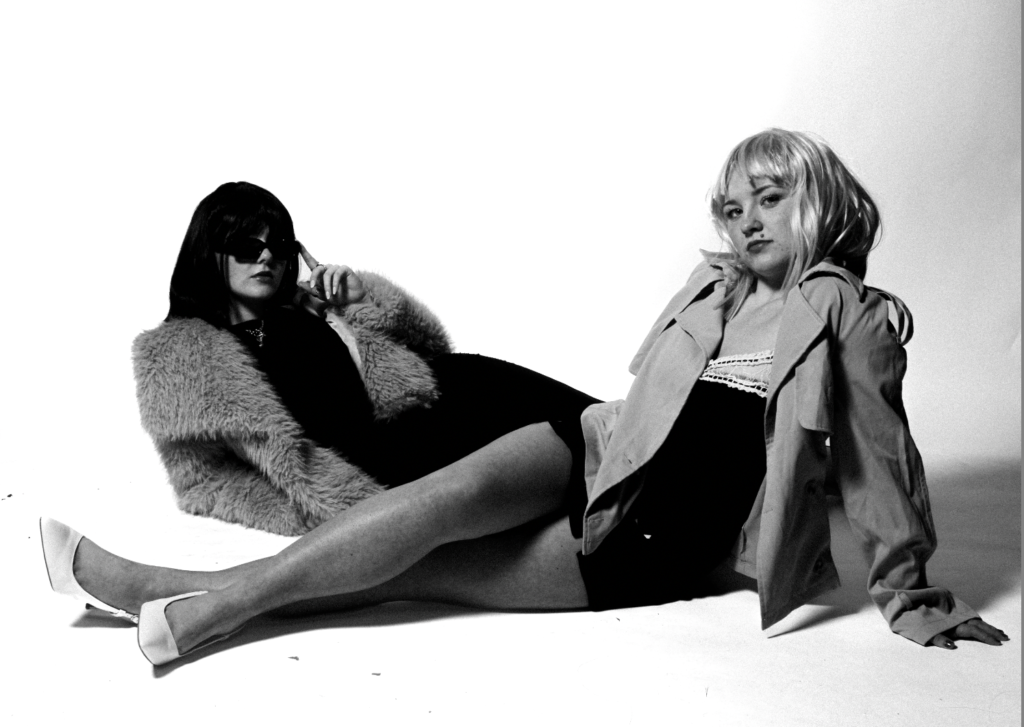
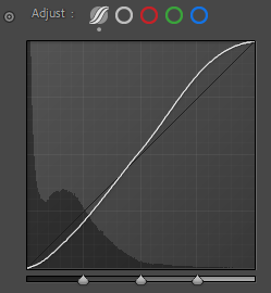
First, I did this by editing her by herself, and then clearing the background. Although it does not get rid of the shadow completely, it keeps it on a very subtle aspect. I personally like this, as it is making the subject the main element of this image. Making her stand out boldly which I personally think suits this type of cinematic photography I have decided to aim for. Due to the aim of making it a luxurious and glamour aesthetic, the clothing is a massive part of this theme. It is almost to look like a fashion shoot with an aspect of wealth. To make this more clear, I increased the texture so you could see the ruffles in the dress to make that more realistic. This also made the wig look more realistic and the fur coat more more texturized. I think this definitely did a lot. Due to the discarding of shadows, the subjects body shape was more noticeable. Another thing to emphasise this was to decrease the blacks to make the ruffles and fur texture more obvious and clear. making the subjects body shape more eye catching. Which is significant as Helmut Newton focused on body size, specifically a certain type causing beauty standards. However, he also added to the revolution of women in the media. Making it more normalised for women to be in the main-stream fashion media which I think this photoshoot gives an aesthetic of. The filter CN10 adds an aspect of uniqueness which links to Yayoi as she was known for her unique beliefs around the body and the female identity.
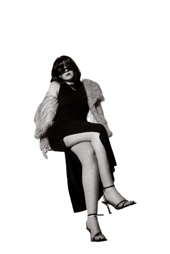
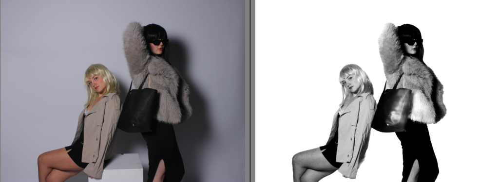
Overall, I think it depends on what I am trying to aim for, which is why I am experimenting to see what I prefer. If I wanted my images to look as if they have came from a more artistic perspective, I will keep the shadows, and experiment with them. However, on the other hand if I wish for my photographs to come from a more fashion photoshoot surrounding women in media that is suppose to look professional, which differs more to my old project, then I will discard the shadows. the reasoning of the shadows is because my subject is standing too far back in the studio against the white backdrop. Although, one thing I do definitely like more from experimenting is the more texture and decrease in blacks to make the subjects clothing more clear and vibrant.
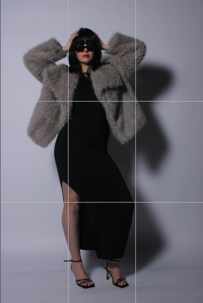
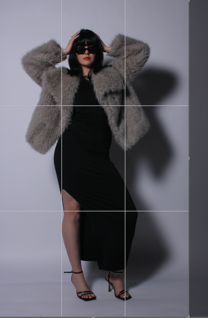
Using this tool and the rule of thirds, I could immediately tell that the subject was not in the centre, making it look un-professional.
Most of my editing will stay the same, however I will experiment with different filters to see which one I prefer the most. Within this image, I really like it in colour as the red lip symbolising femininity really stuck out to me and I really liked the contrasting with the wig and the black dress with the fur coat in-between.
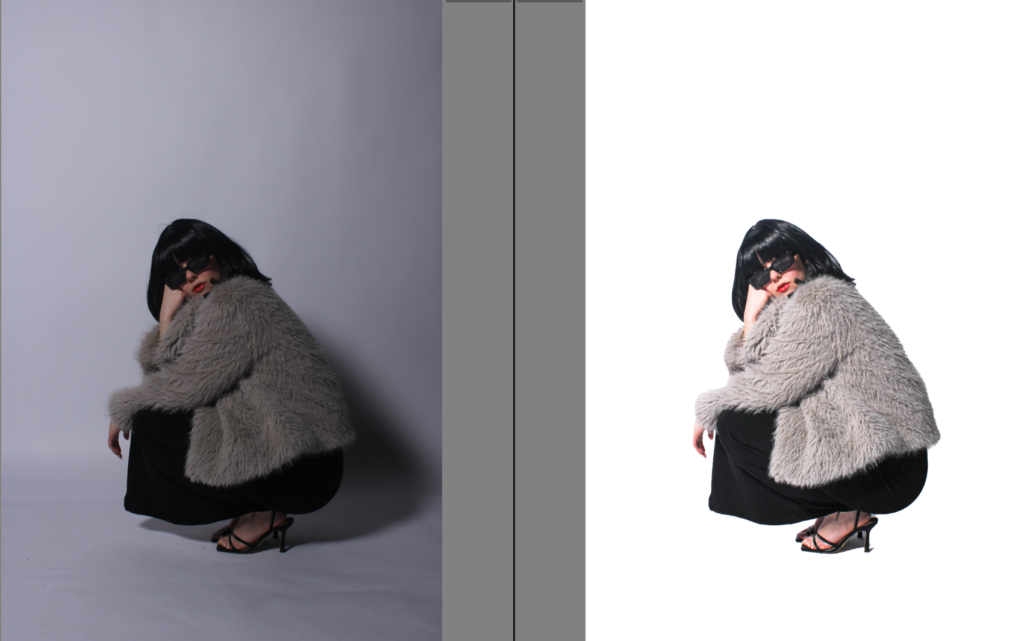
Detecting the background –
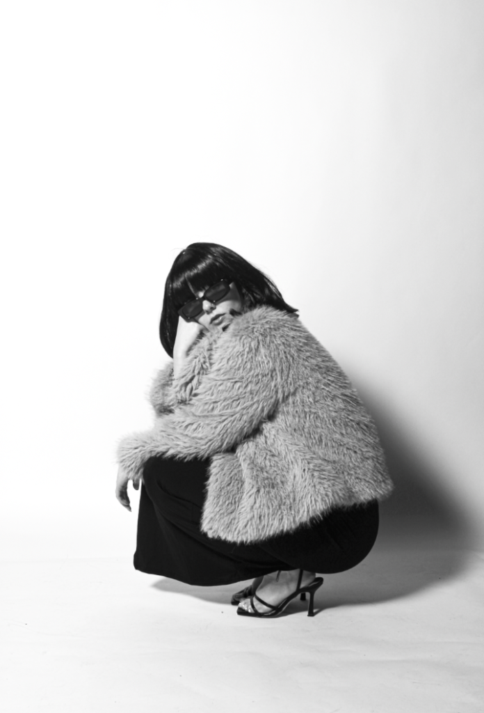
I really liked this filter at of most of the ones I have experimented on so far, this is the BW11 which I think makes it look very retro and vintage which I really like.
In colour:
With BM11 b&w filter-
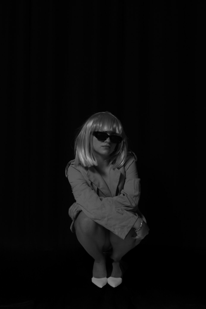
I definitely prefer this image in black and white as the originals subject’s skin tone does not make the red lipstick as bold, therefore, after putting it in black and white and using a BW06 filter, the subjects facial features are more deepened and richer, allowing a viewer to notice it more as it is very significant to my photoshoot.
BW11:
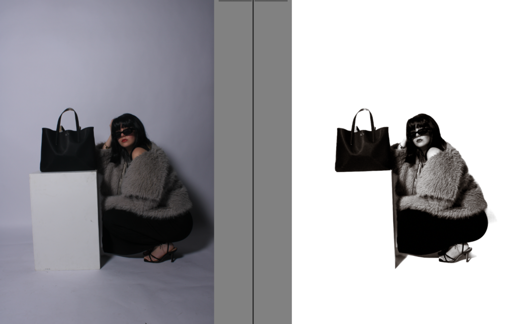
Experimenting using photoshop to change the backdrop-
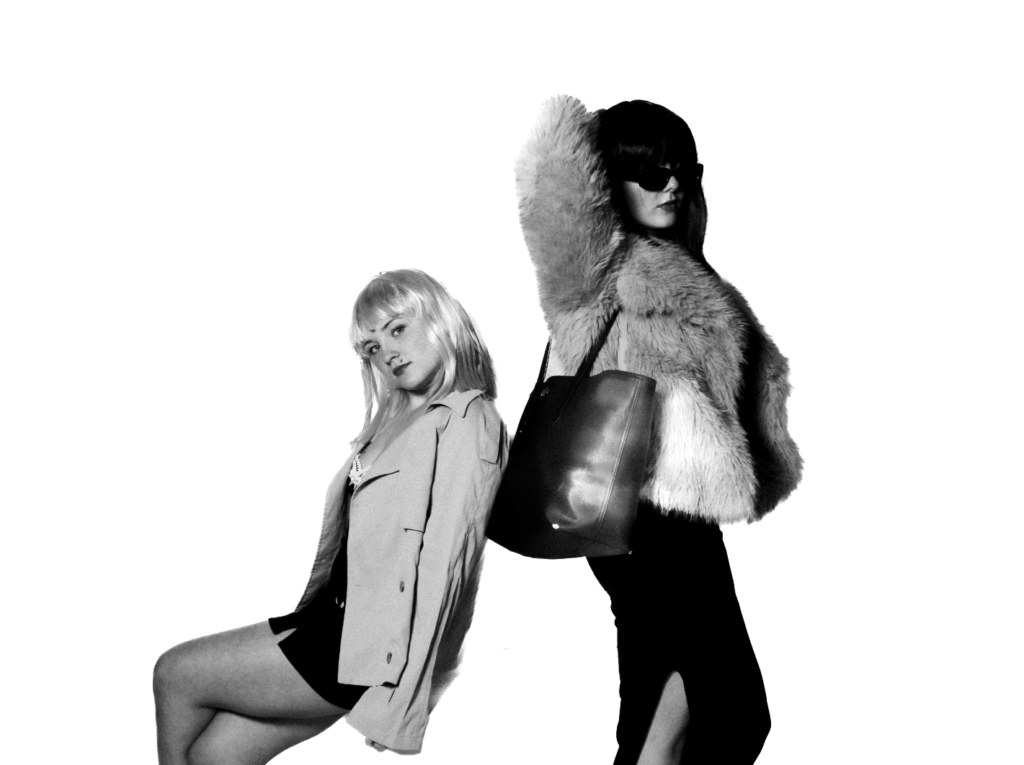
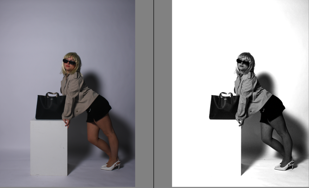
I personally think here, I have experimented however I have learnt for my next photoshoot, to use a white backdrop to make the subject stand out rather than the black one. I did this because I thought my blonde wig wouldn’t stand out against the white background as much. However, the white backdrop overall looks more professional and emphasises the medium to stand out significantly.
Using BW06-
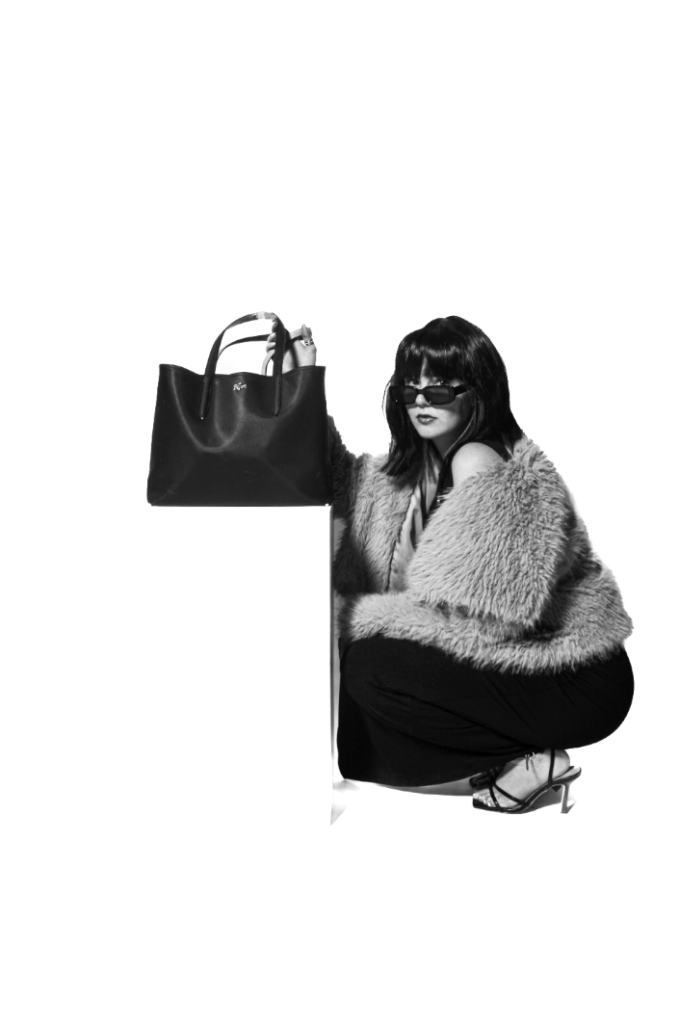
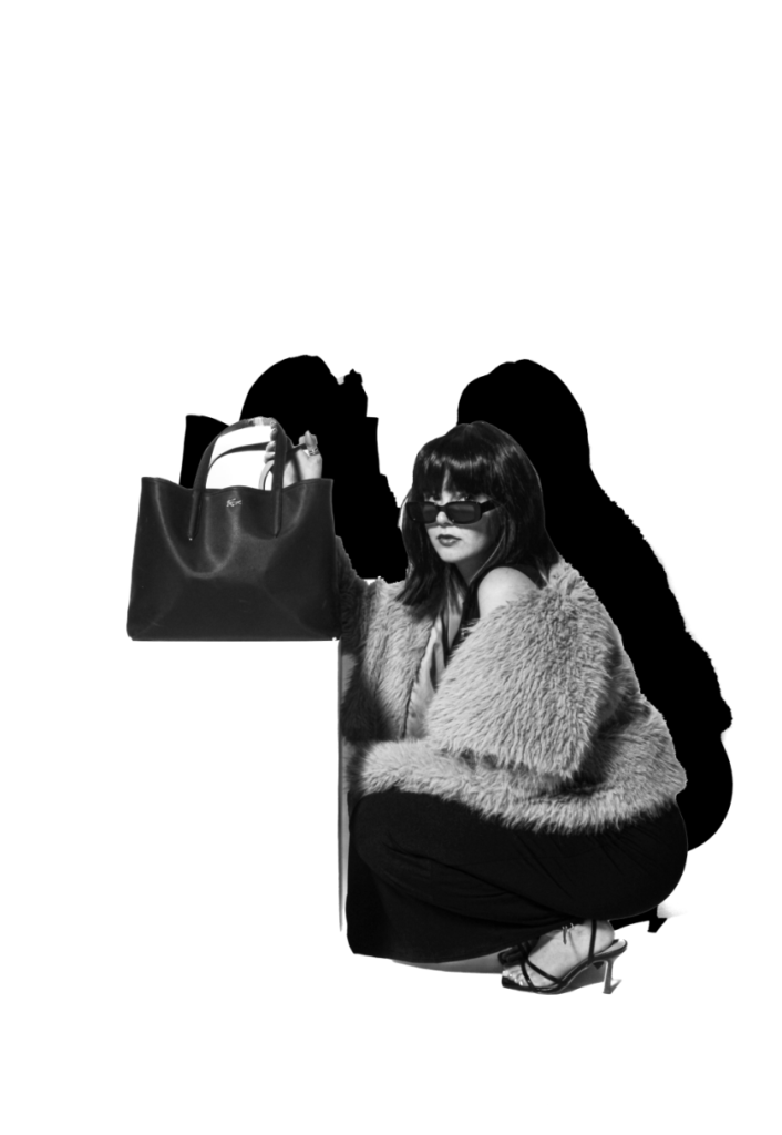
Experimenting in photoshop to see if I can create the illusion of the bag floating by rubbing in white around the shadows and line of the bag stand.
After experimenting, I came to the realisation that because of my subjects clothing such as the fur coat. It would be challenging for me to make it look realistic as I would have to go around every strand of fur which is almost impossible. However, I believe each experiment is significant as I learn and gain experience each time. Therefore, this was my final outcome for this image.
Experimentation in photoshop:
Colour overlay and stroke:
Experiment
Yayoi Kusuma inspiration-
BW11 filter:
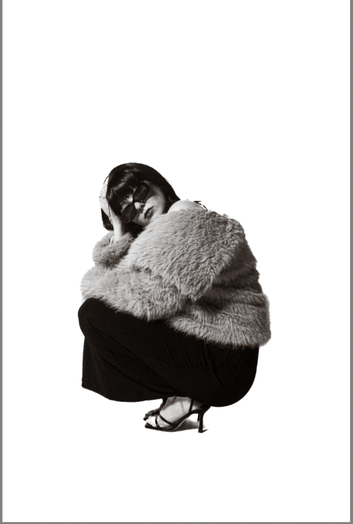
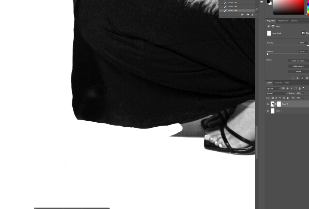
Using the eraser tool, I got rid of the shadow below the subject’s feet.
Looking at the idea of friendship within the theme of union can be valuable for several reasons. Friendship is one of the most fundamental forms of human connection. Looking at how it relates to union, you can gain a deeper understanding of what brings people together; the emotional, psychological, and social bonds that strengthen these connections. It’s a way of exploring how individuals form and maintain meaningful relationships, which is an important part of human experience.
Why it matters to you?
Friendships often provides emotional support and a sense of belonging. People often search for these connections naturally. Additionally, looking at friendship through the lens of union can show a sense of clarity on why these connections are so essential for your emotional well-being and how they contribute to your overall sense of identity. In our world, people can often feel lonely, examining how friendships can unite people might help understand on a deeper level, whether in person or online. Ultimately, studying friendship as a union allows you to reflect on your own experiences and learn how to foster more fulfilling, lasting connections with others.
How you wish to develop your project?
Capture moments where friends come together, whether that’s in a natural or set up way. I’m not fussed on the setting of my images, i’m more focused on capturing the moment, and then editing any flaws out afterwards.
Which form you wish to present your study (photobook, film, prints etc)
I want to present my work in a photobook. I would like to do this as I believe it is the most artistic way of presenting my work. I like how you can search picture for as long as you want and admire them. I also like how you can flick through the pages. What inspired me to do this was previous photobooks I have looked at from ex-students who have already produced one.
When and where you intend to begin your study?
I want to begin my study as soon as possible so I have time to get it perfect, and change anything I want to change. I will begin by going out with some friends, and wherever I go, i want to purely focus on exactly what i want to capture with no distractions.
Arielle Doneson is a photographer whose work focuses on the theme of friendship and connection. She looks at the depth of human relationships. She uses natural lighting, candid portraits, and intimate settings to explore how friendships form, grow, and change over time. Doneson’s photography examines the not as obvious aspects of human connection. She captures her subjects, who are often close friends, but also strangers, to create portraits that show the shared history, mutual care, and existence in each others lives. Doneson’s work has been featured in many publications, including Style Me Pretty, The Wedding Chicks, Elizabeth Anne Designs, and GayWeddings.com. Arielle Doneson’s work links to the theme of “union” in several meaningful ways, even if it’s not the central or overt theme of her photography. Here are a few key connections:
The photo – “Shared Silence”
This is a portrait of two women sitting on a park bench during sunset. The photo captures the moment between words, where the friends’ heads are slightly bowed, their hands gently touching. The photo expresses the quietness they both share, suggesting that no words are necessary for a strong, meaningful connection.
Arielle Doneson’s work, while often focused on individual portraits, also creates the sense of unity between the subject and the photographer. This connection could symbolise the deeper bonds found in friendships, where people come together and form a shared experience. A good portrait is not just about capturing someone’s appearance but about displaying their inner world, like when true friends come together, not just physically, but in understanding and emotionally.
This artist inspired me as she looks exactly at what i was wanting to look in to. Her photographs mildly encouraged what I then captured.
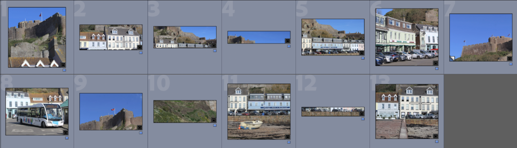
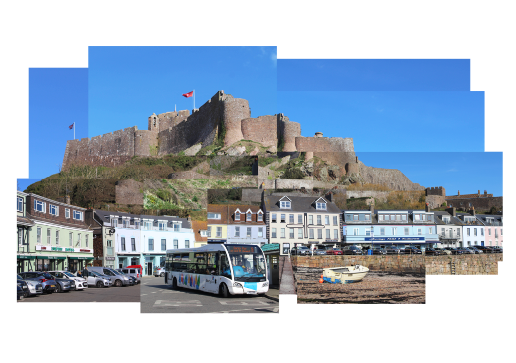
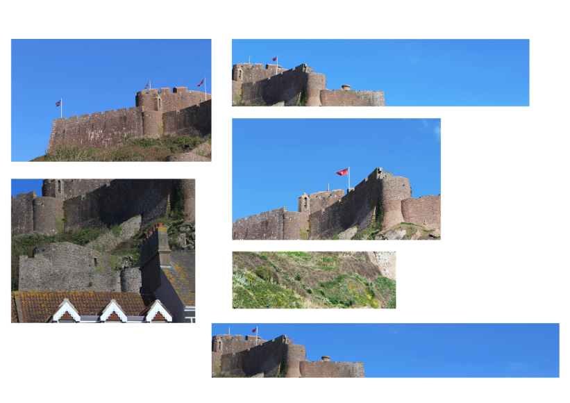
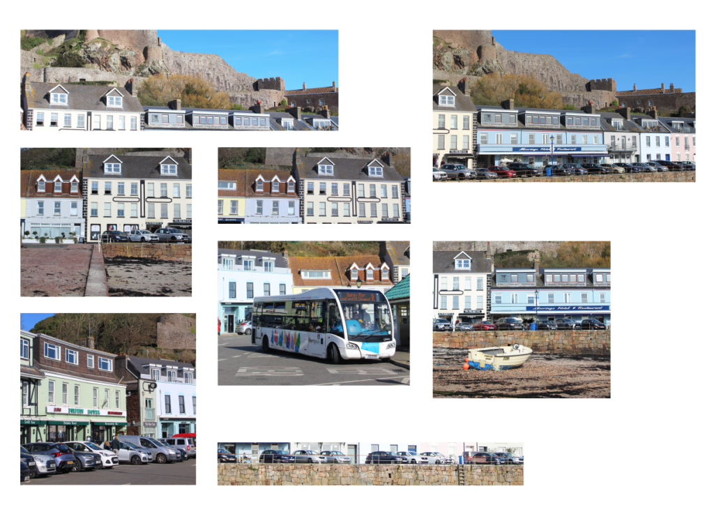
I started off my joiner by creating a mock-up using a powerpoint slide again. I used the images which I had colour-coded as green in Lightroom.
I then made sure to colour-code each image I had used in blue and then I cropped each of these images as to how they were in the joiner.
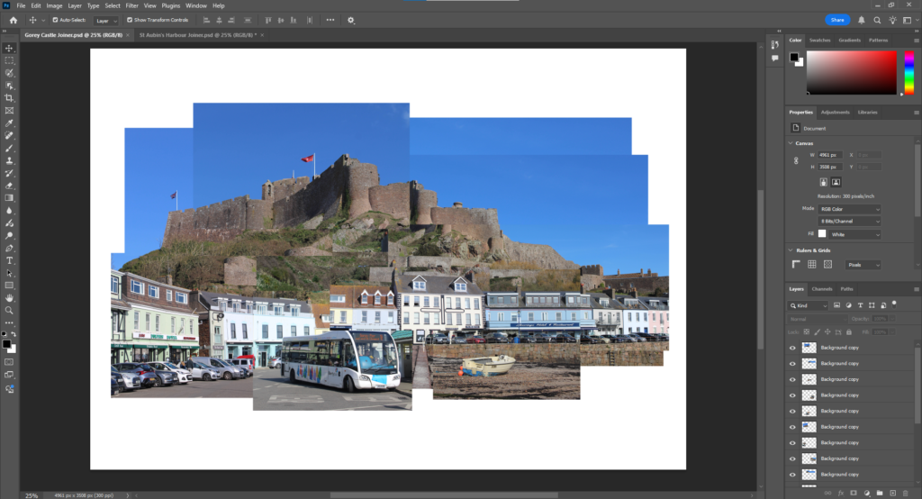
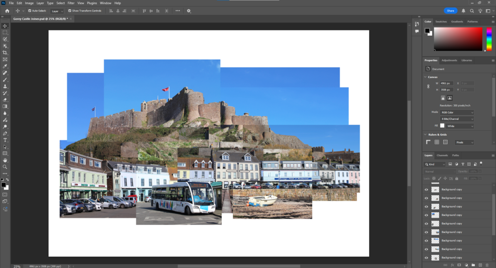
I then exported these images and inserted them into Photoshop. I used these images to form my joiner, imitating the mock-up I had made.
I then individually edited the image segments, changing their brightness and contrast. I decided that for this joiner I didn’t want to add any blur like my last one as I want it to be more of a landscape image than an abstract one.
This is my final joiner:
I would like to also make this joiner by hand so I separated the images on 2 separate A3 sheets in Photoshop so that the images can be printed to the right size. When I make this by hand, I will be able to just cut these images out then stick them down together.
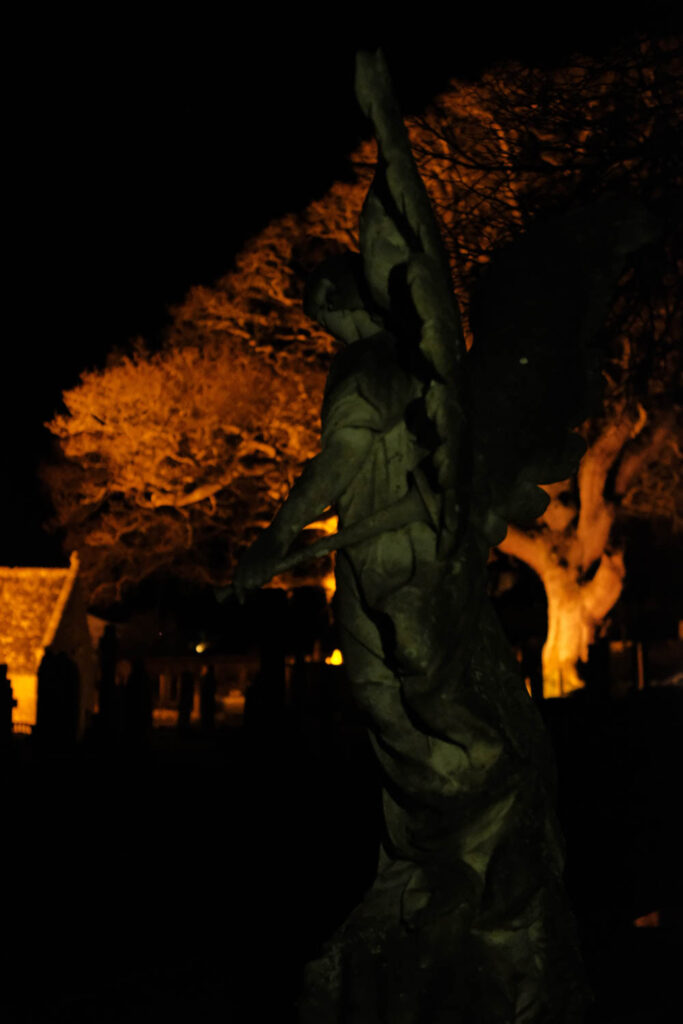
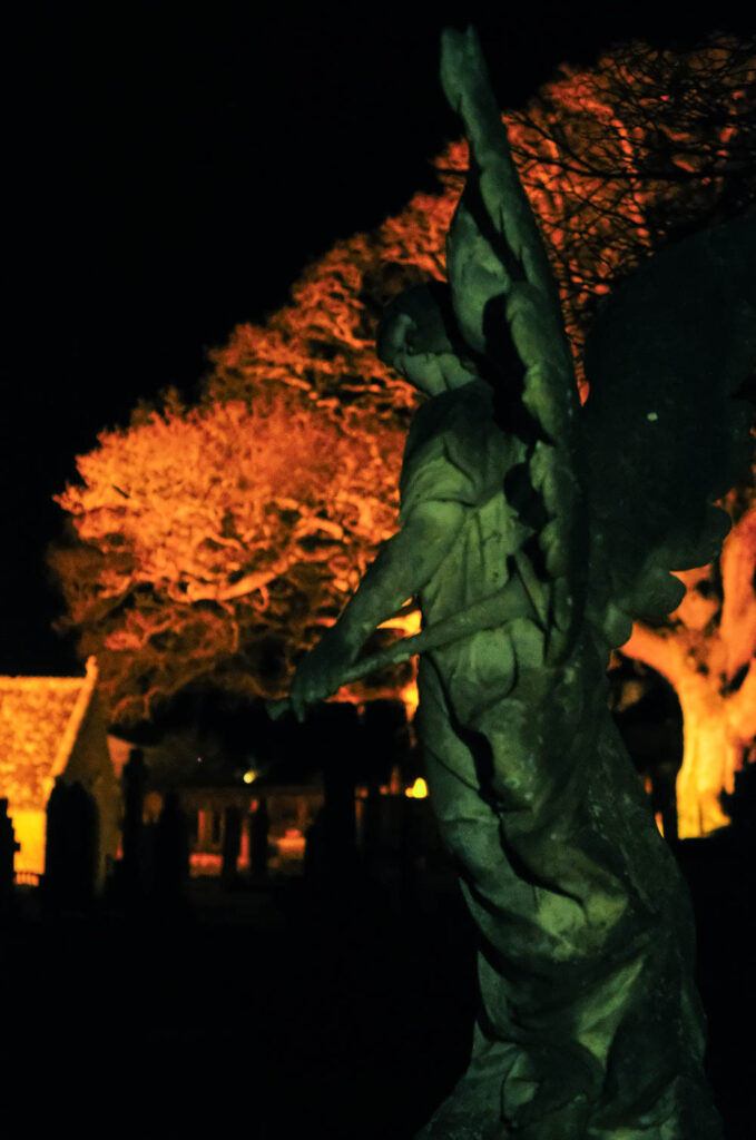
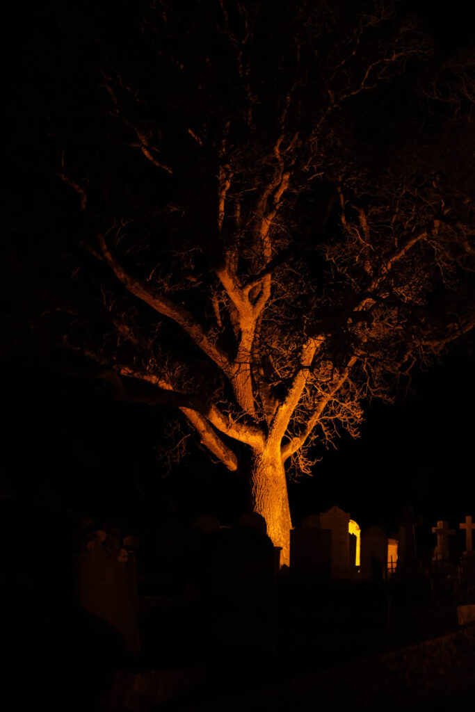
Born in 1953 in Lancashire, England, Kenna originally intended on becoming a priest, but was ultimately drawn to art. He attended the London College of Printing, where he learned commercial photography techniques. Kenna moved to San Francisco in 1977 and began exhibiting in local galleries, developing his hallmark subject matter and high-contrast black-and-white aesthetic. Specialising in long exposure landscapes, Kenna’s work often captures the quiet moments between day and night. He is best known for his black-and-white images of unpopulated landscapes and urban scenes. His black-and-white photography, which sometimes incorporates twilight or the quiet of early morning, emphasizes the interplay of light and darkness in serene and meditative compositions. Often employing long exposure times that he further emphasises in the dark room, Kenna’s work is both picturesque and mysterious. “You can’t always see what’s otherwise noticeable during the day,” he has explained. “With long exposures, you can photograph what the human eye is incapable of seeing.”
Joel Meyerowitz was born in New York City and began taking photographs in 1962. Although he has always seen himself as a street photographer in the tradition of Henri Cartier-Bresson and Robert Frank, he transformed the mode with his pioneering use of colour. As an early advocate of colour photography (in mid-60’s), Meyerowitz was instrumental in changing the attitude toward the use of colour photography from one of resistance to nearly universal acceptance. Throughout his career, Meyerowitz has since produced over a dozen books, and a full survey of his career was published by Phaidon in 2010. Additionally, in 1998 he produced and directed his first film, Pop, an intimate diary of a three-week road trip made with his son, Sasha, and his aging father, Hy.
Meyerowitz is known for his use of colour and light, often photographing scenes at sunrise or sunset. His work captures the transitions of light, particularly in the way it shifts through different times of the day. Meyerowitz’s images frequently focus on the golden moments between night and day, showing how light changes the mood and atmosphere of a scene.
I really love these photos. I love the colour contrast within the whole picture, its very calming and relaxing. i believe these photos tell a story and create images in your head. One photo can speak 1000 words.