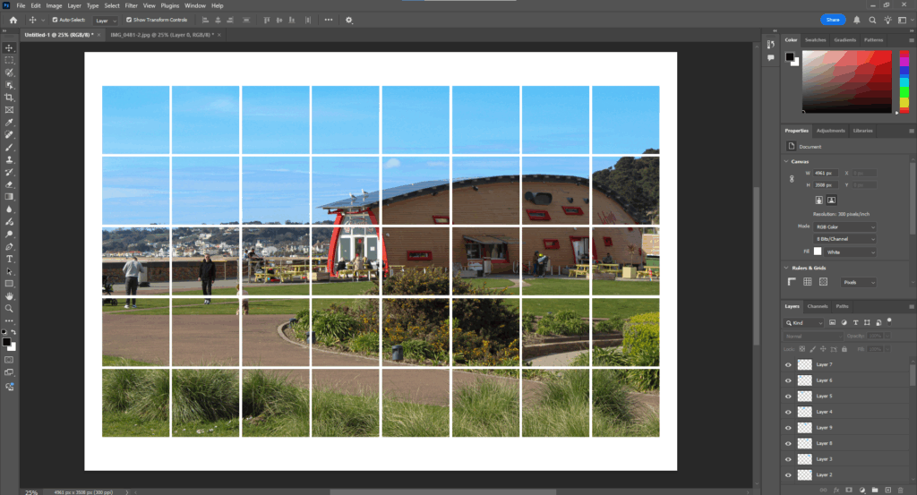
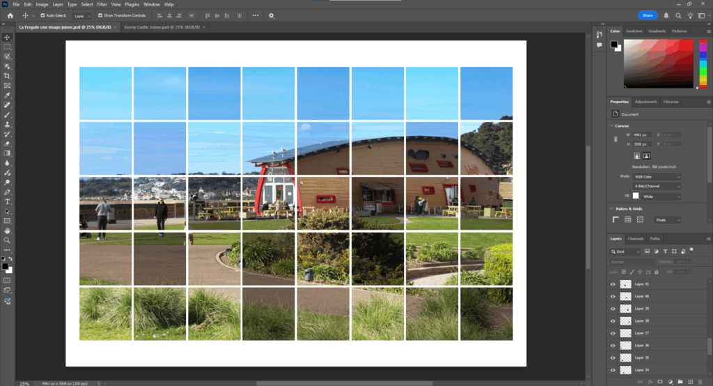
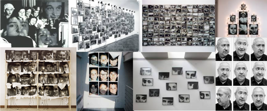
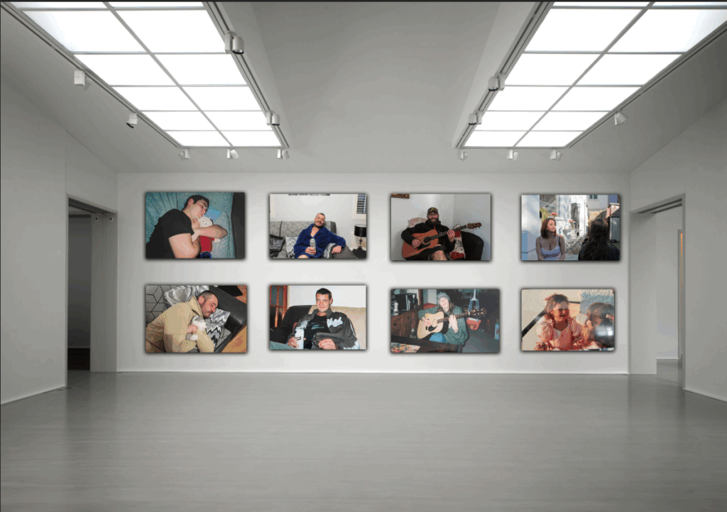
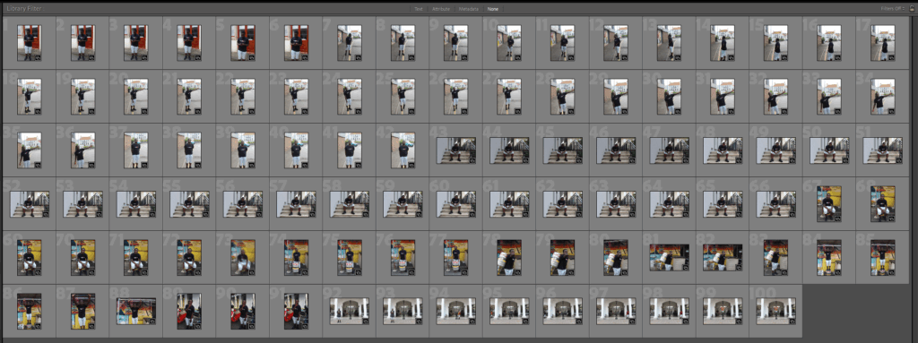
Initial Contact Sheet
For this photoshoot, I stayed in St Helier. I took the same approach as Jamel Shabazz and I went to St Helier which is the main town in jersey, this meant that I would find lots of urban settings which I could use in the background. For this photoshoot I took exactly 100 photos.
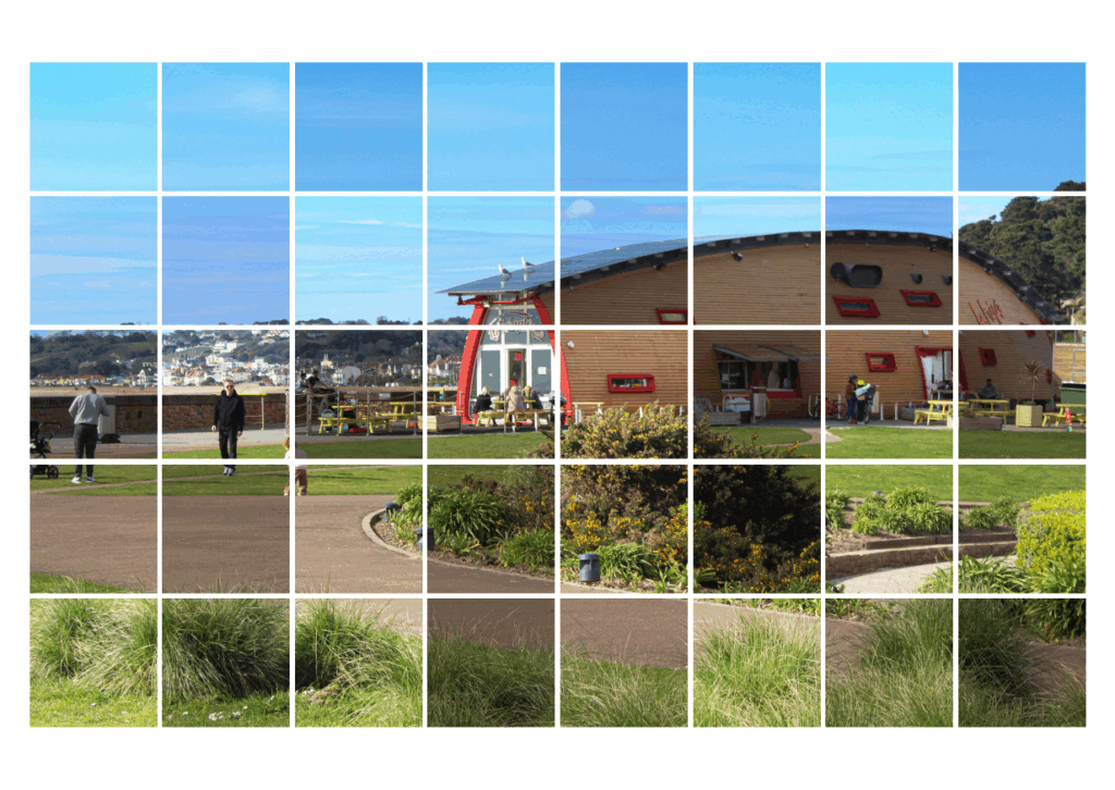
Selection Of Best Images
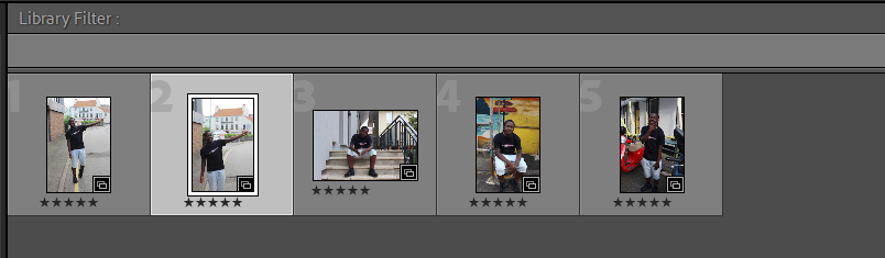
Out of the 100 images I took, these 5 were the best images in terms of relating to the artist, Jamel Shabazz. Although these photos may not be the best in terms of framing and composition, I think that the almost identical relation to the artist compensates for the quality of the composition. The composition can also be changed in photoshop or lightroom using the crop tool, therefore it is not a big problem.
Original Images
Photo #1 – Raw Version
Photo #2 – Raw Version
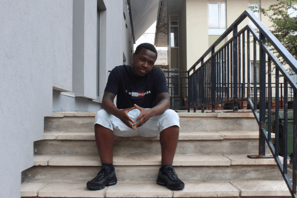
Photo #3 – Raw Version
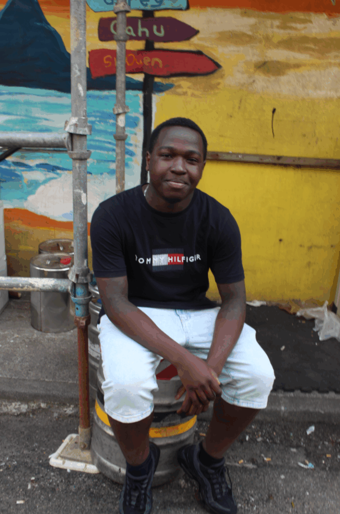
Photo #4 – Raw Version
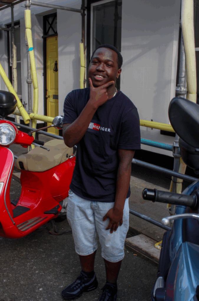
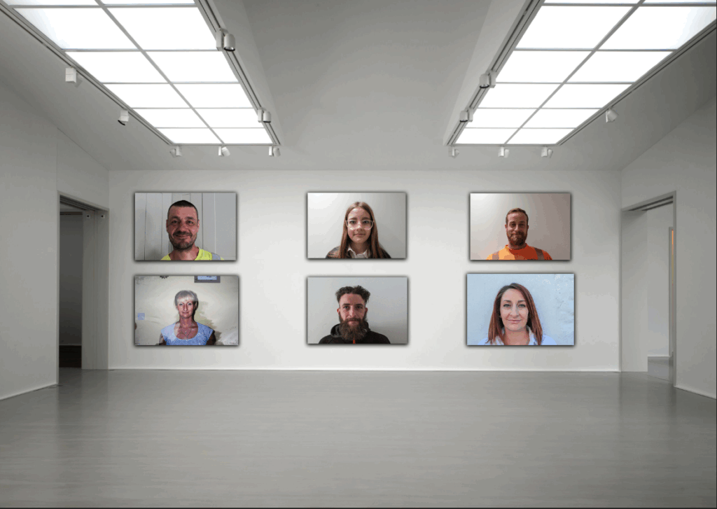
Photo development
Image #1
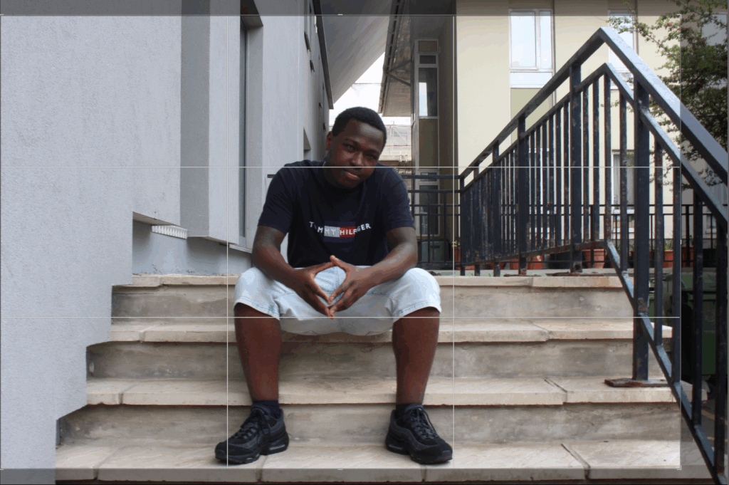
Firstly I cropped the image to straighten it and then I resized the image to get rid of some of the empty space next to the below the model.
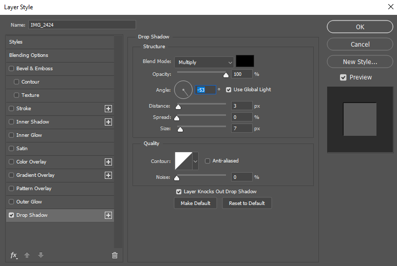
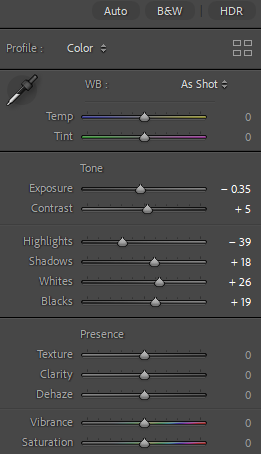
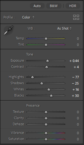
Adjustments Made –
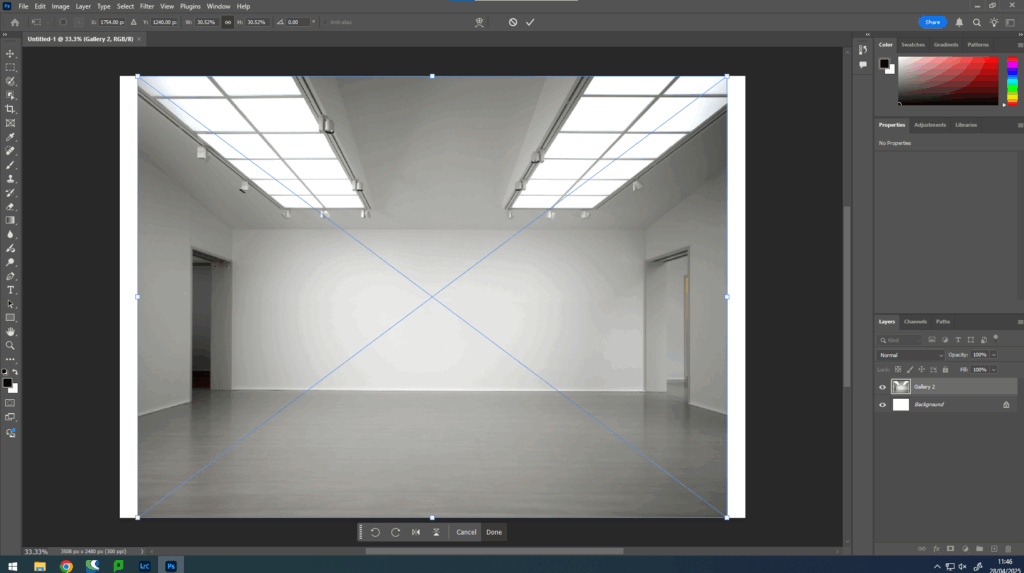
Before And After
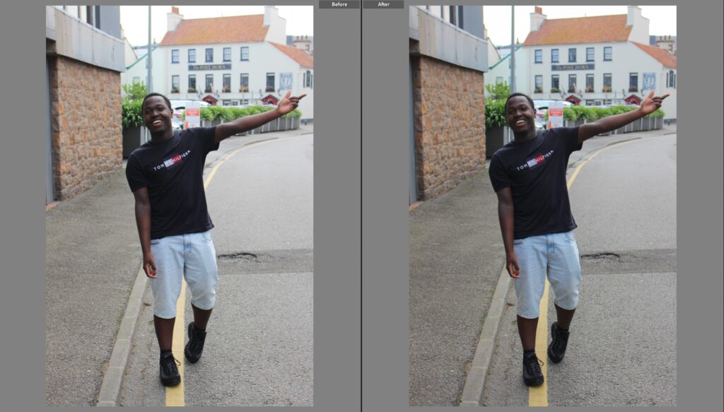
Photo #1 – Final Image
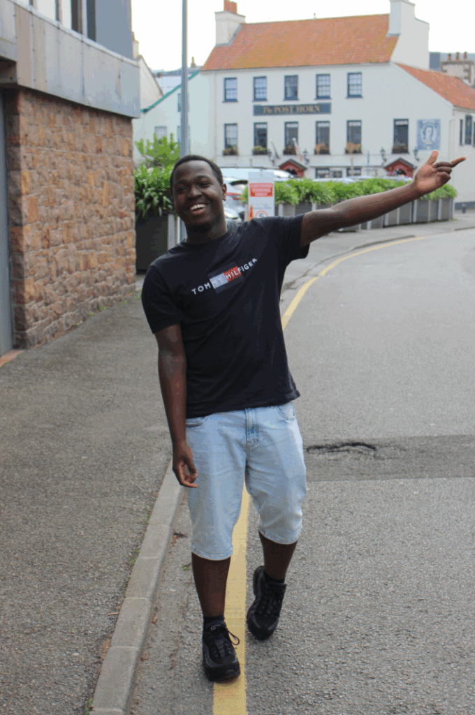
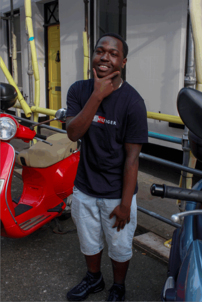
I only made slight adjustments to perfect the image, I used the portrait mode on my camera to take this specific photo. I did this because this mode makes anything behind the subject (the background) blurry which is seen often in Jamel Shabazz’s portraits. I like this outcome, although the photo does look like an action shot, it was candid and the model chose to pose like this. This exemplifies Jamel Shabazz’s work where the photos are clearly candid but don’t feel forced, that’s the idea I get from this photo.
Image #2
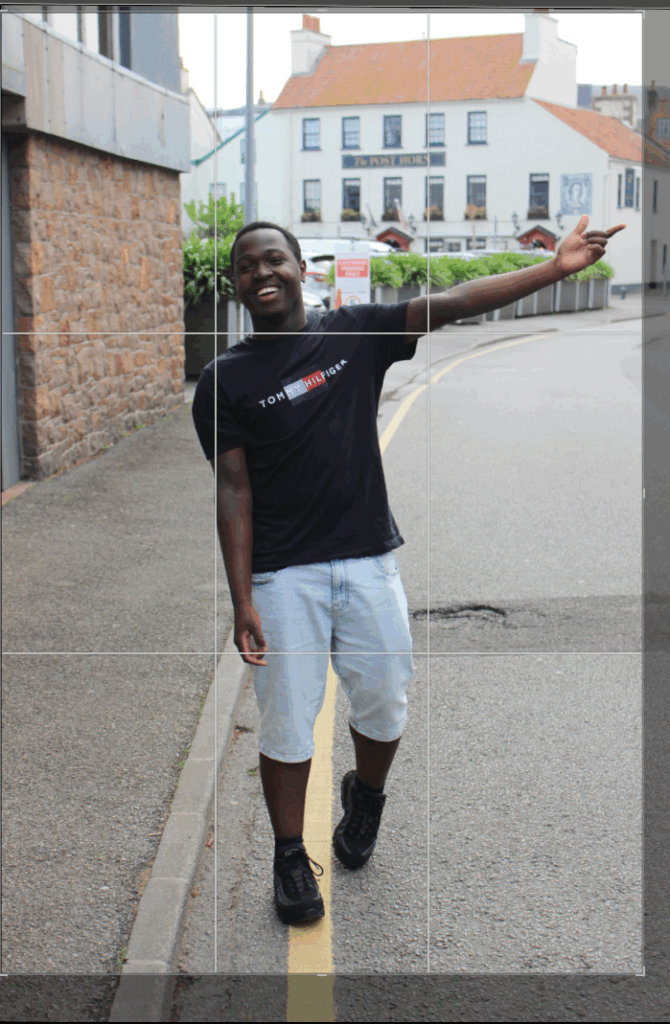
Firstly, I began with cropping and resizing the image, I put the subject in the direct centre of the frame to ensure that he is the focal point of the image.
Adjustments Made –
Before And After
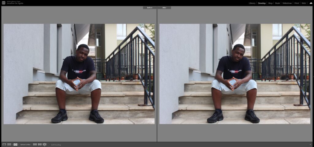
Image #2 – Final Image
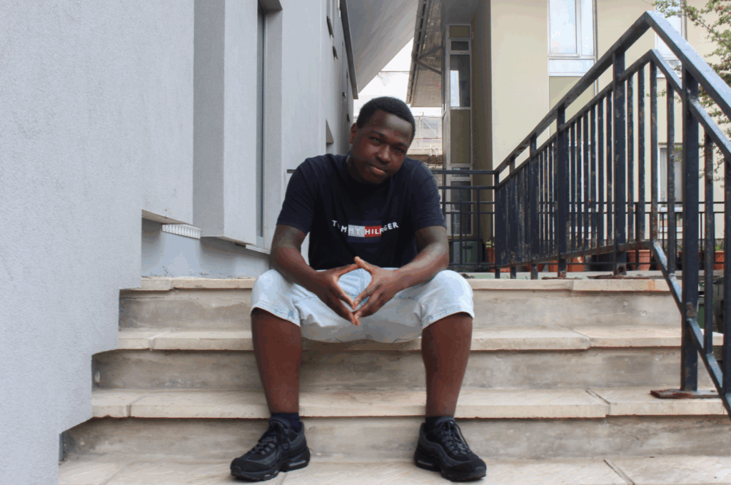
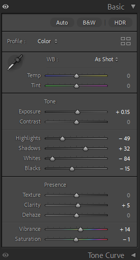
Image #3
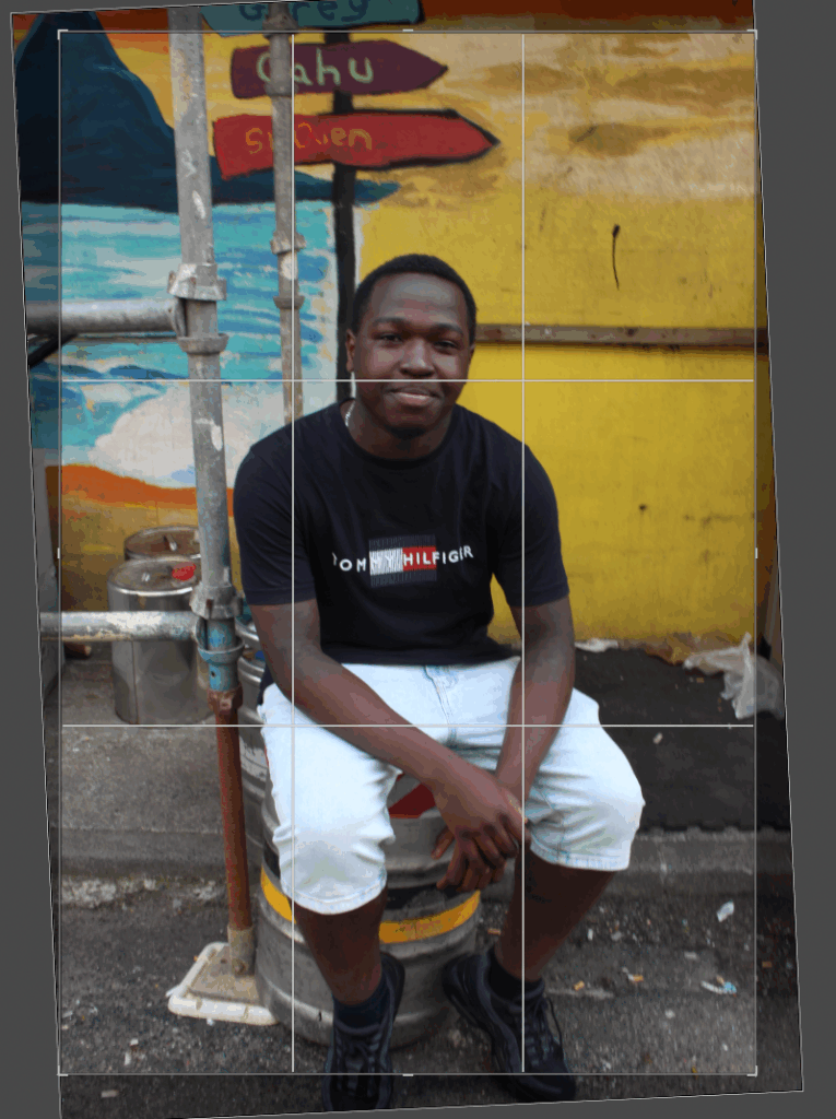
Firstly I began with adjusting the image by using the crop tool and straightening it as the composition was slightly diagonal.
Adjustments Made
Background Mask –
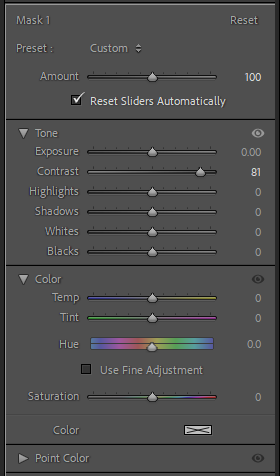
I masked the background layer because I wanted the background to stand out, its vibrant colours were not popping as much as I wanted it to, due to the lack of lighting so I adjusted the contrast of the background in Lightroom Classic.
Before & After
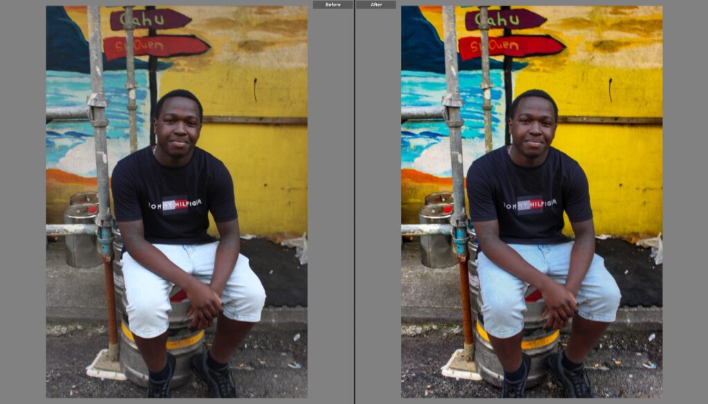
Photo #3 Final Image
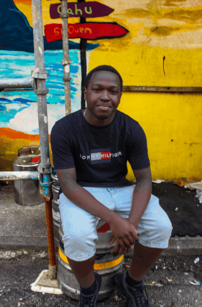
Image #4
Similarly to all the other images, I commenced to edit this image by straightening and resizing it from the top this time to get rid of blank space.
Adjustments Made

Before And After
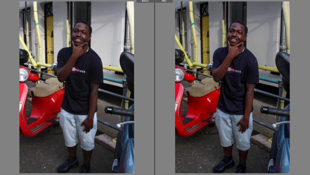
Image #4 – Final Photo