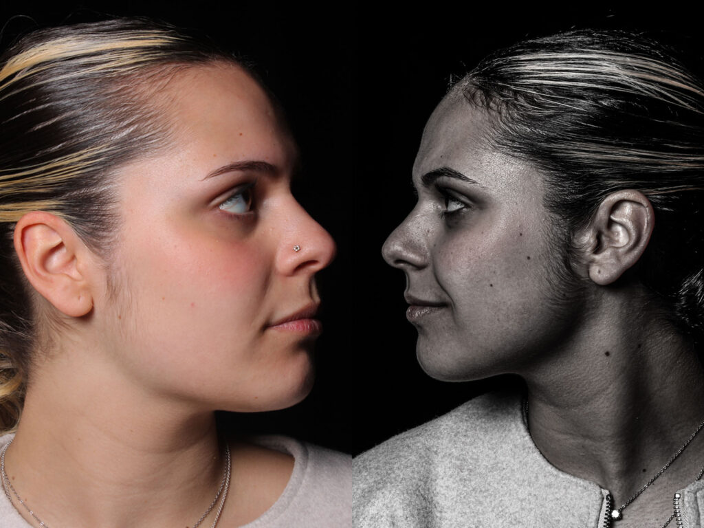
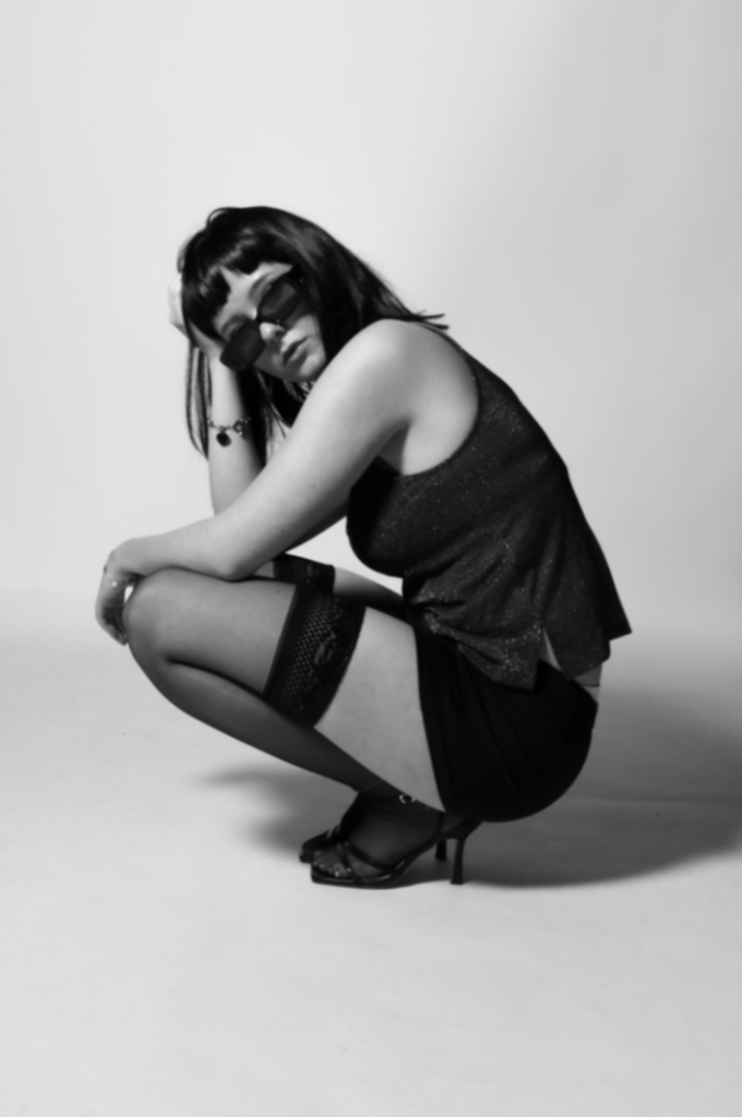
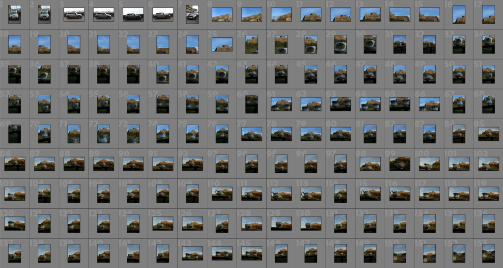
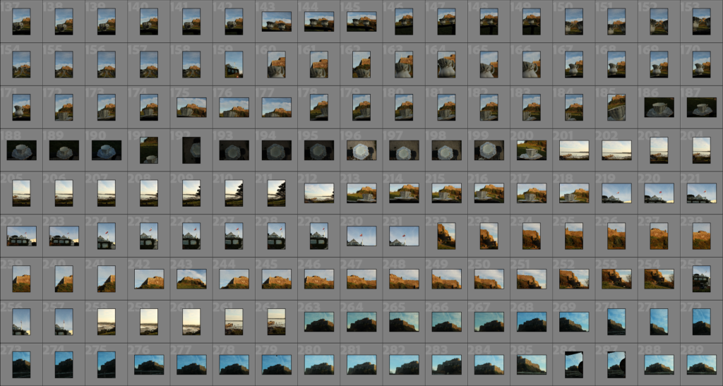
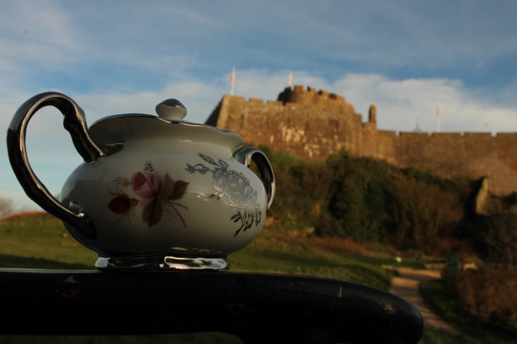
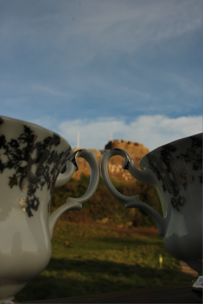
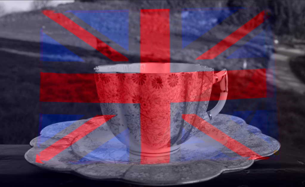
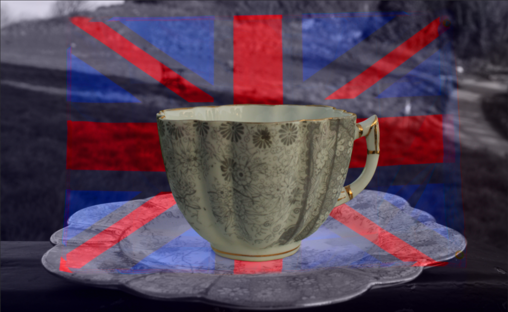
MY PHOTOSHOOT PLANS

Concept & Theme -

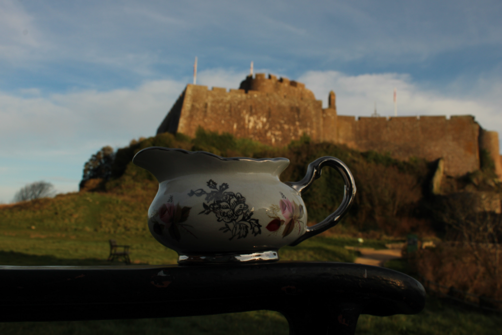
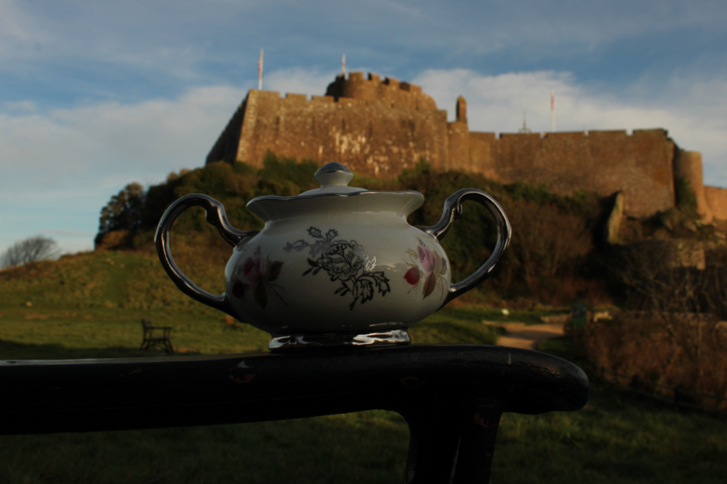
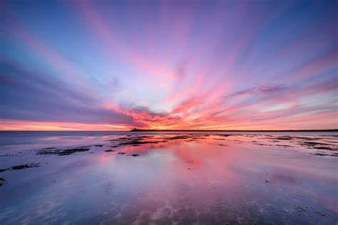
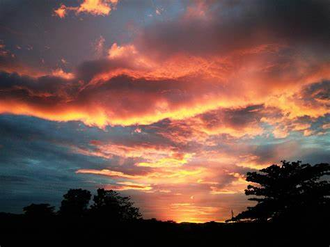
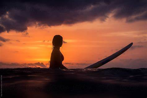
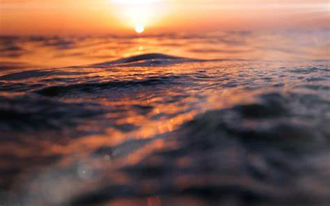
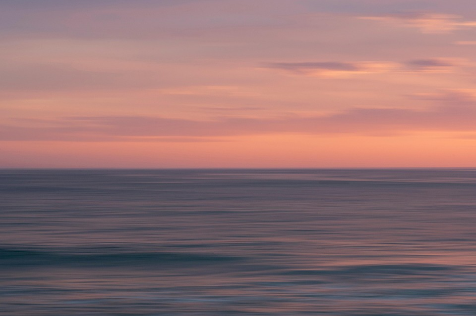
The theme behind this shoot is ‘UNION’ In which I have decided to represent through capturing how colours naturally blend together in a sunset. I really want to focus on the soft, effortless transition between hues, kind of like how everything in nature just fits together perfectly. It’s a simple but powerful way to represent connection, peace, and harmony. To bring this to life, I’m planning to get shots that highlight colour merging creating images like reflections in water, silhouettes against the sky, and cloud textures. The final images should feel warm and calming, almost like you’re standing there watching the sky change in real time.

Location & Timing -

Picking the right location is key for this kind of shoot however I also want it to be natural so I will be planning a few specific locations while also just taking some photos depending on where I am at the time of the sunset. Preferably I would need a spot with a completely open view of the sky so nothing blocks the colours as they blend. Some ideas I have are a beach, a hilltop, an open field, or even a rooftop with a clear horizon. If I can find a spot with water (like a puddle or the ocean), that would be perfect since reflections would enhance the whole merging effect.

Timing is super important too. some of the times of day I will try to capture at will be the golden hour, This would have the best lighting. It starts about 30–40 minutes before sunset, so that’s when I want to start shooting. The real magic happens in the 30 minutes before and after the sun actually sets, because that’s when the colours shift the most. I’ll need to check the exact sunset time for my location and make sure I get there early enough to set up.

Shot List & Angles -

To really bring out the theme, I want to get a mix of different shots and angles:

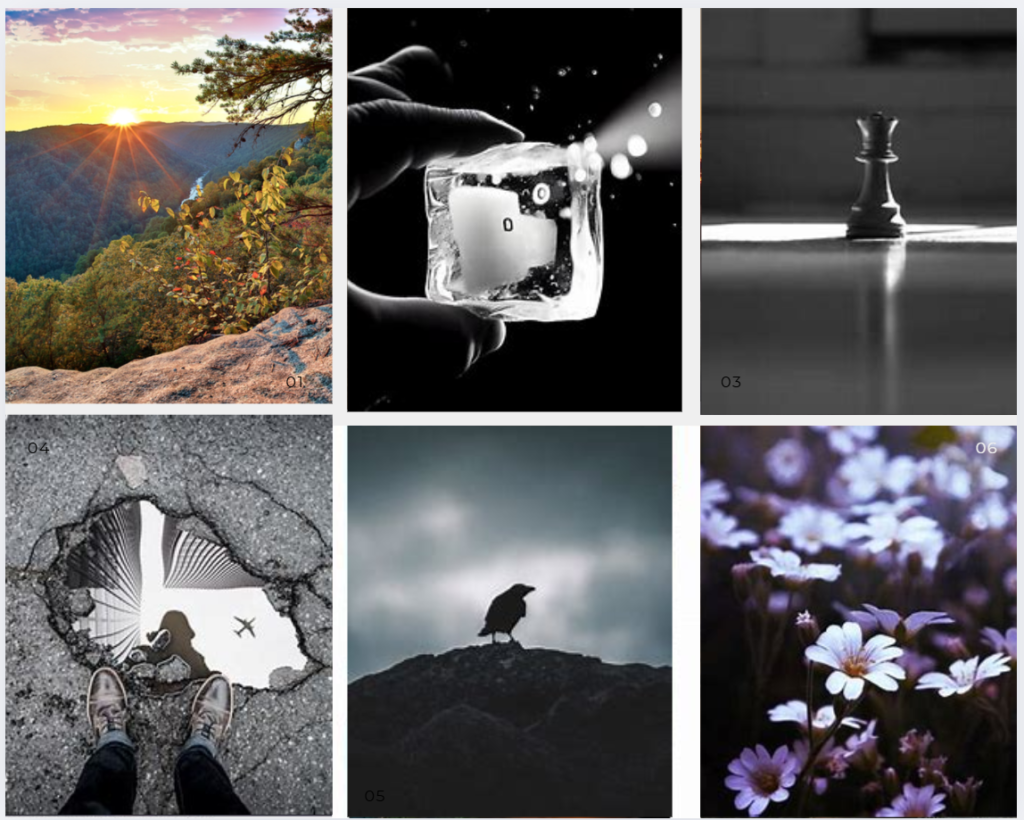
Wide-angle shots to capture the full gradient of colours. These will show how the sky blends together as a whole.

Close-ups of clouds because they naturally mix colours in cool, unexpected ways.

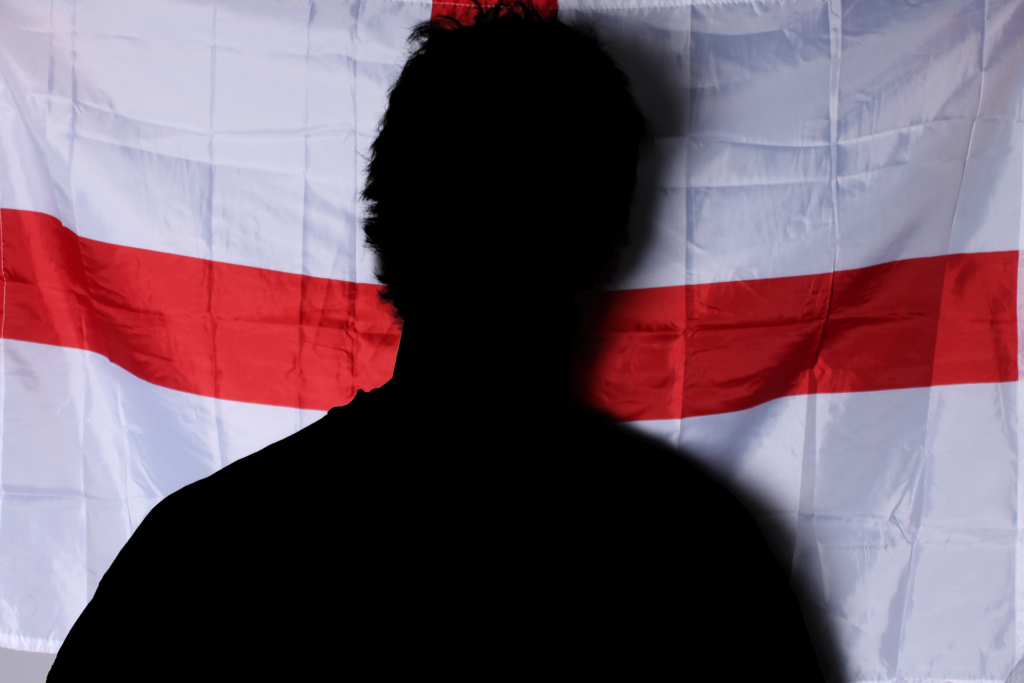
Silhouettes of people, trees, or buildings to create contrast against the soft sky.

Reflection shots using water or glass to double the colours and make them even more striking.

Motion blur effects (if I can pull it off) to make the colours look like they’re literally melting into each other.

I’ll also keep an eye out for unexpected moments, maybe birds flying through the frame or waves catching the sunset just right.

Equipment & Camera Settings -

I want to keep my setup pretty simple but effective. I’ll be using a canon camera with a wide-angle lens (probably something like 16-35mm) for big, open shots and a 50mm or 85mm for closer, more artistic details.

A tripod is a must for sharper shots and longer exposures, especially as the light fades. I’ll also bring a remote shutter release (or just use a timer) to avoid camera shake.

Camera Settings I Plan to Use:

  • Aperture: f/8 – f/11 for clear, sharp shots.
  • Shutter Speed: 1/50s or slower to play around with motion blur.
  • ISO: 100–400 to keep everything crisp and noise-free.
  • White Balance: I’ll manually adjust this, but something around “Cloudy” or “Shade” usually gives that nice warm glow.

Props & Creative Extras -

I don’t want to overcomplicate things, but a few small props could make a difference. I might bring a prism or a piece of glass to play around with light reflections and refractions. A reflector could help bounce warm light onto a subject’s face if I do any portraits. If I really want to push the “merging colours” idea, smoke bombs in sunset shades could be fun, but only if they don’t feel forced.

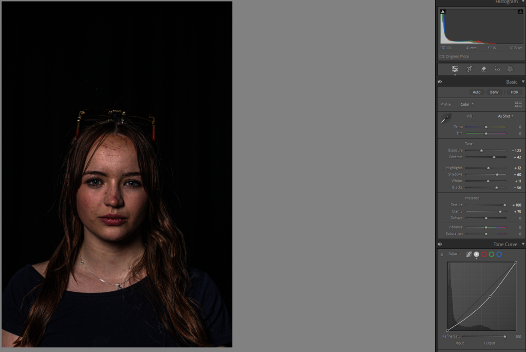
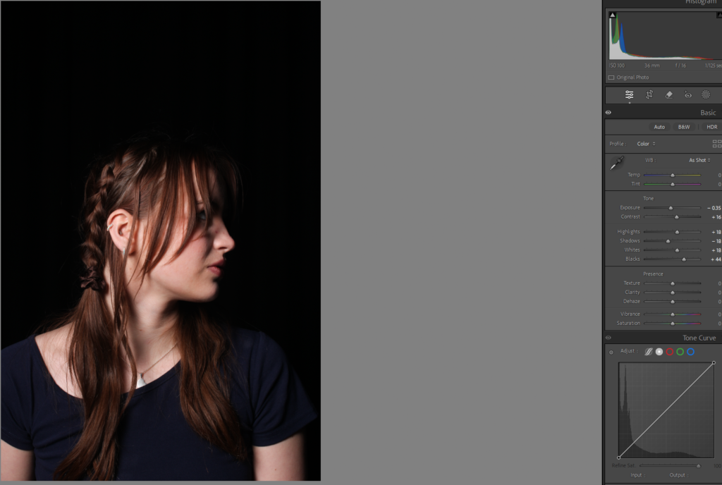
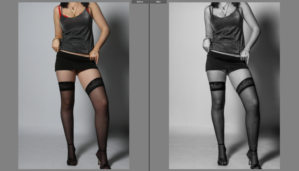
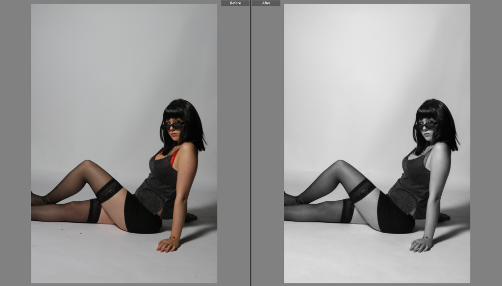
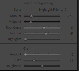
Editing & Post-Production -

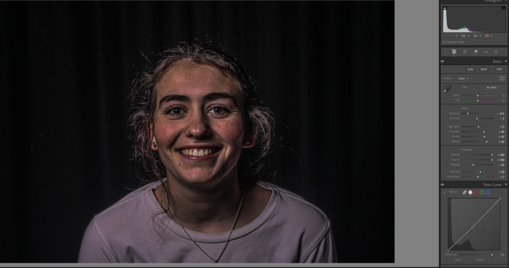
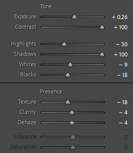
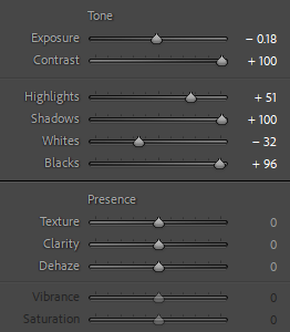
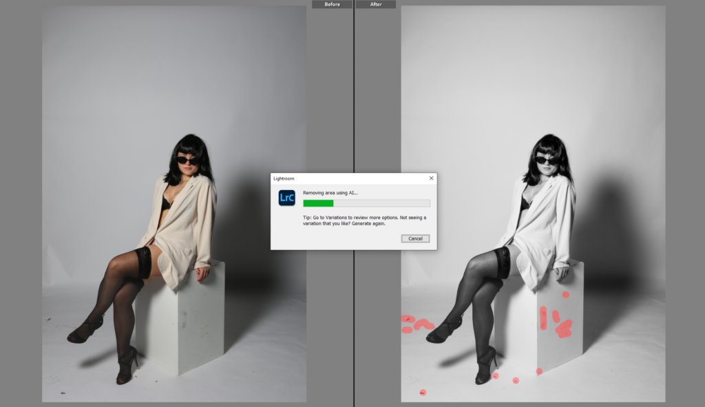
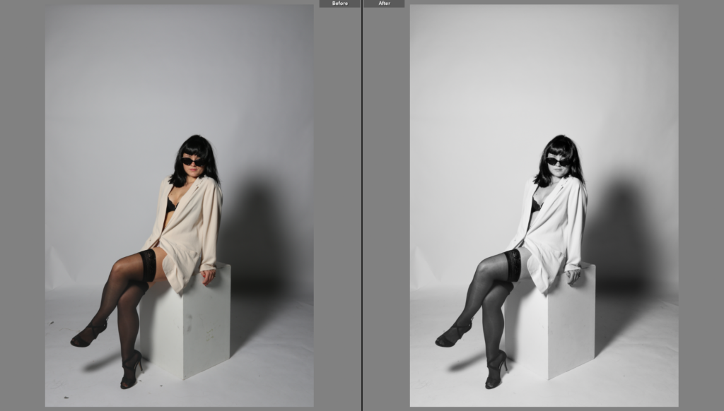
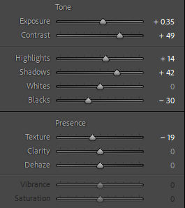
Editing is going to be super important in bringing out the natural beauty of the sunset without overdoing it. I want to enhance the colours while keeping everything looking real and dreamy.

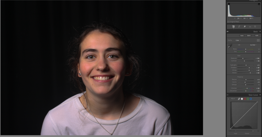
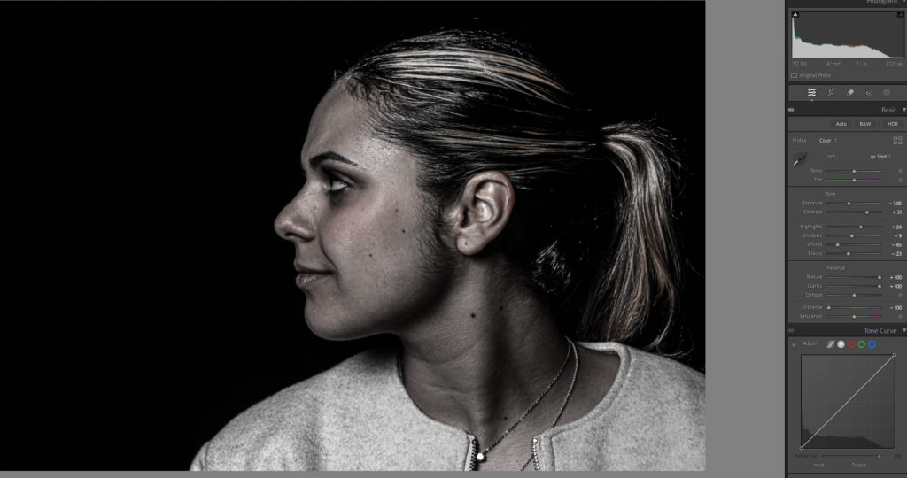
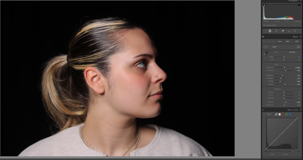
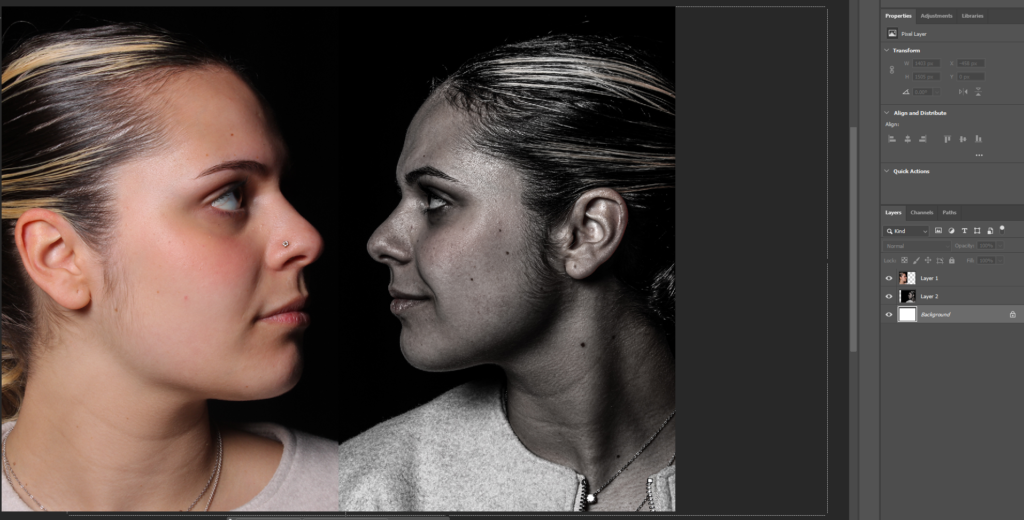
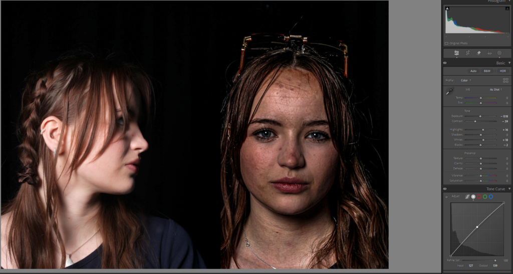
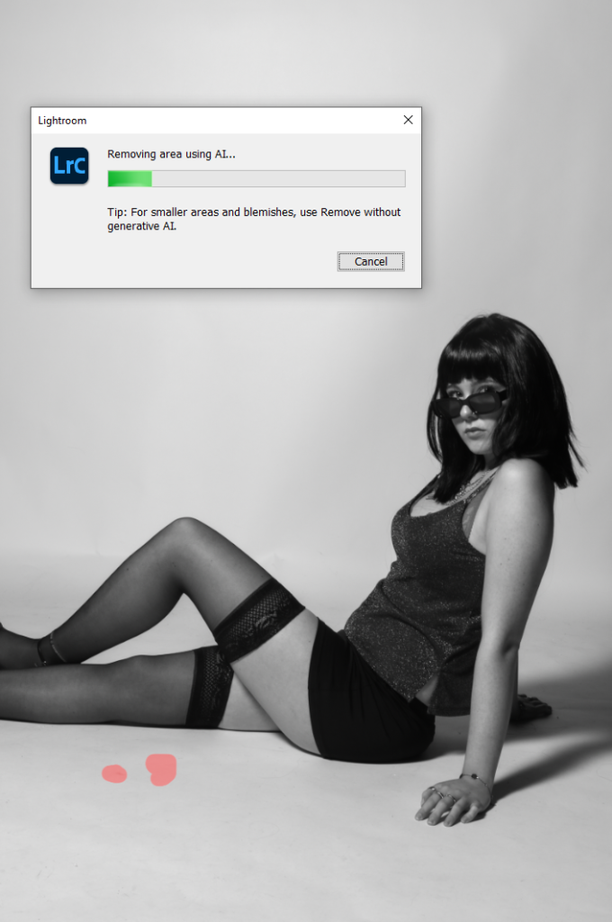
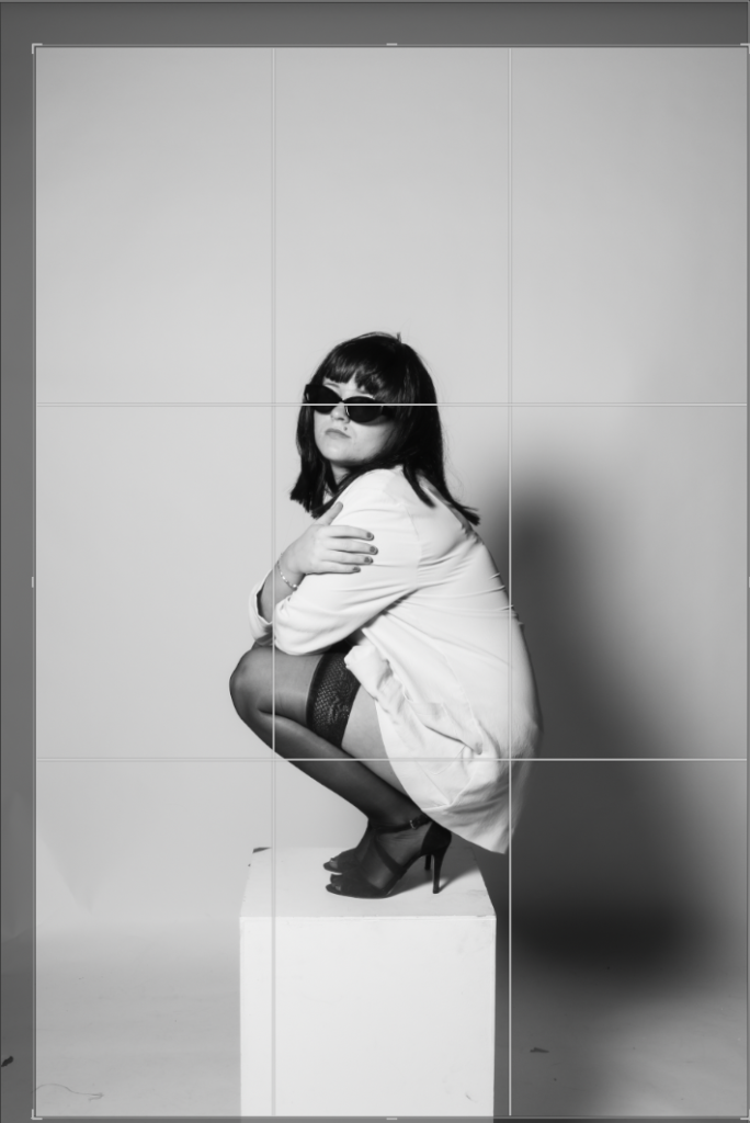
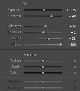
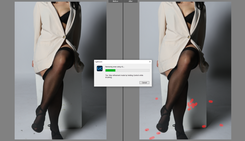
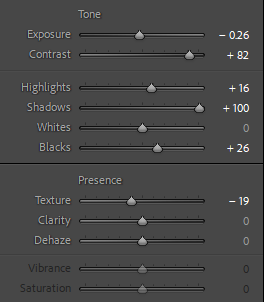
I will do all my edits on both lightroom & photoshop.

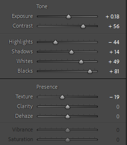
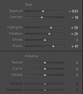
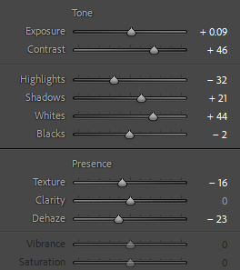
Colour correction: Adjust hues so they blend as smoothly as they did in real life.

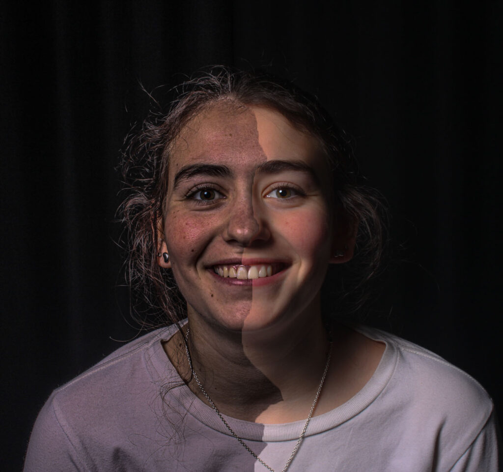
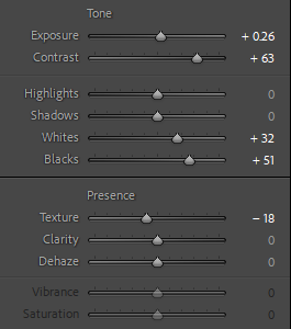
Exposure & contrast tweaks: Just enough to make the image pop without making it look artificial.

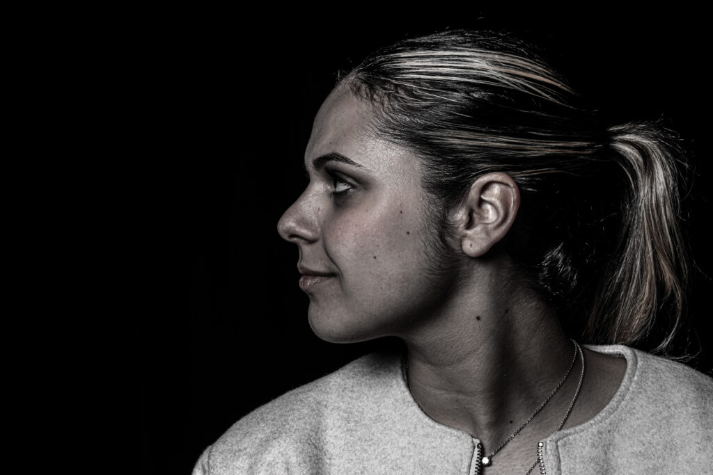
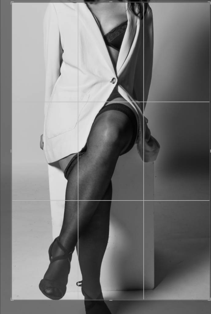
Selective sharpening & softening: I want the sky to feel soft while keeping key elements (like silhouettes) crisp.

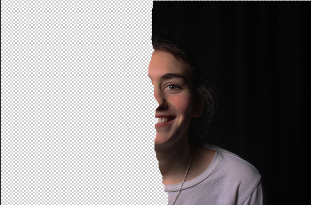
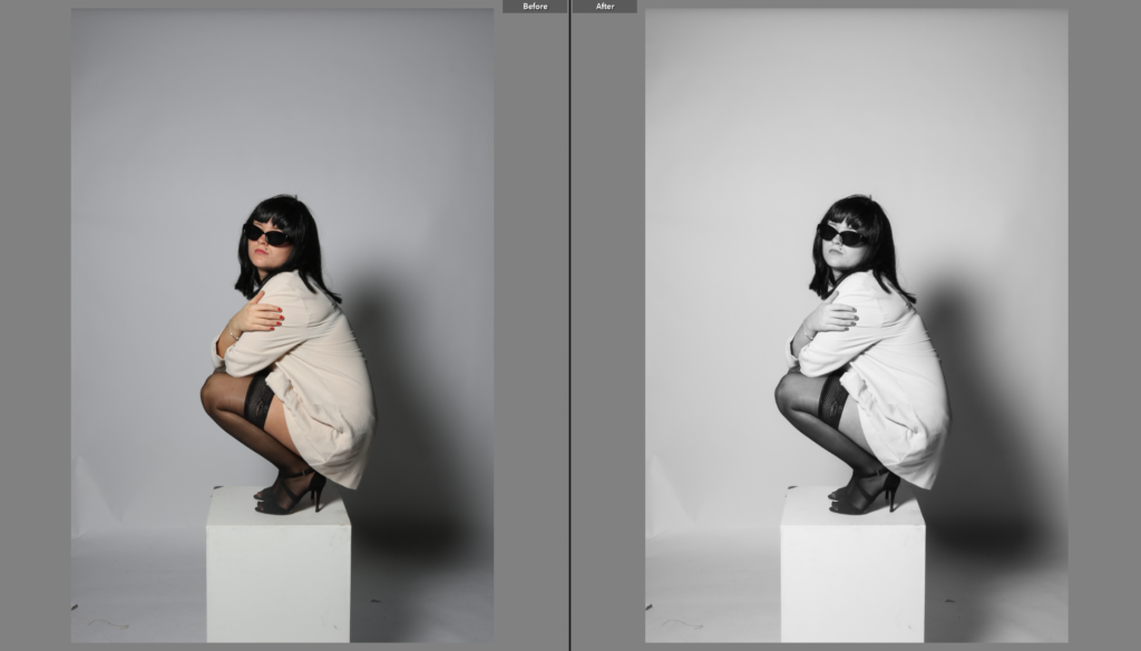
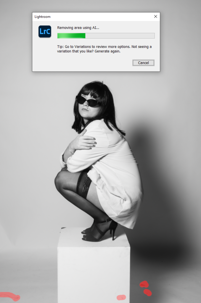
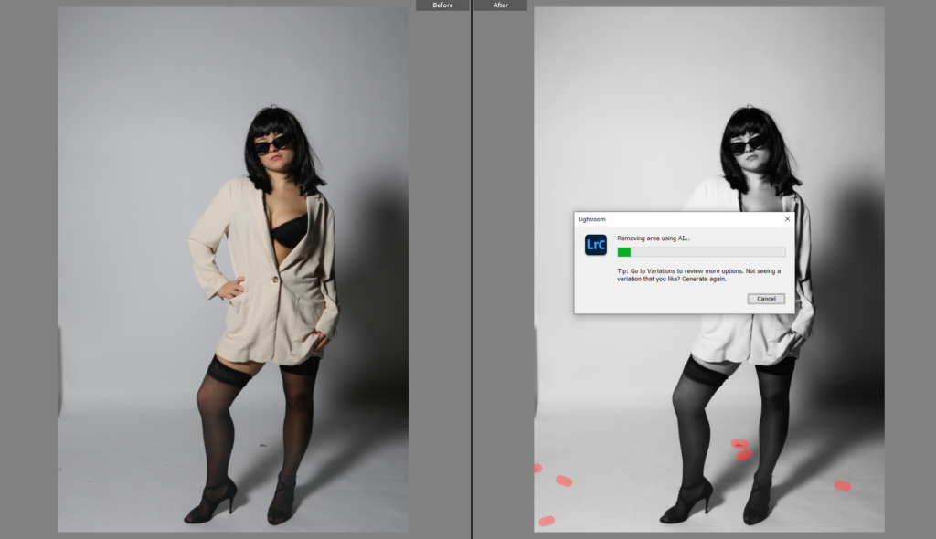
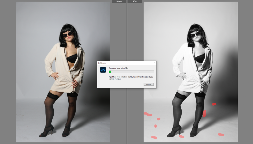
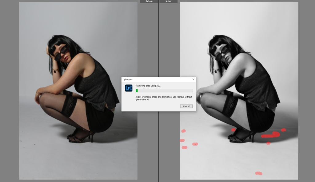
Cleaning up distractions: Removing any random objects or weird lighting flares that take away from the scene.

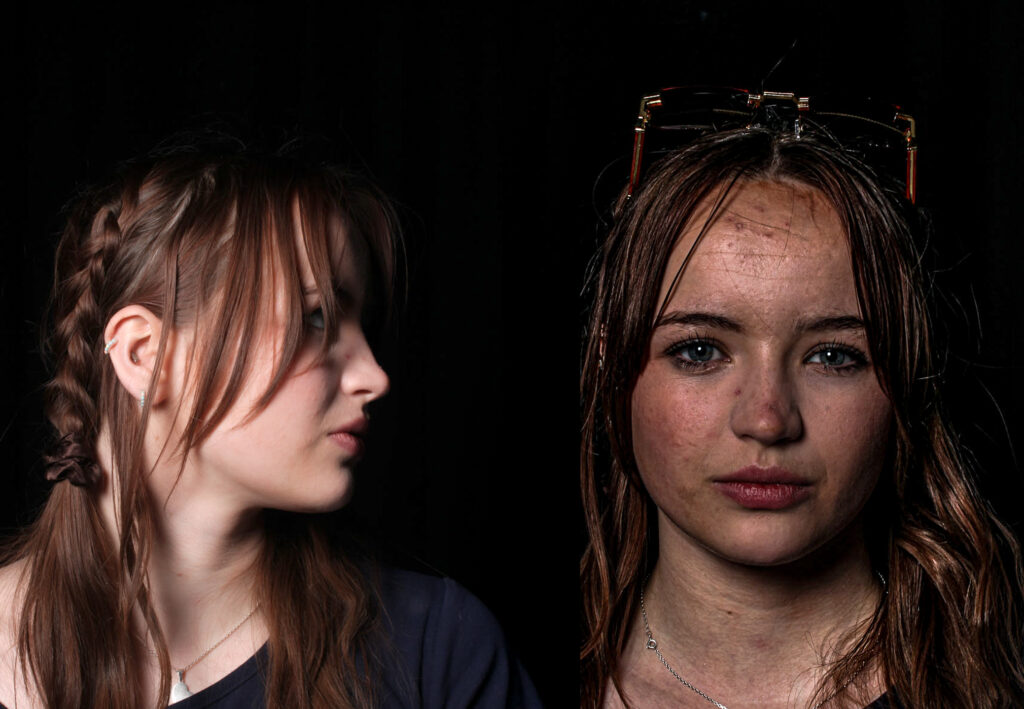
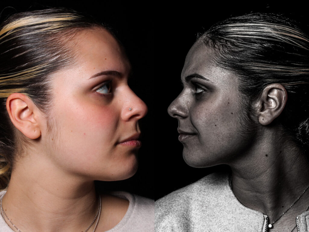
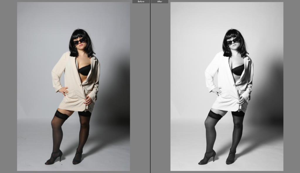
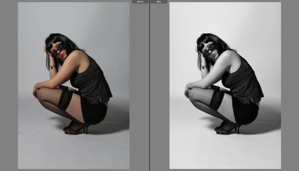
I’ll be using Lightroom and Photoshop to fine-tune everything, making sure the final edits match the mood I envisioned.
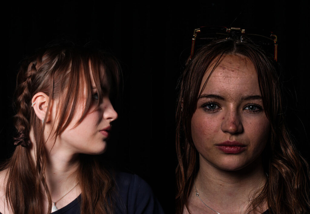
Final Presentation -

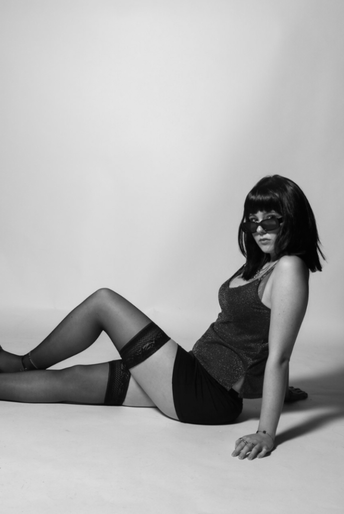
Once I’ve sorted through and edited the best shots, I’ll put together a final selection that really tells the story of the sunset’s merging colors.

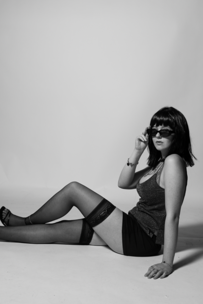
5–10 best shots that showcase the theme in the strongest way.

A timeline series of photos showing the sky’s transition over time.

Behind-the-scenes captures (if I remember to take them!) to document the process.

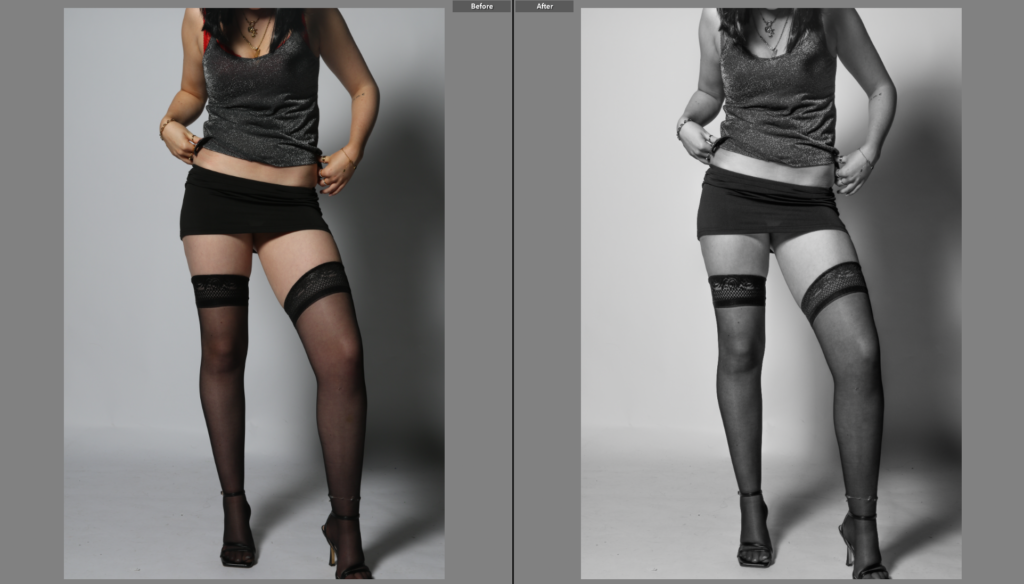
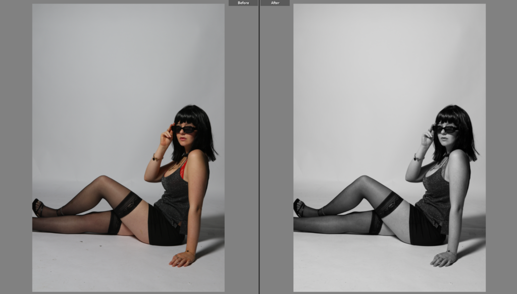
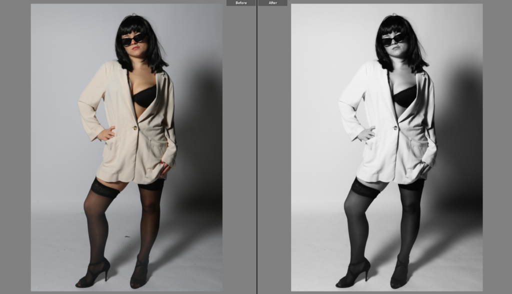
Before & after edits to show how small adjustments bring out the best in each shot.

For the complete final layout I will be making a photobook to complete the project using lightroom and Blurb to get the photobook printed.

Photoshoot 1

Edit 1

Edit 2

Edit 3

SYMBOLISM

What is Symbolism?

Symbolism in photography is when a photographer uses images, objects, or elements in a photo to represent something deeper or more abstract than what is immediately visible. It’s like telling a story or conveying a feeling through visual cues rather than just showing a straightforward scene. These symbolic elements often carry emotional or cultural meanings that make the viewer think about the bigger picture or a hidden message.

For example, a photographer might take a picture of a wilted flower to symbolize loss or decay, or a bird flying in the sky to represent freedom or hope. The key to symbolism is that the object in the photo isn’t just there for decoration; it has a purpose and a deeper meaning related to the theme of the image.

Symbolism has been used throughout art history, and photographers often use it to make their work more thought-provoking and open to interpretation. A simple image can be filled with emotions or ideas, allowing the viewer to connect with it in a personal way, making the photo more than just an image, but a meaningful experience.

A Mood Board of symbolism in photography -

What are some key elements of Symbolism in photography?

Symbolism in photography is a powerful tool for conveying deeper meanings, emotions, or ideas beyond the literal subject matter. Here are some key elements of symbolism in photography:

Colour

Colours evoke emotions and carry specific symbolic meanings. For example:

  • Red can symbolize passion, love, danger, or anger.
  • Blue often represents calmness, tranquility, or sadness.
  • Black may symbolize mystery, death, or sophistication.
  • White often signifies purity, peace, or emptiness.

Photographers use color deliberately to suggest mood or convey underlying themes.

Light and Shadow

Light can symbolize hope, truth, or revelation, while shadow can suggest mystery, uncertainty, or the unknown.

The contrast between light and dark, or chiaroscuro, can convey themes of duality or conflict (e.g., good vs. evil, life vs. death).

Composition

Framing and perspective can suggest various symbolic meanings. For instance:

  • A subject in the center of the frame can symbolize importance or control.
  • A subject in the background or on the edge can represent isolation, neglect, or insignificance.
  • Leading lines might symbolize a path, journey, or transition.

Objects and Details

Everyday objects or natural elements can carry symbolic weight. For example:

  • Roses might symbolize love or beauty, but with thorns, they can indicate danger or complexity.
  • Empty chairs can evoke themes of absence, loneliness, or death.
  • Windows or doors may symbolize transitions, opportunities, or barriers.

Gestures and Body Language -

The posture or expression of people in a photo can symbolize a range of emotions, such as vulnerability, strength, or defiance. For example, a hand reaching out could symbolize hope or connection, while crossed arms might suggest defensiveness or closed off emotions.

Nature and Environment -

Nature often serves as a powerful symbol in photography, with elements like trees, water, and the sky representing themes of growth, change, or freedom.

Urban settings can symbolize isolation, modernity, or societal issues, depending on how they are framed and the mood conveyed.

Time and Decay -

Aging objects or signs of decay can represent the passage of time, mortality, or the fleeting nature of life. For instance, an old, rusted car or crumbling buildings can evoke nostalgia or reflect themes of societal decline.

Motion blur or time-lapse effects can symbolize change, the passage of time, or a sense of impermanence.

Symbolic Use of Space -

Empty space (negative space) in a photo can symbolize solitude, loneliness, or a sense of being lost.

Crowded or dense compositions might evoke feelings of chaos, stress, or oppression.

Metaphors -

Photographers can use visual metaphors to express abstract concepts. For example, a caged bird could symbolize freedom or imprisonment, or a road stretching into the horizon might symbolize a journey, life path, or uncertainty.

Contrast and Juxtaposition -

The juxtaposition of two opposing elements in a photograph (e.g., old vs. new, man vs. nature, light vs. dark) can create a symbolic narrative, highlighting conflicts or relationships between the elements.

By using these elements thoughtfully, photographers can infuse their images with layers of meaning, allowing viewers to interpret the symbolism in various ways.

How am I going to incorporate this into my images -

When I did my shoot on sunsets, I tried to focus on a lot of symbolism and emotion to give my photos a deeper meaning. Sunsets themselves are super powerful symbols of transitions, endings, and new beginnings, so I use them to represent things like closure or personal growth. I am going to play with the light, using the fading sun to show a metaphor for hope or transformation, especially if there’s a silhouette of a person in the frame which I will also be using to represent the strength of relationships and connections within Union. I also love making my shots look dreamlike or mystical by using soft focus or mist to give the scene an otherworldly vibe to make it seem unreal, something you wouldn’t normally see or gives off a warm feeling of how surreal it feels. Reflections in water are perfect for creating a surreal, introspective feel too. On top of that, sunsets can be really spiritual, so I focus on capturing moments of quiet reflection or meditation, with the warm light representing peace or connection to something bigger. I also think about the emotional side, like how the intense colours of the sunset can mirror feelings of joy, sadness, or nostalgia, depending on the vibe I’m going for. I might have a person standing in the light, with shadows creeping in, to show the balance of light and darkness in life. Adding natural elements like trees or birds can help make the photographs feel symbolic, like representing strength or freedom. In the end, it’s all about mixing the right lighting, composition, and mood to create something that feels not just beautiful, but meaningful which is exactly what I intend to capture within my shoots for this project.

Artists who explored Symbolism -

  • Oldion Redon
  • Man Ray
  • Francesca Woodman
  • Joel-Peter Witkin
  • Sally Mann

^ See other blog posts for more in depth details on these Photographers

Archives and Family Background

Family Archives

Contact sheet-

The images which are highlighted green and red are the images I have chosen to edit, because they have better quality than the other photographs. They also work better with what I am researching, which is union. The images which are highlighted red are the archives that I am going to be recreating. I have chosen these images, because I think they will be the best images to recreate to represent family and how time passes, but they are also images that I am able to recreate. Some of these images are harder to recreate, due to family members living in the UK and family members that have passed away.

Family Tree

About the Archives

These archives are images my mum and dad have collected over the years, including images of there family, who have passed, as well as themselves when they were younger. These photos also contain documents of my sisters and my life.

Some of these images are slightly lower quality due to when they were taken, or the physical images being slightly damaged over the years, but they are a good indicator of not only my past, but my families past as well.

About My Family

Dad- My dad was born in England in Burnley and his parents are Tom and Gwyneth. He also has a brother called Adam, who is 2 years older than him. His parents got divorced, so he rotated between who he lived with weekly. He lived in Burnley until he was 23 and moved to Jersey Channel Islands for a job. He is a bricklayer. He then met my mum that same year.

Mum- My mum was born in Jersey and her parents were Darren and Sarah. She has a rough childhood, so lived with her nan Roselyn. She had two younger brothers named Josh and Daniel. There dad was Paul, who lived in England, so they both lived there for a while, until they also moved in with Roselyn. My mum then met my dad when she was 18. My dad worked with her uncle Simon and that how they got introduced.

Me- After dating for three years, I was born in 2006. In 2013 my sister Emily was born. We have both lived with our mum and dad our whole lives.

artists case study 2 – Coco Moore

Robert Doisneau

Who is Robert Doisneau?

Born in 1912, just outside of Paris, life was a bit rough for him early on-His parents died when he was still very young. He was then raised by his aunt and placed in a school where he learned the art of engraving.

Then came the discovery of photography.

In the beginning, he worked in a factory as a photographer for Renault, but he could never make it on time because he would wander around Paris photographing the lives of everyday people. After a time, he was let go, but honestly, this was one of the best things that could have happened to him.

So, he went off doing magazine work and continued-doing what he loves: shooting random moments of real life. Roussel cherished taking photographs of human beings just being: kissing, laughing, getting late for an appointment, shopping, playing-nothing about model work or posing. It was simply life.

The most flattering image from him is The Kiss by the Hôtel de Ville—a couple kissing on a sidewalk in Paris, with pedestrians walking casually past. Everybody was convinced that it captured a truly random romantic moment, but funnily enough, it was staged! He had spotted that young couple earlier and asked them to kiss again during the time he took his picture. Pretty wild, right? But, although posed, it comes off so real. This is why people cherish it.

Artist Study – Coco Moore

Henri Cartier- Bresson

Who is Henri Cartier-Bresson?

Henri Cartier-Bresson (1908-2004) was a French humanist photographer considered one of the greatest photographers of the 20th century. He is widely regarded as the father of street photography and the concept of the “decisive moment.”

Cartier-Bresson was born in Chanteloup, France, and began his career as a journalist and photographer in the 1930s. He served in the French Resistance during World War II, using his photography skills to document the war effort.

In the 1940s and 1950s, Cartier-Bresson became known for his innovative approach to photography, which emphasized capturing the essence of a moment or scene in a single frame. He believed that photography should be a way to reveal the human condition, rather than simply documenting reality. He coined the term “decisive moment” to describe this concept, which refers to the fleeting instant when all the elements of a scene come together to create a powerful and meaningful image.

Cartier-Bresson’s photographs often featured everyday people going about their daily lives, but he was also drawn to capturing the beauty and dignity of marginalized communities, such as gypsies and peasants. His work often had a strong sense of narrative and storytelling, and he was known for his ability to capture complex social and cultural dynamics in a single image.

Photoshoot 3

Contact Sheet:

Flagged images:

Experimentation:

Edit 1:

Edit 2:

Edit 3:

Edit 4:

Edit 5:

Edit 6:

Edit 7:

Edit 8:

Edit 9:

Edit 10:

Photoshoot plan 2:

Here are some of the inspiration photos that I came across, I really like these photos as they are quite unusual and unrealistic, this goes well with the surrealism theme. I also believe that this goes well with the sonder theme that I decided to look at, the idea that everyone has a life and everyone is going through something shows that we are all human. Most of these photos consists of one model doing different poses with different angles of the camera directed towards them. Most of these Inspiration photos are made-up of face portraits and full body length portraits. They are the added together to create the final piece. I really like how these photos have a sense of surrealism as there are smaller characters/ people standing on the model.

If I were to recreate these photos I would like to use the same model just like inspiration photos, although it could look quite cool to have multiple people involved in the photoshoot. First I’m going to be taking portraits up close of the models face, making sure to leave a big gap on top of the models head so that I can place things on top. I could also take photos of the model with the technique of normal portraits and add the smaller people around the models face to make the photos more unique and original to me. I would really like to recreate the top photo on the left as it seems to be a really interesting photo to take. It helps to show the emotions and the sassiness of the model, as the model is then flipping her hair.

Usually, I do tend to make my photos black and white but for this photoshoot I would like to keep my photos in colour as it helps to add emotions and shows how each colour represents a different feeling, it’s almost as if you were to capture each photograph with different colours it would give the photo a whole new perspective. I personally believe that this photoshoot is quite doable as taking these photos wont be hard to capture, though it may be more difficult to edit the photos together to have the smaller model sit right on top of the models head. I also believe that I were to have the smaller model flipping her hair in the air, it would be harder to edit in as there would be bits of the background stuck in the models hair, this could be avoided if I were to use the same background for each portrait but it also depends on how I edit the saturation/ hue to each photo.

For example, where taking the phot there might be a bit of a shadow left behind and I will therefore have to edit the saturation to full brightness to get rid the shadow, this will then affect the pieces of the background that is stuck in the models hair.

Here is an example:

Also turning the saturation all the way up to the brightest might affect the models body depending on how much light was originally used in the process of taking the photo. Here the models legs tend to blend in with the white background which makes the photo look quite unrealistic and not the best quality.

Overall, I believe that this photoshoot will be fun and challenging to complete alongside all the editing that I will have to do to match my final photos to my inspiration. I will have to do the basic editing like controlling the levelling and lighting in the photo. I would then have to merge the two photos of the smaller model and the portrait of the model together. This should be quite straightforward if the background are the same colour I should be able to just put them on top of each other and then possibly add a blending effect on top to help properly merge the photos together. If the background were to be different I would then to outline the smaller model and try and avoid capturing any of the background using the selection tool, this can be seen as quite tricky to be able to get all f the model and none of the background, I would ten place it on top of the models head and mess around with it until I’m happy with the way it looks. I do like how all of the photos are placed on a white background but possibly having theses photos placed on a different coloured background could change the whole mood of the photo, though the white does seem to keep the photo quite clean and neat, it helps to get rid of any distracting around or in the photo and therefore white is a better fit for these types of photographs.

Photoshoot 1 – Contact Sheet

I started by going into the studio with a bag full of Union Jack flags, England flags, Wales flags and other objects that involve the Union Jack flag on, such as a mug/cup, door stand bag, red guard outfit with a black top-hat and more bunting of flags.

I wanted to do an idea where I create a silhouette of someone in front of each flag. So, I got my friend to stand in front of the flags with another person stood on a box behind holding the flags out, then went into photoshop and edited him to be a silhouette in front of each flag ending with the Union Jack flag.

I then wanted to edit this photo of my friend dressed up as a royal guard with the flag overlaying on top of him, which I created by taking a photograph of just the flag and just him and then merging them with the ‘Luminosity’ effect on Photoshop.

I then didn’t want the shadows from the first image, so I used the brush tool and set it to a similar colour as the grey on the left side with no shade, used low opacity so I can blend it in, looking realistic, then covering the shade until it was looking like what I had envisioned, resulting in this.

Photoshoot 2 – Contact Sheet

My second photoshoot, I drove to Gorey Castle, had a bag of different mugs, cups and plates that looked very British. I sat down on this bench in front of the castle and did different angles aiming up towards the castle but focusing on the cups and plates with the castle behind in blur. I selected the white balance to be cloudy and I also experimented in shade mode, this is because half of the castle was in shade but half of it was in the cloudy-sunny day.

These are the camera specs I chose to use to take the photographs.

I did a Low ISO of 100 which allowed my camera to not take in much light whilst also making the photograph less grainy. I made the F-stop, f/13, which allowed the background to be blurry but I didn’t have to do a very high f-stop because the background was so far away it already blurred it.

These effects on the camera, allowed my images to come out like these, which is what I was aiming for.

I then started to edit these images using Photoshop and adding layers of the union jack flag over the top. I chose to do this because I wanted to implant the union jack flag/colours on to the images, but I didn’t know how so I experimented around resulting in these.

Then, I tried to edit the London Pride Pump image I took at The Beaumont Inn. But again, I was experimenting around with different editing tools and ideas with the image, starting with just highlighting the word ‘London’, with keeping the other colours and background all the same resulting in this.

But, didn’t like it so then I edited the whole photograph to be in black and white with a hint of red, grainy photograph, resulting below, but I wanted to focus on the fact that the shield around the words ‘Fuller’s London Pride’, was RED, the union jack’s main colour.

So as I was doing my final images and came across it again, I edited it by keeping the whole image in black and white, but using the colour selection tool on Lightroom to only select red as the whole shield was a strong red, perfectly representing brits and England. I then used a brush tool with 0 saturation and brushed over areas that still had colour in the background and also in the reflection of the pump. Resulting in the bottom image.

I decided to keep the red napkins on the bottom right still in colour in the red, because it adds more to the final image instead of just one part red, there’s two, so the viewer’s attention will get attracted more and easier. I did add a vignette again which helped the red napkins fade in to the image and not just standing out, also the vignette helped the background with all the glasses and lights around the London Pride Pump.