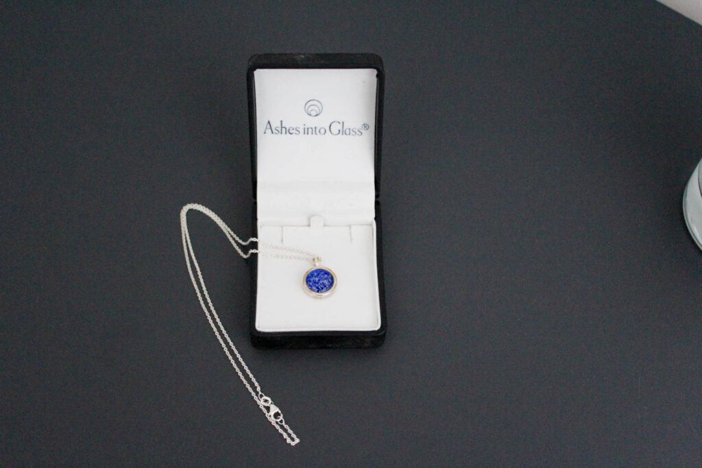
For my photobook I want to use premium lustre paper to give the paper that good quality feel and so the pages have a bit of a shine to them. I also want the book to be a hardback book so the book has that thickness and weight to it.
After a lot of consideration I am deciding to go with standard portrait for the orientation as it is better for creating double page spreads and it means I can put two images on a page if I want to.
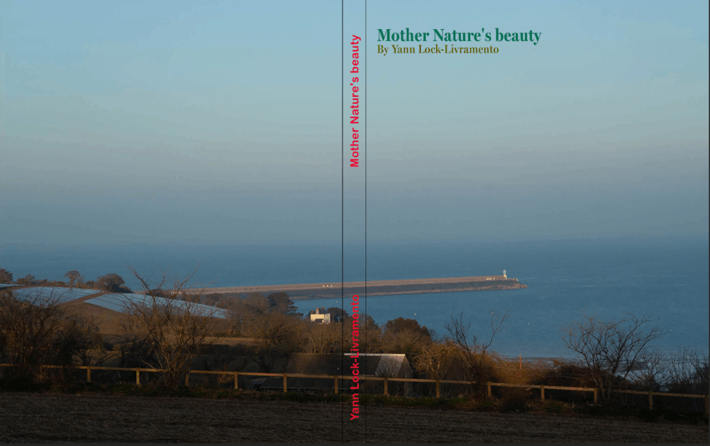
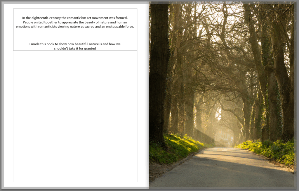
At this point I began to design my photobook, but I needed to come up with a title and after a lot of thought I came up with ‘Mother Nature’s beauty’ as it best describes the intentions of my photobook and also fits the theme of romanticism which is what this all is about.
For my photobook I want to include a lot of double page spreads as I have a lot of landscape photos which I feel like deserve a whole page however not all my pages can be double page spreads as I want a variety of layouts so I am also going to have pages with one image per side and some with two images a side.
Making the book
First I started with the front cover which I spent some time on, I was originally going to have a solid green background however it looked much better having this photo of the sea as an image wrap. Then I started with the text it took me a while to chose the font but I wanted a serif font as romanticism started in the 18th century and serif fonts have that old feel to them. I chose the green for the font colour as green is commonly associated with nature and I used two shades to distinguish between the book title and the author name. For the spine I wanted to have the same font and text in the same position as my previous photobook so my book can be part of collection and if they are on a book shelf you can tell its me who made them.
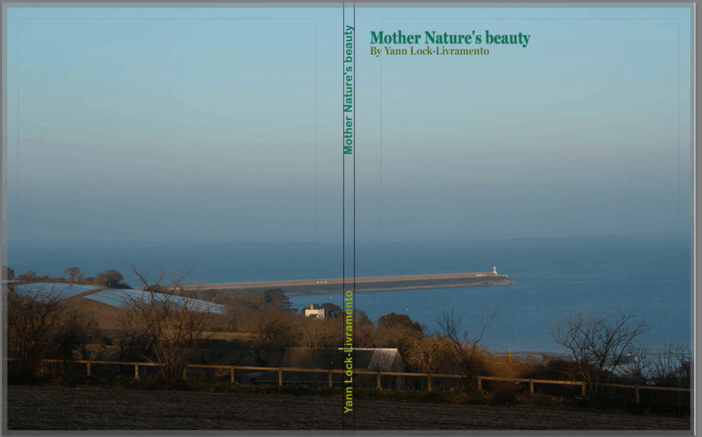
In the end this is the front cover I came up with, I added a little drop shadow to the title to make it pop out a bit and. I also Made the spine text green like the title because the colour I had before didn’t go with the design too well and it’s all about aesthetics. I am happy with how the front cover looks now and thinks it looks better then it did before.
For my first page I created a little opening talking about romanticism and why I created the book, I think it is a nice touch to the book and provides a nice bit of context and thought.
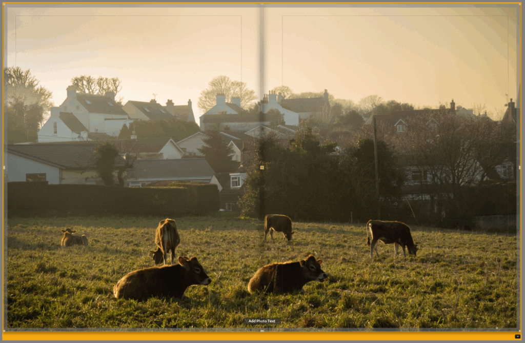
I was going to put this photo of the cows on a single page but I really like the photo and think it looks much better as a double page spread.
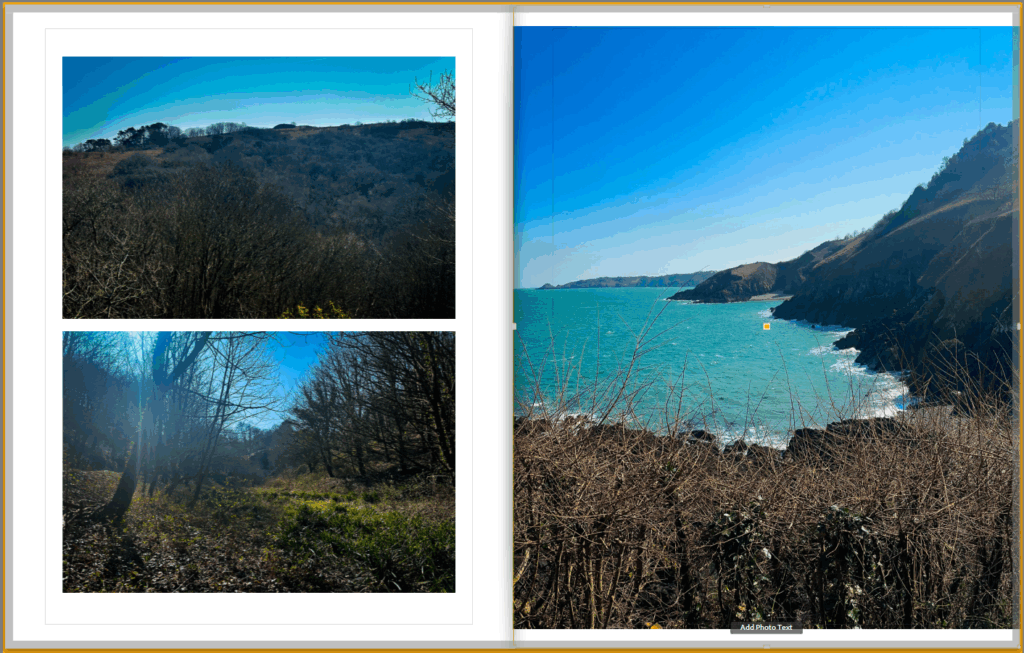
These images were taken from the same photoshoot down by wolf’s lair so I wanted to include them on the same page I decided to put the image of the coast on the right as it has a nice landscape view of the area which sets the scene and by having it on the right means it is the first photo the person looking at my book will see when they turn the page. The two photos on the right I put together and kind of act like detail shots of the area and look good both being the same size and they fit the page well.
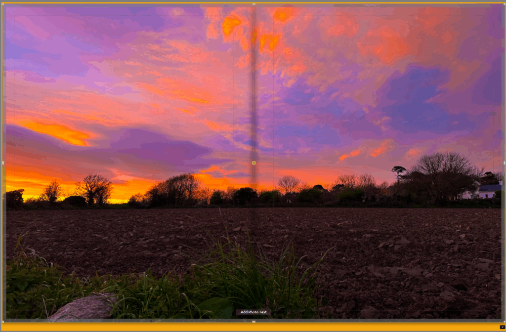
I made this the last full page in my book as I think it is a really beautiful photograph and is one of my favourites and also because I want to end my photobook on a high note as not only is it the last page of the book but it is also nearly the end of my time doing A level photography.
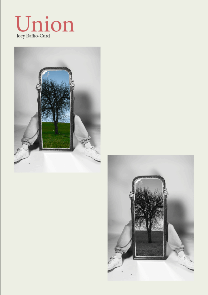
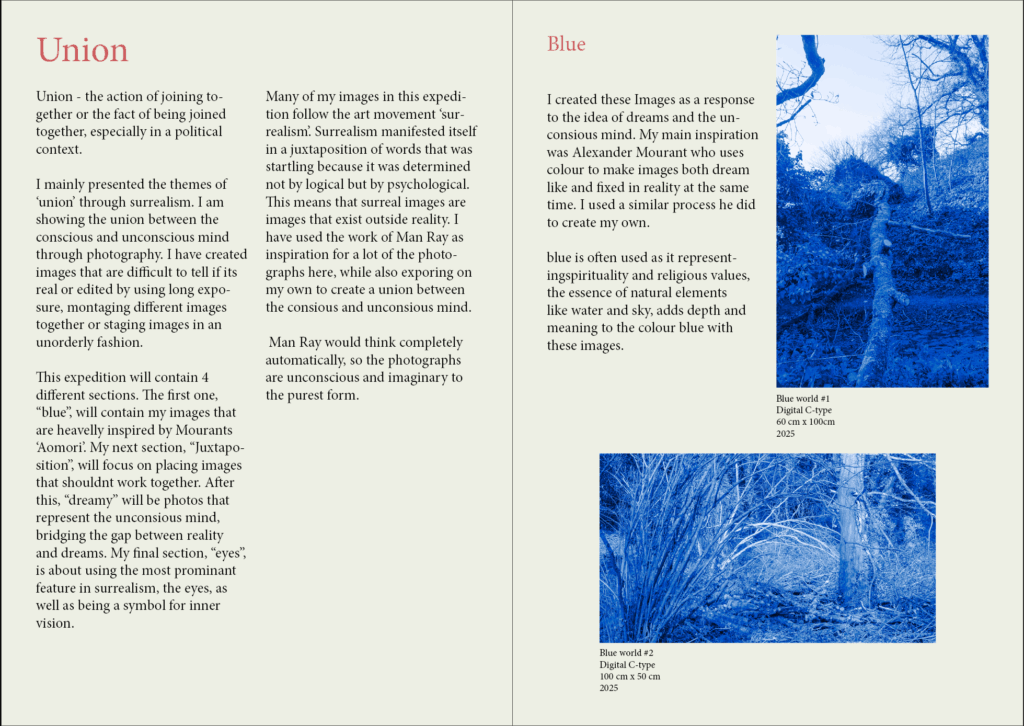
Overall, I think that I have tackled the theme of ‘union’ through photography quite well. My final Outcomes have also been successful through my creation of a exhibition catalogue and how I used different techniques to lay out my final prints. By using inspiration from two artists, Man Ray and Alexander Mourant, and expanding on there work, I have been successful in presenting the union between the conscious and unconscious mind.
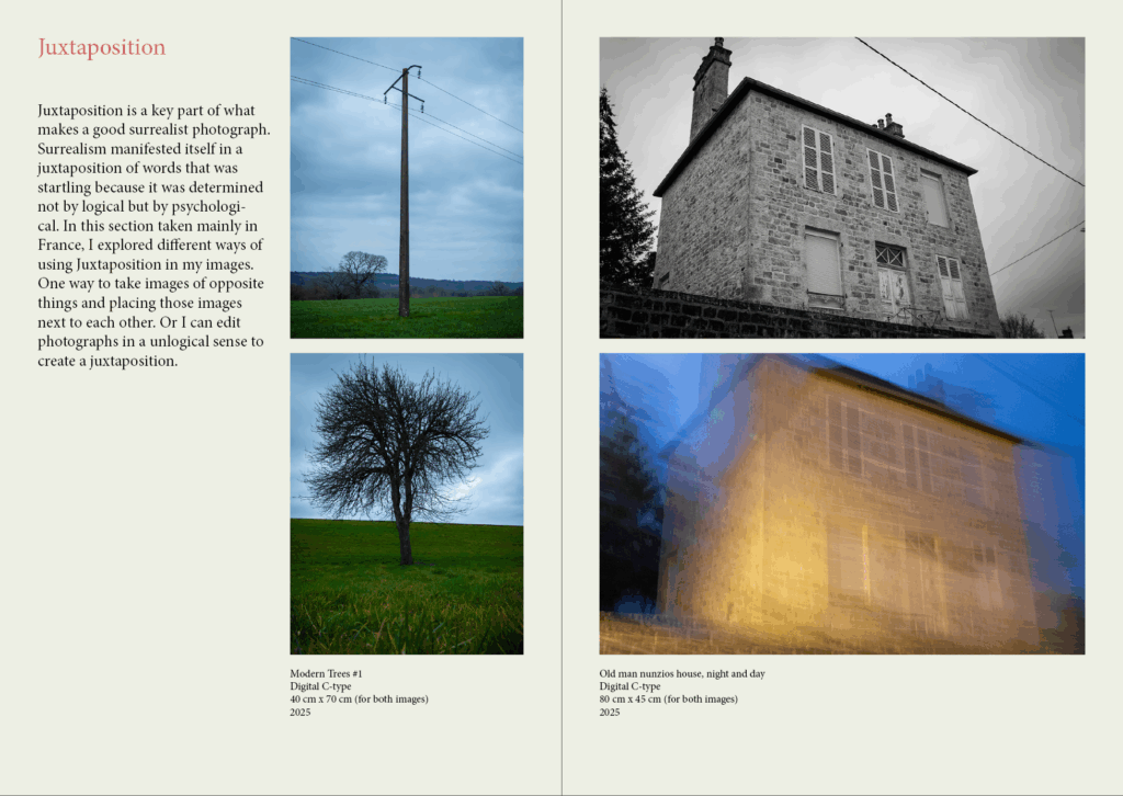
For my first photoshoot, I had an Idea of what I was looking for but as I took it before doing proper research on the artists I named above, I didn’t have much direction In where I wanted the project to go. However, after doing in depth research on these artists, as well as the theme of surrealism, I was able to use these images I took to take my images from the first photoshoot to the next level, by montaging them or editing them with various studio photos I took at a later date, as seen through my experimentation blog posts.
For my second photoshoot, after doing research on the two artists, I believed that liminal spaces would be a good fit. Unfortunately I found it hard to link the liminal space images with other images I took. This is because the style of photo that was needed to create a liminal space with very different to ‘surrealist’ route I decided to follow. The ideas of the unconscious mind is present in both liminal spaces and surrealist photos, but I just found it hard to link in the presentation section of this project.
For my third and forth photoshoot, I went in with the idea of montaging them with the first photoshoot taken in France, and I believe I was very successful In doing so. I also planned on replicating a few of Man Rays images and other surrealist arts which I also think I was successful in. I experimenting with many different images to get the outcome I was looking for, and a lot of them turned out how I expected.
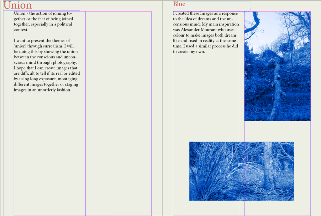
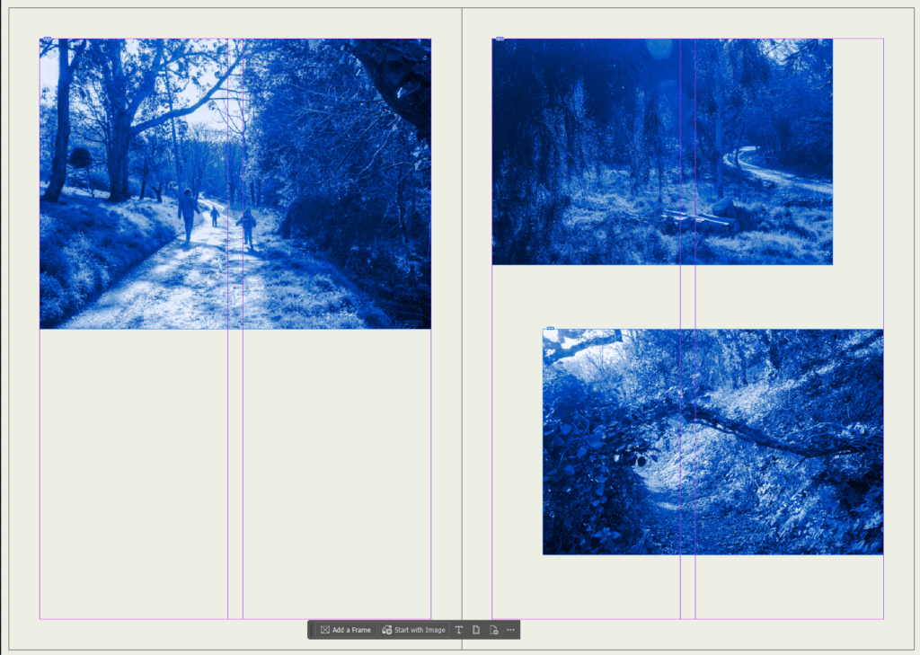
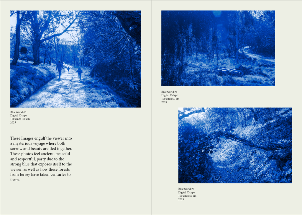
For my fifth photoshoot, which I took in a forested part of Jersey, I was planning on replicating some of Mourants ‘Aomori’ project, which I think I did well in. This photoshoot is found in the further experimentation blog post as I only intended on experimenting with colour. My end photos where monochrome in different colours, and the best and most impactful colour was blue.
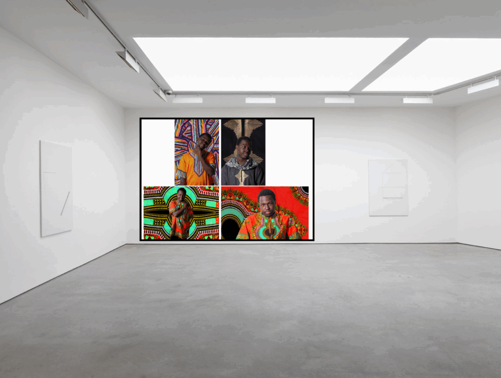
For my presentation, I printed out a few of my strongest images and used boards and card to lay out the images how I want. I think my final images looked just how I wanted them to at the start, even with a few bumps along the road. My exhibition catalogue also turned out how I wanted, where I used InDesign to create it. I do believe, however, that I could work more on writing the true intentions of each photograph in the catalogue.
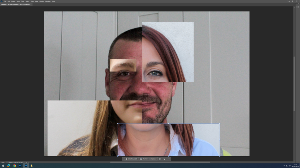
I made these Virtual Galleries using Adobe Photoshop.
Evaluation
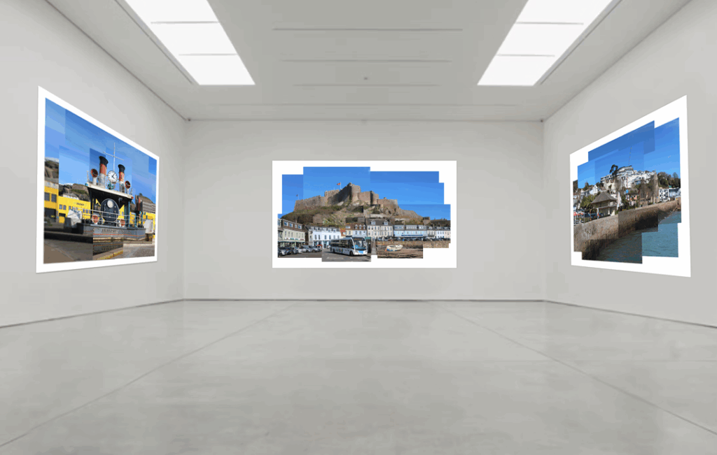
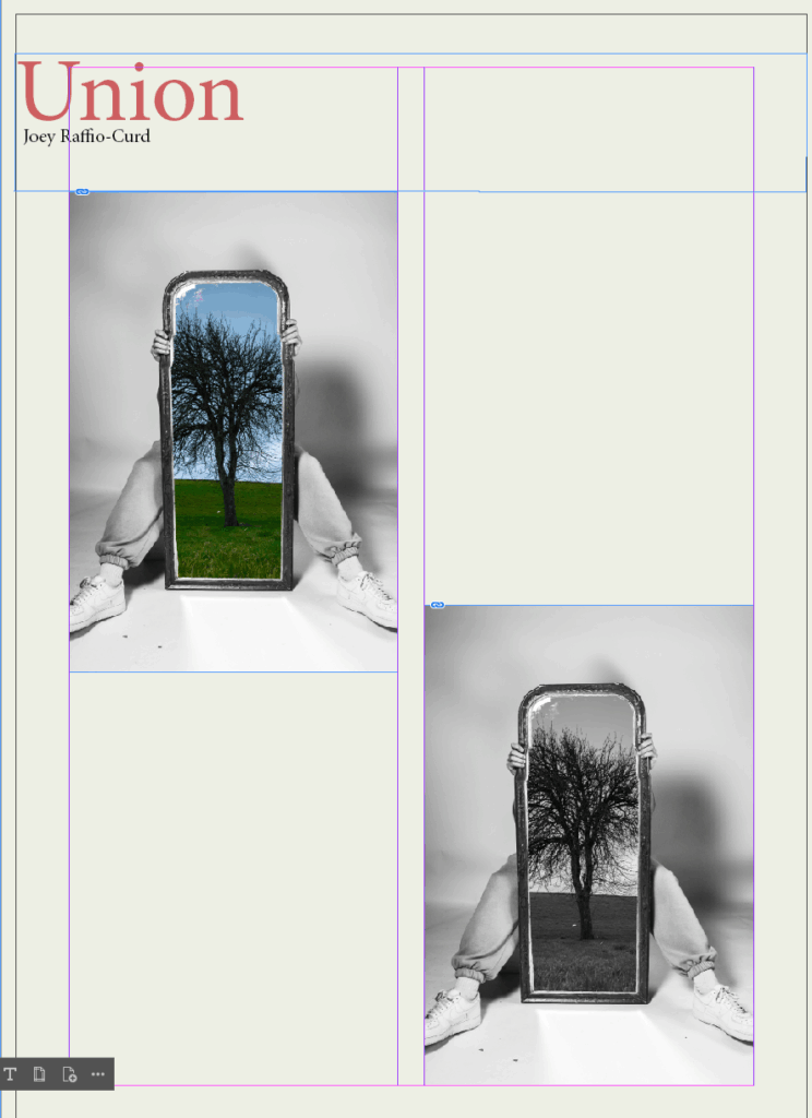
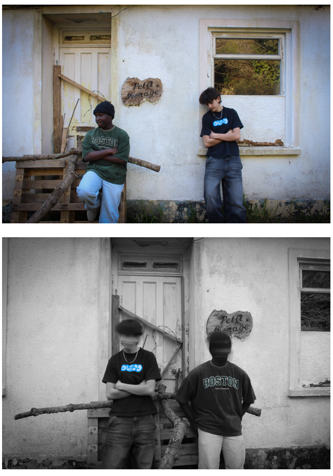
Joiner 1
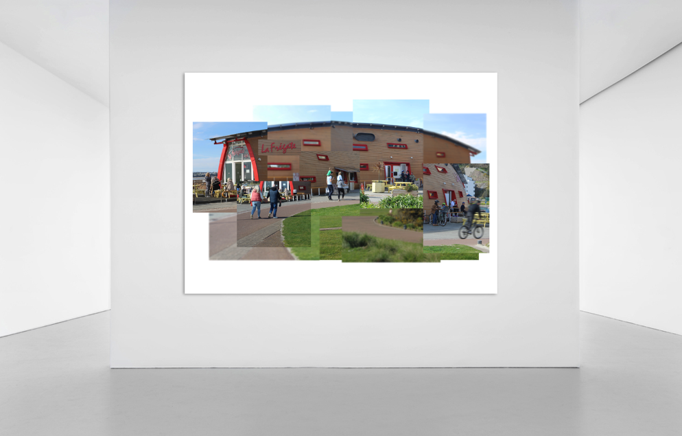
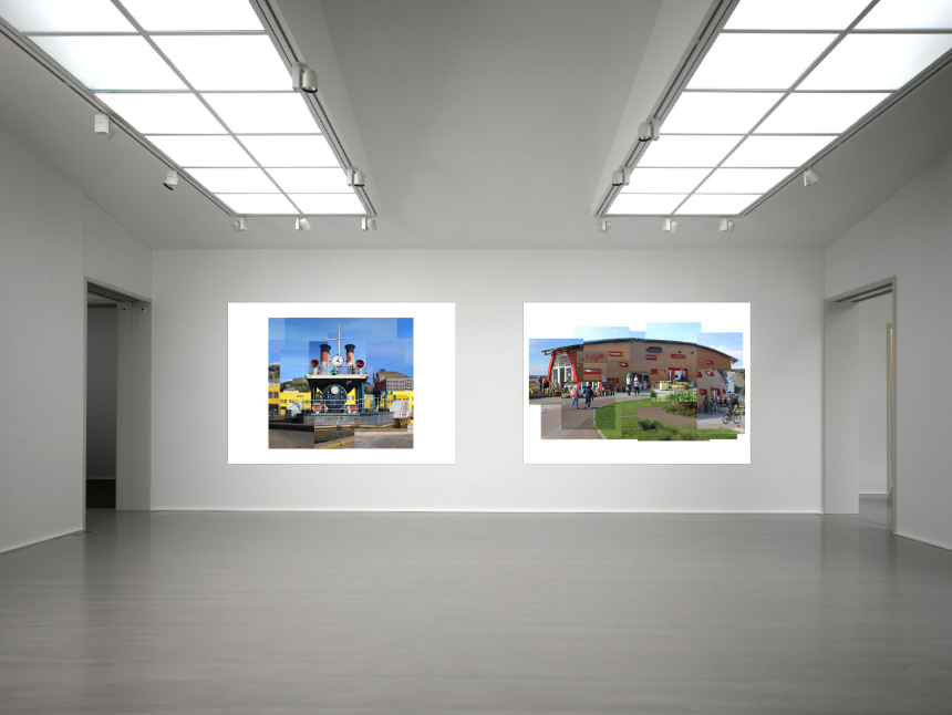
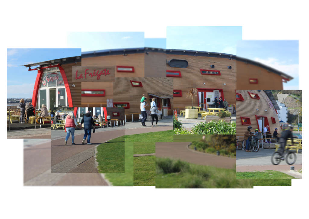
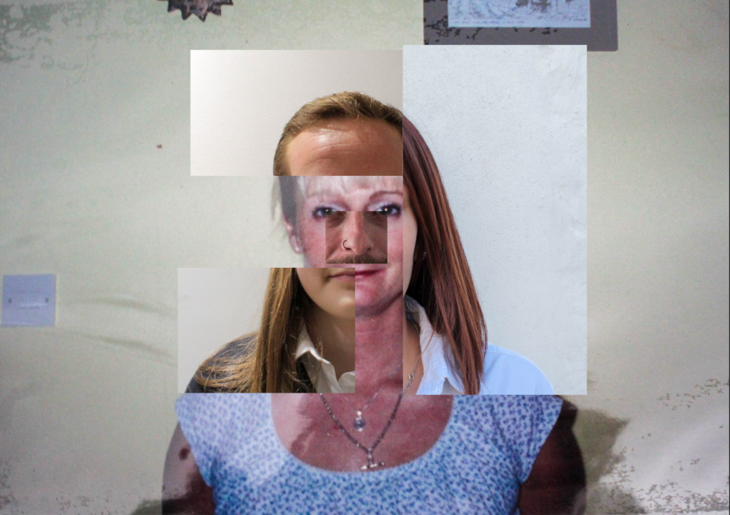
This was the first joiner I made. I chose this location at first as I thought it would have given me the opportunity to capture relationships between people and incorporate them in my joiner. I personally don’t think that this is my strongest joiner as the images hadn’t been taken using the best camera settings. This has made some of the images not fully in focus and some over-exposed. On the other hand, I like that I have used Gaussian blur for some of the segments as it gives the image an abstract feel and relates to my artist reference, Stephen McNally. This joiner is similar to Stephen McNally’s work as I have used both a range of exposures and a blurred effect. These are features which are prominent in his work. Furthermore, this joiner relates to David Hockney’s work as it displays relationships which is something that was common in his work. The relationships in Hockney’s work were personal to him, however, in my joiner I displayed other people’s personal relationships. Moreover, in my joiner, I have displayed movement which is something that Hockney attempted to display in his work. The movement in my work is shown by the path and the people walking along it and by the guy cycling with the motion blur. Finally, this joiner also opposes to David Hockney’s as it is not the most realistic representation of La Fregate as many things have been manipulated such as the name sign which isn’t usually there. Personally, I would say that this joiner is a good combination of both of the styles of my artist references.
Joiner 2
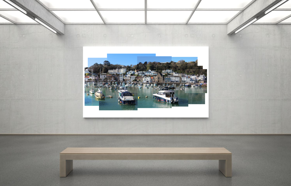
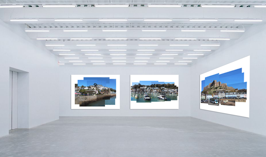
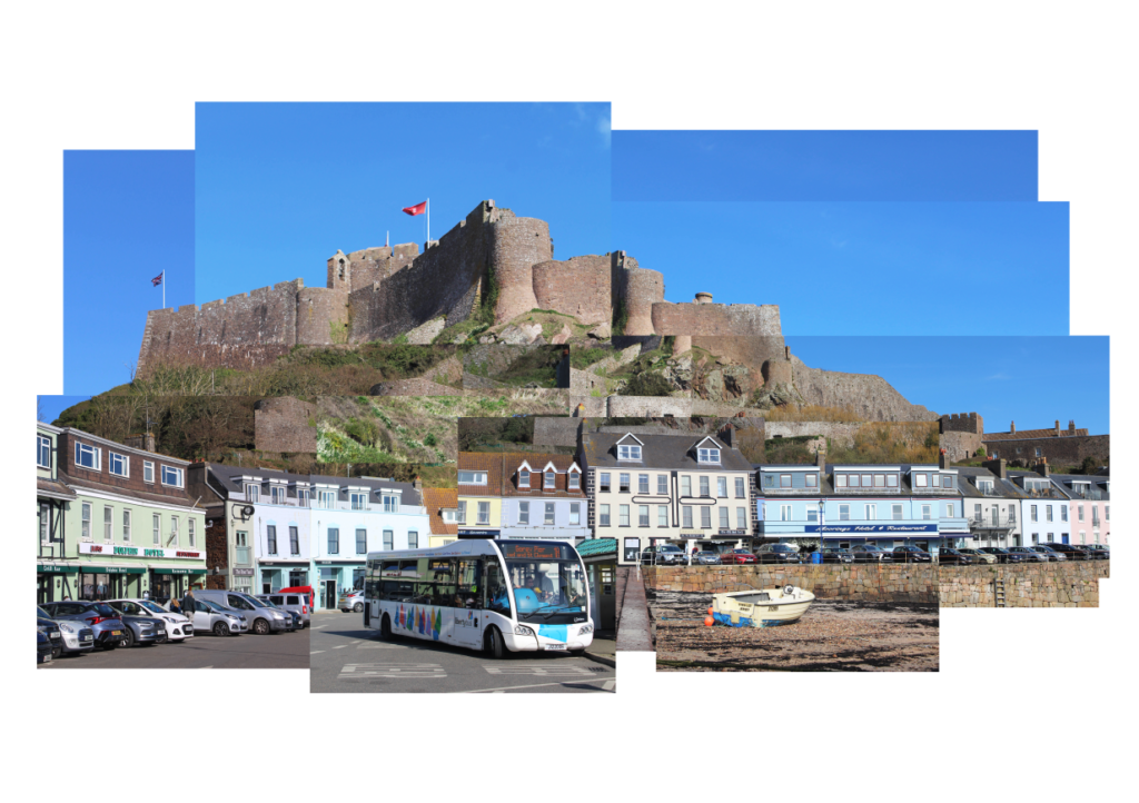
This is one of my personal favourite joiners. I really like how I have managed to display the bus and a boat. The bus emphasises tourism and how people travel to visit Gorey Castle, a landmark in Jersey. The boat is to show that the area is a harbour and to emphasise maritime, which became a theme in my joiners. I would say that this joiner is more similar to David Hockney’s style of work as it is more of a realistic depiction of Gorey Castle and the area around it, rather than abstract like Stephen McNally. On the other hand, this joiner consists of larger photos which have a range of exposures, similar to Stephen McNally. Stephen McNally tends to use larger images and he forms a joiner with them using Photoshop, which is what I did, however, Hockney used a lot of smaller images and formed them by hand. Overall, this joiner is a combination of both of their styles but is most like David Hockney.
Joiner 3
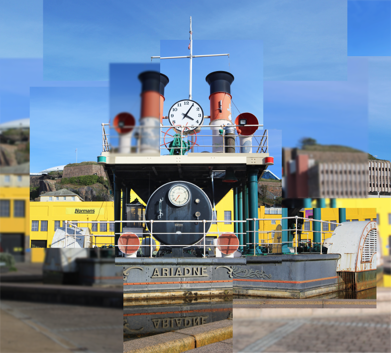
This is a joiner of the Steam Clock in St Helier. I initially chose the steam clock to be a subject of my work as I thought that it was similar to the subjects of Stephen McNally’s work, specifically around the docks in Liverpool. This is because it is a freestanding structure, alike the carousel and the Liverpool eye which McNally photographed. I have used a range of exposures and a blurred effect which to give the final outcome an abstract effect, alike Stephen McNally. I personally don’t think that this joiner has any key similarities to David Hockney as it is colourful and abstract, whereas Hockney’s joiners were often very dull but realistic.
Joiner 4
This is my other favourite joiner which I did. I made this one, along with the Gorey Castle one, by hand in my exam. I personally really like this joiner as I like how there’s lots going on and I think that it’s very aesthetically pleasing to look at. I have combined the styles of both of my artist references with this joiner by making it look realistic yet using a range of exposures. I also wanted to use a range of exposures so that I could emphasise each individual segment of my joiner. I wanted to make it clear that my joiner had been formed using many pieces. I think that this work also differs from both of my artist references as they both have very muted tones and not much colour in their joiners but this photograph does have a lot of colour, specifically blue tones. Some of McNally’s photographs do have blue tones but they’re often much darker.
Joiner 5
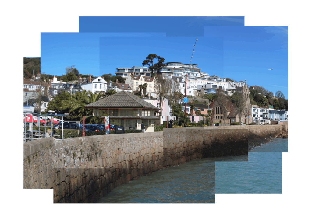
This is my least favourite joiner as I think that it’s just not very interesting. This Joiner is most similar to David Hockney’s work as it is very realistic. I have used a range of photographs of the area from different angles to reform the landscape to its original form. Although I am not keen on this joiner, I do also like it for a few reasons. Some of these reasons include the fact that I have an interest in Architecture and this joiner displays a range of different styles. I also like how I managed to capture the plane in the sky.
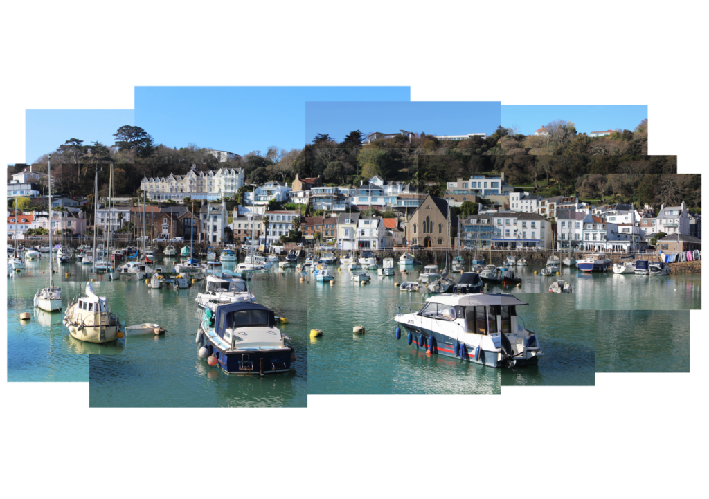
Overall, my joiners can all be linked to Maritime. La Fregate is linked to Maritime as the building has the nickname “the upside-down boat”. Gorey Castle links to Maritime as it has a harbour, alike St Aubin’s Harbour which was the subject of another of my joiners. The steam clock links to Maritime as it is there to signify Jersey’s long association with the sea. Finally, the joiner of St Aubin links to Maritime as it features the sea and the area has significant Maritime history. The fact that each of these joiners can be linked together creates Unity within my work.
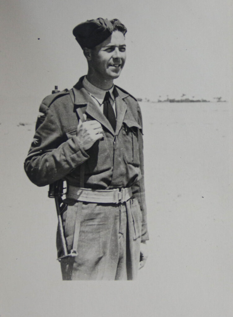
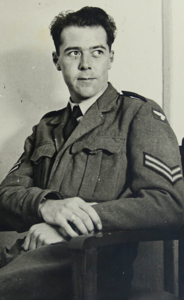
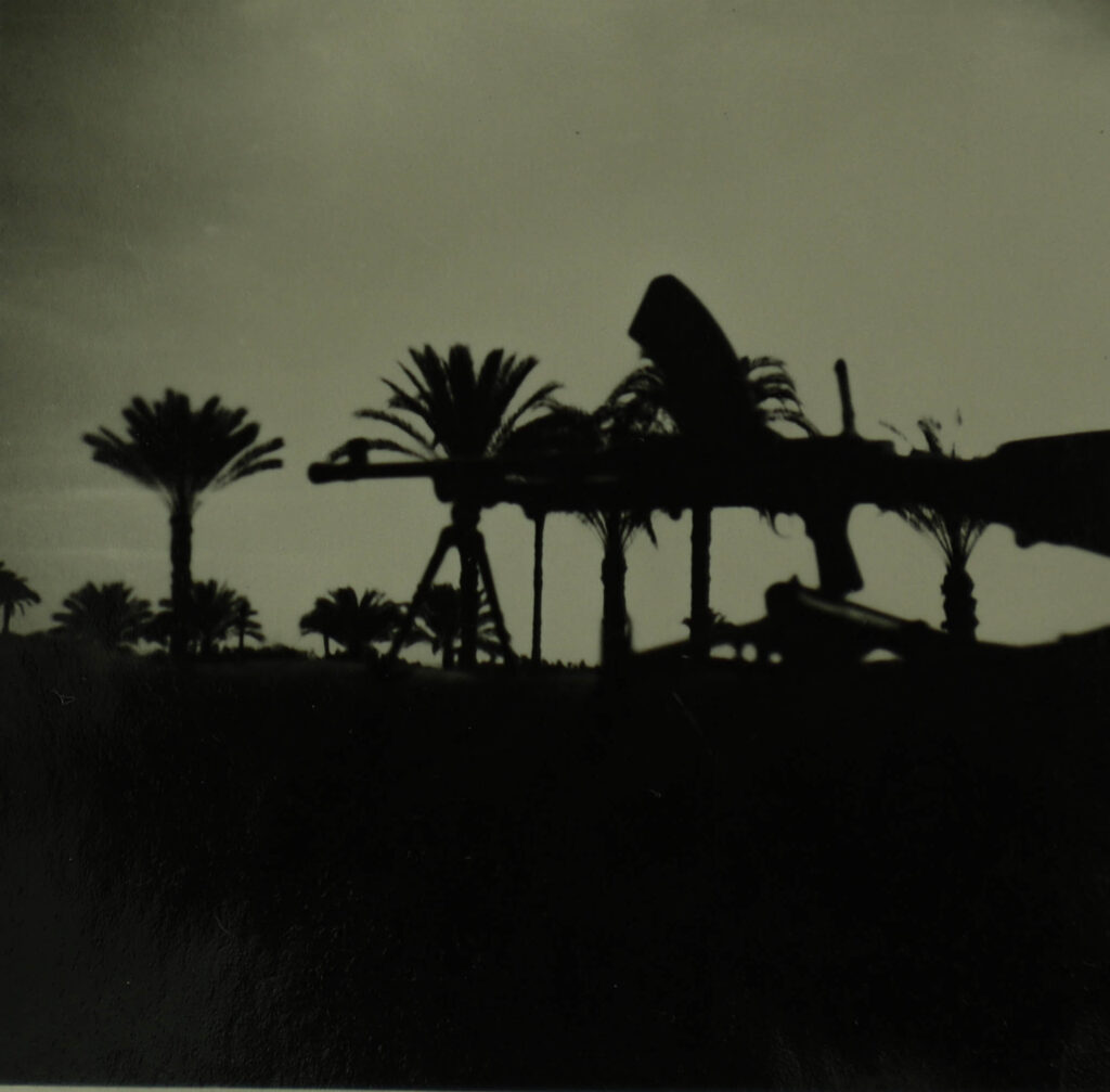
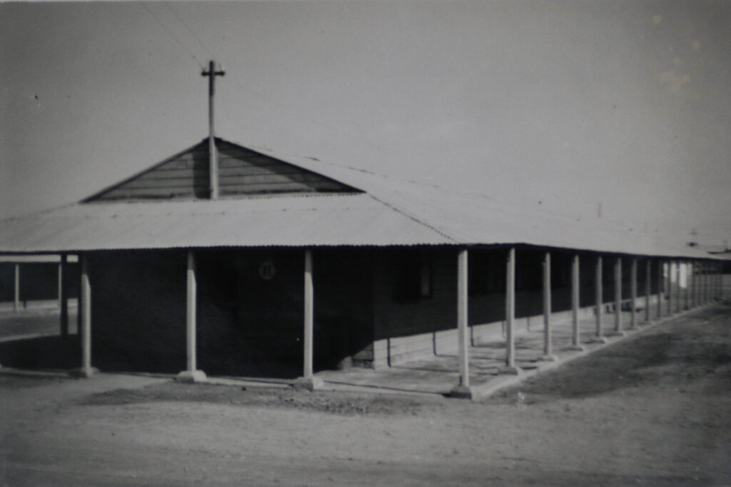
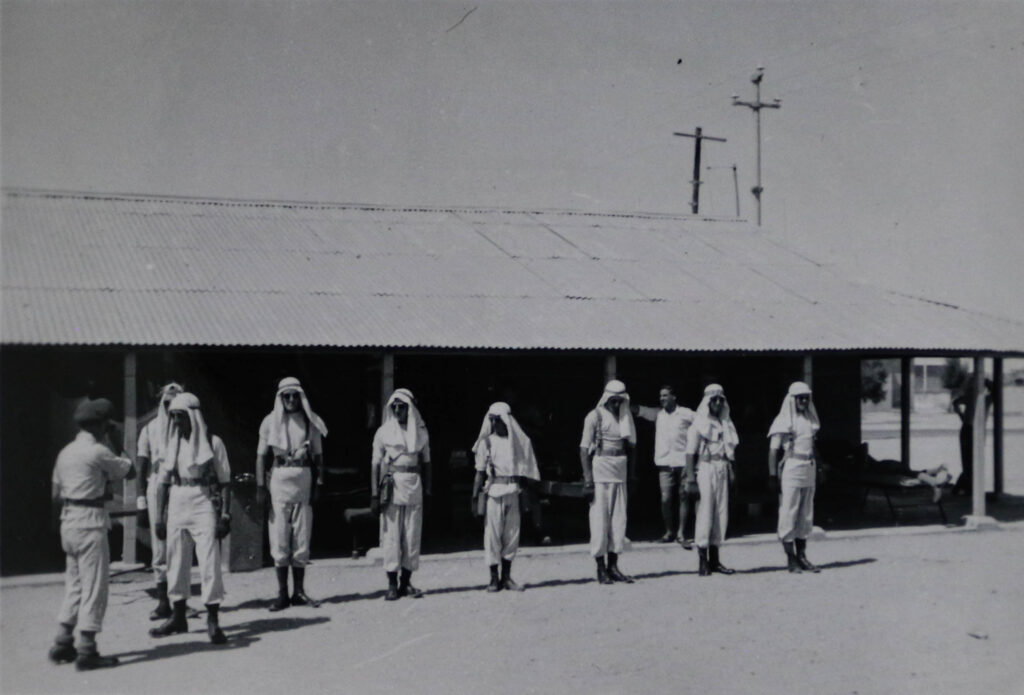
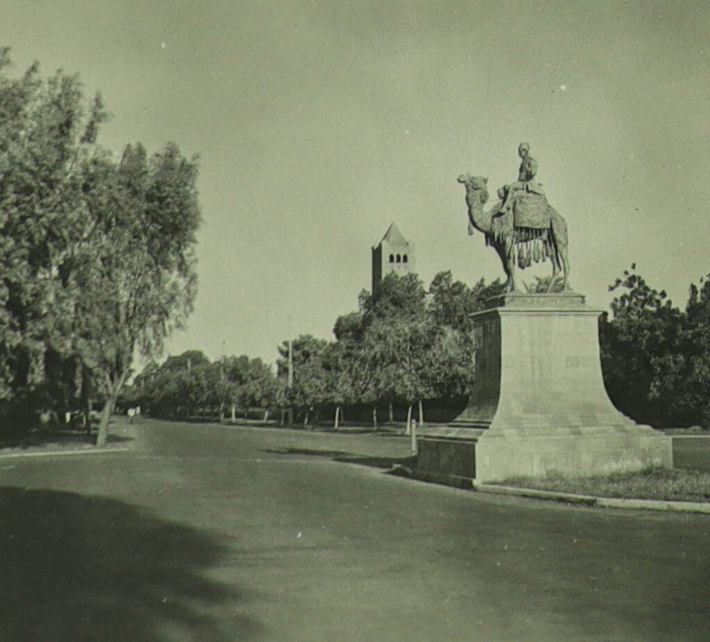
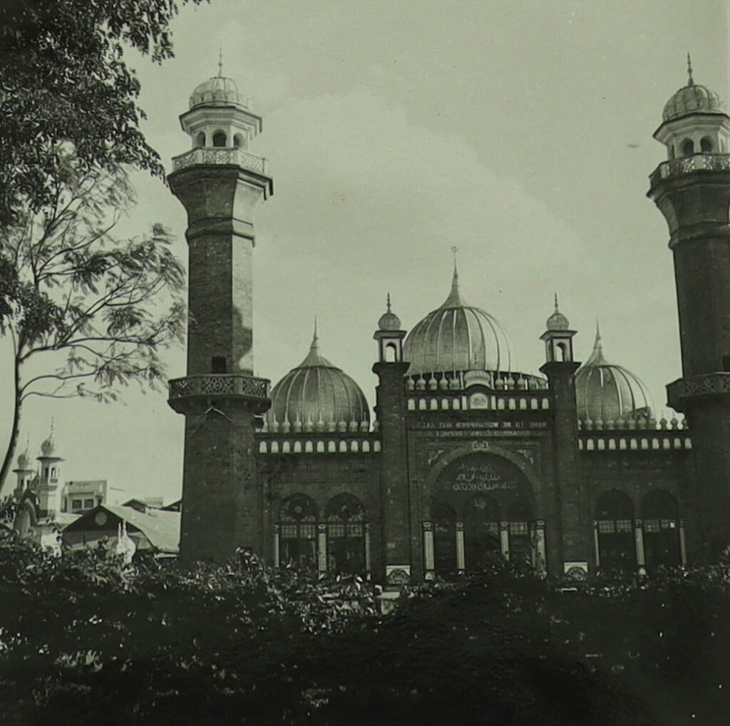
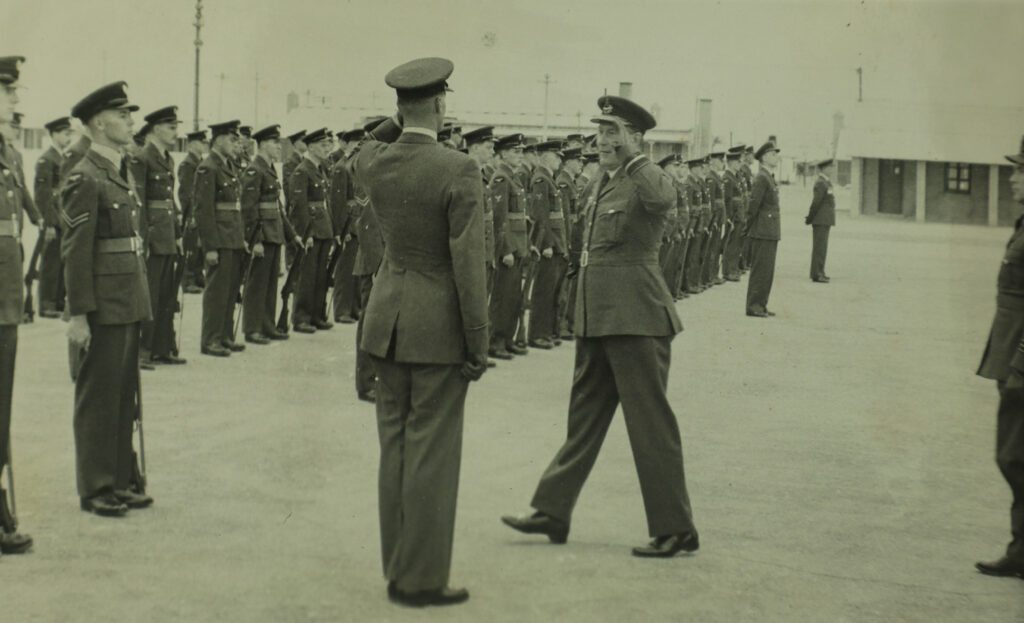
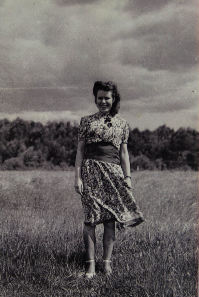
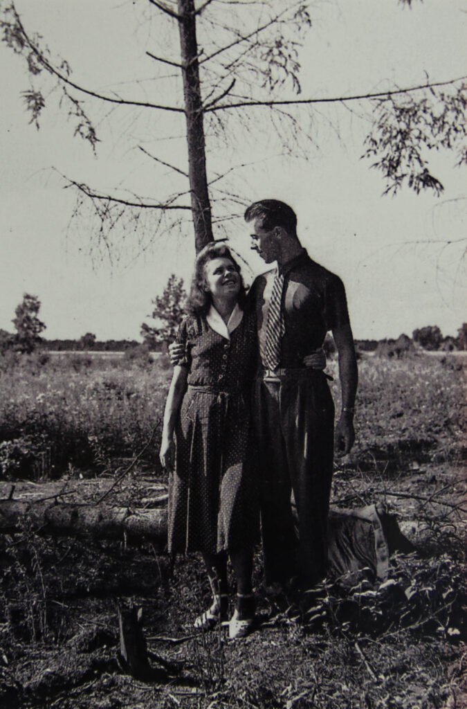
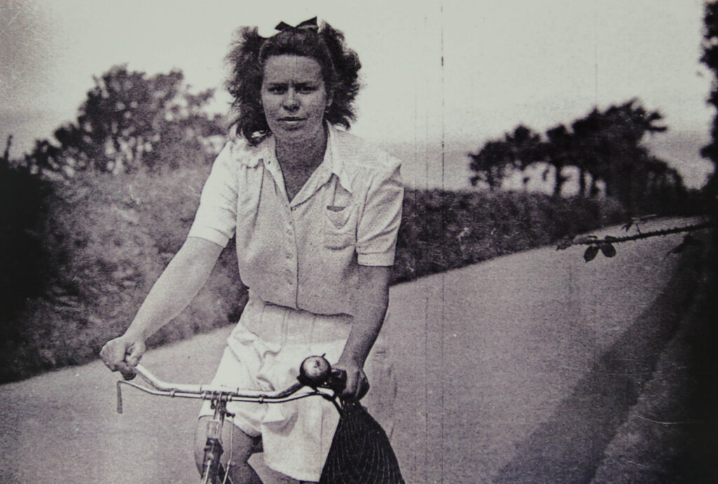
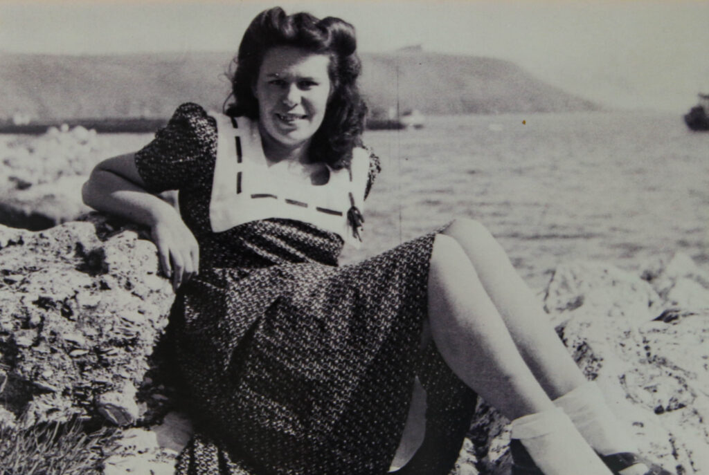
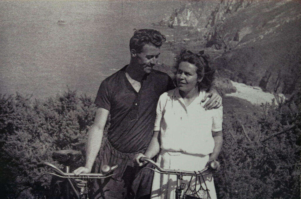
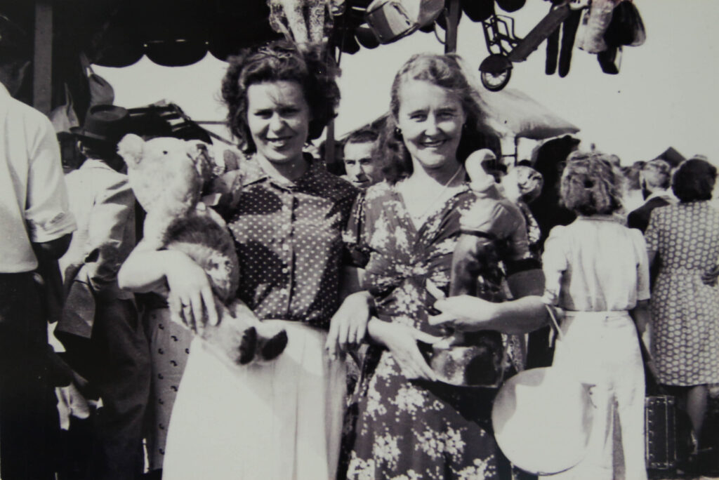
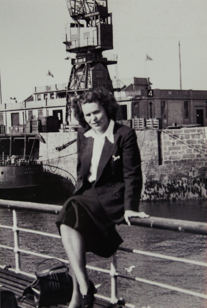
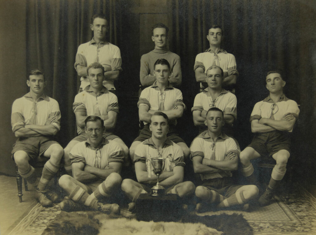
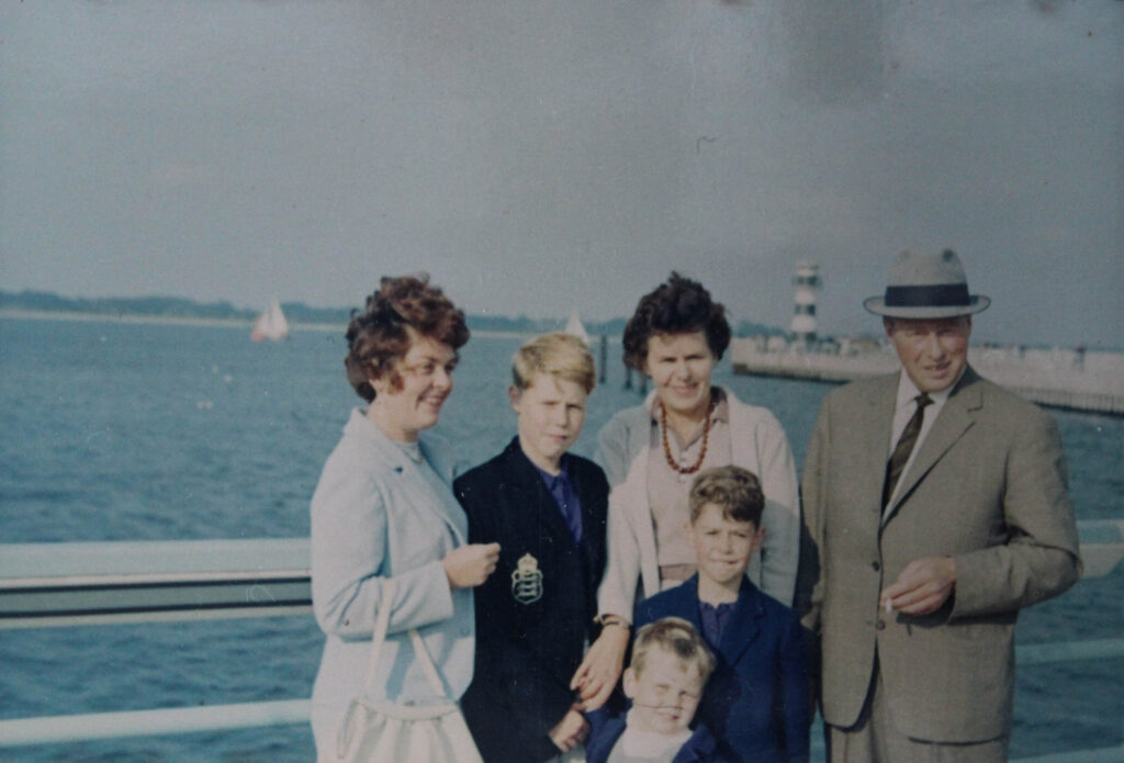
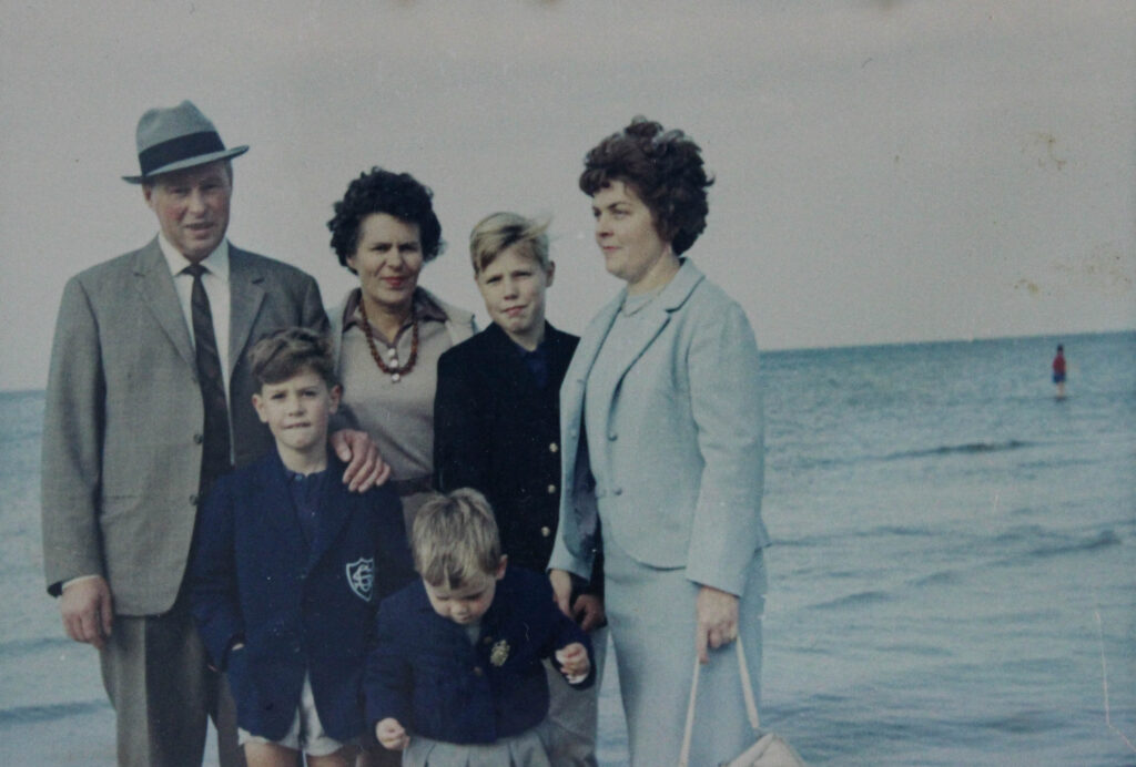
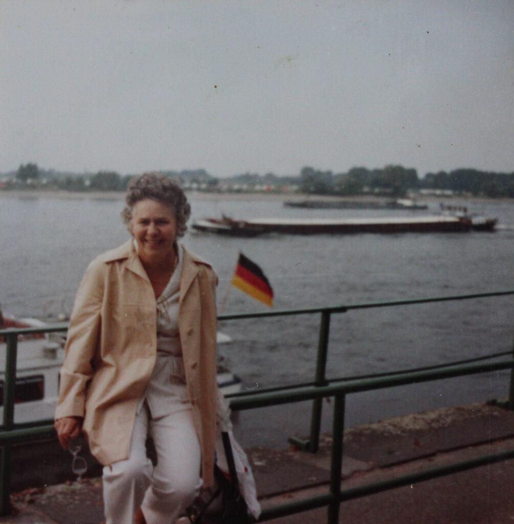
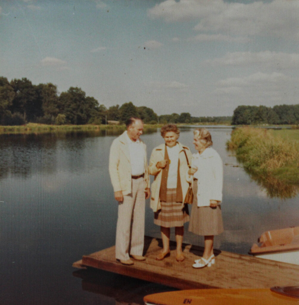
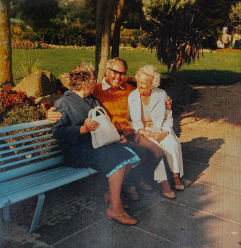
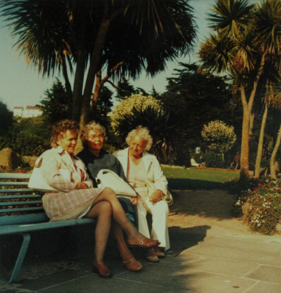
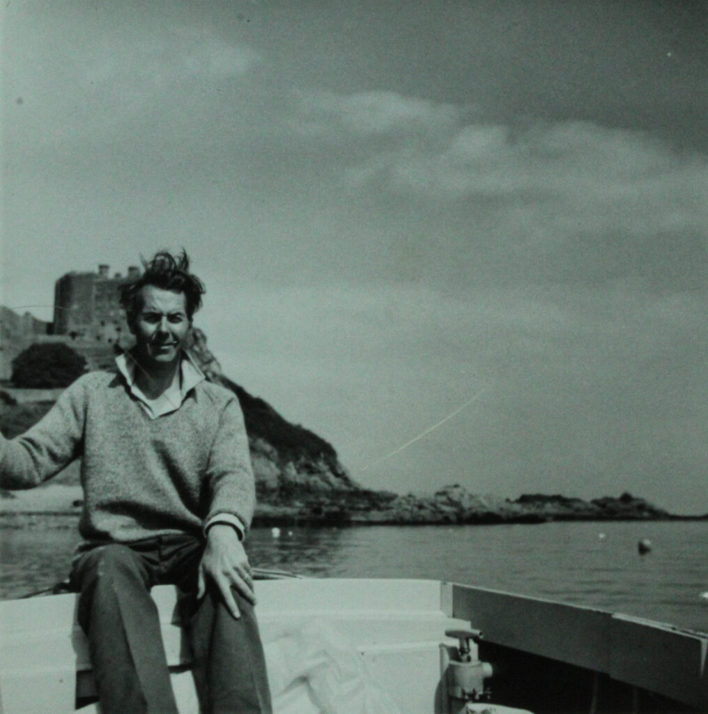
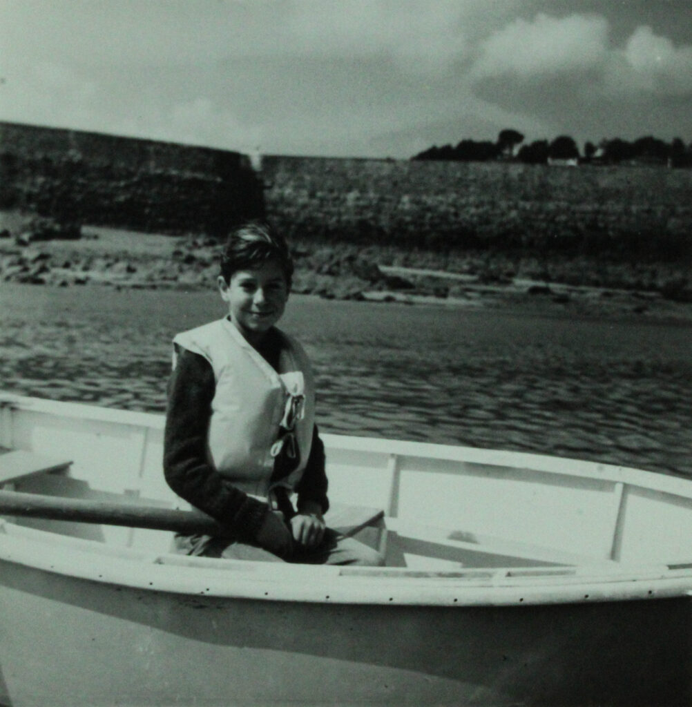
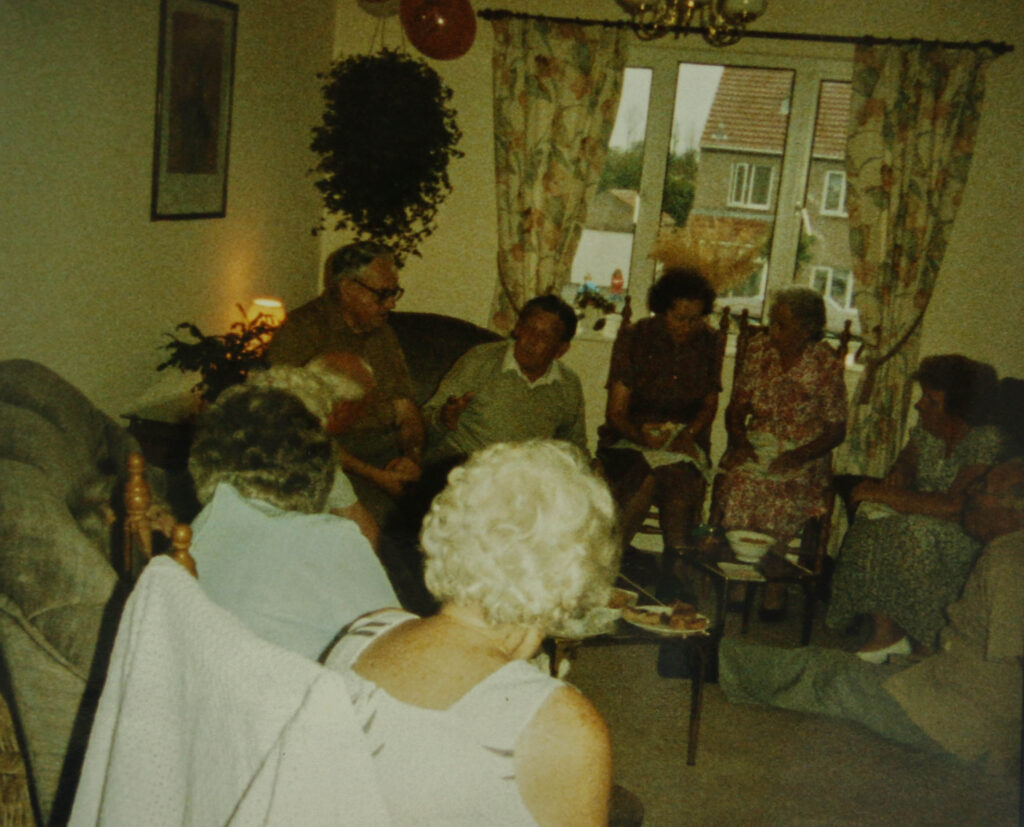
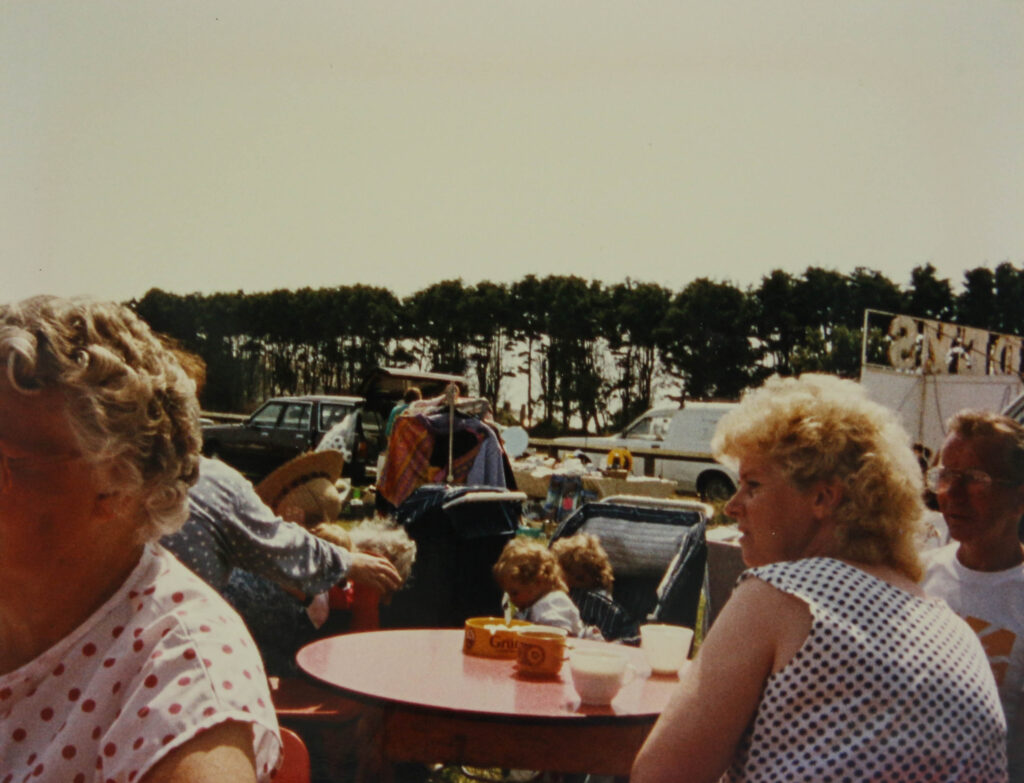
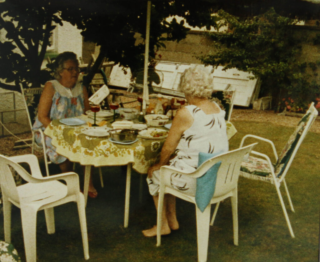
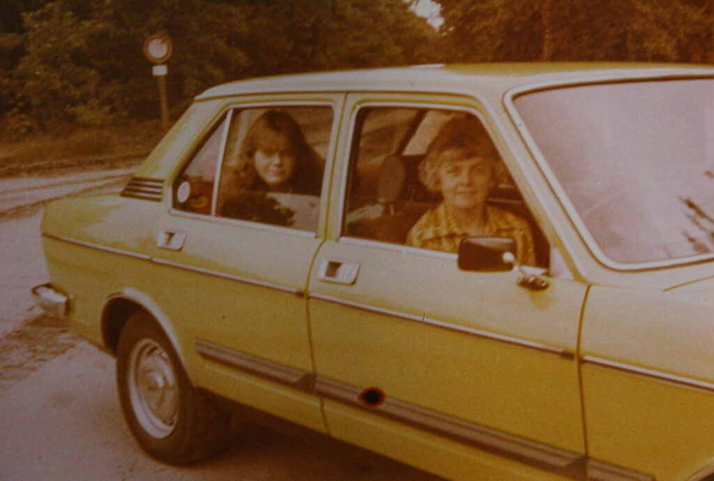
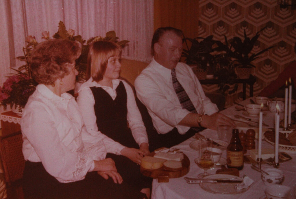
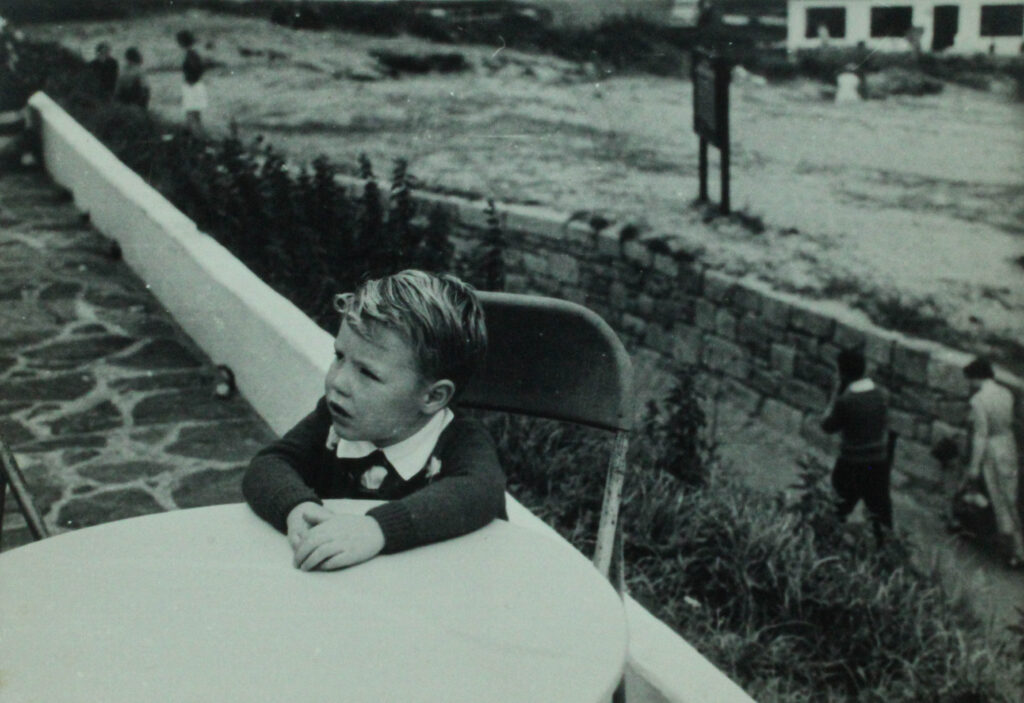
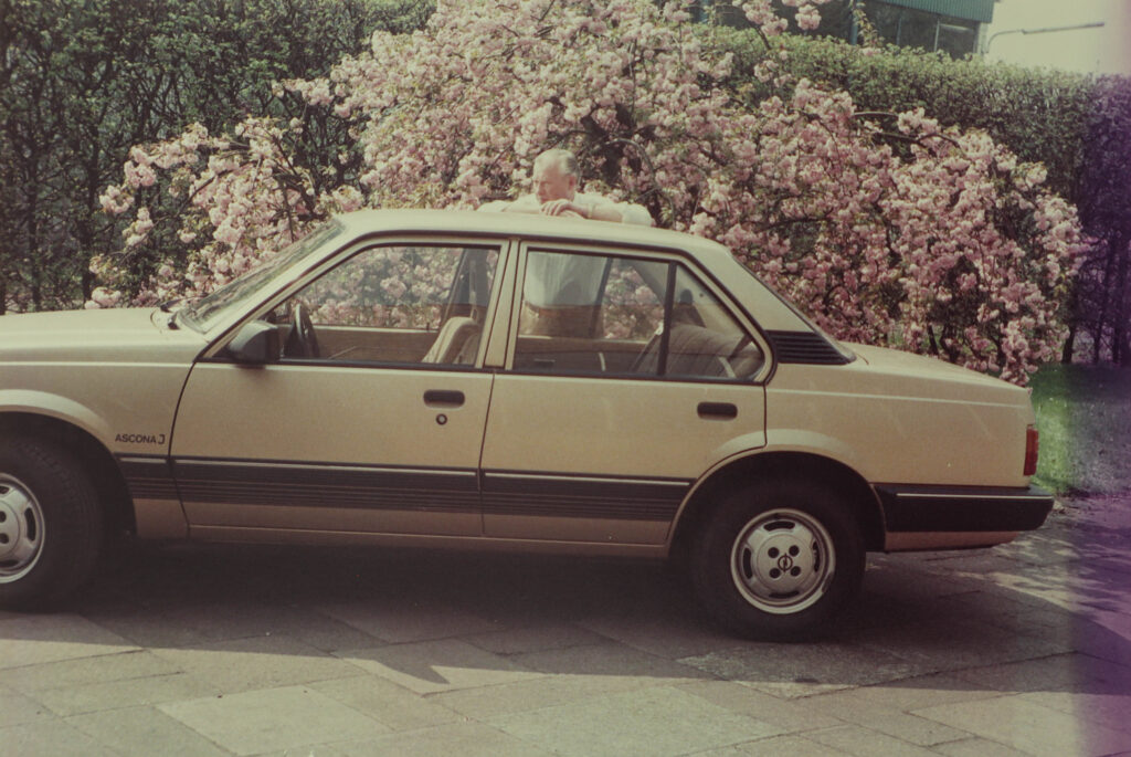
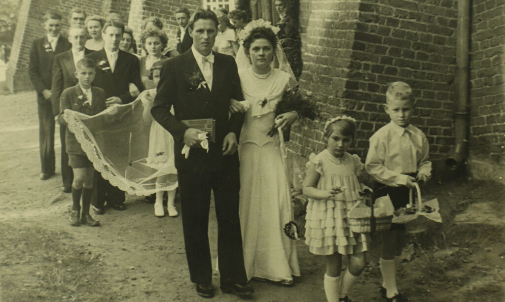
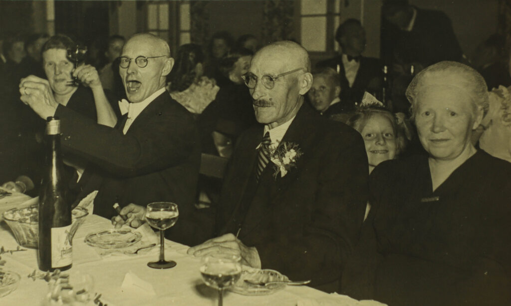
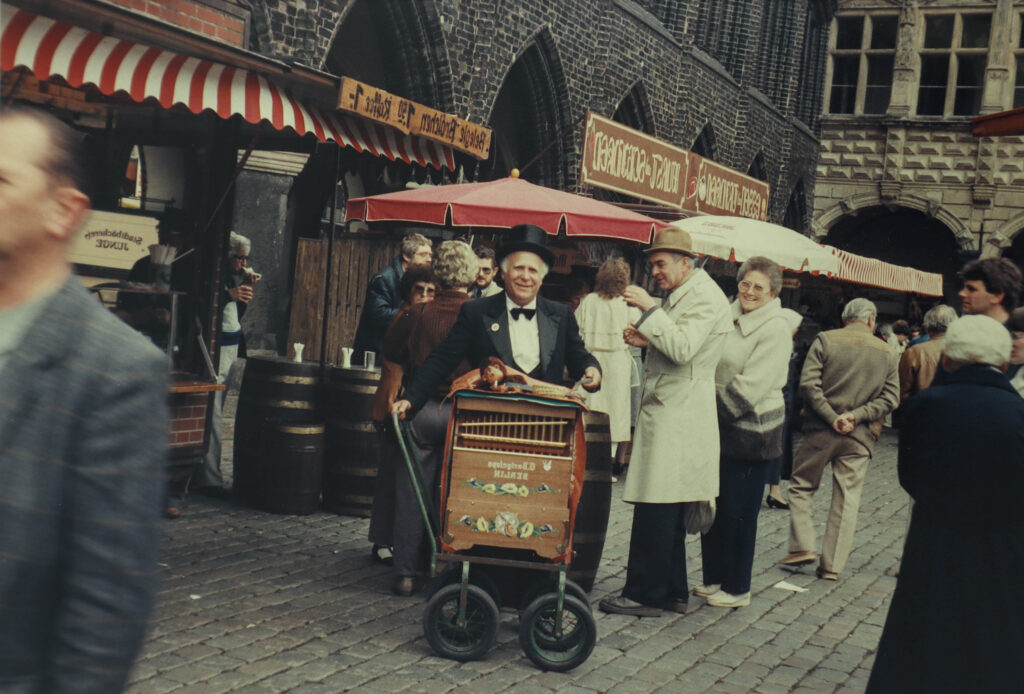
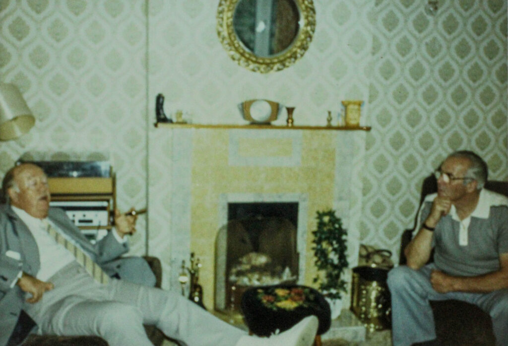
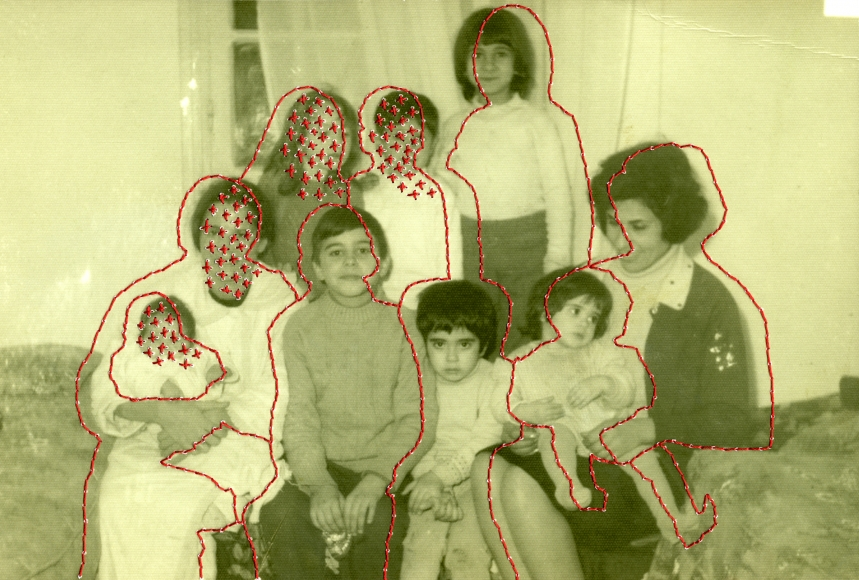
For my first photoshoot I focused on digitalising photos from my family albums. My grandad had a passion for photography so there was lots of different options to pick from. I ended up choosing a few from each prominate stage of their lives. This included photos from when they were stationed in Kenya and Egypt; when they lived in jersey; when they went back and visited Germany etc…
Contact Sheet:
Editing Process:
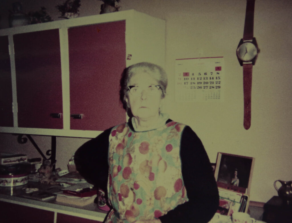
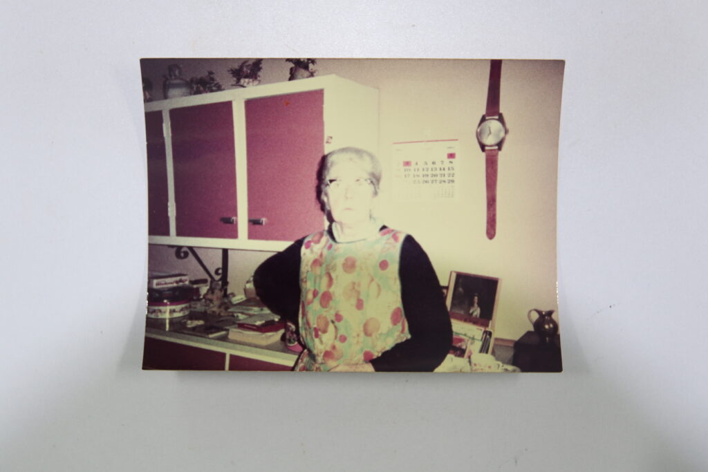
In regards to editing this photoshoot was relatively easy the main aspects of editing which I had to use was the crop tool and for some of the photos I changed the exposure as a few of the originals were a little over exposed.
Edited
Original
Final Images:
Evaluation:
Overall the photoshoot was good I feel like I got a good variety of photos displaying lots of different aspects of my grandparents lives together. I’m happy with the selection of images that I took as I have lots of different images based on different parts of their lives for examples parts of my grandads family, my grandmothers family, their kids, them going sailing etc…
For my first photoshoot I need to digitalise my grandads photos. My grandfather had a big interest in photography therefore I have hundreds of his old photos. My whole project will be centred around these photos and exploring what I can do with them.
Photoshoot 2
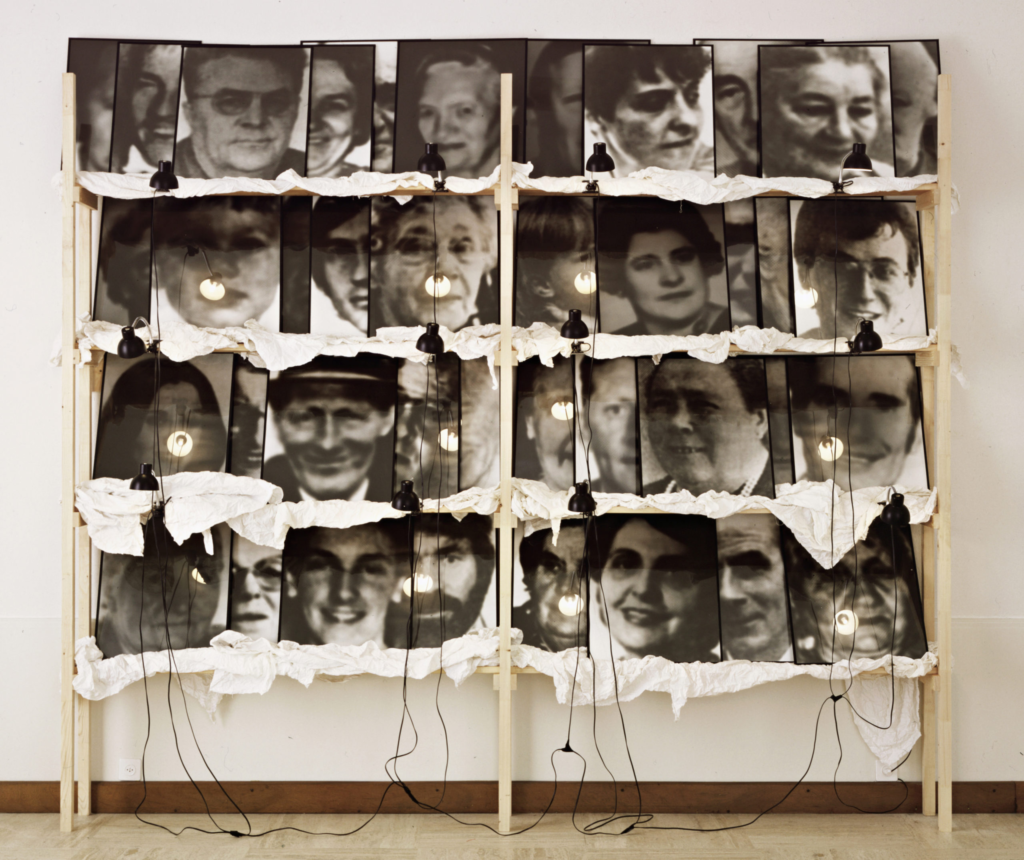
For my 2nd photoshoot I was planning on focusing on the family photos I have. I would like to go through them and organise them into groups to then take pictures of those groups. I was thinking about sorting some into portraits, some from my Grandfathers time in the Royal Airforce, some of their family home etc… I want to base my first photoshoot on Christian Boltanski as he created this work to try and reconnect or learn about these families which is part of the reason I choose to base my project on my grandparents. He creates these huge pieces which will contain lots of portraits of family members which he then uses to create one big collage. I know that lost of the photos that I have access to were portraits of different family members so it will be nice to learn about everyone while I do this.
Photoshoot 3
For my 3rd photoshoot I’m hoping to use embroidery and needle work inspired Carolle Benitah. in order to do this I am planning on using old pieces of fabric and ironing my picture onto that fabric using heat transfer paper.
Ideally I would like to try and stitch signs/icons of the nationality of the persons who’s portraits it is For example if it was a picture of my grandmothers I would bases it on something from Germany. Ideally I would like to use one picture of both my grandmother and grandfather together and try and have their flag behind them.
Photoshoot 4
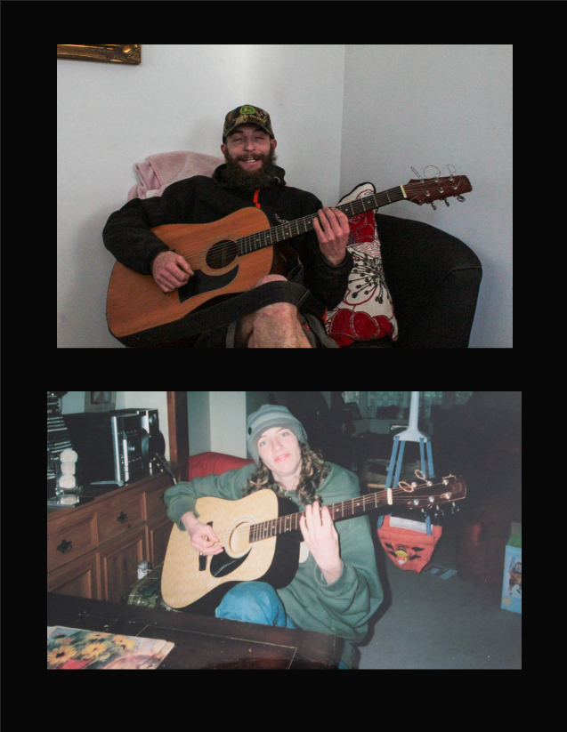
For my 4th photoshoot I would like to recreate some of my grandads photos. I would like to recreate some of the images of my grandmother with myself. In order to to this I will have to use a tri-pod as I will be both the model and photographer however I feel its important for me to be the model when replicating the images due to being the only granddaughter.
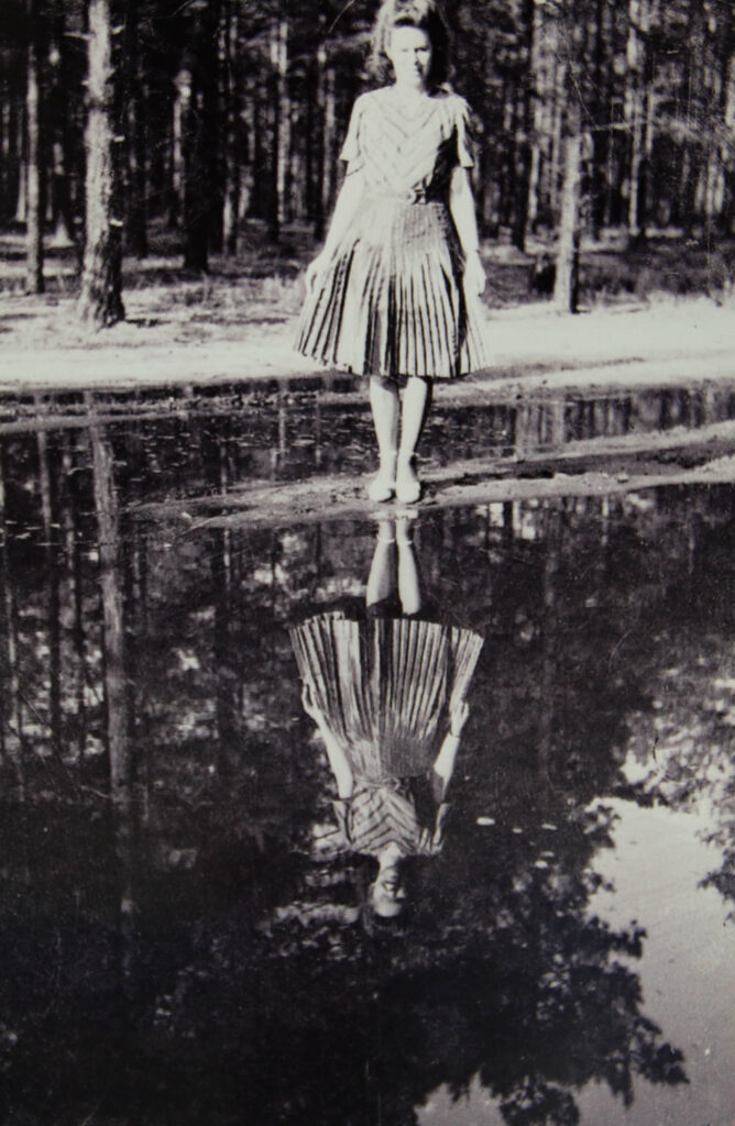
Additionally i potentially will edit some photos so its half my grandads picture and half mine. There is one picture my grandfather took of my grandmother standing in front on a small lake with her reflection looking back at her. I believe recreating this image but editing it so that I’m looking at the camera and my grandmothers reflection will be in the water.
Photoshoot 5
For my 5th photoshoot I would like to get a picture of my dad holding up a picture. This is a picture that has always been on display in my house growing up its a picture of my great grandfather standing next to my grandfather on a bike when he was a child. The reason I want to use that exact photo is because I would like to try and show the three different generations of the men in my family.
Photoshoot 6
For my 6th photoshoot I am inspired by Zoltan Kerenyi’s ‘windows to the past’. This means similarly to Kerenyi I will be using some of the family photos I have of when my grandparents moved back to jersey and returning to the same location. While Kerenyi superimposed his images to utilise both the old and the new I would like to physically be holding up to subtly represent more of a connection to the image. These images seem so personal showing snapshots in time and going back to revisit them which I think will work really well conceptually with my project.
Photoshoot 7
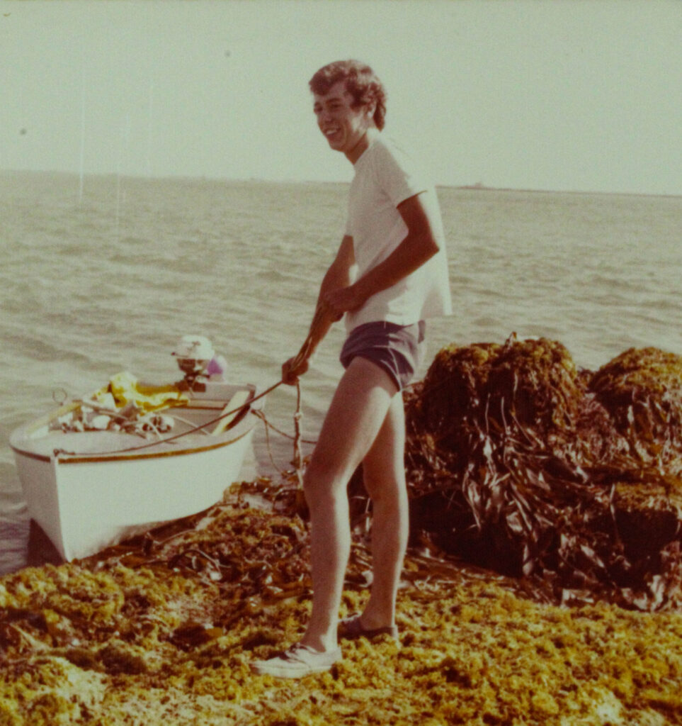
For my 7th photoshoot I’m heading down to the harbour. This is because I want to take photos inspired by my grandad and his love for boats and sailing. I’m planning on doing this through finding similar objects that I could find in my grandads original photos for example I want to find a small boat similar to what they had and maybe some seaweed based on a photo he took of my dad pulling in their boat whilst standing on a platform covered in seaweed.
Photoshoot 8
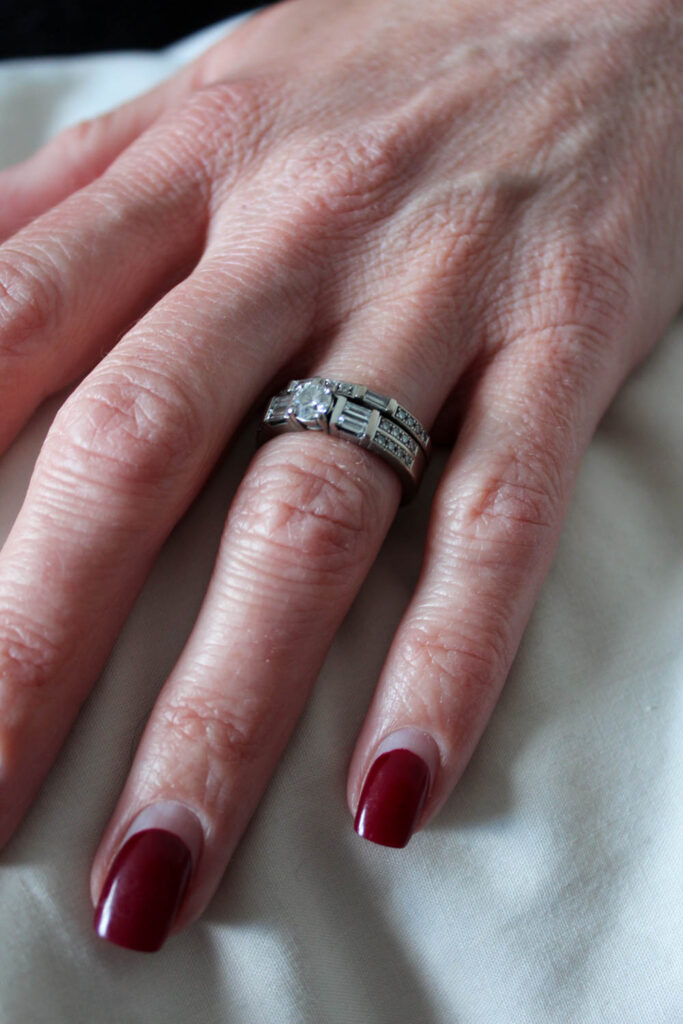
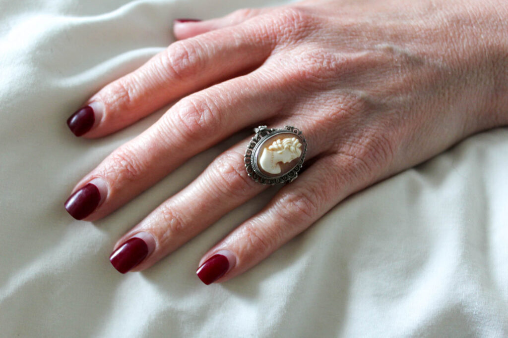
For this last photoshoot all I want is to take a picture of both my grandparents wedding rings together with their marriage certificate. This is important to me and it displays their nationality and little bits of information surrounding them.
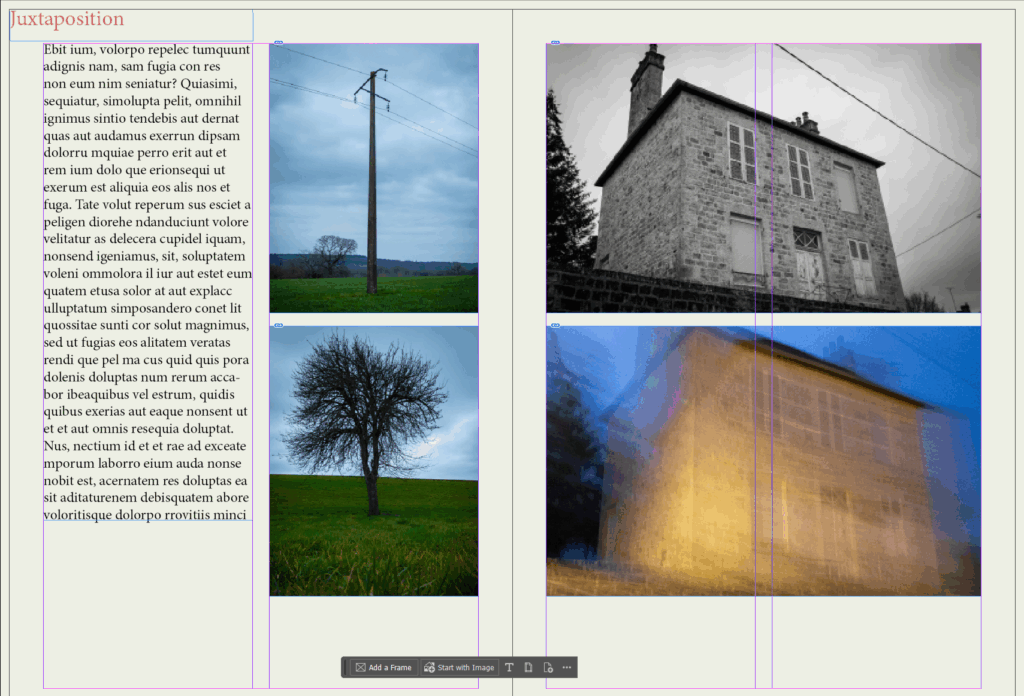
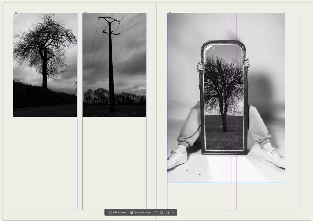
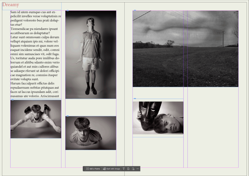
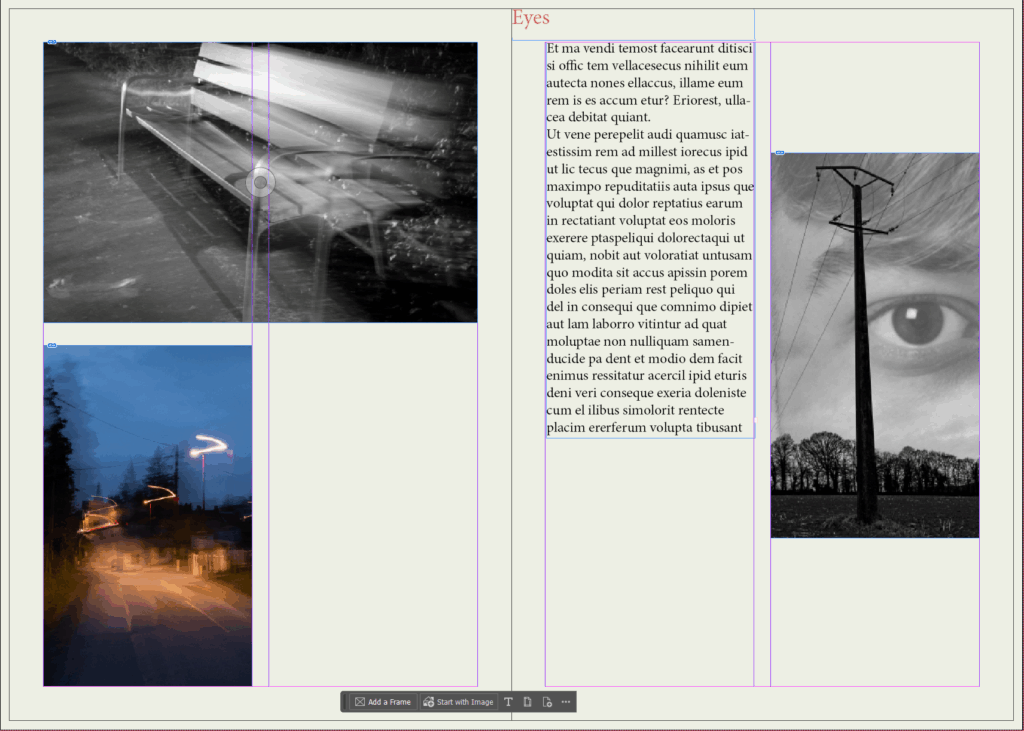
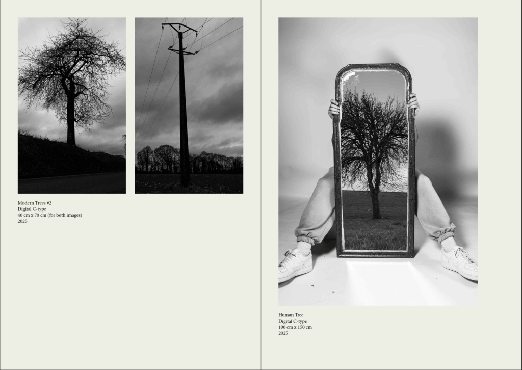
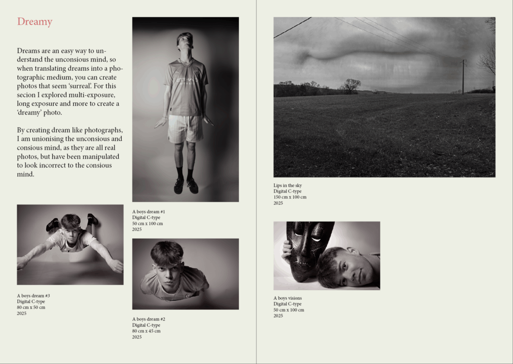
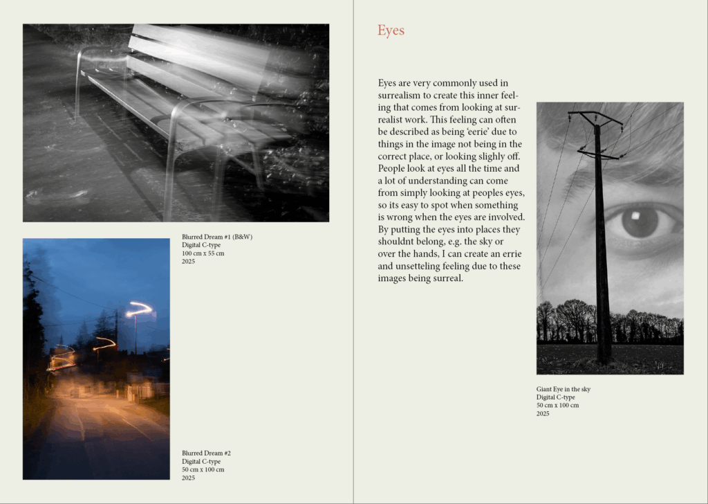
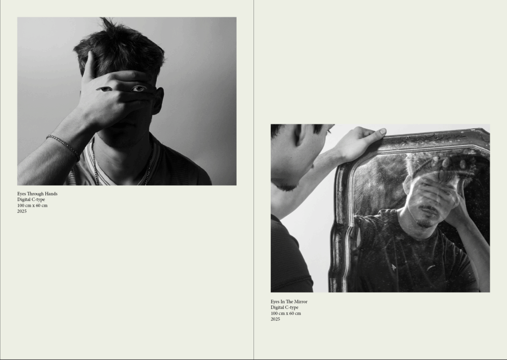
After researching a few exhibition catalogues, I have decided the best way to lay out the catalogue is though categorising each section. The categories I have chosen are “blue”, “Juxtaposition” , “dreamy”, and “eyes” in that order. I have done it in this order to follow the layout of the ‘virtual’ gallery. “Juxtaposition” will include montages of images that don’t go together, like light and dark images, or electricity poles and trees, ext. “blue”, will contain images from the work I did that takes inspiration from Mourants project. “dreamy” will use the images of my subject flying, and other images that look “dreamy” in a way. Then finally, “eyes”, will include my best images that contain the eye.
Another Thing I learned from researching different exhibition catalogues is to always include the meaning behind the work at the start of the catalogue, as well as including the title of images and the size of the image if I where to create a real gallery. I can also go more in-depth which why I took the photos for each section I will create.
Red = eyes, Blue = blue, Green = Juxtaposition, Yellow = dreamy
Above I planned out the images I will be using, using colour coding in light room to categorise them. I will be using InDesign to create my exhibition catalogue.
For the front cover I used my strongest image, in black and white and in colour to allow viewers to understand what kind of photos will be in the exhibition . I’m calling this exhibition ‘union’ as that is what my whole project is based on. I might change the name later to a more create one. I also coloured every page slightly yellow to give the exhibition catalogue an ‘ancient’ look, as well as making white images easier to see. I’ve also made titles red instead of the traditional bold because I think it looks better and makes the pages less cluttered and clearer.
For the first and second page I placed where I want my images to be (in a logical manner), as well as adding some text which I will improve towards the end. I did this for the book, to get an Idea of what it will look like:
filled where I will have important text with place holder text
I have laid it out this way to give more important images more space on the page. Below is the final layout with text included:
I have chosen to leave the back cover black as it’s not suppose be a book but a small paper catalogue which is simply used to show the photos around the exhibition , as well as a small amount of information on why I’ve taken some of the photos. Some things I’ve changed in the final addition above is that I’ve added some info on each photo (the name, how its printed, size, and when it was taken). I’ve also moved the titles down and to the right more to keep a consistent boarder around the pages.
The final Images which I will be mounting and displaying are shown below:
A3 Images
A4 Images
I have chosen these photos in specific, as they are all strong in terms of composition, lighting technique, editing technique and they relate and show off my exploration the best.
Mounting Ideas
Mount idea #1
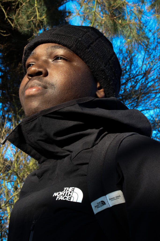
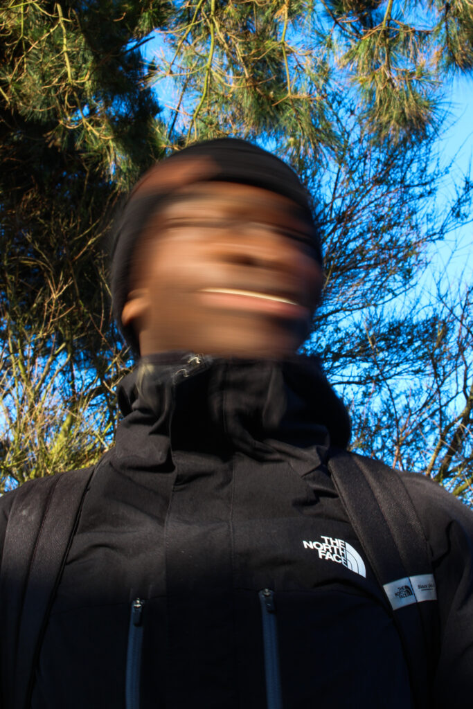
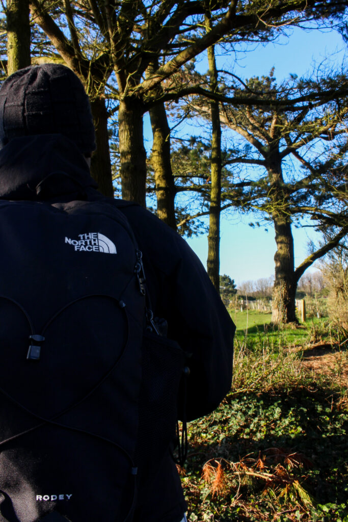
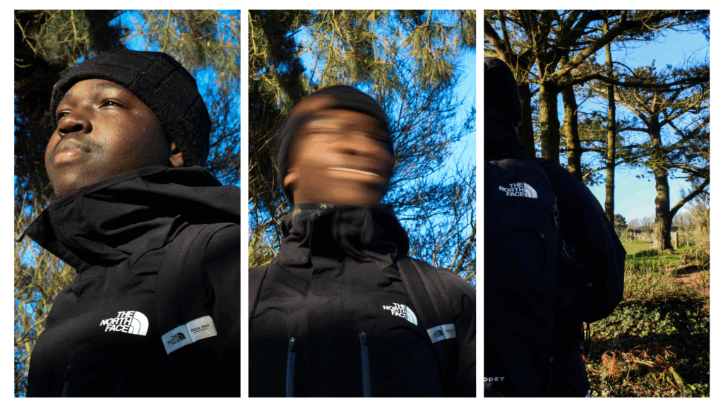
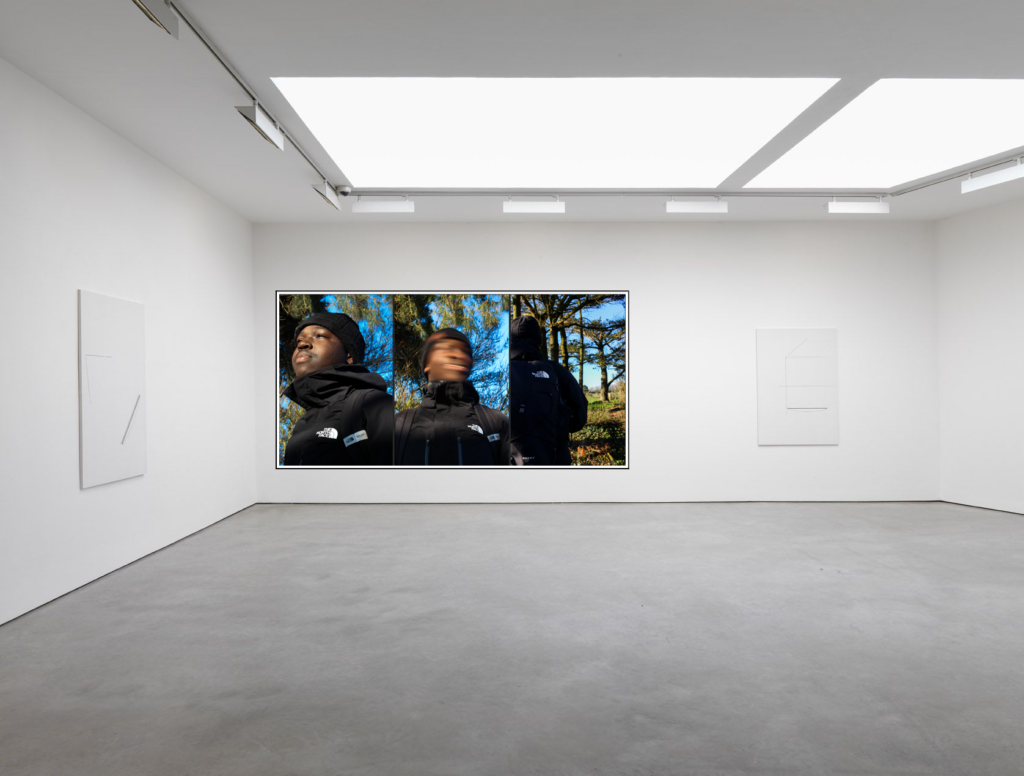
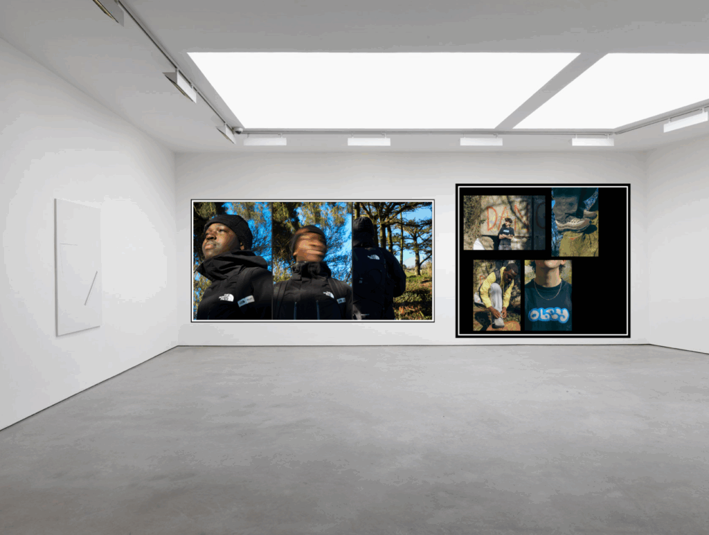
I chose to arrange these three together as they are all part of the same collection, focusing on the brand called The North Face. These photos were taken in a woodlands area on purpose to represent what North Face is about, which is hiking and exploring. I arranged them in a tryptic order with the one of him looking towards the left placed on the left, the one which has him central, arranged in the middle and then the last one being there so that the viewer looks at this arrangement from right to left, in a flowing state.
Mount Idea #2
These are all being arranged together because they were all edited in the same way, with the retro grainy look and they are all part of the same set.
Mount Idea #3
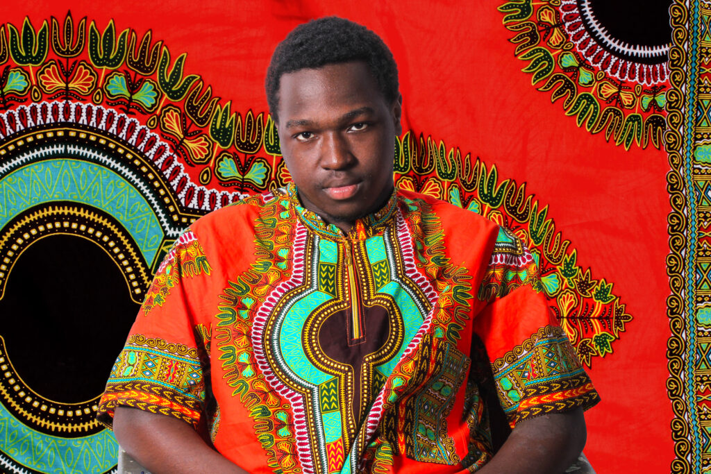
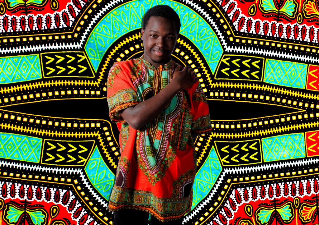
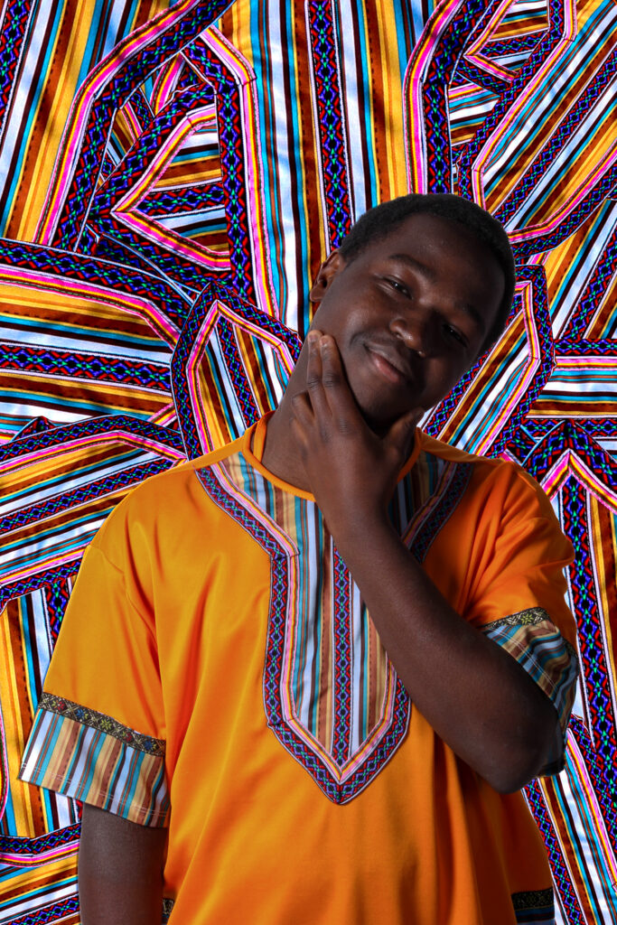
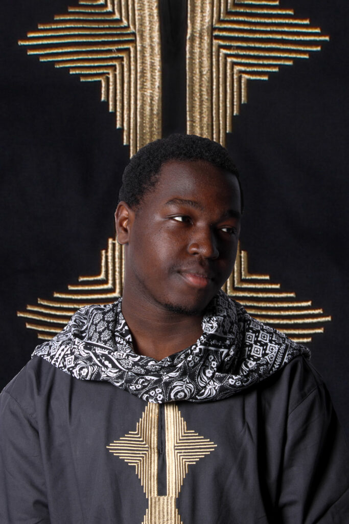
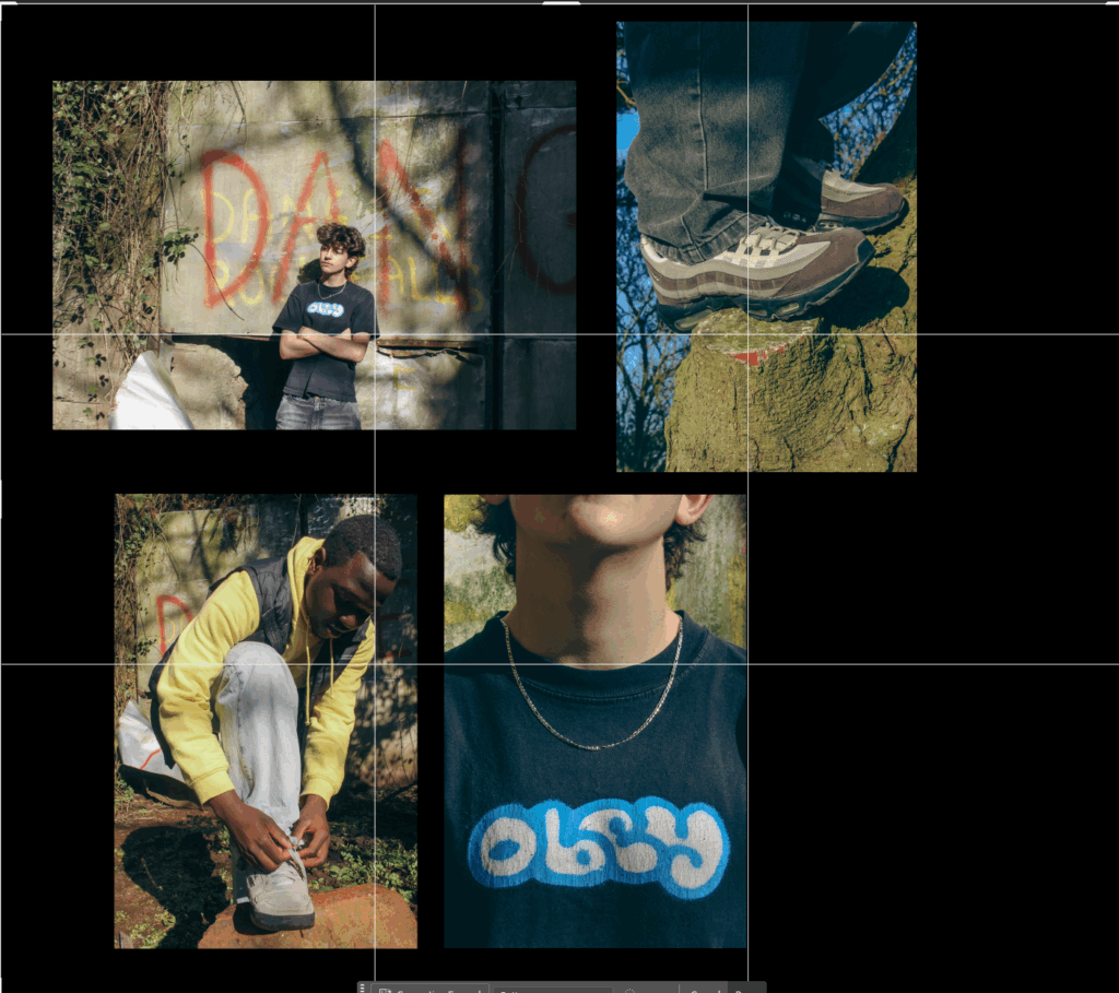
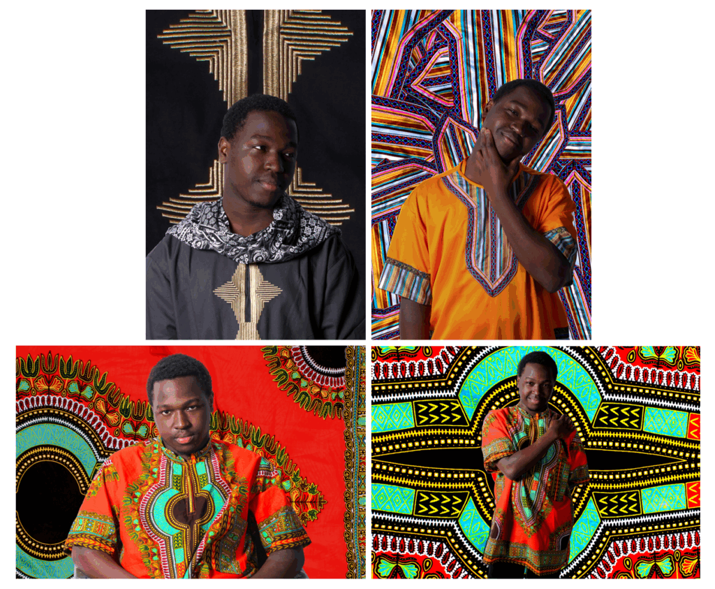
These are all culture portraits of the same model, wearing different clothing in front of different background so I have put these in the same mount.
Mount Idea #4
This is going to be a single print as I do not think that this photo in particular goes with any other prints. However, I think this is a strong self portrait with traditional culture being exemplified which is why I printed it.
Overall, my mounting went well as I was able to present my images in an aesthetically pleasing way and I was able to experiment with both white and black background and different ways of arranging multiple images, or singular images.
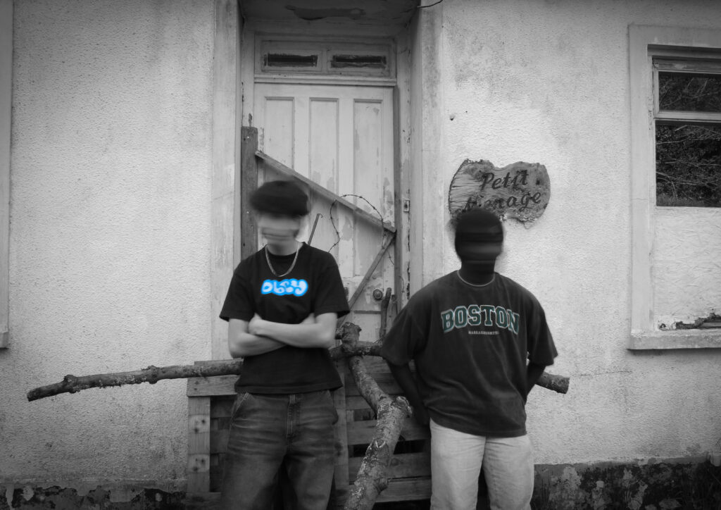
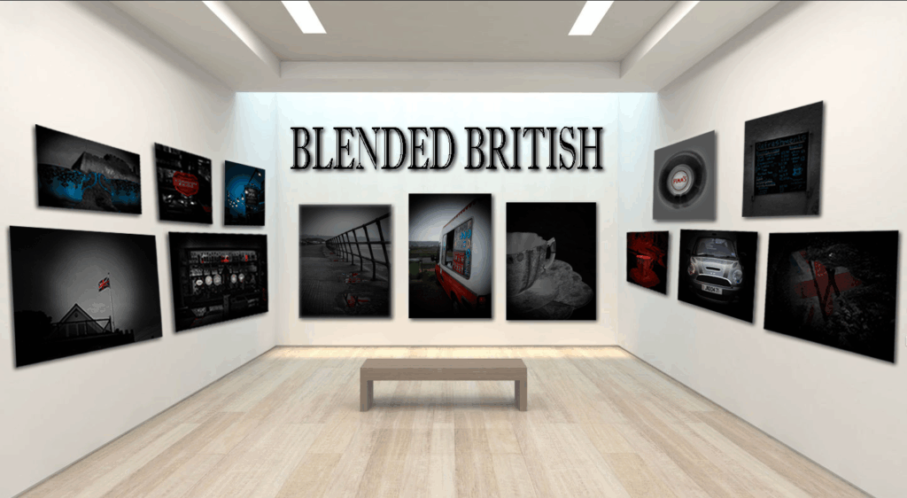
I began by studying what Union meant to me initially planning on focusing on the flags that make up the Union flag, separate nations woven together into one identity. After primary research with my family, I realised that identiy is much more than flags. It is found in everyday moments and objects and things I didn’t even realise were British.
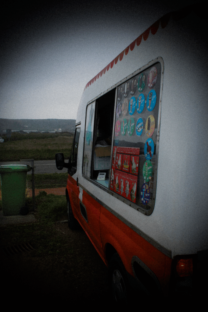
This shifted my project. I started to elevate the everyday, finding humour and meaning in lots of ordinary British scenes and objects. I blended British iconic symbols like the Mini car, pubs and the union flag, with overlooked details like M&S tea bags, wheelie bins and ice cream vans. These combinations then reflected what Britishness actually is – traditional and modern, serious and silly, all blended together.
A turning point came when I realised how much tea and beer is crucial to British culture and we are known for it around the world. The 3 o’ clock tea alarm being believed by Americans, or the fact that pubs are seen as very British. They are social hubs unique to Britain. This is when I suddenly noticed the liquid theme running through my work. Tea, beer, rain, puddles, ice cream, petrol fuelling journeys, and this ties my work together on another level. Not just colours, or everyday scenes but liquids fuel us British people throughout our lives. Liquids move and blend and don’t stand still. Like British culture, some elements remain but others evolve and flow and I find this really interesting.
Union: Blended British became more than a project about national symbols. It became a reflection of me, my life, and where I fit in. It became a reflection of how tradition mixes with the everyday, how identity flows and changes and how Britishness can be found not just in what we see but in what we feel – in the small, ordinary moments we share.
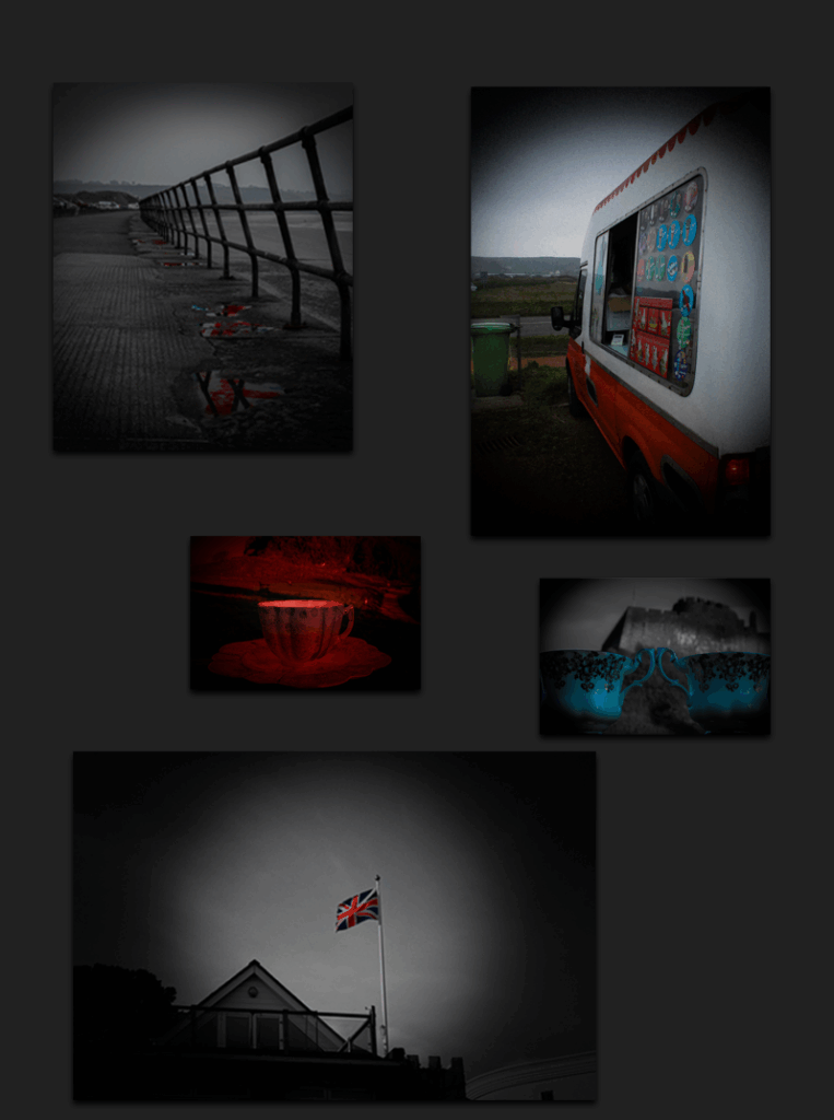
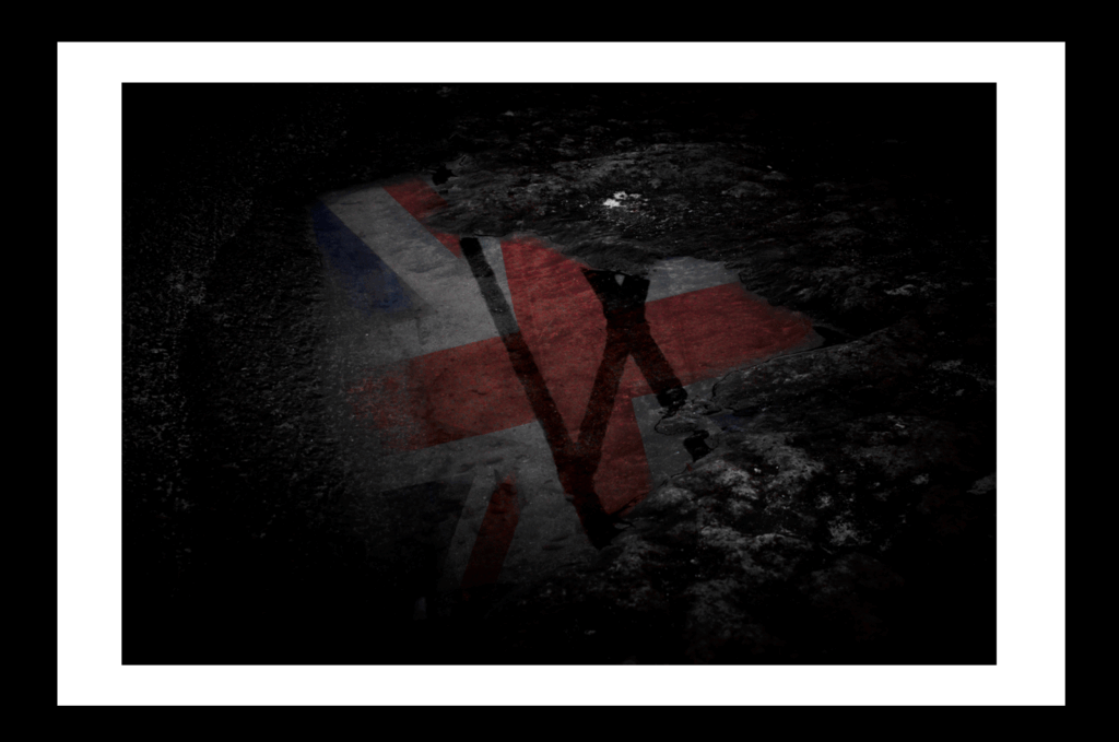
Image 1 – Reflected Glory
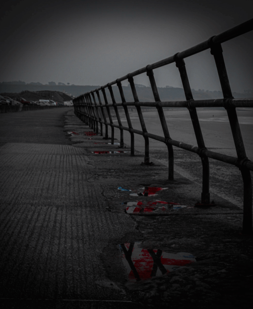
For my first image, I chose this image I took with a camera and then manipulated on Photoshop to create these Union Jack Flag’s inside of each puddle till they all some colour in with the black and white effect on everything else with a vignette around the final image to create focus points on the puddles and also to help the idea of Britishness and a cloudy, rainy day.
Image 2 – A British Puddle
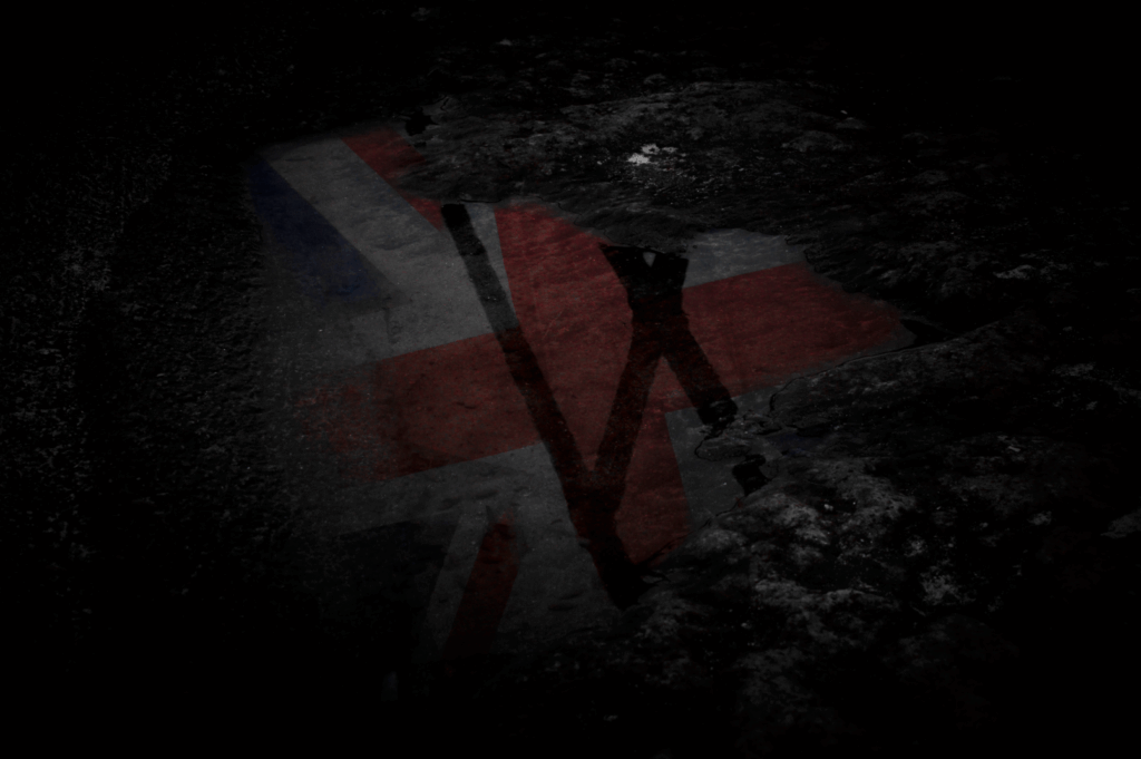
For my second image, I chose this image because not only is it a reflection of the Union Jack Flag inside a puddle again like image 1. But, this is a close-up of just one singular puddle with the flag showing through the reflection which tells the viewer that everywhere you look, even in a puddle, you can always see your heritage and where you came from.
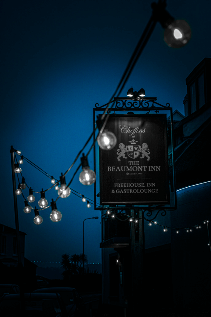
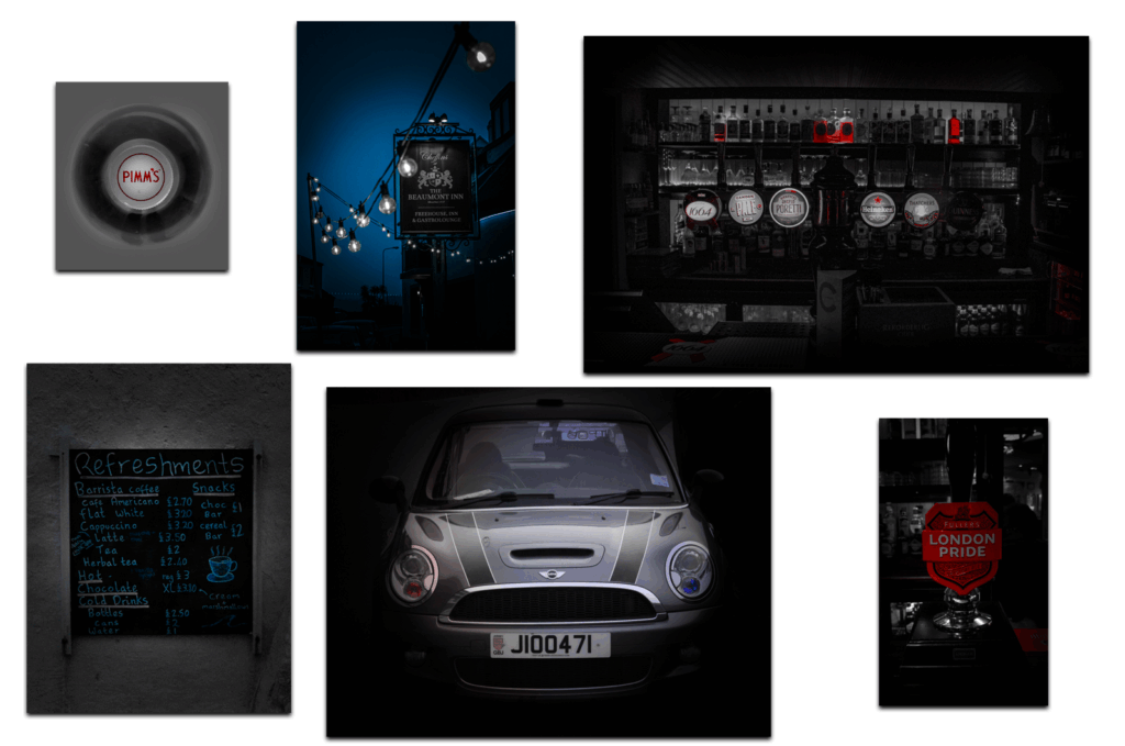
Image 3 – The Public House
For my third photograph, I chose this image because a pub/inn is very iconic and commonly known for as British and where the brits always go to watch the football, have bitter pints with mates, play darts and many more activities. I chose to use this photograph of outside of the pub showing the sign with the lights all around, this is because I felt it looked like a common standard pub which is exactly what I wanted, especially with the blue effects I used over it whilst making everything else in black and white with the vignette, I felt made this image feel even more British.
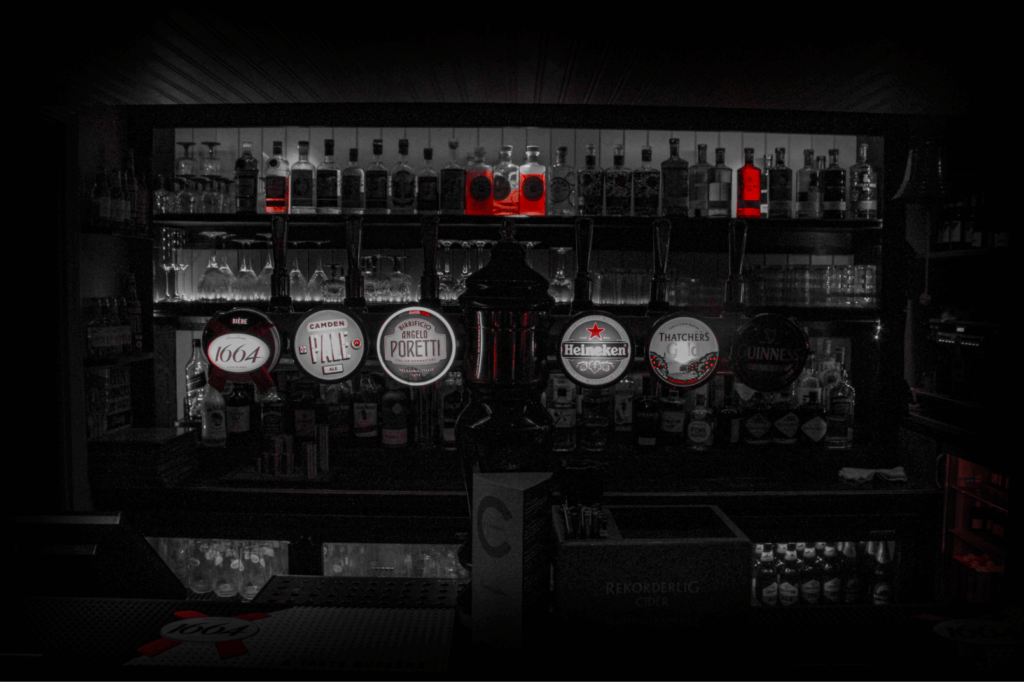
Image 4 – The Red Bar
My fourth image, I chose this photograph I took of inside of the Pub which correlates to image 3, but for this image I wanted to do the opposite of image 3 and instead of only keeping the blue colour, I decided to only go for red as there was more red in the bar than blue and all of the alcohol pumps/logos had red on them.
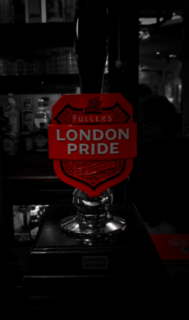
Image 5 – London Pride
Image 5, for my image 5, I got a close-up image of a London Pride Pump, which is clearly British as it has London in the name, but, it also has a full red shield around with a crest design on too, very British design.
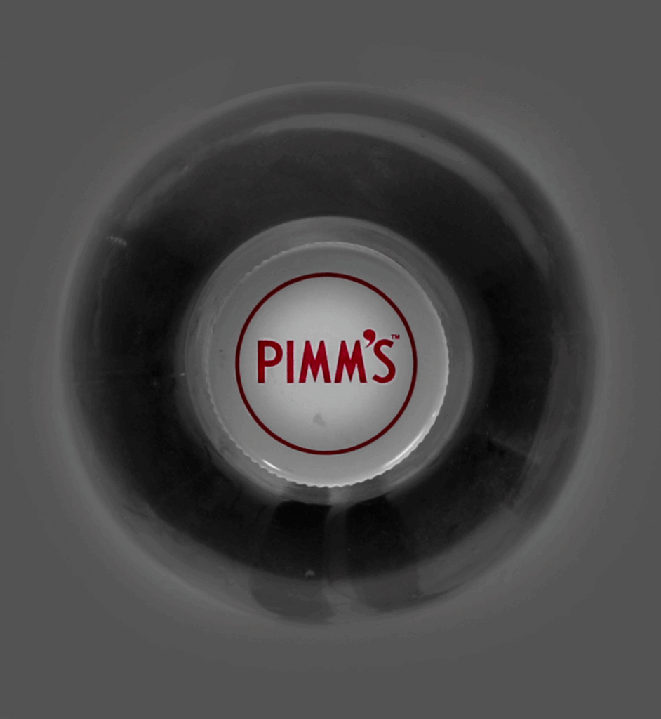
Image 6 – Pimm’s Perspective
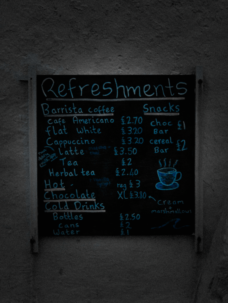
Image 7 – Refreshing Menu
Image 8 – Home Pride
Image 9 – The Colour of Tea Time
Image 10 – Tradition on a String
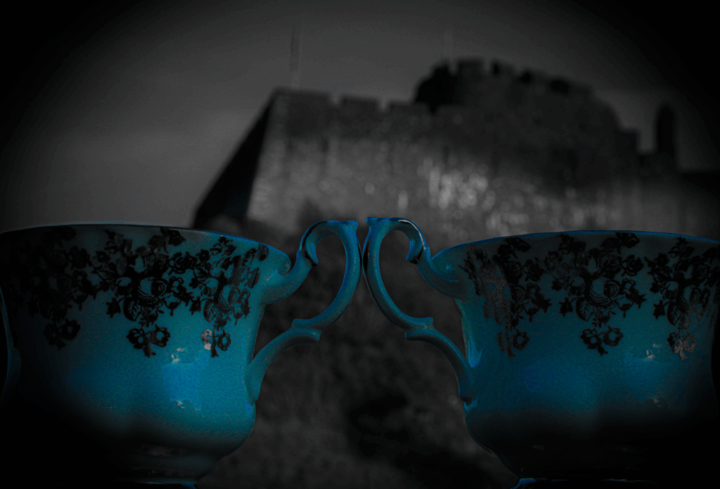
Image 11 – Tea for Two at Gorey Castle
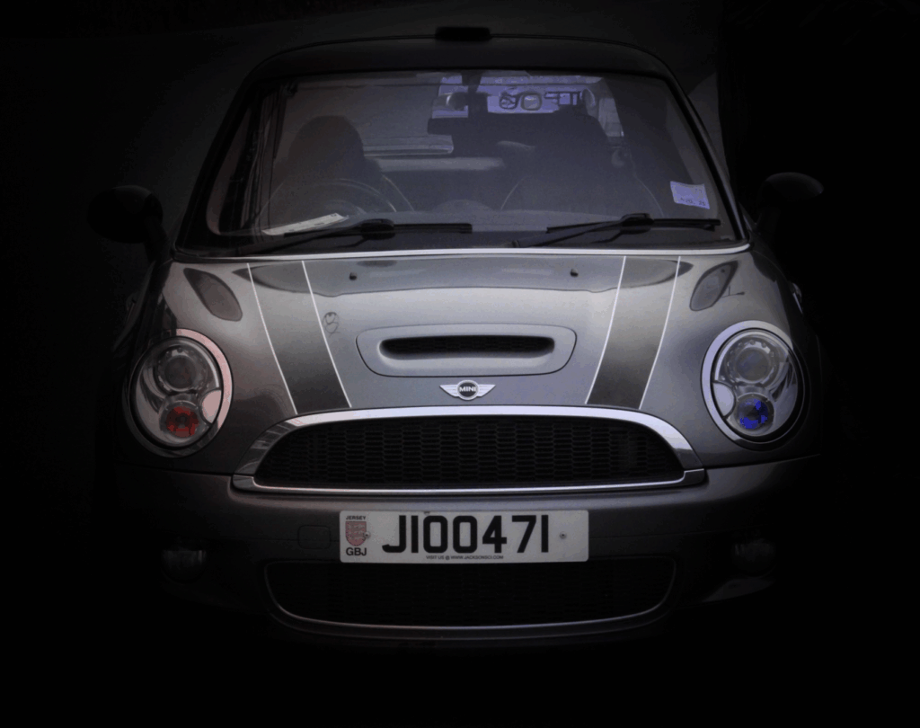
Image 12 – Driving the Union
Image 13 – Freezing Hope
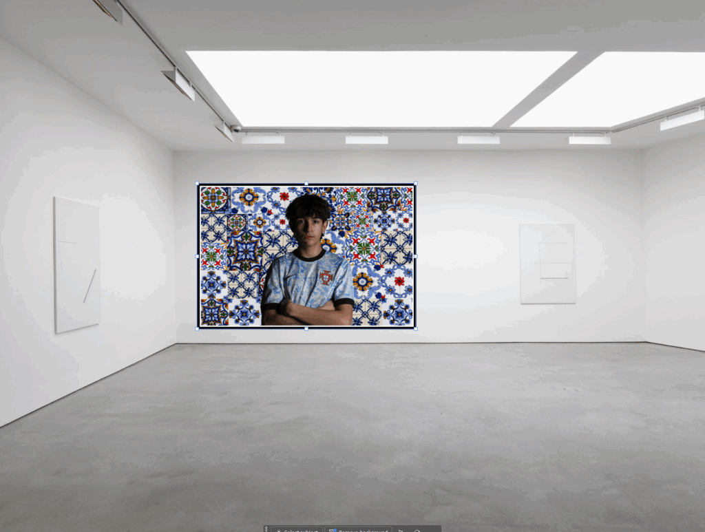
Virtual Gallery
I did a virtual gallery with all my final images and created this using Photoshop stretching and transforming each image to help show the perspective that they are hung on the walls. I also put in my title above the main 3 images ‘Blended British’. I used a very generic-looking font that matched my theme perfectly, this is to show what my collage is called and to show the viewers what it is called.
Mounting & Framed
Mounts
For the physical mounts I created this was the layout I decided to go for. I chose these images on each mount board because half of them went together and worked well next to each other and another half worked well together, so I split them up into two different mount boards which looked like these.
Mount 1
Mount 2
Frames:
For the framed images I created, I framed one image which was image 2 – ‘A British Puddle’. I chose to frame this image because it stood out to me of how it is just a singular puddle with the reflection of the Union Jack Flag, and so I didn’t just want to add it on to a mount board, instead I put a black frame around it but I also had a white border about 4cm long, in-between the frame and the actual image.
Frame 1: A British Puddle.
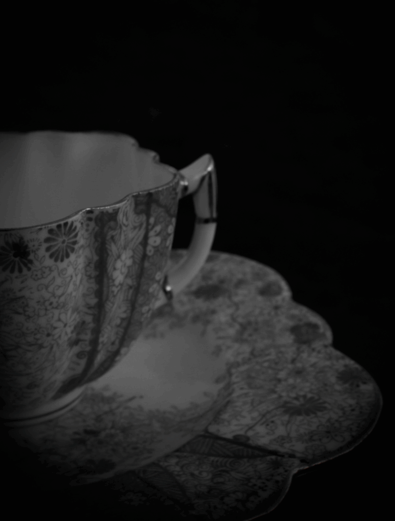
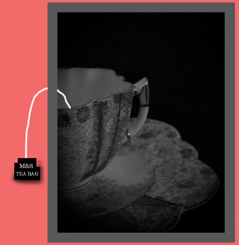
Frame 2: Tradition on a String – Broken.
For my second framed image I created, I chose to frame image 10 – ‘Tradition on a String’. The reason I decided to frame this image, was because like my artist Andrew Scott, he uses the frame in ways as manipulating to bring his images to life. I really like his art work and ideas and decided to try create something inspired from him. That is why I chose image 10 because it is a photograph of a tea cup I took, but I cropped it in half so that when I have a frame around it, I can add a tea bag string coming out of the cup and out of the frame just like Andrew Scott. Also, I wanted to do something to the glass frame as Scott does that too by breaking certain parts on the frame, to interact with the viewer. So, what I did was I dropped the glass frame ever so slightly onto these metal pegs from around 10cm high, which created these 3 large breaks on the frame over the cup of tea, but, this is perfect because it symbolises ‘Broken Britain’, how Britain is slowly breaking and even the cup of tea is dying out as not many younger people drink it nowadays compared to decades ago.
Wasn’t planned but emerged naturally. I realised that liquids move, blend and reflect – just like identity. Liquids are central to British life and the flowing, adapting life we live.
Tea, (ritual, comfort, routine, known for it worldwide, union of people)
Beer, (pubs, community, tradition, union of people)
Rain, (british weather, we talk about the weather a lot and hope it will be good)
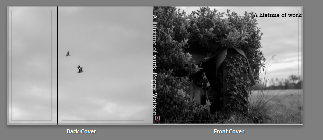
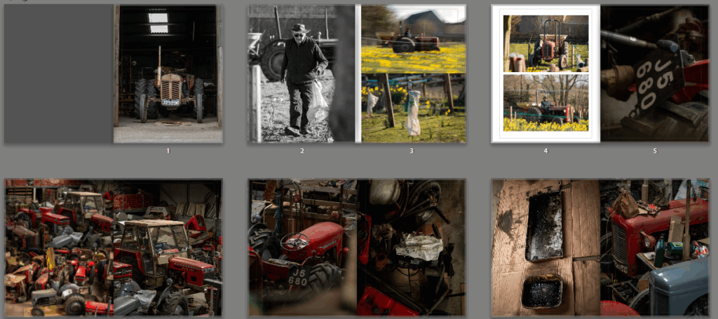
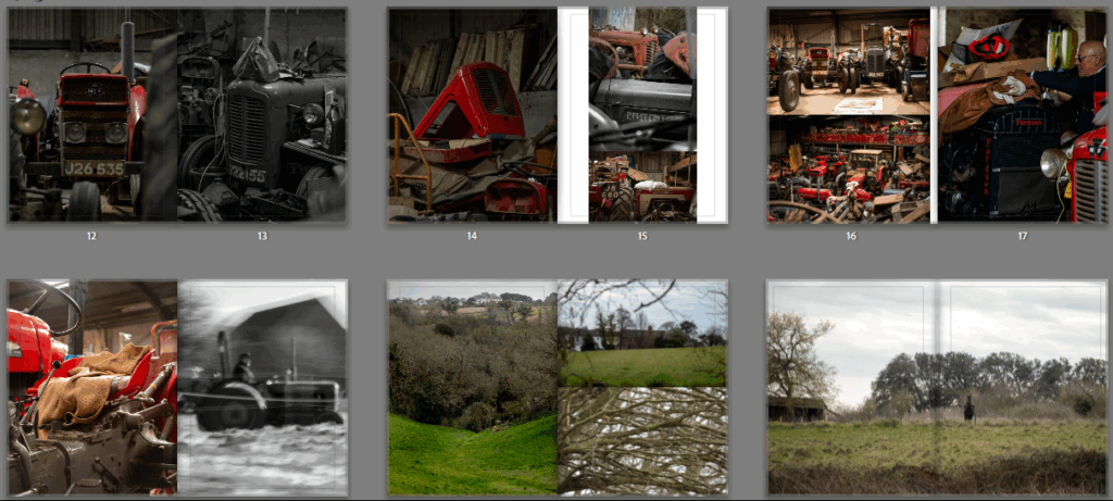
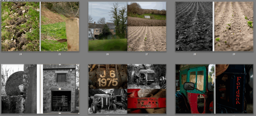
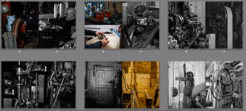
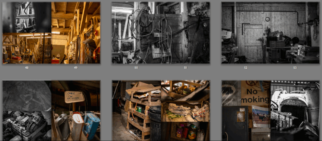
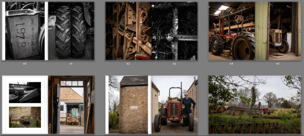
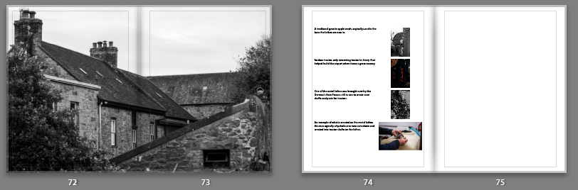
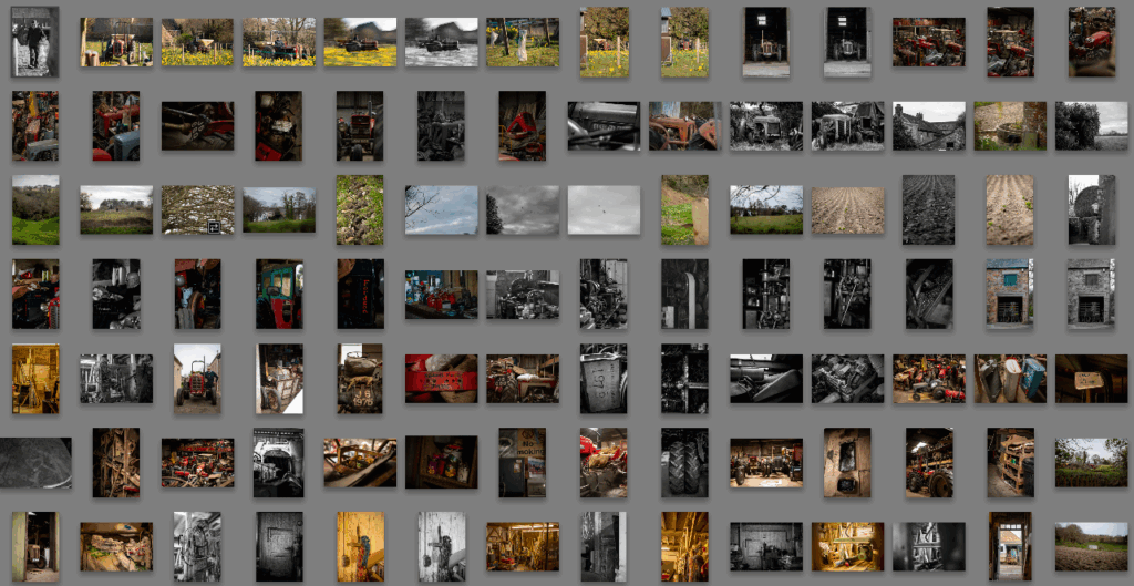
This is my final book, I went through multiple versions, some focusing on colours, some textures but I found they lacked the story. This final version highlights the finer details in the story, shown by different photos, different compositions and different non literal lenses. The theme union was the cause of this project, I wanted to show the connection, union, between man and the land. Farming is the best way to show this as it one of the biggest ways we interact with the land and do our best to maintain it. It is also essential to human life, without farmers there is no food. Within my project I focused on one farmer, Raoul who uses more traditional equipment and methods. The book is an end picture, a summary of this. I spent three days photographing him, his farm, the land and listening to his stories, learning to understand the land around us and how he works to work with it. When I started to edit the photos I split them into the different photoshoots, allowing me to see how I can tell his story through my photos. A huge part of Raoul is his Massey Fergusons so I started my book with Raoul working, this allow the viewer to understand the books point from a point of view of the public who have a rough idea of what farming is. I then went into the tractors, the farmers passion but also deeply involved in his lifestyle, this also allowed me to set up my consistent red mentions throughout the book. Once the viewer has understood a bit about the tractors, and got a sense for the more traditional style of them and therefore the traditional maintenance of them I went into photos of the land. From landscape photos with typical Jersey features like granite fence posts to rows of potatoes, one of Raoul’s main crops. This gives the viewer an insight into rugged Jersey landscape that Raoul works with. Going back to the tractors briefly then showing how they are maintained using a lifetimes worth of skills and knowledge as well as workshops full of tools. A lot of the workshop and tool photos are in black and white, this helps highlight the age and point out missed details, like the wood work shop being the old dairy. Or the wear to the wood panels, covered in tools and useful things. Raoul is a very organised person, as are many farmers who have to get the precise day to plant or the right mm to shave off a tractor part. I wanted to show this with his tractor parts, the way they are organised or labelled, adding smaller details like potato crates and old photos alongside his to add back a personal feel. The final pages of my book highlight the overall farm, the viewer, having seen an insight into the details now has a reflection of what they normally see to remind them just how little they might understand about farming. It was important to me that I added a few of the stories I was told at the end, stories that would otherwise be forgotten but hold important parts of history.
The Link To Union
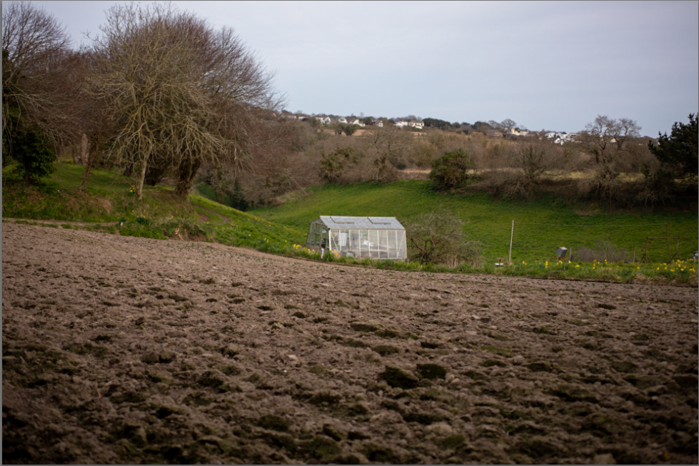
Throughout the project I focused on how I could express the union of land and man. This photo is an example of how I captured it. With three layers, the foreground being farmed land, the middle being a greenhouse but on natural ground then the background being wild unkept looking trees and rugged grass. It looks like a simple photo but it holds many details and is important to the project, especially when paired with other photos.
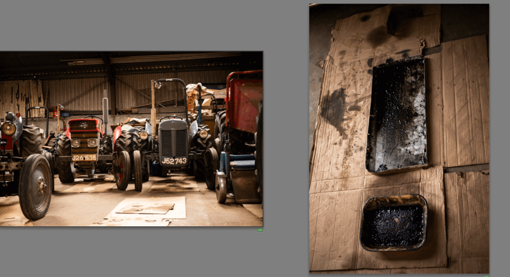
Another link I made to union, the union of man and machine for Raoul tractors are very important but they will always require a lot of work. I kept these two in colour because the carboard pulls to the two photos together, showing how they are linked.
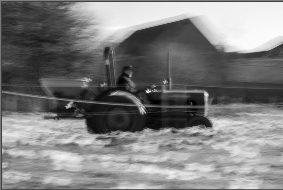
Inspired by impressionism I created this photo. I liked the idea that it forces the viewer to see the connection between man and the land as the blur blends the two together. You can still see the differences but they are one.
Link To Research
Alexander Mourant
Alexander Mourant and his ‘on Living stones and reaching’ project was my main inspiration behind this project. His blunt style capturing the simplicity of the details, but having heavily researched his work and the history behind it before completing the project. He also adds chunks of text to help the viewer understand his work. I liked the idea of explaining the photos and used it on my final book page to tell the viewer about details only I knew when looking back over certain photos. It has helped add a connection to the book for the viewer as they can read about the smaller details, why that photo was taken and the significance it has.
Claude Monet
Claude Monet was also a large inspiration behind the project with his work during the impressionist movement. Monet used bight colours and blurred lines, I used high contrast black and white, motion blur and the colour red as a theme throughout. Having researched Monet’s work I understood the impact of colour and ‘expression’ rather than just technically good work. This has helped draw an authentic feel to the book and make the images powerful with bright colour and high contrast, forcing the viewer to look.
FOR EVERY MINUTE YOU ARE ANGRY YOU LOSE SIXTY SECONDS OF HAPPINESS- Julian Germain
This book was what I researched and based my book style on, while it is two different subjects and content. I used the same idea, pairing images, continuous important details throughout, in Germain’s book it was flowers and bright colours in mine it was Massey Fergusons, the colour red and potatoes. It helps keep the viewer focused on the true book subject and not just look at the photos, keeping the narrative alive. Germain also used a simple cover, featuring the continuous themes, which I liked the idea of but used my own version obscuring it slightly with the tractor being over grown.