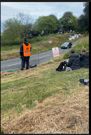
Plan-
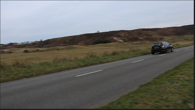
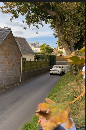
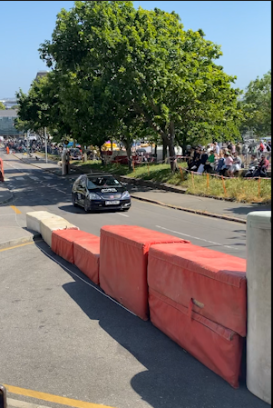
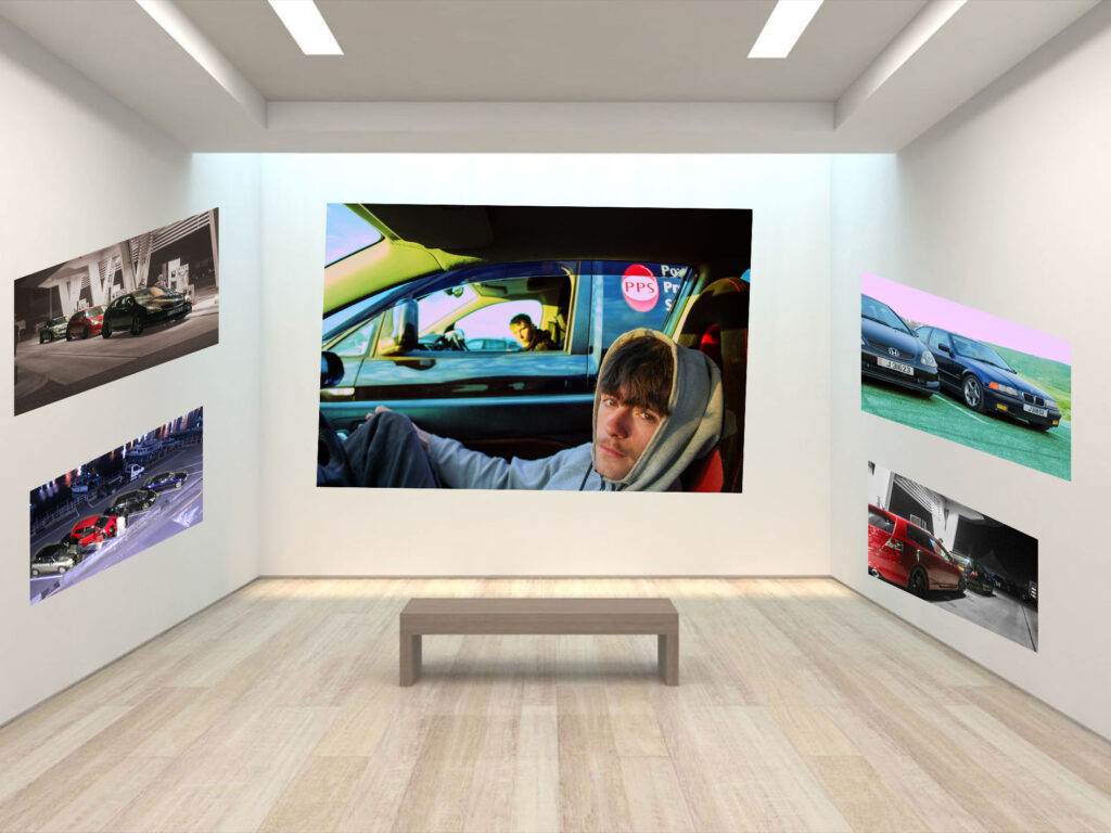
- Cars driving
- Small interviews
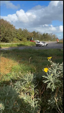
- Cars sat
- Portrayal of a bond
Step 1 :
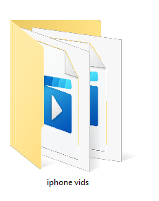
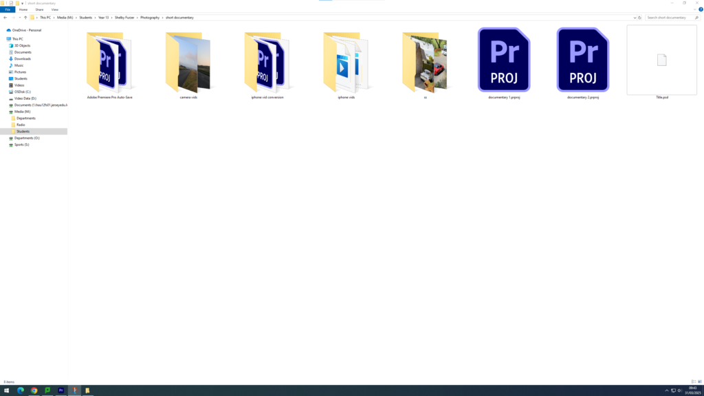
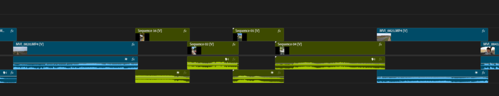
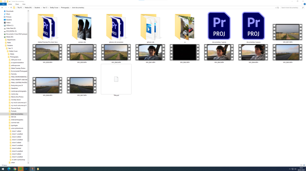
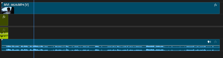
I created Iphone Video Folder within my media drive, and within my photography folder, Within this folder I have the video’s I have filmed on the camera, the ones off my phone, the title and the actual saved project. Therefore I had to ensure that all my files were kept neatly otherwise I may loose track of things, and my premiere file may corrupt due to not being able to locate certain videos.
Step 2:
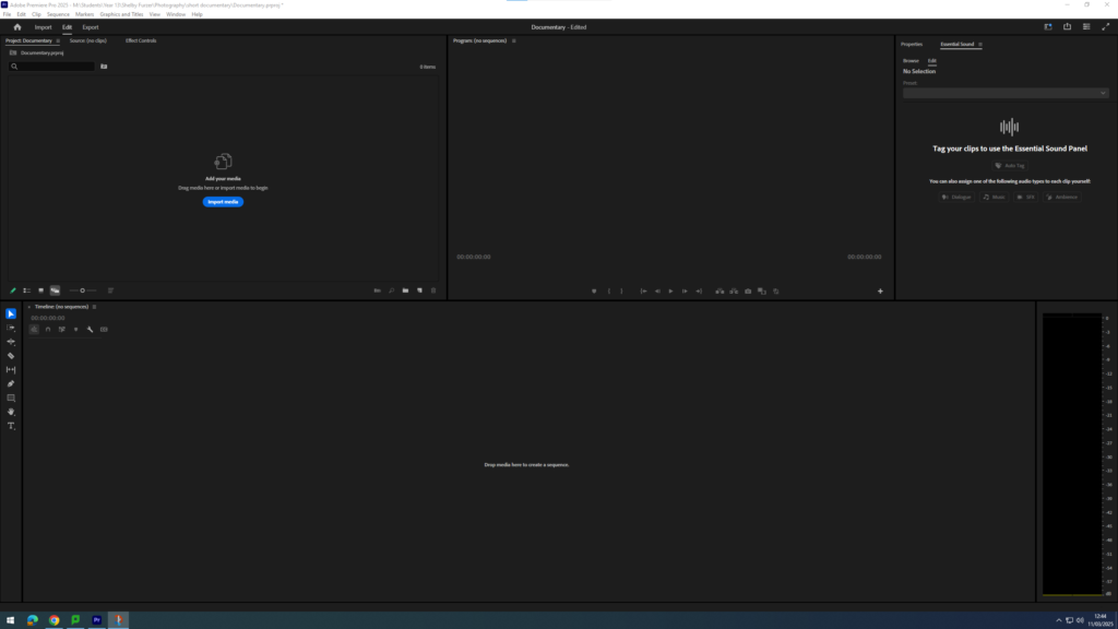
I then created the initial premiere pro file, so that I could start importing files and creating my short documentary. I made sure to save this initially so that there were no files problems.
Step 3:
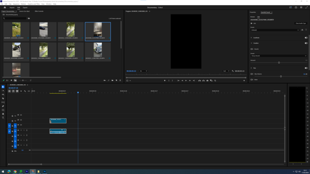
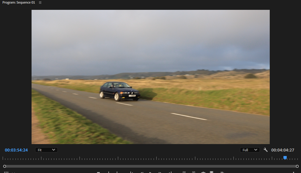
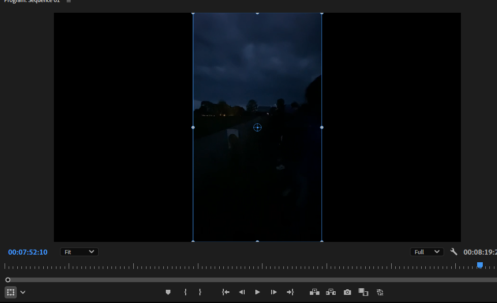
After creating the original premier project I was able to start importing my videos, at this point I only had videos I had filmed on my Iphone therefore the structure of the video itself seemed to be in a portrait position, but I knew that this would change to a wide screen landscape once I started adding video’s from the camera.
Step 4:
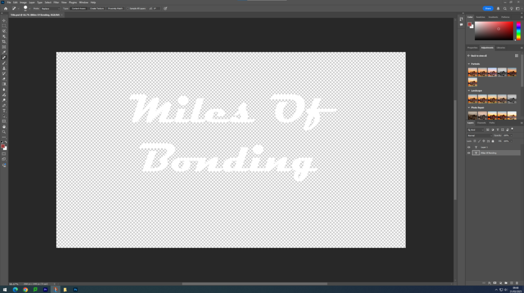
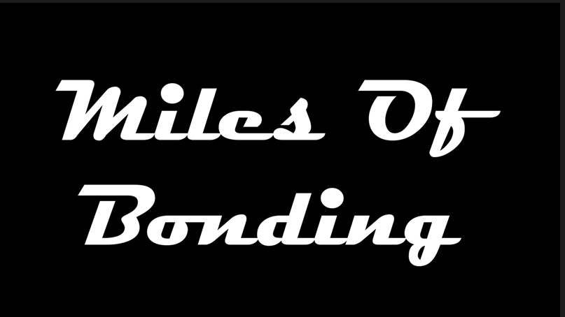
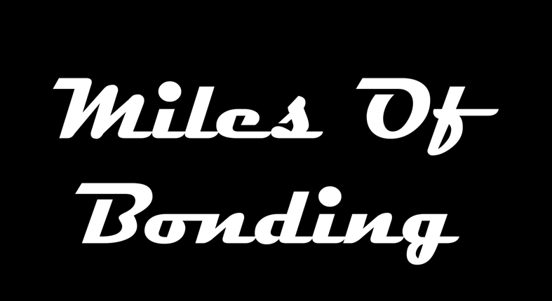
I then came up with some mockup titles, and finally decided on one.
‘Miles Of Bonding’
After deciding on this I had to go into photoshop and create this as a file, by adding my words into a text box on a blank screen, I then had to make sure the background was transparent, otherwise it wouldn’t have looked very good within my video. I also did some research on fonts and finally decided on ‘Magneto’ as I had seen this font used within some different race car magazines.
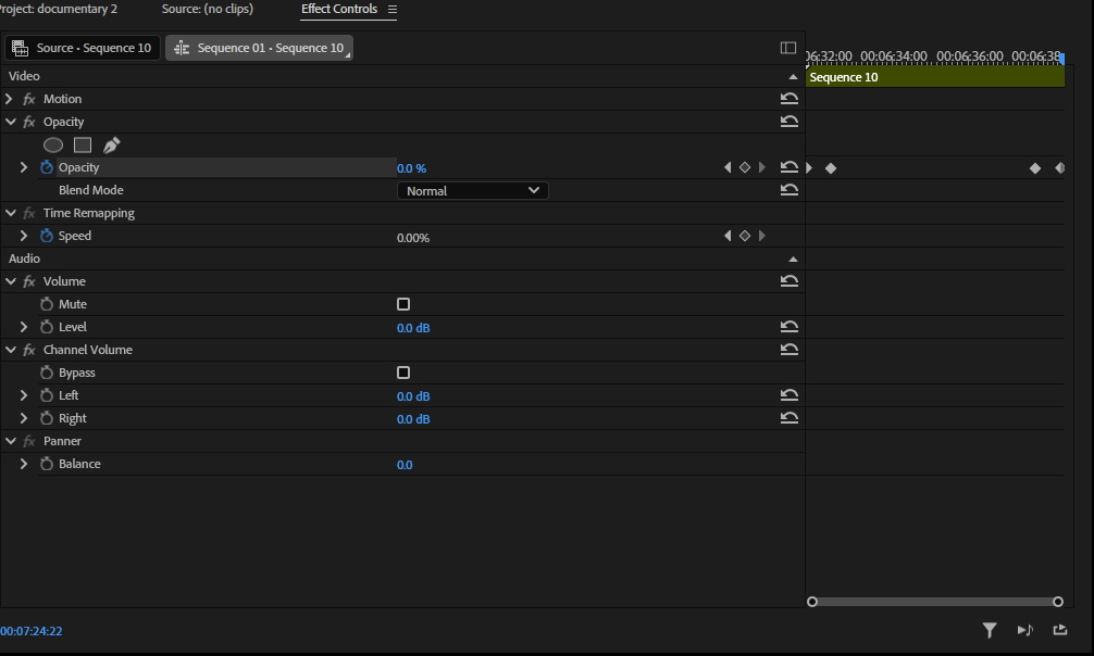
Step 5:
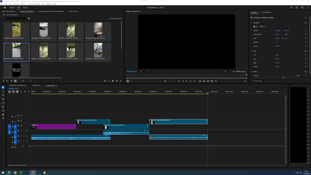
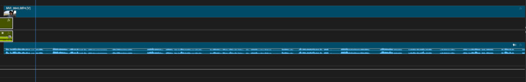
I then imported my title into my premier project, which then sorted out my video alignment to be landscape rather than portrait. I also added a fade into my title, so that after a few seconds it fade completely into black whilst my first clip fades from 0% opaqueness into 100%.
Step 6:
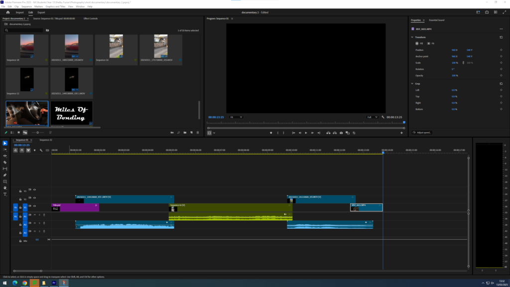
After reviewing my video I realised that due to my videos being filmed on my Iphone they were quite glitchy and slow, with low resolution and the audio not adding up to the videos. I did some research about how to fix this problem, and after watching some youtube videos I came to the conclusion that I would have to save each of my Iphone videos as their own premiere pro project, and then re import them.
Step 7:
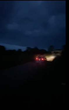
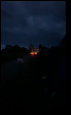
After fixing that small issue I could start on the base of my video. By adding my initial clips to the title, I wanted my video to start off dark to match the aesthetic of my behind the scenes book which also starts off dark.
Step 8:
I then finished adding my initial clips that I wanted to be in the video before my first part of my first interview.
Step 9:
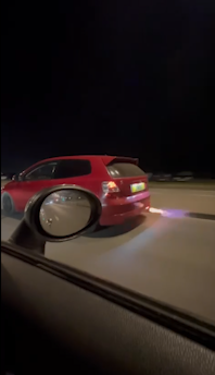
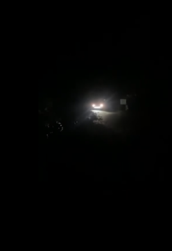
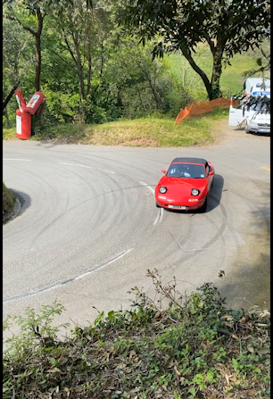
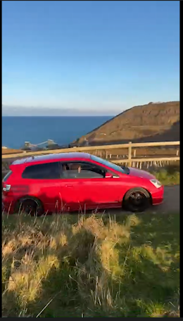
After adding them all in, I started experimenting and playing around with them to see which ones would fit best, I knew that I wanted a big entrance therefore used the clip with the flame as my first clip.
Step 10:
After reviewing my iphone clips I came to the realisation that my video was starting off way too dark so I tried to incorporate some lighter footage at the start which I think really helped to build my intro. I did this through experimentation with trying different clips.
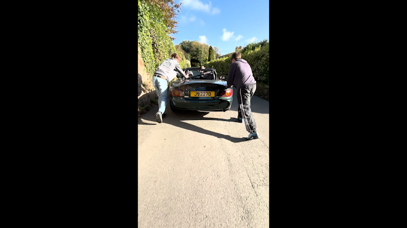
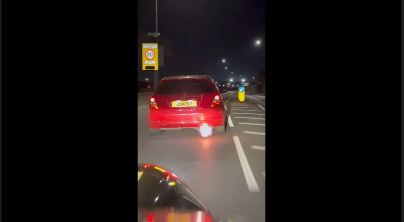
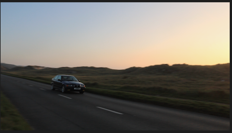
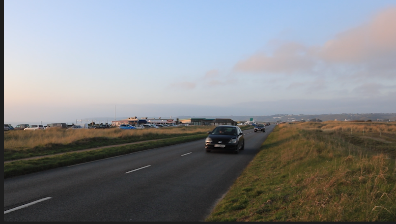
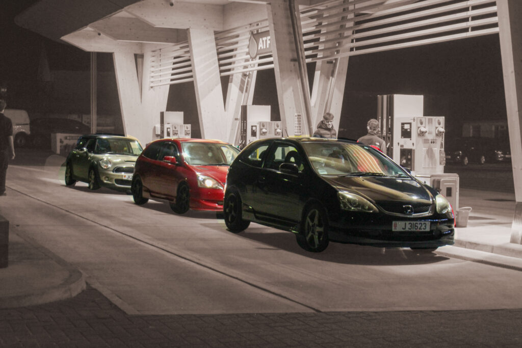
Clips –
Step 11:
I knew that I needed a sort of fade into video before my interview so I added a short clip with no sound and not a lot of movement to create this blending effect.
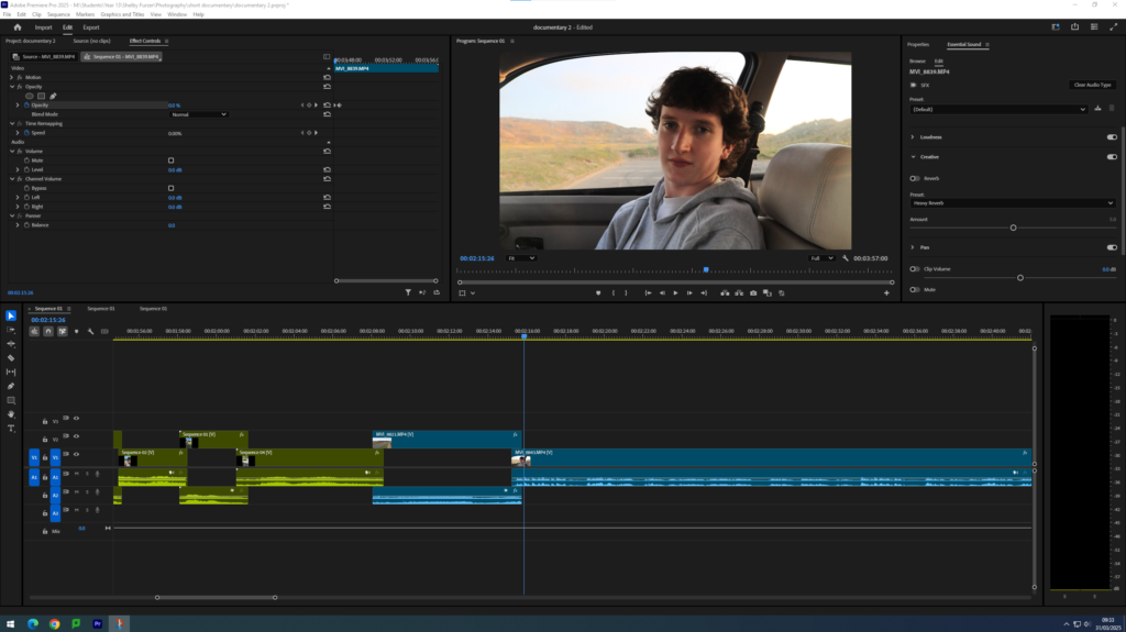
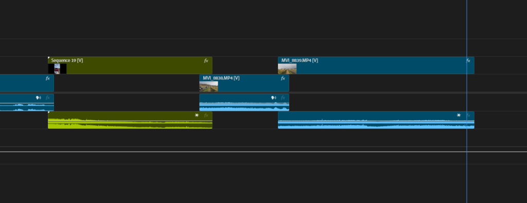
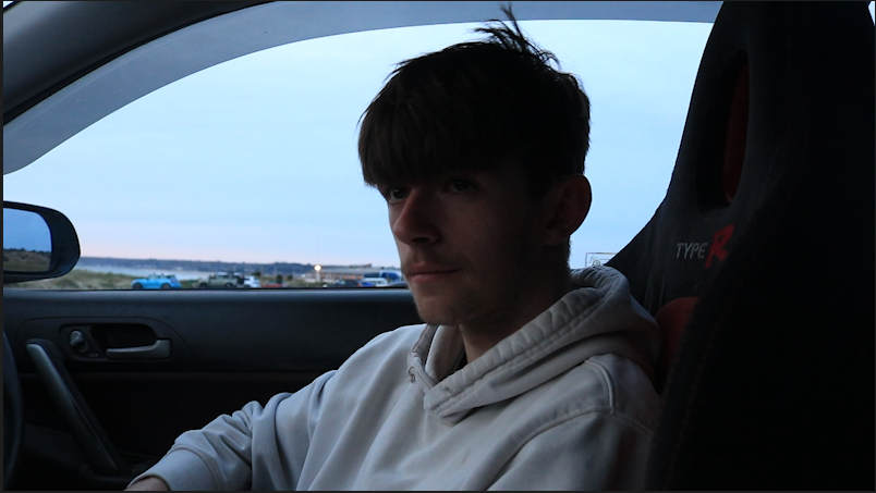
Step 12:
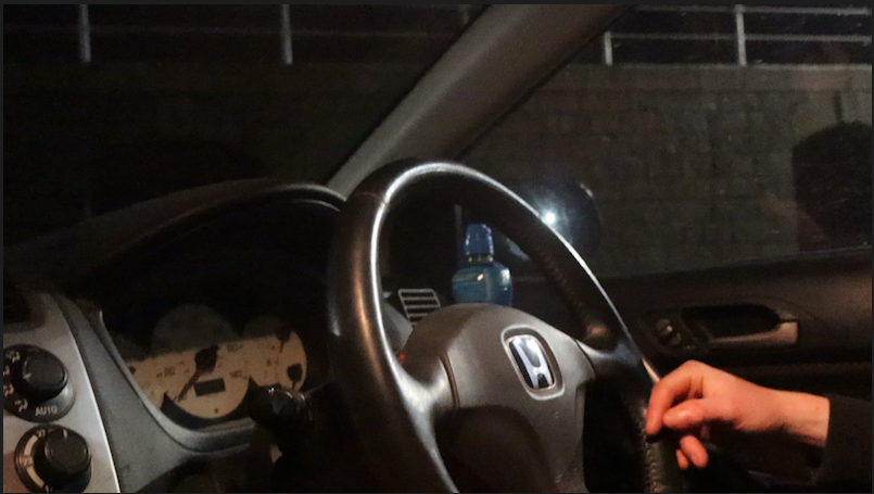
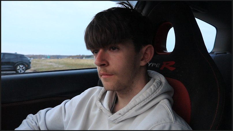
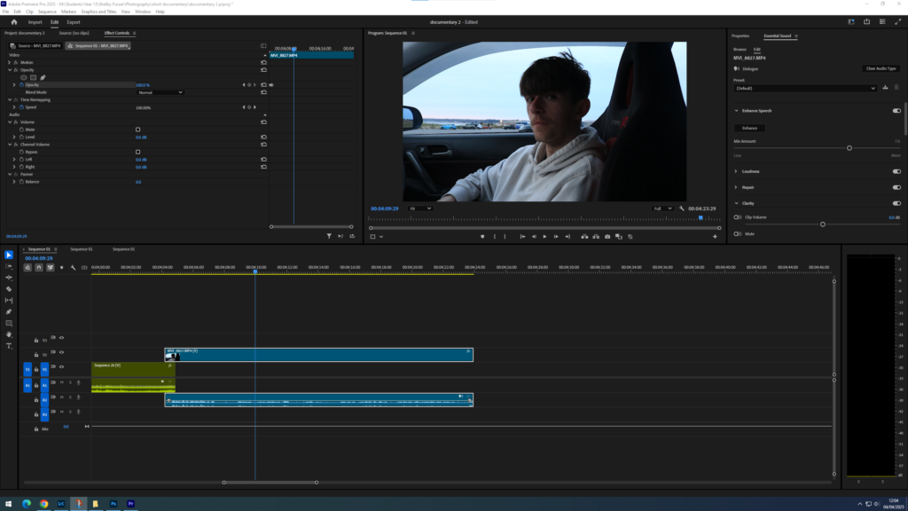
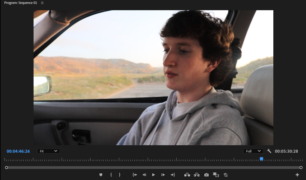
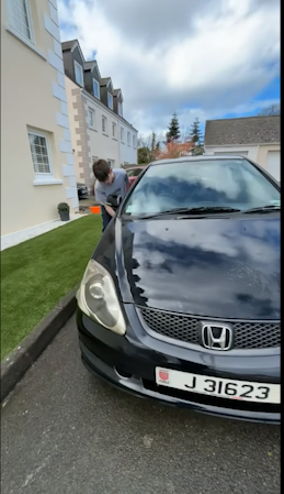
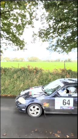
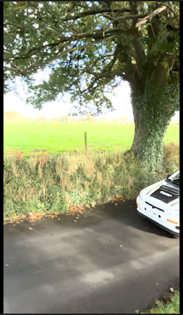
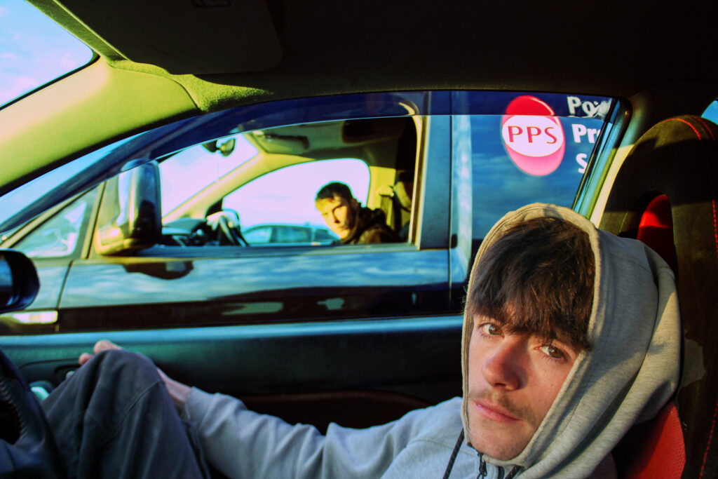
I then added the first half of my interview one, due to having a lot of footage in the same place of pure dialogue I have split them up with scenes of the interviewee in his car and other clips of cars. The main reason why I did this is because I didn’t want to have very long clips of pure dialogue as I feel people would get bored of this, and I wanted to keep attention.
Step 13:
I then added in the clips that I wanted between part one of my first interview and part two of my second interview. I made sure to keep these clips short and snappy as I wanted to gain the viewer’s attention back after that long interview clip.
Clips –
Step 14:
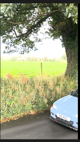
After filming my interview in full and my fly bys I then went through the footage to edit the clips and to cut out any unnecessary video.
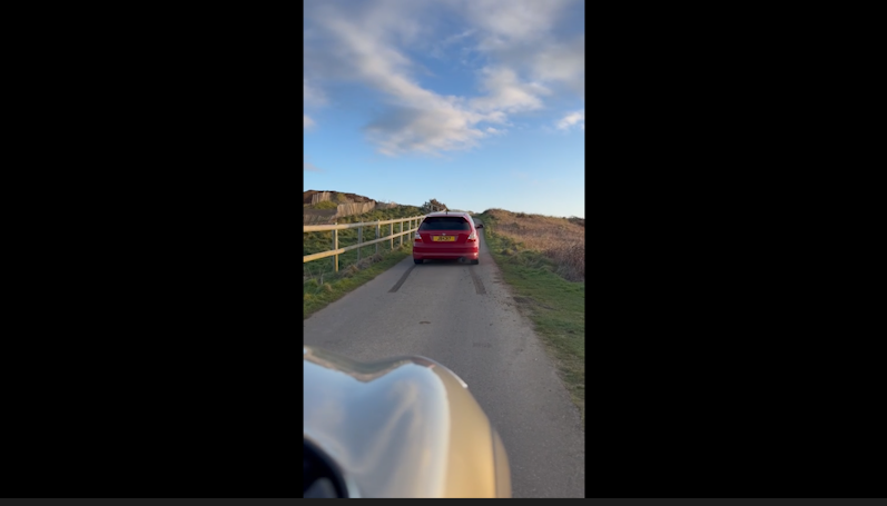
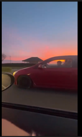
I then used another shot of a fly by to circle back into the next part of an interview.
Step 15:
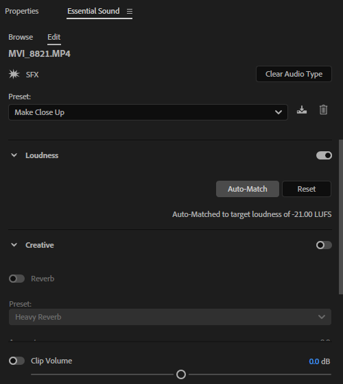
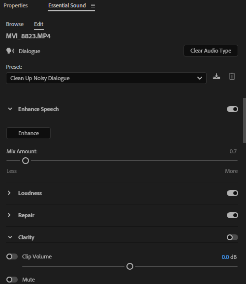
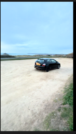
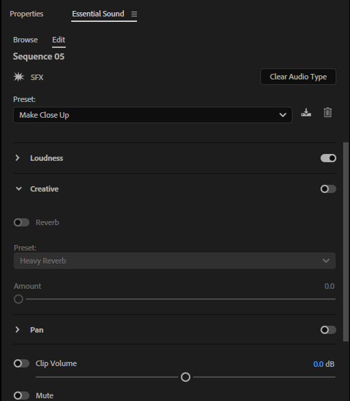
I played around with the sound effects of each video to create as clear a sound as I can, editing the videos of the ‘fly-bys’ to be seen as close up and the audio of the dialogue to make it as clear cut as possible.
Step 16:
As I kept filming new clips I made sure that I was adding them into the correct filming folder to then export them into my premiere pro project. This ensured that all my clips were the best quality that they could be and that there were no errors within the file.
Step 17:
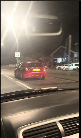
I then added in part one of my second interview, with a smooth fade from the clips of the fly-by into dialogue.
Step 18:
After adding in the first part of my second interview and making sure the sound setting were set to dialogue, I started adding more clips of cars to fade back into my original interview.
Step 19:
I then went through and edited the audio on each clip and made sure that they all faded into one another, so that I could prepare to add part two of my first interview.
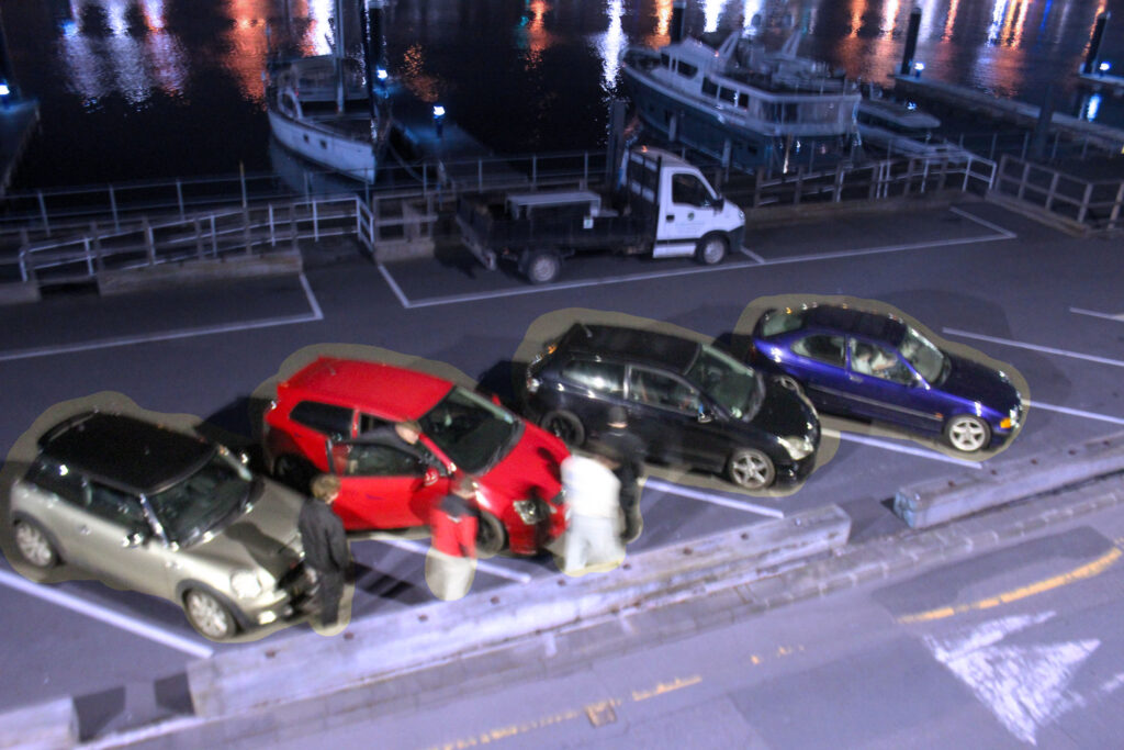
Clips –
Step 20-
I then went on too add the second part of my first interview. Making sure to carefully blend it into my other clips and get the correct audio settings’.
Step 21-
This second part was a lot shorter which meant that I knew that I could add some shorter clips before the next part of my second interview.
Clips –
Step 22-
I then added in my second part of interview 2, which is a very long one so I will keep in mind that between this and the next interview clip I will need to add a lot more little cuts to keep people’s attention.
Step 23-
I then went in and added all of the short interesting clips I wanted to gain retention.
Clips-
Step 24-
I then added in the final clip of my first interview, this clip is only a few seconds long so I know that I won’t need many clips after it for my interlude between here and the last part of my second interview.
Step 25-
I then added a few clips between that final question and the final questions of my next interview.
Clips-
Step 25-
I then went in and added the final part of my second interview, this ment that all interview clips were now used up and all I needed to do was shoot some more small clips to tie it all to an end.
Step 26-
I watched the whole video through and through and went in and did some cropping, blending and audio editing to make sure that everything was flowing smoothly and in good shape.
Step 27-
I then went in and added my final short clips to bring my video back together, tying up the final strings.
Clips-
Step 28-
Once I had finished adding my final clips I then went in and had to resize them so that they fit all the same as the others.
Step 29-
After doing that I then went into the sound properties of my video so that I could make sure that the sound of the final clips were all linked together and in the correct setting.
Step 30-
My final step was to just watch the whole video back and check in for any errors, listening in closely to hear how the audio sound, how the clips look, and if any of my settings needed to be changed.