Photobook deconstruction.

To create my photobook…

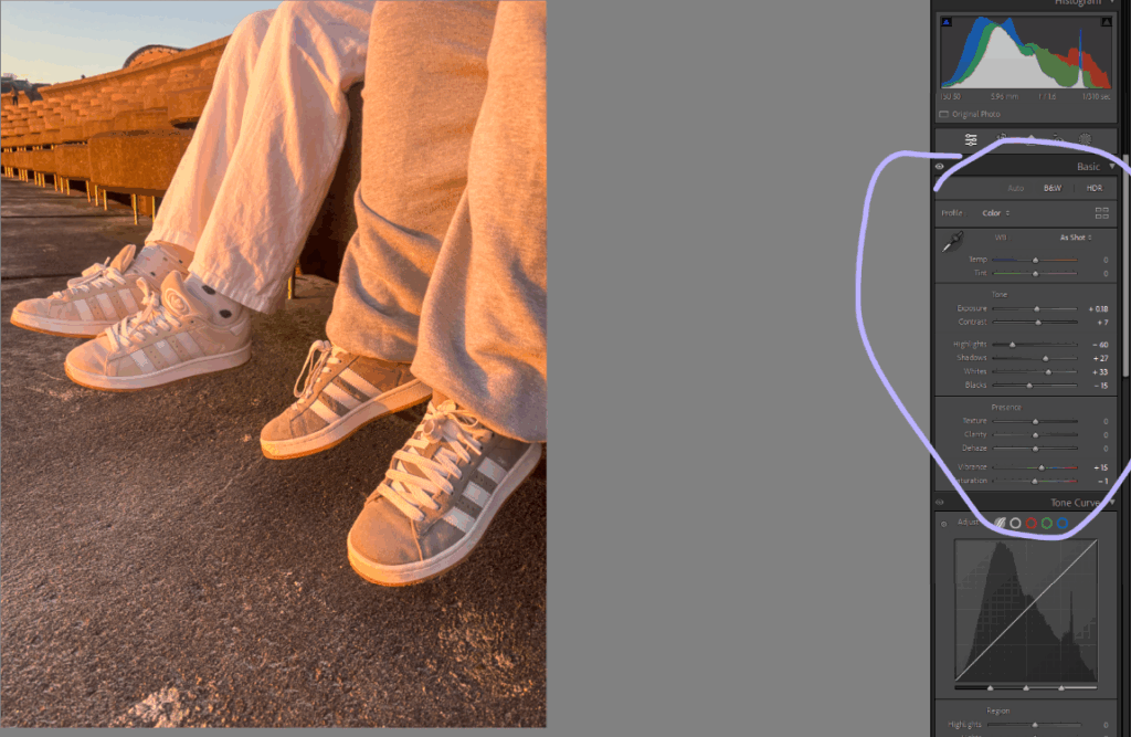
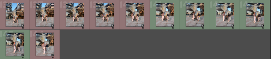
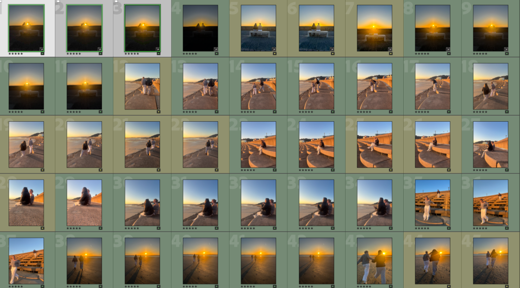
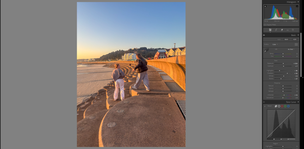
To edit the chosen images for your book you go to the develop department and can edit all the images there just to the right of the image. That being shape, style, size, angle etc.

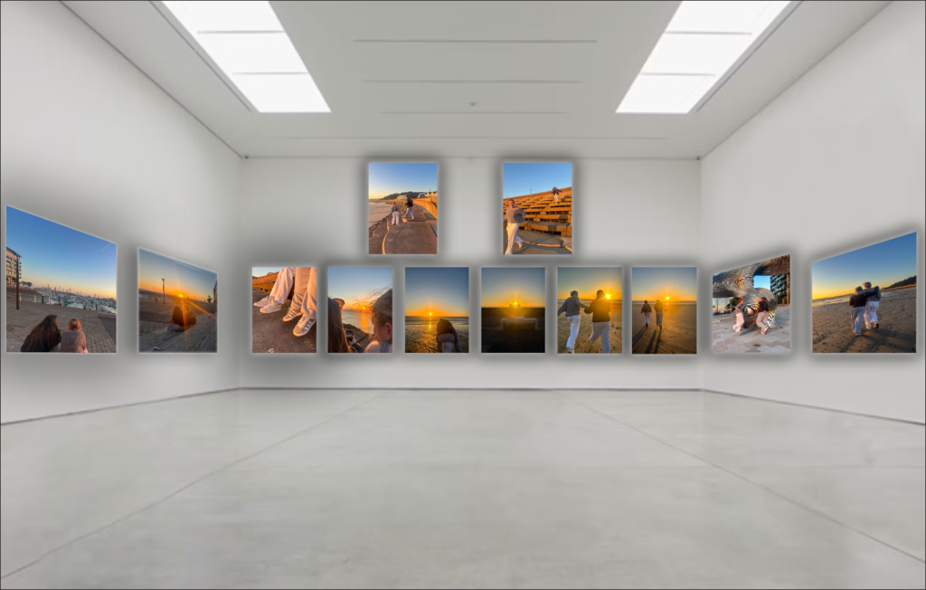
After editing all your pictures, you then press book.

This will put all of your images in to a book format.

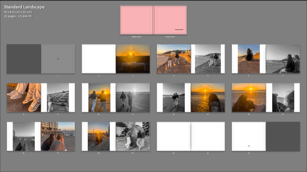
You can then move around your images, adjusting the size of your images, depending on if your wanting them to fill the whole page or not.

After all that, your photobook will be done and your ready to send it to blurb to get it printed.

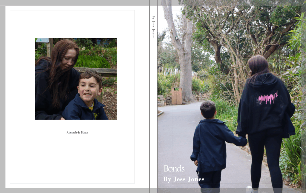
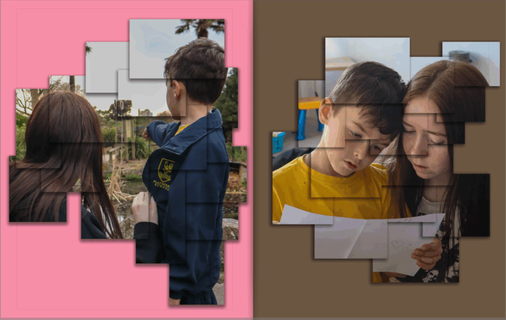
Front and back cover.

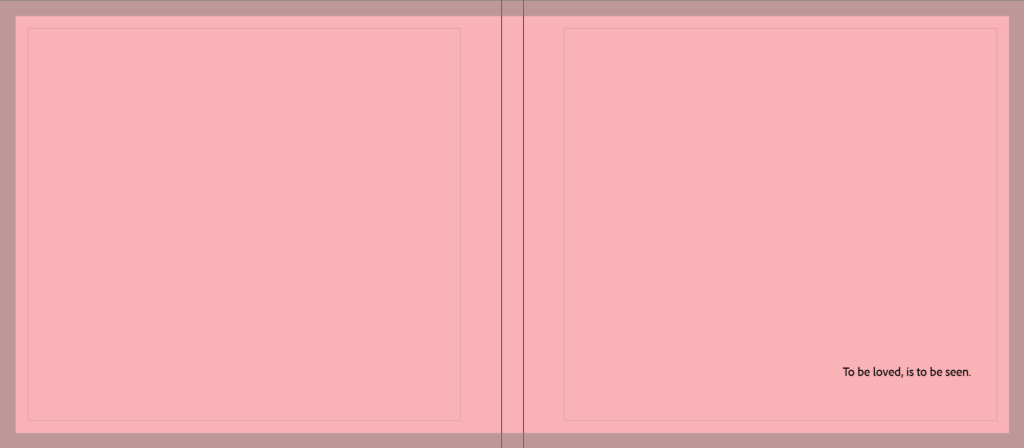
For the front and back cover, I just chose a pinky/peachy colour to reflect a girly effect. I like that there’s no pictures so it doesn’t give anything away. I also have the title ‘To be loved, is to be seen,. This is to create an idea on what the book is really trying to get across to the audience.

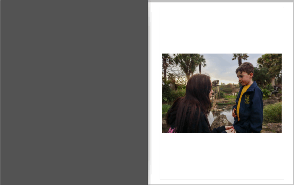
For my first page spread, I left the first page blank. I did this as there was no image I truly believed to be paired with this one that would make sense. It’s an effective photo which came off of an inspirational artist reference, so I was very keen to use it as i liked the way it turned out.

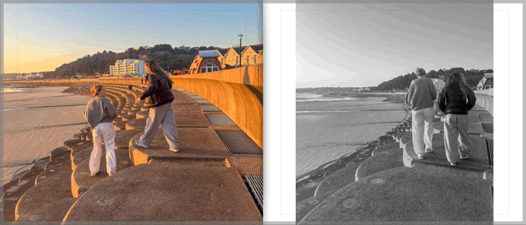
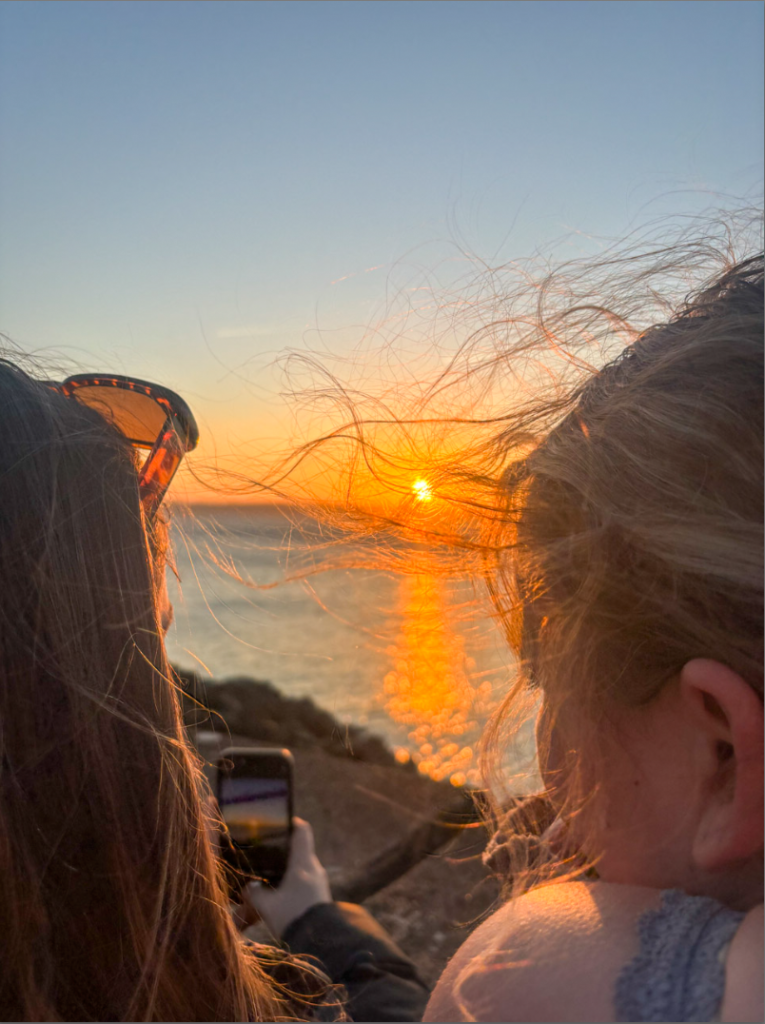
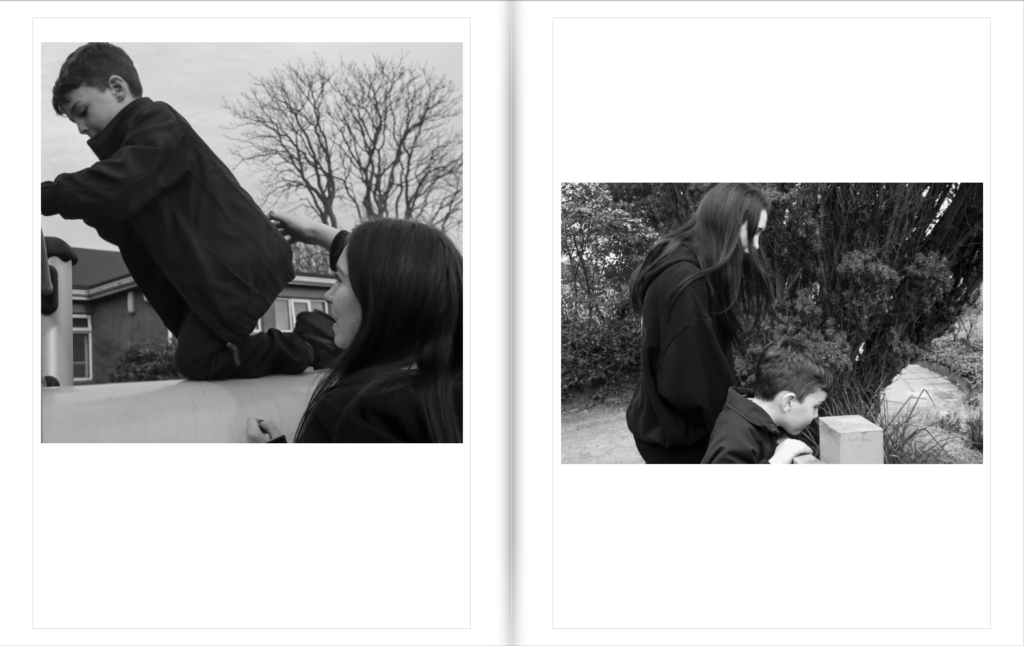
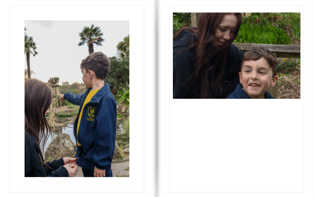
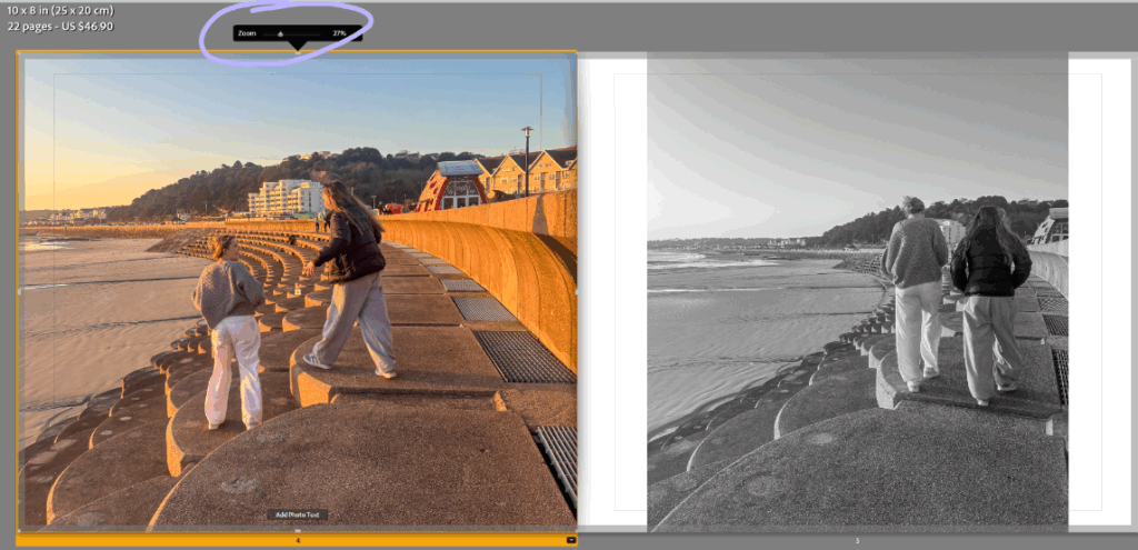
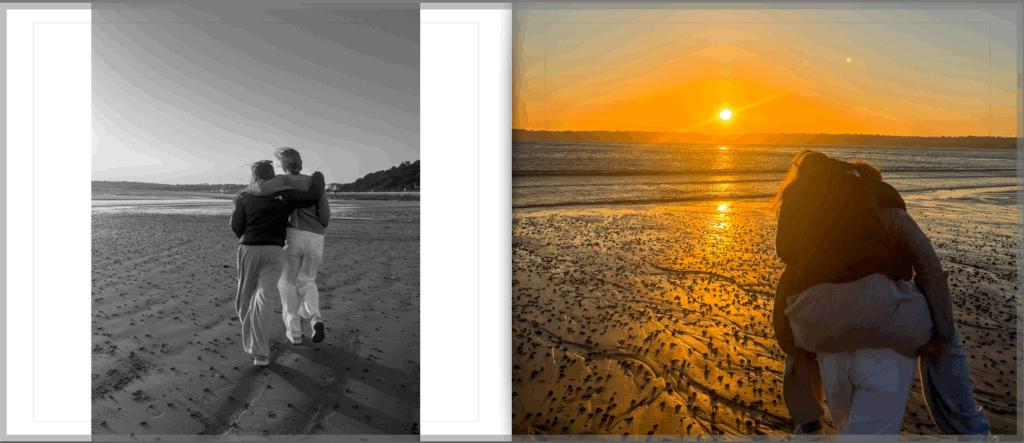
For this page spread, I’ve added in a black and white image (which you’ll see throughout the book). I added in black and white so the audience don’t solely focus on the sunset as that’s not my main focus. I wanted to draw a more serious and real image to show union/friendship.

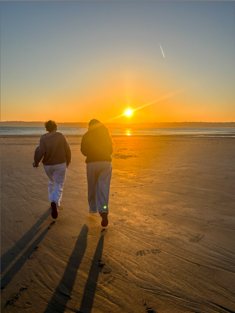
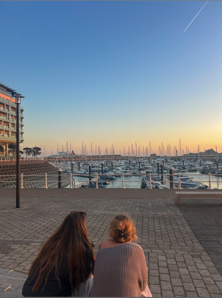
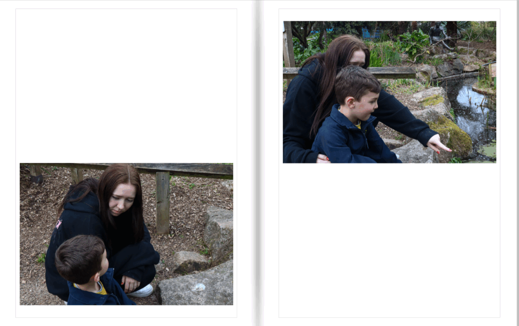
This page spread is probably one of my most successful. I really think it focuses on the friendship between these two girls. I also like how the image has a pretty background. I wanted the backgrounds to reflect the purity of their friendship with the nice colours too.

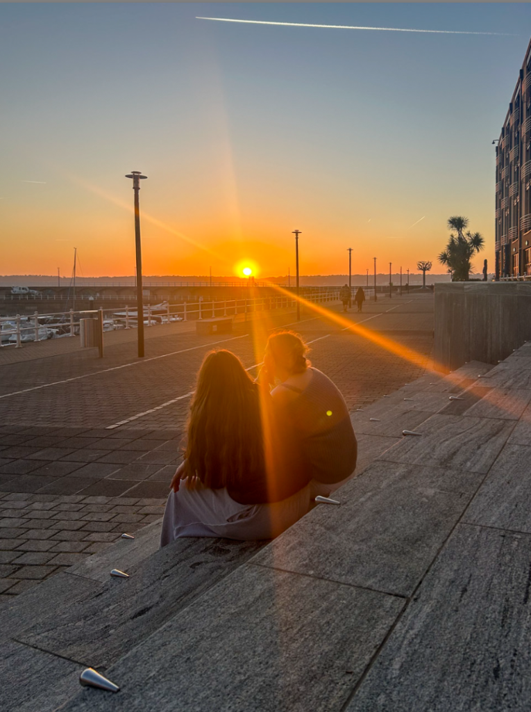
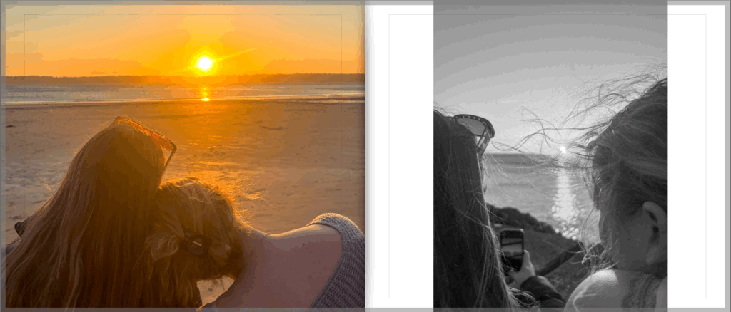
For this page spread, I decided to focus on the more simpler image. I believe the image to the left is so effective. The colours, simplicity and girly-ness of the picture really draws me in. I do love the right image as its pure and candid, however made it black and white to snap back in to the reality of the friendship again.

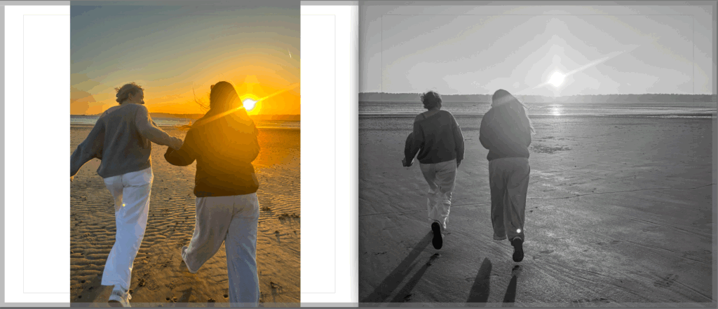
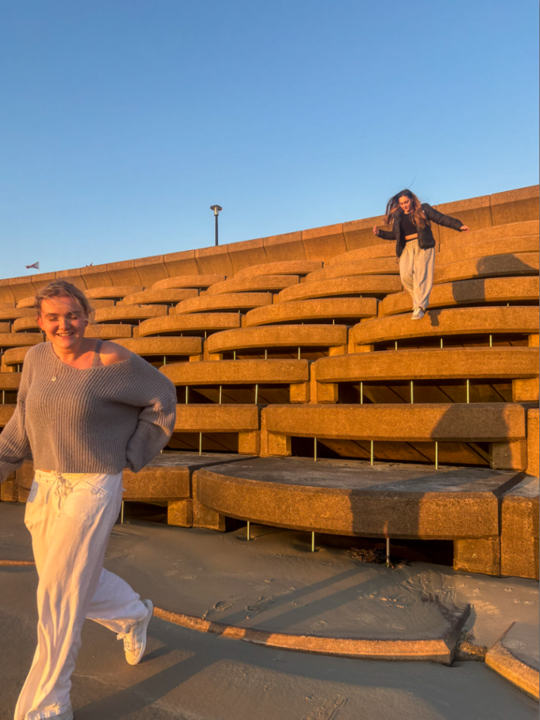
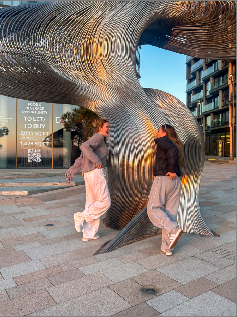
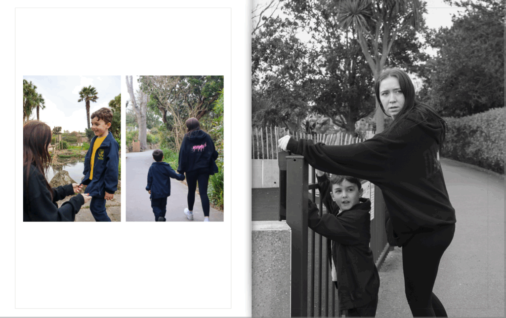
I think this page spread is very aesthetic. I wanted to capture a moment where the girls could just let go and be free. I made the bigger image black and white here as I think it creates the idea that their walk is now a memory and not in the present. However, a happy memory to look back at.

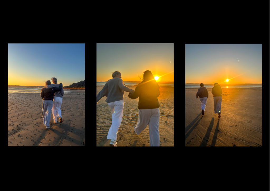
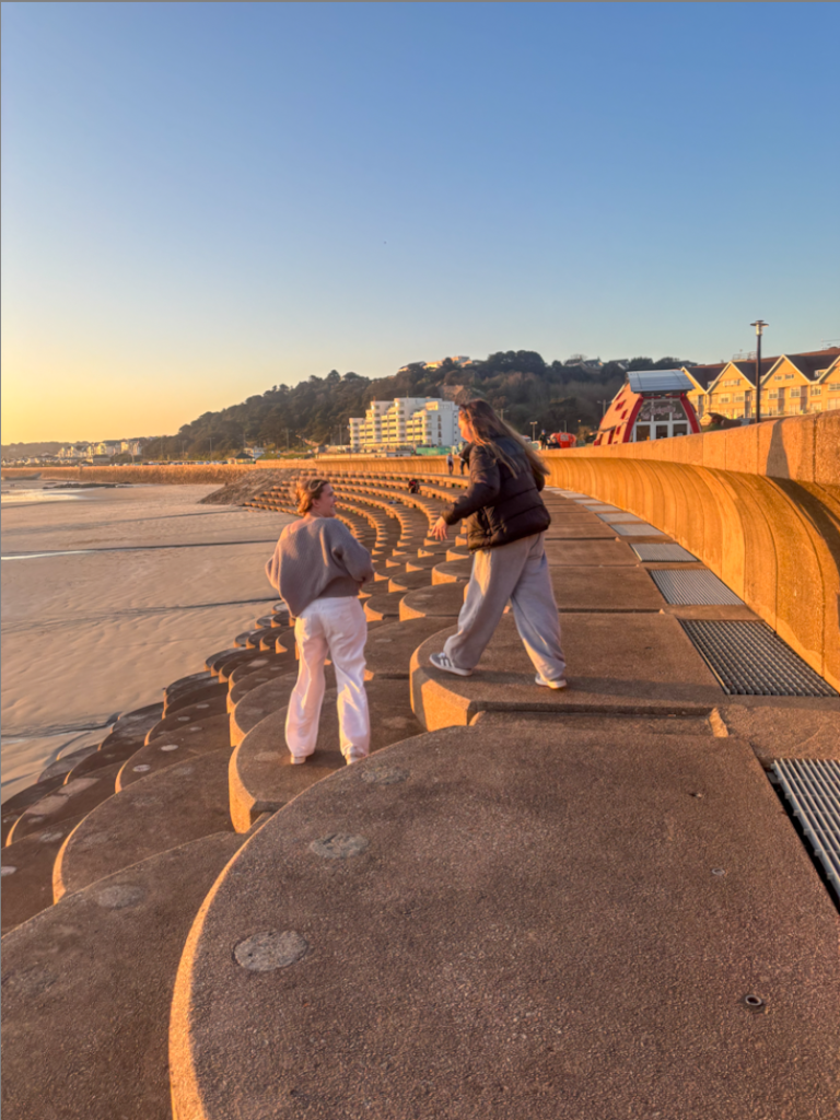
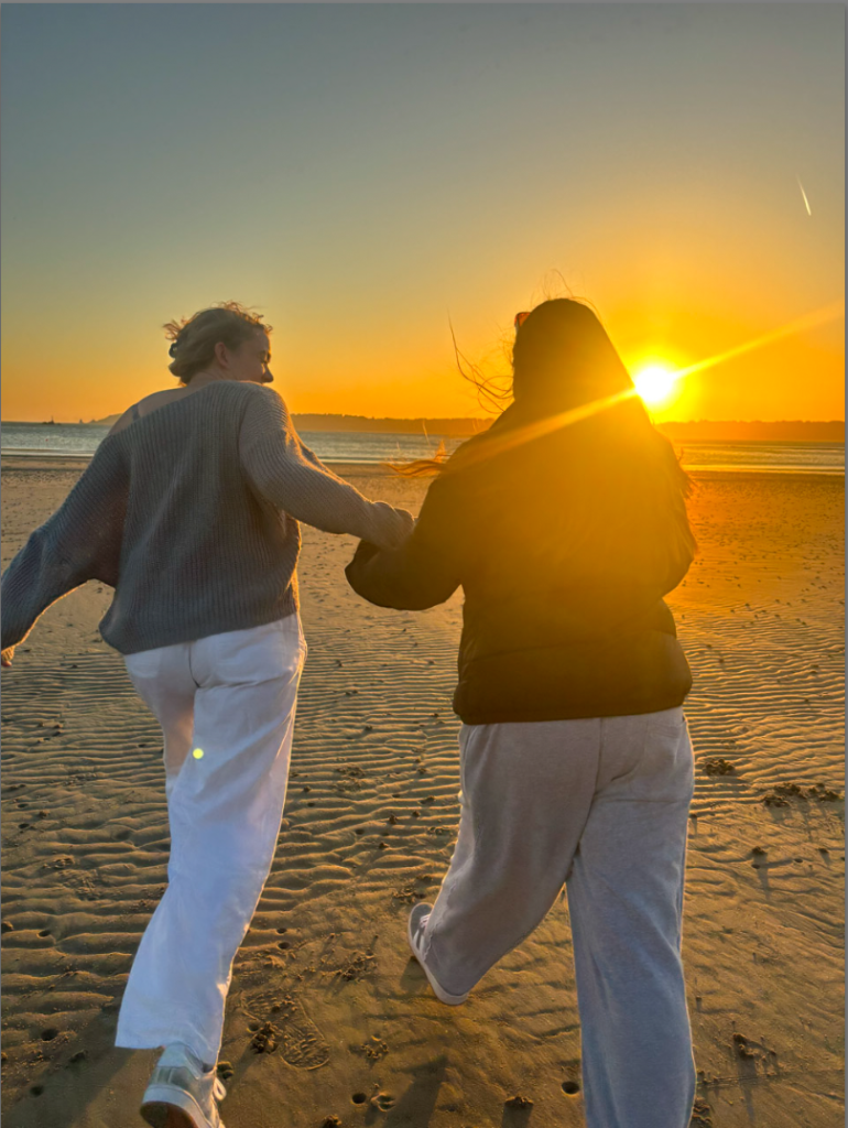
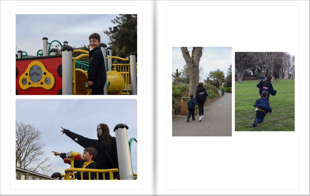
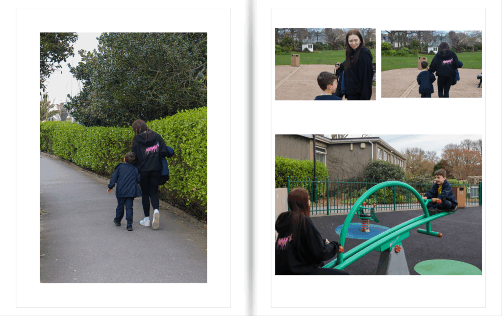
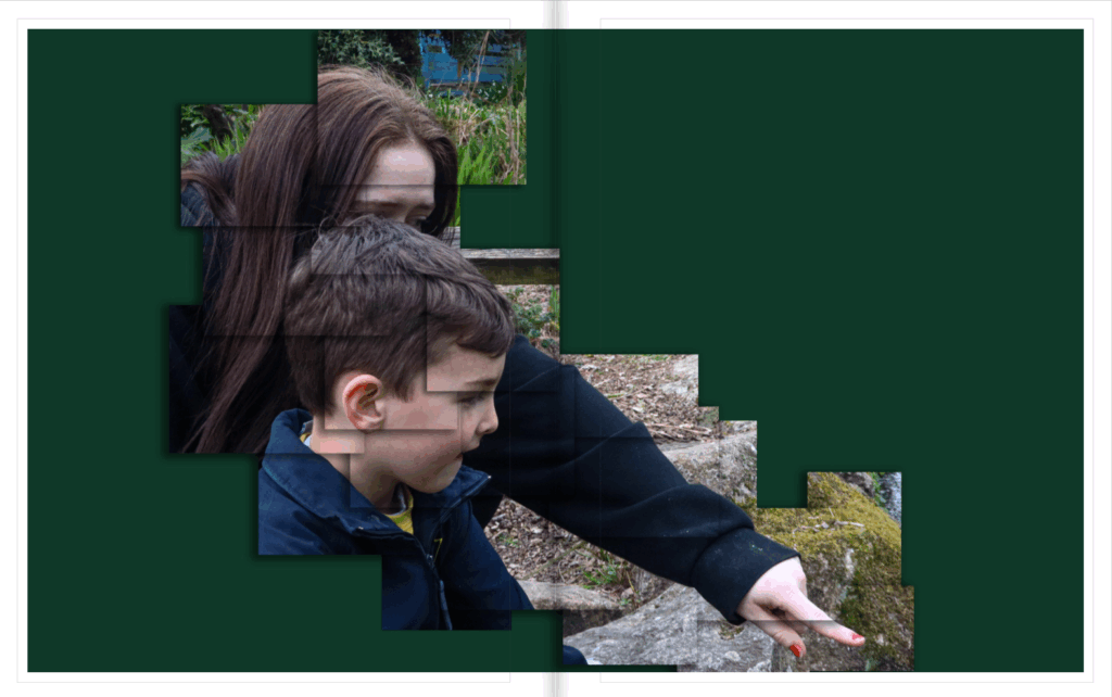
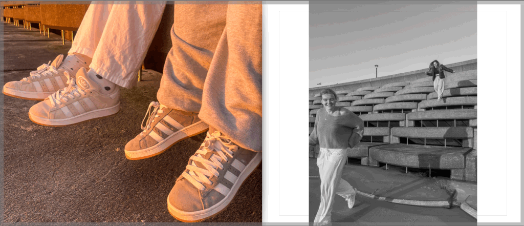
I looked more at creating an image to represent the friendship in a more announced way for this spread. I captured more acts of physical touch and fun for this set. I like the way my book has a structure of them walking across the beach.

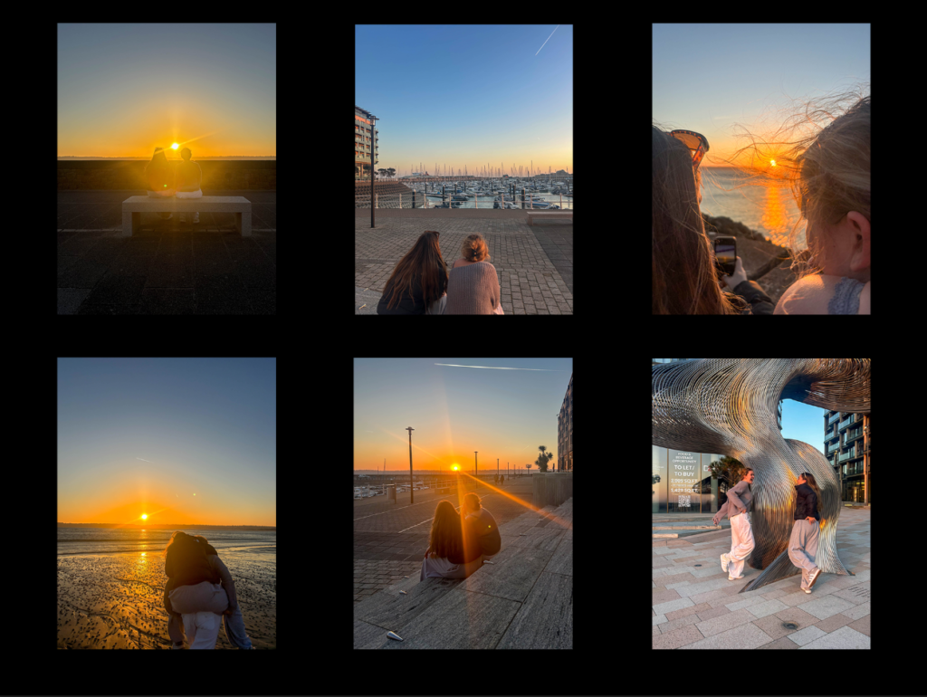
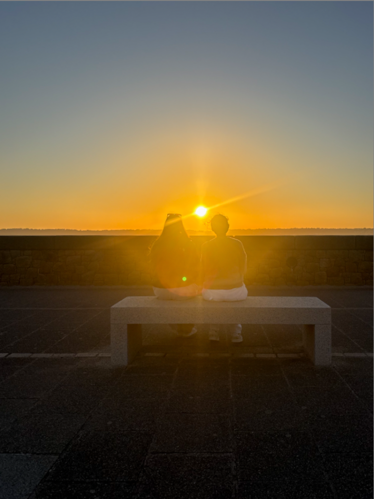
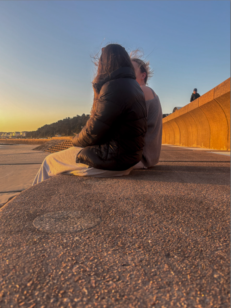
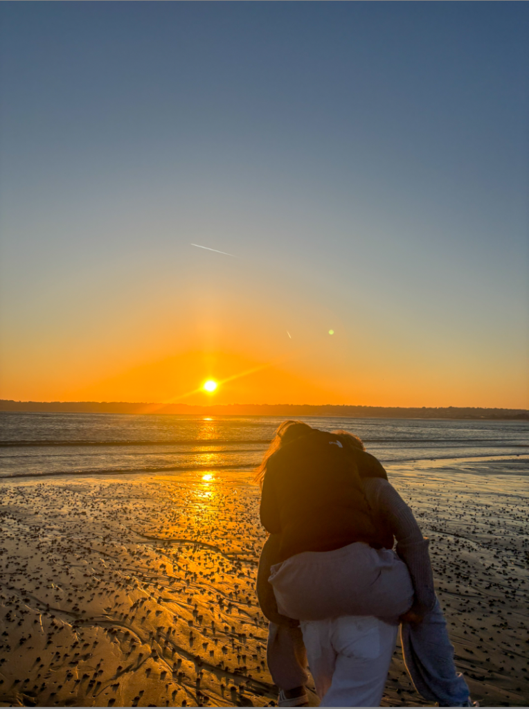
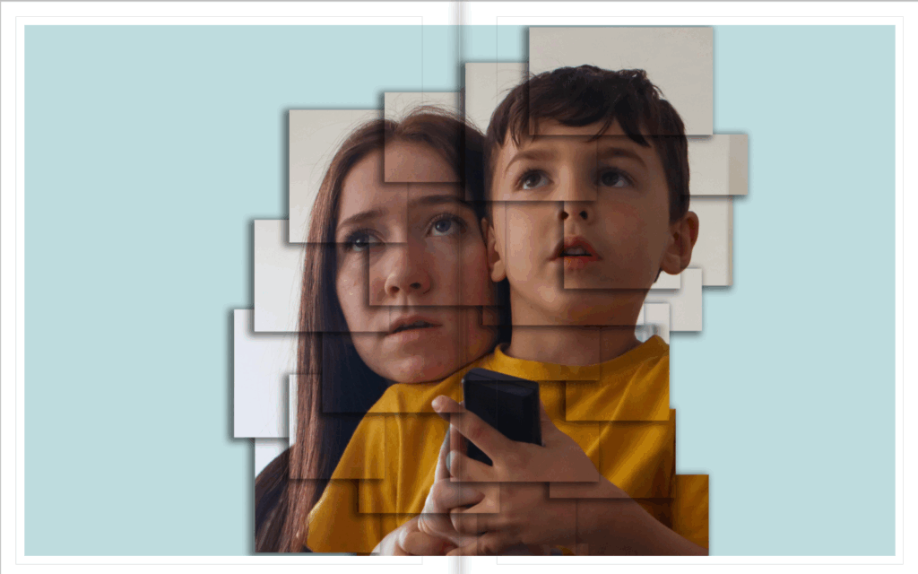
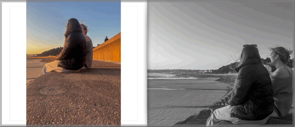
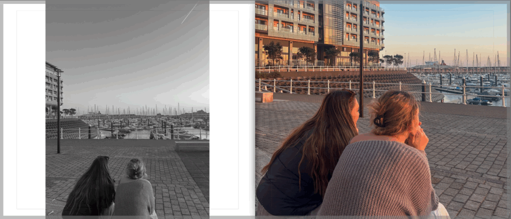
I wanted to focus on the softer aspects of friendship for this page spread. Instead of laughing and having fun in the images, I captured a relaxing moment where the models are just appreciating each other and the view.

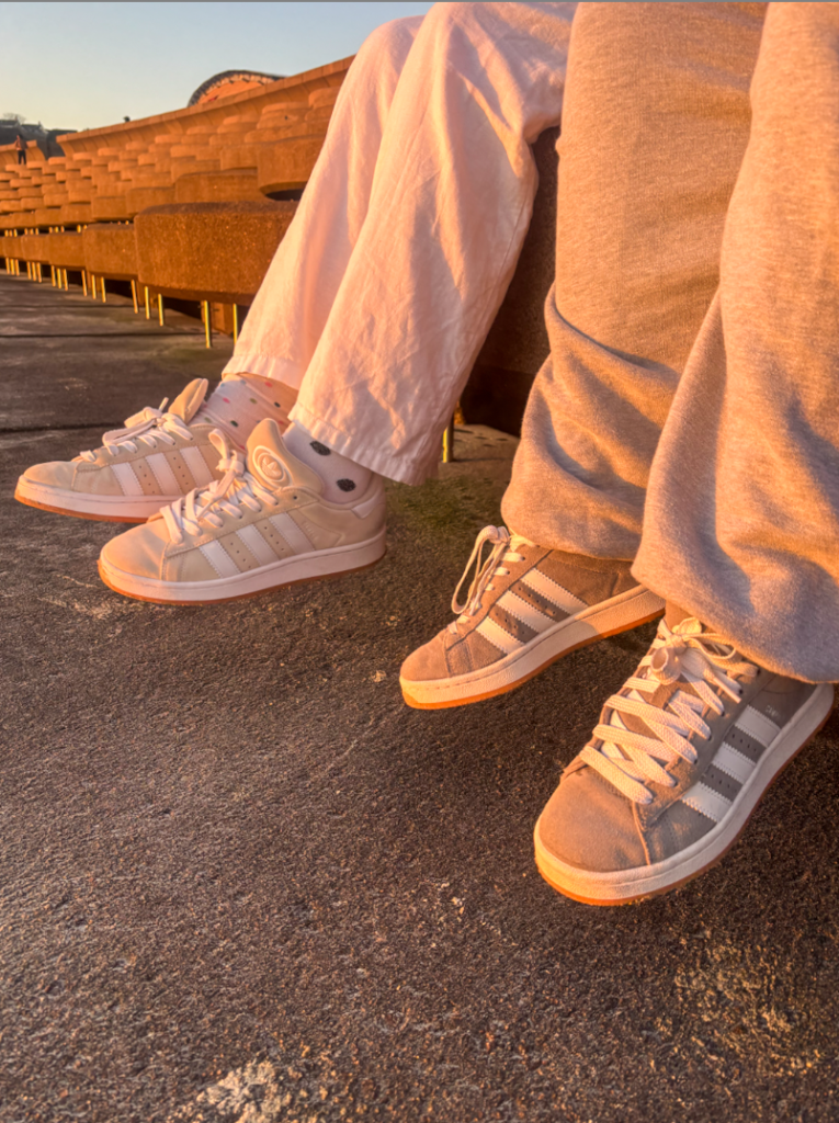
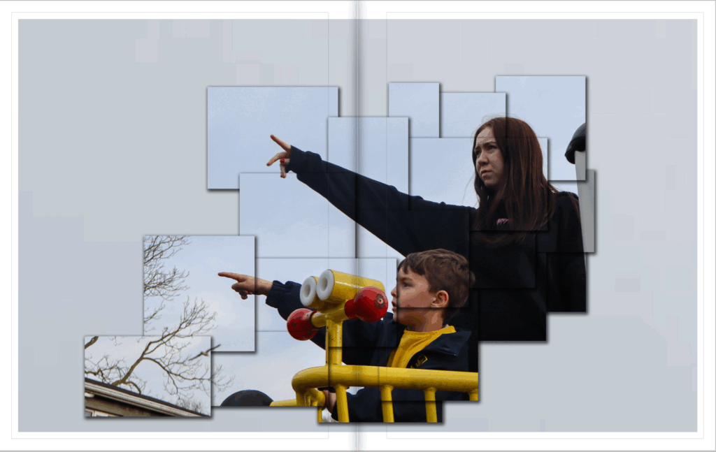
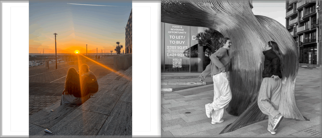
For this page spread I liked the contrast of everything in these images. I like the scenery, the colours, and the position the models are in. Everything about these two images comes together.

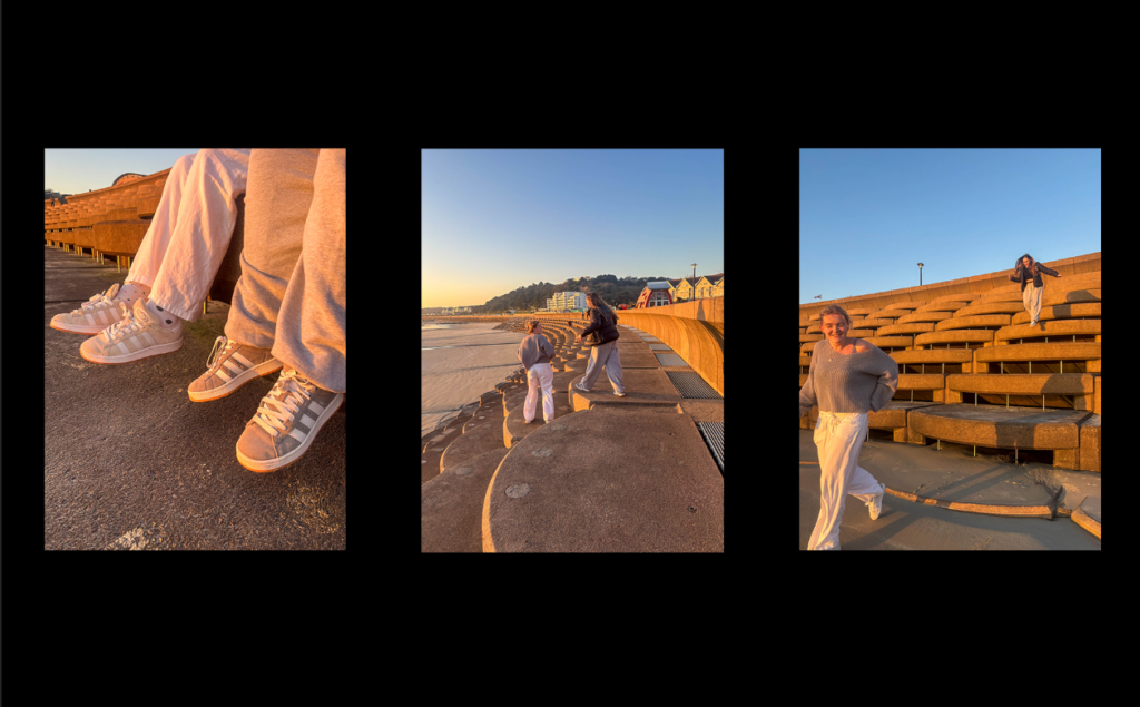
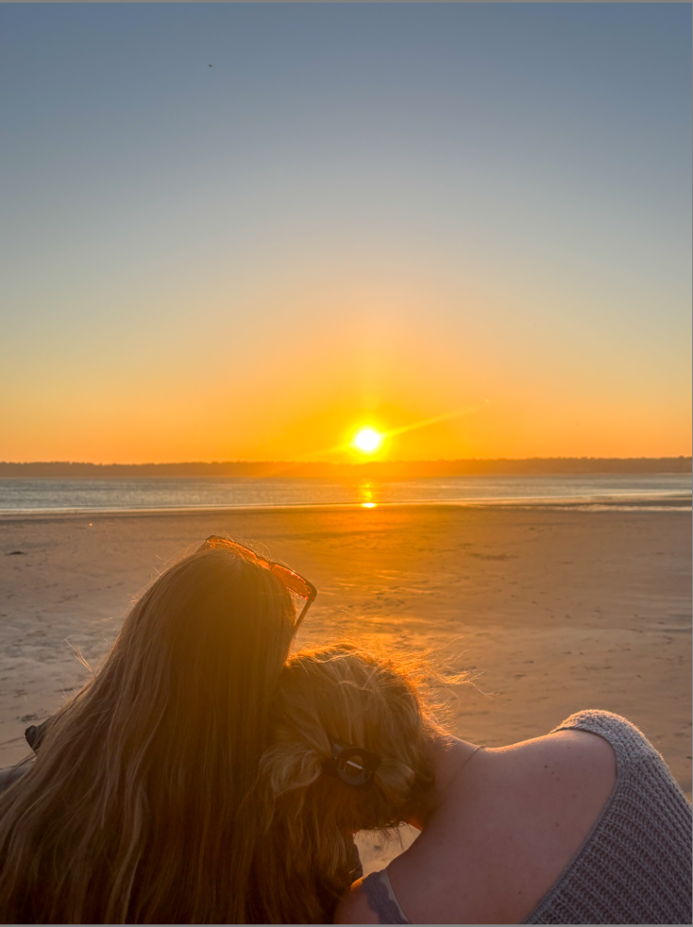
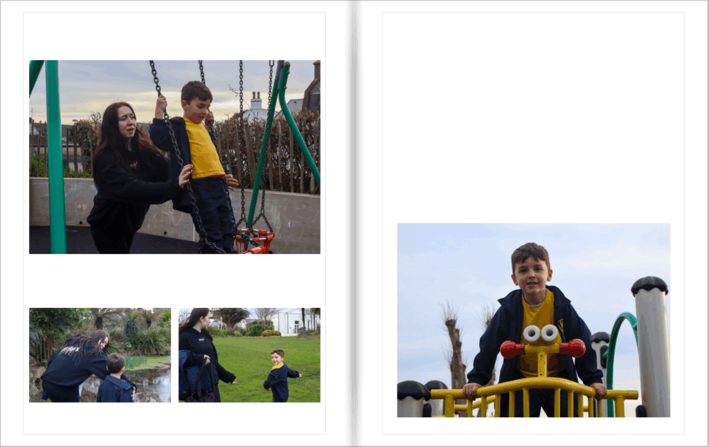
For my final page spread, I captured one last image of them just being girls sat together, then ended it off with a picture of them laughing and having fun in black and white, just to remind the audience of their fun, loving and caring friendship, as if it were a memory.

Photobook Specification.

My inspiration for this photobook was myself in all honesty. I really liked the way my last photobook turned out and anted to create another one. Before i had created my own photobook, i had seen students from my schools previous work. I looked through some of their photobooks and decided i wanted to make one of my own. For my final piece of work amongst this subject, i wanted to present one last photobook.

  • feel of the book – I want my book to be hard back with shiny pages. I want my book to have a consistent feeling where the audience aren’t confused and can follow a storyline within the book.
  • format – I want the format of my book to be a smaller book, maybe 20×25. I want it small and hardback to keep all my pages neat.
  • cover – For my front cover, I went with a plain pinky/peachy colour. I wanted what’s inside my book to be a bit more secretive
  • title – ‘To be seen, is to be loved’ I went with this title as it is one of the most empowering quotes I have heard.
  • narrative 3 words...Friendship, powerful, meaningful. A sentence…showing a friendship through the idea of a union. A paragraph…My photobook shows the pure connection of two teenage girls who need each other very much, and by coming together they create a union. A union doesn’t need to be more than two people if its strong enough.
  • editing – To edit my images and photobook, I used the app Lightroom. It was an easy way to create a book as it already has a layout for you that you can adjust and edit there and then. If i then came across an image that wasn’t edited to the standards I wanted, all I had to do was press develop on the same app.
  • sequencing – In my photobook, I presented all the images in a narrative way. I used my images to also show the walk we went on during this shoot. So, all my images made sense as we walked around Quayside area.

Key words.

  1. Aesthetic

To be concerned with beauty. A set of principles underlying the work of a particular artist or artistic movement.

2. The cubist aesthetic

Cubism was a revolutionary new approach to representing reality invented in around 1907–08 by artists Pablo Picasso and Georges Braque. They brought different views of subjects (usually objects or figures) together in the same picture, resulting in paintings that appear fragmented and abstracted.

3. Indexicality

Guide signs and symbols memory. In photography, indexicality refers to the direct relationship between the photographer, the photograph, and the subject. This concept emphasises that photographs are inherently linked to the physical reality they capture, serving as an imprint of the real world.

4. Formalism

Formalism describes the critical position that the most important aspect of a work of art is its form – the way it is made and its purely visual aspects – rather than its narrative content or its relationship to the visible world. Structure over content ,no emotion or context.

5. Representation

Ideas are depicted. To understand representation in photography is to understand how you are interconnected to the thing in which you photograph. It is to accept the responsibility for how you depict a particular subject. Understanding the deep impact images have in our society is the reason for teaching representation in any capacity.

References.

Joel Meyerowitz is known for his use of colour and light, often photographing scenes at sunrise or sunset. He captured incredible landscape images. He transformed the mode with his pioneering use of colour. I wanted to use his amazing use of capturing colour in my project. This is why I purposefully took my shoots during sunset.

Arielle Doneson is a photographer whose work focuses on the theme of friendship and connection. She looks at the depth of human relationships, she uses natural lighting, candid portraits, and intimate settings to explore how friendships form, grow, and change over time.

What I’ve done with my work, is capture both styles of these artists work and made it in to one. I wanted to work with light during sunset, but focus on capturing the friendship.

Presentation/mock ups

I used Photoshop to play around with the way I want to present my final images.

Here are some rough mock ups of how I would like to present my images in person.

I like using the triptych method. I think it looks simple, however effective. I like using a black background in contrast to my images as I believe it makes them stand out more.

To export these images to my final images print folder I had to go through the steps of :

  • re size to fit short edge
  • 21.000 cm
  • 240 resolution
  • a5 – 14.8cm
  • a4 – 21cm
  • a3 – 29.7cm
  • cost of name and sequence

Each of these steps change the sizing and resolution of each image.

Looking at different styles

Here is a before and after product of some of my photos. Sometimes black and white can add a good effect to your work as it switches it up a bit.

Here are two before and after of where I’ve used slightly different filter effects to change the lighting. I made the colours brighter so the picture comes across clearer.

Here, you can see that I’ve cropped an image. You can crop images to focus on parts on the photo that you find more interesting/effective.

Virtual Gallery

To create my virtual gallery, i had to go on to my documents. I then went to Radio > Departments > Photography > Students > YEAR 13 EXAM 2025 > Gallery Mock ups. This was to get my background.

I then picked my gallery wall, and opened it up in to photoshop. (for example)…

I then used the select tool to draw boxes on to my wall.

This allows images to be pulled on to the background without losing your image behind the background. After drawing my first box, I dragged an image over. To do this, you must have documents open and in the folder you want. You then left click and hold down with the mouse then drag on to your background.

When the image went on to the background, I adjusted the size to what I wanted. However, I couldn’t just have a picture against the wall/background. To make my pictures on the wall look a bit more realistic, I added a drop shadow and outer glow. To do this, I right clicked on my image..

I then pressed Skew to tilt my images, so they fit to the wall to the way the wall goes.

The image shouldn’t look flat, it should look like it goes down a bit from the top to create a realistic approach. Then I added the drop shadow and outer glow. To do this i right clicked the layer the picture was on, and pressed blending options.

Once I clicked blending options, I was able to pick whatever effect I wanted for my image. I picked drop shadow and outer glow to make it look like the image is slightly raised away from the wall and has a shadow.

When picking what layer style I wanted, I saw that you could adjust these styles to the way you want it.

I then did this same process on each image, all around my gallery. I was then left with my finished product.

I think my virtual gallery turned out well as I managed to upload the background and then manage to make the pictures look realistic by creating shadows and depth. I think to make it better is use less pictures so it doesn’t look as busy.

Editing.

First, I opened Lightroom, and imported all my images. I then created a collection named ‘union’, and moved them all in to there. I colour coded each image green, yellow or red. Green being the best, yellow being they’re okay, and red being not using the image.

I then rated all my green images 5 stars, so I can find them a lot quicker when filtered.

I edited my images using the develop bar on the right hand side of the screen, and played around with the filters until I liked what I saw.

Some Edited Images.

Image analysis.

I love this photo because I like how the sun is between both the models, almost creating a silhouette effect. I also like how the sky blends in to different colours, as well as seeing more of the island on the horizon, to then two friends on the bench. I think everything goes together. I believe this pictures presents friendship as calm and simplistic if you have made a good friend.

I love this image. I love how candid and natural it is. The way the left model looks up at the right model creates a fun but nurturing effect, almost as if she looks up to and admires her. I also love the colours in this image, I like how light and pastel the sky is which then reflects on to the stones and the models.

I quite like how this photo is from a below point of view looking up at the models talking. It makes the models the main focus of this image. It almost forces the viewer to think about the connection and friendship these two friends have.

This picture focuses on the joy and fun these two friends are having. I like how natural and candid this picture is, creating the idea these girls have fun a lot of the time.

I really like this picture as if they’re running off towards the sunset together almost creating a metaphor that nothing can stop them because their friendship means everything.

Same with this photo. I believe the picture draws the audience in to their friendship. I like the physical contact where they hold hands in this photo because it creates the beginning of an unimaginable connection a friendship can have.

I like how simple this photo is. There’s not much going on but, with what is going on, I really believe it shows two friends coming together when they need each other, creating a union.

This is probably one of my favourite images. The sunset reflection on to the beach creates a calming and relaxing vibe. I like how the two models are showing a strong bond by again, having fun.

I love this image. This is down to the colours presented in this image. I think its giving off a girly atmosphere with the light pastel colours shining on to their shoes and trousers. I love how simplistic but meaningful this picture is.

I think this photo creates meaning. Down to the head on the shoulder, and how quiet and peaceful the photo looks. I think it creates meaning of pure platonic love.

I like that this photo is engaging. I like how the right model is interested in what the left model is doing. This creates a sense of certainty and looking up to.

I really like how this photo has a lot going on, but its not too much. From the girls looking out, to the colours of the sunset amongst the boats, to the small plane in the far distance. The whole picture just comes together perfectly.

I really like how in this image, the sun almost separates them to remind the audience they are two separate people, despite how close they are to each other.

This candid image shows happiness. I believe that’s the most important aspect in a friendship. Having plenty of friends is good, however mixing with people who don’t benefit the life you want to live will not create happiness.

Photobook ~ Research and Analysis

1. Research a photo-book and describe the story it is communicating  with reference to subject-matter, genre and approach to image-making.

The Photobook I’m researching is Supreme by David Sims and it tells a story of skating and the riders lives. The approach they have taken to image making is very casual a few of the images have the riders posing for the photo and other images in the book are of the riders in their natural environment of the skate park.

2. Who is the photographer? Why did he/she make it? (intentions/ reasons) Who is it for? (audience) How was it received? (any press, reviews, awards, legacy etc.)

The photographer is David Sims, who does lots of advertising photoshoots for well known brands such as Prada, Gucci and Loewe. The book is for anyone who loves high demand, well known fashion and also for people who are interested in skating and have a passion for it. Their was a review from Goodreads about the book saying – it was beautifully produced, the book is the epitome of Supremes dedication to quality and design. This suggests that the book was hugely successful and was a big influence on the community of skaters.

3. Deconstruct the narrative, concept and design of the book and apply theory above when considering:

The narrative of the book is about the lives of the skaters of supreme and how they influence the younger generations of skaters.

How does the book feel/smell ?

The book smells very new and modern and feels very smooth.

Paper and Ink – use of different patterns/texture/colours or black and white for all images.

There are many black ad white images in the book and a few of the images have red in them which is the classic colour of the supreme logo. The images in the book are not the clearest photos and many of them are quite blurry images.

Format, size and orientation: portraiture/ landscape/ square/ A5, A4, A3/ number of pages.

The book has a portrait orientation and is A4 and has 64 pages in it.

Binding, soft/hard cover, image wrap/dust jacket, saddle stitch/swiss binding/ Japanese stab-binding/ Laperello

The binding is a saddle stitch binding and has a soft cover.

Cover: linen/card, graphic/printed image, embossed/debossed, letterpress/silkscreen or hot-stamping.

The cover is linen and has a printed image on the front of the book with no writing on it.

Title: literal or poetic / relevant or intriguing

There is no title to the book, just an image of one of the Supreme skaters, skating on a photo of someone’s lips which have red lip gloss on them, this already indicates what the book is about and what brand is being advertised.

Narrative: what is the story/ subject-matter. How is it told?

The story is told by all of the skaters that skate for Supreme having a portrait image taken of them and put into the book and then having images of them skating showing what life is like for them as being a skater for a well known fashion brand.

Structure and architecture: how is it designed/ repeating motifs/ or do specific features develop a concept or construct a narrative.

The portraits of the skaters are repeated throughout the book including full body shots and portraits of just their faces. There is no specific features that develop the concept of the book.

Design and layout: image size on pages/single page, double-spread/ images/grid, fold-outs/inserts.

There are no double page spreads and there are only single page spreads in the book.

Editing and sequencing: selection of images/juxtaposition of photographs/editing process.

The images have been selected so that they are not all just white images and so that there is a contrast between the images for example the all red image and then the white background image above that creates that dramatic contrast.

Images and text: are they linked? Introduction/essay/statement by artists or others. Use of captions if there are any.

There is no text in the book and no captions the book is specifically told through the images of the skaters.

Image layout for mounting up: Final outcome 3

These are some layouts I may use for mounting up mt images in response to Philippe Gerlach.

Layout 1:

Layout 2:

I like the second layout more as I think it looks better having the image with a pop of colour in that corner. To mount them up I am first going to stick them onto foam board using spray mount before sticking them on a black piece of card.

Editing images in response to Philippe Gerlach

For my editing process I am going to edit each category under individual headings as when I create my magazine this is how they will be presented.

Clothing:

Before:

For my magazine I am wanting to include close up shots like this one as it really shows the layers of clothing. To edit this I am going to make it more contrasted.

I did these edits to the image, I also adjusted the temp and tint and this will remain the same throughout the magazine as I want it to look consistant.

After:

I created a preset which includes all the edits I did to the image, this is so that I can quickly apply it to the rest and not need to do any major adjustments.

Before:

After: (adding preset)

After adding the preset to this piece I did not like the way it looked as it is very saturated and bright, which I don’t want for my front cover. I believe the preset doesn’t suit this image as it was taken outside whereas the other one was taken indoors. For my front cover I may make it black and white.

I changed the image to black and white but kept the other settings the same and I like the way that it turned out, I am going to crop out the shadow from the bottom right corner.

I also decided to use the vignetting tool as it draws the viewers eyes to the center of the image.

Using AI:

For this image I wanted to remove the things in the background, to do this I used AI in lightroom.

Other clothing edits:

Before:

After:

I decided I wanted a mix of colour and black and white in my magazine.

Makeup:

For my photos based on make-up I decided to adjust saturation to make specific things stand out, for example I removed all the colour from the lipstick image apart from the colour on the lips.

Before:

After:

Before:

After:

Hair:

Before:

After:

Jewellery:

Before:

After:

Evaluation:

I think my photoshoot went well as I was able to create the same concept as Gerlach using many layers of clothing. If I was to do it again I would use even more clothing and maybe change the clothing order to make some images more interesting.

Virtual Gallery & Evaluation

– How successful was your final outcomes?
– Did you realise your intentions?
– What references did you make to artists references – comment on technical, visual, contextual, conceptual?
– Is there anything you would do differently/ change etc?

I enjoyed creating this project and am happy with the way it turned out. when developing photoshoot 1 I think I did well to capture genuine moments between the two and was able to demonstrate the theme of union through my images.  I was able to capture many candid shots of them interacting, such as when she was helping him on the swings or walking alongside him near the playground equipment. I also managed to get a few environmental portraits of just her younger brother, which I think turned out really well as it creates a mix of subjects in each image. In photoshoot 3 I was able to change the environment of the shoot to the subjects home which could show deeper connections as they are surrounded by their natural environment where they both live. I thought this photoshoot was more wholesome than the first as the lack of surrounding distractions lead the two to interact with each other more and engage in activities together.

I believe Photoshoot 2 in the studio was quite random and doesn’t fit my project. as it still represents Union within a friendship I think sticking to just the sibling union theme would’ve made more sense so that photoshoot 2 didn’t look so out of place

In terms of final outcomes, I was able to print off all the photos I originally intended to use. I made mock ups of the way I wanted to lay out my images within my photoshoot blog post and I was able to create those with the use of mount board and card but I also developed some new ideas such as a full big page collage of black and white images which I had not planned on doing prior to the mounting. I liked this outcome in particular as there is a lot of images on one page in different sizes to create variation in the piece and also give the viewer a lot to look at and explore. I used a lot of black backgrounds for my final pieces which I haven’t usually done in past projects. I really enjoyed this touch as it made this project differ from the others.

For the joiner images, though they are different images I found the mounting to be quite repetitive as I had 4 A3 joiner images with a black boarder. Additionally, my original plan was to make the window mounts and not just on mount board and black card. I was unfortunately not able to do this as I was not confident enough with the window mount technique. This mean that my images stayed quite basic.

In terms of artist references, I think I did well when it came to relating to Emma Hardy. Emma Hardy’s photography is known for taking a contemporary approach. she tends to try and create stories within her images using her children as the main subjects. She focusses on portraiture within her images but in environments the subject is exploring. Emma Hardy’s work relates to union with the use of exploring her family. The relationships between people would create a union between them. So each family is their own union, siblings are a union and partners are a union. This is what I aimed to take inspiration from and I think I was successfully with this idea. As I focussed on Alannah and Ethan, I was exploring their Union as siblings and family just like Emma Hardy also does. She uses different environments but being outside and in nature tends to be a common occurrence within her images. I think with my photoshoot 1 I also took inspiration from her as I chose to make the environment a park and fields so they linked with her work quite well. When linking to David Hockney, my inspiration was more on his edits of joiners rather than the photos. I think I made a successful approach to taking ideas from Hockney as I was able to develop my own joiners. Even though I did this is a less advanced way than him as I developed mine using photoshop, I was still able to have a final piece inspired by Hockney.

If I were able to do this project again, I would plan to conduct more photoshoots using Alannah and Ethan as I only managed to do 2. Though I made a variation in the use of environments on these two shoots, I think I could’ve planned better in advance and gone to more environments such as a beach, on a walk, in a car, at school etc. I think in order to make photoshoot 2 more part of the project I should’ve spent more time in the studio when photographing the two girls and explored their friendship a lot more so that they become more a part of the project of union and not just a project on the side.

Photobook: Final Layout & Evaluation

Evaluation of Photobook

Overall, I think my photobook turned out well and how I wanted it to.

In terms of the front cover, I decided to make the title of my photobook ‘Bonds’ I chose this as I am showing the bond between two individuals through their relationship with each other. As the whole project is Union I thought bond was a good synonym and works well with the project. I like the front and back cover and I think they both work well together. On the back I added ‘Alannah & Ethan’ under an image of them. I really like how this touch looked as it makes the book more special and personal when the individuals on the pages can be named and recognised. I think the front cover is a good photo as it shows the two in quite a wide frame so that there is empty space around them to make the cover look more interesting. you don’t see their faces in this image which would have probably looked better so that it was clear who the book focussed on, however, I also like the position of the camera as it is only showing their backs but still showing their connection and bond through them holding hands and walking together. I think showing their backs and not having their faces shown invites the viewer to want to open the book so explore their bond more further.

Throughout the book, I like the variation of layouts I used on each page. this meant the photobook wasn’t very repetitive which could lead to the viewer being bored throughout. I liked the use of the two-page spreads in my photobook as it meant I was able to show my favourite photos as a larger image so that they were seen more than just being put on a page with other images around it. The photobook works in order of the two photoshoots I produced. I made sure to add the outdoor environment photoshoot at the start of the book as that was my first shoot I made. It then goes on and transitions into the second photoshoot where I focussed on the personal environments and more connections between the two. I think this works well as it shows the connections get deeper and more personal the further you go into the book. A negative of this is by having the photoshoots with each other it could cause repetition as its the same forest/park environment for a while and then the same with the individuals home environment in the second shoot. This may have been better if I switched up the order and created more of a mix of images.

At the end of the book I decided to add my edits into my project. Even though I printed some of these, I still wanted them to be represented in the photobook to show what I was able to do with the image. I think using a subtitles on the page where the joiners start works well as it introduces the net part of the book to the viewer and so it makes sense why there would be some photos they have already seen.