Evaluation of photobook and Virtual Gallery

Evaluation of Magazine

This is the final layout for my magazine and overall I’m happy with the design of it. I have put certain images next to each other to highlight the strongest images. I have also put one of my most powerful images as the front cover of my magazine to make it look bold and eye catching.

Virtual Gallery

These are some of my best images from my magazine as they are the strongest and have some of the best lighting from all three photoshoots.

Final Prints

Virtual Galleries

This is the virtual gallery for my final prints from my first photoshoot at the Dolmans in St Ouens.

This is the virtual gallery for my final prints from my second photoshoot at Le Moye Quarry.

This is the virtual gallery for my final prints from my third photoshoot at the White House in St Ouens.

I have chosen these specific images from all three photoshoots because they showcase my best and my strongest images from all three shoots.

Photobook deconstruction – Coco Moore

1. Research a photo-book and describe the story it is communicating  with reference to subject-matter, genre and approach to image-making.

“The Ballad of Sexual Dependency” by Nan Goldin

2. Who is the photographer? Why did he/she make it? (intentions/ reasons) Who is it for? (audience) How was it received? (any press, reviews, awards, legacy etc.)

Goldin proposed that the work The Ballad of Sexual Dependency could act as a visual diary of her life alongside the lives of her close friends and lovers; it started life, essentially, as something of a traveling slide show that Goldin held at various parties and galleries, backed by music. This work, by its very nature, demanded immediacy and emotional truth.  At the onset, the audience for it was composed of her friends, lovers, and communally. She never intended for the work to be made famous. Rendered first as a slide show in the early ’80s, many in attendance were scandalized. It was too raw, too sexual, too real-for-the-people, and not mainstream-much too raw and uncensored for any art scenes. But nevertheless, it developed quite a cult following.

3. Deconstruct the narrative, concept and design of the book and apply theory above when considering:

  • Book in hand: how does it feel? Smell, sniff the paper. – It is a thick, matte paper with a subtle texture, giving it the semblance of something old but well looked after. Not glossy. Not clean. It feels like it has been lived in. Just like the people in photos. That classic ink and paper scent but more intense, assistant cigarette smoke and Polaroid chemicals somehow got stuck between these pages. Some dust, some sweat, maybe. Like it’s been up in a loft with records and velvet couches and stories exchanged in the dark.

  • Paper and ink: use of different paper/ textures/ colour or B&W or both. – The book employs an uncoated matte paper for printing by an offset process, allowing strong color saturation without looking painfully sharp or digital. Nan Goldin is famed for her emotional uses of color photography.

  • Format, size and orientation: portraiture/ landscape/ square/ A5, A4, A3 / number of pages. – It is a landscape-based, A4-size photo book, consisting of about 144 pages, mostly filled with raw, emotional color portraits and candid scenes. The intimate diary-like feel that the book takes from the original format of Goldin’s slideshows is enhanced by its matte paper and the grainy texture. Full bleed images, spreads, and carefully paired photographs form the layout, people being deeply personal and cinematic about young love, identity, and vulnerability.

  • Binding, soft/hard cover. image wrap/dust jacket. saddle stitch/swiss binding/ Japanese stab-binding/ leperello This newly published work is softcover, perfect-bound, and has no dust jacket, giving a raw and intimate feel appropriate to its content. The binding is simple and accessible-a visual diary rather than an official art book-reinforcing exactly what Nan Goldin aims at his audience: real life without artificiality.

  • Cover: linen/ card. graphic/ printed image. embossed/ debossed. letterpress/ silkscreen/hot-stamping. – It does come from card stock rather than linen; it has simply a photographic image printed directly on the cover-most typically one of Nan Goldin’s own emotional, color-saturated portraits. The book does not employ any embossing, debossing, letterpress, silkscreen, or hot-stamping methods. The design is intentionally simple and raw, reflecting a documentary, diary-like style rather than an object presented as a polished or luxury art piece.

  • Title: literal or poetic / relevant or intriguing. –Narrative: what is the story/ subject-matter. How is it told? -Structure and architecture: how design/ repeating motifs/ or specific features develops a concept or construct a narrative. –Design and layout: image size on pages/ single page, double-spread/ images/ grid, fold- outs/ inserts. The Ballad of Sexual Dependency. The title seems poetic as well as quite mysterious: it is not a true description of the content but metaphorically one. “Ballad” indicates form in most cases, preparation for tragic or emotional stories, and by “sexual dependency,” it talks about co-morbidities of attachment, love, and other complications in the human condition. It is relevant, as well as intriguing, because it ties much into the institutionalization of the love affairs on-going emotional journey, through which are understood issues of desire and intimacy, and vulnerability, but it also suggests that the journey into this emotional phenomenon continues, even painfully sometimes.

  • Images and text: are they linked? Introduction/ essay/ statement by artists or others.  Use of captions (if any.) Nan Goldin writes her own personal introduction to The Ballad of Sexual Dependency, which lays down an emotional base for the book. There are not really captions, however some pictures do have short, poetic titles with names and dates relating to them given in such a way that they offer concise suggestion on the context. The text and picture are complexly interwoven with the writing for an evocative atmospheric sense rather than as a descriptive accompaniment to the photographs, how one most realistically approaches the work.

Zine Plan

Research

Cover

Since the cover is the first part of the book someone will see they need to stand out and portray as much information to pull someone in. This is done in many ways. To stand out they use mostly one colour with the rest being black and white to make it simple and brighter as the colours aren’t competing with one another. The title is the largest part also so that it can be identified instantly. The main focus is a relatively simple image which portrays the overall message of the book such as a supermodel for a fashion magazine. These identifiers also act  as a way to quickly portray information. Additionally to this the covers also include small snippets of text with page pointers and flashy deals. To highlight these snippets some covers also use small icons to draw attention. 

Some additional details covers include are for convenience such as a barcode and edition details instead. I would like to include small details such as barcodes and edition details to make my cover look more like a realistic cover. Additionally this will make the zine appear like a product which I think fits into the overall message of my photobook. 

Inside

I want the pages to resemble a catalogue or a leaflet. Houses aren’t sold via catalogues anymore and instead usually have online presences as the market moves much faster with mass production of generalized building estates etc. For the overall appearance of these catalogues I had to use older scans and try to combine them with modern website layouts.

Deconstruct

I deconstructed a Vogue fashion magazine I used as inspiration. The book overall felt floppy and disposable because it is released on a monthly cycle and is made up of thin pages and a soft cover. The paper used is a thin material with a glossy shine over the top. It is bound in signatures and glued together underneath the cover. The books format is arranged in a unique order where large, multi-paged advertisements are placed both at the beginning and between sections. Pages used for text are arranged into columns and formatted around images. The size is an A4 page with 100+ pages. The cover has a quickly recognisable title which is sometimes set behind a section of the cover. There are also a few pieces of text on top of the image to quickly point viewers towards useful pages.

Features that differ between magazines are; the binding: smaller magazines are stapled twice with every page included in the single signature; the overall layout: there are significantly fewer adverts in normal magazines and adverts often only take up a portion of the page;

Specification

Binding: As I’ve kept my image selection limited and specific the overall volume of images is low. This means I wont have many pages and could potentially get away with staples. I will only have a small 12-20 pages overall.

Format: Portrait A5 to emphasise the height of the buildings and have landscape A4 for any double page spreads to cover.

Paper: I will use A4 paper which can be folded half way to create both A5 pages.

Size: I am going to keep the images and page count limited so that the point of these images remain clear. I don’t want to fill space for the sake of it as I want every single image to be one I am happy with.

Cover: For the cover I am using a collage I made and turning it into a magazine cover by adding texts and graphic elements.

Title: The title needed to be short and snappy so I just decided to keep the project name of ‘union’ as it has 5 digits like vogue so I can lay it out in the same way.

Design: The overall design is a mix of a catalogue, magazine and online retail site. Each image is numbered and described like a catalogue serving the purpose of showing stock, the cover, text chunks and intermissions act like a magazine and with descriptions and details from a retail site. Catalogues are arranged with an image and the description which I will be laying out however instead of just the name and price I will include a clipping of a home listing. No more than 2 images will fill a page as I don’t want to over crowd the pages. Each image will be a square to generalise the layout.

Editing: Although the images aren’t black and white they will have low saturation and similar dull low contrast. I will adjust the edited images I plan on using to make them seem more like adverts.

Sequencing: I will arrange each image in a pair with an image that looks similar in some way be it shape, subject or weather. Between pages I would like to start with the images that most obviously resemble a house for sale and then shift to images that act more of commentary of issues such as overpopulation and climate change.

Text: Each page will contain text. Some of the bodies of text will be there for the aesthetics but it will still be inline with the theme. I could use the text fill for the aesthetics however I don’t want the text if it isn’t going to be adding to the images.

Narrative: I want to showcase how consumerism in the subject of housing and architecture affects cities, the climate and population. For this purpose I gradually shift from buildings to other subjects as well.

Planning

Layout

I decided to create a brief mock up in in-design which I could then use if I settled on creating a zine. Otherwise I would develop further in Lightroom once I’d settled on a plan as texts and images are easier to move and format in other software.

Features I wanted to try out were a barcode:

I was unsure how to make the building shapes obvious enough but also still look like a real barcode. Initially I tried using a gradient however this didn’t work. I also tried just using a barcode and placing the buildings on top however this also didn’t work. Once I combined the barcode and the building thought it started to look much better. I used an image of the city scape and removed the background. Once I had the shape I added a barcode shape over the top as a mask and began adjusting a few details until I think it looks enough like a realistic barcode.

text options:

I wanted to add a graphic element to my cover which I decided to try with some arrows following the building up. I wanted the arrows to point up with the building to emphasise the growth upwards. An arrow on its own though would have been out of place so I added a small slogan where the arrow would act as a ‘t’. Overall I wanted this section to emphasise the growth so I chose to the top to showcase the competitiveness countries had with building the highest building despite its un-usability. Making it clear that the arrow was a ‘t’ was difficult though. Overall I chopped each arrow head into a size similar to the text. I tried removing the triangle and sitting it on top also but this looked bizarre and didn’t resemble much of an arrow anymore.

I tiered the arrows so that they would line up better with the building too as I didn’t want too many elements overshadowing the image I was using on the cover.

I began developing this cover further where I added a border so that the cover looked fancier, I added more text so that the cover looked more like a magazine trying to be sold and I added a drop shadow behind text so that it could be easily read. The text in the bottom corner was still difficult to read so I added a text box with a gradient so that the bright whites could stand out better against it. In terms of the text, I settled on 4 sentences: ‘A room with a view’ due to its height, ‘One Bedroom fits 3, save space’ because space is getting smaller and smaller, ‘Live luxury at an affordable amount’ because similar contradictory claims are often told like this one, and ‘A generous 70 sq ft for the price of only 50.’ because its a stupid deal which saves nothing and doesn’t make sense but sounds enough like a deal for someone to without thinking go along with.

For the cover I decided to set the title behind the image like other magazine covers do. Additionally I wanted to add more graphics typically seen on normal covers such as page directories, barcodes and additional writings. When it came to these details I wanted them to still make sense with the book so the barcode I created with the silhouette of my images. I ended up switching out the numbers and replaced them with the letters of my name instead so it would blend into the cover much more seamlessly.

I started by simply choosing the images I wanted to use and tried arranging them together. My initial plan was to create squares that left room at the bottom for descriptions, page numbers etc. I thought this would be useful when making a magazine.

I had some of the same locations photographed in the different weather conditions which I wanted to compare in the photobook. I considered both putting them directly next to one another as well as split across the pages. I liked splitting them however I don’t think directly together looks particularly good so I spilt them across the book.

I considered putting in these two images as they show the effects on people however I was unsure of they fit into the book as every other image is of a building with minimal greenery.

I thought this layout looked too bland to be any sort of advertising so I tried out a different layout instead:

For this layout I used the same orange from the front on each page for continuity. Additionally I wanted to create some level of branding/copyright tags so I added a bar of the title along each page. I broke up each set of images with a double page spread to resemble advertisement breaks through magazines. I also think this worked well to add some variety to each page. After id chosen the page template I began adding in the images. I only put two on each page set and made sure to size/format them all the same in small squares. In the empty space around the images I was going to add descriptions of the images/potential listings and some general text.

I made each set of text without the intentions of them actually being read as they were just there as a way to format the layout like a real magazine. I made all the text small and contradictory like irrelevant waffle that fills housing listings and fine print attached to advert.

I tried adding descriptions and prices like a real catalogue/magazine however I thought the page was a little too busy and the images weren’t big enough on the page. When I made the images bigger there wasn’t enough space for all the additions so I just removed them instead and made the images bigger. I did like the idea of this layout still so I adapted it onto the back page instead. 

For the final page I wanted it to somewhat resemble the cover as it also needs to summarise the book but without the need to draw people in. It can be more honest and avoid flashy misinformation added just to attract a viewer. I included the orange edge and combined it with a bottom also like a tape used to rule a page at the end. I added the union banner again because its similar to a watermark but also the repetitive nature of advertising.

Photobook research and analysis

A photobook is a personalised book that features a collection of photographs arranged in a cohesive and creative layout. Most of them have an overall theme or follows a specific storyline. Photobooks provide photographers with a convenient and cheap way of showing their work to a large audience. Most photobooks tend to not have text and if there is, its very minimal. This means that the photographs tend to explain the story they’re trying to convey rather than relying on text.

Deconstructing a photobook

Halfstory Halflife – Raymond Meeks

What the book is about:

Raymond Meeks’ photobook called ‘Halfstory Halflife’ is a book about teenagers growing up in a small town in New York. Over three years Meeks documented a group of teenagers who gathered each summer at a secluded spot called Furlong. Here, they would leap from a 60 foot bridge into the water below. This was a tradition for the teenagers in the area and symbolised their transition from adolescence to adulthood. He spent a few years taking black and white photographs of the moments before they jumped, while they were in the air and as they hit the water. By looking at the images, you can see and feel a variety of different emotions like: excitement, fear and freedom, all of which comes alongside growing up. However, the book wasn’t just meant to be about capturing teenagers jumping off a bridge, it’s supposed to be about that specific time in life when you’re typically trying to figure out who you are. To me, the title suggests how these moments he captured are just one tiny part of a bigger story for each individual in the book and how being a teenager is like living in between two stages of life as you’re not a child anymore but also do not have all the responsibility and stress of an adult, making it difficult for you to find your place in society. This invites those who look at the book to reflect on their own experiences of transition and self discovery. The title ‘Halfstory Halflife’ is drawn from a poem by Dean Young and reflects the project’s exploration of incomplete narratives and the transition between childhood and adulthood.

Why there are images of cars throughout:

The car images seen throughout the book helps to tell the story of teenage freedom and the spaces they inhabit. For example, cars are often seen as a symbol of independence as by having a car, it allows the teenagers seen in the photobook to get to these hidden places in the woods that are away from adults, school and routine. This is important to them as these places and things often have authority over them, meaning they must listen and do whatever is asked of them. But, by having a car, this means they can get away from these places and go wherever they want without being told what to do. However, Meeks could have also added these images of cars parked in natural settings to show the contrast between human made and natural spaces and how these teens temporarily claim a spot in nature. Additionally, the still images of cars juxtapose the action shots of the teenagers jumping into the water and creates a break in the book, giving a feeling of waiting, resting or being in between moments. This matches the book’s tone of exploring transition and reflection. I also think the images of the cars are a way of showing that a person and story has occurred in these places, even if the people are gone, the objects remain and act as a reminder of its past.

Why he photographs the back of people rather than the front:

Whilst looking through the book, I also noticed that the majority of the images Raymond Meeks took is of people from behind. I think this creates a sense of distance and mystery to the book as we can’t actually see who these people are and so can’t build any sort of relationship with them. I think he did this to allow for the people viewing his book to reflect on their own memories of being a teenager as they aren’t distracted by the people photographed in the book’s facial expression. Additionally, by him photographing the people from behind, it makes them seem more vulnerable and exposed as they aren’t acting for the camera. This links to the theme of the book being about growing up and feeling unsure during this journey. Meeks intention with this idea of not photographing people face on was to make the people in the images act as a stand ins for the viewer. This is important as it means we aren’t focussing on who they are but what they’re feeling.

Structure of the book/ how it looks:

In the photobook, Meeks only includes images that are black and white and ensures that there’s only one image on each side of a page. I think he did this to encourage reflection in the people viewing his work as they aren’t distracted by any flashy colours or overstimulated by too many images being on one page. The cover of the book is a wraparound cover and is soft. The cover includes an image of someone walking through a wooded area with their back to the camera. Additionally, the image has a blue-grey tint over it and the opacity is quite low. I think he chose this for multiple reasons. Firstly, the faded blue colour creates a feeling of nostalgia, quietness and melancholy. This matches the reflective and emotional vibe of the photobook and so I think the cover is purposefully created like that to set the tone for the book. To add onto that, the fact that the image is quite faded makes the book feel more old and like a possession you would stumble upon years later in your house, causing a rush of memories to come flooding back to you. He could’ve also decided on the blue colour as it represent the photographs inside which involve jumping into water and capturing the natural landscapes. Therefore, the blue colour echoes the skies, rivers and lakes seen throughout the photobook. I think he chose this simple cover design as it creates a sense of mystery and intrigue in the viewer as you can’t really understand what the book is about just from looking at the front cover, therefore encouraging the viewer to actually open up the book and discover more.

What inspired him to make the book:

Raymond Meeks was inspired to create Halfstory Halflife by his discovery of a hidden spot near his home in the Catskill Mountains known locally as Furlong. Over many summers he observed teenagers gathering there to leap from a 60 foot waterfall into the water below. He was initially drawn in by the dramatic look and contrast between the teenager’s bodies flying mid air and the natural landscape. However, as he observed more, he soon began to see these carefree, fun acts as a ritualistic transition from adolescence to adulthood. He compared the area to an altar, with the teenagers’ jumps representing an offering or sacrament. This perspective was influenced by his Catholic upbringing. Additionally, the title ‘Halfstory Halflife’ was inspired by a poem by Dean Young. His project focuses on masculinity, vulnerability and the profound moments that define the journey from youth to maturity.

“If you could just say I feel lost here and I am going home. For where on Earth would you buy that ticket. Who would meet you when you go there. By what sign would they know you”.

Photoshoot Plan

What am I going to Photograph?

Realism:

  • Photograph people doing what they enjoy/ what they do in their free time – reading, walking, gym.
  • special family/ friends moments such as photographing people holding hands, mother and daughter moments (helping with homework etc).
  • Un-posed moments – people laughing, angry, sad etc.
  • Daily life – washing dishes/ making bed/ cooking/working.
  • street photography.
  • still life – coffee cup, any everyday use objects.
  • portraits o people doing their everyday routine.

Socialism:

  • Photography family or friends activities – going bowling, cinema, swimming etc.
  • group of people.

Individualism:

  • Standing alone in town, beach, café park.
  • Peoples mirror reflections.
  • photograph their hobbies – dancing, painting drawing, gym, singing.
  • portraits of people lost in thoughts – looking out the window etc.
  • capturing raw emotion or expression.
  • people in their personal workplace, room, studio, safe place.
  • Portraits of people in their work clothes and environment.

Who and where am I going to take a photoshoot?

I’m going to be taking photoshoot of friends family and strangers, in loads of different locations such as home, town, out west etc. Some photoshoots will be in a group an some portraits.

photo inspo from chosen artist references.

Experimenting with AI

The way AI learns is very similar to how human learn, by using thousands of similar memory’s, or images for AI, and using them to predict what is needed. However, since AI is not yet as good as the conscious mind to create a correct looking image, it can often look slightly off or ‘uncanny’. This also means I can use AI to create an image like an unconscious mind would.

To achieve this I will use photoshops AI tool and experiment with different prompts until I get an Image that looks strange or uncanny.

For this first image I tried use the prompt ‘walking’ as it juxtaposes what the subject is doing (flying). This has created an image that looks sort of correct, but as you keep looking you notice that things are off. This is just like how dreams always feel correct at first but when you really think about what happened, your brain cannot make full sense of it. This links strongly with my project of unionising dreams and reality through photography.

For this image I used the prompt ‘people’ and it came out with an image that looks really incorrect.

Original image

Above I used the prompt, “army of people in the sky, realistic”. These images again very weird looking.

prompt – “scared person”
Prompt – “giant eye”
Prompt – “many eyes in the sky”

Photobook: final layout and design

Complete layout:

Overall, I think that I have explore the topic of Feminism in a holistic way during my study into the theme of Union as my images cross a lot of issues that young girls and women face in society, whether that may be from social standards and stereotypes to the media and magazine industry.

I feel that something that helped me to achieve this was my use of a short depth of field in many of my images as I can use this symbolically to draw sympathy from the viewer, as this can represent zoning out into the particular pieces of the environment. I think that this worked really well as it also allowed me to provide a rich amount of detail in my images, rather than wide-shot images too. However, I feel that I could’ve introduced the landscape into my work more, for example wide shot angles of locations with poor weather to symbolise loneliness or sadness.

Within this study, I was able to experiment with inspiration from Barbara Kruger which also allowed me to juxtapose this soft focus with graphic, bold writing and line to draw my viewers attention in. I think that this was really effective because it means that my images are diversified from each other and it allows me to show different styles of photography within one body of work. This also allowed me to show passiveness and activeness within the Feminism movement, for example the issues with the beauty standard are highly known, however this often gets overlooked or ignored as society is so used to this concept of what a woman should look and act like, meaning that I can visually depict the importance of addressing these problems instead of allowing them to continue and perpetuate false ideas into people’s heads. This also meant that I was able to incorporate both colour and black & white images into my photobook which differentiates my images from each other even further.

If I was to do this particular study again, I would have liked to get more moving images using a slow shutter speed as all of my images are very still, and I feel that this would have made my project even more interesting. This would have allowed me to easily add direction into my work as this would have created a motion blur, and from here I could have experimented with this.

Wider view:

Further Experimenting

Here I will be experimenting using photoshop to create more ‘surrealist’ work. I will be trying to unite the real and imaginary through photography.

Above I tried to put together 2 sets of images a took. A studio Image which resembles an Image I found online (look at previous blog post), and a photo that I took from my France photoshoot. I used a tree as looks correct compositionally, as it looks like the ‘soul’ of the human. This links very closely to surrealism as the image is both imaginary and real at the same time.

To edit, I created multiple different layers. The first layer is the studio image with the mirror cut out:

Then I cut out the highlights in the mirror, so hopefully the imperfections in the mirror can stay (like smudges and dust) using colour select tool in photoshop, making it look more believable:

Then I put this all together with this image:

I tried a black and white version

However, I will now try use a mirror texture instead as I think it will look better, I will also try creating a green shadow to make it seem like this tree is actually there.

Here I tried made the reflection layer a ‘divide’. I think this makes it look better. I also removed the wire
Here I tried adding a green shadow at the bottom but I don’t think it looks right.

For this image above I did the same method of cutting out the mirror and placing the landscape photo behind the foreground layer. But I tried the ripped filter on photoshop to create some sort of distortion through the mirror. It sort of worked.

Here I did the same thing but with a different image and in colour

For the image above, I used a similar technique from above by using the colour select tool and selecting the shadows on the environment photo. I then deleted the selected parts but on the face layer instead, This is to keep the face behind the trees and electricity poles, making it look like it comes from the sky. I have done this as this image becomes very surreal with these edits.

slightly decreased the opacity of the face as I think it looks better.

Here I tried moving the eye to the left as I think the pole in front of the eye takes away the power the eye has over this image. I also used the dodge tool to make the eye brighter, standing it out more.

Observatory Time: The Lovers, 1936 by Man Ray (top section) – my inspiration to these images
Ive done the same method again but with the lips

Images like Alexander Mourant (Aomori)

Above are a few photos I took a few months ago and I think will work well to create similar images to Alexander Mourant. I took these photos after a storm that happened in late 2024 in Jersey.

original image

Here is my first image, which I edited after playing around with the mid tones and the tone curve for a while until I got something that I liked. I chose this Image as its got kids running around and the light reflecting off the dirt road makes it very ‘dreamy’ looking. There are many other reasons why blue adds to this ‘dreamy’ looks which I’ve explained in my Alex Mourant blog post.

copy of edit above but with a different photo
Slightly increased the shadows as it was a darker image

Here I tried it using the other end of the colour wheel (Brown/Red). It gives a very different emotion to the blue images from above. This emotion can be interpreted differently depending on the viewer and how they process this colour.

This is a green version

Progression – Selecting and Editing Final Images

Union: Blended British

‘Blended British’ is what my union theme will be called. This is because,

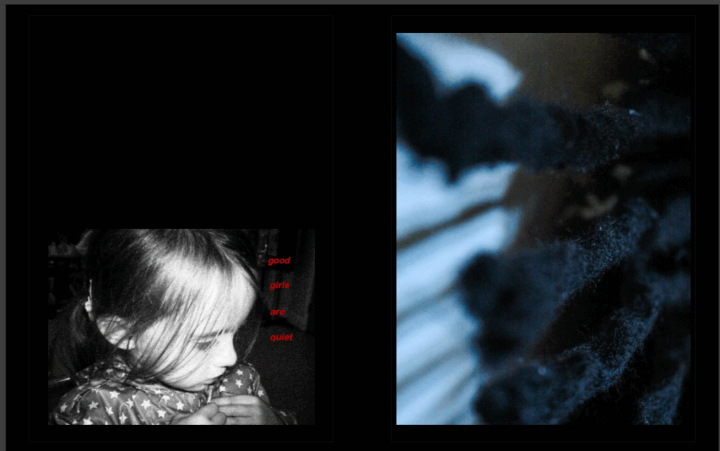
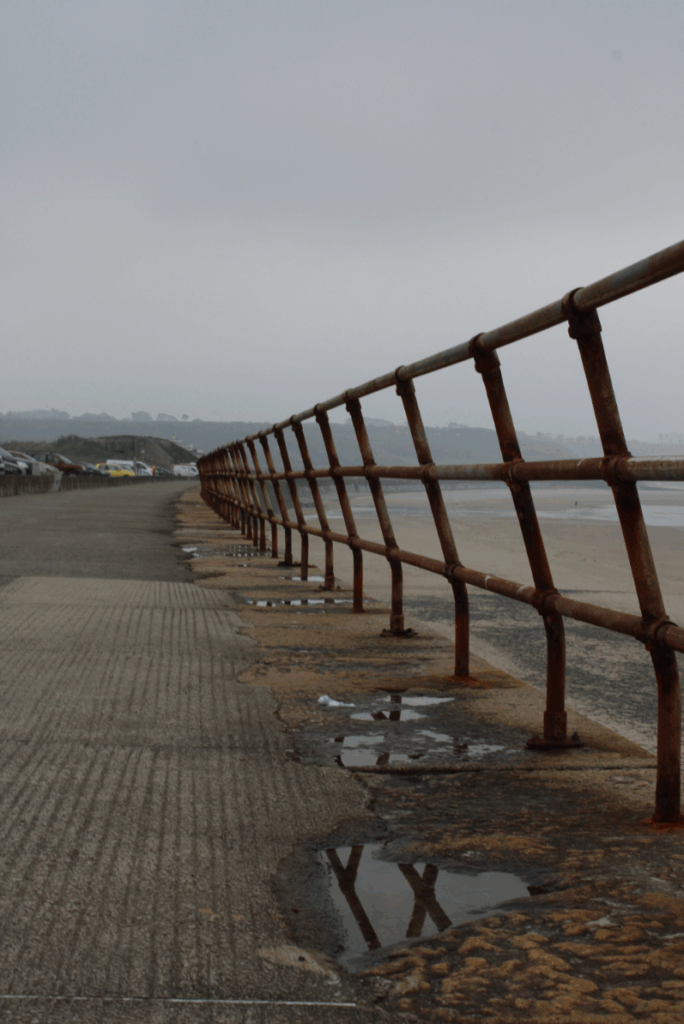
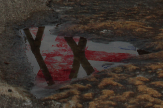
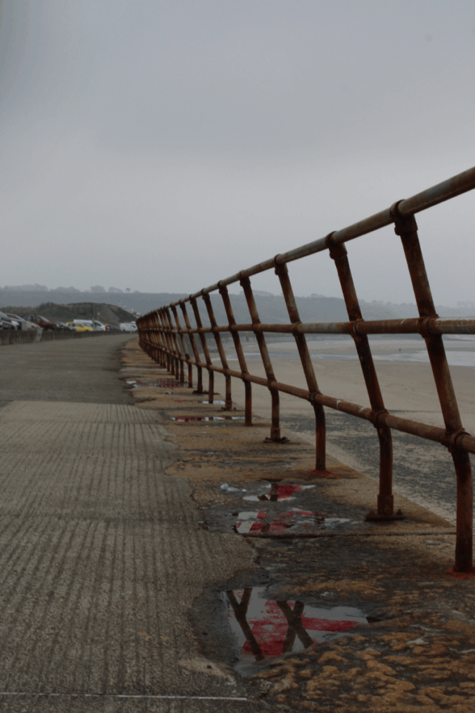
Image 1 – Reflecting Heritage

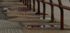
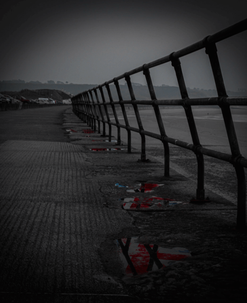
I started using this photograph I took whilst walking along St Ouen’s 5 mile road. I chose this image because I liked all of the different reflections on the ground in the puddles and I can add my ideas on top of this. Also, it is very moody, damp, misty and cloudy which matches the image perfectly to the puddles and especially due to British weather is commonly not so great, it matches my theme perfectly.

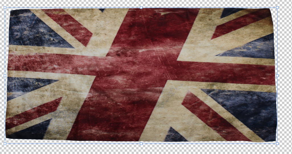
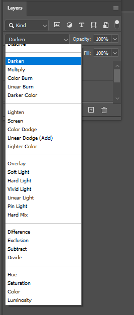
I started editing it by cutting out this photograph of a Union Jack flag I took which already had this grainy, tea-stain look to it. I then made positioned this layer on top of the first puddle and chose the ‘Darken’ Layer filter.

This allowed my image of the flag to be transparent whilst still letting in the darker sides of the flag through and still in colour which was perfect for my puddle reflection and resulted in this.

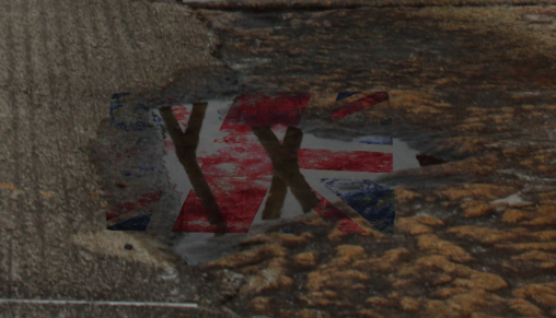
I next used the rubber tool with 20% opacity and rubbed out all of the edges around the flag that was on top of the rock/ground because I only wanted the flag to be in the puddle, resulting in this.

I then decided to do this for most of the other puddles in the background following back, which is what I did next, repeating the same steps.

Then removing all of the parts of the flag which were on top of the rocks and not in the puddle using 20% opacity on the rubber tool.

Finally, I did it once more by using one flag image but spreading it over 3/4 smaller puddles to really spread the flag. Repeating the same steps.

Removing the outside parts of the flag once again until only the flag inside of the puddle is showing, resulting in this.

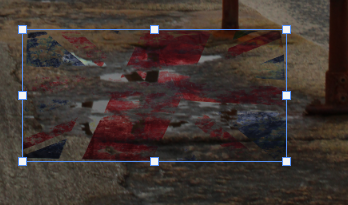
This is the final result of the edited flags inside of the puddles, but I will add a Vignette around the image using Lightroom.

I also cropped the top of this image because I wanted the focus more on the puddles and rails not the sky, and also edited the image to make all of the colours that aren’t red or blue, in black & white to create isolation and more focus points for the viewer on to the puddles.

These are the effects I used to create the Vignette around my final image resulting in this.

This is my final image which I really like and I love how it’s in black and white with only the flag colours showing through, the rail on the right also adds sadness and because it looks like it goes on forever it draws the attention back to the puddles.
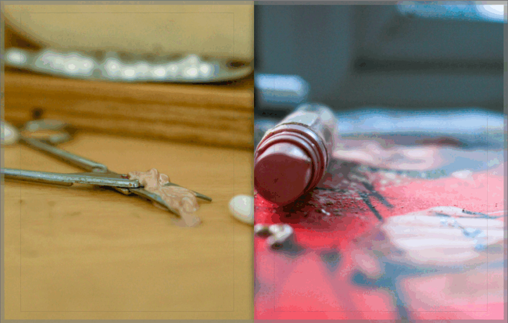
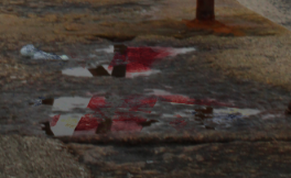
Image 2 – Past

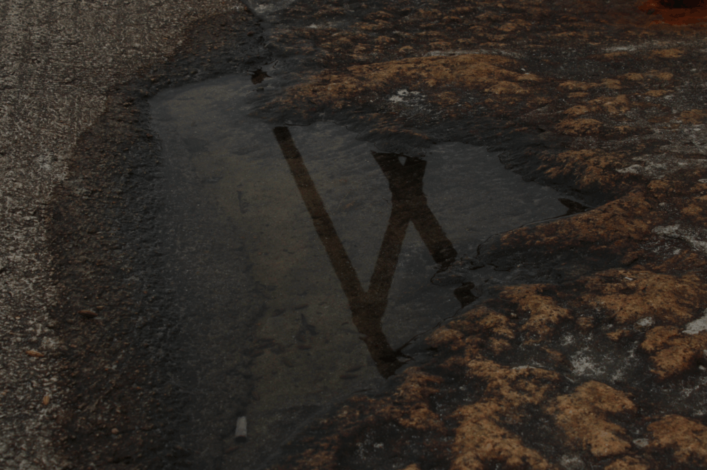
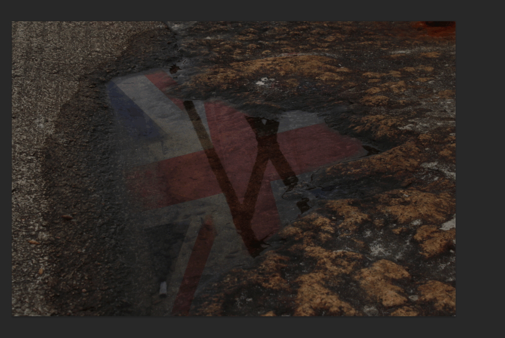
For my second photograph I will be editing, I am going for a similar theme to the first image but instead of multiple puddles, its just one singular one with a flag inside of it.

I chose this puddle image to edit with because I love the rocky ground around it and how the puddle creeps up to the gravel ground. Also, it already has a reflection of a rail inside of it, but I will be keeping this in and overlaying my flag edit on top of it.

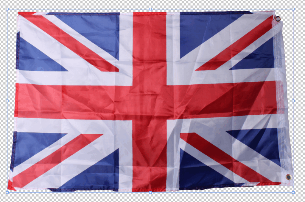
I started by cutting out this image of a flag I took in the studio. I didn’t iron the flag on purpose so that the crinkles on the flag acts as ripples in the water from the puddle.

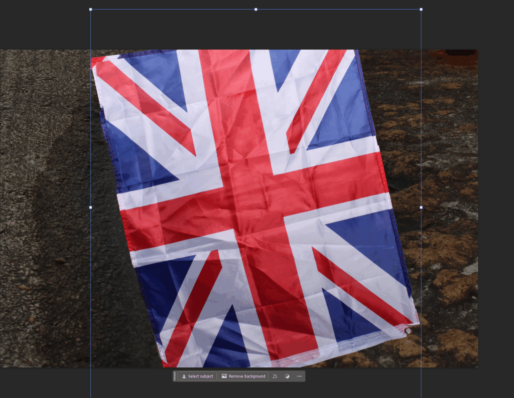
I positioned the flag where I wanted it over the puddle and using photoshop, I selected the ‘overlay’ layer filter which made it look like this.

I chose this layer filter because it helped it give the transparent and puddle/reflection look once again. But then, I cut out all of the edges again from the flag using the rubber tool with 50% opacity, for the big parts of the flag that are only on the rocks, and 20% opacity for the smaller parts that are just touching the edges of the rocks/ground to create the look that the flag is inside of the puddle reflecting the Union Jack flag.

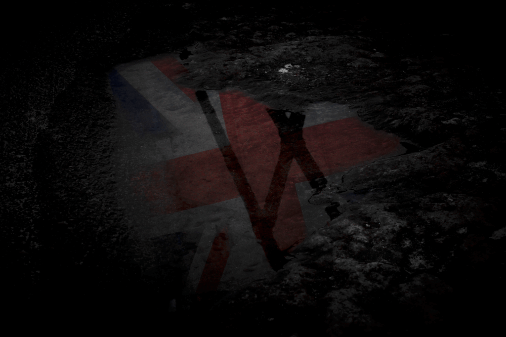
This is how the image resulted after I cut out the edges of the flag and also I lowered the opacity of the flag to 40% from 100% to make the transparent look feel and look more real.

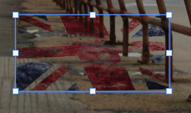
I then did the same editing with the erase of colours apart from blue/red using these effects.

Plus, I added the vignette around this image again so that all of my final images will be correlating the same idea and will look more presentable, with my final photograph turning out like this.

I like this image because it has the same black and white theme as the first image, but it only involves one puddle in it with the singular Union Jack flag. This helps the viewer reflect on how wherever they go in England/Scotland/Wales, they will always see a Union Jack flag as even by looking in a Puddle, they will remember where they are from.
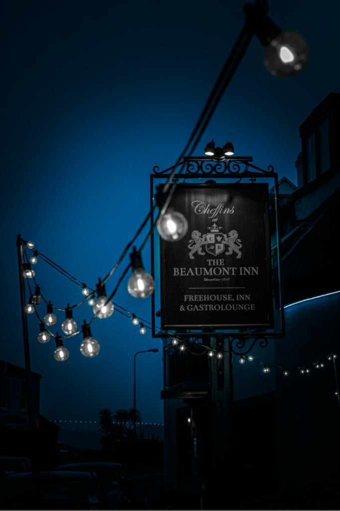
Image 3 – The Inn

For my third image, I decided to edit this photograph I took outside of a Jersey generic looking Pub which the British is widely known for.

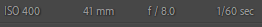
I liked the photograph as it was, which I did by using these camera settings which made the pub sign, in-focus, whilst keeping the lightbulbs around it in blur.

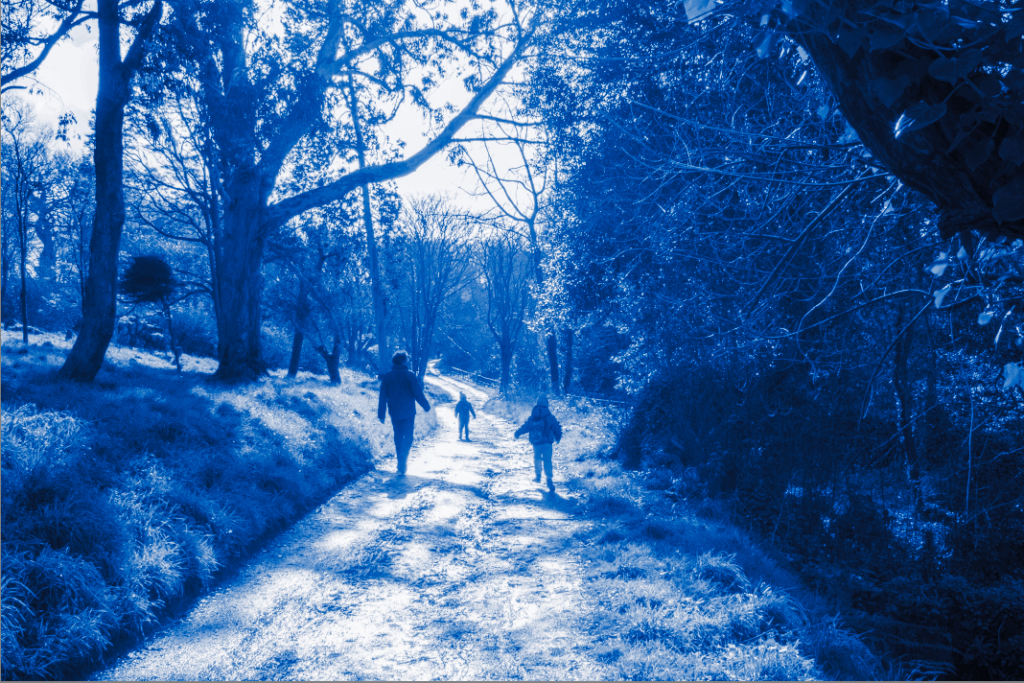
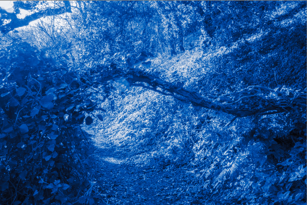
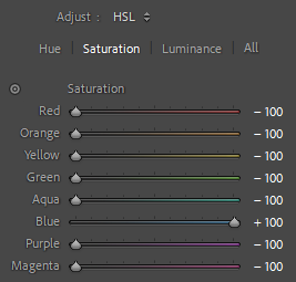
But, I wanted to keep the theme of mainly using mainly red and blue, but also white as well, (the Union Jack colours). So, for this image, I decided to only make it in Blue so that I have some images in both red and blue, and some only in one colour.

I started by using the colour mix tools on Lightroom, with only keeping blue, in colour, whilst the rest in black and white.

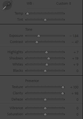
Then, I edited the temperature and tint on the image allowing the whole image to be in blue, and also changed the exposure, contrast, highlights, shadows, whites, texture, clarity and also a vignette again around the final image, to give it a grainy, dark, gloomy feel/look to the image which is exactly what I envisioned of when you think of when you think of a generic English pub.

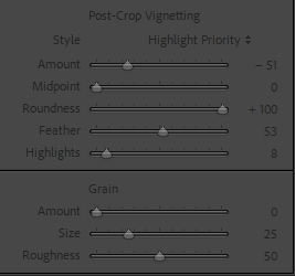
I also added the vignette around the final image again to keep the same theme for each image and to help the gloomy view and attract the viewers eyes to the middle of the image. Resulting in this.

This is the final image which gives off a cold, generic British pub especially because I manipulated the image to have the background and lights in blue, with everything else black and white, the grey light bulbs and sign with the black vignette really helps portray this gloomy, dark pub too.