after constructing my virtual gallery thought it would be apt to create a Gallery Pamphlet in indessign, in order to do this looked at other photographers gallery pamphlets to get ideas about the structure and formatting my pamphlet should follow.
I discovered I was very drawn to portraits in a circle/oval frame, My original thought was too present these images :
in a similar way, however when I presented them with a white background it took away from heir intensity
so I decided my pamphlet would be entirely black based in order to preserve the images intensity.
I noticed most successful pamphlets include things such as
title
price
information about the art work
information about the artist inspiration
so I have included these points of notice throughout and within my pamphlet.
most notable pamphlets include quotes either from the author/artist or artists that have inspired or supported the exhibition I any way, so I will be including quotes to personalise myself to the imagined viewers.
And finally I need to consider an eye-catching front cover for my pamphlet, preferably one that includes a human face.
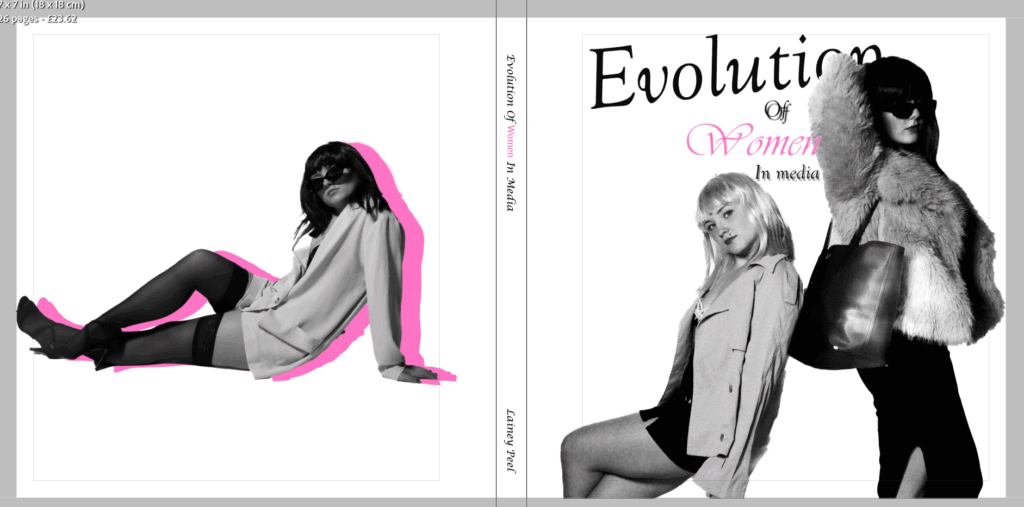
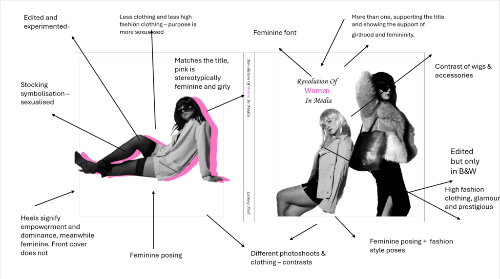
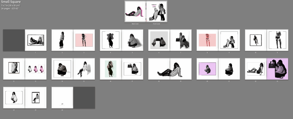
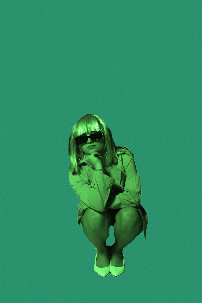
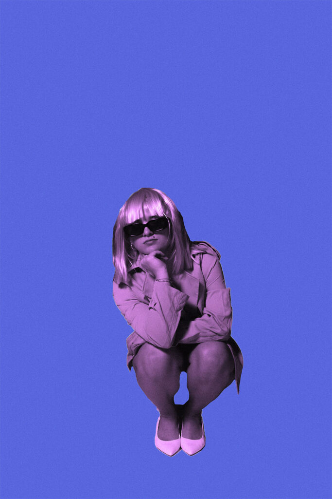
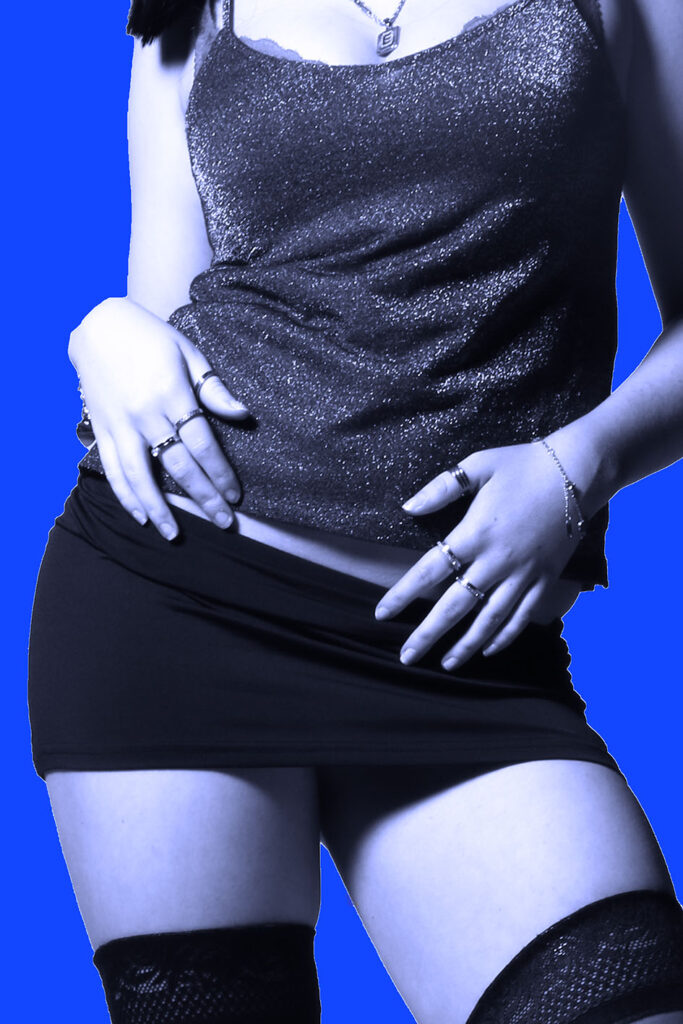
My plan in this magazine styled photobook, is to show off a very feminine aesthetic, straight away illustrating the theme I am focusing on and portraying. To do this, I aim to use stereotypical colours of femininity such as purples and pinks. I want this to be shown straight away on the front and back cover, to emphasise this and let readers aware of my project, before going into the book. My photoshoots are very high fashion, posing and props surrounded, therefore already creating the theme of a fashion photoshoot for a magazine. I really want all my images placed together thoughtfully and carefully to create the most contrast. Almost like this or that. For my front cover, I wanted it to be the both subjects, so it symbols and expresses women as a whole, and fits the term ‘women’ due to being plural. This also signifies how women as a team went through the waves and movements of feminism and eventually increased in the main stream media. Aside from already achieving my powerful and dominant aesthetic of women, I wanted my photobook to add something. Therefore, I will add diversity of boarders to make some images look vintage but also to break apart the white images and make them stand out, rather than blend in. I want to separate all the experimented images so they are spread across the book evenly, and attempt to put 2 pages together to contrast significantly. Although, my aim of my subjects are suppose to look atypical, the clothing etc are very feminine. Therefore, although the pinks and purples contrast with my purpose and aim, they keep the girly aesthetic. The narrative is to signify the revolution of women in the main stream media, and how it was not normalised for women to be in the media before the 1990’s. This is what made Helmut Newton different to other photographers during this time. My narrative is to express modern women in the fashion media and how it changed to the present.
Design and Layout
Photobook style:
I chose this style, as my last project I used standard portrait and wanted to differ. I also chose this because I wanted my book to be petite and mini as I believe it fitted my concluded theme the most. I want my book to be small and have either a soft or hard cover, however I think soft will fit the magazine style more beneficially.
Front and back cover:
Updated version:
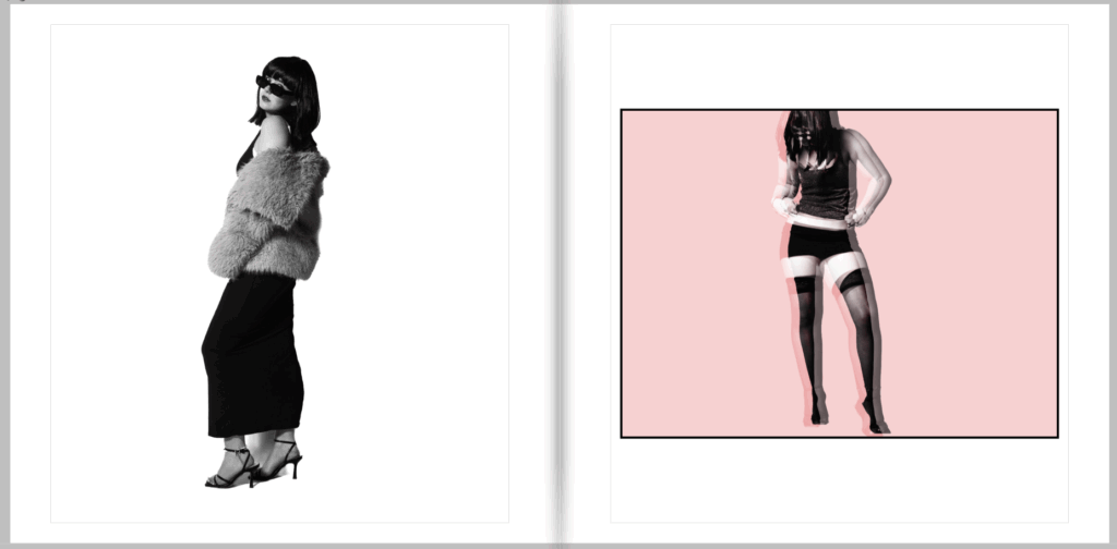
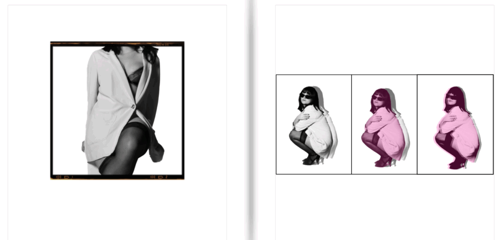
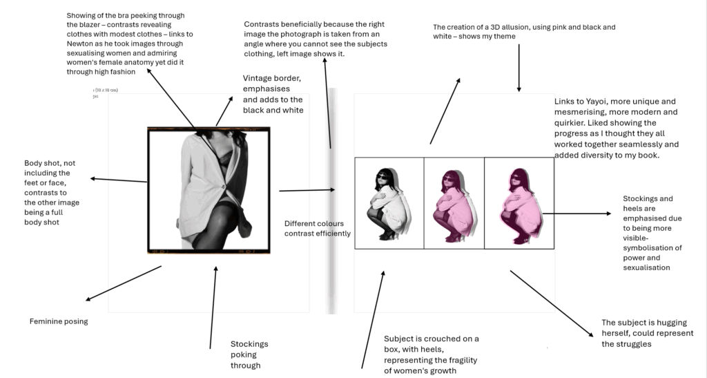
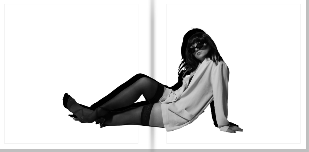
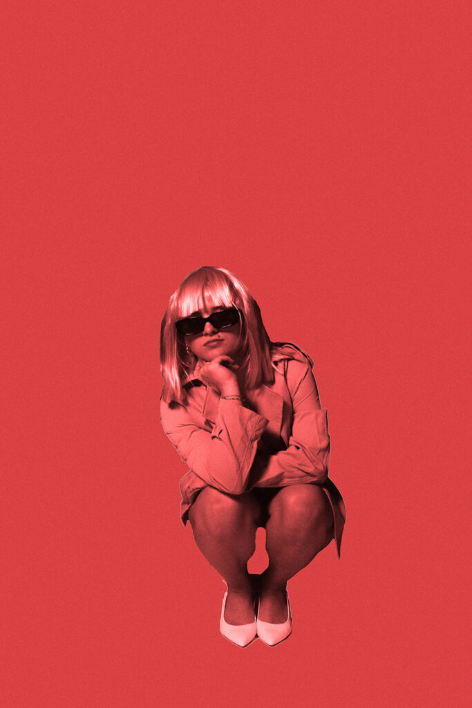
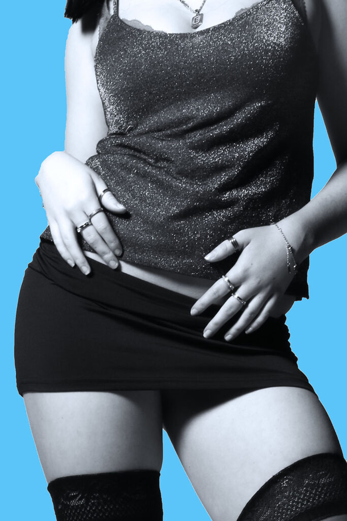
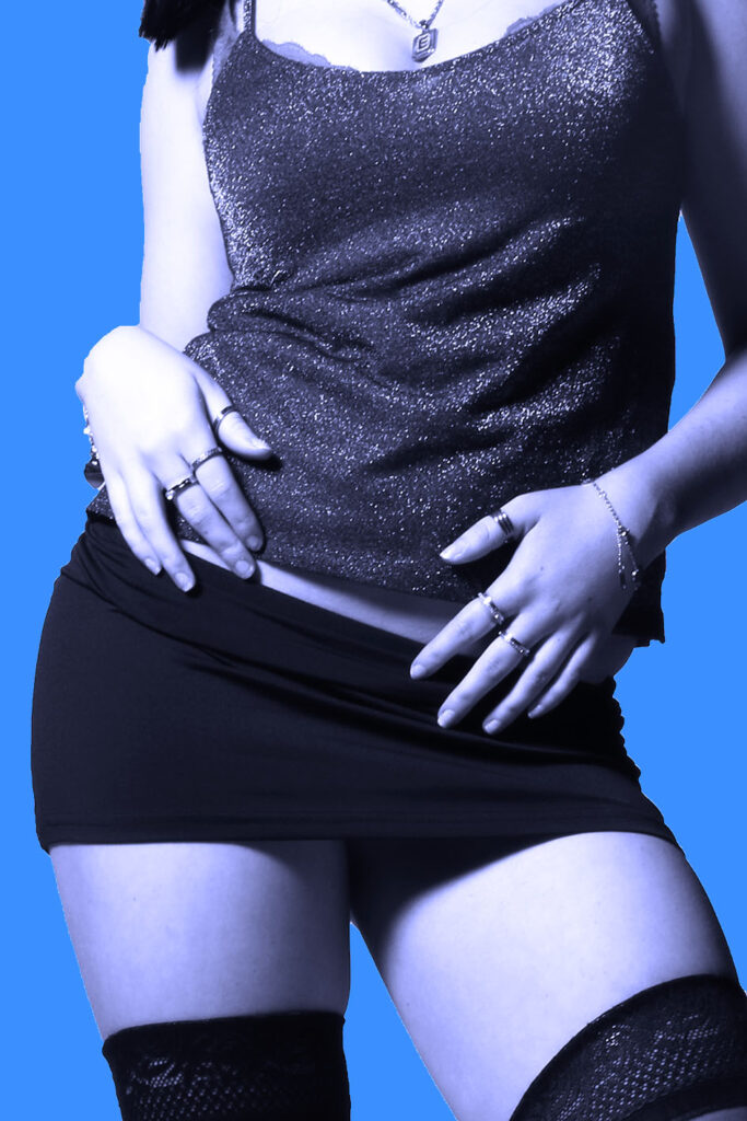
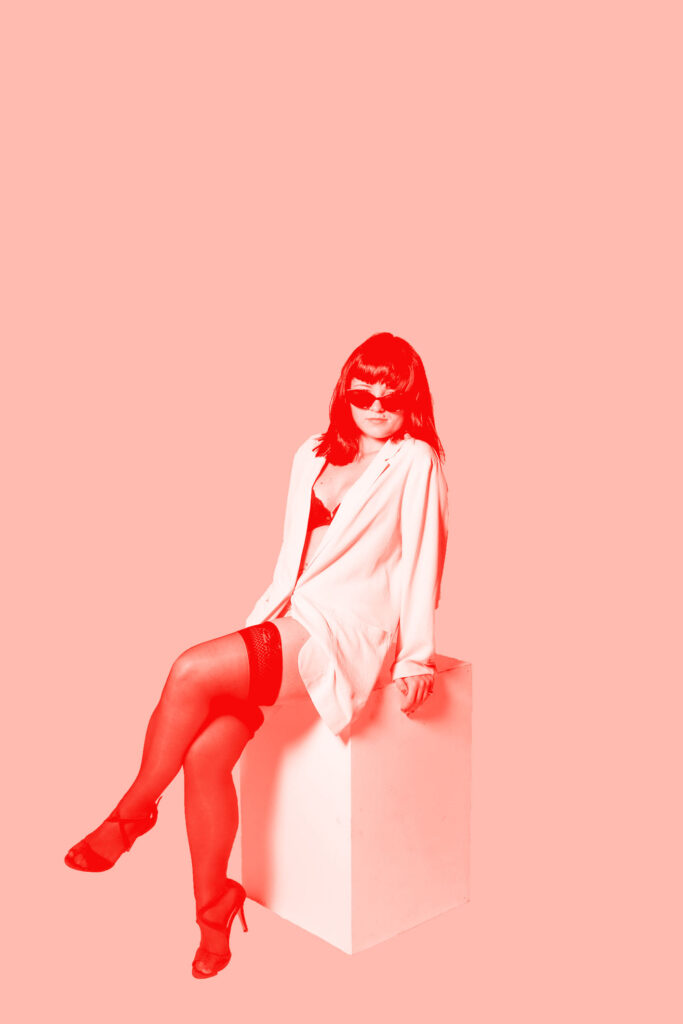
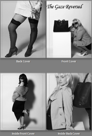
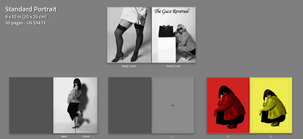
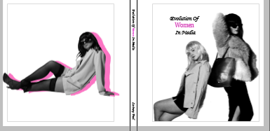
I chose these images as I wanted my title of ‘ women’ to be in pink, therefore I wanted to add something that made this link seamlessly. Due to my photobook obtaining purposely edited colours and black and white, I wanted my back and front cover to show this so the viewers know it is not just in black and white. I made my front cover two women, rather than one to fit the title and show the support of girlhood and femininity. To show that this book is not dull, I added one of my edited and experimented images to the back from a different photoshoot, therefore obtaining different type of women’s styles and what they portray. As shown above, the back cover is more of an over sexualised and objectified aesthetic through the stockings and meanwhile obtaining a modest element to it through the short and flowy blazer with a bra peeking out. I also chose the back cover image because it shows the heels, a very significant symbol in femininity which had to be shown through the first glance. This is because my front cover does not show this, but still shows very feminine and graceful posing. The pink matched perfectly to my title and I think it gave off the correct aesthetic for first glances, which is what I wished to achieve.
Changed title –
Updated after experimented –
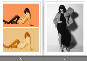
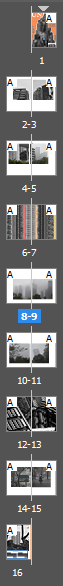
Pages to 26:
Double page spread:
My evaluation:
Overall, I enjoy the diversified images, the use of black and white and colours, and different boarders and sizes. The use of black and white and edited colours, I personally believe contrasts yet ties everything in really well. This is because none of my images are in normal colour, yet a few of them obtain colour whilst maintaining the theme of black and white. I like this because it makes my book not boring and dull to look at and definitely catches the eye. The use of different boarders emphasise this but also adds a different aesthetic to each image, throughout whether I want the image to look modern or vintage. Some of the borders I did on photoshop, and some I added for the book. The different sizes emphasised the contrast I was aiming to achieve, but overall I believe the mixing of the edited/experimented images with the black and white images worked seamlessly and created the most contrast. Lastly, I think the use of pink in the title of ‘women’ immediately tells the theme of my magazine, which is what I aimed to do. The use of font is very feminine in my opinion and added to this factor. Some images obtained shadows, and some did not which I think worked beneficially as it made my book more diversified and unique. Lastly, I believe that my photobook gives off a magazine type style which is exactly what I wanted to achieve, which I think I did successfully, with a unique and different perspective, linking to my artist reference Kusama Yayoi. Whereas the images its self and how it was created through props, fashion and posing links to Helmut Newton through the cinematic and theatre – carefully crafted style.
On Photoshop, I wanted to start creating ideas for my layouts in mounting up my final images as this will give me a clear sense of direction when I finally do this. I wanted to do this alongside my photobook as I want to be able to represent my images in different ways to be separate from each other, and be able to make smaller, more specific storyboards and narratives. I think that my photobook will be able to provide a basic overview, however these final prints can give more detail.
Usually I create a lot of mount-ups, however I think that the meaning behind these images is best represented in a book rather than displayed as story boards, for example, as it is quite a sensitive topic.
1:
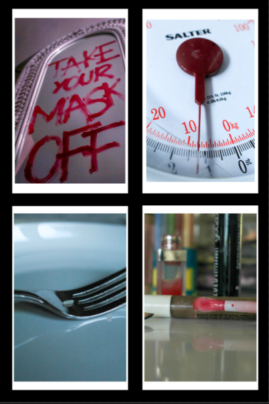
This is my first mount-up, where I have selected 4 images that symbolise different issues that I have investigated within the Feminism movement. I think that these four images work really well with each other too, being that they all are quite focused on one aspect of the environment and all use a short depth of field to pick apart the pieces that build society up. This allows me to give the viewer a rich insight into what my project is about and the different issues that this movement strives to tackle.
I am really happy with this layout because I have also included images that are associated with the project’s of my artist reference’s, the lip gloss being related to Hannah Altman’s ‘And Everything Nice’ exploration of the beauty standard and the writing on the mirror being a more direct inspiration of Barbara Kruger. This is combined with two image concepts that I came up with myself, which means that I can show where all of my ideas have come from on one story board.
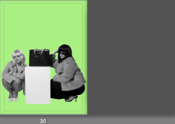
I am going to mount each image onto foamboard, however I am going to leave a white edge around each one of around half a centimetre to create a divide between the image and the black card. I am then going to use double sided tape and stick these to black card with a border of a centimetre at the side and from each other.
2:
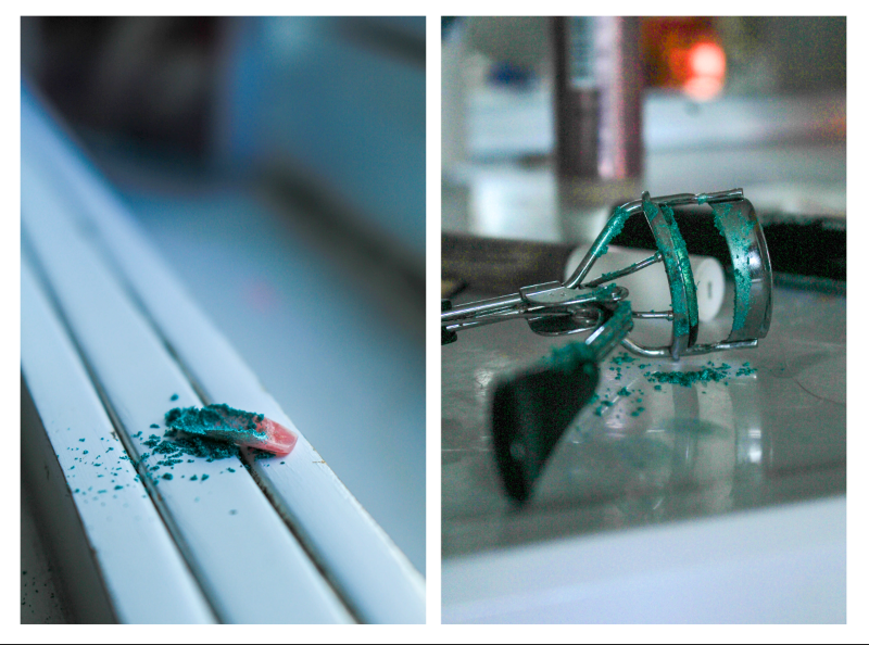
This mount-up is only two images inspired by Hannah Altman where I have used glitter to represent the pain of being held against the unachievable beauty standard. I think that these two images go really well together as they share the same level of vibrancy as well as the same colour palette, meaning that they link smoothly. I also used a short depth of field in both of these images so it allows me to sequence them in a more meaningful way. These two images of course also share the same concepts behind them so it makes it easy for the viewer to understand what my intention was.
I am going to mount these images onto foam board and then cut them out again completely in order to create a platform for them to be raised off of the page. I am then going to remount these onto another piece of foam board with about a centimetre border as I feel that these images would look best with a white background in comparison to a black one as they are both quite light themselves.
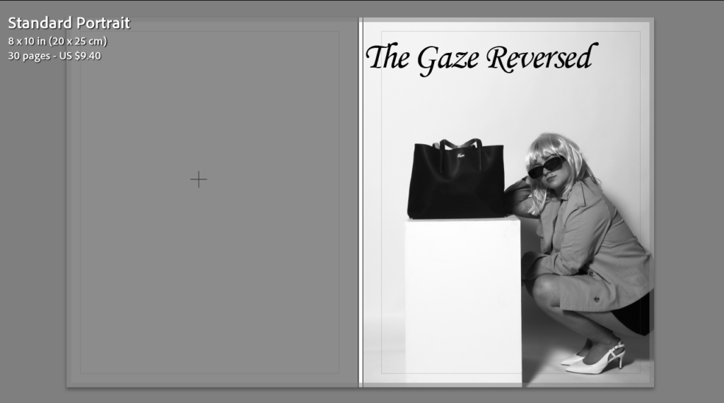
The title of my final photobook will be “The Gaze Reversed“, due to the direct links between my work and ideologies conducted by Laura Mullvey. Mullvey came up with the concept of The Male Gaze, her theory implies how women are often sexualised in the media and how voyeurism is an underlying issue surrounding how women are viewed. I titled my book this because I am aiming to change the way women are perhaps over-sexualised, by playing with clothing and props that resonate with the 1960s, and how women were expected to dress. My objective is to present the subjects throughout my magazine in a way that shows power, importance and dominance through photographing them with elegant clothing, reinforcing the idea that women can have a high status too.
What I want to achieve within my photobook:
My main aim to achieve through completing my photobook is to help switch the firm narrative of women being objectified, and only looked at for pleasure. Only recently did society begin to appreciate women for more than just their looks, allowing them to have a role in the world other than being looked at. I am aiming to present my subjects in a way that they can appear powerful, exhibiting the idea of gender equality and women empowerment.
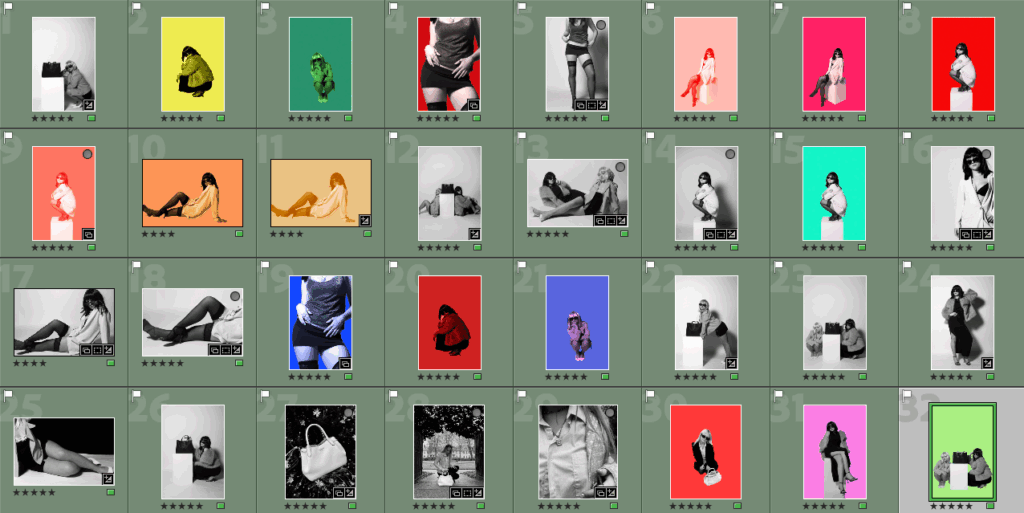
In order to begin designing my photobook, I selected all of my best images from my project and pasted them into a new collection under my project named “Final exam”. I made sure to choose images that I had previously rated 5 stars, and also colour coded green so I knew they were the best quality images.
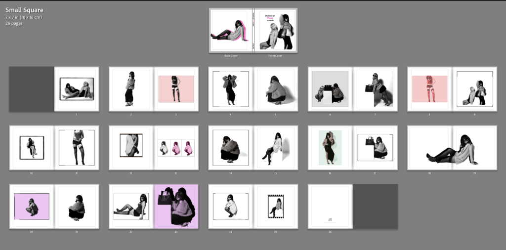
I then pressed the “book” option at the top of Lightroom, where the app would them automatically create a book with all of my images inside. I then had to make the decision on which type of book I wanted my project to be presented as. My original plan throughout this project was to present my images in a magazine layout, as there are aspects of my project linking to fashion. Furthermore, I had also previously researched some fashion magazines such as Vogue Magazine, to help give me inspiration on how to create a successful fashion magazine using appropriate space and imagery. Despite this, I then had the idea to create a small square photobook rather than a magazine, where the paper type would be matte rather than glossy paper, and the book would be significantly smaller than an ordinary book. I experimented with both layouts to help me decide my final one.
When designing my book and adding the images onto the pages, I carefully had to consider factors such as; mixing black and white images with colourful images, the sizing of each image and how it would fit onto the page, if I wanted borders surrounding specific images, and if I wanted any double page spreads. I think both layouts turned out successful overall, both displaying a range of images correlating with my artist inspirations, yet also showing individuality.
Magazine layout:
Front cover with added title:
Front and back cover with inside pages:
Next, I added a back cover that would compliment the front cover effectively. I chose an image from a different photoshoot to allow my book to appear more interesting for the viewer, as well as immediately showing variety without opening the book. I also selected images for inside my front and back covers, I chose ones that correlated with the covers to prevent the book from looking too busy already. I think all four of these images chosen work well together and compliment each other, while also being unique to one another through the use of different angles and costumes.
The rest of my magazine layout:
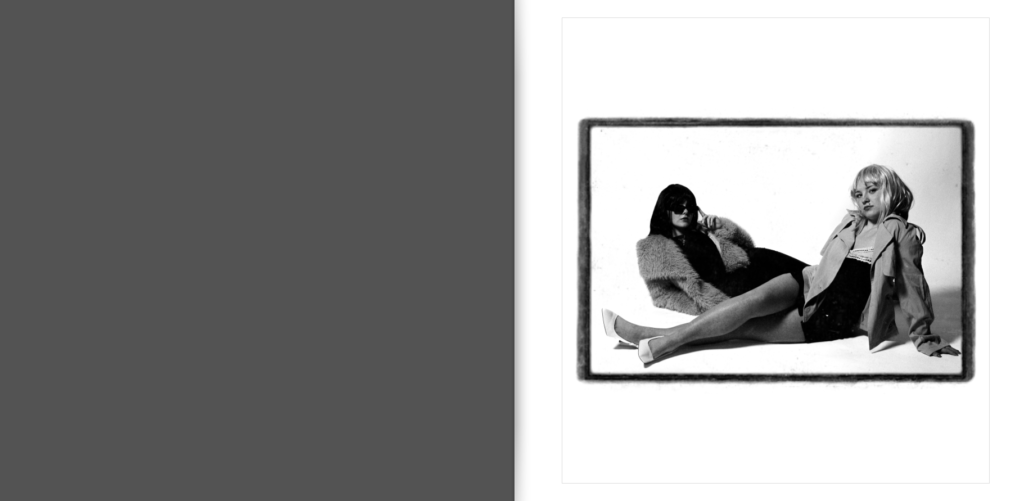
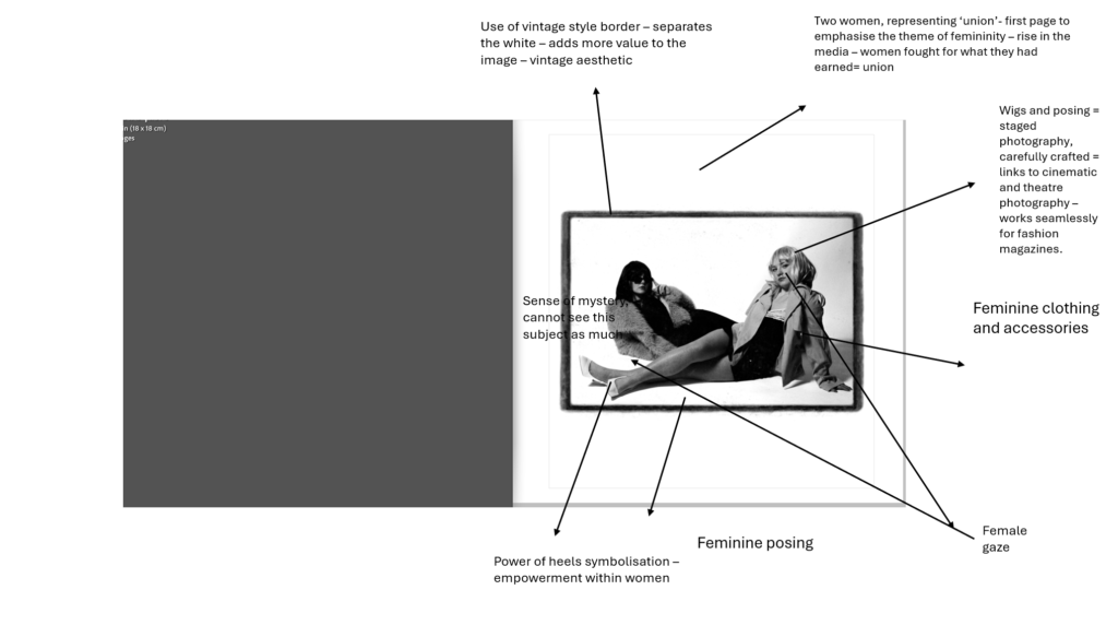
I chose to keep page 1 completely blank as I want most of the images in my book to be next to another one, unless it is a bold image and needs to be presented on its own so all elements within it can be appreciated. However, I want to slowly incorporate individual images into my book, rather than immediately at the front.
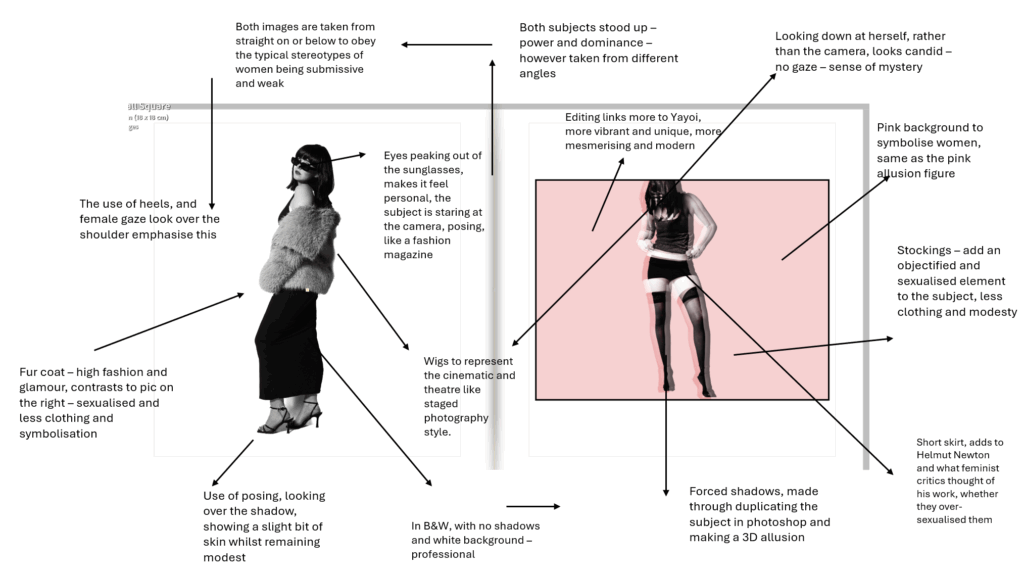
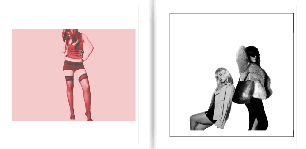
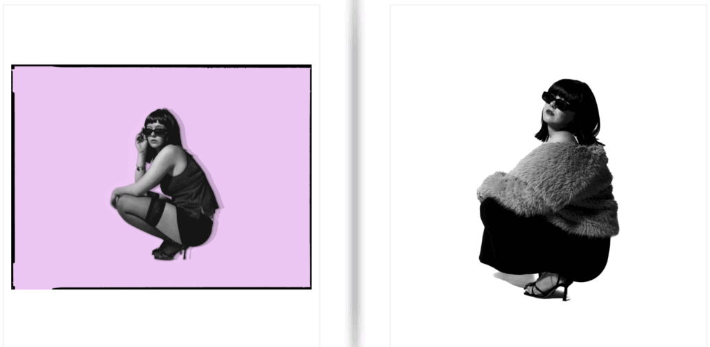
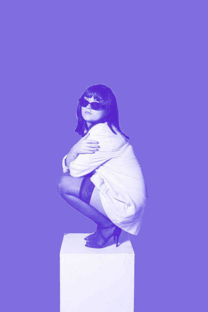
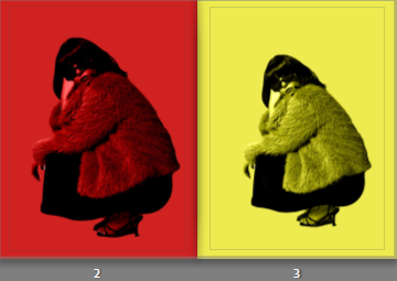
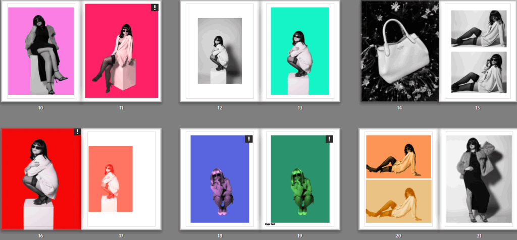
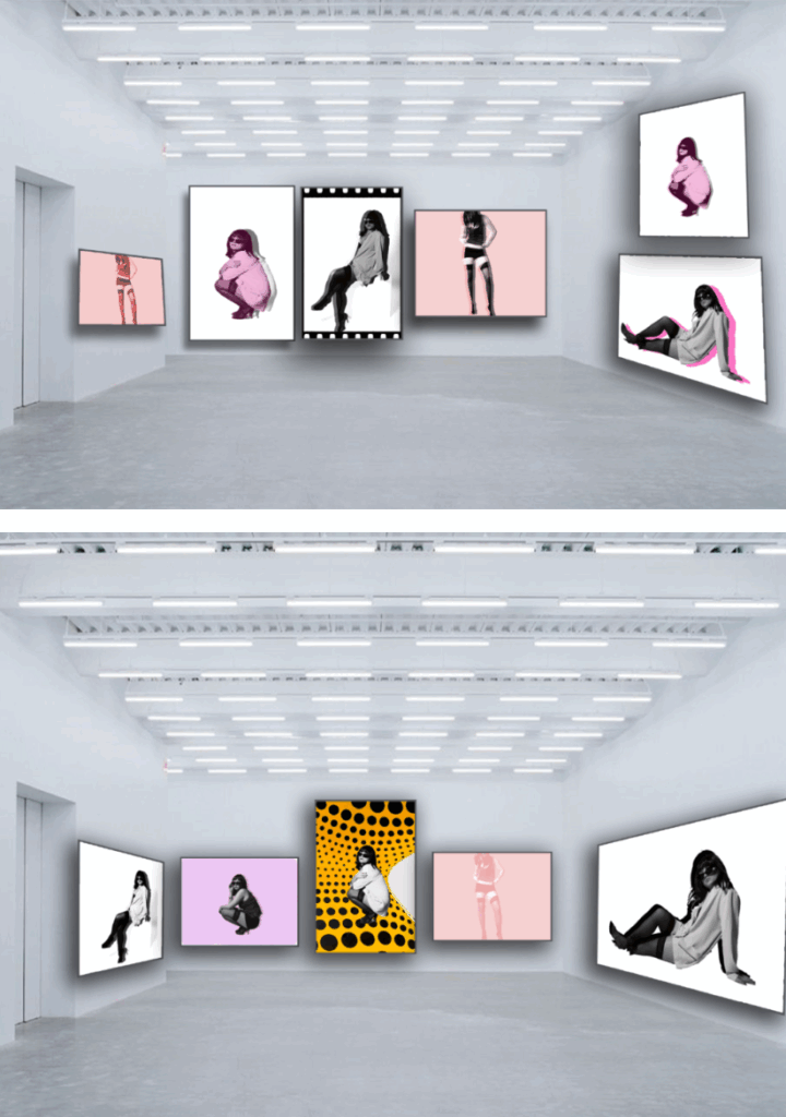
Pages 2 and 3 are the first pages the viewer will see when the book is opened, so by adding bold pops of colour I am linking my book to Yayoi Kusama’s work, as she was inspired by pop art, which includes lots of vibrancy. I placed the same image next to each other, to show a minimal comparison between them and their colour. I made both of these images full bleed with no borders, as I think a white border would clash with the colours within the image as they are dark and bold. Lastly, the red image on the left is slightly more zoomed in, which I think adds a bit of depth to the overall page.
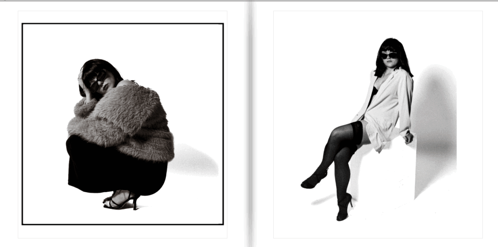
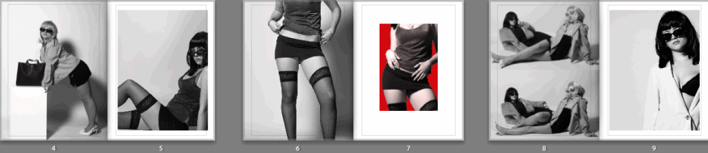
Pages 4 and 5 are black and white images that have only been edited in Lightroom rather than Lightroom and Photoshop. I added these two next to each other at the front of the book because it also tells the viewer pretty early on that there is a break between all of the luminosity. I think placing the unedited versions in between the colourful pages has helped add a sense of Newton’s work into my book, while also keeping it simple and classy. The image on the left is full bleed and has more of a wide angle, which compliments the image on the right which has clearly been cropped and zoomed in, as well as having a white border. This allows the viewer to focus closer on elements such as the wig, sunglasses or stockings, without a colourful background subtracting from them.
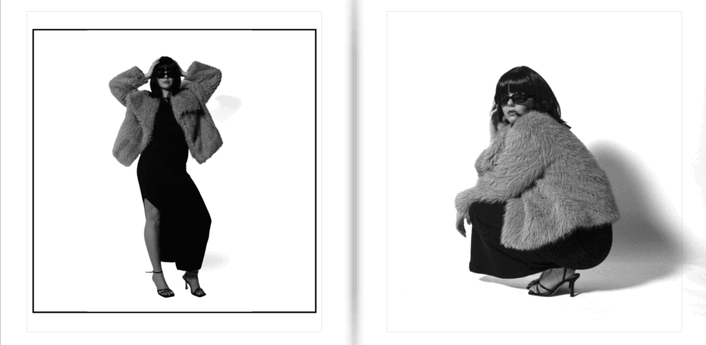
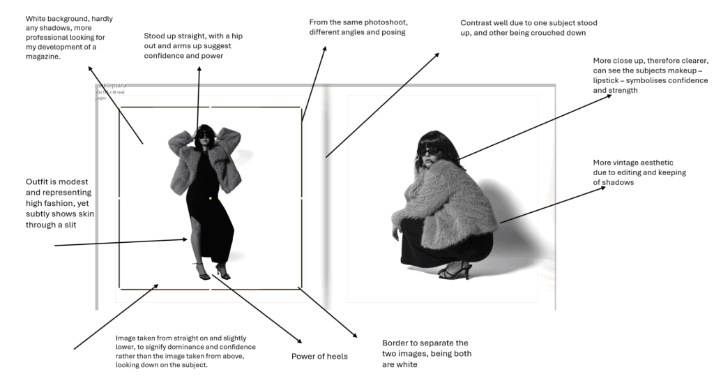
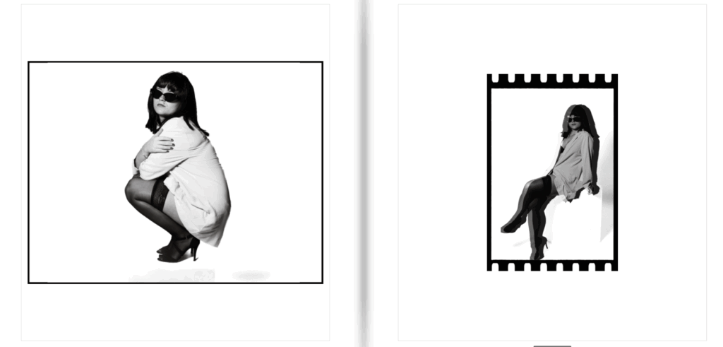
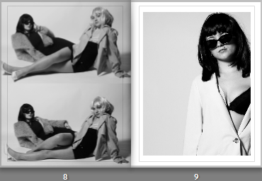
Pages 6 and 7 are two similar images from the same shoot, sharing the same low camera angle as each other. I kept the image on the left full bleed so there isn’t a clash between them. I used a new layout for the image on the right that I hadn’t experimented with before, but I think it looks effective with the border as it helps add dimension to the two similar photos.
Pages 8 and 9 are both in black and white again, but within page 8 I used a two image layout, where I can display photos with similar qualities that are only slightly different to each other. Page 9 is another black and white image, but I zoomed in the original full length image to almost a headshot, which works well with the image on the left as it stops the page from being too busy. Page 8 is another full bleed layout so that the viewer can only focus on the two photos within it, whereas I selected another border on the image on the right.
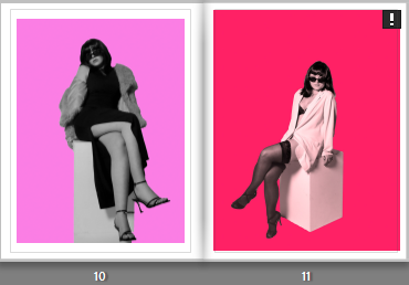
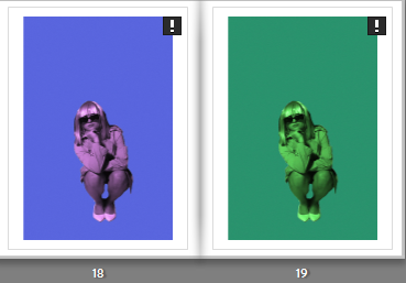
Pages 10 and 11 are very vibrant with lots of colour to them, which is why I placed them together. Both images are portraits, and they both use the white box as a prop, which is also significant. I placed them together due to the similarity in colour and subject posing, and I added a white border to both to break down the use of colour. However, the image on the right has a small exclamation point in the top right corner, which means when I had exported all my edited images from Photoshop, I did not adjust the resolution accurately. This would mean that if the image was full bleed, it may be printed blurry. Therefore, to avoid that I made the image smaller than the layout frame so it was closer to the ideal ppi (200).
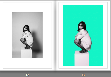
Pages 12 and 13 are also using the same image, one edited in just Lightroom and one edited in Photoshop to add a colourful background. I also experimented with a new layout format on page 12 as I think the large white border helps emphasise the image more, despite it being in black and white. I placed the image on the right using a bigger frame, and dragged the corners to fit the frame appropriately. I think this double page is one of my favourites throughout the book, so I placed it roughly in the middle of all the pages so more attention could be brought to it, despite it being a simple comparison.
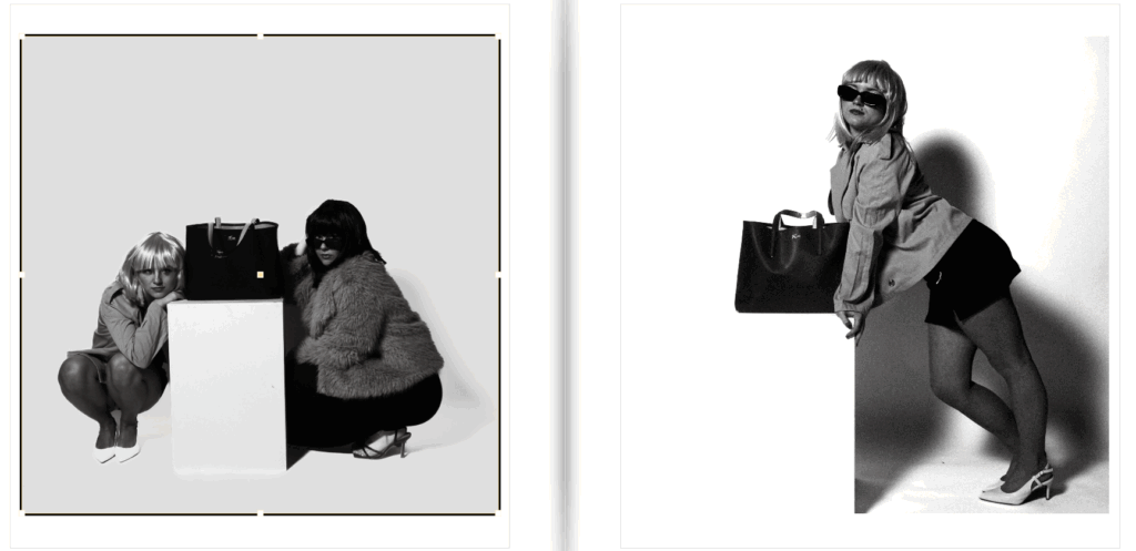
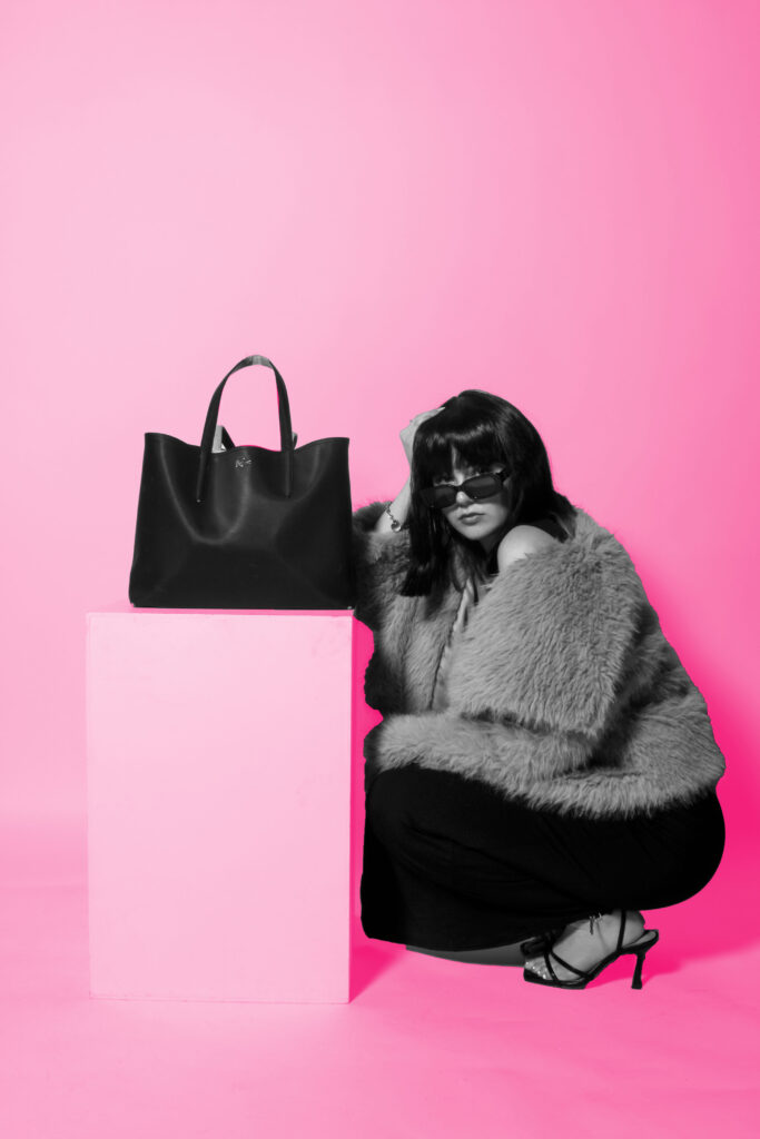
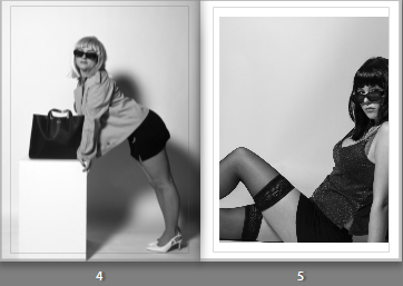
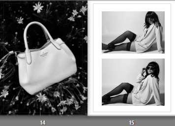
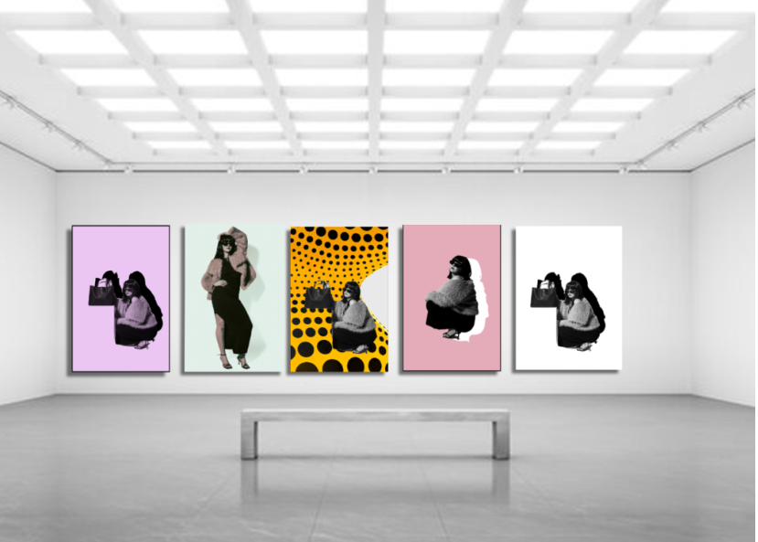
Pages 14 and 15 consist of images from different shoots, and they are almost contrasting one another. The image of the bag on the left links to Yayoi Kusama, as she worked with fashion companies and includes hand bags in many of her images. The image was also taken in an outdoor setting, which is unlike the majority of my best outcomes, so the dark background contrasts the white background of the right images. Page 15 also has a two-image layout, where I added two similar images again to bring some life into my photobook, while also showing a raw approach to my shoots.
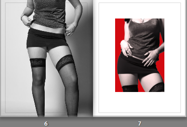
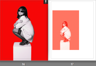
Page 16 and 17 are the same image again, yet the smaller image on the right has a gradient filter over it, carefully blurring the bold colours of the background into the subject. The image on the left is full bleed as I like the angle and the positioning of the subject, and wanted it to be the main focus of the page spread. For page 17, I used a different layout to the rest of the pages, where the image is off centre and to the left of the frame. Usually, I wouldn’t experiment with this approach as I like my images to be centred, however I think this layout works well when the same image is used on both sides.
Pages 18 and 19 are two of my final prints, so I also included them on the same page next to each other because I like how the colours are so different to one another, and how the use of the gradient filter separated the images. Neither o these images are full bleed to avoid the blurriness when they are printed, so I kept a white border which I wouldn’t have done if I had more choice but I still like how the border separates them so the viewer can focus on each image individually.
Pages 20 and 21 are very different to one another, but I placed them together because the image on the right only has black, white and grey tones in it, which ties in well with the top right image ands the use of dark tones in the foreground. I placed another two image layout on page 20 because it is the same image, edited differently. The image on the bottom also uses a gradient filter, blurring harsh lines from the subject and the background to make it appear seamless. This way, the viewer can easily interpret the differences between them within my editing.
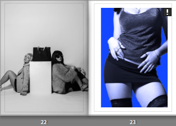
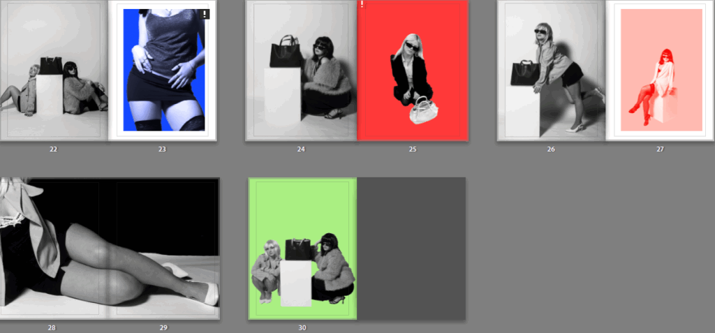
Pages 22 and 23 are also images from different shoots, with no correlation. I placed them together because the image on the right is extremely zoomed in, therefore it would need a border to look effective on the page. This means that the image on page 22 could be full bleed, which I wanted to do because it is one of my best outcomes that has two models in it, rather than one. I also like how this page links to fashion again through the hand bag placed in the centre of the frame, yet it also links to the male gaze and how women are viewed as objects.
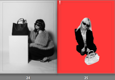
Pages 24 and 25 compliment each other due to both having a handbag in the frame, with the model crouched down or on the floor. Despite that, they are also very different because different camera angles were used, the image on the left page has a lower angle where the model is looking directly at the camera, linking to the female gaze. Yet, the image on the right has a higher angle, making the model appear lower down and therefore weaker. I edited the image on page 25 to get rid of the outdoor background, which was also underexposed. Both images ae placed full bleed across the page so the viewer can recognise the use of the handbag and how they link to each other.
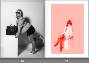
Pages 26 and 27 are images that have been edited differently again, but I placed them together so the viewer can see the difference in mood between them. The image on page 26 has a high contrast, lots of shadows and overall a dark mood to it. Whereas, the image on the right has an edited background as well as the gradient filter again to discard any dark tones and heavy contrasts. The left image is full bleed so the colours from the other page do no not outshine it, whereas the page on the right has a border, so the colours are not overpowering the more raw image on the left.
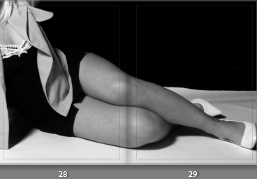
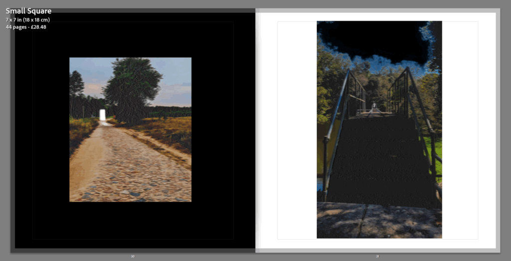
Pages 28 and 29 is a double page spread using one image. I chose this one because it has a unique angle and focal point, as well as being a landscape image. Due to my book being a portrait structure, it was difficult for me to add in landscape images without having to zoom them in and defeating the main focus in them. I think the double page spread looks effective and adds a unique touch to my book overall, especially when there is no border surrounding it, allowing it to look sophisticated and professional.
For the last page of my book, I wanted to add a pop of colour to contrast with the inside back page, which is a plain black and white image. I also made this image full bleed because I think the image is very dark, and I think by having a border it would take away from the image itself as well as the background.
Blurb photobook layout:
This is the layout of the book if I chose to have a normal photo book from blurb, with a hard cover front and back, and matte A4 pages throughout. I think this layout is effective, but not for my style of book where I am focusing on ideas of fashion. Most fashion magazines have glossy paper, and if I do not follow this concept then my ideas maybe misinterpreted.
In my statement of intent, I stated I wanted to express my inspiration through the two artists I studied – being Kusuma Yayoi and Helmut Newton and illustrate the theme of union. I personally believe through my crafting of photoshoots and using the correct lighting and props to portray what I wanted. Being in admiration for the women’s anatomy and expressing this in a way to make women look powerful, confident and dominant to which women were not viewed as in the 1980s and 90’s when Helmut did his photoshoots. Therefore, I wanted to show a modernised version to illustrate the present and employ the evolution of women in the media. I knew I wanted to do this because it was not normalised for women to be in the media during this time, as they were only viewed for traditional values such as the house wife and conceiving. However, over time this changed and debatably Newton pushed this shift. Therefore, I wanted to show straight-forwardly and simply how these times have change, as women are now more in the main-stream media than men. However, sometimes for the wrong reasons such as over sexualising them or wearing revealing clothes to satisfy the male gaze to gain awareness on their brands. This links to my development of being a fashion magazine to express these factors significantly. My photoshoots itself represent Helmut Newton. I did them in a studio trying to gain the correct lighting to make them look staged, this linking to cinematic and theatre play. This itself contrasts to Cindy Sherman’s work as she did the same style, yet portrayed typical stereotypes rather than disobeying them. This is useful as Helmut Newton disobeyed them in my opinion, which feminist critiques may argue. This is because Helmut Newton took images of women from a lower angle, signifying dominance and confidence, and sometimes even took images of women in suits, which definitely was not normalised around this time. To me, this tells me what Helmut was attempting to do by disobeying the typical stereotypes. However, this differs from his over sexualised and objectifying images containing voyeurism as he only took images of the same body type. However, I believe he was in admiration for the female body and was trying to stop these stereotypes as he saw potential in the female body for the main stream media. I believe this all links to the theme of union as women fought together as a minority group t gain equal rights through the feminism movements, and gained more awareness and eventually gained other aspects and characteristics other than traditional values. Through my statement of intent, I believe I did this look successfully whilst keeping it appropriate as I think I portrayed similar things to what I wanted to achieve.
Moreover, I did a high fashion and glamorous look as Helmut Newton executed this successfully. From what I take from this, Newton felt as if women should be dressed up in powerful clothes to emphasise their feminine characteristics. Therefore, I attempted to do this through blazers, long black dresses, fur coats, accessories and mini dresses. This added a wealthy type lifestyle which is what I gained from Newtons aesthetic. This links to my fashion magazine as it is suppose to express as if it is an actual fashion magazine, therefore expressing the paradigm shift in the main stream media of women. The use of feminine posing, photos taken from below or straight on and clothing still obtains a girly look which I wanted to portray as women do not have to ultimately change themselves to disobey the stereotypes of women. Therefore, I think I did what my statement of intent illustrated successfully within Newton’s aspect.
I was heavily inspired by how Yayoi confidently showed her struggles being a woman conveying the theme of identity, female body and mental health issues. I personally find this brave as her work, specifically her images including nudity was seen as controversial considering her Western culture and timeline. Yet she still successfully demonstrated what she was aiming to on a deeper level, despite the backlash. Her work shows some attributes of feminism, minimalism, surrealism, art brut, pop art and abstract expressionism and is infused with autobiographical, psychological and sexual content. Her work was very unique and I personally believe her work showed her mental health issues and struggles of being a woman. For example, her famous and mesmerising polka dots symbolising the growth of being a woman. I wanted to edit and experiment and make it unique. This seemed like a struggle to me as I was not sure what to expect. However, once I began I feel as if i got the hang out of it and attempted to make unique designs and layout to bring out an interesting factor for my end result of being a fashion magazine. I knew I did not want all my images in back and white as I thought this would make it look dull and boring, and have no link to Yayoi.
As shown above, I even experimented with Yayoi’s backgrounds to show psychedelic patterns to symbolise the mental issues. I knew I wanted my editing to link to Yayoi, so I did a diversity of vibrant colours, 3D allusions, forced shadows with different colours, and different backgrounds. This links to Yayoi Kusuma especially the 3D allusions as it adds a psychedelic element which Yayoi was very open about sharing. Although I used multiple colours, a lot were a girly colour like pink and purples to make awareness that it is a feminine project about women in the main stream media. Although I did not use all of my experiments, I used a lot to make my end outcome diversified and to catch the eye, like Yayoi’s work did successfully which I was heavily inspired by. Although the wigs are just a prop, they are a unique hair style and just like Yayoi’s. Yayoi collaborated with Louis Vuitton for her infamous polka dots symbolisation with handbags. Therefore, in some images I added a handbag to look as if we are attempting to sell it through the fashion magazine, like Yayoi.
What I could of changed:
Newtons work is surrounded through a diversity of places and surroundings, mostly in public. I did think of doing these photoshoots in public to add diversity and possibly more to look at, however I didn’t believe it would be seamless in my fashion photobook. This is because, most fashion magazines have a backdrop with zero shadows to make it less distracting and only focus on the subject and the clothing. Therefore, I wanted my images to look as professional as possible and eye catching. Not only this, but it would of made it more difficult to edit as I frequently edited the backdrop in photoshop and changed the colour to make the B&W subject stand out more vibrantly, as they wouldn’t stand out against the white. This work obviously links to Yayoi, therefore my images would not be evenly spread out across both of my inspirations which I ultimately wanted to achieve. Therefore, I prefer how my images work seamlessly together when merged together and is not distracting to surroundings or anything like that.
Another thing, I could of done better was the lighting and how close my subject stood to the backdrop. At times, my subject stood too close to the white or black backdrop, which emphasised shadows which was not exactly my aim. This is because it can be distracting and doesn’t make the subject pop. However, It was fixable in photoshop or Lightroom which I did successfully and beneficially. I did this by selecting the background and increasing the exposure, decreasing the shadows and added whites. If the shadows were in too much depth, I had to move the images to photoshop and do it there or even change the backdrop. This pushed me to experiment and develop my images and I believe I did this successfully.
Lastly, a thing I feel as that I could of benefitted from is the angles. All images were taken straight on or slightly below, however I don’t feel this was as obvious as I wished it to be. I wanted my subject to literally be looking down and the heels to be emphasised to illustrate this dominance and empowerment theme. However, most of the times I was as crouched as I could be to take these images. This is something I think definitely did not come out as much as I wanted it to be. However, with the subject crouching, I think this was successful as it was taken from the same height, avoiding it from above and fitting that typical submissive and weak stereotype. This was good as I was avoiding that factor and did not want to accidently express that. Other than this, I believe I executed my vision successfully and achieved what I wanted.
The photobook development:
I began by putting all the images into a photobook folder in Lightroom, this automatically made a book. I then arranged what should go where and what image it should be next to, to contrast nicely, almost like ‘ This or that’. Once I did this, I then added some borders to emphasise the contrast or because some of my images are white so had to separate them. My book title choice was simple yet expressed every theme I wanted to cover ‘ The Evolution Of Women In Media’. After doing this, I added a feminine font and made the word ‘ women’ in pink to match my back cover and also straight away employ to viewers what my book is about and the concept and narrative behind it. I chose the front cover of two people to cover the theme of ‘union’ to express what women fought for as a whole. This therefore, linked to the title ‘ women’
I believe my photobook went successfully and I would not change anything within my design and layout as It is exactly what I envisioned.
I’m very pleased after seeing my final outcomes. I think that my photobook is my best piece of work produced this project as I like how I’ve presented it. Using black and white, and different sized images in the book, makes it more intriguing and fun. I like my mock ups as they are what I planned, however I do think I could’ve presented them in a more interesting way. overall, I’m happy with what I have produced.
Did you realise your intentions?
Towards the beginning of this project, I had no idea on what I really wanted to focus on. I had several ideas of presenting my images with the theme unity…such as nature, family, friends, day and light light etc. The more I thought about it, I decided I wanted to take up the friendship project. I did this because I believe it shows my idea of union in the best way. When i’d decided what I as going to do, ideas started coming to my head. I finally thought of my photoshoot and decided I wanted to do it during sunset, so waited for a day where the sun was out and would be seen setting. I wanted sunset as I think it brings all the pictures together, making them aesthetically pleasing, as well as making my photos feel more warm and friendly. So, eventually, yes I knew my intentions and wanted to achieve them. However, at the beginning I had no idea.
What references did you make to artists references – comment on technical, visual, contextual, conceptual?
Arielle Donesons work really inspired me. She really focused on the idea of friendship and connection. This helped me build a bridge from where I wanted to start. Her work looks at similar ideas and concepts to my work. Joel Meyerowitz is known for his use of colour and light, often photographing scenes at sunrise or sunset. His work captures the transitions of light, particularly in the way it shifts through different times of the day. This is what struck me to do my photoshoot during the hours of sunset. By capturing this light, I got the images i aspired to have.
Is there anything you would do differently/ change etc?
I believe there is always something an individual can do to produce better work. As happy as I am with my outcome, i personally think i could’ve edited my images on photoshop to add some cooler and funkier effects in. I only say this as my work is great, but some could consider ‘boring’. It is exactly what i was going for, but there is always extra effects you can add to the pictures. I also could’ve added different scenery in, instead of just around Quayside.
Genre/Theme – Surrealist, Dreams Vs. Reality, Uncanny, Liminal
Photobook Link –
Description – This photobook explores the idea of dreams and reality uniting into one to create an uncanny dreamscape in which people may experience themselves through the use of camera and editing techniques as well as digital drawing.
The majority of the text below comes from my statement of intent, I have used it here because it shows my intentions of the photobook and I wanted this blog to be clear about what I am doing.
For my photobook I want to take my viewers on a journey through images that represent the union of dreams and reality, I chose to focus on this subject because of my interest in dreams and how our actual lives fuse with them to create bizarre stories and scenery that may represent certain events or emotions or just some random thoughts.
I’ve also chosen to focus on the aesthetic and technique of ‘found footage’ and liminality, I believe these help showcase uncanny worlds that combine elements of dreams and reality to create an image or video.
I plan for the photobook to be random and not in a narrative structure as I believe this will give the affect of spontaneity and randomness that dreams feature.
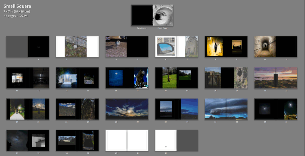
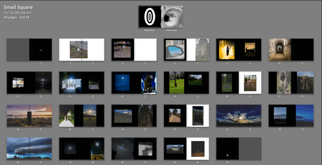
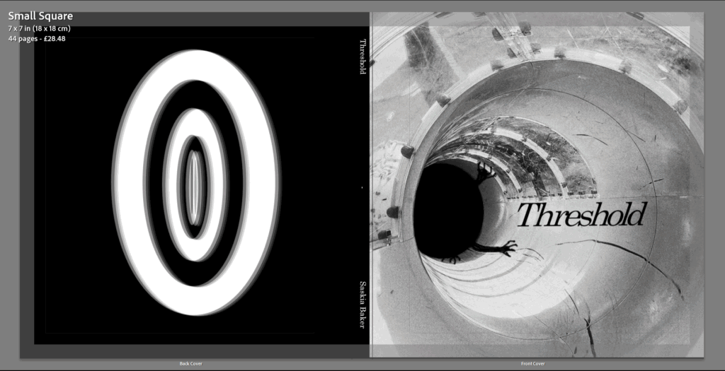
I have chosen the name “Threshold” as my book title because when relating this word to dreams it describes the space between reality and dreams which is the sole meaning of this project.
Inspiration
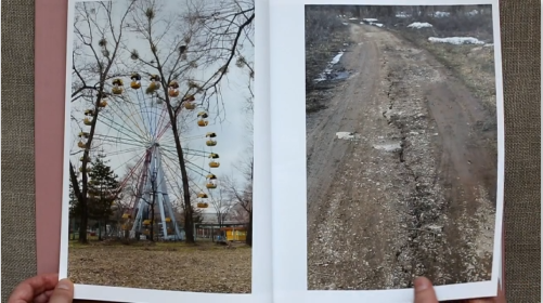
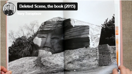
One of my inspirations of the photobook design is Yury Toroptsov – Deleted scene
The purpose for Toroptsov’s pieces of work and photobook was to document his journey in finding traces of his father’s memories in Eastern Siberia. His father died before Toroptsov had turned two.
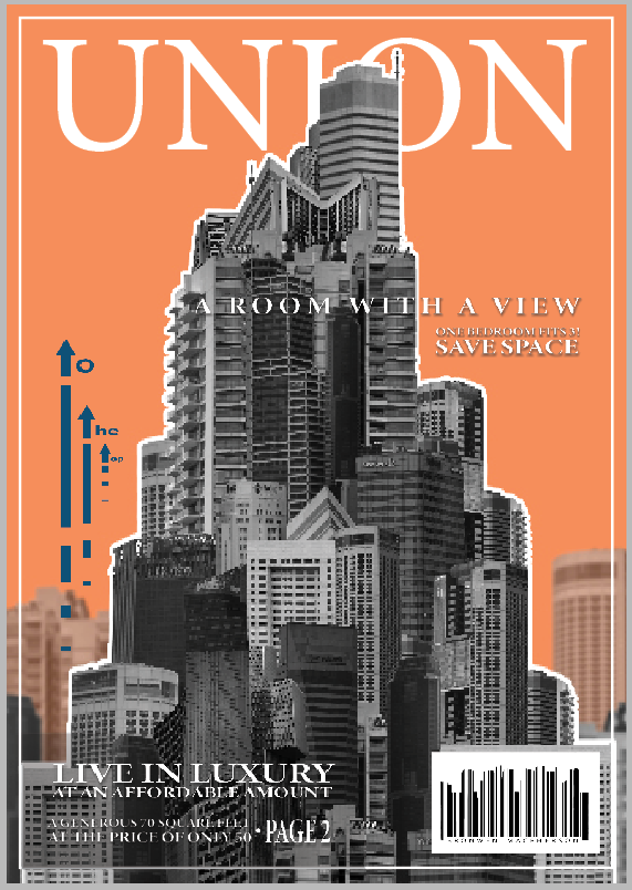
The cover is the only part of the book that resembles a magazine. I had a clear vision for how I wanted the cover to turn out which I think helped it turn out well. I tried to make it appear like a magazine that you would purchase despite the rest of the zine made to appear more like a free hound out to sell a product.
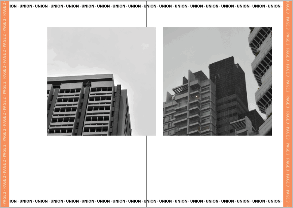
I wanted to start with the clearest pictures first which were these two I took in the style of Kenneth Frederick where the angle encourages upward growth. I matched these two images also due to their similar angles, shapes and lighting.
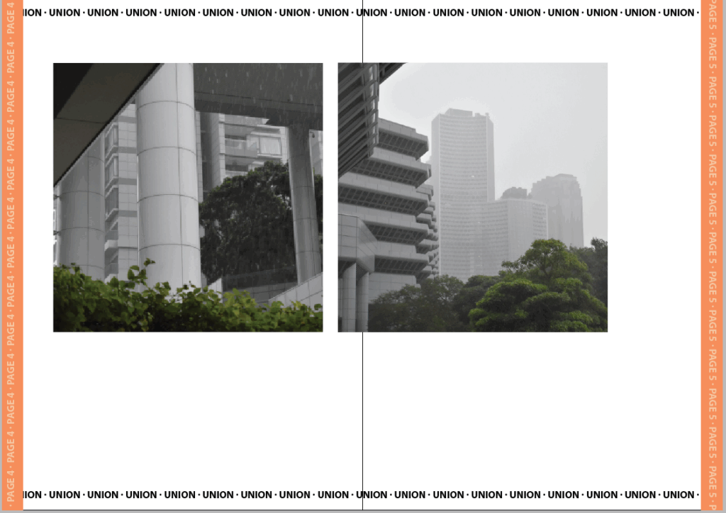
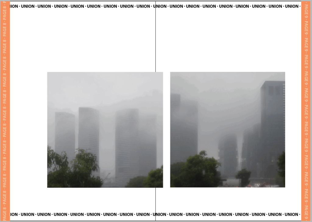
In the next pair the weather had begun to change for the worse. I matched these two because they had a similar foreground and all the buildings were a similar style.
For the first intersection I wanted to use the most colourful edit. I decided to extend this edit and make it look like a more traditional collage by adding colour card and tearing. I think this captures the chaotic miss-match of densely build locations as well as identity-less advertising.
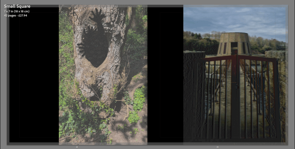
I matched these two images together because of their similar fog levels. I didn’t put these as the last buildings however because they are still identifiable buildings .
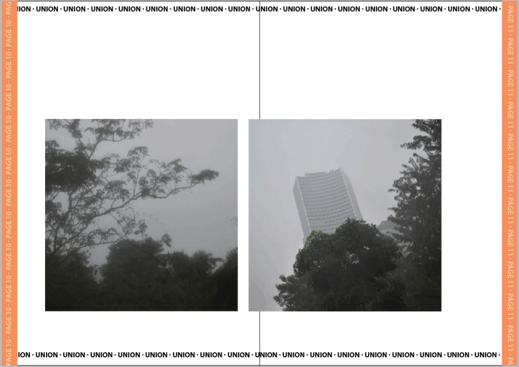
For the final buildings I put these two last because there is less focus on the buildings and more on the space around with the trees and even a fairest wheel. I matched both of these because they are equally foggy and focus the least on the buildings.
For the second intersection I chose the messier and duller of the two. I think that the overwhelming choice of buildings is representative of the choice pushed by advertisements.
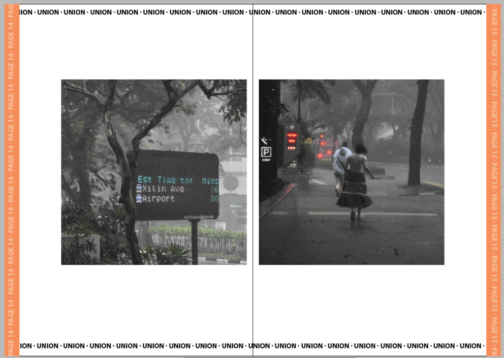
For the final pair I chose these two because they both have colour and show the weather effects on the ground like its been disillusioned by the buildings. They show leaving both with the mention of an airport and visual que of running. I tried to set it up like they’re running from the obsceneness of the cities/effects they’ve caused such as poorer weather.
For the final page I wanted to contrast it with the previous by using another advert but this time clearly marked as one. I like this juxtaposition and Its complete missing the point or ignorance of the rest of the images isn’t an irregular occurrence in marketing.
Evaluation
I think the zine turned out well. If I was going to adapt it further I would have created actual adverts for the intersections and maybe even adjusted the background so the pages didn’t look so blank. I don’t mind this space though as I think it helps the images stand out better but it is something I would have liked to experiment with further. The strongest section of the zine is defiantly the cover page because I spent much longer on each detail. Had I made the zine any longer I think I would have instead tried making a full A4 photobook instead where I could add some additional layout and sizes of images but for the small selection I made I think keeping each image to the same dimensions helps make the zine look more cohesive. I made sure to arrange each set of images differently also so that each page feels unique despite having the same template otherwise which I do think was a good choice as my previous draft with all the images arranged the same felt repetitive and tedious to get through. I did like the dullness of the repletion in relation to the narrative of the zine however I figured I could still tell the same narrative while making the arrangements more interesting.