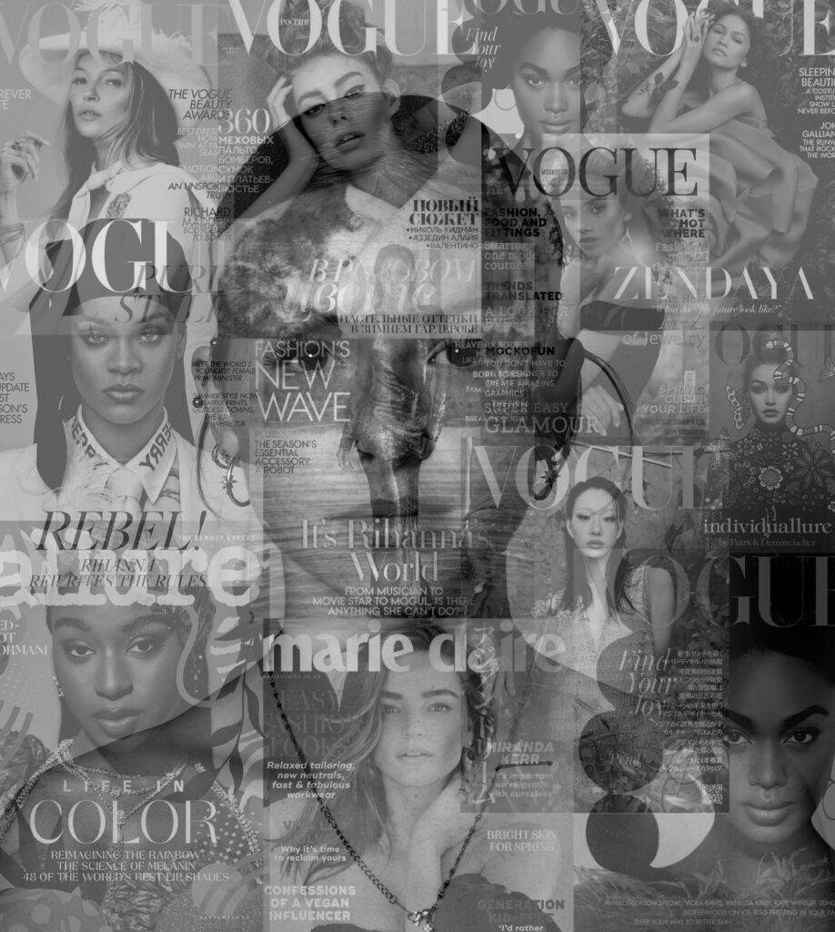
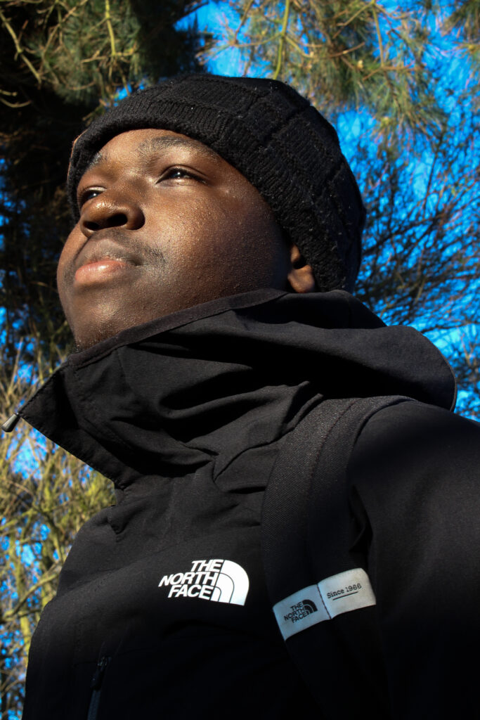
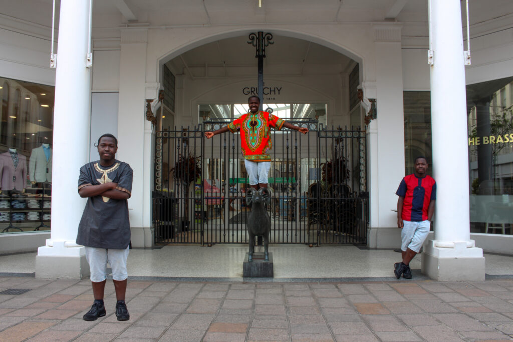
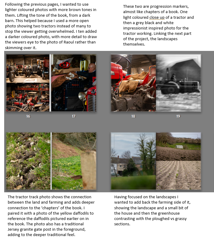
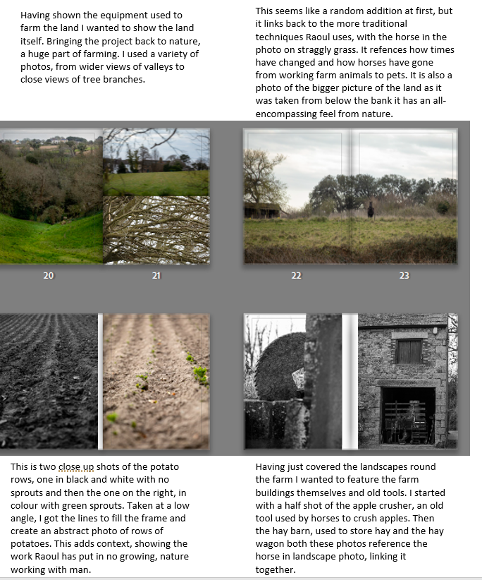
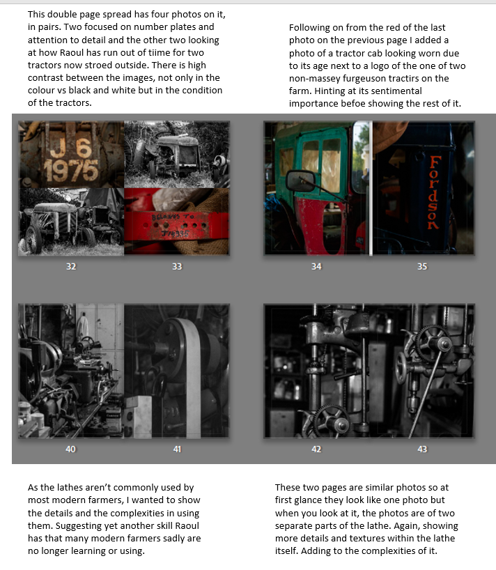
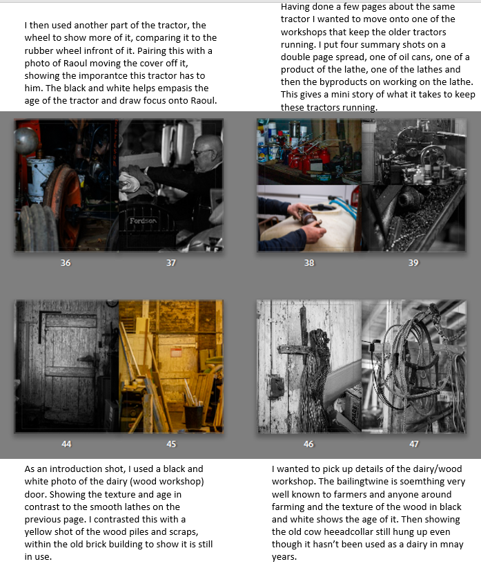
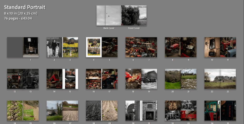
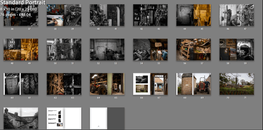
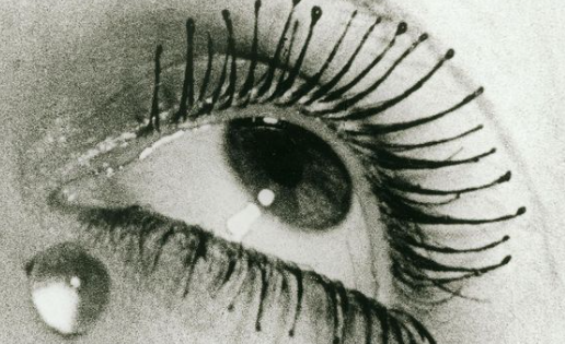
front and back cover:
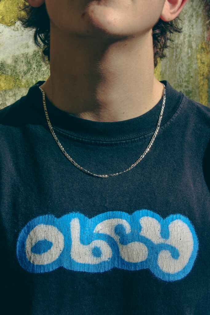
the reason why I decided to make this my front cover is because the title is a contradiction to the image on the cover as “passenger princess” a term that is used when a women gets in the passenger seat of a car which in this case the roles are reversed a man is in the passenger seat and a women is driving. and the colour of text also adds meaning to the image as the pink signifies that a passenger is usually the women then the blue for princess because its a male in the passenger seat.
this page is simply there to set a tone for the book and what to expect/what idea its going to present throughout it.
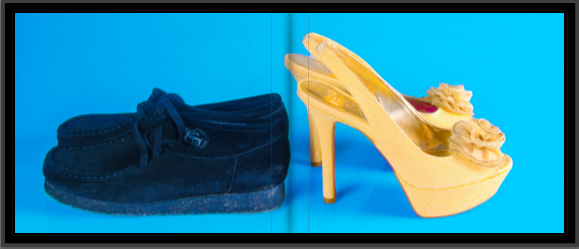
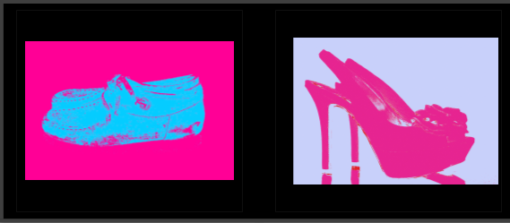
pages 2 and 3:
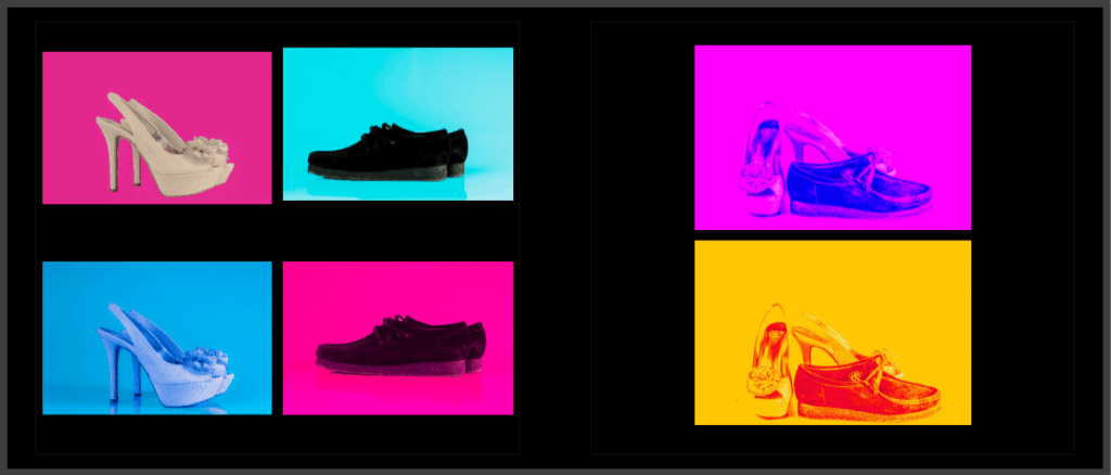
for page 2 and three I wanted to create two complete different types of atmospheres for the heels and the loafers by putting them into different types if colour schemes to represent the two different genders. for page 3 I wanted to make some unique images that still fit my idea these where based around pop art that I experimented with.
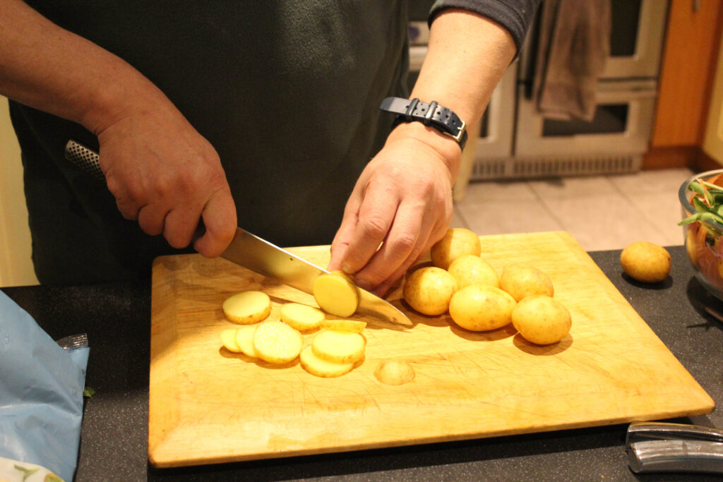
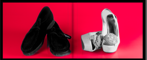
pages 4 and 5:
this image I decided would have been good to have a double spread because it kind of spoke on its own and didn’t really need any other image around it to give it more meaning.
pages 6 and 7:
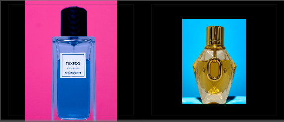
for these two pages i wanted to do something similar for what i did with the footwear earlier but instead of completely making the objects stuck to one gender I wanted to show they could represent both with having contrasting colours in both images as its a fragrance and a perfume which you now see a lot of people using scents that is meant for the opposite gender.
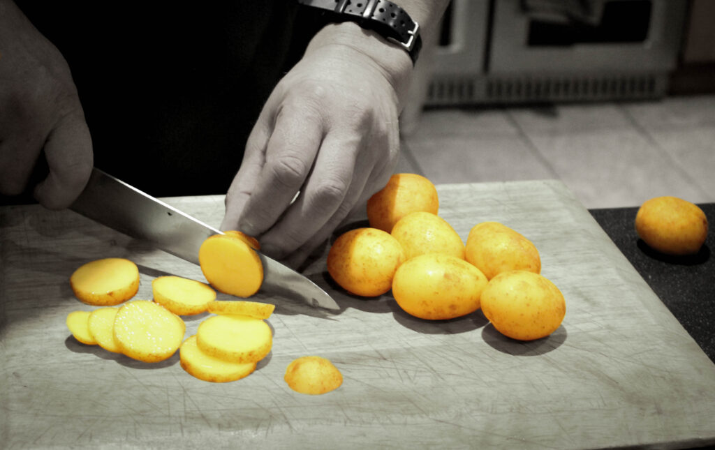
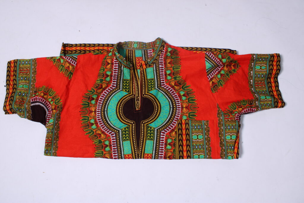
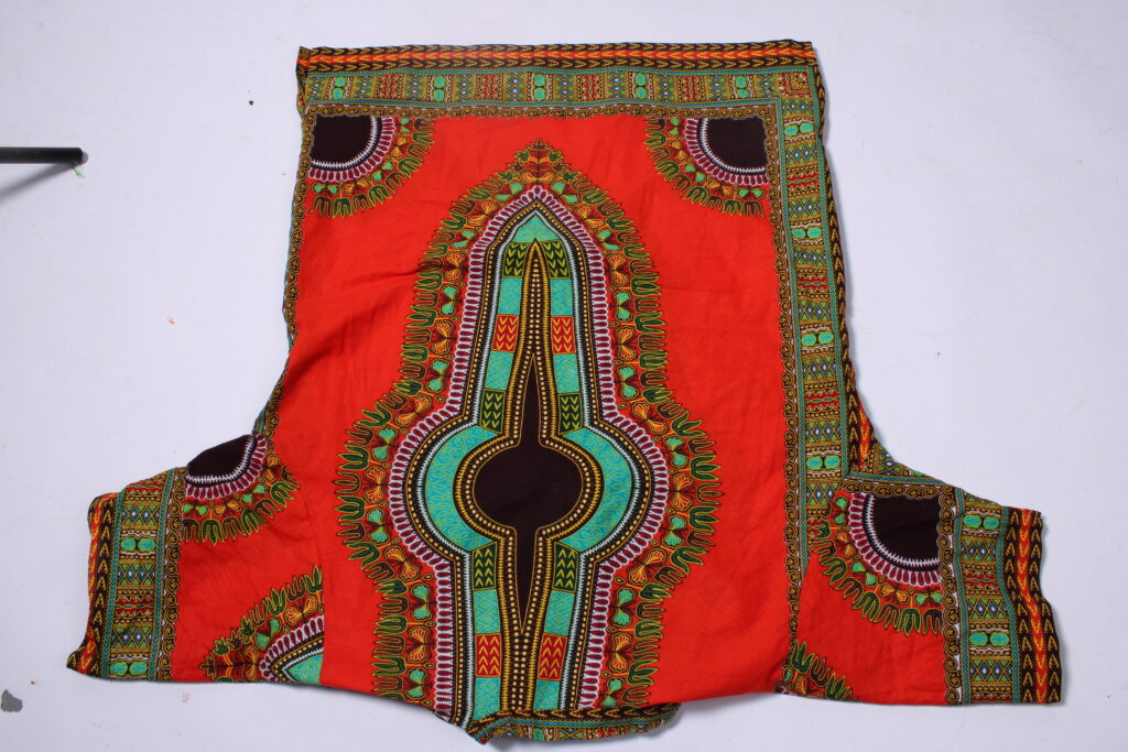
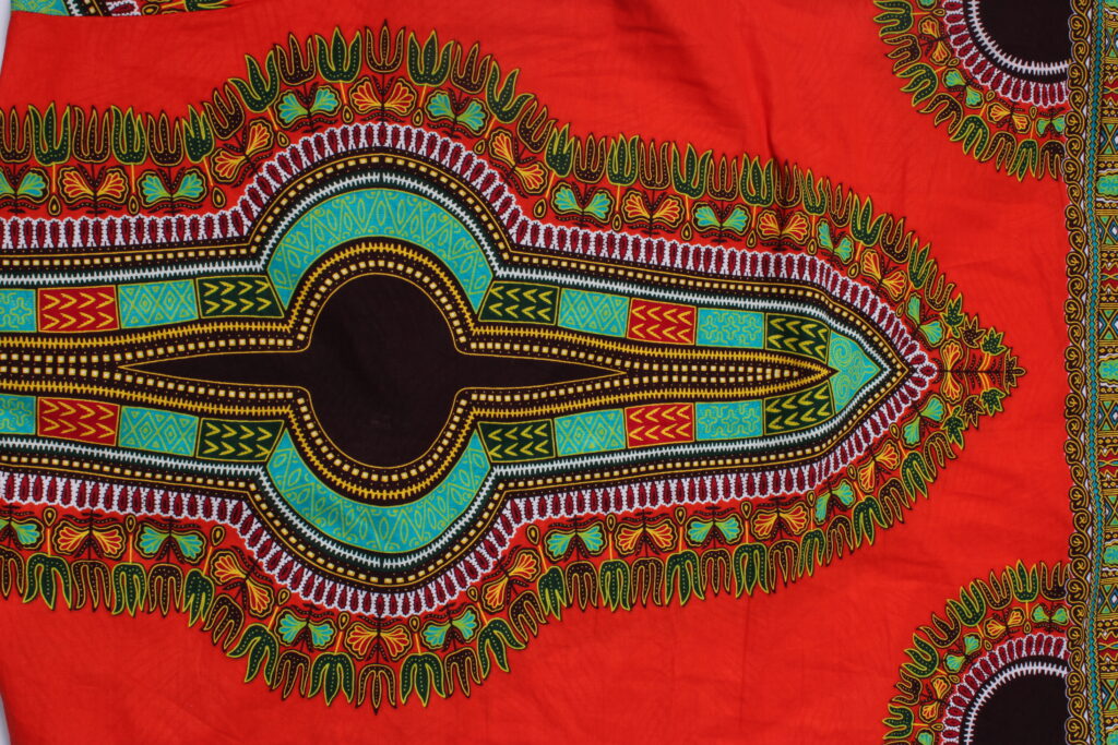
pages 8 and 9:
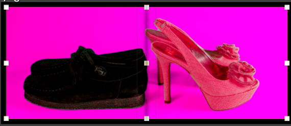
for this page I wanted to make another version of the image from page 4 and 5 to create a contrast between the two images to show that they can be looked at in two different perspectives and not just in one. (doesn’t have to be seen as just only one gender can use loafers or heels).
pages 10 and 11:
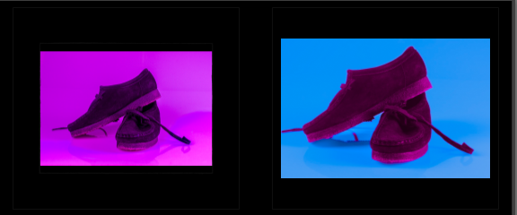
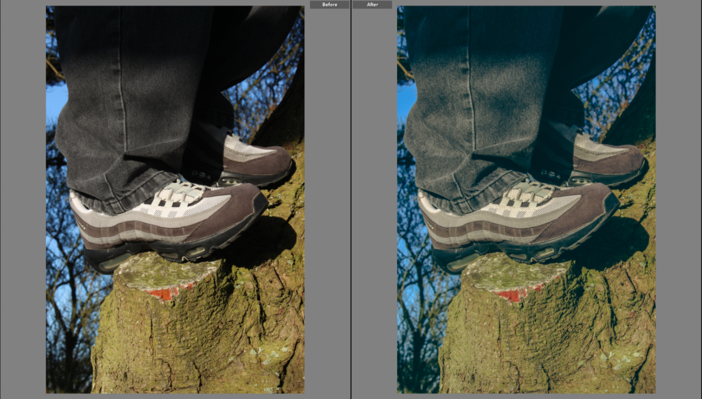
this page was to show the difference between what society should be like vs what its actually like, with the image on the left representing what it should be like as the whole image is pink with the idea behind that being any person can where that without being looked at funny. where as the image in the right is the sad reality we live in it doesn’t who you are you will always be laughed at for something you use as long as its associated to the opposite gender 1000% of time
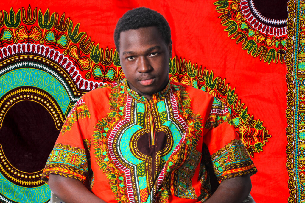
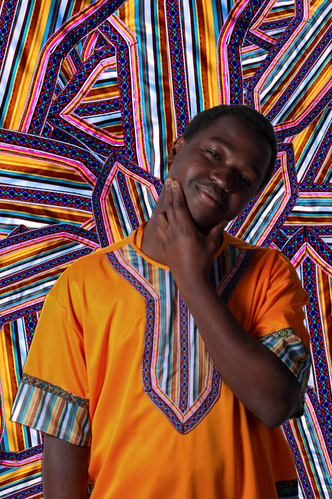
pages 12 and 13:
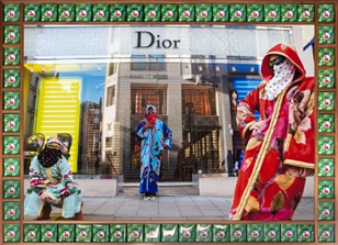
for these two pages i wanted to create images that really represented pop art as it was an idea that sparked from artist reference as Hassan Hajjaj used inspiration from pop art and pop culture for his most of his projects. not only that I think its another contrast to the art style as it was invented decades ago where these stereotypes that I’m touching upon would have been looked down upon and people wouldn’t even dare speak about it. which makes me wonder what would the general reaction be so my work.
pages 14 and 15:
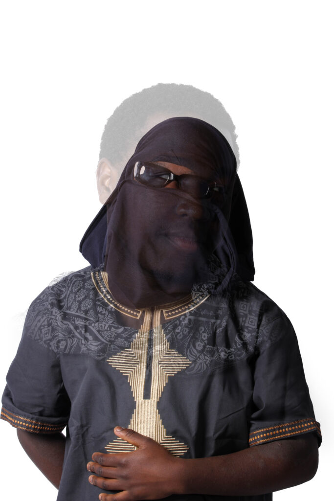
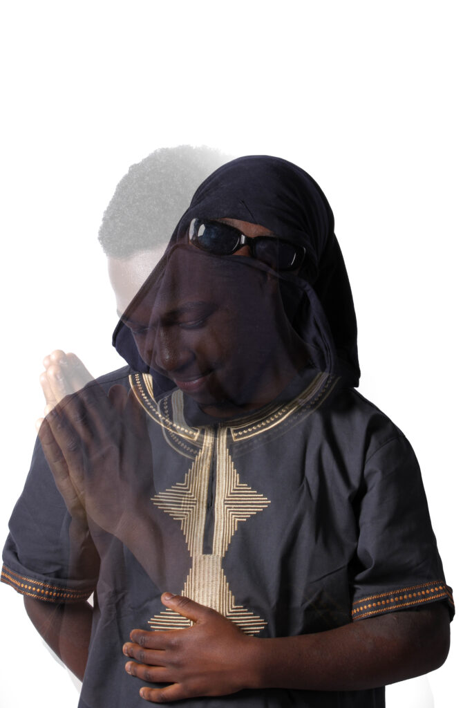
this image was is supposed to signify what people really think of the idea that I’m trying to portray as most people that are apart of these stereotypes do experience a lot of stuff they shouldn’t hence the only colour of the image being red with the footwear being black, grey and white.
pages 16 and 17:
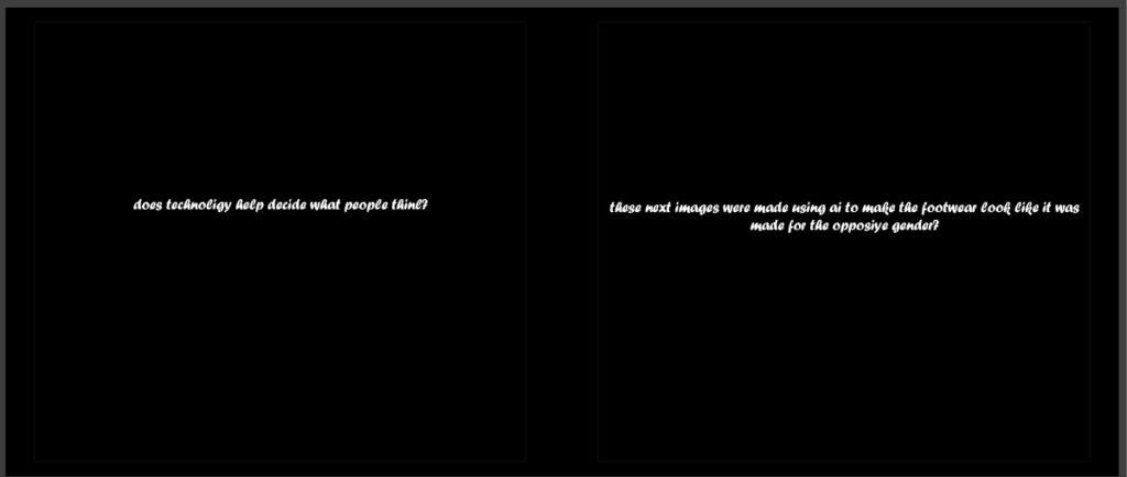
these pages where used to ask a question to reader and help them understand what the next few pictures were going to be based on. with the question being “does technology help decide what people believe in”. and the second page saying “these next few images were made using AI to help make objects look like they were made for the opposite gender” with the use pf AI obviously being the reference for technology.
pages 18 and 19:
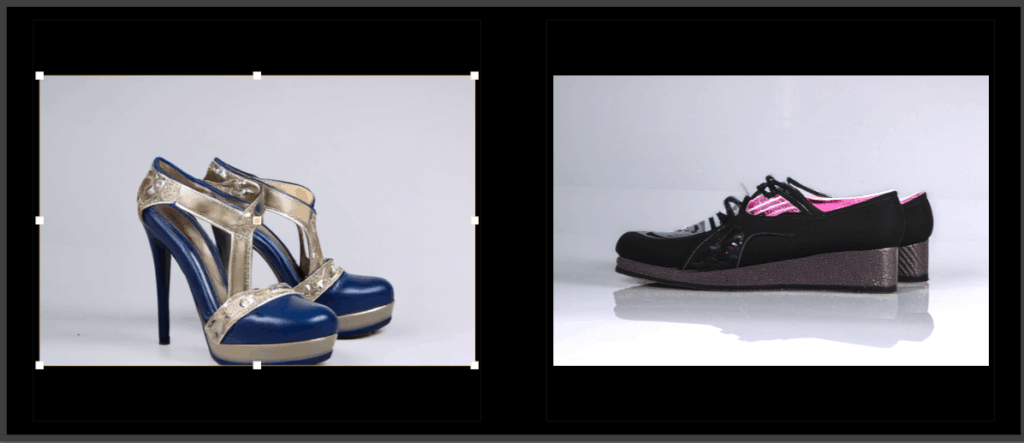
this page consists of the images that got chat gpt to edit using images that I took a picture of. the reason why I did this was to touch upon other ideas to why people may believe in these sort of stereotypes as they are seen as normal because even technology says so.
pages 20 and 21:
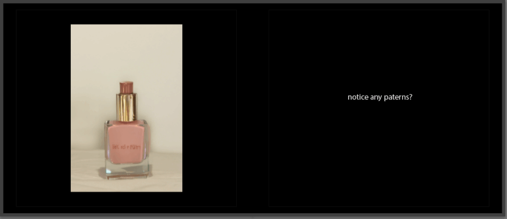
page 20 is practically the same reasoning behind the previous page and the page 21 is asking a the reader a question with fairly obvious answer YES the pattern of the common thought that these objects are practically gender locked and no one else should or can use them.
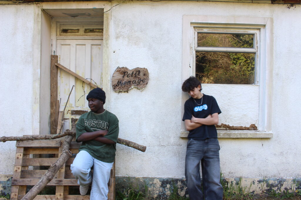
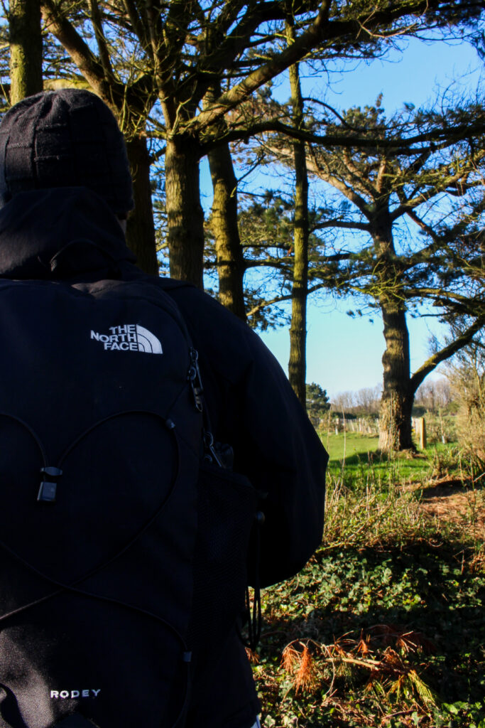
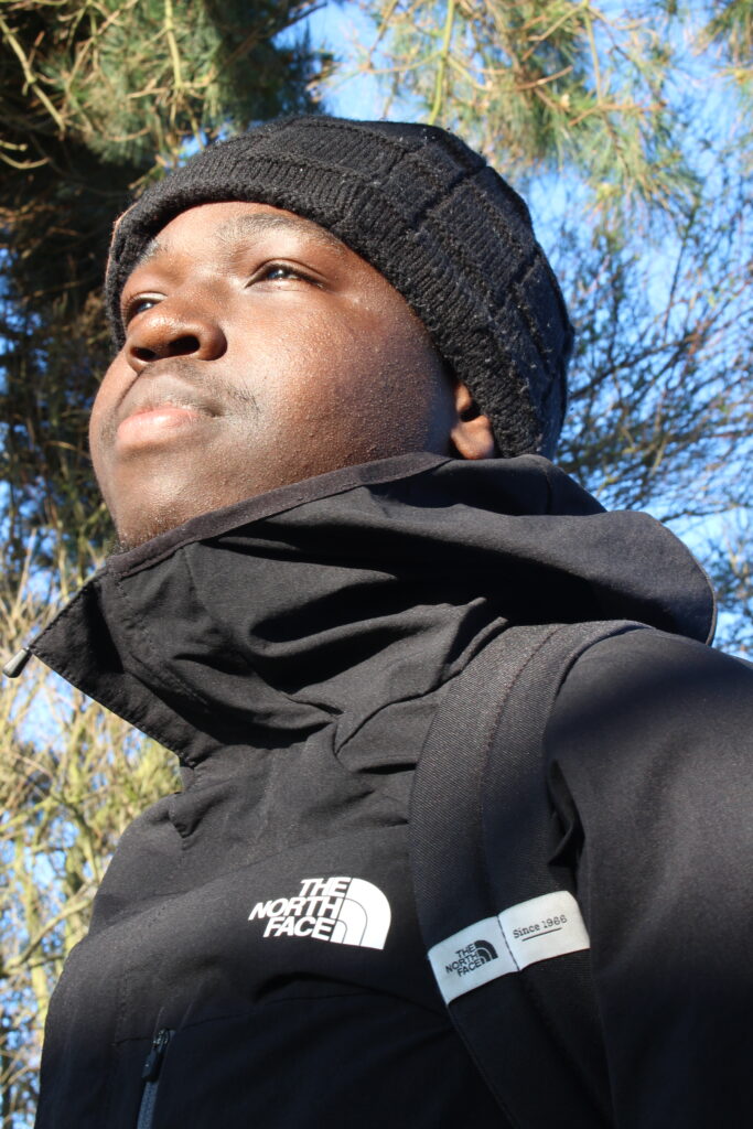
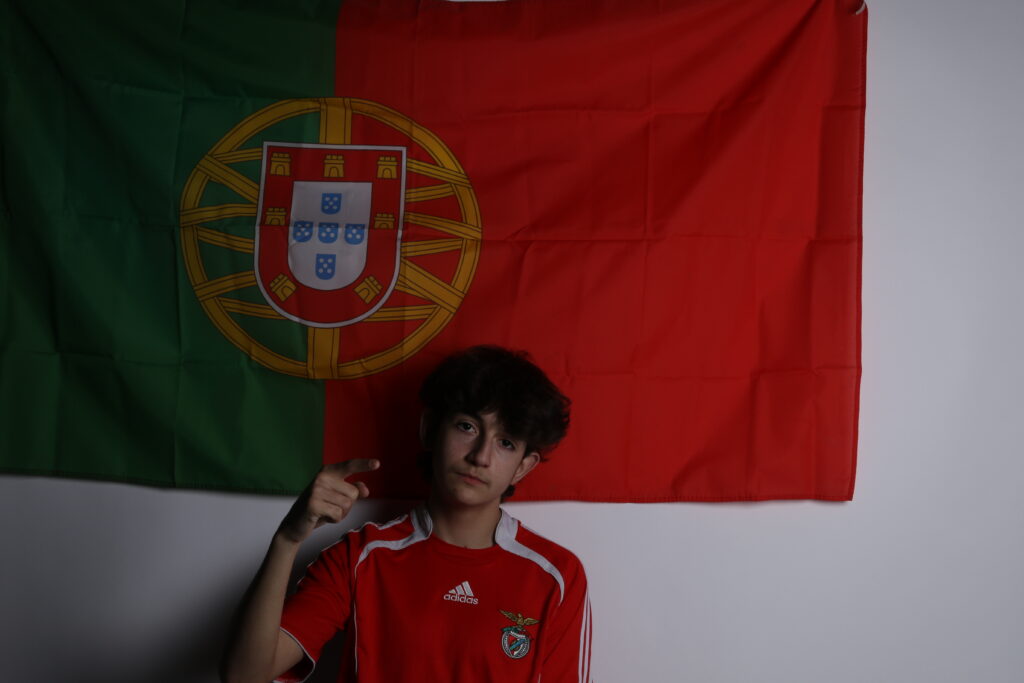
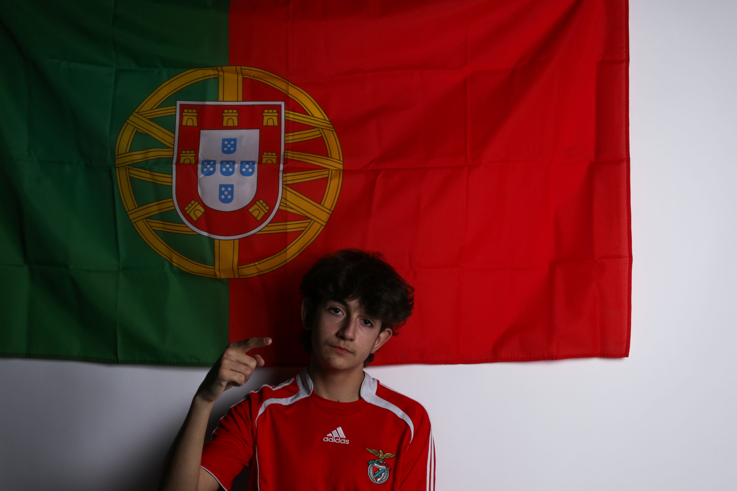
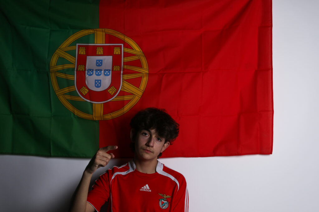
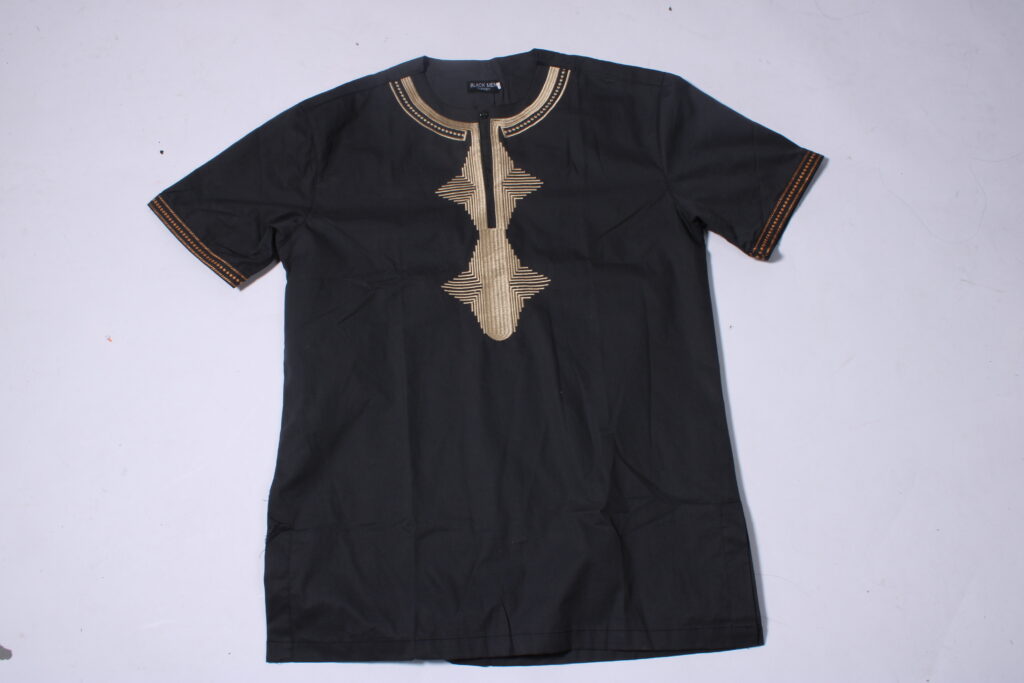
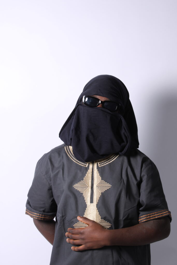
page 22
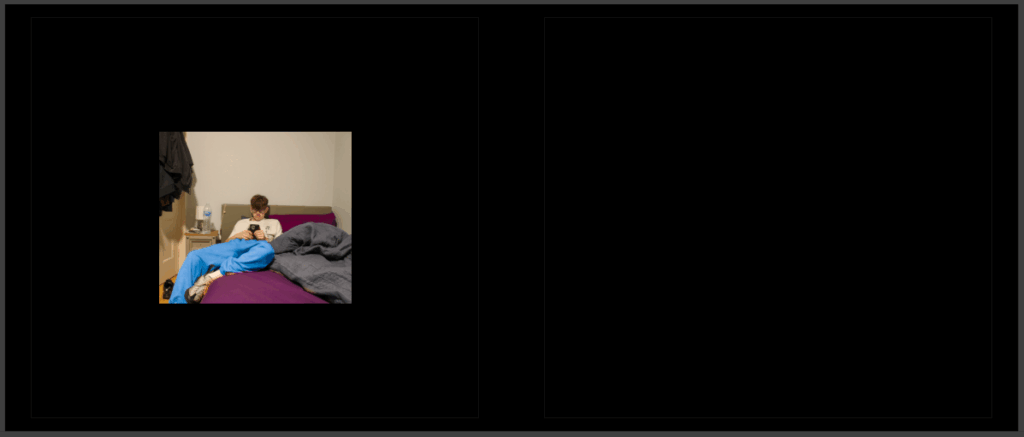
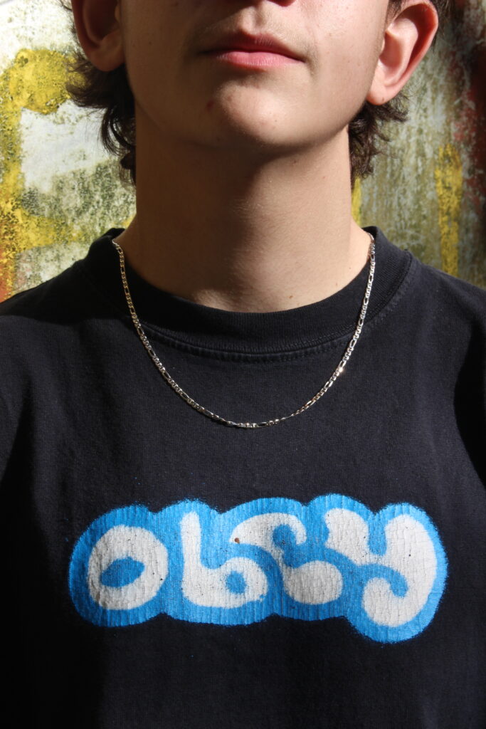
for this page i wanted to put an image of a friend with clothes that had a contrast to the bed cover that is purple to show that its normal for boys to have this colour of cover without being called “gay” or anything else that most people would say.
overall opinions and what I could have done to elevate my project:
I believe to make my photobook better I could have taken more images as it would have helped me layout my book a lot more efficiently and a lot less confusing to the average person going through the book. it also would have made the book a lot more appealing as it would have had more content in the book to actually look at, it also would have helped with explaining what why book is trying to tell people. However I still think my book has a story that you can see through from start to finish with just objects and it does portray the idea I’m trying to show people the entire way through