My Ideas for the final exam are a fashion shoot where I will bring different outfits with me that represent different era of fashion and different styles such as the 70’s, 80’s and 90’s and then I will do a modern day shoot of styles that people wear in the present day. I am going to have the same model for each shoot and I’m going to do three separate shoots one for the present day and then two for previous era’s of fashion styles. I’m going to look at Elaine Constantine’s work as she created these photos outside in public places and not in a studio and her work was also a documentary style approach to fashion which was unique and made her work instantly recognisable.
When and where you intend to begin your study?
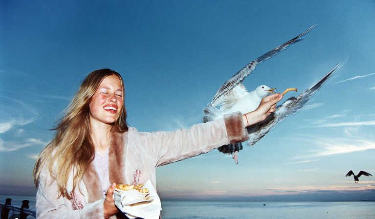
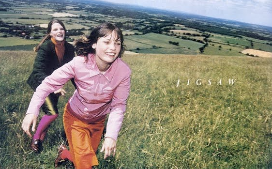
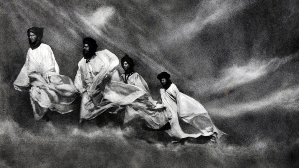
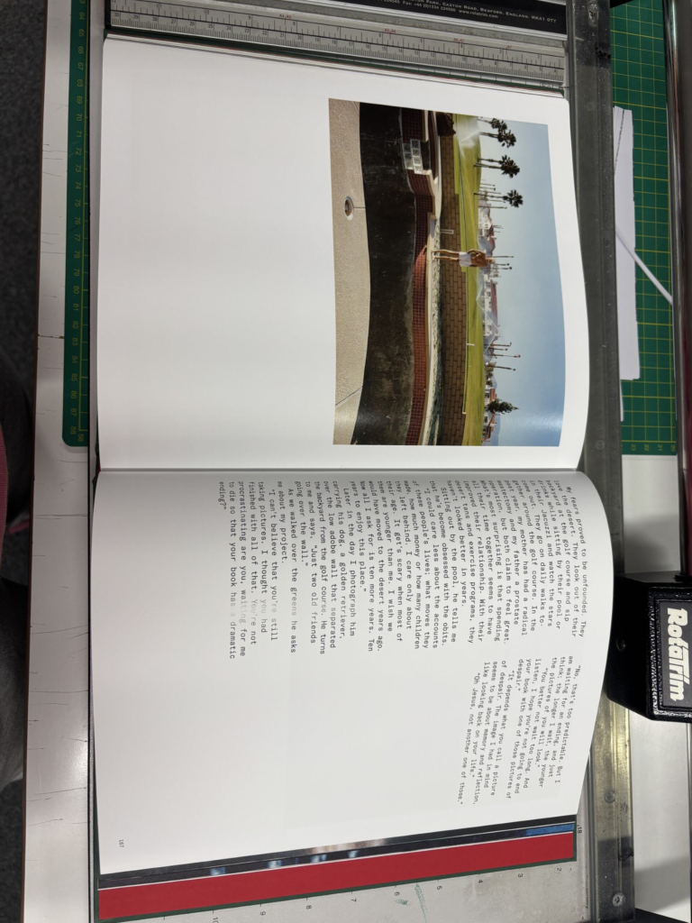
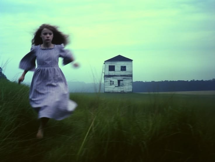
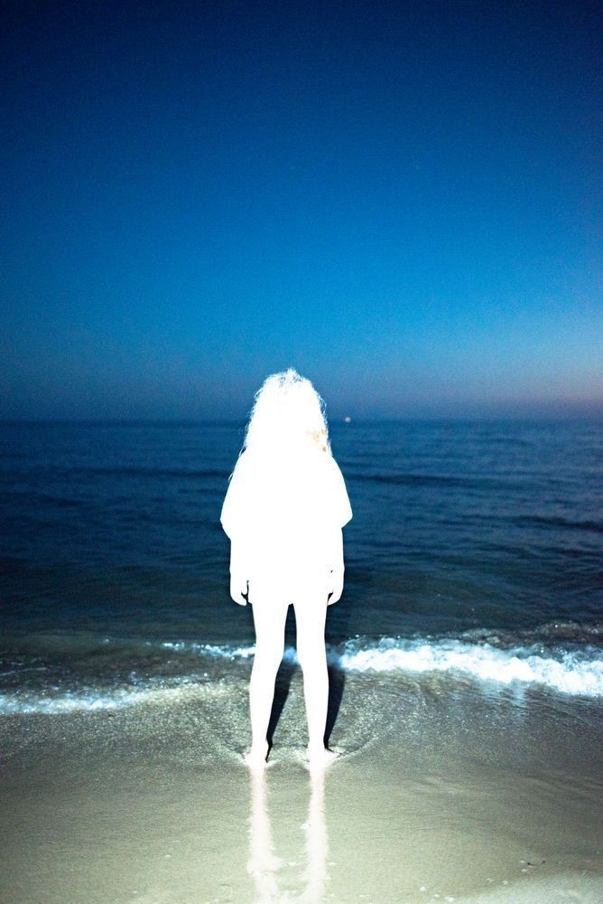
My other idea for the final exam is to take images of known Jersey locations that are popular tourist places such as Gorey Castle, La Houge Bie, the dolmens and the white house down at St Ouens to create three photo shoots that are similar to Elaine’s work. I’m going to combine these two ideas are do the fashion photo shoots at these locations to combine the culture of jersey with these Fashion shoots and making sure that the clothes I bring with me are bright and vibrant when I go to the duller, darker locations to make the outfits stand out. For example in Elaine Constantine’s photo above she has a bright, light pink jacket on that contrasts against the dark blue sky and makes the jacket stand out clearly. By choosing to do these fashion shoots at these specific locations I’m uniting fashion with Jersey’s cultural places and this represents the theme of Union.
Why it matters to you?
This study matters to me because I love fashion and so expressing my passion for fashion through taking these shoots at cultural places in Jersey makes them so much more valuable and important to me because they will show Jerseys history and popular tourist locations as well as different era’s of fashion.
How you wish to develop your project?
I’m going to develop my project by taking each fashion shoot I do at a different location in Jersey that is popular with tourists and then I’m going to bring three different outfits with me that are from three different decades of fashion. I’m going to develop this further by bringing clothes that are bright and colourful when I go to a dull black or white location such as Gorey Castle which I would want my clothes to stand out in front of.
Elaine Constantine is a documentary style photographer who uses this approach for her fashion shoots as she takes the images in public locations rather than a studio. Her work is easily recognised because instead of her fashion photos being a professional shoot they are done in an outside environment.
She carefully plans out her images, by making the models she uses wear bright, vibrant clothing when there is a dull background behind them so that the models stand out in front of the background.
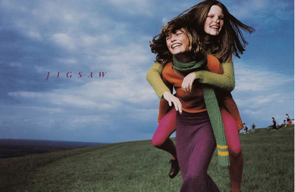
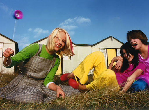
This is also one of her images where you can seen the model in the photo at the front is wearing very vibrant colours so that she stands out against the green fields and because its a photo for a clothing brand it makes the clothing look much more appealing to buy and showcases the clothes as being bright and colourful.
Who inspired Elaine Constantine?
After Elaine received a camera from her Aunt, when she was a teenager, she joined a photography club that was advertised in a local arts and crafts centre. It was during her time at the club, that Elaine first got inspired particularly after reading photographer Chris Killip’s book In Flagrante. His book was made during a period of de-industrialisation in Britain, the work charts a changing landscape and the effect this had on those living in the surrounding communities. This is similar to Elaine Constantine’s photography because the landscapes she uses are important for the shoots she does as it changes what clothing she puts on the models for example if she has a dull, dark background then the models will be wearing more vibrant clothing compared to if she has a bright background the models may be wearing duller clothing such as grey and black.
Elaine Constantine Image Analysis
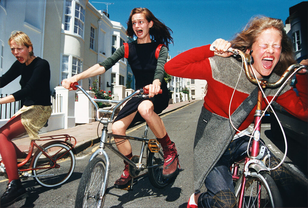
The colour in this image is very bright and vibrant which makes Elaine Constantine’s images fun and different to other photographers. Her images are carefully planned out as when the background of her images are dull and boring and have no colour in them, the models that she uses are wearing brightly coloured clothing to make them stand out in front of the white background and to entice the reader more and make her images more interesting and unique. The lighting in this image is very bright and enhances the features of the models so they are clearer and the colours of their clothing stands out. Elaine Constantine takes her images in the day so that its easier to see the colours of the clothing and because it gives a better contrast against the background because when its daylight outside the background or the building in the background is easier to make out and see the colour difference between the background and the foreground. However some of her images are taken at dusk when the sky is not fully black but dark and the model that she uses in the image is wearing a light pink jacket which stands out against the darker sky so the clothing stands out and looks eye catching to the person that is looking at the image. Elaine Constantine’s images are designed to be this way so that the clothes she uses come across as bright and intriguing to look at and makes more people want to purchase the clothing because it looks more appealing and inviting. This image doesn’t follow the rule of thirds because the models are not directly in the centre of the image which in some ways does make the image less appealing and less aesthetic to look at because there is no leading lines and no focal point of the image. The colour in the models clothing is what draws your eye to the image. The layout of this image is not aesthetically pleasing because the camera is looking up which makes the whole image look of centre and the model on the left hand side is not sat straight and is at an angle which makes the composition confusing to look at.
Why I’m using Elaine Constantine?
I’m using Elaine Constantine as my first artist case study because she is a fashion photographer and she uses very bright, vivid clothing to make the models she uses stand out and purposefully uses a blank background so that the clothes stand out more, I’m going to do this in my photoshoot and wear colourful clothing that stands out against the locations I’m going to for example I’m going to wear a 70’s style outfit and take the photoshoot against the backdrop of the white house at St Ouens, so it stands out and really showcases the outfit.
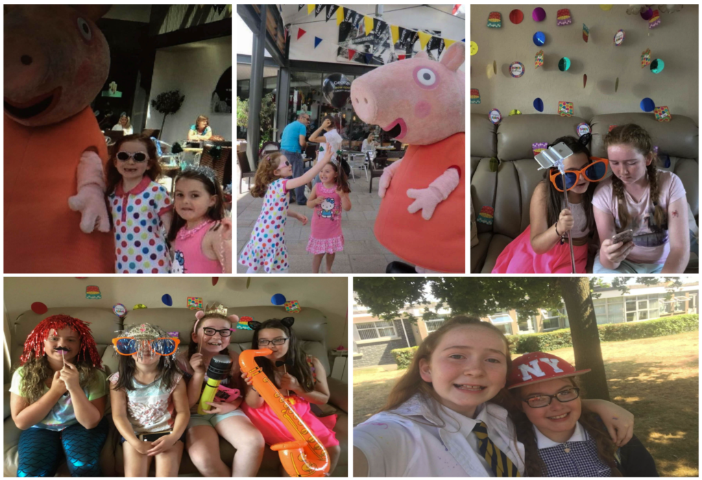
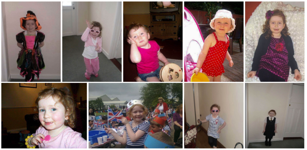
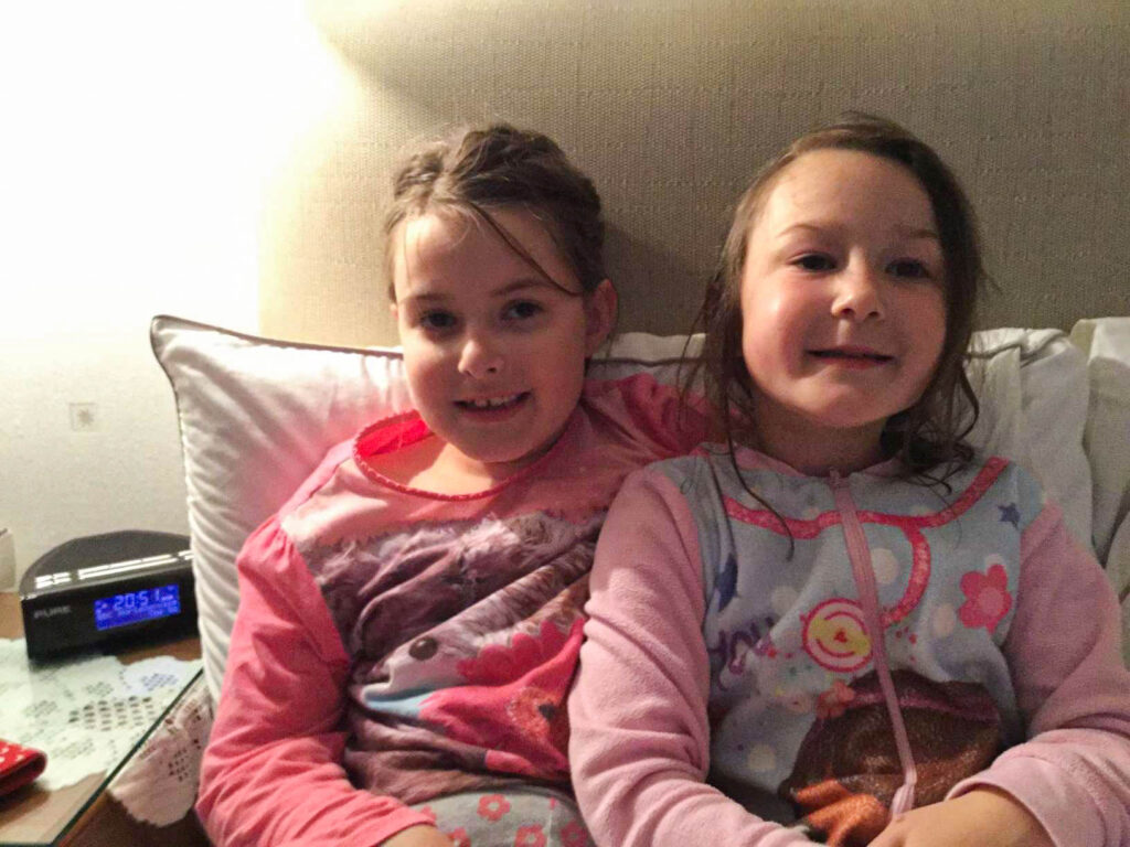
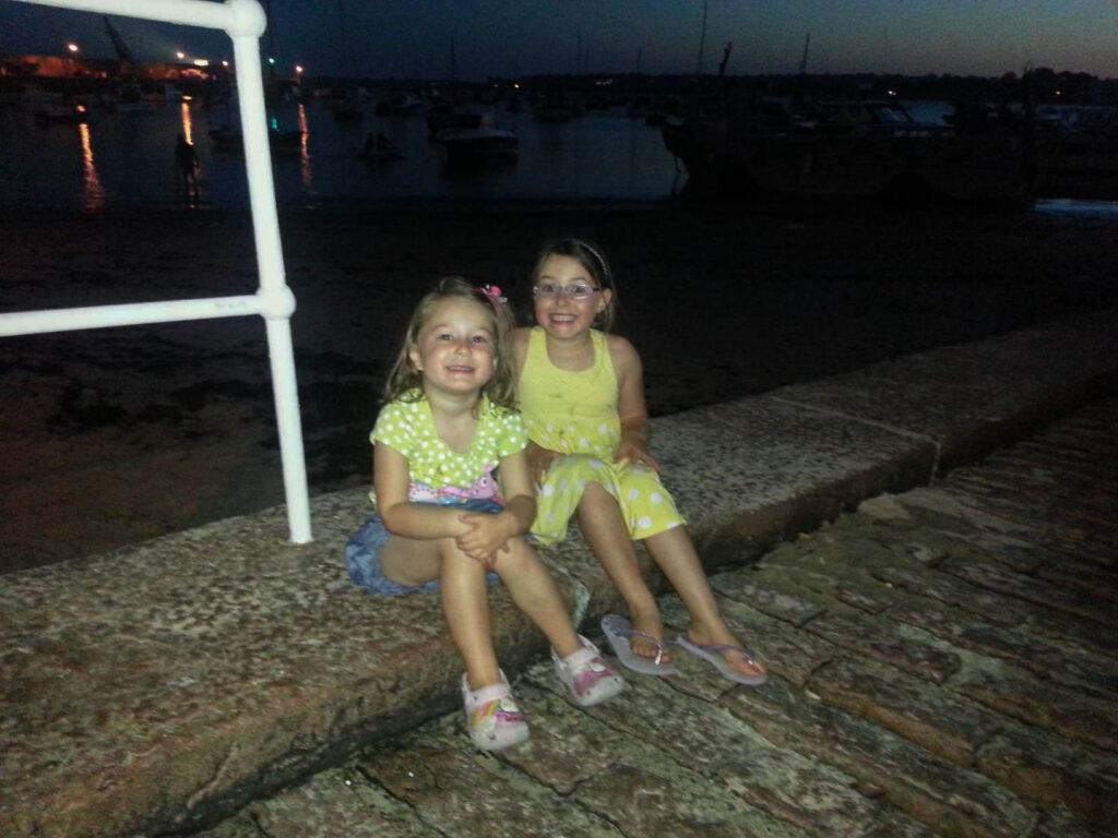
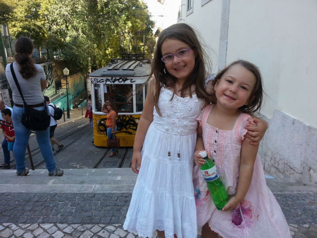
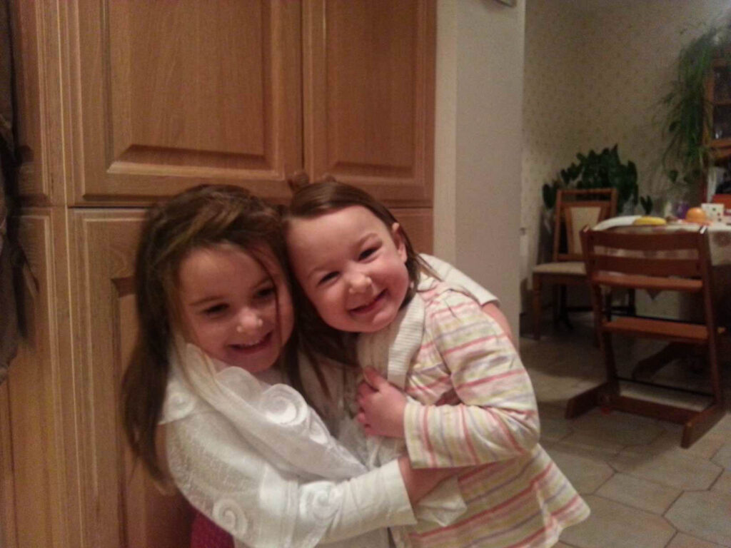
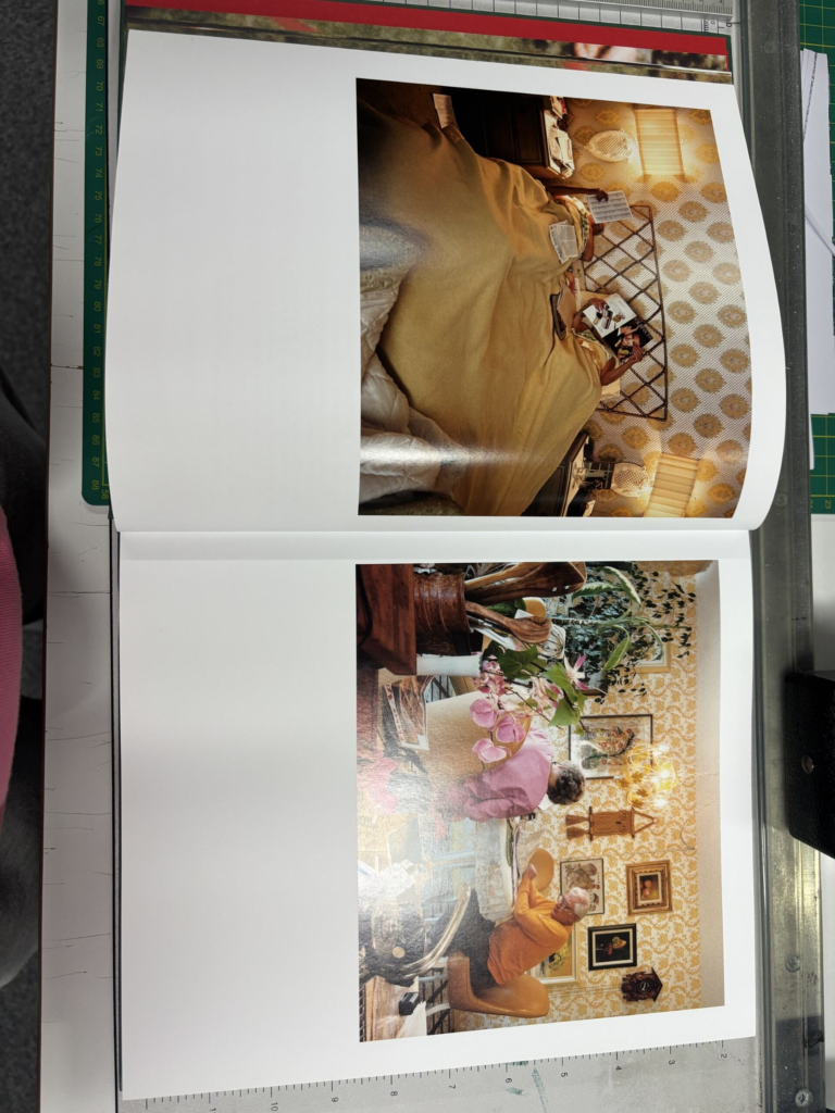
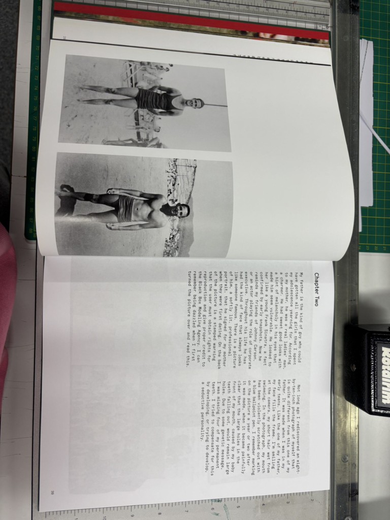
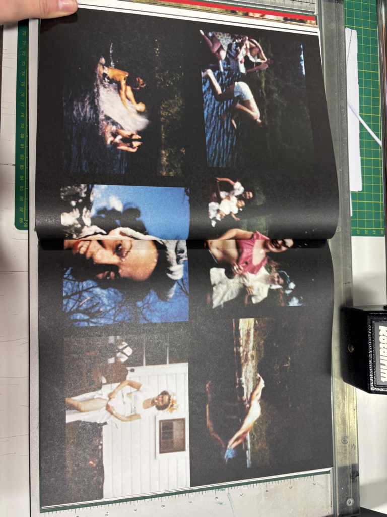
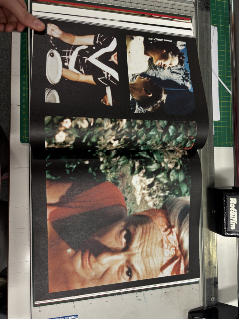
For this photoshoot, I wanted to focus on my friend’s pasts as they have been friends since Nursery. In order to do this, I looked at different photo albums they had in their house and photographed a variety of images from when they were younger. I wanted to gather images of them by themselves and also together. Additionally, I also got them to send me images their parents had taken of them on their phone as these were of slightly better quality than the physical images they had.
Overall, I felt this photoshoot was essential for delving deeper into the dynamic of their friendship, comparing them to what they were like when they were younger to now. By taking photographs of them as friends when they were in nursery to now, it shows how their friendship has evolved over time and shows the strength and depth of their relationship. The contrast between their early years of friendship and their current connection displays the enduring nature of their bond, especially considering that they are still close friends after approximately 14 years. This juxtaposition emphasises not only the passage of time but also the enduring qualities that have kept them together despite the changes they’ve experienced in their individual lives.
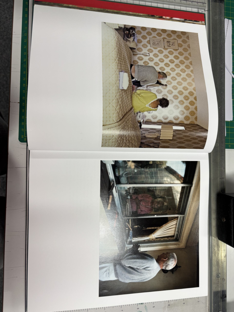
However, during my photoshoot I did face some challenges. One of the primary issues I faced was the quality of the archival images taken during their earlier years. Due to the type of camera used at the time, many of the photographs were not in sharp focus and were therefore quite blurry. This limitation significantly impacted what I could do with these images as I wanted to ensure that my final pieces are of high quality. To try and tackle this problem, I imported the images into Lightroom and made some adjustments to the sharpness and texture of the images, hoping to recover some of the sharpness and definition. While these edits did improve the overall quality to a certain extent, they didn’t fully resolve the issue. Despite this problem, I believe the photoshoot was still successful overall in conveying the strength and continuity of their friendship over the years.
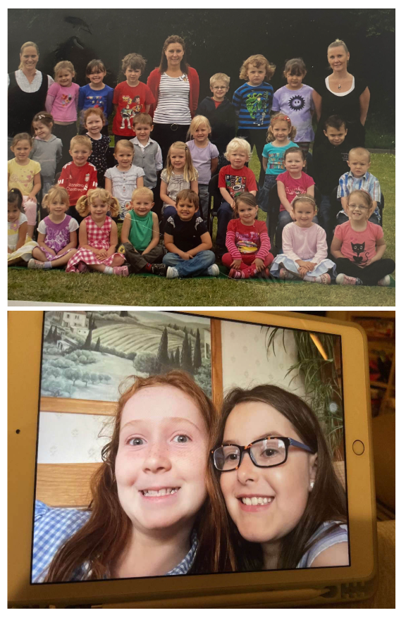
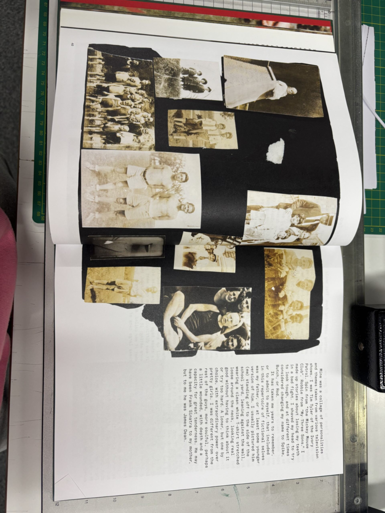
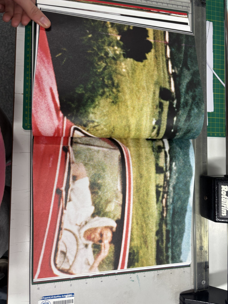
For this next photoshoot, I am going to be focussing on my two friends’ friendship from a different perspective to the previous photoshoot. This time, I will be looking at their friendship in primary school instead of in sixth form. I will do this by getting my friends to send me any digital photographs they have of them either individually or together from primary school. I will also look through some of their photo albums they have as when they were in primary school, parents tended to use a camera which they would then have to print off the images and then stick them into a book. I will then use my camera to take a photograph of any of the images I wanted to use. I will need to position my lighting and physical photographs in a specific way to ensure I don’t get any glares in my images from the light. To do this, I will not place my light source directly above my image or use natural lighting so that it doesn’t produce as harsh reflections. This use of digital photographs and physical photographs will hopefully allow me to get a good variety of images as I am getting them from multiple sources instead of just one. However, as I am going to be using images taken from a long time ago, the camera quality may not be particularly good which may limit what I am able to do with the images. Therefore, I will most likely not be including these images by themselves in my final piece.
During this photoshoot, I will be looking for images that are of good quality and represent the youth and fun of their friendship in primary school. I will also be trying to photograph images that show their individual personalities and what they like. For example, one of my friends is very confident and this can even be seen in her childhood photographs where she is constantly posing for the camera. On the other hand, my other friend is more shy and nurturing which can be seen as she is often photographed playing or hugging with her sister. I hope my images will be able to portray their varying personalities and demonstrate how special their friendship is as although they are very different people, they are still the closest of friends. Additionally, I am aiming to also get some of the professional school photographs they have and then get them to recreate it later on in the studio to create a visual comparison of how much they have both changed during their 14 years of friendship.
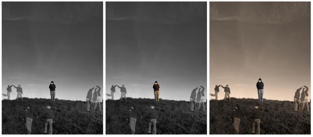
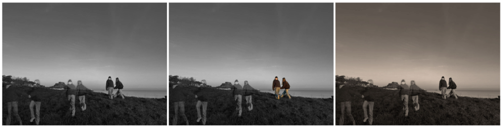
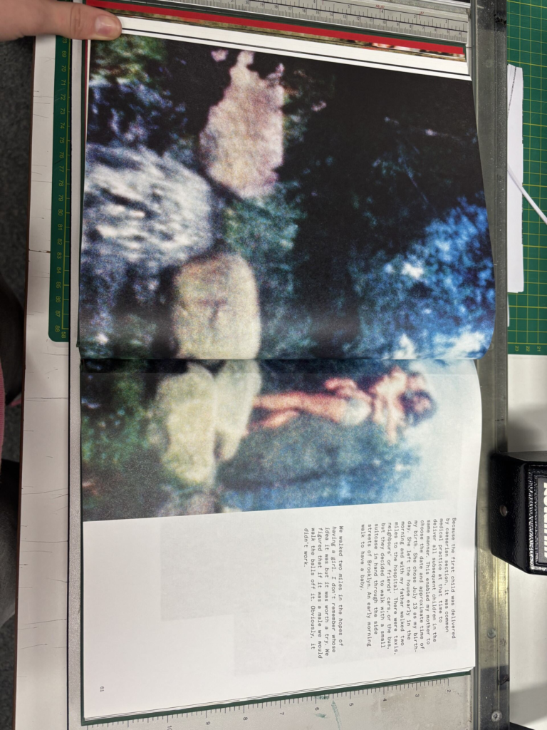
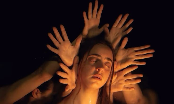
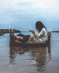
For this photoshoot, I was inspired by Jose Ortiz’s image called ‘The Perfect Present’ and Pictorialism. I didn’t want to copy his image exactly but the premise surrounding it: a person at different points in time. I felt this linked to theme of union quite well as I could reinvent his image by photographing my friends by themselves and then have other images of them at a different points in time around them. Additionally, I will create a black and white filter over my images as seen in his work as I feel this will convey the sadness and emptiness they feel without each other.
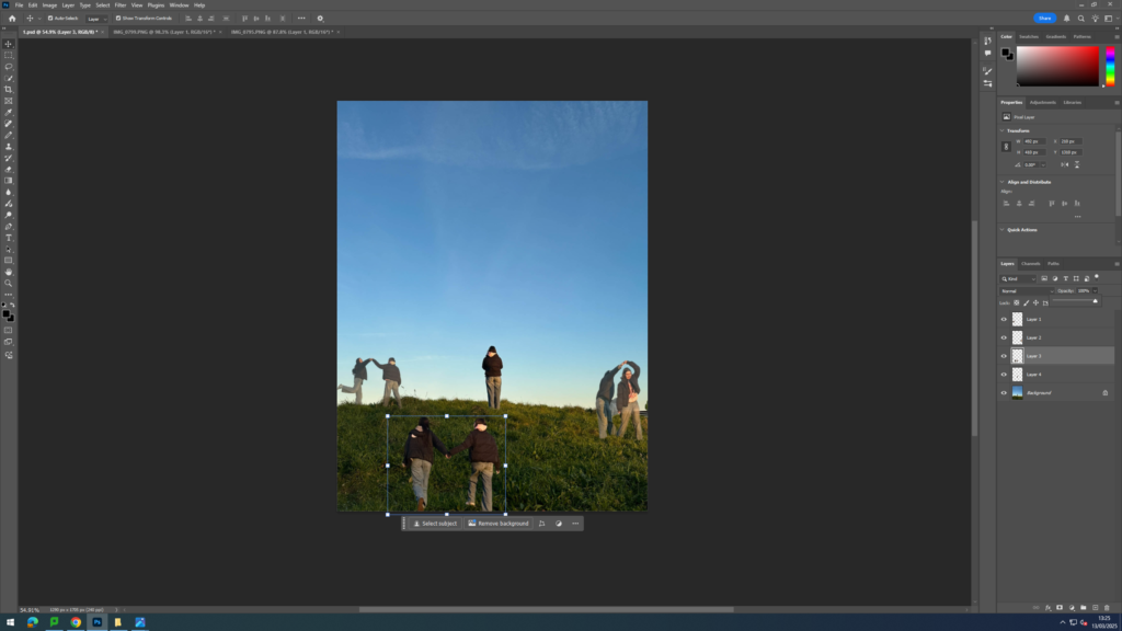
I began my editing process by first narrowing down the images I had previously taken in Gorey of my friends to the ones that only consisted of one of my friends by themselves and then images where they were interacting with each other. I then opened up the singular person image on photoshop and another image of my friends together. Next, I used the quick selection tool to cut out the image where my friends were together and dragged that cut out onto the other image. I then adjusted the size of the cut out to make its size relevant to the other image and to create a sense of depth. I repeated these steps two more times so that I had three different cut outs in one image. I wanted to emphasise the idea of my friend being lonely without her friend and so I made the cut outs lower in opacity and kept the image of her by herself in full clarity. I think this was successful in highlighting that these cut outs are from a different moment in time and how right now she’s by herself, surrounded by ghost like figures representing her past self. To finish this concept, I experimented with making my images black and white, creating a colour splash effect and adding a sepia tone in order to replicate the style of pictorial images.
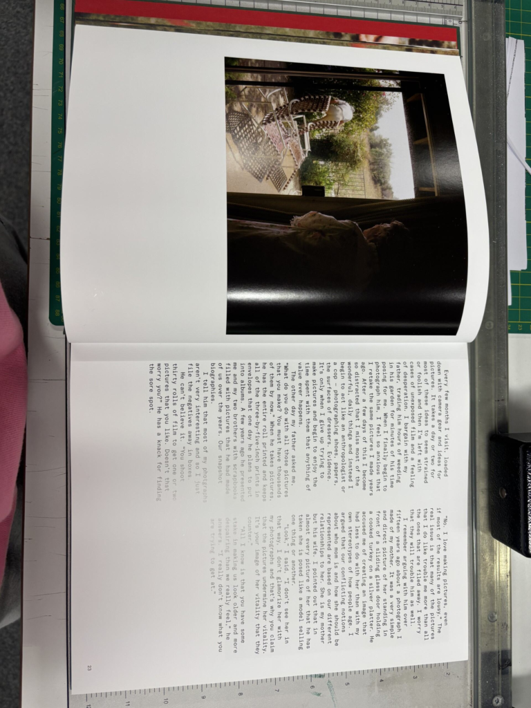
This was the image that inspired my idea
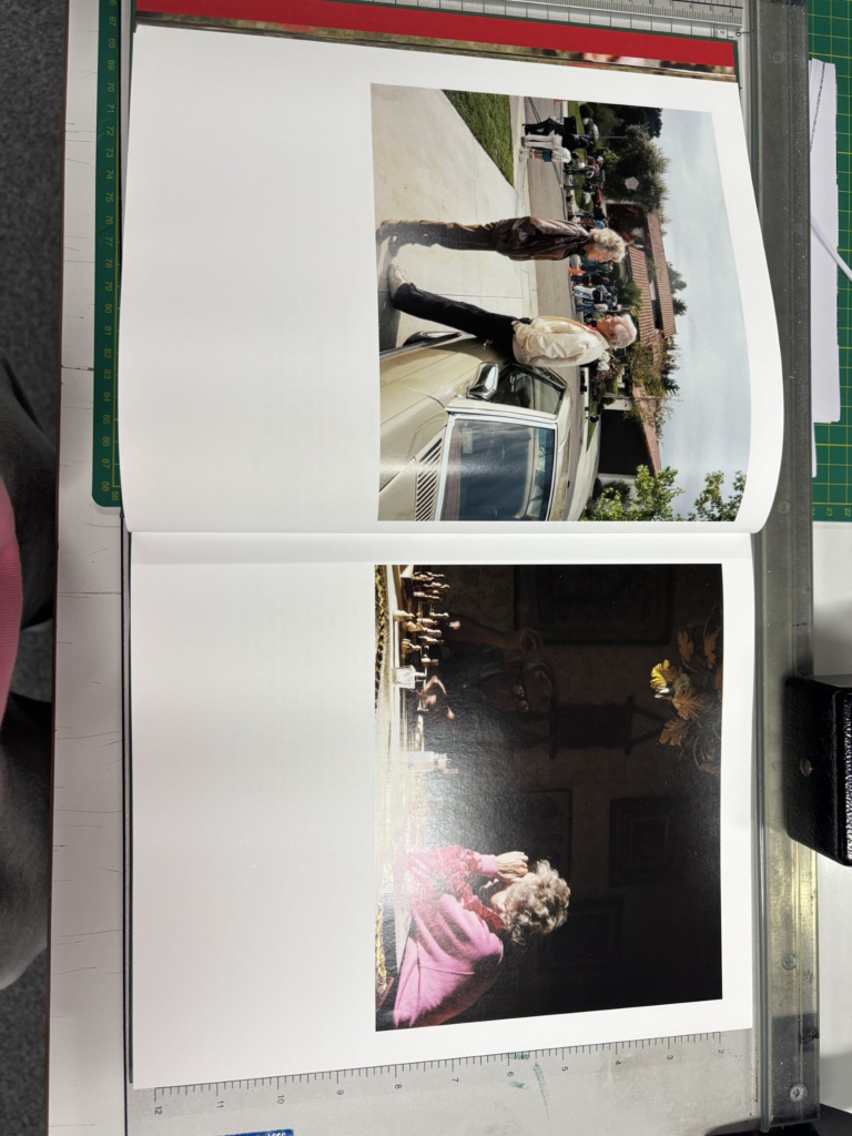
Final images:
Overall, I think this photoshoot was successful in closely replicating the image by Jose Ortiz but still making it slightly unique and different. The concept behind my photoshoot was inspired by the idea of capturing multiple moments in time within a single frame as seen in Ortiz’s work. I recreated his image by changed the concept slightly as I chose to depict my friend standing by herself and being surrounded by the ghosts of her past self and friends. This evokes a sense of nostalgia and reflection as she appreciates the fond memories created with her friends.
During the editing process, I experimented with several different techniques. For example, in some of the images, added a colour filter over my image which was sepia. This added a warm and vintage feel to my images and aligned with my previous research on pictorialism. The sepia tone also created a sense of distance between the present and the past, reinforcing the concept of memories fading over time. Additionally, I decided to create a softer, dreamlike effect to my cut outs by adding a drop shadows to them. This made my edges less shape and made the image like more dreamlike. I decided to do this as pictorial images often use blurred, soften lines to make the photograph look ethereal. Additionally, I also experimented the use of colour by making some versions of my images where the cut outs were in colour and others where they were in black and white. However, I think the images where the cut outs are in black and white portray my idea more as they appear more ghostlike. This photoshoot allowed me to further develop my original images and create a narrative surrounding the idea of my friend being by herself and surrounded by ghosts of her in the past with her friends and her recalling these happy memories they shared in the past.
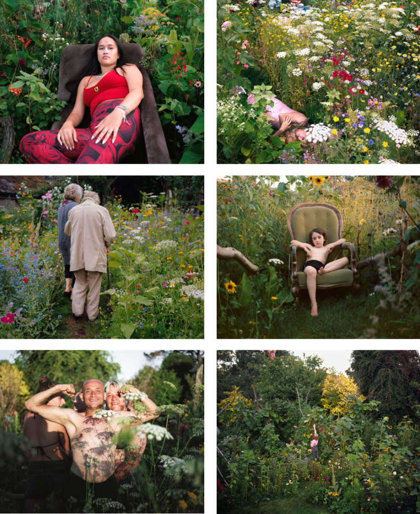
Sian Davey is a British photographer whose work centres around her family, community and herself. She has published multiple books, held solo exhibitions, and accepted awards for her work. Davey was a psychotherapist before taking up photography in 2014, where she focused her work on those close to her, creating a deep sense of connection with her work. Davey is most renowned for her intimate and deeply personal approach to photography. Davey’s style is documentary-based, yet it conveys a strong emotional connection with her subjects, offering a sensitive and reflective portrayal of their lives.
Davey’s background in psychotherapy deeply influences her approach to photography. Her work isn’t just about capturing images but about understanding human connection, emotion and vulnerability. The Garden is a project that is both personal and communal. The idea originated during a time of emotional transition when her son Luke suggested that they transform their garden, mirroring their own personal healing.
Her project ‘The Garden’ consists of images taken in her own garden where she transformed it grow bold, colourful plants like mullein, poppies, sunflowers and more. As the garden flourished, it began to attract communities of people – mothers, daughters, grandparents, teenagers etc. Davey photographed the visitors amidst the vibrant plants capturing moments of joy, vulnerability and connection. The visitors of the garden weren’t just there to pose for photos, it was a chance for them to interact and experience the surrounding nature and to become a part of the story. She described the garden as evolving into “an expression of joy, interconnectedness, yearning, sexuality, and defiance” serving as a metaphor for the human heart. The Garden also symbolises growth, renewal, and the cycles of life. The transformation of an overgrown space into a thriving wildflower sanctuary mirrors personal transformation and resilience.
Davey’s photographic style consists of working with natural sunlight, enhancing the dreamlike and organic feel of her images. She also uses a shallow depth of field which isolates the subjects against a textured background of flowers and foliage. This creates a sense of intimacy and emotional depth, drawing the viewer’s attention to the focal point, the human presence within the landscape. Some of her images feature close, intimate framing, making the viewer feel as though they are physically in the garden with the subject. Whereas, others use wider framing, allowing the garden to play a dominant role in the storytelling, emphasising the relationship between people and nature.
Concept: The whole concept of my book is to show the powerful connection and linkage between humans and nature. This topic is often talked about however its not really photographed or acted on. The idea of my Book is to show people how truly connected we are to nature and how extraordinary mother nature is. By photographing nature and human features and comparing them, it allows audiences to get a true idea of how similar we are to nature.
Narrative: The narrative of my book will be sequenced so that it shows the merge of humans and nature. It will also show comparisons of nature vs humans. This narrative will be smooth and simple. With this narrative, the message is clear and direct. The whole point of my narrative in my book will be to clearly show audiences the correlation between humans and nature.
Design: The design of my photobook will be simple yet effective. The black cover with white text will be straight forward. Its won’t be distracting. Its simplicity will attract. The design of my photobook in terms of layout will be diverse and attractive. The different types of modification within the book will show creativity and understanding because it will show that I understand that certain images need to be presented in certain ways
1. Research a photo-book and describe the story it is communicating with reference to subject-matter, genre and approach to image-making.
2. Who is the photographer? Why did he/she make it? (intentions/ reasons) Who is it for? (audience) How was it received? (any press, reviews, awards, legacy etc.)
3. Deconstruct the narrative, concept and design of the book and apply theory above when considering:
Book in hand: how does it feel? Smell, sniff the paper.
Paper and ink: use of different paper/ textures/ colour or B&W or both.
Format, size and orientation: portraiture/ landscape/ square/ A5, A4, A3 / number of pages.
Title: literal or poetic / relevant or intriguing.
Narrative: what is the story/ subject-matter. How is it told?
Structure and architecture: how design/ repeating motifs/ or specific features develops a concept or construct a narrative.
Design and layout: image size on pages/ single page, double-spread/ images/ grid, fold- outs/ inserts.
Editing and sequencing: selection of images/ juxtaposition of photographs/ editing process.
Images and text: are they linked? Introduction/ essay/ statement by artists or others. Use of captions (if any.)
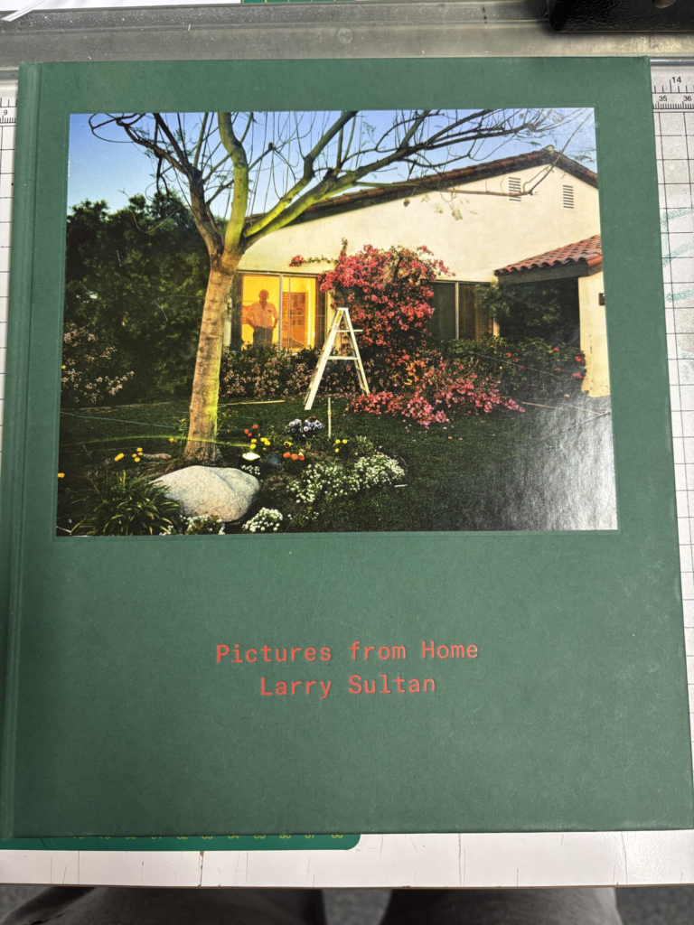
Larry Sultan- Pictures From Home
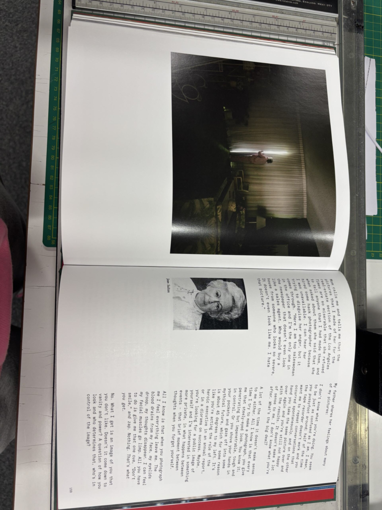
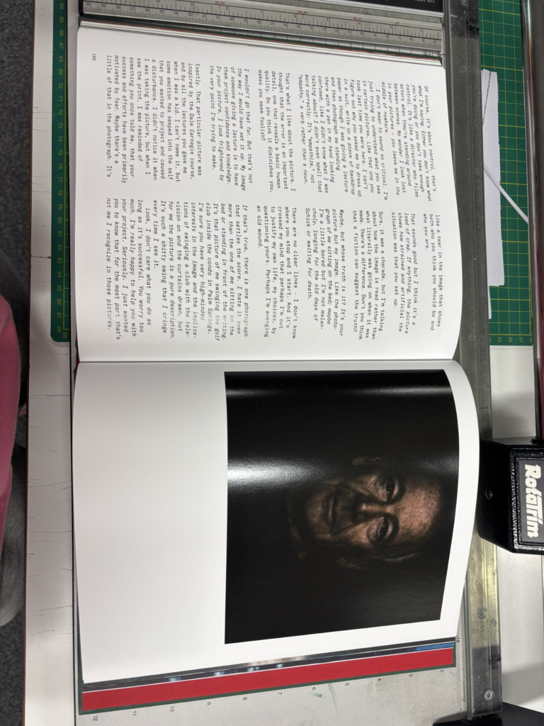
Research into the photobook
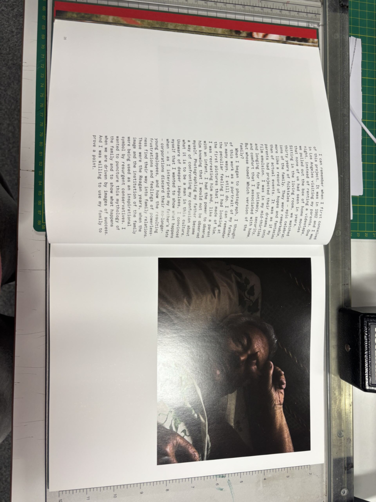
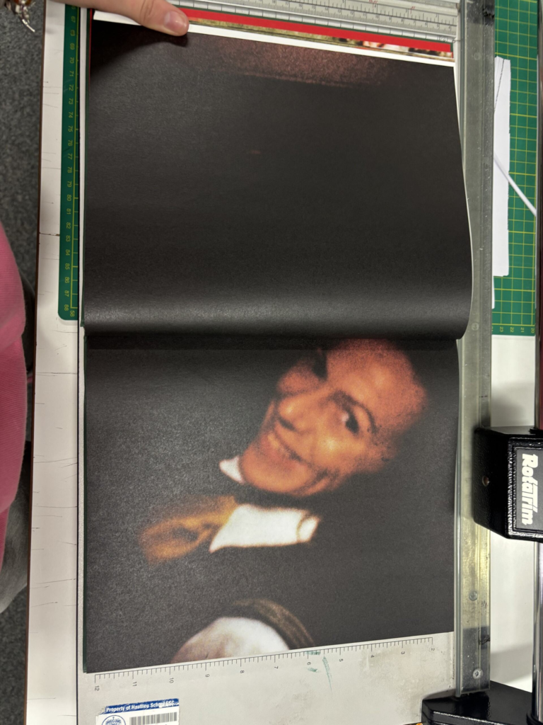
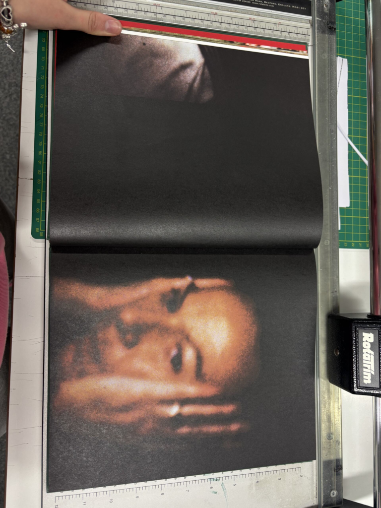
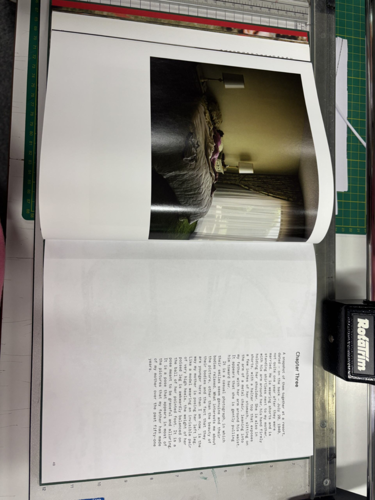
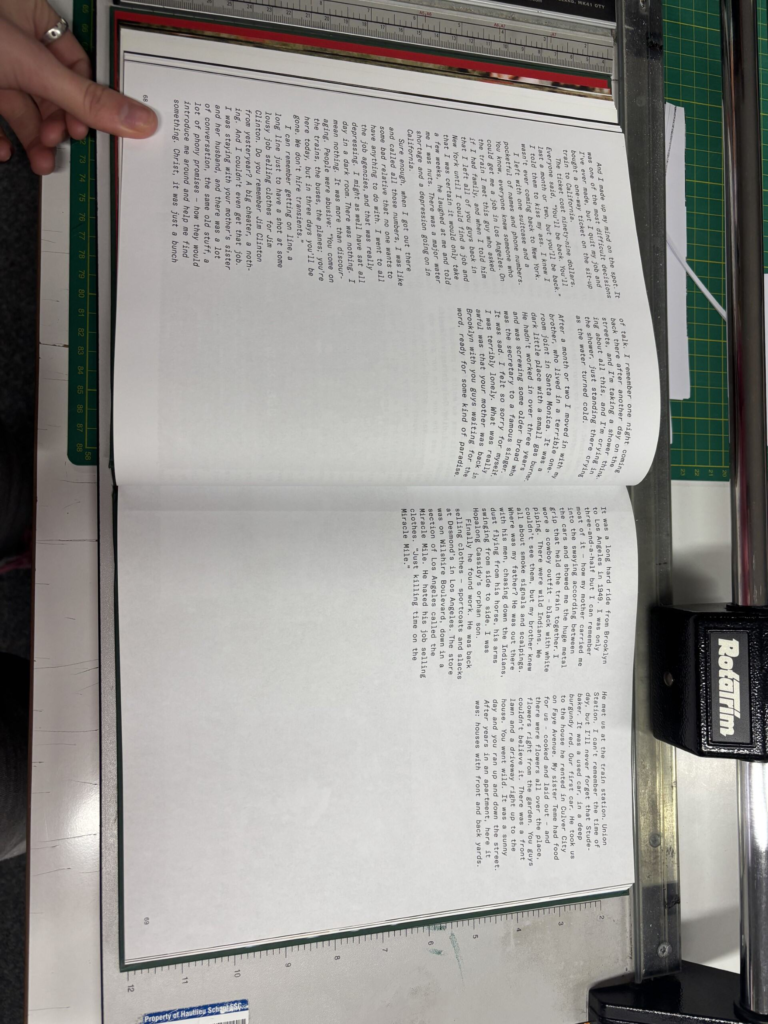
Pictures from Home was first published in 1992 and was a collection of photographs taken of Sultan’s parents in the San Fernando Valley from 1982 to 1992, whose role was to question societal expectations of gender and ageing. Sultan returned home to Southern California, which is where he grew up in his childhood home in the 1980’s and began his work. His home became a source of inspiration for a number of his projects. In ‘Pictures from Home’ he combines contemporary photographs with film stills from home movies, fragments of conversation, Sultan’s own writings and other memorabilia. This results in a narrative that collages both documentary and staged images causing the boundary between them to thin and create images of the psychological as well as physical landscape of suburban family life. Simultaneously, the distance usually maintained between the photographer and his subjects also slips in an exchange of dialogue and emotion that is unique to this work.
“What drives me to continue this work is difficult to name. It has more to do with love than with sociology. With being a subject in the drama rather than a witness. And in the odd and jumbled process of working, everything shifts: the boundaries blur, my distance slips, the arrogance and illusion of immunity falters. I wake up in the middle of the night, stunned and anguished. These are my parents. From that simple fact, everything follows.” – Larry Sultan
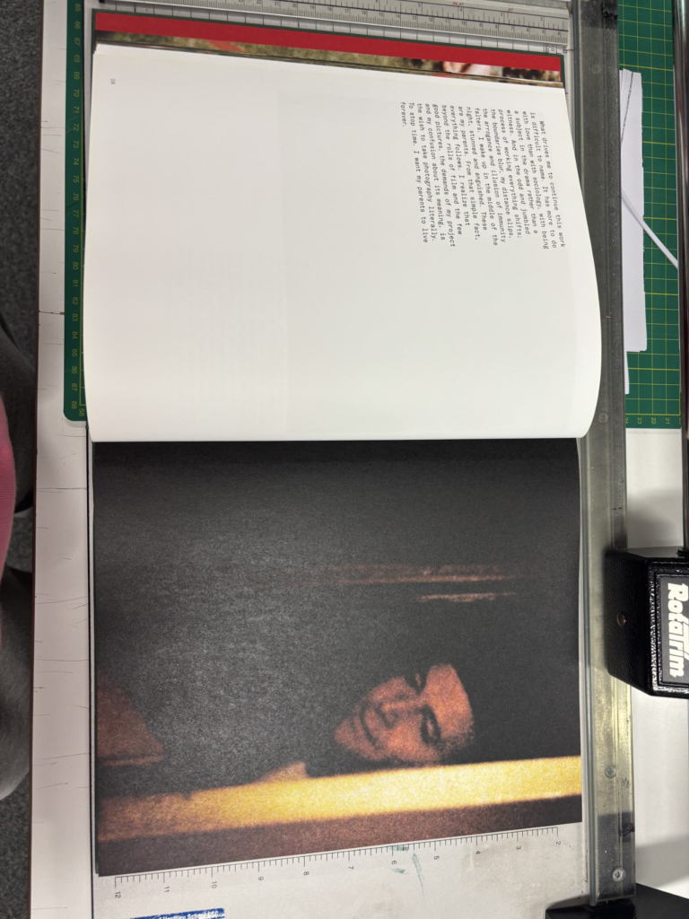
His photobook displays the flow of ordinary life and Sultan noted that he wanted the images in Pictures from Home to “become part of a larger narrative…to slam up against other images (an afterimage). I want to measure how a life was lived against how a life was dreamed.”
2. Who is the photographer?
Larry Sultan was born 13th July 1946 in Brooklyn New York to a Jewish family. He grew up in the San Fernando Valley, part of Los Angeles, California, where his parents moved when he was an infant. He graduated from the University of California, Santa Barbara with a bachelor’s degree in political science, and received a master’s degree in fine arts from the San Francisco Art Institute in San Francisco.
He was an American photographer and started his career in the 1970’s. In 1977, he published a collection of photographs he found in corporate and government archives called ‘Evidence’ with a photographer called Mike Mandel, which the New York Times characterised as “a watershed in the history of art photography.” The two men also created billboards aimed at slowing down road traffic. He then published ‘Pictures from Home’ from 1982-1992, followed by his 2004 assignment for Maxim, which consisted of photographs of middle-class residences rented by the porn industry in the San Fernando Valley, which led to another photographic series called ‘The Valley.’ He also photographed Paris Hilton for Interview in his parents’ bedroom in his childhood home.
Sultan was an instructor of photography at his alma mater, the San Francisco Art Institute, from 1978 to 1988. He then taught at the California College of the Arts in San Francisco as Chair of the Photography Department from 1993 to 1999, and as distinguished professor of art from 1989 to 2009.
He served on the board of trustees of the Headlands Centre for the Arts from 1992 to 1998. At the time of his death, 13th December 2009, he was the artist trustee at San Francisco Museum of Modern Art, a position he had taken up in the same year. He died of cancer and died at his home in Greenbrae, California, with his wife Katherine Sultan, also known as Kelly Sultan.
3. Deconstruct the narrative, concept and design of the book and apply theory above when considering:
Layout of Pictures From Home:
Design of Pictures From Home:
192 pages
9.29 x 1.18 x 10.87 inches
Language: English
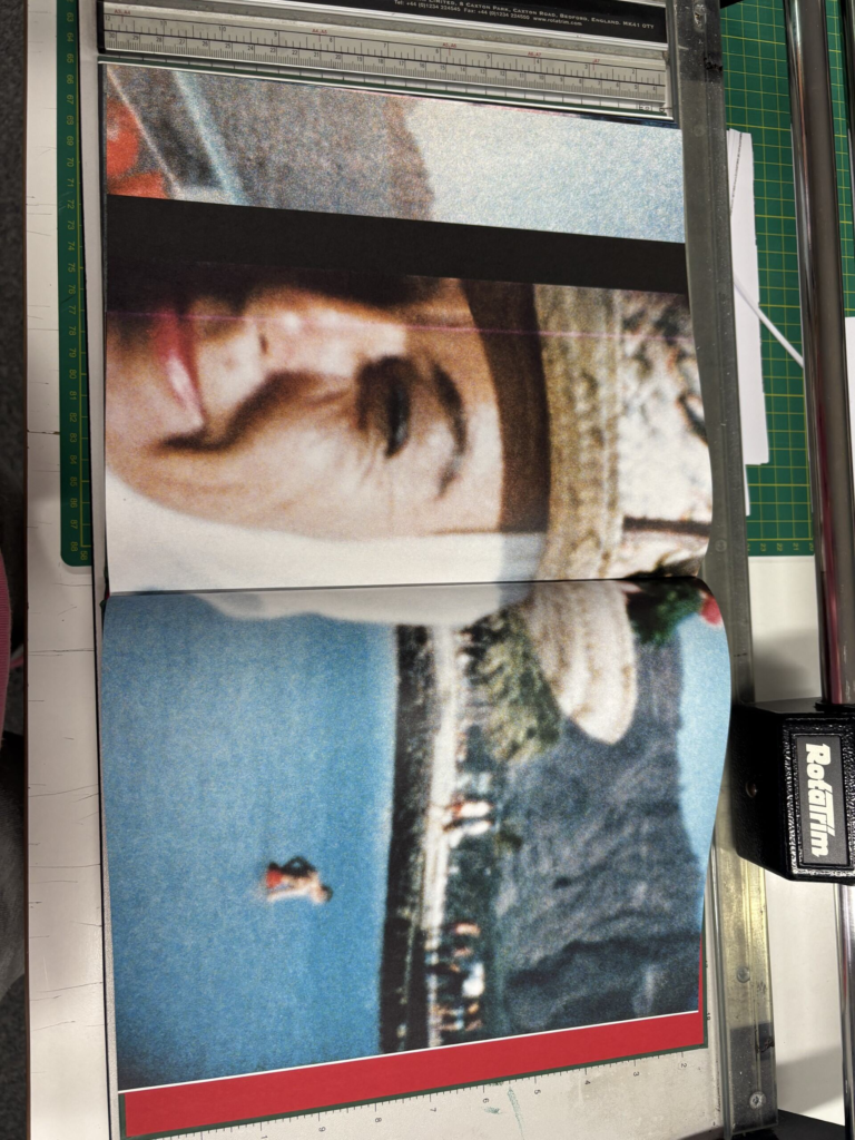
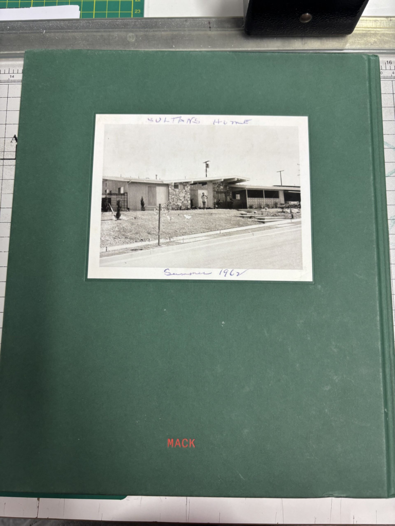
Title: Pictures From Home- This title is a literal title, because the setting for all of these photographs was Sultan’s childhood home. However, the title can be quite intriguing, because you have no way of telling the type of pictures in this photobook until you open it, as it may have been a lower class, or upper class home. In Sultan’s case, his family were upper middle-class.
The cover of this book is a textured, dark green hard cover, with one of Sultan’s photographs stuck onto the front cover. This image is placed in the top two thirds of the cover with the green background framing the image. The title is then written below in bold red writing, with his name underneath in the same font and colour.
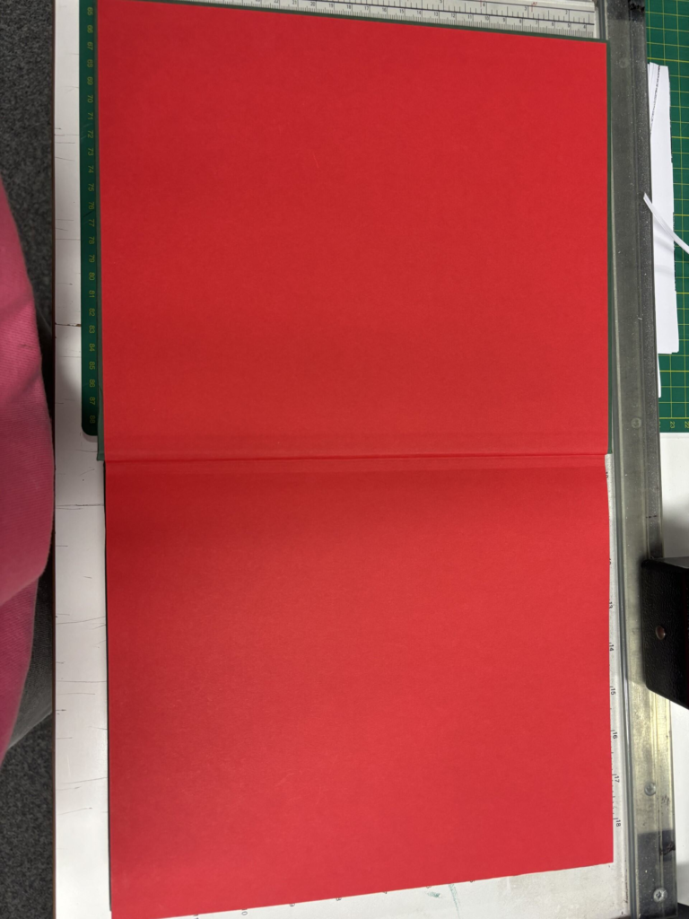
The inside of the cover is the same red that his title was written in and there is another piece of red card before the photographs begin.
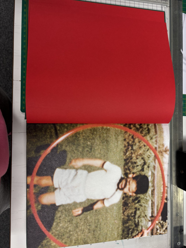
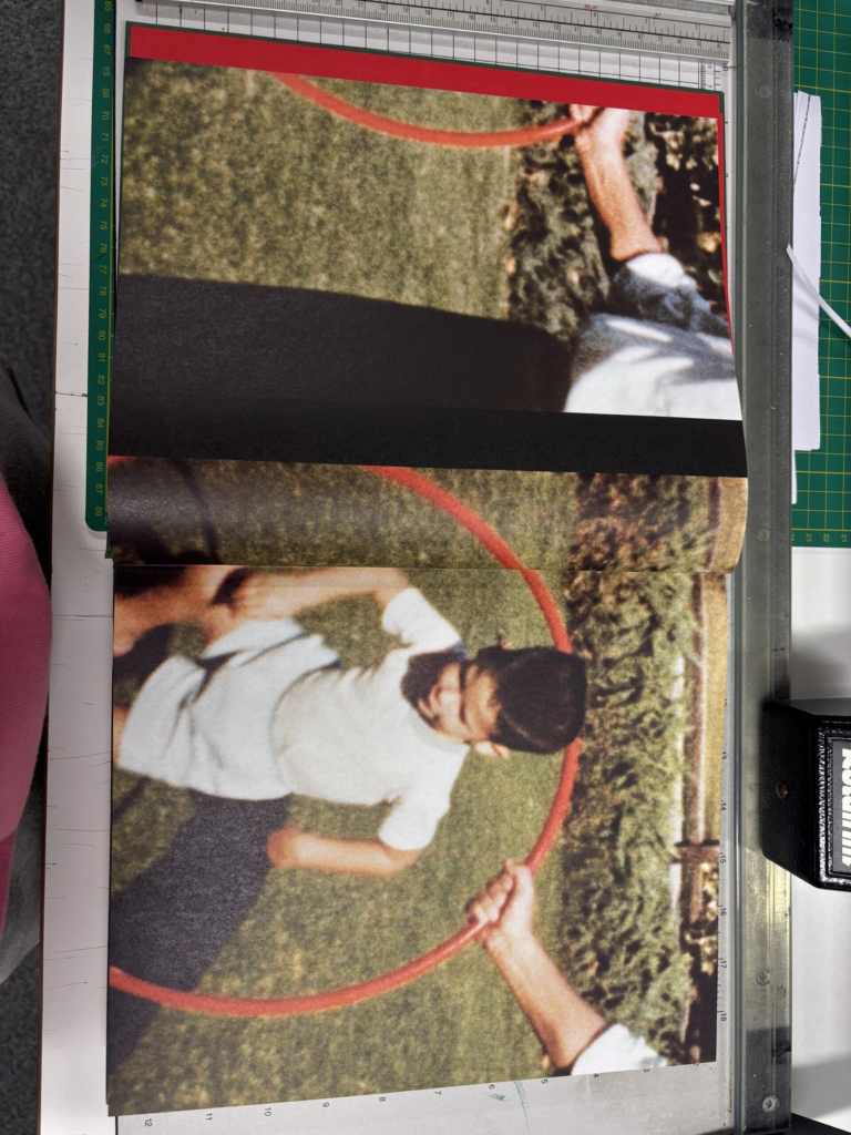
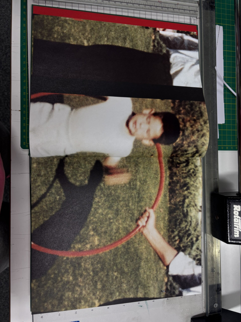
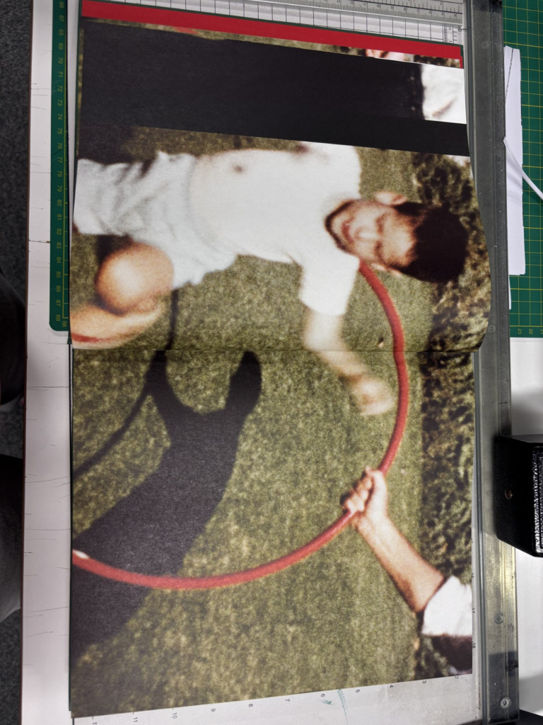
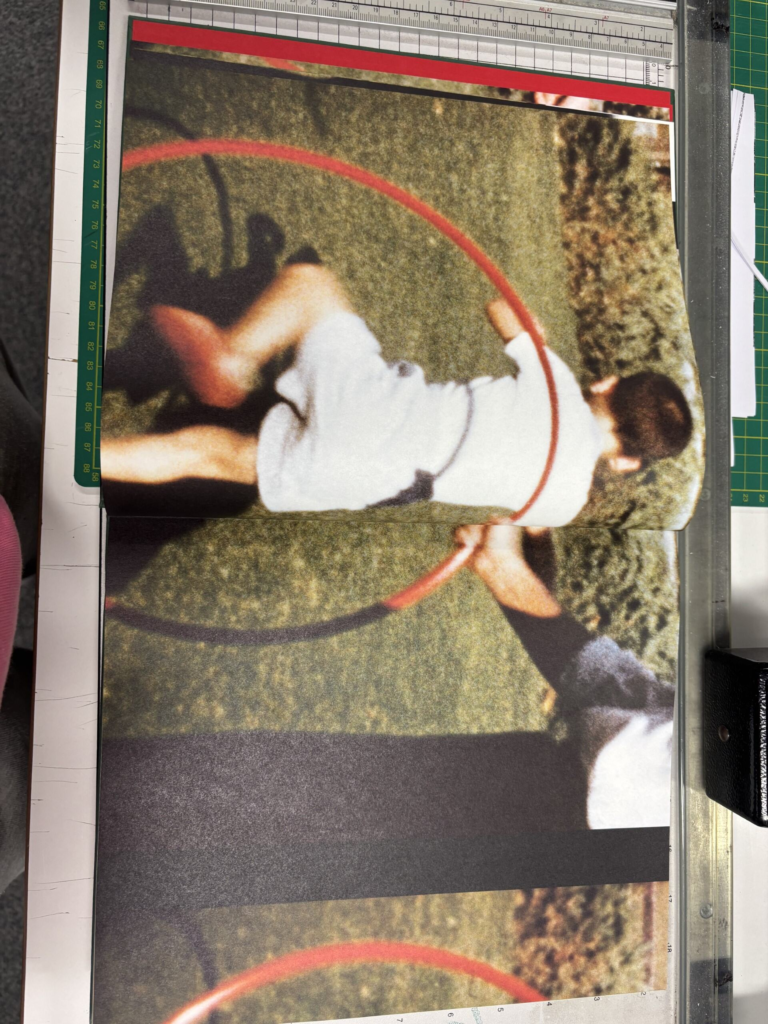
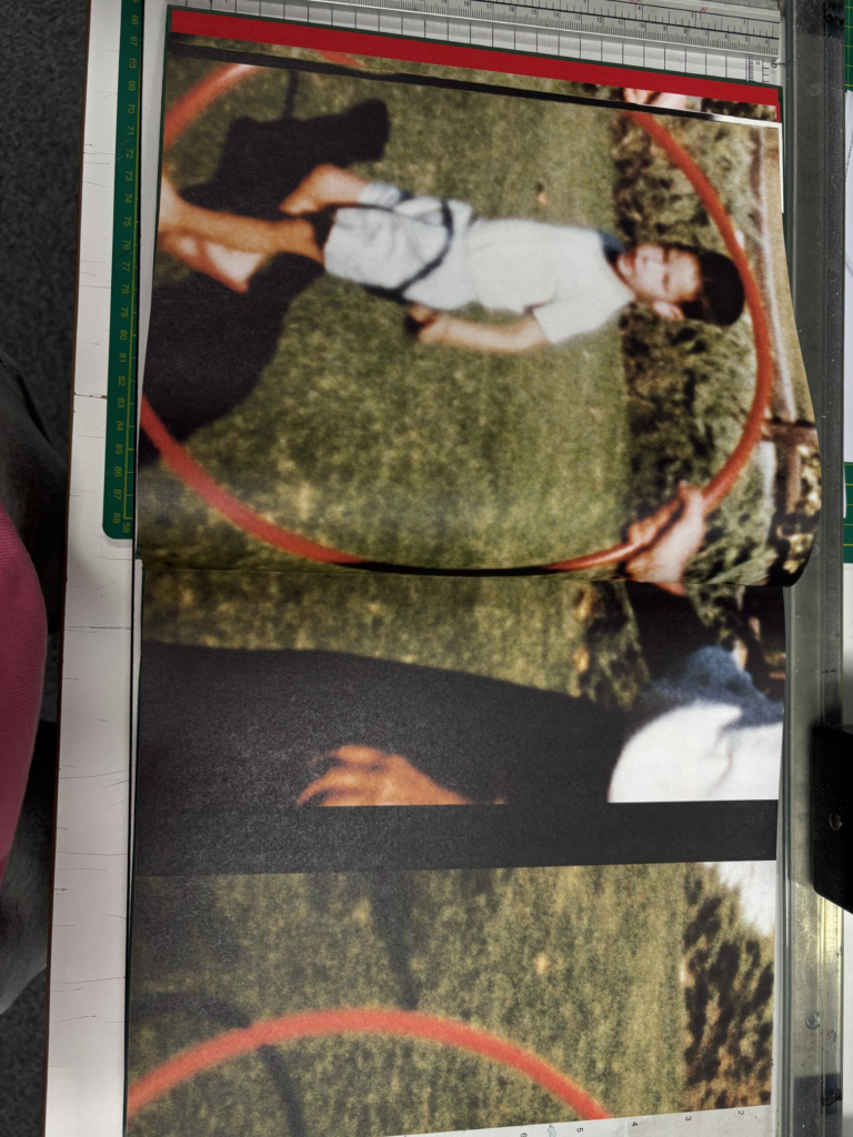
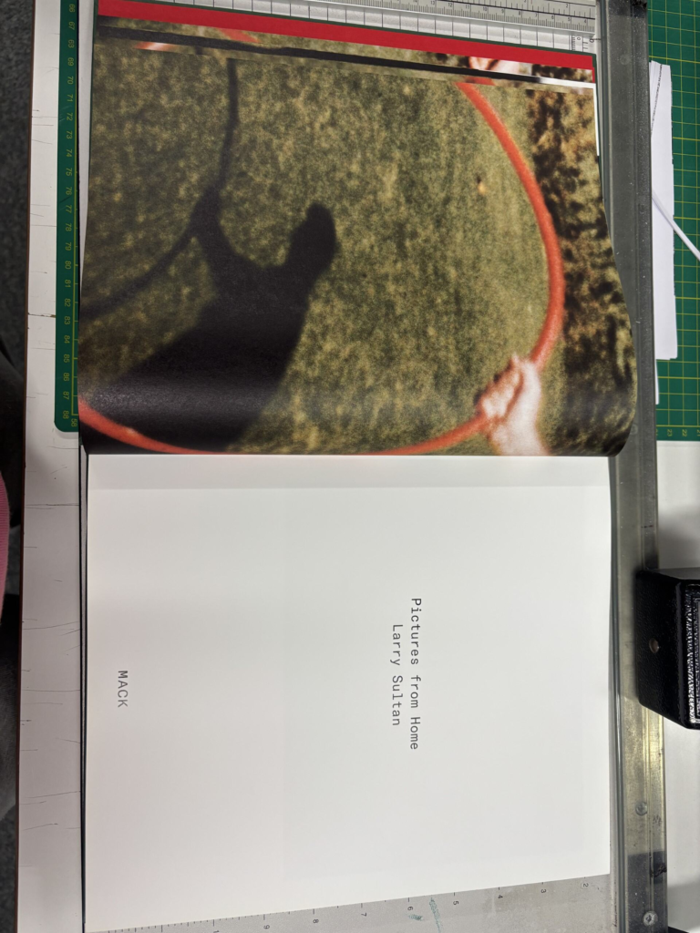
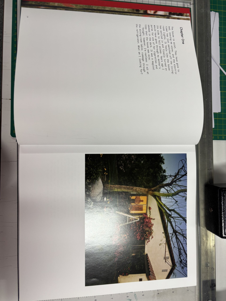
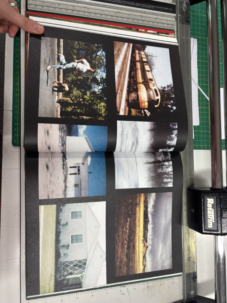
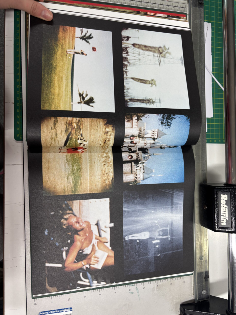
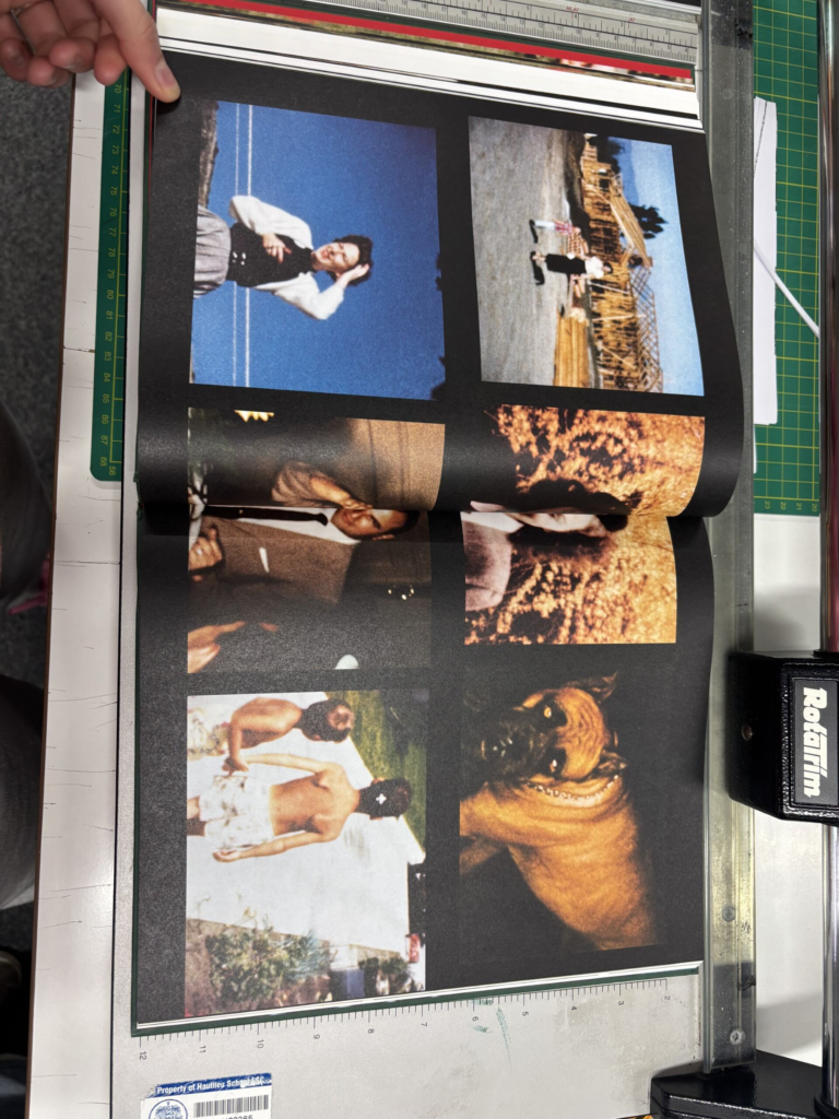
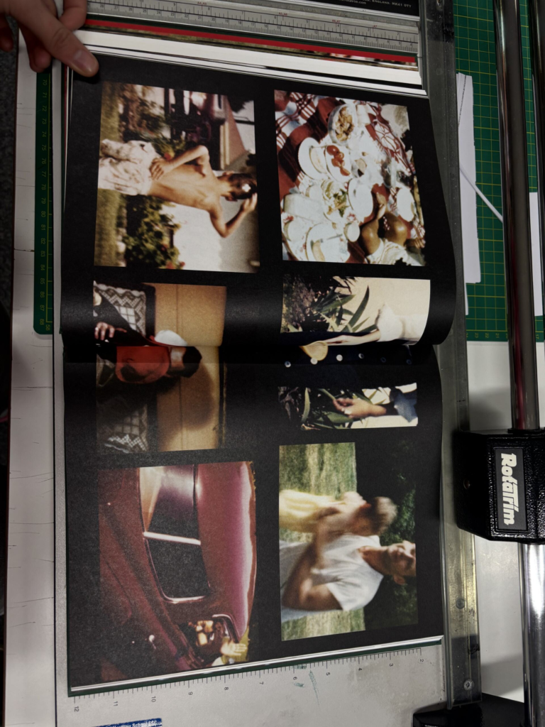
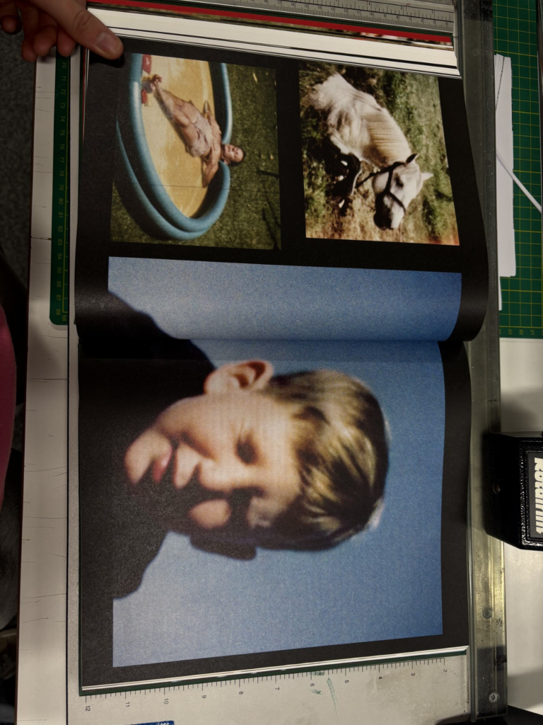
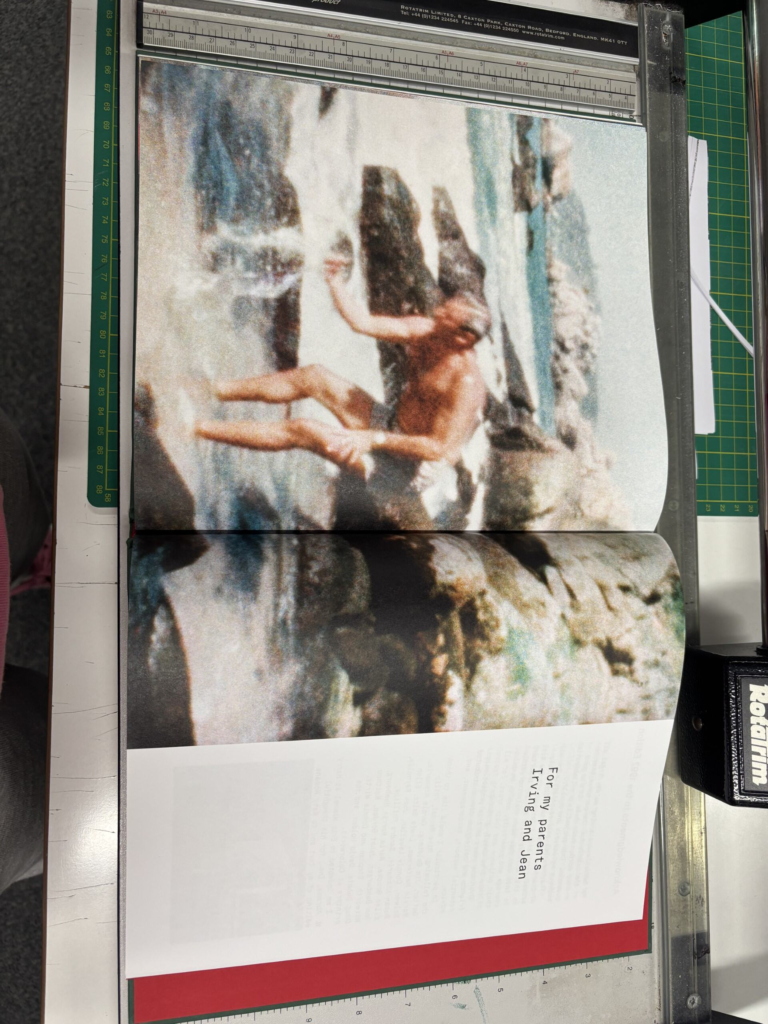
His book starts with snapshots of his family films of Sultan when he was younger. The snapshots are of him playing with a red hula hoop in his family garden. The type of paper used in his book for the pages that the snapshots of his family films is different to the glossy white paper used for the pages with his own photographs. The paper used for these pages is not as thick and is matte, similarly to ordinary A4 paper. His images on these pages are also full sized, compared to the other pages, which are positioned in different areas of the page, with the white background framing them. The layout of this book is very unstructured, so the layout of these photographs differ throughout, but never being a full page spread, unless they are snapshots of the film stills. There is a white glossy page after the first set of film snapshots and before Sultan’s own photographs, which has the title of his book and his name slightly above the centre of the page in black bold writing, in the same font as the title on the front cover.
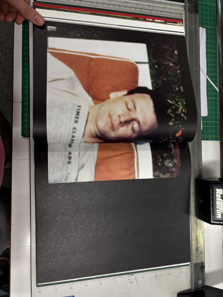
Sultan also includes text throughout this book, that either him, or his parents have written. The text includes the story of his childhood growing up in that family home, as well as other memories of his family from his childhood. He also includes quotes from himself, his mother and his father in this text.
Sultan also includes collages in this book, which include archived photographs, or snapshots from his film stills, which are either paired with text, or laid out on a double page spread.
Sultan uses a range of coloured images, mainly the images he has taken and snapshots of his family films, but he also includes even older archived images that are in black and white, like images of his dad when he was a young boy.
At the end of his own photographs in his book, he has a white glossy page, before including more snapshots of his family films to end his book. On the last snapshot he also dedicates the book to his parents as, it states, ‘For my parents Irving and Jean.’ He then has an acknowledgements page and ends his book with the same red card.
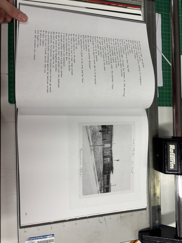
The back cover of his book is the same textured dark green hard cover. It has a polaroid photograph that is an archive in the top half of the cover, with the green framing around it. The polaroid is a picture of his mother stood in front of their childhood home. The polaroid has ‘Sultan’s home’ written at the top of it and ‘Summer 1962’ at the bottom of the image, written in a blue biro pen. The image is also stuck onto the green cover, similarly to the front cover.
Narrative of Pictures From Home:
The narrative of this photo book is the narrative of Sultan’s life with his family growing up in his childhood home, as well as his life now as he takes staged and documentary images of his parents. He has used archives and his own photographs to portray his family now and his childhood. He has also used text to present the narrative of his childhood up to his current life when he was working on this book. He also includes the narrative of what each of his parents were like and how they treated him throughout his life. He portrayed his parents narrative using images, as well as text, which was wrote by his parents and himself. Using text from his parents allows his to present his parents narrative from their point of view, presenting their thoughts and opinions.
The concept he is trying to convey to the viewer:
He is trying to convey the narrative of his childhood up to his current life to the viewers and what his family was like during his childhood and his current life. He also wants to convey the relationships he had with his mother and father during his childhood and his relationship with them in his current life and how it has altered.
My Inspiration
I am taking inspiration from Sultan’s photo book, because I am also taking my own photographs of my family, as well as using archive images of my family and childhood. I am also going to use family films I have, similarly to Sultan and I am going to borrow ideas from the layout of his photo book. I am going to use a range of different paper for my photo book for my film snapshots and archived images. I am also going to use collages in my photo book, as well as using joiners, which I have taken inspiration from David Hockney. I am also going to use a hard cover for my book.
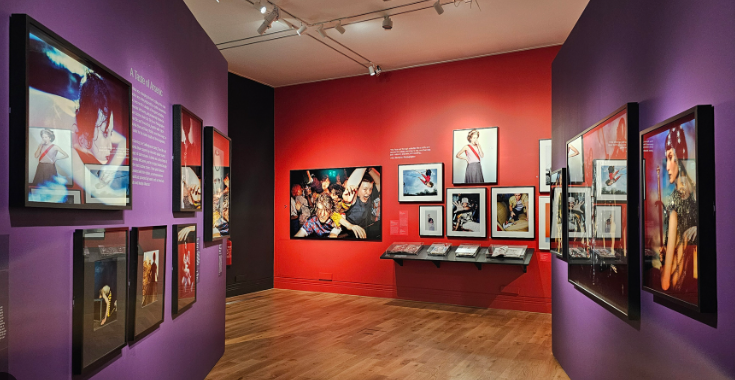
The face magazine celebrates iconic fashion images and portraits from The Face, which is a youth culture and style magazine that has shaped the creative and cultural landscape in Britain. The magazine also launched the careers of many leading photographers and fashion stylists, who were given the creative freedom to radically reimagine the visual language of fashion photography. The exhibition brings together the work of over 80 photographers, including Sheila Rock, Stephane Sednaoui, Corrine Day and many others. From 1980 to 2004, The Face played a vital role in creating contemporary culture. Musicians features on its covers achieved global success and the models it championed, including Kate Moss who became the most recognisable face of the time. The Face magazine relaunched in 2019, and the magazine continues to provide a disruptive and creative space for image makers, championing fresh talent in photography, fashion, music and graphic design.
The Face exhibition shows over 80 photographers work that is unique and different and shows how the styles of all there photography differs from each other.
What inspired the Face Magazine ?
The Face a British music, Fashion and culture monthly magazine originally published from 1980 to 2004 and then relaunched again in 2019. The magazine was first launched in May in London by Nick Logan who was a British Journalist and had been editor of New Musical Express and Smash Hits. He is best known for having founded the Face magazine which forged a new “lifestyle” sector in British publishing in the 1980’s and 1990’s.