All posts by Vitoria Silva

Filters

Author:
Category:

Overall conclusion

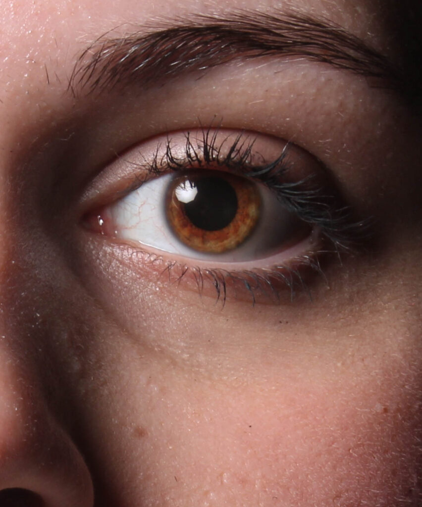
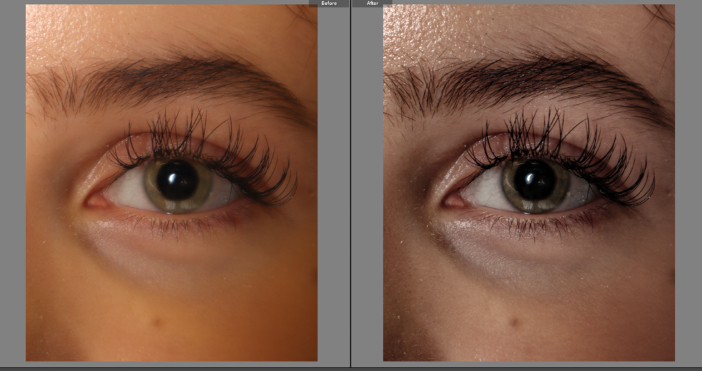
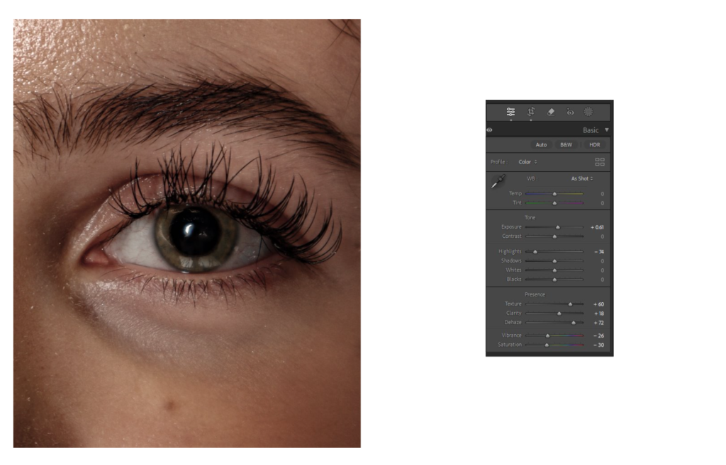
My overall conclusion of this project is that I’m really pleased with my work. I think that my ideas and planning really helped me set myself up for succession and it really helped me understand what union meant to me and how I was going to explore it. I believe that my images are of high quality and that my editing skills which I used to enhance my images are good. My work is clear and inspiring.  

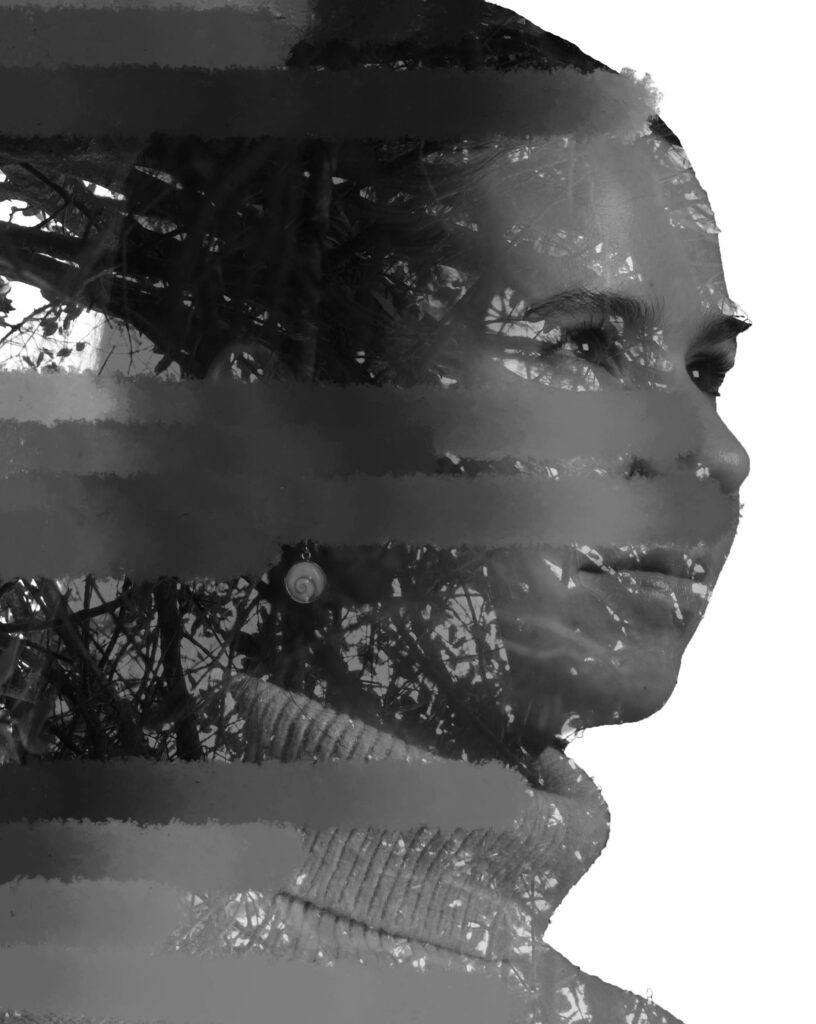
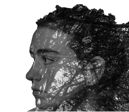
I have many strengths throughout my project. One of them being applying my research to my work. My research into romanticism and my 2 case studies evidently combine with each other and I strongly suggest that my work shows all the hard work I did in terms of researching and especially applying that knowledge to my work.  

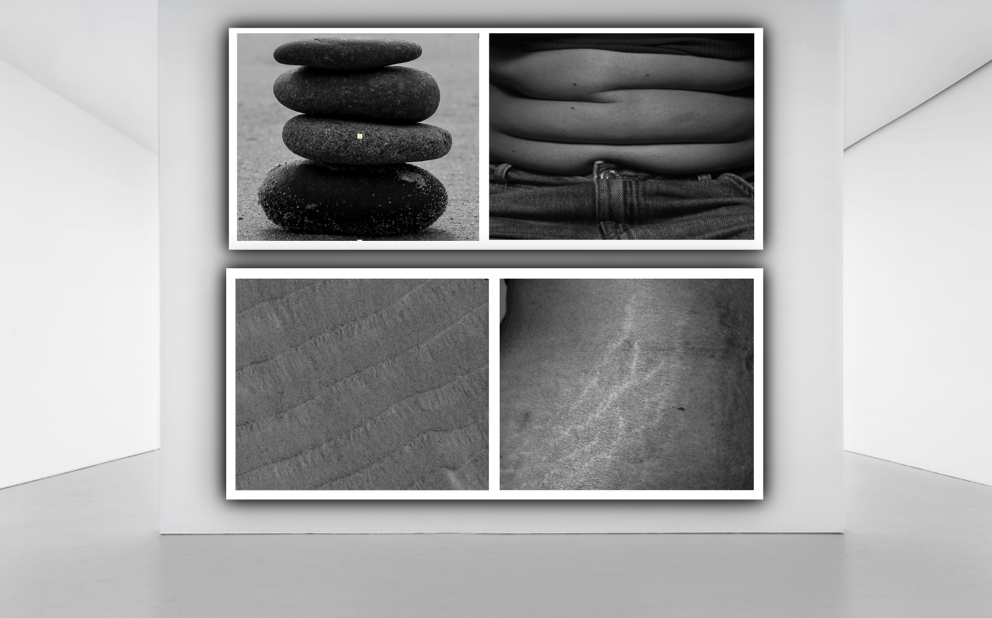
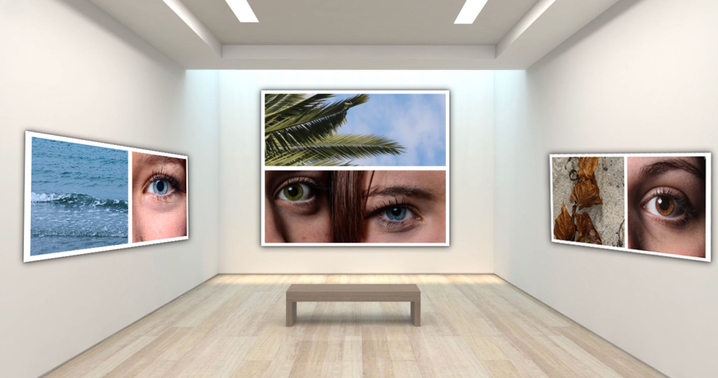
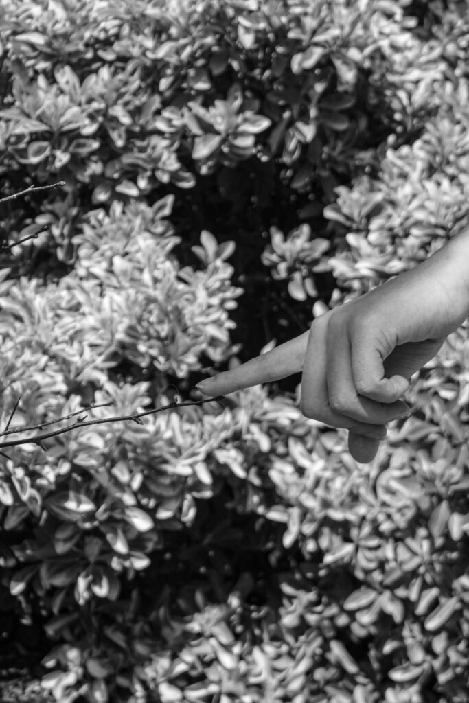
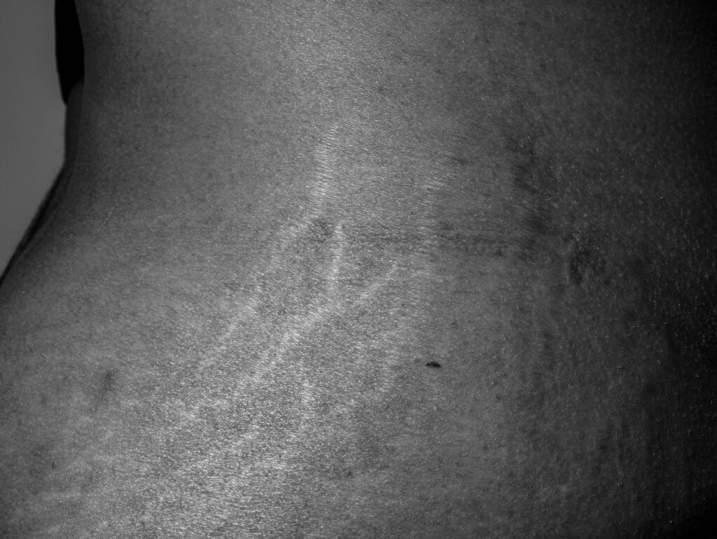
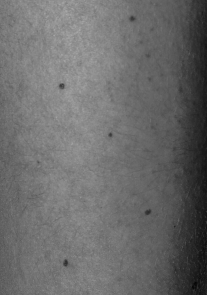
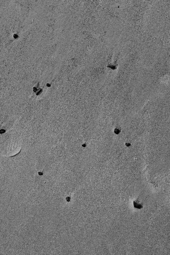
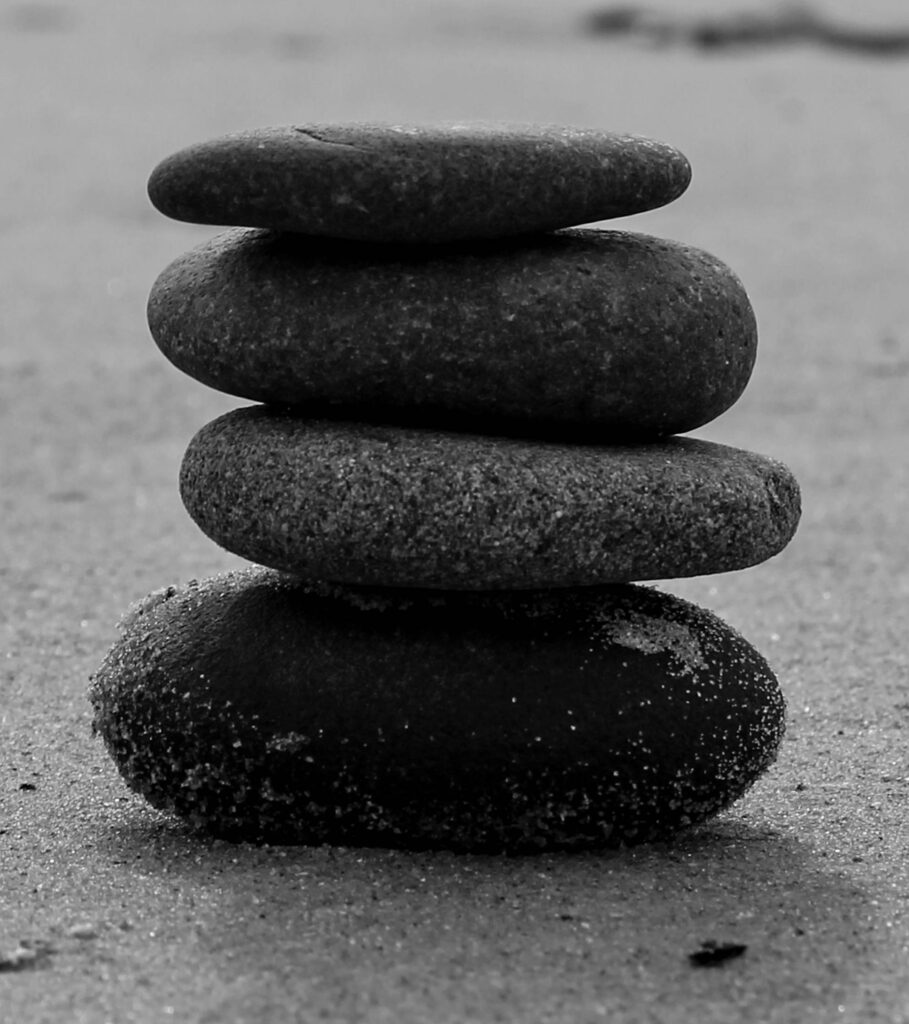
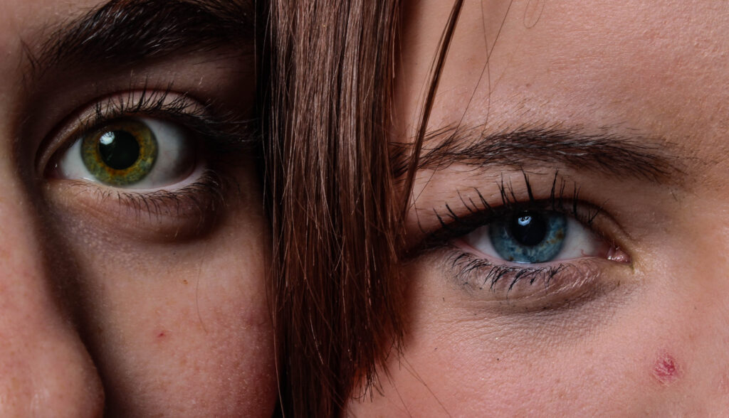
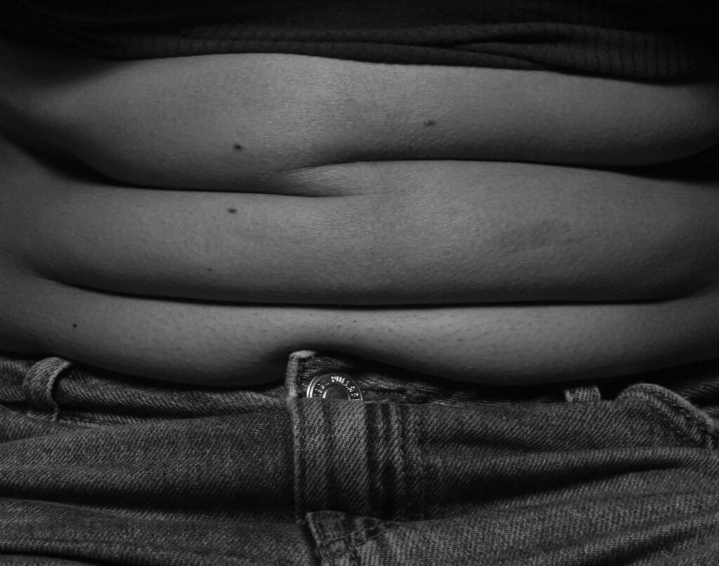
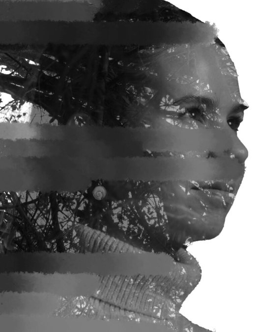
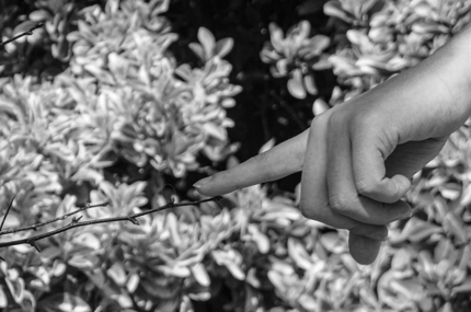
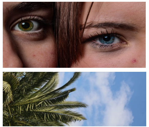
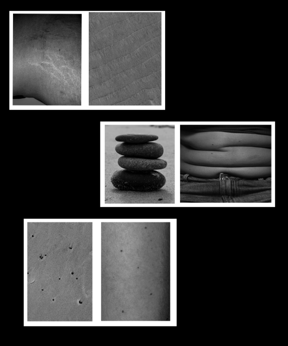
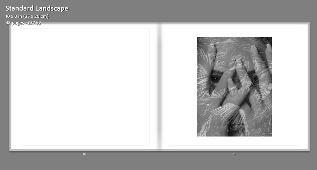
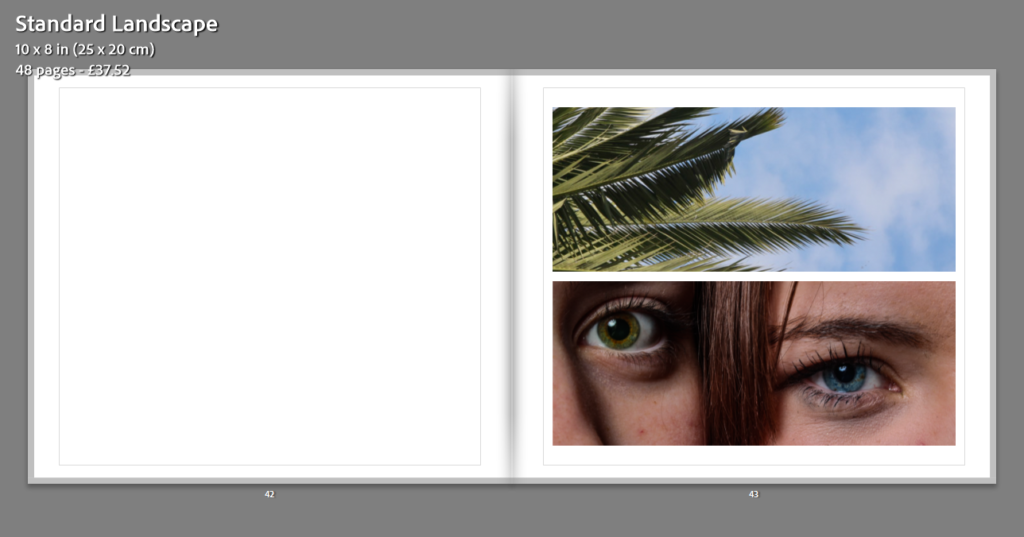
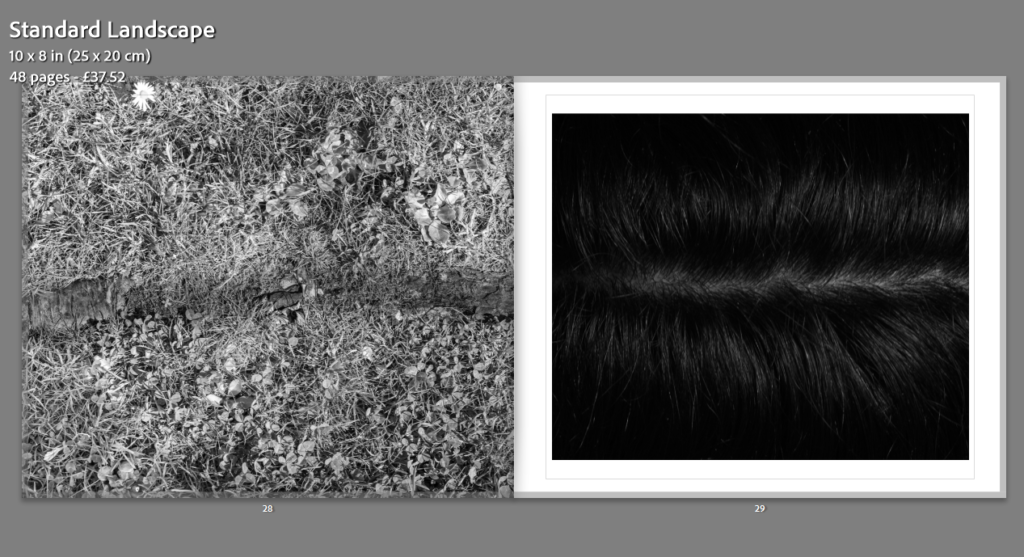
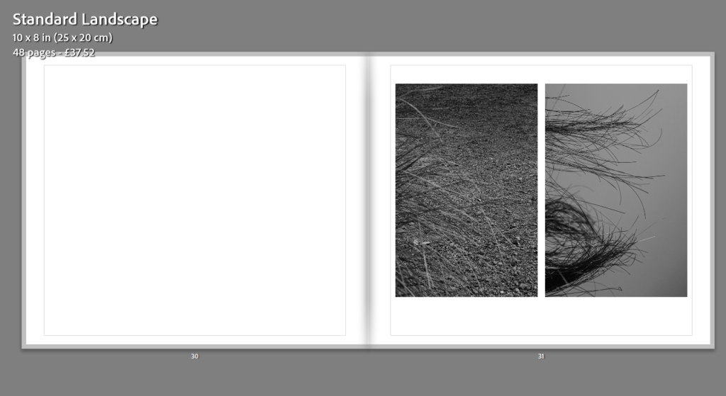
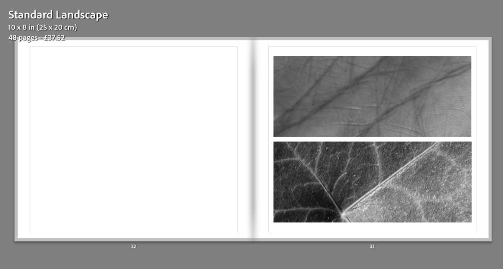
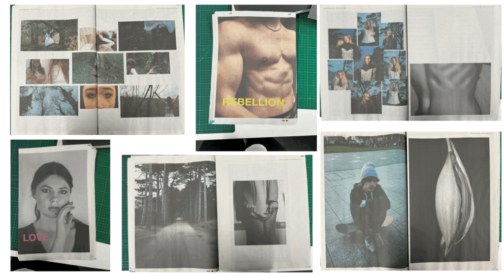
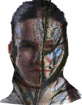
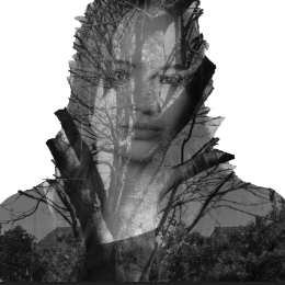
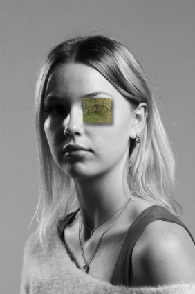
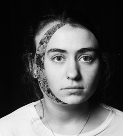
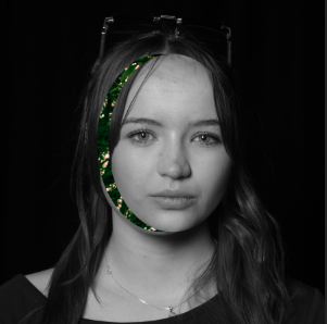
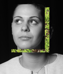
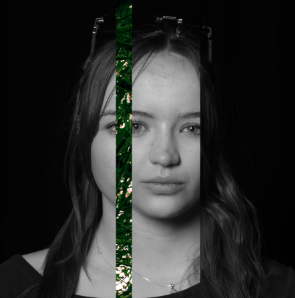
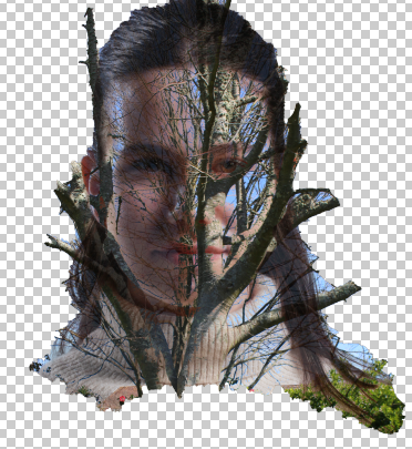
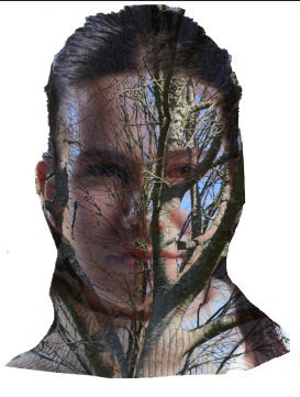
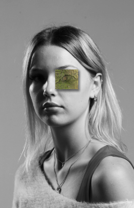
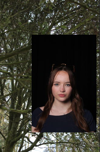
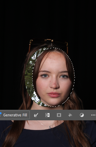
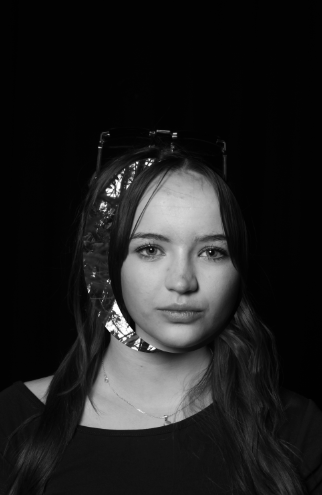
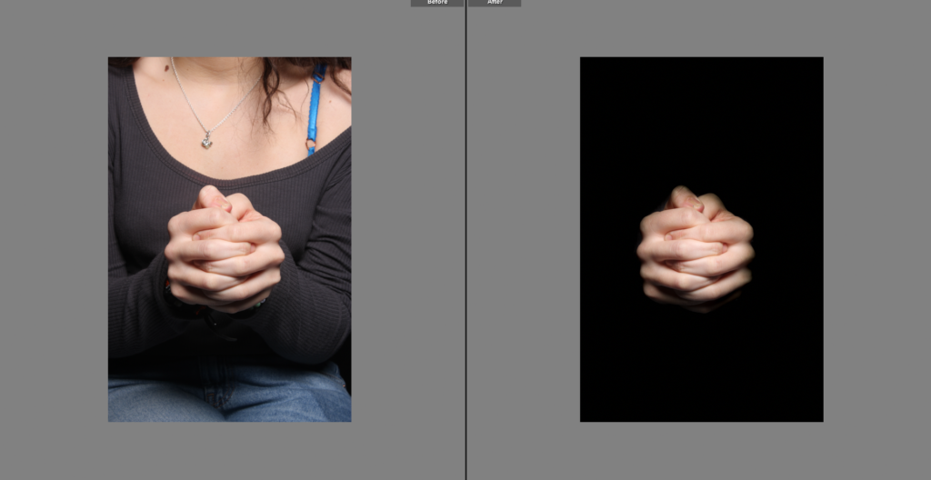
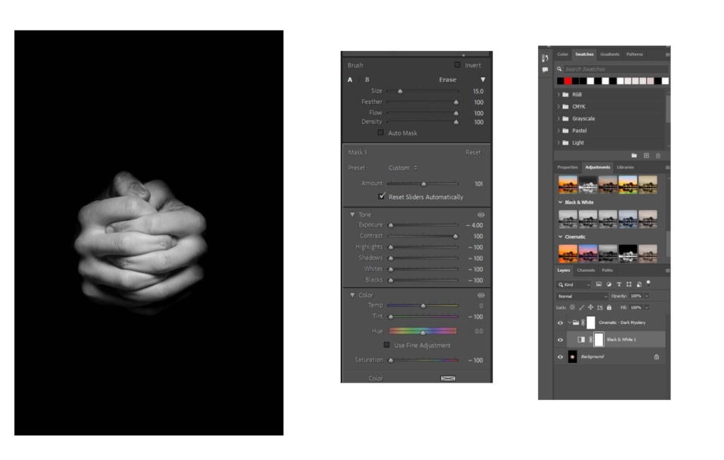
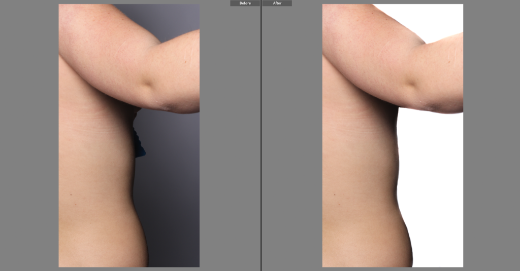
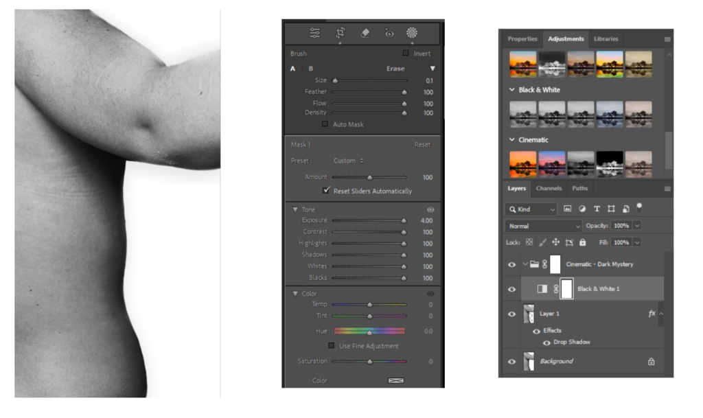
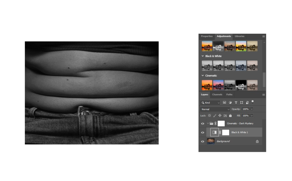
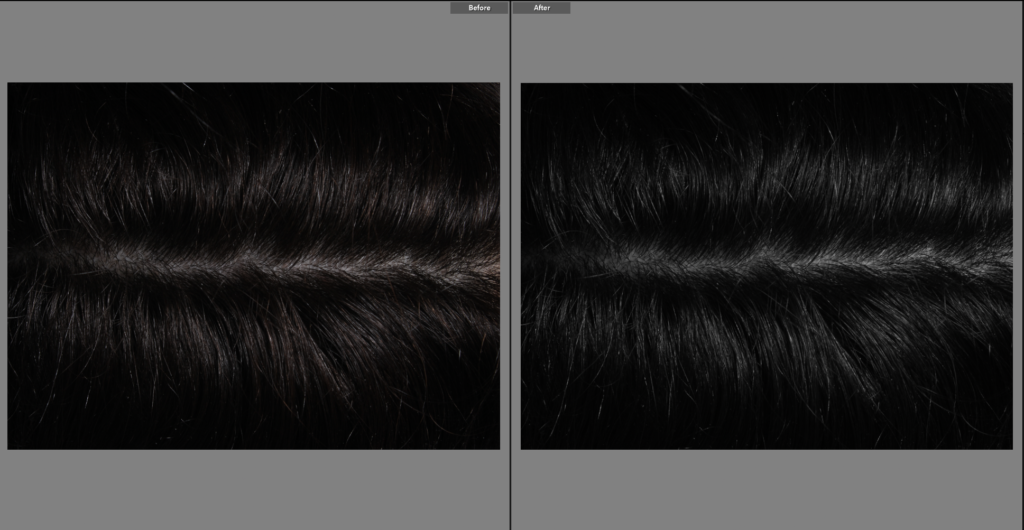
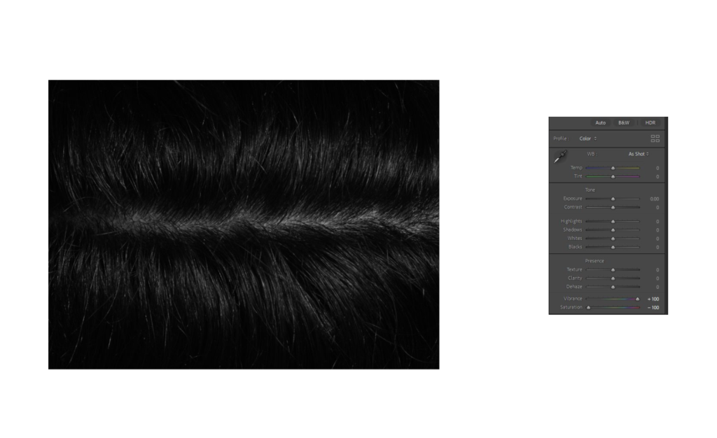
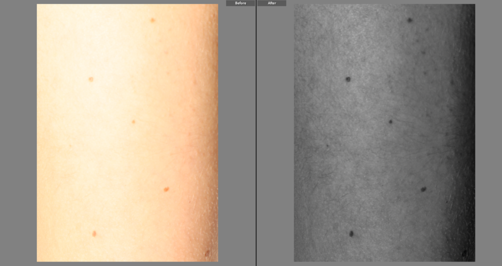
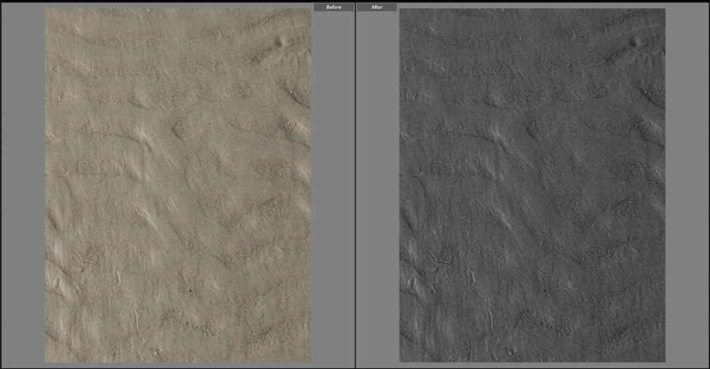
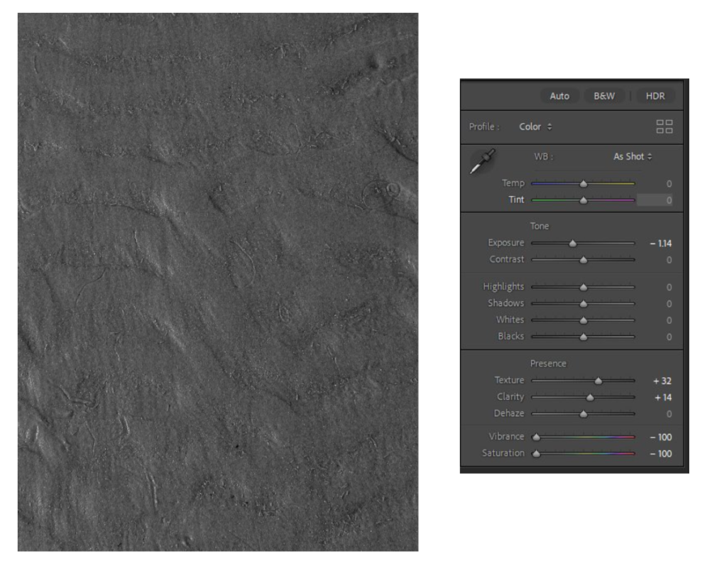
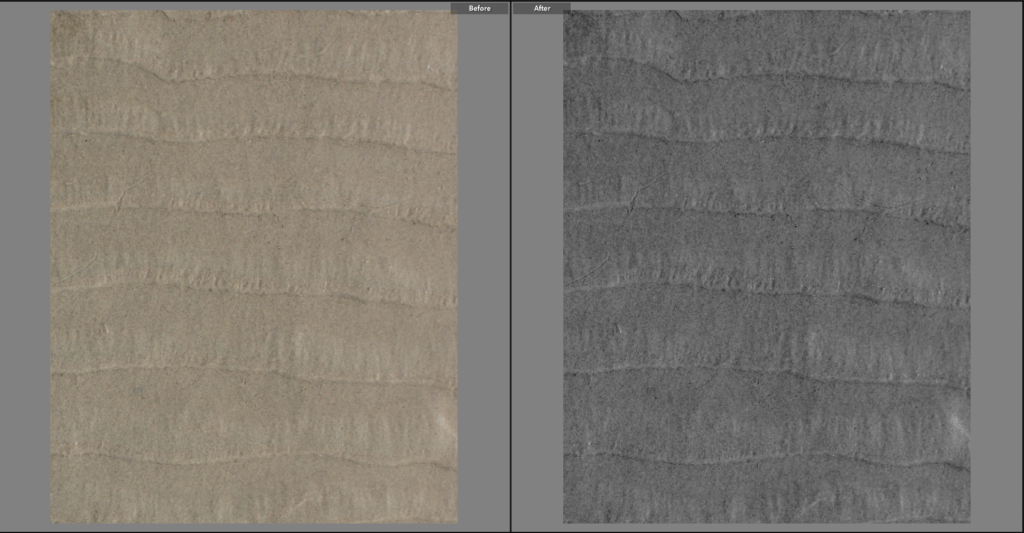
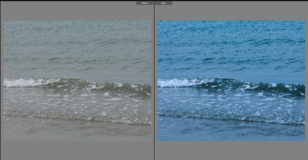
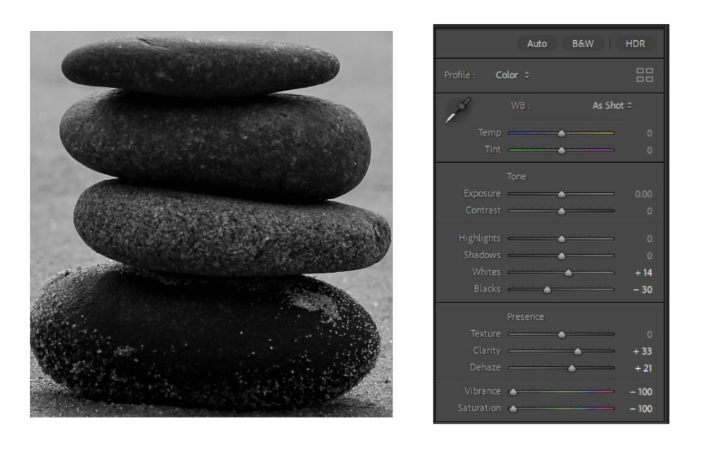
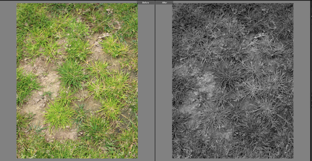
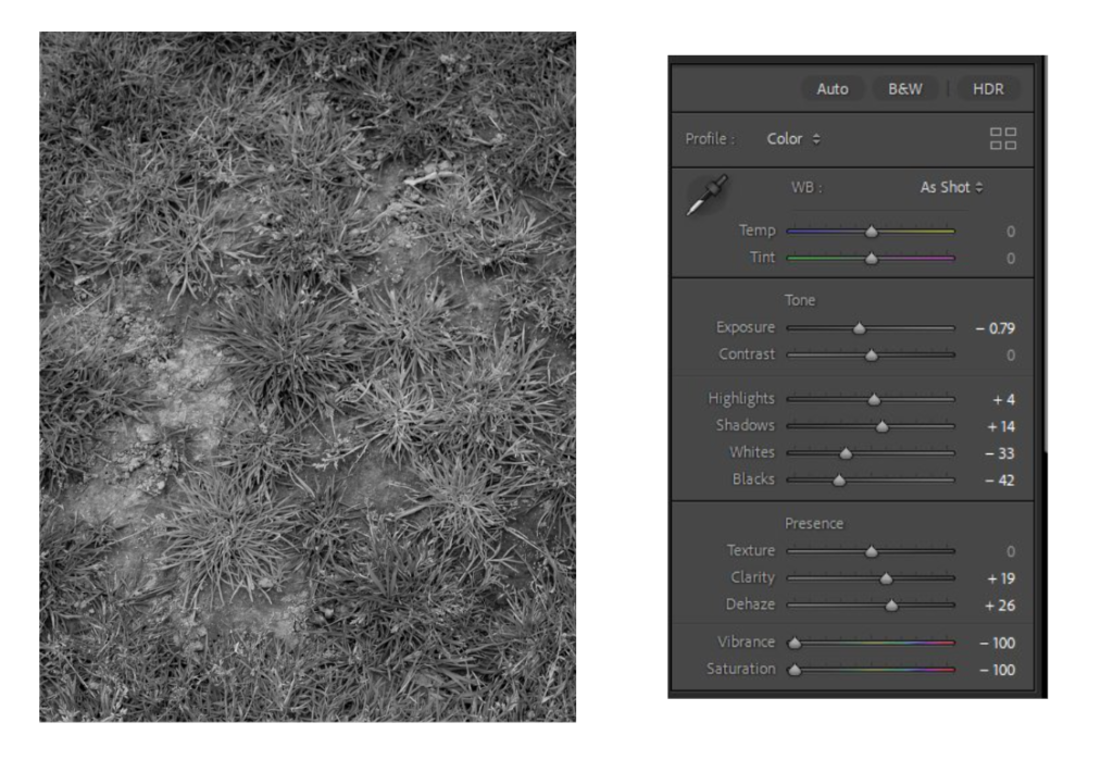
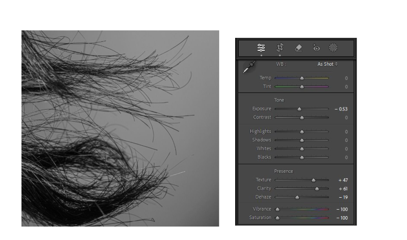
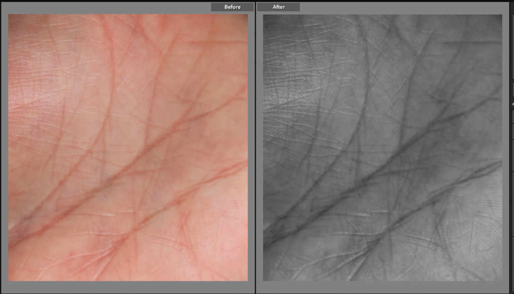
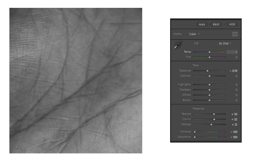
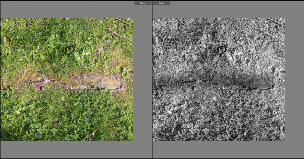
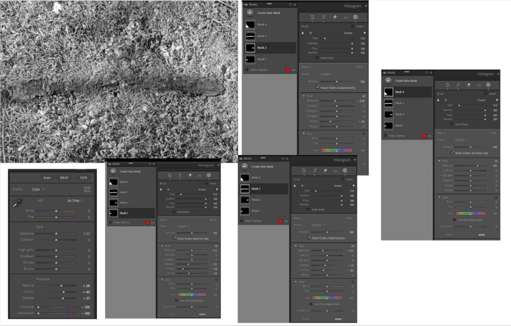
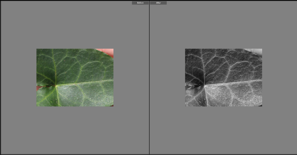
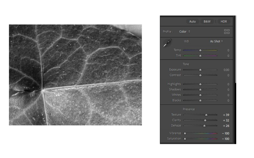
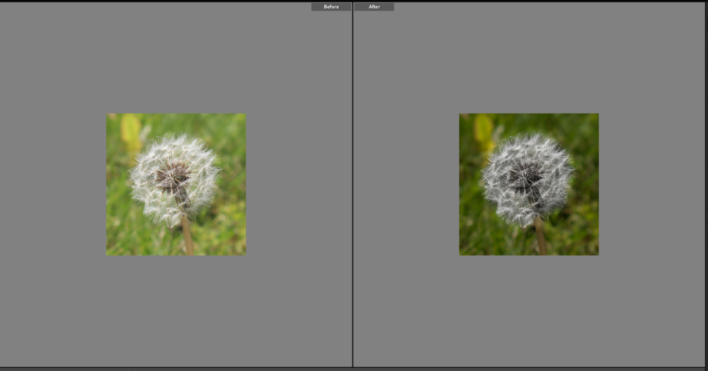
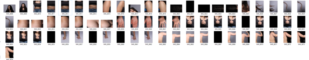
Another strength within my project is the level of experimentation I had. I wanted to make sure that I had enough options and that I had enough content. The creativity I showed in my experiments really showed how engaged I was in this project and how I actively was trying to create different concepts and ideas. The number of photoshoots I did also really helped me have a variety of options when it came to experimenting and editing with images.  

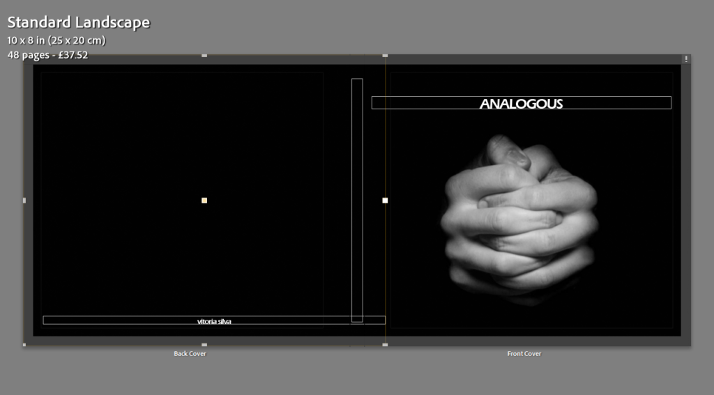
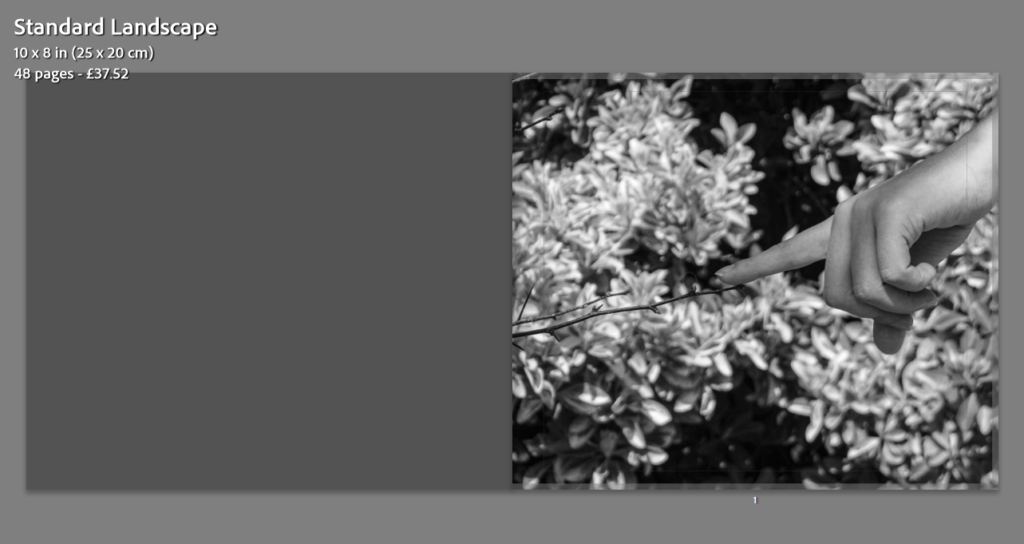
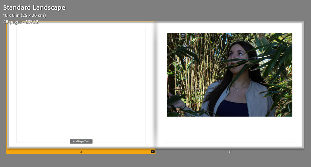
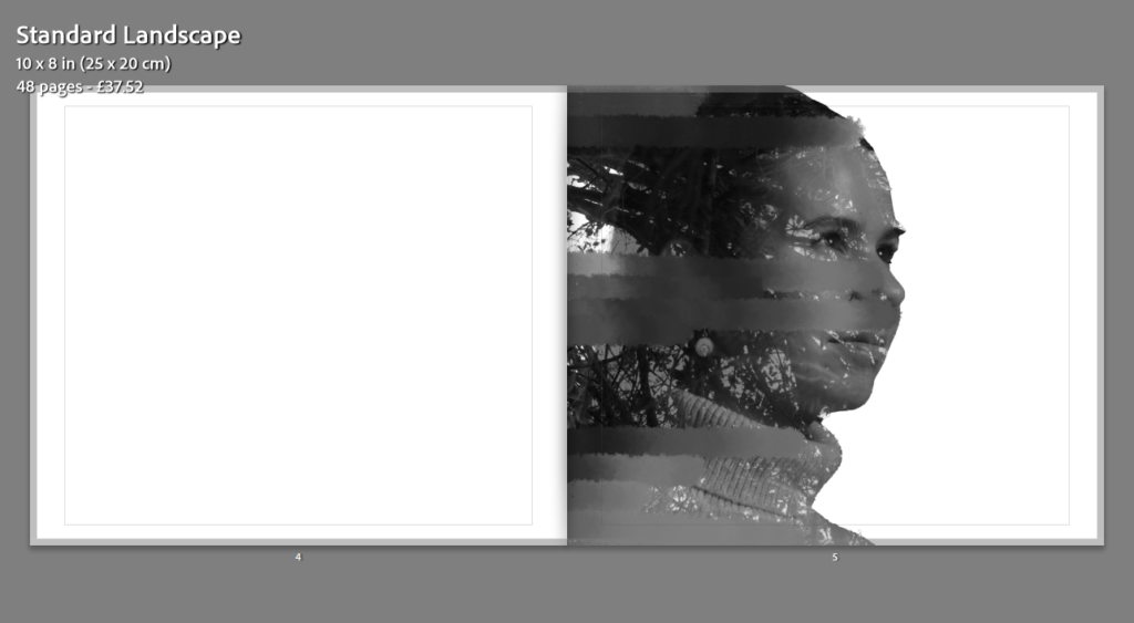
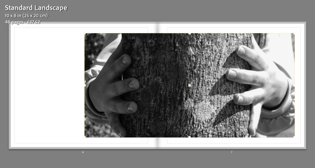
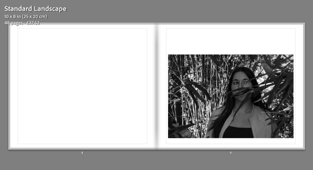
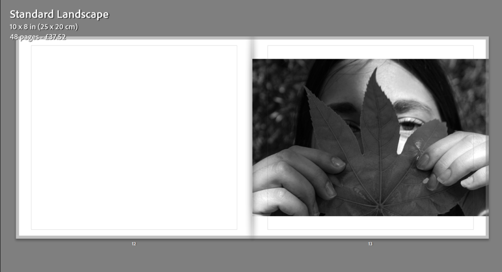
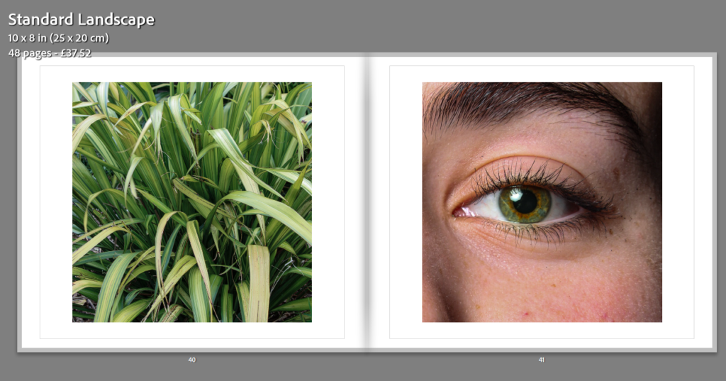
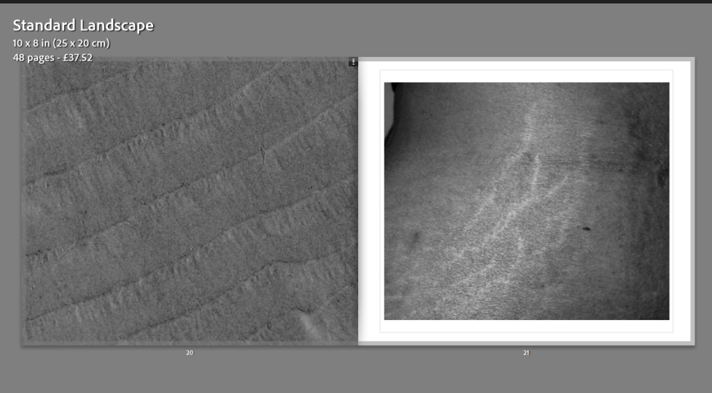
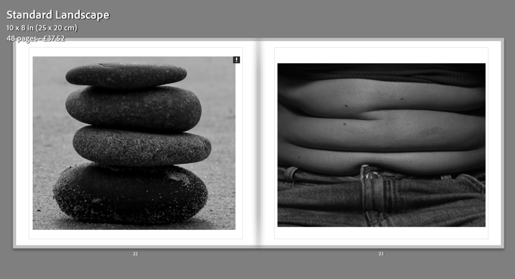
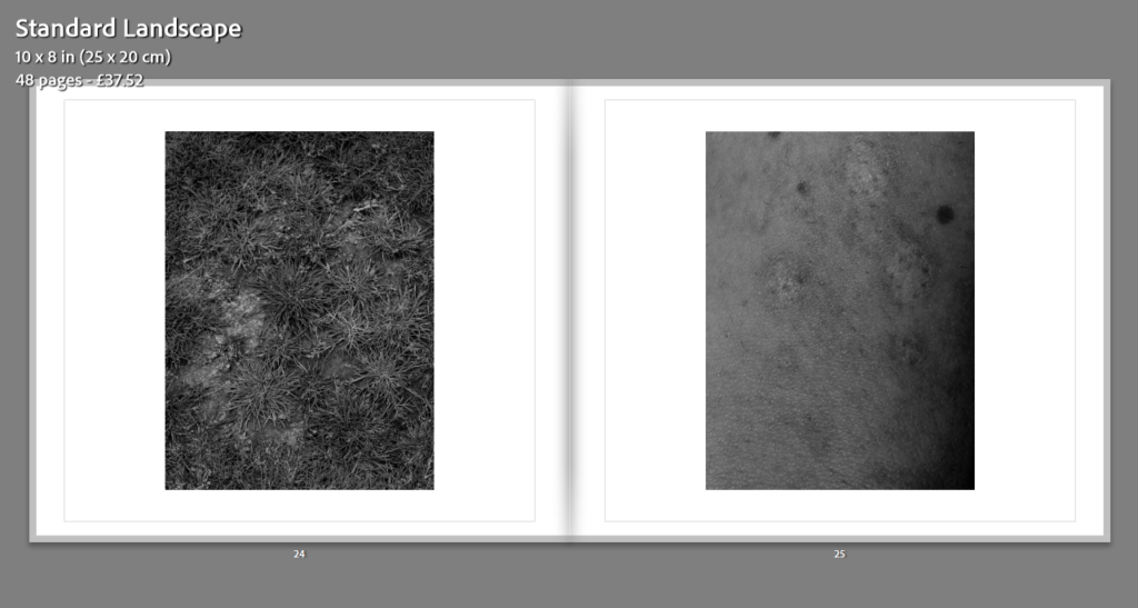
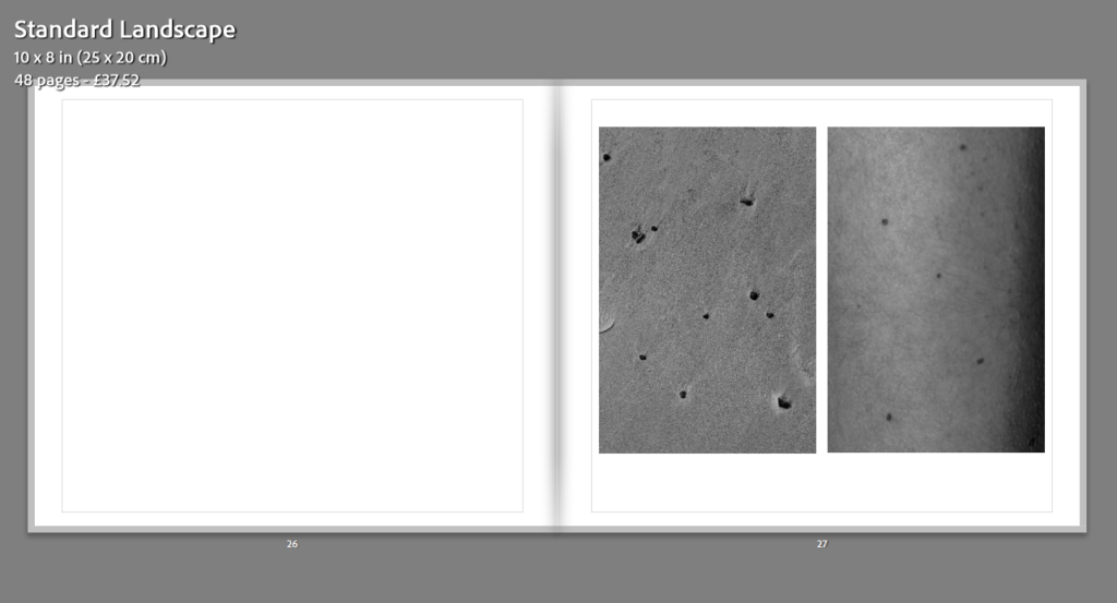
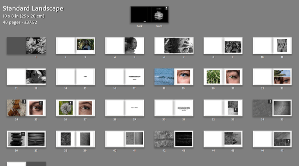
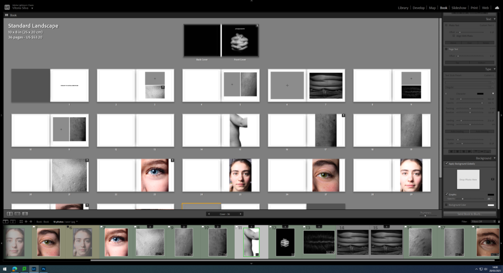
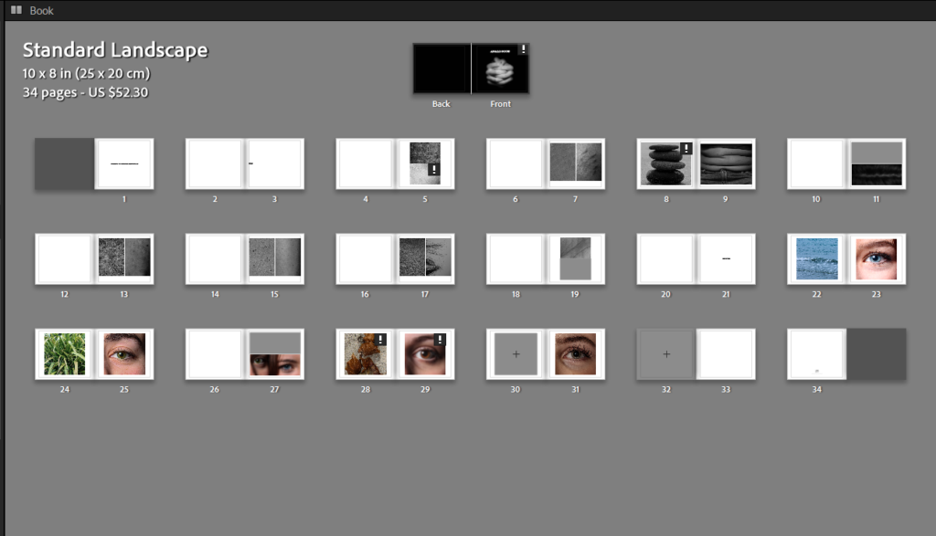
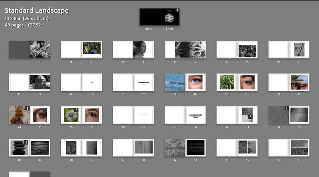
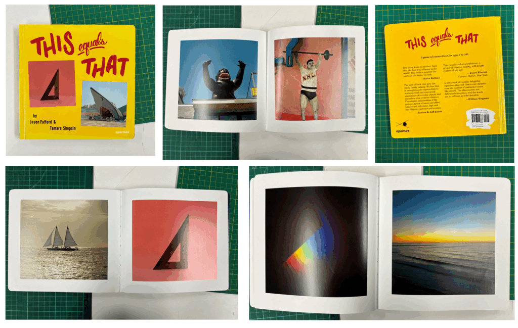
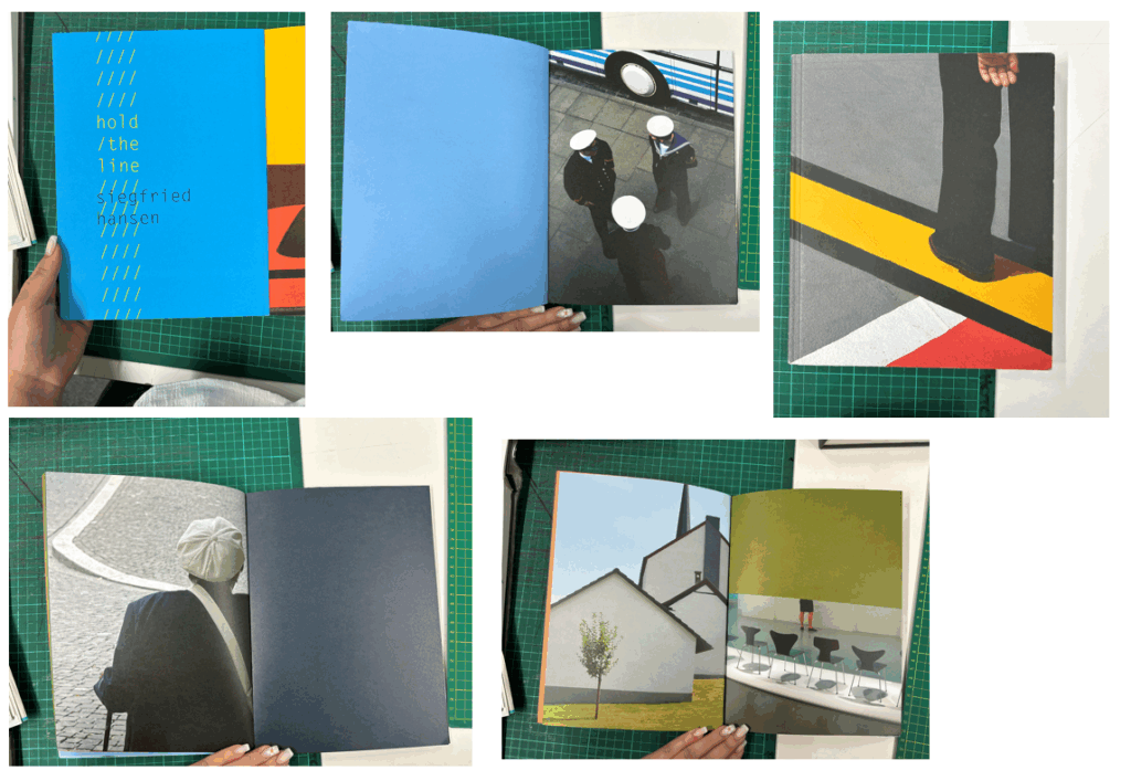
Lastly, I believe that my photobook is my biggest strength. In my photobook I was able to show my research, inspirations and ideas which is what makes my photobook so influential. My photobook is outside of the box, and it has many different concepts within it which is something I’m proud of because all my experimenting and editing I did finally paid back.  

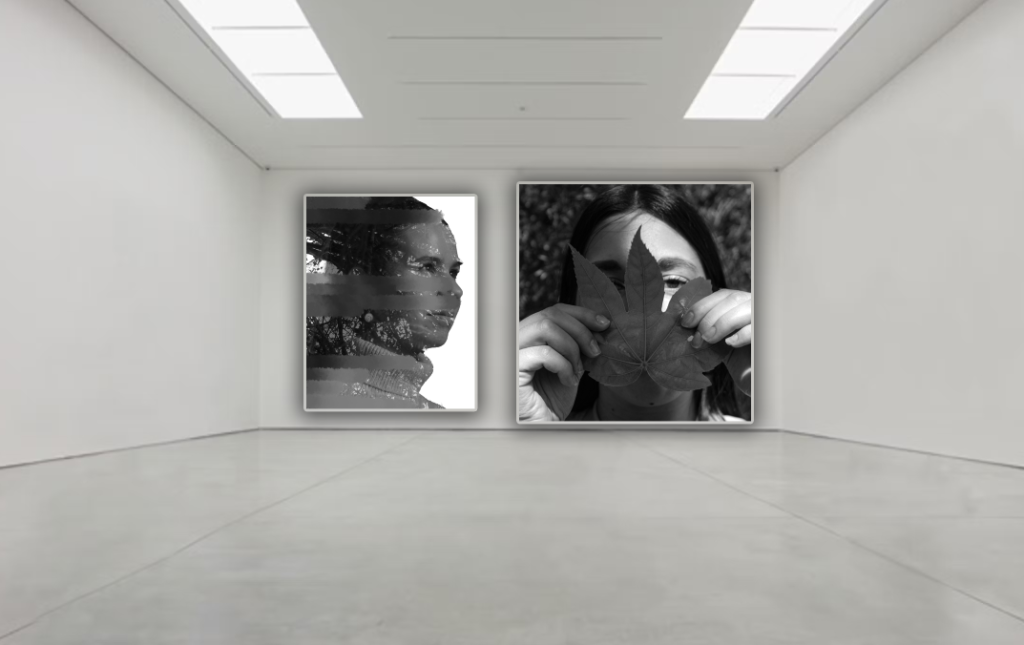
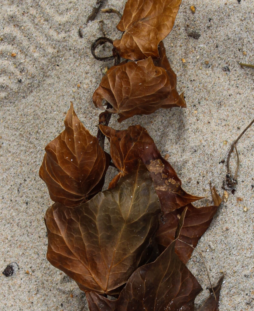
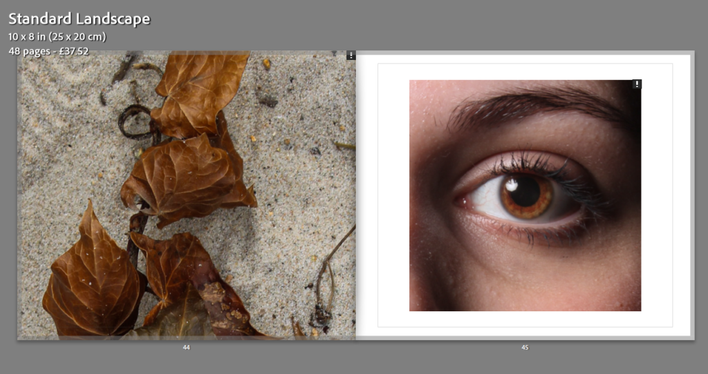
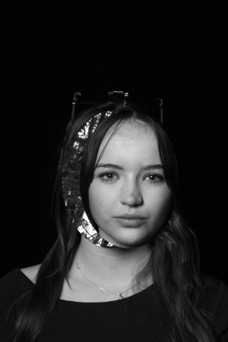
There are of course many improvements in my project and these improvements and suggestions are something that I will take into consideration if I construct another project like this. One of the improvements is that my photobook should’ve been longer and much more creative, in terms of colour and shapes. My final outcomes could’ve also been presented in a much more creative way, like adding textures or natural resources, like leaves to present the images, especially in the virtual gallery.  

If we put this aside, I am really proud of what I have accomplished in this project. I have learnt things, created things and showed skills in this project. This project has taught me to always think outside of the box and to find the deeper form of something.  

virtual gallery and evaluation

Evaluation:

Overall, I am really satisfied with my final presentations as a virtual gallery. I think that the structure of my virtual gallery is smooth and constructed. The images presented in each different virtual gallery evidently link to each other which shows that I have clear understanding of what I am doing and want to show. The structure of my virtual galleries also show how organised and systematic my images are, which is one of my strengths.

 Furthermore, I believe that my final outcomes presented in a virtual gallery, give my outcomes and more real feel to them. It enables me to be more interacted and emerged to my outcomes, which is a strength because it also makes audience feel like the virtual gallery is real, like they are standing in a gallery, looking at my final outcomes. 

Lastly, I strongly trust that my virtual gallery is accurate and real through editing. My editing that I have used in my virtual galleries allow my outcomes to come to life. The use of shadows and outer glows in my outcomes, to make it look like my images are planted on the wall, allows audience to fully believe that my outcomes are in what looks like a real gallery. This is one of my strengths because I am confident that my editing skills are strong and engaging and really bring my outcomes to life, especially when creating a virtual gallery and trying to make it look like an actual gallery and a ‘real life’ experience. 

Final outcomes/ prints and presentation.

A3 prints:

A4 prints:

A5 prints:

Digital presentation:

Presentation 1:

Presentation 2:

Presentation 3:

Presentation 4:

Presentation 5:

Final book layout and evaluation

Pages:

Full Book:

Evaluation:

As seen above, these are my final book screengrabs. I am confident in saying that I am very pleased with my outcome. I believe that there are many strengths and some weaknesses in my book. One of my strengths is my structure.  The use of quotes and colored and black and white images within my book really shows my creativity and thinking process when creating this book. The use of colored images at the beginning of my book, which is where I show a human figure ‘connecting’ with nature, allows me to set the tone for what my book is about. I purposely did this because I am aware that my Heading on my front page is an uncommon word that many don’t know which encourages audience to research about it therefore allows audience to be much more engaged with my book. Carrying on with my colored images, the structure of the images, is meant to show what connecting with nature is like again, reminding audiences what this book is about.

 Moving on, another strength of mine is the use of comparison in my black and white images. These images show how connected and related we are to nature. The use of side-to-side comparison allows audiences to clearly and actively realize the connection we have with nature. I have no doubt that the use of side-to-side comparison shows my clear intentions of what I wanted the audience to realize, which I also believe is one of my strengths. Lastly, I am sure that a strength that I show in my book is my title and cover. My cover is fully black, simple but eye catching. The simplicity of the cover allows no distractions and is straightforward. The fact that it is fully black is also engaging because it is not something that is seen regularly in photo books. The title itself is engaging and powerful. It is an uncommon word which strikes curiosity therefore guarantees that audiences will be interested and involved. It is a word that many will have to research about it, which is powerful itself, hence why I believe that my title is a strength in my photobook. 

However, there are some weaknesses in my book and improvements are needed. Like the fact that my creativity is minimal. My editing is great but my creativity within my image’s lacks. I could have incorporated more images in my book where I merge nature and humans together, using photoshop. For an example, taking an image of a trunk coming from the side of a tree and then merging an arm of a human coming out of the trunk. I could have also used more colour in my book. Like radical colours and edits of my images. This would ensure that I had contrast and diversity in my images and within my book. Lastly, I mention that one of my strengths in my book is the simplicity of the cover, however it can also be a weakness and a place which seeks improvements. This is because simplicity lacks creativity which some may seek and therefore not engage certain groups of audiences. I could have made my cover more colourful and abstract

Book progress

Progress 1:

In this image it shows the start of my book. I have some images produced which I have edited and placed in Lightroom. Pressing the folder which these images are in, I created book. It gave me a random selection of the images and randomly spaced them out. I started to think about how I wanted ti structure it. So in this image it shows how I’m starting to think about how and where I’m going to show my images

Book progress 2:

In this image, I have begun to form a structure in my book. In this image I Begun to form sections in my book. These section will help me develop my book and ensure that the structure of the book is smooth and complementary.

Book Progress 3:

This is my final book progress, here it shows my outcomes and the structure of my book. In this image I was able to show how I came to the structure of my book. In this progress, I have added text and quotes on my book because it shows clear inspiration of my artist case studies. The quotes and text helped me have a clear idea of how I wanted to structure my book so I acted on it

Concept, narrative and design of Photobook

Concept: The whole concept of my book is to show the powerful connection and linkage between humans and nature. This topic is often talked about however its not really photographed or acted on. The idea of my Book is to show people how truly connected we are to nature and how extraordinary mother nature is. By photographing nature and human features and comparing them, it allows audiences to get a true idea of how similar we are to nature.

Narrative: The narrative of my book will be sequenced so that it shows the merge of humans and nature. It will also show comparisons of nature vs humans. This narrative will be smooth and simple. With this narrative, the message is clear and direct. The whole point of my narrative in my book will be to clearly show audiences the correlation between humans and nature.

Design: The design of my photobook will be simple yet effective. The black cover with white text will be straight forward. Its won’t be distracting. Its simplicity will attract. The design of my photobook in terms of layout will be diverse and attractive. The different types of modification within the book will show creativity and understanding because it will show that I understand that certain images need to be presented in certain ways

Research and analysis of other photo books

Introduction:

In order for me to have a guide for my project, I need to research about different books so that I can have a clear image of what I want to do. Doing this, it will help me find the structure or ideas I want to convey in my book and therefore help me produce my book. This will also enable me to have a head start on my book and know exactly what I am doing. So I have looked through 2 books and one magazine, this research will help me immensely with my book and these 2 books and one magazines will be like guide for me when I’m producing and constructing my book.

Book 1: ‘This equals that’ by Jason Fulford and Tamara Shopsin

In this book, I looked at the comparison and contrast within this book. I liked how the authors linked two polar opposite images by things like colours, shapes and shades. This was something that I wanted to take into consideration when producing my book.

Book 2: Hold the line’ by Siegfried Hansen

In this book, I liked the minimal comparison that the author showed in his book. I liked how two pages connected in some way. It was smooth and compact. There was always something that complimented the two images that were side to side. I really like this because the structure of the book was smooth and complimentary. This was something I really wanted to do in my book.

Magazine 3: ‘Love and Rebellion’ by Hautlieu newspapers

Although this magazine is quite all over the place, I really liked the fact that the magazine had black and white images but also coloured images. I also really liked the ‘collage’ theme this magazine had and how some of the page spreads had comparisons. These two factors where factors that I took into consideration before producing my book.

Experimentation:

Experiments:

Images 1, 2 and 3:

Image 4:

Image 5,6,7, and 8 :

How I made image 1, 2 and 3:

First, I opened photoshop and uploaded an image that was in my folder. After this I pressed on the object selection tool and selected the girl show in the photo. After only her portrait was selected, I right clicked and pressed layer via copy so that I would have a copy of her as shown above.

After I opened an image of a tree onto photoshop and using the move tool on photoshop, I dragged the copy of the girl into the image of the tree which then created a layer on top of the image of the tree.

Using the opacity and selecting which type of blending I want, which show on the left where it says normal. I started to play around with the opacity and blending option until I was satisfied.

As you can see, I have played with the opacity and blending modes so that I can produce an image like this. For this image I put the blending option as darker colour and opacity as 83%. Then I flattened the image and used the object selection tool to select only her face and removed the unselected background.

I used the eraser tool to remove any unwanted parts of the image and this is the final product.

How I made image 4:

First of all I uploaded an image onto photoshop and pressed adjustments and made the image black and white. Then I uploaded another image which was a tree with what looked like an eye and cropped the image so that the eye looking part of the tree was the only thing showing.

Then I placed the cropped image on top of the black and white image using the moving tool and then added some blending options like a drop shadow and stroke. This was all I did for this image.

How I made Images 5,6,7,and 8:

For this image, I uploaded an image of tree branches onto photoshop and them dragged the portrait on top of the image of the branches.

Then I selected a part of the girls face (this could be shaped as an oval, square or even rectangle) , like shown and used the move tool in photoshop to grab the selected part and move it away from the girls face.

Lastly, using adjustments, I placed a black and white filter on my image. This was all I did for this experiment.

Editing

Before and after 1:

Before and after 2:

3:

Before and After 4:

Before and after 5:

Before and After 6:

Before and After 7:

Before and After 8:

Before and After 9:

Before and After 10:

Before and After 11:

Before and After 12:

Before and After 13:

Before and After 14:

Before and After 15:

Before and After 16:

Before and After 17:

Before and After 18:

Before and After 19:

Before and After 20:

Before and After 21:

Before and After 22:

Before and After 23:

Before and After 24:

Before and After 25:

Before and After 26:

Before and After 27:

Before and After 28:

Before and After 28:

Before and After 29:

Before and After 30:

Before and After 31:

Before and After 32:

Before and After 33:

Photoshoots

Photo shoot 1:

selecting and coloring:

Photo shoot 2:

Selecting and coloring:

Photoshoot 3:

Selecting and coloring:

Photoshoot 4:

Selecting and coloring:

Photoshoot 5:

Selecting and coloring:

Photoshoot 6:

Selecting and coloring: