All posts by Thomas Little

Filters

Author:
Category:

Final Outcome

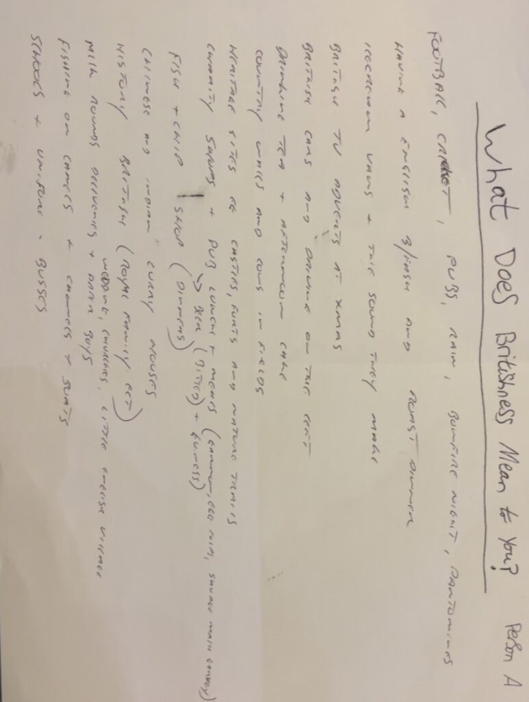
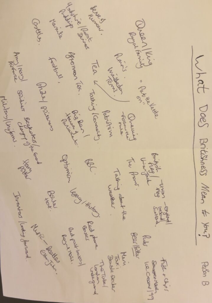
Final Reflection of my Project:

Union – Blended British

I began by studying what Union meant to me initially planning on focusing on the flags that make up the Union flag, separate nations woven together into one identity. After primary research with my family, I realised that identiy is much more than flags. It is found in everyday moments and objects and things I didn’t even realise were British.

This shifted my project. I started to elevate the everyday, finding humour and meaning in lots of ordinary British scenes and objects. I blended British iconic symbols like the Mini car, pubs and the union flag, with overlooked details like M&S tea bags, wheelie bins and ice cream vans. These combinations then reflected what Britishness actually is – traditional and modern, serious and silly, all blended together.

A turning point came when I realised how much tea and beer is crucial to British culture and we are known for it around the world. The 3 o’ clock tea alarm being believed by Americans, or the fact that pubs are seen as very British. They are social hubs unique to Britain. This is when I suddenly noticed the liquid theme running through my work. Tea, beer, rain, puddles, ice cream, petrol fuelling journeys, and this ties my work together on another level. Not just colours, or everyday scenes but liquids fuel us British people throughout our lives. Liquids move and blend and don’t stand still. Like British culture, some elements remain but others evolve and flow and I find this really interesting.

Union: Blended British became more than a project about national symbols. It became a reflection of me, my life, and where I fit in. It became a reflection of how tradition mixes with the everyday, how identity flows and changes and how Britishness can be found not just in what we see but in what we feel – in the small, ordinary moments we share.

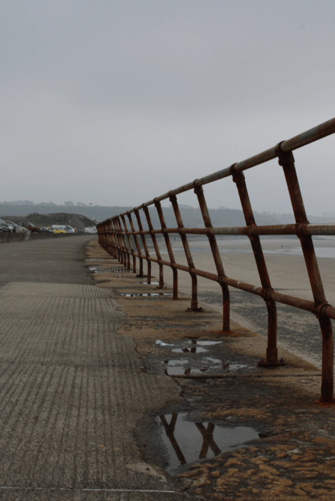
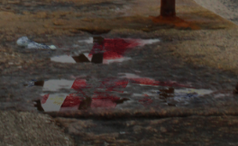
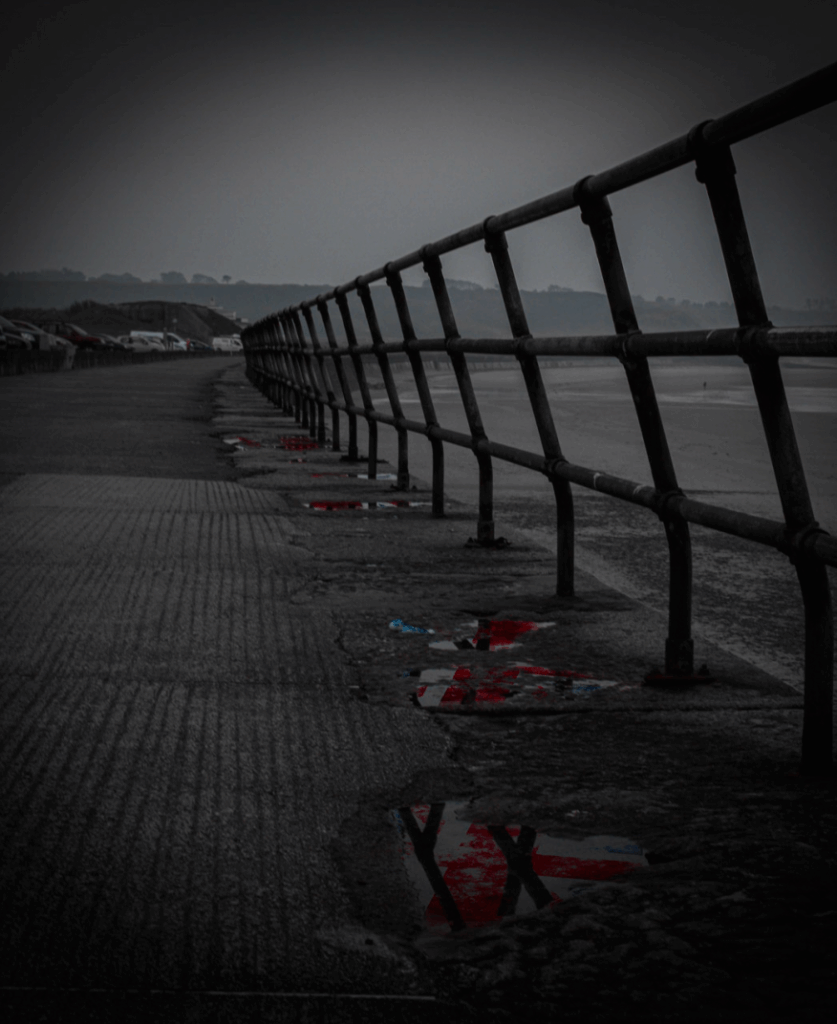
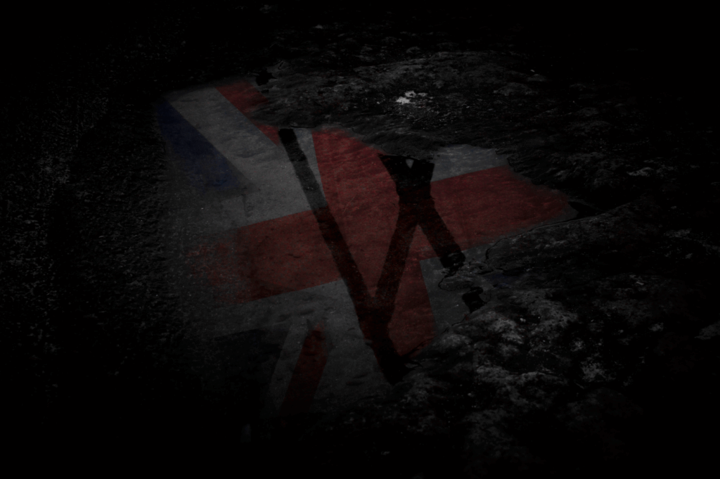
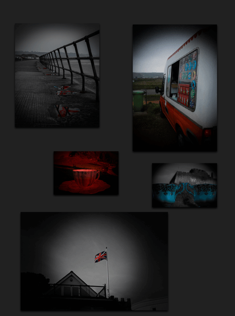
Image 1 – Reflected Glory

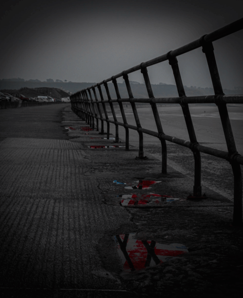
For my first image, I chose this image I took with a camera and then manipulated on Photoshop to create these Union Jack Flag’s inside of each puddle till they all some colour in with the black and white effect on everything else with a vignette around the final image to create focus points on the puddles and also to help the idea of Britishness and a cloudy, rainy day.

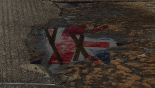
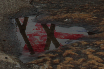
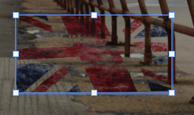
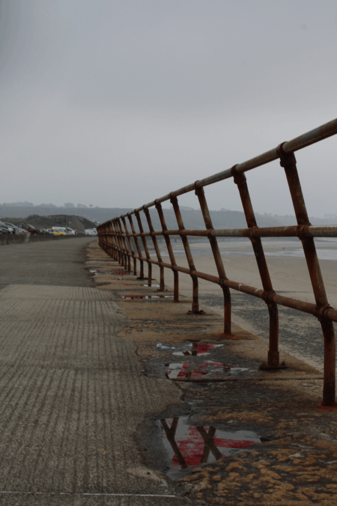
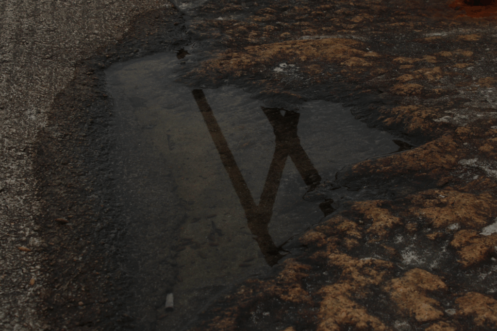
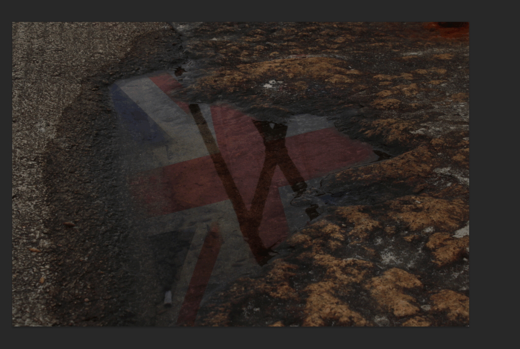
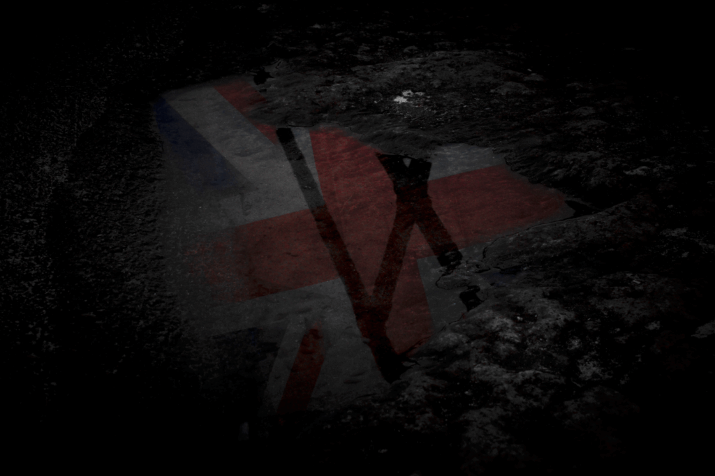
Image 2 – A British Puddle

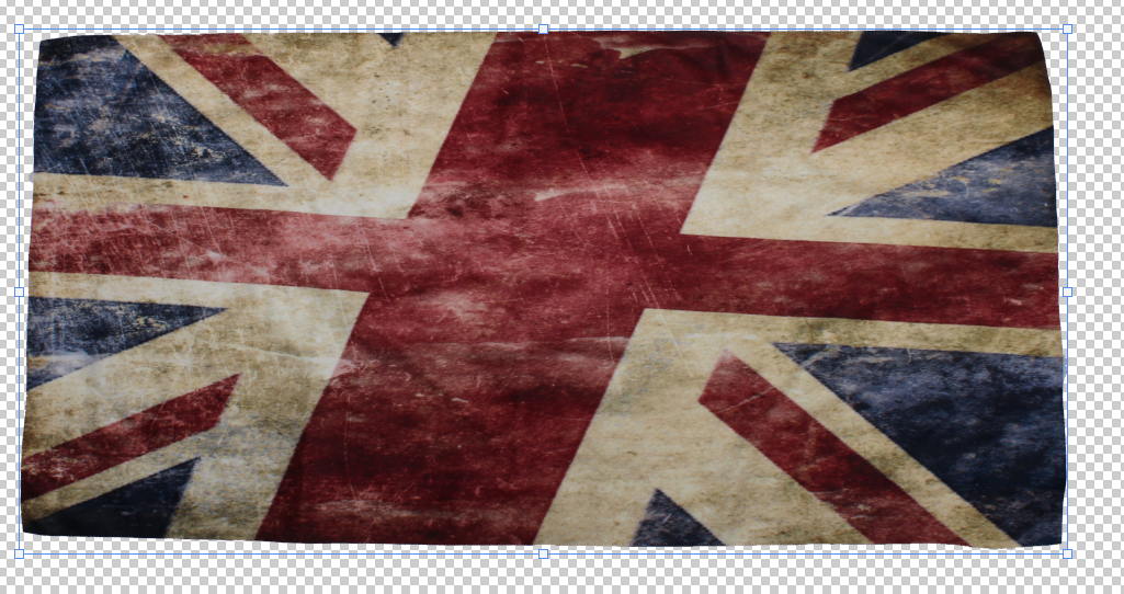
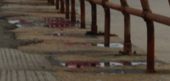
For my second image, I chose this image because not only is it a reflection of the Union Jack Flag inside a puddle again like image 1. But, this is a close-up of just one singular puddle with the flag showing through the reflection which tells the viewer that everywhere you look, even in a puddle, you can always see your heritage and where you came from.

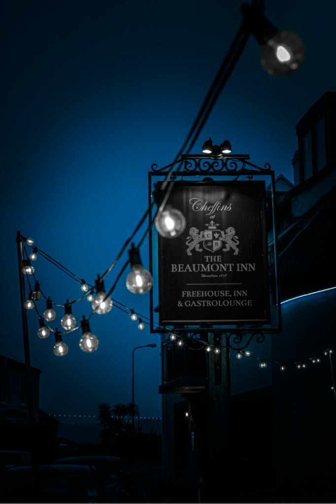
Image 3 – The Public House

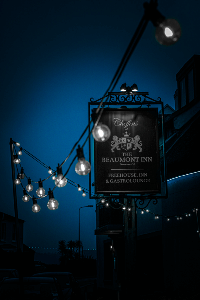
For my third photograph, I chose this image because a pub/inn is very iconic and commonly known for as British and where the brits always go to watch the football, have bitter pints with mates, play darts and many more activities. I chose to use this photograph of outside of the pub showing the sign with the lights all around, this is because I felt it looked like a common standard pub which is exactly what I wanted, especially with the blue effects I used over it whilst making everything else in black and white with the vignette, I felt made this image feel even more British.

Image 4 – The Red Bar

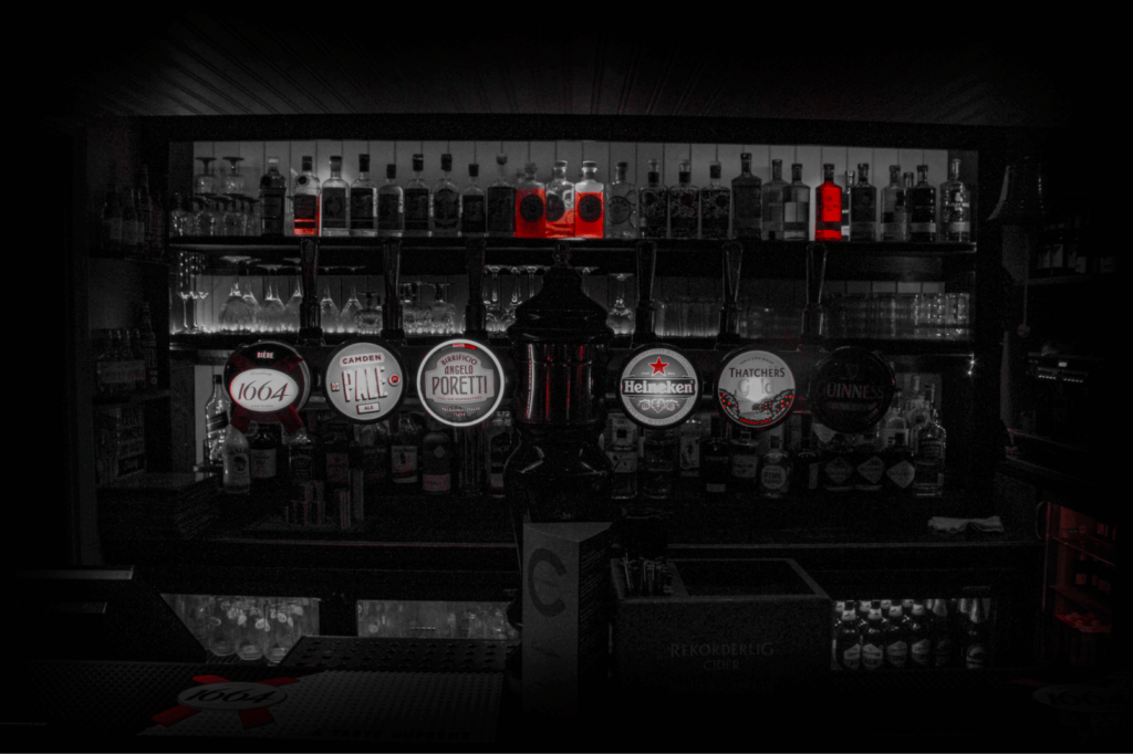
My fourth image, I chose this photograph I took of inside of the Pub which correlates to image 3, but for this image I wanted to do the opposite of image 3 and instead of only keeping the blue colour, I decided to only go for red as there was more red in the bar than blue and all of the alcohol pumps/logos had red on them.

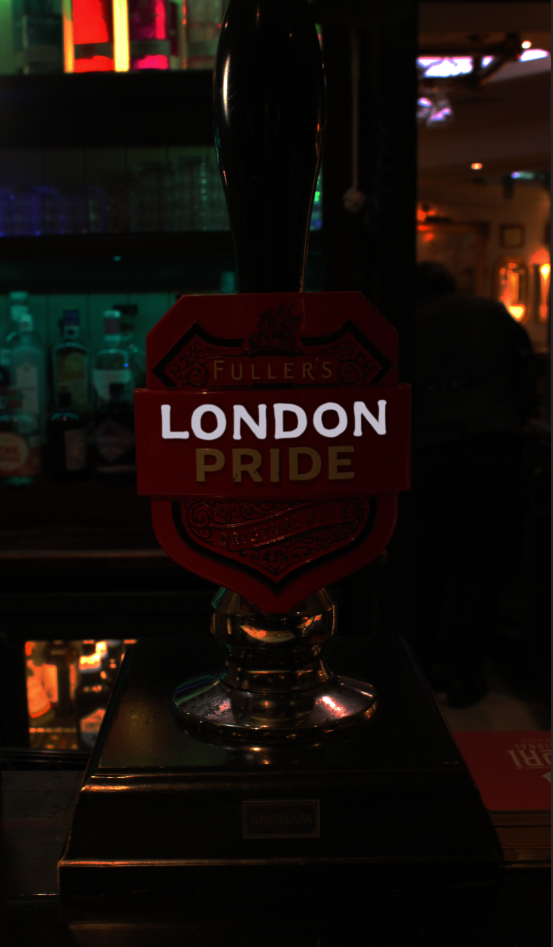
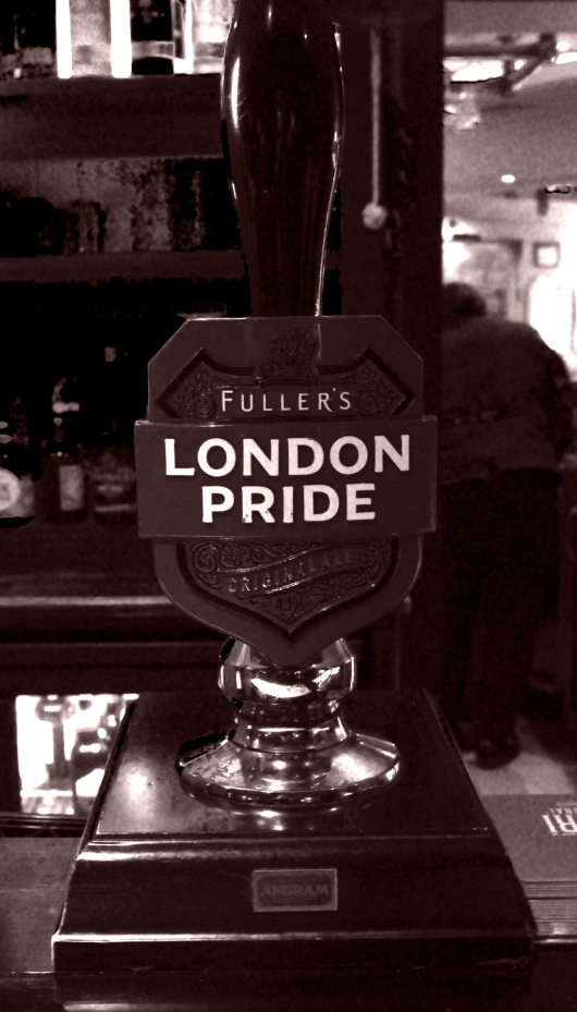
Image 5 – London Pride

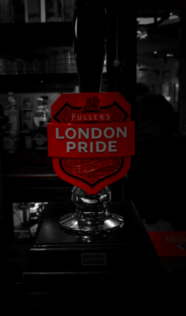
Image 5, for my image 5, I got a close-up image of a London Pride Pump, which is clearly British as it has London in the name, but, it also has a full red shield around with a crest design on too, very British design.

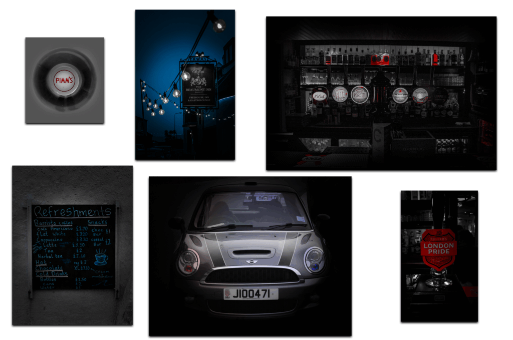
Image 6 – Pimm’s Perspective

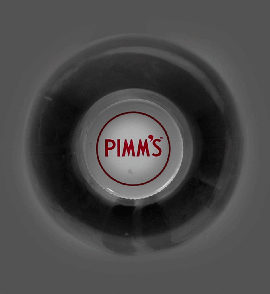
Image 7 – Refreshing Menu

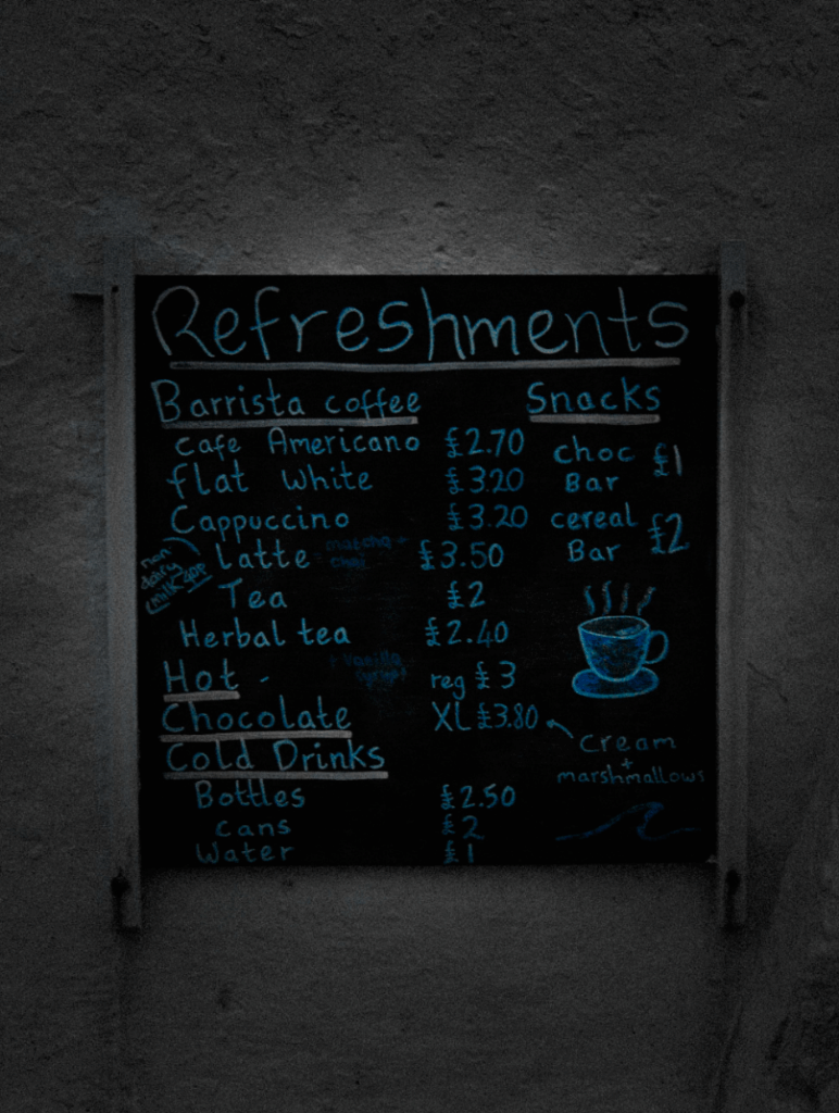
Image 8 – Home Pride

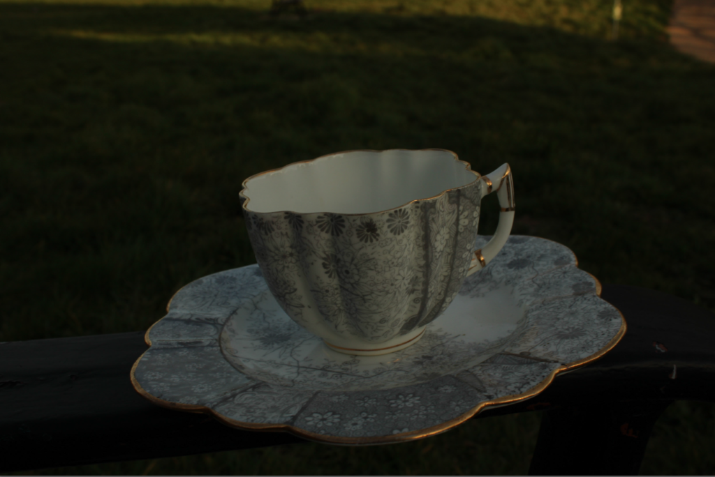
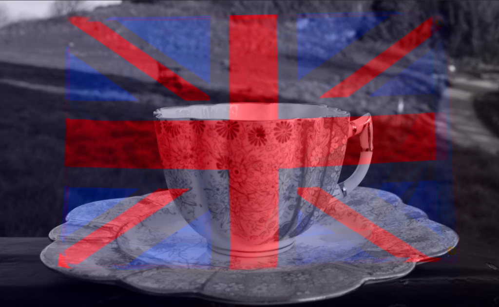
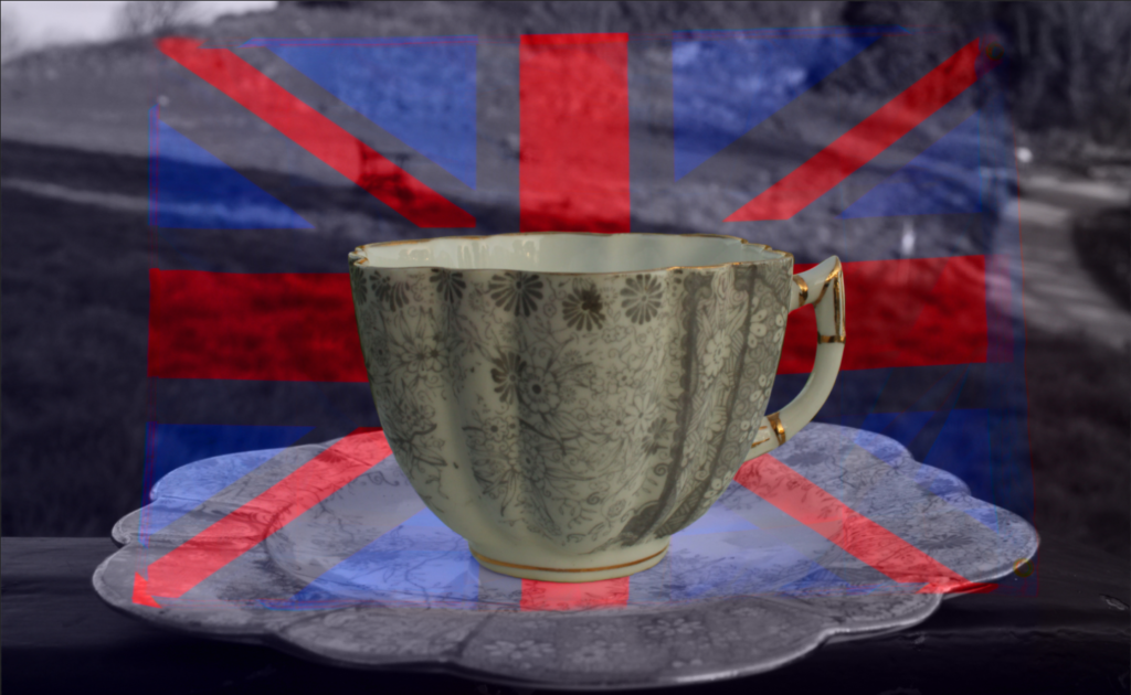
Image 9 – The Colour of Tea Time

Image 10 – Tradition on a String

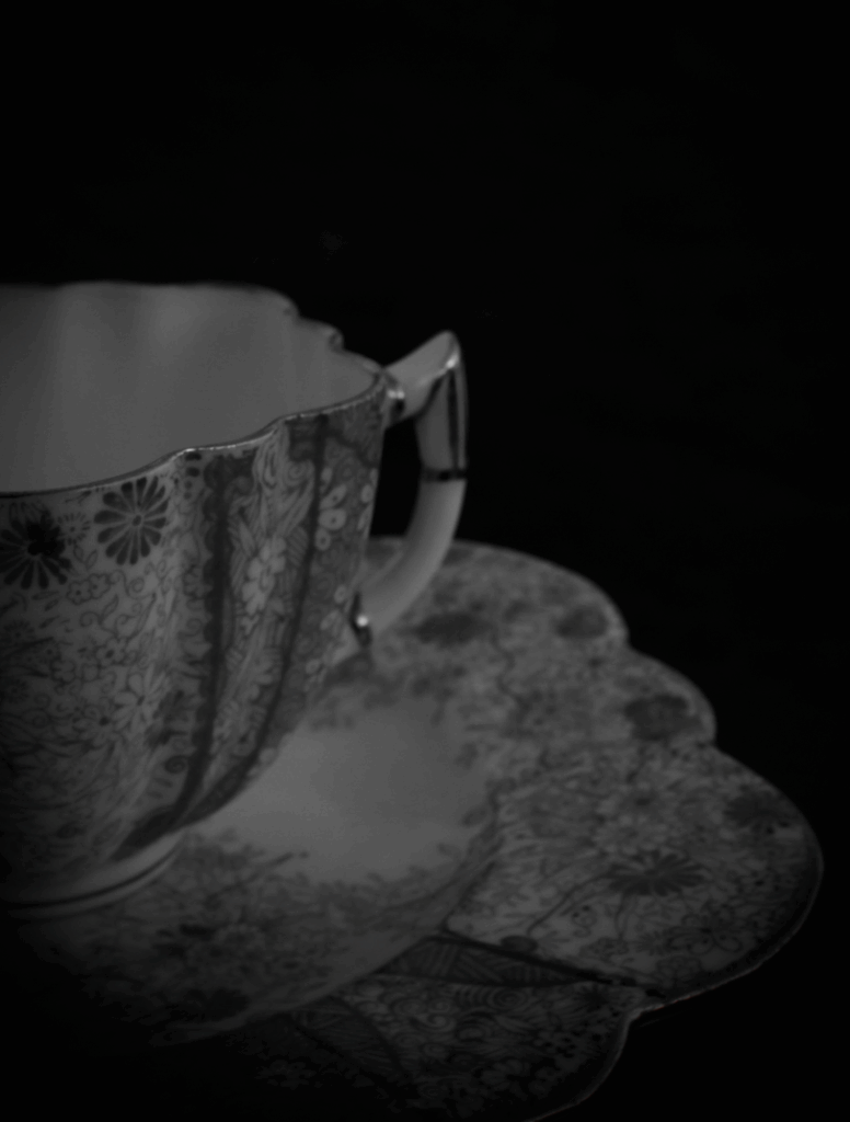
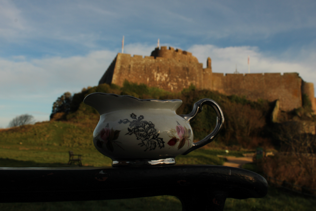
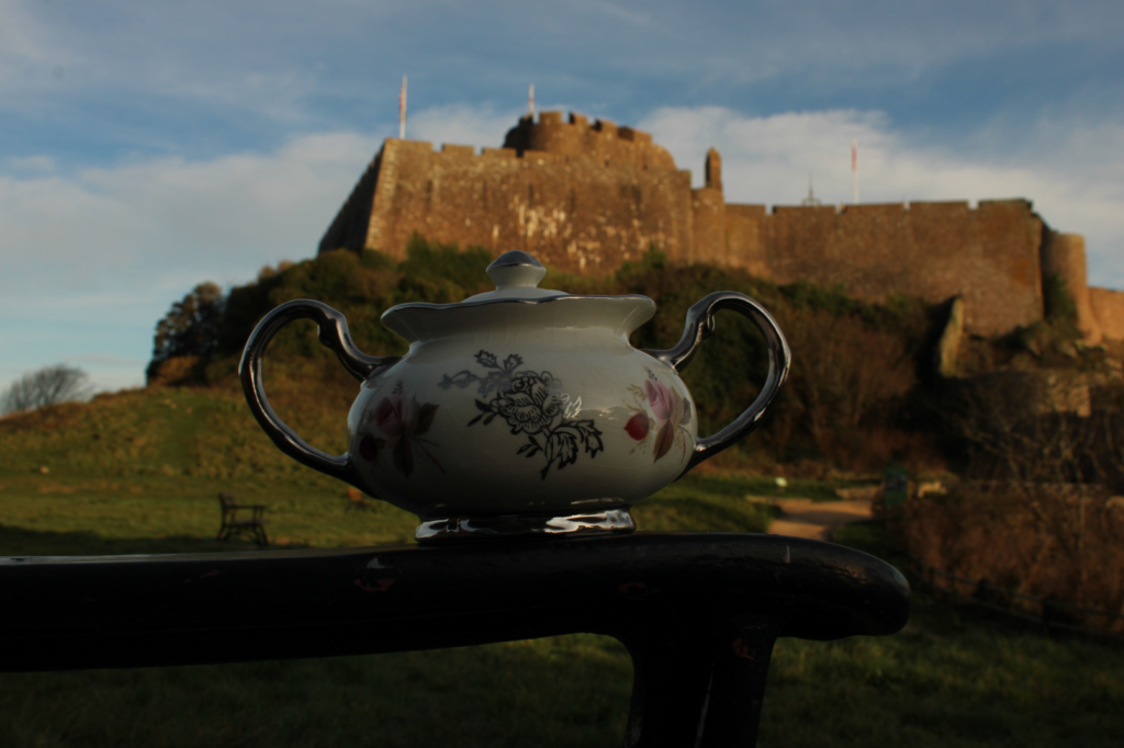
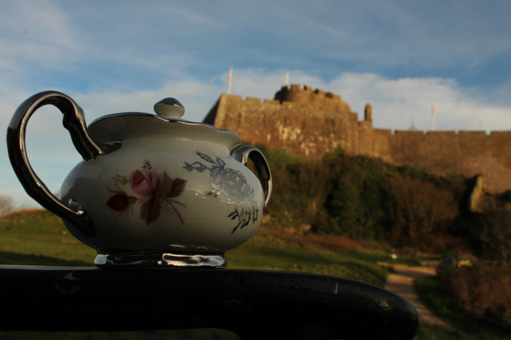
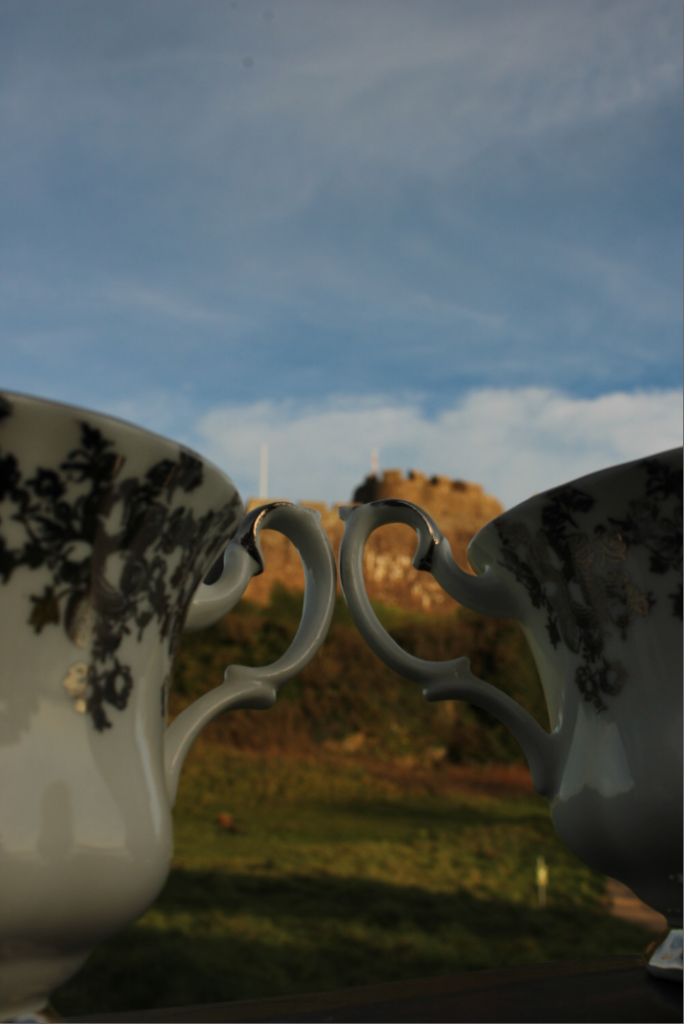
Image 11 – Tea for Two at Gorey Castle

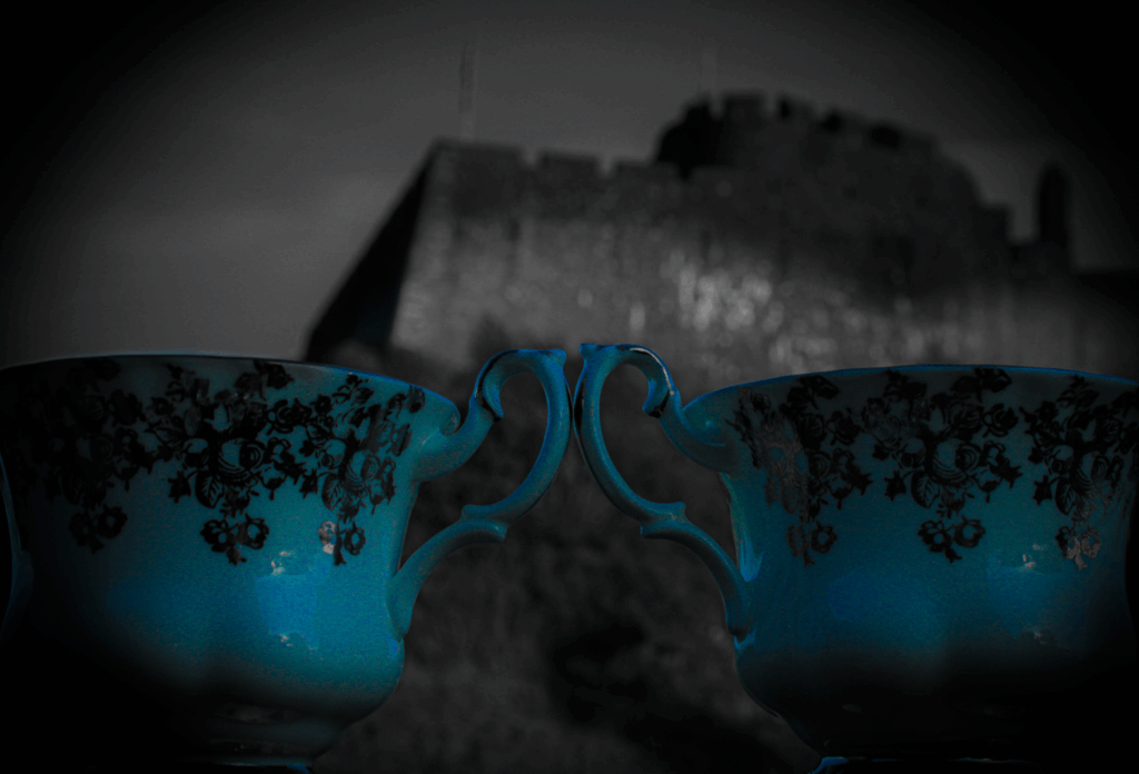
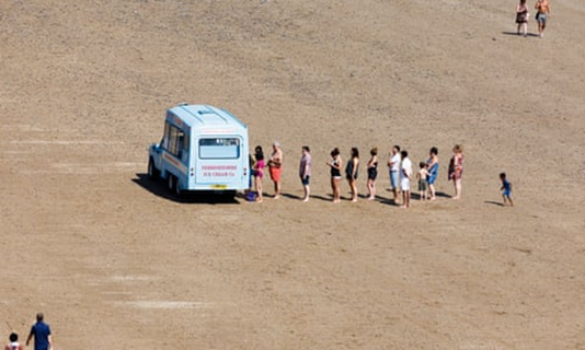
Image 12 – Driving the Union

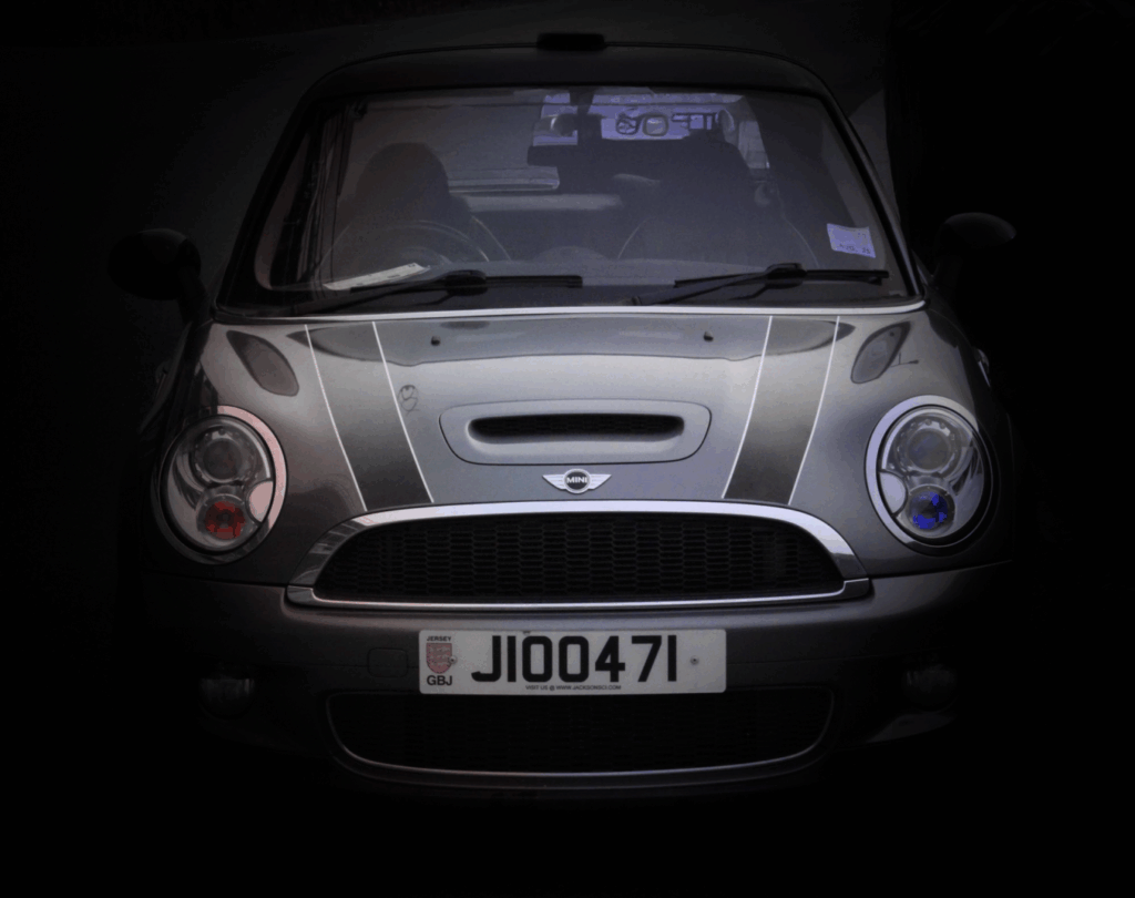
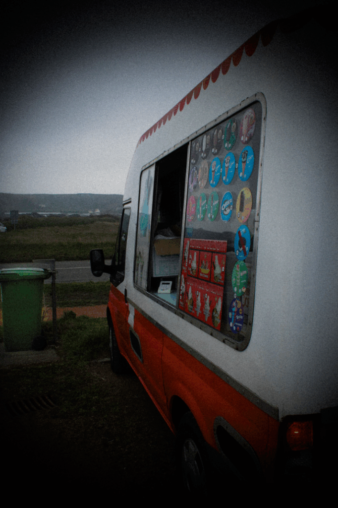
Image 13 – Freezing Hope

Virtual Gallery

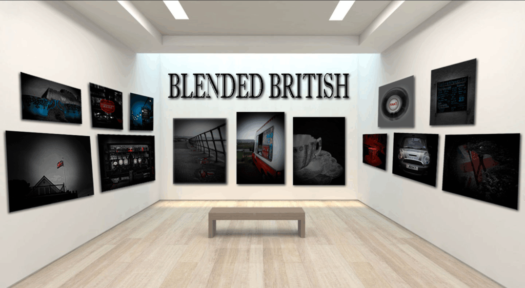
I did a virtual gallery with all my final images and created this using Photoshop stretching and transforming each image to help show the perspective that they are hung on the walls. I also put in my title above the main 3 images ‘Blended British’. I used a very generic-looking font that matched my theme perfectly, this is to show what my collage is called and to show the viewers what it is called.

Mounting & Framed

Mounts

For the physical mounts I created this was the layout I decided to go for. I chose these images on each mount board because half of them went together and worked well next to each other and another half worked well together, so I split them up into two different mount boards which looked like these.

Mount 1

Mount 2

Frames:

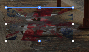
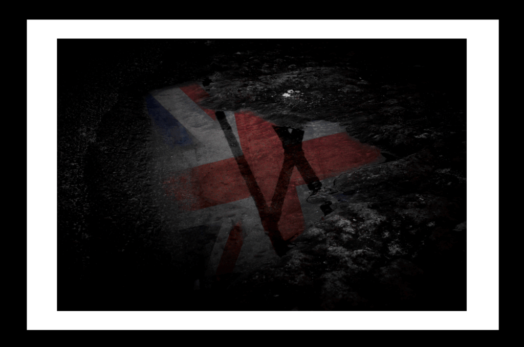
For the framed images I created, I framed one image which was image 2 – ‘A British Puddle’. I chose to frame this image because it stood out to me of how it is just a singular puddle with the reflection of the Union Jack Flag, and so I didn’t just want to add it on to a mount board, instead I put a black frame around it but I also had a white border about 4cm long, in-between the frame and the actual image.

Frame 1: A British Puddle.

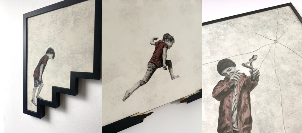
Frame 2: Tradition on a String – Broken.

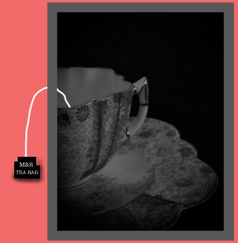
For my second framed image I created, I chose to frame image 10 – ‘Tradition on a String’. The reason I decided to frame this image, was because like my artist Andrew Scott, he uses the frame in ways as manipulating to bring his images to life. I really like his art work and ideas and decided to try create something inspired from him. That is why I chose image 10 because it is a photograph of a tea cup I took, but I cropped it in half so that when I have a frame around it, I can add a tea bag string coming out of the cup and out of the frame just like Andrew Scott. Also, I wanted to do something to the glass frame as Scott does that too by breaking certain parts on the frame, to interact with the viewer. So, what I did was I dropped the glass frame ever so slightly onto these metal pegs from around 10cm high, which created these 3 large breaks on the frame over the cup of tea, but, this is perfect because it symbolises ‘Broken Britain’, how Britain is slowly breaking and even the cup of tea is dying out as not many younger people drink it nowadays compared to decades ago.

Wasn’t planned but emerged naturally. I realised that liquids move, blend and reflect – just like identity.  Liquids are central to British life and the flowing, adapting life we live.

  • Tea,   (ritual, comfort, routine, known for it worldwide, union of people)
  • Beer,  (pubs, community, tradition, union of people)
  • Rain, (british weather, we talk about the weather a lot and hope it will be good)
  •  Puddles, (reflection, after the rain)
  •  Ice cream,  (seaside life, frozen, melting moments)
  • Petrol. (motion, modern life)
  • Liquids tie together the familiar and the unexpected.
  • Represent movement and change. British identity is not fixed, it has its roots in tradition but is evolving and blending.
  • Even the wind in the flag photo connects – air carries water which will eventually make rain, mist, sea spray, movement underpins everything.
  • Liquids REFLECT – I want people to look at my photos and reflect on what they mean to them, personally and as part of their culture.
  • Fleeting – liquids change, melt, flow, freeze, boil.
  • Connects to the personal and the national – a cup of tea at home, to a pint in a pub a puddle on the street and a car journey.

We are all connected, in union and my project is my reflection of Blended British.

Progression – Selecting and Editing Final Images

Union: Blended British

‘Blended British’ is what my union theme will be called. This is because,

Image 1 – Reflecting Heritage

I started using this photograph I took whilst walking along St Ouen’s 5 mile road. I chose this image because I liked all of the different reflections on the ground in the puddles and I can add my ideas on top of this. Also, it is very moody, damp, misty and cloudy which matches the image perfectly to the puddles and especially due to British weather is commonly not so great, it matches my theme perfectly.

I started editing it by cutting out this photograph of a Union Jack flag I took which already had this grainy, tea-stain look to it. I then made positioned this layer on top of the first puddle and chose the ‘Darken’ Layer filter.

This allowed my image of the flag to be transparent whilst still letting in the darker sides of the flag through and still in colour which was perfect for my puddle reflection and resulted in this.

I next used the rubber tool with 20% opacity and rubbed out all of the edges around the flag that was on top of the rock/ground because I only wanted the flag to be in the puddle, resulting in this.

I then decided to do this for most of the other puddles in the background following back, which is what I did next, repeating the same steps.

Then removing all of the parts of the flag which were on top of the rocks and not in the puddle using 20% opacity on the rubber tool.

Finally, I did it once more by using one flag image but spreading it over 3/4 smaller puddles to really spread the flag. Repeating the same steps.

Removing the outside parts of the flag once again until only the flag inside of the puddle is showing, resulting in this.

This is the final result of the edited flags inside of the puddles, but I will add a Vignette around the image using Lightroom.

I also cropped the top of this image because I wanted the focus more on the puddles and rails not the sky, and also edited the image to make all of the colours that aren’t red or blue, in black & white to create isolation and more focus points for the viewer on to the puddles.

These are the effects I used to create the Vignette around my final image resulting in this.

This is my final image which I really like and I love how it’s in black and white with only the flag colours showing through, the rail on the right also adds sadness and because it looks like it goes on forever it draws the attention back to the puddles.

Image 2 – Past

For my second photograph I will be editing, I am going for a similar theme to the first image but instead of multiple puddles, its just one singular one with a flag inside of it.

I chose this puddle image to edit with because I love the rocky ground around it and how the puddle creeps up to the gravel ground. Also, it already has a reflection of a rail inside of it, but I will be keeping this in and overlaying my flag edit on top of it.

I started by cutting out this image of a flag I took in the studio. I didn’t iron the flag on purpose so that the crinkles on the flag acts as ripples in the water from the puddle.

I positioned the flag where I wanted it over the puddle and using photoshop, I selected the ‘overlay’ layer filter which made it look like this.

I chose this layer filter because it helped it give the transparent and puddle/reflection look once again. But then, I cut out all of the edges again from the flag using the rubber tool with 50% opacity, for the big parts of the flag that are only on the rocks, and 20% opacity for the smaller parts that are just touching the edges of the rocks/ground to create the look that the flag is inside of the puddle reflecting the Union Jack flag.

This is how the image resulted after I cut out the edges of the flag and also I lowered the opacity of the flag to 40% from 100% to make the transparent look feel and look more real.

I then did the same editing with the erase of colours apart from blue/red using these effects.

Plus, I added the vignette around this image again so that all of my final images will be correlating the same idea and will look more presentable, with my final photograph turning out like this.

I like this image because it has the same black and white theme as the first image, but it only involves one puddle in it with the singular Union Jack flag. This helps the viewer reflect on how wherever they go in England/Scotland/Wales, they will always see a Union Jack flag as even by looking in a Puddle, they will remember where they are from.

Image 3 – The Inn

For my third image, I decided to edit this photograph I took outside of a Jersey generic looking Pub which the British is widely known for.

I liked the photograph as it was, which I did by using these camera settings which made the pub sign, in-focus, whilst keeping the lightbulbs around it in blur.

But, I wanted to keep the theme of mainly using mainly red and blue, but also white as well, (the Union Jack colours). So, for this image, I decided to only make it in Blue so that I have some images in both red and blue, and some only in one colour.

I started by using the colour mix tools on Lightroom, with only keeping blue, in colour, whilst the rest in black and white.

Then, I edited the temperature and tint on the image allowing the whole image to be in blue, and also changed the exposure, contrast, highlights, shadows, whites, texture, clarity and also a vignette again around the final image, to give it a grainy, dark, gloomy feel/look to the image which is exactly what I envisioned of when you think of when you think of a generic English pub.

I also added the vignette around the final image again to keep the same theme for each image and to help the gloomy view and attract the viewers eyes to the middle of the image. Resulting in this.

This is the final image which gives off a cold, generic British pub especially because I manipulated the image to have the background and lights in blue, with everything else black and white, the grey light bulbs and sign with the black vignette really helps portray this gloomy, dark pub too.

Photoshoot 1 – Contact Sheet

I started by going into the studio with a bag full of Union Jack flags, England flags, Wales flags and other objects that involve the Union Jack flag on, such as a mug/cup, door stand bag, red guard outfit with a black top-hat and more bunting of flags.

I wanted to do an idea where I create a silhouette of someone in front of each flag. So, I got my friend to stand in front of the flags with another person stood on a box behind holding the flags out, then went into photoshop and edited him to be a silhouette in front of each flag ending with the Union Jack flag.

I then wanted to edit this photo of my friend dressed up as a royal guard with the flag overlaying on top of him, which I created by taking a photograph of just the flag and just him and then merging them with the ‘Luminosity’ effect on Photoshop.

I then didn’t want the shadows from the first image, so I used the brush tool and set it to a similar colour as the grey on the left side with no shade, used low opacity so I can blend it in, looking realistic, then covering the shade until it was looking like what I had envisioned, resulting in this.

Photoshoot 2 – Contact Sheet

My second photoshoot, I drove to Gorey Castle, had a bag of different mugs, cups and plates that looked very British. I sat down on this bench in front of the castle and did different angles aiming up towards the castle but focusing on the cups and plates with the castle behind in blur. I selected the white balance to be cloudy and I also experimented in shade mode, this is because half of the castle was in shade but half of it was in the cloudy-sunny day.

These are the camera specs I chose to use to take the photographs.

I did a Low ISO of 100 which allowed my camera to not take in much light whilst also making the photograph less grainy. I made the F-stop, f/13, which allowed the background to be blurry but I didn’t have to do a very high f-stop because the background was so far away it already blurred it.

These effects on the camera, allowed my images to come out like these, which is what I was aiming for.

I then started to edit these images using Photoshop and adding layers of the union jack flag over the top. I chose to do this because I wanted to implant the union jack flag/colours on to the images, but I didn’t know how so I experimented around resulting in these.

Then, I tried to edit the London Pride Pump image I took at The Beaumont Inn. But again, I was experimenting around with different editing tools and ideas with the image, starting with just highlighting the word ‘London’, with keeping the other colours and background all the same resulting in this.

But, didn’t like it so then I edited the whole photograph to be in black and white with a hint of red, grainy photograph, resulting below, but I wanted to focus on the fact that the shield around the words ‘Fuller’s London Pride’, was RED, the union jack’s main colour.

So as I was doing my final images and came across it again, I edited it by keeping the whole image in black and white, but using the colour selection tool on Lightroom to only select red as the whole shield was a strong red, perfectly representing brits and England. I then used a brush tool with 0 saturation and brushed over areas that still had colour in the background and also in the reflection of the pump. Resulting in the bottom image.

I decided to keep the red napkins on the bottom right still in colour in the red, because it adds more to the final image instead of just one part red, there’s two, so the viewer’s attention will get attracted more and easier. I did add a vignette again which helped the red napkins fade in to the image and not just standing out, also the vignette helped the background with all the glasses and lights around the London Pride Pump.

Photoshoot 3 – Contact Sheet

For my third photoshoot I went around Jersey in my car with my camera on a cloudy, gloomy day and took photographs of the sea, benches, surfers, rusted railings, puddles, rocks, shacks that served snacks and teas, traffic with queues, also I took photos of a rugby ball with the Jersey Reds logo on, English cricket bats, and a Jersey branded basketball jersey. Next, I went to a pub and took photographs outside of it and inside too taking photos of the bar, pumps and even a London Pride pump which I have used in my final images.

For the settings I used outside to take photographs of the cars, sea and locations I used these camera settings.

For the photographs I took inside, for close-up photos of the objects, bar inside the pub, and the London Pride pump, I used these camera settings.

Statement of Intent

Project Plan:

My initial plan for my project was to focus on British flags, exploring how the Union Flag/Union Jack is made up of the separate national flags, weaving them together but each country remains distinct. I wanted to visually show the idea of union and separation – historical but progressive, using the flags interlinked and layers to represent the union of british identity.

Person A
Person B
Person C

But as I explored further what Britishness meant to me and my family, mainly via primary research with my British family, (see sheets A, B and C), I realised that identity goes much deeper than national flags. From combining the key themes that emerged, I realised that Britishness is around us in everyday objects as well as in iconic british items that I didn’t even realise originally were totally British (M&S, wheelie-bin, 99 ice-cream, Mini car, Pimm’s and London Pride Bitter Beer). And the iconic British cup of tea, a national pastime I discovered and a cultural tradition bringing everyone together over a cup of tea, symbolic for good times or bad times, there’s always a ‘cuppa’ or ‘a brew’ going on. Knowing all of this made me rethink my whole approach. Yes the union flag is iconic but I wanted to see how Britishness is present in everyday objects. The union flag is sometimes seen but sometimes is ingrained in the object or ritual itself.

I plan to research artists who have used Britishness in their work – from Banksy often using Union flags in or on his work through to Martin Parr who showcased Britishness via seaside resorts, sandcastles, queuing or ice-cream vans, or socks and sandals. I also plan to investigate Andrew Scott who goes beyond the frame. Their influence will help me experiment with blending everyday British life together (tea, pubs, seaside) with traditional colours of the union flag or actually the flag itself, in my project.

I will use a mix of photography, digital manipulation and physical objects to introduce unexpected elements into familiar scenes.  I will also try different colourways, black and white photography, colour selection and framing to challenge how my images are viewed. I will try some surreal techniques to see if they work to improve the image or if it detracts.

Although I started with the idea then of a focus on flags and how they represent the Union , I soon realised that Britishness is a union of much more than just the nations. It’s a blend of history, traditions, humour, everyday objects, pride, reputation and rituals and personal experiences that join together to create a shared but diverse and evolving identity.

My final aim then is to produce my work as a Blended view of British Identity, with many different layers and what it means to me and my family.

Banksy uses the Union Jack Flag widely commonly in his art work with making pieces all around England and even for some popular music artists like Stormzy where he designed a bullet proof vest with the Union Jack flag on the front of it which Stormzy wore to a concert and is now selling for one million pounds.

I will get a lot of different Union Jack flags, England flags, Scotland & Wales flags, all different sizes, textures, shapes, designs, some tinted/faded, some not actual flags but the flag still on objects such as a cup of tea with the Union Jack flag on it, which I can implant into creating photoshoots with. Also, I could create some bunting and place it round in the studio or in an environment I like which matches my theme.

I created these drawings of a few ideas I will be trying to recreate using photoshoots and photoshop with each flag overlapping one another till the top flag being the Union Jack Flag. I also will try the 3 flags in a row next to one another but with the Union Jack flag in the middle and the England flag and Scotland flag each side of it, merging into the Union Jack flag to create it and show how they both make up the main Union Jack flag.

I will be creating the ‘overlapping’ images by putting a tripod low to the ground angled nearly straight ahead, then take a photograph of the England flag on the ground floor, then I would keep the tripod in the same position but instead I would put the Scotland flag on a small white box or platform, then take another photograph and then finally the same idea with another small box/platform on top of the first box/platform, to create more lift on the flag and then place the Union Jack flag on top of both platforms to create the lifted look and how the other two flags are below it but merge together to showcase the full Union Jack flag. I would then use photoshop to edit out the platforms underneath the flags and edit all of the flags to have the same background giving them a ‘floated’ look/idea, which will direct the viewer more towards how the England and Scotland flag are beneath and within the Union Jack flag and come together to create the final Union Jack flag everyone sees.

I started photographing all my items as normal, some in the studio and some outside at specific locations around Jersey. I then added digital techniques and experimented with multi-exposure, colour selection and using different opacities. From the cup repeating in a circle (which didn’t work as it was confused and blurred) to superimposing a flag behind the subject in a traditional British uniform. This felt too surreal and I felt it went away from what I was trying to portray so I didn’t include it in my final images. One key process I tried which worked very well (‘Reflected Glory) was layering and playing with opacity and the rubber tool to make the images of the union flag fit inside of the puddles. This made it look like the flags were a reflection in the puddles themselves. I wanted to make the edits feel natural whilst making the viewer wonder if it was really a reflection of something that can’t be seen. I experimented with photographing real flags reflected in the puddles but it wasn’t as effective as the digital version, so I used separates images of flags I had photographed earlier on in the studio. Subtle yet there. I played with changing the image from all colour to Black and white and decided on a black and white background with colour only in the puddle reflections, this was to show that your heritage can always be seen.  

For my tea cup photo, I experimented with framing techniques, inspired by Andrew Scott and so I got a range of tea bags with strings to see which worked best. I wanted a physical frame and tried a range of versions, choosing a light beige colour frame as a subtle reference to the colour of tea. I tried with string loose or fixed – deciding on a tactile version that could be moved while hanging down, like Banksy adding real bunting to his image. I used a wrapping technique to ensure the string didn’t fall straight down but came slightly out from the frame. Whilst doing this, I accidentally broke the glass. I could have replaced the glass but, like Andrew Scott, who deliberately breaks the glass, I dediced to leave the broken glass as this adds another layer of meaning, given many people say ‘broken britain’ formal tea-drinking is declining (I don’t drink it and few of my friends do) so the ritual is becoming fractured.

I will also be going out in my car driving around the island taking photographs of anything that relates/gives off the impression of ‘Iconic British things’. These will be things such as an ice-cream truck open on a cloudy day near a beach. This is very British because cloudy and foggy days are seen as ‘British’, and especially because the ice-cream truck is open and selling ice-creams, shows that this weather is a norm to everyone. Another example would be Gorey Castle with the Union Jack flag waving on top of it and the Jersey flag. I can also implant this idea by having Gorey Castle as the background and having tea-pots or cups in front of it, which are very British. I can also take photographs of ‘British Sports’, such as rugby, (photographs of a rugby ball), cricket, (photographs of a cricket bat), and other sports. Finally, I will be taking photographs of Pubs, the inside and outside of a generic British looking pub with the bar in the background and a close-up of the draft machines.

UNION – Ideology

Art movements and isms.
Avant-garde art movements in the early 20th century,

  • CUBISM,
  • FAUVISM,
  • DADAISM,
  • DE STIJL,
  • RUSSIAN CONSTRUCTIVISM,
  • SUPREMATISM,
  • FUTURISM,
  • SURREALISM,
  • EXPRESSIONISM,
  • SYMBOLISM,
  • IMPRESSIONISM.

Mood Board:

Mind Map/Mood Board:

Once I was given the theme of Union, I decided to brainstorm all the things that Union meant to me from what I could think about on top of my head (see my mind map) and then after research, I discovered that the British flag is called the Union Flag, and the Union Jack when flown at sea. So, I initially thought I would focus my project on the flag itself, made up of separate countries England, Scotland, Wales and Northern Ireland so thought I may do a study on how the separate identities of these countries are bound by union, but separate and how they’ve evolved over time.

I initially thought about marriage union, family, union in nature and other strands. Once I realised that the British flag was called The Union flag/The Union Jack and that this was a blend of countries and what they stood for, distinct but bound together, this gave me lots of idea to explore. 

I investigated what the individual flags were, how they blended together to create the Union flag, and where Jersey fitted in. I then focused on identity and looked at where I’m from but with British parents so I’m a blend – my roots are British even though I live in Jersey. There are separate parts that blend together but are distinctive and I found that very interesting. I played around with twisting flags together physically to photograph separately and bound, and experimented with frayed edges, flags draped around or under items, plus people standing in front of them symbolising the weight of history but the forward-looking view, nothing stands still. But from researching further with my all-British family, I asked them the following question and they filled in sheets of their answers ‘what does Britishness mean to you?’. This showed that there were many common themes but also some items which I didn’t realise were British (Marmite, London taxis, football, Pimm’s) and also themes which everyone said were British (tea, union flag and queuing). I quickly realised it’s not just objects or flags then that portray Britishness, it’s also a way of life, a feeling (hope, pride) and ways of expected behaviour (queueing, politeness, inventiveness, following the rules). Queuing and Tea-drinking were the most unexpected for me, I assumed everyone did that but found out that’s not correct.  A viral funny story on TikTok highlights the ‘The 3 O’Clock Tea Alarm’ and it was so powerful that many Americans believed it was real – that the British have to stop every day at 3pm and have a cup of tea – we are known for tea-drinking the world over. I also realised that the Union flag is everywhere – I hadn’t noticed it before but as soon as I did this project, I suddenly saw it on houses, public buildings, printed on bread bags, on carrier bags, we are a nation that are our proud of our flag and what it symbolises. I’ve even had it on the stairs wall at home from my sister who painted a picture of it aged 8 and it’s still there.

As I researched further, I realised how much of Banksy’s work involved iconic British symbols which challenge us to think differently eg. physically adding union flag bunting onto the image of child making it. (Sweat shop). He adds unexpected twists around the monarchy (the royal family) and the police. This led me to research everyday British scenes, finding meaning in ordinary objects like wheelie-bins and ice-cream vans or a traditional pub.

I also researched Andrew Scott, whose work plays with breaking boundaries of the frame, often breaking glass, the frame or burning it. This, as well as Banksy adding items to his images led me to experiment with a tea-bag string. Taking the most iconic British union of all – a cup of tea – and having the string escaping the frame showing tea-drinking is much more than the act of just drinking the tea.

I used my surrealist research and knowledge, together with the influence of Banksy’s and Scott’s unexpected approach to digitally add elements like the Union flag reflections into puddles or enhancing colours to reinforce the union flag colours. I also brought in subtle elements like humour into my work for example with Ice Cream on a Cloudy Day reinforcing the british people’s focus on the weather and our collective hope that it will get better.

This investigation shaped my projects into a personal portrayal of layers, leading to me presenting Britishness as a blended union of so many different elements.

Mind map Ideas:

When I was creating this mind map/mood board, I came up with ideas such as Nature/Environment which involve ideas such as, ecosystems, the ocean, forests and food chains. It also gave me ideas about, Animals/Birds which I could include ideas such as beehives, a flock of birds and a pack mentality. Also, it gave me ideas such as Trees, roots, trunks, growing, interconnected whilst also the sky, stars, planets and how they could all be in sync.

‘Union’, also gave me ideas such as Design, which include, reflections, symmetry, puddles, mirrors, glass, optical illusions, architecture, nature/flowers/petals, patterns/fabrics, faded-new, newspaper, royalty – cup of tea. Cities, rat race, motorways-connections.

It also gave me ideas such as Traditions/Religion which involve ideas such as, churches, temples, celebrations, weddings, birthdays, funerals, bar mitzvah – symbols, family getting together, (food, fun).

Next, I came up with ideas such as Human Relationships Connections – Friendships – Shared memories, long-life bond, old v new, then v now, shared cup of tea. Family – Mother & child, holding hands, embracing, hugging. Love – Marriage – Rings, symbols. Work – Life balance, colleagues, working together, (building a house).

Finally, it gave me ideas of Cultural ideas such as, Festivals – Christmas, Easter, Diwali. Protests – Climate action, farmers/tractors in London. National Identify – History of British Union – British Values, 3 countries -> 4. Union Flag – Union Jack – England/Wales+ Scotland + Ireland.

I will be taking multiple photographs of all the ideas I have mentioned above by going into the different environments, such as a forest/zoo for all the different groups of animals/flock of birds, flowers, trees, roots, petals and leaves. I will also be going around town/city life for the architecture, buildings, mirrors, glass, optical illusions and patterns on all of the walls/windows etc. I will be doing research on traditions trying to photograph some weddings or symbols that represent weddings, but also taking photographs of human relationships such as friendships/marriage, hugging, kissing, holding hands. Finally, I would be taking photographs of objects that involve the Union Jack, such as photographing any flag I see around in town, country-side, in shops, on items such as a cup of tea with the Union Jack flag which heavy represents Union Jack a lot as a cup of tea is a main focus point from the UK.

Artist References

Andrew Scott

For my first artist reference, I went for Andrew Scott. He was firstly born in 1991 and was best known for as an artist that makes his art look realistic, because he uses effects such as breaking the glass on the frame to match the drawing/adds actual objects like a popped balloon for an art piece he did which was a little girl looking sad holding the string to the balloon.

In these images, you can see how the art piece he creates, interacts with the frames like the first one with the young boy climbing up the frame, (as stairs), which Scott has created by cutting and changing the physical shape of the frame.

In the middle image, you can see the young boy leaping over nothing, (before the frame is put on). But, after Scott has broken the frame in the middle underneath the boy jumping, it creates a realistic feel to the viewer as now the boy is jumping/leaping over the actual frame.

In the third image, he created this young boy shooting a slingshot just to his right, but in reality there isn’t any damage until Scott changes his frame/glass over the image to help add effect and emotion to the original image, such as using a nail and hammer and creating a smashed hole in the glass frame, to create a view of the young boy in the frame shot his slingshot at the frame and it smashed it. They are all very interictal with the viewers as they create a funny/realistic approach.

Through Andrew Scott’s art work, he experiments a lot whether it’s through breaking, shattering, burning, or reconfiguring frames, but Andrew brings the subjects in his artwork to life. By breaking the fourth wall and making the frame part of the artwork itself, Andrew continually bends artistic convention in new and surprising ways.

Banksy

For my second artist reference I chose Banksy, the reason I chose Banksy as my second artist reference is because as I spoke about Union Jack/Flag in my mood board/mind map above, Banksy uses a lot of the Union Jack/Flag in his art work to express different meanings whether it’s anger, sadness, sorry-for or strength, such as these art pieces he made:

In this art piece Banksy created, it shows the Union Jack as the background, but all torn up, with a man about to throw flowers across the image. The reason for the Union Jack all torn up, could relate to the man who seems upset and angry about to throw away brand new flowers he could’ve just gotten for a loved one or friend. This image is very powerful as it shows anger throughout the whole image from the mans facial expression and body position and also the torn up flag. This has inspired me to create photographs similar with multiple meanings behind it.

This image on the other hand, resembles sadness and loneliness, how the young small boy, is on his knees sowing the union flags, that we put up. He did the similar idea from Andrew Scott with the art piece intertwining with the audience as their is normal in-colour flags starting to get hung up next to the boy as if he was creating them for everyone to see around Britain. I really like this image as well because it creates an emotional connection to the viewer, allowing multiple thoughts throughout and with the black and white artwork with the physical flags in colour also creates a disperse for the audience.

Martin Parr

Martin Parr, Tenby, 2018. People queuing on a beach at an ice cream van.

My image inspired by Martin Parr is documentary like his. It includes the weather (cloudy), a symbol of hope that it might get sunnier and Brits go to the beach regardless of the weather and still want ice cream. I didn’t have a queue of people in my photo, but I have a green wheelie bin instead next to the ice cream van. The Wheelie bin is an Iconic British object. And hints to the fact that British people like to do what is expected – like queuing patiently, they will put their rubbish in the bin where it belongs. Even ice cream comes with a sense of responsibility.

Ideas from Martin Parr – Sense of humor, British stick etiquette, links to my photo, humorous, sense of hope, polite nation, fair. Queuing = Deeply British = Everyday action loaded with cultural meaning.

Man Ray

He was born in 1890, his photography was based on Dada and Surrealism, he was influenced by Paul Cezanne, Auguste Rodin, Henri Matisse, Dada and Surrealism.

The Surrealist community was slowed in the wake of the political turmoil following the Second World War, however, the surrealist movement fully unraveled in 1966 when Breton died. The photography world had all but exploded when surrealism was fading, with the rise of commercial and fashion markets and an increased respect for fine art photography. Yet the avant-garde nature of surrealist photography remained timeless, allowing photographers like Man Ray to publish books, work as a fashion photographer for the likes of Vogue, and be continually exhibited beyond his death in 1976. 

Observatory Time: The Lovers.

Title: A l’Heure de l’observatoire: Les amoureux.
Date: 1936
Style: Dada, Surrealism.

Article: ‘One of Man Ray’s most memorable paintings, Observatory Time, is featured in this black-and-white photograph, along with a nude. It includes a depiction of the lips of his departed lover, Lee Miller, floating in the sky above the Paris Observatory. In the photograph, the nude is lying on her side on a sofa underneath the painting, with a chessboard at her feet. Observatory Time hints at what the woman might be dreaming: a nightmare or an erotic fantasy. The lips in the picture were an inspiration for the logo of The Rocky Horror Picture Show, and many other pop culture iconic images. The chessboard appears in many of the artist’s works – Duchamp, Picabia and Man Ray all loved playing chess. And Man Ray considered a grid of squares, “the basis for all art… it helps you to understand the structure, to master a sense of order.” He also made chess set designs and photographs of chessboards, pieces and players.’