All posts by Ruby Garcia

Filters

Author:
Category:

Evaluation:

Magazine:

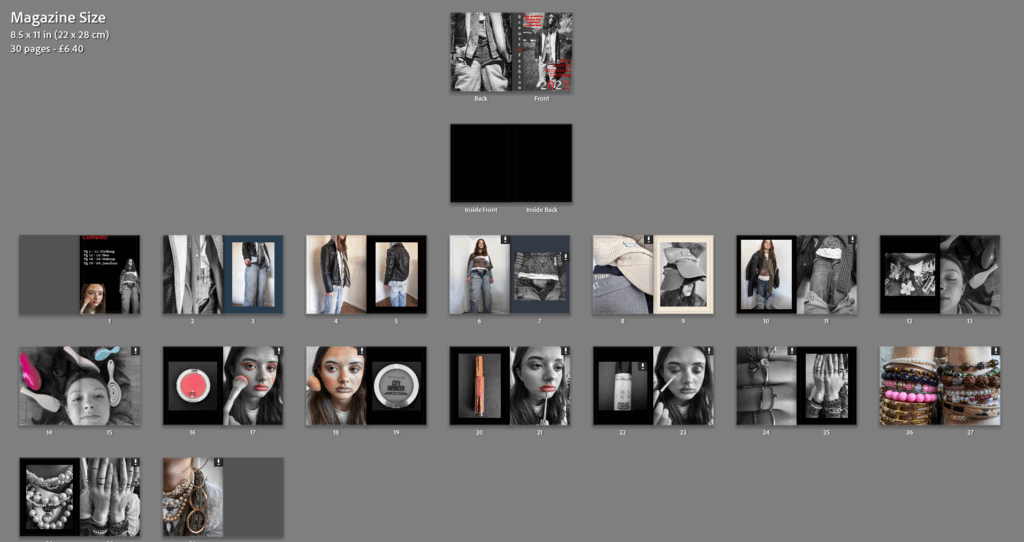
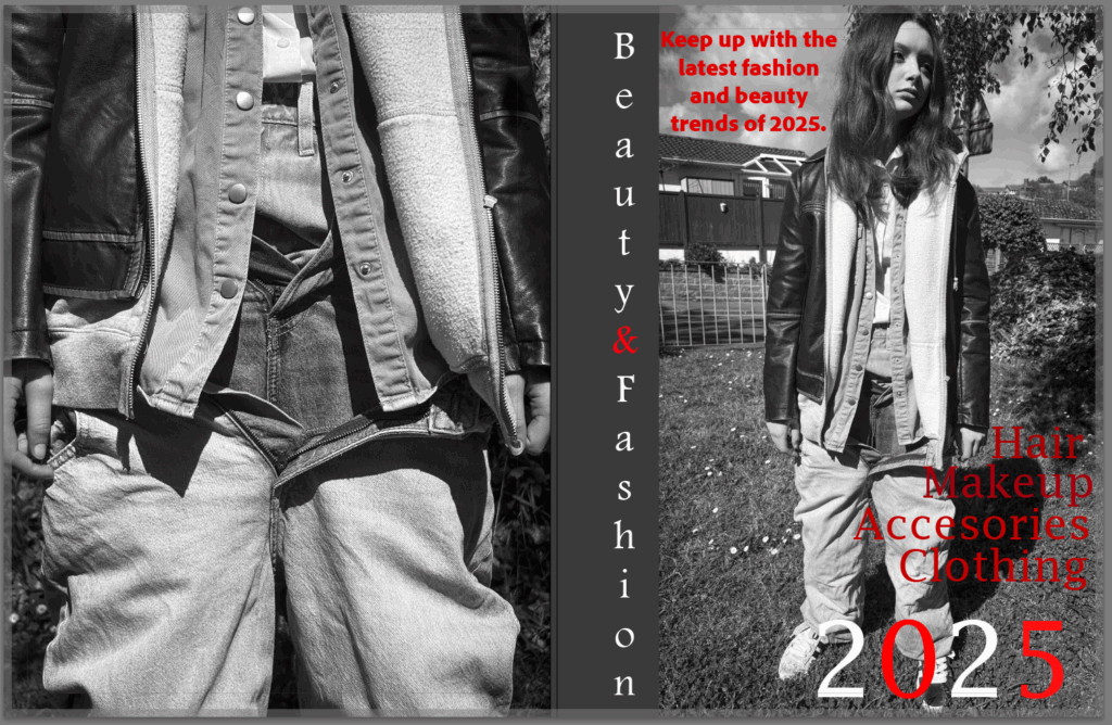
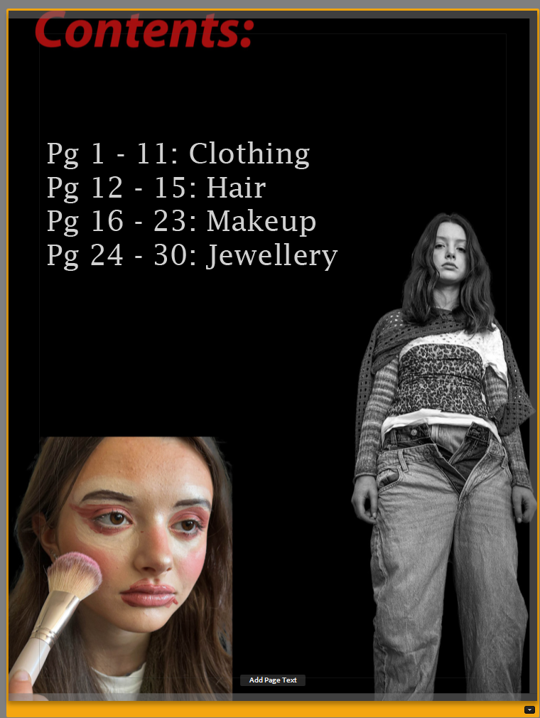
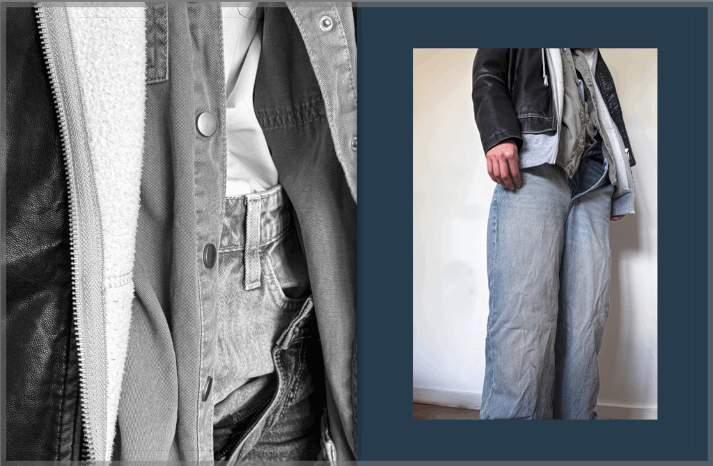
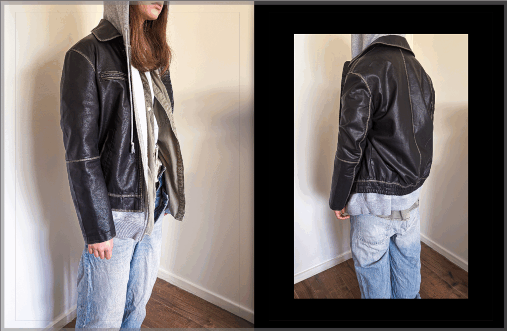
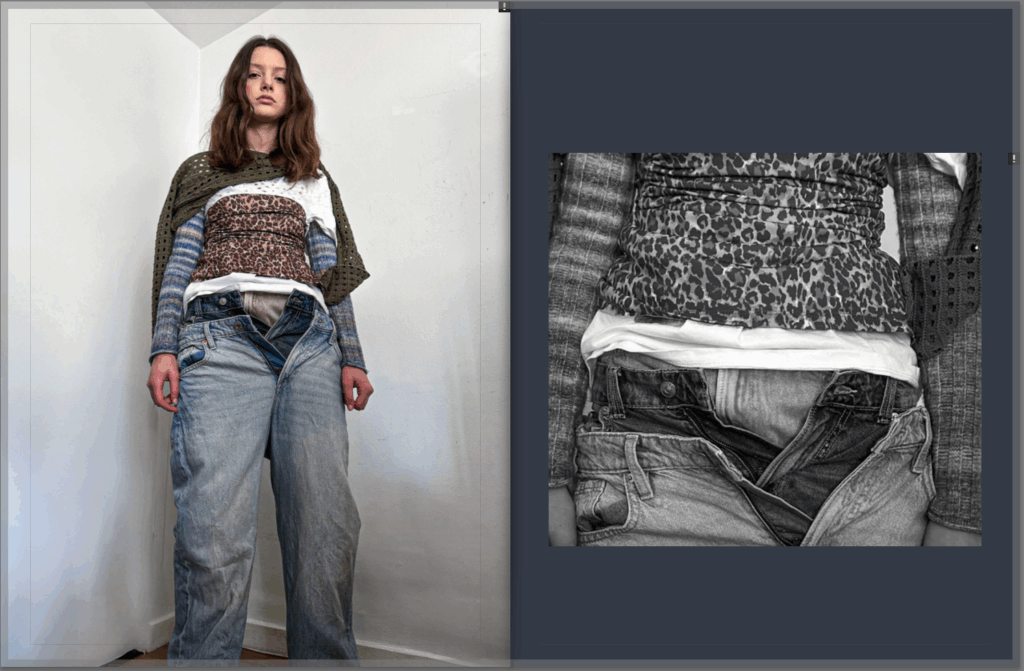
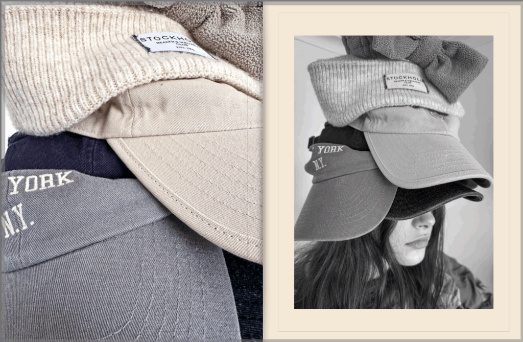
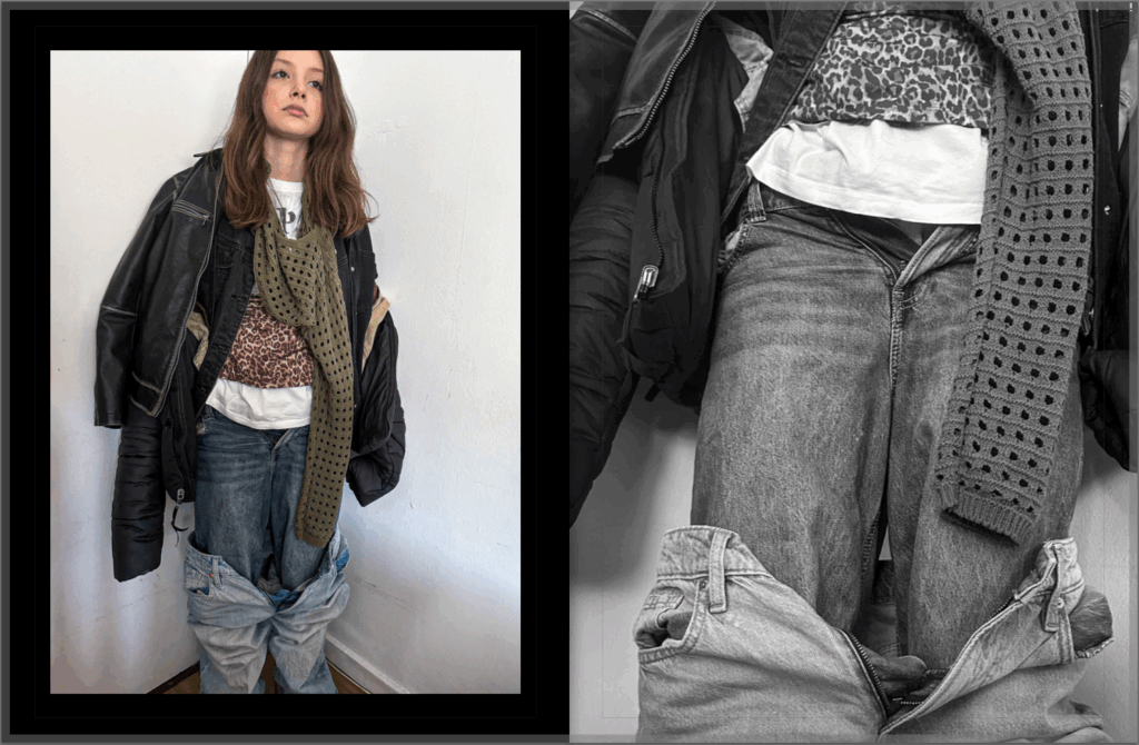
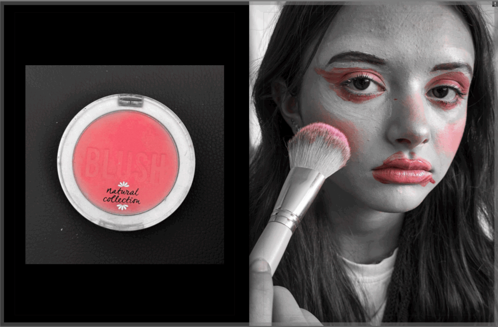
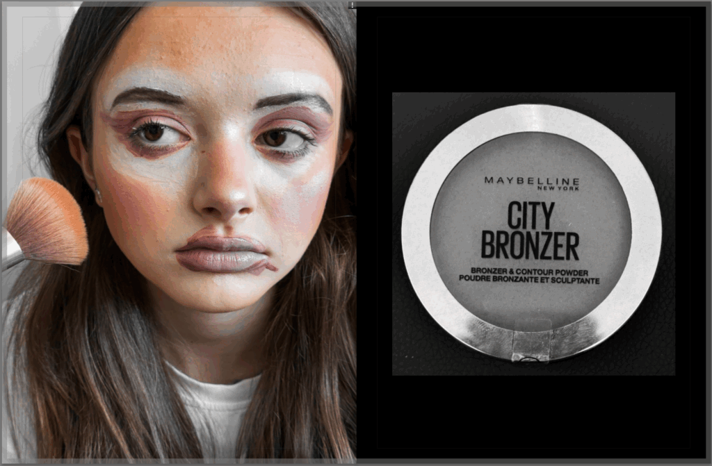
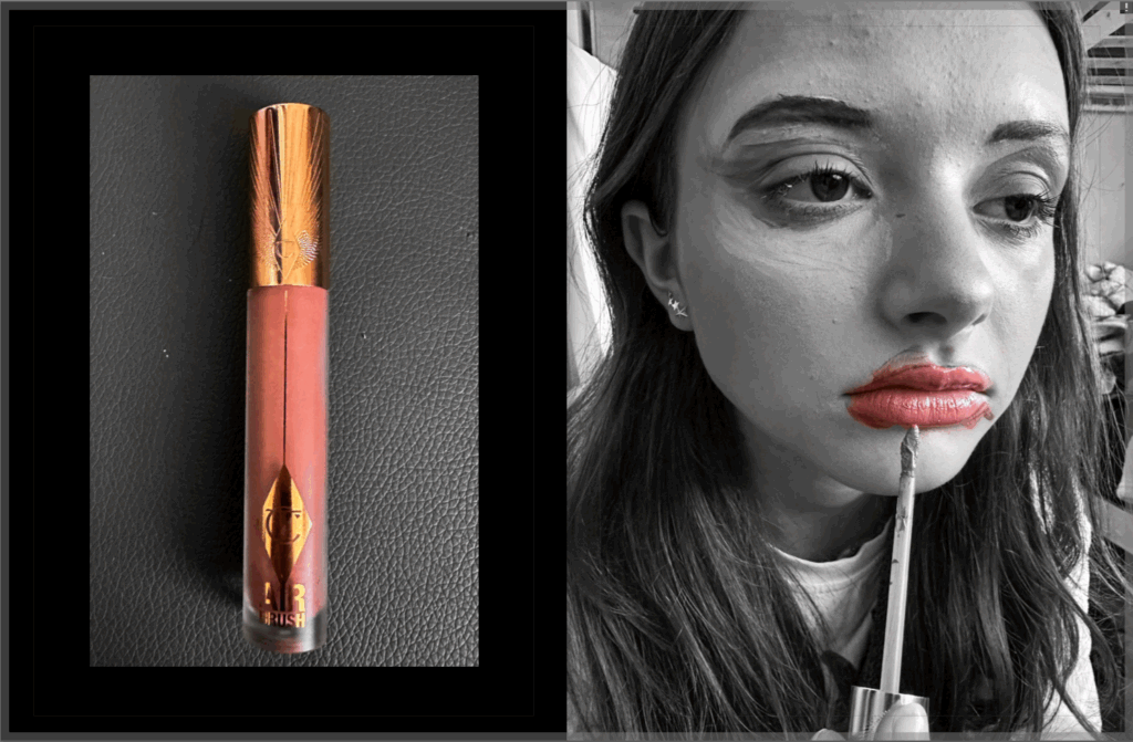
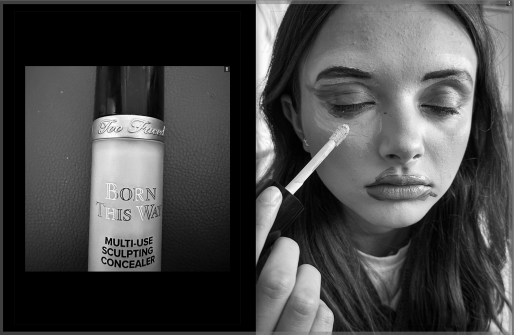
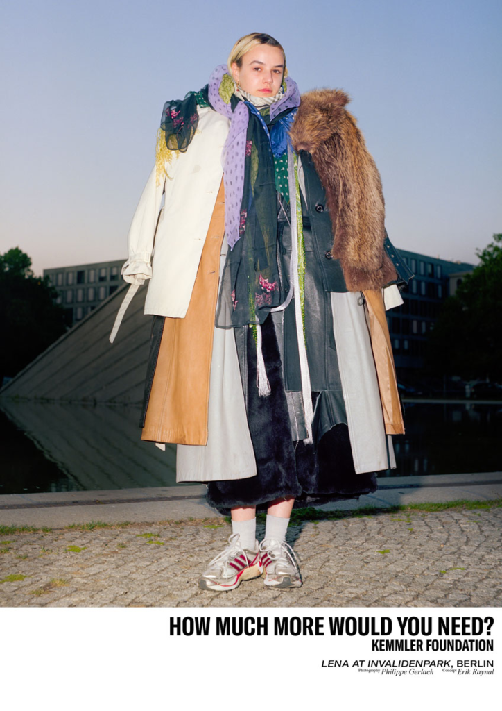
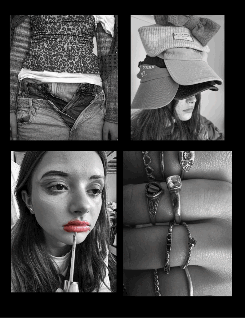
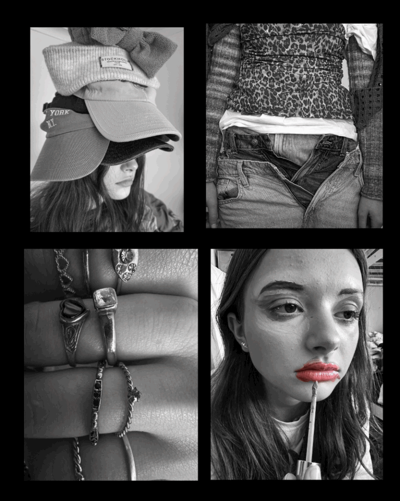
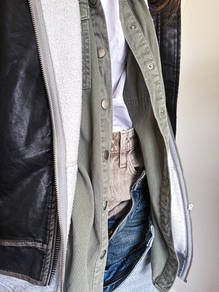
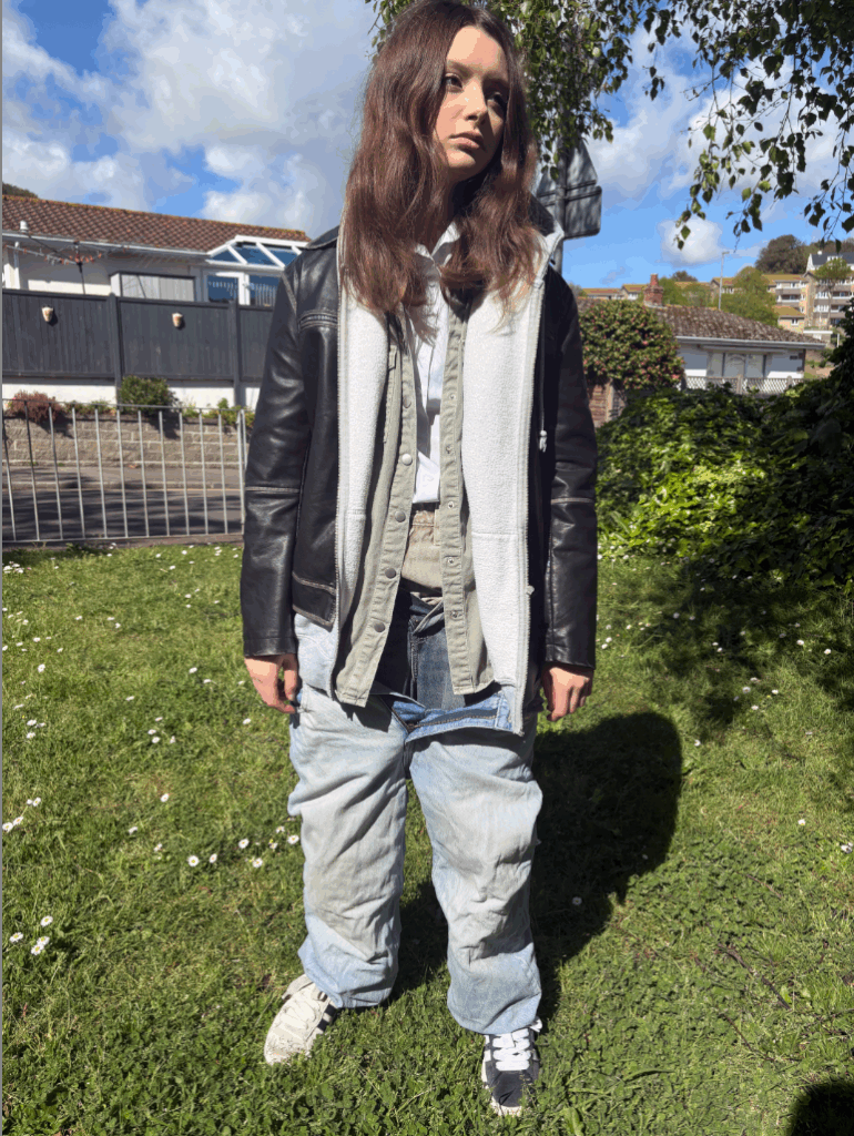
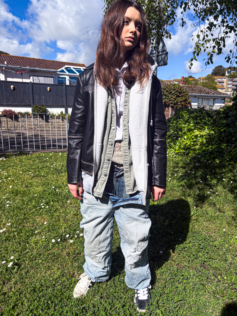
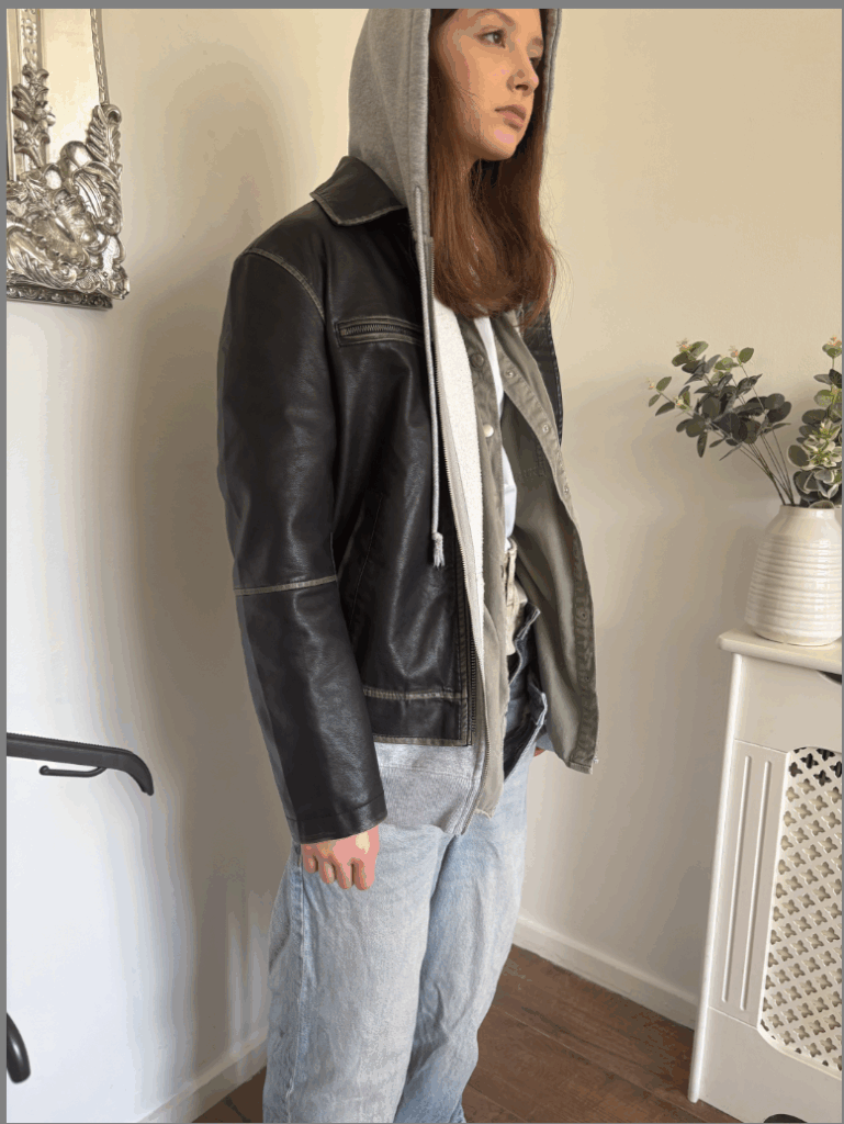
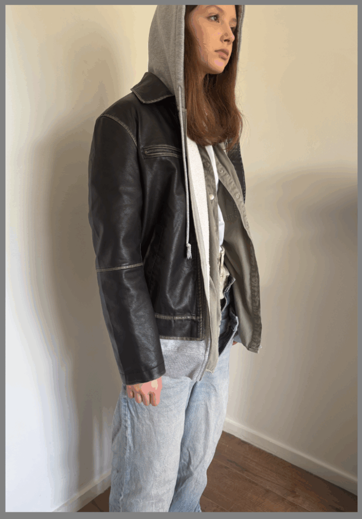
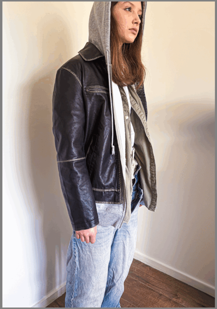
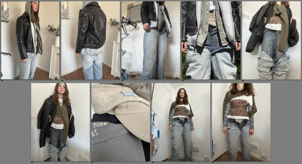
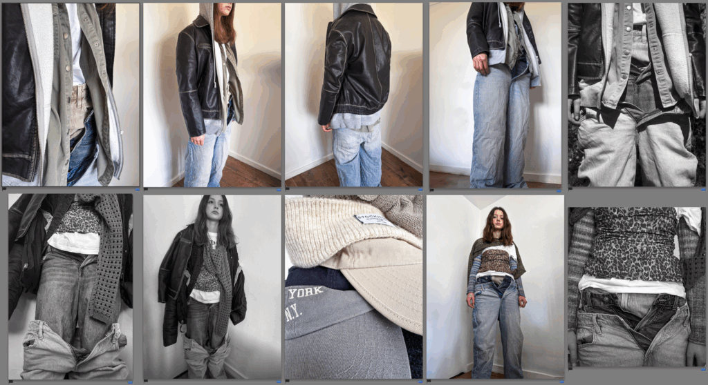
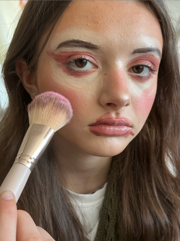
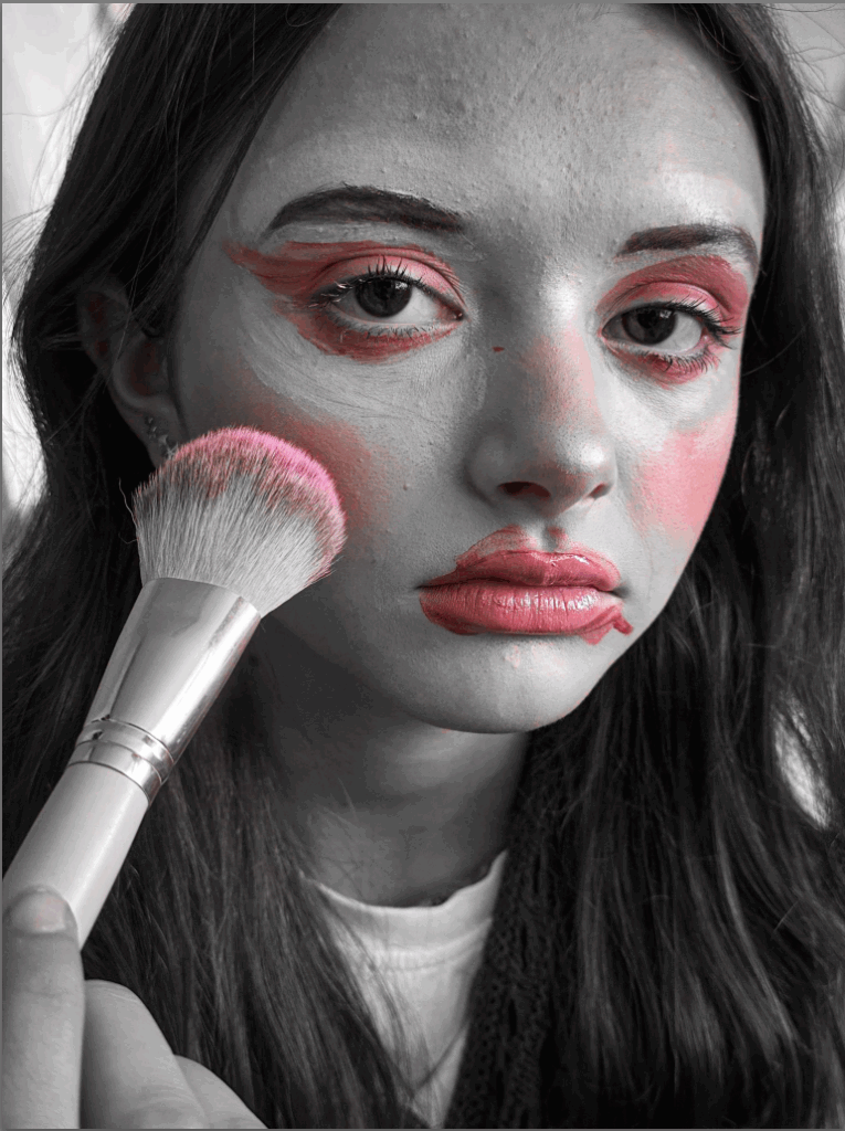
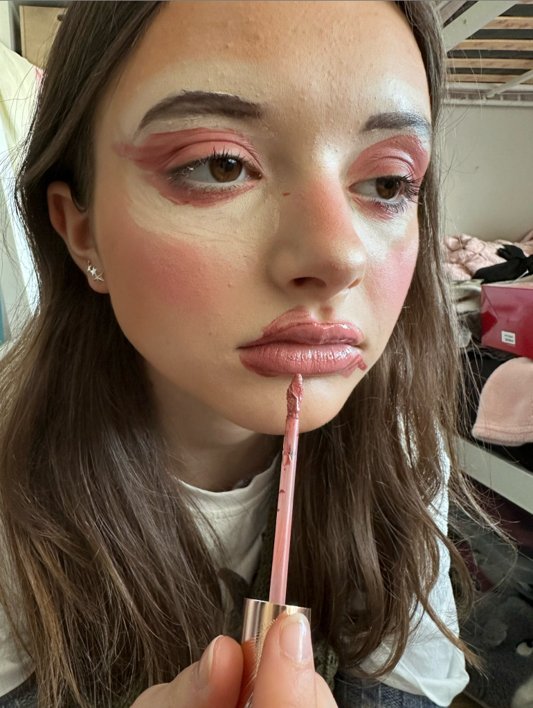
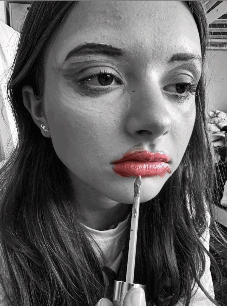
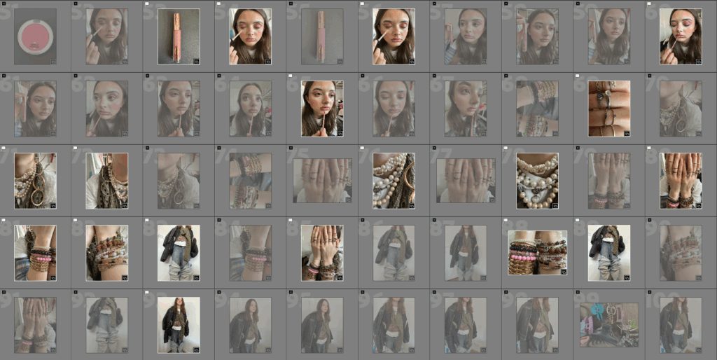
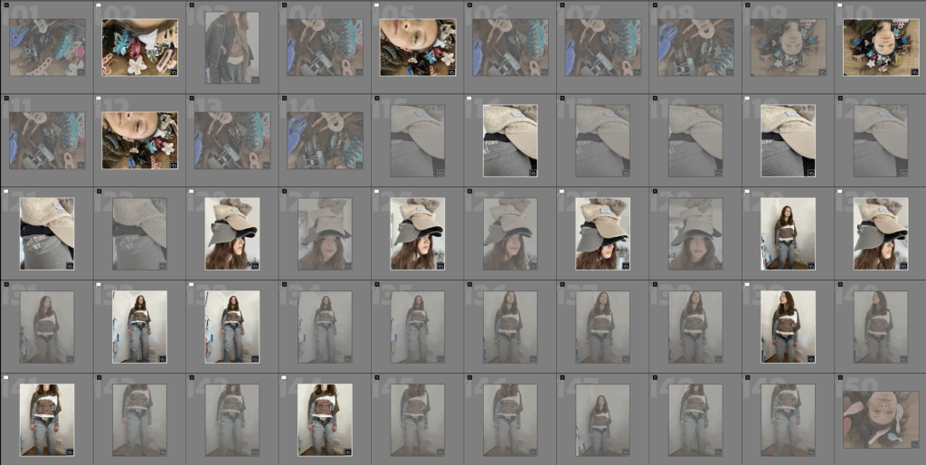
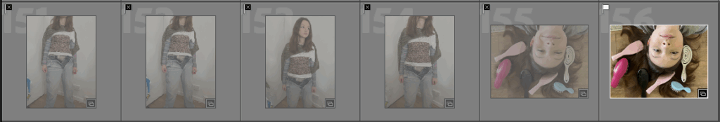
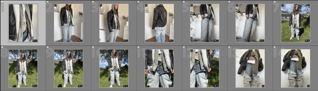
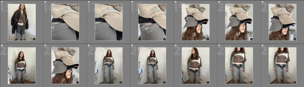
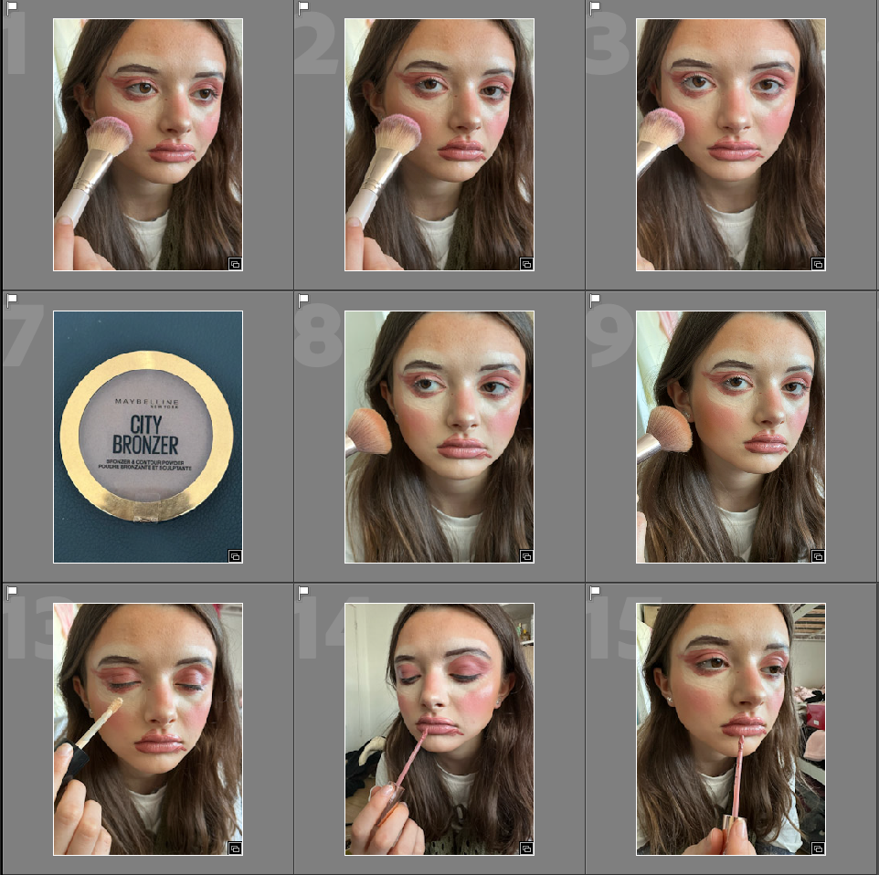
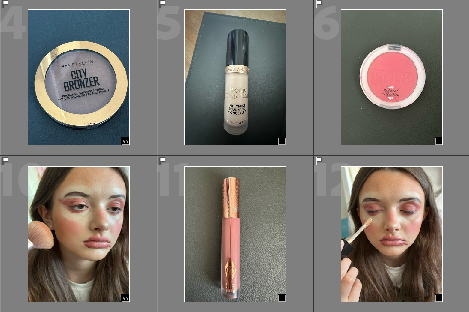
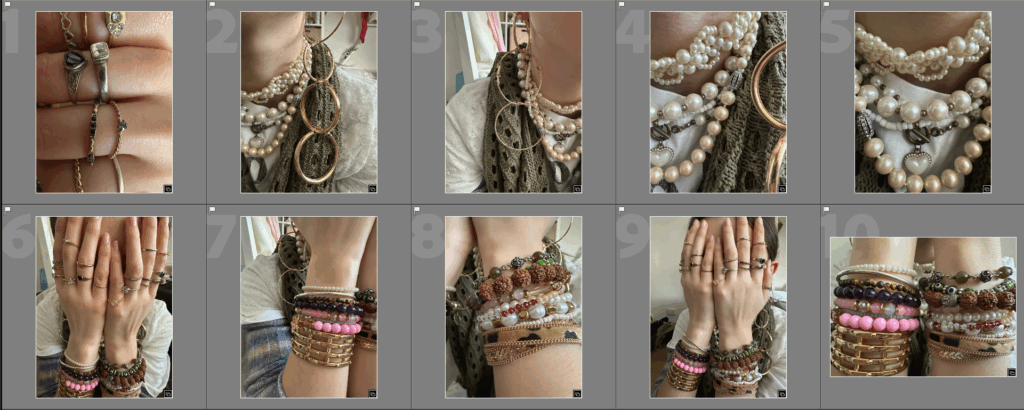
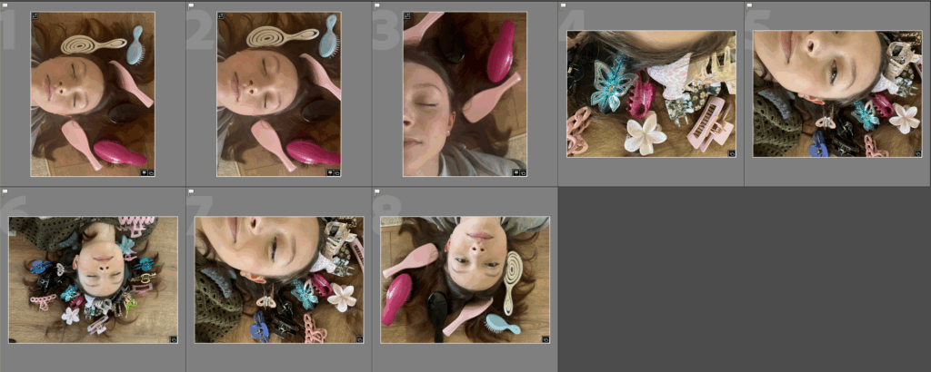
I think my magazine has gone well as I was able to create 30 pages using photos I took in response to Philippe Gerlach. I like the makeup pages especially as they really feel like a magazine in the way that they are showing a product and then showing the product being used on a model. I also like how i did the front cover with red lettering against a black and white image as it is eye catching. If i was to do it again I would take a larger variety of images specifically in the clothing section as I find them to be slightly similar to each other. I would also maybe take more images for the other parts as the clothing part takes up the majority of the magazine.

Virtual Gallery:

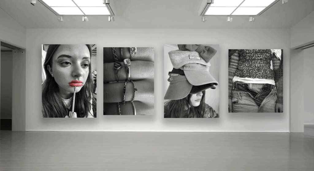
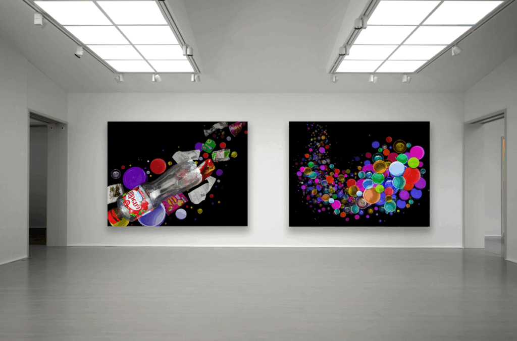
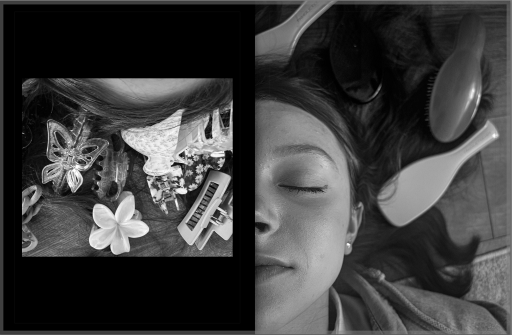
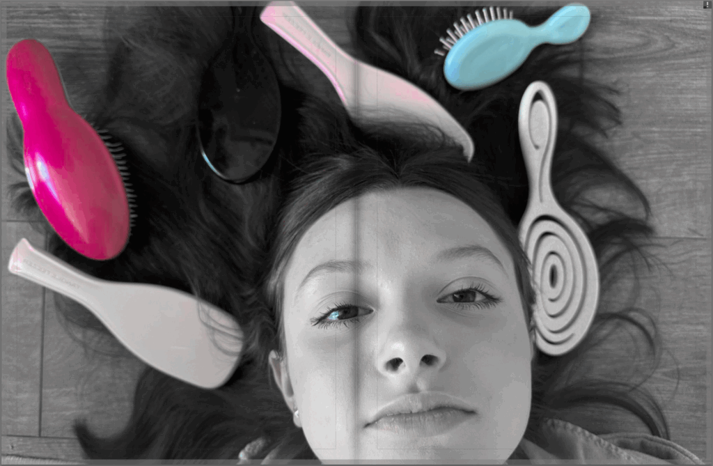
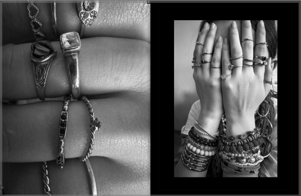
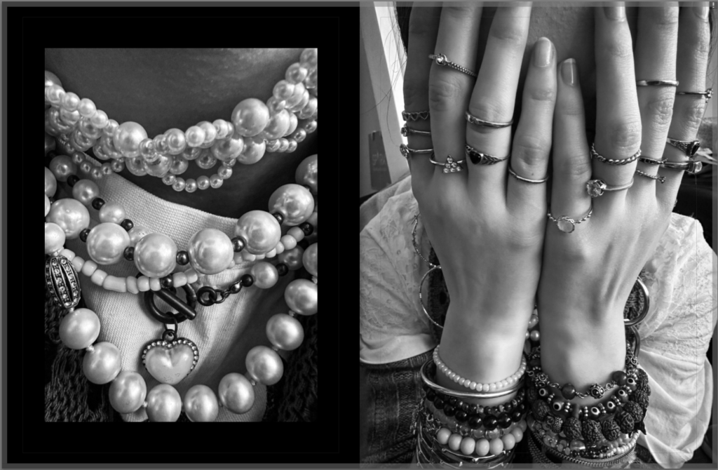
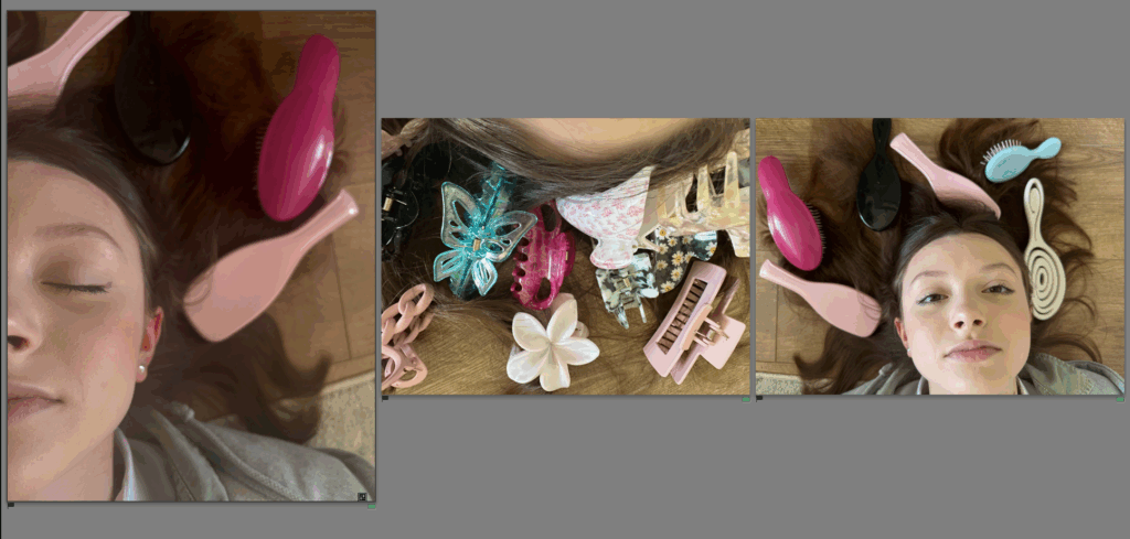
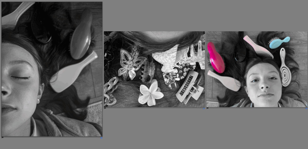
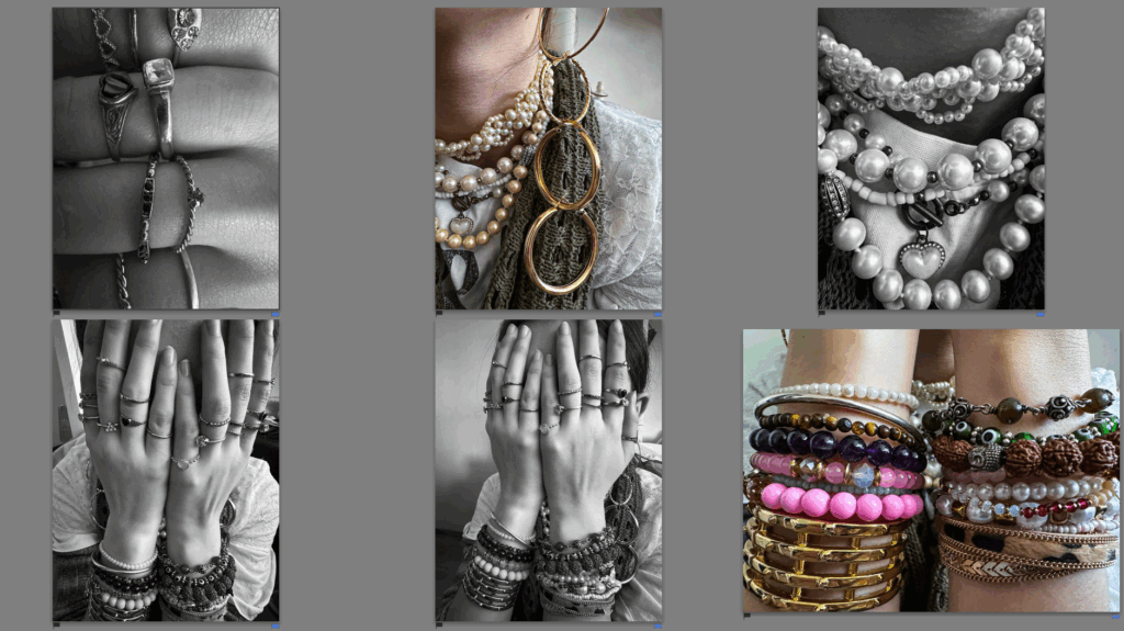
I also chose to present my images in a virtual gallery. I like the gallery as it is primarily black and white with only one pop of colour. I also added a drop shadow which adds depth to the piece and makes it look more realistic.
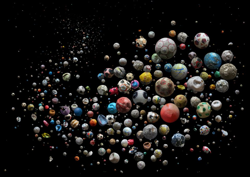
Collages:

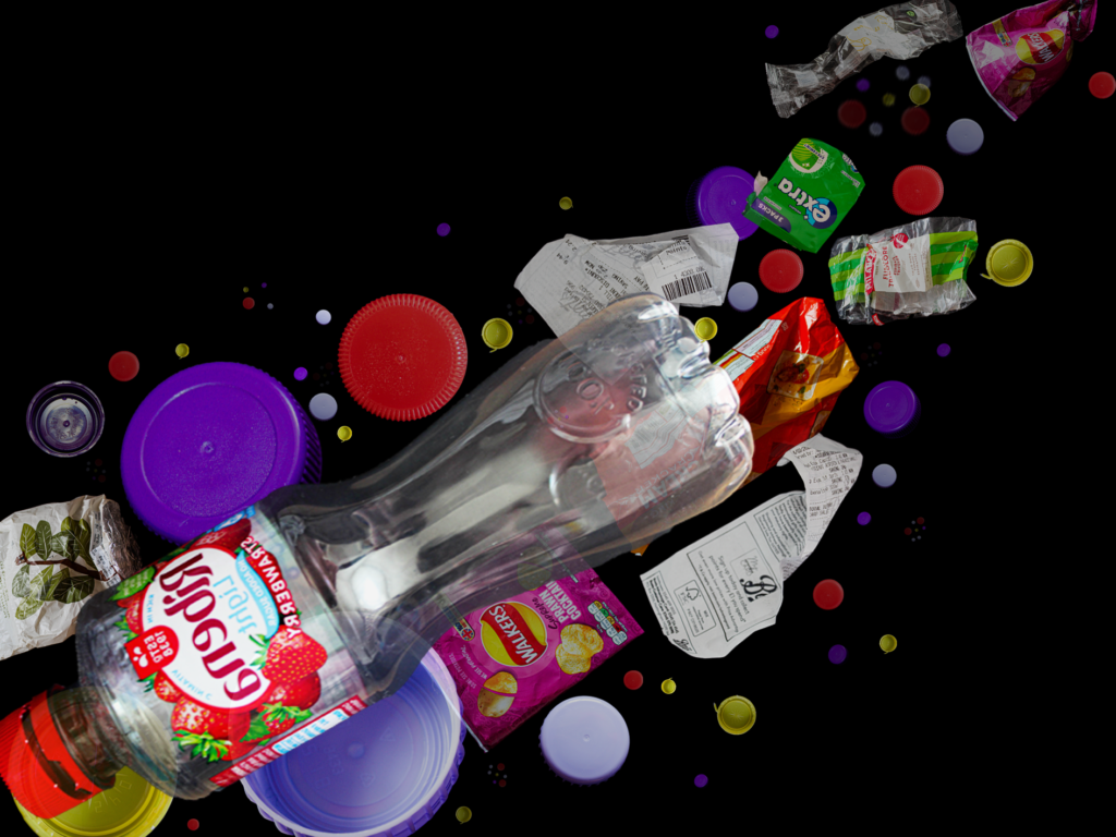
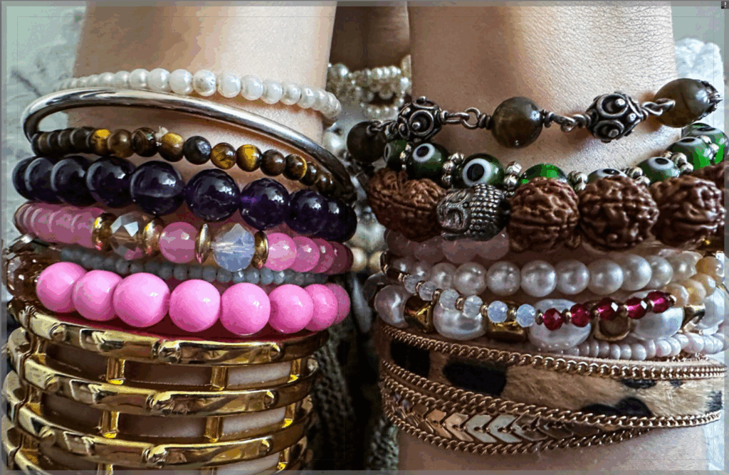
My first collage is okay but I think I could’ve added more pieces to it to make it look more similar to the photographers work, especially in the background.

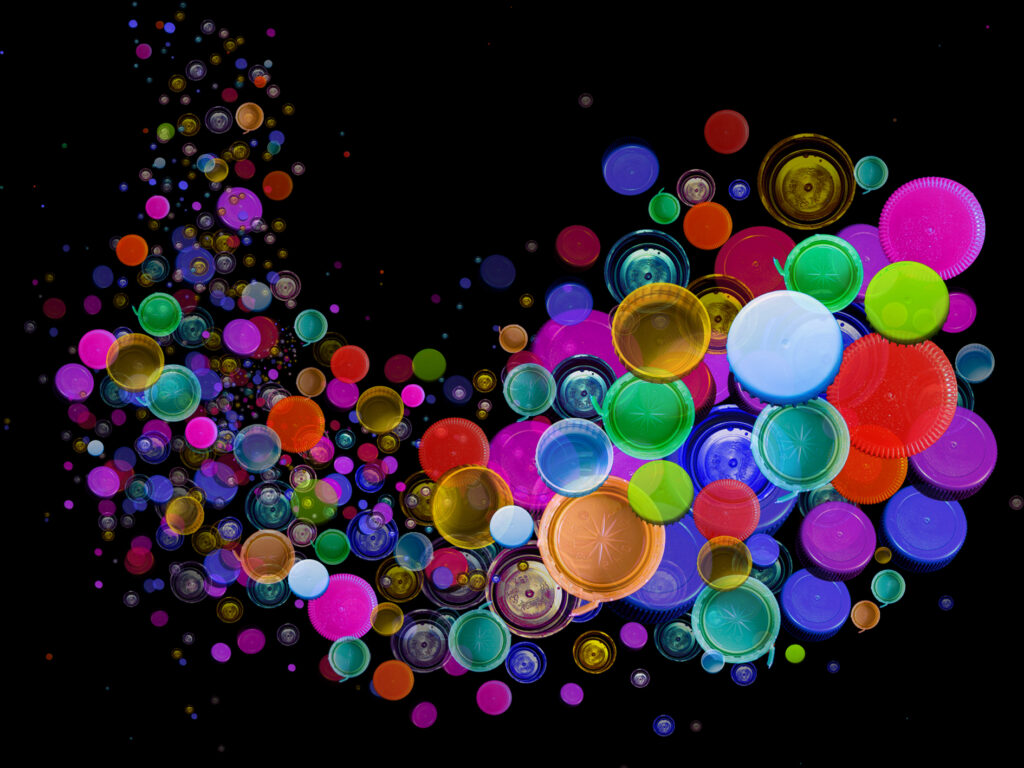
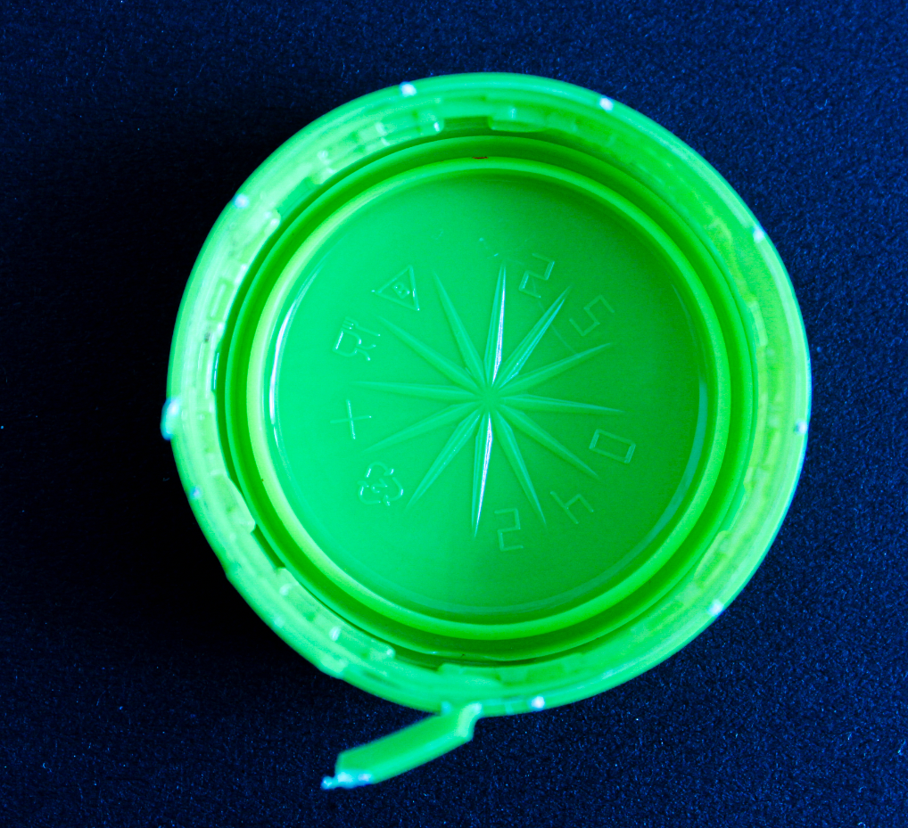
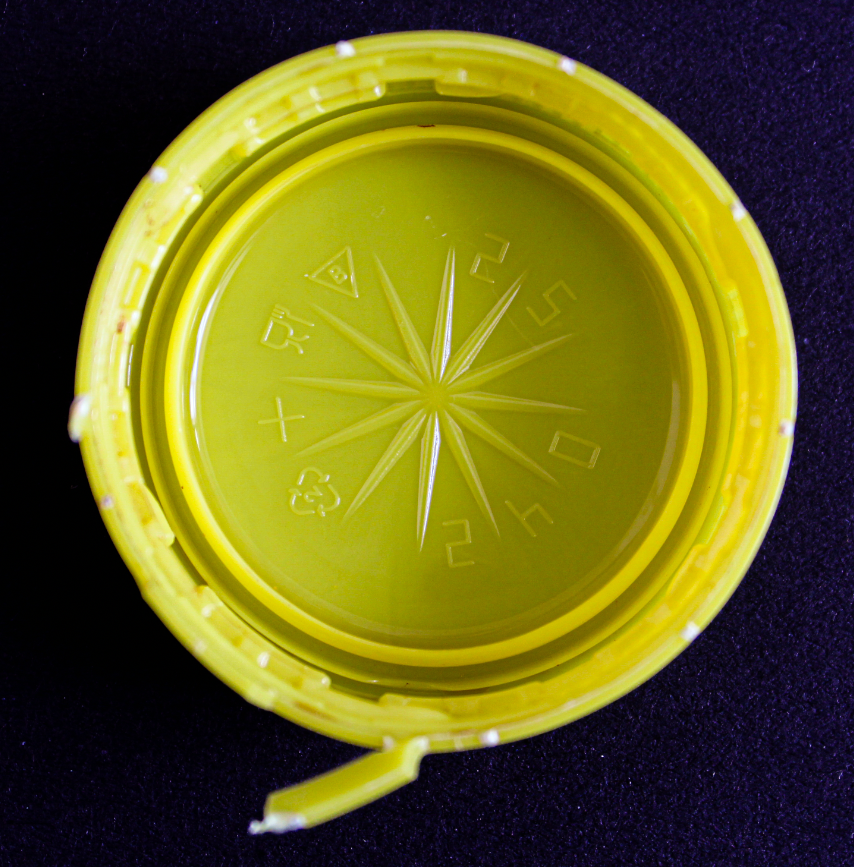
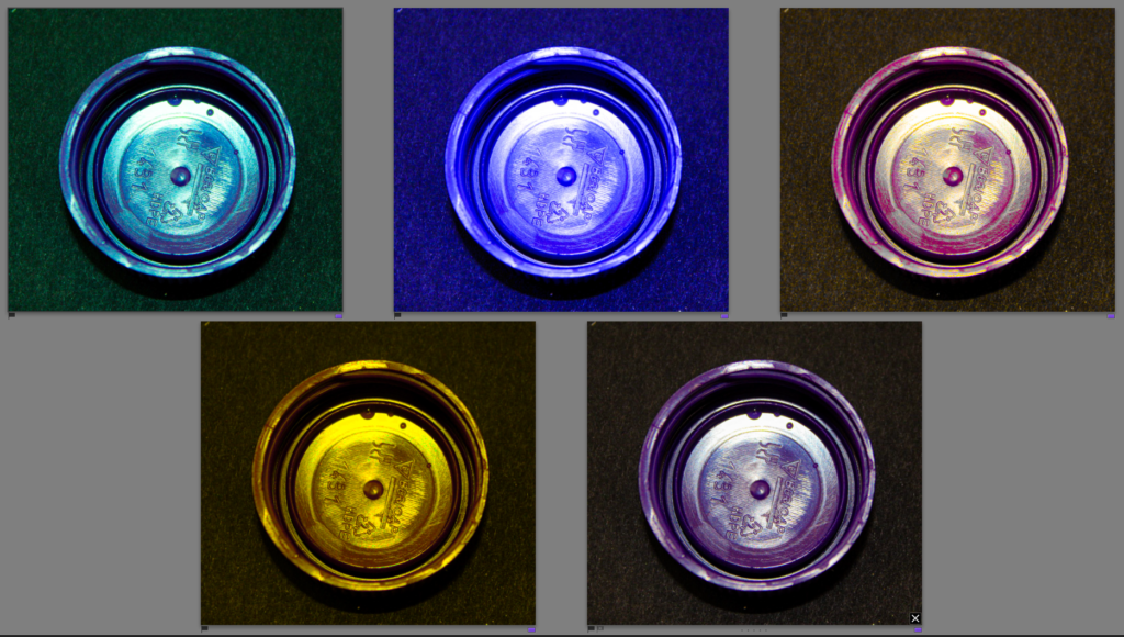
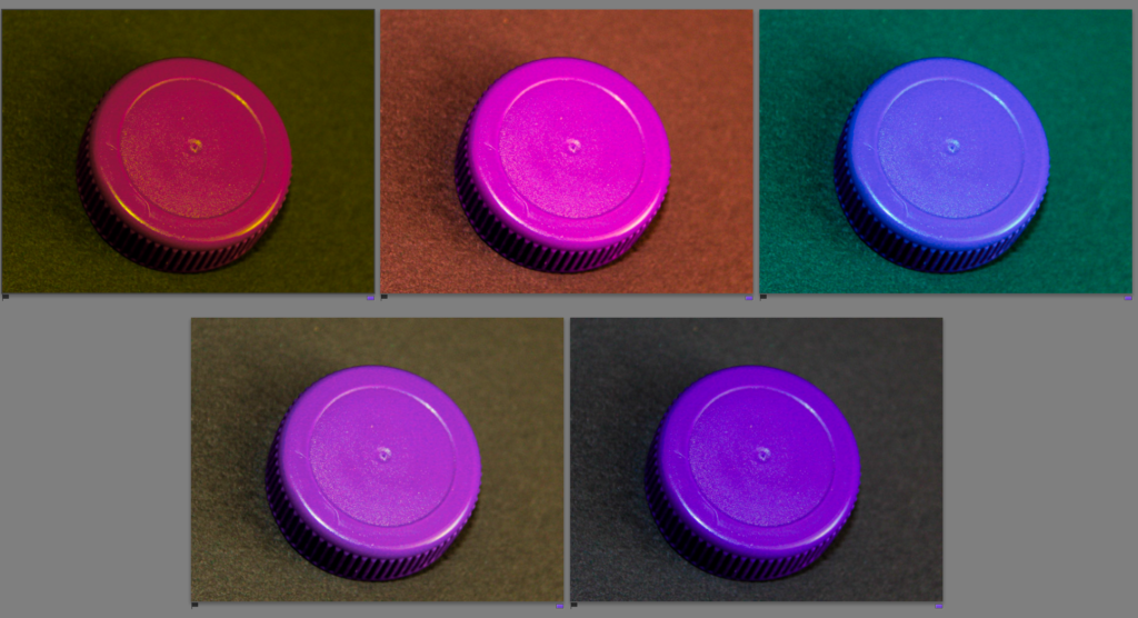
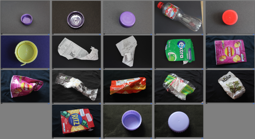
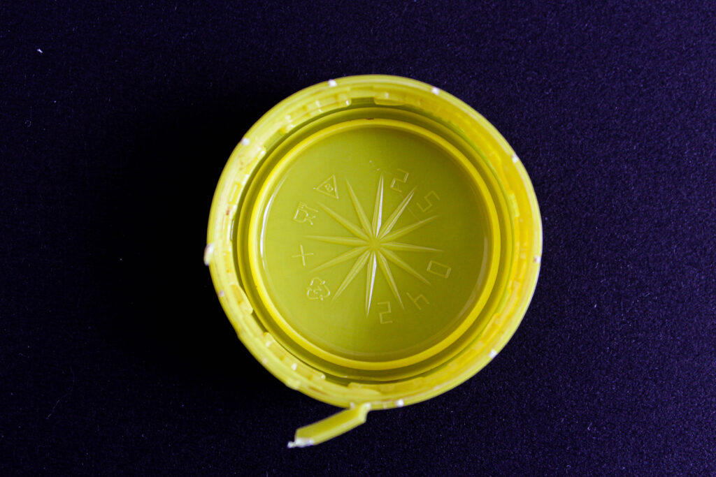
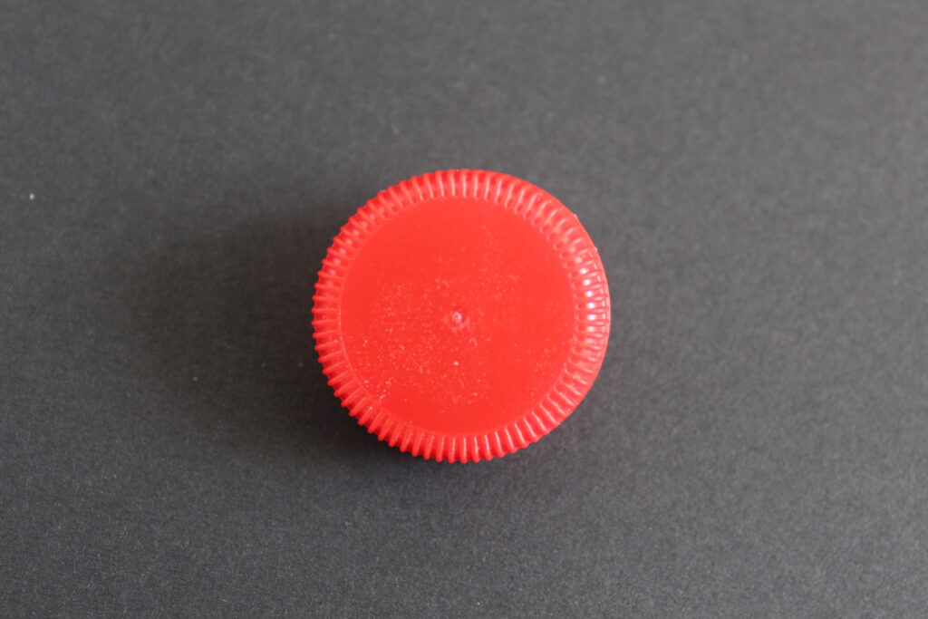
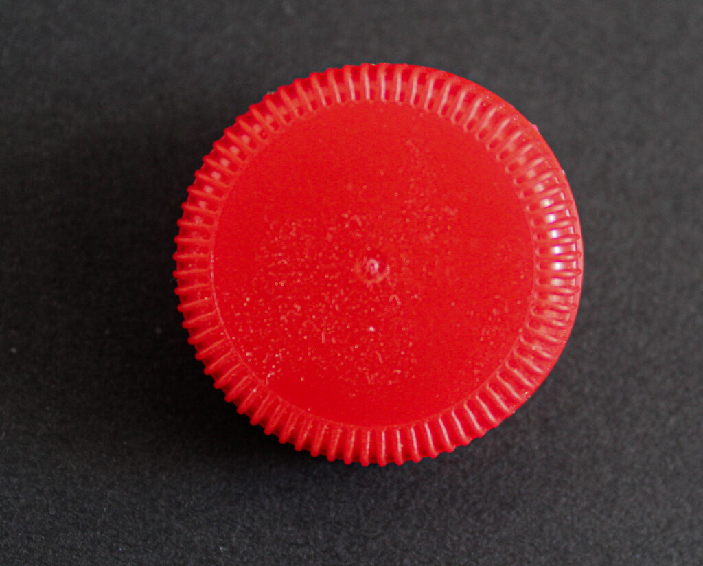
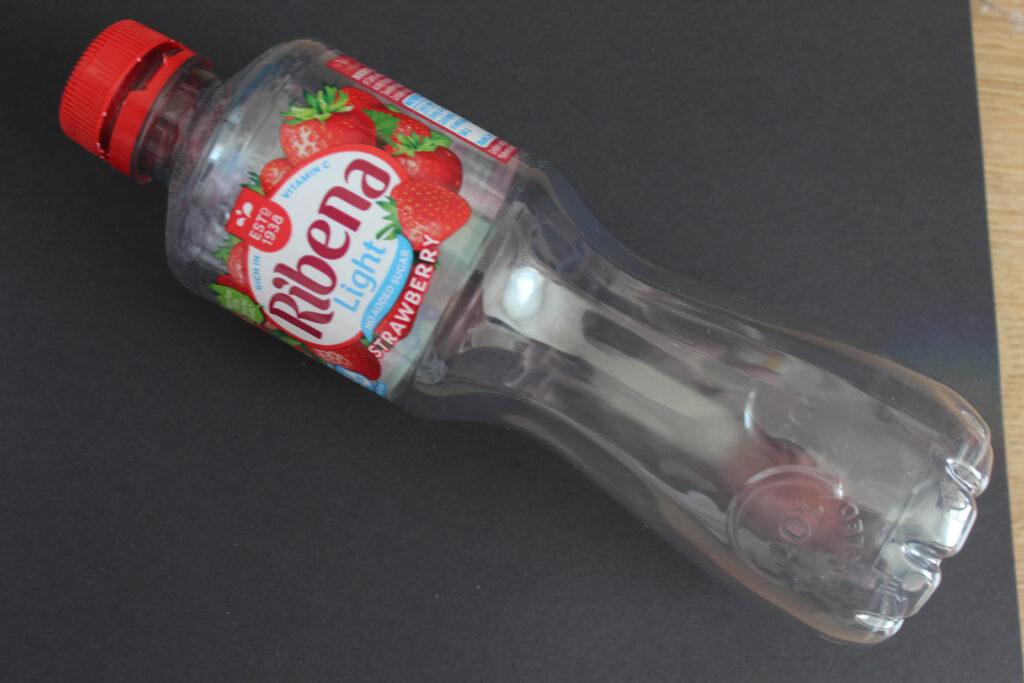
My second Mandy Barker collage is my favourite piece I produced as it looks very similar to the photographers work. I also think I was able to create a good depth and it almost looks 3D. If I was to redo it I would maybe add some smaller ones in the very far background as I think that would add to the depth of the piece. I also like all the colours which I was able to create using different tints and temperatures in lightroom.

Virtual Gallery

Mandy Barker virtual gallery:

Philippe Gerlach virtual gallery:

Evaluation:

I like the way that both my virtual galleries have turned out as they both have drop shadows making them look realistic. I prefer the Mandy Barker one as I like the colours in it as the gallery itself is black and white.

Final Magazine layout: Final outcome 4

Concept and Narrative:

My magazine is going to be based on the idea of overconsumption. I will be doing this in multiple sections including makeup, clothing, hair, and jewellery. I wont include any writing inside of the magazine apart from the concept page. The front cover will include bits of red against black and white images, this will catch the viewers eye.

For my magazine I dont want to include any text as I want the focus to just be on the images I have created.

Front + back cover:

For my magazine I wanted to include a contents page as every magazine has one. In this page I included some images which can be found within the magazine, I did this using photoshop and the object selection fool.

For some pages I changed the colour so that it would look good with the other page, for example I made this one match the beige hat on the left.

For the makeup pages I wanted to make the products which are being used stand out, for example for blush I removed all colours apart from pink, and for the bronzer I removed all the colours apart from the browns.

I decided to make this a double page spread as I think it will look good having a stack of bracelets on each page.

Evaluation:

Overall I am pleased with the way that my magazine has turned out. I like how I have added pops of colour to some of the backgrounds on the pages. I like how I have grouped the images into sections within the magazine. If I was to remake the magazine I would take photos of different models as I think it would make it more interesting rather than having the same model consistently throughout the magazine.

Magazine plan + research

Philippe Gerlach is the photographer I am going to take inspiration from when creating photos for my magazine as he created a magazine like image in his involvement in ‘how much more would you need?’. I will use the same concept as him by layering clothing to look dramatic and over the top. I am planning to not include any writing within my magazine however I will include some on the front cover. I don’t want to include any inside it as I want the main focus to be on my images which I have created.

Image layout for mounting up: Final outcome 3

These are some layouts I may use for mounting up mt images in response to Philippe Gerlach.

Layout 1:

Layout 2:

I like the second layout more as I think it looks better having the image with a pop of colour in that corner. To mount them up I am first going to stick them onto foam board using spray mount before sticking them on a black piece of card.

Editing images in response to Philippe Gerlach

For my editing process I am going to edit each category under individual headings as when I create my magazine this is how they will be presented.

Clothing:

Before:

For my magazine I am wanting to include close up shots like this one as it really shows the layers of clothing. To edit this I am going to make it more contrasted.

I did these edits to the image, I also adjusted the temp and tint and this will remain the same throughout the magazine as I want it to look consistant.

After:

I created a preset which includes all the edits I did to the image, this is so that I can quickly apply it to the rest and not need to do any major adjustments.

Before:

After: (adding preset)

After adding the preset to this piece I did not like the way it looked as it is very saturated and bright, which I don’t want for my front cover. I believe the preset doesn’t suit this image as it was taken outside whereas the other one was taken indoors. For my front cover I may make it black and white.

I changed the image to black and white but kept the other settings the same and I like the way that it turned out, I am going to crop out the shadow from the bottom right corner.

I also decided to use the vignetting tool as it draws the viewers eyes to the center of the image.

Using AI:

For this image I wanted to remove the things in the background, to do this I used AI in lightroom.

Other clothing edits:

Before:

After:

I decided I wanted a mix of colour and black and white in my magazine.

Makeup:

For my photos based on make-up I decided to adjust saturation to make specific things stand out, for example I removed all the colour from the lipstick image apart from the colour on the lips.

Before:

After:

Before:

After:

Hair:

Before:

After:

Jewellery:

Before:

After:

Evaluation:

I think my photoshoot went well as I was able to create the same concept as Gerlach using many layers of clothing. If I was to do it again I would use even more clothing and maybe change the clothing order to make some images more interesting.

Photoshoot 2 – Philippe Gerlach

For this photoshoot in response to Philippe Gerlach I photographed my sister. I done multiple photoshoots within this one:

Contact sheet:

Clothing:

For my photoshoot on clothing I began by getting her to wear many pairs of jeans at one time, I did the same thing with jackets and tops. I did this because it is the same thing which Gerlach does with his models to convey the idea of overconsumption. I also did the same process with multiple layers of hats. I took some of my images outside as I may use these ones as a front cover.

Makeup:

I also used the same concept that Gerlach used to photograph overconsumption in the form of makeup. For this photoshoot I put thick layers of makeup on her face to convey the idea of it being too much and over the top as this links to the idea of over consumption especially with social media which influences many people to purchase huge amounts of makeup which is not needed.

Jewellery:

I also photographed her in many layers of jewellery such as bracelets, rings, necklaces and earrings.

Hair:

For the hair section of my photoshoot I focussed on photographing many hair clips in her hair at once. This is to create the question of whether you really need that much of the same product? I also did the same thing with multiple hair brushes in her hair.

  • For each of the separate categories I decided to place them into individual folders in lightroom classic as this will make editing images easier.

Evaluation:

I think my photoshoot went well as I was able to create a variety of images which I plan to use within a small magazine. I think the hat ones and clothing ones have gone the best as they look most similar to the photographers work and align with his concept well. If I was to do the shoot again I would maybe photograph multiple models rather than having the same one in every photo.

Collage 2: Final outcome 2

For my second collage I am going to experiment by using the ‘tint’ tool to change the colours of my bottle caps so then I have a range of different ones to create my second collage from.

1:

For example, this one I changed the temp to -67 and the tint to -61.

This allowed me to change the colour of the bottle cap to green.

2: These are all the varieties of colours which I was able to create using the tint and temp option in lightroom.

3: My aim for this collage will be to use the bottle caps and create a similar style collage to this one produced by Mandy Barker.

Final Product:

Overall I like how my piece has turned out and I think I managed to capture the same movement that Mandy Barker’s piece has.

Collage 1: Final outcome 1

1:

Firstly I selected the object using the ‘object selection tool’, I then selected the ‘select subject’ option and I chose ‘layer via copy’. This created a layer which only had the object in it.

2:

Then I dragged the layer including the object to my base. To create my ‘base’ I made a document which had a black background.

3:

Next, I used the move tool to move and resize my image.

4:

An import step when creating these collages is to adjust the opacity. This is because it makes the objects look further away creating depth to the image. This is what Mandy Barker does when creating her pieces in her ‘soup’ series to create pieces which look like parts of the ocean or space. It also gives the image movement.

Final product:

Editing images in response to Mandy Barker

Before editing I selected the images which I am going to edit and collage by setting the colour label blue so that it is easy to find them. The images which I selected are surrounded by black space as I am going to use them to create a collage in a similar way to Mandy Barker, which is why I needed the images to be surrounded by nothing.

Images I plan on editing:

There are a total of 18 images which I plan to edit to then combine using photoshop.

Before and after editing:

For all of my images I edited them in the same way to make the background darker, this is so that when I combine them on a dark background they will all blend nicely. I also increased the saturation as this is what Mandy Barker’s images are like. They are all bright and colourful which catches the viewers attention.

For most of my images I used the same edits and copied them from one image to another as it is more time efficient, however I did adjust some settings depending on the image such as cropping and saturation.