My aim/plan: Narrative and concept
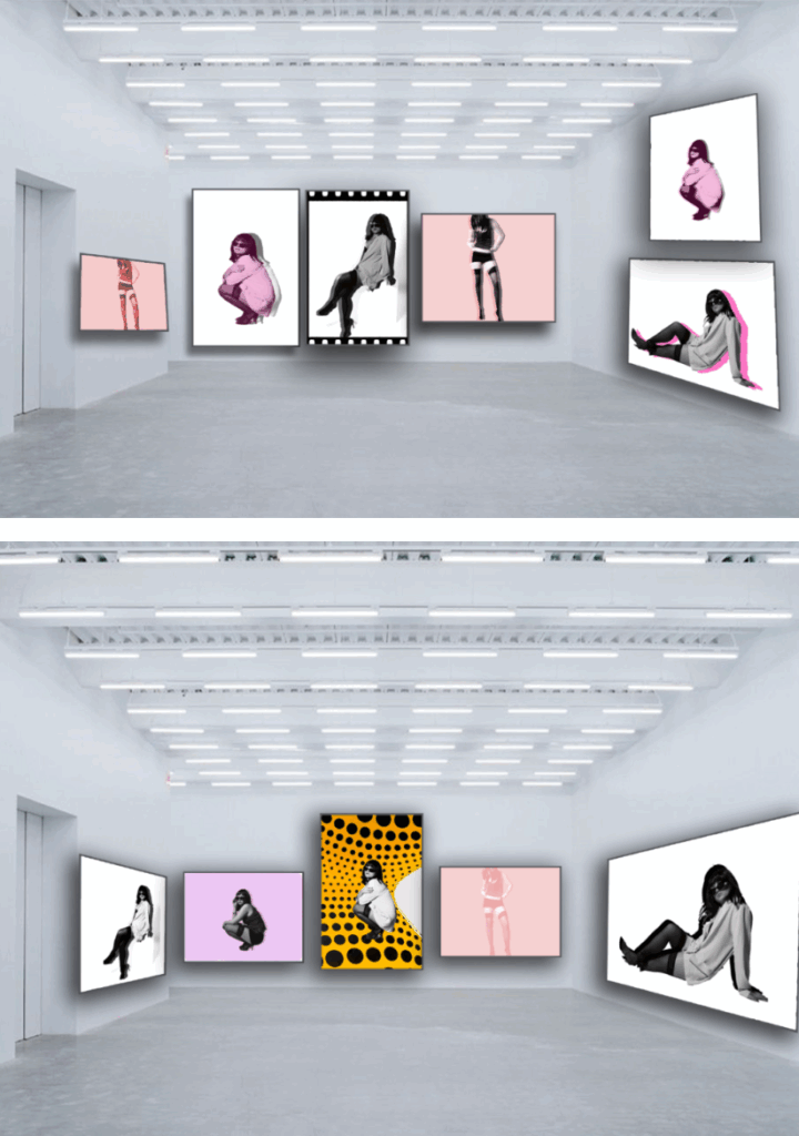
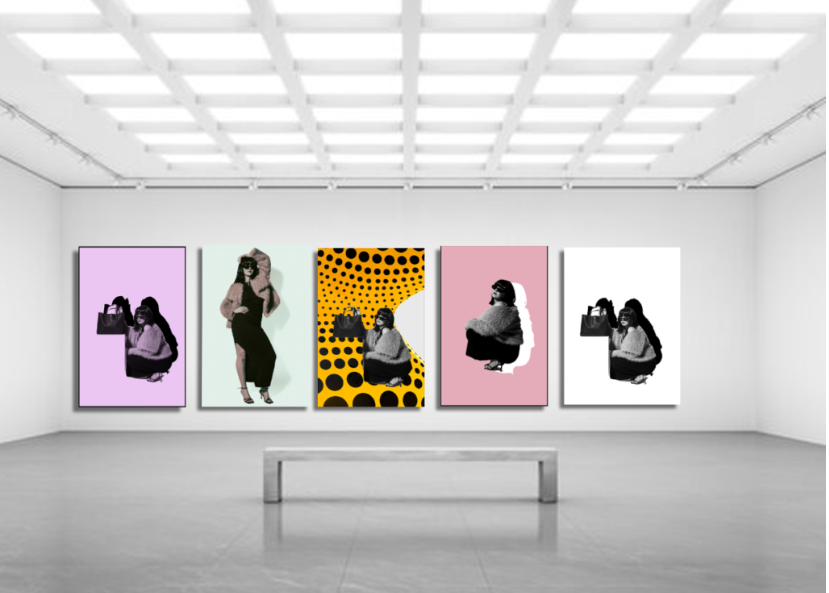
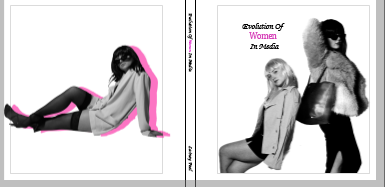
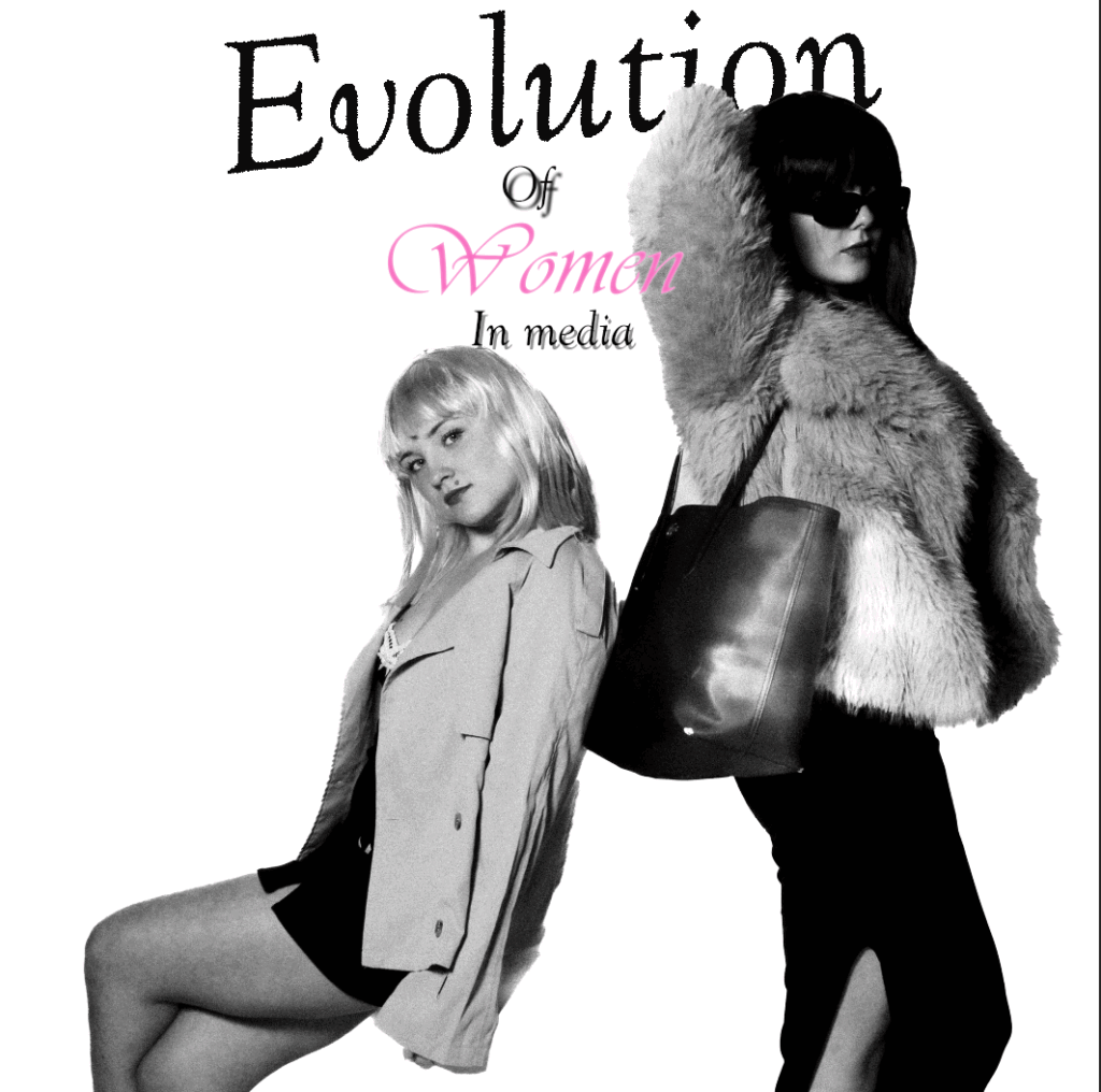
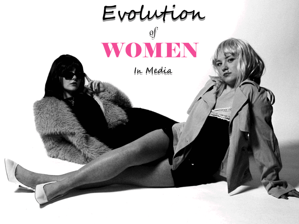
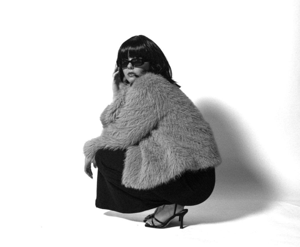
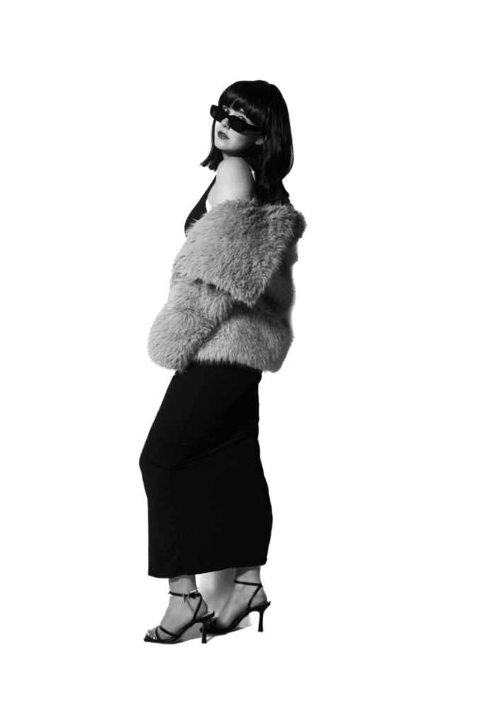
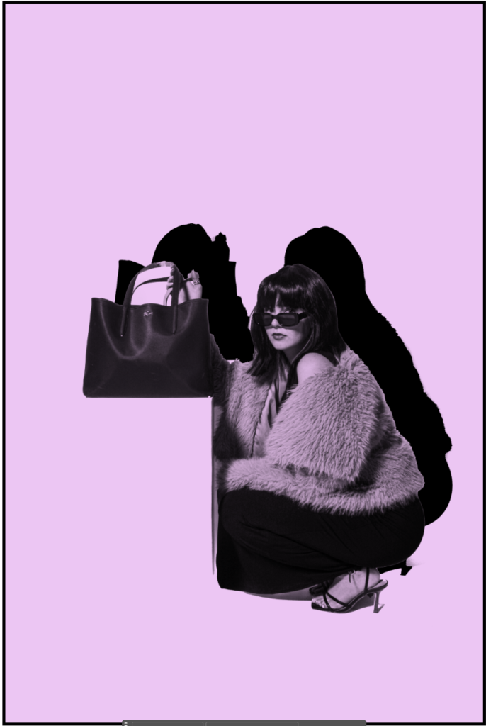
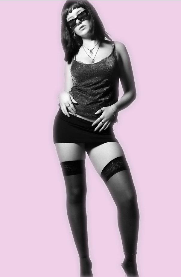
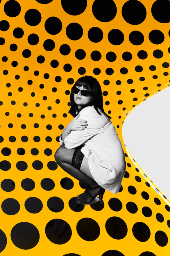
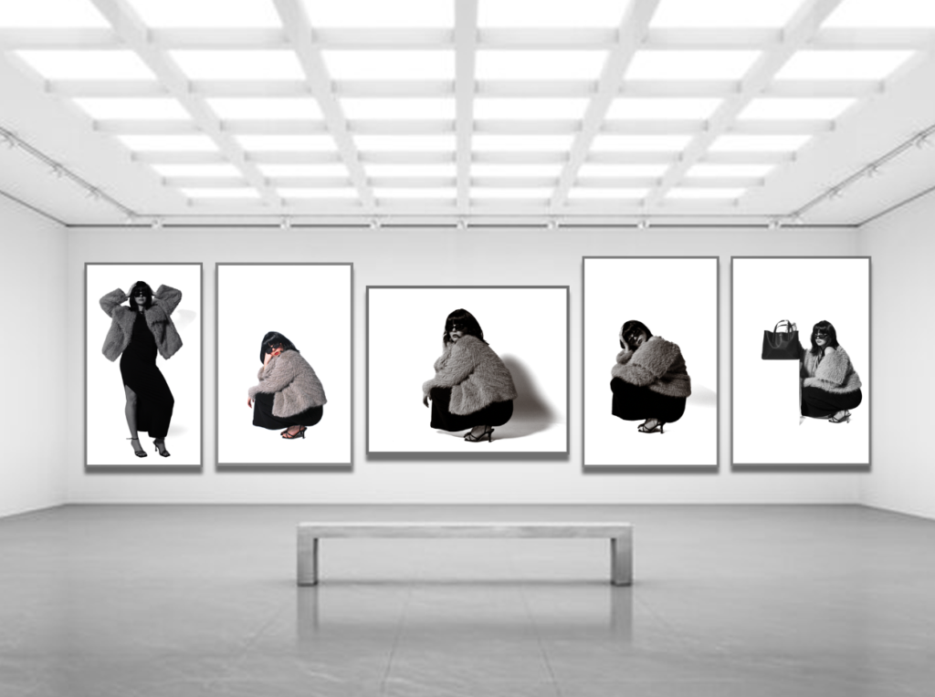
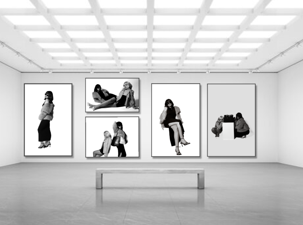
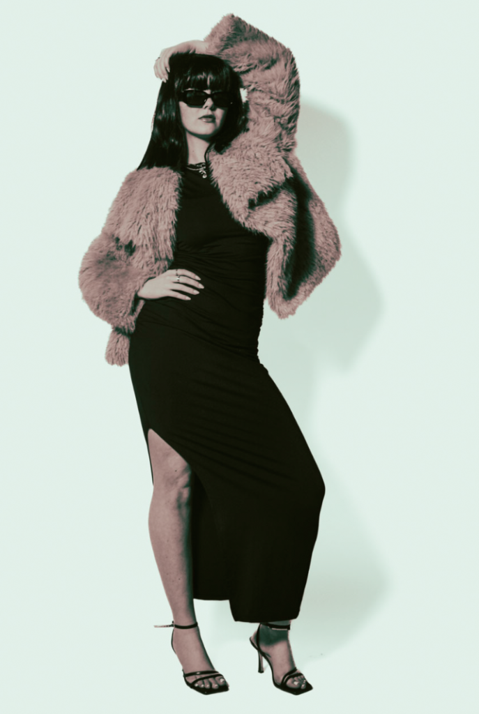
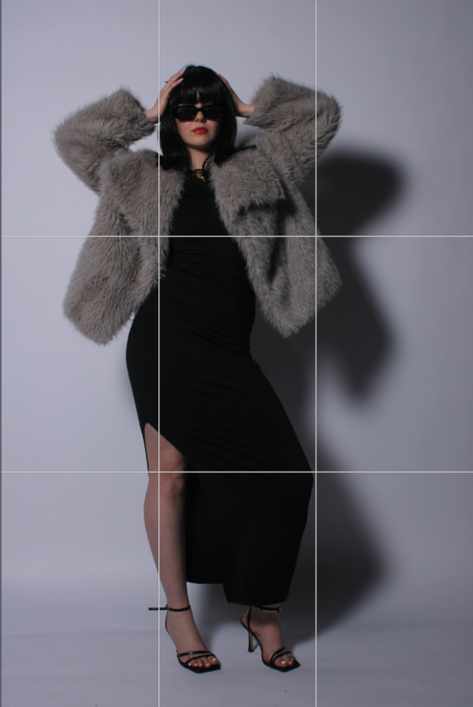
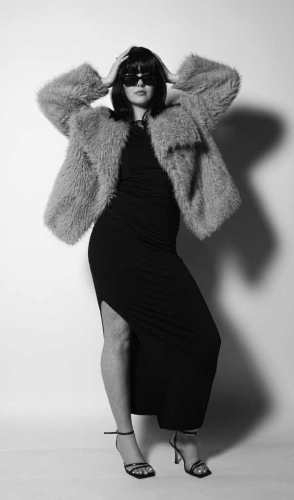
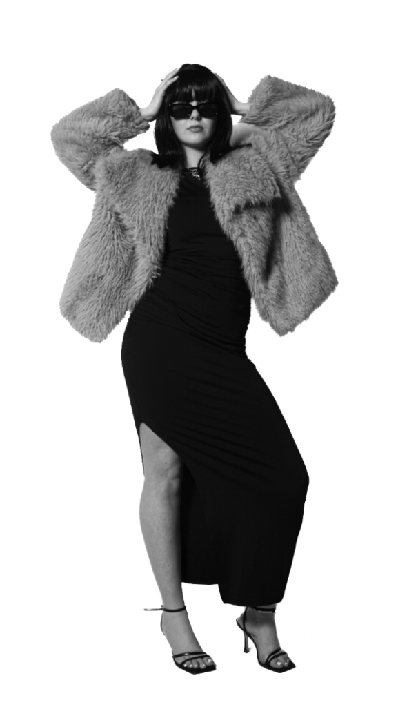
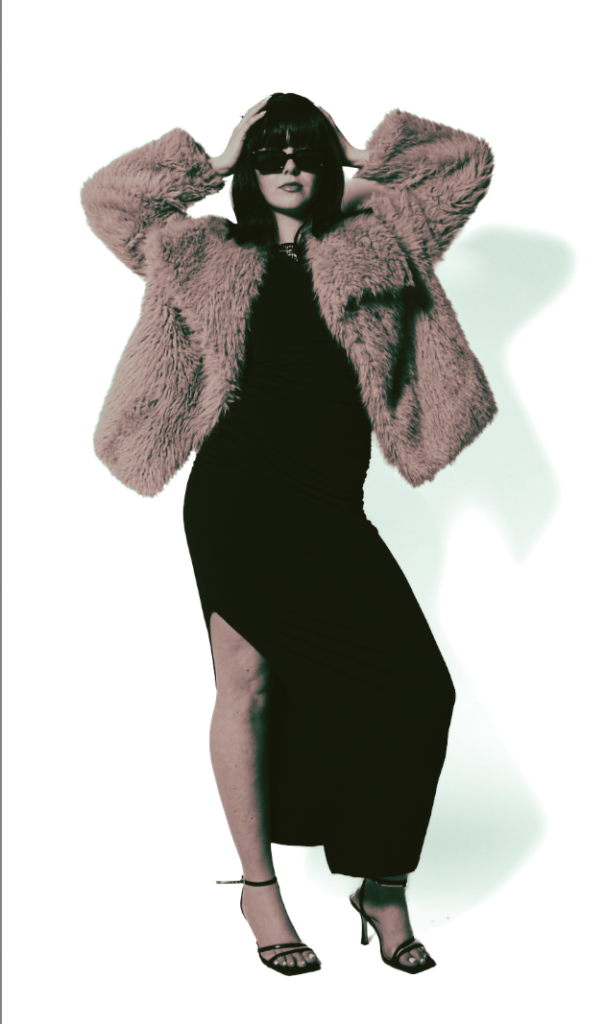
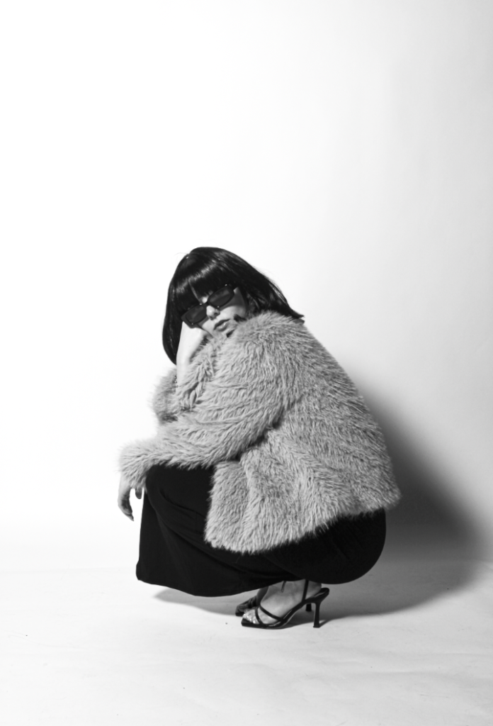
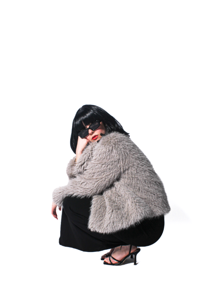
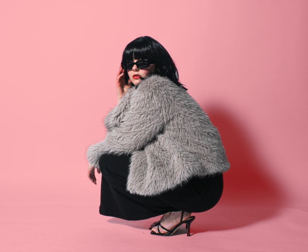
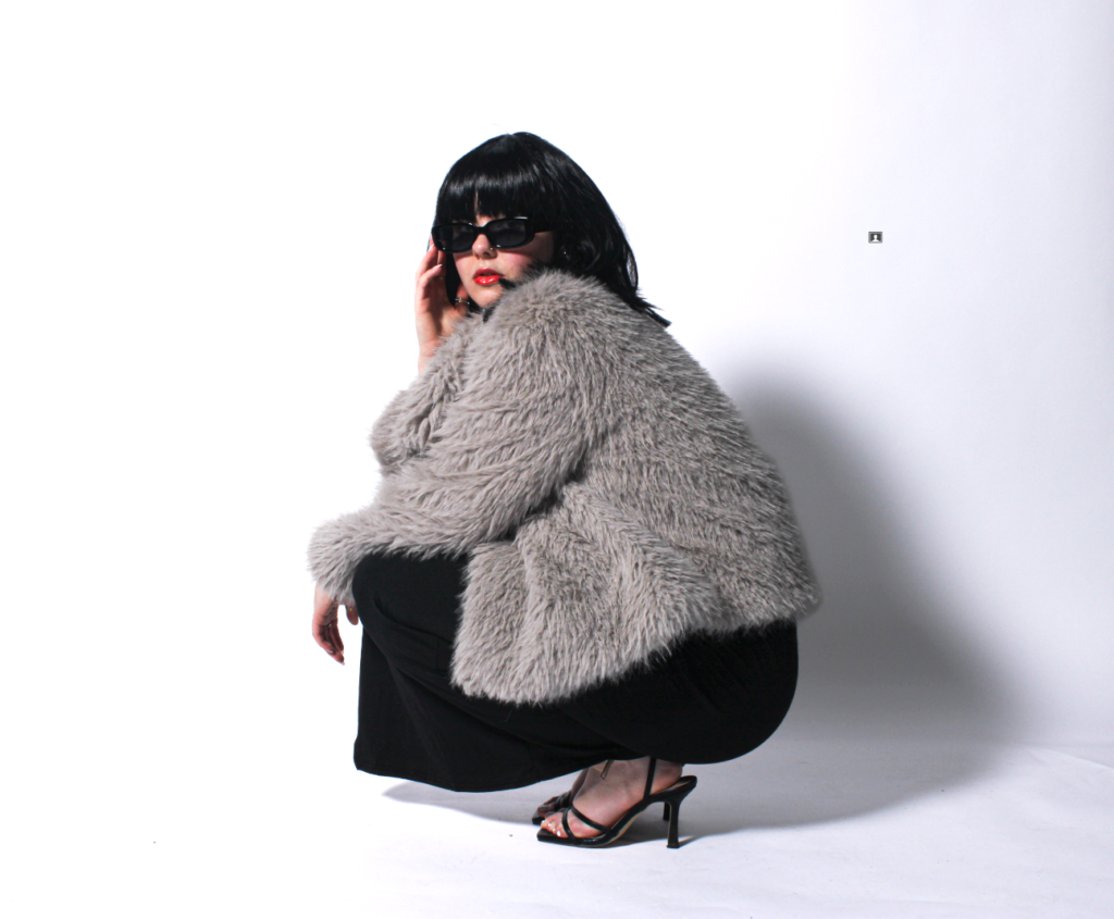
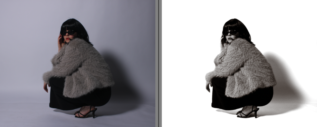
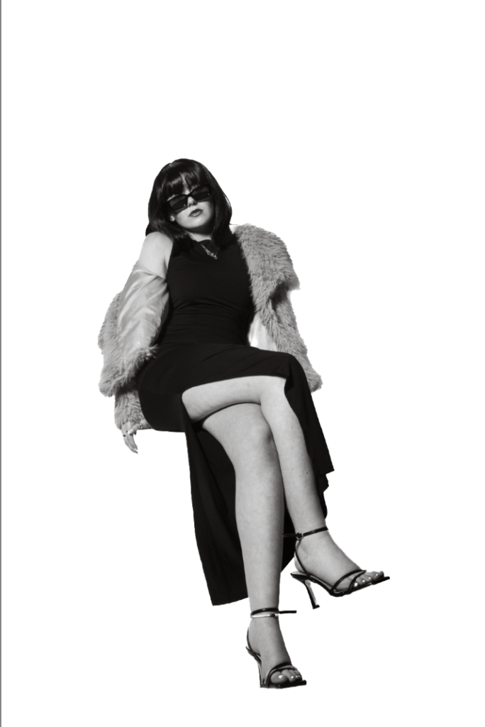
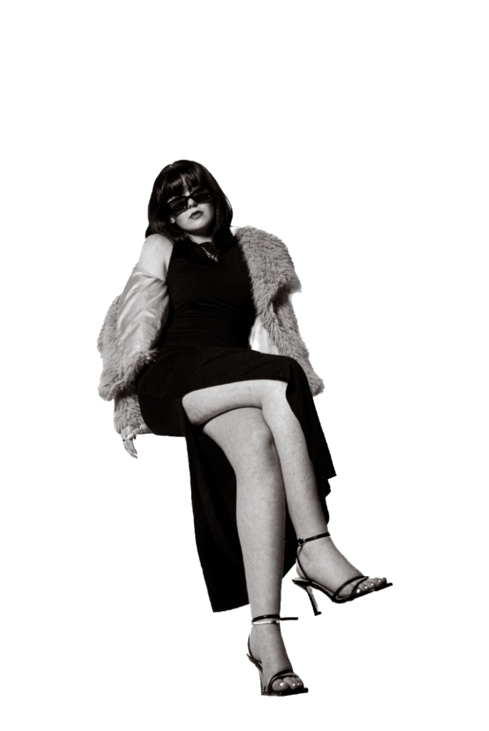
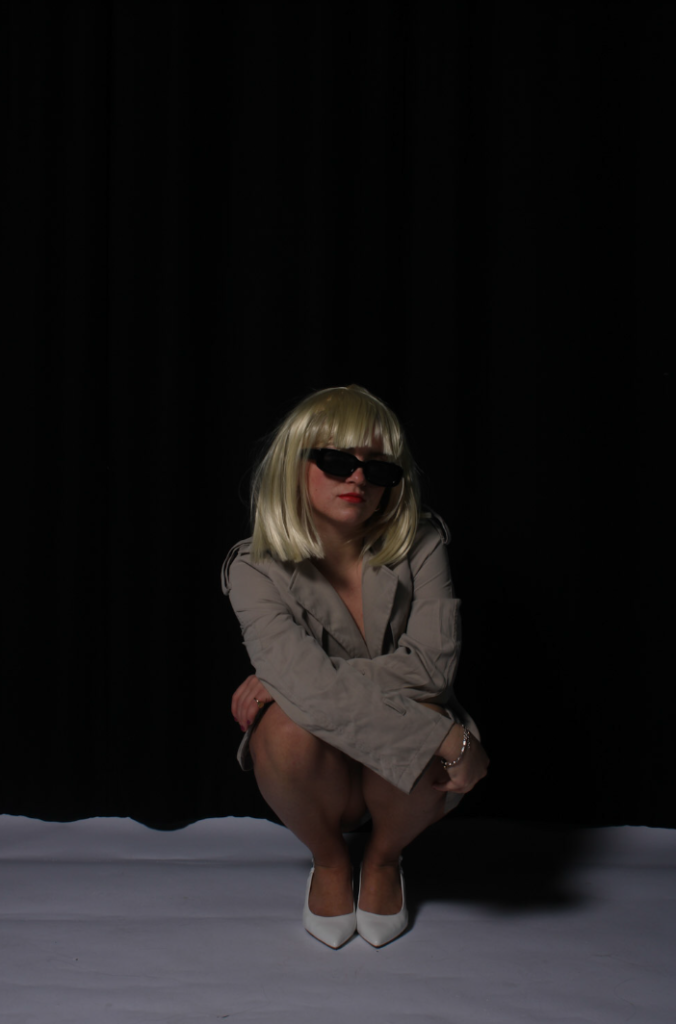
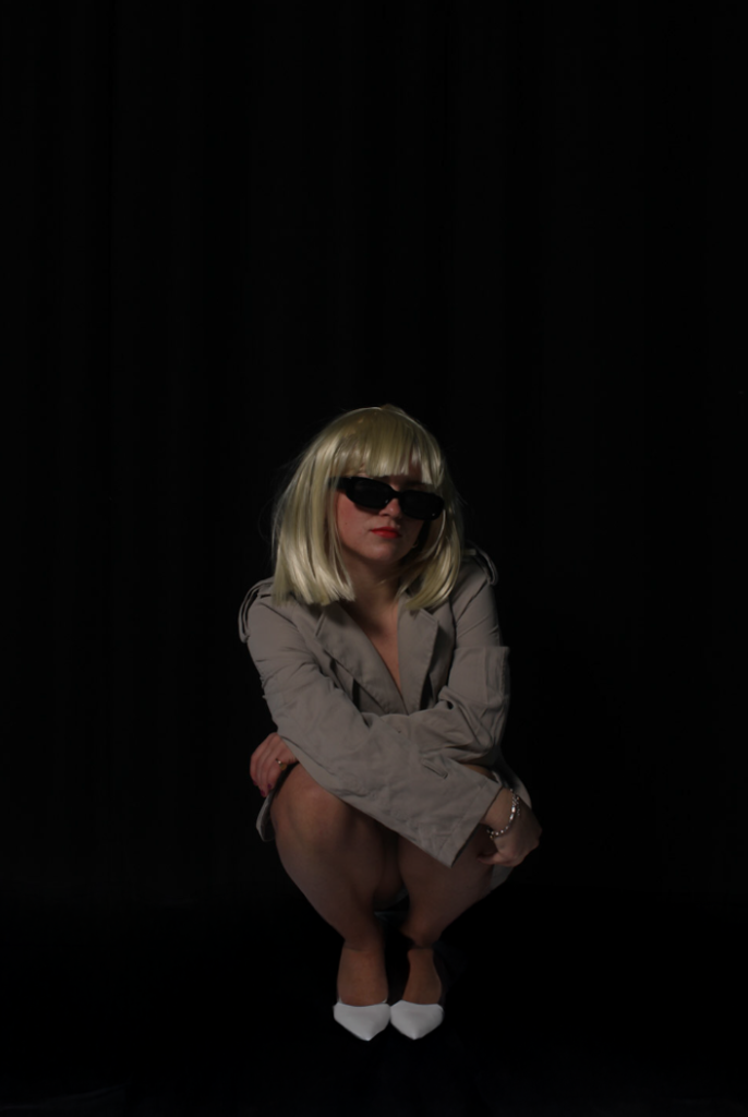
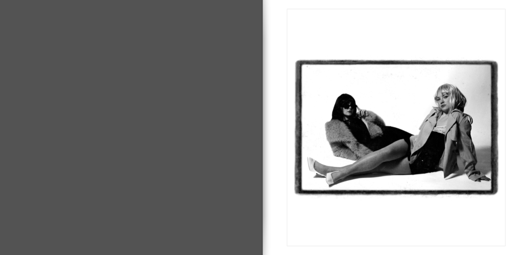
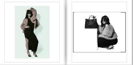
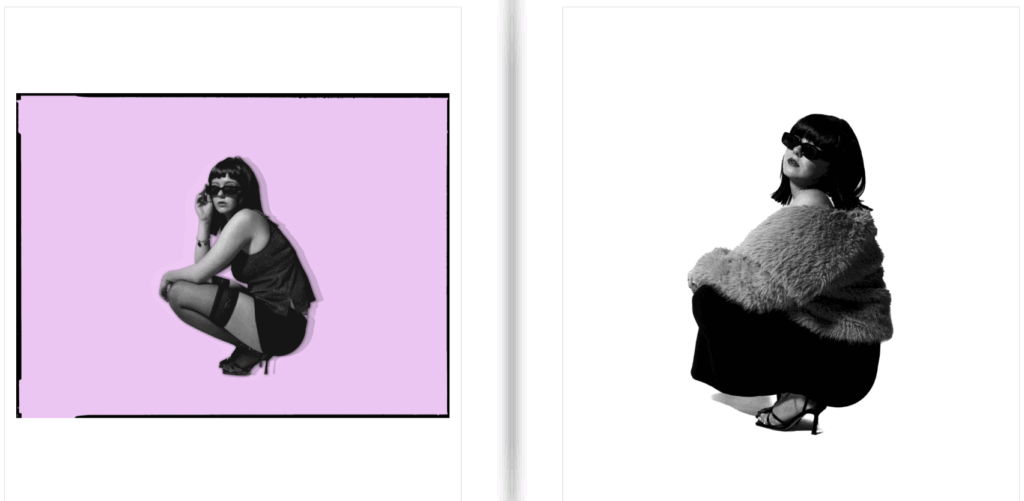
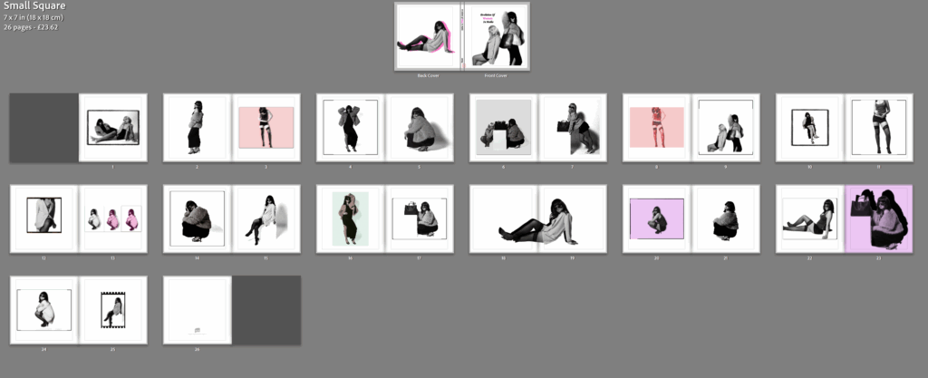
My plan in this magazine styled photobook, is to show off a very feminine aesthetic, straight away illustrating the theme I am focusing on and portraying. To do this, I aim to use stereotypical colours of femininity such as purples and pinks. I want this to be shown straight away on the front and back cover, to emphasise this and let readers aware of my project, before going into the book. My photoshoots are very high fashion, posing and props surrounded, therefore already creating the theme of a fashion photoshoot for a magazine. I really want all my images placed together thoughtfully and carefully to create the most contrast. Almost like this or that. For my front cover, I wanted it to be the both subjects, so it symbols and expresses women as a whole, and fits the term ‘women’ due to being plural. This also signifies how women as a team went through the waves and movements of feminism and eventually increased in the main stream media. Aside from already achieving my powerful and dominant aesthetic of women, I wanted my photobook to add something. Therefore, I will add diversity of boarders to make some images look vintage but also to break apart the white images and make them stand out, rather than blend in. I want to separate all the experimented images so they are spread across the book evenly, and attempt to put 2 pages together to contrast significantly. Although, my aim of my subjects are suppose to look atypical, the clothing etc are very feminine. Therefore, although the pinks and purples contrast with my purpose and aim, they keep the girly aesthetic. The narrative is to signify the revolution of women in the main stream media, and how it was not normalised for women to be in the media before the 1990’s. This is what made Helmut Newton different to other photographers during this time. My narrative is to express modern women in the fashion media and how it changed to the present.
Design and Layout
Photobook style:
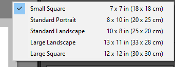
I chose this style, as my last project I used standard portrait and wanted to differ. I also chose this because I wanted my book to be petite and mini as I believe it fitted my concluded theme the most. I want my book to be small and have either a soft or hard cover, however I think soft will fit the magazine style more beneficially.
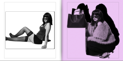
Front and back cover:
Updated version:
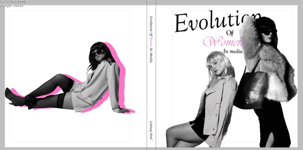
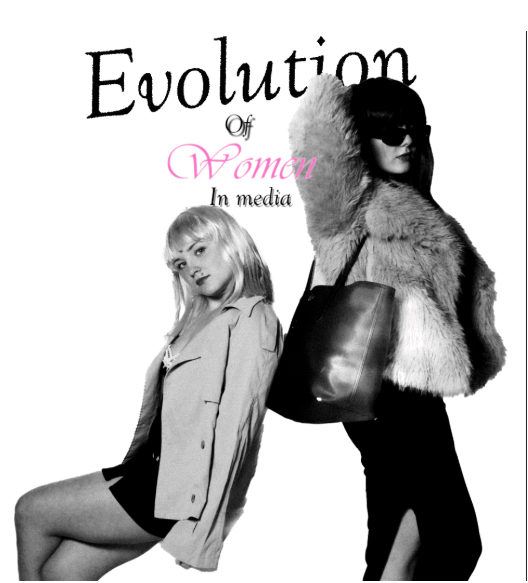
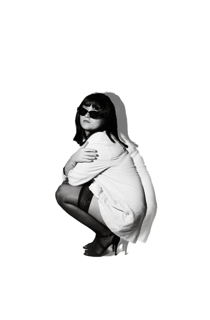
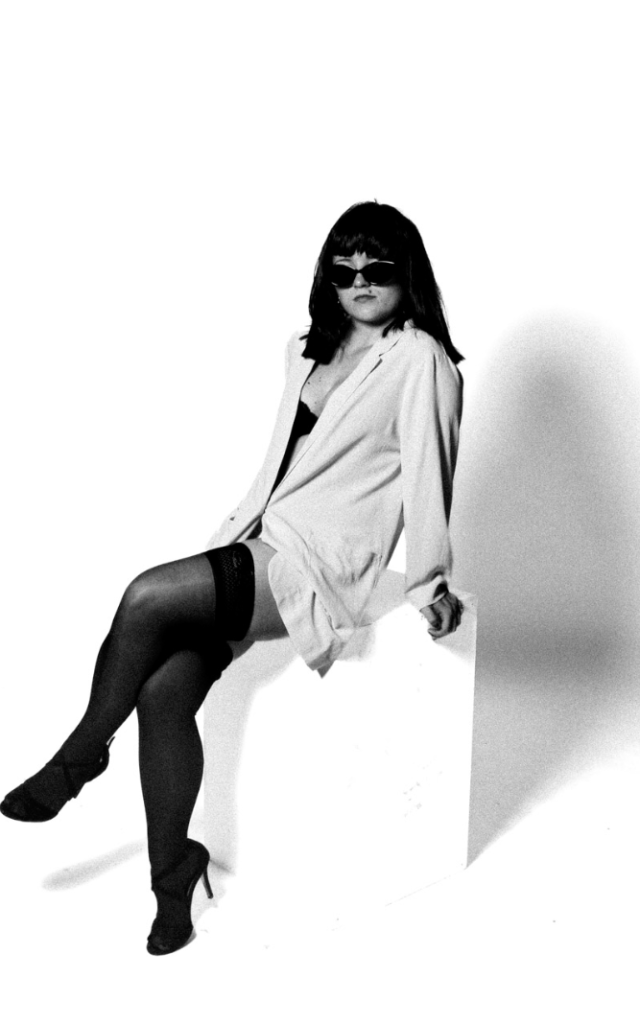
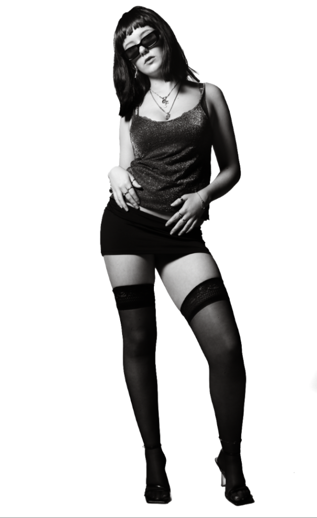
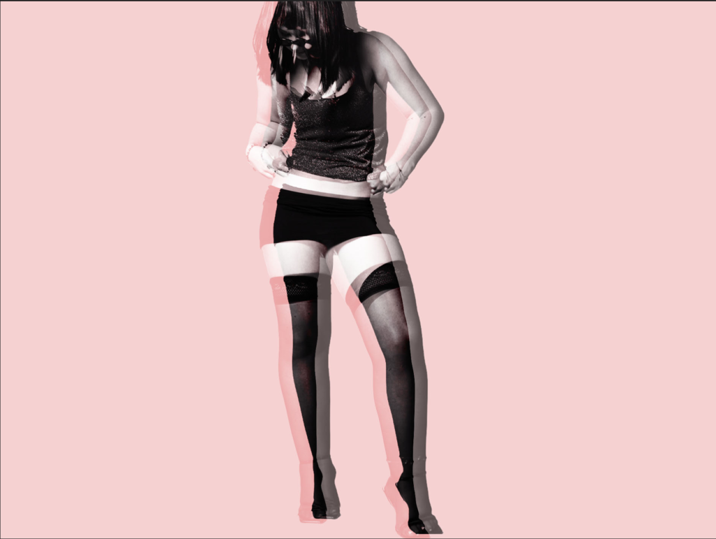
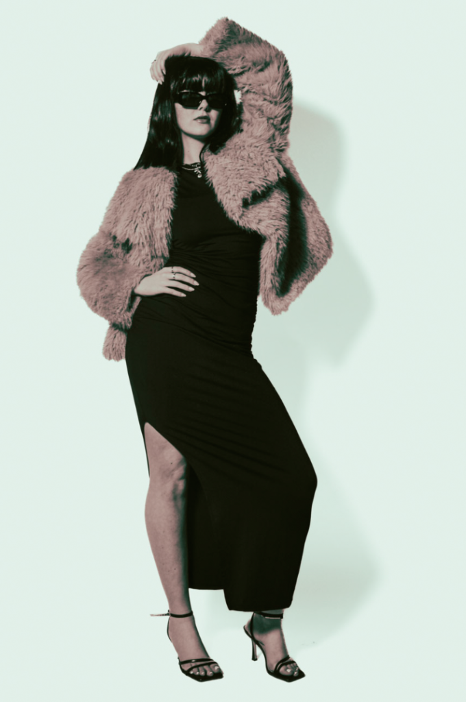
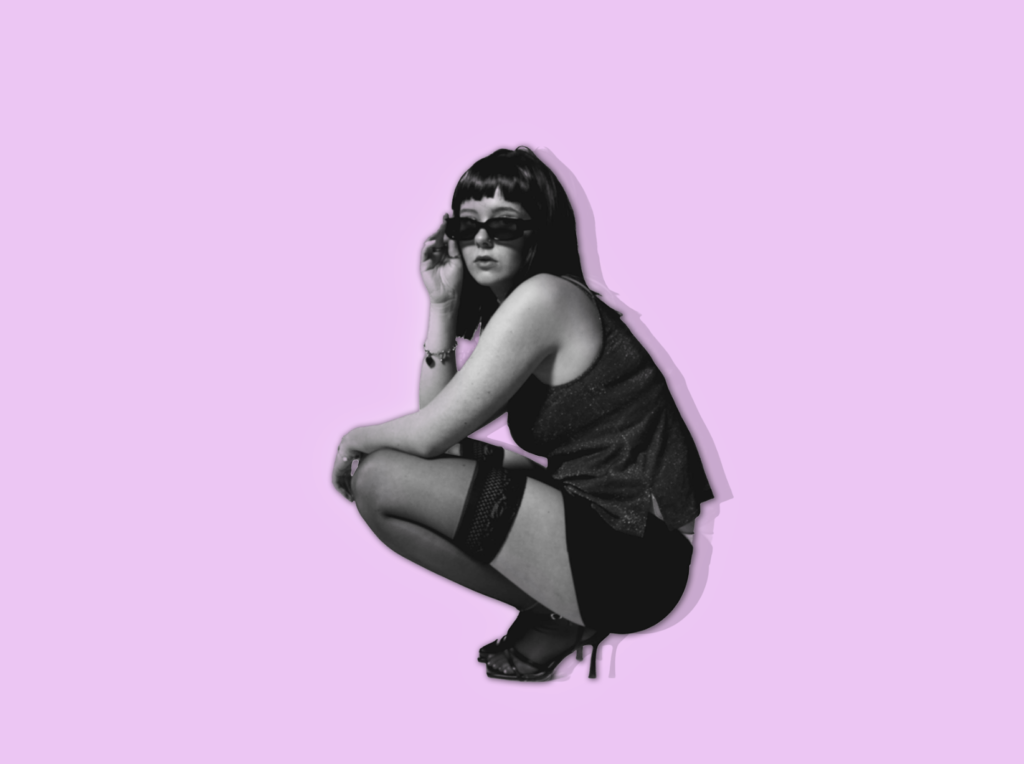
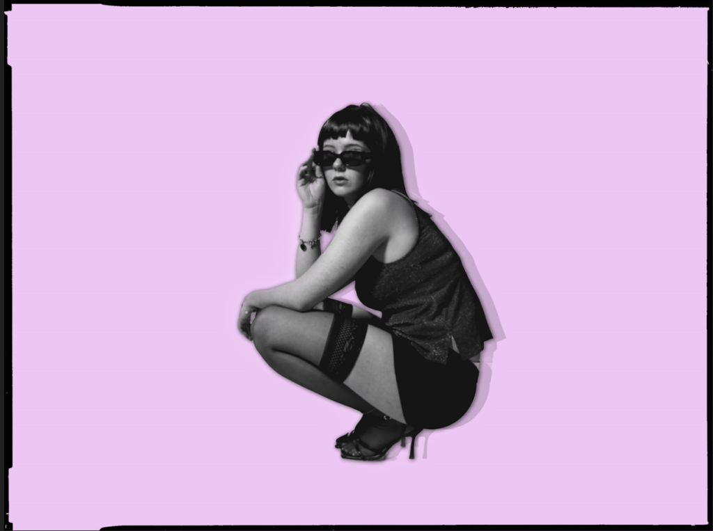
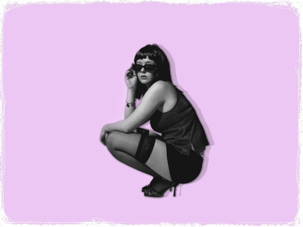
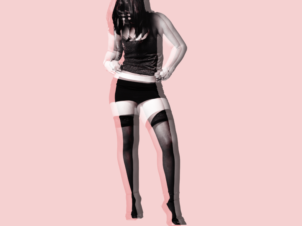
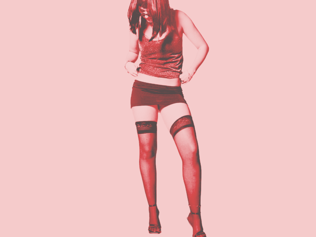
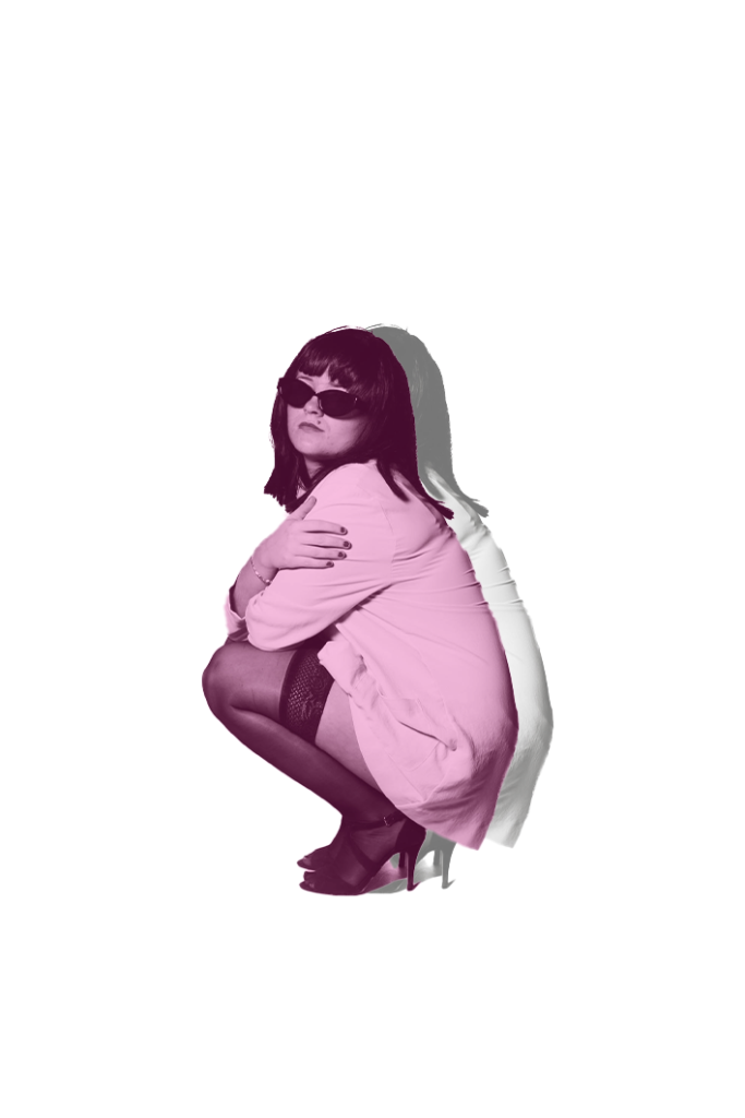
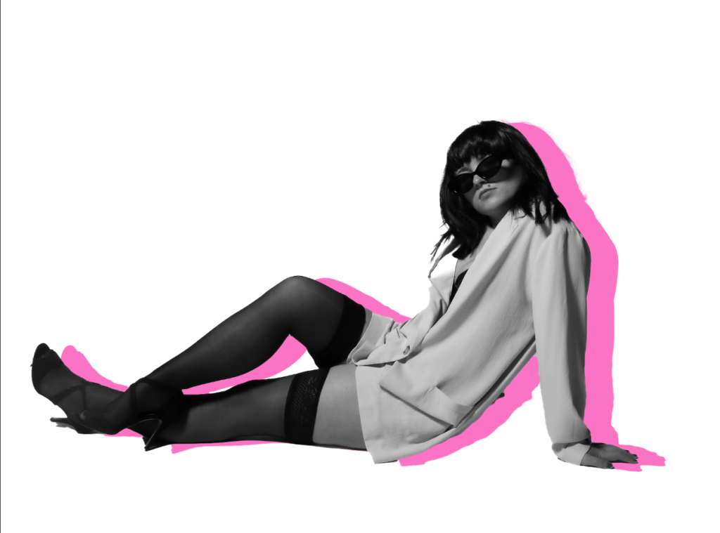
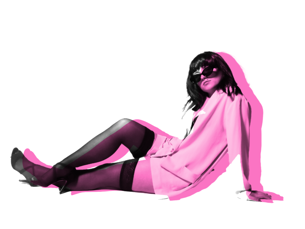
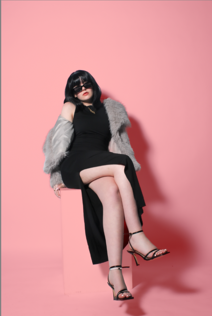
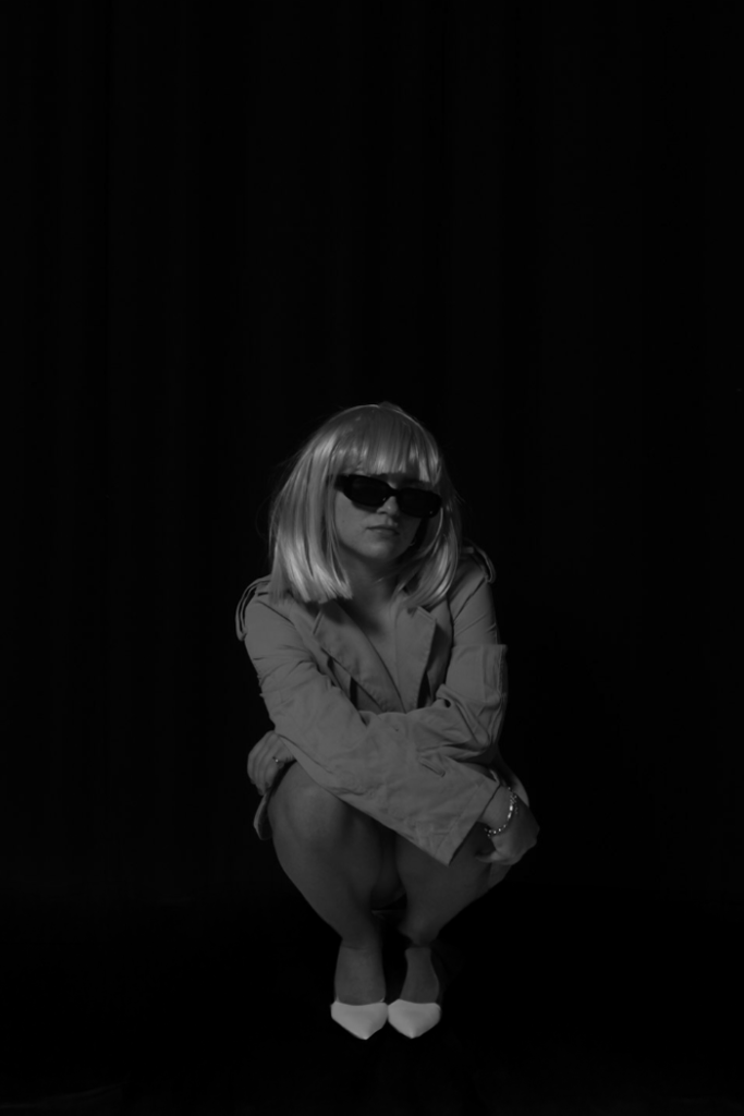
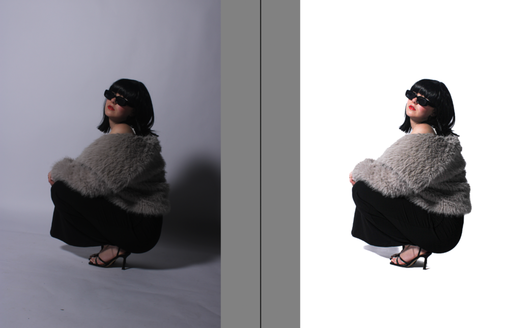
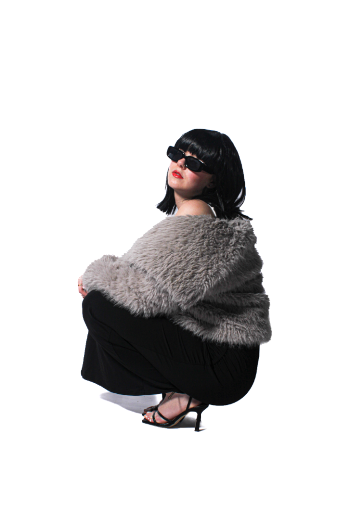
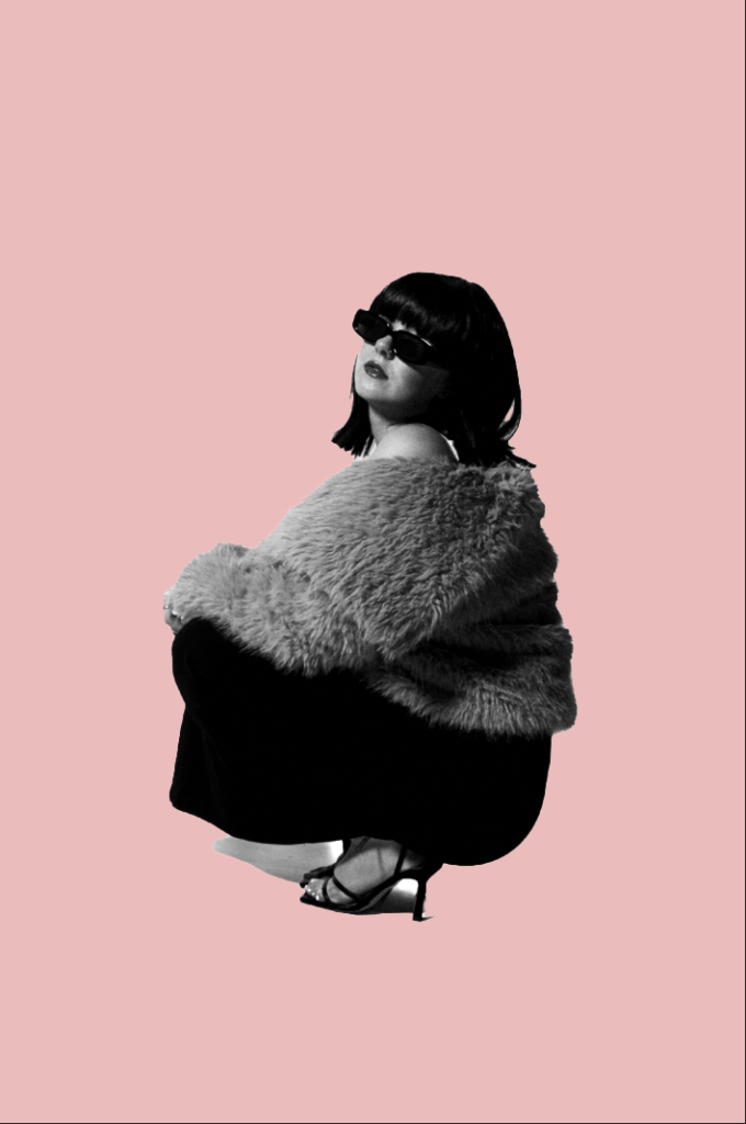
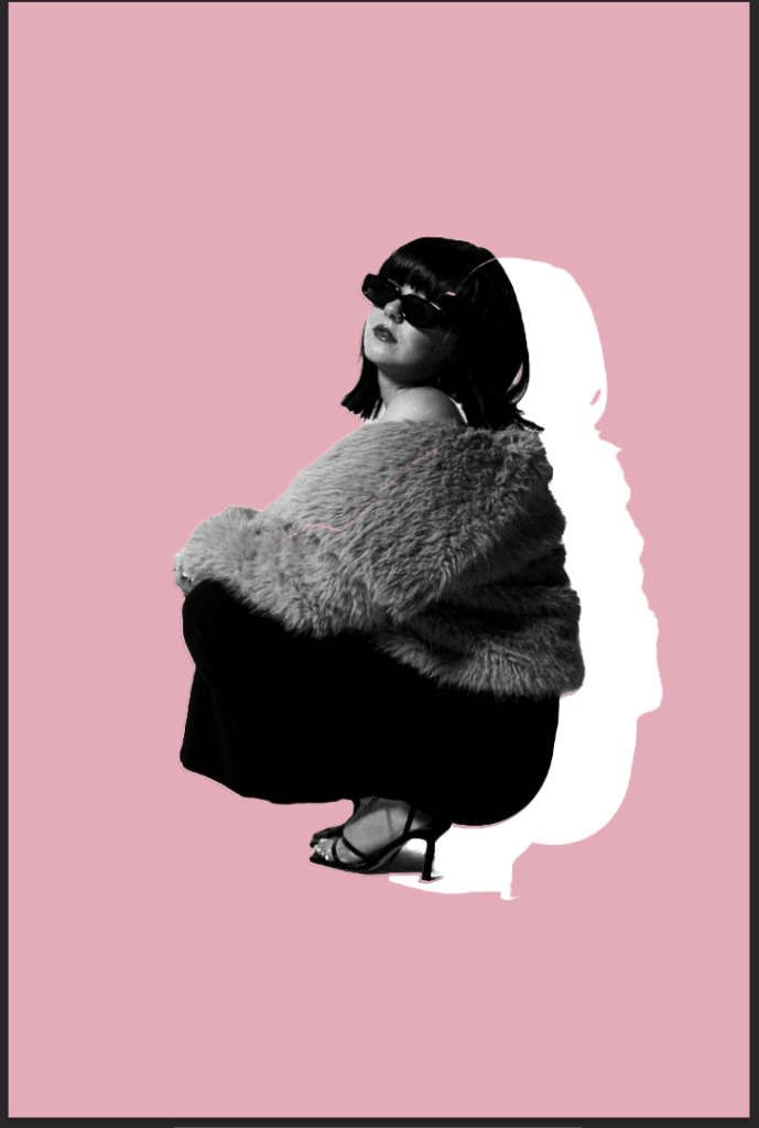
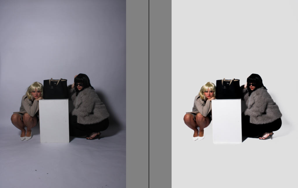
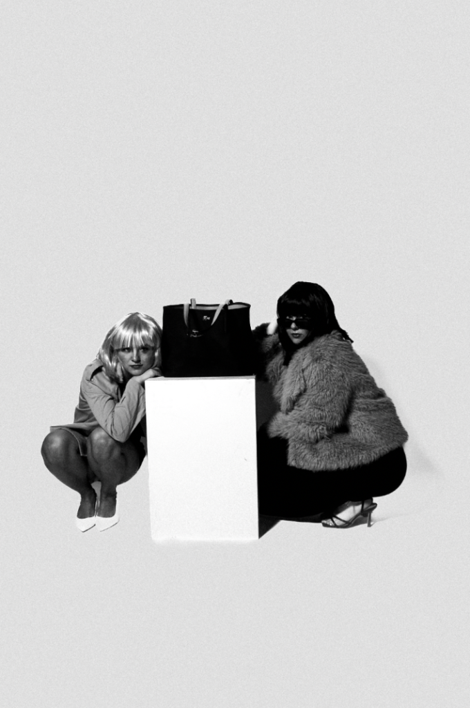
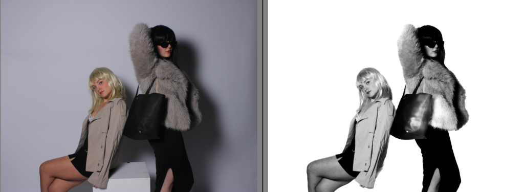
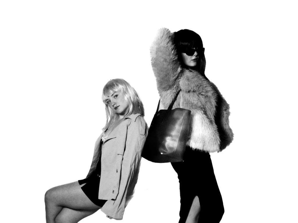
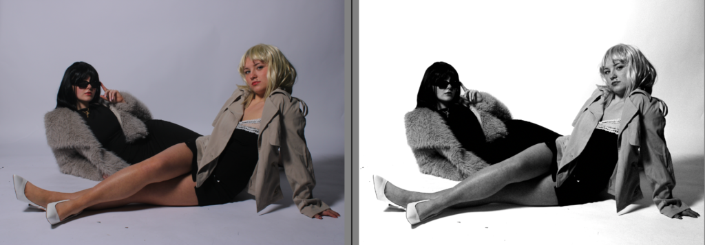
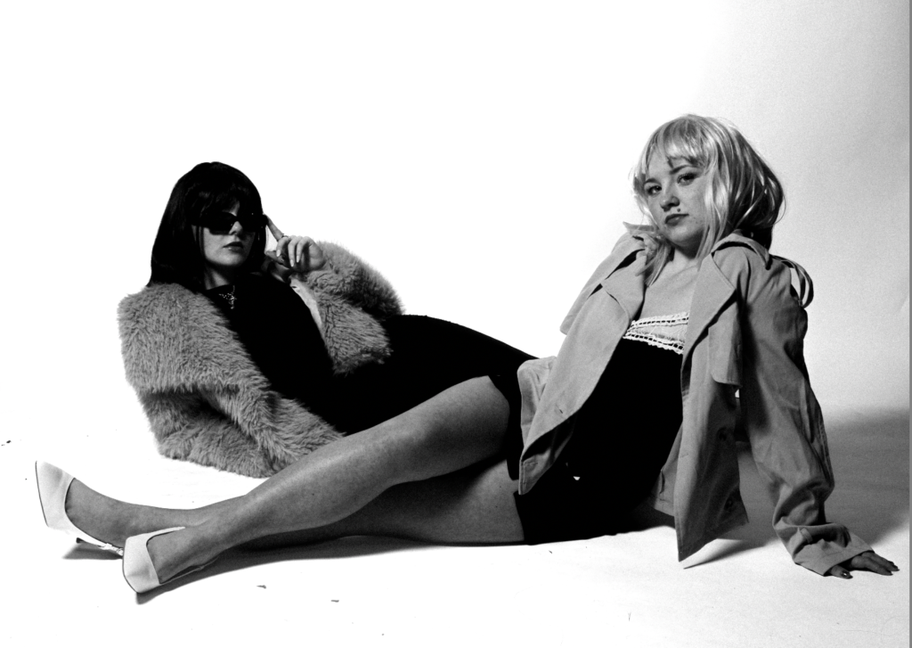
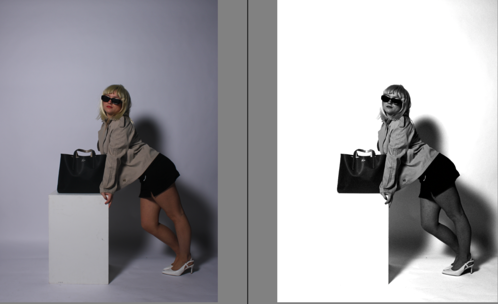
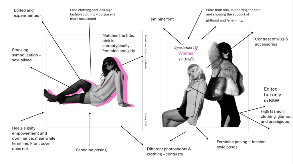
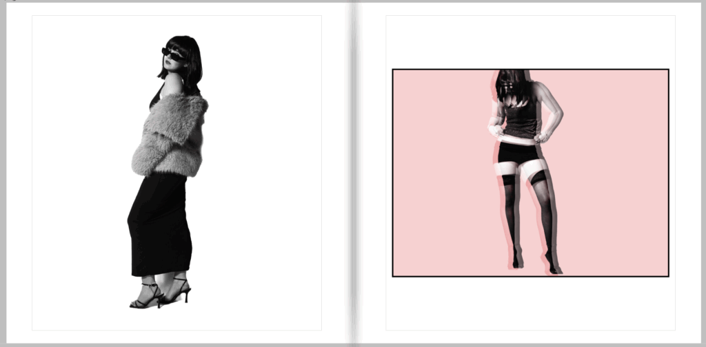
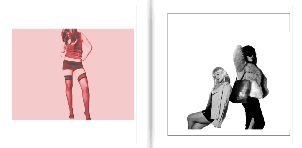
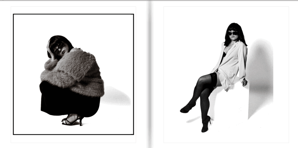
I chose these images as I wanted my title of ‘ women’ to be in pink, therefore I wanted to add something that made this link seamlessly. Due to my photobook obtaining purposely edited colours and black and white, I wanted my back and front cover to show this so the viewers know it is not just in black and white. I made my front cover two women, rather than one to fit the title and show the support of girlhood and femininity. To show that this book is not dull, I added one of my edited and experimented images to the back from a different photoshoot, therefore obtaining different type of women’s styles and what they portray. As shown above, the back cover is more of an over sexualised and objectified aesthetic through the stockings and meanwhile obtaining a modest element to it through the short and flowy blazer with a bra peeking out. I also chose the back cover image because it shows the heels, a very significant symbol in femininity which had to be shown through the first glance. This is because my front cover does not show this, but still shows very feminine and graceful posing. The pink matched perfectly to my title and I think it gave off the correct aesthetic for first glances, which is what I wished to achieve.

Changed title –

Updated after experimented –

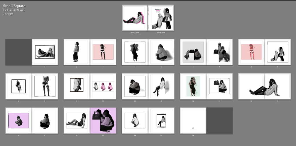
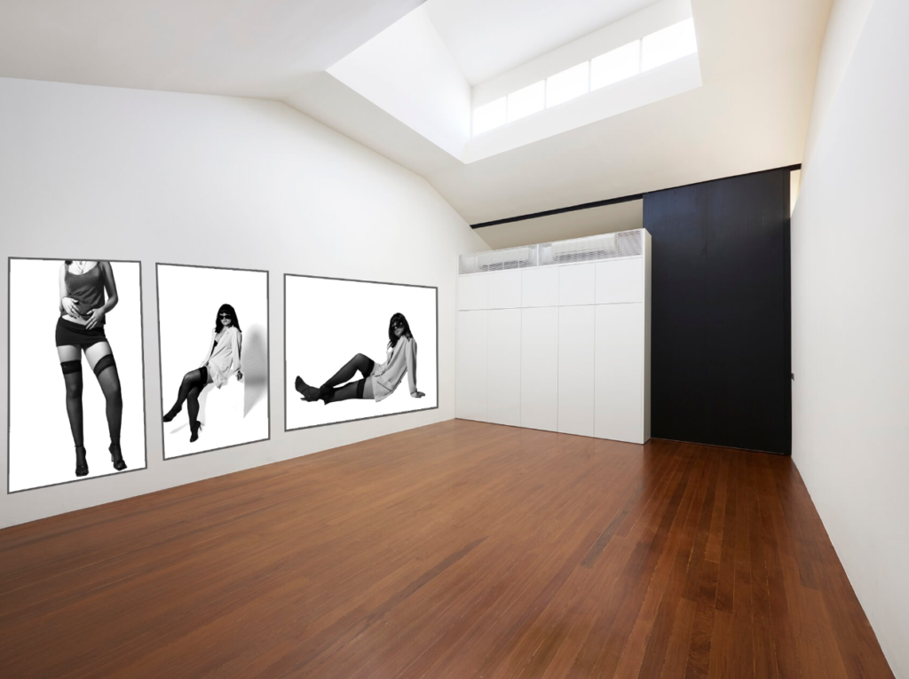
Pages to 26:

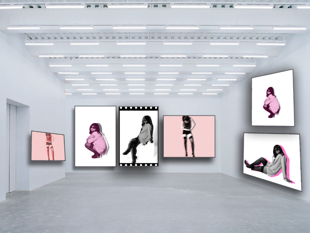
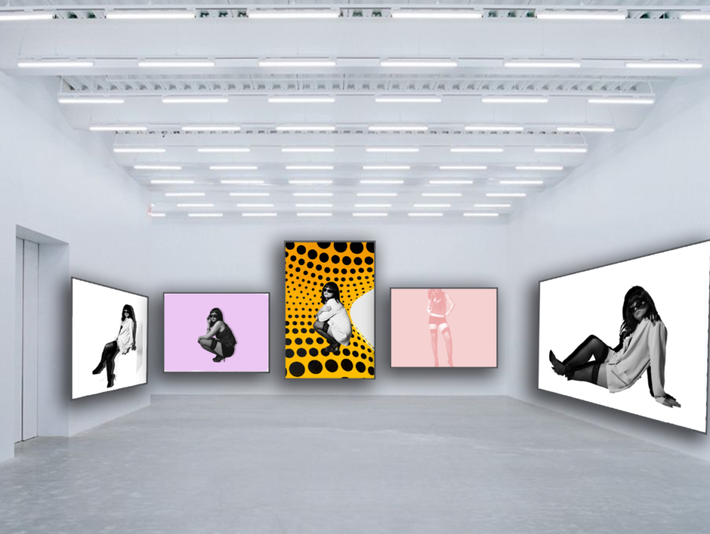
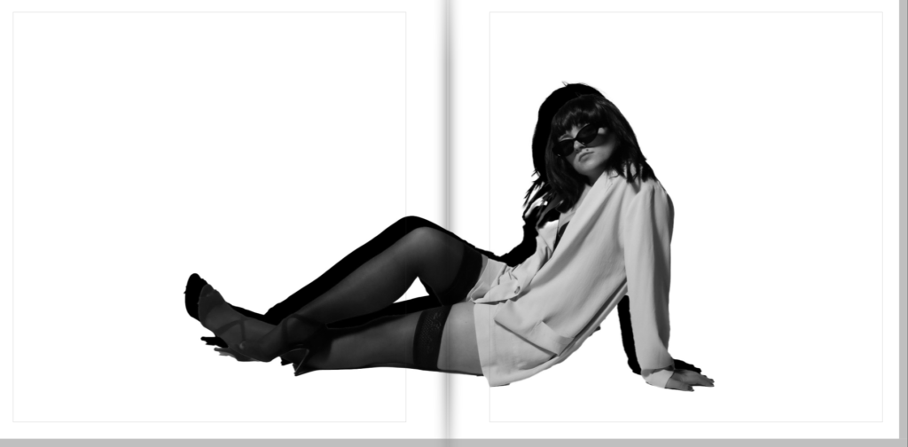
Double page spread:

My evaluation:
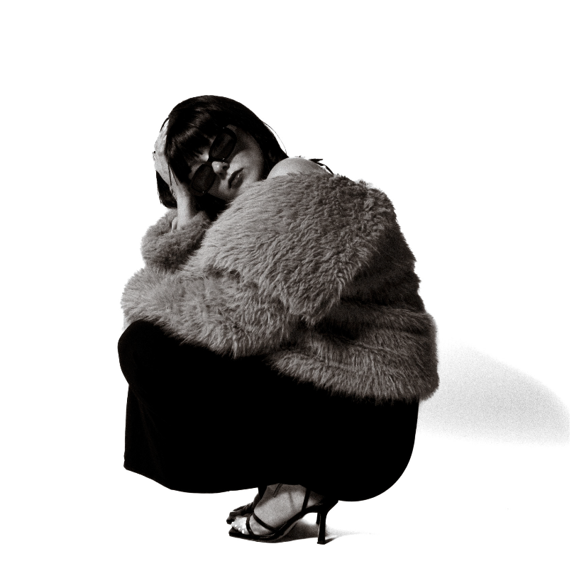
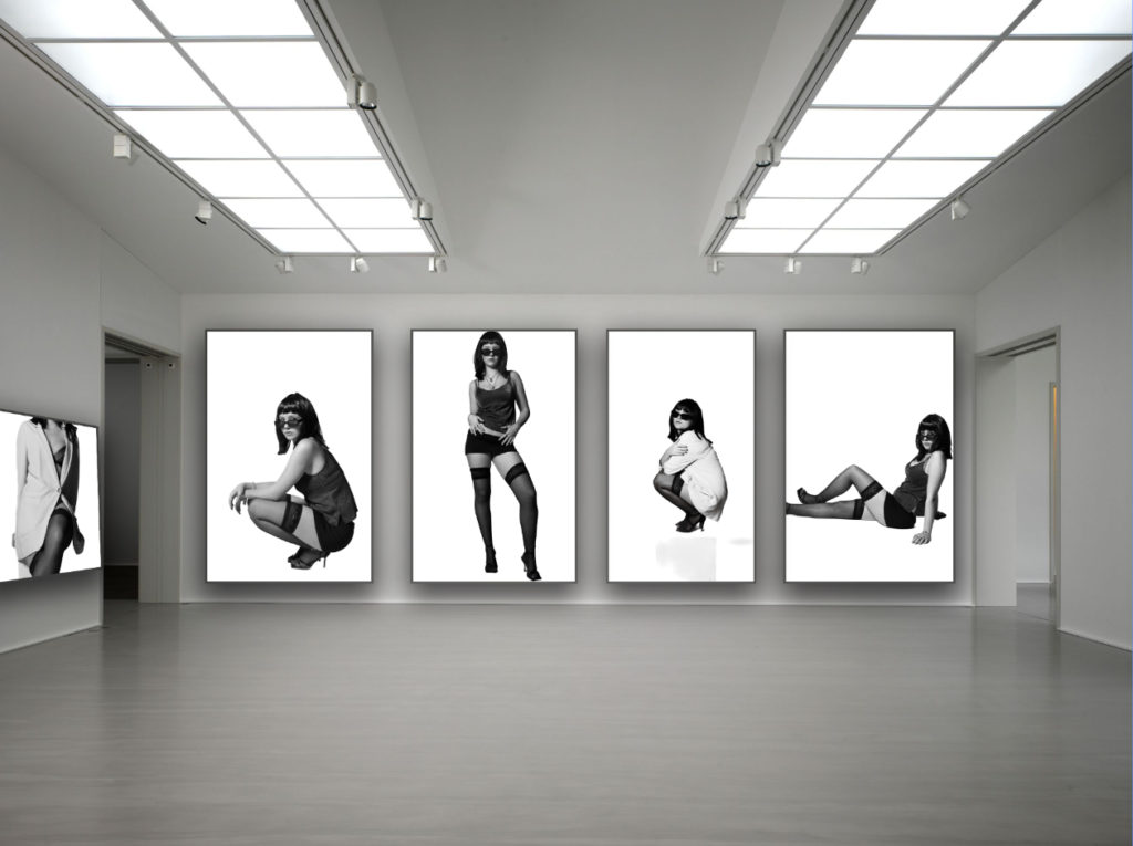
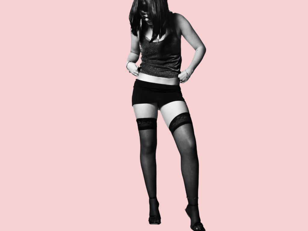
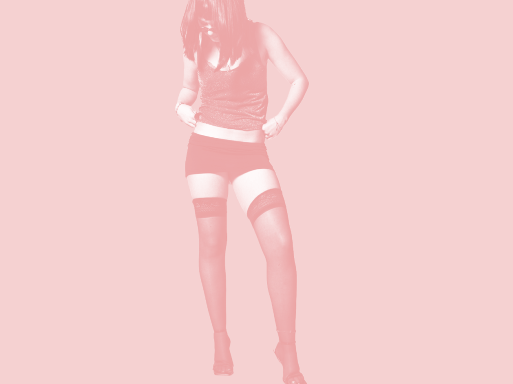
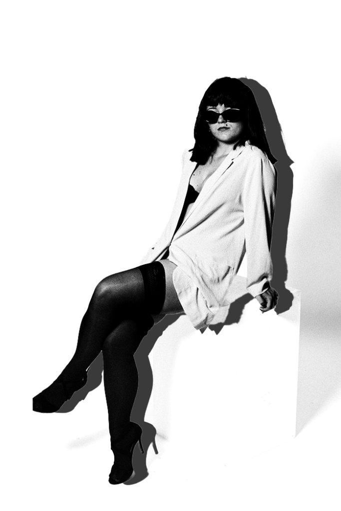
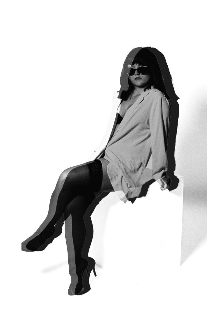
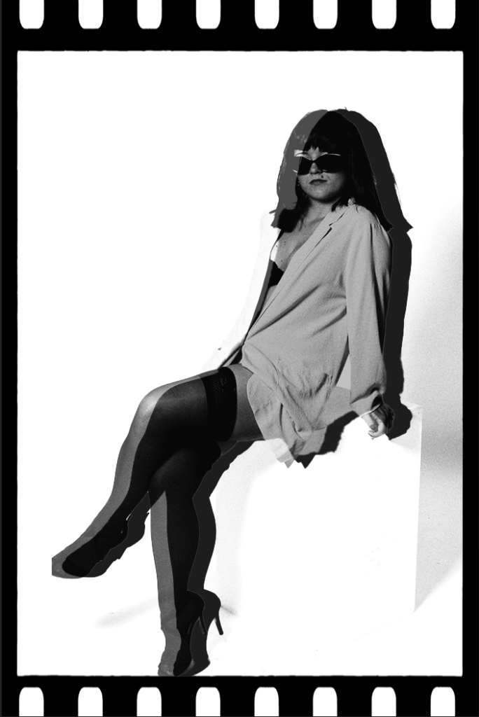
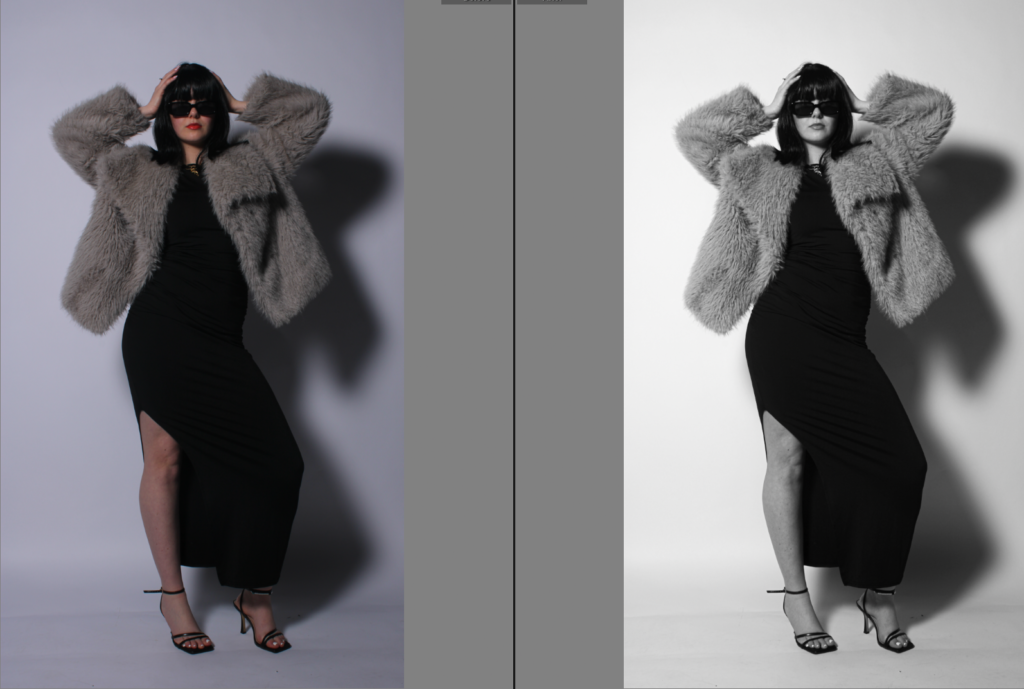
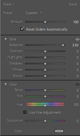
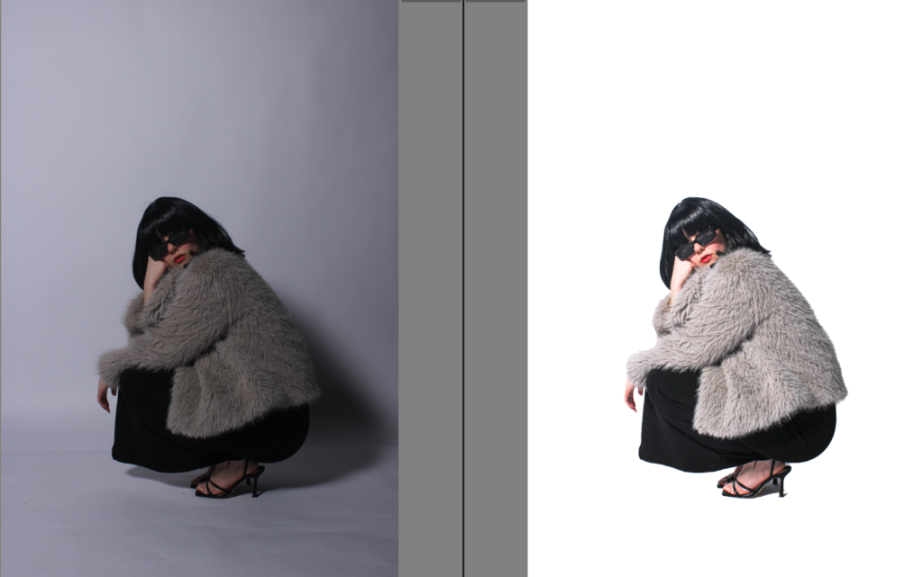
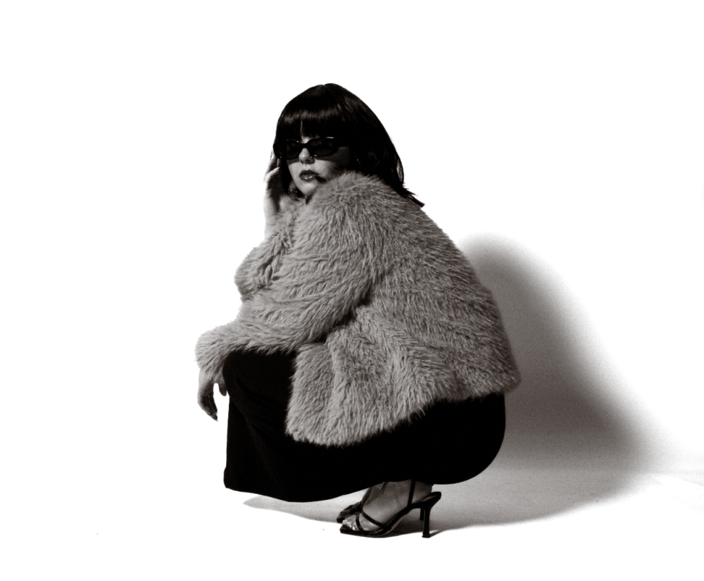
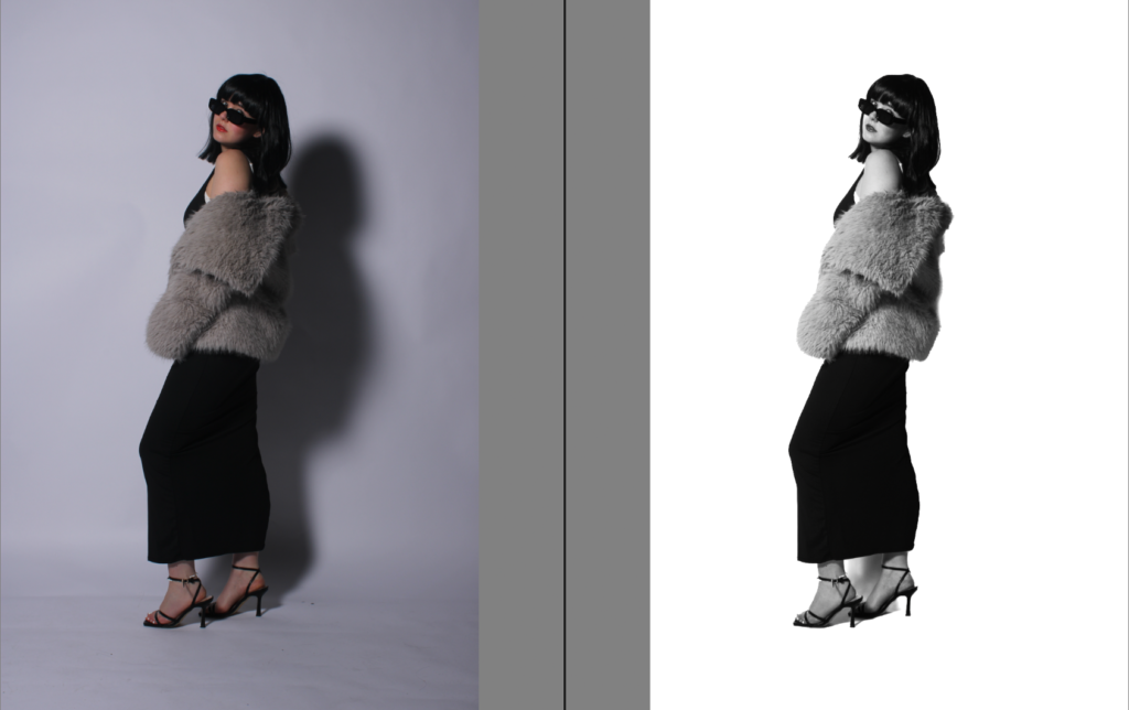
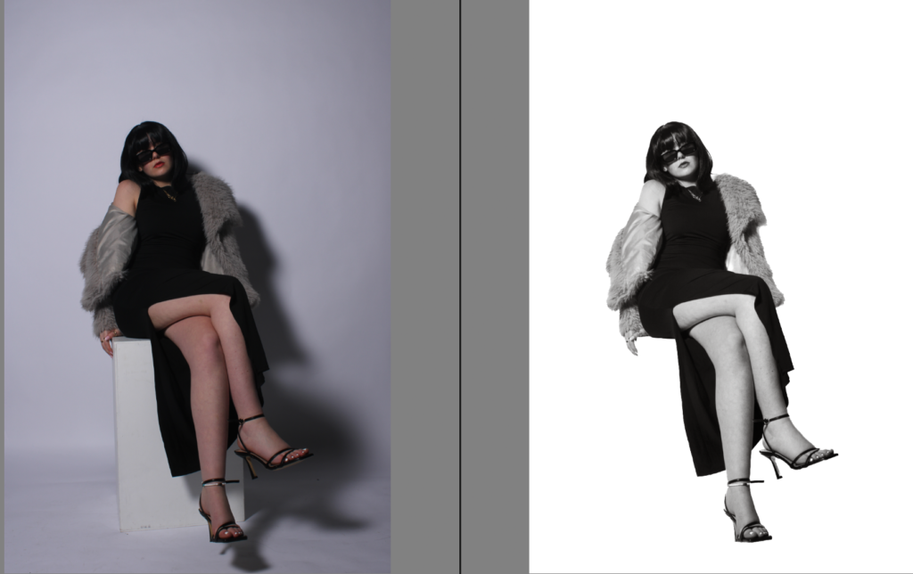
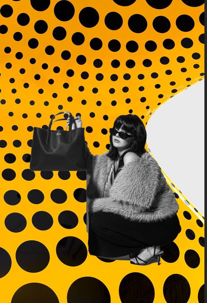
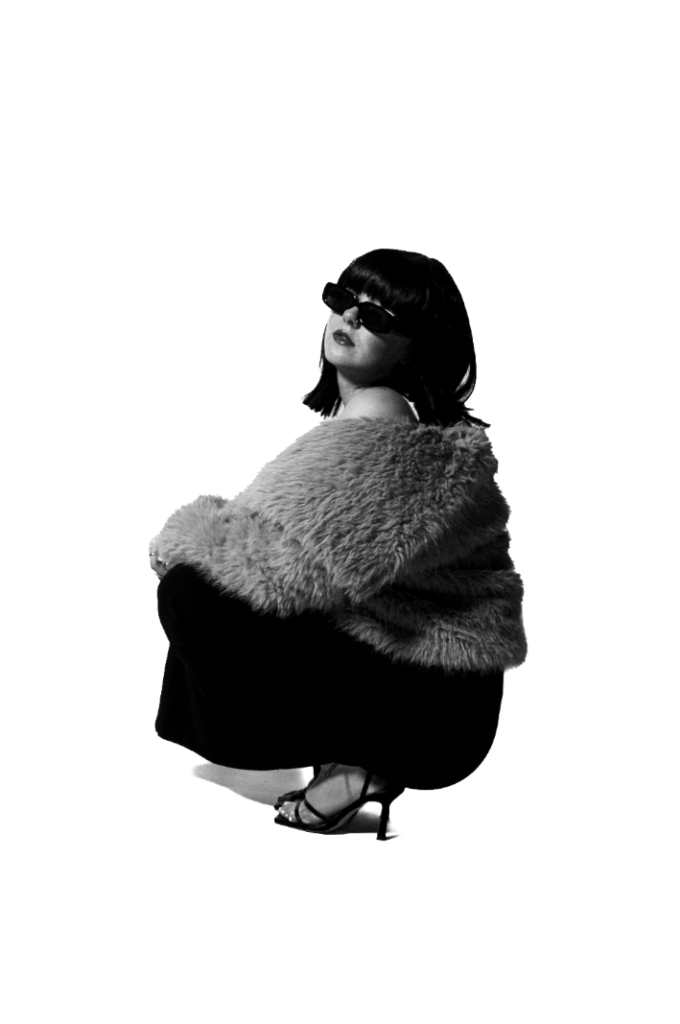
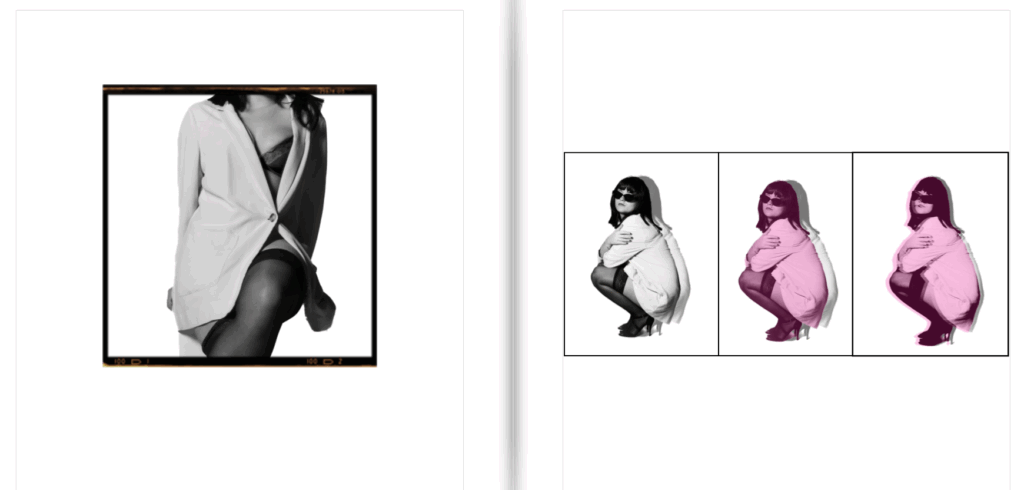
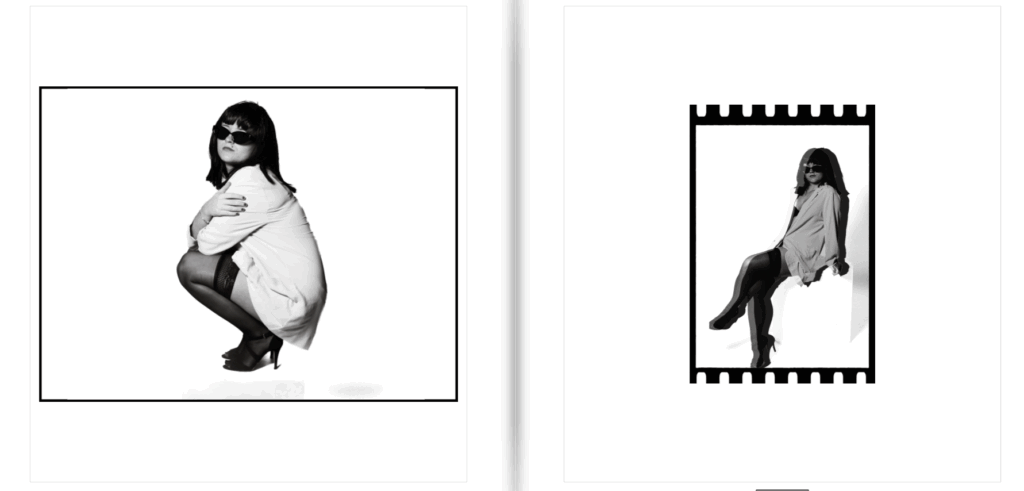
Overall, I enjoy the diversified images, the use of black and white and colours, and different boarders and sizes. The use of black and white and edited colours, I personally believe contrasts yet ties everything in really well. This is because none of my images are in normal colour, yet a few of them obtain colour whilst maintaining the theme of black and white. I like this because it makes my book not boring and dull to look at and definitely catches the eye. The use of different boarders emphasise this but also adds a different aesthetic to each image, throughout whether I want the image to look modern or vintage. Some of the borders I did on photoshop, and some I added for the book. The different sizes emphasised the contrast I was aiming to achieve, but overall I believe the mixing of the edited/experimented images with the black and white images worked seamlessly and created the most contrast. Lastly, I think the use of pink in the title of ‘women’ immediately tells the theme of my magazine, which is what I aimed to do. The use of font is very feminine in my opinion and added to this factor. Some images obtained shadows, and some did not which I think worked beneficially as it made my book more diversified and unique. Lastly, I believe that my photobook gives off a magazine type style which is exactly what I wanted to achieve, which I think I did successfully, with a unique and different perspective, linking to my artist reference Kusama Yayoi. Whereas the images its self and how it was created through props, fashion and posing links to Helmut Newton through the cinematic and theatre – carefully crafted style.