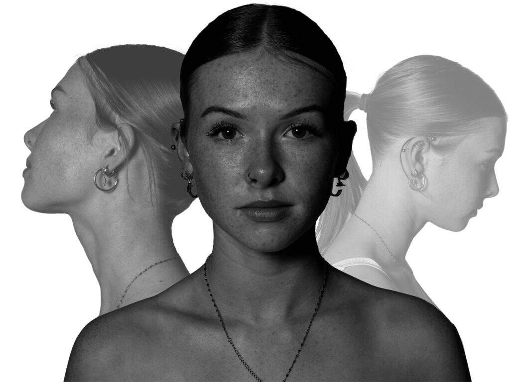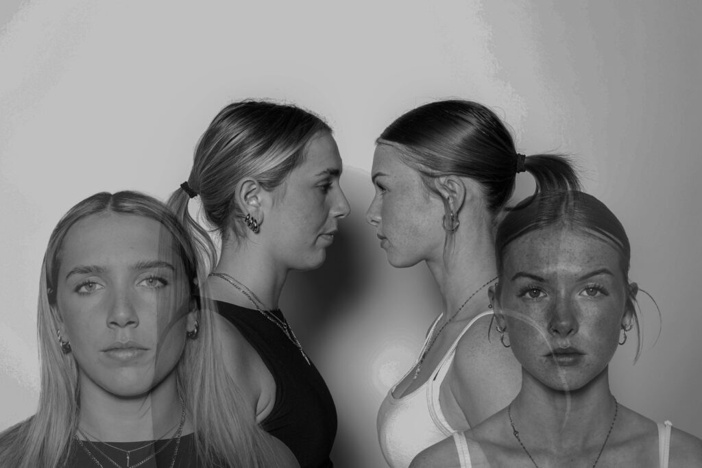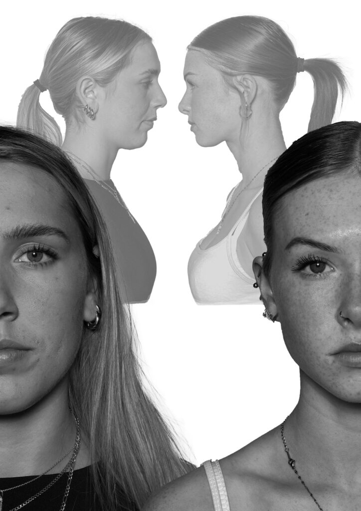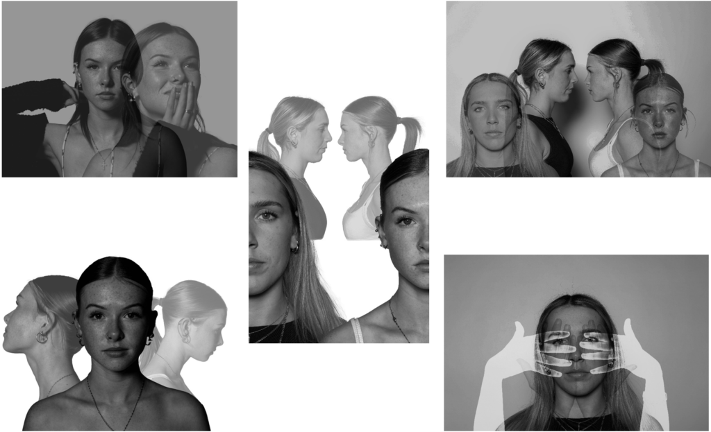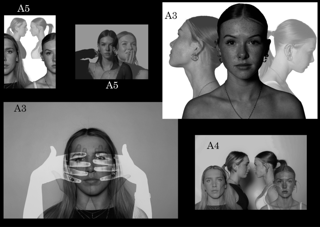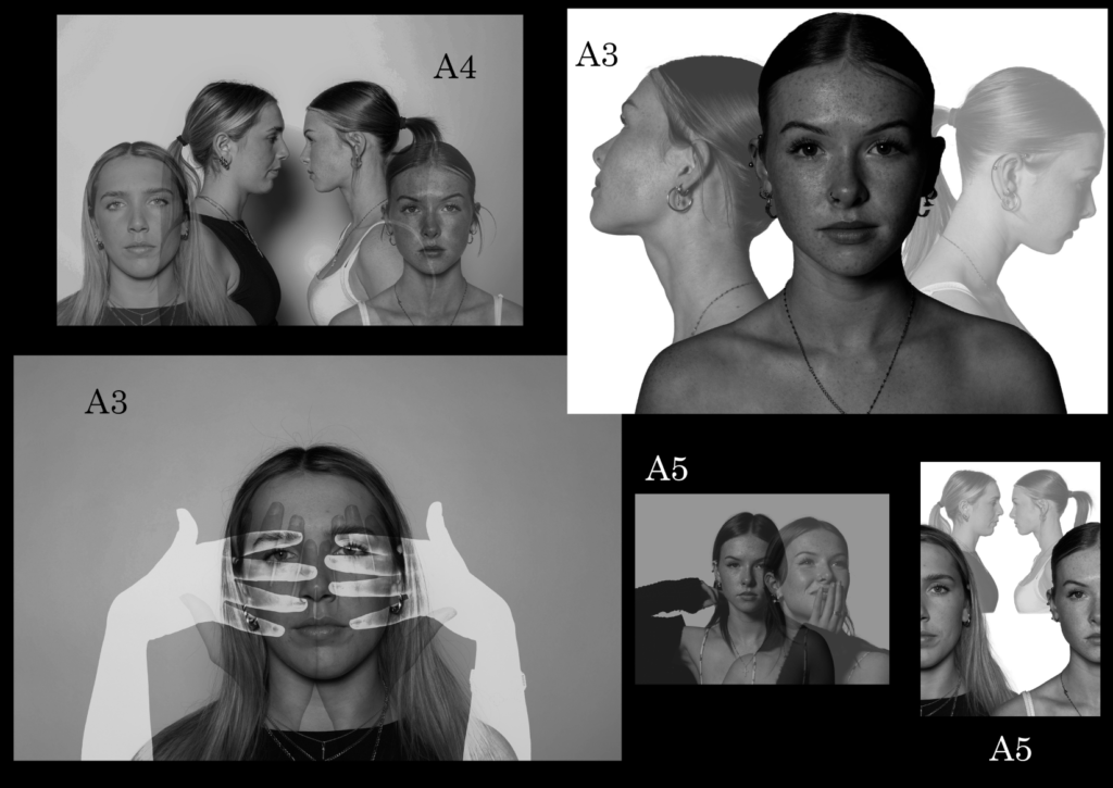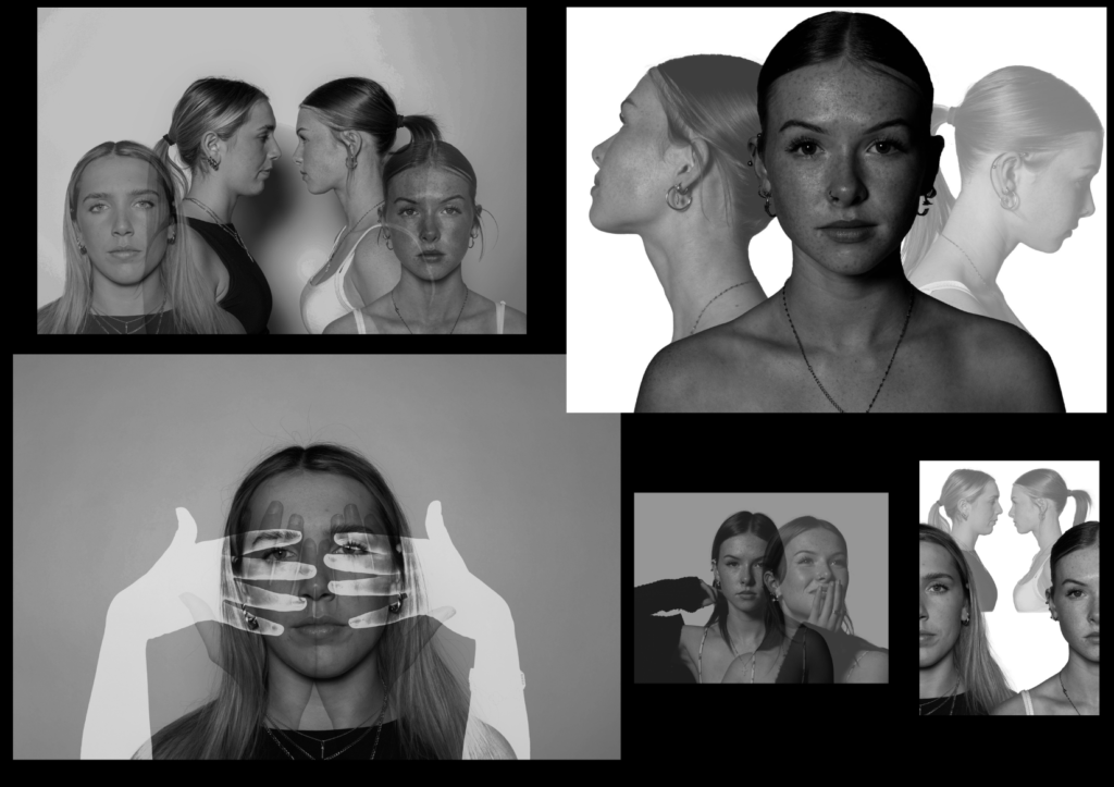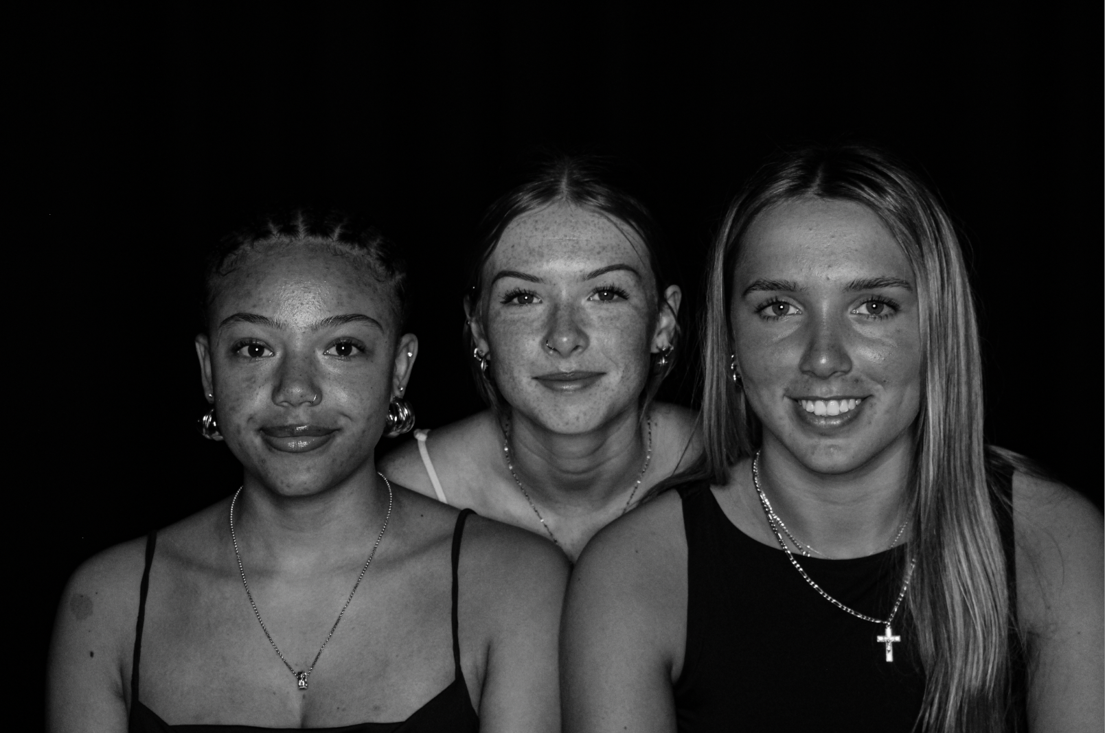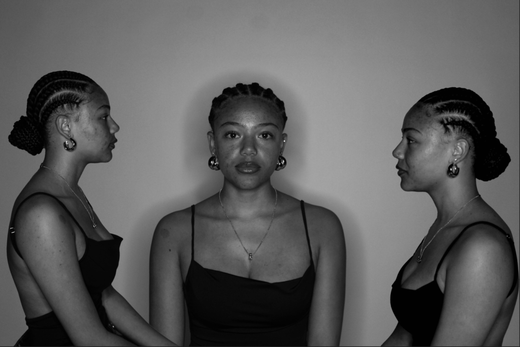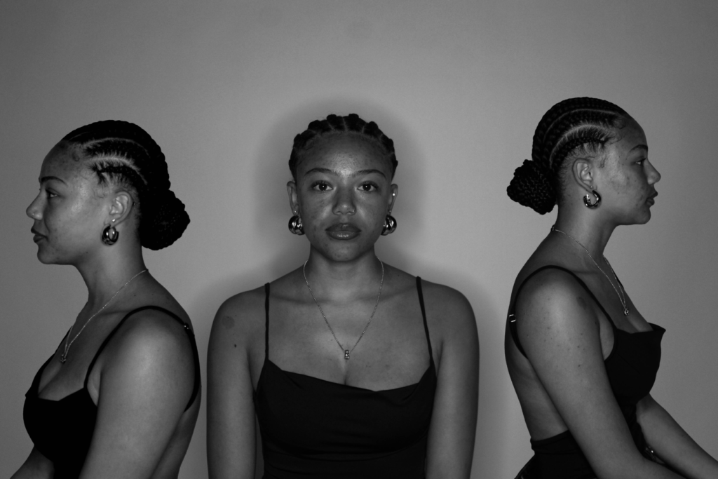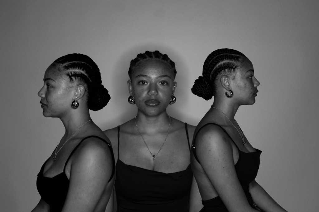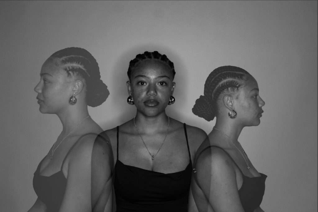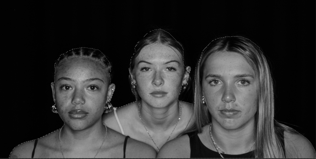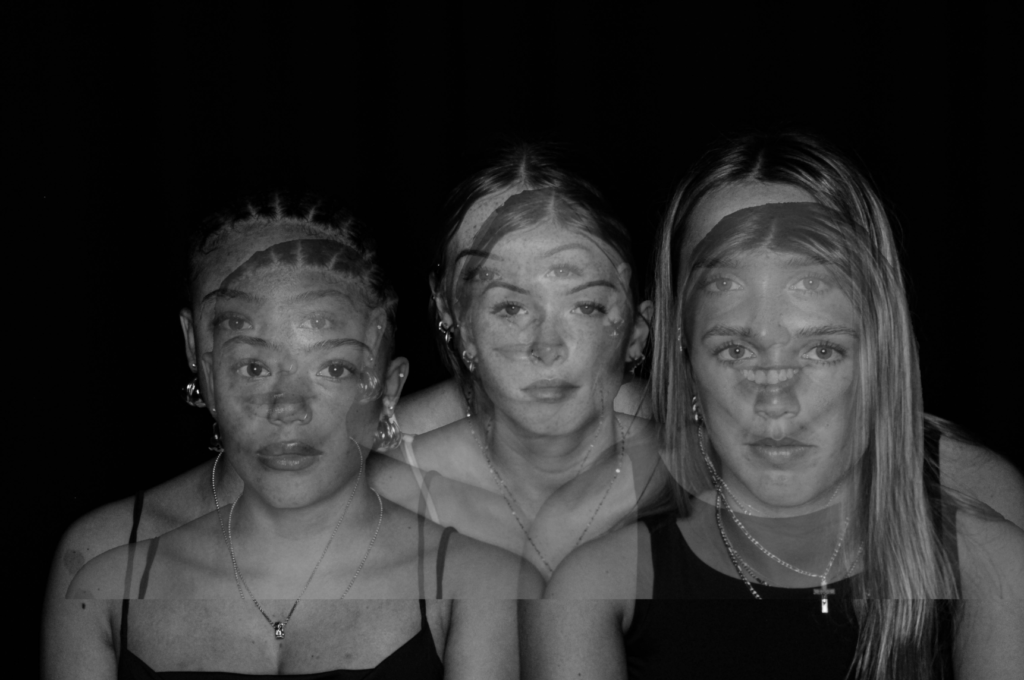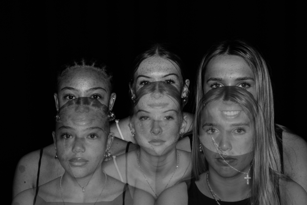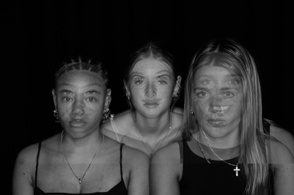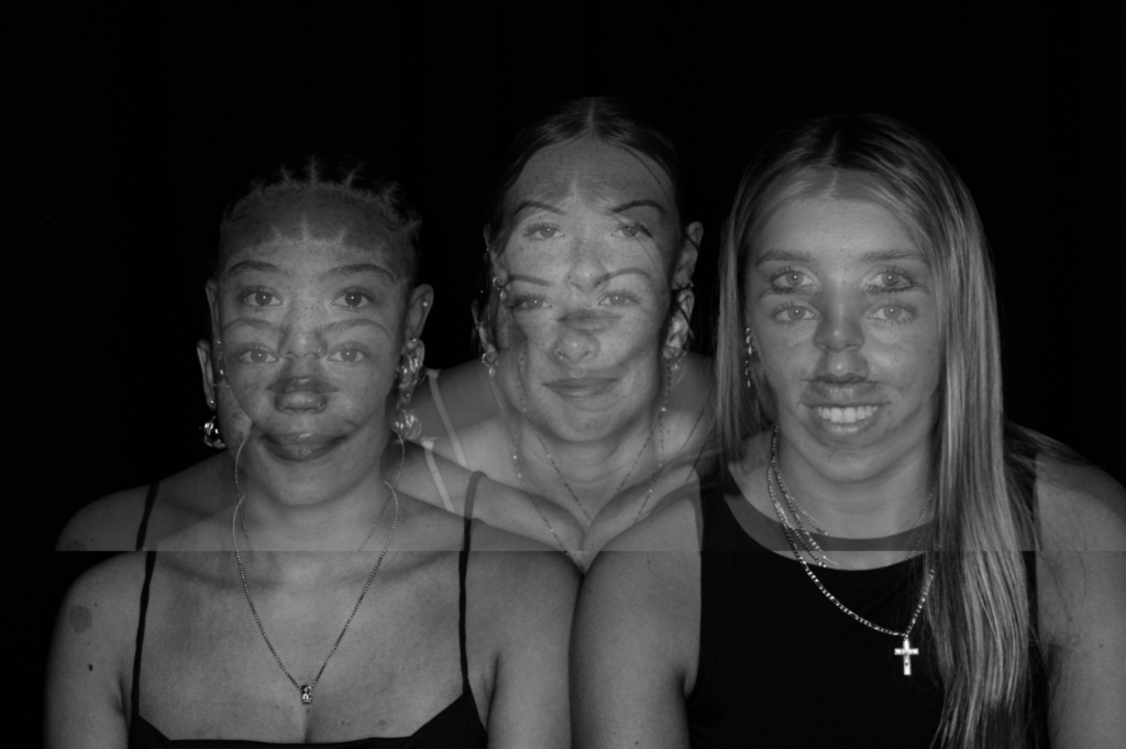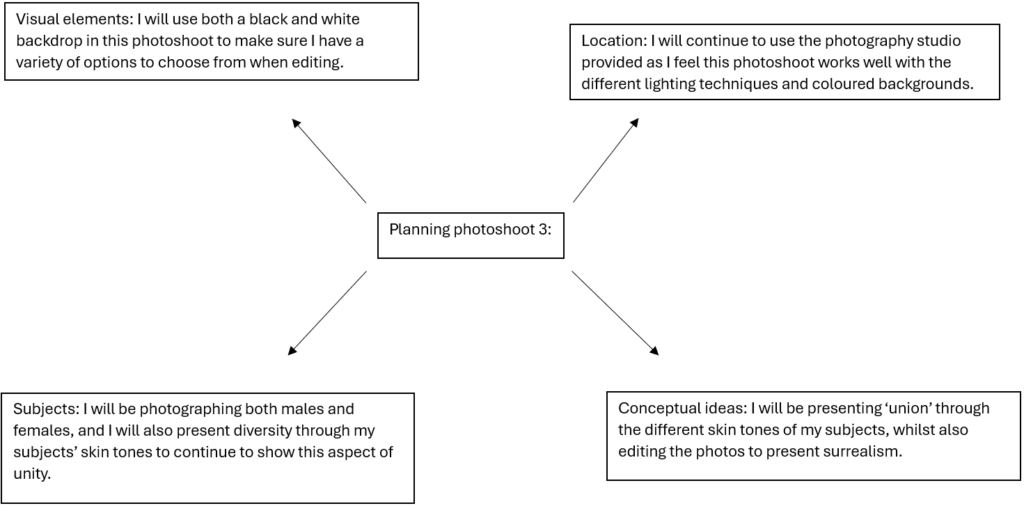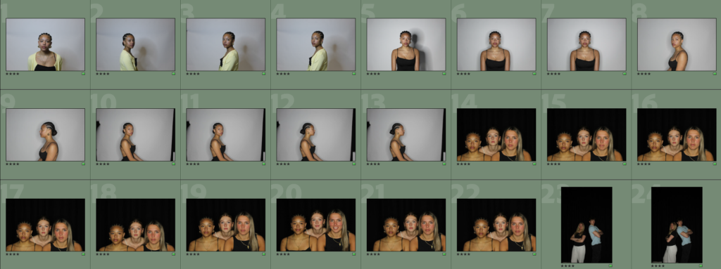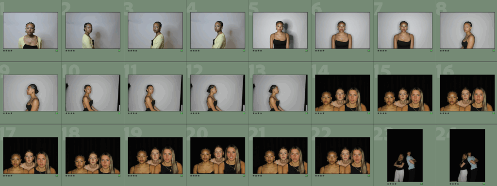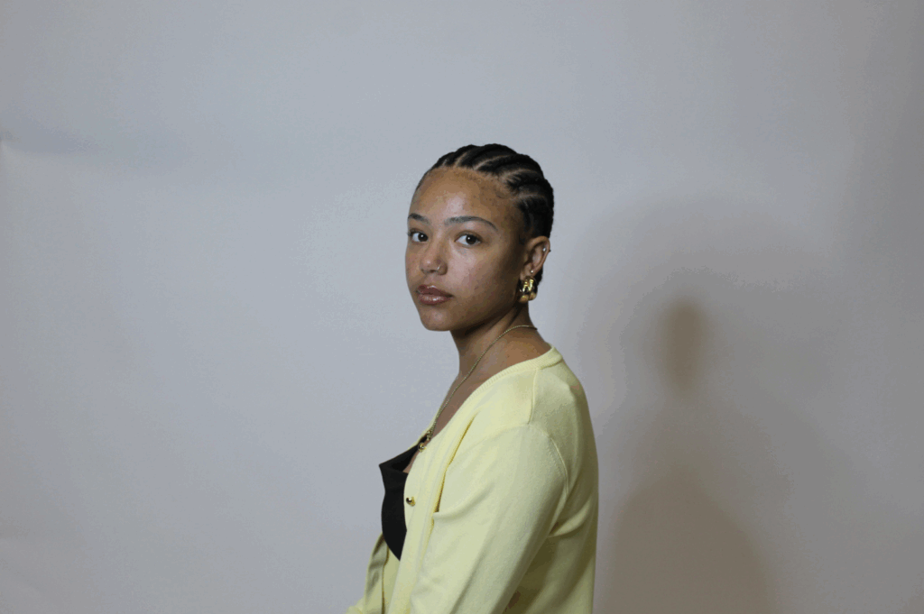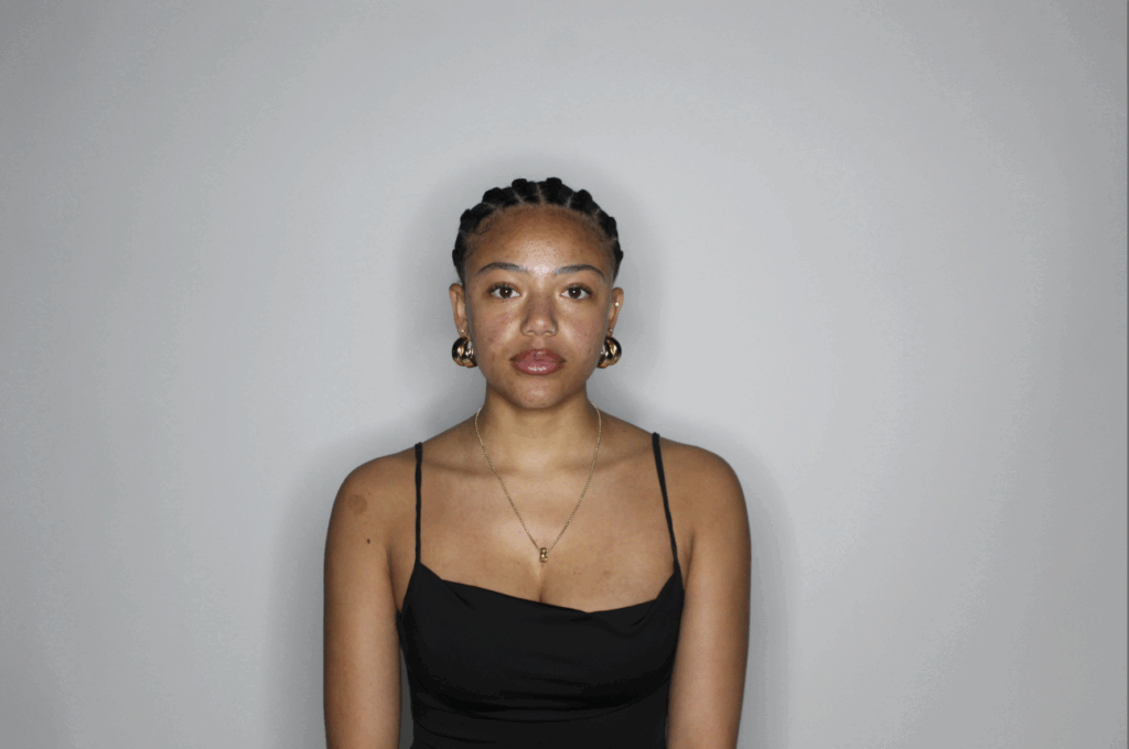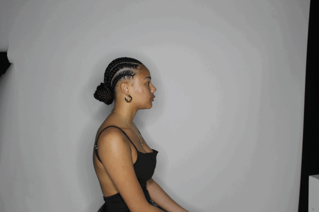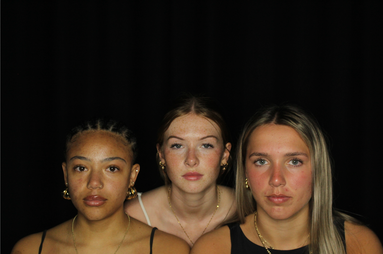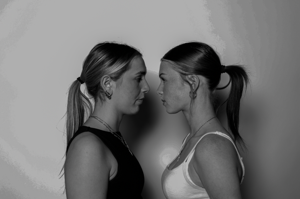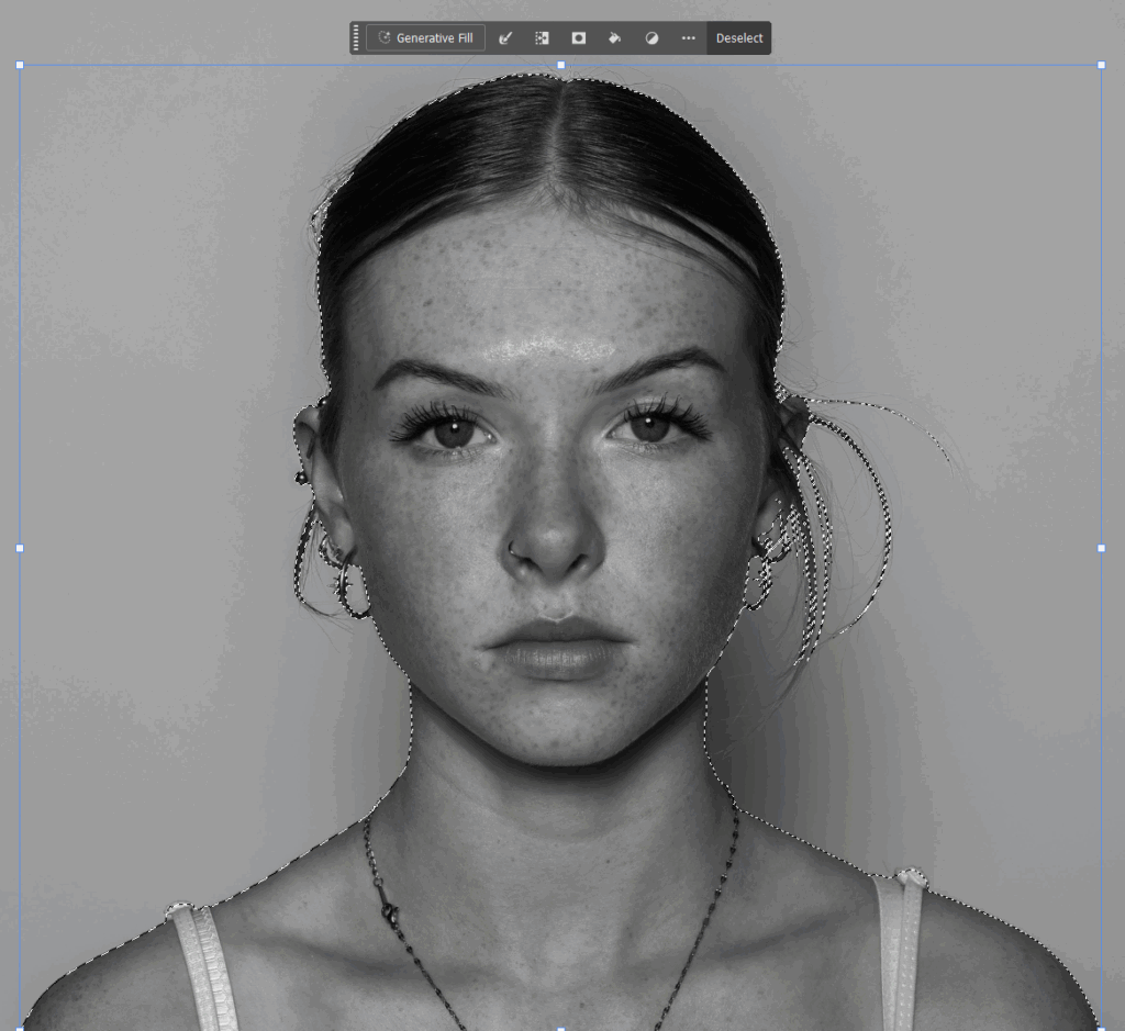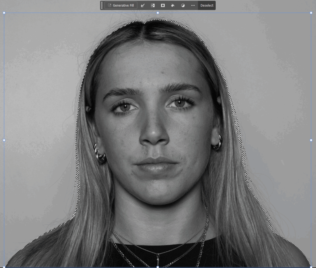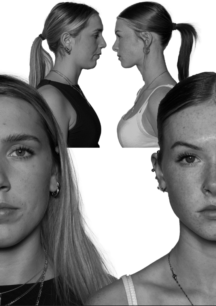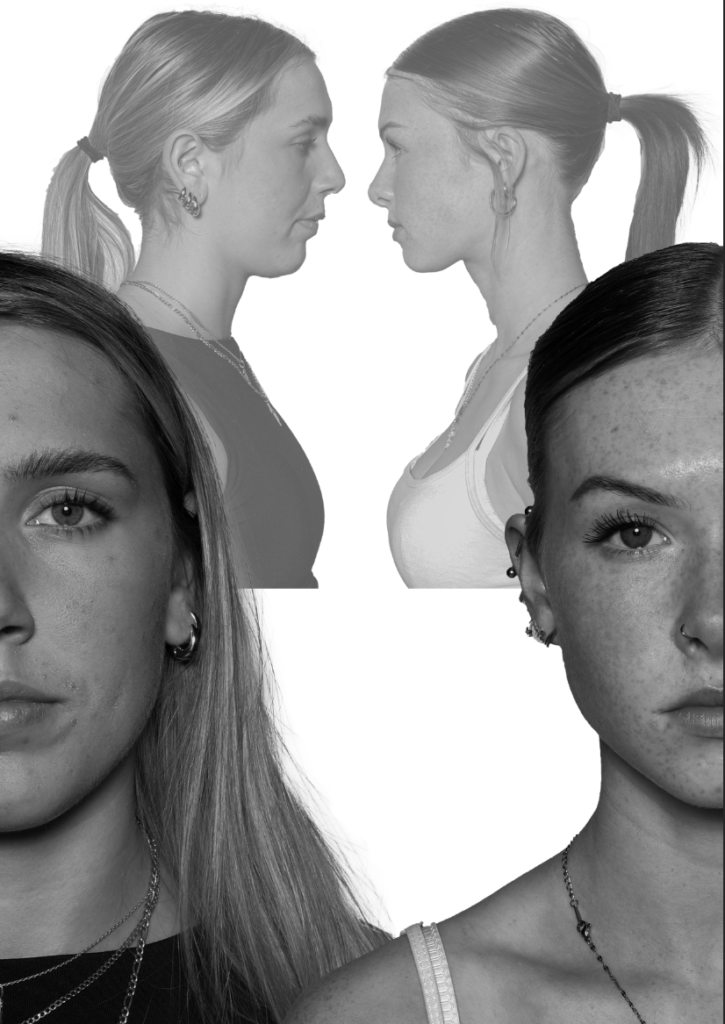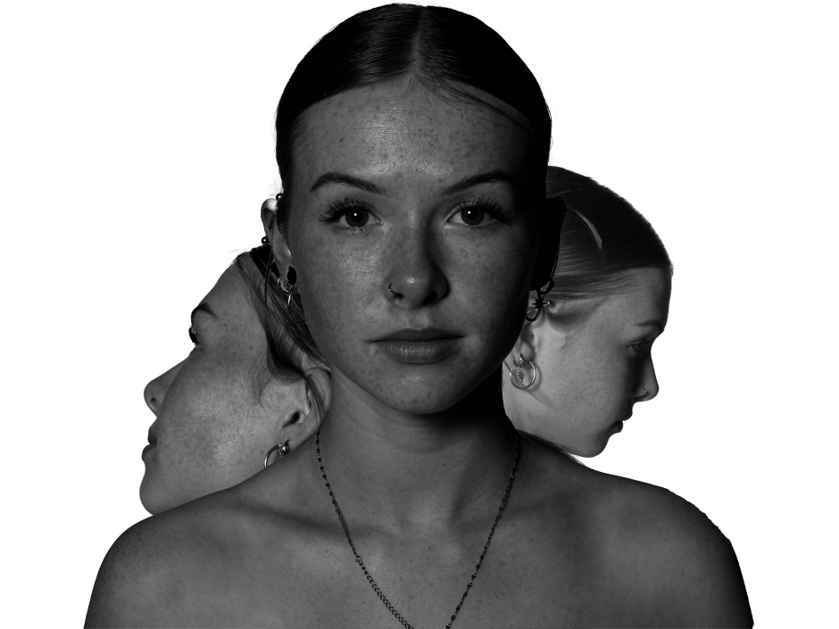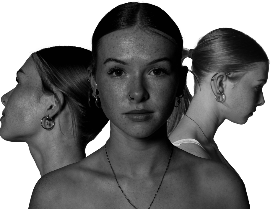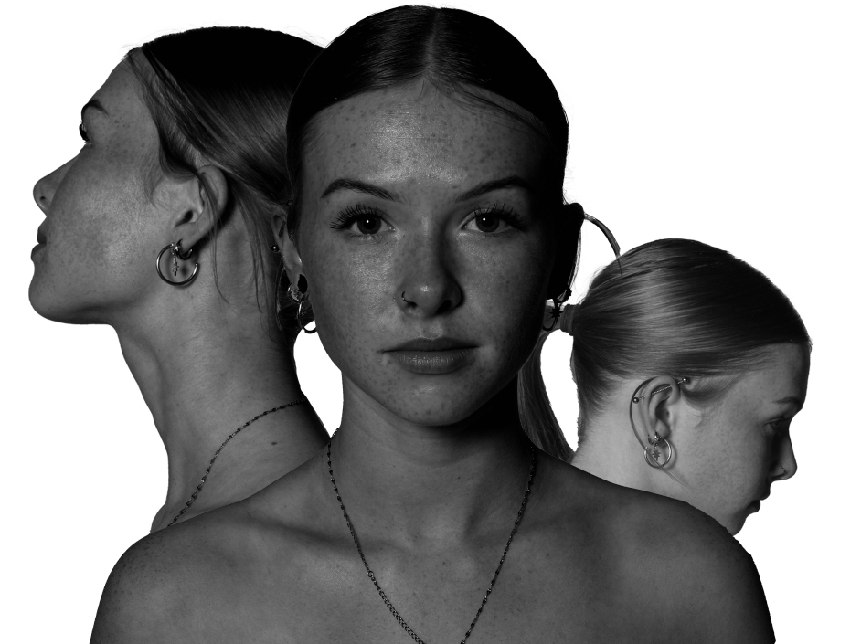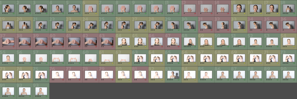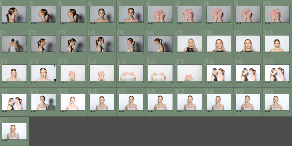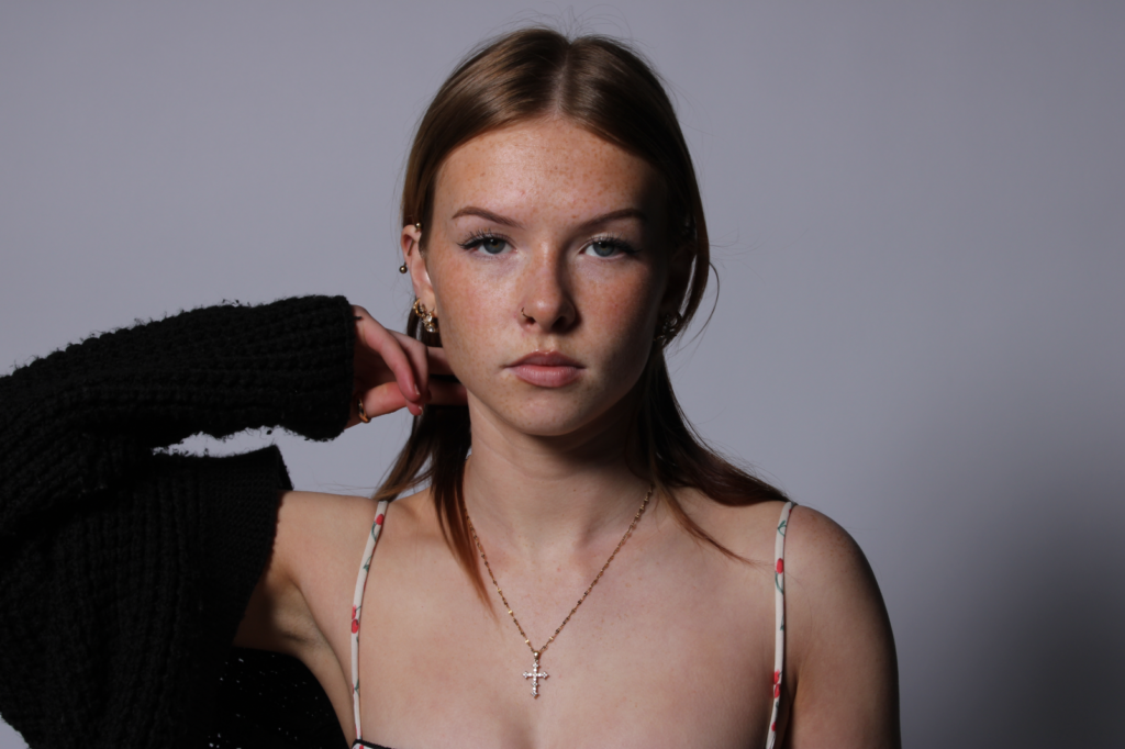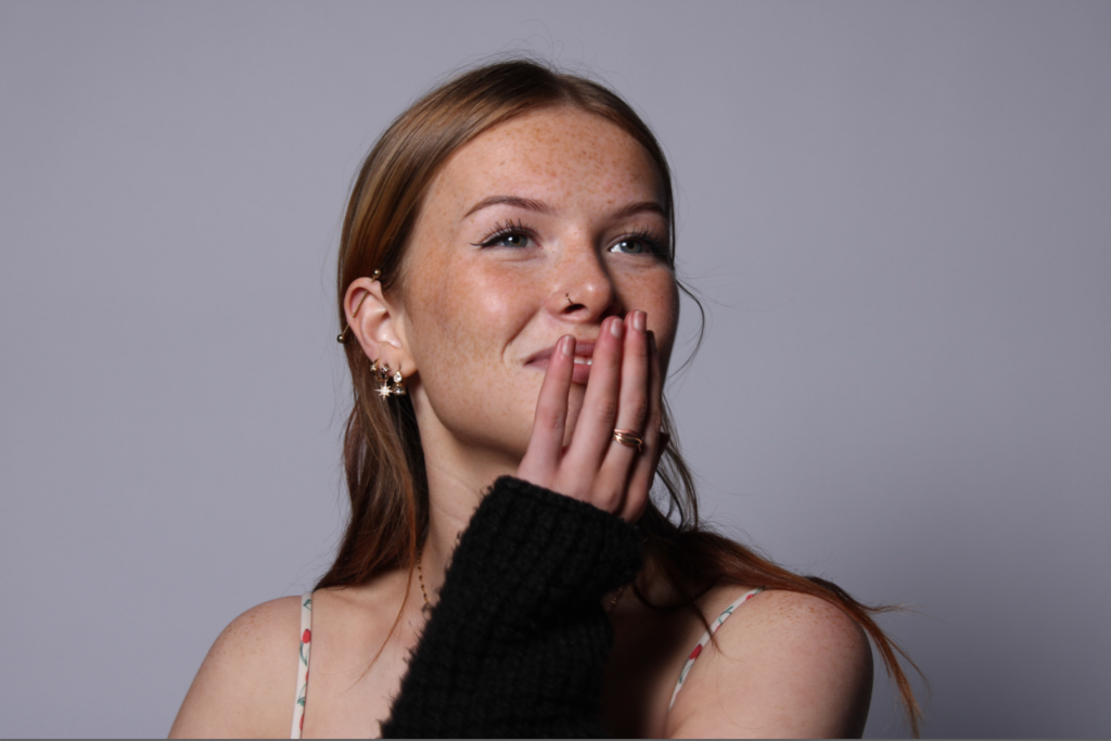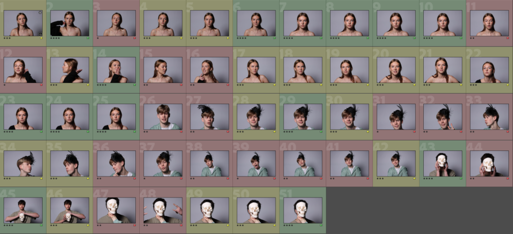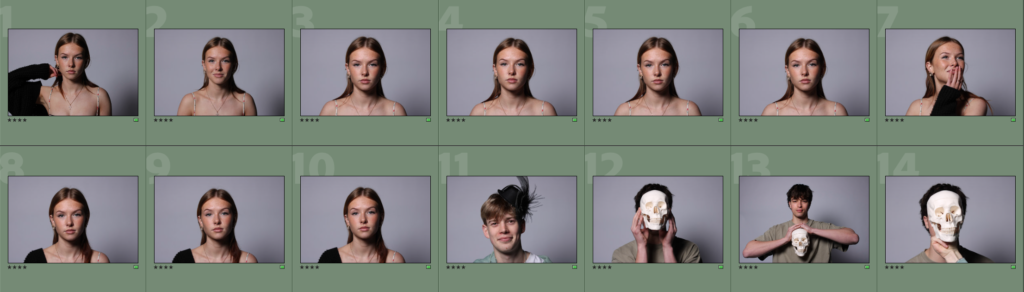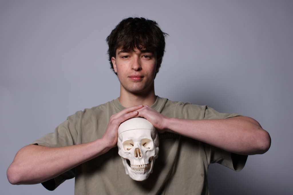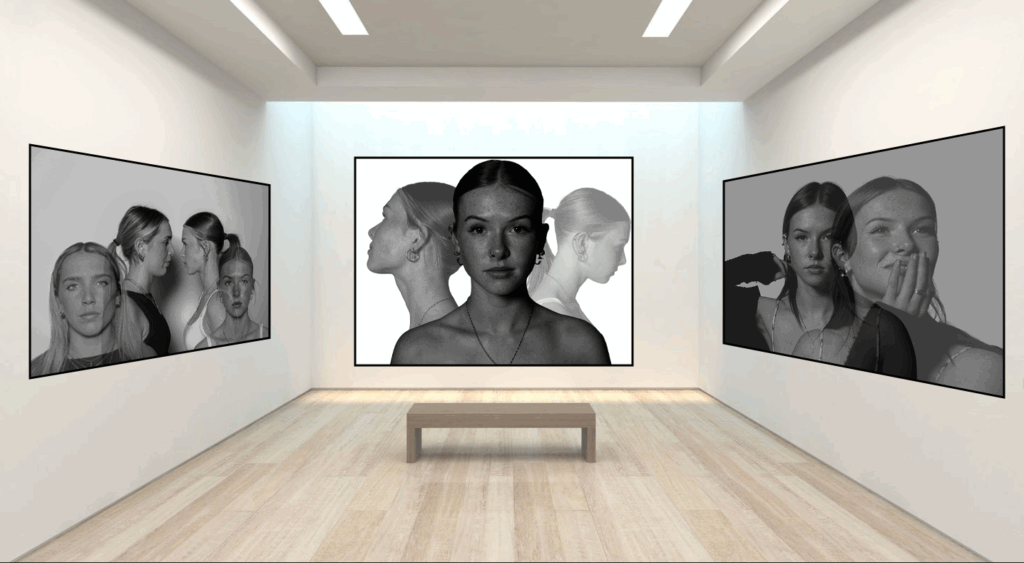
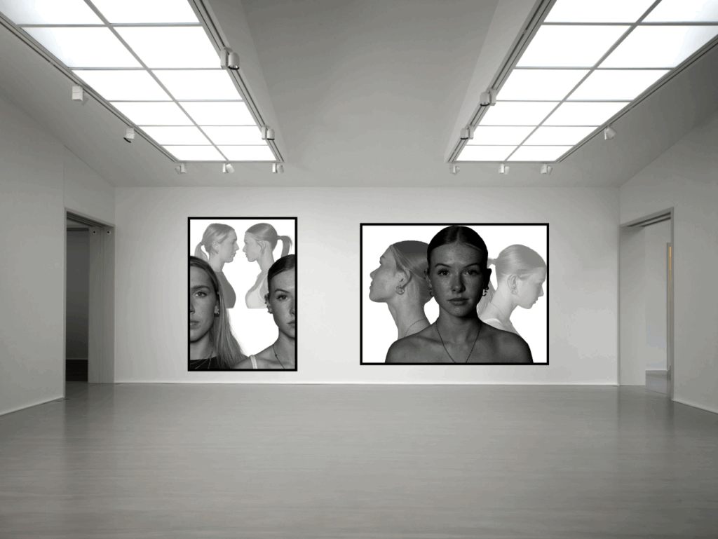
Within my virtual galleries, I made sure not to overcrowd the gallery with too many photos as I wanted them to look clean and simple to give more affect. Each photograph represents the theme of union through the combination of subjects and body parts. I am very happy with the layout of my galleries and the way I have presented union through surrealism.
Overall, I have enjoyed portraying unity through my photographs as it has been an interesting theme to work with. The main thing I regret doing was taking too little photoshoots, as I didn’t have many photos to work with. I think that my planning and preparation supported the structure of my photoshoots and editing, helping me stay organised. I believe that my editing within Photoshop is of high quality and really presents unity within the surrealist photographs.
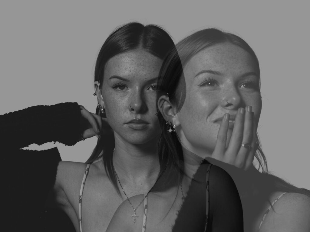
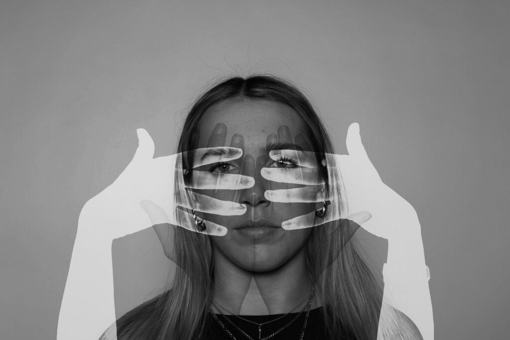
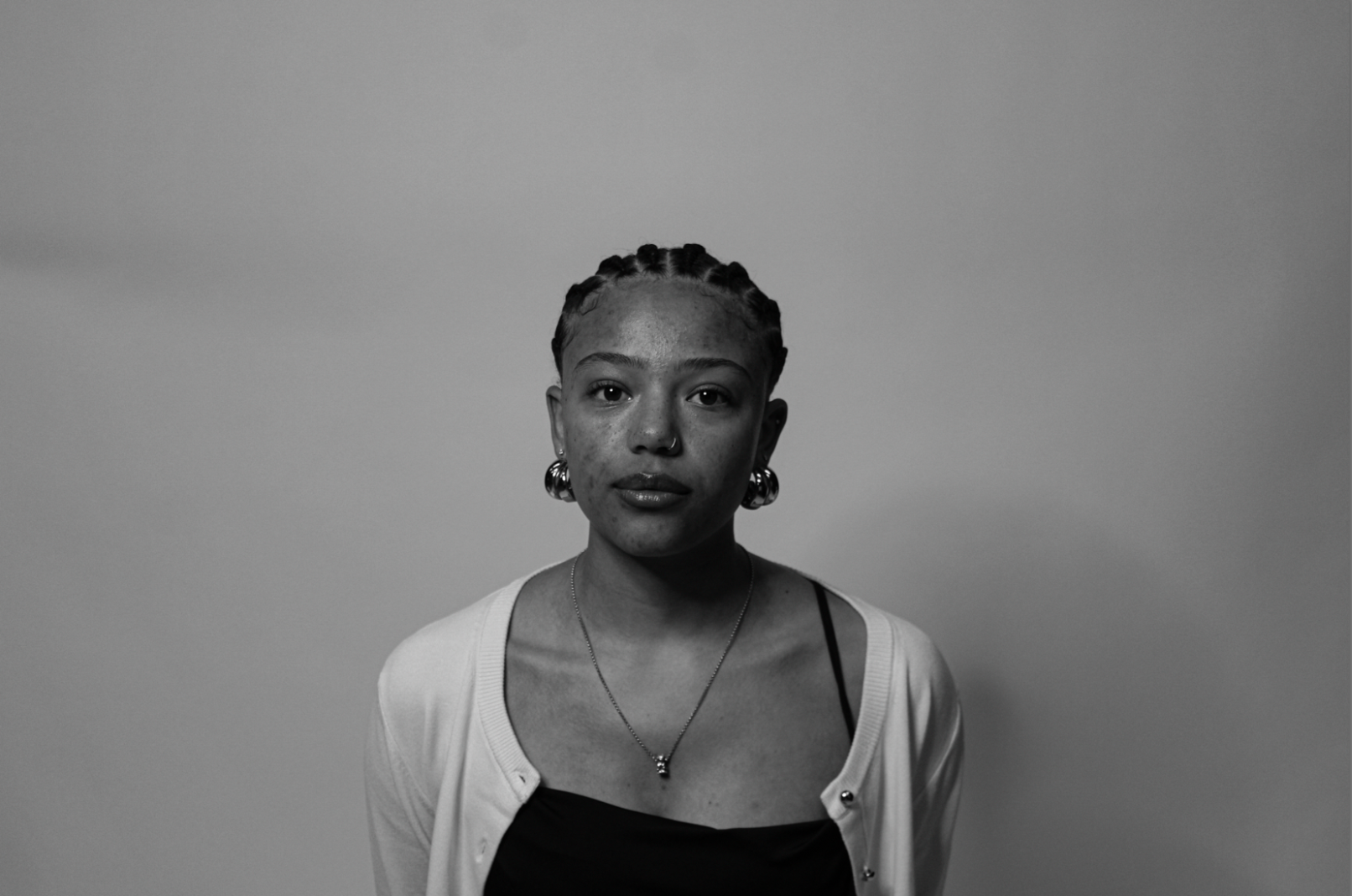
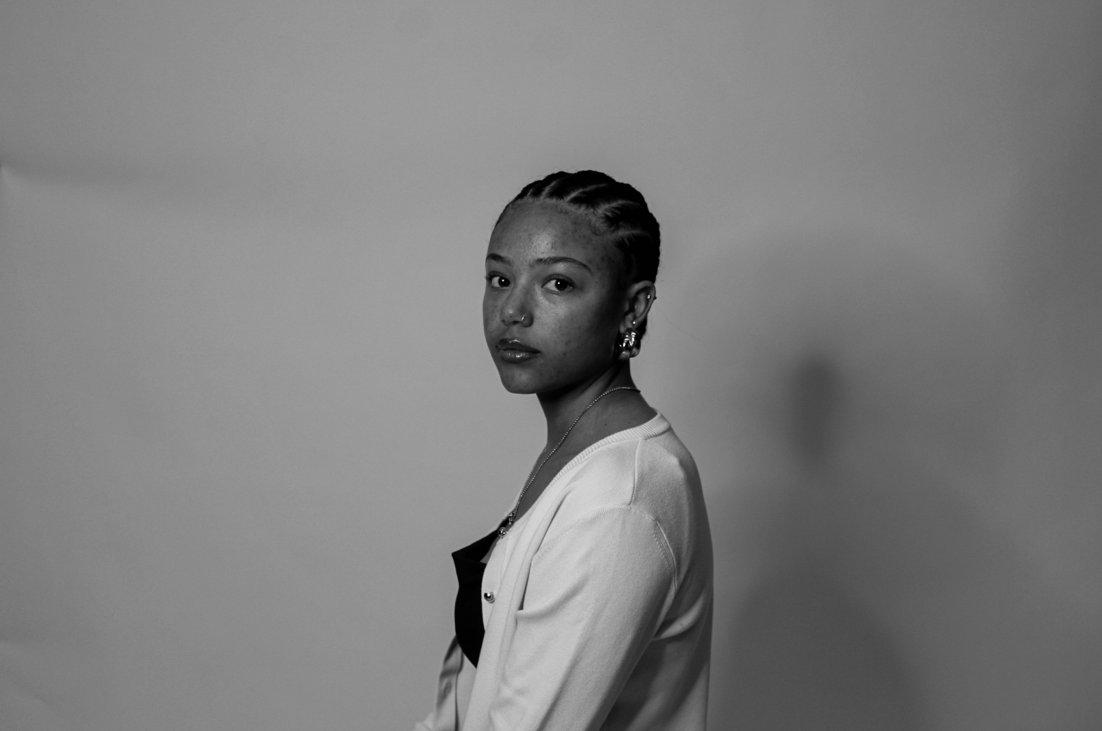
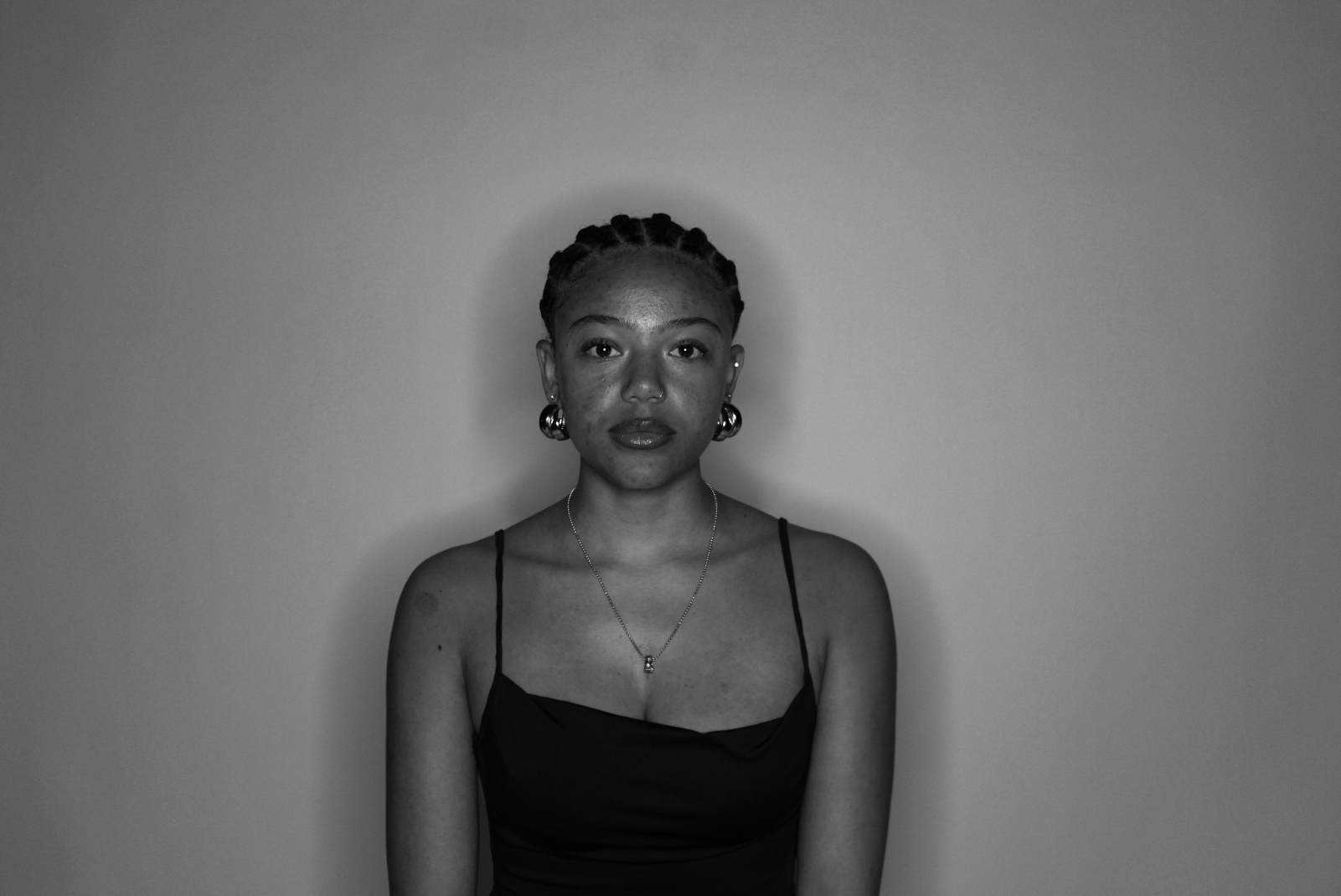
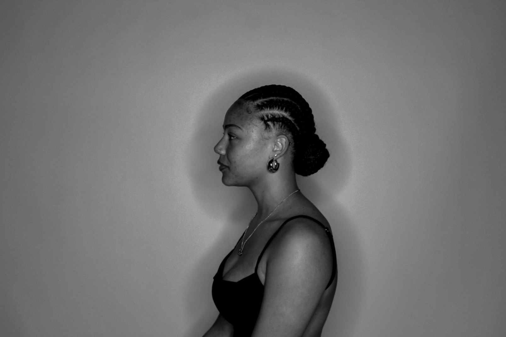
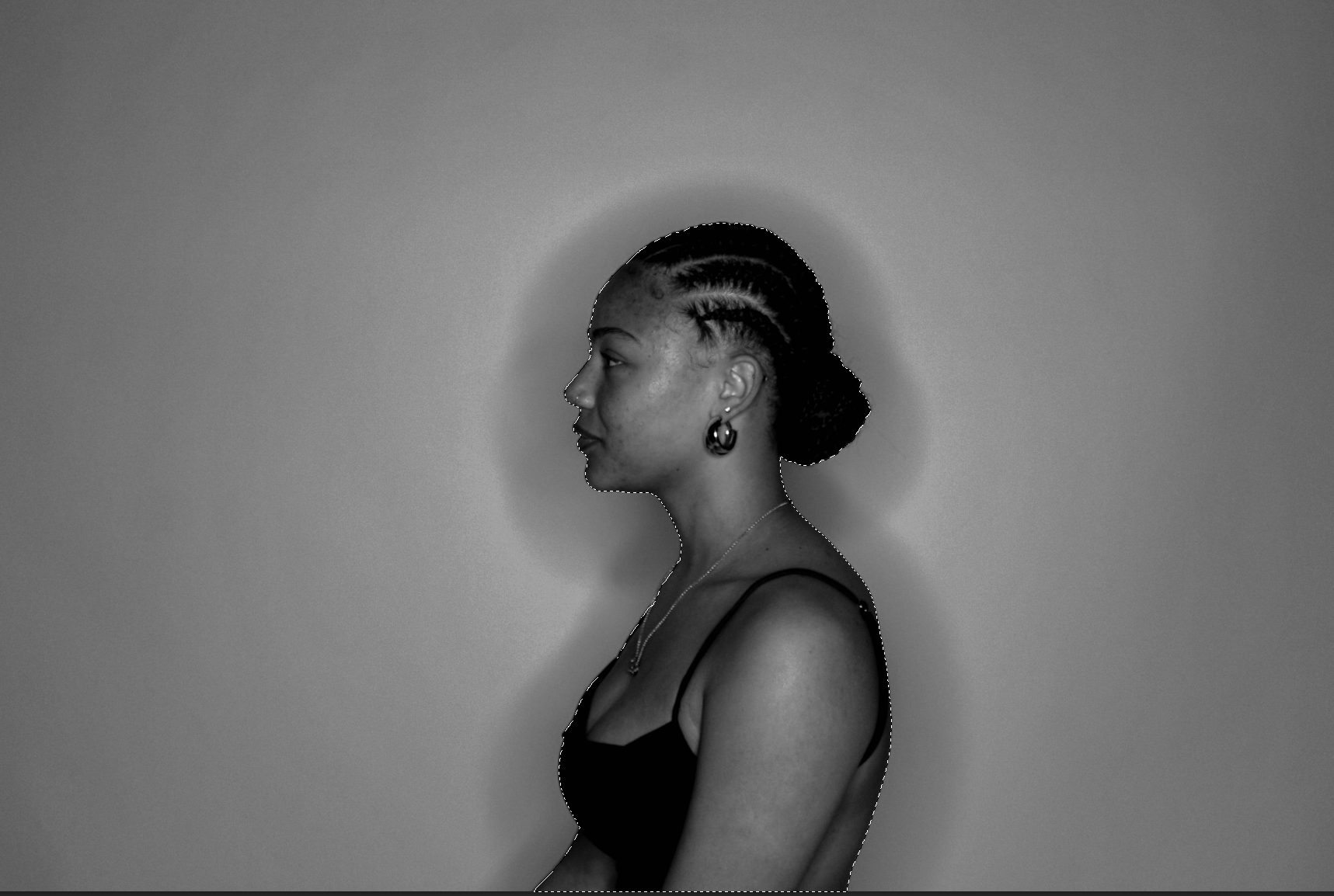
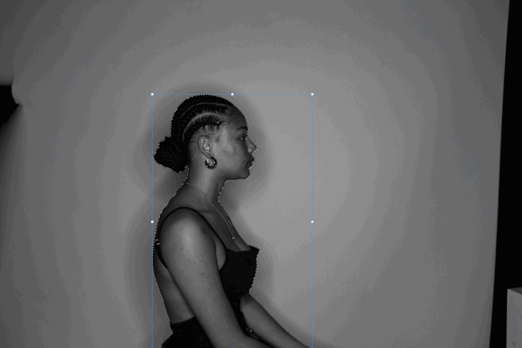
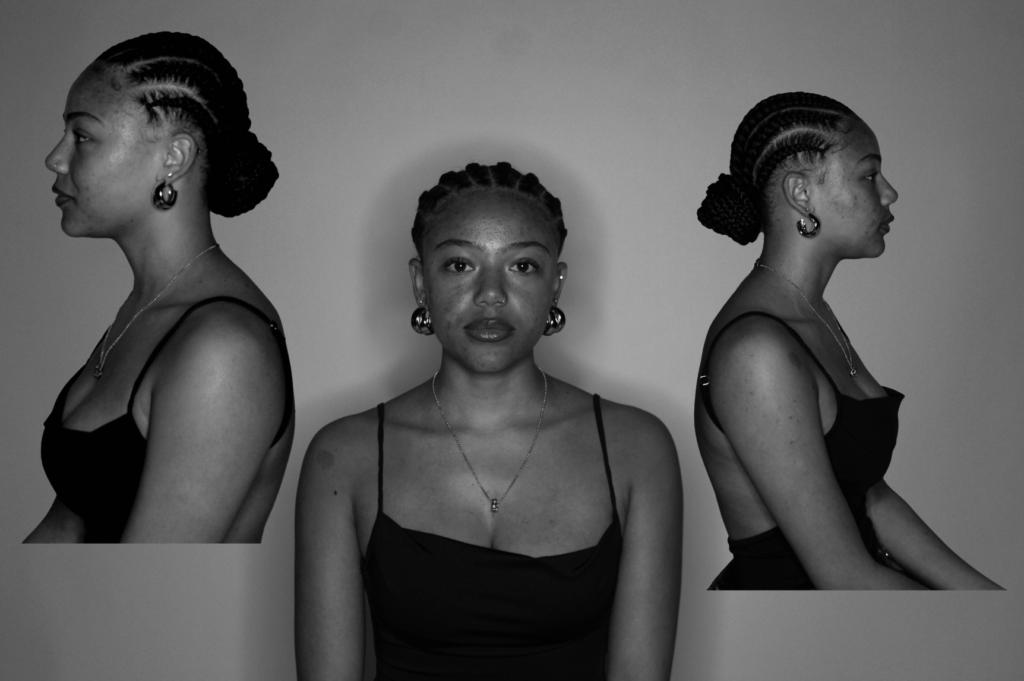
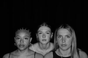
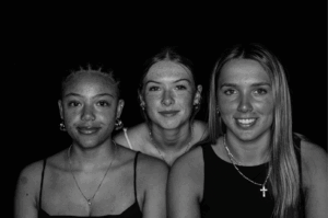
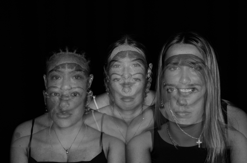
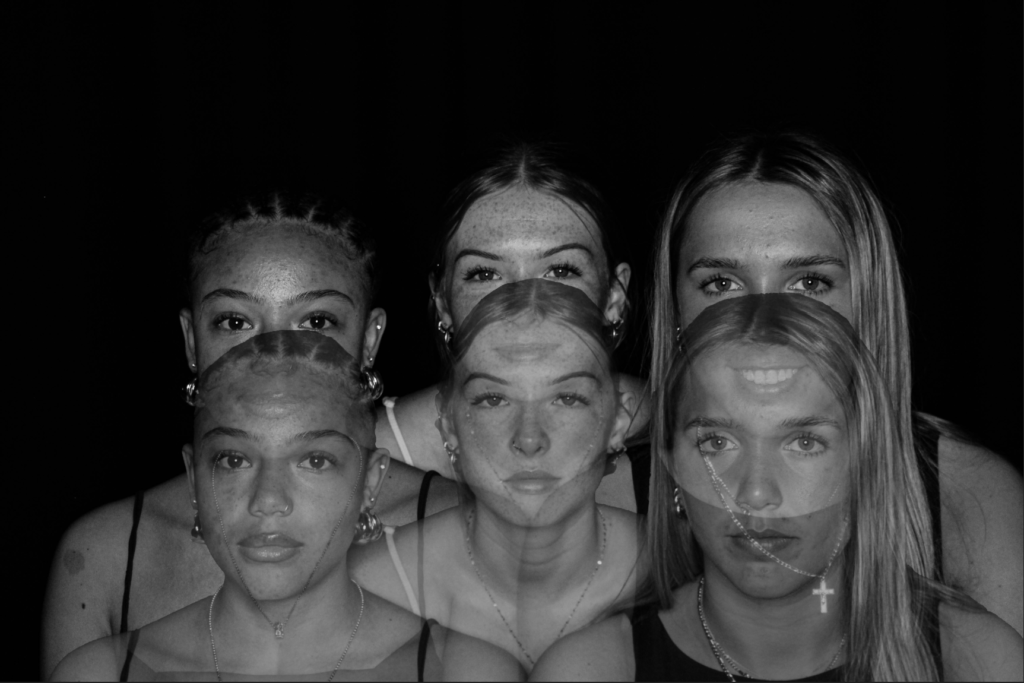
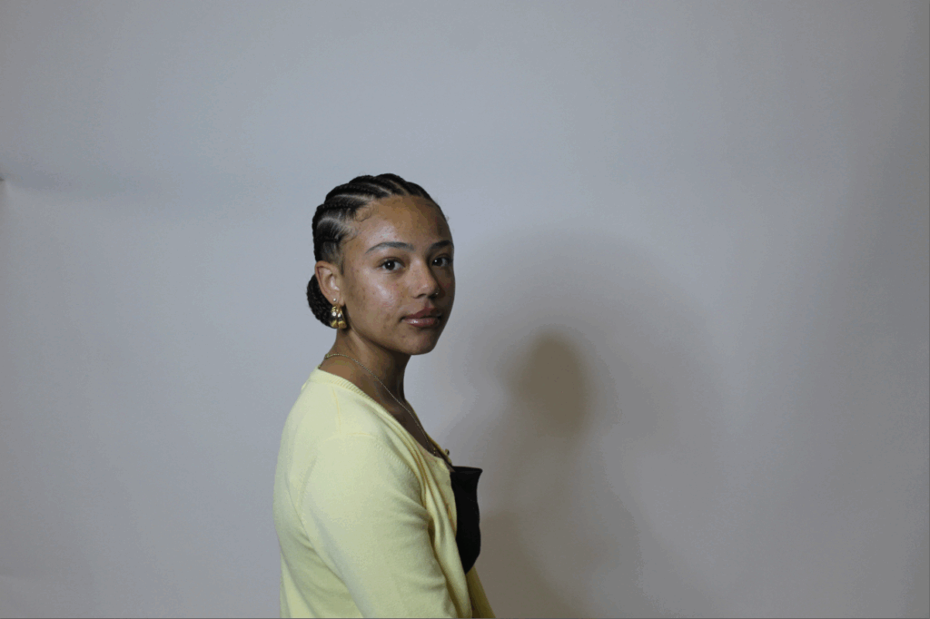
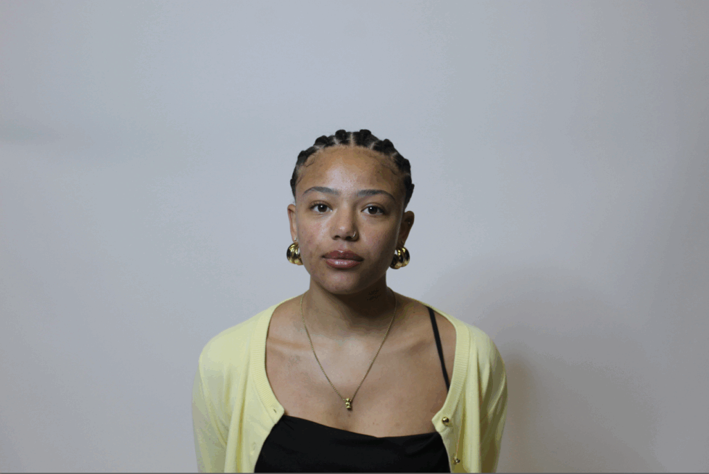
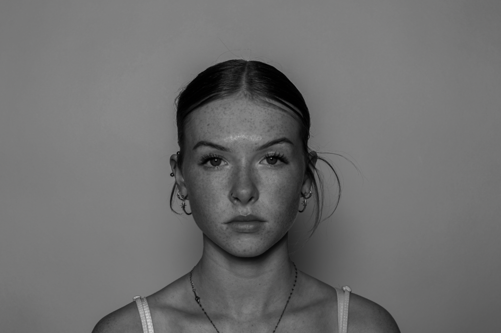
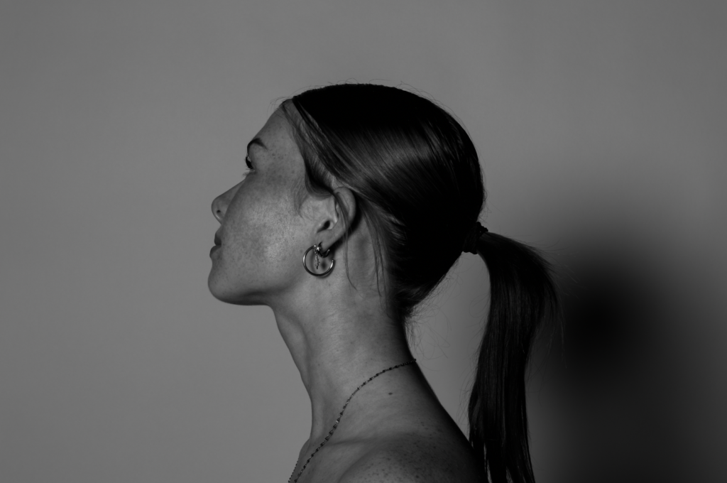
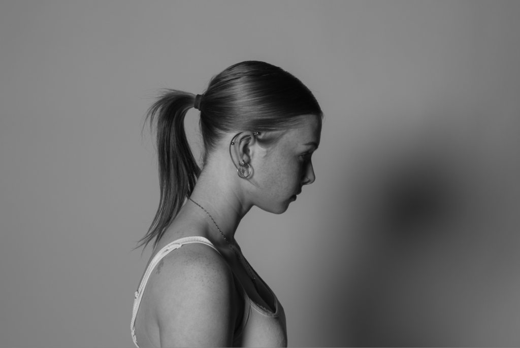
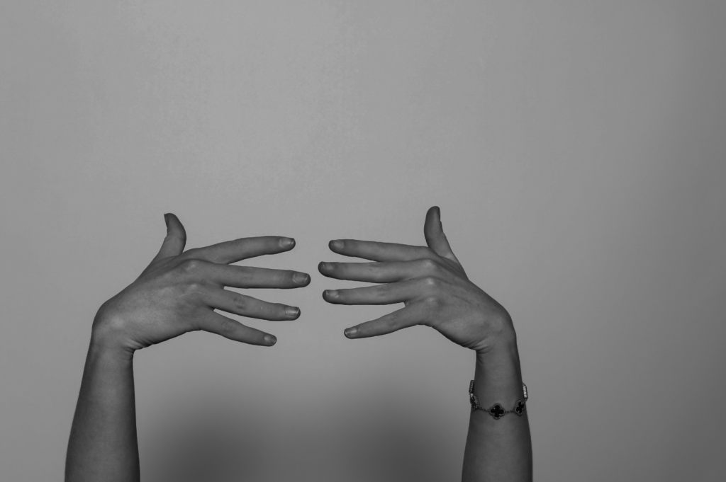
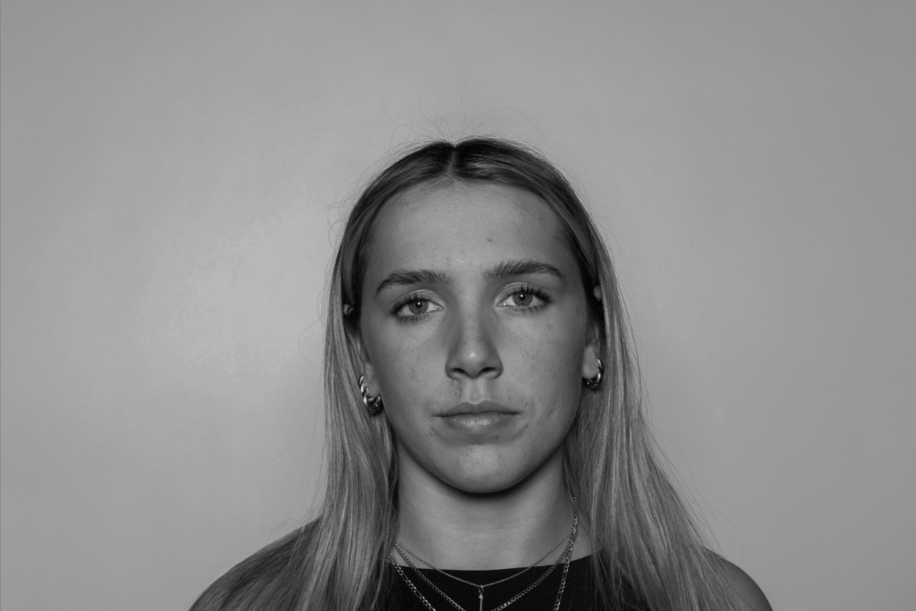
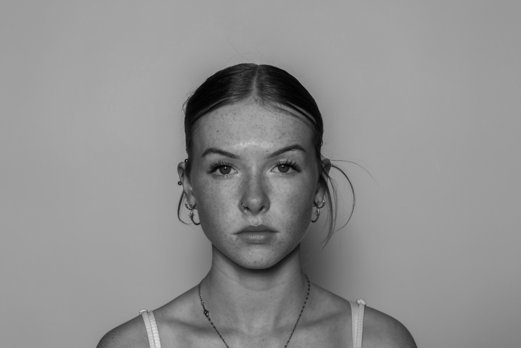
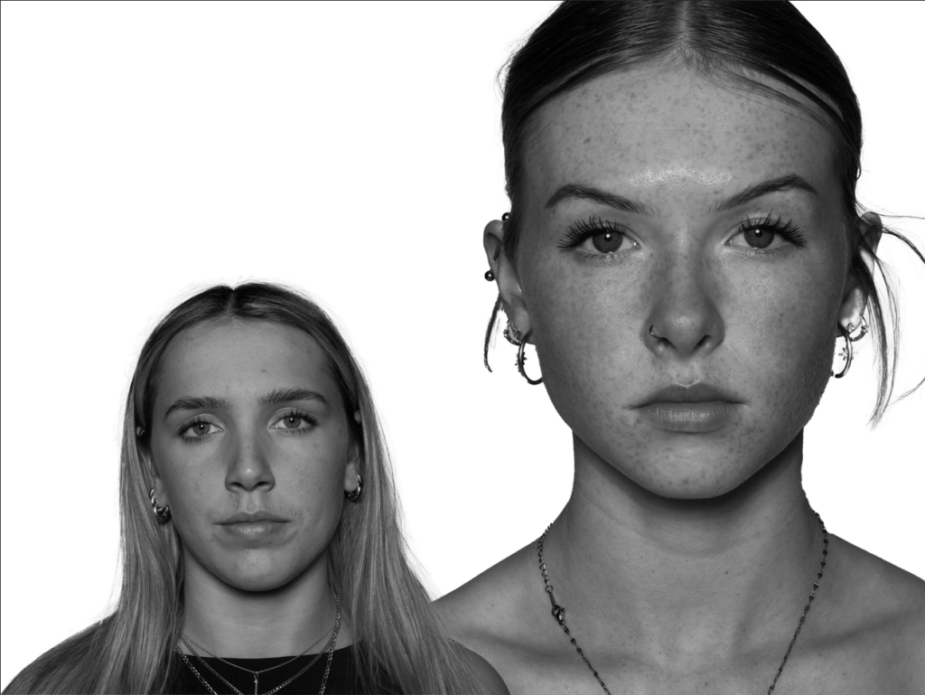
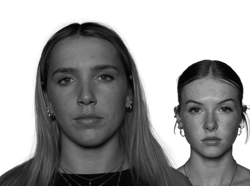
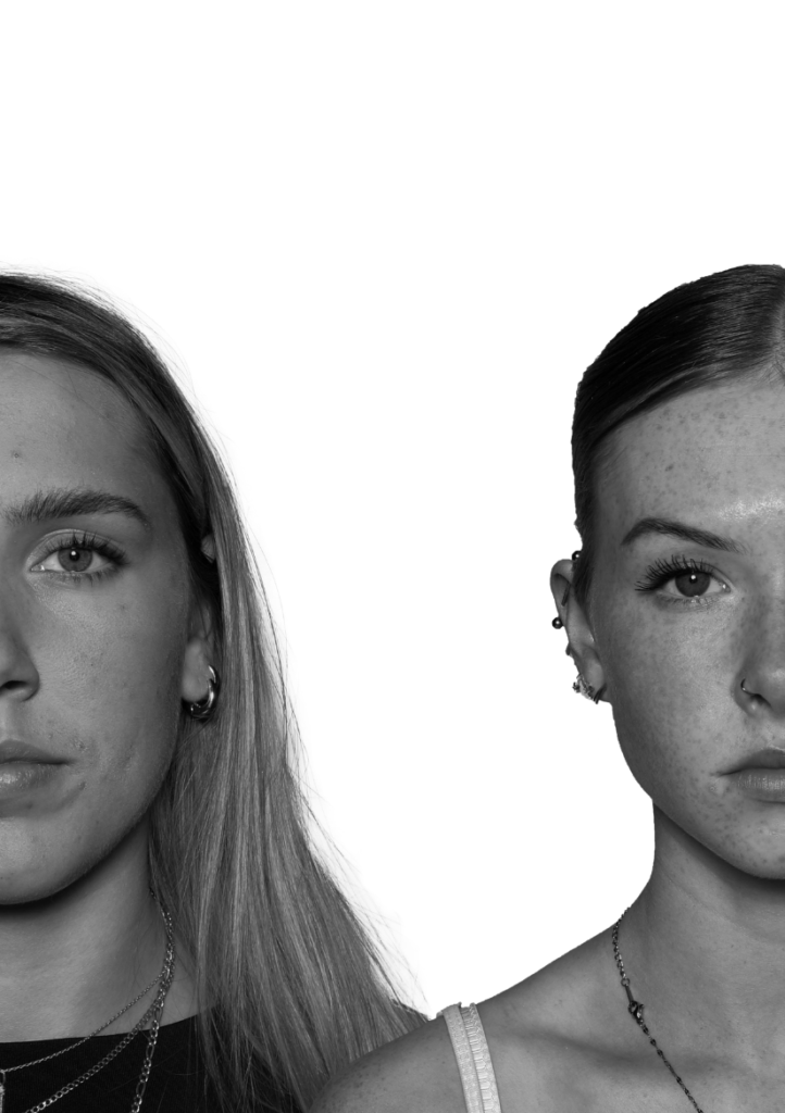
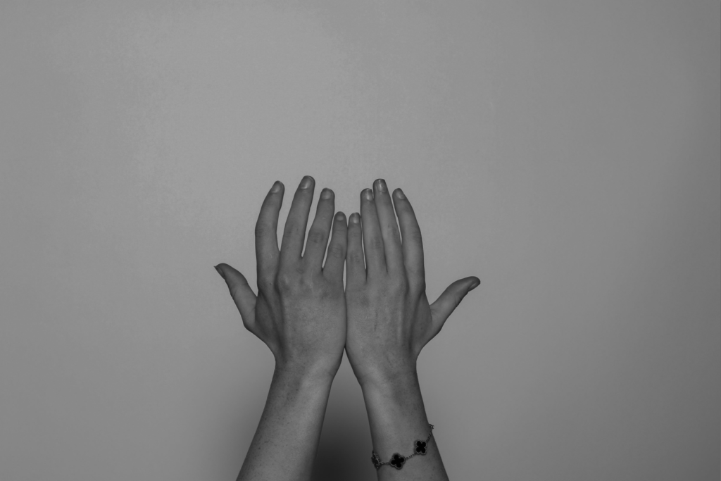
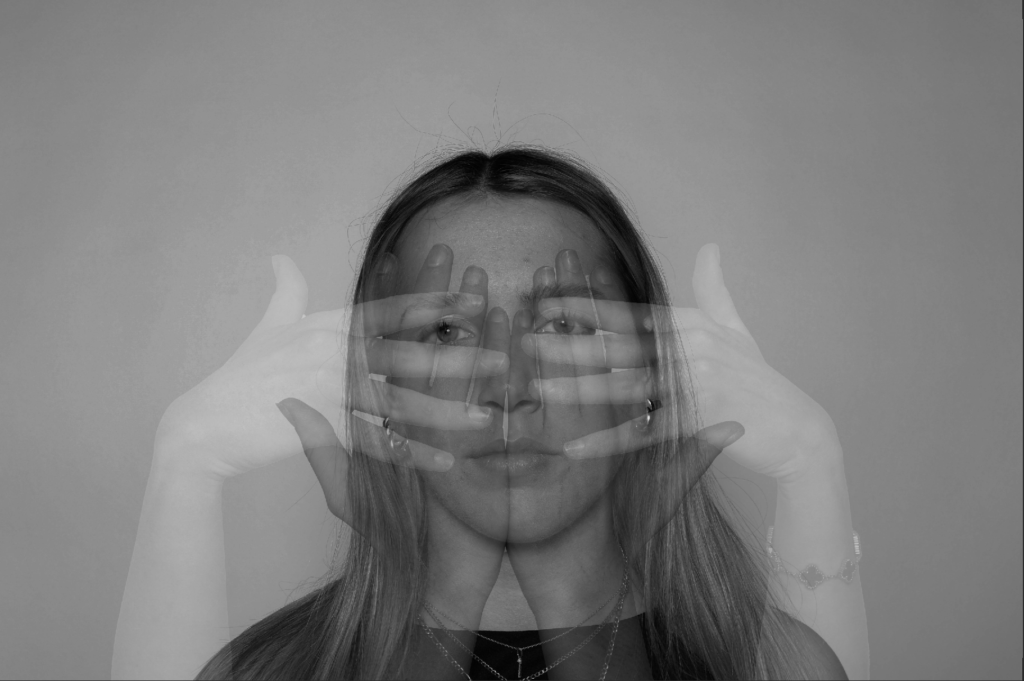
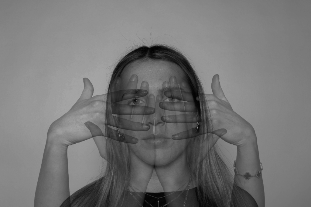
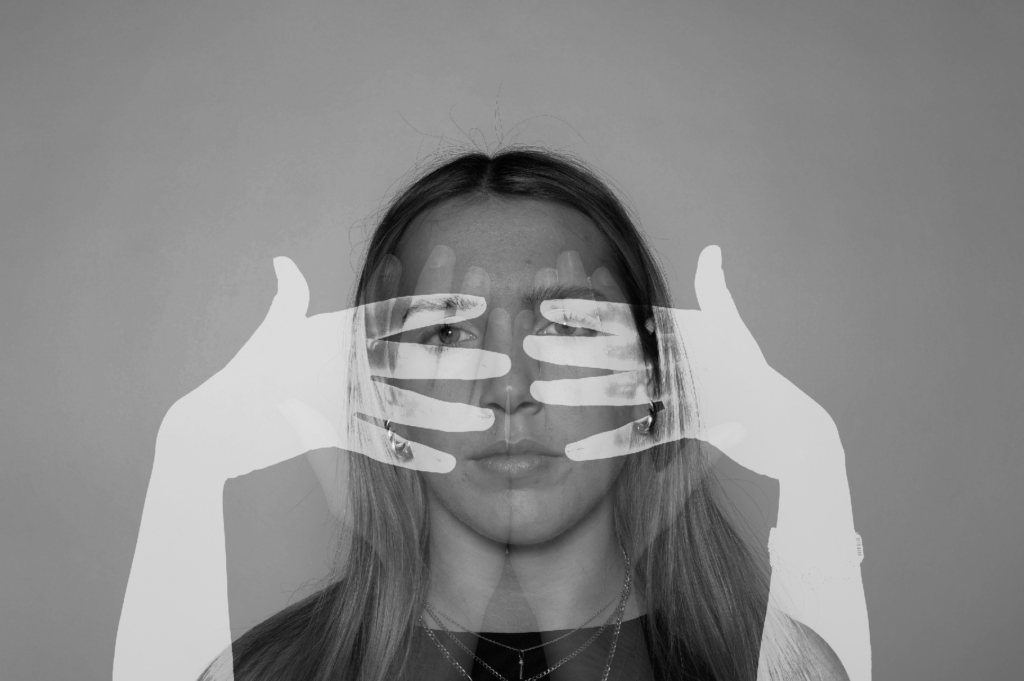
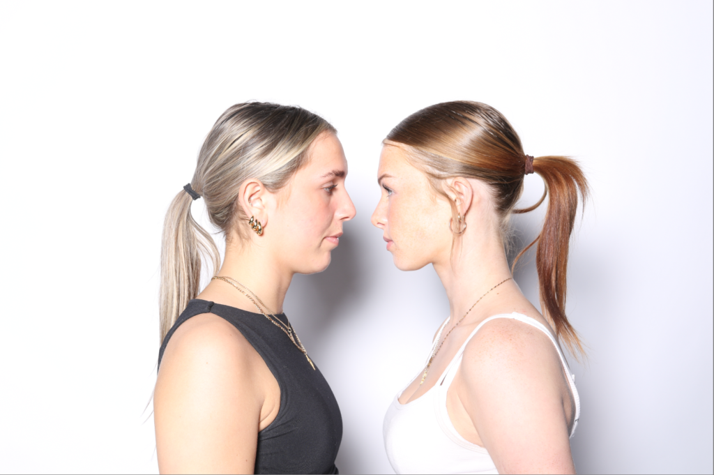
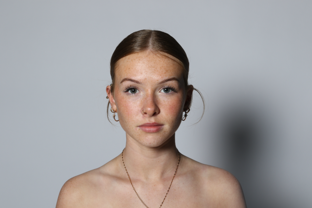
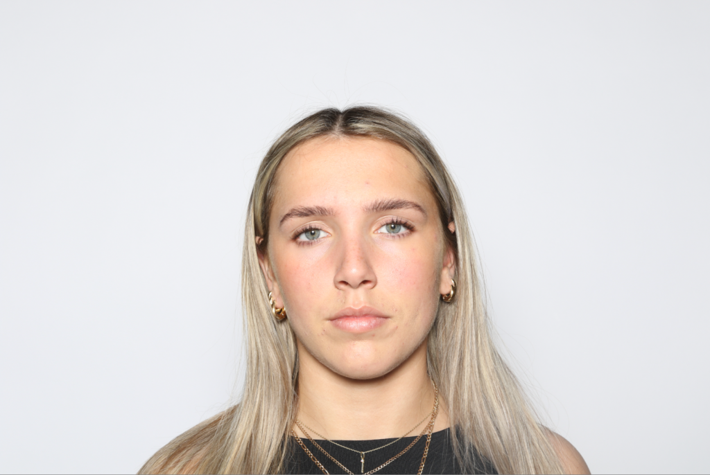
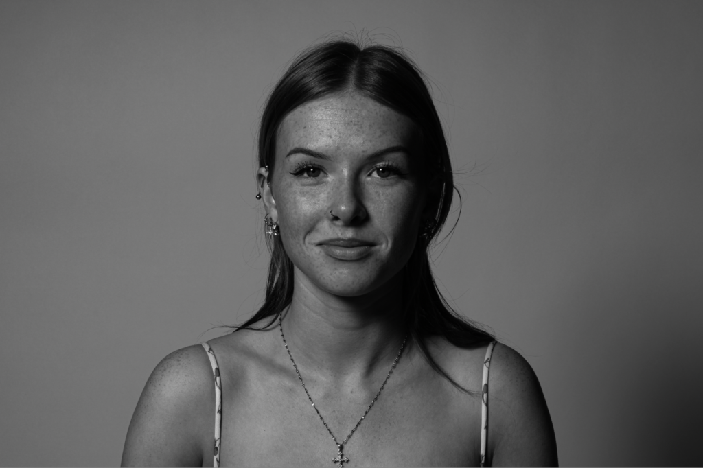
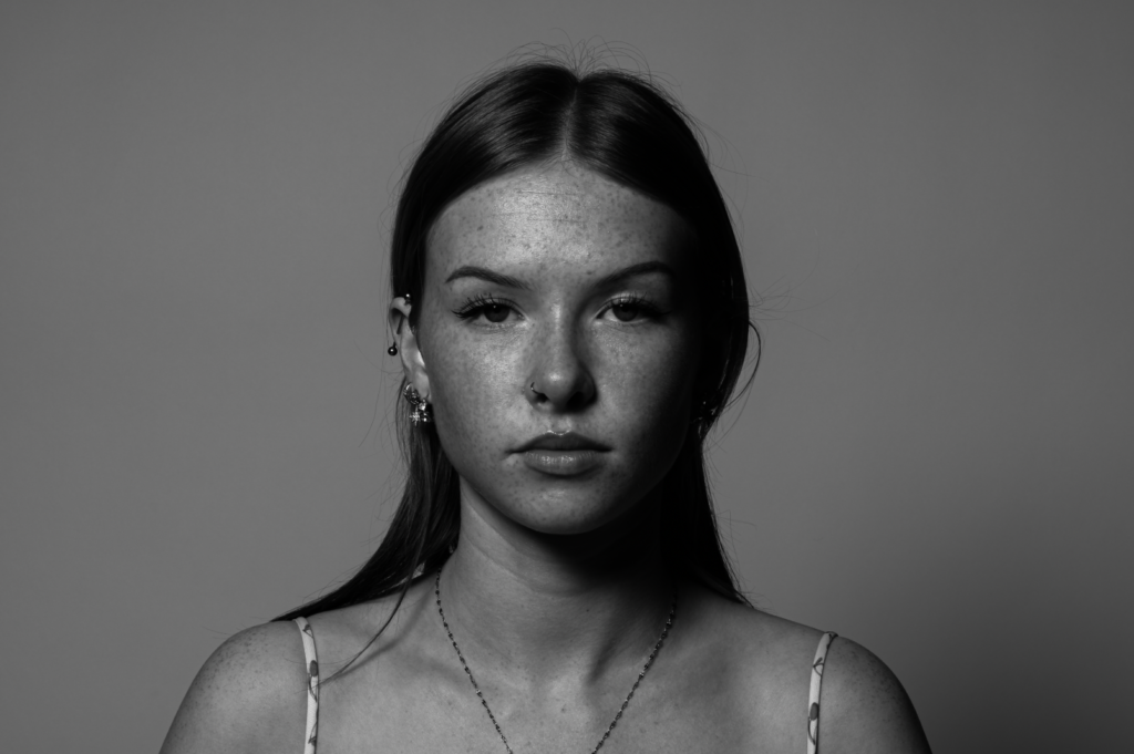
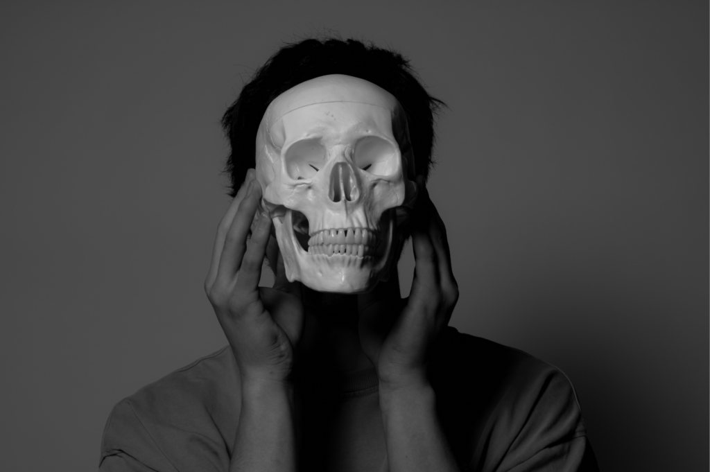
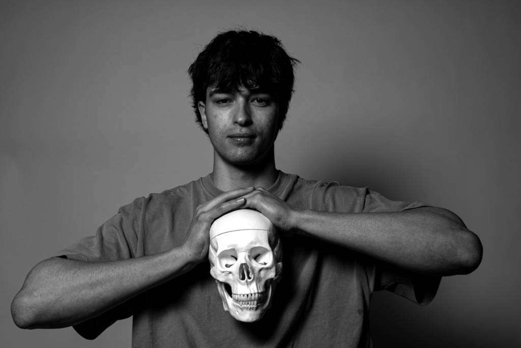
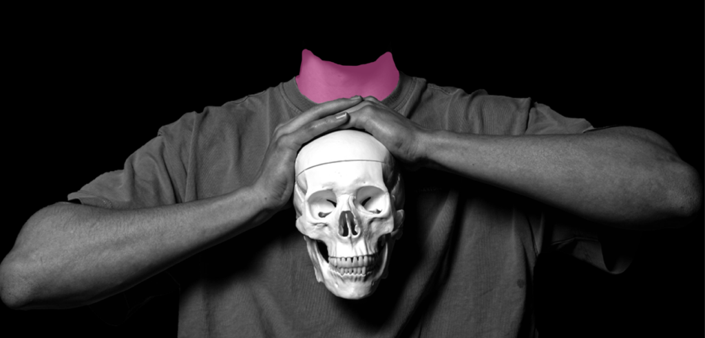
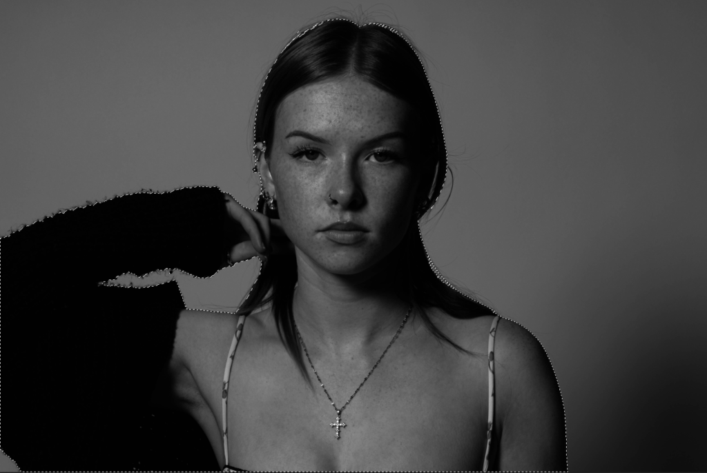
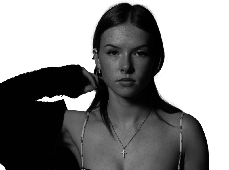
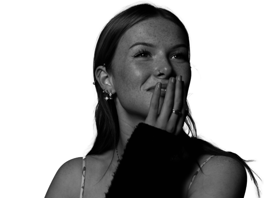
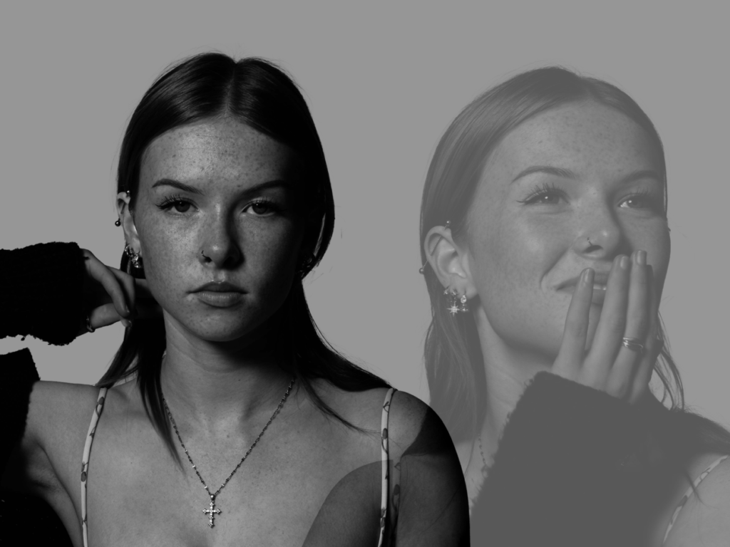
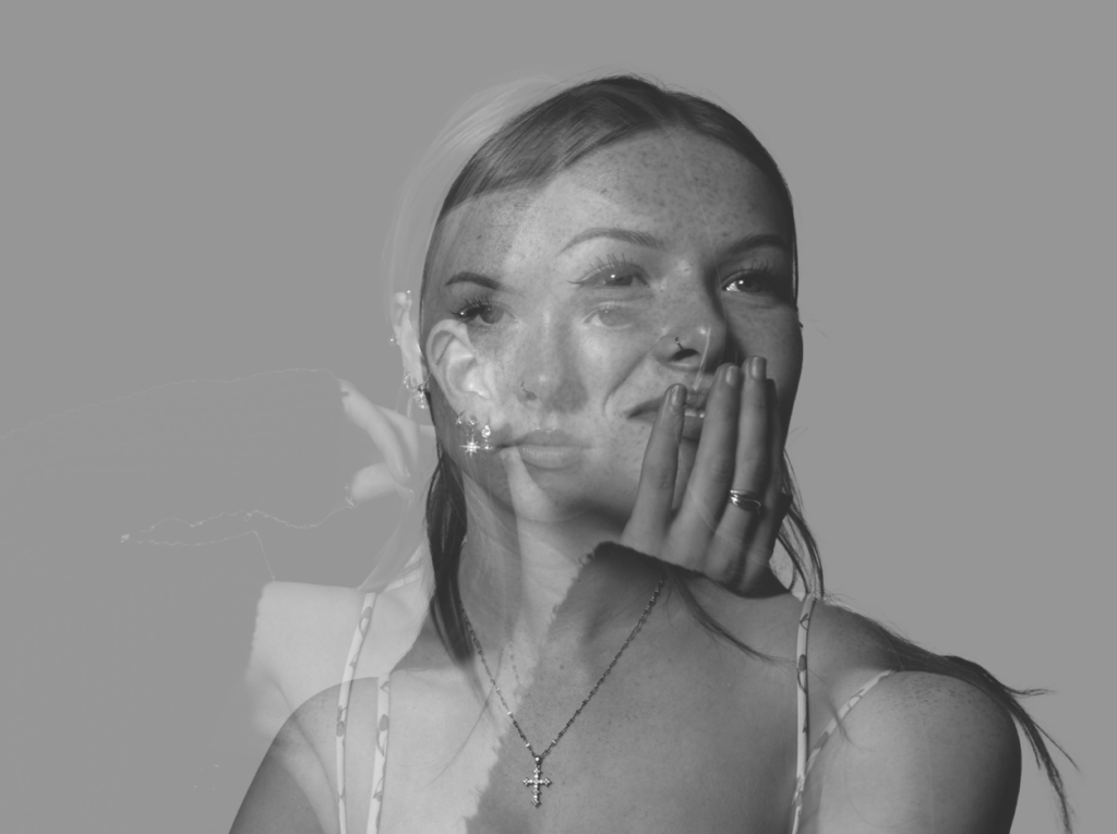
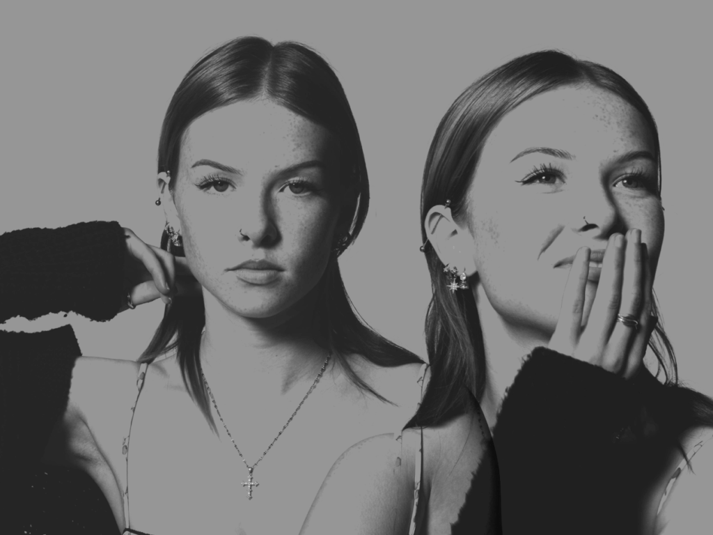
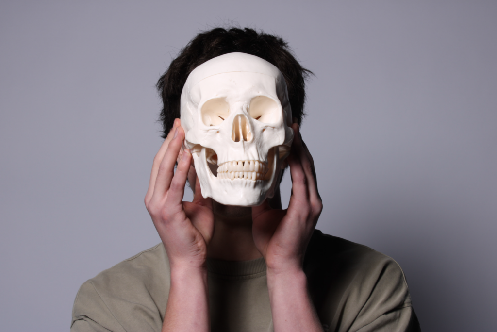
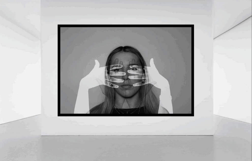
In my statement of intent, I stated that I wanted to express unity through surrealistic images as a way to show combinations of faces and body parts. I feel as though I have succeeded this as I have used the photographic technique double and multi-exposure to create these images. I have also linked back to my artists quite well and used inspiration from them as I feel my images are similar to both Ray and Ingberg’s. To do this, I edited all of my images black and white, same as Ingberg, to reflect my inspiration from his photography. Whereas, Man Ray inspired me to combine faces with hands, using double exposure to present this idea.
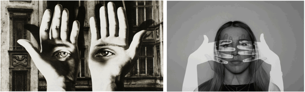
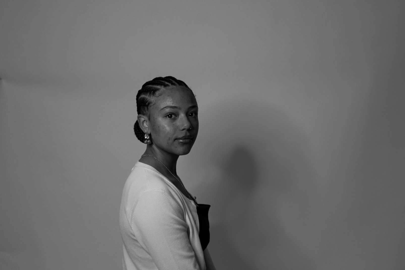
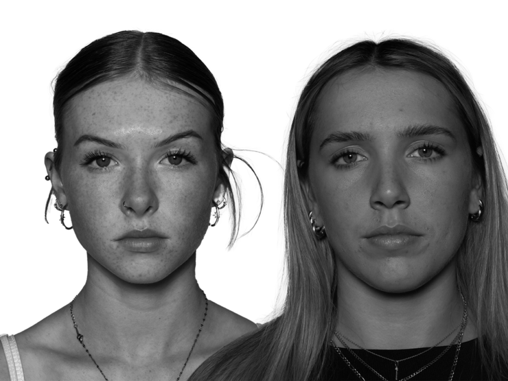
Here, you can see the similarities between my photo and Man Ray’s. I have used him as inspiration to merge hands on top of someone’s face. Similarly, I also edited my image to be black and white. It is clear that I have taken inspiration from both of my artist references.
Finally, I am happy with my final images as I feel as though they link really well to the theme, and my photos clearly show the relationship of union within surrealism photography.