All posts by Lauren Hodgson

Filters

Author:
Category:

Virtual Gallery and Evaluation

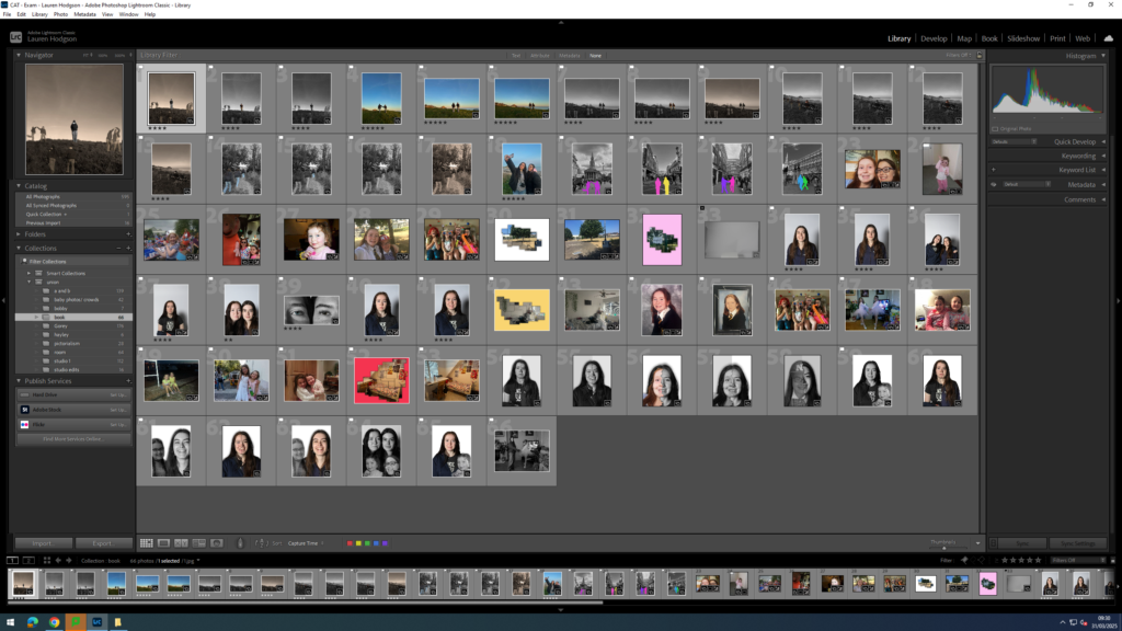
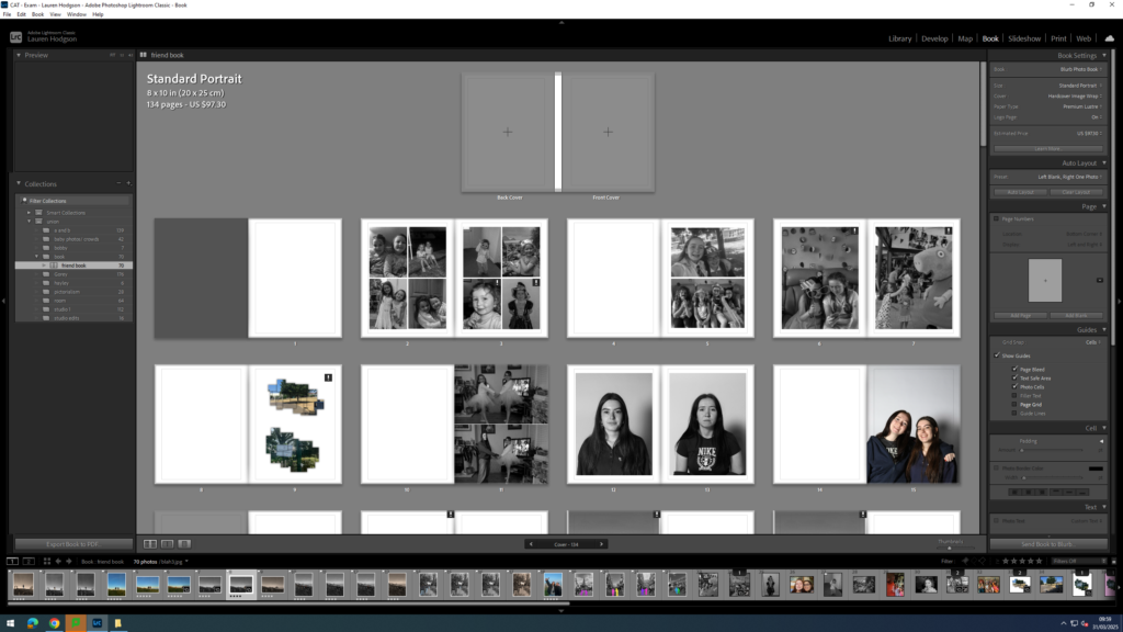
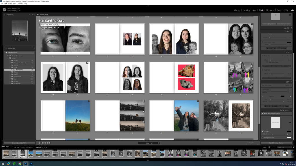
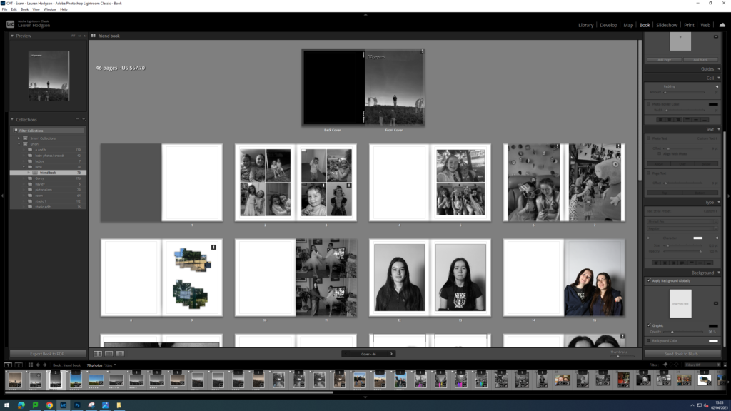
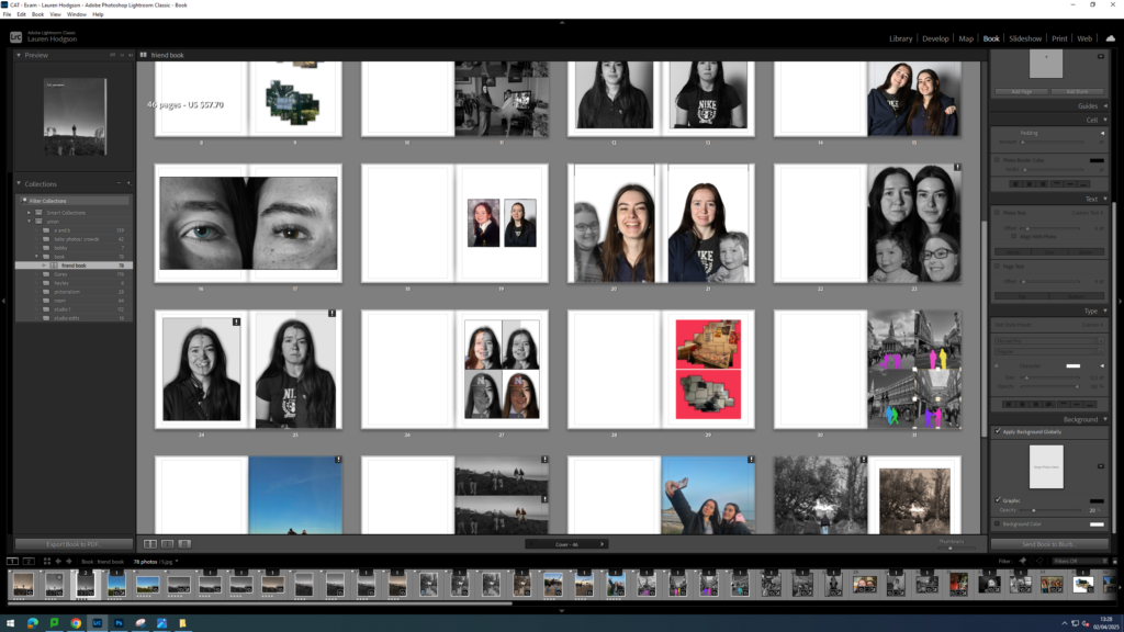
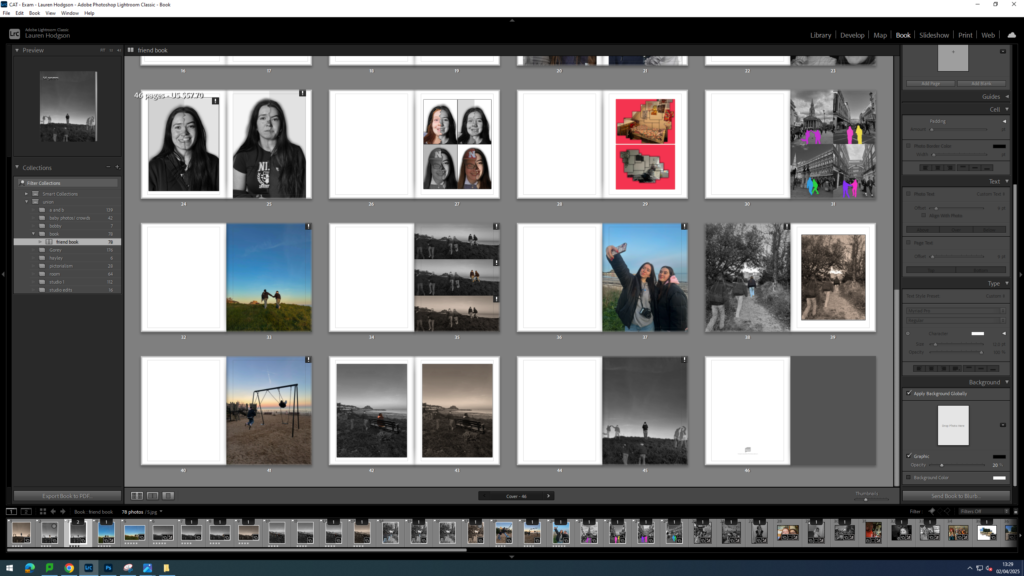
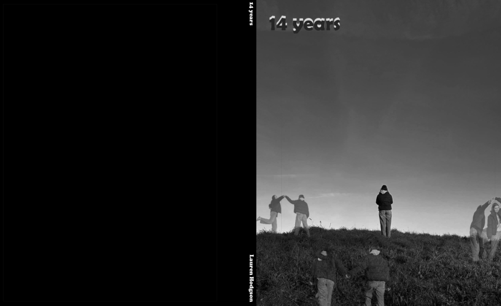
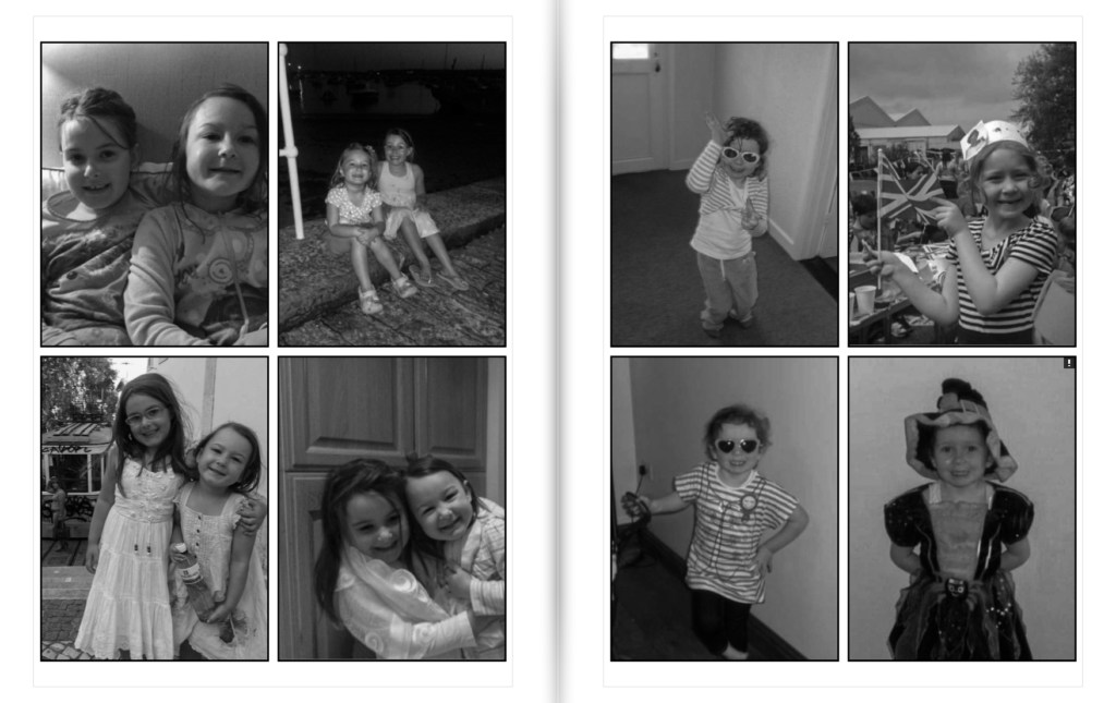
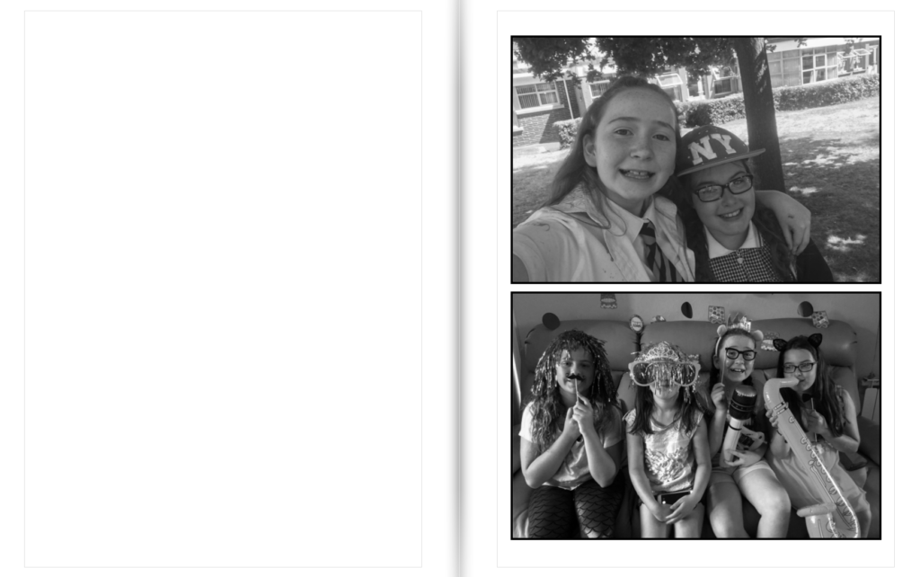
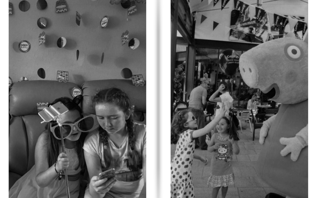
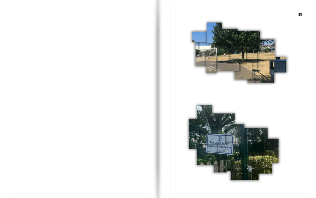
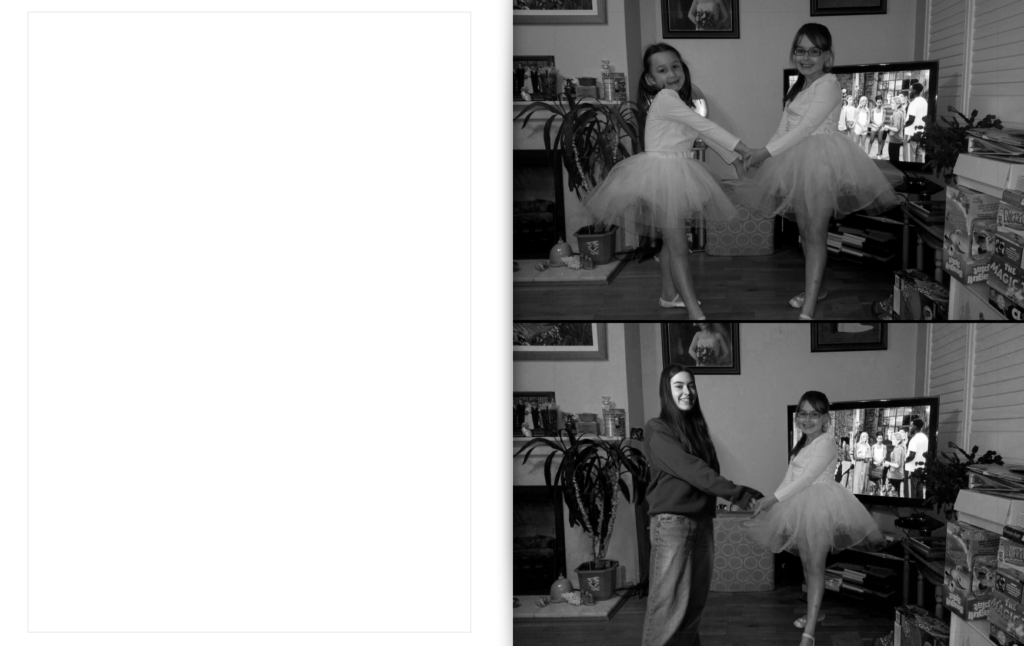
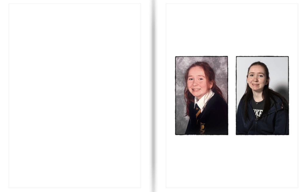
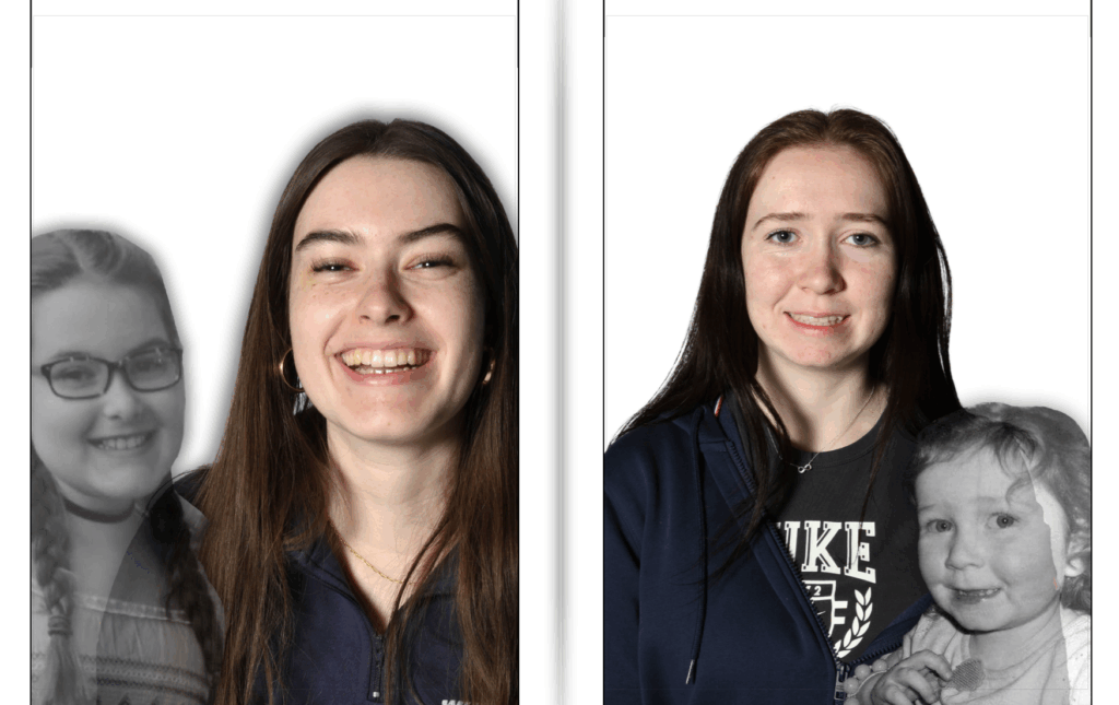
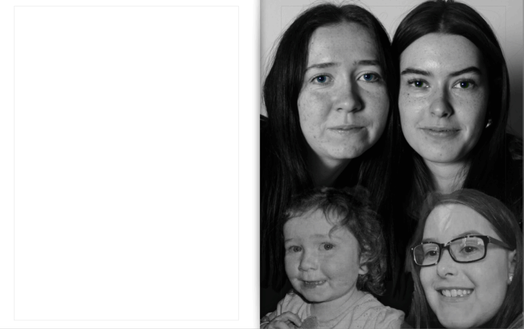
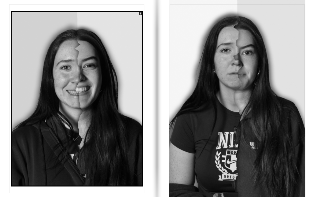
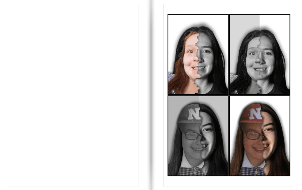
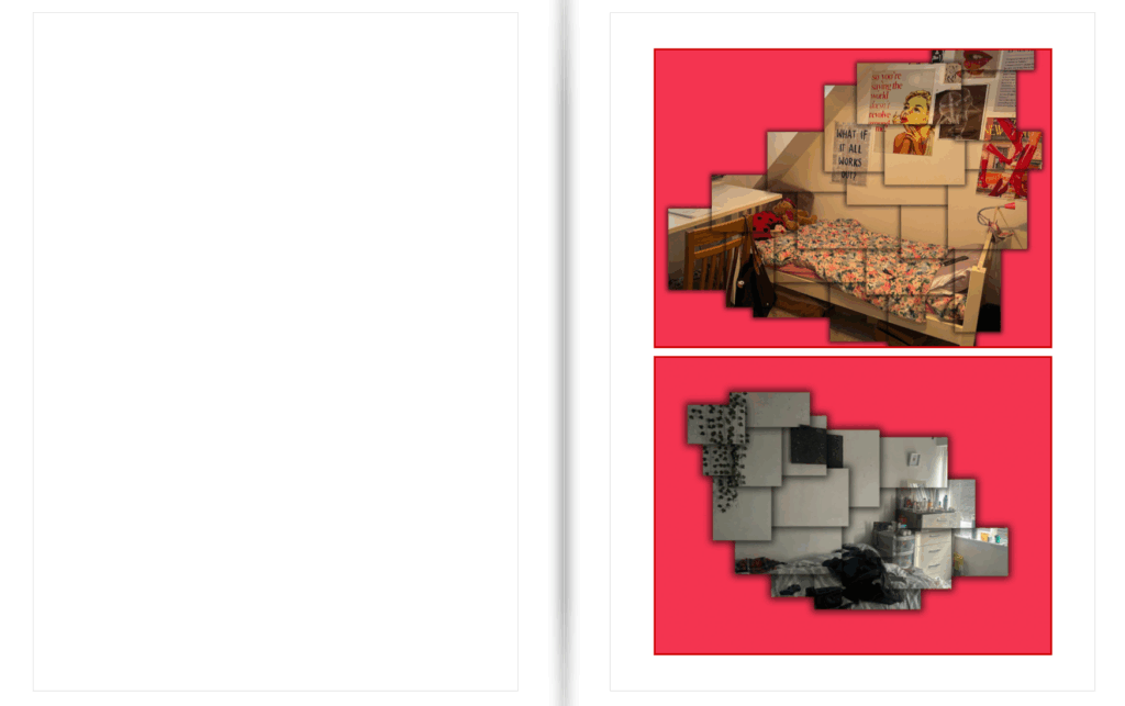
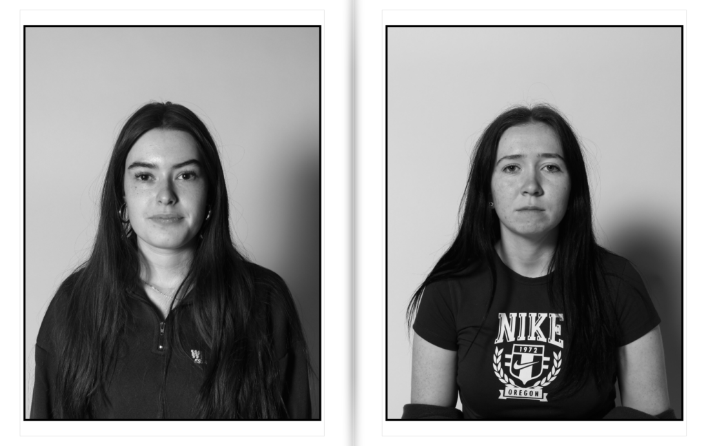
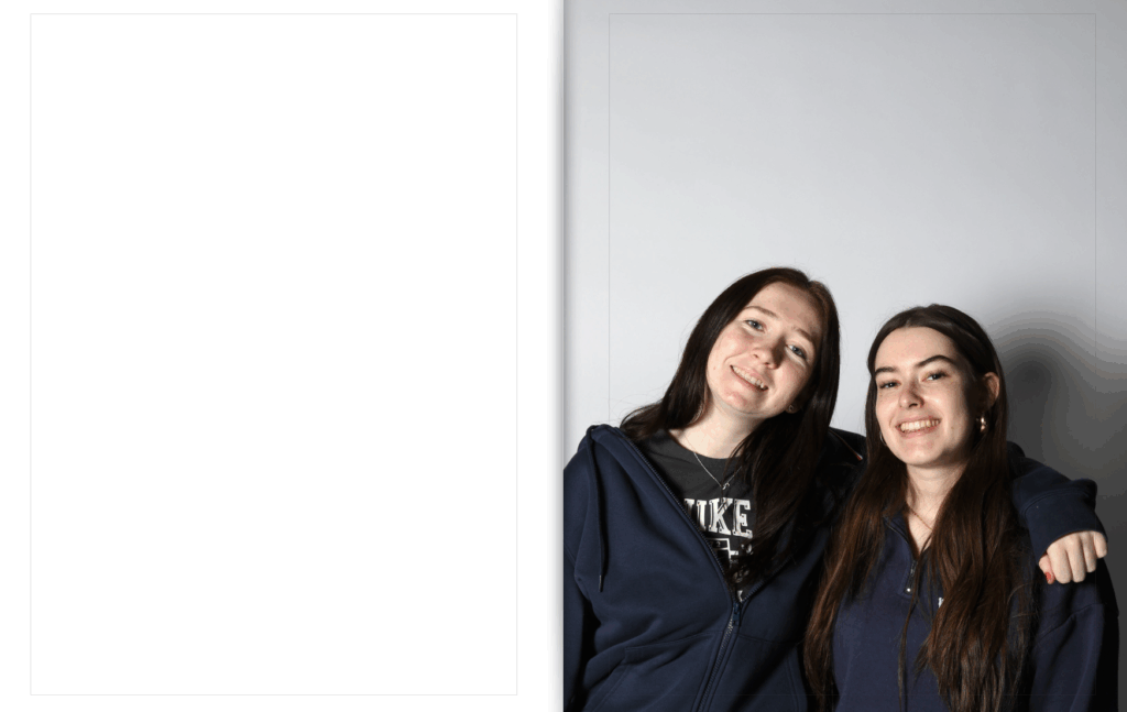
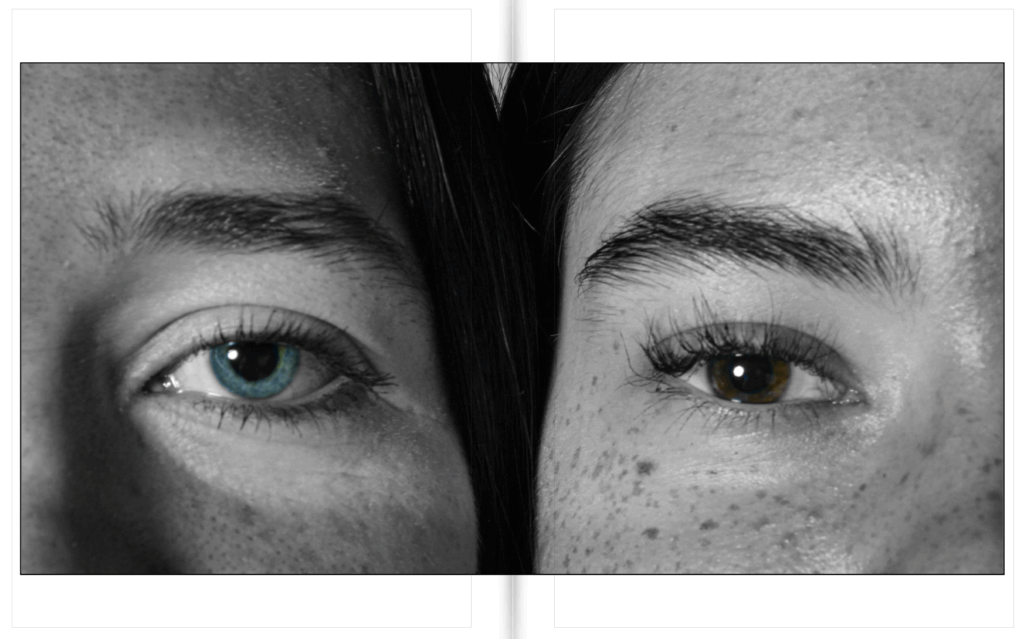
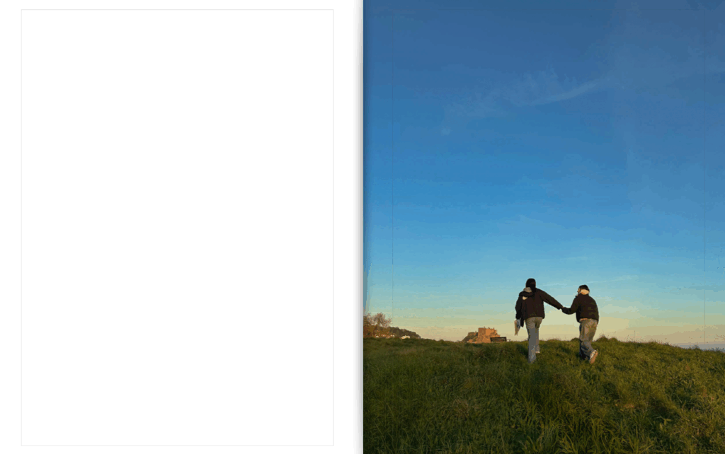
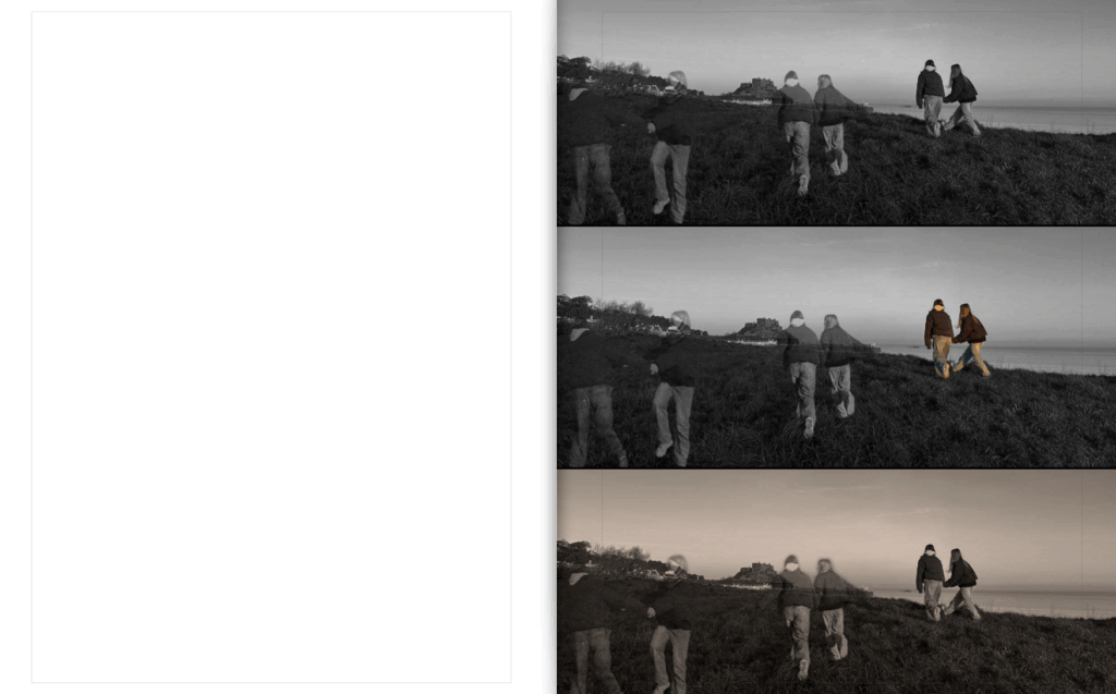
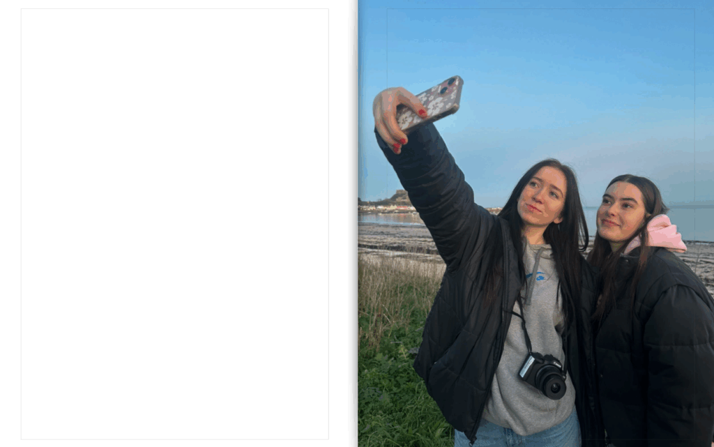
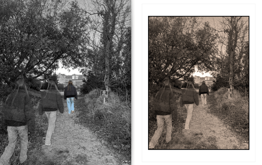
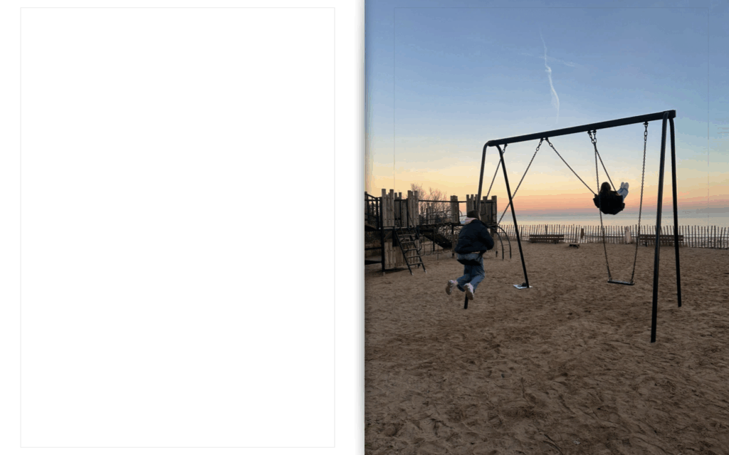
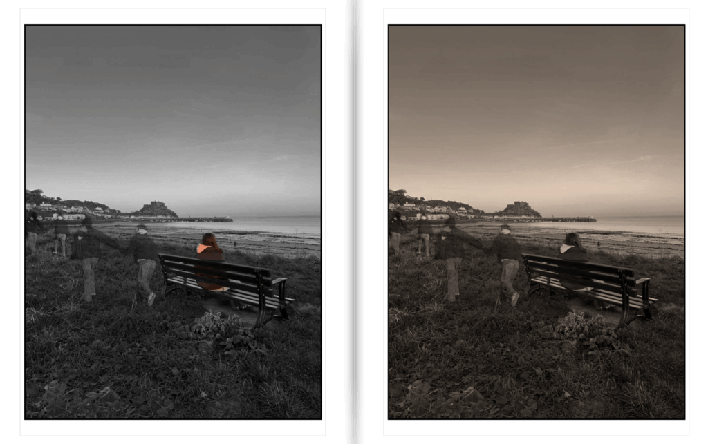
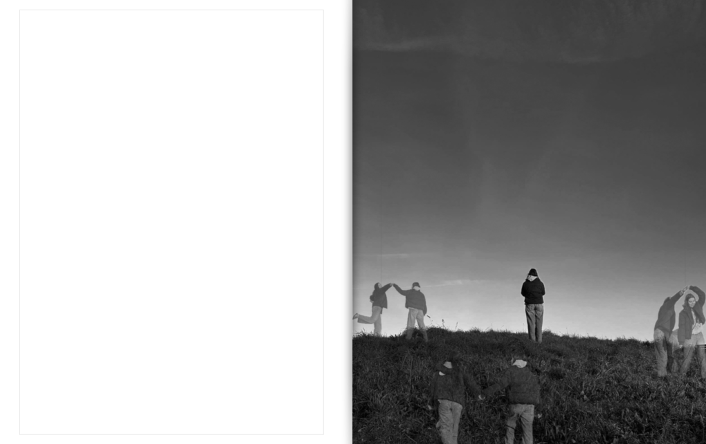
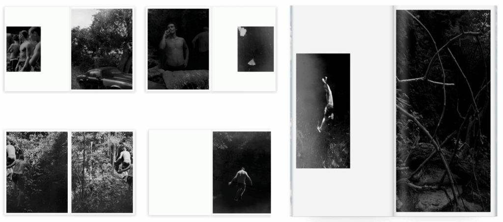
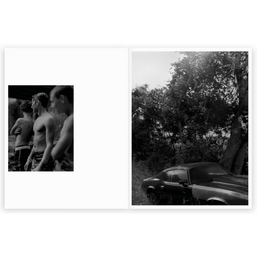
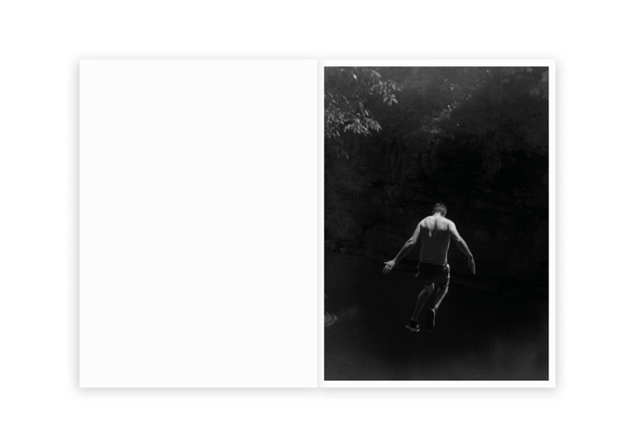
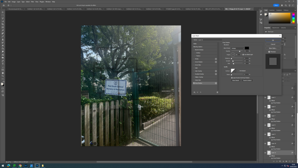
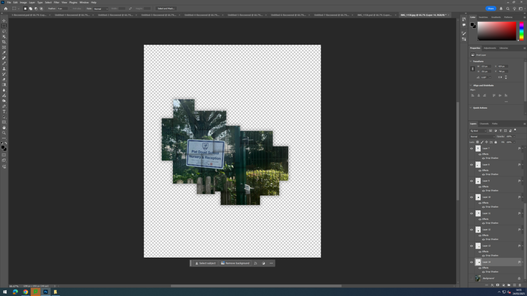
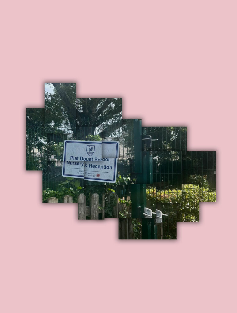
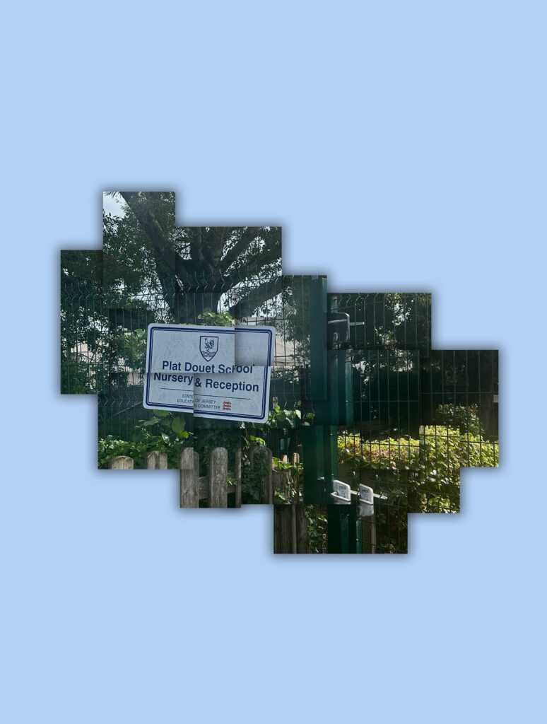
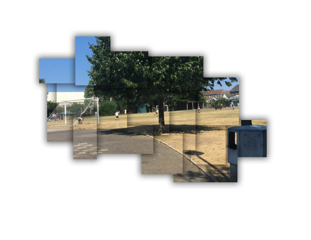
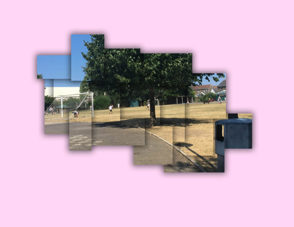
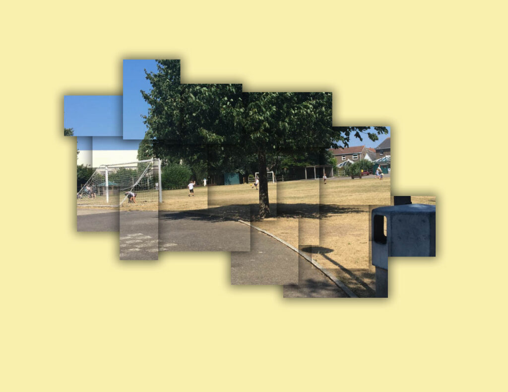
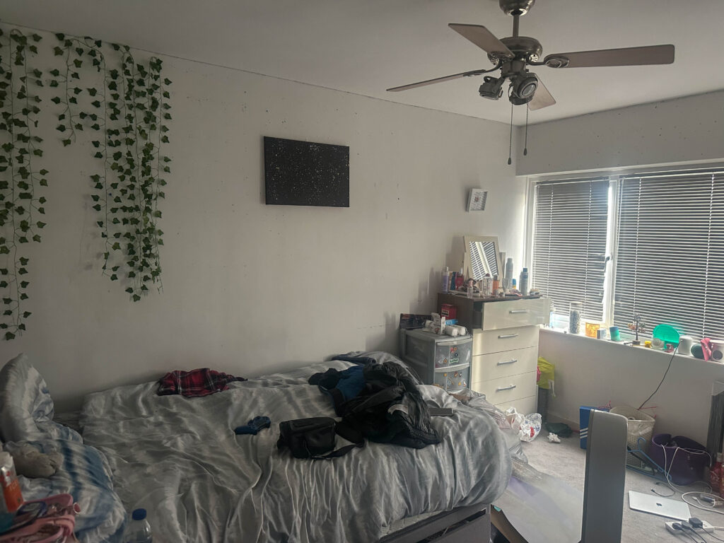
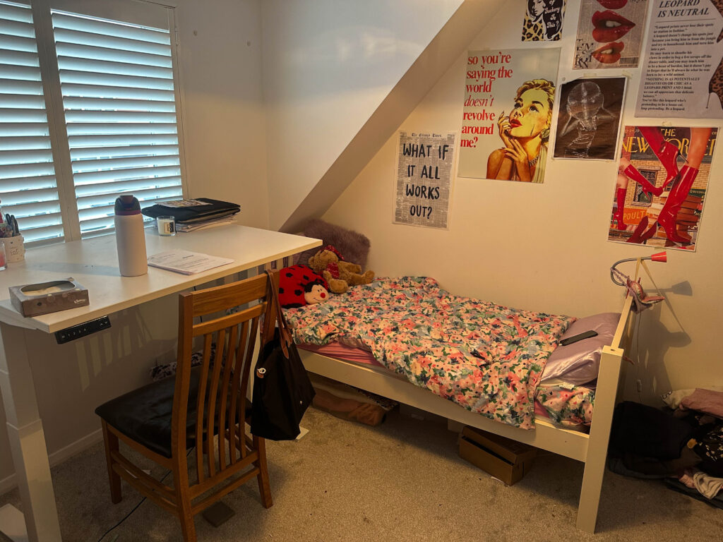
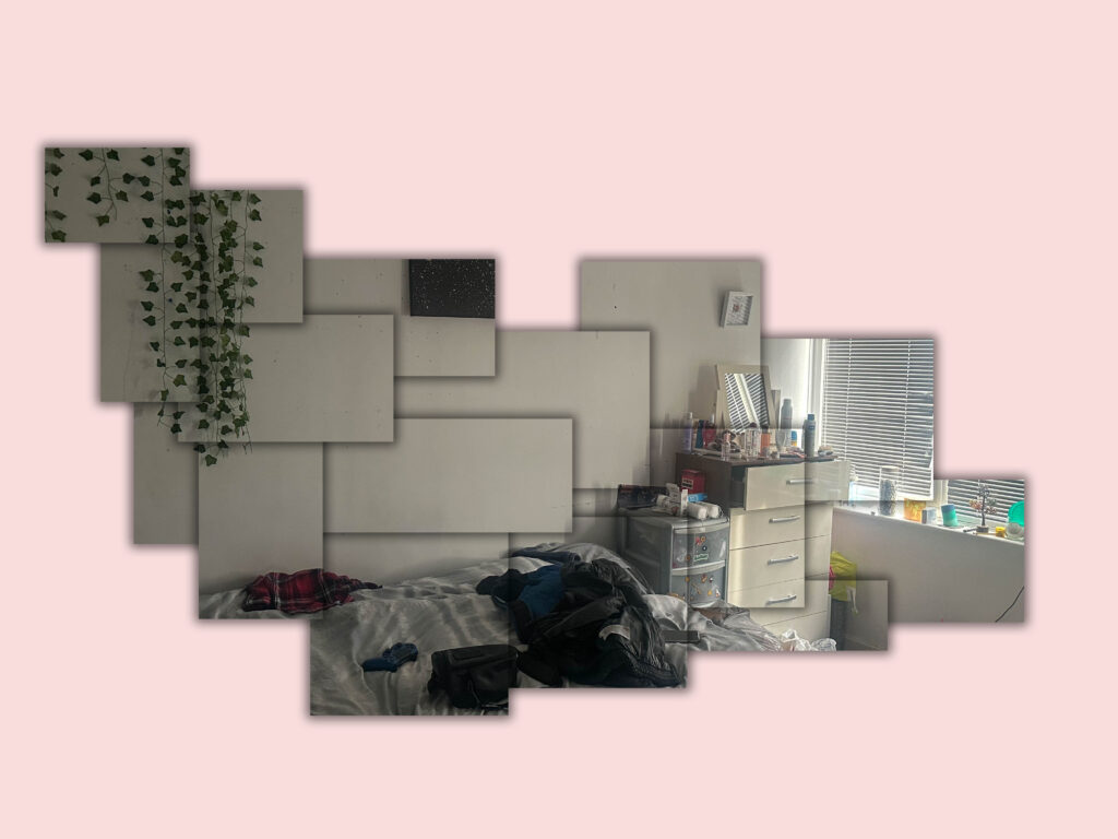
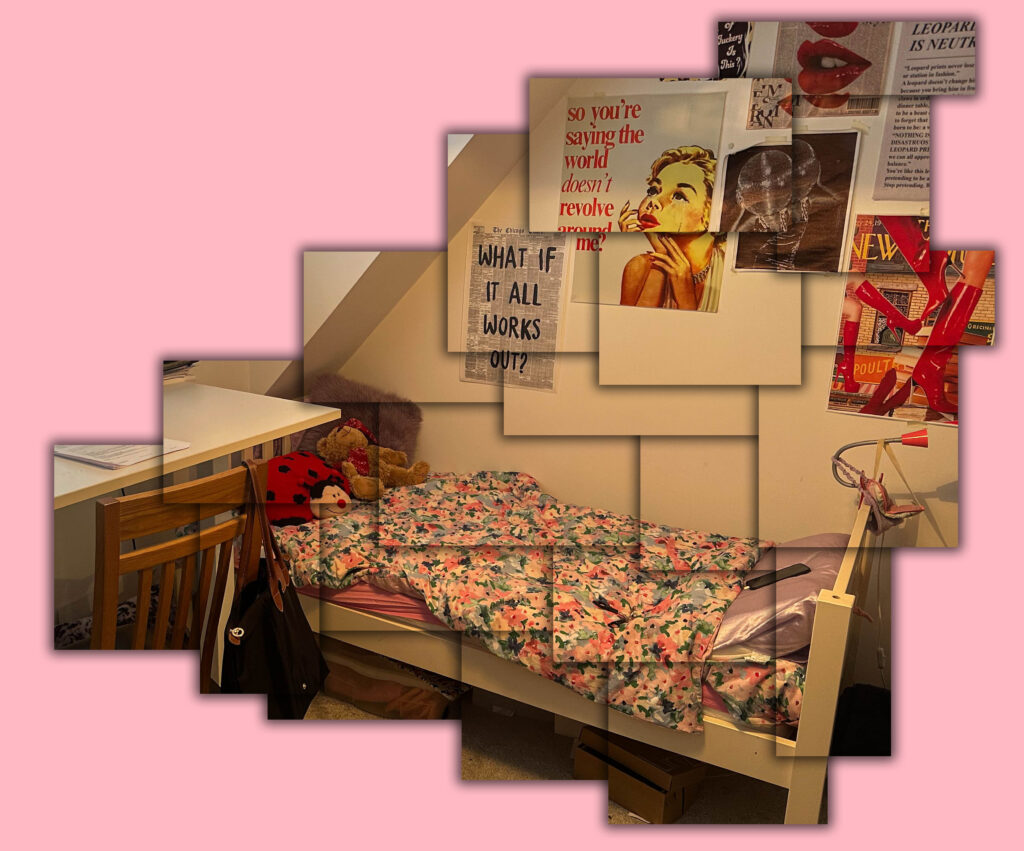
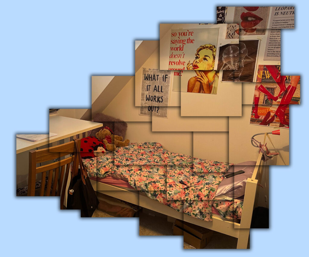
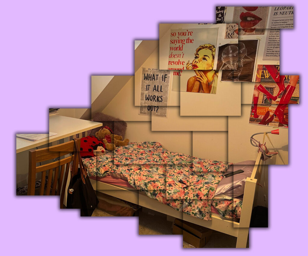
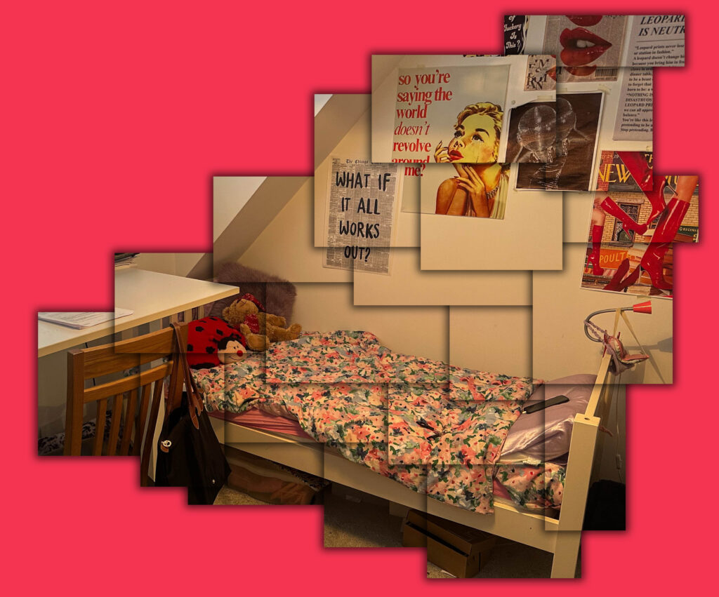
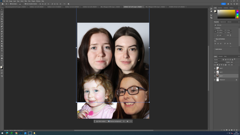
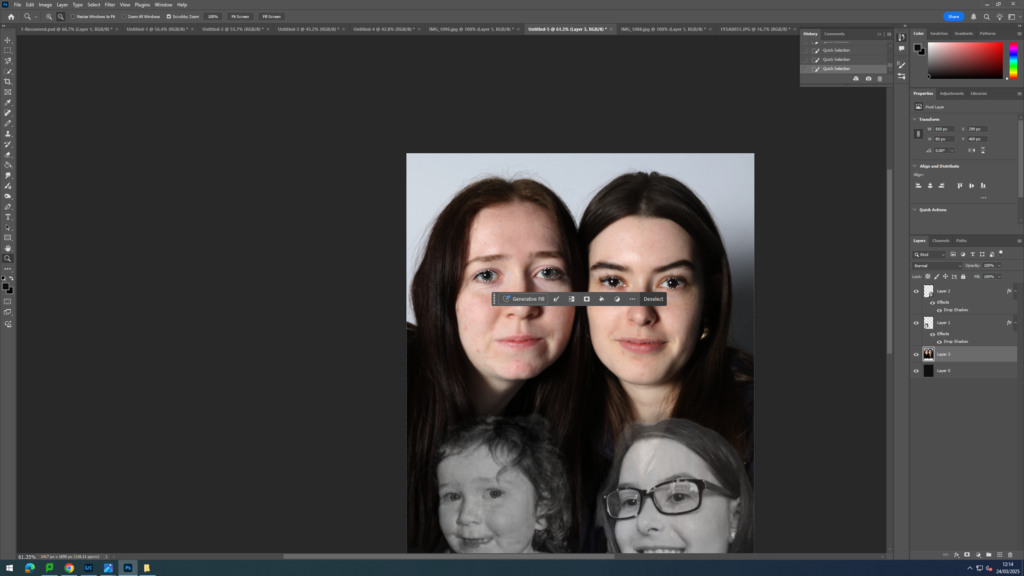
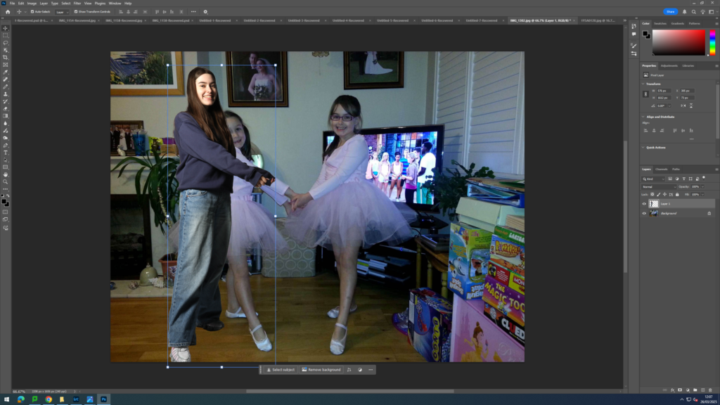
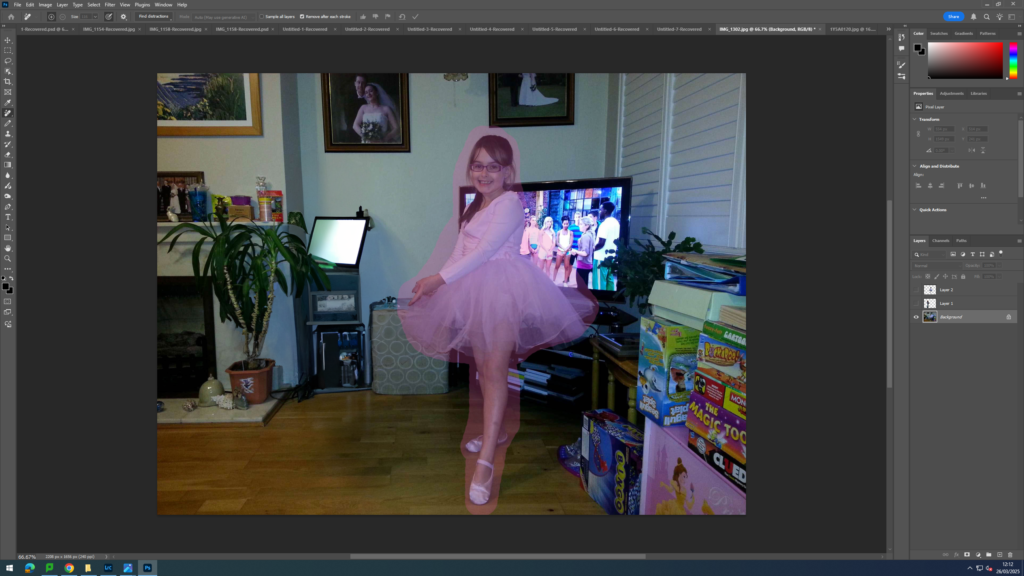
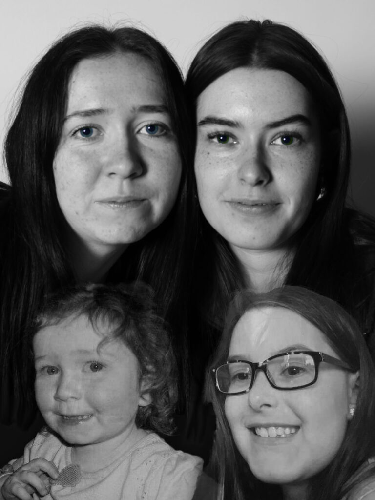
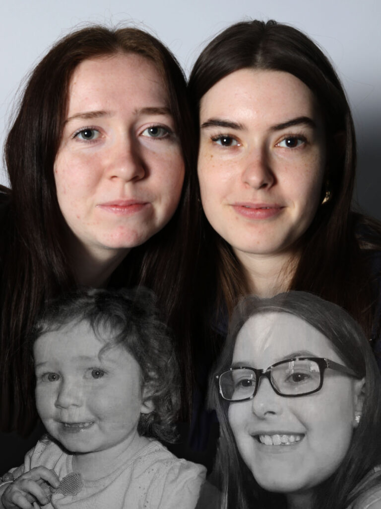
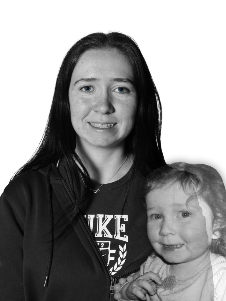
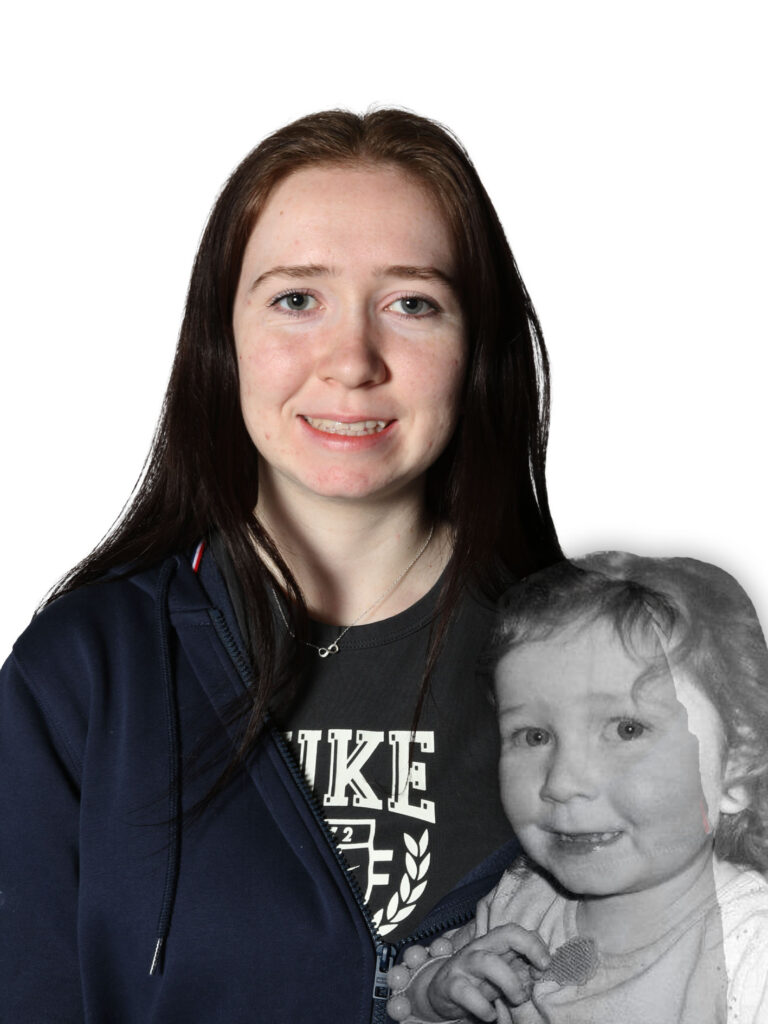
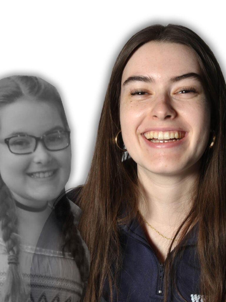
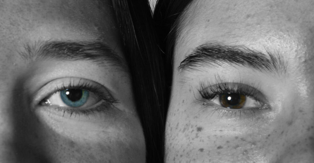
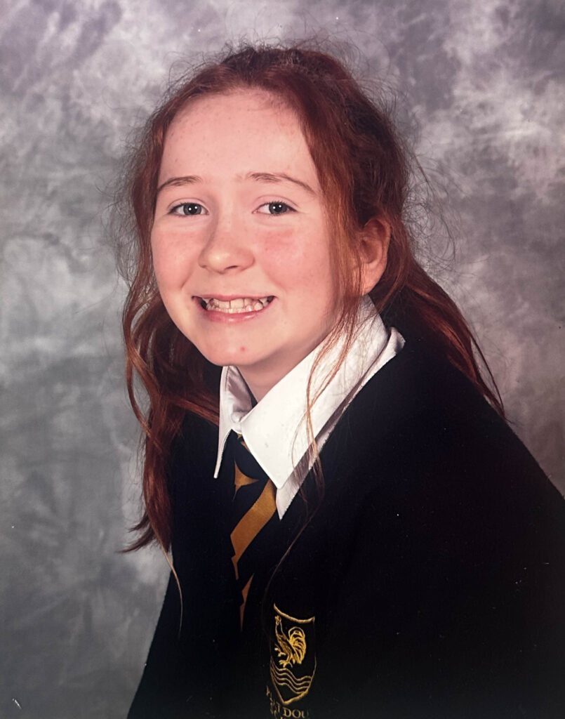
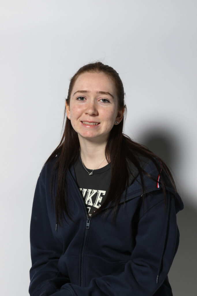
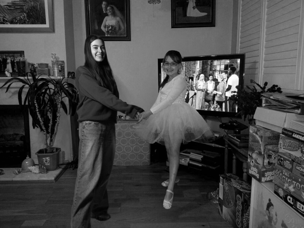
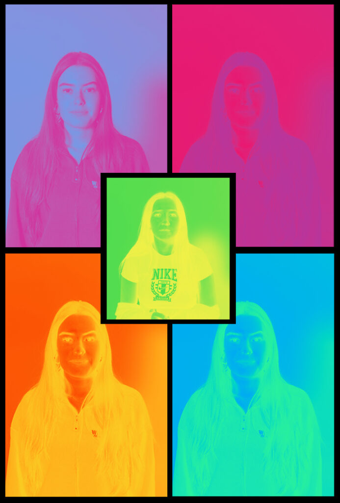
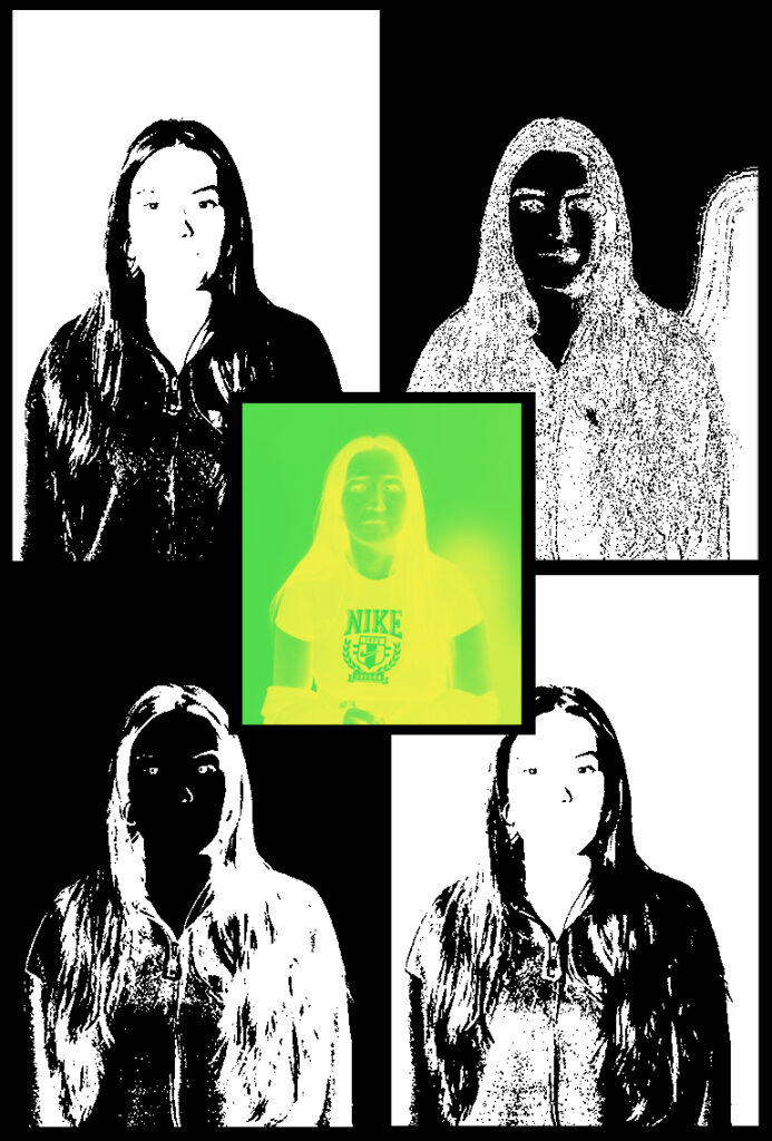
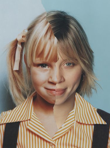
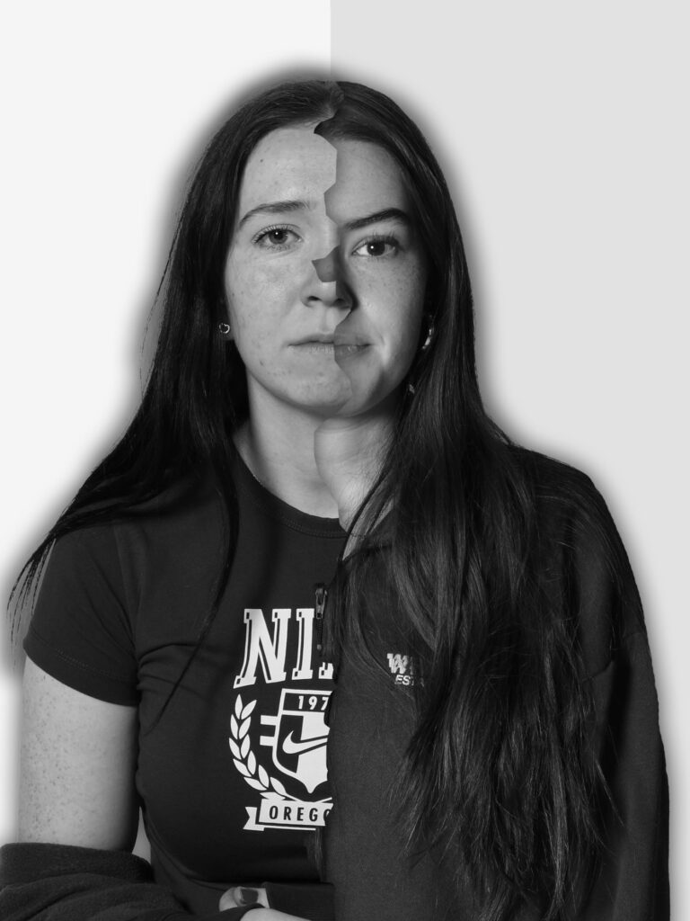
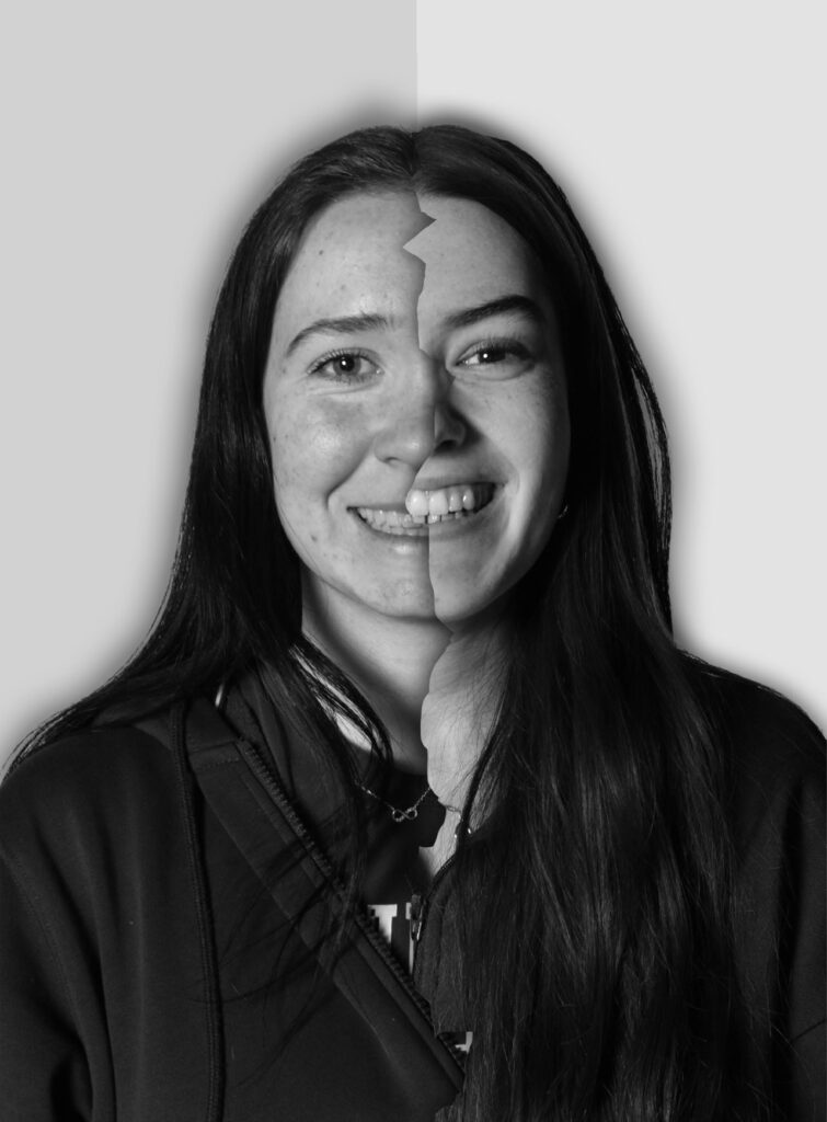
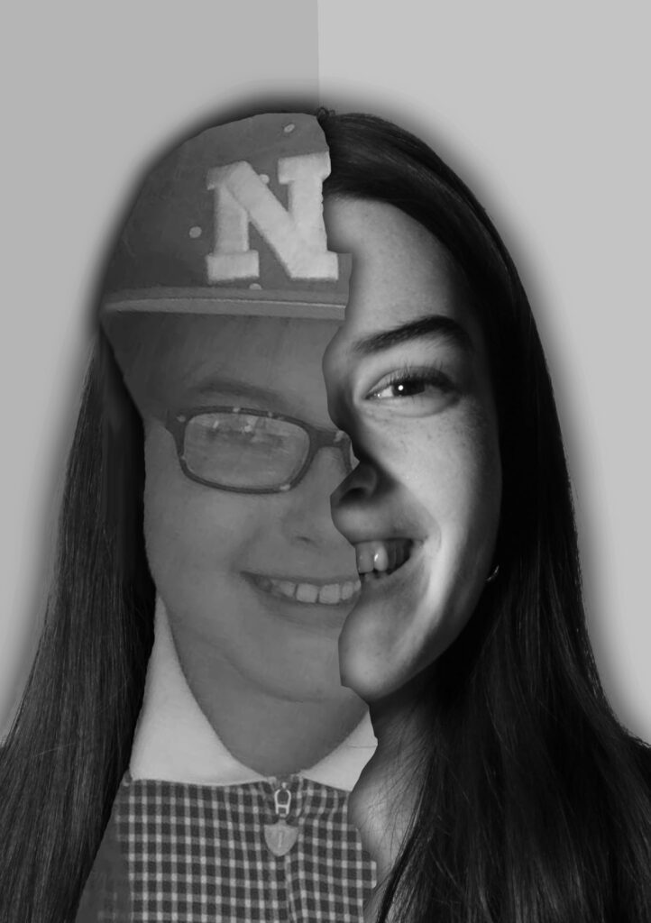
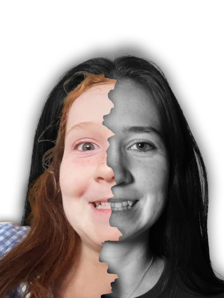
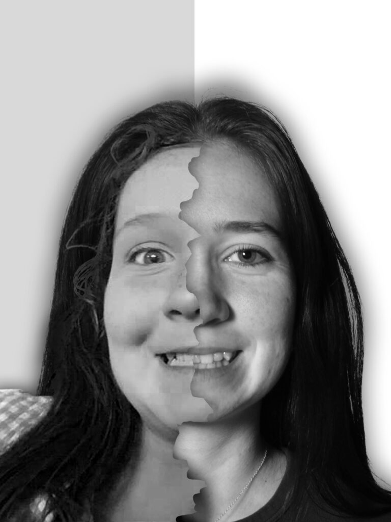
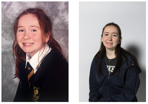
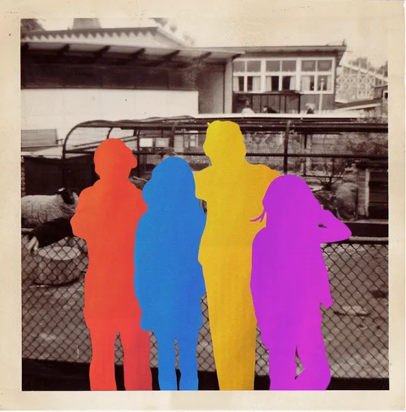
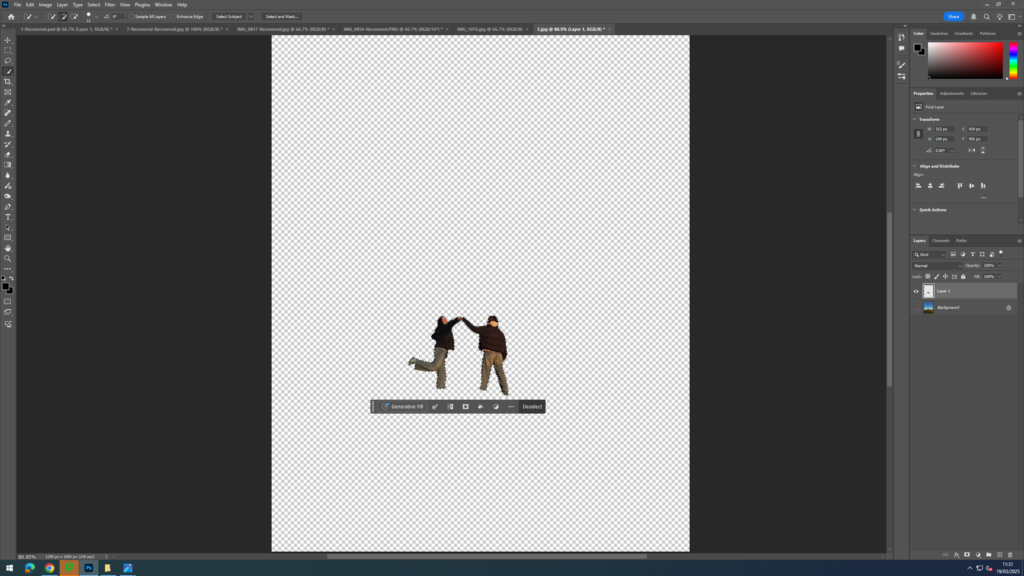
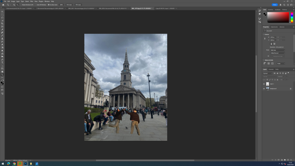
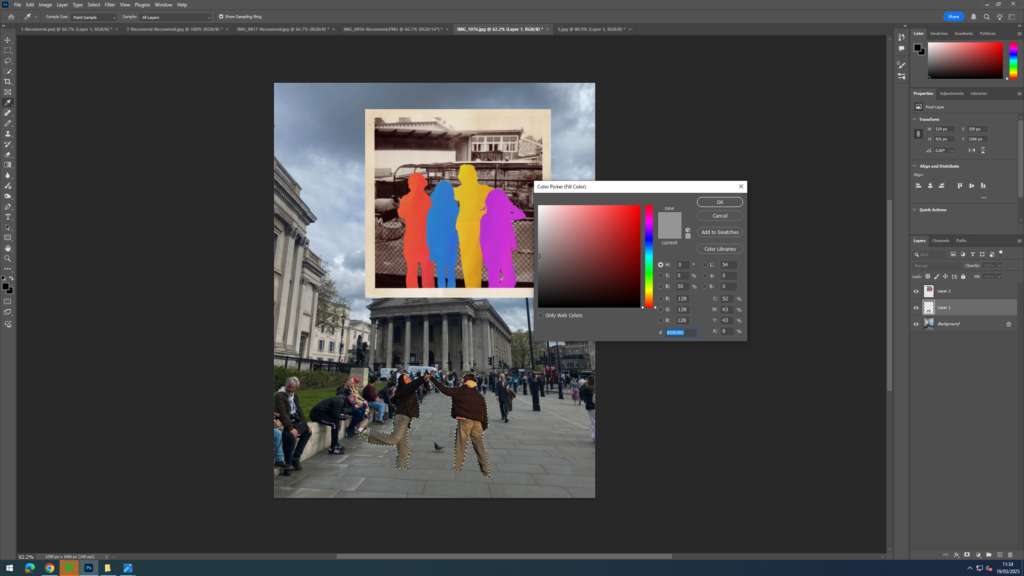
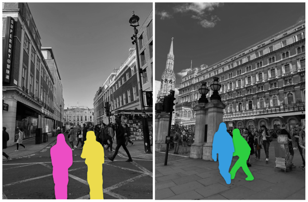
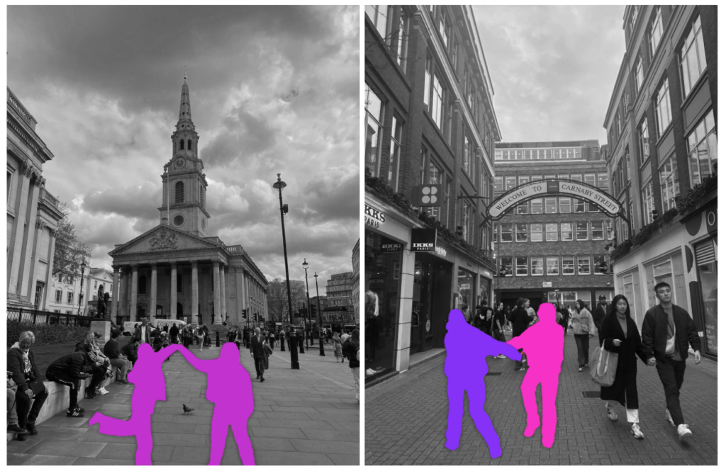
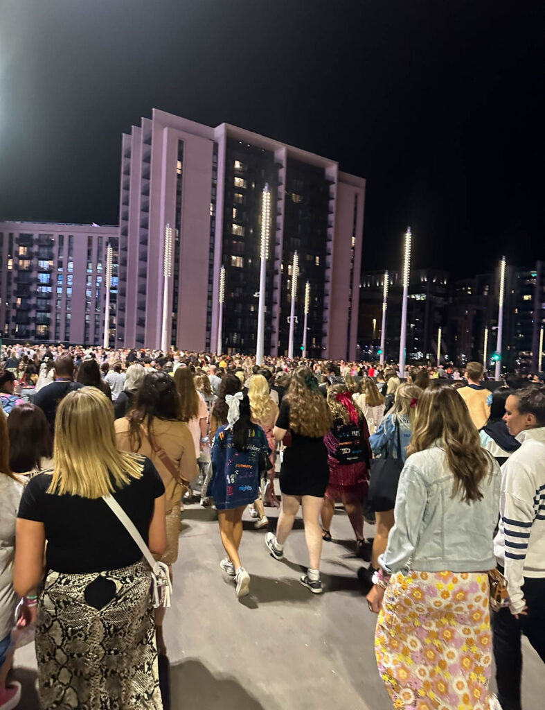
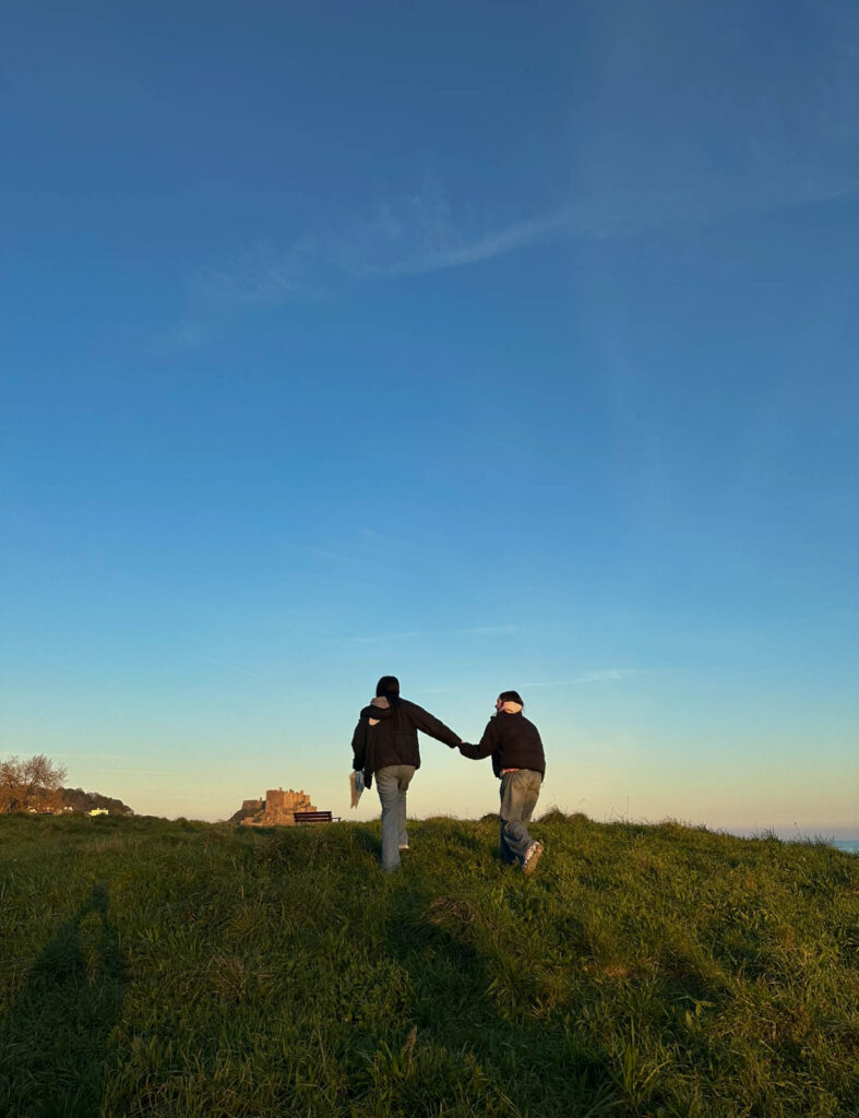
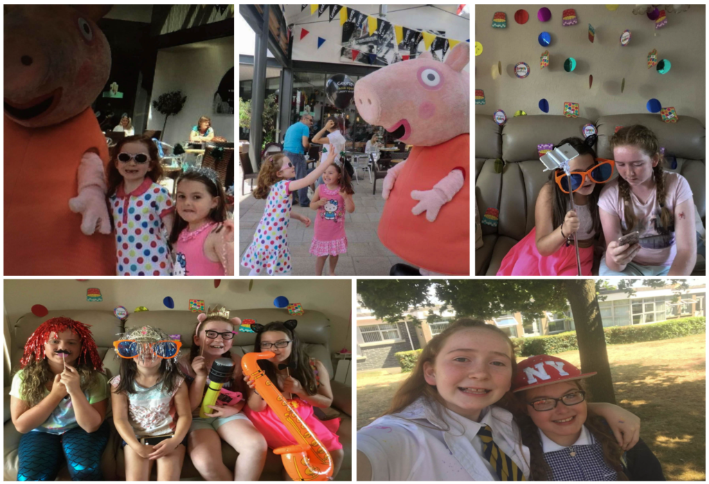
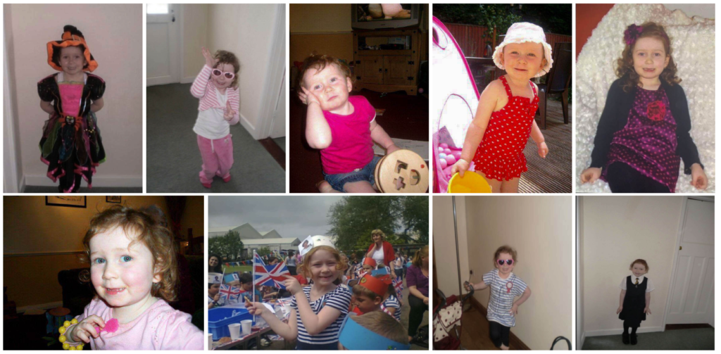
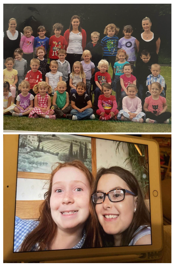
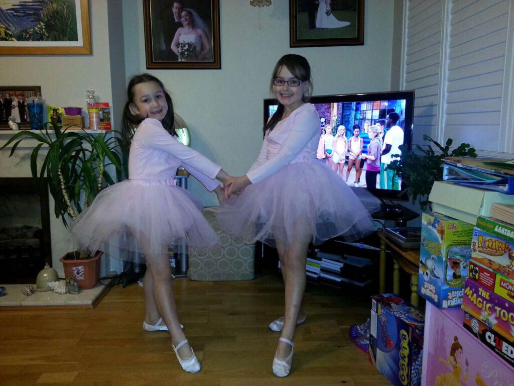
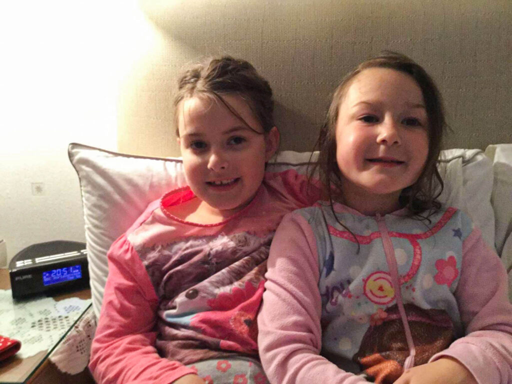
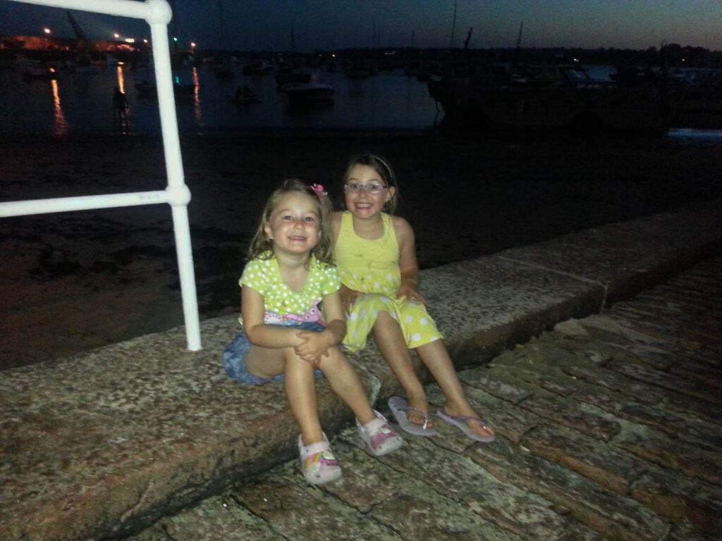
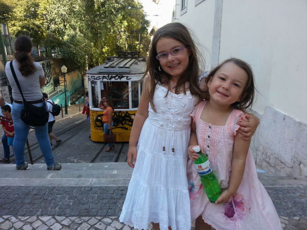
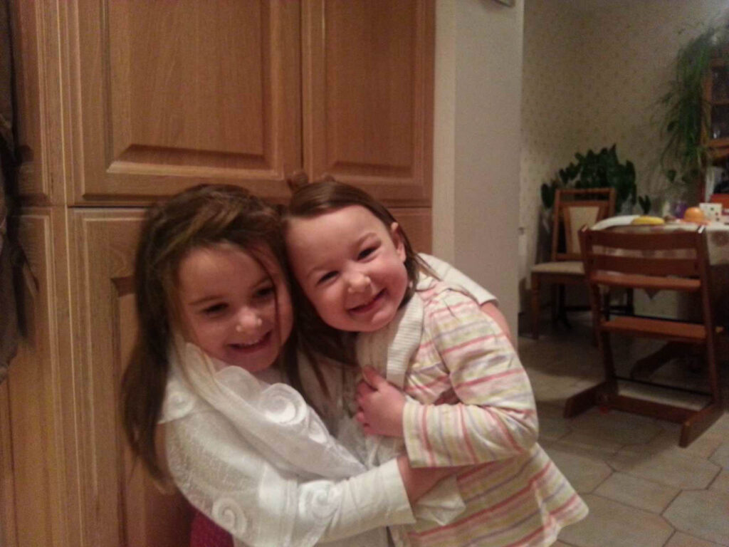
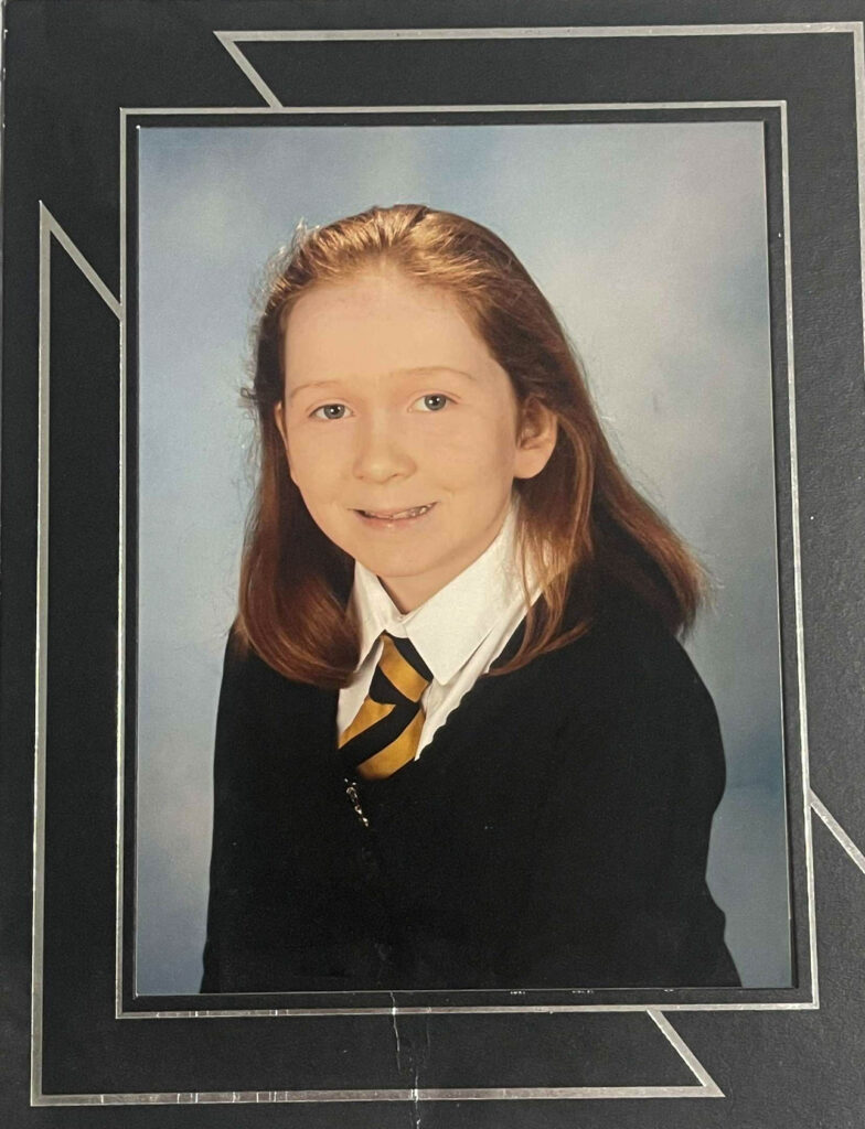
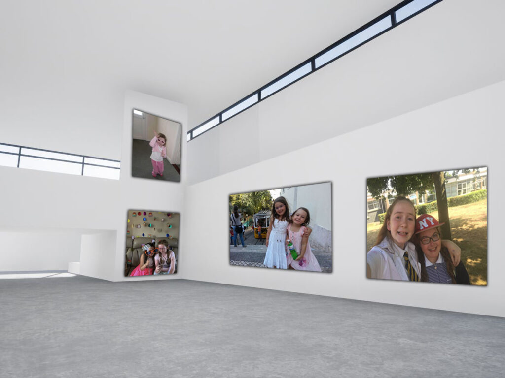
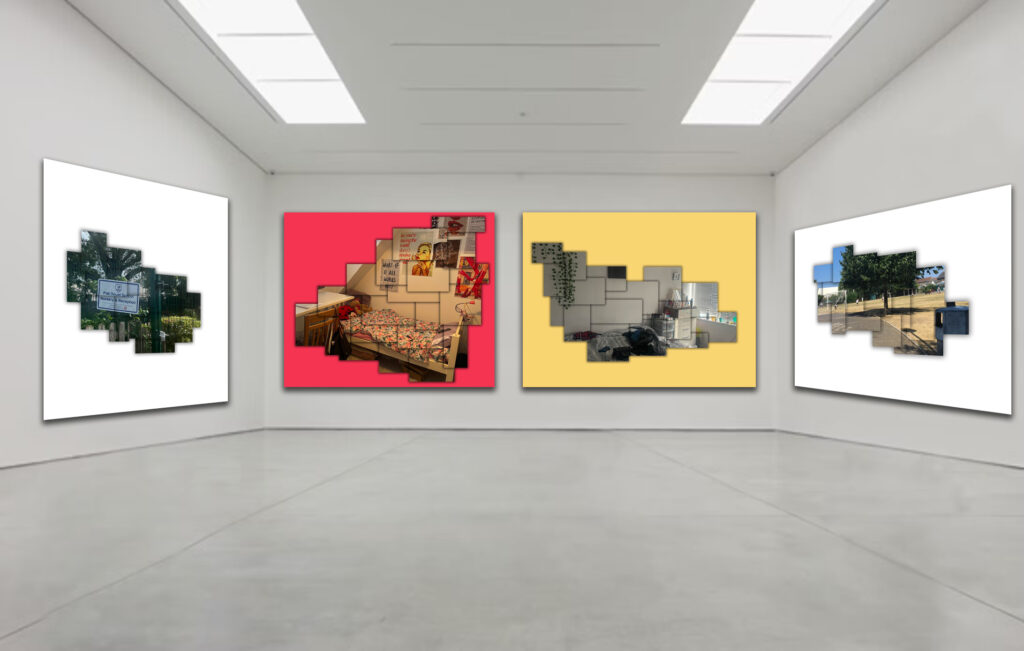
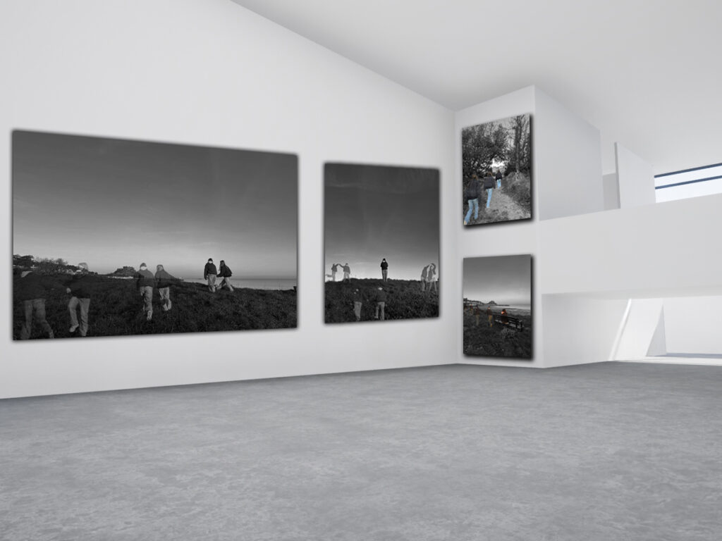
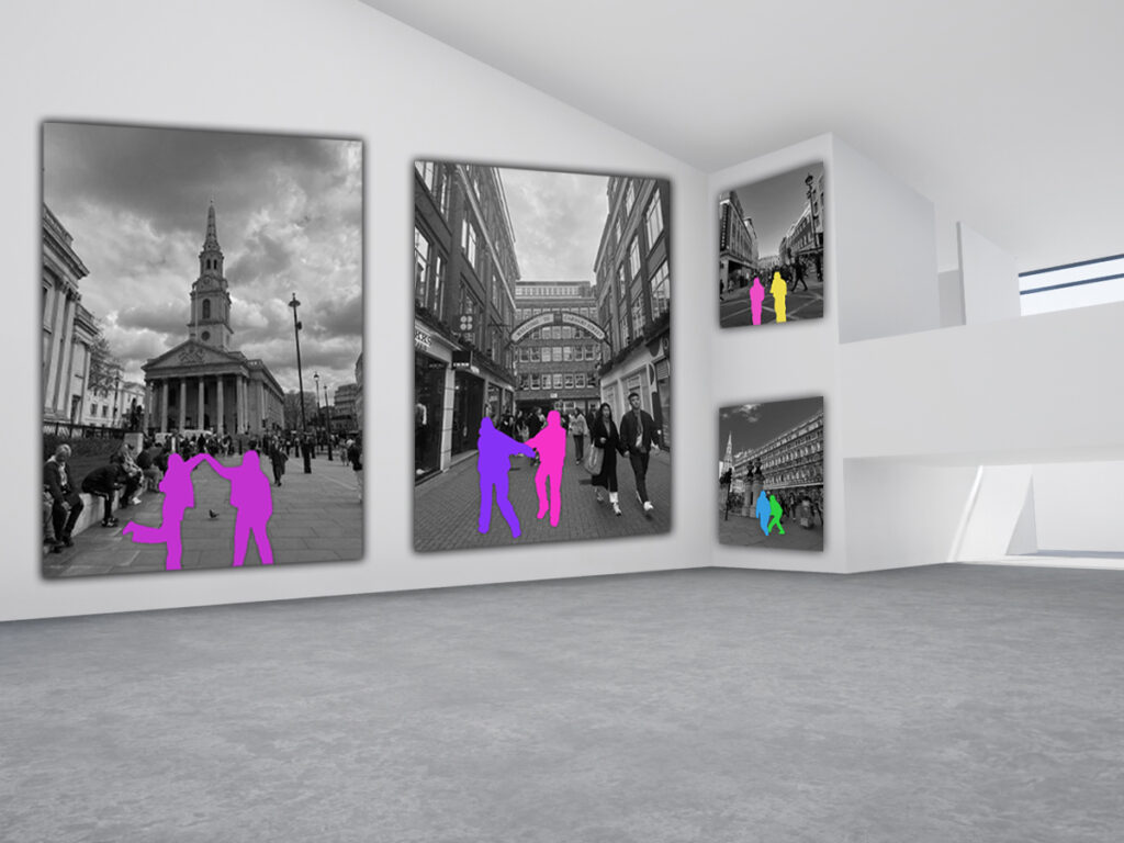
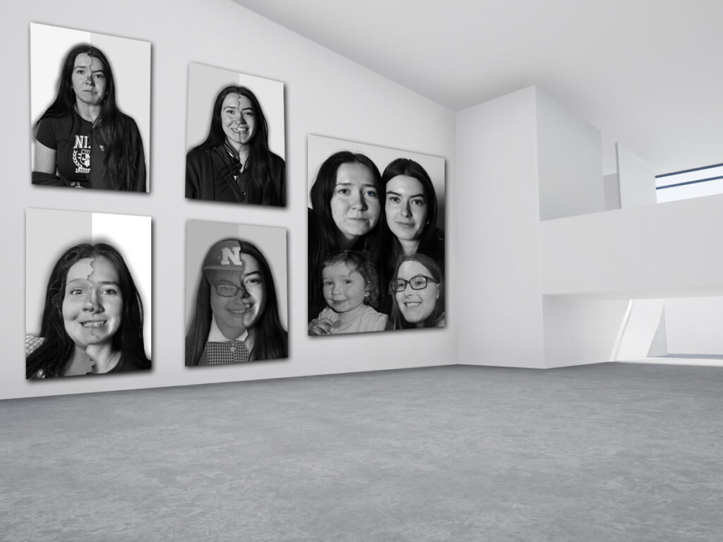
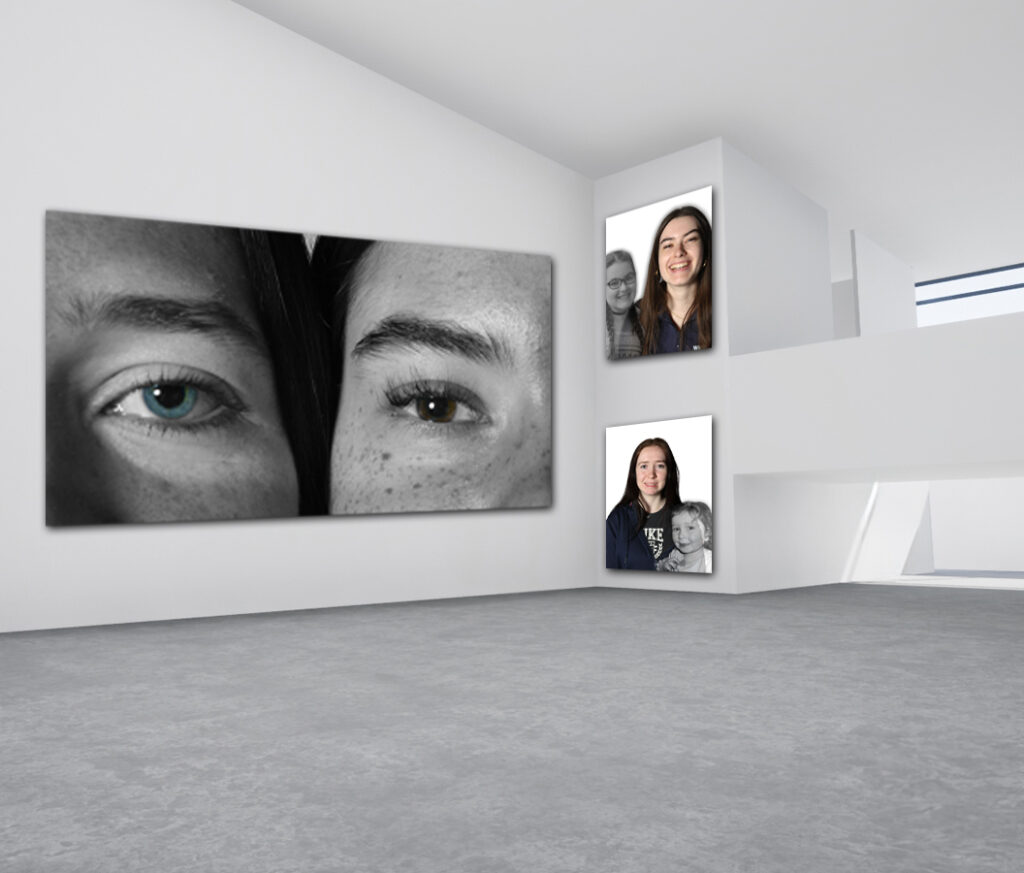
Overall, I enjoyed exploring the theme of union, what it means and different ways union can be seen in our daily lives. I decided to explore the idea of friendship as a form of union in my project and chose to focus on my two friends’ friendship which has lasted for 14 years and counting. I began by researching three different artists: Jose Ortiz, Hayley Warnham and Bobby Neel Adam’s whose work I believed linked to my idea quite well. For example, I found a image in the style of pictorialism by Jose Ortiz who depicted the same man walking at different points in time and combined all of these together. This sparked my idea of creating images where I would have an image of my friend standing by herself then surround her with images of her and her friend taken in the past at the same location; highlighting how much brighter and warm the world feels when she’s with her friend. I also tried to replicate this style of pictorialism seen in his image by adding a sepia tone over some of my images and adding shadows to the cut outs to make the lines more blurred and fantasy like. Overall, I like how my experiments came out however it doesn’t really replicate the work of Jose Ortiz that similarly as his piece only inspired an idea for my work loosely. Next, I looked at the work of Hayley Warnham who adds bold, bright colours to her grandads vintage photographs. I thought her work linked quite smoothly to an idea I had that I wanted to convey in my work about showing the effect their friendship has had one another; making their world brighter and better when they are in each other’s presence. I like how this idea came out as I managed to successfully replicate her work whilst still making it unique to my idea. I think the bright colours were successful in conveying the positive emotions associated with their friendship. Finally, I wanted to emphasise the strength and length of their friendship in my work which lead to me finding the artist Bobby Neel Adam’s who merges pictures of people now with pictures of them when they were younger. I decided to create multiple versions of this idea to create a visual narration of how long they have been friends for. I started by making images of my two friends separately and merging themselves with images of themselves as young children, I then merged two images of them as young children together, then finally I merged two images of them now together. However, when creating the image with two images of them merged together when they were younger, the merge between the two images didn’t look very smooth as one of my friends didn’t have any close up photographs of herself as a child and the one she did have was quite blurry, limiting what I could do with it. Therefore, I decided not to include this image in my final pieces but overall I think I was able to effectively convey the length of their friendship as I made clear comparisons between how they used to look when they first met one another to how they look now. One improvement I would make to my project is photographing different objects that represent their personality. Whether that be photographing their different likes and hobbies literally, or photographing things that represent their personality metaphorically (eg the sun for my friend who is always happy, loud and bubbly and the moon for my friend is more quiet and calm in nature), I think this would’ve added more depth into my project and explored who my friends are as individuals, which in turn helps to explore and understand their friendship further. I think this would also help highlight the beauty and rarity of their friendship as although their likes and dislikes differ, they are still best friends. 

Photobook

My concept

My photobook will act as a Time Machine; taking you back in time to where my two friends first met each other. Throughout the photobook, I will be creating a journey that’s representative of the strength and length of their friendship. The beginning of the book will be focused around their friendship when they were in primary school and will include individual portrait images of themselves. This will then be followed by images of them in the present which will allow the viewer to see how although they may have evolved and changed overtime, their friendship has remained constant. 

The main message I want my photobook to portray is strength and beauty of friendship by showing the unique bond between my two friends. I hope to convey the idea of appreciating the people who choose to stay, who show up and who make time for each other even when life gets complicated. Their story is proof that friendship can still be maintained even as the individuals within it change. By looking at where their friendship started and where it stands today, I hope to remind people of the importance of holding onto these special people in a world that moves quickly and changes constantly. I am planning to add a variation of different layouts of images in my book such as having some single images fully spread out onto one page and then some pages where there’s 4 or more images on one side. I am also going to make my photobook portrait as this is how most of my images as oriented too and have a hard cover as it gives it a more professional and sleeker look.

Designing process

In order to make my photobook, I first imported all of my edits I had made on photoshop onto Lightroom then began narrowing down the ones I wanted to use by assigning them a white flag and the rest a black flag. I then created a new collection and called it photobook which I then dragged all the images I wanted to include in it. I then ensured my book was in a portrait orientation and saved it beforehand.

I wanted my photobook to tell a story of their friendship so I decided to have the first couple of pages of my book dedicated to images of them when they were younger. I experimented with different layouts and numbers of pictures but ultimately decided on a page which had 4 images together as I thought this replicated the photo albums in which they found these images. Additionally, this layout ensured that all of the images were quite small in size which was essential for making sure that they wouldn’t print out blurry/ of not good quality as they would’ve if they had been bigger due to the photographs being from a time where the camera quality on phones weren’t as advanced. I then decided to add my David Hockney inspired images that depicted their old primary school as I felt this linked in well to their childhood photographs. Next, I added in my images where I experimented with adding pictures of them now with pictures of them as small children as this was supposed to represent how much time has passed and how they’re still friends despite this. I then decided to add some more of my David Hockney inspired images but this time it involved images of their bedrooms now, both of which are significantly different and represent their opposing personalities. Finally, I ended my book with a variety of photographs of them in the present both together and individually. Once I had finished my layout of my images, I then decided to add a black boarder around some of them as some of the pages felt sparse. I then went onto the front cover of my book and picked out an image. I decided to use the same image as the last one in the back of the book as I thought it was a nice way to link the whole book and story together. Next, I experimented with making different short, simple titles for my book but ultimately decided on ’14 years’ as it is a bit vague and so the viewer has to actually look at the book to understand what it is about. I chose this title as this is the amount of years my two friends have been friends for and since the book is about their friendship from beginning to end, I thought it fit quite well.

Final photobook

Overall, I like how my photobook ‘14 years’ came out. I believe I was able to successfully convey the strength and value their friendship holds as I explored their friendship not only now but since they were younger too, through using pictures of them in primary school and pictures of them now, still close as ever. Additionally, I also like the layout of my photobook as it is not repetitive in nature. I ensured to use a variety page layouts throughout my book and not have the same layout more than twice in a row. I think this makes my photobook more interesting and exciting to look at as you can’t predict how the images will be laid out on the next page. Another thing I like about my photobook is the lack of writing in it. I think this is a positive thing as in my last photobook I had quite a lot of writing as I felt like it was necessary in order for people to understand what story I was trying to convey, but in this photobook I think my images and the order of them are effective in creating a story that does not need words to explain it, showing the quality of my images and clarity of my idea this time around. However, when looking over my photobook once I thought I had finished, I noticed I had some pictures of my friends now right after the images of them as children. I thought this didn’t fit the storyline as I wanted my book to act as a journey of their friendship starting from the beginning to the end and so I decided to move these pages further down to make my story more smooth. One improvement I would make to my photobook is adding more pages that only consist of one full sized image whether that be on a single page or a double page spread as I think it would help my book look less cluttered and read more smoothly. Additionally, I would have liked to use more raw studio photographs I had taken as it would’ve allowed me to show off my photography skills in taking studio portraits and adjusting things like lighting, as most of my images involve me using photoshop to manipulate them so you cannot really see the raw image behind it.

Photobook research and analysis

A photobook is a personalised book that features a collection of photographs arranged in a cohesive and creative layout. Most of them have an overall theme or follows a specific storyline. Photobooks provide photographers with a convenient and cheap way of showing their work to a large audience. Most photobooks tend to not have text and if there is, its very minimal. This means that the photographs tend to explain the story they’re trying to convey rather than relying on text.

Deconstructing a photobook

Halfstory Halflife – Raymond Meeks

What the book is about:

Raymond Meeks’ photobook called ‘Halfstory Halflife’ is a book about teenagers growing up in a small town in New York. Over three years Meeks documented a group of teenagers who gathered each summer at a secluded spot called Furlong. Here, they would leap from a 60 foot bridge into the water below. This was a tradition for the teenagers in the area and symbolised their transition from adolescence to adulthood. He spent a few years taking black and white photographs of the moments before they jumped, while they were in the air and as they hit the water. By looking at the images, you can see and feel a variety of different emotions like: excitement, fear and freedom, all of which comes alongside growing up. However, the book wasn’t just meant to be about capturing teenagers jumping off a bridge, it’s supposed to be about that specific time in life when you’re typically trying to figure out who you are. To me, the title suggests how these moments he captured are just one tiny part of a bigger story for each individual in the book and how being a teenager is like living in between two stages of life as you’re not a child anymore but also do not have all the responsibility and stress of an adult, making it difficult for you to find your place in society. This invites those who look at the book to reflect on their own experiences of transition and self discovery. The title ‘Halfstory Halflife’ is drawn from a poem by Dean Young and reflects the project’s exploration of incomplete narratives and the transition between childhood and adulthood.

Why there are images of cars throughout:

The car images seen throughout the book helps to tell the story of teenage freedom and the spaces they inhabit. For example, cars are often seen as a symbol of independence as by having a car, it allows the teenagers seen in the photobook to get to these hidden places in the woods that are away from adults, school and routine. This is important to them as these places and things often have authority over them, meaning they must listen and do whatever is asked of them. But, by having a car, this means they can get away from these places and go wherever they want without being told what to do. However, Meeks could have also added these images of cars parked in natural settings to show the contrast between human made and natural spaces and how these teens temporarily claim a spot in nature. Additionally, the still images of cars juxtapose the action shots of the teenagers jumping into the water and creates a break in the book, giving a feeling of waiting, resting or being in between moments. This matches the book’s tone of exploring transition and reflection. I also think the images of the cars are a way of showing that a person and story has occurred in these places, even if the people are gone, the objects remain and act as a reminder of its past.

Why he photographs the back of people rather than the front:

Whilst looking through the book, I also noticed that the majority of the images Raymond Meeks took is of people from behind. I think this creates a sense of distance and mystery to the book as we can’t actually see who these people are and so can’t build any sort of relationship with them. I think he did this to allow for the people viewing his book to reflect on their own memories of being a teenager as they aren’t distracted by the people photographed in the book’s facial expression. Additionally, by him photographing the people from behind, it makes them seem more vulnerable and exposed as they aren’t acting for the camera. This links to the theme of the book being about growing up and feeling unsure during this journey. Meeks intention with this idea of not photographing people face on was to make the people in the images act as a stand ins for the viewer. This is important as it means we aren’t focussing on who they are but what they’re feeling.

Structure of the book/ how it looks:

In the photobook, Meeks only includes images that are black and white and ensures that there’s only one image on each side of a page. I think he did this to encourage reflection in the people viewing his work as they aren’t distracted by any flashy colours or overstimulated by too many images being on one page. The cover of the book is a wraparound cover and is soft. The cover includes an image of someone walking through a wooded area with their back to the camera. Additionally, the image has a blue-grey tint over it and the opacity is quite low. I think he chose this for multiple reasons. Firstly, the faded blue colour creates a feeling of nostalgia, quietness and melancholy. This matches the reflective and emotional vibe of the photobook and so I think the cover is purposefully created like that to set the tone for the book. To add onto that, the fact that the image is quite faded makes the book feel more old and like a possession you would stumble upon years later in your house, causing a rush of memories to come flooding back to you. He could’ve also decided on the blue colour as it represent the photographs inside which involve jumping into water and capturing the natural landscapes. Therefore, the blue colour echoes the skies, rivers and lakes seen throughout the photobook. I think he chose this simple cover design as it creates a sense of mystery and intrigue in the viewer as you can’t really understand what the book is about just from looking at the front cover, therefore encouraging the viewer to actually open up the book and discover more.

What inspired him to make the book:

Raymond Meeks was inspired to create Halfstory Halflife by his discovery of a hidden spot near his home in the Catskill Mountains known locally as Furlong. Over many summers he observed teenagers gathering there to leap from a 60 foot waterfall into the water below. He was initially drawn in by the dramatic look and contrast between the teenager’s bodies flying mid air and the natural landscape. However, as he observed more, he soon began to see these carefree, fun acts as a ritualistic transition from adolescence to adulthood. He compared the area to an altar, with the teenagers’ jumps representing an offering or sacrament. This perspective was influenced by his Catholic upbringing. Additionally, the title ‘Halfstory Halflife’ was inspired by a poem by Dean Young. His project focuses on masculinity, vulnerability and the profound moments that define the journey from youth to maturity.

“If you could just say I feel lost here and I am going home. For where on Earth would you buy that ticket. Who would meet you when you go there. By what sign would they know you”.

Photoshoot 6: David Hockney Inspired

For this photoshoot, I was inspired by David Hockney and his ‘joiners’ series. I began by taking photographs of the primary school Plat Douet as this is where they both went to and is what ultimately led them to meeting and becoming friends. I also decided to take photographs of both of their rooms as I believe their contrasting rooms give an insight into who they are as people and their different interests. I then imported these images into Lightroom and adjusted the exposure, contrast, whites, blacks and shadows accordingly. Next, I opened up my adjusted images in photoshop and selected the rectangular marquee tool and began creating boxes on my image. To create these boxes, I right clicked on them and pressed layer via copy then I added a drop shadow to the box by right clicking on the layer and pressing blending options and selecting drop shadow. I then repeated this step multiple times (making sure to go on the background layer each time I wanted to create a new box) until I had a shape that resembled the work of David Hockney. Finally, I added a new layer behind all of my boxes and got rid of the original image and filled in the new layer with various different colours.

Final Images:

Plat Douet:

Their bedrooms:

Overall, I believe this photoshoot where I photographed my friends’ rooms and their primary school to explore their different personalities through room layouts, was an insightful and creative attempt in portraying their personal identities. The concept of using their environment (their room) as a way to delve into who they are and their interests as individuals was creative and effective in my opinion. The contrast between their childhood space (Plat Douet) and their adult environments (their rooms) was an effective way of showcasing their personality changes and growth over time. I believe their rooms act as a portrait themselves as by looking at the various objects, colours and layouts in their room, you can begin to understand who they are.

I think I managed to successfully recreate the work of David Hockney’s ‘Joiners’ series quite closely. As in his work, he used lots of polaroid pictures he had taken of a specific thing from multiple perspectives and then joined them to make a composite image. Similarly to his work, I created this fragmented effect on photoshop by adding boxes to my image then moving them slightly to give that not perfectly lined up look. However, if I were to improve this idea, I would make the image more fragmented and emphasise the concept of time passing within the same image by photographing their room at different times in the day as this is what he typically did. This would make my work align more closely with David Hockney’s and allow me to explore their room from more than one perspective.

Photoshoot 5 plan

For this final photoshoot, I am going to be taking photographs of Plat Douet school as this is the primary school in which my friends both first met one another and was what ultimately brought upon their friendship. I will also be taking photographs of their individual bedrooms as I believe this gives you a good insight into a person’s personality through looking at the different objects in their room which reflect their interests and likes. By doing this, I hope to display their opposing personalities as their rooms are significantly different from one another. This should create a greater appreciation for their friendship as they have still maintained their friendship despite having very opposite interests in life. I will try and capture their whole bedroom in one image in order to really capture their essence by using a landscape orientation and standing in a corner.

After I have photographed these various different places, I will then edit these photographs on photoshop to create a ‘joiner’ image which is inspired by David Hockney. This process will involve me opening up one of the images on photoshop then pressing on the rectangular marquee tool which will allow me to create boxes on my image. Once I have created a box, I will then right click and press layer via copy. I will repeat this step multiple times until I feel I have enough boxes. Then, to create the more disordered effect as seen in David Hockney’s work, I will move the boxes slightly so they don’t align exactly. Finally, I will finish this idea by adding a drop shadow to all of my boxes to add more depth to my work.

Photoshoot 5: Studio

For this photoshoot, I went into the studio with my two friends and took images of them individually and together. I did this as I wanted to explore who they both are as individuals and capture their personalities and how although they may differ in this sense, they still are able to be close friends. I positioned in different ways like: getting them to face to the side, straight forwards, hugging each other and placing their heads next to one another. I then also got my friends to recreate some of their baby images. For example, I got one of my friends to recreate her primary school photographs and got her to make her hair like seen in the older images. I decided to do this as I wanted to create a side by side image showing how they have both changed over time. Additionally, I also got one of my friends to recreate an image of her and her sister dancing together when they were younger. The idea behind this was to cut out the image of her recreating the pose now and add it into the old image to create a photograph that looks like she’s dancing with her younger self. The main focus of this photoshoot was to create a visual relationship between their younger self and now.

Once I had completed this photoshoot, I then imported my images into Lightroom and began narrowing them down using the same system I normally do. This consists of me first giving each a white flag or black flag (white for want to use and black for not going to use). Next, I turned on the filter setting and changed it to flagged so I could only see the images assigned with a white flag. I then gave all of these images a rating out of 5 (5 being the best and 1 being the worst). I decided to edit the exposure, contrast, white balance etc of the images I gave a 4+ star rating to.

I then further experimented with different manipulation techniques by opening up my images on photoshop and creating images where I incorporated photographs of my friends now and when they were younger all into one image. I then made these images of my friends when they were younger into black and white and lowered the opacity of them to convey the idea that these are their past selves and creating a comparison of how much they’ve grown individually and together.

I also used the quick selection tool to drag a cut out I had made of my friend recreating a dance pose she was doing in an old photograph from her childhood to make it look like she is dancing with her younger self.

Final images:

These are my favourite final images I created when experimenting with different tools and ideas on photoshop. I think this photoshoot was successful in portraying the journey they have both gone through as people as they have evolved from small children to adults. I also liked this photoshoot as it allowed me to have a lot of creative freedom and turn these once boring portraits into something more unique and challenging.

Bobby Neel Adams inspired:

I then decided to recreate the work of Bobby Neel Adams using these same studio portraits and images of my friends as children that I had previously taken. In order to replicate his work, I first began by opening up the two different images: one of my friend now and one of her as a child. I then used the quick selection tool to cut out only them from the images. Then, I dragged both of these cut outs onto a plain piece of A4 paper. Next, I used the magnetic lasso tool to make a rip like shape down the centre of the image and brought this around the studio image. I then pressed layer via copy and hid the layer that had the full studio image in. This made it so that I now had a split image: showing one half of my friend when she was younger and one half where she is older. I then added a drop shadow to both of the cut outs. This created depth in my image and made the rip down the centre more pronounced. I also decided to split the background in half and give the baby image side a more yellow toned background to create the illusion of the image being vintage and old. After I had done this for both of my friends separately, I then decided to create my own version of his concept by adding half of one friends face and half of my other friends face together.

This is the image by Bobby Neel Adams that inspired my idea

Final images:

Overall, I think I managed to successfully recreate the work of Bobby Neel Adam’s in a way that’s explores the friendship between my two friends. By combining younger versions of my friends with their current selves, it creates a sense of nostalgia to my images while also highlighting how they’ve grown/ evolved over the years. I think it was crucial to highlight how although they have changed a lot since they were younger, their friendship has remained strong and consistent. It also shows how strong friendships can endure all physical and personal transformations. Additionally, I also like how I adapted him work and made it more personal to my work by combining two different people together instead of just one person at different ages. By adding my two friends together, you can start to see similarities between them (as people often become a product of who they hang out with) but you can also appreciate the differences between them.  I experimented with making some of my images in colour and some in black and white as his work often varies in this sense. However, I prefer the images in black and white as it enabled me to blend the two different faces together more smoothly as in colour, the difference in lighting was more prominent and made the final image look a lot less seamless and smooth. One improvement I would make to this photoshoot is getting my friends to recreate the exact same faces they were pulling in their childhood photographs to make the link between the two more smooth and clear. This would also mean that my work more closely replicates Bobby Neel Adam’s’ work as he gets his subjects to act out the poses they were pulling in their childhood photographs which leads to an overall better final image. 

Photoshoot 4 plan

For this photoshoot, I will be taking photographs of my two friends in the studio. This will allow me to have more control over the lighting of my images as I can adjust where its coming from, the warmth of it and the brightness. I hope to create some more thoughtful and planned images instead of only relying on candid images as they don’t showcase my photography skills and camera techniques. During this photoshoot, I want to take a range of images of my friends by themselves and together. I want to ensure that when they are together in the image, they are smiling and looking happy to convey the tone of their friendship and in the images where they’re by themselves, they have a neutral or slightly sad expression on their face. This is to highlight the difference in emotions they experience when together versus when apart. Additionally, I also want to get my models to recreate some of their childhood images I have taken in my previous photoshoot. For example, I will get Alannah to recreate her school photograph by getting her to tie up her hair as seen in the original image, facing the same direction, and having the same facial expression as she did back then. I then plan to create a comparison by putting her baby image and current image onto one piece of paper side by side. This will give my viewer a short insight into how she has changed over the years. Furthermore, I would also like Beatrice to recreate her childhood photograph in which she can be seen dancing with her little sister. However, as I want to show how she has changed over time, I will be getting her to recreate her sister’s pose in the image and then cutting out this new image of her recreating her sisters pose and putting it on top of the original image to create a final image where it looks like she’s dancing with a younger version of herself. Finally, I then want them to recreate a photograph of the both of them when they were younger now. This will ensure that I have shown how both of them have changed individually and their friendship as a whole.

I will then take some images inspired by the artist Bobby Neel Adams who merges images of young people with their older parents/ grandparents. I will be creating something similar to this by merging the images of my friends when they were younger with images of them now. In order to do this effectively, I will try and get the camera a similar distance away from their head as seen in the original images and get them to try and copy the faces they were pulling in their childhood photographs as closely as possible. This should help make the blending between their two faces as smooth as possible. However, one problem that may occur when trying to complete this idea is the fact that I didn’t get any straight-on images of Beatrice by herself. This means that it will be hard to make a seamless blend between an image of herself in the past and an image of herself now as it would involve me having to zoom up very close on an old image of her, which will lead to a poor quality image being next to a very sharp, good quality image. I will try and fix this problem by putting the childhood picture in Lightroom and increasing the texture and clarity although this may not fix the problem entirely.

Photoshoot 4: Hayley Warnham Inspired

For this photoshoot, I first began by taking pictures of crowded places in Jersey and England. I decided to do this as I wanted to highlight the strength of their friendship by showing how they managed to become friends despite there being billions of other people in the world who they could’ve been friends with. I then decided to further this photoshoot and make my message more clear by taking inspiration from the artist Hayley Warnham. I felt this artist’s work linked well to my images as she adds bold colours to photographs taken by her father which is symbolic of the happy, positive emotions she felt whilst looking at these vintage images of her family.

Overall, I like how these images came out as they are not blurry and have crisp edges which is what I was trying to achieve. Additionally, I think I was able to capture quite large crowds in all my images which enables me to highlight this sense of the low probability of them becoming friends yet them overcoming this.

This is the image by Hayley Warnham which inspired my idea

I then took these images of crowds and began to recreate the work of Hayley Warnham. I began by opening up one of my crowd images on photoshop and then another image I had taken separately of my two friends together. I then used the quick selection tool to outline my friends only then pressed layer via copy. Next, I dragged this layer onto the crowd image and adjusted the size to make them proportional to the rest of the people seen in the image. Afterwards, I went onto google and copied one of her images into Photoshop. I used this as a reference for the colours I was going to use in my image to make my work replicate hers more closely by using the pipette tool to select the exact same colour she used. I added colour to my cut out by using the quick selection tool again on them but this time pressing fill to which it then allowed me to select a colour to fill the area outlined. Finally, I wanted to emphasise the bold colours of my friends more and so I decided to make the background image black and white.

Final images:

Overall, I think my photoshoot inspired by Hayley Warnham was successful in exploring the of the theme of friendship. By contrasting the vibrant cut outs of my friends together with the black and white backgrounds, I managed to create a visual narrative about the transformative power of friendship and the way my friends bring each other colour and joy to their lives. The colours symbolise how my friends elevate one another’s lives and without each other, their lives would be mundane and boring (as conveyed through the use of a black and white background). By photographing crowds, which can often symbolise anonymity or a lack of individuality and making it into a backdrop for my two friends highlights their strong bond and the special impact they have on each other as they cause each other to not just fade into the background of life. I like the juxtaposition of vibrant, colourful figures against the greyscale background as it helps make the cut outs stand out and ensure they’re the focal point of the image. The bright colours create a sense of energy, joy and life whereas the neutral tones in the background helps put more emphasis on the cut outs, symbolising the importance of friendship as a source of emotional colour.

In conclusion, I think my photoshoot has been successful in creating an engaging narrative about how my friends infuse joy into each other’s lives. I also think I managed to replicate the work of Hayley Warnham quite closely as I used the exact same colours seen in her cut outs using the pipette tool and I created a clear contrast between the background and my friends by making the background black and white (similar to how her backgrounds are often a sepia, muted tone).

Photoshoot 3 plan

For this next photoshoot, I will be focusing on the strength and rarity of their friendship. I will do this by photographing them in large crowds to convey the idea of there being billions of people in the world, yet they somehow met one another and chose to be friends everyday for 14 years and counting. In order to convey this message, I was planning to go out into town and taking pictures of crowds of people. However, as Jersey is quite a small island and there often aren’t many crowds around, I have decided to instead photograph the crowds of people typically seen in central London as I will be going there during the half term. I think this environment will allow me to further emphasise the vast amount of people in the world and subsequently the strength of their friendship as there are constantly thousands of people roaming the streets and huddled up in certain areas in London. This will allow me to be able to photograph a variety of more crowds and places than I would be able to if I only did it in Jersey, making the photoshoot less repetitive and more interesting to look at. However, as I will be taking these images in England instead of in Jersey, it means that I wont be able to photograph my friends in these crowds as they wont be there. To fix this, I will also be taking images of my friends walking together and playing around in Jersey which I can then cut out and stick them into the images of crowds in London.

Once I have completed this process of adding cut outs of my friends into images of crowds, I will then be covering only them in blocks of colour. This is inspired by the artist Hayley Warnham who adds bold, bright colours into her grandfathers old photographs of her family to create new and interesting pieces of art. I think this idea of adding bright colours will help exaggerate the speciality of their bond as the bold colours represent the positive, joyful emotions they experience when in one another’s presence. Additionally, the colours will also draw the viewers attention to them instead of the rest of the crowd, symbolising how they picked to be friends with one another despite being around hundreds of other potential friends in primary school. In order to add this colour to my friends in the image, I will use photoshop where I will click on the object selection tool to create an outline on only them then right click and press fill then choose a vibrant colour to fill up the outlined space that reflects the positive emotions their friendship provides one another.

Photoshoot 3: Childhood Friends

For this photoshoot, I wanted to focus on my friend’s pasts as they have been friends since Nursery. In order to do this, I looked at different photo albums they had in their house and photographed a variety of images from when they were younger. I wanted to gather images of them by themselves and also together. Additionally, I also got them to send me images their parents had taken of them on their phone as these were of slightly better quality than the physical images they had.

Overall, I felt this photoshoot was essential for delving deeper into the dynamic of their friendship, comparing them to what they were like when they were younger to now. By taking photographs of them as friends when they were in nursery to now, it shows how their friendship has evolved over time and shows the strength and depth of their relationship. The contrast between their early years of friendship and their current connection displays the enduring nature of their bond, especially considering that they are still close friends after approximately 14 years. This juxtaposition emphasises not only the passage of time but also the enduring qualities that have kept them together despite the changes they’ve experienced in their individual lives.

However, during my photoshoot I did face some challenges. One of the primary issues I faced was the quality of the archival images taken during their earlier years. Due to the type of camera used at the time, many of the photographs were not in sharp focus and were therefore quite blurry. This limitation significantly impacted what I could do with these images as I wanted to ensure that my final pieces are of high quality. To try and tackle this problem, I imported the images into Lightroom and made some adjustments to the sharpness and texture of the images, hoping to recover some of the sharpness and definition. While these edits did improve the overall quality to a certain extent, they didn’t fully resolve the issue. Despite this problem, I believe the photoshoot was still successful overall in  conveying the strength and continuity of their friendship over the years.