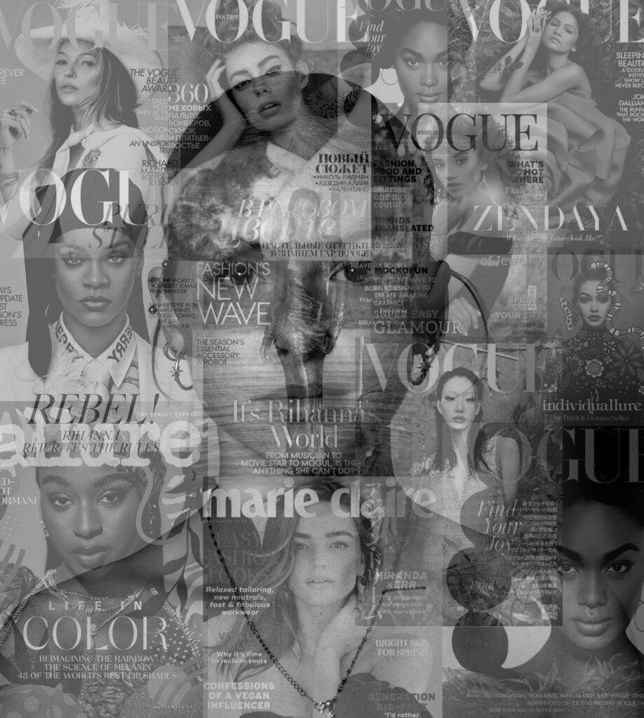
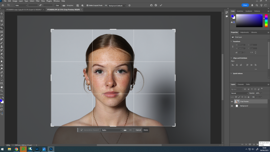
When creating my images on photoshop, I experimented different ways on how to create a sense of union when doing so :
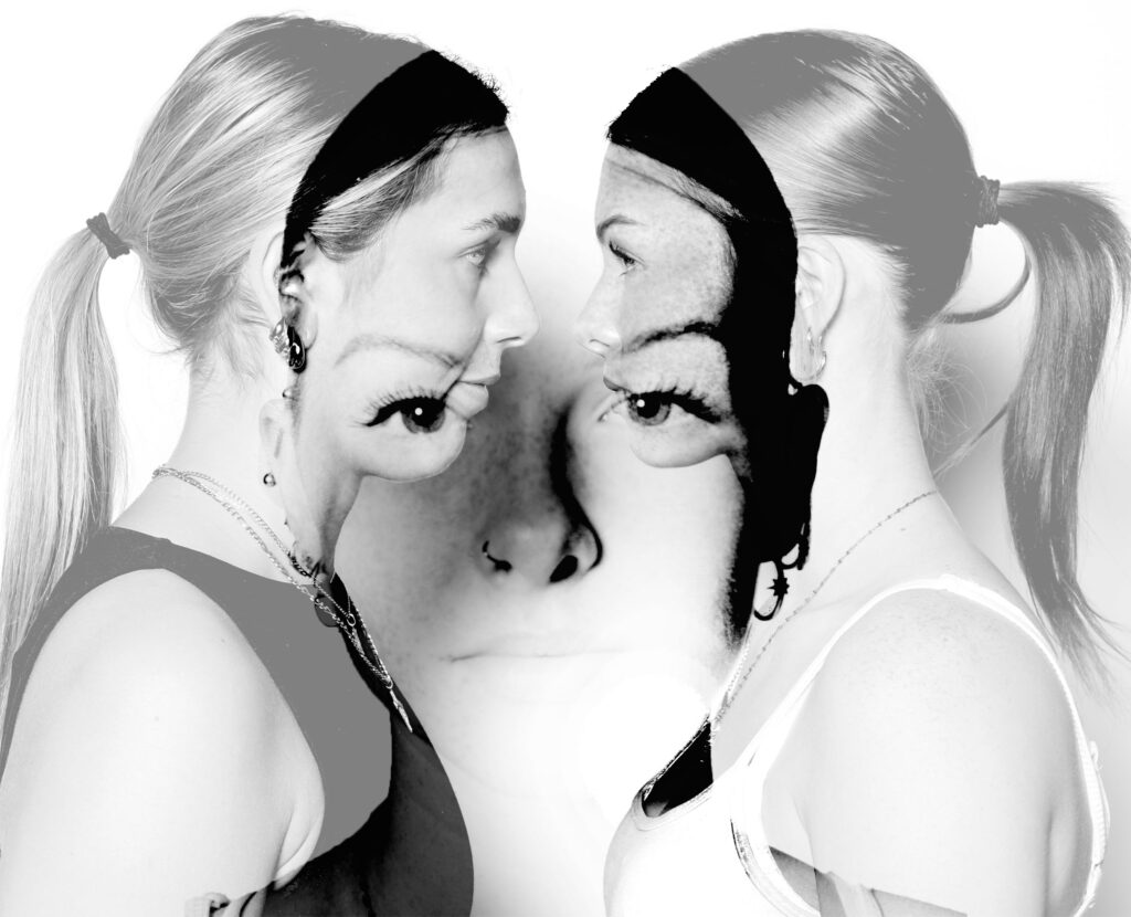
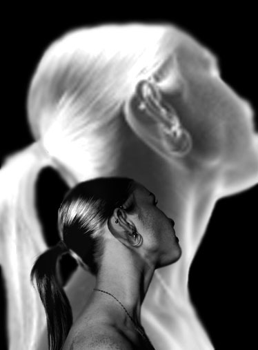
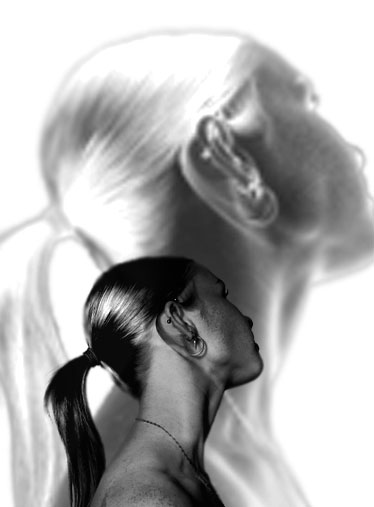
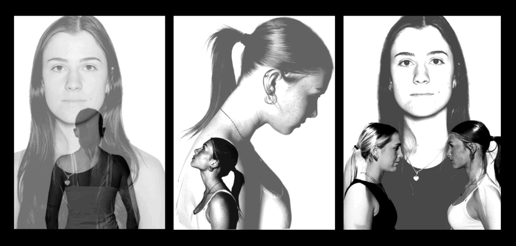
These were the images I experimented with that I decided against using for my final images. I like how all of these images turned out however felt as though they weren’t as strong as my other images. I
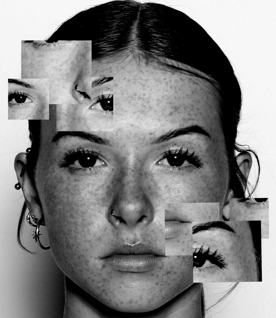
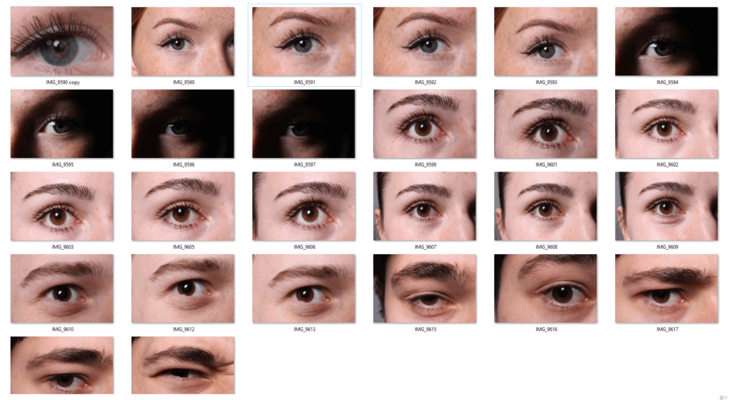
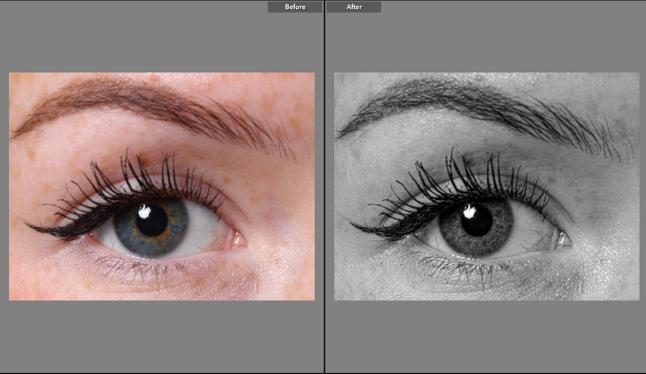
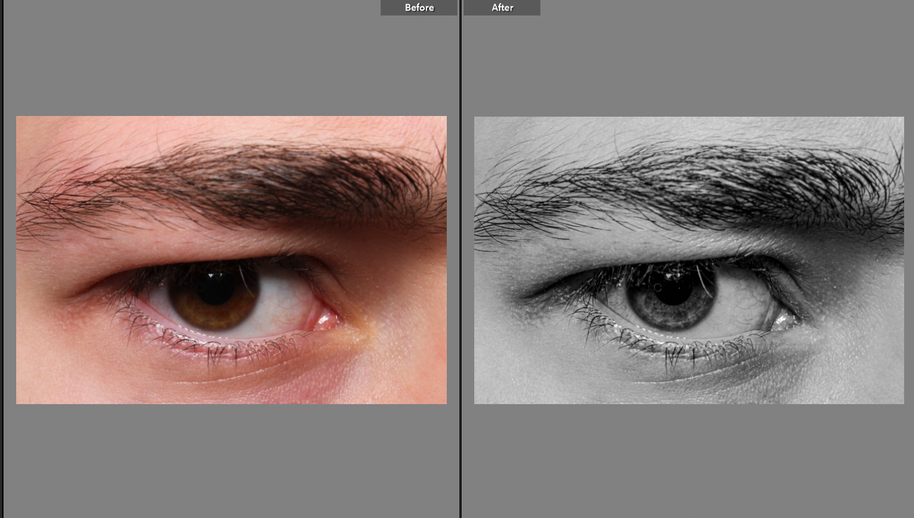
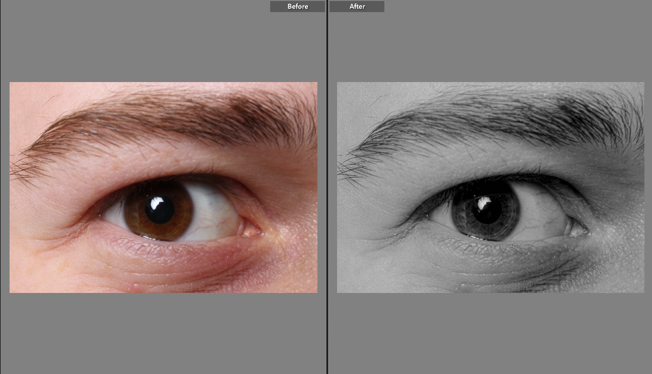
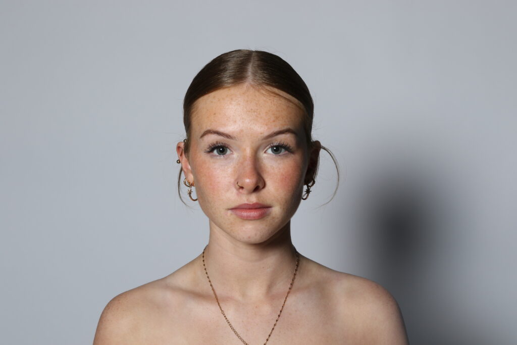
For this photoshoot, I went into the studio with others to take pictures of their eyes. I used the studio lighting and placed it directly in front of the eyes to enable me to get every detail in the image. When instructing the people in the images, I told them to keep their eyes wide open to allow me to get a clear shot of their eyes. I took pictures of girls and boys eyes as I feel like they are very different however are classed as the same which creates a sense of union for my project. When taking my images I made sure to be at a straight angle in line with the eyes to get the best and most effective images which I think went really well. I really like how my images turned out and I think it matches Man Rays image of the eye he captured.
Before and After
What Went Well
I think that these images went really well, this is because I feel as though I was able to capture a lot of detail within the eyes and it portrays a feeling of union by having a collective of eyes being presented together. I also like the way that I have edited them to be black and white because of the way that it portrays a sense of loneliness when the images are displayed on their own. In the first image the eye is looking up, I feel as though this really relates to the idea of sadness and it correlates to Man Rays idea of union.
The second artist I am going to be looking at is Man Ray.
Man Ray (Emmanuel Radnitsky) was born on August 27th, 1890 in Philadelphia, Pennsylvania . His parents were Russian Jewish immigrants who moved to America looking to start a better life for themselves and their future family. His father worked as a tailor which meant that Emmanuel grew up around fabrics, patterns and elements of designs this meant that he was surrounded by creativity which sparked his love for design. His family changed their name to “Ray” to allow them to escape the Anti- Semitic prejudice. Emmanuel then changed his first name to “Man” which showed his masculinity through his identity. When Ray was still a child his parents moved to New York where he started to find his love for art in which his parents supported, however they still expected him to pursue a career in something practical which made it hard for him to balance his work ethic and his passion of photography. He went to an art school briefly through his teenage years but then discovered that he preferred to teach himself and experiment in different ways on how to produce artwork. He was inspired by modernist art and this is where he could observe and get ideas for his own work. In 1920, Ray oved to Paris where he was able to pursue his love for art and this is where he became a key figure in surrealist art. In 1940, due to WW2, he moved back to America and lived in Hollywood, but unfortunately he never felt at home there and was able to move back to Paris in the 1950’s where he lived for the rest of his life.
Man Rays artwork relates to the idea of union in many different ways. The first way that his art work relates to union is because he was the first artist to blur the lines of photography, painting and sculpture. He was able to create a dream-like compositions without a camera that were a light of union. Another way he was able to link in union with his work was by merging the idea of bodies and objects creating sensuality and psychological depth. Man Ray was interesting in collaborating with other artists such as Marcel Duchamp, Kiki De Montparnasse and Lee Miller, these partnerships united these artists together to create effective artwork which essentially then created a union through the artists coming together.
Image Analysis
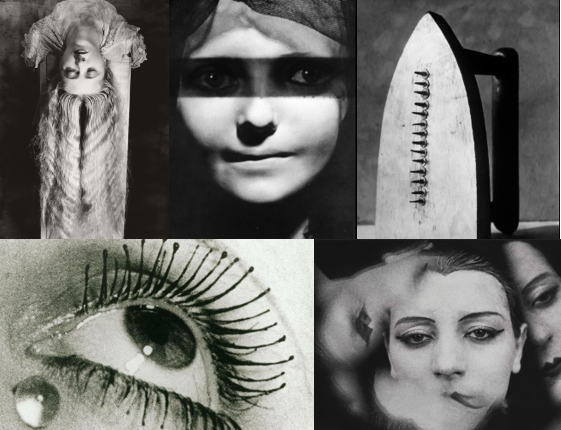
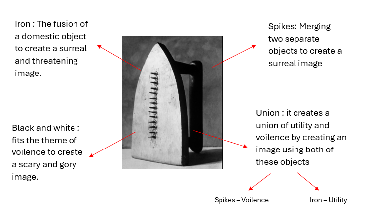
I really like this image produced by Man Ray and it is my favourite. I like this image because it relates to the theme of union by merging two objects together to create one image. He has merged a violent tool (spikes) with a utility tool (iron). However both of these objects could be used violently as the iron is also dangerous. I like the way he has created a threatening image using these objects to portray a sense of surrealism and to make the viewer feel uneasy by the idea of the deadly objects. I also like how he has made this image black and white because it correlates to the gory image and adds to the mysterious sense of scariness.
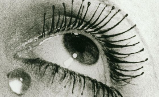
I am inspired by this image taken by Man Ray, this is because I feel as though it relates to the idea of union. Eyes create the idea of union because they come as a pair and it portrays a sense of togetherness. This images only has one eye which creates a sense of loneliness as it has been taken apart from the other half. I like the expression that this eye gives because it shows a sense of sadness which could be from the feelings of loneliness and isolation from everything else. The tear next to the eye adds sufficient meaning to the photograph and a sense of solemnness because of the way it has dropped down from the eye. The image being in black and white could signify the idea of sadness because there are no bright colours or any colour at all. Therefore, this could make the viewer feel sorry for the person in the picture and create a sense of empathy towards the person in the image.
When I am creating my own images, I am going to take pictures of eyes like this. I am inspired by this image because I can relate it to the idea of union and I feel as though it would be a good way to edit the image. I am going to make my images of the eyes black and white to also create a sense of sadness because of the individuality of the eye without its “other half”. I am going to aim to take pictures of lots of different eyes and edit them together to create my own surreal image that portrays the idea of union. I feel as though having an image of one eye has a adverse affect on the meaning of union which I feel will be extremely powerful to create.
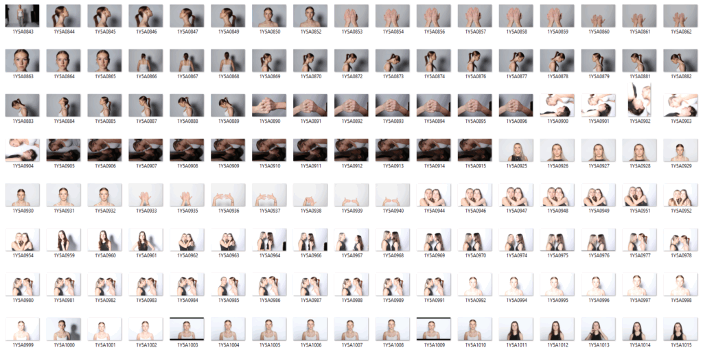
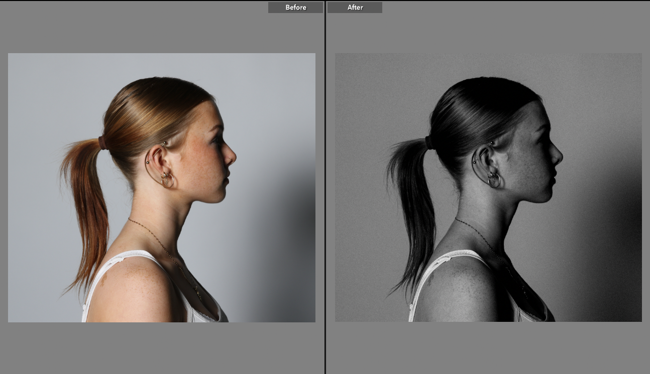
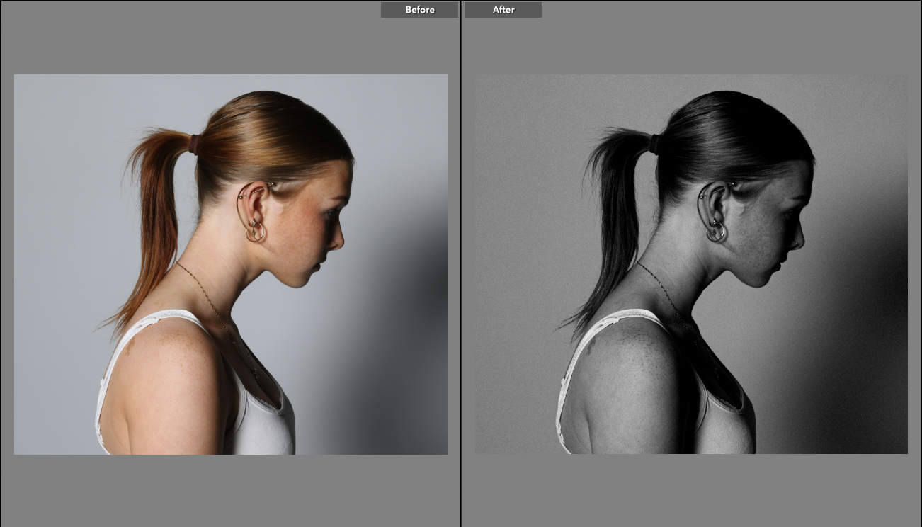
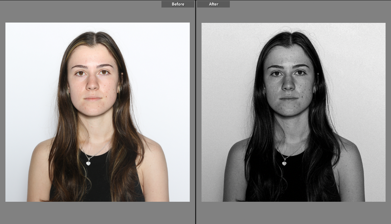
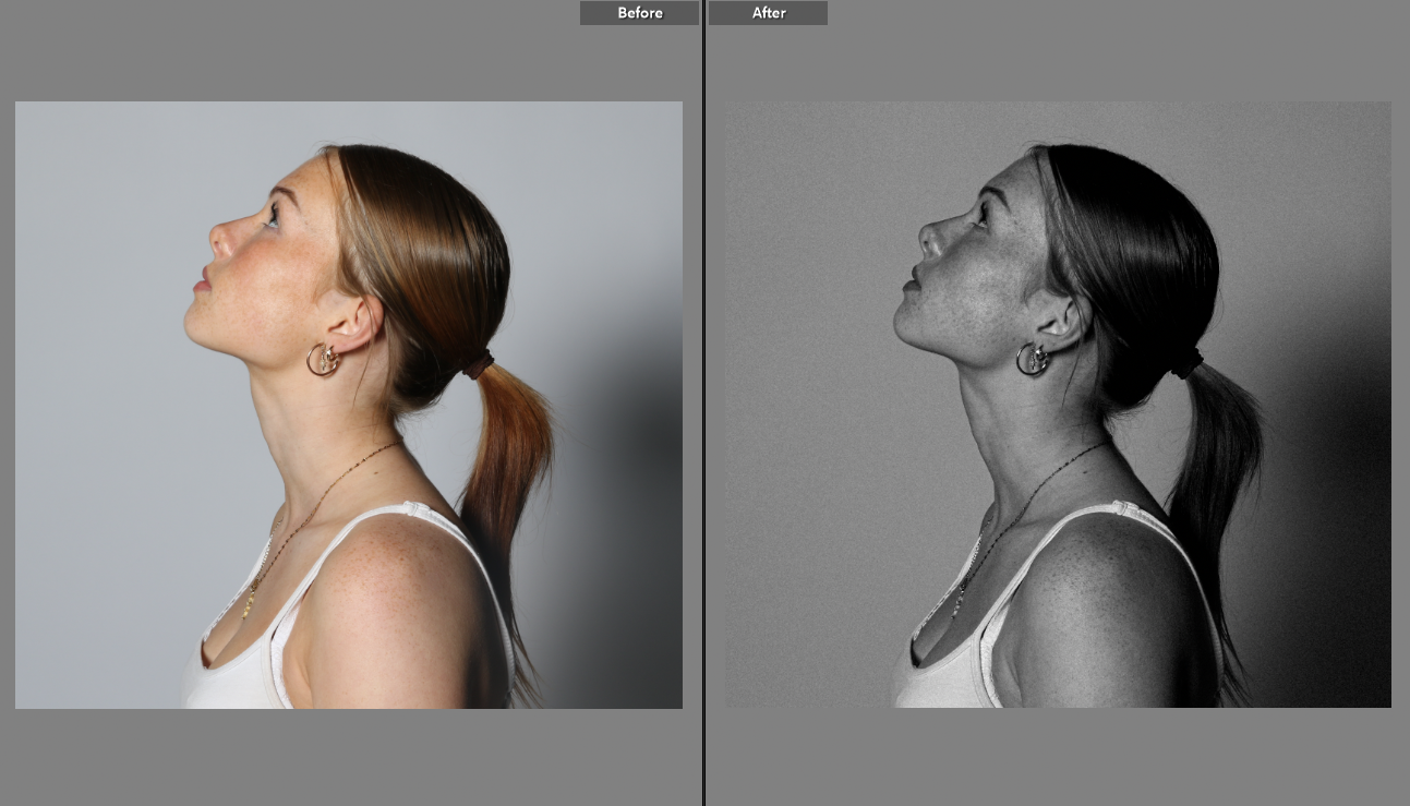
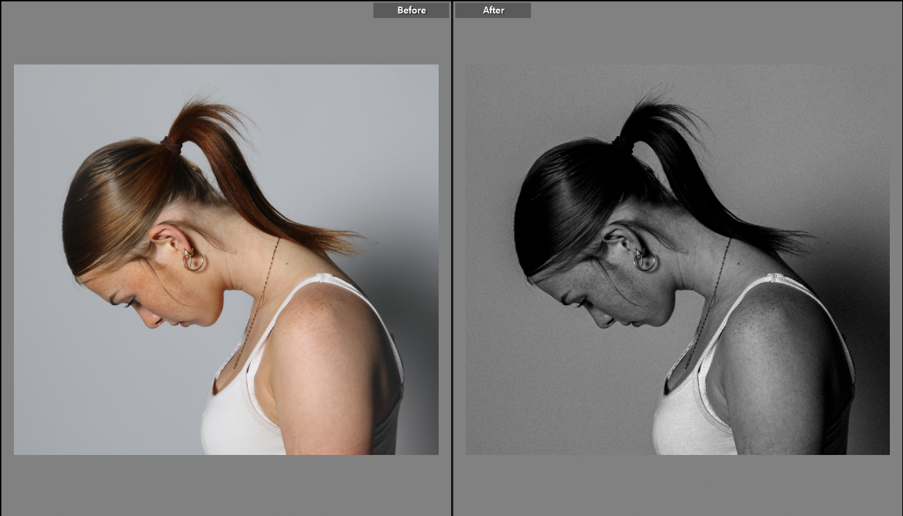
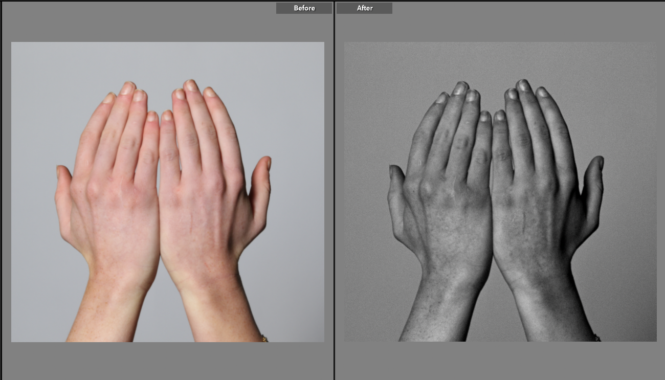
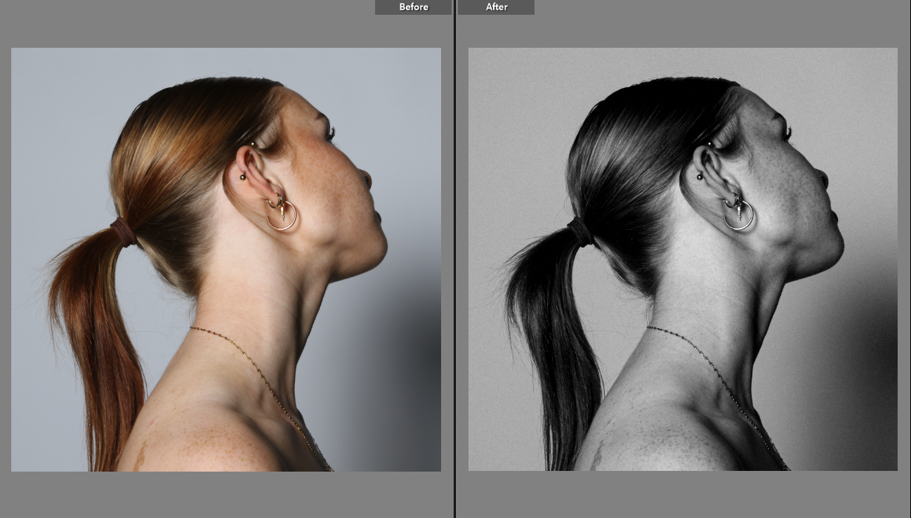
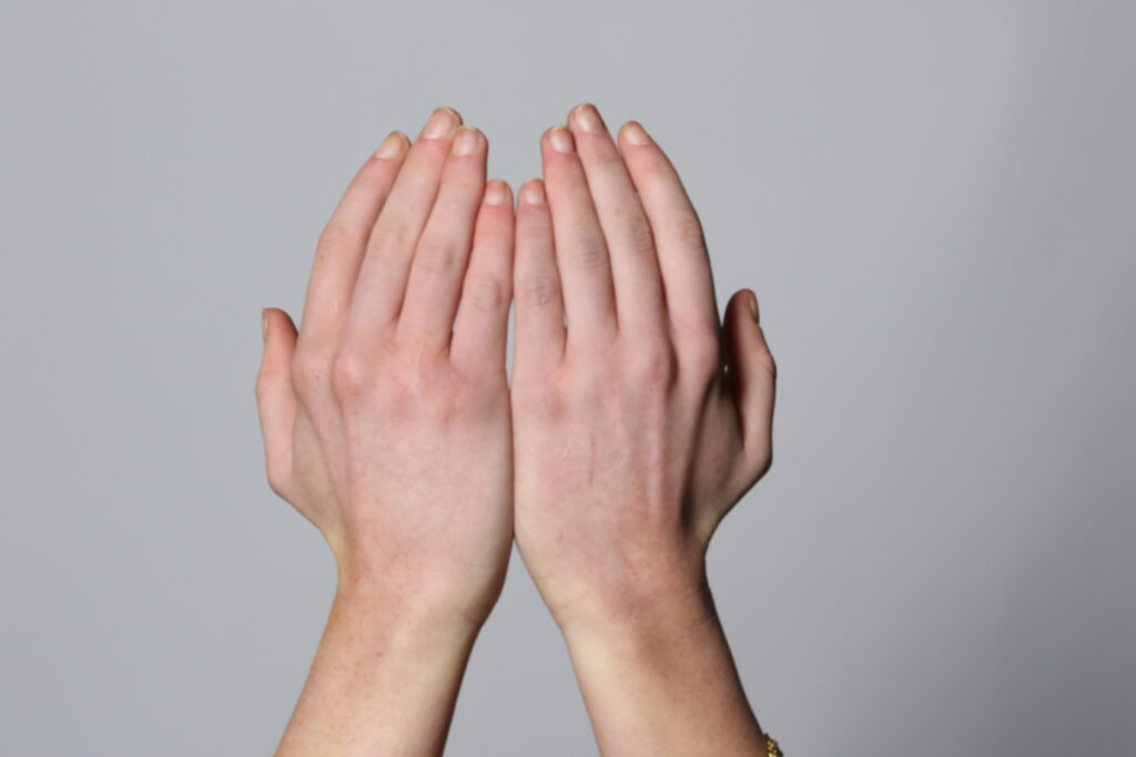
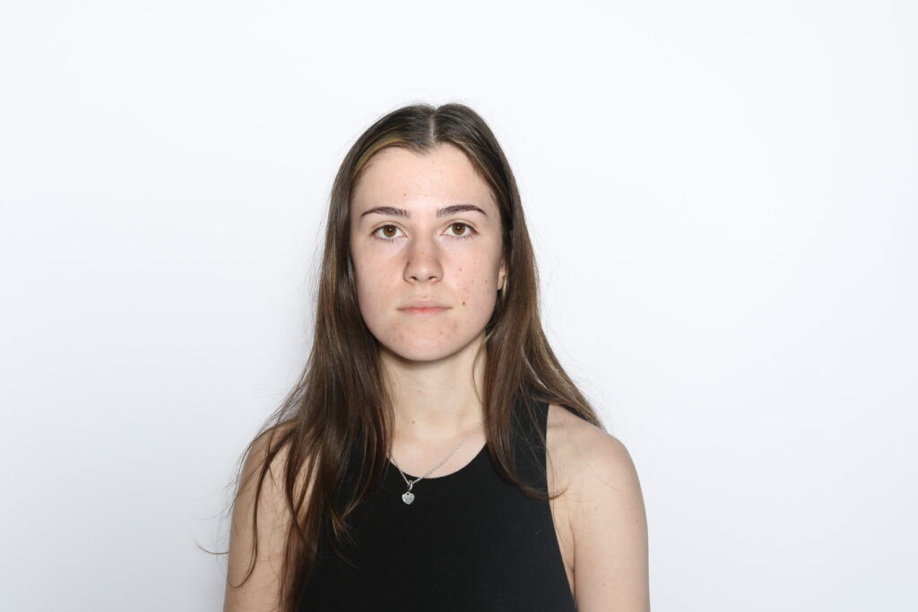
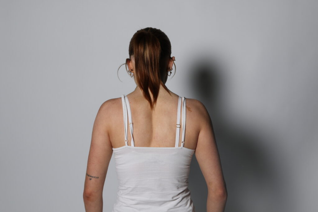
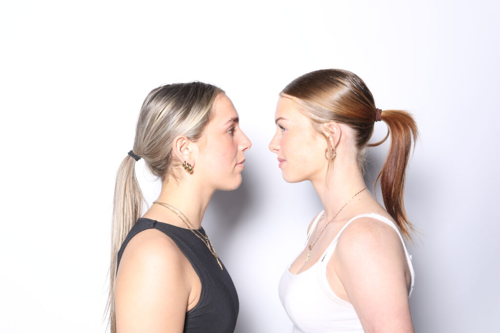
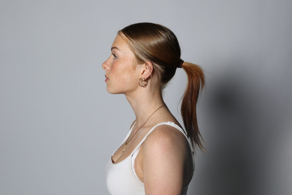
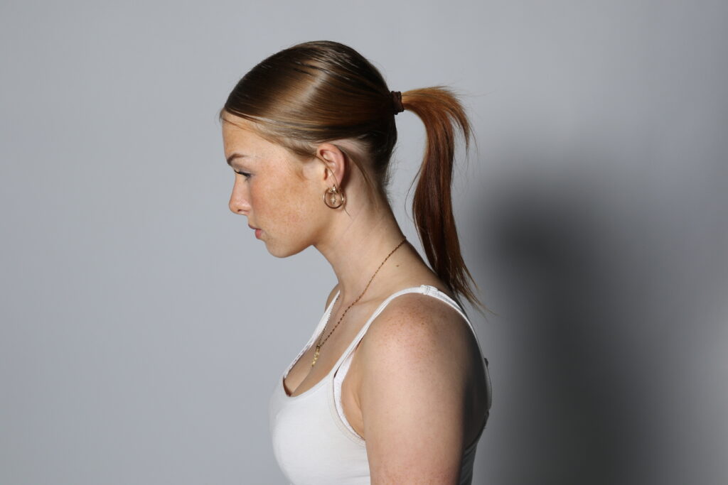
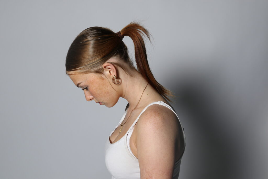
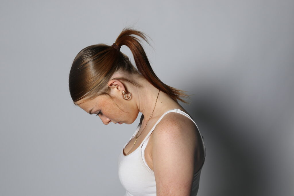
For this photoshoot, we went into the studio to take photos. I used artificial lighting with the studio light to create an even light in the images. When taking my images, I made sure that the light was behind the camera to prevent there being any unwanted shadows. I also used a plain white background to contrast with the people in the photos. I also used a white background as I felt that it would work best when I proceeded to edit my photos in photoshop. When I was in the studio, I took pictures of predominantly portrait photos, however I also took pictures of hands and backs to allow me to edit them together to create a union image. I like how my images turned out because I feel as though they will be effective when I start editing them together to create a photoshopped image. I also like the lighting of my images because they are bright to bring out the details in the peoples faces to enable me to merge them together. My aim was to take pictures that correlate with Tommy Inberg because I want to create surreal images to portray a sense of union between the different pictures coming together.
Before and After
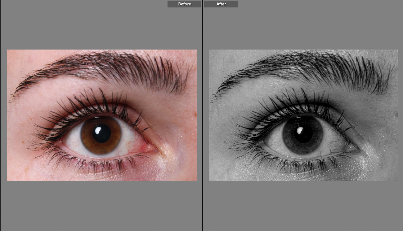
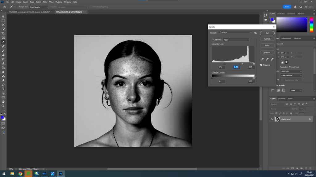
For all of my images I used Lightroom to edit them. I started by cropping them into a square shape as I feel as though this was the most effective way for them to be presented. I used the BW10 for my images to ensure that they were all the same tone and colour to allow me to merge them together later on in my project. I made sure that the lighting wasn’t too dark or too light as I feel that it would’ve taken the purpose away from the image.
What Went Well
I really like how my images turned out. I think that the colour of black and white that I chose really compliments the details on the image and makes it stand out. I have kept my images black and white to stick to the gory and mysterious theme similar to Tommy Inberg and Man Ray who I have been inspired by. I also feel as though keeping the images a square shape was the most effective way to have my images as it meant there was limited blank areas which didn’t add anything to the image. Having my images all square allows me to edit them together on photoshop when I start my edits which will make it easier for me to get straight into photoshopping them to become something else. I have used these images purposely because I wanted to create a meaningful edit to correlate to the word union and I figured that these were the best images to do that. When taking my images, I feel as though they turned out really well. I kept them at a straight angle to capture a modernistic feel and I enjoyed doing so.
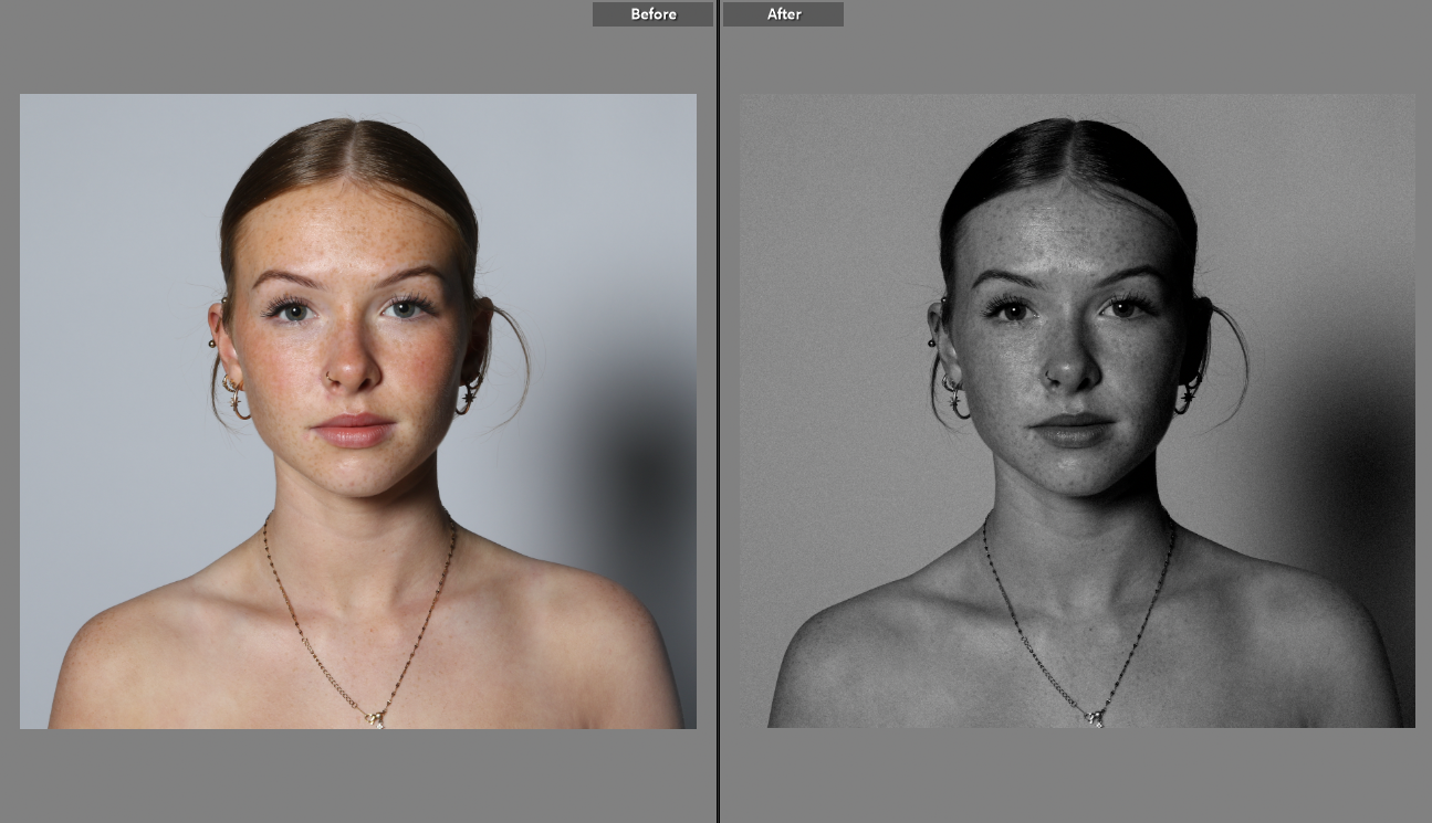
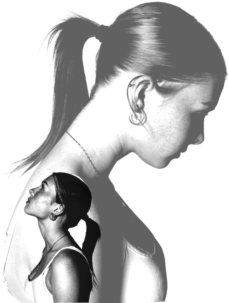
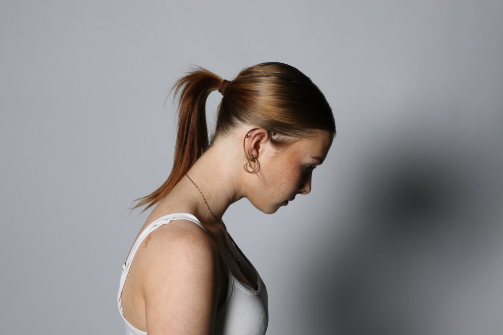
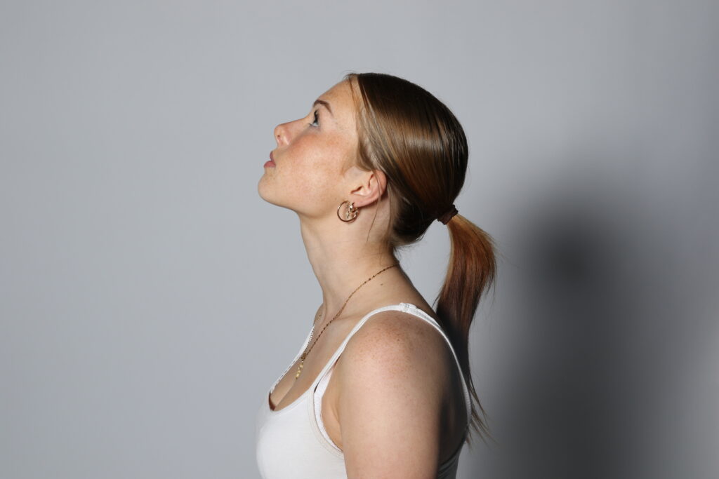
I feel as though I used the correct lighting when taking my images in the photography studio. This is because when looking at the images of the girls, you can see the details on their faces, like freckles and moles and the structure of their faces. I decided to use cool lighting rather than warm lighting because I felt as though it would be easier for me to edit. I also liked the brightness of the light being all the way up as I felt as though it made the images clearer and allowed my to see what to photograph. In one of the images of the girl looking up with her head tilted sideways, you can see the detail of her jawline which I think turned out really well because it gives the image a sharp feel to it.
How To Improve
I feel as though my images went well however there are some slight changes I would make if I were to repeat the process again. When taking my images, I kept them at a straight angle inline with the face every time. If I were to do this again I would try out different angles from below or from above to experiment which ways worked the best. I also would try angles from different sides to capture different features of the face that maybe I had missed or didn’t get a chance of photographing.
Another thing that I feel as though I could improve on is ensuring that there are no shadows in the image. In some of my images during the editing process, I discovered that there were a couple of shadows behind the subject in the image. To improve on this I would try and move the studio light to ensure that there were no shadows. I feel as though having the studio light above the camera or as close to the camera as possible would be extremely effective in preventing shadows. Another way I could’ve overcome this problem is by changing the back drop of the images from white to black. This could’ve minimalised the chance of a shadow and allowed me to edit my pictures without trying to hide them.
I really like how all my photoshop edits turned out. This is because I feel as though they all present the idea of union. I made all my images black and white because all the images are different however having them with no colour make them interlinked and come together as a union. I like this idea of black and white images because they infer that all the people in the image have similar features however they differ from each other in a slight way. I also like how I have merged images together to create a single or set of images. I feel as though I have related to Tommy Inberg and Man Ray but put my own twist on it to create surreal and dream-like images that came from my imagination. I also like the way the images portray a meaning behind them but yet I have allowed the viewer to create their own narrative of my images and merge their own feelings with the images. I feel as though my editing skills have been show through the techniques in my work and the way I am able to change the opacity and to connect the images into one. I also like how I have taken my images to show the way I am able to take effective images to enable me to edit them further. I also like how all my images are presented in groups, this is because it portrays a union of images and having them presented together allows the viewer to see the images as a collective rather than individually.
If I were to do this project again, I would maybe create some images in colour and have the colour be symbolic in a way that represents union. At this point in time all my images are black and white which symbolises opposites coming together to create an image or series of images that feel powerful when put together. I would also try and create one image on its own that would be more powerful left on its own rather than have it next to other images. I feel as though this way I would be able to portray a sense of union through one image and to edit it in a way that made it look like a collective. I would also like to do this because I feel as though having one image would catch the viewers attention and really engage them to see the detail and meaning behind it.
When I start mounting my images, I am going to present these series of images together on a black piece of card. Firstly, I will mount them using white foam board ensuring that none of it can be seen. I am going to do this because when I present them on the black piece of card I want the images to be slightly elevated instead of blending in with the card. I think this will be the most effective way to show these images because there is a lot of white in my images and I feel as though putting them on black card will make them stand out more due to the contrast of the background. I also feel as though this is the most effective way because the background is dark it will make the images stand out more and catch the viewers eye.
I used a knife tool, to cut around my images to ensure that they are all the same size and shape before using spray mount to stick them onto foam board. Once I had completed this, I cut around the white foam board so that it was the same size as my image and to ensure there was no foam board seen when looking at the image. I then used a pencil to sketch out where I wanted to place the three images and to ensure they were all equally spaced out. After this, I used double sided tape to stick the images onto the black piece of card. Once I had done this I measured the sides of the card and made sure that they were all even and the same length apart from each other and from the sides.
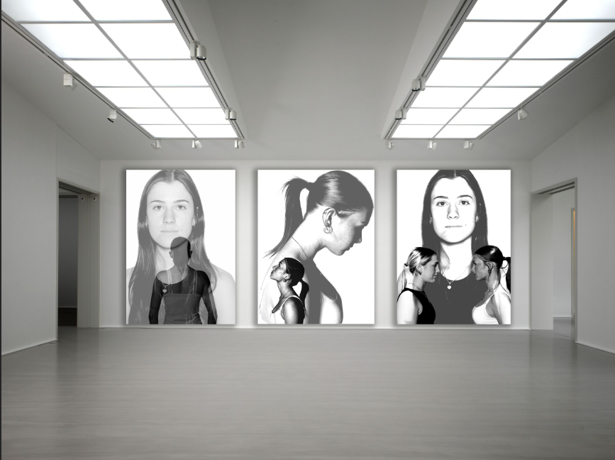
I really like how my first final presentation of my images turned out. This is because I like how the contrast of the back and white really makes the images stand out. I also like the order I have placed them in because the middle one is slightly more different to the other two which has a nice pattern to it. If I were to do this again, I would maybe print out the images A4 as I printed mine in A5 and they came out a bit small.
Second Presentation
When presenting my this series of images, I am going to present them on white foam board. I have chosen white foam board because I feel as though the contrast between the black colours in the images will stand out against white card. I think this will be the most effective way to present my images because the white background will make the images stand out and will allow the viewer to focus on the details of the images and notice the differences of each one.
I started by trimming down all the images to get rid of any unwanted areas around the image itself, after this I stuck the images down on a white piece of foam board. I then used the spray mount to stick the images down before using the knife tool to cut round the foam board right up to the image to ensure there is no foam board showing when looking at the image. I did this to allow the illusion of the images being raised and coming out of the background because it meant that they weren’t all the same level. After this, I used another big piece of foam board and laid out my images to see which way round would look best. After I had decided the order, I used a pencil and a ruler to measure out the sides and decide how much foam board I would be leaving out to be visible. I then used double sided tape on all the images to stick them down onto the big piece of foam board. After I had completed this, I used the knife tool to cut off any excess piece of foam board that weren’t within the measurements.
I really like how I presented my images because of the differences of each image coming together to make one canvas. For this presentation I like how I have left the foam board on display to contrast with the images.
Third Presentation
When presenting this image, I am going to use a black piece of card for the background as I feel it would be the most appropriate for this set of images. I think this will be the most effective way to present my images because there is black in my image and I feel as though it will go well with showing the different dimensions and illusions that are in this image. I am also going to mount the image up onto a bit of foam board to raise the image from the background to create the idea that the image is coming out of it. I think this will look good as the image is quite gory and the black background correlates to this idea.
For this image, I used the cutter to get a clean precise edge on the two images instead of using scissors. After this, I got a big piece of white foam board and used mount spray to stick them onto it. I then used the knife tool to cut around through the foam board around the image ensuring that no form board was left on show as I wanted the background to be purely black. After I had completed this, I used a pencil and a ruler to create markings on the black piece of card to ensure that both images were the same distance apart from the edges so that they were equal. After I was happy with the measurements, I used double sided tape to stick the images together. I chose to put my two images on top of each other, this is because I liked how this looked and I liked how it created a sense of symmetry as they are similar images edited the same way.
I really like how I presented my images because I like how the black background contrasts with the images to make them stand out and ensure that the illusions are the focus point of the image. If I were to present my images again, I would make the images brighter because in one point there is a dark area on one of the images that blends in with the background.
I am going to be looking at an photographer called Tommy Inberg.
I have chosen to look at surrealism for my project with a specific focus on Tommy Inberg as I feel as though I am able to create lots of different images using photoshop to create the idea of union. Tommy Inberg is a photographer and visual artist born in 1980 in Sweden. His interest for photography came apparent when he received his first camera at the age of 15, and that was the start of his passion for photography. Throughout his teenage years he loved to experiment with his camera and try out lots of different genres of photography such as portraits, street photography and nature photography. During his early 20’s, Inberg felt loss and had a lack of direction with his life which led him to him expressing all these emotions through his photography. He liked doing this because he saw photography as therapeutic and a way that he could forget about his problems and focus on something that he loved to do. Throughout his photography career, Inberg has been self taught, experimenting different ways to create his images using the method of trial and error. His work proceeds to explore the Still to this day he does a lot of digital editing with his images to create minimalistic and self–reflecting surreal photo montages while taking into consideration the thoughts and feelings behind the images he presents. Inberg describes his work as a visual diary because of the personal aspects that he choses to add into his photography.
I have chosen at Tommy Inberg because I feel as though he relates with the theme of union. This is often depicted from his surreal and symbolic artwork. though there is not a specific meaning to “union” I feel as though his work shows the concepts related to this word. In one of Inberg’s images there is a picture of a boot being supported by multiple hands. This shows the idea of people coming together to support each other and to help each other. This also shows the feelings of people being united and connections through the idea of union. It symbolises the collective effort and support. It reflects on the importance and strength found within unity and shows the idea of togetherness.
I am inspired by this artist because I feel as though the meaning behind his images of human nature link in perfectly with the idea of union. This is because human – nature correlates with the idea of communities and society’s coming together as a group which is a force of habit through the way we are raised through our primary observations and learning. Tommy Inberg often leaves the interpretation of his artwork up to the viewer for them to create their own narrative on his work. Inberg uses his own feelings and thoughts through the vision of his work and makes it personal about his life trying to portray this through his abstract work.
Image Analysis
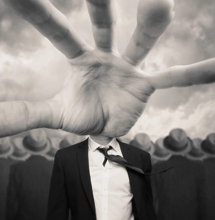
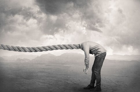
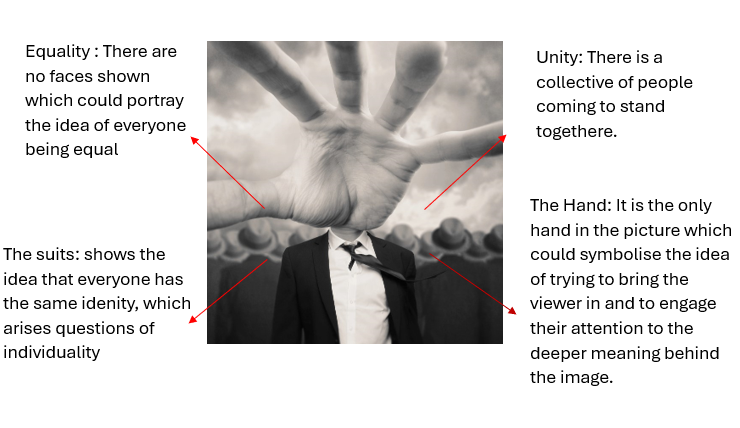
This is one of my favourite image developed and made by Tommy Inberg. This is because of the way it has been edited to look real when in fact it is not and this correlates well with the idea of surrealism. I like the way that there is a unity of people in the background because it creates a gory but yet interesting feel to the image. The people in the background are wearing hats, which could symbolise the idea of equality and everyone being the same and makes the viewer question about the idea of individuality. In the image there are no faces or heads being shown as it is covered by the hand and the hats, which makes me question as to why? I can infer that the idea of this was to have all the people in the background the same to create a sense of mystery and to develop a personal narrative for each viewer to think about. In this image I like how the hand is placed in the middle of the image to allow it to be the focus point of the image. I feel as though the hand is to create the idea of being pulled in and to engage the viewer by having the hand reaching out towards us. I also like how the image is black and white and has clouds in the background as it makes the image surreal in a way that is scary looking and could give the viewers a sense of unease.
When I create my own images, I am going to use Tommy Inberg as my inspiration for the surrealism part of it, this is because I like that two opposing images can be created into one by merging them together to create a union image. I am going to aim to take pictures of hands, eyes and portraits of people to put them together to create a narrative that is down to the viewer to relate their own thoughts and feelings to. I am also going to ensure that my images are black and white as I feel that surreal images are more powerful when having no bright colours as it can take away from the details of the subjects in the image and it could also distract the viewer from having a deep sense of thought about what the image is trying to portray.
The first artist I am going to be looking at is Man Ray. He was an American visual artist who spent most of his time in Paris. He contributed to the dada and surrealist movements.
For this photoshoot, we went into the studio to take photos. I used artificial lighting with the studio light to create an even light in the images. When taking my images, I made sure that the light was behind the camera to prevent there being any unwanted shadows. I also used a plain white background to contrast with the people in the photos. I also used a white background as I felt that it would work best when I proceeded to edit my photos in photoshop. When I was in the studio, I took pictures of predominantly portrait photos, however I also took pictures of hands and backs to allow me to edit them together to create a union image. I like how my images turned out because I feel as though they will be effective when I start editing them together to create a photoshopped image. I also like the lighting of my images because they are bright to bring out the details in the peoples faces to enable me to merge them together. My aim was to take pictures that correlate with Tommy Inberg because I want to create surreal images to portray a sense of union between the different pictures coming together.
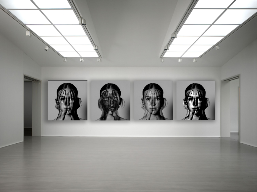
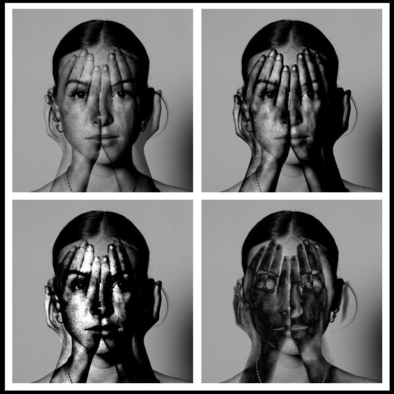
1st Photoshop Edit
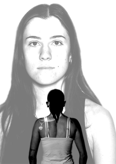
For this photoshopped image I used these images:
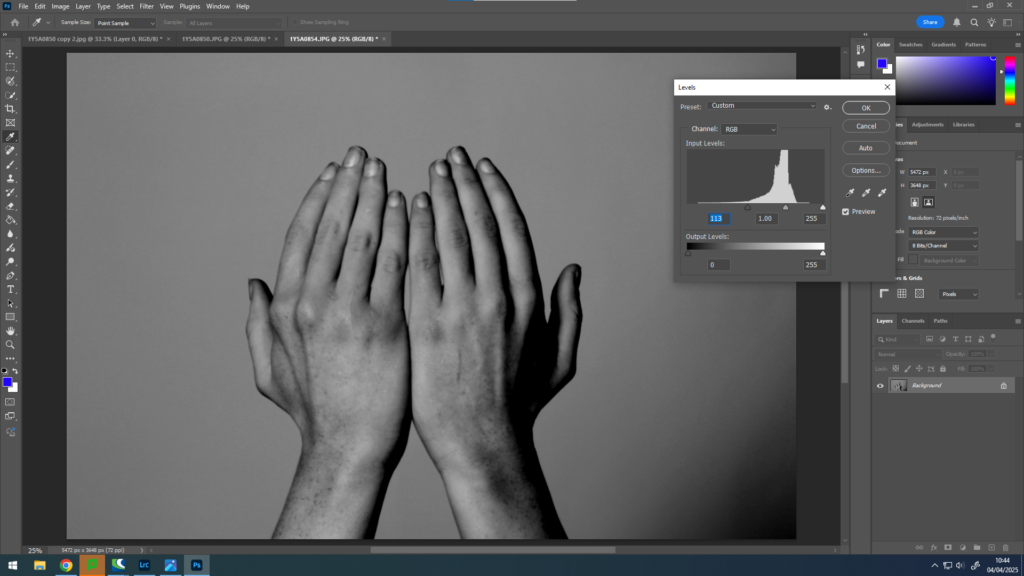
Firstly, I opened these two images on photoshop on a separate page. After this, I cropped the portrait image to get rid of the empty space around the face to enable the viewer to see the detailing of the image. After this I made both images black and white and levelled them to make them the same tone and texture.
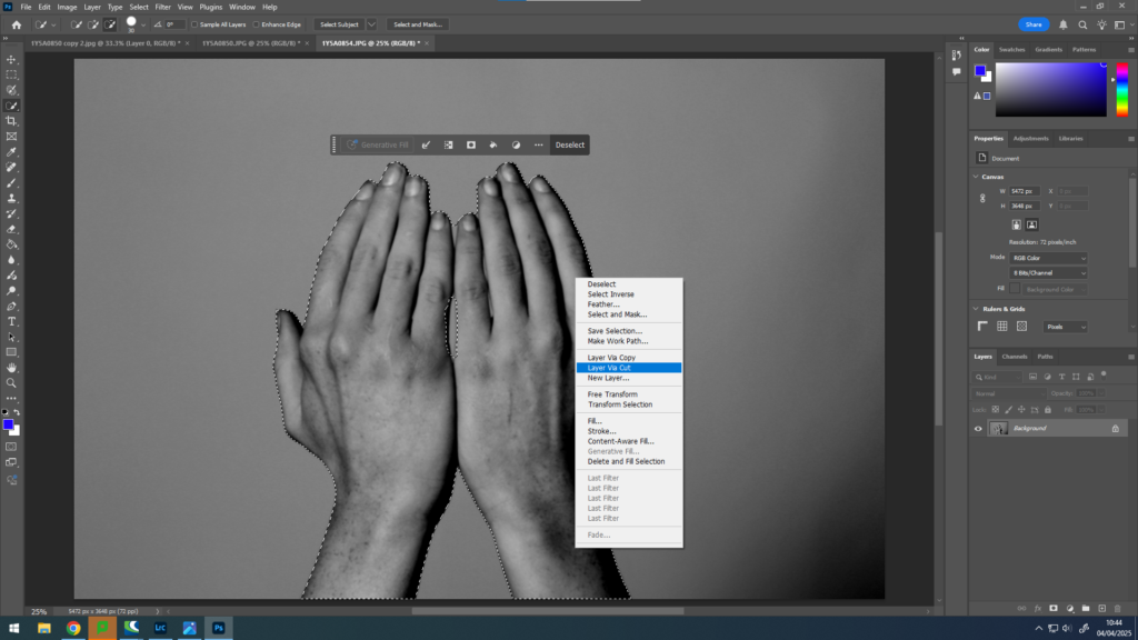
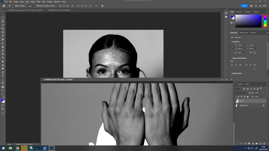
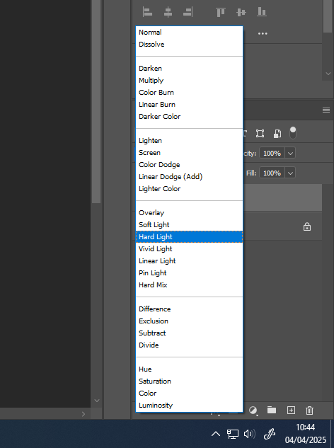
Once I had completed this, I used the Quick Selection Tool to select the hands and making sure that there were no areas that were selected incorrectly. I did this by zooming in and carefully selecting all of the areas I wanted to be selected. After I had done this, I “Layer Via Cut” the hands to enable me to move them onto the face.
I then proceeded to place the hands over the face where I wanted them to go ensuring that the whole face was covered to allow me to change the opacity of the hands to create a surreal image.
Once this was completed, I used the opacity tool to experiment with the edited image. I decided to select “Linear Light“, “Difference” and “Darken“. I used these three tools because I like how they sequenced together triadically.
I really like how these images turned out because I like how they correlate with the word “union”. The reason as to why I think they fit in with the idea of union is because I have taken two images and merged them together to create one image. I also think this because I have created three of the same images with a slight difference. I have done this to unite the images together and when I display them I am going to stick them all together to create a final image like this :
This photoshop edit was inspired by Tommy Inberg and his surrealist artwork. He uses his thoughts and feelings within his imagination to create personal images and leaves the narrative up to the viewer. My interpretation of my images is that I have tired to portray a sense of union by using the face covered by the hands. I have tried to portray the feeling of isolation within people and the idea of someone trying to hide behind something, the idea of having three images correlates because it can be inferred with lots of people having the same feelings of feeling lonely or isolated but yet all unite together as one. despite still having our own differences within the same feeling. These images correlate to the idea of union because of the way that all the images are edited very similarly and look the same however have a slight difference. This has allowed me to present them together as one and I feel as though this is a good way to represent a union set of images.
2nd Photoshop Edit
For these images, I transferred them onto photoshop. For the first image I used these two images:
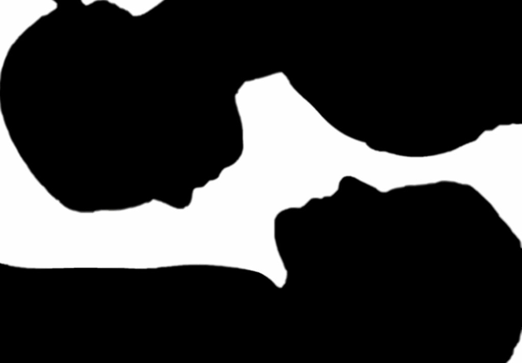
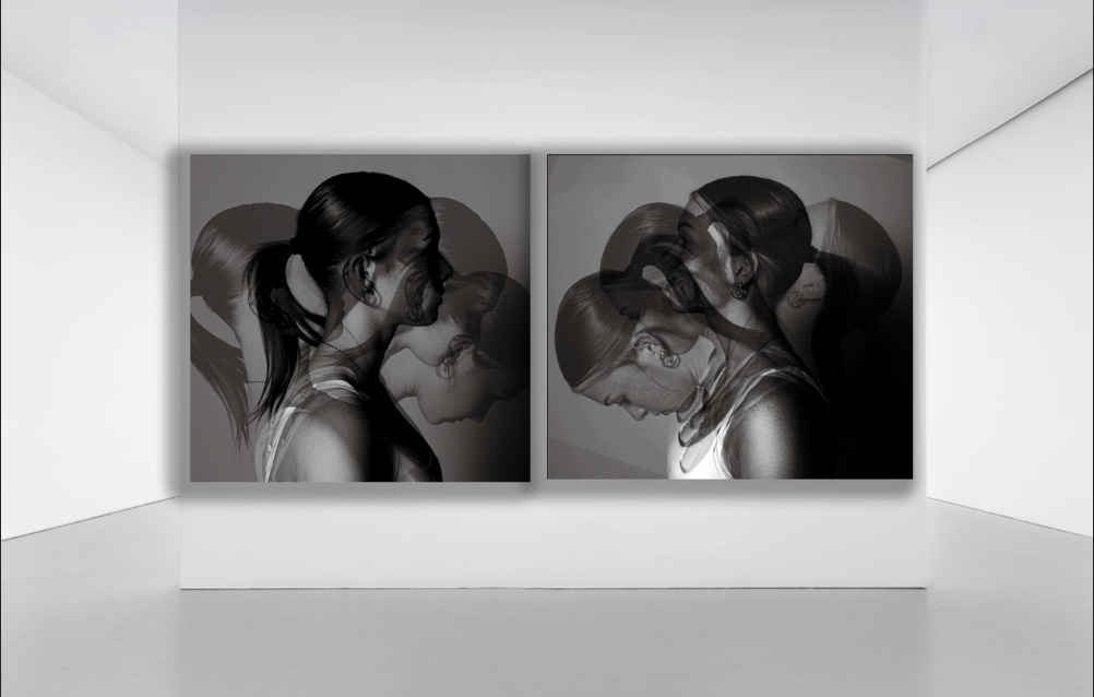
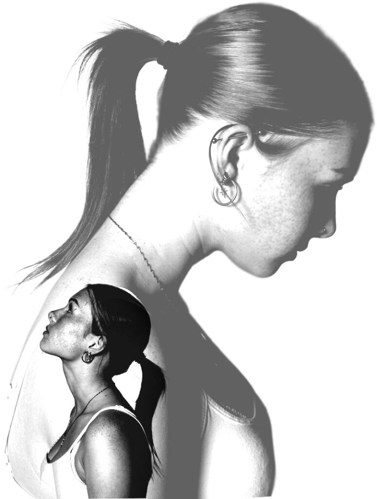
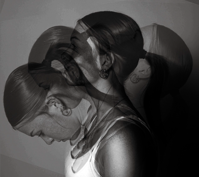
Firstly, I made both images black and white and levelled them to get the desired lighting that I wanted. After this, I started with a blank template and made it portrait. After this, I went onto my image of the girl looking down and used the Quick Selection Tool to select her. I ensured to zoom in when doing this so that I didn’t miss any areas. Once I had completed this, I clicked “Layer Via Copy” and transferred it onto the blank template. I repeated this with the other image of the girl looking up. Once I had them both onto the blank template, I moved the images around experimenting on what looked the best. I decided that the two images facing away from each other looked the best so I ensured to make one big and one small. I put the big image behind the small one to ensure that both of them were the main focus point of the image. After I had done this, I proceeded to use the opacity tool to decide what type of opacity I wanted for each one. I decided on “Pin Light” and “Hard Light” because I wanted the opacity of the large image to be much less than the smaller image to create the sense of a shadow or a thought of the small image.
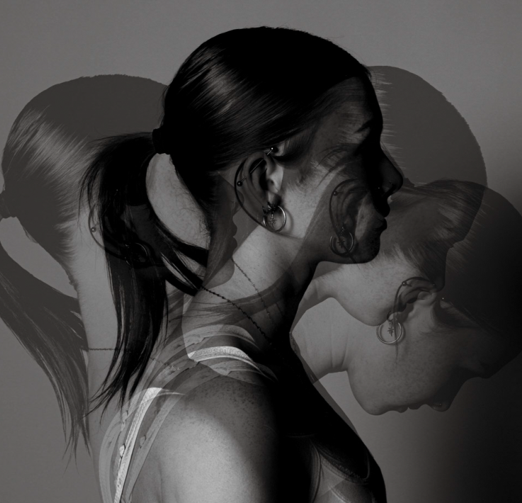
I really liked the way my images turned out because of the idea of two different images merged together to create a sense of union. I like the images in black and white because it gives it a gory yet subtle look because of the lighting of the images are still bright instead of being dull. When presenting my images once they are printed, I am going to stick them down on a black piece of card to ensure that the whites in the image stand out instead of blending in if I were to use a white piece of card. I am going to lay them out in this order:
I have chosen this order because I like the way that the middle one is slightly different to the other two. Therefore I feel as though that they correlate with the idea of union because of the middle one being slightly out of place however still having similar properties to the other two.
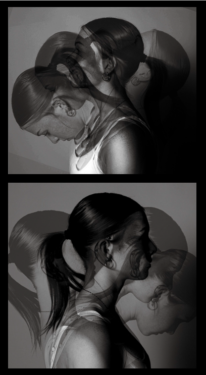
3rd Photoshop Edit
For this photoshop edit, I used these images :
I started by transferring these images onto photoshop one by one, and making them black and white before levelling them to get the same lighting for all of the images.
When presenting these images, I am going to put them on top of one another, as I feel as though they have a slight symmetry which is powerful when they are put together. I like the way that the images are reflecting each other and represents a slight sense of togetherness and allows the viewer to create their own narrative to the image as there isn’t an exact story to follow with them. I have taken this idea from Tommy Inberg who stated that he leaves the narrative up to the viewer to create their own meaning behind the images.
I really like how all my photoshop edits turned out. This is because I feel as though they all present the idea of union. I made all my images black and white because all the images are different however having them with no colour make them interlinked and come together as a union. I like this idea of black and white images because they infer that all the people in the image have similar features however they differ from each other in a slight way.
For my project, I am going to create images on photoshop to correlate to the title of my project of union. the concept of my images is to create different ways to present union in my photos. I will use photoshop to merge images together or to resize images smaller and larger to create an illusion of union. I will use photoshop to make all my images black and white because I like the idea of all the images being the same colour to create a sense of union. I also like the idea of having my images black and white because I feel as though it creates a sense of mystery and leaves the viewer to create their own narrative to what they think the story of the images are about. I am also going to create series of images that go together so that I can present them together and create a sequencing story through them. I like the idea of union and I can infer that it is the idea of people coming together and being united. It shows togetherness and friendships and also the idea of peoples differences coming together to be as one. I would like to represent the idea of union through my photoshop edits:
For my first photoshoot edit, I am going to attempt to create four images to display them all together. I am going to use a portrait image and a picture of hands that I took purposely for this idea. I am going to edit the image of the hands onto the face and use the opacity tool to blend both of the images together to ensure that the face is still seen through the hands. To create four different images like this, I am going to use the same images but I am going to change the style of opacity and see which ones look the best. I am also going to put all these images black and white as I feel this makes the image more powerful and effective to the viewer because it will have a mysterious and gory feel to them. This way I can display the images all together and create a sequencing narrative to the images.
For the second photoshop edit, I am going to create two images that are the same but reflect each other to create a line of symmetry. I am going to do this by using the images I took in the studio of the person standing sideways looking down and slowly lifting her head up whilst still being photographed at each position her head moves in. I also took the same images of the girl facing the other way to enable me to create two images that are the same but facing the opposite way. I am going to transfer these images onto photoshop to enable me to edit them. Once I have them onto photoshop, I am going to layer each of the images on top of each other, after I have done this I am going to use the opacity tool again to create an image of mystery. I am also going to put these images into black and white to stick to the theme of my project. I think this will be really affective because the image will give the illusion that the girl is moving in slow motion or it could create the idea that its her imagination or thoughts exiting her mind.
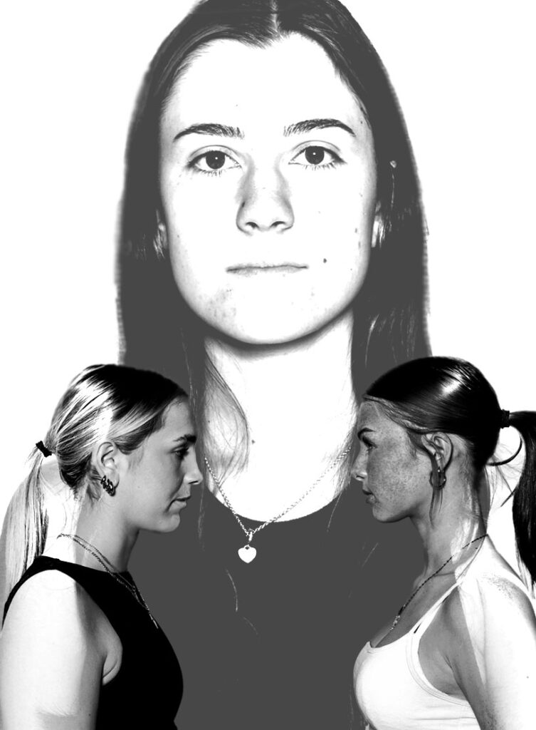
For my third photoshop image I am going to create three images that all correlate to each other. I am going to use my studio portraits that I took for this project and transfer them onto photoshop. Once I have done this, I am going to use an image that shows a girl looking down and the same girl looking up. I am going to make one big and one small as though it is a duplicate of herself looking at one another. I am going to experiment with the images and decide if they should stay facing each other or if I should place it so it looks as though they are facing away from each other. Once I have done this, I am going to keep the smaller image full opacity and change the opacity of the large image slightly less to create an idea of thoughts and feelings being presented. I am going to do this on a white background to ensure that the images stand out to be the focus point of the image. I am going to do this two more times experimenting and trying different ways to create similar but different ways to show the idea of union.
When displaying my images, I am going to ensure that I have chosen the most appropriate colour for my images. I will likely use black card to display my third photoshop edits as they have a white background on the images, therefore using black card for the background will help the images stand out because of the contrast. This will allow them to have a main focus point for the image and allow then viewer to get a good view of the details of the images.
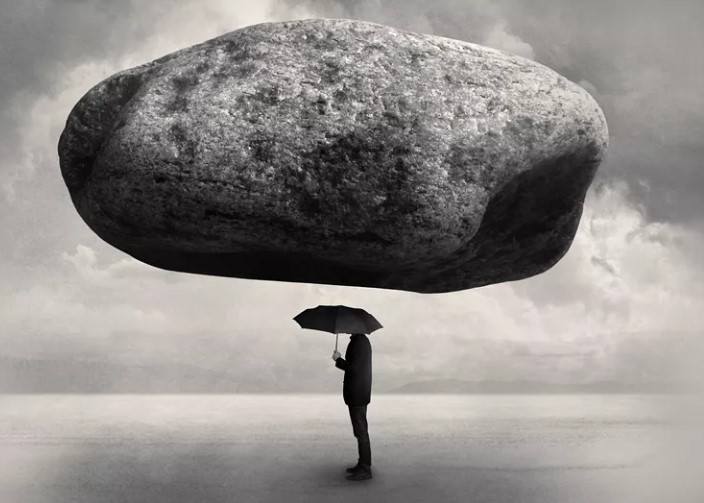
I am going to use surrealism when creating my images. This is because I feel as though this is the best way to create union by having dream-like images to capture a sense of union. I also like the idea that I can use my imagination to create images. I think surrealism is the best way to present my images as I feel as though I can create unusual and made up images that wouldn’t be possible in real life. I like this idea because it allows be to get creative and show the different ways I can display images using the initiative of union. I am inspired by Tommy Inberg and his creative mind and the way he presents photos using his imagination. I also like the way he makes his images meaningful to him yet allows the viewer to create their own narrative to what they think the meaning behind his images are. He has a broad imagination and creates images that could never be real in life which makes his images fascinating to look at and to think about the deeper meaning behind them.
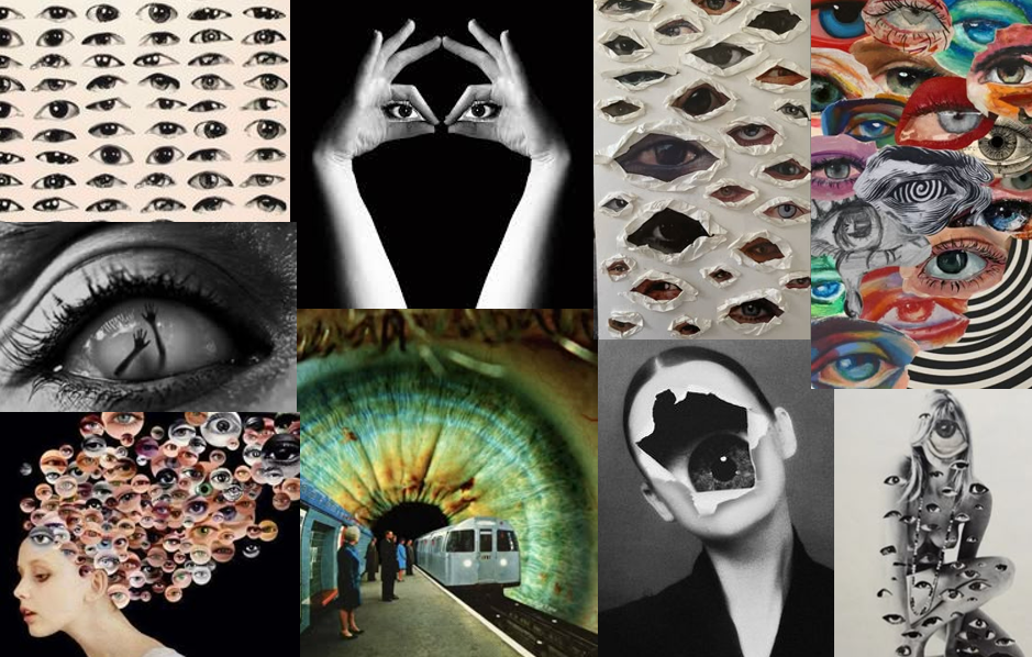
I have decided to base some of my project on eyes. I feel as though eyes relates to the word “union” because of the different shapes, colour and expressions that eyes can have. I like the way that eyes can all be different but be classified as one type of thing and the way that eyes are viewed as a collective. I also feel that eyes relates because they come as a pair, in “union”.
For my project I would like to create different ways of expressing the different types of eyes and presenting them all on one frame or one image to create a sense of union. I will attempt to take pictures of different peoples eyes and use them to create a montage or a photoshopped image where they can be seen as the main subject of the photograph.
I am going to use surrealism when creating my project to express the different illusions and bizarre ways that eyes can be used in an image. I also feel as though eyes are a good way to view imagination and dream-like images to express certain emotions and feelings. I also feel as though surrealism can be viewed differently and have unique narratives seen through the eyes of people.
I have also decided to base my project on the idea of surrealism. This is because I feel as though it really relates to the title of union. Having surrealism images relates to creating dream-like and imaginative images by merging objects together that simply wouldn’t make sense in real life. When merging images together I feel as though creates a sense of union because of the way that images are coming together to create one.
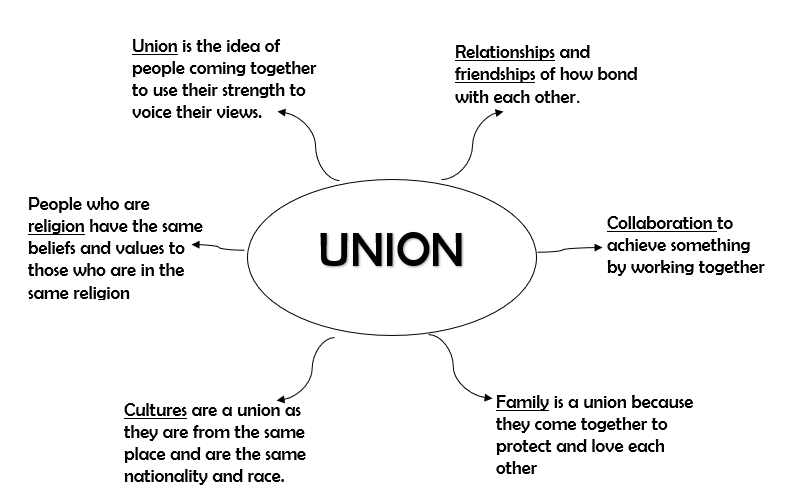
The definition of union is the act of joining together or the fact of being joined together. However, my interpretation of union is the idea of people being united as a society. I have used my photos to express this idea and used different techniques and editing skills to show this. I have based my project on surrealism by creating images that could only come from the imagination or dreams that seem bizarre or out of place. I like the idea of using surrealism to present my images because I feel as though it correlates to the word “union” by merging things together. This could also link to different cultures or ethnicities of people in the world that come together to empower their beliefs and to be united.
There have been many unions through history that have led us where we are today. Labour unions have been a big part of the industrial revolution starting in the eighteenth century in Europe. Trade unions have played an important part in the role of independence. This links back to my project as it shows the different ways that unions can be interpreted, whether it is one person or a group of people coming together to support each other and to be there for one another.
When creating my union images, my idea is to take pictures and edit them in photoshop together. I want to do this because I feel as though this will correlate to the word union because of the idea that two things joining or coming together as one. I also like this idea because I like the way that I am able to use my imagination to create surreal images that could not physically be possible to see or do in real life. I am going to create images which look like they’re from dreams as I feel as though this will turn out well.