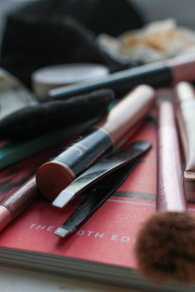
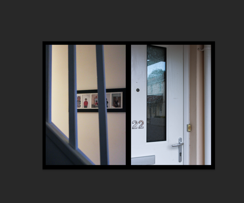
On Photoshop, I wanted to start creating ideas for my layouts in mounting up my final images as this will give me a clear sense of direction when I finally do this. I wanted to do this alongside my photobook as I want to be able to represent my images in different ways to be separate from each other, and be able to make smaller, more specific storyboards and narratives. I think that my photobook will be able to provide a basic overview, however these final prints can give more detail.
Usually I create a lot of mount-ups, however I think that the meaning behind these images is best represented in a book rather than displayed as story boards, for example, as it is quite a sensitive topic.
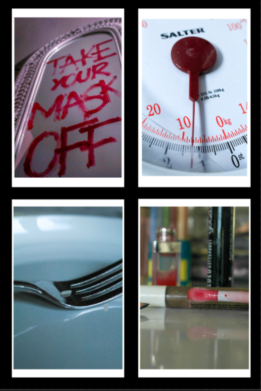
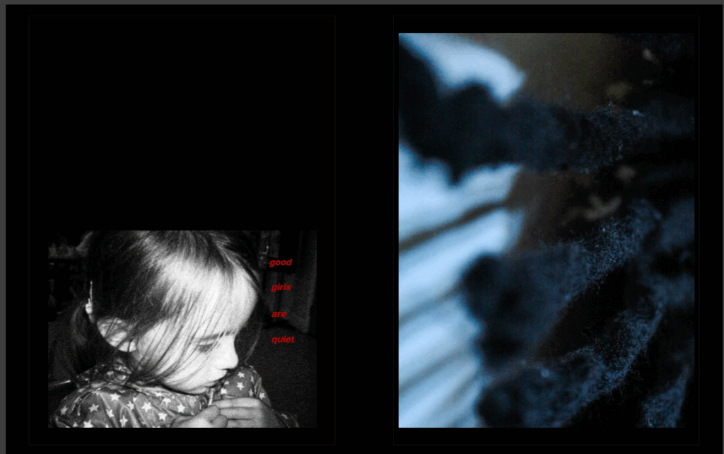
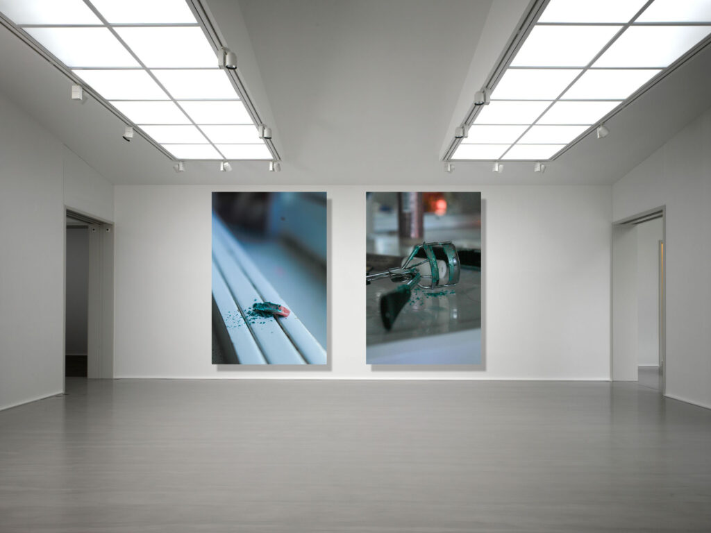
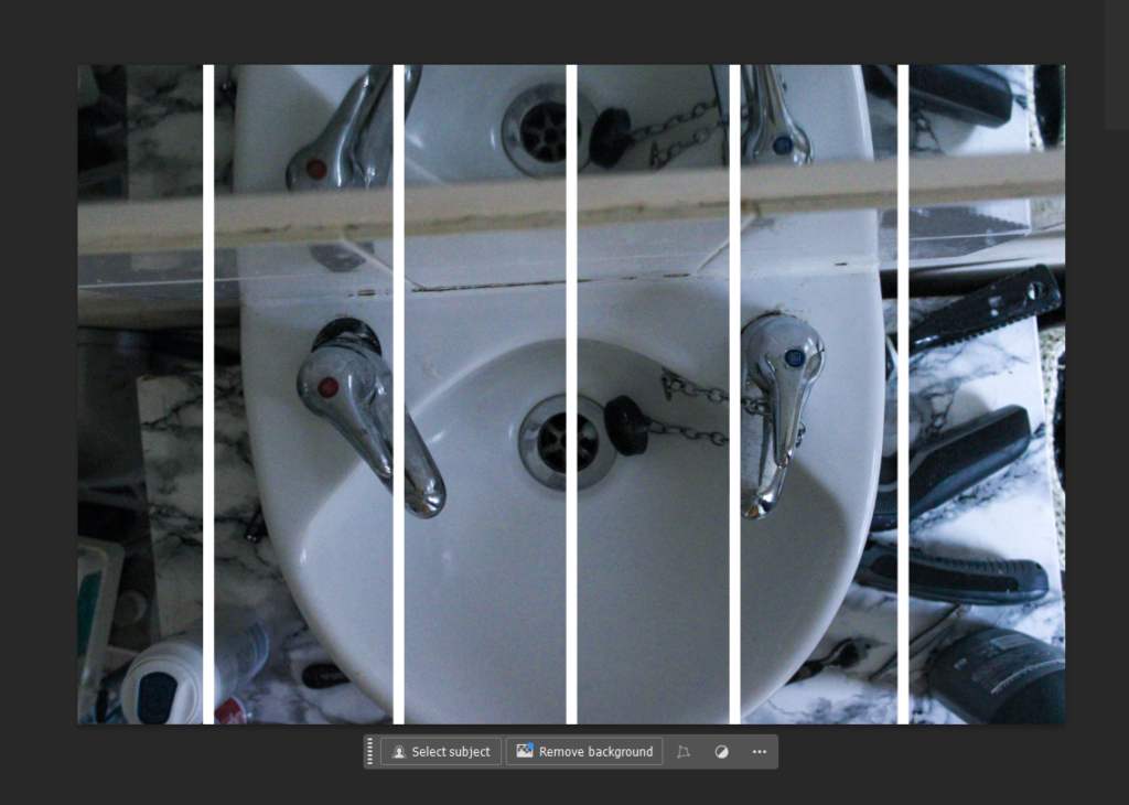
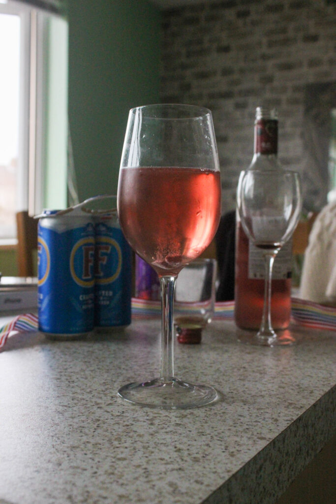
1:
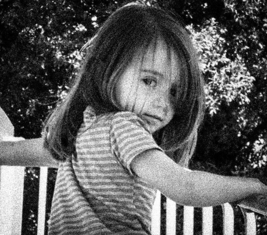
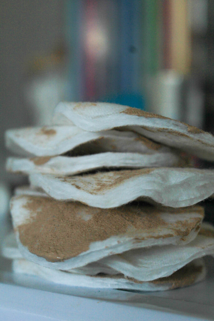
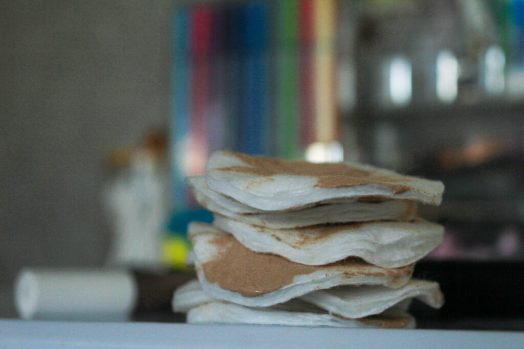
This is my first mount-up, where I have selected 4 images that symbolise different issues that I have investigated within the Feminism movement. I think that these four images work really well with each other too, being that they all are quite focused on one aspect of the environment and all use a short depth of field to pick apart the pieces that build society up. This allows me to give the viewer a rich insight into what my project is about and the different issues that this movement strives to tackle.
I am really happy with this layout because I have also included images that are associated with the project’s of my artist reference’s, the lip gloss being related to Hannah Altman’s ‘And Everything Nice’ exploration of the beauty standard and the writing on the mirror being a more direct inspiration of Barbara Kruger. This is combined with two image concepts that I came up with myself, which means that I can show where all of my ideas have come from on one story board.
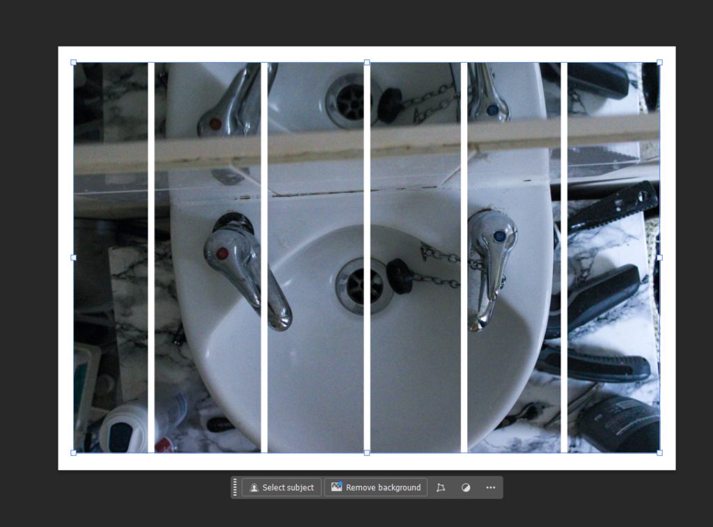
I am going to mount each image onto foamboard, however I am going to leave a white edge around each one of around half a centimetre to create a divide between the image and the black card. I am then going to use double sided tape and stick these to black card with a border of a centimetre at the side and from each other.
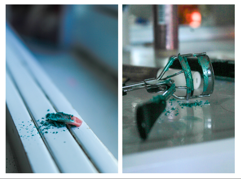
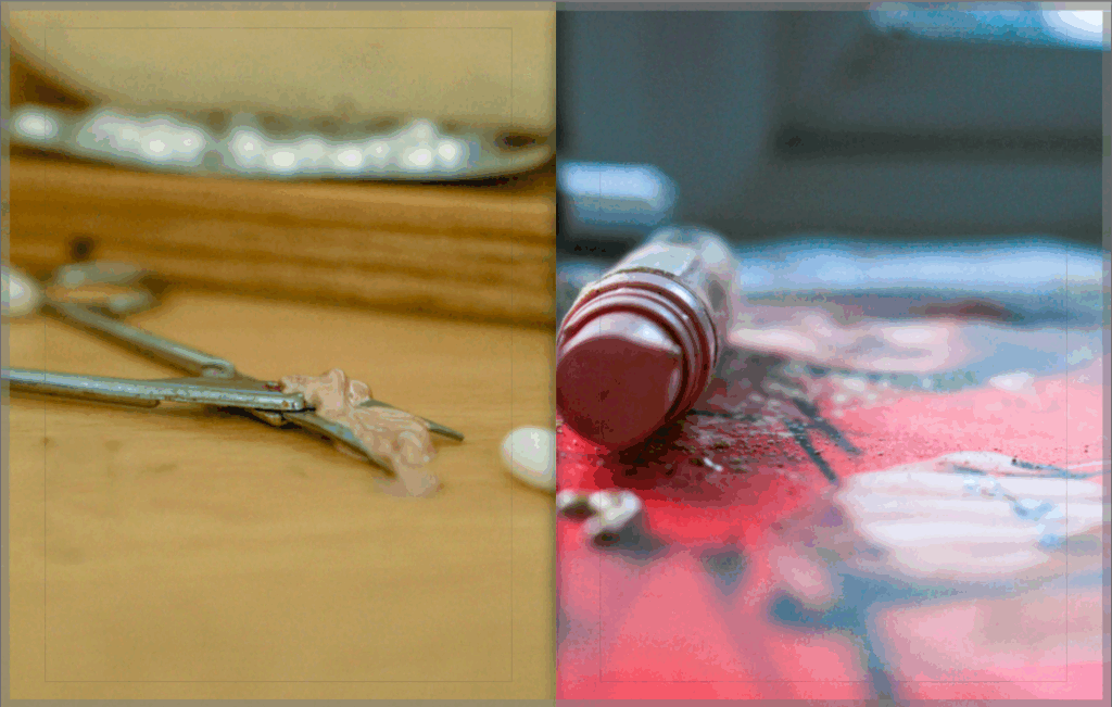
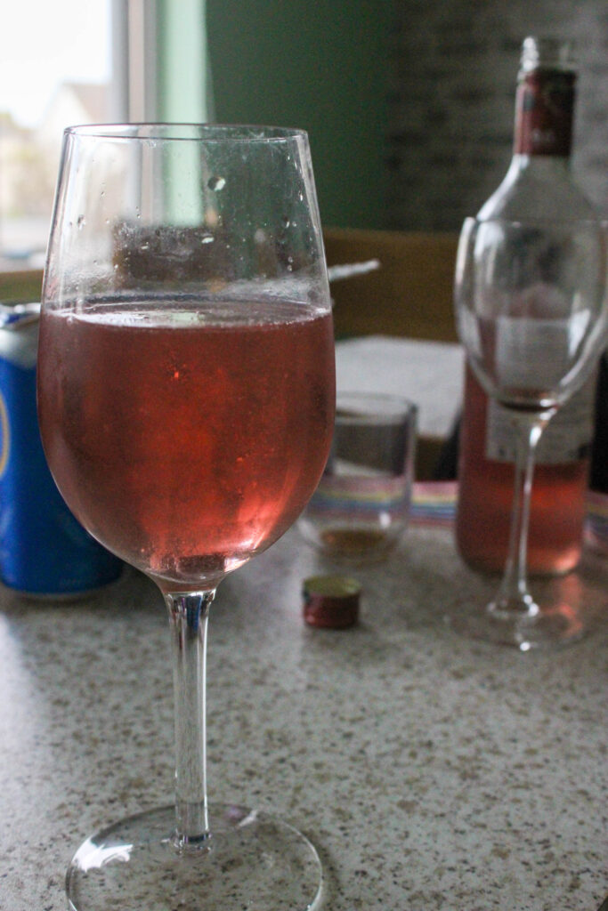
2:
This mount-up is only two images inspired by Hannah Altman where I have used glitter to represent the pain of being held against the unachievable beauty standard. I think that these two images go really well together as they share the same level of vibrancy as well as the same colour palette, meaning that they link smoothly. I also used a short depth of field in both of these images so it allows me to sequence them in a more meaningful way. These two images of course also share the same concepts behind them so it makes it easy for the viewer to understand what my intention was.
I am going to mount these images onto foam board and then cut them out again completely in order to create a platform for them to be raised off of the page. I am then going to remount these onto another piece of foam board with about a centimetre border as I feel that these images would look best with a white background in comparison to a black one as they are both quite light themselves.
Overall, I think that I have explore the topic of Feminism in a holistic way during my study into the theme of Union as my images cross a lot of issues that young girls and women face in society, whether that may be from social standards and stereotypes to the media and magazine industry.
I feel that something that helped me to achieve this was my use of a short depth of field in many of my images as I can use this symbolically to draw sympathy from the viewer, as this can represent zoning out into the particular pieces of the environment. I think that this worked really well as it also allowed me to provide a rich amount of detail in my images, rather than wide-shot images too. However, I feel that I could’ve introduced the landscape into my work more, for example wide shot angles of locations with poor weather to symbolise loneliness or sadness.
Within this study, I was able to experiment with inspiration from Barbara Kruger which also allowed me to juxtapose this soft focus with graphic, bold writing and line to draw my viewers attention in. I think that this was really effective because it means that my images are diversified from each other and it allows me to show different styles of photography within one body of work. This also allowed me to show passiveness and activeness within the Feminism movement, for example the issues with the beauty standard are highly known, however this often gets overlooked or ignored as society is so used to this concept of what a woman should look and act like, meaning that I can visually depict the importance of addressing these problems instead of allowing them to continue and perpetuate false ideas into people’s heads. This also meant that I was able to incorporate both colour and black & white images into my photobook which differentiates my images from each other even further.
If I was to do this particular study again, I would have liked to get more moving images using a slow shutter speed as all of my images are very still, and I feel that this would have made my project even more interesting. This would have allowed me to easily add direction into my work as this would have created a motion blur, and from here I could have experimented with this.
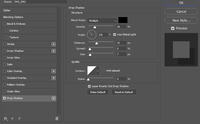
I create some virtual galleries using Photoshop in order to document some of my best images. I added a drop shadow to each of the images so that they would appear to be hanging off the wall instead of looking flat.
Gallery 1:
These two images have clear reference to Hannah Altman’s ‘And Everything Nice’ through its use of glitter to represent the pain that the pressures of the beauty standard apply to women and girls across the world. I feel that these two images have specifically been successful because of the short depth of field that I have applied, differing my work from Altman’s, as it hones in the viewers focus onto the real concept behind the image instead of appearing to just be revolved around beauty itself rather than the actual pressures. I also feel that these images are clear references to Altman’s work because of the randomised pattern of the glitter as I tapped it onto these objects using a brush. This makes it look more natural like Altman’s work, as if the viewer wouldn’t feel suspicious of this looking strange or out of place. However, I did use different objects to what Altman used such as a razor because this didn’t require too much setting up, meaning that my images would have looked too similar otherwise.
These two images share similar components in their aesthetic and composition. Here, I have shot from an angle horizontal to both of the objects to make the perspective more dynamic rather than risking the images employing the ‘dean-pan’ aesthetic, for example, as I want this portion of my study to be specific and stern rather than more documentary-style. Additionally, both of the images have echoes of each other, while the glitter is an obvious link between not just these images but the entire photoshoot, but they both share the main colour of white in the composition whilst using a relatively low-exposure to ensure that the viewer doesn’t think that the images have an alternative, happier meaning.
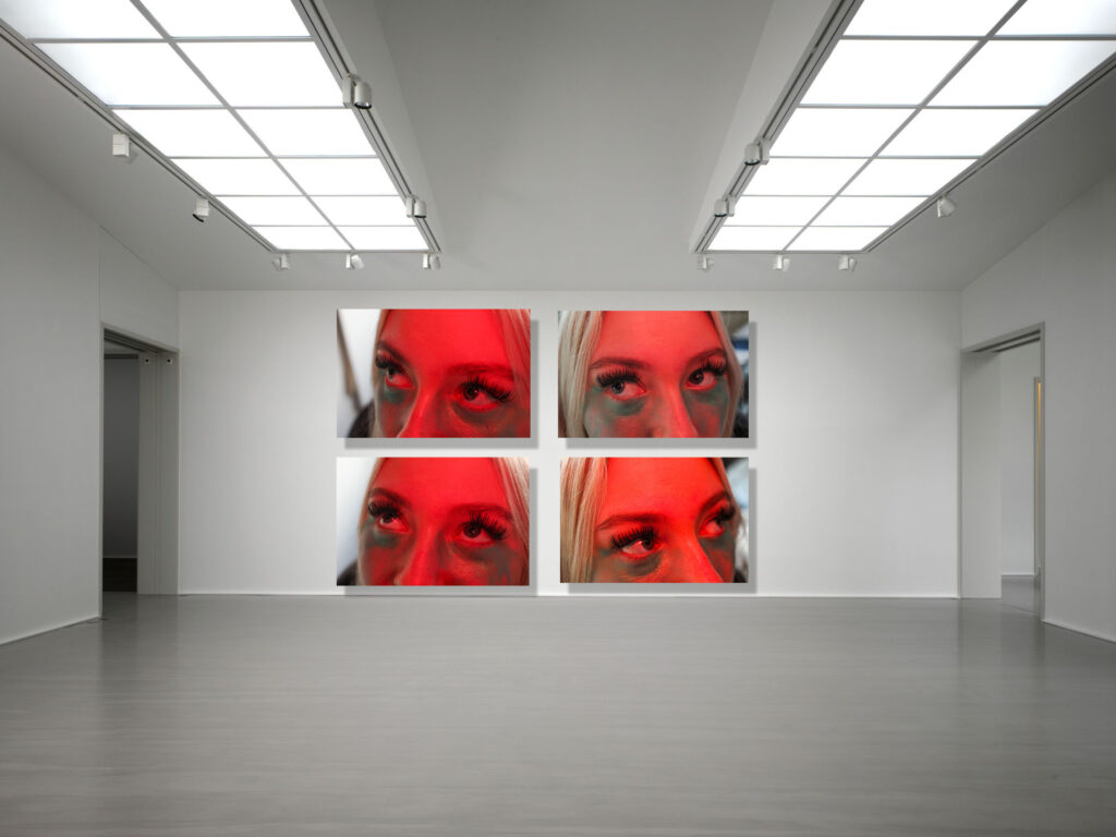
Gallery 2:
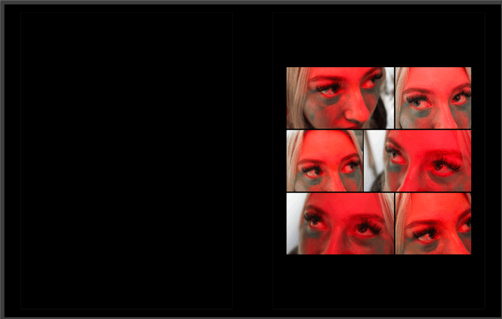
For this gallery, I created a grid of four images of the same subject looking in different directions as I think that this works very nicely, as if each image contains an individual person looking at the others. This was inspired by Hannah Altman again from her self-portrait with glitter underneath her eyes, where the glitter is delicately placed in representation of tears from trying to fit into the beauty standard.
As this image from her work is quite notable in being one of the more popular images from her project, my images differ from the nature of the glitter. In Altman’s image, the glitter is cautiously placed however I have overexaggerated the glitter on my subject as I feel that it makes her show more anguish as its spread out carelessly, as if she has gripped her face out of despair. Also, Altman’s images employ natural lighting, however I wanted to juxtapose the colour of the blue glitter (being able to represent the stereotype that only boys should wear blue) with a red to symbolise anger from the subject towards the issues that I am targeting. This is why I used the flash on the camera, however I covered it with my hand in order to make her face red without editing to look more truthful, and also to create this ghostly effect in the background that creeps over the side of her face.
Whilst Altman appears to have meant for this image to be interpreted as distress over the beauty standard, I feel that my work is more applicable to the inverse of the male gaze, where my subject is taking back this term and coining it as her own to reduce the discomfort she feels and sending it back to these people. I think that this is a powerful extension of Altman’s work as her eyes dart around in an intimidating way, rather than being intimidated.
Gallery 3:
This was really helpful as it allowed me to begin thinking about how I want my prints to be laid out when I mount them up. This also means that I can start thinking about my sequencing in my photobook as I can look at which images compliment each other and the ones that don’t have any relation to each other.
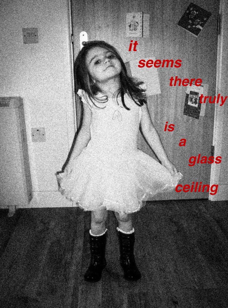
I specifically like my third gallery because I feel that the narrative is linked quite smoothly as each image has a high relevance to feminism. I also really like the way I have laid this out because each image has an aspect of the last within it, for example shades of red become echoed as well as the introduction of new tones which enriches the flow of them too. The third image within the gallery is inspired by Barbara Kruger, where I have written similar phrases to her ironic insults towards magazine and media outlets pushing the beauty standard. Whilst I have created edits similar to her on Photoshop, I really like this method as it is a more direct approach, blocking a girls negative thoughts about her reflection, whilst also being more modern and relative to society now as Kruger’s work was heavily influenced by the 80s beauty standard and ideologies about women. By doing this, I can still make a greater reference to Kruger’s work whilst not being too explicit.
Evaluation
Overall, I feel that my study into Feminism in relation to the theme of Union has been highly successful and I feel that I have create a clear link between the two through adding a personal touch through my experimentation, being a generational connection between the women in my family, in order to show that this movement has real-life relevancy and the issues that it hones in on don’t have individual effects but collectively impact society on a whole.
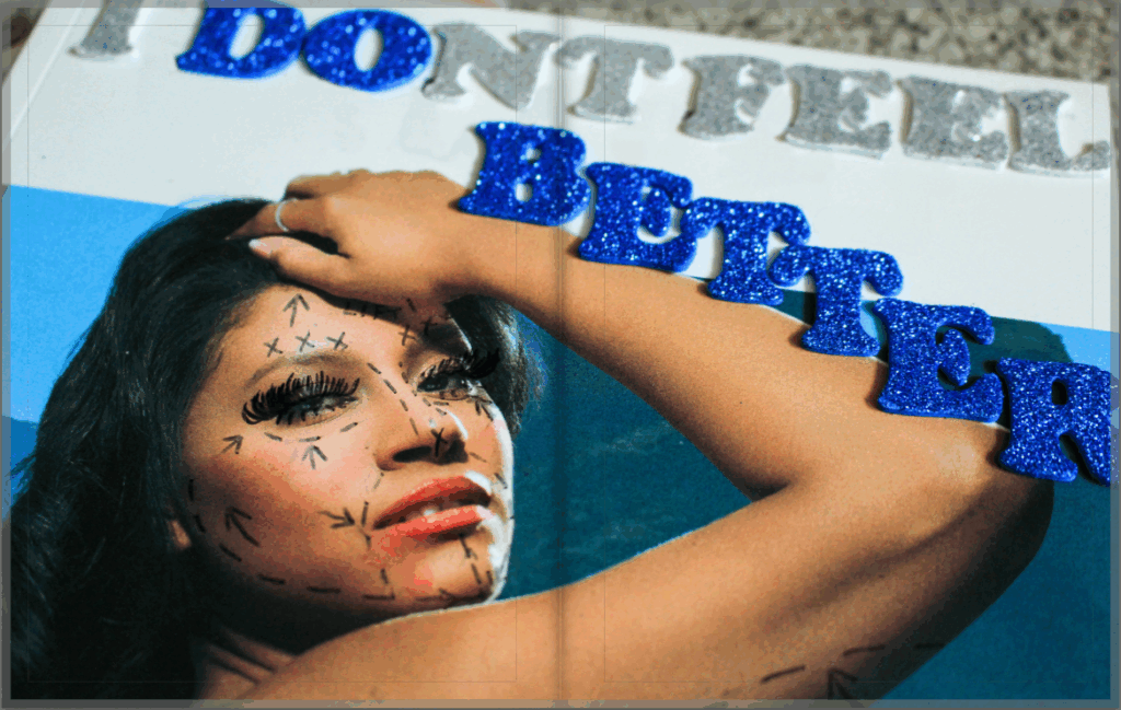
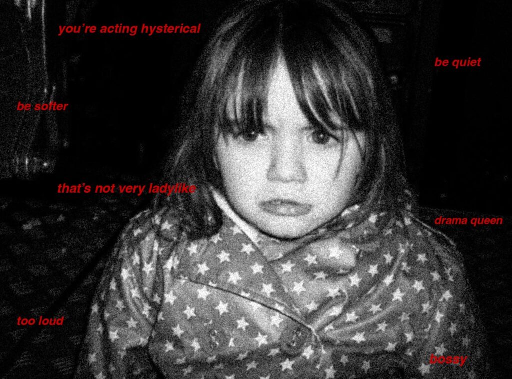
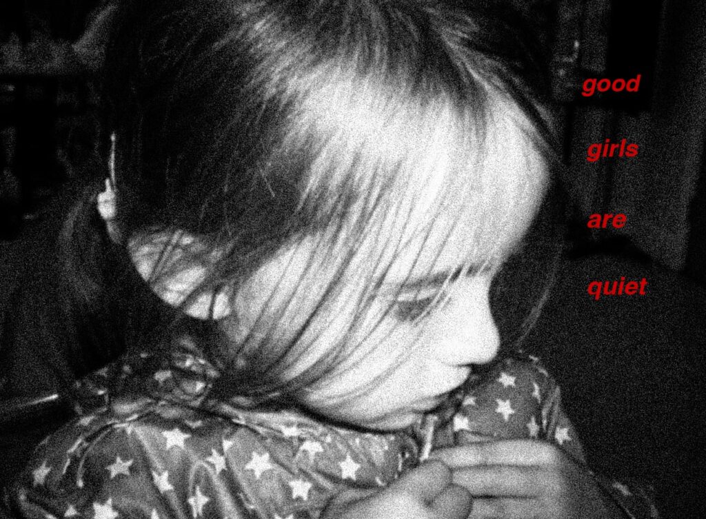
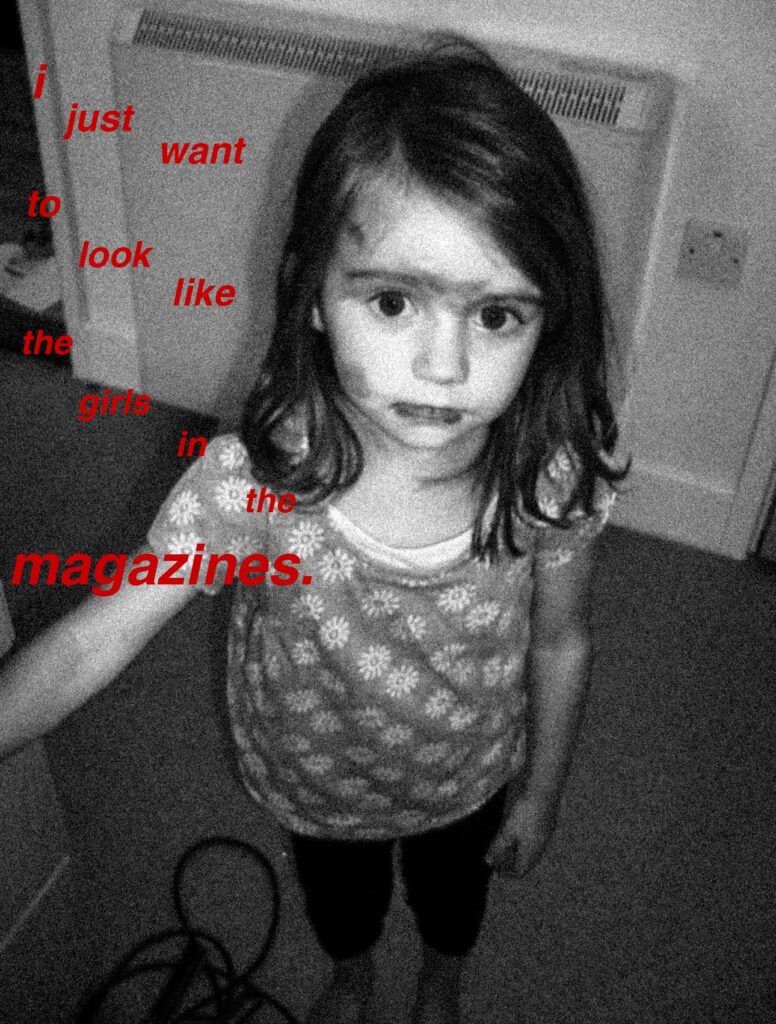
Within this investigation, I have been extremely experimental due to one of my artist inspirations being Barbara Kruger. At the beginning, I shot images of Greek statues and then developed this into using archived images of myself when I was younger, then leading this into my wider family members such as my gran and my mum. This allowed me to really develop my ideas in a structured way as in the beginning, my work was very similar to Kruger’s in terms of aesthetic. However, I wanted to make it more personal and more of a reference rather than a similar image with text as Kruger’s work is notorious for using these direct statements with bold red text. As my ideas began to grow, I began to write accusatory and almost angry statements on mirrors using red lipstick in capitals, using some of Kruger’s phrases whilst using this to come up with my own. I think this was very effective because it allowed me to move away from the typical black and white grainy images that I had been producing and create something more relevant to modern society, as the work that I found myself inspired by was revolved around the beauty standards of the 80s whereas it has changed now. This led me to be able to create some experimental pieces of Photoshop that I really liked, however I didn’t end up using them all as they didn’t fit properly with the sequence or the overall tone of the book.
However, I think that I could’ve pushed this even further into the modern beauty standards that we uphold now and target the aesthetics of magazines and media put into circulation. I had planned to try and create some experiments that looked into how social media is used to further perpetuate unrealistic goals for women, for example looking into how Instagram is a place filled with photoshopped images that can’t be distinguished amongst the unedited ones. However, I couldn’t really come up with any ideas on how to execute this, so if I carried this out again I would really like to be able to create a more socially relevant interpretation of Kruger’s work to today’s standards.
With my investigation into Hannah Altman’s work, I feel that I was really able to develop my ideas and take some really creative images. I began by creating similar images to Altman’s ‘And Everything Nice’ where I tapped blue glitter onto different cosmetic tools such as tweezers or eyelash curlers, trying to find other tools that she had not incorporated into this body of work. These images were really successful where I was able to use a short depth of field to make the viewer solely focus on the item that I had manipulated and how the glitter was representing the pain of conforming to these set standards. However, I feel that I could have made these images more interesting, for example using different colours of glitter or I could have extended this into shooting a subject applying a cosmetic product that had been replaced with glitter.
However, this enabled me to start thinking about other ways I could add glitter into my images and I actually was inspired by the way Kruger uses text, which is why I then began changing the name of magazines using glitter letter stickers and editing the real name from the background. I wanted to do this to show the true intentions behind these magazines underneath the actual cover name. This then led me to start drawing on the models on the front covers and creating plastic surgery markings. I was really happy with this idea and found it to be very interesting as my intention was to act as if I was taking away all of the airbrush and filters to show the viewer how unobtainable it is to reach these standards even though they appear real. However, if I repeated this I would incorporate generative Ai into this to try and get a digitised look as I feel that this may have looked better in comparison to pen on the magazine.
Whilst I am really happy with my outcomes, if I repeated this topic I would definitely include more portraiture into my work as I feel that I could have gotten more experimental and showed physical union rather than it being more symbolic. However, I feel that I have done this in a very subjective way and I think that the images are still open to interpretation and can evoke strong emotion in the viewer due to its theme. I would also have liked to include some landscape images that could have symbolised anger and distress as this is such a sensitive topic, for example a thunderstorm could show rage in a broader way.
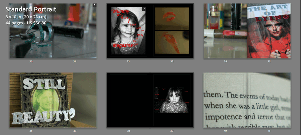
I wanted to create a photobook for my project revolved around Feminism as this allows the viewer to physically manoeuvre the images themselves instead of just looking at the visual elements. My book I produced during my personal study about my brother was quite successful so I wanted to create one again, as both of these topics are quite important matters which I feel makes a photobook more appropriate as it seems to be more professional-looking in my opinion.
The narrative and concept:
My photobook revolves around the topic of Feminism and the modern issues we have that this movement tries to tackle in society. The theme of my images is predominantly looking into eating disorders, spiking, the pressures of the beauty standard, media and magazine aesthetics and trying to capture the emotions that these types of issues make young girls and women feel. This leads my images to cross over between subjective and objective, as emotion is not a tangible thing and can be implied through exposure levels for example, however I have still photographed explicit things that directly communicate the message to the viewer.
I have also manipulated and experimented with many archived images that I took from my mum and my gran to show a generational connection in these issues and the change in attitudes towards women from when my gran was a teenager, to my mum, to me.
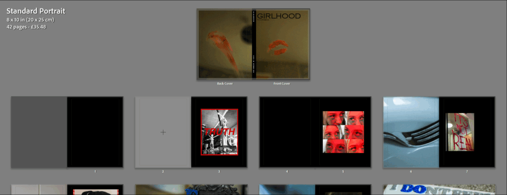
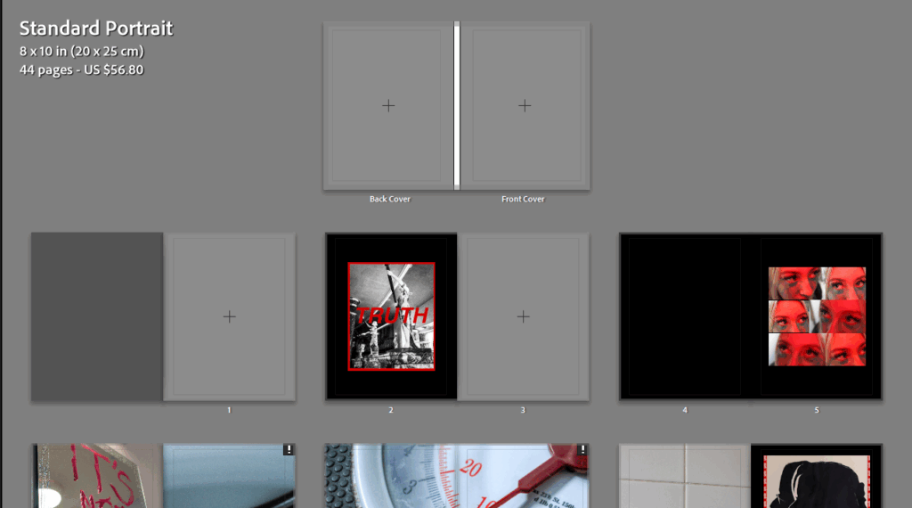
I did this using Blurb in Lightroom, where I initially flagged all of my best images so that it would be easier for me to see my images rather than just having to look through all of them when designing the layout. I then created a saved book so that I could keep this in my Smart Collections to make it more accessible.
I decided to go with a standard portrait book because most of my images are vertical, however I am still able to incorporate my horizontal images as double-page spreads as these are some of my best images so a portrait book allows me to do that easier.
I created my first initial layout before thinking of my front cover or the title as I felt it would be easier to draw this together once I sequenced my images in order to ensure the narrative could be conveyed clearly and effectively. I wanted to be very cautious with my placement of images as this movement covers a lot of heavy topics that have to be represented in a delicate way to suit the theme.
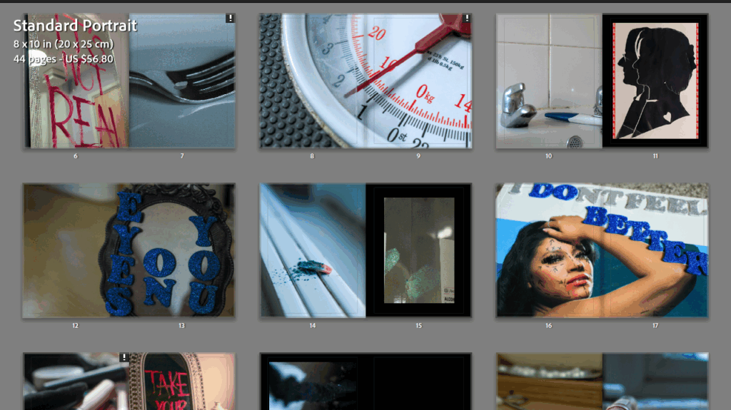
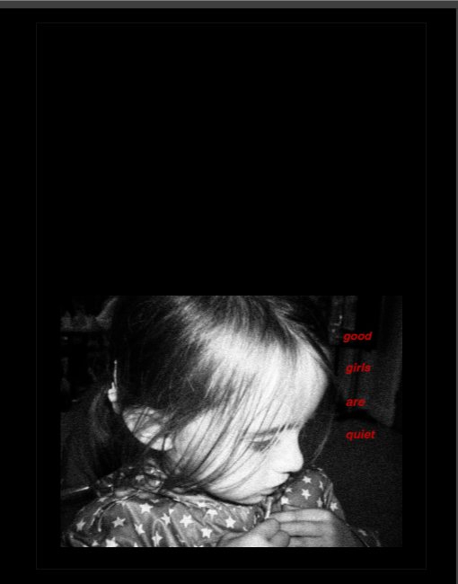
I decided to use a black background on all of my pages as many of my images are inspired by the work of Barbara Kruger, meaning that I can enhance the shade of red that I have replicated to make my images stand out more. As well as this, I find it to be more relevant to the concept of my photobook than white pages for example, as the colour black has negative connotations. This allows me to reinforce the negative meaning behind my images and I can make sure the viewer doesn’t interpret my images in an irrelevant way.
I didn’t want to add any text to the photobook itself, contrasting my last, because many of the images have writing on them already so I didn’t want to drive the viewer’s attention away from this. Additionally, I wanted my images to stand alone and speak for themselves, specifically the images where I have employed a short depth of field or soft focus as I think that this is key in representing how delicate each of these sub-themes are within Feminism.
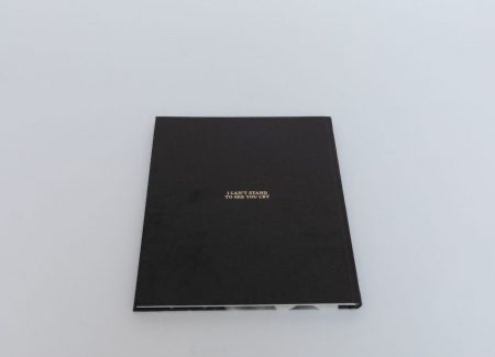
I decided I was going to make this as a hardcover photobook because I selected this for my last photobook and I really liked the overall aesthetic of it. Additionally, when I was researching different photobooks to deconstruct I found I generally preferred those with a hardcover, for example Rahim Fortune’s I can’t stand to see you cry. I also decided to leave a few blank pages in my photobook to create a serious tone around some of the images as they stand by themselves, making them looking more ominous whilst suggesting there is a deeper meaning.
Many of my Barbara Kruger inspired archived images had to be reduced in size due to the resolution varying as these images were already quite old from childhood and had a large amount of editing with the grain feature on Lightroom in order to obtain that ‘hardened’ and almost vintage look that Kruger gave her images. However, this worked quite well in the end as it allowed me to just use them as featuring images, with them having writing on anyway to ensure that the viewer still remained engaged. I had to keep these images small so that the resolution would remain above 120ppi.
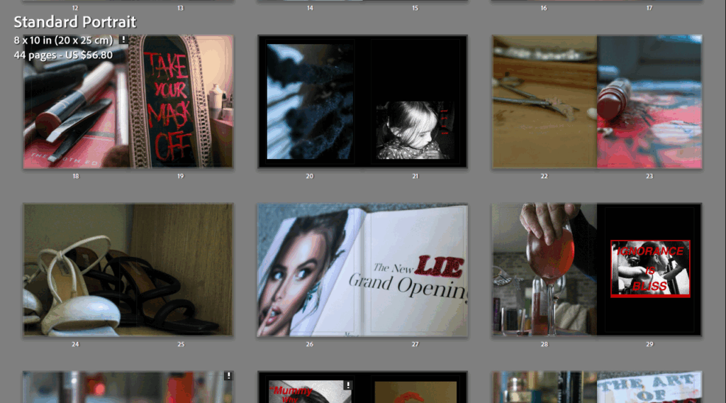
The layout that I typically used for my images were full-bleed pages, whether that may be single or double, because I think that this means the viewer cannot become distracted by the aesthetic of the book itself, but instead the composition of the image as there is nowhere else to look. However, I didn’t want to just do this as it would make the design quite boring, so I played around with many different page layouts as well as swapping around some of the pages with each other to make sure the sequence ran smoothly.
For example, I really liked this as one of my first few pages as it is really unique and uses 6 different images at varying sizes. I used 6 similar images to represent the inverse male gaze, where instead my subject darts her eyes around different directions on the page as if she is searching for her place in society. This was a set of images inspired by Hannah Altman’s And Everything Nice, replicating the glitter under her eyes in representation of tears.
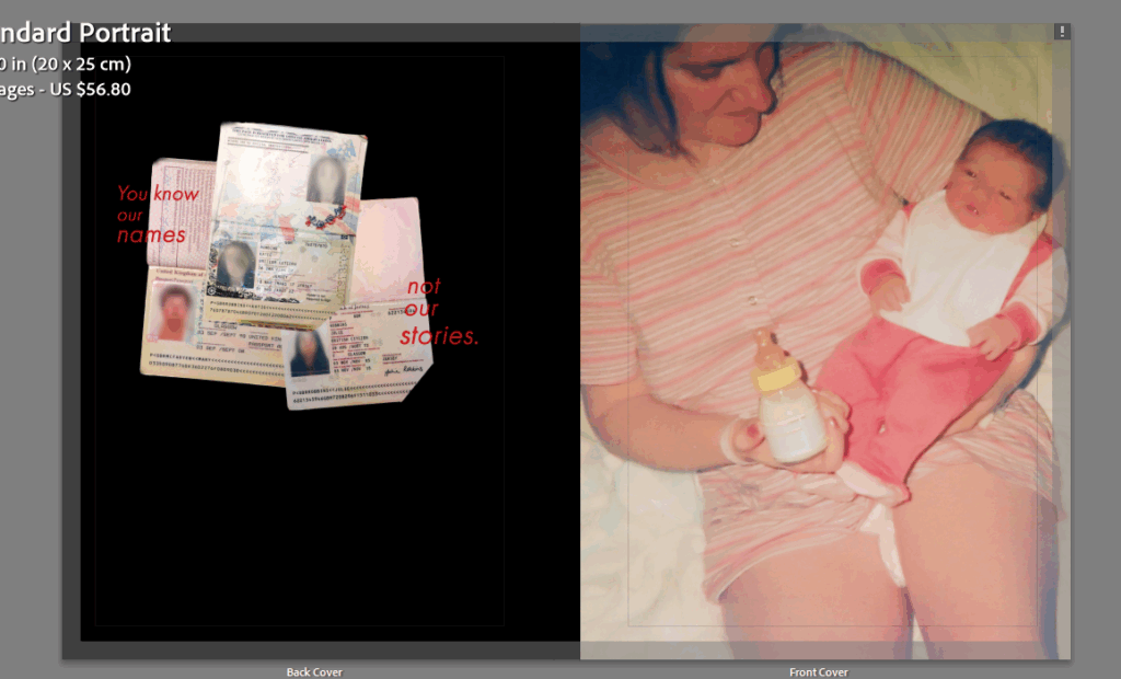
Front and back cover:
I used all of the images I liked inside the photobook so I decided to go back through my photoshoots and try to see which images would be suitable. I specifically went through my fourth photoshoot where I digitised archived images and belongings that were from my mum or gran so I felt that this would give me an opportunity to use them.
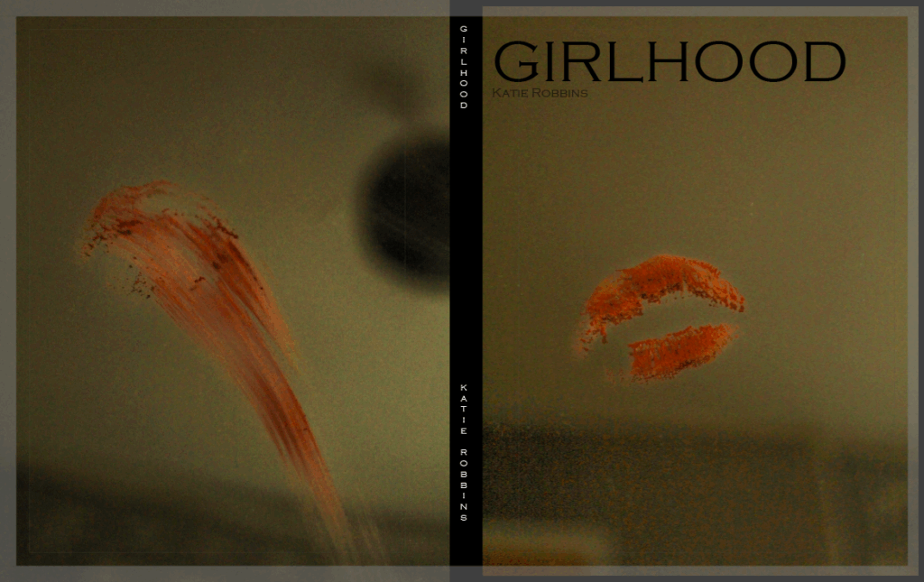
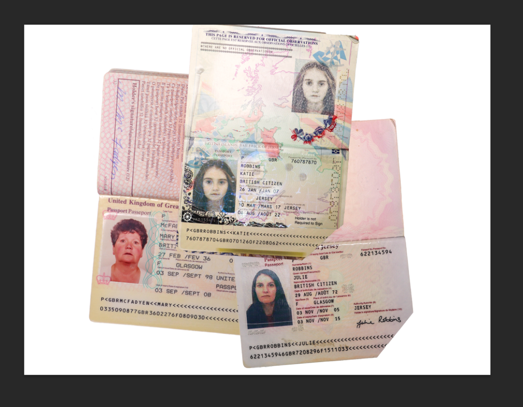
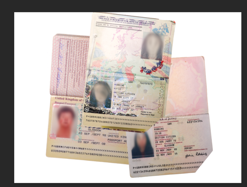
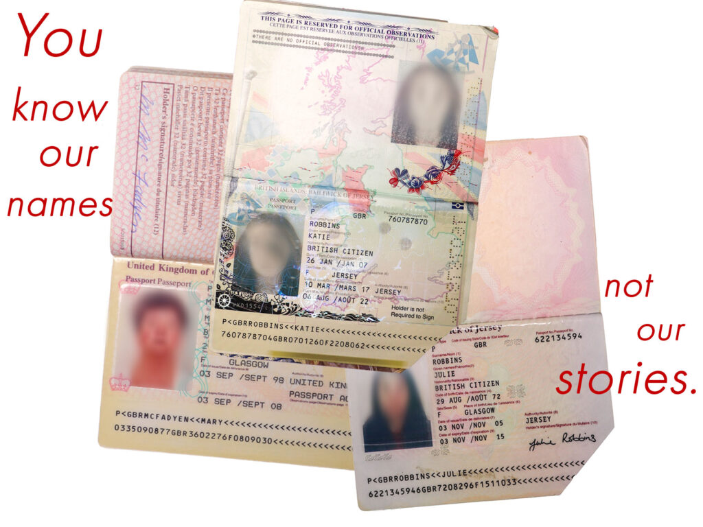
My initial choice was to use these two images, the left being one of my experimentations (blurring out the faces of myself, my mum and my gran on our passports in Photoshop and then layering them to show that this is an issue that is faced by all women) and the right being an image of my mum looking after me when I was younger. I chose this image as both me and my mum are solely wearing pink which is a colour commonly associated with femininity, as well as the image showing a traditional stereotype of a mother looking after a baby.
However, I felt that this looked too much as if the narrative was going to be an internal reflection rather than an exploration of this movement.
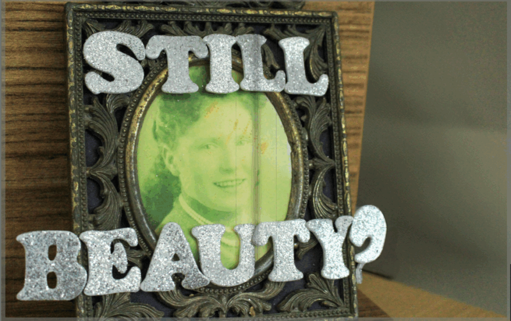
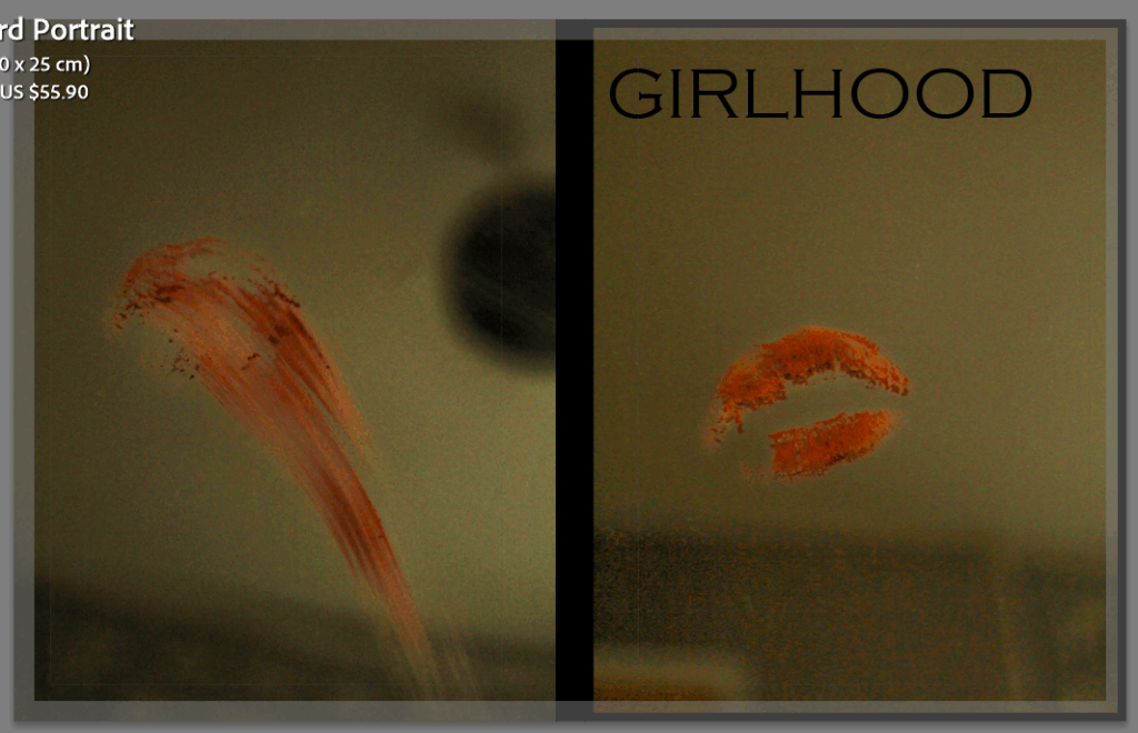
I decided to settle on this one as I like how the back cover has wiped the lipstick away, signalling that the book is complete and has finished. I made the spine of the book remain black and played around with different fonts and titles. Because there is quite a low tone and exposure in thee two images, I feel that this makes the book seem more ominous as the phrase ‘girlhood’ connotes ideas of love and friendship, whilst the background contradicts and juxtaposes this. I used the title girlhood in an ironic way for this reason. I put the title quite big and in bold using the font Copperplate Gothic Light which I think has tied together well with the black spine of the book as it keeps the composition dark and mysterious.
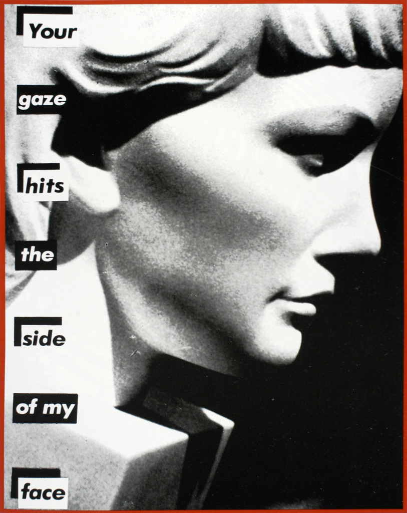
For this photoshoot, I was inspired by Barbara Kruger’s work where she writes direct and accusatory statements across her images in a bold red. I used archived images that I had found and experimented with Kruger’s methods using Photoshop.
Initial images:
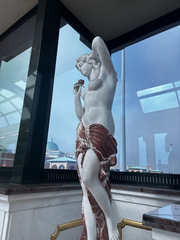
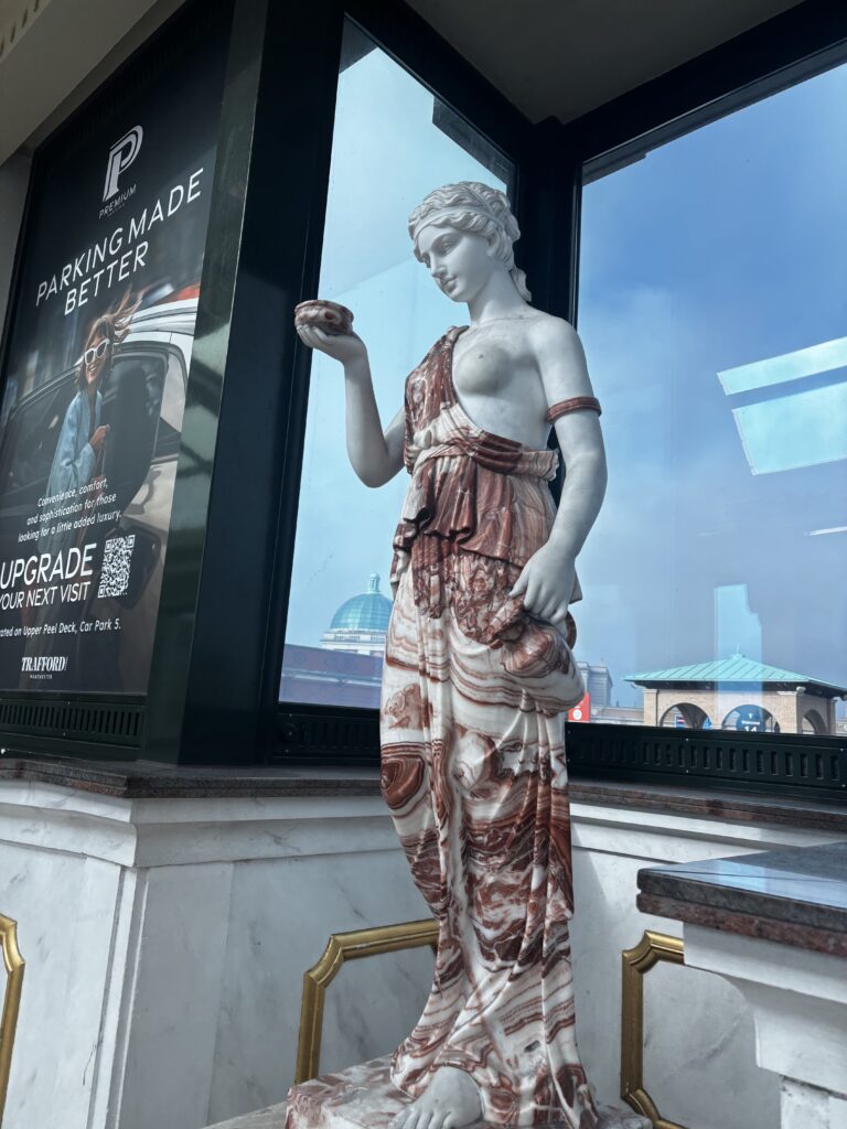
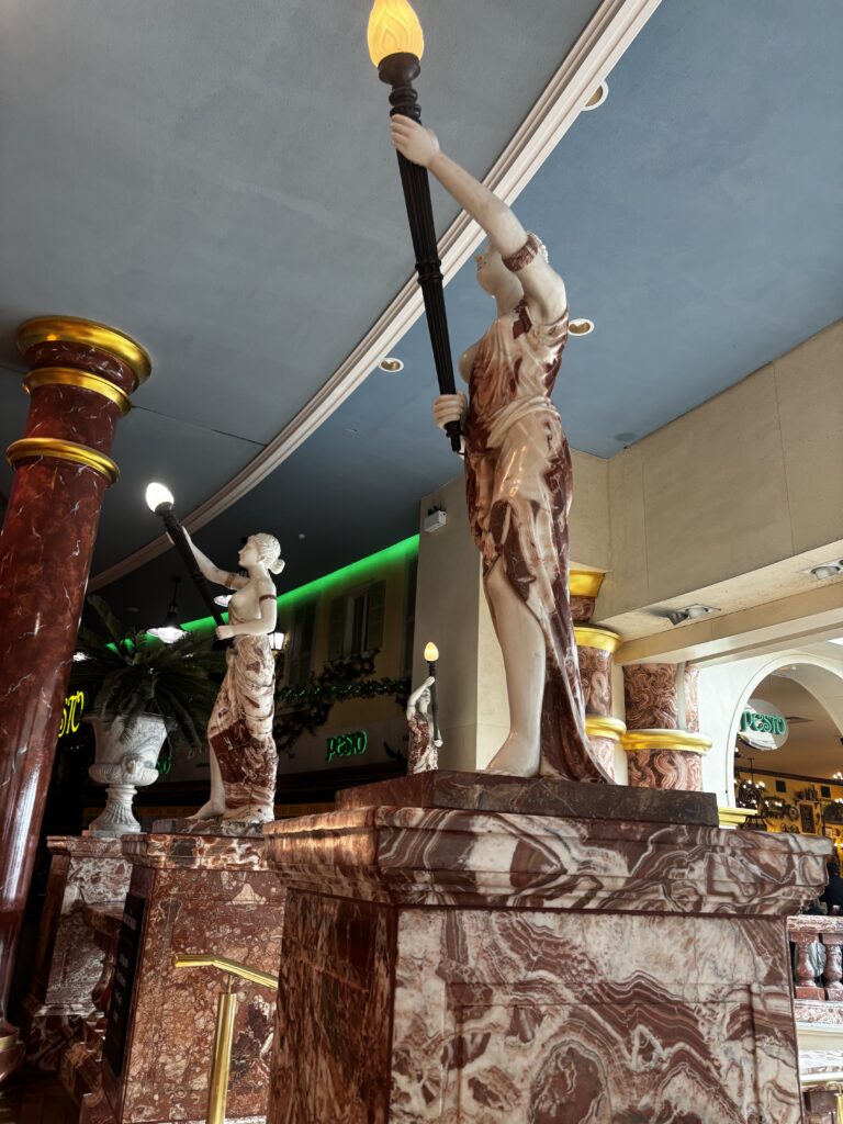
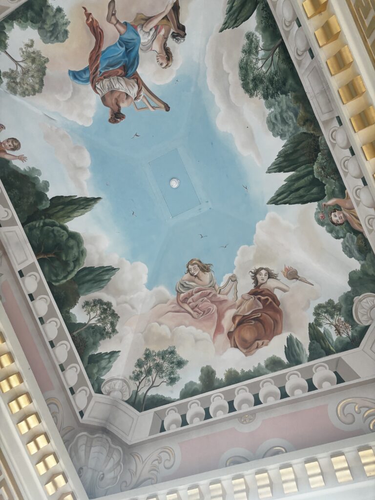
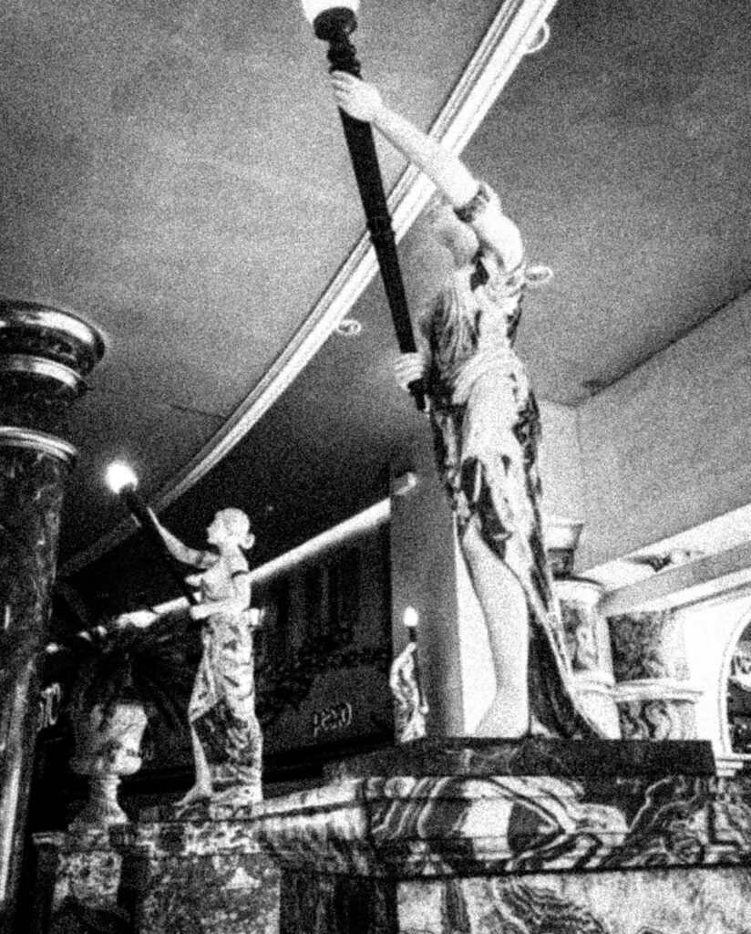
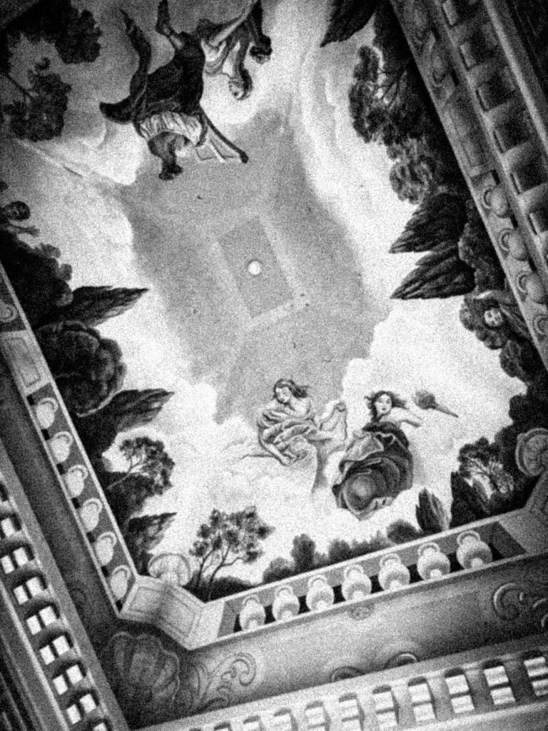
I first took these four images during my trip in Manchester as they idolise greek women in the form of Romanticism due to their dream-like nature consisting of a clouded, ethereal fantasy aesthetic. There was also a ceiling mural which I decided to photograph as it relates to the paintings of the Romanticist era.
I wanted to photograph these statues specifically because they represent the beauty standard during the Roman era, established by their hairstyles and clothing. These statues are typically nude or partially nude as a form of art, studying the anatomy. However, these statues of women often get treated inappropriately, for example taking photos of each other touching the statue’s naked body. This is a complete misinterpretation of what the statues were initially placed there for, taking an expression of art into a sexual way which demeans the female body and objectifies it.
Barbara Krueger often incorporates these statues into her work, so I felt that this would be a good nod towards some of the photographic content in her images:
Example:
First Edit:
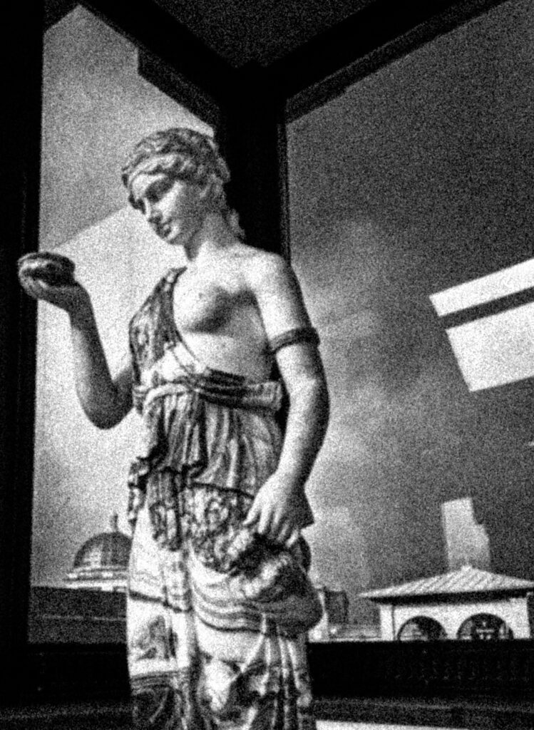
Upon editing these images, I wanted to make them black-and-white as this is a running theme in Kruger’s work so I felt that this would be able to clearly show relation. As Kruger tries to make her images look old and archival, I decided to increase the grain of the images fully to get this effect, then playing around with the size and amount to see what best suited the exposure of the images to make sure it wouldn’t look too dramatic or over-emphasised.
After this, I also added a slight vignette to all four images to make the edges of the image darker to centralise the focus of them. I paired this with editing a high contrast on all the images as Kruger uses a deep black-and-white tonality in all images that I felt wouldn’t be reflected in my images otherwise as all the blank-and-white filters made each image’s tonal range too vast, instead of a more blocked-colour approach.
Final edits:
To do these captions in a similar way the Barbara Kruger does in her work, I used the rectangle tool to create these, then used the colour wheel to select a shade of red the most similar I could. I used this to create rectangles of different widths and lengths, then rotated them depending on which image I was gaining inspiration from.
I then would use the text tool to create either 1-2 words and put them into the caption, however I would only input one word into each text box so that I had entire control over the colour and angle I wanted each word to go into. I used inspiration from Kruger’s similar images, however for some images I created my own captions that I felt related to the Feminist movement in brief but direct ways.
I didn’t want my work to be too explicitly related to Kruger’s images as this could come across as very basic or simple so I began to think of other images that I could use. I decided to begin compiling not just archived images of myself, but other women and girls that I know and use their childhood images as this is would be emotionally-provoking when paired with similar interrogatory phrases that Kruger uses linked to feminism.
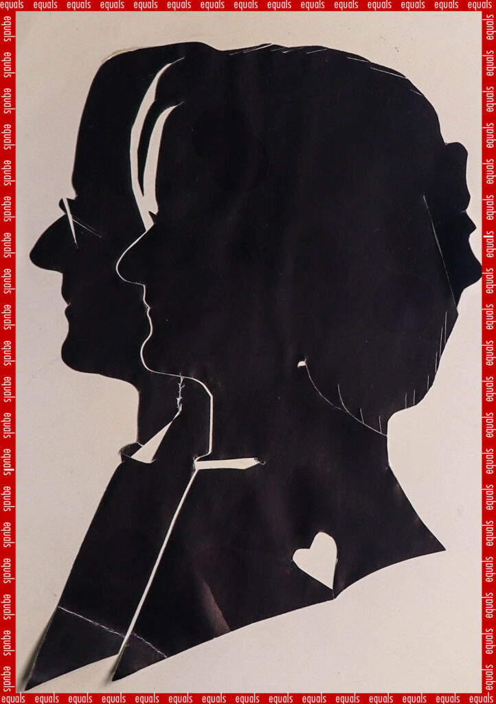
I also wanted to incorporate the childhood images that I have from my family archives because this is an issue that is extremely relevant to me and actively affects me in my day-to-day life. I wanted to involve those around me to show how this is a universal issue that isn’t restrictive to me only. Following this, I decided I also would like to do a vertical linking of me, my mum and my gran to show this generational development of the beauty standard, and how many of the battles that the Suffragettes fought are still rife in society, and how even the progress that they fought for is going back in time in many countries.
I followed the exact same procedure for each of my images during this photoshoot and ensured I used the same shade of red across all the images, being #c40000, and pasted this so that I wouldn’t accidentally use a different shade and make the images inconsistent.
Throughout my further images, I varied between black, white and red like Kruger, however I used different phrases to make my work separate from hers.
Original images of me:
Some of the images had poor resolution whilst others were actually quite high, however this wouldn’t affect the final outcome of the images as there was a grain added to all of them as well as a monochrome tone to recreate the Kruger aesthetic.
Initial edits:
Final edits:
I also wanted to include more contemporary-styled edits of archived images as Barbara Kruger created these images in the 80s, styled in the way that magazines and different media was during this period. As there was no social media when she created these images, I wanted to hone in on Instagram as this is where many of these unrealistic standards are portrayed in the modern world.
This will allow me to make comparisons between then and now in my photobook, and how these different issues have festered and grown through the decades. This will enable me to highlight how many of these issues have not been tackled even though they have been challenged for a long time, as well as the new issues that have grown and been created. By doing this, I can also show how the beauty standard has been changed over time and how different features become more or less ‘desirable’ in the public eye.
The specific images that I was inspired by for this photoshoot:
I started to look for material that I could use to link me, my mum and my gran to this topic. I was able to find many images, both physical and digital, of my mum and gran in the past in order to link this.
I wanted to gather images of my mum and gran with my dad and graded too as this way, I can use this to question traditional marital roles and stereotypes, especially when my gran was growing up. I also gathered a range of passports that my mum had kept which I think will be very useful in my experimentation.
Contact sheet:
I wanted to create more experiments in relation to Barbara Kruger’s work so that I could show a generational link using the women in my family to show that not only is Feminism crucial in a universal way, but also how times have changed from then and now – this will allow me to explore different timelines of Feminism and the variation of attitudes and opinions towards women. However, I have already created images that are closely linked to Kruger’s, so now I am looking to develop on these ideas more through these experiments.
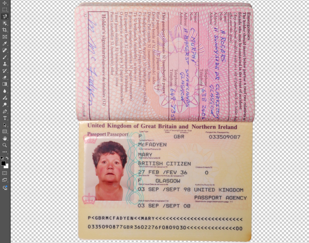
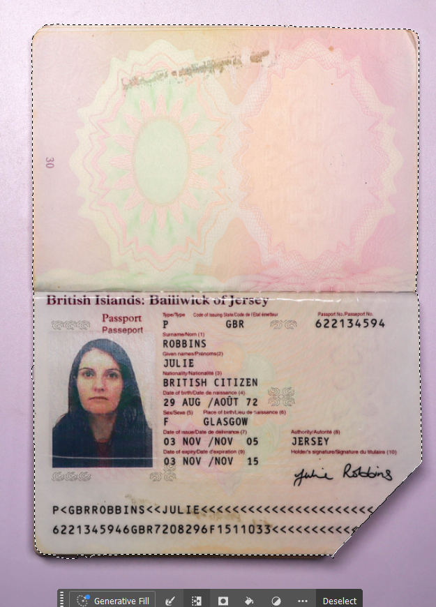
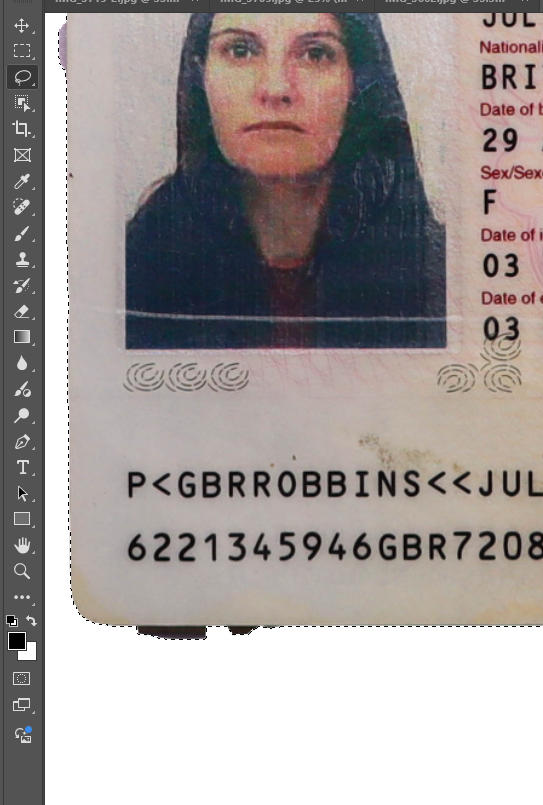
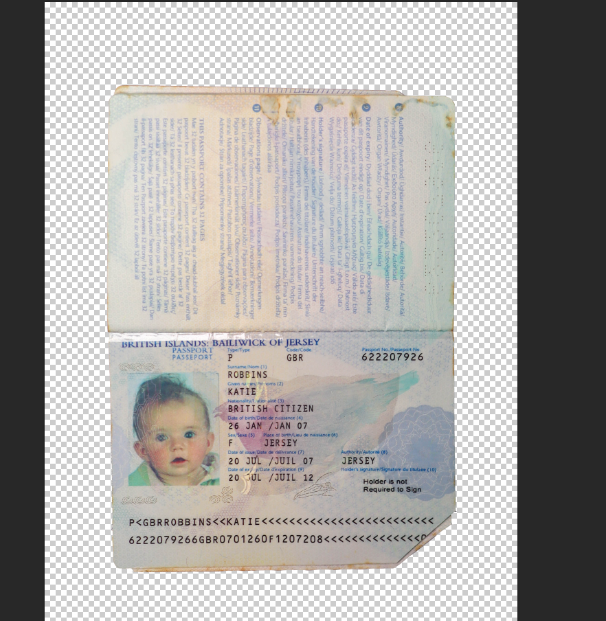
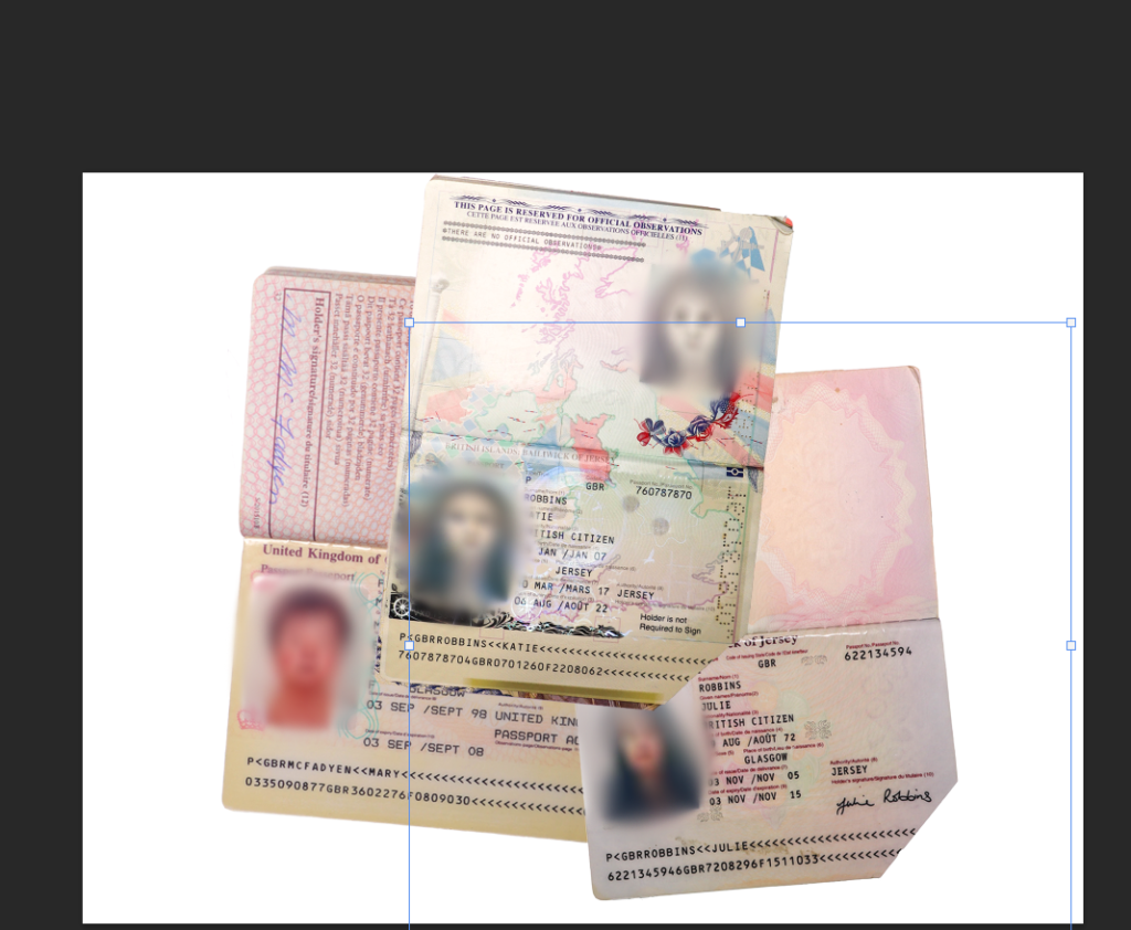
I used the magnetic lasso tool to cut out my gran’s passport as this tool sticks to the sides of what is trying to be cut out so that I can ensure that the lines are accurate and straight. I then repeated this with my childhood passport as well as my mum’s when she was younger.
I did this by outlining what I wanted to keep, and then using the invert selection option on the tool bar so that I would be able to delete the background. This made it easier for me s otherwise I would have had to cut the background out individually which could have made the image come out messy.
I then went and refined any edges that hadn’t been cut out using the magnetic tool. I wasn’t sure whether to use a baby passport or a child passport for this idea, so I just cut both out as whichever one I don’t use can be used for another idea.
I decided to use the childhood passport as I think it is able to align with the topic of feminism more than a new born would. Whilst I am using baby pictures, this idea is more suited with a child’s photograph.
I layered the three passports and began to think about what I could do next to them.
My first intial idea was to use the brush tool in the same shade of red that I used in all of my other Barbara Kruger experiments, however this looked strange and out of place. I also couldn’t really make it look right and I didn’t want to waste time trying to make it look suitable. I also tried to use generative Ai to get a realistic enough red string, however this was difficult to do and did not give me my desired result:
I then changed the pen mode to clean the brush after each stroke, meaning that I could make the images blur together instead of using a vibrant colour that would look out of place. I initially began by moving the mouse in circular motions around each subject’s face within the passport to get a blurred effect on each face:
This was quite messy due to the flow however it was necessary in order to make the blurring soft instead of harsh as this would have made the image look too exaggerated. I then used the healing brush tool to clean up the edges.
I then decided how I would like this to be laid out:
The three images below are some of my favourites I have shot so far as I think that I have composed them really well, as well as having a strong concept behind them that I find has been demonstrated well.
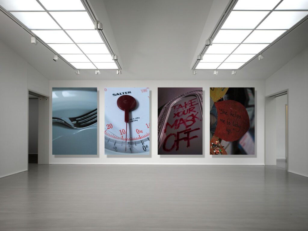
These images are symbolic towards the impact that airbrushed beauty and fashion magazines have on women’s and young girls’ perception of themselves and their self-esteem. As well as this, I wanted to curate images that created an overdramaticised, visual epresentation of pro-ana websites which are targeted towards young girls and promotes unhealthy eating habits that perpetuate eating disorders. I used a grain of rice and put it onto a plate with cutlery in alternating positions to show how extreme this issue is, and that women are not nourishing themselves with enough food to function properly. Due to the promotion of unrealistic body standards in the media, this leads to an internalised self-hatred due to wanting to have this unobtainable body, distoring their perception of themselves. I think these images are really powerful because it means that these habits can be demonstrated, even in a melodramatic way. Of course, nobody is actually having a meal like this however this is a visual depiction of the idea that a lack of food won’t cause the body to deterioriate, however when presented in this format then we can truly see how devastating it is that there are young girls being motivated to restrict themselves of fuel just because of society’s expectations of what woman should look like, making it almost impossible to feel comfort in being natural.
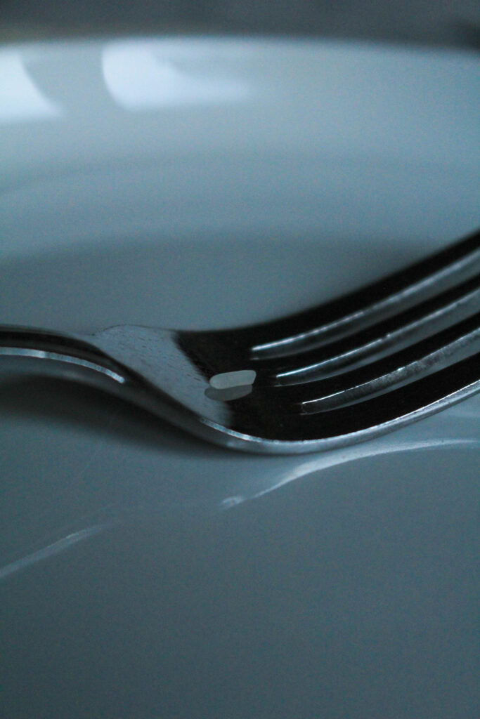
This is one of my favourite images because I have used a soft focus on the background through my short depth of field, and when paired with the bold silver of the fork, this means that the image is balanced between blurred and sharp. I removed all small specks that may have been on the camera when I shot this photoshoot, however of course I left the reflection of the fork into the place as otherwise, this may have looked really strange or it could have meant that the viewer would not know that the fork is resting on a plate, confusing the concept behind the image. However, I also really like this because adds direction into the image, where the end of the fork and it’s reflection oppose. This adds line into the image, which means the viewers eyes can be drawn through the image to flow easier.
The fork is highly contrasted against itself, meaning that it appears almost black instead of a light silver. I think that this is crucial to the image because it means that the foreground and background of the image can be distinguished easier, making the focal point of the image more bold so that I can further create a focus around the concept of eating disorders. I zoomed in very close to the fork so that I could use this image as a detail shot in my photobook. As this is a sensitive topic that I am focusing on, I think it is crucial that I incorporate this into my work because it will allow me to pick apart the structures in society and focus on the small clues in the environment that point to the feminist movement or stereotypes in general.
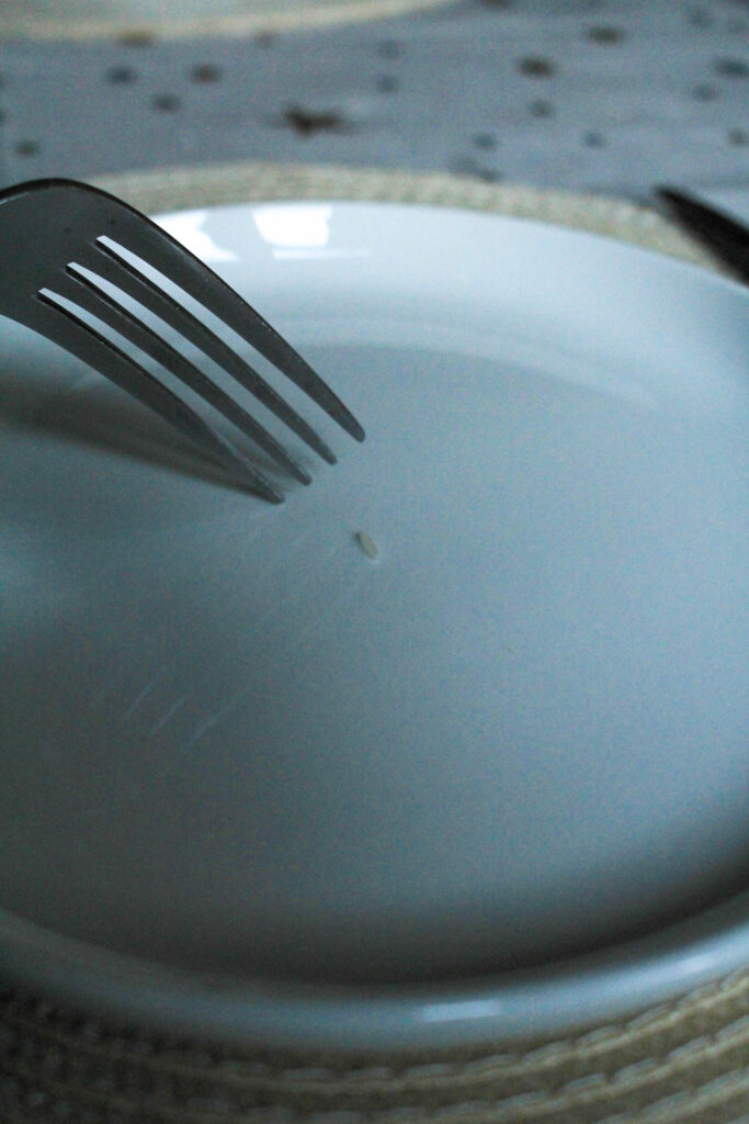
Similarly with this image, I zoomed out from the previous angle and put the grain of rice in the middle of the plate to be more emotionally provoking. This is because the sight of the empty plate with just a grain of rice on may be more compelling than the previous image as it is more direct in showing that this is the only thing being provided as food. I used a short depth of field again to blur out the rest of my table as this is not relevant to the concept of the photo so I didn’t want this to distract the viewer from the message that I am trying to send.
I held up the fork in a hesitant way, kind of drifted away from the grain as if it was being ‘played’ with. This is metaphorical towards the way that eating disorders are still psychological issues, even though the consequences are physical, where the patient feels restricted in her eating by her brain believing that she shouldn’t, leading her to struggle and hesitate when about to eat. I wanted to do this as eating disorders are so detrimental to the mind, body and soul so that, even over something as small as a grain of rice with little to no calories in, there is still a significant struggle to feel able to actually eat it. I slightly got the top of the knife in on the right side of the image so that I could almost pretend that this was an actual meal with the table set as I feel that this is more compelling in making the viewer feel sympathetic, as this is such an abnormal scene.
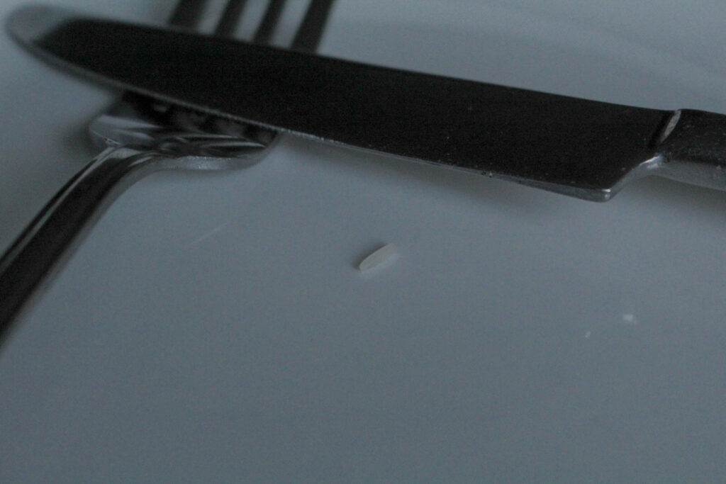
Finally, I also took a horizontal shot as I wanted to be able to vary the direction of my images in my photobook and I wasn’t sure which way I wanted to place them yet. For this, I just simply crossed over the knife and fork on the plate as if the subject was finished. I did this leading on from my previous image concerned with the hesitancy that eating disorder victims may face even when trying to eat something with practically no nutrition at all. In this image, I have staged the knife and fork into a ‘finished’ position to act as if the hesitancy had won over, leading this ‘meal’ to being finished before it even started. This image uses a sharper focus to provide a different perspective into my work, however the exposure is still low to provide that ominous tone I wanted in this set of images because it is such a deep and dark topic that I am representing, therefore I wanted the aesthetic to be linked with this to make it flow more.
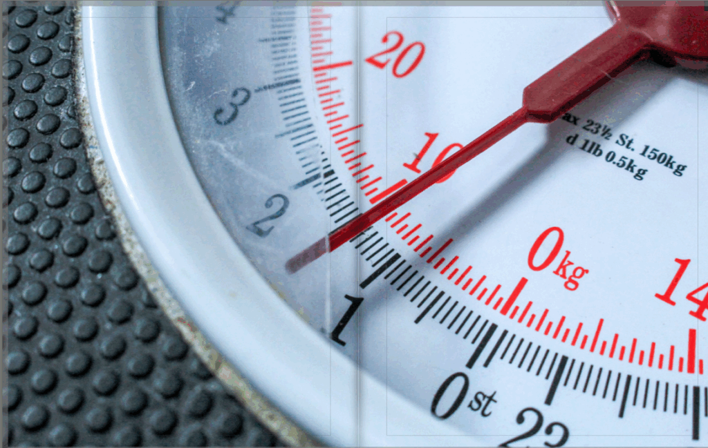
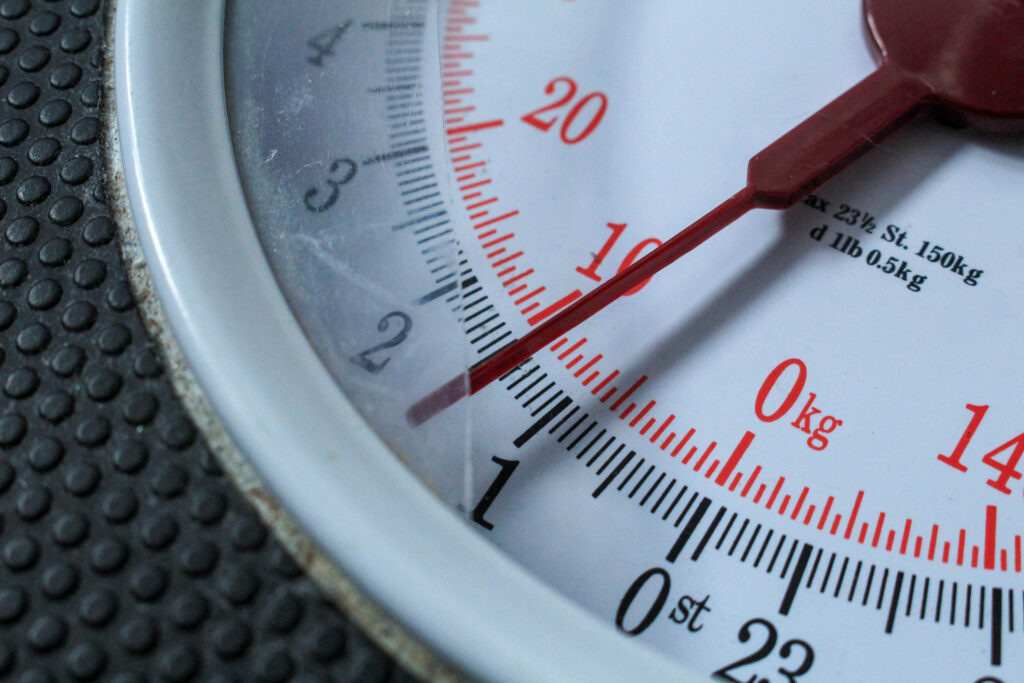
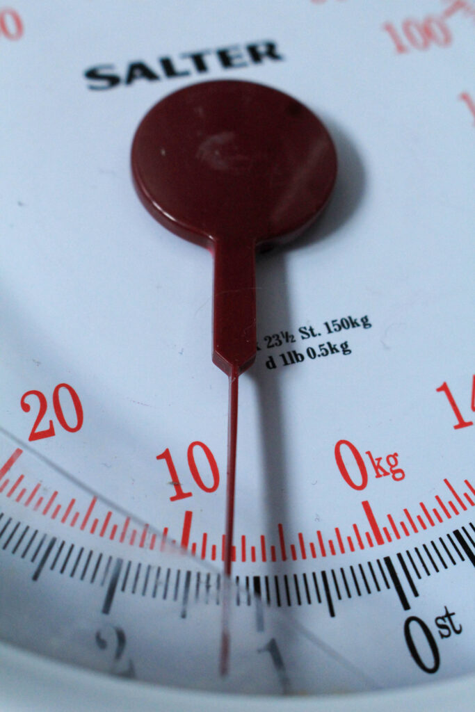
For the next few images, I shot different angles of a broken scale that I have in my bathroom. I included multiple versions of this because I think that there are multiple successful images here that I could also experiment with if I don’t end up incorporating these into my photo book the way that they are. As the plastic on the scale is smashed, I wanted to use this as it can represent the anger that loved ones may feel when supporting a family member with an eating disorder or body image issues as the victim wouldn’t have the same perception of themselves as their families would. This could also be representative of the frustration that a victim may feel in their suffering because they are aware of what this illness is doing to them, however their brain becomes programmed to act in this way, making the scales smash as they are so outraged that they are experiencing this.
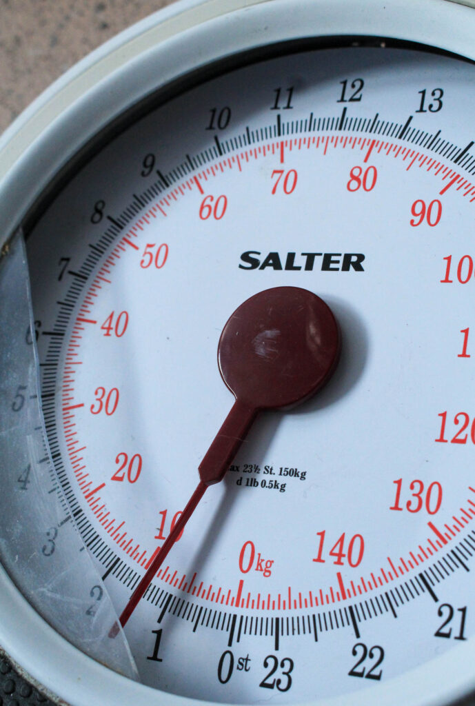
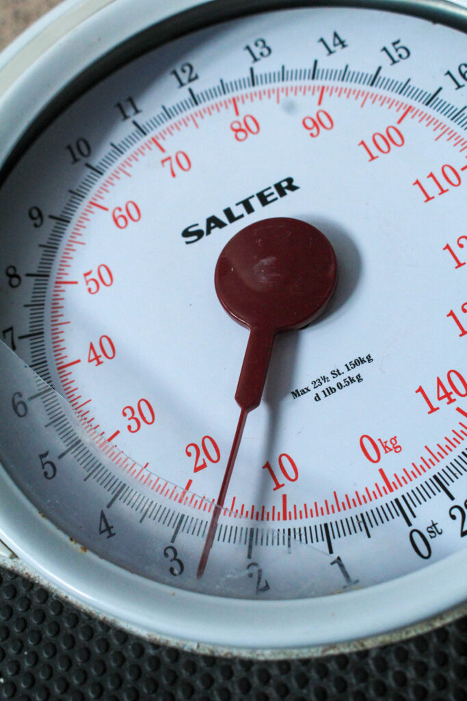
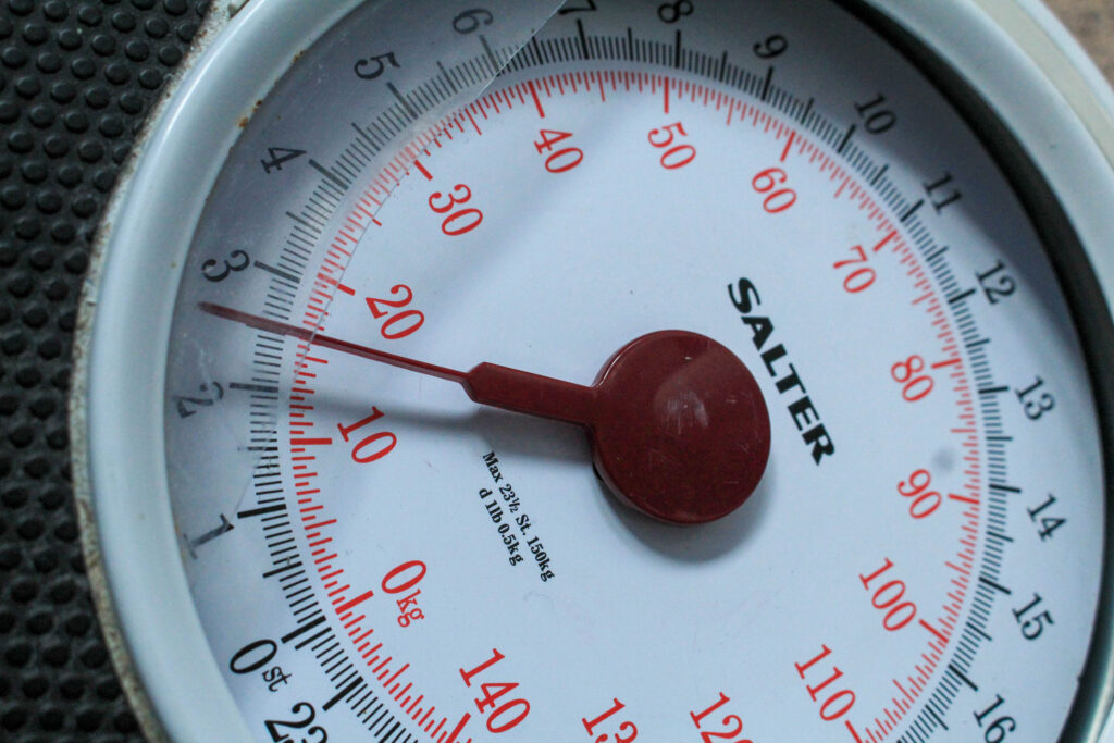
As the scales were broken the arrow would go onto random weights, however I feel that this contributed to the concept of the photographs as it points at 1 stone which is an incredibly low weight, as if someone struggling with these issues is stood on it. I took this image horizontally as I know that the image or scales when associated with eating disorders is extremely emotionally-provoking meaning that, depending on the quality of my other images, this may be able to be used as one of my defining images in my photo book – a double-spread image to validate the viewers preconceptions of what they believe the photo-book to be about. I used natural lighting for all of the images of this nature as the scales are white, so I wanted this to be enhanced with natural shadows which aren’t as deeply contrasted. I used the spot corrector tool in Lightroom to remove some of the obvious particles that had been on the scales, however I didn’t remove all of them because I feel that the dirt on here may be relevant to the way a victim of an eating disorder will be frequently using the scales in order to keep up with the progression of their illness.
I took a few more images at different angles to try and see which would be best. This would also allow me to be more creative when designing and sequencing my photobook as I can alternate whether I want a full-page spread or pairing it with other images.
Barbara Kruger Extension:
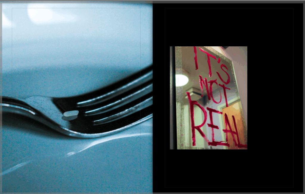
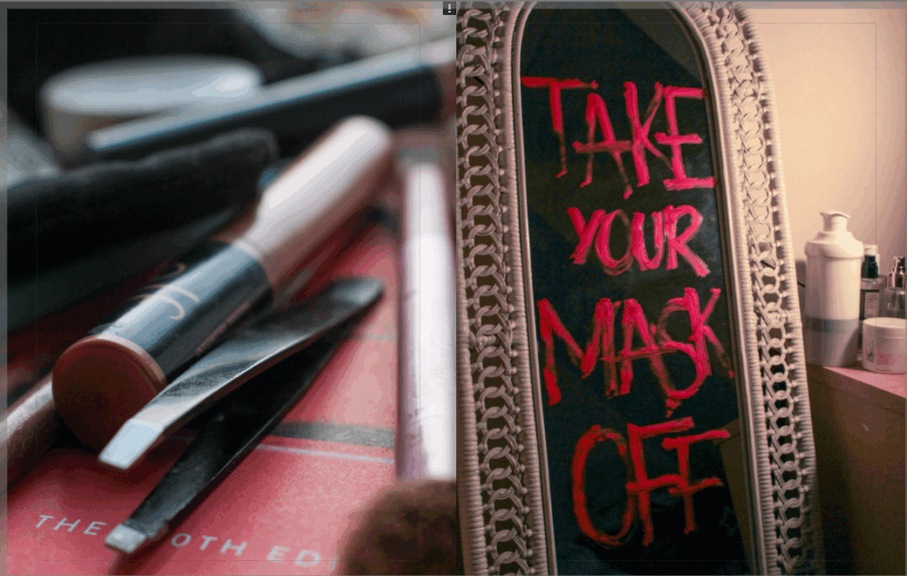
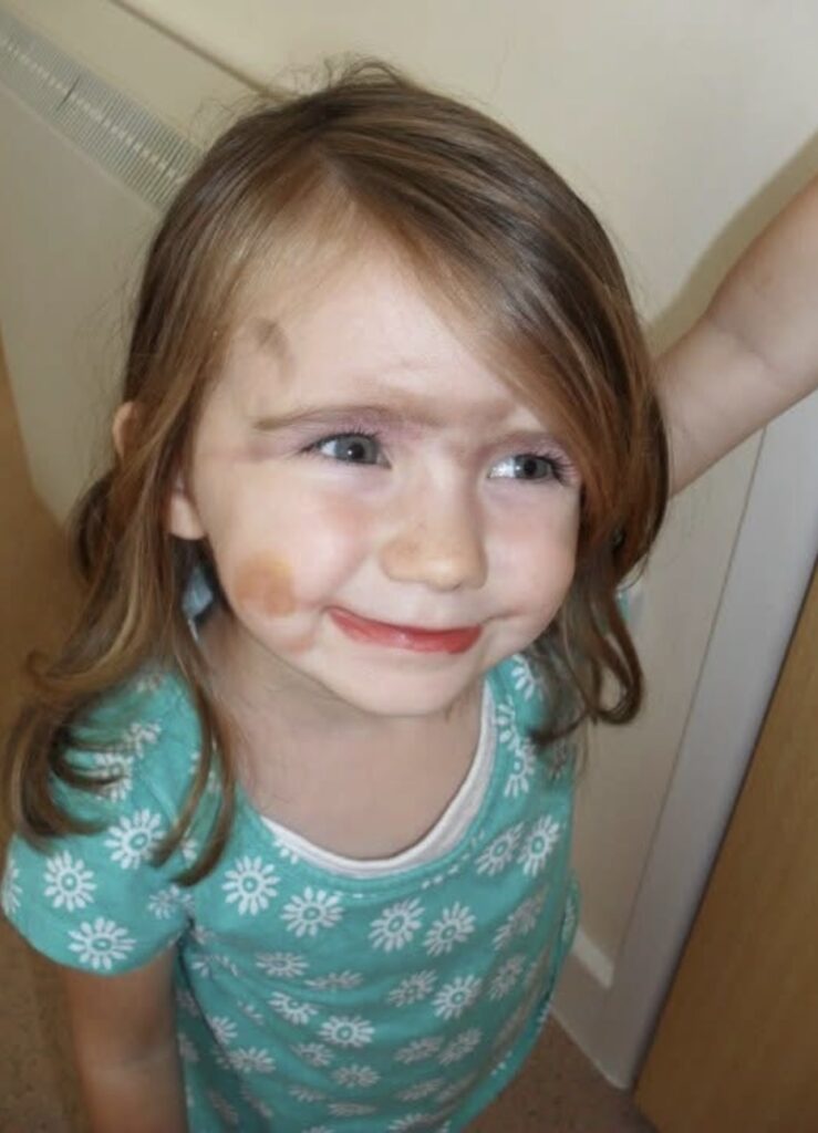
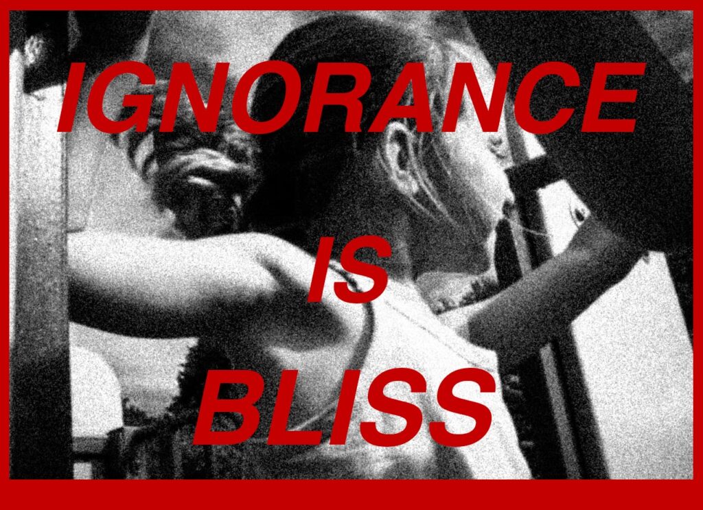
For these three images below, I utilised the red, direct and interrogatory messages that Kruger incorporates into her work and wrote different statements in red lipstick across different mirrors. As Kruger’s work tends to challenge aspects of the beauty standard and targets the medias inaccurate representation of women, I wanted to write these phrases onto mirrors as this is the environment of which women would be comparing themselves to these airbrushed images – being in a bathroom or bedroom mirror and feeling defeated in themselves due to this unrealistic and unfair comparison.
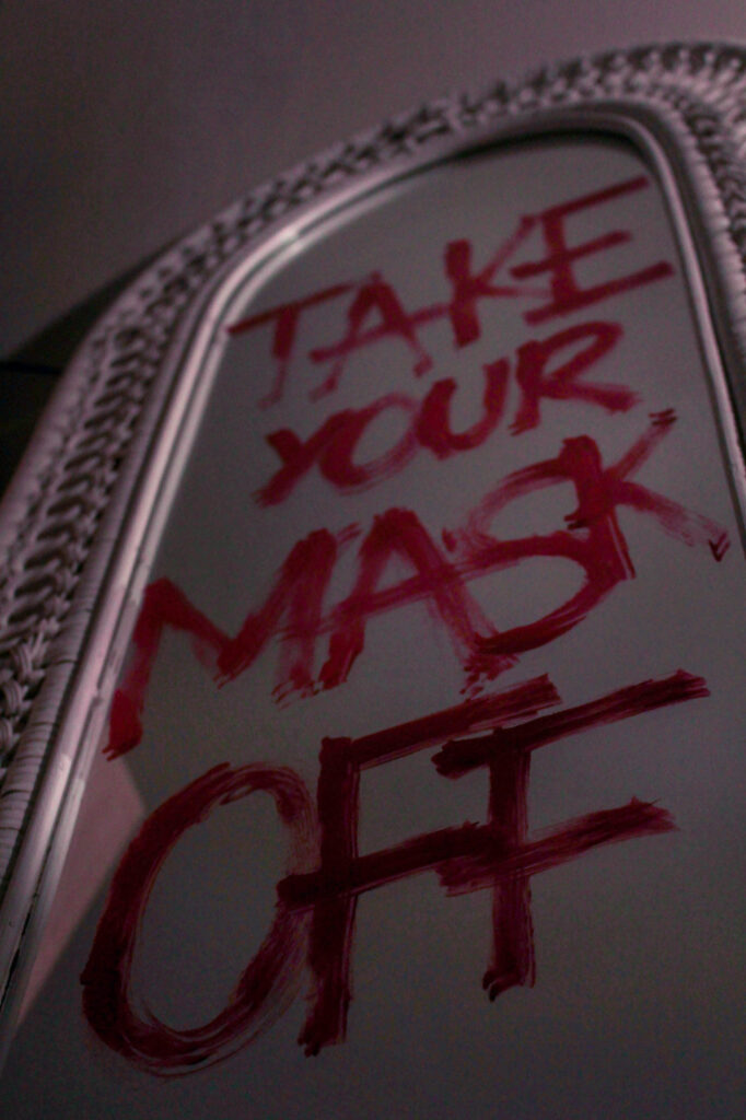
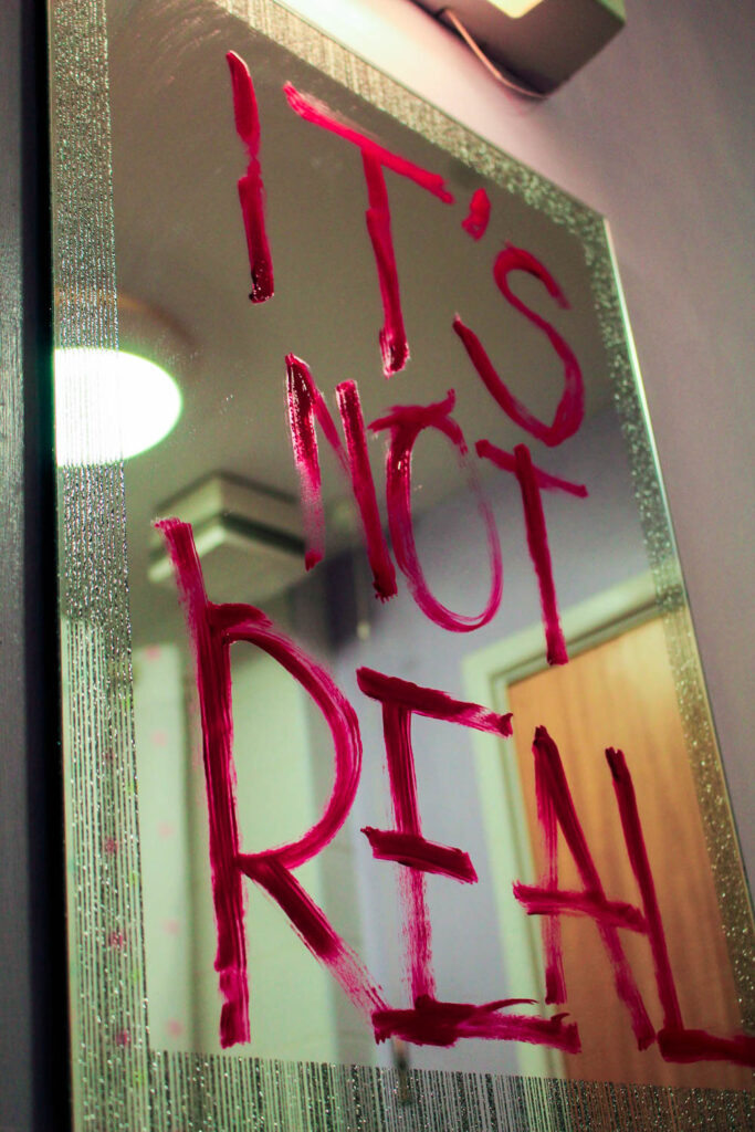
I though that I could employ this by acting as if the mirror was repeating these phrases, for example the third image states ‘It’s not real’ which is a message to how women may develop body dysmorphia due to their distorted perception of themselves and what they believe they should look like. With the statement ‘Take your mask off’, I put this because it acts as a statement to remind her that there is no need to hide behind poor self-esteem at the hands of media and magazine outlets because it sets unrealistic and unobtainable expectations about themselves and other, being that there is no need to hide behind insecurities that have arisen from a photoshopped image.
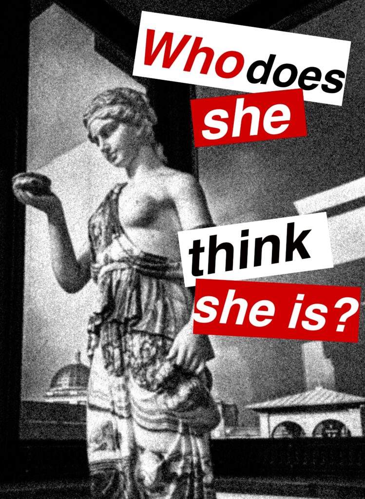
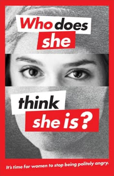
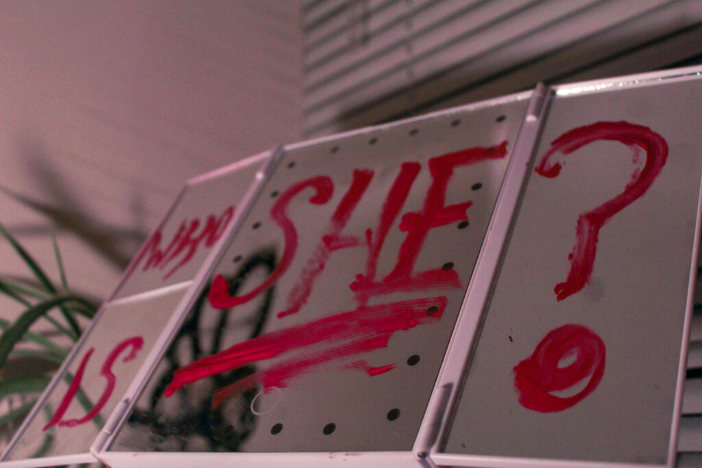
With the 2nd image, I put ‘Who is she?’ as a link to Barbara Kruger’s work as one of her popular images consist of a woman’s face with the words ‘Who does she think she is?’. I saw this as an effective way to make sure that my work still resonates with Kruger’s, however not exactly in the same way or using the same phrases as I don’t want it to be too direct. When I wrote each of these, I was cautious with how much product I applied to the mirror as I didn’t want it to look thick or neat, I purposefully made the letters have gaps in or look rushed because this emphasises the message. This way, the words come across intense and as if they have been written erratically to push the severity of this issue that I am targeting. This could also be interpreted as the ‘subject’ (being a woman or young girl) writing this on her own mirror in order to avert her mind from focusing on what has been dictated to be ‘undesirable’ by these standards, therefore she has written this really quickly on her mirror before her brain can begin to insult her.
I think that this will work really nicely with my Barbara Kruger photoshoot experiments as the red can be a predominant factor that is clearly linked all throughout, which will also help me convey anger and rage as if ‘enough is enough’. I think that I am going to take more photos in this way to make sure I can include them at balanced intervals in my photobook.
In this image, I shot from a low angle almost at the floor in order to gain depth in the image, seeing as the word ‘off’ looks larger than the initial word of ‘take’ although they are the same size. I used artificial lighting for this by setting up my lamp a bit further away and pointing it diagonally to the writing on the mirror. As this was a warm toned light, I then went into Lightroom and decreased the temperature so that the image would look more balanced as the saturated yellow tinge that the lighting gave clashed with the writing, making it more difficult to read. By doing this, I neutralised the temperature of the image so that it appears as if I’ve used a regular lamp for this. Once again, I have employed a short depth of field in order to make the writing zoom out of focus the further away it was, however I was careful to not make this too short as otherwise it may have made the image confusing if it meant that the writing was difficult to read until the very end, defeating the whole purpose.
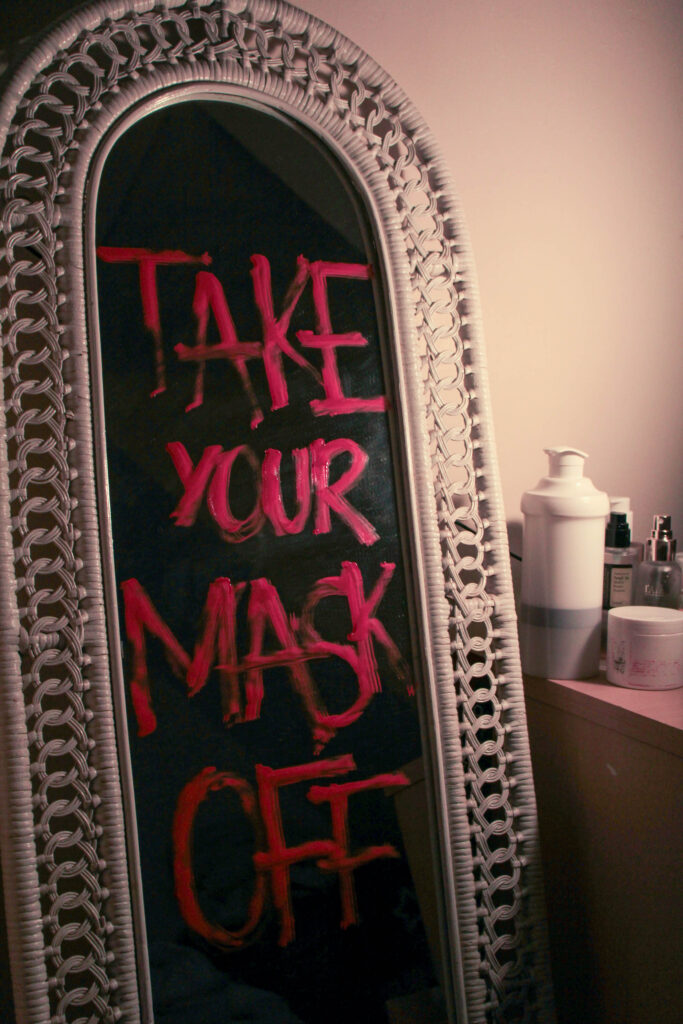
I also took this image using the same mirror from a different angle. I wanted to include this image too as the background has become blacked out due to the direction of the lighting being pointed in the opposite direction. I also really like the way that there is a large cluster of skincare next to the mirror as if this has been excessively used in order to try and heal these insecurities. I think that I am going to experiment with what I can do with this image as my other composition is better, however I still feel that this image will be useful.
Similarly, I used a smaller mirror for this to include different types of mirrors as this is a universal issue rather than just specialised to one person, meaning that I can act as if these different scenes are representing different women’s lives. I also wanted to use this mirror as it has a similar aesthetic to old Hollywood mirrors with lights all around the side, which is beneficial to the concept as the beauty standard has evolved since this period. With the lipstick, I wanted to really exaggerate this phrase as I feel it can be interpreted as an internal question, such as a young girl looking at her reflection in the mirror and not recognising herself after the distress of trying to alter her appearance in order to try and meet these standards. This is a very important issue that is growing more common, where girls are having issues with their self-esteem at an incredibly young age when this should not be their concern, explaining why she asks who she is because appearance should not be a priority or insecurity for such a young person.
For this image, I used the same methods as before, however this didn’t require a temperature change in terms of lighting as I just used my bathroom lighting which was the correct tone that I wanted. I liked using this mirror because it has glitter around the edges, sort of romanticising the idea that there is this false beauty standard that appears to be solely about fashion and beauty, when in reality it is truly just a form of demeaning women based on just appearance.
Hannah Altman extension:
Looking further into Hannah Altman’s work, I experimented around with liquid highlighter as a replacement for glitter in some of my images as I wanted to see how this would look, as I was able to manipulate it more due to it being liquid. Whilst I really like the technical elements of the two images below, being that the short depth of field has been really effective on honing in on the highlighter, however I am not sure if I would like to develop this further as I feel that it seems more muted when this project is about challenging these problems directly.
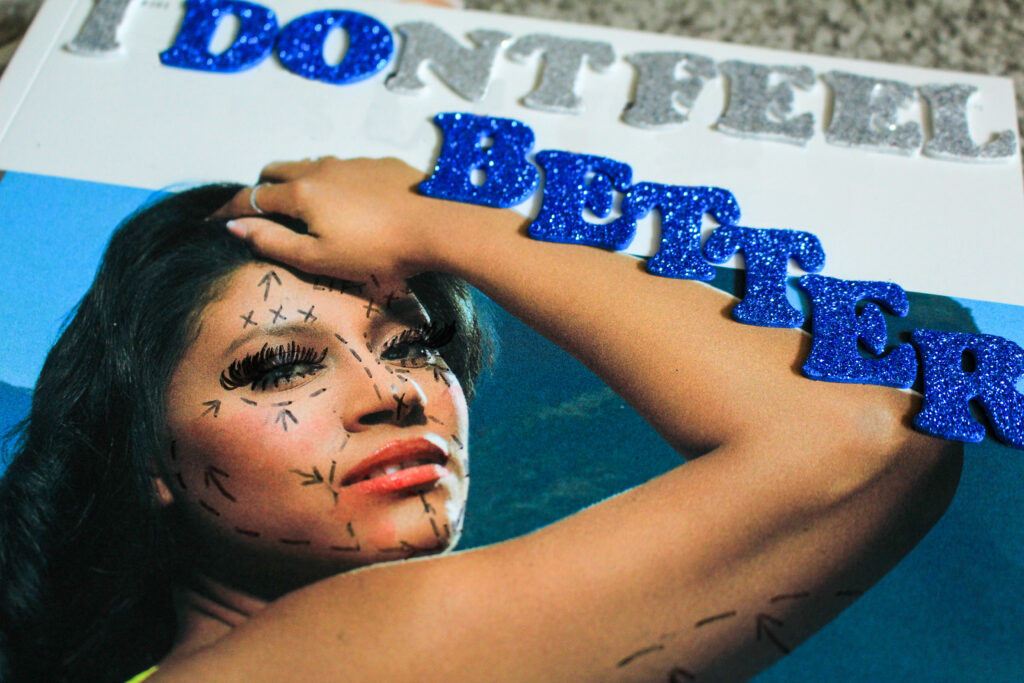
However, this led me to start thinking deeper about the beauty standard and more specifically, how I could represent this in terms of magazines in a more direct way as I felt that my current work hadn’t quite targeted that explicitly yet.
I bought a local magazine that didn’t use specialised paper so that I could manipulate makeup into it. Within this, I tended to use a short depth of field as I wanted to focus on the nature of the makeup rather than the actual components of the composition. My goal here was to make it appear as if a girl had been looking at the cover of this edited magazine and erratically was putting on makeup in order to try and look like her, coming from a place of insecurity and a persistent need to want to fit into what society expects rather than being an individual.
I shot this with the camera placed on the magazine and directed slightly to the cover so that I would be able to include the model’s face using depth, but still being able to keep the focus on the concealer that I dropped. I began this by gathering lots of different makeup, and then splattering and dropping it in a randomised way so that it would fall naturally without me having to touch it as then this would look too staged and distort the concept that I had initially planned for. As you can see, in-front of the concealer, there’s a thick patch of concealer which means I can begin to reinforce the idea that a thick amount of makeup has been layered on over this girls face in order for her to feel the slightest bit confident. I used natural lighting for these images as I wanted to use natural shadows rather than artificial.
It is more visible in this photograph to see the way that the makeup particles are spread out as if they have been used in a rush and discarded carelessly. I incorporated the model’s eye into the right edge of the image so that it would be clearer to the viewer that this is targeting the unrealistic expectations that magazines push. I used similar techniques in the rest of my photographs of this style:
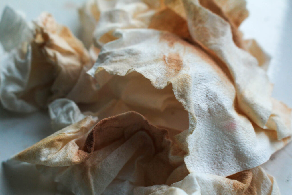
I took inspiration from my previous photoshoot, where I layered multiple cotton pads on top of each other lathered in foundation. Whilst I liked these images, I wanted to find a way to add more texture into the composition of these images as they came out looking relatively flat. Here, I used my own old makeup wipes and gathered them as they were dried out, meaning that they had more shape to them and would stay in whatever position I put them in – giving me more freedom to be creative.
I crushed a handful of them into a ball, and then let them slowly unravel themselves as they wouldn’t move very quickly or drastically. As I shot this in natural lighting, the shadows that each crease has made off of each other is more gentle rather than having a high contrast so that all of the old makeup is visible. I still used a short depth of field to blur the background, however the centre of the image has high definition which means there is a lot of texture within the composition, for example I have been able to capture the small fibres on the edge of the makeup wipes.
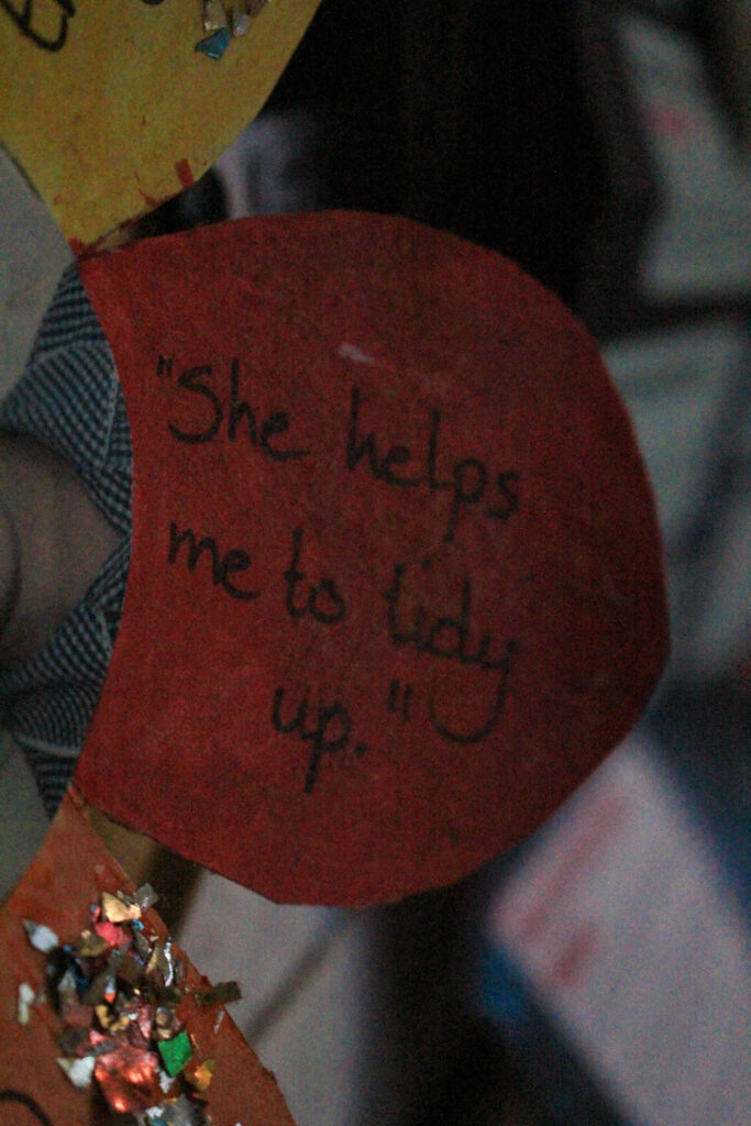
I took this photograph of one of my primary school projects that my teacher made, where my picture was in the middle and other students gave compliments to write around the edge. I wanted to photograph this one specifically as a kind of experiment to see how applicable this is to my topic. Whilst I understand that this is something that had positive intentions to uplift me, however I felt that this could be relevant to the stereotypes that have developed over the years since this time. For example, this was an alternative way of stating helpfulness, however (whilst this wasn’t too long ago either), in society now this may be perceived as a role that I should possess even at such a young age due to the traditional idea that women should stay at home and tidy up. This could be seen as a self-fulfilling prophecy, meaning that I would help people tidy up because I believed that was my role and purpose in society.
Of course, the actual intention was not this and was just a genuine nod to helpfulness, however I feel that this can be interpreted this way in modern society as issues within feminism begin to unravel.
For these two images below, I started thinking about how I could further the concept of male violence and how young children are very susceptible to being influenced by these predetermined stereotypes and misogynistic ideologies about women, for example a young boy may become influenced by these statements and begin to act on them against young girls through violence as this can be highly influential in furthering the idea that women should be seen as lesser than men. This got me thinking into how I could connote the topic of male violence or domestic abuse into my images because it is such a sensitive topic, so I didn’t want to go with such an obvious perspective as it is so heavy and could be regarded as offensive if I didn’t do it right.
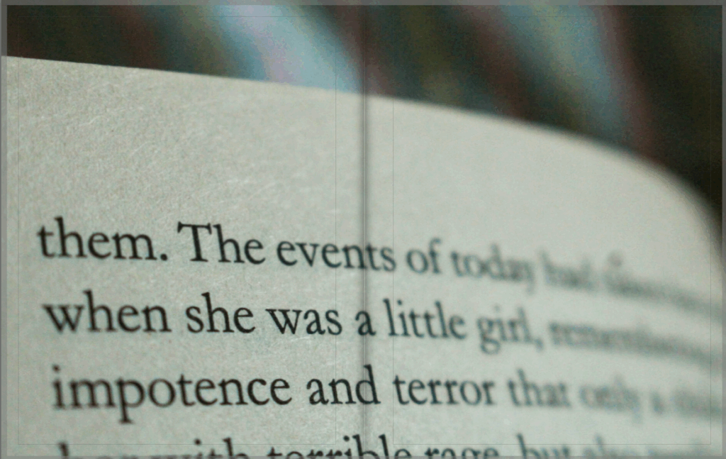
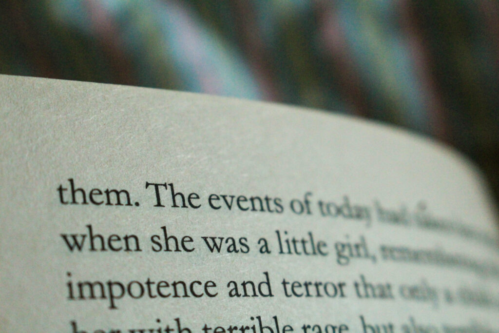
The first idea that came to mind was to use written words out of books, and using a soft focus to create a short depth of field in natural lighting so that this can act as an emotional trigger for the viewer to sit back and evaluate what they have just seen. I think that the short depth of field contributes greatly to this as it will allow me to highlight certain areas to almost symbolise ‘blocking out the noise’ of all else around individual when they experience male violence or domestic abuse, representing the disorientated thoughts and feelings that would arise. This could also be highly representative of how this could cause a numbness, meaning a woman is so used to facing this kind of abuse from being trapped in this relationship that she fades out from reality when it occurs to almost ‘cope’ better.
As this was at the top of the page, I was able to effectively blur out the other words that were not relevant to my photoshoot, and capture ‘when she was a little girl’ above the words ‘impotence’ and ‘terror’. I think that this combination of words within one section is very powerful because we wouldn’t want to feel as if these two phrases would ever be associated together, however they are due to this kind of violent behaviour that can be seen to be increasing against young girls. For example, stories have began to arise more frequently in the news about young boys having violent actions or even fantasies towards young girls due to an emerge of podcasts and YouTube videos promoting misogynistic comments of hate against women, which impressionable minds come across and become influenced by. This is extremely dangerous as it begins a new generational perspective of hate against women that can become out of control, to the extent that there is now male violence between schoolchildren.
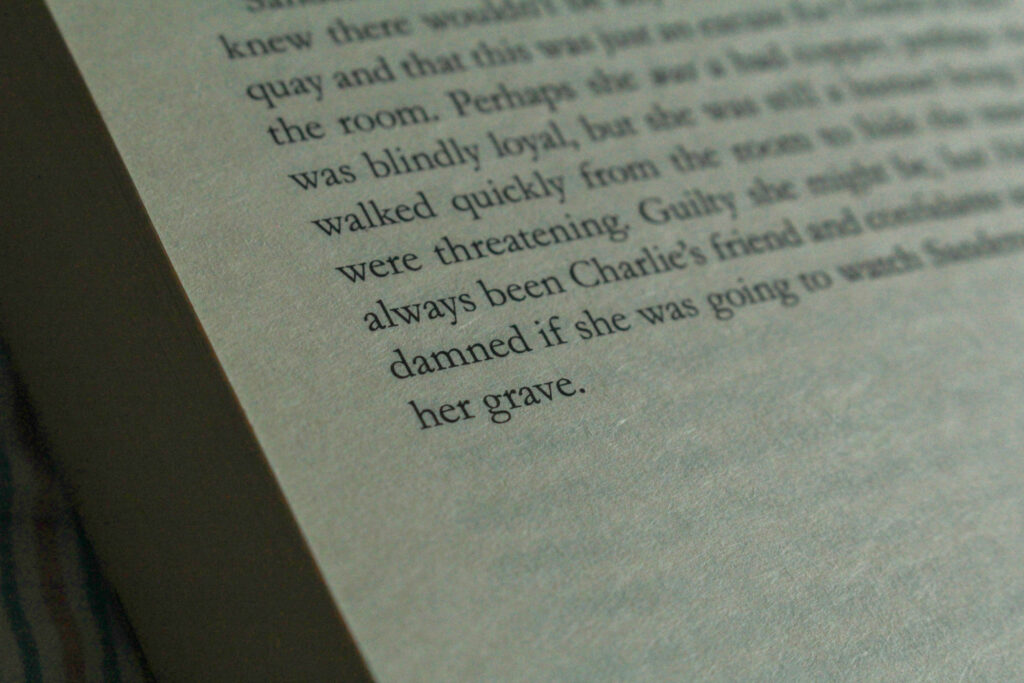
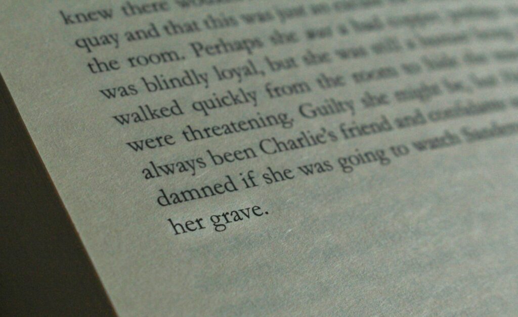
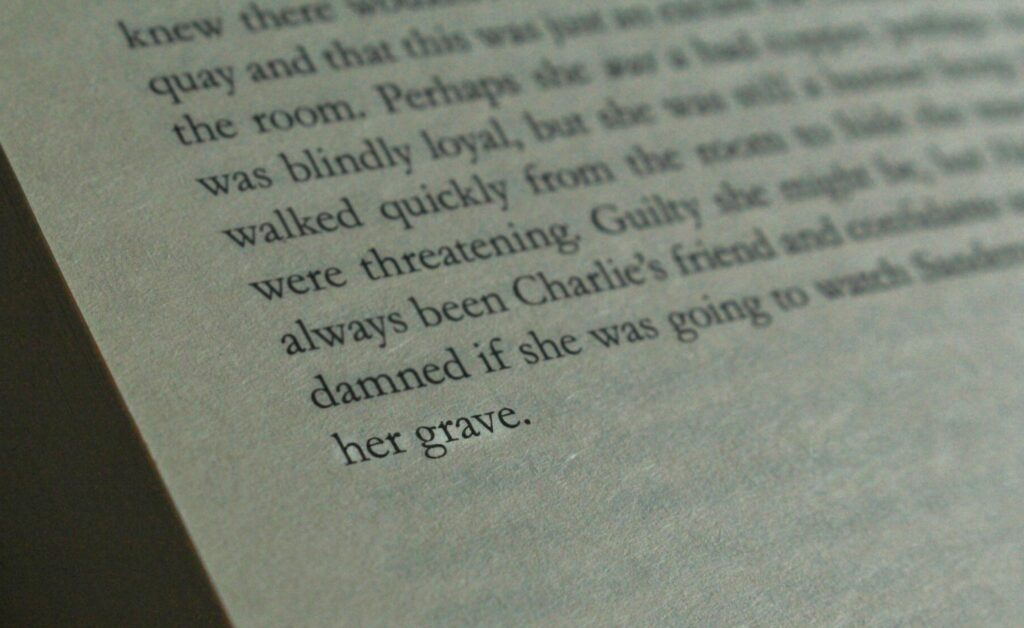
For this image, I am going to experiment on Photoshop to try and blur the irrelevant words out also that the viewers focus is on the words ‘her grave’. This is a more direct approach to the topic of male violence as it explicitly talks about a woman dying, w which is why I wanted to involve it. Whilst there is no other context, I think that this will be able to speak for itself and that the viewer will be able to interpret it in the way that I have intended once the other words are removed. I tried to use a short depth of field on this, however I found it very difficult as this was towards the back of the book so it would not lie flat, so I could only use one hand.
I used this tool to try and highlight the words instead as it would have looked strange if I had blurred out all the other irrelevant words apart from ‘her grave’.
Outcomes:
These were the results as I found it quite difficult to work with the dodge tool so I decided to just not use this image.
Photobooks are one of the many ways that photographers present a project of images targeting a certain topic. This is typically used by photographers when the concept is storytelling, as this particular method means that the images can be linked stronger through the layout. Multiple images can be compiled into one page or displayed individually, and can bleed right to the edge of the page or placed in strategic ways such as in the corner.
The layout of a photobook is extremely important because this plays an active role in ensuring that there is a consistent narrative across the body of work being presented. This is because the way that the images are linked together has an impact on the overall reaction of the viewer. For example, as the sizing and number of images can be varied, this means that a photo can be paired with a smaller one to extract certain emotions from the viewer as it can be used in a metaphorical way – such as the smaller image being less significant. Text is also sometimes incorporated into phonebooks which means that contextual information about the images can be provided so that the direct interpretation can be highlighted, whilst also being able to provide opinions or quotes which can contribute to the overall aesthetic of the book itself.
For my final study, it is important for me to deconstruct a photobook so that I can gain inspiration for not only the internal layout as this will give me a starting point for the placement of my images, but also the external aesthetic being the front page. The front page is one of the most important factors contributing to a successful photobook because it is what will draw the viewer in, being that this is the first initial impression that the viewer will have before actually looking at the contents.
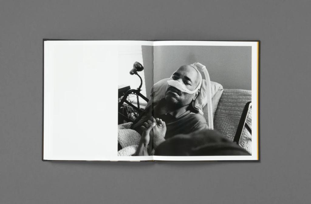
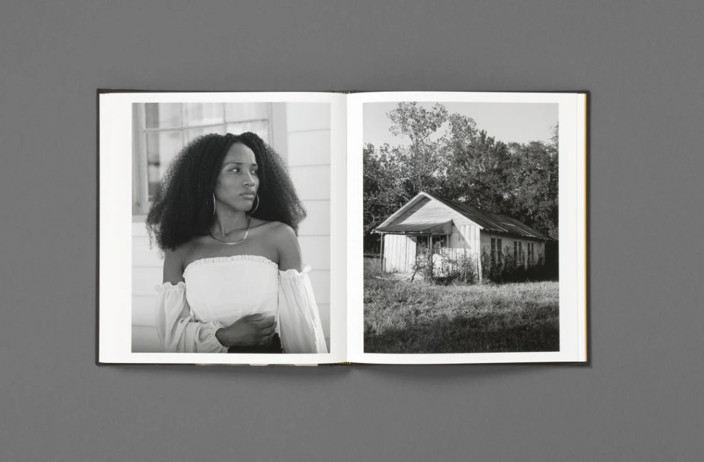
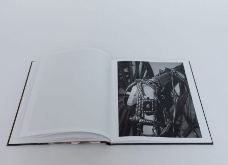
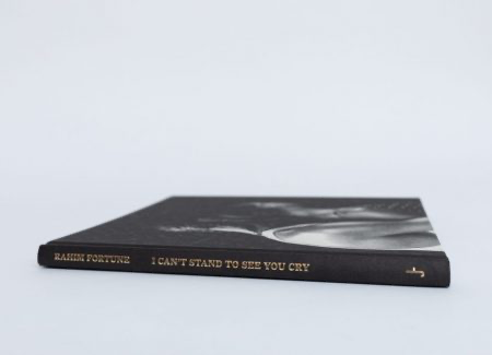
I have chosen to look into Rahim Fortune’s I Can’t Stand to See You Cry, being that I really liked the overall aesthetic to the photobook as well as it being relevant to the theme of Union due to it’s exploration of community and relationships during a time of vast environmental and health crises, using his own personal experiences to highlight this.
Rahim Fortune’s – I Can’t Stand to See You Cry
“A year and change into father’s diagnosis, his nightly calls began to become more frequent. My sister and I, his youngest children, spent countless hours in his room caring for him as his body gave up. Many nights we’d leave his room both knowing his condition was getting much worse, but we chose to say nothing of it.” – Rahim Fortune
Fortune uses ‘I can’t stand to see you cry’ as an exploration of Texas and its surrounding states in America, looking into the people who reside in this complex landscape. This allows him to analyse close relationships between family and friends, whilst also showing the absence of relations with strangers. In the midst of the COVID-19 pandemic, this photobook unravels how the community works together in order to maintain grace through difficult external issues, being environmental too. This work stems from Fortune’s own personal experiences too, where he attempts to unpack his own identity through an authentic approach during a cross-country move, the loss of his father and civil unrest, reflecting on the past events of his life and how this may shape his future. By having a holistic viewpoint in this photobook, Fortune’s images are able to highlight the conflict between public life and private life, looking at the issues in everyday life that are deeply rooted in the landscape around him.
Fortune describes this second book of his to be a culmination of the last five years of “Black love, photography and history”. (Anothermag)
‘I can’t stand to see you cry’ was initially intended to be a documentation of the progression of his father’s illness, being hospitalised three times for Amyotrophic Lateral Sclerosis (ALS) as Fortune watched his father’s body fail him repeatedly before he passed away. Much of the work was curated in the past year however one photo does go back to 2016, where he comments that “It’s like a film noir Western of my life,”. As his father’s health declined, this was parallel with the country’s as the pandemic began to take millions of lives. Whilst this was happening, the recognition of police brutality and racial violence surged, specifically after the murder of George Floyd. This injustice motivated millions to join and march in the fight against this brutality, paving the way for people to come together and stand up against feeling unsafe around those whose jobs purpose is to provide protection and security. Fortune took many images during this period, especially when him and his sister would be spending long hours by his father’s bed, which were informed by the ongoing events in society as well as the thoughts that his father had about them.
Fortune grew up in the South, being born in Austin, Texas, and examines the convergence between cultural traditions and the personal expression of an individual by utilising the themes of belonging, community, identity and representation.
Fortune has similar works to this that work under similar principles, being rooted in family history and dynamics. For example, he self-published an artist book entitled ‘Oklahoma’ which also entails challenging the reality behind the persistence of racial inequality as well as economic disparity. however, this work doesn’t entirely seek to argue and criticise, but also seeking healing from events of the past.
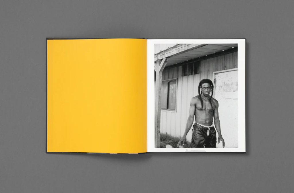
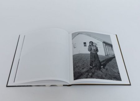
Rahim Fortune employs a black and white tonality across all of his images in the photobook where the images are seen to have a high contrast. These images a quite contemporary, including informal portraits of couples as well as images that document the Southern surroundings that he grew up in around Texas – his home town. His photographs are infiltrated with this culture, consisting of portraits of family, friends and occasionally strangers too on the street which makes it appear as if the viewer is simply crossing paths with these people in the street.
Portraiture images
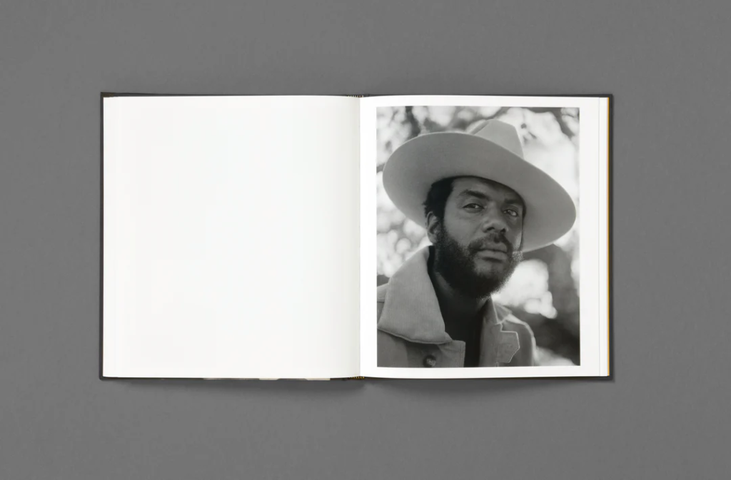
One way that Fortune lays out his images is by placing a vertical image on a double page spread by itself. This means that the viewer’s sole focus is on this one image, emphasising its significance to the narrative of the story that he is trying to depict. This also means that we, as the viewer, can try to interpret the image individually; for example asking who she is, why she has been photographed, or what her backstory is. However, Rahim Fortune doesn’t do this with all of his images as this would reduce the consistency of the storyline within his photobook and make it more difficult for it to be conveyed. The more significant or better composed images would be by themselves as this means that they can speak for themselves.
Double page spreads
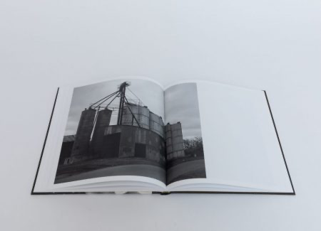
For example, Fortune creates double page spreads and pairs together different styles of images to create contrast in his work. As some of Fortune’s images consist of him zooming into particular and specific aspects of the environment, here being a bell, this means that he can pick apart small sections of his surroundings that has both significance to the Southern culture and his own personal experiences of growing up in Texas, as well as wide landscape shots to provide geographical context. I really specifically like this example here, as the bell goes in the same direction as the subject’s head. This means that there’s a sense of direction across this page where the viewer’s eyes can flow easily between the two images. This also just contributes to the overall linking of the two images as it just creates a more sophisticated aesthetic.
3/4 spread
Fortune also utilises this layout for his images, where a horizontal image bleeds onto the other page. This makes the images become more dynamic as it is increases the complexity than just keeping the image on one page or using one image on a double page spread. This is actually one of the last few images in the book, showcasing the progression of his father’s illness. Fortune showed this tender and emotional moment on purpose at the end of the book as this was originally going to focus on the process of looking after his father, however further talks with his publisher allowed him to evolve this into a deeper and more holistic reflection. However, Fortune does still take ambiguous images to suggest that the family is dealing with supporting a loved one with serious health-related trauma before this near final image to link a face to this suggestive content, for example there is a photograph of an empty bed with medical equipment surrounding.
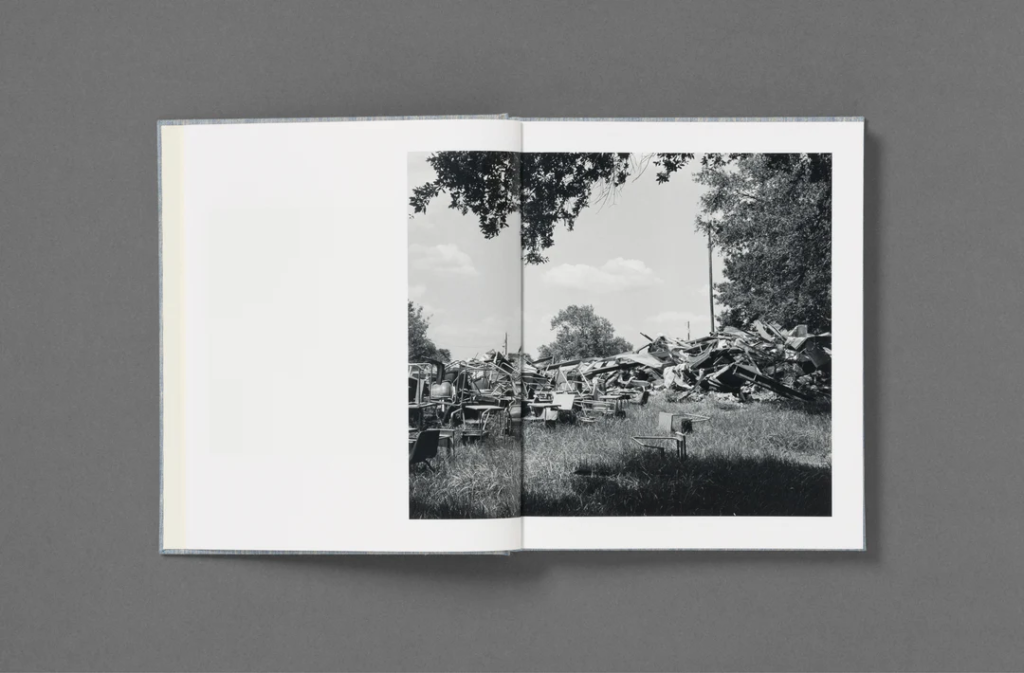
More image types that Fortune incorporates are landscape images, which can be further categorised. For example, many industrial structures are shot as a nod towards the way that these buildings are detrimental to the environment, as well as residential houses or abandoned, run-down buildings. Further social factors are also incorporated, being a close up shot of an arm with a tattoo outlining Texas, paired with a freshly stitched scar, to show the pain and hardships that Fortune may have faced whilst growing up here, however the addition of the stitches suggests healing from events of the past. Additionally, there is a blurry shot of people running during the Black Lives Matter protests following the murder of George Floyd to show how this was forthcoming to the millions taking a final anti-racism stance, fighting as enough was enough.
There are so many different emotions being provoked in this photobook, demonstrating the strength of a community in areas of both vulnerability and connection.
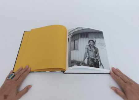
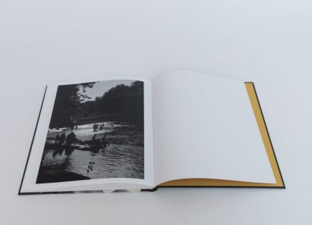
The first and last images are extremely vital to the narrative of the photobook as this can act as a summary or overview. Greeted by bold yellow endpapers, this means that the first impression that we get is an organised one as this slowly comforts the viewer into the book. This is then followed by a photograph of a man named Billy outside a house, giving a direct stare into the lens of the camera, meaning that the viewer is engaging with a subject as soon as they begin to look at Fortune’s work. Contrasted by this, the end photograph is wholesome, where both children and adults can be seen relaxing in a swimming hole next to a bridge on a hot summer day. This leaves as a reminder of the beauty of life, referring to paintings of the Romanticism era and connoting ideas of the sublime from its portrayal of sunlight reflecting off the water in a hopeful way.
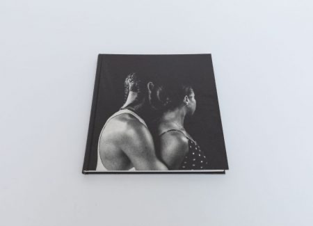
Fortune’s name and title is written in gold letters on the spine of the book, as well as the title on the back of the book in the centre, pairing this with the endpapers to keep this yellow consistent throughout. I really like that this has been incorporated as the images are all in black and white, meaning some colour is still present. Fortune uses a black embossed hardcover with 112 white pages which means that the cover is tightly linked to the aesthetic of the images. The title ‘I can’t stand to see you cry’ adds a sense of vulnerability to the book, suggesting that this could’ve been something his father would say to him as his illness progressed. However, this could also be relevant to reinforcing the concept of community that is expressed highly in the images, being that we never want to see our loved ones cry, as well as strangers too. Fortune also does not use text or captions on any pages, leaving the images to speak for themselves by being striking without any interruptions. The front cover is actually an image of Fortune and his partner, as he embraces her in his arms to connote love and relationships with others.
I can’t stand to see you cry is an incredibly thoughtfully designed photobook which allows a specialised insight into the Southern culture and community that helped shape Rahim Fortune into the person he is today. This acts as an announcement of representing his background and taking charge of the way this is perceived, providing a balance between the documentation of the pain Fortune had experienced at a time that coincided with the entirety of America, as well as the strength a community has when working together, signifying hope and promoting healing.
Once I had uploaded my images I started by labelling images yellow or green, yellow being for images that I felt I could use however there could’ve been better versions of it or green for images I thought were more successful. I flagged these images after so it would be easier for me to export them all at once, and rejected the ones where I didn’t like the composition.
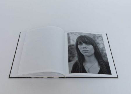
I did this photoshoot using Hannah Altman’s ‘And Everything Nice’ work as inspiration, looking into the impacts and repercussions of the pressures of the beauty standard, specifically against young girls. However, I think that my images have multiple wider interpretations within the feminist movement.
My images:
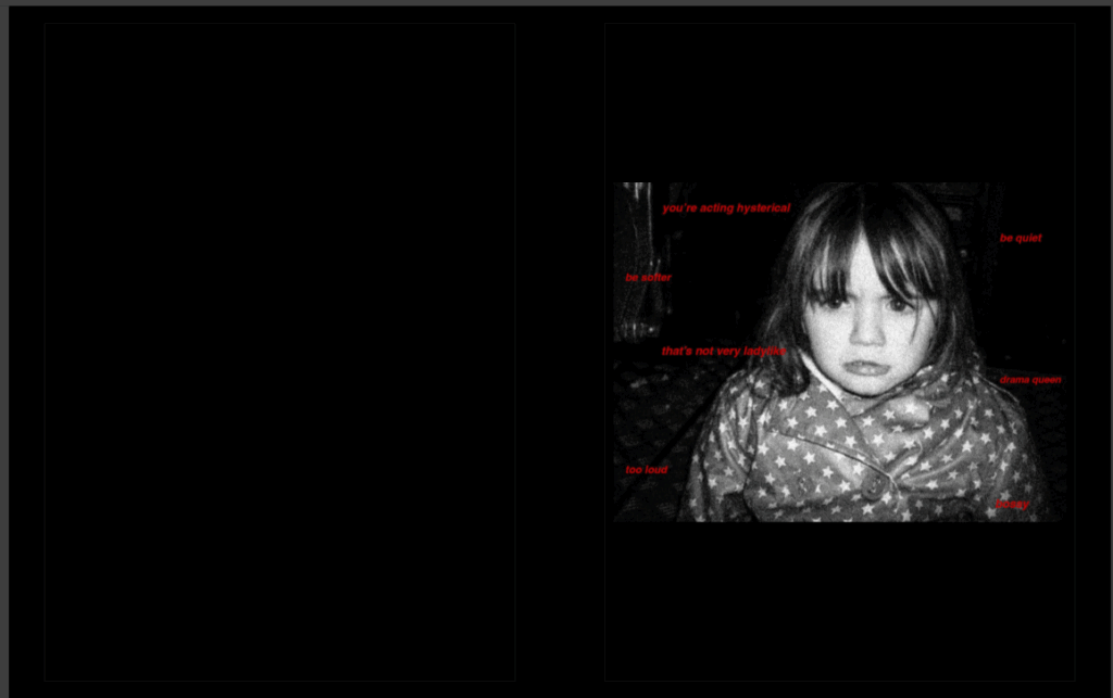
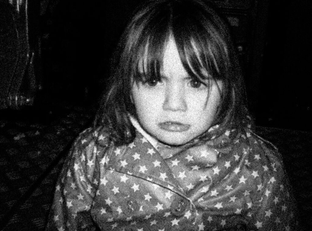
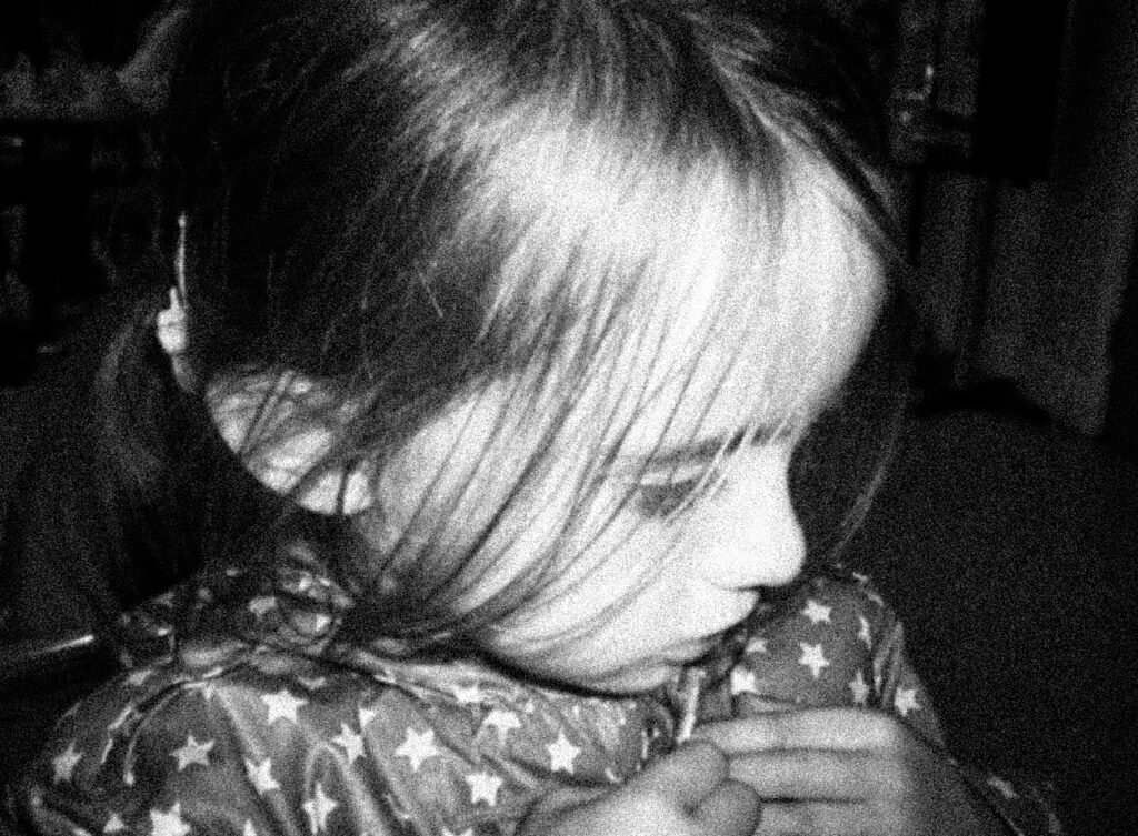
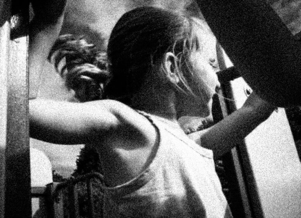
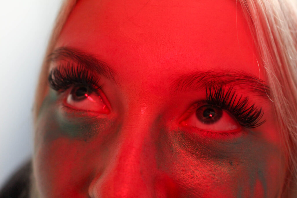
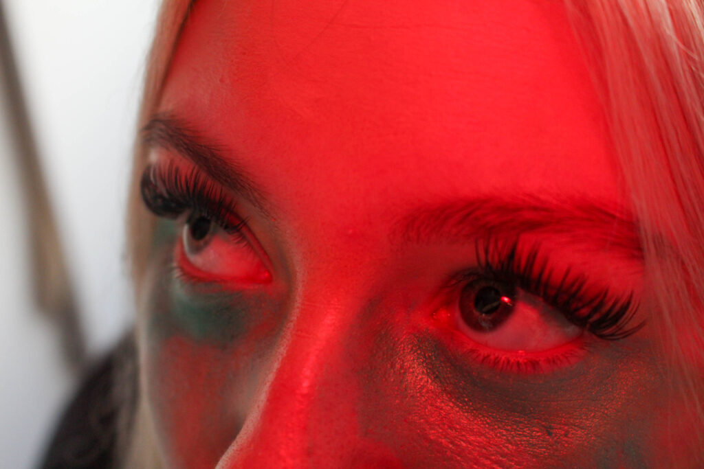
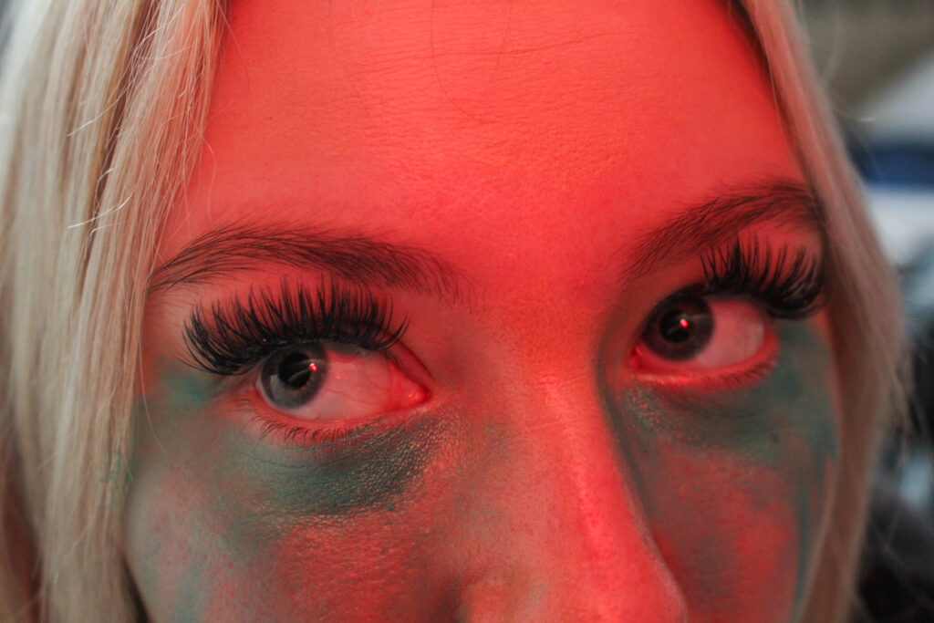
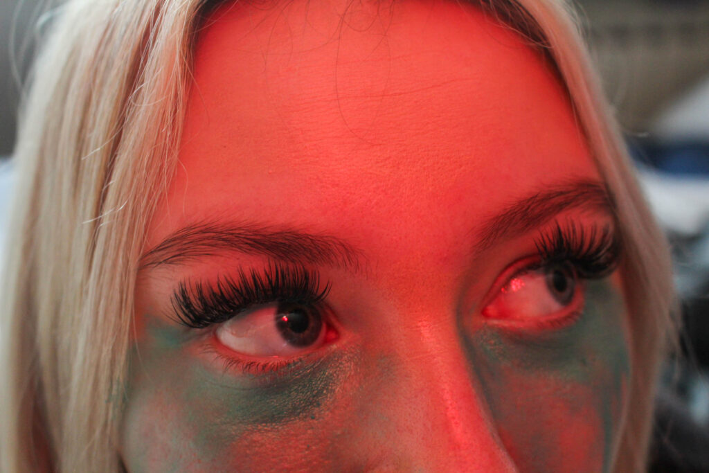
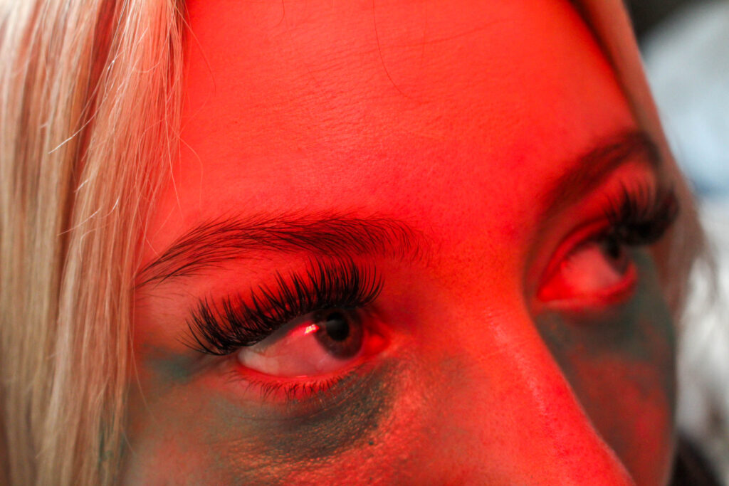
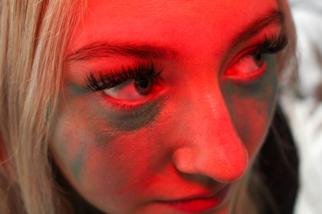
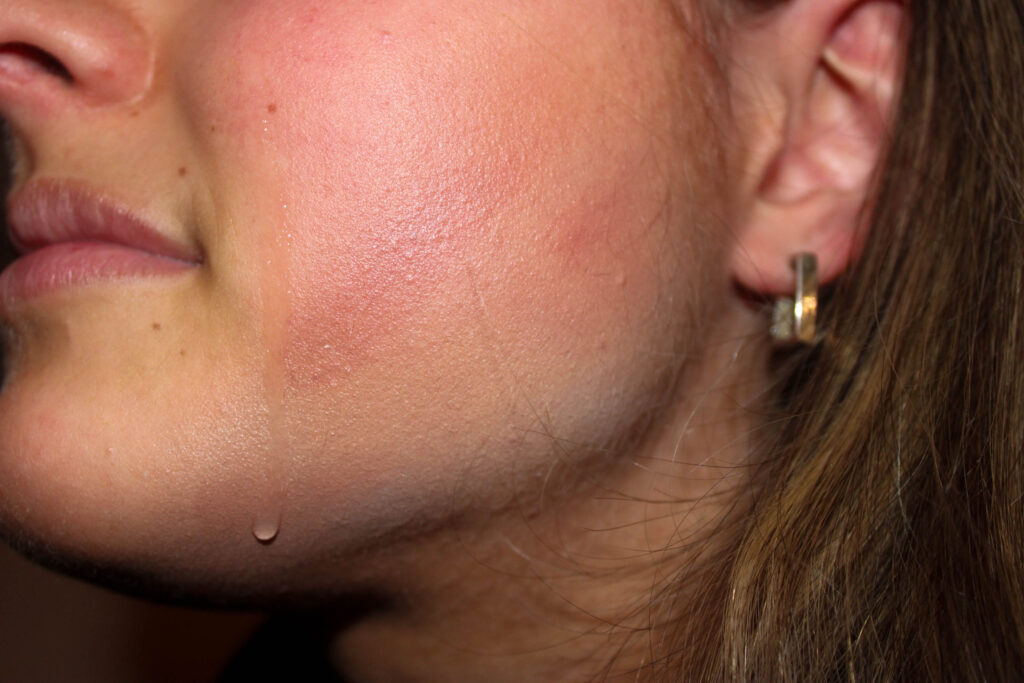
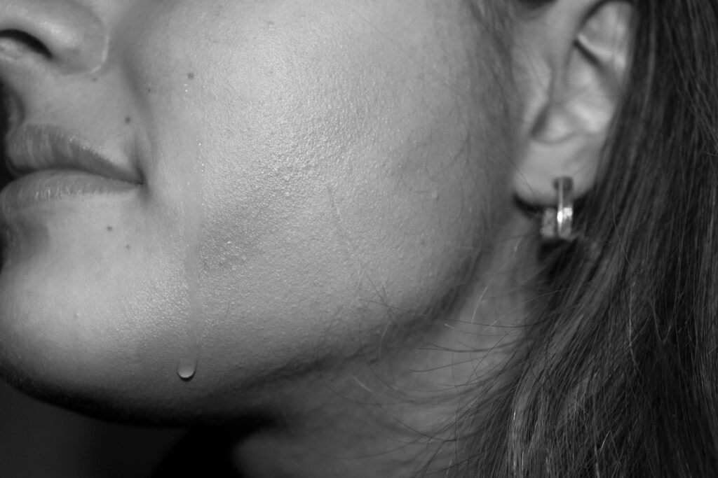
For these images here, I actually used the flash on the camera but covered it with my hand to create this red glow on the subjects face. I did this because I felt that the image alone would look quite bland as it is only the upper half of her face, and this also emphasized the blue iridescent tone of the glitter underneath her eyes. I got my subject to look in different directions in order to make it appear as if she is looking around bewildered.
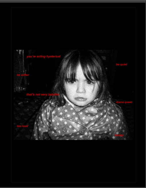
I used a short depth of field so that the only area in focus would be her face rather than including the background because this meant that the viewer wouldn’t get distracted and start looking at areas that aren’t contributing to the meaning behind the image. My personal favourite is the first image because the background blends with the side of her face to make it appear feathered, adding a soft focus to the left side of her face. I think this contributes extremely well to the topic of feminism as this can be seen to symbolise the stereotype that women should be soft, gentle and nurturing. This becomes juxtaposed by the red light across her face as this is commonly associated with feelings of rage and anger, feelings that are arisen by misogyny. This is a implicit way of challenging the traditional stereotypes against women as it becomes a metaphor for the anger that is felt by millions of women and girls when they are told they should be quieter or more soft-spoken.
Whilst Hannah Altman predominantly uses a pink glitter in her images, I used a blue in this set as this is the colour that is traditionally associated with the male sex, for example in children’s advertising the colour scheme is typically shades of blue due to the stereotype that girls should wear pink and boys should wear blue. By using this blue, it enables me to make a clearer establishment of what my images are about. When this is associated with the colour red to symbolise rage, this could also be representative of male violence against women, hence why the subject communicates her fear with her eyes instead of her entire face.
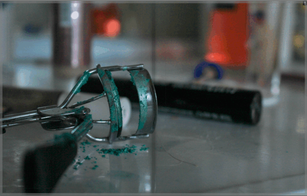
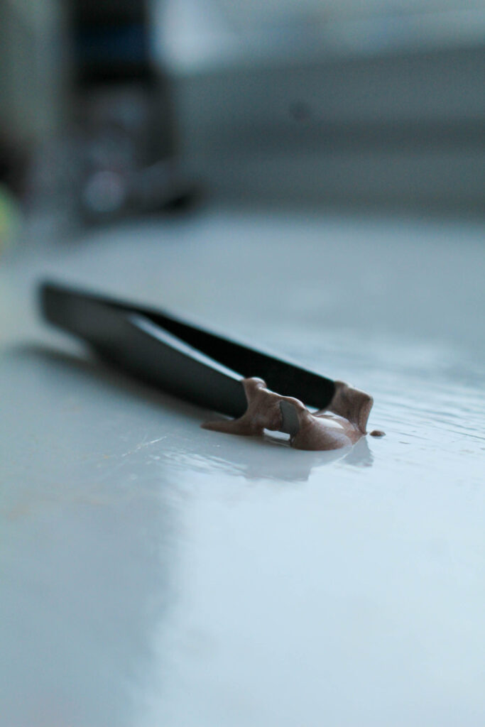
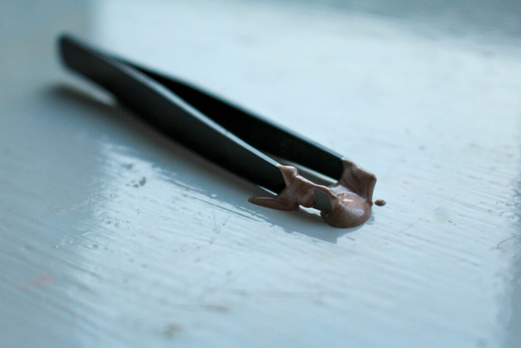
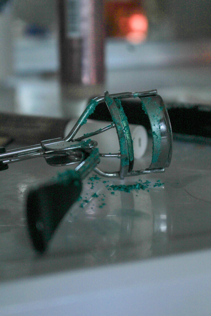
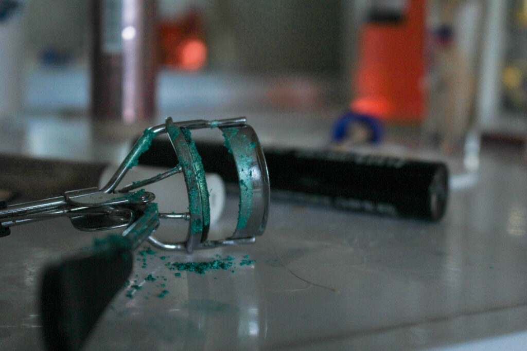
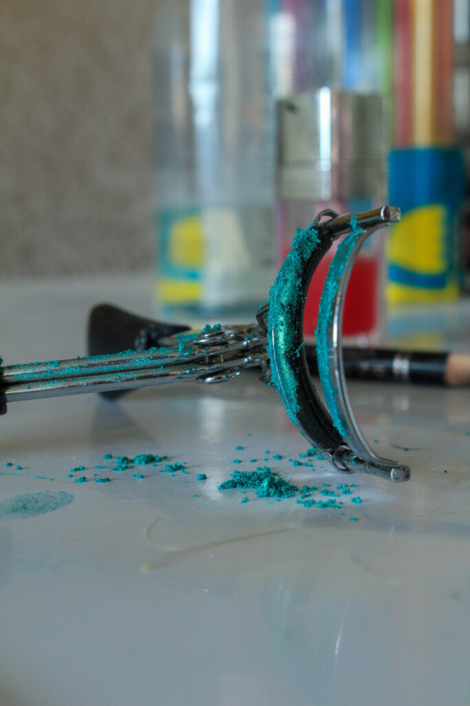
I incorporated 3 versions of my set-up using an eyelash curler and the same glitter used in the previous images because they were shot from different angles and I wasn’t sure which way I would prefer when it came down to creating my photobook. Also, in my previous photobook I used quite a low exposure as the topic of my personal study was quite intense and dark, so I included two images using a low exposure as I may want to utilise this again to highlight how much of a pressing matter this is.
In all 3 images I have used a short and soft depth of field to create a blur on the other beauty products scattered around in the background because I wanted to ensure the eyelash curler was the focal point of the image, however I also did this to make sure that the context of the image was still consistent in the background rather than it just being blank and empty. For these images, I grabbed a handful of different makeup products and spread them out in a chaotic, random way as if they had just been discarded for and chucked around. My intention behind this was to make it appear as if someone had erratically been putting on makeup in a frenzy, because this can demonstrate the pressures of the beauty standard specifically on teenage girls. With the pressure of wanting to look like the girls on covers of airbrushed magazines, it is highly likely that these young girls are damaging their skin barriers on their faces by applying thick layers and layers of makeup over and over again in order to feel comfortable in their own skin. This is really important to demonstrate as it highlights the impact of these falsified magazines on young girls, how this develops insecurities over even the smallest things and builds up to break down their self esteem before they even reach the age of 18.
I used a brush to tap the glitter onto the eyelash curler and the pillow of the curler in order to make it fall by itself instead of looking manipulated, I wanted the glitter to look as if it was ‘real’ rather than being something abnormal and that it had been placed there purposefully. I also then did use my finger to create two marks by the handle of the eyelash curler as if someone had just used it before the image was shot. I tapped it over the eyelash curler quite a lot to make it look more dramatic and emphasized, harder to miss. Because of this, it means that I was able to create mountains of glitter which then allow me to incorporate texture into the image to make it more visually pleasing.
I didn’t want to have all of my images directly reference Altman’s, so I tried to find other beauty products that can be linked to the ‘beauty is pain’ motif that can be seen in ‘And Everything Nice’. I feel that these images were very successful in doing this and I think the use of a soft focus is really helpful because it is the most appropriate to the topic as it is sensitive.
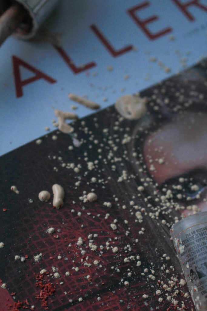
I have chosen to include three variations of my idea of a pile of cotton pads with thick makeup smeared across them for the same reasons as my previous three with the eyelash curler. I feel that by creating three similar images using different angles, this will allow me to experiment more with my photobook when I begin organising the layout as I will be able to be more flexible in my placement.
My idea behind this was to show how young girls may struggle with their self-esteem when it comes to their appearance, leading them to use a high amount of foundation every day in order to cover up their insecurities and feel more confident. This tends to happen with extremely young girls, for example 12 year olds when they begin secondary school. I wanted to highlight this as it is such an absurd idea that a 11-12 year old would be feeling so uncomfortable in their own skin, so I felt that by showing a large amount of cotton pads covered in foundation, this would allow me to show how ridiculous this concept actually is in a visual way. The tower of cotton pads looks strange and abnormal, allowing me to associate this thought with the meaning behind the image.
Also, by doing this I include the formal elements into the image, specifically line and texture, as the roughness of the cotton pad can be seen to juxtapose the liquidity of the foundation. Whilst this doesn’t contribute to the conceptual side of the image or actually contribute to the topic of my study, this makes the image more appealing to the viewer as it means that there is greater detail and depth in the photograph. As this is paired with my short depth of field, this means that the image has a large contrast between the foreground and background to make the cotton pads stand out even further.
This was one of my yellow images as I am still unsure whether I will be including this in my photobook, this depends on the quality of my other images in other photoshoots. I wanted to compose the cotton pads in a different way, whilst still using a soft focus on the image so that there is consistency across my work. I toppled over the tower, making it look more natural, and then lined up some foundation tubes behind.
I chose to use three foundation tubes in the background to try and demonstrate the high amount of foundation being used to cover up foolish insecurities that many young girls face. I wanted to do this because the other images implicitly suggest this whilst this image is able to visually communicate this.
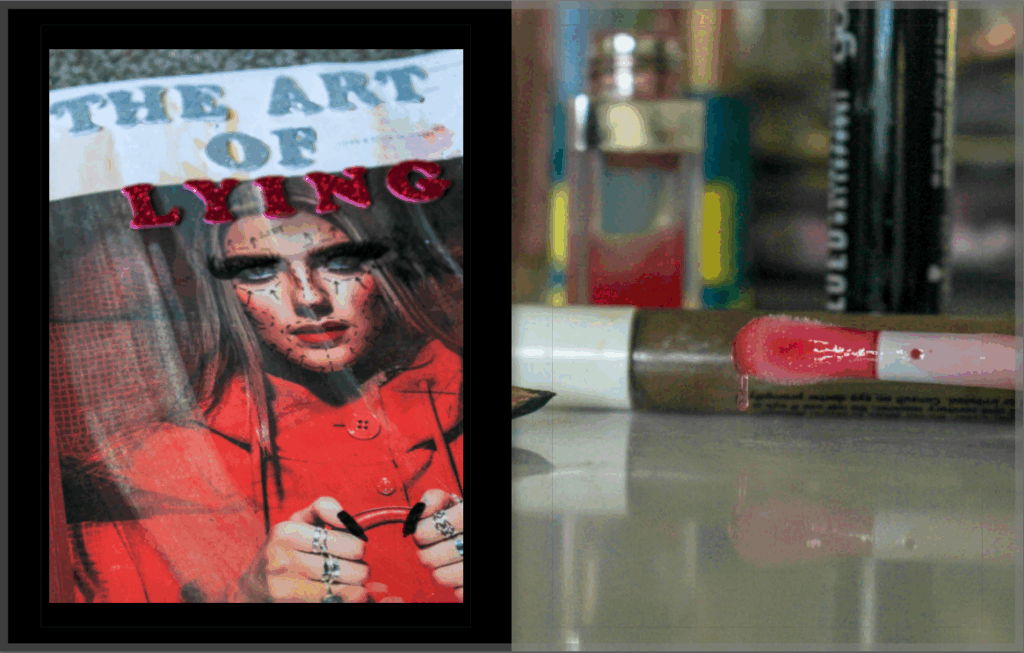
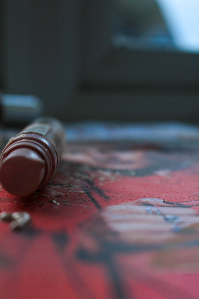
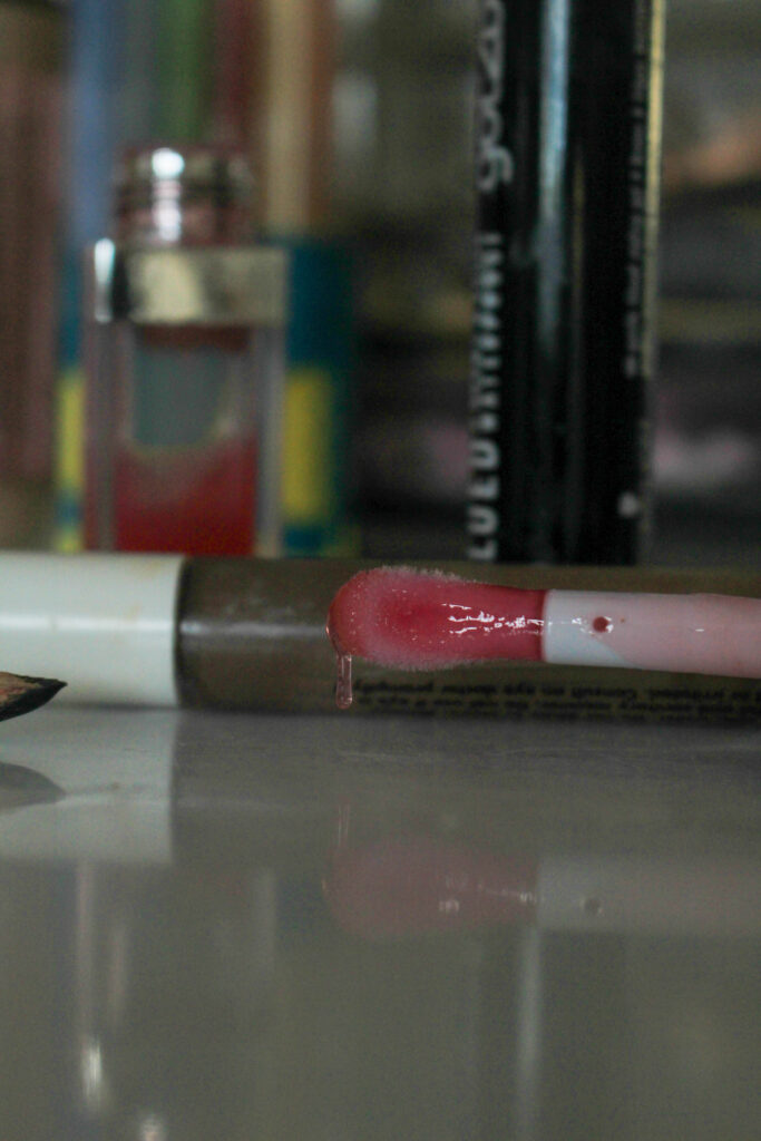
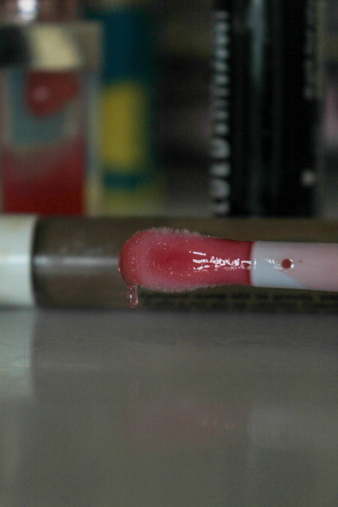
This image is used as a detail shot to incorporate makeup into my photoshoots as this is a key factor in explaining what my photobook represents. This image uses a short depth of field in order to gain the viewers complete focus on the drip of lipgloss.
I wanted to create an image like this in order to show how makeup may be frantically put on out of distress due to the high pressure of having a low self-esteem, and how this pressure is significant to a young girls life and may be consuming. I kept the image at quite a low-exposure as otherwise I feel that the concept may not come across as unfortunate, as the use of a high-exposure may cause the viewer to assume that this has a positive meaning behind it. This way, the pink of the applicator is still the most predominant and eye-catching factor of the image without being vibrant.
This is one of my favourite images because I think that the entire composition has been extremely successful. The soft focus means that the viewer’s focus is solely on the nail and clusters of glitter, making this extremely defined.
I tapped glitter onto the broken nail to symbolise blood being on it as if a girls acrylic nail had snapped off.
My initial idea when trying to figure out how I would shoot this image is to reinforce my references to this ‘beauty is pain’ ideology surrounding the need to fit into the perceived beauty standard. Of course, having a nail snap off would be incredibly painful, however this pain has stemmed from wanting to feel beautiful. I then began thinking of other ways this could be relevant to my work, with this being able to be interpreted in the terms of male violence, for example a girl experiencing this for getting her nails done as her partner believes she is having these treatments done in order to ‘impress other people’ when it’s sole purpose is for the feelings of the woman and feeling beautiful in herself. I think that this is a very important way to look at the image as this is an aspect of being in a controlled and toxic relationship, where a woman may feel unable to get these beauty treatments done for herself out of the fear of her significant other believing that she is trying to impress others.
Here, there is a direct comparison of the colours blue and pink which is a clear notion towards gender stereotypes as blue is commonly associated with the male gender, and pink with female. This means I can create a direct reference to critiquing gender roles that are created in society. I think that this image has a clear link to those belonging to Altman, however it uses a short depth of field instead to create a distinct focus on the nail, removing any chance of the background overpowering the object.
I feel that this image is very similar to Altman’s as it shoots from above
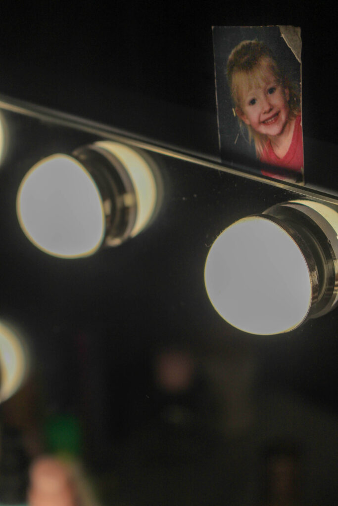
I wanted to also include this image and add my friends childhood picture into the background to add a sense of vulnerability into the image. By using a short depth of field again, I have made the childhood image stay slightly out of focus so that it is still visible. I did this because I wanted to get the viewer to reflect how a young girl’s priorities should be going outside and having fun with her friends, rather than the way she looks. I think that this image is really important in getting the viewer to question the value that the beauty standard has in society, and actually evaluate how damaging this is in the media, especially against impressionable girls who can easily be influenced.
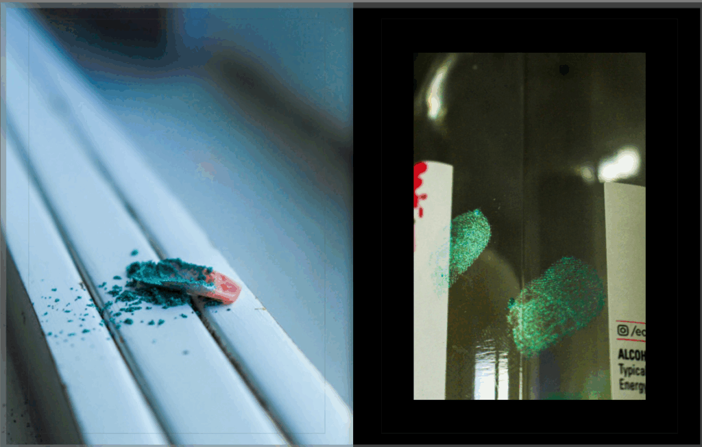
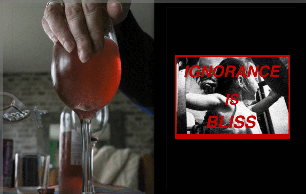
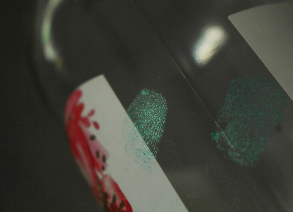
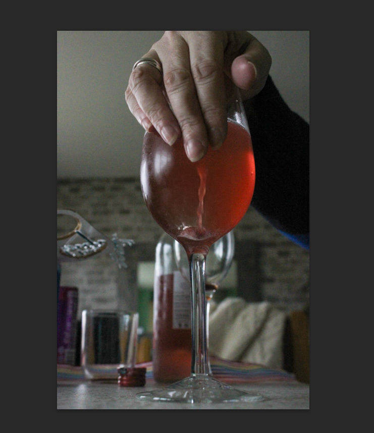
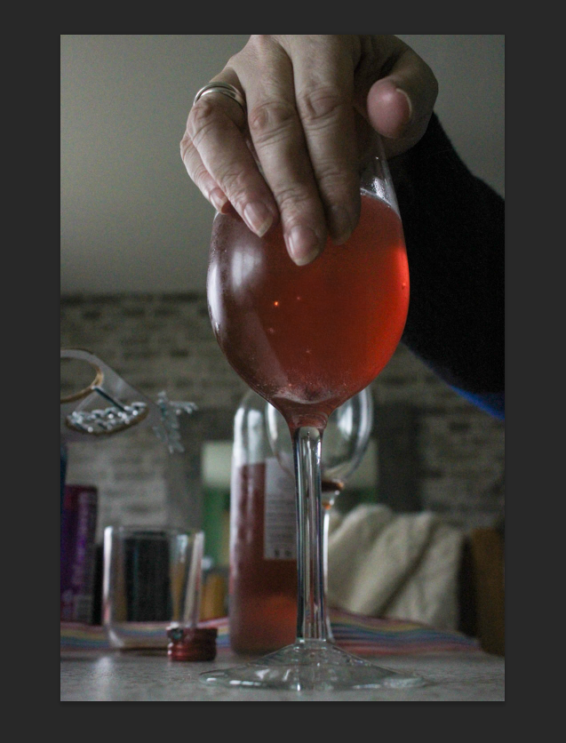
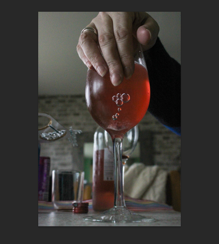
I created two fingerprints onto a bottle of wine for these two photos, and took up-close shots to get a clear shot of the ridges of my fingerprint to make deep detail.
I did this onto a wine bottle to highlight how the pressures to fit into the beauty standard are so incredibly damaging that this can result in the dependency on things such as alcohol or drugs in order to create an outlet for coping with the crushing manner of a low self-esteem. I also did this because it is can also be interpreted towards domestic abuse, being that around 40-60% of reported domestic abuse situations involved alcohol or drugs use. Addiction is a large factor in coercive and controlling behaviour, and can lead to the person displaying erratic and toxic behaviour. This can not only result in being emotionally and psychologically damaging to the woman due to fear of their husband/ boyfriend having an active role in addiction, but also physical damage may be incurred which is extremely dangerous especially when the abuser has less control over their impulsivity.
This can also be a link to how women in an abusive relationship have a higher likelihood of building a reliance on drugs or alcohol in order to feel numb to their trauma or pain that they are experiencing by feeling entrapped in the relationship. This is very dangerous because it would cause that woman or young girl to feel even more out of control of their life, meaning that their partners awful behaviour can continue without any restriction.
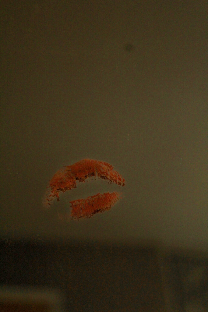
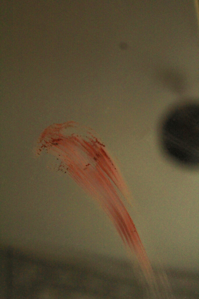
For these two images, I created a lipstick mark on the mirror and then smeared it downwards after. I tried to do this using glitter, however it wasn’t as effective as the glitter wouldn’t sit in place making it hard to tell what was actually on the mirror.
I did this as a nod to the beauty standard, with my plan being to make this into a diptych in my photobook, showing that makeup shouldn’t hold such a high significance in society and needs to stop being normalised towards young girls who should not be concerned with the way they look without makeup.
I smeared the lipstick down the mirror to show that its importance should be wiped away, and that makeup should be perceived as an enjoyable thing to be used rather than a defence from insecure thoughts and feelings. I would like to experiment with this set of images in photoshop and try turn the lipstick into glitter as this will make my image more relevant to the work of Hannah Altman.
Finally, this image is to also create that sense of vulnerability again in the same way that I intended with my image of the acrylic nail with a childhood photo out of focus in the background. This time, I made the mirror have a soft focus, and create detail on another archived image. I wanted to use the mirror as it has a similar aesthetic to old Hollywood mirrors, which is relevant to the beauty standard as this has altered from then to now.
My intention behind this image is to highlight once again that appearance should not be a priority at such a young age, which is why the childhood image is placed above the reflection of the mirror to serve as a reminder that every time the girl judges or insults her own appearance, she is also saying that to her younger self. This causes the viewer to reflect on their own actions, and how they would feel if someone said those awful things that they say about themselves to their younger self. This adds emotionality to the image that can be provoking in minimising how young girls and women think about themselves due to the comments made by the media, men and even other women in reference to the beauty standard.
Before I started mounting up my final prints, I decided to use Photoshop to make digital mock ups of how I wanted to arrange my images. This meant that I could experiment with using diptychs or triptychs, for example, before I actually started to stick the images down so that I would be prepared.
I made sure to print images in A3, A4 and A5 so that I would have a range of different options of layouts to go with and I could also have variety in my work.
First:
The first mount up that I was going to do was my A3 one because I already had a brief idea of how I wanted to arrange these two images:
I decided to go with the layout on the right because the image with a lower-exposure was placed on top which I preferred as its darker, whereas the other way around I think that the board looks emptier.
I decided to double mount these, so I first sprayed them onto their own pieces of foam board and cut them out to look like the plan above. However, I then separated them in half so that I could place them on black card as I think that the black emphasized the features of each image more whereas if I kept the images on white, this could have washed them out.
Second:
I decided to go with the second option because the key of the door would be in the centre, whereas if I chose the first layout then this leaves a large empty space between the two images as the photo of the door is quite sparse on the left side.
I doubled mounted these onto white card as the images use quite a light colour palette of silvers and baby blues which I think goes better with white, whereas if I used the black then this doesn’t particularly match the aesthetic of the two.
Third:
I wanted to place these images onto a black piece of card because I feel that the black made these images look more mysterious and depressing because these were taken during a photoshoot that was to represent the intangible feelings that there are when growing up with someone who is mentally unwell.
I was going to double mount these images but without the white border of the board because I wanted them to be raised above the page and made to be 3D as I feel that this brings the images to life and are become more appealing. Because they aren’t flat on the page, I really prefer this method too because you can see the images being displayed more sophisticated.
However, I had already done two diptychs so I wanted to include another image into this, being one of my archived edits of me and my brother so I experimented with this physically on the page during my layout process.
Fourth:
I already knew I was going to do a diptych of these two images as this was my intention during this photoshoot. I wanted to use a black background because the images use a low-exposure so I thought that this would complement the aesthetic of them. I picked the second layout also because this means that the viewer gets a brief overview of the surroundings, however the focus then becomes concentrated and zooms into the fluffy teddy which is something that I think works really well, acting like a process.
Fifth:
For my fifth mount, I decided that I wanted to display just one image in A3 as I really liked this specific image however it didn’t link with any of my other prints in the way I wanted it to. However, I didn’t want it to just be a plain image because I didn’t want to risk it coming across as quite simplistic, so I began to think about the ways I could distort the photo by cutting it up.
I eventually thought about slicing the image into six sections, as I measured the image to be 42 cm I was able to make each section even by cutting it at 7cm. As the image is showing a diagonal reflection, I thought it would be interesting if I added vertical straight lines to juxtapose this angle seen. I got this idea from initially thinking about slitting it down the middle, however I think that this is quite effective.
I mounted the image onto white foam board as I think that this adds to the illusion of the image and reinforces the distortion that I did as it is raised up off the page instead.
I experimented with both black and white to see which one would be the most suitable. I chose to use the black card because it means the separation lines in the image look more exaggerated and obvious which I think is more effective that if I had used the white.
Sixth:
For my final print, I decided to make a similar diptych to before where I use two images that share the same tonal range and colour, and pair them using solely foamboard to keep it bright I like using this method because it means that the images can become 3D and off of the page so that they can properly be engaged with rather than just looked at.
I chose the first layout because I liked the way that the footprints in the right image led towards the dog’s head. I also chose this design because the side of the curtain is caught on the edge of the left image, meaning that this divides the two images more whereas this may have looked strange if I did it the opposite way round.
I didn’t end up using all of my prints because I didn’t think that they were all necessary or particularly linked as I experimented with which went with which at the beginning of the mock exam, meaning that some were exchanged out for better options and left by themselves. I think my mounting went really well as I have ended up with 6 different boards that all represent different tones and storylines. For example, my double-A3 board is very explicit in its storytelling as it includes words such as ‘hospital’ and ‘tablets’, meaning that the viewer can make a clear connection between the two photographs and understand the meaning entirely. However, some of my other boards aren’t as obvious, for example my second more is more ambiguous and conceptual, trying to represent an intangible emotion. I also think my planning was very effective in contributing to my final outcomes as it allowed me to really be considerate about my placement of my images. I think this was really beneficial because it means that the process can run smoothly and I can prevent mistakes from happening.
If I were to mount this personal study again, I think that I would like to also include some black and white variations of my work and experiment with them, whether that may be solely black and white or a combination with coloured images too. I would have liked to do this because all of my images are in colour, so it could have been nice to see black and white versions of my images too. I would also have liked to have done a ‘storyboard’, where I would’ve scattered a large combination of images across a big board. This is because it means that the viewer can gather a large insight into what the work is about really easily, for example I could have added detail shots alongside still-life images.
For these two image, my concept was to present this in a diptych format when I began sequencing my photobook, being that this young girl is covering up the documentation of her abuse with makeup. I wanted to photograph this as I think it’s a direct reference to domestic abuse rates which is something that I wanted to cover in my study, however I think hat these two images work very well to provide a storyline like a comic strip, instead of being overly expressive.
I used the flash on the camera to shoot these images because I wanted them to give off the aesthetic as if she was getting her friend to document and take images of what had happened to her which I think has worked very well as it is more relevant, being that victims of abuse try to conceal it so it would most likely be covered up around others unless it wanted to be revealed. This is also why I used a low angle to my subject’s face when shooting because it means that I can conceal her eyes, as if I was hiding her identity from this abuser, so that she can come forward and speak out against what has happened to her.
I also put the image of my subject crying in black and white to see what it looked like as the image had a high contrast beforehand, so I wanted to experiment with a monochrome tone to see if this looked better, however the second image didn’t look as good in black and white.
I like this version too as it has a large tonal range which adds greater depth to the image, however it makes it more difficult for the viewer to distinguish the concept or what it actually is that I am photographing as there is no colour on her face.
Spiking:
These three images were shot to represent the dangers of spiking, where many young women are victimised and taken advantage of due to drugs being put into their drink without their awareness. This results in these women being out of control of their faculties, possibly not being able to walk or speak coherently, which is why I wanted to photograph this as it is such an important issue that doesn’t necessarily get acknowledged as much as others.
I wanted to create a staged scene with various types of alcohol in the background to create an environment that looked similar to a party. Then, I used a wine glass and broke up a vitamin C tablet and put it into the drink as these tablets dissolve and produce a large amount of fizz, enough for me to photograph it before it stopped. I put this into the bottom of the glass and kept it there as an exaggeration of spiking, as whatever would be put into the drink would not be visible in order to minimise the chance of being caught in the act, so that the viewer would be more aware of what my intentions were.
I initially began with shooting from various angles of the glass itself as I wanted to make it appear as if this drink had been left unattended, and this act had occurred whilst they were gone:
As I was shooting this, I could see my idea coming together to be successful however I felt that something was missing. As I shot from various angles, this allowed me to experiment with which direction would produce the best perspective of the tablet fizzing as this was crucial to the concept behind the images themselves. I would say that My favourite image out of this selection here would be the one on the right as the other two have natural lighting in the background which minimises the ‘party’ impression that I was trying to suggest to the viewer.
I used natural lighting for these images, facing away from the window, as this would create diagonal shadows across not just only the the wine glass itself, but create direction in the composition through the background as the objects behind are placed in alternating sequences.
This was my best image out of that selection of images. I decided to ask my mum to place her hand over the top of the wine glass and pretend that she was guarding it from other people and protecting herself from getting spiked. Although this image is explicitly highlighting this issue in comparison to the other images, I think that this is a great way to ensure that the viewer doesn’t become confused about what the intent was behind the image, for example if they don’t initially see the tablet inside then this could lead to the meaning of my image becoming distorted. I asked my mum to do this so that I could use a feminine hand as my study is honing in on the themes inside the Feminism movement, for example her gold ring adds to the composition as it draws the viewers eye from being contrasted to the rest of the foreground.
I used a short depth of field for this image in order to blur the other types of alcohol in the background, however the viewer can still make out what it is and understand that this would be occurring in a social context rather than a personal one. I also think that this is relevant because it can resonate with the way vision may become blurry when alcohol is consumed, or how the eyes of someone who has been spiked may zone out due to having a lack of control over their autonomy. I once again used natural lighting however I moved my positioning to be able to crop the window out so that it wouldn’t be in the background.
I decided to try and experiment with this image to enhance the fizzing on the tablet and exaggerate it a little bit more. It is still visible in the image however I wanted to try and use the Generative Ai tool in Photoshop. However, these images were not that successful as it was quite difficult to find the correct word to generate to get the desired results. This also meant that the fizzing would be as subtle and realistic, but I still wanted to include them here regardless. If I were to shoot this again, I think that I would have put a bit more of the tablet in to create a greater volume of bubbles as I only used half because I didn’t want it to be too obvious or visible.
My experiments:
Dissolving FizzBubbles
2. Pregnancy:
For this image, I tried to use a pregnancy test to highlight how the increase in restrictions against abortive care leaves many women and young girls at great risk. I placed the test on the side of the sink as if someone had just taken it and was waiting for the results, however I added a vignette to this image as I feel that this connotes ideas of fear and waiting on edge, being that in many countries if the test came back positive then that woman would have no choice but to become a mother even if she was not ready.
I took many images with the test, trying to arrange it at different angles in my bathroom but I couldn’t execute it well enough as there wasn’t many locations that I could stage it that would look realistic and also allow me to get a good angle or use of depth. If I were to shoot this again, I would have liked to go to a public toilet for example and stage images there because I feel that this would suggest a greater amount of fear, being that the woman isn’t even doing it in her own home out of worry that others will find out.
However, I do still want to use this image as I think that it is good for applying context into my study of Feminism. Additionally, I feel that the taps, specifically the left, have a high contrast between the glow of the reflection against the black circle on the bottom. This is really eye-catching and I think that I just need to sequence this image correctly with another that has a similar concept or message behind it.