All posts by Joseph Raffio-Curd

Filters

Author:
Category:

Final Evaluation

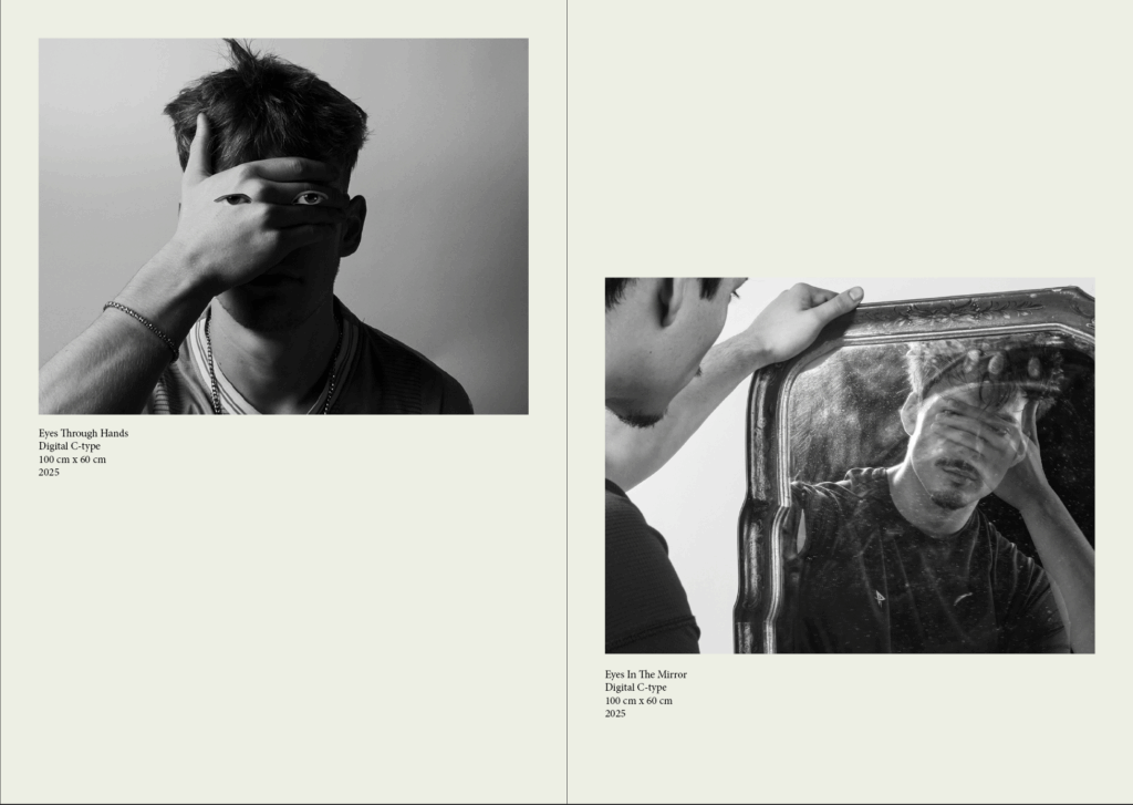
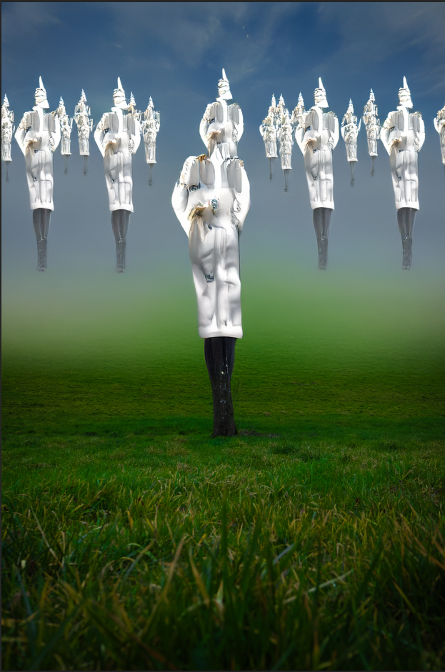
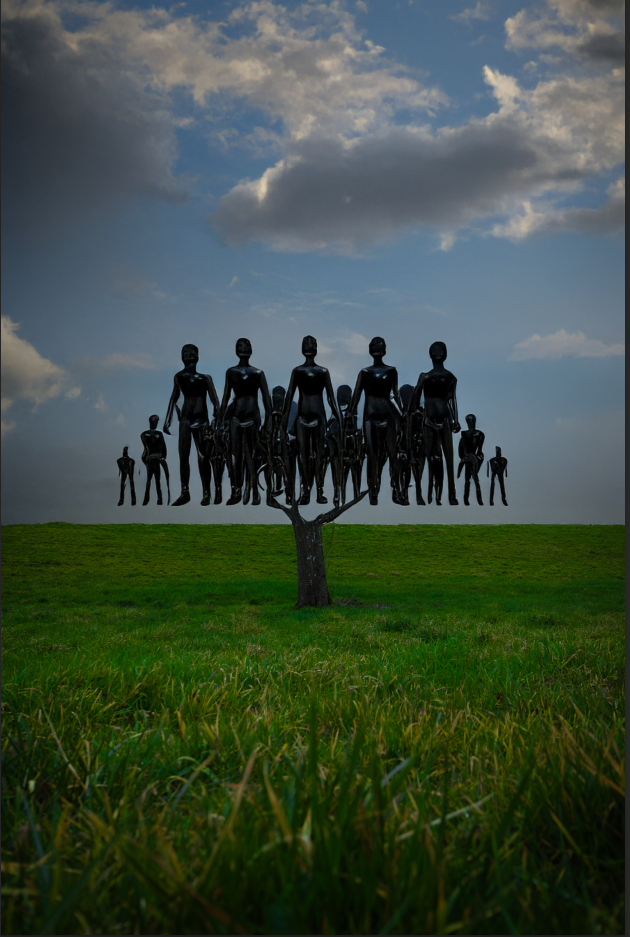
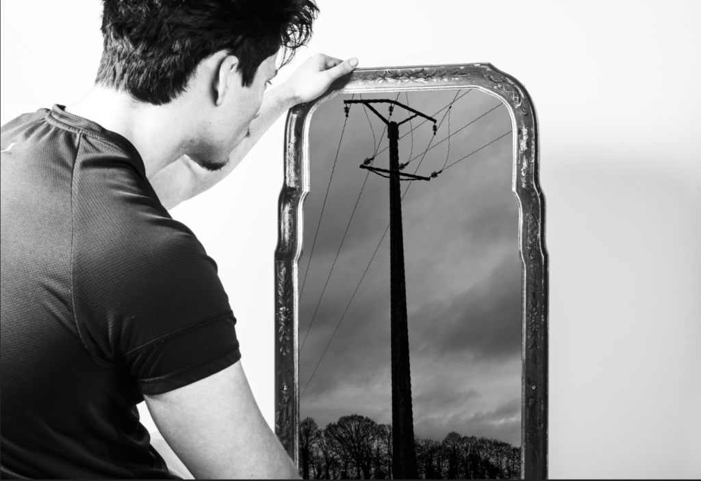
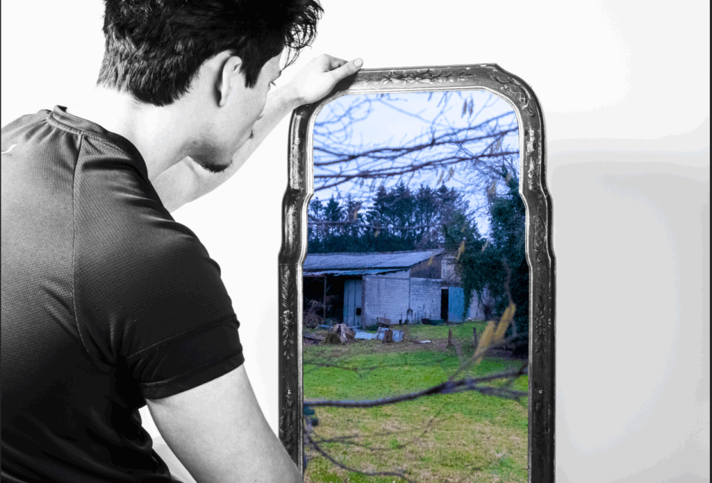
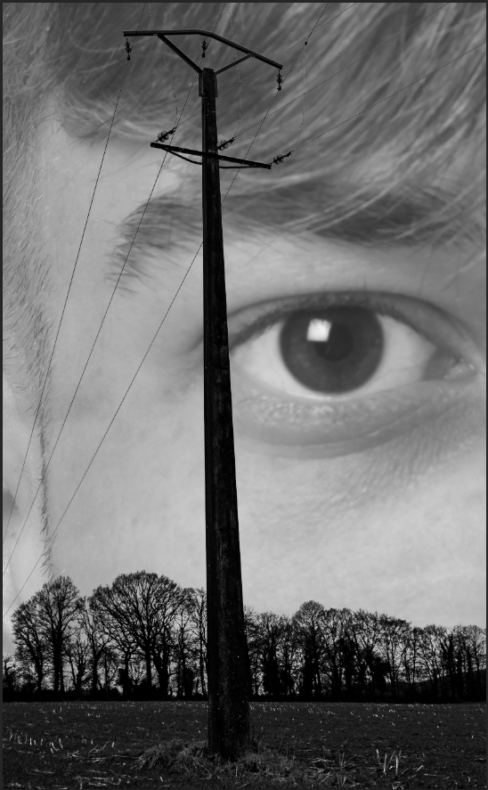
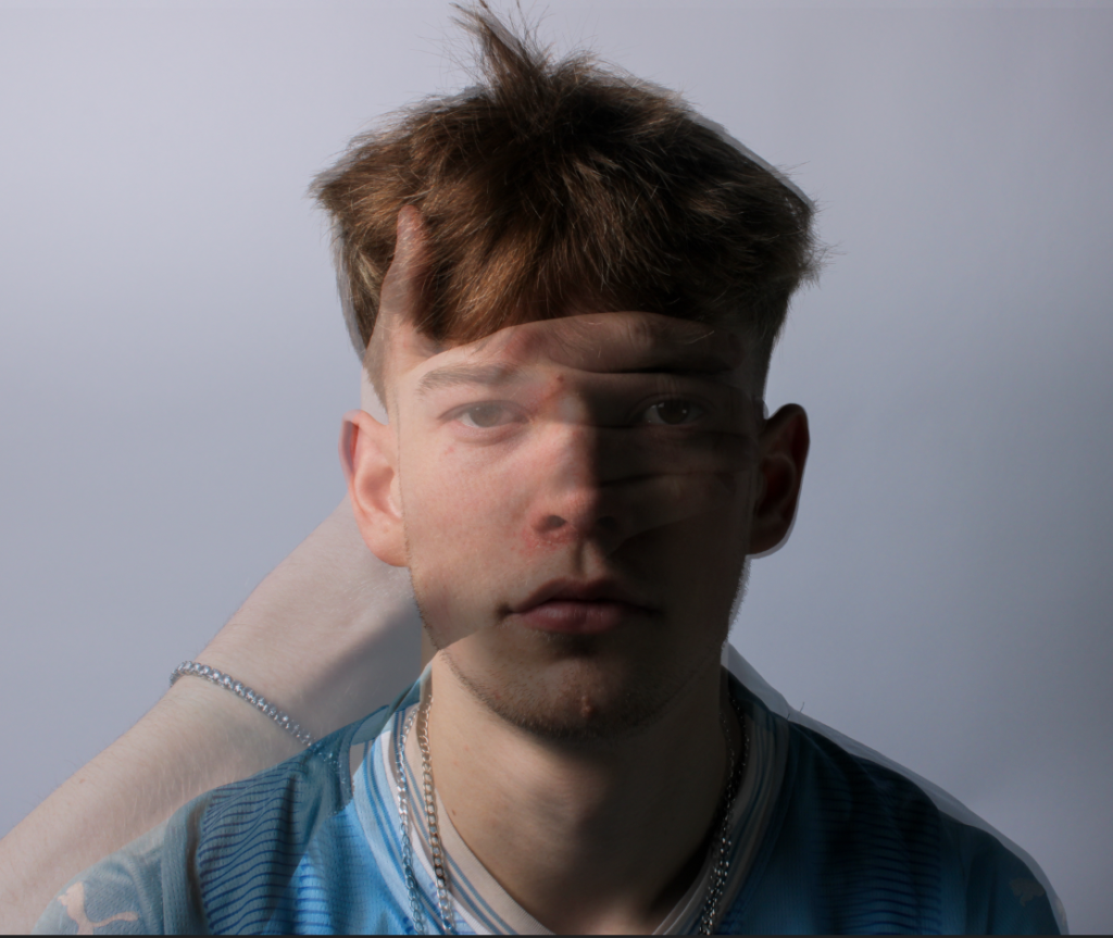
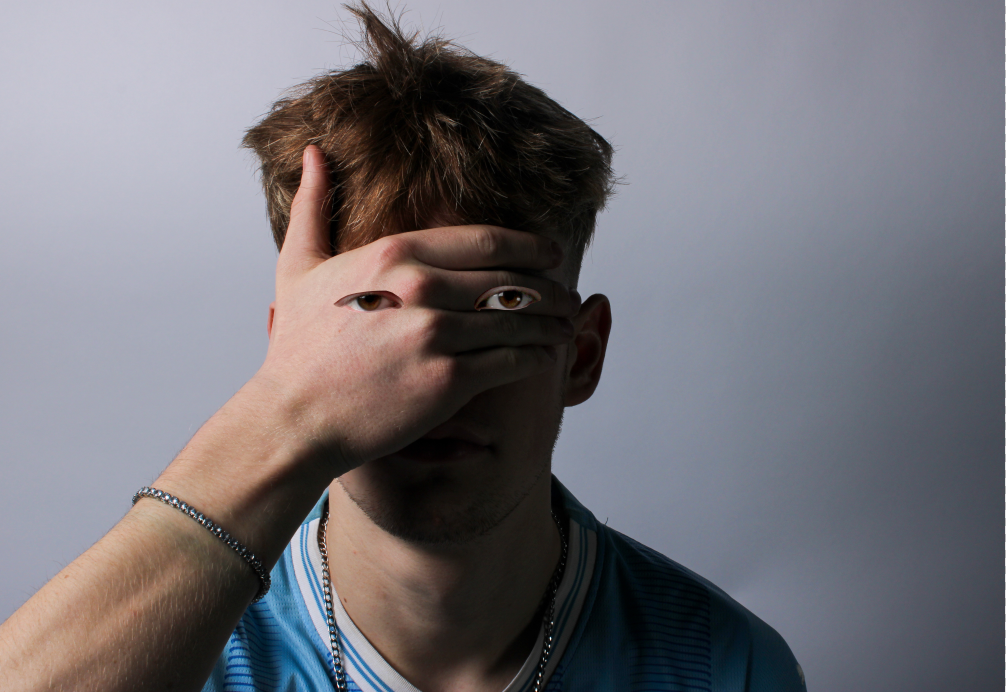
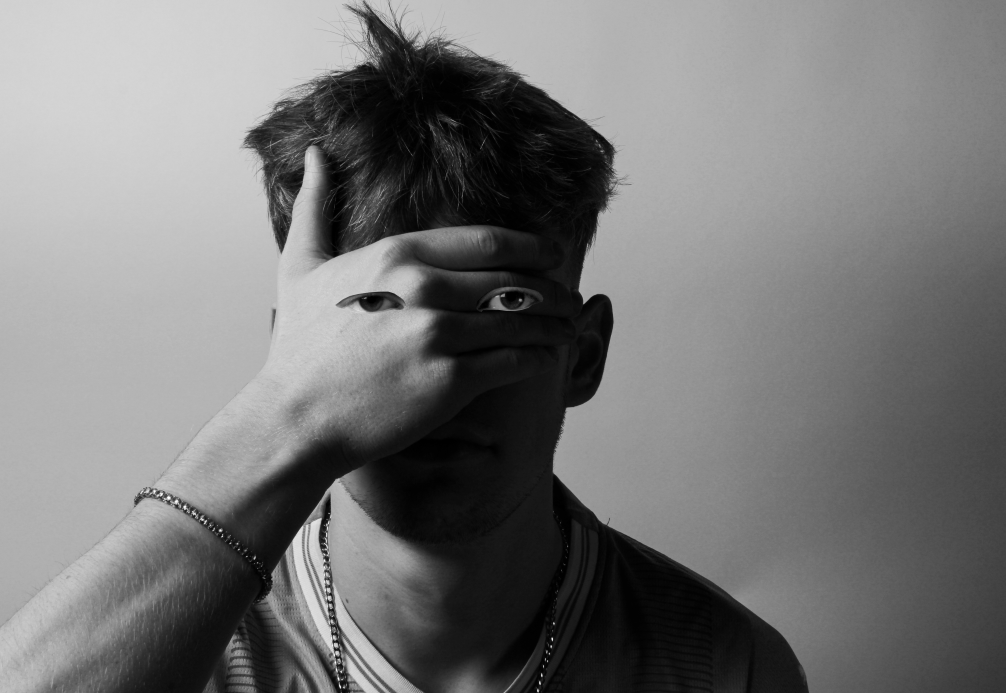
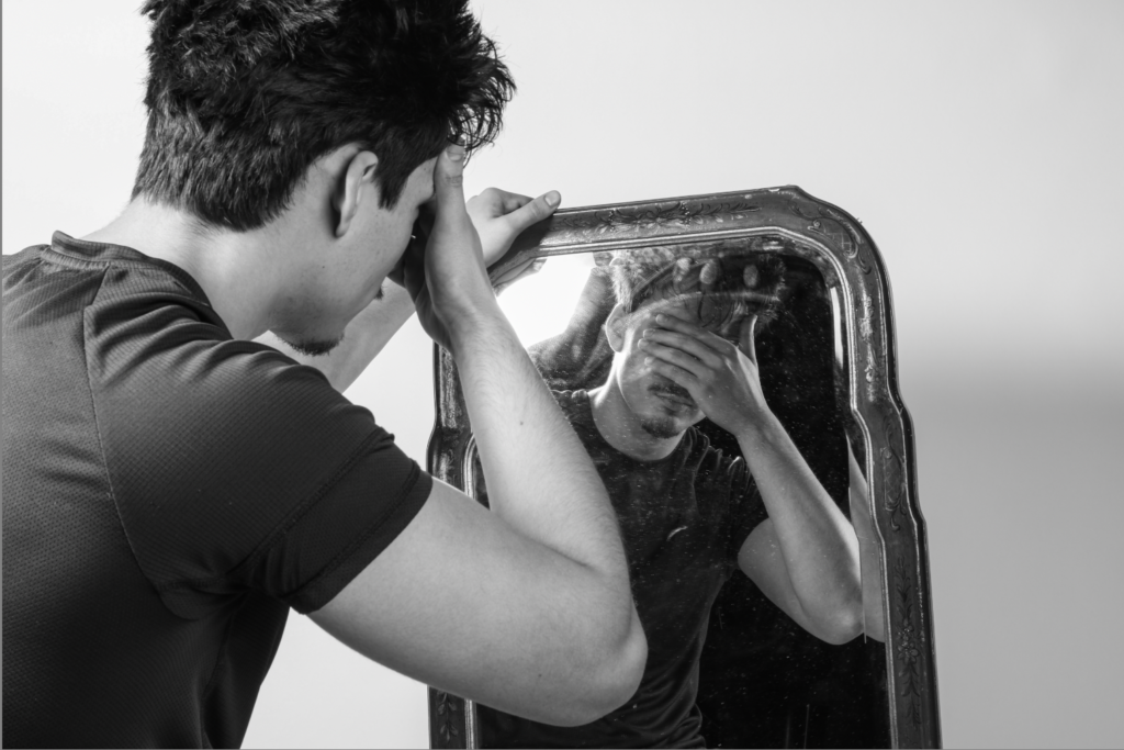
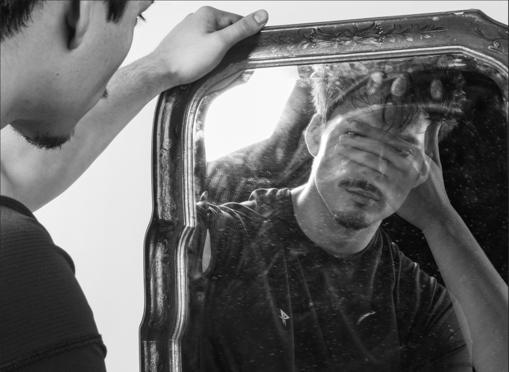
Overall, I think that I have tackled the theme of ‘union’ through photography quite well. My final Outcomes have also been successful through my creation of a exhibition catalogue and how I used different techniques to lay out my final prints. By using inspiration from two artists, Man Ray and Alexander Mourant, and expanding on there work, I have been successful in presenting the union between the conscious and unconscious mind.

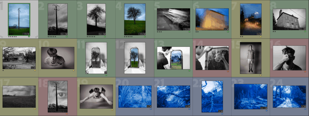
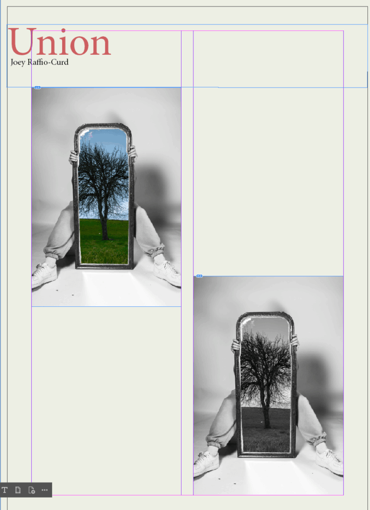
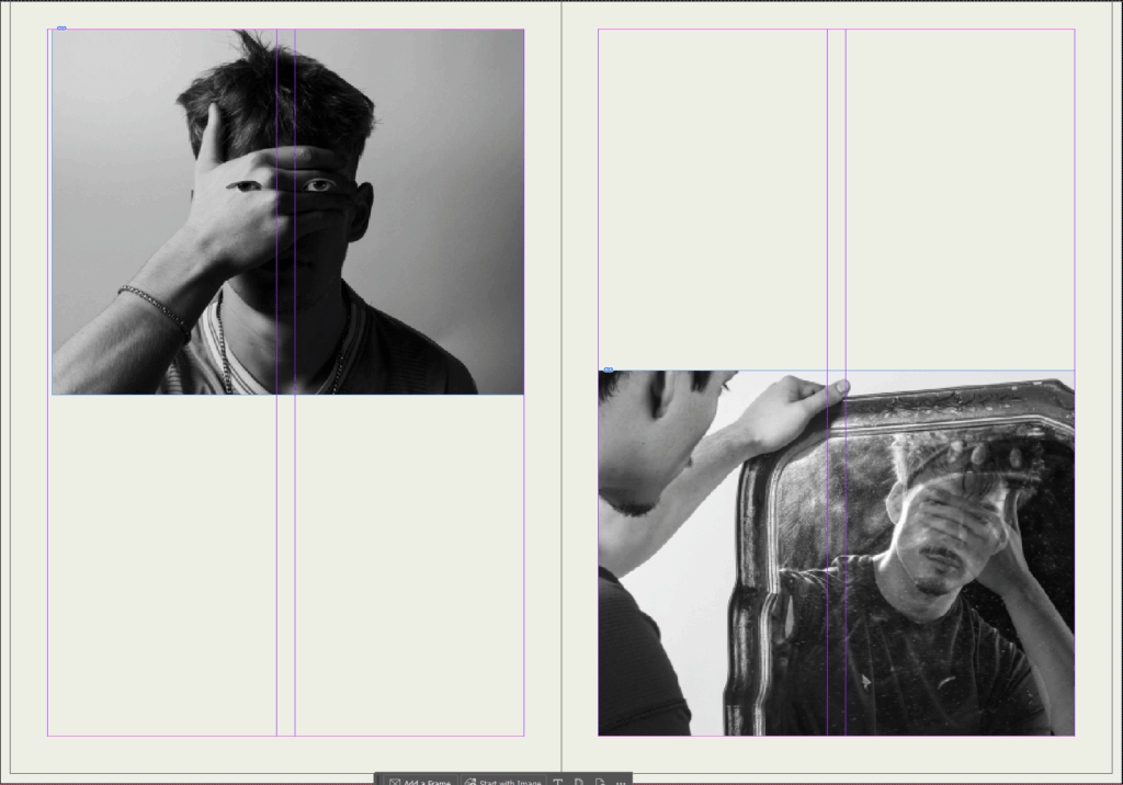
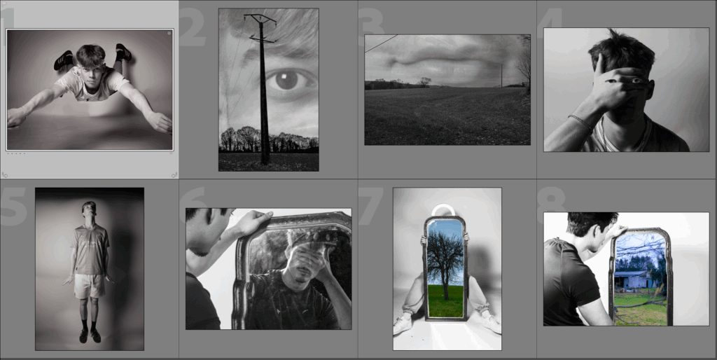
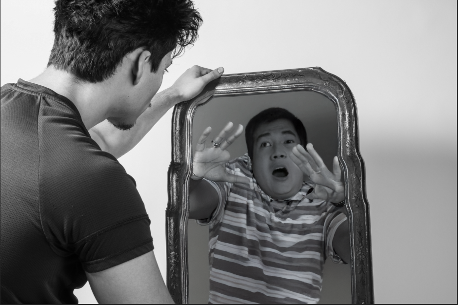
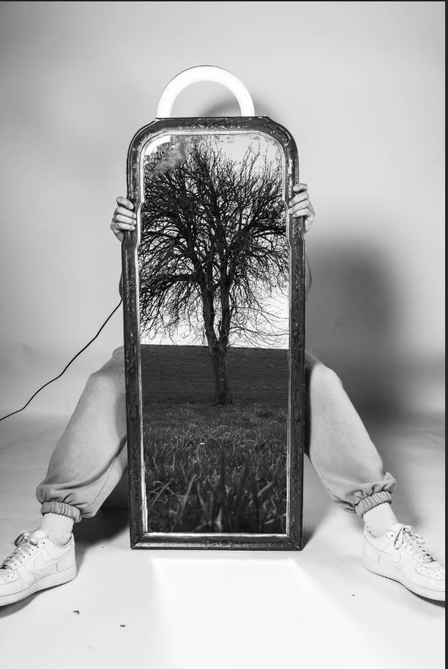
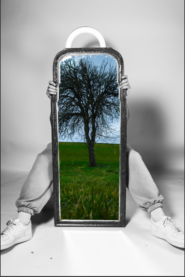
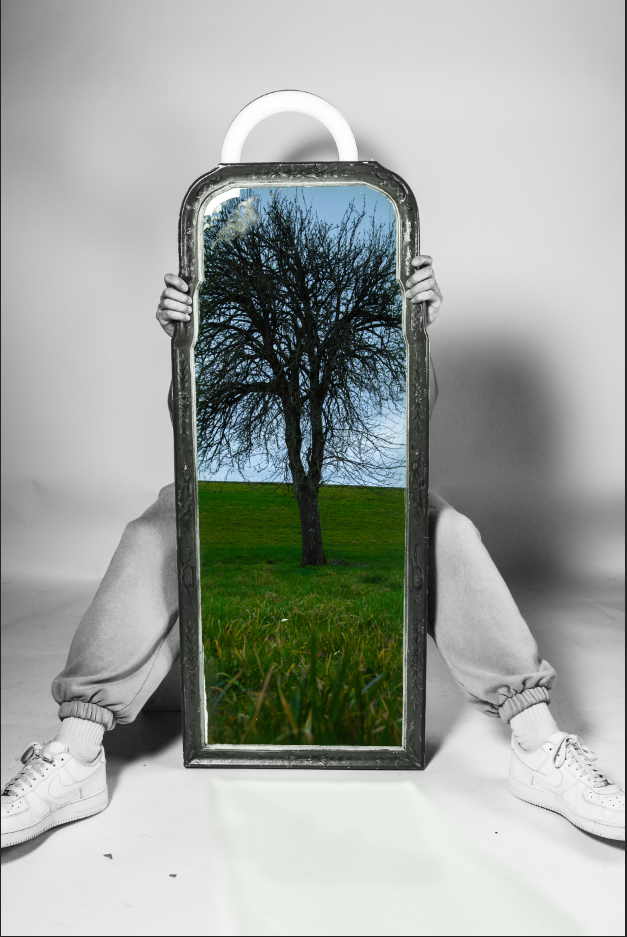
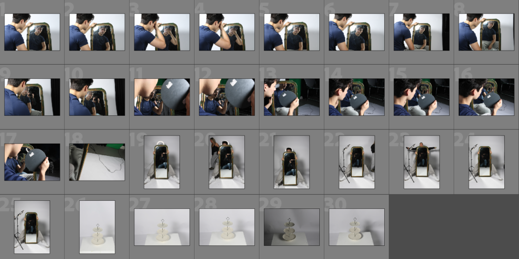
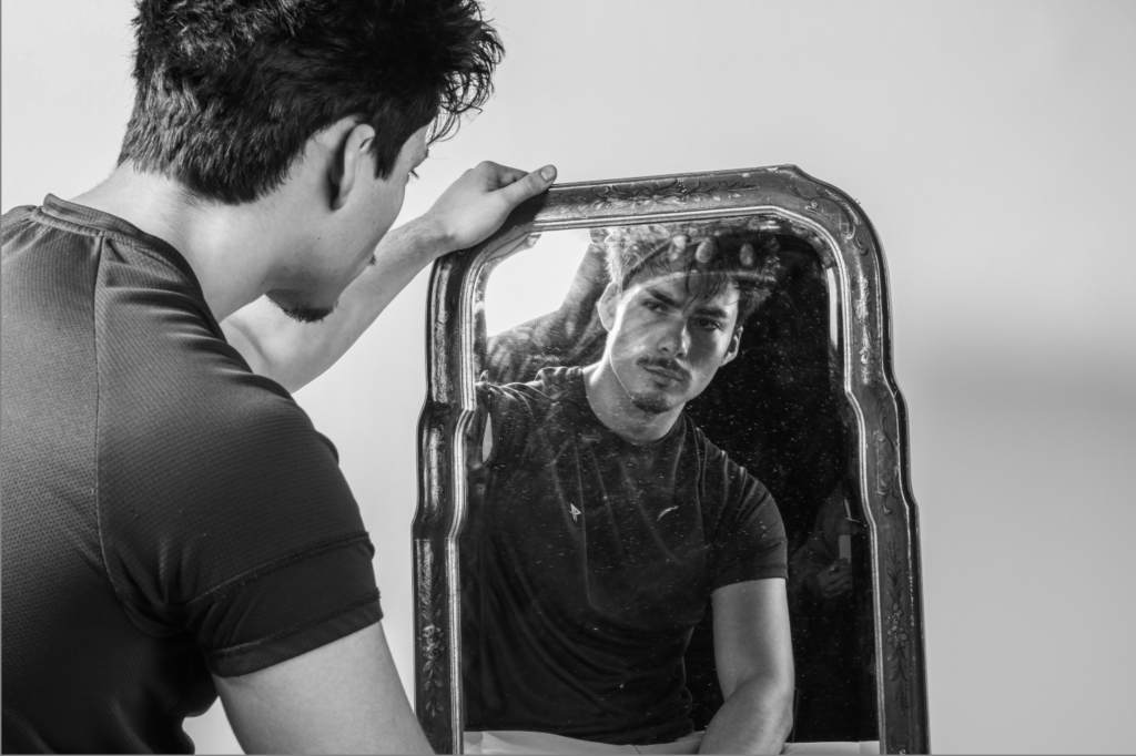
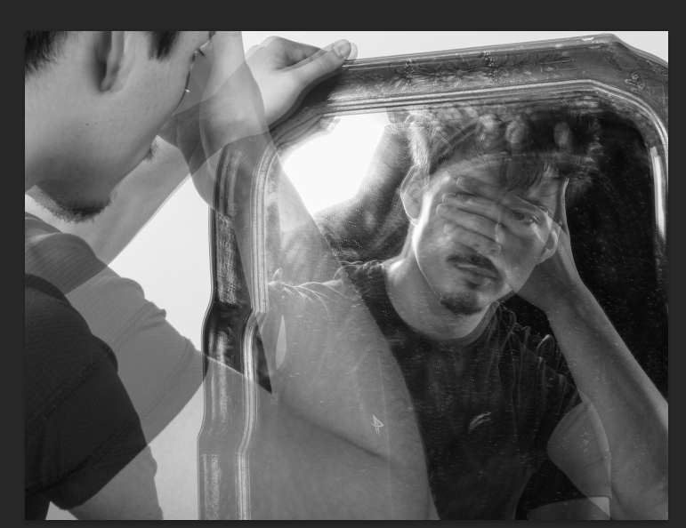
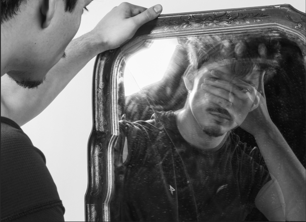
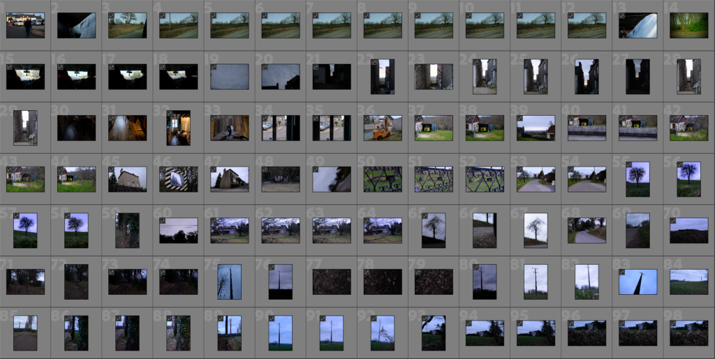
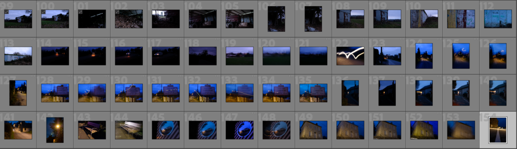
For my first photoshoot, I had an Idea of what I was looking for but as I took it before doing proper research on the artists I named above, I didn’t have much direction In where I wanted the project to go. However, after doing in depth research on these artists, as well as the theme of surrealism, I was able to use these images I took to take my images from the first photoshoot to the next level, by montaging them or editing them with various studio photos I took at a later date, as seen through my experimentation blog posts.

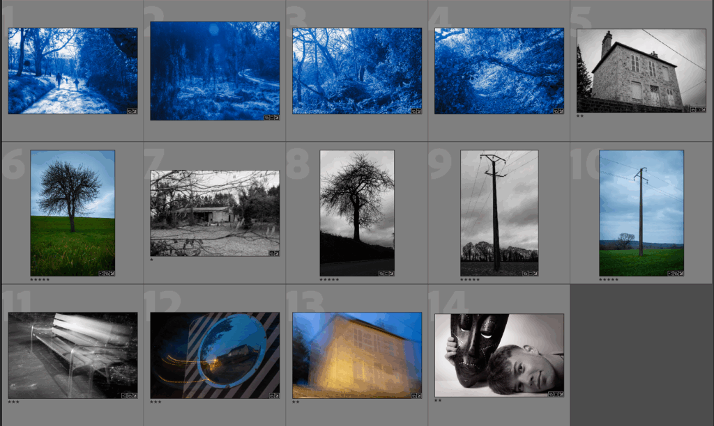
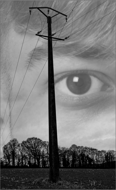
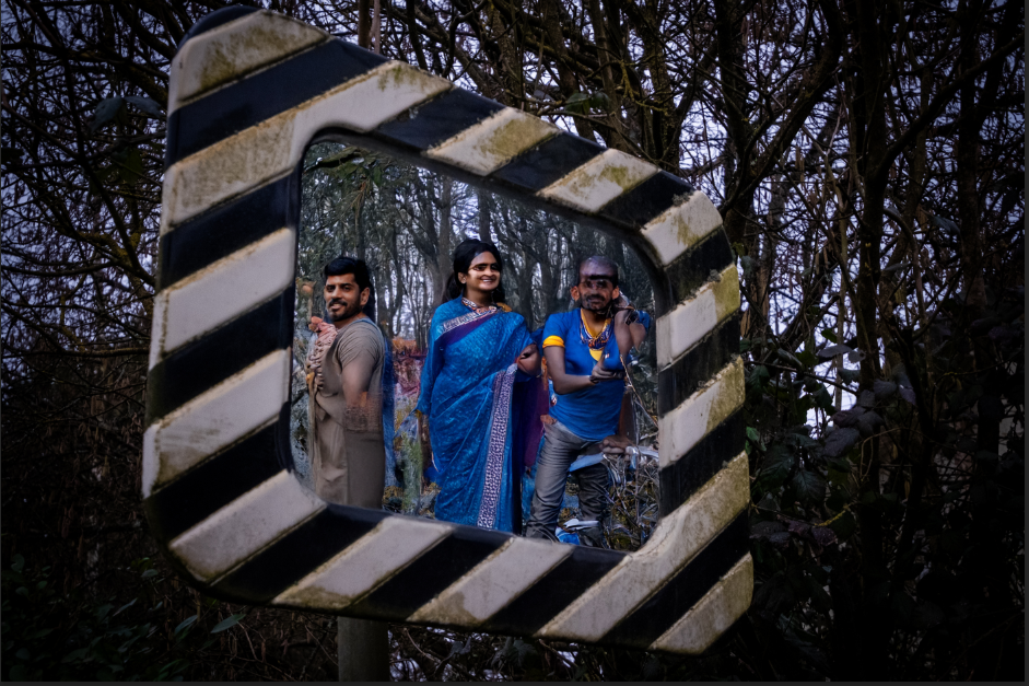
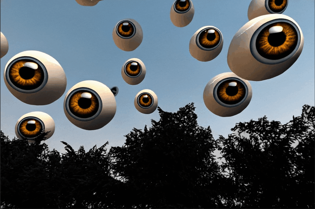
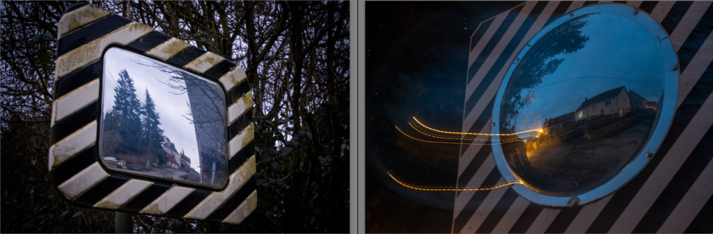
For my second photoshoot, after doing research on the two artists, I believed that liminal spaces would be a good fit. Unfortunately I found it hard to link the liminal space images with other images I took. This is because the style of photo that was needed to create a liminal space with very different to ‘surrealist’ route I decided to follow. The ideas of the unconscious mind is present in both liminal spaces and surrealist photos, but I just found it hard to link in the presentation section of this project.

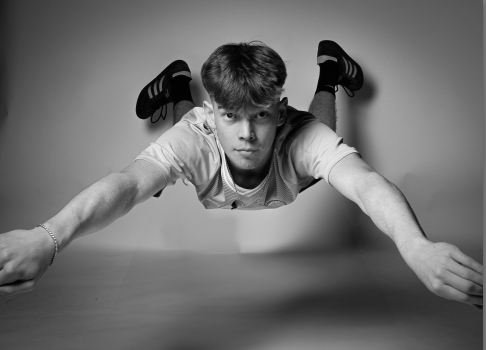
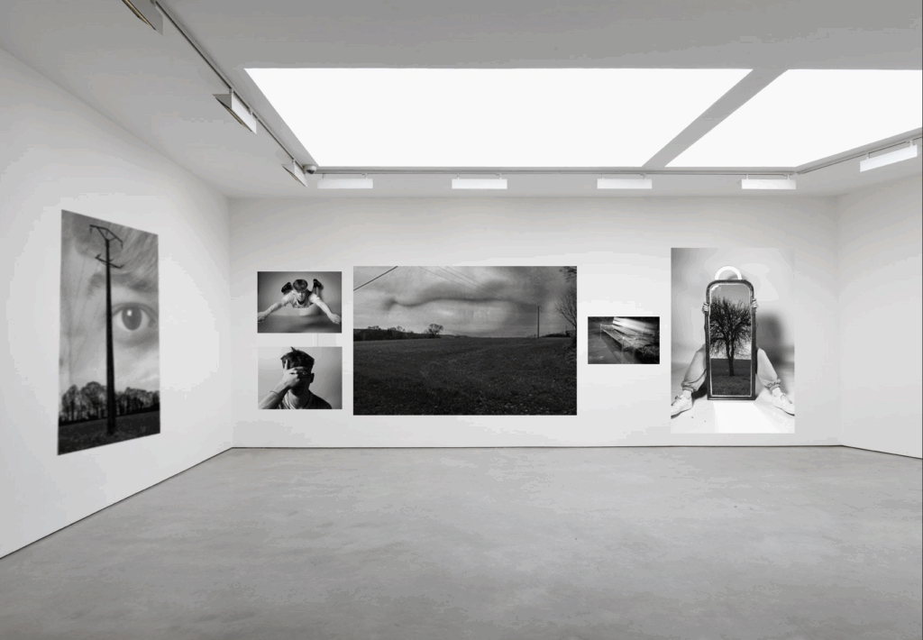
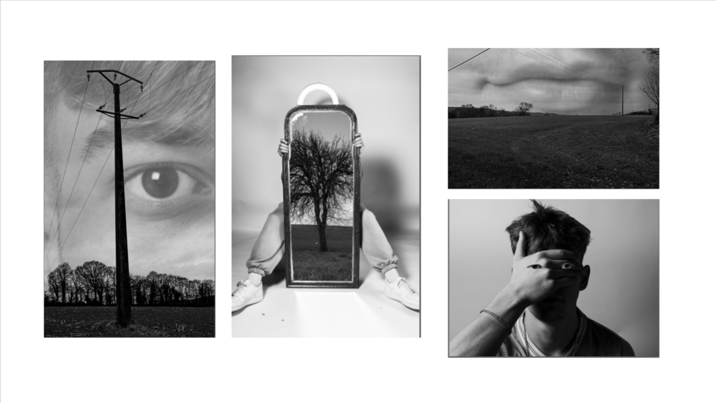
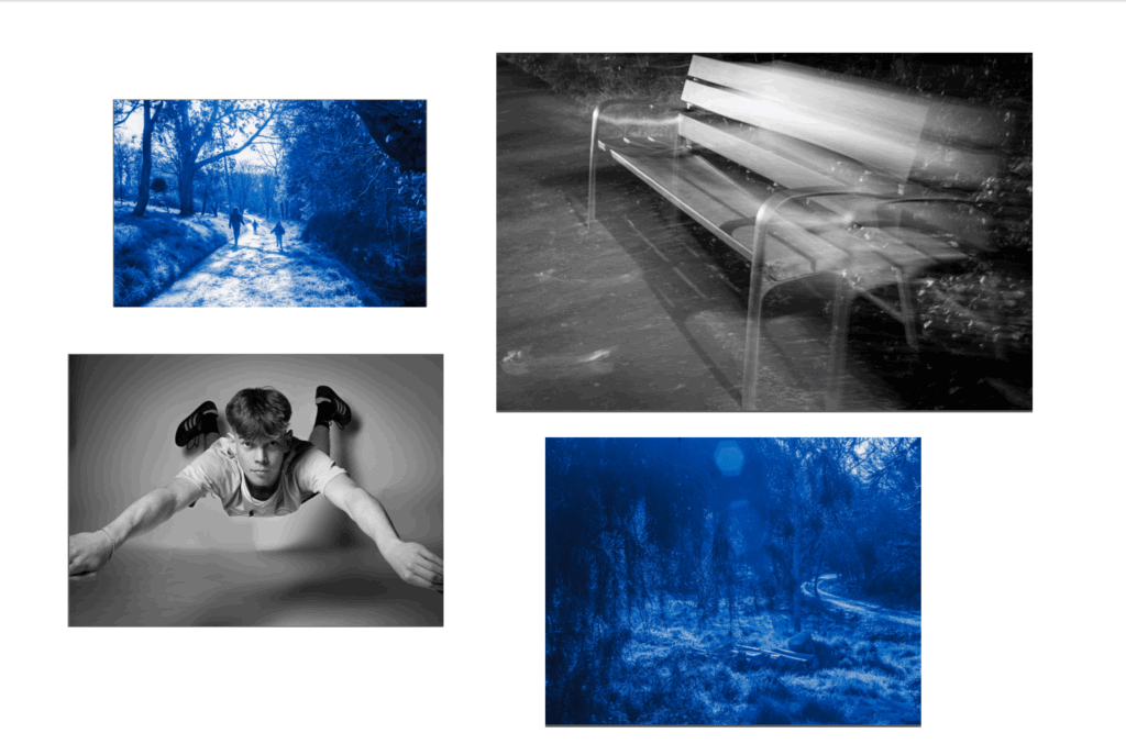
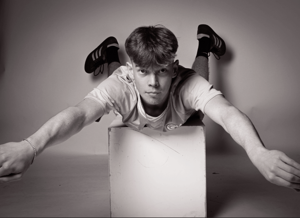
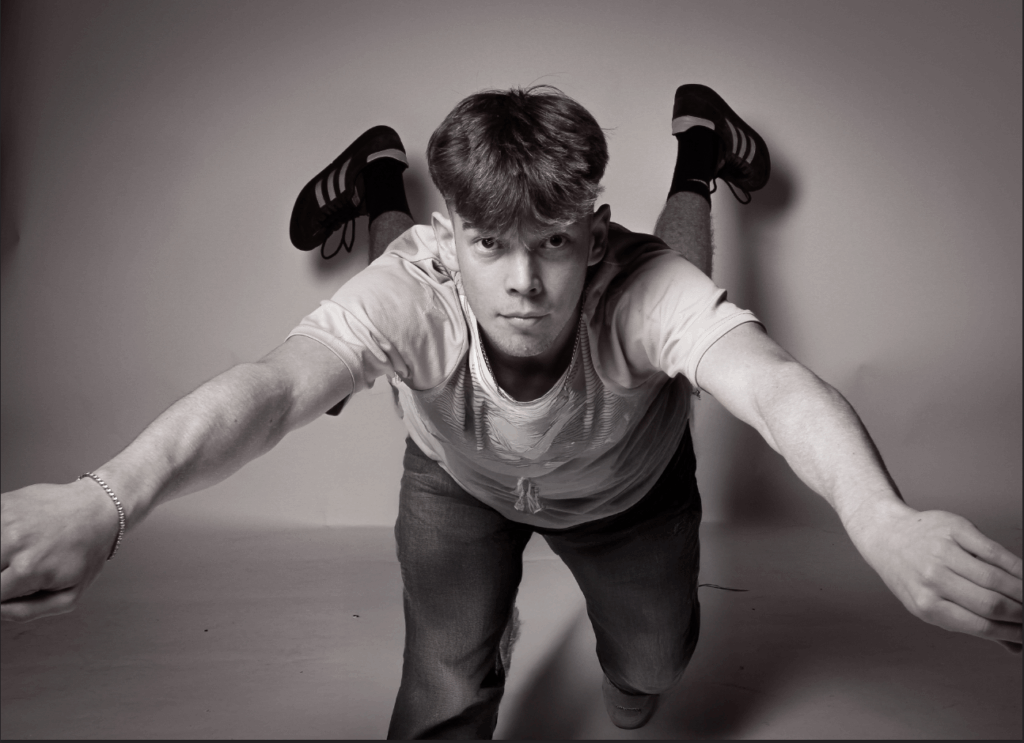
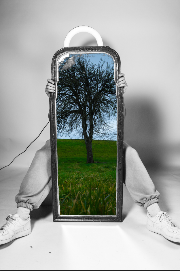
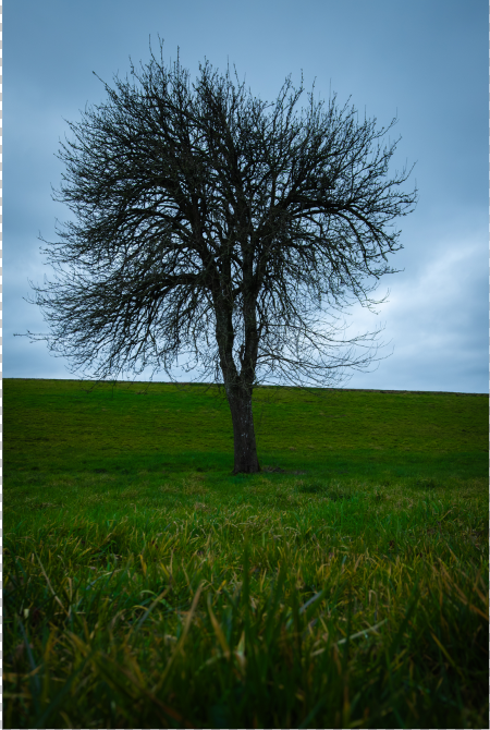
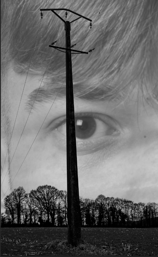
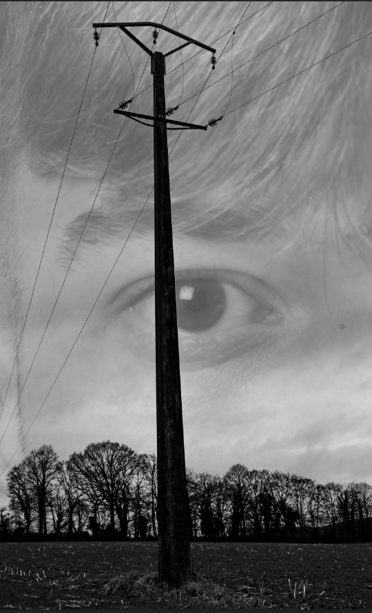
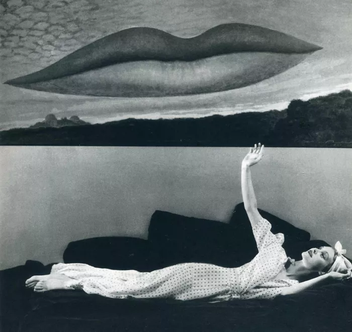
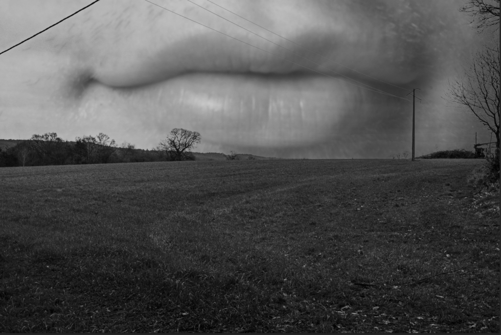
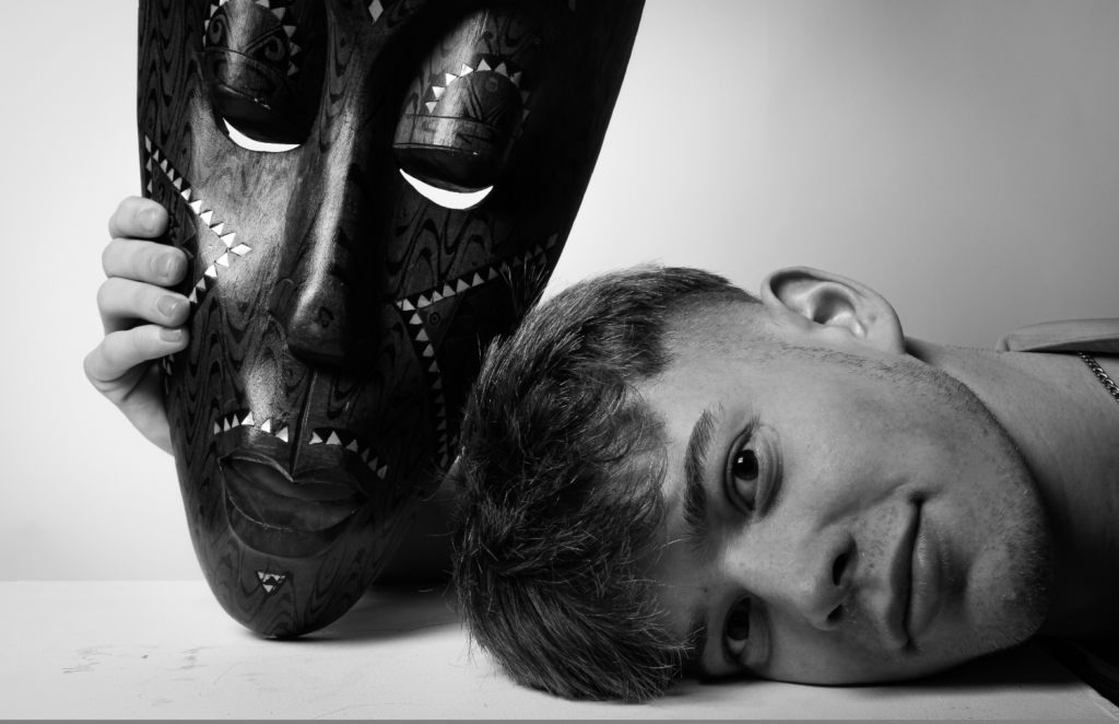
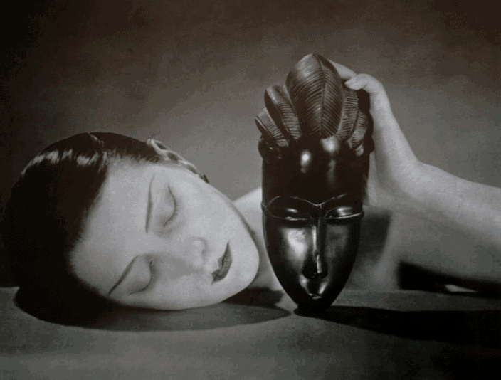
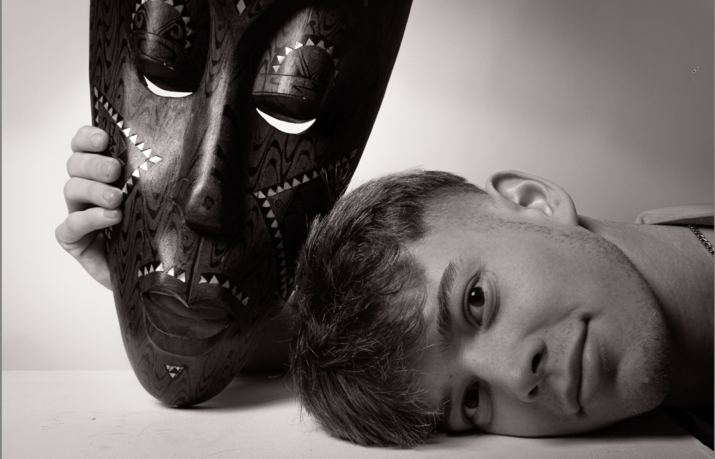
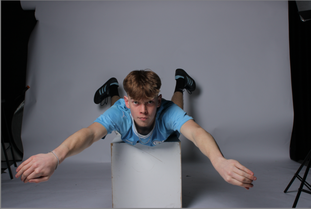
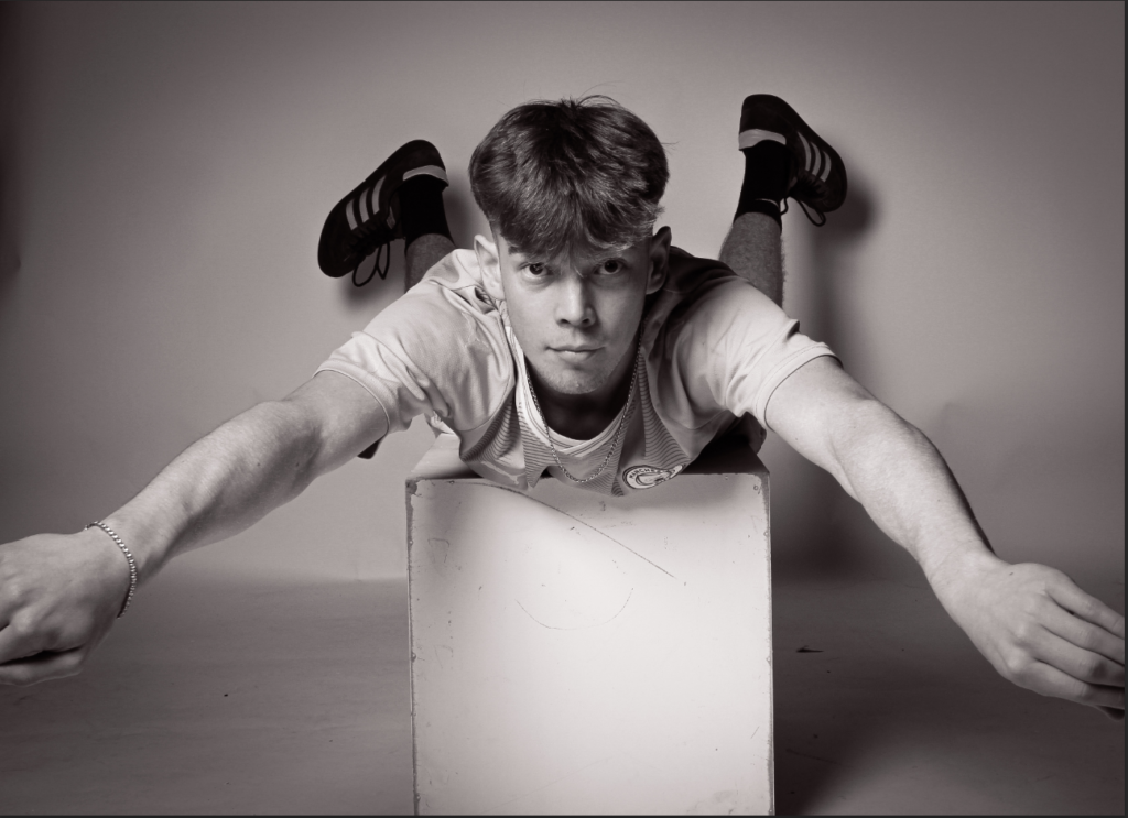
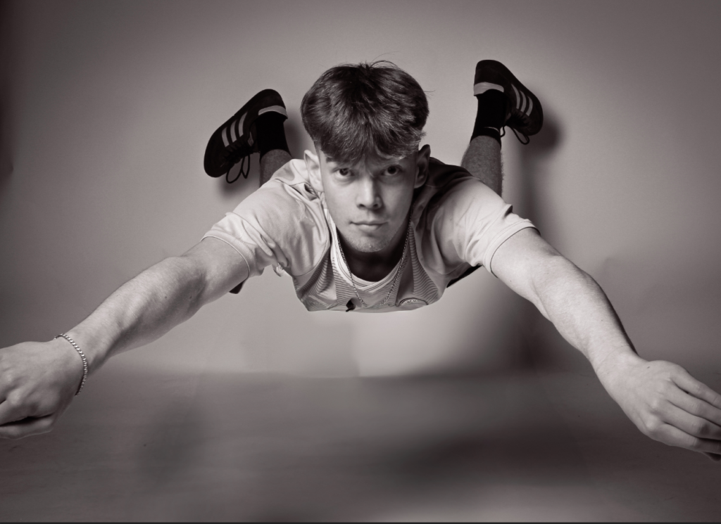
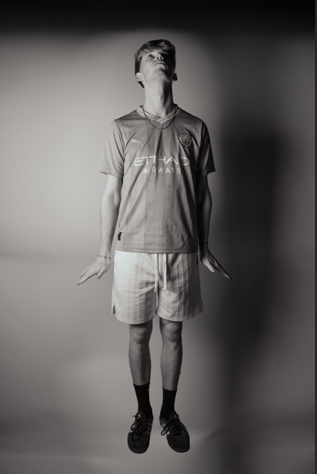
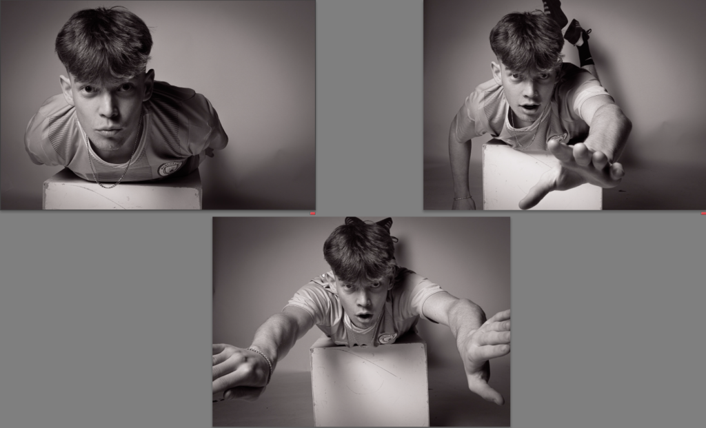
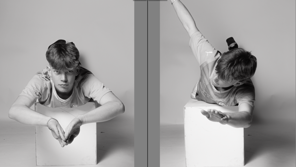
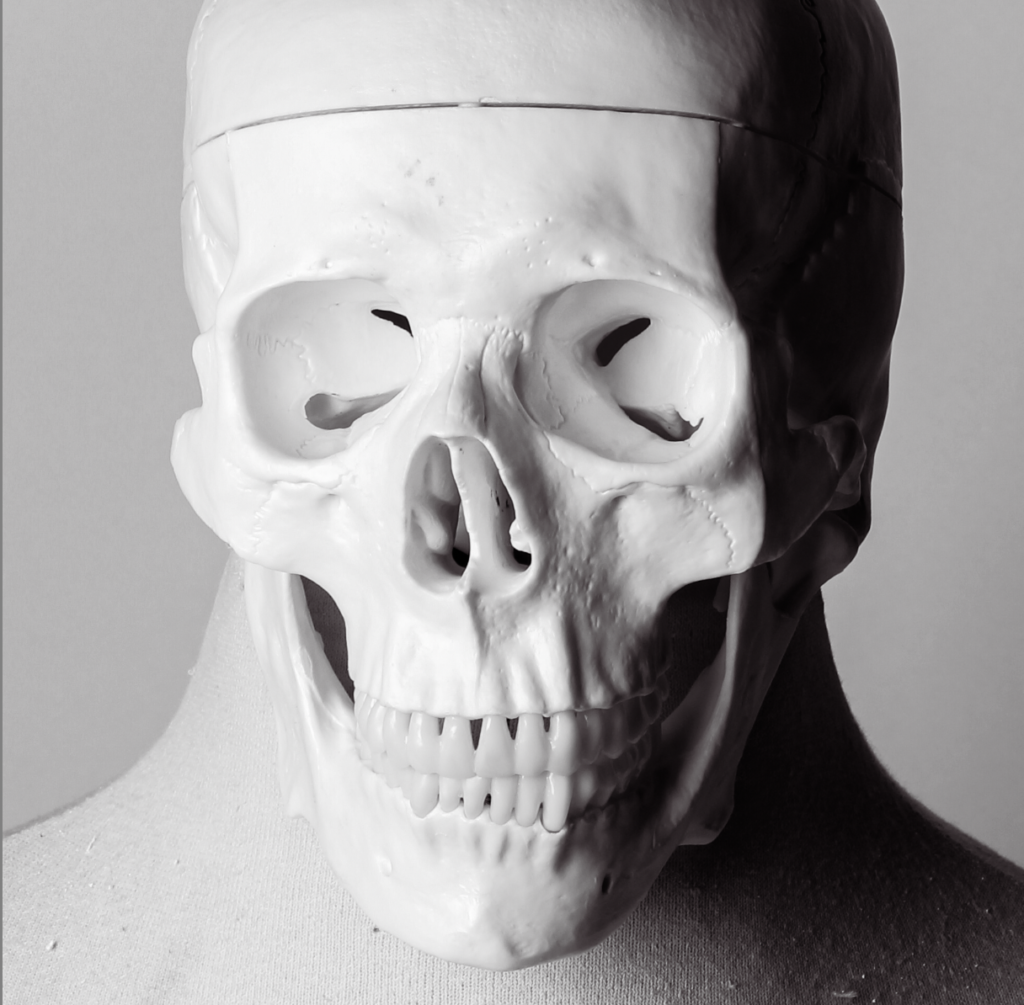
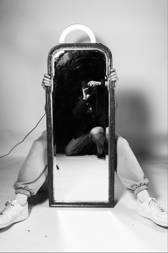
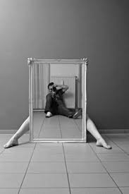
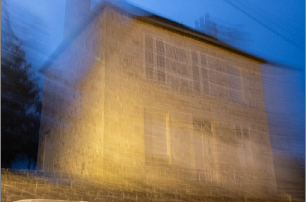
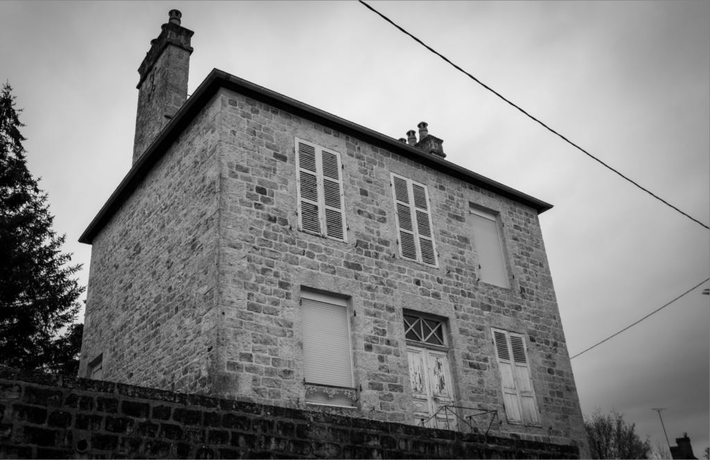
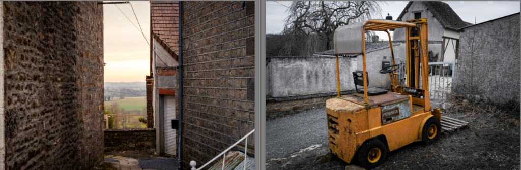
For my third and forth photoshoot, I went in with the idea of montaging them with the first photoshoot taken in France, and I believe I was very successful In doing so. I also planned on replicating a few of Man Rays images and other surrealist arts which I also think I was successful in. I experimenting with many different images to get the outcome I was looking for, and a lot of them turned out how I expected.

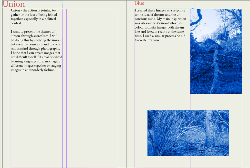
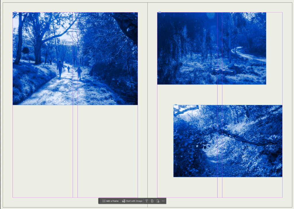
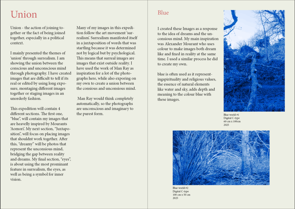
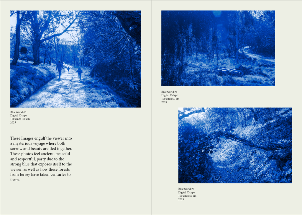
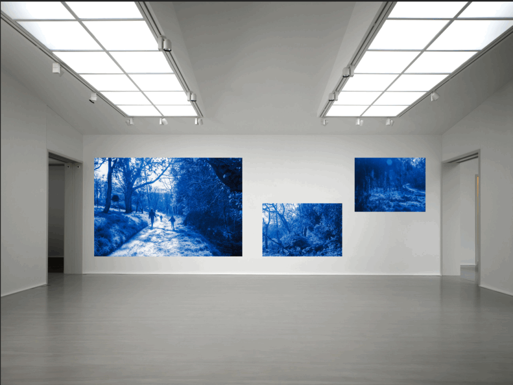
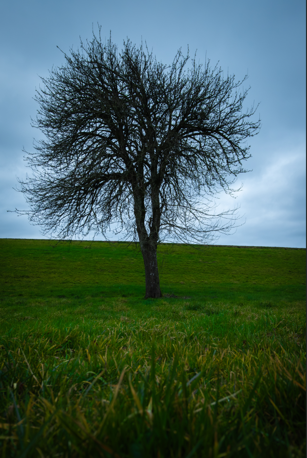
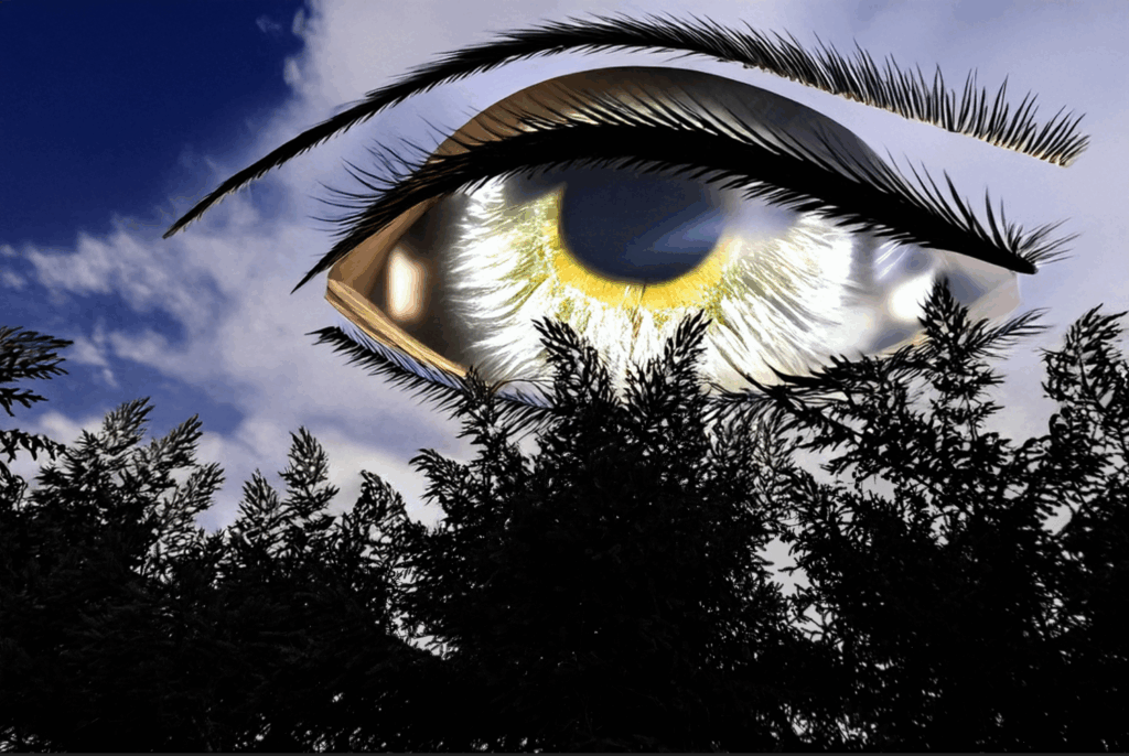
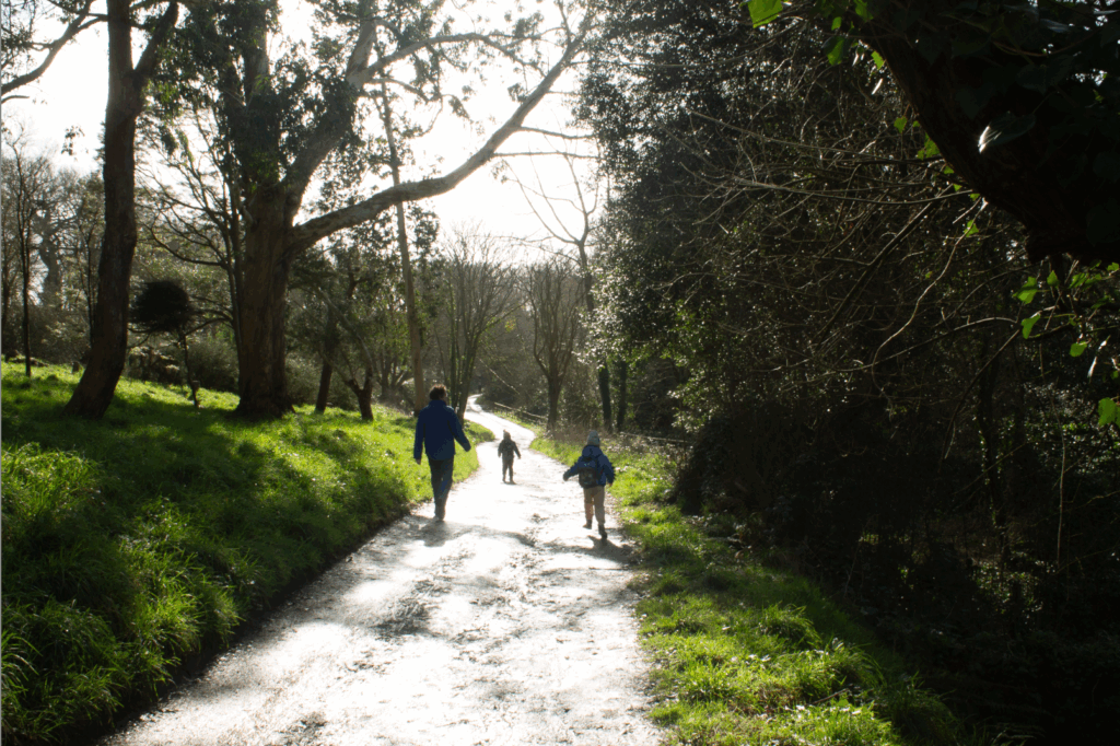
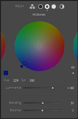
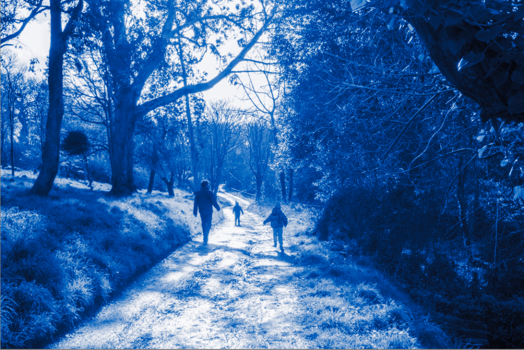
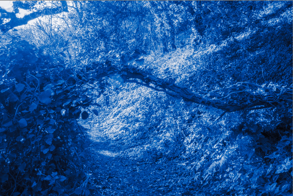
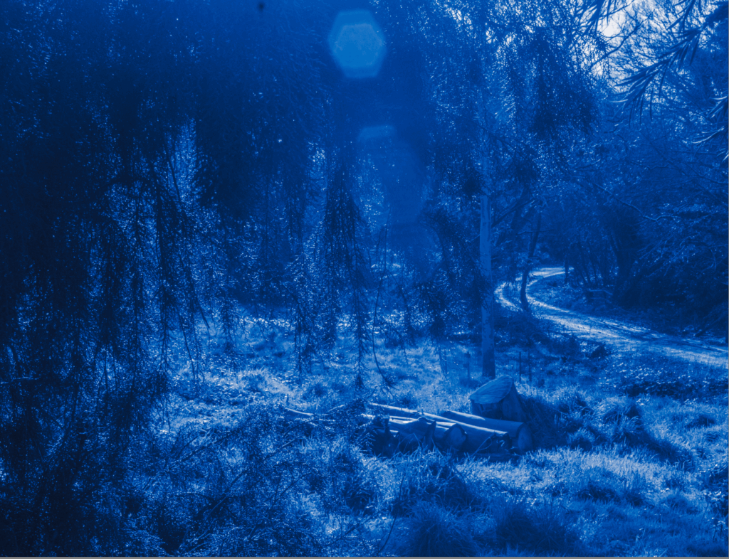
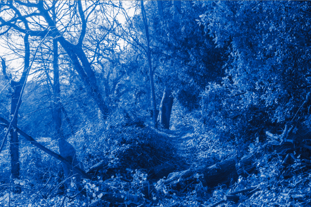
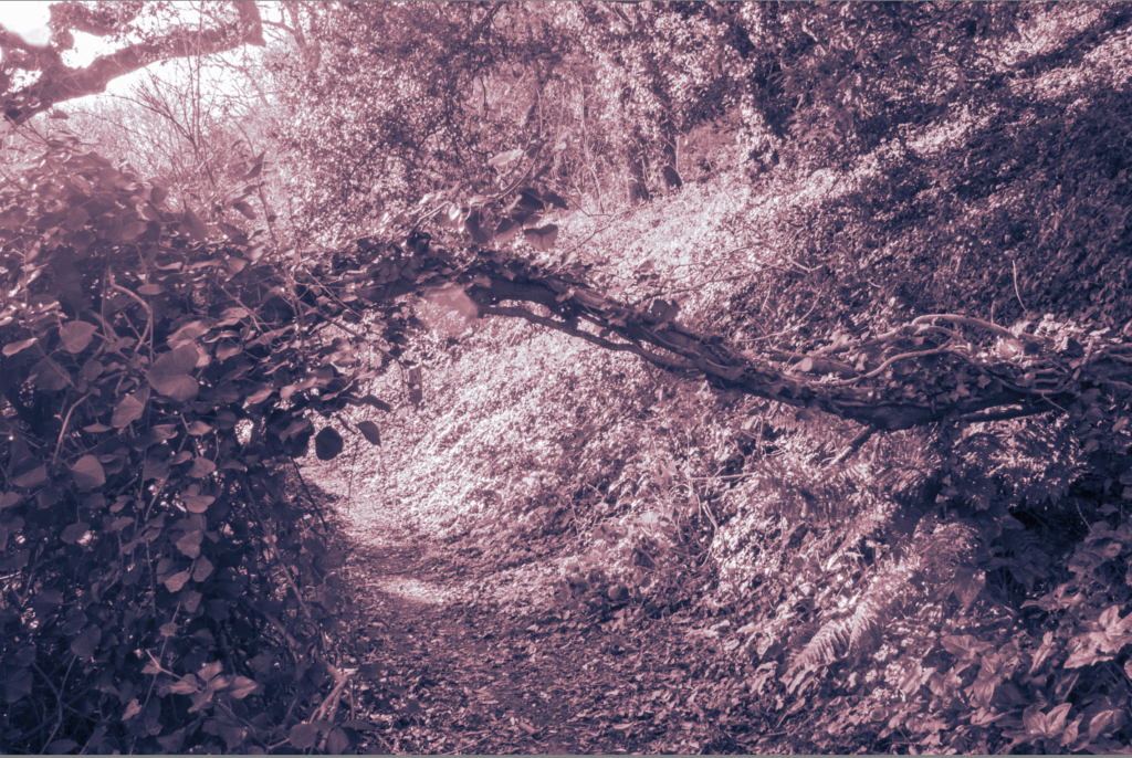
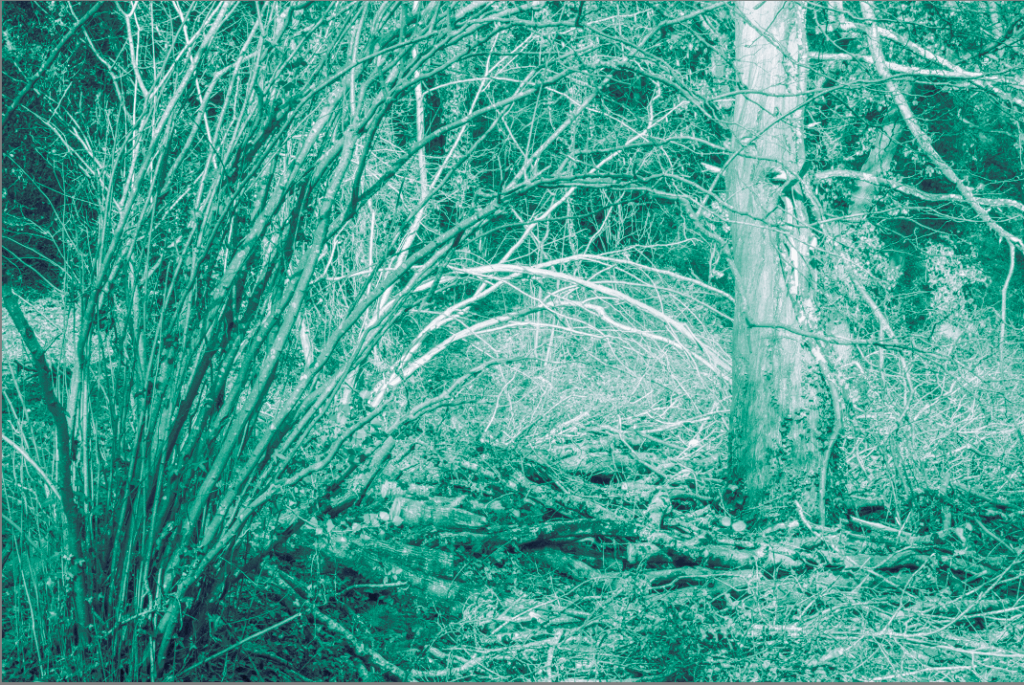
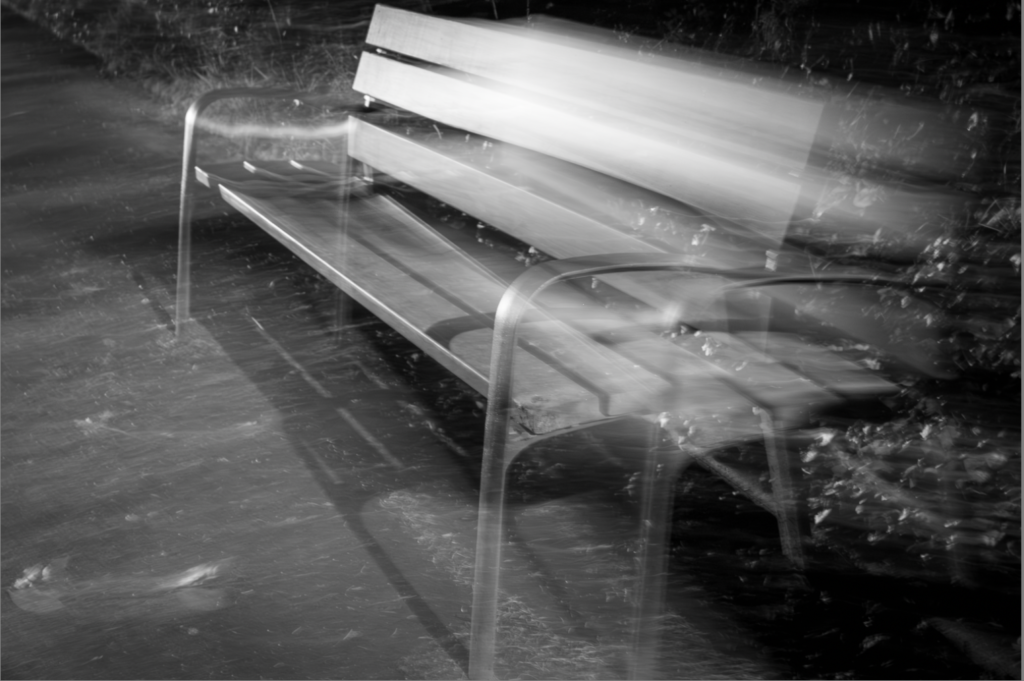
For my fifth photoshoot, which I took in a forested part of Jersey, I was planning on replicating some of Mourants ‘Aomori’ project, which I think I did well in. This photoshoot is found in the further experimentation blog post as I only intended on experimenting with colour. My end photos where monochrome in different colours, and the best and most impactful colour was blue.

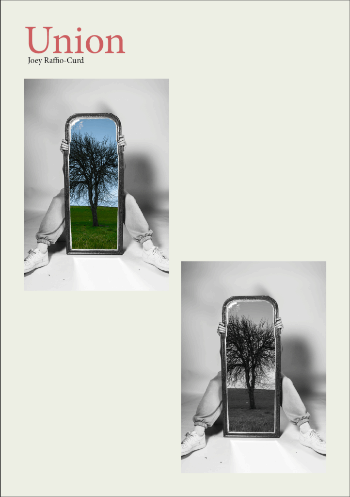
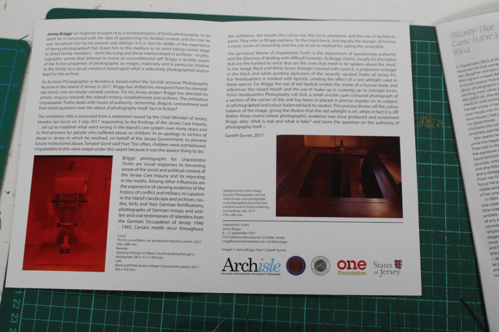
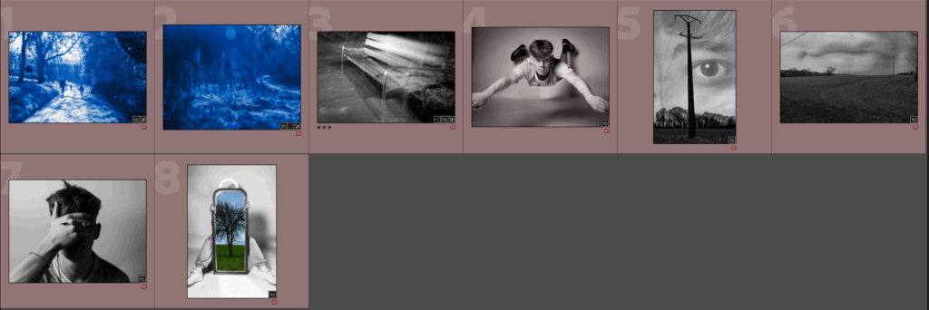
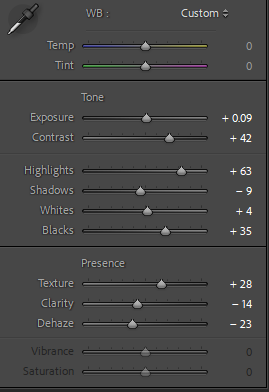
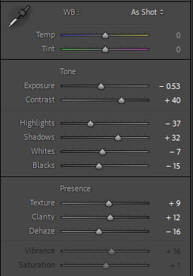
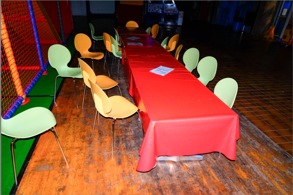
For my presentation, I printed out a few of my strongest images and used boards and card to lay out the images how I want. I think my final images looked just how I wanted them to at the start, even with a few bumps along the road. My exhibition catalogue also turned out how I wanted, where I used InDesign to create it. I do believe, however, that I could work more on writing the true intentions of each photograph in the catalogue.

exhibition catalogue – Design and final layout

After researching a few exhibition catalogues, I have decided the best way to lay out the catalogue is though categorising each section. The categories I have chosen are “blue”, “Juxtaposition” , “dreamy”, and “eyes” in that order. I have done it in this order to follow the layout of the ‘virtual’ gallery. “Juxtaposition” will include montages of images that don’t go together, like light and dark images, or electricity poles and trees, ext. “blue”, will contain images from the work I did that takes inspiration from Mourants project. “dreamy” will use the images of my subject flying, and other images that look “dreamy” in a way. Then finally, “eyes”, will include my best images that contain the eye.

Another Thing I learned from researching different exhibition catalogues is to always include the meaning behind the work at the start of the catalogue, as well as including the title of images and the size of the image if I where to create a real gallery. I can also go more in-depth which why I took the photos for each section I will create.

Red = eyes, Blue = blue, Green = Juxtaposition, Yellow = dreamy

Above I planned out the images I will be using, using colour coding in light room to categorise them. I will be using InDesign to create my exhibition catalogue.

For the front cover I used my strongest image, in black and white and in colour to allow viewers to understand what kind of photos will be in the exhibition . I’m calling this exhibition ‘union’ as that is what my whole project is based on. I might change the name later to a more create one. I also coloured every page slightly yellow to give the exhibition catalogue an ‘ancient’ look, as well as making white images easier to see. I’ve also made titles red instead of the traditional bold because I think it looks better and makes the pages less cluttered and clearer.

For the first and second page I placed where I want my images to be (in a logical manner), as well as adding some text which I will improve towards the end. I did this for the book, to get an Idea of what it will look like:

filled where I will have important text with place holder text

I have laid it out this way to give more important images more space on the page. Below is the final layout with text included:

I have chosen to leave the back cover black as it’s not suppose be a book but a small paper catalogue which is simply used to show the photos around the exhibition , as well as a small amount of information on why I’ve taken some of the photos. Some things I’ve changed in the final addition above is that I’ve added some info on each photo (the name, how its printed, size, and when it was taken). I’ve also moved the titles down and to the right more to keep a consistent boarder around the pages.

exhibition catalogue – Research

I first explored 5 different exhibition catalogues, taking photos of important parts of each book to give me inspiration for how I want my catalogue to look. Below are the 5 catalogues I looked at:

The first catalogue I looked at was Capturer la beaute by Julia Margaret Cameron. This one stood out the most to me as it was printed using A4 instead of the traditional A5. This catalogue likely costs money and is not handed to you at the start of the gallery like most catalogues. It also had card covers, like a book or some magazines which made it feel high quality. The book has been categorised into three subsections, photographs from Cameron’s early photography career, photographs of famous people that she did later, and finally photos of staged acts (e.g. ones that replicate moments in the bible). The book also starts will 2 pages of her autobiography. Each photo has a small amount of text explaining the meaning behind it, as well as context. Below is an example:

Some images are shown with a different style

The next catalogue I looked at was much more traditional and was for the artist Hassan Hajjaj. It again contains an autobiography, as well as some text for why he took these photos around morocco. The exhibition presents only eight photos, and each photo takes up a large amount of space on the catalogue. Below are some photos:

The next catalogue I looked at, by Victor Burgin, contained much the same as the rest, but did have a little map at the start to guide viewers through the gallery. Below are two photos of the catalogue:

I also looked at ‘Unpalatable Truths’ by Jonny Briggs, This contained only two images, with a lot of writing to go with it. The catalogue also contain the size of the image, and the title. Below is what the catalogue looks like:

Final Images For print

1st set
Second Set

Above I’ve put together some images that I may decide to use. The first set of images are photos from light room and the second set are from photoshop, which dive deeper into surrealism.

I picked the images I liked the most using a colour system and placed them in a separate folder.

Why did I choose these Images?

I chose the Images that stood out the most to me, while also taking into account how they would fit together once I print them. Since my way of presenting union was through the concepts of surrealism, I chose Images that I believed most represented this art movement.

I chose a few photos from my photoshoot which took inspiration from Mourants ‘Aomori’, because they remind me of dreams or thoughts of the past. The blue monochrome images make these images look and feel ancient and precious, like a dream that you want to keep remembering. Even though this is not surrealism, it still links with the ideas of surrealism though its ‘dreamy’ look. I also chose some edited photos, which I based the edits off real surrealist photographer (like man ray).

Below I explained, in further detail, why I picked some of the photos.

I picked this one as it instantly stood out to be as being a blurred memory. I took this image using a long exposure to create this effect. The bench is the only relevant thing in this photo, adding meaning to it and making the viewer question the meaning behind it. maybe it was where a loved one sat? or maybe its been taken as it brings back nostalgia?. This photo creates many questions which is why I like it.

I picked this one as I feel like it can break the eerie feeling that a lot of my other photos have. Its also very dream like as we all which we could fly.

I picked this one as the eye is very common in surrealist art work and photography.

I picked this one again because the eyes are what the viewer most likely will pay attention to. This is because at first glace you see the eyes looking straight into the camera, then you notice that the hand should be covering the eyes, so it makes the eyes the most dominant part of this photograph.

I chose this image as Its very surreal in the way the reflection is incorrect. The tree acts as the body of the person, or even the soul.

Virtual Gallery

Above I put together two virtual galleries, using photoshop. I used the distort tool to line the photos up on the wall. I decided to do two separate virtual galleries as I like how my photos based on Mourants project turned out, but I didn’t think it fit well with the rest of my images.

Above I used power point to decide how exactly I will lay out my images.

Experimenting with AI

The way AI learns is very similar to how human learn, by using thousands of similar memory’s, or images for AI, and using them to predict what is needed. However, since AI is not yet as good as the conscious mind to create a correct looking image, it can often look slightly off or ‘uncanny’. This also means I can use AI to create an image like an unconscious mind would.

To achieve this I will use photoshops AI tool and experiment with different prompts until I get an Image that looks strange or uncanny.

For this first image I tried use the prompt ‘walking’ as it juxtaposes what the subject is doing (flying). This has created an image that looks sort of correct, but as you keep looking you notice that things are off. This is just like how dreams always feel correct at first but when you really think about what happened, your brain cannot make full sense of it. This links strongly with my project of unionising dreams and reality through photography.

For this image I used the prompt ‘people’ and it came out with an image that looks really incorrect.

Original image

Above I used the prompt, “army of people in the sky, realistic”. These images again very weird looking.

prompt – “scared person”
Prompt – “giant eye”
Prompt – “many eyes in the sky”

Further Experimenting

Here I will be experimenting using photoshop to create more ‘surrealist’ work. I will be trying to unite the real and imaginary through photography.

Above I tried to put together 2 sets of images a took. A studio Image which resembles an Image I found online (look at previous blog post), and a photo that I took from my France photoshoot. I used a tree as looks correct compositionally, as it looks like the ‘soul’ of the human. This links very closely to surrealism as the image is both imaginary and real at the same time.

To edit, I created multiple different layers. The first layer is the studio image with the mirror cut out:

Then I cut out the highlights in the mirror, so hopefully the imperfections in the mirror can stay (like smudges and dust) using colour select tool in photoshop, making it look more believable:

Then I put this all together with this image:

I tried a black and white version

However, I will now try use a mirror texture instead as I think it will look better, I will also try creating a green shadow to make it seem like this tree is actually there.

Here I tried made the reflection layer a ‘divide’. I think this makes it look better. I also removed the wire
Here I tried adding a green shadow at the bottom but I don’t think it looks right.

For this image above I did the same method of cutting out the mirror and placing the landscape photo behind the foreground layer. But I tried the ripped filter on photoshop to create some sort of distortion through the mirror. It sort of worked.

Here I did the same thing but with a different image and in colour

For the image above, I used a similar technique from above by using the colour select tool and selecting the shadows on the environment photo. I then deleted the selected parts but on the face layer instead, This is to keep the face behind the trees and electricity poles, making it look like it comes from the sky. I have done this as this image becomes very surreal with these edits.

slightly decreased the opacity of the face as I think it looks better.

Here I tried moving the eye to the left as I think the pole in front of the eye takes away the power the eye has over this image. I also used the dodge tool to make the eye brighter, standing it out more.

Observatory Time: The Lovers, 1936 by Man Ray (top section) – my inspiration to these images
Ive done the same method again but with the lips

Images like Alexander Mourant (Aomori)

Above are a few photos I took a few months ago and I think will work well to create similar images to Alexander Mourant. I took these photos after a storm that happened in late 2024 in Jersey.

original image

Here is my first image, which I edited after playing around with the mid tones and the tone curve for a while until I got something that I liked. I chose this Image as its got kids running around and the light reflecting off the dirt road makes it very ‘dreamy’ looking. There are many other reasons why blue adds to this ‘dreamy’ looks which I’ve explained in my Alex Mourant blog post.

copy of edit above but with a different photo
Slightly increased the shadows as it was a darker image

Here I tried it using the other end of the colour wheel (Brown/Red). It gives a very different emotion to the blue images from above. This emotion can be interpreted differently depending on the viewer and how they process this colour.

This is a green version

Photoshoot 3&4 – Studio

Below are the photos I took over the first photoshoot day with Tommy. I took a few photos with the intention of montaging them together with landscape photography, and some as there own photograph. I started the photoshoot with some portraits of Tommy, with a focus on the eye as its a common theme in surrealism, then I went to taking photos of hands and they are often associated with the conscious mind as the unconscious usually cannot process hands. Finally, I went to taking some Images of skulls as I may use them later to add to my landscape photos.

B&W

Here I took inspiration from one of Man Ray’s famous portraits called Noire et Blanche (1926). Bellow is an edited version try try replicate the same ‘brown’ that’s in Man Ray’s image:

I kept my subjects eyes open as it means I can create a montage of images with my subject later on, all with a similar theme of the eye being in focus.

Surrealist painters and photographers often use eyes into their works to create a sense of mystery, depth and phycological exploration. It can also be used to evoke emotions and provoke thoughts. “eyes are the windows to a soul”. This is very true as a lot of emotion of a subject can be depicted from there eyes.

Same editing settings as the image a few above
box removed

Above I told my subject to act like he was flying, while his belly was resting on a box. I used the same edit as the image above, and I also took the image to photoshop to try and remove the box, adding a real flying allusion. However, I found it difficult to remove the box so I opted on using the remove tool in photoshop.

Another attempt

I tried montaging a few of the flying images together with the same edit again
and again with a slightly different style, edits below

Here I added two images together with different opacities to create this transformation through time, when the subject has his hands down and his hands up. I also see this kind of image very often when I’m looking for inspiration for a surrealism photograph.

Above I used the same two sets of images as before, but cut out the eyes. This has created a very eerie looking image as the viewer cannot escape the eye.

Montage of a skull

Photoshoot 4

Here I Tried to use the same method as before, but with a different subject and using reflections, I will now try to edit is arm out so I confuses the viewer.

Attempt 1 – I cut out the actual subjects body on the second image
Attempt 2 – I duplicated the reflection of the arm covering the face and placed it over the first image
Here I tried removing the studio light reflection using a custom paint brush in photoshop (attempt 2 photo)

Here I tried replicating an Image I saw while looking for inspiration of Surrealism.

Mini photoshoot 2 – liminal spaces

I took these photos at around 9pm after I finished basketball. Its inside fort regent (Jersey), and a week prior I noticed how much nostalgia I got from looking at the play park, as well as a bit of a scared feeling as It looks very run down and forgotten. I got the idea to take photos of it from past research in liminal spaces, as this area reminding me heavily of photos trying to capture this space. I only had 5 minutes to capture some images of here before fort regent was closed for the day, so I didn’t capture too many images.

liminal spaces are empty or abandoned places that appear eerie, forlorn, and often surreal. Liminal spaces are commonly places of transition, pertaining to the concept of liminality. This is basically the space between present and past, with old memories distorting this space. Photography of this rarely contains people, and focus on trying to capture an uncanny valley of architecture and physical places. Liminal space imagery often depicts this sense of “in-between”, capturing transitional places (such as stairwells, roads, corridors, or hotels) unsettlingly devoid of people.

I also increased the grain

The photos that I see online that give me the most ‘nostalgic’ and eerie feeling often look like there weren’t planned and had spontaneously taken the photos. So to make these images look unplanned I edited some of them with motion blur and added some grain, as well as making some images have a tilt.

Photoshoot 1 – France

I took these photos a few days after the exam paper way released. I started this photoshoot in a little village in Normandy, France. It was about 5pm when I started my walk and I planned on capturing the village before the night and during the night, using different photographic methods during each time period, for example, I experimented with long exposure once I got back into the village at night.

My purpose of this photoshoot was to capture interesting images of quite an uninteresting place. As well as unionising different things together, like light and dark, and natural and un-natural object.

Here is an example where I put together 2 images of the same house, with my edits below. The left image was taken at night, with a long exposure to make a blurry image, as it its like a memory of the image on the left. The image on the left was taken at night. I decided to create even more of of a contrast between these two images by having one in b&w and one in colour.

Here I put together the ‘colour’ of the image. I noticed while picking the best photos that the sunset is very similar to the colour of the truck so I placed them together. I think this does look a bit naf so I’ll try to find better examples as I continue looking though photos. I think this photo would look better with just the truck.

To edit the colour photo on the right of the truck I simply decreased the saturation for all colours except orange, Increased its luminance and increased the exposure a bit.

Here is another example of taking images during the evening and the night, but this time using mirrors.

I quite like this image as it really reminds me of a blurred dream. This image makes the viewer think this bench has some meaning, and is fading away slowly. My edit is above.

Above I montaged together images of electricity polls and trees.

Above are some other photos I like and might further edit with in photoshop. One editing process I’m thinking of is multi exposure, as well as placing subjects or objects in parts of the image that doesn’t make sense. This will allow me to link these images to the surrealist movement.

Statement of Intent

For my project, I want to present the themes of ‘union’ through surrealism. I will be doing this by showing the union between the conscious and unconscious mind through photography. I hope that I can create images that are difficult to tell if its real or edited by using long exposure, montaging different images together or staging images in an unorderly fashion. I’ve also been very interested in liminal spaces (a space between reality and the dream), and have a few ideas of how I can capture this space.

I chose to analyse Ray Man as one of my artists. Firstly he works closely with the ideas of surrealism, which links with the idea of union (as explained in my isms blog post). Its all about placing the unconscious into he conscious, which is similar to my plan for this project. He also has a very large range of work to get inspiration from, giving me more options in how I will present this project at the end. For example, his images with juxtaposition create a conflict in the mind on what’s reality and what’s imaginary.

I also chose to analyse Alexander Mourant, as I will be taking inspiration from a few of his projects like Aomori and The Lightness, using colour to help make my images both dream like and fixed in reality at the same time. I will be replicating his process of making images to improve my own.

First photoshoot plan

I’ve already taken a few photos when I went to France during half term and I will likely end up using them towards the end of my project. However, for my first photoshoot I will be replicating some of Mourant’s Images, but using editing software to create the colour I want instead of a filter.