Evaluation
Overall, my mounting went well as I was able to present my images in an aesthetically pleasing way and I was able to experiment with both white and black background and different ways of arranging multiple images, or singular images.

Evaluation
Overall, my mounting went well as I was able to present my images in an aesthetically pleasing way and I was able to experiment with both white and black background and different ways of arranging multiple images, or singular images.
How?
I used photoshop to create my virtual galleries. First, I selected A4 and Landscape and created a blank document.
Then, I went onto my documents and dragged the virtual that I have saved on their onto my blank document.
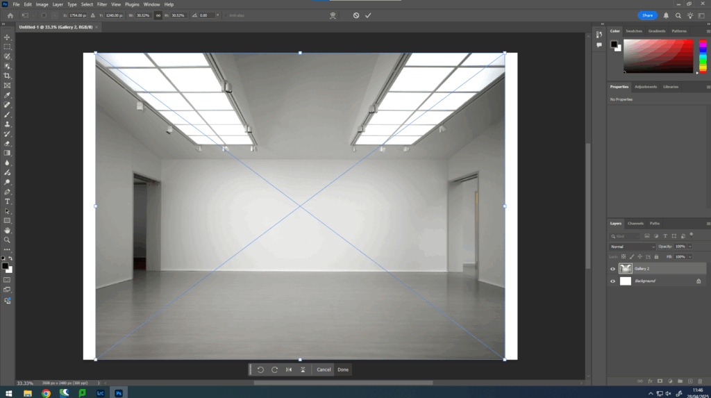
Then, I resized and adjusted it. Next, I selected the final images that I wanted to use for my galleries dragged them in and also adjusted and resized them.
Once I have my layout, I then click fx and drop shadow, so I can create some shadows under my images to make it look more 3D.
Then, I edit to opacity, angle and thickness of them, until I think they look good.
Finally, I repeated this for each one of my photoshoots, but I experimented with different gallery backgrounds.
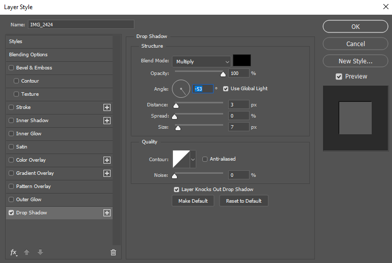
Photoshoot 1
Photoshoot 2
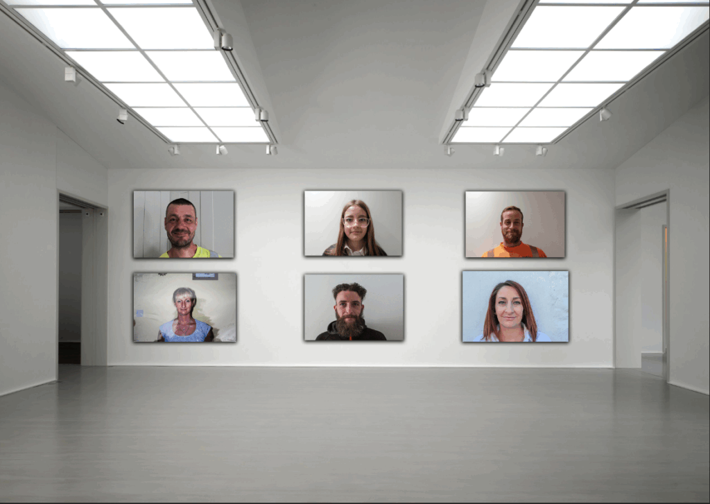
Photoshoot 3
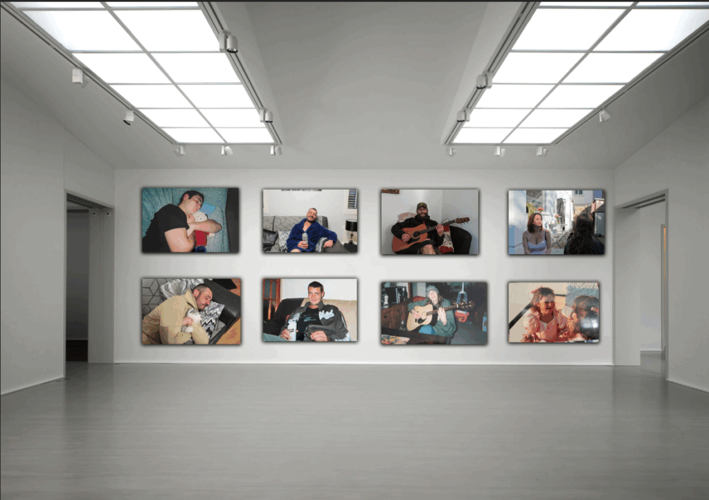
Photoshoot 4
Evaluation
Overall, my virtual galleries have gone well, as I have been able to display a gallery for each photoshoot, and I was able to use my editing tools to create more form in each of my galleries, so they look more 3D, rather than a flat 2D image.
Concept
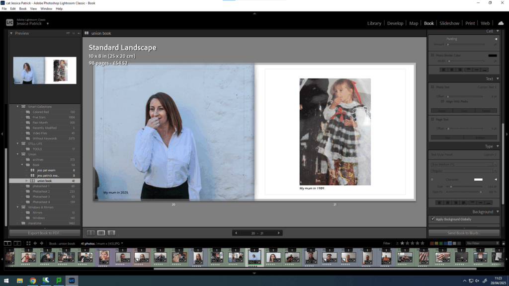
The concept of my photobook is to explore the theme of union through exploring the union my mum and dad have to each other, because of their marriage, and how that has brought two once separate families together and increased the family, by having my sister and myself.
Narrative
Explain the narrative in:
3 words: My family union.
A sentence: The marriage union between my mum and dad that has created a family.
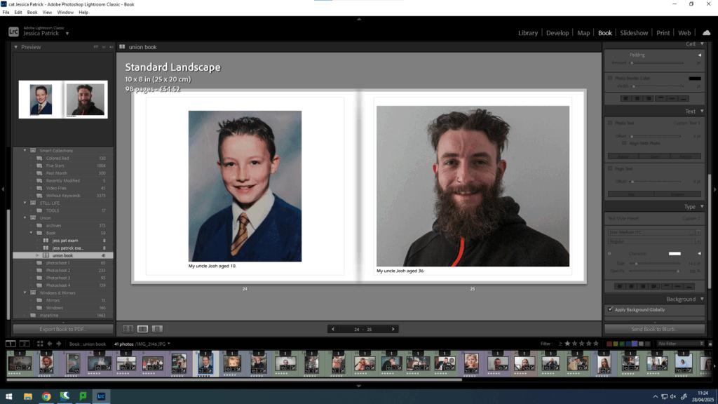
A paragraph: The narrative of my photobook is to present how the individuals in my family have grown and changed over time, but the union still stays as strong as ever. It is also to present the marriage union between my mum and dad that unified two once separate families into one family.
Design
For the design of my photobook, I have taken inspiration of Larry Sultan’s photobook of pictures from home, as I really enjoyed deconstructing his book and I thought it was very visually pleasing.
How?
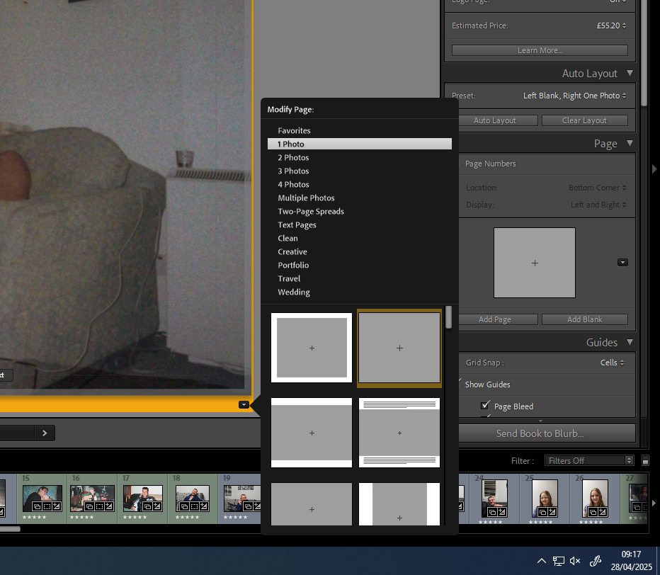
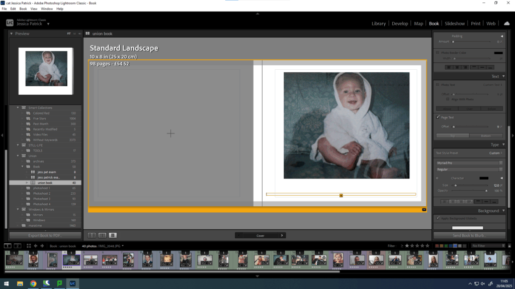
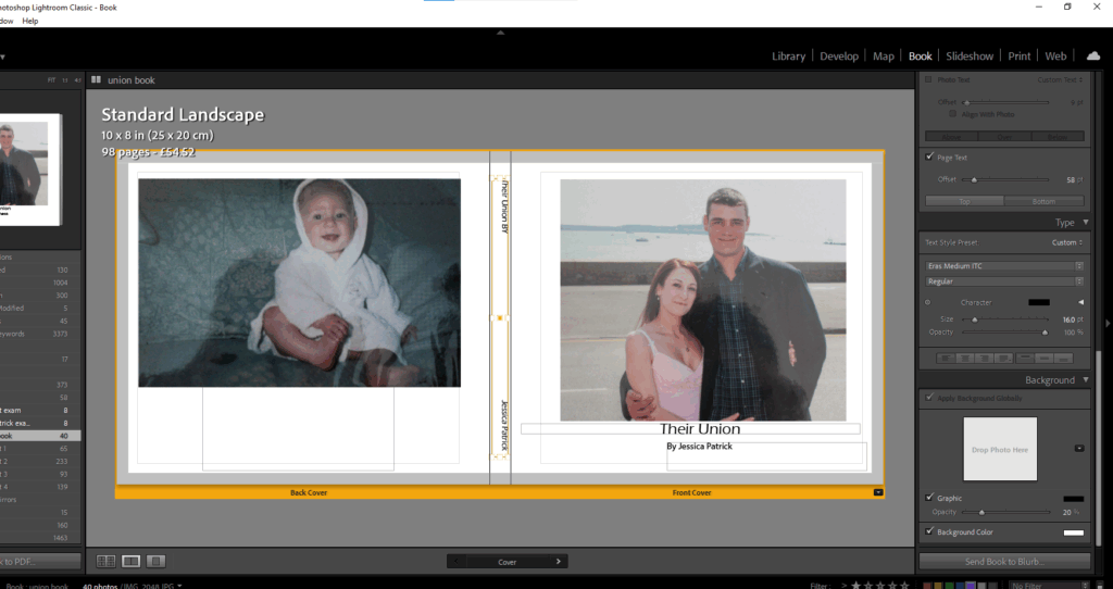
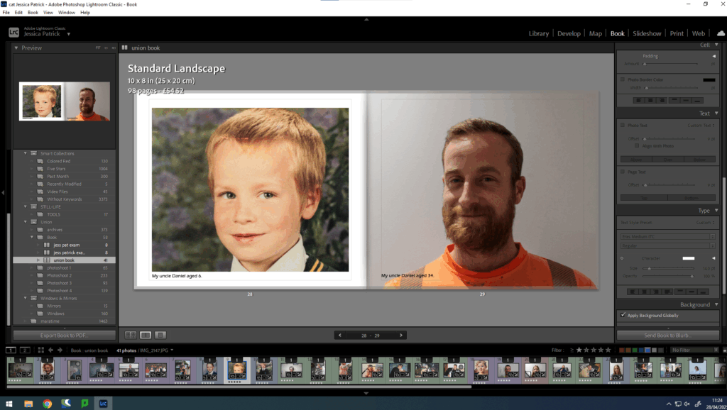
Firstly, I select my final images that I am wanting to use in my photobook in Lightroom and click book.
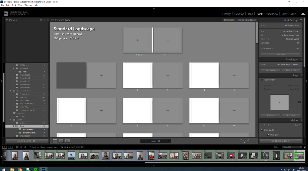
Then, I select whether I want my book landscape or portrait. I decided on the standard landscape.
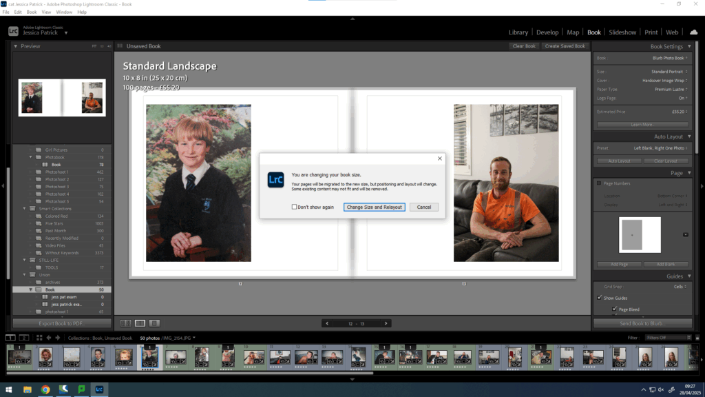
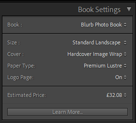
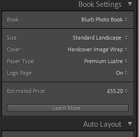
I would then also choose which type of front cover I want and what kind of paper I wanted to be used in my photobook. I chose a hard cover image wrap and premium lustre paper, because I wanted glossy pages, rather than matte.
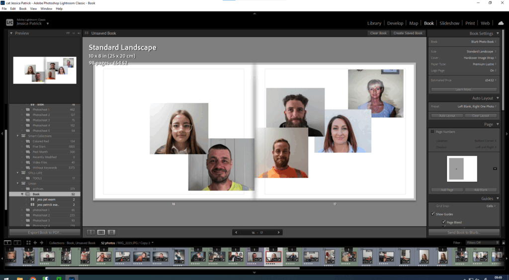
Then, I can drag the image to the page I want it to be on and I can change the layout of the image.
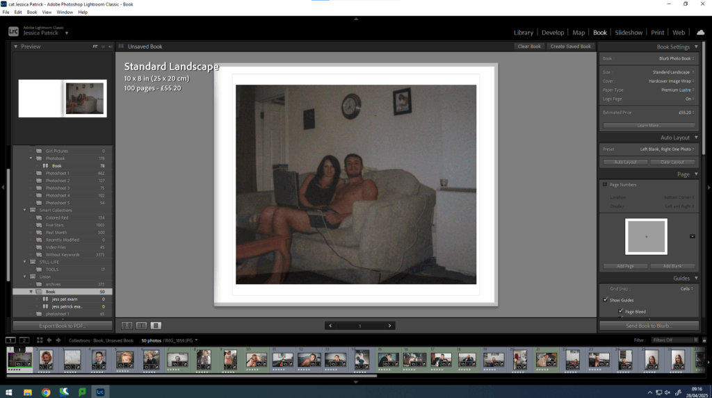
Then, I did this with all my photographs and experimented with the layout and design.
Then, I experimented with including a collage in my book, because when I researched Larry Sultan’s book, I thought it looked very aesthetically pleasing.
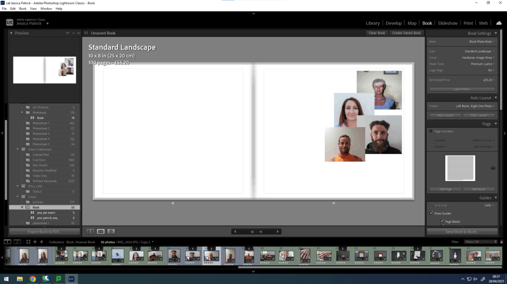
I also experimented with making it a double page spread collage as I hadn’t done that before.
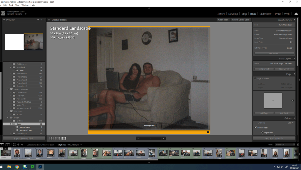
Then, I started to experiment with text.
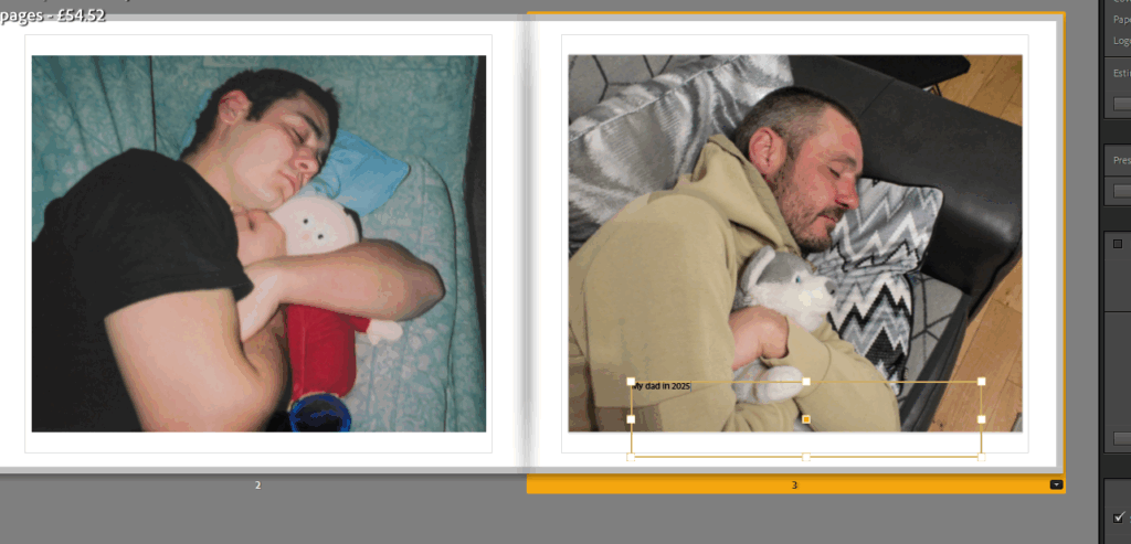
First, I wanted to caption the year of my photographs, so that the archives could be distinguished from my photographs.
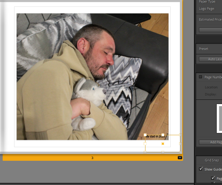
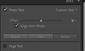
Then, I experimented with the placing, until I selected align with photograph, because I thought that looked the best.
Once I had added all the text I thought neccesary I experimented with the colour, font and size of the text.
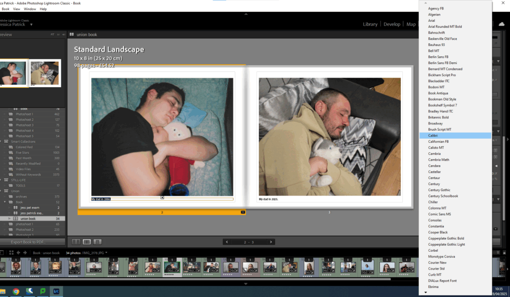
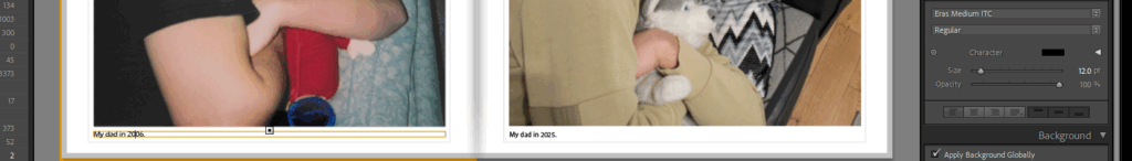
First, I looked through all the fonts to see which one I liked the most. I decided on Eras Medium ITC.
Then, I experimented with the colours.
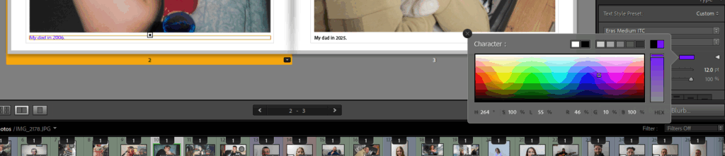
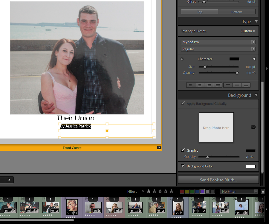
In the end I decided on black, as I thought it looked best, but I did have to go through my book and change the writing to white in some images, as the black writing couldn’t be seen as clear on the darker images.
However, I still found this quite hard to see in some of the images, so I had to alter my layout slightly more.
I also had to change the layout of the writing from the bottom to the top of the page for some images in order for them to be more visible.
Finally, I experimented with the size of the text.
It was originally on 12pt, but I decided it looked better on 14pt.
Next, I started to work on my front and back cover pages. At first, I experimented with creating a collage of my family archive images on photoshop.
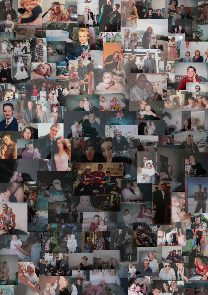
This was the collage that I had created. However, it wasn’t the best quality and it was made in portrait, but I decided on having my photobook landscape.
Instead, for my front cover I decided on just using one archive image, instead of lots.
Then, I experimented with different titles. I selected the same font as all my other writing, but the size of the title was 20pt and the size of my name was 18pt.
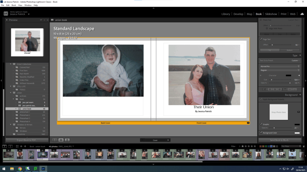
Then, I experimented with putting text on the spine of the book.
Then, I cantered it.
Finally, I wanted to do one more experimentation with the opacity of the writing, so I played around with that, but ultimately decided on it being 100% opacity.
Final layout

Evaluation
Overall, I think this photobook went well, because I was able to creating an aesthetically pleasing layout of images, using my best final images. I also used quite a bit of experimentation throughout the making of this photobook. I was also able to include some text as well as just images, which I quite like, because I didn’t use any text in my previous photobook.
I also feel this photobook displays many different members of my family and shows how we were unified years ago and still are today. I also feel like the process of making these images has brought us all a little closer together, which I think can be seen in this photobook.
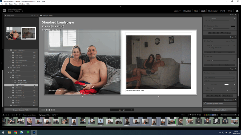
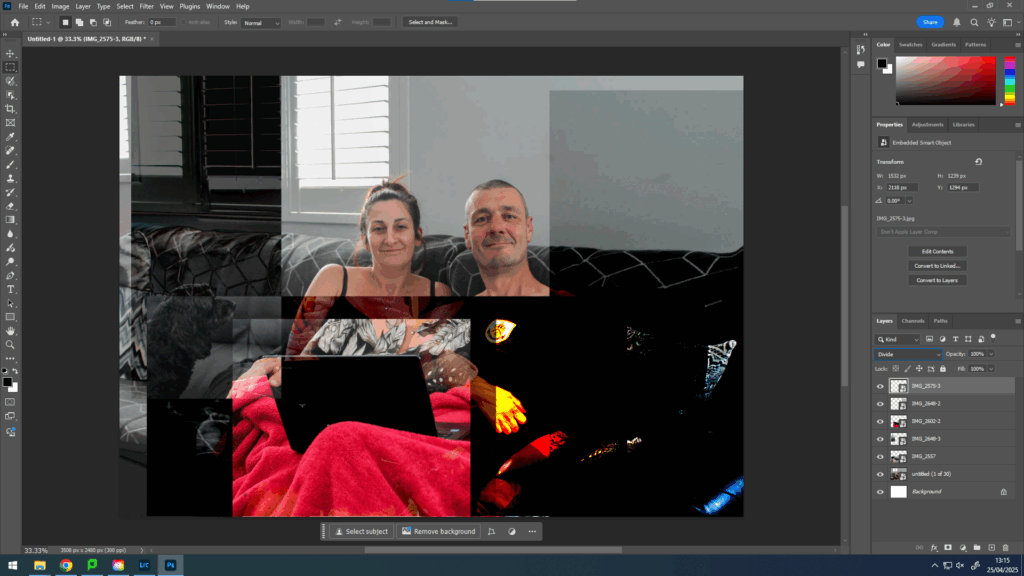
I have taken the same photograph of my mum and dad on the couch at slightly different angles and times, so that I can create a joiner that displays different perspectives at the same time.
Photos Used
How?
Photoshop:
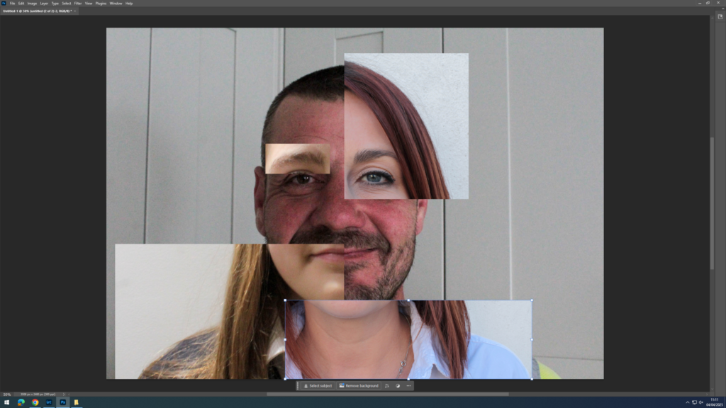
Firstly, I created virtual copies of the images I wanted to use to create my joiner. Then, I cropped my images, so that I could overlap these images onto one A4 sheet of paper to display different perspectives.
Then, I imported the images into photoshop and adjusted the size and positioning of them, until I liked them.
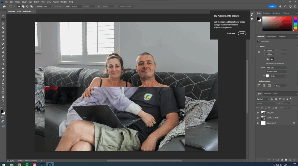
At first I experimented with having them in line and I used the opacity feature to do so to get them in line as best as possible.
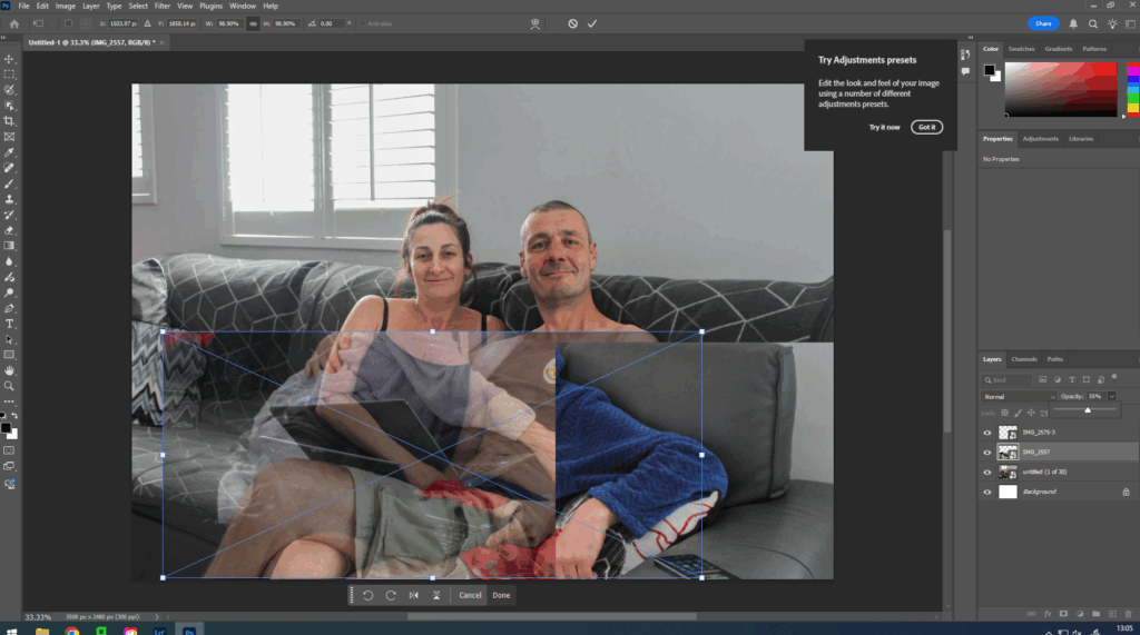
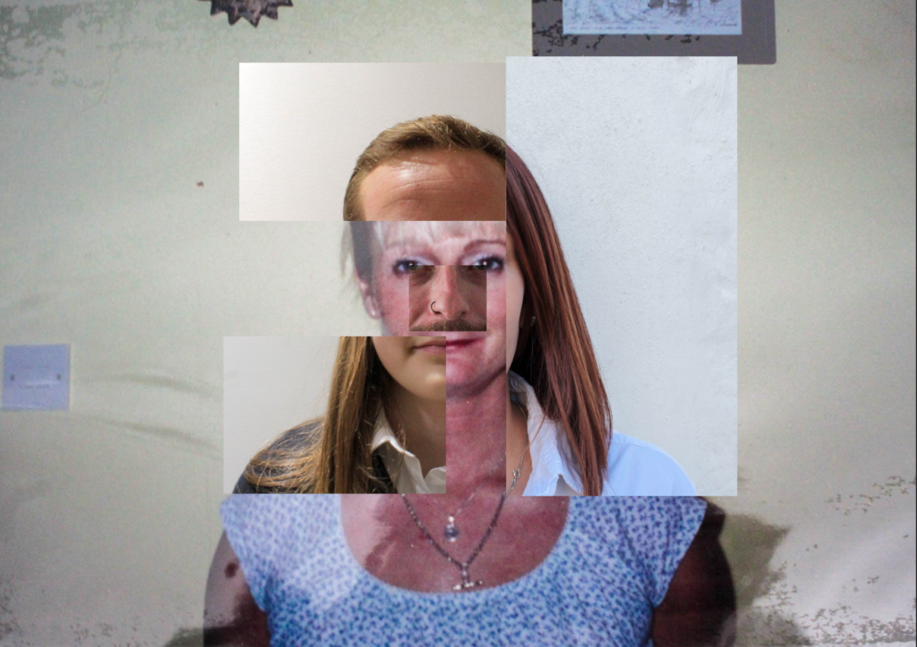
However, I had already done this in my previous photoshop work of combining facial features, so I wanted to try something different and not have them all in line.
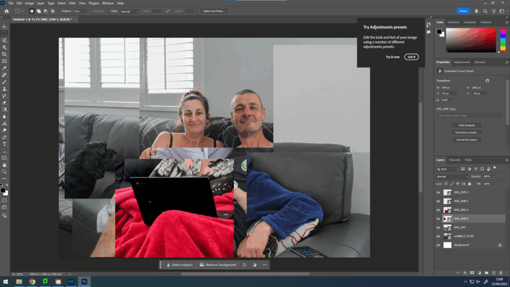
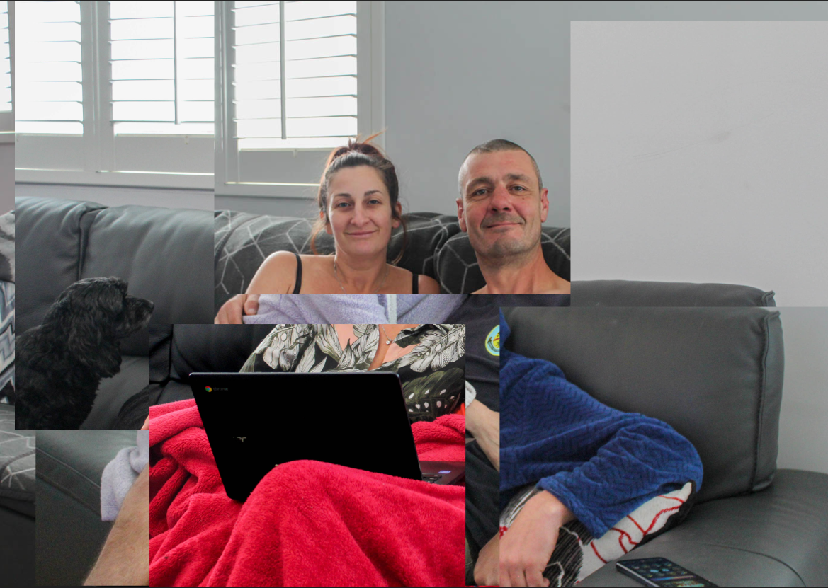
Next, I wanted to experiment the blending tool in photoshop to see if I could make my image more fun.
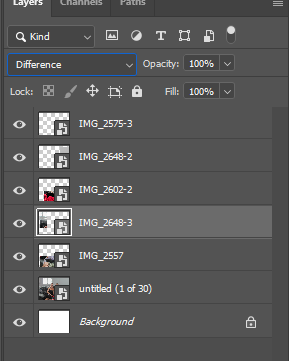
I did this by selecting which layer I wanted to alter and then selecting normal and using the arrows on my keyboard to change the appearance of that layer.
Evaluation
I think the creation of these joiners using photoshop went well, as I was able to present different perspectives all at once, similarly to cubism, which I have previously researched and done work based around. I also enjoyed experimenting with the blending tool as it allowed me to add different colours and tones throughout my image as well as perspectives, which some cubist also do in their work.
The concept of these joiners is that all the pieces are unified together, just how my mum and dad are unified together. It also takes a lot of time to take these photographs and edit them together, print them out and piece them together in an aesthetic way, which also symbolises time and how the union of marriage and family will last until the end of time.
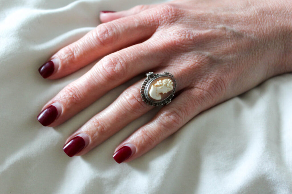
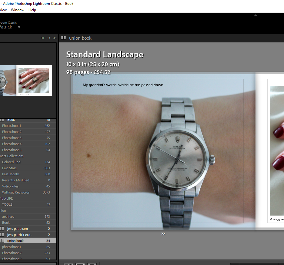
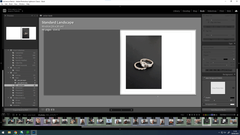
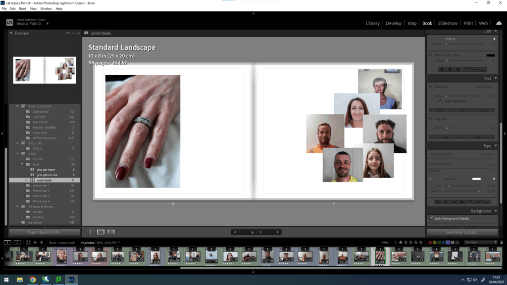
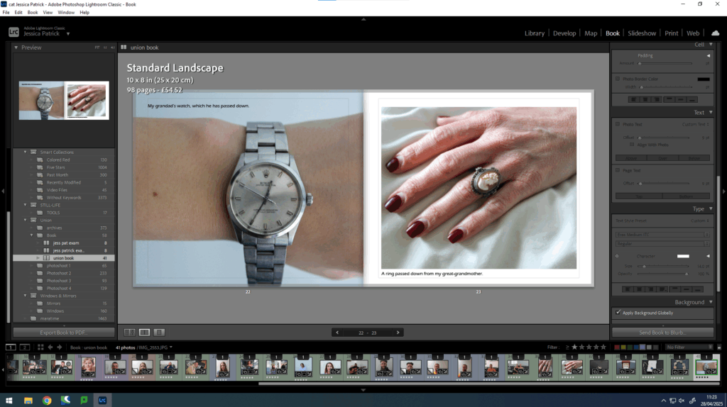
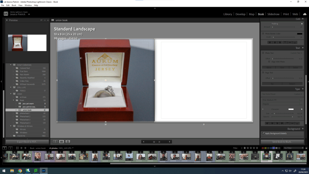
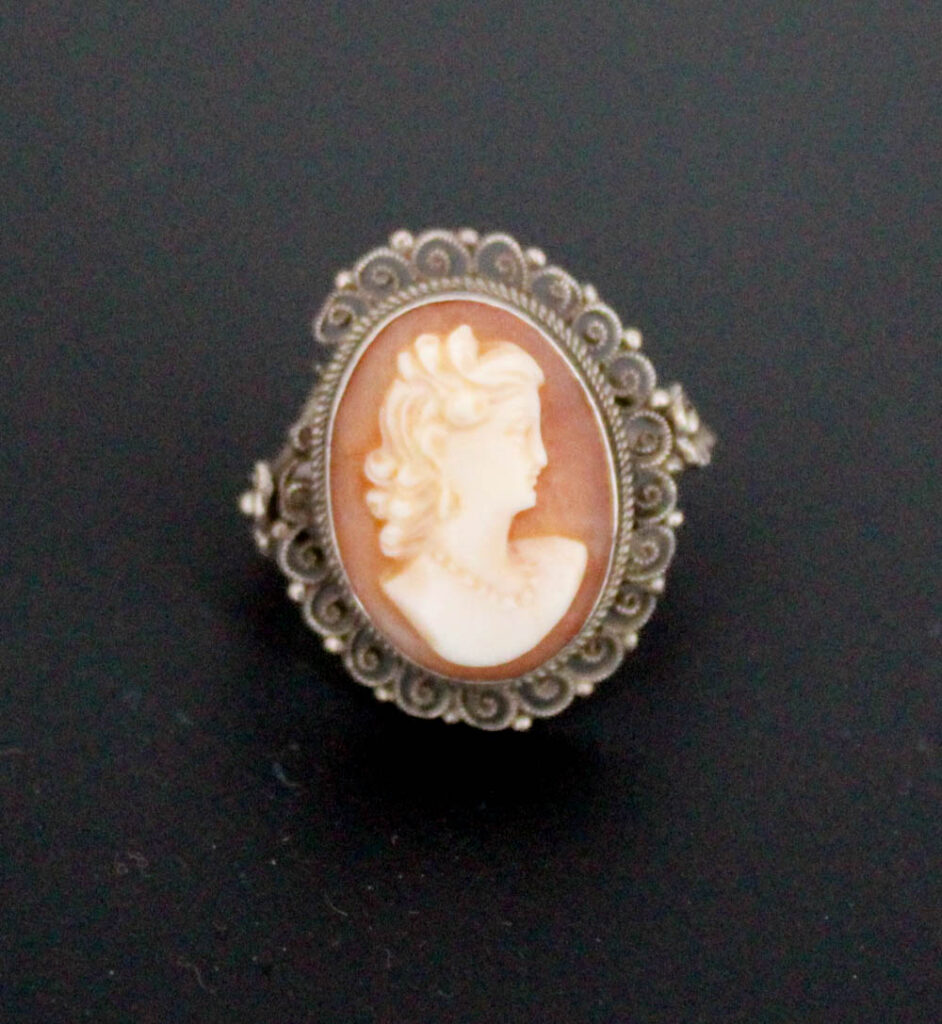
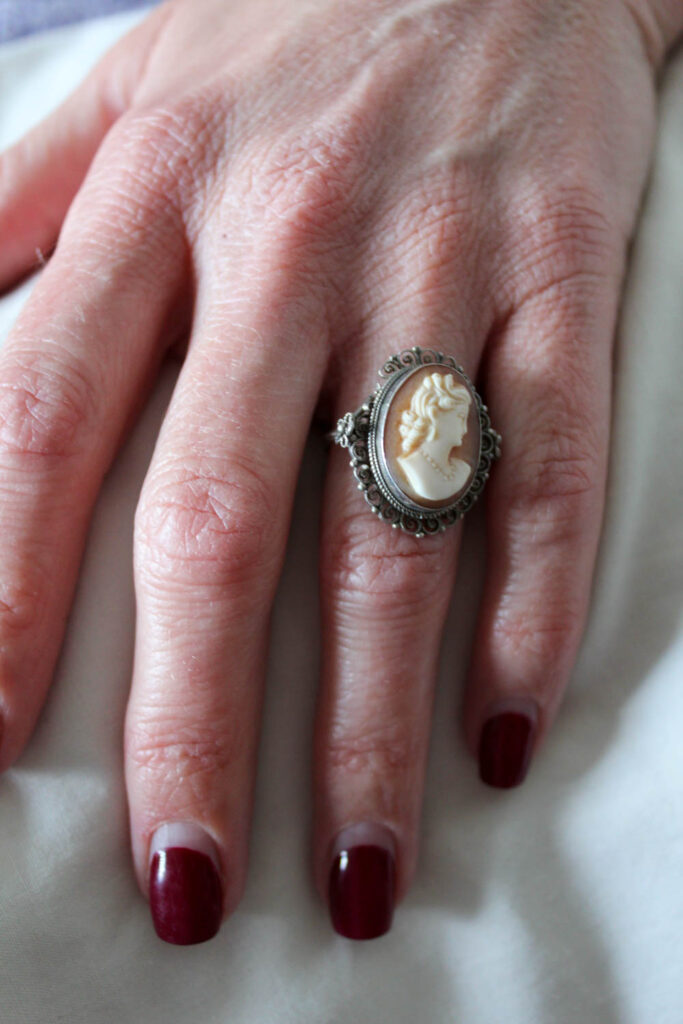
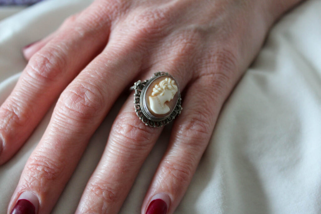
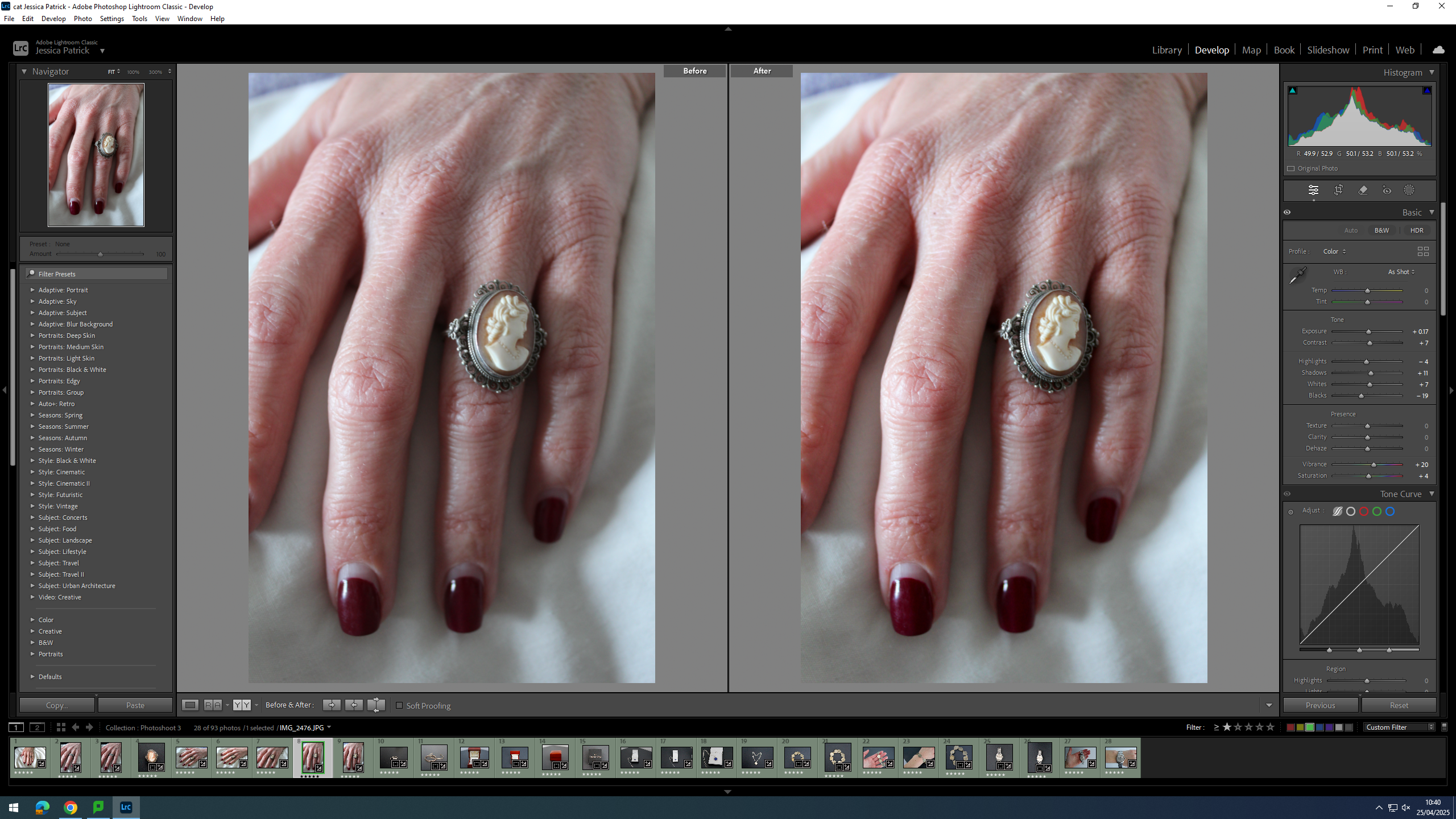
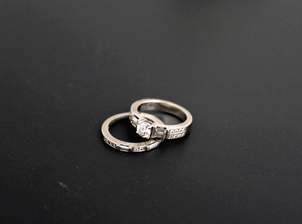
For this photoshoot I took pictures of family heirlooms that we have in our home, that have been passed down through my family on my mum and dad’s side. I have also taken pictures of my mum and dad’s wedding rings, as well as other sentimental family jewellery.
Final Images

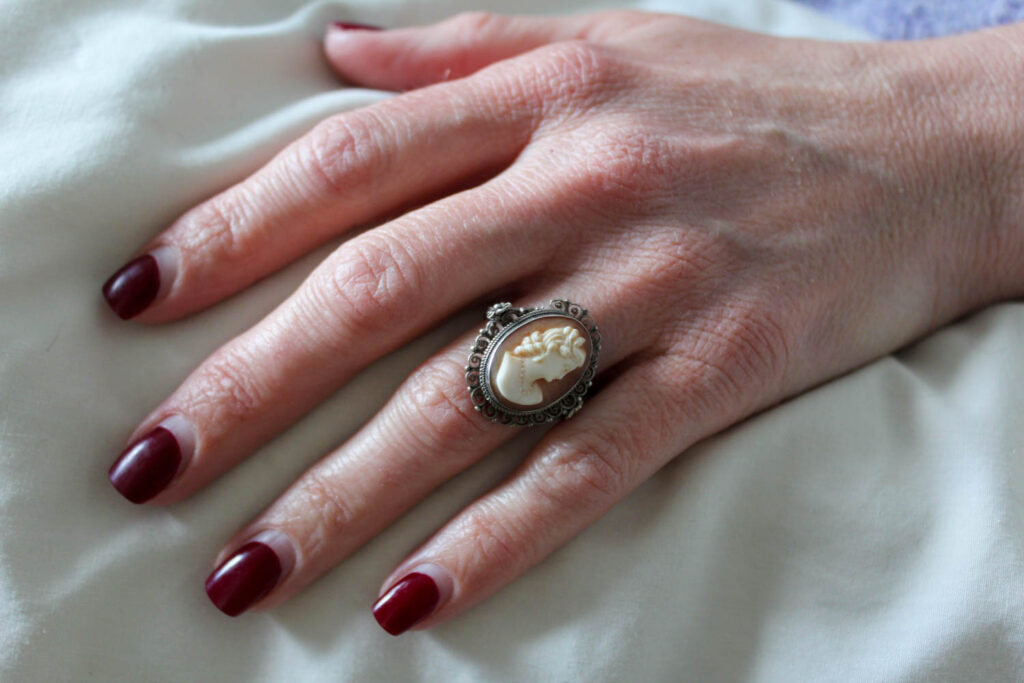
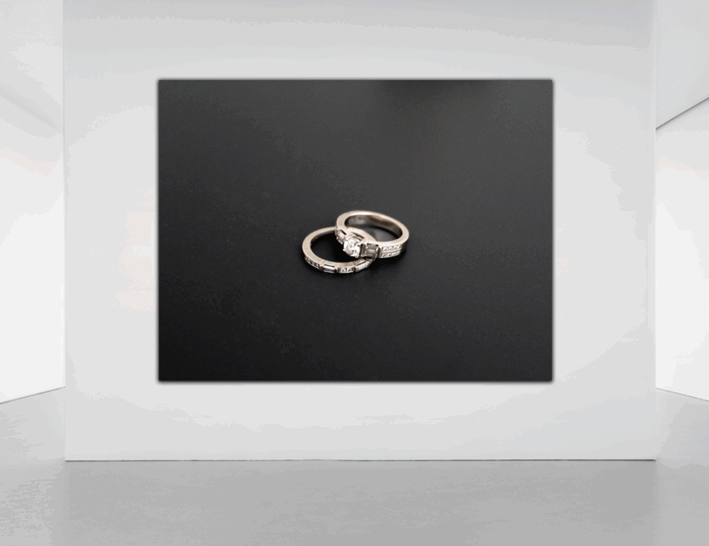
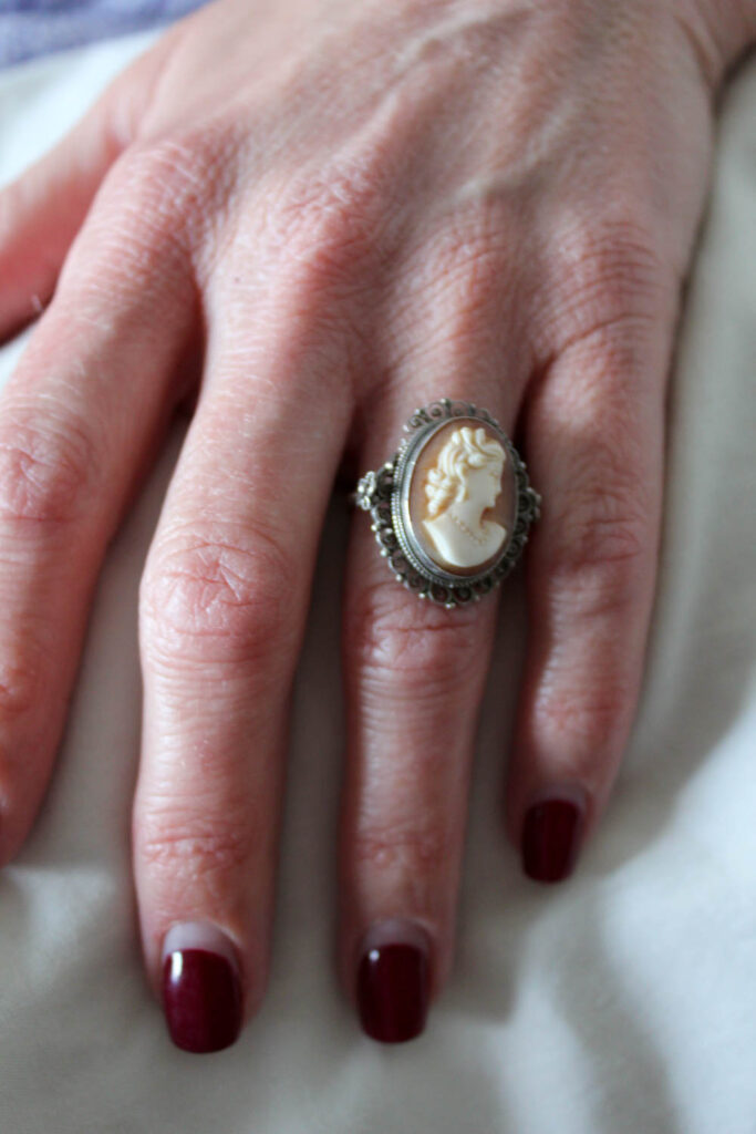
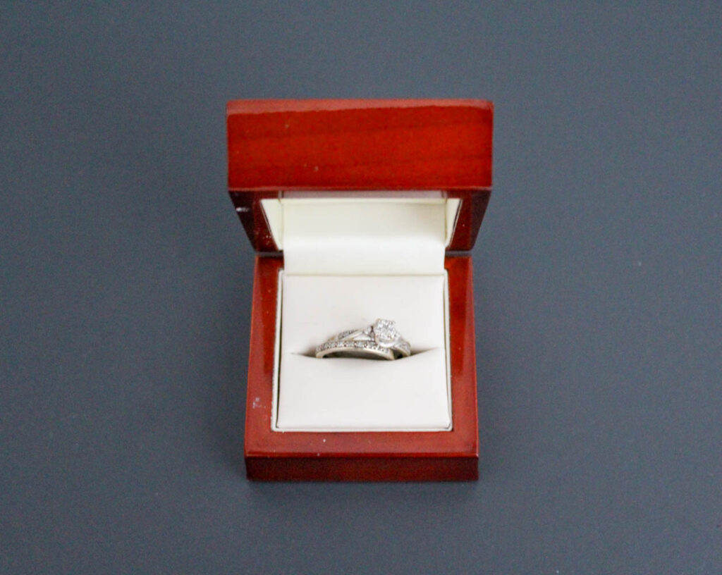
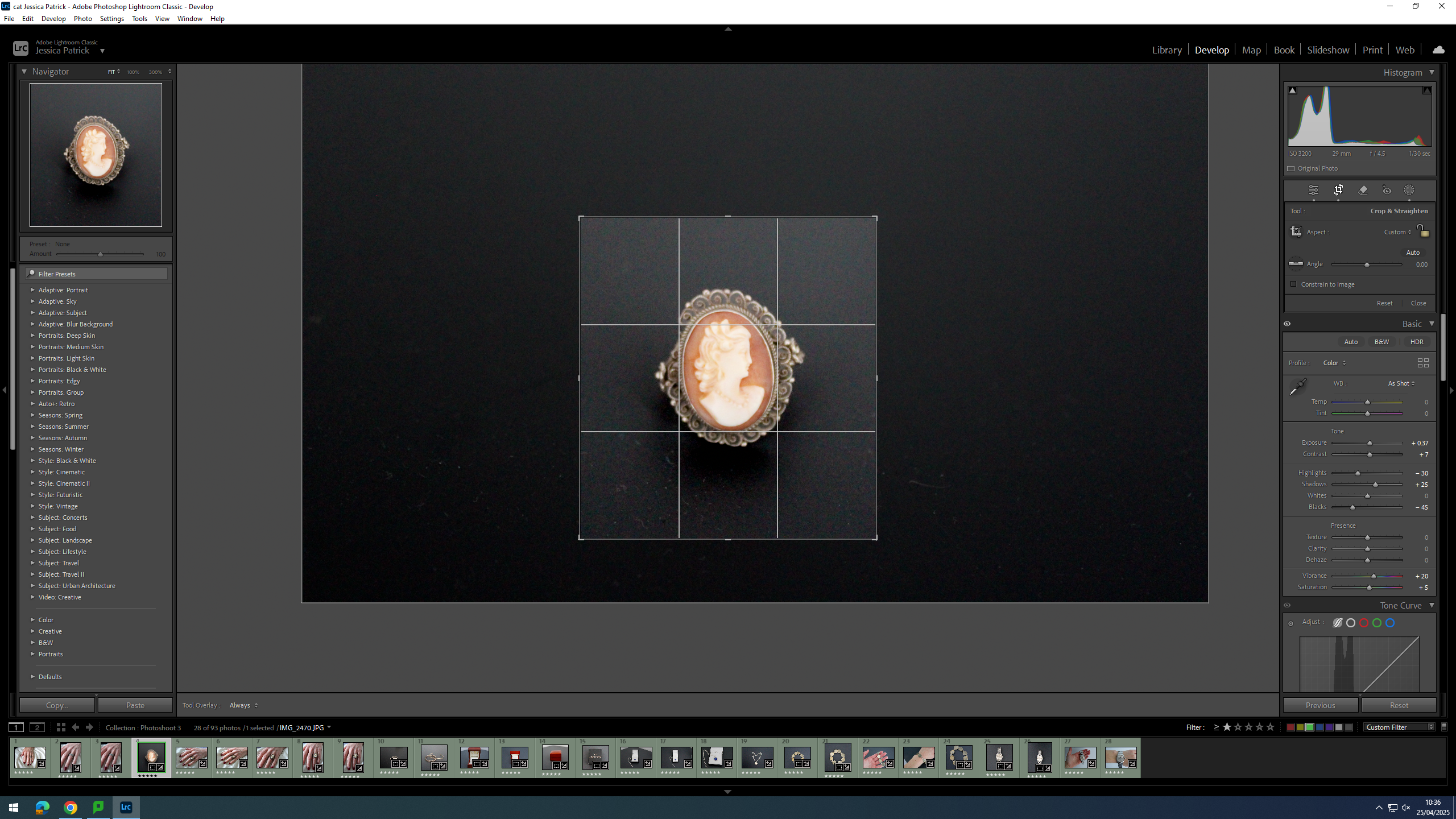
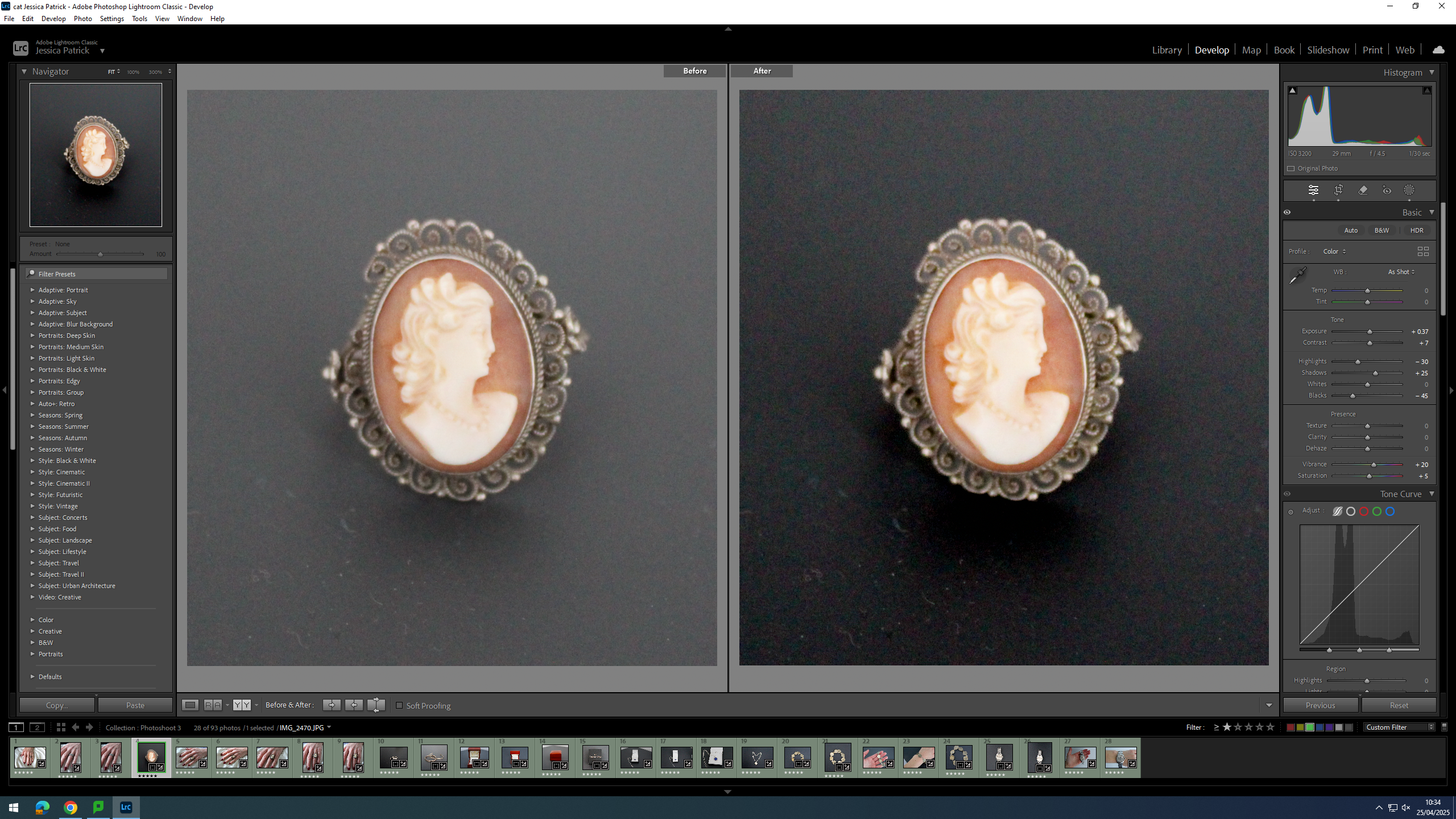
This ring has been passed down from my great grandmother on the my mum’s side of the family.
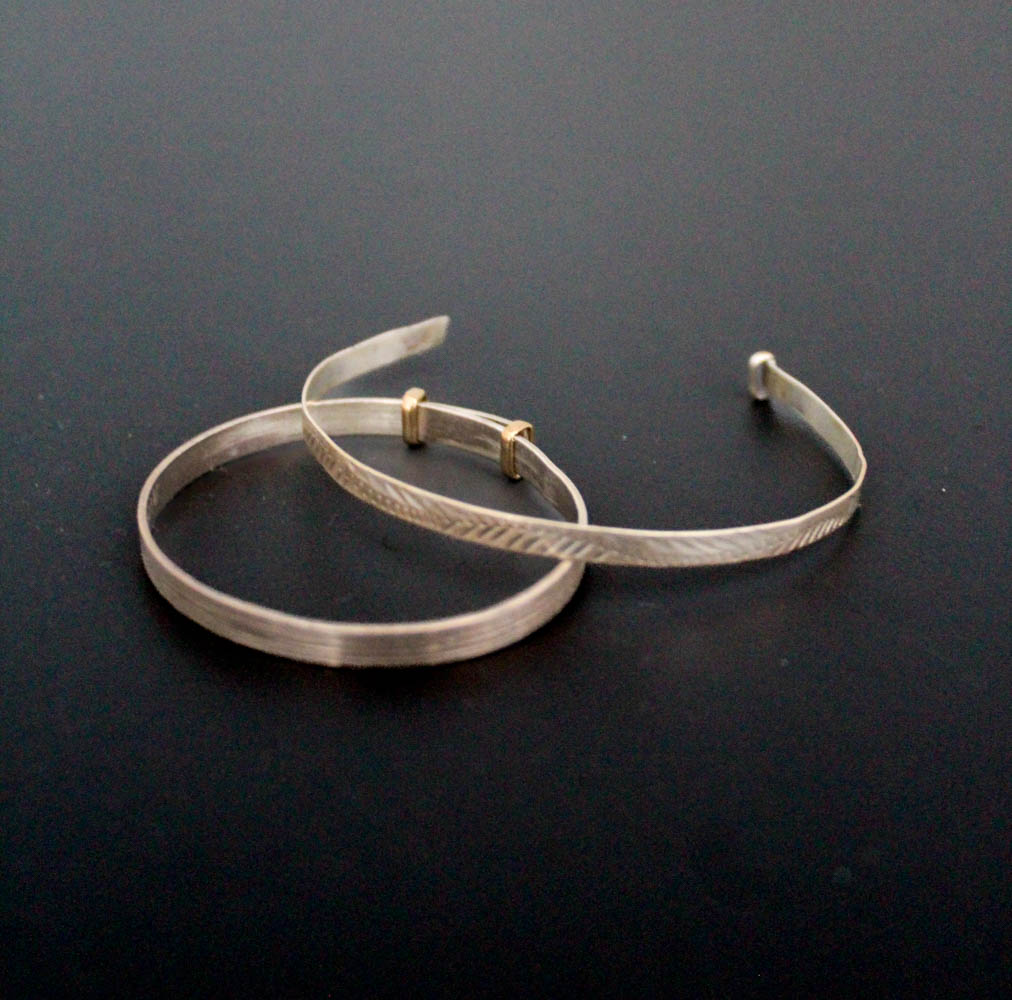
These bracelet were my mum’s when she was a baby and she passed them down to me and my sister to wear when we were both babies.
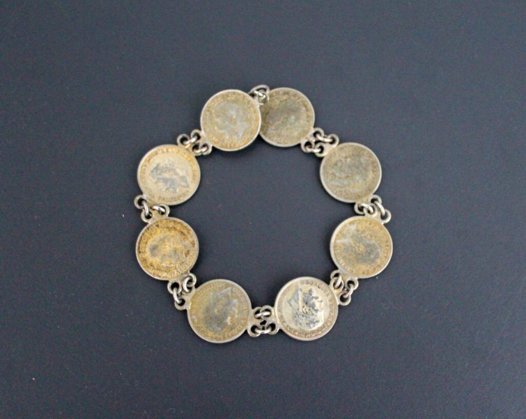
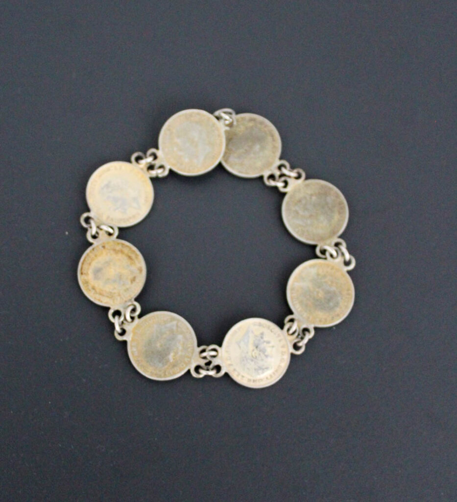
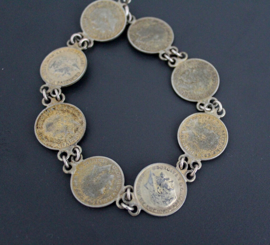
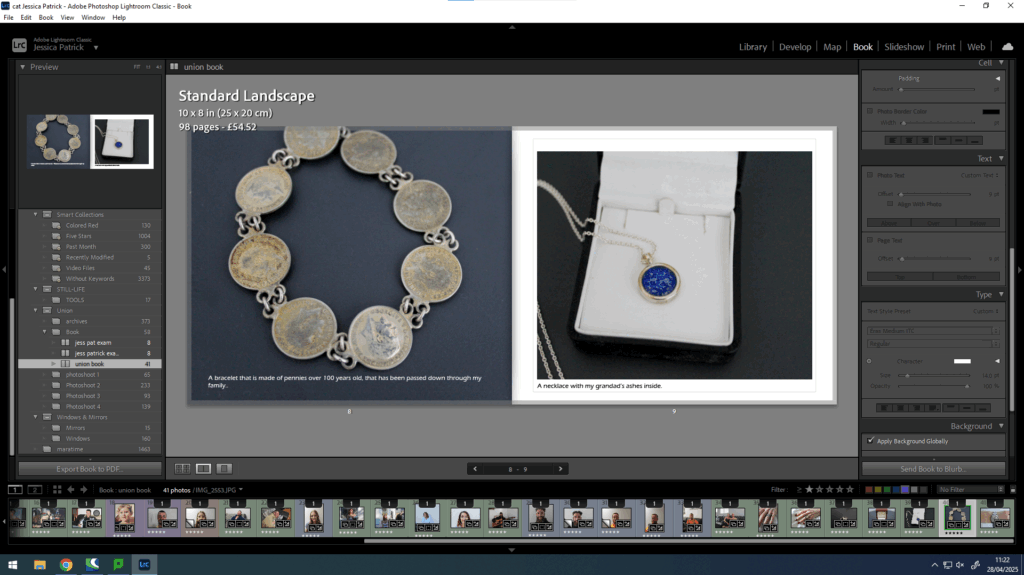
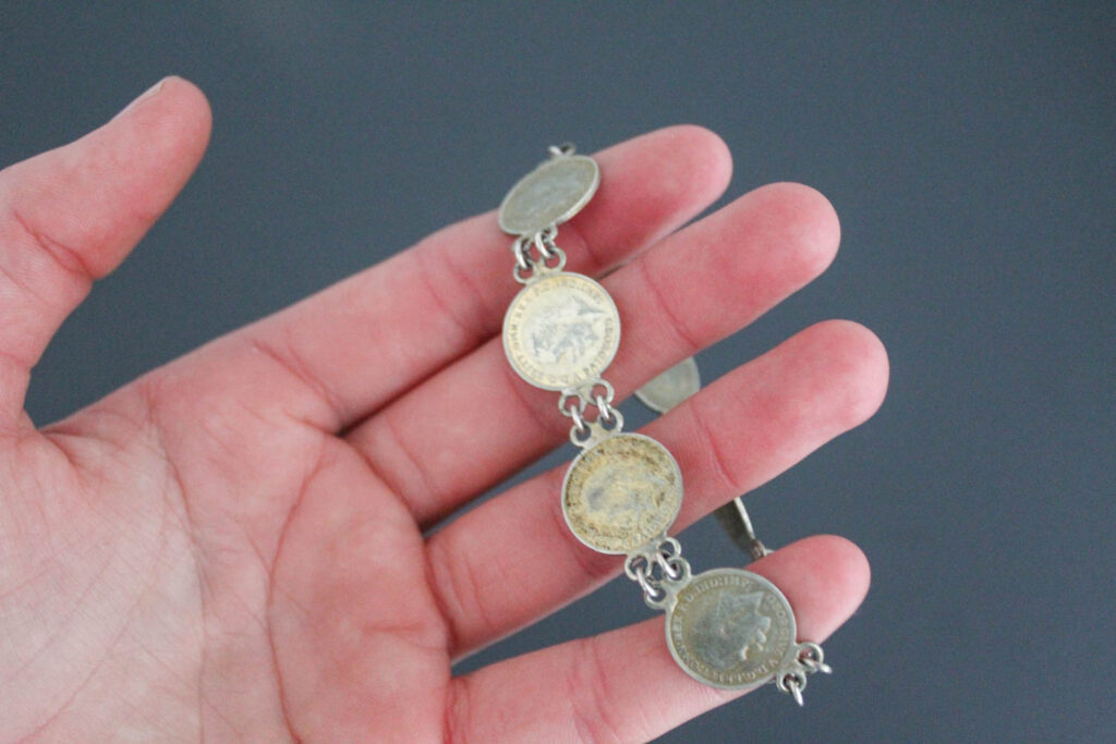
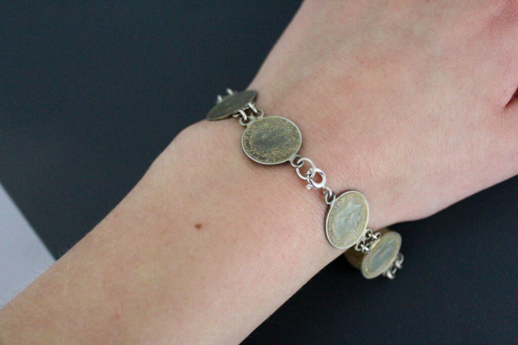
This bracelet was passed down from my great-great grandmother on my mum’s side. It is made from pennies that are over a hundred years old.
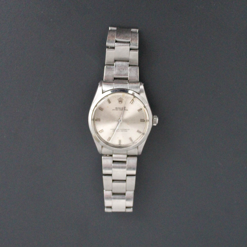
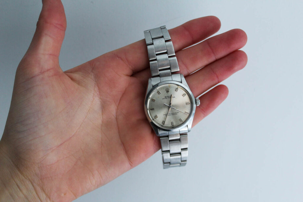
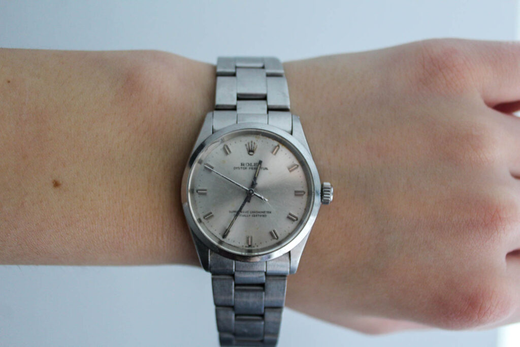
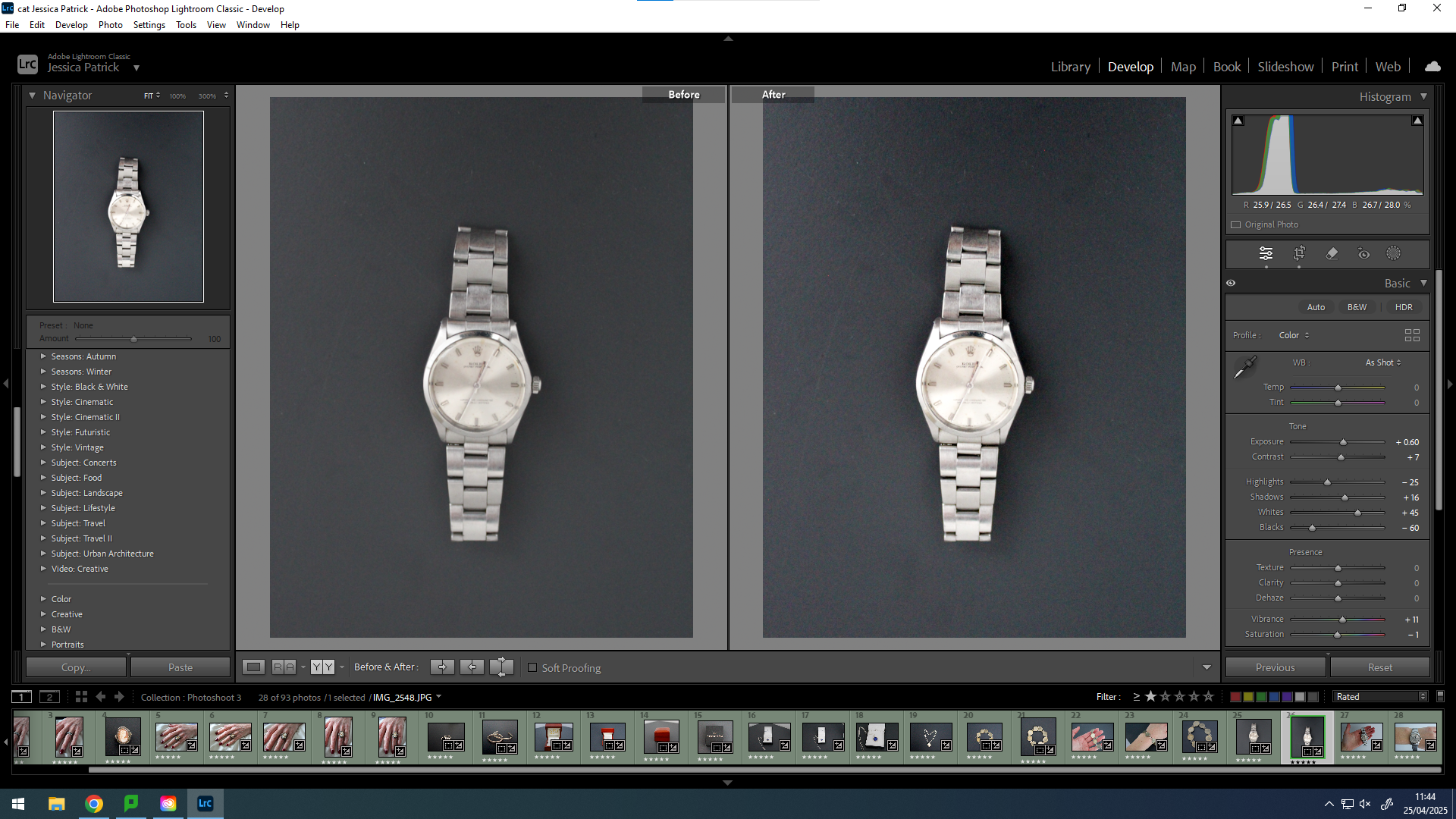
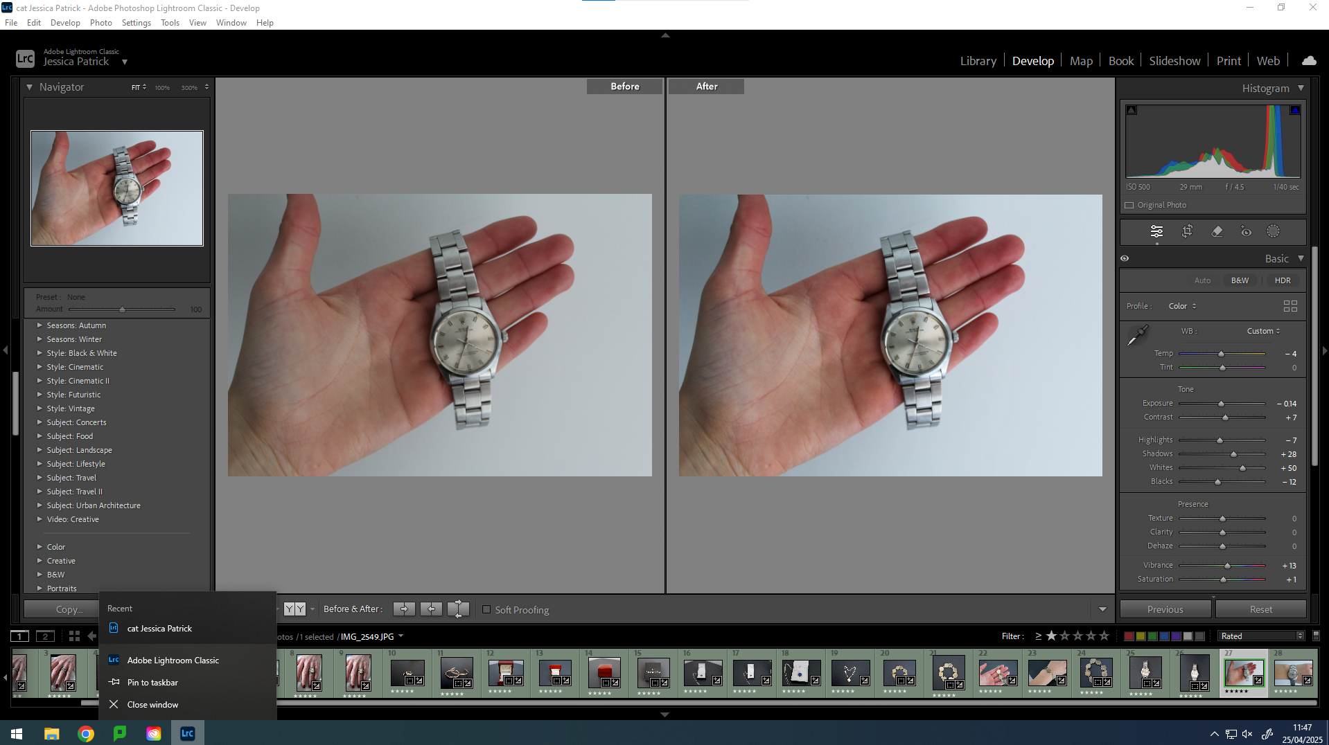
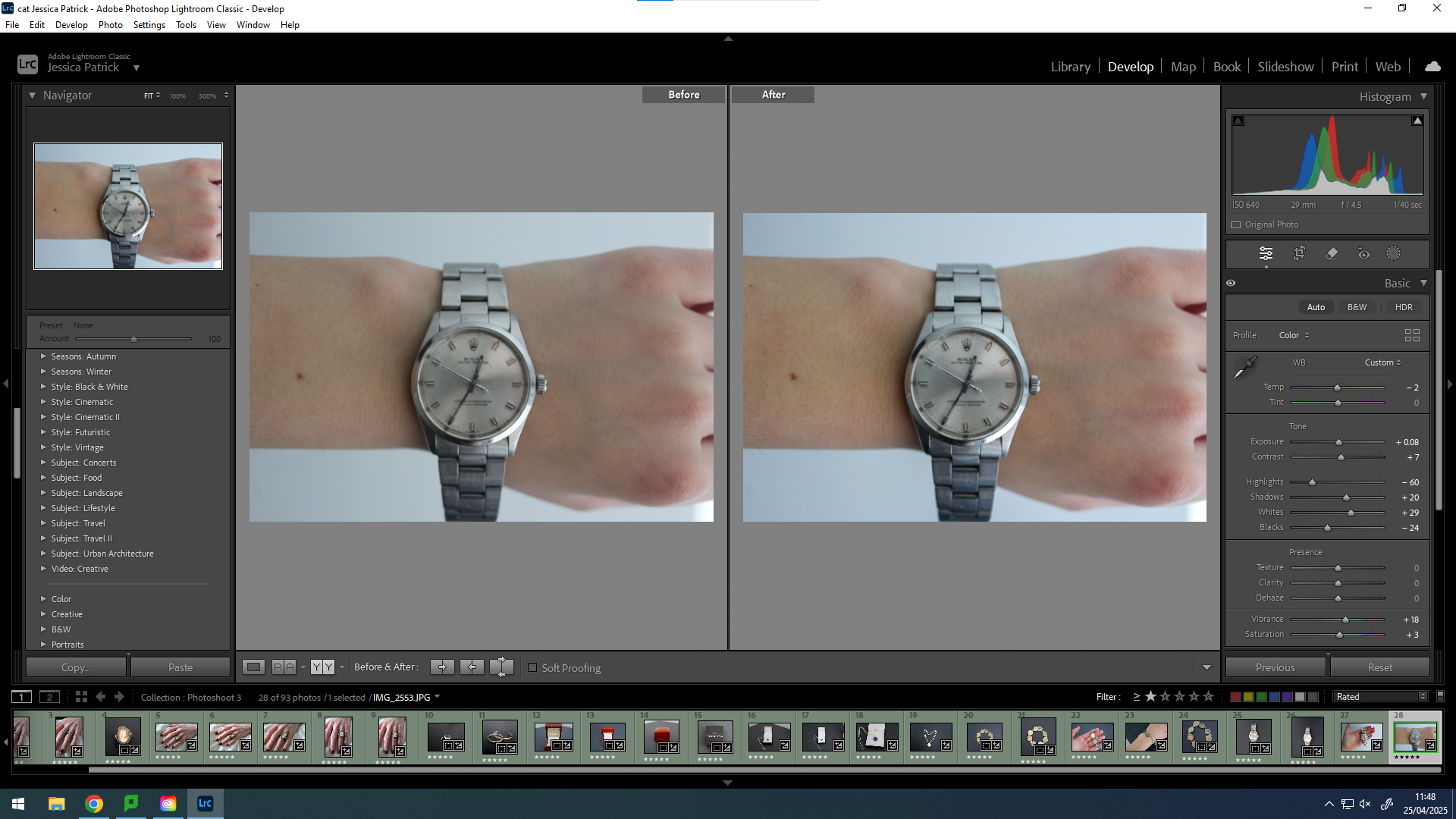
This was my grandad’s Rolex on my dad’s side, which he has passed down to my dad before he passed away.
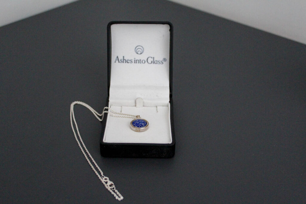
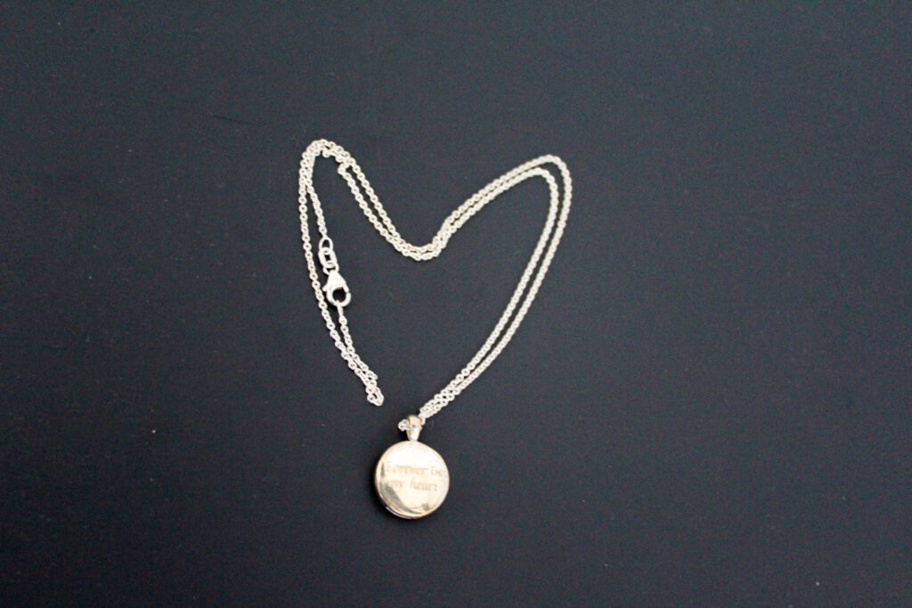
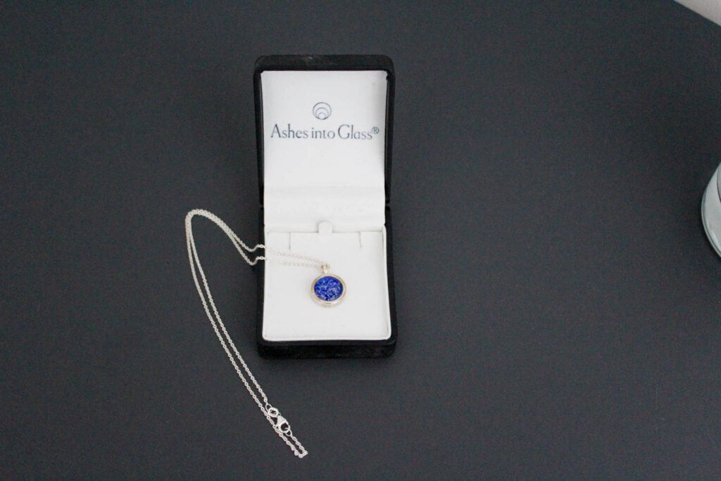
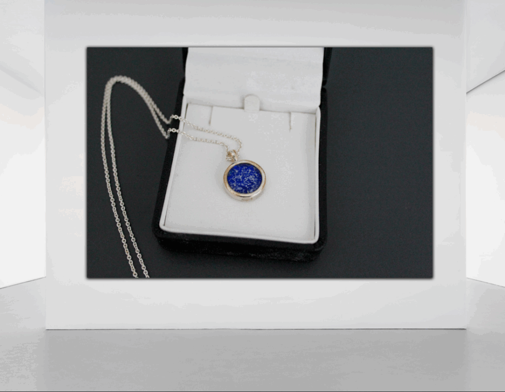
The necklace above contains my grandad’s ashes on my dad’s side.
Analysis of 2 Images
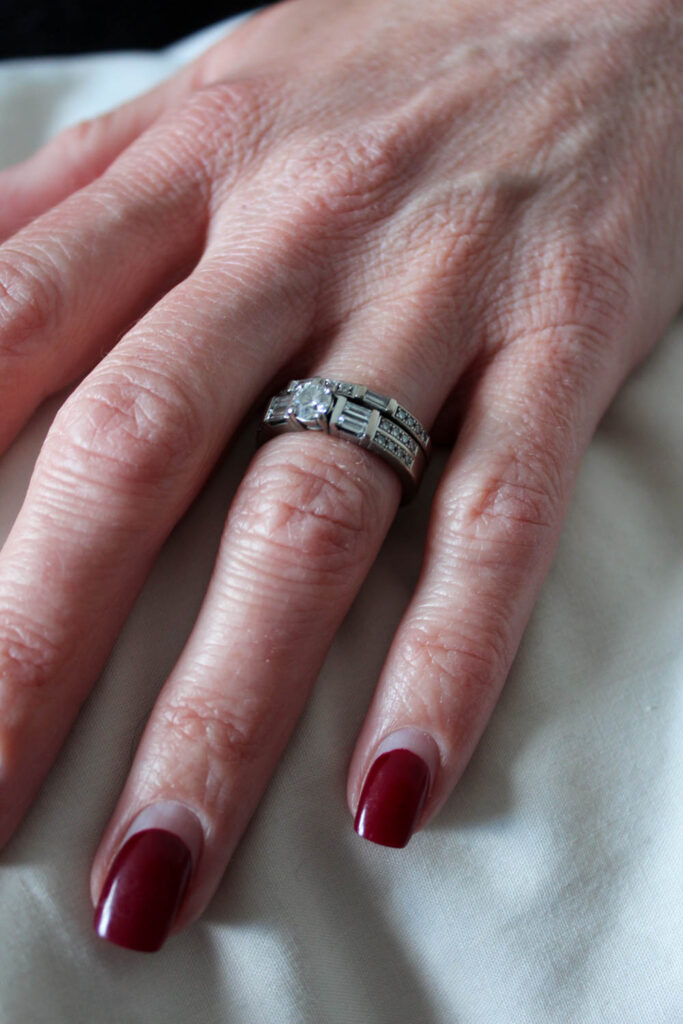
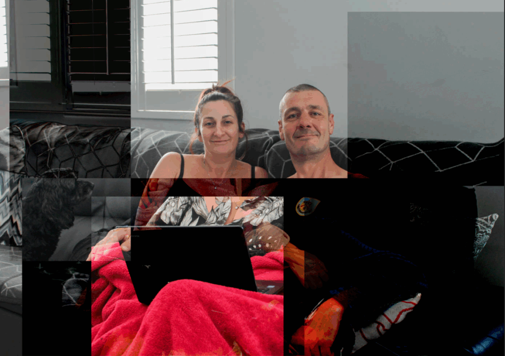
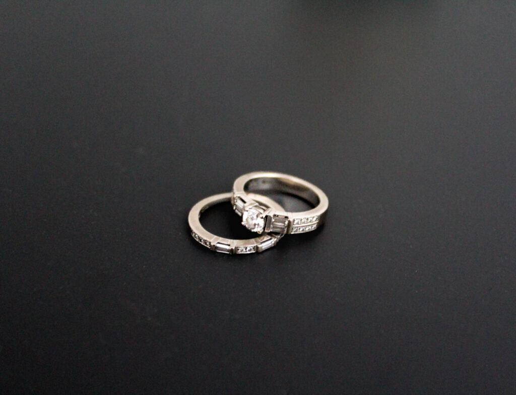
The lighting used in this photograph was natural daylight coming through the window. This meant that I had little control over the lighting. However, I did have high levels of control over the layout and composition of this image, as I manipulated the positioning and distance of the rings, as well as myself with the camera and the background of this image.
F-stop: f/4.5
Exposure time: 1/30secs
ISO speed: ISO-3200
The colours used in this image is the black background and the grey/ silver rings. This means there is contrast between the darker tones of the background and the lighter tones of the rings. There is a lot of shape in this image due to the circular rings and how they are positioned, which creates form.
The composition of the rings is a simple composition. I manipulated the positioning of the rings, so one ring is resting upon the other, in the centre of the frame. The rings are the main viewpoint.
These rings are my mum’s wedding and engagement rings, which my dad gave to her almost 10 years ago. These rings signify their union through marriage and they are circular, because their union is eternal and never ends, just like a circle.
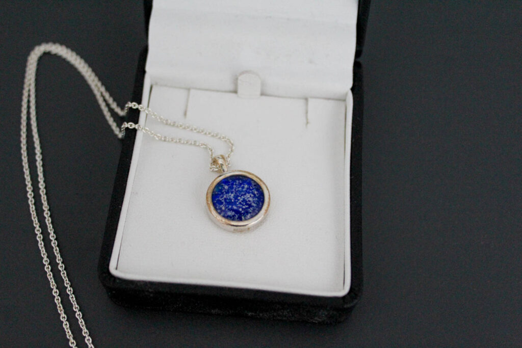
The type of lighting used in this photograph was natural daylight coming through the window. This meant that I had little control over the lighting. However, I did have high levels of control over the layout and composition of this image, as I manipulated the positioning and distance of the necklace and the box it is in, as well as myself with the camera and the background of this image.
F-stop: f/4.5
Exposure time: 1/30secs
ISO speed: ISO-3200
The colours that can be seen in this image is black, white, blue and a little bit of brown/red. The light and dark tones in this image create a bit of contrast with the blue being a pop of colour in the image. There is a lot of shape in this image, including the circular pendant and the square box.
The composition of this image consists of the circular pendent being inside the jewellery box with the chain flowing onto the table. The circle pendent is in the centre of the frame, because it is the main viewpoint of the image.
This necklace has my grandad’s ashes inside it on my dad’s side (my dad’s father). This necklace represents how family unions still stay strong and unbreakable, even if the person isn’t here with us anymore. The physical object presents this union, because you have a momentum of them, instead of just memories, which ensures them and the memories you have of them are never forgotten.
Evaluation
I think this photoshoot went well as it allowed me to capture lots of detail shots, which would be aesthetic in the composition of my photobook. It also allowed me to present how a family union lasts and how the belongings of an individual can be passed down through generations, keeping that union alive, even after they have passed. It allows the memory of them to never be forgotten.
However, next time I would experiment with the background of my images more, as I feel this background didn’t work the best for some of these photographs. However, I did think I edited the photographs well to try and amend this.
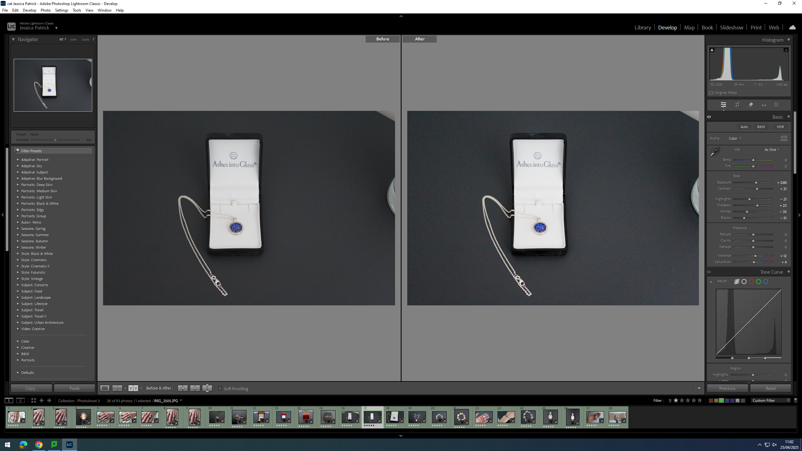
For this photoshoot I have taken images of family heirlooms, which have been passed down on both my mum’s and dad’s side of the family. I have also taken pictures of my mum and dad’s wedding rings to signify their union.
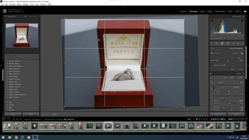
Contact Sheet

Edits
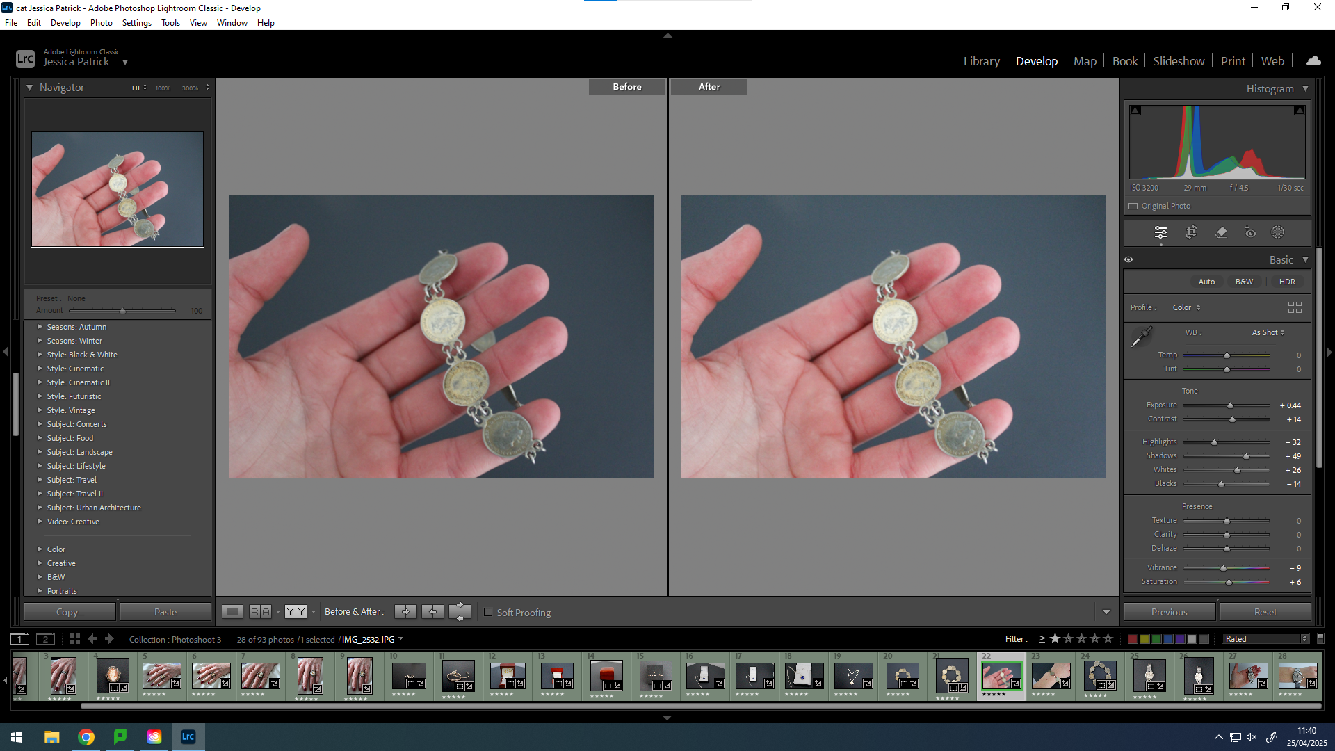
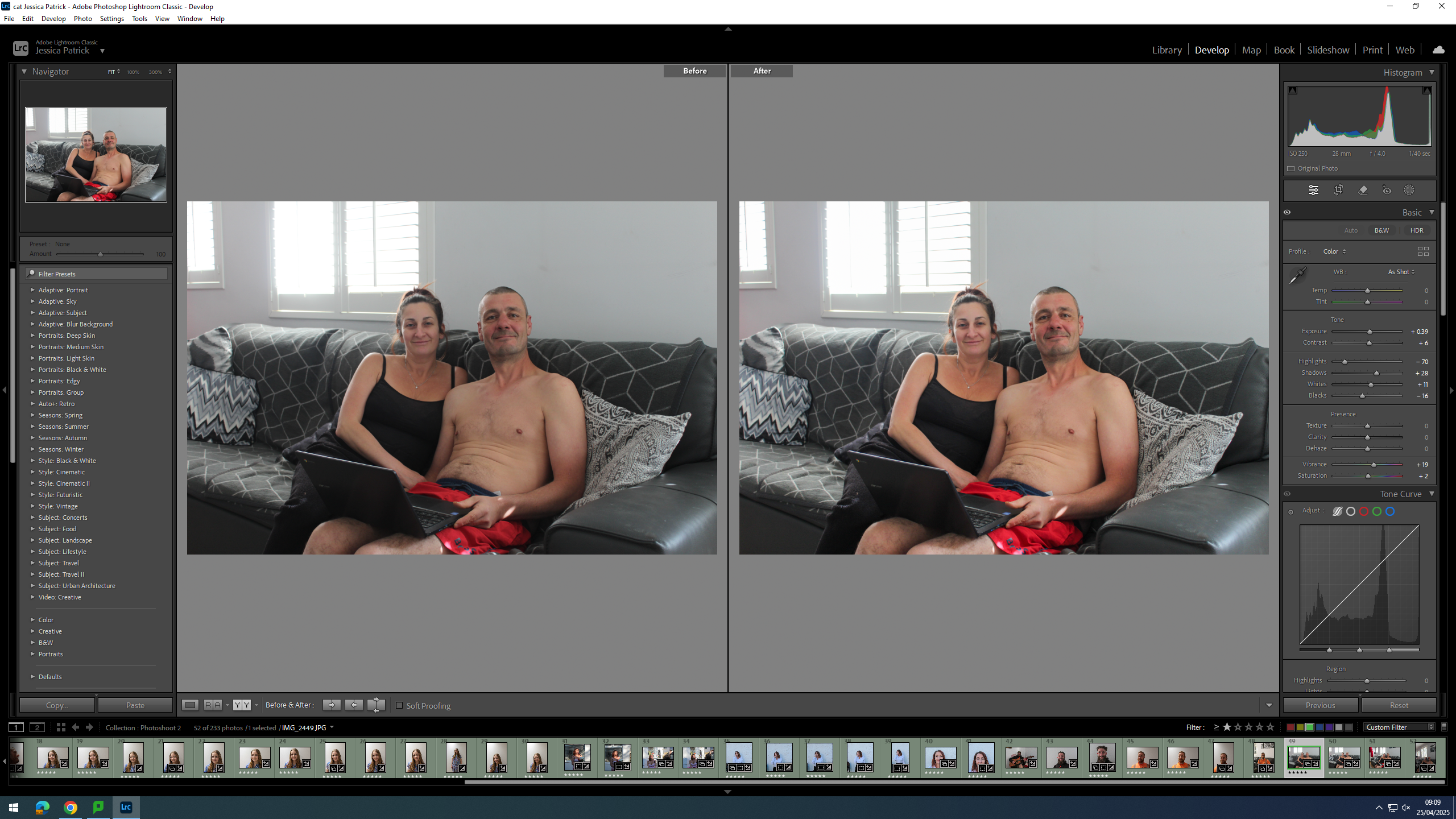
I have edited this photo by increasing the exposure, contrast, shadows, highlights, shadows, vibrancy and saturation, while decreasing the blacks. I did this, so that the image would be slightly more exposed and more vibrant, so that it looks less dull.
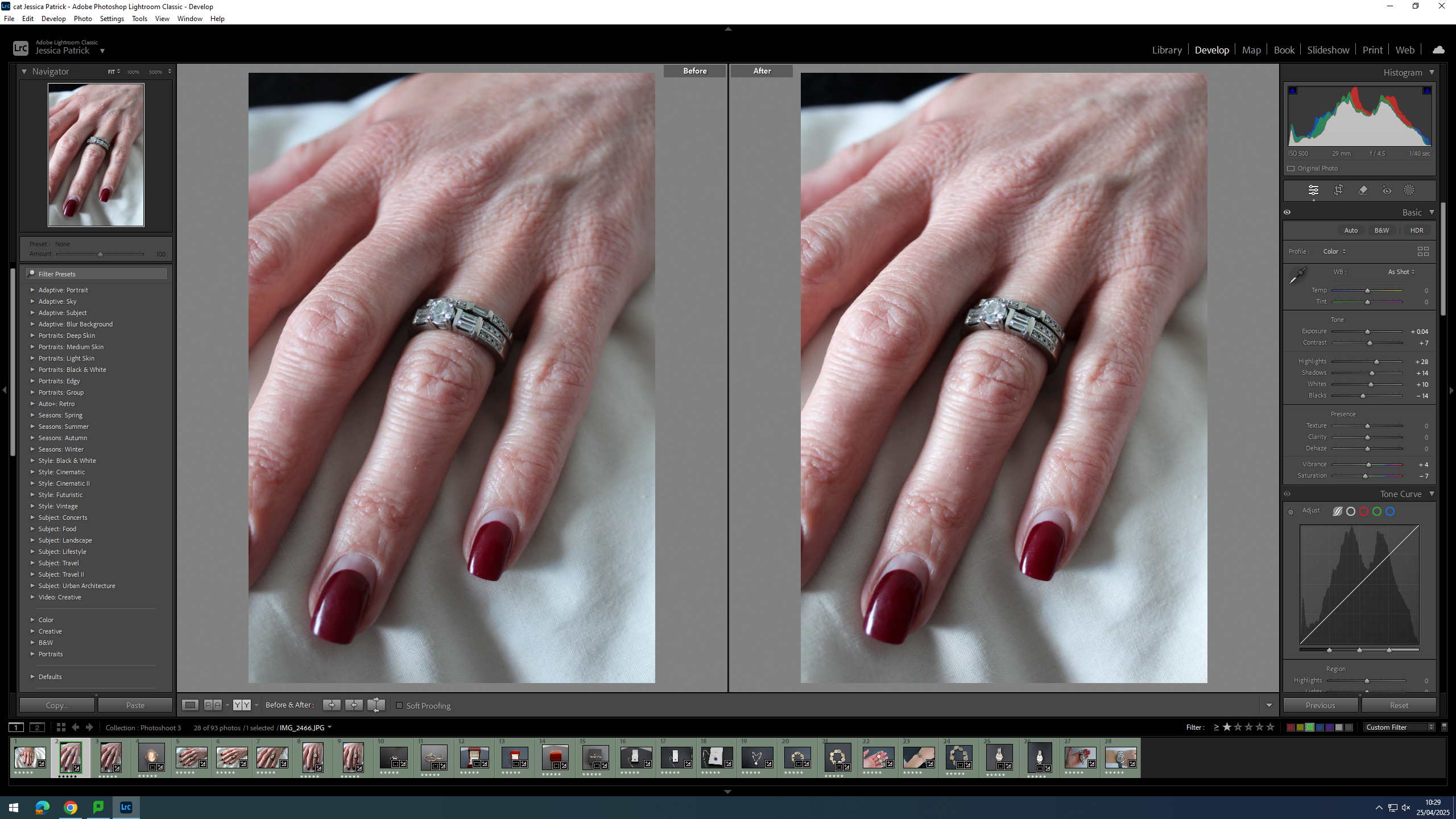
I edited this image by increasing the exposure, contrast, highlights, shadows, whites and vibrancy, while also decreasing the blacks and saturation. I did this, so that the image would be more vibrant and have more colour, so that it looks less dull and grey.
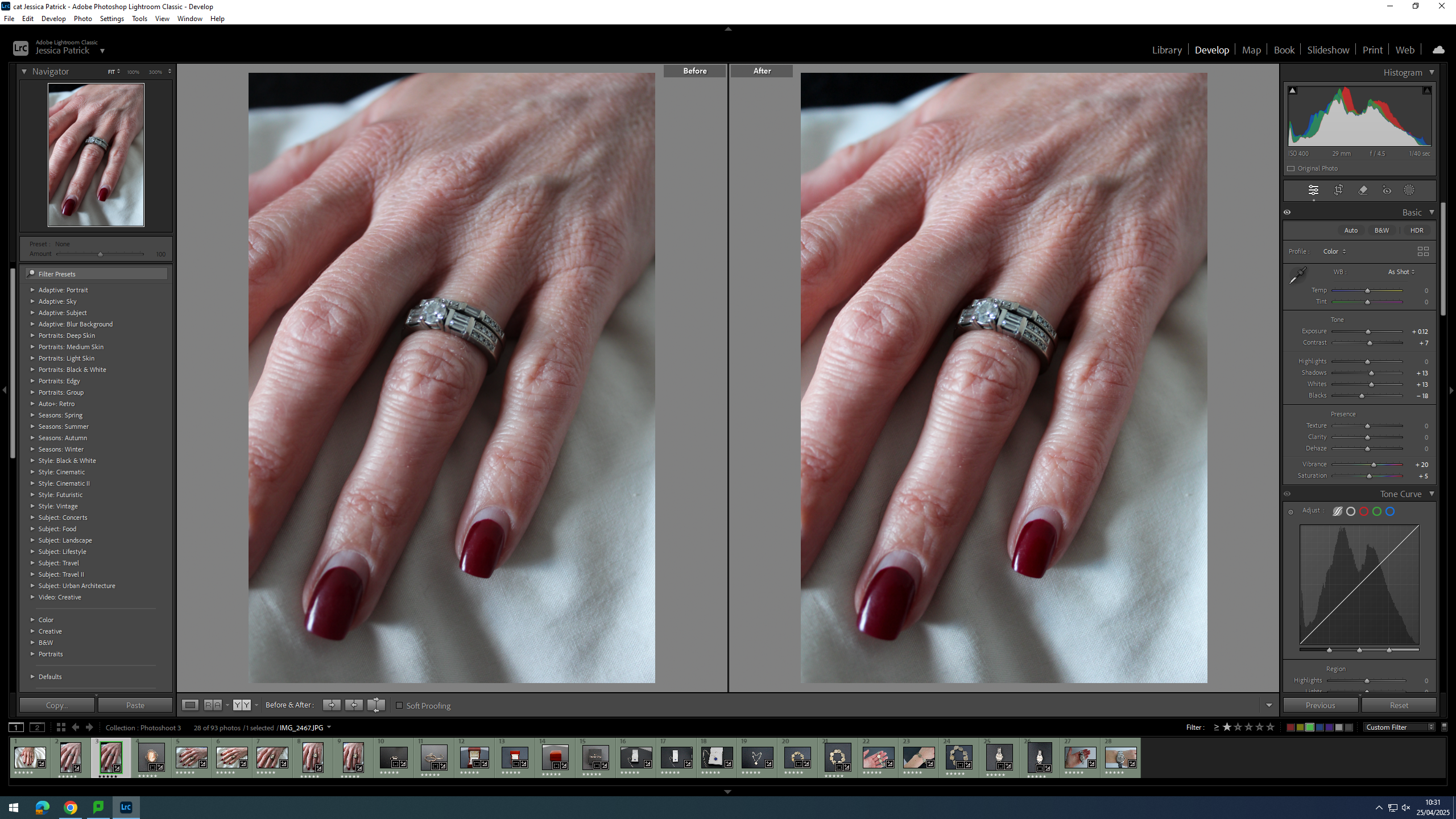
I edited this image by increasing the exposure, contrast, shadows, whites, vibrancy and saturation, while decreasing the blacks. I did this, so that the image would be slightly more exposed and have more colour, so that it looked less dull.
First, I cropped this image to crop out all the negative space in the image, so that the subject would take up majority of the frame and not get drowned out my the background.
I edited this image by increasing the exposure, contrast, shadows, vibrancy and saturation, while decreasing the highlights and blacks. I did this, so that the subject of the image would be more vibrant.
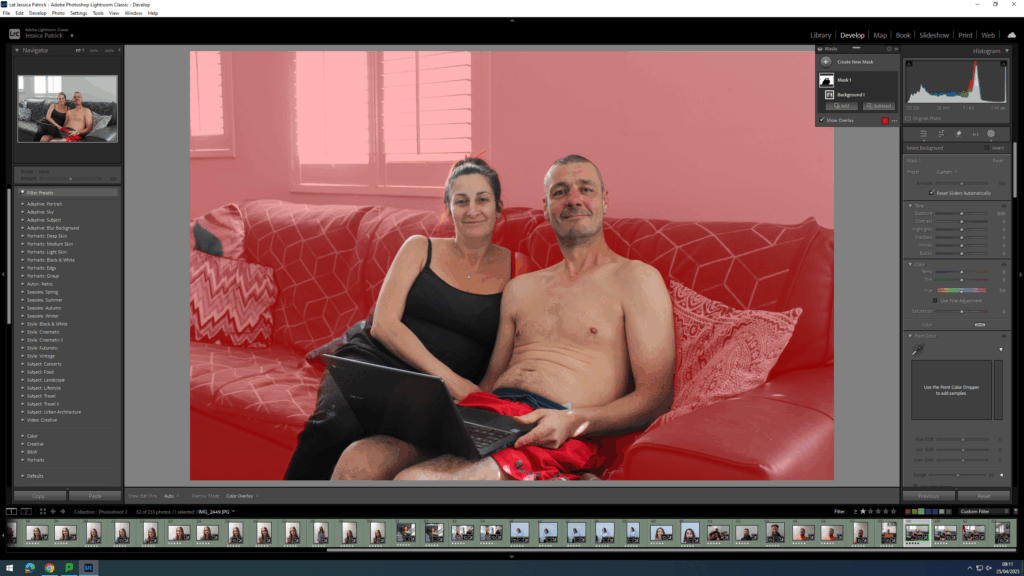
Then, I selected the background of this image and decreased the blacks, so that the background was more black, which created more contrast between the background and the subject.
I edited this image by increasing the exposure, contrast, shadows, whites, vibrancy and saturation, while decreasing the highlights and blacks. I did this, so that the image would be more vibrant and less dull.
I edited this image by increasing the exposure, contrast, shadows, whites, vibrancy and saturation, while decreasing the highlights and blacks. I did this, so that the image would be more vibrant and less dull.
I edited this image by increasing the exposure, contrast, shadows, whites, vibrancy and saturation, while decreasing the highlights and blacks. I did this, so that the image would be more vibrant and less dull.
I edited this image by increasing the exposure, contrast, shadows, whites, vibrancy and saturation, while decreasing the highlights and blacks. I did this, so that the image would be more vibrant and less dull.
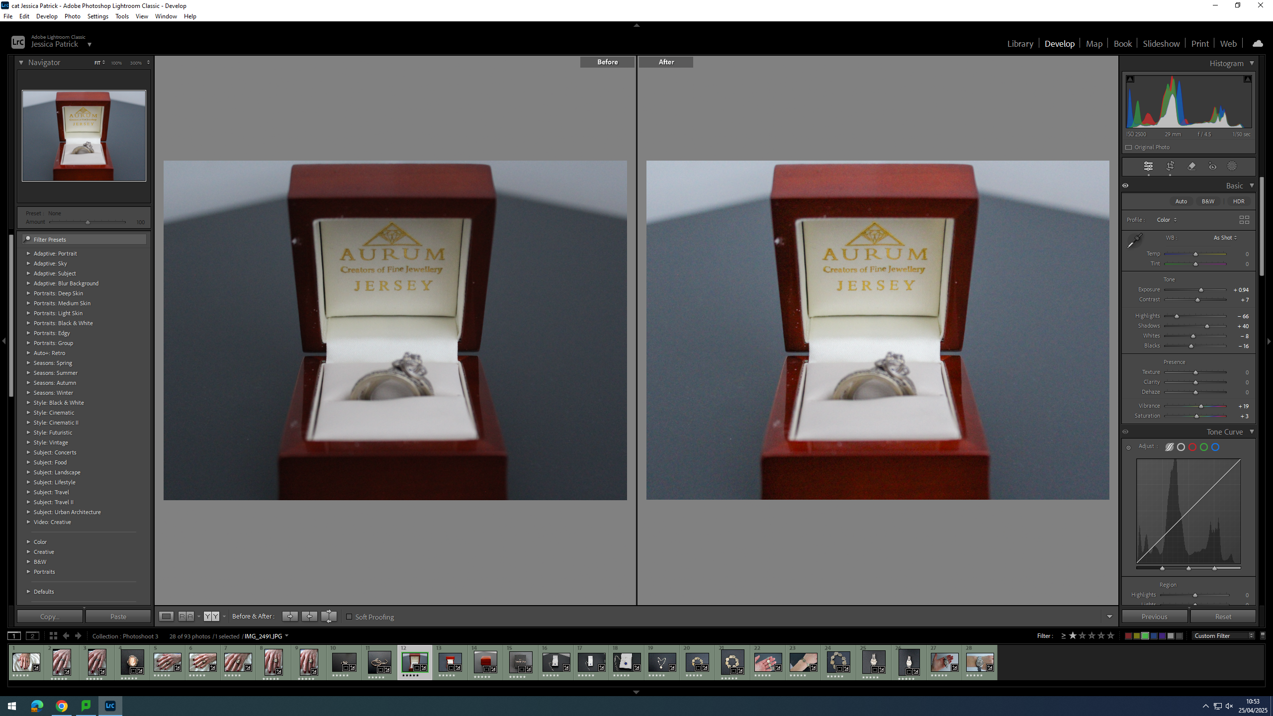
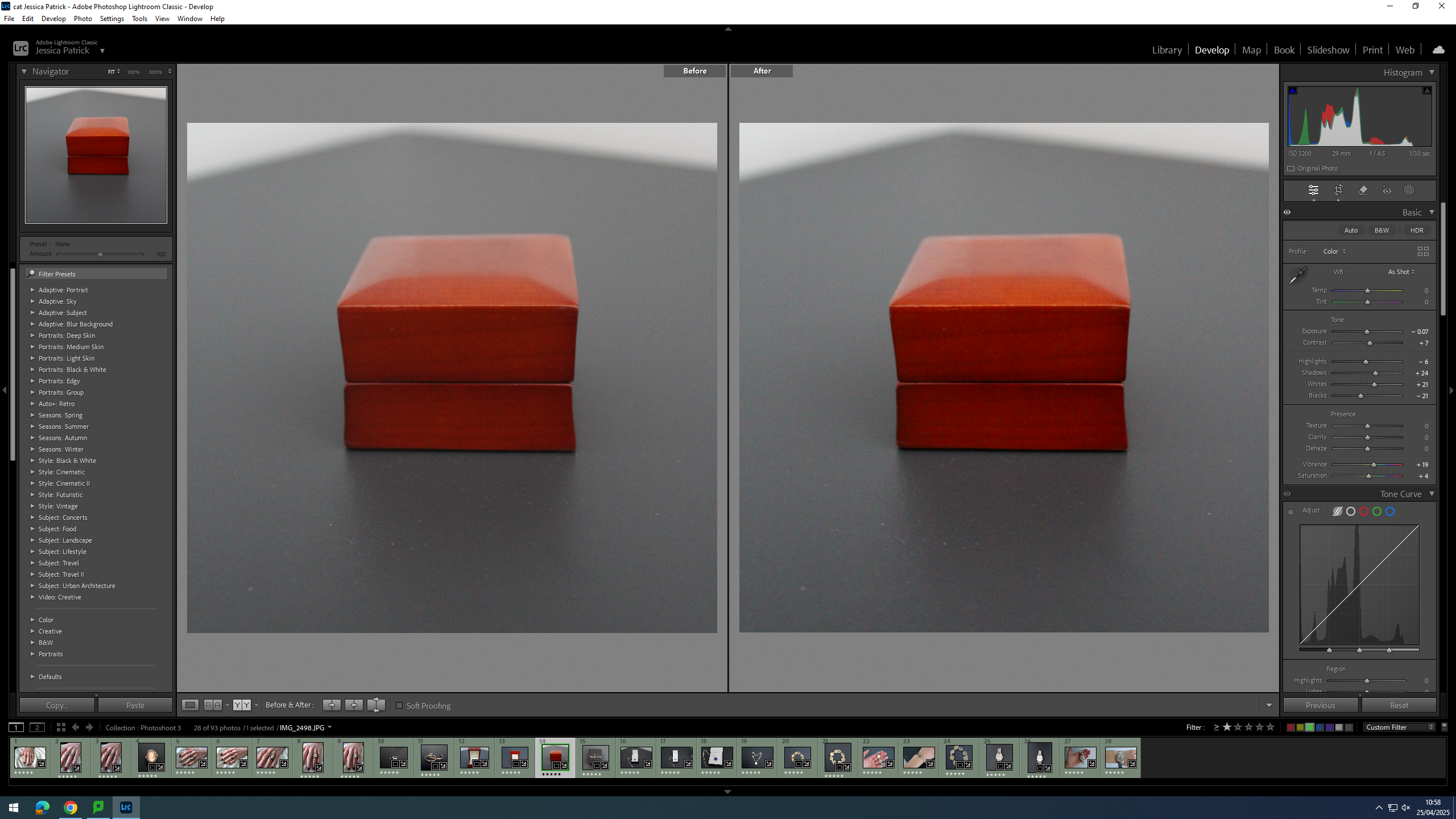
Firstly, I cropped this image, so that the main viewpoint of the image would be in the centre of the frame, following the rule of thirds, which can be seen by the grid.
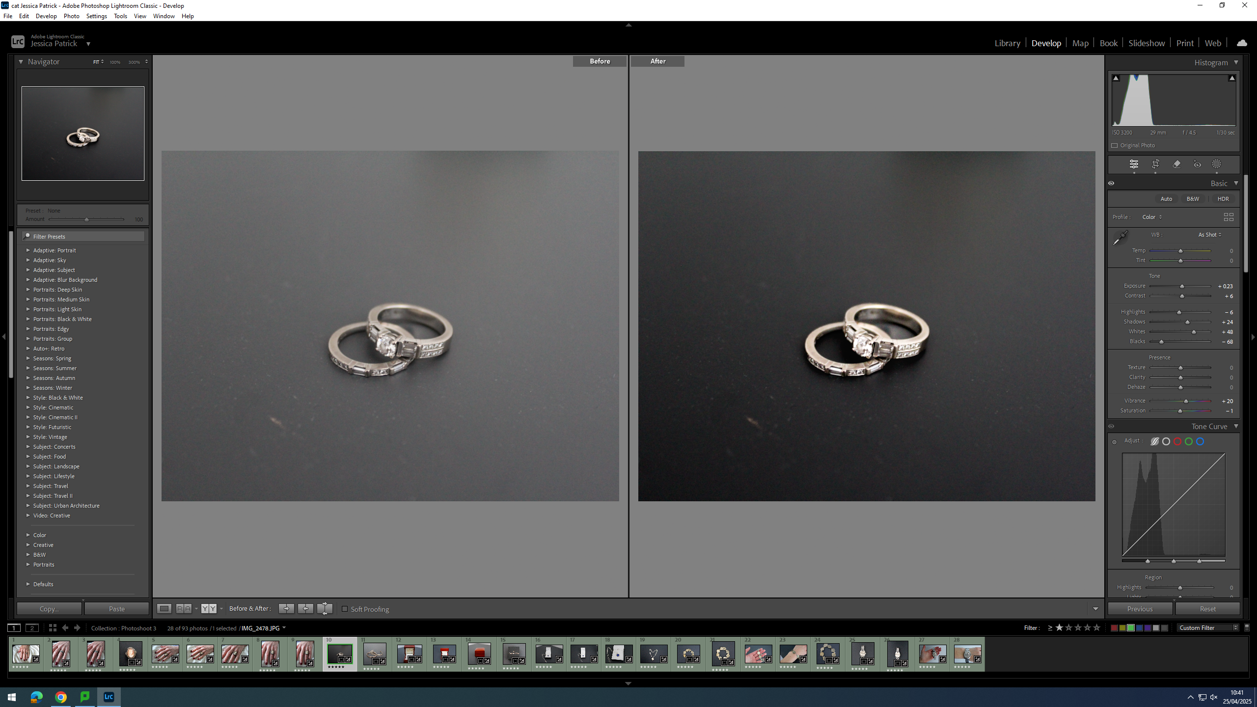
Then, I edited this image by increasing the exposure, contrast, shadows, whites and vibrancy, while decreasing the highlights, blacks and saturation. I did this, so that the rings looked less dull and had more highlights to them.
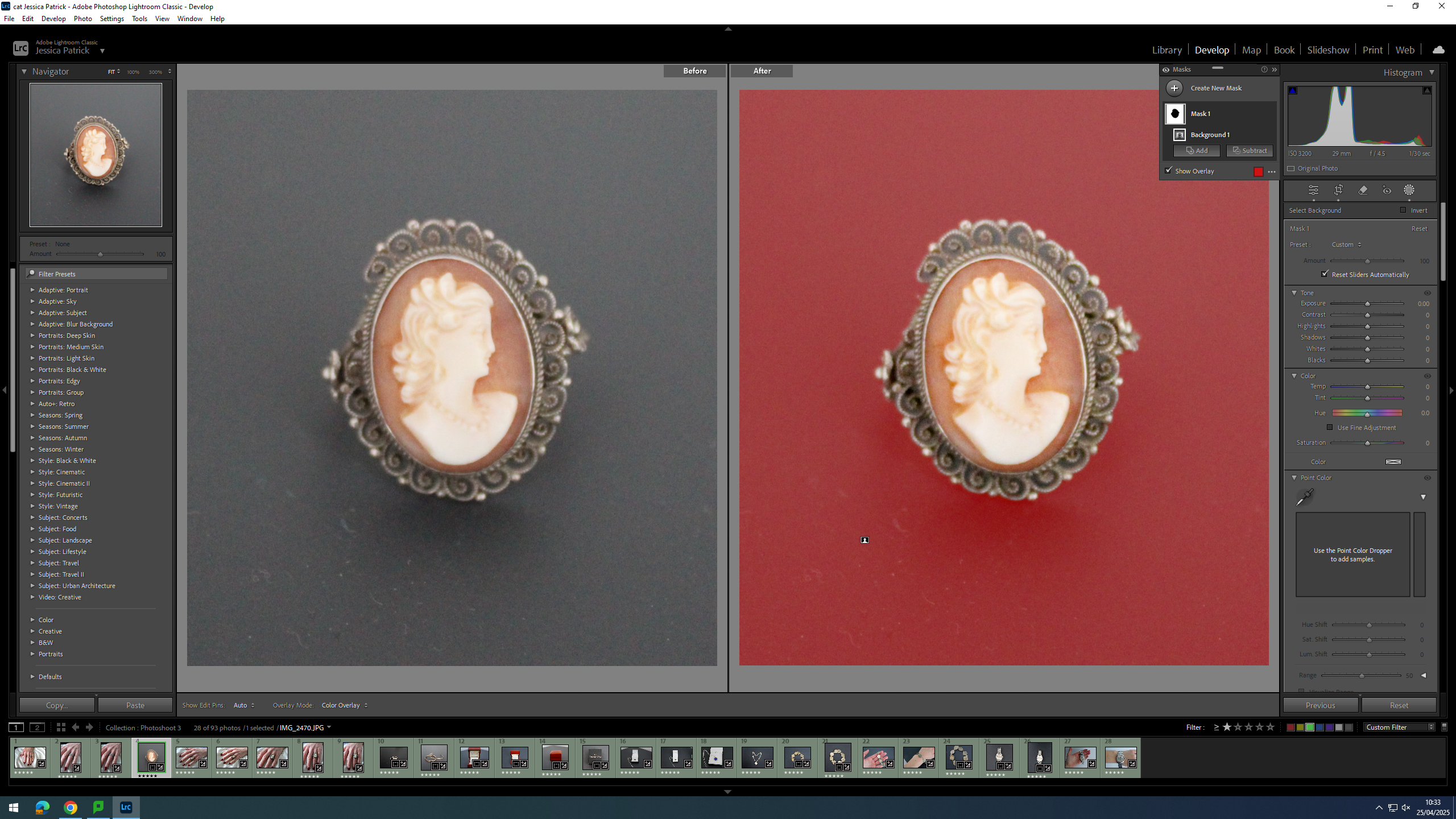
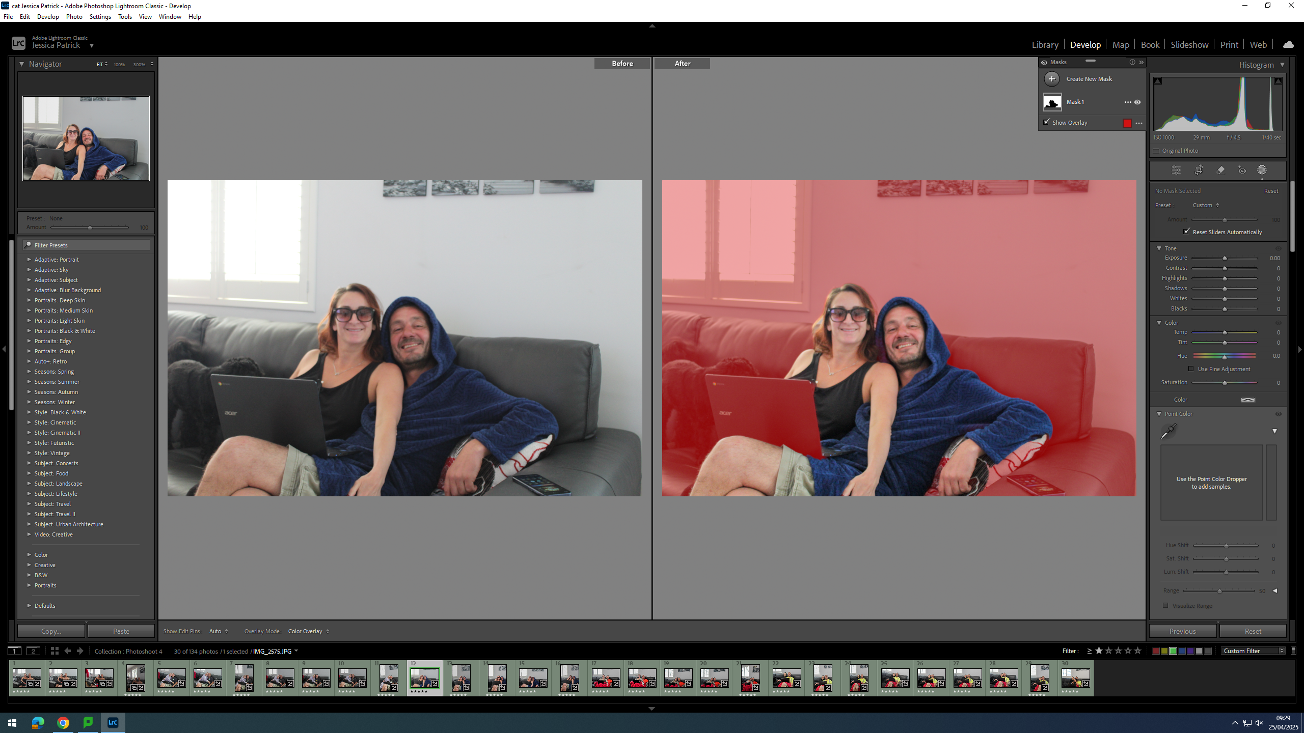
Then, I selected the background of the image and decreased the whites, shadows, exposure and highlights, while increasing the blacks and contrast. I did this, so that the background would be more black, and the try and hide some of the dust on the surface.
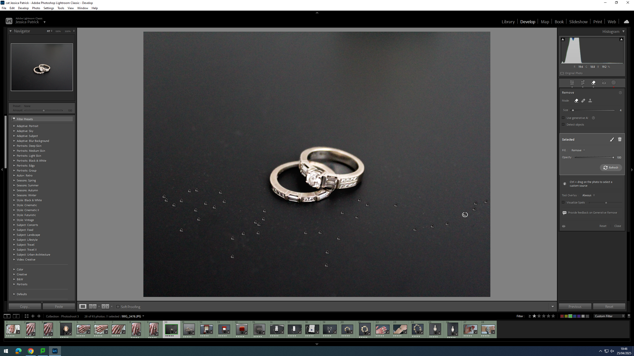
Finally, I used the correction tool to try and remove the dust.
Firstly, I cropped the image, so that the main viewpoint of the image was in the centre of the frame, and so the background of the image didn’t have the white wall and the triangle shape in the background.
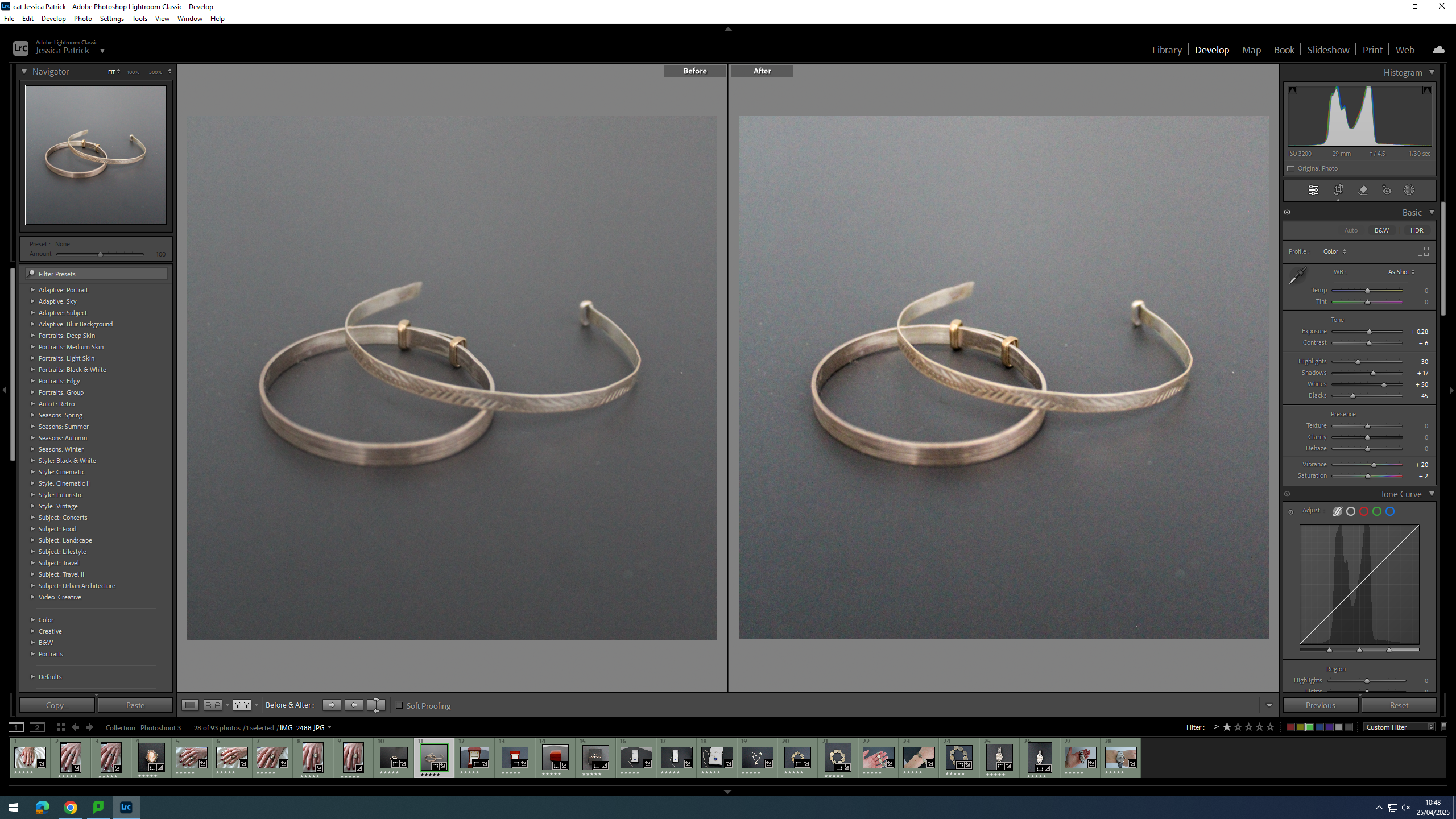
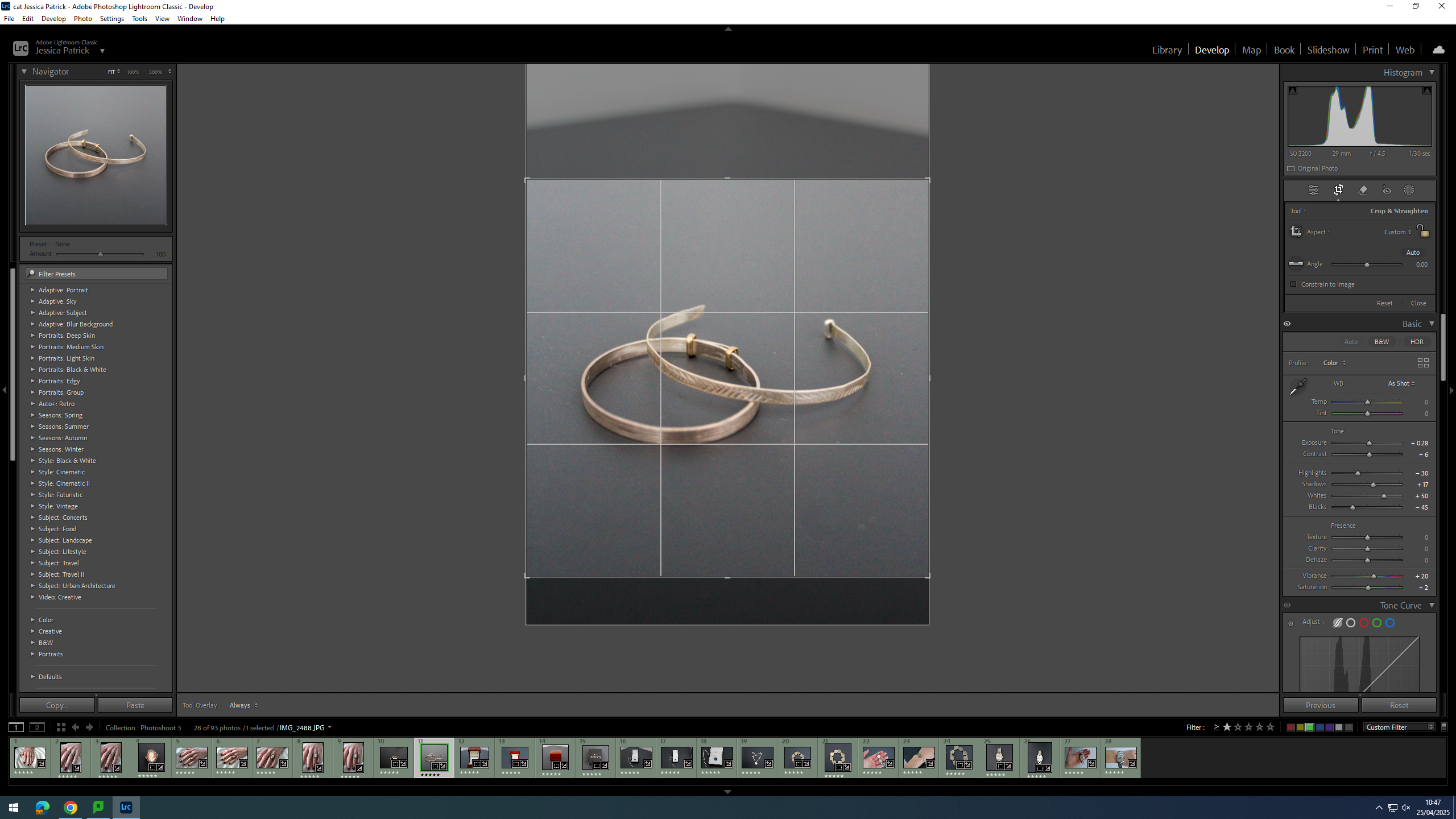
Then, I edited the image by increasing the exposure, contrast, shadows, whites, vibrancy and saturation, while decreasing the highlights and blacks. I did this, so that the bracelet’s were brighter and looked more rustic.
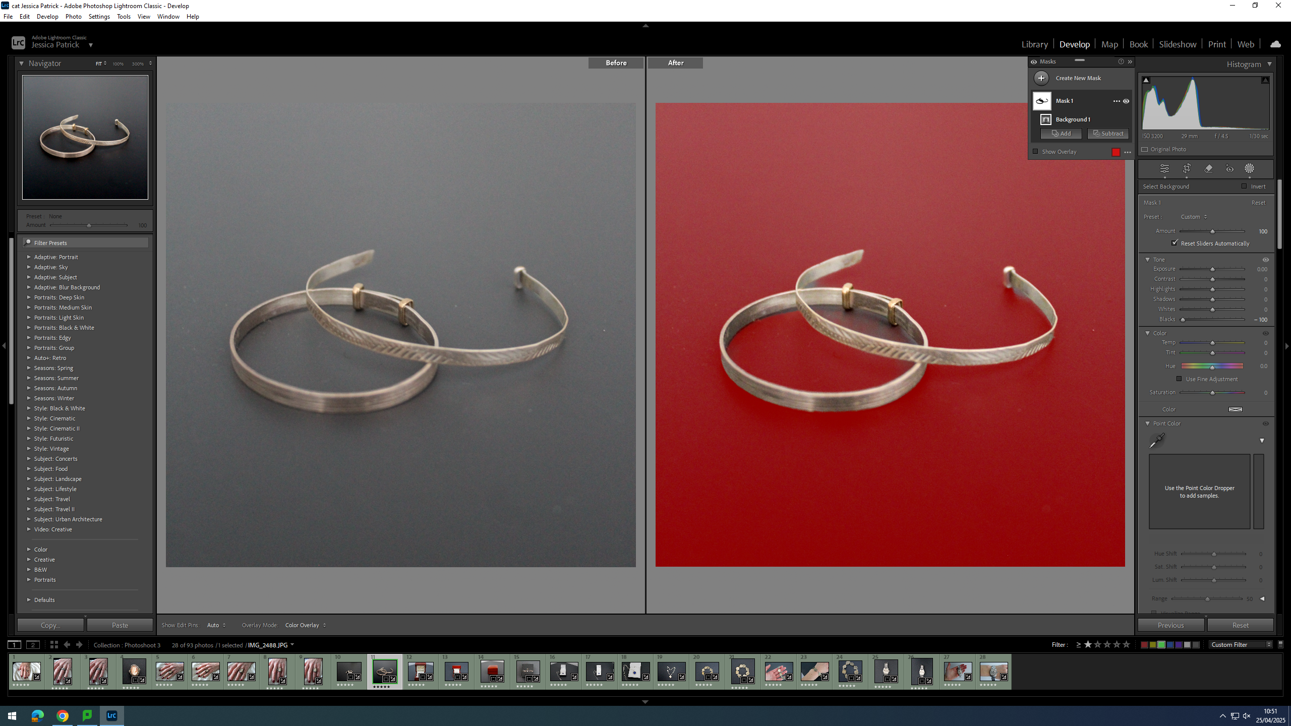
Finally, I selected the background of the image and decreased the blacks, so that the background was more black, which creates more contrast between the bracelets and the background.
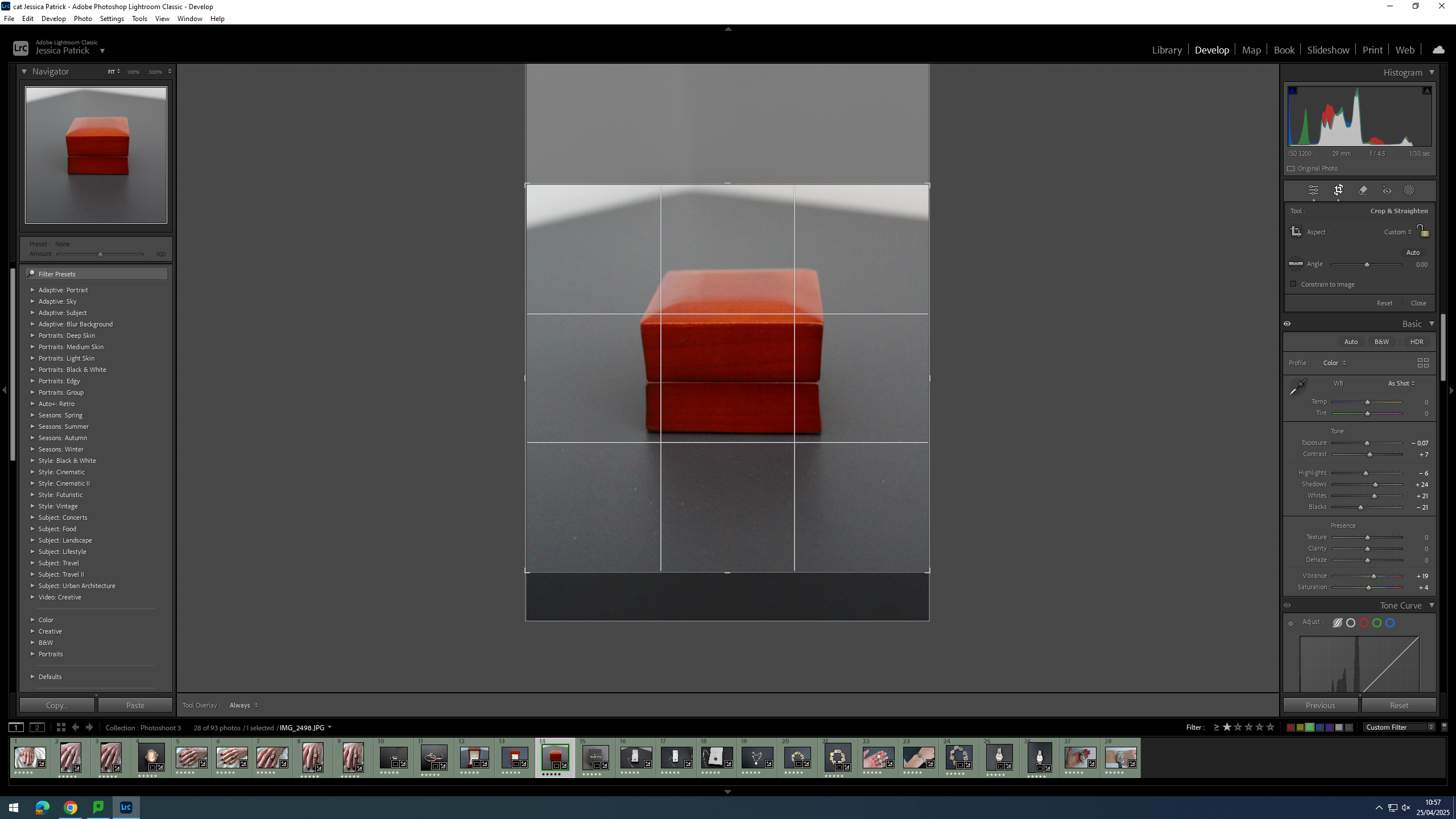
Firstly, I cropped the image slightly, because I manipulated the angle of the image, so that the wedding ring box was straight on, instead of slanted to one side.
Then, I edited this image by increasing the exposure, contrast, shadows, vibrancy and saturation, while decreasing the highlights, whites and blacks. I did this, so that the image was slightly more exposed and more vibrant.
Firstly, I cropped this image by manipulating the angle of the image, so that the wedding ring box was centre in the frame and positioned straight, instead of slanted.
Then, I edited this image by increasing the exposure, contrast, shadows and vibrancy, while decreasing the whites, highlights, blacks and saturation. I did this, so that the image would be slightly more exposed and vibrant.
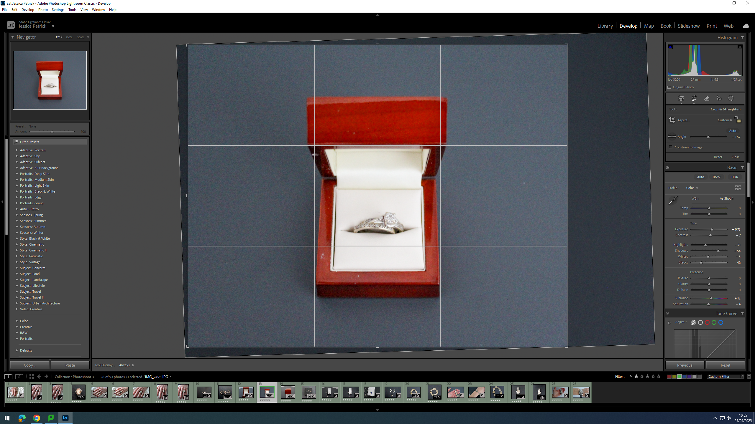
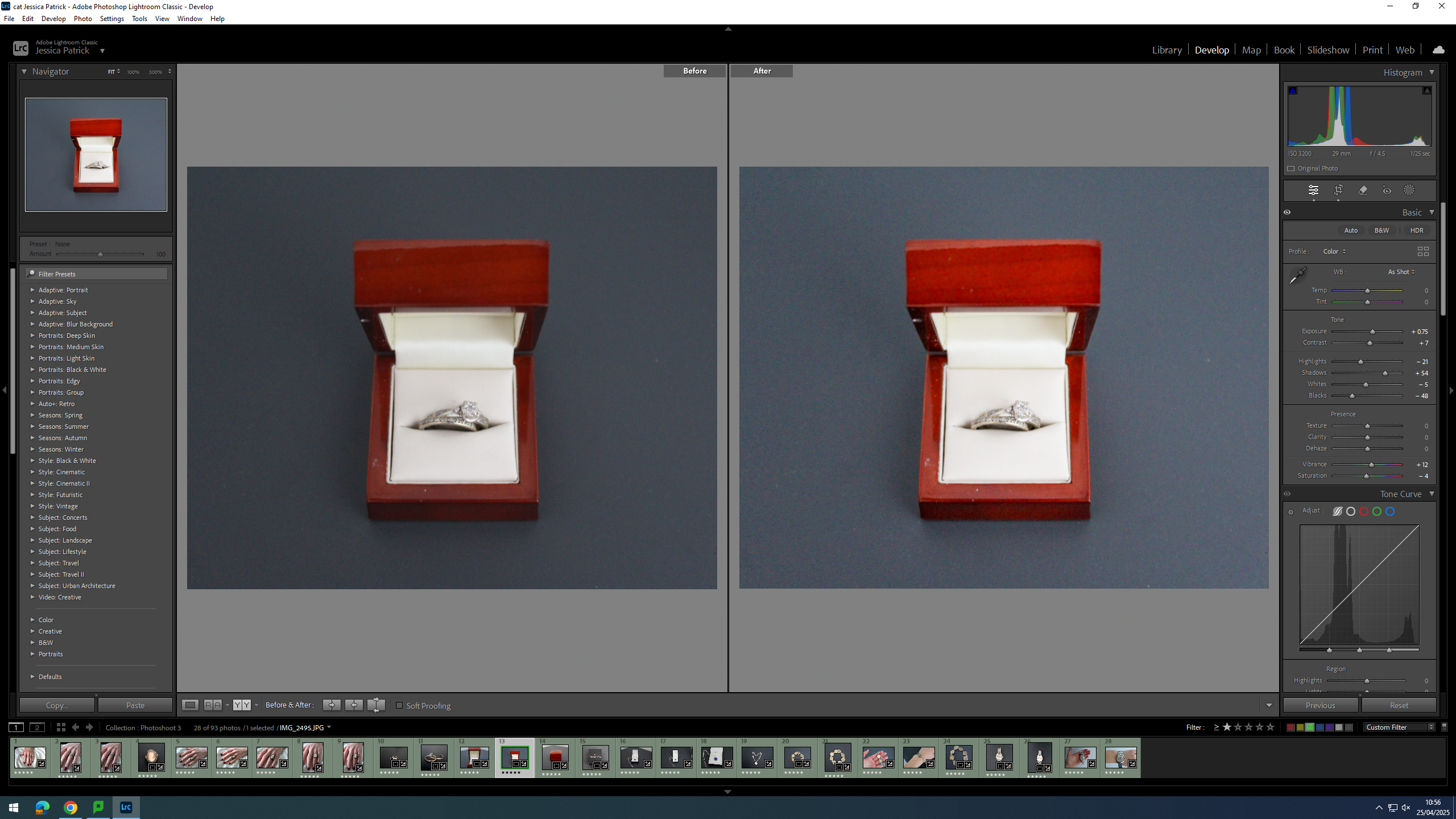
First, I cropped this image, so that the wedding ring box would be in the centre of the frame.
Then, I edited this image by increasing the contrast, shadows, whites, vibrancy and saturation, while decreasing the exposure and highlights. I did this, so that the image was slightly more vibrant.
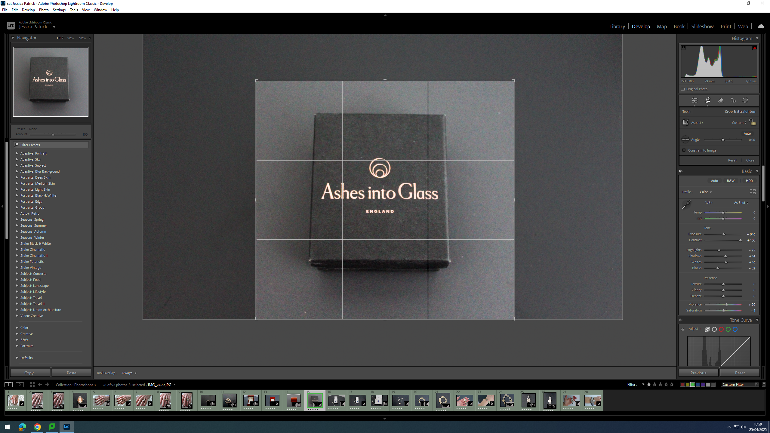
Firstly, I cropped this image, so that the jewellery box would be in the centre of the frame.
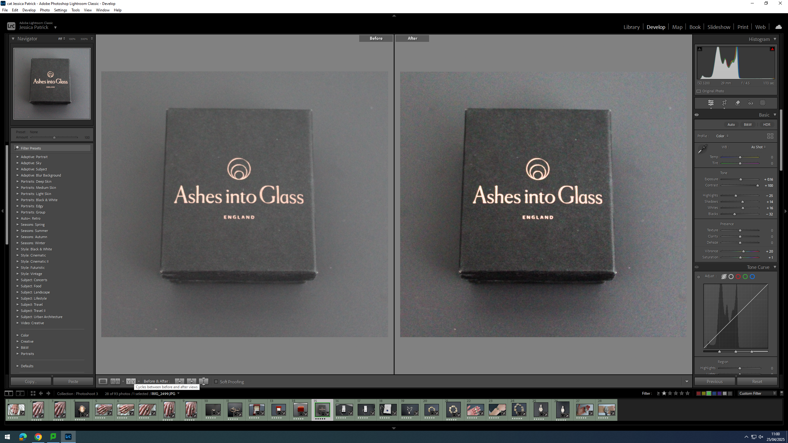
Then, I edited this image by increasing the exposure, contrast, shadows, whites, vibrancy and saturation, while decreasing the highlights and blacks. I did this, so the jewellery box would stand out more from the background, as they are very similar colours.
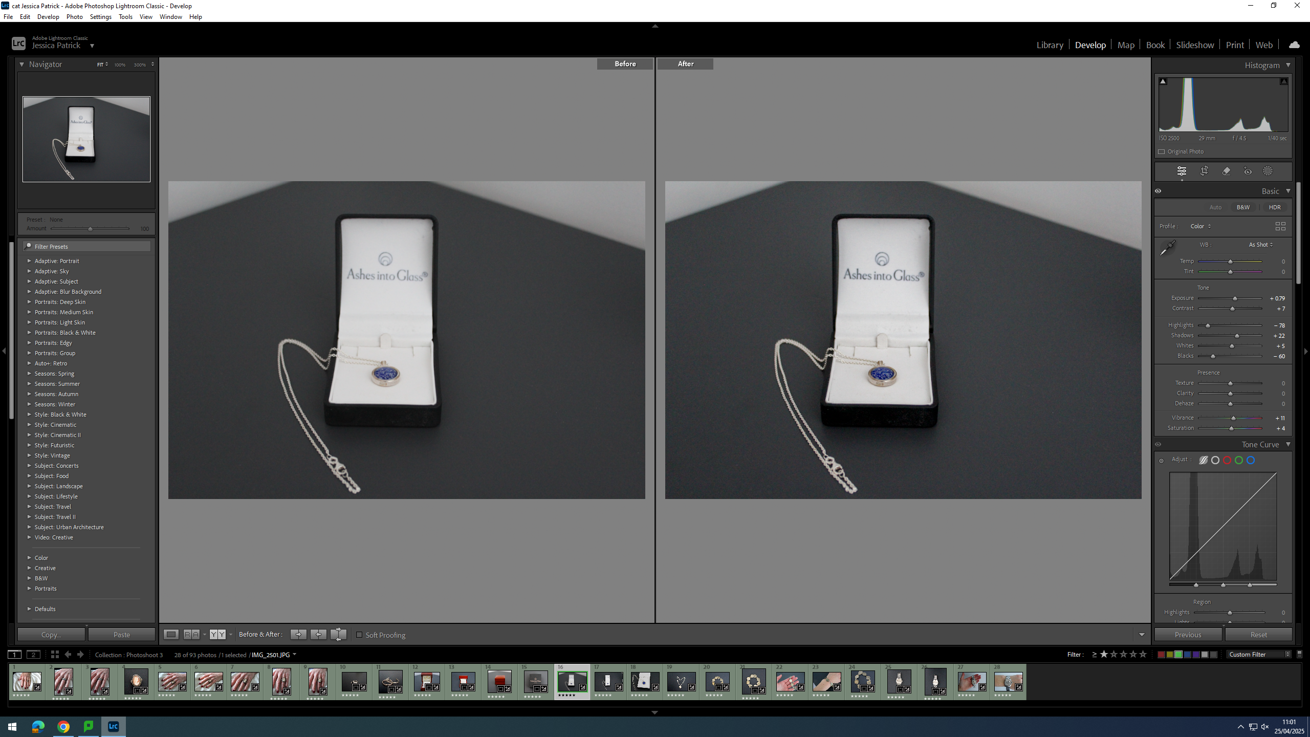
I edited this image by increasing the exposure, contrast, whites, shadows, vibrancy and saturation, while decreasing the highlights and blacks. I did this, so that t more contrast and the necklace was more vibrant and stood out more.
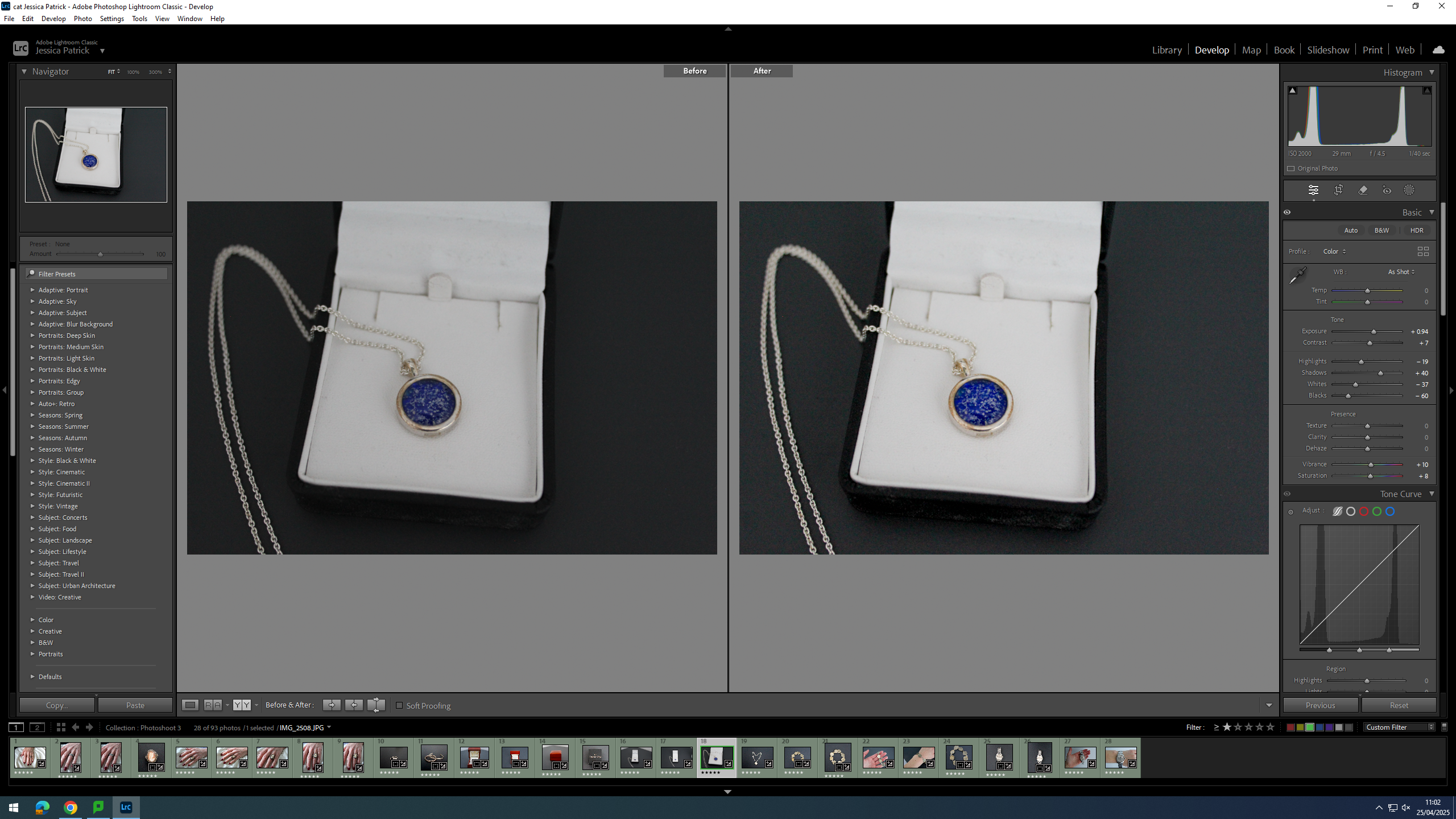
I edited both these images by increasing the exposure, contrast, shadows, whites, vibrancy and saturation, while decreasing the highlights, whites and blacks. I did this, so that there were more dark tones to create more contrast and so the necklace was more vibrant.
I edited this image by increasing the exposure, contrast, shadows, whites and vibrancy, while decreasing the highlights, blacks and saturation. I did this, so that the background was more black, so it would create contrast between the background and the necklace. I also wanted the necklace to look brighter/ shinier.
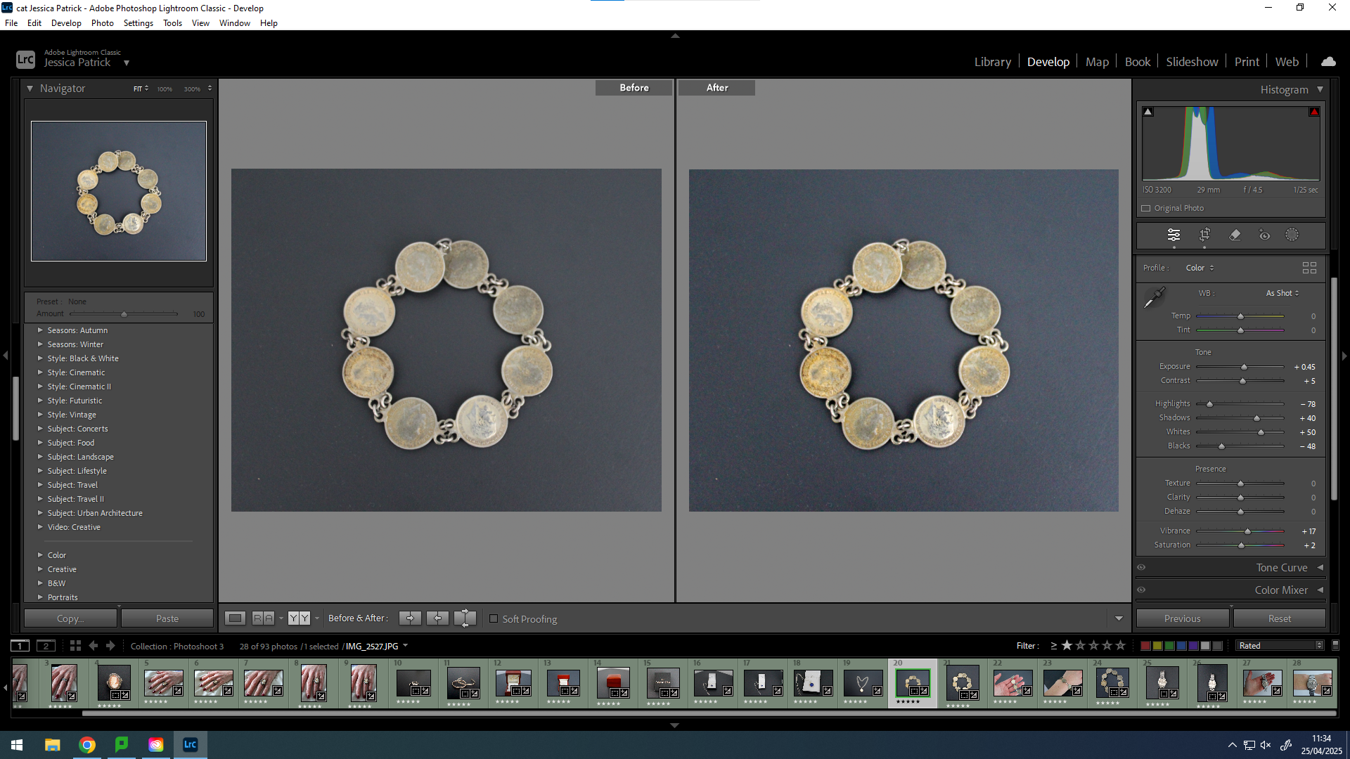
I edited this image by increasing the exposure, contrast, shadows, whites, vibrancy and saturation, while decreasing the highlights and blacks. I did this, so that the background was more black to create contrast between it and the bracelet and so the bracelet was more vibrant with a more rustic look.
I edited this image by increasing the exposure, contrast, shadows, whites and vibrancy, while decreasing the highlights and blacks. I did this, so that the image would be more vibrant.
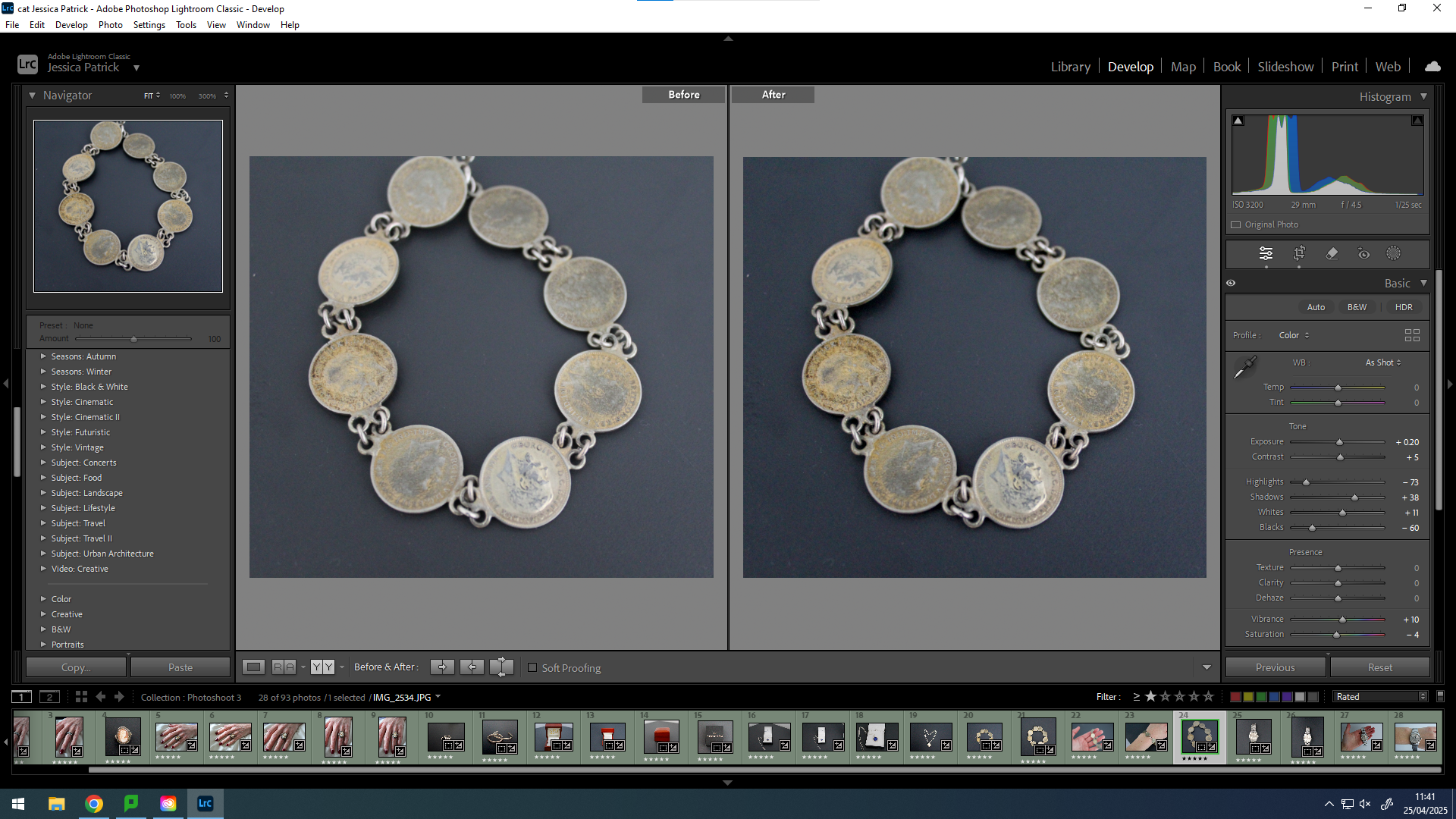
I edited this image by increasing the exposure, contrast, shadows, whites and vibrancy, while decreasing the highlights, blacks and saturation. I did this, so that the background would be more black, which would create more contrast between the background and the bracelet. Also to make the bracelet more vibrant and detailed.
I edited this by increasing the exposure, contrast, shadows, whites and vibrancy, while decreasing the highlights, blacks and saturation. I did this, so that the image would be slightly more exposed and have more contrast.
I edited this image by increasing the contrast, shadows, whites vibrancy and saturation, while decreasing the exposure, highlights and blacks. I did this, so that the image would be more vibrant.
I edited this image by increasing the exposure, contrast, shadows, whites, vibrancy and saturation, while decreasing the highlights and blacks. I did this, so that the image would be slightly more exposed and vibrant.
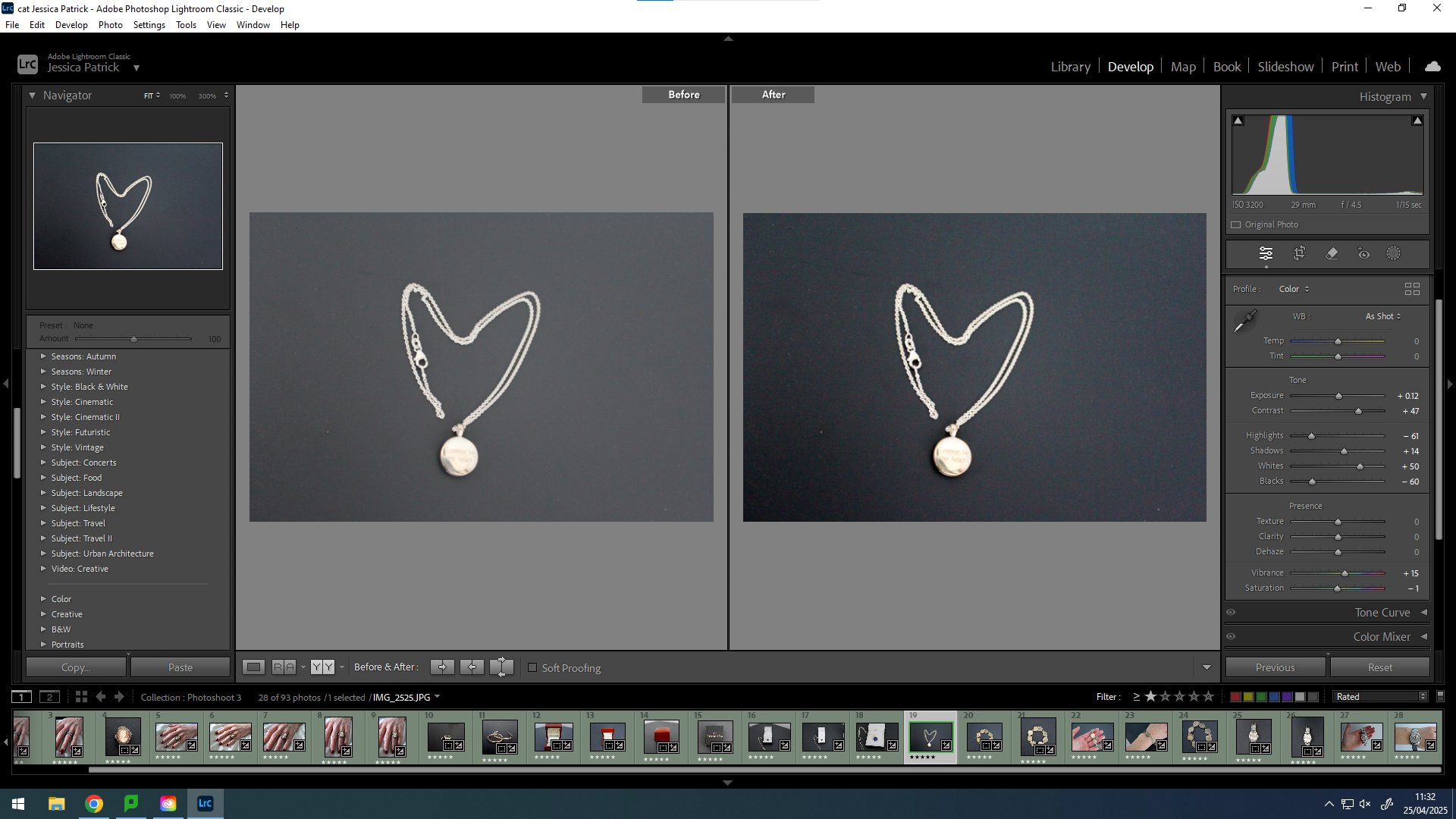
For this photoshoot I am going to be taking detail shots, because I think they would look good with my other images in my book. I am going to be taking pictures of family heirlooms, my mum and dad’s wedding rings etc.
This links to the theme of my family being a union, because I will be presenting the union of two people (my mum and my dad) in marriage and how that has unified two families who were once separate and how it has grown the family union by bringing myself and my sister into the world. As well, as also presenting family heirlooms that have been passed down through the entire family really presenting how we are all connected.
I would also like to compare these objects to archive images of the same objects, but from many years ago, if I have any archive images of them. If not just the detailed shots on their own will be enough.
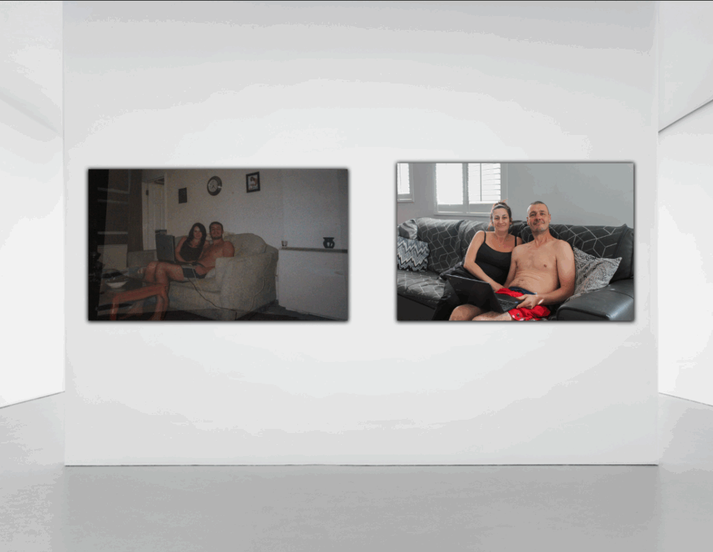
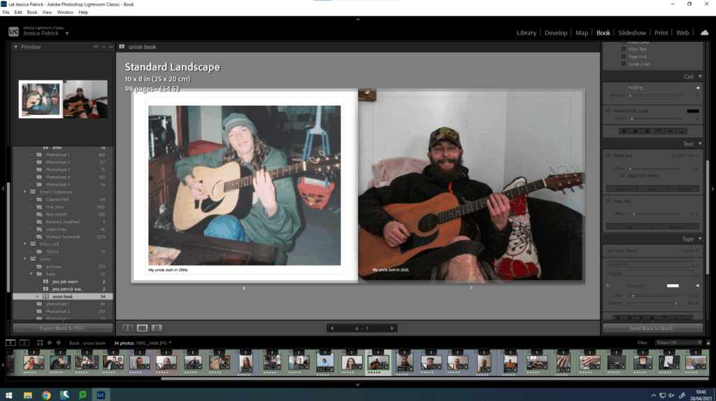
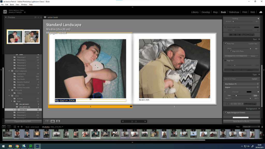
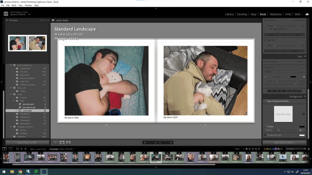
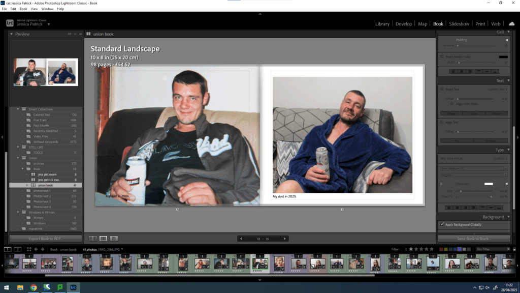
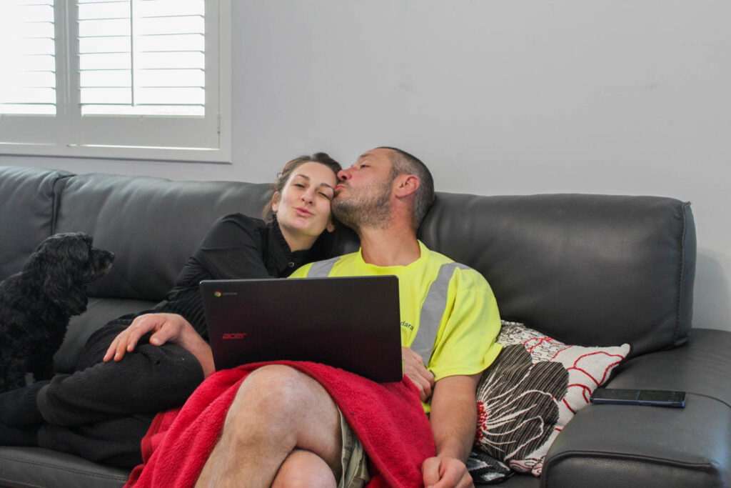
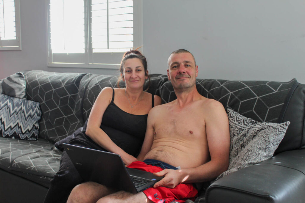
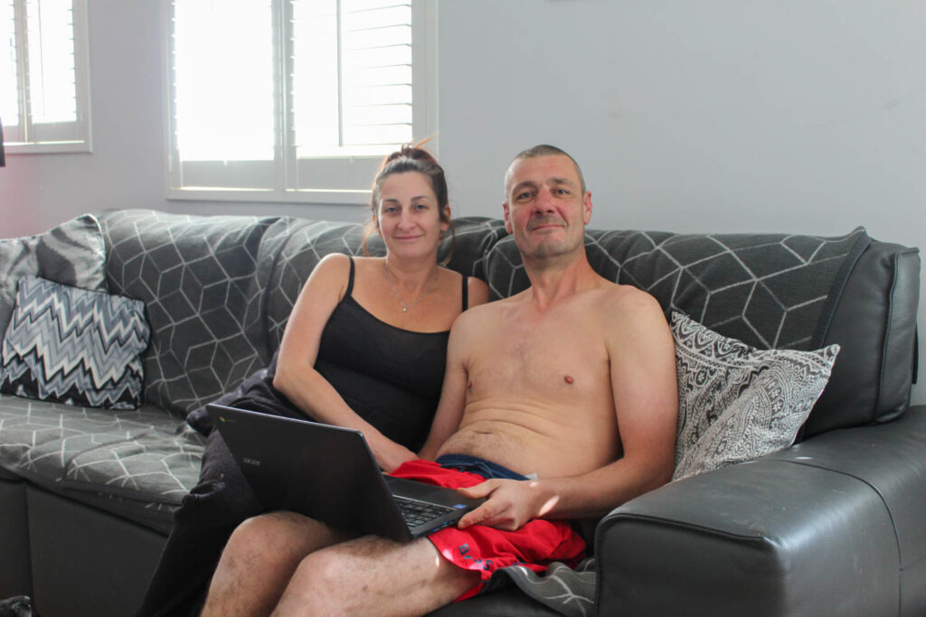
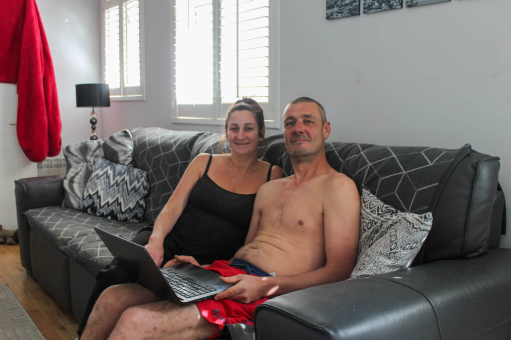
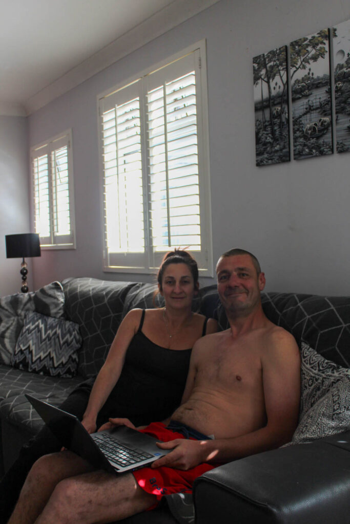
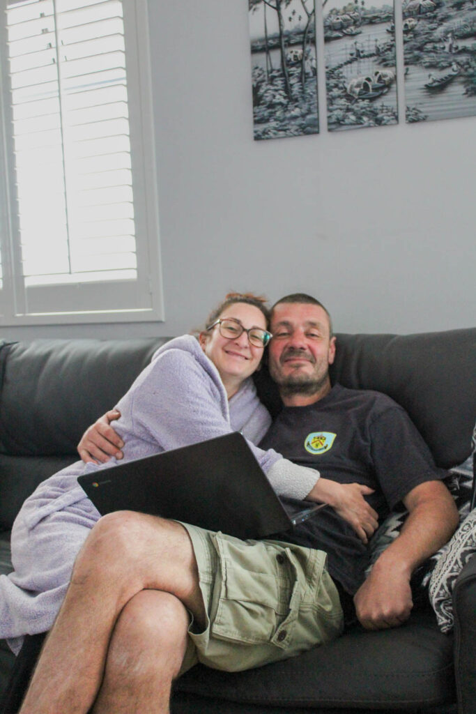
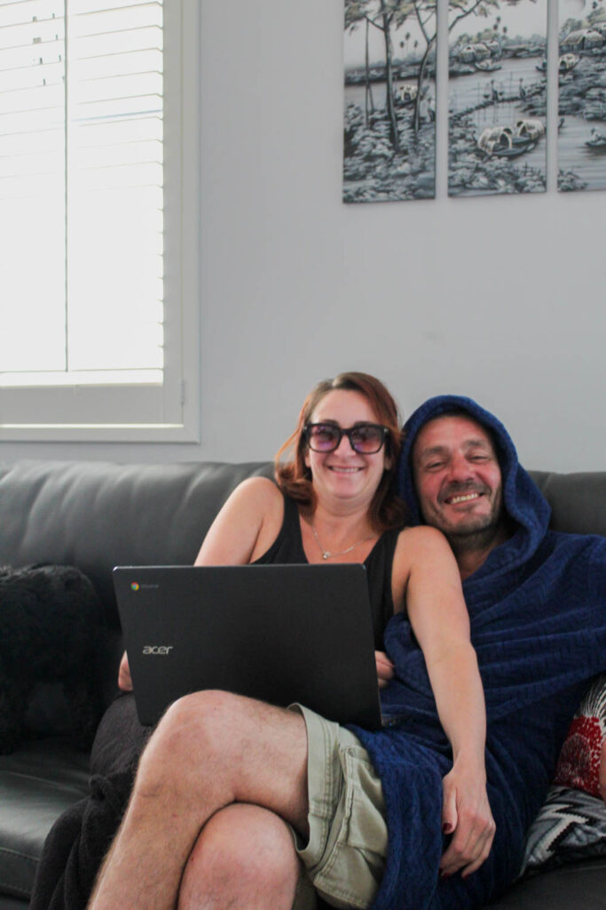
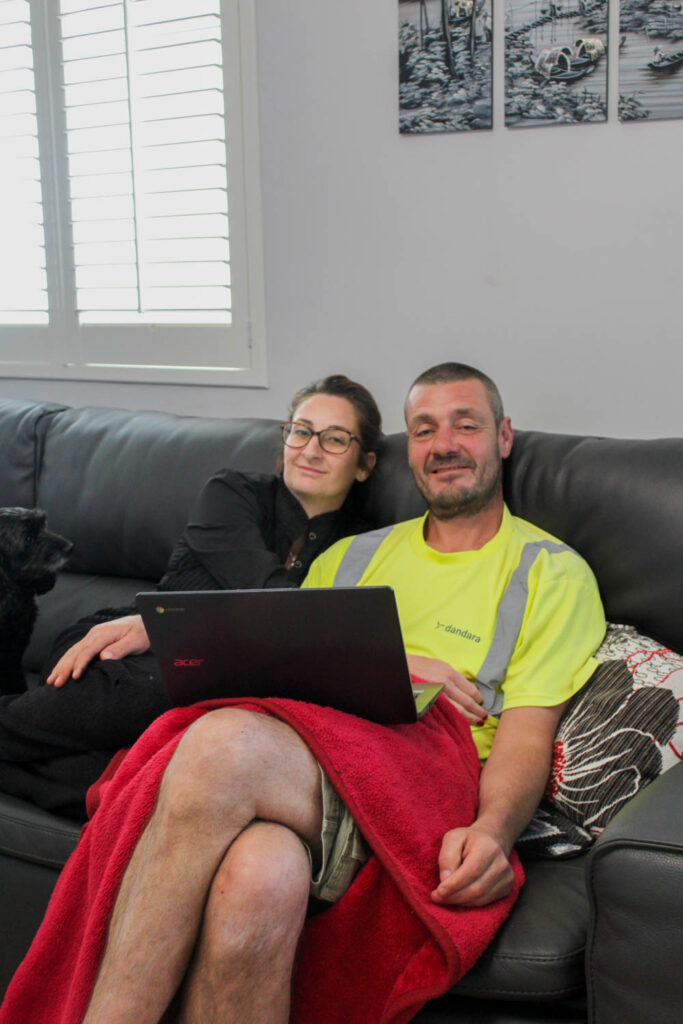
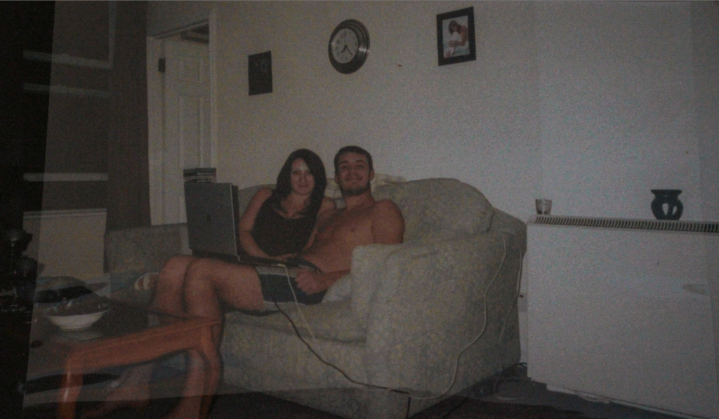
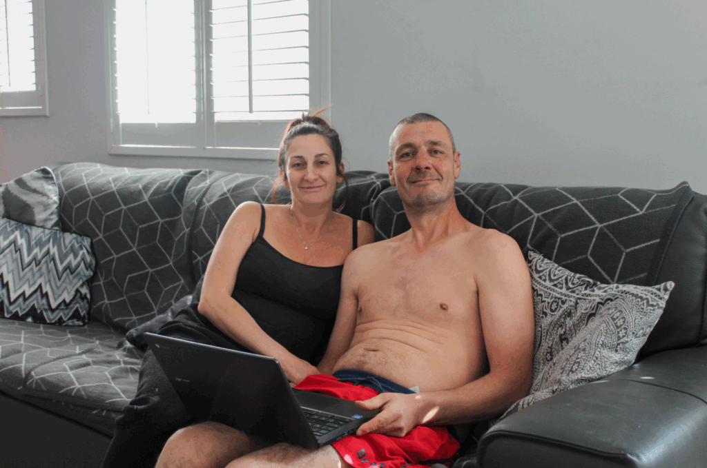
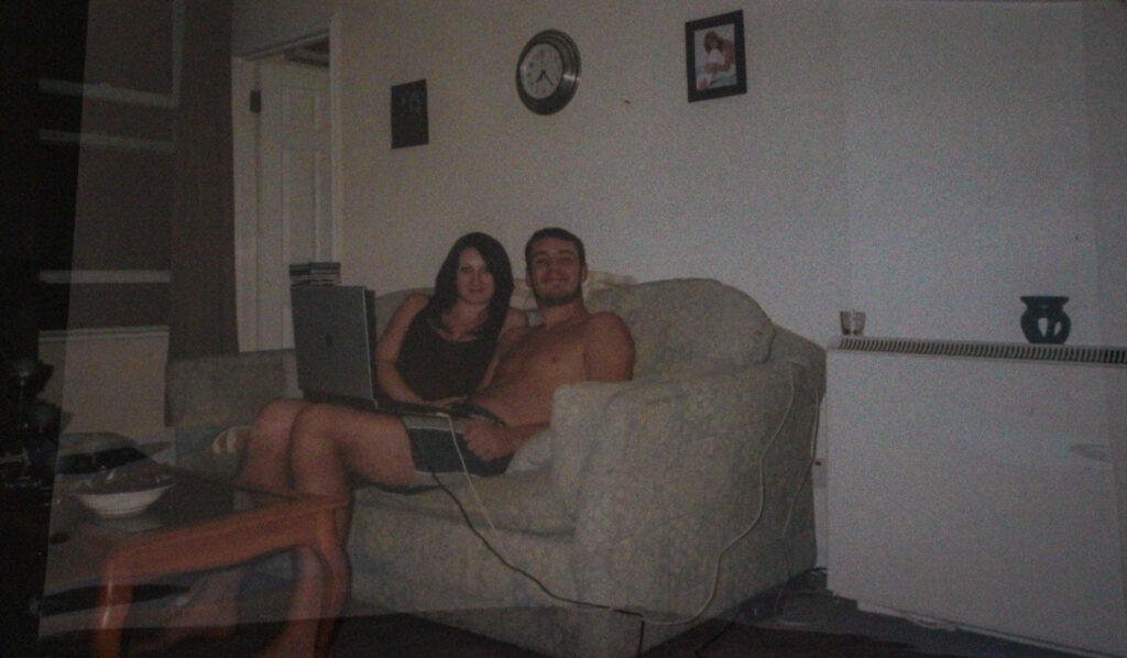
For this photoshoot I recreated an archive image of my mum and dad in 2006 in my first ever home.

I recreated this image of my mum and dad from slightly different angles at slightly different times. I did this, so I would be able to use these images to create joiners similarly to David Hockney.
Final Images

Analysis of 1 Image
The lighting used in this image is natural daylight, which is coming in through the windows in my living room. There are high levels of control in this image, because this is a staged image, where I have manipulated the positioning and distance of my subjects, as well as myself and the camera. I have also chosen the setting of the image. However, there is slightly less control in this image with the lighting, as I am using natural lighting, instead of artificial lighting.
F-stop: f/4
Exposure time: 1/50secs
ISO speed: ISO-320
The colours in this image include black, white, grey and red. I used these colours, because the setting of my living naturally has these colours and I wanted to compare my home now in 2025, to my home in 2006, which had a green couch and a wooden table. I kept my mum in the same black tank top, but my dad only had red shorts, so they are different to the shorts in the original image. There are also lots of light and dark tones throughout this image, due to the bright lighting coming through the window in the background and the darker tones of the couch. This creates contrast in the image. There is also a lot of contrast between my image and the archive image, due to the lighting difference. There is a lot of shape and pattern in the image as well, due to the patterned pillows and blanket on the back of the couch, which creates a lot of repetition.
The composition of this image is the same as the composition of the archive image, because that is what I am trying to replicate. The main viewpoint of the image is my mum and dad, which are the two subjects. They are in the centre of the frame.
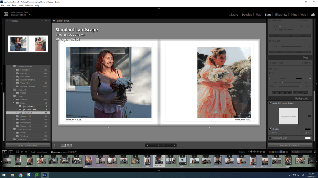
The image I have taken is a recreation of an archive image of my parents in my first home in 2006. My mum was 21 years old and my dad was 26 years old. The image I have taken presents them in our current home in 2025 ages 39 and 44. I have replicated this image to present how they have grown together and stayed unified and how their bond staying strong has allowed them to grow together and now buy their own home together. This relates to the theme of union as it shows how their marriage union has stayed strong for almost 19 years and how it has allowed them to grow individually as well as together and achieve their goals together.
Evaluation
In this photoshoot I was able to complete what I set out to do, which was to take the same photograph of my parents, which is inspired by an archive photo of them in 2006, but from slightly different angles and at slightly different times. I also felt like I recreated the image well, even though I had to change the perspective.
However, next time if I were to do this again I would focus more on my lighting, as the window in the background made the images far too exposed, which meant I had to do more editing then I would have needed. I would also focus on my camera settings in order to try and prevent this as well. There was also one image that was slightly unfocussed, so I would also work on that.
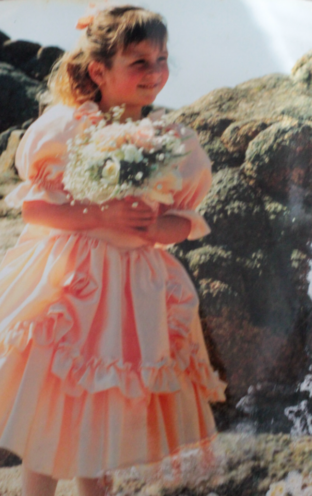
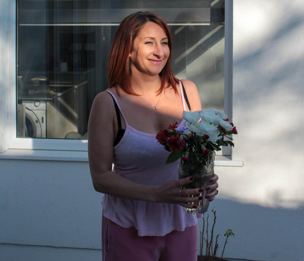
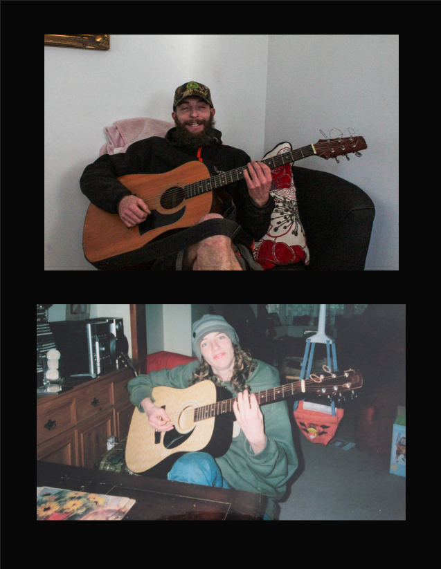
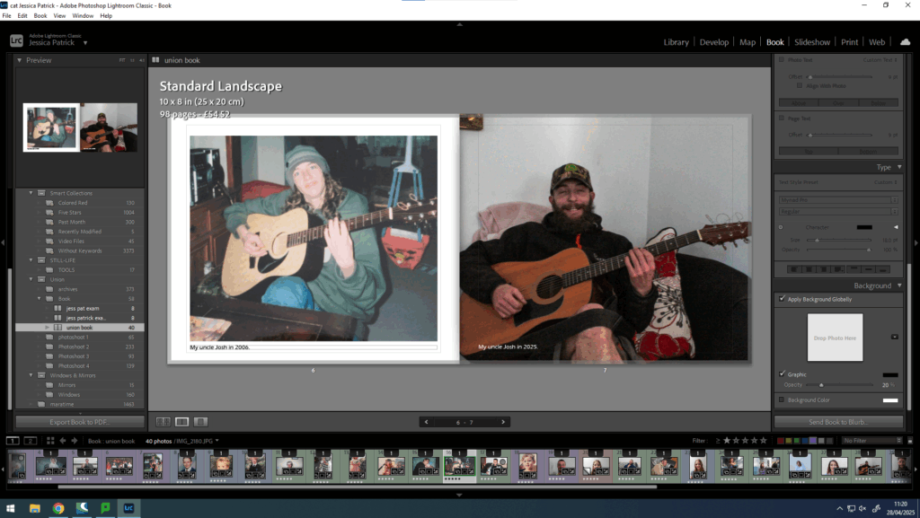
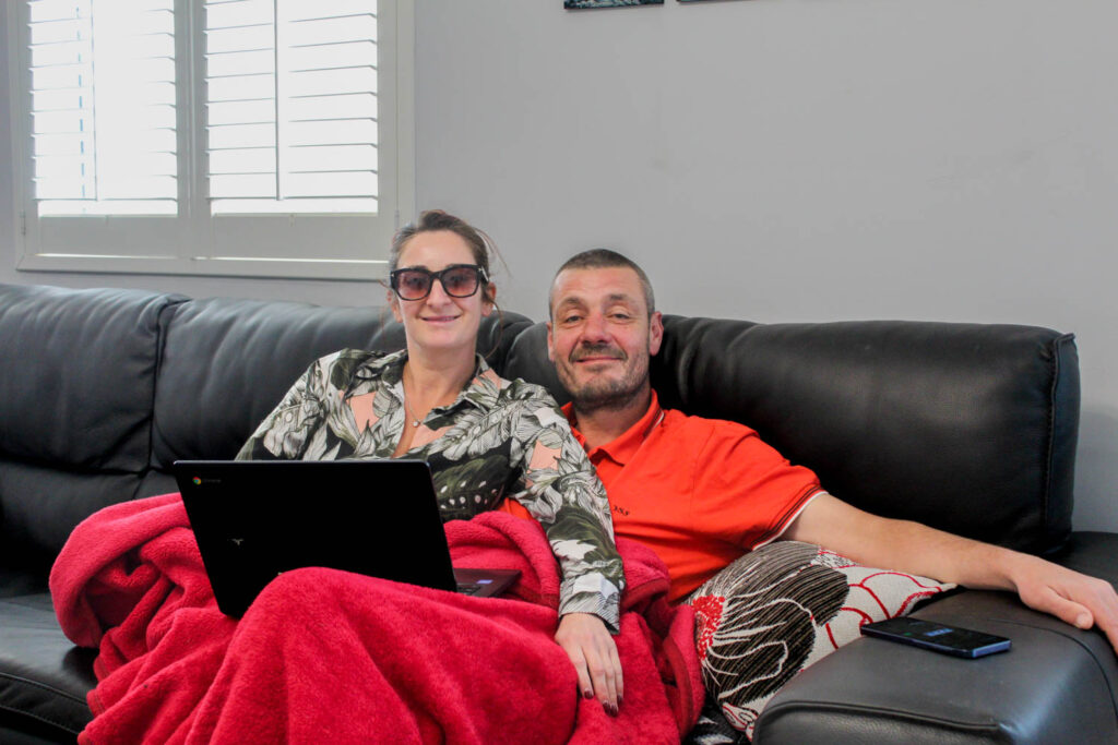
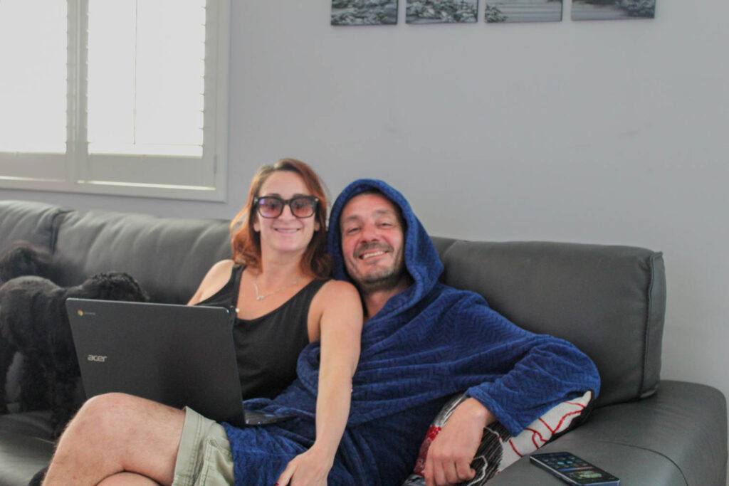
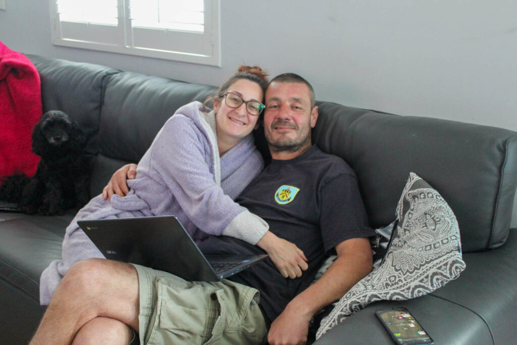
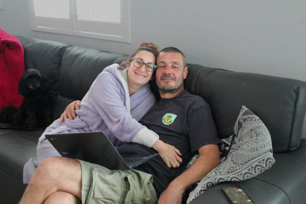
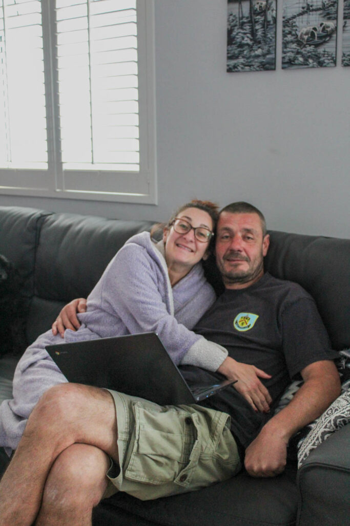
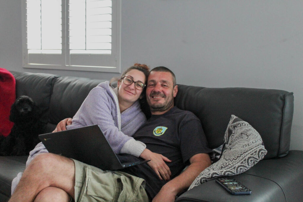
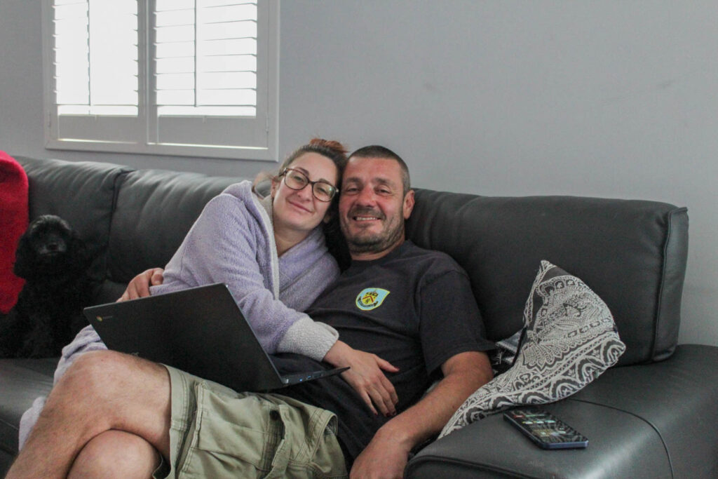
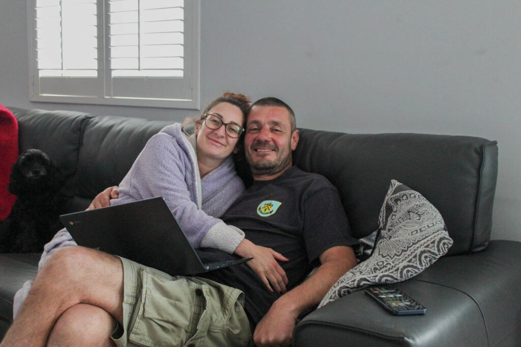
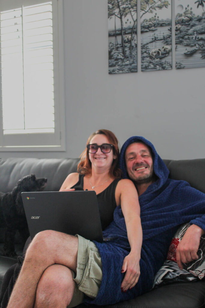
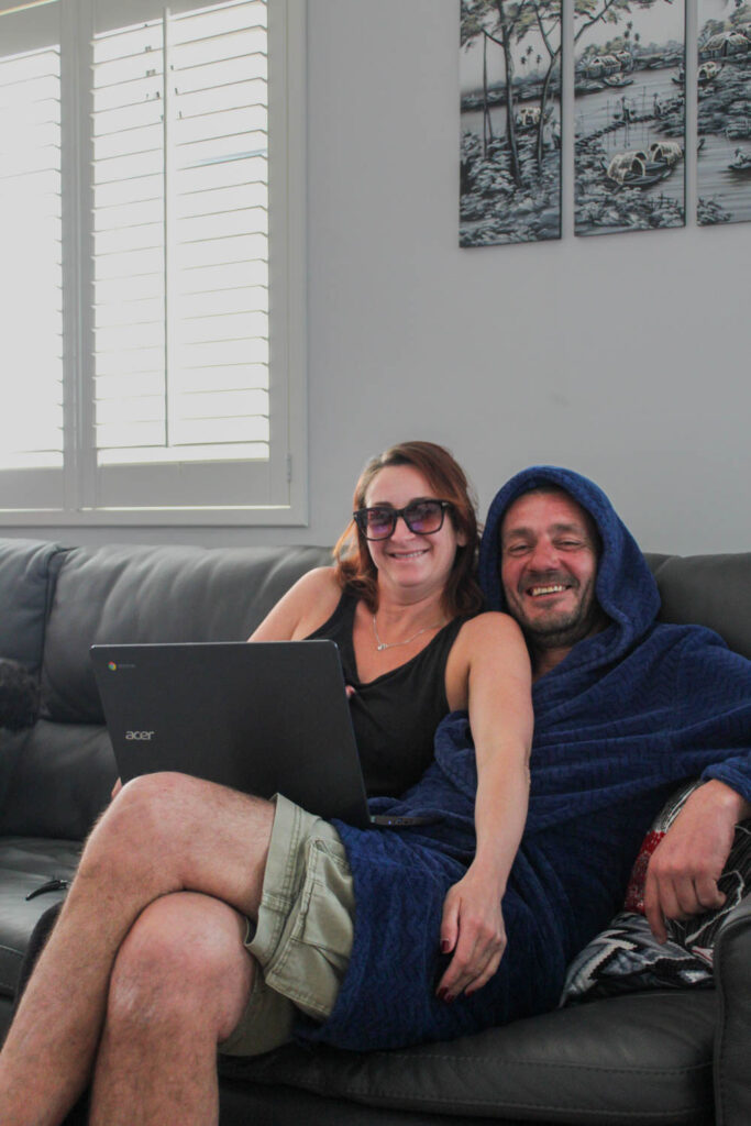
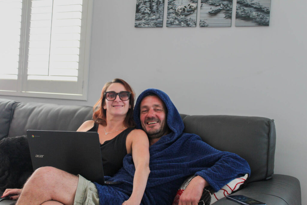
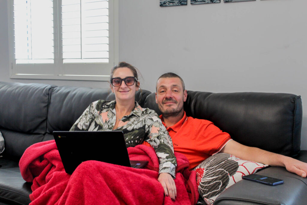
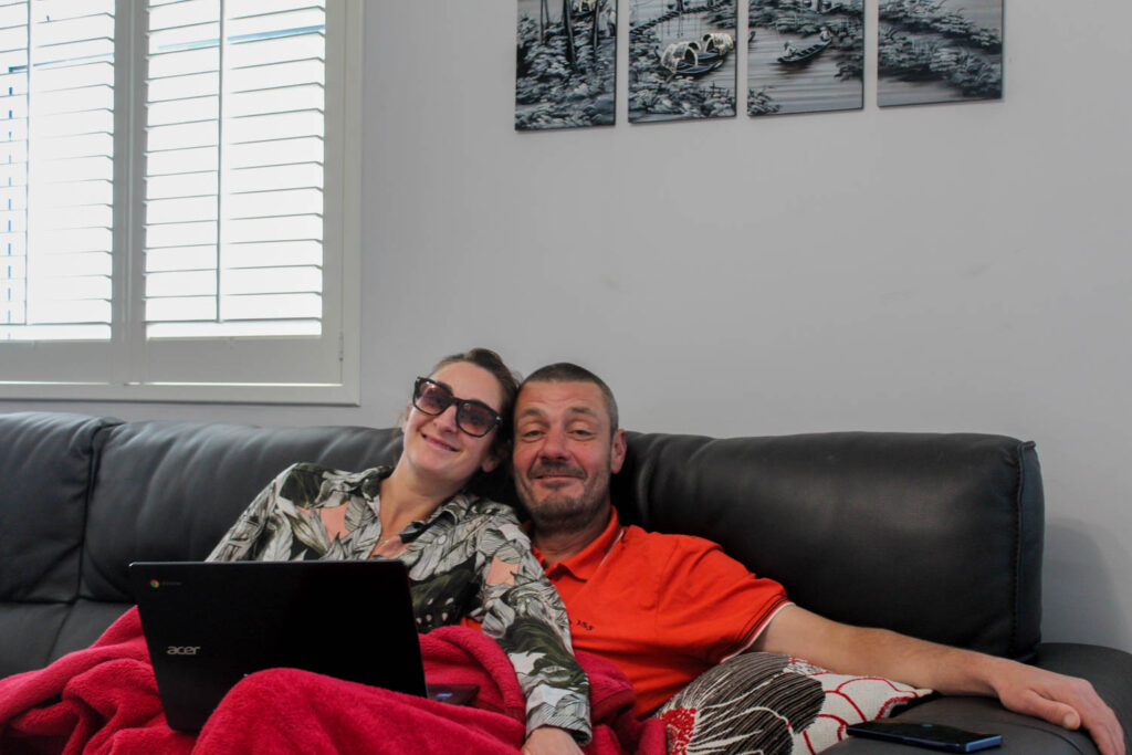
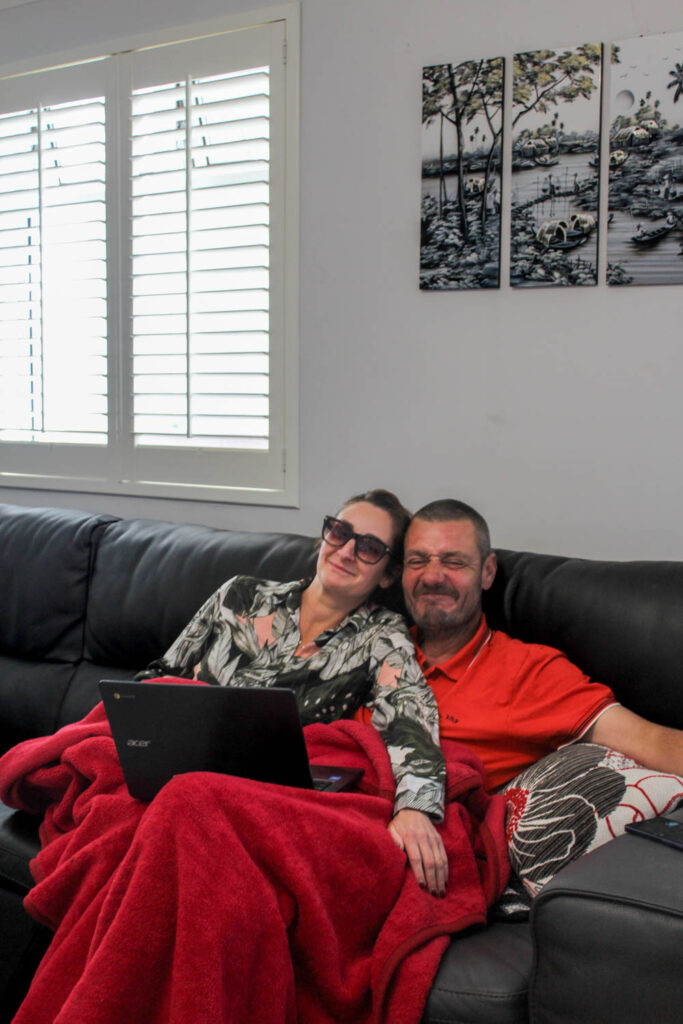
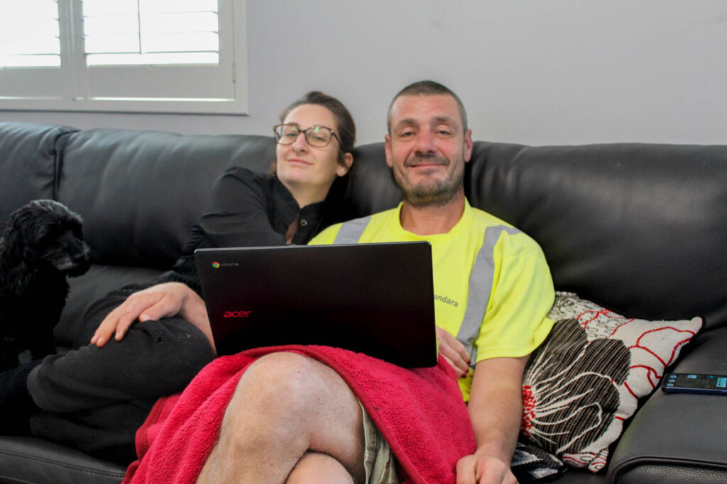
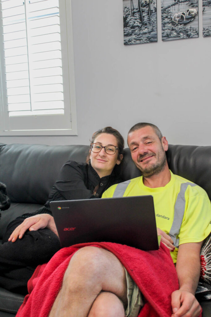
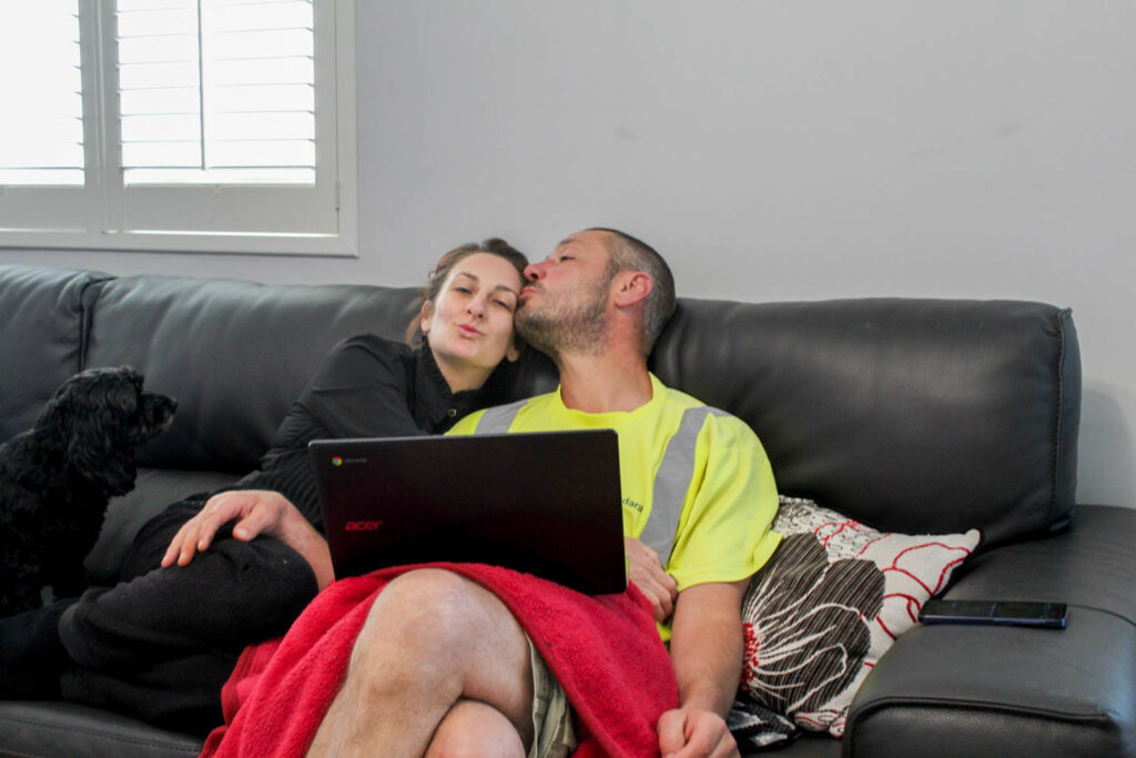
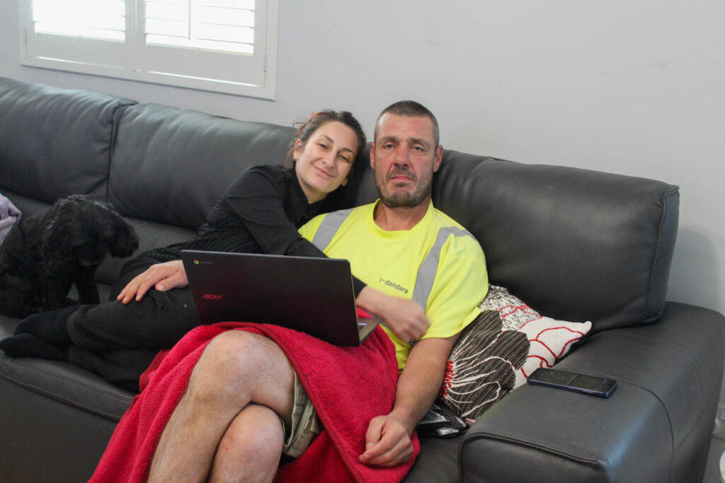
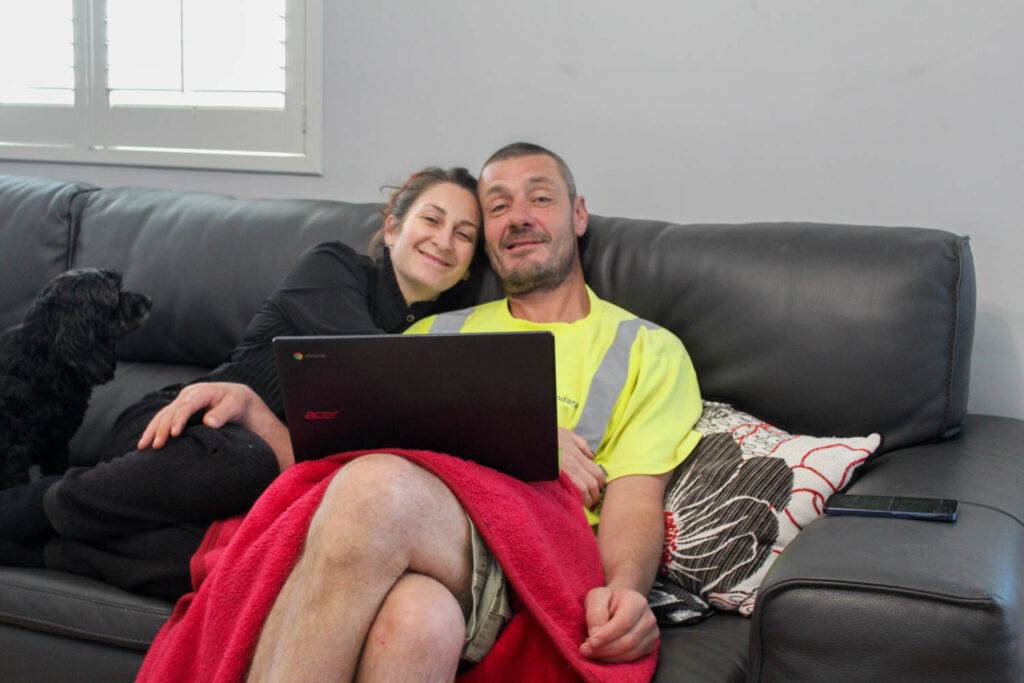
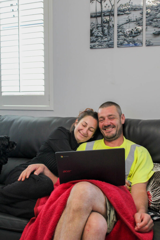
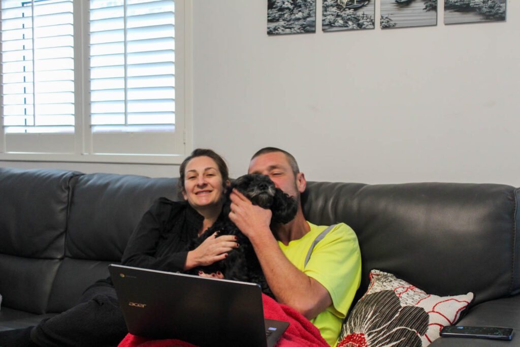
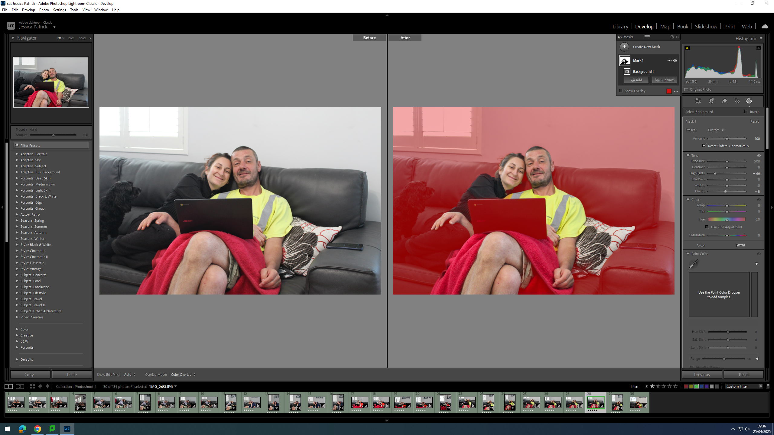
For this photoshoot I took the same photograph of my mum and dad once a day for a week, but from slightly different angles. The photographs I took were also inspired by the archive below:
However, I also took photographs that weren’t inspired by an archive. They were photographs of my mum, my dad and my sister sat together on the couch and they were also taken once a day for a week at slightly different angles.
Contact Sheet
Edits
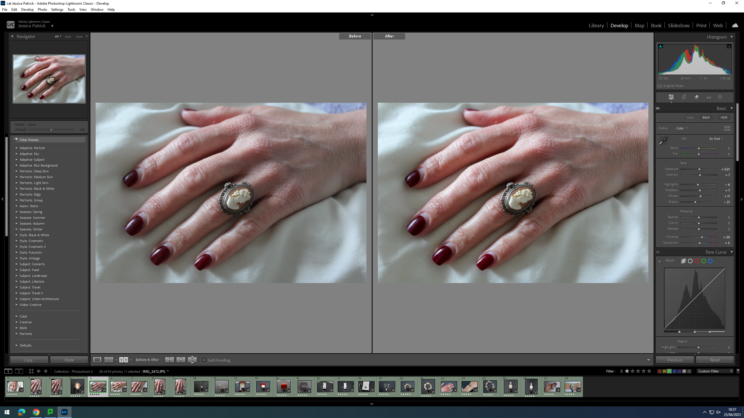
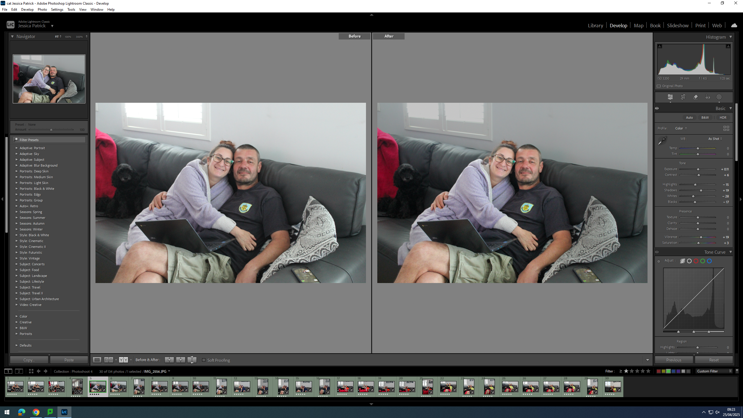
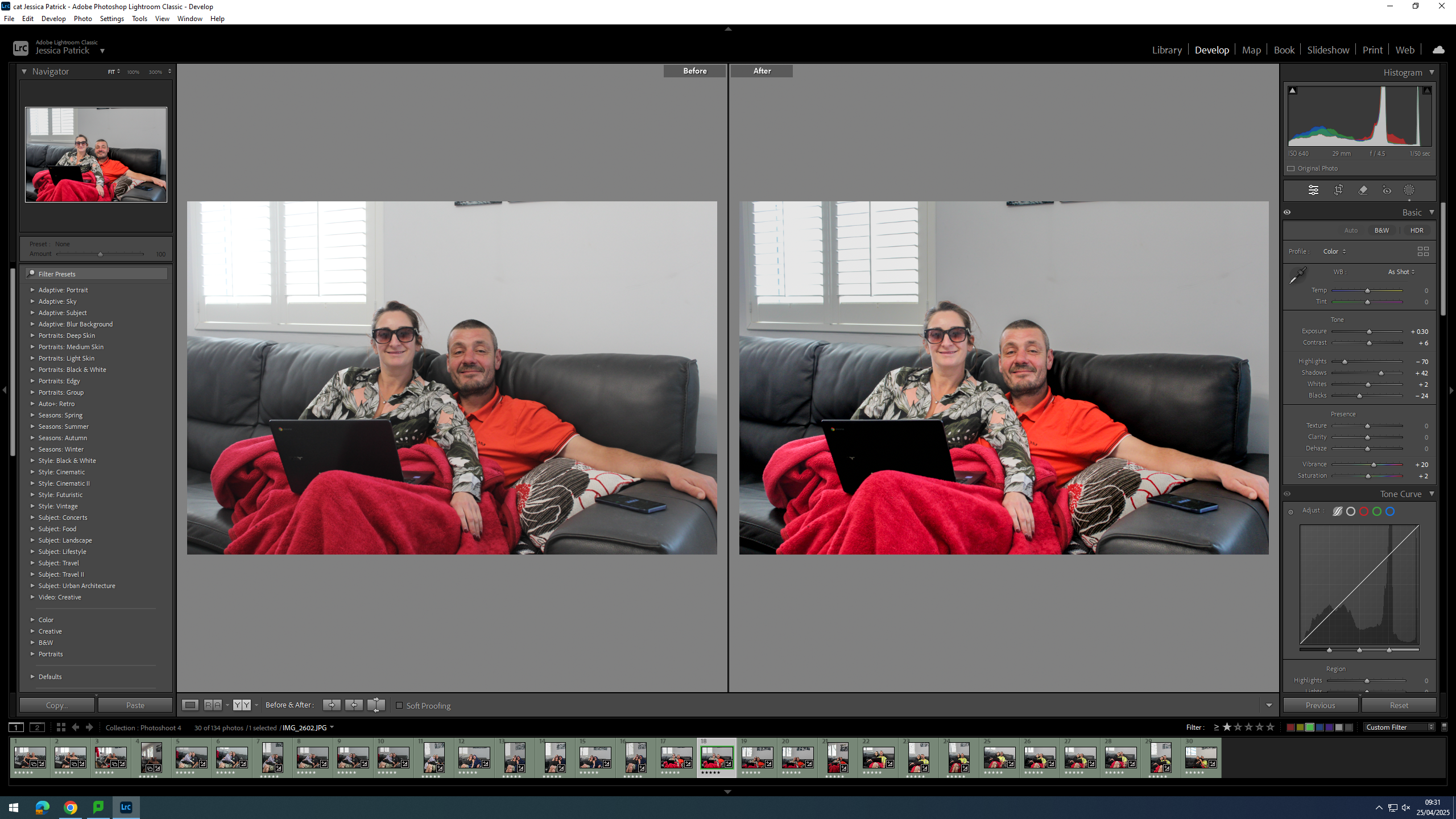
I edited this image by increasing the exposure, contrast, shadows, whites, vibrancy and saturation, while decreasing the highlights and blacks. I did this, so that the image would look less dull and be slightly more vibrant.
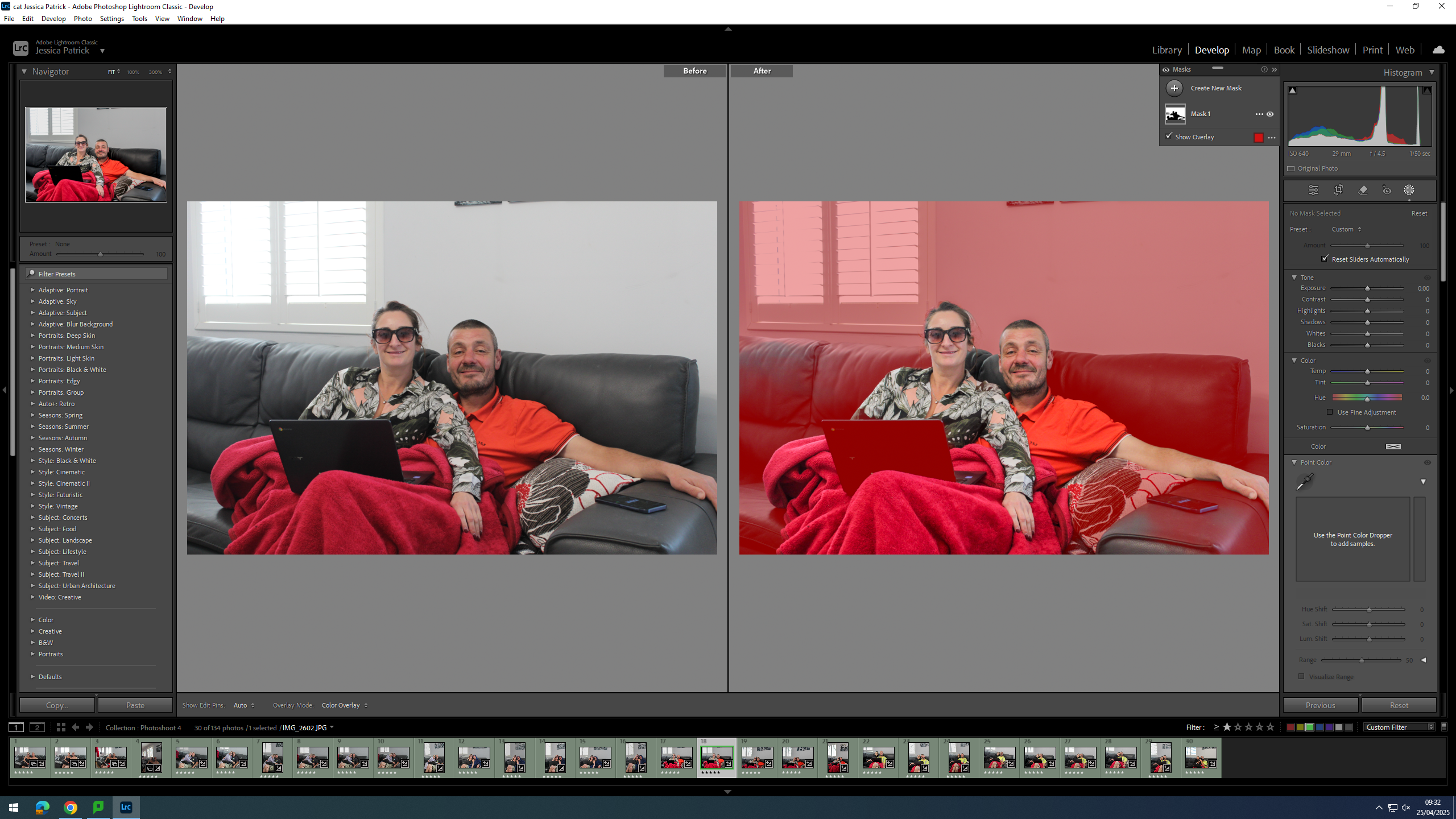
Then, I selected the background of the image and decreased the highlights and whites and increased the blacks, so that the light coming through the window was less bright.
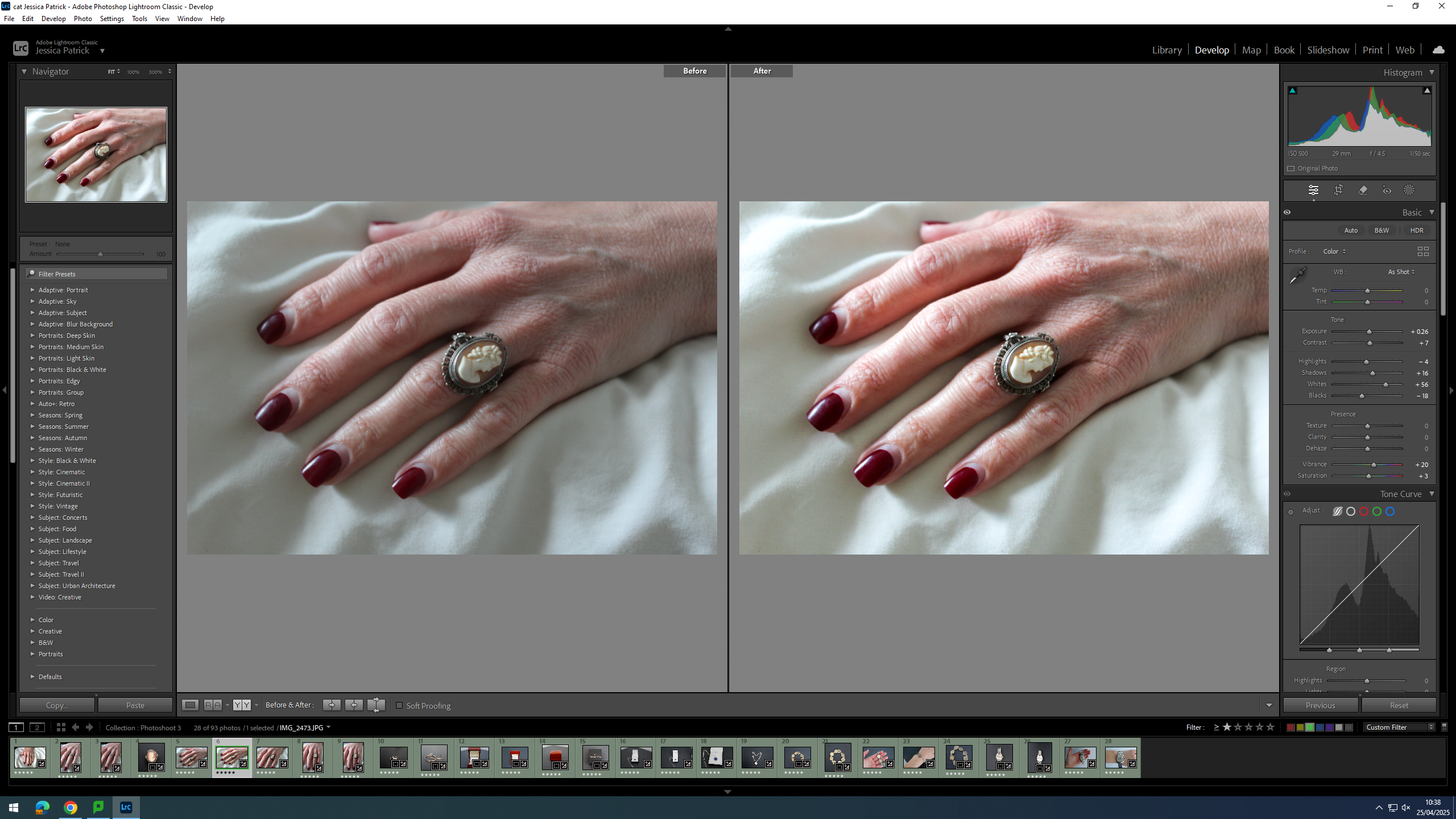
I edited this image by increasing the exposure, contrast, shadows, vibrancy and saturation, while decreasing the highlights, whites and blacks. I did this, so that the image would have less white/ exposure coming in through the window.
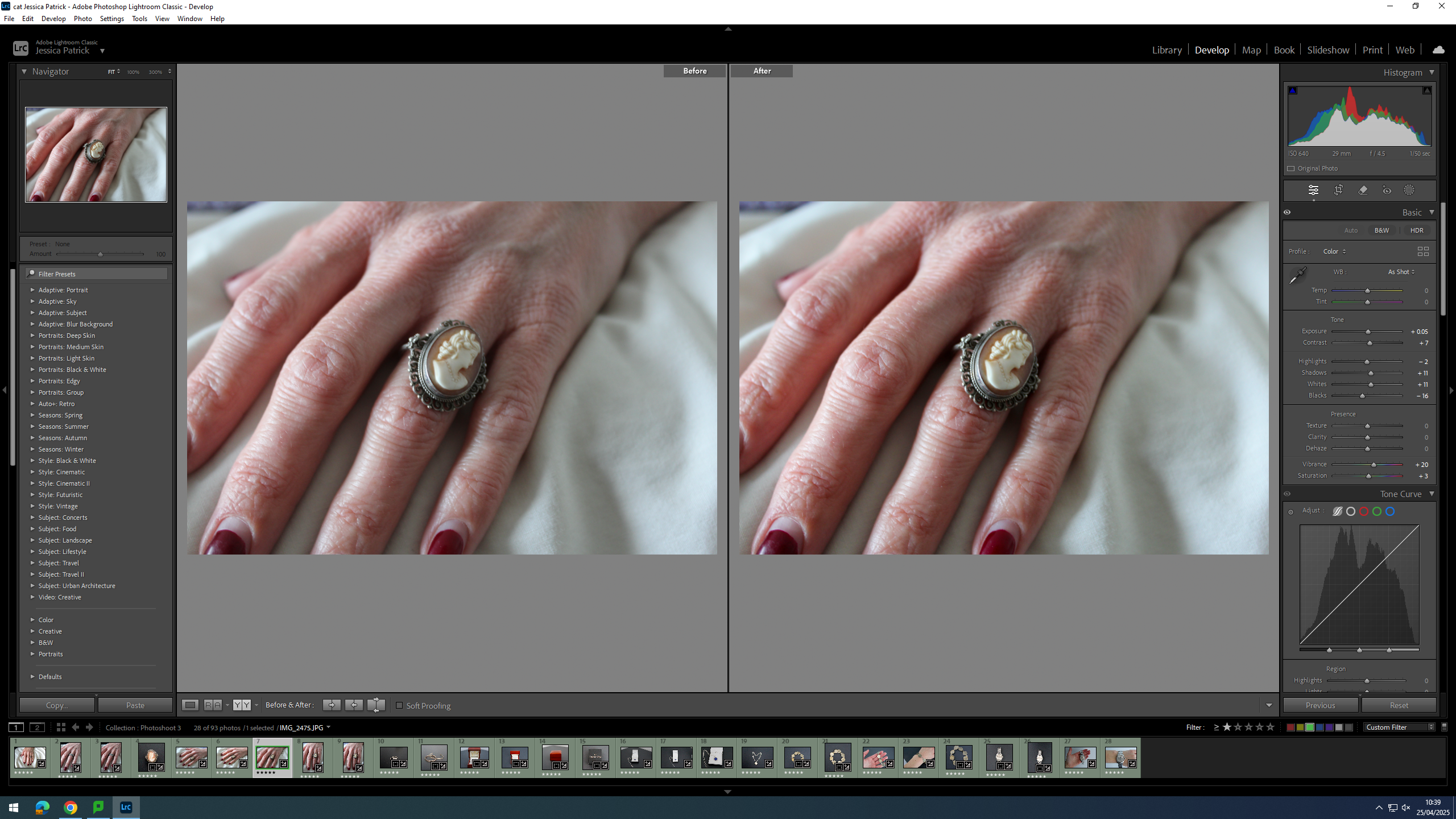
I edited this image by increasing the exposure, contrast, shadows, whites, vibrancy and saturation, while decreasing the highlights and blacks. I did this, so that the image would be slightly more exposed and look less dull.

I edited this image by increasing the exposure, contrast, shadows, whites and vibrancy, while decreasing the highlights and blacks. I did this, so that the image would be more vibrant.
Then, I selected the background and decreased the highlights and whites in order to lower the exposure of the lighting coming through the window, as it was too bright.
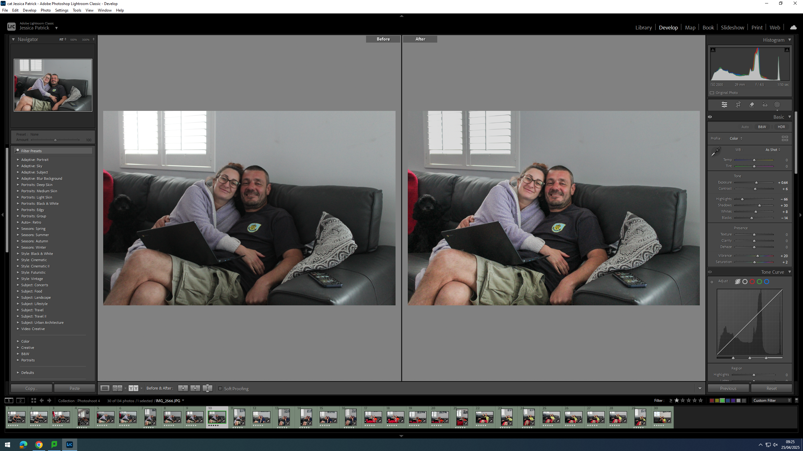
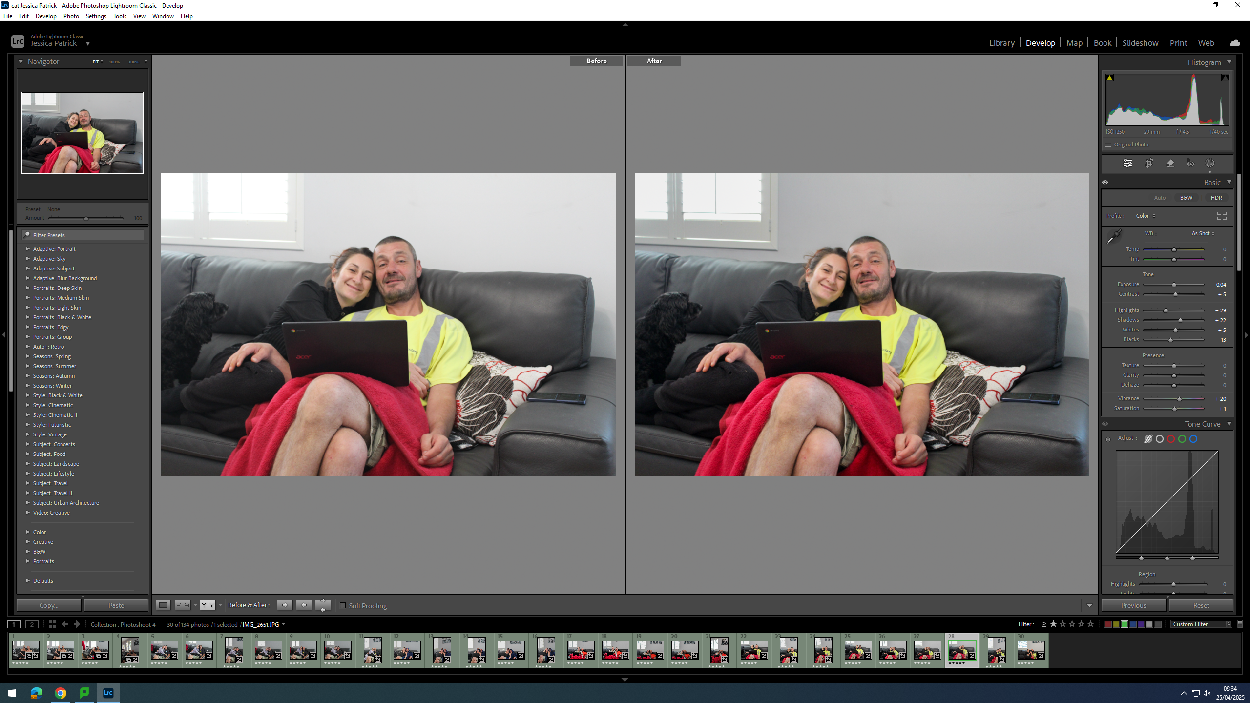
I edited this image by increasing the exposure, contrast, shadows, whites, vibrancy and saturation, while decreasing the highlights and blacks. I did this, so the image would be slightly less dull and more vibrant.
Then, I selected the background of the image and decreased the highlights, whites and blacks. I did this, so that the lighting coming through the window would be less bright.
I edited this image by increasing the contrast, shadows, whites, vibrancy and saturation, while decreasing the exposure, highlights and blacks. I did this, so that the subjects would have more colour to them and be more bold.
Then, I selected the background and decreased the highlights and blacks in order to make the background less exposed, because the lighting coming through the window was too bright.