All posts by Jemma Mullins

Filters

Author:
Category:

Virtual Gallery & evaluation

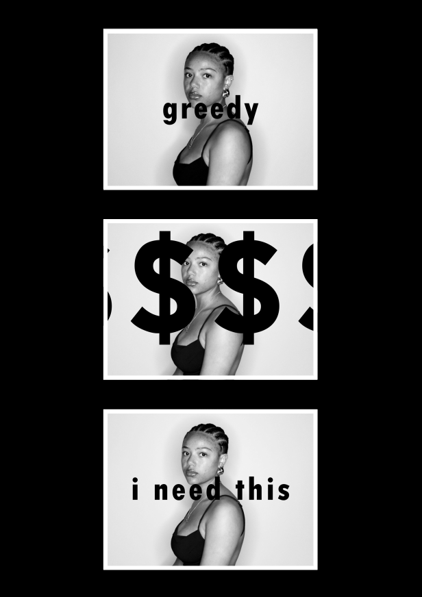
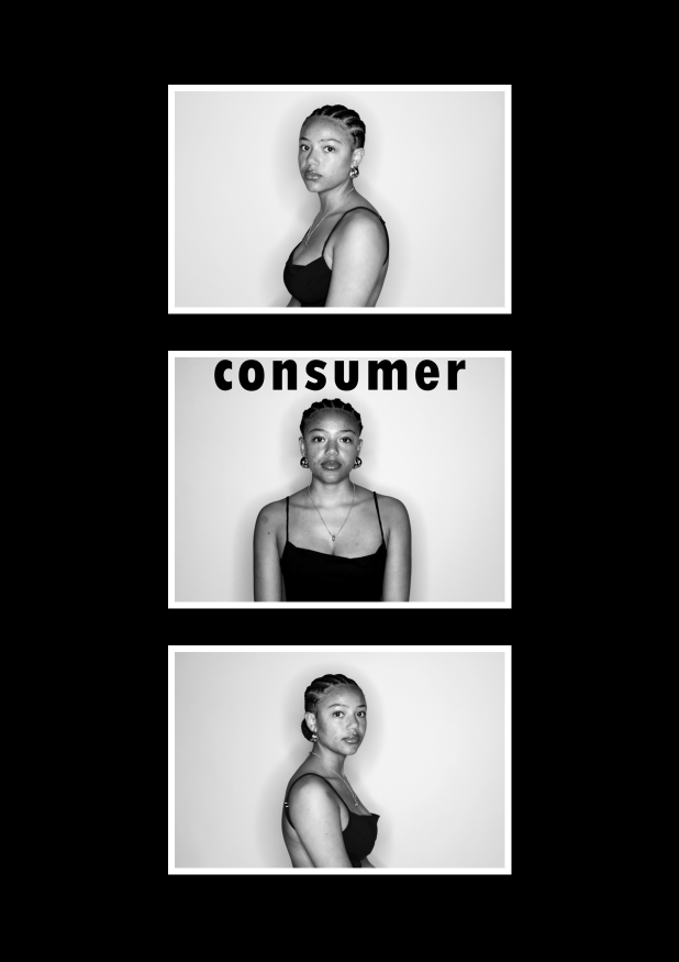
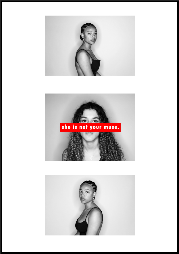
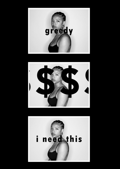
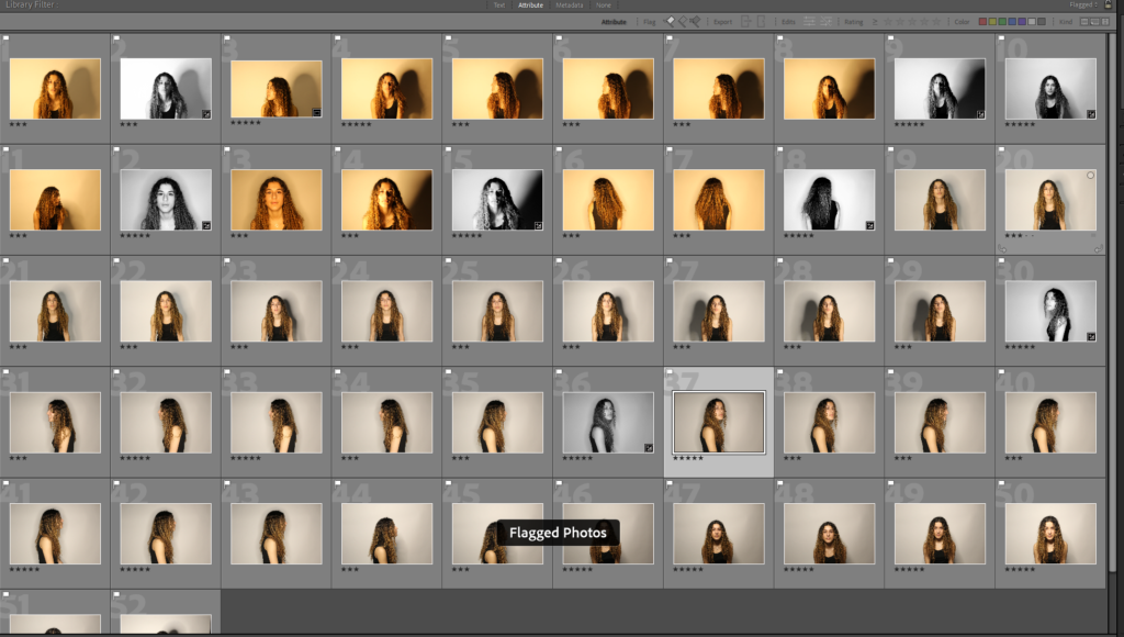
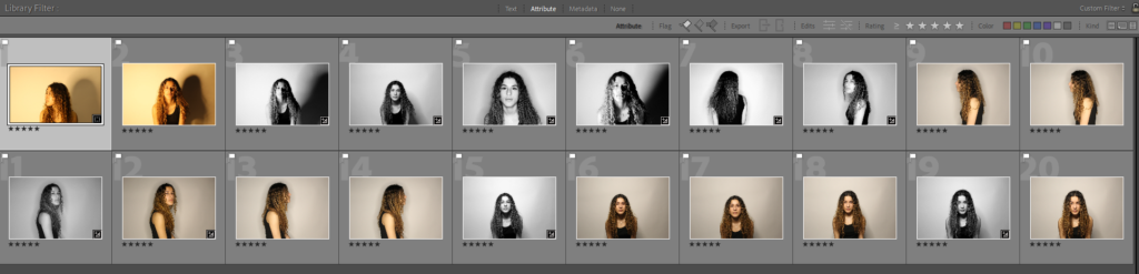
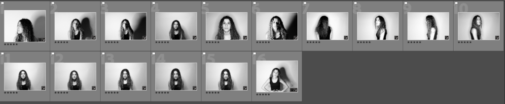
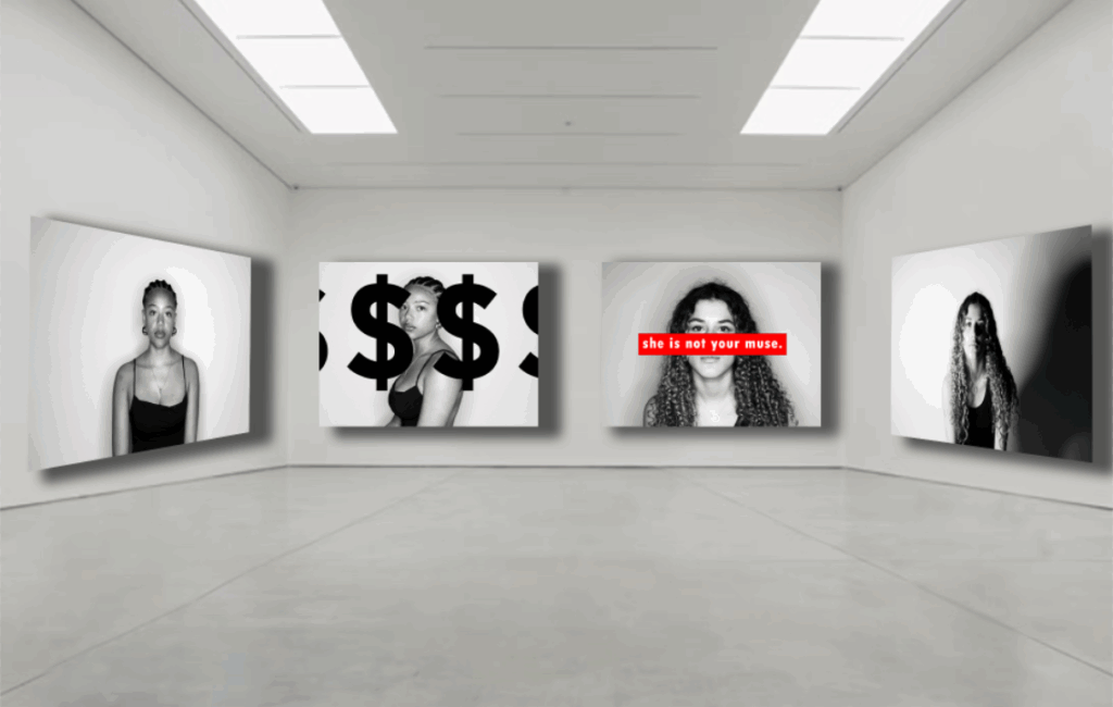
I have made three different galleries for my final images which I have used to display both feminism and consumerism within all three.

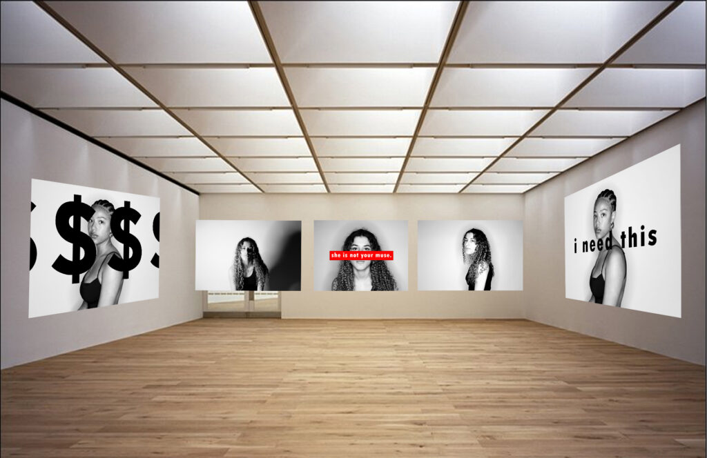
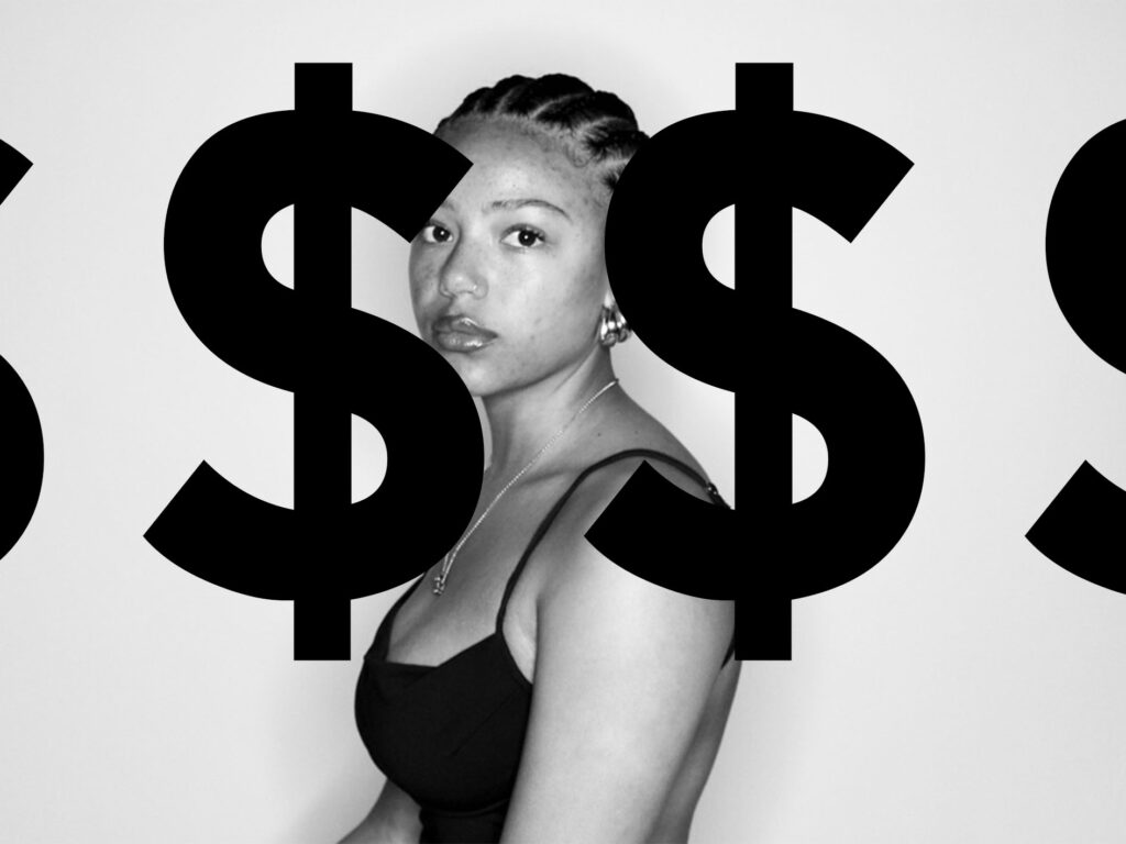
For my first gallery I have used two of my consumerism images and three feminism images. The consumerism images are opposite each other and the feminism images are all laid out across the back wall. I have used a mixture of both to represent both sides of my work in one.

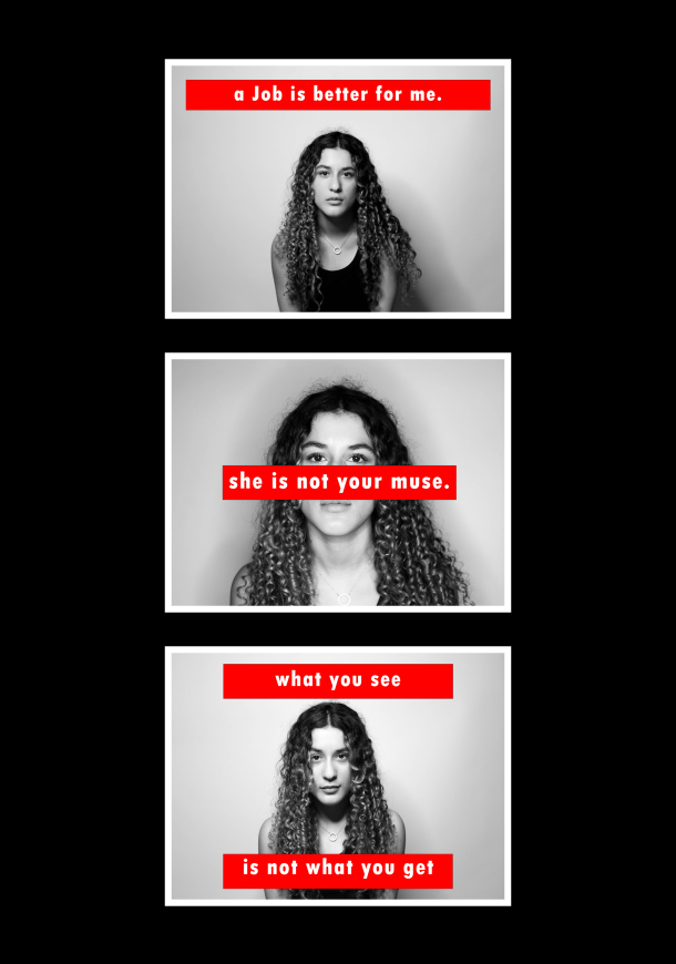
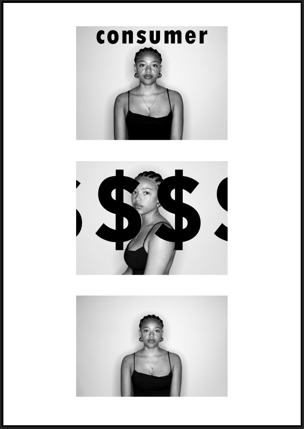
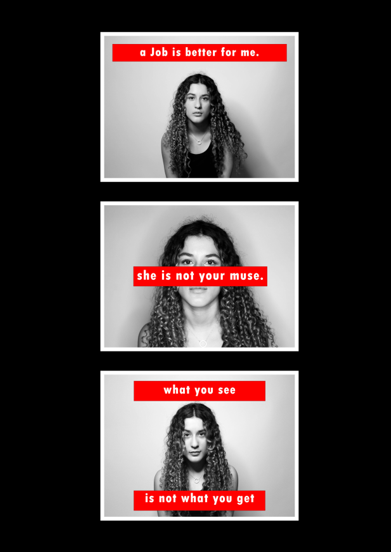
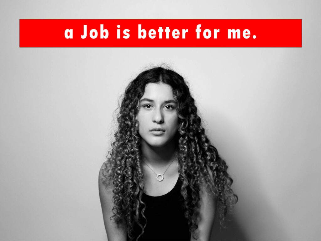
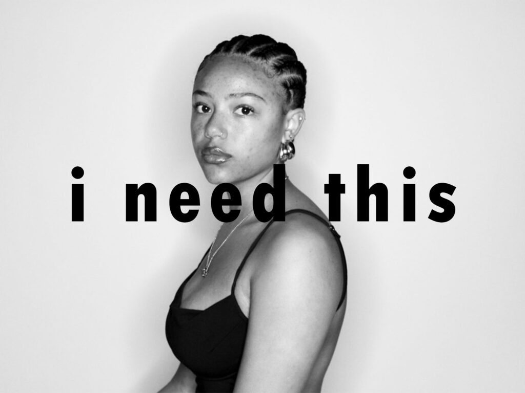
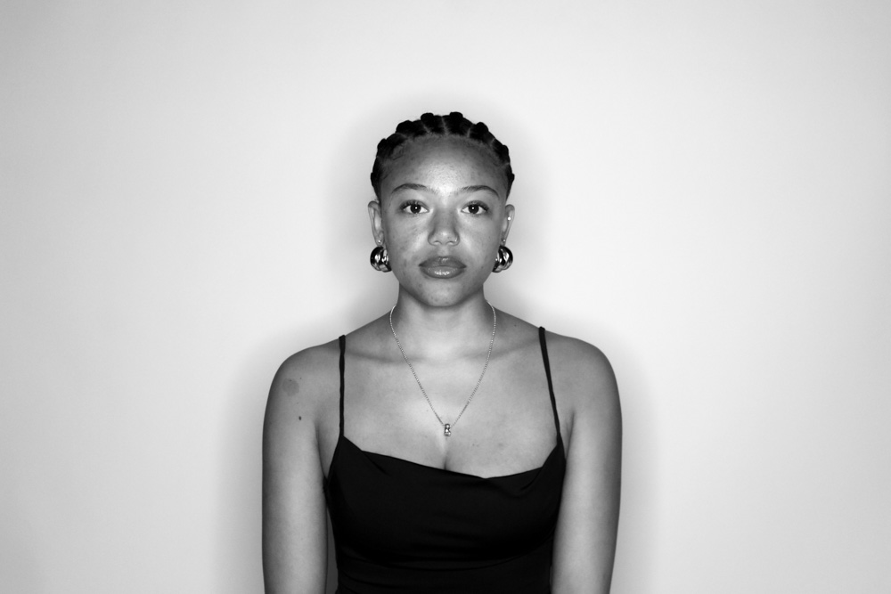
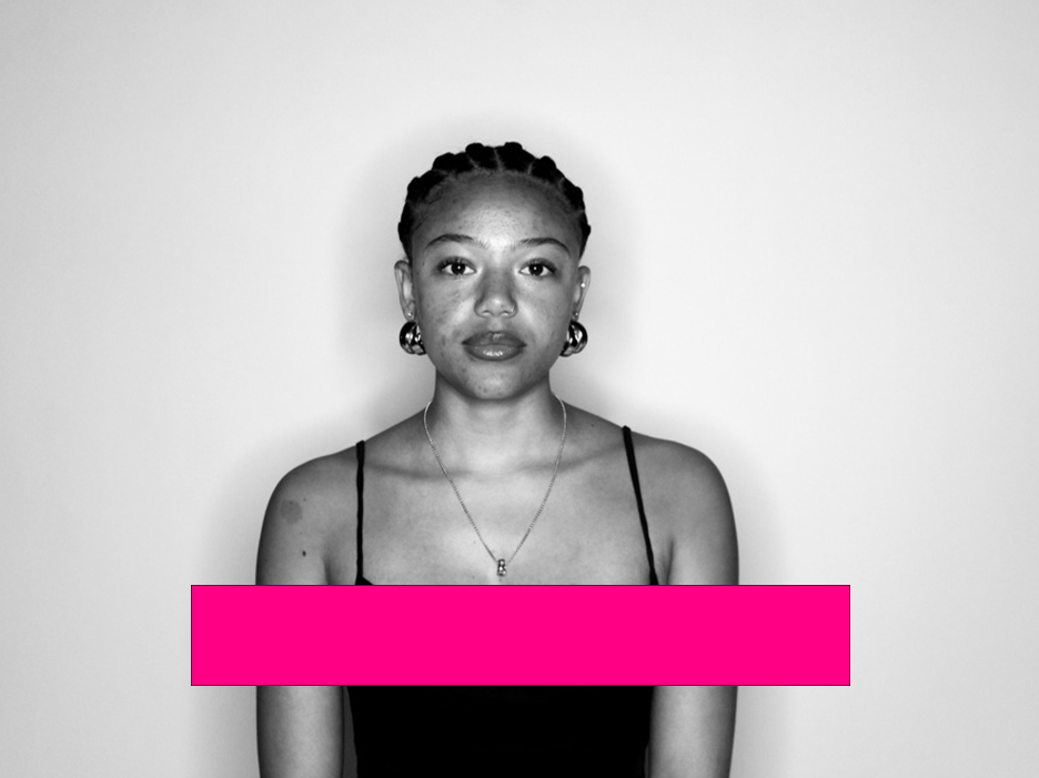
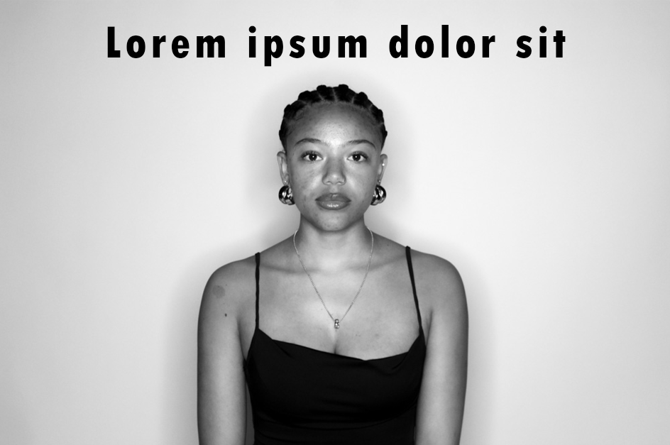
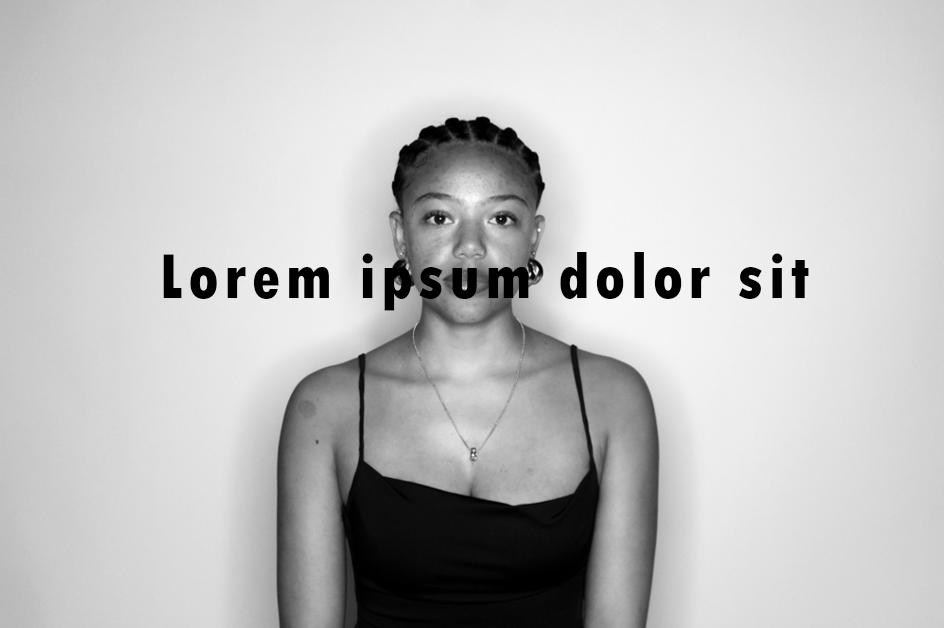
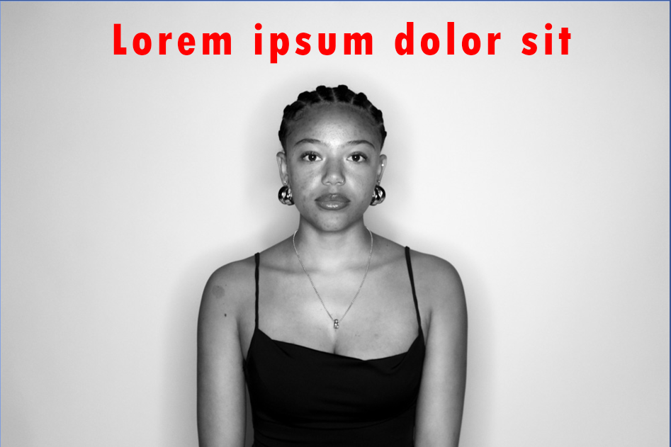
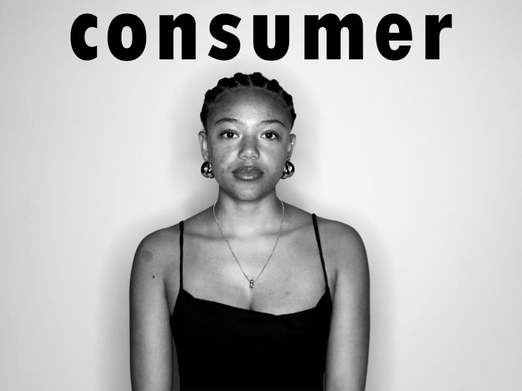
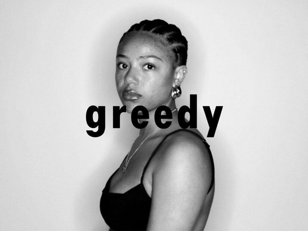
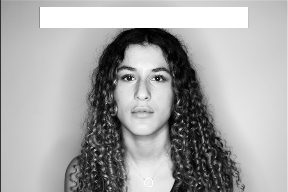
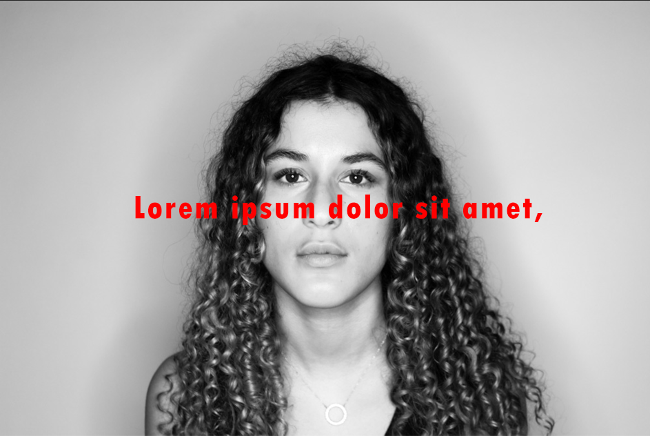
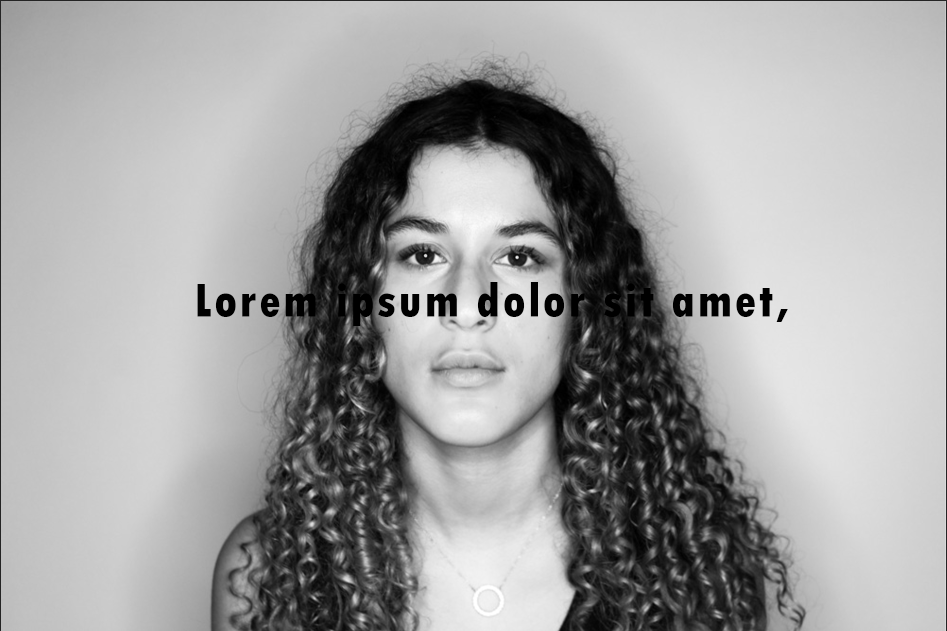
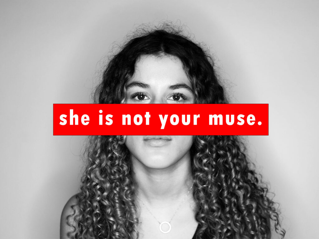
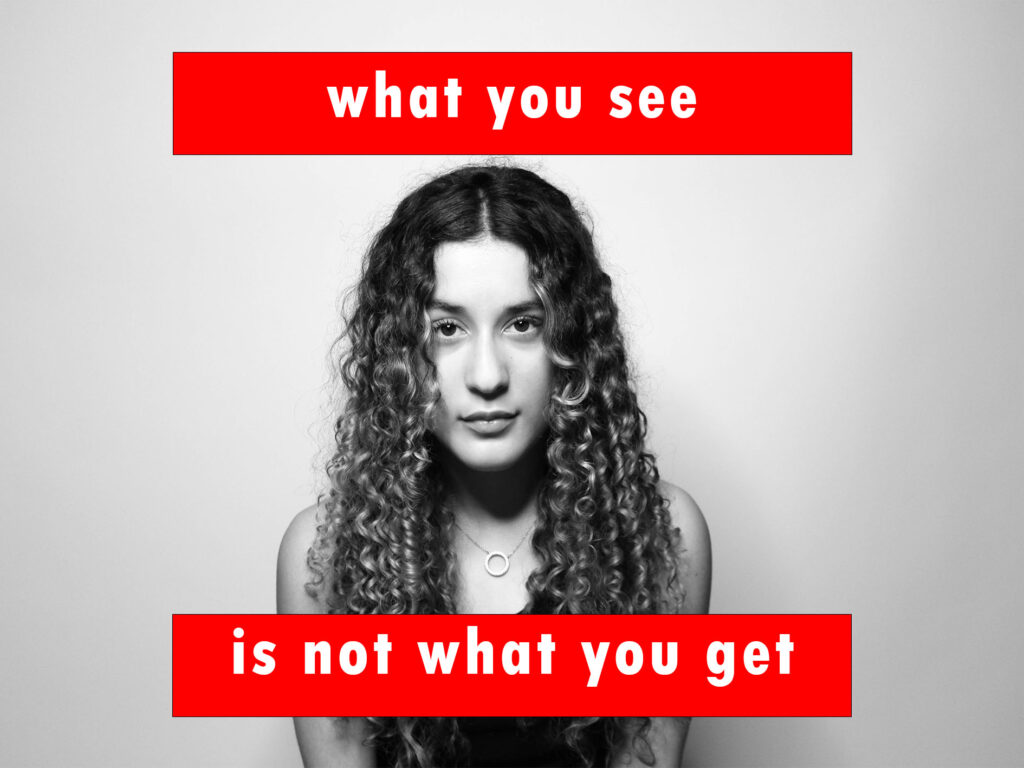
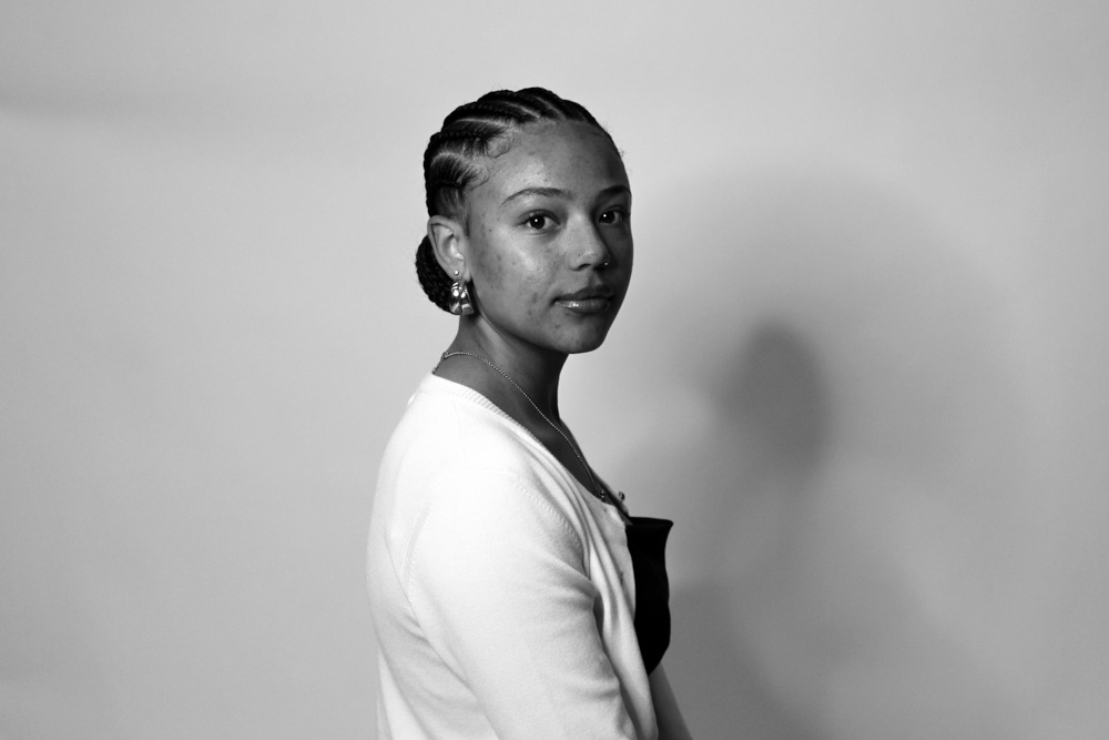
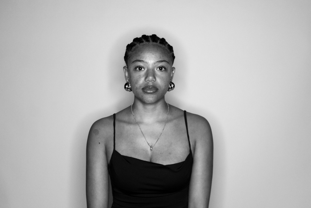
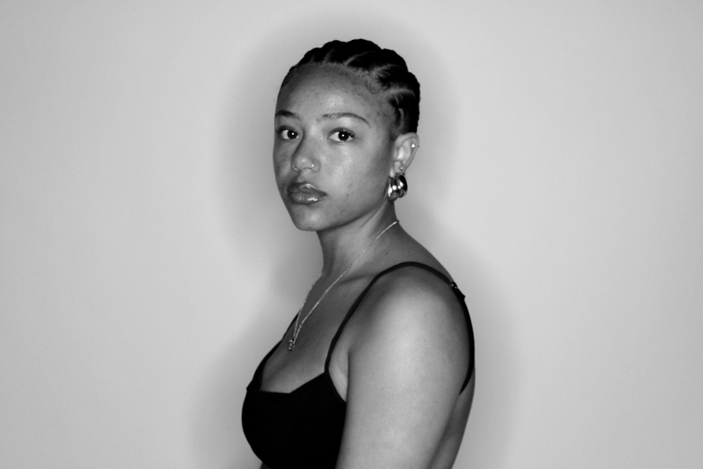
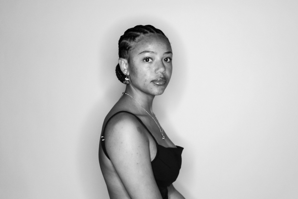
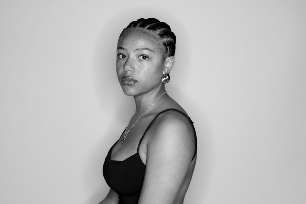
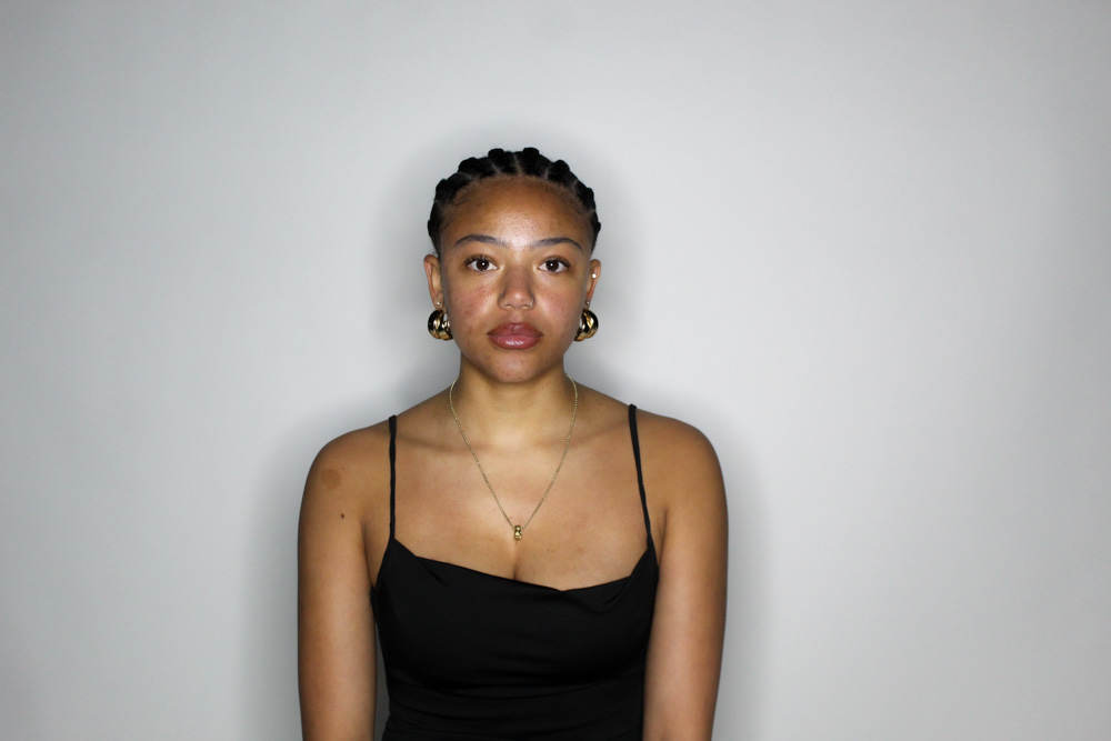
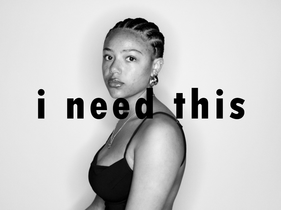
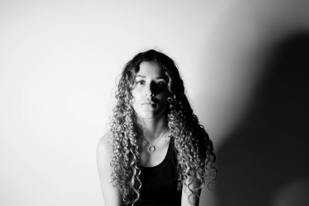
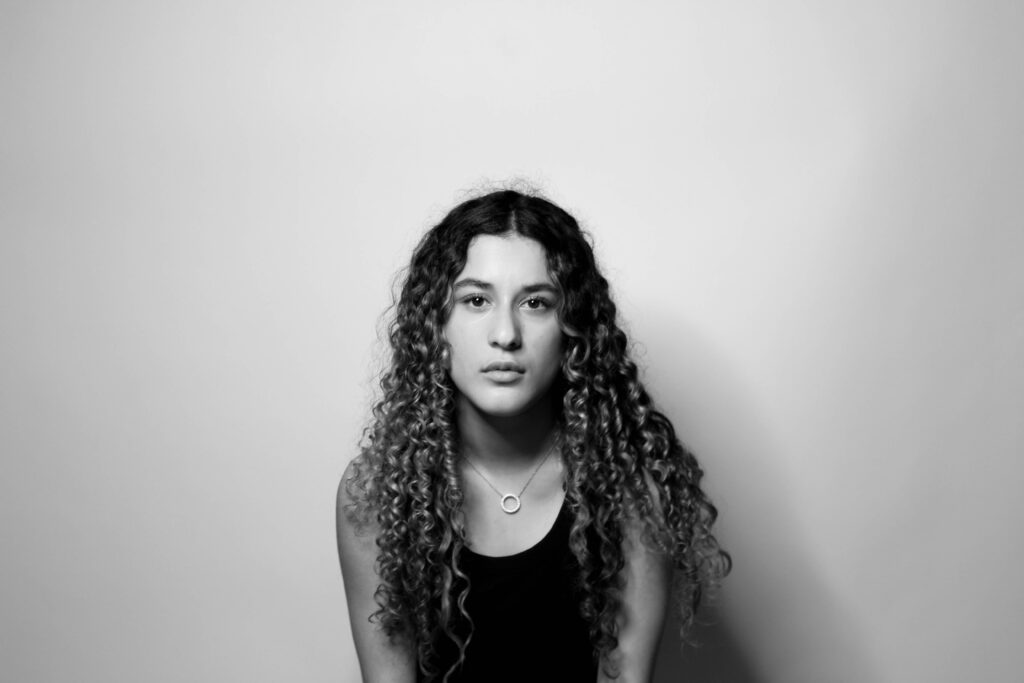
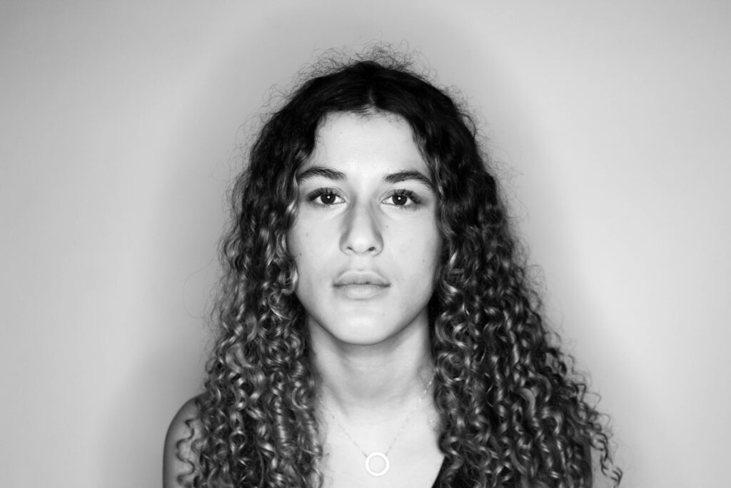
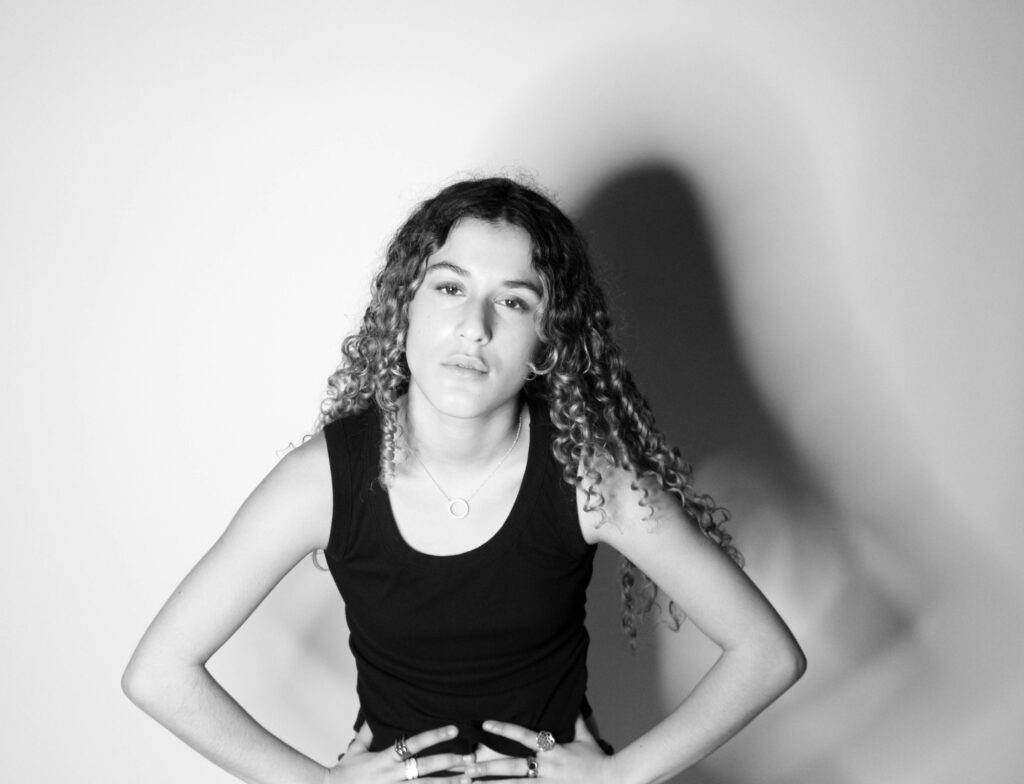
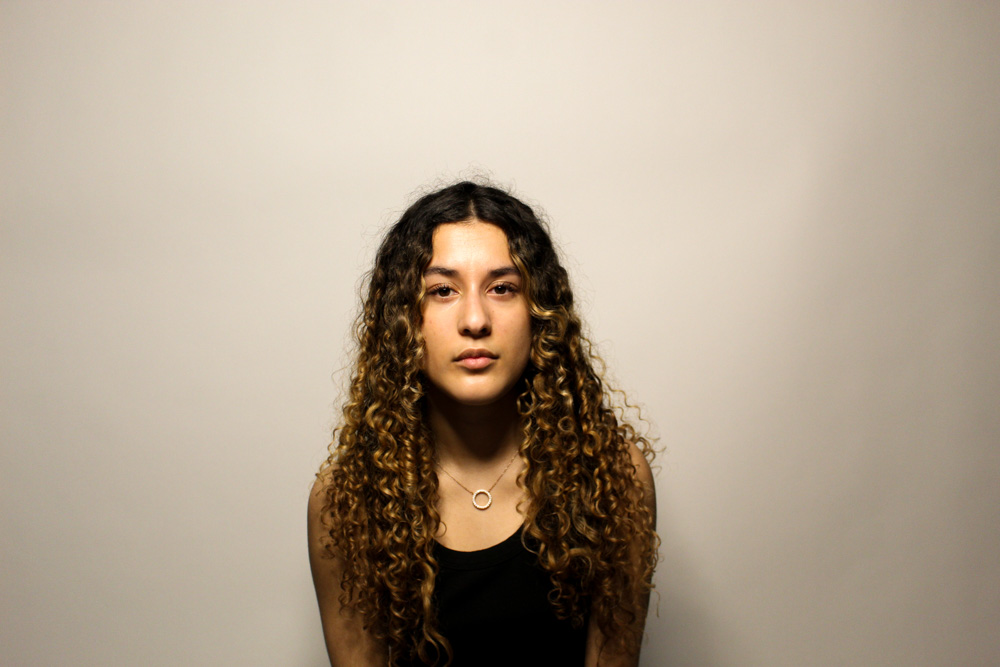
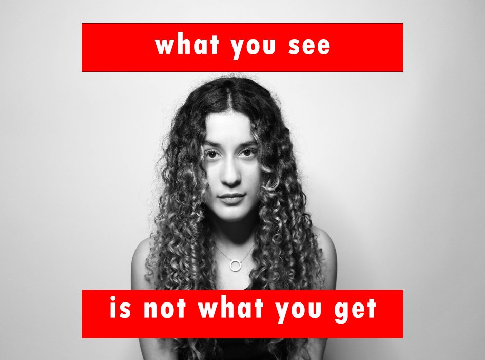
For this gallery I have used my favourite pictures I have created. They are all very simple images but all have their own strong messages. The two images on the outside are pictures which are both straight on from the camera, one with no shadows, the other with a strong shadow. The middle two images are my favourite images that are also straight on, but with text over the top.

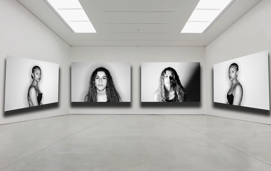
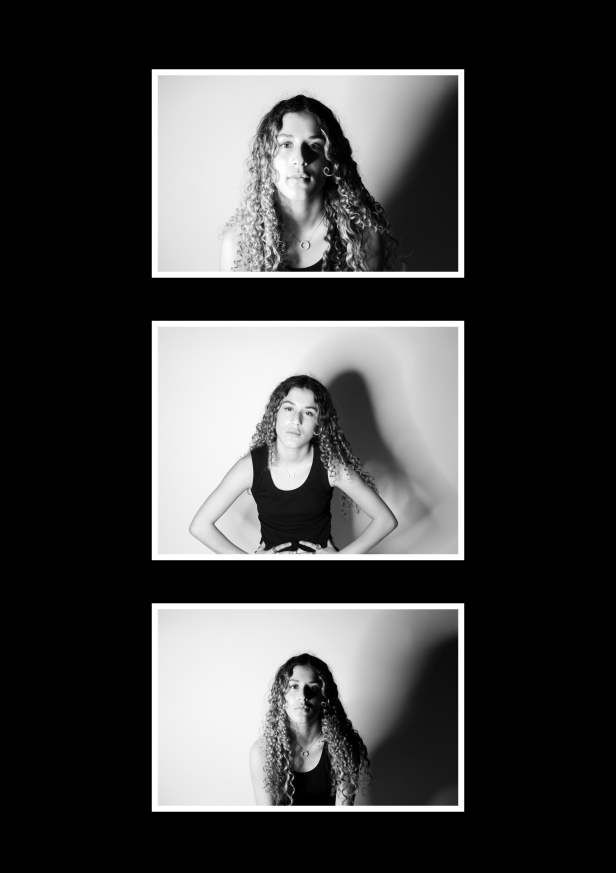
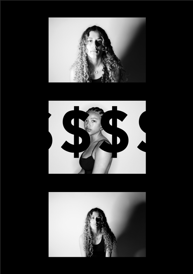
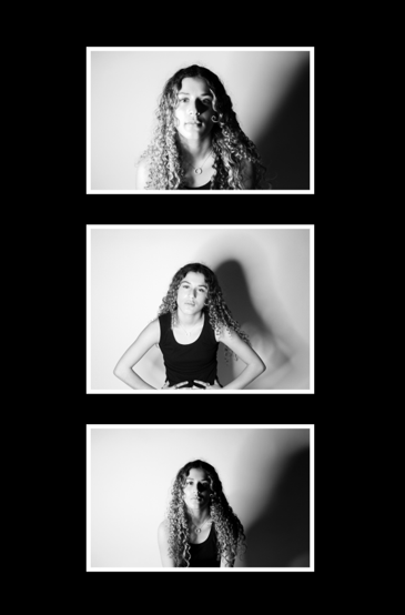
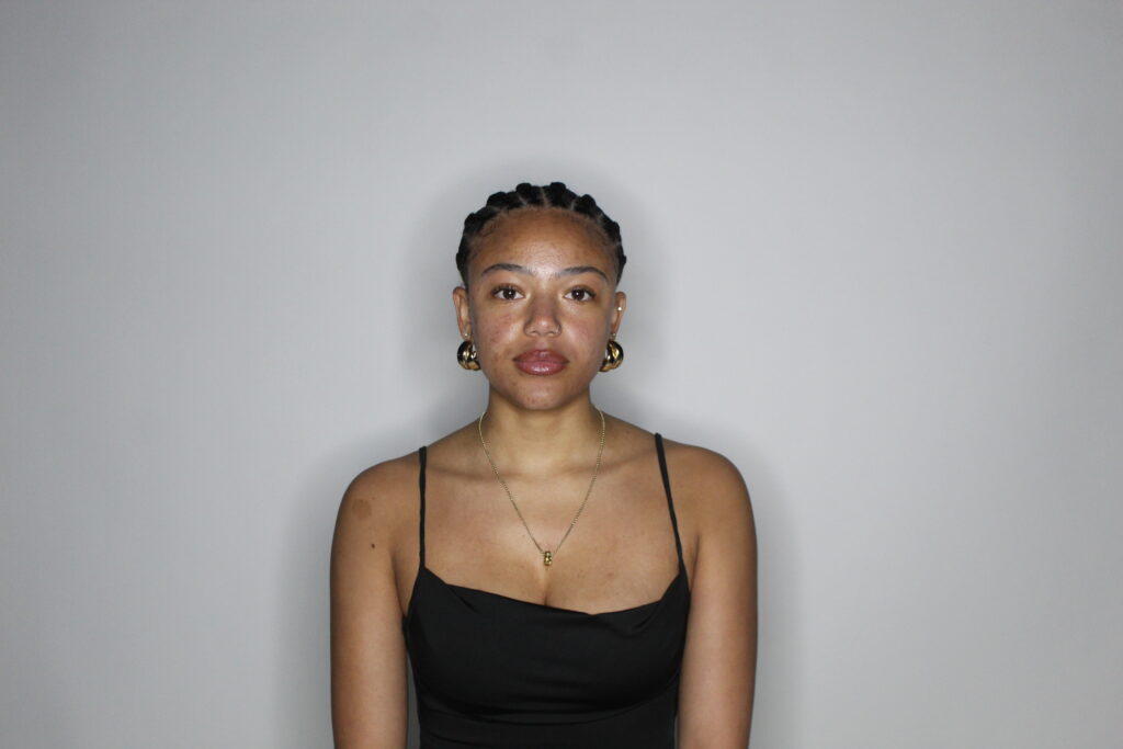
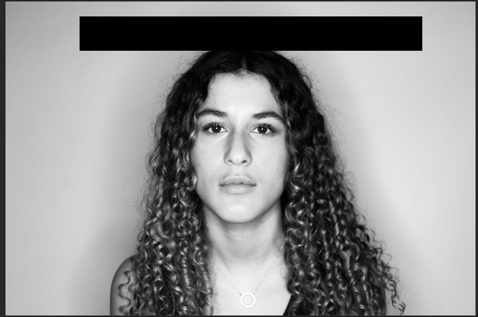
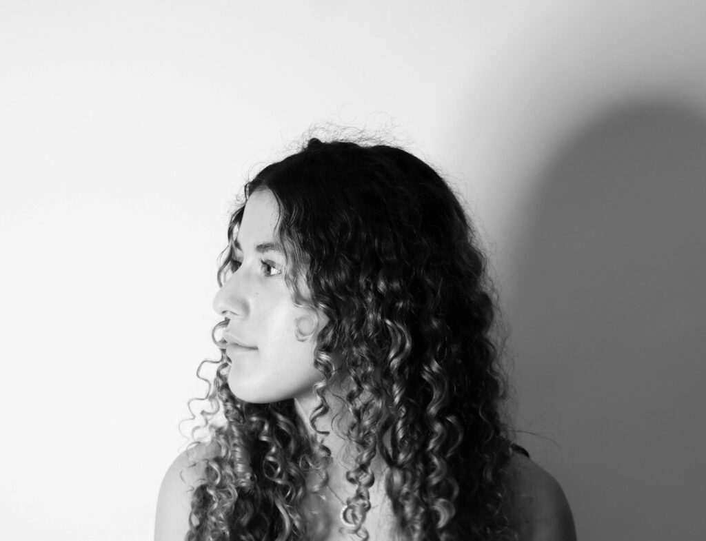
These images are my favourite ones without text they are very simple, yet they strike you at the same time when in the gallery together. The two outer ones have been taken with the model sitting to the left then to the right, it is symmetrical. Then the middle two face shots with the woman staring into the camera, using lighting techniques to create different shadows and views of this woman. This gallery is made to look like these images are used to support the feminist idea of strong women, staring straight into the camera

What went well:

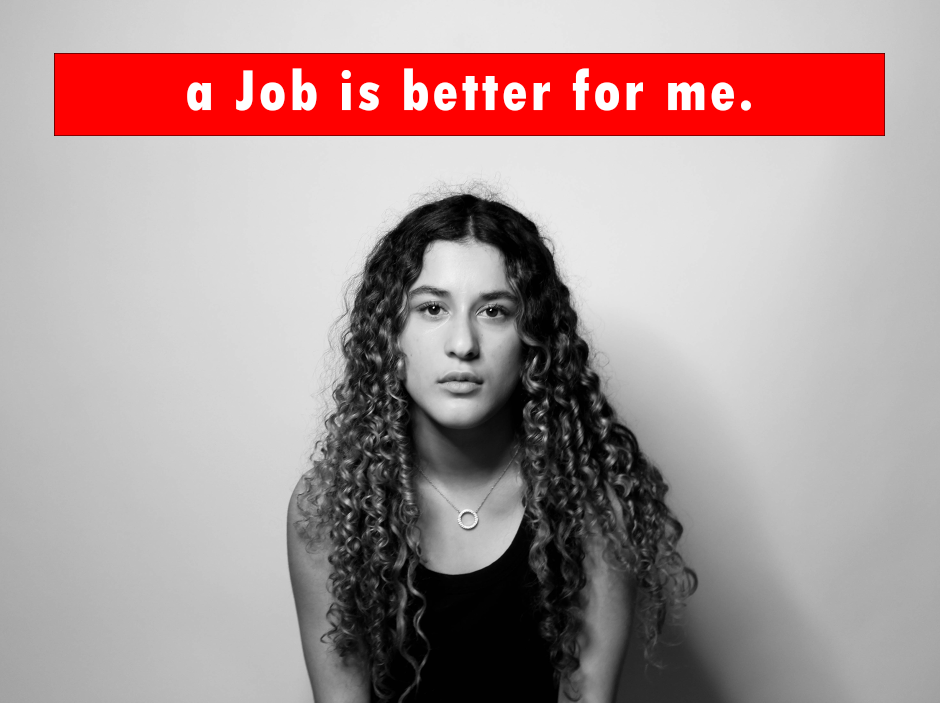
My final outcome was successful and I think it fits the theme of ‘Union’ well. For my project the things I think were most effective things were the actual portrait images, and the lighting I used to do these. I think that the lighting techniques I used played a key part in my final outcome, with the different shadows and images with no shadows at all as it added dimension to my pictures. Another thing I believe went well was the simplicity of my images and how they are presented on my final prints with the simple, yet effective editing with strong statements and slogans, with minimal distractions from them.

What could be better:

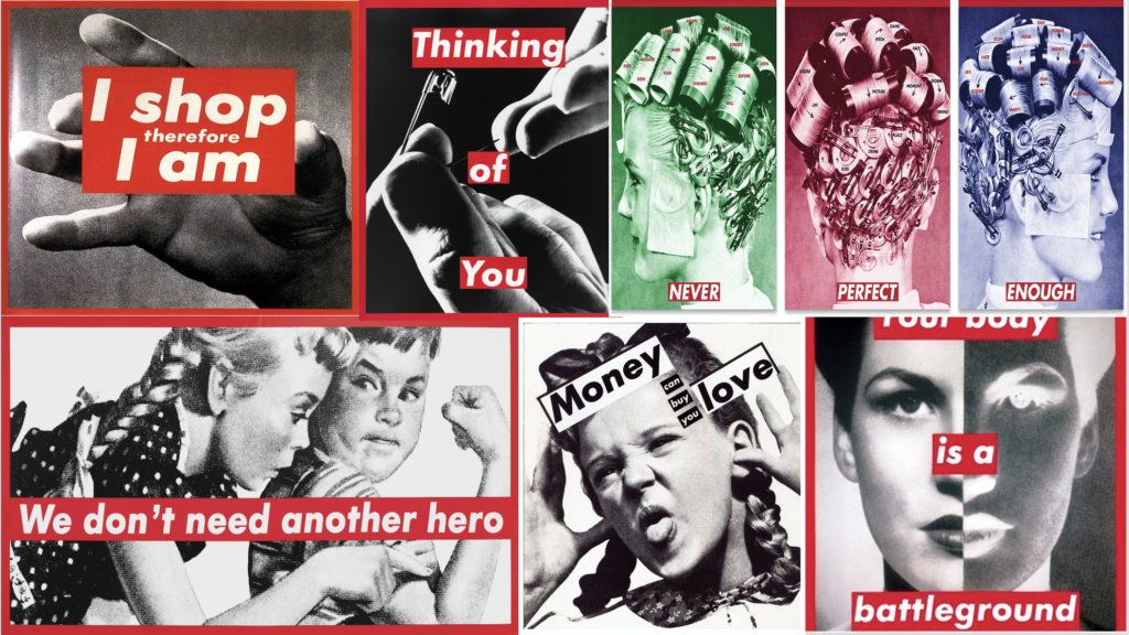
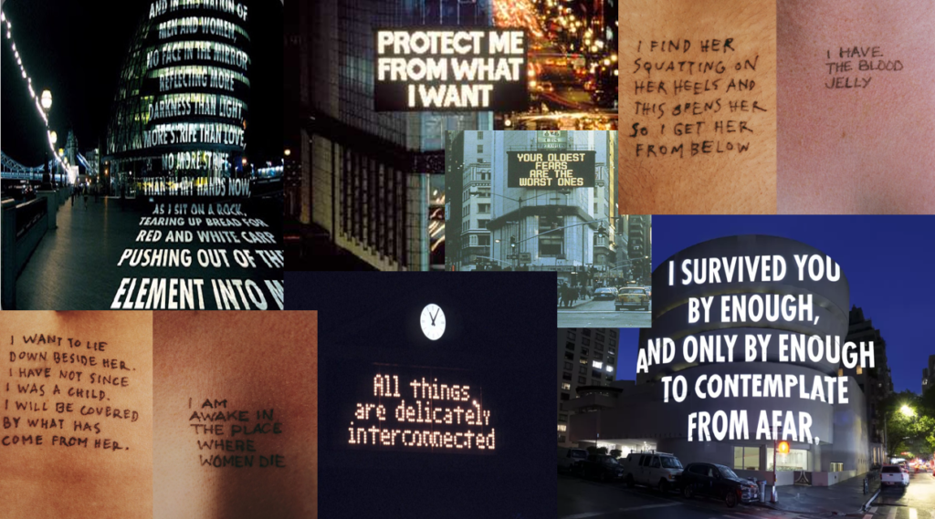
The things I believe I could improve on was my mounting techniques, I could have done a window mount for my final project where it is more complicated and challenging to do, yet it could have potentially been more effective. Another thing I could have done better is maybe stray away from my artist inspiration and been more creative with my own editing techniques for my first photoshoot as they were similar to Barbara Krugers work.

Prints – Final Images, layout & evaluation

My final images and layout conclude of 12 images. These 12 images I have laid out on four different pieces of black window mounts in groups of three and kept the white border of each image. I decided to layout my images like this because I wanted my work to be simple and have a sense of symmetry so you can focus on the text and image instead of a layout where its complicated and grabs your eye rather than the work itself. I used a black window mount instead of white foam board because It contrasts nicely with the black and white image and also the white background of each photo. I kept the white border of the images to split the black wall mount from the picture.

I decided to group these images together as all the images are the same, but with different text on. I also grouped them together because the top and bottom image have writing in the middle of them, this created symmetry within the work and I wanted my work to look simple, clean and bold which the symmetry helps it to achieve this look. The middle image separates the two symmetrical ones with the large, bold dollar signs spreading across the image. All three of these images have phrases, words and symbols defining consumerism, with each having their own meaning of it.

For this group of images I have used symmetry again to make this layout. the top and bottom images I have taken of the model sat facing the left, then the right, with the middle image straight on with the word ‘consumer’ above her. This gives the effect of a mugshot where there are three different angles of her face, like its a crime and wrong for being a consumer/over-consuming.

I chose to group these three images together because they all have the same red bordered writing on them. Each of these images are face shots with the camera directly in front of the model, which is a reason why I put them all together, creating an idea that the words written across the images are being said to the person looking at it because of her eye contact with the camera. The top image is a strong statement which expresses that a job is better for her than a man would ever be. the middle image is stating that a woman is not for men to have or talk about, she is her own person. And the last image is showing that the woman may look one way but when you meet her its not how you thought she would be.

For these three images I have used different lighting techniques to create different kinds of shadows. The first image I have used chiaroscuro lighting technique, then I held the light above the camera and took one straight on creating a shadow behind her, then the last one used Rembrandt to shadow half her face. For the top image I have taken it quite close to her face with strong shadows where you can see the shadow of her nose on her face and the strong shadow behind her. The middle image is meant to show her being tired and looking impatiently into the camera. For the bottom image I have put the light directly to the left of her to shadow half of her. I have done this to create a contrast of being able to see her face clearly in the white then the other half to be in the shadows. I liked this effect because it links back to other meanings behind my different images and text I put over them like ‘what you see is not what you get’ by being able to see her, but not fully.

For my final pieces I have created four different wall mounts and each represents consumerism and feminism, which is my final outcome for the theme of ‘Union’. Overall, I think that my best pieces were my images with text on as I think that was one of the most creative aspect of the project. I liked my use of lighting techniques and being able to create different shadows in the background, and on the faces of the models I used.

Prints – Experimenting

I experimented with different layouts for each of my prints where I tried using white and black backgrounds, I had a combination of images with and without text, then images that only had text and ones without any text. I mixed up the photoshoots and created layouts that had both consumerism images from photoshoot 2 and feminism images from photoshoot 1.

My final outcome ended up with having the consumerism and feminism images being split into four wall mounts each with three images on them. I used black as my background colour as it stood out more than the white and looked better with a white border around each image, which also helped create a modern, clean vibe.

Comparison to Barbara Kruger & Jenny Holzer

This is my mood board of Barbara Kruger’s work which I have taken inspiration from. My comparison to Barbara Kruger is that we both have similarities and differences within our work.

A similarity we both have is that our images are in black and white with red bordered writing over. I have taken this inspiration as it strongly resembles my idea of being angry with the media and society as a whole with the stereotypes of women, and what women ‘should do’. A reason the red border worked for my project as well as Barbara Krugers is that red is a colour that can symbolise different types of emotions, some that can contrast one another for example, love/hate, anger, passion and strength. These are all emotions that I feel go well with my work, and the final theme of Union as there are so many emotions linked with and can be stemmed from the word. Both pieces of work, show the strengths and struggles of being a woman with the statements over the top of them, my slogan states that a job would be more fulfilling and better for her than a man would be, but also shows that getting a job is hard for a woman as well due to the stereotypes of women in a mans field of work. A difference with my work and Barbara Krugers is that she took photos of body parts, like hands, which I did not do as I wanted to have the womans face be my main focus as it can show many different emotions and stories.

This is my mood board of Jenny Holzers work which I also have taken inspiration from, although I have presented my work differently there is a similar message behind the work.

A similarity with my work and Jenny Holzers is that both short slogans can have two meanings behind them, both about consumerism and also relationships. ‘Protect me from what I want’ can be about wanting to buy something, but also about wanting a relationship, which is like my statement ‘I need this’. Both images have large text over, but a difference with the two is that Jenny Holzers is in all capital letters while mine are all lower case, but both have a sense of urgency and need projecting emotions that come with a relationship, and over-consumption, due to the large bold writing. Another difference is that Jenny Holzer specifically used large billboards and projections for her work while mine is over the top of a womans face. A lot of Jenny Holzers work circles feminism but also sexual assault, which is an everyday problem which occurs to women and men all the time. A difference with her work and mine is that Holzers can be viewed from three different perspectives of crime; the victim, observer and the person who has committed the crime, which can be seen in the second image in the gallery where it can be seen from all different perspectives.

Development & Experimenting – Photoshoot 2

I again began with editing my images in Lightroom to become black and white. For these images I made sure that the contrast was high, and the black and white features were prominent within these as I wanted the different shades to be harsh from the background.

After edited on Lightroom, I moved on to photoshop where I add text. I again experimented with borders and non-bordered text, but I chose for non-bordered text as I wanted to differentiate my first photoshoot from my second so that there is an obvious divide between the feminism aspect and the consumerism aspect of my work.

For each imagine I experimented with different text, styles, borders and colours, but I decided I wanted it to be bold, simple but the statement, phrase or symbol to still come across quite aggressively. I have done this by putting the text into black large writing with a bold font but in lower case letters. The lower case letters create a casual style of saying these words but the large, black text makes it seem aggressive.

Development & Experimenting – Photoshoot 1

I firstly edited my images in Lightroom to be in black and white. I did this as I wanted all my images to be black and white.

I then went onto photoshop and experimented with different ways I can present my text onto the images. I tried with and without borders around the text, and then tried different coloured text. I decided that the borders look better as they made it stand out and provided a space for the text to go as it was necessary for it to be in my images.

For my first photoshoot I ended up with a Barbara Kruger inspired work, which I used for my final piece. I came up with feminist quotes and put them into my work. I used red borders around white text to make the message seem angry, aggressive and try to replicate a title for a newspaper/magazine to give my work a sense of urgency.

Photoshoot 2

I took 48 for my second photoshoot and I narrowed it down to editing 10 images.

I have edited these images also very similarly to my first photoshoot where they are all in black and white with strong white and black colouring. I have got one final image in colour which I will use to experiment with using when I am mounting my images.

On photoshop I will be adding text on top of my images. To do this I have separated my photoshoots and created two sections using feminism and consumerism. For photoshoot two I have linked it to consumerism and the thoughts that people would think about someone who is shown to be an over-consumer. The words and symbols I will be using are:

‘Consumer’

‘$$$$’

‘greedy’

Originally I was going to go with the Barbara Kruger style of displaying text, and I tried different colours. I decided that I should separate the people I have used to take images of and use different text to display the ‘Consumers’ and ‘Feminism’ so I decided to use large, plain black lower case letters with no border. I have done this because the large, lower case letters because the largeness of the text symbolises the need to get something but the lower case represents the calmness and casualness of wanting to buy it.

For my writing on top of my images I have used a mixture of phrases, symbols and words. the phrase ‘I need this’ is used to create two different views, one being something she wants to buy which she thinks she needs, the other being a relationship where she feels as though she needs someone, which you can link to a feminism side of consumerism. The next thing I have used to go on top of my image is the dollar symbol repeated ‘$$$$’. I have done this because I feel it created a strong vision of spending money, impulse buying things as there are no words used and just big dollar symbols that are in your face when you see them, which is like impulse buying when you see it, you want it. The final word I have used is ‘greedy’. I have used this word because an outside perspective where someone is not an over-consumer, they can view consumerism and over buying as greedy. I think this is a good word to use as its not a nice thing to call someone yet people will call someone that anyway,

Jenny Holzer used large text on billboard to represent her work but I have used large text over a portrait picture. I have used phrases, words and symbols to represent consumerism and feminism in this photoshoot which could have different meanings for both terms. ‘I need this’ is a phrase I have used on one of my images which can be meant in two different ways, a consumer way in needing to buy something, then also a feminist way where she could be needing a relationship, which is something Jenny Holzer has done before with her work.

Photoshoot 1

For my first photoshoot I took pictures in the studio of my model. These images are portraits of her face.

I took 153 pictures and have flagged 52. I then have rated the pictures from 5 stars, 3 stars and no stars, the ones with 5 stars are the ones that I will edit.

For most of my images I have edited them the exact same way, In black and white with either strong shadows or no shadows at all, I have done this as I want her face to be both prominent in some images, but then the images with shadows I want to hide half of her face. I have used these lighting techniques to create the thought of strength when in the bright light and the shadows. I have increased the white tones to make the backdrop brighter to increase the contrast of her dark hair, her features and the shadows. I decreased the blacks and shadows to increase the darkness of her features. I have edited one image in colour that I may use in my final presentation.

I then went onto photoshop and put text over the top of them.

On photoshop I will be adding text on top of my images. To do this I have separated my photoshoots and created two sections: One to show feminism and strength, while the other is about consumerism. I have used two different people to show these two things, and each has their own quotes and statements to what they are representing. The statements and words I will be using are:

What You See Is Not What You Get.

She is not your muse.

A job is better for me.

My final photoshop edits are inspired by Barbara Kruger. I have used statements that I think link to different aspects of feminism. The first being ‘she is not your muse.’ which creates an image of women being thought of by men as theirs to talk about. I think that the full stop emphasises a vision of strength as the statement is short and blunt so it ends the quote as if it would a conversation. The next statement ‘what you see is not what you get’ is showing that women are not what you expect them to be when you only see them. This means that she may look nice, innocent or weak on the outside but when you meet or get to know her its the opposite. This shows that women can be seen by men and just see a face or body and think one thing, but when actually meeting or speaking to the women its the opposite. The next statement ‘a job is better for me’ means that a job is more fulfilling for her than a man or his money would be. I have used this statement because its about being independent an not relying or benefitting from a man and his money.

Barbara Kruger edited her images in black and white, like I have also with white text bordered red. She used phrases which have a strong, powerful feminist meaning behind them which I have also done

Photoshoot plan

For my photoshoots I will be taking photos of women’s faces. I will be taking inspiration from Barbara Kruger who took portraits and body shots of women and put bold red slogans on top of them images to show that women’s rights in politics are not respected, and the bold red writing represents the anger and consumerism where it looks like the title of a magazine. I will also be using my artist reference of Jenny Holzer who used projections and text in her work to also provide insight on consumerism and feminist activity, where it challenges the roles of traditional women in society and how males can control women.

For my final images I want to have women looking a mixture pf casually and angry at the camera with text over the top of some of my pictures to show the two different types of people I’m representing within my book. I want my final outcome to show the struggles and anger of feminism and consumerism and being a women in our modern generation with social expectations.

For my first photoshoot I will be taking portraits of women’s faces in the studio with the plain backdrop behind the model so that there are no details in the background of the images. I will be taking pictures with all the lighting techniques that I have learnt like butterfly, Rembrandt, chiaroscuro and just the average portraits with the camera straight in front of the model. I will do photoshoots each with a different model to show my two ideas of feminism and consumerism within the theme of union.

I will edit my images to be in black and white as I want to make the pictures all the same for both photoshoot. I want my images to be in black and white and some will either be in large bordered writing or large black writing over the images. For the bordered writing I will be using a red border for the feminism aspect of my project. This is because red is a colour that shows anger, strength and passion, its boldness shows that it wants to be seen and heard by the audience, then contrast the bold red writing with the black and white background shows that its not about the image its about the text on top of it.

Statement of intent

For my project of the theme ‘Union’ I will be exploring femininity and consumerism and from that the power, identity and stereotypes that come from it. I will be exploring this as I think that femininity is strongly linked to the theme of Union as women have been sticking together and fighting for rights all throughout time. I want to explore this because I like the work that has stemmed from feminism and consumerism and the story behind it then linking the two together where the consumerism links to feminism and the feminism links to consumerism. I am exploring feminism as the work is powerful and with that has created a ‘Union’ with women all around the world.

This matters to me because as a woman and seeing different things that go on in the world with women in places like The Middle East where women cant wear what they want, cant work or go to school and America where abortions have been banned by men in charge and male roles in politics who are controlling what women can and cant do. Women should be allowed to do the bare minimum without being controlled. Anti-feminism is a large problem in the world since the start of time, where men have control over women and their bodies. I am also basing my work off consumerism and the intent to buy things, as it is also linked to a stereotype of being a woman and wanting to spend money, buy and have a lot of things. I am doing this because I want to present final images with words that can mean buying things and over-consuming but also link it back to the feminism side and use words like ‘Greed’ which can link to both consumerism and feminism. I want to make my work to circle consumerism, and the male view on women and use quotes and words from what I feel empowers femininity and layer them on top of my pictures I take of women’s faces.

I wish to develop my project by creating images where I take pictures of women’s faces, and putting text over the image with strong statements and quotes from feminist articles or words that I would use to associate feminism and consumerism. I will do this by taking pictures of different girls and present them in two different ways of consumerism and feminism. I will then have my final outcome being a mounted pieces of the two (consumerism and feminism) and created different mounts with my final images.

I intend to begin my study by researching ideas from Barbara Kruger and Jenny Holzer and follow their ideas of what they represent and created when they made their work of feminism and consumerism. I want to have strong quotes, statements and symbols to put over the top of my images that I think link to my idea feminism and consumerism, then take inspiration from my two artists I studied and create slogans from that. I then need to take photos of women’s faces and combine the images and text together to create my final piece.