All posts by Jess Jones

Filters

Author:
Category:

Virtual Gallery & Evaluation

– How successful was your final outcomes?
– Did you realise your intentions?
– What references did you make to artists references – comment on technical, visual, contextual, conceptual?
– Is there anything you would do differently/ change etc?

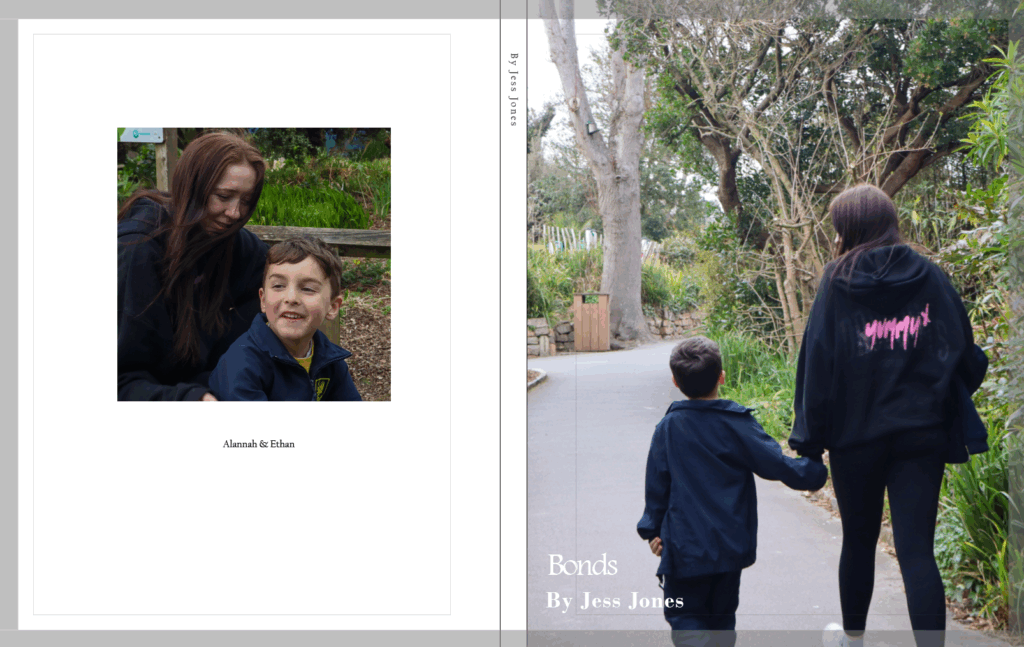
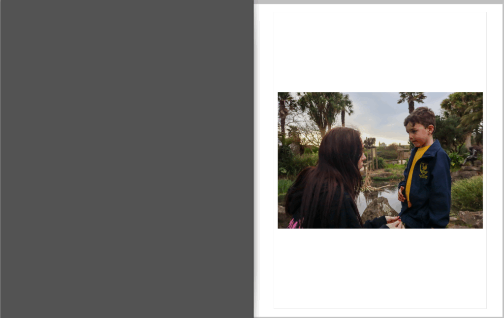
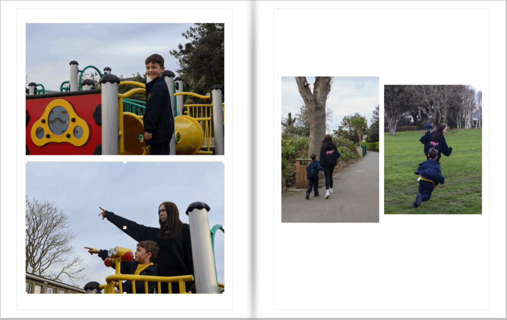
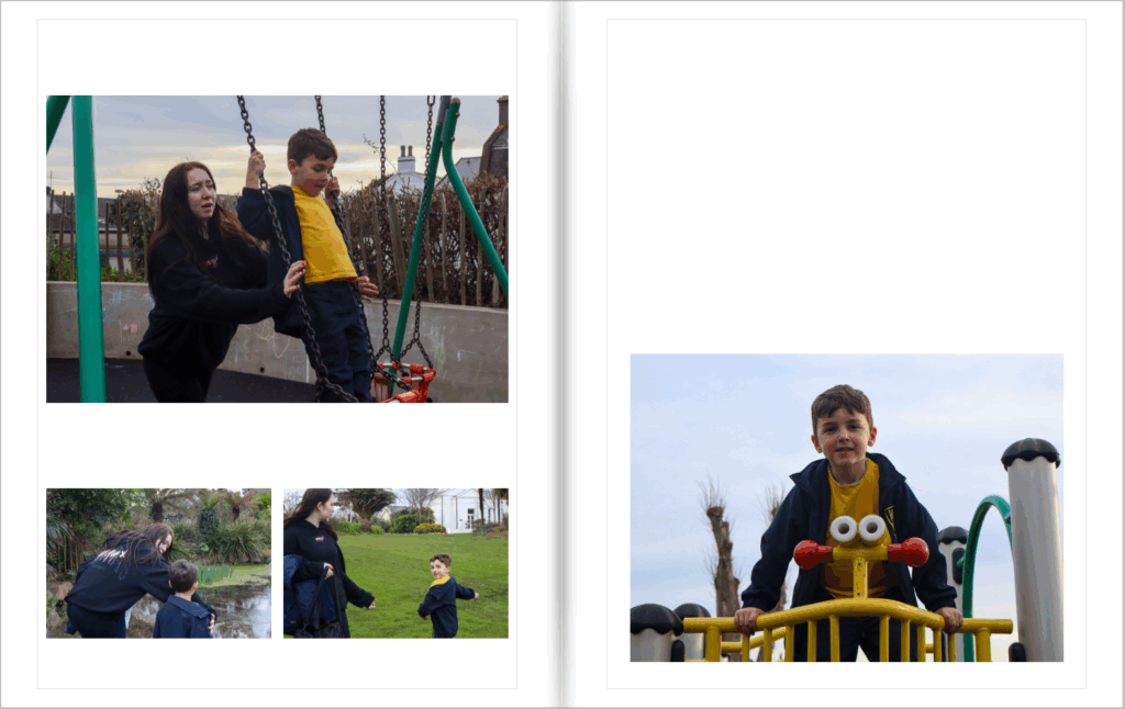
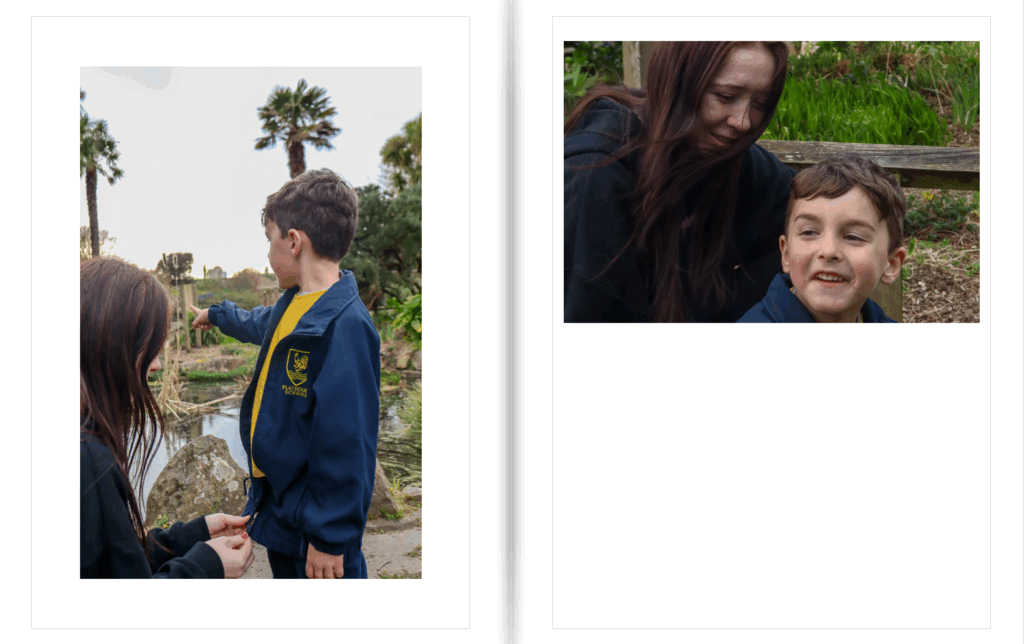
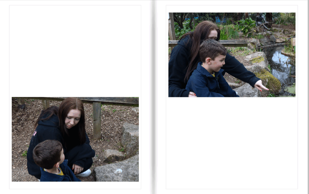
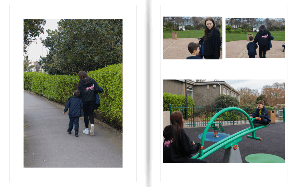
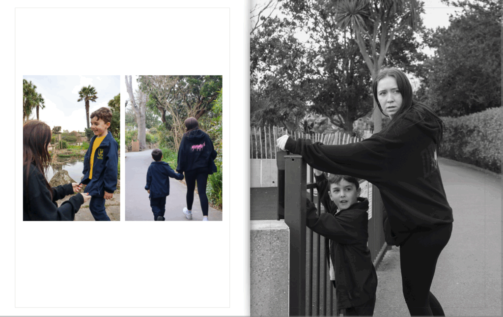
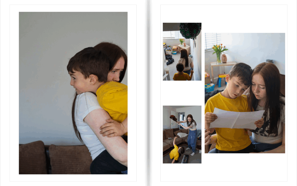
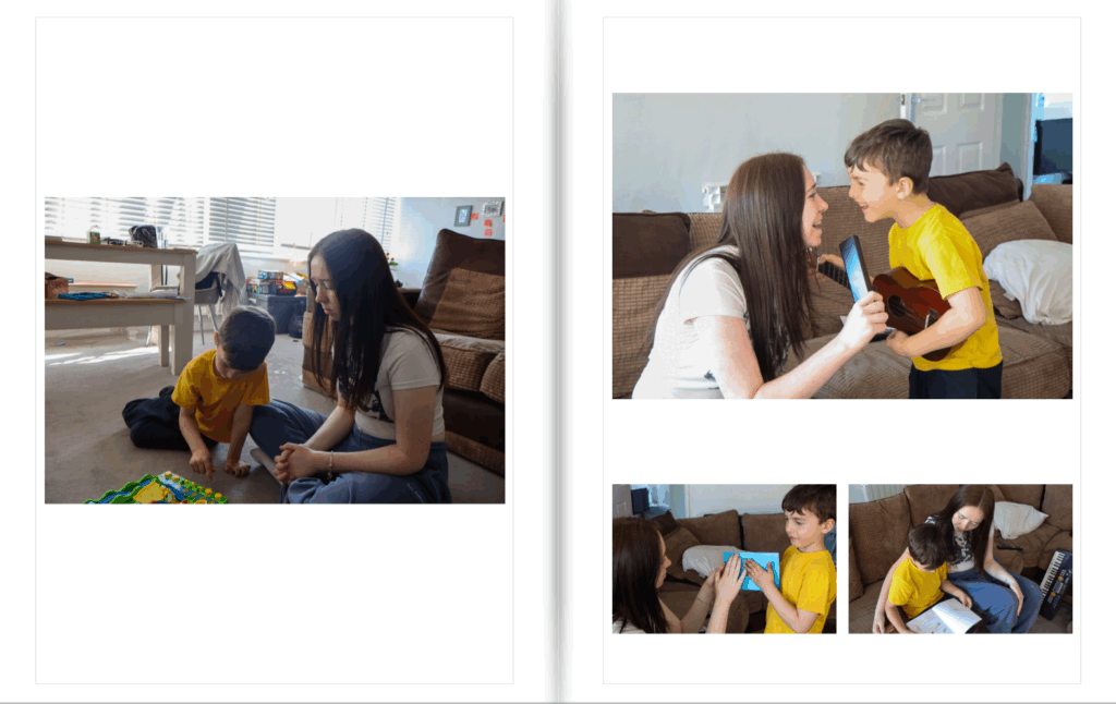
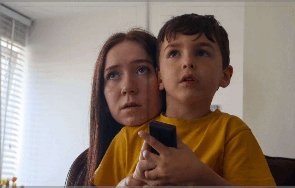
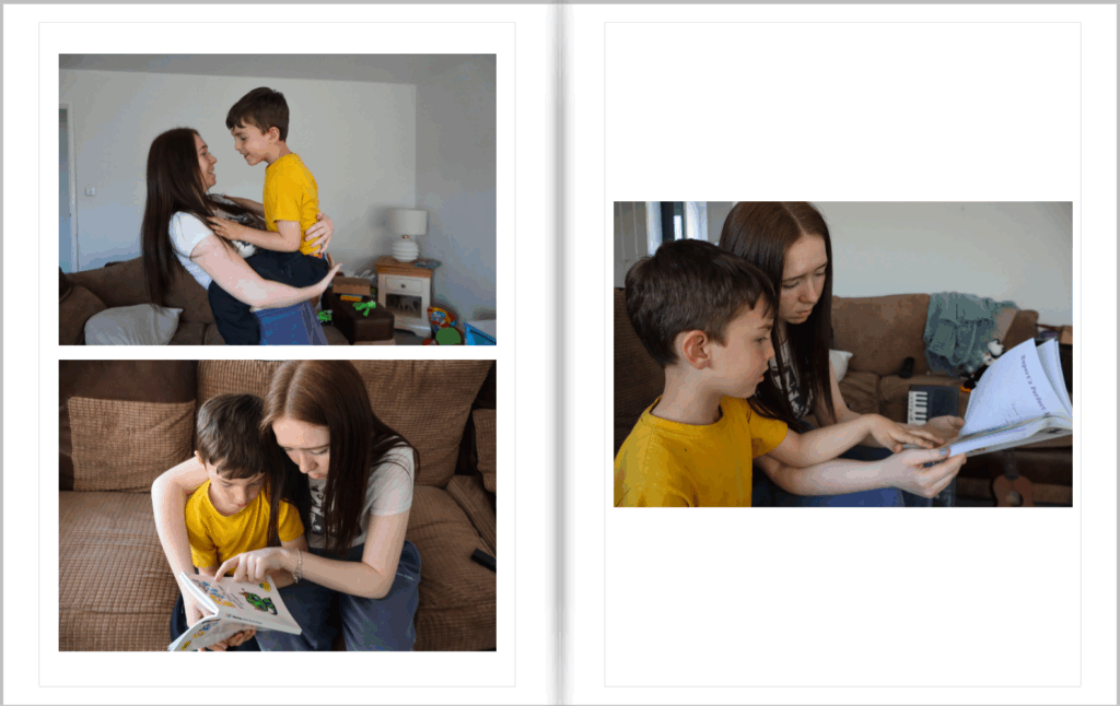
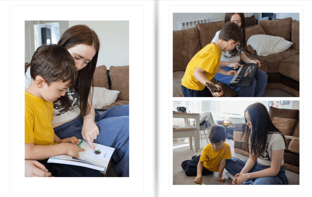
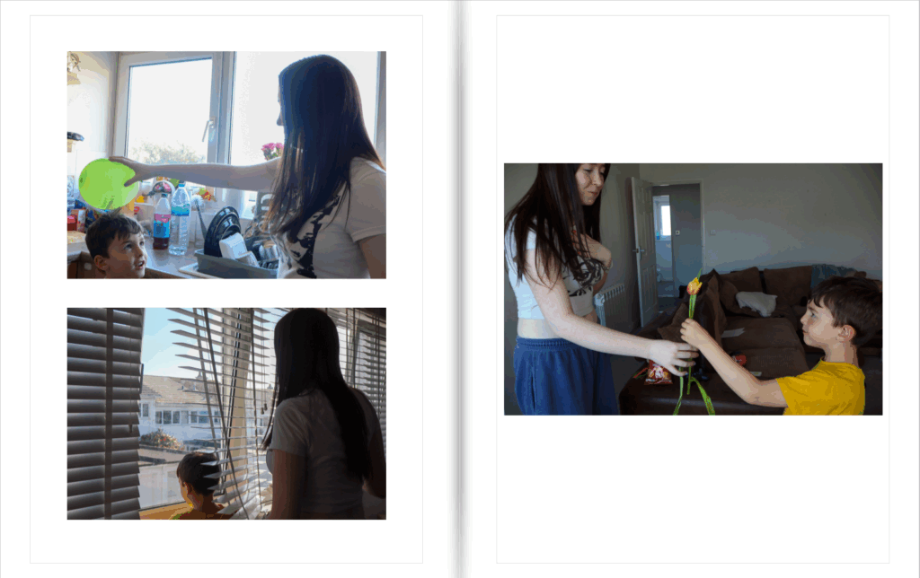
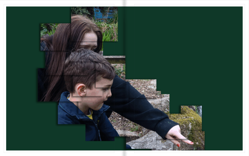
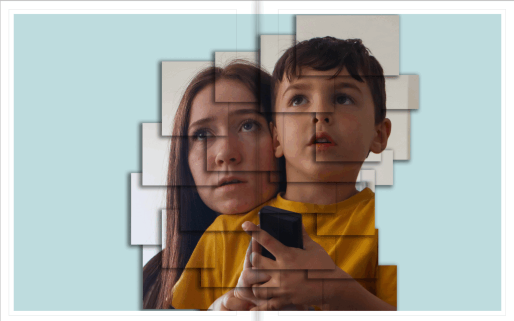
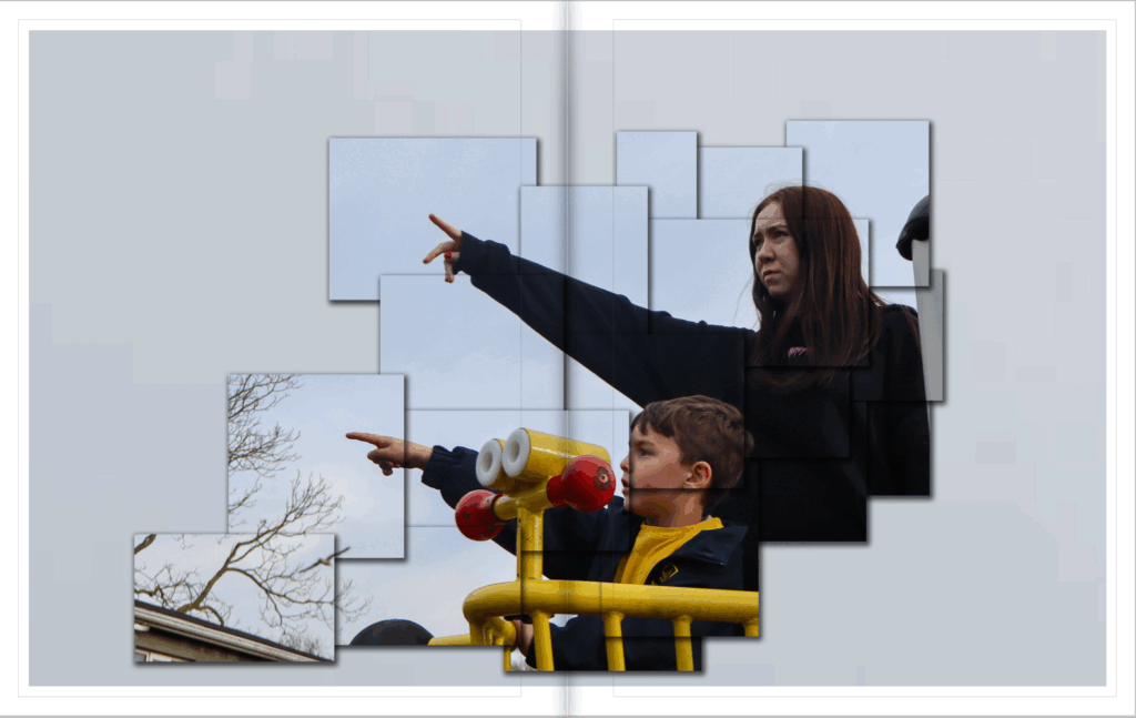
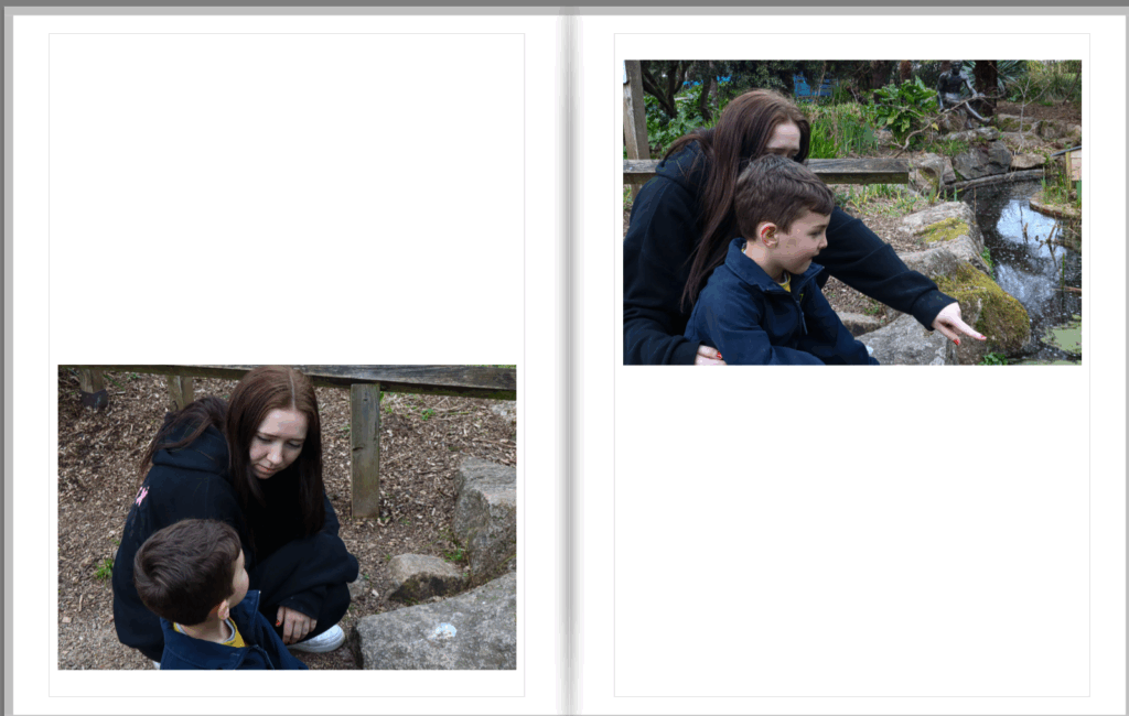
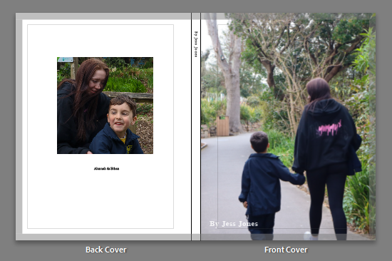
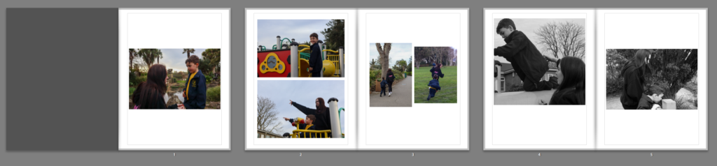
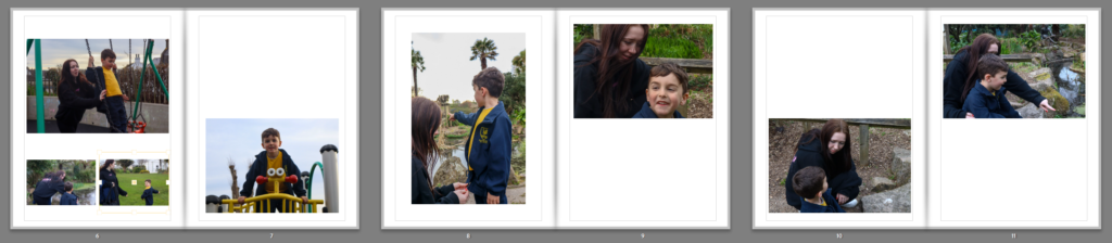
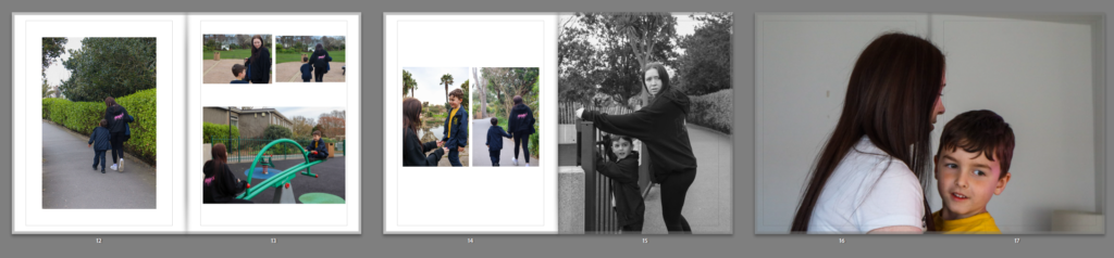
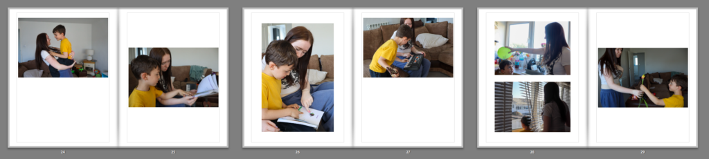
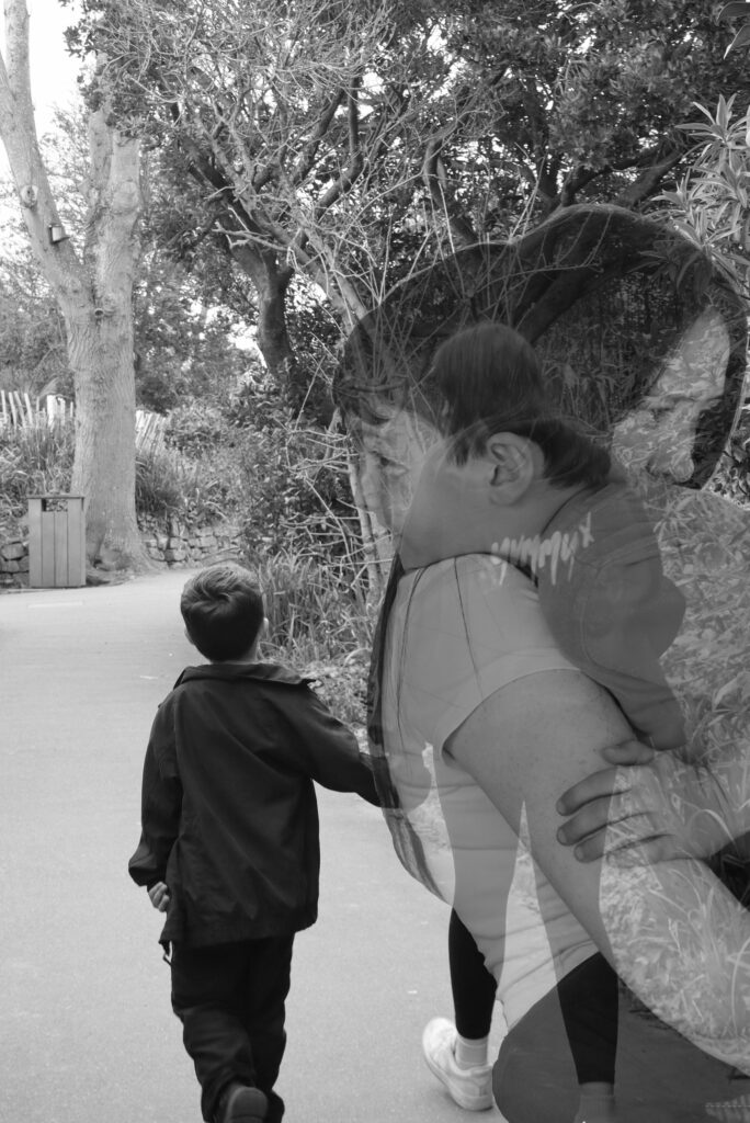
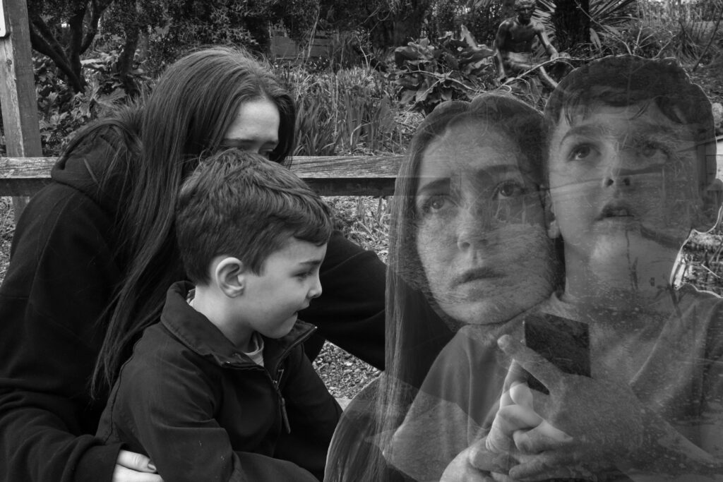
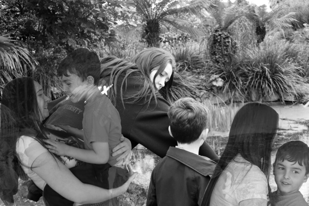
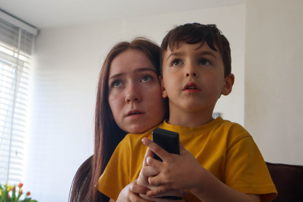
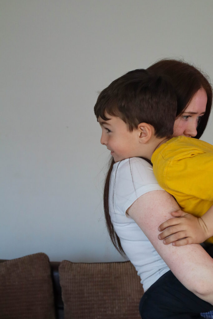
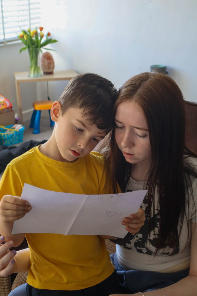
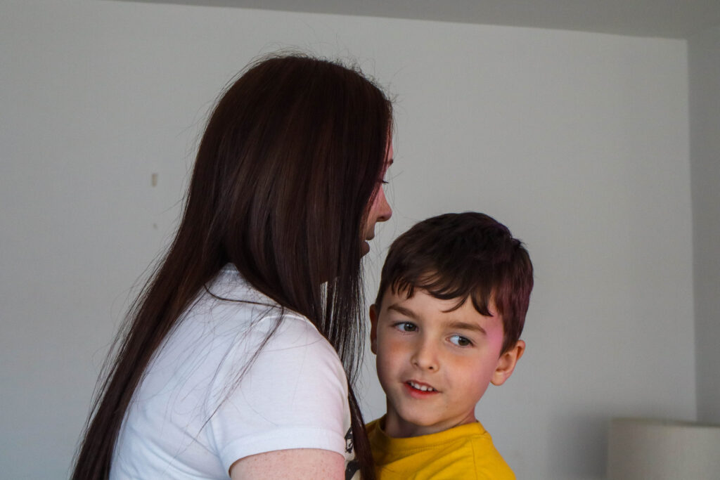
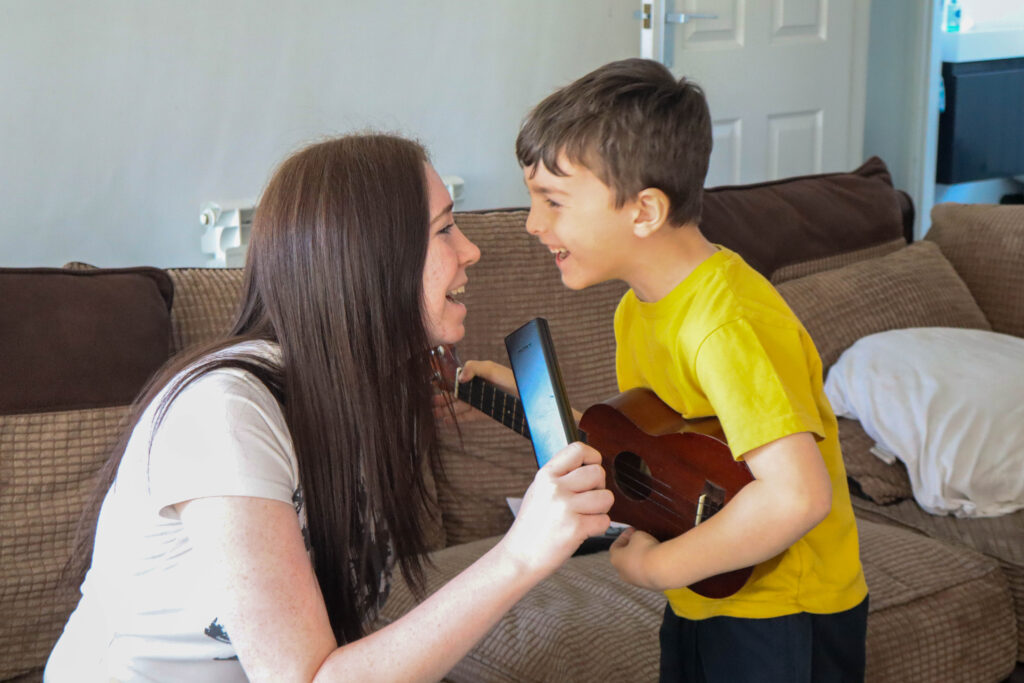
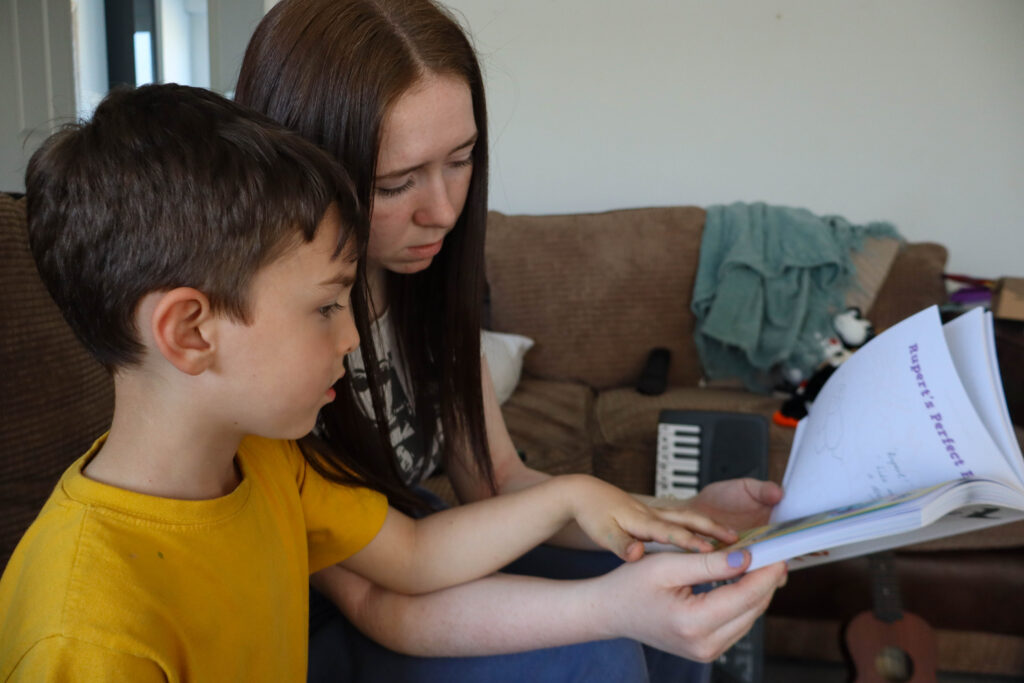
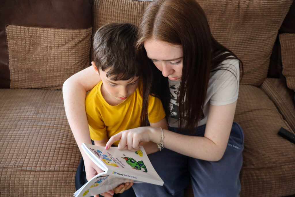
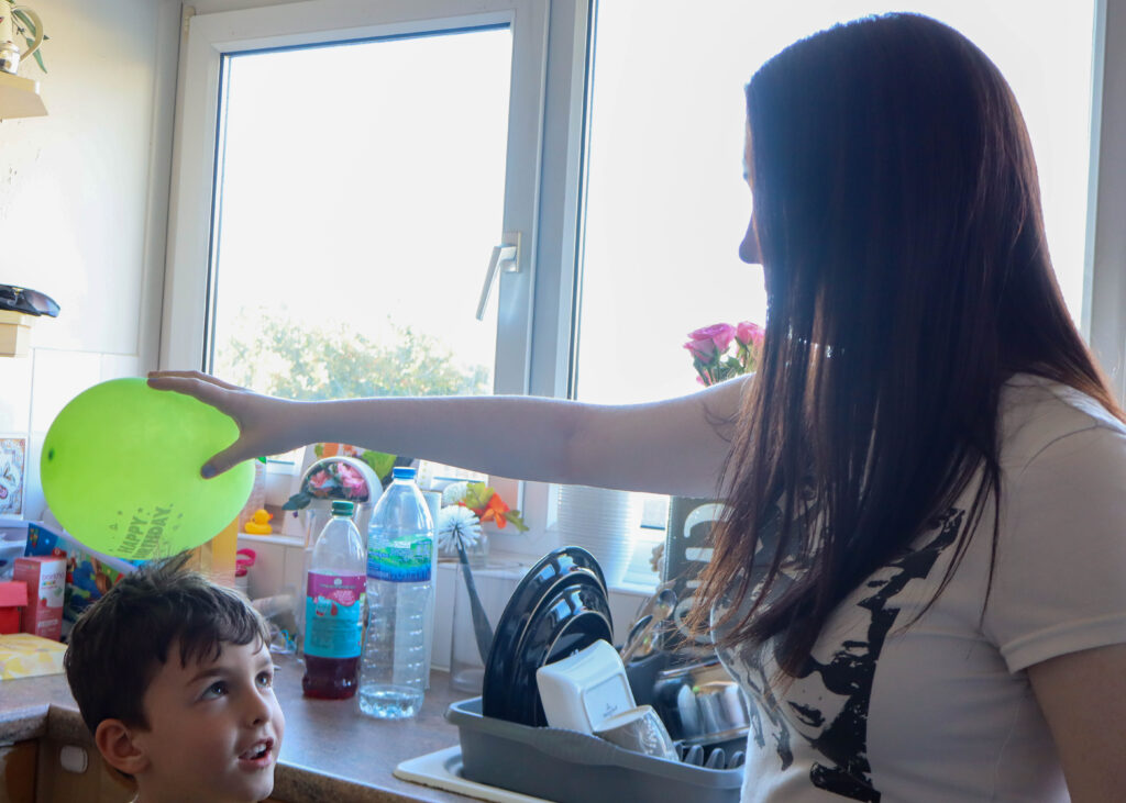
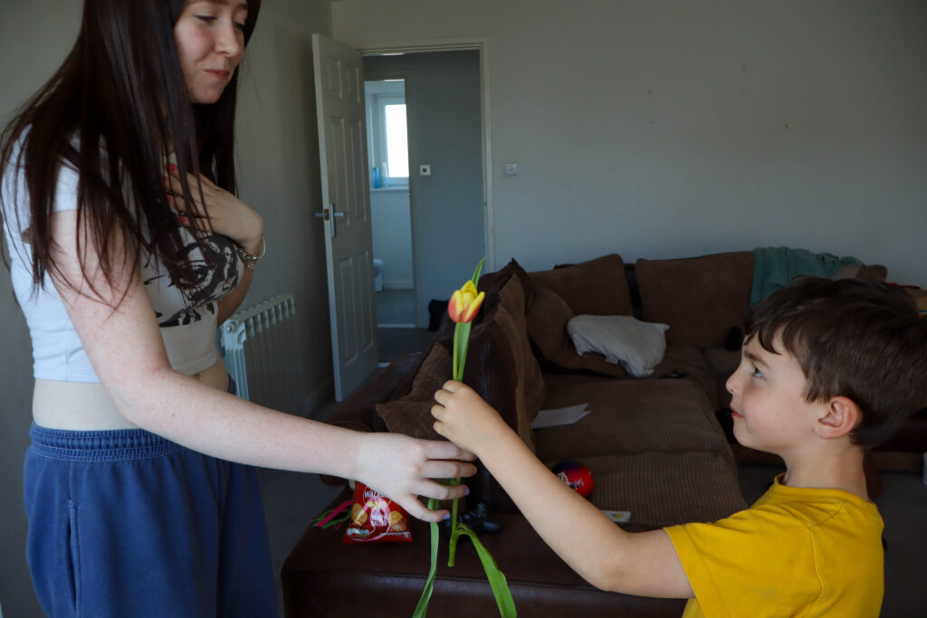
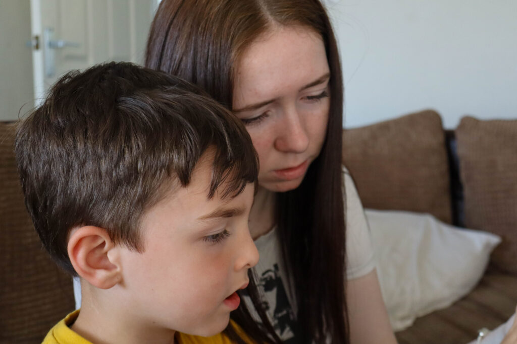
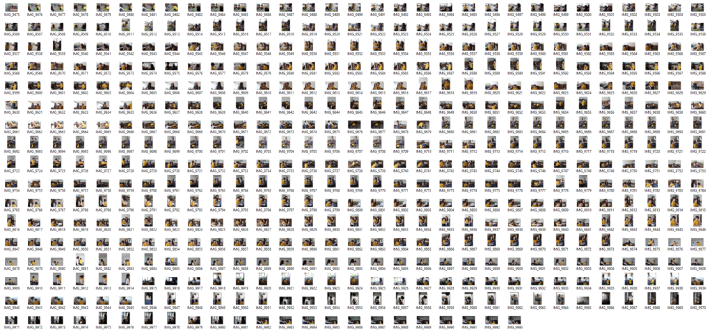
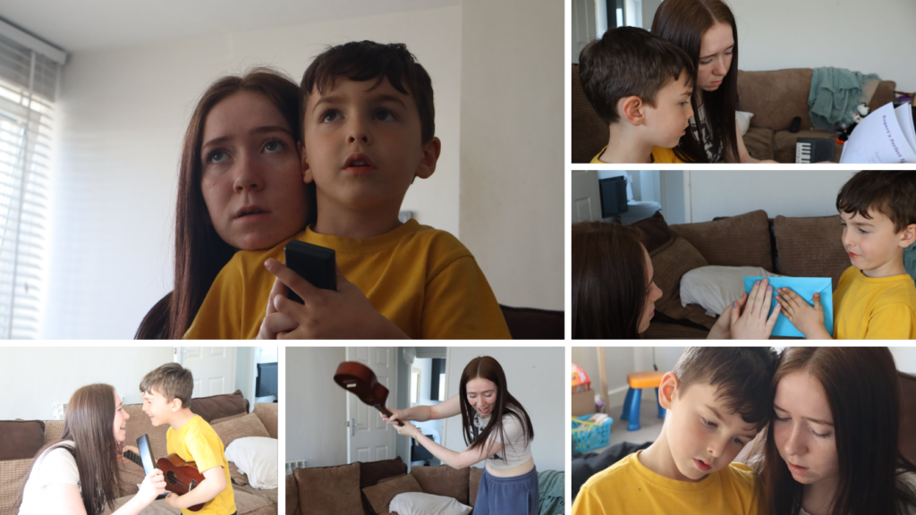
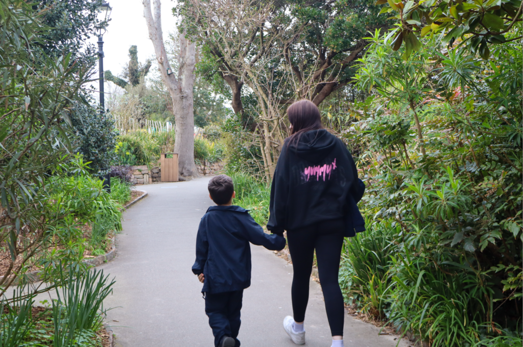
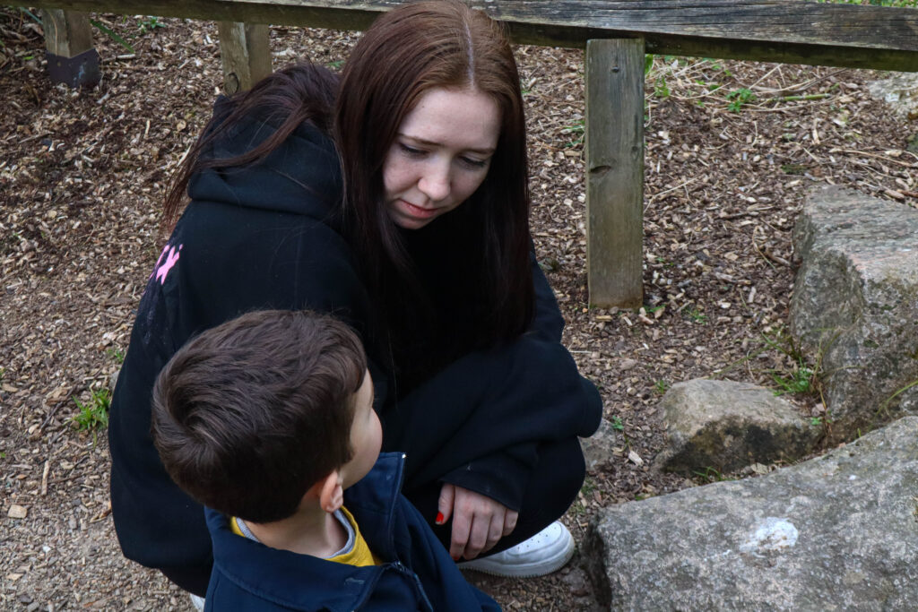
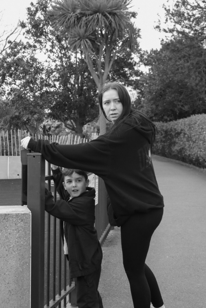
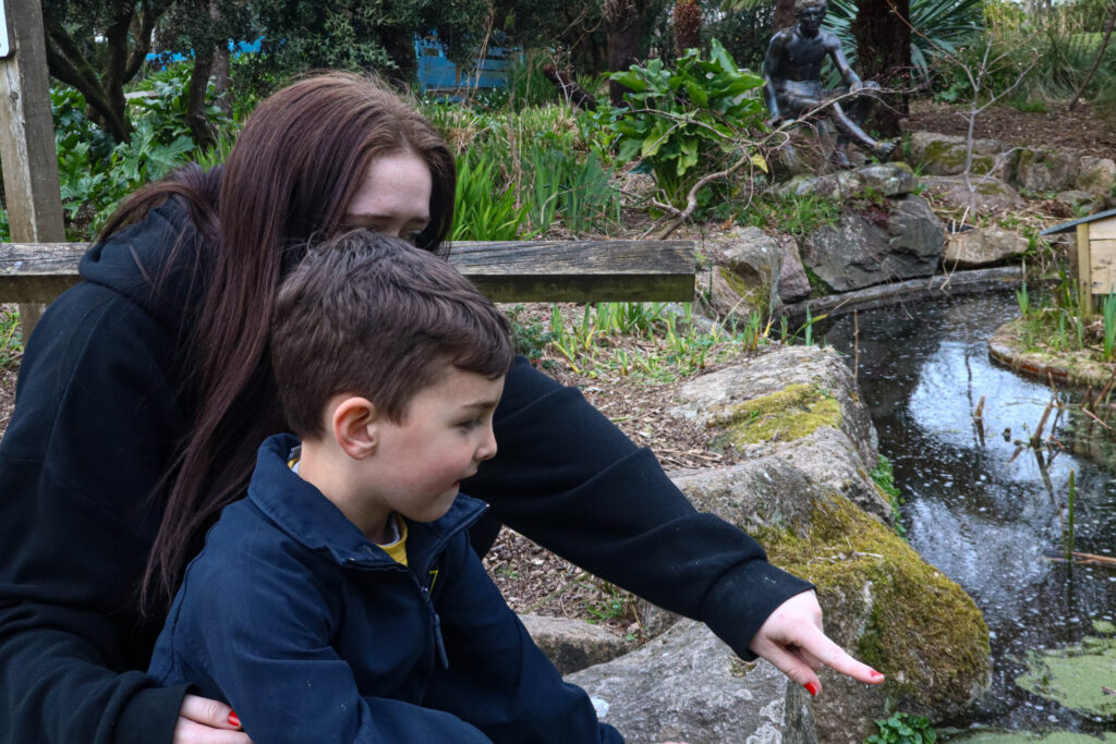
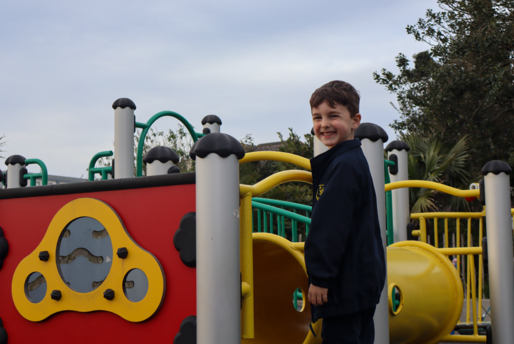
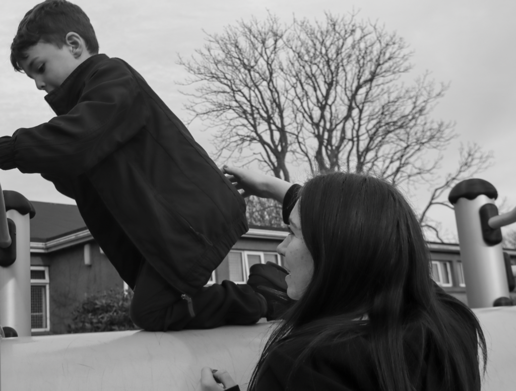
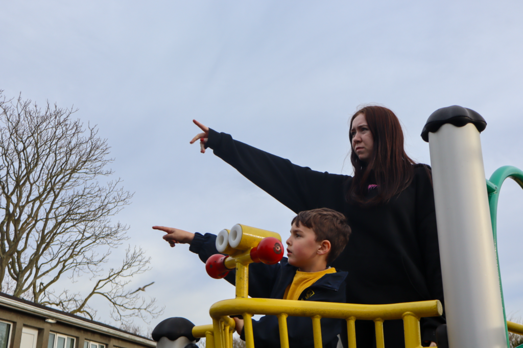
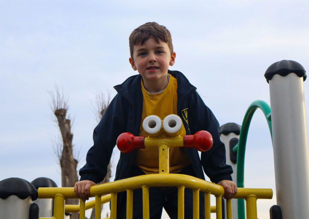
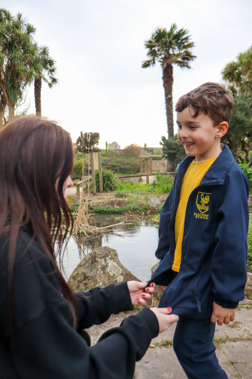
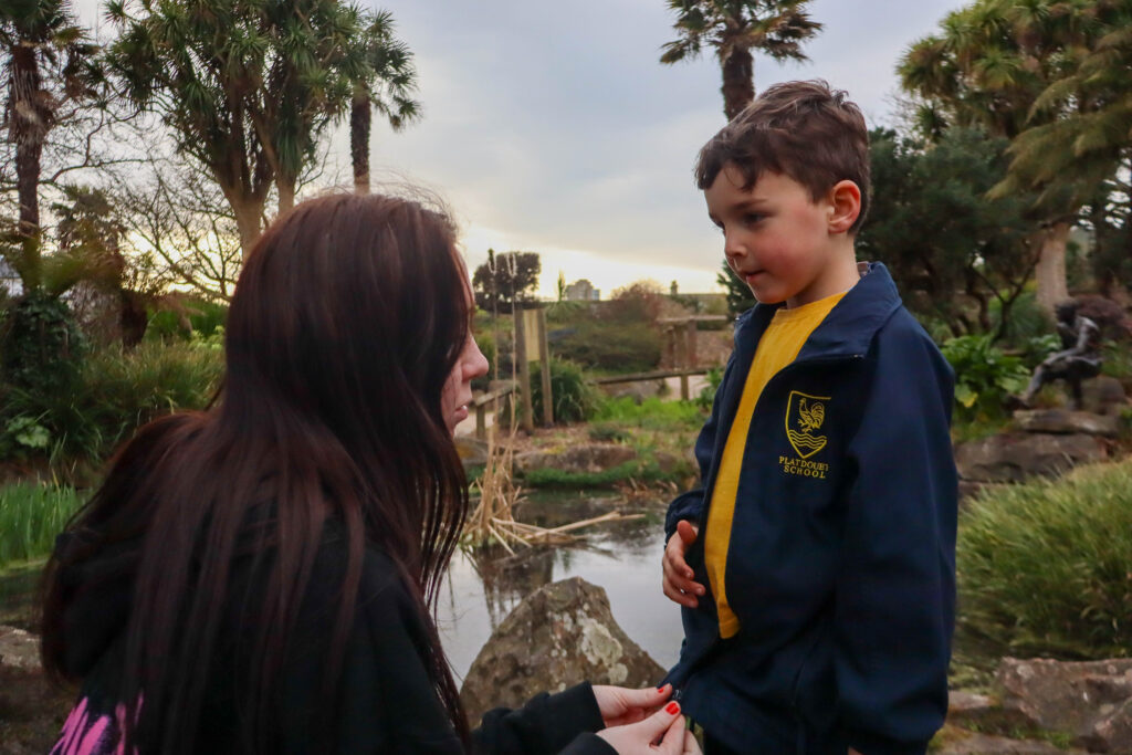
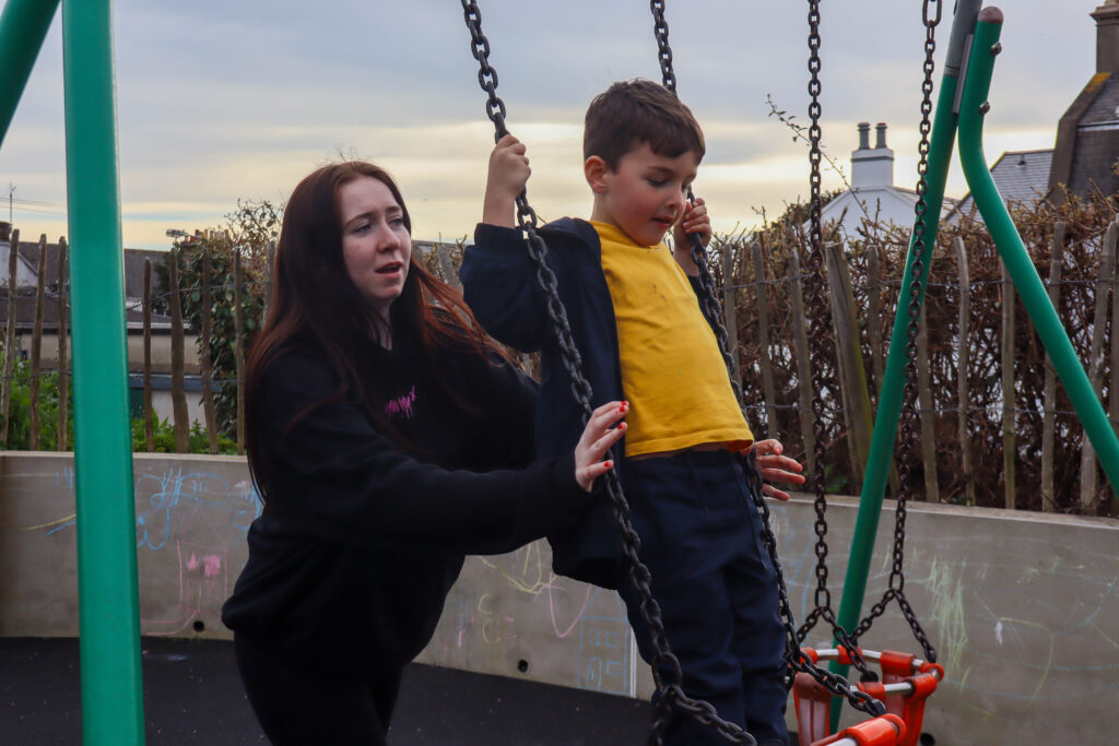
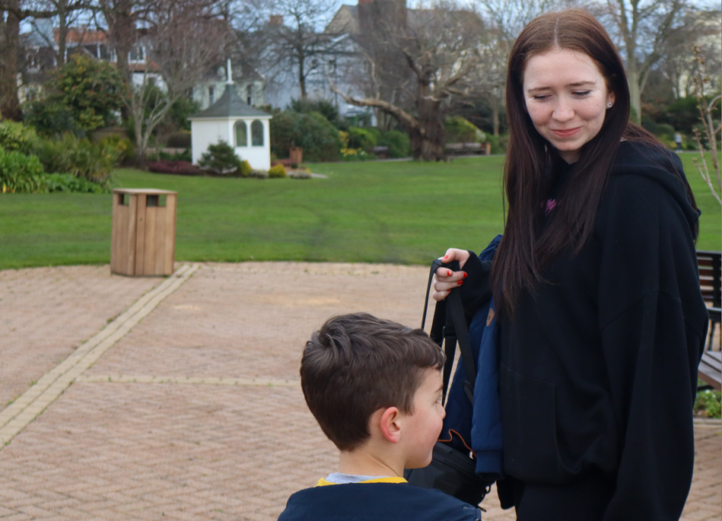
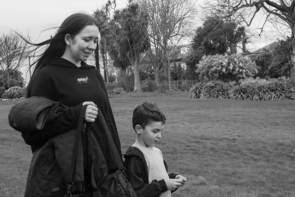
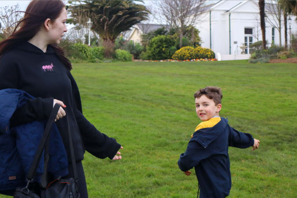
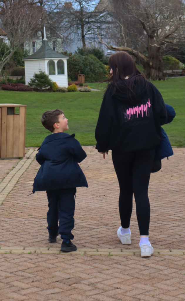
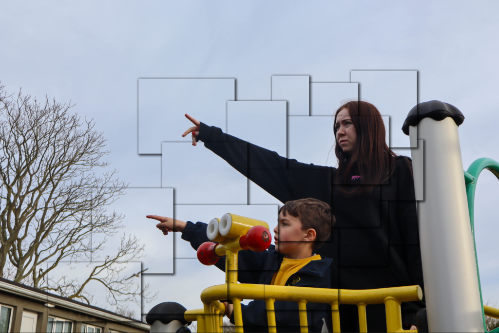
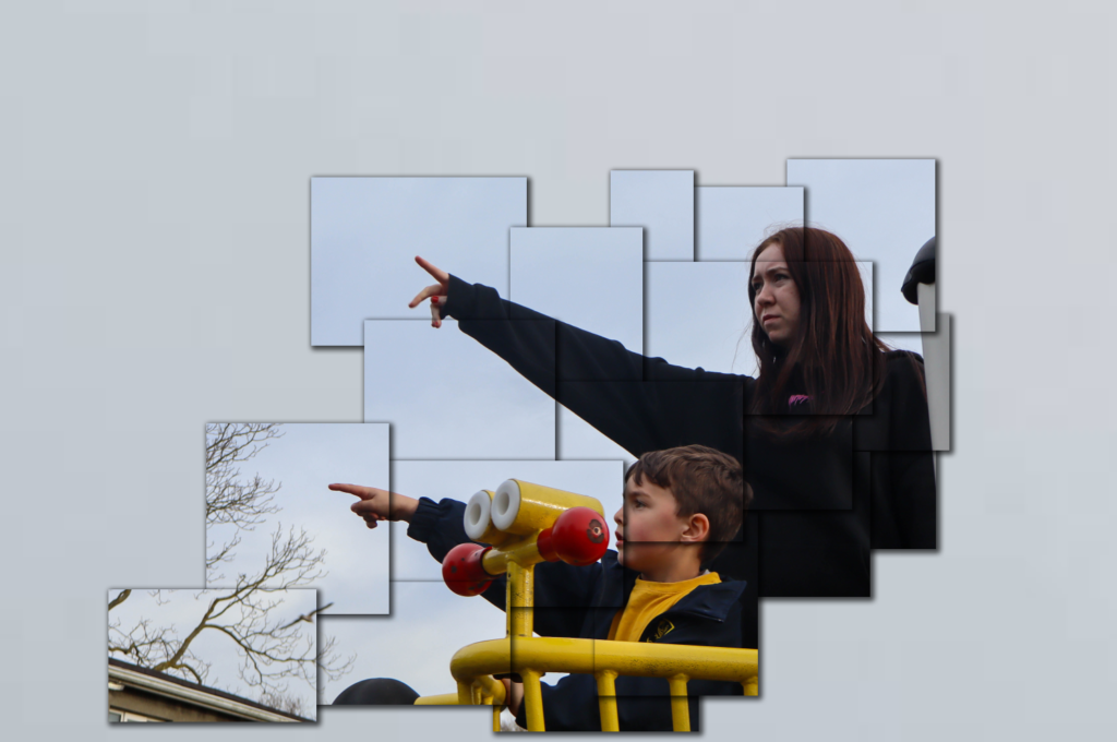
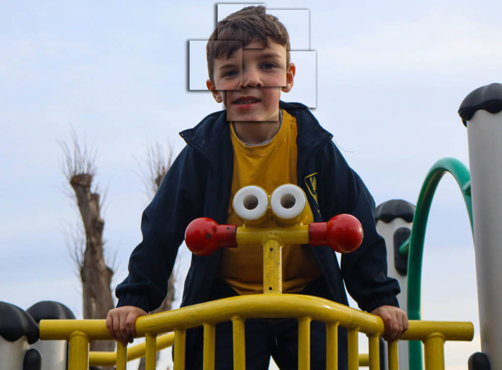
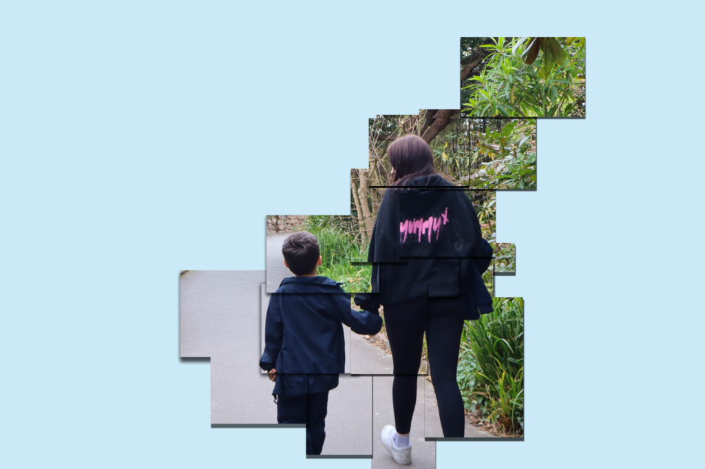
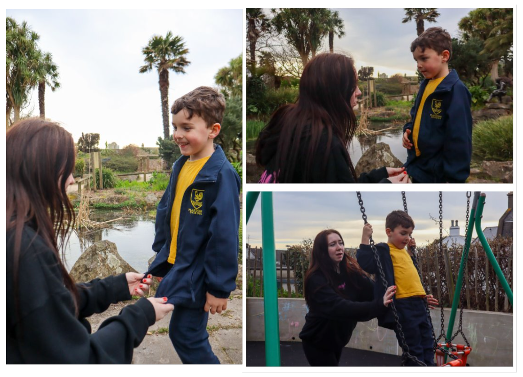
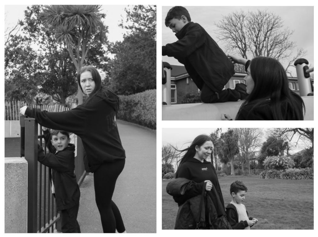
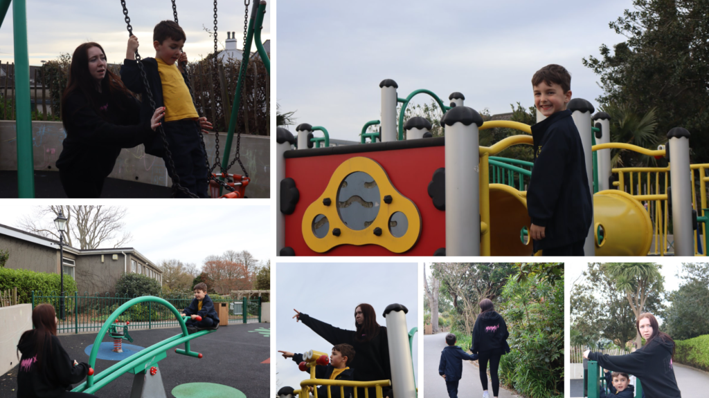
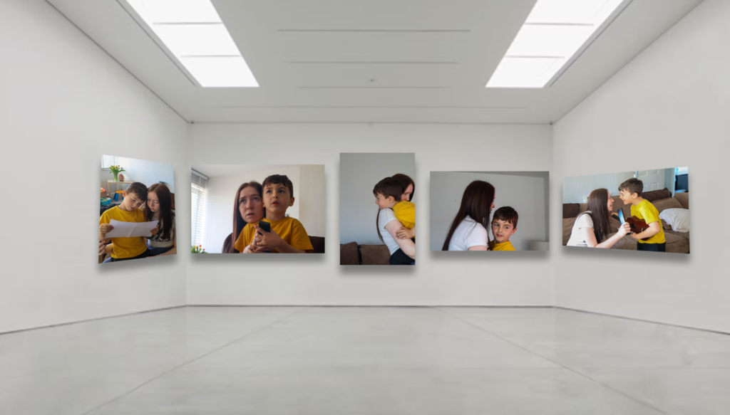
I enjoyed creating this project and am happy with the way it turned out. when developing photoshoot 1 I think I did well to capture genuine moments between the two and was able to demonstrate the theme of union through my images.  I was able to capture many candid shots of them interacting, such as when she was helping him on the swings or walking alongside him near the playground equipment. I also managed to get a few environmental portraits of just her younger brother, which I think turned out really well as it creates a mix of subjects in each image. In photoshoot 3 I was able to change the environment of the shoot to the subjects home which could show deeper connections as they are surrounded by their natural environment where they both live. I thought this photoshoot was more wholesome than the first as the lack of surrounding distractions lead the two to interact with each other more and engage in activities together.

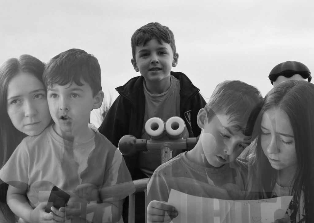
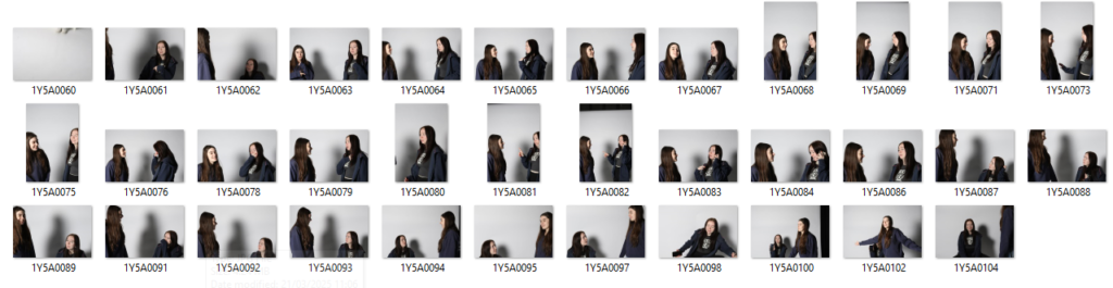
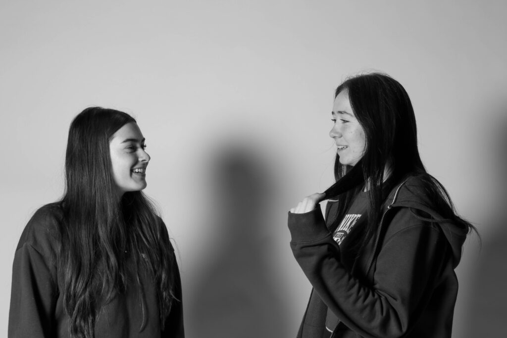
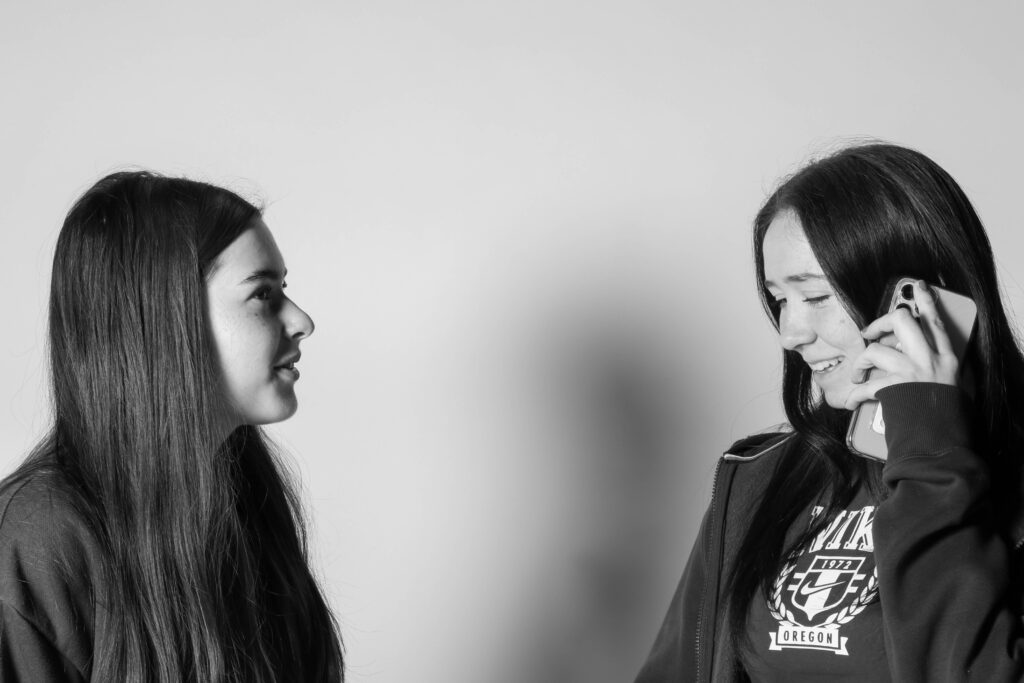
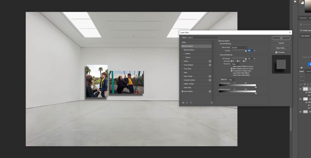
I believe Photoshoot 2 in the studio was quite random and doesn’t fit my project. as it still represents Union within a friendship I think sticking to just the sibling union theme would’ve made more sense so that photoshoot 2 didn’t look so out of place

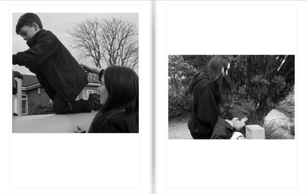
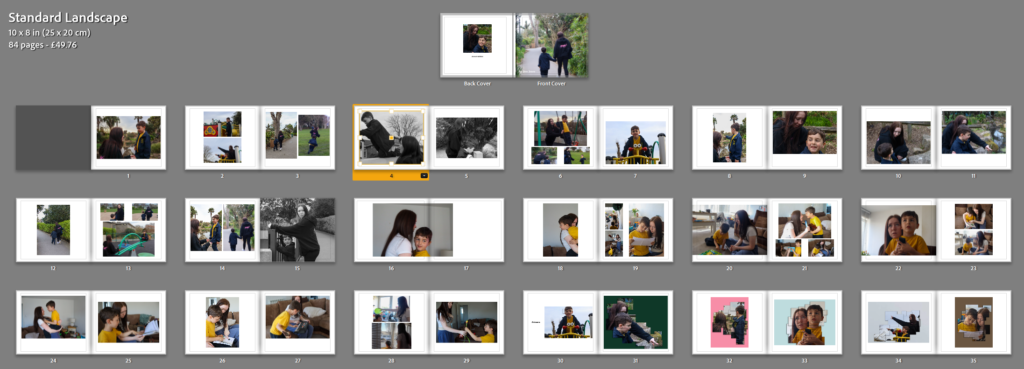
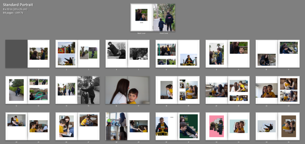
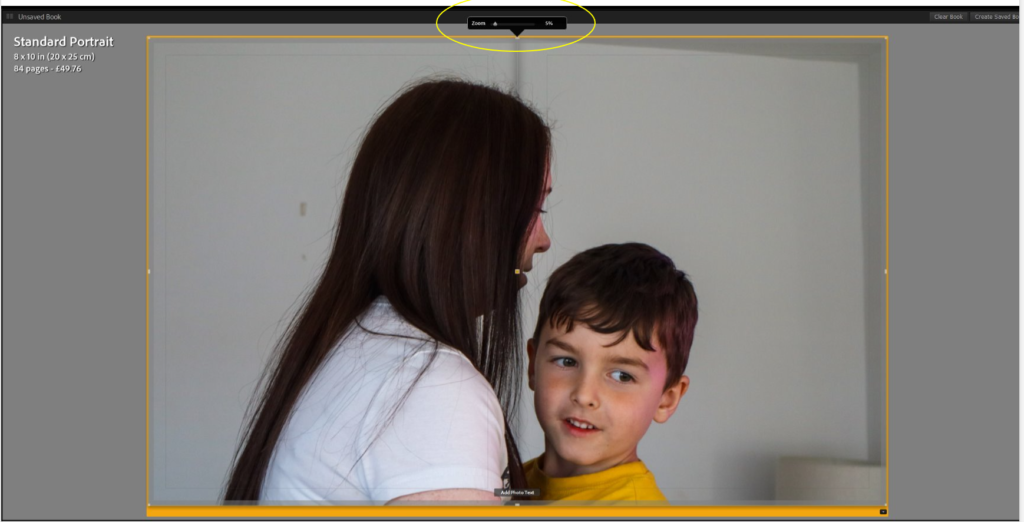
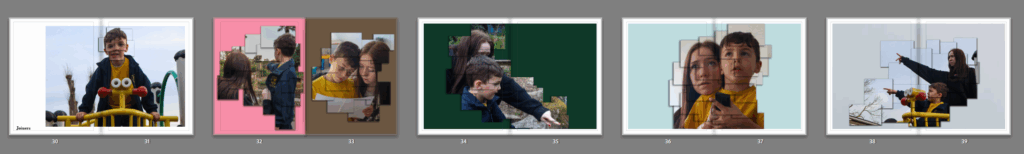
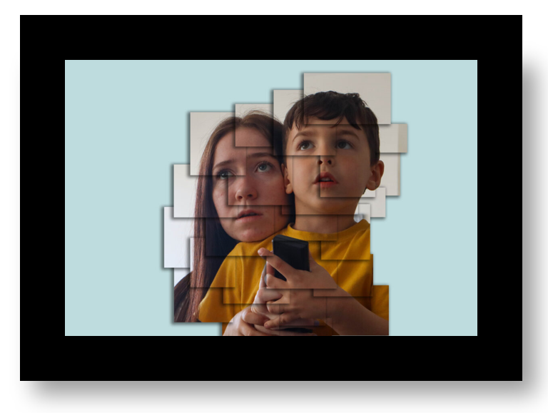
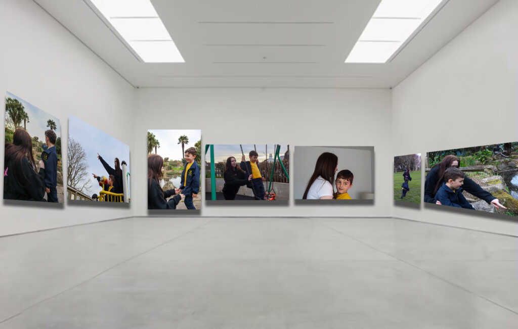
In terms of final outcomes, I was able to print off all the photos I originally intended to use. I made mock ups of the way I wanted to lay out my images within my photoshoot blog post and I was able to create those with the use of mount board and card but I also developed some new ideas such as a full big page collage of black and white images which I had not planned on doing prior to the mounting. I liked this outcome in particular as there is a lot of images on one page in different sizes to create variation in the piece and also give the viewer a lot to look at and explore. I used a lot of black backgrounds for my final pieces which I haven’t usually done in past projects. I really enjoyed this touch as it made this project differ from the others.

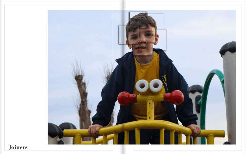
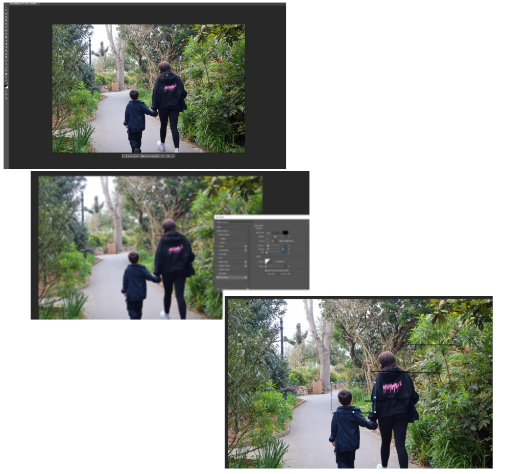
For the joiner images, though they are different images I found the mounting to be quite repetitive as I had 4 A3 joiner images with a black boarder. Additionally, my original plan was to make the window mounts and not just on mount board and black card. I was unfortunately not able to do this as I was not confident enough with the window mount technique. This mean that my images stayed quite basic.

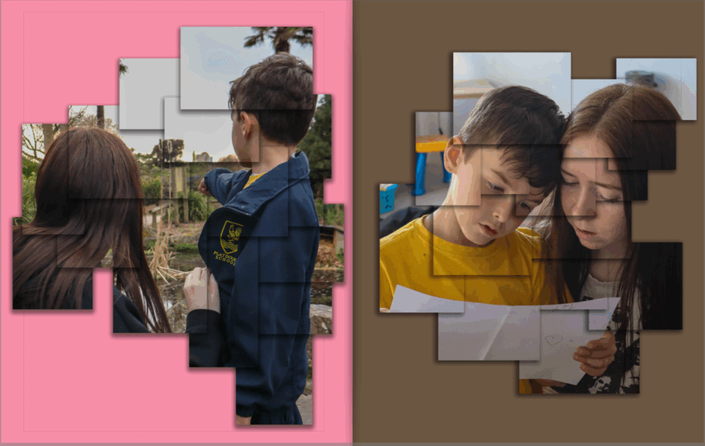
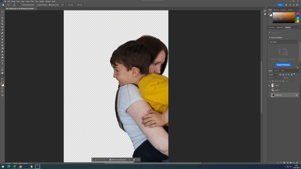
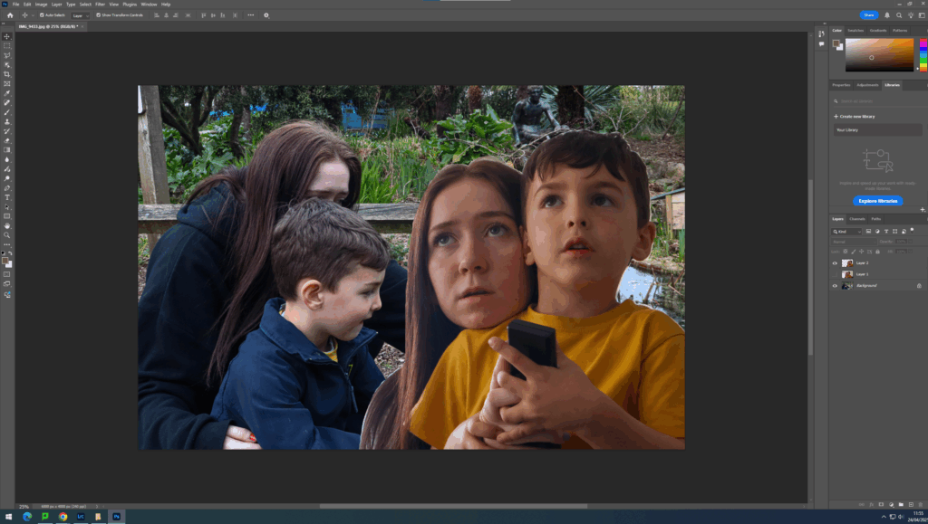
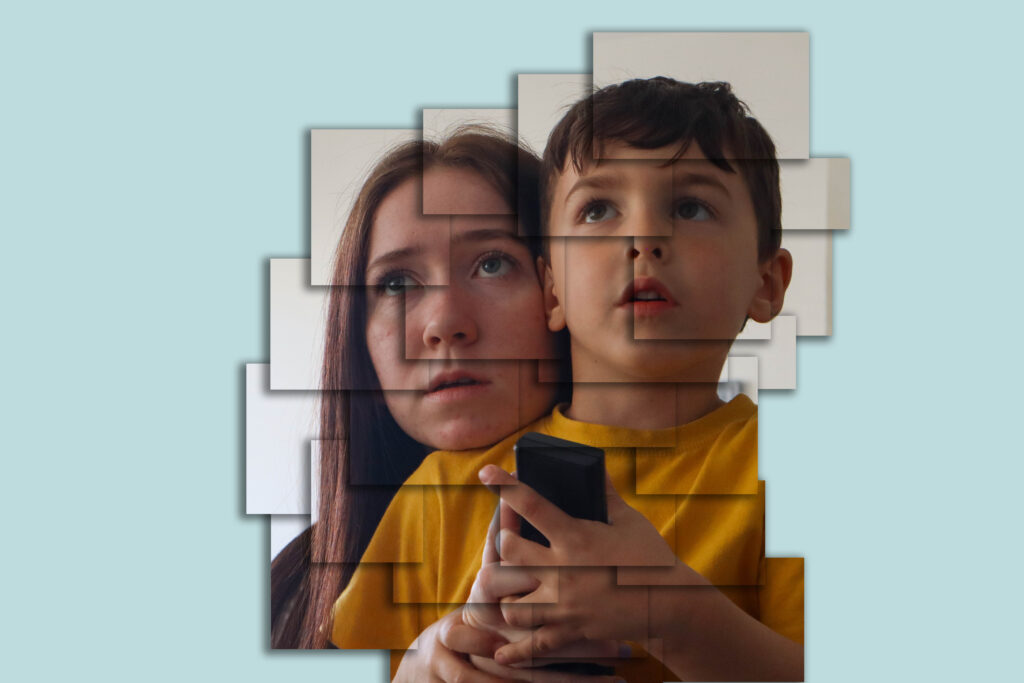
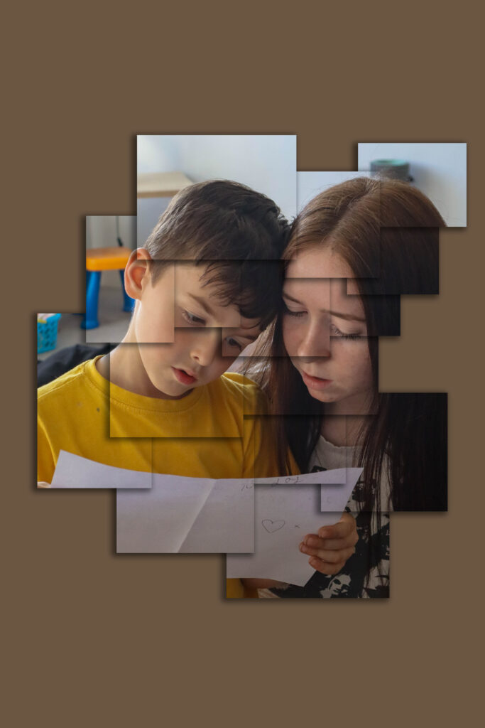
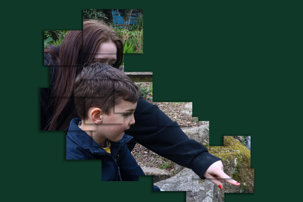
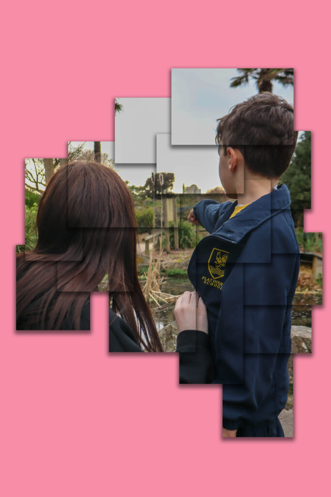
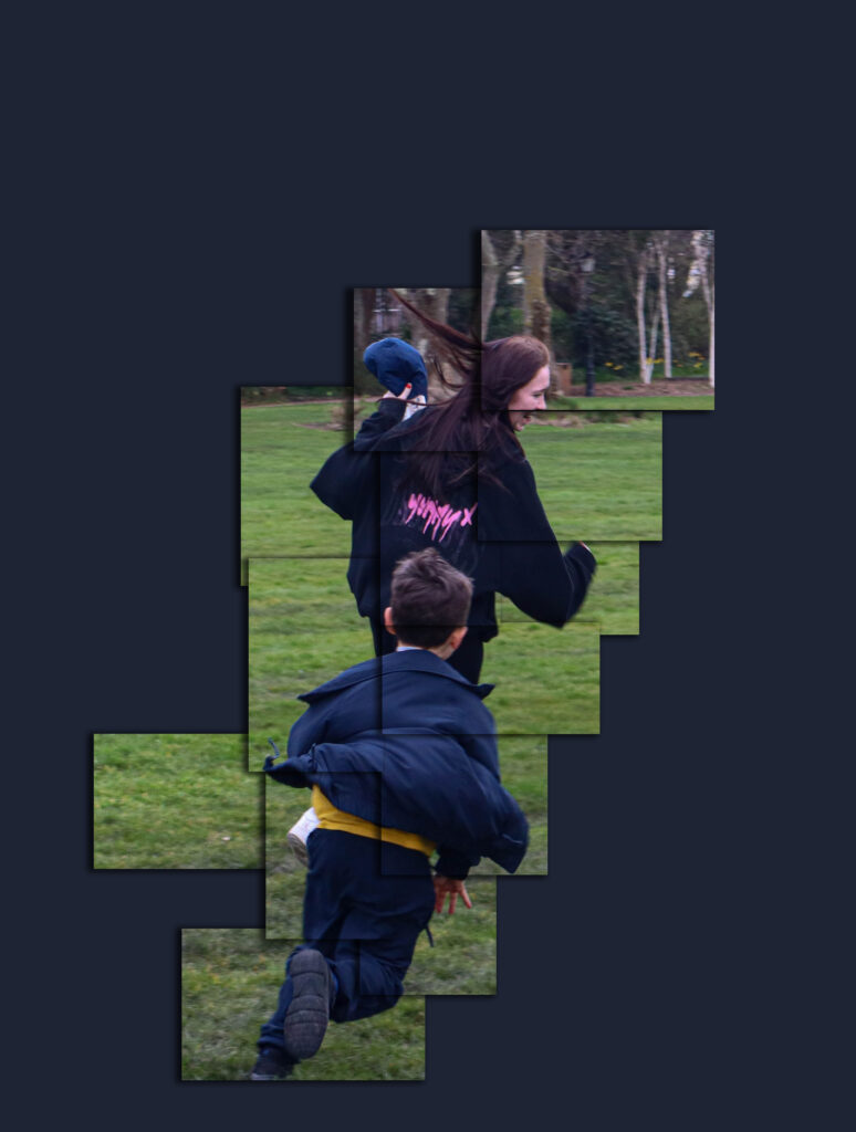
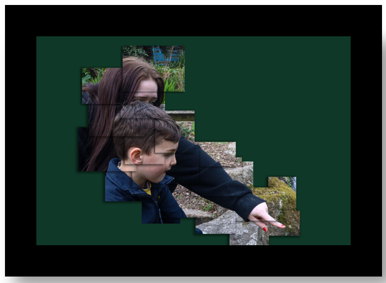
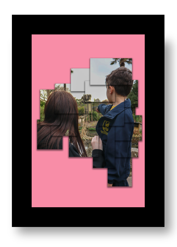
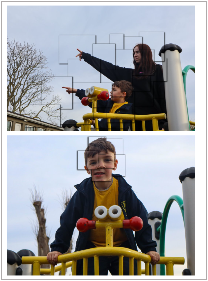
In terms of artist references, I think I did well when it came to relating to Emma Hardy. Emma Hardy’s photography is known for taking a contemporary approach. she tends to try and create stories within her images using her children as the main subjects. She focusses on portraiture within her images but in environments the subject is exploring. Emma Hardy’s work relates to union with the use of exploring her family. The relationships between people would create a union between them. So each family is their own union, siblings are a union and partners are a union. This is what I aimed to take inspiration from and I think I was successfully with this idea. As I focussed on Alannah and Ethan, I was exploring their Union as siblings and family just like Emma Hardy also does. She uses different environments but being outside and in nature tends to be a common occurrence within her images. I think with my photoshoot 1 I also took inspiration from her as I chose to make the environment a park and fields so they linked with her work quite well. When linking to David Hockney, my inspiration was more on his edits of joiners rather than the photos. I think I made a successful approach to taking ideas from Hockney as I was able to develop my own joiners. Even though I did this is a less advanced way than him as I developed mine using photoshop, I was still able to have a final piece inspired by Hockney.

If I were able to do this project again, I would plan to conduct more photoshoots using Alannah and Ethan as I only managed to do 2. Though I made a variation in the use of environments on these two shoots, I think I could’ve planned better in advance and gone to more environments such as a beach, on a walk, in a car, at school etc. I think in order to make photoshoot 2 more part of the project I should’ve spent more time in the studio when photographing the two girls and explored their friendship a lot more so that they become more a part of the project of union and not just a project on the side.

Photobook: Final Layout & Evaluation

Evaluation of Photobook

Overall, I think my photobook turned out well and how I wanted it to.

In terms of the front cover, I decided to make the title of my photobook ‘Bonds’ I chose this as I am showing the bond between two individuals through their relationship with each other. As the whole project is Union I thought bond was a good synonym and works well with the project. I like the front and back cover and I think they both work well together. On the back I added ‘Alannah & Ethan’ under an image of them. I really like how this touch looked as it makes the book more special and personal when the individuals on the pages can be named and recognised. I think the front cover is a good photo as it shows the two in quite a wide frame so that there is empty space around them to make the cover look more interesting. you don’t see their faces in this image which would have probably looked better so that it was clear who the book focussed on, however, I also like the position of the camera as it is only showing their backs but still showing their connection and bond through them holding hands and walking together. I think showing their backs and not having their faces shown invites the viewer to want to open the book so explore their bond more further.

Throughout the book, I like the variation of layouts I used on each page. this meant the photobook wasn’t very repetitive which could lead to the viewer being bored throughout. I liked the use of the two-page spreads in my photobook as it meant I was able to show my favourite photos as a larger image so that they were seen more than just being put on a page with other images around it. The photobook works in order of the two photoshoots I produced. I made sure to add the outdoor environment photoshoot at the start of the book as that was my first shoot I made. It then goes on and transitions into the second photoshoot where I focussed on the personal environments and more connections between the two. I think this works well as it shows the connections get deeper and more personal the further you go into the book. A negative of this is by having the photoshoots with each other it could cause repetition as its the same forest/park environment for a while and then the same with the individuals home environment in the second shoot. This may have been better if I switched up the order and created more of a mix of images.

At the end of the book I decided to add my edits into my project. Even though I printed some of these, I still wanted them to be represented in the photobook to show what I was able to do with the image. I think using a subtitles on the page where the joiners start works well as it introduces the net part of the book to the viewer and so it makes sense why there would be some photos they have already seen.

Photobook: Design

I experimented with both a standard landscape book and a standard portrait book and found that the portrait book worked nicer.

After changing to portrait, I found it easier to use templates like two page spread as it meant my images weren’t stretched out to fill a landscape layout. I managed to create variations of layout on each page such as having two at different positions and sizes. I also did a few pages with 3 images.

For the back cover, I decided to give an extra recognition to the two individuals who are the main parts of this project by adding a small boxed image of them together with their names below.

For pages such as this one, I used images that relate to one another by being I the same environment, the same activity is occurring, the same facial expressions etc. on this page in particular, both images are in the same setting. they are different as one if of the two looking at each other and the other image is of them looking at the same thing by pointing at something out of frame.

The circled part shows what I used for the zooming in. By using this tool, the image was able to fill the two page spread without stretching the image so that the photo still looked good quality without the subjects being distorted. This cancelled out a lot of empty space in the image and resulted with making sure the main focus was the two and that they were in the centre.

Layout

The photobook works in order of the two photoshoots I produced. I made sure to add the outdoor environment photoshoot at the start of the book as that was my first shoot I made. It then goes on and transitions into the second photoshoot where I focussed on the personal environments and more connections between the two. At the end of the book I decided to also add my edits as a final part of the project. I designed a page with a title of ‘joiners’ to introduce the next part and to show it was a separate part to photoshoot 2 as it includes both.

I decided to make the title of my photobook ‘Bonds’ I chose this as I am showing the bond between two individuals through their relationship with each other. As the project is union I thought bond was a good synonym and works well with the project.

Photobook: Research & Analysis

Field Studies By Chrystel Lebas

Lebas’ photobook grabs the viewers attention with the natural look of the cover. The feel of the book is textured to match the theme of fields and nature and the brown covering like cardboard makes it feel as though its been handmade. the spine of the book has ‘Chrystal Lebas, Field Studies’ in black text on a cream bump textured covering. The photobook is heavy and A4 demonstrating the amount of pages and photos that are within. The cardboard texture of the book carries on around to the back page with just the spine to separate the front and back.

The front cover has the title again in the top left corner and a dated looking black and white image to the side of it with text that reads ‘Walking through Landscapes and Archives’ under it. This suggests to the viewer that there also may be hints of history within the book. Lebas’ name is also repeated on the front cover to the left and on the bottom of the page there is a coloured image of a forest that takes half of the page up showing its importance as it gives the viewer a look into what the book will contain. On the back of the book There is no writing but instead a single photo of a stem which branches off into 8 different shaped and sized leaves. This is a silhouette example of a plant so it is a black figure filling the centre of the A4 page.

Within the book, the first page copies the front cover texture and contains a contents page of the book. this would suggest that there is a lot of information enough to need a contents page. The pages of the book are thick and good quality making the book feel more expensive and strong. The book begins with pages of writing to introduce the artist and their work. Throughout the book the colour themes of blue and green a very commonly used as photos of the sea and forests are captured frequently.

The first page that has a phot in the book shows a contrast of images where the photographer has captured a shot at low tide and then a shot at high tide. The image of low tide shows the long distance of sand and seaweed that travels along the beach until it reaches the shore and buildings and hills can be seen. The lighting of this image is fairly dark as the photo has been taken at the end of the day. Th blue tint from the sky gives the image a cool effect that could almost make the viewer experience a brush of a cold feeling as they view the image. In the contrasting image, the tide is high which covers the seabed and the seaweed. The sky in this image is more over casted then the first image as it contains many dark clouds making this image darker to the other. When reading the writing at the bottom of the page, you can notice that the photographer has included the date of publication where the first image reads August 2012 (low tide) and the second image reads December 2013 (high tide). this shows that the photographer didn’t intend to create the contrast when she took the first image as the next time she returned to take the next image was a year later.

Photoshoot Experimentation (1 & 3)

For these edits, I decided to mix photoshoots 1 and 3 together and did edits on photoshop .

For these edits, I chose the two images I wanted to mix together. I made sure that I had one image from photoshoot 1 (outdoors) and one image from photoshoot 3 (indoors). I put the outdoor photo on the bottom in many of my edits and then opened another tab where id chose the photoshoot 3 image. using this image I clicked on the selection brush tool and cut out the part of the image I wanted (Alannah and Ethan) I changed the size of the brush to a smaller size when I began to cut out the edges. after completing that step, I then right clicked the selected part and pressed layer via copy. this then created a new layer on the side of the edit. I then dragged this tab down so that it was seen with my photoshoot 1 image. while being on the move tool, I was able to move over the cut out layer onto my other photo. I removed the extra tab I didn’t need and then moved the cut out part to where I wanted it on the image. I experimented with colour before deciding that using black and white worked better. I clicked on adjustments and then black and white for both the background and the cut out image. I selected the cut out portion and double clicked the box on the right side where the layers are. I then adjusted the opacity to around 80% which meant the underneath image was able to be seen through it. I repeated his step for each of the edits below sometimes using three images instead of two.

Photoshoot 3: Developing and Experimentation

This photoshoot was the shoot I wanted to focus on my friend and her little brother and how their relationship is a union. The difference from the first photoshoot is that this shoot is set indoors in their house.

Favourite edited images:

Joiners:

I created the joiners in the same following steps:

To create these I first edited my images on Lightroom where I adjusted the exposure levels and contrast. I decided on keeping some images in their original colour and some in black and white.

I then filtered the colour marked images and exported them to my documents where id be able to use the edited images to create the joiners.

The first image I used was of the two walking together while holding hands. To do the edit I used the rectangular marquee tool to draw out the boxes that I wanted. after highlighting the first cut out, I right clicked on the box and pressed ‘Layer via copy’ where I then got another layer on the right side under my background. I duplicated the background and moved the layers that I was cutting out to the top. I did this many times while also hiding the background multiple times to see what squares I had missed and if it looked okay. I think went back on each layer and double clicked them. this then gave me editing options for that particular section so I went down to drop shadow and edited the opacity, size, angle and width. doing this meant the boxes were more visible and looked more like they stood out.

The last thing I did was add a colour as the background. I did this by simply copying an image from the internet and pasting it onto the edit which created a new layer which was then able to move end every other layer in the edit which brought it only to the background.

Photoshoot Evalution:

In my opinion, the photoshoot for the theme “Union” went quite well overall. The settings I planned to use in my photoshoot plan was the one I ended up using and this was the subjects own home. I think choosing their home as a photoshoot setting was a good choice as the two are familiar to their surroundings and feel more comfortable participating in a shoot when they know their environment well. As well as this, I believe taking the images in the house makes the shoot a lot more personal to the siblings as its where they have spent part/all of their lives living with each other. I was able to get more shots that were staged rather than candid like photoshoot one as I found it easy to freeze the scene just by telling the two to sit still. this would’ve been more difficult to do in an outdoor setting as I wouldn’t be able to control other factors like moving cars, other people in the shot, or the affect of the weather (eg wind). I like how in this shoot I’ve managed to take images of many different activities the two are engaging in as it was all there to use and set up. this inside things like games, instruments, music playing on the tv and balloons. Being in their home meant they were able to show more deeper connections between each other like laughing while playing instruments or simply having a hug. As well as the first photoshoot, this shoot was again able to show the older siblings care for the younger sibling by helping him with the reading or helping him play the game on the floor.

One thing I didn’t manage to do was create the joiners with the camera. I did my joiners on photoshop again as I was unable to create them the other way.

How I want to lay my images out:

window mount ^^

Photoshoot 3: Planning and recording

For this photoshoot I am going to use the same subject in my images as photoshoot (my friend and her little brother)

Settings:

I am planning to do the opposite as photoshoot one and have this shoot in an indoor setting. I want to try and conduct the photoshoot in the subjects own home so that the images will be more personal to them. I am planning on making this shoot consist of more portrait images instead of in the moment shoots like photoshoot 1.

The timing of day doesn’t matter for this photoshoot as the lighting will come from the lights in the house. I am planning to get images of the two in places where they go a lot (eg living room & bedrooms). Though I am focussing on indoor settings their garden or outside space of their house still contributes to be person to them as it is still their property and where they go.

When it comes to the editing part of these shoot, I am planning to do the joiners again however I am wanting to do it different so that I don’t do cut outs on photoshop. as the subjects will be sat still in a pose, then instead of editing the sections of the images I will take individual photos of each section of the frame and then put each image on one page and fit them together to create the abstract effect of a joiner. This would mean this shoot should have more images than the other as each shot will consist of 10 images to create one. I think doing this indoors is good as it means I can control background movements which I wouldn’t have been able to do outside (eg cars passing by)

Contact sheet:

Unedited photos:

Photoshoot 2: Studio

I conducted this photoshoot in the studio with two of my friends as I wanted some images that weren’t of siblings and instead use friends as its still a relationship and therefore a union. This was a short shoot and I didn’t get many photos.

These two images were my favourite from the small shoot and I am planning to mount them both together.

Evaluation of photoshoot:

This was my shortest photoshoot as it wasn’t very planned prior to the shoot. I think the few images I got worked well to represent the twos relationship as I have captured them talking, laughing and smiling together which demonstrates their friendship and how they are a union. However, as this was short photoshoot I think it doesn’t make much sense as Alannah and Ethan’s shoots are a much larger part of my project. however I still plan to print two of these images so that my final prints include all my photoshoots.

Photoshoot 1 Development & Experimentation

This photoshoot was the shoot I wanted to focus on my friend and her little brother and how their relationship is a union.

Favourite edited images:

Joiners- David Hockney

To create these I first edited my images on Lightroom where I adjusted the exposure levels and contrast. I decided on keeping some images in their original colour and some in black and white.

I then filtered the colour marked images and exported them to my documents where id be able to use the edited images to create the joiners.

The first image I used was of the two walking together while holding hands. To do the edit I used the rectangular marquee tool to draw out the boxes that I wanted. after highlighting the first cut out, I right clicked on the box and pressed ‘Layer via copy’ where I then got another layer on the right side under my background. I duplicated the background and moved the layers that I was cutting out to the top. I did this many times while also hiding the background multiple times to see what squares I had missed and if it looked okay. I think went back on each layer and double clicked them. this then gave me editing options for that particular section so I went down to drop shadow and edited the opacity, size, angle and width. doing this meant the boxes were more visible and looked more like they stood out.

The last thing I did was add a colour as the background. I did this by simply copying an image from the internet and pasting it onto the edit which created a new layer which was then able to move end every other layer in the edit which brought it only to the background.

Photoshoot Evaluation:

In my opinion, the photoshoot for the theme “Union” went quite well overall. The settings I planned to use in my photoshoot plan were the ones I ended up using (the park and the fields). I believe that choosing the park as a setting was a great decision, as it naturally suited the younger subject’s age and meant he was more conformtable being involved in the photoshoot as he could just play and do his own thing. As a park is a familiar environment for him, it really allowed for genuine moments between him and his older sister. I was able to capture many candid shots of them interacting, such as when she was helping him on the swings or walking alongside him near the playground equipment. I also managed to get a few environmental portraits of just her younger brother, which I feel turned out really well. We also took some photos in the field which was an open space that gave the two of them the freedom to run around and play. The movement and energy in these shots really captured the sense of fun and unity between them. One setting I hadn’t originally planned on using was the area beside the pond in the park. I think this location worked unexpectedly well. The photos of her looking after him, like when she made sure he didn’t fall into the pond or zipped up his jacket, really emphasized the caring and protective aspect of their relationship.

One environment I didn’t manage to capture, which I would like to include in the next photoshoot, was their home. I believe photographing them in a more personal environment would be able to show deeper connections between them.

For the David Hockney-inspired joiners, I edited the images on Photoshop, experimenting with various photos to create interesting compositions. I’m pleased with how they turned out, especially with the use of vibrant colors that helped make the images stand out and draw attention to the subjects.

Overall, I’m happy with the photoshoot. For the next one, I plan to expand on the ideas I’ve explored and focus on capturing even more varied moments of union in a more personal environment such as the subjects home.

Mock ups of how i want to present the images in this photoshoot:

window mount ^^

Photoshoot 1 Planning and Recording:

For this photoshoot I am going to focus on my friend and her little brother.

Settings:

I am planning to get shoots in places like parks or fields where the two can act how they normally would. I want to get some outside and in this environment as I would be able to get good lighting by being outside to make the shoots as natural as possible. The time I am aiming to do this shoot is around 5pm so that the sun is starting to set but its still very bright so that the quality of images stays good.

Types of photographs:

for most of the images I am focussing on getting in the moment shoots where I can capture the two subjects emotions and interactions with each other. As well as this I will also aim to get some portrait photos where I aid the subjects to pose in certain ways or the photograph instead of getting spontaneous shoots.

a few unedited photos