Overall I believe this has been a successful project. I set out to explore food and wine and have done so. I do wish I came up with the idea and how to execute it sooner so I would of had a little more time and could properly plan shoots and brainstormed some more ideas and attempt to experiment a little more.
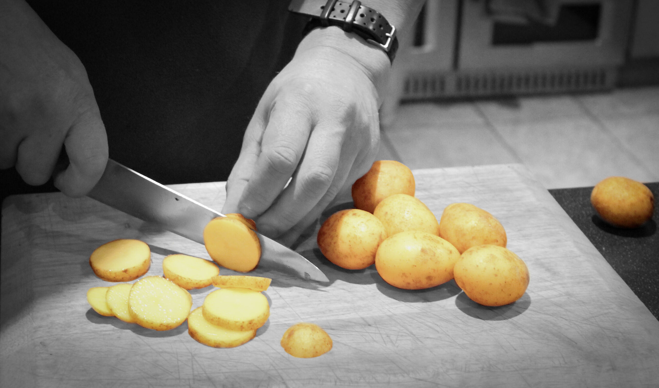
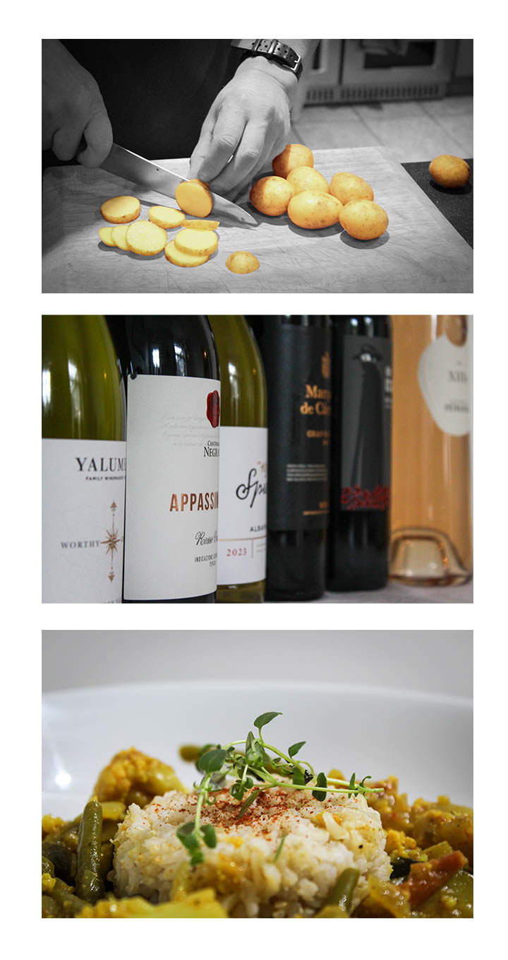
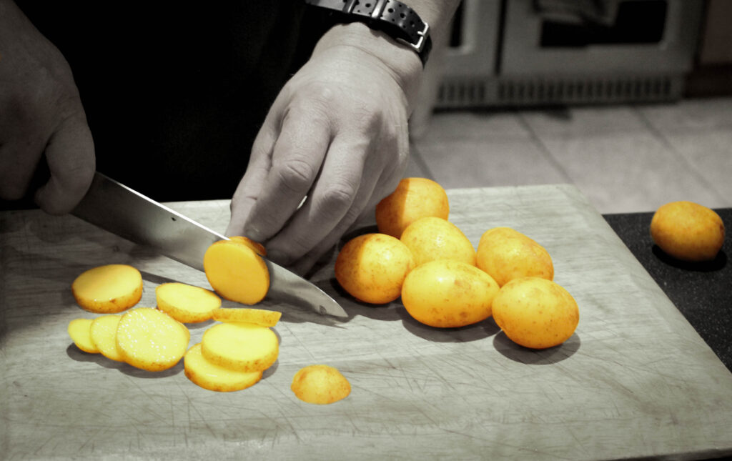
For this shoot I wanted to capture the teamwork and fun that goes into the prep of a meal.
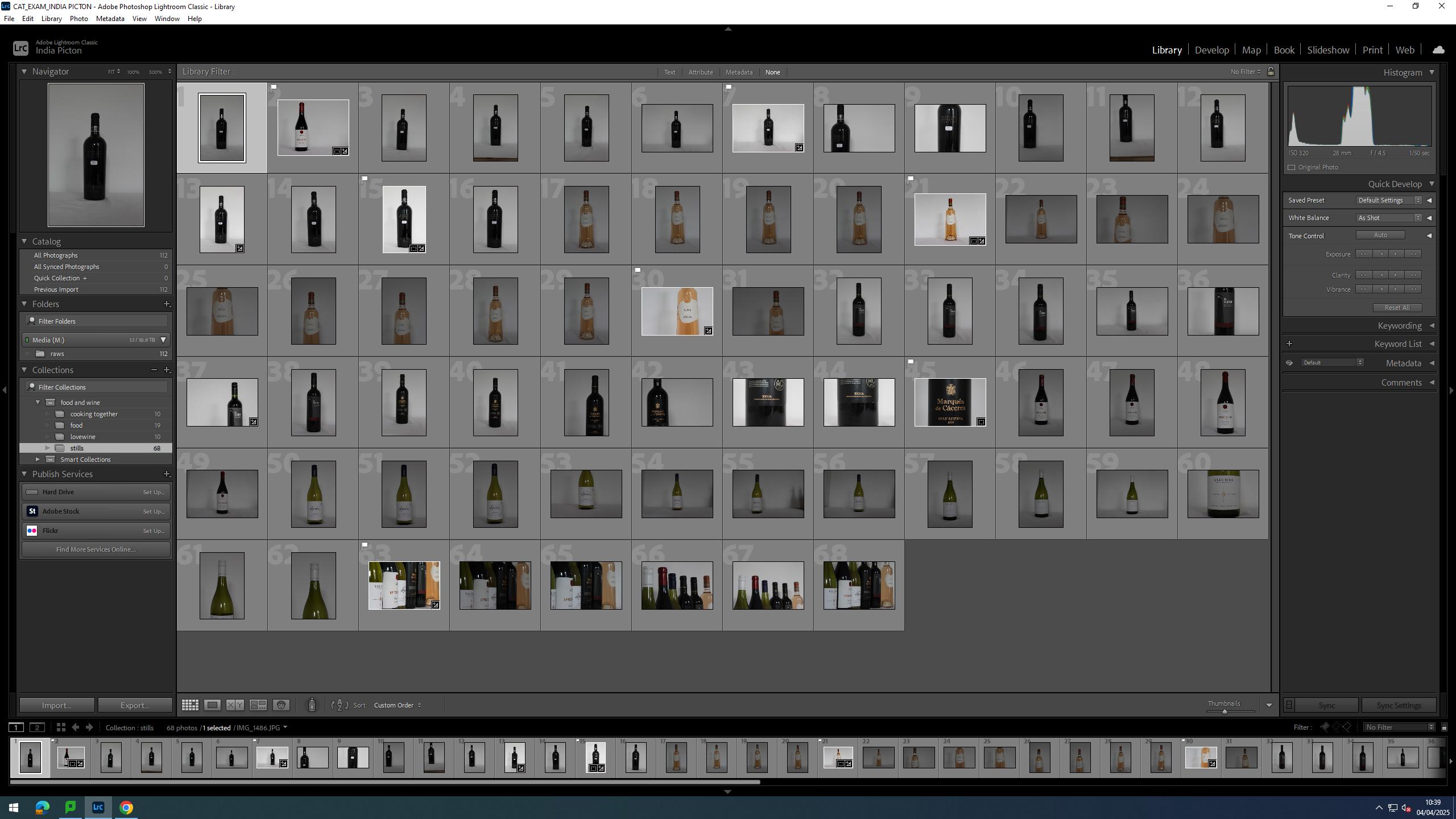
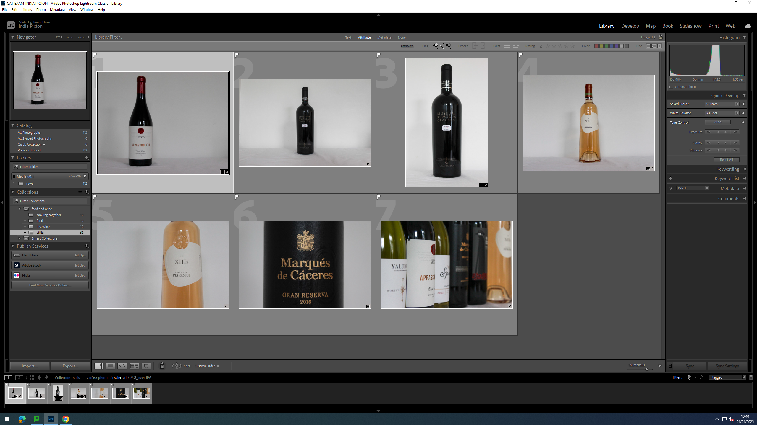
Contact Sheet
For this shoot I only got so many images as I was taking in-between helping cook dinner. I ended up with 10 photos of which I liked 4.
Editing
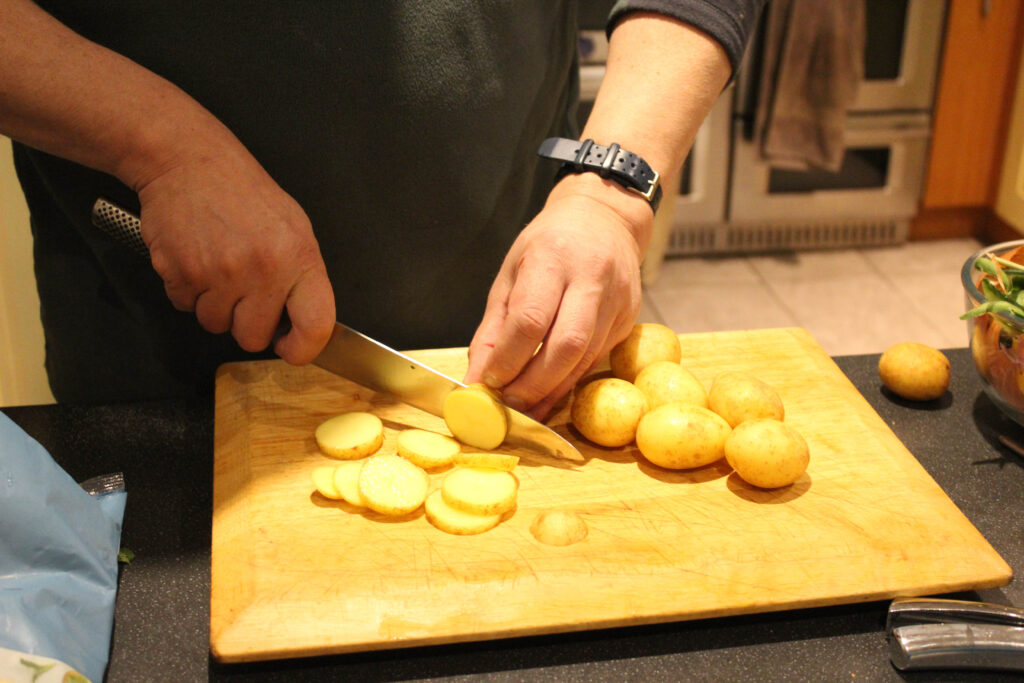
For this image, I cropped in in the potato’s and knife then isolated the potato’s so they were the only ones in colour and everything else is black and white. This not only added depth and tone to the images but cleared up the background and removed some of the chaotic nature of the oven and the mess on the table.
Finals
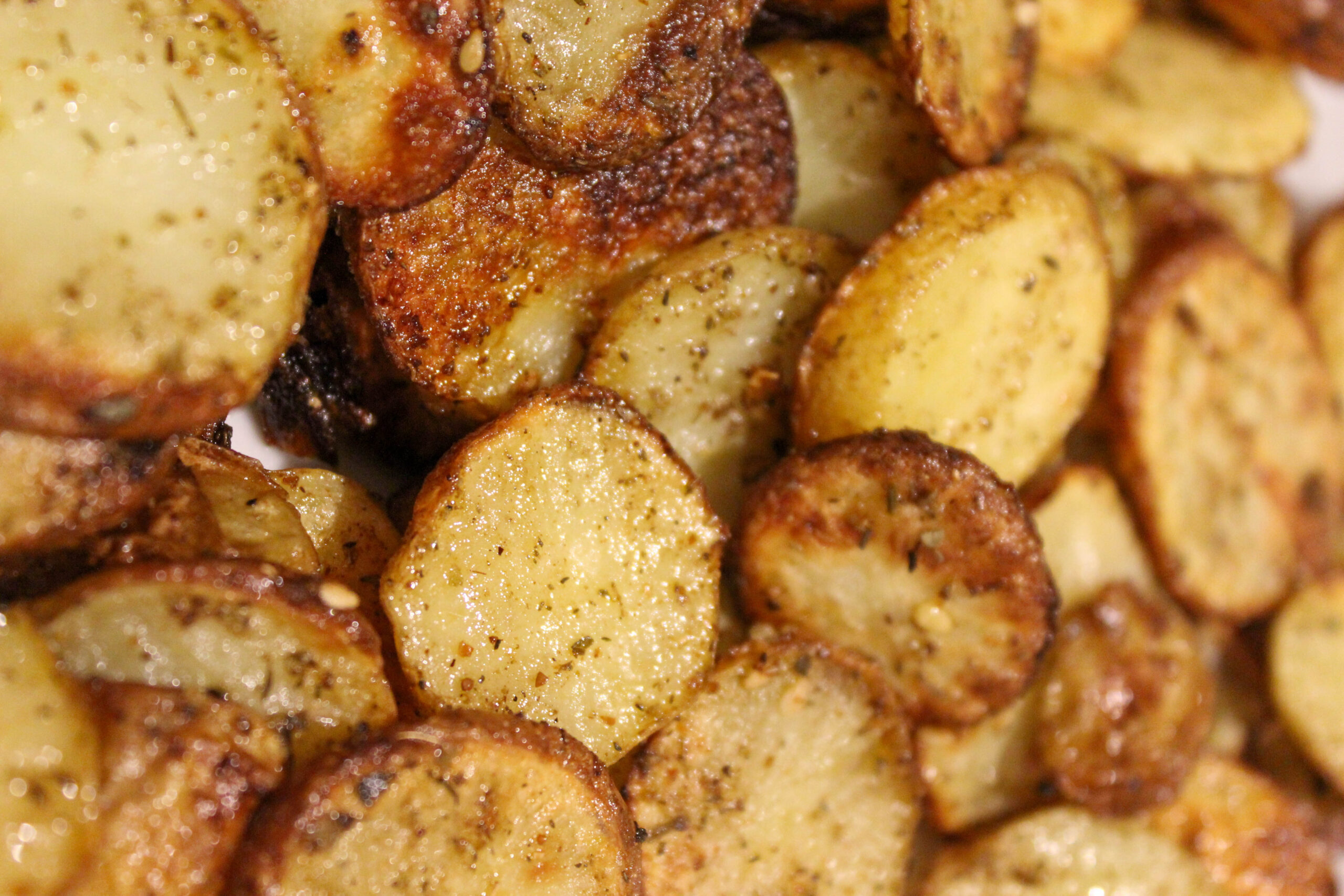
The isolated potato’s in this image, bring a warmth the the black and with background, standing out to show that a warm meal will always bring people together. The blurred background creates a depth of field that leave the issues of the present to themselves and away from the table, focusing on being fed.
Evaluation
For this shoot, though I did get some nice images, I am not overly pleased with the way it came out. I would of liked to maybe repeat the shoot again with different meals and maybe get some portraits as well.
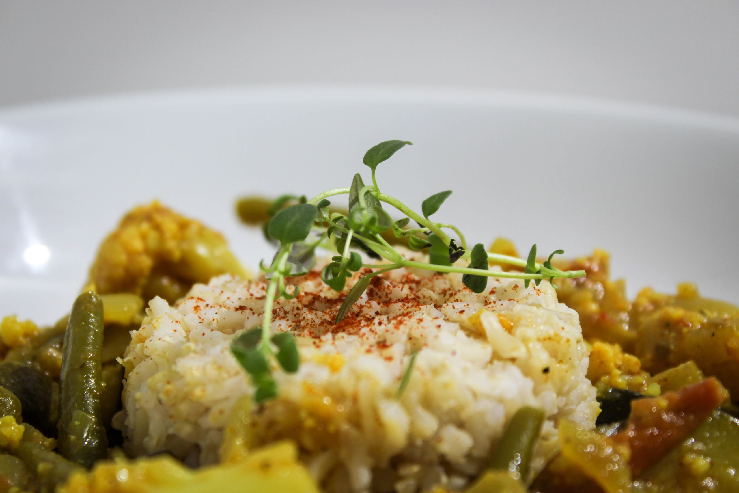
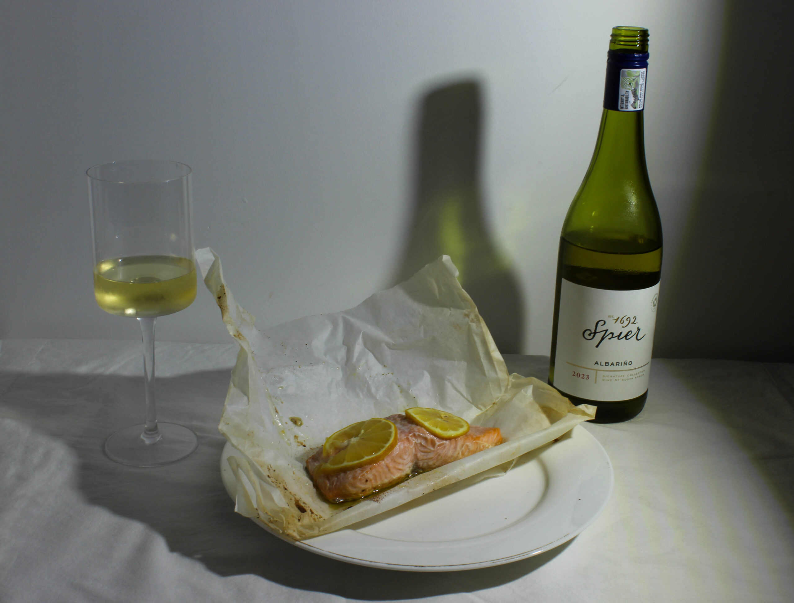
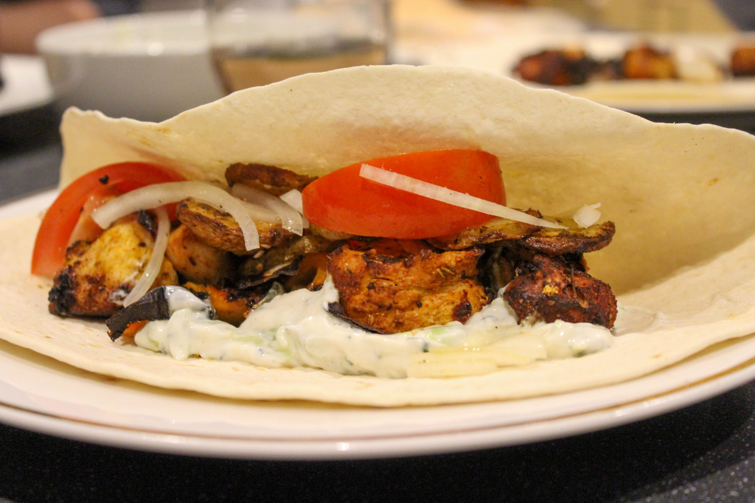
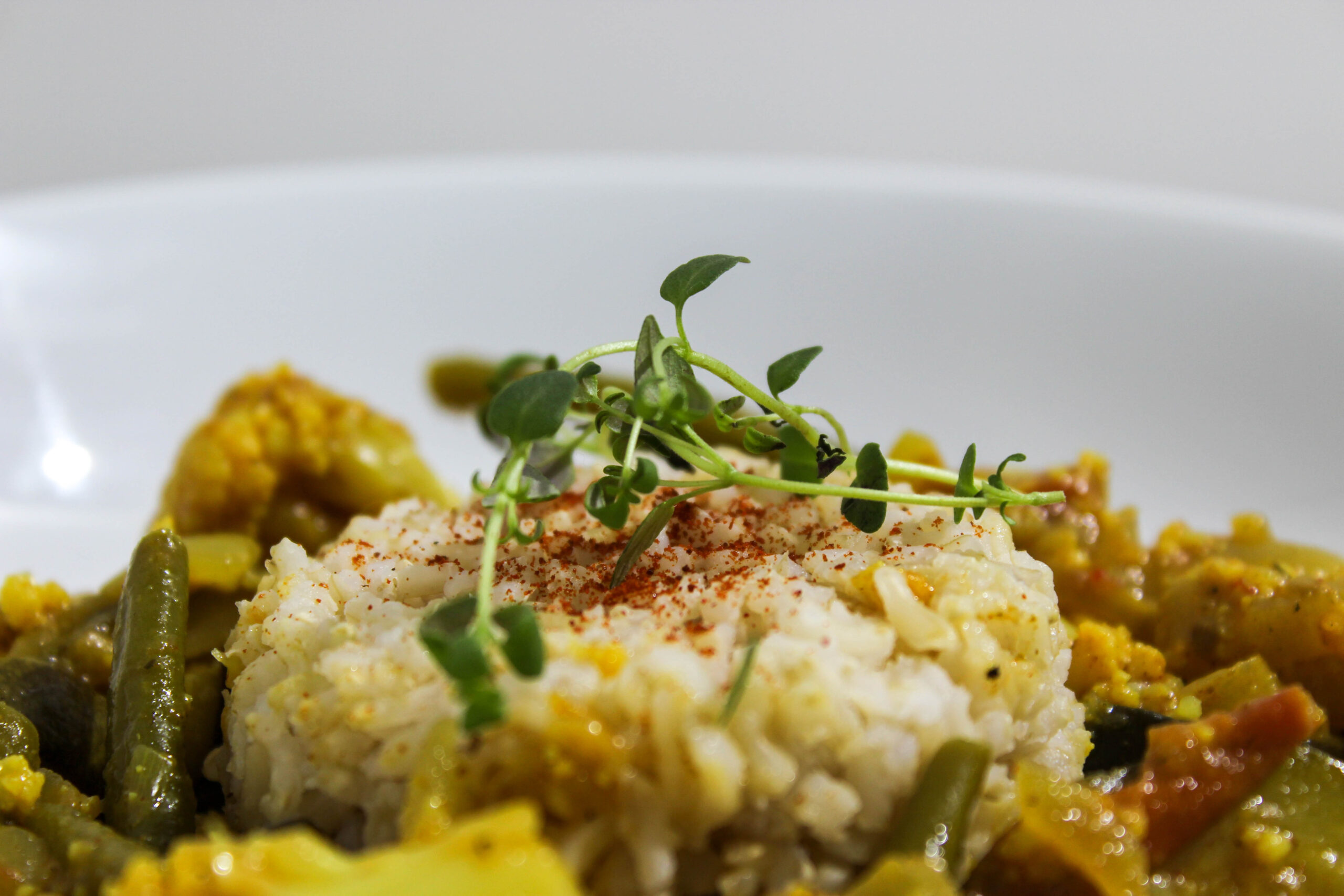
For this shoot I wanted to get some shots of meals plated up.
Contact Sheet
I ended up taking 19 photos over a 2 days.
Editing
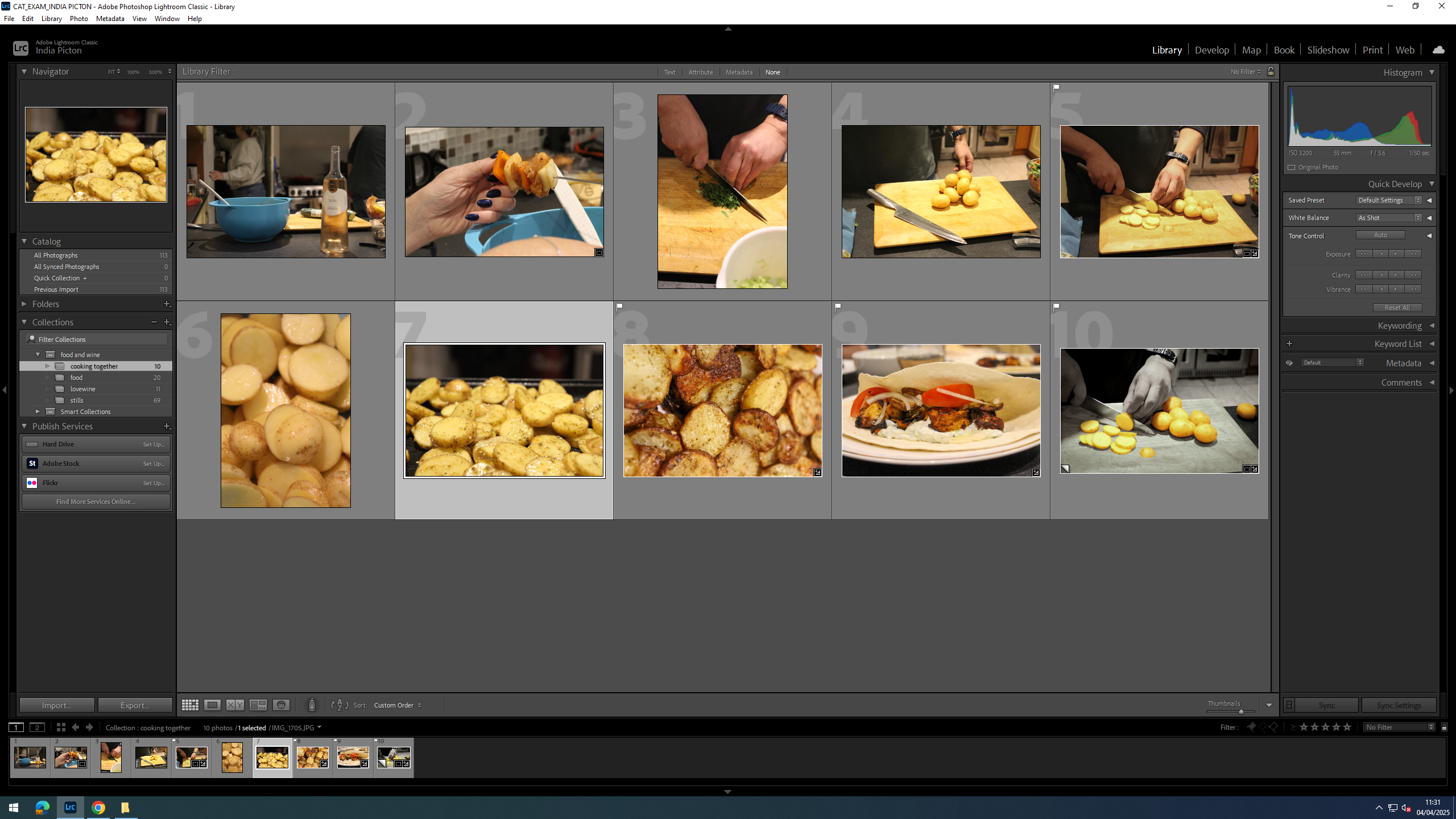
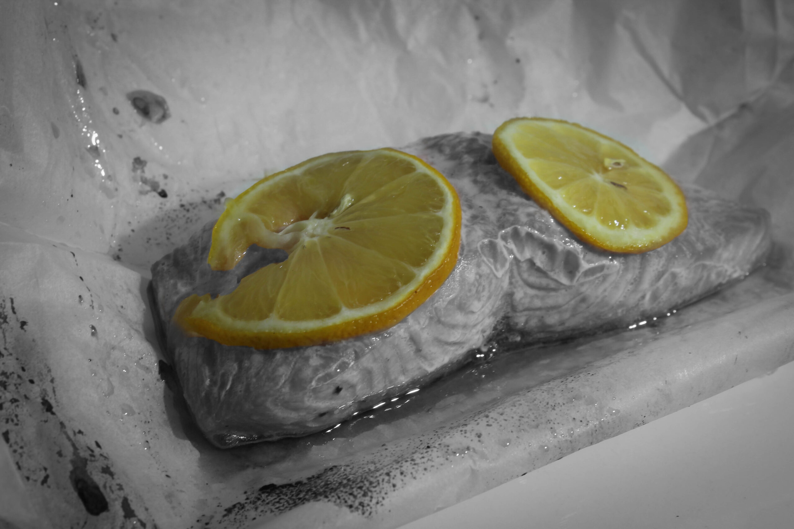
For this image of a piece of salmon, I felt that the lemon on top was muted and I wanted it to really stand out so I isolated the lemons and made the background black and white with a bit of vignette to add sort of a smoky feel.
Finals
This is probably my favourite image from the whole project. It is a simple lay out with an bottle and glass of wine and a piece of salmon cooked in paper. However so much thought went into the design of this photo, such as where the glass stood in relation to the shadows the way the bottle casts a green shadow over the wall adding more depth the the image and extending the backdrop further, pushing it away.
Evaluation
I did really enjoy this shoot, getting to try out more lighting ideas by using my dads heavy duty work light, altering brightness and the angle that it shone from. If I had to do it again, I would expand the shoot over several more days.
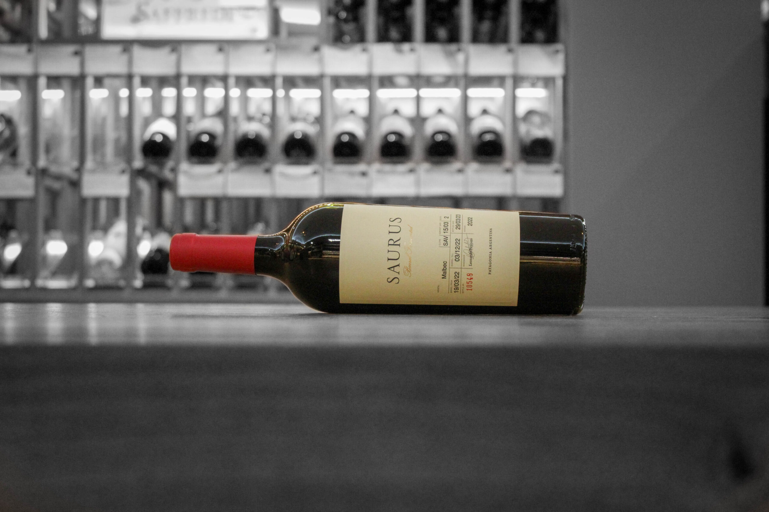
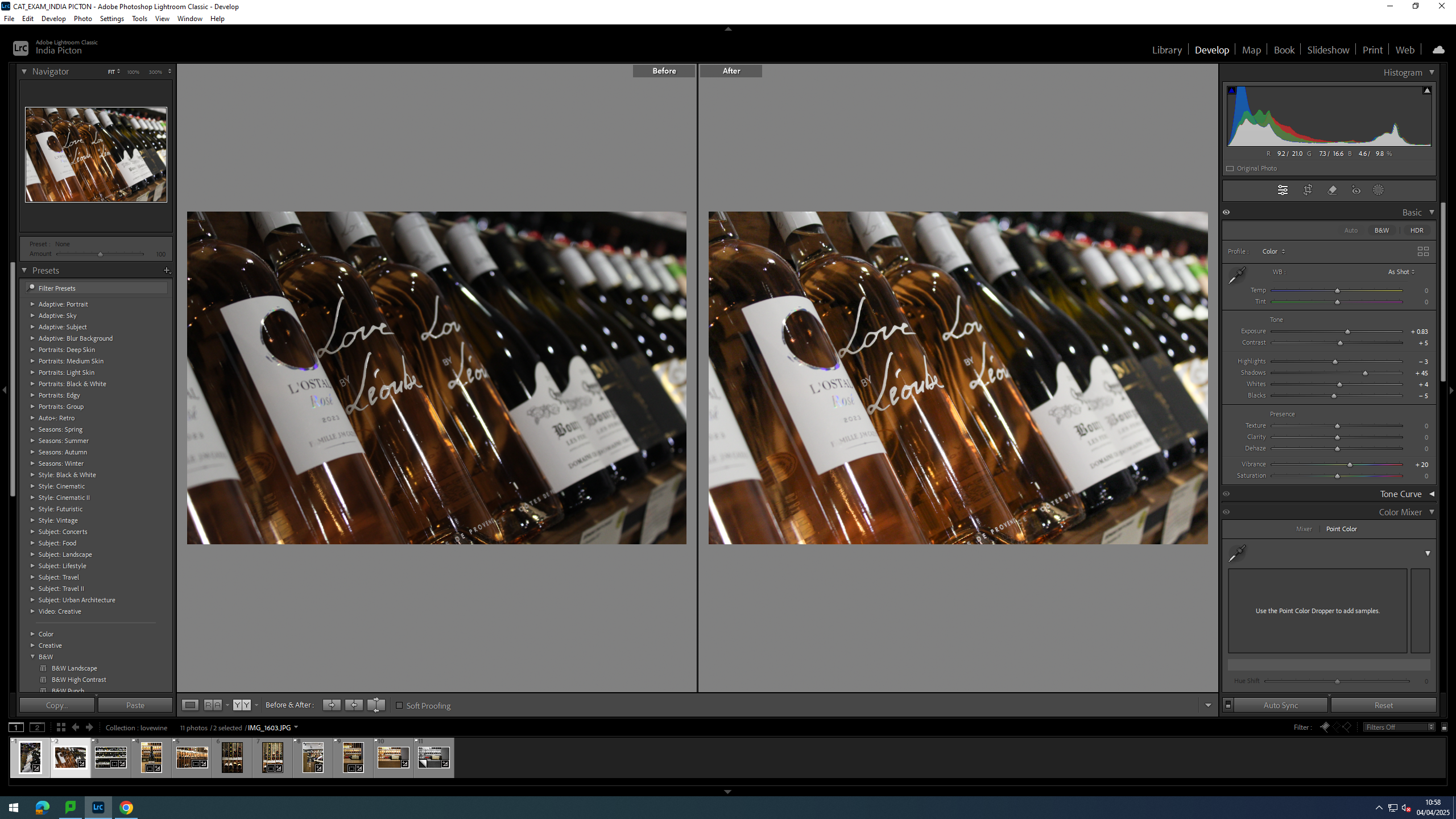
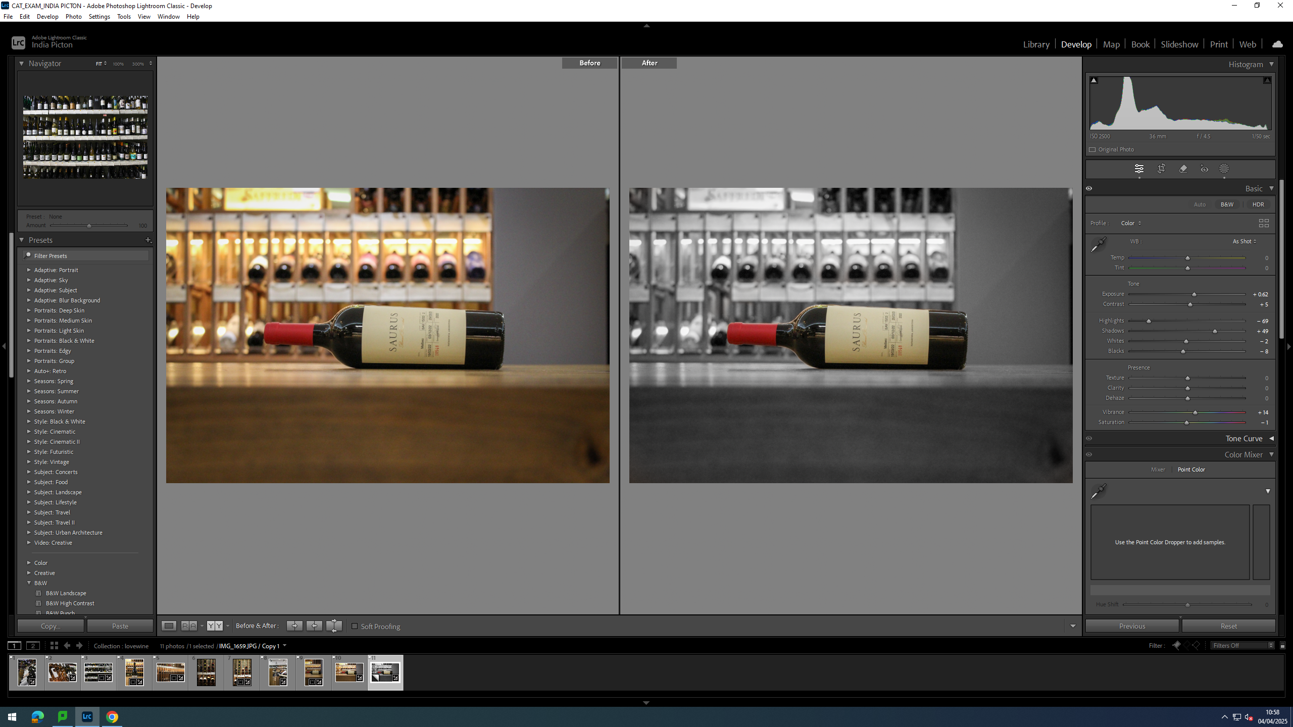
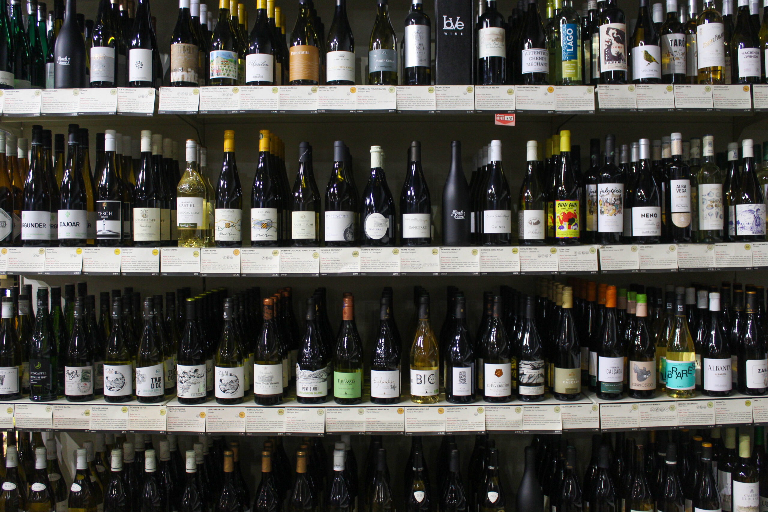
For this shoot I took my camera into my place of work, Love Wine, and got some pictures of the shop and some of the bottles we sell there.
Contact Sheet
I started out with 11 photos of which I liked 4.
editing
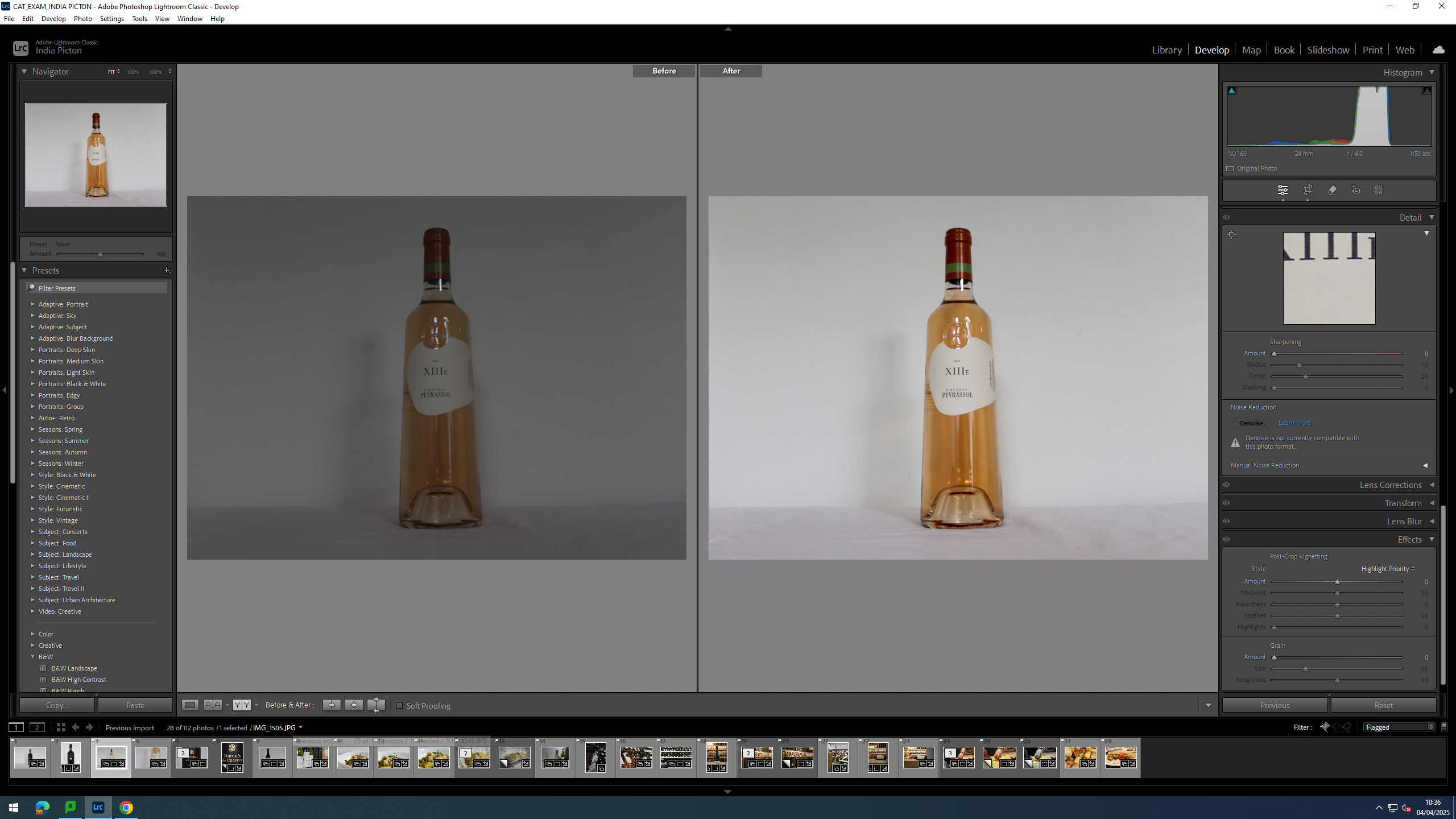
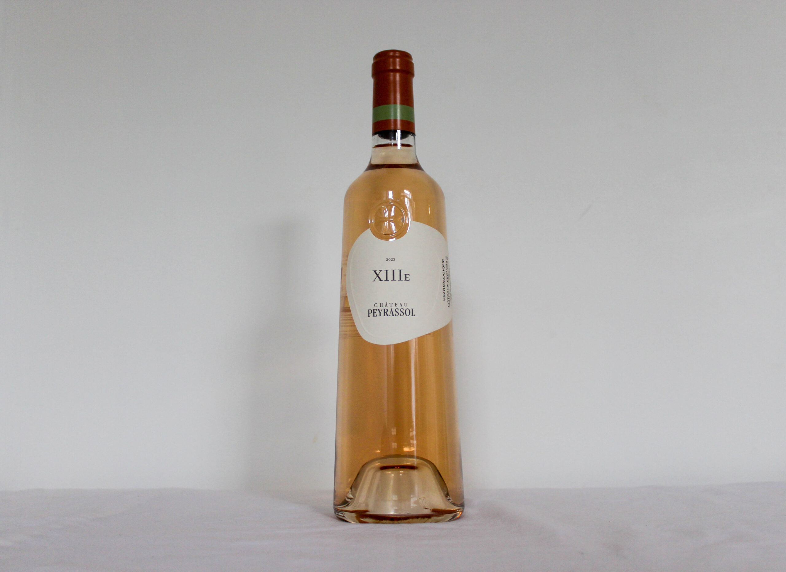
For this image I brightened it up, upping the exposure and making the rose colour stand out more by upping the vibrancy and adding a little bit of vignette.
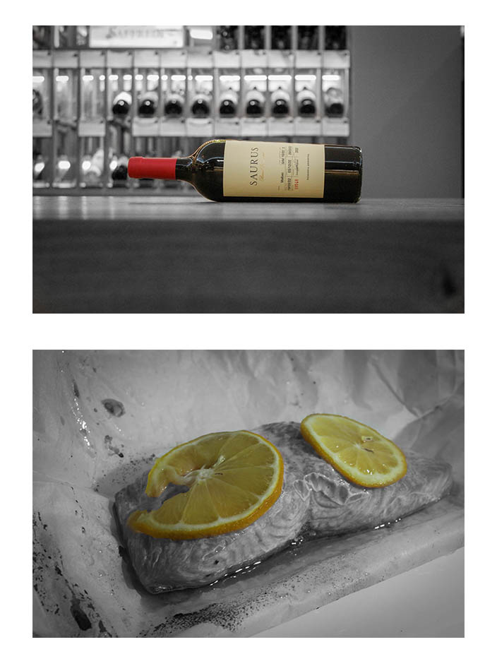
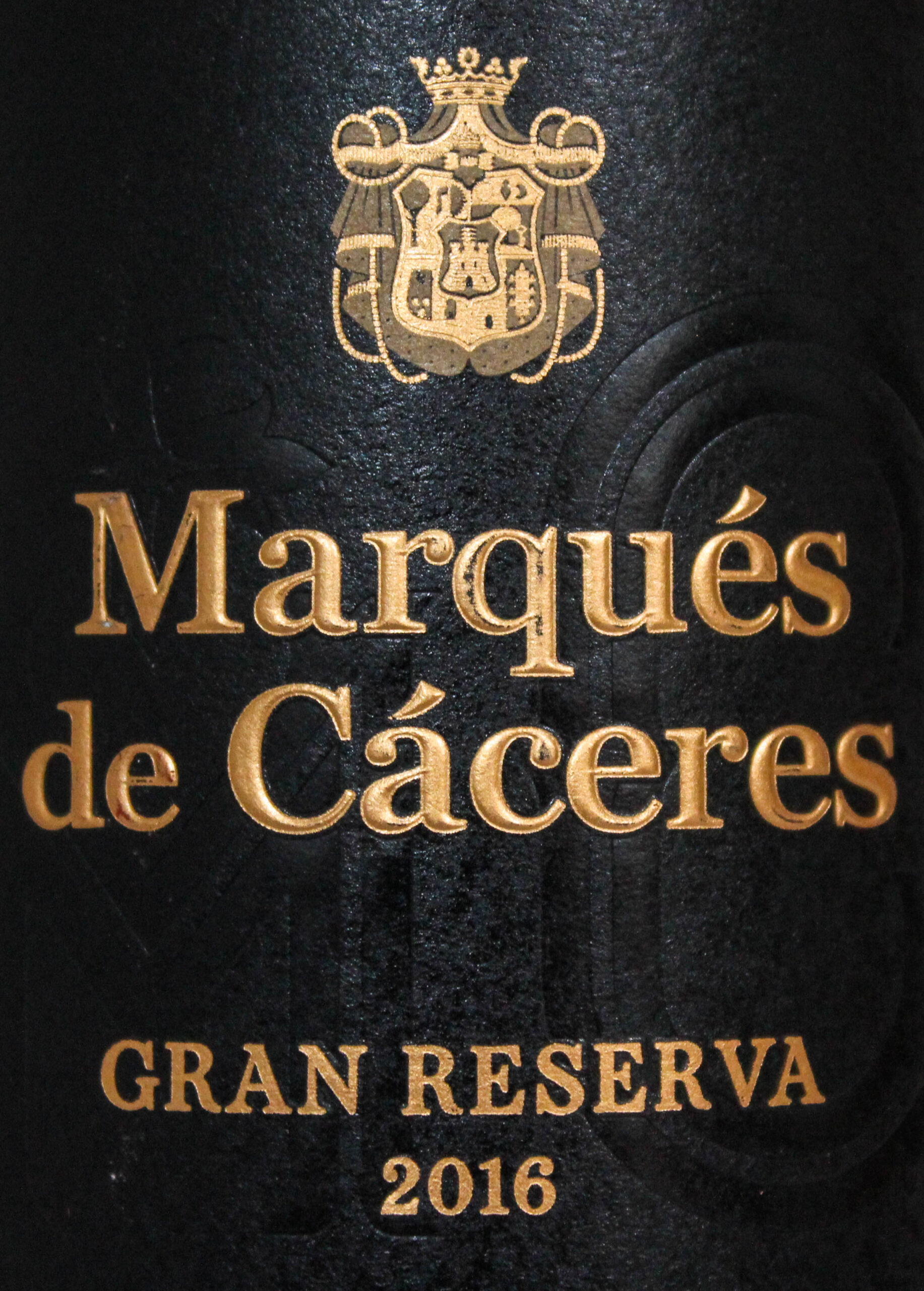
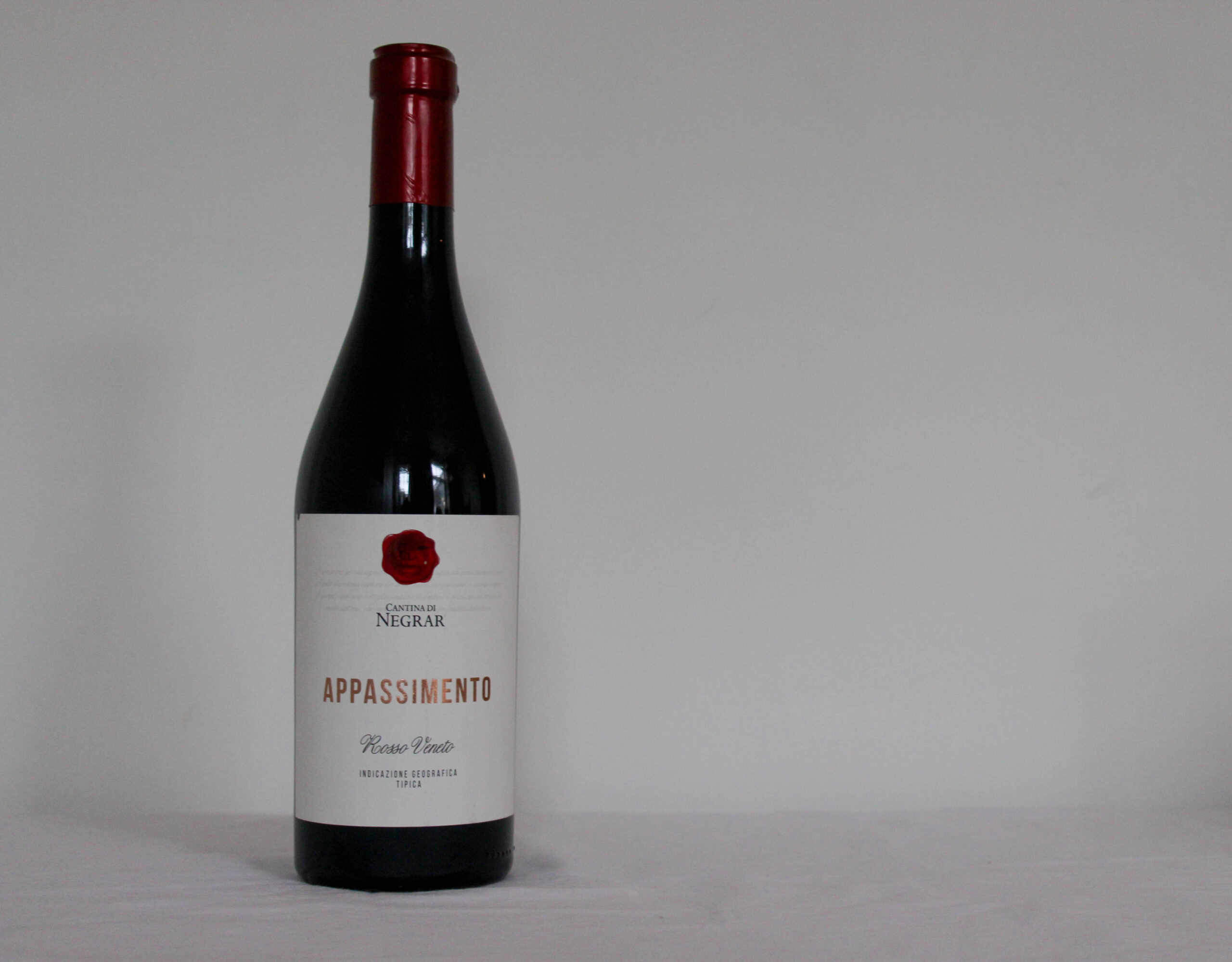
For this image I wanted to make the bottle stand out from the background as the have similar hues of yellow, especially with in the label, I also wanted to make that red stand out and pop more. so to rectify this I singled out the bottle with a mask and removed to colour from the background.
Finals
The vibrant red of the foil around the neck and cork makes the black and white background feel cold. The negative space of the side of the table helps place a slight frame at the bottom and make it seem as though the bottle is floating.
Evaluation
I think this shoot turned out really well and I’m incredibly happy with the quality of the photos. however, if I could do it again, I would go in on a day that I am not working as it would give me more time to get images.
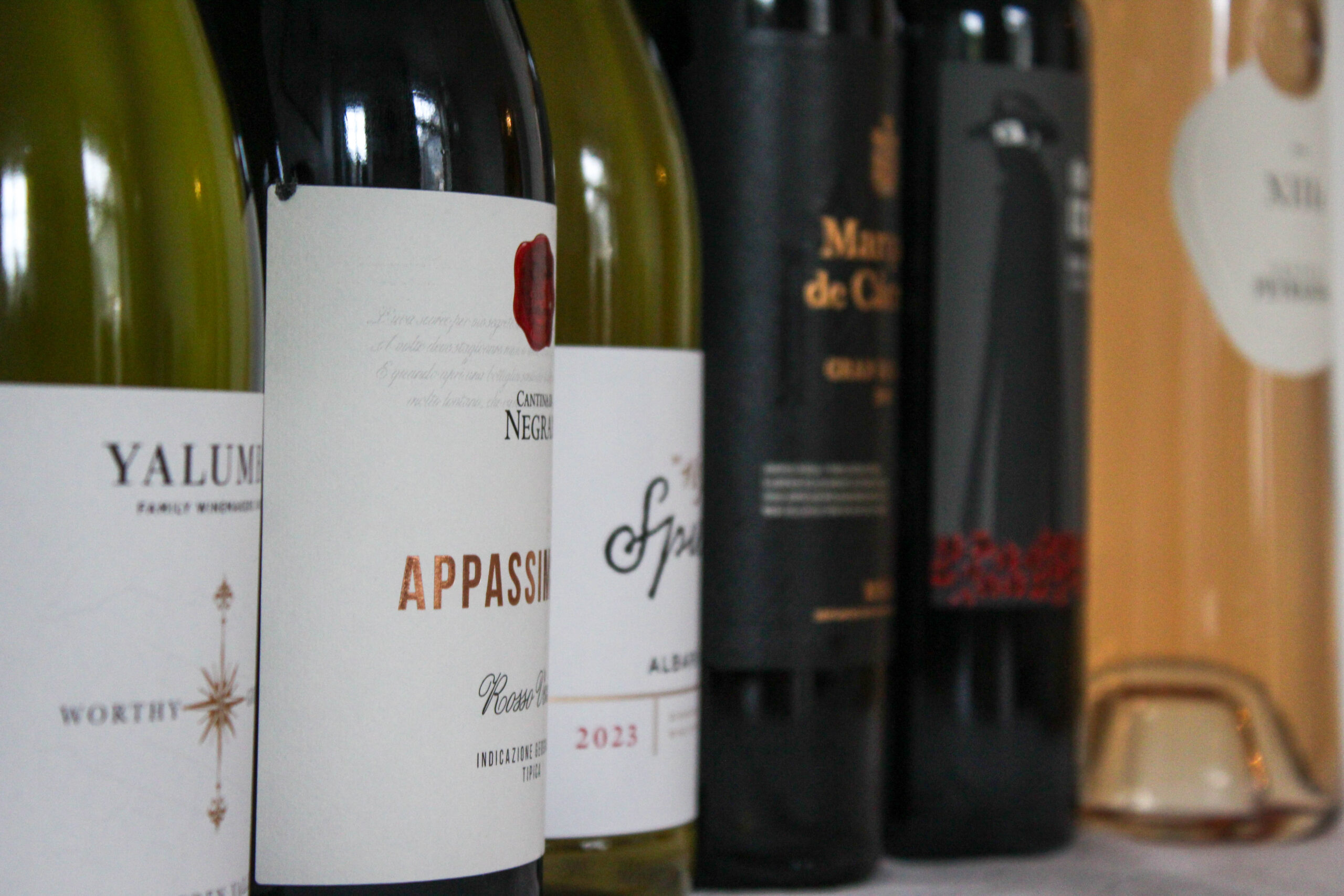
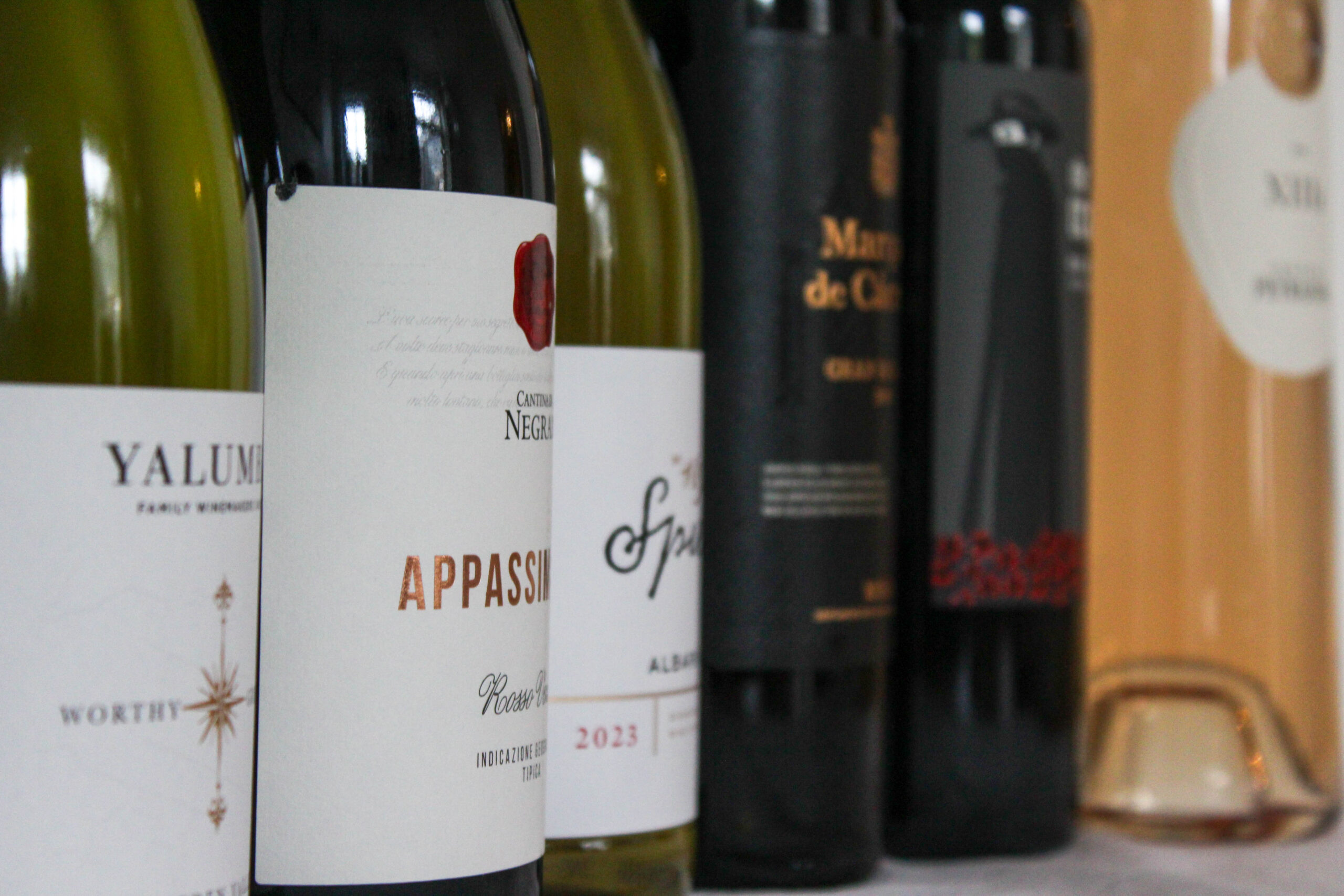
For this shoot I wanted to get some still life’s. I went and brought six bottles of wine, and got some single images of just the bottles, some more abstract images of the labels and some of them grouped together.
Contact Sheet
I started with 69 images from this shoot, I then selected the ones I liked best.
Editing
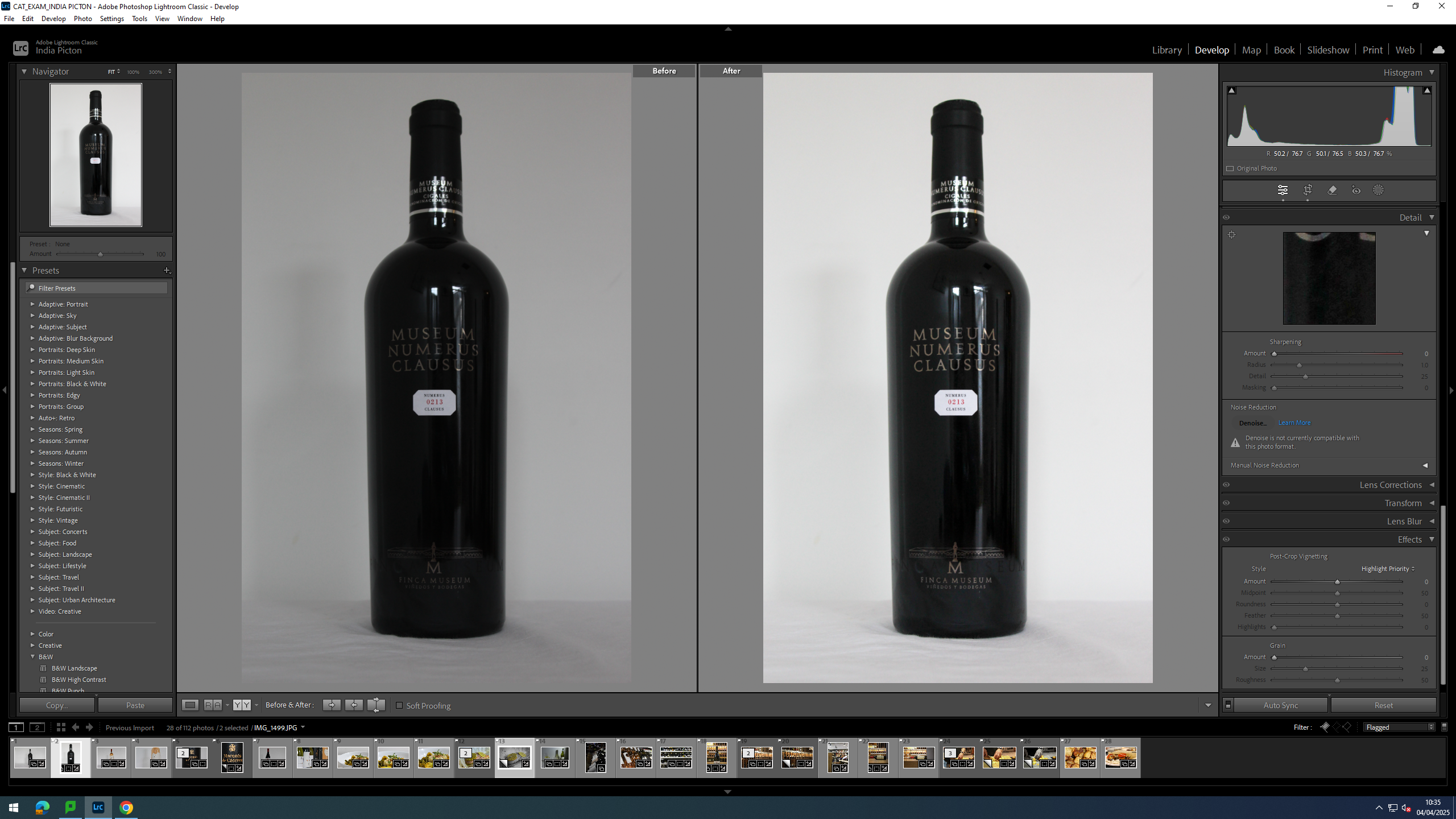
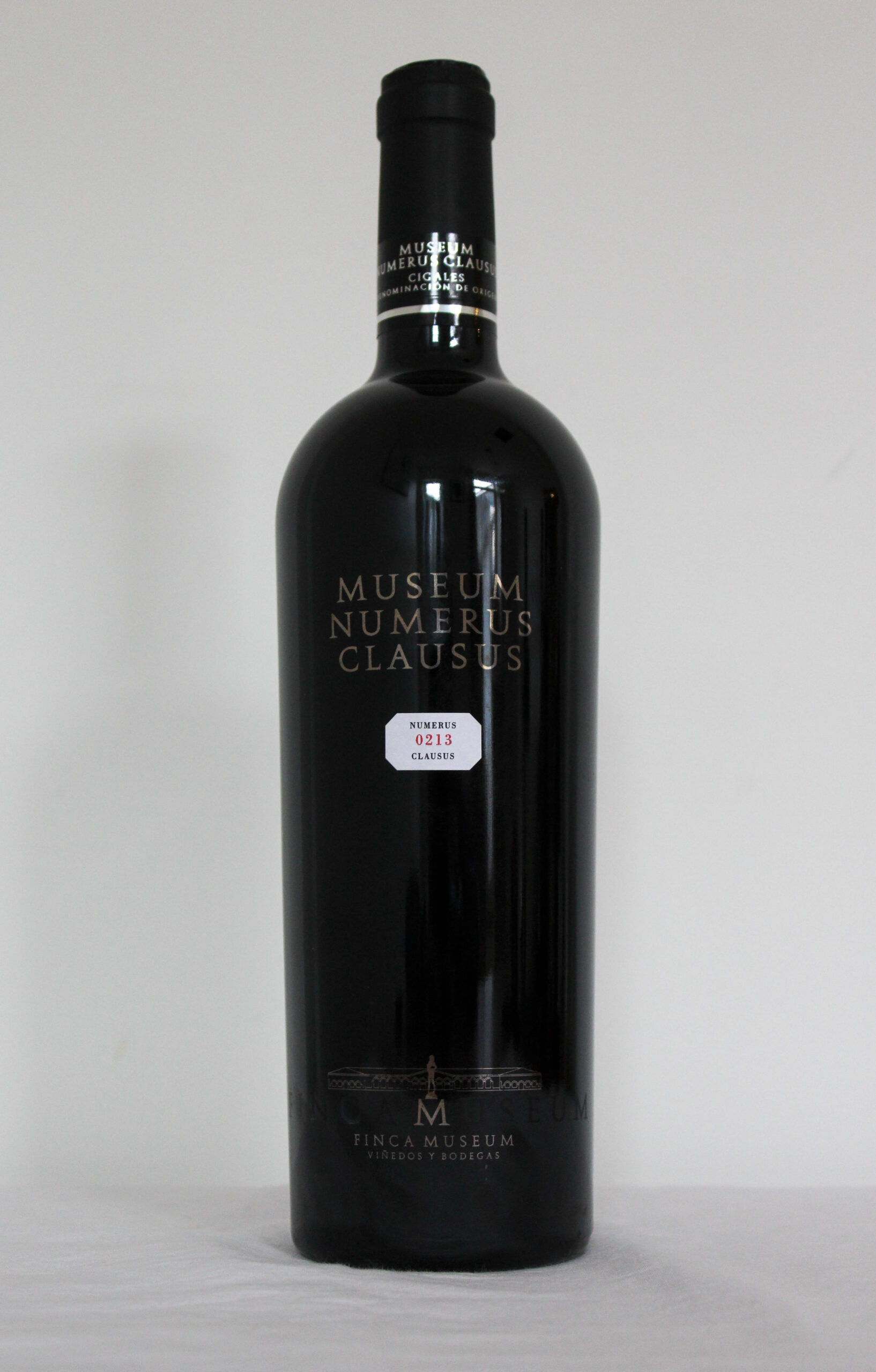
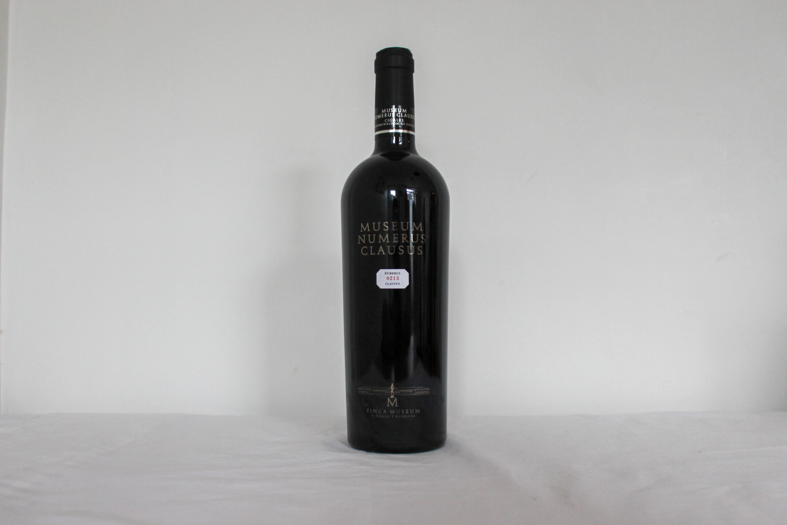
Most of the images only needed brightening up.
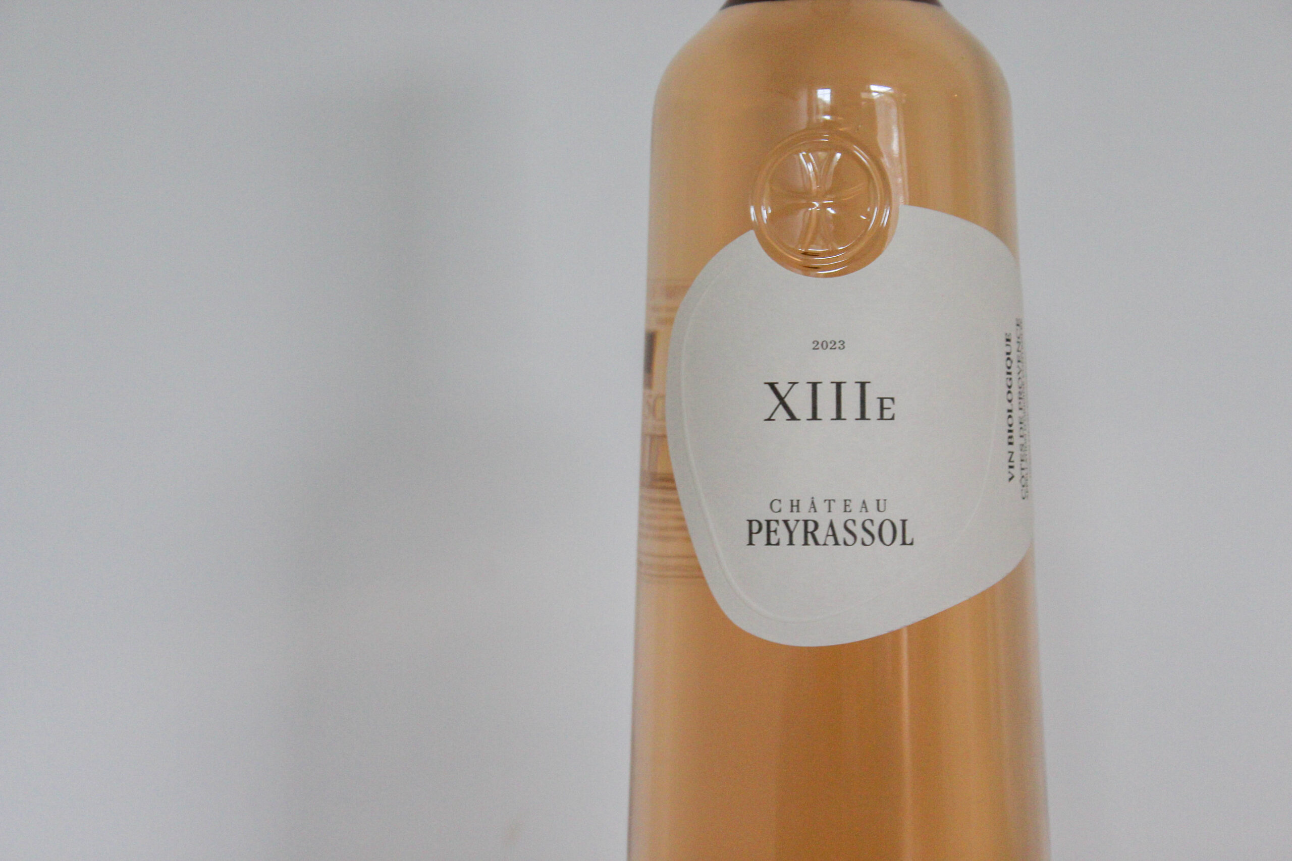
However, for the image of the label, I cropped in on the text and emblem more, so they took up most of the frame, to bring out some of the harder to see details with in the image. Such as the embossed lines which run along the label .
Finals
This is one of my favourites from this shoot. the ambient light give a nice sheen to the bottles, bouncing reflections back at the viewer. As the bottles go back they blur creating a interesting depth of field that sifts as the last bottle is turned slightly. The colours stand out with warm whites and creams, and deep reds working together to create a mixed colour palette of autumn.
Evaluation
Overall I’m happy with how this shoot turned out and I got some really good images. however, in the future id like to try a black backdrop for some images like this and see if it creates a different feel.
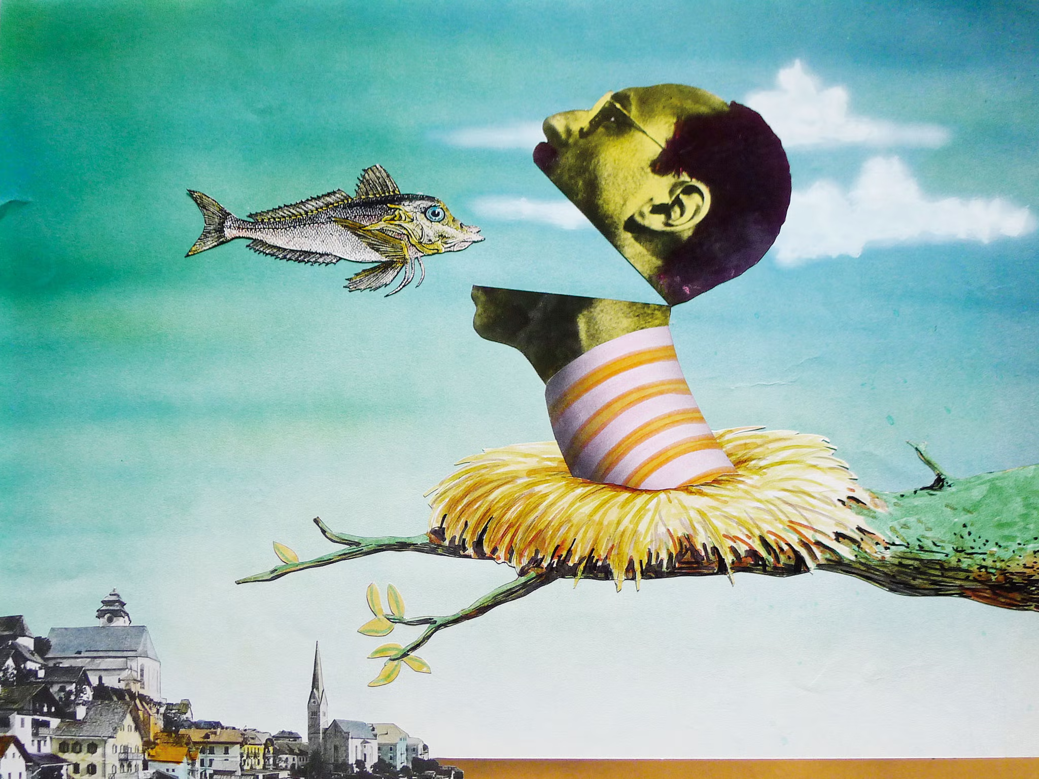
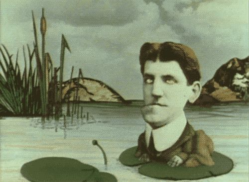
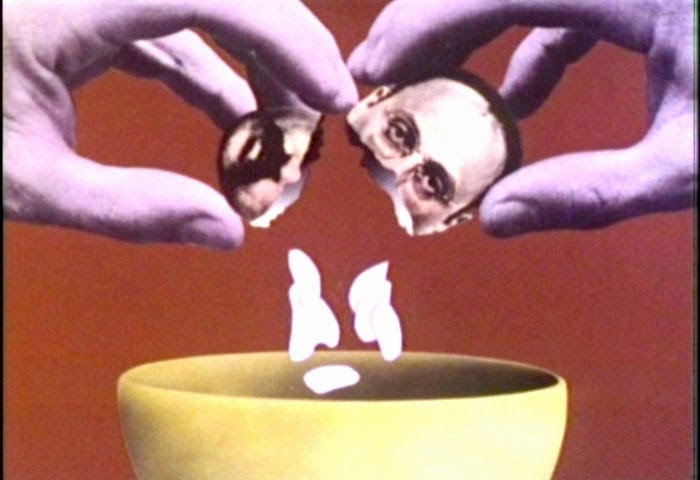
Well know for his work alongside Monty python, he illustrated magical pieces that defined a lot of the franchise. By incorporating photo montage into his animations he created something truly worth of playing along side the sketches the group created. These animations have created some marvellous and ludicrous stills that make you wonder what else he has instore.
Terry was a member of Monty Pythons flying circus right off the back, he frequently play characters which no on else wanted to play, such as the knight in armour that hit other characters with a plucked chicken. But most importantly, he created the animations that liked the sketches together, he even designed the series posters and movie posters and album covers.
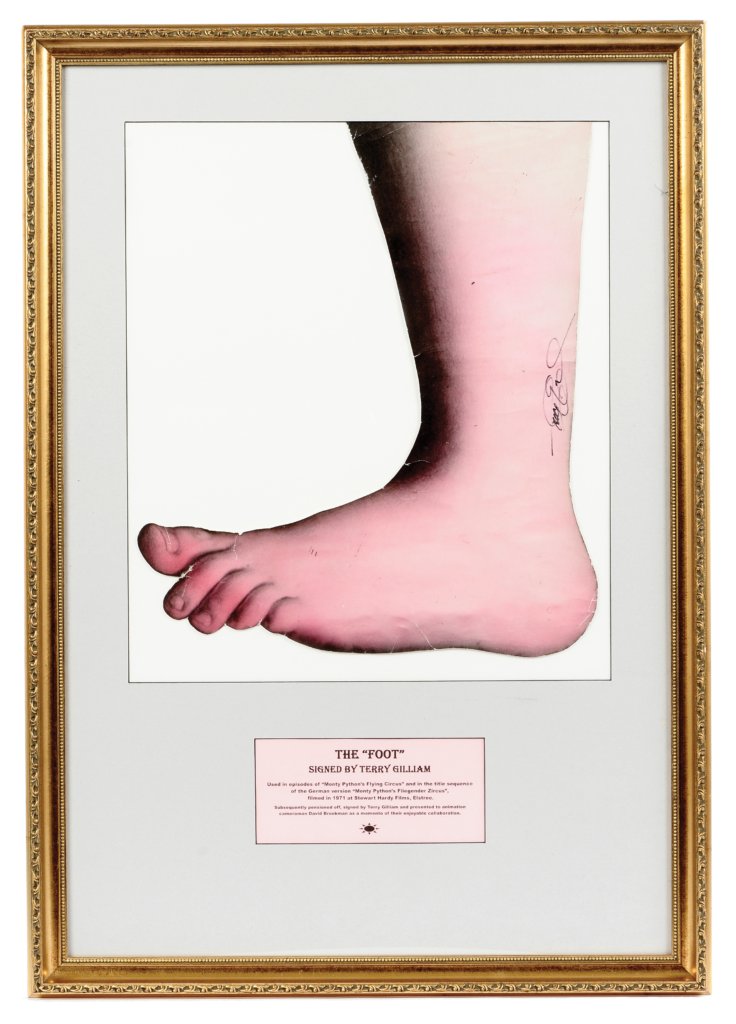
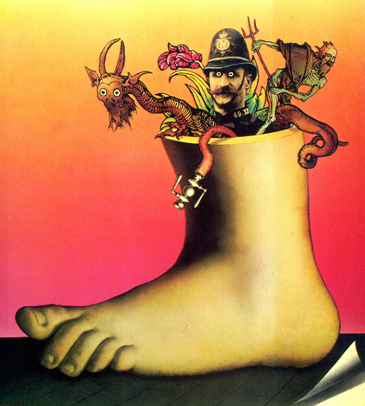
The above photo is the “foot” famously known for stomping down twice in the opening sequence of Monty pythons Flying circus. In July 2014 it sold at auction for £16800, the piece was only estimated around £400 to £600.
This photo is quite colourful, lots of reds, oranges and yellows, which form an eye catching image that doesn’t overpower the senses and isolates the subject from the background. By using a mix of photos and his own art, Gilliam’s has taken the idea of photomontage and created something unforgettable. The deep shadows on the ankle moves to accentuate the figures appearing out of the top. The dark colour of the policeman’s uniform makes the other creatures stand out.
I wish to explore food and wine and how it brings people together, How people come together over a meal and how they can work together to create something special. I also wanted to explore food being paired with wine to bringing out certain flavours, and accentuate the enjoyment of the meal. I aim to take not only still life photos and group photos, but some showing the process which leads to a meal whether that be the walk to a picnic and the set up, or the meal preparation and cooking process.