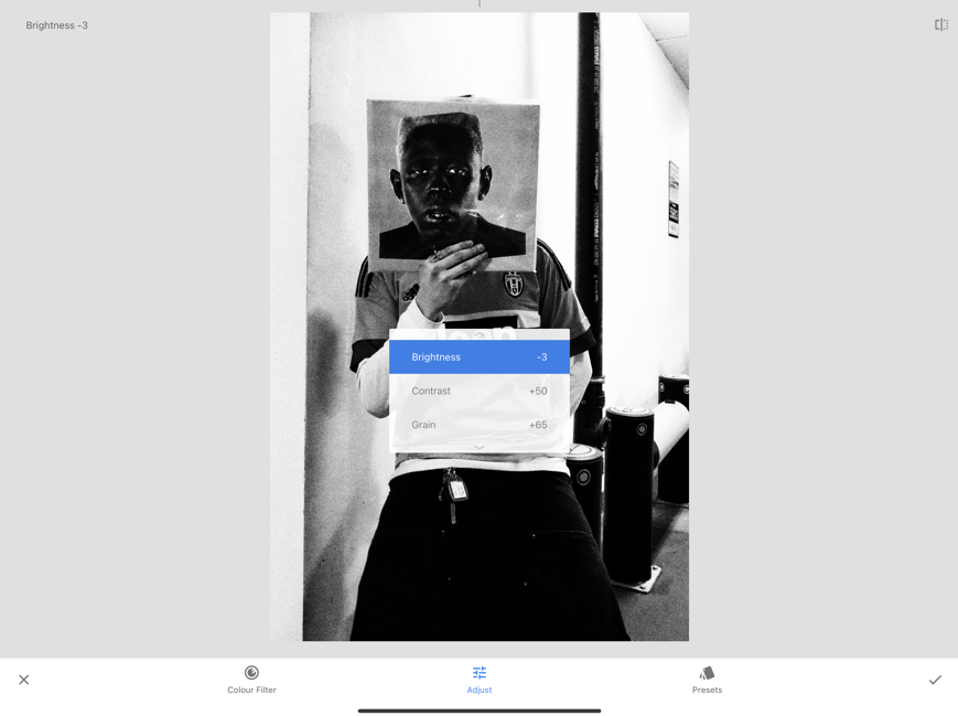
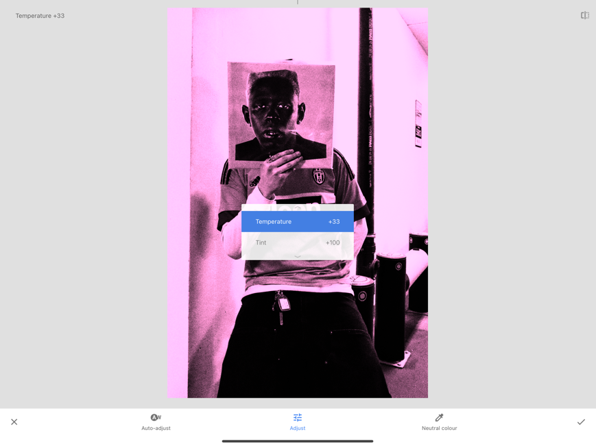
Planning:
Narrative, concept and design –
For my project, I wish to create a magazine centred around the subjects of Fashion, Identity and Youth Culture. Inspired by other magazines such as Carrhart WIP and other similar brands, I wish to present multiple images with unique yet similar aesthetics to present my chosen subjects. Using them as a reference I will construct my magazine to feature a similar appearance. This applies to deciding where the images will go on the page and the relation of text to images – the overall design.
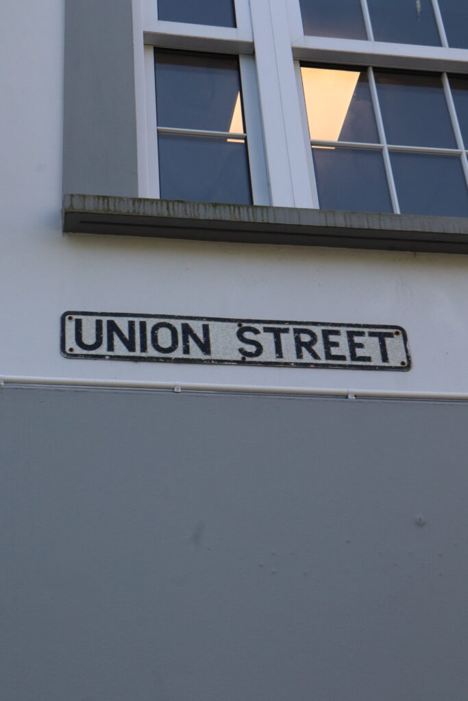
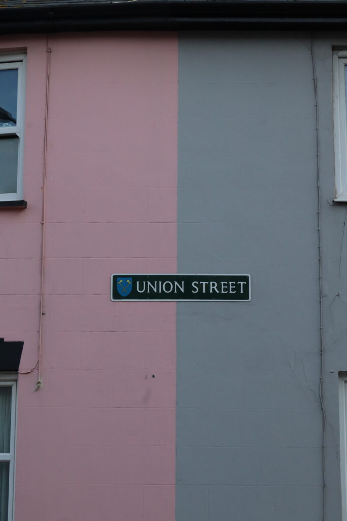
Being a magazine, these images will be printed out on a glossy paper-like surface which Is a common feature amongst magazines, page sizes will be 8.5 by 11 inches (22 x 28cm). As mentioned, the concept being my magazine will be focused on a union of many subjects that I find relate to bringing young people together – such as music, fashion, Identity and the cultures and environments that relate, or surround, them.
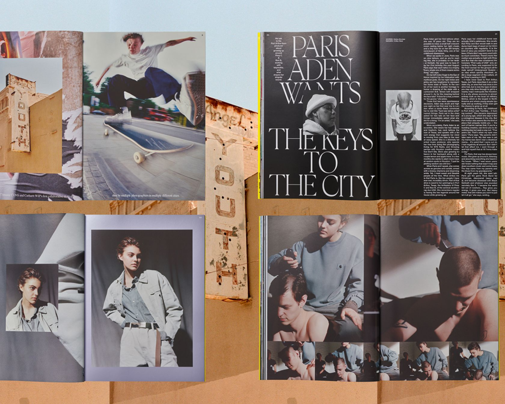
The narrative of my magazine follows in the influence from some of my references such as with the skate magazines were each subject or ‘article’ gets its own series of photographs and information, which are then separated by an ‘advertisement’ of images inspired by my artist studies into impressionism and social realism.
Construction Process:
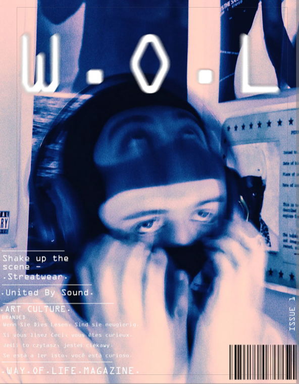
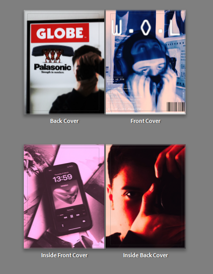
Front cover:
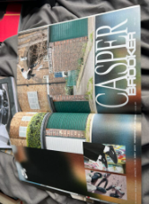
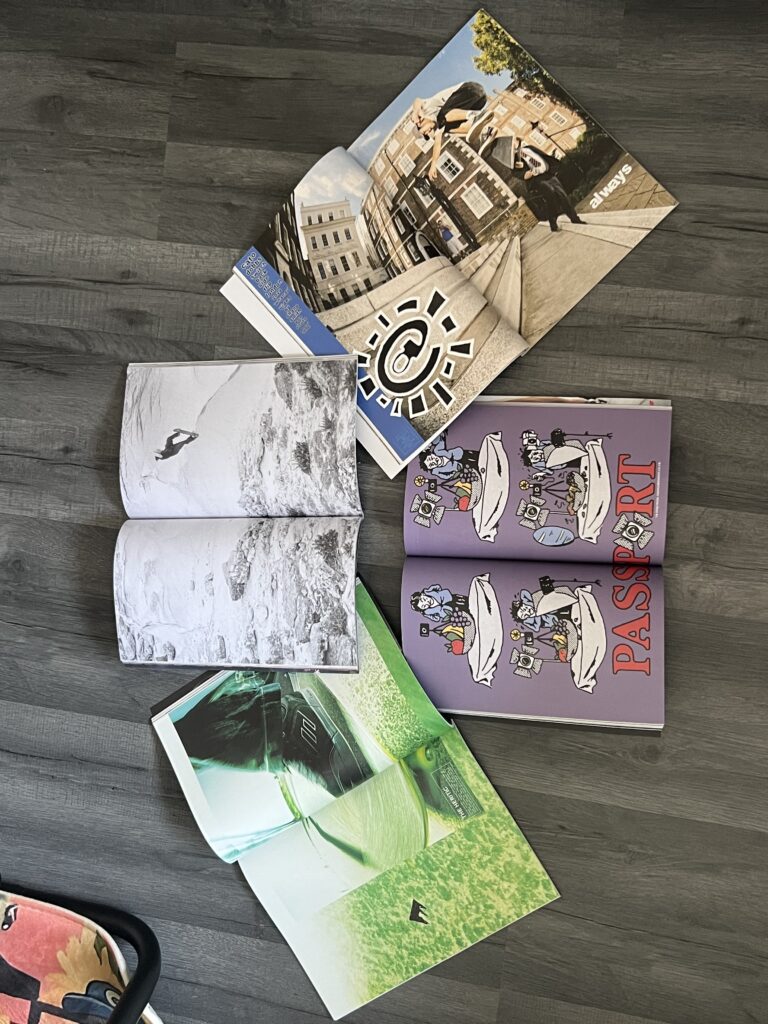
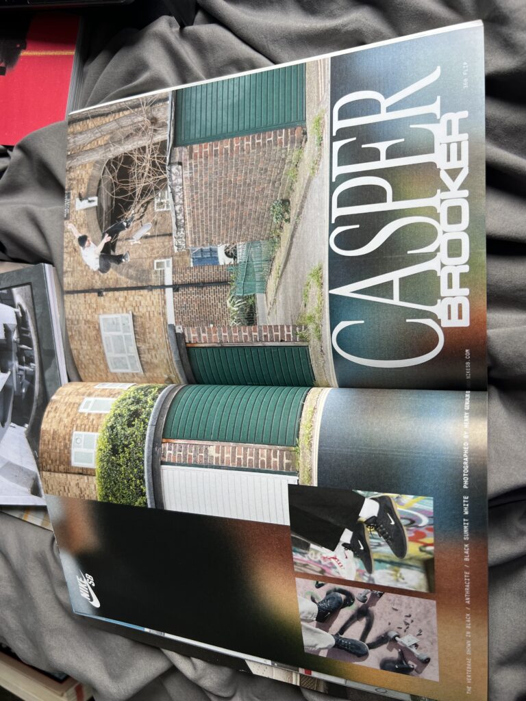
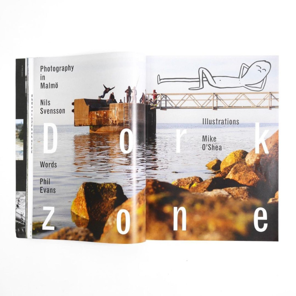
For my front cover I have created a similar image inspired by the Carhartt WIP magazine. On the WIP magazine it features articles and features, on my cover, I will replicate this by producing ‘articles’ I can then reference to that feature in my work.
Making the cover –
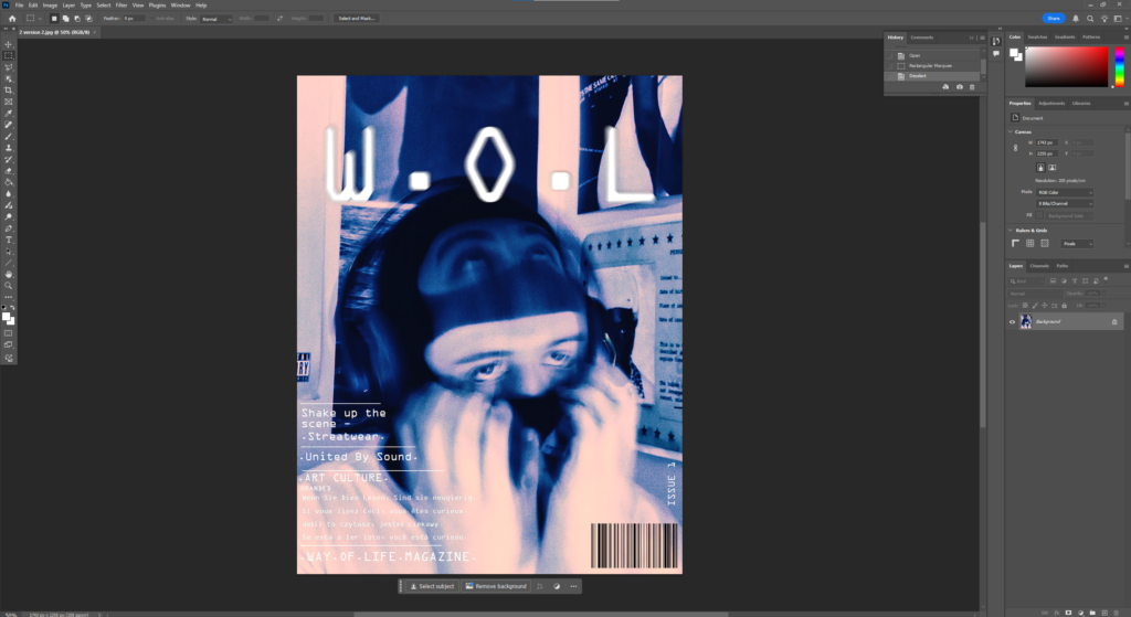
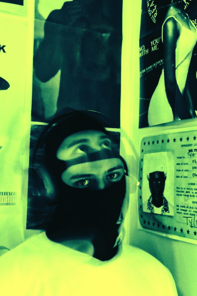
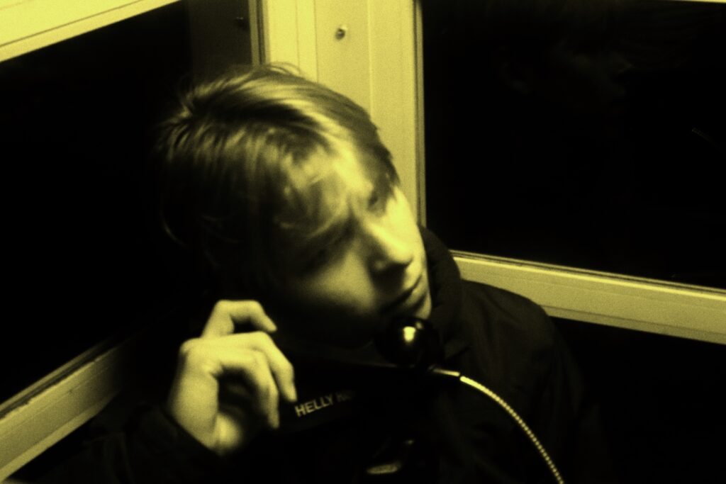
Choosing a fake name I decided, W.O.L – way of life. – This summarises the Youth culture and identity aspects of the project focus. Having it short and abbreviated as W.O.L this was inspired by brands such as ADWYSD – Always do what you should do and Carrhartt WIP – Work In Progress. In addition to this I also included the features from my inspiration such as issue number, barcode and article features.
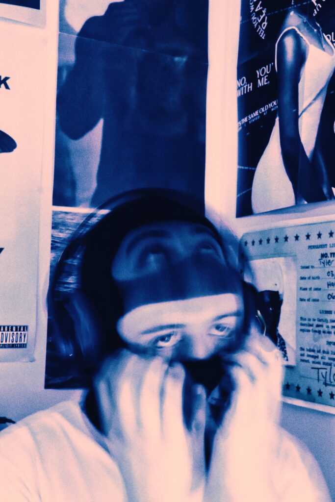
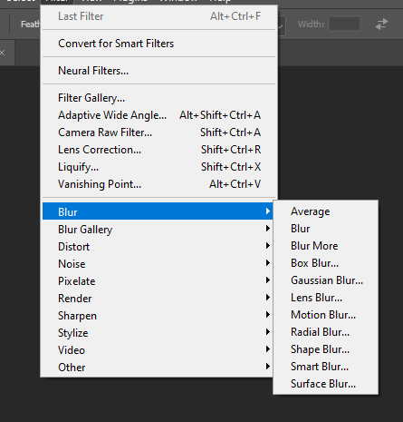
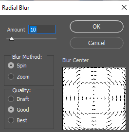
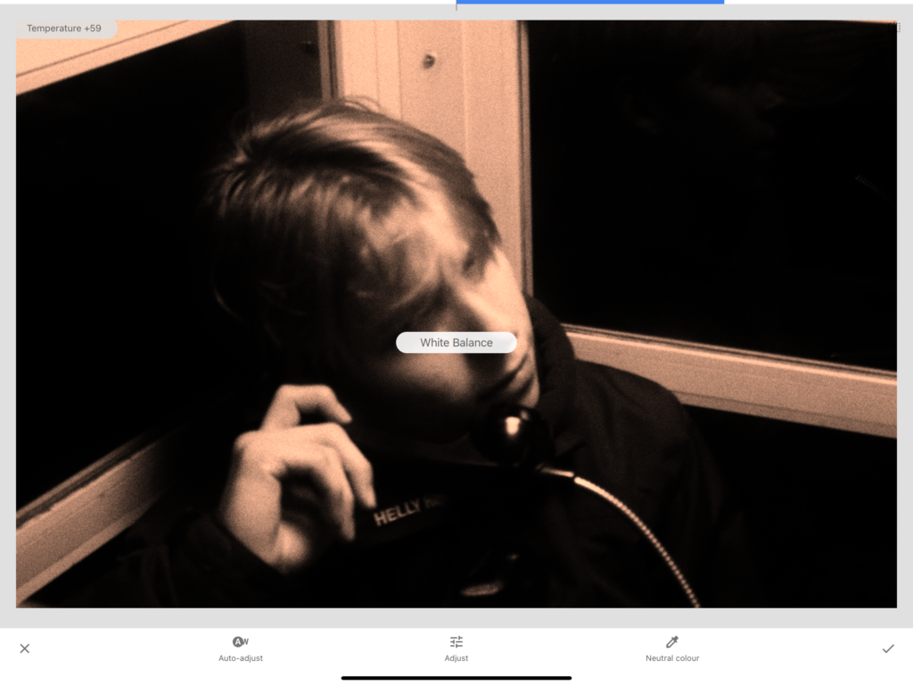
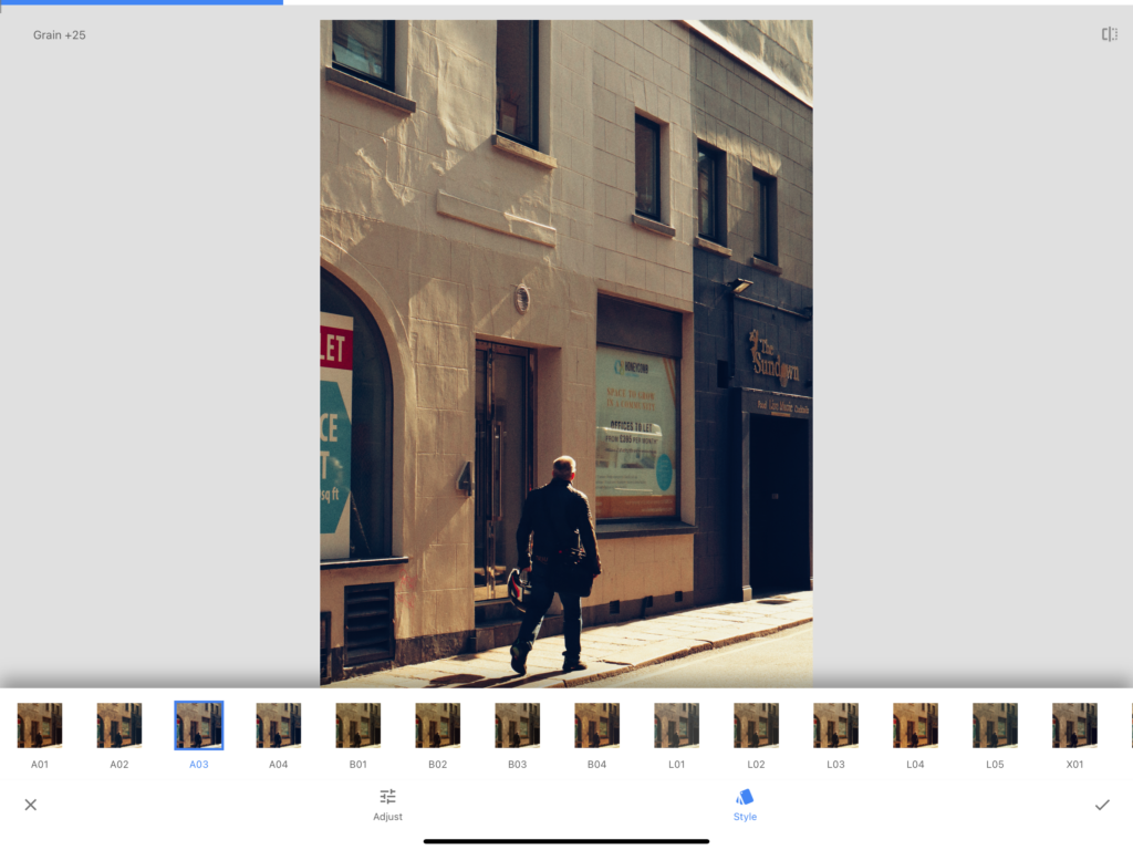
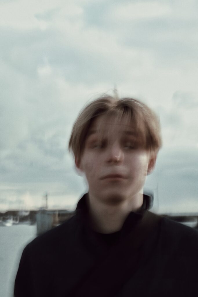
Using photoshop, I was able to create this through adjusting the text positioning and where I wanted it. To create the Blurred effect of my title I used the Filter effect featured at the top of photoshop and applied a radial blur to distort the text.
page designs:
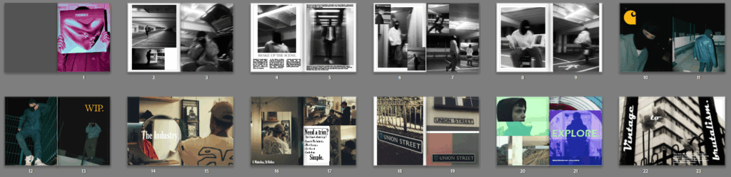
Using these types of image placements as my inspiration for my magazine, I will write brief yet related fake articles around them. The text will act as context to the images as I have selected such as being used for advertisements, art pieces, etc. All sorts of subjects that are featured in magazines I have taken reference from.
To present the theme of union through the subject matter of youth culture, identity and fashion through a magazine I produced fake articles surrounding some of my images. For the impressionist and social realist inspired images I took, I wrote these fake articles around some of the subjects and features of a magazine to go along with my images:
Fashion –
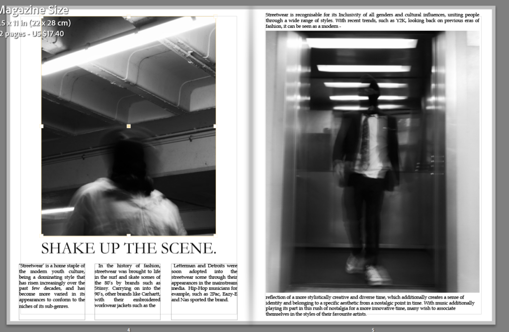
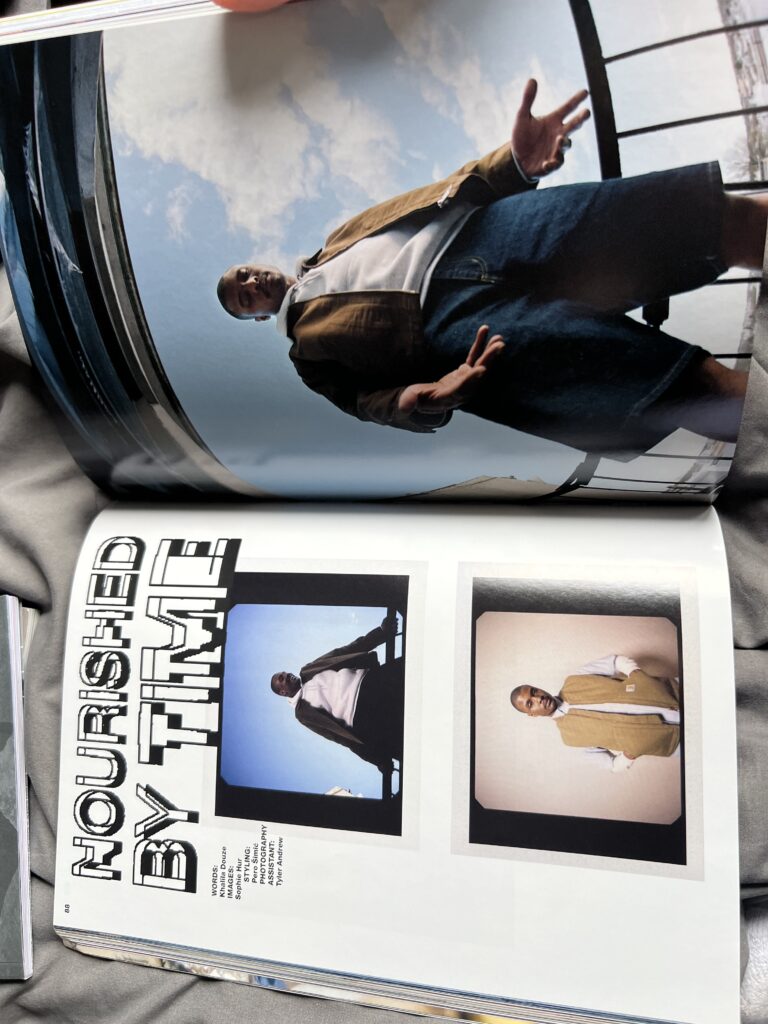
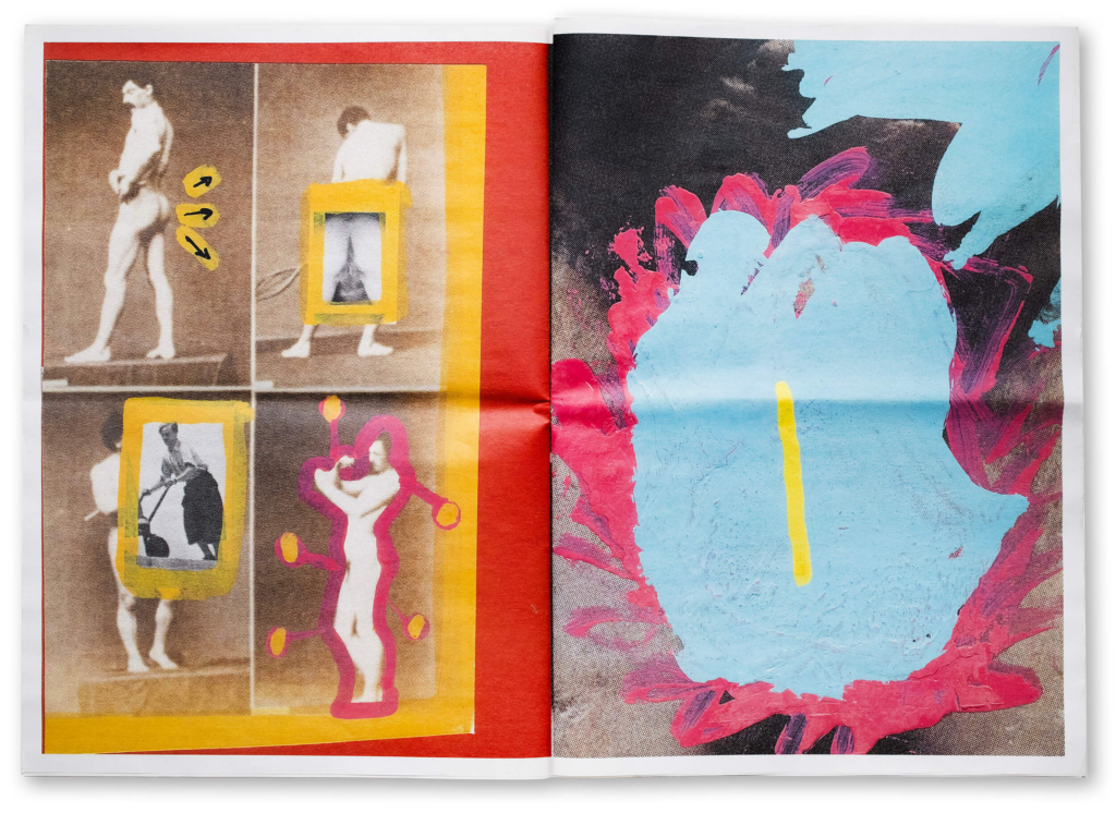
‘Shake up the scene’ – streetwear:
Fake article:
‘Streetwear’ is a home staple of the modern youth culture, being a dominating style that has risen increasingly over the past few decades and has become more varied in its appearances to conform to the niches of its sub-genres. In the history of fashion, streetwear was brought to life in the surf and skate scenes of the 80’s by brands such as Stüssy, carrying on into the 90’s other brands, like Carhartt with their embroidered workwear letterman and /Detroit jackets were soon adopted into the streetwear scene through their appearances in the mainstream media with Hip-Hop musicians such as 2Pac, Eazy-E and Nas.
Streetwear is recognisable for its Inclusivity of all genders and cultural influences, uniting people through a wide range of styles
With recent trends, such as Y2K, looking back to these eras of fashion, it can be seen as a modern reflection of a more stylistically creative and diverse time, which additionally creates a sense of identity and belonging to a specific aesthetic from a nostalgic point in time. With music additionally playing its part in this rush of nostalgia for a more innovative time, many wish to associate themselves in the styles of their favourite artists.
More fashion articles:
Branded – Fashion in photography.
What brand do you belong to?
Brands such as Nike and Adidas run the show in the fashion industry, keeping consistent to what’s new and what people want. Others such as ADWYSD, creating pieces that stand out from the norm. With many consumers finding preference other one brand to another, what brand best defines you?
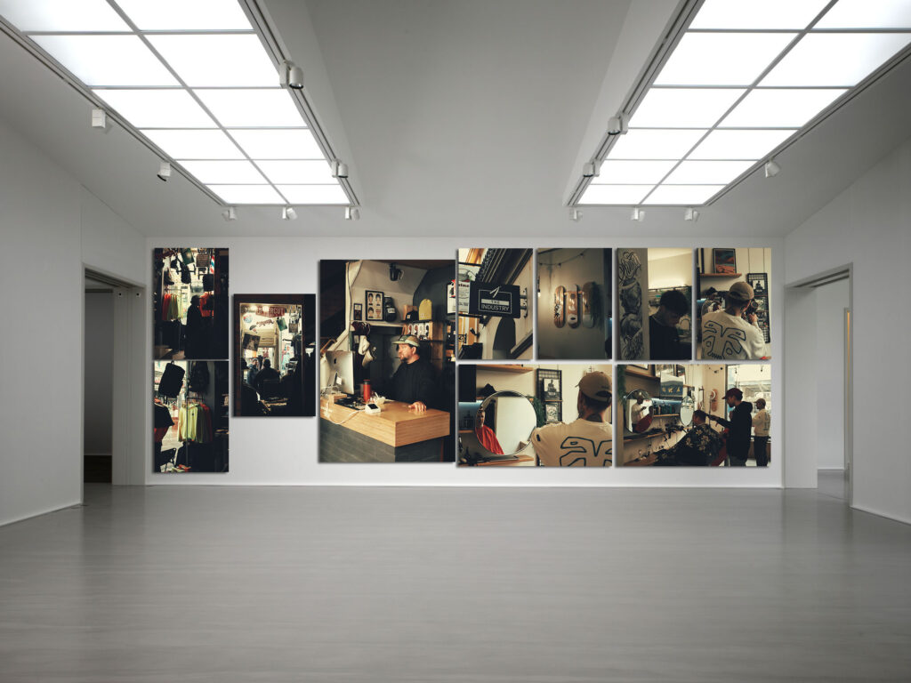
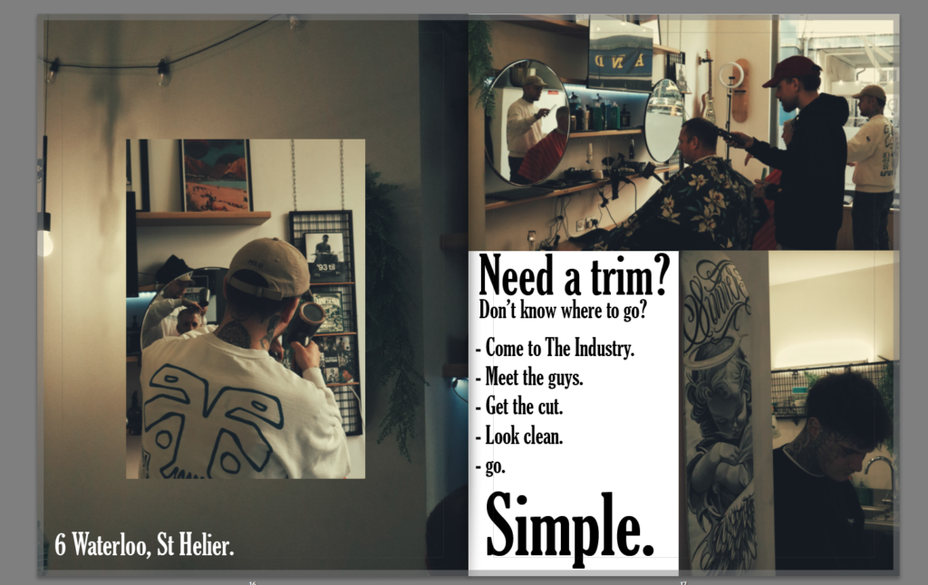
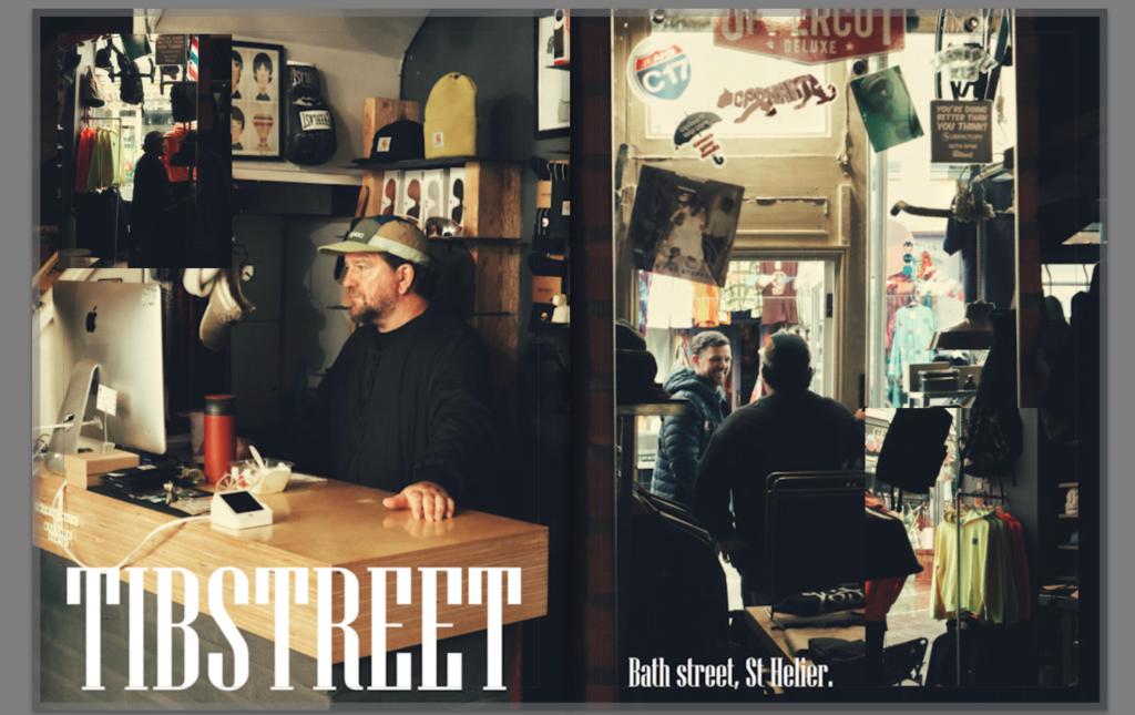
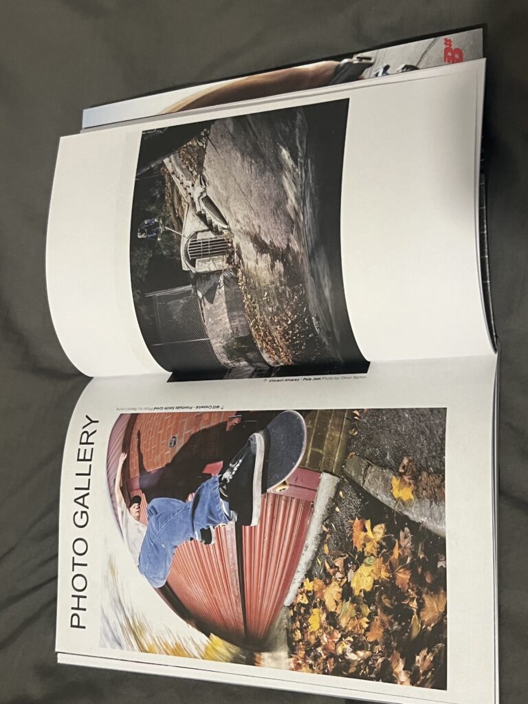
The Industry, Tibstreet , Portlet and branded, and other photos – advertisement pages – inspired from skate magazines.
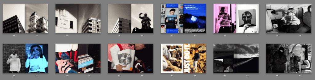
Music –
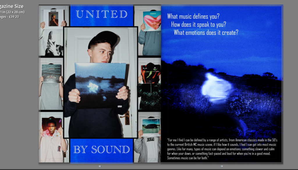
United by sound – Daniel Caesar remade album cover +poster of ‘United by sound’
What music defines you? How does it speak to you? What emotions does it create?
“For me I find I can be defined by a range of artists, from American classics made in the 50’s to the current British MC music scene, if I like how it sounds, I feel I can get into most music genres. Like for many, types of music can depend on emotions: something slower and calm for when your down, or something fast-paced and loud for when you’re in a good mood. Sometimes music can be for both.”
Art/identity –
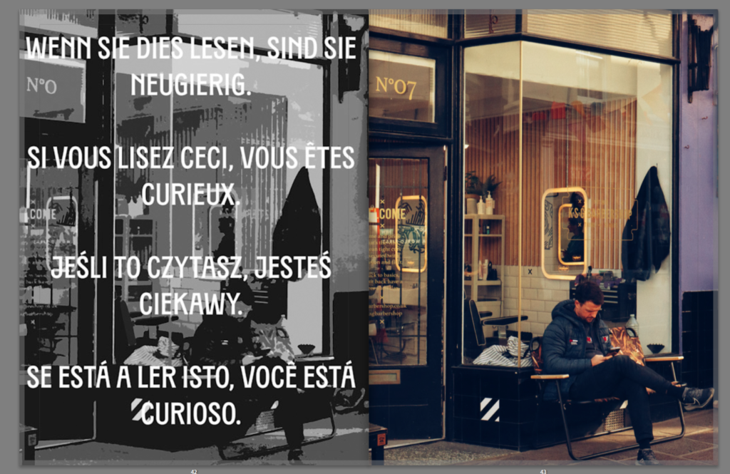
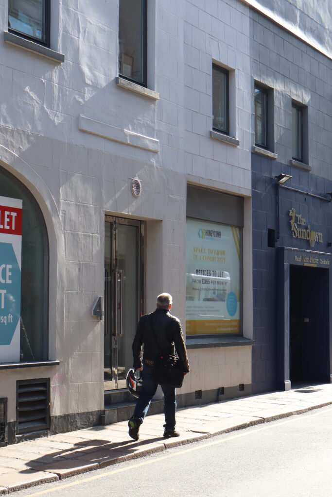
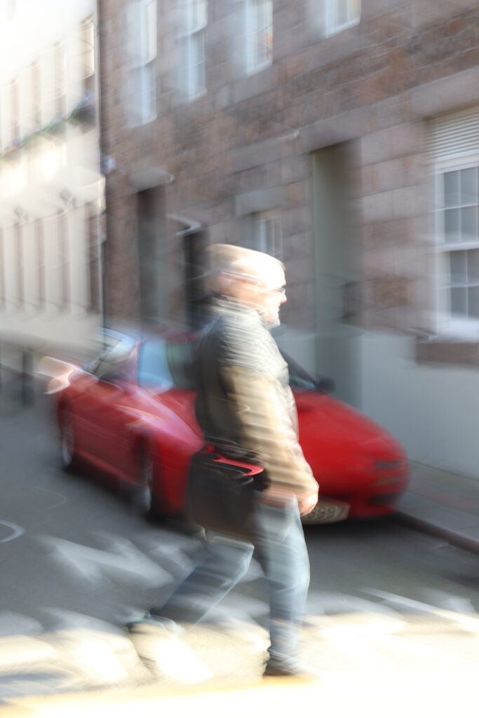
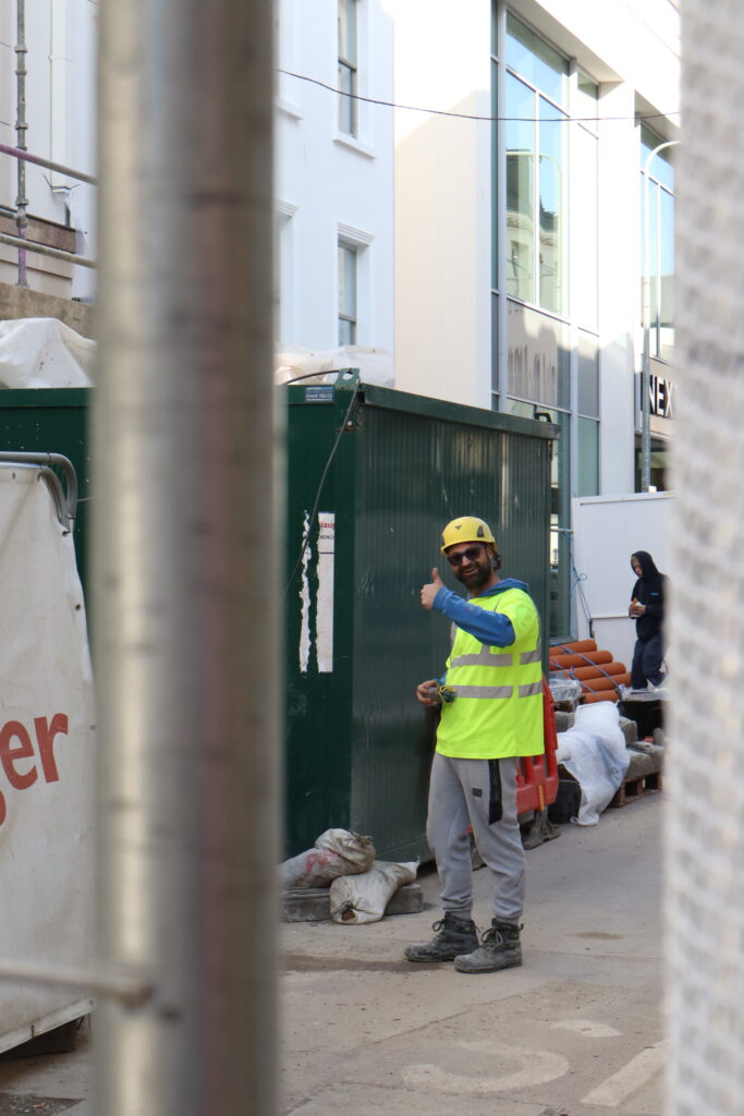
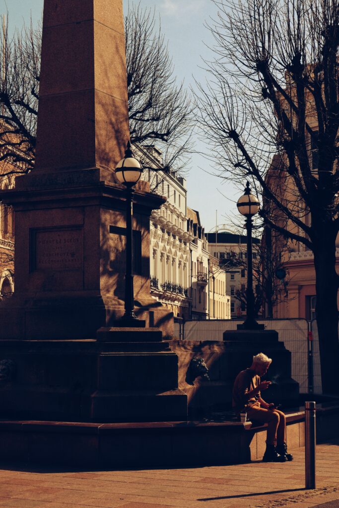
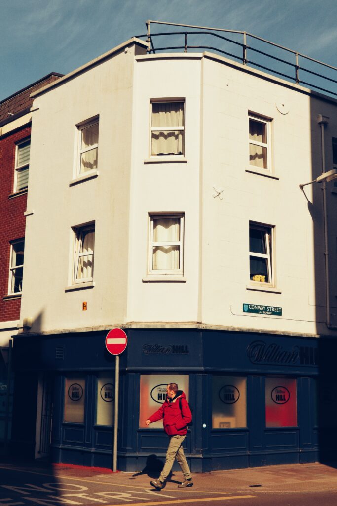
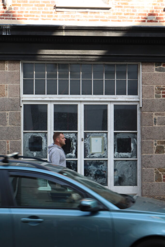
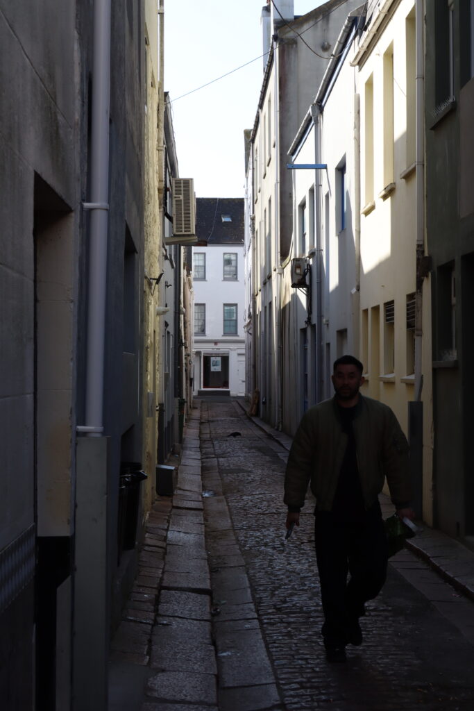
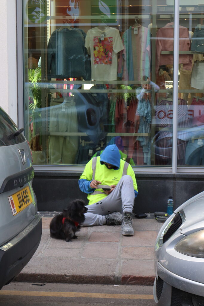
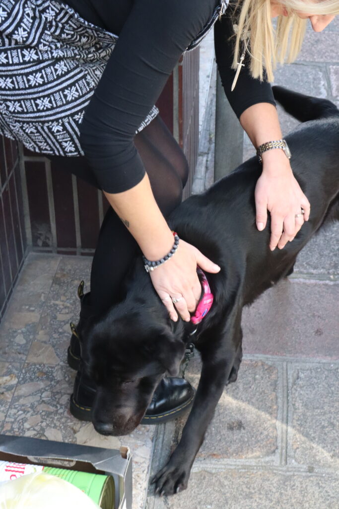
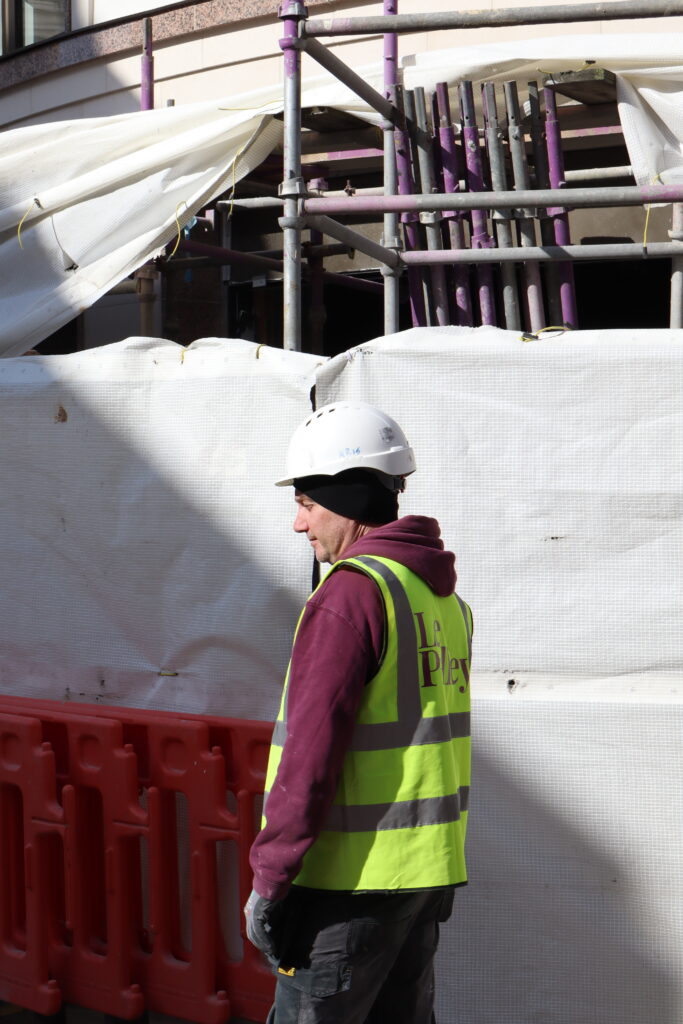
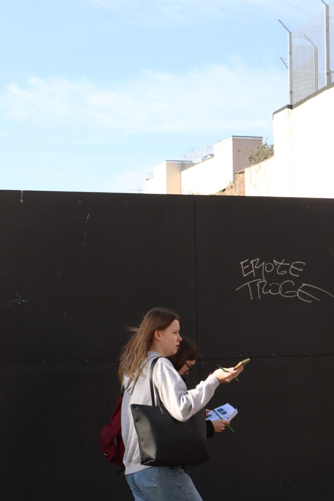
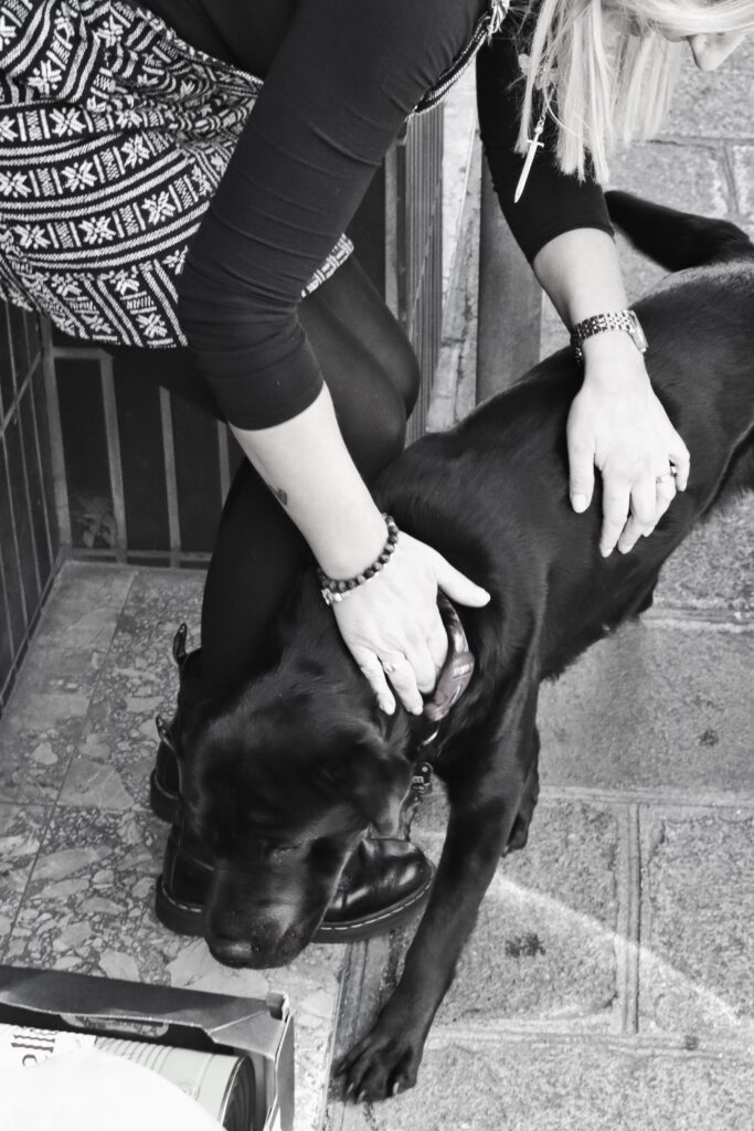
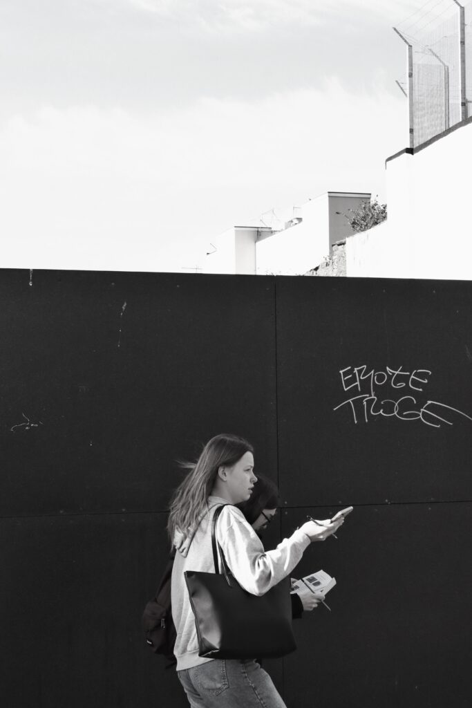
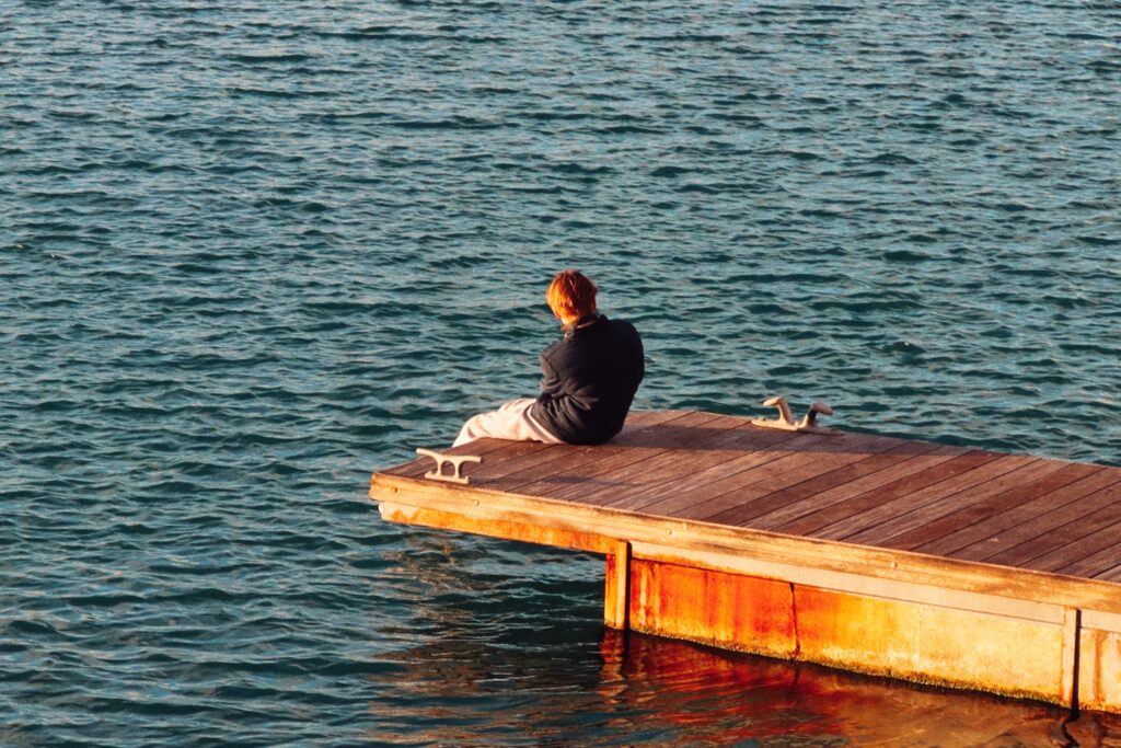
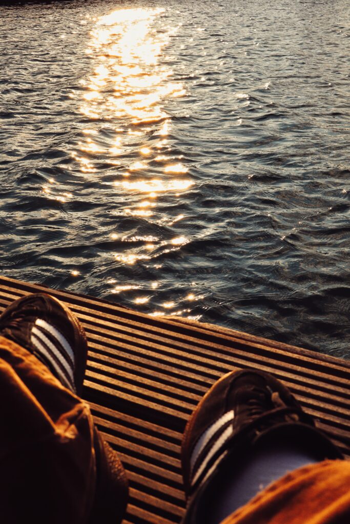
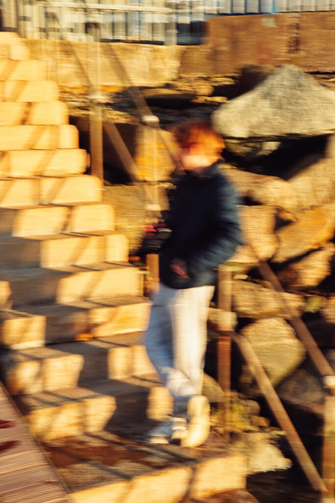
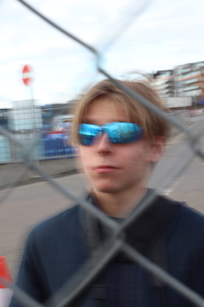
(Goes with the images of people around town – coloured and black and white images)
Wenn Sie Dies Lesen, Sind sie neugierig.
Si vous lisez Ceci, vous êtes curieux.
Jeśli to czytasz, jesteś ciekawy.
Se está a ler isto, você está curioso.
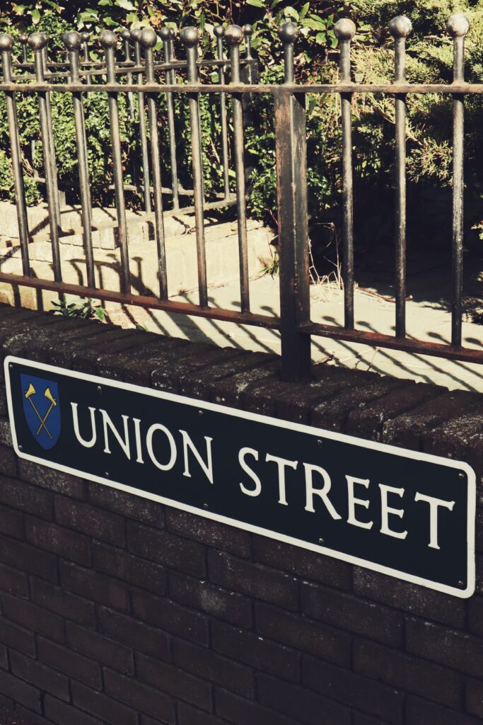
– translated: If you are reading this, you are curious. – multiple languages to represent town’s multi-cultural identity.
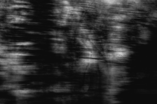
Social-realist photography:
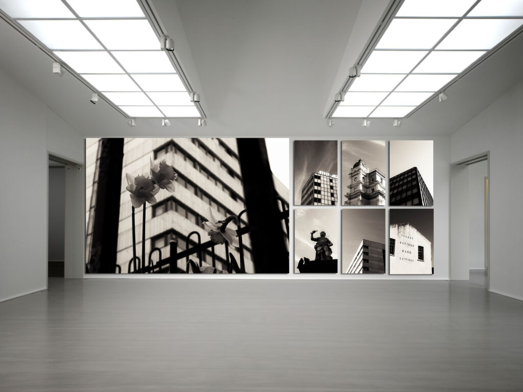
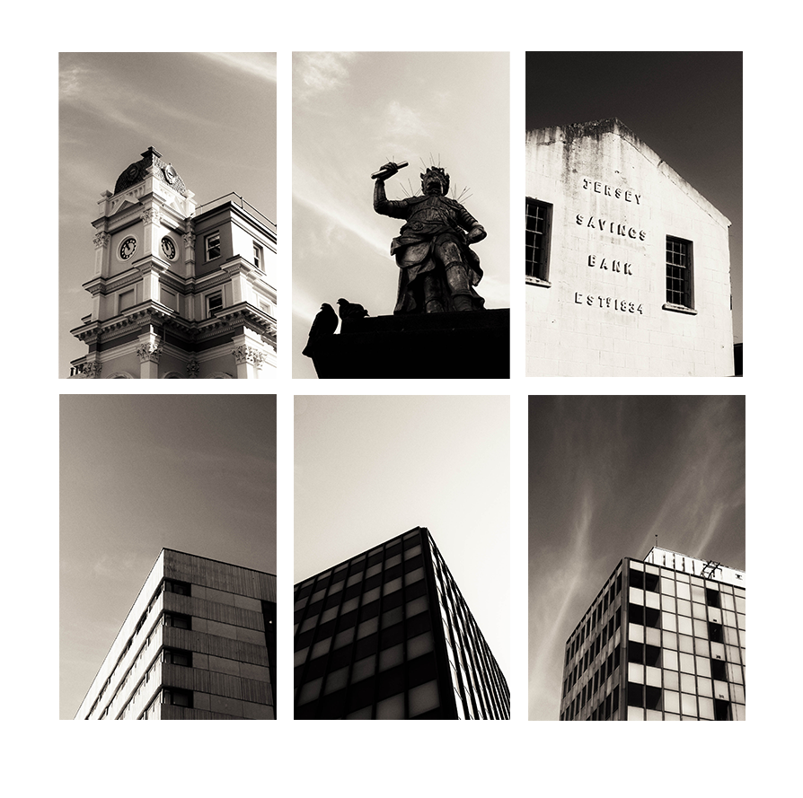
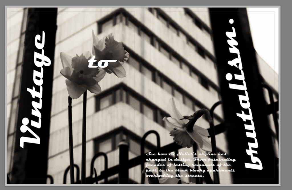
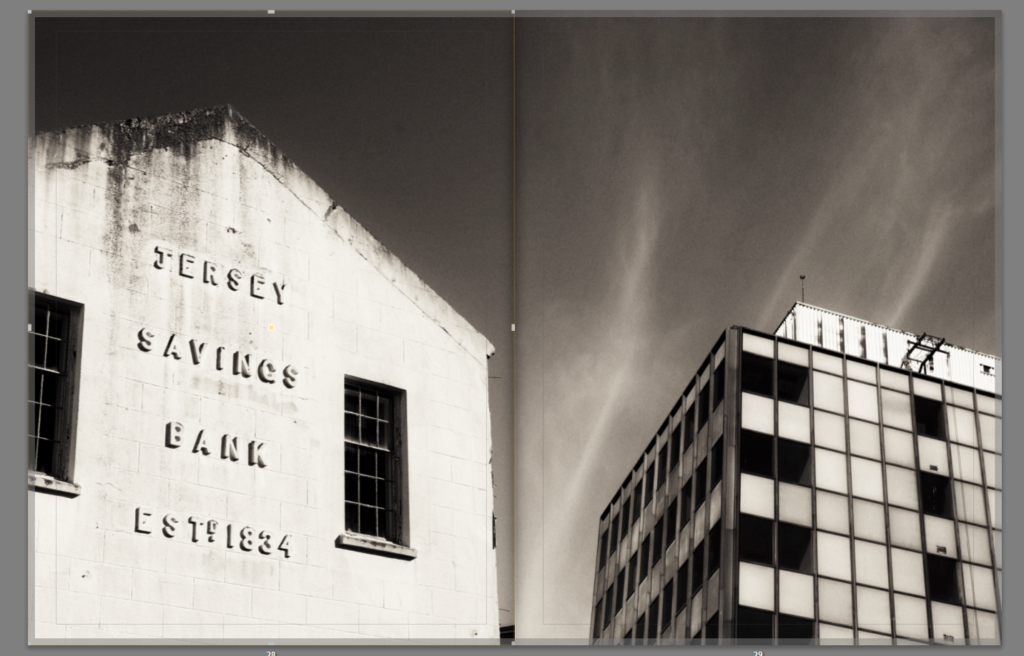
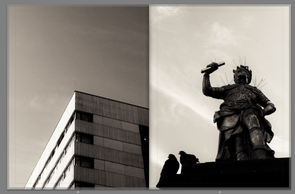
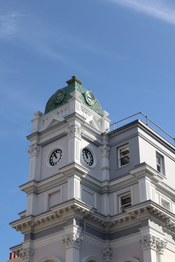
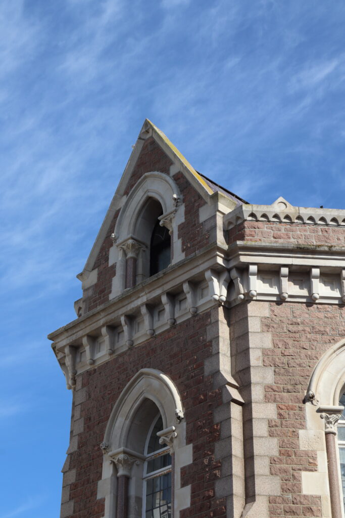
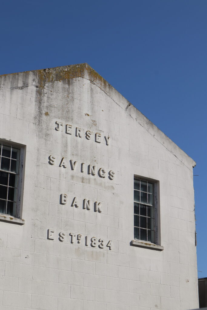
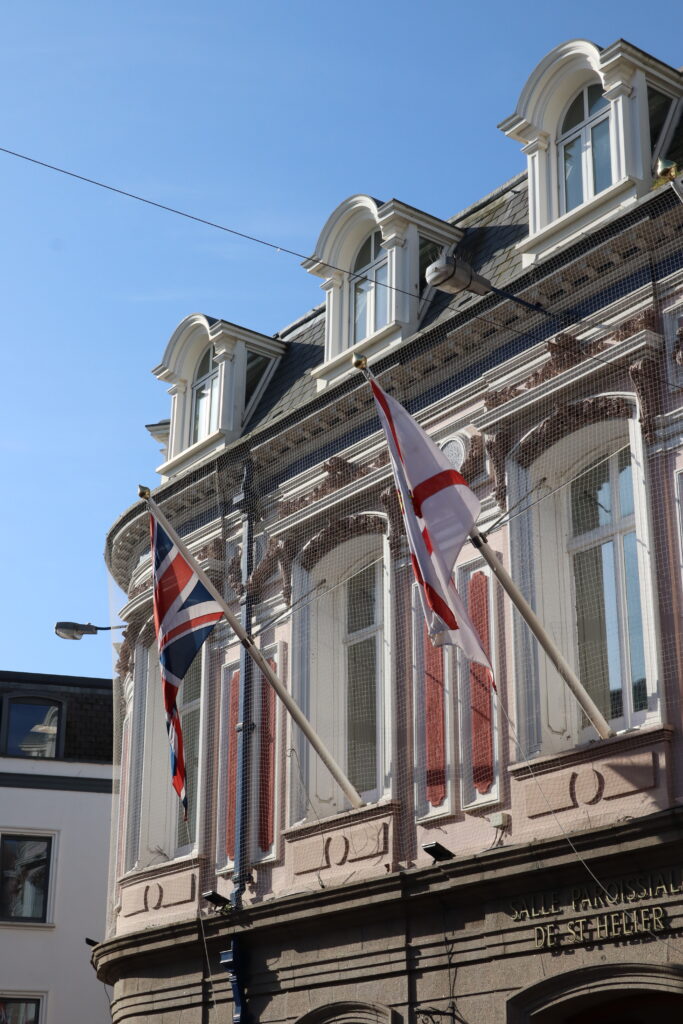
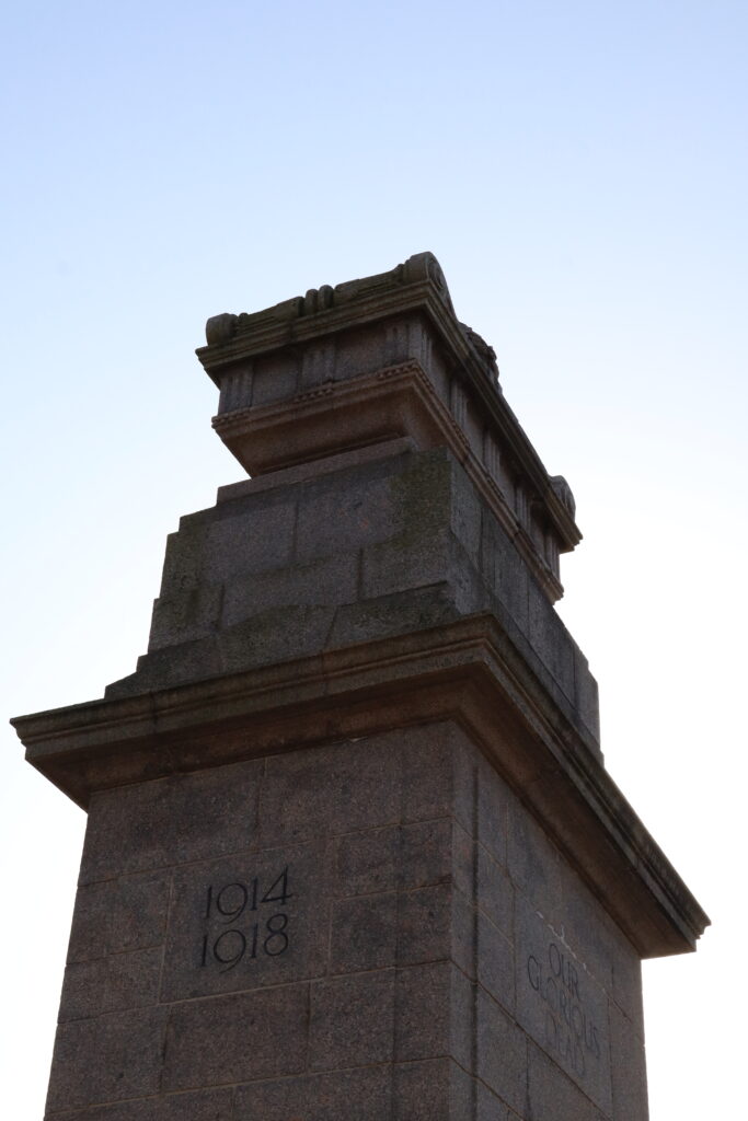
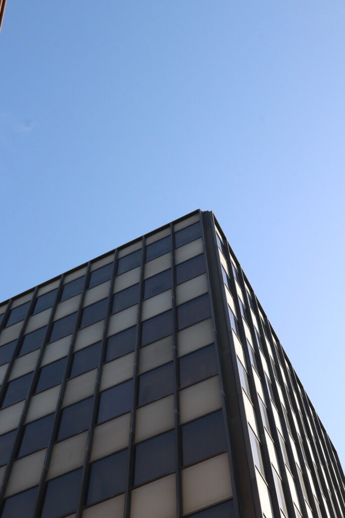
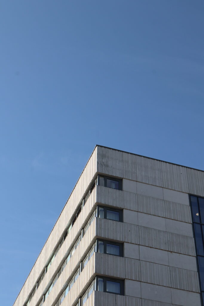
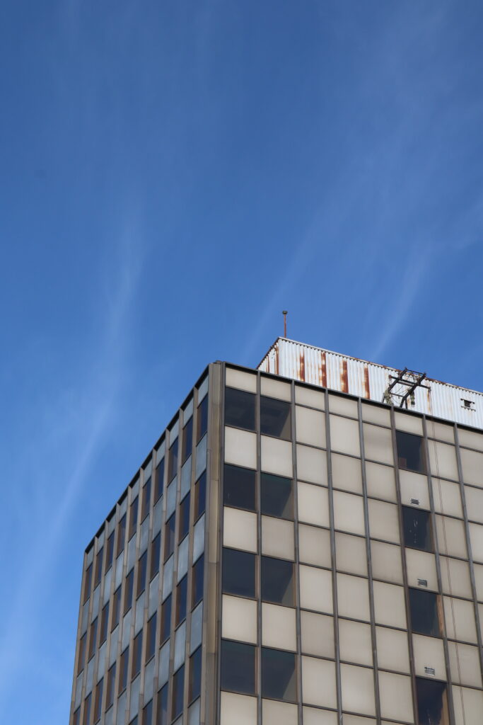
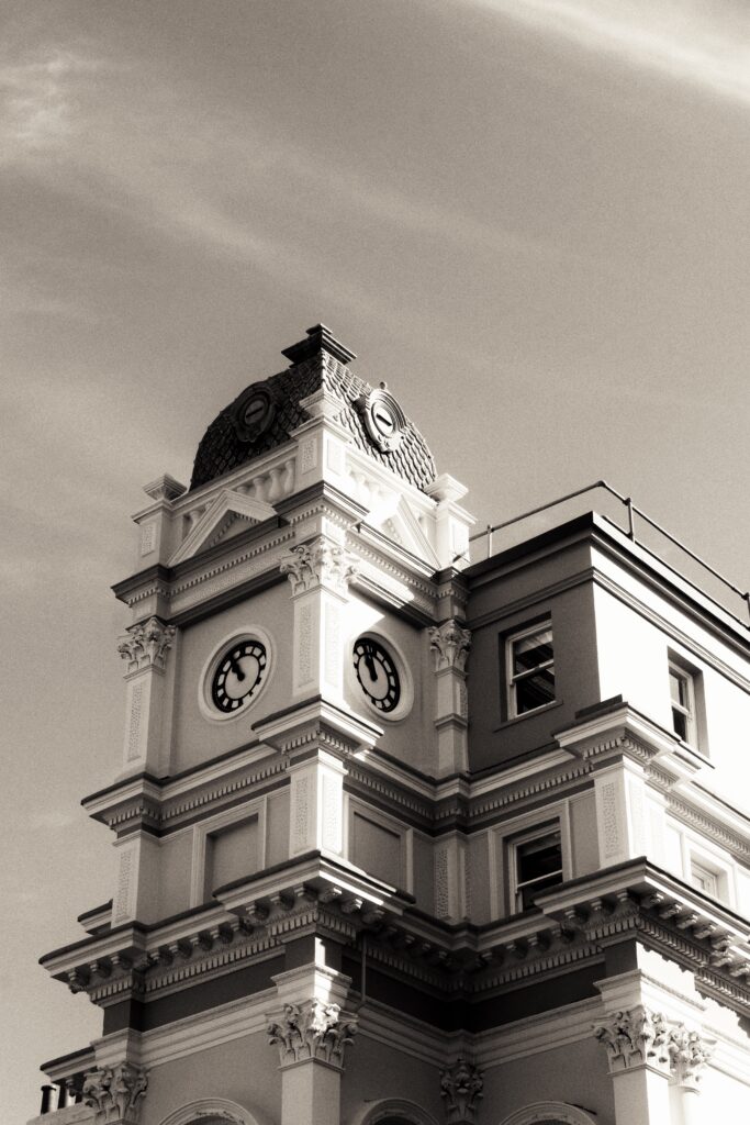
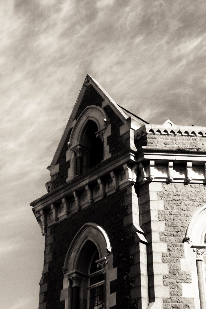
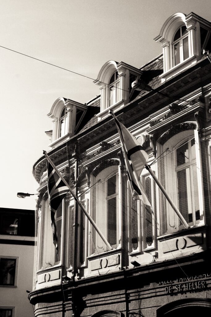
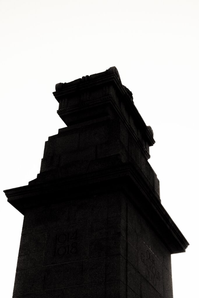
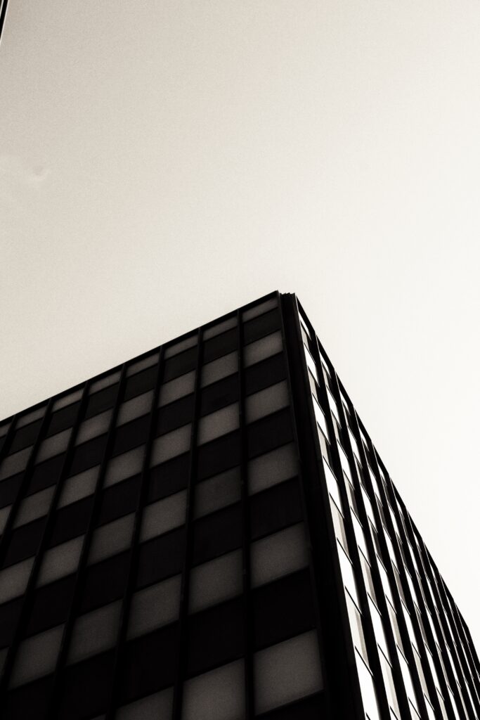
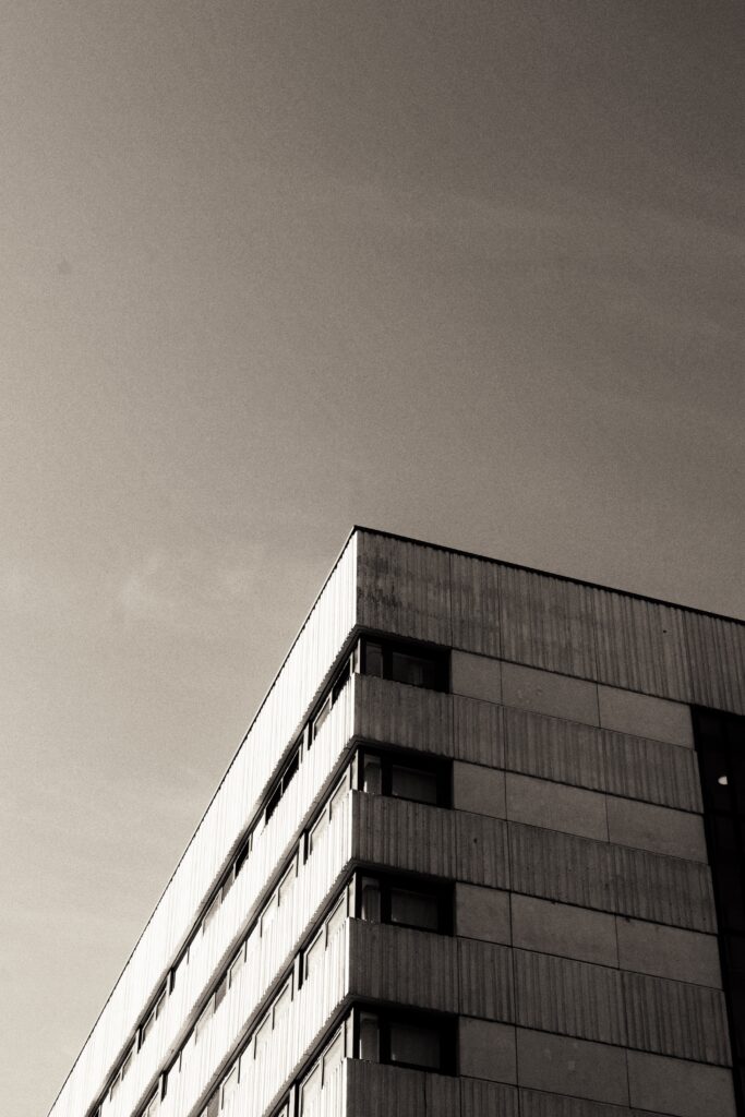
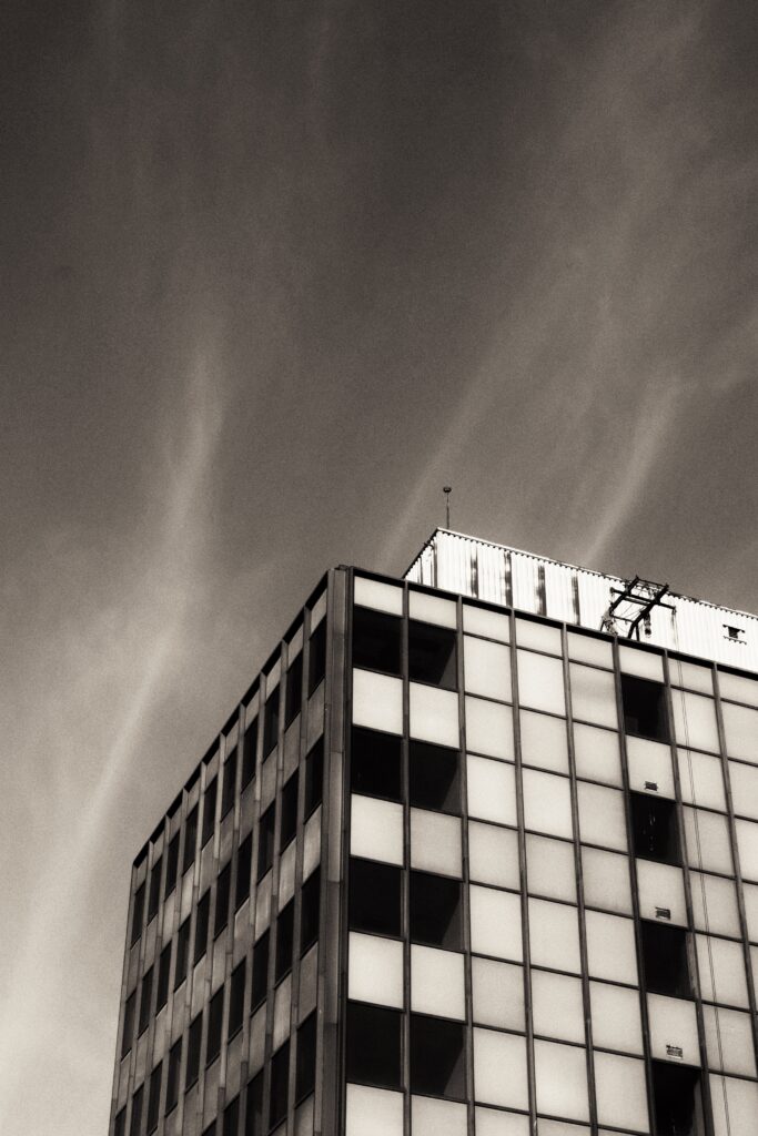
Vintage to Brutalism:
See how St Helier’s skyline has changed in design. From fascinating facades of lasting remnants of the past, to the bleak blocky apartments overlooking the streets.
(Used with skyline photos).
Making the pages –
Fashion pages:
How I made my layouts:
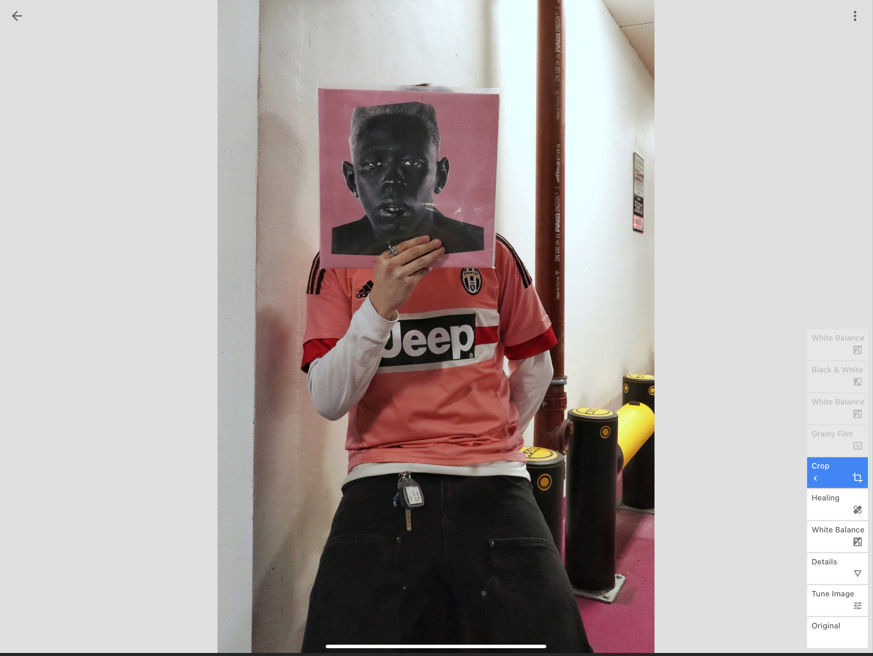
With pages having pre-sets of image layouts already, I used these to construct some of the pages in my magazine. For more experimental page designs which included text or an image placement that was not already built in as a pre-set I would have to insert either a photo or photo-description cell to create the designs.
Pre-set page designs:
Constructing page designs:
Page designing –
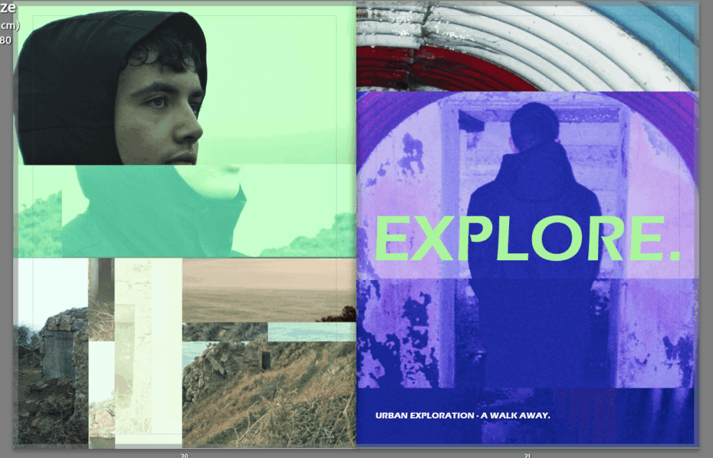
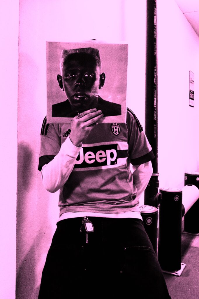
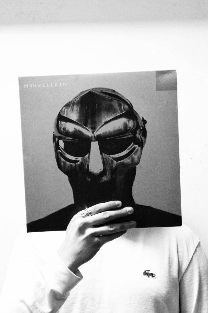
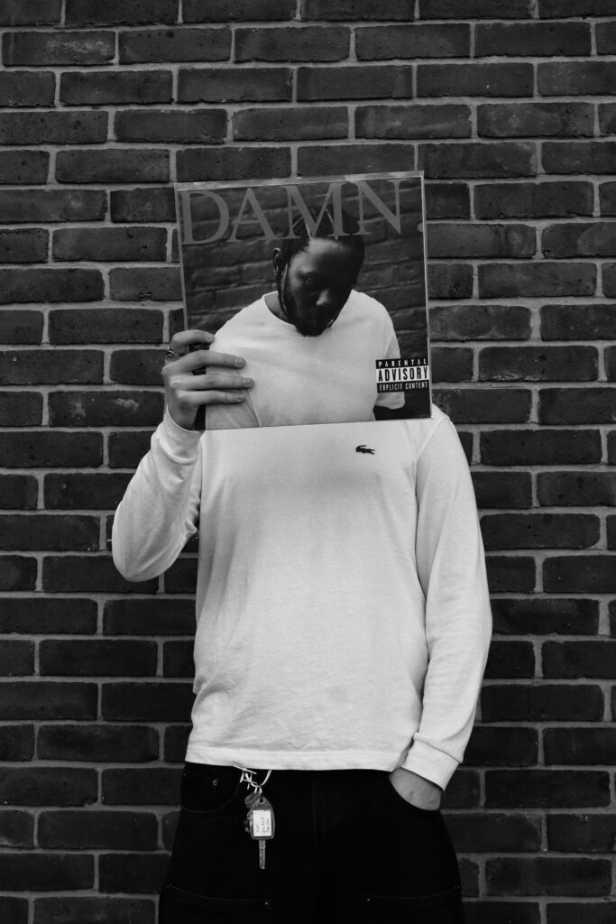
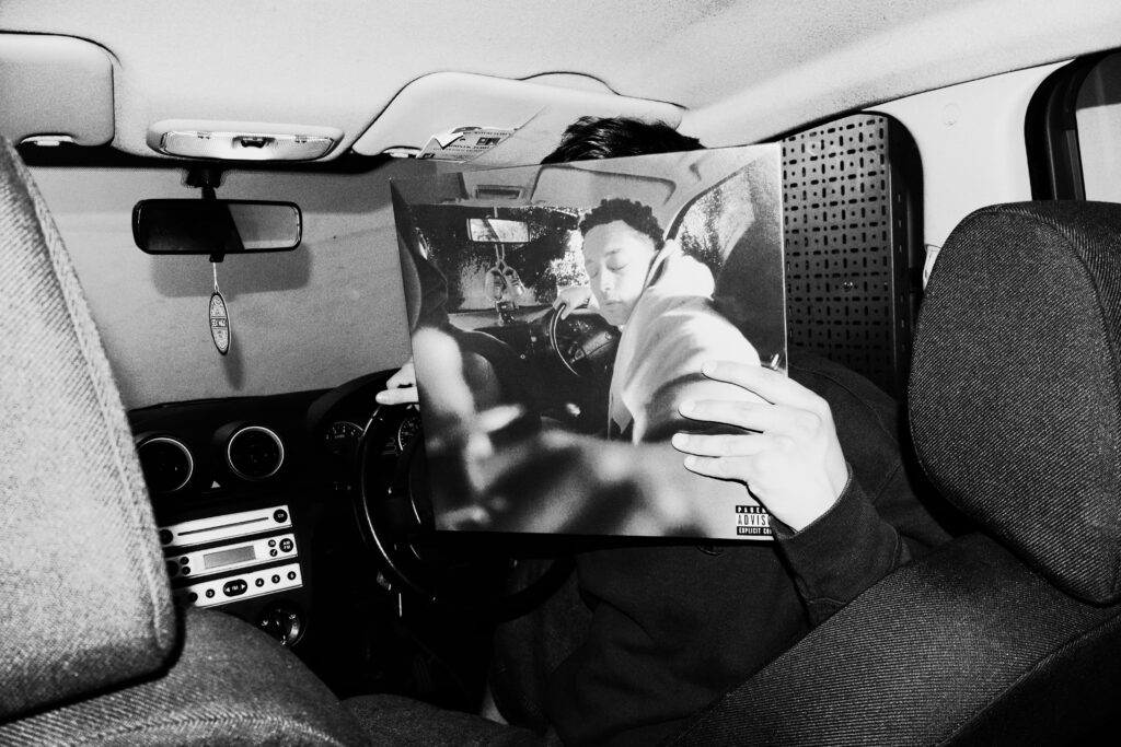
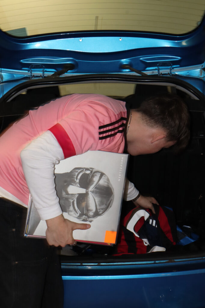
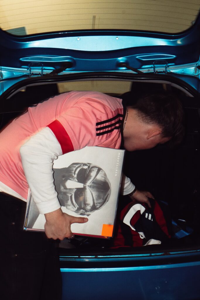
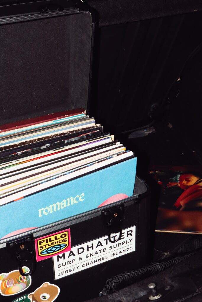
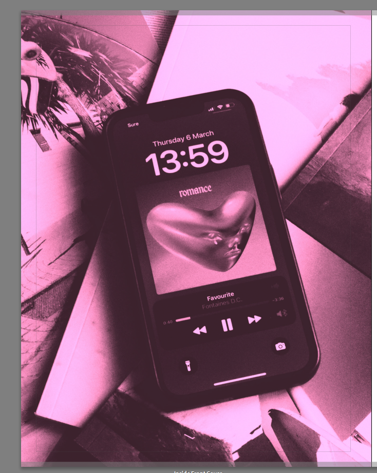
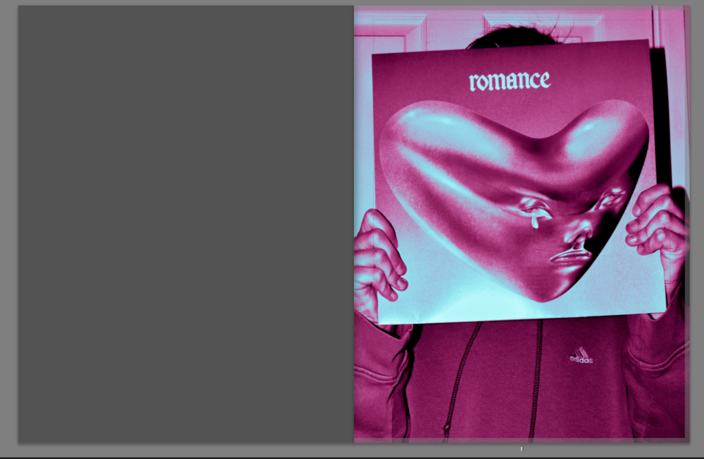
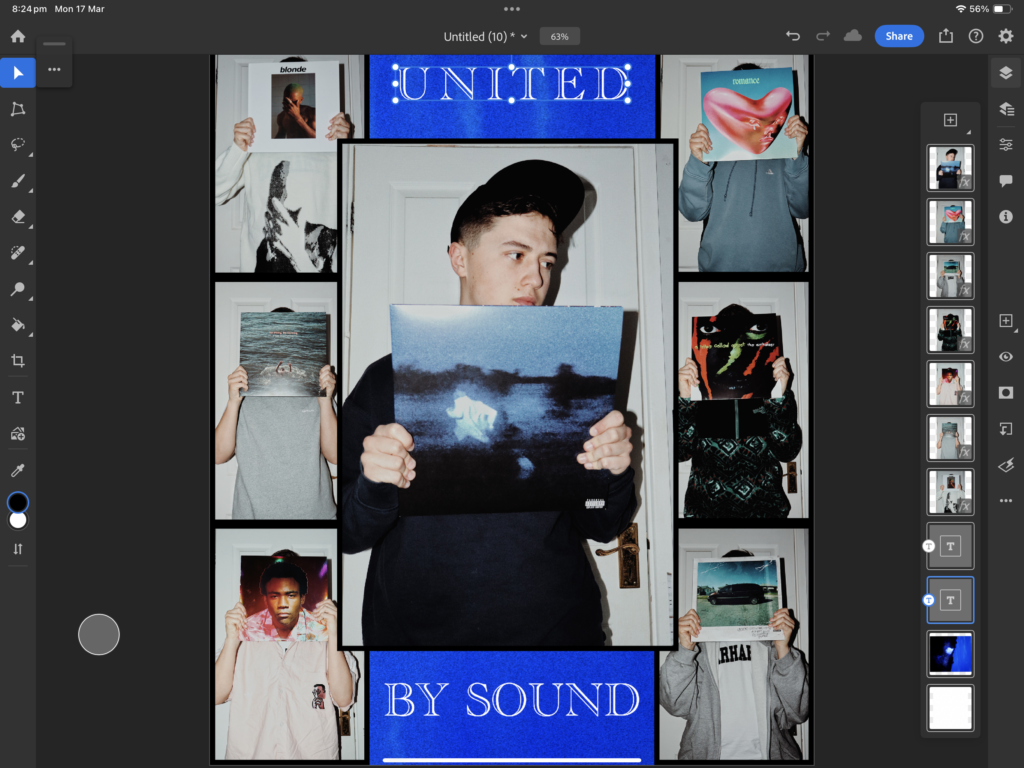
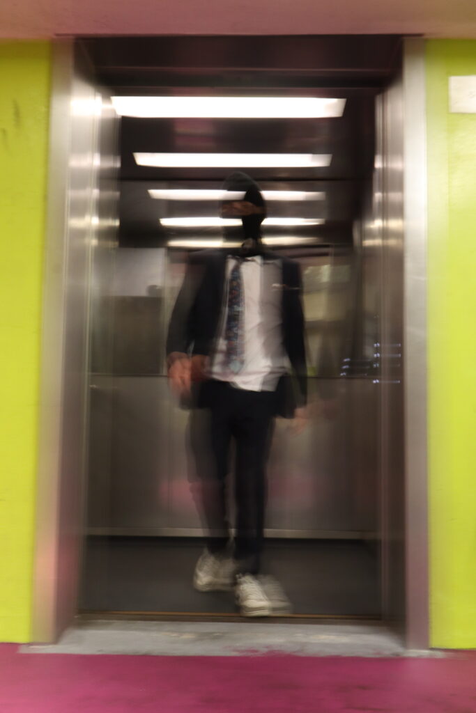
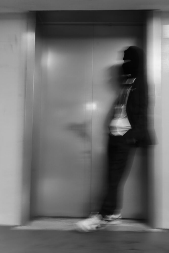
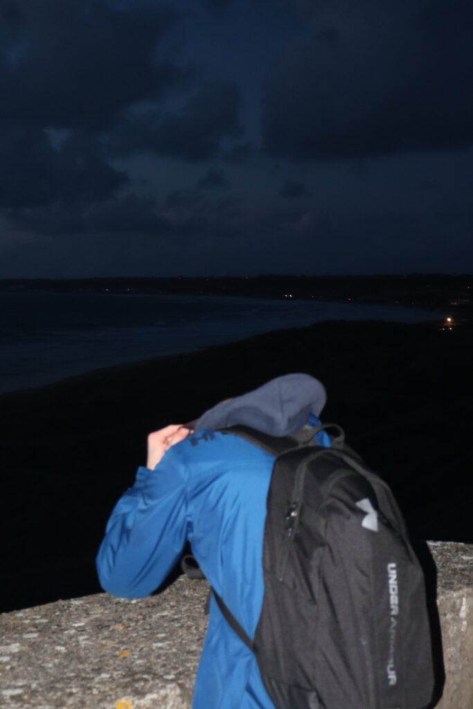
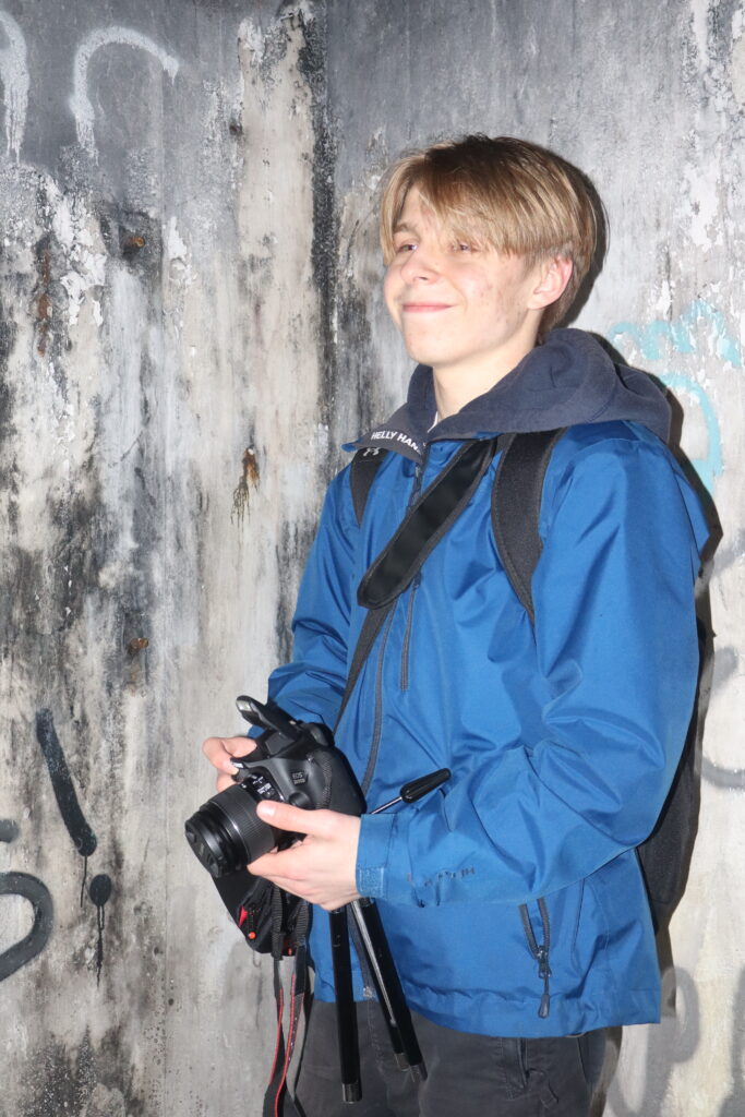
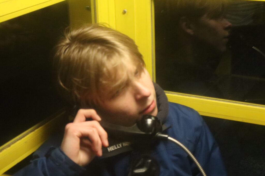
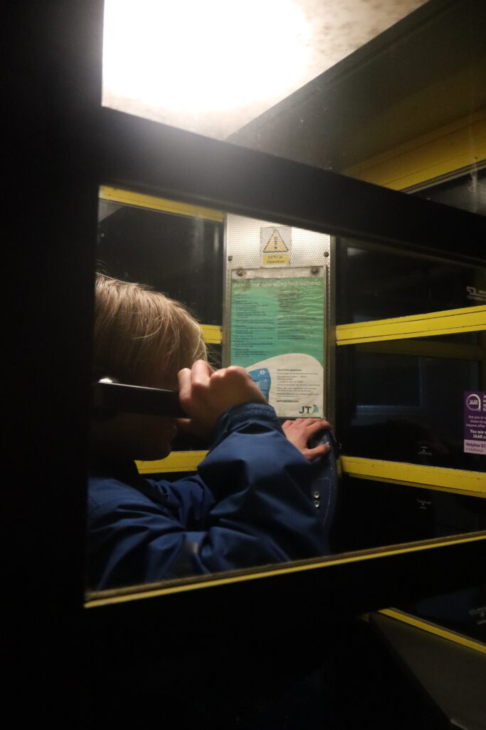
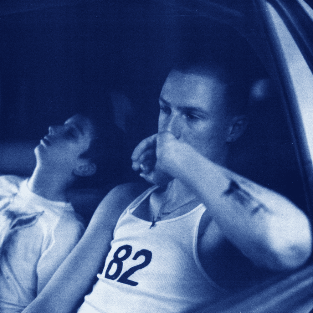
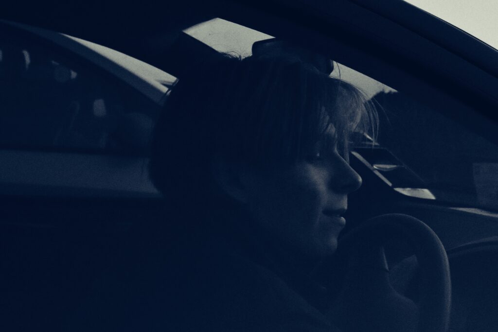
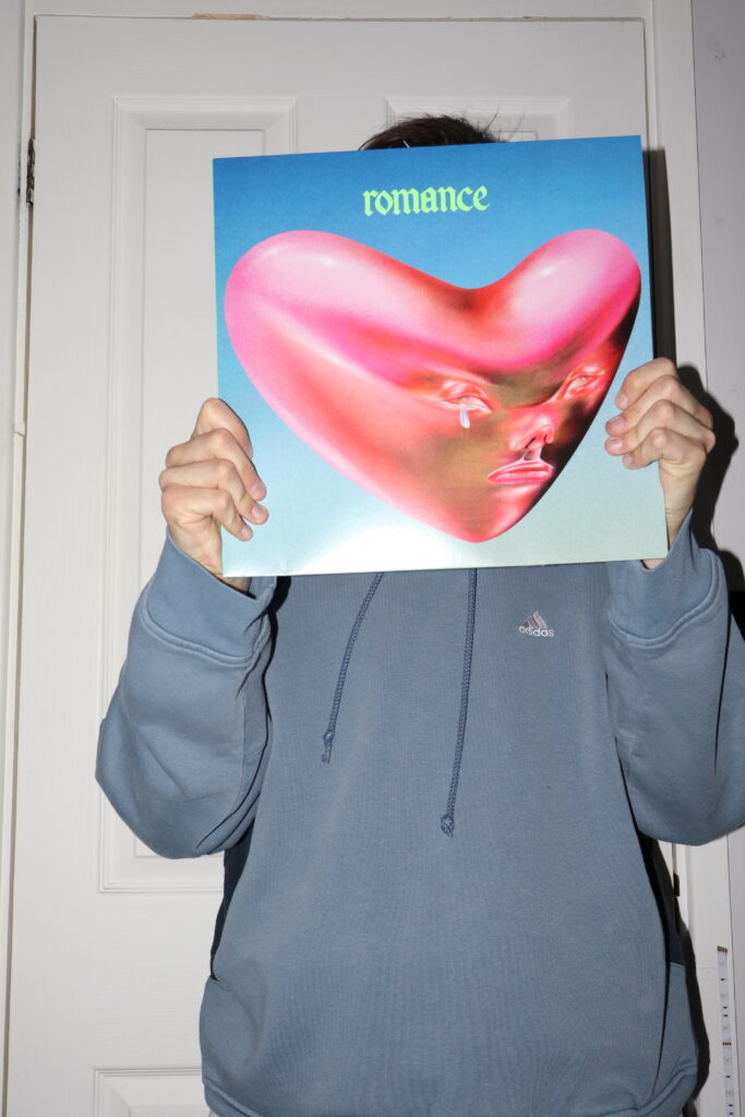
To create the opening images, I wanted to merge some existing photos I took to create a visually interesting set of images which I find visually summarises my project. With Music (Fontaines D.C album), fashion (adidas hoodie) and me behind the record (identity) all resembling the subjects I chose to include to represent union.
Front cover-inside image:
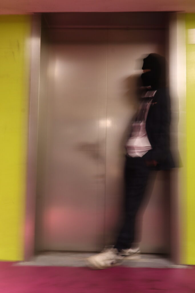
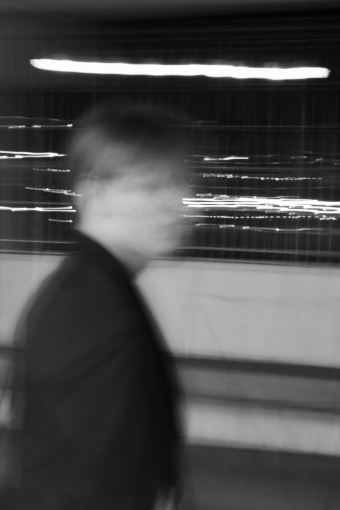
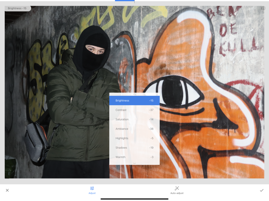
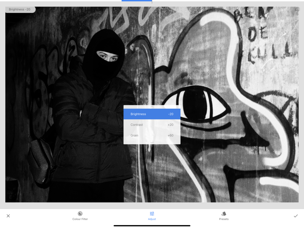
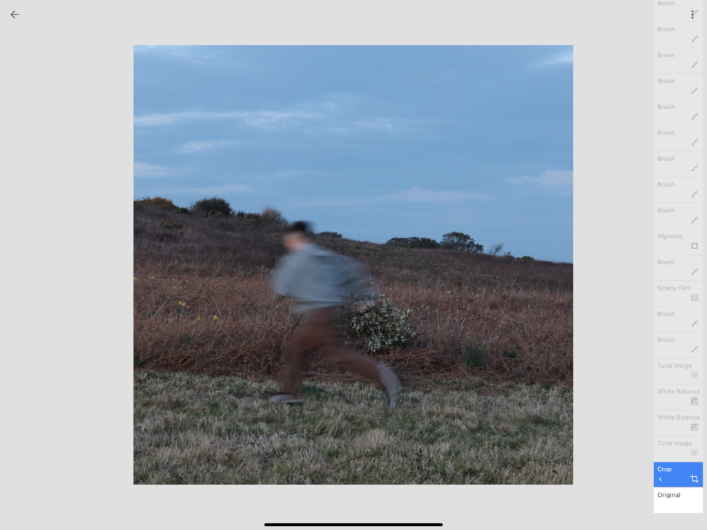
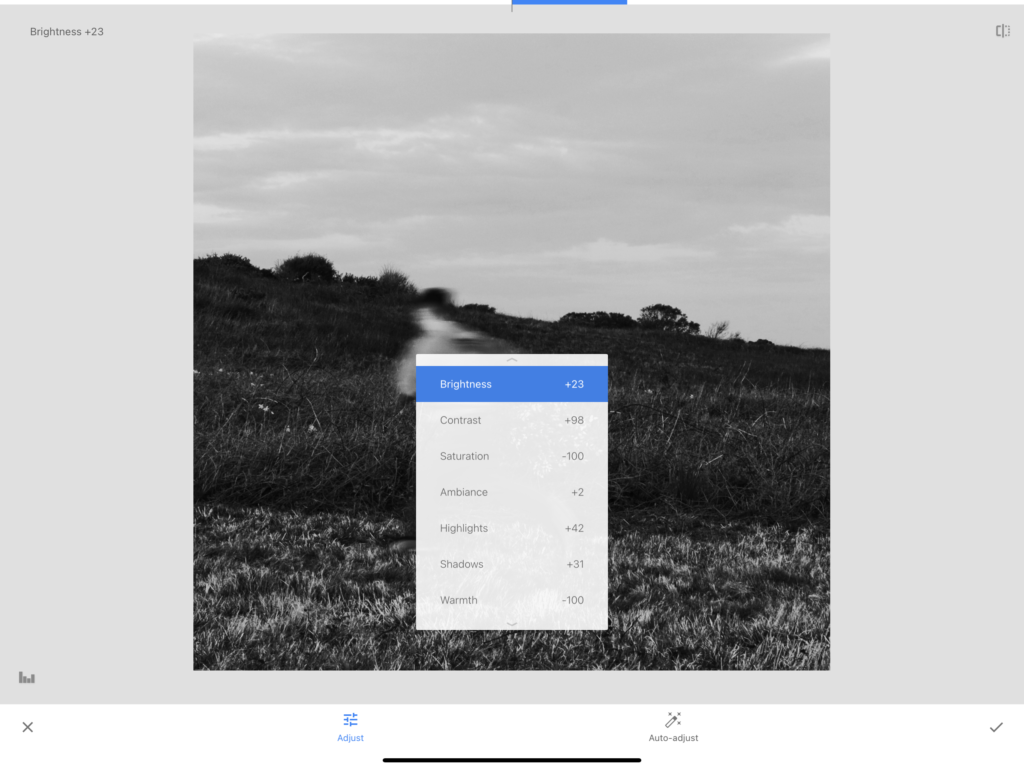
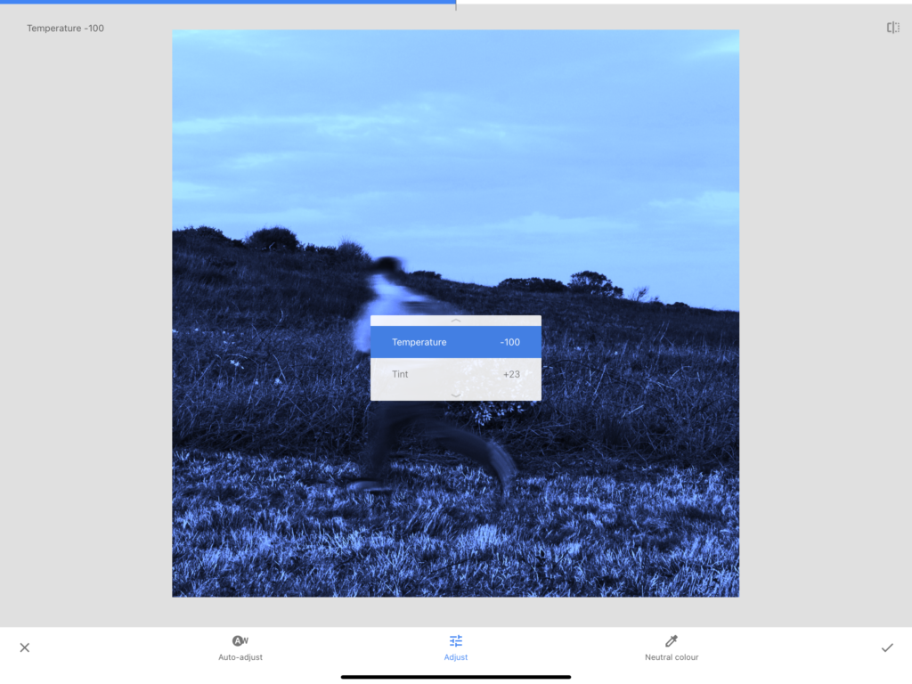
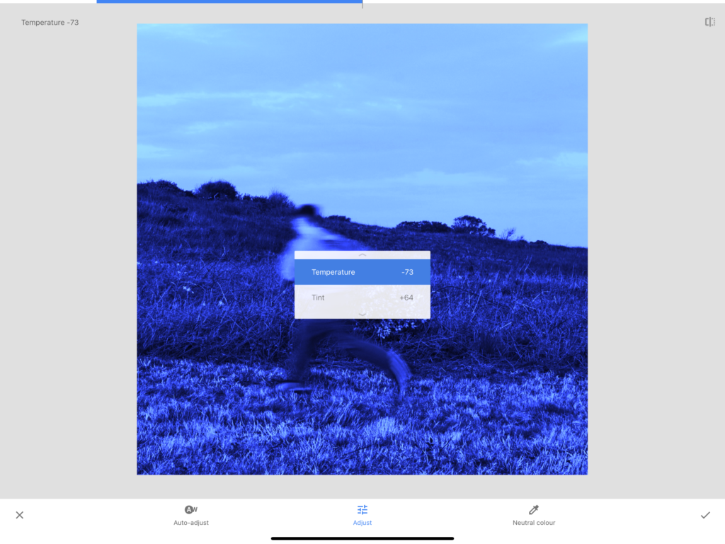
Its connecting page:
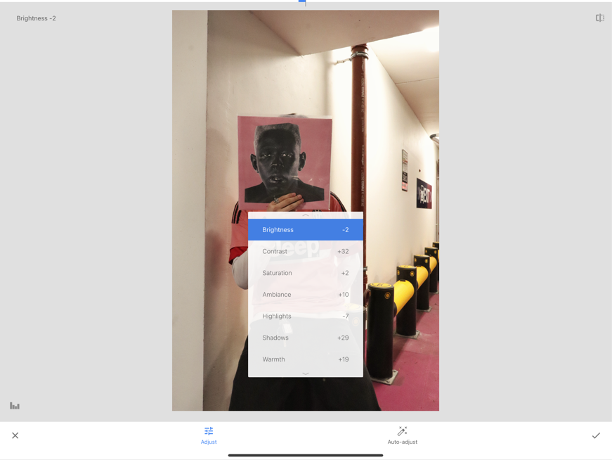
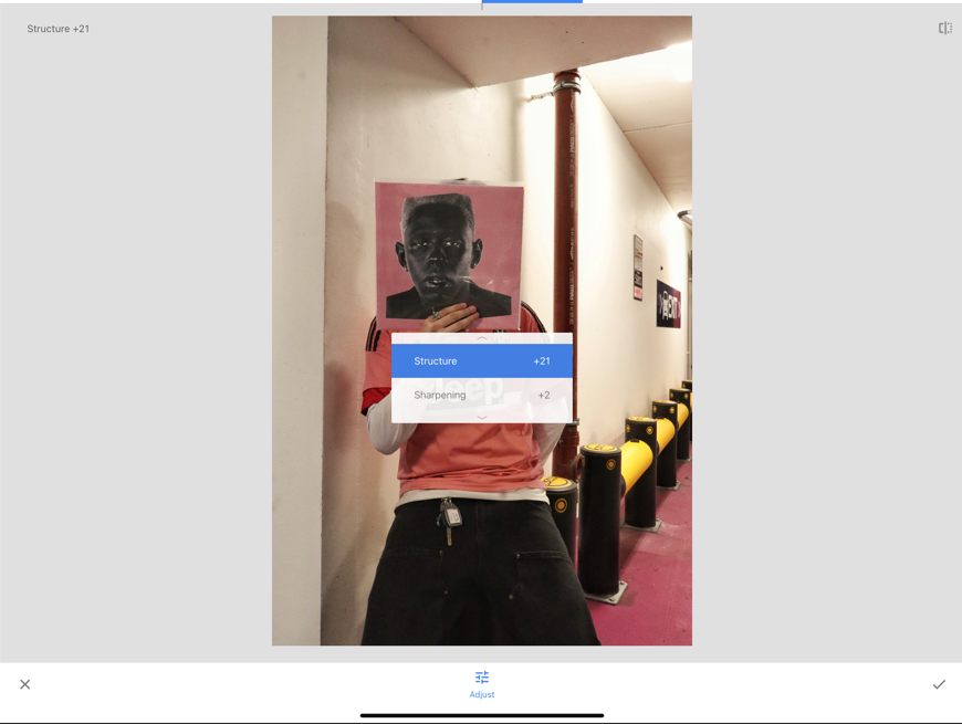
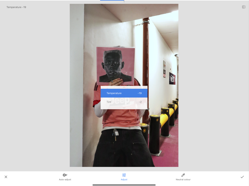
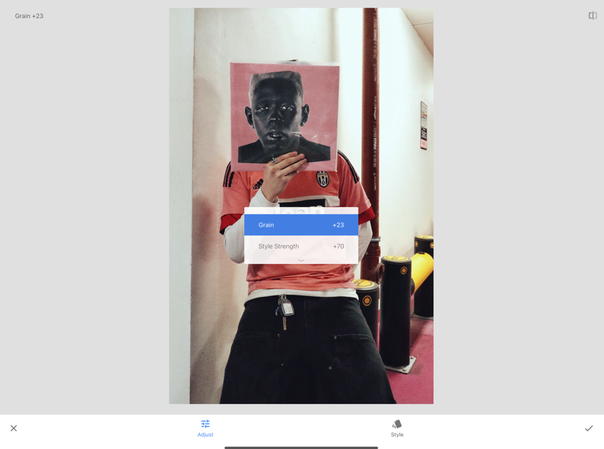
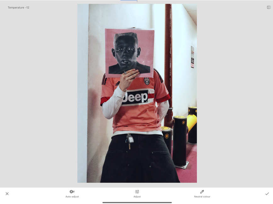
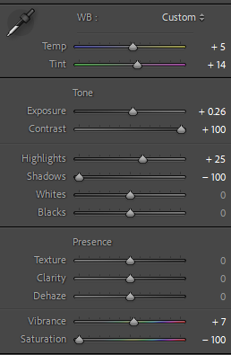
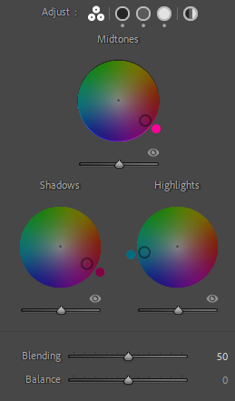
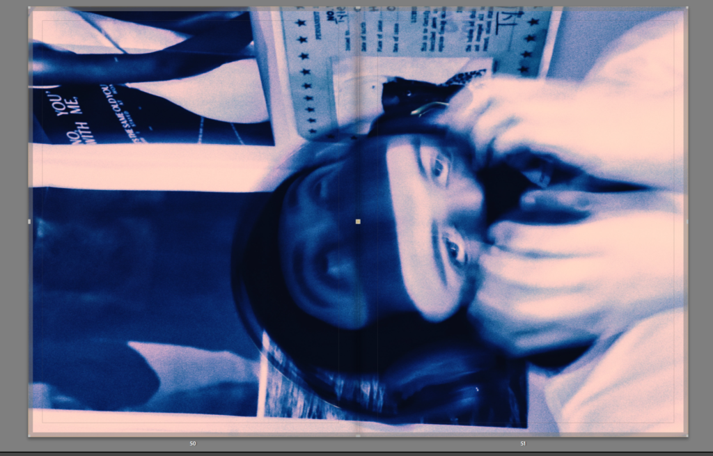
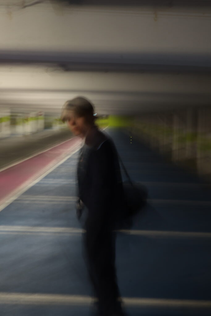
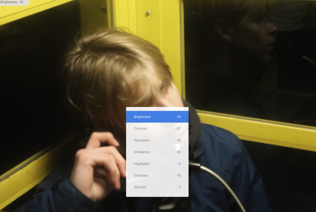
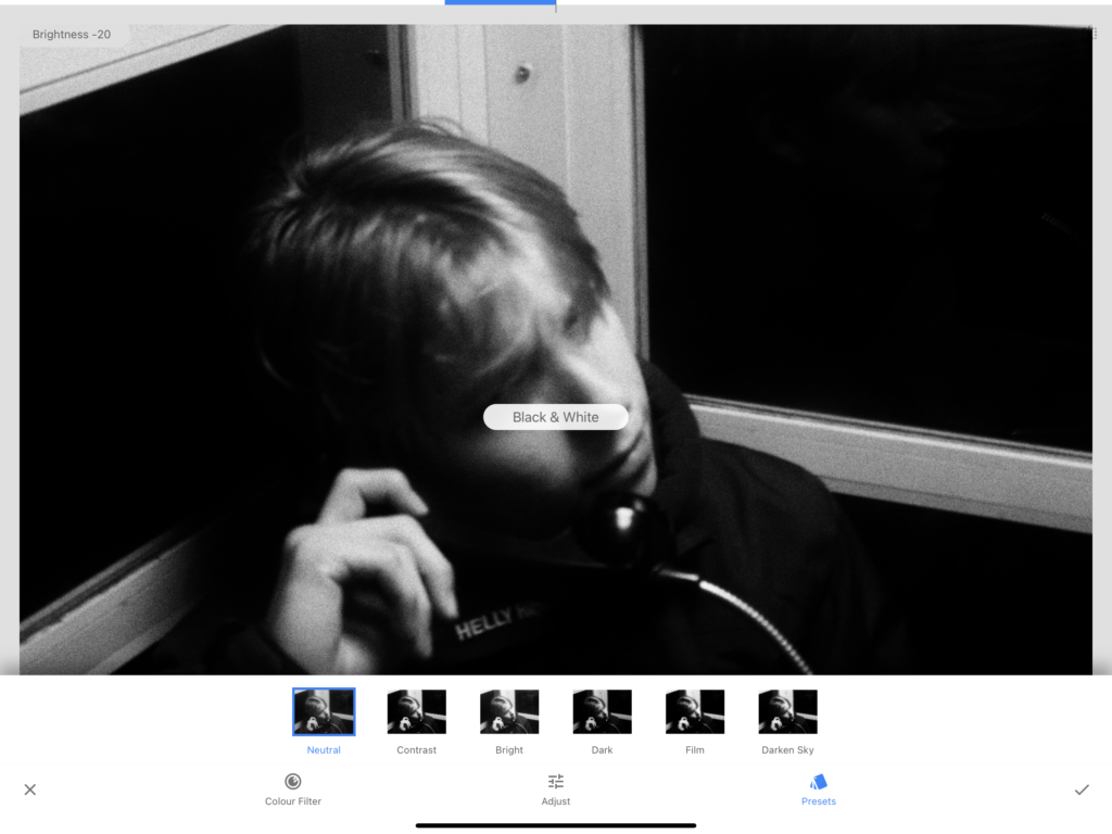
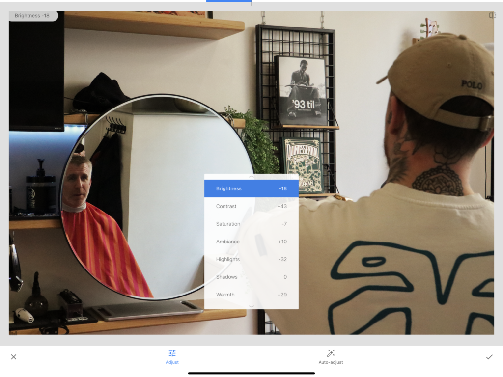
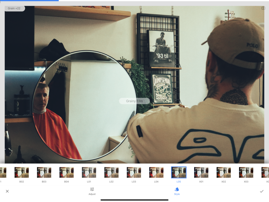
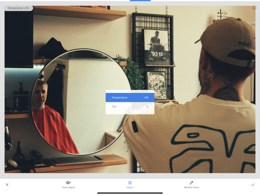
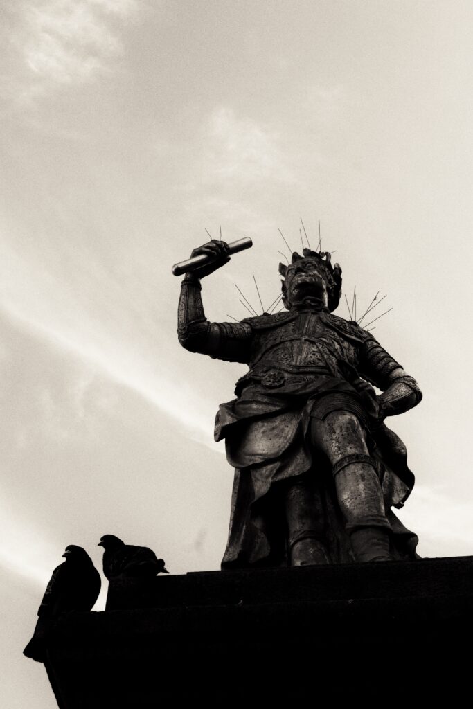
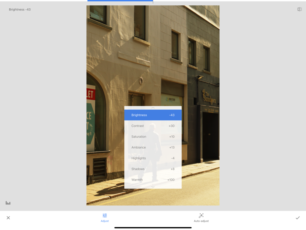
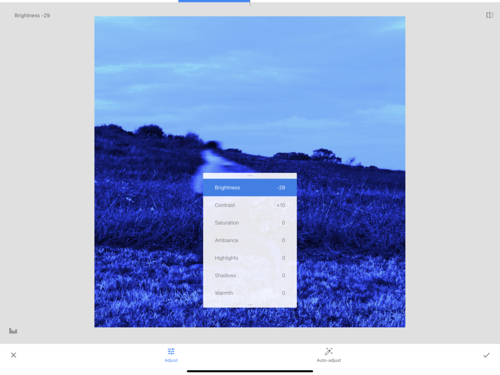
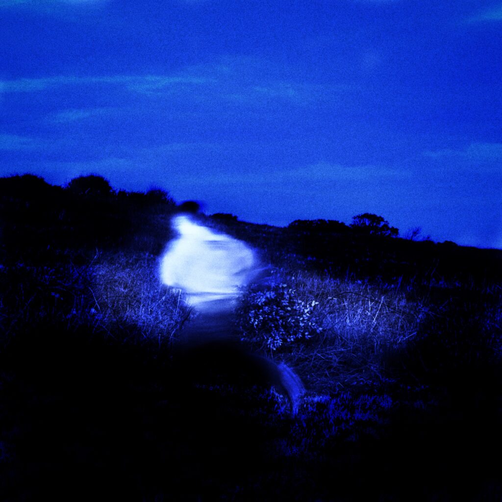
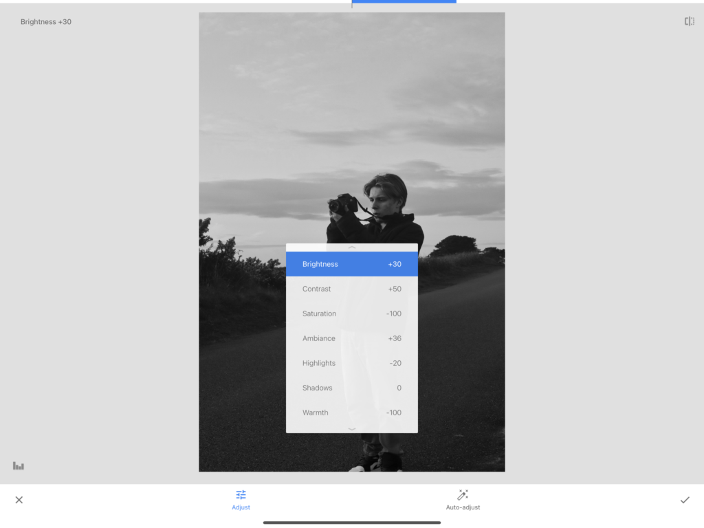
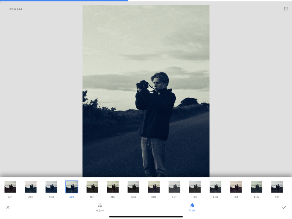
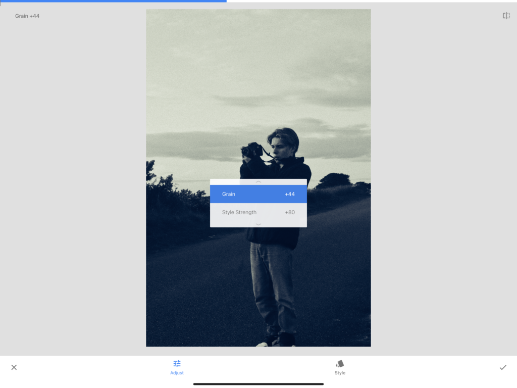
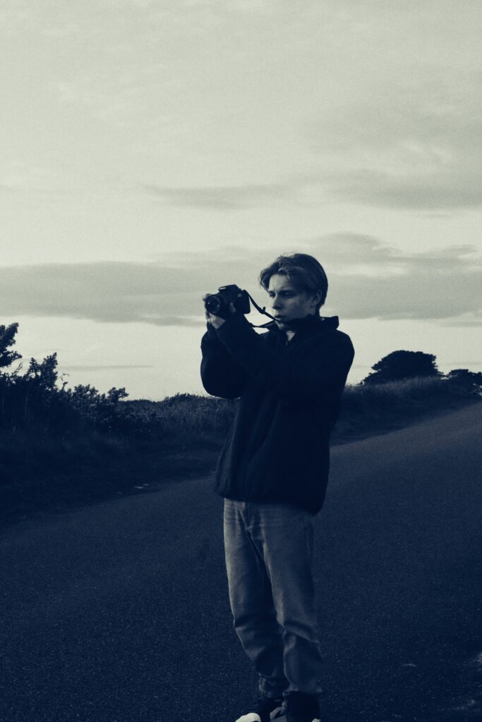
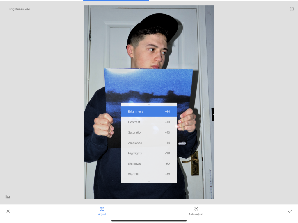
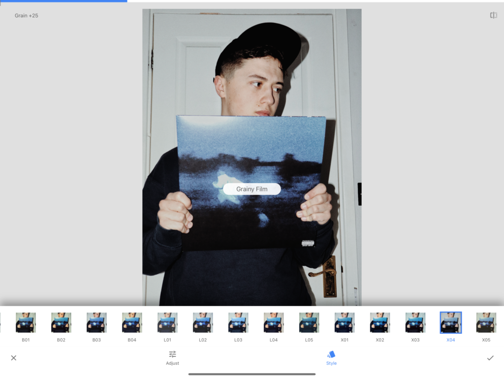
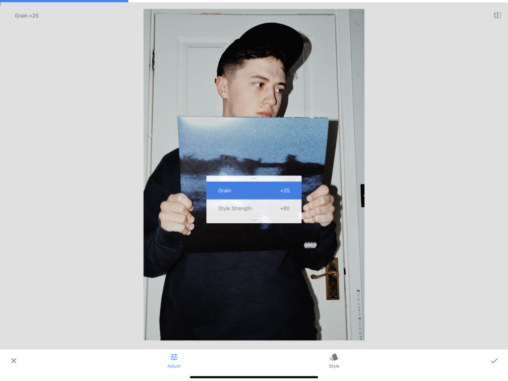
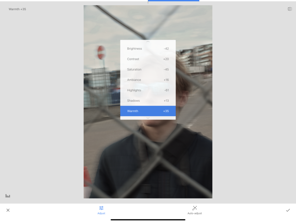
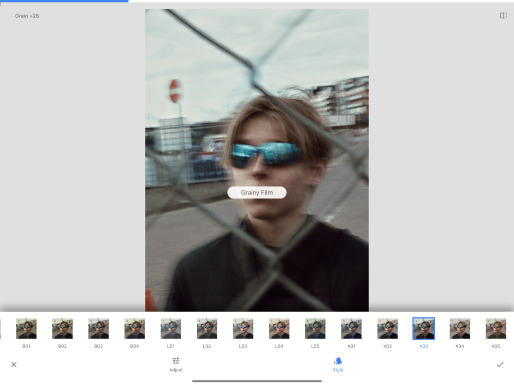
With this being a re-used image from my music page, I altered its appearance through Lightroom with the following settings.
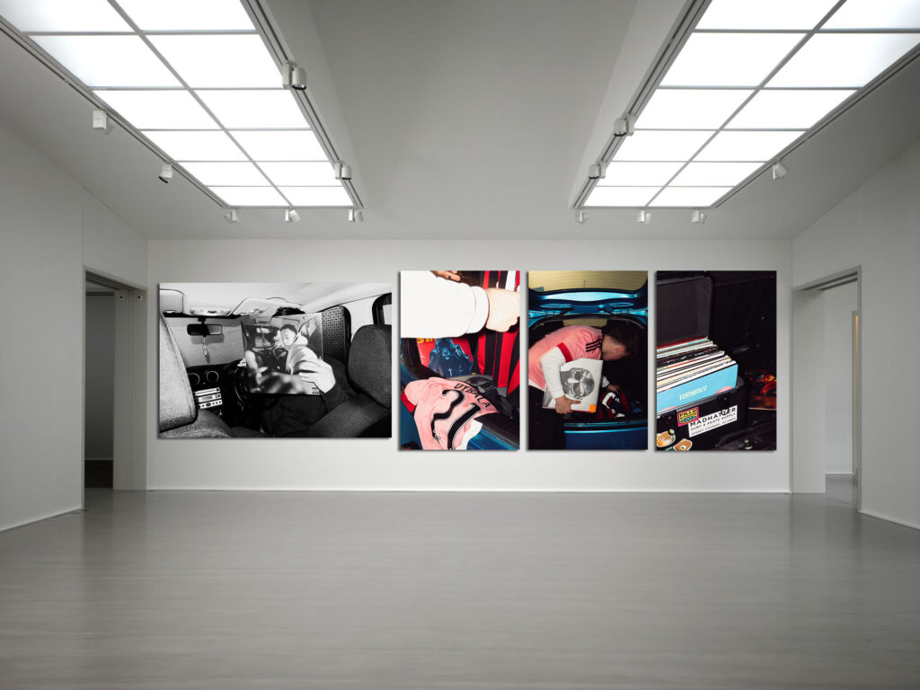
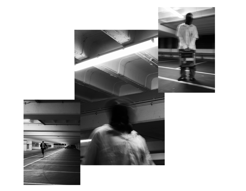
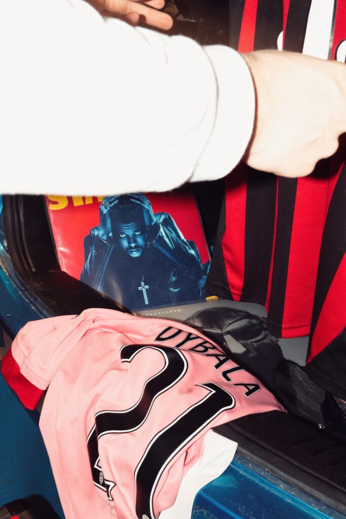
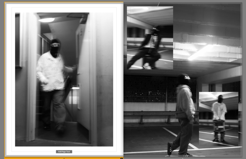
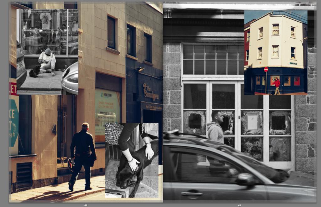
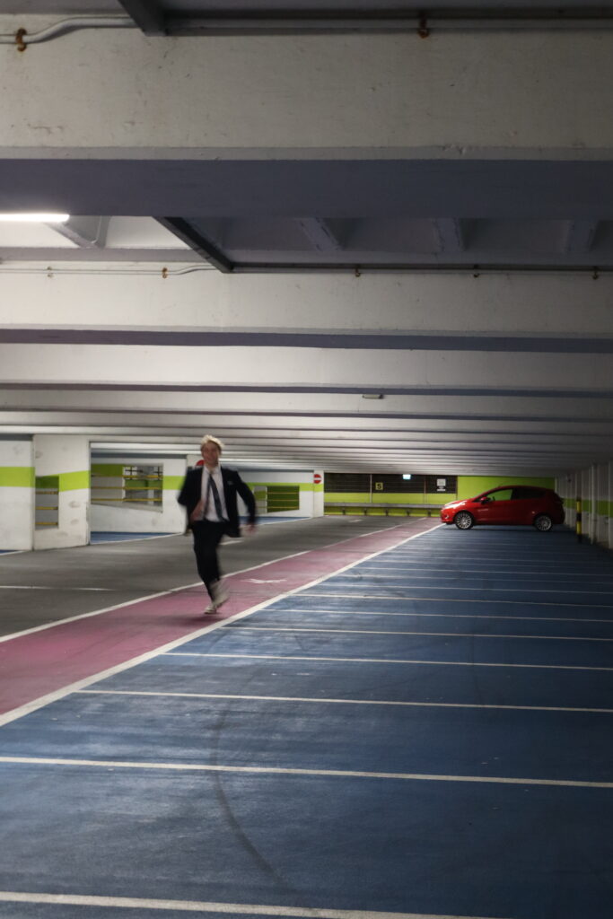
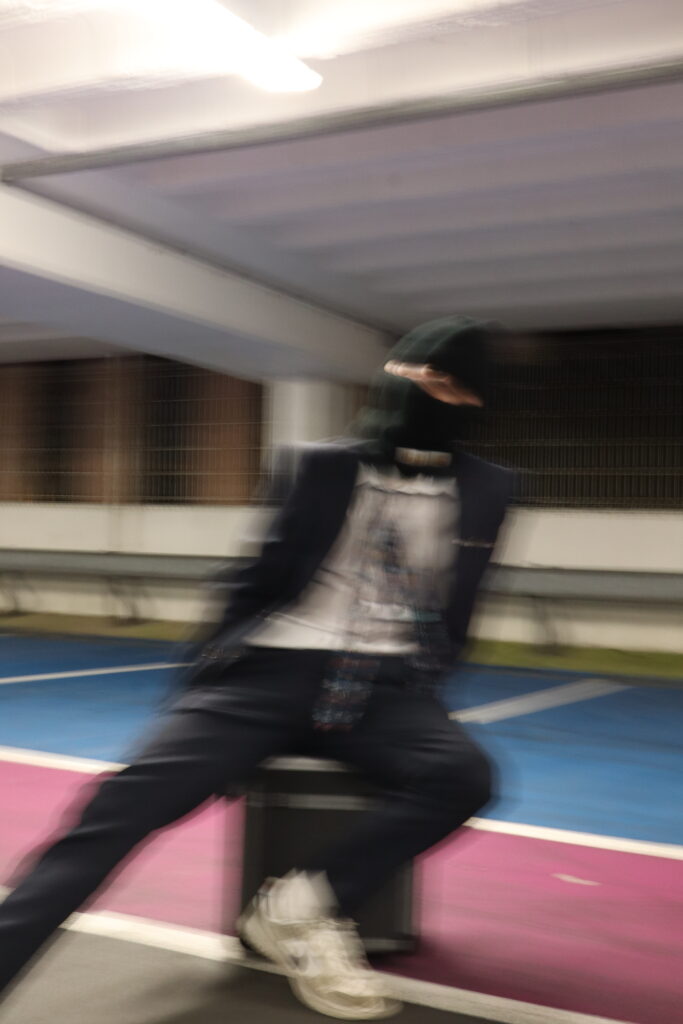
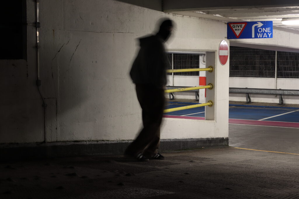
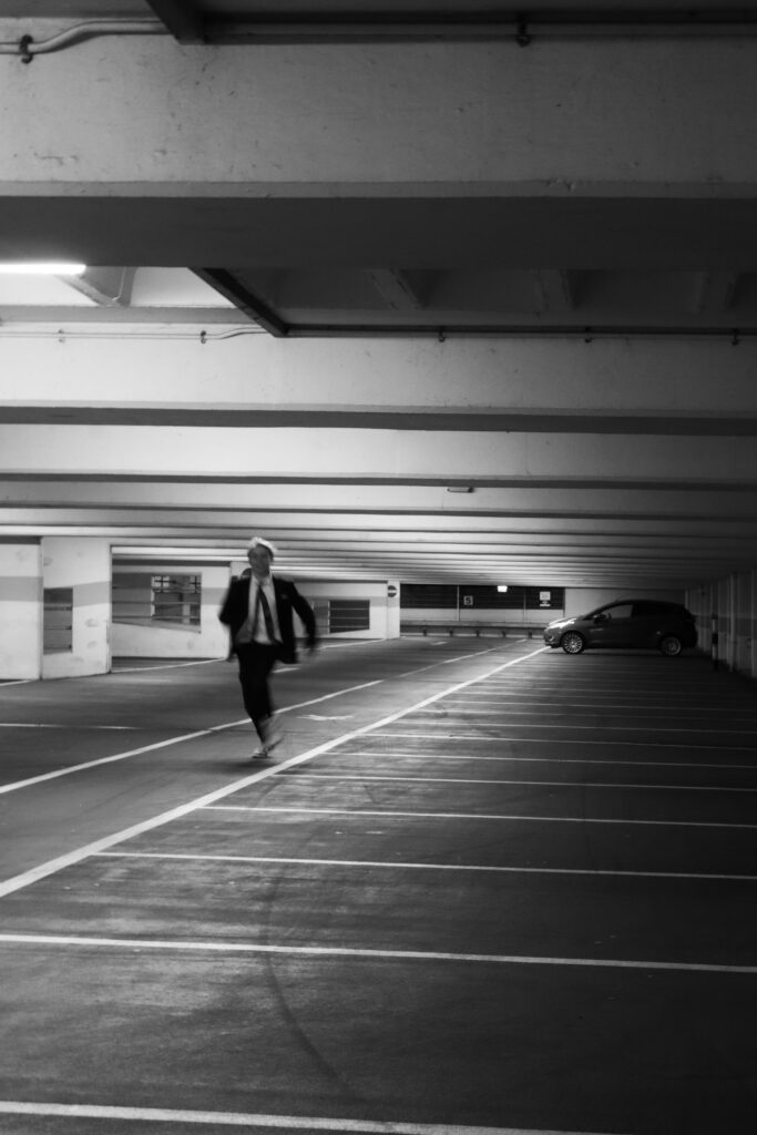
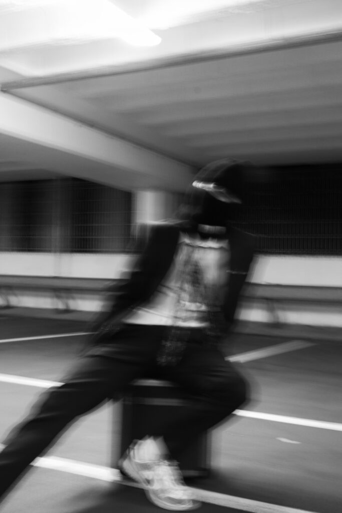
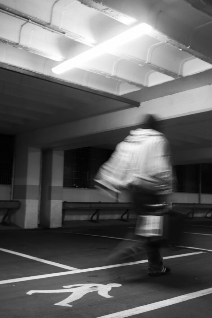
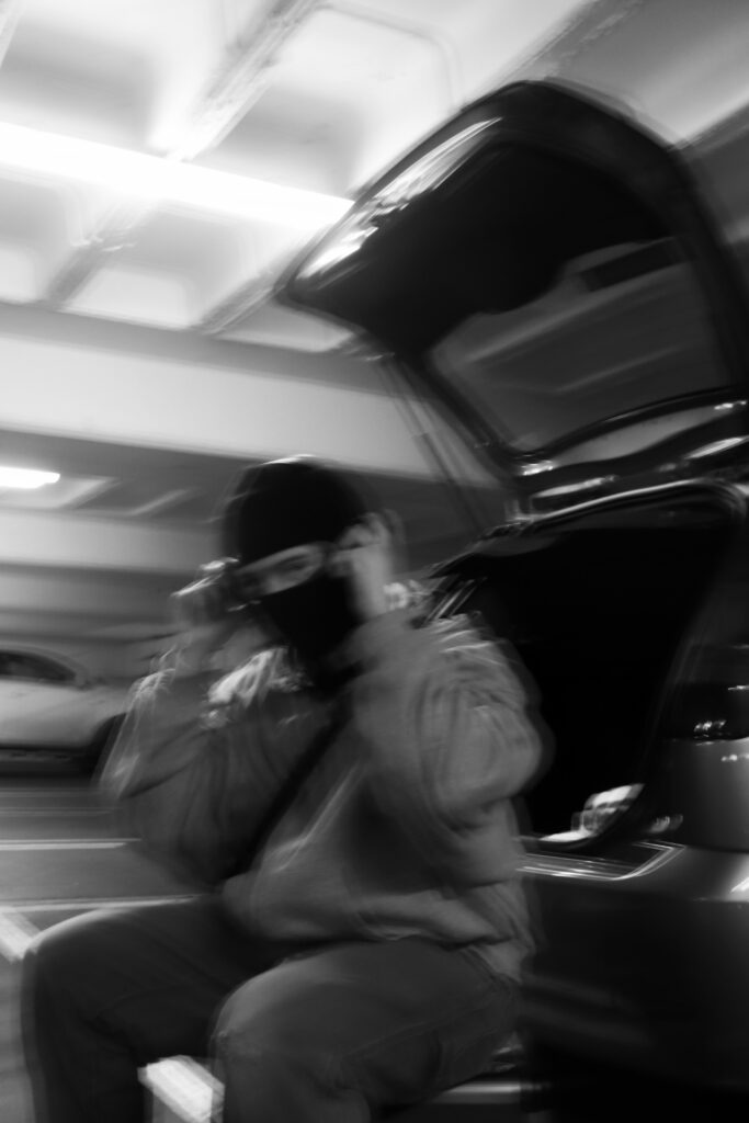
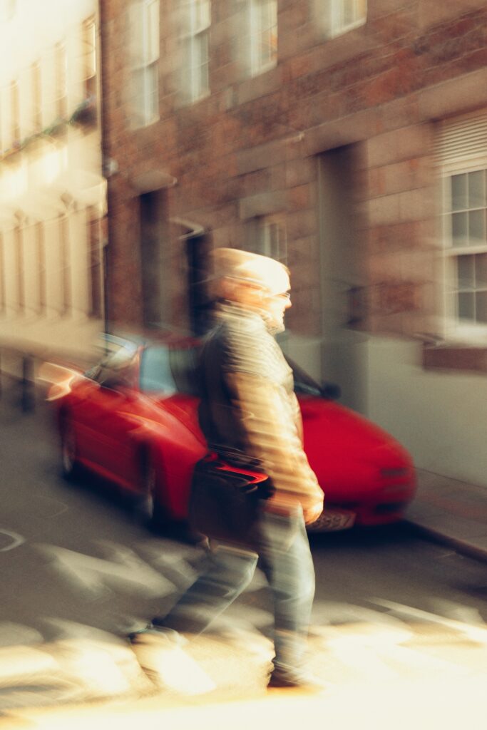
For the car park ‘Streetwear’ article, I took from the inspiration from the pages of the magazine designs in the skate magazine ‘Free’. I was particularly inspired with their image placement designs which I tried to incorporate into some of the pages of my own magazine. With the pages retaining to a set focus or aesthetic between them I applied the same for my work.
With how text is positioned on pages was another thing I coped from these magazines to create a well rounded composition of my pages that felt experimental yet, professional and well made.
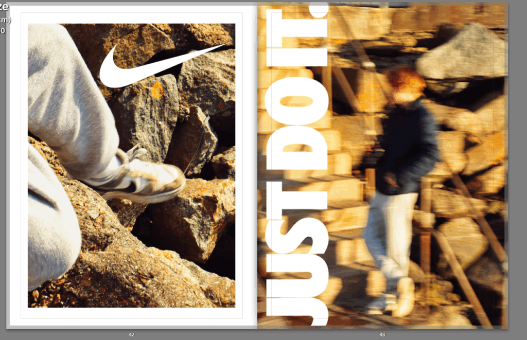
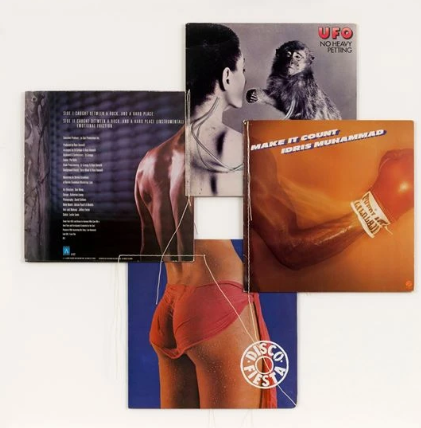
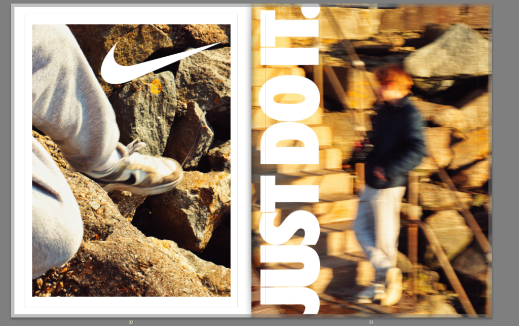
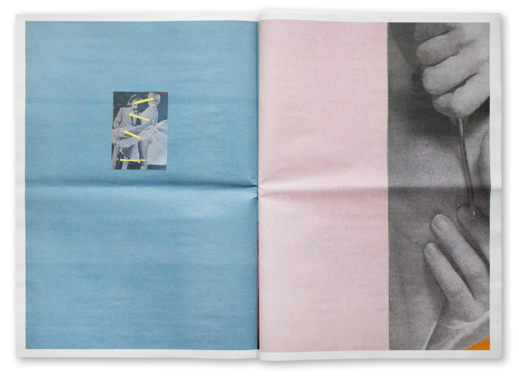
For the ‘advertisement’ pages I attempted to replicate the full-bleed and 2 page spread style of adverts I saw in my magazines. With the design of this Vans ad being a really cool one, I tried to incorporate it into mine. Placing the images I made into photoshop, I then added PNG’s of the Nike Logos to each images and then merged them into one image to produce what is shown in the image below. When placing the PNG’s I also had to account for Image crop depending on how the size of the image fits into the page. For example the slogan line “Just do it.” was not intentionally meant to be cropped however I find it creates a more unique and bolder design when it overlaps the edge.
With this Nike ad, featuring another image as a backdrop for a lot more images, this was another design style I wanted to copy, as it produced an interesting composition in terms of how the similar images worked together and meant more images could be focused onto 2 pages rather than 4.
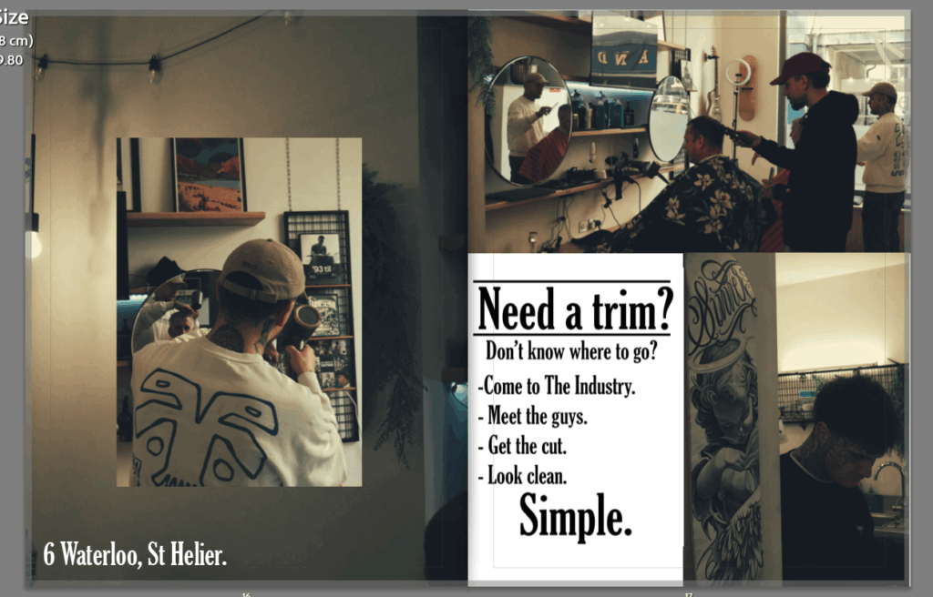
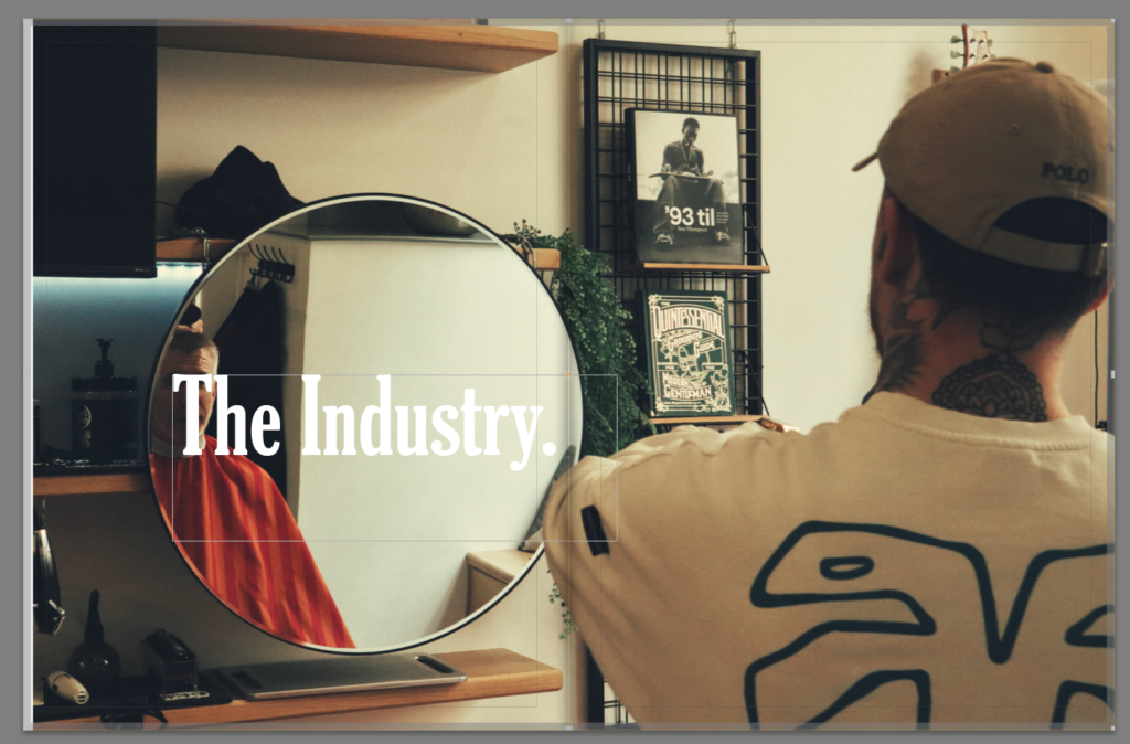
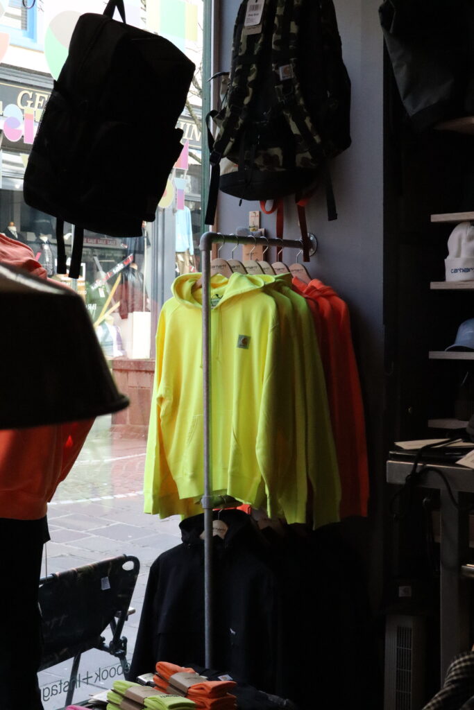
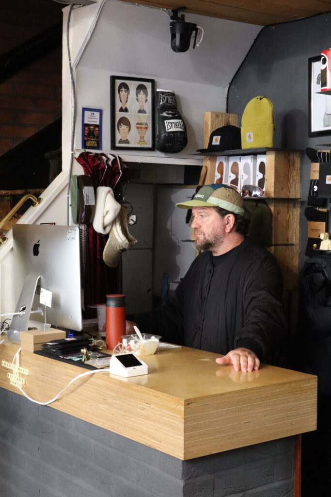
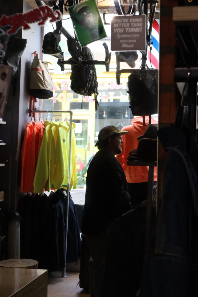
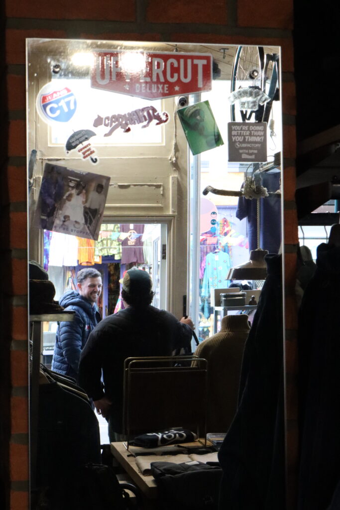
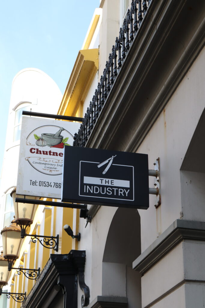
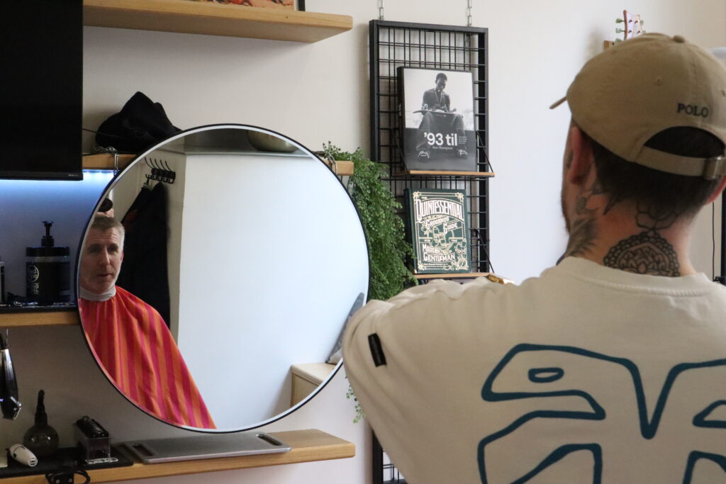
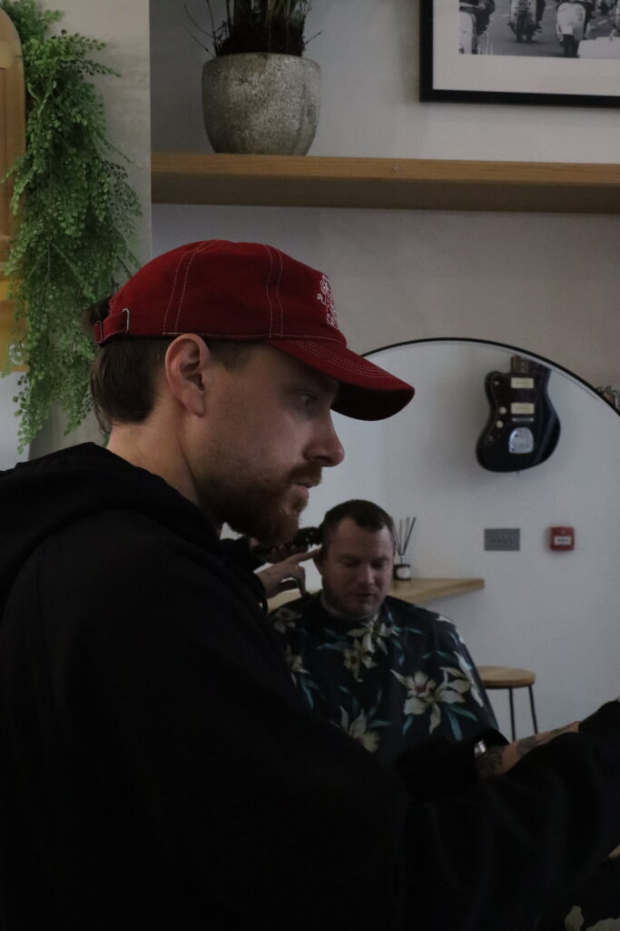
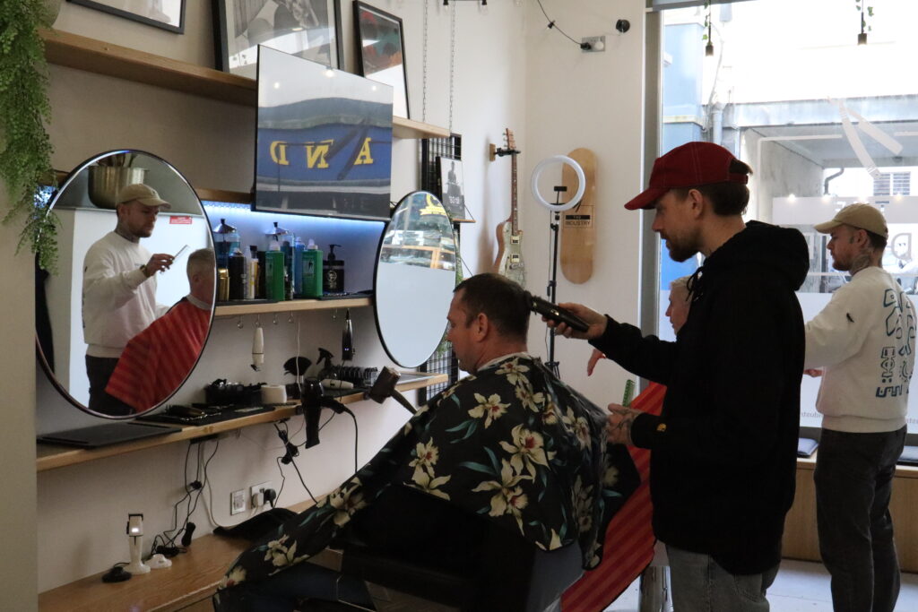
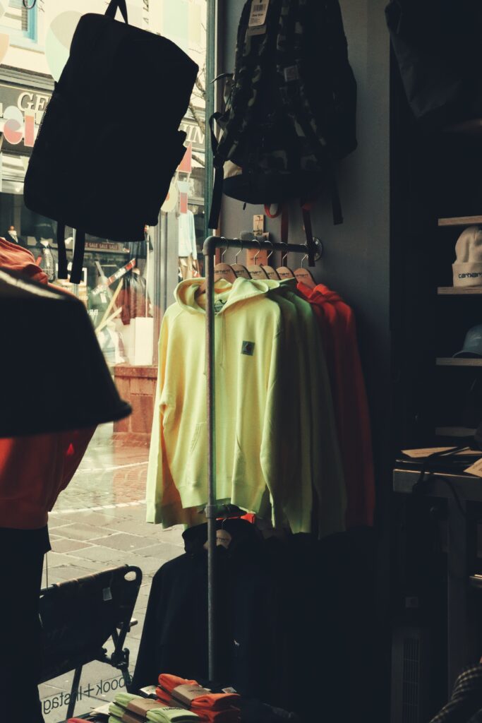
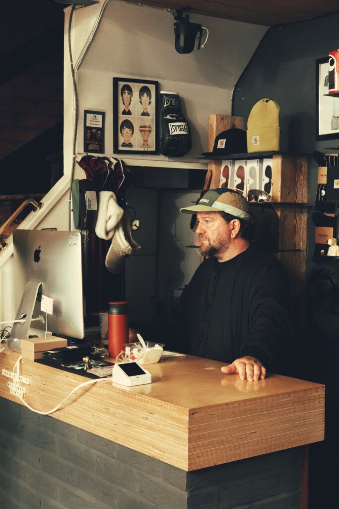
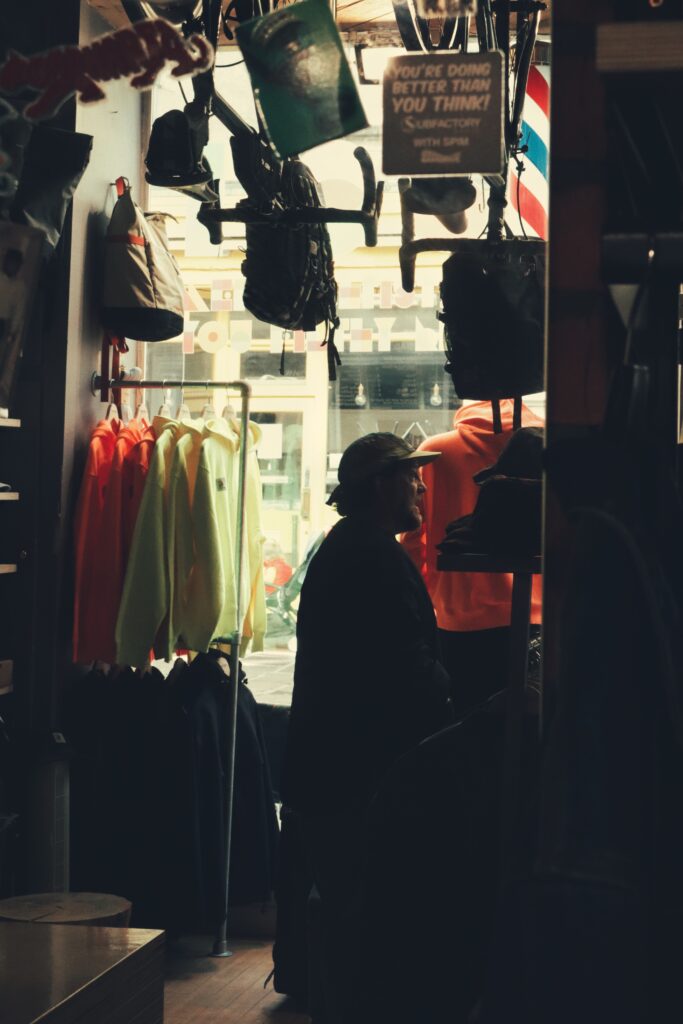
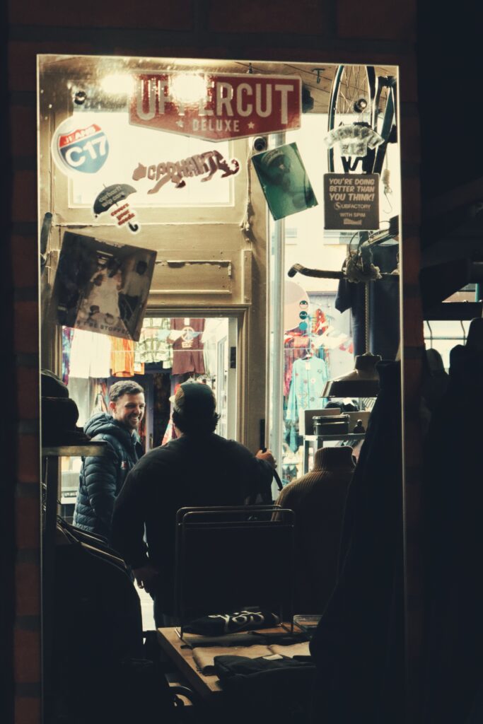
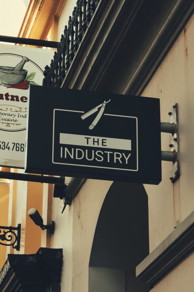
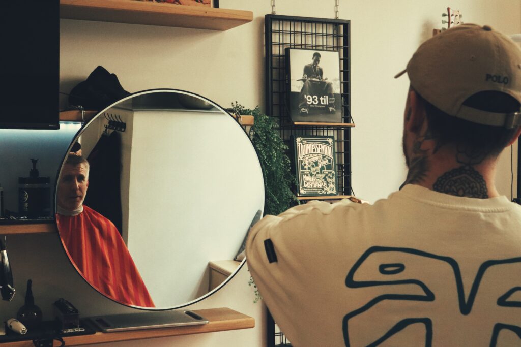
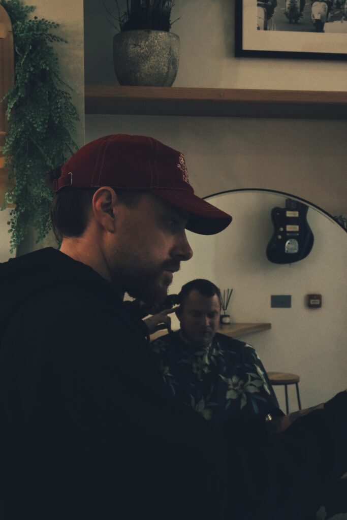
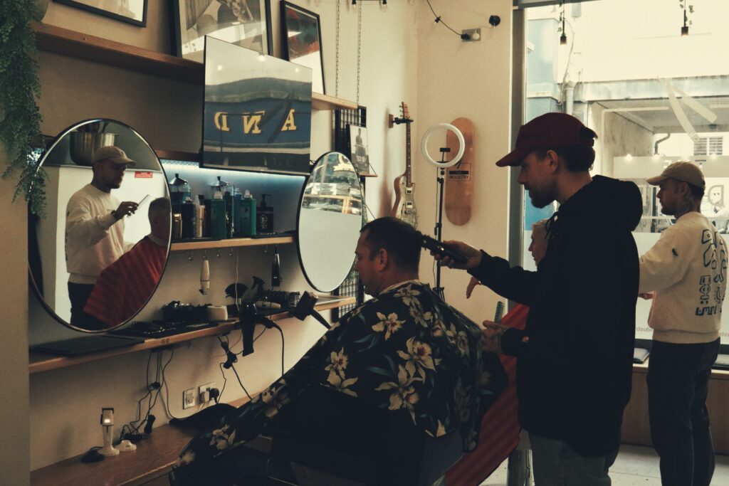
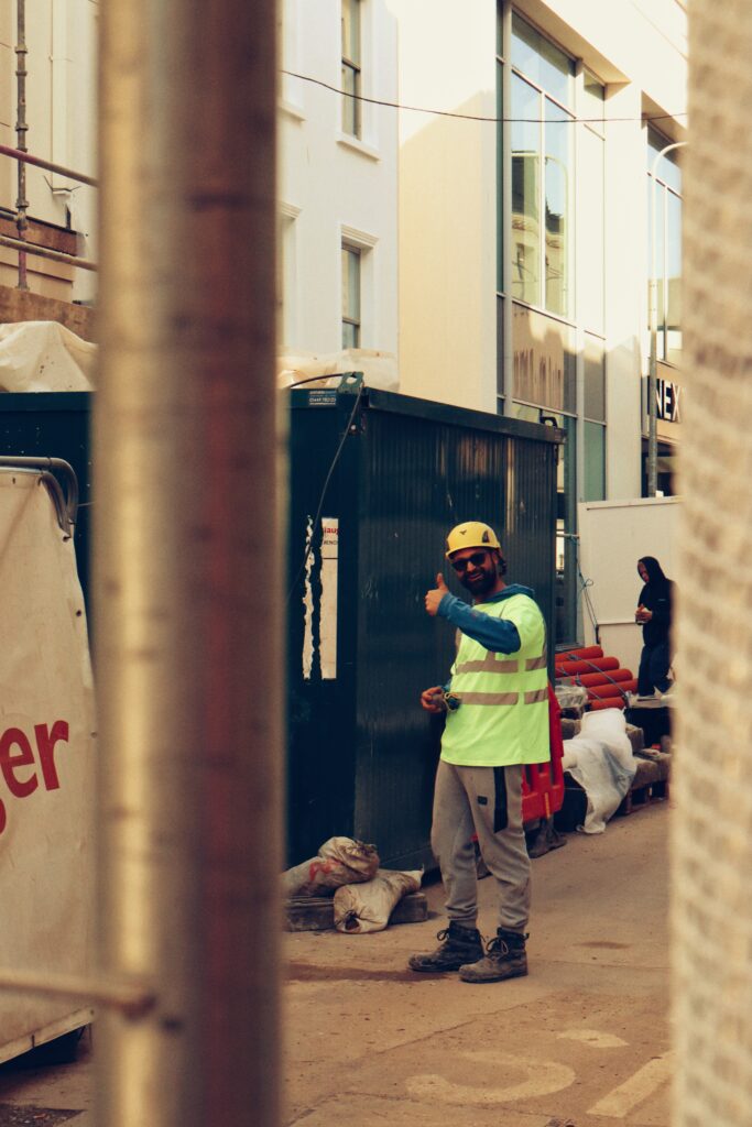
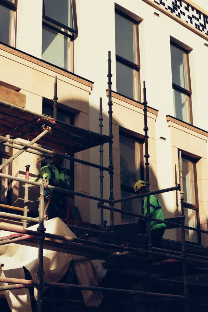
With this Nike ad design, being one that I found very visually interesting, I copied it again to present my own ‘advert’ photographs of local business’s such as ‘The Industry’ barbershop and ‘Tibstreet’ clothing store. By creating multiple image cells on the page, I would then adjust them into the positions I wanted.
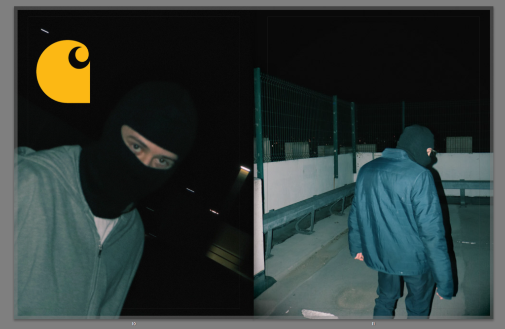
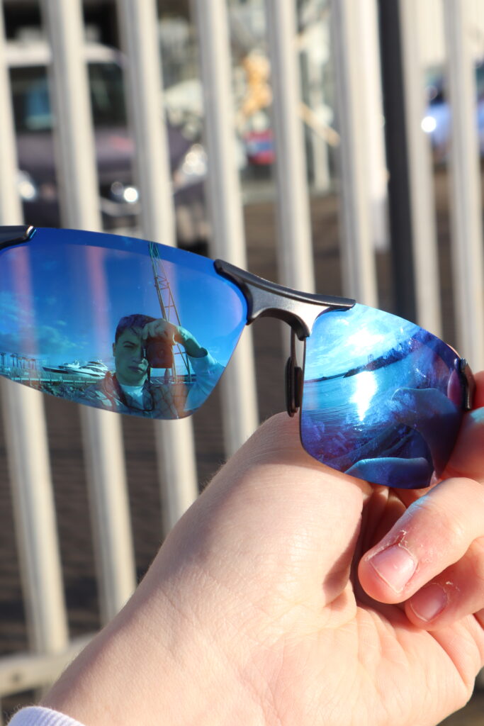
Another style influenced from these magazines were the use of full bleeds on both single and double pages. Here I took influence from Carhartt WIP for example, producing my own Carrhartt ad.
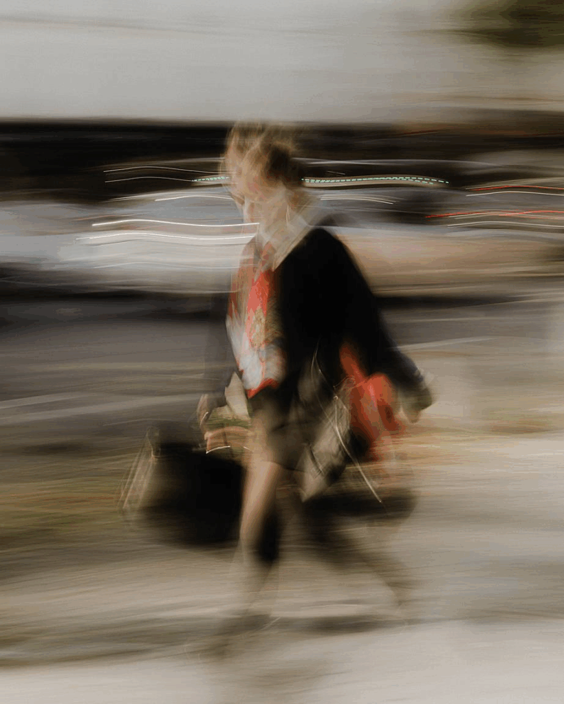
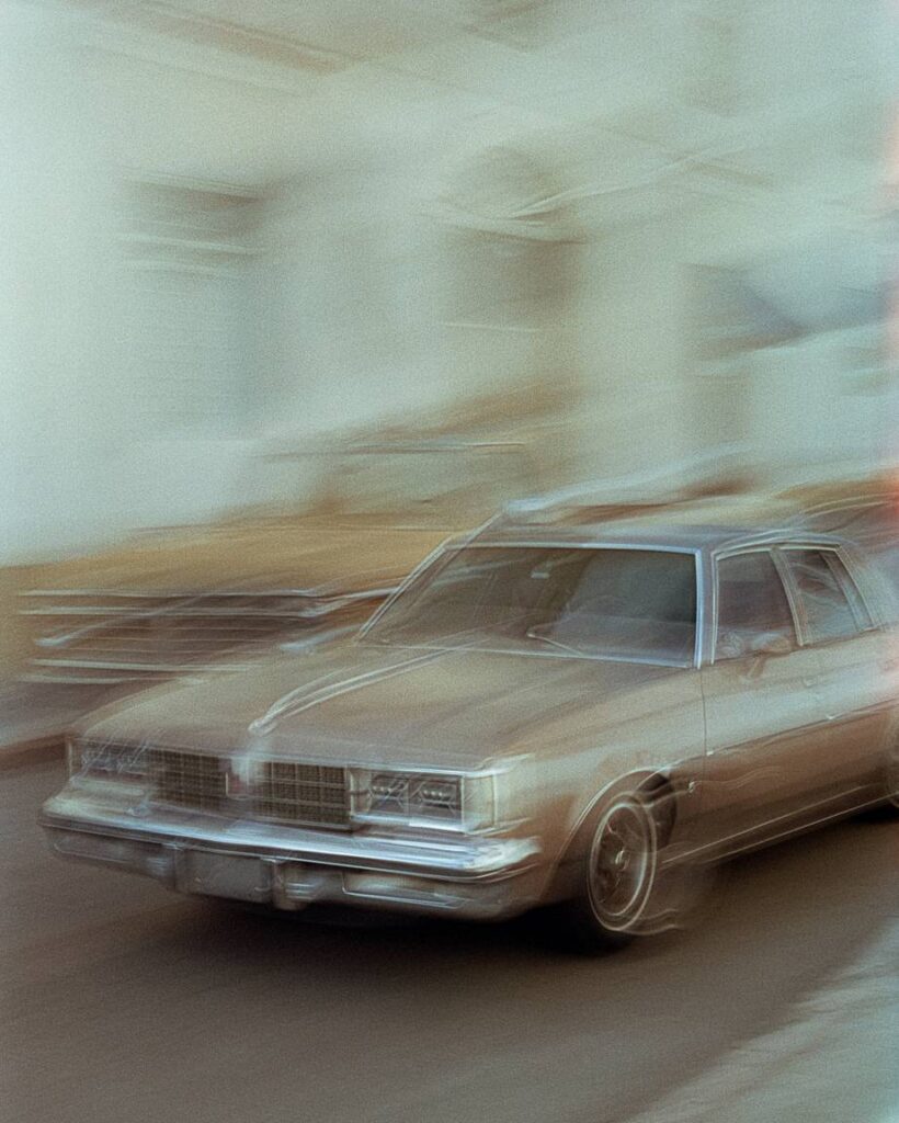
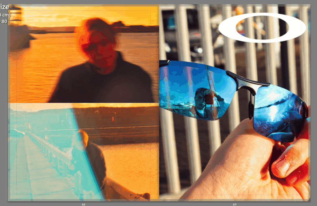
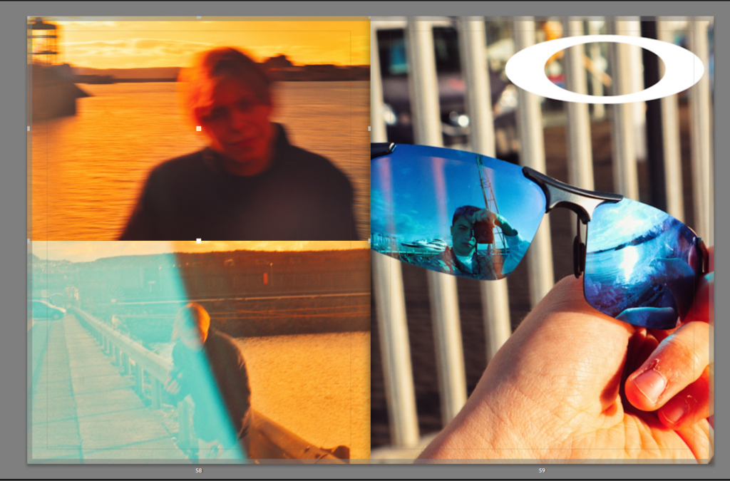
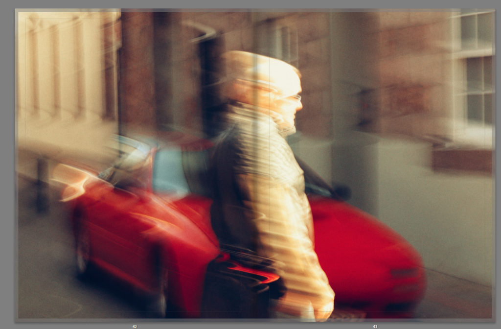
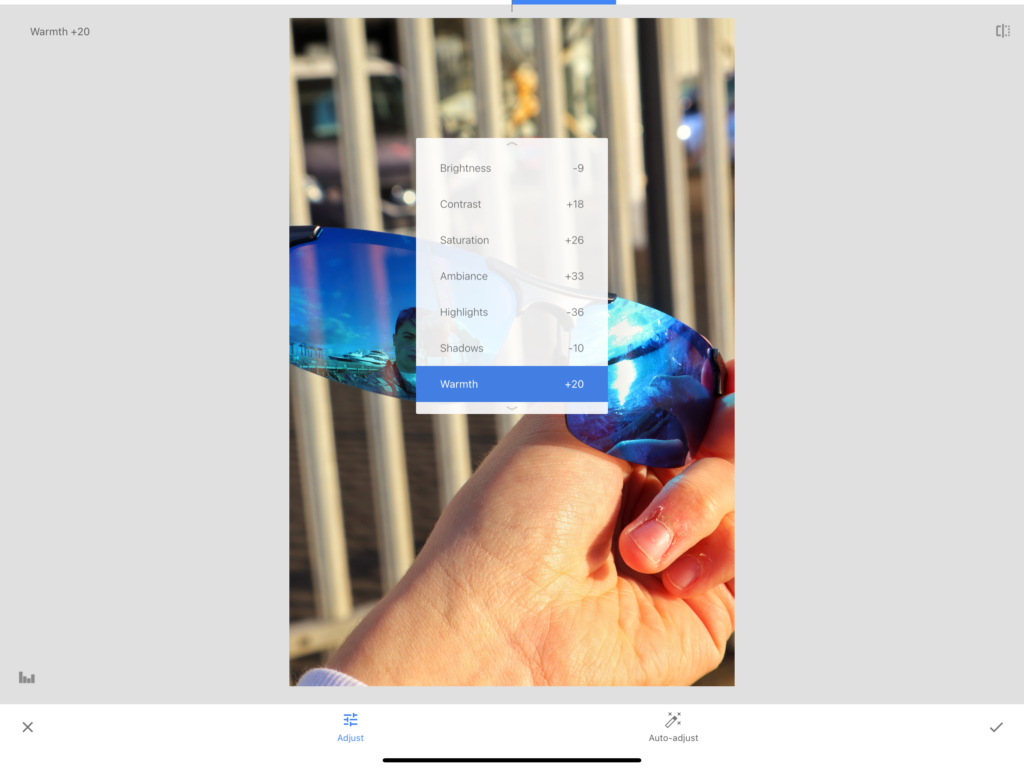
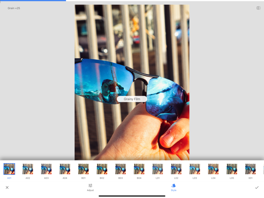
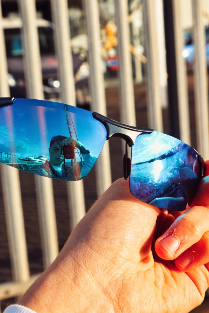
Making adds for brands such as Carhartt and Nike, I chose to include another fashion brand, however this time for eyewear. For this I chose Oakley’s. To create these images, I made use of reflections and also using the glasses themselves as a make-shift filter to create the distorted image effect, which looks like over-exposed film.
How I did it:
I also copied the effect of having the front cover on its on individual double page, as this creates more of a focus to its detail which can be taken away with text on it.
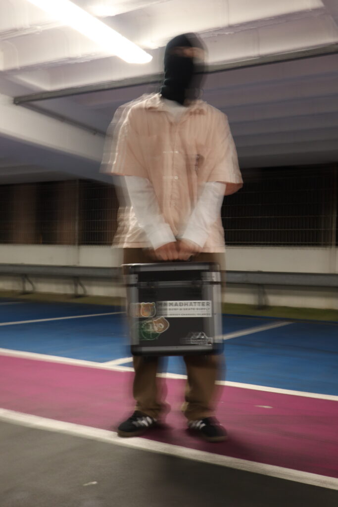
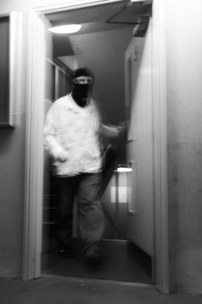
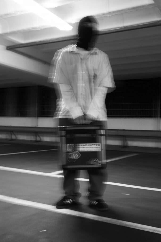
To add more variety to the advertisements, and reasons to include more photographs of different aesthetical styles, I chose to create a made-up brand.
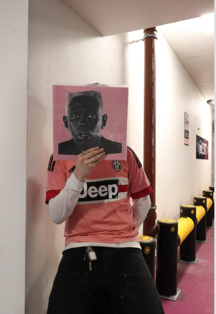
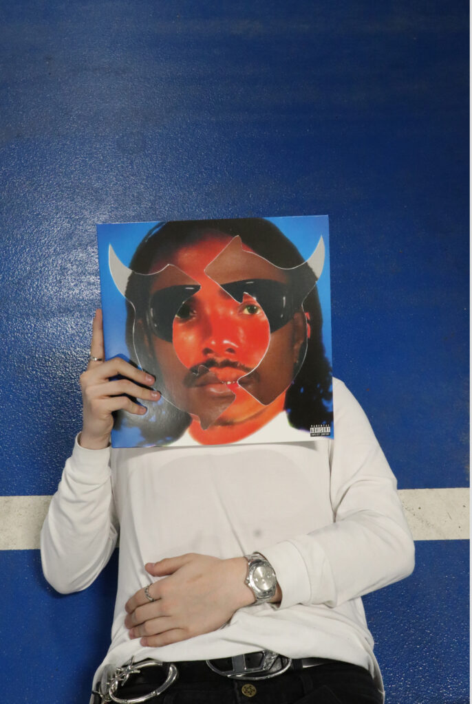
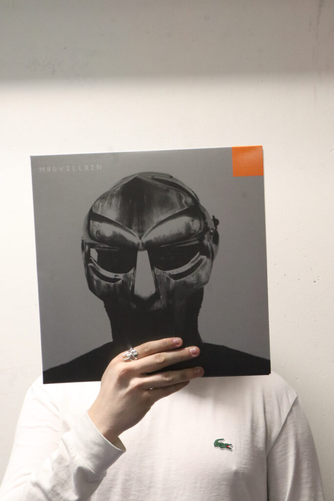
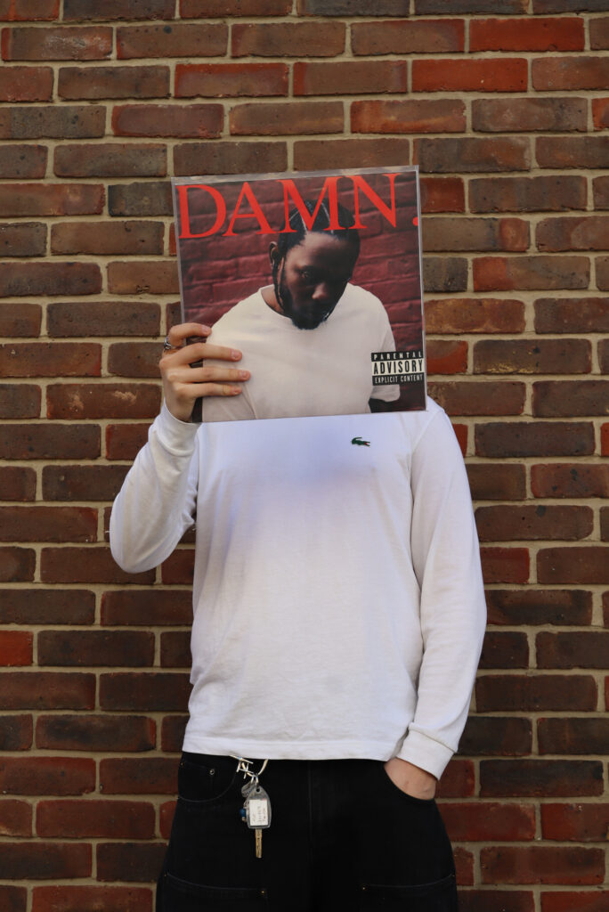
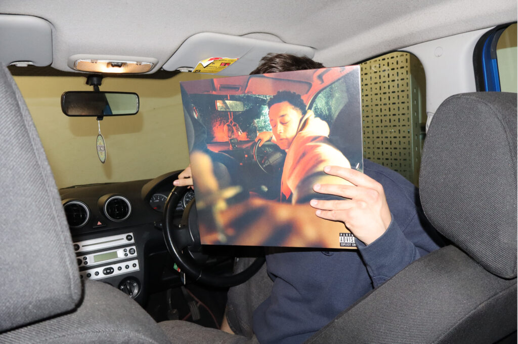
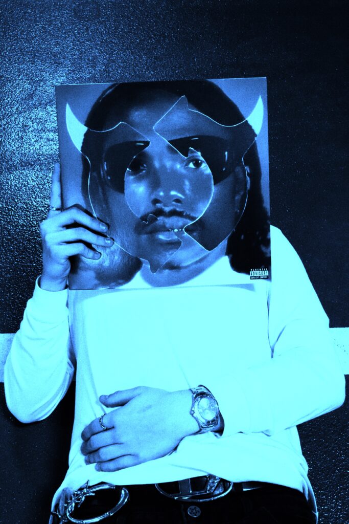
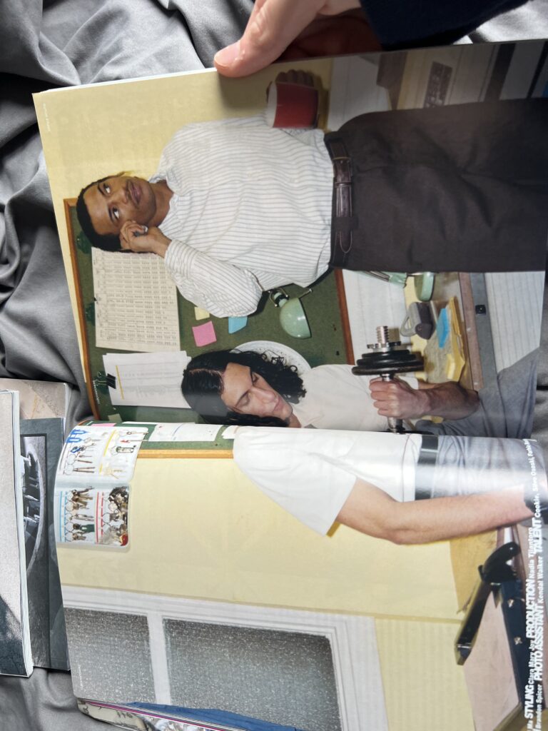
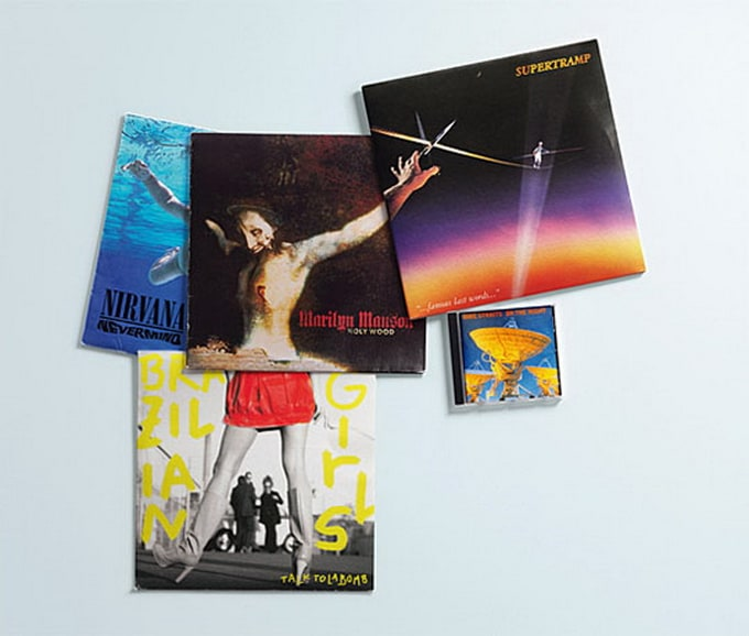
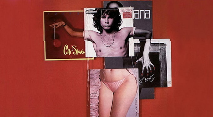
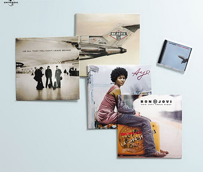
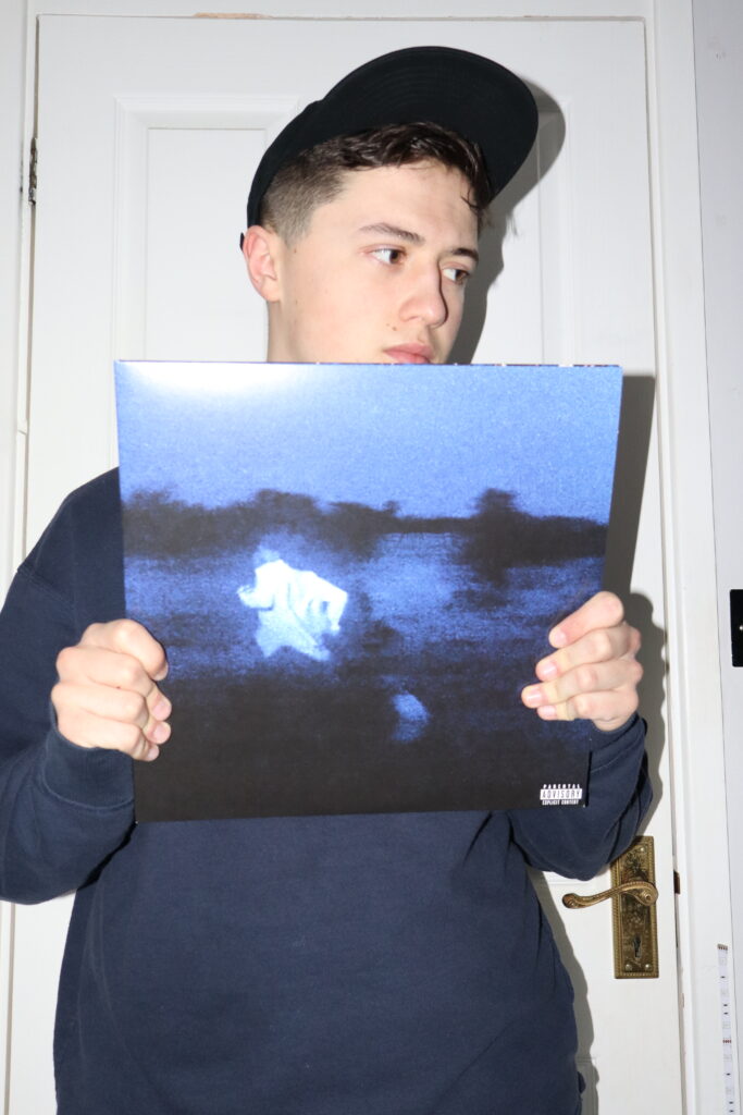
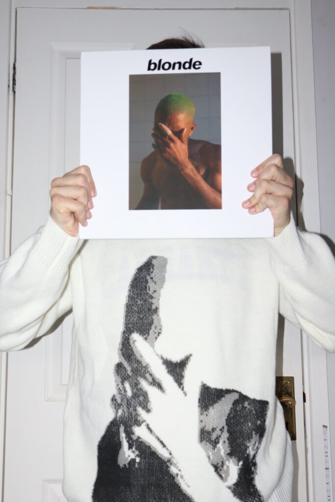
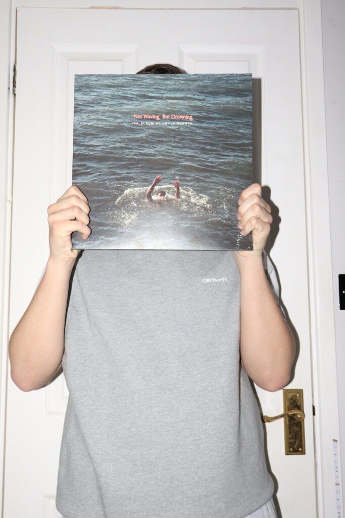
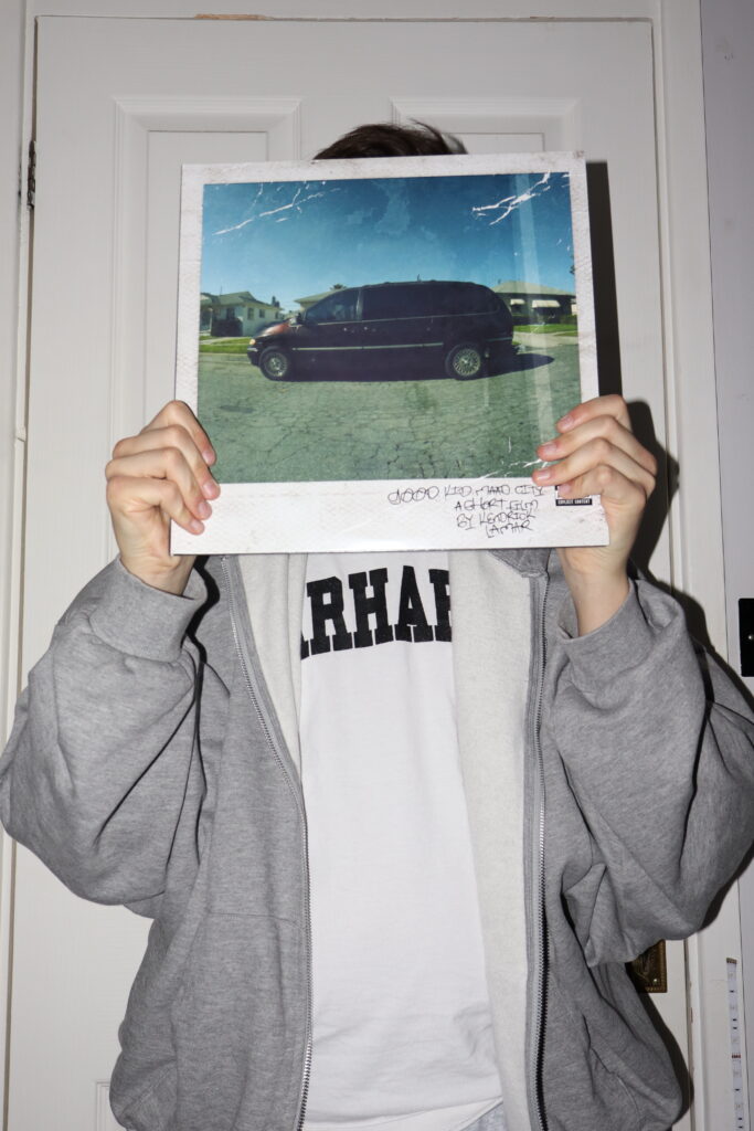
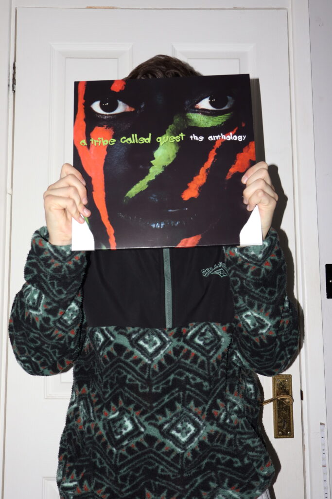
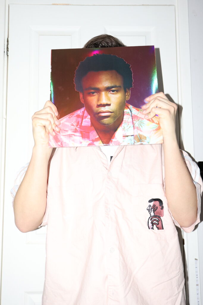
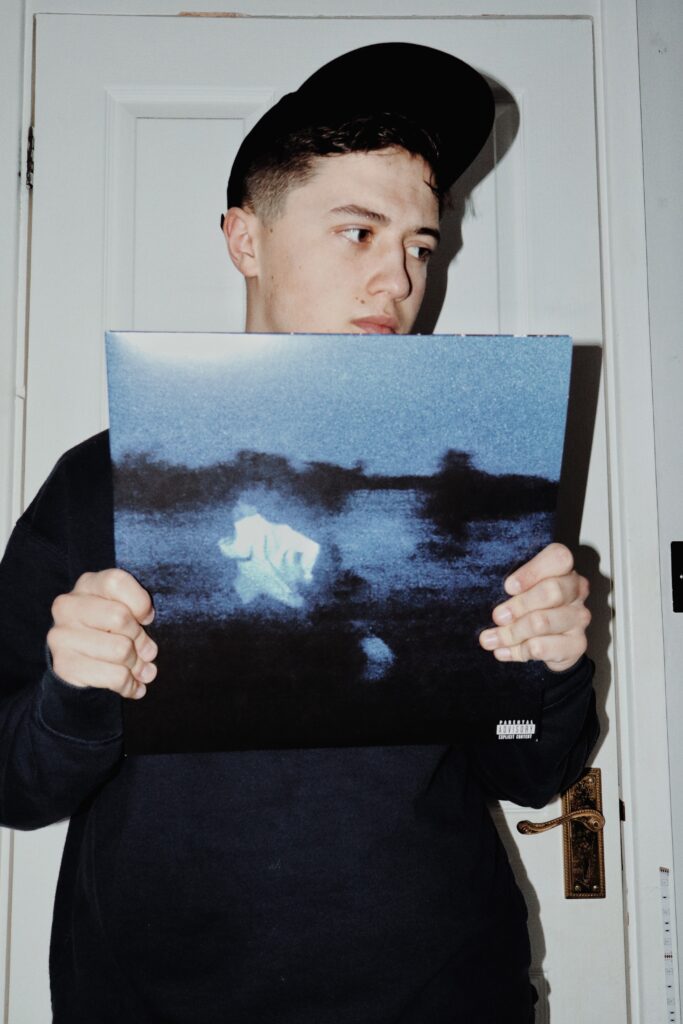
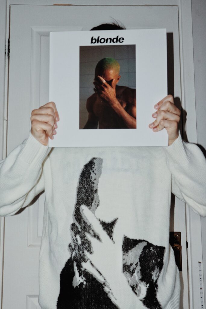
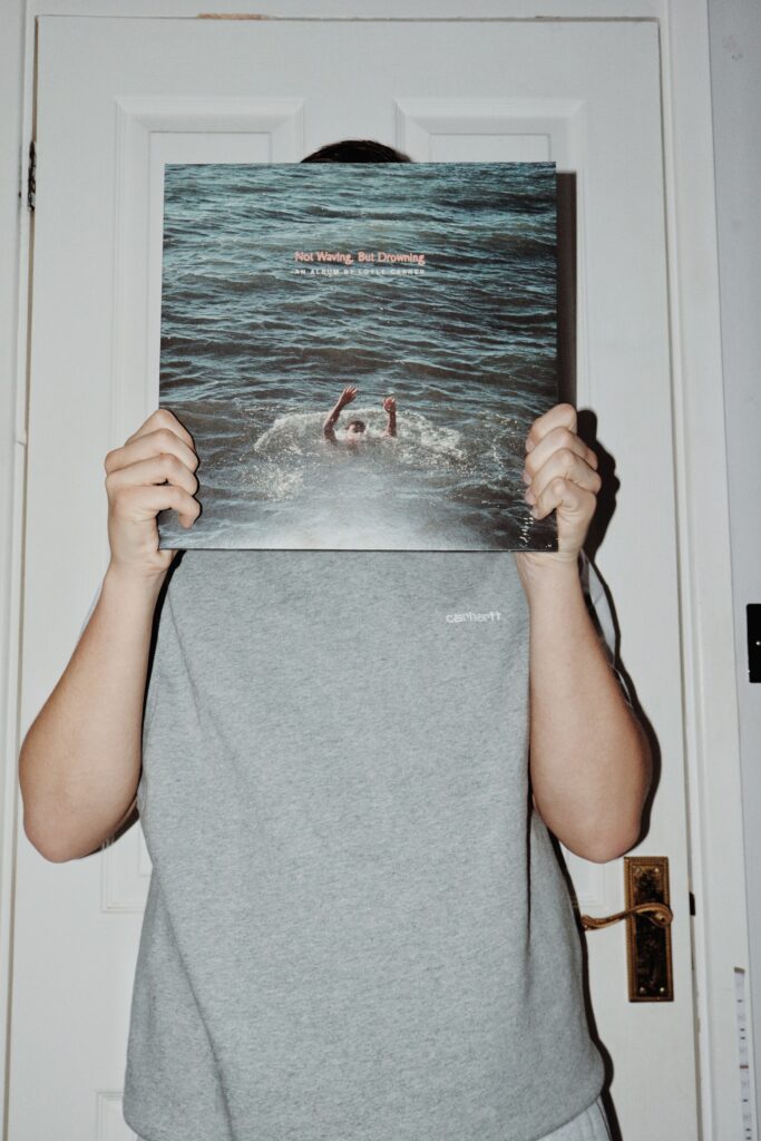
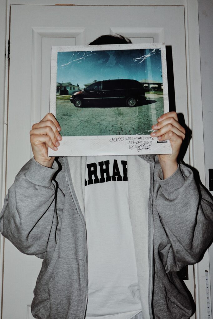
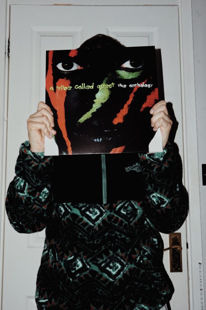
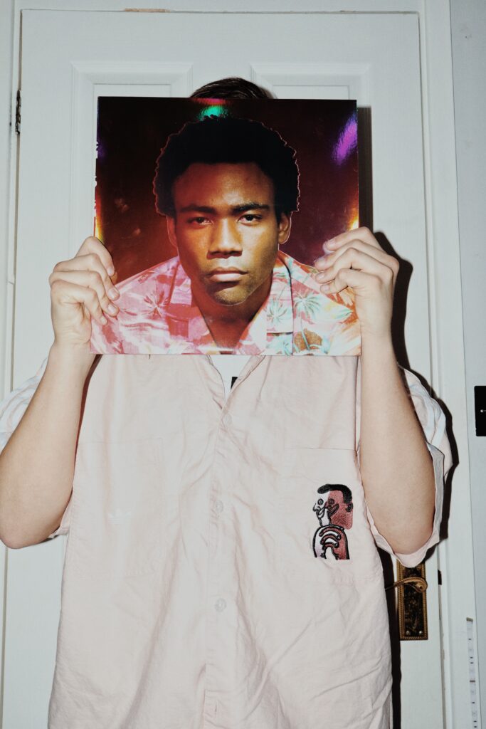
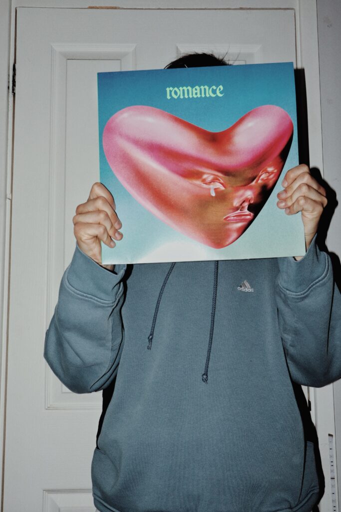
Music pages:
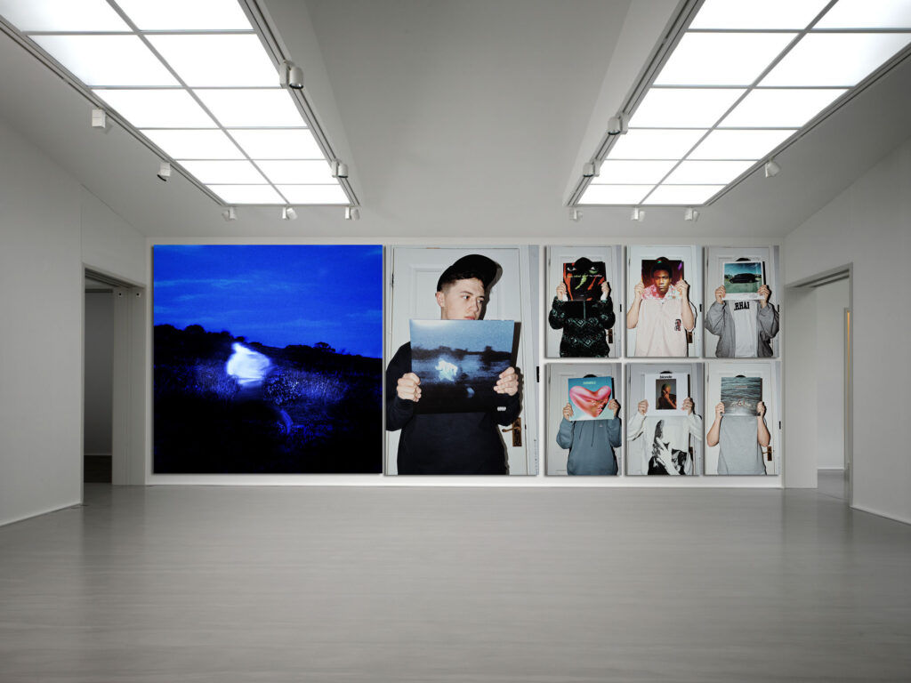
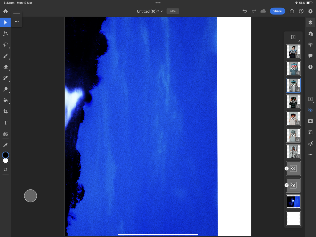
For this page I used the backing of my recreated album cover image to create the same colour tone for it so when I place them together they would match.
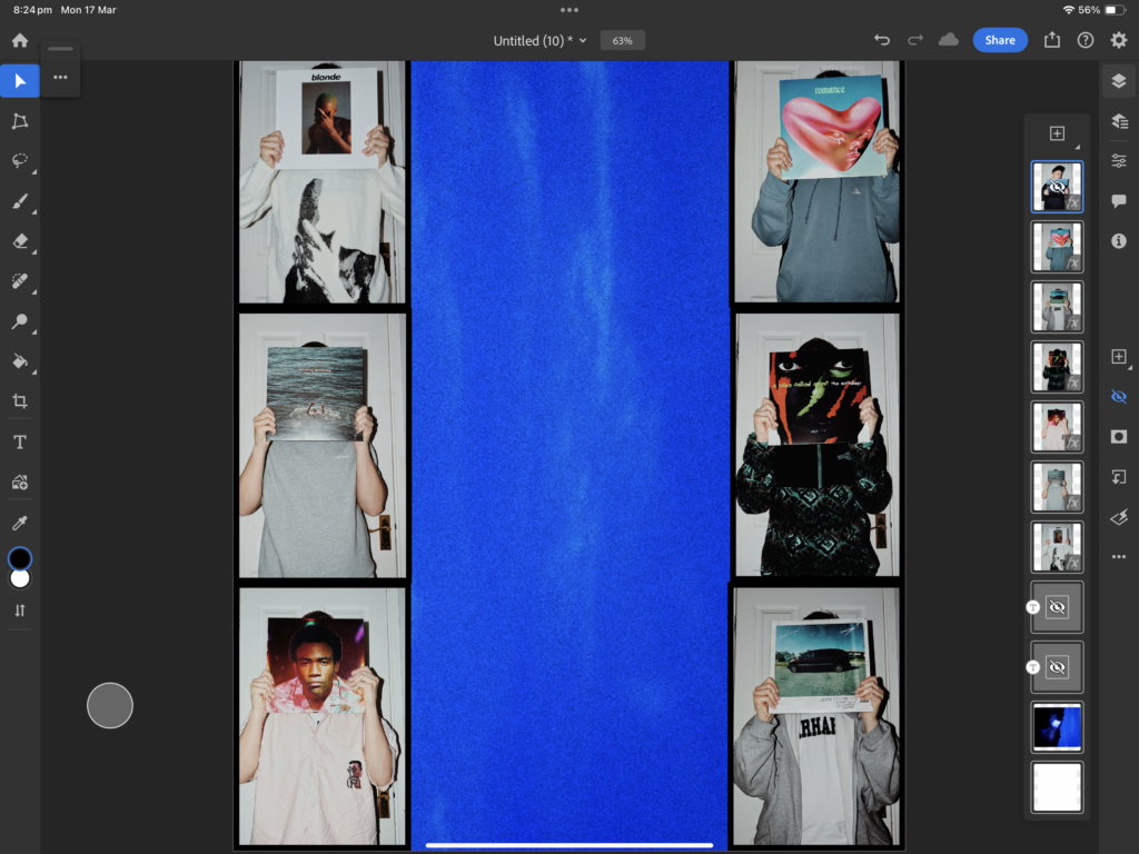
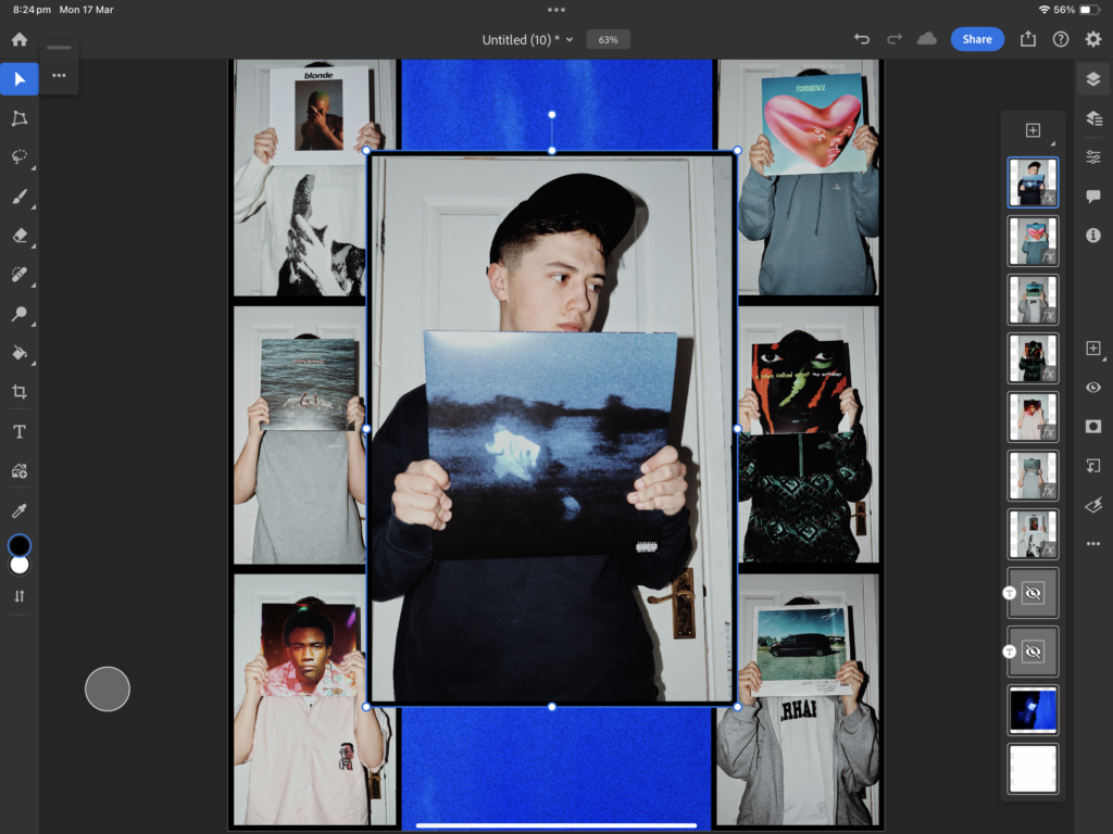
From this, I then added the edited photos of myself wearing different clothes holding album covers to display the array of music genres I listen to and find that represents my music taste.
Then I added the main image of myself holding the album cover I recreated, placed together on a page I find it will represent how I identify myself through my music tastes.
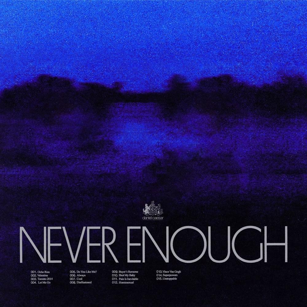
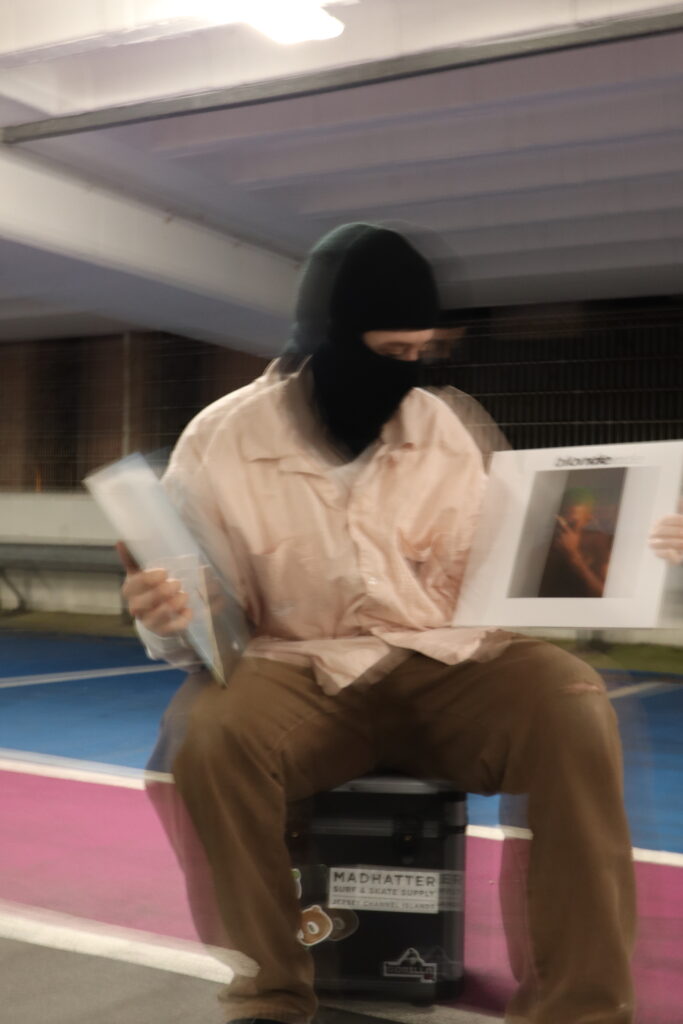
With the collage of images now made, I then added the title of the fake article, creating a poster like effect. With the font, I tried to use one similar to the one that is used on the ‘Never enough’ album I am holding.
Example –
When placed together on the page, alongside the article I find this creates an interesting display.
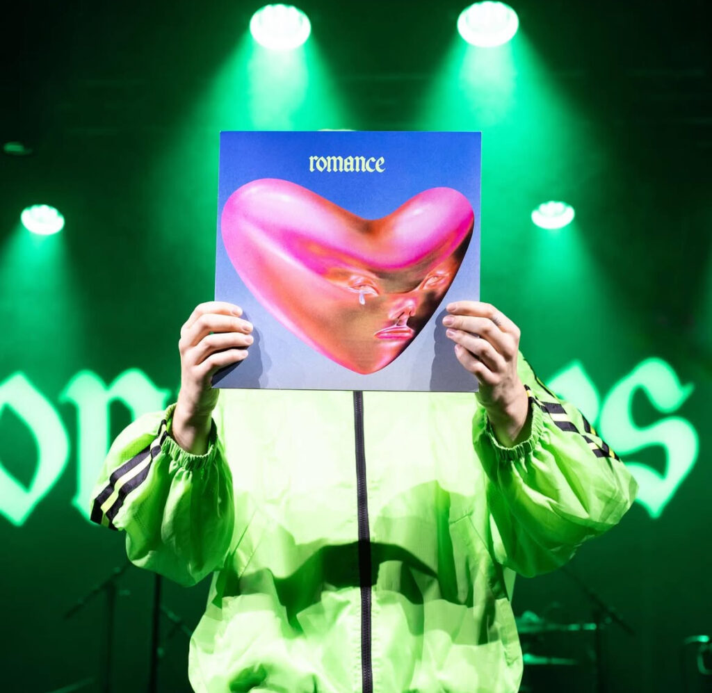
What inspired me to create this was was mainly recreating Daniel Caesar’s ‘Never enough’ album cover as I found it seemed an achievable one to make, additionally, this image made by the band, Fontaines D.C. was another source of inspiration for creating the poster image that went along with it. The interview style text on the image on right-hand page was inspired by the interviews of artists and individuals in both WIP and Skate magazine.
Additional Images:
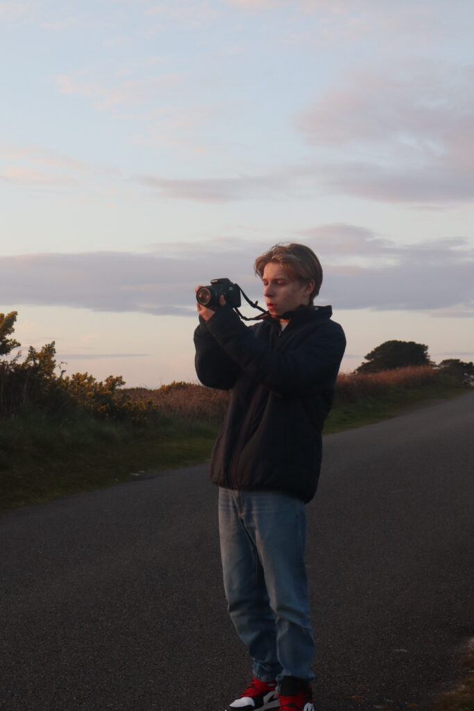
Wanting to expand on the music element of my magazine further, I did so by creating more images inspired from the ones above. To see what I added this link will direct to a separate post outlining the intentions, editing process and outcomes which I will then add to the final layout.
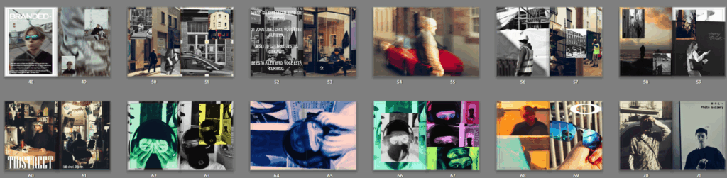
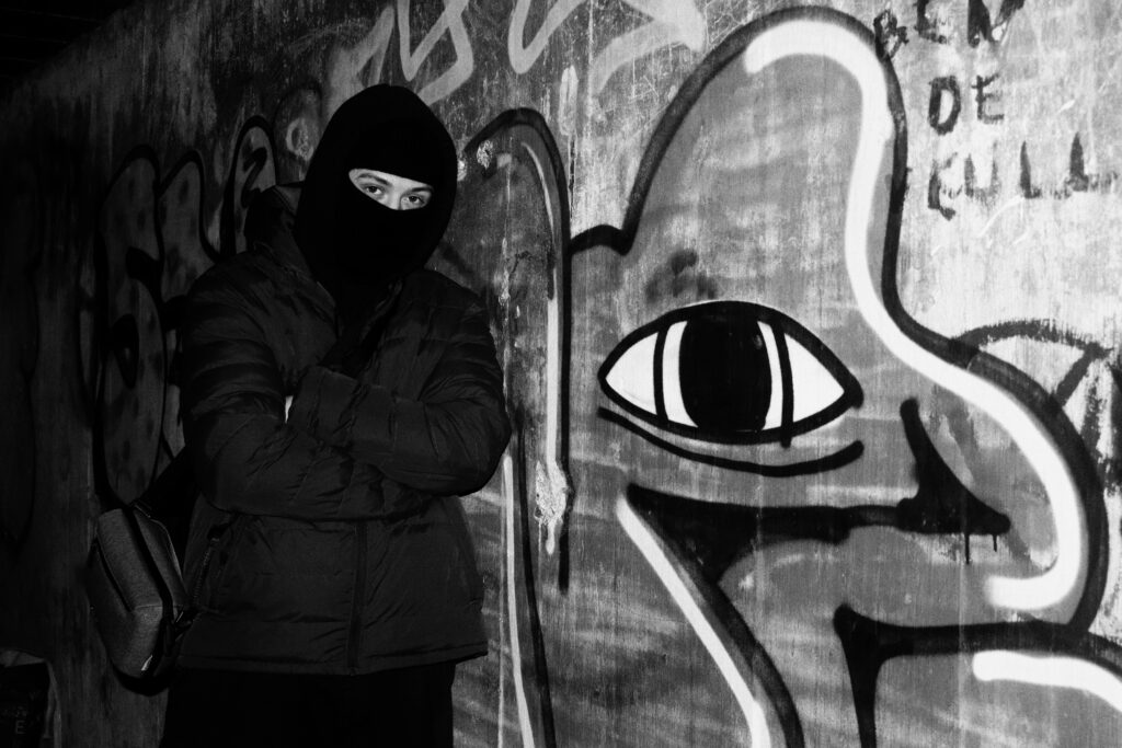
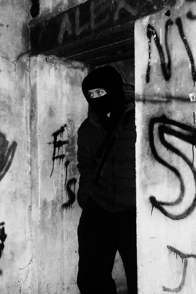
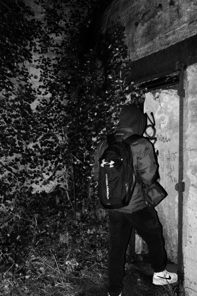
Art/identity pages:
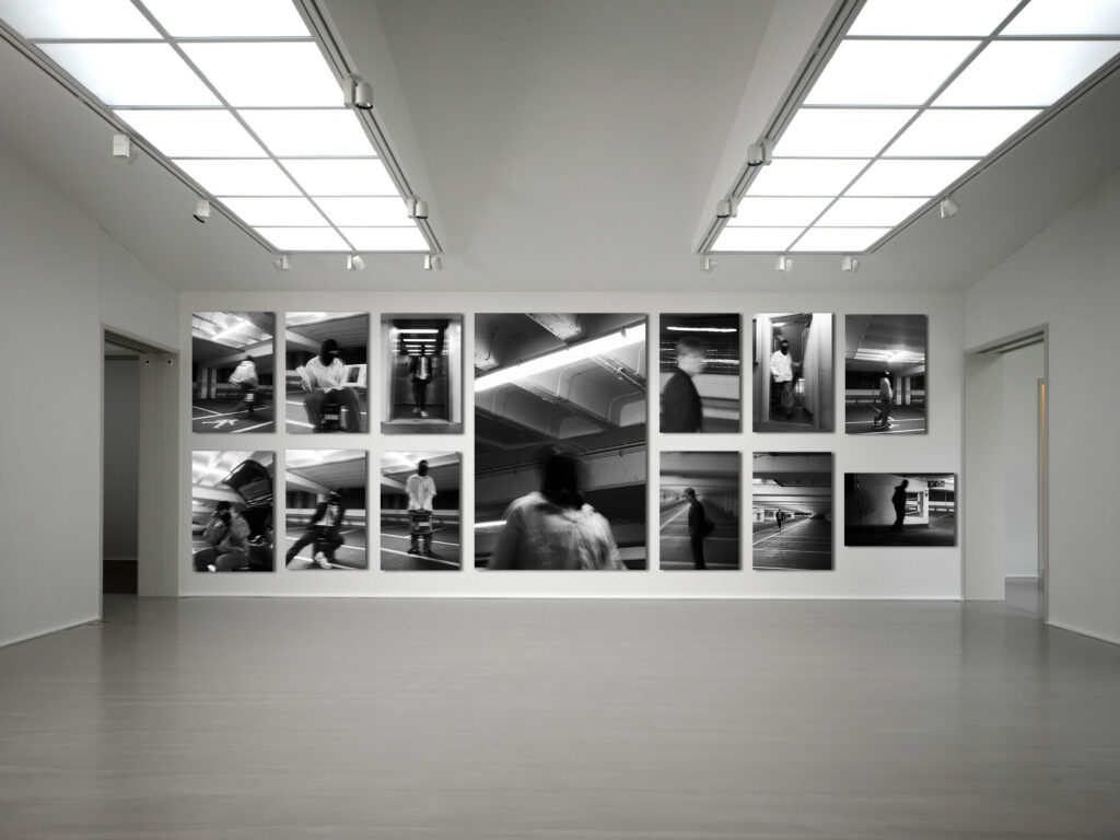
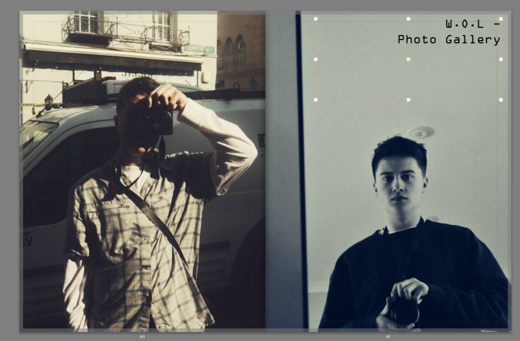
Using the pages for ideas on layouts, I took to creating a sort of gallery section within my magazine which focuses less on having text to explain it but rather just have the photography be there by itself, as featured in this magazine.
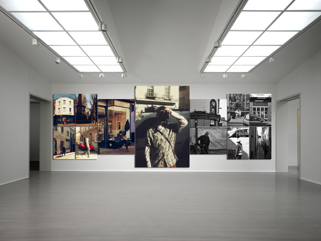
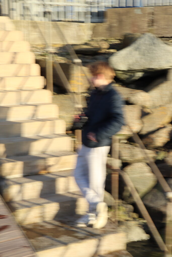
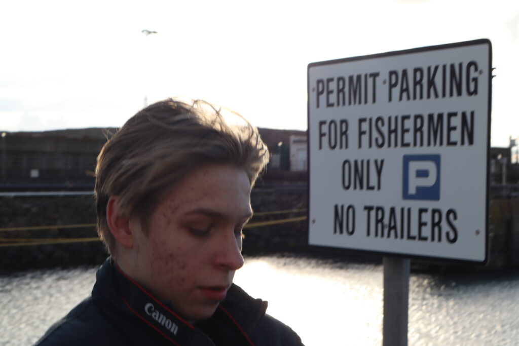
People in town pages –
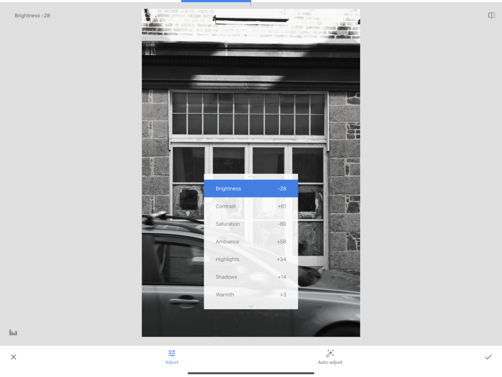
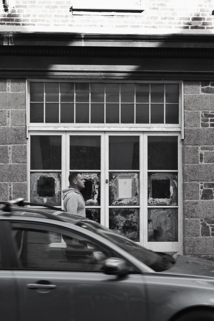
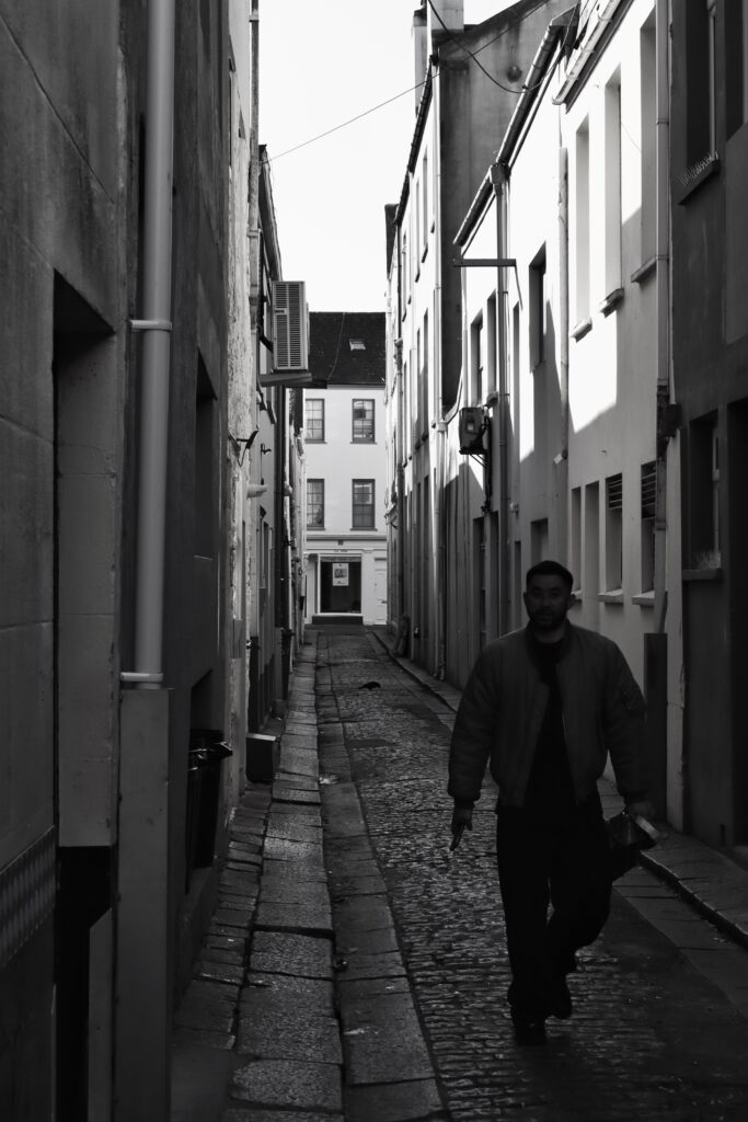
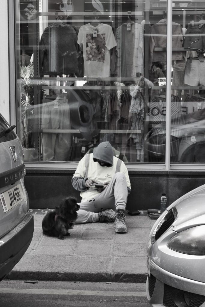
for the multiple identity photos of people in town, I chose to create a mix of both coloured and black white images to add some visual variety and further add to the erratic aesthetic of different display’s of work.
For this page I used the greyscale and brushstroke filter on photoshop to create the alternative image on the left which I then put the artwork title over.
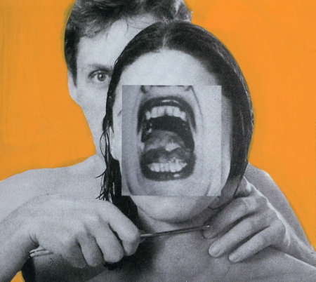
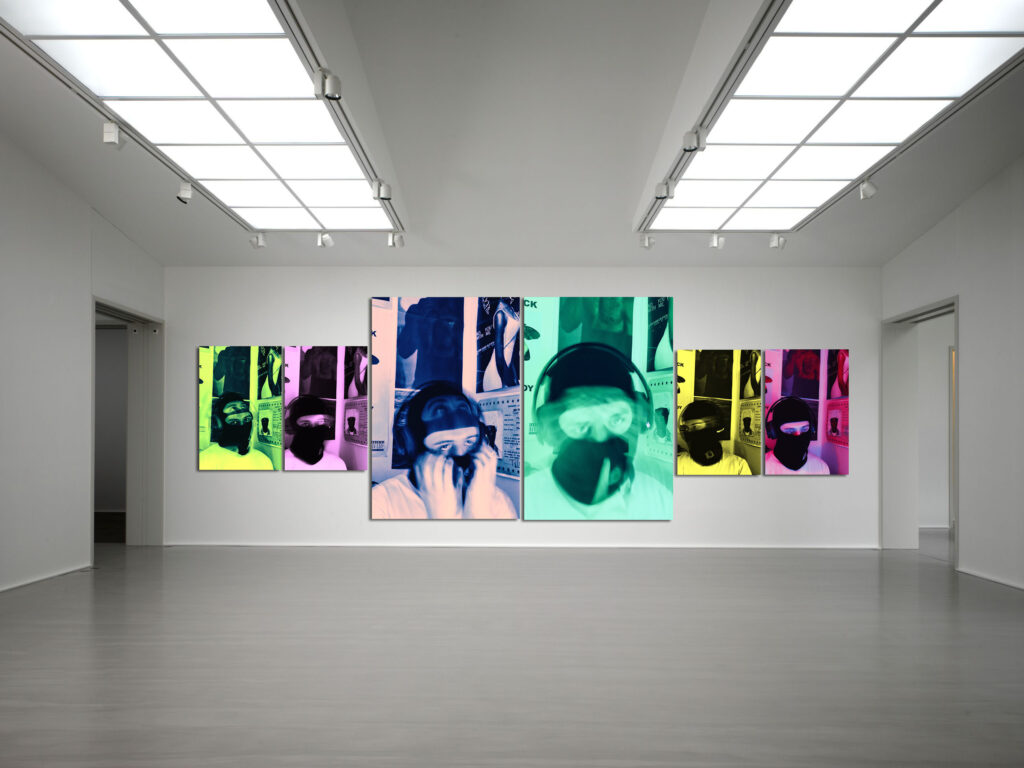
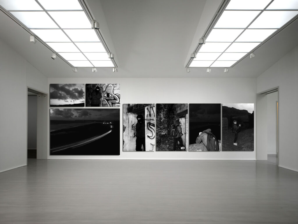
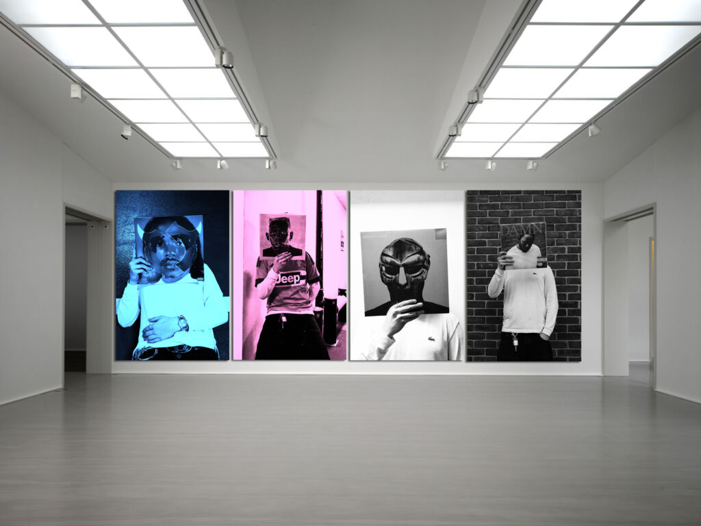
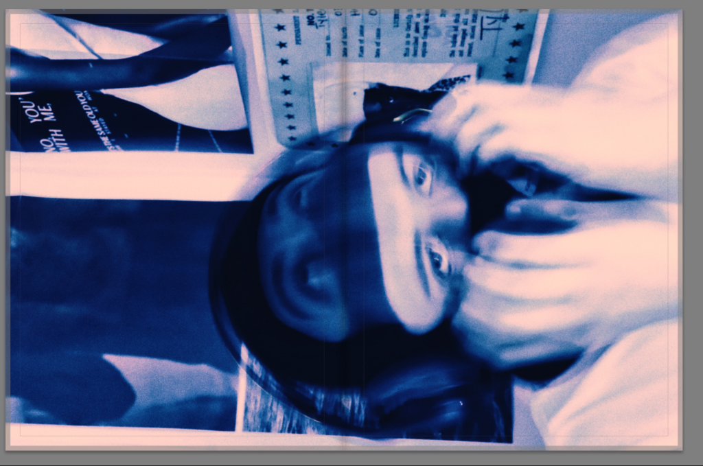
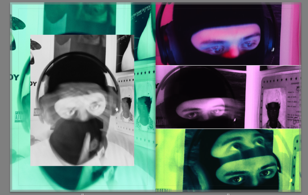
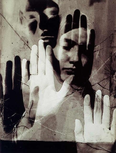
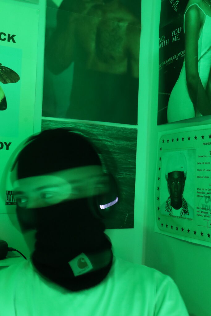
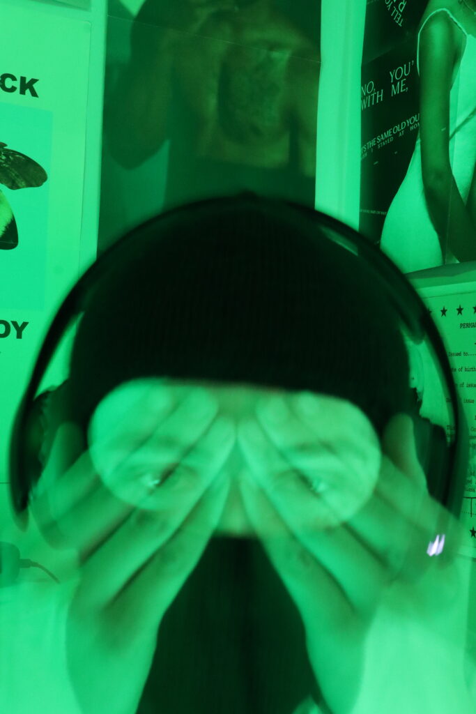
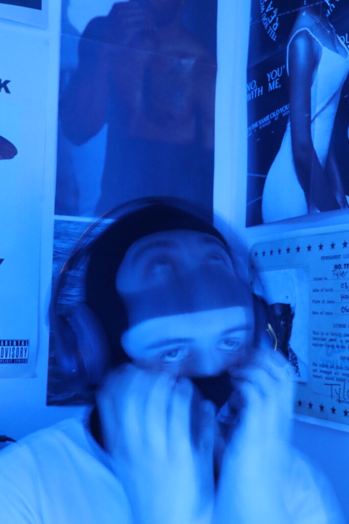
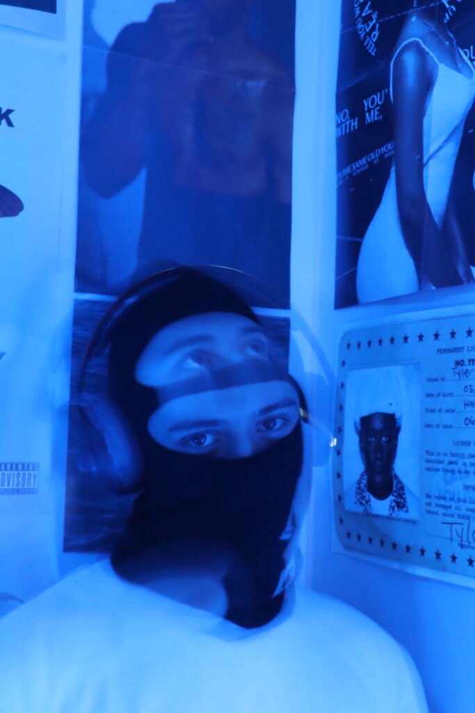
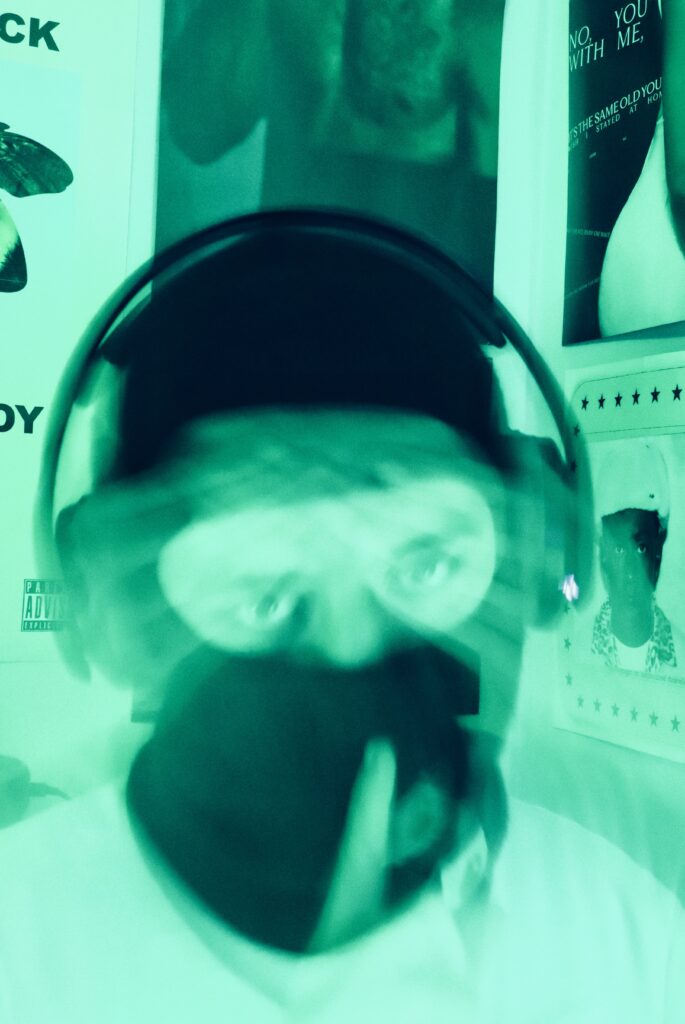
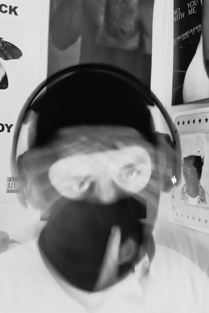
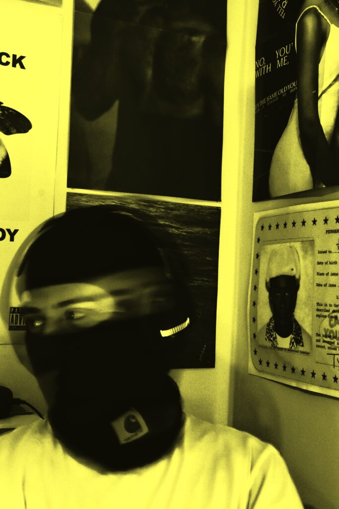
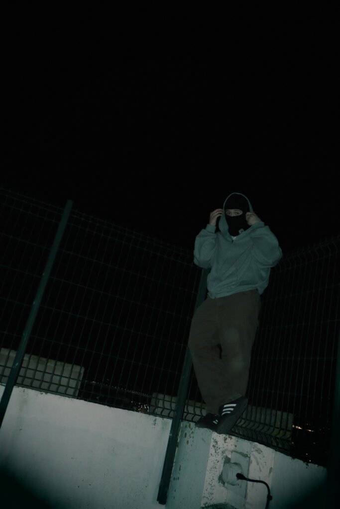
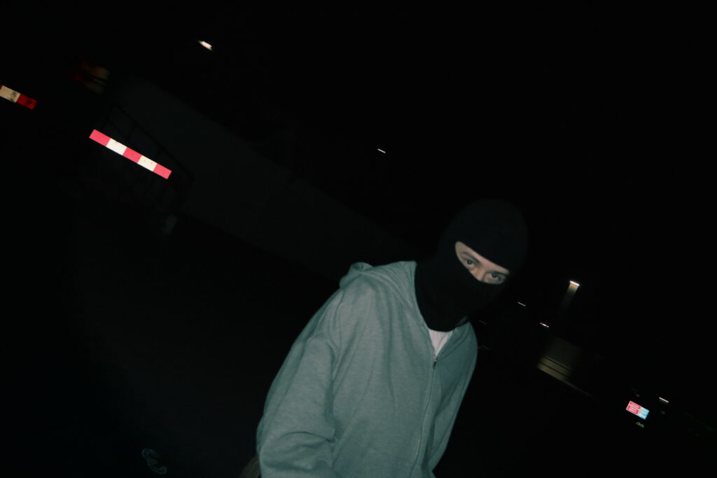
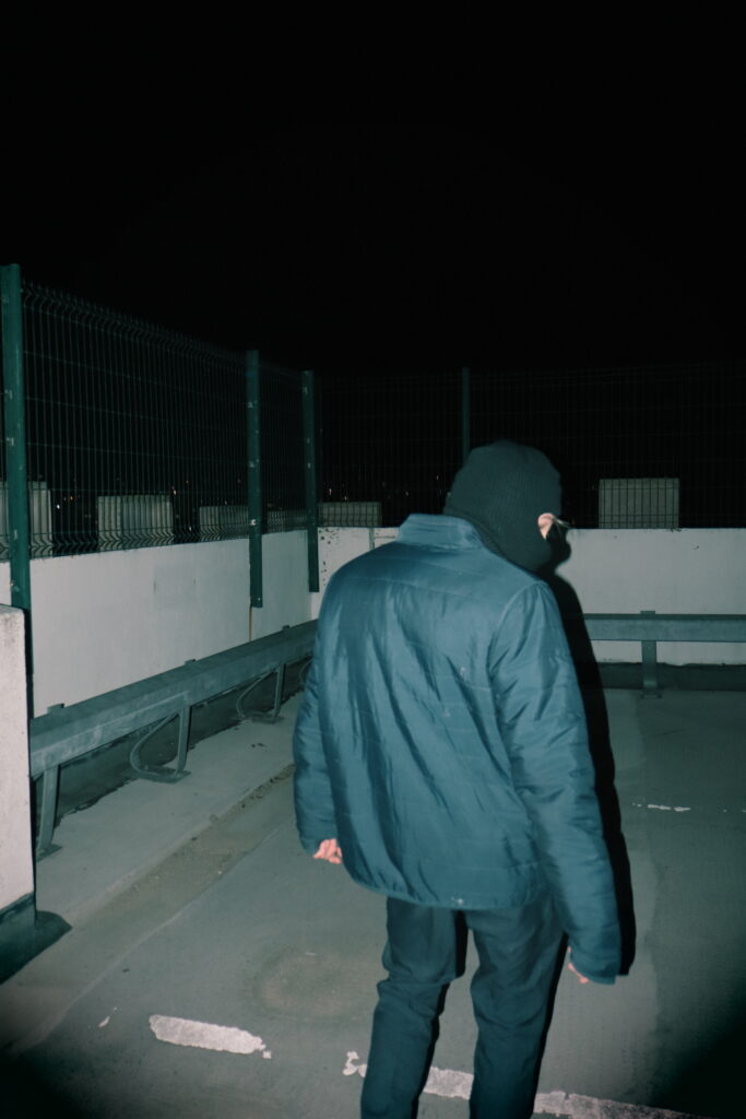
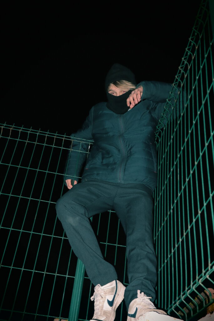
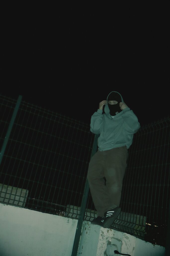
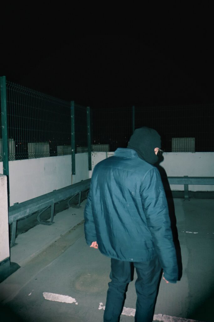
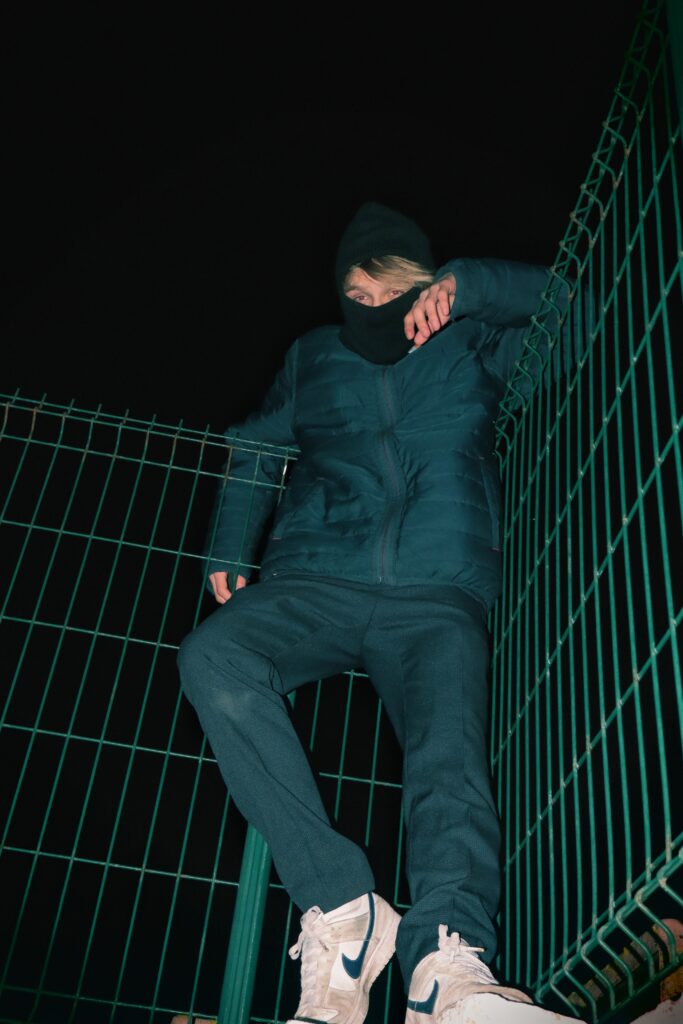
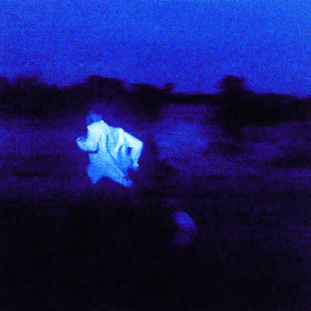
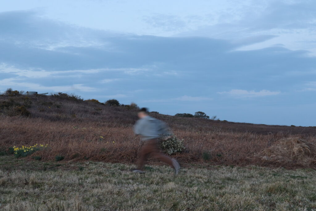
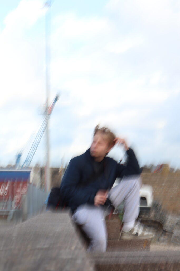
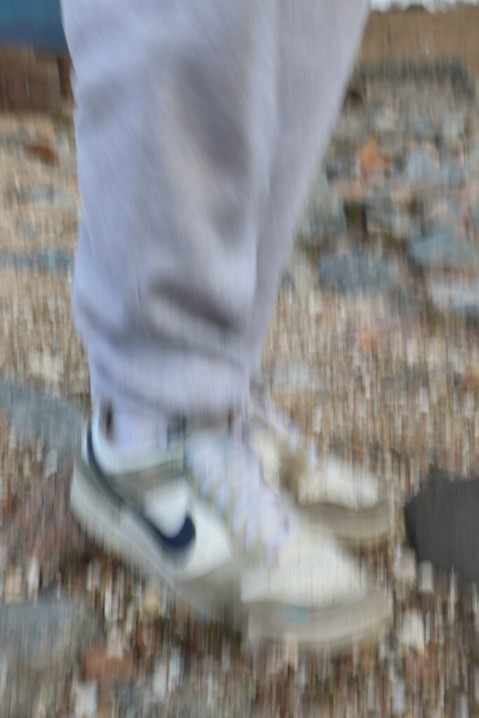
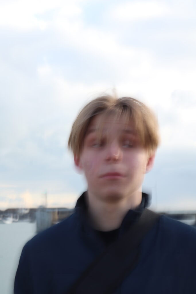
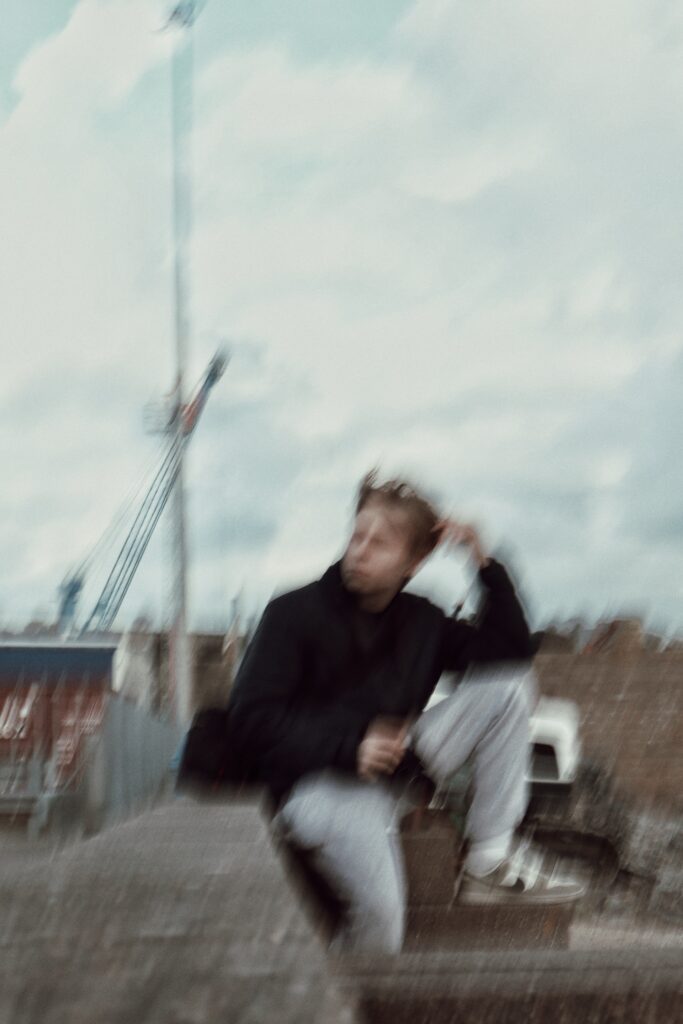
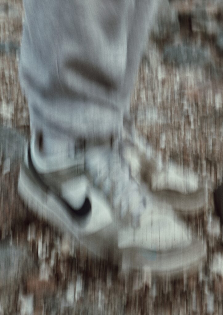
Experimental self-portraits pages –
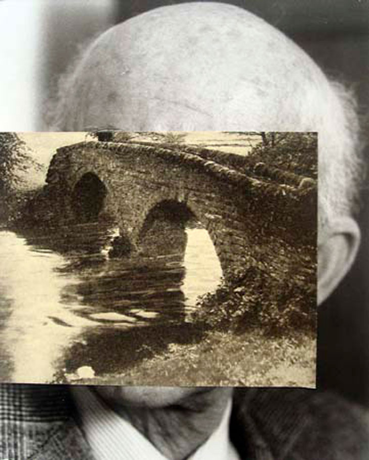
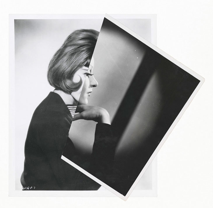
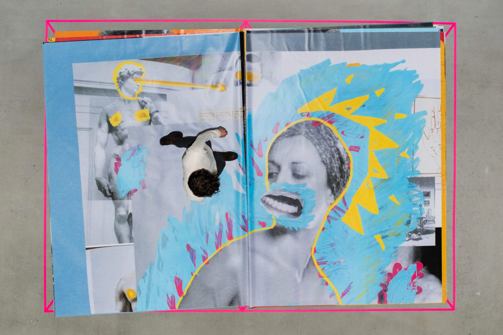
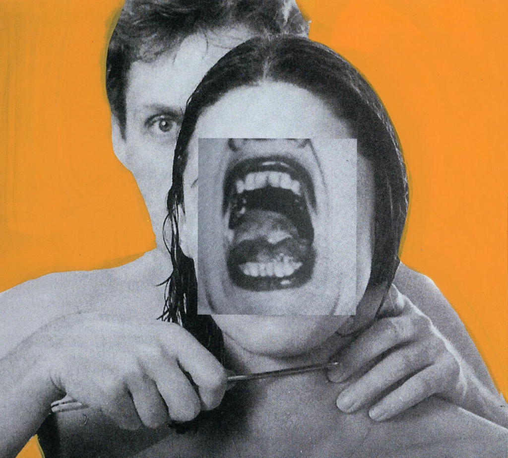
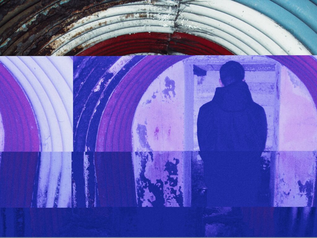
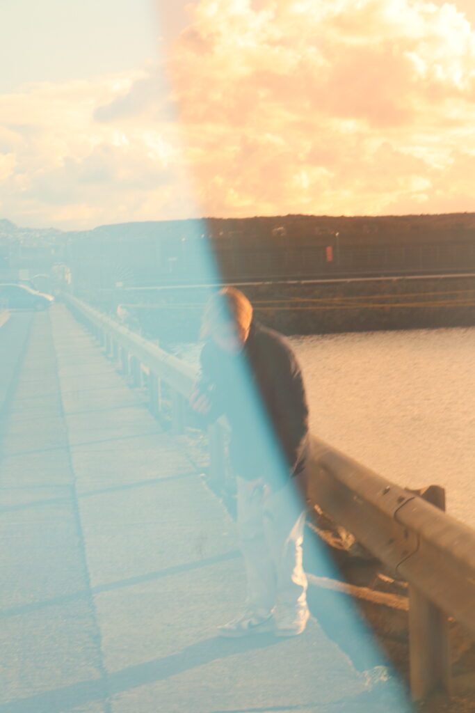
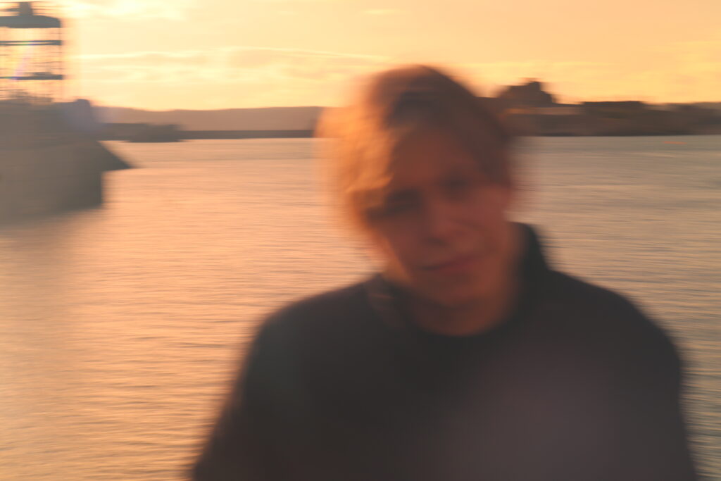
For these images, I choose to take some influence from the art style of collaging to overlay images to create a interesting effect where the colourful images clash in tone to their black and white counterparts. These images will be in the art collection of the front cover image.
I took partial inspiration from artist studies into collaging and montaging in terms of the same bright colour use of Milach, and the lighting placement of Stezaker with soft but strong light sources (LED lights inside my room).
Vintage to Brutalism:
Editing the title-image in photoshop, I used the text tool to add the title and rotate it into the positions of the 2 metal bars. I then did the same with the text on the second half of the page to add some balance.
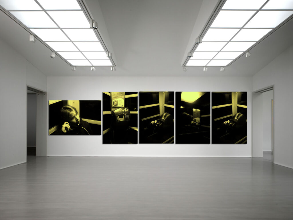
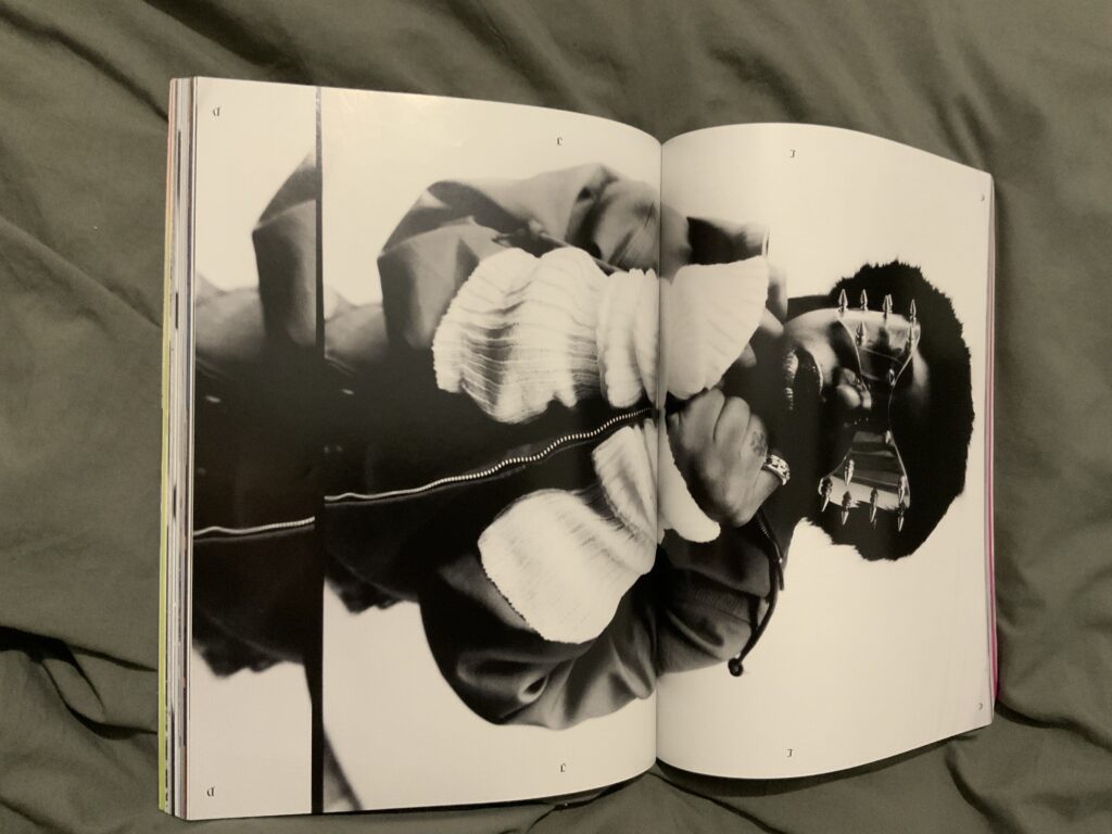
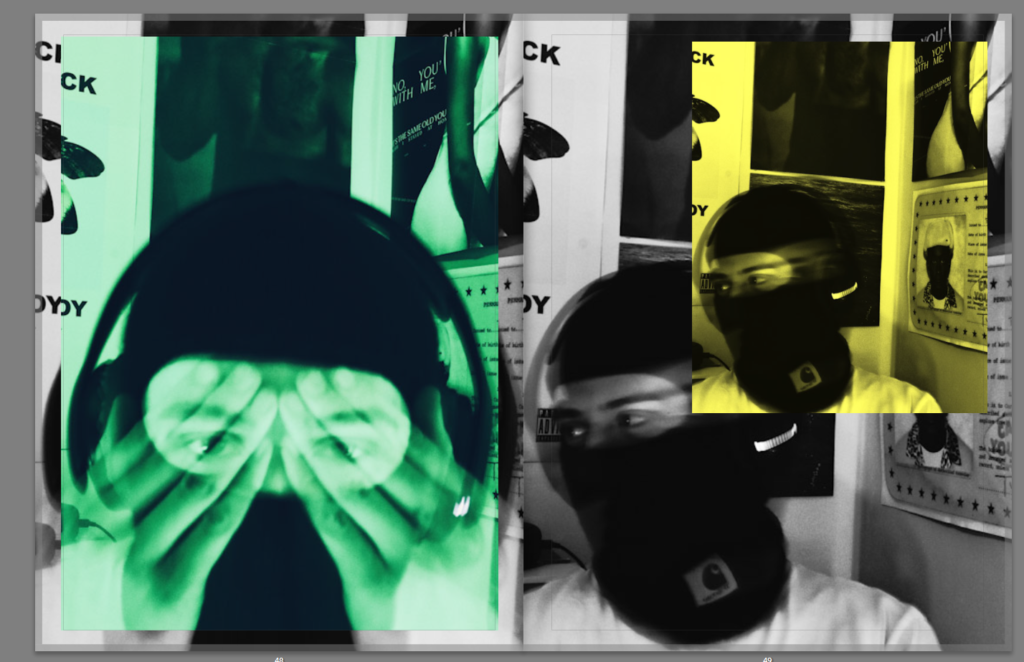
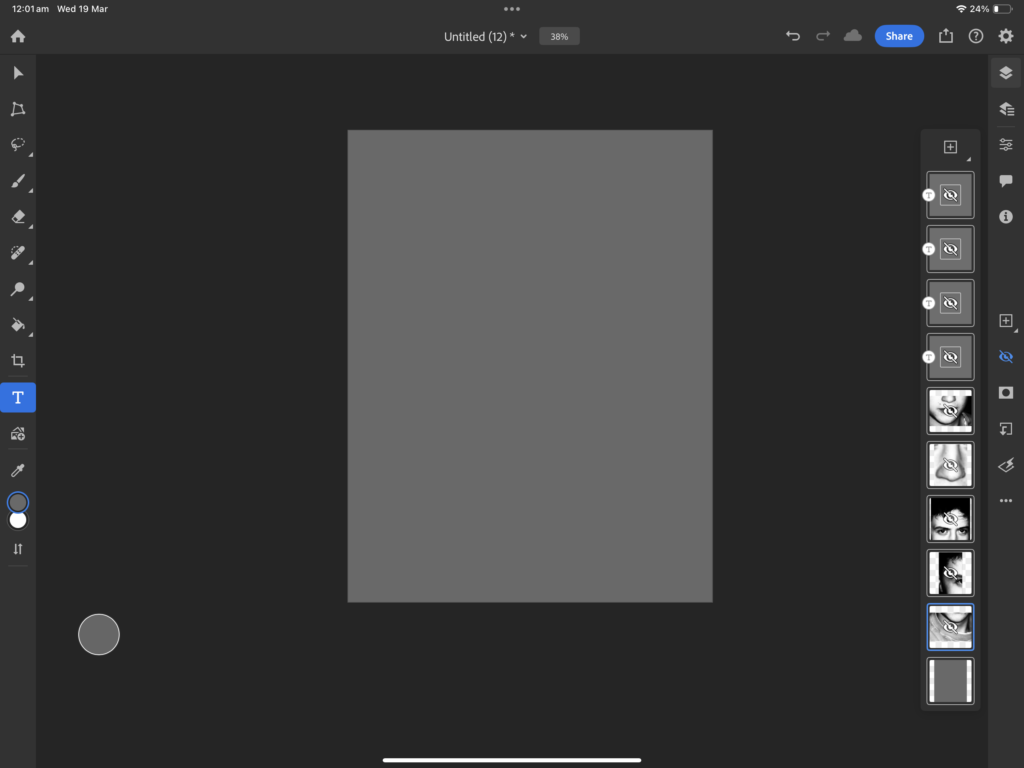
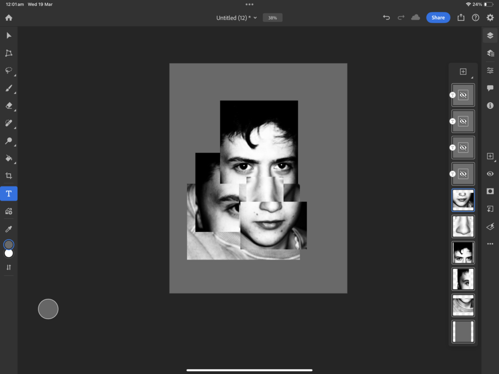
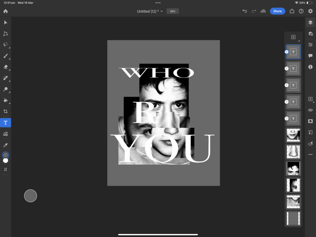
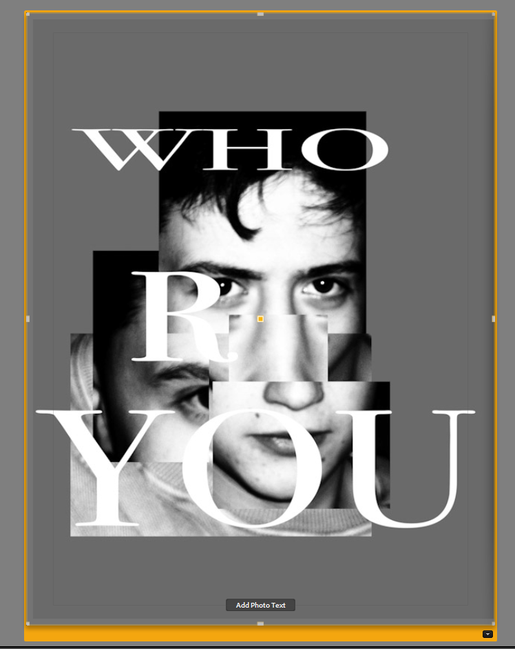
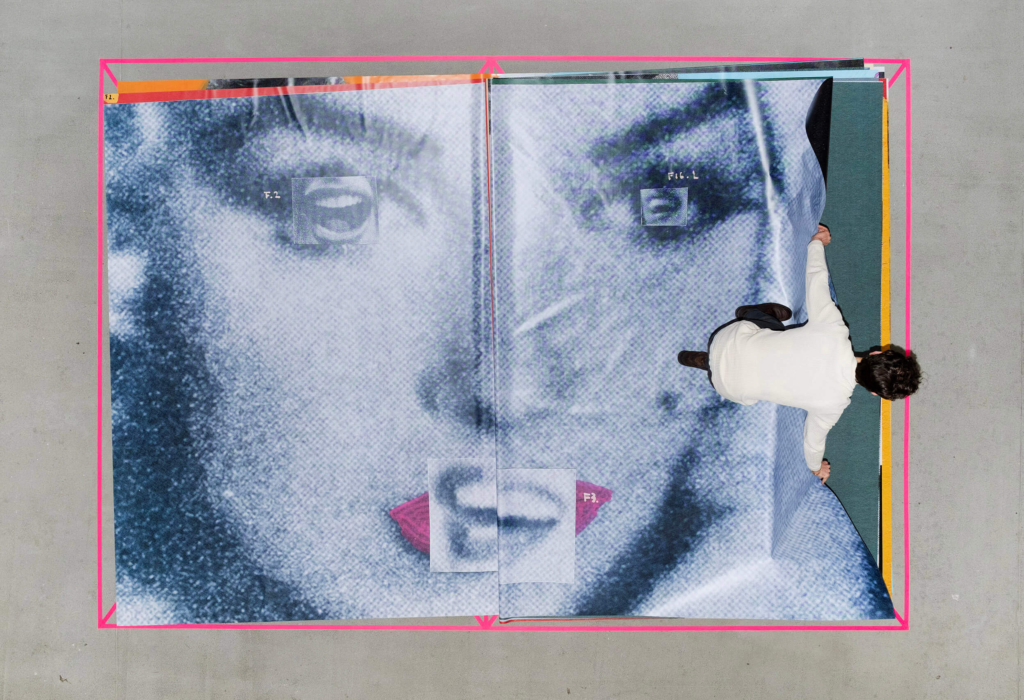
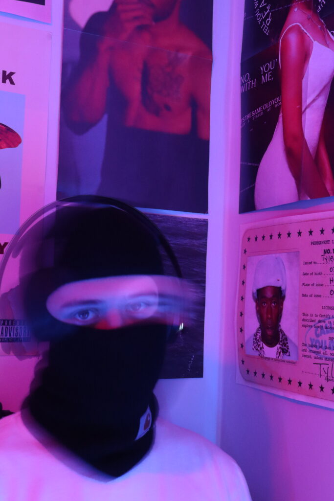
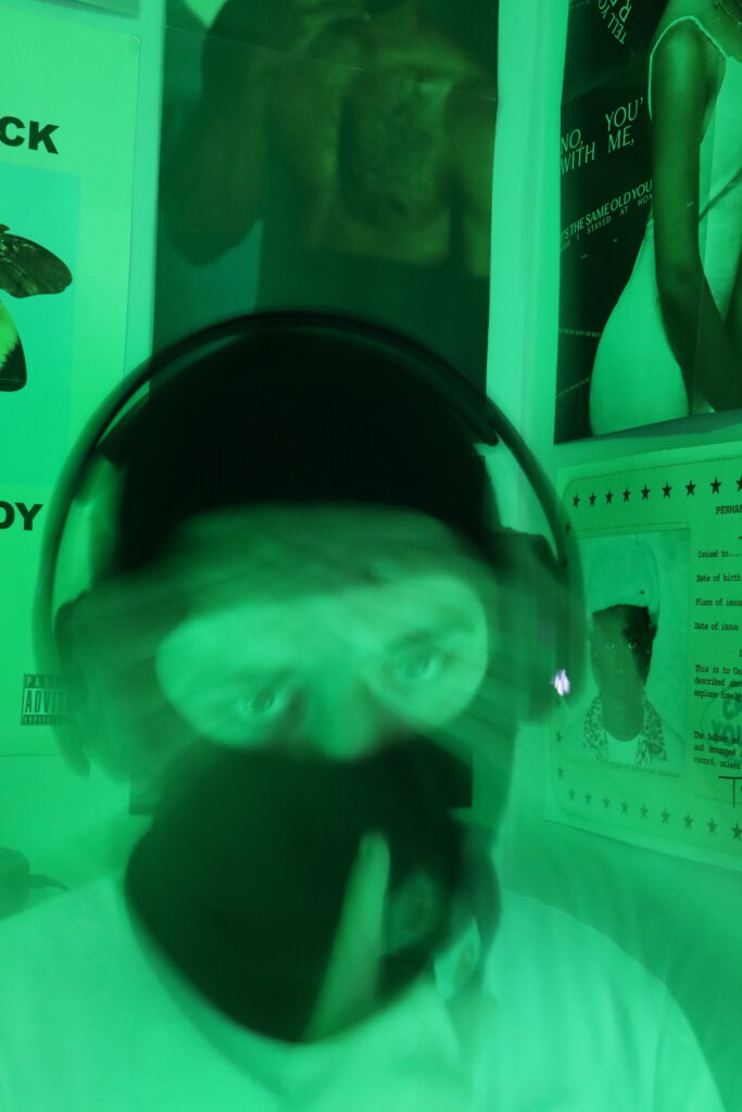
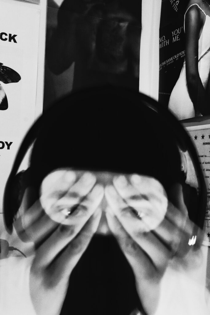
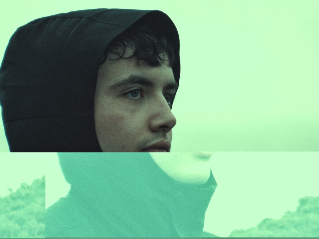
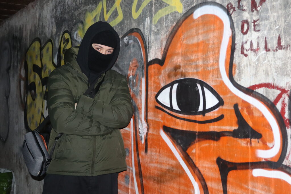
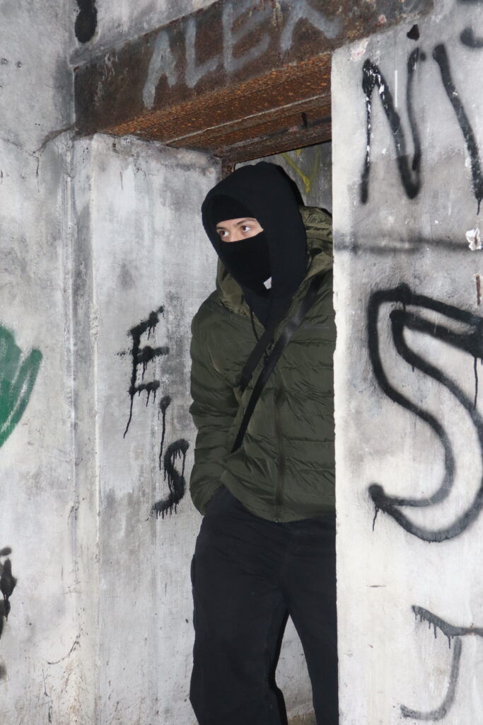
‘Who R you’:
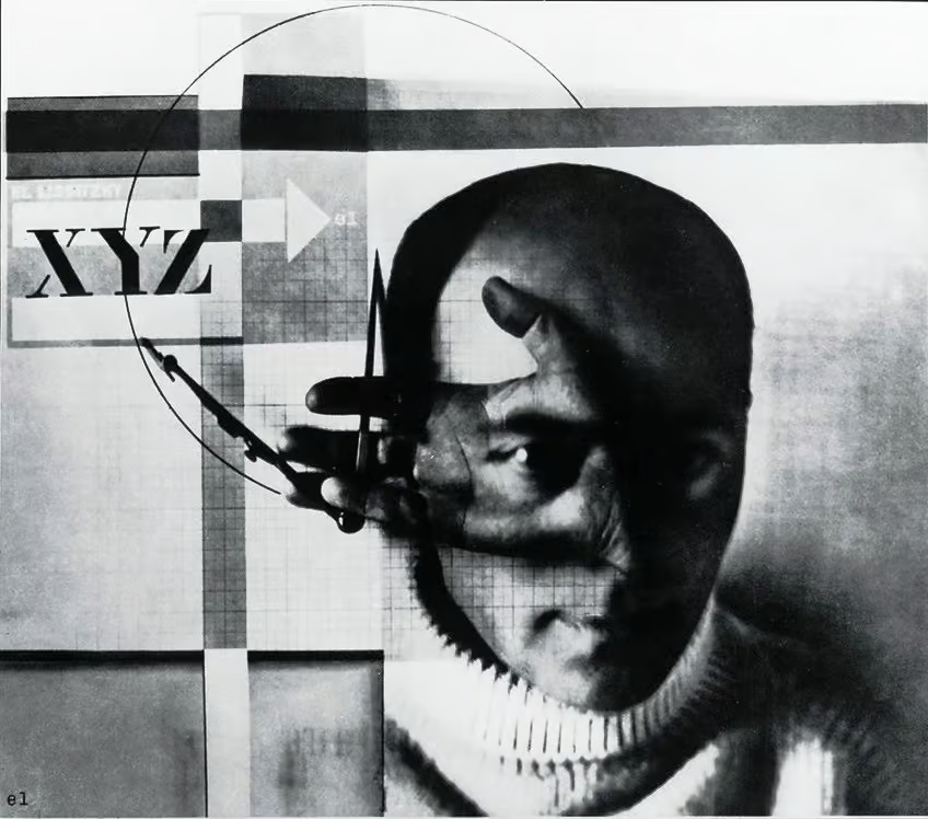
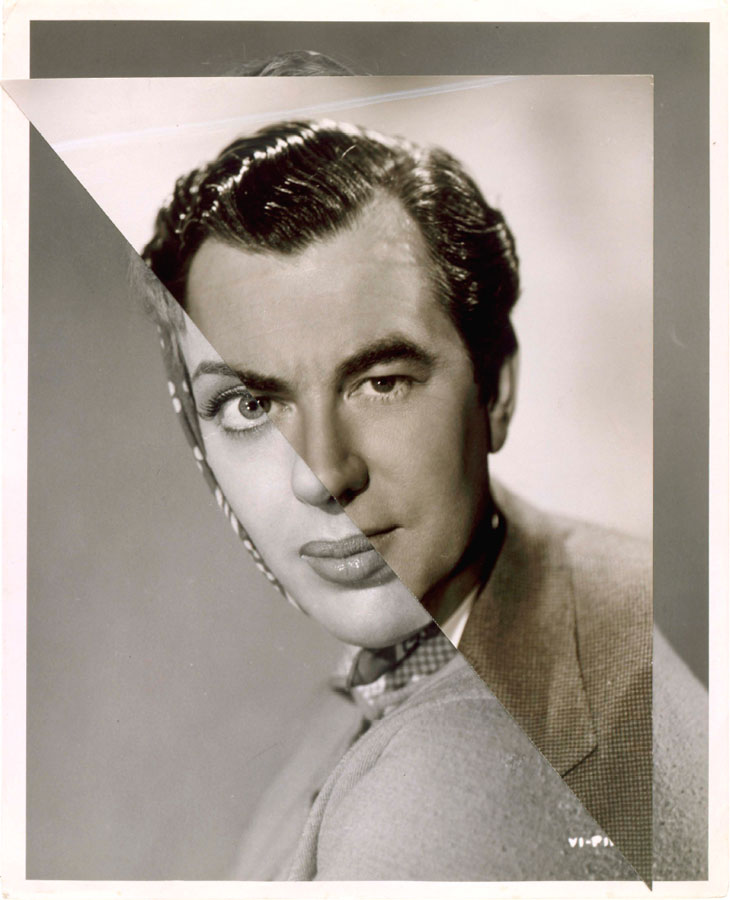
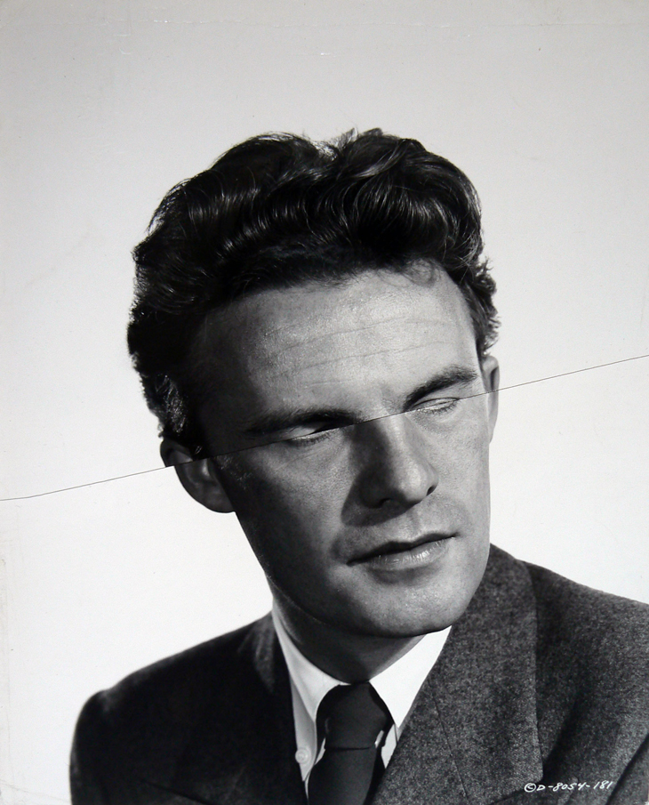
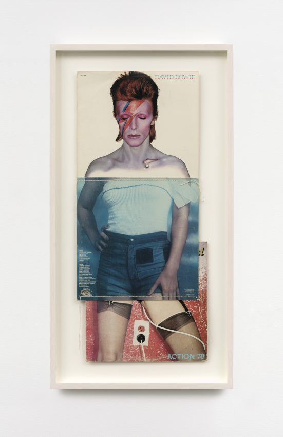
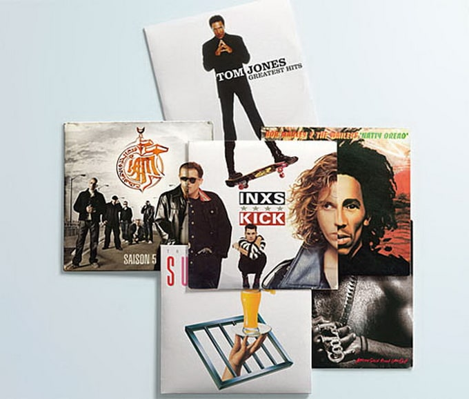
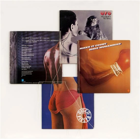
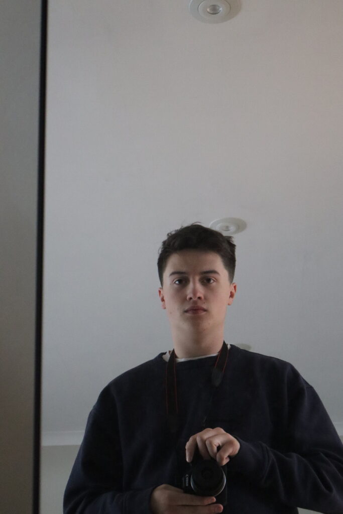
For this being the last page, I wanted to try and incorporate some of my research into montaging and collaging through this image. With how I arranged my images, I took inspiration from both Stezaker’s and Marclay’s style with the splitting of a headshot but also using square shapes like the vinyl sleeves to piece them together. Using photoshop on my I-pad, I cropped a singular image of myself I took on a grainy digital camera into different shapes and then merged them to create this distorted self-portrait.
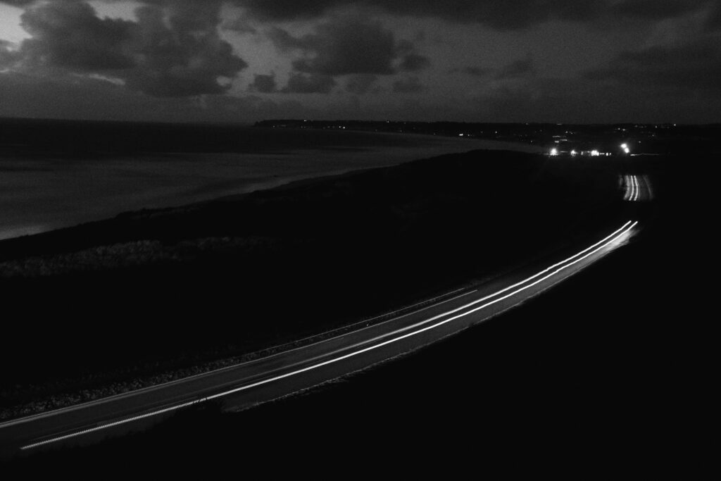
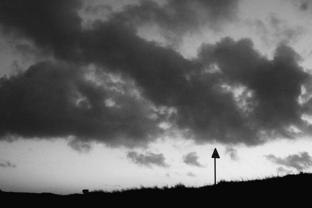
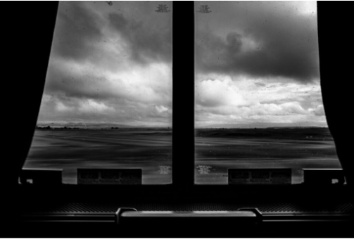
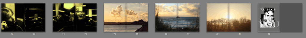
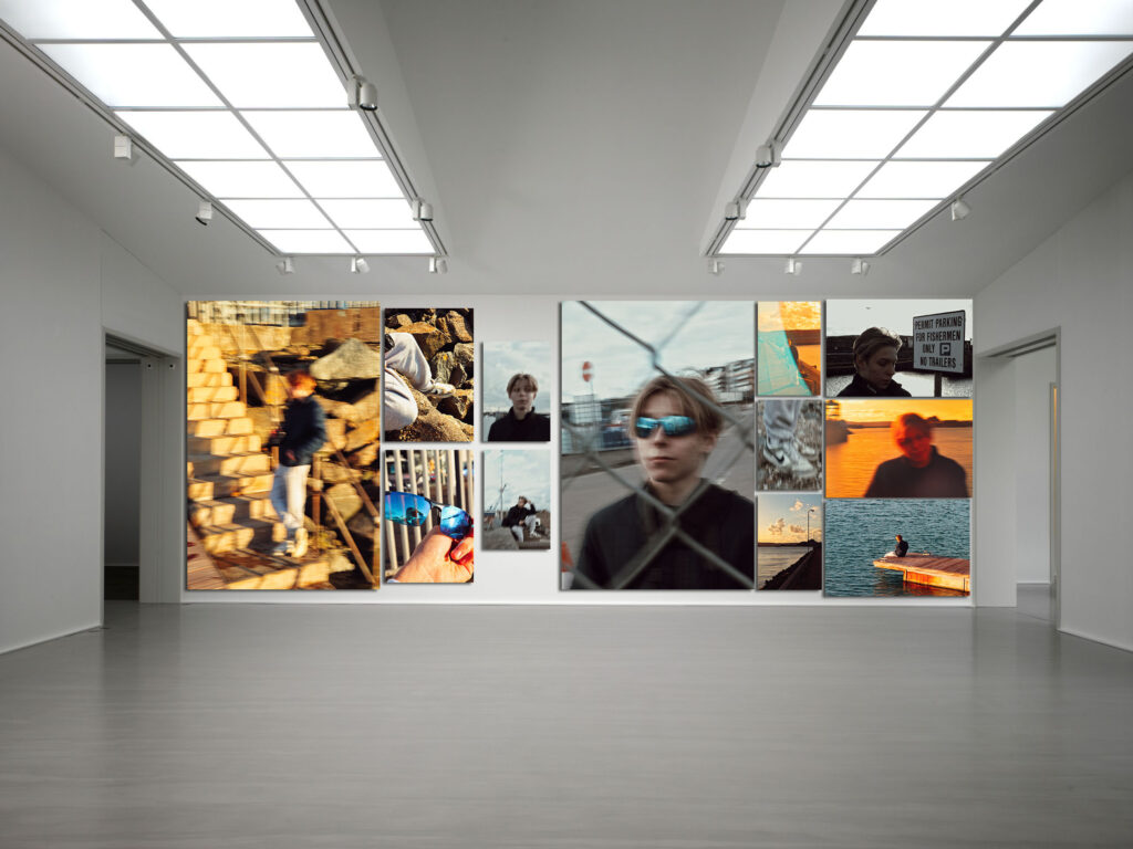
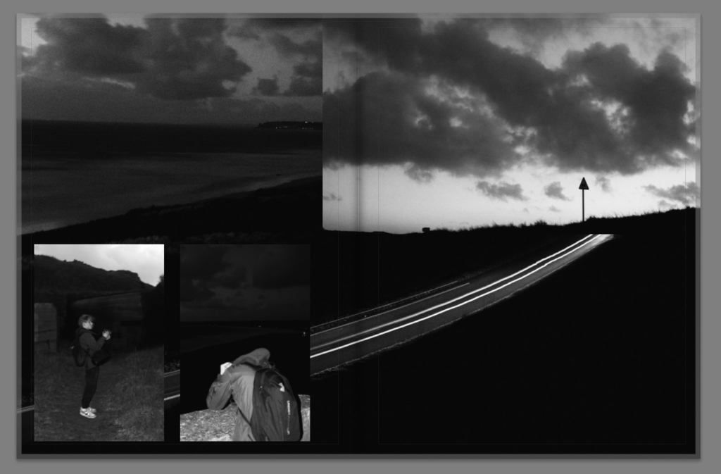
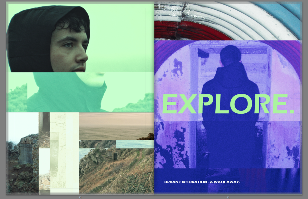
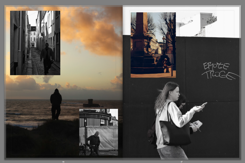
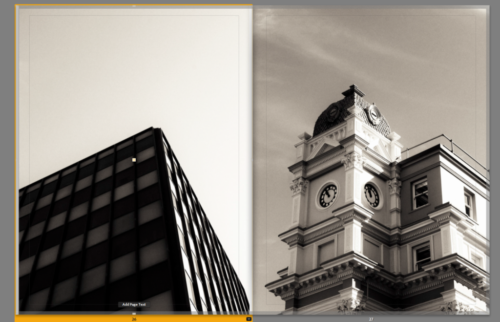
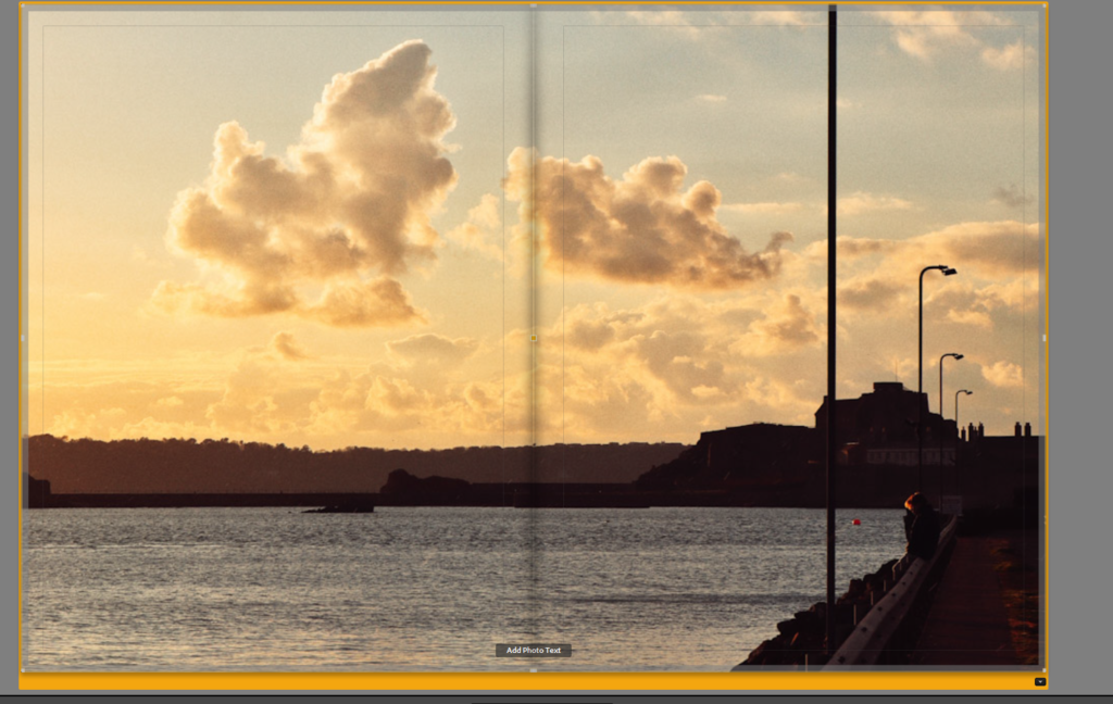
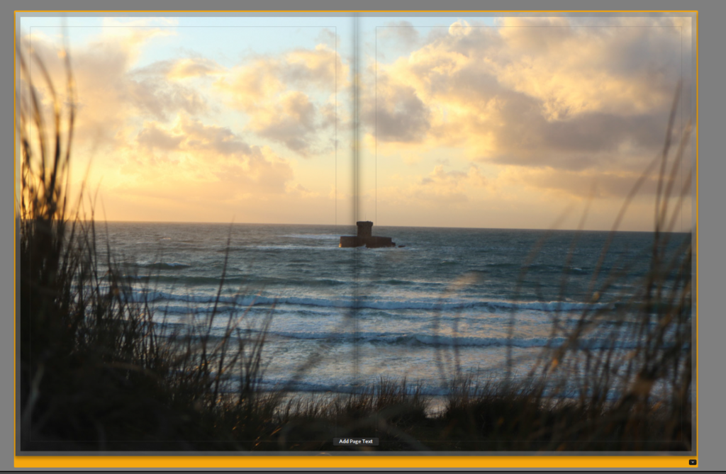
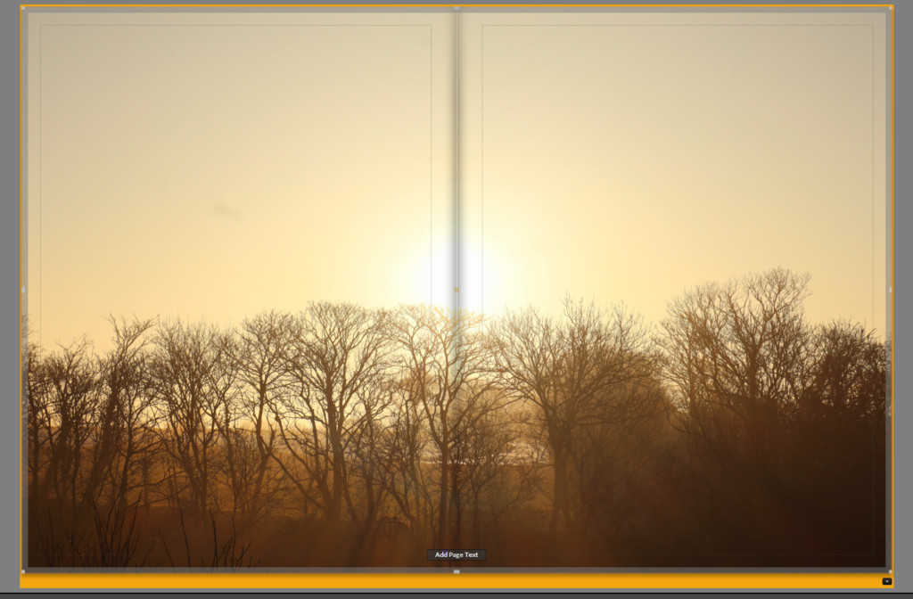
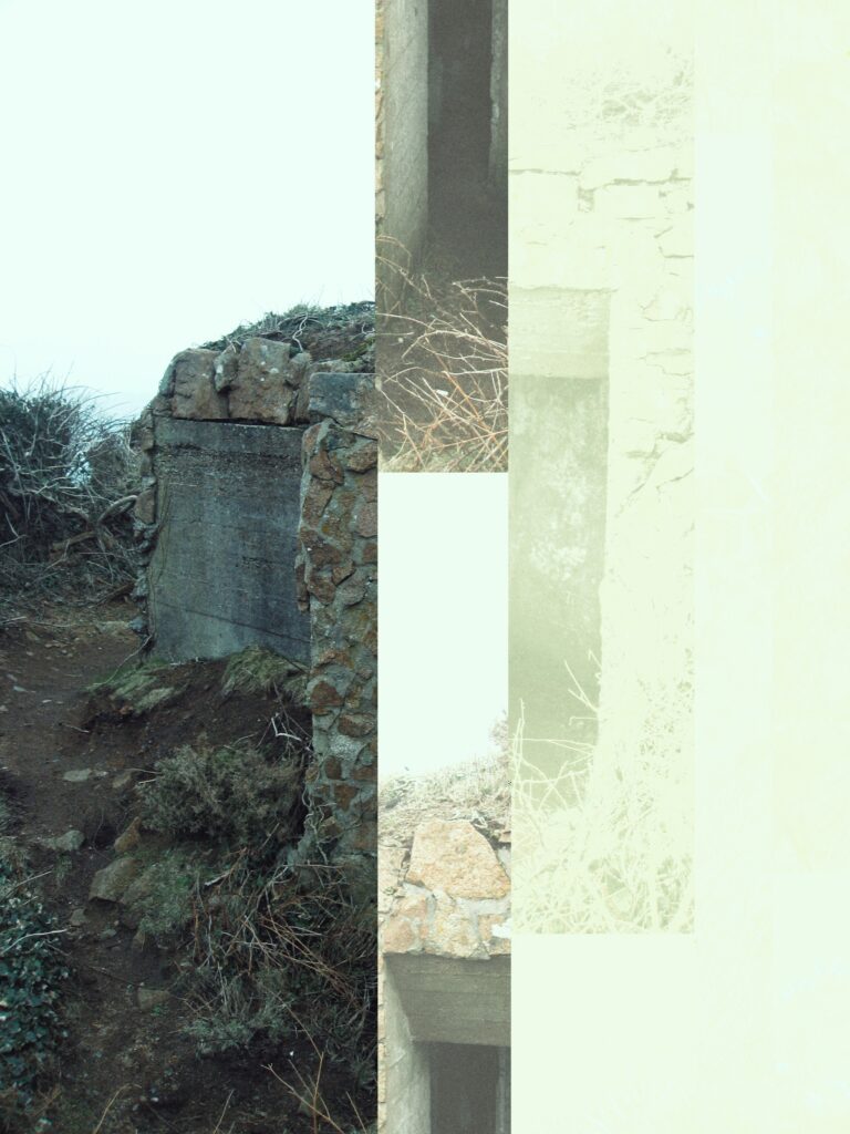
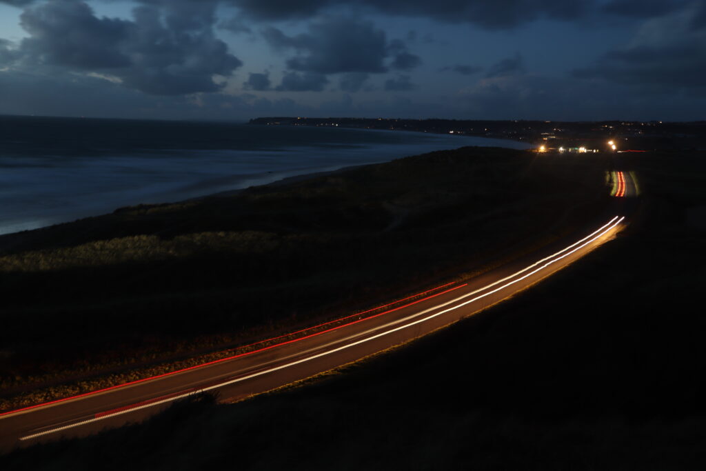
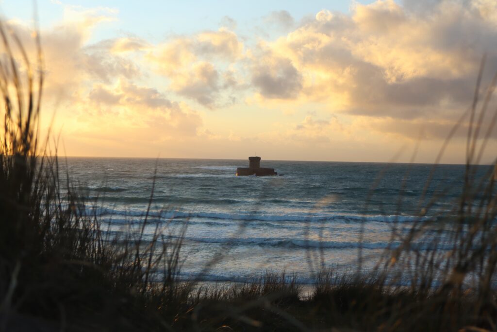
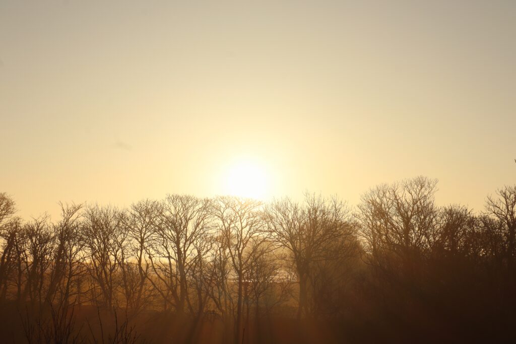
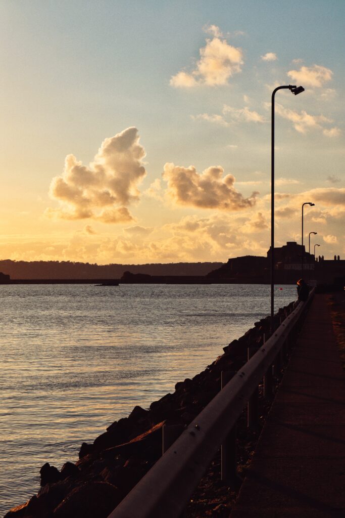
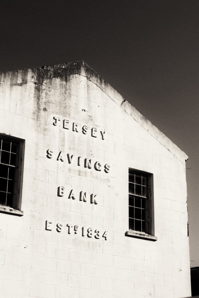
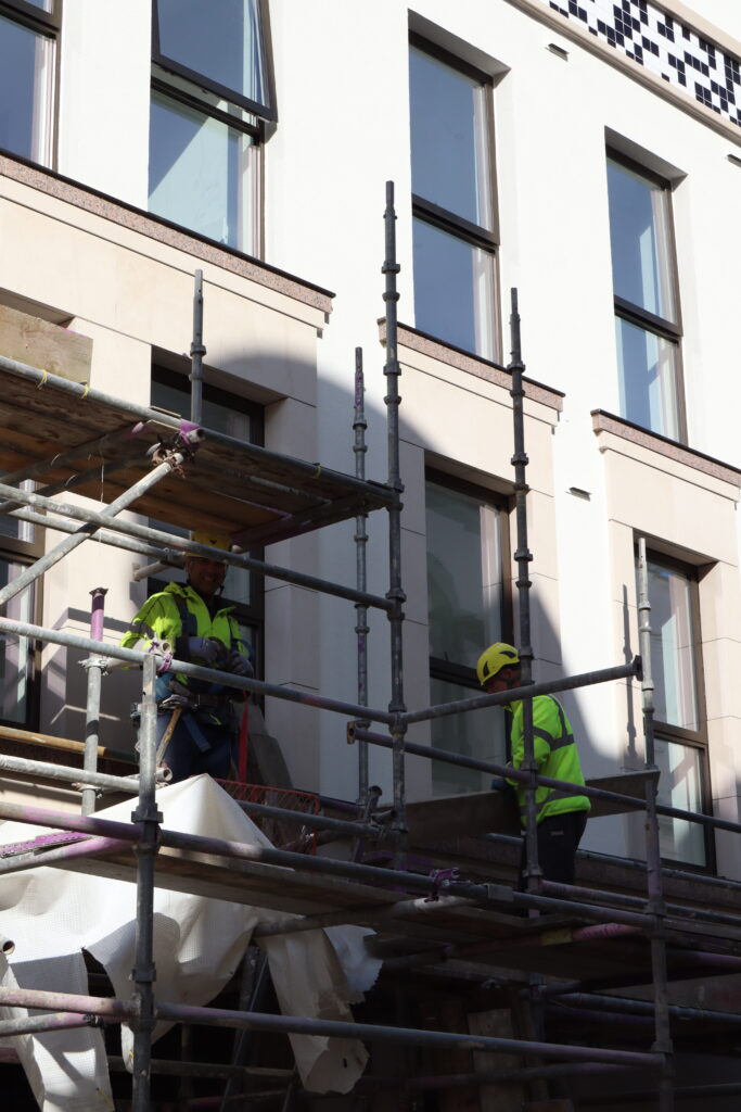
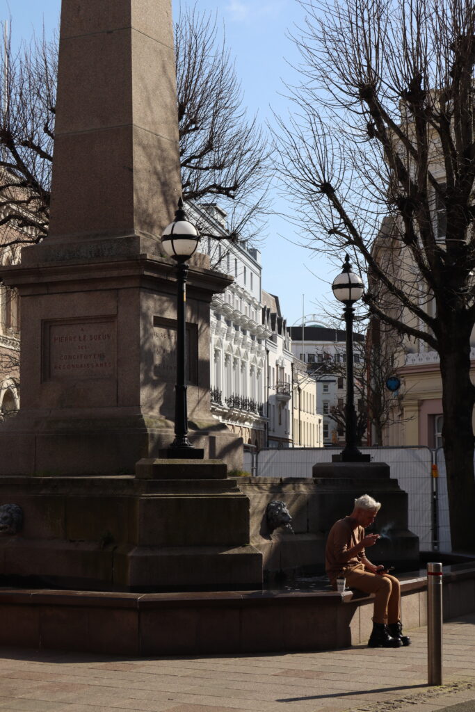
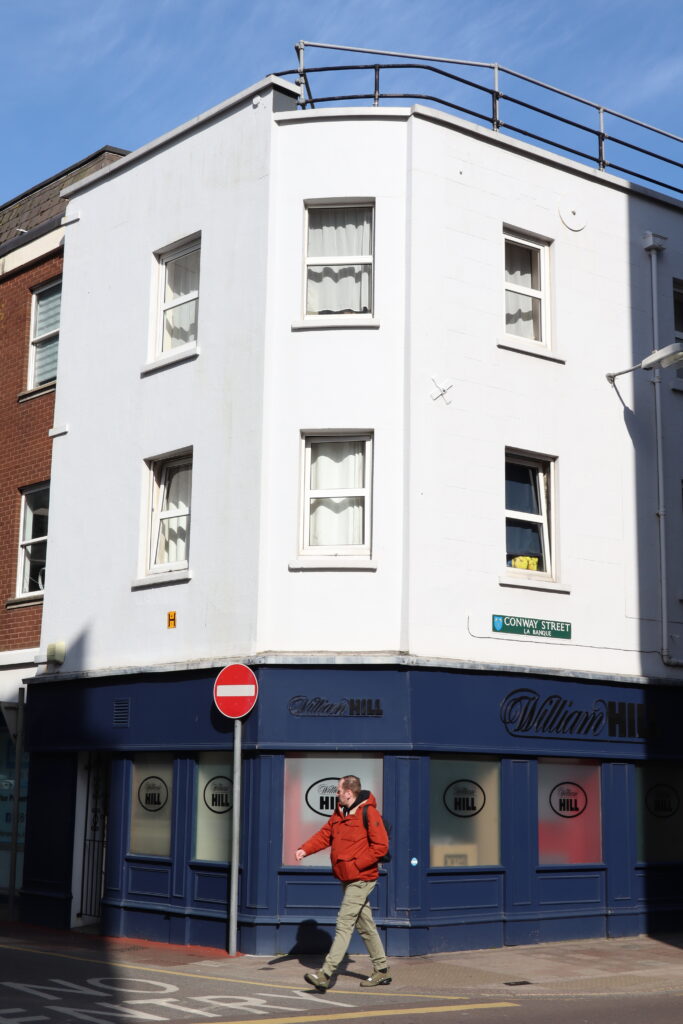
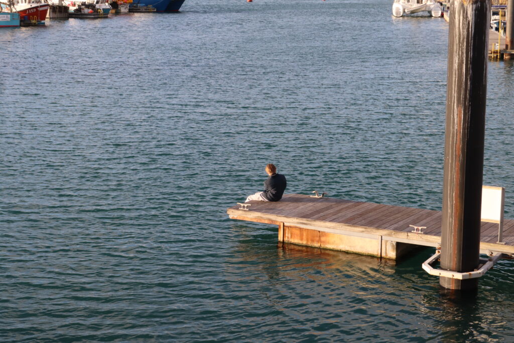
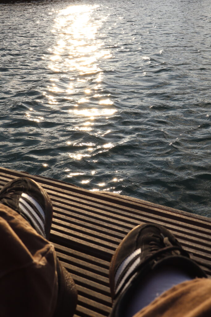
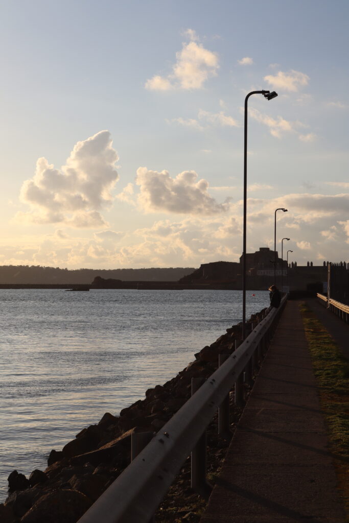
Local Landscapes:
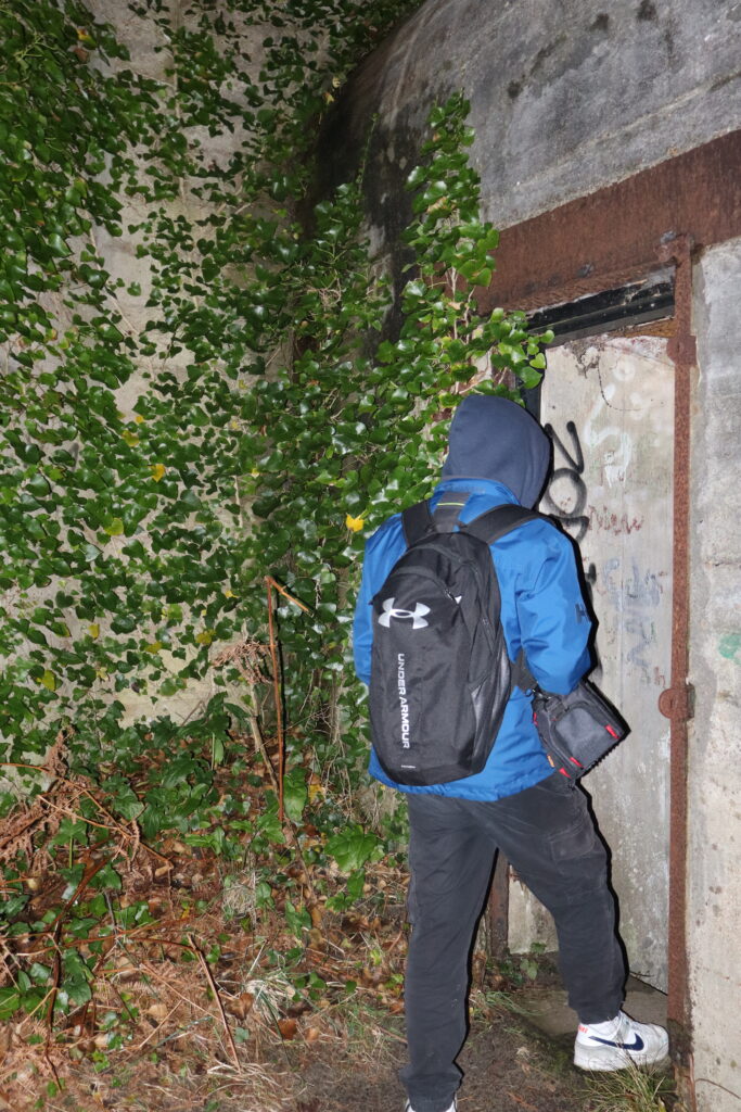
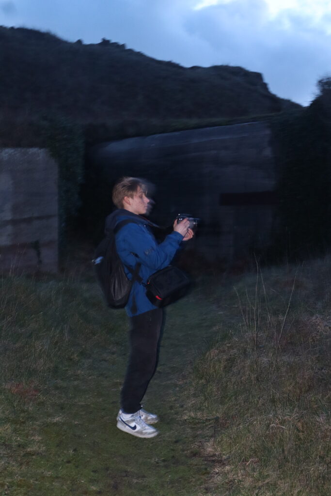
For the final pages, I wanted to include some landscapes of Jersey Just to cement the locational identity of the magazine being set within Jersey. This takes influence from Skate magazines global identity and use of geography to cement its creation.
Making the back cover –
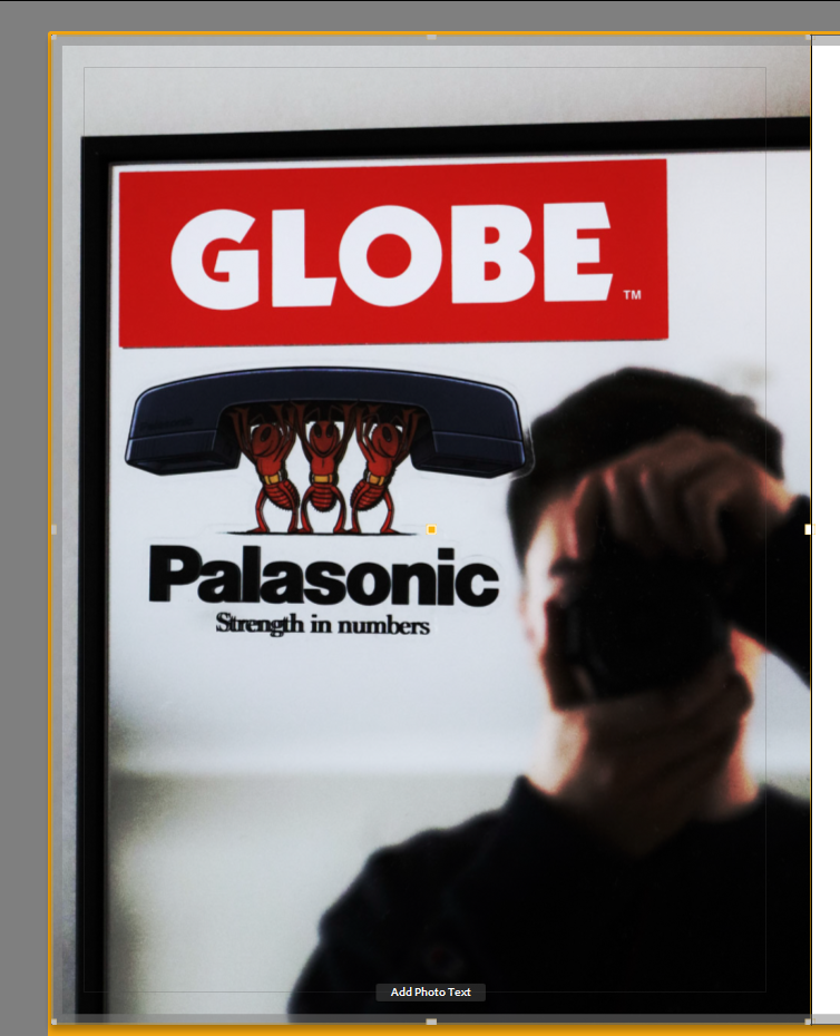
Seeing how fashion magazines such as Carrhartt WIP magazine presented their back covers, I attempted my own version, with both images being unrelated to the front and being a stand-alone image, I find this provides a more diverse aesthetic which attracts attention.
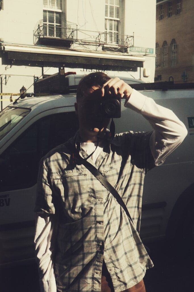
In addition to this, with the image I chose to be my back cover, it covers much of the subjects I wish to cover within my magazine: Fashion – Globe + Palace stickers, both are clothing brands, Union – ‘Globe’ – hints at a collective demographic, with the slogan ‘strength in numbers’ of the Palace sticker adding to this, with both brands being popular amongst young people, this also ties in to youth culture. And finally identity/art – with me in the blurred background holding a camera, this also includes the aspects of photography and the representation of identity I have chosen to show within my magazine.