All posts by Edgar Perestrelo

Filters

Author:
Category:

photobook final layout and evaluation- eddy

front and back cover:
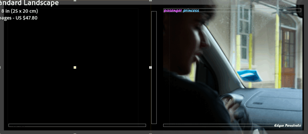
the reason why I decided to make this my front cover is because the title is a contradiction to the image on the cover as “passenger princess” a term that is used when a women gets in the passenger seat of a car which in this case the roles are reversed a man is in the passenger seat and a women is driving. and the colour of text also adds meaning to the image as the pink signifies that a passenger is usually the women then the blue for princess because its a male in the passenger seat.
this page is simply there to set a tone for the book and what to expect/what idea its going to present throughout it.

pages 2 and 3:
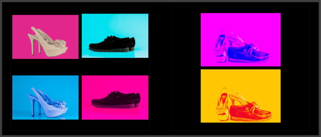
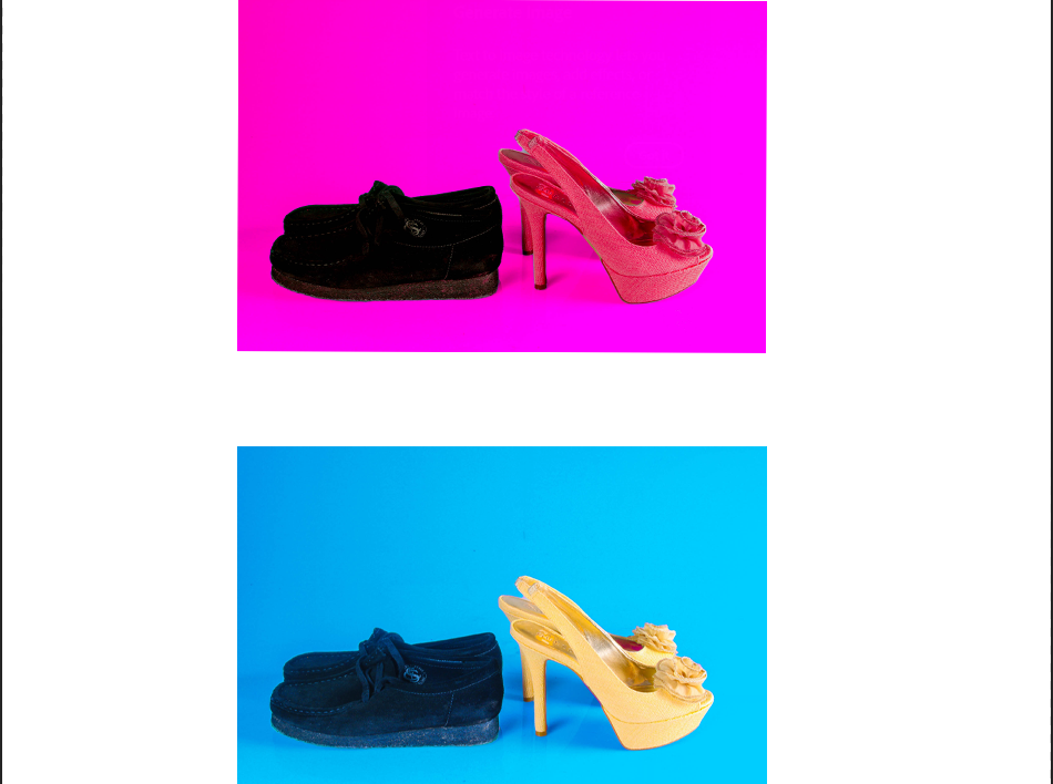
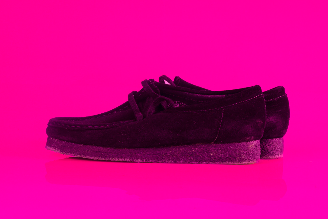
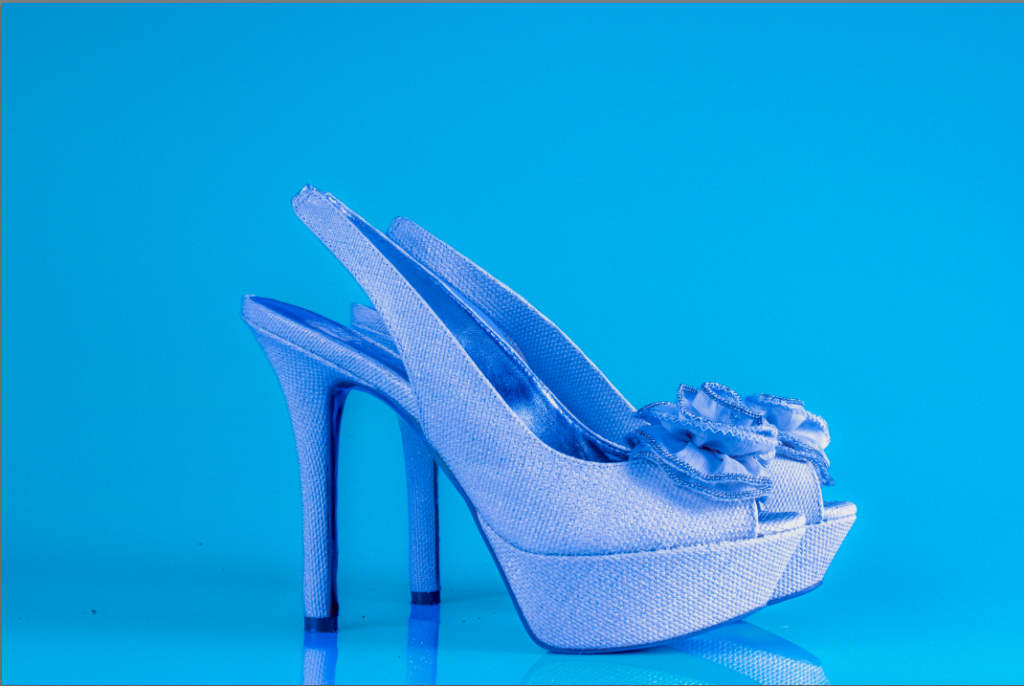
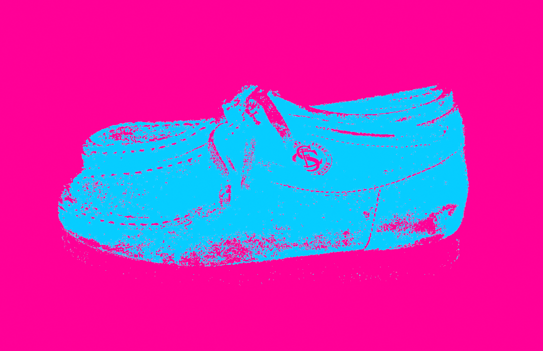
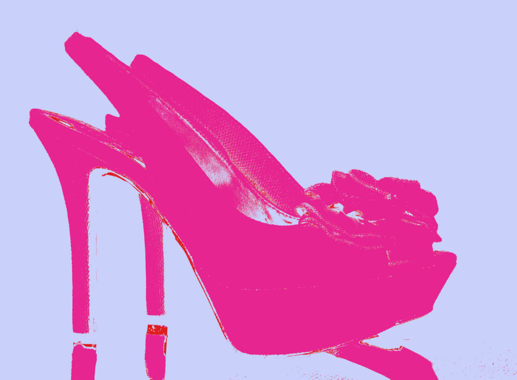
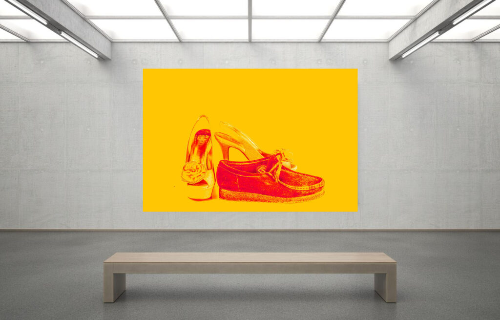
for page 2 and three I wanted to create two complete different types of atmospheres for the heels and the loafers by putting them into different types if colour schemes to represent the two different genders. for page 3 I wanted to make some unique images that still fit my idea these where based around pop art that I experimented with.

pages 4 and 5:
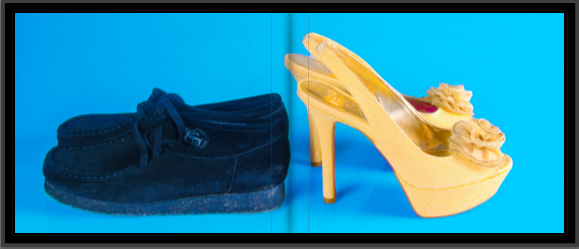
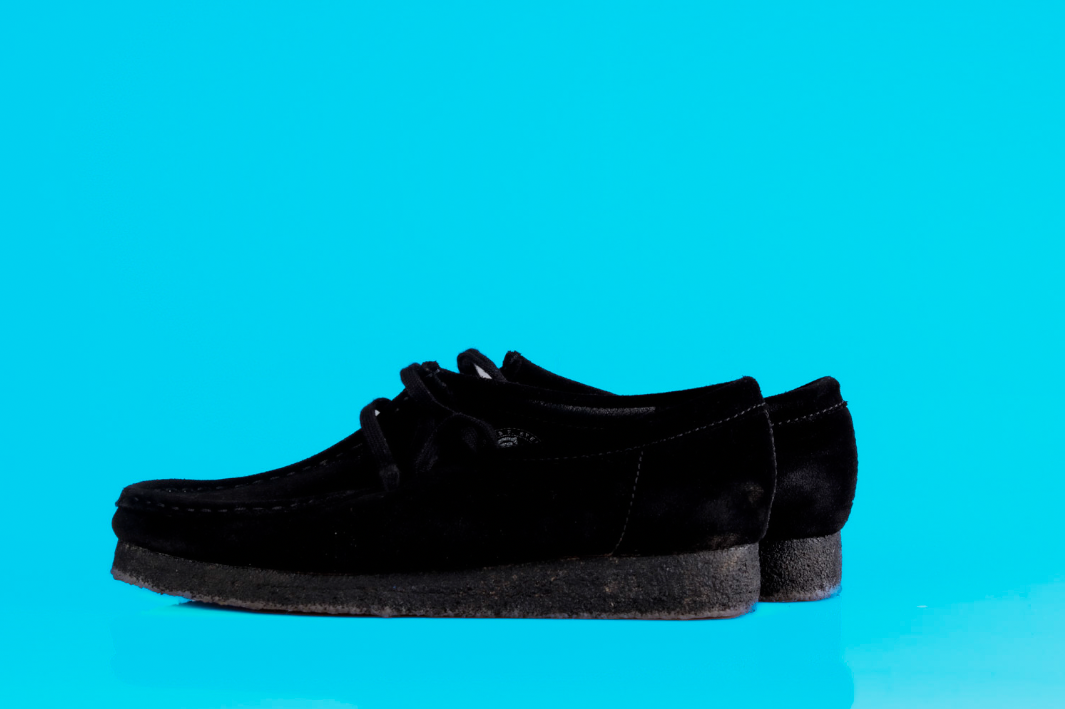
this image I decided would have been good to have a double spread because it kind of spoke on its own and didn’t really need any other image around it to give it more meaning.

pages 6 and 7:
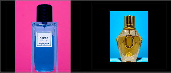
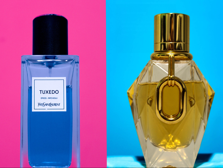
for these two pages i wanted to do something similar for what i did with the footwear earlier but instead of completely making the objects stuck to one gender I wanted to show they could represent both with having contrasting colours in both images as its a fragrance and a perfume which you now see a lot of people using scents that is meant for the opposite gender.

pages 8 and 9:
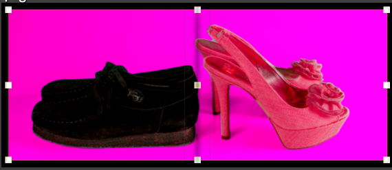
for this page I wanted to make another version of the image from page 4 and 5 to create a contrast between the two images to show that they can be looked at in two different perspectives and not just in one. (doesn’t have to be seen as just only one gender can use loafers or heels).

pages 10 and 11:
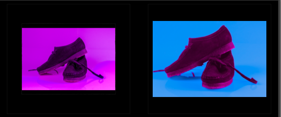
this page was to show the difference between what society should be like vs what its actually like, with the image on the left representing what it should be like as the whole image is pink with the idea behind that being any person can where that without being looked at funny. where as the image in the right is the sad reality we live in it doesn’t who you are you will always be laughed at for something you use as long as its associated to the opposite gender 1000% of time

pages 12 and 13:
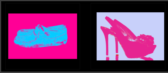
for these two pages i wanted to create images that really represented pop art as it was an idea that sparked from artist reference as Hassan Hajjaj used inspiration from pop art and pop culture for his most of his projects. not only that I think its another contrast to the art style as it was invented decades ago where these stereotypes that I’m touching upon would have been looked down upon and people wouldn’t even dare speak about it. which makes me wonder what would the general reaction be so my work.

pages 14 and 15:
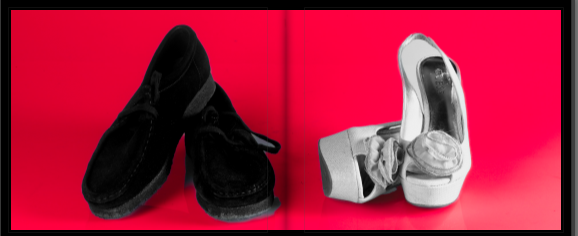
this image was is supposed to signify what people really think of the idea that I’m trying to portray as most people that are apart of these stereotypes do experience a lot of stuff they shouldn’t hence the only colour of the image being red with the footwear being black, grey and white.

pages 16 and 17:
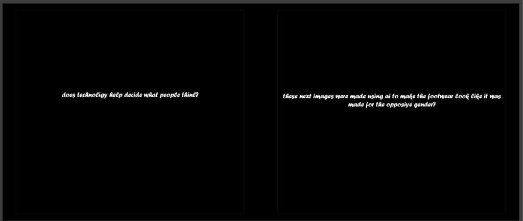
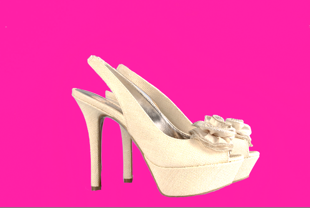
these pages where used to ask a question to reader and help them understand what the next few pictures were going to be based on. with the question being “does technology help decide what people believe in”. and the second page saying “these next few images were made using AI to help make objects look like they were made for the opposite gender” with the use pf AI obviously being the reference for technology.

pages 18 and 19:
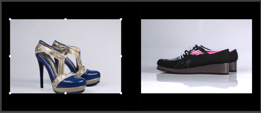
this page consists of the images that got chat gpt to edit using images that I took a picture of. the reason why I did this was to touch upon other ideas to why people may believe in these sort of stereotypes as they are seen as normal because even technology says so.

pages 20 and 21:
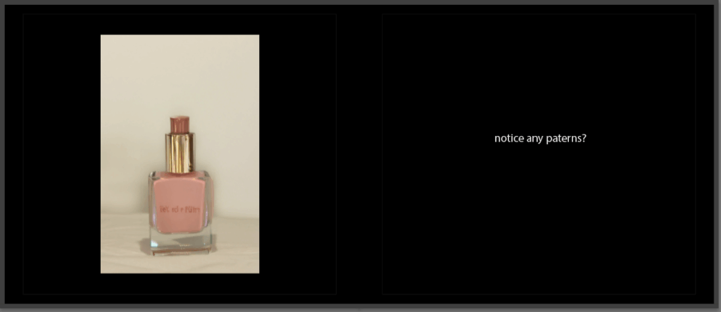
page 20 is practically the same reasoning behind the previous page and the page 21 is asking a the reader a question with fairly obvious answer YES the pattern of the common thought that these objects are practically gender locked and no one else should or can use them.

page 22
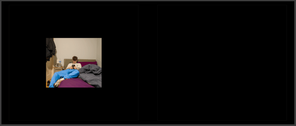
for this page i wanted to put an image of a friend with clothes that had a contrast to the bed cover that is purple to show that its normal for boys to have this colour of cover without being called “gay” or anything else that most people would say.

overall opinions and what I could have done to elevate my project:

I believe to make my photobook better I could have taken more images as it would have helped me layout my book a lot more efficiently and a lot less confusing to the average person going through the book. it also would have made the book a lot more appealing as it would have had more content in the book to actually look at, it also would have helped with explaining what why book is trying to tell people. However I still think my book has a story that you can see through from start to finish with just objects and it does portray the idea I’m trying to show people the entire way through

photobook concept narrative and design

concept:

what is the concept behind my photobook? well the concept behind it is to help break down stereotypes that have been happening for multiple decades, such as people being discriminated for there, belfies, sexuality, race etc. and I’ve done this by taking pictures of objects and editing them to contradict what people would typically believe, for example I have made images with loafers with the predominate colour being pink which links to the concept of the book and its a stereotype that’s being challenged a lot in this current time as its become a lot more popular for girls to use loafers due to Rap figures such as Playboy Carti making the opium movement massive. this consists of people wearing boots, loafers and other crazy things that people are wearing and people are being seen wearing things they might not typically be associated to.

narrative:

The narrative behind my photobook is to take people through a story to go against traditional society beliefs and get phrases such as “only girls should wear that” (visa versa) out of there head by showing objects in two different perspectives with the colours I’ve implemented in my images, although society is changing it still has its fair share of problems with these sort of topics which is highlighted in the book.
design:

the approach i have taken for the design of my book was to make it as unnatural as possible with my images, the reason I’ve decided to do that is because of the idea I’m portraying these stereotypes aren’t seen as a normal thing to do in modern day and age with certain views only being normalised a lot more in certain places around the world. How did I achieve making images look unnatural? I achieved this by making my images in a studio with unnatural lighting then editing them to make them seem even more unnatural with bright colours all over these images and some images I made some of them look like pop art which originates from multiple decades ago which plays on the idea imagine if people from that time saw my work and what i was trying to portray. How would it have been viewed and most importantly would it have been received.

virtual gallery/final prints evaluation

evaluation:

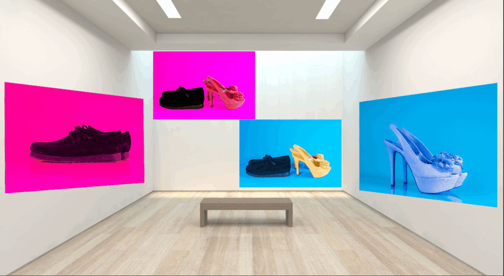
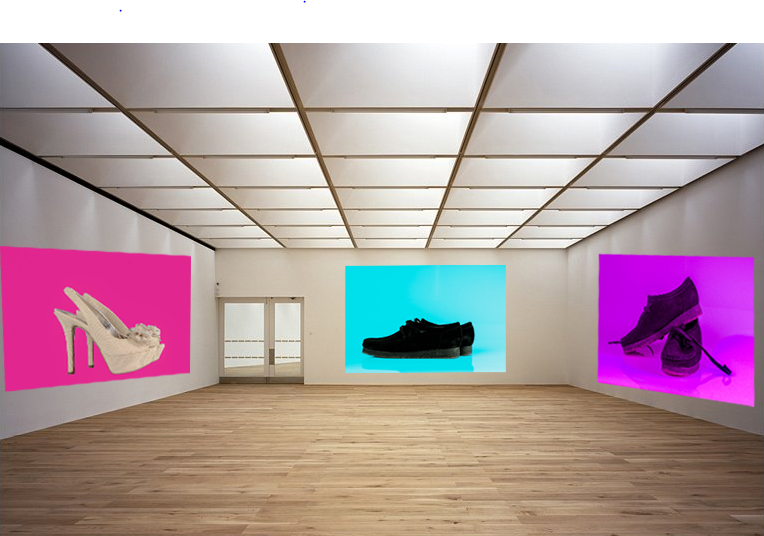
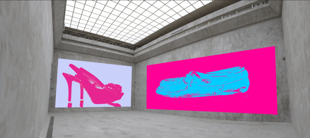
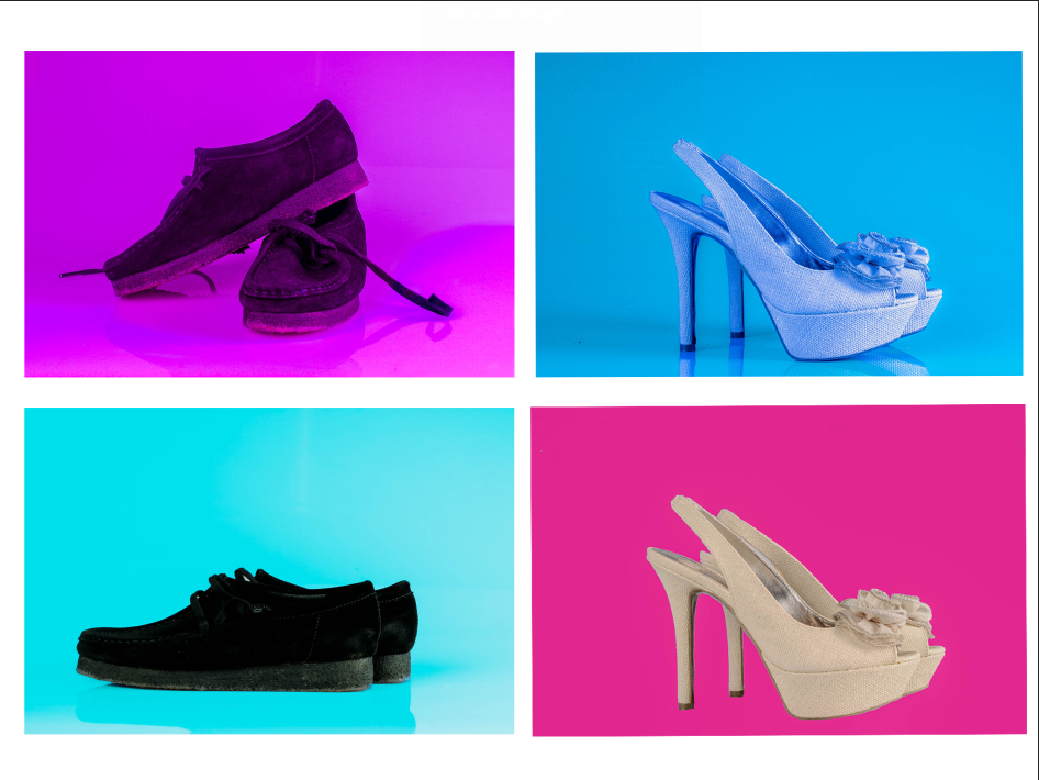
overall I think the selection of images that I have chosen were with out a doubt the best images I have created and all link to my the theme that I was trying to portray throughout my photobook, as they all show different aspects of gender sexuality and stereotypes. But not only that I was able to create images that linked to my artist references with there idea behind the image but with my own twist to it. For example Hassan Hajjaj made very bold images that he says are inspired by pop culture and pop art, which is which is a recurring theme throughout my photobook.

what I would do to improve my project:

theoretically if there was a next time and I had to do this project all over again I would have liked to take more images of multiple different objects and people to link to my theme which would have been more than achievable as there is an endless possibility to the theme of stereotypes as so many stereotypes have been made from modern and the pre modern society’s. It also would have helped me produce a better book as there would have been more content for whoever is seeing it to grasp what I’m trying to portray in multiple different lights.

the similarity’s of my images to the artist references I made would without of doubt be Hassan Hajjaj this is because my images are very much based on modern pop culture that is addressing the same issues I’m bringing up but just doing it a tad bit differently (lyrics, music videos etc) instead of pictures. and this links to Hassan as his inspiration to his work is also pop culture and he also makes very bold images that contain lots of bright colours all over his images with sometimes the entire background of the image just being one colour.

how they were mounted up:

when looking at most of my images above i think there is something’s I could have done to tweak the final outcome of the results I got. For example i think i could have changed the composition on a lot of these images by changing the way they were laid out and possibly getting different and perspectives of some of the objects, and possibly change the background of the images to add more meaning to these images is something I could have touched upon. Another thing I could could have done on the technical side was take more images with different lighting techniques with lower intensity as most of the images are very up close and intense they also have lots of glare and some of the images are also pretty saturated.

development and experimentation: outcome 2

for the set of images I’m about to present I wanted to show oppose the views of people not being able to wear certain footwear or certain objects because of their gender or other personal reasons, as the hole point of my project is to oppose common society beliefs and you’ll be able to see that in some of the images I produced.

these images that I produced was what I was looking for as I took inspiration from a photoshoot that I had seen on the internet that was based around sexuality and the acceptance of people who are “different” because of there preferences and beliefs, this lead to me editing some more images as i liked the way the images came out but i thought i could have added something to make them look more appealing and more enjoyable to look at.

after experimenting:

the change i made in the images was instead of just editing the background of the image and making it a certain colour i decided to edit the images as a whole. I also started to edit the colours of the footwear to help get my point across for my of what I want to portray while creating this book, I also think the images look more lively than the other images I created as well.

development and experimentation: outcome 1

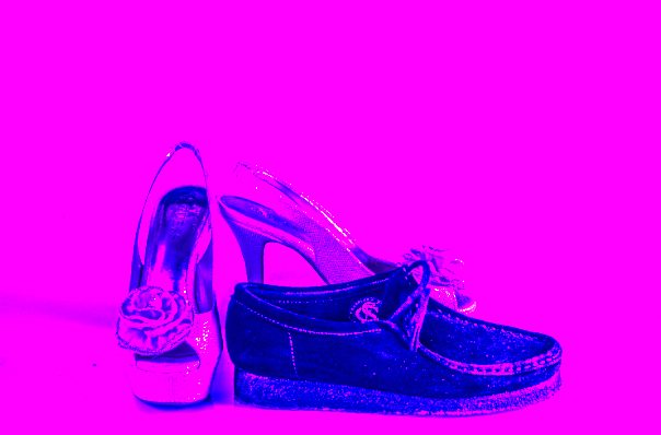
for my first experimentation I done when editing my images was to try and create images that looked some what like pop art as one of the artists made pop inspired images, however i took a different twist on it and decided to make images that looked very much like old school pop art.

aside the inspiration I got from the one of the artists I studied I also wanted to do this to create some bold images that would stick out from the rest of the images that I made, as I didn’t want everything in my photobook to look to bland. these examples that I just showed I believe came out well but I was only adding a bit of grain and messing around with the images. However after going on InDesign I think I came out with much better results producing images that look like pop art

this was exactly what I was looking for when creating these images which I believe came out perfect as they look exactly like pop art which what I was going for. I managed to create these images by editing them in Lightroom then taking it over to InDesign to add the final details to give it pop art look.

photoshoot recording and editing

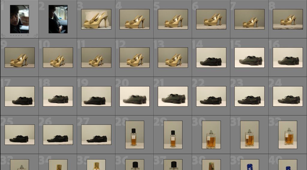
for my first photoshoot I wanted to photograph objects that I would say are “gender locked”, meaning that it would be seen as quite strange by the majority of public if the opposite gender were to use them this include objects such as perfumes, fragrances, loafers, high heels. My thought process behind this was that id edit some of the images with colours opposing the gender that would normally use them. For example, with a picture of loafers i would change the background of the image to blue and then create a contrasting image with pink as the background. The reason for this is because i want people to look at these images and challenge the stereotypes that people often make and have been making for a very long time.

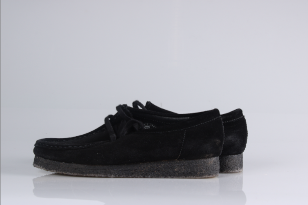
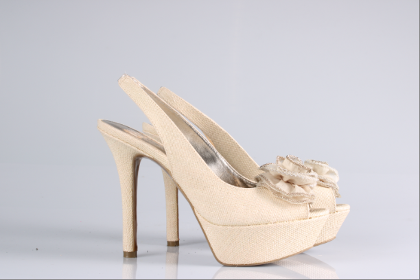
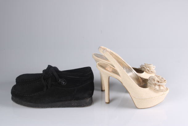
this batch of images I think didn’t come out well in this photoshoot as I didn’t have the right set up when taking these images as the lighting was off and the canvas I was taking the pictures on didn’t help much either as it looked to tacky. so to help create better images I went to a studio for my second portion of images from this photoshoot.

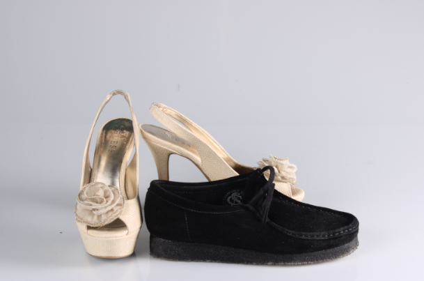
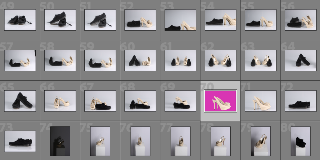
like previously stated I managed to create far superior images in the second batch as I had a proper set up for my images the images came out with a much better quality, and a lot more detail on the objects which is exactly what I wanted to achieve.

the reason why I believe these three were the best from the photoshoot is because they came out exactly how i wanted them as I needed the images to look a certain way for my editing process, as I needed the object to have a plain white background with minimal shadows as I would be able to take the shadows out through Lightroom.
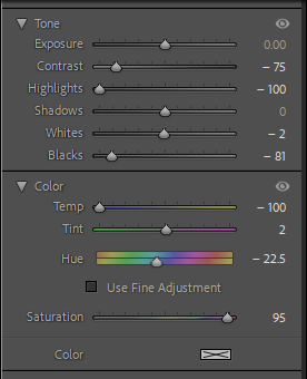
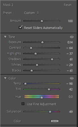
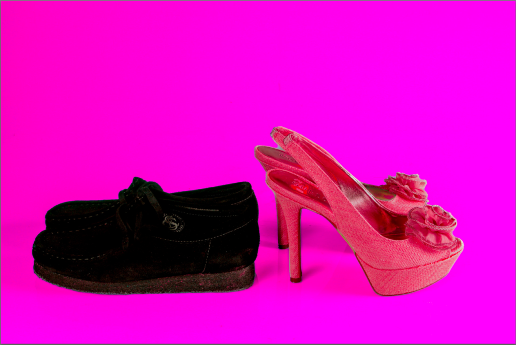
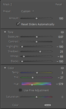
for this image I didn’t touch the basic parts of the image I just added two mask to adjust the appearance of the heel and the background of the image, the reason I decided to change the colour of the shoe was because I thought it would look to plain and boring if it was just the same shoe over and over again across all images. I also made sure the colour of the heel wasn’t to similar to the background so it wouldn’t be to hard to tell apart.

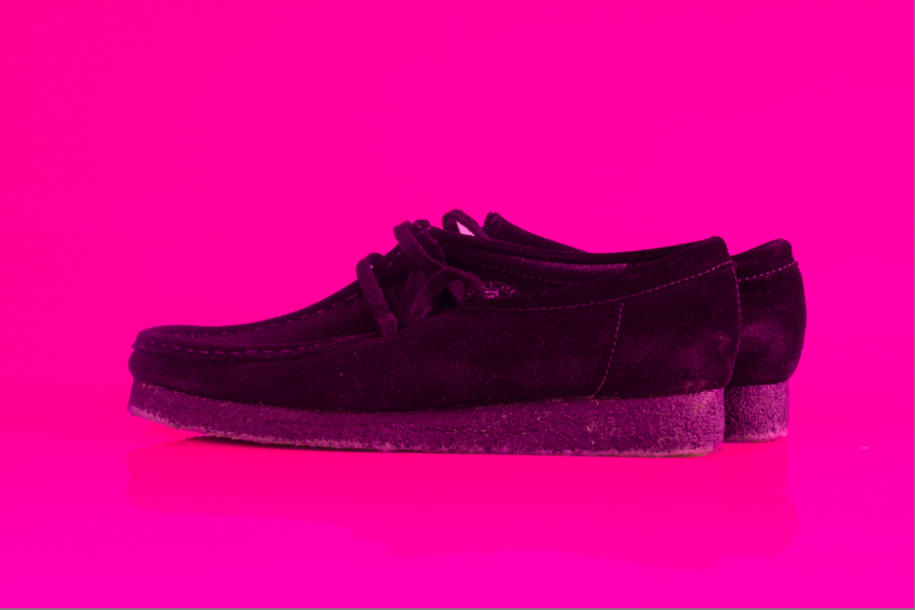
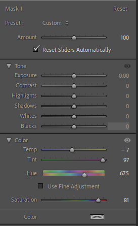
the editing process of this image is fairly similar to the first one as I wanted to make sure to keep a pattern in the book as I didn’t want anything to look out of place. as you can see by the adjustments I made to the image I focused on just changing the colour of tint of the loafers as they are black I couldn’t change the colour of it without it looking odd so I decided to add a pink tint over the shoe to go with the pink background.

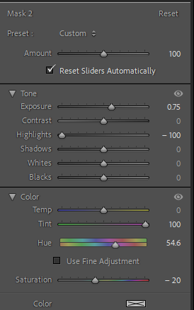
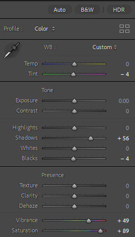
for this image I decided to work on more than just the masking of the image as I wanted to make sure the colours were going to pop all over image and not just the background hence the saturation and vibrance being substantially increased in the editing settings.

when editing the objects of the image I wanted to try something a little bit different instead of having the objects the same colour as the background I decided to change the colour of them to something a little different to the background but not to far off so it wouldn’t look to off the colour scheme of the image which is why I adjusted the heel to be red still fitting with the colour scheme of pink .

This is the reason why i though these were the best images from the photoshoot as they allowed me create exactly what I wanted to the best out of all the other images as I was able to make the images have near to none shadows with the coloured background to make the objects pop out the image as much as possible which was what I wanted to create. However if i was to do this photoshoot again I would have taken a lot more images from different angles accompanied with different forms of lighting to bring out a different type of image, this could have consisted of the objects having different things around them to help bring a different meaning to the image/understanding of it.

artist reference 2- Eddy Perestrelo

Jennie Baptiste

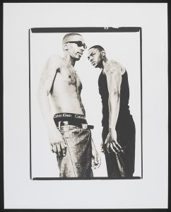
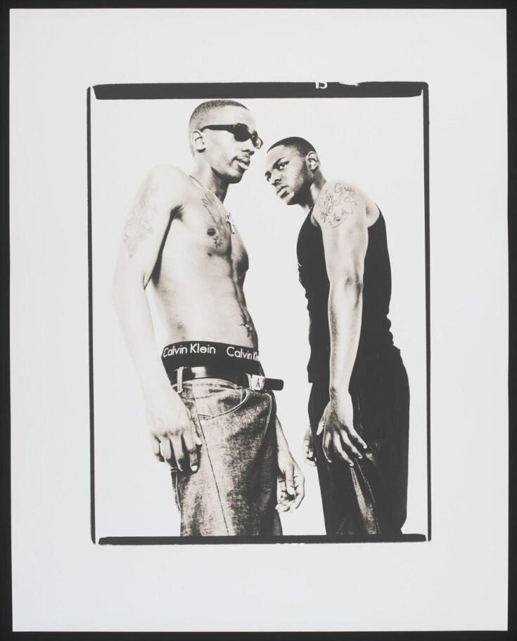
Jennie Baptiste was born in north London in 1971 where she would then go on to graduate from the London collage of communication in 1994. but what is the style of her photography? The style of her photography explores the idea of music and pop culture but primarily focuses on black British identity, taking pictures of day to day people or even celebrities such as Jay Z, P Diddy.

the idea behind this image was that Jennie Baptiste wanted to take image of people from Brixton so she went to the highstreets and bought people in to take images of people who had tattoos and other features for a portrait project, she also claimed this fitted her idea of youth culture. as when looking at the context behind the image it speaks for itself. As wearing low slug jeans with a belt had become a trend due to American prisoners being banned from using them, which had become very popular between the youth which had gained the attention of rapper Dizzee Rascal. Which is when he then made a song referencing the trend with the lyric “I socialise in Hackney and Bow, I wear my trousers ridiculously low”. The reason why i have chosen this image is because it links to my idea is because as the image is looking into the culture of people from this time period in the UK which is similar to what I’m doing I’m going to photograph people of colour to look at stereotypes that currently exist in the modern day.

lighting: when looking at the lighting in this image we can see that it isn’t natural as it looks like it was taken in a studio with some sort of artificial lighting that is being provided as there is no shadows behind the people in the image.

white balance: when looking at the white balance in this image we can see that the accuracy of any colour in the image is a little off as its been overpowered by the white (the jeans, the belt etc)

ISO: the light sensitivity is slightly high in this image as the image contains a hint of grain that is visible but not overpowering, id also say there is quite a lot of contrast in the image as from the clothes to the skin colour of the people is completely different to the background of the image.

this image consists of contrasting shades of black and white but predominantly white, giving the image a lighter tone. the shape of the image is quite flat due to the background and lighting of the image being so bright it looks like the main focus of the image (the people) in a blank space.

the context behind this image is that Jennie Baptise liked to base her work around the hip pop culture as during the 90s pop was at an all time high in the UK, and at this time there was a trend from the American culture to wear low jeans with flashy belts which had made its way to the UK due to Dizzee Rascal making the trend even bigger which led her to taking pictures of people that she found in the Brixton high street.

The idea behind Jennie Baptiste’s work was to capture the ever changing culture of hip pop in the UK as every month there was always a new wave that everyone one would jump on to and follow, she also wanted to capture the black British culture as just like the hip pop culture the black British culture had significantly change from the 80s towards the early 2000s.

artist reference- Eddy Perestrelo

Hassan Hajjaj-

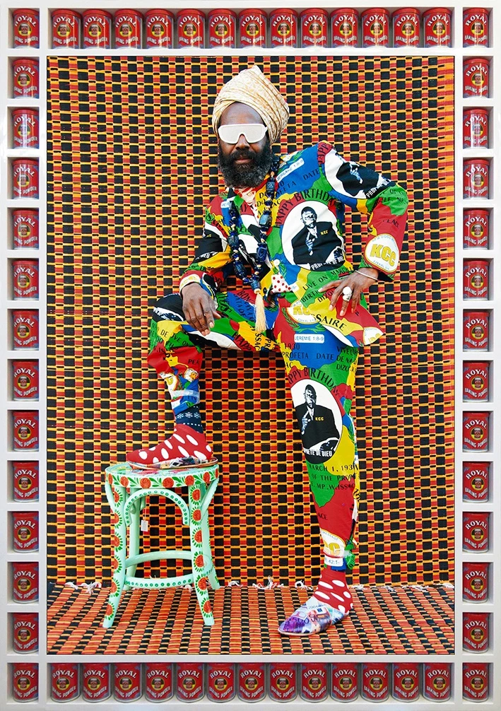
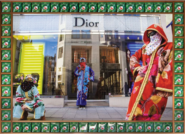
Hassan is a Moroccan photographer who is known for his portrait photography that uses a pop art type of style in his images. What’s the idea behind his work? the idea behind it is that he wants to break the wall down between any type of race, culture, gender or origin put simply any sort of discriminatory label that can be put on anyone, in his word there are three things to take away from his work commitment to truth, necessity of play, and pride in one’s origin. Meaning that he wants people to view his images they should embrace where they are from, their sexuality, skin colour etc. which is why i have decided to study Hassan as his images may not be what I’m inspired by but his idea behind them is what got a hold of my interest.

for example an image like this dives into this persons culture and background as traditional African clothing is known for its patterns and its loud colours. and the reason I picked this image is because Its relevant to the work I want to achieve as its got the same concept to what I want to do as his work captures wider social narratives, meaning that his work helps show people different cultures can be unified through a simple photo. another thing that interest me was his influence for his images hip pop, fashion, west African and UK lifestyle, this interested me as he is able to create all these images and mixing in so many different ideas into to one singular photo. which is what I hope to achieve throughout my project but I also want to make sure that I makes sense throughout my project as I don’t want it to look like a bunch of different ideas crammed into one book.
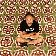
image analysis:

technical:

Lighting: when looking at location of the image I believe its fair to say the images lighting would be natural daylight and when looking at it I wouldn’t say that the lighting has been manipulated in any sort of way. however the border around the image is a big contrast when looking at main colours popping at (red, blue, yellow, green). the image isn’t saturated as your seeing the image for what it is people wearing loud clothing items in the middle of the day.

white balance: when looking at the mix of colours shown in the image i think its fair to say its got both warm and cold colours such red and yellow and blue and green for cold colours. which fits perfectly when looking at the context of the photographer Hassan wants to bring a mix of different cultures as people together he isn’t just doing this with the people he photographs but with the colours he’s showing in the images as well.

Shutter speed: the image contains a short exposure as we don’t see any blur or colours seeming to be over exposed which would be apparent with the amount of colours that are in the image. and there also any recognisable motion blur as everything in the image is clear and focused in the image.

visual:

when looking at this image the visual elements that pop out straight away is the form, colour, and tone as they are the elements that catch your eye straight away we get see a light tone with a ray of colour all over the image and the boarder around it as well serves as the layout of the image making it look like a painting or something that has been framed. In my opinion the image lacks balance as its got so many different colours in one photo as you have red layering a bold blue light and the same on the other end with a bright blue layering over a yellow light.

contextual:

when looking at this image you might just think of it as a crazy fashion shoot with a wide range of things happening in the image (all the colours, what people are wearing). however there’s more to the image that meets the eye when looking at the photographer who took the image Hassan Hajjaj he likes to unify different countries and continents, which explains the amount of colour and type of clothing has been used for these images as it helps show off the Muslim culture he wants to show off and for all we know the people wearing it may not even be of the culture.

conceptual:

the concept behind this fashion photoshoot is the unity of cultures, its expressed in this image though the the location of the image and not just the colours and clothing as its expressing the Muslim culture in a European country this is because the Muslim culture has spread all over the globe but mostly in Europe in places such as France who is home to a lot of designer brands but also lots racist stereotypes due to how diverse the country is. which is why i believe Hassan has done this photoshoot to break the barriers between the issues some of these countries may face because of the diversity in culture and race.
statement of intent- Eddy Perestrelo

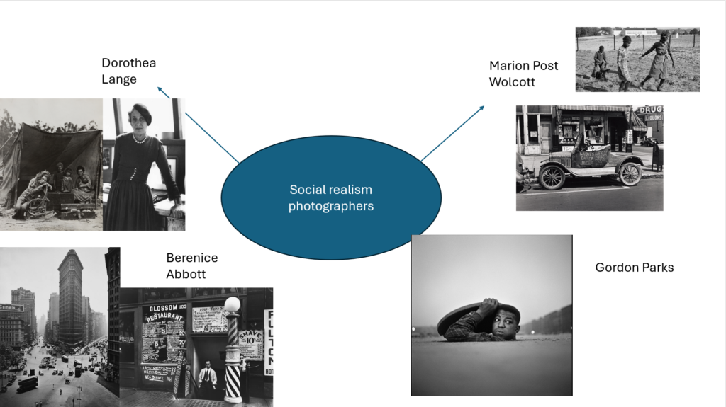
for my exam project i want to highlight the theme “union” by perusing the idea of social realism by categorising my images as stereotypes. The reason why I want to do this is by breaking down the walls between stereotypes that have been engraved in peoples minds that have become more and more common, for example the idea of sexuality this would consist of challenging the idea “that’s boys clothes” and vies versa. i will also look at stereotypes such as peoples physical appearance, race and cultural diversity by doing the same as previously mentioned challenging stereotypes of the given topics above. why does my idea matter to me? The reason it matters to me is because my entire life I’ve always been around by a diverse mix of people from gay relatives, different cultured friends, and this has lead to many people in my circle being discriminated for the way they look, the way they are, and what they believe in which is why this project is a little more personal to me.

How do I wish to develop my project? For example my first photoshoot will consist of me taking pictures of objects that might be looked at as a something a “Women would wear” or that a “Man would wear” these object will be things such as heels and boots and having the background of the image as blue for the heels and pink for the boots to oppose the view that only a certain gender should be applicable to that sort of footwear. I will also use things such as lipstick and also men and women fragrances and do something similar to the other objects. when looking into sexuality I want to take pictures of people of both genders wearing clothing you wouldn’t particularly associate them with, for example a man wearing a dress and a women wearing a suit or some short of formal attire that men would use. I think it will go hand in hand with the project as it will help paint the picture of what I want to tell people when looking at my project. so i would do the same for all my other photoshoots just oppose the idea of the stereotypes.

when and where do I intend to start my study? I plan to start my study by taking image of the objects I named previously in the studio as will be able to create the best images possible with the lighting and other resource’s available to me in the studio. I also intent on taking some images from home for the gender photoshoot as I’ve got resources at home to take the images I need to take. And for my other photoshoots i will need to go out and take images of people or pictures of things that symbolise what my topic is about (sexuality, diversity, etc).

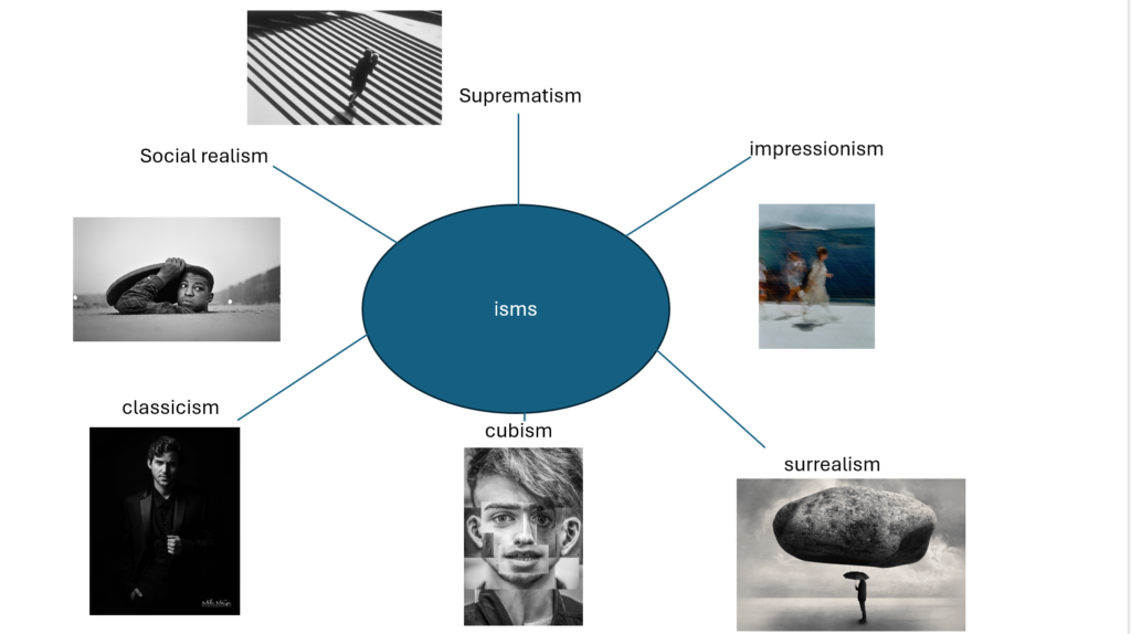
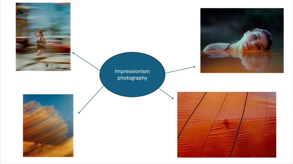
isms mind map