All posts by Eden Mulliner

Filters

Author:
Category:

Evaluation of photobook and Virtual Gallery

Evaluation of Magazine

This is the final layout for my magazine and overall I’m happy with the design of it. I have put certain images next to each other to highlight the strongest images. I have also put one of my most powerful images as the front cover of my magazine to make it look bold and eye catching.

Virtual Gallery

These are some of my best images from my magazine as they are the strongest and have some of the best lighting from all three photoshoots.

Final Prints

Virtual Galleries

This is the virtual gallery for my final prints from my first photoshoot at the Dolmans in St Ouens.

This is the virtual gallery for my final prints from my second photoshoot at Le Moye Quarry.

This is the virtual gallery for my final prints from my third photoshoot at the White House in St Ouens.

I have chosen these specific images from all three photoshoots because they showcase my best and my strongest images from all three shoots.

Photobook ~ Final layout and Evaluation

Final Layout

This is my final layout for my magazine from all of my different photoshoots.

This is my front and back cover of my magazine and I chose this image as the front cover because its strong and bold and looks powerful for the front cover.

This is my Index page for my magazine, where I have described my three photoshoots and what era of fashion they are and the location they were taken at.

Evaluation

Overall I’m very pleased with how my photobook turned out and I think the placement of all the images makes them all stand out and compliment each other, making the images loom really strong. I also put some of my best images on double page spreads to showcase them in the magazine.

Photobook ~ Concept, Narrative and Design

Concept

The concept for my photobook is to do a magazine in a similar style to how David Sims did advertising photos for the the Bazaar magazine and for other famous brands.

Narrative

The narrative of my photobook is to combine historic tourist attractions in jersey with three eras of fashion, and showcase this within my book. The three eras of fashion I have done is 70’s, 80’s and modern day fashion.

Design

The design of my photobook is suppose to look like a fashion magazine from Vogue or from Bazar. I have added a large title and a full page image to the front cover to make the magazine look aesthetic and interesting as soon as you look at it.

I have also changed the colour of the title to a dark reddish colour to contrast against the dark green colour of the spine and so that it also stands out against the dark background of the image on the front cover.

Photobook ~ Research and Analysis

1. Research a photo-book and describe the story it is communicating  with reference to subject-matter, genre and approach to image-making.

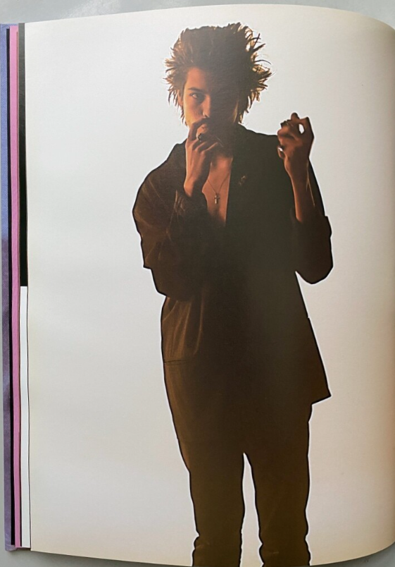
The Photobook I’m researching is Supreme by David Sims and it tells a story of skating and the riders lives. The approach they have taken to image making is very casual a few of the images have the riders posing for the photo and other images in the book are of the riders in their natural environment of the skate park.

2. Who is the photographer? Why did he/she make it? (intentions/ reasons) Who is it for? (audience) How was it received? (any press, reviews, awards, legacy etc.)

The photographer is David Sims, who does lots of advertising photoshoots for well known brands such as Prada, Gucci and Loewe. The book is for anyone who loves high demand, well known fashion and also for people who are interested in skating and have a passion for it. Their was a review from Goodreads about the book saying – it was beautifully produced, the book is the epitome of Supremes dedication to quality and design. This suggests that the book was hugely successful and was a big influence on the community of skaters.

3. Deconstruct the narrative, concept and design of the book and apply theory above when considering:

The narrative of the book is about the lives of the skaters of supreme and how they influence the younger generations of skaters.

How does the book feel/smell ?

The book smells very new and modern and feels very smooth.

Paper and Ink – use of different patterns/texture/colours or black and white for all images.

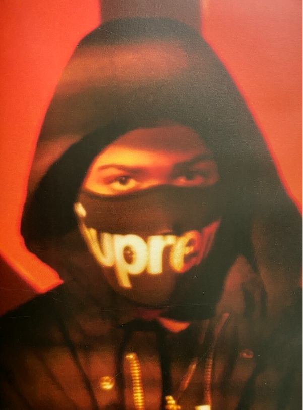
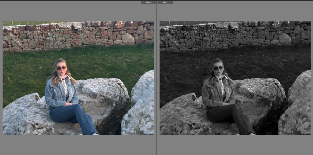
There are many black ad white images in the book and a few of the images have red in them which is the classic colour of the supreme logo. The images in the book are not the clearest photos and many of them are quite blurry images.

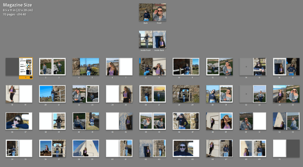
Format, size and orientation: portraiture/ landscape/ square/ A5, A4, A3/ number of pages.

The book has a portrait orientation and is A4 and has 64 pages in it.

Binding, soft/hard cover, image wrap/dust jacket, saddle stitch/swiss binding/ Japanese stab-binding/ Laperello

The binding is a saddle stitch binding and has a soft cover.

Cover: linen/card, graphic/printed image, embossed/debossed, letterpress/silkscreen or hot-stamping.

The cover is linen and has a printed image on the front of the book with no writing on it.

Title: literal or poetic / relevant or intriguing

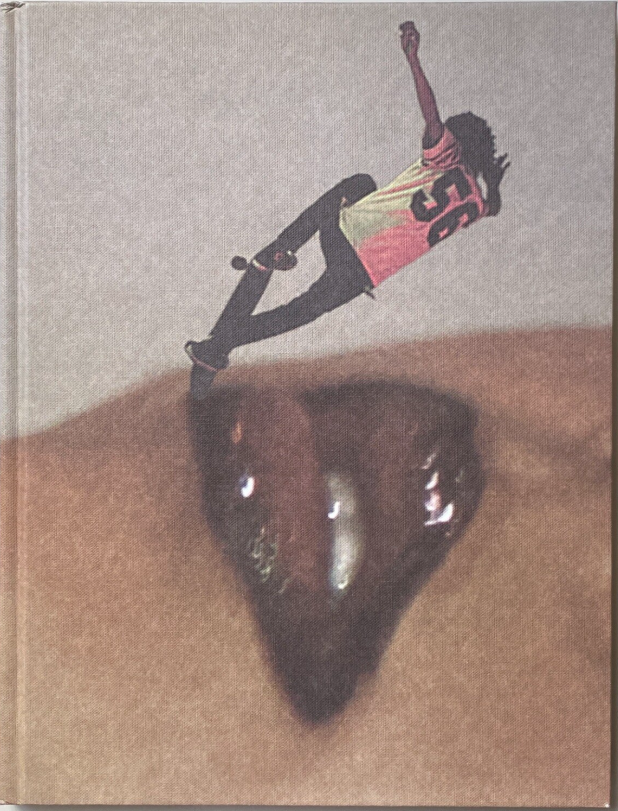
There is no title to the book, just an image of one of the Supreme skaters, skating on a photo of someone’s lips which have red lip gloss on them, this already indicates what the book is about and what brand is being advertised.

Narrative: what is the story/ subject-matter. How is it told?

The story is told by all of the skaters that skate for Supreme having a portrait image taken of them and put into the book and then having images of them skating showing what life is like for them as being a skater for a well known fashion brand.

Structure and architecture: how is it designed/ repeating motifs/ or do specific features develop a concept or construct a narrative.

The portraits of the skaters are repeated throughout the book including full body shots and portraits of just their faces. There is no specific features that develop the concept of the book.

Design and layout: image size on pages/single page, double-spread/ images/grid, fold-outs/inserts.

There are no double page spreads and there are only single page spreads in the book.

Editing and sequencing: selection of images/juxtaposition of photographs/editing process.

The images have been selected so that they are not all just white images and so that there is a contrast between the images for example the all red image and then the white background image above that creates that dramatic contrast.

Images and text: are they linked? Introduction/essay/statement by artists or others. Use of captions if there are any.

There is no text in the book and no captions the book is specifically told through the images of the skaters.

Development and Experimentation shoot 3

This is one of my best images in photoshoot 3 because of the lighting across my face, it makes the image really unique and interesting.

This is another one of my strongest images as the white house contrasts against the bright top that I’m wearing and makes the outfit look really bold.

Virtual Gallery

This is my Virtual Gallery for photoshoot 3 of my best images in the shoot.

Mock Ups

This image is going to be by itself as one A4 print.

This is going to be another one of my Mock Ups and I’m going to do a tryptic of another 3 of the best images from the third photoshoot.

Development and Experimentation shoot 2

I have chanced a few of my photos into black and white images because it brings out the texture of my clothing and because the lighting is so strong changing the images to black and white makes me stand out.

This is another image I changed to black and white and by doing so it enhances the features of the rocks in the structure behind me and also the plants that are in front and overall it gives the image more texture.

I increased the contrast of this image and increased the blacks so that my jumper would stand out more and the colour of my jeans stands out and contrasts against the dark background of the rocks.

This is another one of my best images as the composition of the image works really well and the colour match between the sky and my blue jeans contrasts with the browns from the granite rocks.

Virtual Gallery

This is a Virtual Gallery of some of my best images from photoshoot 2.

Mock Ups

This is my Mock Up for my second photoshoot and its a similar concept to my first Mock Up for photoshoot 1 with one big image in the middle and 4 surrounding images around the outside.

Development and Experimentation shoot 1

I have increased the contrast with this image and increased the exposure as well so that the colours in this image stand out and look a lot clearer, by increasing the exposure the sunset also looks more vibrant in this image as well.

I’m changing the images into black and white to see whether some of the photos look better.

This is one of my best images that I’m going to use for my photo magazine, I have increased the contrast so that the colour in my face stands out more. I have also increased the blacks in the image so that the grass in the background contrasts against the light colours of my outfit.

This is another one of my best images, I have used the masking tool for this image to make the background of the photo more blurry and the face a lot clearer so that it draws your attention to the portrait rather than the background of the image.

Virtual Gallery

This is my Virtual Gallery of some of my best images, I used the perspective tool to drag the images out to make them a line perfectly with the gallery template.

Mock Ups

I have created a Mock Up of what I want my images to look like when I mount them up and how I’m going to present them. The image in the middle will be A4 and the images surrounding it will be A5.

Contact Sheet Photoshoot 3

My Best Images

Contact Sheet Photoshoot 2

My Best Images