Before conducting my project, my statement of intent consisted of a few paragraphs stating what I wished to achieve through this exam project. I stated that I aimed to closely follow themes of power roles and femininity, through photographing women and depicting them as equal to men, as this has been a reoccurring struggle in society for centuries. I aimed to illustrate the theme of union by tying in power roles to unity, through creating images that perfectly present women as a community, and how they have come together to defeat traditional expectations and stereotypes. I knew I needed to link my artist inspirations: Yayoi Kusama and Helmut Newton, to the theme of union as well as incorporating my own ideas based on experience of being a young woman.
I crafted my photoshoots in a way that I had originally planned to, exploring indoor and outdoor scenes, as well as photographing in places that my artist studies did. This way, I was able to carefully resemble my inspiration’s work, as well as including unique and personal ideas to develop this project. Helmut Newton is renowned for his provocative style of imagery, delving into themes of eroticism and power. Yayoi Kusama is well known for her distinctive use of repetition of colourful backgrounds with lots of pattern, where she explores self-obliteration and mental health. She uses the busy backgrounds to symbolise her mental state, after growing up suffering with hallucinations. Despite both of my artists being extremely inspiring and successful, they uniquely portray hidden messaged through their work, which is what originally inspired me to merge them together into my project.
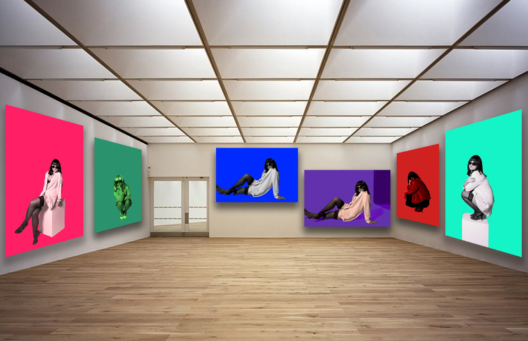
Gender inequalities have created a strong narrative that women should not be allowed to have important roles or a high status, but I have always wanted to challenge this idea. Therefore, I want to show a modernised version of how the world views women, yet depicting them as powerful and dominant throughout my own work, despite not having lived through the 60s and 70s when these issues were at an all time high. I want to successfully demonstrate my understandings of these societal problems through presenting my work as a way of comparison, highlighting the change and how far women have come since the 60s, while also expressing my knowledge on how the world has changed to view women as equal to men. This effectively links to the theme of union, by highlighting the unity of men and women, not only women. Newton managed to help push this shift, as he demonstrates his feminist beliefs in an appropriate way that women can appreciate, which shows that many men in the world do believe in gender equality. In relation to Helmut Newton, my project follows his values as I used techniques that would allow the females in my images to appear how I want them to: confident. I used low camera angles in many of the photographs, to allow the model to be viewed as a character that holds power and dominance, this is because the use of a low angle physically makes them appear bigger in the frame.In relation to Yayoi Kusama, my developing and editing aspect of my project is mainly inspired by her bold approach to photography. Although I did not have vibrant backdrops or even set ups of installations, I used Photoshop to add in pops of colour to create luminosity, which I think turned out successful. I believe my work illustrates clear themes of femininity, power roles and even identity through my different approaches to each shoot.
What would I have changed:
Overall, my project as a whole has been successful. I demonstrated understanding of my artist inspirations and linked them to the theme of union, whilst also incorporating originality. However, one of the main aspects that brought my project down is my editing skills as I am not as comfortable with Photoshop than I am with Lightroom. This limited my ability to edit my images effectively, with patterned backgrounds. This meant that all of my final images that I edited using Photoshop were plain, and arguably dull.
Another element within my project that I would change is my camera skills. Sometimes I am not careful enough with the camera settings, meaning some images were underexposed and some were overexposed etc. Therefore, this made my editing process a lot longer because I had to fix simple mistakes that could have been avoided.
Lastly, I would change the style of my first photoshoot and also carry out more photoshoots. If I had completed a few extra photoshoots in the time given, this would mean my final outcomes would vary a lot more, displaying different aspects of the themes. Also, my first photoshoot was an experiment photoshoot, where I did not yet have a clear enough idea on how my images resonated with the theme union etc. This meant that by not doing enough research ands analysis before photographing, my photoshoot appears random and perhaps irrelavent.
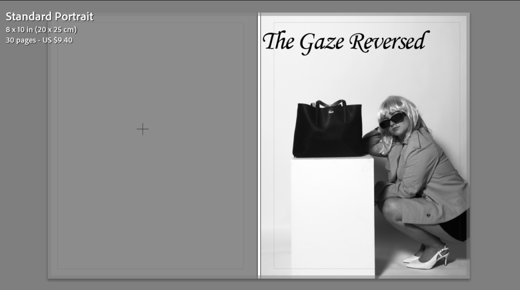
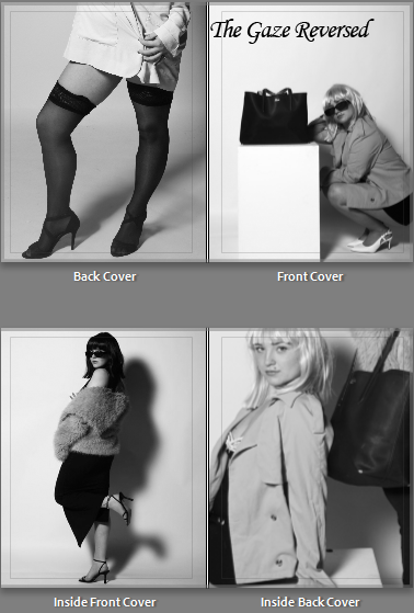
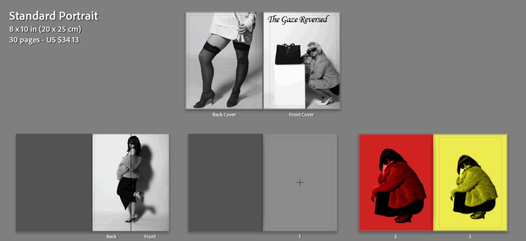
The title of my final photobook will be “The Gaze Reversed“, due to the direct links between my work and ideologies conducted by Laura Mullvey. Mullvey came up with the concept of The Male Gaze, her theory implies how women are often sexualised in the media and how voyeurism is an underlying issue surrounding how women are viewed. I titled my book this because I am aiming to change the way women are perhaps over-sexualised, by playing with clothing and props that resonate with the 1960s, and how women were expected to dress. My objective is to present the subjects throughout my magazine in a way that shows power, importance and dominance through photographing them with elegant clothing, reinforcing the idea that women can have a high status too.
What I want to achieve within my photobook:
My main aim to achieve through completing my photobook is to help switch the firm narrative of women being objectified, and only looked at for pleasure. Only recently did society begin to appreciate women for more than just their looks, allowing them to have a role in the world other than being looked at. I am aiming to present my subjects in a way that they can appear powerful, exhibiting the idea of gender equality and women empowerment.
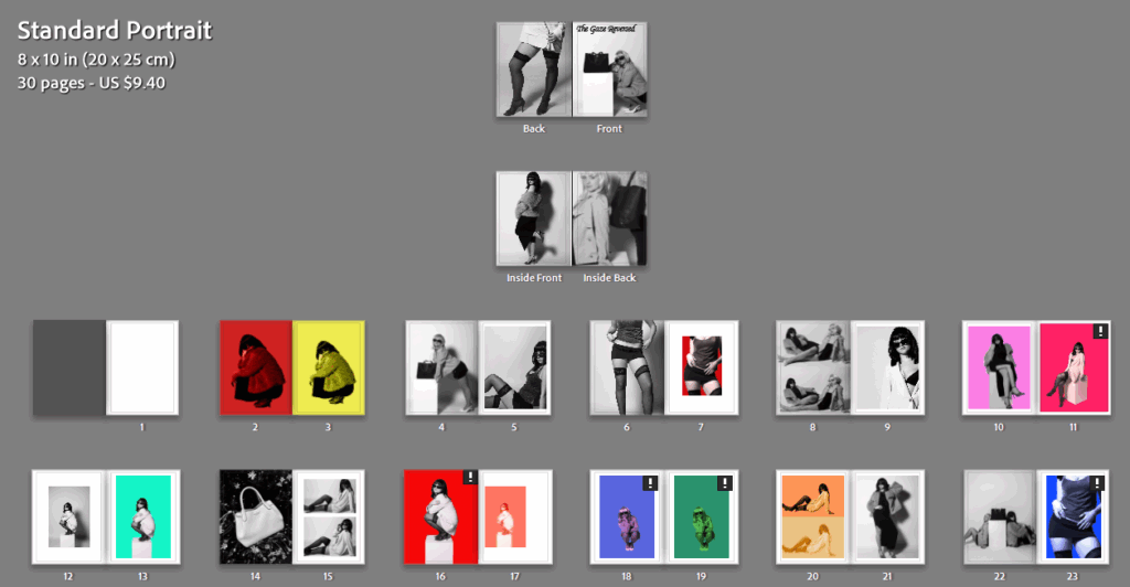
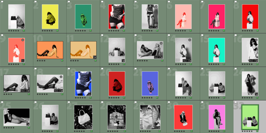
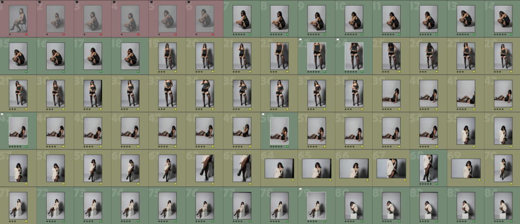
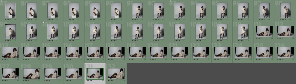
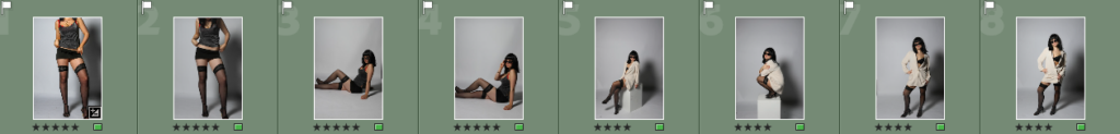
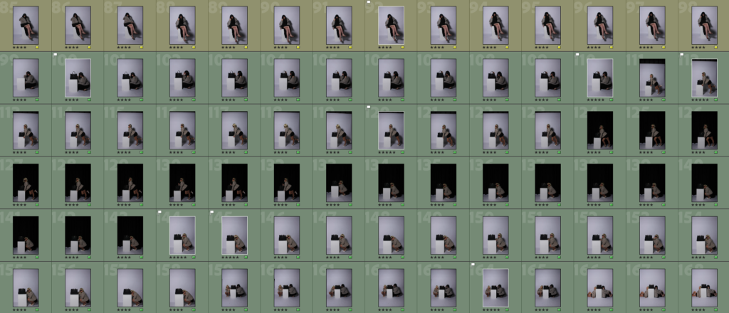
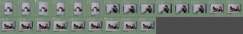
In order to begin designing my photobook, I selected all of my best images from my project and pasted them into a new collection under my project named “Final exam”. I made sure to choose images that I had previously rated 5 stars, and also colour coded green so I knew they were the best quality images.
I then pressed the “book” option at the top of Lightroom, where the app would them automatically create a book with all of my images inside. I then had to make the decision on which type of book I wanted my project to be presented as. My original plan throughout this project was to present my images in a magazine layout, as there are aspects of my project linking to fashion. Furthermore, I had also previously researched some fashion magazines such as Vogue Magazine, to help give me inspiration on how to create a successful fashion magazine using appropriate space and imagery. Despite this, I then had the idea to create a small square photobook rather than a magazine, where the paper type would be matte rather than glossy paper, and the book would be significantly smaller than an ordinary book. I experimented with both layouts to help me decide my final one.
When designing my book and adding the images onto the pages, I carefully had to consider factors such as; mixing black and white images with colourful images, the sizing of each image and how it would fit onto the page, if I wanted borders surrounding specific images, and if I wanted any double page spreads. I think both layouts turned out successful overall, both displaying a range of images correlating with my artist inspirations, yet also showing individuality.
Magazine layout:
Front cover with added title:
Front and back cover with inside pages:
Next, I added a back cover that would compliment the front cover effectively. I chose an image from a different photoshoot to allow my book to appear more interesting for the viewer, as well as immediately showing variety without opening the book. I also selected images for inside my front and back covers, I chose ones that correlated with the covers to prevent the book from looking too busy already. I think all four of these images chosen work well together and compliment each other, while also being unique to one another through the use of different angles and costumes.
The rest of my magazine layout:
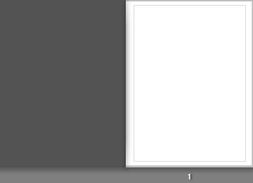
I chose to keep page 1 completely blank as I want most of the images in my book to be next to another one, unless it is a bold image and needs to be presented on its own so all elements within it can be appreciated. However, I want to slowly incorporate individual images into my book, rather than immediately at the front.
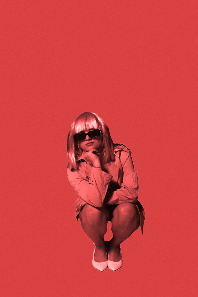
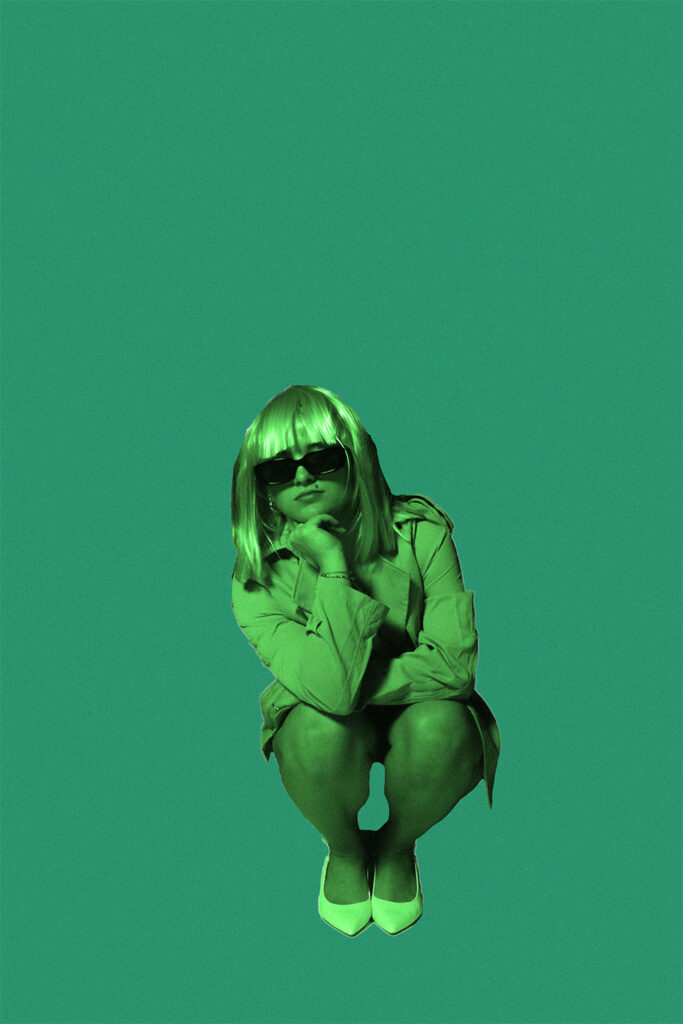
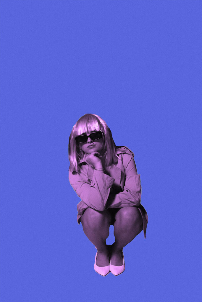
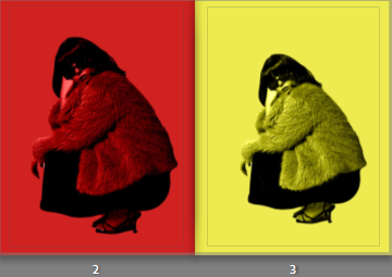
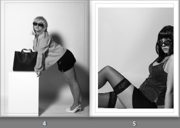
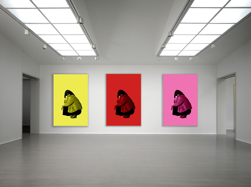
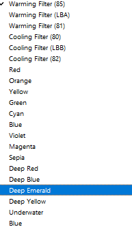
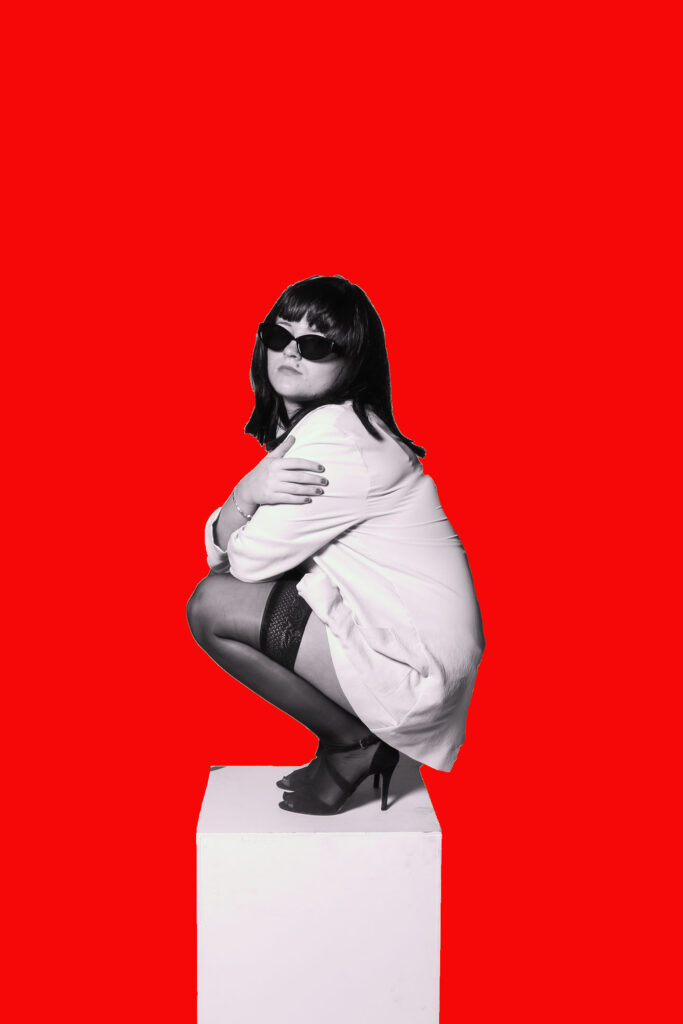
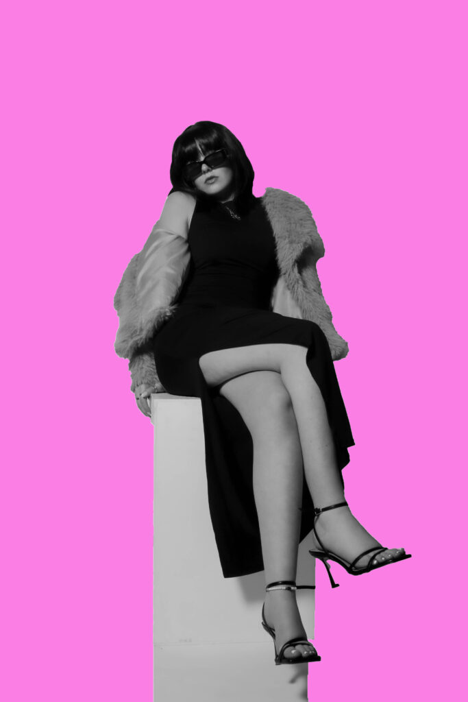
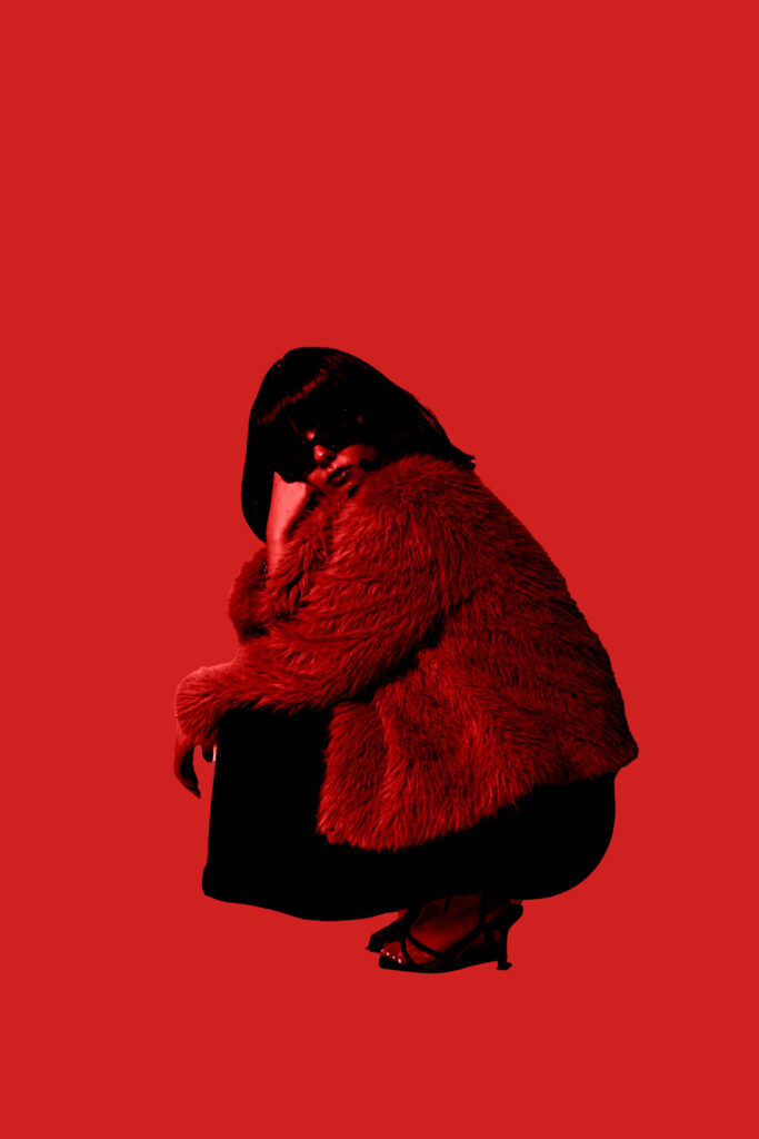
Pages 2 and 3 are the first pages the viewer will see when the book is opened, so by adding bold pops of colour I am linking my book to Yayoi Kusama’s work, as she was inspired by pop art, which includes lots of vibrancy. I placed the same image next to each other, to show a minimal comparison between them and their colour. I made both of these images full bleed with no borders, as I think a white border would clash with the colours within the image as they are dark and bold. Lastly, the red image on the left is slightly more zoomed in, which I think adds a bit of depth to the overall page.
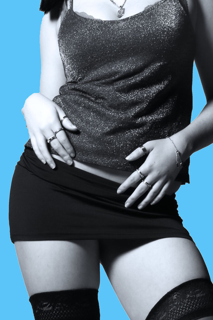
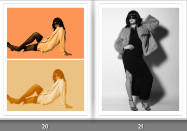
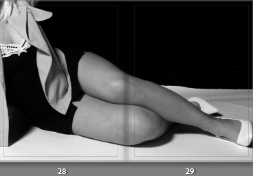
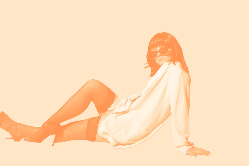
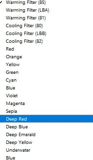
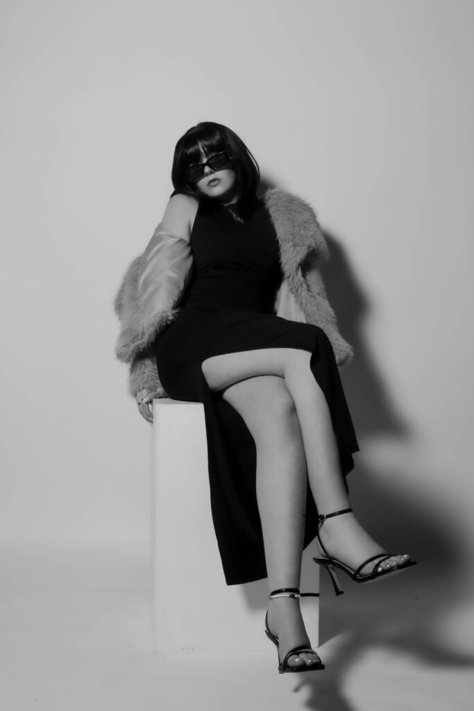
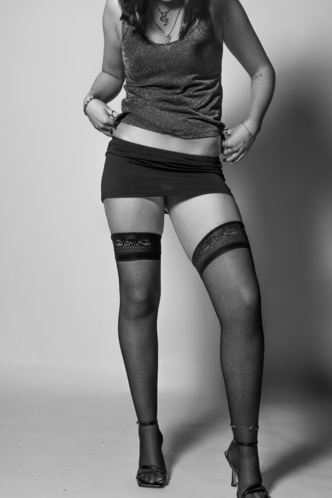
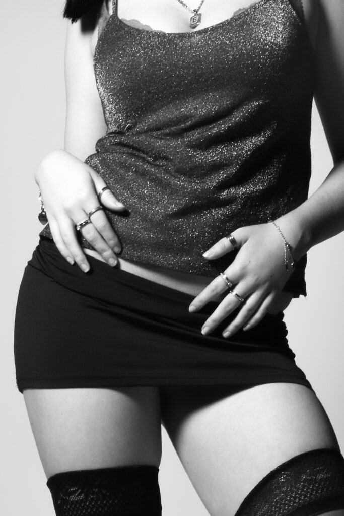
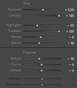
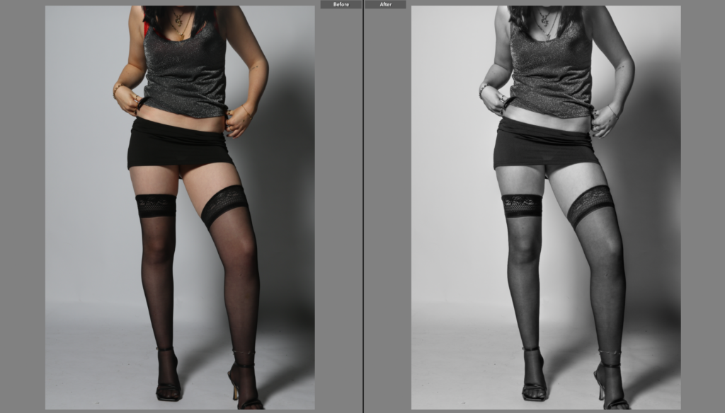
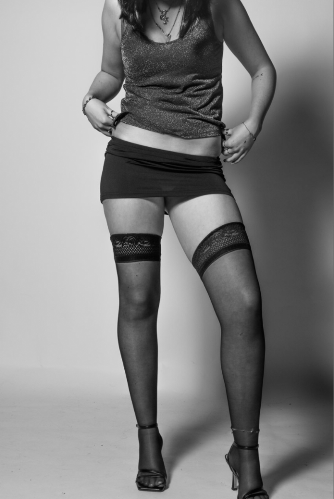
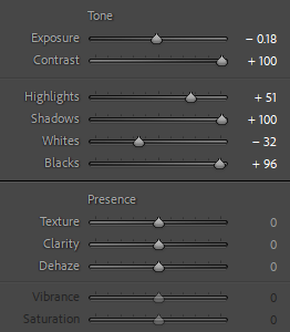
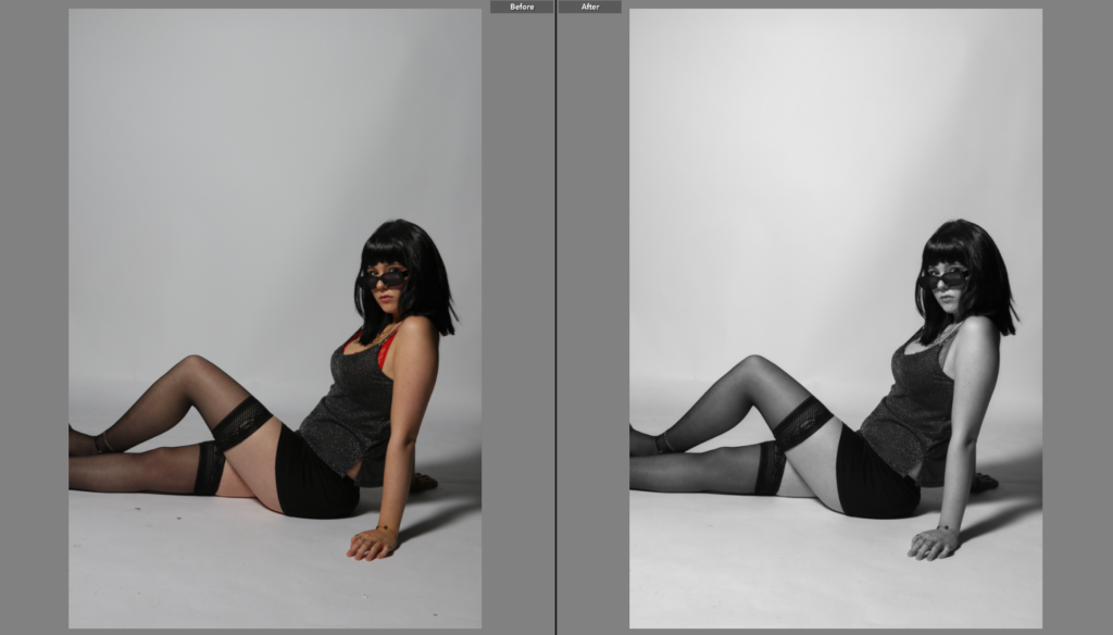
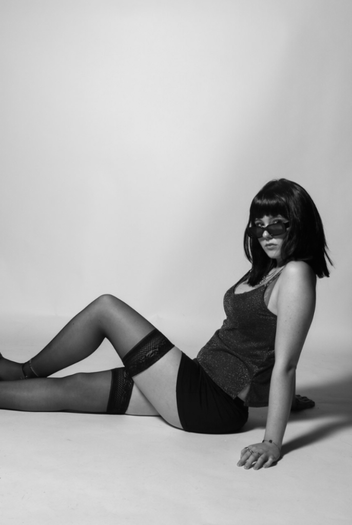
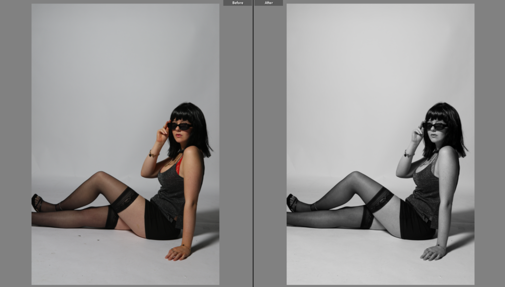
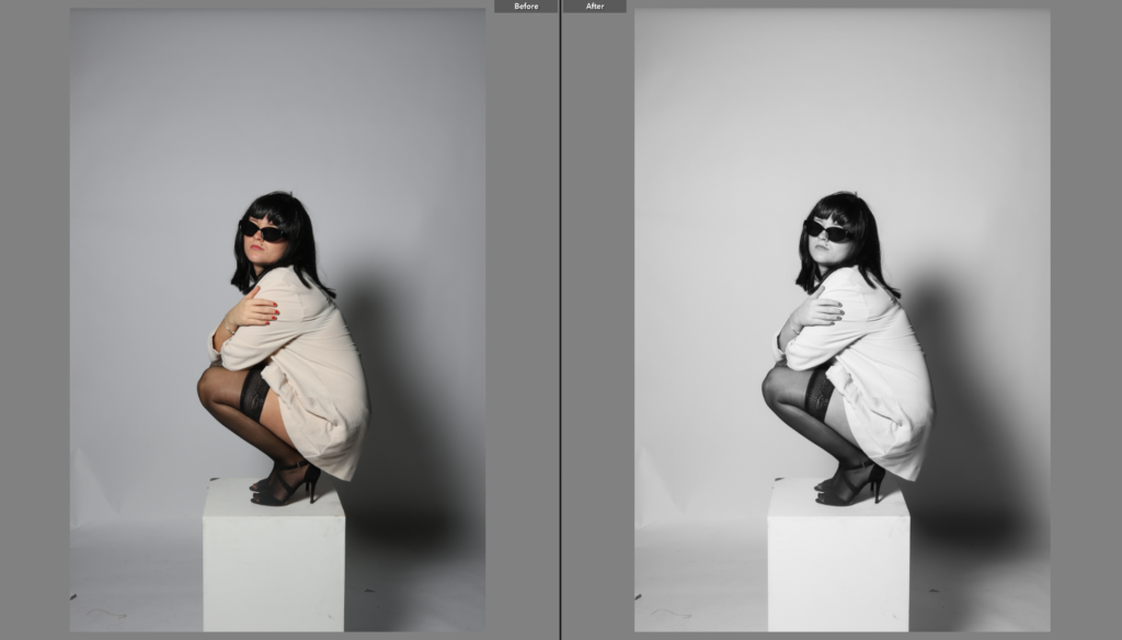
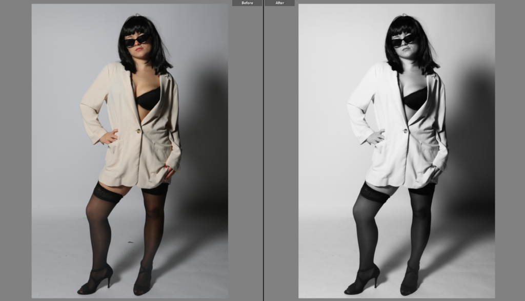
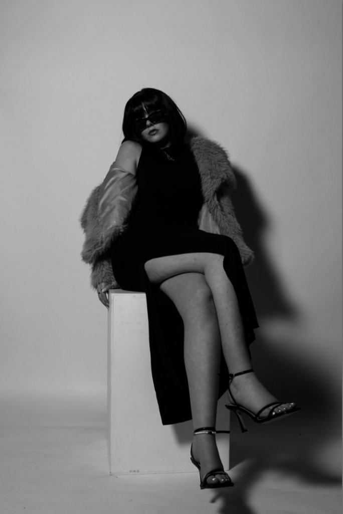
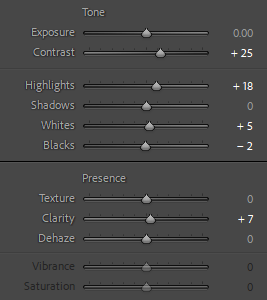
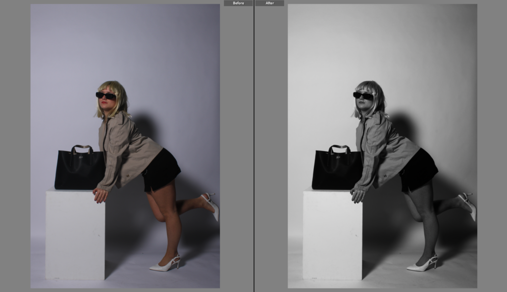
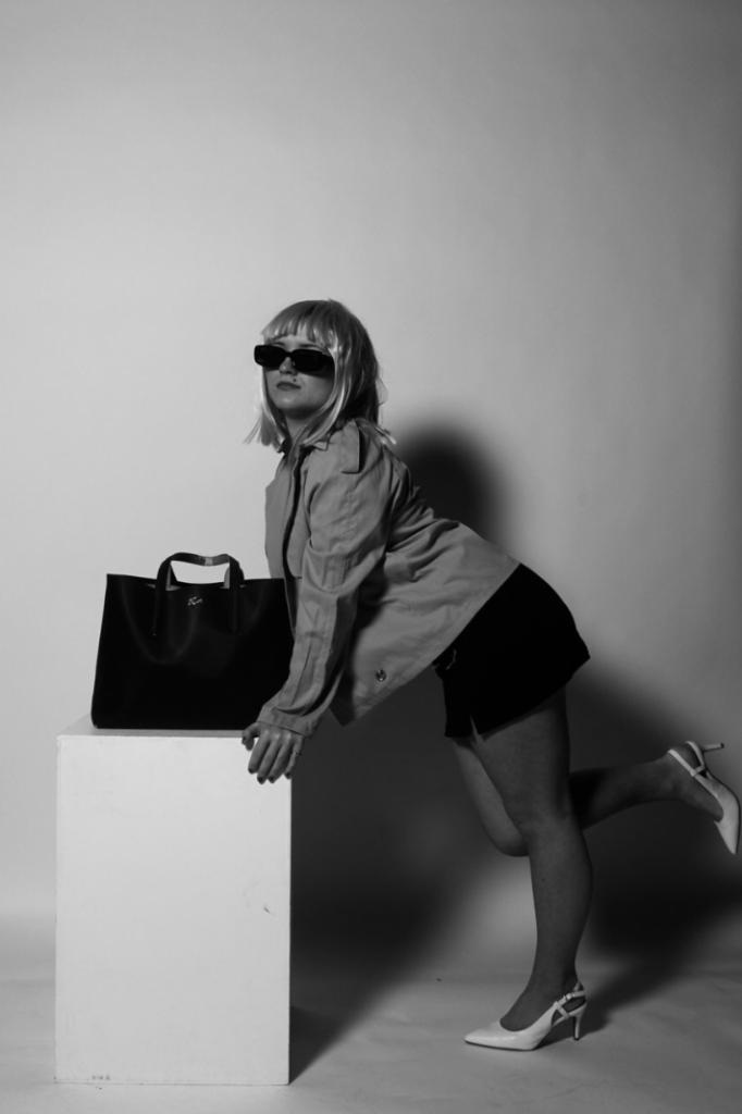
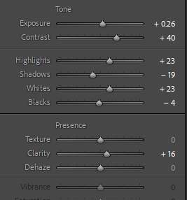
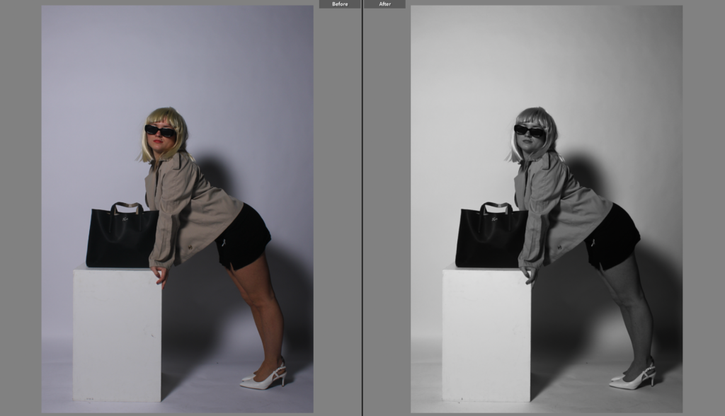
Pages 4 and 5 are black and white images that have only been edited in Lightroom rather than Lightroom and Photoshop. I added these two next to each other at the front of the book because it also tells the viewer pretty early on that there is a break between all of the luminosity. I think placing the unedited versions in between the colourful pages has helped add a sense of Newton’s work into my book, while also keeping it simple and classy. The image on the left is full bleed and has more of a wide angle, which compliments the image on the right which has clearly been cropped and zoomed in, as well as having a white border. This allows the viewer to focus closer on elements such as the wig, sunglasses or stockings, without a colourful background subtracting from them.
Pages 6 and 7 are two similar images from the same shoot, sharing the same low camera angle as each other. I kept the image on the left full bleed so there isn’t a clash between them. I used a new layout for the image on the right that I hadn’t experimented with before, but I think it looks effective with the border as it helps add dimension to the two similar photos.
Pages 8 and 9 are both in black and white again, but within page 8 I used a two image layout, where I can display photos with similar qualities that are only slightly different to each other. Page 9 is another black and white image, but I zoomed in the original full length image to almost a headshot, which works well with the image on the left as it stops the page from being too busy. Page 8 is another full bleed layout so that the viewer can only focus on the two photos within it, whereas I selected another border on the image on the right.
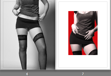
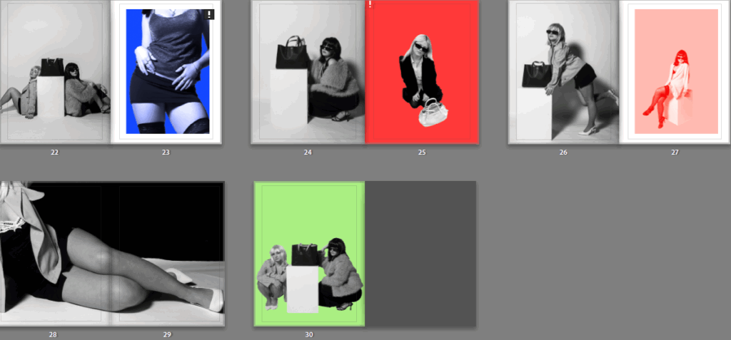
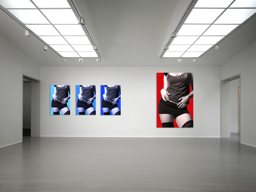
Pages 10 and 11 are very vibrant with lots of colour to them, which is why I placed them together. Both images are portraits, and they both use the white box as a prop, which is also significant. I placed them together due to the similarity in colour and subject posing, and I added a white border to both to break down the use of colour. However, the image on the right has a small exclamation point in the top right corner, which means when I had exported all my edited images from Photoshop, I did not adjust the resolution accurately. This would mean that if the image was full bleed, it may be printed blurry. Therefore, to avoid that I made the image smaller than the layout frame so it was closer to the ideal ppi (200).
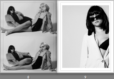
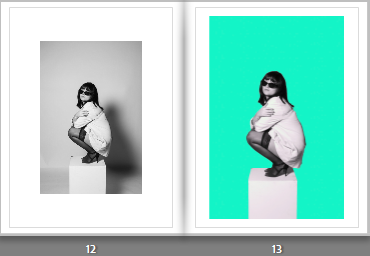
Pages 12 and 13 are also using the same image, one edited in just Lightroom and one edited in Photoshop to add a colourful background. I also experimented with a new layout format on page 12 as I think the large white border helps emphasise the image more, despite it being in black and white. I placed the image on the right using a bigger frame, and dragged the corners to fit the frame appropriately. I think this double page is one of my favourites throughout the book, so I placed it roughly in the middle of all the pages so more attention could be brought to it, despite it being a simple comparison.
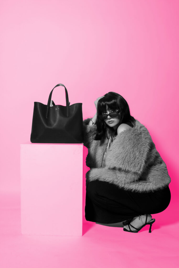
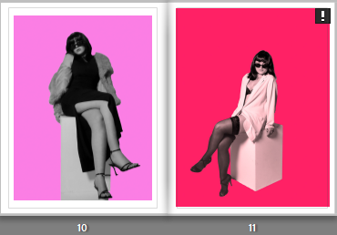
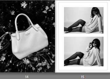
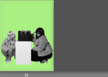
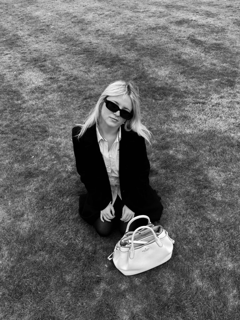
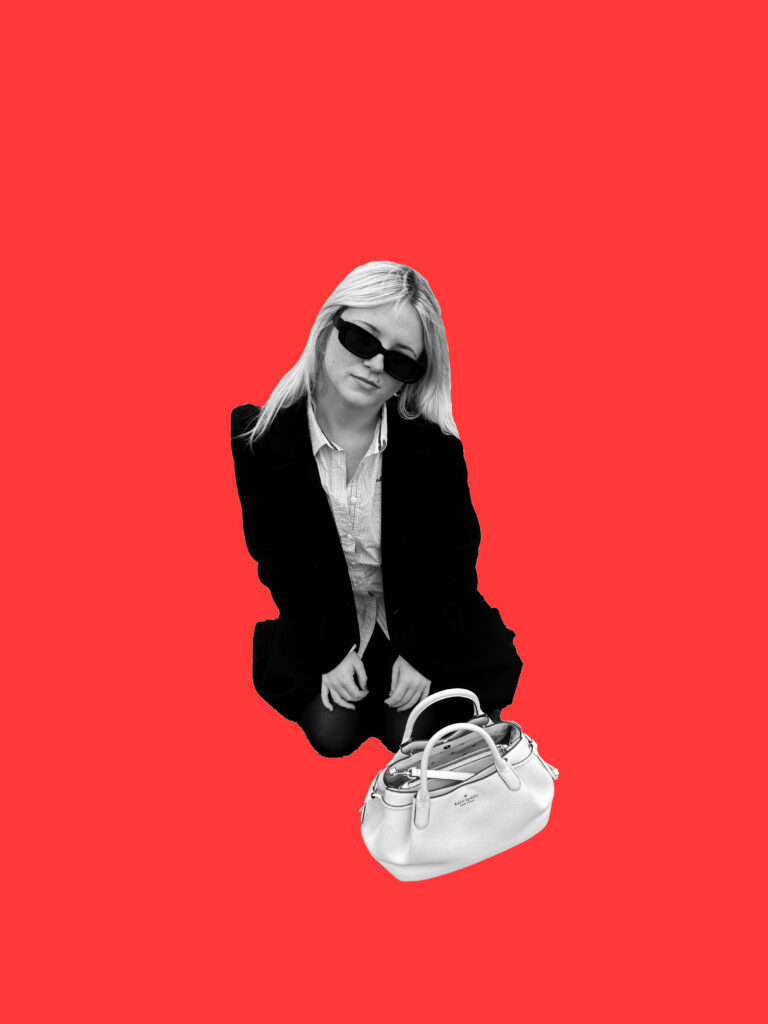
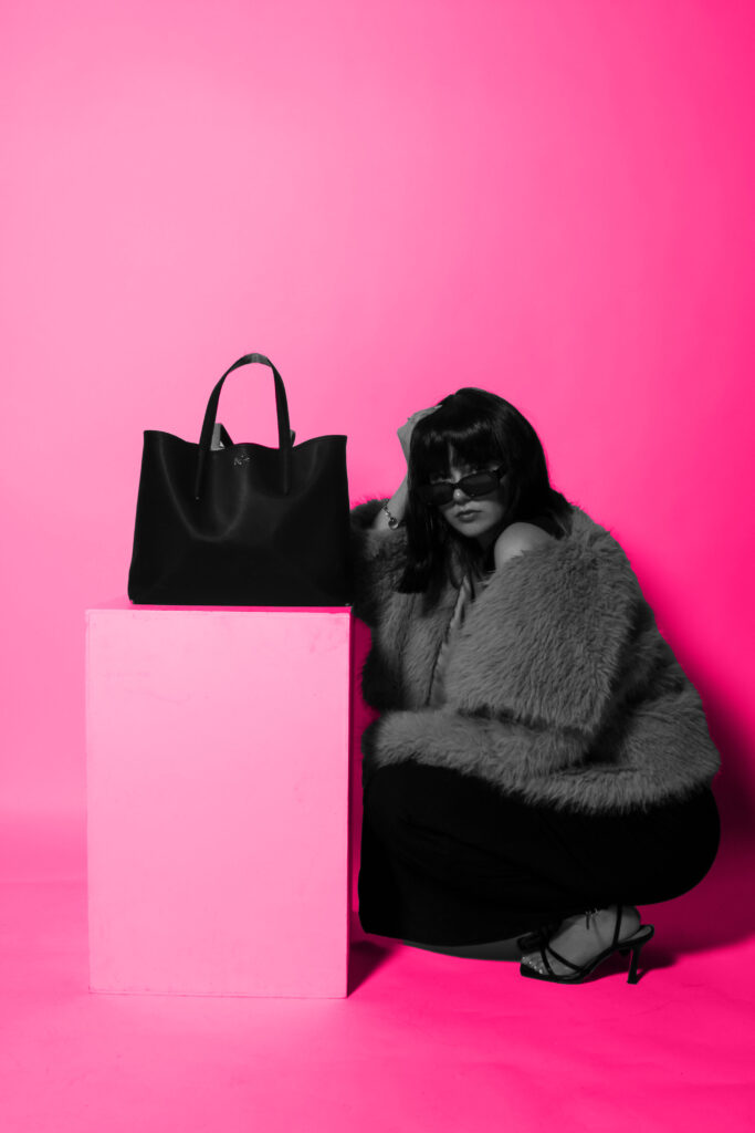
Pages 14 and 15 consist of images from different shoots, and they are almost contrasting one another. The image of the bag on the left links to Yayoi Kusama, as she worked with fashion companies and includes hand bags in many of her images. The image was also taken in an outdoor setting, which is unlike the majority of my best outcomes, so the dark background contrasts the white background of the right images. Page 15 also has a two-image layout, where I added two similar images again to bring some life into my photobook, while also showing a raw approach to my shoots.
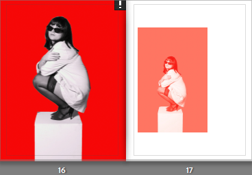
Page 16 and 17 are the same image again, yet the smaller image on the right has a gradient filter over it, carefully blurring the bold colours of the background into the subject. The image on the left is full bleed as I like the angle and the positioning of the subject, and wanted it to be the main focus of the page spread. For page 17, I used a different layout to the rest of the pages, where the image is off centre and to the left of the frame. Usually, I wouldn’t experiment with this approach as I like my images to be centred, however I think this layout works well when the same image is used on both sides.
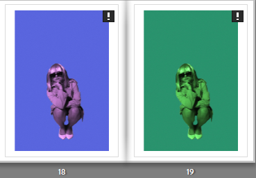
Pages 18 and 19 are two of my final prints, so I also included them on the same page next to each other because I like how the colours are so different to one another, and how the use of the gradient filter separated the images. Neither o these images are full bleed to avoid the blurriness when they are printed, so I kept a white border which I wouldn’t have done if I had more choice but I still like how the border separates them so the viewer can focus on each image individually.
Pages 20 and 21 are very different to one another, but I placed them together because the image on the right only has black, white and grey tones in it, which ties in well with the top right image ands the use of dark tones in the foreground. I placed another two image layout on page 20 because it is the same image, edited differently. The image on the bottom also uses a gradient filter, blurring harsh lines from the subject and the background to make it appear seamless. This way, the viewer can easily interpret the differences between them within my editing.
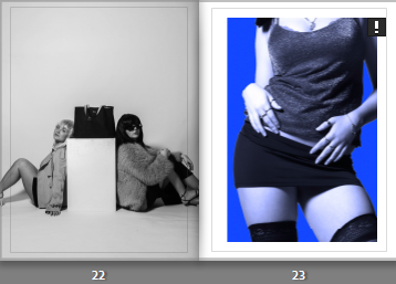
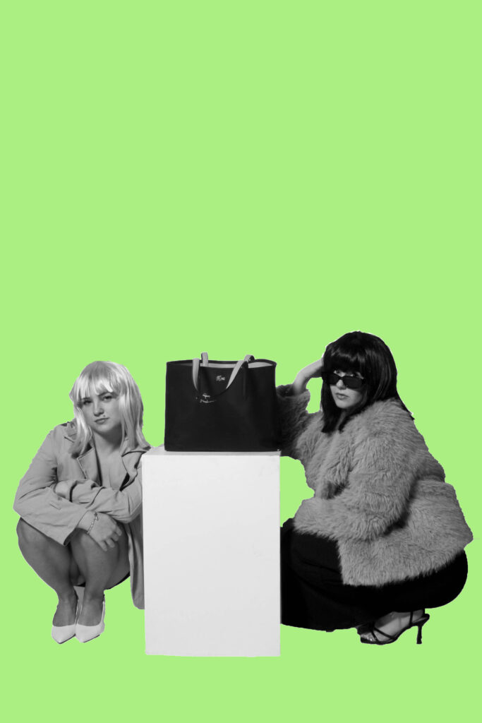
Pages 22 and 23 are also images from different shoots, with no correlation. I placed them together because the image on the right is extremely zoomed in, therefore it would need a border to look effective on the page. This means that the image on page 22 could be full bleed, which I wanted to do because it is one of my best outcomes that has two models in it, rather than one. I also like how this page links to fashion again through the hand bag placed in the centre of the frame, yet it also links to the male gaze and how women are viewed as objects.
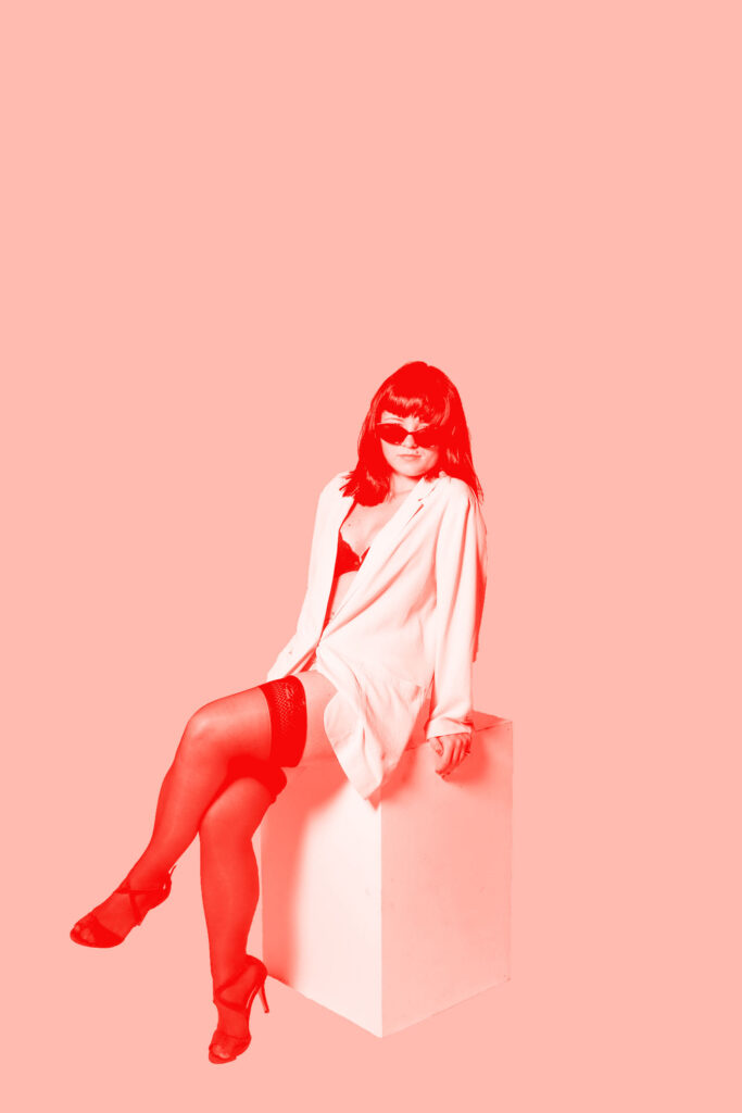
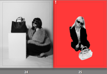
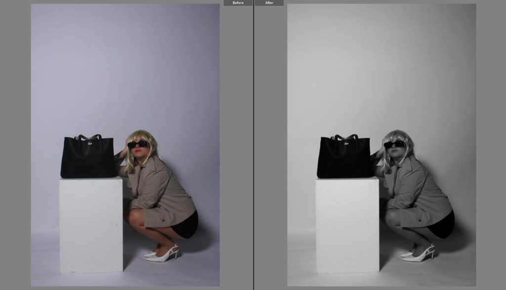
Pages 24 and 25 compliment each other due to both having a handbag in the frame, with the model crouched down or on the floor. Despite that, they are also very different because different camera angles were used, the image on the left page has a lower angle where the model is looking directly at the camera, linking to the female gaze. Yet, the image on the right has a higher angle, making the model appear lower down and therefore weaker. I edited the image on page 25 to get rid of the outdoor background, which was also underexposed. Both images ae placed full bleed across the page so the viewer can recognise the use of the handbag and how they link to each other.
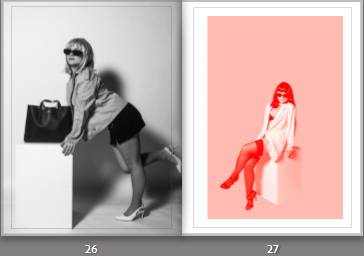
Pages 26 and 27 are images that have been edited differently again, but I placed them together so the viewer can see the difference in mood between them. The image on page 26 has a high contrast, lots of shadows and overall a dark mood to it. Whereas, the image on the right has an edited background as well as the gradient filter again to discard any dark tones and heavy contrasts. The left image is full bleed so the colours from the other page do no not outshine it, whereas the page on the right has a border, so the colours are not overpowering the more raw image on the left.
Pages 28 and 29 is a double page spread using one image. I chose this one because it has a unique angle and focal point, as well as being a landscape image. Due to my book being a portrait structure, it was difficult for me to add in landscape images without having to zoom them in and defeating the main focus in them. I think the double page spread looks effective and adds a unique touch to my book overall, especially when there is no border surrounding it, allowing it to look sophisticated and professional.
For the last page of my book, I wanted to add a pop of colour to contrast with the inside back page, which is a plain black and white image. I also made this image full bleed because I think the image is very dark, and I think by having a border it would take away from the image itself as well as the background.
Blurb photobook layout:
This is the layout of the book if I chose to have a normal photo book from blurb, with a hard cover front and back, and matte A4 pages throughout. I think this layout is effective, but not for my style of book where I am focusing on ideas of fashion. Most fashion magazines have glossy paper, and if I do not follow this concept then my ideas maybe misinterpreted.
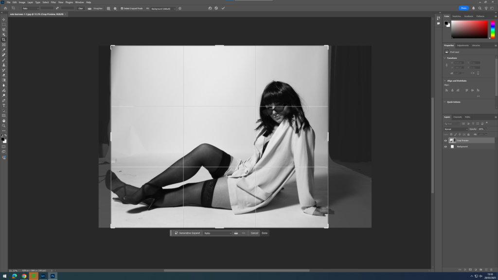
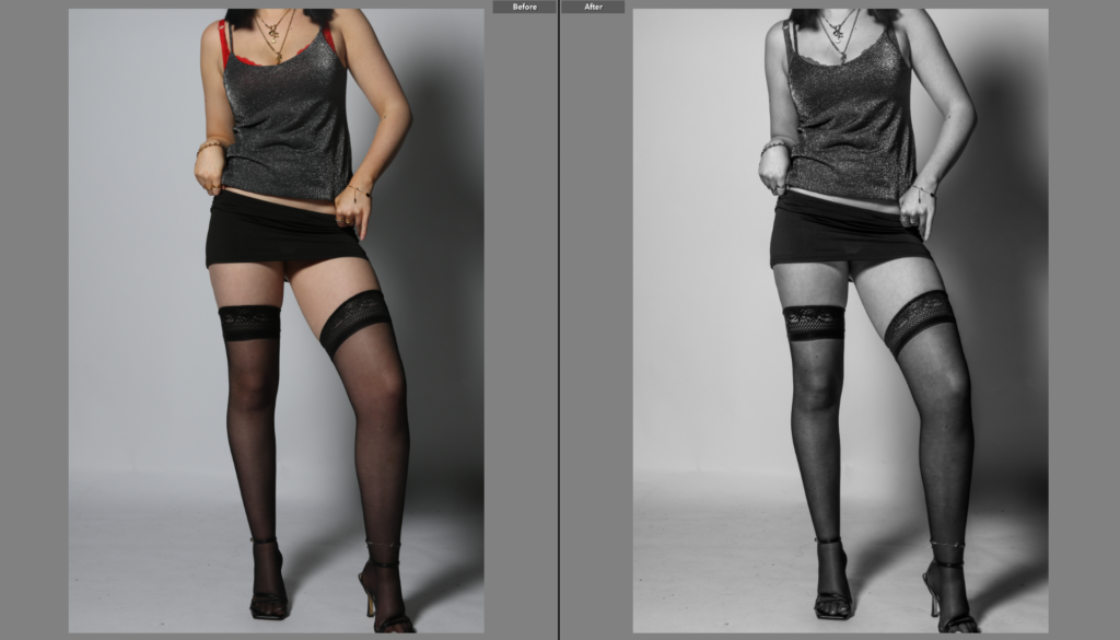
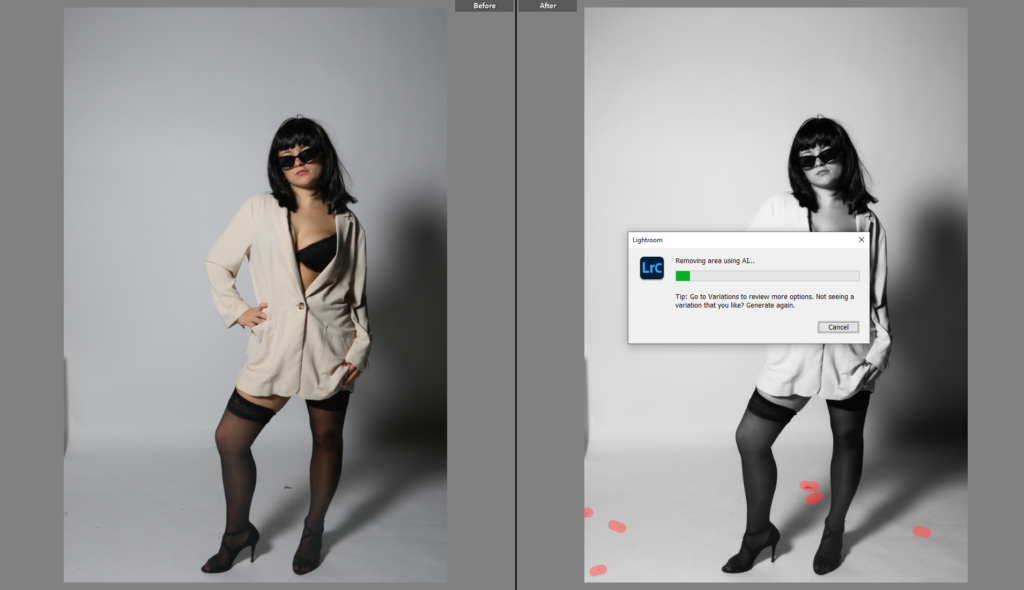
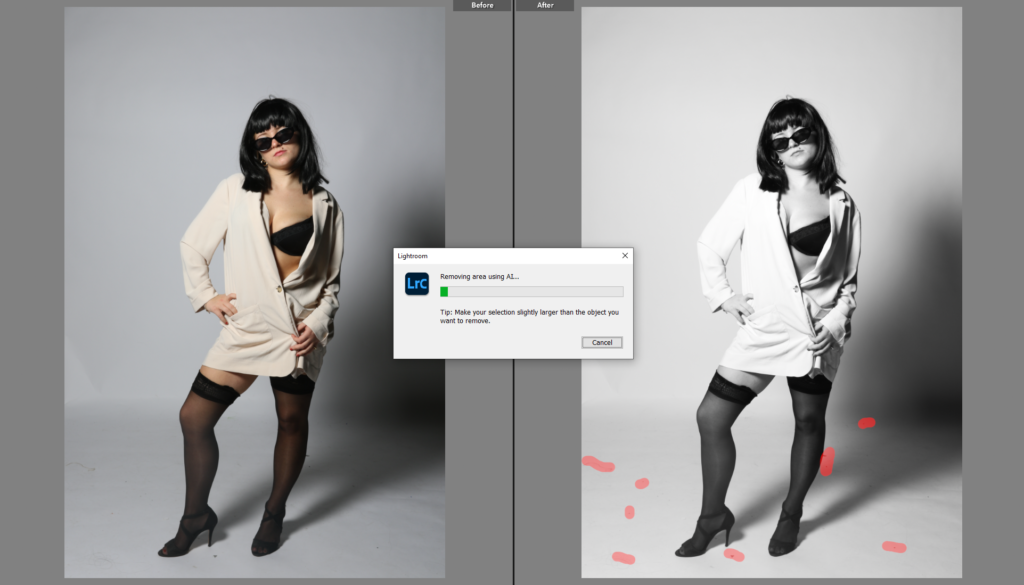
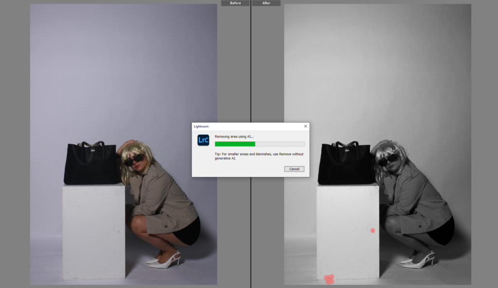
I chose to crop this image using photoshop rather than Lightroom. This is because photoshop allows you to crop certain areas within your image without cropping the whole thing, so by doing this I was able to crop out some of the unwanted material on the left side near the model’s feet, yet keep the image to a good size so all the elements I want to be included are.
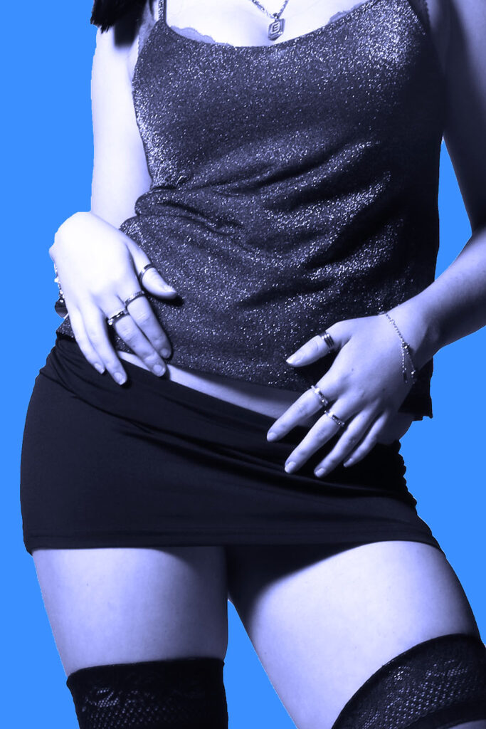
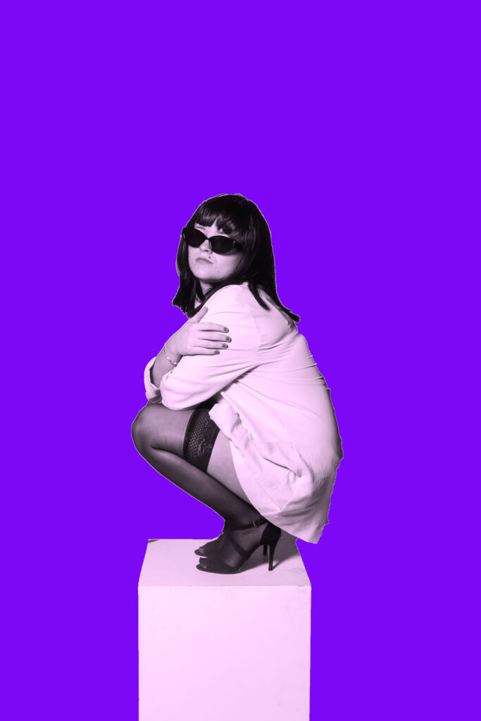
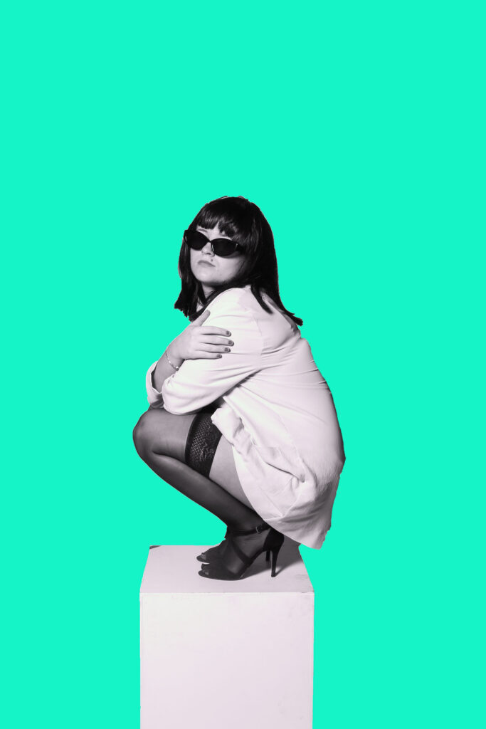
Background editing using photoshop – E.g. :
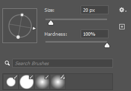
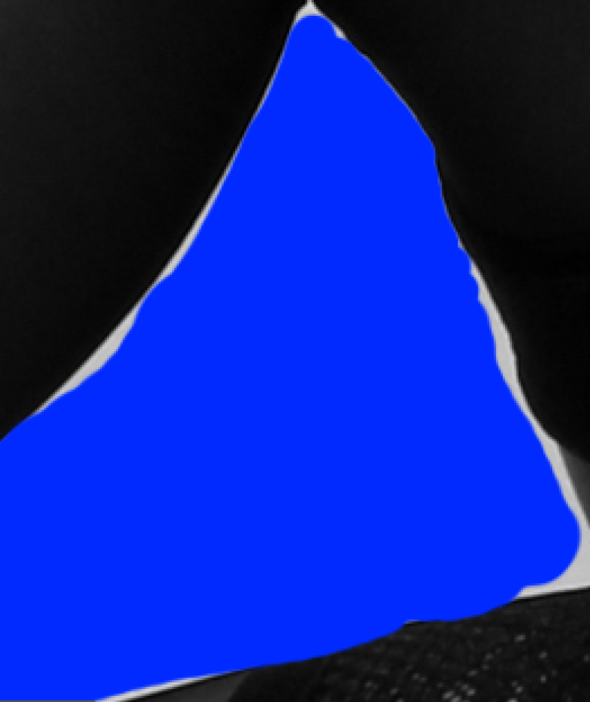
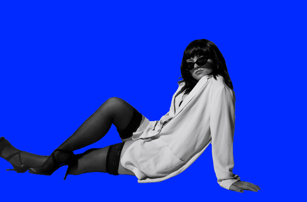
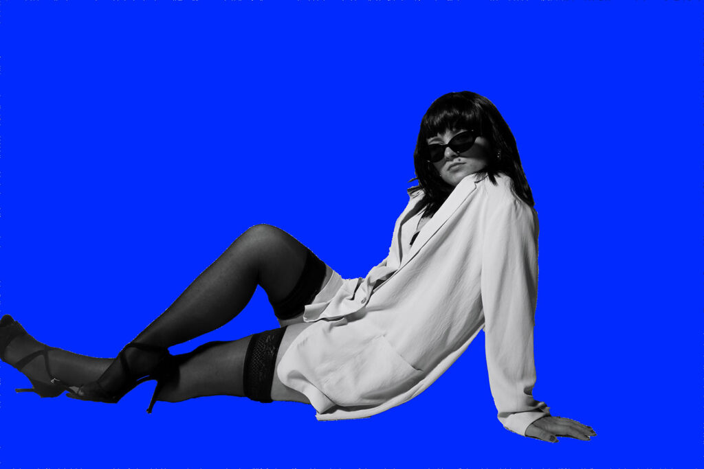
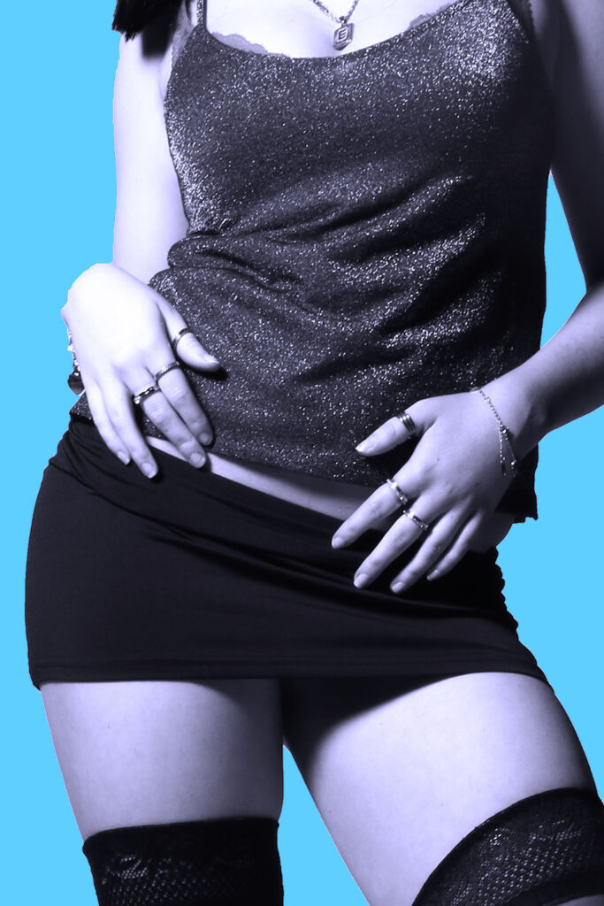
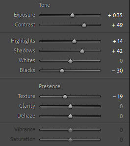
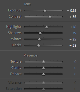
To achieve a plain blue background, I followed the same process that I have explained previously in one of my editing blog posts. In order to make the outcome look as realistic as possible, I had to carefully colour in all of the edges of subject to prevent a harsh outline. I used the pen brush tool, and adjusted the size of the brush so I can be more precise and make it look neat. I also adjusted the hardness to 100% to enhance the preciseness, and allow for no messy or white edges between the subject and the background.
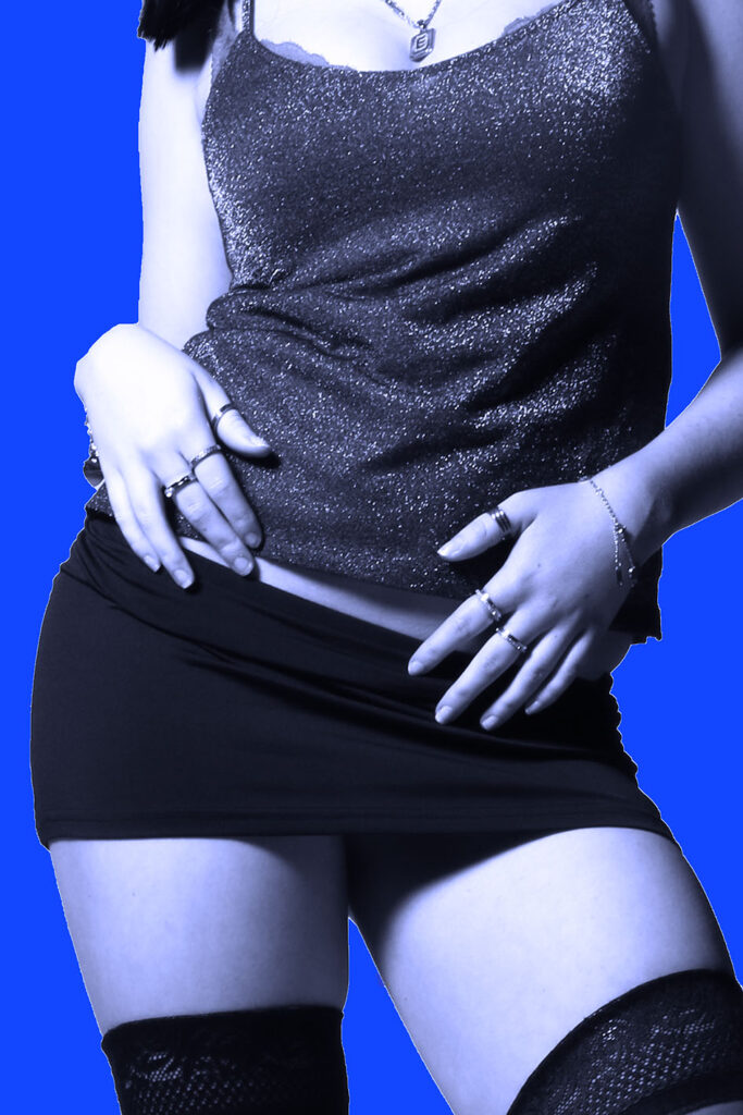
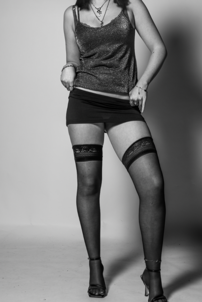
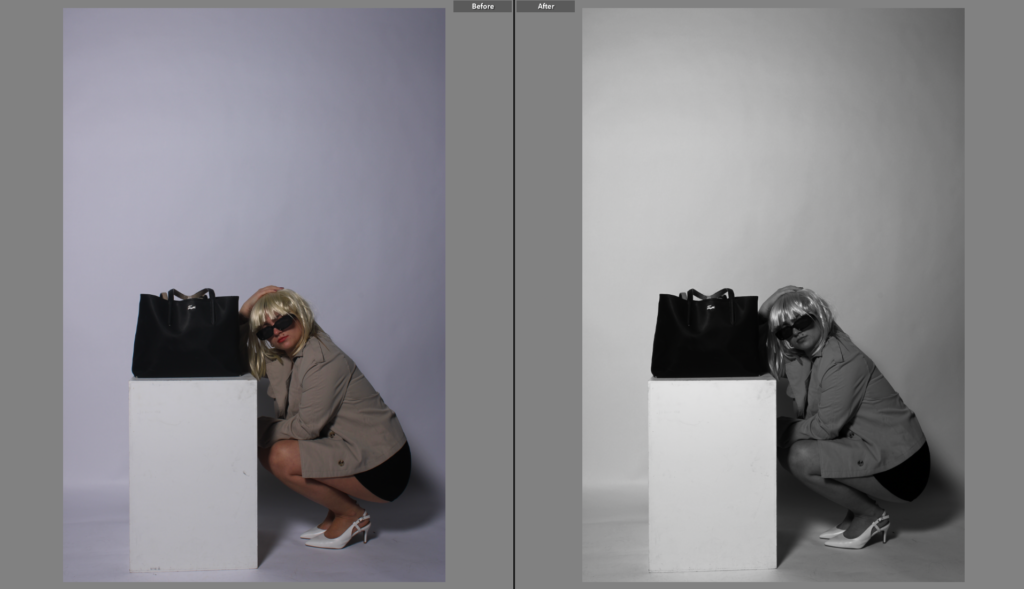
Here is what my image looked like after using the brush tool and removing all of the white edges, which I think looks a lot more successful and realistic.
Finally, I decided to add a simple filter that would enhance my outcome further. This way, it gives the effect that everything is merged and blended together subtly, rather than it looking very separate and unprofessional.
Edit 1with random experimentations:
version 1:
version 2:
version 3:
version 4:
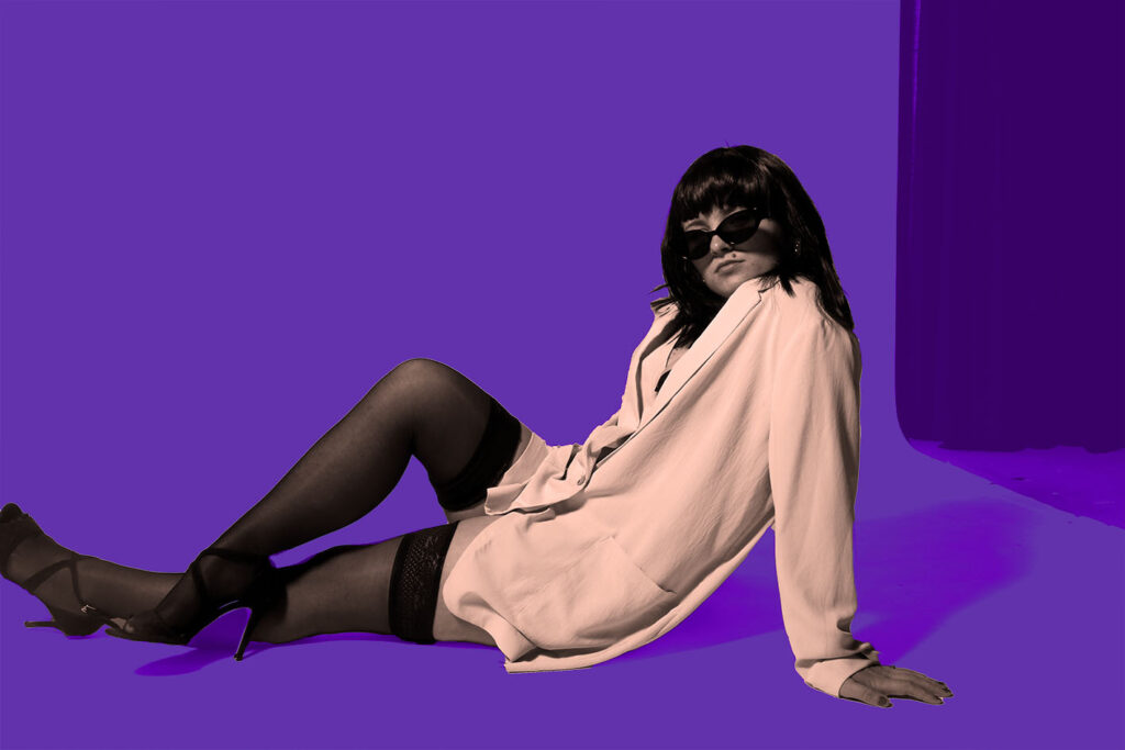
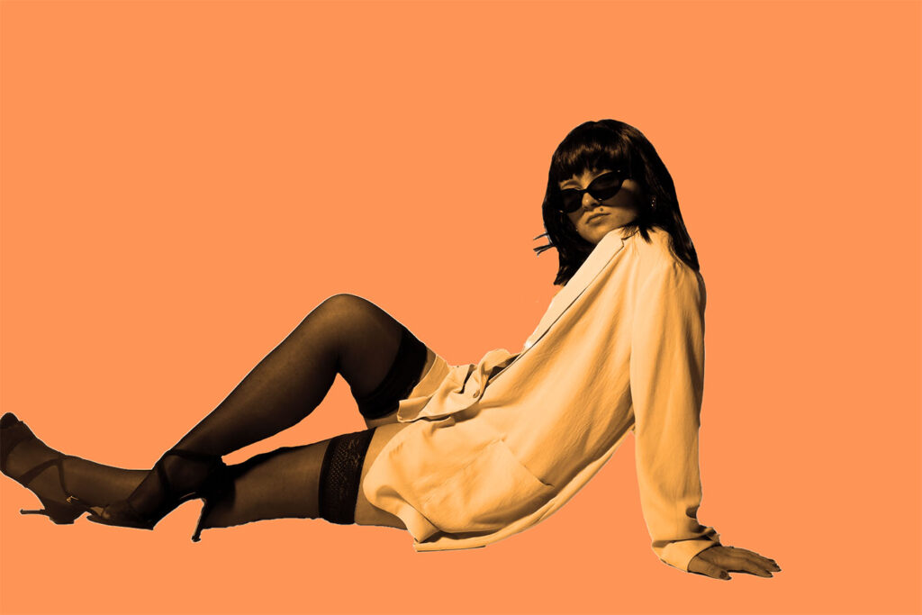
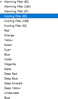
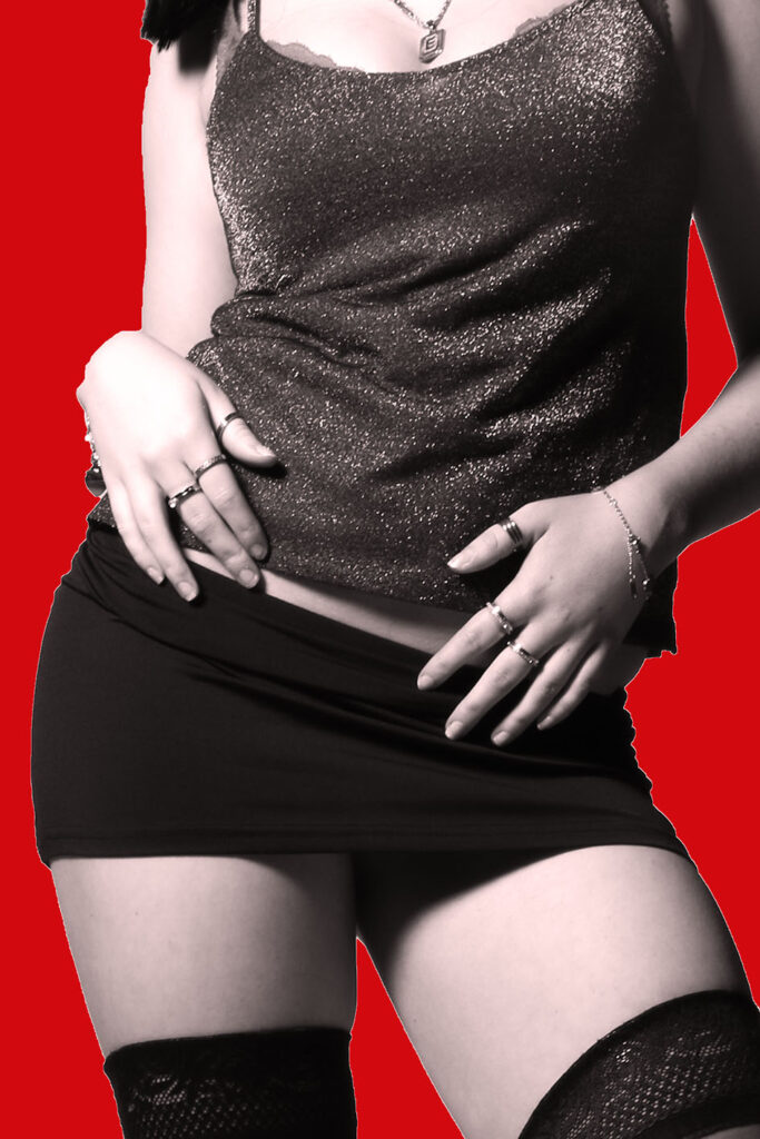
Furthermore, I selected the adjustments so I could subtly change the colour of the subject so that it matches the colour of the new backdrop. I selected the photo filter tool, where I could then decide which filter would suit the tones within each individual image
Edit 2:
version 1:
version 2:
version 3:
version 4 –(additional experiment) :
Edit 3:
version 1:
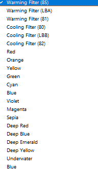
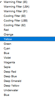
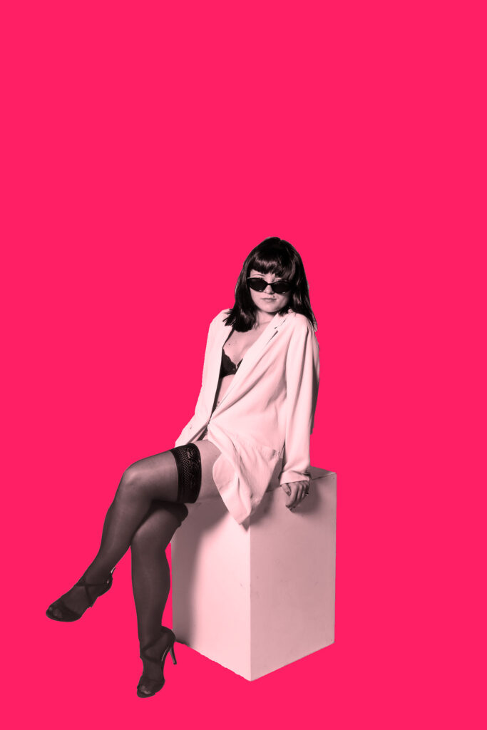
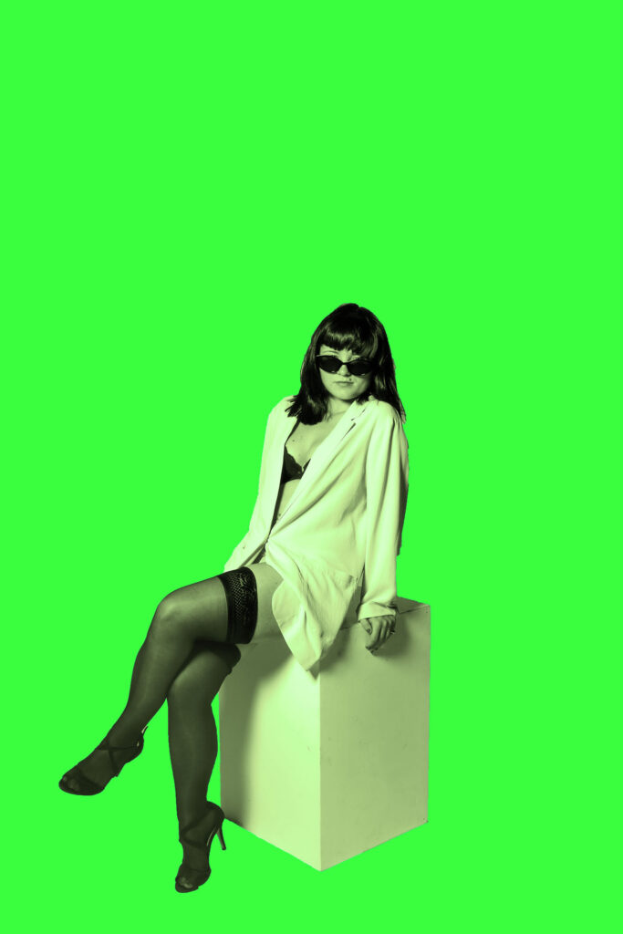
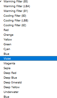
To achieve the different colour filters, I selected the adjustments tool and scrolled down to the photo filter. By doing this, my selected subject can blend seamlessly into the background as she will pick up a slight tint that matches the background, and this prevents harsh lines and the image from looking too artificial.
version 2:
version 3:
Edit 4:
version 1:
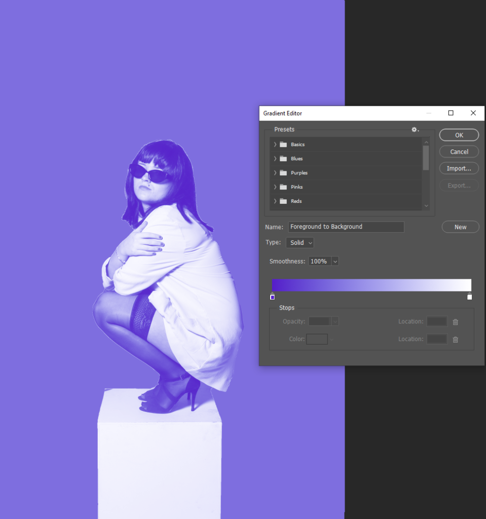
Same image but using the gradient map tool:
The gradient map tool further blends the selected subject into the background, which I like as it doesn’t allow for the image to appear too vibrant and fake. However, my artist inspiration Yayoi Kusama only uses bold colours in the backgrounds of her images, presenting a more real life effect. This filter makes my images feel more staged due to the excessive use of colour and editing, which could ultimately subtract my aim of creating raw images. Therefore, I will only use this filter on a small amount of my final outcomes for my photobook, this way I can present my raw and realistic approach, yet also showing some experimentations I conducted along the way.
version 2:
version 3:
Extra edits for my photobook:
before editingafter editingbefore editingafter editingbefore editingafter editing
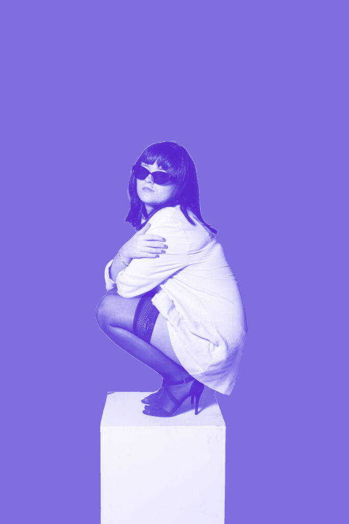
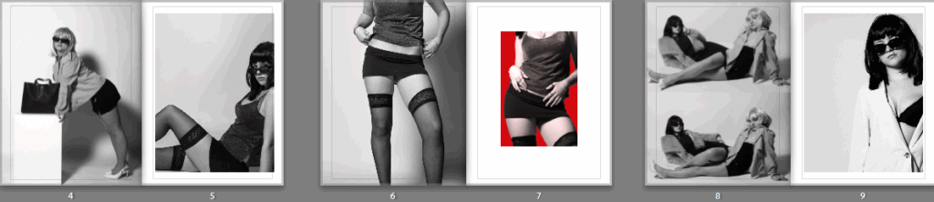
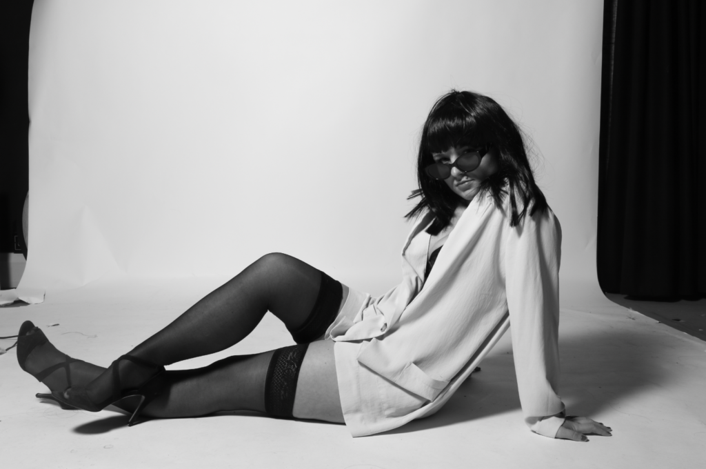
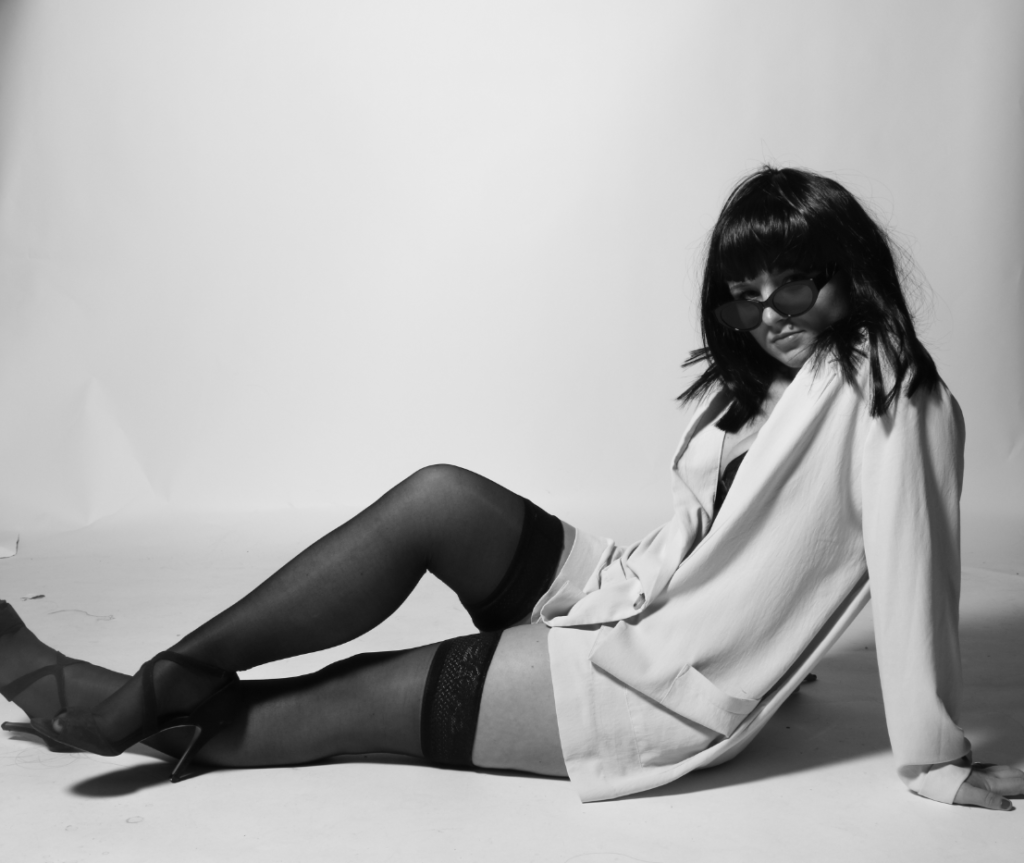
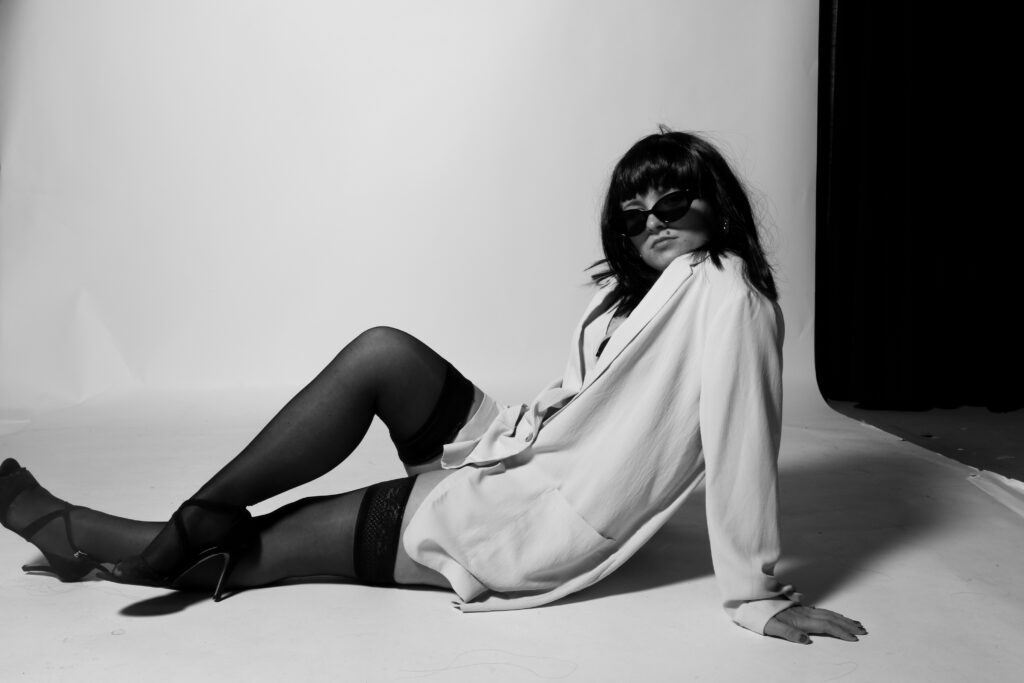
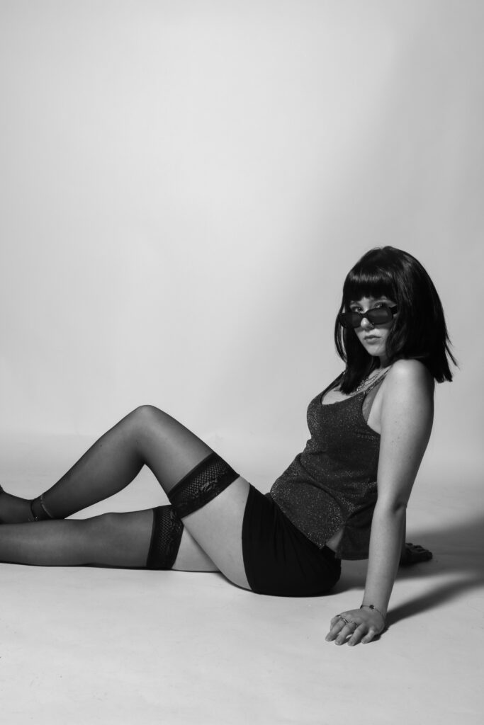
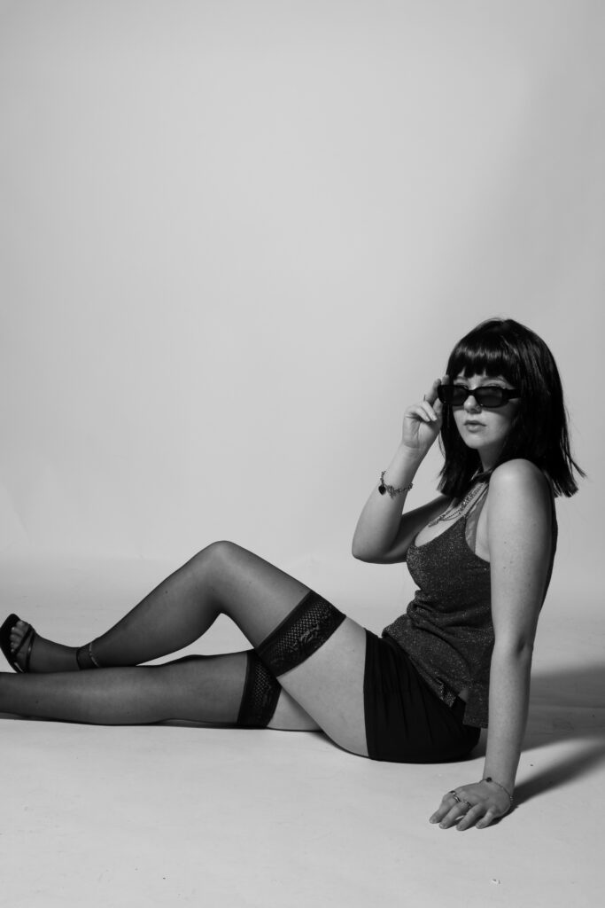
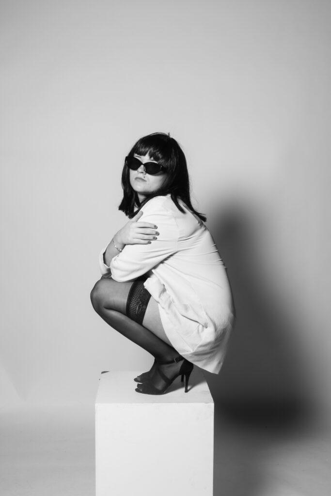
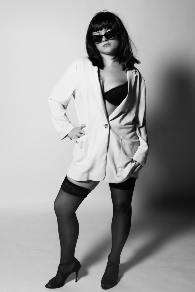
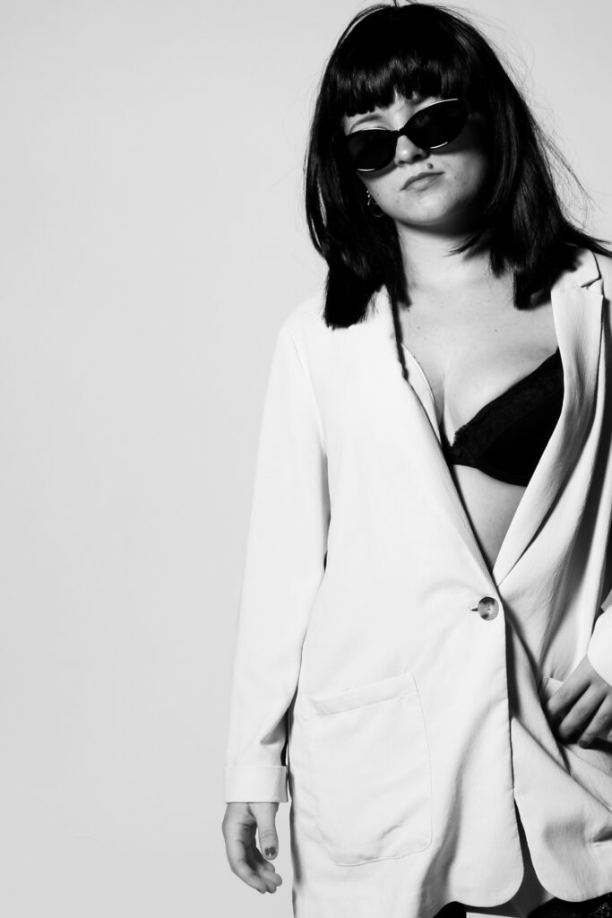
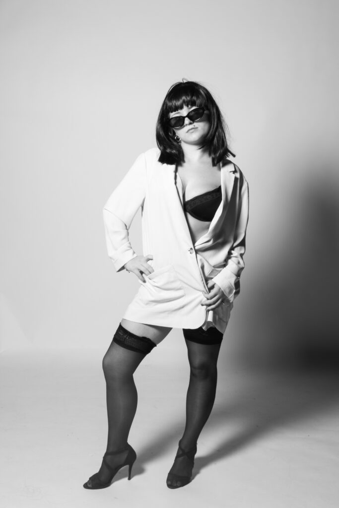
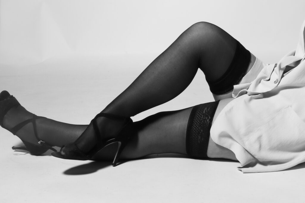
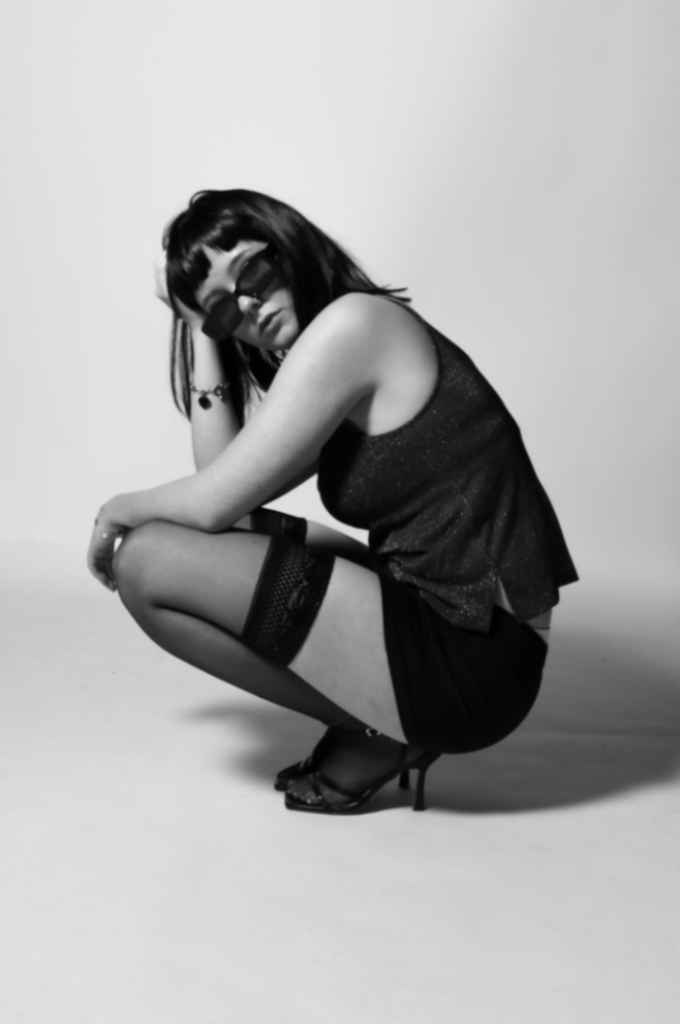
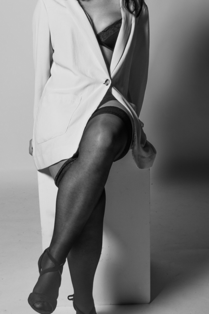
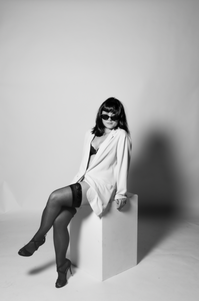
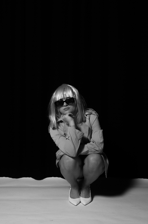
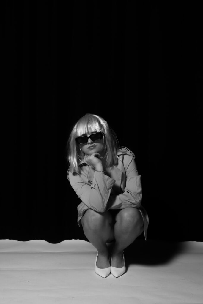
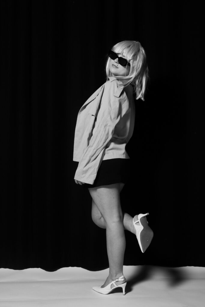
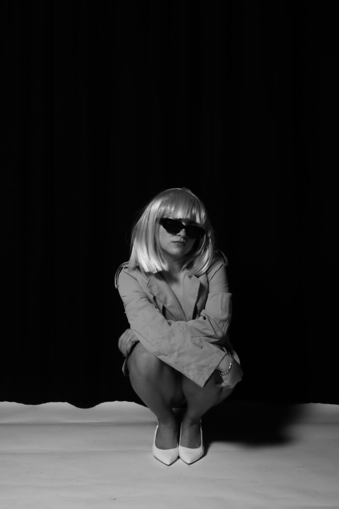
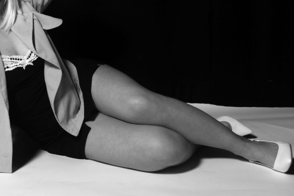
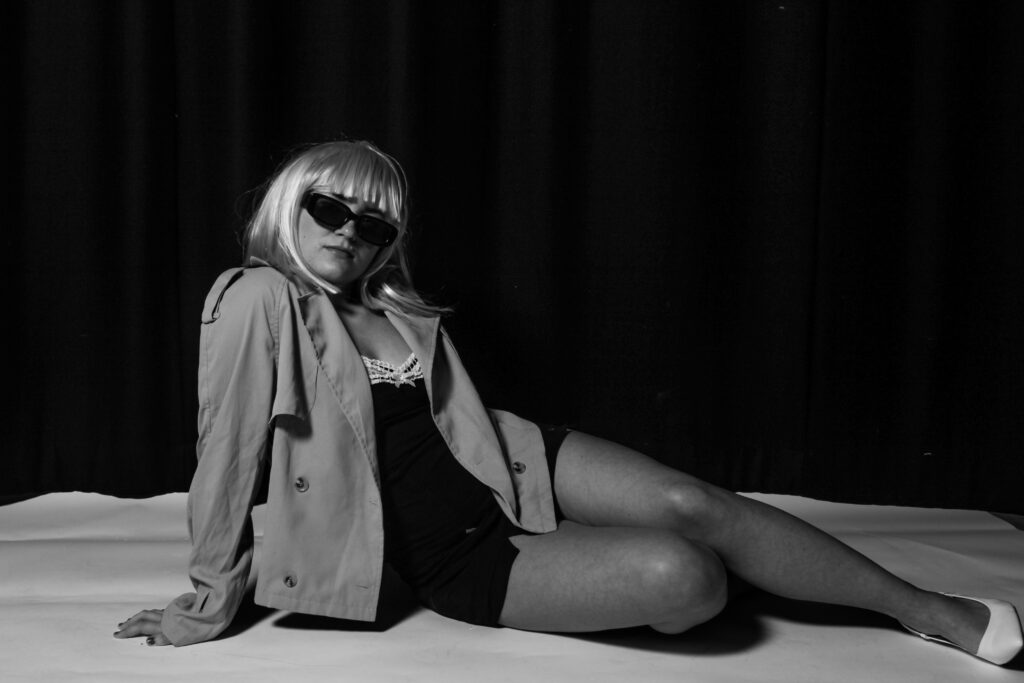
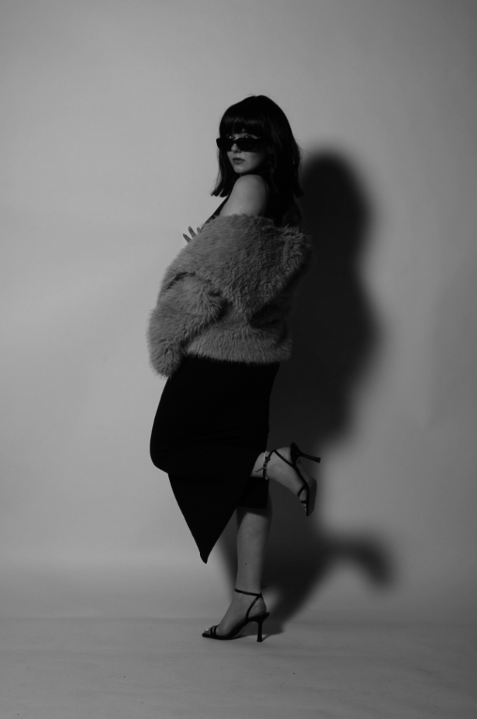
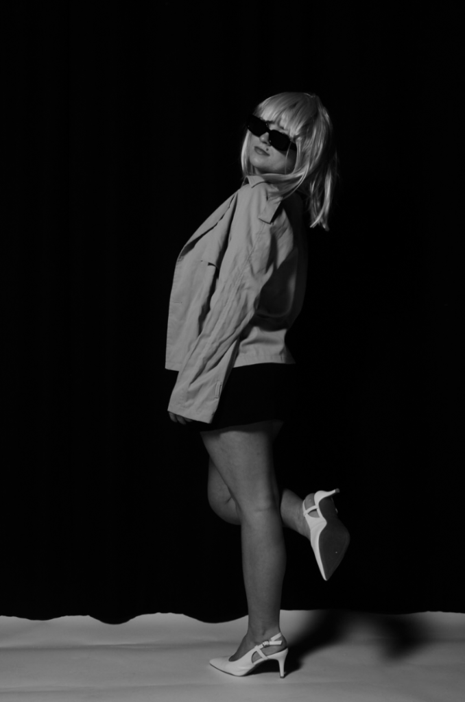
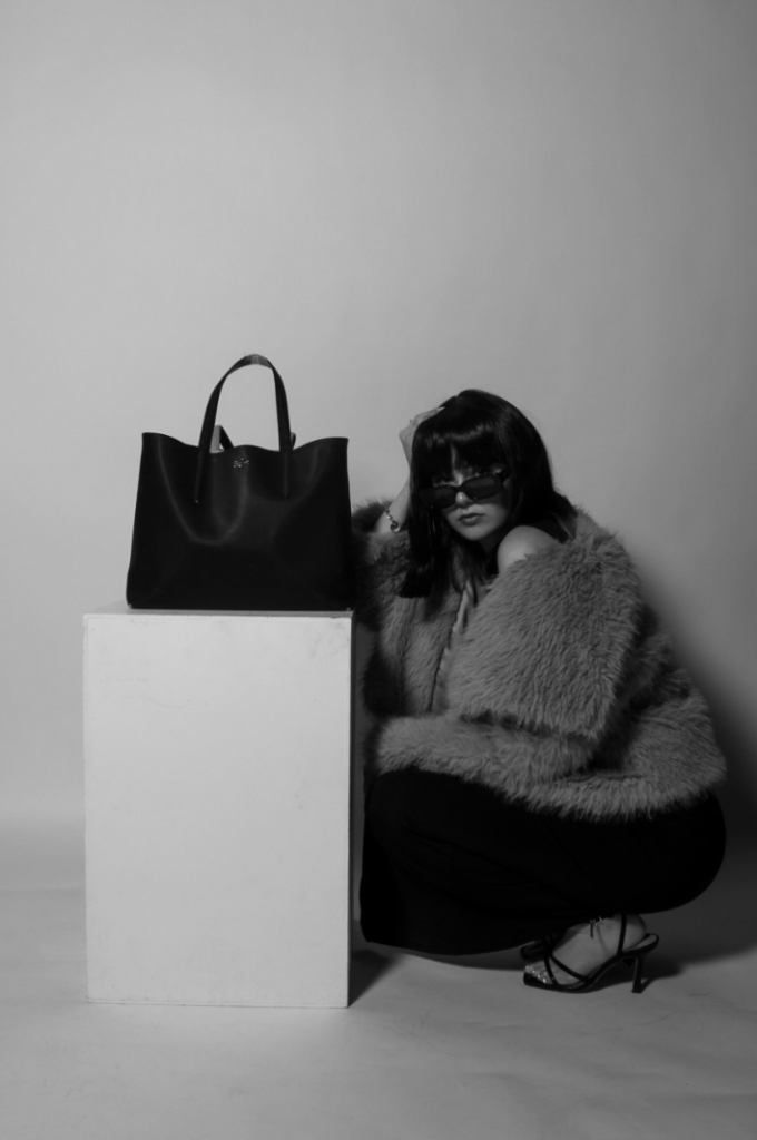
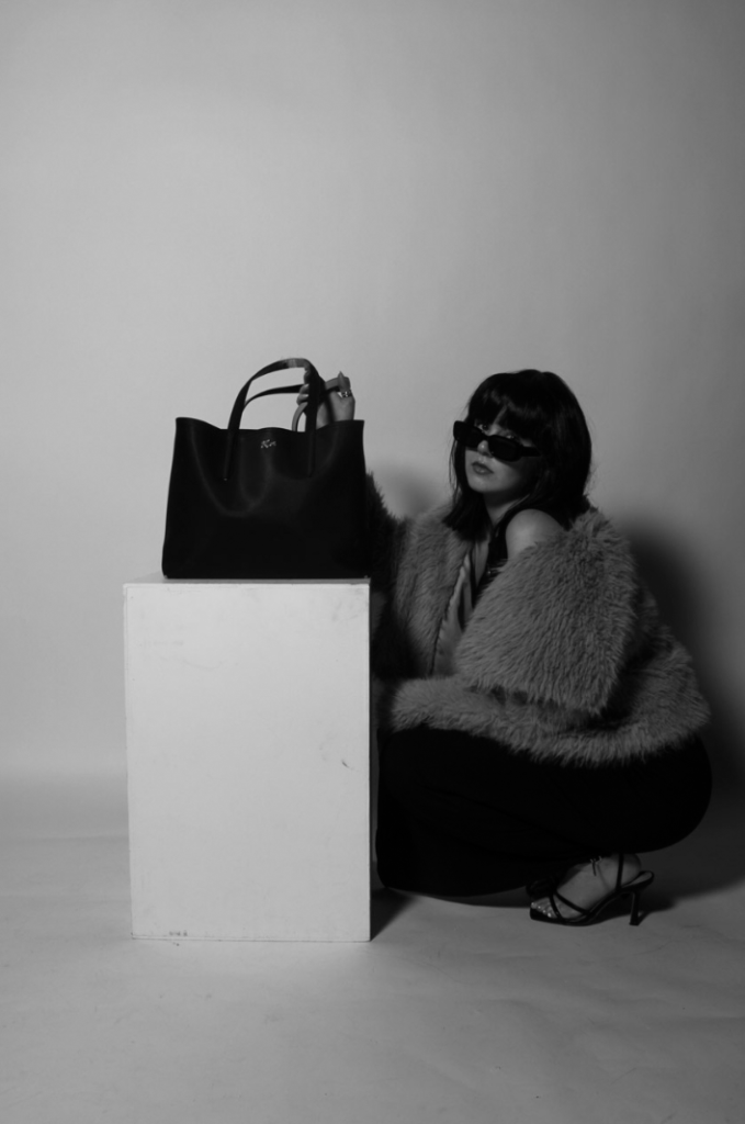
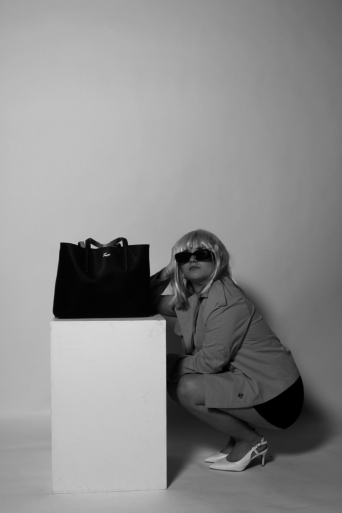
To evaluate, I believe this last shoot was the perfect end to my planning and recording aspect of my project. It effectively links to Helmut Newton and his reinforcement of women empowerment, as well as displaying a creative and more personal side to it due to me carrying out this shoot as a female and being able to incorporate my own ideas based on experience. The costumes and props used in this shoot are very similar to the second shoot, where we played similar roles and wore similar clothes to exhibit a strong narrative of the expectations surrounding women behaviour. This is a powerful element to include because I am linking my work directly to historical contexts of the 1960s, when traditional gender roles and stereotypes occurred. I think overall, this shoot conducts a raw and sentimental approach through the camera angles used, forcing the viewer to focus on specific elements such as the heels or the stockings, as this is what women were expected to wear in order to fit into society’s patriarchy.
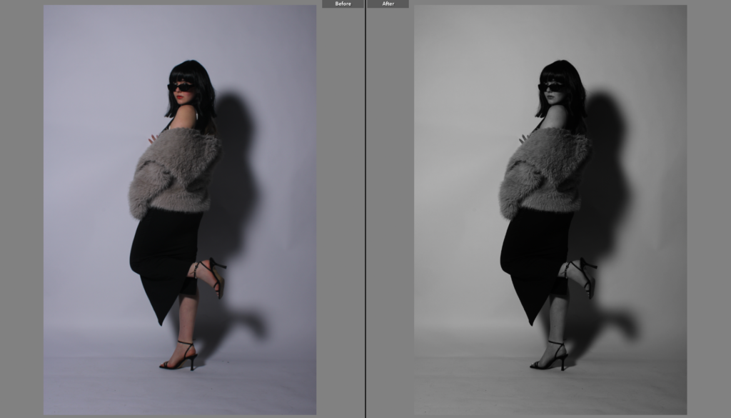
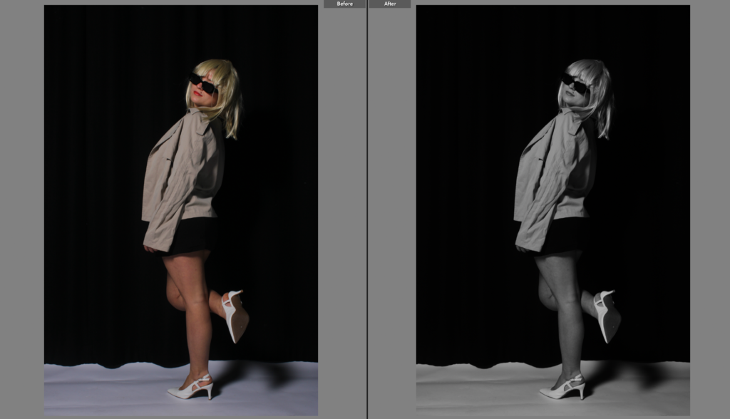
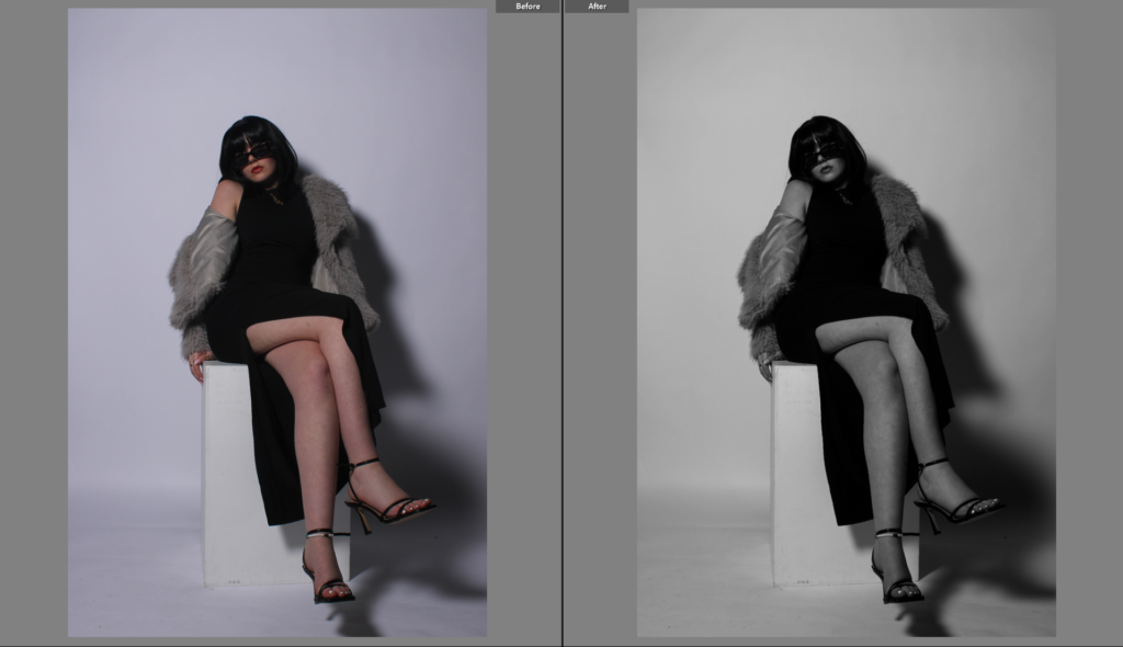
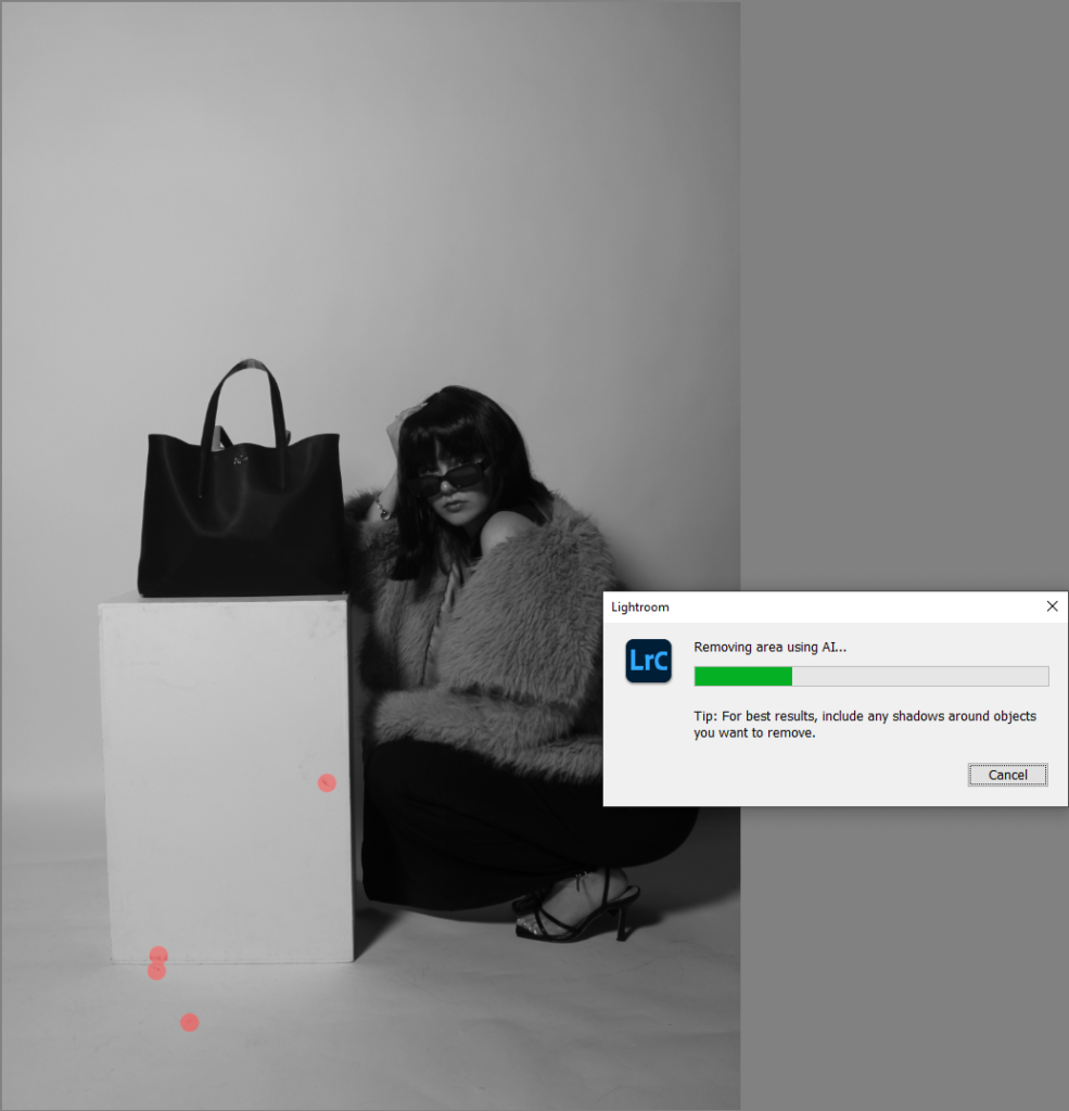
My third photoshoot was photographed in the photography studio, which is another factor that helps my shoots blend together better. The same lighting was also used: two flashlights, one either side of the camera. The brightness of these lights was very strong, which helps give my images a more staged approach. Although the message behind my work is very raw and honest, I like the idea of my images looking slightly staged, as this follows Newton’s approach, where they look very well put together and the idea presented to the viewer is very clear.
What went well:
I remembered to use a white backdrop only, the black is too harsh and takes away from the image itself
Clothing – a successful recreation of what women were expected to wear in the 60s due to it being quite flashy and exposing
Posing ideas – models look confident and powerful rather than weak, this emphasises the idea of women empowerment
Range of camera angles – shows variety and differs images from one another
What could be improved:
Subjects are to close to the backdrop, which allows for strong shadows. This would look more professional if there were no shadows
Occasional blurry image – ensure camera settings are accurate and work effectively with the lighting in order to reach maximum potential
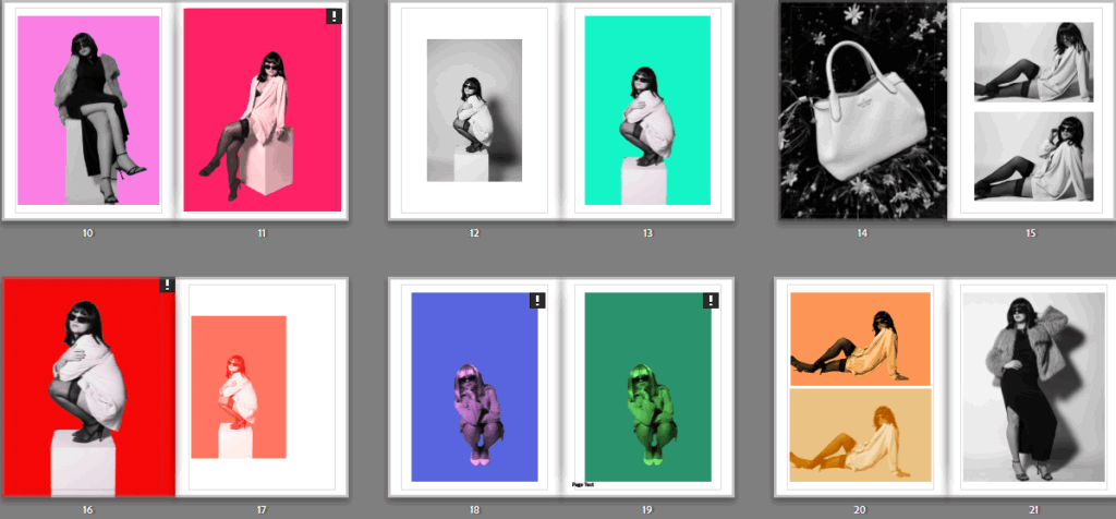
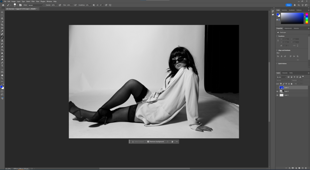
So far, my second shoot I have carried out has been my favourite, with a range of different poses and creating more of a variety within my project, while closely following approaches from Newton and Kusama. Therefore, I decided to edit these images further, creating more of a link to Yayoi Kusama and her vibrant aesthetics in her images. To do this, I exported all of my best outcomes from photoshoot 2 into a folder, then imported them all into Photoshop to begin editing.
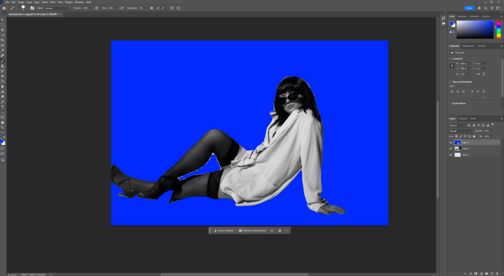
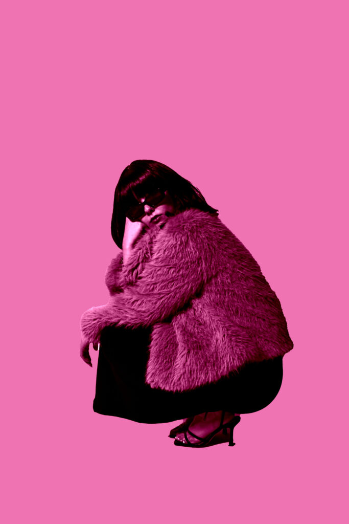
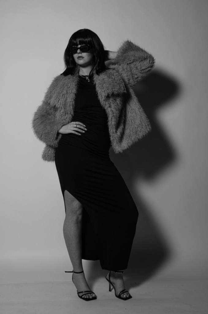
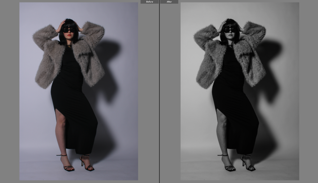
I found it useful that each of these images were taken against a plain background because it makes the editing process easier for me, as it is easier to cut out and select specific subjects and place them onto coloured backgrounds. I kept them all black and white as it allows the more sophisticated look to still remain, while also incorporating vibrancy.
Once I had cut out my subject that I wanted to move, I pressed ctrl c, followed by ctrl v to paste it onto a new layer with no background. Next, I selected the colour I wanted and changed the vibrancy so it could appear brighter and create a harsh contrast. I then selected the paint bucket tool and clicked the background to fill the background with the solid colour.
Edit 1:
v1:
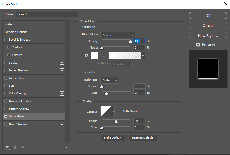
For my first edit, I used the selection of styles on the left hand side of this screen shot and chose the outer glow effect so the outline of my subject glows against the background, allowing it to stand out more against the solid colour.
v2:
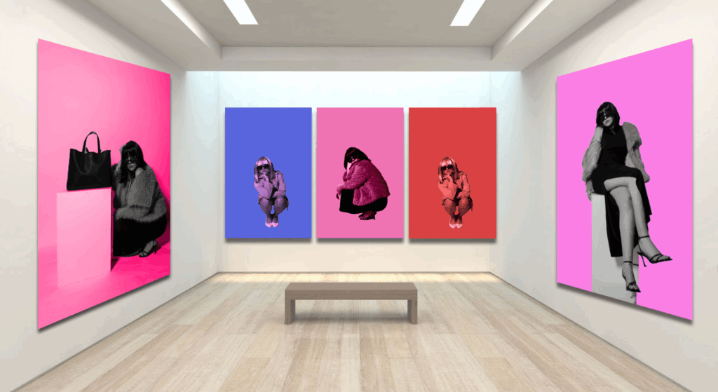
I followed this process for each variation of my images. I completed a few variations of different images to give me more choice when it comes to selecting my best ones for a virtual gallery. The only changes I made was selecting different colours and choosing to blend the colours differently.
In conclusion, I believe this photoshoot was significantly more successful than the first one I executed. This is mainly due to the costumes and props used as they have more of a direct link to my artist inspirations and the overall aim I am trying to achieve through my project, while giving it a realistic approach as well as linking to historical contexts of the 1960s. The use of the wigs creates a raw sense to my shoot, where the viewer can immediately tell the time period I am reflecting on, they also help disguise my personal identity and allow me to touch on roles of other people in the 60s, which almost makes it appear representative to those women who were trying to overcome traditional expectations.
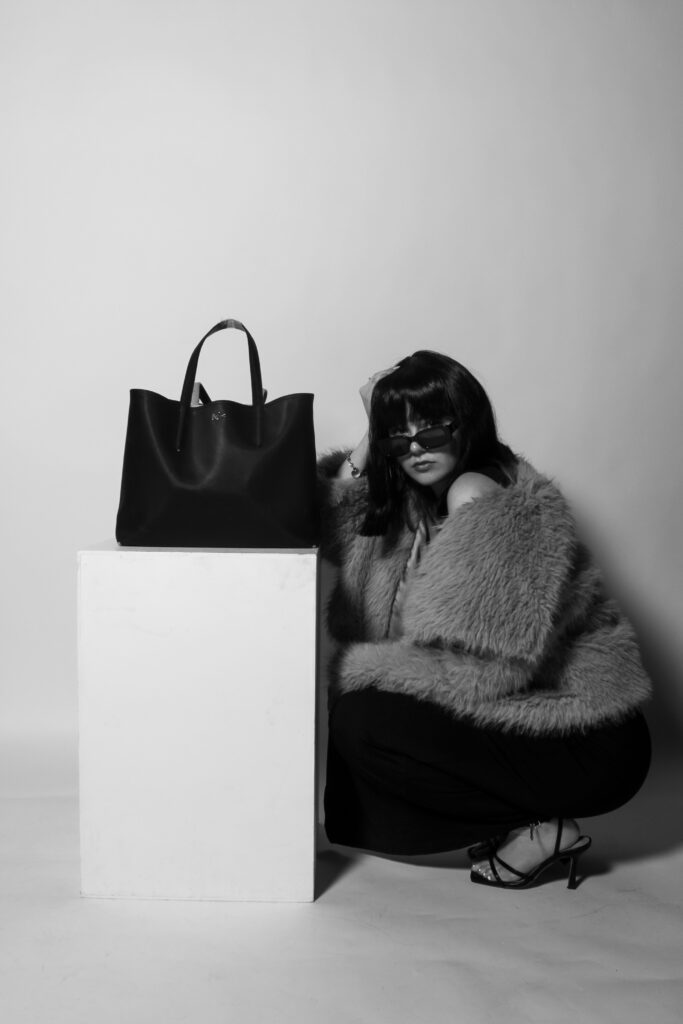
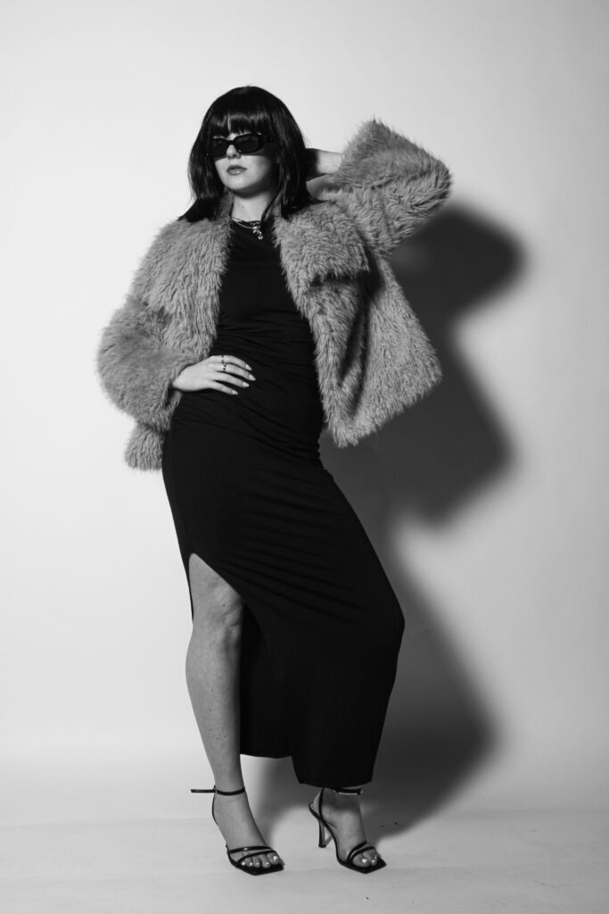
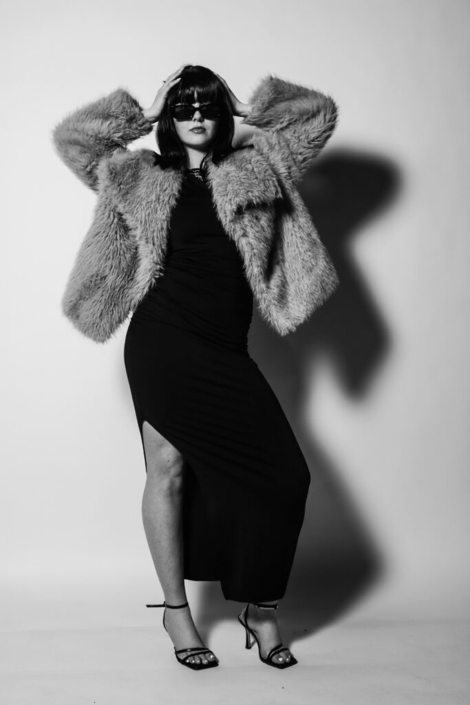
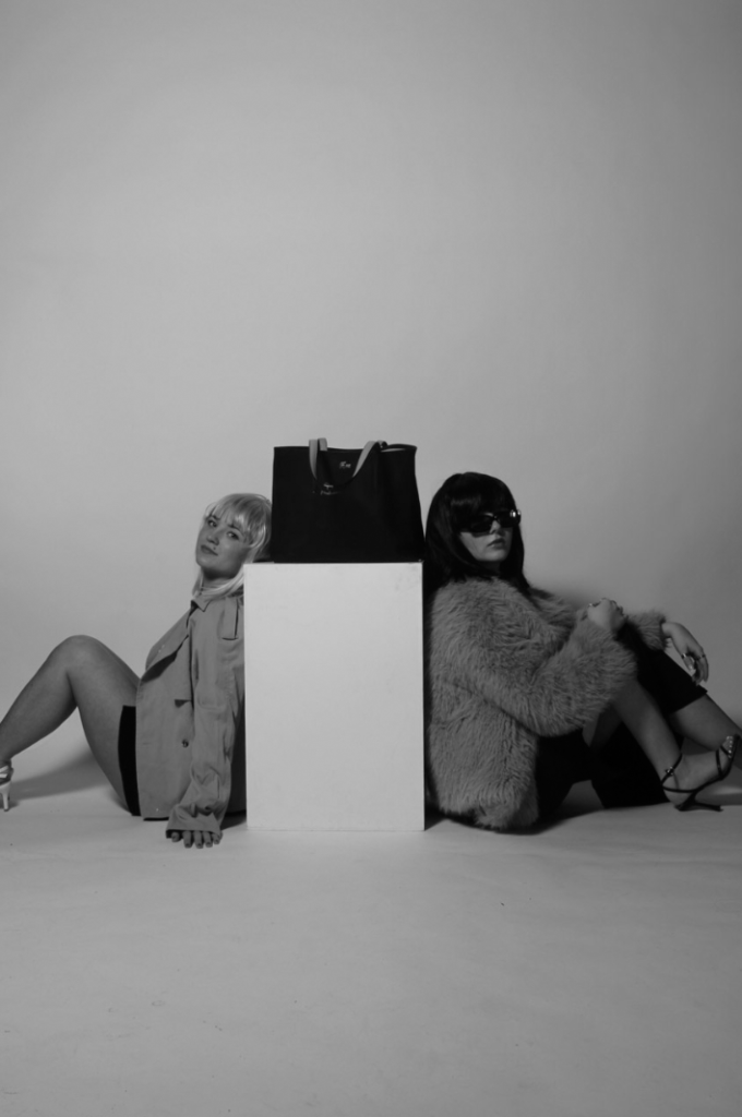
This shoot was captured in the photography studio, with effective lighting positioned right in front of the camera, which gives a more staged approach due to the brightness of the flash. The backdrops are plain, either white or black, which is a very important factor as it allows each image to look more fitting to a magazine. This is the aim I was going for as the viewer can really focus on the content within each image, and it will prevent their eyes from wandering throughout it. I think the idea of just having one main subject in the foreground against a plain background is the most effective way of carrying out a shoot, while also making it look more professional and well thought through.
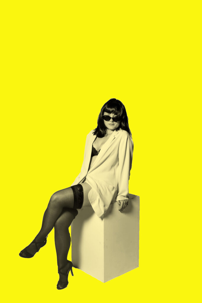
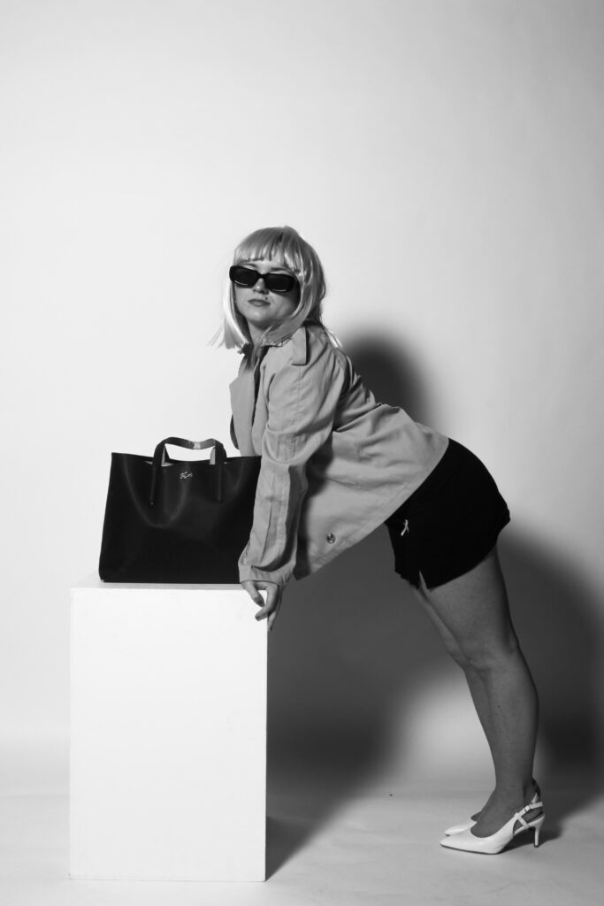
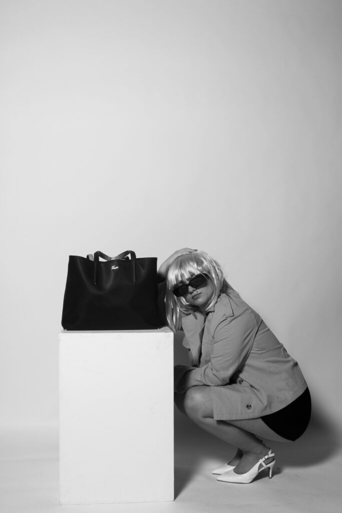
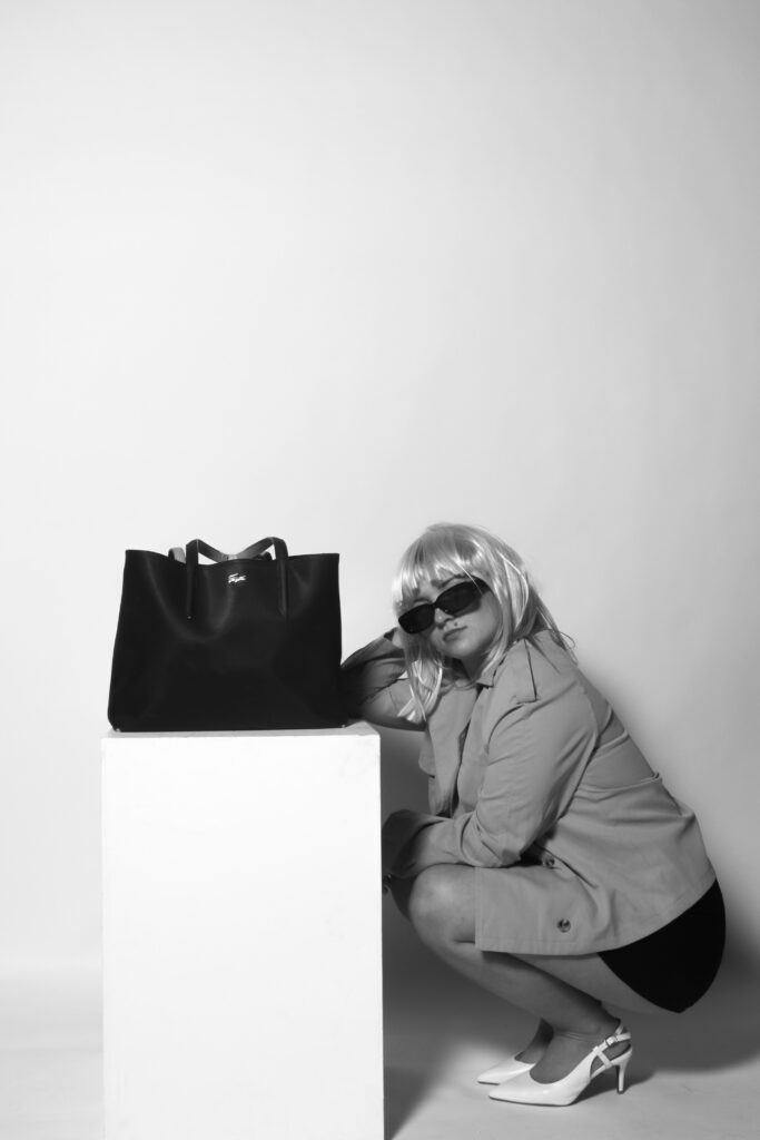
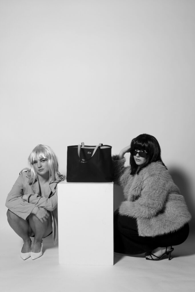
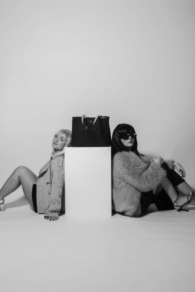
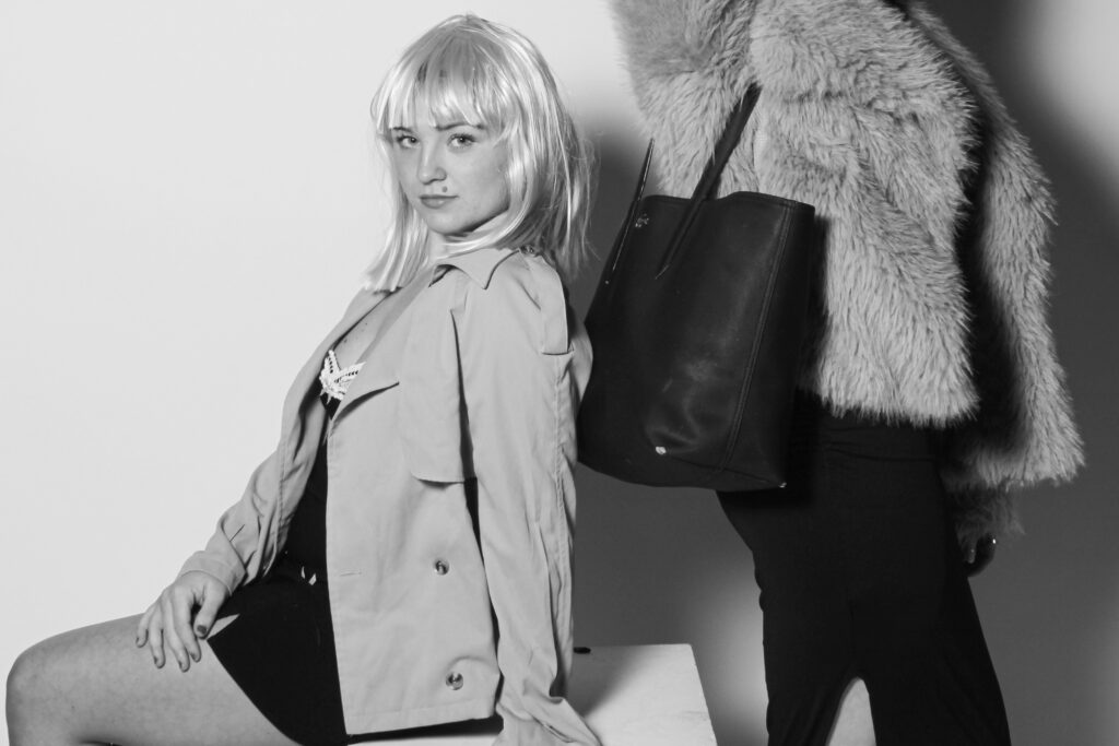
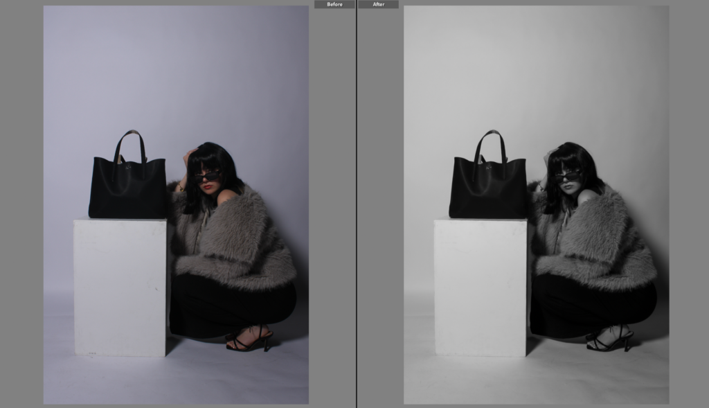
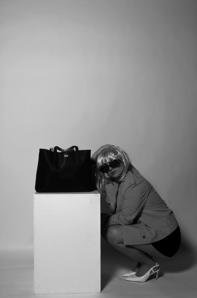
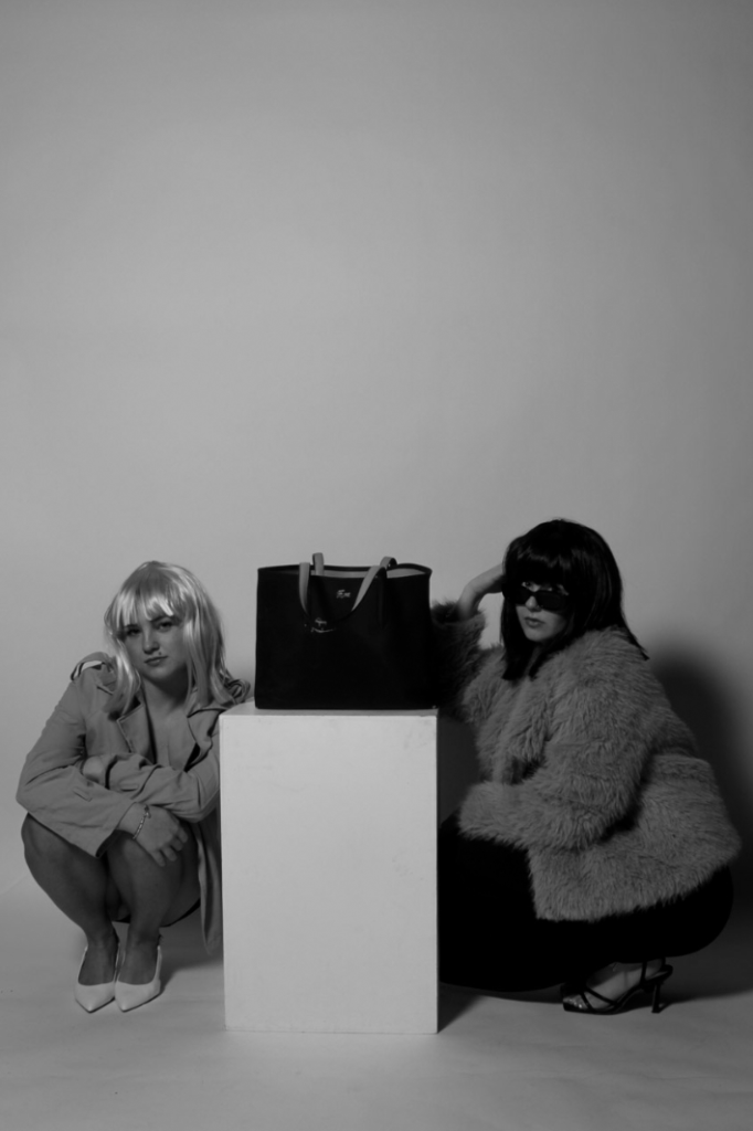
Similar to my first photoshoot, I also included the large black handbag as an important prop, allowing it to even be the main subject in some of the images. This is because I feel that my shoot mostly has links to Helmut Newton, as the subjects are dressed accordingly to his shoots, as well as the black and white filters which also follow similar themes. By including the handbag, I am able to also resemble Yayoi Kusama’s work as this is one of her main focuses, working with fashion brands. I firmly believe the use of the box in most of the images is very effective too, as it allows for a bigger variety of poses surrounding it, and by placing either the models or the props on it, it is easy to immediately interpret what I want the viewer to focus on, and which elements I am trying to emphasise within each image.
What went well:
Setting and background – makes my images look more professional and more fitting to be in a magazine, rather than being outdoors in public.
Wigs, costumes and props – by disguising myself and playing the role of other people, I feel it tells more of a story and will allow the viewer to connect with my work on a deeper level by seeing close resemblances.
Has clear and visible links to both of my artist studies, while also having my own unique approaches, showing my understanding of each artist but being able to tell stories through my own work.
Improvements that can be made:
Stick to white backdrops – by using only white backdrops, it gives more of an organised approach as the differences between each image will be interpreted quicker and they will look more effective if they all had the same background. The black takes away a sense of liveliness within the images, making them appear darker and not allowing the clothes to stand out.
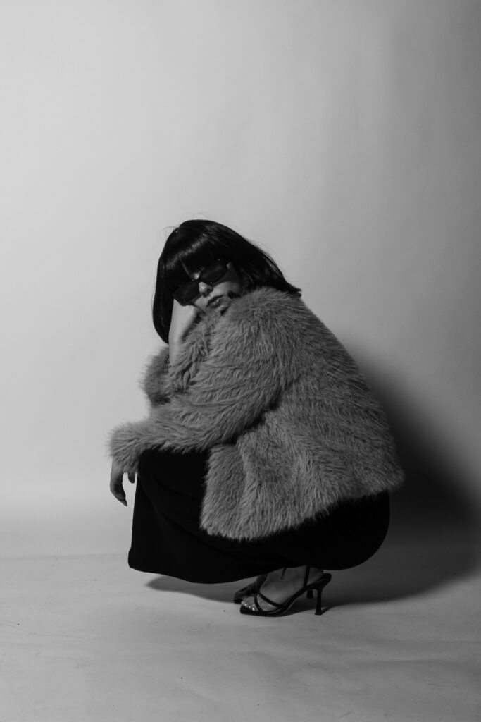
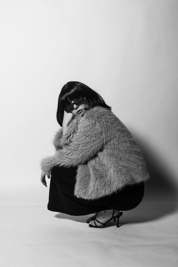
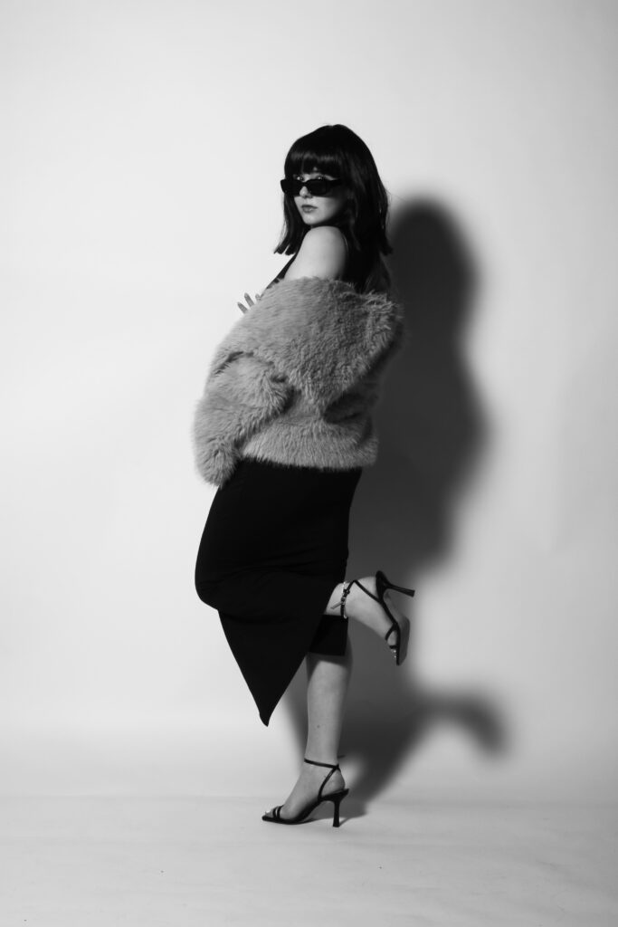
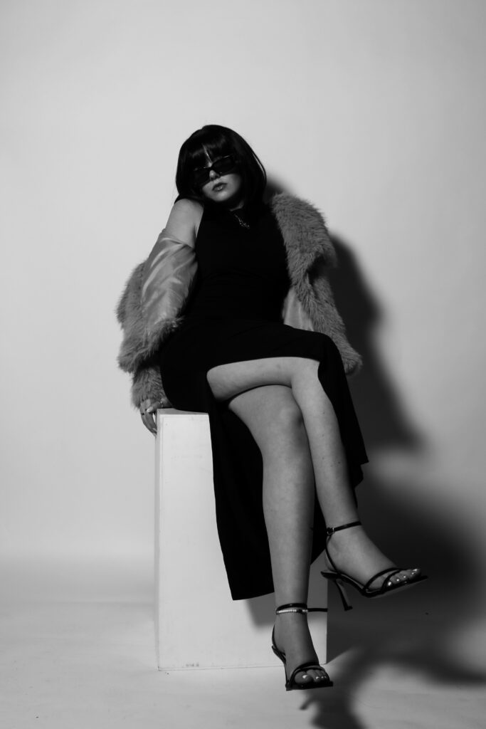
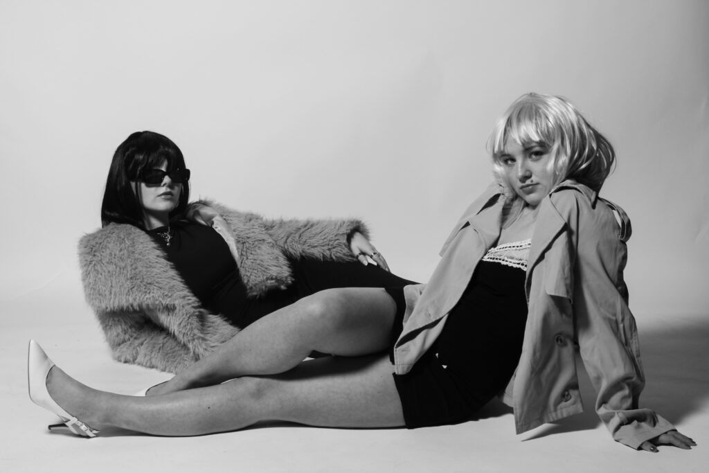
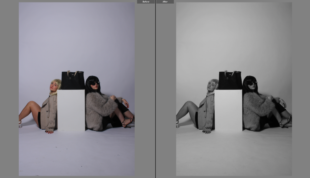
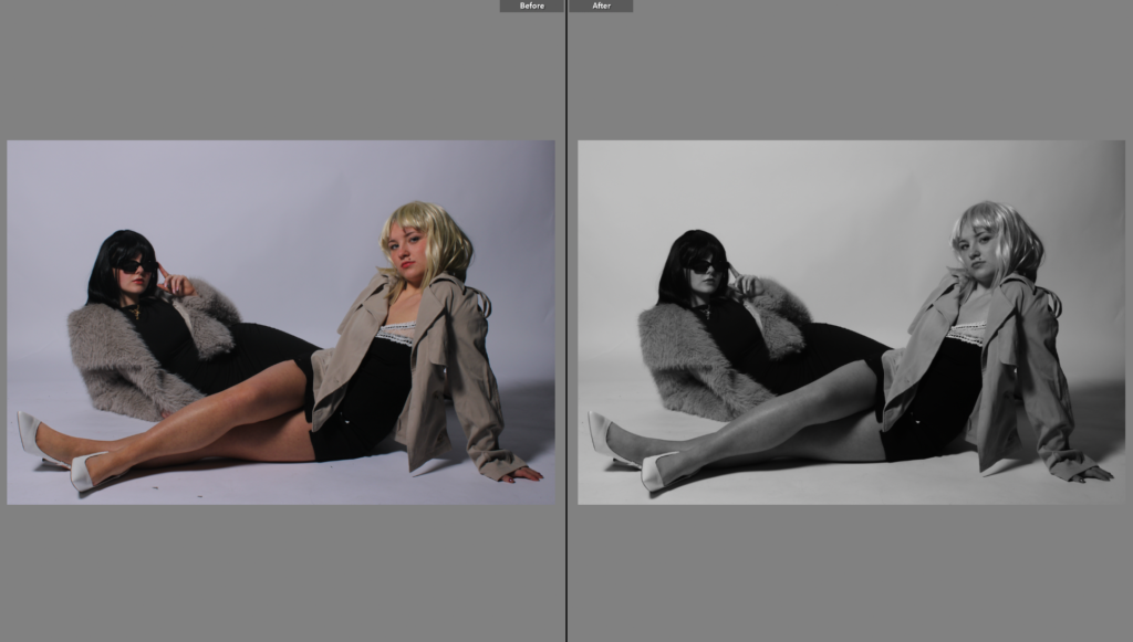
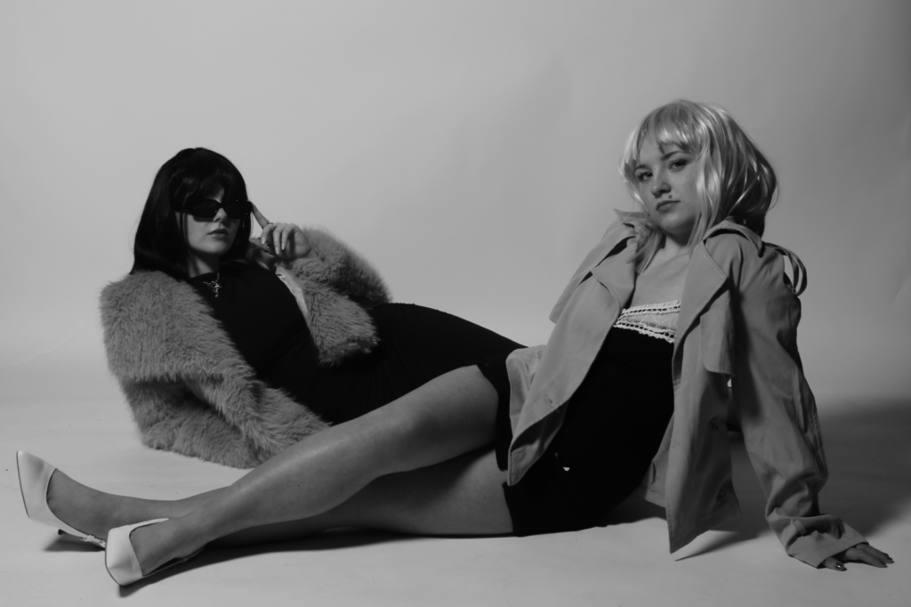
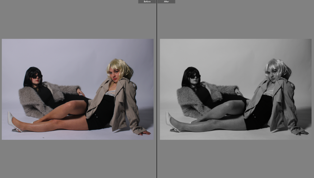
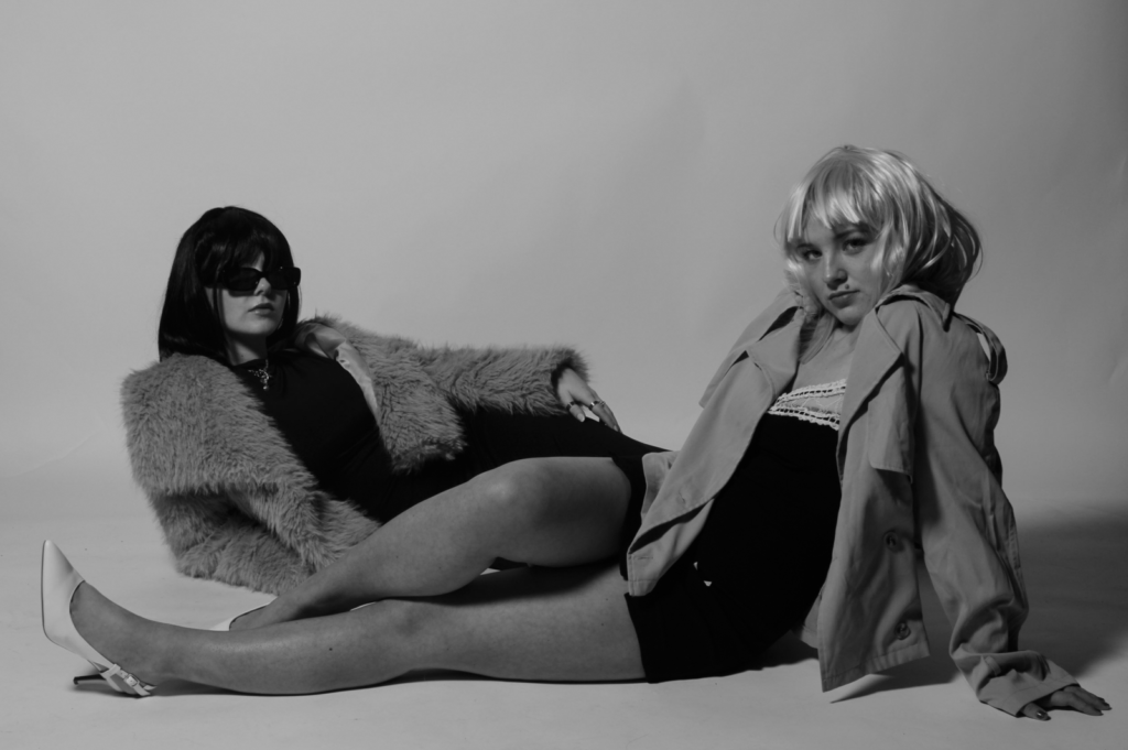
For my second photoshoot of my final exam project, I wanted to mainly focus on elements that resemble Yayoi Kusama, through the use of a wig that has a similar style to Kusama’s. With the use of my wig being black but still similar enough to Kusama, I am also able to draw in aspects of Newton’s work as he often included dark and dramatic tones throughout his images. This shoot differs from the first one as I took my own criticism on board when photographing, such as more appropriate clothing and props. Also, I got one of my friends who was not going to be in front of the camera to be the camera man. This way, me and my other subject could be in the frame together rather than individually which I think looks a lot better. This was an advantage for me because me and my other subject could resemble unity by being together in the images, clearly displaying a bond between us while also including elements of fashion.
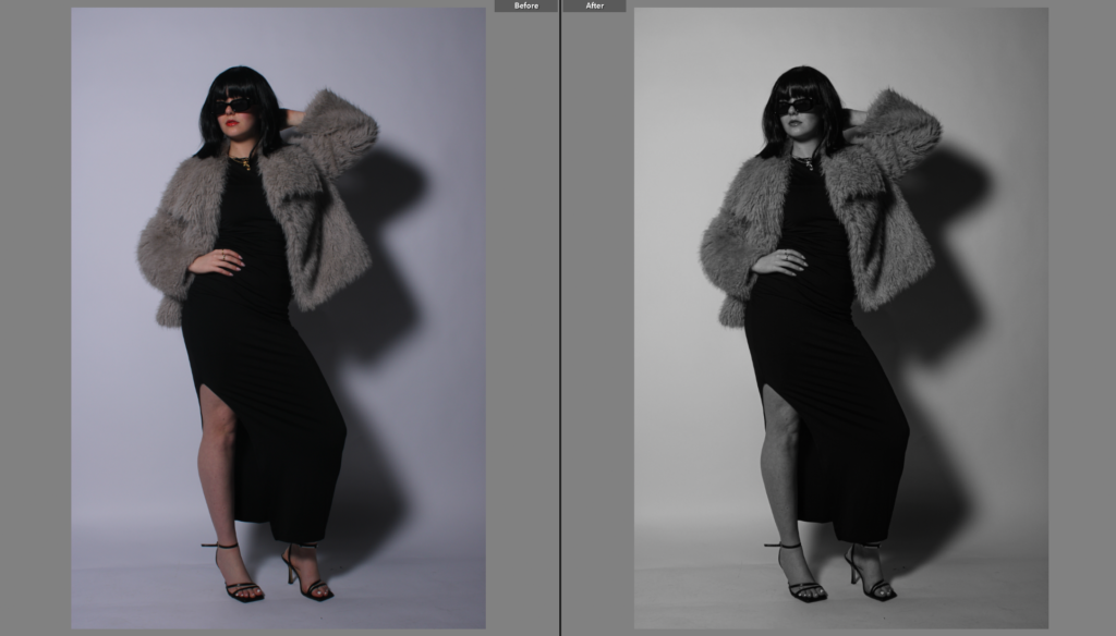
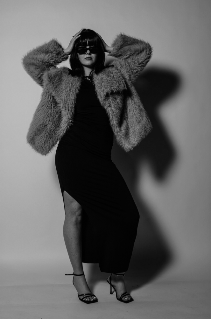
The location of this shoot was in the photography studio, where we had brought sleek and elegant dresses, sunglasses, wigs, heels and fur coats to highlight femininity, and also play into the act of the male gaze. I think the use of having a plain backdrop is a lot more successful than the backgrounds in the first shoot, as it resembles fashion photography a lot closer than being outdoors. I like this outcome significantly more because for my final outcomes I want to display them in a fashion magazine, and most successful fashion magazines such as Vogue Magazine choose this approach.
Throughout the shoot we were posed in empowering and provocative ways, drawing attention to our clothing by posing in different positions that allow us to appear confident and dominant, which is important for me as I am aiming to challenge traditional expectations of women. The range of positions we were framed in shows variety within the shoot, and we kept the angle of the camera very low so we appear more powerful which opposes from my first photoshoot entirely.