All posts by Coco Moore

Filters

Author:
Category:

Virtual gallery and evaluation – coco moore

This is my first virtual gallery, it has a few of my photos mainly the ones that show neglected and incorrect love, surrounded by social media.

In this second pat of my virtual gallery there are two comparison photos, that I did include in my final book, and prints.

Then I have these three roses showing the slow death between as each image goes by.

Evaluation.

This is my final and over all evaluation to my work and how it went throughout everything, during I have given evaluations of my parts, mainly my final photobook outcome, where I went into detail about my photos and the story it tells. over all I found my work went quite well, I enjoyed doing photoshoots, and artists studies, if I was going to do it all again I would probably take more photoshoots, and start earlier with them, I always find that I start flowing with ideas near the end and not all my images are perfect, some lighting I don’t love and even when editing it didn’t fix it, so if I went back I would be able to take more and have even more images so that I was prepared when things did go wrong, quite like how some of the images I wanted to use weren’t actually great or would have fit better if I had taken more images. Ideas always come to me near the end when I don’t have time I swear. I really enjoyed this topic, and personally a some main photos I would take more of are the comparisons as they were my favourite looks wise and in general to take, I just feel like my book could have done with some more throughout it. My artists studies also went well but could probably do with some more detail on the artist, what I did like about this as yes I used them as inspiration but I didn’t have to focus my topic on doing it exactly like the artist, I could really go down my own root, which felt a lot more freeing and let my own imagination come out, and show how I thought things where really going in my reality and feel a lot more like a real artists. Obviously my mood boards and mind maps aren’t the most exciting things and they show my first original fresh ideas, which I do enjoy that now I look back and see how I really trailed off an became something very new, and if I remade them now they would look completely different, but I enjoy you can see my whole journey and really see how my brain cooks and conjures ideas bouncing off one another. I then had my first day of the exam where the main task was to have images I wanted in the print folder, partly this was a little stressful because I’m not actually sure I had even finished editing my images yet and had no idea what I wanted in the print folder, by the end I had uploaded loads because I have learnt from past experiences that I never find I have enough, I also created an idea for them to all go together and make a massive presentation explaining the story in a different way to my book, and to continue keeping all my presentations yet stories different, as the way I present them is different in my photobook, prints and virtual gallery. I didn’t love how the prints came out because they actually came out very dark, and mounting up images is actually one of my least favourite parts, as much of a perfectionist I am I cant seem to have them perfect in my eyes, I love how they look and if anything its better then how I virtually made them there is juts the little tweaks and cracks that I see that bother me, like the image being to dark or a little jiggered slice here and there, but I really do like them. Then finally I finish off with the virtual galleries which again is not my favourite part compared to actually going out and taken photos and making a book, this is because I don’t think they best represent my work, not compared to what a real gallery would do, some images are hard to see and I don’t always have the best idea on how I want them to go and worry someone might not understand the order I picked. Through and through that is my project finished and I’m genuinely pleased with the outcome because I presented how I wanted to I got to really flow into my creative devices and I think that I have created something I can be really proud of.

Photobook final lay out and evaluation – coco moore

This is the final layout of my photobook, I do really like how it turned out. My photobook is a symbolic piece of work all about how social media ruined and killed romance, I show this throughout the book of comparisons photos I took, photos of street photography, and staged photos of my friends posting and focuses all on social media and not their partner. After about five photoshoots and over 700 photos, I came out with a 44 page book, I would like to say I’m very proud of and clearly shows what I intending to demonstrate through photography and photography skills. Of course there has been some hiccups through the way, especially when making my photobook, and starting to criticise how it looked, but that’s all now going to be part of my evaluation.

Lets start with my front and back cover. I really wasn’t sure on how I was going to do this, and didn’t think any of my images would work on the front and back cover, I firstly wanted to go for one image of the couple holding hands, or taking a photo of the view so they are on their phones but between the couple they are split up by the gap from the spine. Then I thought to have a completely black cover which just looked very plain and boring and I am very opposite to that, I tried making it the background, or playing around with images, and well if anyone has used adobe Lightroom to make a book they know that sometimes it just does not go well, I had glitches all over the place ands I was stressing out. Then I stumbled across these two images I took in one of my photoshoots, which I did not end up using in the actual book, and I thought hey these two together would really work, I wont need to mess around making them a background or attempting to make the photo perfectly cross over the spine. it took a little bit of editing to make the photos perfectly match the black and white editing, the contrast and exposure, once I completed that they still weren’t a specific match and needed to be slightly cropped so they fit together like puzzle pieces. when the title wasn’t on the spine is looked a bit odd having a black line split the images up, but I knew it would work well once it was actually printed and split up between a real spine instead of looking online which isn’t always the best. I came up with the title by just thinking about my project, I struggled a bit and it was actually one of the last things I decided, I was planning on having a much longer title, but something about the one word ‘disconnected’ hit a lot better. the one word was more powerful and explained the book in one word, as we are disconnected from each other from social media, and disconnected is almost a technology term.

then its the start of my book, with the first pages, I don’t have much to say as this isn’t my photos, but it does have a little poem I made to some up my photobook in a way, saying what is happening now that social media is involved it love. I do like it but not sure its the best poem I have written.

I decided to have this rose as my first image, this was to create a story starter, roses symbolise love, this rose it well, alive, beautiful and full of colour, symbolising the same for love, I wanted to start my story with a strong image of love, to show that once it was strong and powerful, it could still be, but as you continue through my book you will see how that is not so much. I really like this image, because its really bright and stands out with the background, and it looks lonely which I just thought was more powerful having one singular rose stand out to begin my story.

After you turn the page you continue you on to these images, they are a comparison photo, and I really liked my comparison images, as this one very much shows an old image, from the 60’s/70’s of a couple in love ignoring the world around them and focuses on each other, the background is blurred and they are looking lovingly into each others eyes, while holding hands and laughing not involved in their phones or anything else, I wanted to clearly show how love used to be and how we all thought it would be or wanted it to be. As you can see it goes onto my image, right next to it which is a replicate of the other image, also in black and white which I liked as it gives a better affect, but instead of looking lovingly to each other they are walking on their phones not involved in the world around them because they are too focused on their phones, no longer in each others presence, all to know they are a couple is to see they are holding hands, but almost with distance between them. Both the images are places the same on each page perfectly opposite to show a very clear comparison to those who see it.

Then I moved on to this second comparison, again giving the same vibe as before which is what all my comparison images do, I think these ones go particularly well together because apart from the difference in sky they match quite well with their colourings with the same deep contrast of lightness from the skin and darkness from the car and clothes, I also liked that both the men are wearing black and the women wearing grey, to make it even more symmetrical.

I then decided to break up the comparisons to not have to all at once because then I think the book looked a bit clunky and odd so added in a sequence to make the book flow better and show more of my images, and also have stories within stories, leading to the same outcome, like as you can see here this image comes in on mainly the left side of the pages, where a couple look very in love and are cuddling to and kissing to show their romance, they are the start of the book to show the strength and love of romance that is still around or that has been and is slowly dying depending on how the viewer takes it in.

Then on the right side and next pages, I have a photo of a man on his phone, this isn’t my favourite photo but it is here to also continue to tell the story of how social media is slowly sneaking its way into our lives, destroying our romance.

We then go back to comparisons, to continue that sequence of two comparisons then a romantic photo and then a phone photo, I really liked this comparison once again having the images the exact same opposite, only slight differences between them

Then we move onto another comparison where in this one it shows a couple carving their heart together, knowing that only those two will know what it means and other people will just see it and wonder who this couple was, when in my photo its the same but they are taking a photo of their heart to post on social media to let the whole world see their cute private moment which now because of social media i snot so private, the main thing I don’t like about my image is because its not clear enough to see the heart, it does not stand out enough, like it does in the other photo, but you can see it an because of the first image I think it makes it more clear what is going on.

We then move on to another romantic picture of this couple showing that love is alive, and well, but not for long.

Then on the right side is more street photography of once again another person walking on their phone oblivious to the world around them, continuing to show the poisonous affect of social media that is creeping upon us that we don’t even realise, and that I hope to show throughout my book as a I realised it even more when taking the street photography, the one factor I don’t love of this image is that its quite bright, and I did have it a lot darker before, but once I printed some of my images for the print folder and in my last book I made a lot came out a lot darker then how they looked on the screen, so to be safe I brightened most of my images.

Then I have my final comparison which I actually my least favourite comparison and I wasn’t sure on but I mainly like all my comparison photos, but I don’t love the first photo, but there isn’t anything I can really change about it and I wasn’t planning on using it, I did have it saved for just in case and inspiration then accidentally I made a perfect comparison image. I would liked if I had another one of giving a slower and instead of her just on her phone ignoring him she is taking a photo to post on social media but I liked this one as well and its almost coincidental on how it came to be. I also don’t love my image because of how bright it is and it isn’t particularly clear that there is s a flower there, but I made it brighter for the book when it is printed and after lots of editing I couldn’t really find a way I wanted it to go apart from this.

After that I have this image which shows the same rose, but now it is slowly starting to die just like romance which I think is really good and I actually really like this page and genuinely this idea in my book, and if I had more photos or pages I would have added this more.

Then these pages, which again tell their own story and have their own symmetry, to me it is quite clear, and shows the girl seeing a couple on social media and getting jealous or comparing her relationship to that, it shows that one couple isn’t very private either, so she decided to take the exact same image with her boyfriend, to also make other people feel the same way she did or show that her relationship is cute just like how other people show theirs. but no one sees the other side of it.

Then we go back to the loving couple and sequence we had throughout the book but only now the couple is not so loving and look more involved in their phones, and that’s showing how social media has come into their relationship and suddenly its not just about them two being together its about everything else.

And right after those pages is this one, that shows a man walking texting on one phone and calling on the other which I think fit well because as you see people on their phones and the couple slowly more involved on their phones and the rose slowly dying from social media, this man is on two phones showing how social media is completely surrounding us.

Then this image, which I just really like as an image in general the couple are together, looking at a beautiful view but instead of look at this view and saving this cute moment they are taking photos ready to post on social media and continue to be involved by their phones, I also really like how I decided to present it in the image, because it is full bleed but the image is split in half by the fold of the book to continue to show how they are disconnected and split apart from social media.

Then this image, which the image I genuinely really like as it shows death and love together symbolising love is dead or just showing opposites together which I think gives a powerful metaphor to anyone who sees it, I don’t love it here in the book think it is randomly placed and really debating on whether it stays in or not but I like the image a little too much and think it shows so much using symbolism which is a massive part of my book.

After is these images, which where taken together, of one guy sitting alone and single looking for love, sat on his phone slightly resenting the relationship he sees around him, wondering how he can find that him self, and also slightly represent that depending on all the social media is how that couple might end up. I do like how the images are opposites of each other on the page they are perfectly symmetrical and show a very clear opposite images.

then these images, of the same alone an. who sat on his phone not going out to look for love in reality but resorting to a dating app, so using more social media thinking that it isn’t fake and dishonest, when reality you see the real person, but he might be stuck talking to someone through a screen and never knowing what the reality of this person is. I had the first image like that so you can see he’s look on his phone to then have the second image more zoomed in an standing out so you can see what he’s on on his phone.

Then this image, which I really like because its that same couple, now with the girl on her phone not only not paying attention and giving affection to her boyfriend but he is also paying attention what’s on her phone because it has made him jealous and paranoid wondering what she is looking at, who she is texting.

Then this final image of the same rose, now completely dead just like love and romance now on the right side of the book, to be closing off the story.

All in all I really like this book, because it shows everything I wanted to and gives a story and sequence throughout, there is things that could be better but like all work that is, but apart from the little tweaks there is nothing really I want to change massively as I am pleased about how it ended up.

Photobook deconstruction – Coco Moore

1. Research a photo-book and describe the story it is communicating  with reference to subject-matter, genre and approach to image-making.

“The Ballad of Sexual Dependency” by Nan Goldin

2. Who is the photographer? Why did he/she make it? (intentions/ reasons) Who is it for? (audience) How was it received? (any press, reviews, awards, legacy etc.)

Goldin proposed that the work The Ballad of Sexual Dependency could act as a visual diary of her life alongside the lives of her close friends and lovers; it started life, essentially, as something of a traveling slide show that Goldin held at various parties and galleries, backed by music. This work, by its very nature, demanded immediacy and emotional truth.  At the onset, the audience for it was composed of her friends, lovers, and communally. She never intended for the work to be made famous. Rendered first as a slide show in the early ’80s, many in attendance were scandalized. It was too raw, too sexual, too real-for-the-people, and not mainstream-much too raw and uncensored for any art scenes. But nevertheless, it developed quite a cult following.

3. Deconstruct the narrative, concept and design of the book and apply theory above when considering:

  • Book in hand: how does it feel? Smell, sniff the paper. – It is a thick, matte paper with a subtle texture, giving it the semblance of something old but well looked after. Not glossy. Not clean. It feels like it has been lived in. Just like the people in photos. That classic ink and paper scent but more intense, assistant cigarette smoke and Polaroid chemicals somehow got stuck between these pages. Some dust, some sweat, maybe. Like it’s been up in a loft with records and velvet couches and stories exchanged in the dark.

  • Paper and ink: use of different paper/ textures/ colour or B&W or both. – The book employs an uncoated matte paper for printing by an offset process, allowing strong color saturation without looking painfully sharp or digital. Nan Goldin is famed for her emotional uses of color photography.

  • Format, size and orientation: portraiture/ landscape/ square/ A5, A4, A3 / number of pages. – It is a landscape-based, A4-size photo book, consisting of about 144 pages, mostly filled with raw, emotional color portraits and candid scenes. The intimate diary-like feel that the book takes from the original format of Goldin’s slideshows is enhanced by its matte paper and the grainy texture. Full bleed images, spreads, and carefully paired photographs form the layout, people being deeply personal and cinematic about young love, identity, and vulnerability.

  • Binding, soft/hard cover. image wrap/dust jacket. saddle stitch/swiss binding/ Japanese stab-binding/ leperello This newly published work is softcover, perfect-bound, and has no dust jacket, giving a raw and intimate feel appropriate to its content. The binding is simple and accessible-a visual diary rather than an official art book-reinforcing exactly what Nan Goldin aims at his audience: real life without artificiality.

  • Cover: linen/ card. graphic/ printed image. embossed/ debossed. letterpress/ silkscreen/hot-stamping. – It does come from card stock rather than linen; it has simply a photographic image printed directly on the cover-most typically one of Nan Goldin’s own emotional, color-saturated portraits. The book does not employ any embossing, debossing, letterpress, silkscreen, or hot-stamping methods. The design is intentionally simple and raw, reflecting a documentary, diary-like style rather than an object presented as a polished or luxury art piece.

  • Title: literal or poetic / relevant or intriguing. –Narrative: what is the story/ subject-matter. How is it told? -Structure and architecture: how design/ repeating motifs/ or specific features develops a concept or construct a narrative. –Design and layout: image size on pages/ single page, double-spread/ images/ grid, fold- outs/ inserts. The Ballad of Sexual Dependency. The title seems poetic as well as quite mysterious: it is not a true description of the content but metaphorically one. “Ballad” indicates form in most cases, preparation for tragic or emotional stories, and by “sexual dependency,” it talks about co-morbidities of attachment, love, and other complications in the human condition. It is relevant, as well as intriguing, because it ties much into the institutionalization of the love affairs on-going emotional journey, through which are understood issues of desire and intimacy, and vulnerability, but it also suggests that the journey into this emotional phenomenon continues, even painfully sometimes.

  • Images and text: are they linked? Introduction/ essay/ statement by artists or others.  Use of captions (if any.) Nan Goldin writes her own personal introduction to The Ballad of Sexual Dependency, which lays down an emotional base for the book. There are not really captions, however some pictures do have short, poetic titles with names and dates relating to them given in such a way that they offer concise suggestion on the context. The text and picture are complexly interwoven with the writing for an evocative atmospheric sense rather than as a descriptive accompaniment to the photographs, how one most realistically approaches the work.

Photobook Planning And Creating – Coco Moore

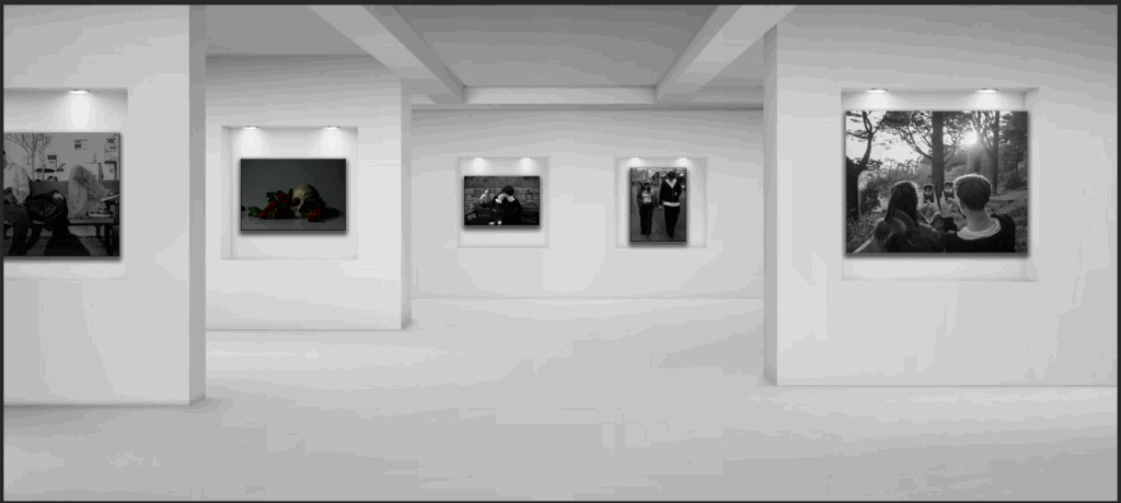
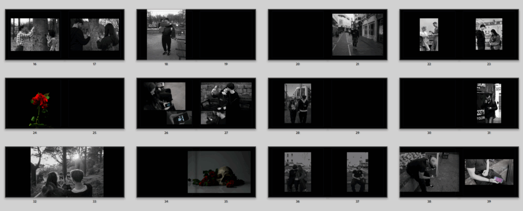
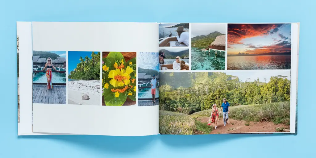
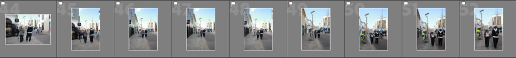
When I first go onto the book side, I have to take some time to see al my images and embrace how I want them placed. Its quite overwhelming at first.

I started by making all the pages black, not definite to keep it like this but I did do black backgrounds for my last book and really liked the outcome, and because I have majority black and white images that are dark and sad in a way the black pages represent that better.

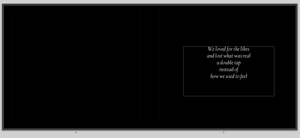
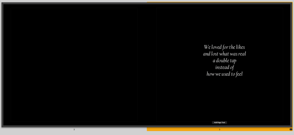
I like to leave the first two pages blank, page three I plan on maybe writing a poem, even maybe joyful about love or as if the beginning of the story which this is.

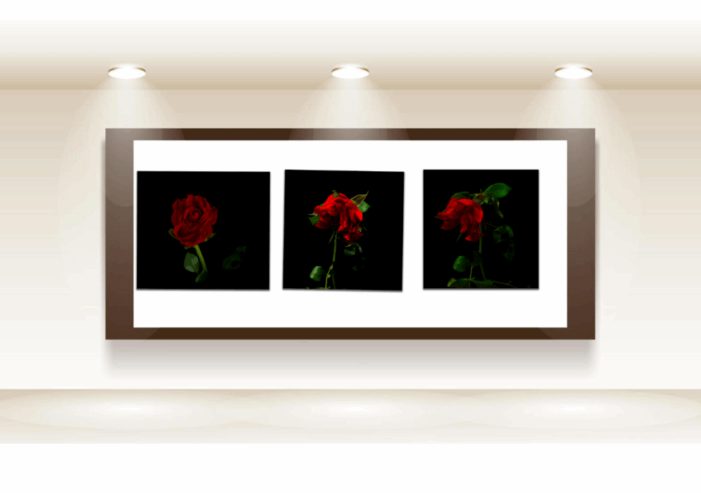
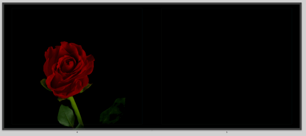
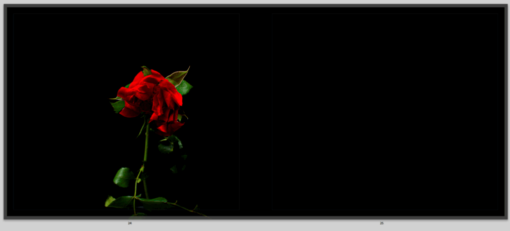
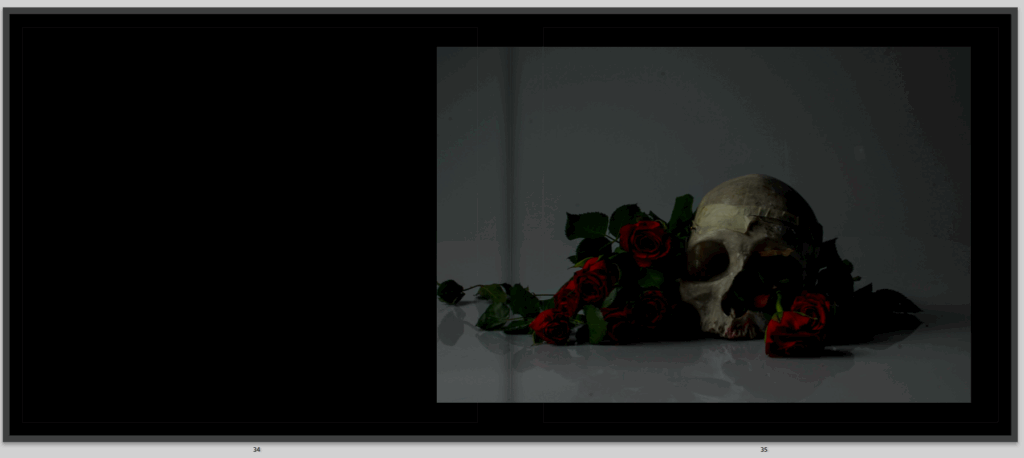
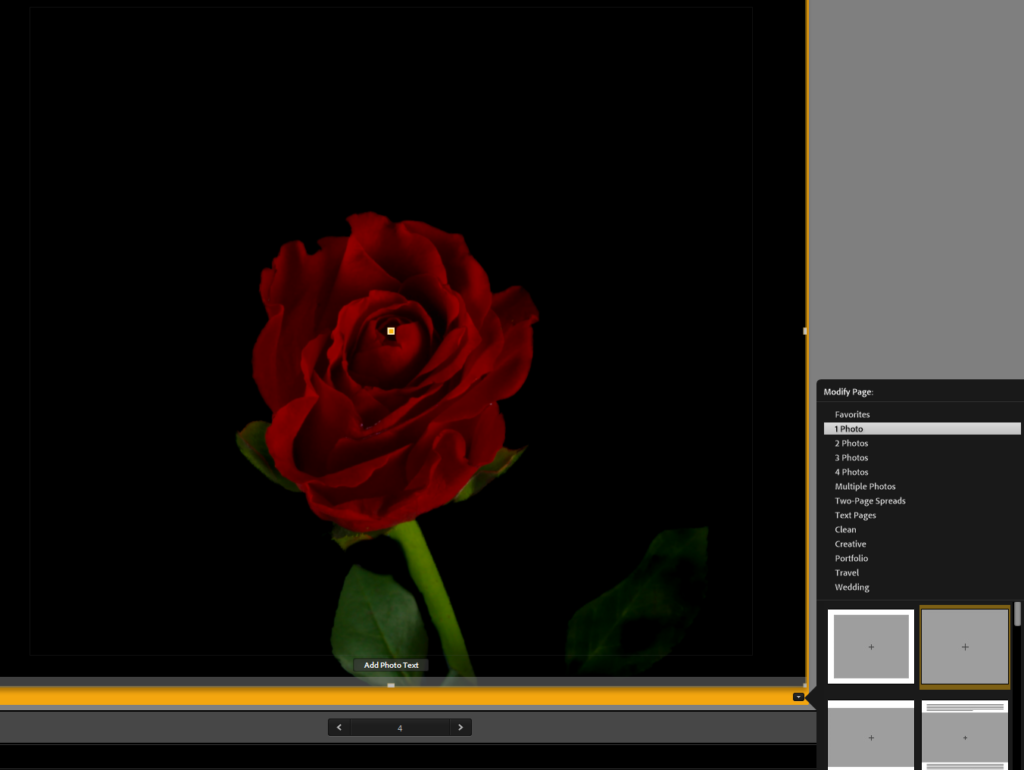
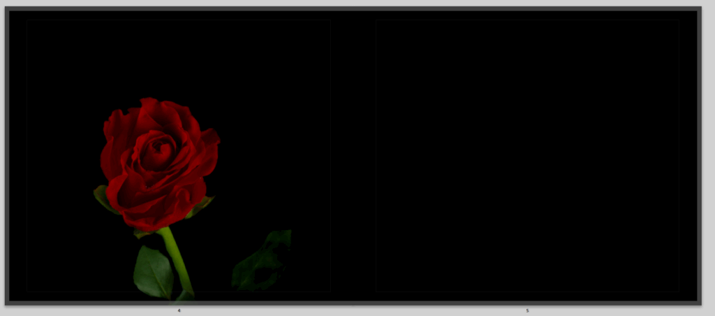
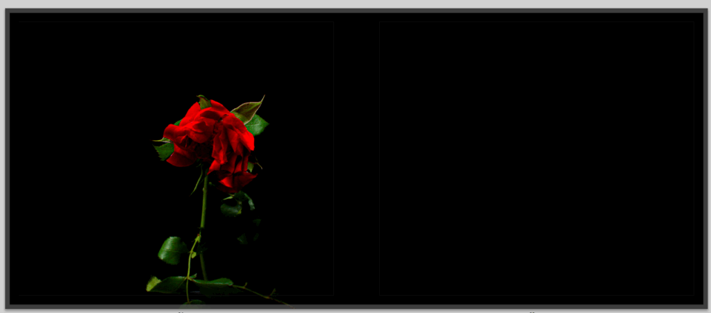
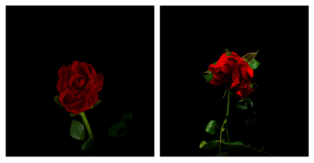
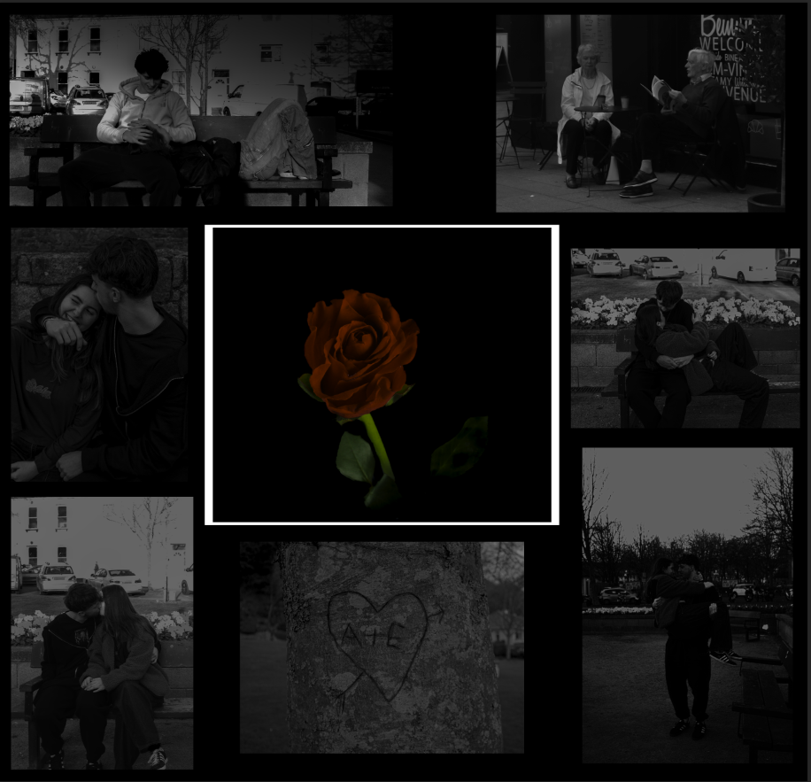
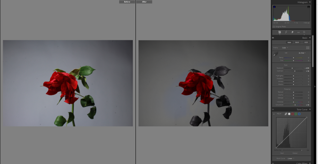
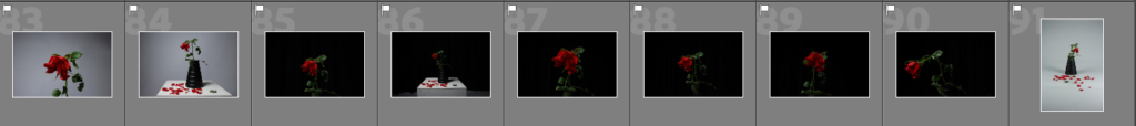
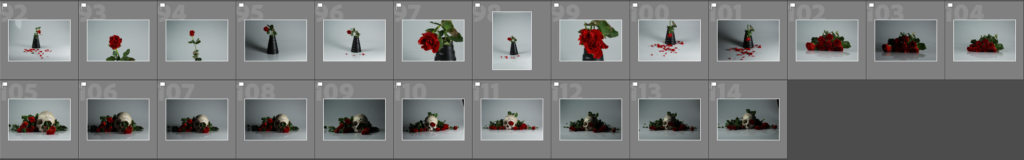
I am considering and trying out this as my first image, the flower is bright and full of life, symbolising that romance is not dead yet, which helps bring in my symbolism, it also shows the start of life, and romance being beautiful, I moved it around so the flower was centre and made it full bleed but it is a black background image anyway.

I firstly laid out these two images together, I’m not sure I like them together, I wanted to show happy love at first and as I go throughout my book I show it dying but, I just think these images look a bit clunky together and don’t love them, but just for the minute I am going to leave them there.

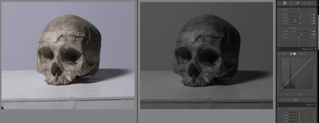
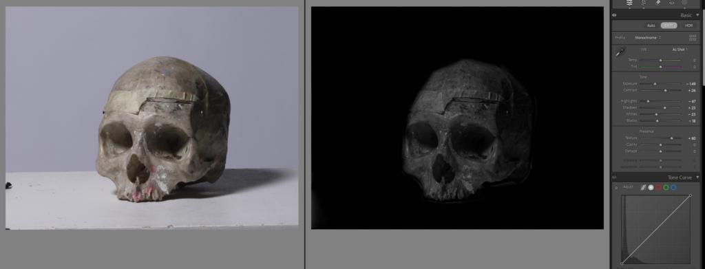
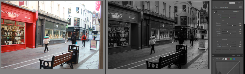
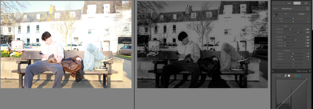
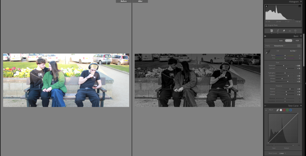
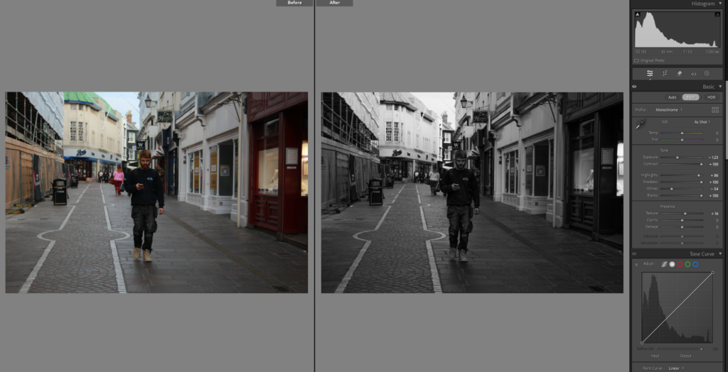
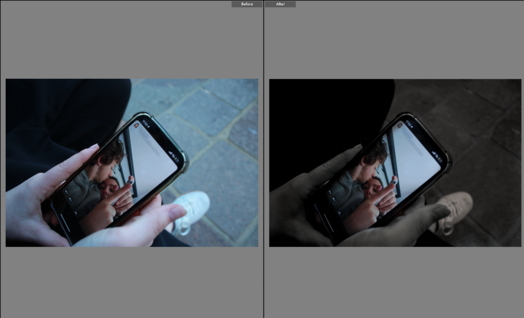
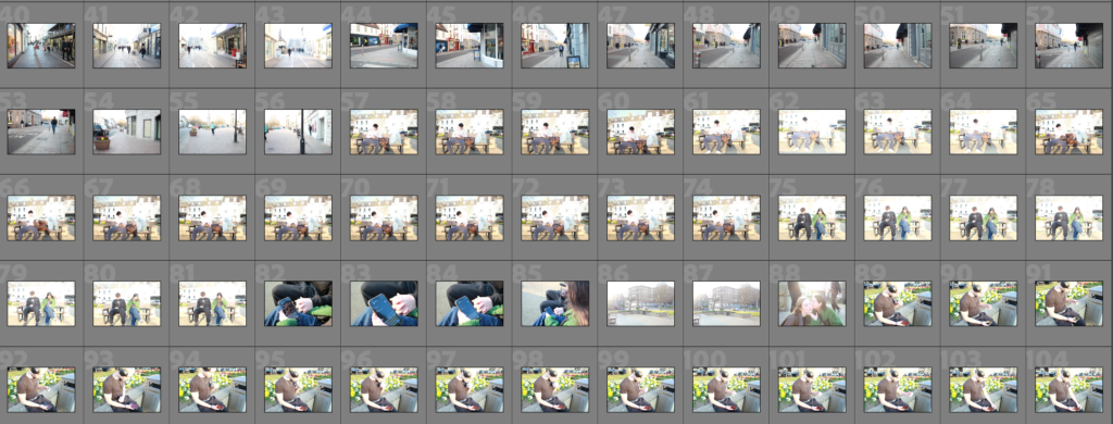
I decided to change how I was going to start the images, and started with doing the comparisons because those are photos I’m sure of and sure on how I will present them.

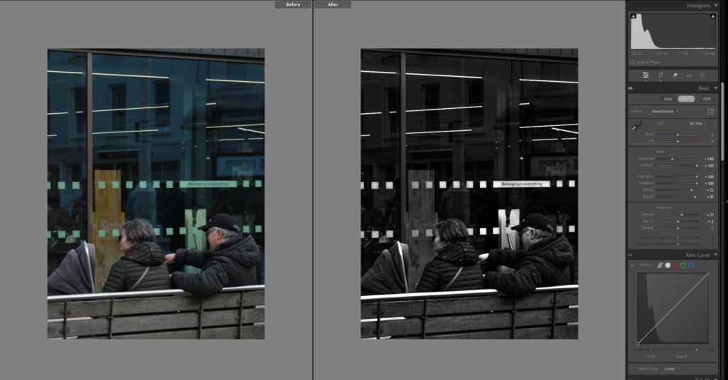
This is my second comparison photo, so still doing the comparison ones first and will slowly work around those pages, to decide on which ones will go first and which ones will go after, or go in at all.

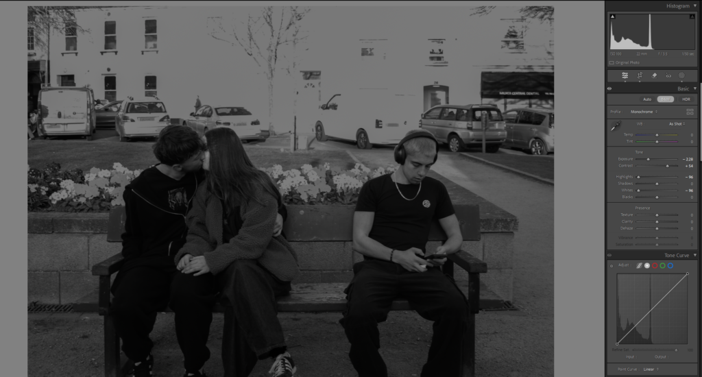
This page will have a comparison photo with it but I don’t have it saved at the moment, so its going blank, I am going to do this with a few other pages that I don’t have the comparison photo with yet.

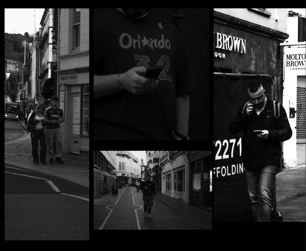
Then I wanted to show slowly more ways in that social media had ruined romance, and used this photo as a full bleed along these pages, to show no one living in the moment.

I continued it on to these pages where I try to tell a story of someone seeing a couple being cute on social media and wants to be like that, not 100% certain this will be the final layout but this is what this blog is for to experiment on how i want it to look.

I then tried this way for a bit more symmetry and sequence in my book, but still not convinced.

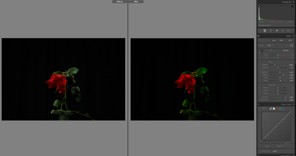
After all the comparison photos because I was certain on how I wanted them I added in this photo which is the same as page 4 and 5 to continue the sequence and story telling as this flower is a little more dead and it shows romance dying.

Then I moved this page after it.

Then I had this image which I used as a full bleed image, and then down the middle is between them both almost as if they are being split apart from the nature and each other due to phones.

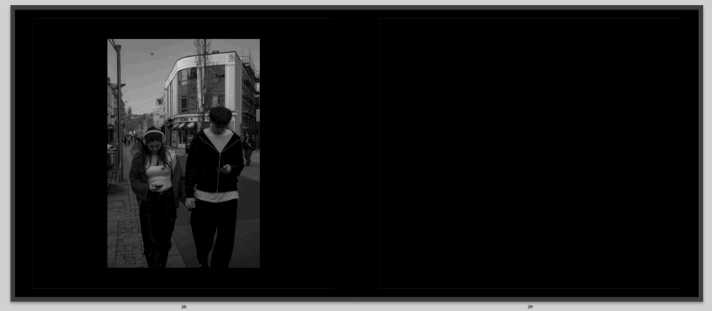
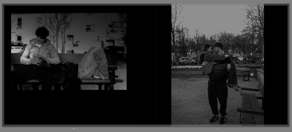
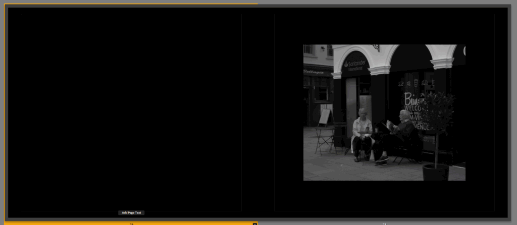
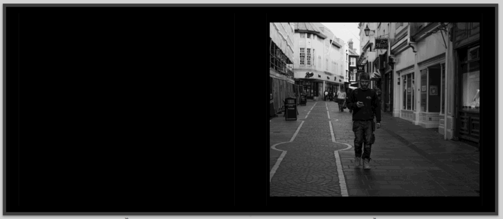
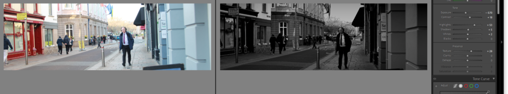
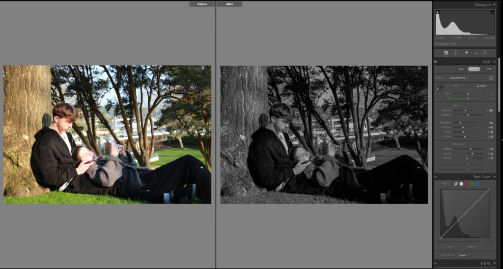
Then i had this photo all on its own to show an older relationship of street photography.

Not sure about this page and think it might be random on where it is places but I am just trying to make pages I like then hopefully find some sort of order onto them when they are done or keep them how they are.

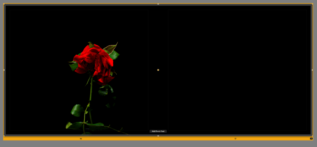
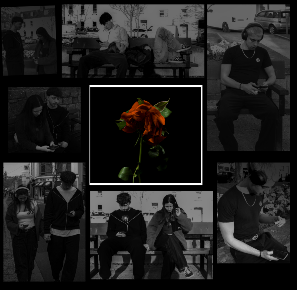
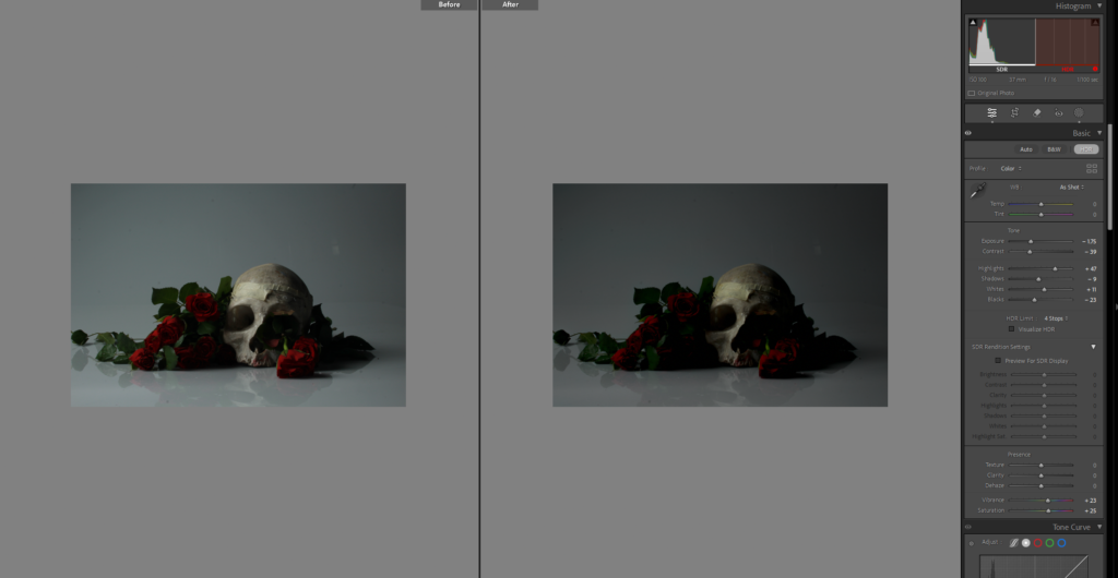
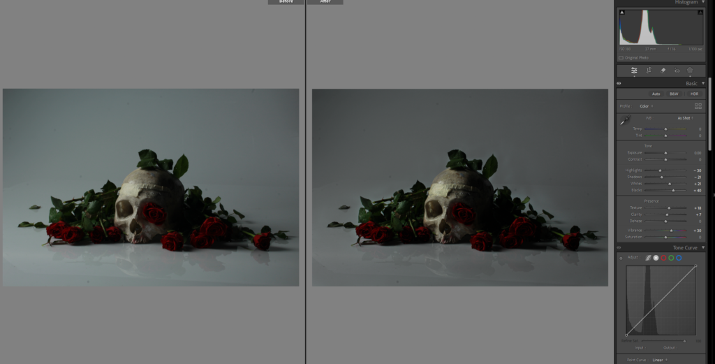
Dying flower even more dying as we continue throughout the book.

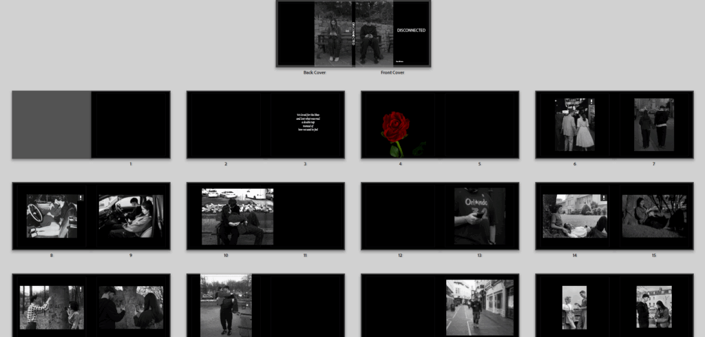
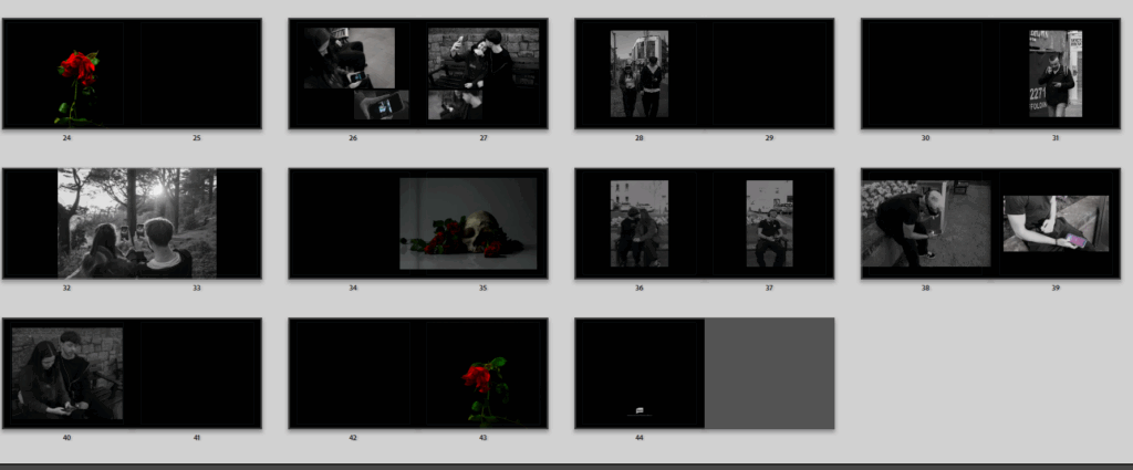
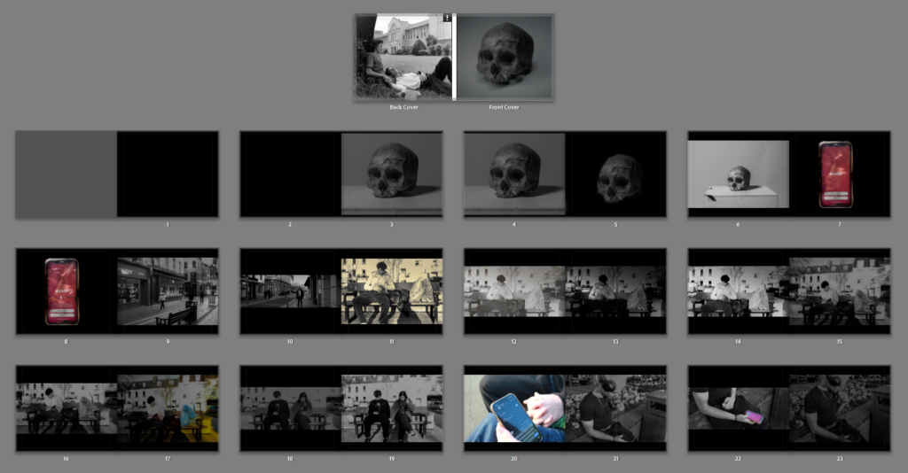
so I am almost completely finished with my book, I rearranged the order there are just a few things I cant decide.

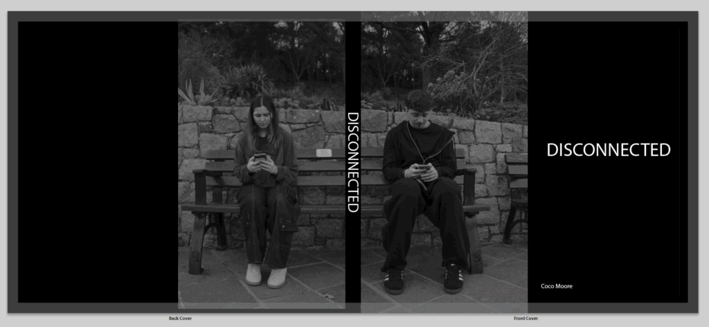
I cant decide my front and back cover and might just have to plain with the title and my name, I also cant decide a title and need to decide that.

Next is these pages where I am planning on having a poem or few sentences that are about my book, and might continue that throughout the book.

Then I start my book, with a very beautiful alive flower, to dip into my symbolism and represent love being alive and beautiful

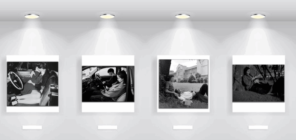
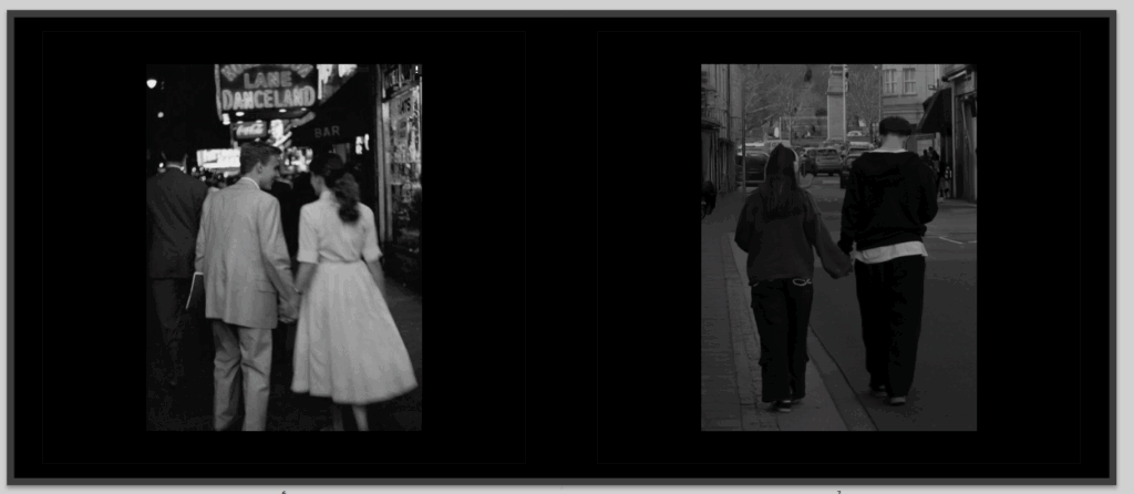
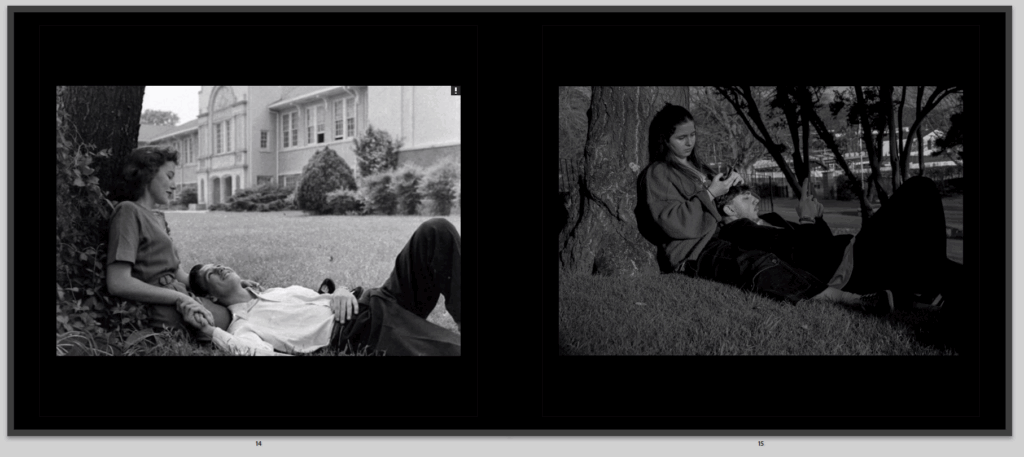
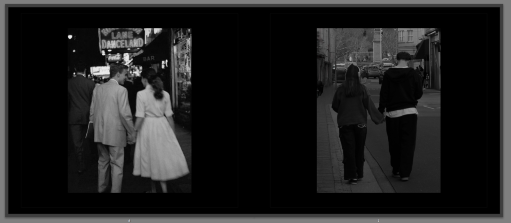
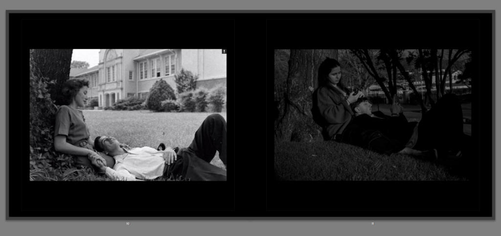
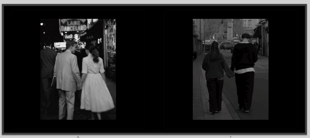
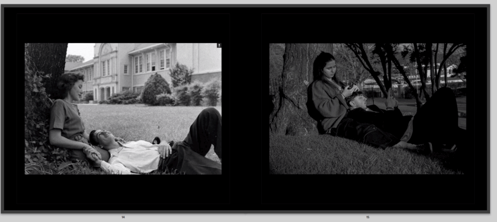
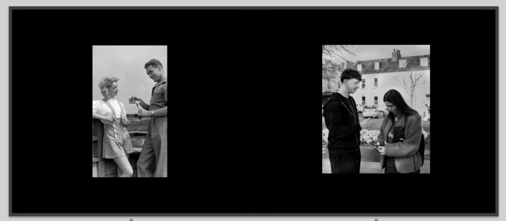
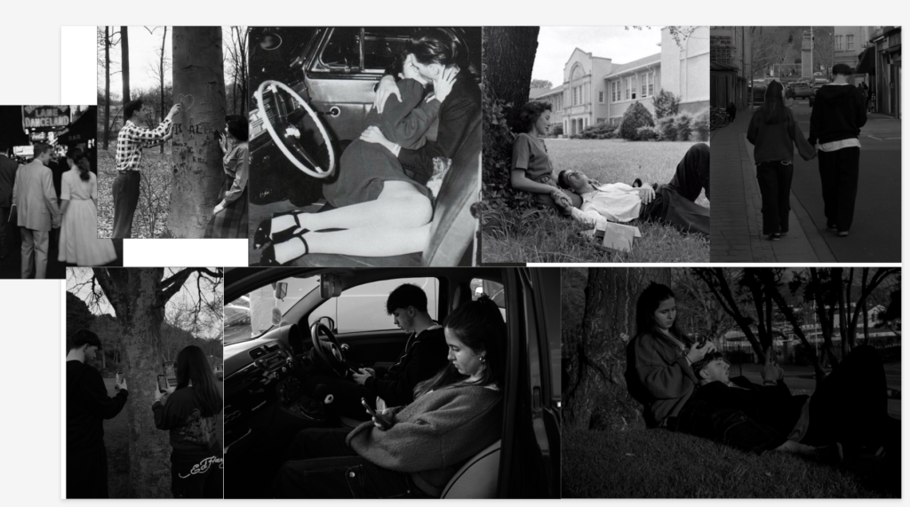
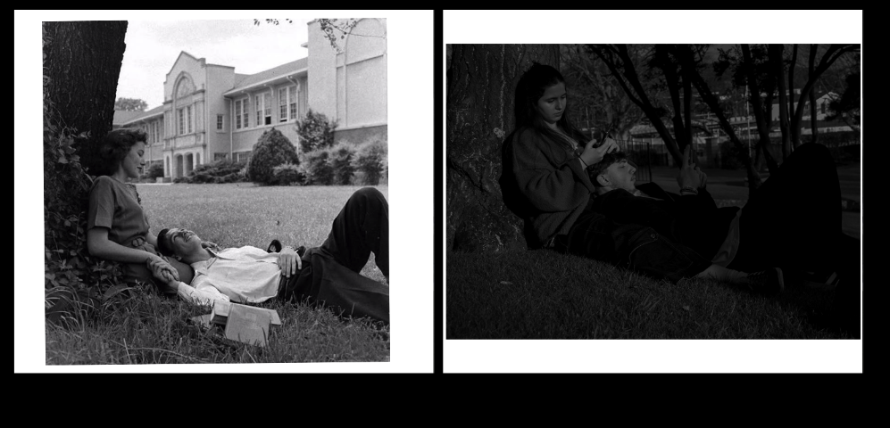
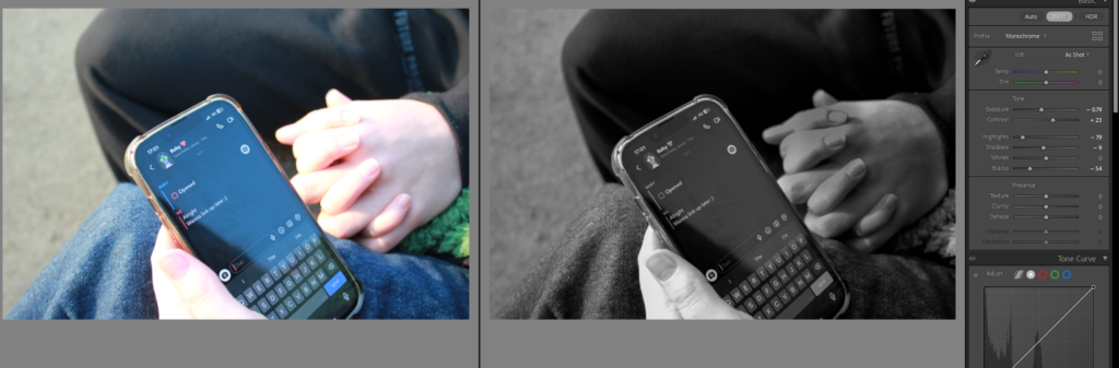
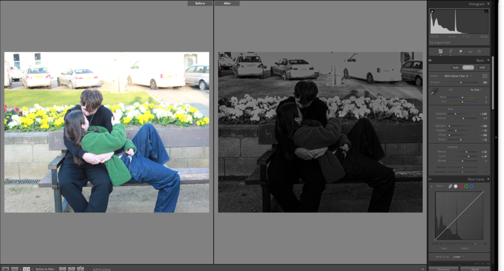
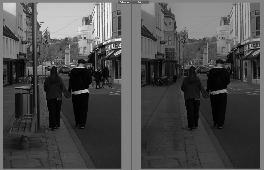
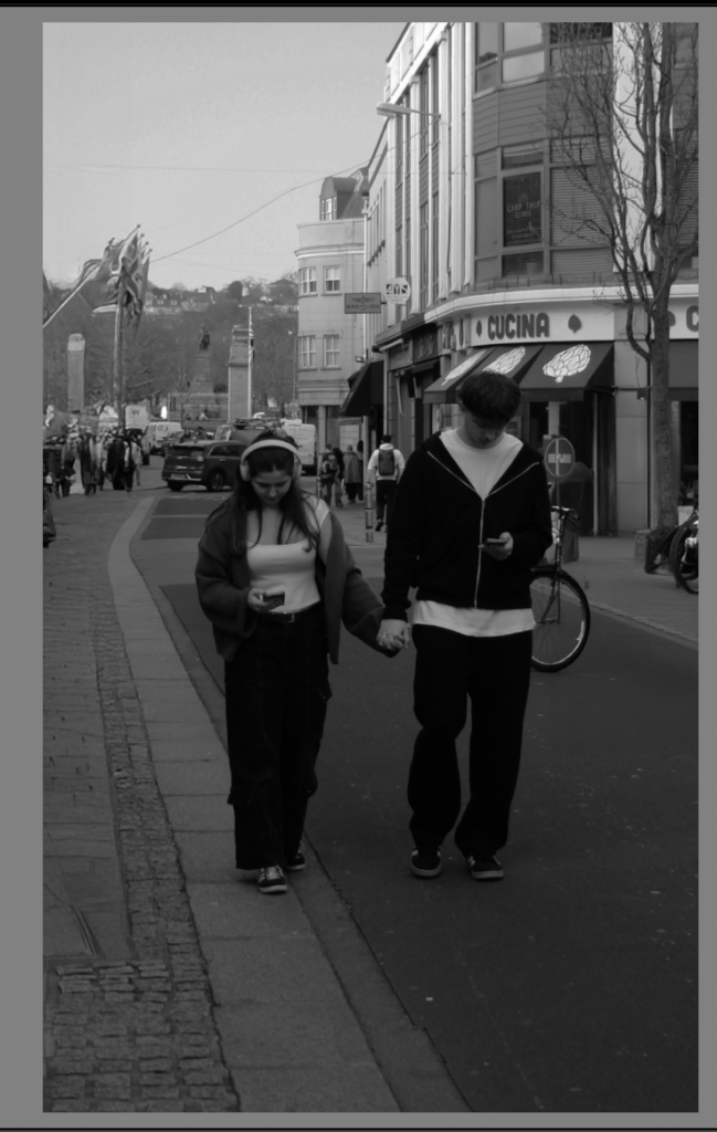
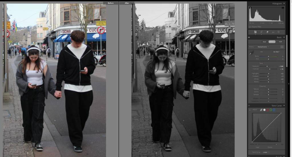
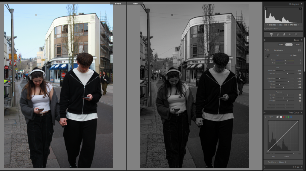
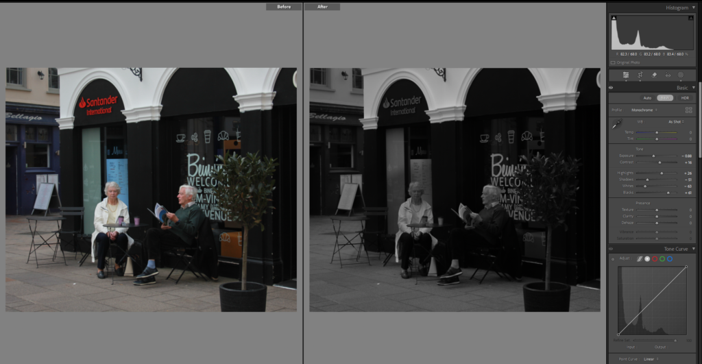
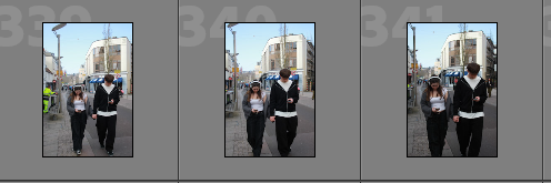
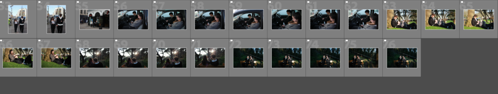
After that I move onto my first comparison photo, of love year ago, where are a couple are holding hands and looking at each other with love, when the photo next to it is love in the 21st century where they are on their phones with headphones on. not talking to each other but it is clear they are a couple holding hands.

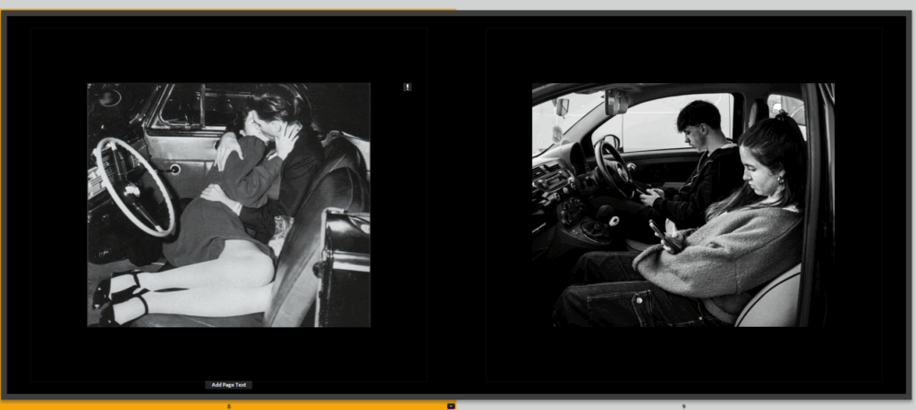
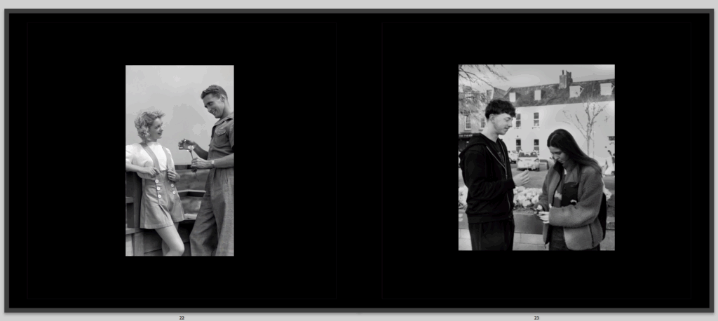
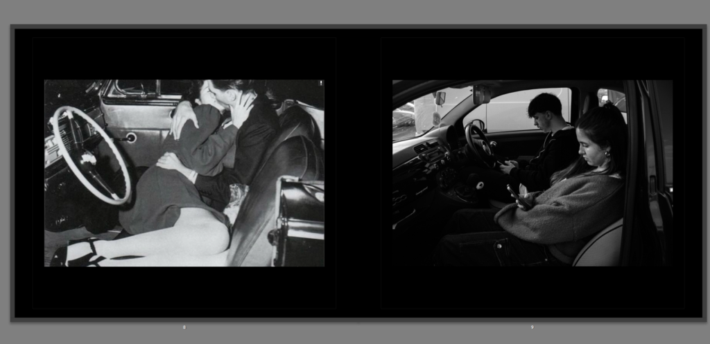
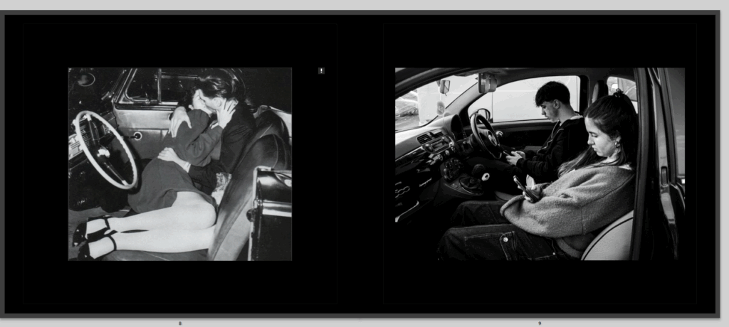
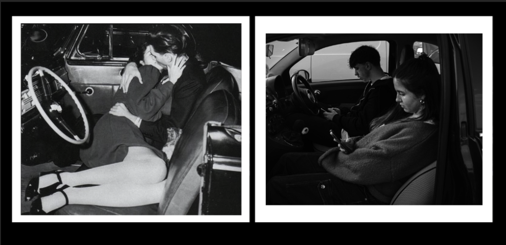
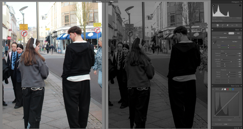
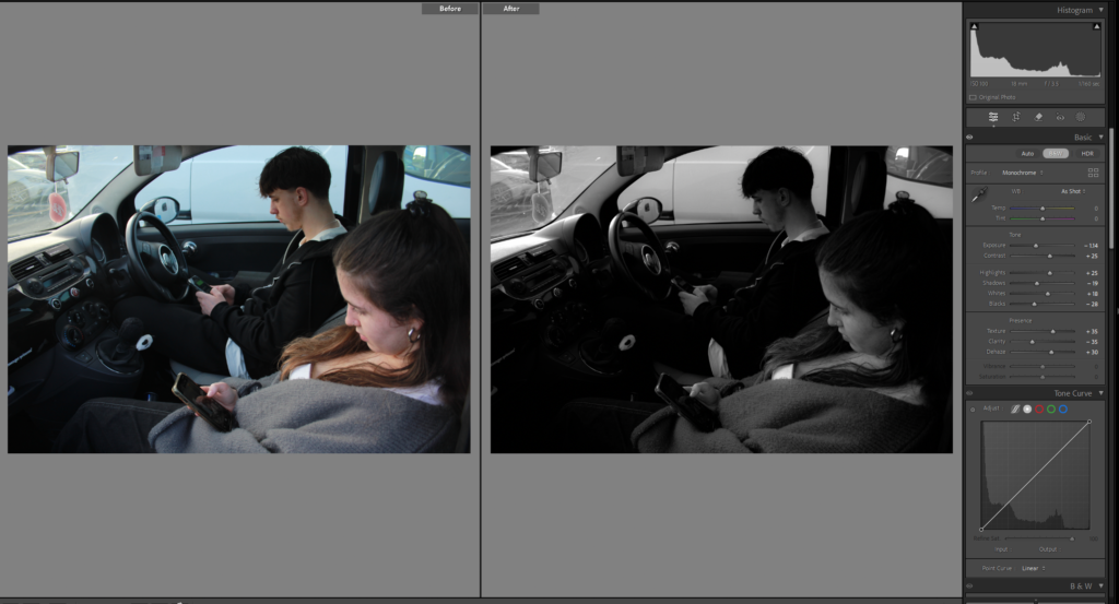
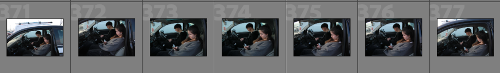
Then we have the second comparison, again the first image, in a car kissing lying on one another, clearly in love as known in movies, what was dreamed of, because when people look back into the 80’s and older, they think of drive in movies and kissing in a car, and in todays world, we think the same thing but going in cars isn’t as romantic as was pictured.

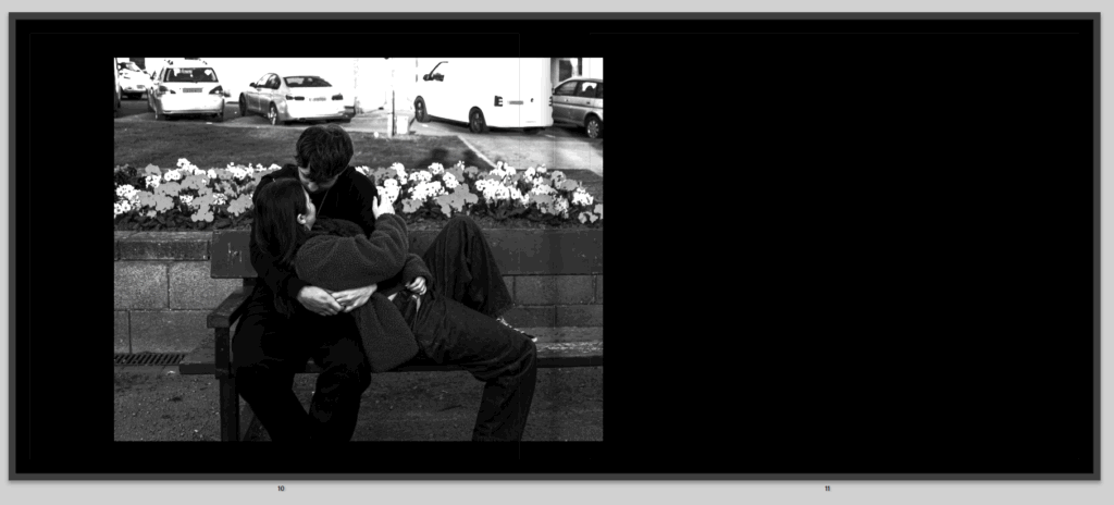
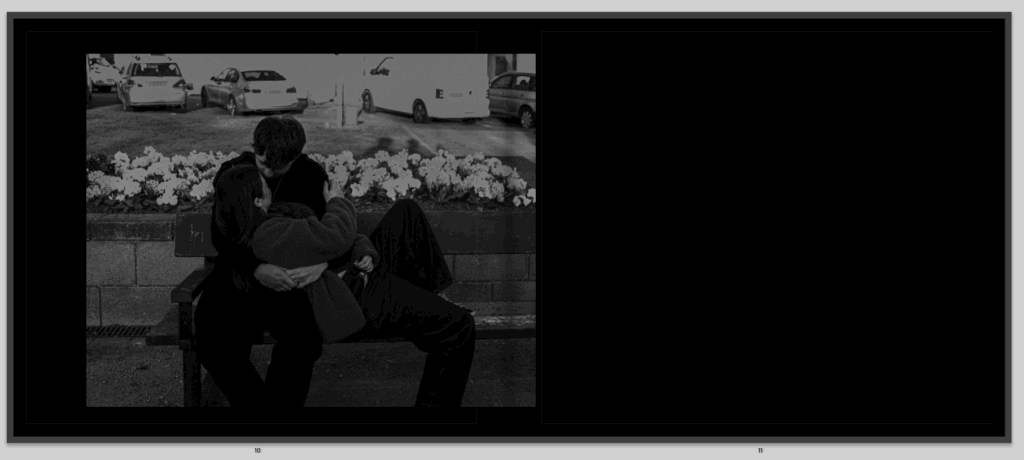
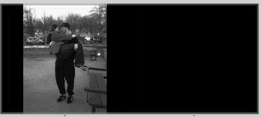
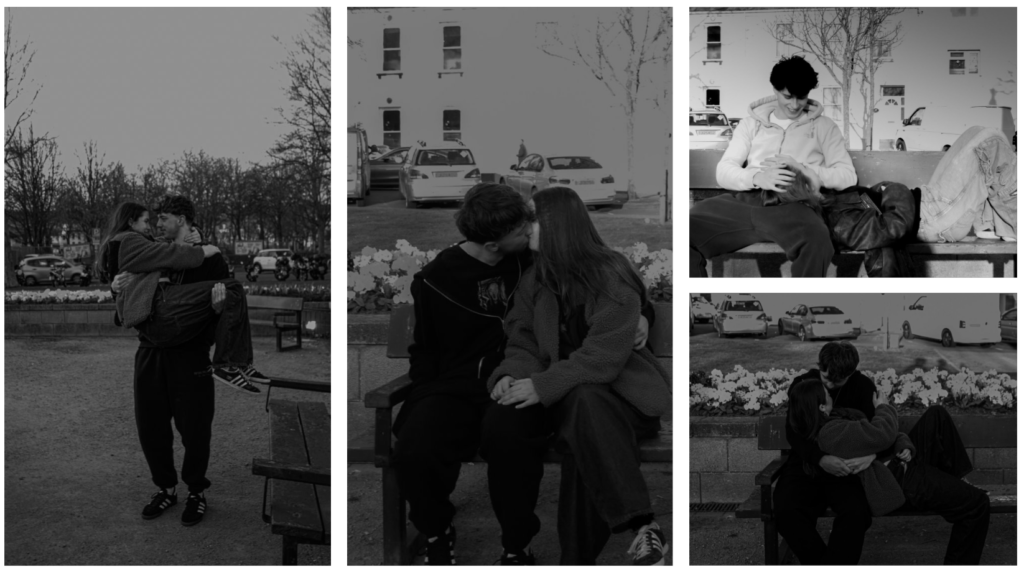
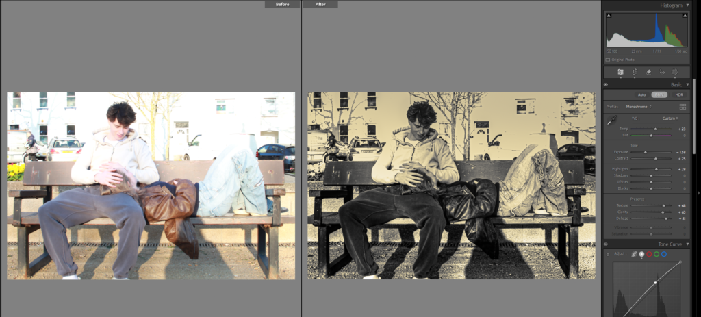
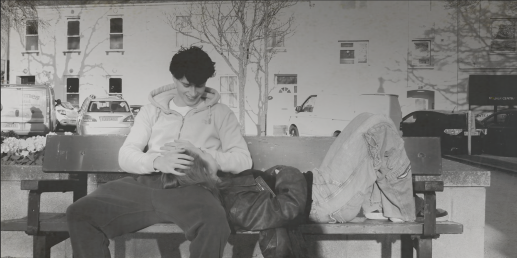
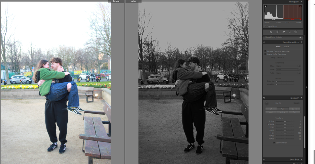
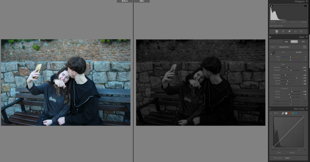
After that I added in a new image, that shows a couple in love and cuddling, to show that some love is still alive and to break the comparisons up.

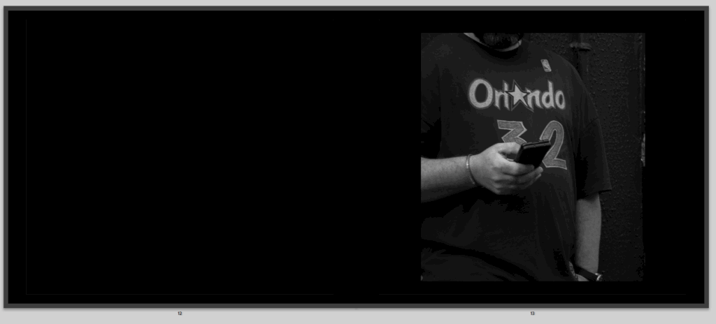
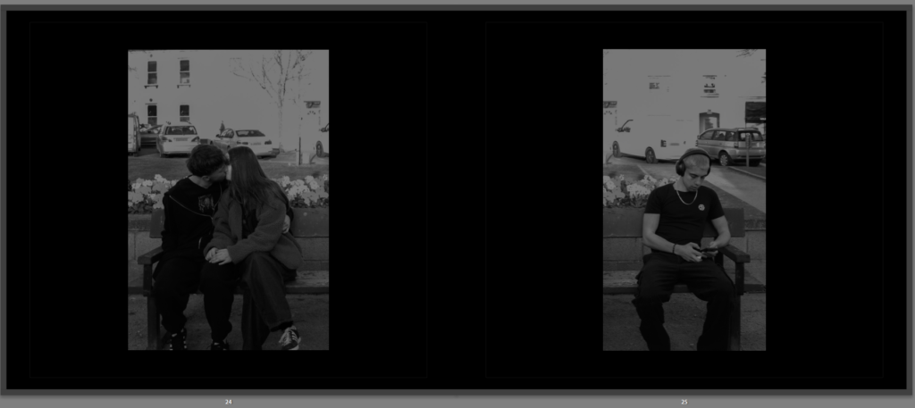
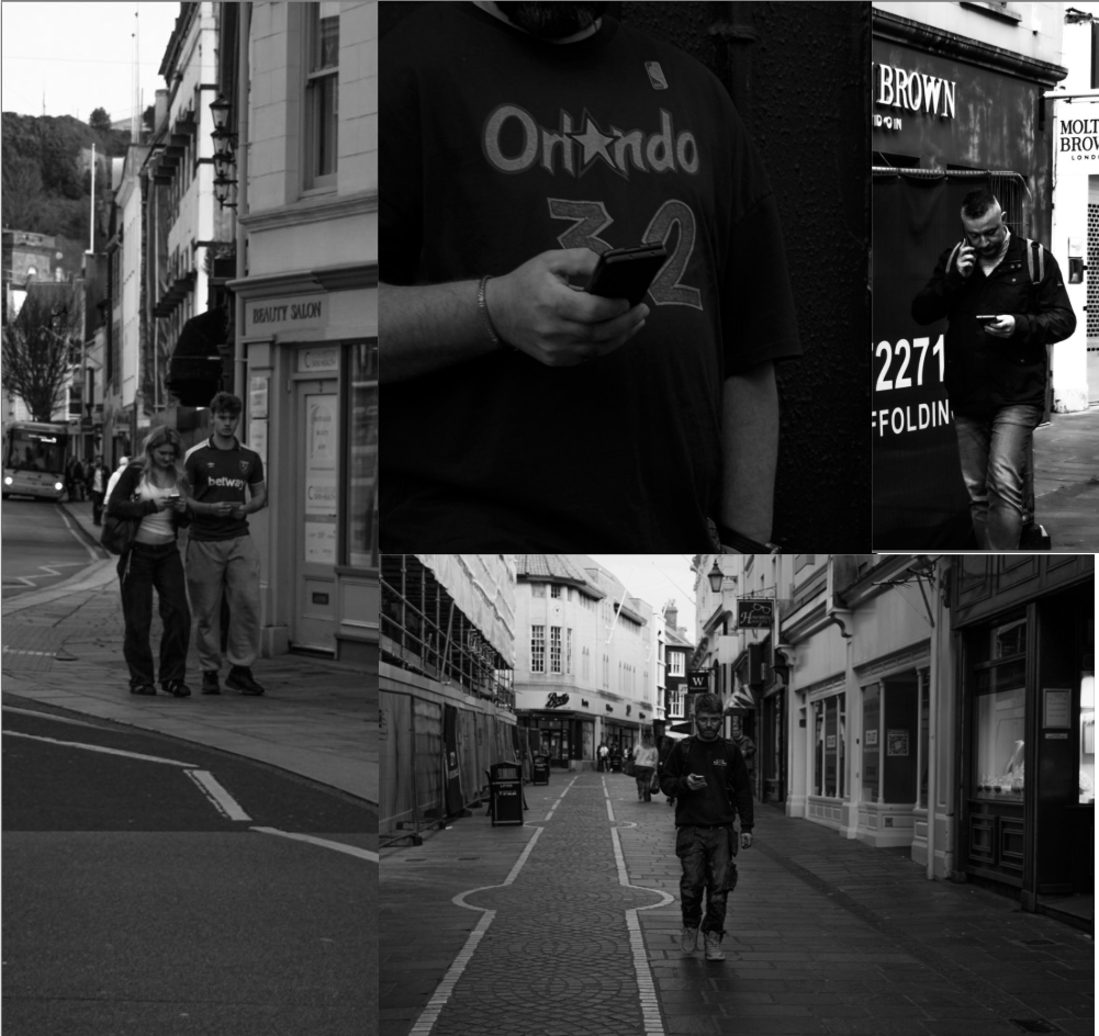
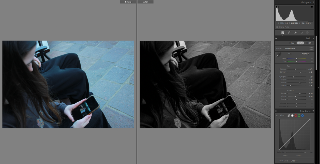
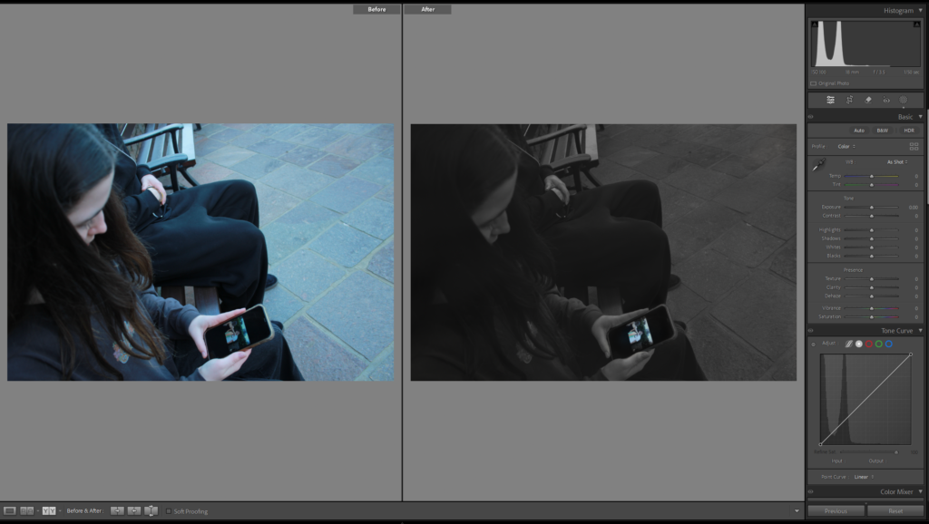
Then it is a photo of someone on their phone, over on the other side, to add a sort of symmetry and sequence into the book, this shows that their is love in the page before but here comes the social media that is known to be ruining romance slowly.

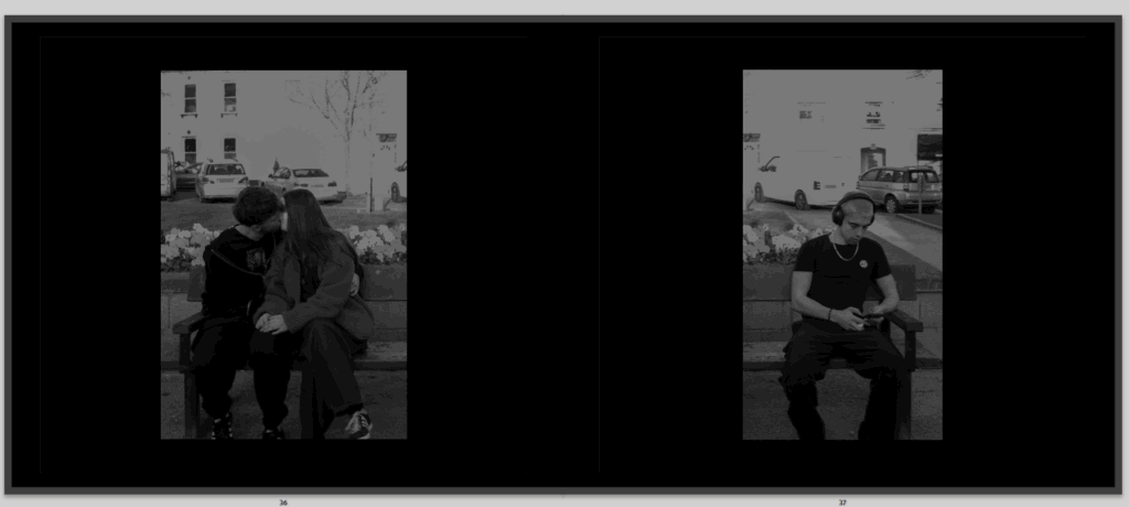
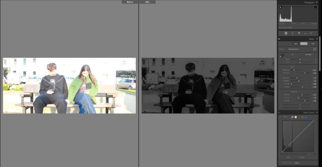
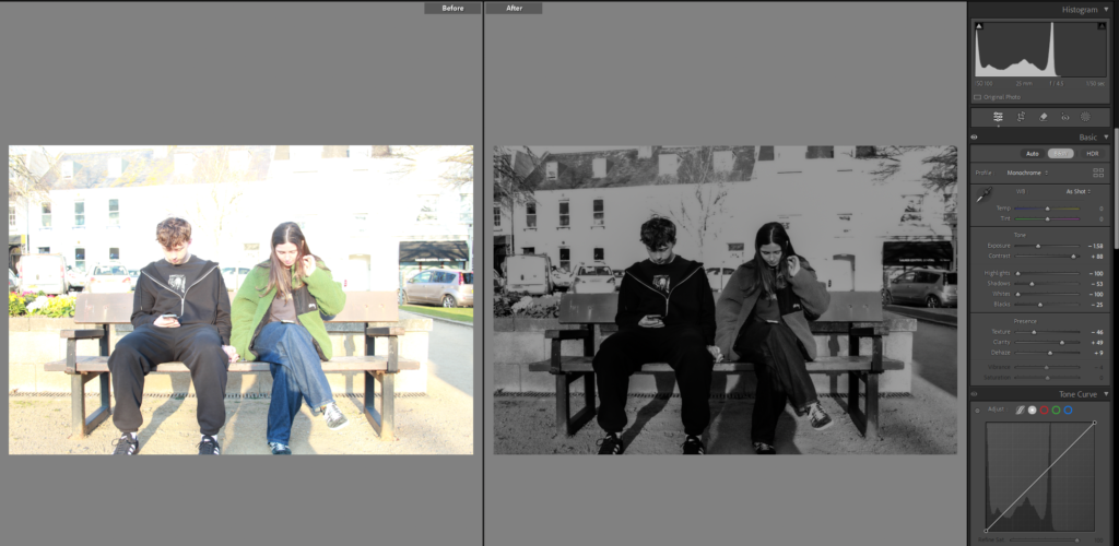
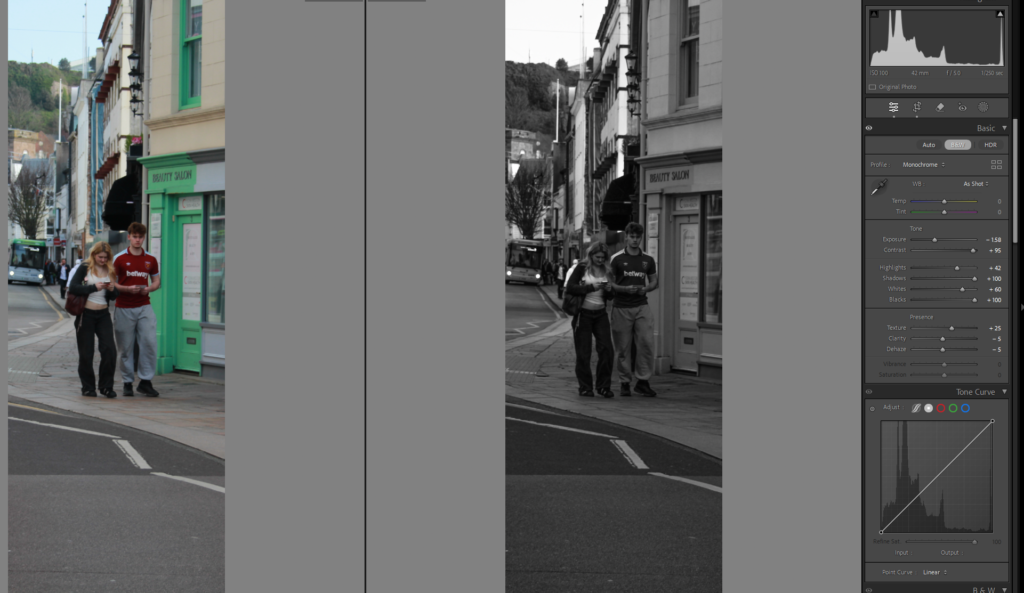
Then I return back to my comparisons, again where instead of the couple speaking with each other they are on their phones, not really in each other presence like we should be.

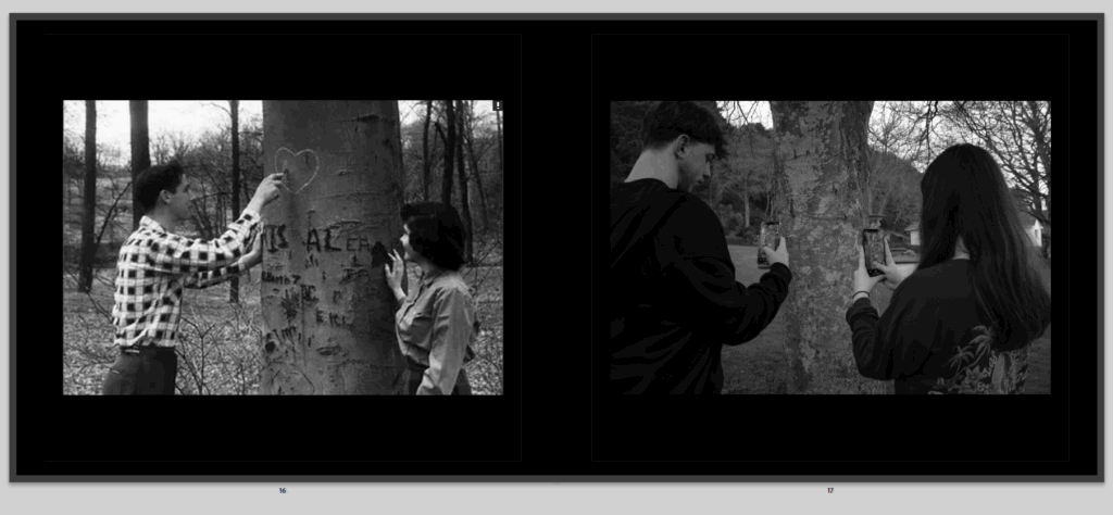
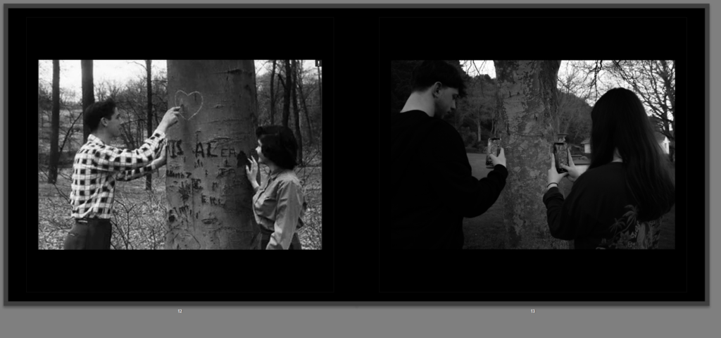
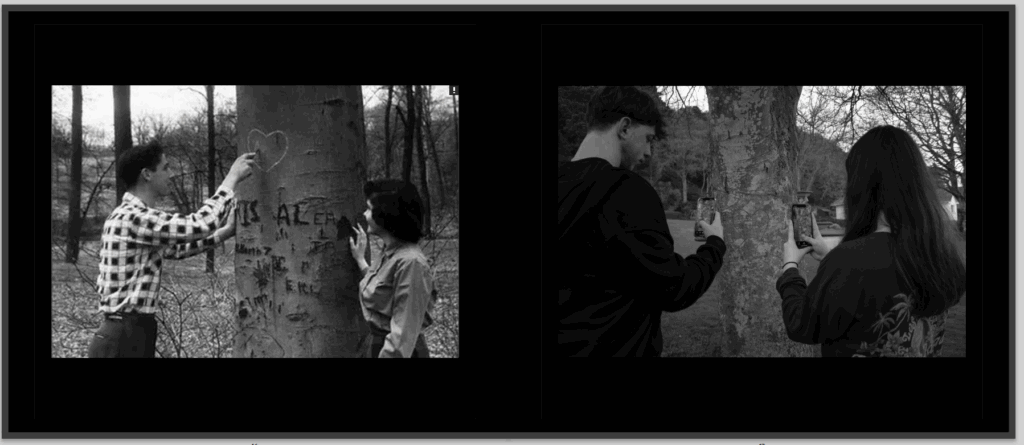
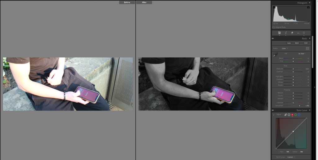
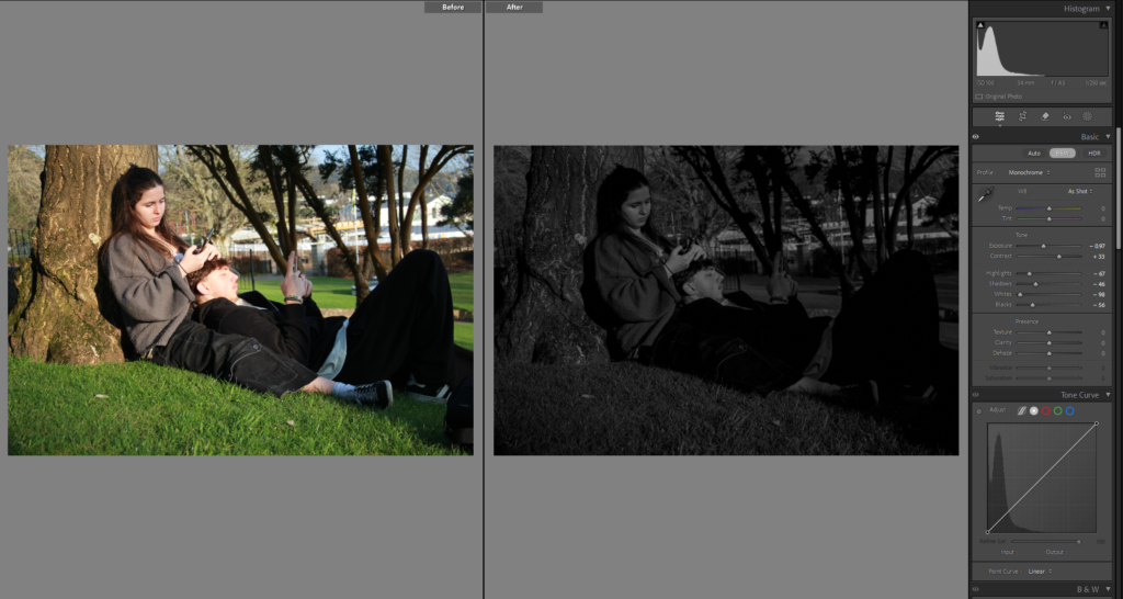
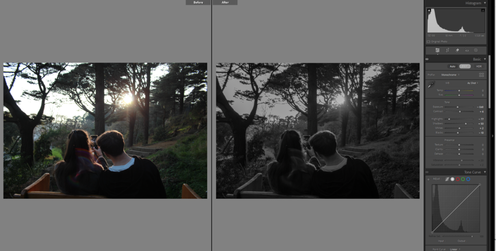
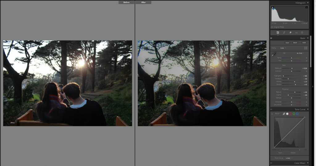
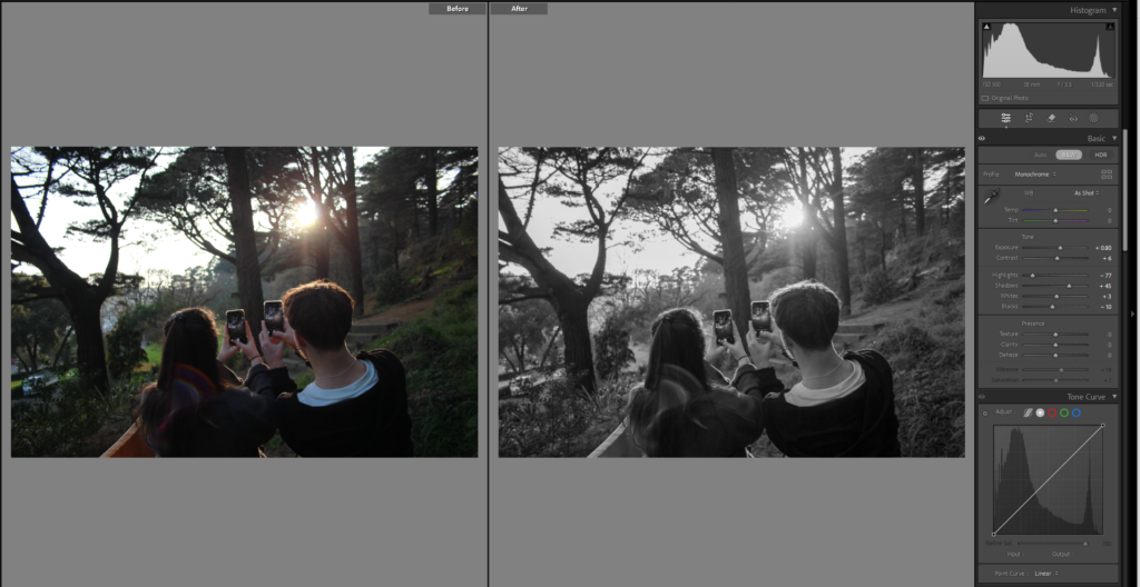
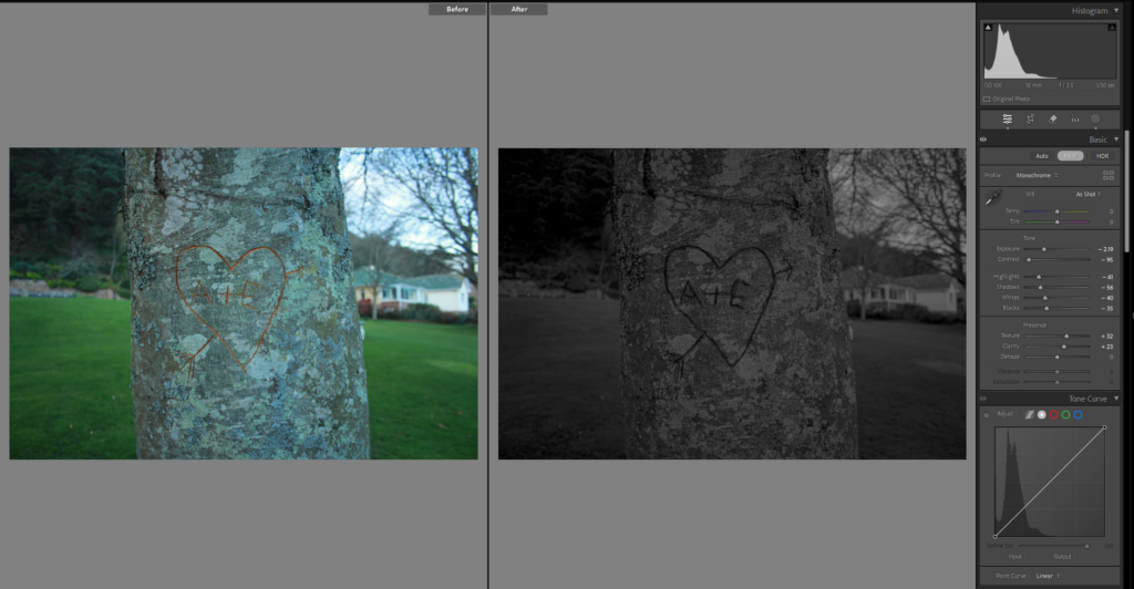
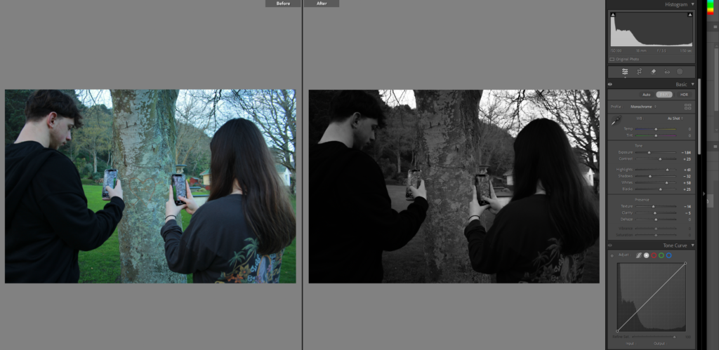
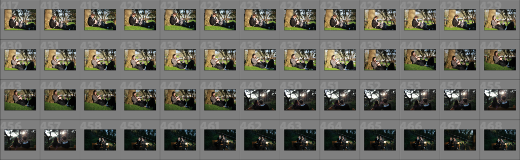
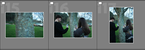
Continue on to another comparison, which I do like but it bothers me that you cant really see the carving in my photo. in this one it shows that they only did the couple thing of carving their names into a tree to post it so everyone thinks their couple is cute.

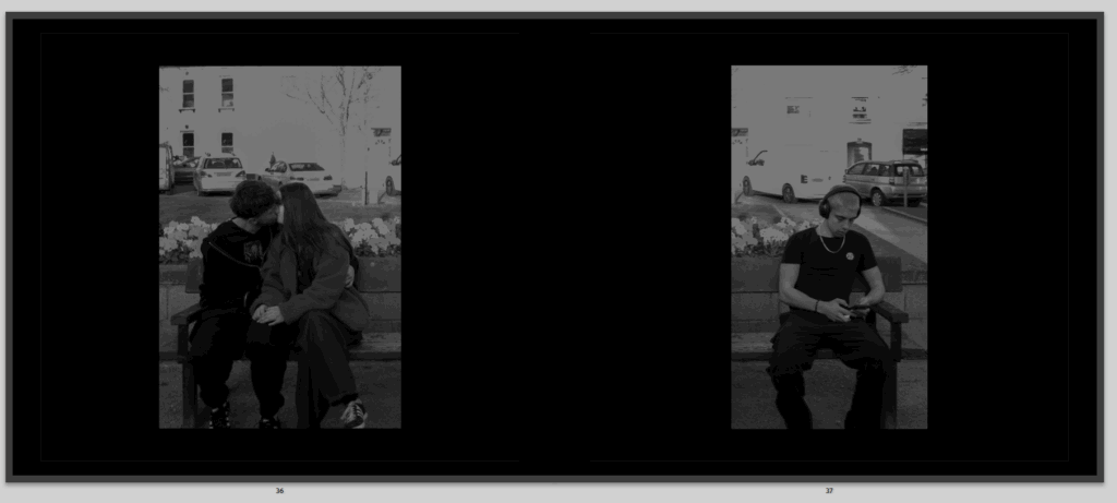
To continue on the sequence of my book, I have another coupley image on the left side, after two comparisons.

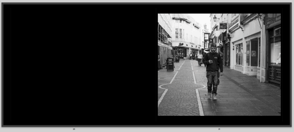
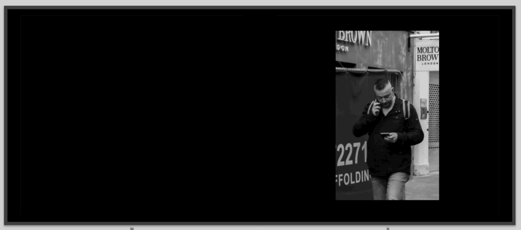
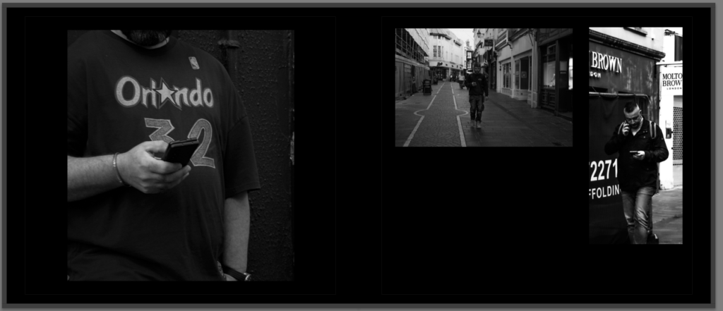
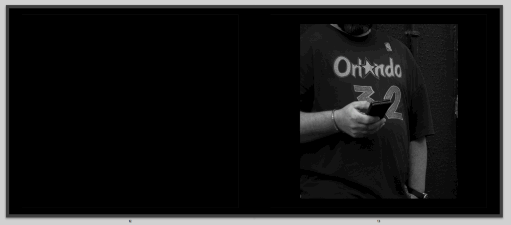
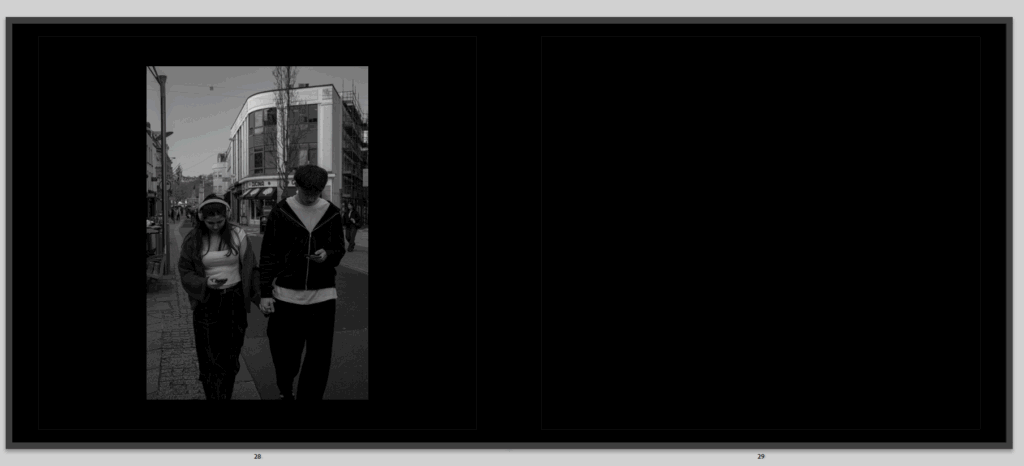
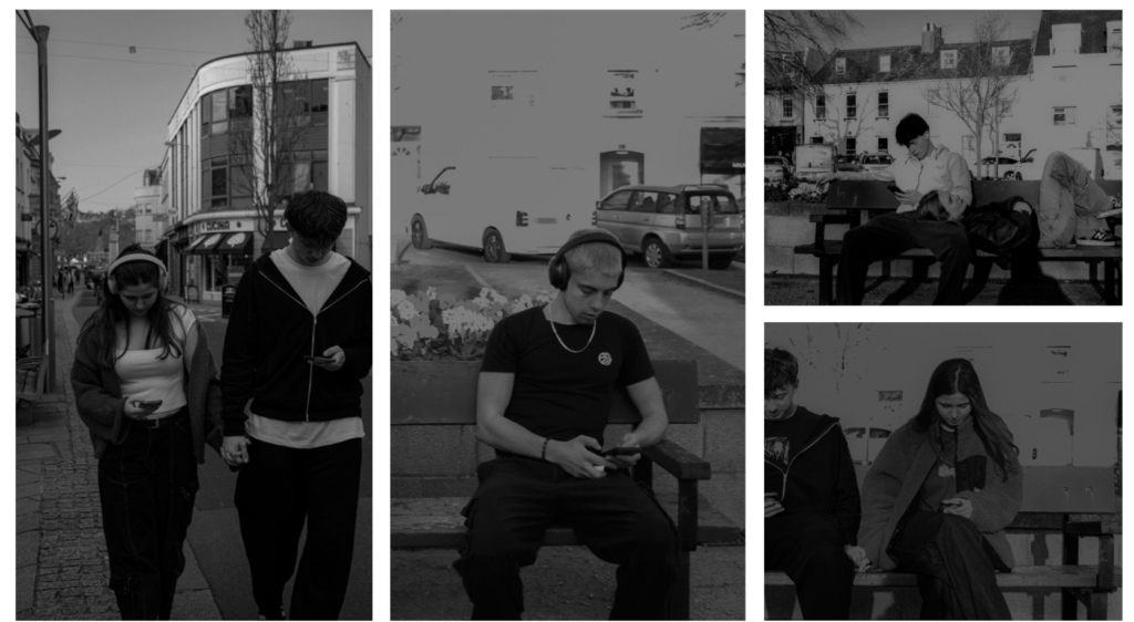
Then on the other side, a man walking on his phone, oblivious to what is going on, unaware of the romance that could find him, maybe thinking that all the couples he sees on social media is something he wishes he had. And it is another image of someone on their phone after a romantic picture to demonstrate more that social media is slowly taking over.

then I go onto another comparison, and continue that symbolism, and sequence throughout.

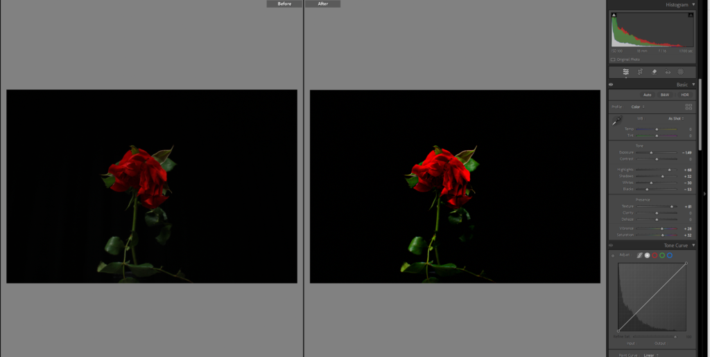
Then to have it continue even more like a story and show that romance is dying, I have the same flower once again but it is more deceased and lifeless.

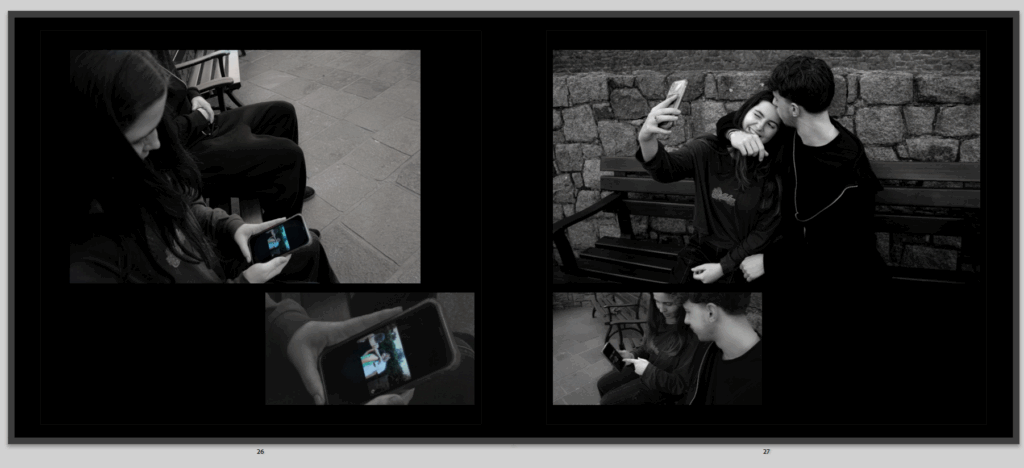
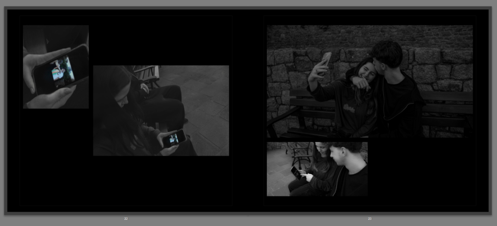
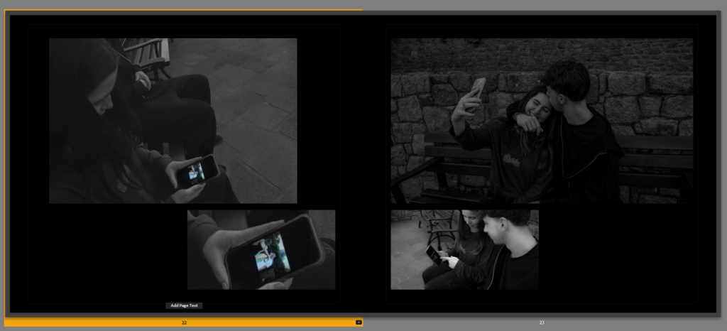
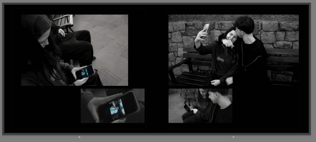
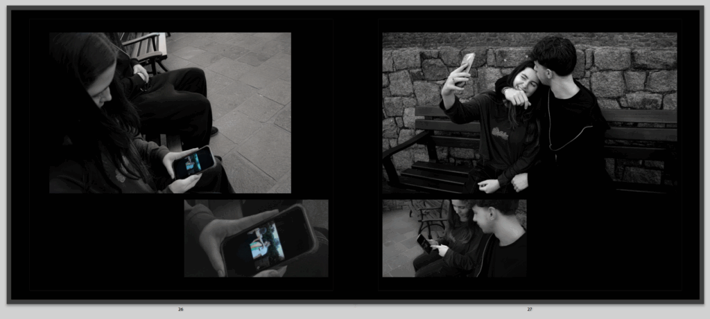
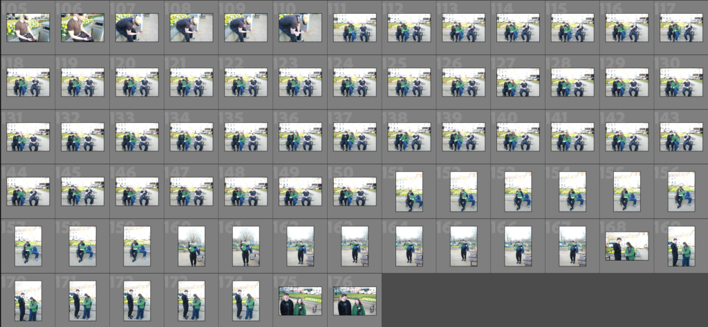
Then I move onto these pages where they tell a story within them selves and have their own symmetry of what’s going on, they tell the story, of the girl seeing a couple online being cute, and likes the idea, is jealous that her relationship isn’t the same, so decides to show her boyfriend and create the same image to post online.

Then back to the overall symmetry of the book we have this image on the left side, as the previous two have been of them being coupley and cute, but this shows that they are now more infected by social media then they where before, they are still holding hands and being cute but they are more involved in their phones.

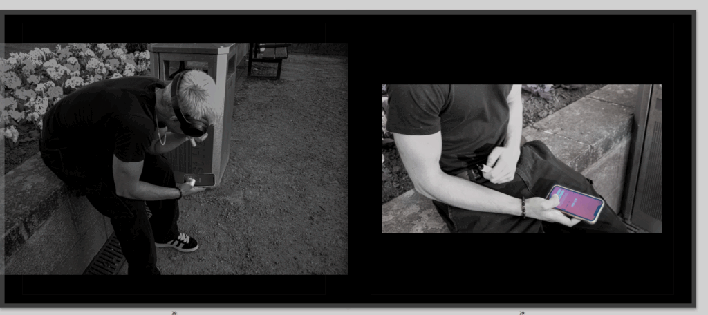
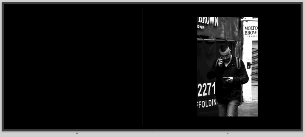
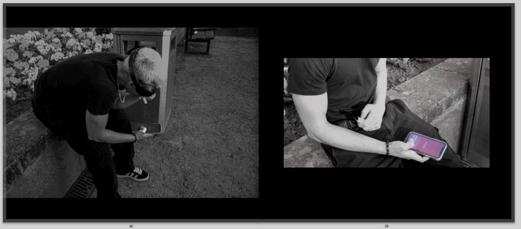
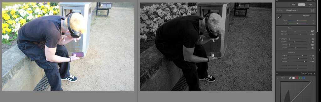
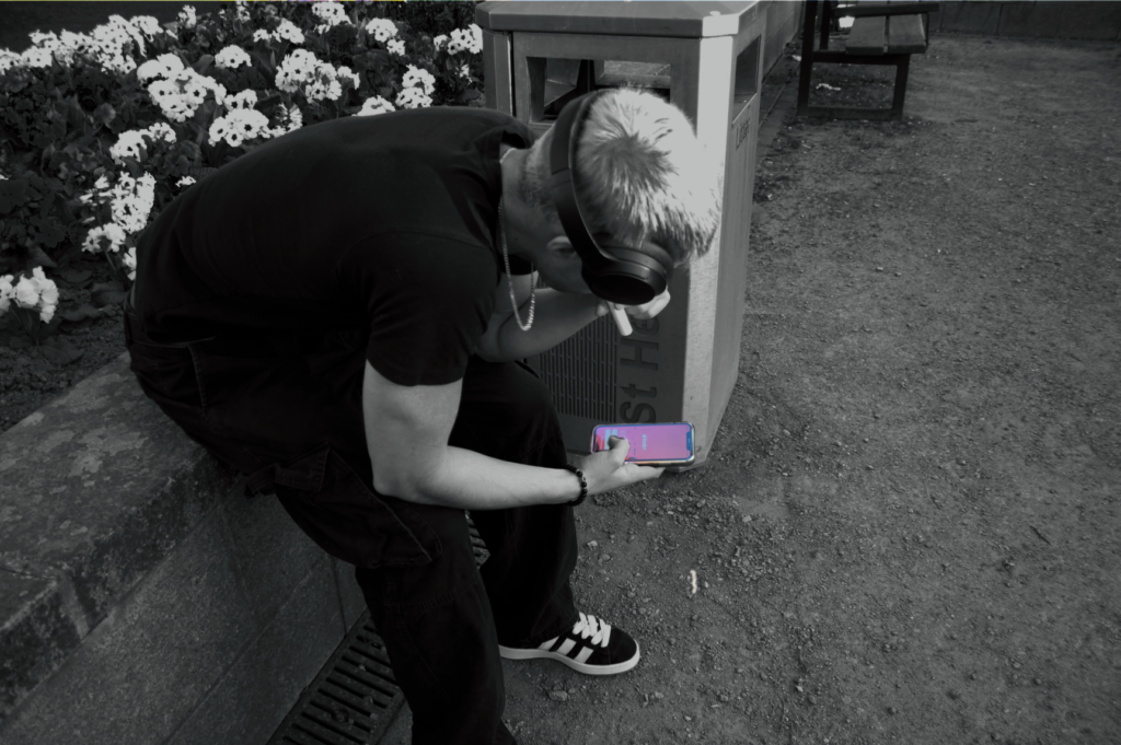
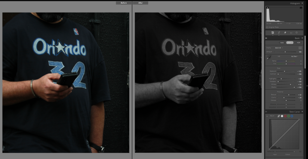
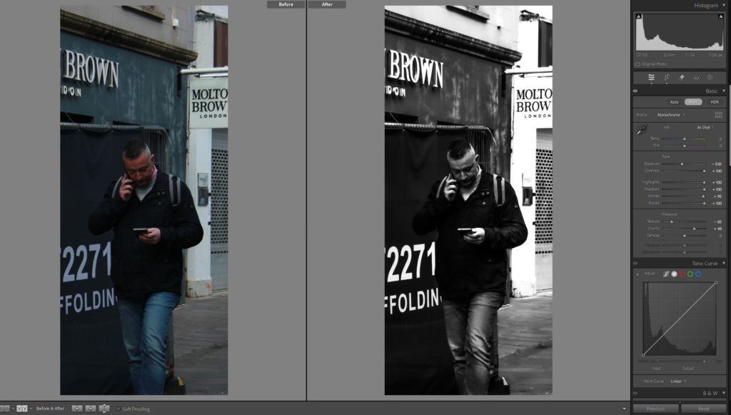
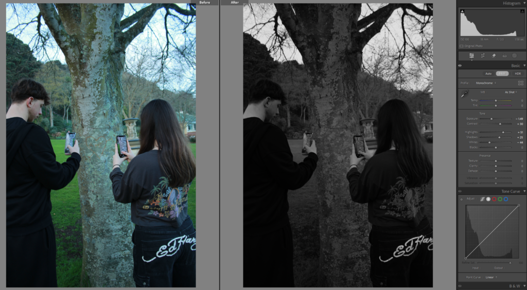
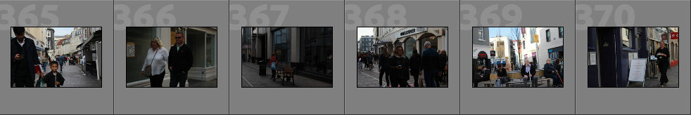
Then we have another street photography photo of someone on their phones, but this one is even more social media based, and showing the infection of phones even more to represent how it is getting worse as he is carrying two phones.

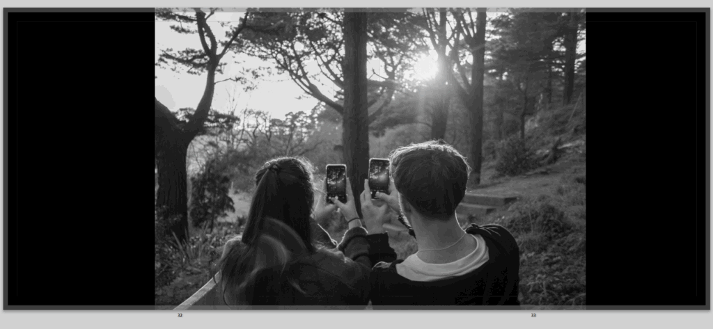
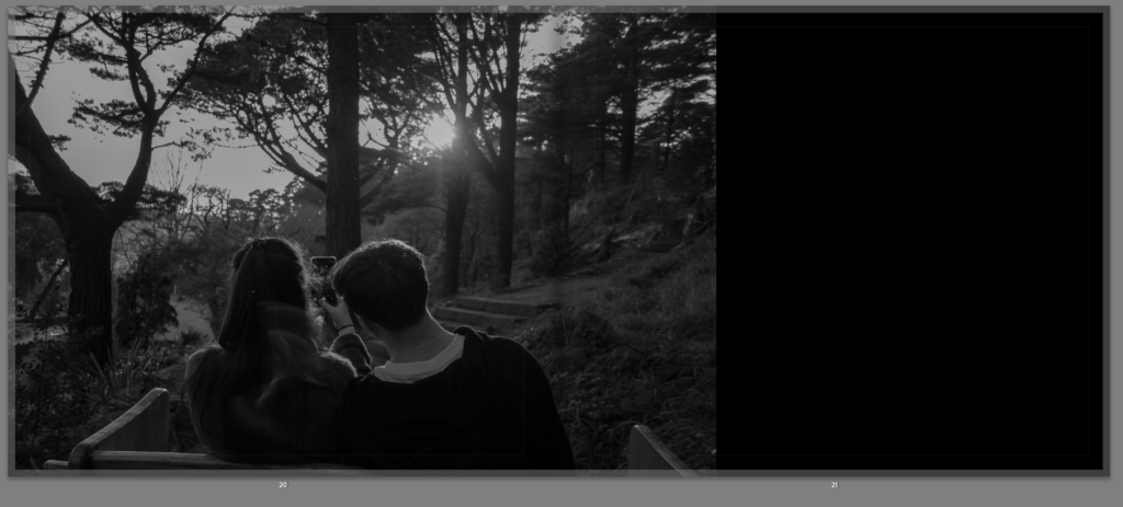
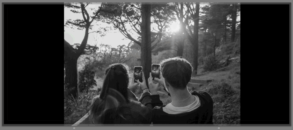
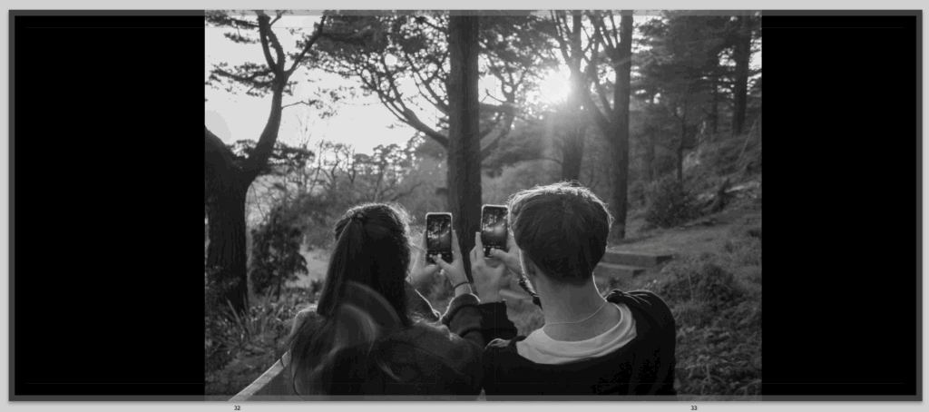
Then I have this image, which I really liked, and always wanted to be in it especially as a full bleed image, not only do I like that it represents the couple not appreciating being their with each other looking at the gorgeous view but it also shows them taking photos to post of social media, proving that social media is fake, and taking over, but I have also placed it in a way that the image will be split in half but the fold of the pages breaking up the couple so that they have a split between them, showing that the social media is taking them away from each other without even realising it.

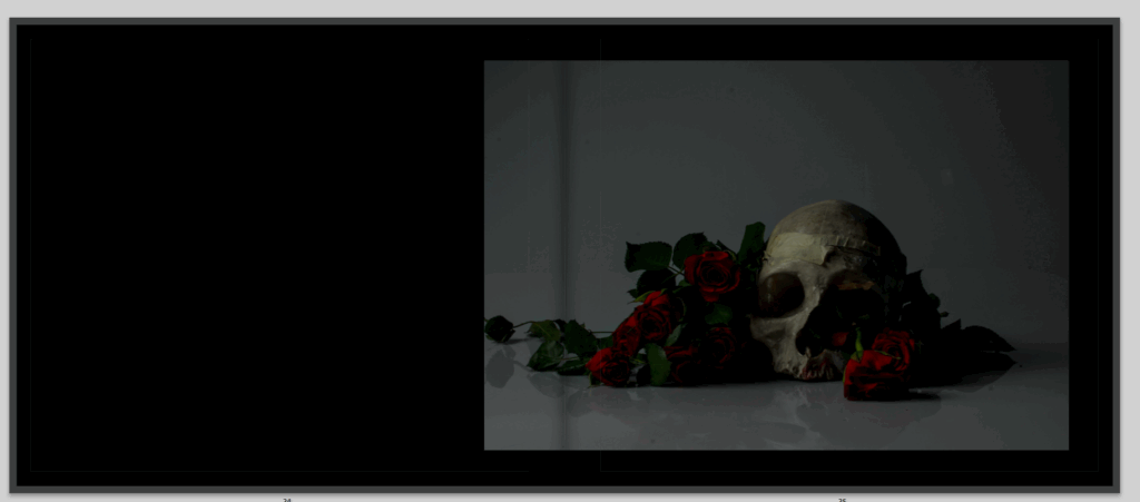
then I have this image, which I don’t know if I will defiantly keep here, but I really like it and I was tempted to have to has my front and back cover but it didn’t spread across the page or look right. so I moved it into my book but this here is is randomly placed.

Then I have this image, which I also don’t know if I love and will keep there.

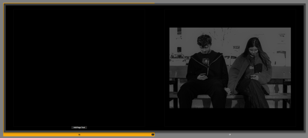
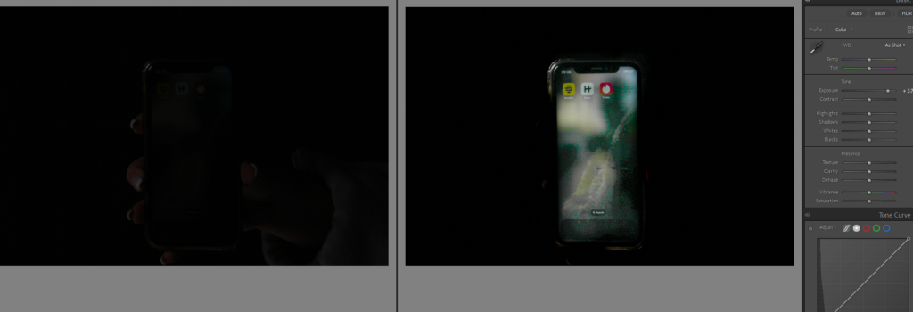
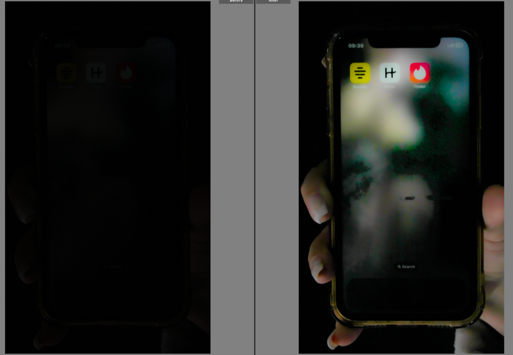
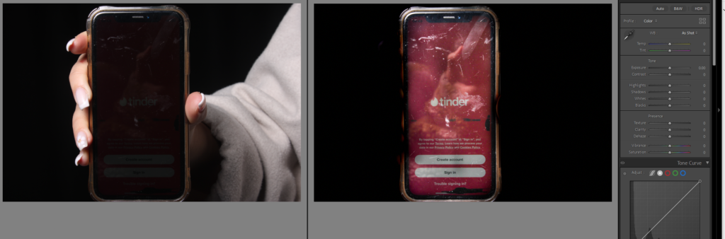
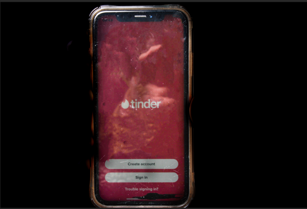
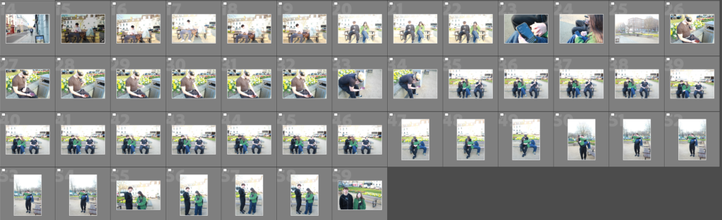
Then I move onto these pages, which show the guy sitting alone on his phone and that he was really look at a dating app, which shows that he believes he needs a relationship due to social media and what he sees around him and he ends up using social media to find it, and dating apps are known for being creepy, and fake and unreliable.

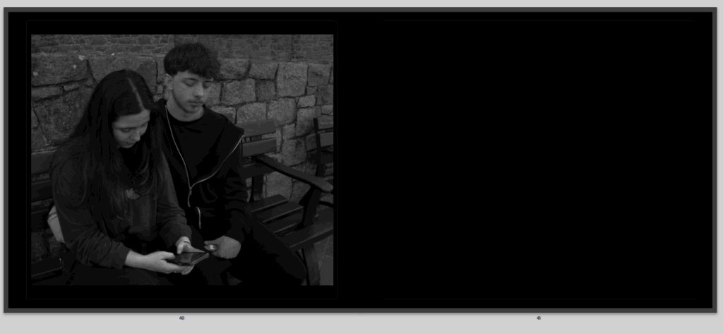
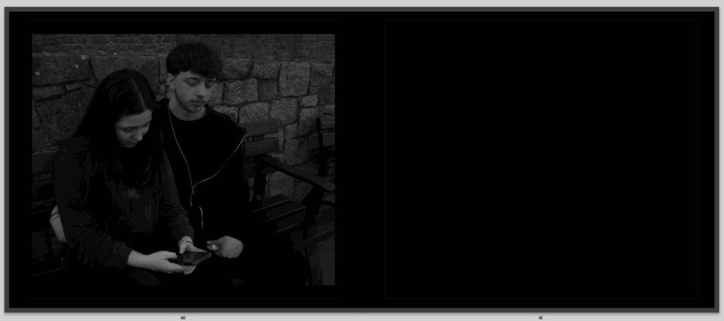
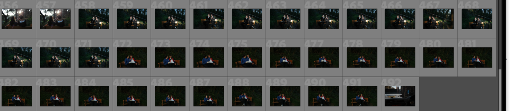
Then I have this image of the same happy couple shown before, now not so happy, as she is on her phone and caring about social media or sat looking for whatever not involving herself with her partner, and the partner is now jealous and paranoid looking over at her phone.

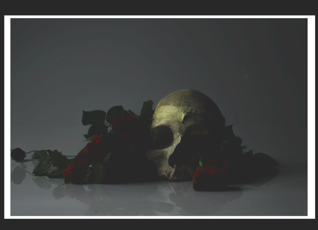
Then I have the final photo, of the flower we began with now dead and destroyed, like romance, on the right page opposite to the first to show that we are ending the story.

And that is my book layout plan as of now.

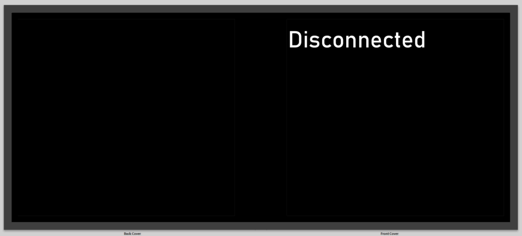
Then I started planning my front page and title, for the title I decided between ‘digital intimacy, real distance’ or ‘disconnected’ and decided that disconnected sounded a lot better, so that was going to be my title.

This was the first look, but I don’t like it because it looks boring.

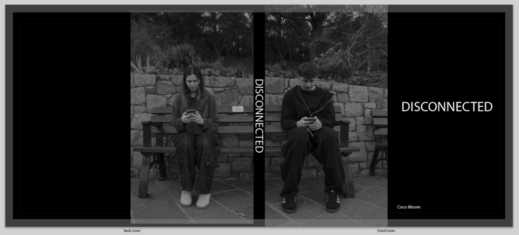
Then I changed it to have these two images here but separated by the spine so that it breaks them apart as they are right next to each other by miles apart.

Then finally I added in a little poem to begin my book. slightly explaining but in a symbolic poetic affective way. I might add more poems throughout, not sure.

Prints Planning – Coco Moore

Images I want to print:

This is my first mood board of images I am going to print, these all go together on this slide because these are my comparison picture, the ones I plan of putting together in the prints.

These are some more images that if I was going to print them they would all go together to show the obsession and evolvement over phones and how they consume are day to day life.

I really like these images and want to print them but I would probably print them next to other images, maybe the alive rose surround by happy loving images and the dying rose next to the opposite.

Next to loving images like this.

Next to some not so loving images.

Now that I have selected all the images I want to print I am going to go into photoshop and show you how I want to present them once they are printed and the sizes I want to print them as.

Print presentment:

these are draft examples of how I will present it when printed, but for all the comparison photos I think with the white foam paper I will give this polaroid affect then place it on top of the black card paper, I am going to show the other comparisons then, when I actually print them out I will decide if I keep them all together on one big board or separate them. I am thinking of doing them A5.

This is another draft of the comparison print photo, for the actual thing I will size it better so that the boarder matches correctly but here is my experiment of what I will attempt and have it try to look like and if I actually want to have it like that.

These are all my comparison photos done.

Then I have all these images together, will probably print them all A4 or the two in the middle A5 but I think that will then leave them quite disproportioned. I might board the two in the middle with a white boarder or window cut them.

for this print presentation the rose in the middle is going to be A4 and the photos around with be A5. I plan on having the rose in the middle as a window cut to give it its on way of standing out which is what I tried to present here in this virtual one.

This is the same but of the dying love.

This is my final image I would print and present as an A3 print and have a window cut to present it.

Photobook Research – Coco Moore  

What is a photobook?  

A photobook more or so refers to a book that holds a collection of photographs put together for the specific purpose of telling a story or investigating a manner in which they exist. Unlike a normal photo album, a photobook has lots of thought put into how the images are arranged in terms of layout and the overall aesthetics, allowing for a creative presentation in which photographs complement each other. Photobooks could be either personal projects or by renowned photographers, but either way, they provide an exciting medium to show off photography while exploring some idea or expression of a feeling. 

Photorahers known for their photobooks: 

Robert Frank – His photobook The Americans (1958) is one of the most influential in the history of photography; it bears the documentary style of rawness which portrays the postwar life in America. 

William Eggleston – He is most known for his radical use of color in photography. His photobook William Eggleston’s Guide (1976) is regarded as one of the significant births in the history of color photography. 

Nan Goldin-her photobook-The Ballad of Sexual Dependency-is a visual diary that touches powerful, personal, and raw moments in the life of the artist as well as that of her friends. 

Why are photobooks important to the world of photography? 

In fact, photobooks are so important in photography that they give the photographer an opportunity to narrate or convey a message through the images in a more intimate and thoughtful way than a single photograph. Instead of making random pictures, the photobook is a convenient medium for creating a larger picture or an emotional experience by letting the photographer choose and arrange their photos carefully. It is also another option for photographers to show their style, message, or even a theme they are very passionate about, all within the reach of people outside galleries or exhibitions. As for the moment preserved and shared, they also make photobooks historic and artistically synonymous in the photography world. 

The evolution of photobooks: 

The progress of photobooks changes a lot with time. It all began with the early decades in the 20th century when photographers such as Alfred Stieglitz and Edward Weston turned books into new avenues to display photography work in something more artistic than just random snapshots. In the 1950s and 60s, photobooks gained such great resonance when photographers like Robert Frank and William Eggleston would make them containers of epics or time-catchers, usually questioning the traditional ways of photography. Over the years, innovations have not been set aside, including all modernization with the coming up of new technologies, printing techniques, new layout approaches, and overall freedom photographers have with experimenting. Today they are the avenue that opens to everyone wanting to show their personal vision and arts-one-of-the-best venues that have grown to be photography culture. 

Edited Photoshoots – Coco Moore

Photoshoot 1:

I edited this photo by changing the basics to give it better lighting and more the effect of dark and gloomy I was going for. I still don’t think it is perfect and didn’t love the background because I wanted it to be black. the main point of this skull is to symbolise the death especially the death of romance.

I have the way I edited it next to the image, and the rest of the images like this I plan on editing in similar ways. but for this one to experiment I brought it into photoshop to attempt to change the background.

This was my first attempt of a back ground I wanted it to be black but I thought this looked cool.

This was my second attempt.

This is another photo of the skull I edited but instead of going to photoshop I edited the black background in Lightroom by using the brush filter and bringing down the exposure and blacks, and contrast.

This was my first attempt to edit this image of my phone to make it more obvious what was on the screen, as you can see from the first photo it is not clean what’s happening in the image, so I used the brush tool again, I used it to make the background around the phone dark, and the used it again to make the phone light. but I just didn’t light the photo because of the lighting and graining in it.

I tried again with this image, and cropped it so it was more focused on the phone, I lowered the texture to not give the grainy affect which still didn’t work because the lighting in the studio wasn’t right for taking photos of the phone, it worked better in this image but still not clear enough with what’s going on in the image.

Did the same with this image, which worked better because my screen was brighter but my phone looks very grubby with all the marks on it so I will take it in photoshop to try and remove them.

I removed most the scratches but there is still some and I’m just not sure it looks great.

Photoshoot 2:

I do like this image, and fits well into the street photography aspect and inspiration from Henri Cartier Bresson, but it isn’t perfectly edited it was a bit rough just to test out the tools on how I wanted it to look. Mainly turned it black and white and adjusted the exposure and contrast and used the brush tool a little in the top where it was brighter from the sun.

I edited this in black and white as well which is what I think most of my images will be, I decided to crop this one, and used linear gradient instead of the brush tool to darken where the sun was shining brightly

I wanted to make this image look like an old in time image, so edited in Lightroom, I liked it but didn’t think that it gave the right affect still.

I attempted again by putting the image into photoshop and using another image of a textured old time affect, and then lowered the opacity, but it was a little too faint the actual image, so then I added the same background image again on top and lowered the opacity of that image.

On this image I used the linear gradient, to make it so half the screen was black and white where harry the guy is sitting because he is on his phone and it gives a symbolic effect that the darker side is the falling out of love or less invested in the relationship while Martha the girl has colour but its slowly fading, because she is getting fed up.

Again I made it black and white and changed the exposure used the brush tool on the hand to change the lighting a little because it was very bright, don’t love this image just because I think it should be on messages, but I liked the editing and how clear it was that was said.

I made this image completely black and white using the brush tool but kept the phone bright and upped the saturation a little to make it brighter and more visible.

Again with this photo I edited the exposure and contrast especially for the hair as it is very bright and blonde, I made it black and white because I think it looks better and gives a cooler more dingy affect on my images, contrasts everything better, but I want the phone to stand out more, so might consider cropping it, trying again with that being the only part with colour its still not obvious enough though.

This was my attempt in photoshop and it looks a lot better.

Liked this image, just made it black and white, and if I wanted to add it into my book I thought I would have there fold of the pages right down the middle to show the juxtaposition between the people more clearly. Decided to edit it in some different way.

I then tried it using the linear gradient tool again on the side of the single man to give the dark cold black and white affect on his side and a colourful side on the couple.

I then cropped it so it was only the couple and the other crop is only the single man.

I cropped this image as well, made it black and white and this will be an image that correlates with another image from the old days, possibly.

After going through and editing all my current images I coloured the either, red, yellow, or green, I did this to show which ones I really like and want to keep or the ones I hate.

Red = I don’t like it don’t use

Green = love it, definitely using it

Yellow = I do like it not certain though, maybe ill use maybe I wont.

Photoshoot 3:

At first I edited this image making it black and white, I didn’t like all the people in the background though and attempted to get rid of them in photoshop but it did not work as well as I wanted.

Got another photo from the couple on the street but instead for this one I moved it to photoshop and removed the people, the bin, bench and pole. so to not take away focus from Ellen and Tony.

This image I once again removed things from the background but don’t love how it worked out and think its still gives a cool affect when it is next to the comparison photo.

This image I turned black and white, and did the basic edits as you can see of the exposure and contrast, but then I also specifically used the brush tool on the ladies face because she was very bright which isn’t a bad thing just think their wasn’t any shading or texture to her face and it looked odd.

these are my street photography of couple or people on their phones and I don’t have a specific way of editing I am making them all black and white and then playing around with all the other tools until I think it looks and gives the right affect.

Photoshoot 4:

I edited this image by making the surrounding black and white using the brush tool, and then I decided to bring the saturating up for the rose to add to it standing out but I don’t love it.

I moved this photo into photoshop to change the vase.

Photoshoot 5:

In this image I wanted the heart to stand out so outlined it with the brush tool and darkened the exposure, didn’t pop out as much as I wanted.

This photo I used the brush on both the phone and the background, the brush tool used on the phone was to make it brighter and slightly more visible and full of colour, when the brush tool on the background was used to make it black and white.

Then I decided to crop the photo so you can see the phone and the photo on the phone more clearly to see what’s being looked at.

And this image I am editing in photoshop and it is incomplete right now as I plan on adding different text messages and more above the girls head but need to select them first.

Finally I have the last 88 images, either in green, yellow or red, to be selected and chose for my photobook.

Photoshoots – Coco Moore

Photoshoot 1:

For my first photoshoot I did not have much plan yet but I went into the studio and took some photos of still life, and my phone which I may end up using in my final piece but I always find that my first photoshoot is the practise photoshoot.

I took 29 photos in this photoshoot.

After that I went through and flagged which ones I wanted to edit and where the best and most likely to use, this left me with 12 photos.

Photoshoot 2:

In my second photoshoot I had an idea of what I would do for my project and when I wanted to do it, I still think it was more rushed, I took street photography photos in town and also some photos of my friends being coupley or on dating apps to represent love today, romance, and social media has affected that and also some recreations of old in day couple photos.

In this photoshoot I took 137 images.

Once again I went through and selected the best ones and ended up with 47 images. These I plan on editing and improving to hopefully use in my final project.

Photoshoot 3:

In this photoshoot I took 164 photos, of my friends who are in a couple that was similar to old photos that I used as inspiration but except they where on their phones, to show a contrast and juxtaposition.

That I slimmed down to 33 photos that I will edit and choose the best ones for my book.

Photoshoot 4:

Photoshoot four was a photoshoot in town of street photography mainly just people walking by on their phones not paying attention to things around them, maybe missing out on future relationships they past by.

I only took 30 photos in this photoshoot, and will probably take more but these photos will just be fillers in-between pages probably to show even more affect of social media.

Then I slimmed that down to 7 photos, to edit.

Photoshoot 5:

In this photoshoot I went into the studio and mainly used roses and a skull to get symbolic images of romance and death.

This was 113 photo in this photoshoot.

This was cut down to 32 photos.

Photoshoot 6:

I then took more photos, in Churchill park in St Brelade. there are 89 photos here.

then slimmed them down to 22 photos.

artists case study 2 – Coco Moore

Robert Doisneau

Who is Robert Doisneau?

Born in 1912, just outside of Paris, life was a bit rough for him early on-His parents died when he was still very young. He was then raised by his aunt and placed in a school where he learned the art of engraving.

Then came the discovery of photography.

In the beginning, he worked in a factory as a photographer for Renault, but he could never make it on time because he would wander around Paris photographing the lives of everyday people. After a time, he was let go, but honestly, this was one of the best things that could have happened to him.

So, he went off doing magazine work and continued-doing what he loves: shooting random moments of real life. Roussel cherished taking photographs of human beings just being: kissing, laughing, getting late for an appointment, shopping, playing-nothing about model work or posing. It was simply life.

The most flattering image from him is The Kiss by the Hôtel de Ville—a couple kissing on a sidewalk in Paris, with pedestrians walking casually past. Everybody was convinced that it captured a truly random romantic moment, but funnily enough, it was staged! He had spotted that young couple earlier and asked them to kiss again during the time he took his picture. Pretty wild, right? But, although posed, it comes off so real. This is why people cherish it.

Artist Study – Coco Moore

Henri Cartier- Bresson

Who is Henri Cartier-Bresson?

Henri Cartier-Bresson (1908-2004) was a French humanist photographer considered one of the greatest photographers of the 20th century. He is widely regarded as the father of street photography and the concept of the “decisive moment.”

Cartier-Bresson was born in Chanteloup, France, and began his career as a journalist and photographer in the 1930s. He served in the French Resistance during World War II, using his photography skills to document the war effort.

In the 1940s and 1950s, Cartier-Bresson became known for his innovative approach to photography, which emphasized capturing the essence of a moment or scene in a single frame. He believed that photography should be a way to reveal the human condition, rather than simply documenting reality. He coined the term “decisive moment” to describe this concept, which refers to the fleeting instant when all the elements of a scene come together to create a powerful and meaningful image.

Cartier-Bresson’s photographs often featured everyday people going about their daily lives, but he was also drawn to capturing the beauty and dignity of marginalized communities, such as gypsies and peasants. His work often had a strong sense of narrative and storytelling, and he was known for his ability to capture complex social and cultural dynamics in a single image.