All posts by Chanelle

Filters

Author:
Category:

Evaluation:

Overall, I believe that this project went quite well as I was able to take photos and express how they created a sense of unity. The key word for this project was “Union”, for me that word means a group of people, a society, people that share things in common, or don’t. For my project I decided that I wanted to incorporate my own word to make my project more personal to me, I decided on the word “sonder”- which means that everyone has a life as complexed as yours, even the people that walk past you in the street. Its the idea that everyone is struggling and finding things difficult, but it shouldn’t be seen as a negative thing. This made me realise that each individual has a different life ahead of them, some may live longer than others, be more fortunate and others may be influential in peoples lives, but I feel like todays society has completely forgotten how to respect each other and take care of others but most importantly yourself. I do believe that doing an experiment of different photoshoots before completing the project was very helpful for me as if allowed me to understand the true meaning of a union and what I can do to make the theme more personalised to me.

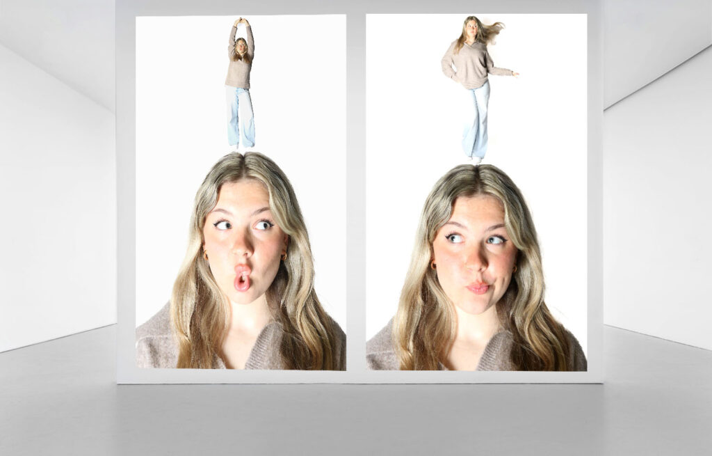
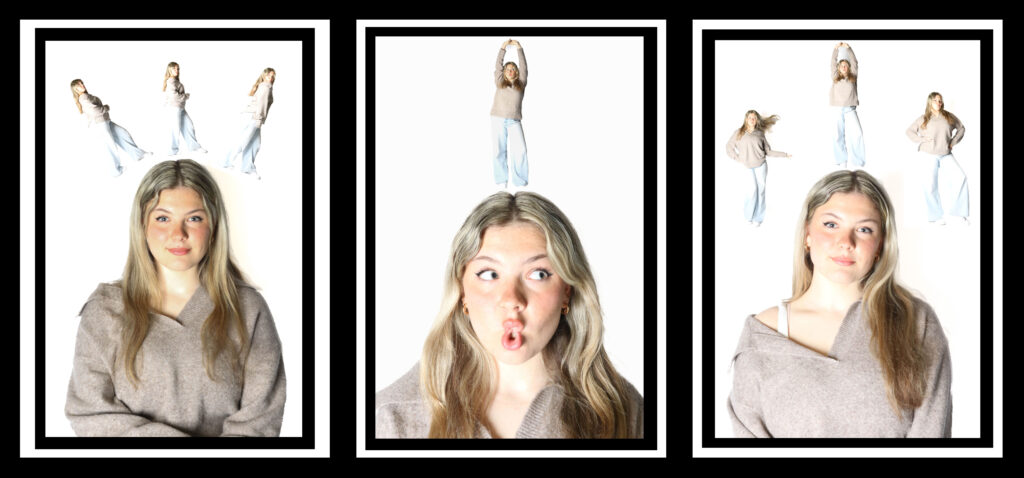
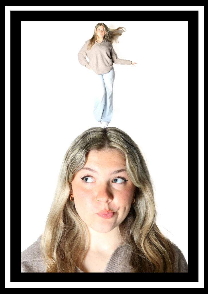
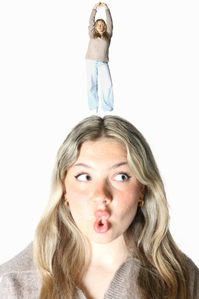
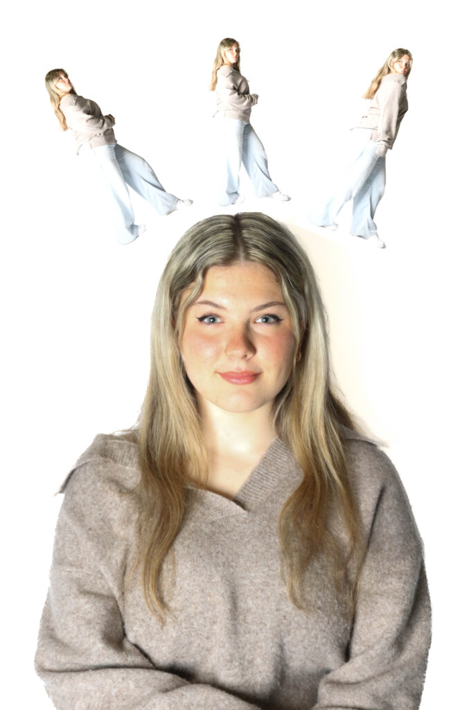
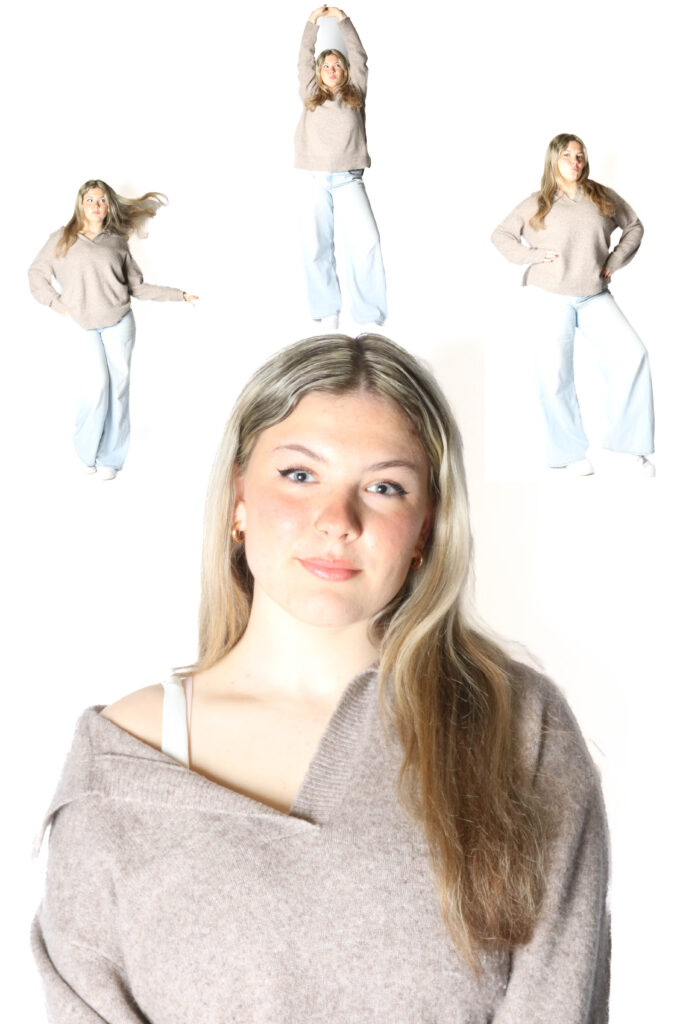
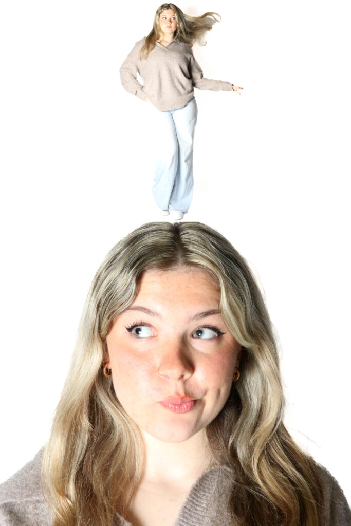
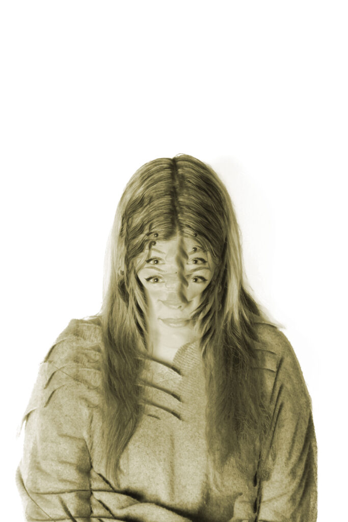
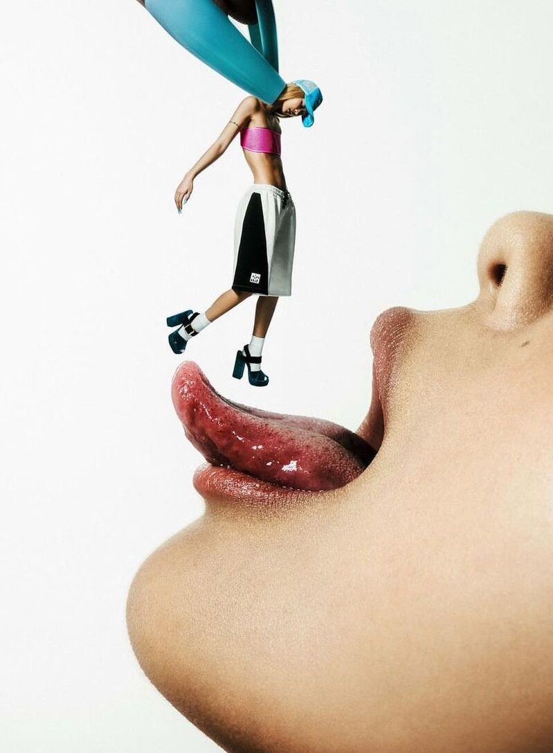
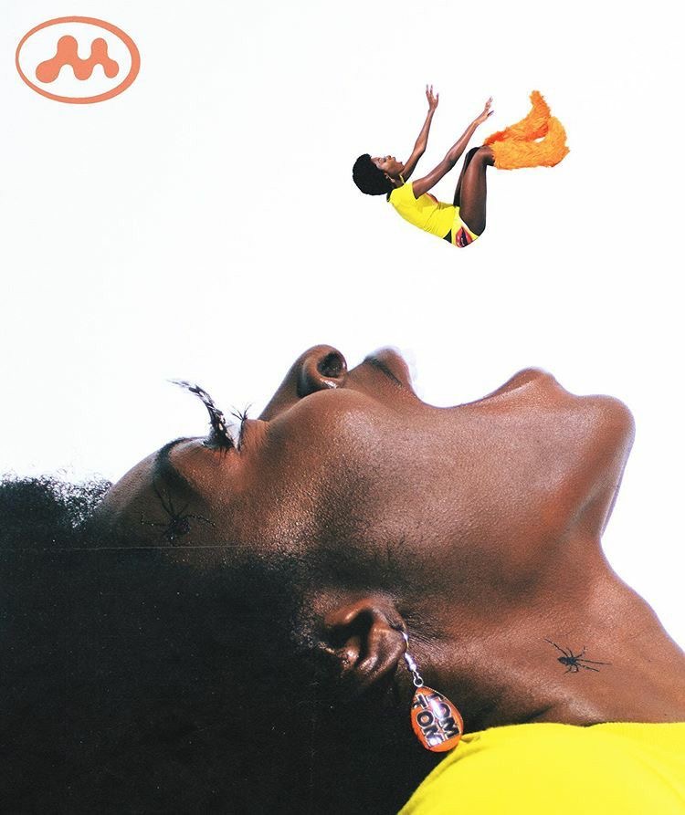
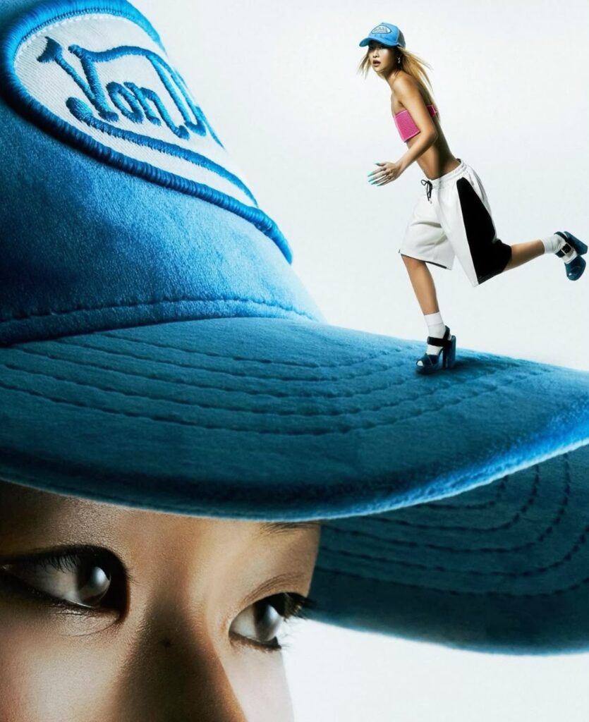
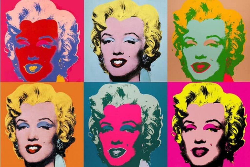
My plan was to go and take some pictures of different concepts based on my artists research and the art movements, I decided to pick surrealism and Dadaism, for surrealism, the concept that I used was to have a portrait of the models face while having another model/ the same model standing on top of the models head, this makes the photo look 3D and has a different type of effect to it, it’s almost as if someone was controlling the model and telling them what to do. It’s very surreal as it’s not a subject you would tend to see often. For the Dadaism movement I decided to do some work around Pop art as it was quite influential back in the day, I also did an artists research on Andy Warhol who came up with some great concepts.

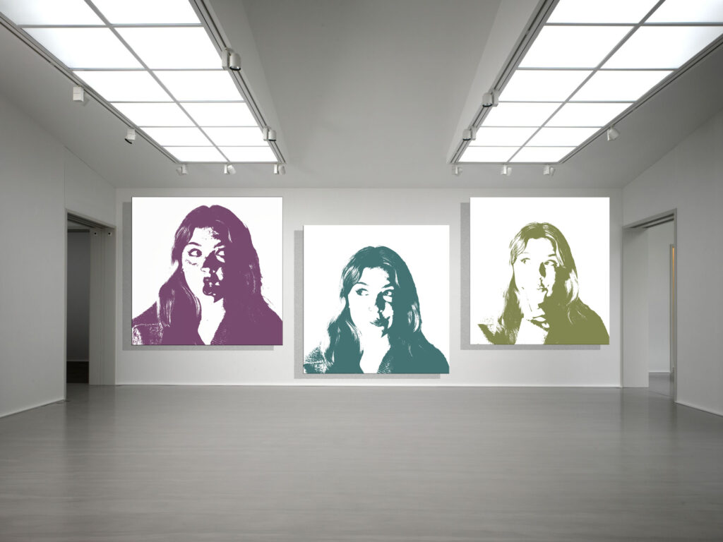
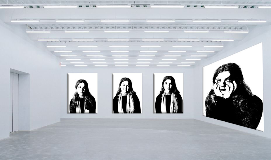
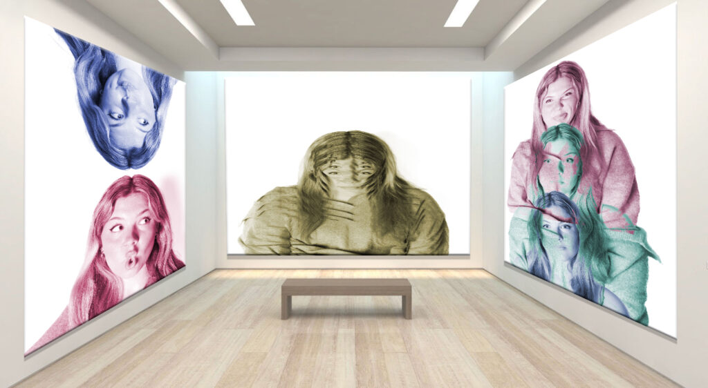
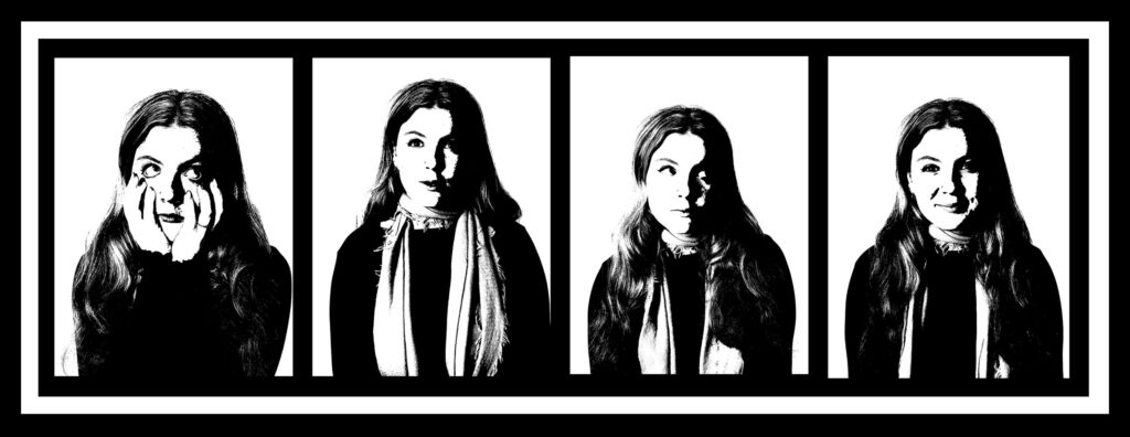
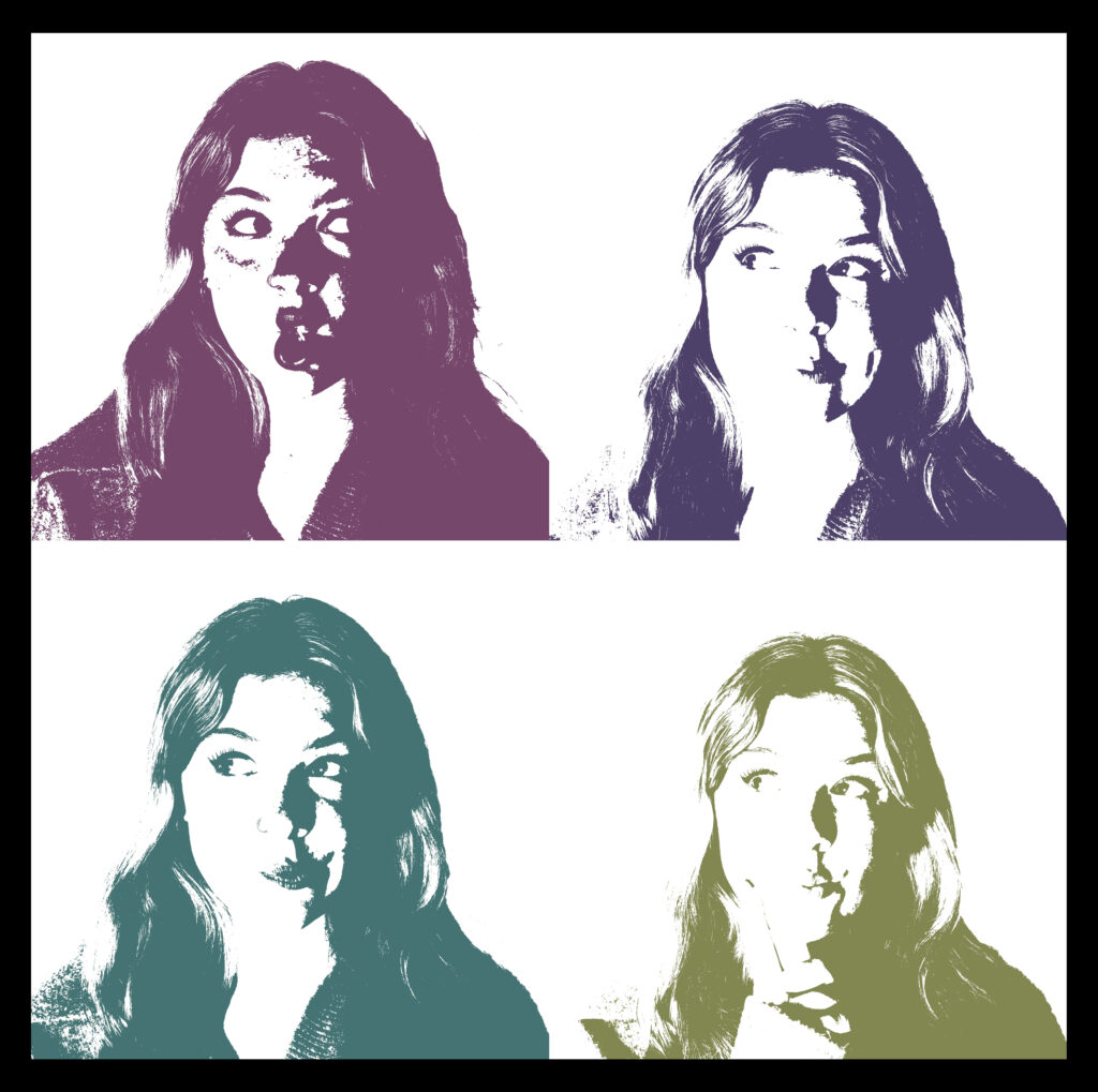
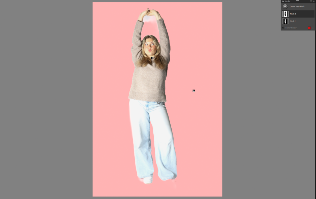
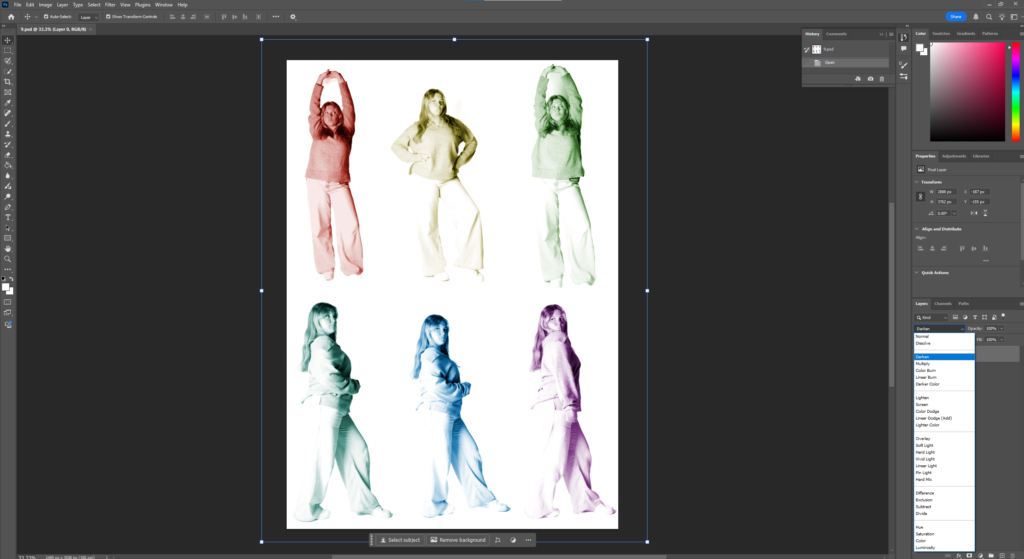
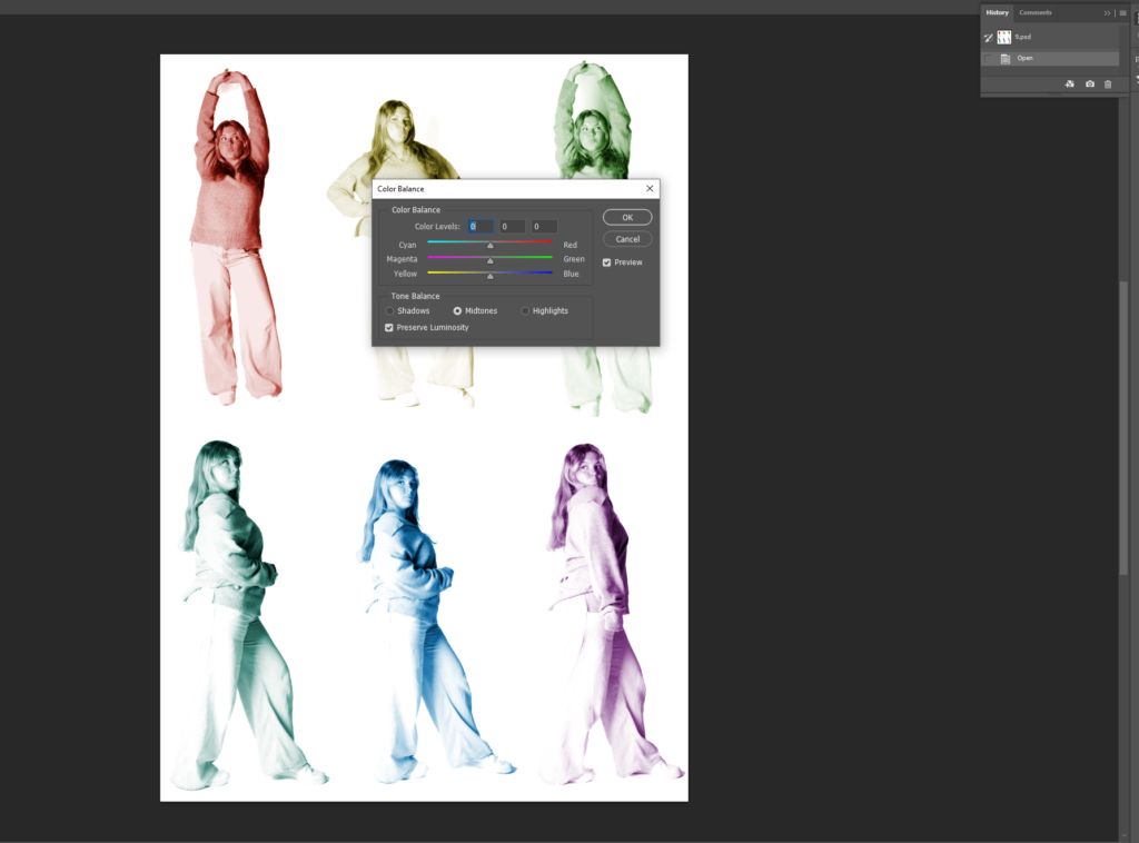
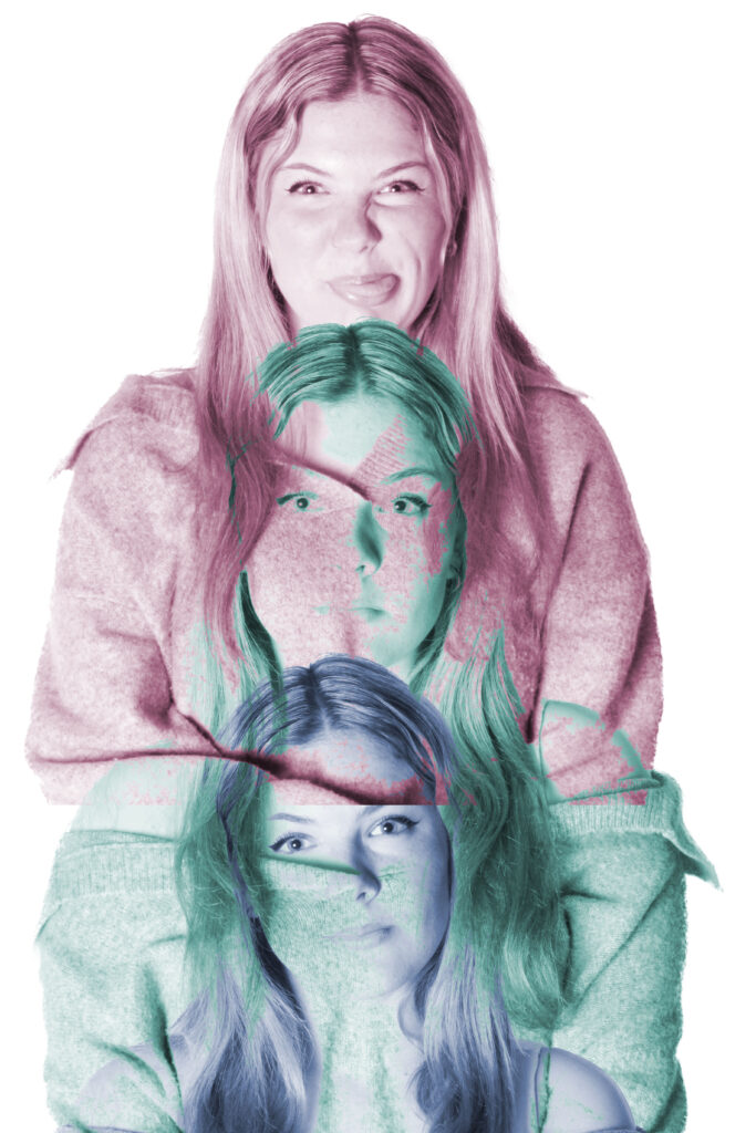
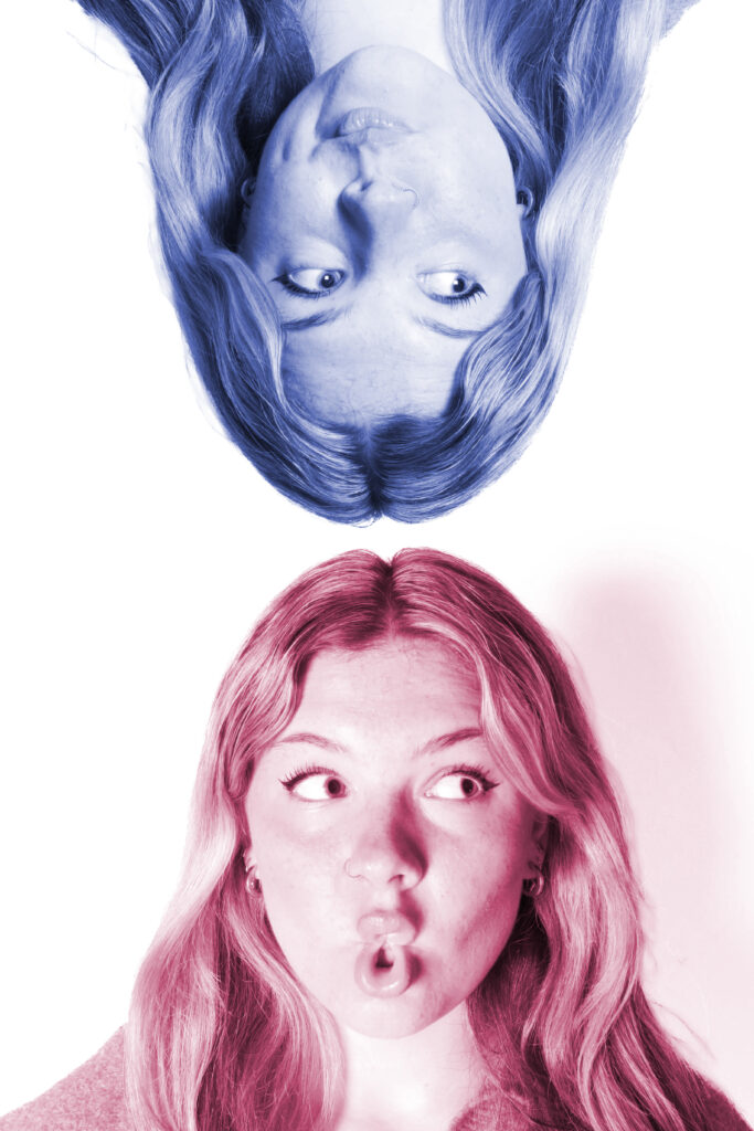
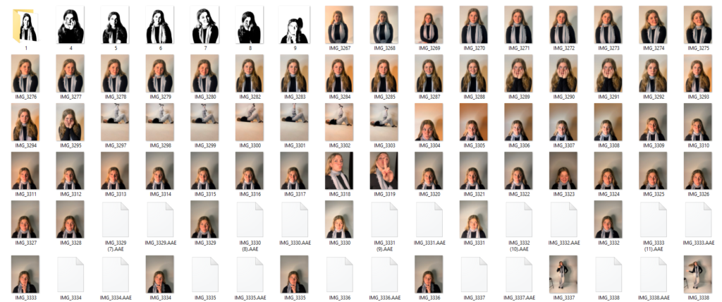
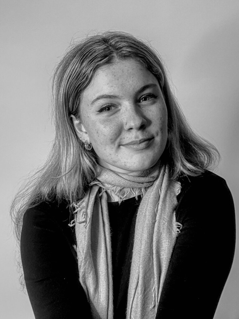
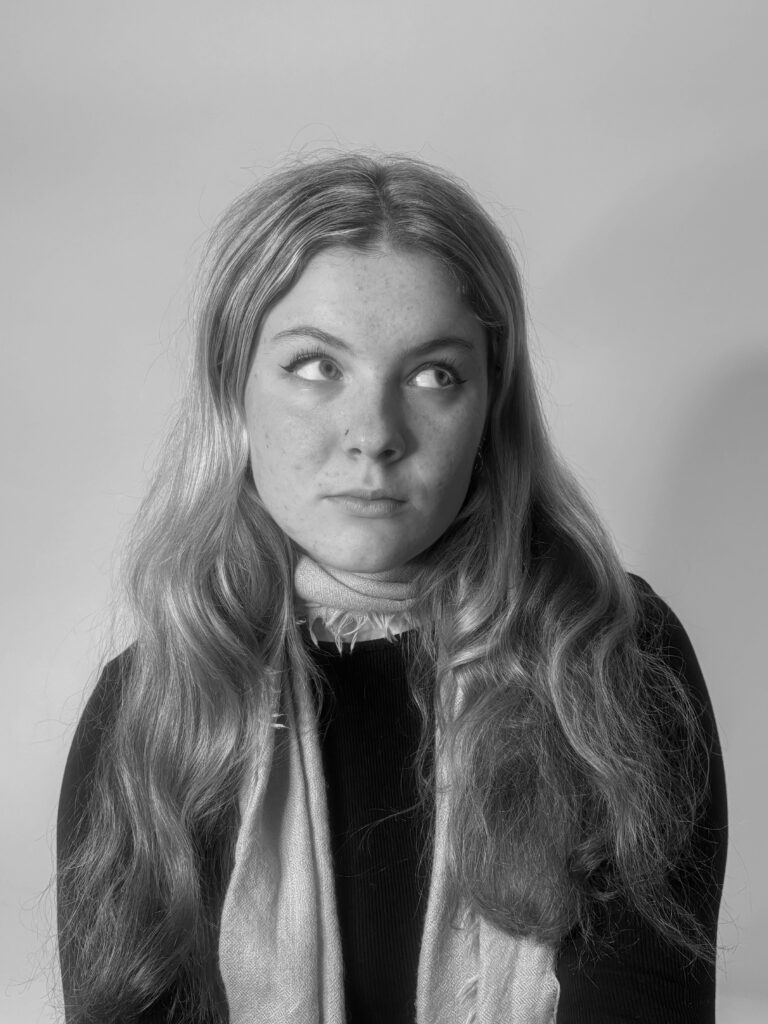
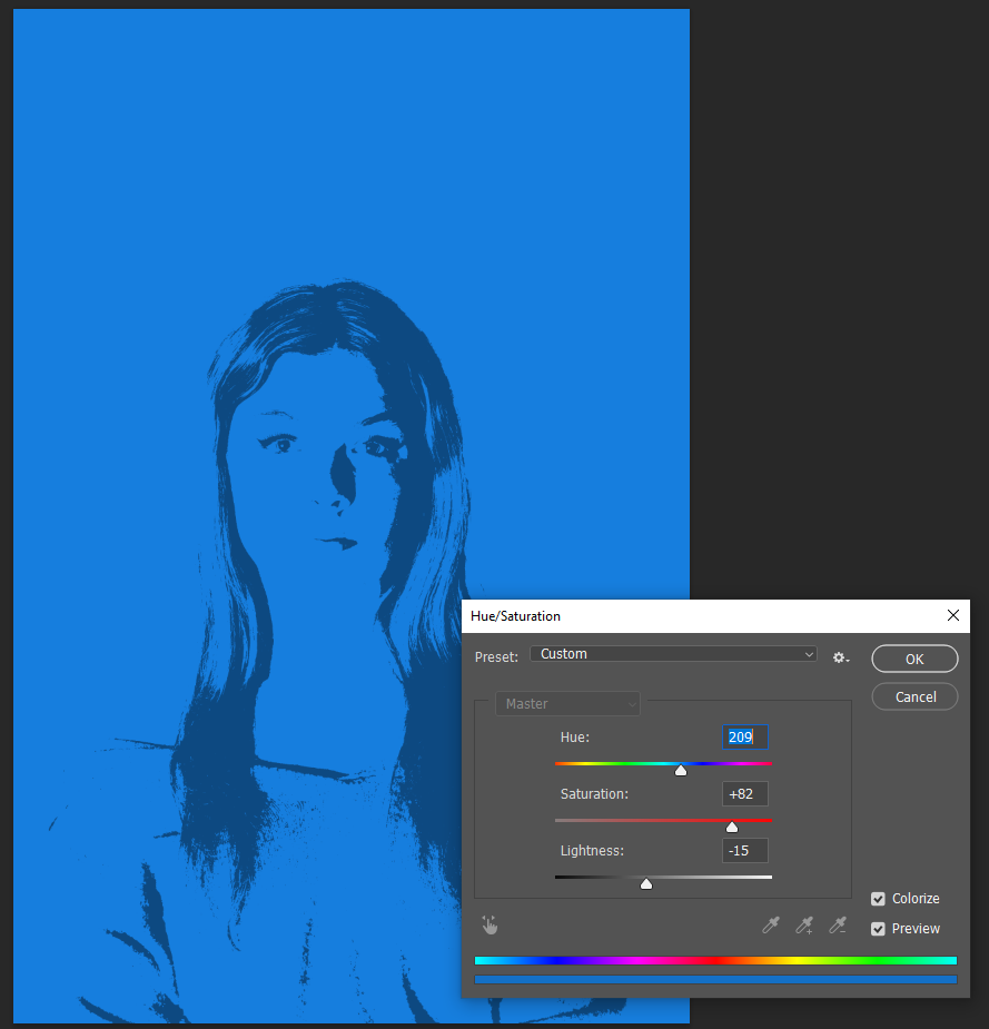
My photos turned out quite well and I even experimented with it deciding to use some of my photos in colours and some turned into black and white. I also did some other experiments on Photoshop and Lightroom by adding different contrasts and different layers on top of my photo. Some of my experiments concluded me to turn my photos upside down and almost have it look like they are hanging, where as for another experiment I decided to add all the portraits of the model side by side and turn each photo into a different colour, as I feel that each colour represents different emotions. I really like how my experiments turned out.

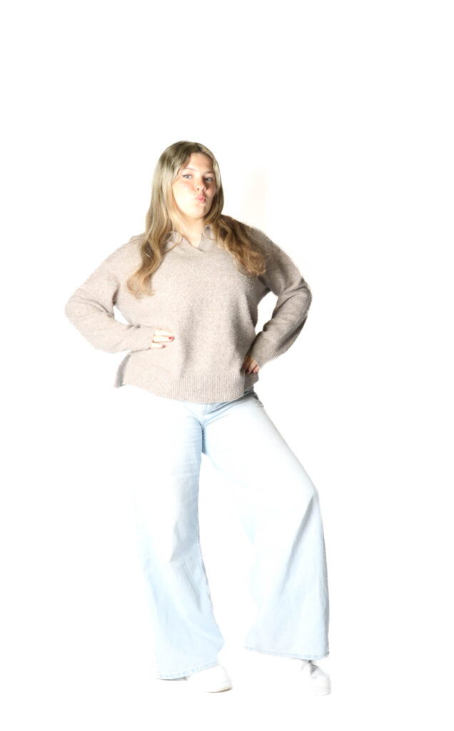
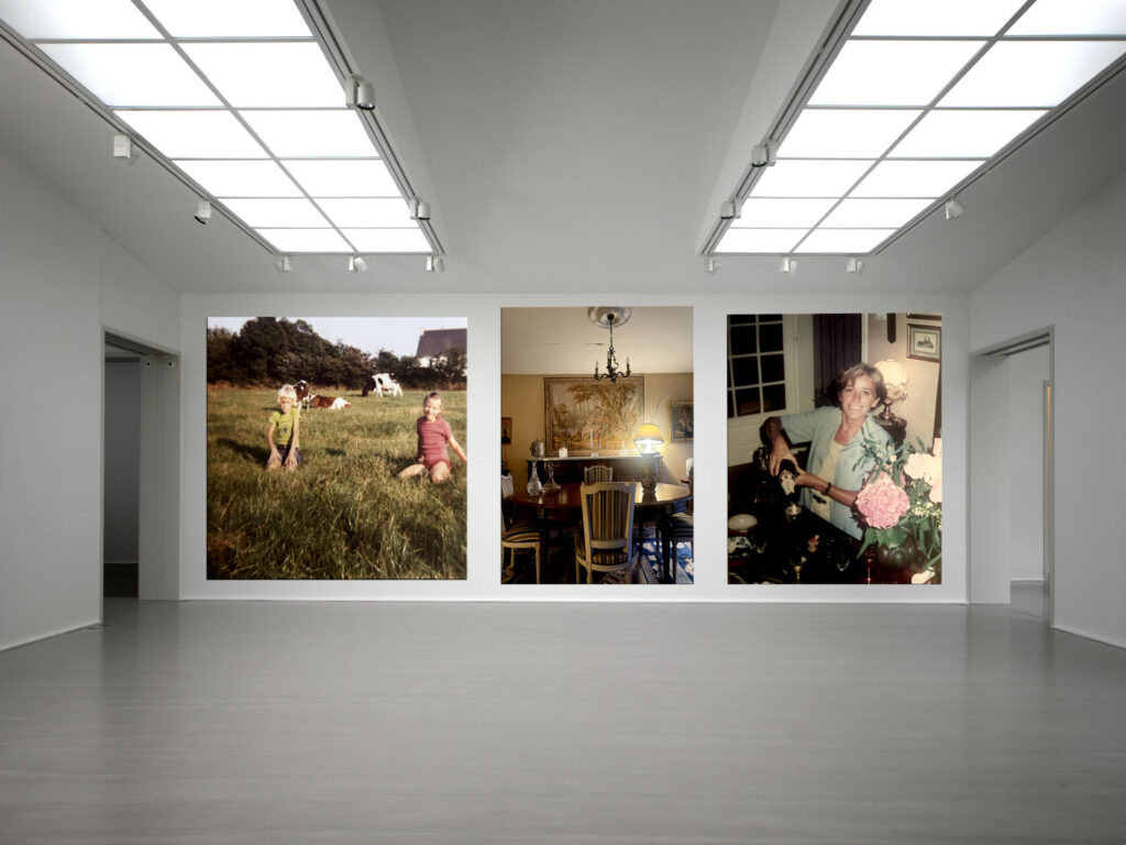
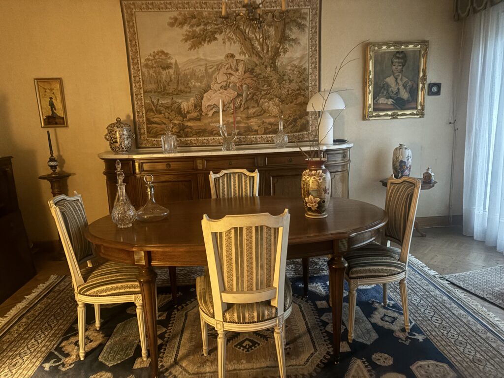
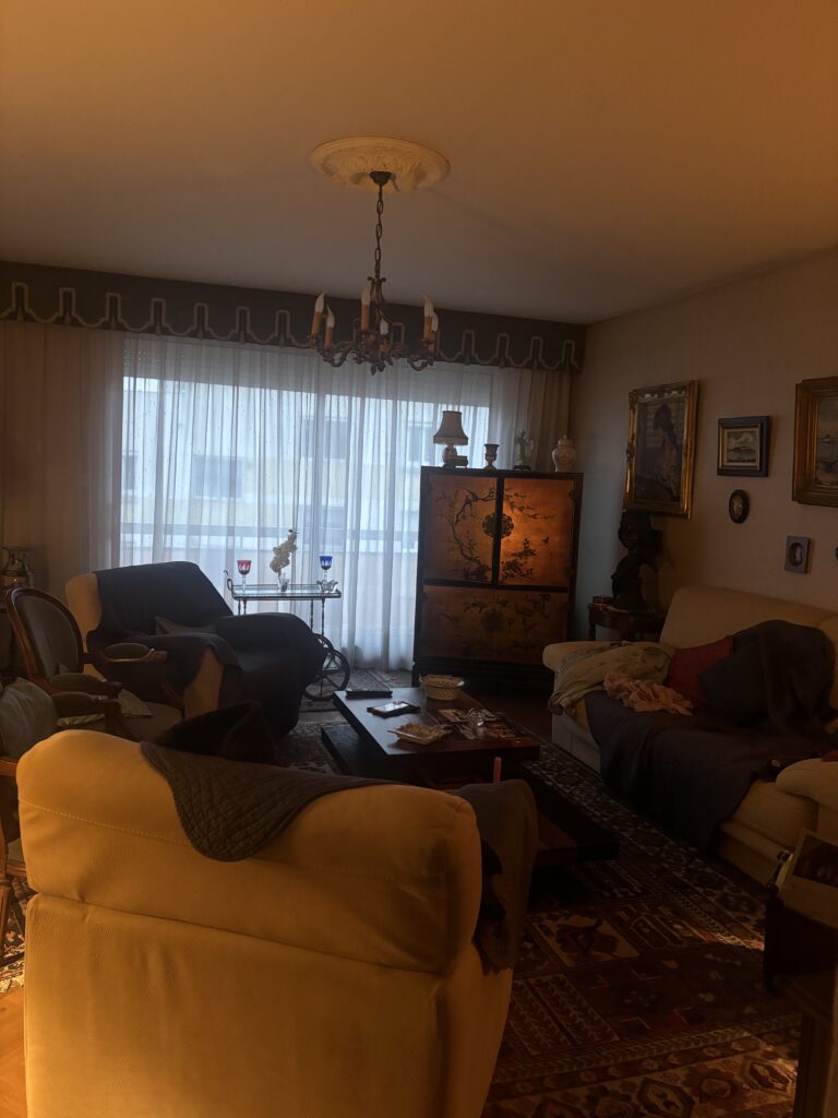
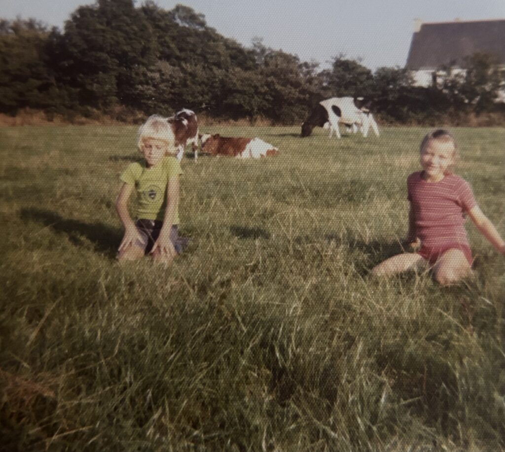
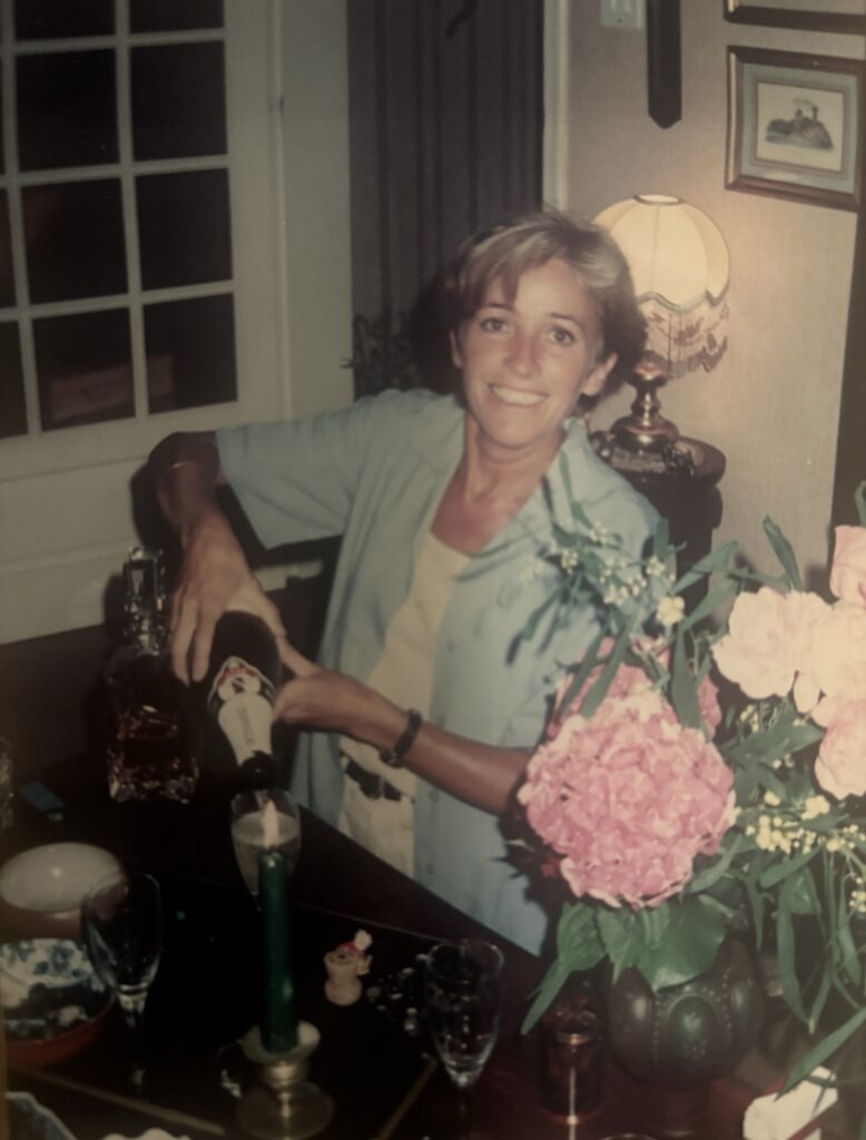
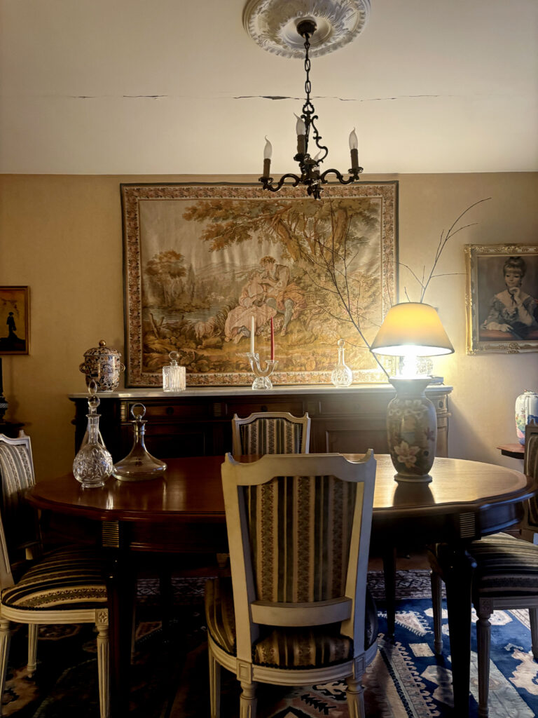
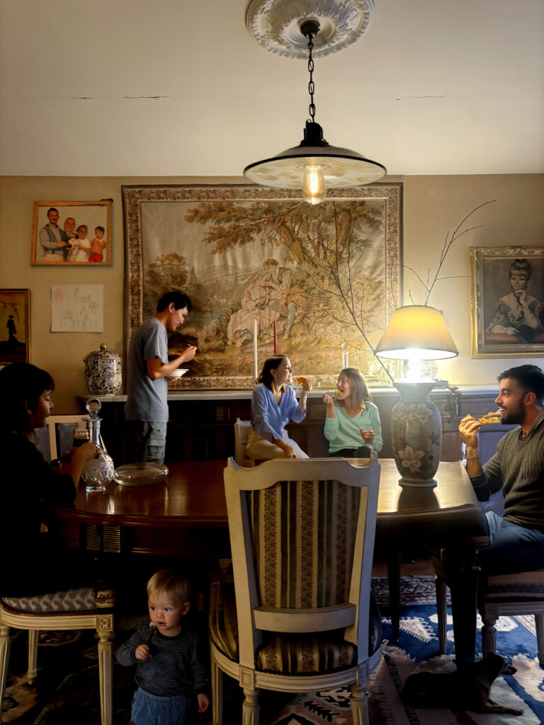
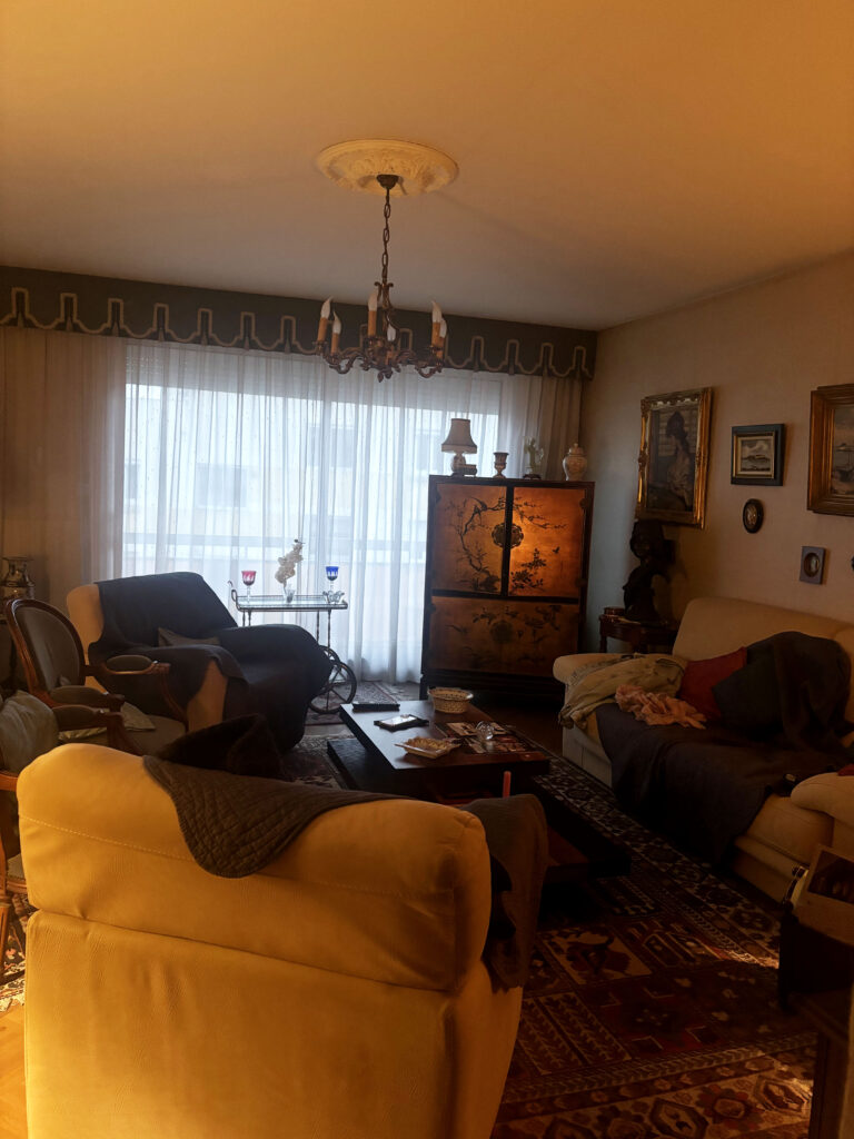
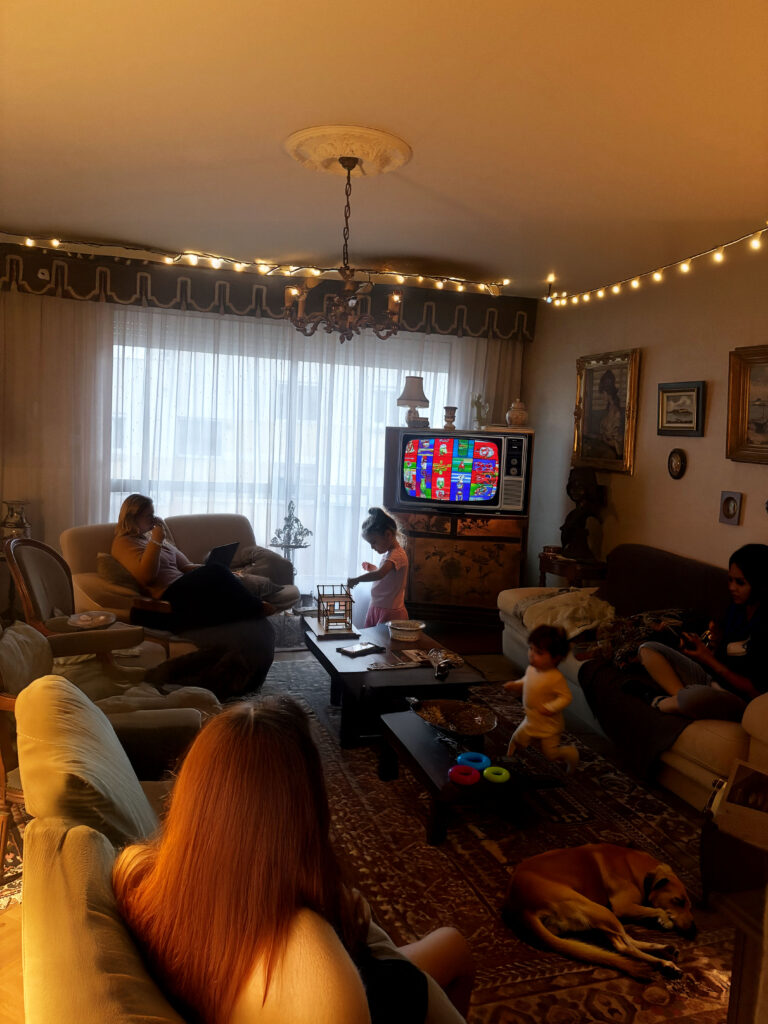
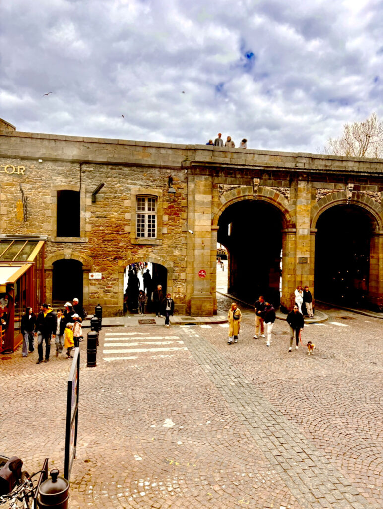
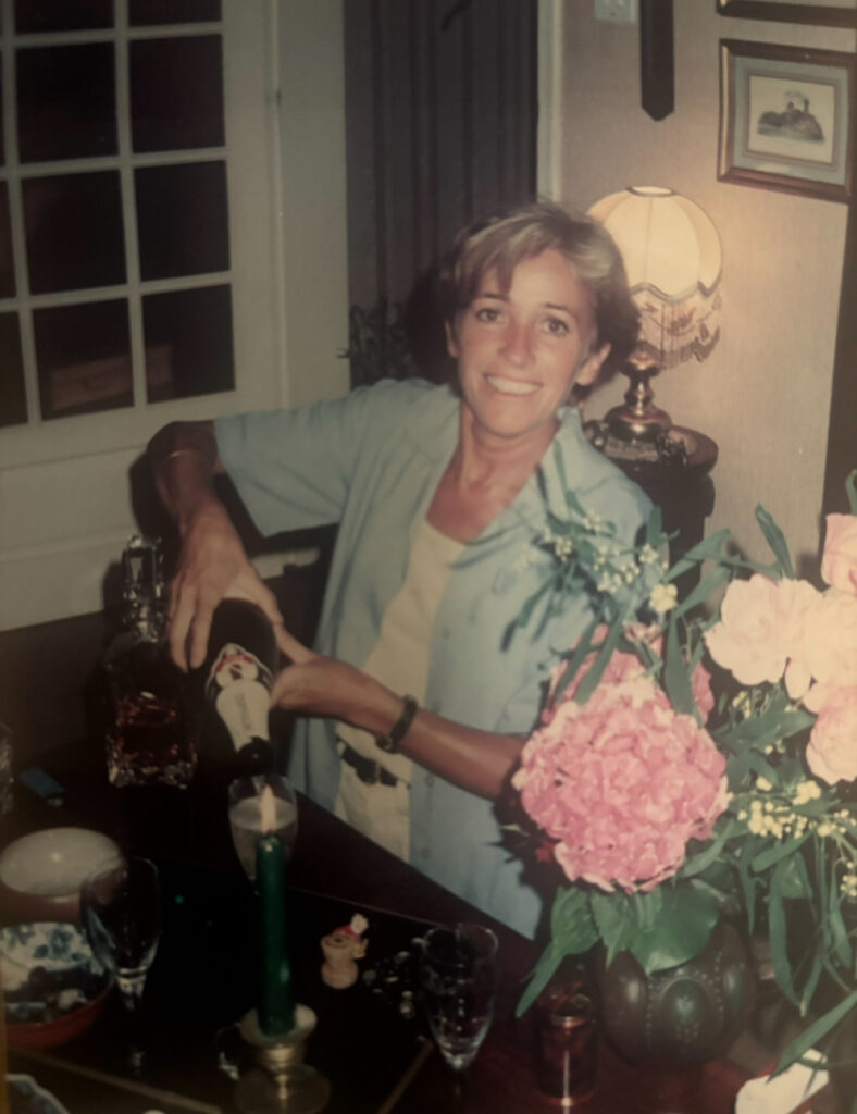
Before I started adding an artist research or art movement to my work I went away and took some photos that seemed to have a concept to do with the key word “union” . I decided on adding my own key word into the photoshoots, I had gone away and taken photos of France, a place my family grew up in, I decided to go to a family members house and simply take pictures of their house, the way each piece of decoration was set up and how it was set up, how it made it their own and personal to them. I had the idea to then use AI to add people to the photos as the photos consisted of an empty room filled with furniture. The added people helped to add a sense of liveliness and a sense of love and comfort. This links in well with the theme of union, the idea of having a family together, sitting down and having a good time, enjoying themselves. However it isn’t really related to any art movement which defeats the whole purpose of this project. Although I wasn’t able to capture the true moment of a union, I was able to add people to a place I felt comfort in. I was also able to find some old photos of some relatives and add them into my work and how a union of people also known as my family can mean so much to a person.

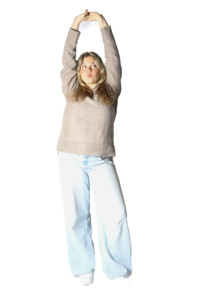
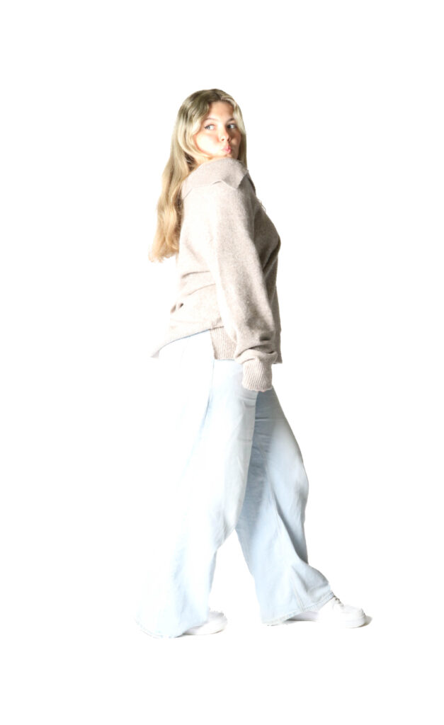
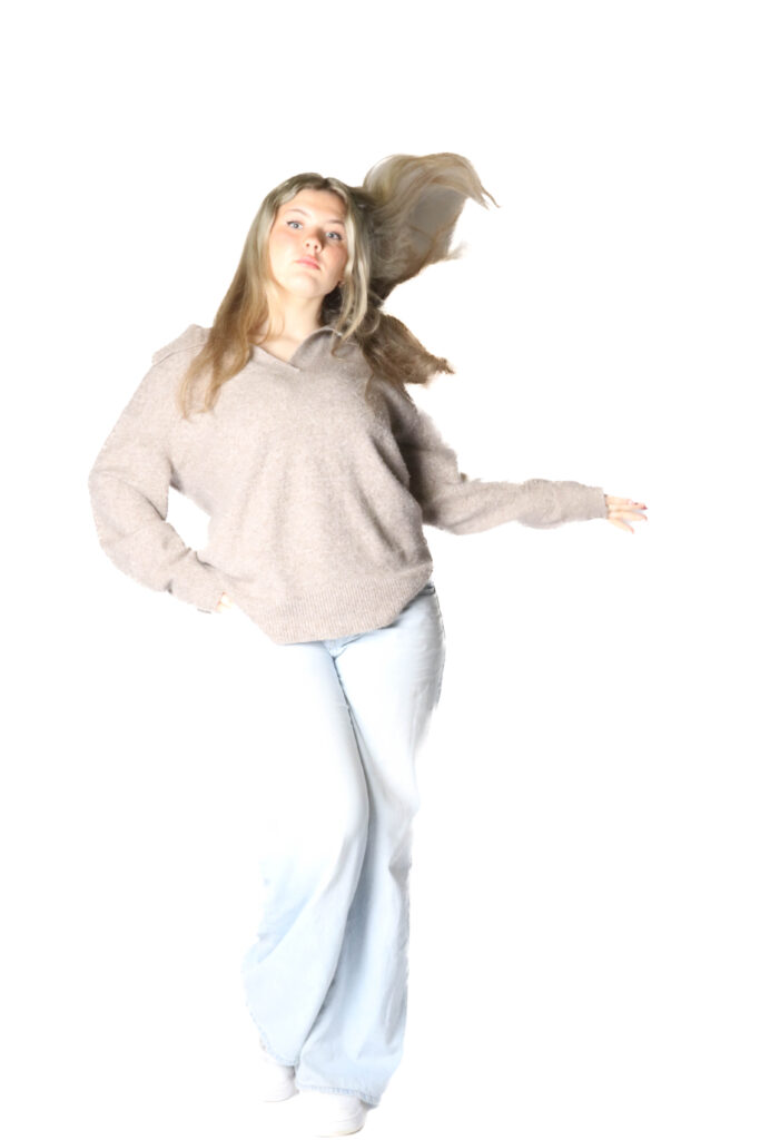
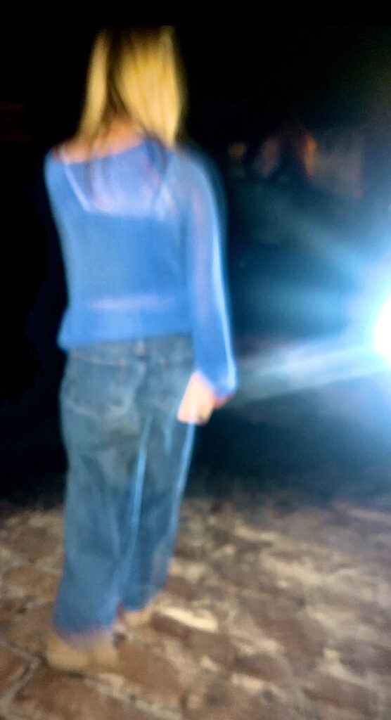
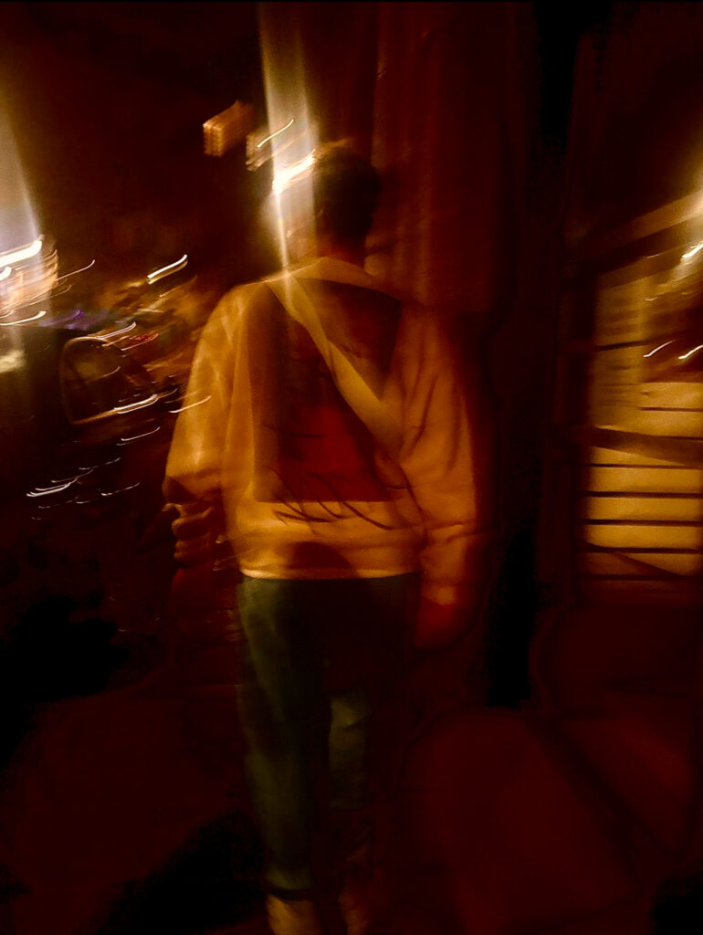
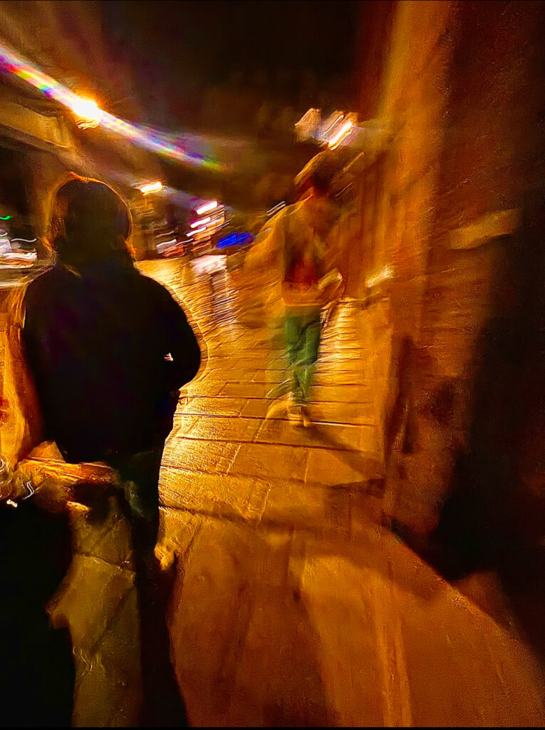
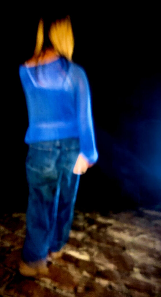
Although I have been looking at a union of people, I also wanted to incorporate a union of emotions and how important your emotions are. I did have a few photos of individual people, that could show a sense of strong emotions, for example I had a photo of a girl wearing a blue jumper and blue jeans, she seemed to be walking towards the edge of something, which could represent a sense of fear and dread, the girl could be afraid of heights or possibly just wanting to have a look at the view ahead of her. Its a sense of mystery and both the themes of sonder and union of emotions came in. Overall, I believe that this project went well as I was able to understand and demonstrate the theme of Union. I added some of my own ideas to create work personalised to myself, by using photos of important people or important surroundings. If I were to do this project again I would simply focus on one thing related to union, for example I would either put just people or just emotions, I personally believe that I would pick emotions as it is quite a deep topic to explore, its quite a big topic and will allow me to expand my knowledge.

I do like that I chose the surrealism art movement as it’s very interesting to look at and see how things can become surreal, I feel like when editing in photoshop and using AI, it would be quite easy to create a surreal piece of work, but adding surrealism and emotions together would be quite challenging and fun to work with. I was able to get a strong understanding of what surrealism is and how to create a surrealist effect, I did also for some research on Dadaism and I wasn’t a big fan of it, but I do wish that I had incorporated it more into my work, Dadaism gives me the idea that my work could have been a collage of some sort, possible a collage of people, emotions, or simple a union of things.

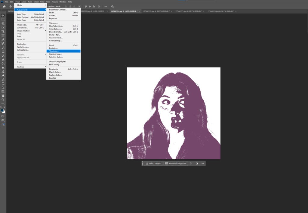
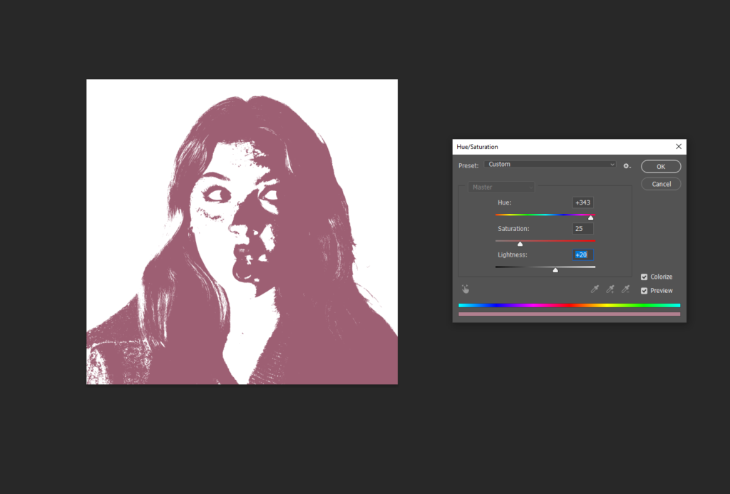
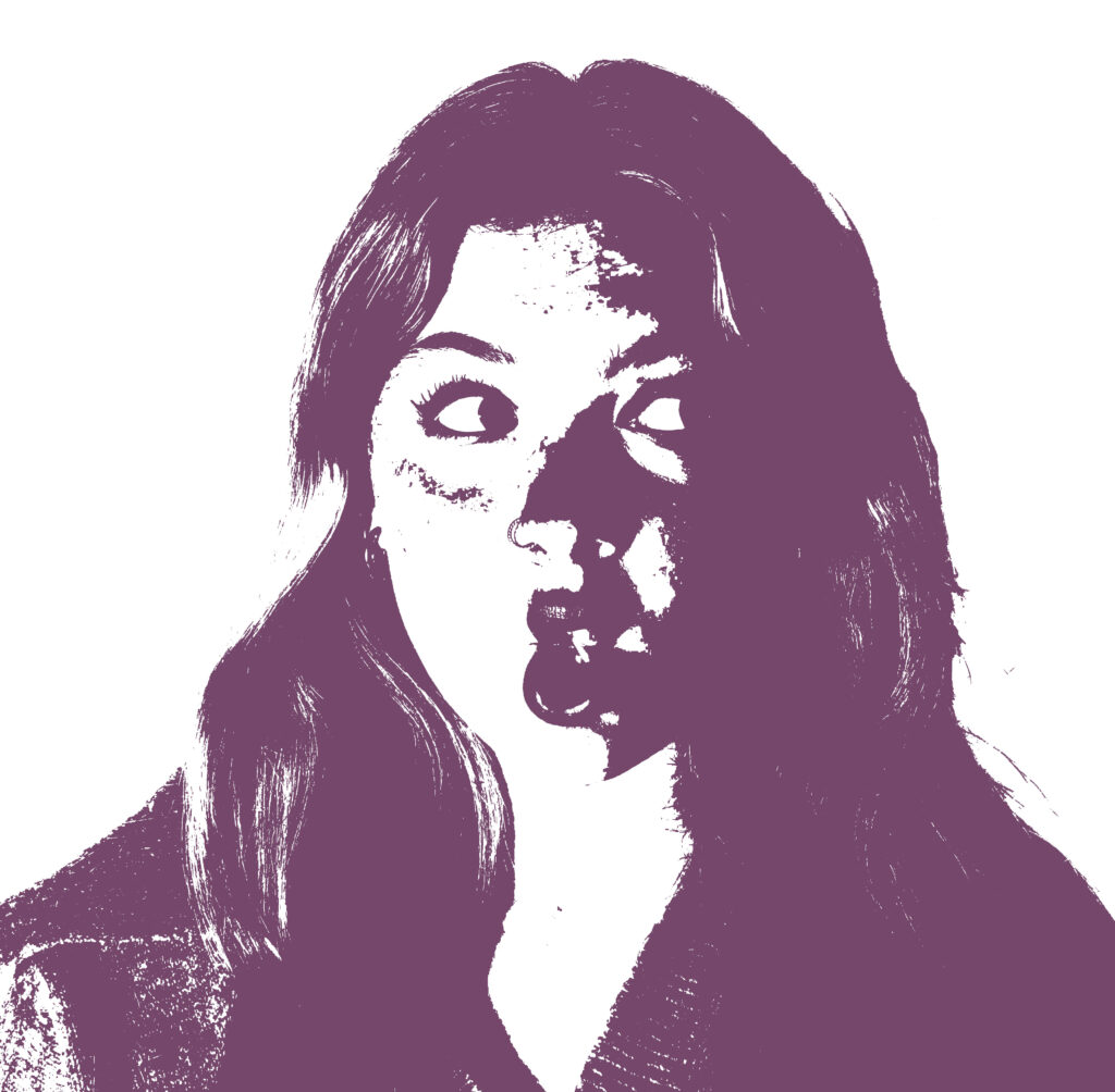
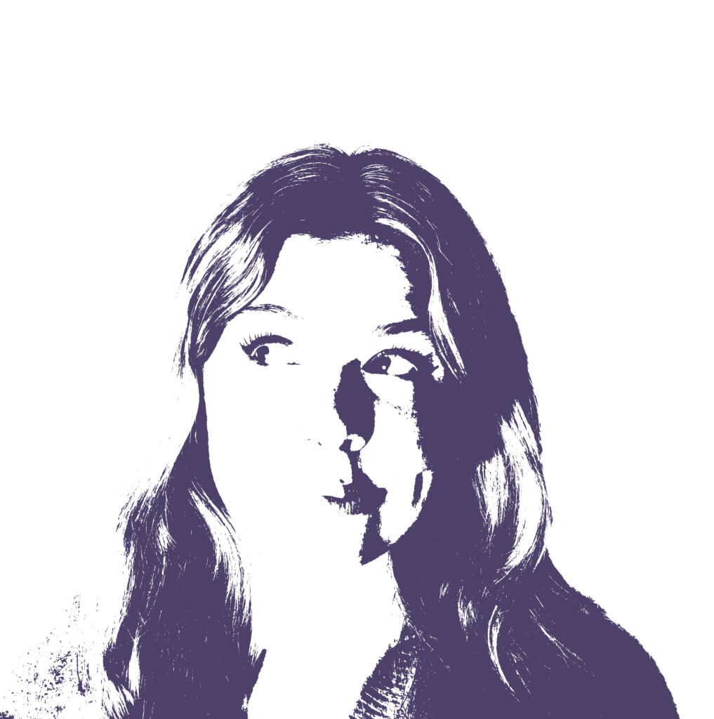
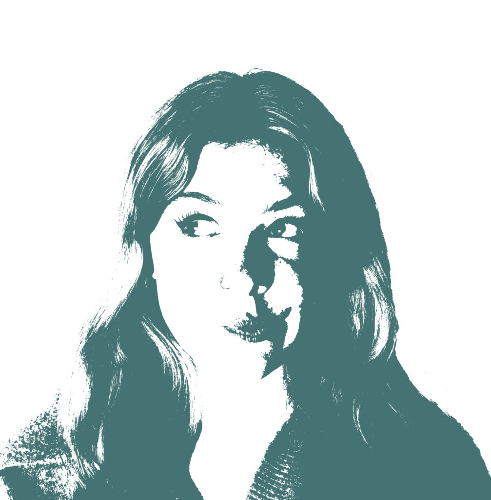
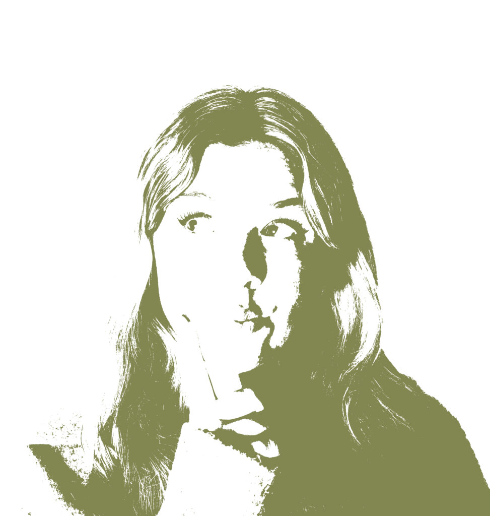
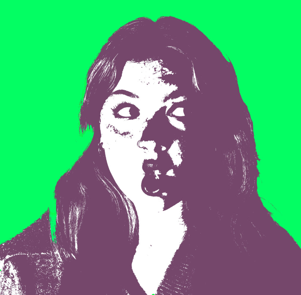
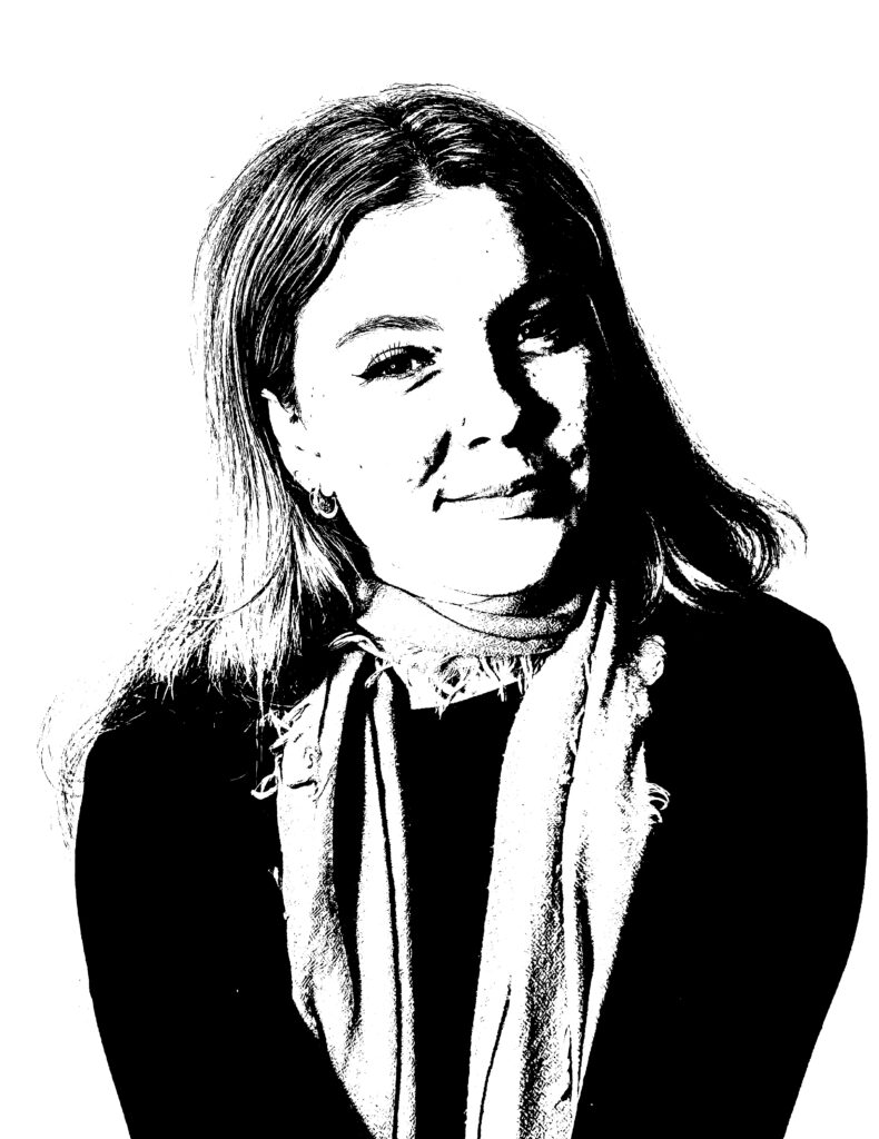
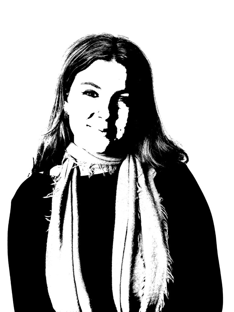
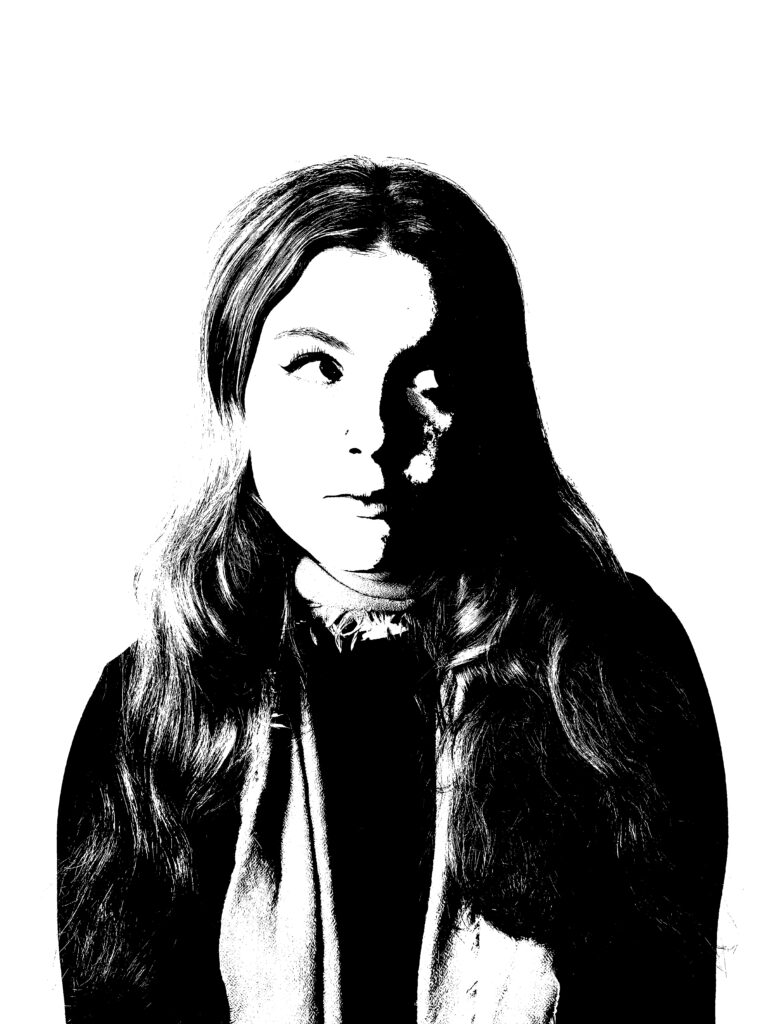
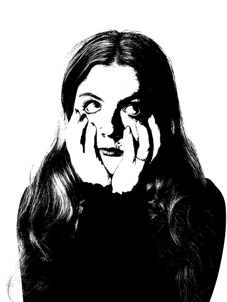
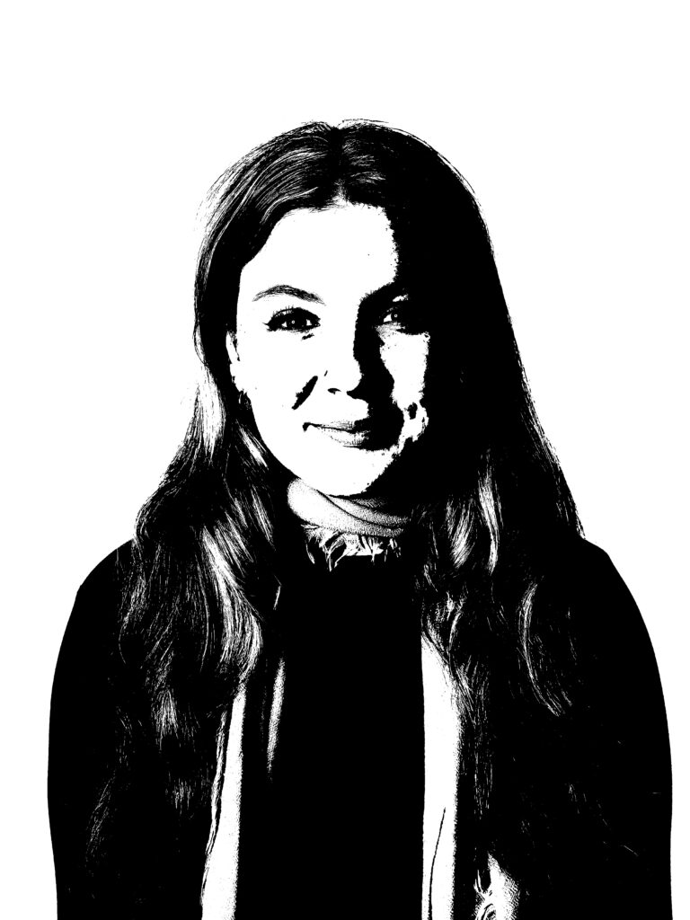
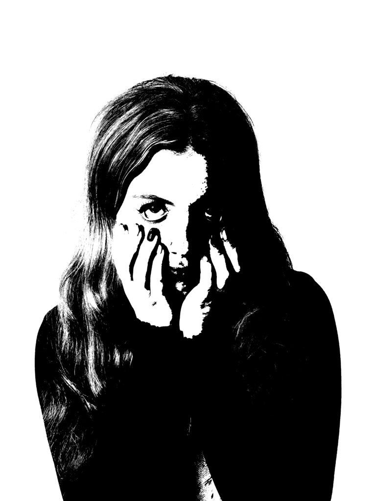
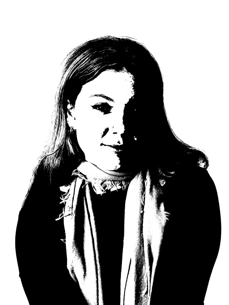
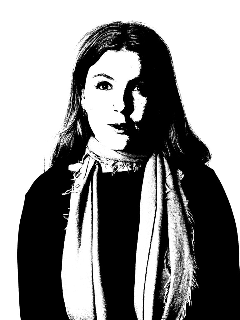
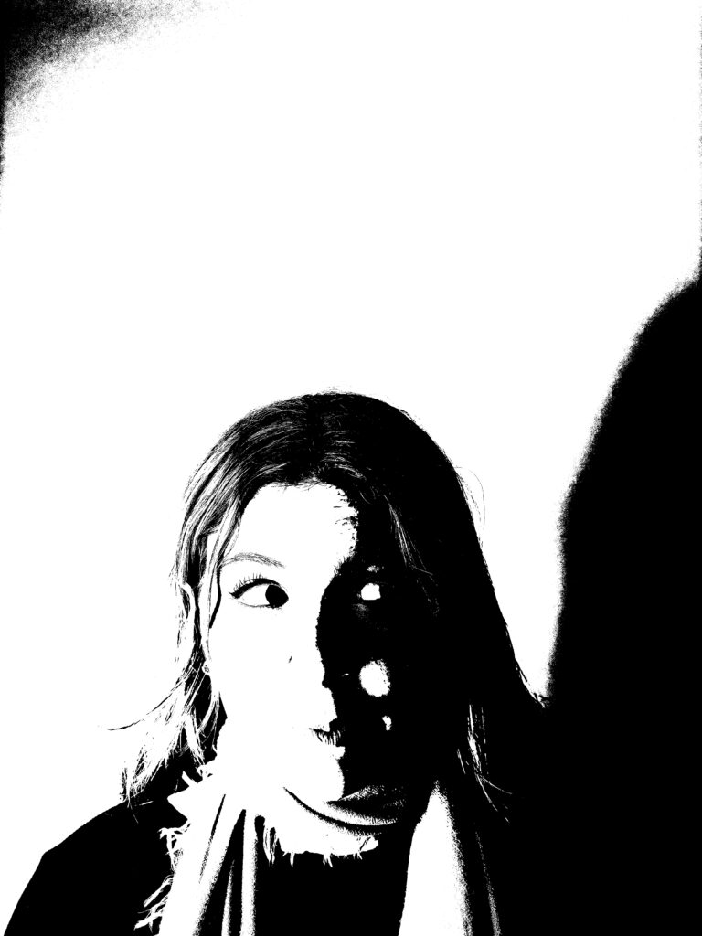
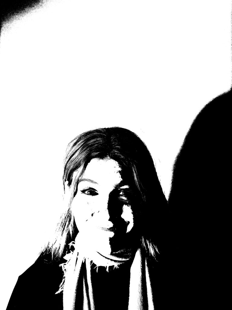
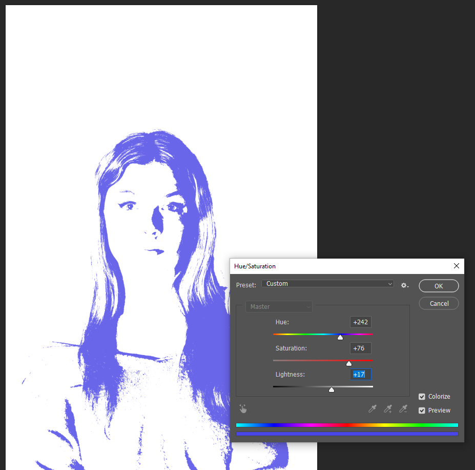
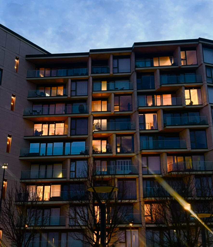
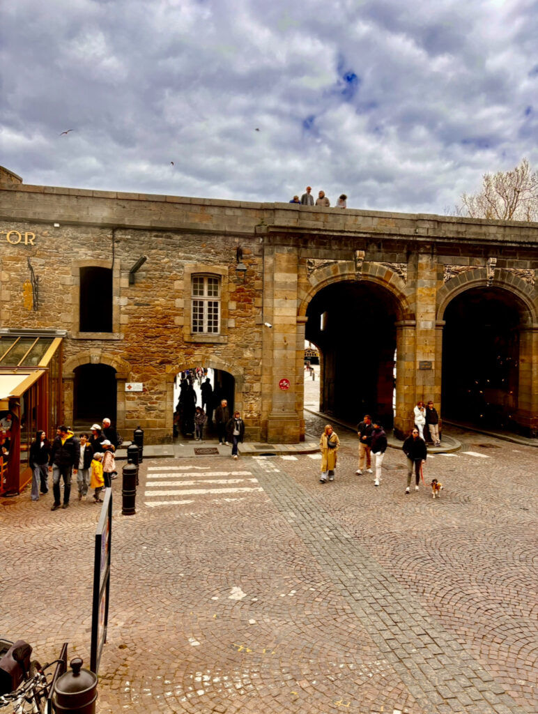
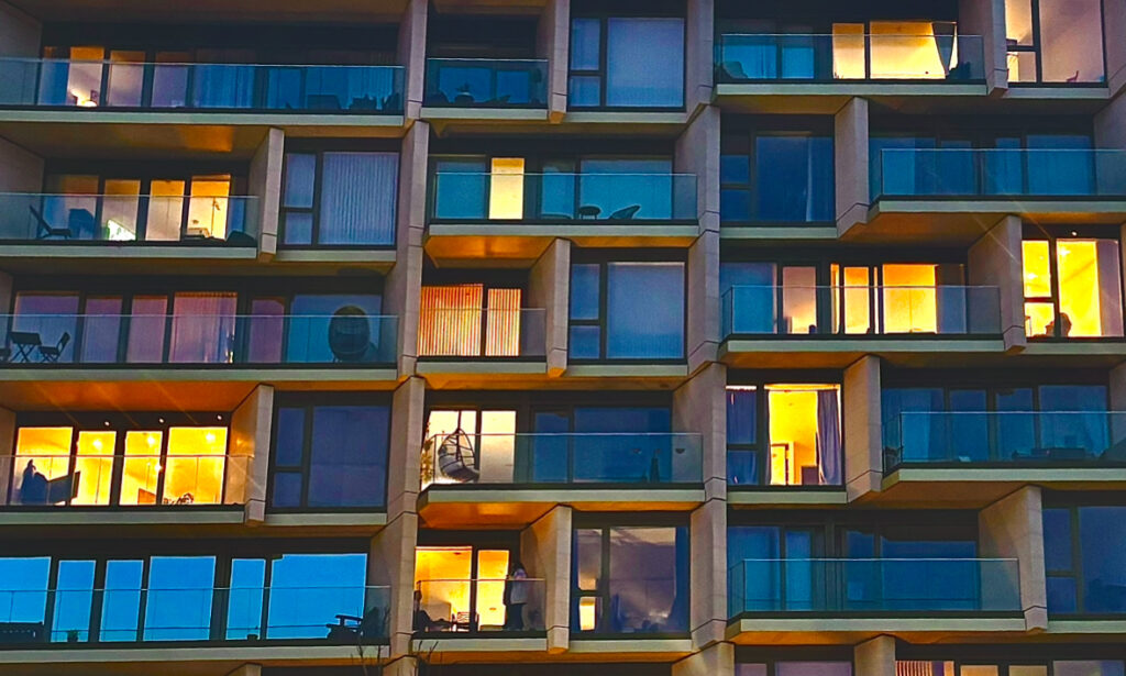
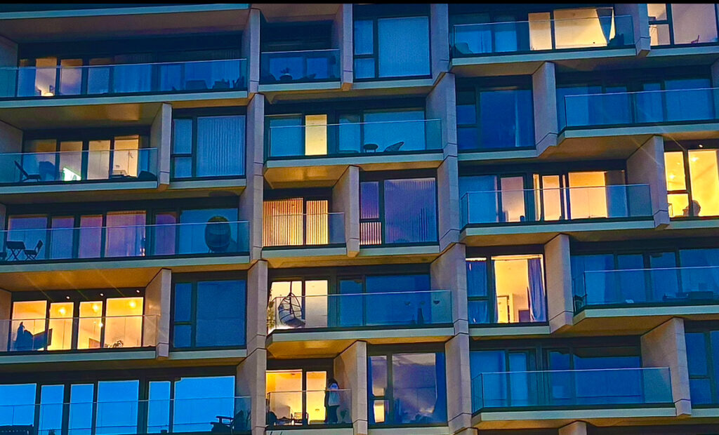
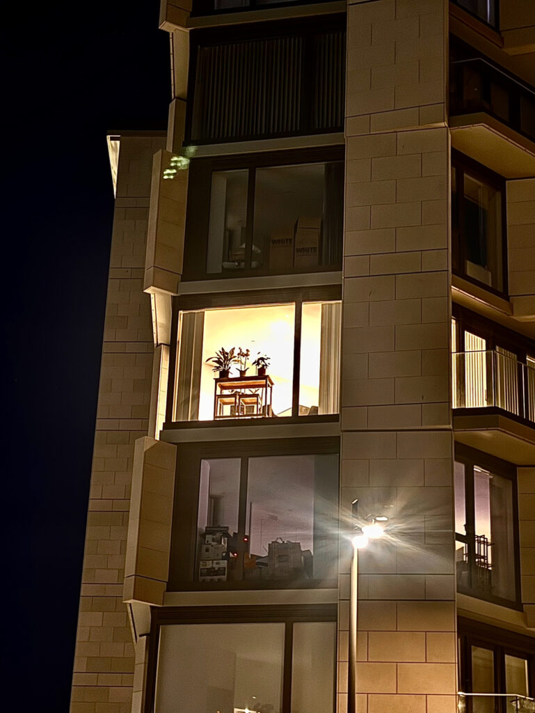
For the the technical side of my work I was able to adjust the different lighting techniques used in my work, this helped to understand what lighting looked the best to achieve the best grade possible, I was also able to change the colour of the light to see if I wanted my photo have a cold or warm effect. Though I did end up making a lot of my photos into black and white so that didn’t really effect a lot of my photos, I also turned a lot of my photo into different colours. For the visual side of my work, this would be mainly my editing I had done in Photoshop and how I had adjusted the levels of the lighting and the composure of my work. For the contextual side, I decided to incorporate some surrealist concepts into my work, for example, when editing in photoshop I used the threshold filter to add an unrealistic look to my work, this also links in well with one of my artist research I had done, Andy Warhol, was an artists who studied Pop Art and also used the threshold filter on his work, I was able to change the colour of the photo to either black and white or one solid colour which changed the whole concept of my photo. The whole concept of my project was to identify a union of people or emotions whether that was family or strangers, I was able to show the idea of things changing over time and how one single minute can change everything, I also went round and took photos of peoples windows and how each window had a different personality, as I had identified, some people had plant pots, or boxes in front of their window, some had lights shinning through, or blinds covering the inside. Some windows showed no sign of life as if no one was home.

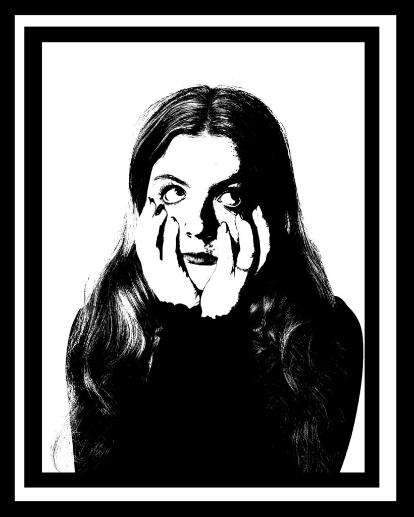
During the 15 hour exam I was able to plan how I would layout my final prints, which became very useful, some of them I had changed up a bit though as they looked better without a big border, I didn’t do any window mounts as I though my pictures were already detailed enough that they didn’t need to have a big broad border over it. I really like how my final prints turned out some had 3 borders while some had none, I had put one of my final photos onto a foam board without any of the board sticking out. This made the photo stand out from all of the rest, especially as it was the only photo that didn’t have any sort of border. I really like how I was able to add a few photos together to be able to recreate some sort of collage. Overall, I am happy with the outcome of my final prints and how I have laid them out.

Virtual Gallery

This is a virtual gallery of one of my final prints, This final product turned out quite well as I was able to place each photo carefully based on the direction the models eyes were leading to, for example the photo of the model on the left is looking at the smaller person on the right and it applies for the other side. This virtual gallery would have been better if I had used two different photos of different models or possible the same model but wearing different clothes to show that the people are different. This would have also looked better if the models were at the same length as the left model is slightly taller than the right which shows that the models don’t line up correctly.

Here I made a Virtual gallery for some of my final prints, this is a good way to present my work and show how well my project went. For the virtual gallery just above with the 3 coloured photos, I decided to put the Purple-ish one on the far left as the models eyes are staring towards the right, this creates an effect that makes the viewer curious as to what the model may be staring at, then I decided to put two pictures of the model staring towards the left as it brings back the attention to the far left photo. I really like how the different colours go well together and almost compliment each other, I believe that each colour represent a different emotion, for example Blue normally represents a sense of sadness but I tried to make the blue show a sense of curiosity, a green colour could represent a sense of feeling sick, and purple could represent a sense of boredom, however I made I tried to experiment with the colours to see if they could create a different emotion. When laying out my photos I decided to put the middle photo slightly lower down as it helped me pay attention to each photo without getting overwhelmed. I was also able to add a slight shadow at the bottom of the photo to almost make it look like the photo was floating. Overall I really like how this final virtual gallery turned out.

Here is another virtual gallery that shows some of my final prints, I had to do some editing to be able to make the side photo sit right on the corner wall and make it look like it was rightly placed, for the others it was more straight forwards as I was able to place them straight onto the wall, I also added a shadow onto the background to make it look like my photo was up against the wall but help make it look 3D. This will improve the quality of my work as it will help to distract the fact that the photo is just placed onto the wall. Again i tried to place each photo in the right place, for example the photo on the side wall was put on its own as it is a big final print and will be presented on its own, whereas the 3 photos on the middle wall will be presented as a whole, I placed each photo with care depending on the direction of the models eyes, to help divert the viewers attention to each photo carefully.

Lastly, I made a virtual gallery with some of the experiments I did in photoshop. These photos turned out quite well. When put the photos on the side I had to use the skew settings to be able to add an angle onto the photo, this helps to corner my photo in the right place. I didn’t use any of these photos for my final pieces as I though it would be best to keep them as experiments.

Overall, I am happy with the way my work turned out. I was able to layout my work in different ways and present what I hade made. If I were to redo some of the virtual galleries I would simply add more dimension to my photos to make them stand out, I was also add a shadow to each photograph as it helps to make the photo look more stabilised on the wall.

Ideas for Final Mounts

Here I have mapped out some ideas of what I can do with some of my final print outs, I have added a lot of borders, mainly to be able to see them properly online, but I do believe that it could a special effect to some of the photos, as some of the photos don’t have much going on in them, then the add of a border can make it stand out a lot more than rest. For the first one. I’ve decided to put 3 final photos together, I put the simpler one in the middle to make sure it gets as much recognition as the other and the more detailed ones are on the outside, the 2 photos on the side consist of 3 characters on the models head or around it. I made sure to put a border on each of the photos and then a border on top of that, this makes the photo stand out a lot more and adds dimension to the final piece. For the second final piece I’ve decided to put 4 photos together, these photos will be in the smallest print size to make sure the final piece isn’t too big. I’ve put these 4 photos together as they create a good dimension, I really like how these turned out, I also made sure it was layered it in borders to make the photos look 3D. Next, these photos were in black and white therefore I didn’t think that it needed a strong border, so I only added one instead of 3 as the colours in the photo grab enough attention and don’t need to have a big border to divert the attention somewhere else. I also wanted to have some mounts that aren’t too basic, although all of my mounts consist of just simple borders I believe that my photos don’t need big and detailed borders as that can distract the whole concept of the photo. For the last mount that I have selected I made it have loads of boarders which increased the dimension of the photograph, since the photo is in black and white and almost looks quite sketchy I thought having some dimension might make it look cooler.

Experimenting in Photoshop

Experiment 1:

Here I went to photoshop and used the Threshold filter, to make my photo look like it has a gradient effect. I also adjusted the colour to show how it can affect the mood of the image. This experiment is very similar to the pervious one I had tried except I hadn’t added colour before, these photos tend to represent a different emotion. I really like how these turned out as they aren’t just basic portraits after, at first had a different idea of what to use those portraits for, but after messing around in Photoshop I discovered the threshold filter and it made my photos have more of a design to them. As from the photos before you can see I adjusted the hue/ saturation and changed it to colour, this then allowed me to decide what colour looked best on each photograph. I had only taken a fair few photos of the model with a large gap at the top of her head, therefore I wasn’t able to edit multiple photos, if I were to do this experiment again I would simply ask my model to do different poses and make them more unusual, I would also like to get different people in my photos, as I was aimed to do a theme of sonder, the idea that everyone has a different life and everyone in the world is going through something, this makes it difficult to identify if i only use one model, however, though I’m only using one model it could represent the thoughts and fears that this person is going through and how they are different to mine, as the model is posing for the photos thinking of different things while I’m the one editing the photos, thinking of something completely different. I’ve chosen to use specific colours for each specific photo which could have been different if I had asked for the model’s opinion. I would like to get more models involved in my photoshoots to help create meaning. This experiment was inspired by Andy Warhol who also creates very similar photos like these.

Experiment 2:

This experiment was inspired by Pinterest, the model has a smaller person (herself) on top of her head. This could represent having different thoughts or different influences changing a person’s thoughts and their idea of living, I really like how this photoshoot turned out, though I did have to do a lot of editing to get rid of the shadow behind the model that was reflecting onto the background. I simply went into Lightroom Classic and used AI to crop out the background, I then changed the exposure on only the background and transformed it fully white. I then repeated this process for each individual photo I wanted to use, then I adjusted each photograph on top of the base photo. I really like how these final photos turned out. But yet again they would have turned out better if I had used different models to show how different people can influence a person’s life and how each person has things going on in their lives that we don’t know about. However, I could perceive these photos as if there are different people on top of the model’s head, these people could be perceived as a negative or positive thing. Overall, I do like ow these photos turned out as they do look very similar to my inspiration pictures. Although I said it would have looked better with a different model, from my inspiration only one model is used in the photograph. 

Experiment 3:

Lastly, I tried to use a blending filter with each of these photos, not really aiming to get a specific concept. I really like how the bottom one on the right turned out as I added all of the photos of the model standing up and doing a pose, I also changed the colour of each of the photos to make it more unique and stand out more. I made sure to make the bottom three on that photo look as if there was something behind them. Also, on the bottom left I simply overlaid each photo and turned one upside down. I also changed the colours of each photo to make it look more interesting and eye catching for the audience. For the top one on the right I added three photos on top of each other using a blending mode, each photo has a different blending mode added to make it have a different effect to it For example the pink photo of the model is quite hard and has a strong sense of colour and saturation whereas the middle blue one is struggling to seem through, the facial expression on the middle photo shows a sense of weakness and sadness, something that is wrong and the two outside photos are showing string happy emotions, there facial expressions are lot more visible, playing that the happiness if over shadowing the sadness and that is the reason people hide their emotions, this can show that this model/ person is going through something but isn’t showing it because they don’t want to be a burden to the others around them, and simply that the people around them have things going on as well. This whole sonder concept has been incorporated into my photos in a subtle way. Lastly the top left photo was purely just an experiment as I layered three photos together and slightly moved each one high or lower than the original, its slightly similar to the photo to its right. In this photograph, the eyes are the most prominent detail shown in total as they show a sense of power and dominance. As I had coloured all my other photos, I thought I would do the same for this one too but make the colour more subtle and less powering, for instance the colour I chose is a dark yellow with an orange shade. 

Overall, I was inspired by the Surrealism and Dadaism movement to try and recreate something that is dreamlike and unrealistic. I also wanted to incorporate the sonder theme inspired by union. Sonder means to reflect that everyone around you has their own life and is going through something that you aren’t aware of. It’s a way of showing that everyone is struggling some more than others and some people are better at hiding it than others, it shouldn’t make anyone feel weaker or less important due to their trauma. The main thing I was looking at was people and their emotions and how their emotions were reflected on. Each emotion has its colour but what if you were to switch the colours would the emotion still stand as strong or would I weaken. I believe that if the model shows a strong emotion, a colour won’t be able to change it and can simply only make it look overpowering to simpler. 

Photoshoot 2

Here I went into the studio to take some portraits of the model, most of these portraits of the model show that the model isn’t really posing and is simply just smiling, however when taking these photos there was a dark shadow left behind the model and I had to use photoshop and Lightroom classic to get rid of it, simply by asking AI to select the background and leave the model out, then I was able to change the hue/ saturation of the background, I turned the saturation all the way up so that the background was fully white and no shadow was showing. I had to repeat this for each photograph, due to the shadow overpowering the photo. I also did the basic editing changing the levels and adjusting them to make the photo look more coloured and bright.

If I were to redo this photoshoot I would have simply make the model sit a little bit further away from the back wall as that implemented in the shadow being quite dark and powerful and I would also like the model to do a range of poses and less portraits that look quite boring and simple, this would help spice up the photograph and make it more original, as from my inspiration photos the models aren’t just taking basic portraits, the model is doing a certain face is is standing a certain way which makes the photo look different and unique. I do also feel like these photos may have been slightly over exposed as they look really bright and have quite a hard light shining on them. This can be fixed in photoshop as I can control the levels of the photo but it can be more difficult due to changing the hue/ saturation of the background interfering with the model. I did manage to get a few good photos but I would have liked to have captured are with either the same or different model wearing different clothes to make it stand out more and make it less obvious that it is the same model. I will be doing some experiments with these photos to see if I can capture and create any photos similar to surrealism and how that can help to make the theme of union come to life. My main goal is to try and implement the idea that everyone has a life and everyone is living it. We only live once and people make mistakes as its part of learning and living. I tend to go by with the key word ‘sonder’, meaning everyone has a problem going on in their life but some choose to hide it and others don’t, you cant always know that someone is fighting a battle especially the people you don’t know and the people walking past you the street every day. I’m trying to represent this word with my photos by showing that the model can feel a certain way in one moment and feel different the next, for example when editing these photos together I will be putting a portrait of the model as the man focus and then picking a suitable photo I took to go on top almost as if the model is standing n herself, both these models may be feeling a different type of way and each photo was taken as the same time within a space of minutes. It just shows that peoples feeling can sometimes be over looked and not taken into consideration.

I do think that this photoshoot went well as I was able to capture a decent amount of good photos. Although these photos are really basic, this will allow me to edit them with different colours and graphic design, for example I really like the threshold filter as it makes the photos look a lot like Andy Warhol’s photographs. I can also make them more original to me by making the photos into black and white whereas Warhol makes his photos stand out with a pop of colour. I can also experiment with the blending tool and put my photos on top of each other and select a certain blending mode, this will make my photographs look quite interesting and different. Overall, this photoshoot went quite well but I did do a mistake with having a shadow present in the background which makes it really difficult to focus on the subject (the model).

Photoshoot plan 2:

Here are some of the inspiration photos that I came across, I really like these photos as they are quite unusual and unrealistic, this goes well with the surrealism theme. I also believe that this goes well with the sonder theme that I decided to look at, the idea that everyone has a life and everyone is going through something shows that we are all human. Most of these photos consists of one model doing different poses with different angles of the camera directed towards them. Most of these Inspiration photos are made-up of face portraits and full body length portraits. They are the added together to create the final piece. I really like how these photos have a sense of surrealism as there are smaller characters/ people standing on the model.

If I were to recreate these photos I would like to use the same model just like inspiration photos, although it could look quite cool to have multiple people involved in the photoshoot. First I’m going to be taking portraits up close of the models face, making sure to leave a big gap on top of the models head so that I can place things on top. I could also take photos of the model with the technique of normal portraits and add the smaller people around the models face to make the photos more unique and original to me. I would really like to recreate the top photo on the left as it seems to be a really interesting photo to take. It helps to show the emotions and the sassiness of the model, as the model is then flipping her hair.

Usually, I do tend to make my photos black and white but for this photoshoot I would like to keep my photos in colour as it helps to add emotions and shows how each colour represents a different feeling, it’s almost as if you were to capture each photograph with different colours it would give the photo a whole new perspective. I personally believe that this photoshoot is quite doable as taking these photos wont be hard to capture, though it may be more difficult to edit the photos together to have the smaller model sit right on top of the models head. I also believe that I were to have the smaller model flipping her hair in the air, it would be harder to edit in as there would be bits of the background stuck in the models hair, this could be avoided if I were to use the same background for each portrait but it also depends on how I edit the saturation/ hue to each photo.

For example, where taking the phot there might be a bit of a shadow left behind and I will therefore have to edit the saturation to full brightness to get rid the shadow, this will then affect the pieces of the background that is stuck in the models hair.

Here is an example:

Also turning the saturation all the way up to the brightest might affect the models body depending on how much light was originally used in the process of taking the photo. Here the models legs tend to blend in with the white background which makes the photo look quite unrealistic and not the best quality.

Overall, I believe that this photoshoot will be fun and challenging to complete alongside all the editing that I will have to do to match my final photos to my inspiration. I will have to do the basic editing like controlling the levelling and lighting in the photo. I would then have to merge the two photos of the smaller model and the portrait of the model together. This should be quite straightforward if the background are the same colour I should be able to just put them on top of each other and then possibly add a blending effect on top to help properly merge the photos together. If the background were to be different I would then to outline the smaller model and try and avoid capturing any of the background using the selection tool, this can be seen as quite tricky to be able to get all f the model and none of the background, I would ten place it on top of the models head and mess around with it until I’m happy with the way it looks. I do like how all of the photos are placed on a white background but possibly having theses photos placed on a different coloured background could change the whole mood of the photo, though the white does seem to keep the photo quite clean and neat, it helps to get rid of any distracting around or in the photo and therefore white is a better fit for these types of photographs.

Andy Warhol

Andy Warhol’s work:

Andy Warhol was an American visual artist, film director and producer. A leading figure in the pop art movement, Warhol is considered the most important artist of the second half of the 20th century. His works explore the relationship between artistic expression, advertising, and celebrity culture that flourished by the 1960s, and span a variety of media, including painting, sculpture, photography, and filmmaking.

Warhol was born and raised in Pittsburgh in a family of Rusyn immigrants, Warhol initially pursued a successful career as a commercial illustrator in the 1950s. After exhibiting his work in art galleries, he began to receive recognition as an influential and controversial artist in the 1960s. After exhibiting his work in art galleries, he began to receive recognition as an influential and controversial artist in the 1960s. His New York studio, The Factory, became a well-known gathering place that brought together distinguished intellectuals, drag queens, playwrights, bohemian street people, Hollywood celebrities and wealthy patrons. He directed and produced several underground films starring a collection of personalities known as Warhol superstars , and is credited with inspiring the widely used expression “15 minutes of fame.” Warhol managed and produced the experimental rock band the velvet underground. Warhol expressed his queer identity through many of his works at a time when homosexuality was actively supressed in the United States.

Warhol has been described as the ” bellwether of the art market”, with several of his works ranking among the most expensive paintings ever sold In 2013, silver car crash (double disaster) (1963) sold for $105 million, setting a record for the artist. In 2022, Shot sage blue Marilyn (1964) sold for $195 million, which is the highest price paid at auction for a work by an American artist. Warhol has been the subject of numerous retrospective exhibitions, books, and documentary films. The Andy Warhol Museum in his native city of Pittsburgh, which holds an extensive permanent collection of art and archives, is the largest museum in the United States dedicated to a single artist.

I really like Andy Warhol’s work and would quite like to include it into my work, I could simply just add the pop art filter on top of one of my photos to see what kind of effect it will give, I have a feeling that pop art tends to make a photograph a lot more brighter and happier than it is intended. Pop art tends to be really bright and has many colours involved. I could try and make my photos look more original to m and make each photo look more gloomy and hidden by using a dark filter, that still provides the pop art effect but isn’t filled with colour and more so a controversial look. I would like to take some portraits of my model and simply just experiment with different filters and see what looks best on each photograph that I had taken. The theme of this project is union and i have added another word to my project, “sonder”, the idea that everyone is living a complexed life. The pop art can help identify each emotion of the models face or either hide and this proves the point that you never know what happens in a persons life, its the idea that everything can change within a few minutes or even a few seconds.

My final outcome:

Overall, I do like how this turned out as it looked quite similar to my inspiration photo, though mine does lack a bit of colour. I do believe that a colour can completely change a perspective of a photograph as each colour represents a different emotion. To make my image look even more like Andy Warhol’s work would be to add a coloured background. Each photograph tells a story of what is going on inside the models head and what way they might react to a certain piece of news, it’s a way of showing that everyone has different morals and purposes in life, each individual have a different goal and will achieve it with different timings. Most of the expressions the model is making are quite similar but each photo if different depending on the position the model is sitting in, for example two of the photos are very similar but in one of them the model is tilting her head which creates a whole new perspective of what he model may be feeling, it could be a sense of confusion or possibly a sense of annoyance.

coloured example:

Photoshoot 1

The use of the filter called ‘threshold’ was used to add the final black and white gradient to my image. I did the basic editing before making sure that the levels of the photo were right and the curves. I used both photoshop and Lightroom to edit these photos, my aim was to get one person or a few other people to pull different faces to the camera to show that everyone has different emotions and feel different pains and that we are all human but I wanted to add an effect to my photo to make it different than a basic portrait of the model. I really like how I used a white background as I was able to show mostly the model and nothing else in the background to restrict any distractions from the model. These photos almost give me the impression that they are icon pictures or profile pictures as they only show the body and nothing else. I would say that I was able to produce some good photos but I would like to go back to the studio and get some more photos of possibly a black background so that the model will be highlighted with a light stencil. This will show a contrast between the two different shades. I would also like to do this photoshoot with different people to get different features from each person. This could also help to make these photos more original. I did have some other photos that I could have used but they didn’t turn out as well as I would have hoped as there was a bit of a shadow in the background and it would interfere with the persons head. This made it look like there was a shadow of a different person behind the model which could look really fascinating but isn’t quite what I was going for.

If I were to do this again I would like to ask the model to make different faces and poses to help make the overall outcome look more interesting as these photos look quite bland and don’t really have much personality to them. I would definitely like to use the same effect but have colours included in my photos, possibly like pop art where they have a very vibrant set of images and each model is holding a different facial expression. I would say that overall the final outcome didn’t disappoint once I went through with properly editing my images. But I do need to be careful for next time to avoid any type of shadowing in the background, this makes the photograph look less professional and more rushed.

When editing these photos I used Lightroom Classic first to make sure to get a good amount of gradient into each photo, I wanted there to be a good amount of details shown in each photo, I adjusted the lightness and darkness surrounding the model and added a few highlights to darker sides of the photo. Despite this editing, I want quite able to remove fully the background shadow which left a human figure in the background of my photos. I then imported my images into photoshop and Cropped any unnecessary details that were lingering in the background. I really like how defined each photo is and how the details are very visible to an extent, for example it is clear that there is a scarf on the modes neck but also I wouldn’t be able to identify if there was anything on the models face as most of the small details disappeared.

Photoshoot plan 1:

This photoshoot in inspired by Andy Warhol who tends to use the Threshold filter on his photos. I found his work quite interesting and unique and almost looks like pop art. I want to do an experiment with the threshold filter by simply making it similar to his work by adding colour or making it different and leaving it in black and white. For this Photoshoot I will be taking portraits of people and simply editing them with the basic editing they might need, fixing the exposure, saturation and other things, I will then simply use the threshold filter.

This can be quite tricky to use, as you have to make sure that the models face still shows details and sometimes the shadows over power the filter and make it impossible to see any details on the model, in that case I could try and get the outline of the model and simply add colour to the model, this could be a solid block o colour or a gradient effect deepening on the vibe of the photo. Simply press (ctrl u) and then it will bring the option of the Hue, saturation and lightness which can be adjusted to your liking.

Also, I could make the background colourful and the outline of the model will stay a greyish colour. Once I have played around with that I will save my work and repeat that process a few times to see which colour fits best with each portrait I have taken.

Firstly, I will need to take a standard portrait of my model and ask the model to do different poses and pull different faces to get some different photos. I can repeat this process with different models or keep them the same. I do want to take portraits on different days to see if the models mood changes at all and the models clothes will also change to make the photos look different and less boring. After I would quite like to turn these photos into a poster or some sort of collage and put more than one photograph together.

Experiments for the key Term “Union”

Here if my first photoshoot I completed when I received the key word “union”. immediately I though of a union of people and emotions and people. I linked in things that mean a lot to me, but then i realised that these photos didn’t really link in well with the Art movements of surrealism and Dadaism, therefore I decided to keep this as an experiment and not my final work. I was able to get some inspiration for my final project based on how I can introduce my own ideas into the key word “union”.

This virtual gallery doesn’t represent any of my final prints but i felt that it went well with the project theme of union as it helps to show a sense of a community, people that have things in common, for example these photos are related t my family members. These photo’s a family union, things that are important to my family, as I have some old photos of relatives and a photo of a dinning room that is an important factor related to mine and my families up brining. This virtual gallery would have turned out better if I had added a backdrop/ shadow, so that it didn’t look like the photos were just placed down onto a wall. Though I do like how this final virtual gallery turned put as I have the two older photos on the sides and in the middle is a recent photo I had taken of the dinning room, it almost compares how things can change within time and it could also possibly show how society has changed over time, how the internet has improved along with camera quality and how our society is different to back then.

Photoshoot Plan:

For this photoshoot I will be going round and taking different photos of random people I come across on the street, these photos will be candid photos and I will be taking them discretely, each photo I will take will have a different purpose and a different story to tell, most photos have a story behind them and I want to try and create a story behind my photos to show how important everyone around us is and how they impact our life. I would also like to go round and capture photos of peoples windows and try and understand how that window is showing a personality, each persons widow will be decorated differently and that will help to understand what is happening in their life and how they are handling it. I would also like to find some old photos of my family members as it helps to identify how time has changed and how they have changed within time. I really like how things can change over time and you don’t ever realise it. I’m planning on capturing photos that are meaningful to me and show a representation of me and my family, possibly something that happened in the past that i am not aware of that has changed something in my family, possibly an significant even and how it has shaped my family yo be the way they are, my family love capturing memories and have many photo albums stored. I want to take photos to show how our society has shaped and changed everyone, we have the use of social media and internet whereas back then there wasn’t such a thing, we also went through a pandemic and that was quite traumatising to some people, people all around us are feeling things that we wont ever know, the idea that everyone has the same amount of importance.

Here is a selection of random photos I had taken while I went away or when I went out into town, I want to show that every photograph has a purpose and a meaning behind it. All theses photos were taken during different time periods, hence the reason they don’t all look the same. Theses photos are going to help explain a story about everything that is happing around you, how each person has a different life to you and feels different things to you. A few of these photos are meaningful to me as they are people from my family or objects related to my family, some of the photos are pictures of my friends and others are of complete strangers I came across in the streets.

For these two photos I used AI to add people and help make the photo look full and lively, when I originally took theses photos, there weren’t any people present as they were in different rooms, but this was a house that my family members grow up in and now these are only two people left in it, which can make the house look quite lonely, the idea that time changes everything and anything and that now the people living in this house could feel quite lonely and lost without there children being home, if you were to look at this house from the outside, you wouldn’t get this rush of emotions, you would simply feel that its a nice house and its quite big, but you don’t ever consider the history of the house ad the people that grew up in it, the people who has their whole childhood in that house and now it’s left alone without anyone to fill it up and use it. In the first photo, it’s a picture of the dinning room, where my family members would go and eat everyday and talk about how they days are, now it doesn’t get used much as the people still living in the house feel too captivated by loneliness to sit on the table alone. I asked AI to add people sitting down and eating but somehow the photo still feels empty, there is a sense of something missing but you still cant work it out. It’s the idea that this room means a lot to a person, while others may believe it’s just a simple room filled with decorations, everyone has a different life and has experienced different memories. The second photo is a photo of the living room, this room is used a lot more than the dinning room but when I went to take a photo of it, it was empty. yet again I asked AI to add people and some children playing around to make the photo feel alive and colourful, I had even added some lights at the top, to add more spirit to the room. Some of the props in the room have changed around, for example the tv was locked into the a box and the tv was turned off, so i asked AI to make a tv to make it look as if he people in the room where watching the tv. I really like how in the corner of the room their is a small girl playing with a doll house which looks really realistic, this little girl looks similar to a photo I found of two children sat in a field of cows posing for the camera, that photo is also a photo of my family members, therefore the photo helps to add meanings to it’s real purpose of showing how each individual holds onto a certain memory.

These two photos were taken exactly 1 minute apart, which helps to picture how fast things can change, some people have stayed the same in this photo but others have moved around and even disappeared from the photo, this is showing that anything can happen within a couple of minutes. Every single person in this photo has their own life to live and are doing different thing, for example, the 3-4 people at the top looking down at the town on the rest of the people, these people haven’t moved within the minute whereas most of the people at the bottom have changed position. For example, the grey van at the bottom has changed place and is no longer in sight. This could represent the meaning that nothing is promised and a specific life event can change everything.

Here ae some of the photos from Photoshoot 3, these are the photos of peoples windows and how everyone has different decorations in front of their window, for example, certain windows have lights turned on and therefore makes it easier to look inside, some other windows have curtains blocking us from looking inside and some windows are completely pitch black with no lights, which could suggest that no one is home. I do like how these turned out as they are quite similar to my inspiration photo, but I did have to crop the photos as there were trees in front of the apartments and there were street lamps also in the way, I preferred taking these pictures during night time as in the day you don’t really get to see much action in the apartments as people are mostly at work or outside, whereas at night people have their lights on dew to the darkness outside. Also if you were to look at the middle window in the middle, the window changes as in the top photo the window blinds are closed and you aren’t able to see anything whereas on the bottom photo there is a persons figure showing, indicating that they are closing the blinds. The shows that things can change very quickly.

Here is a different building of someone’s window, these windows all look different, as the middle window has a light turned on, with a small table and a plant in front of it. The top window has some boxes in front of the window, implying that someone is either moving in or moving out, there don’t seem to be any sign of lights being turned on, which could mean that no on is home whereas the bottom window also has boxes in front of the window and shows a little bit of light in the corned of the apartment. Each apartment holds a different personality and is customised differently, just like people are. We each have different style and interests depending on the way we were brought up or how good we are at something. Each factor changes things completely. For example if you were brought up without a certain thing then it could most likely not be involved when your older.

These photos are older photos of my family members, the bottom photo shows two children sat in a cow field owned by their dad, this photo is really meaningful as it keeps a memory of their childhood and how close their bond was, now they aren’t close and don’t really speak to each other, their bond was broken through time. This photo also represents how they will never be this young again and its a way of looking back and remembering how happy they were. This photo was obviously taken in France, where they grey up, the cow farm was their second home as they did spend a lot of time playing and running around the field, this photo captured a moment they will never capture again. Then there is a photo of a lady pouring a drink, this photo is very nostalgic to me as I didn’t get to know her young, I’ve known her as a slightly older lad and I never got to experience her fun side, she is a family member that lives very far away from me. Therefore it’s hard for me to capture memories of her. lastly the photo of the building id meaningful to me as its a business building owned by one of my family members, with our shared last name printed on it. This is a building I have never come across and when I did I though it would be a good photo to have and hold as a memory. That area of France is filled with good memories though I didn’t really get to experience them as I grew up in Jersey, but these photographs help to prove how memories can stay alive.

Lastly, here is a photos of a mysterious figures walking in the dark, it’s seems to be that the figure is walking toward the edge of something, the photo slightly blurry due to the gradient effect added which helped to define each and every detail. I had to do some editing and used AI for the corner of the photo as there was a bright light shining through, I wanted to get rid of the light and simply darken the photo to help make it look more mysterious. It also helped to avoid any distractions from the figure as she is the main focus of the photo. I also believe that the strong colour of blue helps to add emotion to the photo, it almost makes the photo look sad and unsettling. Whereas if the girl was to wear an orange jumper, the whole mood of the photo would be different.