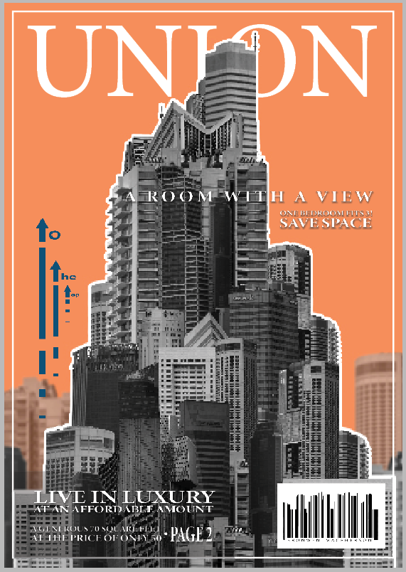
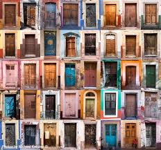
The cover is the only part of the book that resembles a magazine. I had a clear vision for how I wanted the cover to turn out which I think helped it turn out well. I tried to make it appear like a magazine that you would purchase despite the rest of the zine made to appear more like a free hound out to sell a product.
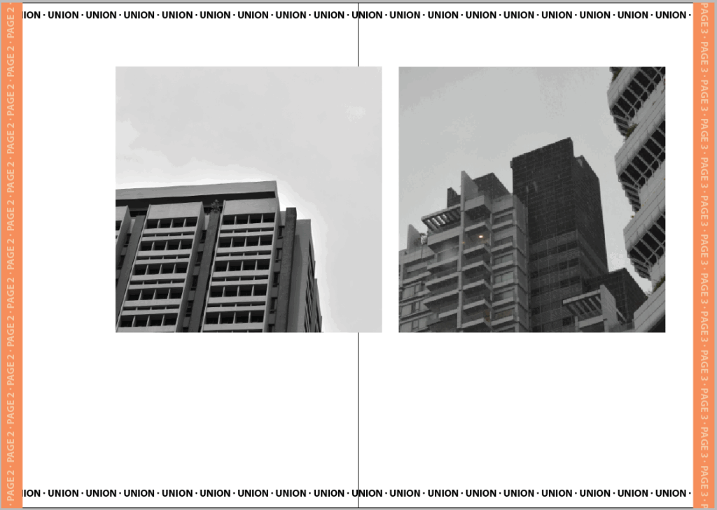
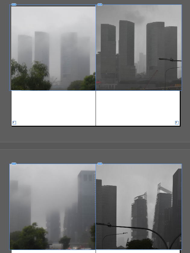
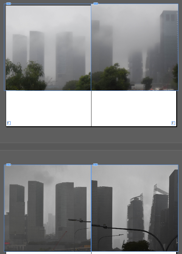
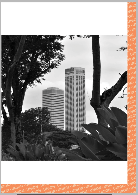
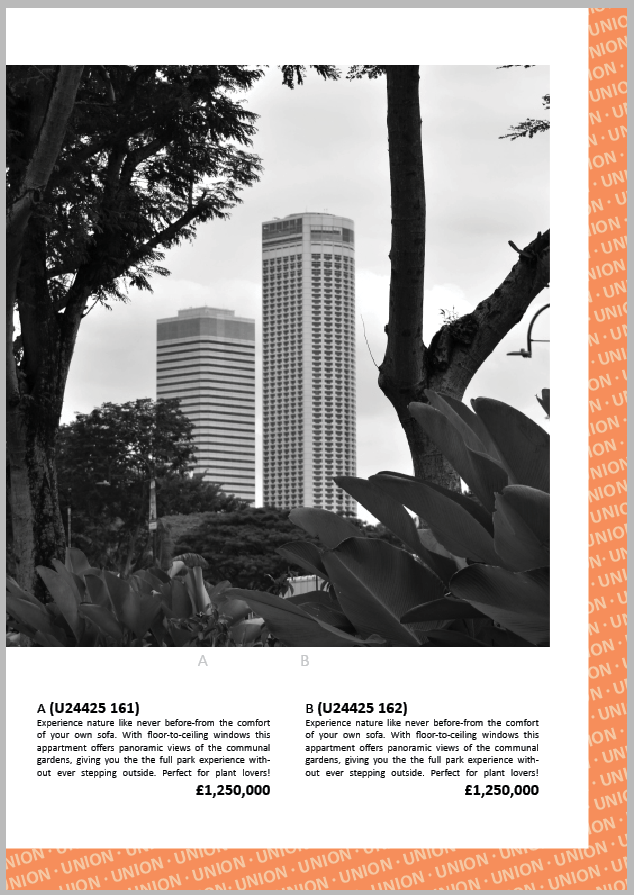
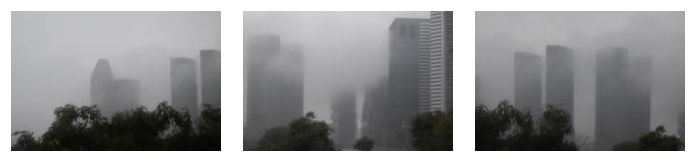
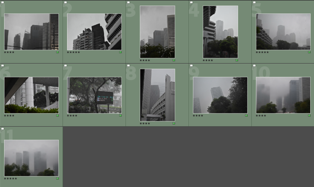
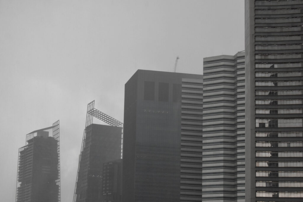
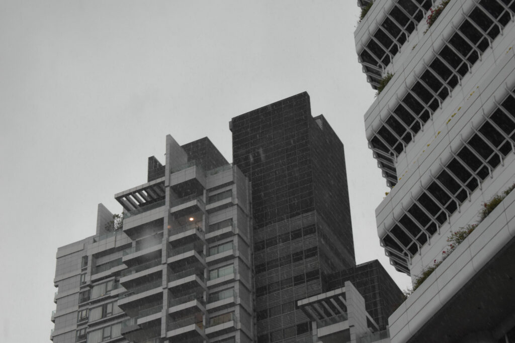
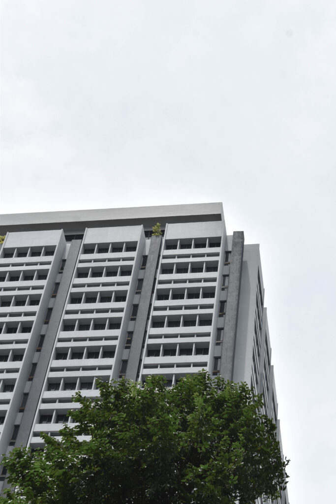
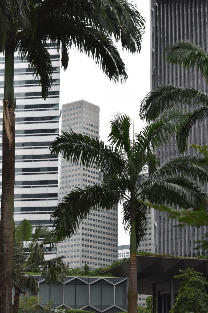
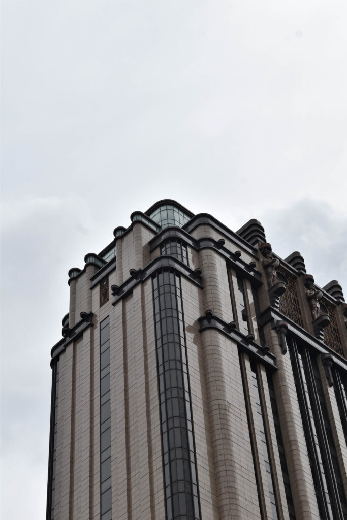
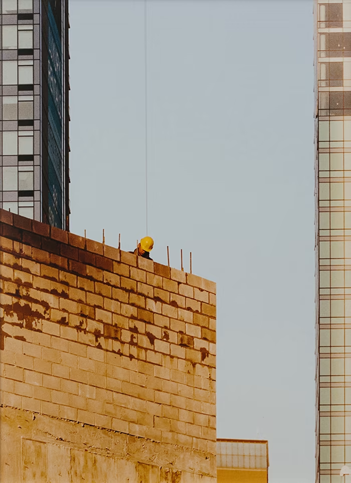
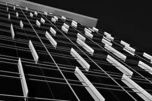
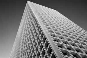
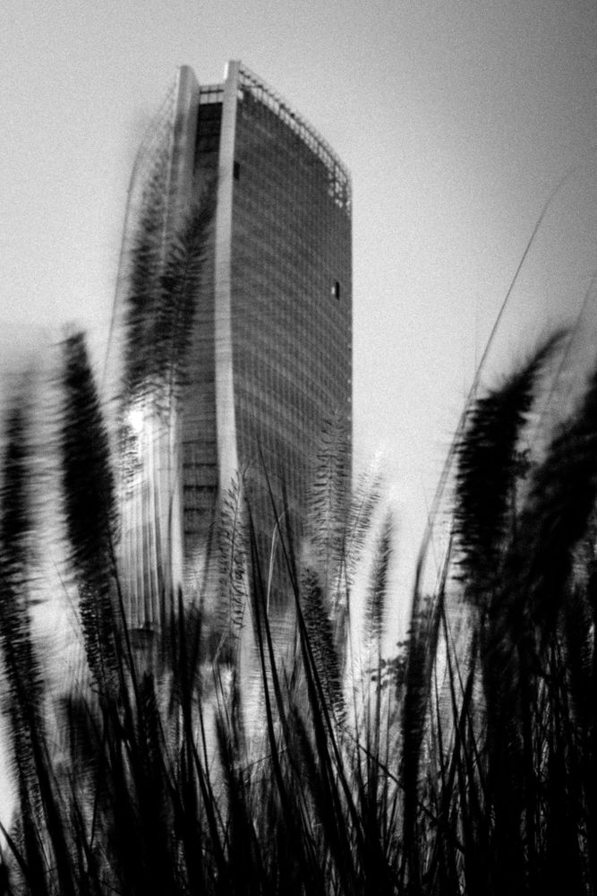
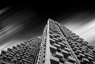
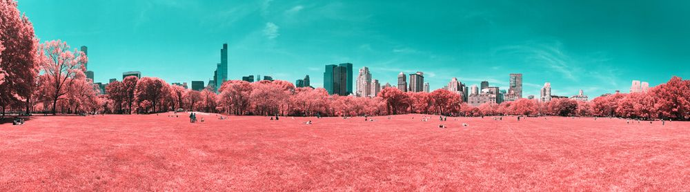
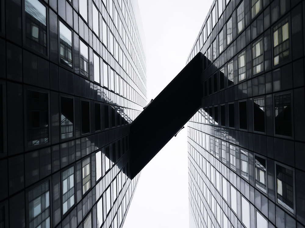
I wanted to start with the clearest pictures first which were these two I took in the style of Kenneth Frederick where the angle encourages upward growth. I matched these two images also due to their similar angles, shapes and lighting.
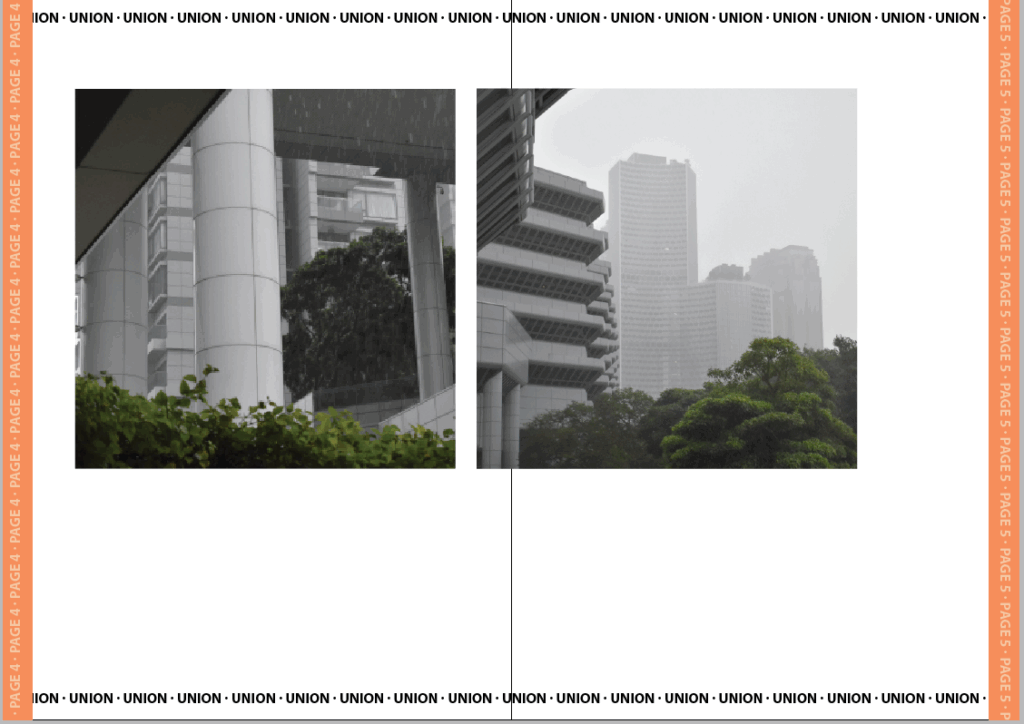
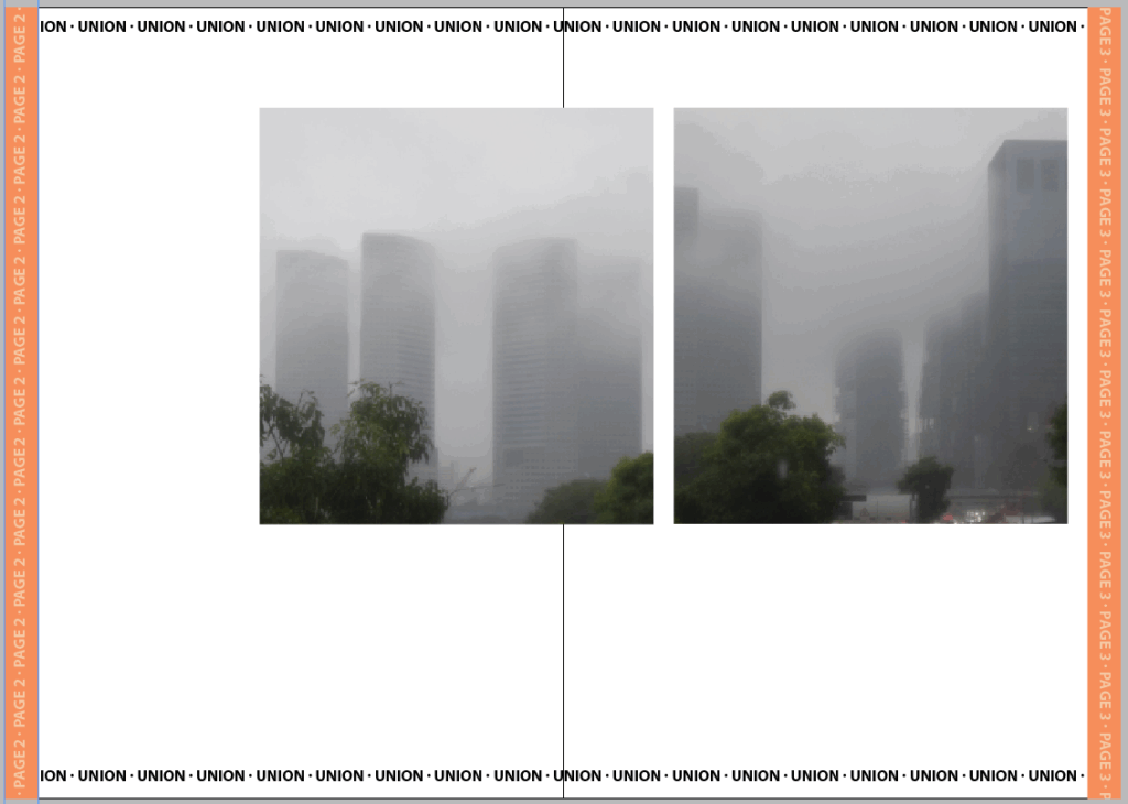
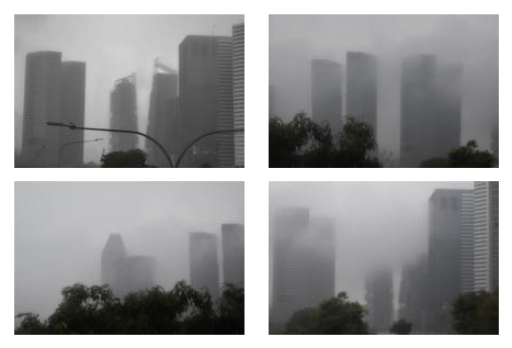
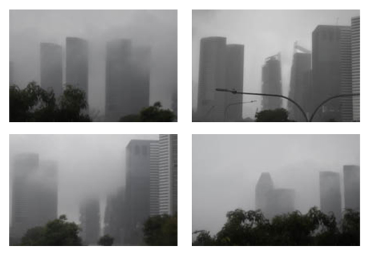
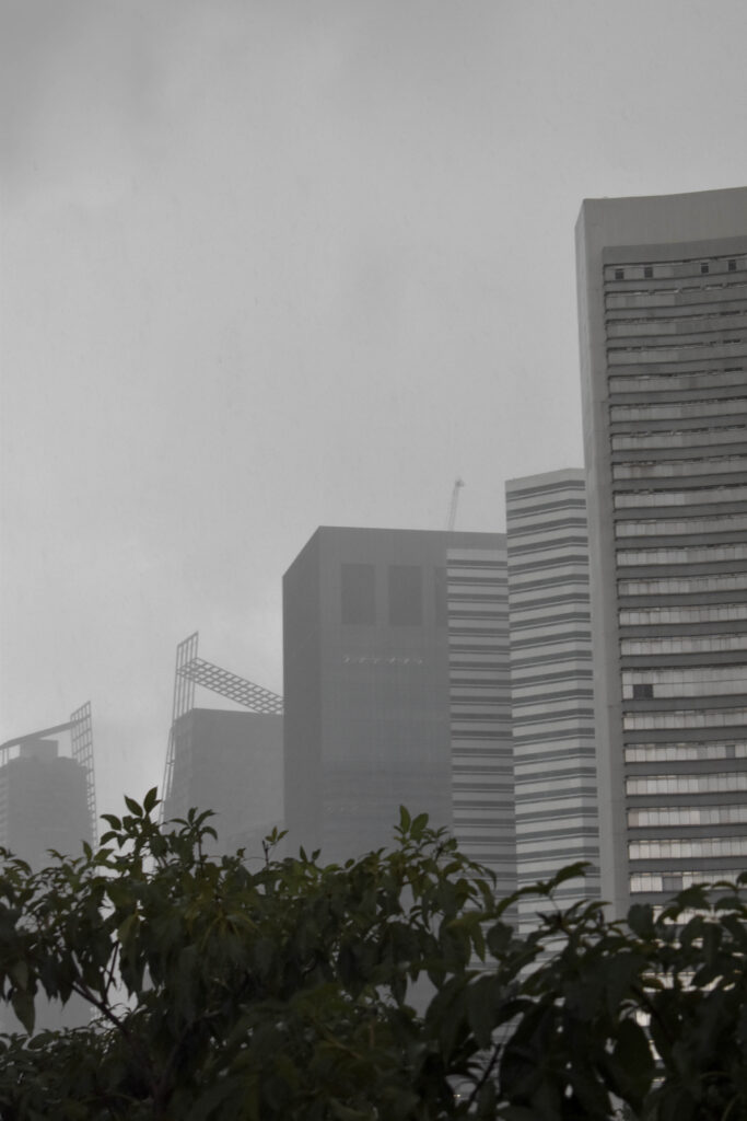
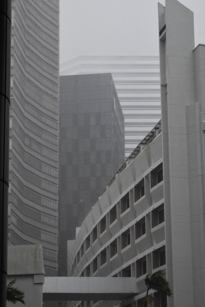
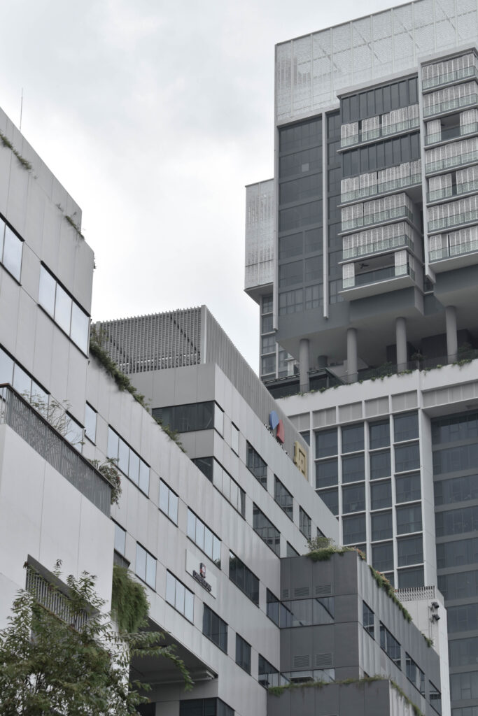
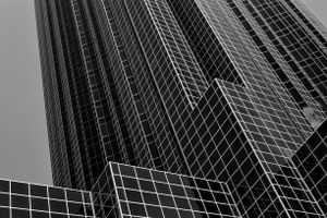
In the next pair the weather had begun to change for the worse. I matched these two because they had a similar foreground and all the buildings were a similar style.
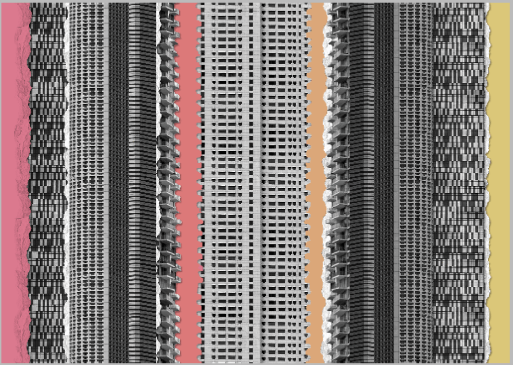
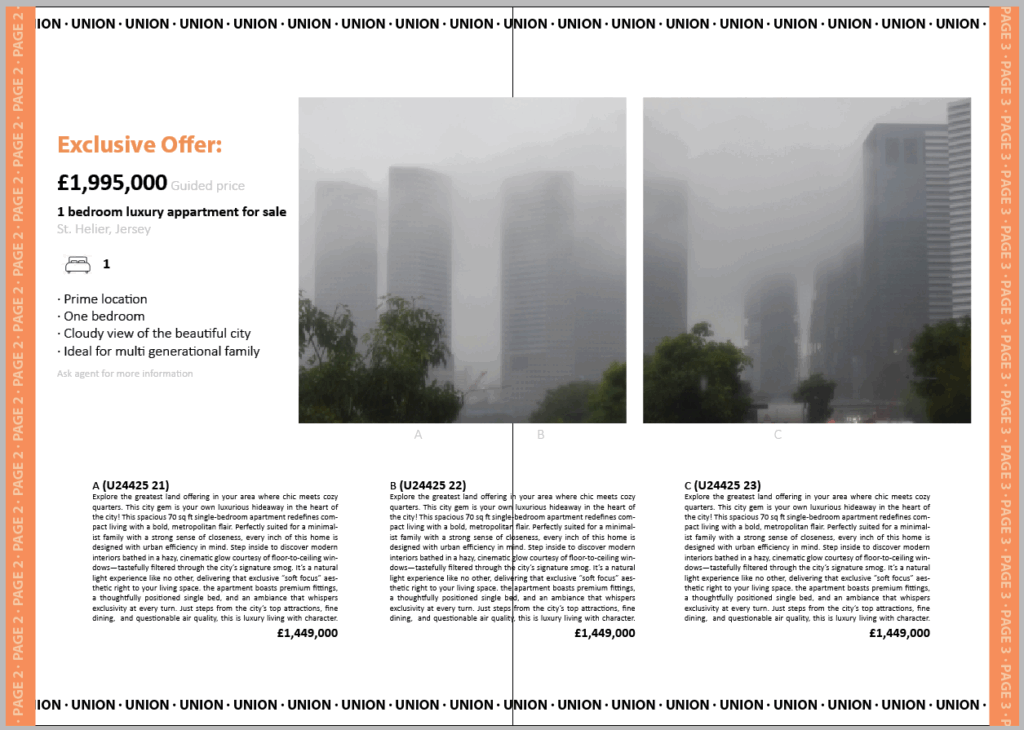
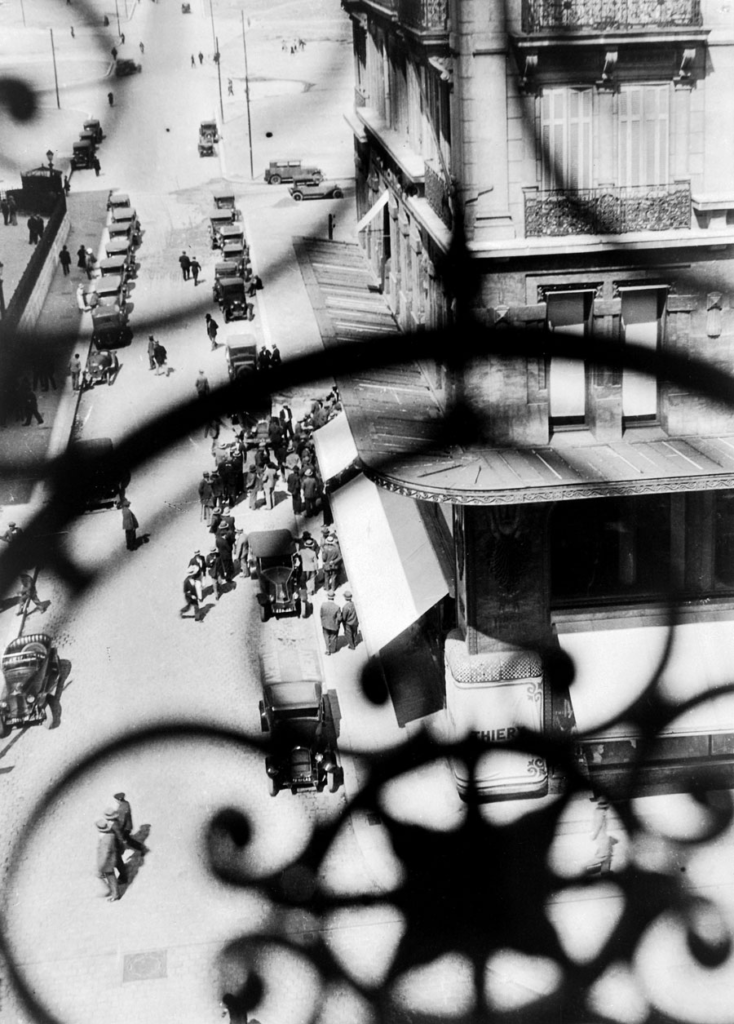
For the first intersection I wanted to use the most colourful edit. I decided to extend this edit and make it look like a more traditional collage by adding colour card and tearing. I think this captures the chaotic miss-match of densely build locations as well as identity-less advertising.
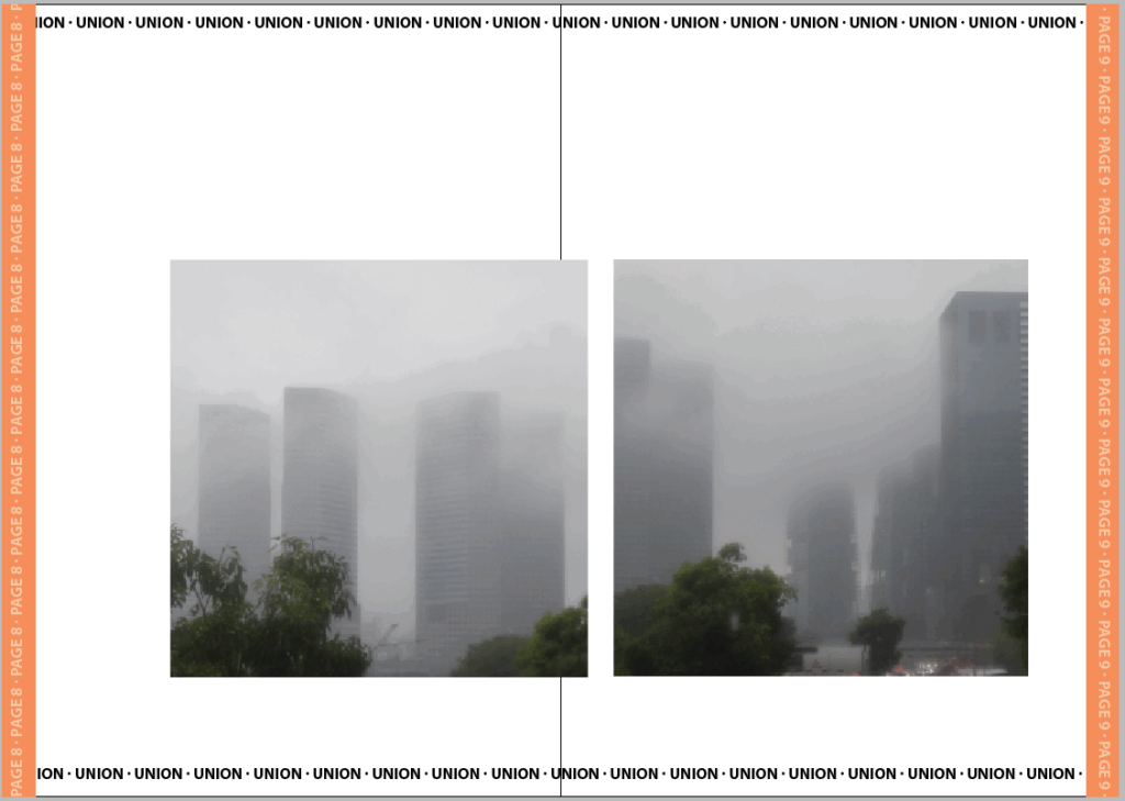
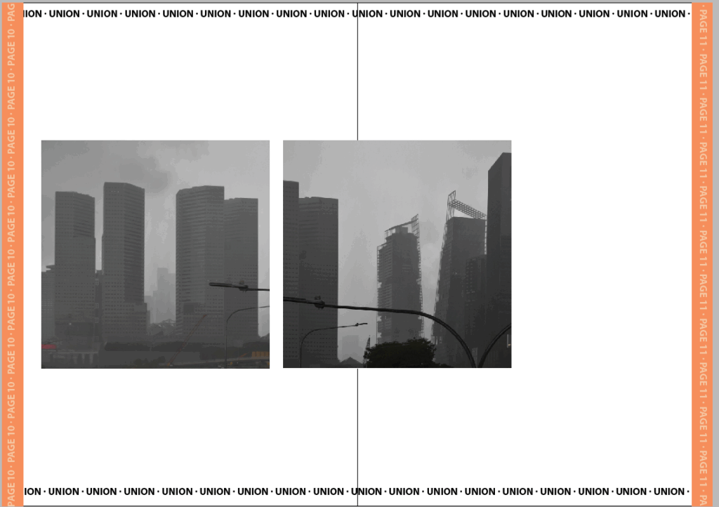
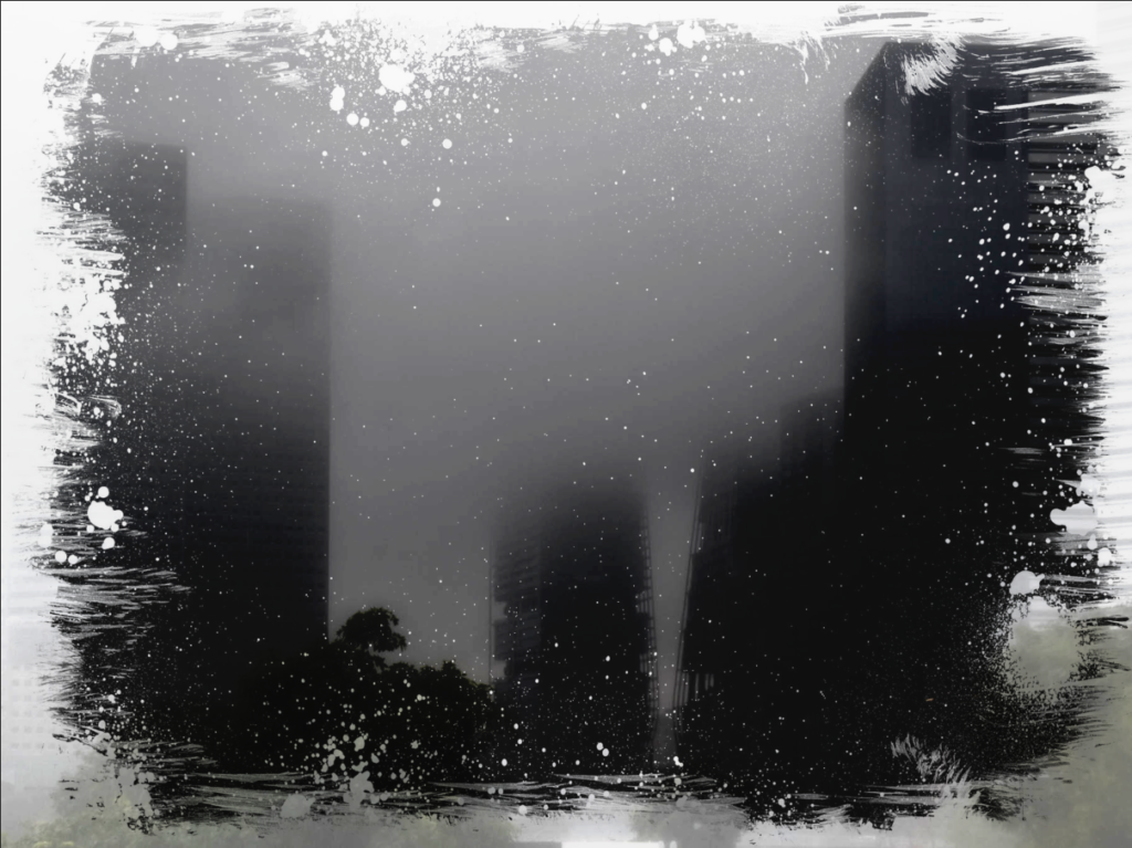
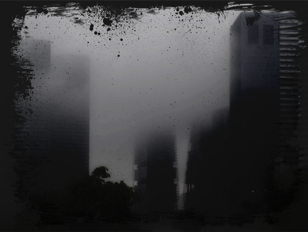
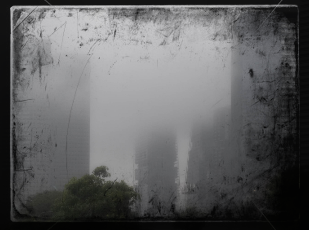
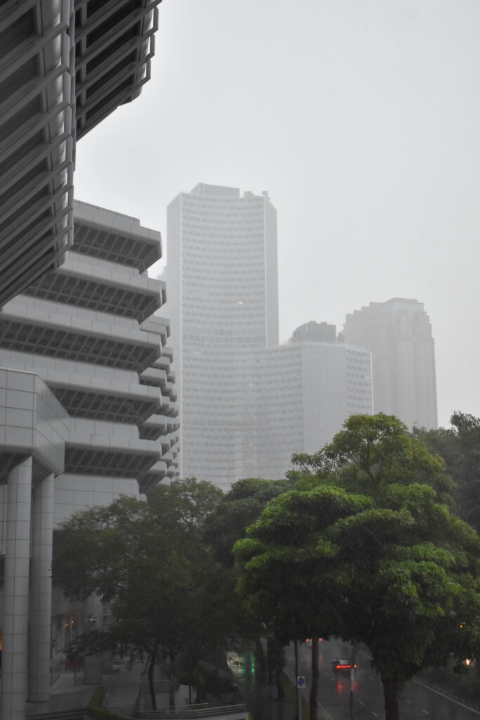
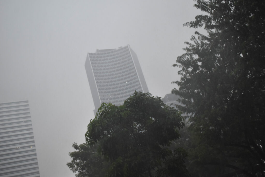
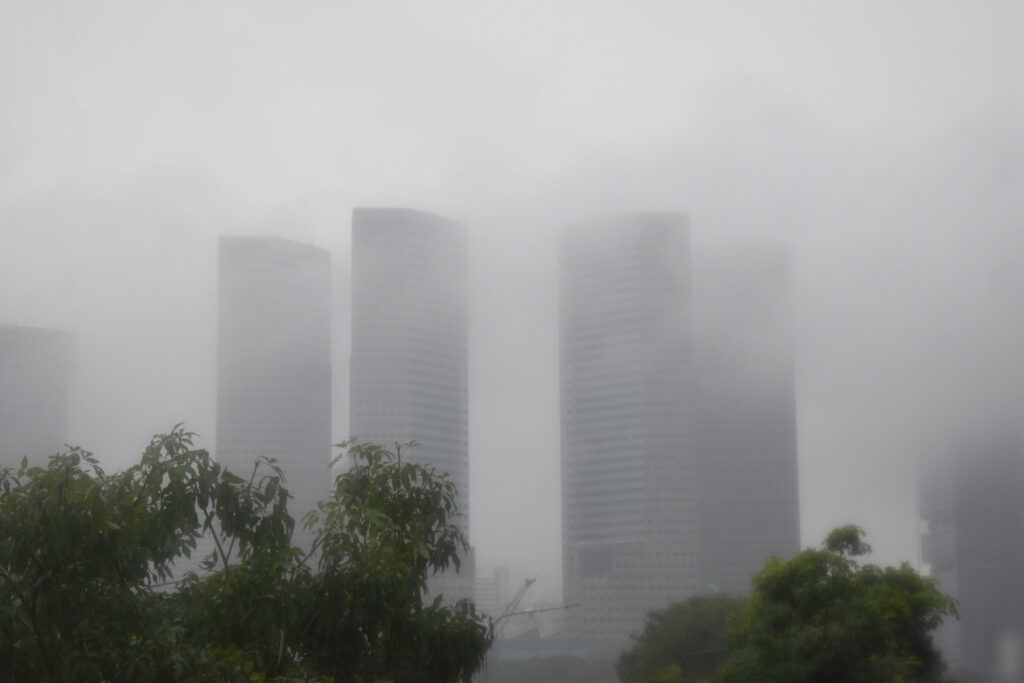
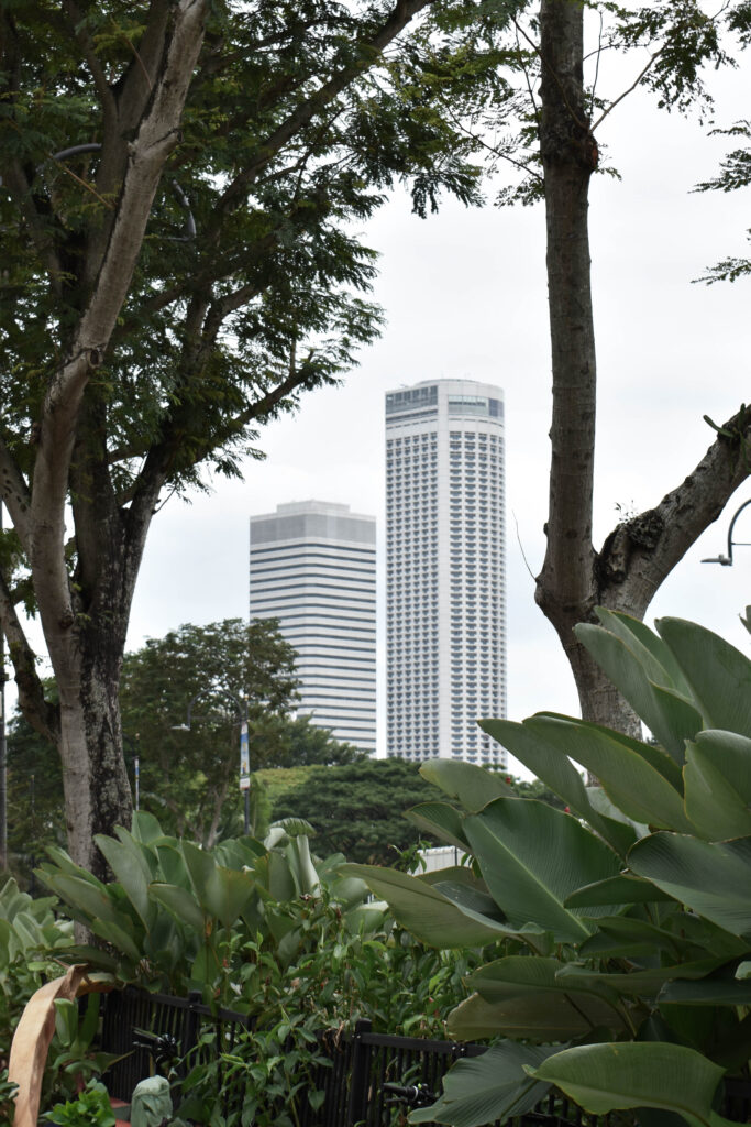
I matched these two images together because of their similar fog levels. I didn’t put these as the last buildings however because they are still identifiable buildings .
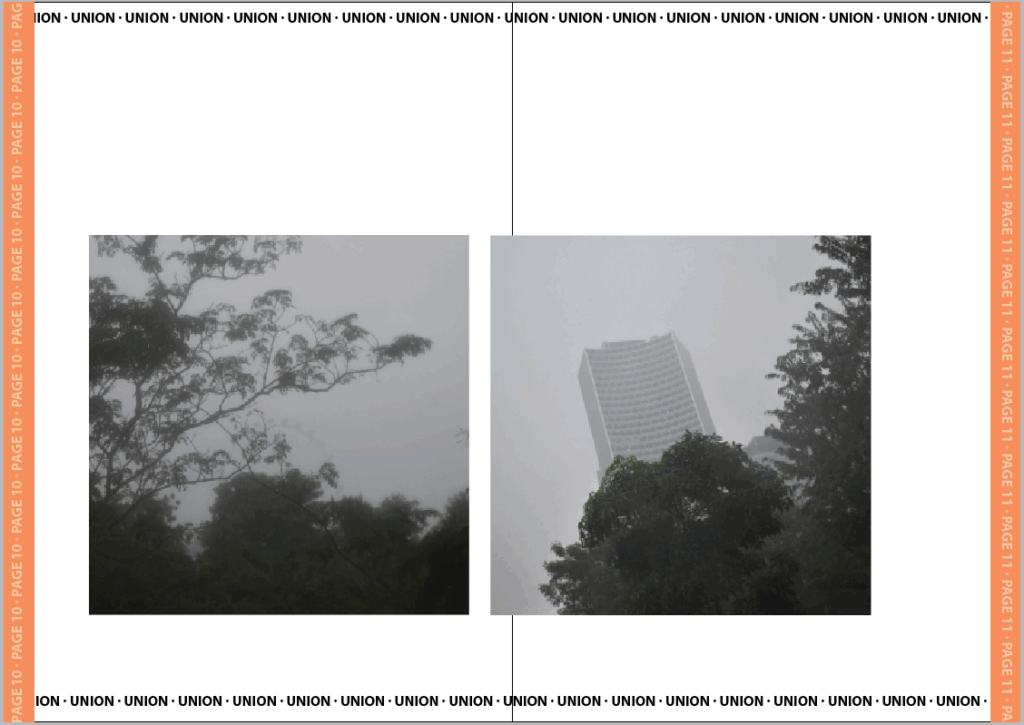
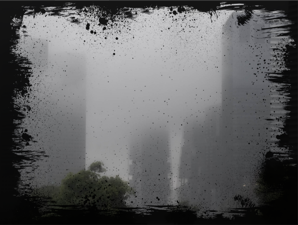
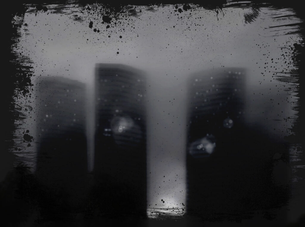
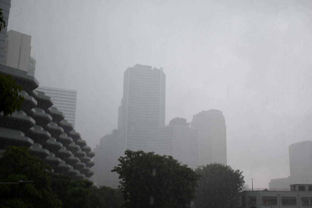
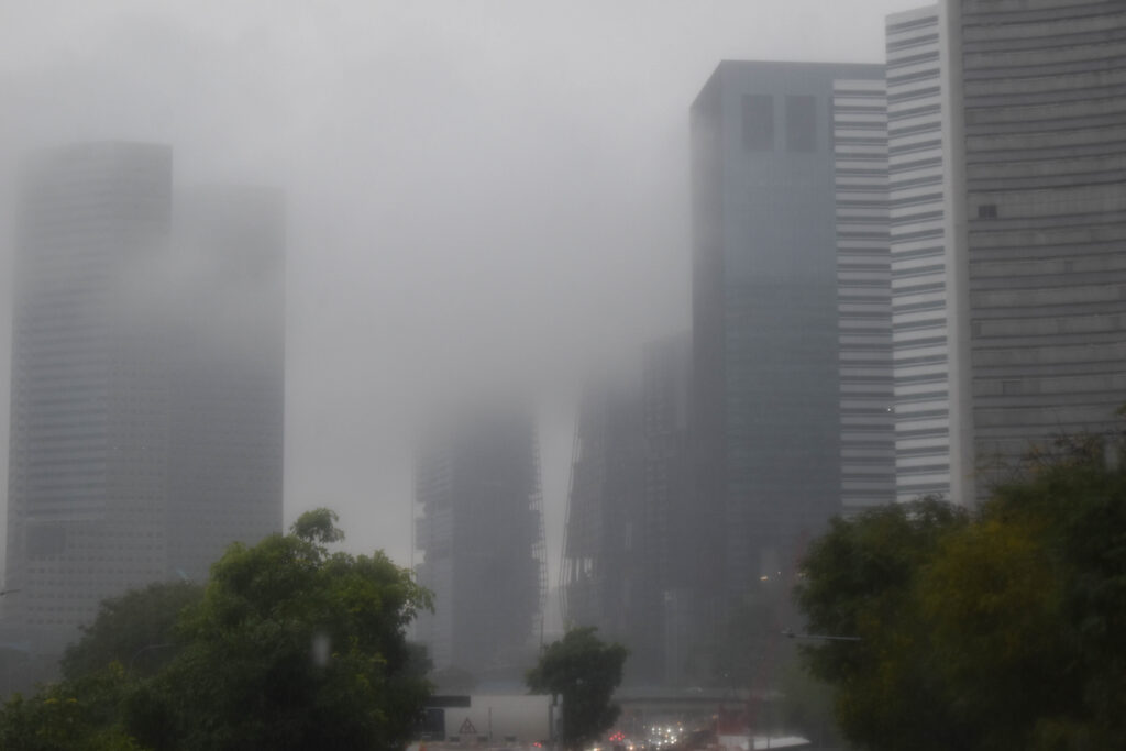
For the final buildings I put these two last because there is less focus on the buildings and more on the space around with the trees and even a fairest wheel. I matched both of these because they are equally foggy and focus the least on the buildings.
For the second intersection I chose the messier and duller of the two. I think that the overwhelming choice of buildings is representative of the choice pushed by advertisements.
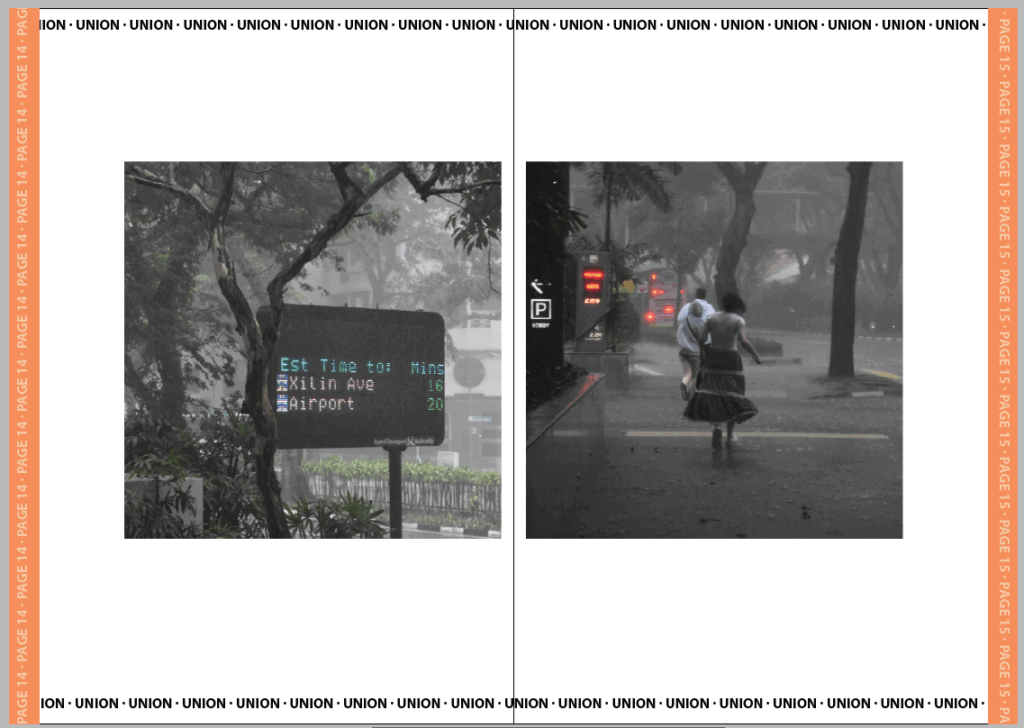
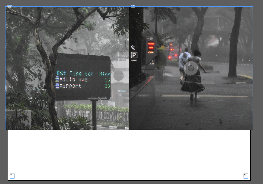
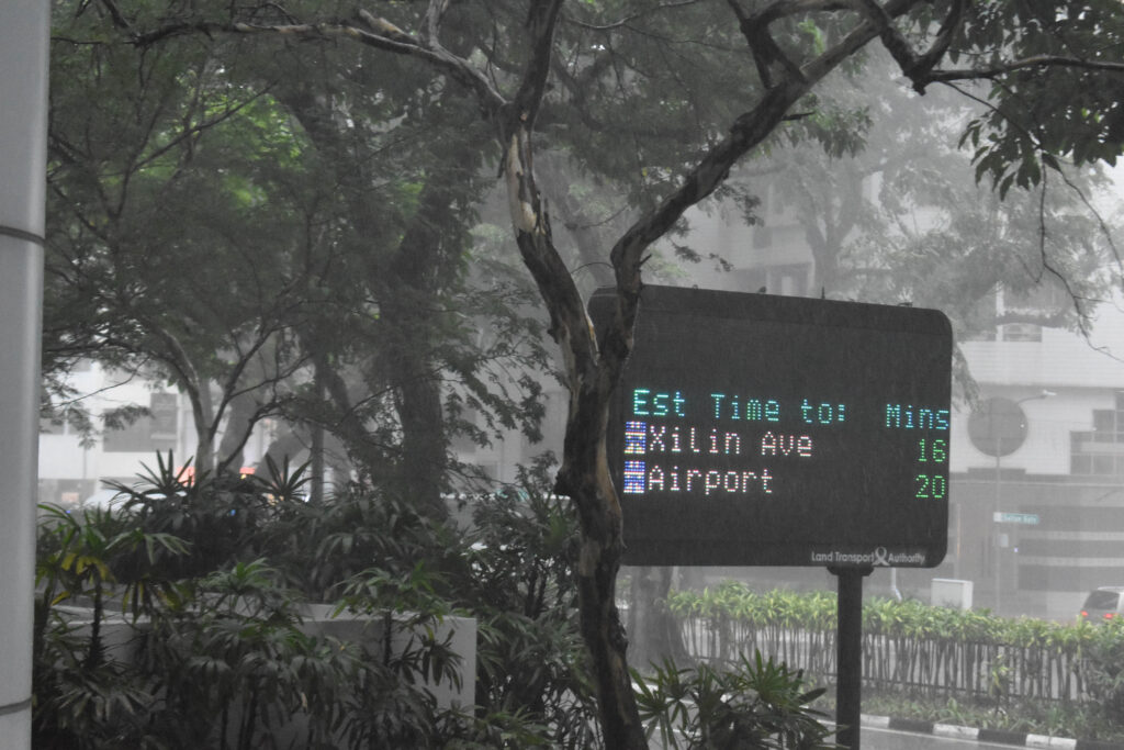
For the final pair I chose these two because they both have colour and show the weather effects on the ground like its been disillusioned by the buildings. They show leaving both with the mention of an airport and visual que of running. I tried to set it up like they’re running from the obsceneness of the cities/effects they’ve caused such as poorer weather.
For the final page I wanted to contrast it with the previous by using another advert but this time clearly marked as one. I like this juxtaposition and Its complete missing the point or ignorance of the rest of the images isn’t an irregular occurrence in marketing.
Evaluation
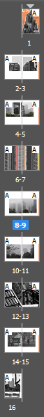
I think the zine turned out well. If I was going to adapt it further I would have created actual adverts for the intersections and maybe even adjusted the background so the pages didn’t look so blank. I don’t mind this space though as I think it helps the images stand out better but it is something I would have liked to experiment with further. The strongest section of the zine is defiantly the cover page because I spent much longer on each detail. Had I made the zine any longer I think I would have instead tried making a full A4 photobook instead where I could add some additional layout and sizes of images but for the small selection I made I think keeping each image to the same dimensions helps make the zine look more cohesive. I made sure to arrange each set of images differently also so that each page feels unique despite having the same template otherwise which I do think was a good choice as my previous draft with all the images arranged the same felt repetitive and tedious to get through. I did like the dullness of the repletion in relation to the narrative of the zine however I figured I could still tell the same narrative while making the arrangements more interesting.
Since the cover is the first part of the book someone will see they need to stand out and portray as much information to pull someone in. This is done in many ways. To stand out they use mostly one colour with the rest being black and white to make it simple and brighter as the colours aren’t competing with one another. The title is the largest part also so that it can be identified instantly. The main focus is a relatively simple image which portrays the overall message of the book such as a supermodel for a fashion magazine. These identifiers also act as a way to quickly portray information. Additionally to this the covers also include small snippets of text with page pointers and flashy deals. To highlight these snippets some covers also use small icons to draw attention.
Some additional details covers include are for convenience such as a barcode and edition details instead. I would like to include small details such as barcodes and edition details to make my cover look more like a realistic cover. Additionally this will make the zine appear like a product which I think fits into the overall message of my photobook.
Inside
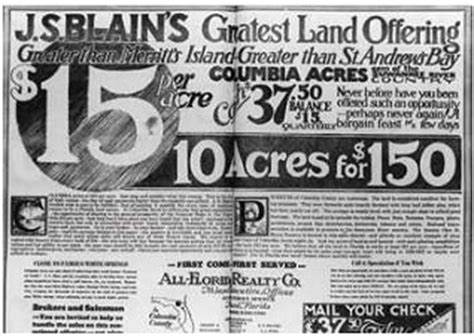
I want the pages to resemble a catalogue or a leaflet. Houses aren’t sold via catalogues anymore and instead usually have online presences as the market moves much faster with mass production of generalized building estates etc. For the overall appearance of these catalogues I had to use older scans and try to combine them with modern website layouts.
Deconstruct
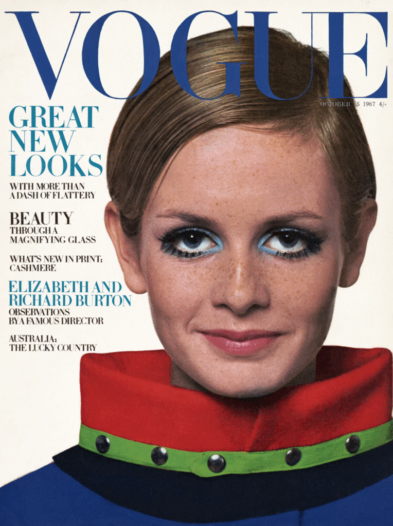
I deconstructed a Vogue fashion magazine I used as inspiration. The book overall felt floppy and disposable because it is released on a monthly cycle and is made up of thin pages and a soft cover. The paper used is a thin material with a glossy shine over the top. It is bound in signatures and glued together underneath the cover. The books format is arranged in a unique order where large, multi-paged advertisements are placed both at the beginning and between sections. Pages used for text are arranged into columns and formatted around images. The size is an A4 page with 100+ pages. The cover has a quickly recognisable title which is sometimes set behind a section of the cover. There are also a few pieces of text on top of the image to quickly point viewers towards useful pages.
Features that differ between magazines are; the binding: smaller magazines are stapled twice with every page included in the single signature; the overall layout: there are significantly fewer adverts in normal magazines and adverts often only take up a portion of the page;
Specification
Binding: As I’ve kept my image selection limited and specific the overall volume of images is low. This means I wont have many pages and could potentially get away with staples. I will only have a small 12-20 pages overall.
Format: Portrait A5 to emphasise the height of the buildings and have landscape A4 for any double page spreads to cover.
Paper: I will use A4 paper which can be folded half way to create both A5 pages.
Size: I am going to keep the images and page count limited so that the point of these images remain clear. I don’t want to fill space for the sake of it as I want every single image to be one I am happy with.
Cover: For the cover I am using a collage I made and turning it into a magazine cover by adding texts and graphic elements.
Title: The title needed to be short and snappy so I just decided to keep the project name of ‘union’ as it has 5 digits like vogue so I can lay it out in the same way.
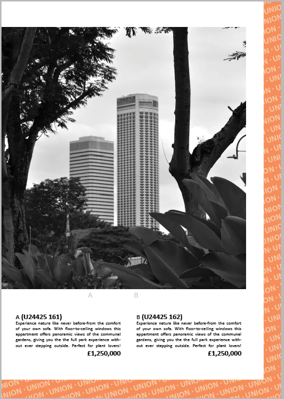
Design: The overall design is a mix of a catalogue, magazine and online retail site. Each image is numbered and described like a catalogue serving the purpose of showing stock, the cover, text chunks and intermissions act like a magazine and with descriptions and details from a retail site. Catalogues are arranged with an image and the description which I will be laying out however instead of just the name and price I will include a clipping of a home listing. No more than 2 images will fill a page as I don’t want to over crowd the pages. Each image will be a square to generalise the layout.
Editing: Although the images aren’t black and white they will have low saturation and similar dull low contrast. I will adjust the edited images I plan on using to make them seem more like adverts.
Sequencing: I will arrange each image in a pair with an image that looks similar in some way be it shape, subject or weather. Between pages I would like to start with the images that most obviously resemble a house for sale and then shift to images that act more of commentary of issues such as overpopulation and climate change.
Text: Each page will contain text. Some of the bodies of text will be there for the aesthetics but it will still be inline with the theme. I could use the text fill for the aesthetics however I don’t want the text if it isn’t going to be adding to the images.
Narrative: I want to showcase how consumerism in the subject of housing and architecture affects cities, the climate and population. For this purpose I gradually shift from buildings to other subjects as well.
Planning
Layout
I decided to create a brief mock up in in-design which I could then use if I settled on creating a zine. Otherwise I would develop further in Lightroom once I’d settled on a plan as texts and images are easier to move and format in other software.
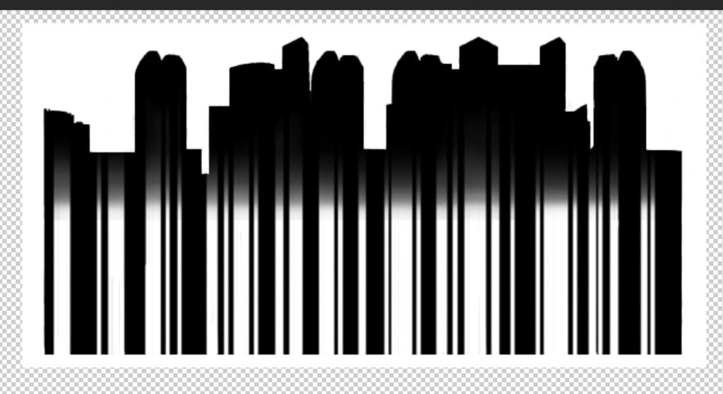
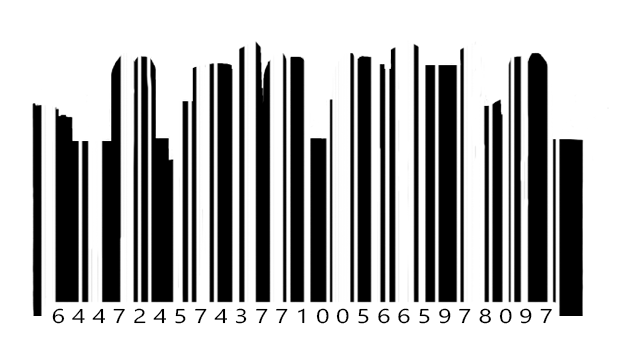
Features I wanted to try out were a barcode:
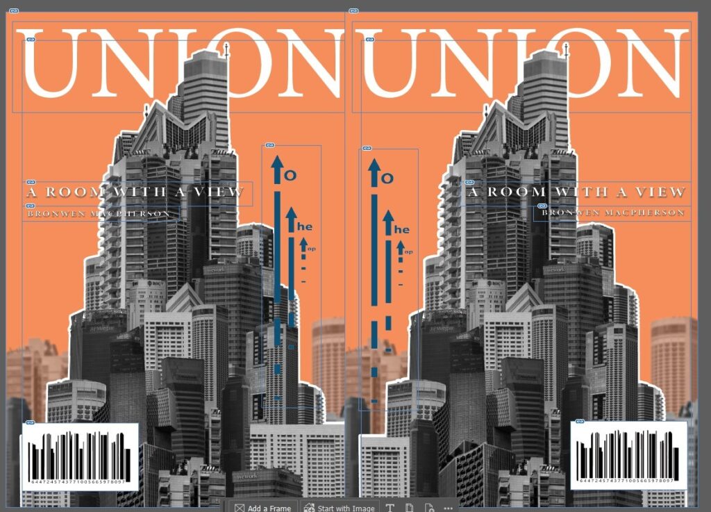
I was unsure how to make the building shapes obvious enough but also still look like a real barcode. Initially I tried using a gradient however this didn’t work. I also tried just using a barcode and placing the buildings on top however this also didn’t work. Once I combined the barcode and the building thought it started to look much better. I used an image of the city scape and removed the background. Once I had the shape I added a barcode shape over the top as a mask and began adjusting a few details until I think it looks enough like a realistic barcode.
text options:
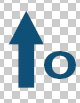
I wanted to add a graphic element to my cover which I decided to try with some arrows following the building up. I wanted the arrows to point up with the building to emphasise the growth upwards. An arrow on its own though would have been out of place so I added a small slogan where the arrow would act as a ‘t’. Overall I wanted this section to emphasise the growth so I chose to the top to showcase the competitiveness countries had with building the highest building despite its un-usability. Making it clear that the arrow was a ‘t’ was difficult though. Overall I chopped each arrow head into a size similar to the text. I tried removing the triangle and sitting it on top also but this looked bizarre and didn’t resemble much of an arrow anymore.
I tiered the arrows so that they would line up better with the building too as I didn’t want too many elements overshadowing the image I was using on the cover.
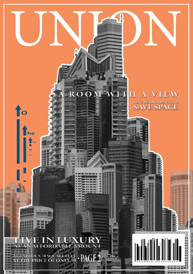
I began developing this cover further where I added a border so that the cover looked fancier, I added more text so that the cover looked more like a magazine trying to be sold and I added a drop shadow behind text so that it could be easily read. The text in the bottom corner was still difficult to read so I added a text box with a gradient so that the bright whites could stand out better against it. In terms of the text, I settled on 4 sentences: ‘A room with a view’ due to its height, ‘One Bedroom fits 3, save space’ because space is getting smaller and smaller, ‘Live luxury at an affordable amount’ because similar contradictory claims are often told like this one, and ‘A generous 70 sq ft for the price of only 50.’ because its a stupid deal which saves nothing and doesn’t make sense but sounds enough like a deal for someone to without thinking go along with.
For the cover I decided to set the title behind the image like other magazine covers do. Additionally I wanted to add more graphics typically seen on normal covers such as page directories, barcodes and additional writings. When it came to these details I wanted them to still make sense with the book so the barcode I created with the silhouette of my images. I ended up switching out the numbers and replaced them with the letters of my name instead so it would blend into the cover much more seamlessly.
I started by simply choosing the images I wanted to use and tried arranging them together. My initial plan was to create squares that left room at the bottom for descriptions, page numbers etc. I thought this would be useful when making a magazine.
I had some of the same locations photographed in the different weather conditions which I wanted to compare in the photobook. I considered both putting them directly next to one another as well as split across the pages. I liked splitting them however I don’t think directly together looks particularly good so I spilt them across the book.
I considered putting in these two images as they show the effects on people however I was unsure of they fit into the book as every other image is of a building with minimal greenery.
I thought this layout looked too bland to be any sort of advertising so I tried out a different layout instead:
For this layout I used the same orange from the front on each page for continuity. Additionally I wanted to create some level of branding/copyright tags so I added a bar of the title along each page. I broke up each set of images with a double page spread to resemble advertisement breaks through magazines. I also think this worked well to add some variety to each page. After id chosen the page template I began adding in the images. I only put two on each page set and made sure to size/format them all the same in small squares. In the empty space around the images I was going to add descriptions of the images/potential listings and some general text.
I made each set of text without the intentions of them actually being read as they were just there as a way to format the layout like a real magazine. I made all the text small and contradictory like irrelevant waffle that fills housing listings and fine print attached to advert.
I tried adding descriptions and prices like a real catalogue/magazine however I thought the page was a little too busy and the images weren’t big enough on the page. When I made the images bigger there wasn’t enough space for all the additions so I just removed them instead and made the images bigger. I did like the idea of this layout still so I adapted it onto the back page instead.
For the final page I wanted it to somewhat resemble the cover as it also needs to summarise the book but without the need to draw people in. It can be more honest and avoid flashy misinformation added just to attract a viewer. I included the orange edge and combined it with a bottom also like a tape used to rule a page at the end. I added the union banner again because its similar to a watermark but also the repetitive nature of advertising.
The first layout that I thought of was all the edits together. I tried this first layout in front of both a white background and a black background. I don’t think I like how window mounting on black card looked because none of the images had particularly high contrast and are made up of more mid-toned greys. I would print the building on A4 and the two squares on A5. I like how this layout looked but I wanted to experiment and see what else might work better. The additional images to the side looks a bit like a zoom in from a textbook of what’s going on with the first image.
Layout 2:
I would print the squares on A4 for this layout and the building on A5. I didn’t like how the images looked laid out horizontally so I tried arranging them differently again. This layout made the mega-structure look small and unimportant which I don’t think matches the message i’m trying to portray.
Layout 3:
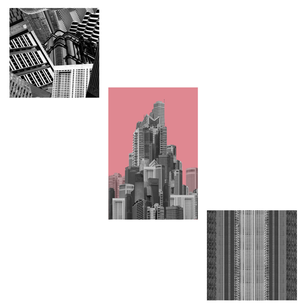
I decided to try a layout where it was just the two squares instead. Although both edits are square their not particularly similar in any other way so I decided to change this layout by adding back in the building.
Layout 4:
I think this one looks better then previous because the colourful pop of the background looks good in the centre however there is a lot of wasted space. While the building and the stripes match the collage doesn’t so it looks odd all together.
Layout 5:
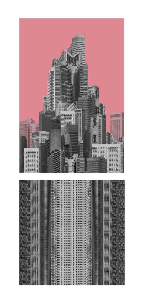
I decided to remove the other square image and arrange these two together instead. I like how the building looks like its sat on top of an elongated structure as it makes the building look even taller and unrealistic.
Layout 6:
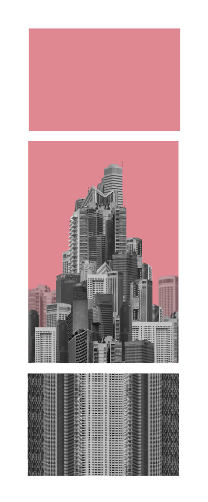
I liked how layout 5 looked overall It just looked a little off so I tried to balance out the layout by adding an additional section on top with the background colour to both elongate the shape and create a symmetrical layout. Both smaller images would be a size down from the central building and creates a clear distinction between the buildings and the background/sky. The square edit wont be square for this image as I didn’t want the layout to be too long.
Layout 7
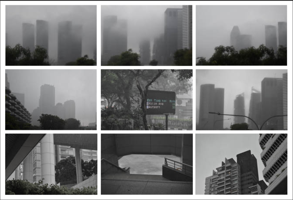
I wanted to arrange these images into more of a grid to show the overall aesthetics instead of individual images. When making these I was unsure whether to present them as a grid of final prints or an arrangement in a photobook so I tried both.
When creating this larger grid of images they didn’t all match overly well so Ill keep most of them for the photobook instead and narrowed the selection down.
Layout 8:
I downsized the nine images into a grid of four instead so that all the images were more similar and I could arrange the images into a typography.
Layout 9:
I removed the darker image because it didn’t fit as well with the other three but I’m unsure if I want to present two triptychs.
Layout 10:
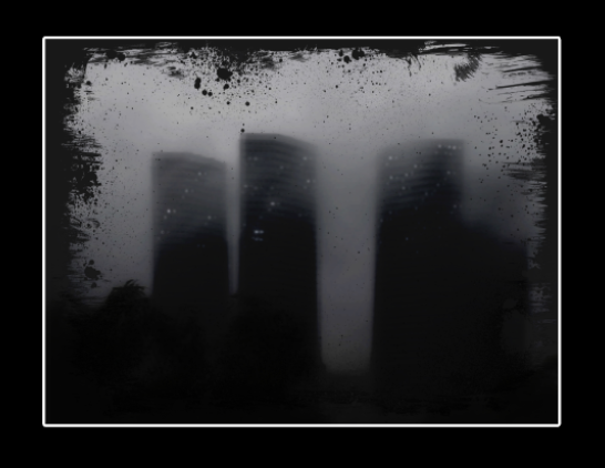
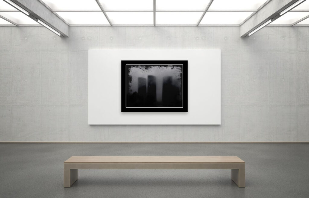
I liked how this image turned out and I decided to mount it up. I didn’t think it matched with the other images so I decided to mount it up on its own. Since this image was so much darker I decided that an A4 window mount would look best. I like the relatively chunky border around the image as it makes the overall appearance a bit darker which I think looks better than one which would be too thin. Since the image is so dark on its own, the window mount makes sense and the white strip breaks up the overwhelming dark.
Virtual Gallery:
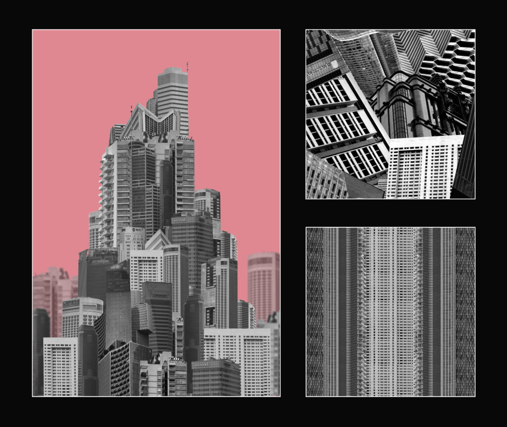
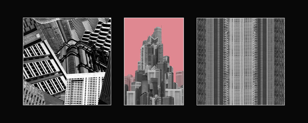
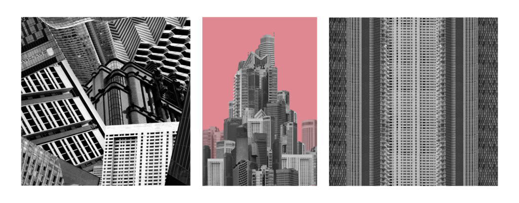
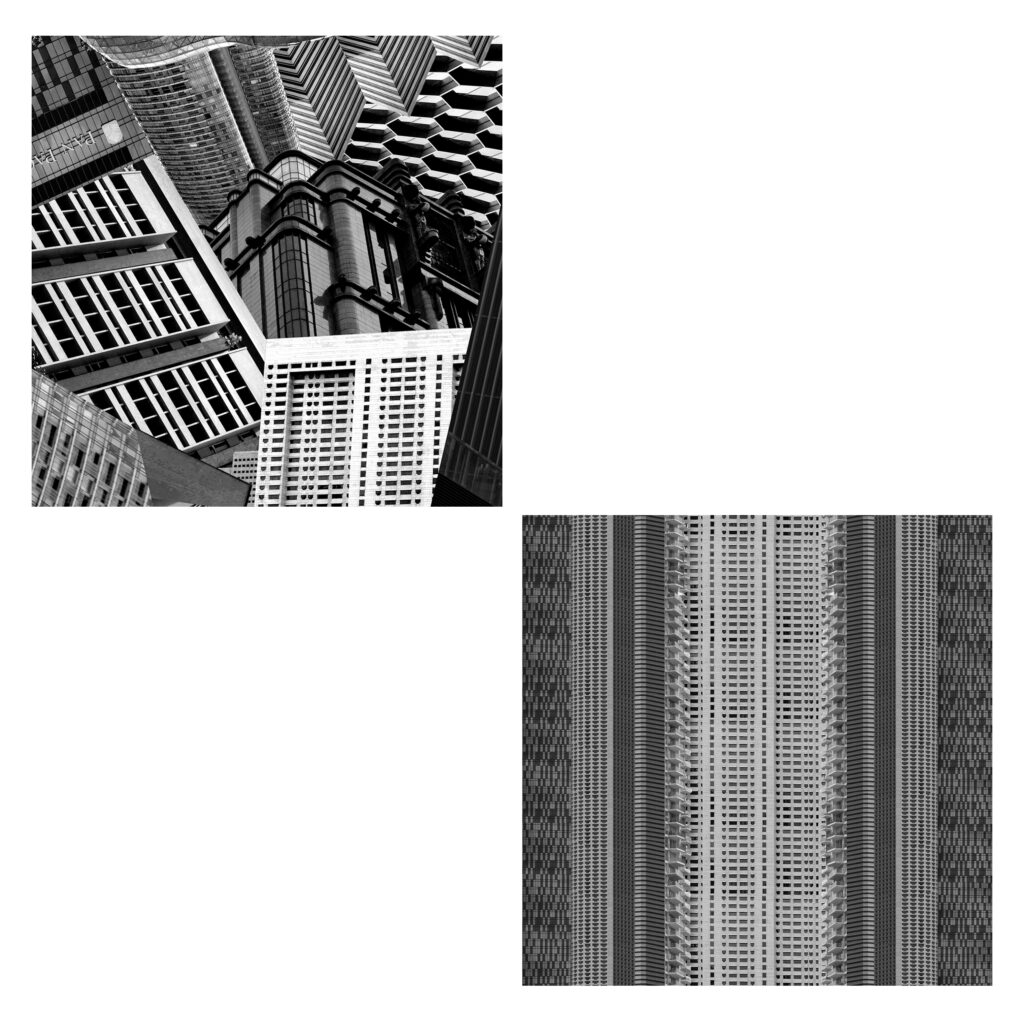
For the final layouts I decided on number 6, 8 and 10. I will be presenting layout 6 with small frames between each image and a wide border around the whole thing. The building will be printed A3 while the other two sections will be A4. I will mount them on mountboard in front of a white background. For layout 8 I will be printing each image in A5 and mounting them on mount board on a white background also. After mounting up I realised that for layout 6 I should have printed the largest image in A4 and the other two in A5 as the mount board was not big enough to fit all 3 images and the line left when stitching two together looked a bit odd. Additionally When printing a size down there is an additional few centimetres of border added to the smaller images so they don’t align perfectly with the A5 image. I presented layouts 6 and 8 separate from 10 because of the difference in darkness. The window mount is so much darker that it looks odd putting all 3 together.
Evaluation
I had 3 main outcomes from this project which I think all turned out well. They each portrayed the message I had intended in different ways:
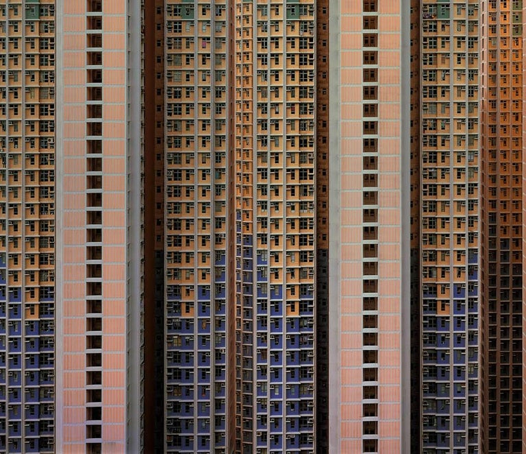
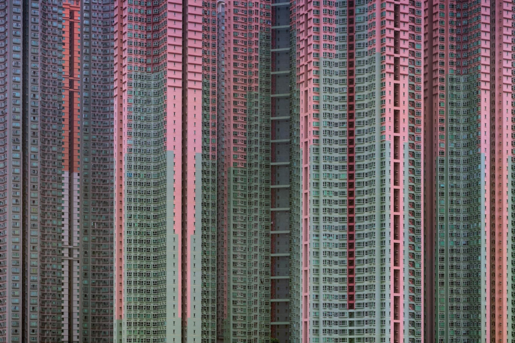
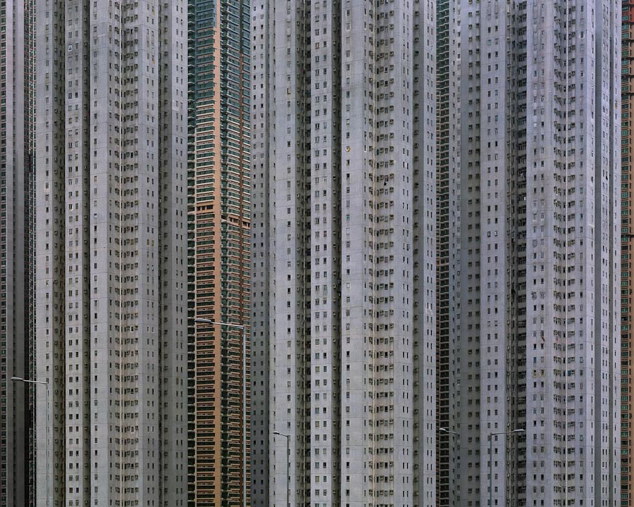
Michael Wolf, architecture of density
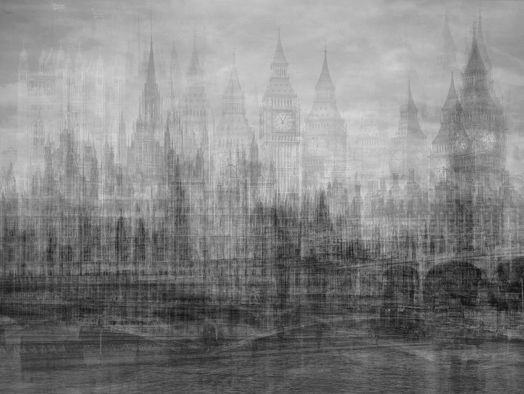
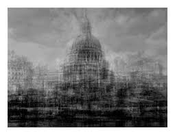
These images were inspired by Michael Wolf with different approaches. I think these both portray the message of overpopulation and overproduction well which was important for me to show in a few key images for my photobook. The main difference between them is that I set my images in black and white and I combined multiple different buildings into one strip. Had I kept using the same building at different angles, I might have been able to easily uniform the colour. If I was going to experiment further than I would have tried this as well. I do think that by using multiple different buildings in the stack it creates a more reasonable layout as different buildings are built together not by aesthetic choice but because the land is close by.
Lewis Bush, Metropole
I was inspired by Lewis Bush for this image to show the synthetic nature of buildings. The lights are a physical representation of how people have overcome the dark and the haziness creates an ominous, unnatural appearance. The biggest difference visually is my image has more mid-tone grey and the artists has more near-black grey. I think that for my image the mid-tones work better as it makes the buildings stand out more as something emerging from behind the smog where as Lewis Bushes has more emphasis on the setting sun and artificial lights.
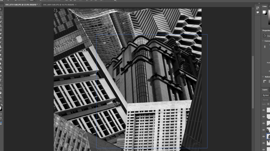
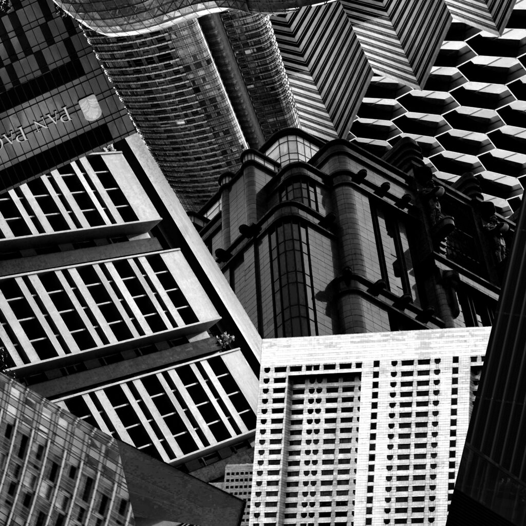
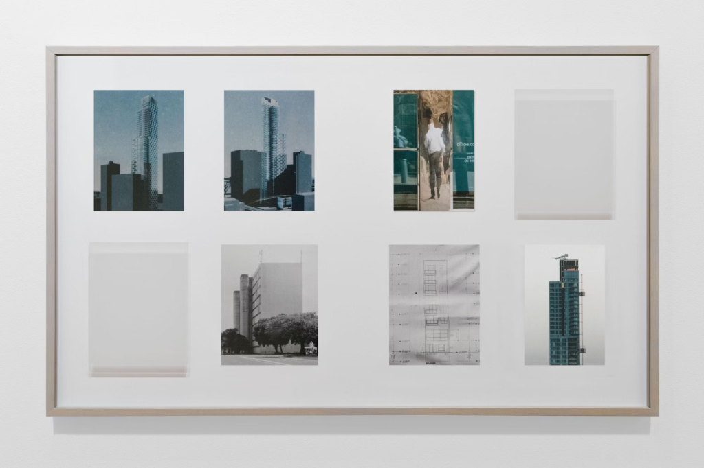
With these images I was inspired by typology and arranged all these images into a grid. They are all similar in location, subject and lighting which makes them all fit together well. Additionally they are all images of the same type: high-rise buildings. Overall these images together create a sense of scale and show architectural the feats as something somewhat sinister.
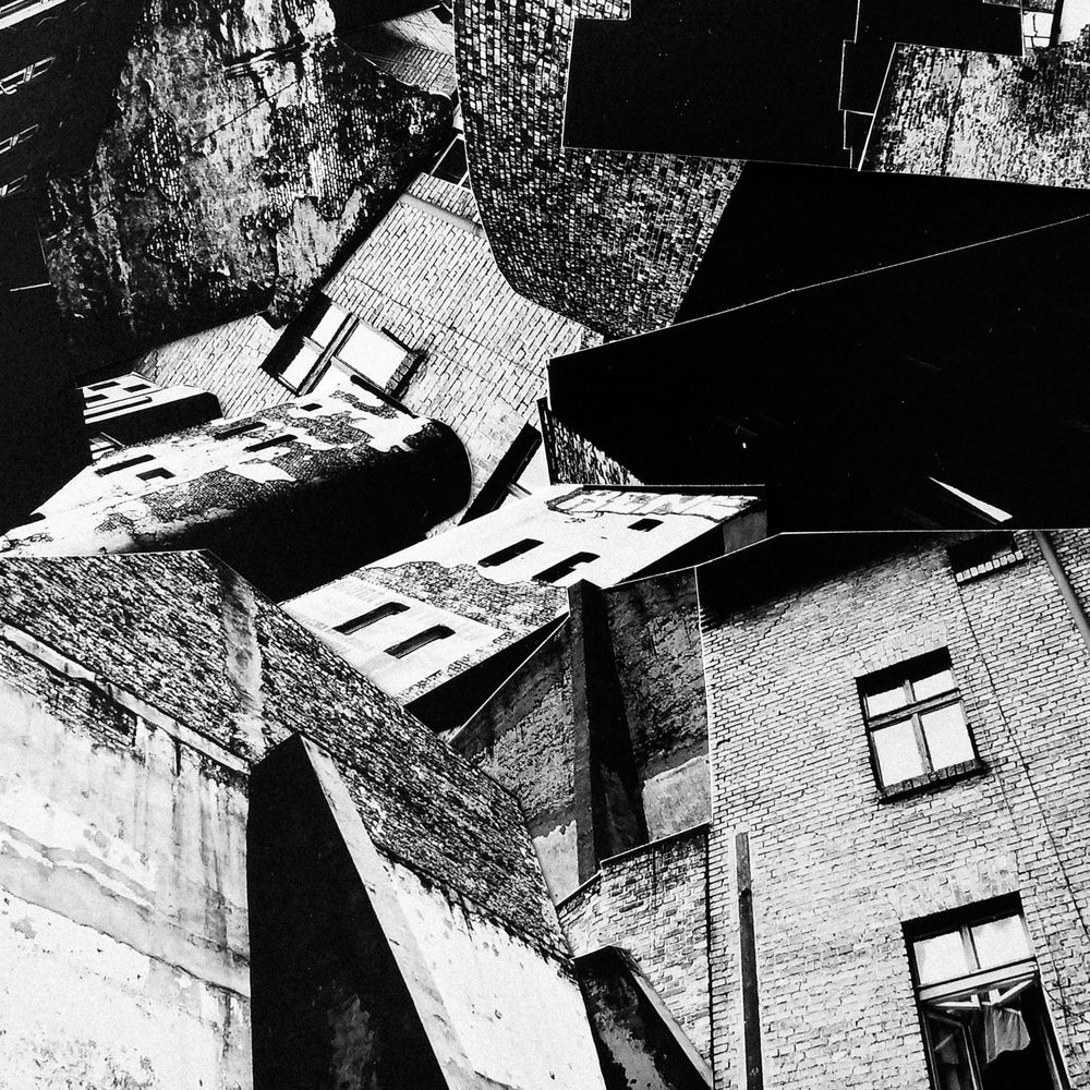
For my first attempt at creating the building collage I used the single landscape image and cut up a number of buildings. I arranged these on top of the image to fill in space and make the image look more full. I tried to make the outside of the frame look rounder than the inside like seen in futurism and Vorticism however with every building being shot at the same angle the image overall looks too flat for my liking. For my second try I decided to use more angled images where the perspective is different. Additionally I tried adjusting the contrast of the images to be more extreme.
I tried lining up different buildings to create something which flowed better with different textures. I used fewer buildings so each on could be larger in the frame.
Final Outcome:
This outcome looks far better than the first. I think is due to a number of reasons, the most important being the addition of angled buildings. Additionally each building links to one another and I even combined a few to create different shapes. The variety of textures looks more unique and each building is larger with so few in the same frame. To improve this image I would have added more texture to the bottom left corner to balance the top right and maybe tried one without a recognisable building instead so it was made up of only background textures instead.
Outcome 2:
Inspiration
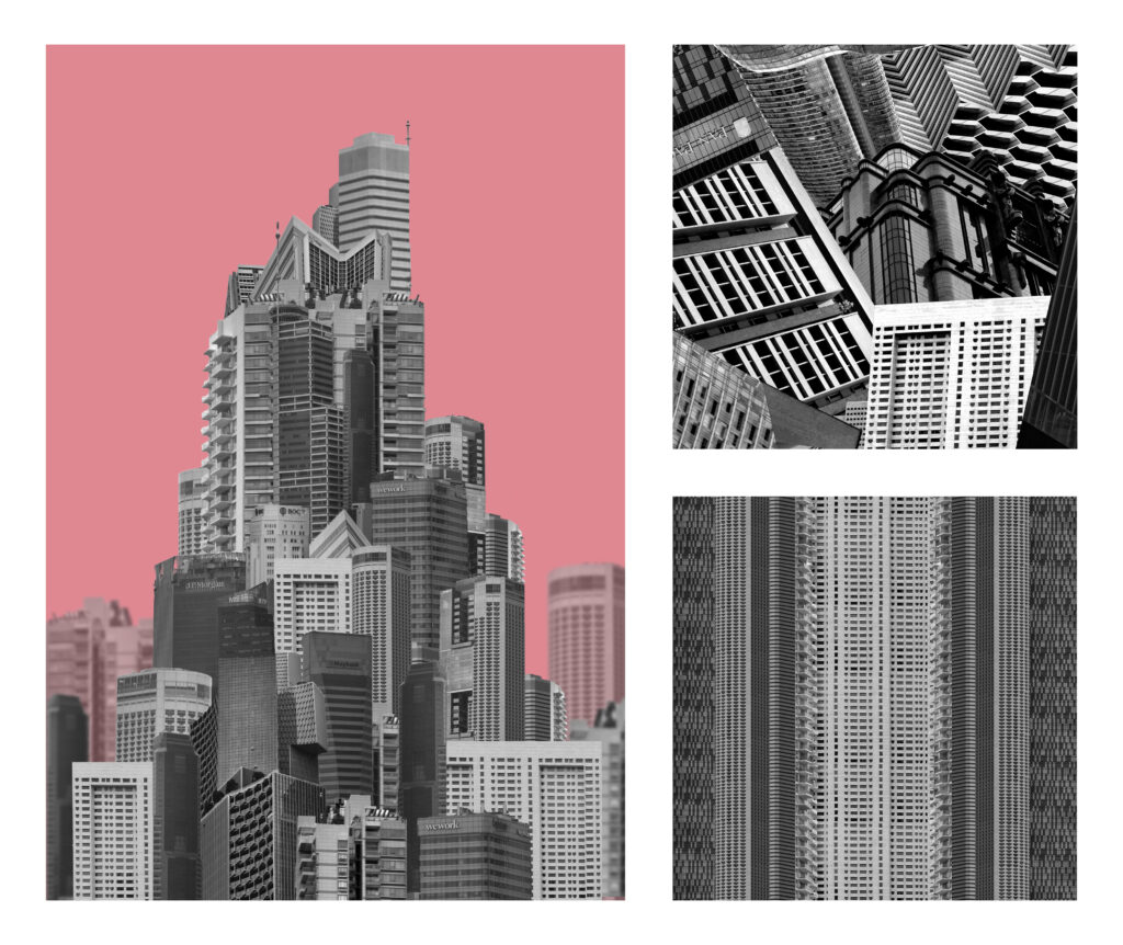
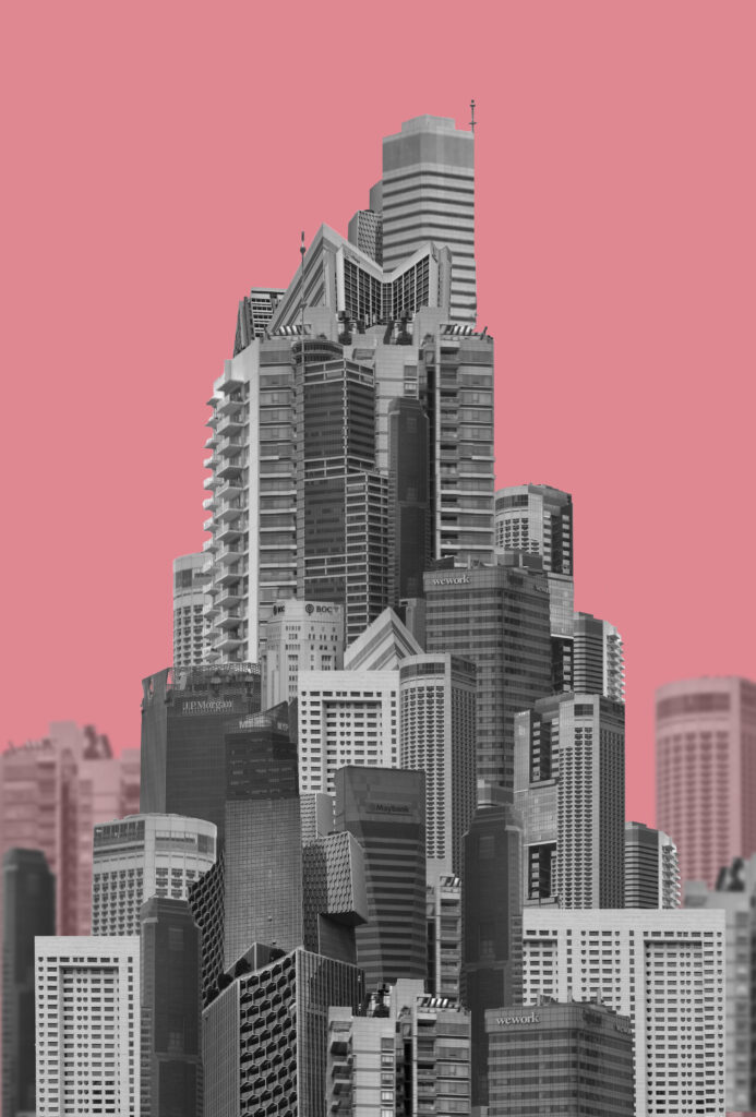
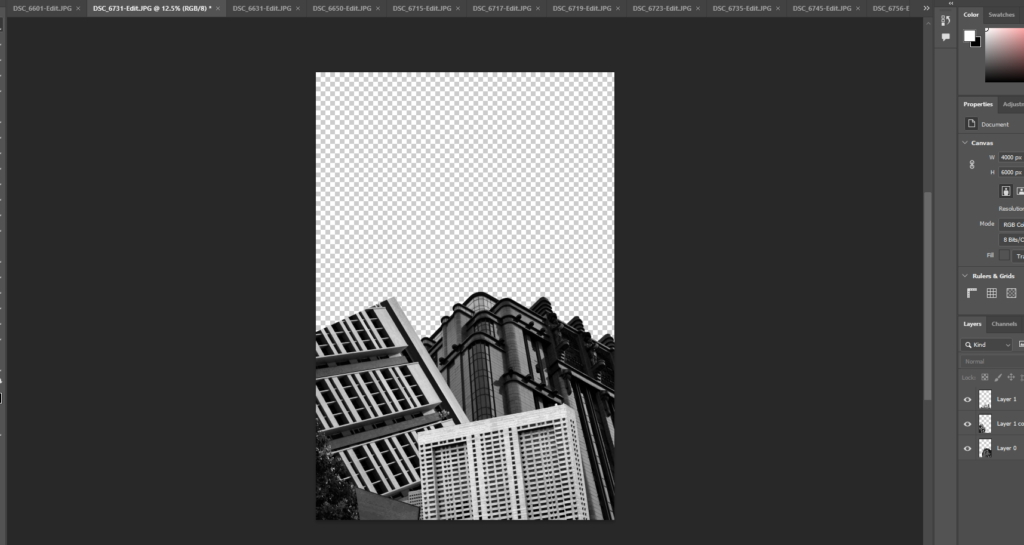
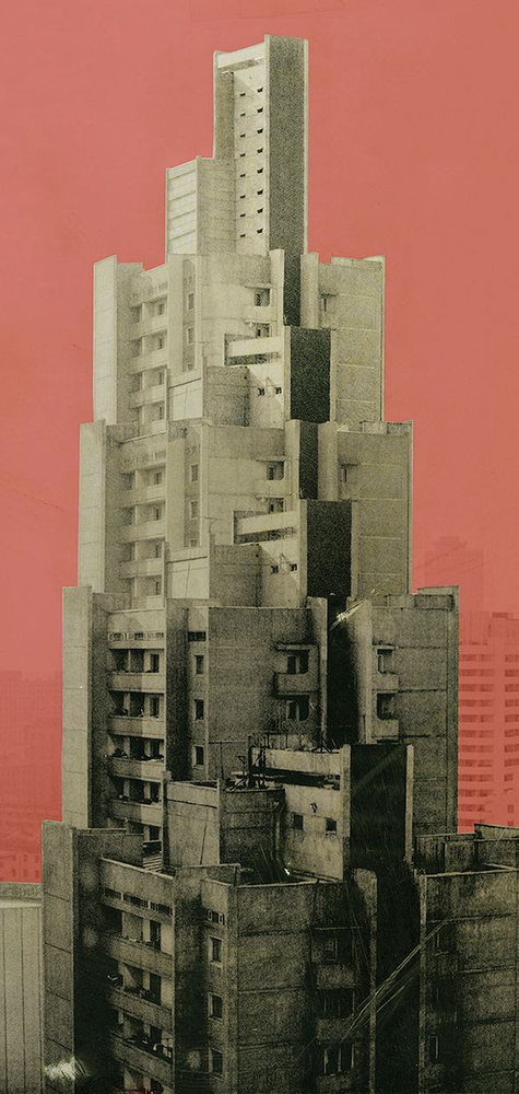
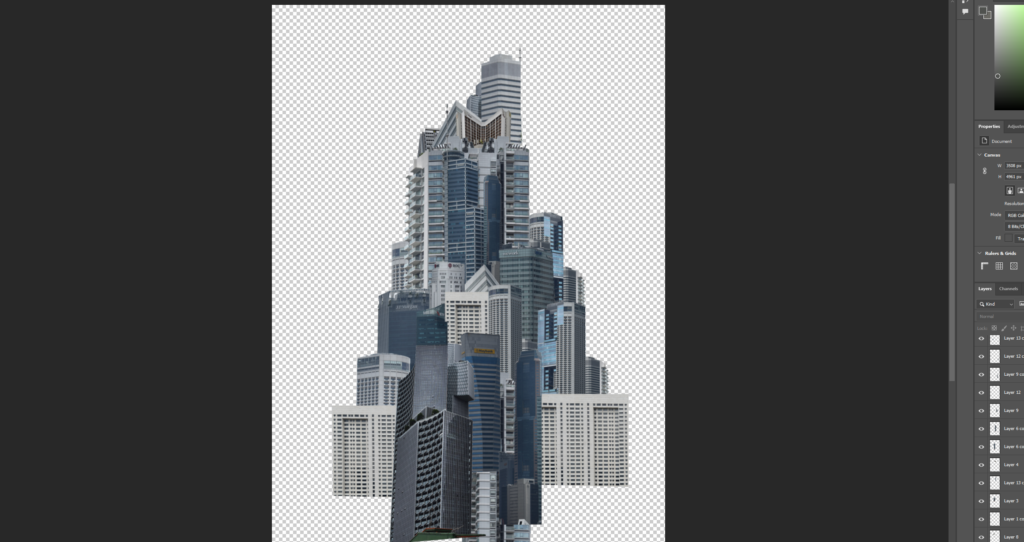
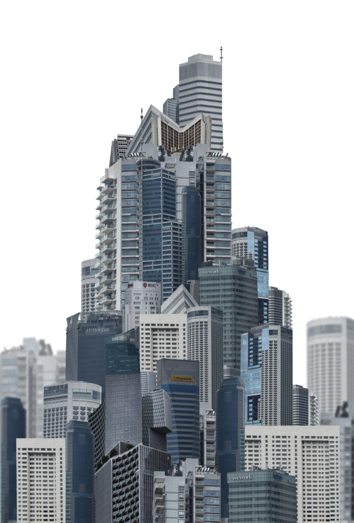
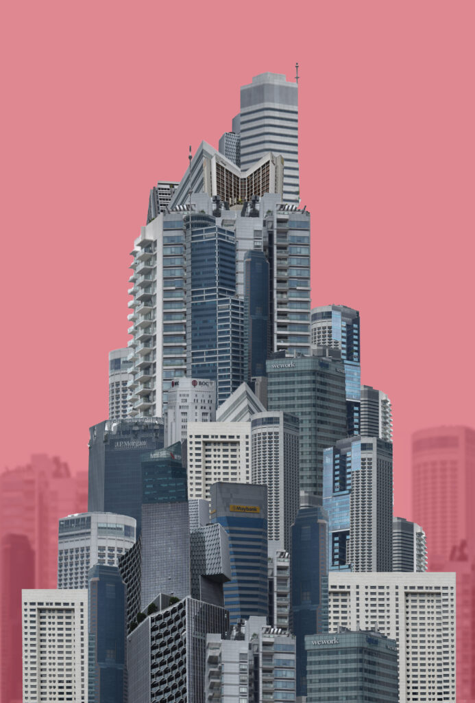
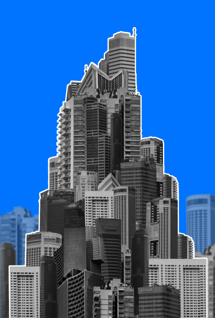
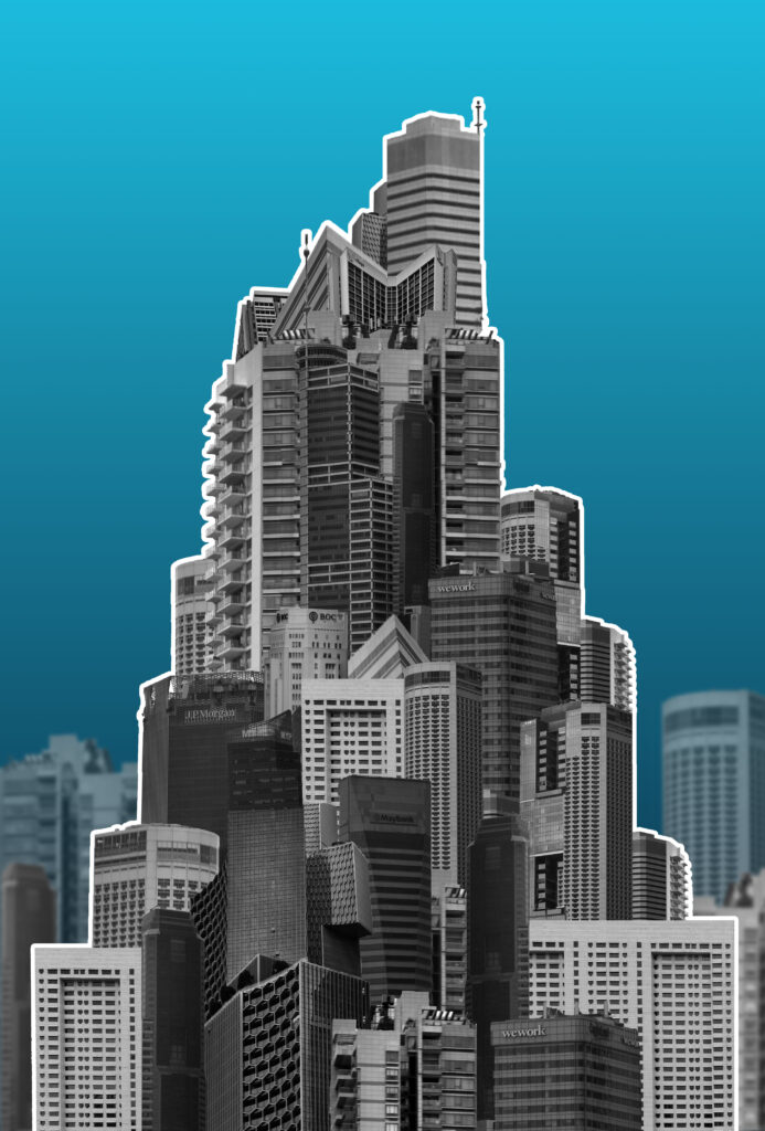
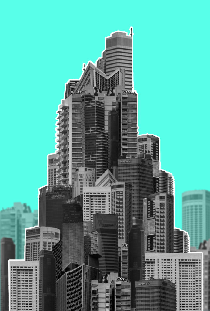
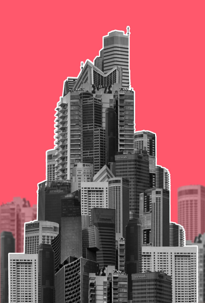
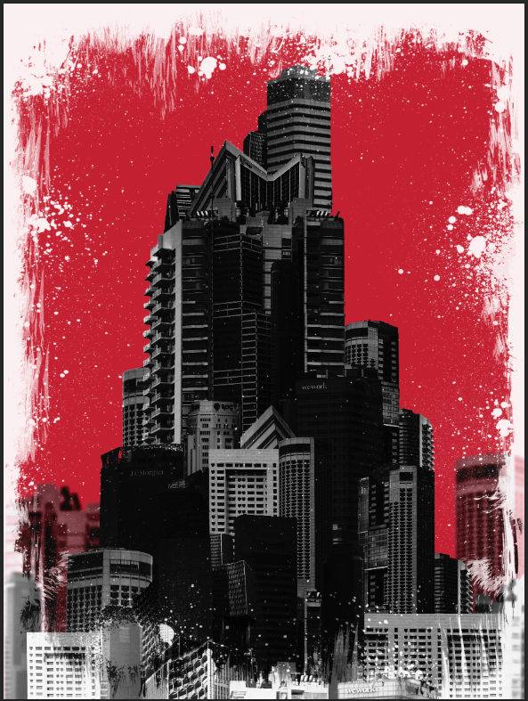
While the original image is a single building I wanted to create a mega-structure made with multiple faces of different buddings so it looks choppier and messier without much thought like many modern buildings appear. I will create a colourful background like this one since I think it will resemble a magazine cover which I would like to experiment with for a potential zine/flyer I might make. An artist who creates work similar to this is Michael wolf however I wanted the focus to be on the eventual top of the building as opposed to the elongated parts.
I combined most images from my second photoshoot and chopped out the buildings. I began building them up into a general triangular shape pointing upwards.
I tried to add some sort of background to make the structure seem larger and something actually on location in a city. I made the opacity lower and blurred them slightly. I added a colour to the background to see how that would turn out and also tried black and white. Without a colour in the background the background buildings blend into the shape better and don’t look as obviously separated. The black and white buildings look better with the colour background as it pops more but I think that If I tried colour with a background that fit better It would look more coherent. I also tried moving the background buildings in front of the colour with a lowered opacity so that they looked more similar to the main structure but still visible different.
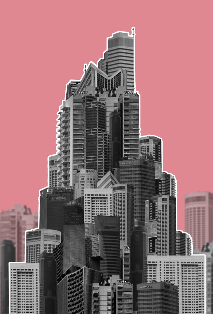
When trying to make the structure stand out I also tried an outline. I think that if I added more graphic elements this approach could work for a cover while the other approaches would work better as a print out/page spread. I tried a few other colours also:
Final Outcomes:
I will be using the orange one as the cover for my magazine since the colour is bright and the outline makes the shape jump out. The pink one however I will be printing out as a final image. I like these two as my final outcomes as the colours, orange and pink, are used as various warning colours.
Outcome 3:
Inspiration
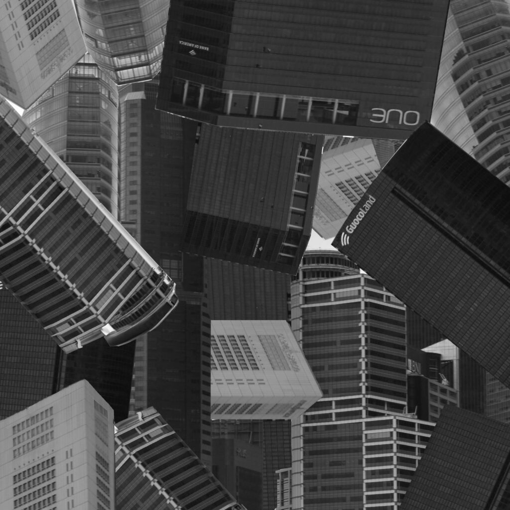
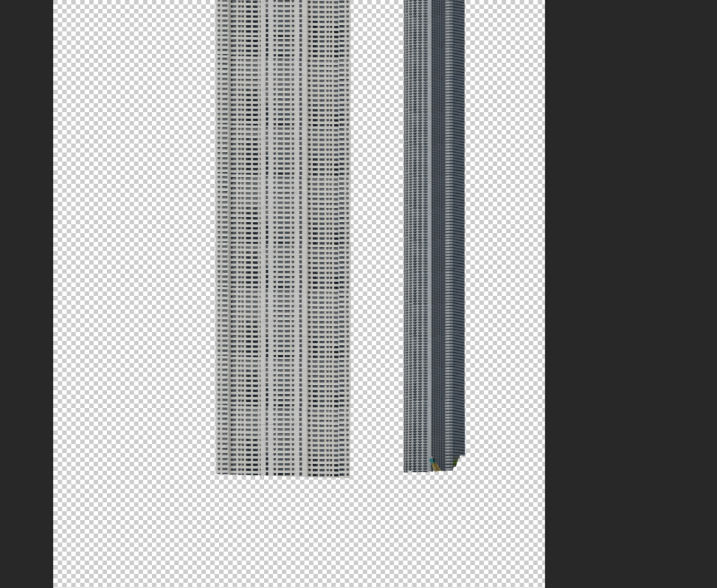
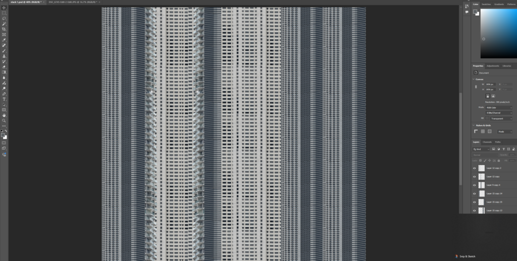
Inspired by Michael Wolfs ‘architecture of density’ I elongated buildings by cutting out faces in photoshop and stacking them on top of each other to create a landscape of stretched buildings.
I started by stretching individual buildings before arranging them all together. I created multiple copies of the same building and arranged them together on top of one another to try and seamlessly create a longer version. The first arrangement didn’t have much thought behind the arrangement of the images which I fixed when creating the second arrangement which looked more symmetrical like a real block of flats.
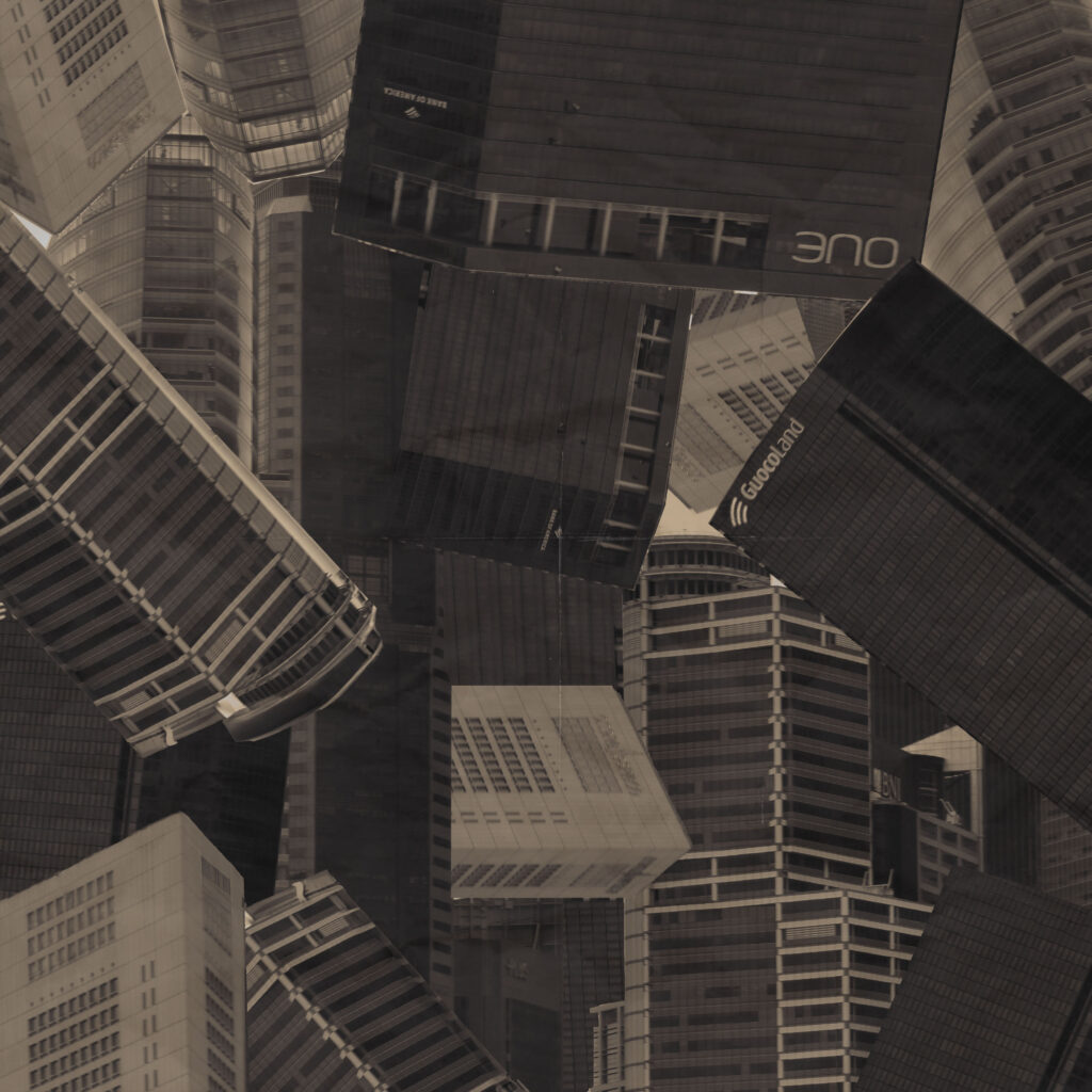
I began laying them all out together into stripes and tried both black and white and colour. I didn’t like how the colour one looked so I opted for black and white instead.
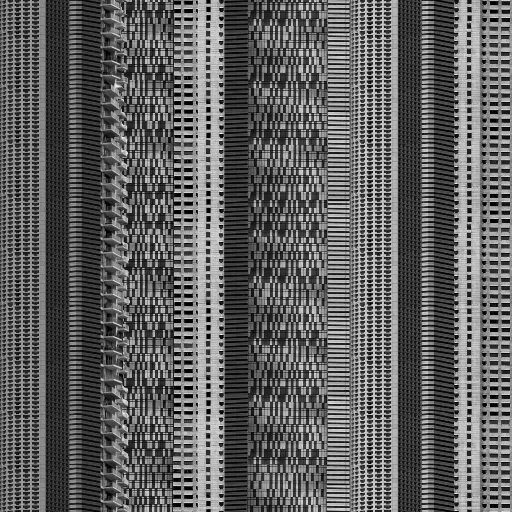
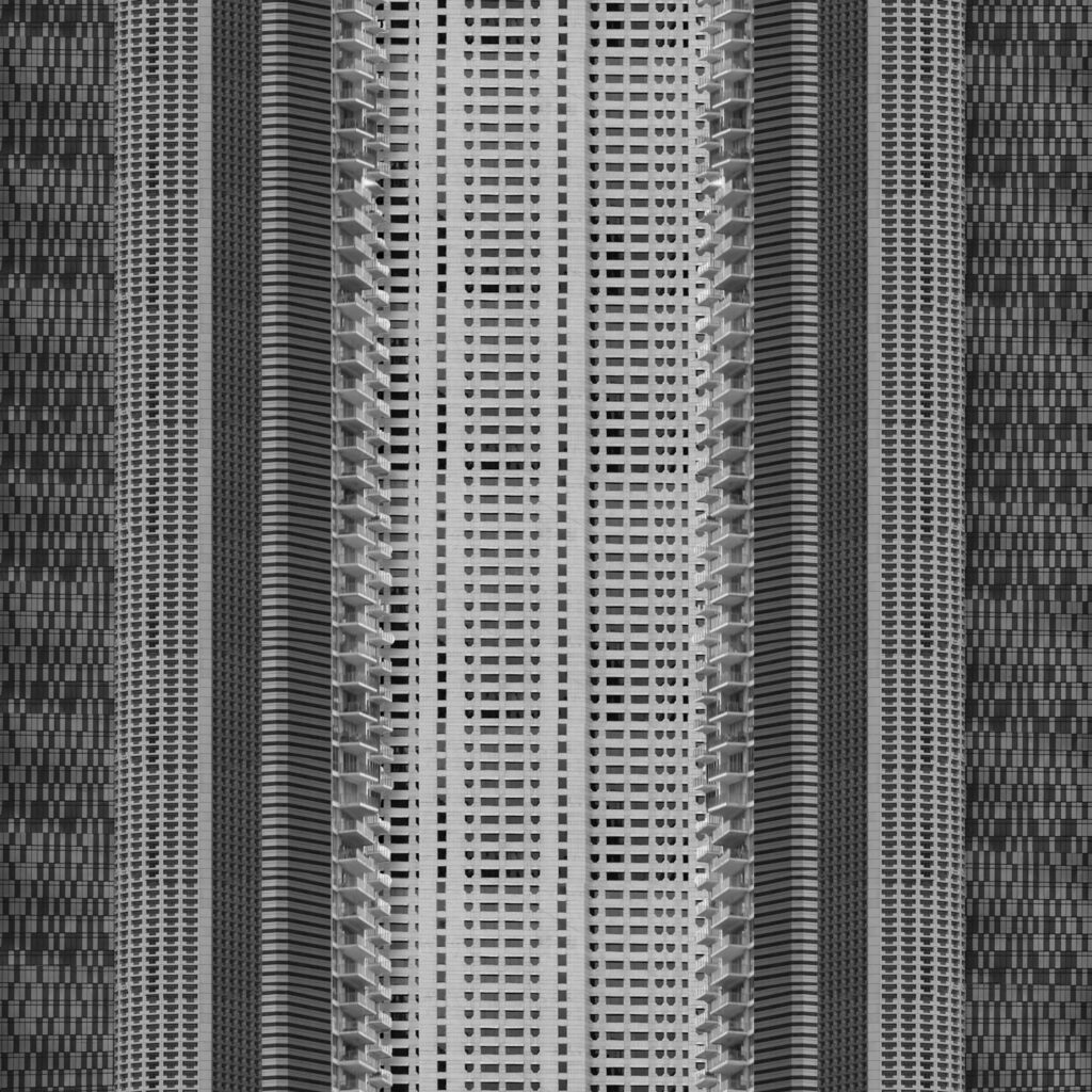
I like both arrangements for different reasons. The first one shows the messiness of arrangements of buildings while the second looks a bit more realistic. I arranged these images into squares because I wanted to show how far cityscapes spread both upwards and outwards as they expand.
Final Outcome:
Overall I choose this one because I liked the more realistic approach over the more random assortment. I created a better contrast between buildings by adding a drop shadow also so that the image didn’t look so flat. I like how top is not in sight as it creates the effect of the building being infinitely tall which is similar to how some of these buildings feel.
Outcome 4:
Inspiration
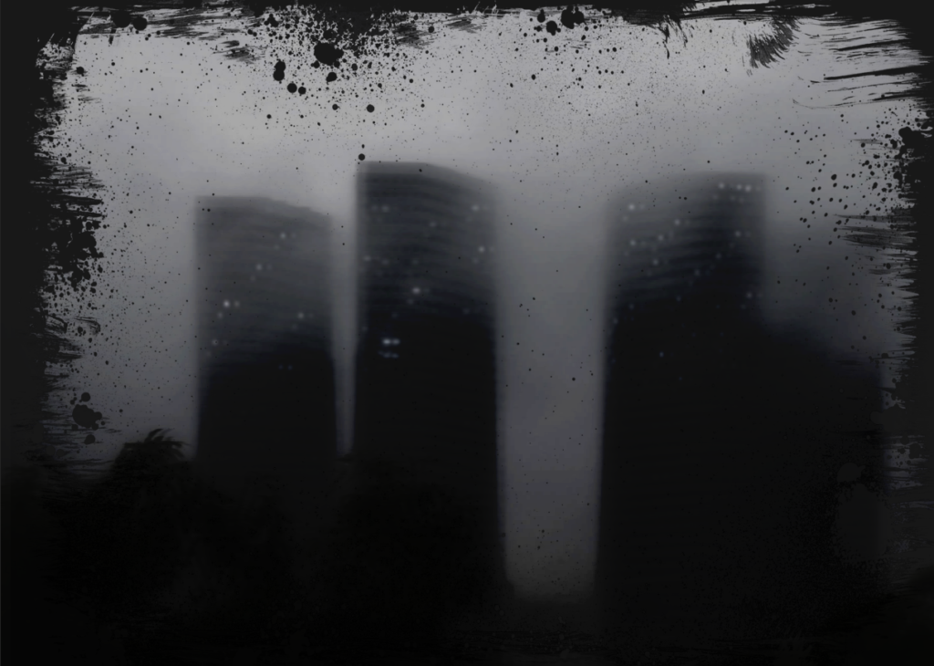
Using the frame:
I wanted to experiment with frames so I started with one frame and compared 2 different blending modes to see the different outcomes.
the first blending mode was overlay:
Overlay darkened the images which I thought looked best with the Smokey landscape. It made the image look darker like night photography which I decided to develop further.
Blending mode 2, Subtract:
Subtract removed the white centre of the frame while keeping the full dark frame. Since both modes create different effects I decided to combine the two to create a darker image with the black frame.
I liked how this turned out but it was missing something so I decided to try a different frame which resembles a damaged negative:
The outcomes turned out different as this border cut out the corner but otherwise sat close to the edge.
I didn’t like this one a much so I decided to try the first frame with a different image and add lights to better resemble a night-time image. I like how both the few lights looks as well as the light flares. The light flares resembles more like Lewis Bushes images and when I added the multiple exposures I think it better resembled Lewis bushes. Overall however I prefer how the fewer lights looks as its simpler and I didn’t blend the middle sun light very well.
Final Outcome:
I like this outcome because its dark and grey which creates a gloomy appearance. I think it develops that original hazy dull image into something a bit more sinister and ominous. To contrast with this, the lights I added creates a soft light which makes the buildings seem more approachable. If I was going to develop this idea further I would have set the image to be centred because while I like this outcome and how it fades into the frame, I think using the frame as what it is to highlight the centred image would look better. Additionally I would try adding a few more small window lights or explore making the multiple exposures clearer.
I went out during a tropical storm to photograph buildings in the rain and cloud. While these images weren’t taken in black and white they appear monochrome with lots of mid-tones while still having a small pop of colour from the trees. I narrowed these images down to 11:
Final 11:
I like how the buildings fade in the background to show their ominous presence and how gloomy the images appear with the grey and dull weather.
Photoshoot 2
For this photoshoot I decided to try taking different, qirkier angles like that of Kenneth Fredericks work. I made sure not to be caught in bad weather for this photoshoot and narrowed down these images into a final 8:
What – I’m not going to photograph people instead I want to focus on buildings and other man-made structures.
When – I want to take some photos during the day when builds will be well lit from one side.
Where – To photograph high-rise buildings I will take these photos in a city. I will take a range of angles from close looking up to far away landscapes.
Why – I want to create a variety of collages like Futurism and Vorticism pieces to commentate on the difference from where we as a society expected to go and where we ended up.
Photoshoot 2
What – High-rise buildings and man-made structures.
When – I want to do a similar photoshoot in different weather. During a storm would make the buildings more ominous and could show negatively the effects of industrialisation or at night could show even more so how artificial these buildings with lots of lights.
Where – These ones will be all further away landscapes to show the different weather.
Why – I want to show the same types of buildings in a different way to try experiemnting.
Photoshoot 3
What – Smaller buildings like houses as well as parks.
When – Throughout the day to compare and contrast effects of time like Idris Khan.
Where – These images are taken to build up some final images using multi-exposure techniques. Each image will be taken from a different angle/time of the same focus to build them up.
Why – I like the dynamic effects and appearance of 3D in these images as well as how they show time passing.
How – Once I take the images I will combine them in photoshop on top of each other with lending modes and adjusted opacity. An additional idea I’ve had with these images is to create a mapping for instance with a building I’d align each face next to one another like it could be folded into a paper building.
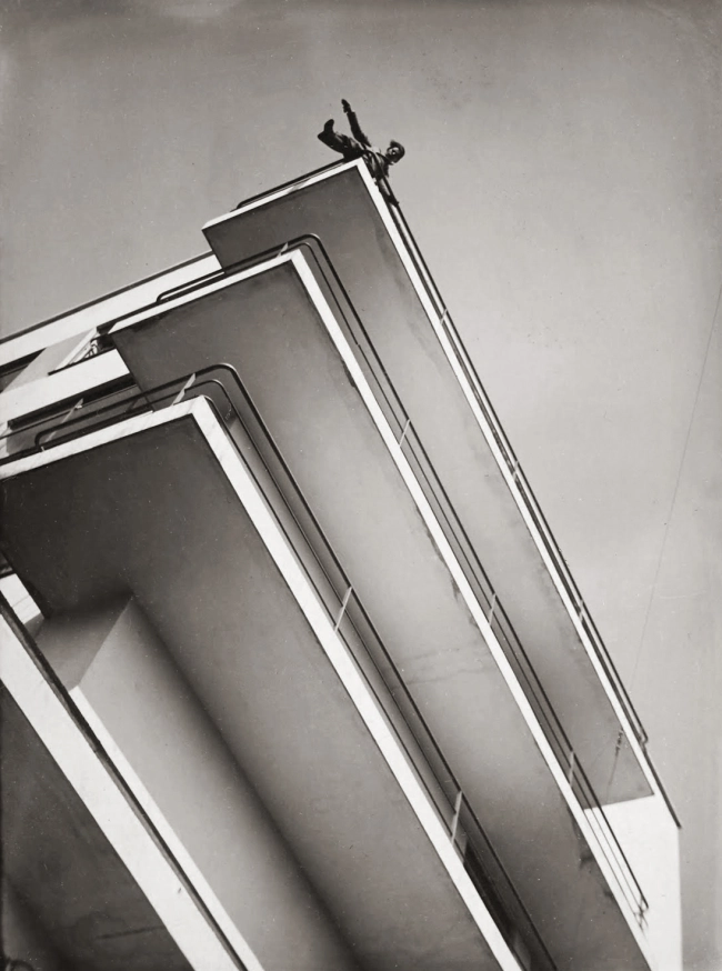
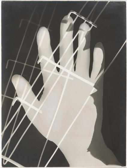
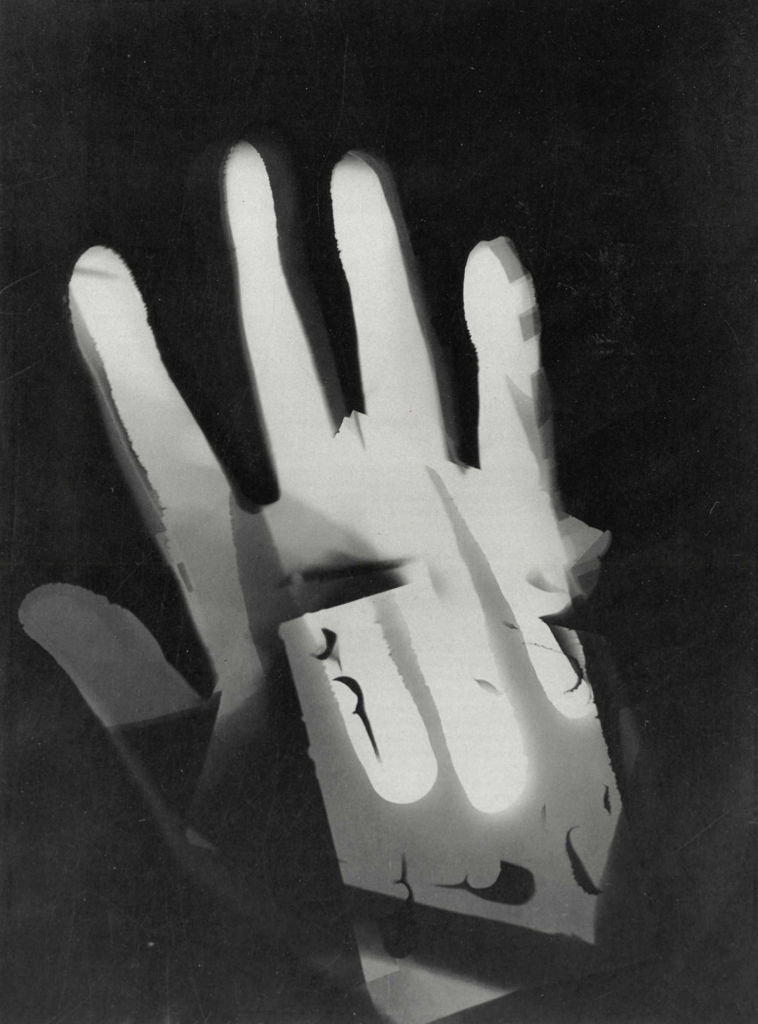
László Moholy-Nagy was a Hungarian photographer who explored modernity and the integration of technology. He was a figure head of constructivism and photographed everything from topography to industrial design as long as they appeared modern. Although his work shows elements of both Dadaism and Constructivism, he never formally joined either art movement.
This image is a black and white abstraction produced by combining multiple materials such as hands on light-sensitive paper in the darkroom. He believed that humanity and technology should work ‘hand in hand’ to create the brightest future. This is evident in his habits of shifting between photography and painting even going as far as naming the photogram, a camera less photograph like this one. The most clear shape is a hand which acts as a cut-out from the black background. There is another hand visible also at a different angle as well as an unrecognisable materials behind with holes.
The lighting used in this image would have been a relatively bright light to set the image in the darkroom which creates a sharp shape. The second hand is a bright white which looks overexposed from the layering created. There is a high contrast between the background and the centre which draws the attention to the bright hand in the centre. The image doesn’t have much depth as its made up of multiple flat layers however the difference in shades of white does create a sense of depth. The hand is off centre which makes the dark background seem more prevalent and ominous.
I believe that this image is László Moholy-Nagy’s way of showing his beliefs of embracing technology as he is not only developing his own way to use photography but also reaching out. The contrast between the bright hand and the dark void could be reaching out to the ‘dark’ future seen by others where the bright hand represents his positive beliefs and enthusiasm despite the future no-one else seems to see where the other hand reaching back could be the bright future he sees as its only visible through his hand.
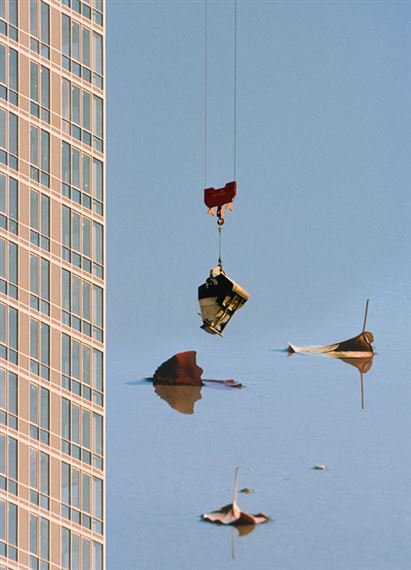
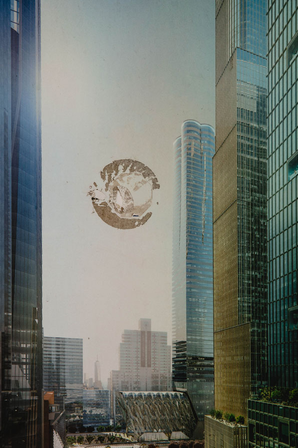
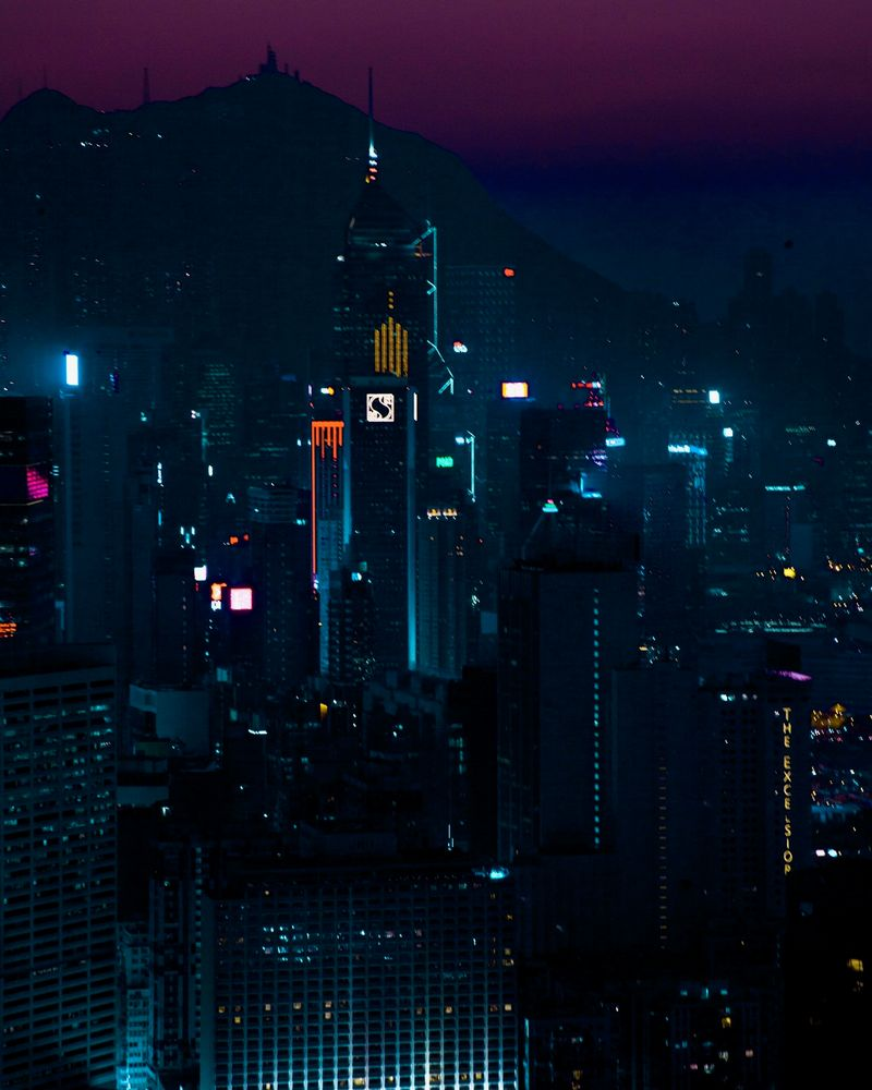
Daniel Shea
Daniel Shea is an American photographer well known for the the photobook he created: 43-35 10th Street, where he documented changes taking place in his neighbourhood. The book is a critique of the densely packed cityscape created by American capitalism as well as how this is reflected in architecture which shows wealth divides and class boundaries.
This photograph makes use of natural lighting from the upper left corner. This light reflects off the sky-scrapers glass creating the appearance of glowing. The whole frame is in focus to show the expansive and overwhelming size of the city. The colour is an unnatural shade reminiscent of older images to create a nostalgic feeling.
There are 2 main colours in this image, blue from the glass and a warm yellow from the sun which creates a comforting atmosphere. This photograph shows a city being viewed from a number of floors above ground level. Even at a reasonably high level the camera is still angled upwards looking up at even taller floors of taller buildings. This creates a positive outlook on the city and what it stands of embodying the American dream. The damage mark contrasts this message. It looks like a cup or something similar has been placed on top of the image without much thought and would have damaged the print.
This contrast of ambition in the image and carelessness of the mug mark shows the wealth divides that Daniel Shea sets out to portray. The carelessness would be the successful workman who practically lives in these buildings. He would have had the print in his office as a decoration without much care or thought. The photographer would represents the ambitious low level worker who aspires to find his place in these large buildings and is overlooked by these careless workmen. The image is aged/tinged or even light damaged which can show how the ambition has begun rubbing off also. These contrasts effectively show the differences in positions, wealth and classes.
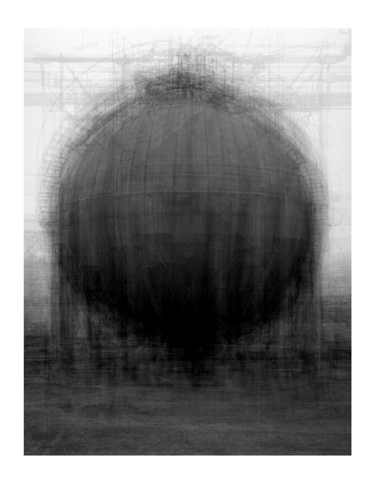
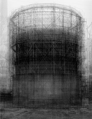
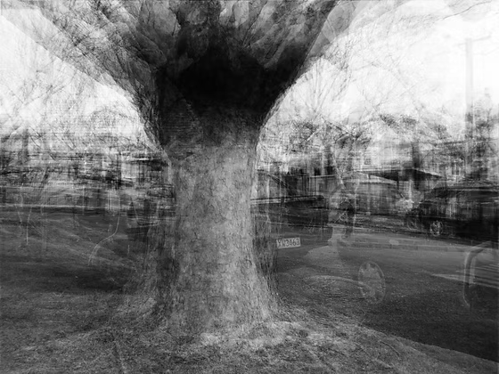
Idris Khan
Idris Khan combines scans and images to build up these layers digitally into dynamic photographs. He draws from a diverse selection of literature, religion and history in these images to explore time/memory which are equally soft as they are intense. His work is described as flattening both 3D space and time into a singular moment.
This is a black and white multi-exposure image created by taking images at different angles around a tree over a long period of time. The trees trunk remains at the same spot throughout the images. The background changes massively around the tree which clearly shows the passage of time. The image has been taken outside with natural lighting which grounds the image which is useful when the image has a lot going on otherwise. Each image used in this photograph is sharp which overlaid creates a fuzzy appearance where the actual size of the tree is difficult to distinguish. By setting this image in black and white it harmonises each layer as different colours could be overwhelming. The image takes a 3D setting and flattens it into a single dimension without loosing the detail from each direction.
This photograph shows the complexities of 3D that is often ‘lost in translation’ when photographing from a single angle like a flat sculpture. The faded backgrounds also shows a sense of past time, the faint recognisable details showcases the feeling of a memory which is difficult to see as a crisp still moment and a vague short period.
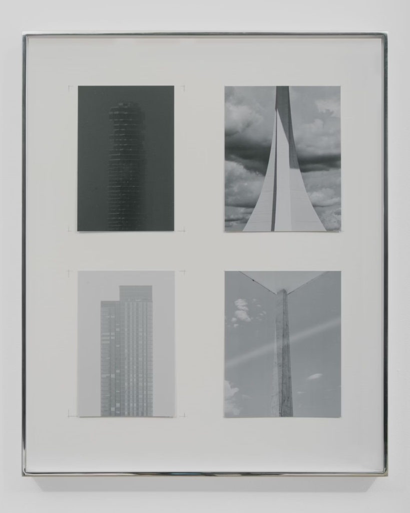
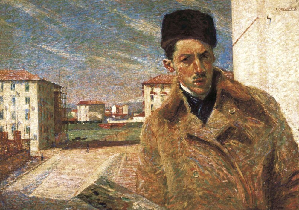
Kenneth Frederick
Kenneth Frederick photographs geometric shapes found in buildings. His images are set in black and white to reflect the industrial nature of these man-made sculptures. This photograph resembles an early render with the grid and sharp lines. The photograph is black and white where only the grid is a white grey and everything else is much darker. There is no pure white or black instead a few shades of grey creating low contrast. There is a soft light coming from the right which creates depth when it hits the side of the structure.
The photograph is taken at a low angle which makes the structure look taller where the top is cut off so the building doesn’t have an end, making it taller still. The image has been taken at an angle where the edges create leading lines pointing upwards to show the nature of a high-rise building. This image has a dull appearance due to its repetition and lack of colour which reflects the dull and lifeless nature of corporate mega-structures. Not seeing the top of the building or looking up can show a lack of aspiration and acceptance of the people working low position in a job in this building.
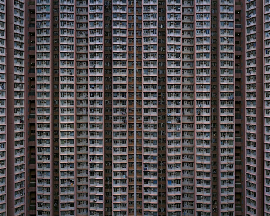
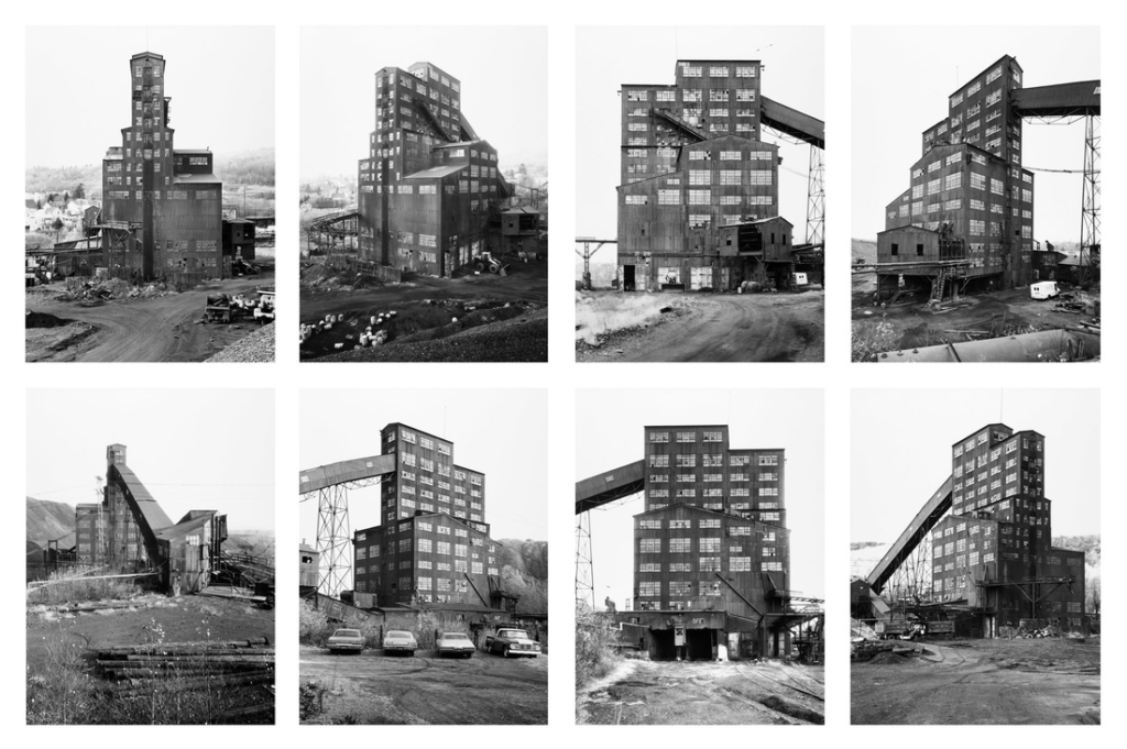
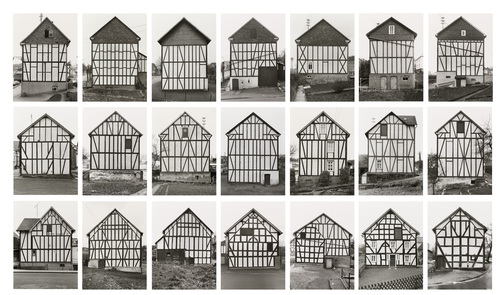
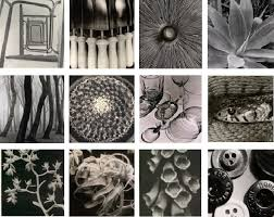
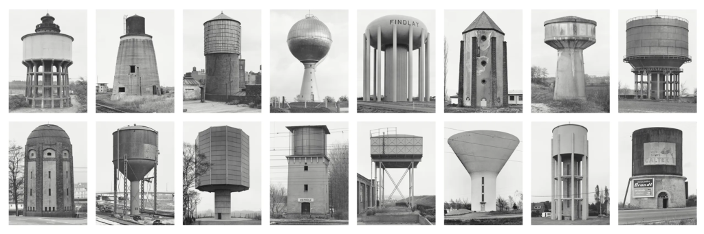
Bernd and Hilla Becker were a pair of photographers who coined the term: Typology. Typology means the study of types, in photography this means a collection of the same subject photographed and arranged together in a grid, inspired in part by 3 German photographers.
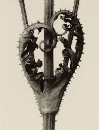
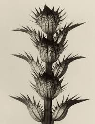
Karl Blossfeldt
Karl Blossfeldt produced a body of work where he showcased standardised photographs of different plant-life. Each image showed a highly detailed copy of a plant arranged in the same way for a uniform look. The images were arranged together in the book which was originally used for modelling by art students. The inspiration that Bernd and Hilla Becker took from his work was his study of type, standardisation and arrangements which they later changed into grids. Karl Blossfeldt thought that photographers should utilise the cameras realism to scientifically showcase the real world which I would have also inspired the dead-pan approach used in typologies.
Albert Renger-Patzsch
Albert Renger-Patzsch studied the natural form and industrial subjects shown like a scientific illustration. Similarly, like Karl Blossfeldt, he believed that photography’s strengths were in its ability to capture real life texture. Bernd and Hilla Becker took inspiration from the subject matter of Albert Renger-Patzsch being industrial texture and the approach of realism.
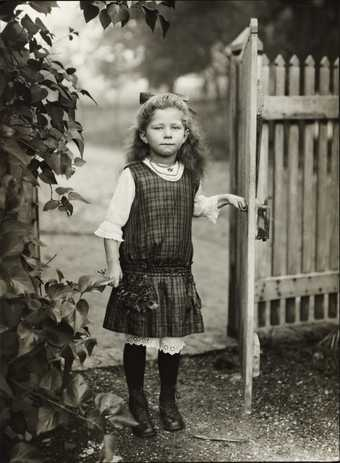
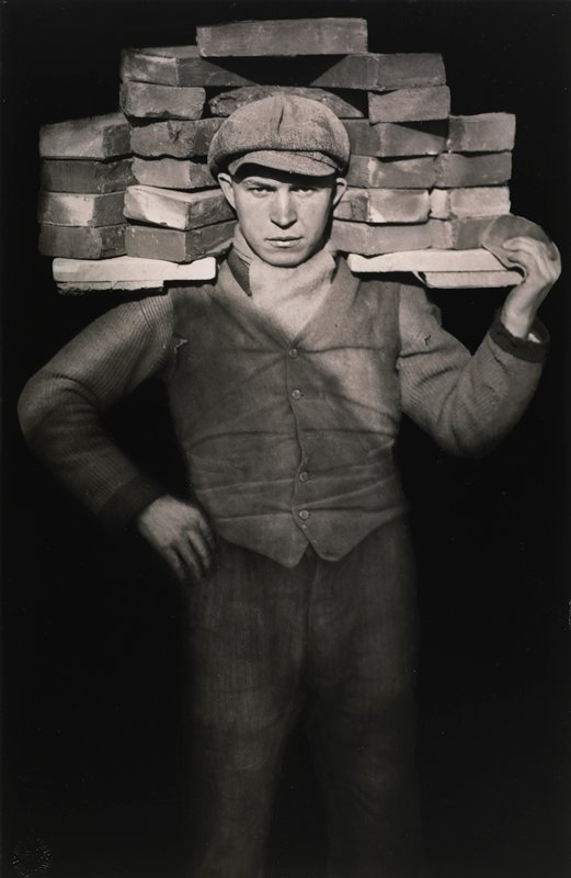
August Sander
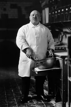
August Sander was a German documentary photographer who aimed to photograph every person in his town for his project People of the Twentieth Century. “If we can create portraits of subjects that are true, we thereby in effect create a mirror of the times.” is a famous Quote from August Sander which represents his approach to this task: portraying the town justly and truthfully. He didn’t just photograph the elite or those who could afford to be photographed as this would be a biased ‘miss telling’ of the townsfolk, he photographed everyone from children to bakers and those who would otherwise be forgotten. He arranged his photographs into the volumes: The Farmer, The Skilled Tradesman, The Woman, Classes and Professions, The Artists, The City, and The Last People. His work was to act as a truthful time capsule of the real people in his town. The inspiration that Bernd and Hilla Becker took from his work was honestly capturing every ‘type’ and preserving it.
Bernd and Hilla Becker
Bernd and Hilla Becker’s Typologies were in black and white showing industrial structures before they were taken down as a way of preserving the uniqueness of each structure. They were large grids of structures that looked different but served the same purpose. Each photograph was taken outside in natural lighting. The sky makes up most of the background and would have been taken in cloud or grey skies. The use of natural light show the structures honestly as they would have been seen which was important for the point of preserving the structures in photographic form. The contrast is quite low without any dark blacks or bright whites. Every image was taken at the same angle with the same framing to standardise each image which makes them fit together in a grid. Each one is centred and close cut in the frame to minimise wasted space which is important when arranged them in the grid as space is added between each image. This also makes the focus extremely clear which is equally important when quickly glancing at the overall grid.
Each photographers influence is clear in these images. The photographs show an industrial structure like Albert Renger-Patzsch, arranged in a grid like Karl Blossfeldt and preserve unique subjects like August Sander all the while standardising and grouping by types.
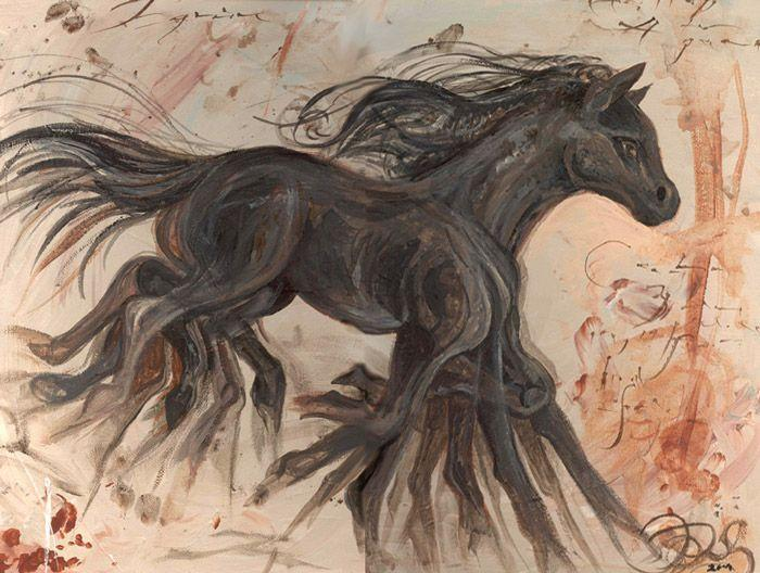
Union means joining together for a common interest. For my project I would like to take the ideas that unified artists in the movement of futurism (technology, growth and glorified modernity) and combine them with modern architecture, something that requires the culmination of many different people, talents and recourses. Compared to Jerseys high-rise cap, cities build massive sky-scrapers that sit above the skyline invading public space with logos and reminders. I was interested in this topic because in contrast to the island these cities feel dystopian and dangerous. I would like to photograph a variety of both offices and skyscrapers as well as smaller homes so I can edit them in ways reminiscent of Futurism/Vorticism. Messages I aim to portray are the dangers of the overpopulated cityscapes on the environment and privacy as well as the seeming sanitary white future seen in modern architecture.
In terms of artist references I am going to look into László Moholy-Nagy who was inspired by the integration of technology into the arts and Idris Khan who creates the appearance of dynamic via multi exposure, Lewis Bush and potentially even Michael Wolf. When experimenting with outcomes I would also like to create collages of buildings similar to a geometric futurism painting. I think collages are important for the outcomes because cityscapes are mashes of various buildings without much consideration for how they look next to one another, they’re all extremely loud in appearance. The final outcome will be final prints because I intend to experiment with edits as opposed to constructing a narrative. I might experiment with creating a small zine or a leaflet to show structures photographed like products which will line up with the photographs focusing on high-rise banks and offices as a product of capitalism.
I will start with some photographs of buildings (both houses and offices) and begin collaging them into 2 types of images:
This one will be made up of multiple buildings arranged together. this one will use a mixture of houses and offices set in black and white.
I also want to make an image that looks like this by use of collage also. I will make a megastructure out of multiple high-rise offices to create a tall structure like this one with a coloured background.
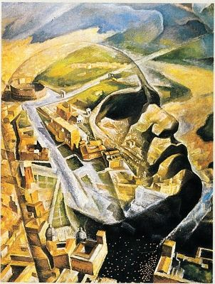
Futurism was an art movement formed in Italy as a way to look past its dark history and instead towards the brighter future, the metaphorical movement through time. It unified artists with a common ideal and approach: ‘we will free Italy from her innumerable museums which cover her like countless cemeteries’ (quote from manifesto). The work is often dynamic and energetic for this exact reason: to inspire and differentiate itself from dull history threatening to overshadow the future. Alternatively it could also be seen as a representation of the rapid post war society especially in terms of technology. The movement proceeded to inspire similar movements such as Russian Avant Garde and Dadaism. This movement was pioneered by a few key artists such as:
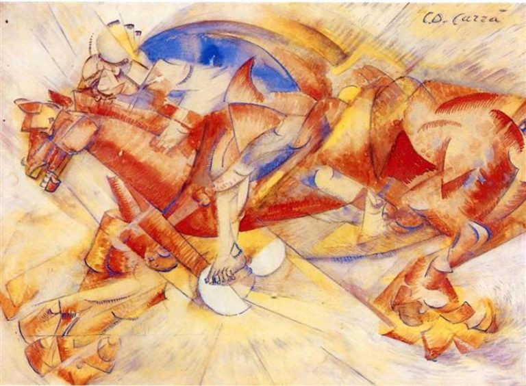
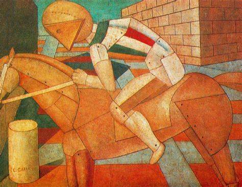
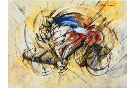
Carlo Carrà
His work shows movement. He captures the appearance of a moving background and seemingly still foreground. He achieved this by painting a detailed bike or horse with the appearance of multiple exposures and a background made of light colours. Additionally to show the movement of the bike lines spread outwards from the centre creating leading lines. Additionally, he only uses the primary colours: blue, red and yellow. He creates the illusion of detail by contrasting fine line work and blocks of basic colour, this creates an image with what appears like plentiful detail but only actually resembles the limited level of detail processed when seeing a snippet of a moving structure.
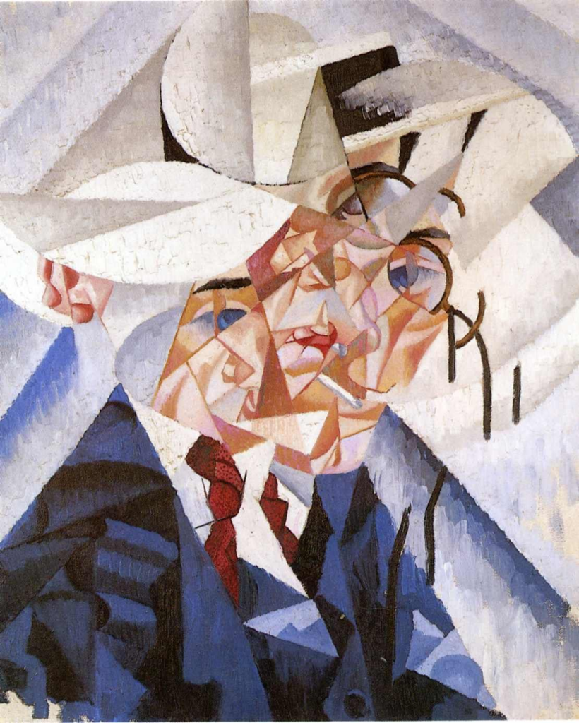
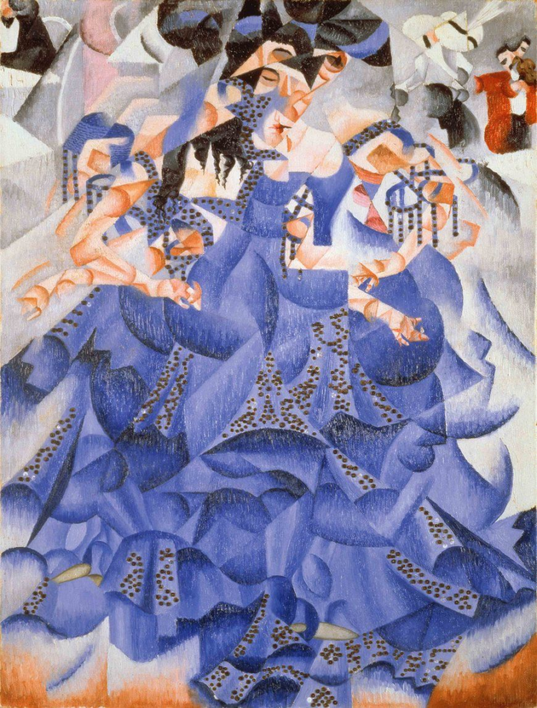
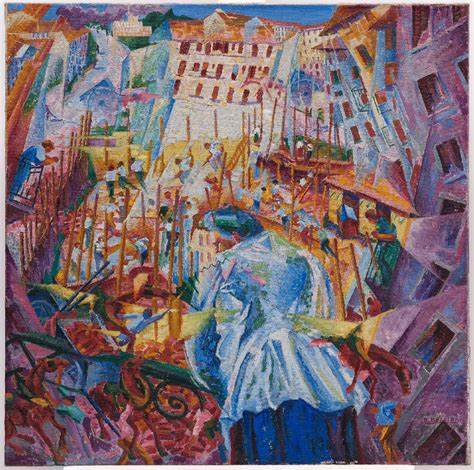
Gino Severini
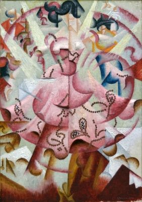
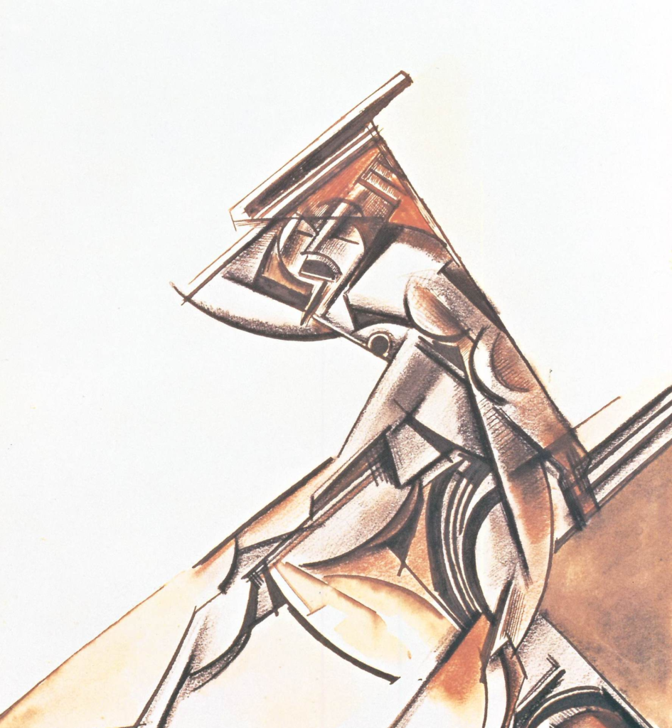
His work shows movement. This painting shows a dancer in the centre of the frame. The image is broken up into squares where each square is a different perspective. The very centre if the image appears still with each detail a similar perspective however moving outwards, each square looks more and more different to its neighbours. These sections show varyingly different perspectives which create the appearance of a spin such as her dress flaring, her hair showing up in different spots which contrasts with the lights which don’t move at all and appear still which makes movement seem clearer.
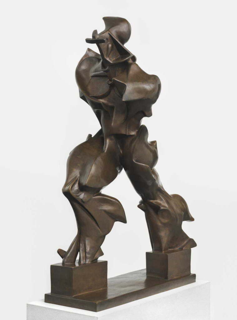
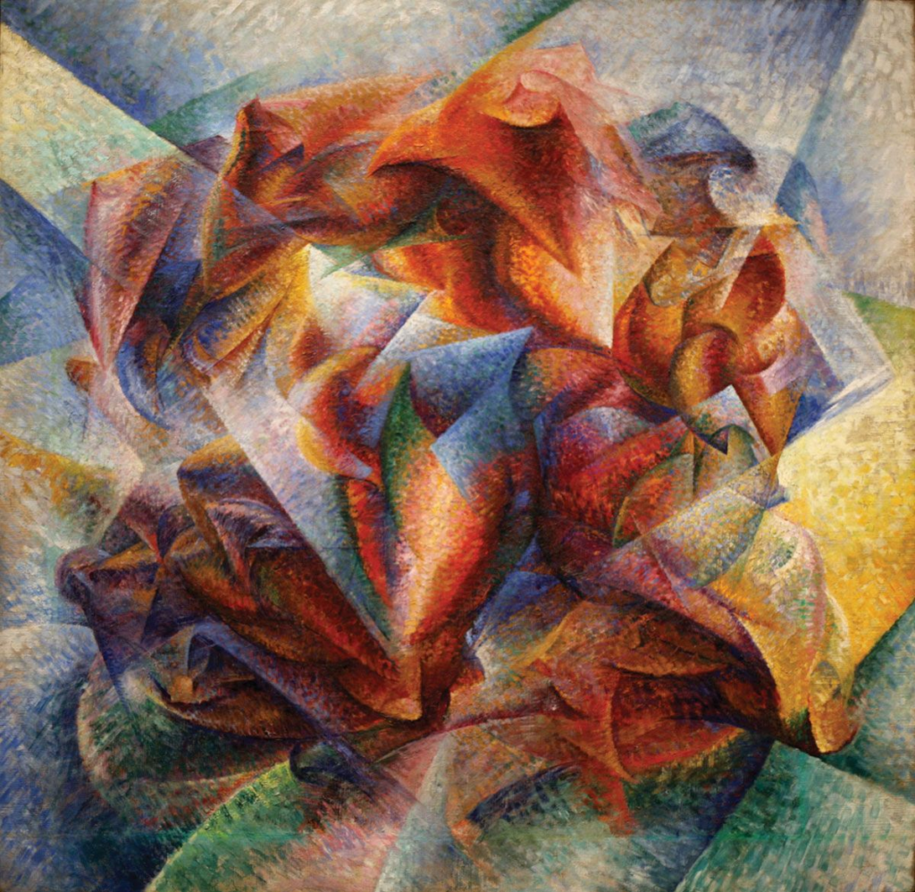
Umberto Boccioni
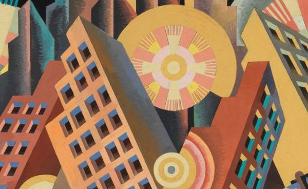
His work made use of bold colours, perspective and movement. This image creates a fish eye effect where the buildings around the edge seem to bend into a circular shape. This effect creates the appearance of perspective and looking out a keyhole. The colours are bold and shows a celebration.
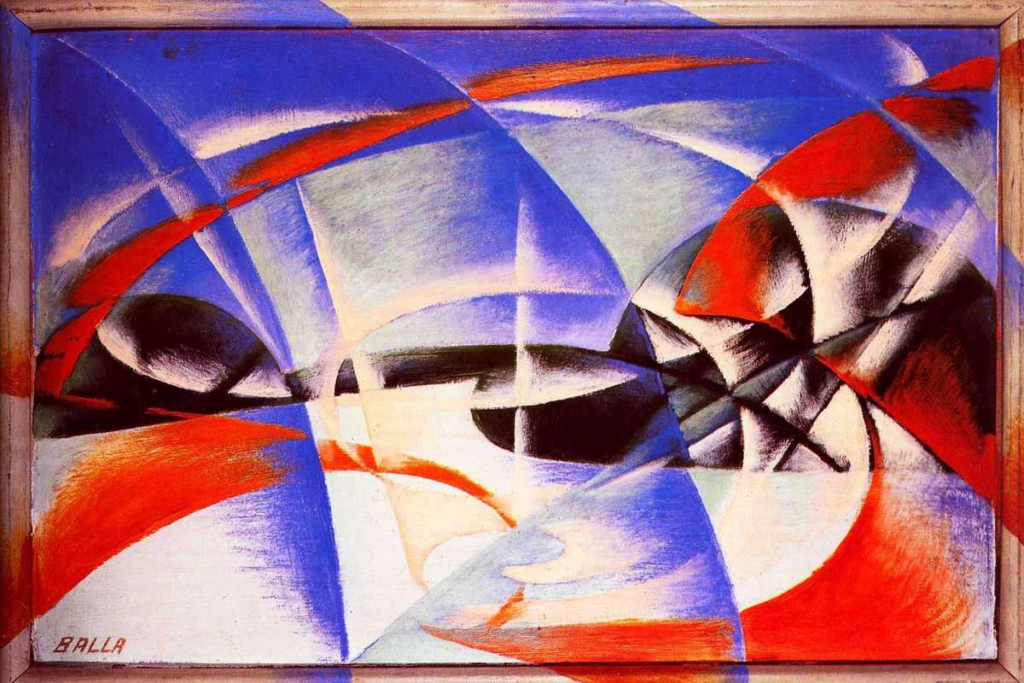
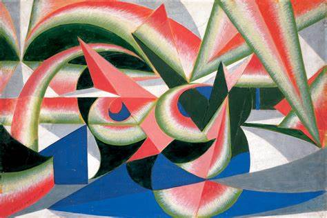
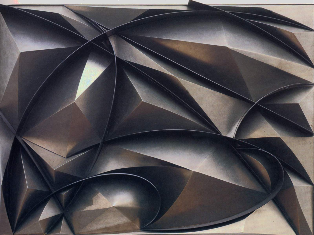
Giacomo Balla
His work makes use of texture and shape. This image creates the appearance of depth with dark valleys between points and bright faces of points. The colours resemble a metal which creates a sense of danger combined with the sharp points.
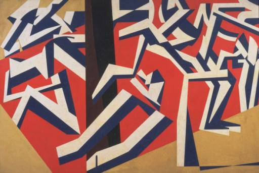
Vorticism
Around the same time, Vorticism was rising in the UK. The British equivalent often appeared more abstract and shape driven due to its heavier cubism influences. The movement gained its name due to its typical appearance of a spiral of movement where the centre is still and the outsides of the frames appear moving. The movement expressed energy and dynamism towards an industrial future which was soured by WW1 dissipating the movement. Both movements started from a still center and created dynamic movement moving outwards as the name would suggest. The most visible difference is usually the subject where futurism may show a bike or performer and vorticism shows abstract shapes.