All posts by Alannah Landers

Filters

Author:
Category:

Final Pieces Outcomes – Gallery + Evaluation

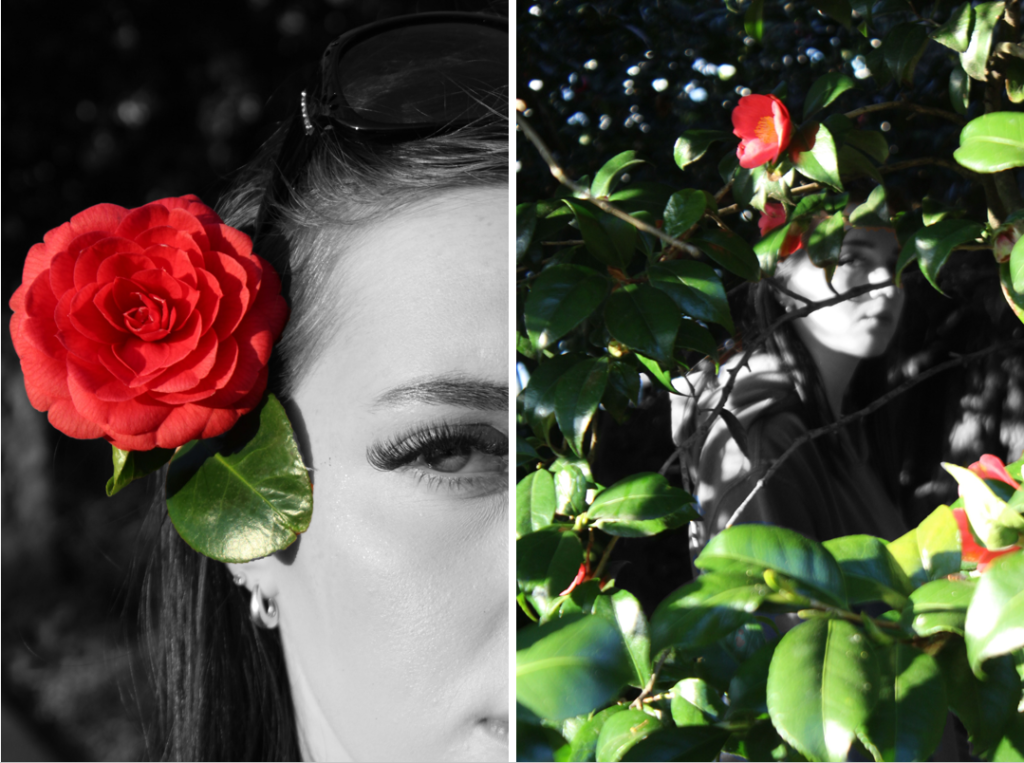
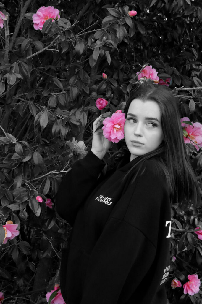
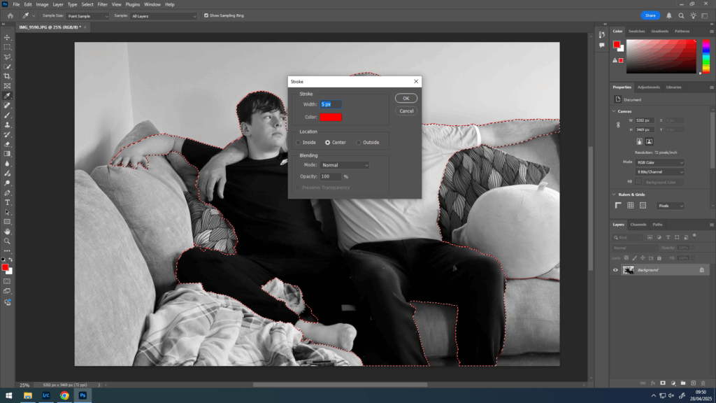
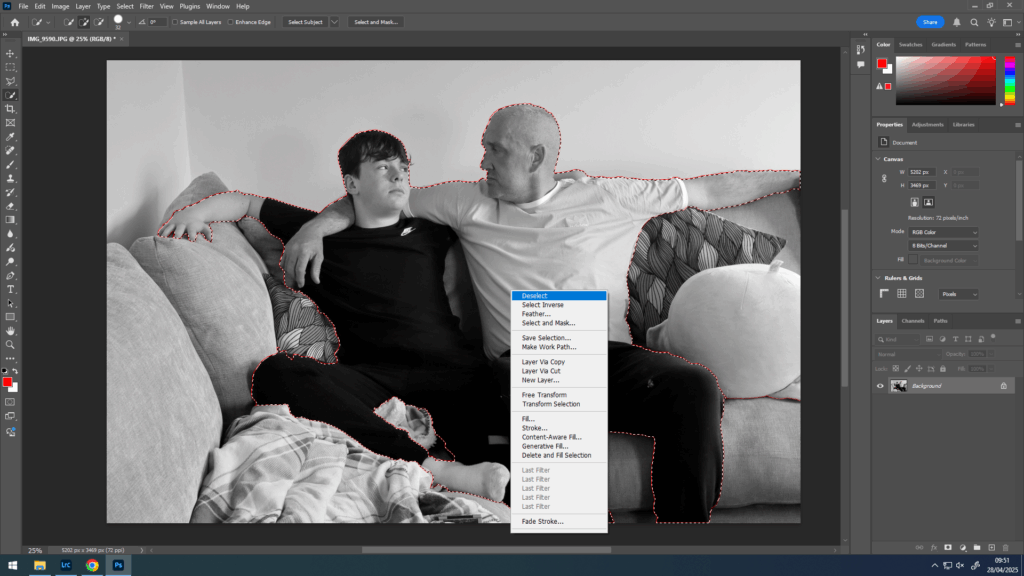
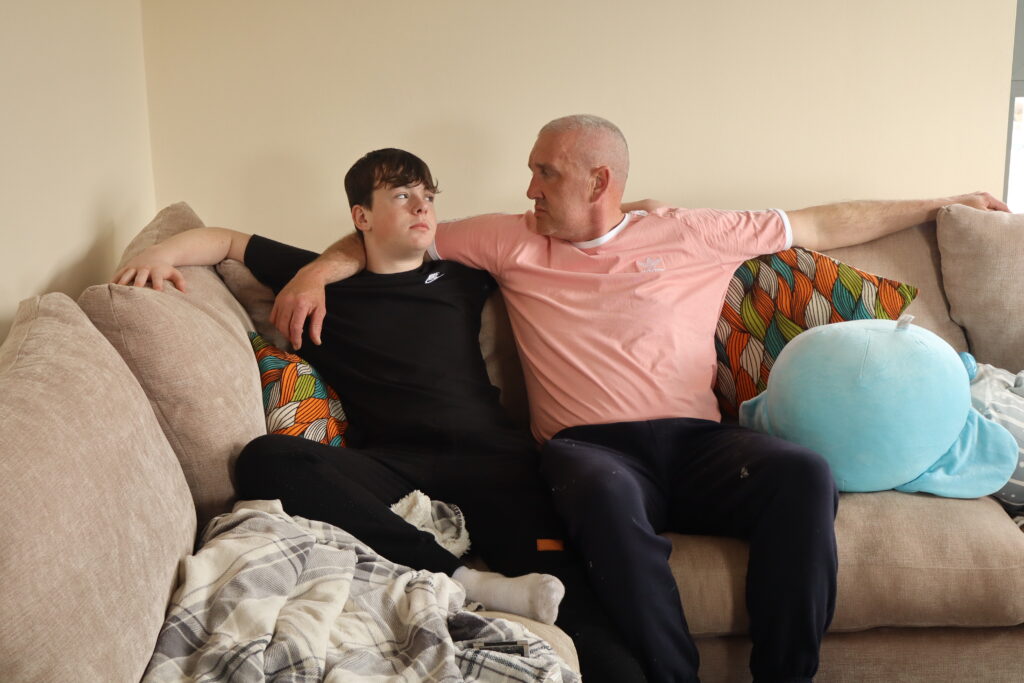
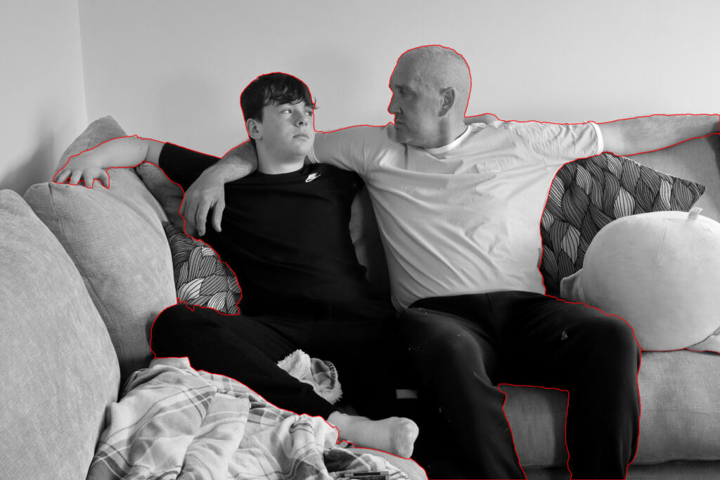
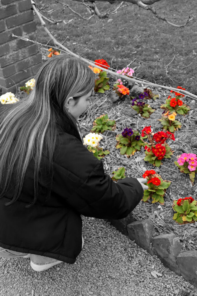
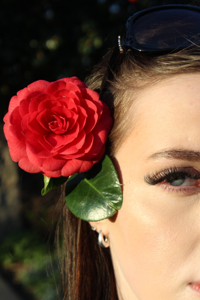
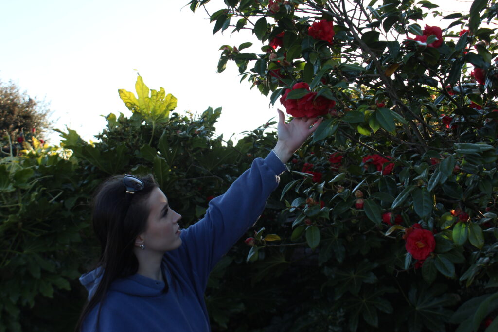
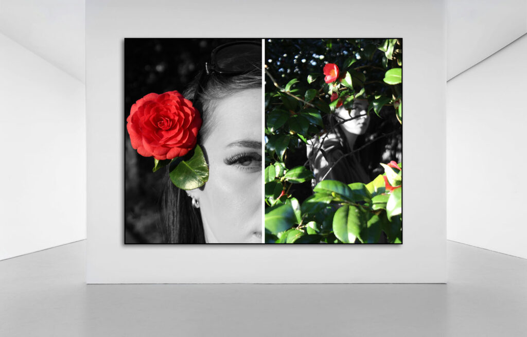
I think that this first piece turned out really well as the images themselves are strong photographs which I had manipulated in photoshop. The ‘colour splash’ style of editing allows the colourful nature to stand out and draw in attention. Although the contrast between the coloured flowers and leaves and the black and white person is strong, it highlights both areas projecting the unity between nature and mankind. These images are mounted on foam surrounded by a border which really entices the viewers eyes to the photographs.

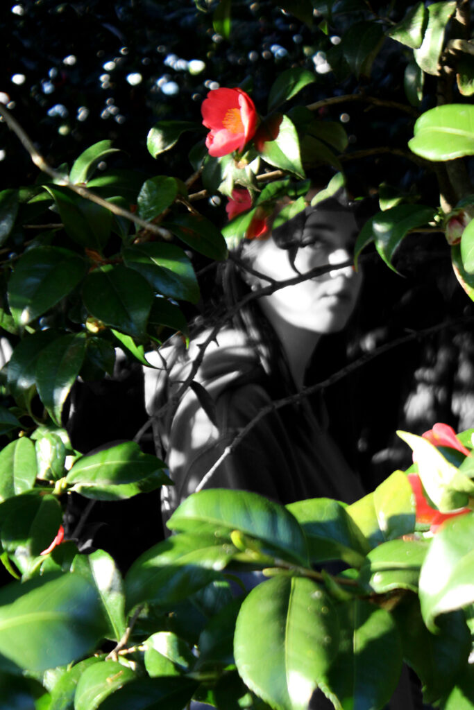
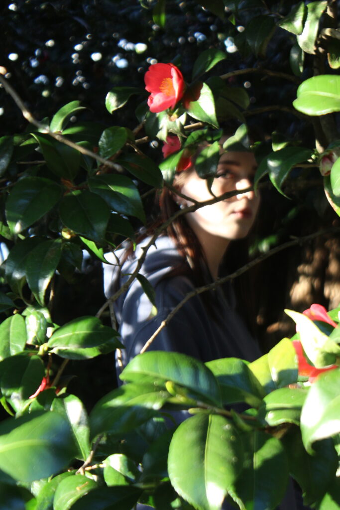
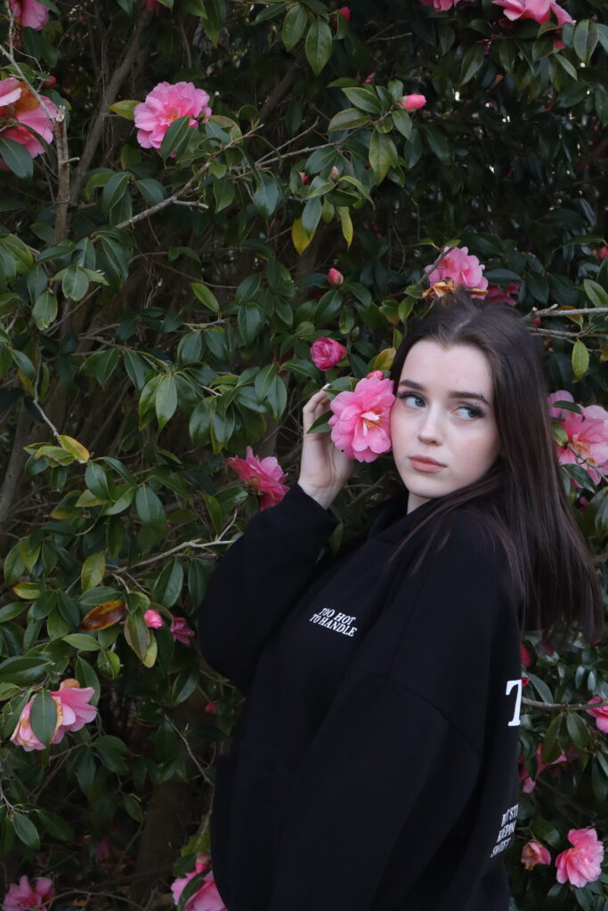
This piece connects to my artist research on Sian Davey’s project ‘The Garden’, in particular the image on the right of the piece. This is because her project consists of photographing people amongst trees, bushes and flowers in her garden and in my image the model is within the trees and captures her surrounded by them. The images also link to Agnieszka Lepka’s project that I researched as the focus is on both humanity in nature, although my style of image taking and representing this is quite opposite, it was her meaning behind her photographs is what inspired my images.

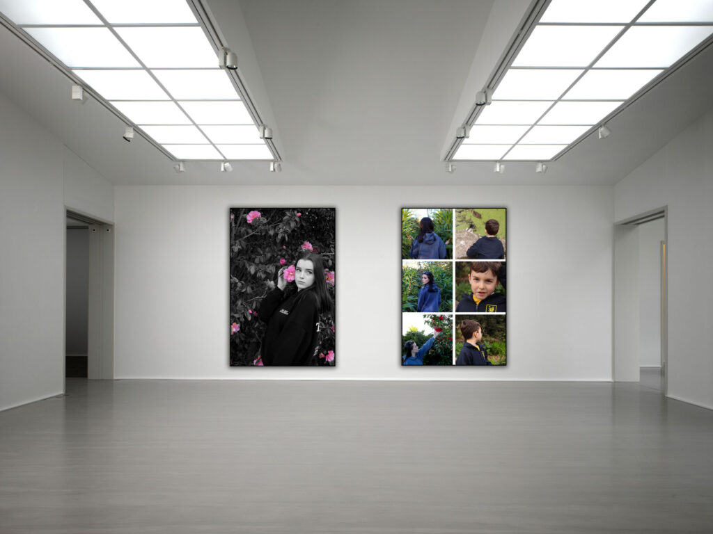
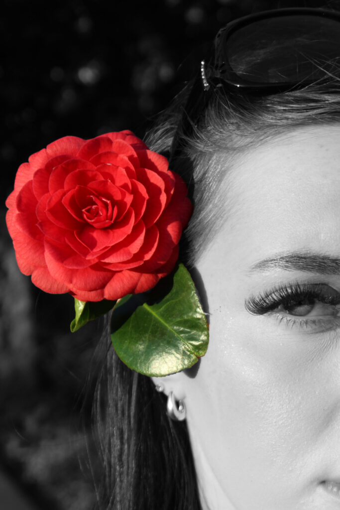
The photographs on the left is another colour splash image that I have edited in photoshop. To present this image, I have printed it in the size of A3 and backed it against black card to give it a black border. I found that this worked really well as the black border matches the black and white main images, while letting the pink flowers stand out. I think that this second final outcome is really strong as it has the right components to make a good image.

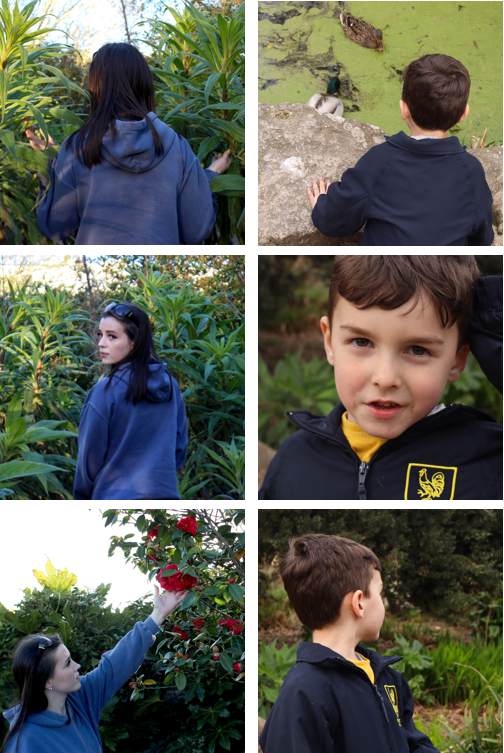
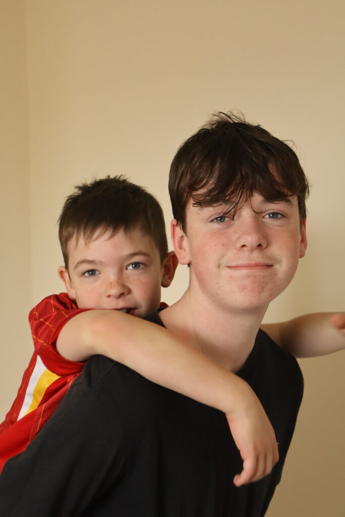
My third final outcome on the right of the virtual gallery is made up of six images grouped together. These six images work better together than they do alone which makes the final piece better. I think this is a really strong piece so I have printed them as A4 squares making the whole thing bigger.

Both of these final pieces show links back to Sian Davey’s images that inspired my own. I think I have successfully taken inspiration from her project as both of these pieces consist of people amongst the nature environment. However, for my photographs I have used ways the make them more my own such as the colour splash editing and presenting six images in one whole piece. I think this works really well when comparing it to my artist research as you can visibly see the link while still being able to see that I used my own creative skills to create these final outcomes.

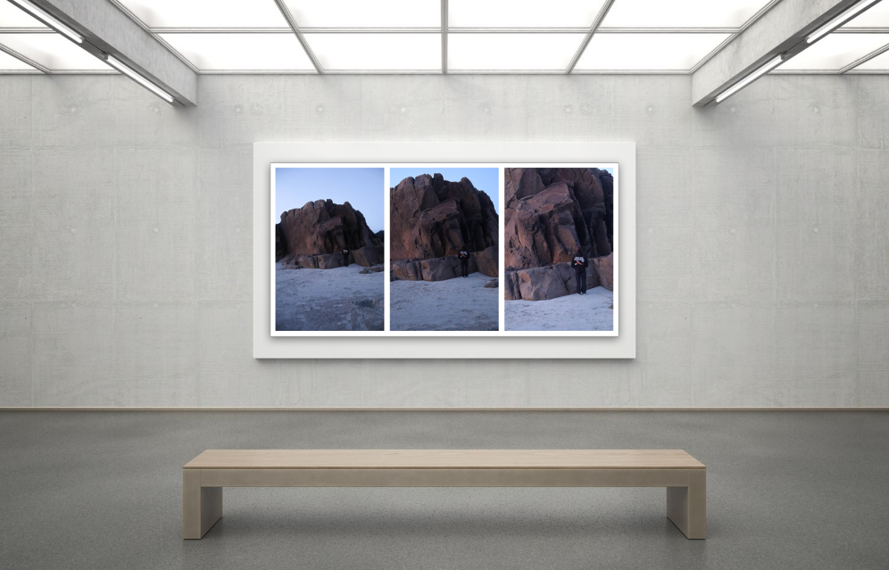
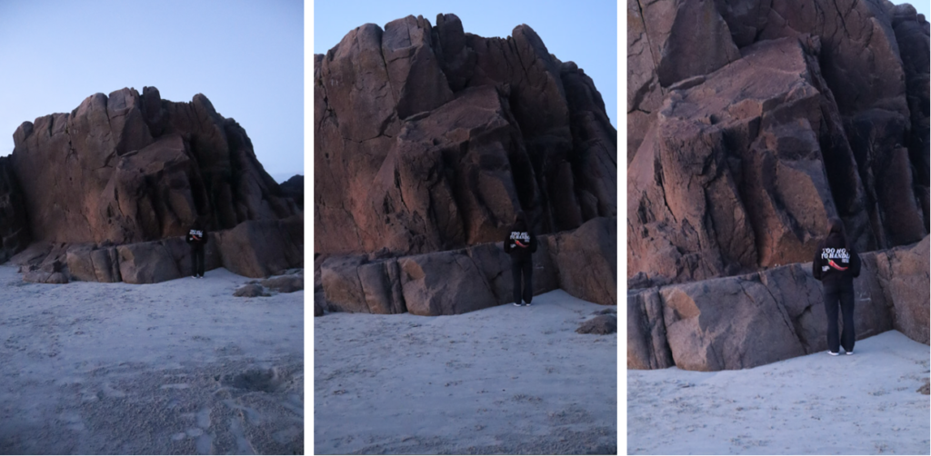
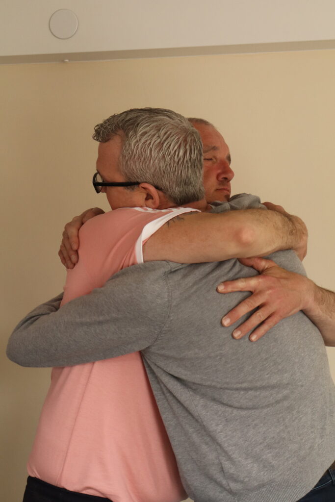
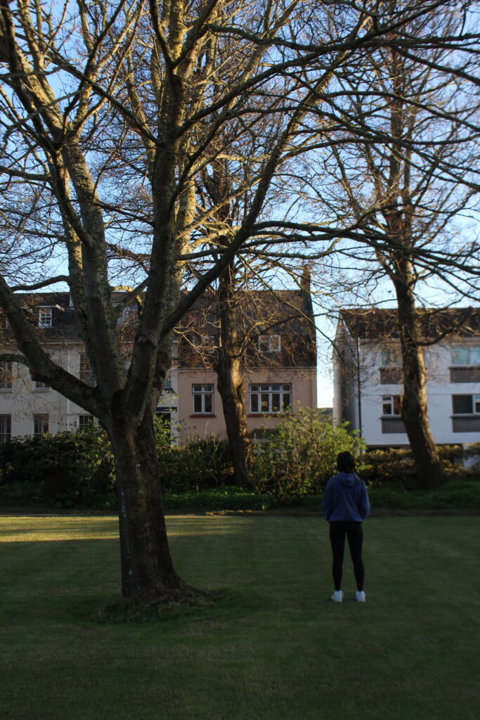
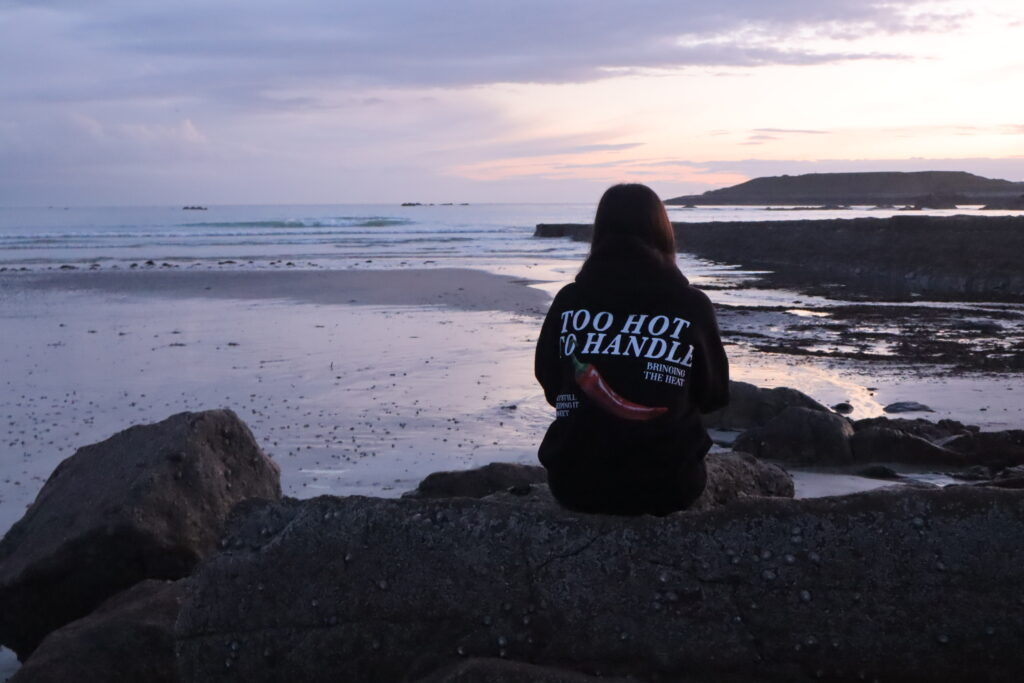
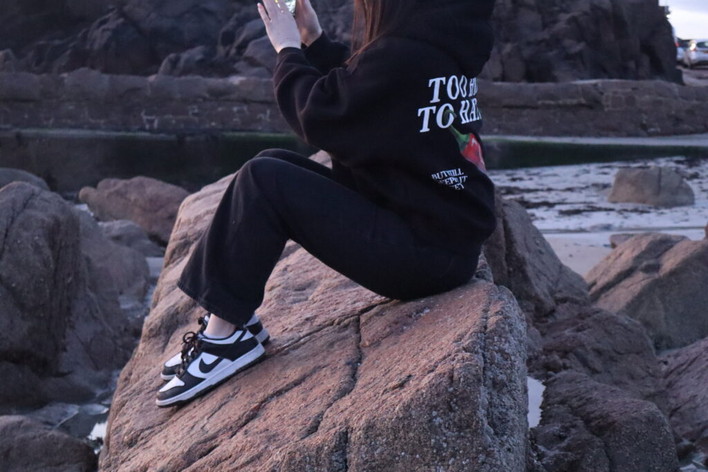
This is my last final outcome which I think worked well when presented as a tryptic as the images are of the same thing however each one gets closer and closer to the subjects. This piece is one of my weaker ones as I feel that the other images are stronger and higher quality alone and especially when presented as a final outcome. However, I still find that this piece is good as are the individual images used.

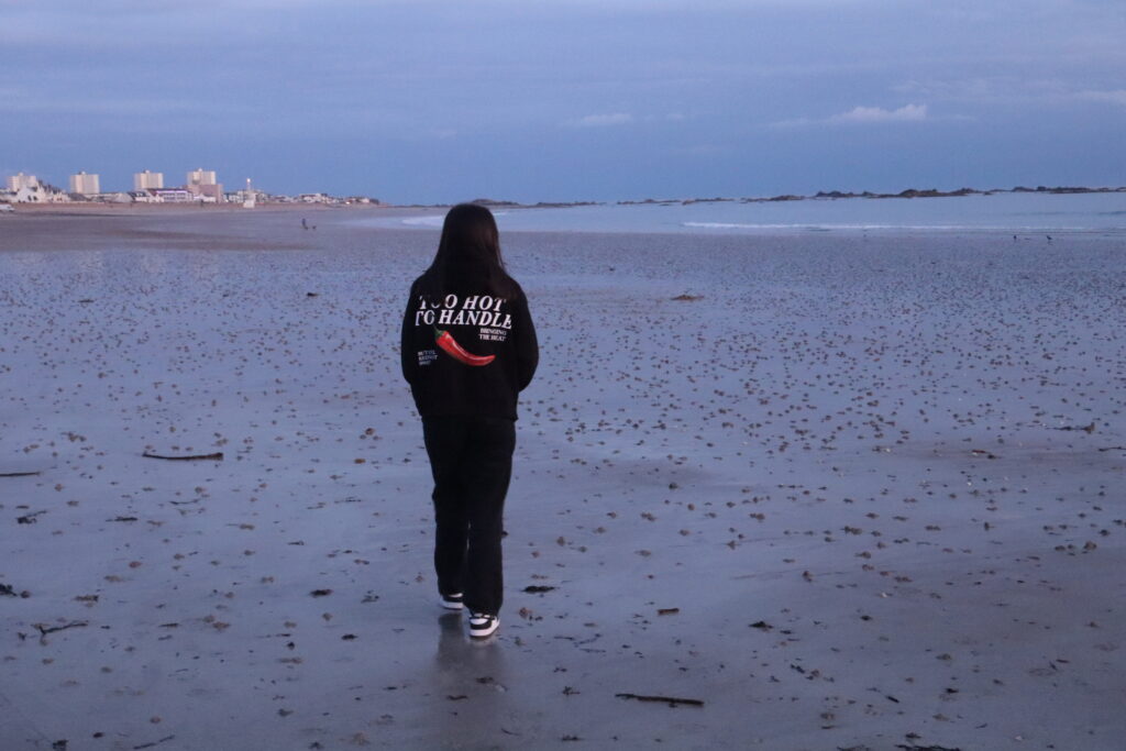
This piece differs from the others as there is less of an obvious connection between this and the artists that I researched. This is because the image doesn’t consist of nature such as trees, flowers, and other greenery, this focuses on the beach and rocks, using the giant rock compared to the human that becomes more obvious with each image. despite this, it still holds a connection to Sian Davey and Agnieszka Lepka’s work that I research as the narrative behind mine and their own work is to do with the nature.

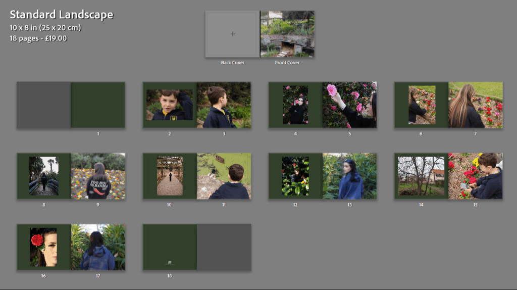
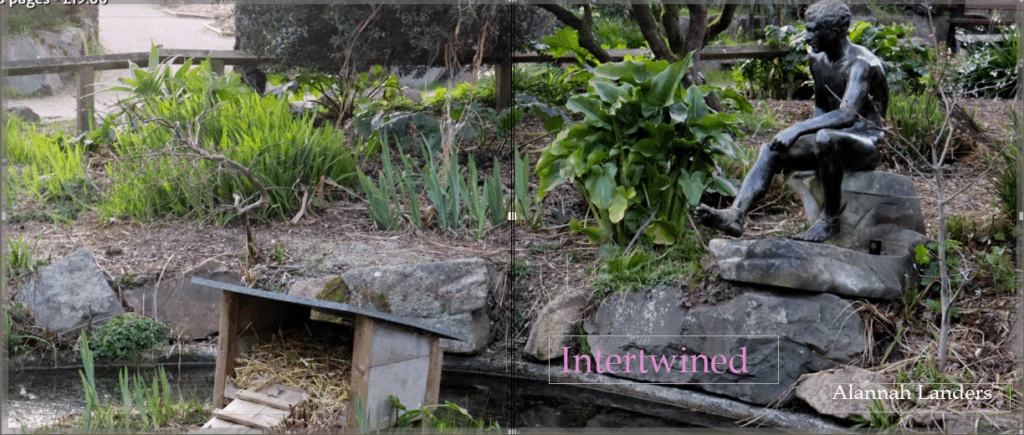
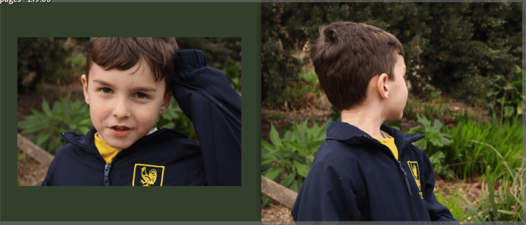
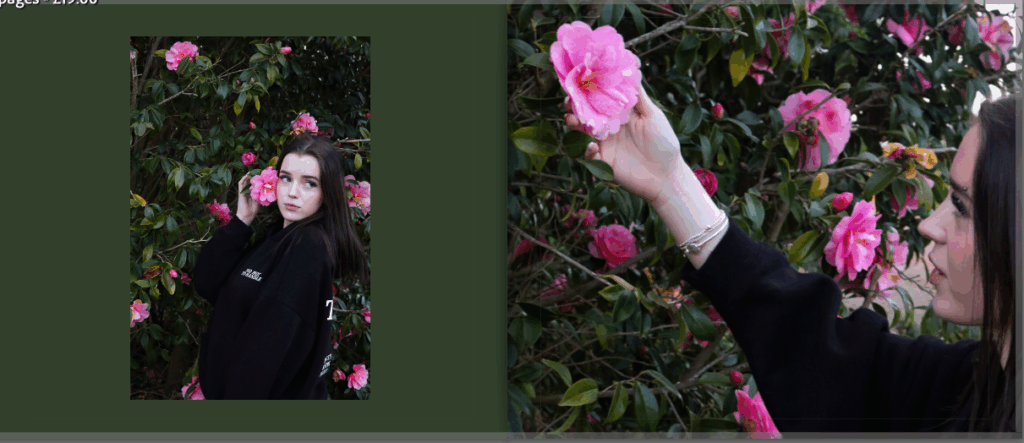
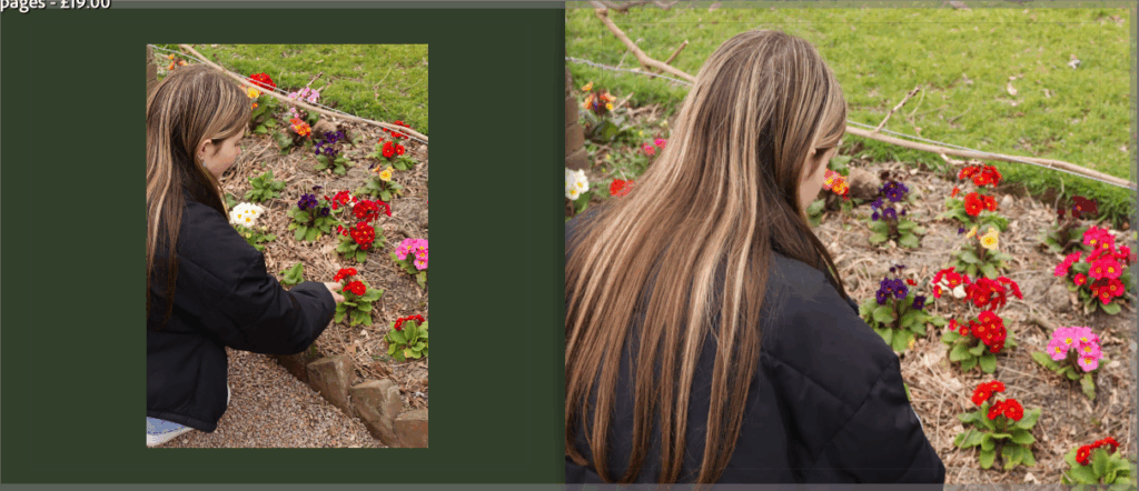
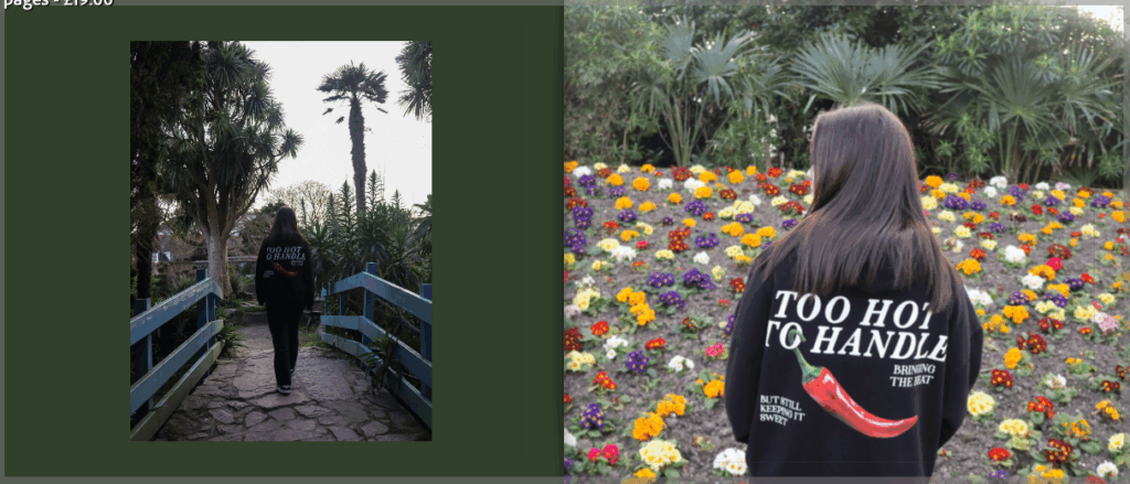
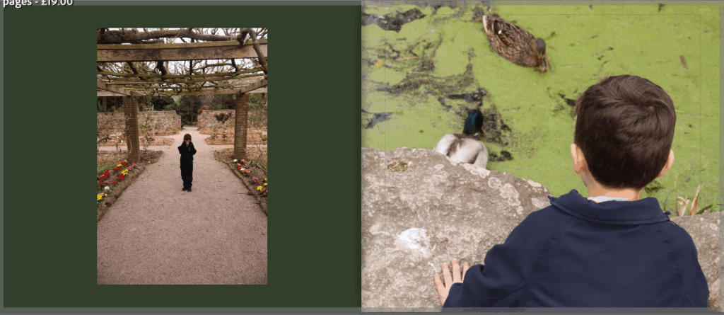
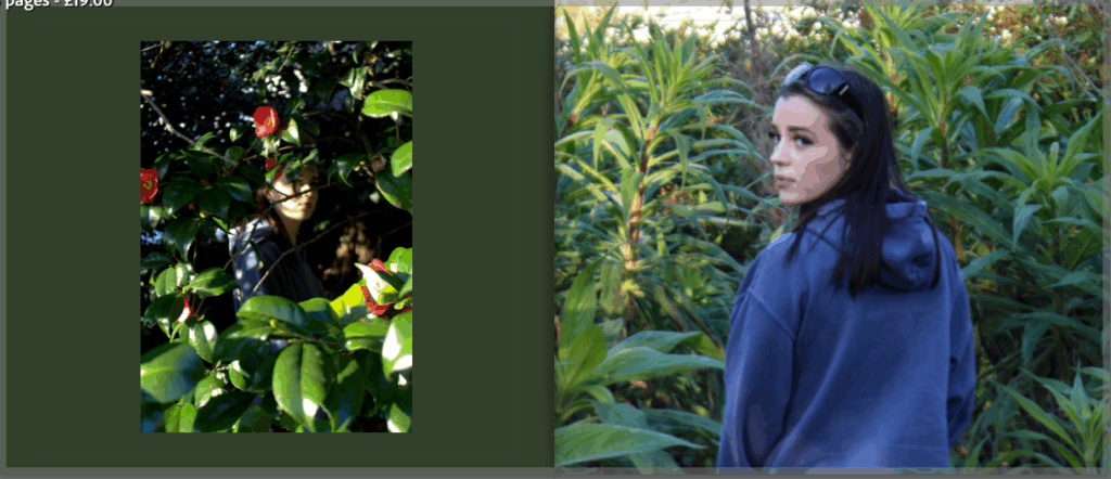
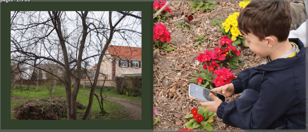
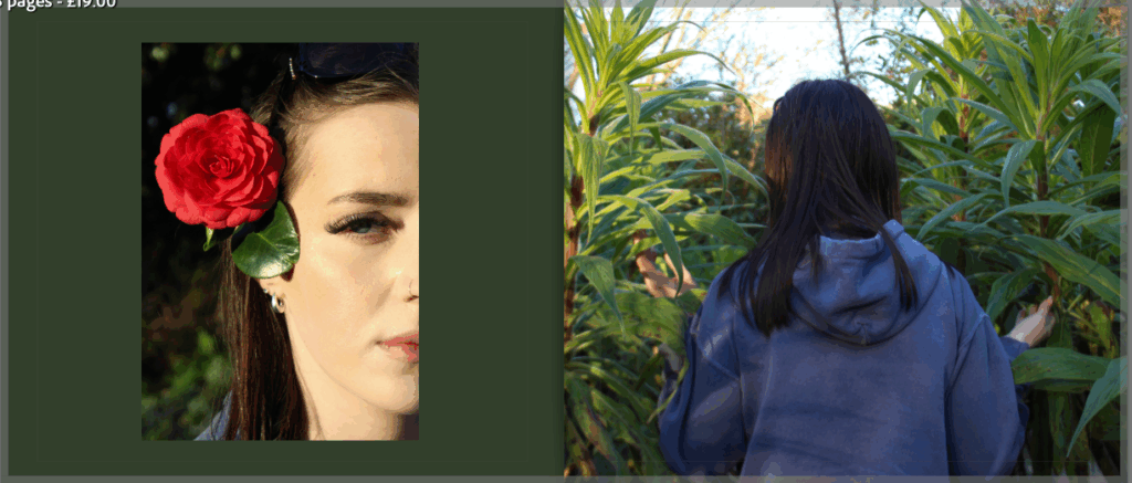
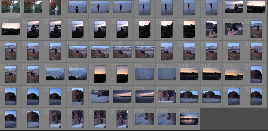
I think this photobook turned out very well as I successfully presented some of the best photographs from my photoshoots and it allowed me to share more images than just the ones I have printed and mounted. Within this book, you can also see visual links to my artist research such as the models of the photographs, in most cases being surrounded by greenery, similar to Sian Davey, as well as the pairing of specific images links to Agnieszka Lepka’s layouts of her photographs. Although, mine aren’t comparing anything, I took inspiration from her layout as it enhances the aesthetics of my own work.

Photobook + Evaluation

For this project I have decided to make a photobook as well as mounting my final images. This book consists of some of the same and some different images from across my project. The reason I have made a photobook is to be able to present some more images from my photoshoots, and to show some photographs I have already printed but in a different layout or with different editing styles.

To start, I created the book in Lightroom and went through my images deciding which ones to keep or discard. Once I had chosen my first draft of photographs, I moved them around into different places next to different images. Eventually, when I had chosen my final images along with their placements, I experimented with different ways that the image could be placed on a page, for example if I wanted the photograph to cover a whole page or have a border around it.

Once the order and positionings were complete, I then went on to create the front and back cover. After trying different images, some being a double page spread, or two individual images for each side, I decided to choose the image below across both the front and back cover to keep it consistent. I also went on to change the background colour of the pages as I found that the white pages didn’t work as well as I had hoped. So, after trying a number of different colours and shades, I chose a darker green colour as it ties in with the green nature in the photographs, letting the brighter colours stand out.

Finally, I chose a title and placement for the title to finish up the whole book. The title is ‘intertwined’ to represent the images all aiming to portray the unity between nature and humankind and how they are and could be more intertwined with one another.

My final photobook:

Evaluation

I really like how this photobook turned out, I think the layout of the images being in a consistent pattern presents the photographs in an organised but eye-catching way. Making this photobook, I was able to present images that I haven’t already printed and mounted on foam board or black card, allowing more of my photographs to be shown. I will print this photobook with a soft cover, using premium lustre paper as I feel that the images will look best with the glossed sheets.

I feel that this photobook has successfully followed my narrative of this project which was the photograph and capture the union between nature and humankind. I think that the flow of images follows this nicely as well as the dark green colour of the pages being a naturalistic colour to consistently portray this narrative.

Final Pieces Outcomes

For this piece, I am going to mount both images on a foam board, placing them next to each other as a diptych. I am pairing these two images as they have both been manipulated in the same way, making the colourful nature stand out against the rest of the image in black and white. This creates a link between the two and presenting them next to each other makes both images stronger and more enticing.

I have decided to present this image as a single image as the photograph itself is a strong image which I will mount on a single piece of foam board. After editing it in the same way as I have with other images, I found that they didn’t fit well together aesthetically and so, presenting this image alone is better. This way, the viewer’s attention can solely be on this one image, allowing it’s individual differences to stand out.

For this piece, I have decided to present a group of six images together in a sequence. This is because all of the images share similarities with each other, showing an obvious link. I found that after experimenting with the positioning of the images, they looked strongest when presented in columns of three images alongside each other. I will also mount these images together on foam, however, I am going to double mount them allowing the images to pop out slightly, creating a border around each image.

Finally, with these images, I have presented three similar images in a row which I will mount of foam board, keeping them next to each other. I have grouped these photographs together as they are all of the same scene but each image is a closer shot of the model in front of the rock.

Photoshop Images 2

For this set of images, I decided to manipulate my photographs in photoshop to express the theme of unity in a more creative way.

To start, I selected my original image and cropped it, adjusted the levels and curves, before changing the image to black and white. Once this was done, I then used the quick selection tool to outline what I intended, which was my family members. I did this to have a conjoining like across them.

When I had ensured that I selected the subjects efficiently, I then used the stroke to create a bold outline around them. When outlining the people, I decided to not separate them, but to keep the line around them linked to show the connection between their union. I chose the outline to be red as it is a bright colour that will catch the viewers attention, as well as having connotations of love to highlight the family aspect.

Finally, I deselected my outline to make it appear. I was able to do this look at the outline and make sure it was precise before concluding the editing.

My photoshopped images:

Original:

Edited:

Original:

Edited:

Original:

Edited:

Original:

Edited:

Photoshop Images

For this project on unity, I decided to manipulate some of my final photographs to present the unity between nature and humankind in a unique way. To achieve this, I duplicated my original image, making one black and white while the other remained in colour. I then used the quick selection tool to cut out parts of the coloured image that I wanted to keep, which was the vibrant, coloured parts of nature so that they could stand out from the rest of the black and white photograph. I think my final edits turned out just as I had hoped. I like that the contrast of the bright colours of the flowers and leaves within a black and white image draws the viewers attention to those specific details while also letting the black and white image to stand out too.

I think that these edits turned out really well as for the most part, they are clean, precise edits which make the original image more individual and attention-catching. The bold colours compared to the black and white background was a successful choice which will add to my project.

Final edits:

Photoshoot 4

For this photoshoot, I decided to explore unity within a different context, family. I focused my images on the men in my family and captured images of them in different ways, some candid and some where I instructed their poses. The aim of this photoshoot was to portray the unity between the men and boys in my family, specifically focussing on them as their is a certain stereotype around men suggesting they are tough and almost emotionless. This is why I photographed them in an emotional environment, showing the love between them.

This photoshoot took place in one location where the subjects are most comfortable – their own home. This was so that I was able to capture photographs of them in their natural place to ensure the images were an authentic representation of themselves. I think this photoshoot turned out successful as I was able to capture a variety of images which show the narrative I was aiming for.

Some unedited images:

Photoshoot 3

For this final photoshoot, I wanted to focus on flowers, trees and grass to expand on my images from my first photoshoot. I think this was successful as I was able to differentiate the types of images I took by instructing the model to pose and interact with nature in different ways than the first time. This was because I was able to look at the photographs from the first shoot and decide what I wanted more of, wanted to re-do or change slightly or come up with completely new image ideas. So, for this photoshoot, I went to the same location as my first one to broaden the types of images I shot. Although it was the same location, the park, I discovered different areas of trees and plants that I was able to incorporate into my images. Overall, I think this photoshoot was very successful and the images from this shoot will help my project a lot.

Photoshoot 2

For my second photoshoot, I, again, explored the theme of unity between humans and nature by taking photographs of people around different features of nature. However, this second photoshoot took place at the beach where the model was interacting with the sand, sea and rocks. I was able to get some good images from this photoshoot, although the interactions from the model to the nature didn’t turn out as I had hope but despite this, I was able to shoot some good images. For this photoshoot, the images were taken as the sun was setting making the photographs turn out to be darker. However, this caused a blue hue which I find fits with the location of the beach so even though the shoot wasn’t in the day like I had hoped, I feel it still worked out.

After this photoshoot, it again helped me to figure out more specific types of images I wanted to capture. As well as this, I was able to compare these photographs to the ones from my first shoot and figure out which location worked better for the images and narrative that I was trying to portray.

Some unedited photos:

Photoshoot 1

For my photoshoot, explored the theme of unity between humans and nature by taking photographs of people around different features of nature, mostly flowers and grassland, and captured the model interacting with it. I think this photoshoot turned out well as I was able to get a good number of images which turned out as I aimed. However, I would have liked to get more a variety of images with the models interacting with nature in a number of ways so I am going to do a third photoshoot to achieve this.

This photoshoot took place in a park where I was able to capture images with flowers, trees and a pond. I think these photographs turned out well as the vibrant colours of the flowers compared to the soft tones of the model have a strong contrast while looking aesthetic alongside each other. As well as this, I was able to capture models around greenery such as grass and trees. My photographs were able to show the unity between humans and nature which is what I aimed for.

Overall, this photoshoot captured what I had planned and aimed to do while also allowing me to figure out how to expand what types of photographs I shoot. After this photoshoot, I was able to plan and aim to shoot more specific images in the next shoot. I am happy with the photographs produced and glad that this first shoot was able to set me up for a more particular shoot.

Some unedited photos:

Photoshoot Plan – Family

For this photoshoot, I am going to explore another side of unity, within the context of family. I will take images of members of my family, in their houses where the environment is natural for them. I am going to focus on my dad, uncle, and younger cousins. This is because I will be able to not only show the family unity between them, but also highlight that they are all males to show past the stereotype that men have.

For this photoshoot, I will take a variety of different images, within the same house but explore the number of places to take photographs. As well as this, some images I take will be candid shots of them unaware as they interact, whereas some images I will instruct poses and manipulate the scene.