
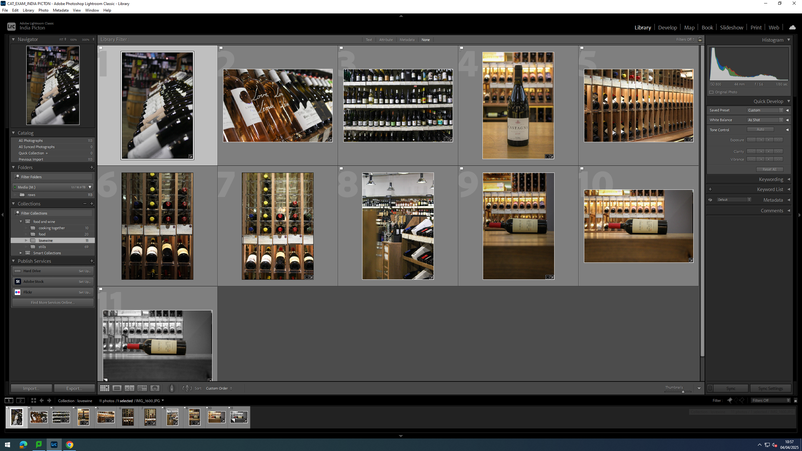
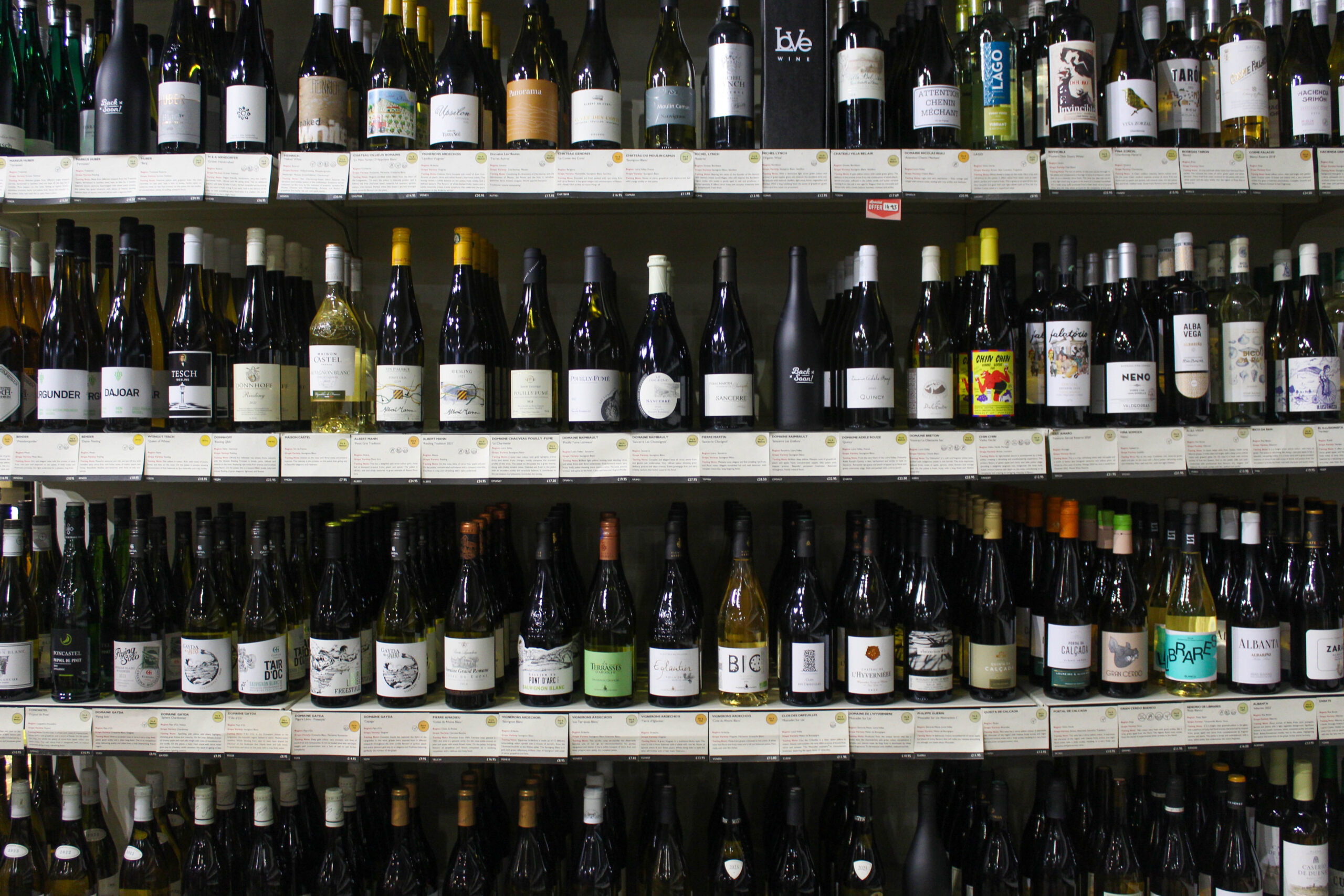
For this shoot I took my camera into my place of work, Love Wine, and got some pictures of the shop and some of the bottles we sell there.
Contact Sheet
I started out with 11 photos of which I liked 4.
editing
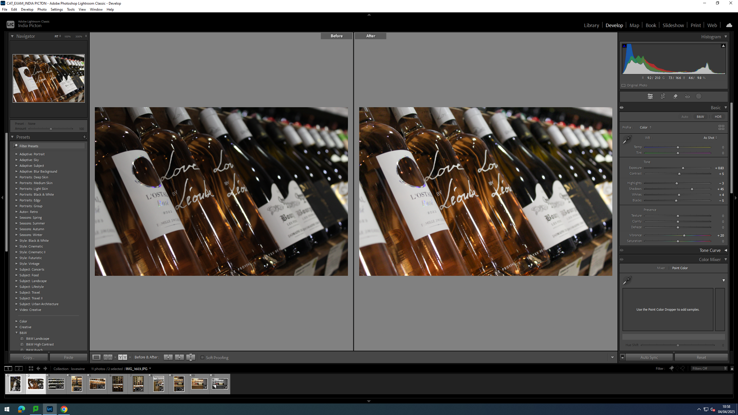
For this image I brightened it up, upping the exposure and making the rose colour stand out more by upping the vibrancy and adding a little bit of vignette.
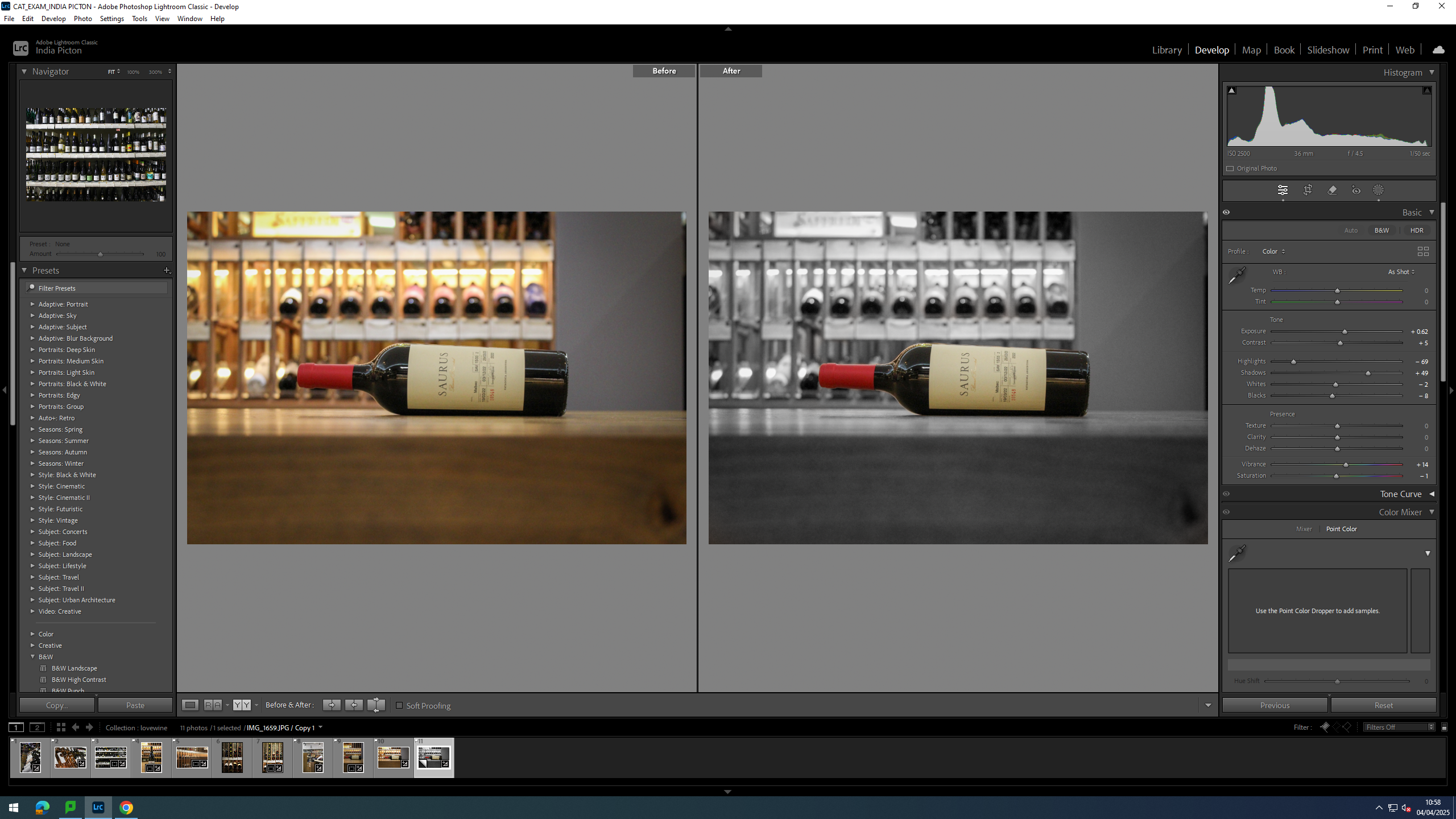
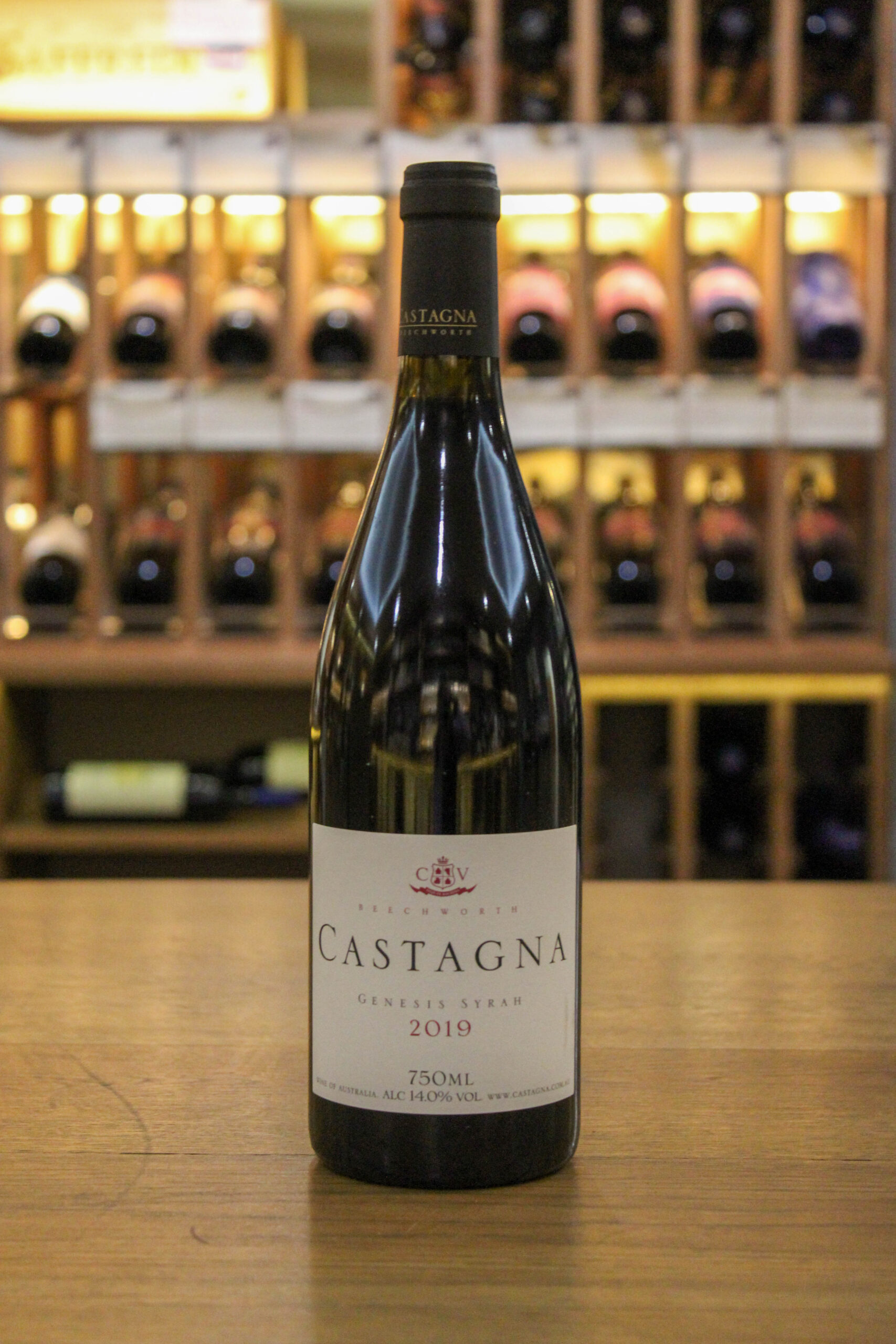
For this image I wanted to make the bottle stand out from the background as the have similar hues of yellow, especially with in the label, I also wanted to make that red stand out and pop more. so to rectify this I singled out the bottle with a mask and removed to colour from the background.
Finals
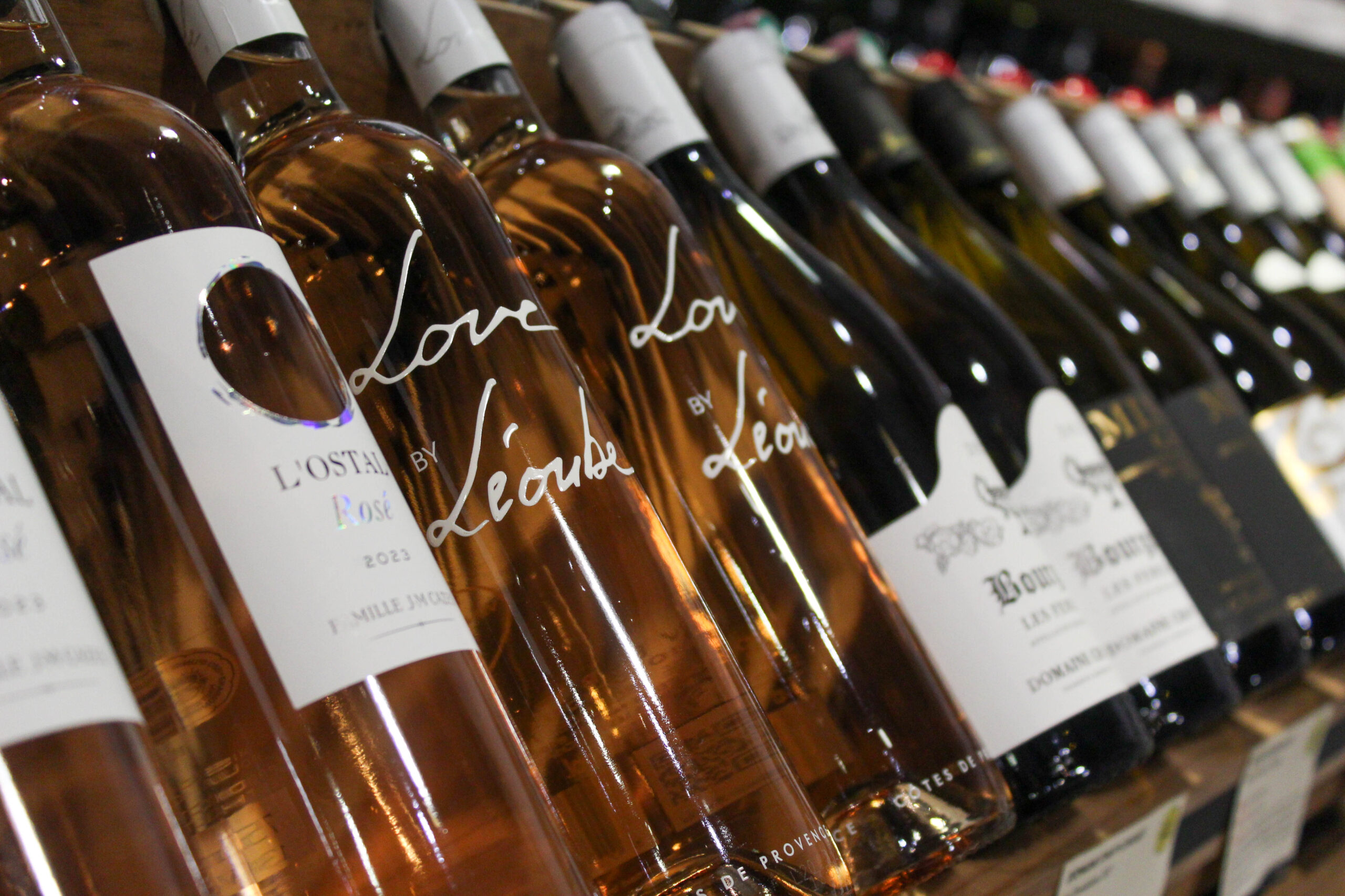
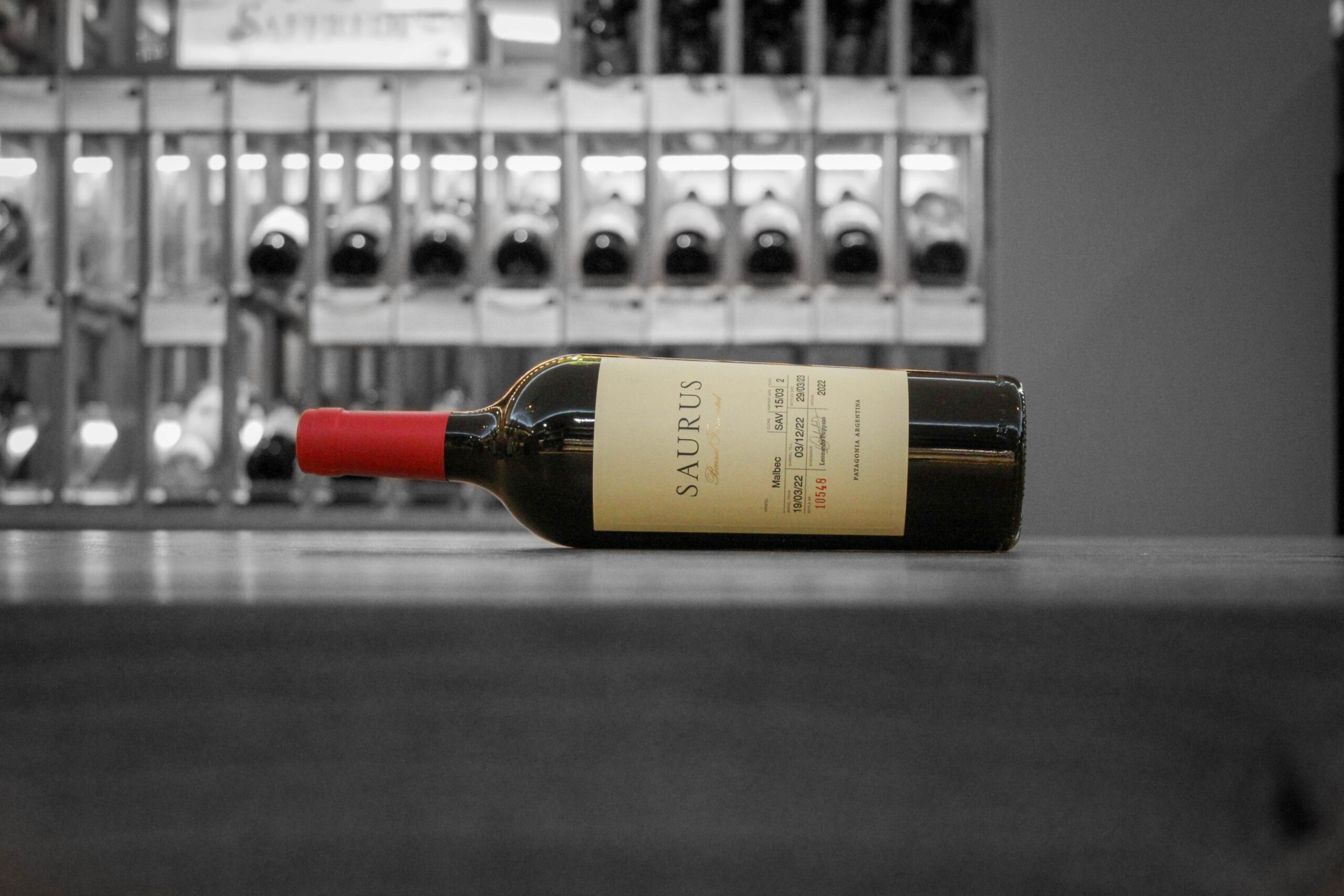
The vibrant red of the foil around the neck and cork makes the black and white background feel cold. The negative space of the side of the table helps place a slight frame at the bottom and make it seem as though the bottle is floating.
Evaluation
I think this shoot turned out really well and I’m incredibly happy with the quality of the photos. however, if I could do it again, I would go in on a day that I am not working as it would give me more time to get images.