Complete layout:
Overall, I think that I have explore the topic of Feminism in a holistic way during my study into the theme of Union as my images cross a lot of issues that young girls and women face in society, whether that may be from social standards and stereotypes to the media and magazine industry.
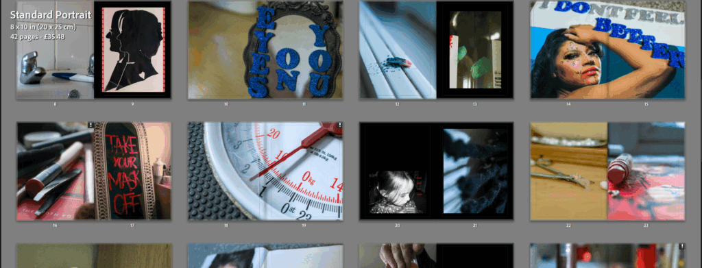
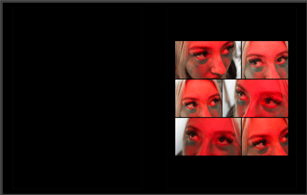
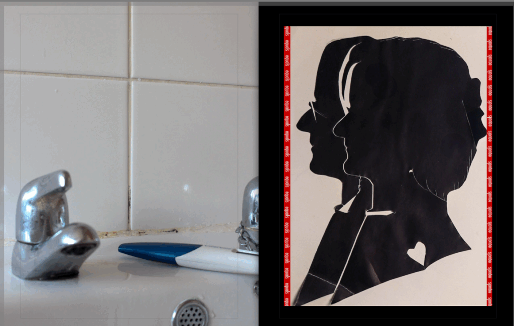
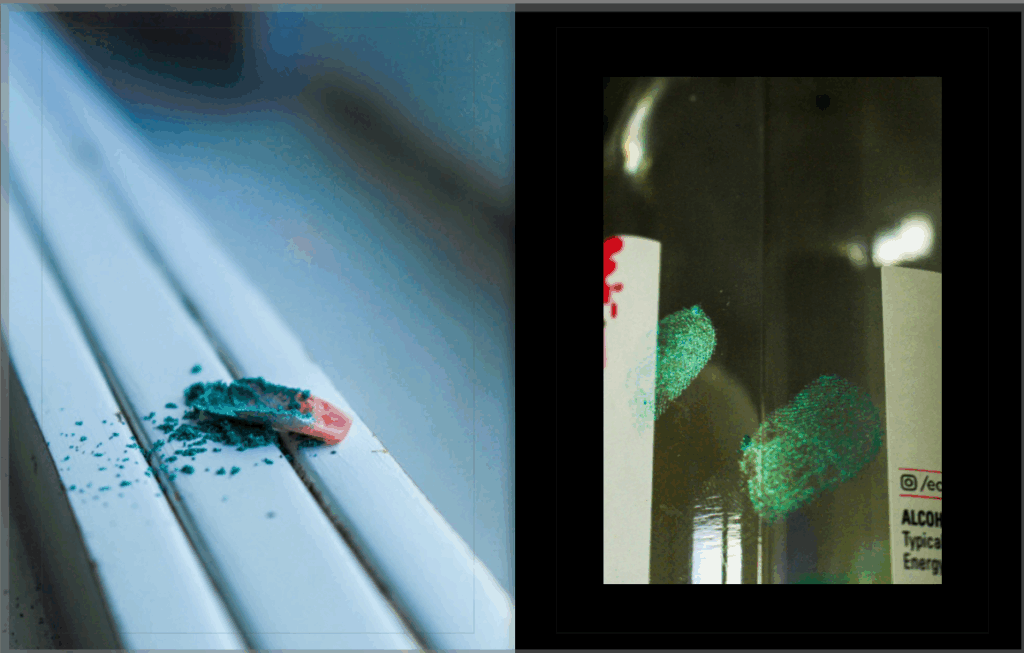
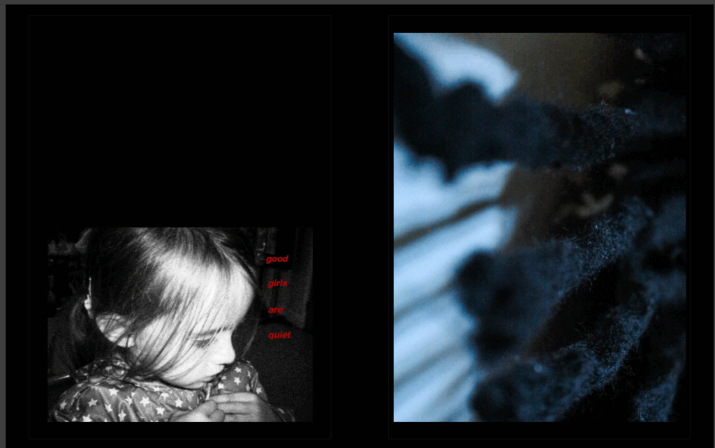
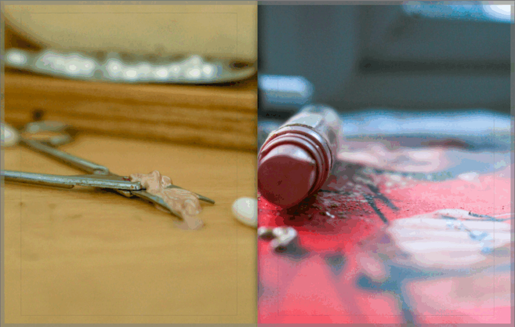
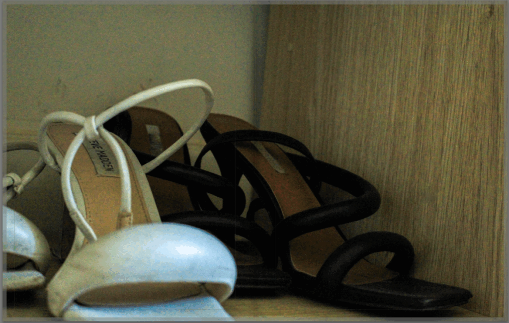
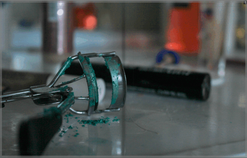
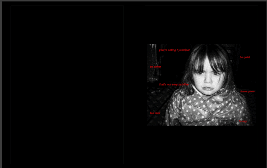
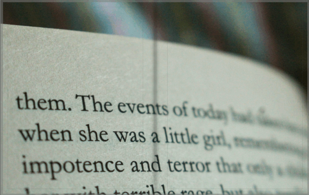
I feel that something that helped me to achieve this was my use of a short depth of field in many of my images as I can use this symbolically to draw sympathy from the viewer, as this can represent zoning out into the particular pieces of the environment. I think that this worked really well as it also allowed me to provide a rich amount of detail in my images, rather than wide-shot images too. However, I feel that I could’ve introduced the landscape into my work more, for example wide shot angles of locations with poor weather to symbolise loneliness or sadness.
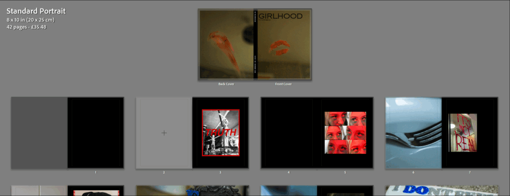
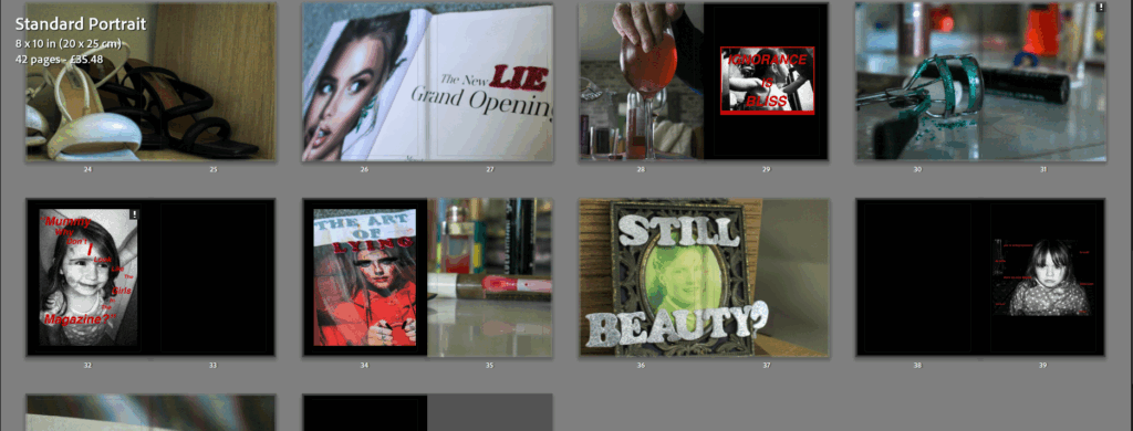
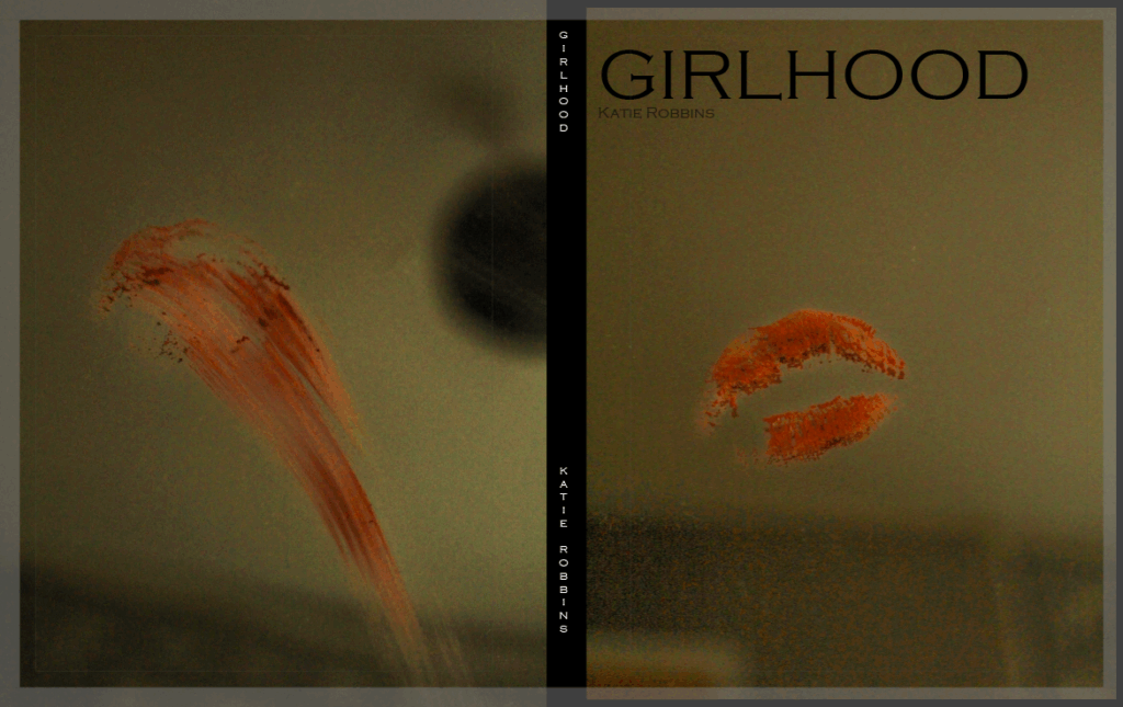
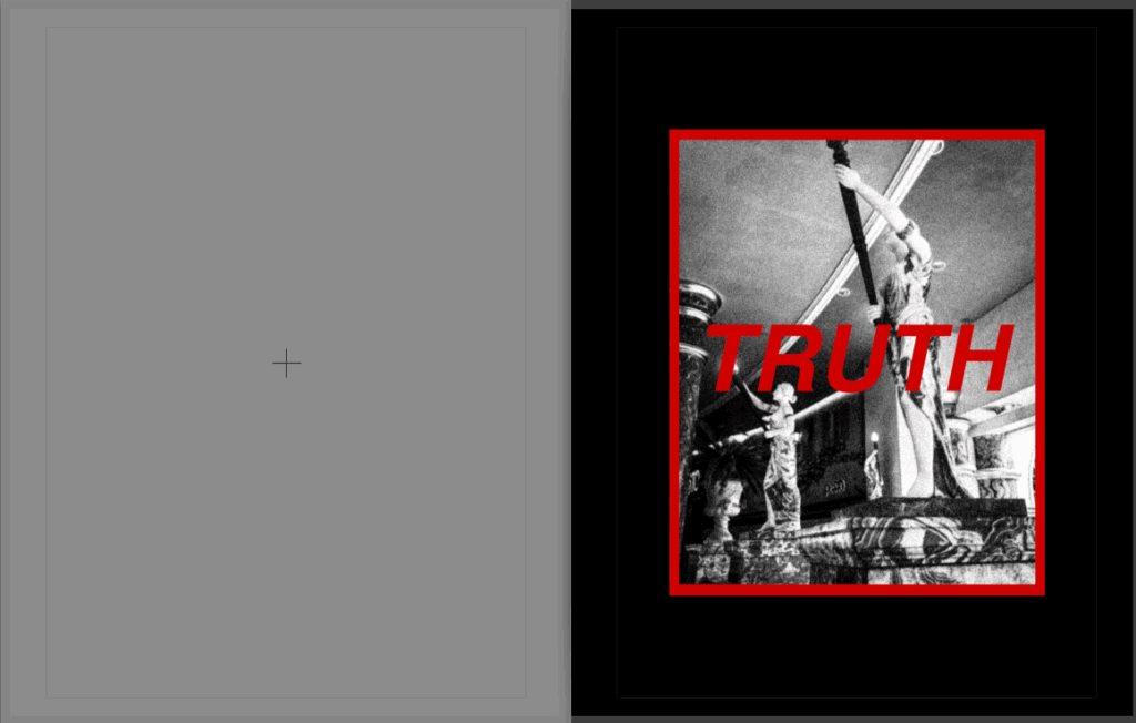
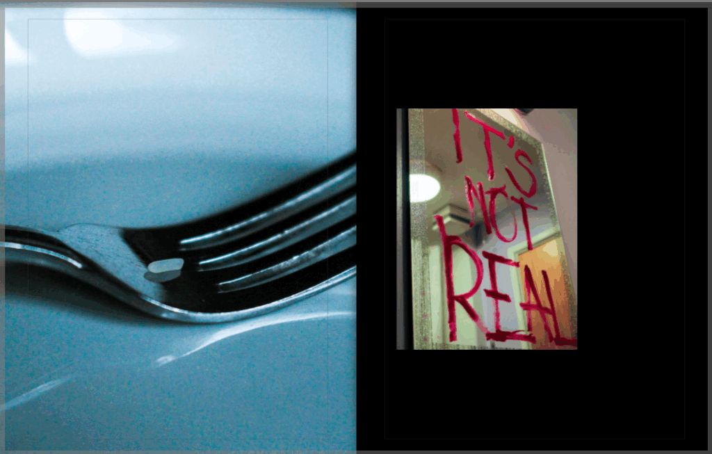
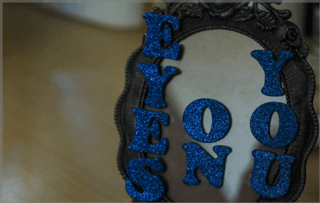
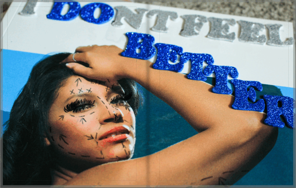
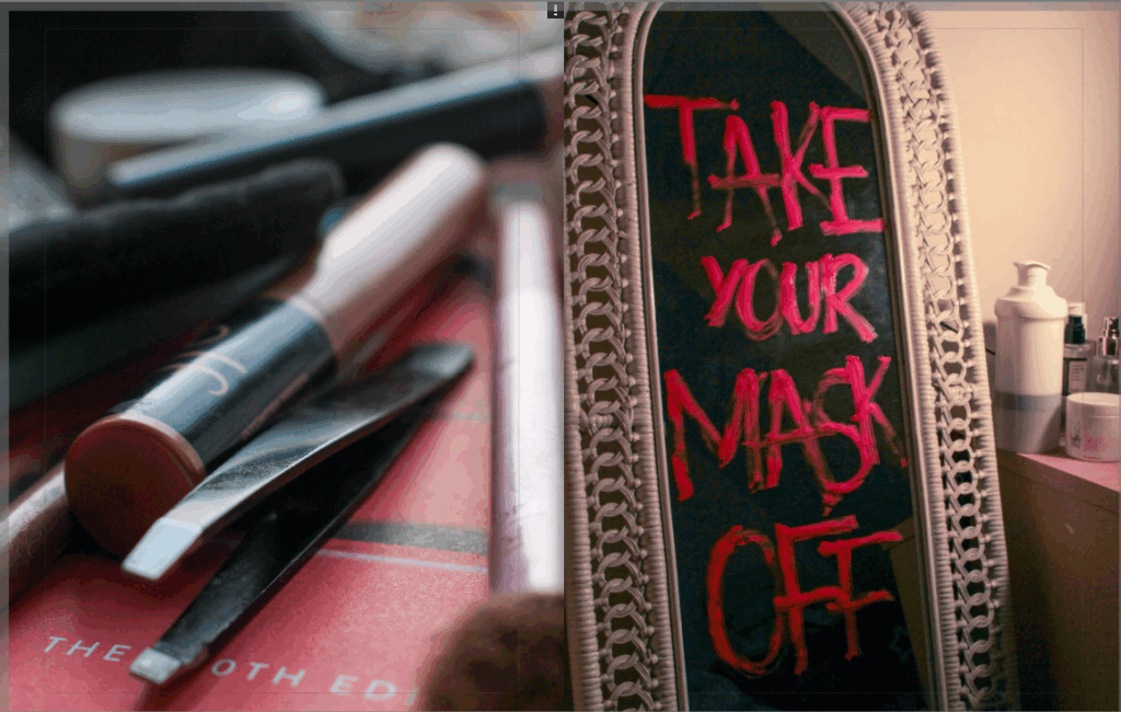
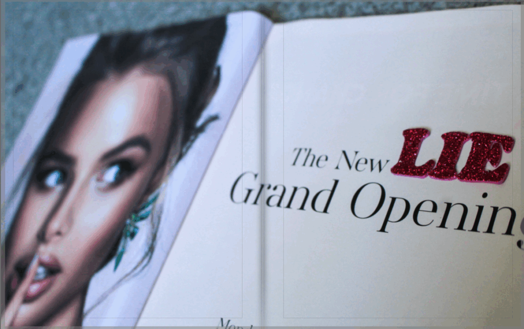
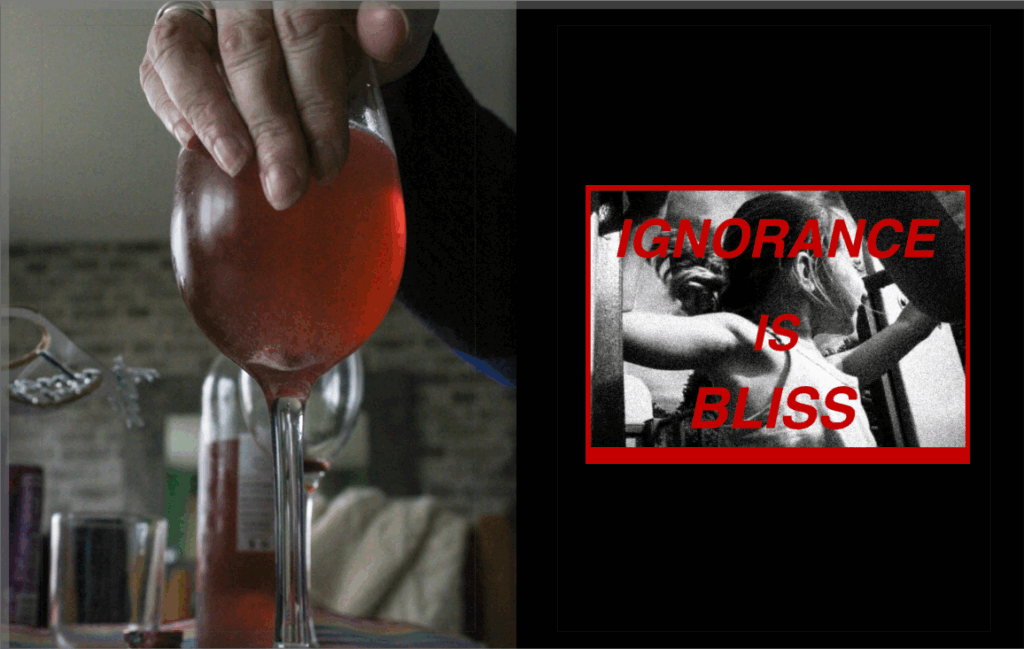
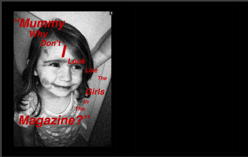
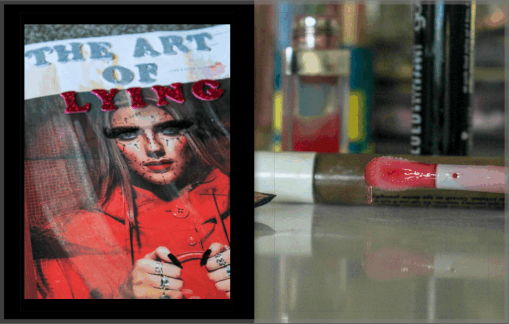
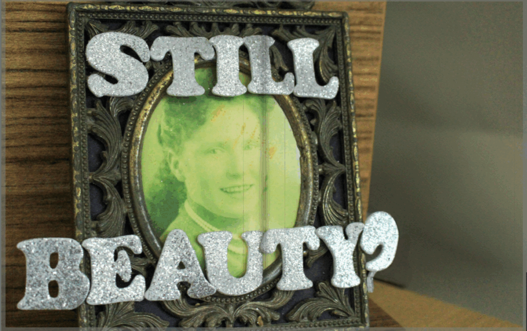
Within this study, I was able to experiment with inspiration from Barbara Kruger which also allowed me to juxtapose this soft focus with graphic, bold writing and line to draw my viewers attention in. I think that this was really effective because it means that my images are diversified from each other and it allows me to show different styles of photography within one body of work. This also allowed me to show passiveness and activeness within the Feminism movement, for example the issues with the beauty standard are highly known, however this often gets overlooked or ignored as society is so used to this concept of what a woman should look and act like, meaning that I can visually depict the importance of addressing these problems instead of allowing them to continue and perpetuate false ideas into people’s heads. This also meant that I was able to incorporate both colour and black & white images into my photobook which differentiates my images from each other even further.
If I was to do this particular study again, I would have liked to get more moving images using a slow shutter speed as all of my images are very still, and I feel that this would have made my project even more interesting. This would have allowed me to easily add direction into my work as this would have created a motion blur, and from here I could have experimented with this.
Wider view: