
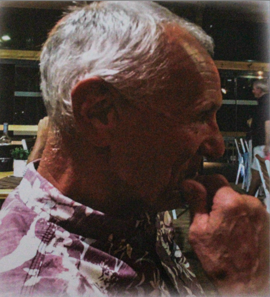
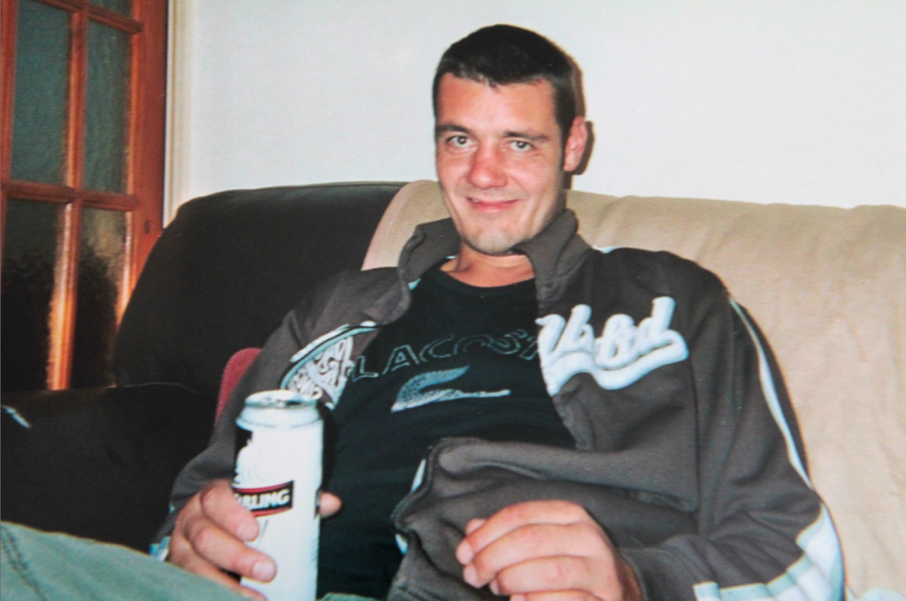
In this photoshoot, I focussed on recreating old archive images of my dad when he was younger. I also wanted to use my dad to recreate images of his dad (my grandad), who has passed away, because I could not use my grandad. My dad and my grandad also have lots of similar characteristics that I want to present as well, as they look very alike.
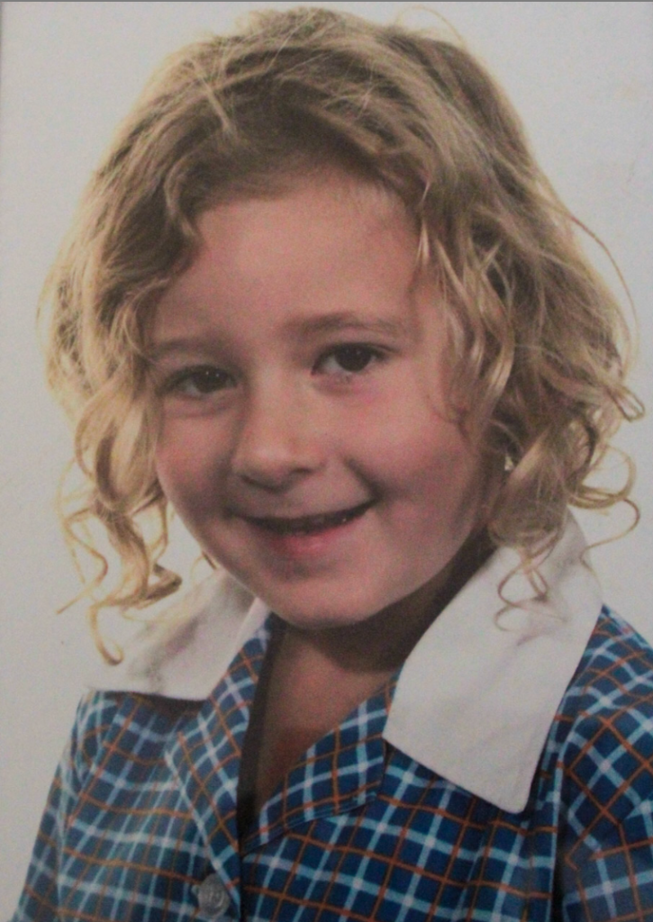
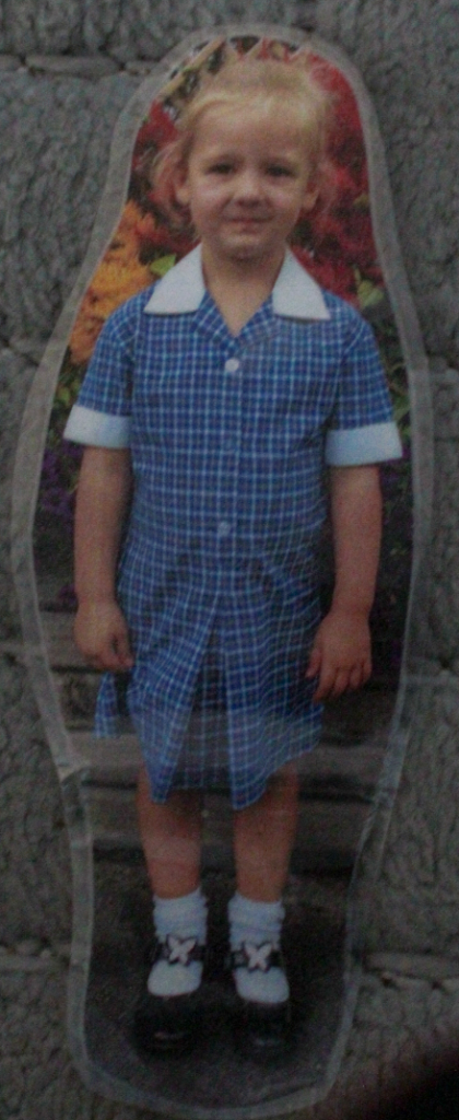
I also found archive images of myself at a similar age to my sister, so I recreated the images of myself, but with my sister. I did this, so that I could present the similarities my sister and I share due to our shared DNA.
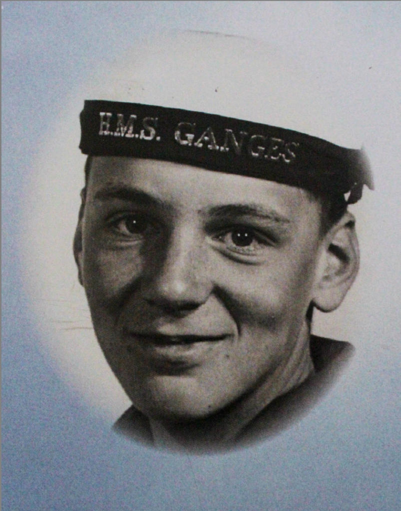
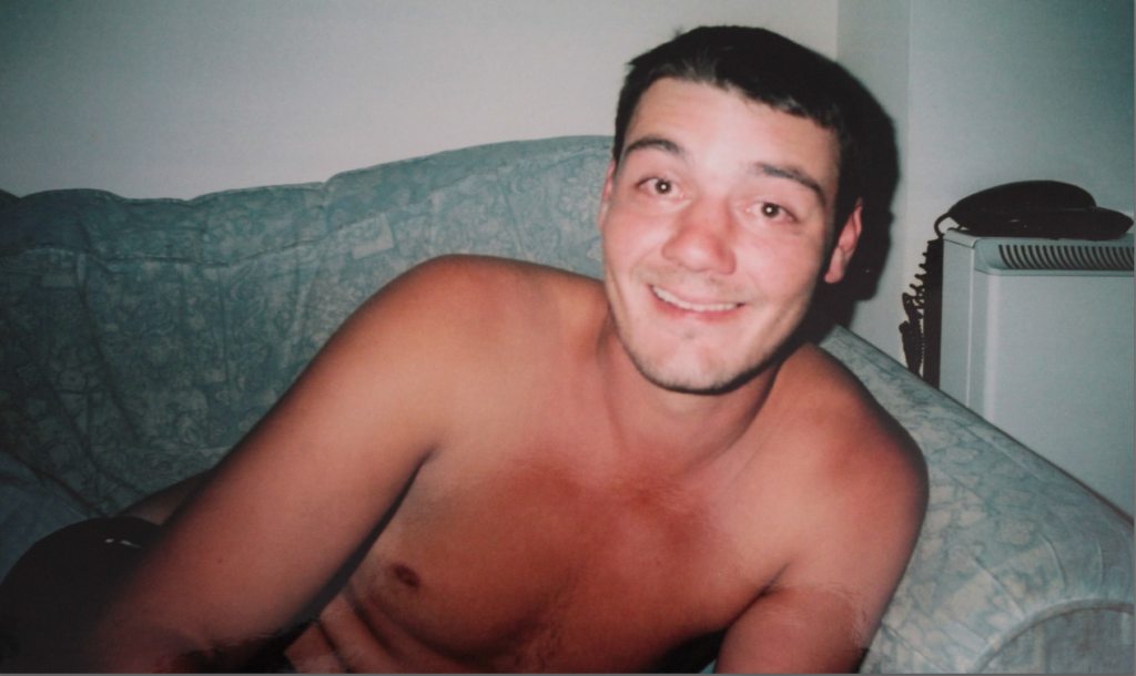
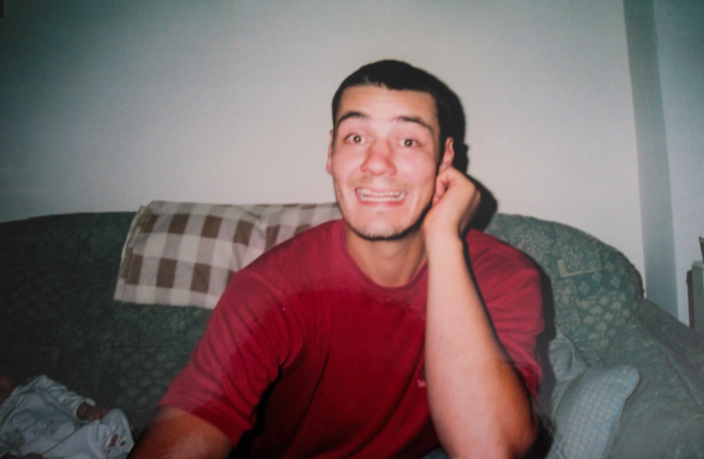
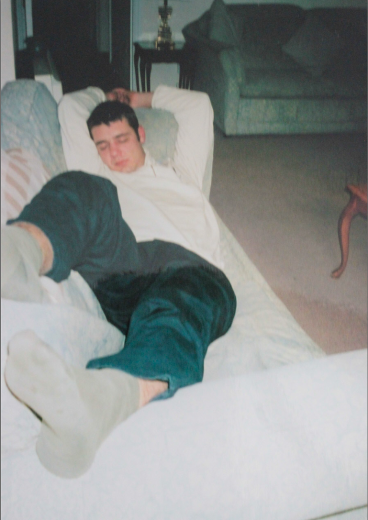
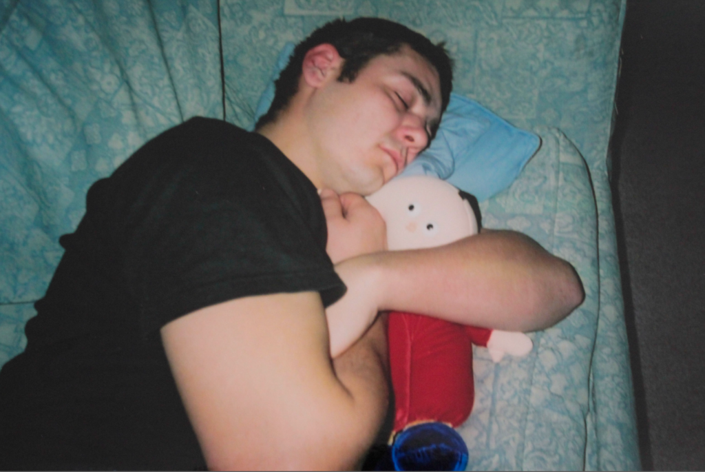
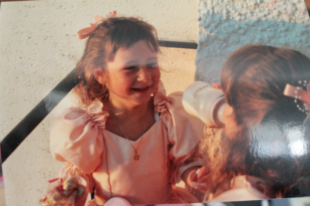
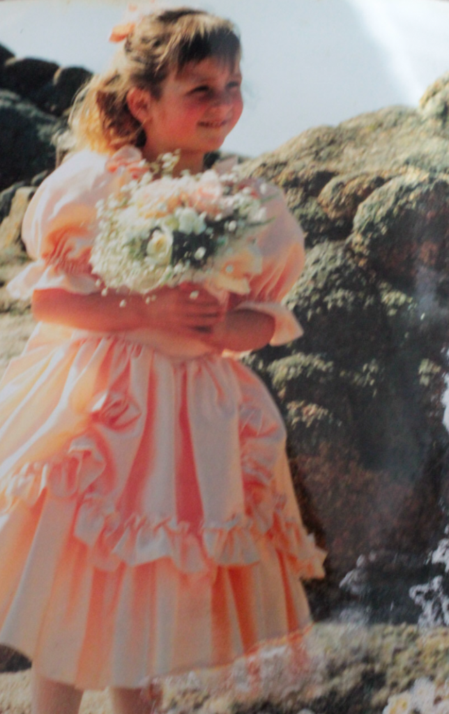
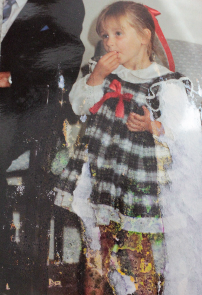
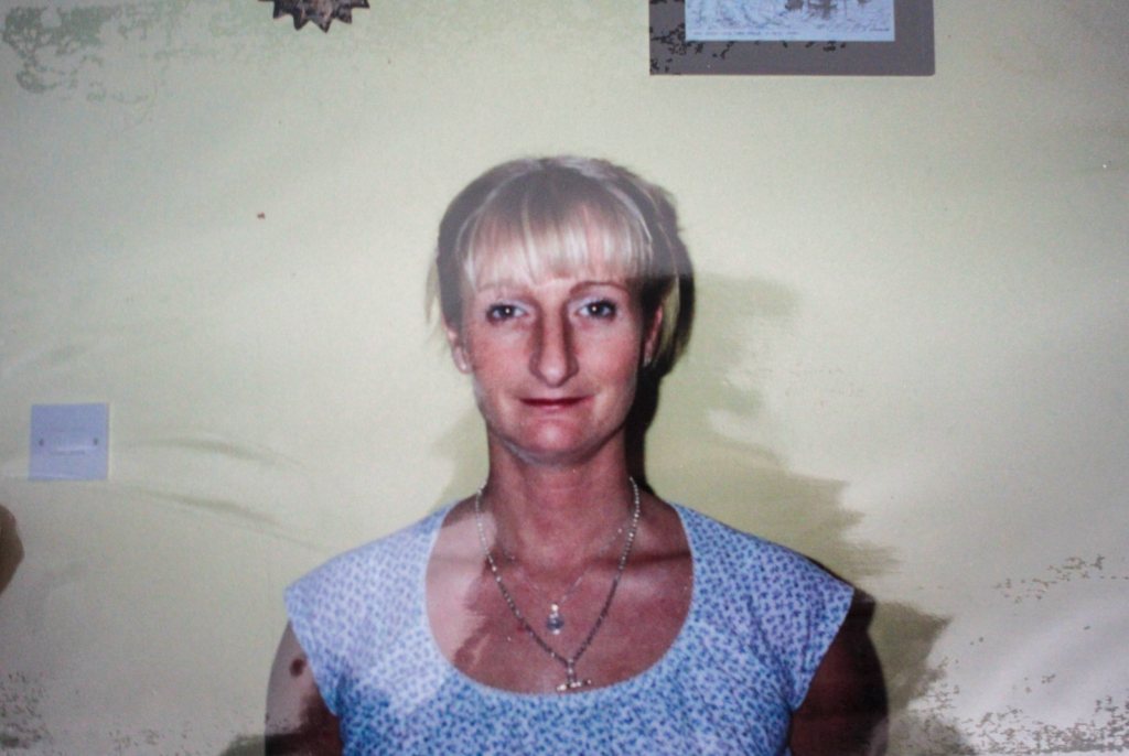
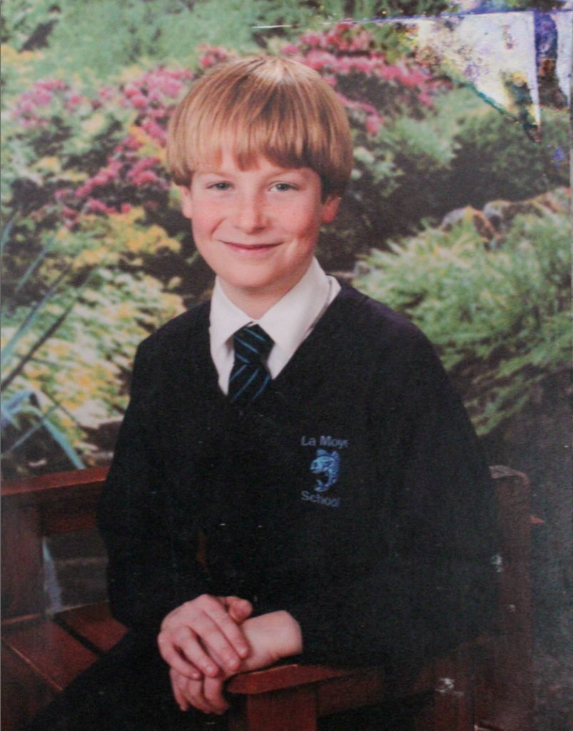
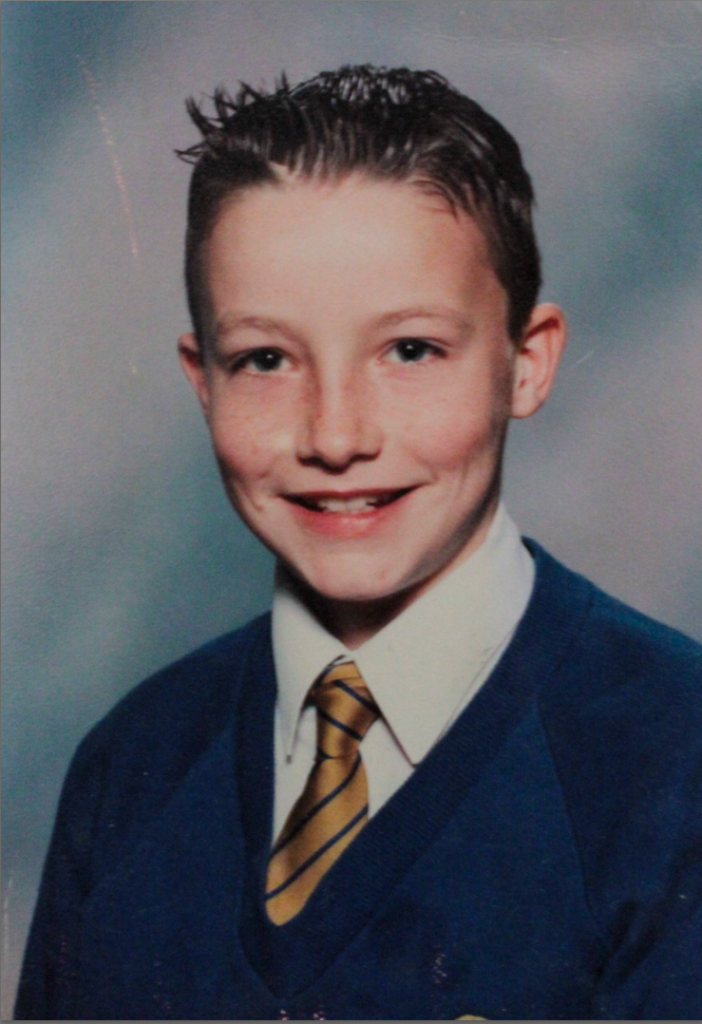
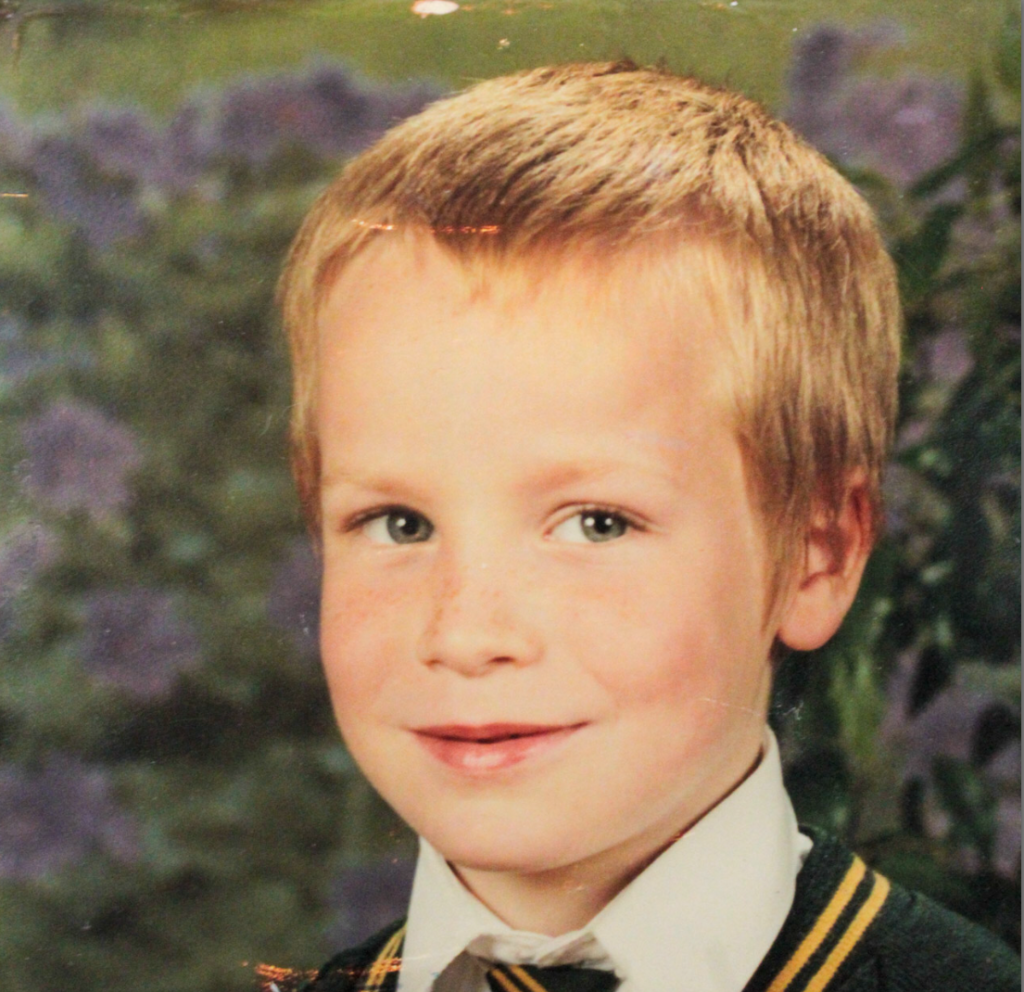
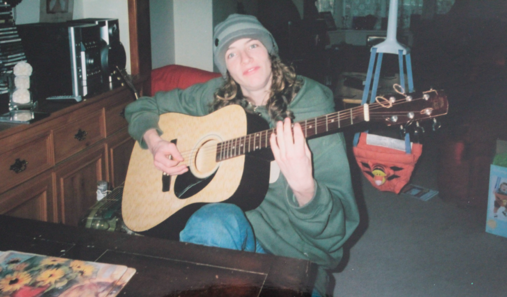
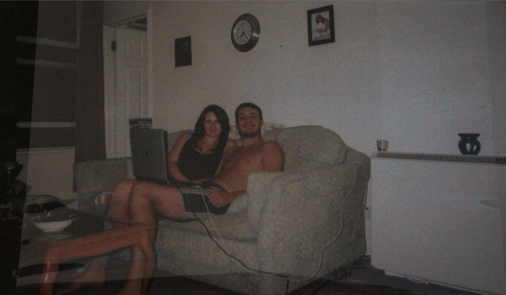
Archive Images Used
Edits
I edited this image by increasing the contrast, shadows, whites, vibrancy and saturation, while decreasing the exposure, highlights and blacks. I did this, so that the image was slightly more vibrant and looked less dull and grey.
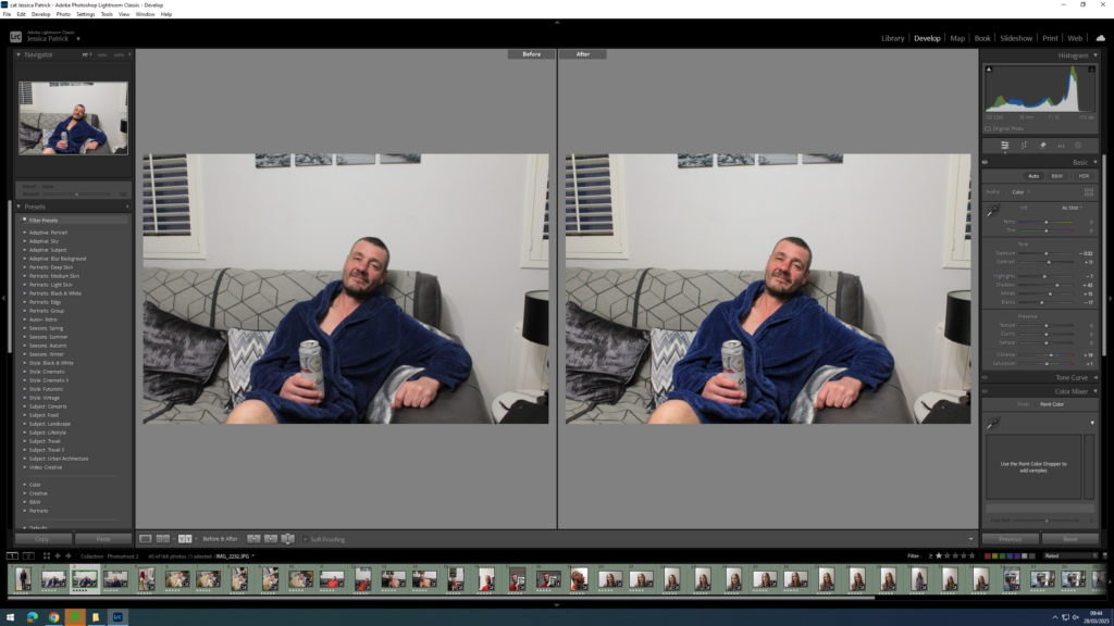
I edited this image by increasing the contrast, shadows, whites and vibrancy, while decreasing the exposure, highlights and blacks. I did this, so that the image was slightly more vibrant and had less of a grey wash.
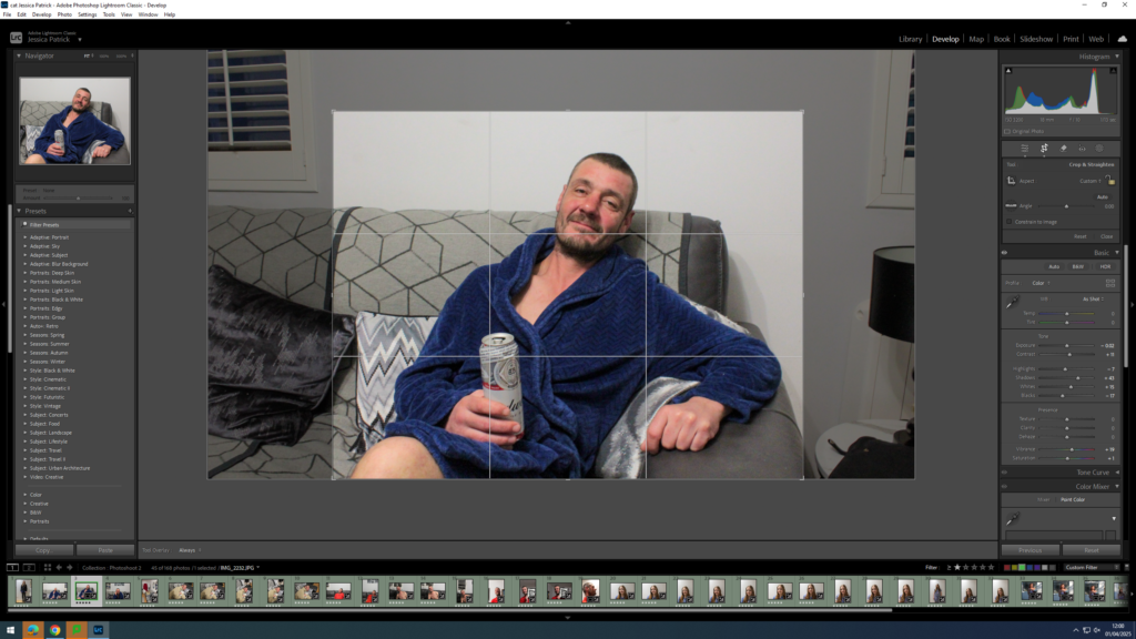
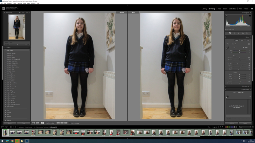
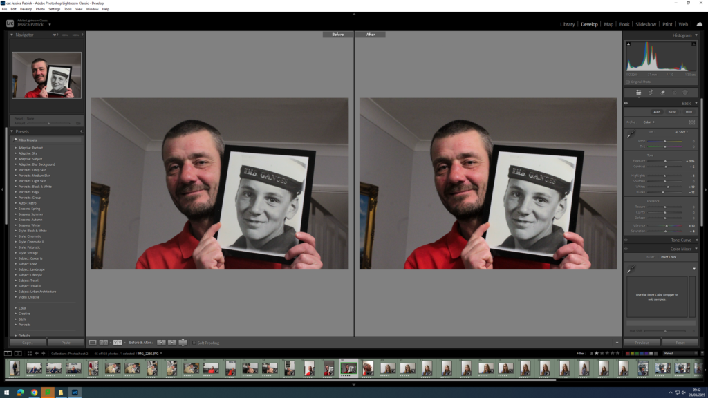
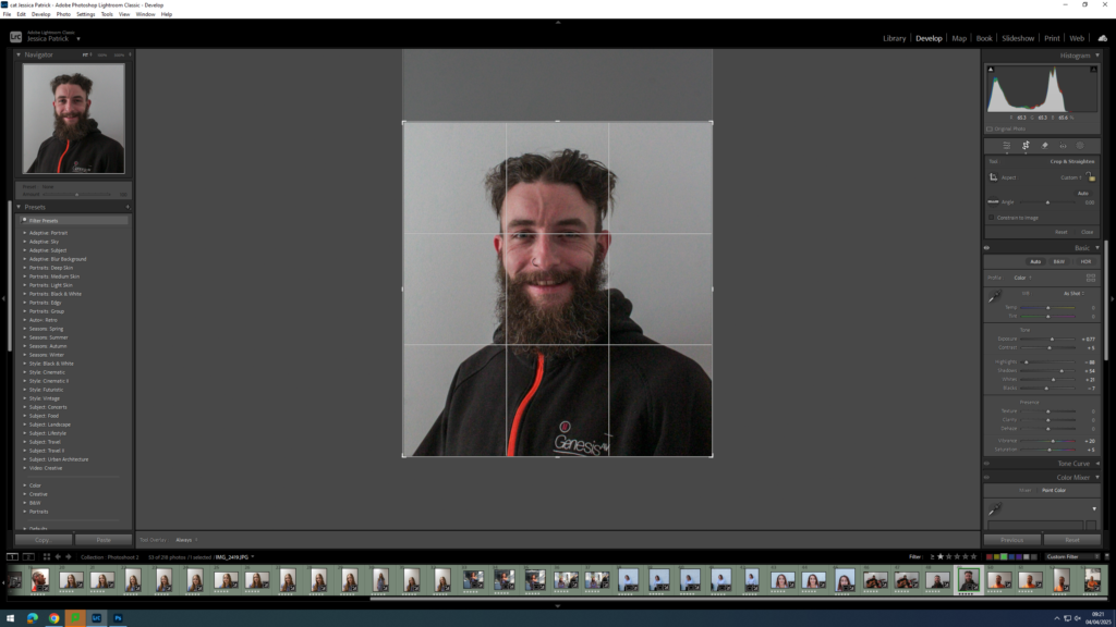
Next, I cropped the photograph, deleting the negative space around my dad, so that the image was more similar to the archive image.

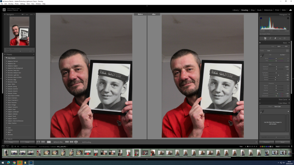
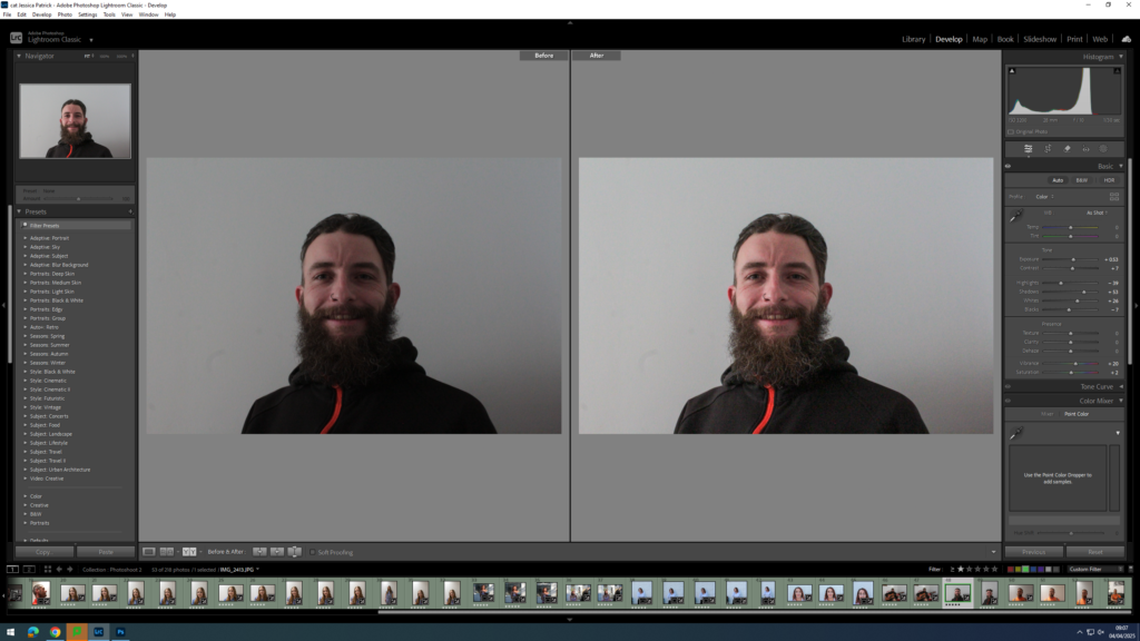
I edited this image by increasing the contrast, shadows, whites, vibrancy and saturation, while decreasing the exposure, highlights and blacks. I did this, so that the image would be slightly more vibrant and my dad would have some more colour in his face.
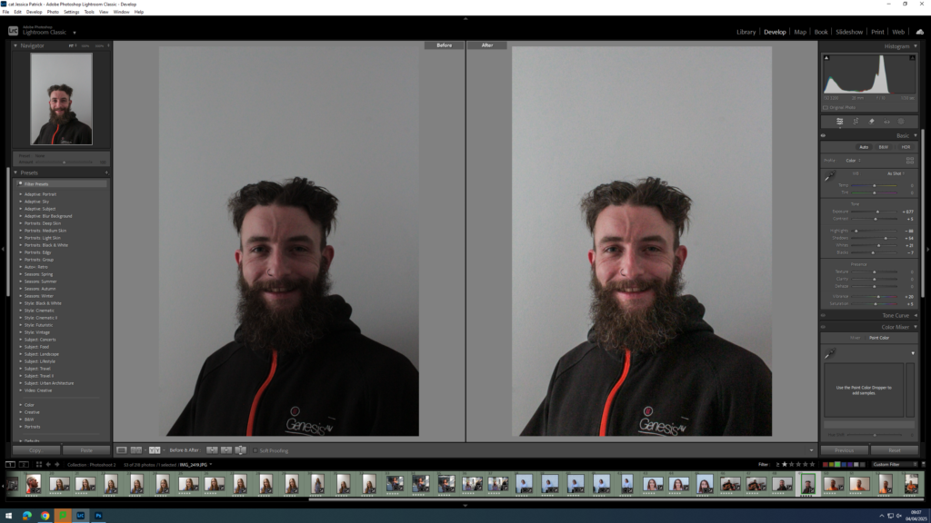
I edited this image by increasing the exposure, contrast, shadows, whites, vibrancy and saturation, while decreasing the highlights and blacks. I did this, so the image would be slightly more vibrant.
I edited this image by increasing the exposure, contrast, shadows, whites and vibrancy, while decreasing the blacks. I did this, so that the lighting would be slightly more exposed and the colours slightly more vibrant.
I edited this image by increasing the exposure, contrast, shadows, whites and vibrancy, while decreasing the blacks. I did this, so that the lighting would be slightly more exposed and the colours slightly more vibrant.
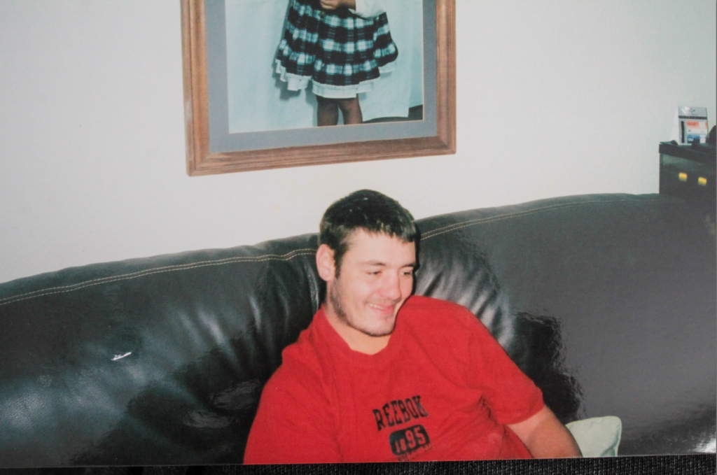
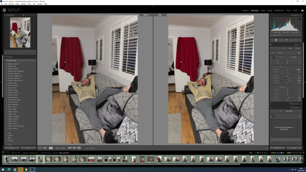
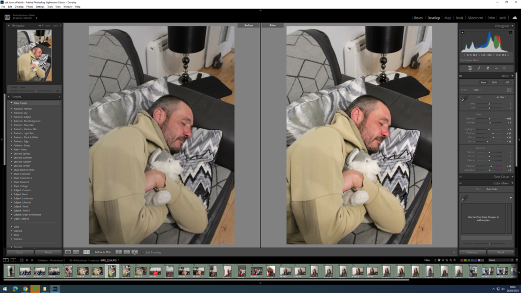
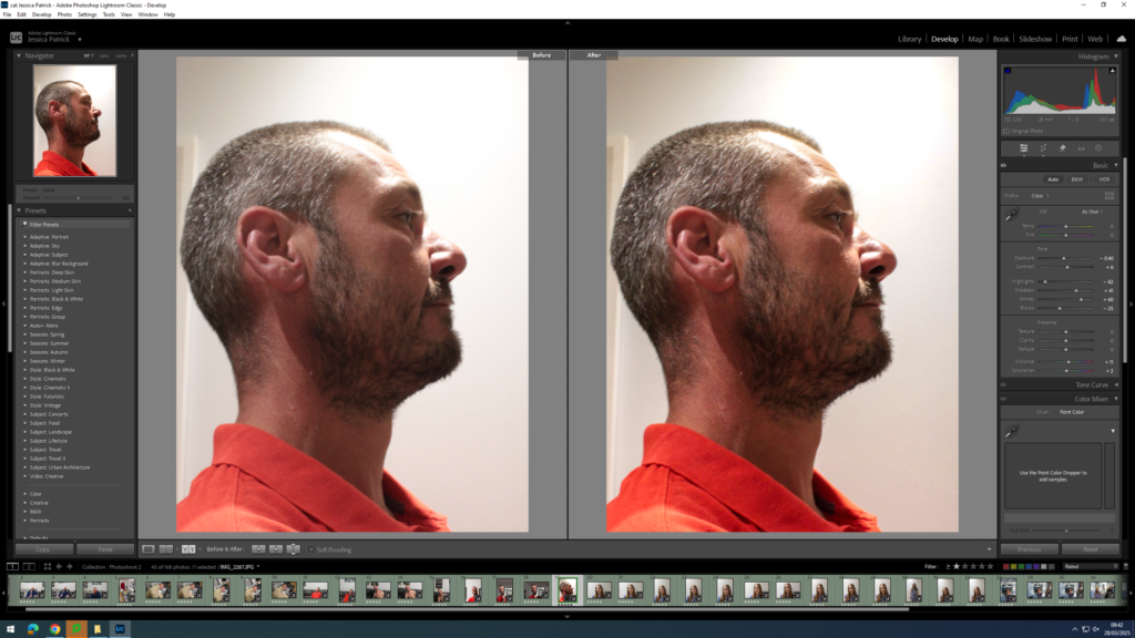
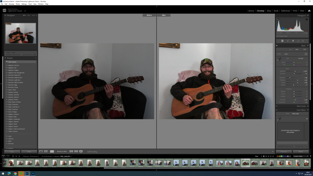
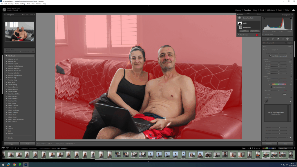
I edited this image by increasing the contrast, shadows and vibrancy, while decreasing the exposure, highlights, whites, blacks and saturation. I did this, so that the red top my dad is wearing would be slightly more vibrant and the lighting would be slightly less exposed.
I edited this image by increasing exposure, contrast, shadows, whites and vibrancy, while decreasing the highlights, blacks and saturation. I did this, so that the image is slightly warmer and less dull.
I edited this image by increasing the exposure, contrast, shadows, whites, vibrancy and saturation, while decreasing the highlights and blacks. I did this, so that the image would be slightly more vibrant.
I edited this image by increasing the exposure, contrast, shadows, vibrancy and saturation, while decreasing the whites and blacks. I did this, so that the image would be slightly more exposed, with slightly more contrast between the black and white images and my dad’s red top.
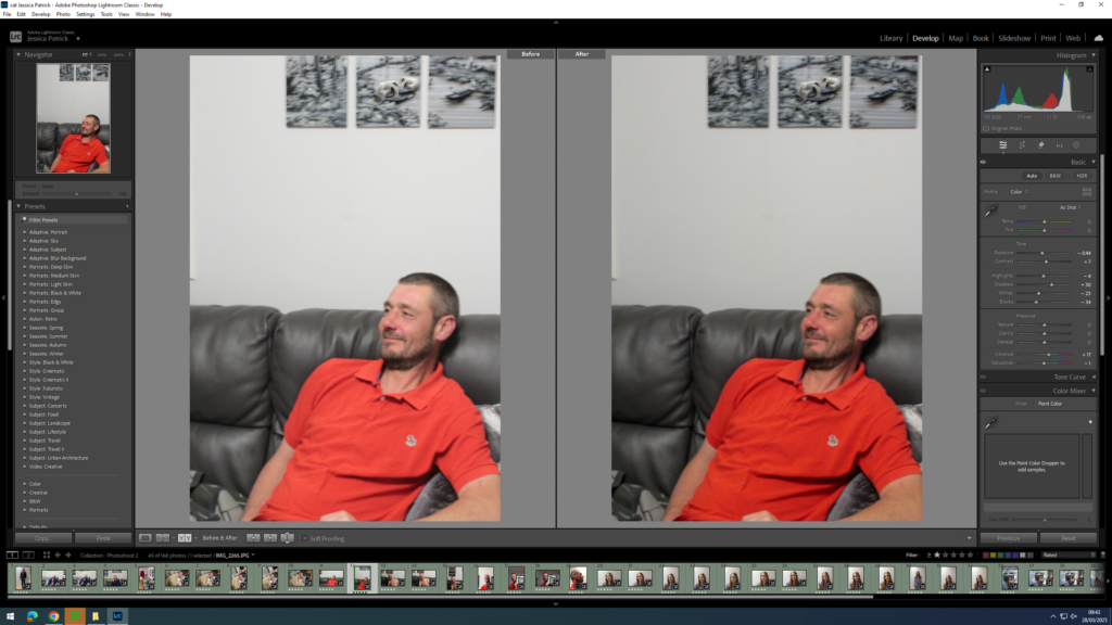
I edited this image by increasing the exposure, contrast, whites, vibrancy and saturation, while decreasing the highlights and blacks. I did this, so that the image would be slightly more exposed and vibrant, with more contrast between the black and white images and the colour around it.
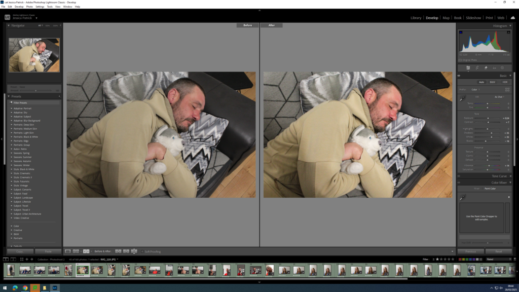
I edited this image by increasing the contrast, shadows, whites, vibrancy and saturation, while decreasing the exposure, highlights and blacks. I did this, so that I could attempt to improve the lighting.
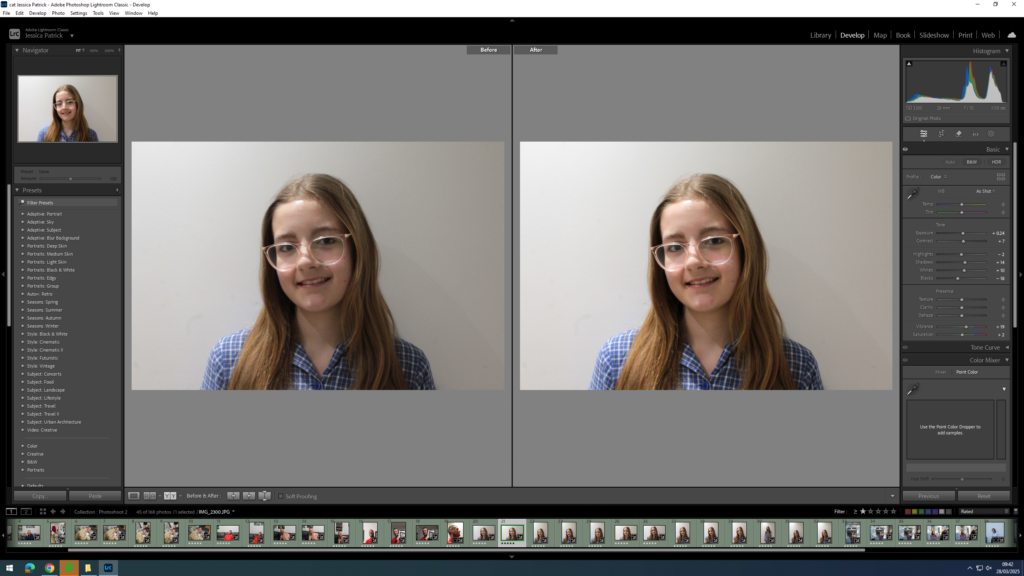
I edited this image by increasing the exposure, contrast, shadows, whites, vibrancy and saturation, while decreasing the blacks. I did this, so that the image would have more exposure and better lighting, so it looked more similar to my archive image of my school photo.
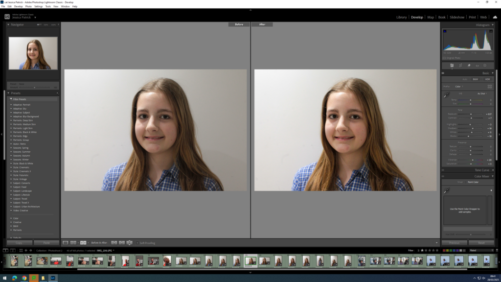
I edited this image by increasing the contrast, shadows, whites, vibrancy and saturation, while decreasing the exposure, highlights and blacks. I did this, so that the image was slightly more exposed, so that the lighting was improved. I did this, so that it would look more similar to my school photo archive.
I edited this image by increasing the exposure, contrast, shadows, whites, vibrancy and saturation, while decreasing the highlights and blacks. I did this, so that the image was slightly more exposed, so that the lighting was improved. I did this, so that it would look more similar to my school photo archive.
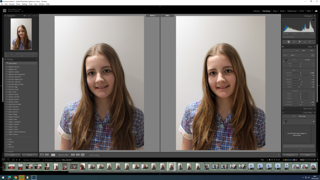
I edited this image by increasing the exposure, contrast, shadows, whites, vibrancy and saturation, while decreasing the blacks. I did this, so that the image is slightly more exposed with better lighting.
I edited this image by increasing the exposure, contrast, shadows, whites, vibrancy and saturation, while decreasing the highlights and blacks. I did this, so that the lighting is better as it is slightly more exposed.
I edited this image by increasing the contrast, shadows, whites and vibrancy, while decreasing the exposure, highlights and blacks. I did this, so that the image lighting is improved, because the levels of light and shade are not what I intended for this image.
I edited this image by increasing the exposure, contrast, shadows, whites, vibrancy and saturation, while decreasing the highlights and blacks. I did this, so that the lighting in this image could be improved, because the levels of light and shade are not what I intended for this photograph.
I edited this image by increasing the exposure, contrast, shadows, whites and vibrancy, while decreasing the highlights and blacks. I did this in order to improve the lighting, because the levels of light and shade from the sun are not what I intended.
I edited this image by increasing the exposure, contrast, shadows, whites, vibrancy and saturation, while decreasing the highlights and blacks. I did this in order to improve the lighting, because the levels of light and shade from the sun are not what I intended.

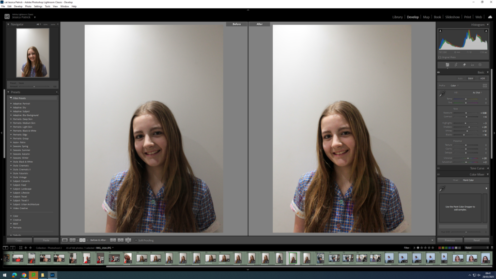
I edited this image by increasing the exposure, contrast, shadows, vibrancy and saturation, while decreasing the highlights, whites and blacks. I did this, so that the wall would be more white, compared to grey and so the image would have better lighting.
I edited this image by increasing the exposure, contrast, shadows, whites, vibrancy and saturation, while decreasing the highlights and blacks. I did this, so that the background would be more white compared to grey.
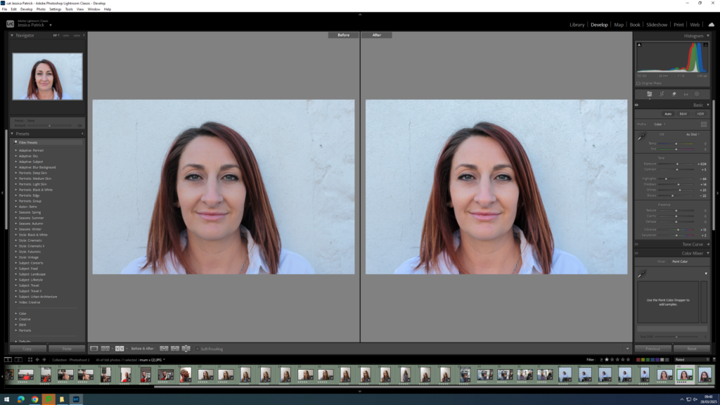
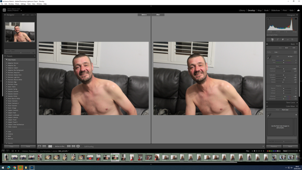
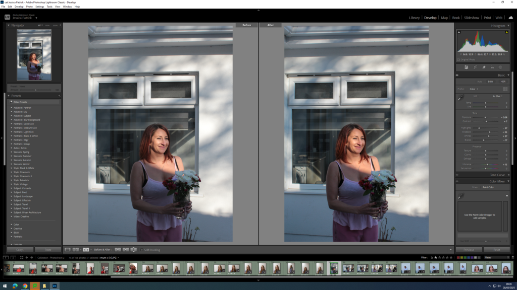
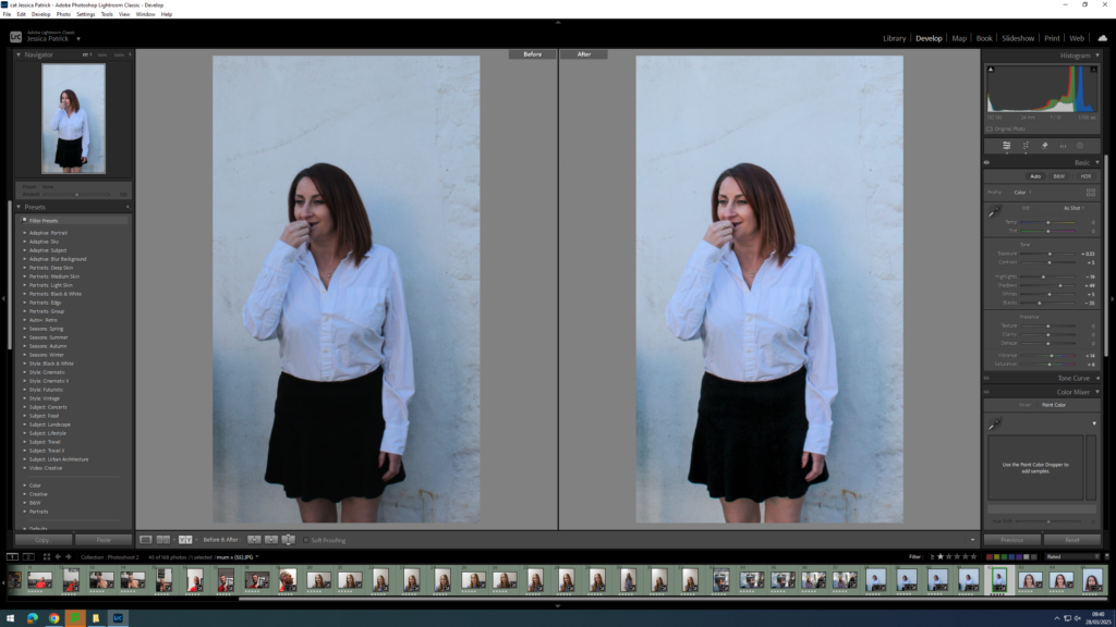
I edited this image by increasing the exposure, contrast, shadows, whites, vibrancy and saturation, while decreasing the highlights and blacks. I did this, so that the background wall would be more white, compared to grey and so my mum would have more colour in her face.
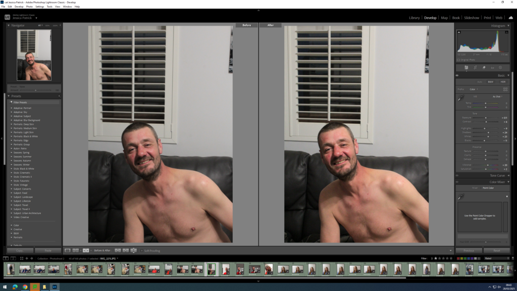
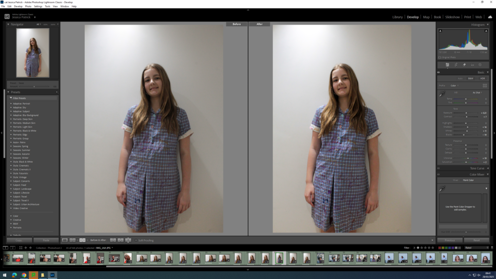
I edited this image by increasing the exposure, contrast, shadows, whites, vibrancy and saturation, while decreasing the highlights and blacks. I did this, so that the image would be more exposed and therefore have better lighting.
I edited this image by increasing the exposure, contrast, shadows, whites, vibrancy and saturation, while decreasing the highlights and blacks. I did this, so that the image would be more exposed and therefore have better lighting.
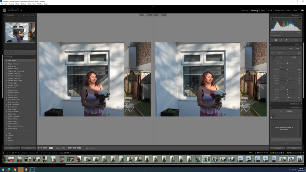
I edited this image by increasing the exposure, contrast, shadows, whites, vibrancy and saturation, while decreasing the highlights and blacks. I did this, so that the image would have better lighting.
I edited this image by increasing the exposure, contrast, shadows, whites, vibrancy and saturation, while decreasing the highlights and blacks. I did this, so that the image would have better lighting. I also cropped the negative space out from the top of the frame, so it was more similar to the archive photograph.
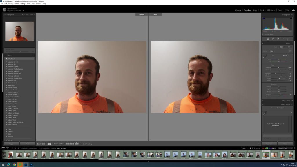
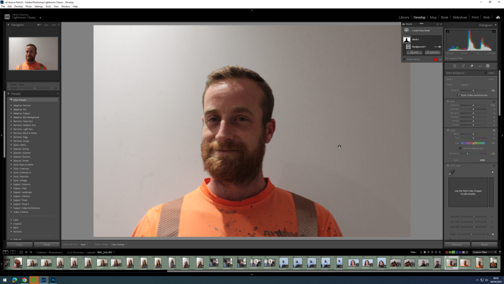
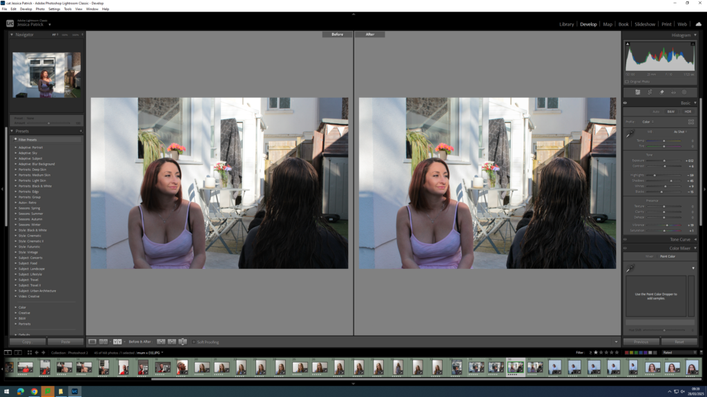
I edited this image by increasing the exposure, contrast, shadows, whites and vibrancy, while decreasing the highlights and blacks. I did this to try and correct the lighting coming from one side, rather than straight forward. I also selected the background and decreased the saturation, so that the background would be more white, compared to the orange colour it was before hand due to the warm lighting and the reflection of the orange top.
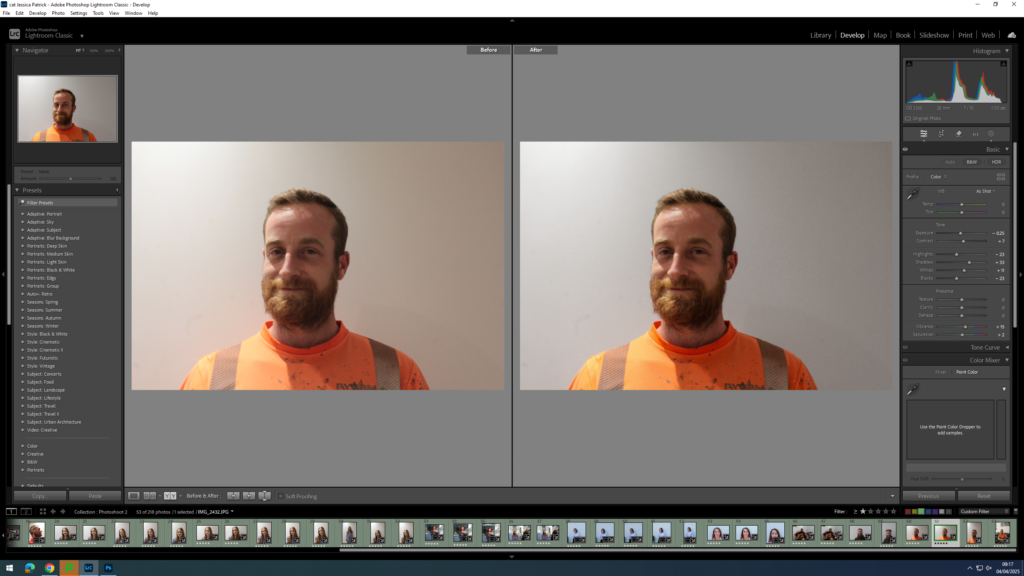
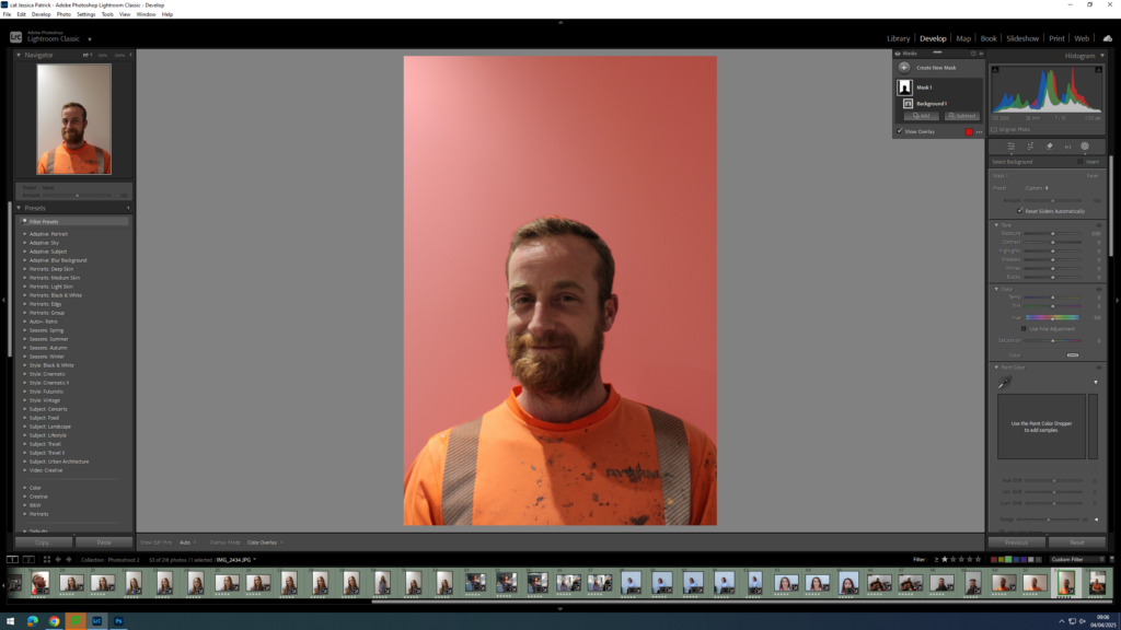
I edited this image by increasing contrast, shadows, whites, vibrancy and saturation, while decreasing the exposure, highlights and blacks. I did this to try and improve the lighting that was coming from one side, rather than straight forward. I also selected the background and decreased the saturation, so that the background would be more white, compared to the orange colour it was before hand due to the warm lighting and the reflection of the orange top.
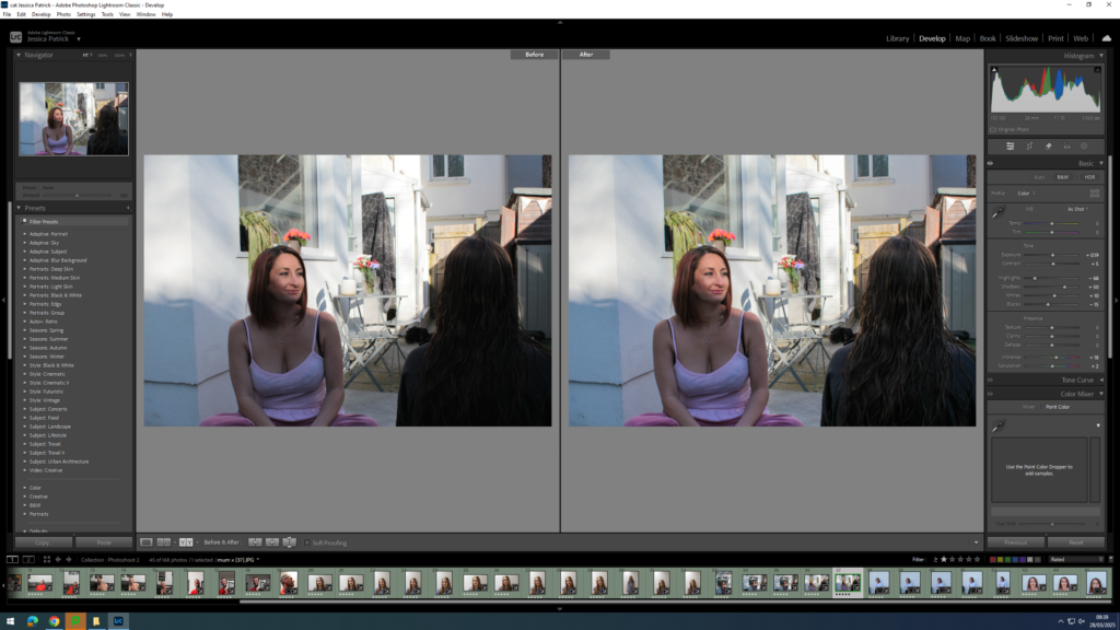
I edited this image by increasing the exposure, contrast, shadows, whites, vibrancy and saturation, while decreasing the highlights and blacks. I did this, so that the image would look less dull and be slightly more vibrant.
Then, I selected the background of the image and decreased the highlights and whites and increased the blacks, so that the light coming through the window was less bright.