
Project Plan:
My initial plan for my project was to focus on British flags, exploring how the Union Flag/Union Jack is made up of the separate national flags, weaving them together but each country remains distinct. I wanted to visually show the idea of union and separation – historical but progressive, using the flags interlinked and layers to represent the union of british identity.
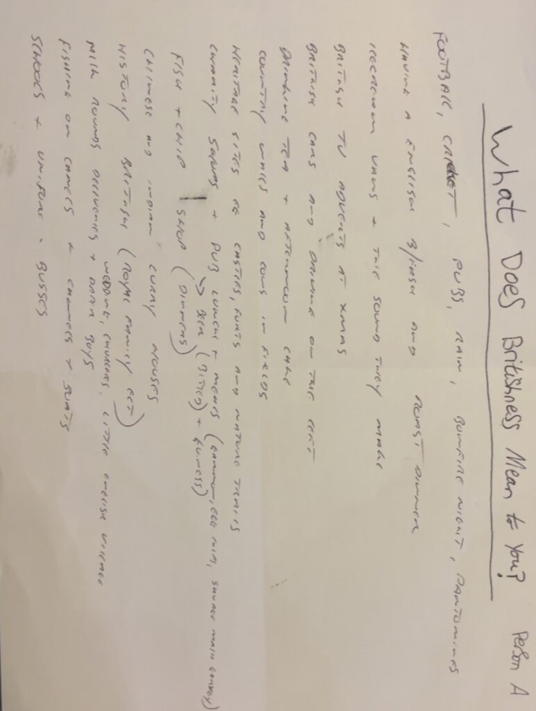
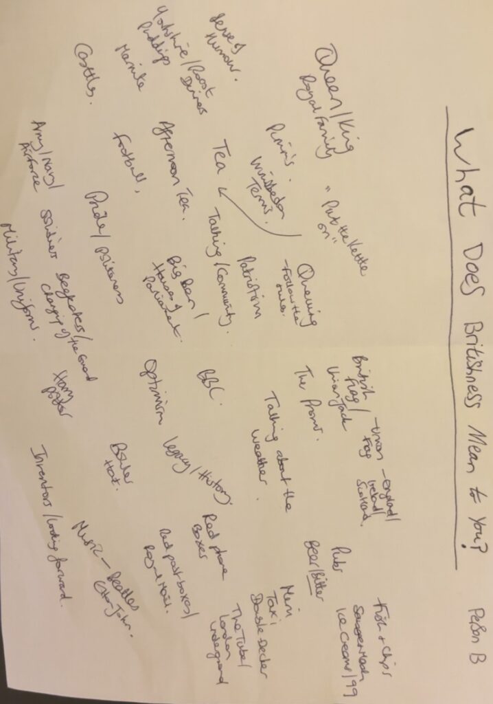
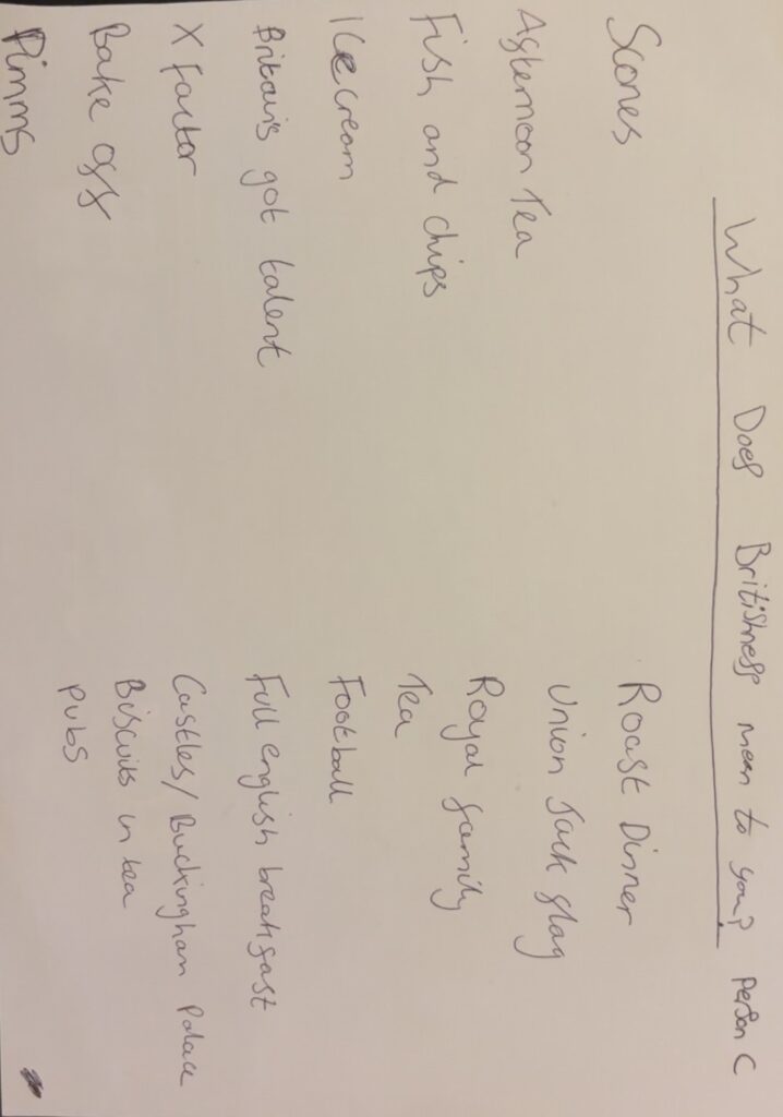
But as I explored further what Britishness meant to me and my family, mainly via primary research with my British family, (see sheets A, B and C), I realised that identity goes much deeper than national flags. From combining the key themes that emerged, I realised that Britishness is around us in everyday objects as well as in iconic british items that I didn’t even realise originally were totally British (M&S, wheelie-bin, 99 ice-cream, Mini car, Pimm’s and London Pride Bitter Beer). And the iconic British cup of tea, a national pastime I discovered and a cultural tradition bringing everyone together over a cup of tea, symbolic for good times or bad times, there’s always a ‘cuppa’ or ‘a brew’ going on. Knowing all of this made me rethink my whole approach. Yes the union flag is iconic but I wanted to see how Britishness is present in everyday objects. The union flag is sometimes seen but sometimes is ingrained in the object or ritual itself.
I plan to research artists who have used Britishness in their work – from Banksy often using Union flags in or on his work through to Martin Parr who showcased Britishness via seaside resorts, sandcastles, queuing or ice-cream vans, or socks and sandals. I also plan to investigate Andrew Scott who goes beyond the frame. Their influence will help me experiment with blending everyday British life together (tea, pubs, seaside) with traditional colours of the union flag or actually the flag itself, in my project.
I will use a mix of photography, digital manipulation and physical objects to introduce unexpected elements into familiar scenes. I will also try different colourways, black and white photography, colour selection and framing to challenge how my images are viewed. I will try some surreal techniques to see if they work to improve the image or if it detracts.
Although I started with the idea then of a focus on flags and how they represent the Union , I soon realised that Britishness is a union of much more than just the nations. It’s a blend of history, traditions, humour, everyday objects, pride, reputation and rituals and personal experiences that join together to create a shared but diverse and evolving identity.
My final aim then is to produce my work as a Blended view of British Identity, with many different layers and what it means to me and my family.
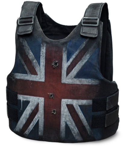
Banksy uses the Union Jack Flag widely commonly in his art work with making pieces all around England and even for some popular music artists like Stormzy where he designed a bullet proof vest with the Union Jack flag on the front of it which Stormzy wore to a concert and is now selling for one million pounds.
I will get a lot of different Union Jack flags, England flags, Scotland & Wales flags, all different sizes, textures, shapes, designs, some tinted/faded, some not actual flags but the flag still on objects such as a cup of tea with the Union Jack flag on it, which I can implant into creating photoshoots with. Also, I could create some bunting and place it round in the studio or in an environment I like which matches my theme.
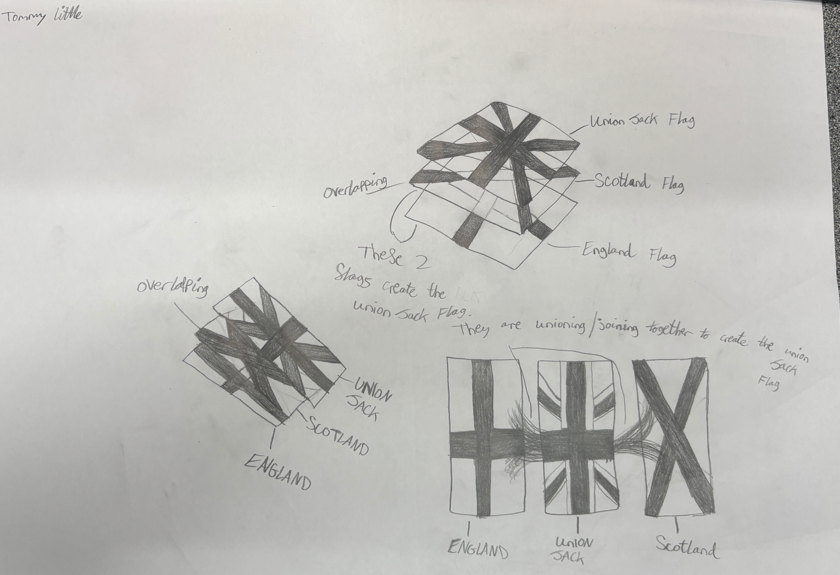
I created these drawings of a few ideas I will be trying to recreate using photoshoots and photoshop with each flag overlapping one another till the top flag being the Union Jack Flag. I also will try the 3 flags in a row next to one another but with the Union Jack flag in the middle and the England flag and Scotland flag each side of it, merging into the Union Jack flag to create it and show how they both make up the main Union Jack flag.
I will be creating the ‘overlapping’ images by putting a tripod low to the ground angled nearly straight ahead, then take a photograph of the England flag on the ground floor, then I would keep the tripod in the same position but instead I would put the Scotland flag on a small white box or platform, then take another photograph and then finally the same idea with another small box/platform on top of the first box/platform, to create more lift on the flag and then place the Union Jack flag on top of both platforms to create the lifted look and how the other two flags are below it but merge together to showcase the full Union Jack flag. I would then use photoshop to edit out the platforms underneath the flags and edit all of the flags to have the same background giving them a ‘floated’ look/idea, which will direct the viewer more towards how the England and Scotland flag are beneath and within the Union Jack flag and come together to create the final Union Jack flag everyone sees.
I started photographing all my items as normal, some in the studio and some outside at specific locations around Jersey. I then added digital techniques and experimented with multi-exposure, colour selection and using different opacities. From the cup repeating in a circle (which didn’t work as it was confused and blurred) to superimposing a flag behind the subject in a traditional British uniform. This felt too surreal and I felt it went away from what I was trying to portray so I didn’t include it in my final images. One key process I tried which worked very well (‘Reflected Glory) was layering and playing with opacity and the rubber tool to make the images of the union flag fit inside of the puddles. This made it look like the flags were a reflection in the puddles themselves. I wanted to make the edits feel natural whilst making the viewer wonder if it was really a reflection of something that can’t be seen. I experimented with photographing real flags reflected in the puddles but it wasn’t as effective as the digital version, so I used separates images of flags I had photographed earlier on in the studio. Subtle yet there. I played with changing the image from all colour to Black and white and decided on a black and white background with colour only in the puddle reflections, this was to show that your heritage can always be seen.
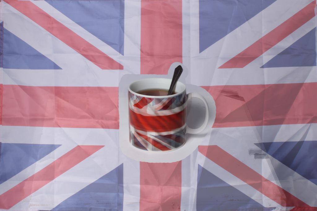
For my tea cup photo, I experimented with framing techniques, inspired by Andrew Scott and so I got a range of tea bags with strings to see which worked best. I wanted a physical frame and tried a range of versions, choosing a light beige colour frame as a subtle reference to the colour of tea. I tried with string loose or fixed – deciding on a tactile version that could be moved while hanging down, like Banksy adding real bunting to his image. I used a wrapping technique to ensure the string didn’t fall straight down but came slightly out from the frame. Whilst doing this, I accidentally broke the glass. I could have replaced the glass but, like Andrew Scott, who deliberately breaks the glass, I dediced to leave the broken glass as this adds another layer of meaning, given many people say ‘broken britain’ formal tea-drinking is declining (I don’t drink it and few of my friends do) so the ritual is becoming fractured.
I will also be going out in my car driving around the island taking photographs of anything that relates/gives off the impression of ‘Iconic British things’. These will be things such as an ice-cream truck open on a cloudy day near a beach. This is very British because cloudy and foggy days are seen as ‘British’, and especially because the ice-cream truck is open and selling ice-creams, shows that this weather is a norm to everyone. Another example would be Gorey Castle with the Union Jack flag waving on top of it and the Jersey flag. I can also implant this idea by having Gorey Castle as the background and having tea-pots or cups in front of it, which are very British. I can also take photographs of ‘British Sports’, such as rugby, (photographs of a rugby ball), cricket, (photographs of a cricket bat), and other sports. Finally, I will be taking photographs of Pubs, the inside and outside of a generic British looking pub with the bar in the background and a close-up of the draft machines.
Tommy…it is a bit difficult to see what you are aiming for here, but there are some potentially interesting ideas taking shape.
It seems quite graphic…which may mean theta you incorporate
TEXT
LAYERS
TEXTURES
…and this can be an exciting route to explore (using photoshop but also traditional collage / montage techniques.)
One last thing…the artist is Man Ray, not Ray Man !