
László Moholy-Nagy
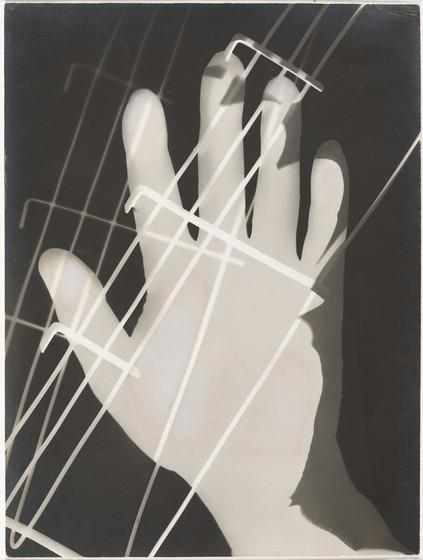
László Moholy-Nagy was a Hungarian photographer who explored modernity and the integration of technology. He was a figure head of constructivism and photographed everything from topography to industrial design as long as they appeared modern. Although his work shows elements of both Dadaism and Constructivism, he never formally joined either art movement.
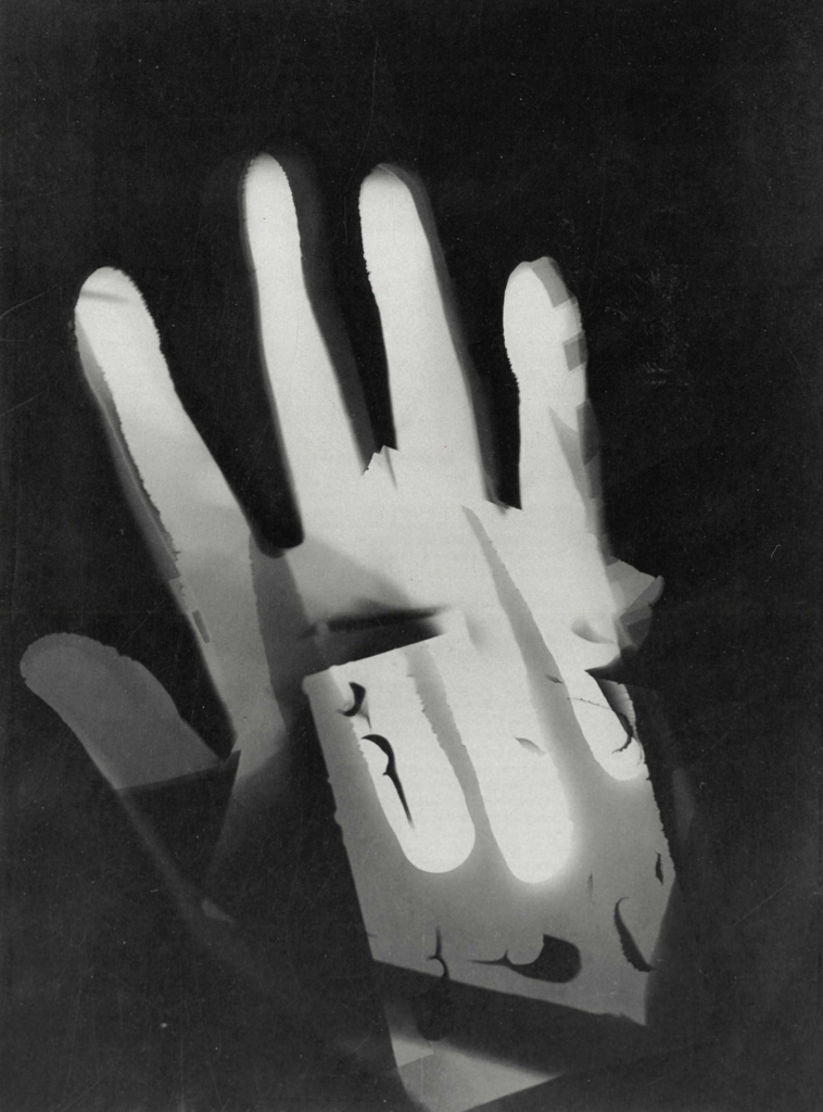
This image is a black and white abstraction produced by combining multiple materials such as hands on light-sensitive paper in the darkroom. He believed that humanity and technology should work ‘hand in hand’ to create the brightest future. This is evident in his habits of shifting between photography and painting even going as far as naming the photogram, a camera less photograph like this one. The most clear shape is a hand which acts as a cut-out from the black background. There is another hand visible also at a different angle as well as an unrecognisable materials behind with holes.
The lighting used in this image would have been a relatively bright light to set the image in the darkroom which creates a sharp shape. The second hand is a bright white which looks overexposed from the layering created. There is a high contrast between the background and the centre which draws the attention to the bright hand in the centre. The image doesn’t have much depth as its made up of multiple flat layers however the difference in shades of white does create a sense of depth. The hand is off centre which makes the dark background seem more prevalent and ominous.
I believe that this image is László Moholy-Nagy’s way of showing his beliefs of embracing technology as he is not only developing his own way to use photography but also reaching out. The contrast between the bright hand and the dark void could be reaching out to the ‘dark’ future seen by others where the bright hand represents his positive beliefs and enthusiasm despite the future no-one else seems to see where the other hand reaching back could be the bright future he sees as its only visible through his hand.
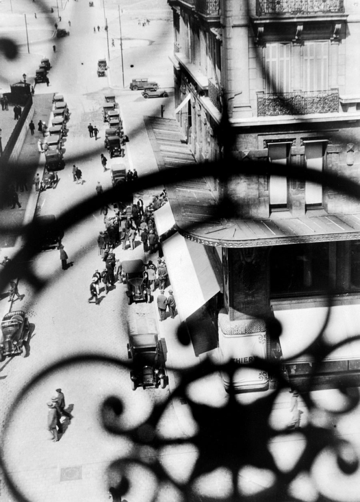
Daniel Shea
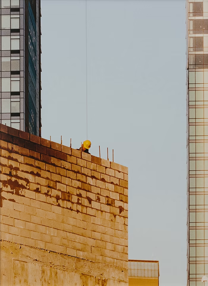
Daniel Shea is an American photographer well known for the the photobook he created: 43-35 10th Street, where he documented changes taking place in his neighbourhood. The book is a critique of the densely packed cityscape created by American capitalism as well as how this is reflected in architecture which shows wealth divides and class boundaries.
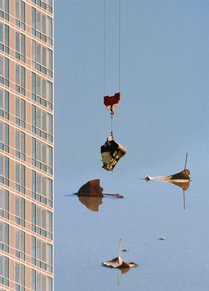
This photograph makes use of natural lighting from the upper left corner. This light reflects off the sky-scrapers glass creating the appearance of glowing. The whole frame is in focus to show the expansive and overwhelming size of the city. The colour is an unnatural shade reminiscent of older images to create a nostalgic feeling.
There are 2 main colours in this image, blue from the glass and a warm yellow from the sun which creates a comforting atmosphere. This photograph shows a city being viewed from a number of floors above ground level. Even at a reasonably high level the camera is still angled upwards looking up at even taller floors of taller buildings. This creates a positive outlook on the city and what it stands of embodying the American dream. The damage mark contrasts this message. It looks like a cup or something similar has been placed on top of the image without much thought and would have damaged the print.
This contrast of ambition in the image and carelessness of the mug mark shows the wealth divides that Daniel Shea sets out to portray. The carelessness would be the successful workman who practically lives in these buildings. He would have had the print in his office as a decoration without much care or thought. The photographer would represents the ambitious low level worker who aspires to find his place in these large buildings and is overlooked by these careless workmen. The image is aged/tinged or even light damaged which can show how the ambition has begun rubbing off also. These contrasts effectively show the differences in positions, wealth and classes.
Idris Khan
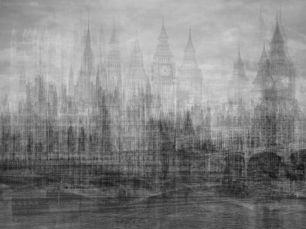
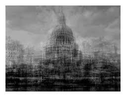
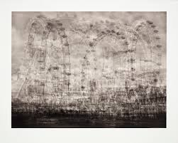
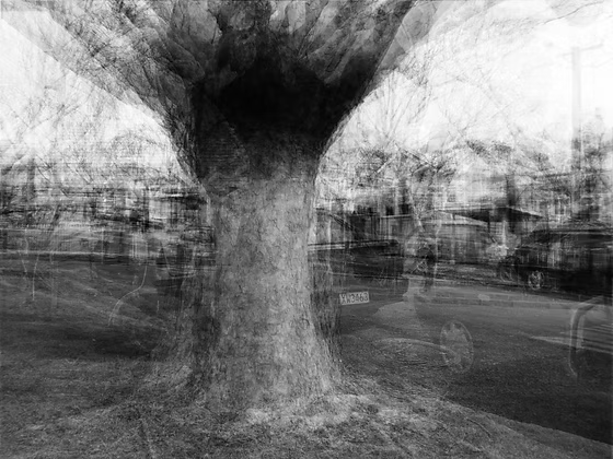
Idris Khan combines scans and images to build up these layers digitally into dynamic photographs. He draws from a diverse selection of literature, religion and history in these images to explore time/memory which are equally soft as they are intense. His work is described as flattening both 3D space and time into a singular moment.
This is a black and white multi-exposure image created by taking images at different angles around a tree over a long period of time. The trees trunk remains at the same spot throughout the images. The background changes massively around the tree which clearly shows the passage of time. The image has been taken outside with natural lighting which grounds the image which is useful when the image has a lot going on otherwise. Each image used in this photograph is sharp which overlaid creates a fuzzy appearance where the actual size of the tree is difficult to distinguish. By setting this image in black and white it harmonises each layer as different colours could be overwhelming. The image takes a 3D setting and flattens it into a single dimension without loosing the detail from each direction.
This photograph shows the complexities of 3D that is often ‘lost in translation’ when photographing from a single angle like a flat sculpture. The faded backgrounds also shows a sense of past time, the faint recognisable details showcases the feeling of a memory which is difficult to see as a crisp still moment and a vague short period.
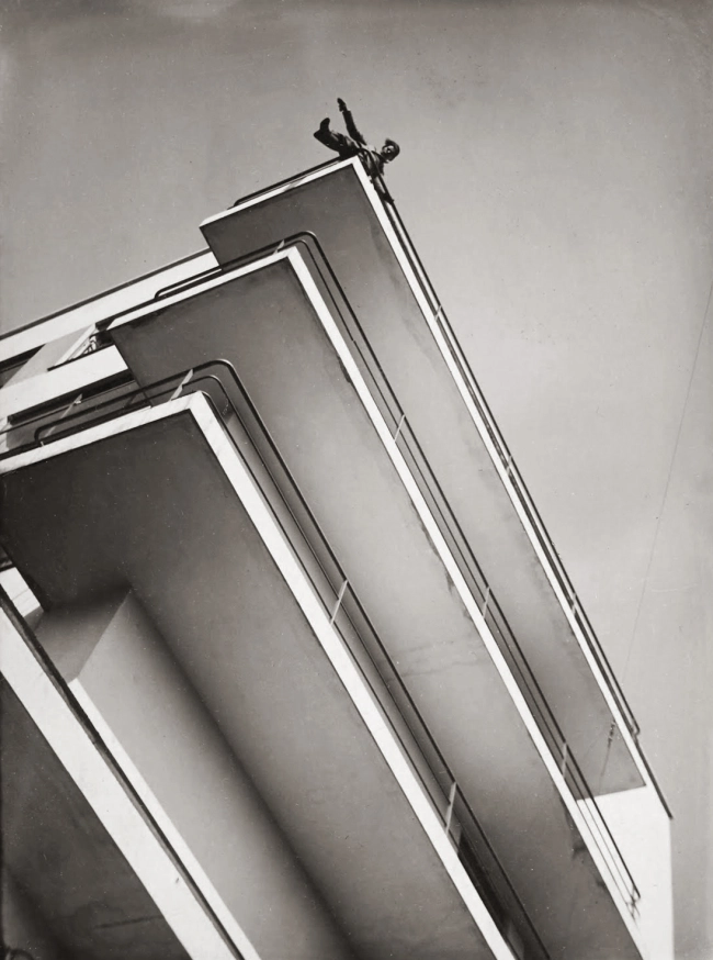
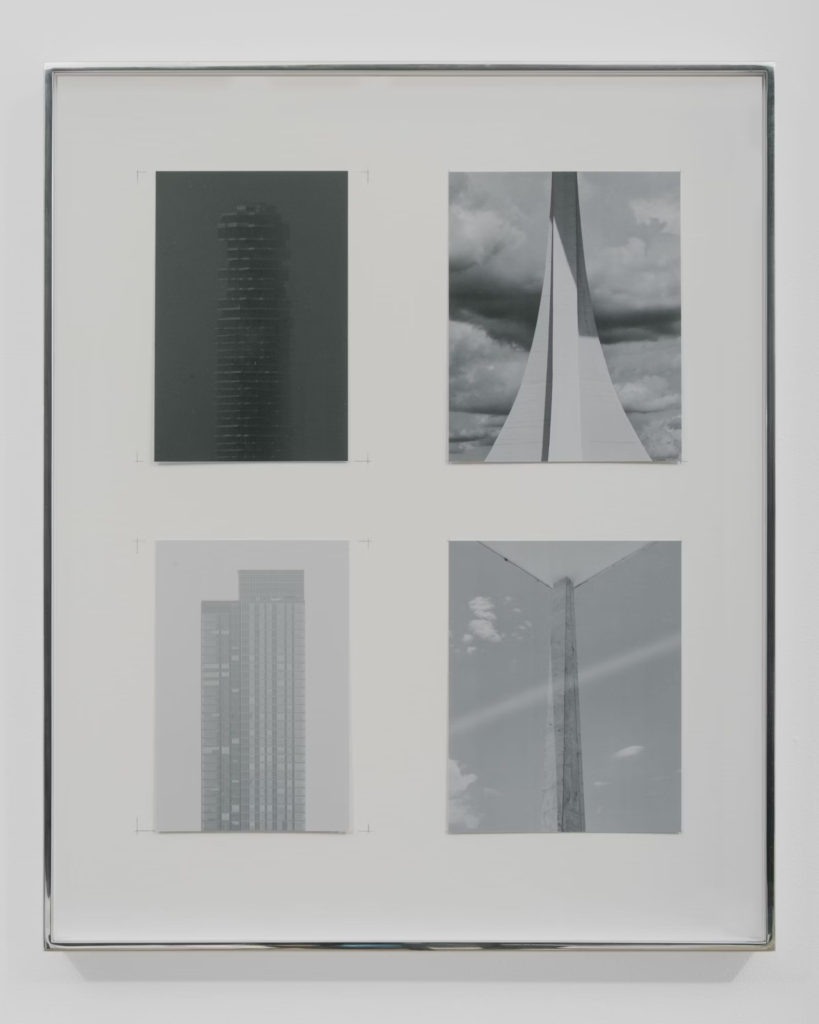
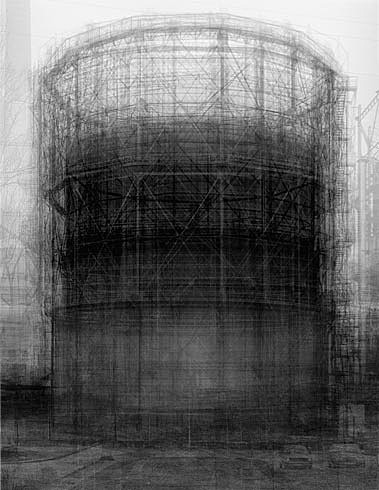
Kenneth Frederick
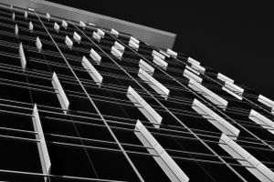
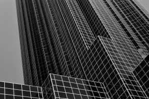


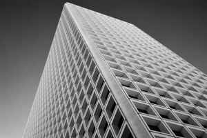
Kenneth Frederick photographs geometric shapes found in buildings. His images are set in black and white to reflect the industrial nature of these man-made sculptures. This photograph resembles an early render with the grid and sharp lines. The photograph is black and white where only the grid is a white grey and everything else is much darker. There is no pure white or black instead a few shades of grey creating low contrast. There is a soft light coming from the right which creates depth when it hits the side of the structure.
The photograph is taken at a low angle which makes the structure look taller where the top is cut off so the building doesn’t have an end, making it taller still. The image has been taken at an angle where the edges create leading lines pointing upwards to show the nature of a high-rise building. This image has a dull appearance due to its repetition and lack of colour which reflects the dull and lifeless nature of corporate mega-structures. Not seeing the top of the building or looking up can show a lack of aspiration and acceptance of the people working low position in a job in this building.