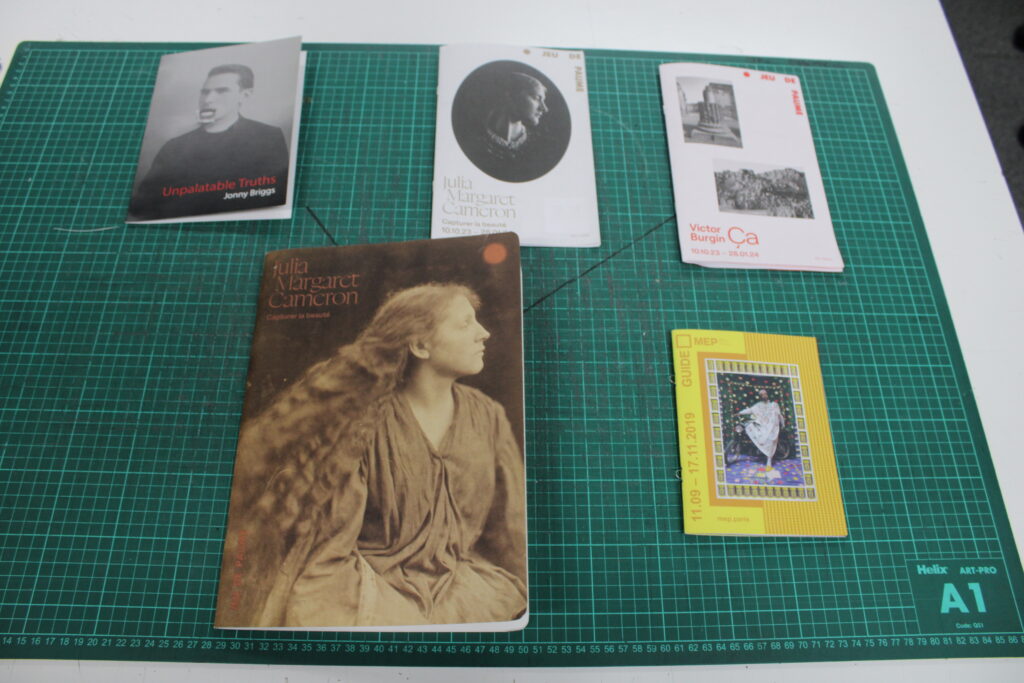
I first explored 5 different exhibition catalogues, taking photos of important parts of each book to give me inspiration for how I want my catalogue to look. Below are the 5 catalogues I looked at:
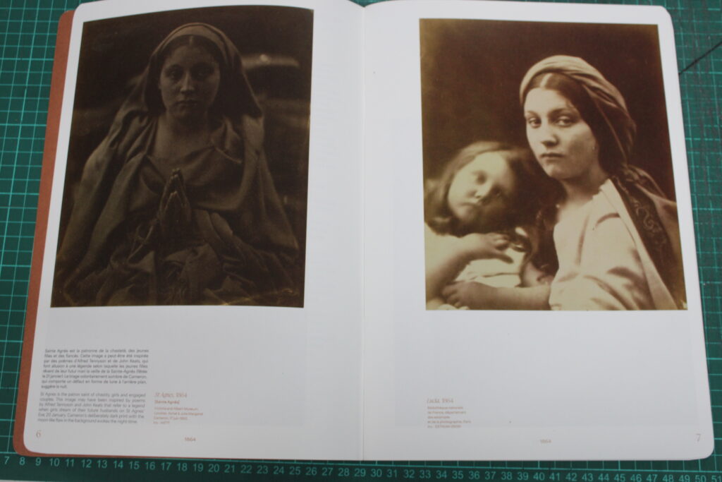
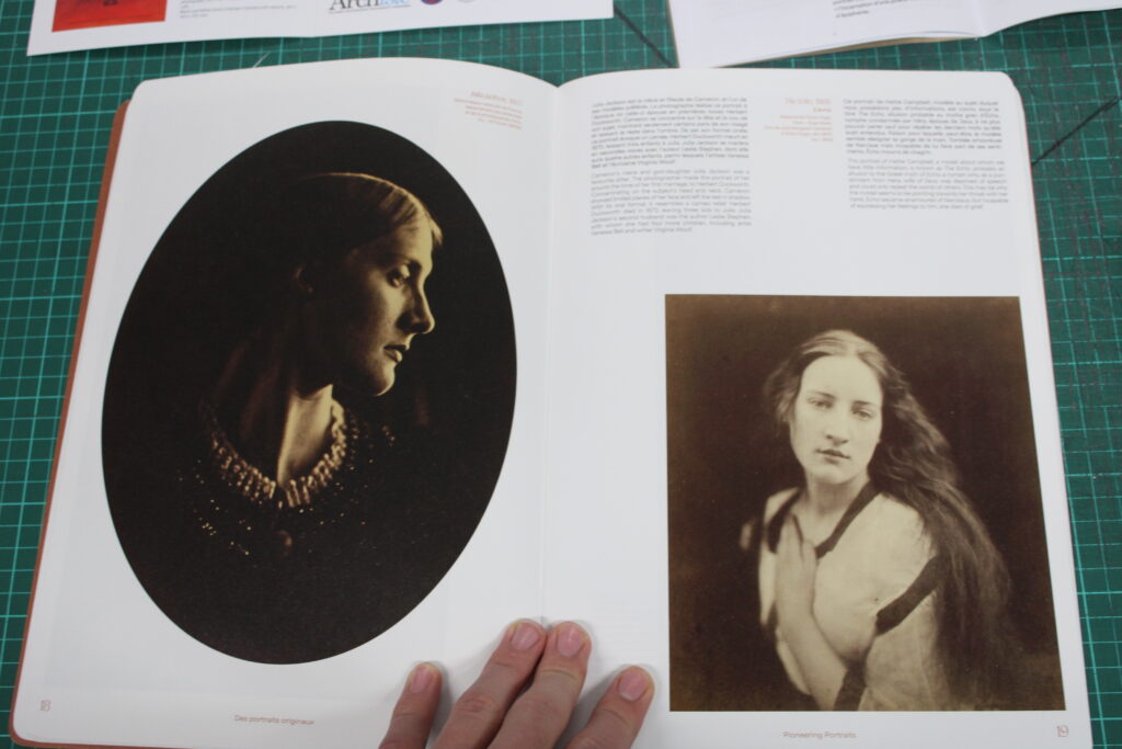
The first catalogue I looked at was Capturer la beaute by Julia Margaret Cameron. This one stood out the most to me as it was printed using A4 instead of the traditional A5. This catalogue likely costs money and is not handed to you at the start of the gallery like most catalogues. It also had card covers, like a book or some magazines which made it feel high quality. The book has been categorised into three subsections, photographs from Cameron’s early photography career, photographs of famous people that she did later, and finally photos of staged acts (e.g. ones that replicate moments in the bible). The book also starts will 2 pages of her autobiography. Each photo has a small amount of text explaining the meaning behind it, as well as context. Below is an example:
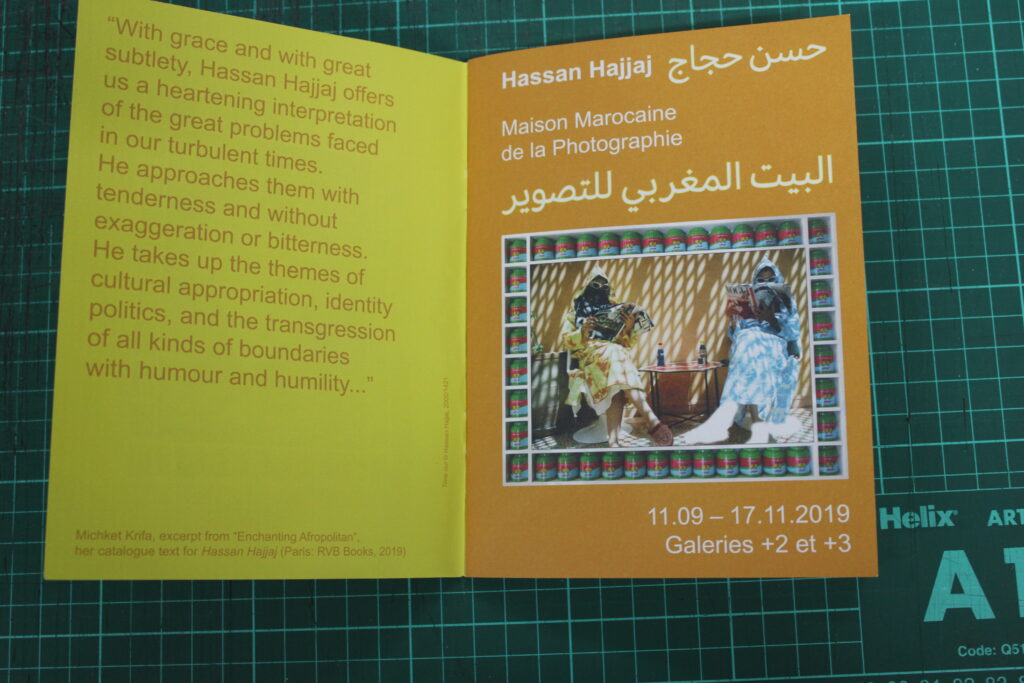
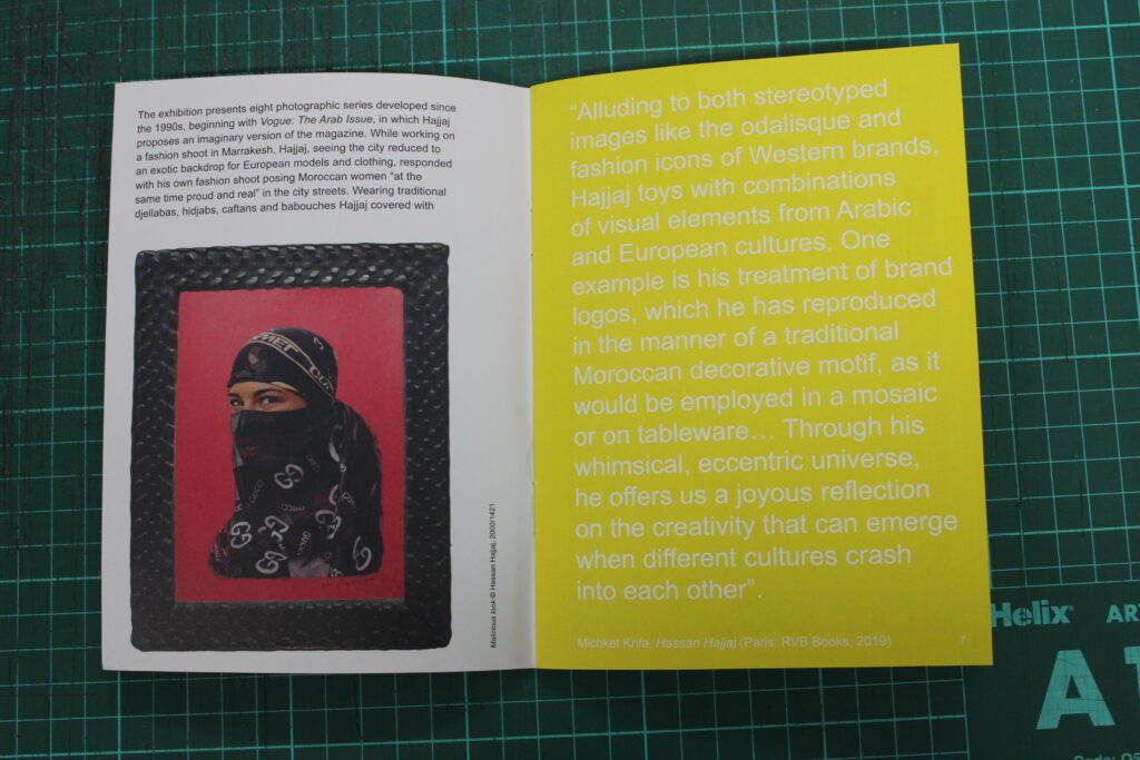
The next catalogue I looked at was much more traditional and was for the artist Hassan Hajjaj. It again contains an autobiography, as well as some text for why he took these photos around morocco. The exhibition presents only eight photos, and each photo takes up a large amount of space on the catalogue. Below are some photos:
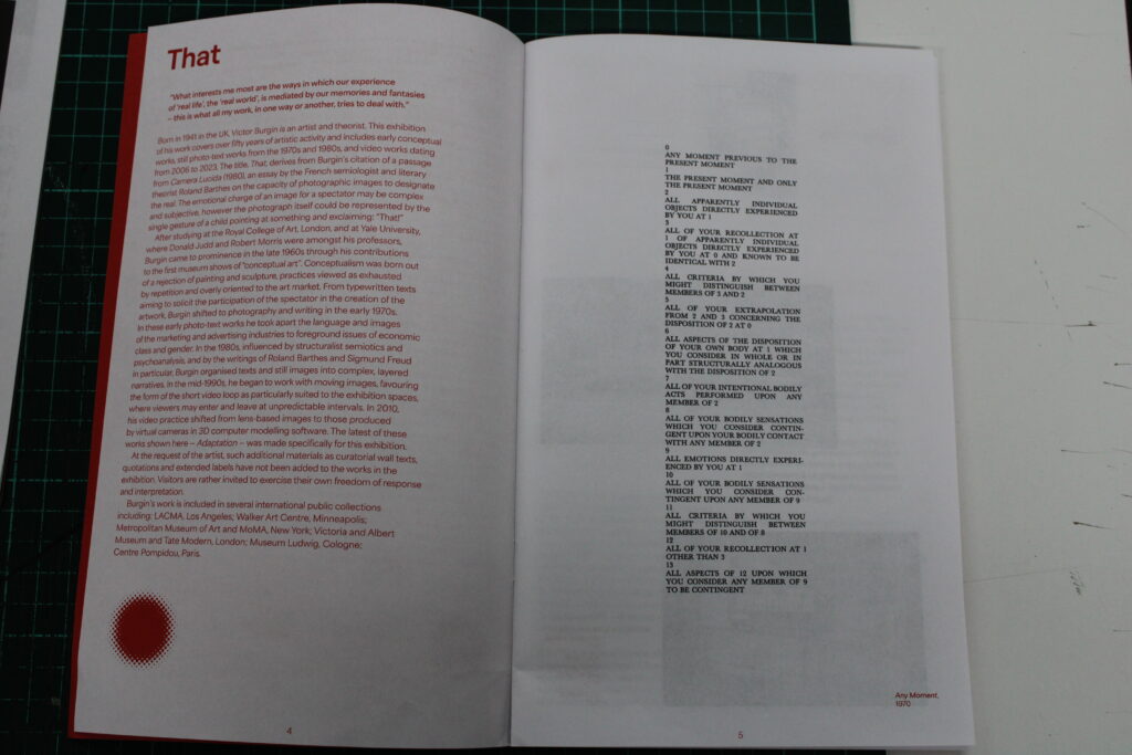
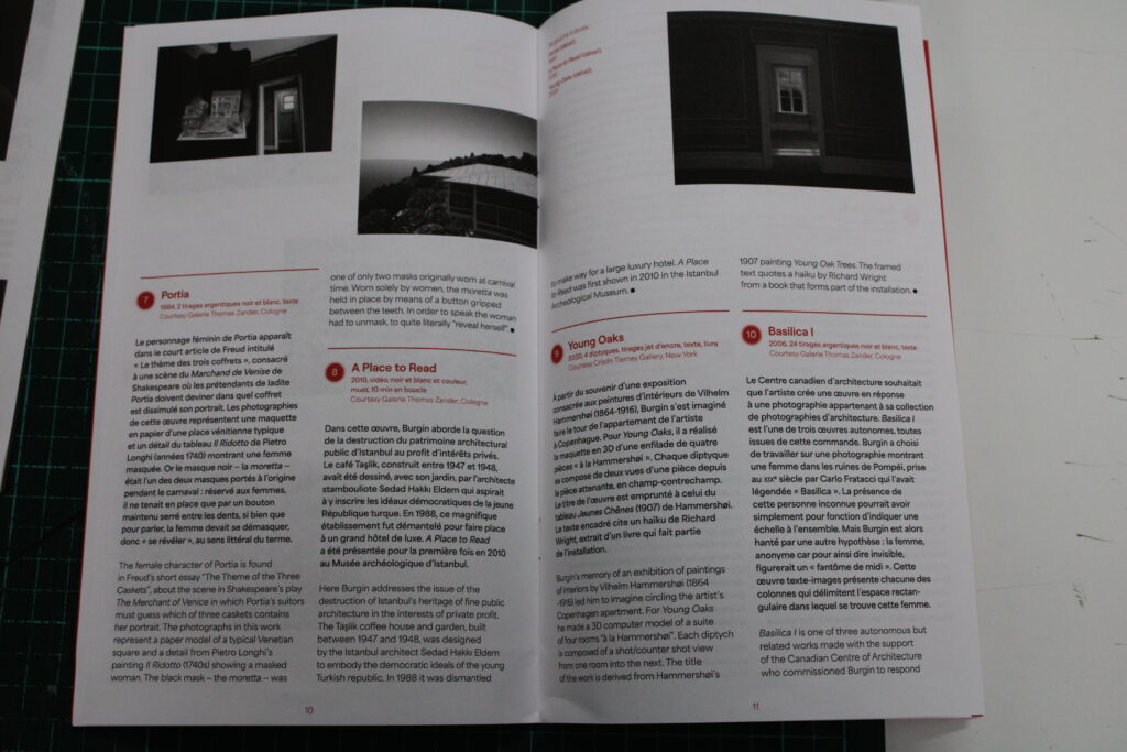
The next catalogue I looked at, by Victor Burgin, contained much the same as the rest, but did have a little map at the start to guide viewers through the gallery. Below are two photos of the catalogue:
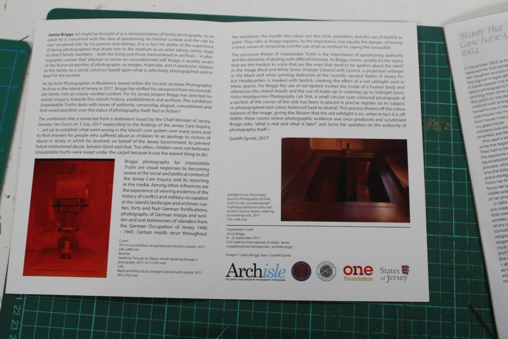
I also looked at ‘Unpalatable Truths’ by Jonny Briggs, This contained only two images, with a lot of writing to go with it. The catalogue also contain the size of the image, and the title. Below is what the catalogue looks like: