
My final images and layout conclude of 12 images. These 12 images I have laid out on four different pieces of black window mounts in groups of three and kept the white border of each image. I decided to layout my images like this because I wanted my work to be simple and have a sense of symmetry so you can focus on the text and image instead of a layout where its complicated and grabs your eye rather than the work itself. I used a black window mount instead of white foam board because It contrasts nicely with the black and white image and also the white background of each photo. I kept the white border of the images to split the black wall mount from the picture.
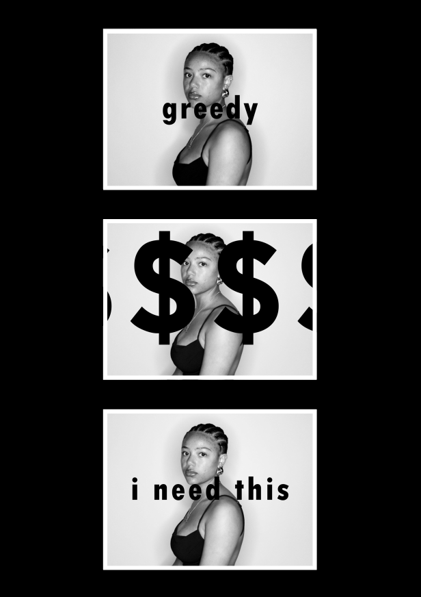
I decided to group these images together as all the images are the same, but with different text on. I also grouped them together because the top and bottom image have writing in the middle of them, this created symmetry within the work and I wanted my work to look simple, clean and bold which the symmetry helps it to achieve this look. The middle image separates the two symmetrical ones with the large, bold dollar signs spreading across the image. All three of these images have phrases, words and symbols defining consumerism, with each having their own meaning of it.
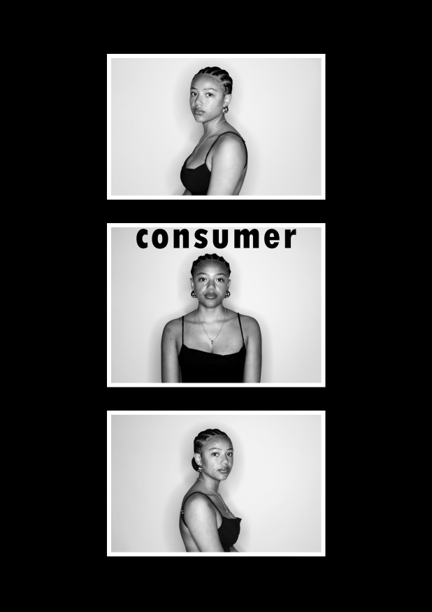
For this group of images I have used symmetry again to make this layout. the top and bottom images I have taken of the model sat facing the left, then the right, with the middle image straight on with the word ‘consumer’ above her. This gives the effect of a mugshot where there are three different angles of her face, like its a crime and wrong for being a consumer/over-consuming.
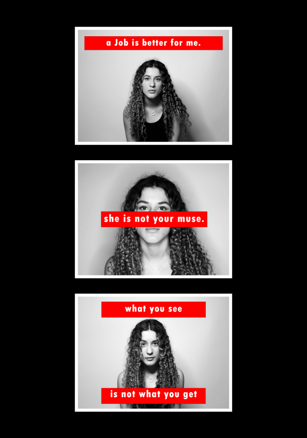
I chose to group these three images together because they all have the same red bordered writing on them. Each of these images are face shots with the camera directly in front of the model, which is a reason why I put them all together, creating an idea that the words written across the images are being said to the person looking at it because of her eye contact with the camera. The top image is a strong statement which expresses that a job is better for her than a man would ever be. the middle image is stating that a woman is not for men to have or talk about, she is her own person. And the last image is showing that the woman may look one way but when you meet her its not how you thought she would be.
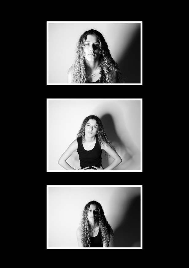
For these three images I have used different lighting techniques to create different kinds of shadows. The first image I have used chiaroscuro lighting technique, then I held the light above the camera and took one straight on creating a shadow behind her, then the last one used Rembrandt to shadow half her face. For the top image I have taken it quite close to her face with strong shadows where you can see the shadow of her nose on her face and the strong shadow behind her. The middle image is meant to show her being tired and looking impatiently into the camera. For the bottom image I have put the light directly to the left of her to shadow half of her. I have done this to create a contrast of being able to see her face clearly in the white then the other half to be in the shadows. I liked this effect because it links back to other meanings behind my different images and text I put over them like ‘what you see is not what you get’ by being able to see her, but not fully.
Final outcome and evaluation
For my final pieces I have created four different wall mounts and each represents consumerism and feminism, which is my final outcome for the theme of ‘Union’. Overall, I think that my best pieces were my images with text on as I think that was one of the most creative aspect of the project. I liked my use of lighting techniques and being able to create different shadows in the background, and on the faces of the models I used.