
I wanted to create a photobook for my project revolved around Feminism as this allows the viewer to physically manoeuvre the images themselves instead of just looking at the visual elements. My book I produced during my personal study about my brother was quite successful so I wanted to create one again, as both of these topics are quite important matters which I feel makes a photobook more appropriate as it seems to be more professional-looking in my opinion.
The narrative and concept:
My photobook revolves around the topic of Feminism and the modern issues we have that this movement tries to tackle in society. The theme of my images is predominantly looking into eating disorders, spiking, the pressures of the beauty standard, media and magazine aesthetics and trying to capture the emotions that these types of issues make young girls and women feel. This leads my images to cross over between subjective and objective, as emotion is not a tangible thing and can be implied through exposure levels for example, however I have still photographed explicit things that directly communicate the message to the viewer.
I have also manipulated and experimented with many archived images that I took from my mum and my gran to show a generational connection in these issues and the change in attitudes towards women from when my gran was a teenager, to my mum, to me.
I did this using Blurb in Lightroom, where I initially flagged all of my best images so that it would be easier for me to see my images rather than just having to look through all of them when designing the layout. I then created a saved book so that I could keep this in my Smart Collections to make it more accessible.
I decided to go with a standard portrait book because most of my images are vertical, however I am still able to incorporate my horizontal images as double-page spreads as these are some of my best images so a portrait book allows me to do that easier.
I created my first initial layout before thinking of my front cover or the title as I felt it would be easier to draw this together once I sequenced my images in order to ensure the narrative could be conveyed clearly and effectively. I wanted to be very cautious with my placement of images as this movement covers a lot of heavy topics that have to be represented in a delicate way to suit the theme.
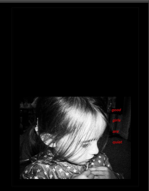
I decided to use a black background on all of my pages as many of my images are inspired by the work of Barbara Kruger, meaning that I can enhance the shade of red that I have replicated to make my images stand out more. As well as this, I find it to be more relevant to the concept of my photobook than white pages for example, as the colour black has negative connotations. This allows me to reinforce the negative meaning behind my images and I can make sure the viewer doesn’t interpret my images in an irrelevant way.
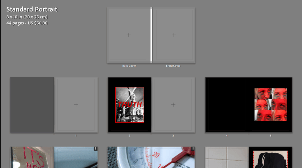
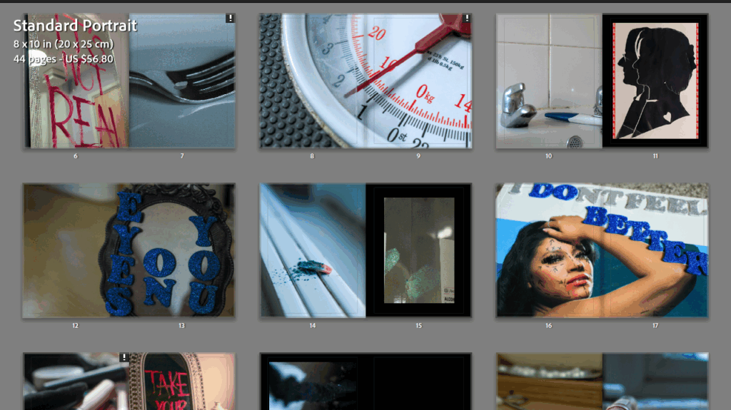
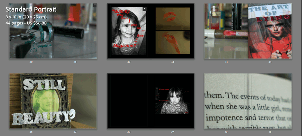
I didn’t want to add any text to the photobook itself, contrasting my last, because many of the images have writing on them already so I didn’t want to drive the viewer’s attention away from this. Additionally, I wanted my images to stand alone and speak for themselves, specifically the images where I have employed a short depth of field or soft focus as I think that this is key in representing how delicate each of these sub-themes are within Feminism.
I decided I was going to make this as a hardcover photobook because I selected this for my last photobook and I really liked the overall aesthetic of it. Additionally, when I was researching different photobooks to deconstruct I found I generally preferred those with a hardcover, for example Rahim Fortune’s I can’t stand to see you cry. I also decided to leave a few blank pages in my photobook to create a serious tone around some of the images as they stand by themselves, making them looking more ominous whilst suggesting there is a deeper meaning.
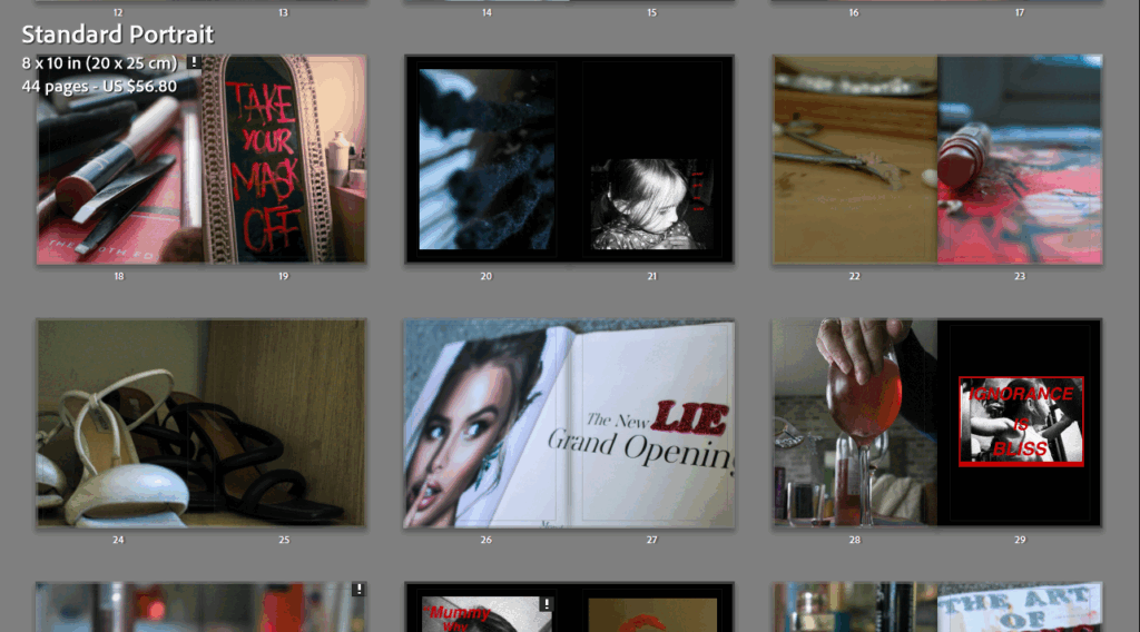
Many of my Barbara Kruger inspired archived images had to be reduced in size due to the resolution varying as these images were already quite old from childhood and had a large amount of editing with the grain feature on Lightroom in order to obtain that ‘hardened’ and almost vintage look that Kruger gave her images. However, this worked quite well in the end as it allowed me to just use them as featuring images, with them having writing on anyway to ensure that the viewer still remained engaged. I had to keep these images small so that the resolution would remain above 120ppi.

The layout that I typically used for my images were full-bleed pages, whether that may be single or double, because I think that this means the viewer cannot become distracted by the aesthetic of the book itself, but instead the composition of the image as there is nowhere else to look. However, I didn’t want to just do this as it would make the design quite boring, so I played around with many different page layouts as well as swapping around some of the pages with each other to make sure the sequence ran smoothly.
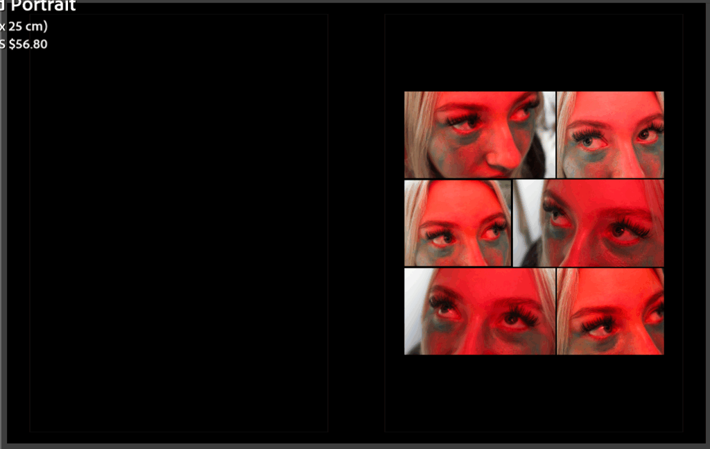
For example, I really liked this as one of my first few pages as it is really unique and uses 6 different images at varying sizes. I used 6 similar images to represent the inverse male gaze, where instead my subject darts her eyes around different directions on the page as if she is searching for her place in society. This was a set of images inspired by Hannah Altman’s And Everything Nice, replicating the glitter under her eyes in representation of tears.
Front and back cover:
I used all of the images I liked inside the photobook so I decided to go back through my photoshoots and try to see which images would be suitable. I specifically went through my fourth photoshoot where I digitised archived images and belongings that were from my mum or gran so I felt that this would give me an opportunity to use them.
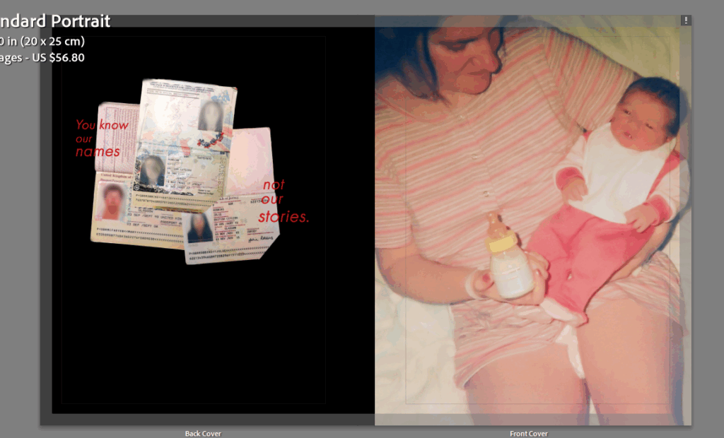
My initial choice was to use these two images, the left being one of my experimentations (blurring out the faces of myself, my mum and my gran on our passports in Photoshop and then layering them to show that this is an issue that is faced by all women) and the right being an image of my mum looking after me when I was younger. I chose this image as both me and my mum are solely wearing pink which is a colour commonly associated with femininity, as well as the image showing a traditional stereotype of a mother looking after a baby.
However, I felt that this looked too much as if the narrative was going to be an internal reflection rather than an exploration of this movement.
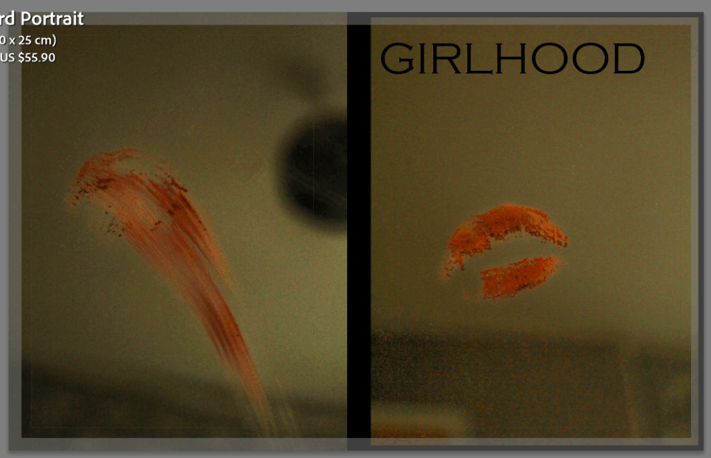
I decided to settle on this one as I like how the back cover has wiped the lipstick away, signalling that the book is complete and has finished. I made the spine of the book remain black and played around with different fonts and titles. Because there is quite a low tone and exposure in thee two images, I feel that this makes the book seem more ominous as the phrase ‘girlhood’ connotes ideas of love and friendship, whilst the background contradicts and juxtaposes this. I used the title girlhood in an ironic way for this reason. I put the title quite big and in bold using the font Copperplate Gothic Light which I think has tied together well with the black spine of the book as it keeps the composition dark and mysterious.