
for my first photoshoot I wanted to photograph objects that I would say are “gender locked”, meaning that it would be seen as quite strange by the majority of public if the opposite gender were to use them this include objects such as perfumes, fragrances, loafers, high heels. My thought process behind this was that id edit some of the images with colours opposing the gender that would normally use them. For example, with a picture of loafers i would change the background of the image to blue and then create a contrasting image with pink as the background. The reason for this is because i want people to look at these images and challenge the stereotypes that people often make and have been making for a very long time.
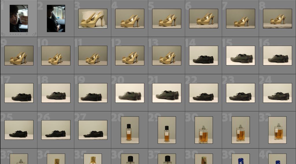
this batch of images I think didn’t come out well in this photoshoot as I didn’t have the right set up when taking these images as the lighting was off and the canvas I was taking the pictures on didn’t help much either as it looked to tacky. so to help create better images I went to a studio for my second portion of images from this photoshoot.
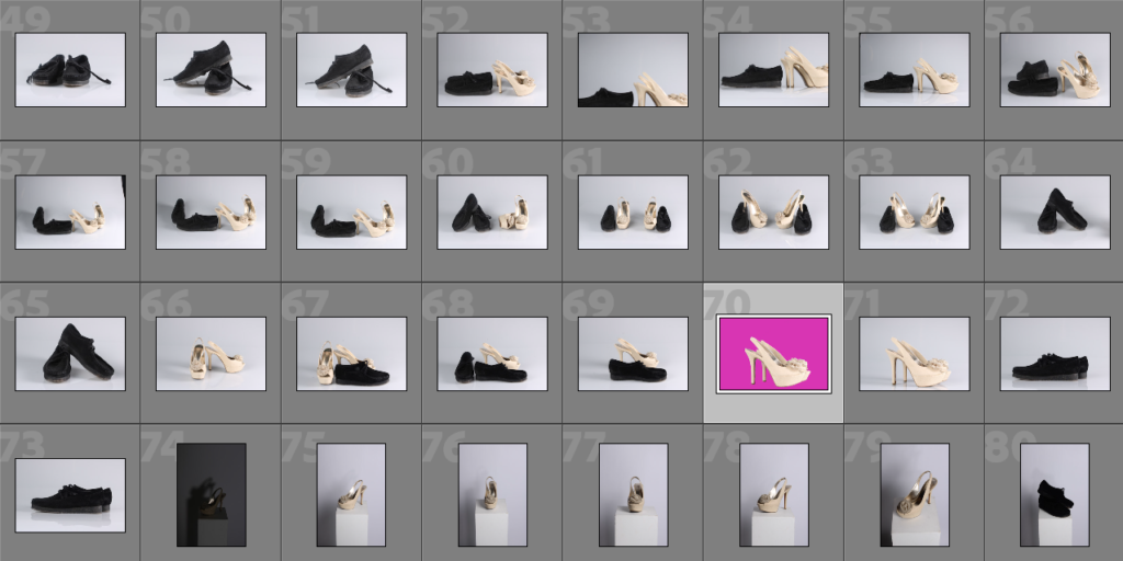
like previously stated I managed to create far superior images in the second batch as I had a proper set up for my images the images came out with a much better quality, and a lot more detail on the objects which is exactly what I wanted to achieve.
3 best images from the photoshoot:
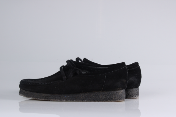
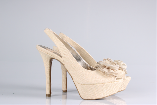
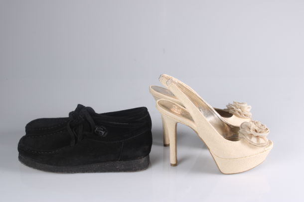
the reason why I believe these three were the best from the photoshoot is because they came out exactly how i wanted them as I needed the images to look a certain way for my editing process, as I needed the object to have a plain white background with minimal shadows as I would be able to take the shadows out through Lightroom.
outcomes of the best images and how i edited them:
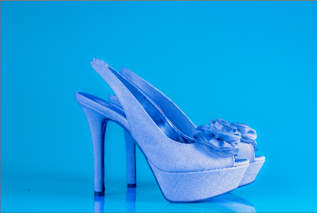
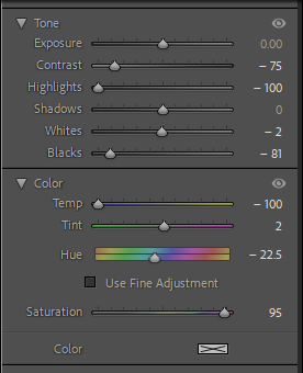
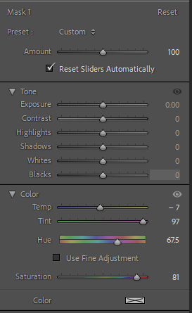
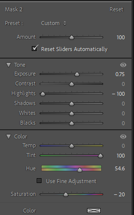
for this image I didn’t touch the basic parts of the image I just added two mask to adjust the appearance of the heel and the background of the image, the reason I decided to change the colour of the shoe was because I thought it would look to plain and boring if it was just the same shoe over and over again across all images. I also made sure the colour of the heel wasn’t to similar to the background so it wouldn’t be to hard to tell apart.
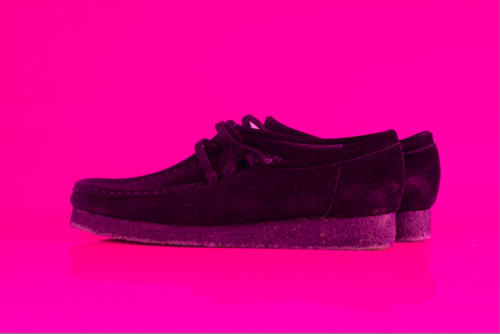
the editing process of this image is fairly similar to the first one as I wanted to make sure to keep a pattern in the book as I didn’t want anything to look out of place. as you can see by the adjustments I made to the image I focused on just changing the colour of tint of the loafers as they are black I couldn’t change the colour of it without it looking odd so I decided to add a pink tint over the shoe to go with the pink background.
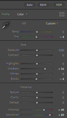
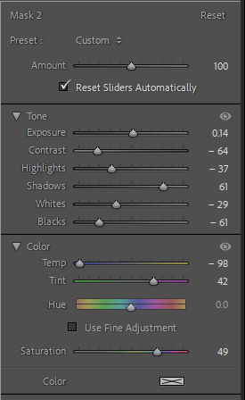
for this image I decided to work on more than just the masking of the image as I wanted to make sure the colours were going to pop all over image and not just the background hence the saturation and vibrance being substantially increased in the editing settings.
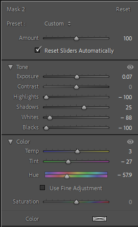
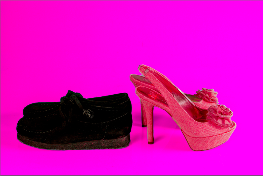
when editing the objects of the image I wanted to try something a little bit different instead of having the objects the same colour as the background I decided to change the colour of them to something a little different to the background but not to far off so it wouldn’t look to off the colour scheme of the image which is why I adjusted the heel to be red still fitting with the colour scheme of pink .
conclusion of photoshoot 1:
This is the reason why i though these were the best images from the photoshoot as they allowed me create exactly what I wanted to the best out of all the other images as I was able to make the images have near to none shadows with the coloured background to make the objects pop out the image as much as possible which was what I wanted to create. However if i was to do this photoshoot again I would have taken a lot more images from different angles accompanied with different forms of lighting to bring out a different type of image, this could have consisted of the objects having different things around them to help bring a different meaning to the image/understanding of it.