
I create some virtual galleries using Photoshop in order to document some of my best images. I added a drop shadow to each of the images so that they would appear to be hanging off the wall instead of looking flat.
Gallery 1:
These two images have clear reference to Hannah Altman’s ‘And Everything Nice’ through its use of glitter to represent the pain that the pressures of the beauty standard apply to women and girls across the world. I feel that these two images have specifically been successful because of the short depth of field that I have applied, differing my work from Altman’s, as it hones in the viewers focus onto the real concept behind the image instead of appearing to just be revolved around beauty itself rather than the actual pressures. I also feel that these images are clear references to Altman’s work because of the randomised pattern of the glitter as I tapped it onto these objects using a brush. This makes it look more natural like Altman’s work, as if the viewer wouldn’t feel suspicious of this looking strange or out of place. However, I did use different objects to what Altman used such as a razor because this didn’t require too much setting up, meaning that my images would have looked too similar otherwise.
These two images share similar components in their aesthetic and composition. Here, I have shot from an angle horizontal to both of the objects to make the perspective more dynamic rather than risking the images employing the ‘dean-pan’ aesthetic, for example, as I want this portion of my study to be specific and stern rather than more documentary-style. Additionally, both of the images have echoes of each other, while the glitter is an obvious link between not just these images but the entire photoshoot, but they both share the main colour of white in the composition whilst using a relatively low-exposure to ensure that the viewer doesn’t think that the images have an alternative, happier meaning.
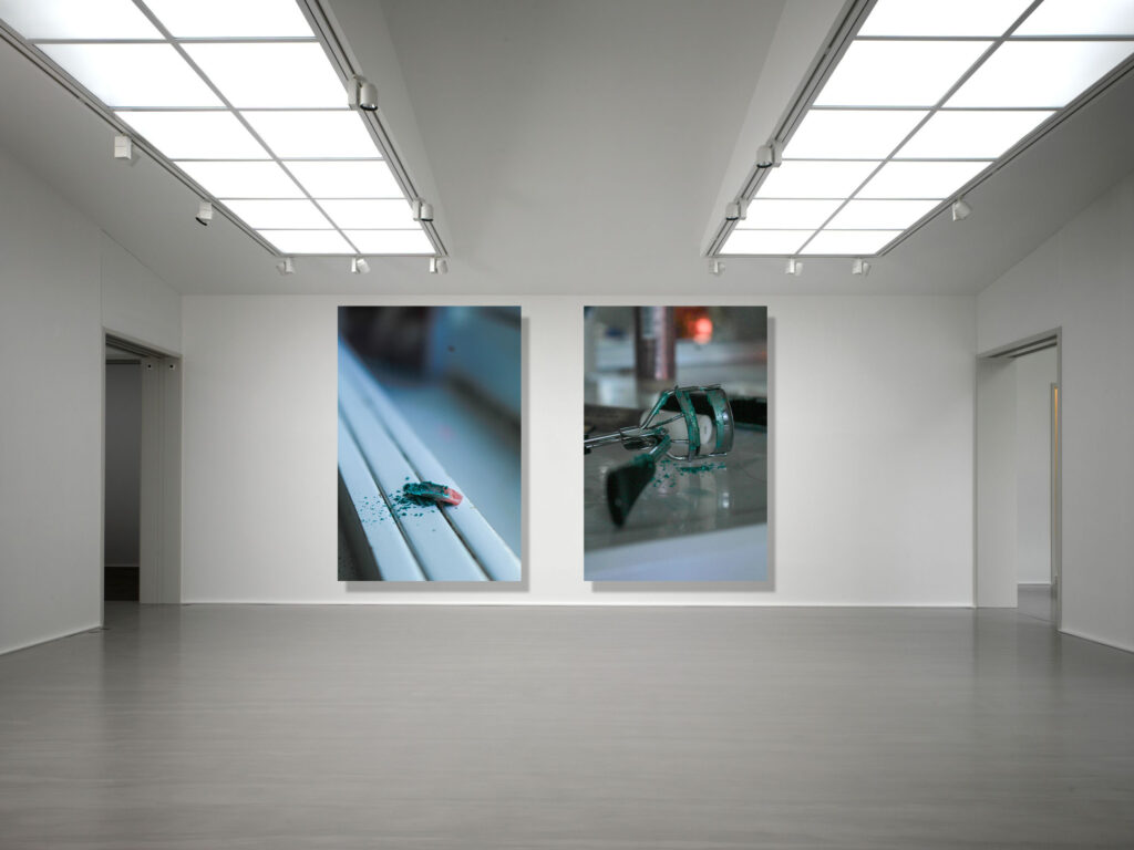
Gallery 2:
For this gallery, I created a grid of four images of the same subject looking in different directions as I think that this works very nicely, as if each image contains an individual person looking at the others. This was inspired by Hannah Altman again from her self-portrait with glitter underneath her eyes, where the glitter is delicately placed in representation of tears from trying to fit into the beauty standard.
As this image from her work is quite notable in being one of the more popular images from her project, my images differ from the nature of the glitter. In Altman’s image, the glitter is cautiously placed however I have overexaggerated the glitter on my subject as I feel that it makes her show more anguish as its spread out carelessly, as if she has gripped her face out of despair. Also, Altman’s images employ natural lighting, however I wanted to juxtapose the colour of the blue glitter (being able to represent the stereotype that only boys should wear blue) with a red to symbolise anger from the subject towards the issues that I am targeting. This is why I used the flash on the camera, however I covered it with my hand in order to make her face red without editing to look more truthful, and also to create this ghostly effect in the background that creeps over the side of her face.
Whilst Altman appears to have meant for this image to be interpreted as distress over the beauty standard, I feel that my work is more applicable to the inverse of the male gaze, where my subject is taking back this term and coining it as her own to reduce the discomfort she feels and sending it back to these people. I think that this is a powerful extension of Altman’s work as her eyes dart around in an intimidating way, rather than being intimidated.
Gallery 3:
This was really helpful as it allowed me to begin thinking about how I want my prints to be laid out when I mount them up. This also means that I can start thinking about my sequencing in my photobook as I can look at which images compliment each other and the ones that don’t have any relation to each other.
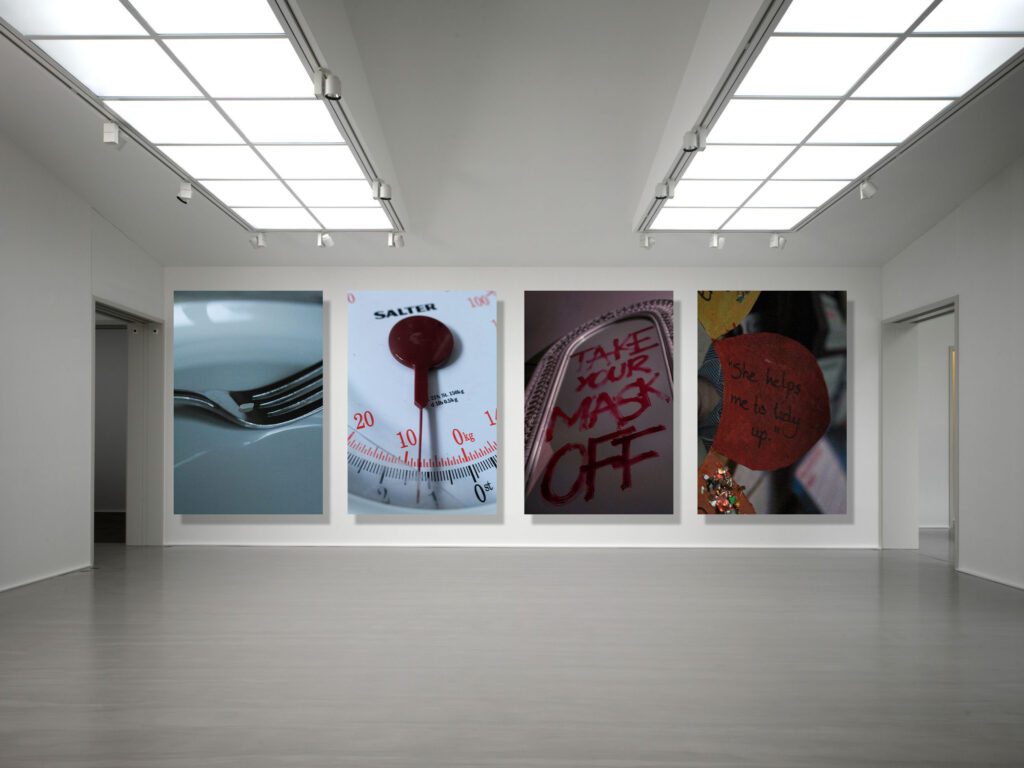
I specifically like my third gallery because I feel that the narrative is linked quite smoothly as each image has a high relevance to feminism. I also really like the way I have laid this out because each image has an aspect of the last within it, for example shades of red become echoed as well as the introduction of new tones which enriches the flow of them too. The third image within the gallery is inspired by Barbara Kruger, where I have written similar phrases to her ironic insults towards magazine and media outlets pushing the beauty standard. Whilst I have created edits similar to her on Photoshop, I really like this method as it is a more direct approach, blocking a girls negative thoughts about her reflection, whilst also being more modern and relative to society now as Kruger’s work was heavily influenced by the 80s beauty standard and ideologies about women. By doing this, I can still make a greater reference to Kruger’s work whilst not being too explicit.
Evaluation
Overall, I feel that my study into Feminism in relation to the theme of Union has been highly successful and I feel that I have create a clear link between the two through adding a personal touch through my experimentation, being a generational connection between the women in my family, in order to show that this movement has real-life relevancy and the issues that it hones in on don’t have individual effects but collectively impact society on a whole.
Within this investigation, I have been extremely experimental due to one of my artist inspirations being Barbara Kruger. At the beginning, I shot images of Greek statues and then developed this into using archived images of myself when I was younger, then leading this into my wider family members such as my gran and my mum. This allowed me to really develop my ideas in a structured way as in the beginning, my work was very similar to Kruger’s in terms of aesthetic. However, I wanted to make it more personal and more of a reference rather than a similar image with text as Kruger’s work is notorious for using these direct statements with bold red text. As my ideas began to grow, I began to write accusatory and almost angry statements on mirrors using red lipstick in capitals, using some of Kruger’s phrases whilst using this to come up with my own. I think this was very effective because it allowed me to move away from the typical black and white grainy images that I had been producing and create something more relevant to modern society, as the work that I found myself inspired by was revolved around the beauty standards of the 80s whereas it has changed now. This led me to be able to create some experimental pieces of Photoshop that I really liked, however I didn’t end up using them all as they didn’t fit properly with the sequence or the overall tone of the book.
However, I think that I could’ve pushed this even further into the modern beauty standards that we uphold now and target the aesthetics of magazines and media put into circulation. I had planned to try and create some experiments that looked into how social media is used to further perpetuate unrealistic goals for women, for example looking into how Instagram is a place filled with photoshopped images that can’t be distinguished amongst the unedited ones. However, I couldn’t really come up with any ideas on how to execute this, so if I carried this out again I would really like to be able to create a more socially relevant interpretation of Kruger’s work to today’s standards.
With my investigation into Hannah Altman’s work, I feel that I was really able to develop my ideas and take some really creative images. I began by creating similar images to Altman’s ‘And Everything Nice’ where I tapped blue glitter onto different cosmetic tools such as tweezers or eyelash curlers, trying to find other tools that she had not incorporated into this body of work. These images were really successful where I was able to use a short depth of field to make the viewer solely focus on the item that I had manipulated and how the glitter was representing the pain of conforming to these set standards. However, I feel that I could have made these images more interesting, for example using different colours of glitter or I could have extended this into shooting a subject applying a cosmetic product that had been replaced with glitter.
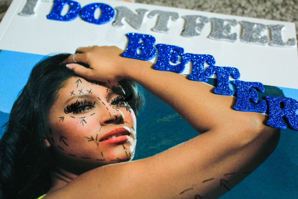
However, this enabled me to start thinking about other ways I could add glitter into my images and I actually was inspired by the way Kruger uses text, which is why I then began changing the name of magazines using glitter letter stickers and editing the real name from the background. I wanted to do this to show the true intentions behind these magazines underneath the actual cover name. This then led me to start drawing on the models on the front covers and creating plastic surgery markings. I was really happy with this idea and found it to be very interesting as my intention was to act as if I was taking away all of the airbrush and filters to show the viewer how unobtainable it is to reach these standards even though they appear real. However, if I repeated this I would incorporate generative Ai into this to try and get a digitised look as I feel that this may have looked better in comparison to pen on the magazine.
Whilst I am really happy with my outcomes, if I repeated this topic I would definitely include more portraiture into my work as I feel that I could have gotten more experimental and showed physical union rather than it being more symbolic. However, I feel that I have done this in a very subjective way and I think that the images are still open to interpretation and can evoke strong emotion in the viewer due to its theme. I would also have liked to include some landscape images that could have symbolised anger and distress as this is such a sensitive topic, for example a thunderstorm could show rage in a broader way.